KRYSTAL ALSTON
SELECTED DESIGNS 2016 - 2021
CONTENTS ARCH 202 | Design Studio || : Site, Structure and Program FARNSWORTH HOUSE VISITOR CENTER URBAN HYBRIDS HOUSING URBAN RENEWAL EXPLORATORY Personal Work 2016 - 2021 ARCH 301 | Housing Studio ARCH 302 | Intro to Urban Design
ORGANIC BOND
FARNSWORTH HOUSE VISITOR CENTER
URBAN HYBRID HOUSING
ARCH 301 Housing Studio
Partner: Racquel Clarke
PROJECT GOALS
The Project explores a solution using hybrids
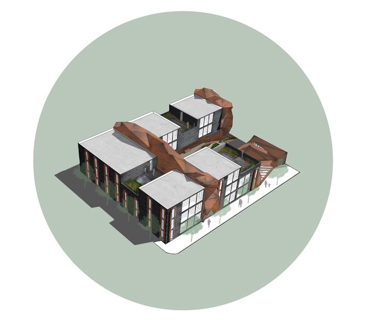
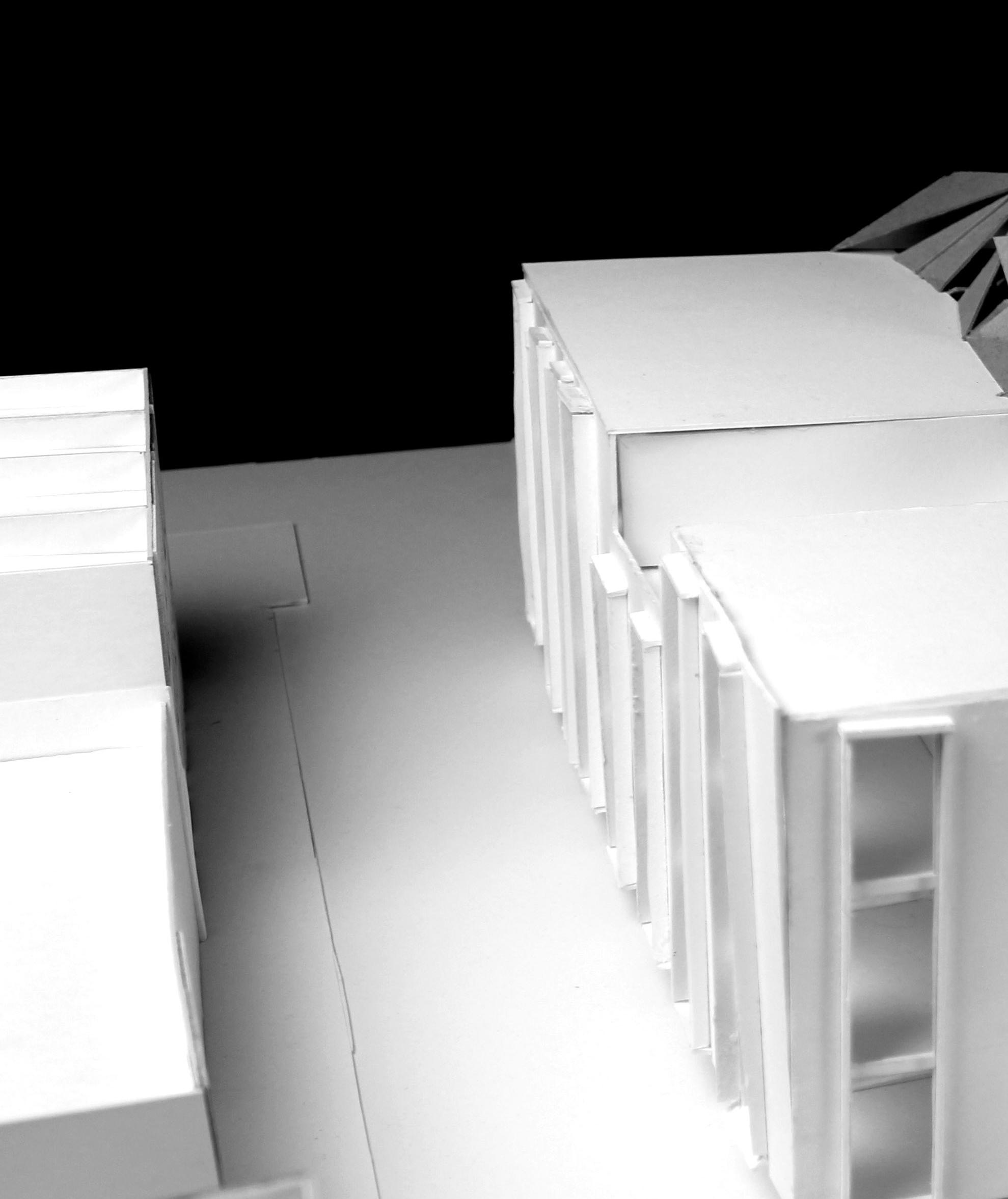
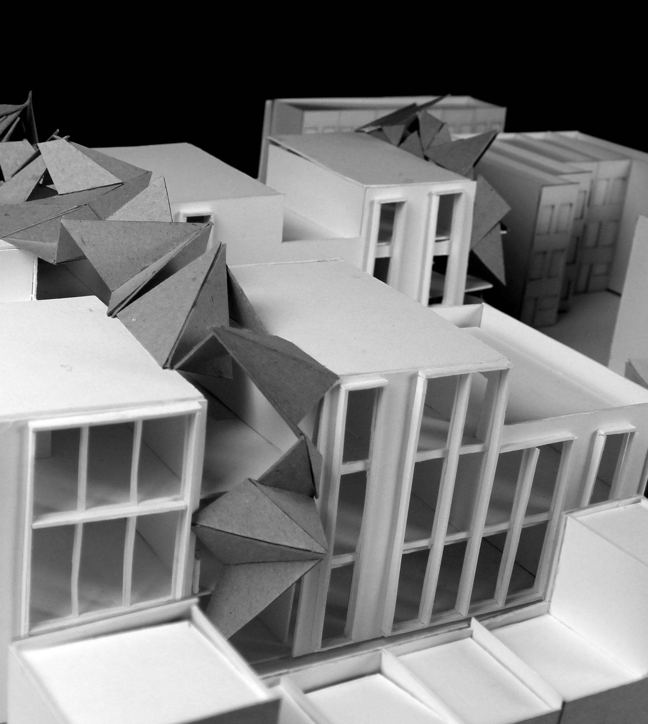
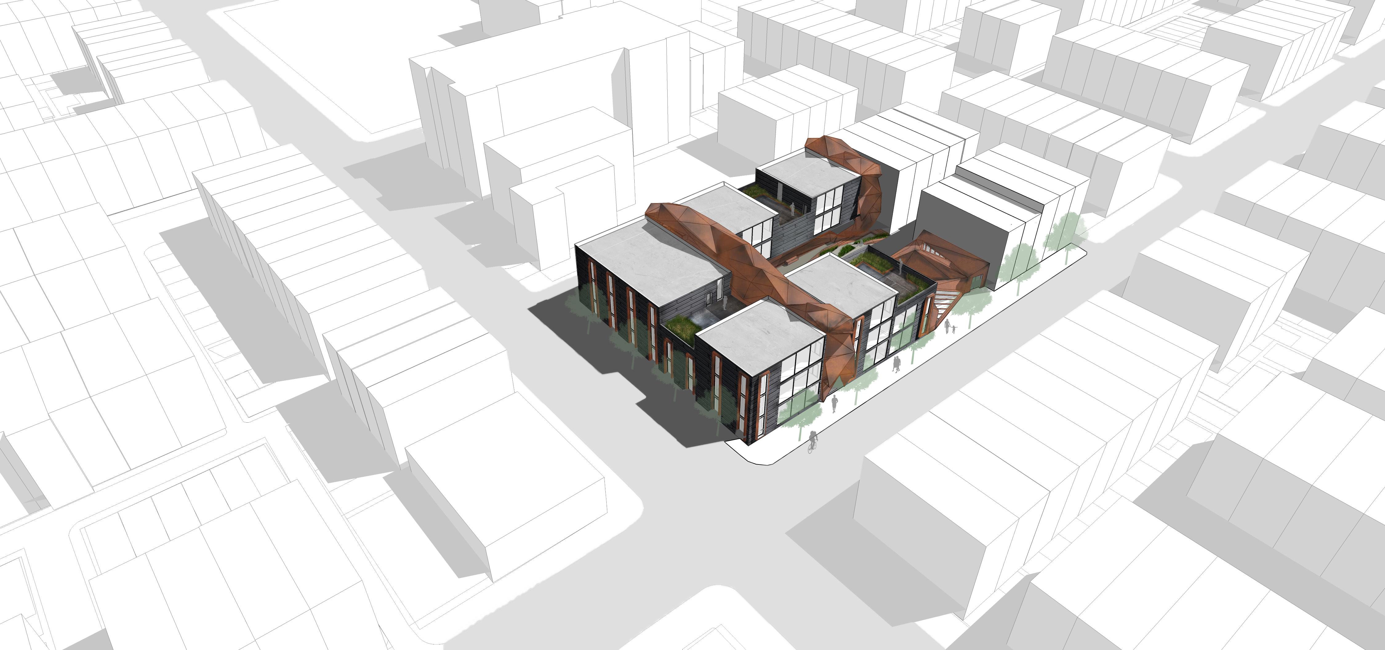
The Row-House and the Low-rise Apartment that includes open public, private, and semi-private spaces. While using a various of design methodology and design process. Working within a group of two, different creative possibilities propose design features such as courtyards, a public sculpture gallery and bright work spaces.
Organic Bond uses techniques to merge and connect the hybrid.
1
2
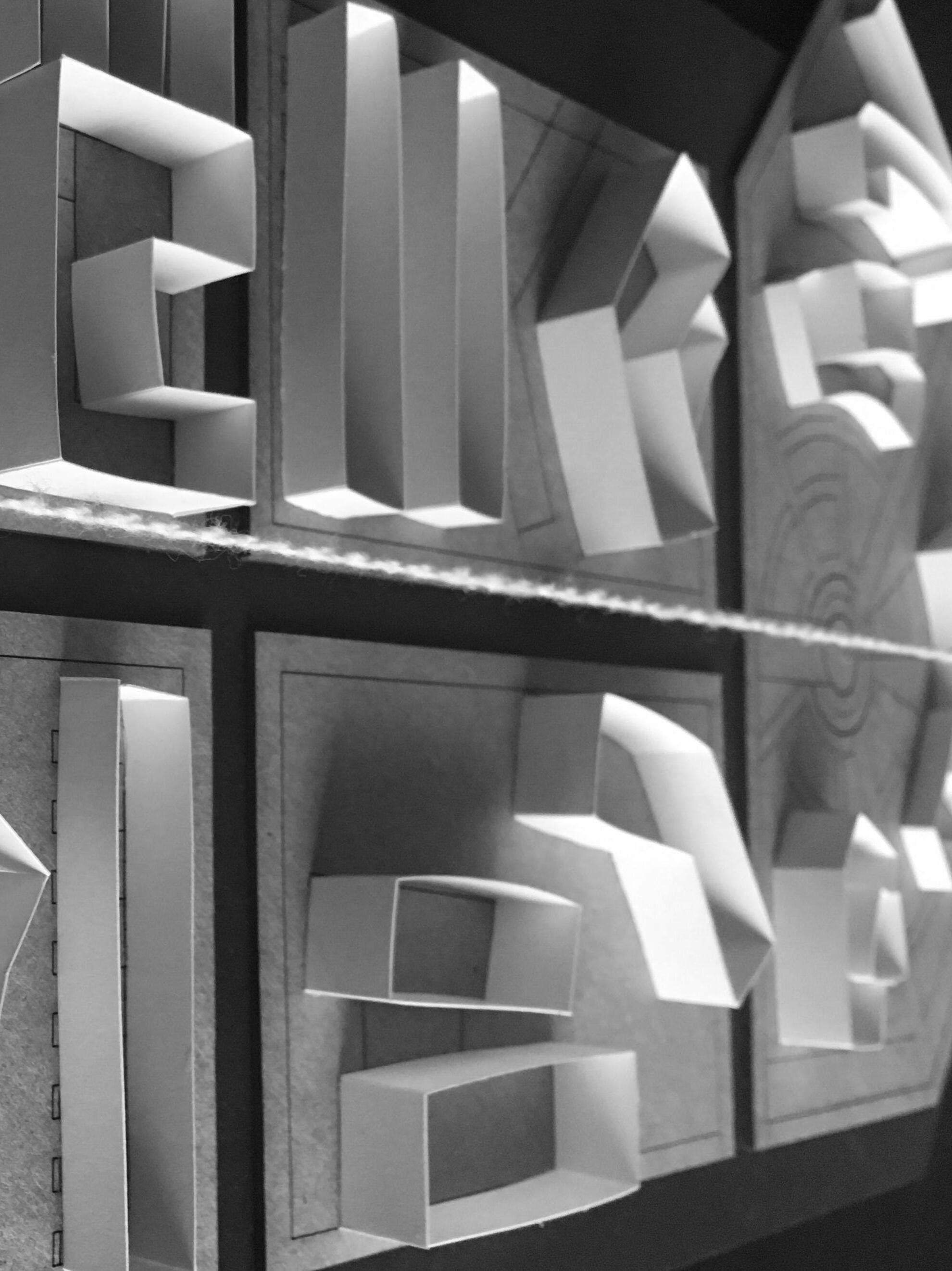
The ridge and organic building form are inspired by a scorpions silhouette and anatomy. Influenced by elements of a scorpion such as the rhythm, geometry, material selection, program, circulation, space to space relationship, and form. There are many connections that can be made from the ideas of a scorpion anatomy that reflect into the space.
Volume is manipulated to profile. A green space
COURTYARD GALLERY SITE
PROGRAM
GEOMETRY
for merges with the art gallery, steel skin.
3
The courtyard occupies the lower level at street grade allows residences to have a semi-private intimate experience.
compliment the urban fabric’s residence that interlocks and gallery, building units and corten
A organic multilayer facade screen, maximizes visual appeal to residents and brings the building into harmony with its urban context.
GEOMETRY PROGRAM AREA
SKIN
4
5
TOTAL #UNITS PER BLOCKS: 12
APARTMENT TYPE : (6) 3-BEDROOMS, (6) 2-BEDROOMS
DESIGN FEATURES : GREEN COURT YARD, GALLERY, SCULPTURE GARDEN. ETC

6


UNIT TYPES 3 BEDROOM 4 BEDROOM WORK SPACE CIRCULATION UNIT TYPES 3 BEDROOM 4 BEDROOM WORK SPACE CIRCULATION UNIT TYPES 3 BEDROOM 4 BEDROOM CIRCULATION UNIT TYPES 3 BEDROOM 4 BEDROOM WORK SPACE CIRCULATION WORKSPACE FORM UNIT TYPE CIRCULATION UNIT TYPES 3 BEDROOM 4 BEDROOM WORK SPACE 7
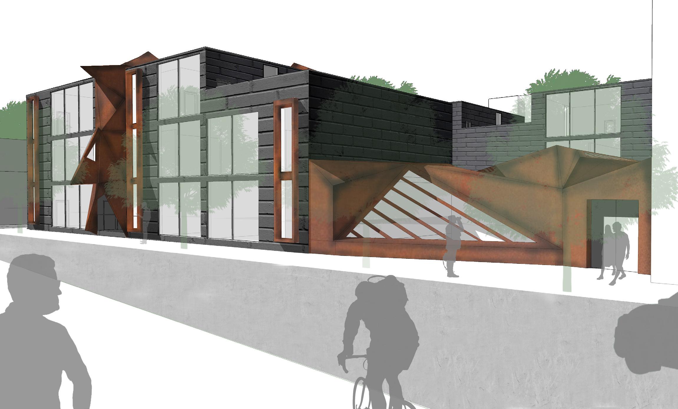

EXTERIOR - STREET VIEW 8
WHOLE BUILDING
MATERIALS:


CO RTEN STEE L BRIC K CONCRET E
SKIN
CORTEN STEEL

CURTAIN WALL
L ANDSCAPE
COUR TYAR D COMMON SPACE
GALLE RY
USER: AR TIST & STUDENTS


S CULPTUR E GARDEN
COMMON S PACE
BUILDING
12 UNITS
PUBLIC & PRIVATE
APARTMENTS
CIRCUL UNI 3 BEDROOM 4 BEDROOM WORK CIRCULATION UNIT TYPES 3 BEDROOM 4 BEDROOM WORK SPACE CIRCULATION UNIT TYPES 3 BEDROOM 4 BEDROOM WORK SPACE 9
1 OPEN SPACE 10
LEVEL 3 LEVEL 2 LEVEL
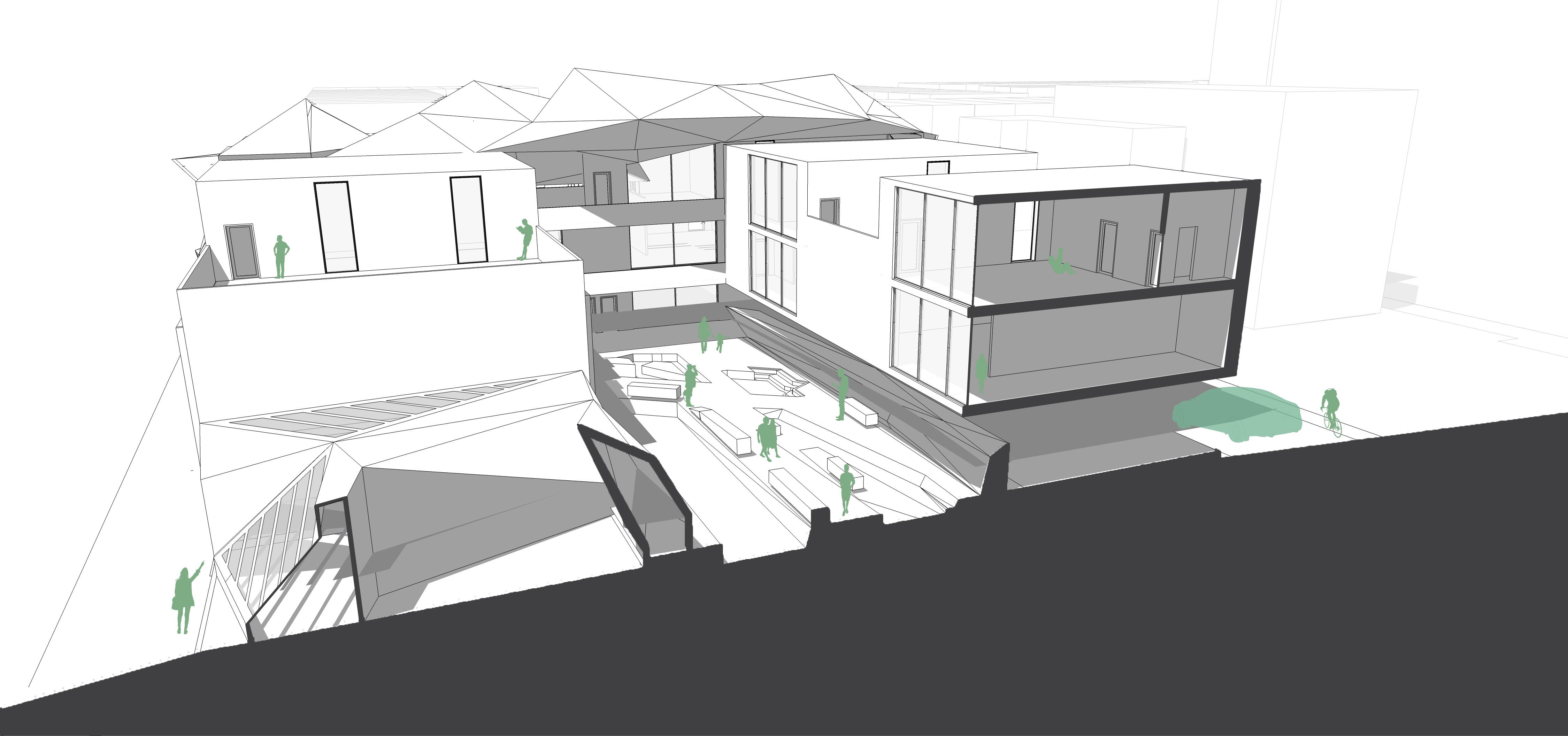
| SCULPTURE GARDEN SECTION CUT - THROUGH GALLERY, COURTYARD & UNITS 11
GALLERY
12 UNITS :
(6) 3-BEDROOMS
(6) 2-BEDROOMS

GREEN COURT YARD PARKING
12
LINKED
FARNSWORTH HOUSE VISITOR CENTER

2016 ACSA Competition Submission
ARCH 202 | Design Studio ||
PROJECT GOALS
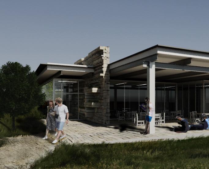
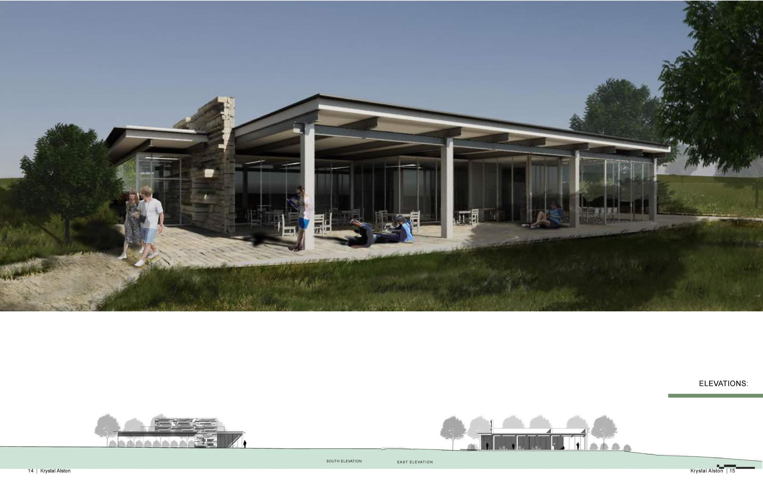
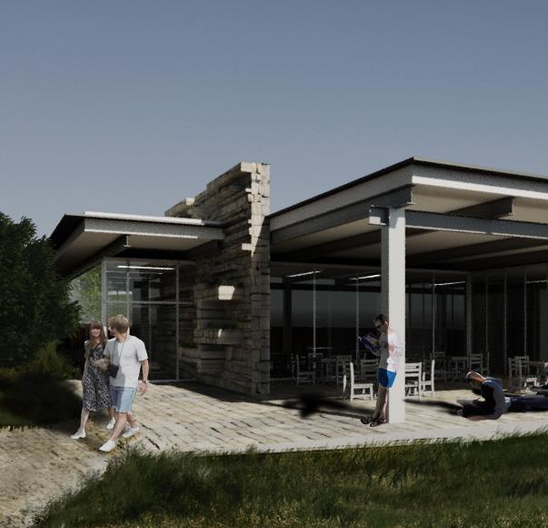
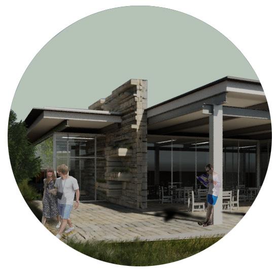
Linked, creates a solution that respects the Farnsworth house and pre existing site. Using the concepts of layering , interlocking and overlapping throughout the space created an interactive space for visitors and staff.
“The project will assume the objective and purpose of 2016 ACSA Competition: Preservation as Provocation a new visitor center for the Dr. Edith Farnsworth House designed between 1946 and 1949 by Ludwig Mies van der Rohe and constructed between 1949 and 1951 in Plano, Illinois.”
13
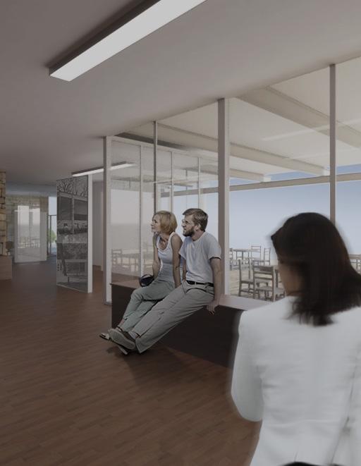
GALLERY 14
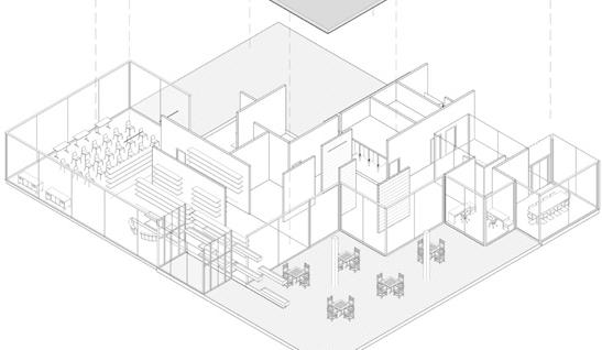
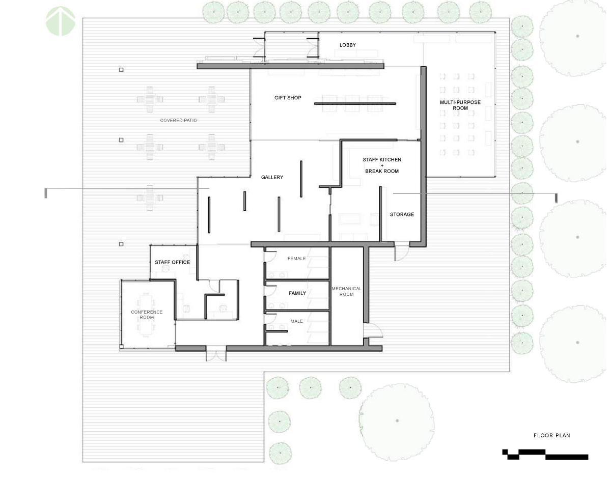
Influenced by elements of The Farnsworth House in Plano, Illinois, designed by Mies van der Rohe such as structure, form, repetition, rhythm. The parti consists of interlocking panes serving as the main structure enhanced by the grid along with raw materials sourced from the site. The structure is manipulated to create thresholds for smooth transitions and creating a seamless interactions between light and shadow. FORM

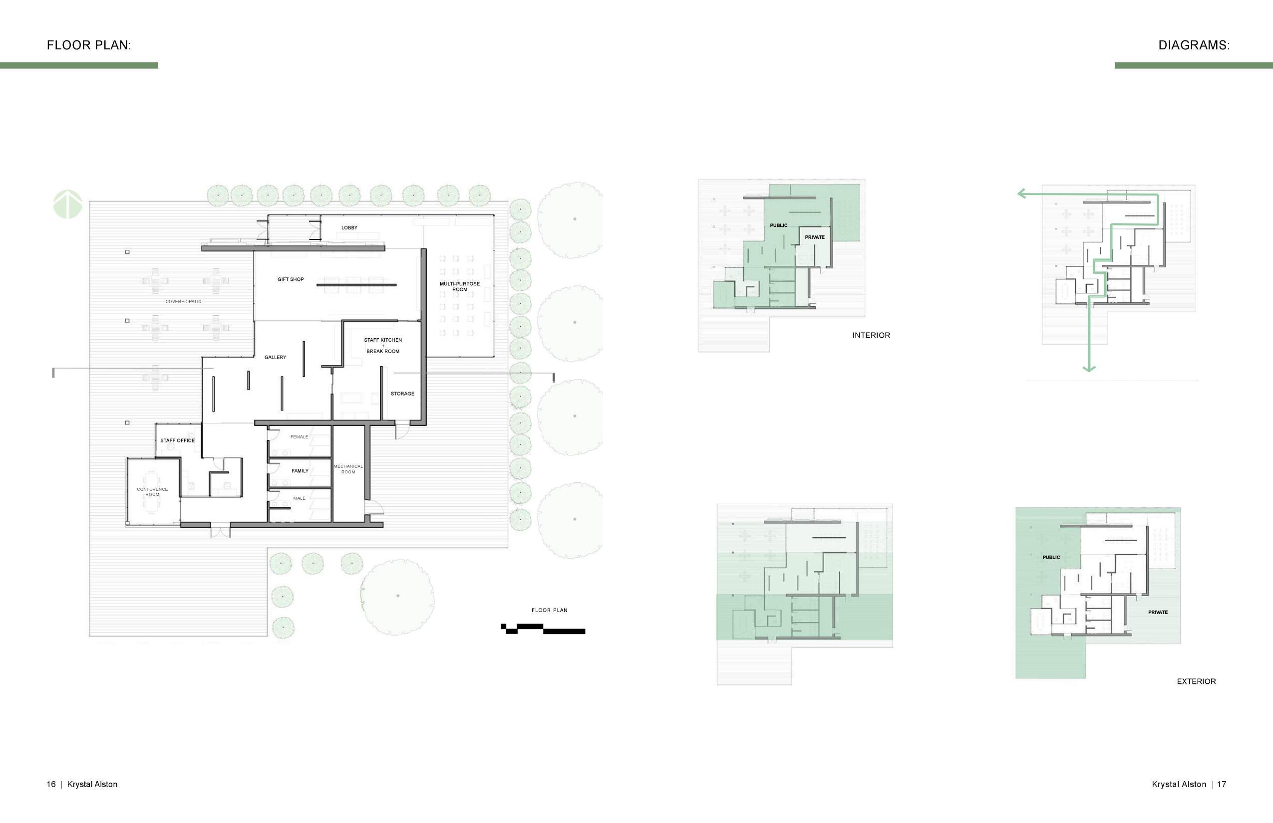
 The geometry is manipulated to topography and Farnsworth House for visitors that overlaps with office, and conference room.
15
The single panes can interlock their volumes and merge the buildings form and program placement.
SKIN
to compliment the site’s House profile. A patio space the gift shop, gallery, staff


16
The structure consists of precast concrete floor, The facade is made of single panes of glass spanning from floor to ceiling, fastened to the structural system by steel mullions.


SOUTH ELEVATION 17


EAST ELEVATION 18


DIAGRAMS 19

PATIO 20
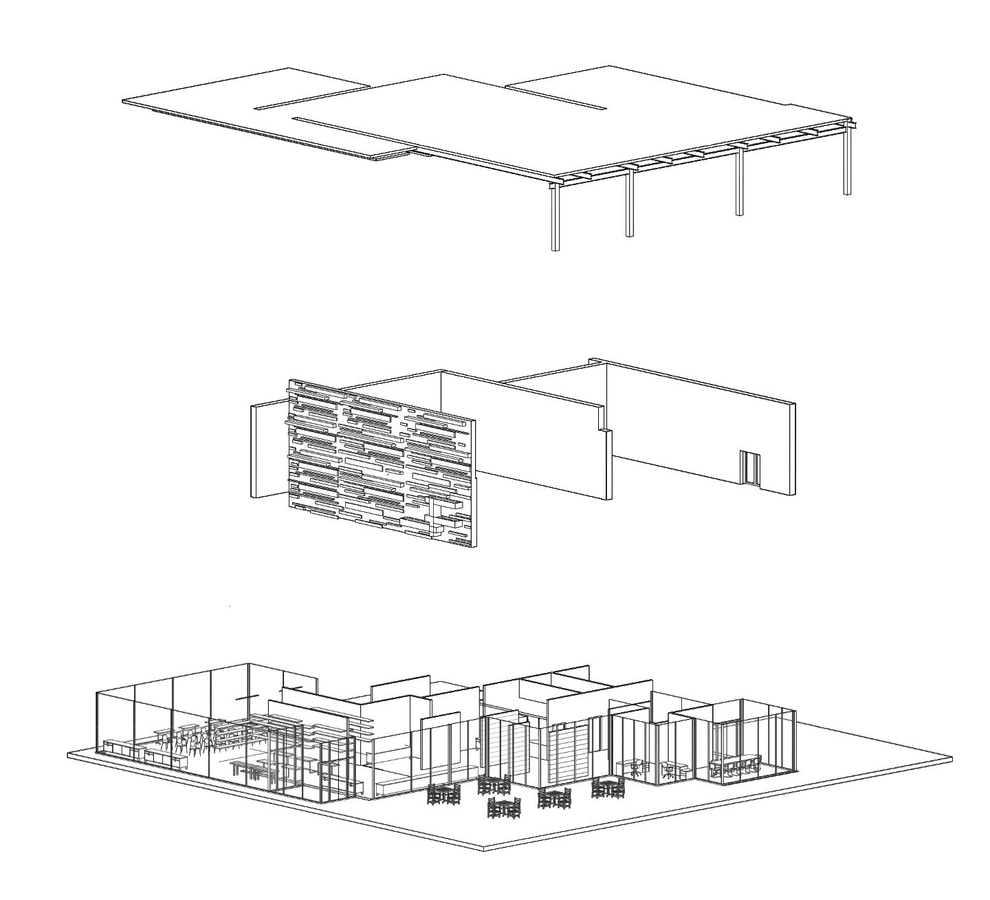
AXON: INTERIOR AND EXTERIOR STRUCTURE


CIRCULATION UNIT TYPES 3 BEDROOM 4 BEDROOM 21

FLOOR PLAN S 22


20|
23
Krystal Alston


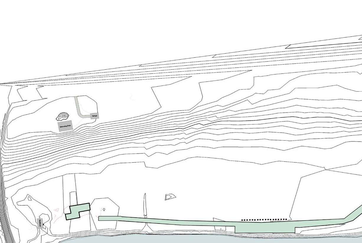
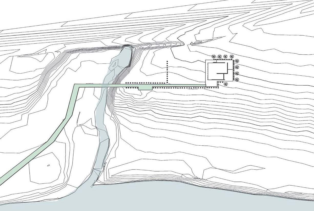
21 Krystal Alston | SECTION A SITE MAP: SECTION A 24
REVITIALIZATION
FARNSWORTH HOUSE VISITOR CENTER
URBAN REDEVELOPMENT
ARCH 302 | Intro to Urban Design

PROJECT GOALS
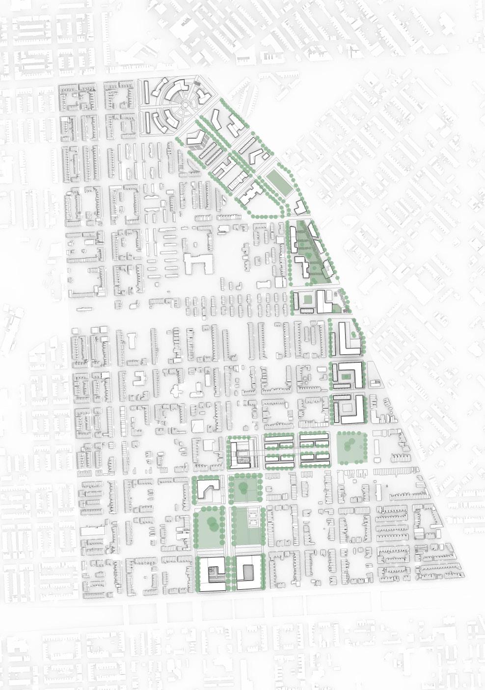
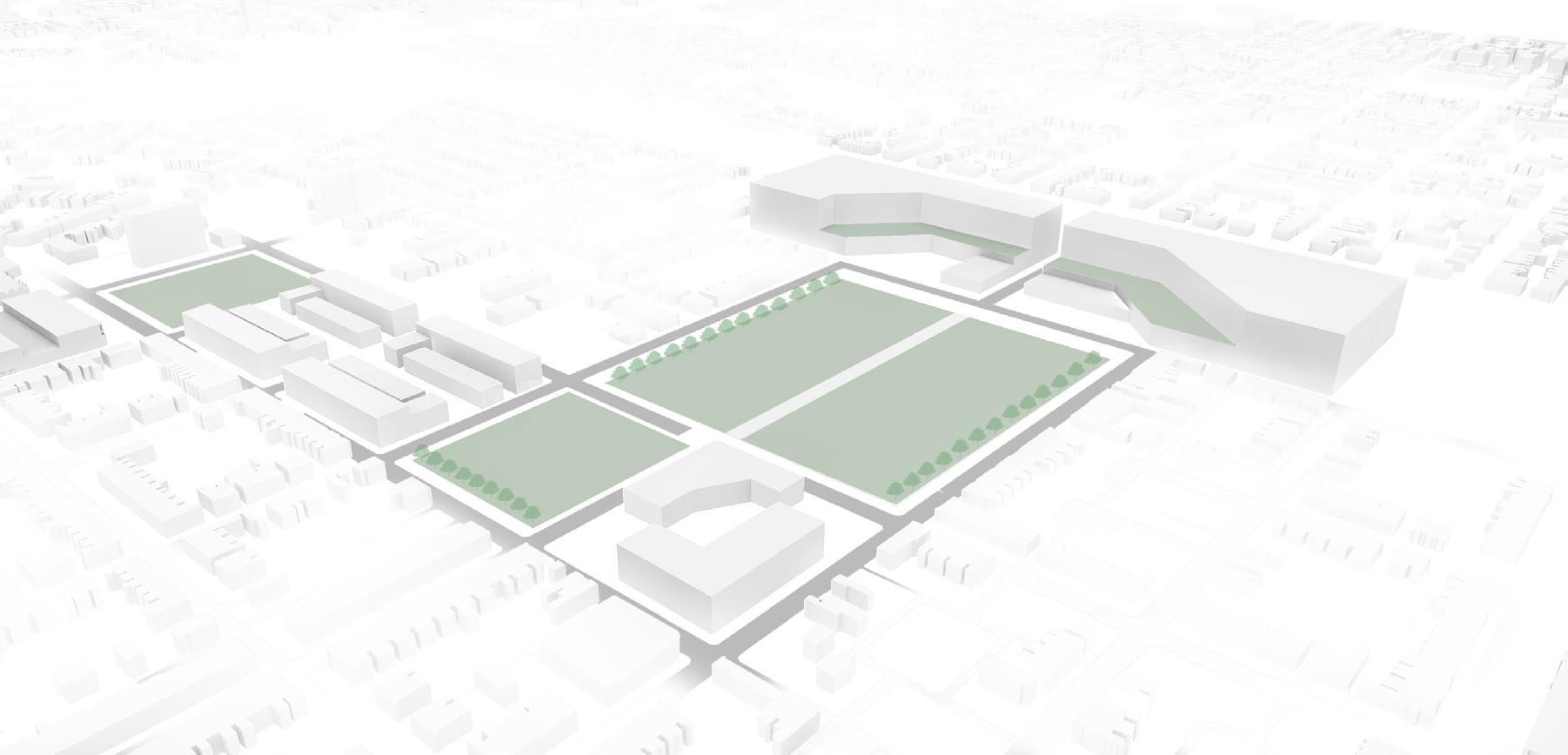
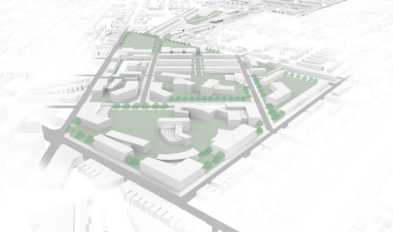
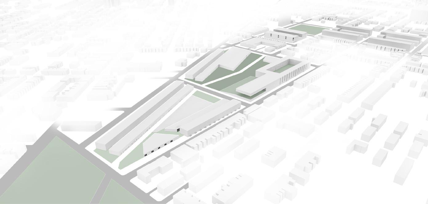
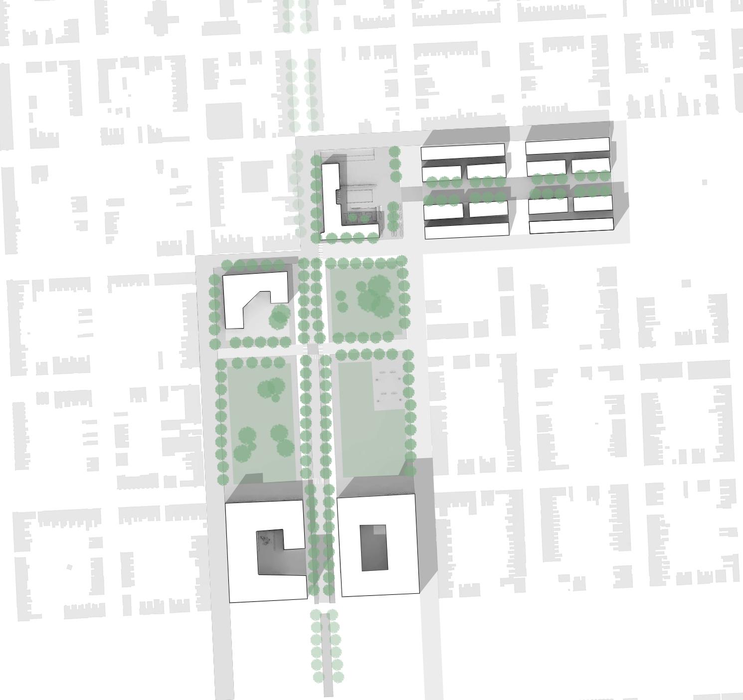
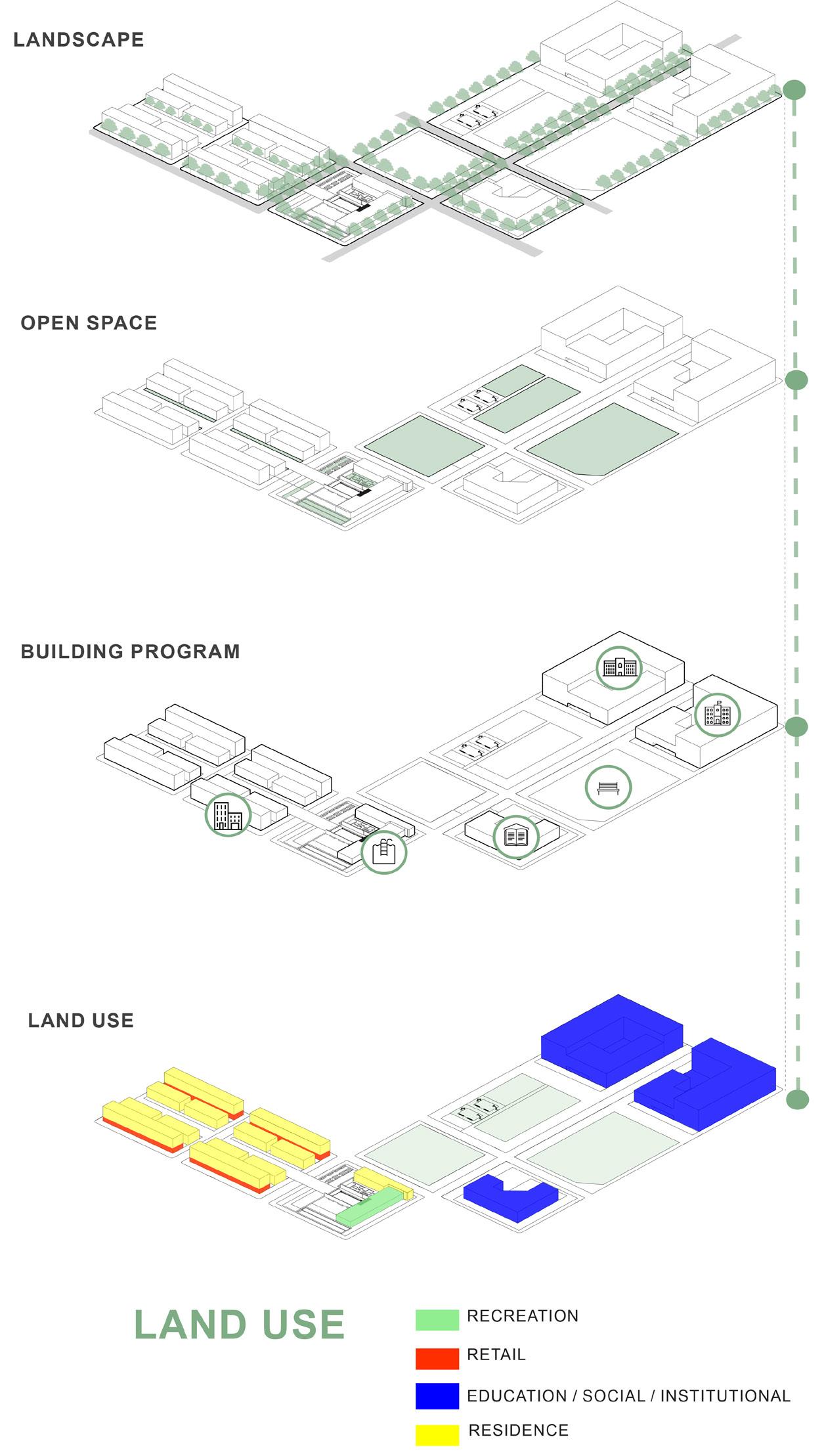
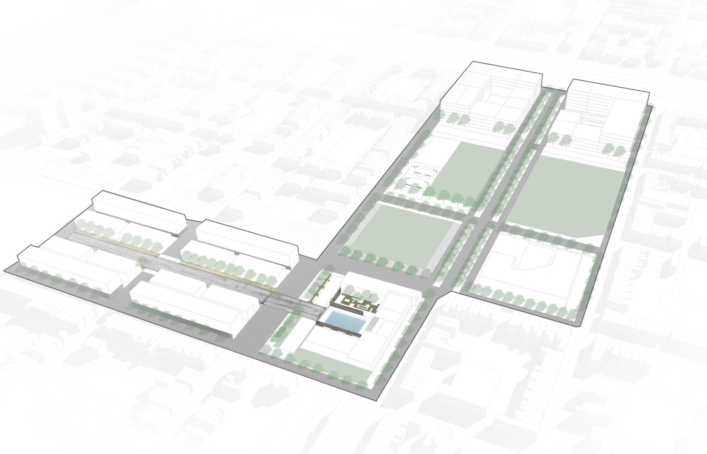
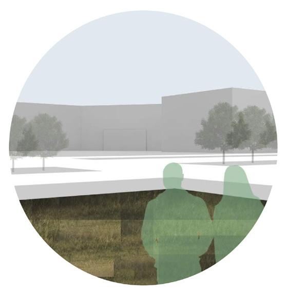
Based on the Harlem park and SandtownWinchester conditions the urban movement provides an effective green network. The movement of economic growth, linked green spaces, and historical neighborhood pride. The main green networks connect three movements the public institution along with the market space / commercial space and the secondary education system.
25
Design Team: Jocelyn Belmonte | Niles Parker

26

HIGHER EDUCATION COMMERCI AL / MIXED USE 1 2
27
3 EDUCATION LINKS PARKS
URBAN REGENERATION (DENSITY & ECONOMIC DEVELOPMENT): HOUSING FOR ECONOMIC AND SOCIAL DIVERSITY
MIXED USE - HOUSING COMMERICAL AREA
GREEN NETWORK (ENVIRONMENTAL INTEGRATION & PUBLIC LIFE): OPEN SPACE


LINKING PARKS FROM NORTH TO SOUTH
PUBLIC INTERFACE (SAFETY AND ACCESS): CONNECTIVITY
PEDESTRIAN TRAIL
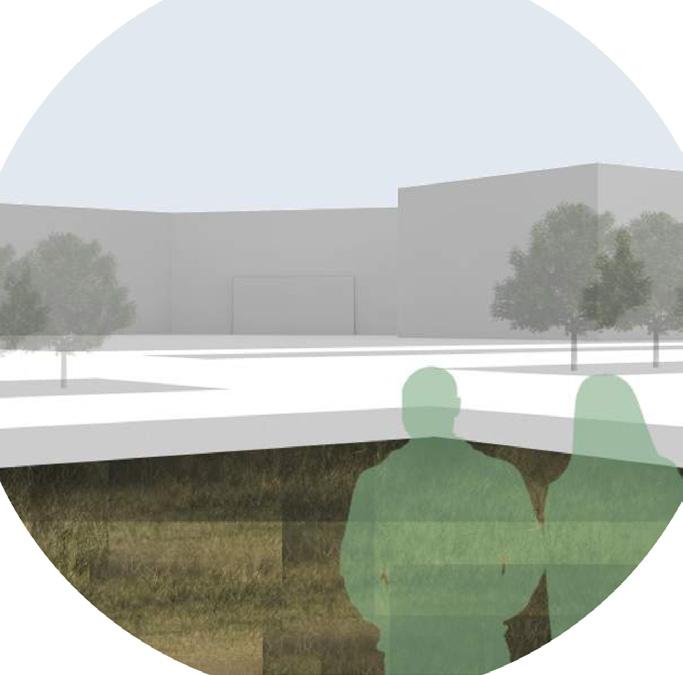
GREEN SPACES CONNECT THE STREETS TO PARKS WALKABILITY (W NORTH AVE / N FREMONT)
28


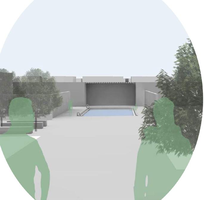
EDUCATION RECREATION CENTER | POOL LIBRARY 29

SITE PLAN 30

31
AXON: DIAGRAM
EDUCATION LINKS PARKS

CONCEPTUAL DIAGRAM
3
32
PAINTINGS
Medium : Oil & Acrylic
CONCEPT BOARDS
Creative Collage Series
ABSTRACTION
Illustrations

2016 - 2021
2016 - 2019 2019 - 2020 2021 33
EXPLORATORY

34
PAINTINGS OIL & ACRYLIC
2016 - 2019
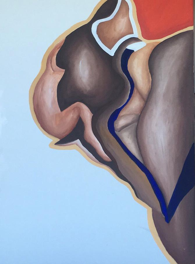
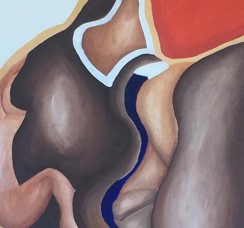
The large and small-scale canvas paintings explore the interaction of organic forms through materials, shadows, and light . Using various mediums of oil, acrylics, and glass to express these ideas in a visual format.
Stretch is a large-scale oil painting that expresses themes such as harmony, rhythm, and space to void relationships . Using soft tones, a calm color pallet radiates the themes through delicate brush strokes.
Themes
Motion
Depth
History
Poetry
Space | Form
35
Stretch, Medium: Oil & Acrylic

36
CONCEPT BOARDS SERIES
2019 - 2020
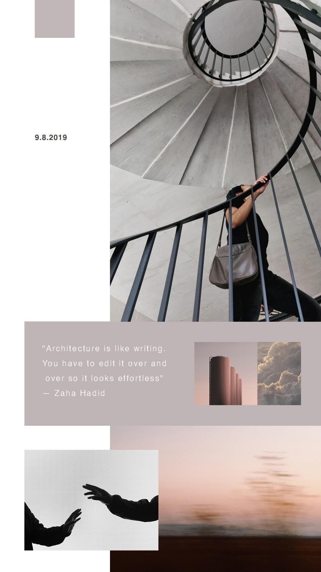
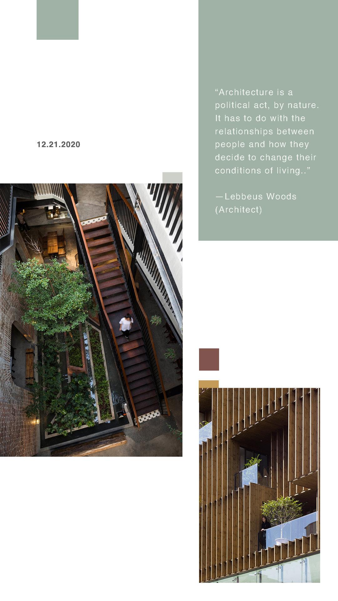
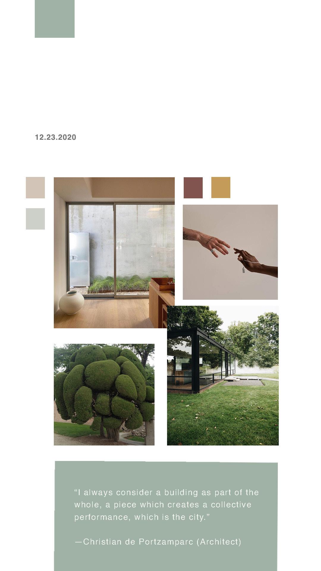
The Concept Boards are an ongoing series of experimental colleges to explore color, texture, and composition.
The series started as an exercise to brainstorm colors and forms that would eventually serve as sample proofs for paintings, drawings, exhibitions, installations, and ceramic sculptures. Creating a daily piece to post [on Instagram] to serve as inspiration, each study serves as a new opportunity to embrace simplicity.
The series embraces the ideas of layering words/ quotes with photographs, and colors to communicate rhythms, space, layering and abstraction, observation, and re-imagining.
“Architecture is like writing. You have to edit it over and over so it looks effortless”
―Zaha Hadid
39

40

45

46
ABSTRACTION SERIES
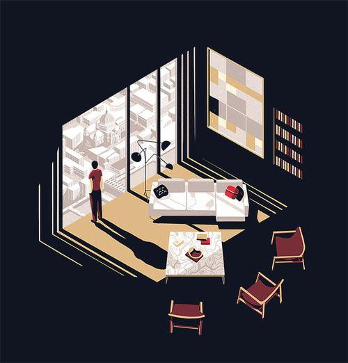
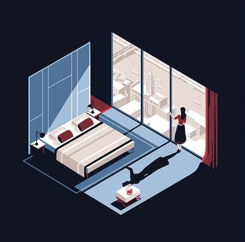
Abstraction began as an experiment of collecting inspirational images for mood boards, then inspired a series of illustrations.
After selecting image(s) that would serve as the inspirations are then translated into a form of original artworks along with conceptual spaces.
The following series of Illustrations explores themes of color, texture, form, and depth.
2021 47
IDEATION + EXECUTION 48


01
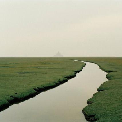
photo by Nadav Kander, France 2002
49
photo via clubmonaco


clubmonaco
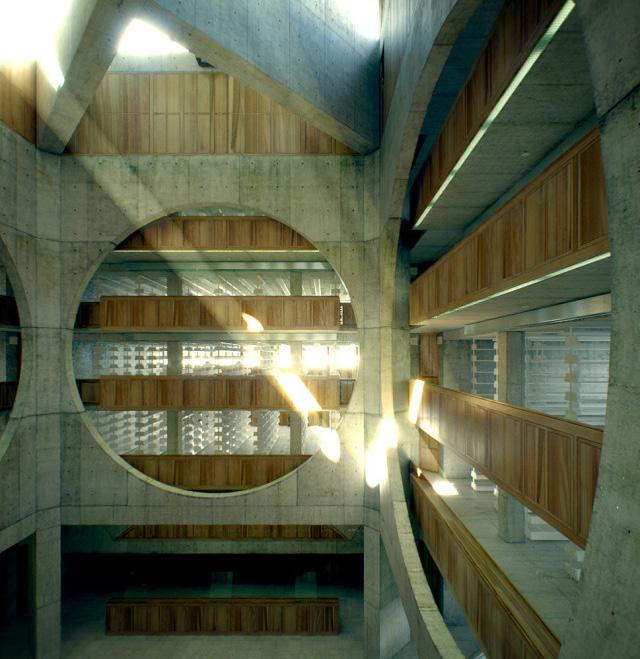
photo via Phillip Exeter Academy Library
50
Architect: Louis Kahn
SELECTED INSPIRATION IMAGES
02 51
IDEATION + EXECUTION
FINAL SERIES


03 52

THANK YOU Krystal.m.alston@gmail.com Krystalalston.com


 The geometry is manipulated to topography and Farnsworth House for visitors that overlaps with office, and conference room.
