


Another wonderful year has passed and we are once again celebrating the best of community newspapers in Ontario.
There were a few changes to this year’s competition; the General Excellence circulation ranges were altered slightly in order to divide papers more evenly throughout the categories. Cartoon of the Year was changed to Cartoonist of the Year, to recognize the talent of the cartoonists. The most drastic change of this year’s competition is the online entry system. The new online portal allowed for a more convenient and time efficient process for submitting entries, distribution to judges and collection of the winning entries. OCNA will continue to use the online system for the competition.
We are extremely thankful to the many judges- award winning newspaper professionals and college/ university professors- who spent countless hours providing their attention and expertise. We are also grateful for the continued support of out category sponsors. They allow our best to shine.
Special thanks to all those who have entered the competition – more than 1,700 digital tearsheets of your best work were received and judged.
It won’t be long before the call for entries in the 2010 competition will be going out, but in the mean time, take a moment to sit down with this book and celebrate our industry with pride.
Abbas Homayed OCNA President 2009/2010Vaughan Citizen

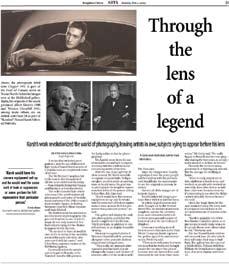
First place – Stefania Lamacchia’s look at a new Yousuf Karsh exhibition at the McMichael Canadian Art Collection in Kleinburg was deftly handled. Lamacchia’s piece uses two sources to explore the master photographer’s work, even delving into his portraits of the heroes of industry, which were taken during the golden age of the automobile. Though the journalism is sparse, she even manages to work in the current problems in the auto industry. Solidly written, beautifully laid out with strong photos from Karsh, Lamacchia’s piece was a standout in the class.
Toronto Leaside Rosedale Town Crier
second place goes to Lorianna De Giorgio for her piece on the comic Kate Davis. The snappy copy, which promoted the seventh annual Funny Girls and Dynamic Divas fundraiser, is engaging. But it also sheds light on the difficulties of female comics face breaking into the field. It’s clear that De Giorgio has plenty of experience writing arts copy, and while this story was a little sparse, the writer’s sparkle, the art and good use of design in cramped quarters makes it a winner. Nice work.
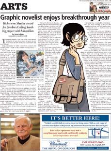
third place went to Steve LeBlanc for his piece on quirky graphic artist Faith Erin Hicks.
LeBlanc wrote a decent profile of an up-and-coming graphic storyteller, and how women are starting to alter the male-dominated field. LeBlanc and his colleagues did a great job presenting the story.
JUDGE
Richard Mostyn
Richard Mostyn has been the editor of the Yukon News since 2005. He has won many national and international awards for his journalism and editorial writing. He lives in Whitehorse with his wife, two sons and two springer spaniels.


First place – A great team effort covering perhaps the major news story in Ontario and its impacts on the people involved. The writers put you on the ground at the plants and also do an excellent job explaining the background information and analyzing the reasons for the auto market fallout.
Oshawa This Week
second place – The strongest storytelling of any of the entries. It’s a different way of covering a story a number of papers were doing. Would have been even better if it started with the people.
Toronto North Toronto Town Crier
third place – A blow-by-blow tour of how the economic challenges impacted a neighborhood. Lots of sources and good storytelling.
General comment – The top three entries stood out from the rest because of the writers’ efforts to go the extra mile in getting a number of voices in their stories and also understanding that a good business story isn’t just a profile on a business or person who seems interesting.
Michael Gorman is a regional and national awardwinning journalist with the Yarmouth Vanguard. He has worked at the newspaper for four years.

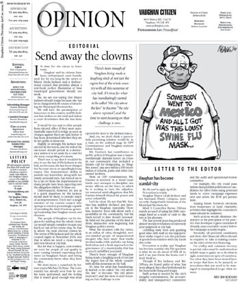
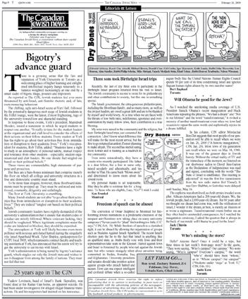
First place – This editorial was well-written and very relevant to the paper’s readers. The issue of bigotry and a warning of its advance is a message all Canadians should heed. The author presents the issue succinctly and gives the reader a strong warning of the consequences if nothing is done. Plenty of local community impact and to the point of the matter. Placement was average.
Vaughan Citizen
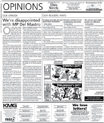
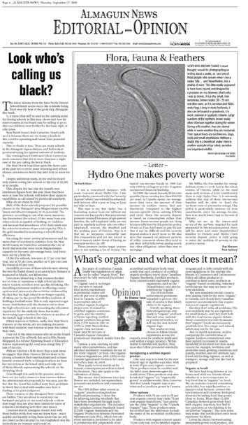
second place – Local government incompetency is an issue many newspapers share, yet for this community, it’s a major issue. This well-written editorial tackles the matter head-on and gets to the point quickly. It names where deserved and offers concise challenges and options to reach a solution. It’s placement is good, as it strengthens an opinion page, where readers come to expect solid stances by their community newspaper.
JUDGE
Steven Heywood
Peterborough
third place – This editorial takes a national issue and makes it local. It hits hard, giving specific examples and issuing a direct challenge that will only benefit the readers and broader community of local taxpayers. This is an example of how a message should be communicated.
General coMMent – I marked this category hard, as I hope readers would also do when it comes to the stances taken by their local papers. The top two were separated by only a quarter-point. For editorial writers, you must get to the point quickly and offer readers a challenge or a solution to an important issue. Reduce the stats, numbers, quotes and excess words that would be better suited to a news story or sidebar. Make your point, make it well. And please edit your own work - some submissions had spelling or grammar mistakes that, for me, are a turn off. Strong writing and messages that stayed on target separated the top of the group from the rest. Better placement and easier-to-read editorials might have helped some scores. Watch that opinion page design. Overall, this was a diverse set of editorials there were, for the most part, good reads.
Steven Heywood has been the editor of the Parksville Qualicum Beach News in B.C. for six years and has been in the field for 15 years. His work has been recognized provincially and nationally, including last year’s CCNA awards, earning second pace among the top editorial pages in The News’ circulation class.

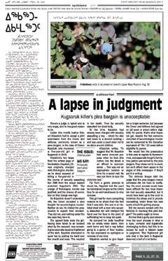
First place – From the first line to the strong and moving last statement this editorial takes a strong stand and reflects the outrage of a community. While a little long, the subject matter warrants it. Also great lay out that makes it appealing and easy to read. Great job on an emotional issue.

second place – A strong and well supported argument on an important community issue. A little long, but very readable due to a clean lay out with appropriate white space.
third place – Direct and to the point. Written clearly and concisely presented in a clean and attractive layout.
General comment – What set the top three apart was their strong argument, concise writing and clean design.
Too many of the editorials were very long, used a first person viewpoint and focused on issues not specific to their community. Many layouts were crowded, with tight leading or small crowded headlines.
However, overall, it is clear small town editors are passionate about the issues in their communities.
Bird is the editor and publisher of the North Island Gazette, a weekly Black Press newspaper serving 13 communities on northern Vancouver Island, B.C.

First place – A great, eye-grabbing lead from Kim Zarzour kicks off a wellwritten, well-researched piece on the challenges schools faced in dealing with the H1N1 virus.
second place – Great photos and a good idea going along for the ride on the band trip to the Windy City. This story about music could have used more soul.

third place – A good example of explaining to parents – the presumed readers of the piece – about how education is changing, how technology is playing a role and how kids are making the most of the opportunity.
General coMMent – The majority of entries in this category lacked originality. Stories about people lacked personality and stories about institutions and educational processes lacked detail, nuance and much-needed additional reporting.
Richard Dal Monte
Richard Dal Monte is a Vancouver native and editor of The Tri-City News, a twice-a-week B.C. community newspaper serving a region of about 200,000 people. He has worked as a community newspaper reporter and editor for 24 years.

First place – This story stood out from a number of entries on the same subject matter. Well-written, well-balanced, thorough and easily understood. The story was almost perfectly presented.
second place – Well-written and nicely presented story on the efforts to preserve 1,100 acres of green land. Made its point nicely without forcing the issue on its readers.


third place – Well-written and very nicely illustrated, the story delivered complicated subject manner in a way easily understood by the average reader.
General comment – Many strong entries in a closely-contested competition.
Darrell Greer
Darrell Greer is in his 12th year as editor of Kivalliq News in Rankin Inlet, Nunavut. He was named Columnist of the Year for the CCNA in 2009, as well as earning second place for his environmental writing. He also penned the Best Environmental Story of the Year in 2006 (Avian cholera) for the Manitoba Community Newspapers Association.
First place – Martha Perkins accomplished the ultimate in community-minded writing in this thorough and emotionally charged feature ‘The Truth about Rumours’. A family’s grief exposes how words can hurt.
The reader is brought into the grief of this family whose pain is further escalated from insensitivity and wild gossip around the painful loss of a son and brother.
It shows the value of a community newspaper in that the family entrusted the writer to correct the inaccuracies of hurtful gossip- and this writer didn’t let them down. It’s indeed a powerful read and written with all the sensitivities a story like this demands. This submission floated easily to the top of the pile as the best.
Elmira Independent

second place – Gail Martin landed second place with her submission ‘An awesome Antarctic adventure’. From layout to her writing flow, Martin nailed this feature and made it indeed an awesome read. This feature demanded much description and the author certainly painted a vivid picture of Antarctic (through the experience of the student she interviewed) this showed great interviewing and listening skills and that Martin was totally focused. The story is informative, interesting and written very well.
Kincardine Independent
third place – Kristen Shane displayed great writing style in her very personal feature Living with dementia. The story allows the reader a glimpse inside the lives of families who are challenged with dementia. It’s a very informative piece that helps us understand the progression as well as the science of the complex.
The writing flowed well and Shane definitely had no problem holding the interest of her readers with this beautifully told feature.
General coMMent – Carli Whitwell of Parry Sound North Star came so very, very close that it was difficult not to place her story ‘100 years of Georgian Bay Summers’ in the top three. It was a very entertaining account, very eloquently told and surely captured the interest of many readers. A great ending and wonderful injections of humour made this very worthy reading and very deserving of mention.
Michelle Stewart
I am a reporter at Peace Arch News, and won first place for best feature story in the 2009 CCNA Better Newspapers Competition and 2009 Suburban Newspaper of America awards. I was also a finalist for the Jack Webster Award for community reporting.

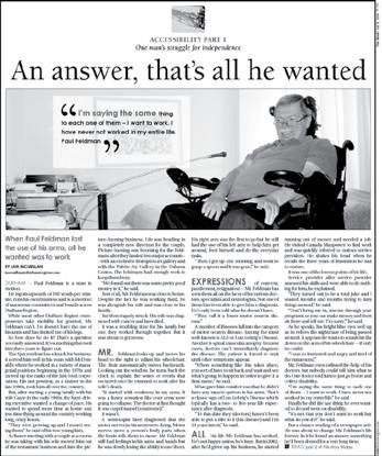
First place – There is no question Paul Feldman’s story is awesome. His experiences of monumental loss and unexpected discovery are so difficult to fathom, one is at a loss for words. Except Ian McMillan.
The writer’s use of colour and description gives the reader the feeling of being present during the interview, observing Feldman through the eyes of the reporter.
One can visualize him moving his head to adjust his wheelchair or hear his voice rising when he talks about his first visit to the Assistive Technology Clinic.
Simple revelations (“It appears he wants to smash his fist down on the arm of his wheelchair if only he could”) are more telling of Feldman than even his own quotes.
It’s a reminder that readers are interested in “and benefit from” being told the simple things. Applause to McMillan for not only noticing those small details, but understanding their important role in telling this story and choosing to include them.
Any reporter could have spoken to Feldman and come away with a feature. The difference here is McMillan took that extra step, he made it award-winning.
second place – In ‘The Rising Problem of Child Poverty’ writer Jennifer O’Meara reveals a side of poverty not often seen, a personal one.

While many living in poverty prefer to keep their situation private, the story’s subject, Paula Fillion, is candid, open and honest.
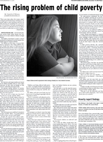
O’Meara describes details of Fillion’s lifestyle, such as buying meat on its sell-by-date and freezing it, as well as patching hand-me-downs to make them new again for her kids.
By offering insight into her struggles, O’Meara puts a face on poverty, making the situation tangible and easier to relate to.
A person can read report after report on poverty “ingesting facts and statistics” and never really grasp the significance of the problem.
Fillion, however, is hard to ignore. She is far more than just a number.
third place – Writer Pam Douglas delves into the life of street hooker, Tee, in ‘On the edge and in the shadows’, revealing her background and relationships with others including her deceased drug-dealer husband.
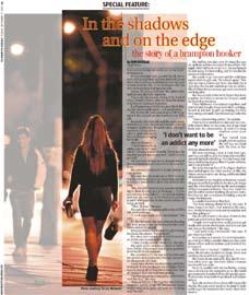
It is easier to relate to Tee once one understands more about her, and how she ended up where she is today. By offering a look at prostitution from a personal, human perspective, Douglas drives the issue home, and potentially changes the way people think about it.
General comment – It was extremely difficult to choose three stories from the many fascinating and well-written submissions.
There is no doubt there is a great amount of talent in Ontario, and it was a pleasure to be exposed to it.
Hannah Sutherland Editor of the Aurora-the-community newspaper of Labrador West in Newfoundland and Labrador. Has won various awards over the years from CCNA and ACNA. Awards include: feature writing, best headline writing, best news story, best historical story, best resource story, best editorials and overall general excellence.
Sponsored by O’Donnell, Robertson & Sanfilippo

First place – Excellent writing in this emotional story about a mother and family whose lives have been effected by a still-born child. This is a subject that you don’t often see discussed publicly. It was tastefully written, well reported and certainly touching.
second place – Solid news reporting about the H1N1 Flu virus and the effect it had on this community. The article is a well-researched piece that has a huge impact on the community readership.
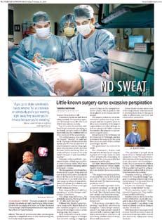
third place – Great storytelling and excellent page design help to illuminate this story about the little-known condition of Hyperhidrosis. The article tells the personal story of a hyperhidrosis patient and the relieving results of the solution.
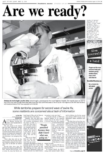
Erik White is a journalism professor at Cambrian College in Sudbury and also works as a reporter for CBC Radio. Previously, he was a reporter with the St. Catharines Standard

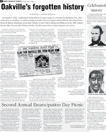
First place – Superior research, and a commitment to uncovering a historical incident that many would rather leave in the past. Well-written and conceived. Outstanding.
Dundas Star News

second place – Old-fashioned digging and excellent research uncover a great story – with a heritage angle.
Brampton Guardian
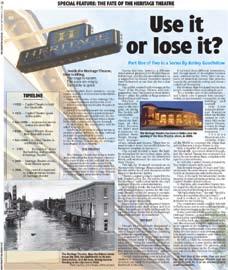
third place – This page had the most interesting and attractive layout. Article was interesting and brought the history of the theatre to life.
Kurt Muller has worked in television news since graduating with an MA in Journalism from the University of Western Ontario in 1993. He was a reporter with CFTO News from 1994 to 1997 and he has spent seven years as a writer for CTV News with Lloyd Robertson, and with CTVNews.com. He has also worked as a freelance reporter for CHCH News in Hamilton.
Kurt began his career as a general assignment reporter at the OpasquiaTimes, a community newspaper in The Pas, Manitoba.
Kurt is the coordinator of the Journalism: Print and Broadcast Program at Mohawk College.

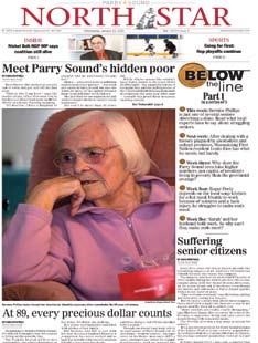
First place – A comprehensive, multi-part series of stories that lays bare the personal and community cost of Parry Sound’s hidden poor. Reporter Carli Whitwell worked tirelessly over weeks chronicling the scourge in an area with a higher seniors population than the Ontario average, and where 25 per cent of the First Nation of Wasausking lives on social assistance. But Whitwell doesn’t rely on dry statistics, and uses personal stories to give a face to the problems, including the 49 year-old recovering addict who makes crafts in his trailer to make ends meet, and a 60 year-old fibromyalgia patient who declares to the reporter: “I’m lucky if I’m going to live for five more years. I’ve had a rough life.” But Whitwell also uncovers the spirit of people in the community who can find dignity in trying to make the best of the little they have.
second place – After employees of the Craiglee Nursing Home tipped off The Mirror about an incident at the home in August, the paper used Ontario’s Freedom of Information law to obtain ministry inspection and “unusual occurrence” reports. Later, documents filed in court explain how the home became insolvent. But reporter Mike Adler resisted the temptation of opening his first report with dry statistics. Like the North Star entry, he put a face to it:
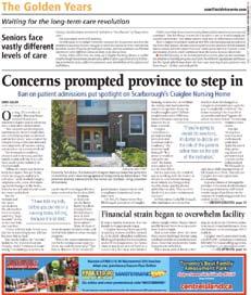
“On Aug. 25, a worker at Craiglee Nursing Home noticed blood on a resident’s slipper and no dressing over a skin ulcer on her ankle. She cleaned out the slippers and when she went to bathe her, she noted the worms on the bed and on her ulcer.” If this didn’t grab the reader’s attention, then perhaps this quote by one of the home’s workers does: “I have told my kids, before you put me in a nursing home, kill me because it’s so bad.”
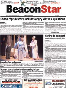
third place – When disbarred lawyer Bill Sinclair, who’d bilked clients of millions of dollars 10 years ago, showed up for a routine meeting with Seguin Township council to seek reduced security rates for his 236-unit condo development plans, reporter Evan French asked him about his past. Sinclair declined to comment, but that didn’t stop the reporter from digging into Sinclair’s past, and interviewing two of Sinclair’s former aged clients from whom he had misappropriated funds. One was Karl Reichert, whose 93year old mother had $200,000 bilked from her investment. This and the other winners in this category speak to journalism’s most honourable function -- to comfort the afflicted and afflict the comfortable.
Joe Banks
Joe Banks has been an Ontario community newspaper reporter, editor and publisher for 25 years. He now coordinates, and is a professor, for the journalism program at Algonquin College.


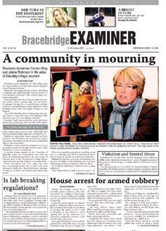
First place – A very clear picture of the damage caused by the flooding from a general perspective as well as a more ground-level point of view. Excellent pictures to support the story and laid out so as not to distract from it.
second place – Always difficult to approach a story about the tragic loss of a community-involved mother and her daughter. The story was told in a way that managed to retain some compassion without leaving out the finer details from people in her life.
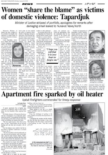
third place – The breaking story of the deployment of the Minister of Justice due to an inapproprite e-mail suggesting that victims of domestic violence deserved an equal share of the blame, was very well reported. Layout could have been a little more appealing.
General comment – A lot of very good entries and it was difficult to find the few that really stuck out. Well done, to everyone who entered.
I’m the editor/ reporter/photographer for TheValley Echo in Invermere, a paper that serves the Columbia Valley with a circulation of more than 3,000. We publish supplements for real estate and travel in the area, both of which I contribute to as well.
I’ve also worked in broadcast for the CBC, and written for trade magazines in Ontario including OH&S Canada and Canadian Plastics and for newspapers in the UK including the Cornwall-based West Briton.
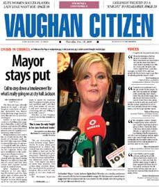
First place – A comprehensive package of unfolding political action, as a council demands the resignation of its mayor. A good combination of expert opinion and related research. Well-packaged, with key background context.
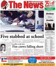
second place – A solid and colourful piece of journalism, in the wake of a multiple stabbing at a local school. Good effort to track down multiple sources that provides insight into the incident, beyond the standard police quotes.
third place – Another entry in the Vaughan mayoral scandal, which also displayed good effort to tell the story and bring a wider perspective to the issue. This submission would have scored higher, except it lacked critical background information in regard to the mayor’s expense account, which was central to the story.

General coMMent – There were many potentially terrific story-telling opportunities in this category. Reporters should always take advantage of grand opportunities to use narrative to put the reader in the midst of the action. Some accounts were too standard or superficial. Instead, try to bring depth and dimension to the central characters through personal observation and research.
JUDGE
Andrew Holota
Andrew Holota is the editor of the Abbotsford News, a tri-weekly community newspaper serving a city of more than 130,000. He is also the regional editorial director for Black Press Lower Mainland, which includes overseeing the editorial quality of 17 newspapers, as well as staff training and mentoring. Holota is a national and provincial award-winning journalist and editor, with 30 years of experience in the community newspaper industry. His career has been primarily focused in the Fraser Valley and Lower Mainland of B.C.

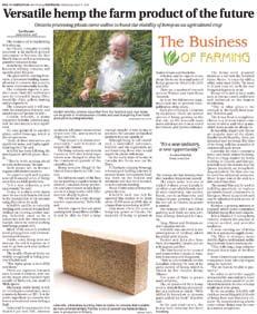
First place – This story has it all: good writing, a decent photo that helps make for an attractive package, and most of all a well-researched story that will interest both rural and urban readers for the alternative energy and land use issues involved. The reporter does a good job ensuring the story goes beyond ‘man floating idea to the press in the hopes of winning public support’ by talking to other good, credible sources. The actual project could still be a pipe dream, but the story still has value by educating readers about a subject matter, turbine co-ops, that many probably haven’t heard about.
Elmira-Woolwich Observer
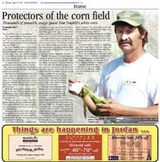
second place – A decent story about an issue that resonates with rural Canadians, and a timeliness that will get readers’ attention. The reporter fleshes out the issue by talking to a variety of sources, and overall has done her homework. The photo could be stronger but is helped by a decent layout.
Niagara this Week, Grimbsy
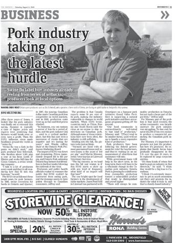
third place – A fascinating story about how industrial agriculture still has a lesson or two to learn from Mother Nature. The story has good flow and shows attention to detail through solid research. The subject matter has a pretty good appeal due to the agricultural science issues involved. The story suffers from a weak lede and poor photography. Another source or two, especially a grower, would round out the story.
General comment – This was a fun category to judge. A variety of informative issues were covered from wind turbine co-ops to backyard chicken coops and loss of rural land. Few points separated the top three, and many others were not far behind.


Bryan Alary joined the St.Albert Gazette in 2006 as the paper’s civic affairs reporter. He became the paper’s editor in 2009 and currently oversees a newsroom of 10 staff. He gained first-hand experience with rural reporting during a previous stop at the Lacombe Globe, where served as editor.

First place – A sharply-written, extensively-researched story that is very relevant to its community, with great colour photographs and a vibrant layout.
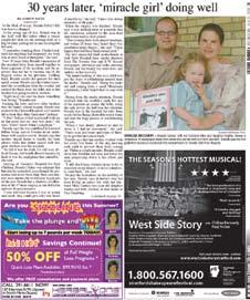
second place – A very compelling story that was well researched, relevant to the community and had an excellent colour picture, in a nice layout.
third place – Well written, well researched, significant local story, with a nice layout and excellent photographs.
General coMMent – The vast majority of stories were very well written and researched. What separated the best from the rest was the fact that the top stories had better pictures, better layouts and the subjects of the stories were interesting and easy to read.
Jake Boudrot
During his 11 years as editor, The Strait Area Reporter in Port Hawkesbury, Nova Scotia has received 11Canadian Community Newspapers Association and Atlantic Community Newspapers Association awards.

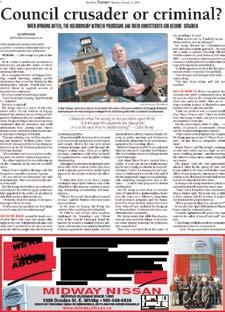
First place – Superior writing and deftly balanced presentation of the issues won Jeff Mitchell top marks for his profile of Scugog council watchdog Colin Kemp. The two-part news feature takes the reader to the dark side of municipal government, exploring the line between the rights of citizens to express dissent and the rights of politicians to operate free from harassment and bullying. By blending case histories and police transcripts with interviews and background on the Kemp affair, Mitchell keeps the series moving forward at a furious pace. Insightful and disturbing.

second place – In her month-long series on smoking cessation, Jillian Follert succeeds from Day 1 in making the reader care about her three smokers. Follert’s direct, conversational writing style and seemingly easy familiarity with her subjects carry the series, which also benefits from engaging photos, informative pull-outs and sidebars. A fresh approach to a perennial health story.
Ottawa Hill Times
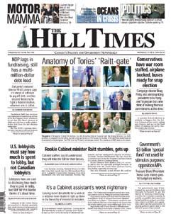
third place – Harris MacLeod and Abbas Rana provide fascinating details of the June 2009 controversies surrounding former Natural Resources Minister Lisa Raitt. In the first story, Ottawa insiders measure the fallout from secret Cabinet documents left behind in a TV studio by one of Raitt’s staffers. But that story pales next to the interview with The Chronicle Herald’s Steve Maher, who reported on taped conversations with Raitt that included her infamous characterization of the isotope crisis as a “sexy” issue. A riveting read.
General comment – There were a large number of entries in this category. The quality was consistently good. This made judging a difficult task. If the quality of the OCNA member entries is indicative of all the province’s community newspapers, Ontario is being well served.
Murray Elliott

Murray Elliott is the publisher and partner in Mountain View Publishing which consists of the Olds Albertan,Didsbury Review,Innisfail Province,Sundre RoundUp,CarstairsCourier and the MountainView Gazette.
I have 18 years experience in the community newspaper business, and am a board member of the Alberta Weekly Newspapers Association.
First place – A lot of city dailies would do well to tackle such an important subject in such an ambitious and ultimately successful way. The stories clearly identified a significant issue in the area, and described it in depth -- in both broad social and narrow personal terms. (Particularly powerful were the portrayals of individuals, who themselves deserve credit for being willing to help put a human face on local poverty.) But the stories didn’t stop at describing the problem; they also pointed to both short- and long-term measures to combat it. To top it off, the material was attractively packaged, with evocative photography and sharp graphics. If, as has been said, the role of journalism is to ‘comfort the afflicted,’ then surely this series is an impressive accomplishment. Congratulations to Carli Whitwell and colleagues.

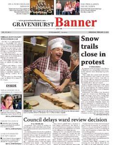

second place – The scope and detail of these stories were quite amazing. Jim Moodie and Lindsay Kelly seemed to explore just about every angle imaginable -- not just the political developments around the windmill farm, and the traditional esthetic issues, but also environmental, health, telecommunications concerns, etc. They also balanced their coverage well, with substantive input from all sides. Perhaps a few ‘mugshots’ of some of the people quoted would have lightened the long columns of text that dominated the stories; the graphics that were used might also have had more impact (and more ‘educational’ value) if they were larger. Still, these stories were just packed with important information. Congratulations!
third place – This series of stories very effectively fulfilled the Banner’s ‘fourth estate’ role, by systematically (and engagingly) explaining a significant imbalance in grass-roots political power in the community. Allyson Snelling closely followed developments both inside and outside council and gave all sides their say. I thought the graphics were both a strength and weakness here: they clearly showed how some Gravenhurst voters were under represented and some were over represented under the old ward system; I merely wish that they had been brought to the fore earlier in the series... and that the map showing the final redrawing of the wards was bigger (and therefore clearer).
General coMMent – It was a pleasure to get to consider so many worthy nominees. An actual majority of them were serious contenders for the top three slots. Deciding among them was difficult. All in all, I feel very encouraged to see such serious journalism emanating from so many smaller newsrooms around Ontario. Well-done, all!
Stephen Cogan is a proud alumnus of community newspapers in the Upper Ottawa Valley. He’s also been a writer and editor at the Kingston WhigStandard, CBC News in Toronto and NBC News in New York. He manages the journalism program at Centennial College in Toronto.

First place – A great multi-sourced story on a growing issue in our society - seniors and their place in society.
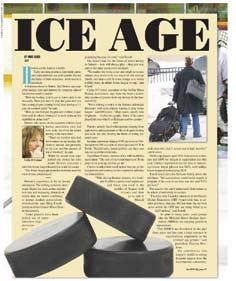
The story captures how many, many older people are living better, healthier lives through involvement in pursuits like sports.
The writer does a great job telling the story through the use of compartmentalized mini-stories.
Great presentation that really drew in the eye, including pictures of very vibrant, healthy looking seniors. Great job!

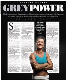
second place – Writer Mike Dodd might have taken first place with this story, if not for the great work of Mike Dodd in the first place effort.
The same comments apply here. Well-written, great sources, story told with ministories and was well-presented.
These top two stories were very, very strong pieces of topical writing with strong presentation. Great job Mike!
third place – I have a hard time imagining anyone reading this story and not smiling. It was one of those feel-gooders that you don’t have to be a sports fan to appreciate.
The writing itself was strong, but not the dominant factor. The dominant factors that pushed this story into the top three, were the simple beauty of the story along with a strong presentation. We, meaning mankind, need to hear more stories like this more regularly.
General comment – Overall, this was an incredibly strong category. Most of the entries finished with marks in the mid to high 40s out of 55. That is an impressive indication of the talent working within OCNA’s membership.
It was nice to see the wide variety of content. Of course there was hockey (there’s got to be hockey), but there were so many other sports and pursuits from many different angles.
I want to offer special mention of stories from Elmira, Orleans, Oshawa and Sudbury that also came very close to cracking the top three!
After serving as a sports reporter, sports editor and editor at community weeklies in Manitoba and Alberta, Darryl is now the publisher of the Airdrie Echo, CochraneTimes, Banff Crag & Canyon and the Canmore Leader.

Darryl is also a high school basketball referee, amateur football referee, and was a ballboy at the 2009 Grey Cup in Calgary.
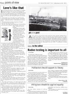
First place – Steve Galea for his Column: Tales from Vinegar Hill. A man, a dog and his wife...can you have better material? Combined with wit and good writing and you get a winner like Steve Galea.

Deep River North Renfrew Times
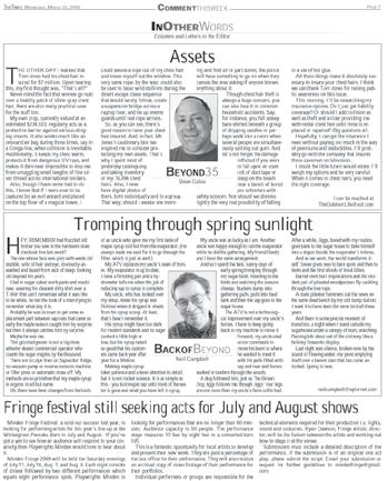
second place – Vance Gutzman has a gift for finding humour in unlikely places and a bigger gift in sharing it.
Minden Times
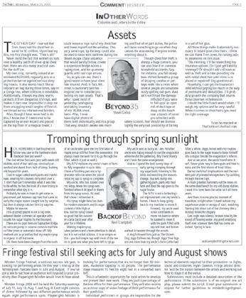
third place – Steve Galea gets two out of three this year, the second for his column: Beyond 35. Steve does an excellent job of finding the humour in aging. These columns will only get better with time.
JUDGE
John DeMings
Digby Courier editor John DeMings started down the path of journalism at the Dunnville Chronicle in the same year Julia Roberts was born, Montreal opened Expo and Canada celebrated its second or third coming of age. None of those events were coincidental.
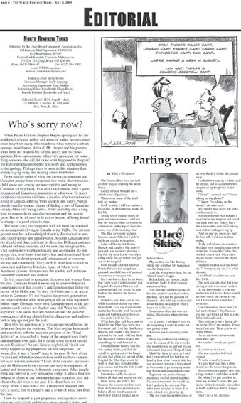
First place – Neil Campbell’s writing is as sweet as the maple syrup he describes in his column “Tromping through spring sunlight. His use of imagery is inspired, and his attention to the sonority and rhythm of words and phrases mirrors his subject matter precisely. A master story teller, and a most deserving winner of the OCNA Columnist of the Year award.
second place – In his Food for Thought columns, Owen Roberts tackles difficult subjects and makes them accessible to a general readership -- a challenging task for any columnist. His writing is crisp and lucid, and he builds his arguments with care, brick by brick, in such a way that his eventual conclusions are inescapable and unassailable. Brilliant work.
third place – Bernie O’Neill is a consummate stylist with a feather-light touch. That’s good. Better yet is his ability to wield that formidable style in the service of timely and important social and political issues. The combination make for effortless reading and compelling commentary -- a worthy Bronze Medalist at this year’s OCNA Columnist of the Year awards.
General comment – Wow. What an extremely talented field of writers to choose from at this year’s OCNA Columnist of the Year Awards. An almost impossible task to select three “winners” from so many worthy writers. Clearly, in a world where big-city papers are struggling to find their footing and relevance, community newspapers are more vibrant, vital and alive than ever. Congratulations to everyone who competed this year.


In his 20-year career as a newspaper and magazine journalist, Mark Anderson has written columns on everything from business to sports. He’s currently on the masthead of three national magazines: Outdoor Canada, Explore and Finanicial Post

First place – Reporter Jennifer O’Meara did a wonderful job of taking what is typically a hush-hush subject and providing valuable information and stories about young parents, the struggles they face and the help they can receive. The sidebars were packed with facts.

second place – This was the only entry to provide a true cross-section of three different stories in order to evaluate the reporter, which showed Jason Misner’s versatility. His best was about the arts centre using American bricks over locally-made products. The fire story was the weakest and the editor should have done a better job. The emphasis should have been on a $500,000 business going up in smoke and how that affects the owners and employees, not the concerns of fretting parents whose children were never in danger.
third place – Jeffrey Morris’ story was, by far, the best written of the entries. It’s a heartbreaking tale of two tragedies that affected a family led by a single mom. It would have placed first if Morris interviewed other people who helped and know the family. Their comments and insights would have made the story that much better as well as giving it more balance.
General coMMent – I would encourage this year’s entrants to continue developing their writing style and to tell stories that are well-connected and thoroughly researched. Always try to avoid using acronyms unless they are very well known as well as clichés, such as “life has thrown them another curve ball”. Be straightforward and brutally honest in your storytelling. Your readers will appreciate it and it will enhance your credibility in the community as a journalist who tells compelling stories which the public needs to know and understand.
JUDGE
Paul Rudan
Paul Rudan began his career in community newspapers at the News-Record in Clinton, Ontario, in 1987, before moving west to Vancouver Island in 1990. He is presently editor of North Island MidWeek and senior reporter for the Campbell River Mirror. He has won numerous Canadian and provincial awards for both writing and photography, and has earned the CCNA’s award for Outstanding Reporter Initiative twice in the last three years.
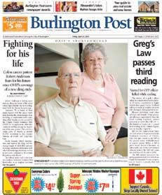
First place – This was a very moving story which had a cohesive layout and strong photography. It was clear the photographer took the time to arrange the elements of the photo to best show all sides of the story. The photo of Shirley’s daughter led the eye towards Shirley and the man, and their expressions showed two sides of this story – sorrow and joy.
Also, seeing Shirley put a heart on his chest added to the subtle impact of the photo. A nice added touch. With Shirley facing inwards it brought the whole picture full circle with no distracting background features. It was also nicely lit. The layout was excellent. I enjoyed the short brief on the side as well as the text font and colour. The cutline was placed nicely on the photo filling in the open space in an unobtrusive way. The design allowed breathing room and did not crowd the front page. All the elements came together.
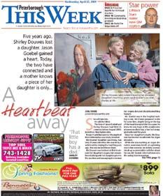
second place – I could not deny the time, effort, originality and excellent layout of this concept. The photo was well thought out, creative and very well executed. Great use of white space, and a nice text choice. I would have preferred to move the “Wrap Up” just a bit so it wasn’t starting to go over the next line of text. However, the colour scheme worked well, it grabbed my attention, and overall the page and photo got the point across in a new and exciting way.

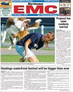
third place – The photo elevated this entry into third place. A great reaction by the photographer and the impact is undeniable. A smart decision to play it nice and big in the layout. Well composed and a nice clean background. This entry would have scored higher with better editorial treatment. A photo title would have elevated the overall design.
General comment – A strong category. Several other photos came within points of the top three. Overall, the quality and impact of the photo and the editorial treatment determined the winners.
Anne-Marie Jackson
Anne-Marie Jackson began her career as a reporter working for a variety of small weekly newspapers in Alberta. She became a staff reporter at the Lethbridge Herald and discovered her love for photography. She went on to pursued a diploma in Photojournalism at Loyalist College, adding to her Print Journalism diploma and certificate in Desktop Publishing and Design. She now works for Canada’s National newspaper, The Globe and Mail, and has been published in Outdoor Canada magazine, Edmonton Journal, National Post and Multimedia Muse to name a few. Anne-Marie has lent her skills volunteering as a speaker for the Canadian Association of Journalists and the Canadian University Press. She has also been involved with The Course, the Great White North Workshop and is publisher of the News Photographer’s Association of Canada.

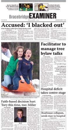

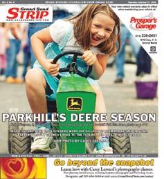
First place – I think the photographer made some smart decisions regarding depth of field and camera angle to help us feel this child’s pure joy. The viewer is right there with her. I really love this image.
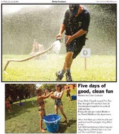
second place – I thought this image was the most artful. The camera angle and patience used in this shot combine to produce a memorable image.

third place – How can you not love this photo? It brings back many happy memories. Shot at precisely the right moment to capture the essence of the event.
General coMMent – I really loved the image of the organic farmer submitted by Vankleek Hill Review as well, and had a hard time not choosing it as a winner. The light was fantastic but in the end I felt it depicted the opposite feeling from the copy. All in all some very interesting images. Thank you for allowing me to be involved.
First place – The North York Mirror entry presented a unique and creative use of typography in conjunction with a simple layout. The photography was technically excellent and the selection of images provided a good range of content and perspectives.

second place – The Ajax/Pickering NewsAdvertiser entry presented a bold use of colour that was consistent with the content as well as a straightforward layout and effective use of typography. The variety of images helped to tell the story in a compelling way.
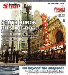
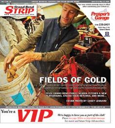
third place – The Grand Bend Strip used an uncomplicated layout and typography that allowed the photograph to communicate effectively.
General comment – There were 8-10 entries that made the short list this year and the difference between the winners and other contestants was minimal. This year’s entries leaned a little too heavily on the fun side of life and not a single entry dealt with a serious community issue.
JUDGE
Joe
Joe Callahan teaches in the three-year Journalism: Online Print and Broadcast program at Loyalist College in Belleville, Ontario. He is currently researching newsroom practices at Ontario newspapers focusing on standards, with the support of the Ontario Journalism Educators’ Association.

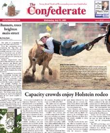
First place –This photo has the right elements to make it the 2009 sports photography winner. Not only does the photographer demonstrate the requisite technical competency and technique required for effective sports photography, just as importantly the moment is perfectly timed. The viewer is immediately struck by the cowboy’s precarious position - one arm around the calf while being simultaneously pulled away by his horse. He is not in full control and his expression shows it. There is humour in the situation but also apprehension of a possible bad outcome. It’s such uncertainty that draws us to sports. We enjoy the thrill of athletic success but also the potential for disaster.
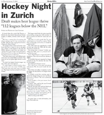

second place – Sports are exhilarating both for athletes and spectators. This image captures a key moment of the match, and of sports in general, where one athlete has succeeded and the other has not. It’s a compelling capture that combines peak action and the emotions of the moment. Congratulations to the photographer for being in the right place at the right time for a less commonly seen and storytelling soccer image.
third place – There is more to sports than action on the field, rink, court, etc. The photographer is commended for exploring behind the scenes to reveal a closer look at those who play simply for the love of the sport. Effective composition and technique draws the viewer into the lone hockey player’s far off gaze to wonder about his thoughts and experiences.
Ron Scheffler is a freelance photographer based in Hamilton Ontario specializing in corporate and editorial photography. With nearly 20 year’s experience photographing CFL football, FIFA World Cup soccer, Formula One racing, baseball, basketball, hockey and over 150 NFL games, Ron enjoys the challenge of creating newsworthy images made possible by the unpredictable and spontaneous nature of sports events.


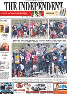
First place – It earns first spot for its depiction of a picture perfect set of photos for one photographer, but not for another as one cameraman was trampled by the enthusiastic stampede of runners. It’s both serious and funny at the same time and includes wonderful action shots. Jon Borgstrom got it right.
Stouffville Sun-Tribune
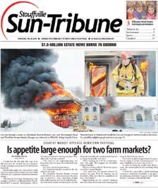
second place –The Stouffville Sun-Tribune takes second place for the raging luxury house fire and its depiction of an acting fire captain who seems to be in calm control as fires rage behind him. Well done, photographer Bill Roberts.
Parry Sound North Star
third place – The Parry Sound North Star takes third place for the scene showing parts of a recovery operation after three tragic drownings. Good composition and a powerful image by photographer Cody Storm Cooper.
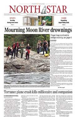
General comment – Generally almost all pictures entered were of a very high quality and there is very little to criticize as many photos were taken under sudden events where photographers had to be in the right spot at the right time. This of course is sometimes difficult to achieve for a variety of reasons.
My only suggestion for some would be to make the photo larger than you think it should be, then crop tight.
Quality photojournalism is alive and well in Ontario.
Rich Holmes grew up in a newspaper family in Alberta back in hot metal days and has spent his entire life in the industry. He has served on the CCNA board and is a past president of AWNA.
First place – The winning photo by Sabrina Byrnes has it all. It depicts a young black man looking through a window that has been vandalized by racist graffiti. She has managed to infuse a well-composed image with a strong news statement.

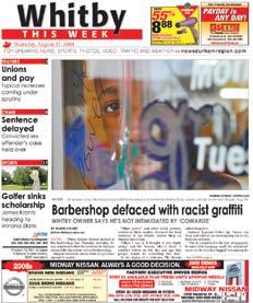

second place – The second place finish goes to Celia Klemenz for her photo of damage done to a heritage train. She saw the opportunity to change her vantage point and make the smashed window a frame to focus your attention on the man preparing to cover the ruined window.
Orleans Star
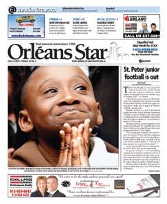
third place – Third place goes to Etienne Ranger for the photo of a young boy whose smile conveys all the message this picture needs. He was listening to a talk by Habitat for Humanity spokesperson about all the work that went into the building of his new home. A good job at spotting the essence of an event distilled into one child’s expression.
General coMMent – There were some very good photos in this year’s competition but unfortunately a number of them would have had a better chance at winning if they had been entered in another category. Quite a few of the photos should have been submitted as Sports photos or Feature photos. Just because a photo appears on the front page of a newspaper does not mean that it is a News photo. These pictures scored well on their image quality but poorly on news value.
All in all some very interesting images. Thank you for allowing me to be involved.
First place – A solid body of work by Lance Anderson. Fantastic work capturing some wonderful “moments”.
Bill White
second place – Strong features photographed by Casey Lessard. Some very nice lighting. The news image was out of context.
Belleville EMC
third place – Michael Brathour has strong overall shooting with some good use of different lenses. Some cliché moments.
General comment – A strong competition. I was impressed by the quality of news images that were featured. Well done everyone.

Bill White is a professor of Photojournalism at Loyalist College.

First place – First place has to go to Steve Nease. These are three good cartoons. Instant impact, clever gags, sound use of black and white contrast and a good variety of subjects with both a national and local flavour. A treat for readers and judges alike.
Port Perry, Scugog Standard
second place – Nothing like a good local cartoon. Walt Radda’s cartoons have some nice design elements with good artistic flair. The gags are clever and give the news stories some strong visuals! Good job!
Vaughan Today
third place – Patricia Storms’ cartoons that take a good poke at local politicians always give a newspaper good bang for its buck! Nice caricatures, good design elements and funny gags. Nice work!!
General coMMent – Local cartoons are vital to both national and local newspapers. They can create more attention and involve more readers than any other spot in a paper. Ontario is well served by this batch of wiley creators. It was a difficult job to pick the winners but I enjoyed both the process and the clever work! I applaud the editors and publishers for supporting their cartoonists!!!

Sue Dewar has worked for the Calgary, Ottawa and Toronto Suns, and now, Sun Media as a staff editorial cartoonist since 1984. Sue also produced a panel cartoon “DOWNHILL” for Canada Wide Syndicate,1986-89 and a comic strip “US AND THEM” with Wiley Miller for Universal Press from 1994-1998.

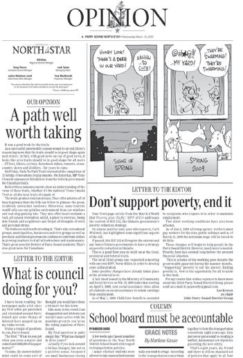
First place – Tammy Gravina combines excellent drawing skills with a good point on a tough local subject. Her use of caricatures was also well done.
second place –I like Norm Muffitt’s work. It has a folksy friendly feel to it and he uses humour to make his point. Well done.
Vance Rodewalt

third place – Well drawn on a good local subject. A bonus to his newspaper.
General comment – Once again a very good slate to choose from and I’m sure their respective newspapers are happy to have them. Sticking with local issues helps to make them even more special. Keep up the good work!
Vance Rodewalt was born in Edmonton, Alberta. In 1970 he moved to Calgary and became editorial cartoonist for The Albertan, a morning newspaper that became the Calgary Sun in 1980. In 1984 he accepted an invitation from publisher Patrick O’Callaghan to become editorial cartoonist of the Calgary Herald where he has been the resident cartoonist ever since. Vance has won many awards including a national newspaper award in 1988. His work is syndicated worldwide by Artizans.
“ Who would have thought that you could make a nice living making fun of important people?“
...Vance Rodewalt
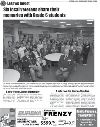
Kanata Kourier-Standard
First place –The Kanata Kourier-Standard entry “Lest we forget” is a simple yet elegant reminder of how journalism works and why journalism matters.
By bringing two generations together through the tools of journalism’s craft and showcasing those stories with arresting layouts, the paper’s staff created a local moment that reminds us all of the hidden wealth within every community -- the experience and history of lives long lived.
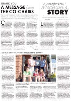
The testimonials speak to the powerful experience of tapping into these local riches and the great personal rewards that come from the act of sharing stories. In this way, the project built community in very real terms -- by fostering communication.
This entry was exemplary not only for its originality for community service but also because it broke from “routine coverage” of November 11.
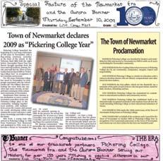
Midland/Penetanguishene Mirror
second place – This project was a strong example of community service using more traditional means of engagement. The special section was well-presented, the editorial was engaging and the content raised awareness of important and often hidden people and experiences in the local community.
Vaughan Today
third place – This project remained focused on the more narrowly-defined relationship between businesses and consumers (rather than other aspects of community life) but it was notable because of the positive and action-oriented nature of the campaign. The “Shop Local” response during a global recession provided an important lesson on the relationship of a local economy to local community life.

General coMMent – Congratulations to all entrants for generating such a strong panel of selections!
Maija Saari, (Assistant Professor, Journalism), designed and launched an innovative interdisciplinary undergraduate degree program in journalism for Wilfrid Laurier University’s Brantford Campus in 2005. A former daily news reporter for The Chatham Daily News and The Standard (St. Catharines), Saari was also a television videographer for the Baton Broadcasting System. She teaches introductory reporting and writing classes, as well as courses focusing on media representation of human diversity, identity and science. Her research focuses mainly on health reporting and journalism education and she is studying toward her doctorate in Higher Education in the Department of Theory and Policy Studies at the Ontario Institute for Studies in Education at the University of Toronto.

First place – Very informative and timely feature. I was impressed with the partnership the paper built with the regional health centre; along with the relevant and interesting editorial. The quality of the printing, ad design and layout makes this product a must read for the entire community. Featuring some of the contributors will help ensure the community will continue to support this special cause. Great Job.
second place – Top quality Visitor Guide with relevant information for visitors and locals. Great blend of local informative editorial with well-designed ads with a local flare. Superb thought given to the revenue injection and additional reader value with the pull out Chamber map.

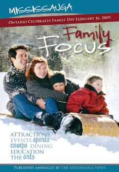
third place – Handy family guide to attractions and events in the Mississauga area. Every newspaper should consider publishing one of these features. The pocket size makes this feature convenient and lends itself to a longer shelf life. Easy to read and easy to carry this mini tab makes a great addition to any outing.
Jody has been working for Black Press on Vancouver Island for 10 years and as a senior account rep., director of sales and now sales manager for UsedEverywhere.com. Congratulations to all the winners for a job well done.

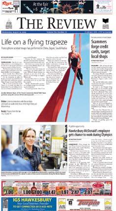
First place – The top two finishers, the Newmarket Era-Banner and the Vankleek Hill Review, are in a class by themselves thanks to clean, eyecatching designs that invite readers in and doesn’t force them to sort through all the clutter.
second place – Vankleek was slightly stronger visually, including great use of an acrobat photo and a striking teaser, but the well-crafted writing in the Newmarket Era-Banner propelled it to the top spot. The Era-Banner’s reporting on topics ranging from election rhetoric to library funding to a kilt ban at school was fresh and engaging.
It’s clear that both papers make great first impressions.
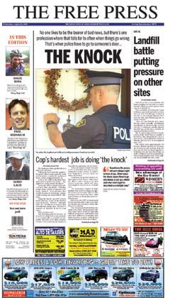
Midland Free Press
third place – The Midland Free Press did a nice job of presenting its lead story, as well as its teasers, but it’s certainly pushing things to put seven ads on the front page.

Ted Murphy has been enjoying mild, rain-filled winters, and summers, as editor of the Delta Optimist, located in the southwest corner of mainland Canada, for more than two decades. He works with a great team, in the office and at home, that makes up for his many shortcomings.

Barrie Advance
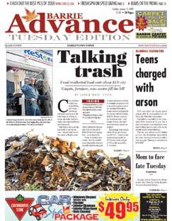
First place – Eye-catching layout with a good amount of information presented in tight, interesting writing. Design and photos add to overall package where advertising is catchy without being over-powering.
Sudbury Northern Life
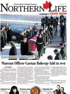
second place – Clean design includes several teasers to draw readers inside. Story was well-written and included a sense of the emotion of the day.
Toronto Bayview Mills Town Crier
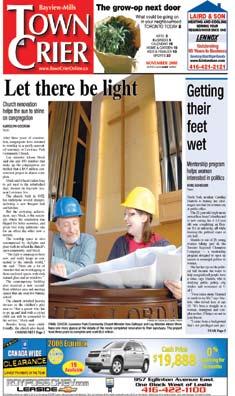
third place – This entry came out on top of the strong competition for third place with an attractive design and good writing.
General comment – Lots of great front pages to choose from in this collection. Most entries would certainly draw readers to the publication with nice designs and punchy headlines. The most common issues were not giving readers quite enough information or boring photos that would have benefited from a little more thought.
Natalie Musseau is the Editor/Manager of The Gulf News, a weekly newspaper in Port aux Basques, NL, where she has worked for nine years.
 JUDGE
JUDGE

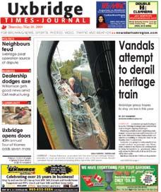
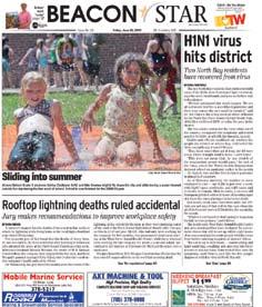
First place – A well laid out front page, nice and clean with good use of white space. The flag is clean and the teasers along the top are well done. Some good, strong news stories on the front page and a decent photo. Excellent use of typography for headlines and kickers. The main criticism would be the main headline which is six decks on a one column headline - simply too much. One column stick to four decks as a rule of thumb.
Also, it is great having some news choices on the front, but the third story almost gets lost in the layout. Perhaps two stories here would have been enough. Overall, an excellent, clean front page.
second place – A nice front page with an excellent, large photo to grab the reader. Also, having two strong stories on the front is excellent. Good typography as well. This front page would be much stronger if the flag was given more prominence. It is a little small. This is the newspaper’s signature and it deserves more play. A larger flag would also allow the paper to feature the teasers better as they are insignificant as they stand.
third place – A powerful looking front page, with good use of teasers along the side and a crisp strong photo which is essential for a tabloid front. The main concerns here are with typography as the headline font simply is not strong enough and too much leading.
Also, the use of red looks great on a pdf, but I am curious to see how it prints. Red is not usually a great choice for newsprint and it is overpowering on this front page. Just because we have colour does not mean we need to use it. Overall, a nice front page and with a little tweaking with typography and colour choices it could be excellent.
General coMMent – Some excellent submissions in this class and it was difficult to select the winners from the top four or five as they were all well done and some strong designs. The one thing most of the submissions need to look at is their use of typography which is so important and there were some odd choices. Also, and the business managers will not like this, some simply were overpowered with the amount of advertising on the front pages. I know this makes money, but it also shows your priority is advertising dollars, not news or editorial content.
John Barlow

John Barlow is the Associate Publisher of the Okotoks Western Wheel Newspaper and Senior Editor, Southern Alberta for Greatwest Newspaper Group. He is a two-time winner of the Alberta Weekly Newspapers Association’s Editorial Award of Excellence and has won numerous AWNA and CCNA awards.
Sponsored by Laurentian Publishing
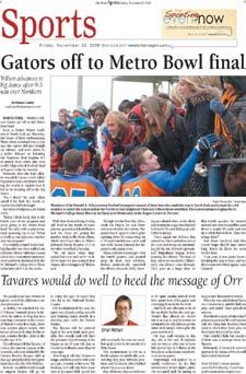
Oakville Beaver
First place – This was a well laid out, well thought out sports section that has plenty of local content. The headline story “A Diamond in the Rough” about Kaitlin Marrin’s rapid ascent to a golf scholarship was a superbly written article that hooked the reader’s interest from the lead, and maintained that interest until the very last sentence. The graphic: Path to a golf scholarship, was clever. The photos in the section were very good, particularly the action photos, and they received good placement on the pages. The byline stories also captivated the reader’s interest.
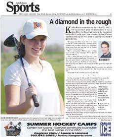
Brampton Guardian
second place – At a close second was The Brampton Guardian. The front page of the section is clean, with an excellent layout. The unique angle of the photo that accompanied the main story about the Brampton Battalion was eye catching and a good example of how a photo of people ‘standing still’ can be just as captivating as an action photo when thought and effort are put into it. Many papers could learn from this. Good combination of long stories and sports briefs and a good variety of different sports covered.
Oshawa This Week
third place – Photos on the front pages of the sections catch your eye. Well written stories, good sports column. Nice feature package with the piece: The incomparable Orr. Good variety of sports coverage, including football, hockey, speed skating, polo and so on.
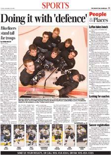
General comment – Many of the newspapers judged have very good sports sections that cover a good cross representation of sports taking place in the communities served by these newspapers. In many the photography was striking. Sports is about action and that should be reflected on the pages. And when you have a great shot, if space allows, don’t be scared to run it big. It was disappointing in some cases to see the best photo had run the smallest, when it could have had so much more impact on a page.
JUDGE
Tina Comeau
Tina Comeau is the associate editor of YarmouthVanguard. She has 20 years of journalism experience and over the years has won numerous regional and national awards for her writing and photography.

First place – A truly impressive special section. What a great idea to celebrate the accomplishments of both elementary and high school students in Durham region. Plus it engages the youth (and their families) in that market to pick up and read a newspaper as more and more young people turn to the Internet for their news.
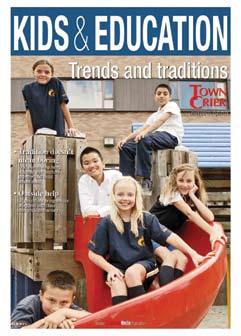
The advertising support is tremendous as well as the support from the students, the teachers and school boards involved. I can just imagine the effort it took to co-ordinate a project of this scope.
The piece is easy to read, has a nice flow “the editorial content is the main focus with ads playing a supporting role.

It is not often you see a special section from a community newspaper that is 104 pages. A job well done.
Almonte/Carleton Place
Canadian-Gazette
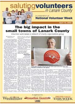
second place – International Women’s Day is an excellent section that mixes both editorial and advertorial content in an easy to read format.
The layout is clean, bright and easy to follow. The use of Electra bright paper allows the colours to jump off the page without overpowering the content.
One suggestion (if possible) would be to have the font size in the individual ad spots uniform.
To have the piece tied to International Women’s Day gives the section a new twist on the Women in Business theme. Judging by the number of ads, advertisers feel they are getting great value for the dollars they are spending. I am confident it is a special section that will be read cover to cover.
Al Glaser
Alan Glaser has been in the “media” business since 1989 – first in radio and then moving to newspapers in 1997. Alan has worked in several towns and cities in Ontario in roles ranging from reporter to editor, sales manager to director of retail sales and publisher.
Al joined the St. Albert Gazette as the advertising/marketing manager in June of 2009.

third place – The first item that caught my attention was the quality of the photos. It is obvious the editorial staff spent time visiting each school as the photos are action photos and are not staged.
Again the editorial content is the major focus with the advertising playing a supporting role.
I thought highlighting certain teachers as Classroom Leaders added a nice touch as most of us can remember a certain teacher who had a profound effect on our lives.
The index at the back in alphabetical order was an added bonus for the reader as it easily and clearly summarized each school’s programs and features. Not every community newspaper can sell a section catering to these types of schools. However, I commend the staff at the Toronto Forest Hill Town Crier for identifying a unique sales opportunity and generating additional revenue.
First place – Professional effort from the front cover, through a series of interesting and well-written articles. Impressive in its scope and coverage of the mining industry.
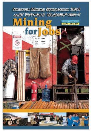
Parry Sound Beacon Star
second place – Good coverage of the environment and assembled in a well laid-out package. Interesting and well-written features.
Listowel Banner
third place – Good package of articles that would interest the local community. Some good photography and layout, particularly the well-designed cover of the second section.
Rob Paxton has taught in the Journalism program at Durham College since 1995. Paxton began his career as a reporterphotographer at the Welland Evening Tribune in 1972, before being promoted to district editor and then city editor at the Tribune. Paxton also worked at the Daily News in Truro, Nova Scotia as managing editor. He returned to Ontario in 1991 as managing editor of the Oshawa Times where he worked until the newspaper closed in 1994. He moved to the Peterborough Examiner as editorial page editor. In 1999, Paxton took a full-time teaching position at the college.

First place – Not only does this ad stand out, but it delivers an excellent marketing concept as well. The cars are front and centre, and the extra bonus of acquiring a fun-filled exciting holiday is clear. Bravo!


Orangeville Banner
second place – OK, this ad is cheesy! However, it makes me smile, and I appreciate all the work that has gone into it. I am sure it attracted lots of attention, and probably brought in some customers.
Burlington Post
third place – Bright and attracts attention. This ad is an effective version of a old classic that always looks fun and engaging. Not very original, but impressively executed.
General coMMent – Given the fact that these designers do not have very much in the way of good images to work from, I am impressed with the overall quality and what they can do with limited resources.
JUDGE
Dawn Lambert
With over 15 years of design and advertising experience at several Toronto design firms, Dawn Lambert now teaches Graphic Design at Humber College, and freelances to keep up to date and current in the industry.

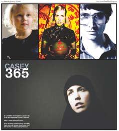
First place – Unexpected clean layout for the clutter of ads in a community paper will make someone pause long enough to read it.

Nunavut News/North
second place – Intrigued me enough that I wanted to shop in the store.

Mount Forest Confederate
third place – Personalized the experience...you would want to meet these people in the store.
JUDGE
Wayne Aubert
Wayne Aubert is a Professor and the Program Coordinator for the Advertising Program at Mohawk College in Hamilton Ontario. He has over 20 years of advertising industry experience and is also a Program Director with the Institute of Communications Agencies (ICA) in Toronto.

Bracebridge Examiner
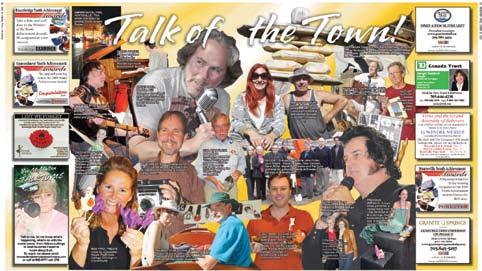
First place – Nice dynamic layout. Really good collage and composition.
Ottawa Hill Times

second place – Good layout design with a structured grid, clean and effective.
Guelph Tribune
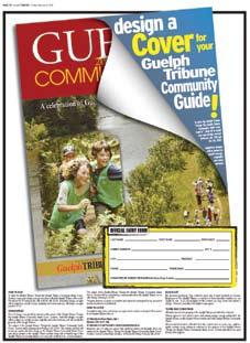
third place – Good colourful, beautiful concept, with nice type contrast.
Rafael Ferreira

Rafael Ferreira came to Mohawk College with 15 year’s experience in the Advertising Industry. Originally from Campinas, Brazil, Rafael has worked as an Art Director in Sao Paulo, California, New York City and Toronto, in both agencies and studios.
Mississauga News

First place – Mississauga News created a colourful, engaging layout with good eye flow. The page is both appropriate for the client and appealing to the target audience.
Port Perry, Scugog Standard
second place – The Scugog Standard’s entry has great graphics and appealing fall colours.
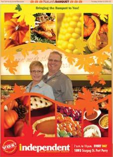
Toronto Canadian Jewish News

third place – Canadian Jewish News’ retail layout was simple and spoke well to the target audience.

First place – The Post’s ad idea for a pink page and ads related to the Breast Cancer Foundation was unique and certainly caught the viewer’s eye. It was obvious a lot of thought went into this. Well put together.

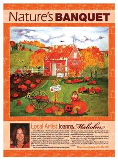
second place – Nature’s Banquet included gardening tips and tricks, Autumn events and fall recipes. A great place for local advertisers to display their Autumn spirit. Really nicely put together.
third place – The Waterdown Flamborough Review produced a Best of Flamborough insert for its newspaper. The pages had great news highlights and solid design.


Jef Petrossi has worked as a Copywriter in the advertising industry for over eight years. In that time, he’s worked at several major agencies across Canada. His work has been featured in MarketingMagazine, AppliedArts,Archive Magazine,USAdReview, AdAge, the National Advertising Awards and the New York Festivals.

First place – Nice tribute to the firefighters of Northern communities. Unique idea. Clean lines, excellent design/graphic elements.
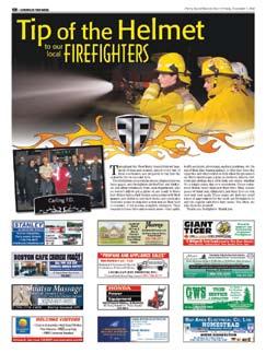
Parry
second place – Truly unique approach to engage community. Fun promotion to generate excitement and create interest for local businesses.
Listowel Banner
third place – Well designed and executed. Lots of information, great variety of ad design.
General comment – Wonderful category to generate interesting ideas to produce revenue for the local newspapers. Nice to see this type of creativity to add interest to the different publications.
Peggy Barnwell
I have an Honours BA in Communications from York University and a specialist certificate in Sales and Marketing from Sheridan. I have worked on all sides of the Industry from advertising sales to agency account management to client side managing a multi million dollar marketing communication department. I began teaching Marketing and Sales at Sheridan part-time (while raising small children and running the fundraising initiative / PR / marketing communications for a localized non profit organization). I joined the Advertising program as a full-time Professor in April of 2002 and currently coordinate the Sheridan Advertising 2 year Diploma, the Advertising 3 year Advanced Diploma and the Post Graduate Advertising Management programs.

First place – A great team effort covering perhaps the major news story in Ontario and its impacts on the people involved. The writers put you on the ground at the plants and also do an excellent job explaining the background information and analyzing the reasons for the auto market fallout.
Fort Frances Times


second place – The designer is forced to use a layout with lots of text and placement of ads. The type is designed for readability, and the ads nicely house the text.
Mississauga News

third place – The Ad is playful in terms of shapes and colours. This layout works well with the overall message of the ad.
Photographs of the people in place create a tactile feel, drawing in the audience.
JUDGE
Kevin Brandon
Kevin Brandon is a Professor of Graphic Design with Humber College’s School of Media Studies. Kevin started designing with art board and ink pens and quickly moved into digital design, working for local and national organizations.

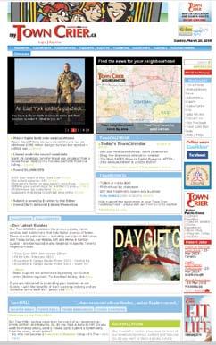
First place – Very attractive, big bold headers mean you can’t get lost, Facebook/RSS/Tell Your Friends - all great. Hosting server is a little slower loading than most
second place – Overwhelming content but well organized. Good colour scheme. Good ads. Business videos nice touch. Remove old links (e.g. 40 Under 40).


third place – Big fonts for navigation. Like the map. Advertising rates should open in a new window. Love the Newsstands page. Guestbook is nice addition. Excellent subscribers form.

General comment – * Lining up your columns at the bottom makes for a more attractive presentation. If you haven’t sold enough ads to fill the right column, move some of the stuff from the left column somewhere else. White space is good, but too much is not.
* Make sure any broken links are fixed (images and hyperlinks), and that links to outdated events or old links are removed. Also make sure there are no Error Messages on your page(s) or errors with your server.
* Do not use .zip files for anything.
Kathleen Windsor Kathleen Windsor is the leading Professional web designer at Windsor Graphics. The Company has been designing quality, award-winning websites on the Internet since 1996.

* Whether by using background colour, divider lines, or larger spacing, the division between columns should be clear.
* Do not use titles in capital letters only. Use a combination of upper and lower case letters.
* If “Community Involvement” is one of the judging categories, make sure there’s something on your website that describes how you are involved in the community. If it’s not there, you’ll end up with a zero.
* If you’re putting text over a flash image, make sure your flash timing is slowed down
enough to read what’s written on the image.
* Putting up an Events Calendar just to say you have one is not serving your customers. If you’re not going to keep it updated, get rid of it.


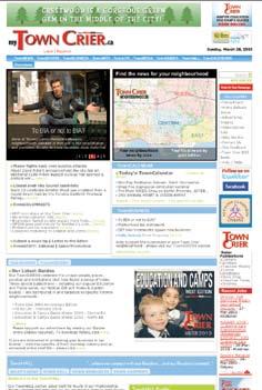
First place – Mapping feature is great. interesting twist on most popular - most shared & recommended. Photo gallery player well laid out. Nearly missed the top of page navigation.
second place – Love the neighborhood map sorting articles by area. Town Hall including Town Resources is a good concept, looking forward to seeing it executed.
third place – Boutique interesting revenue generator. Good to see community contributions online from photos to comments. Odd to still see link to the old website on every page - not sure when that changeover happened but if more than a month ago, seems unnecessary.
Cheryl Wirch-Ryckman

Cheryl WirchRyckman is the Director of Operations New Media for Black Press. Cheryl worked agency-side and then in print before making the leap to the fastpaced world of Black Press’ Digital division a few years ago. Black Press has over 150 papers/websites across North America delivering quality daily and community news that matters, both in print and online.
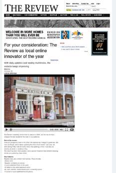
First place – The Sioux Lookout Wawatay News had the greatest impact of improvement. Its integration multimedia, such as pod casts combined with target local content made it the winner in this category.
second place – With a clean design, great presentation and very effective multimedia storytelling the Vankleek Hill Review was a strong second place in this close competition.
Sudbury Northern Life
third place – The Sudbury Northern Life has a well-developed site with good use of technology and combined with a mobile site, granted it third place in this competition. Excellent subscribers form.


General comment – This was a very close category. The top three competitors scored within a point of each other and required detailed scrutiny of innovation, use of technology and impact of improvement. The best use of storytelling and content decided the winners.
Sean Toohey is the Director of New Media Technology at Black Press Digital where he oversees the technical direction and development of over 130 Newspaper websites. Sean has extensive knowledge of web application development and architecture, with over 13 years experience in Information Technology. He has successfully designed and produced several web based and multimedia systems, that have included: E-Commerce, Online Newspapers, Directories, Content & Document Management, Asset Management, Corporate Training, Legacy Web Enablement, Sales Force Automation and Work Order Management.



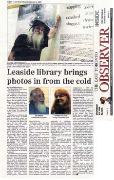
First place – Written by Victoria Wells – A deftly crafted and engaging look at an often-ignored segment of society -- the homeless -- through the frame of a unique art project that affords a perspective from the streets. In crisp, lucid prose, the writer captures the import of the exhibit, but more importantly humanizes the issue by sharing the personal stories of exhibitors who were previously down-and-out. Extra marks for incorporating statistics on the rate of homelessness and putting the problem in a broader social context.
Durham College
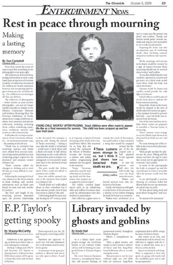
second place – Great lead, fascinating subject, and a thorough -- but never boring -- rundown of pre-interment practices in the Victorian era. The archival photograph of a dead child with eyes propped open would be enough to get anyone reading this story, but full marks to writer Don Campbell for keeping us hooked until the, well, end. The article is packed with information, but it moves along briskly, thanks to the author’s smooth transitions and aptitude for picking the details that provide a visceral punch.
Algonquin College
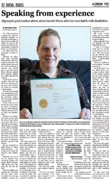
third place – A subject relevant to any institutional setting, but rarely broached, is effectively and thoughtfully addressed in this story by Christopher Hunt. In sharing the ordeal, and eventual triumph, of one student who struggles with anxiety and claustrophobia, the writer is sensitizing many less-challenged students to an issue they likely overlook, while providing an inspiring message to those who do encounter difficulties. The story usefully directs anyone who might have a mood disorder or learning disability to resources that will help them overcome these hurdles, but its real strength lies in taking us inside the experience of one individual who never thought she’d graduate -- yet did.

JUDGE
Jim Moodie is the editor of The Manitoulin Expositor and a freelance contributor to such magazines as Explore,Cottage Life,and Canoe & Kayak. He lives on the world’s largest lake on an island in a lake.
Humber College
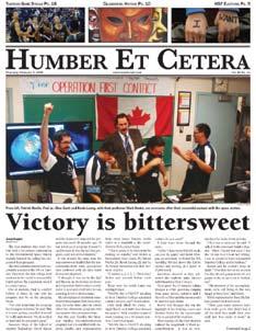
First place – The irony of this article is driven home in a solid headline and a tight, well-written lead.
The story has relevance to the college readership, but also the broader community.
It would have been easy for the reporter to side with those in favour of maintaining the telecommunications program. Instead, balance is steady throughout, and facts and excellent quotes tell the story.
Cambrian College
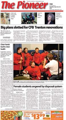
second place – This article displays sound reporter initiative. Typically the fire story or politician’s visits appears on the front page, but in this case some digging resulted in an off the beaten track story with general reader interest.
Loyalist College
third place – It is not always easy to tackle stories that have a sensitive or personal subject matter. In this case the reporter is not deterred by what some might consider a topic to be avoided, and addresses the issue with excellent quotes and balanced writing.
JUDGE
Bruce Hickey
Bruce Hickey is a regional Editor and Assistant General Manager for Metroland North Media. He has been working in the community newspaper business for 18 years.

First place – First place goes to Loyalist College student Jon Currie for his repatriation photo honouring a fallen soldier returning to Canada. Although I would have liked to see it run larger on the page, this truly is a remarkable photograph with great cropping and impressive lighting. A very powerful and emotional moment in time captured by the photographer.
second place – Second place goes to Niagara College’s Stephanie Couture for her interesting photo of a teacher and student working on a film set. The photographer chose an unusual vantage point. Add good cropping, lighting and composition and for a great photo to bring readers into the editorial copy.
third place – Third place goes to Ryan Logan from Loyalist College for his wonderful portrait of a man and his garlic. Great lighting, composition and expression make for a great cover shot.
General coMMent – A good photo captures a moment in time, clearly telling a story while creating an emotion with the viewer. The image must be well presented on the page, sharp, properly exposed and nicely cropped.
There were many good images presented in this category and choosing the top three proved to be a difficult task.
The top photographers caught all the elements of a good photograph with their work. These shooters looked for an interesting moment, worked with light and composition to make his or her photo a truly great shot.
There are some good emerging photojournalists coming from the school system. Some students might consider putting more thought into their photography, closer cropping, better lighting, better angles and expressions.
Rob Mooy Kingston This Week photoeditor Rob Mooy has worked in the industry as a photojournalist for 40 years.
He has been a staff photographer and reporter with KingstonThisWeek for over 25 years.

After beginning his career with the Toronto Telegram in the 1970s, he worked at several Toronto-area weeklies before moving to Kingston.
During his time with KTW, he has received many top honours for his photography from the Ontario Community Newspapers Association, Canadian Community Newspapers Association, Suburban Newspapers of America and the Eastern Canada News Photographers Association.
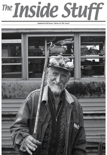
Rob was also nominated for a 2005 Citizen of the Year award by the Junior Chamber International, Kingston.
In 2006 he was awarded the first BRAVO Award of Excellence for feature photography from the Canadian Association of Communicators in Education.
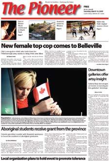
Most recently Rob was named the 2008 Photographer of The Year and won Best Feature Photo by the Ontario Community Newspapers Association.
Sponsored by Young Drivers of Canada
First place – Cobden Sun was visually strong, had decent photo quality throughout and as one judge noted succinctly, “They covered all the bases.” This was indeed a small newspaper that carried a full menu. If there was to be criticism it would come on the editorial page and op ed where the Sun found itself running behind a few others in terms of commentary on local (regional) issues. They made up for any weakness there by showing they had the chops to cover their community more completely and with expertise. There were strong cover pages and they weren’t afraid to go bold with photos. They covered their community ... good, bad and completely.


second place – Not much to separate The Manotick Messenger from the top ranked publication. This paper is easy to read and contains good detail such as a classified key, good advertising production and promotional content along with good press work. Editorially we saw features inside with nice centre spread presentations. This publication was clean and clear throughout. They also didn’t fudge on local hard news content. In one issue it could have benefitted with a larger news holes which would enable it to look more like a newspaper rather than a free advertising publication. But hey, we know what pays the bills!
third place – The Grand Bend Strip is the most eye-appealing publication in this class. The ad, strip-away right corner spot, we trust is a premium money-maker for them. No question about artistic quality and photo presentation. That is tops in the class. This paper also provides good, easy to read features with strong leads. It’s a home-spun feel good paper with a professional flair. Where it fails is in the almost total lack of hard news and no classifieds other than the network generated ads. There was a general disregard for hard news/community coverage. If Grand Bend wishes to climb the ladder it will have to make a commitment to put more news into the newspaper. Council, police, courts, school boards, educational issues ... they need to be included if a newspaper is to be taken seriously.
honourable mention: The Blue Mountains Courier-Herald - Strength throughout, good news coverage and solid ad content. It could get a bit messy looking. Front page photos were good but then photos inside sometimes lacked imagination. We know they can’t all be gems, so perhaps we just caught them in a down week, because overall we see the Courier-Herald as a busy outfit.
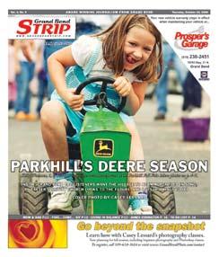
First place – I have always had a lot of admiration for a community newspaper that showcases the younger population doing what they do best, having fun. The Minden Times caught my attention with the front page photography that continued throughout the whole paper. It really portrayed the feel of the community by covering stories and events of its residents, young and old alike. The paper was colourful, interesting and I really enjoyed reading it. The Minden Times should be very proud of its staff, advertisers, readers and the communities that it serves.


second place – Starting with a great front page the Express has good news coverage, relevant editorials and some great photography. A strong community feel to this paper - great job.
third place – Readers of the Independent are treated to a newsy publication that begins with an interesting front page and continues throughout. There is an obvious commitment to community coverage. A great blend of photos, news and opinions.


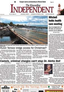

honourable mention: The New Hamburg Independent is a fine newspaper that is serving its readership well. The Independent contains a great mix of hard news, features and opinions supplemented by good photography and an attractive design. The Independent begins with an excellent front page containing strong news stories and photographs packaged in an attractive way. The attention to design continues throughout the newspaper, providing readers with an attractive, well-organized package of news and advertising. The Independent is a great newspaper that sets a high standard for other papers in its circulation category, and indeed for all newspapers in OCNA.
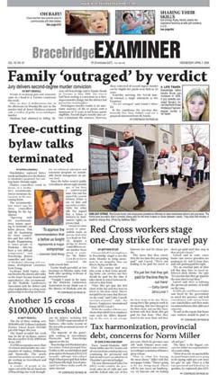
First place – Kudos to the Bracebridge Examiner for putting together a consistently fine product. Wonderful, tight leads on stories, imaginative soft-news features and a great editorial page that actually addresses the issues of the community instead of the weather and the importance of the annual cancer fundraiser. A lot of attention paid to detail and proofreading, and an editorial team that treats even the smallest of stories with the respect they deserve. A well-deserved first place.
second place – Hot on their heels in second was the Huntsville Forester. Nice news and sports coverage, good editorial pages and nice ad design. Someone is obviously paying attention to page design and proofreading. A word of advice (which would apply to about 90 per cent of the papers in this category): please, please, please pay attention to photo cropping! Way too many people in photos missing hands and feet! Either re-size your boxes or reduce the image to fit.
third place – Some very nice arts coverage in third-place finisher Parry Sound North Star, but some pretty weak editorial expounding and far too many pages of “grip and grin” photos. Good use of feature photos to break up feature story copy.
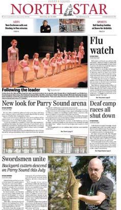
General coMMent: Fort Frances Times – The judges had a bit of a struggle in this category in that the top three became the top four, with only a point or two separating the third and fourth place finishers. As a result, we’ve chosen to award an honorable mention to the Fort Frances Times. These top four, were clearly ahead of the rest of the pack in almost every category, from variety and volume of local news to sports and business coverage and photography.
 Dave Newell, Editor, Advertiser


First place – There were some excellent entries in this category, but the clear and top choice was The Leader with Town Crier, also from Niagara this Week as a close second. In fact, both newspapers were in a virtual dead heat, so they both deserve high praise.
Both papers were excellent with appealing front pages, strong stories and eye-catching photos.
Some papers in this category were scattered with no consistent feel or layout. That cannot be said for The Leader and Town Crier
Both had consistent layout throughout with clear and distinct sections properly laid out. You knew where the hard news ended and the community news started, where in some of the other papers you did not.
second place – Both papers also had strong opinion and letters pages, where as some of the other newspapers had very little letters content; a poor reflection of these newspapers as a lack of letters indicates a lack of engagement by the paper to its readers and the communities they serve.
Photography and reproduction was strong with eye-catching photos in both papers. A well-rounded sports section was also prominent, where it was virtually non-existent in some of the other newspapers in this category. Advertising content and classifieds in both of the Niagara products were also strong adding to an overall fine product from start to finish.
Great job!
Innisfil Journal
third place – The Innisfil Journal was also a strong choice for judges.


A clear and concise front page with strong art work brought the reader in right away. The overall news section was okay, but there was no clear indication where the hard news ended and where the community section began. A community heading might have helped here.
Photography was good and the reproduction was solid. A bit more emphasis on sports and layout of the sections might have put the Journal over the top. A solid effort. Educational issues ... they need to be included if a newspaper is to be taken seriously.
General comment: The Port Perry Star gets a honourable mention from the judges for a strong front page, news coverage and photography. Again, like many in this category, a better designation of sections would help the hard news and community news flow better. Sports coverage was good, but more photos would have been nice to see. Too many gray pages hurt the Star in getting into the top three.

 Gail Sjuberg, Gulf Island Driftwood
Midland/Penetanguishene Mirror


FiRsT pLAcE – Clean lines, good production values and a focus on community news brought the Midland/Penetanguishene Mirror to the top of the list in its class. Strong front pages with good use of strong photos, and suitable point-size headlines for the top compelling news stories help draw readers. The Mirror has great local flavour, a healthy sports section, and strong editorial. Good space given to full-page features, page eight. This kind of dedicated space is not typically seen in community newspapers, which gives added emphasis to the work put in. Colour photography was used well to break up otherwise grey pages and add visual impact. Arts and entertainment coverage decent, although both would benefit from a stronger section front page. Overall, kudos to staff for generating copy of interest to local readers.
Elmira-Woolwich Observer

sEcONd pLAcE – Another paper with strong community focus is the Elmira-Woolwich Observer. Good use of photography on front page to catch the eye. Very clean front page look, although size of type seems large on front and throughout (greater indent might make for easier reading, as well). Leading Off page 3 copy good for catching the eye and keeping readers involved, again coupled with strong photos. The editor’s column might be better moved closer to the editorial page, early placement tends to suggest opinion is as weighty as the news. Nice treatment of local woman in Africa feature; combining pictures, graphics and copy. Somewhat disappointed that both editorials were provincial, rather than local, in nature. Decent sports and entertainment sections, consider larger photos, rather than small clusters.
Midland Free Press
ThiRd pLAcE – The Midland Free Press makes good use of its size to include graphic elements and photography in its stories. Strong front page, sports section and features with quality photos and bold headlines add to the attraction of this broadsheet. Page 4 seems early for editorial page, however included a good mix of strong opinions and letters. A little heavy on grip and grin photos particularly in the sports pages and a lack of arts and entertainment coverage is somewhat disappointing.

 Stephanie Matches, Publisher, Whistler Question Laura Lavin, Editor, Sidney Pen News Review
GENERAL cOMMENT: The Brighton/East Northumberland Independent packs a lot of punch into a small space. Strong front page and editorial pages, good photography help make it an interesting read. Be wary of the use of too many teasers they take up a lot of news space. Good work on Trent Hills feature, it encourages readers to watch for others in the series. Good play given to items like Earth Hour and train tracks stories. Good use of features concerning locals, such as modelers and author, sports and arts coverage somewhat lacking.
First place – A quality overall newspaper, starting with an excellent front page. It has a welllaid out editorial page, several excellent feature pages and tons of local content. It has well-written articles covering crime, business, arts to sports that are all delivered in a nicely designed package that includes clean and clear advertising.
Northumberland News
second place – The Northumberland News is a good looking paper with clean production values and a healthy number of stories about its communities. Strong front pages with good use of photos and graphics help draw in readers.
One area in which the paper can improve is by varying the size of headlines. Pages with multiple stories are less confusing if there is a clear hierarchy of font sizes and typefaces.
Waterloo Chronicle


third place – A paper that does a great job of covering its community, including wonderful twopage editorial-op ed section. Clearly dedicated to covering local events, from municipal affairs to human interest/arts. Offers an interesting mix of sports coverage. A good read from start to finish.
honourable mention: The photography of Judee Richardson Schofield helped raise the Cambridge Times above other papers in this class. Cambridge also has one of the better sports sections in Ontario among papers in circulation range. A stricter adherence to modular design and a bigger news hole would help move this title closer to the podium.
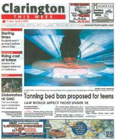

First place – I liked the classic, clean style of the Burlington Post’s front page, not too cluttered, but inviting at the same time. Could have used more pictures inside, but the tabloid size and tight papers prevent much of that.
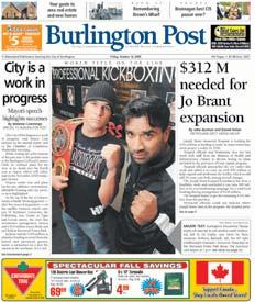

second place – In contrast, Oshawa This Week had a good use of interesting photos to break up the grey.
third place – Third-place finisher Mississauga News, the only broadsheet in the bunch, was chock full of news but it was crammed, ‘90s-style, into the more generous space available.
General coMMent: In general there were not enough photos, too many grip-and-grins, and the papers would benefit from larger photos. This was difficult to judge as each newspaper serves their communities well covering local news. More local features would help, some papers had zero in the editions they entered. Overall, an excellent class.


 Margaret Hasein, Editor, Biggar Independent

First place – Topping the list was the Durham College Chronicles: strong community news of college events and news-related events to the college. The paper had near perfect sports coverage, good presentation and top advertising content and design. The fact they didn’t have any glaring weaknesses in the other categories made them the top student newspaper in the province for this judging year.

second place – In second place was the University of Waterloo Imprint. The judging strength of this paper is in its editorial and op ed pages and advertising content. By the judging criteria, what kept the Imprint from a higher score was the sports category.
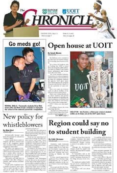
third place – In third place was Humber et Cetera. This paper’s strength was in its top front page, good presentation, advertising content, advertising design, local features and production quality. The Humber papers that were submitted did virtually everything well, no evident weaknesses. The two papers that placed ahead of them did so by outstanding strengths in certain categories.
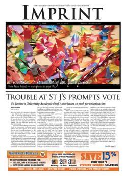
honourable mention: It should be said the scores here do not reflect at all the quality of the respective journalism programs -- in some cases the schools that sent entries do not even have journalism programs. Higher marks were given to the student papers that featured stories relating to their respective schools and what news stories had direct impact to their schools.
To use just one example, this judge was more impressed with a sports column discussing the school’s sports team as opposed to a sports column discussing the Toronto Maple Leafs. Yes, there are major news stories that do have local angles, but it should be a common refrain for everyone in the OCNA: news coverage should be as local as possible, even, and especially, at this level.

Dennis and Jackie Smyk have, for more than 40 years, owned and published the only newspaper in the remote township of Ignace, Ontario. Where’s Ignace, you ask? Get to Thunder Bay in northern Ontario, and drive about 3 hours northwest.
In a community with a declining population, Dennis and Jackie are passionate about local personalities, business, youth, educating others about local history, and various community events. They continue to make it a priority to promote their community through both their newspaper and as active volunteers for a list of local organizations so long it would be impossible to name them all.
Dennis’ years of involvement in the community include a wide range of roles from politics, to youth leadership, to local business development. He has been mayor and a councilor of Ignace, fire chief, held various executive positions as a member of the Ignace Kinsmen, is involved with Scouts Canada, the Ignace Venturers, Friends of the White Otter Castle, the township’s 125th Year Celebration, and numerous other local youth clubs, as well as a founding member of the Ignace Business Association, Chamber of Commerce and Economic Development Committee.
Dennis, in his private avocation is an archaeologist and spends his free time exploring, uncovering and cataloging many rock paintings, aboriginal camp sites and area wildlife, and leads historical tours of the area. His expertise was sought by novelists chronicling historical data for a book on Ignace for the town’s Centennial celebration.
Dennis is one half of this amazing team, as his wife Jackie is equally as committed to their newspaper and community. In addition to actively assisting Dennis in his activities, particularly his archaeological
excursions and the Friends of White Otter Castle, Jackie spends time working with many local committees such as the Ignace Recreation Committee, Library Board, Nursery School and Figure Skating Club. She is involved with Scouts Canada, and serves on the board of the Mary Berglund Community Health Centre, while supporting many other local sports, literacy, civic, cultural and fraternal organizations through membership. Well known for her impressive quilting ability, Jackie has donated many of her beautiful quilts to local ambulances or fundraising efforts for those in need. She throws herself wholeheartedly into her chosen activities without expectation of praise or compensation.
The Smyk’s passion for local art and artists spurred their joint involvement in founding the Treasure Chest Artisans Market, which features many talented artists in the Ignace community and helps attract tourists and much-needed revenue to the area.
Dennis and Jackie appear to have endless energy as their involvement in the many and varied activities continues undaunted while the two of them alone manage all phases of the Ignace Driftwood, which they publish from a home-based office, often late into the night. Over the years they have pursued other employment in order to sustain the newspaper for the community.
It is no wonder that the Smyks are such an integral part of the Ignace community. They epitomize the qualities of commitment and true leadership. We can think of no other more deserving of the 2009 Molson Award in Memory of Mary Knowles.

Congratulations Dennis and Jackie!

Class 5 (Circ 12,500 - 24,999)
Fort Frances Times
Hamilton Community News
Hydro One Networks Inc.
Laurentian Publishing
Metro Creative Graphics
Metroland Southwestern Region, St. Marys Journal Argus
Northern News Services Ltd.
O’Donnell, Robertson & Sanfilippo
Ontario Journalism Educators Association
Ontario Power Generation
Transcontinental Media c/o Orleans Star
Young Drivers of Canada


