

To be an artist is to believe in life—
“Art enables us to find ourselves and lose ourselves at the same time. Art is not what you see but what you make others see. Art is never finished, only abandoned.”
Our business has grown tremendously since 2020, when the pandemic began. Everyone was at home, and everyone wanted to redecorate. We are grateful for the opportunity to be able to work when other businesses were locked down.
I began selling the prints on my old dutch bicycle at flea markets in Berlin. I am now writing this introductory letter from a 220m² factory where we produce thousands of monthly orders. Since starting the business in 2018, we have printed over 100,000 posters and shipped them worldwide. What an adventure!
As an artist (photographer), I realized that our business model was built on the millions of public domain images available online in old books, libraries, and public archives. I appreciated the opportunity to promote such great art while also making so many clients happy.
However, I felt we should celebrate not just the dead artists but the living ones too. That’s where our concept of Support Living Artists originated. It’s time to give back.
After a few years of “improvising” our graphic design, we hired Nico Tracey as a fulltime graphic designer. Maryna and I were impressed with her resumé and her cover letter. However, what was most impressive was observing her in action. Very focused with a strong work ethic, Nico edited thousands of images for us. (including the rest of the things done).
If Nico Tracey had not joined our team, we would not be considered one of Europe’s leading wall art companies. We are very grateful for her numerous contributions and look forward to many more years of collaboration with her and the other artists. This issue is dedicated to her.
— João Paulo Freire Paglione, Founder


CONTENTS
MEANINGFUL PURSUITS IN ART, DESIGN & PRINTING
04 — humility in design
The story & impact of design on Kuriosis through the last year.
30 — charitable causes
Selling posters to give back to charitable causes close to our hearts.
38 — support living artists
Insights & articles introducing our Artist collaboration partnerships from 2021.
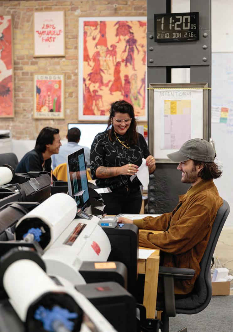
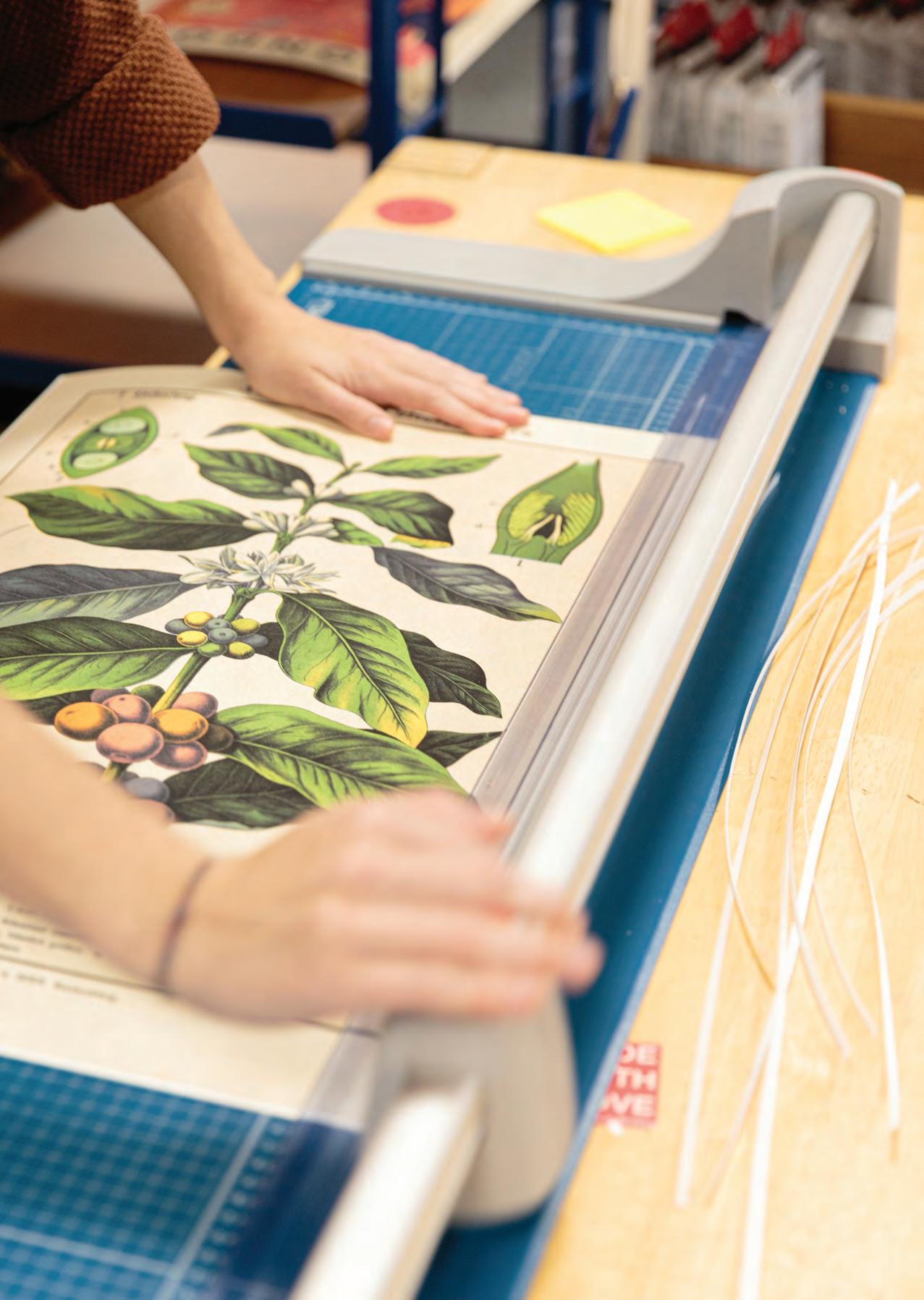
78 — made by humans. for humans.
A behind the scenes photo essay of our production atelier in Berlin, Germany.
86 — captured moments
A curated selection of images from some of the world’s most renowned photographers.
94 — time, method, media
The story of Art, history and its influences throughout our vast collection of artwork.
164 — kind words & happy people
Testimonials and photographs from our customers worlds.
170 — stockists & b2b info
Where to find our prints & how to become a B2B Partner.
in Design Humility
From conception to execution, design is not just about how things look and feel but, essentially, how they work. The expression of a brand through the language of design can be seen in every aspect of Kuriosis, from that first impression on the website to the final feeling of excitement when a customer opens their package and countless details in between.
Graphic design, in its simplest definition, involves bringing words and images together to communicate effectively. Design thinking solves problems in business not only through the look and feel of a website, a sign, a catalogue, or a poster but in how they function, communicate and, at the end of the day, and probably most importantly — how they make you feel.
It is with this thought process that Kuriosis was changed over the course of a year. In early 2021, Nico Tracey started working with Kuriosis, which was, at that point, a company mainly focused on archival images, vintage posters and historical lithographs from encyclopedias and old books.
Working with Creative Director Maryna Bittencourt’s support, Nico helped bring Kuriosis into the present. With a new effort focused on collaboration with contemporary artists, under the newly founded Support Living Artists initiative; the creation of multiple new & dynamic poster series’ that aimed to speak to a broader community and the injection of design principles into the fabric of the company. It was a very different world to the agency set-ups that Nico was used to — but the steep learning curve and the culture shock came with an equally cherished sense of autonomy, confidence & creative freedom.
With any young business, things can change dramatically from one day to the next, the implementation of new systems and standards through design worked well together with the existing ethos of continuous improvement to transform an already successful company into an even greater competitor with a clear point of difference & unique offering in the landscape of European wall art companies.
“The role of the designer is that of a very good & thoughtful host anticipating the needs of his guests”
– Charles Eames

With a background in Visual Communication Design, graduating with First Class Honours from the Institute of Art, Design & Technology in Dublin — Nico has experience working in design in Dublin, New York and Berlin, as well as her freelance practice.


Nico’s work playfully embraces both design and fine art, a line constantly crossed through her love aff air with both, visual communication and analogue media. This contrast allows her to thoughtfully cultivate great ideas, beautiful typography and unique image-making into engaging visual content.

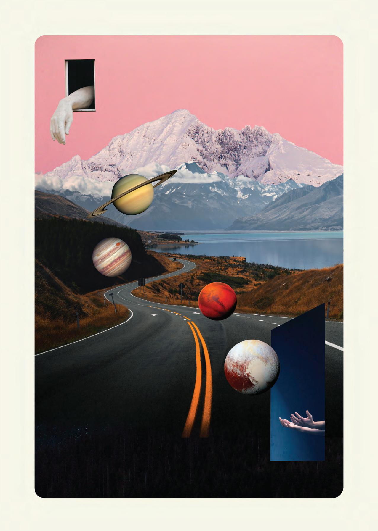
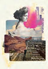
Old & new, analogue & digital, sound & vision — Our daily lives are made up of so many opposites, juxtapositions and re-imaginings of old trends and familiar nostalgia. The following pages explore the curious creations of collages, posters, and image-making Nico has produced during her time at Kuriosis, with some behindthe-scenes insight into the process that allowed them to be.
Through her work at Kuriosis, Nico is always trying to honour the future whilst constantly paying homage to the past — heroes and idols, the greats of science, art, design and, well, to be honest, everything in between. With this passion and diligence, Nico creates fresh communications and new work with an original perspective.
So, open your mind and take a trip with us through Nico’s journey through the weird and wonderful world of Kuriosis and explore her process, collections and many other things conquered in the last year.








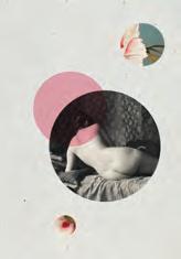


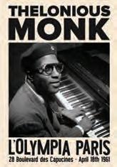














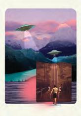










Restoration & Reinvigoration
A huge part of the history of Kuriosis is founded in the restoration & reinvigoration of archival images. We have spent many years searching through archives, old books and encyclopedias to introduce new and exciting works to our customers that otherwise may be lost in time.
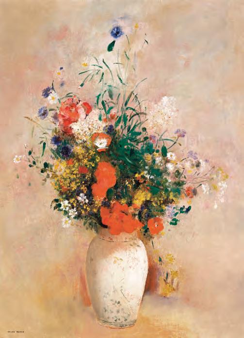
Restoration processes can vary in intensity — Sometimes, it can be as simple as boosting the colours and adding a new border; other times, we redraw the artwork or remove dust, scratches and dirt particles from the reproduction.
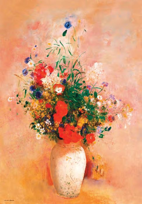
These processes allow us to transform these relics into their former glory and to continue their journey to the walls of your homes. Take a look at the before and after images pictured here to get a sense of the transformative process of restoration.
Before & After—
Before & After—


NINA SIMONE Crafting a Bestseller
A NOTE ABOUT OUR MOST POPULAR PRINT OF 2021
The inspiration for the Jazz & Soul collection came from a combination of the visual language of old, iconic Jazz records, using block images split into grids with bold typography, typically found on historic gig posters from the time. And, of course, a deep resonance with the music.
The entire collection of Jazz posters took only 3 days to design & 1 day to prepare the files for print and promotion. Initially inspired by a painting I had seen of a Jazz musician which captured the energy and power of the music, I was captivated to create a series on two of my favourite genres of music; Jazz & Soul.
Creating an original collection of work for commercial consumption can vary significantly in the time it takes and the amount of work involved — luckily, this one came together very quickly. I think the effortlessness of the design played a part in its success; nothing has been overworked or contrived. A couple of ideas and sketches, some research into old music posters and vinyl records and I got to work.
As a designer, my work has always been a very intuitive process, rooted in iteration and experimentation; I always aim to start with a strong idea and then feel my way through until I land on an execution that works!
I firmly believe, as has been my education & experience over many years, that the best designs result from great ideas — that is no less the story here. Of course, I can not take all the credit; the success of this collection is intrinsically linked to the genius of the music & icons that it represents, who came many years before me.
The thing about art is that it is all about emotion; the overwhelming popularity of this collection stems directly from the very concept that defines the genre it is based on — Soul. People feel in their soul the nostalgia, happiness, sadness, love, hate; whatever it is — the poster is just a vehicle in communicating a reminder about the individual connection they already had; to a favourite melody, riff, or lyric.
So thank you for the music — Nina, Otis, Louis, Billie, Thelonious, B.B. Ella, Miles, Charlie & Nat and the inspiration.


Nina Simone

Nico Tracey
JAZ009
Billie Holiday
Nico Tracey
JAZ002
Louis Armstrong
Nico Tracey
JAZ004
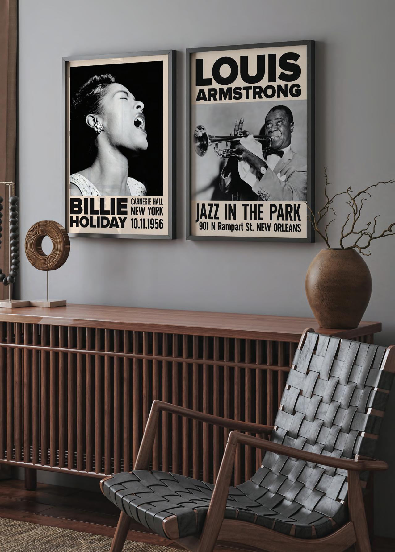
PEACE Posters for
RAISING MONEY FOR THE PEOPLE OF UKRAINE

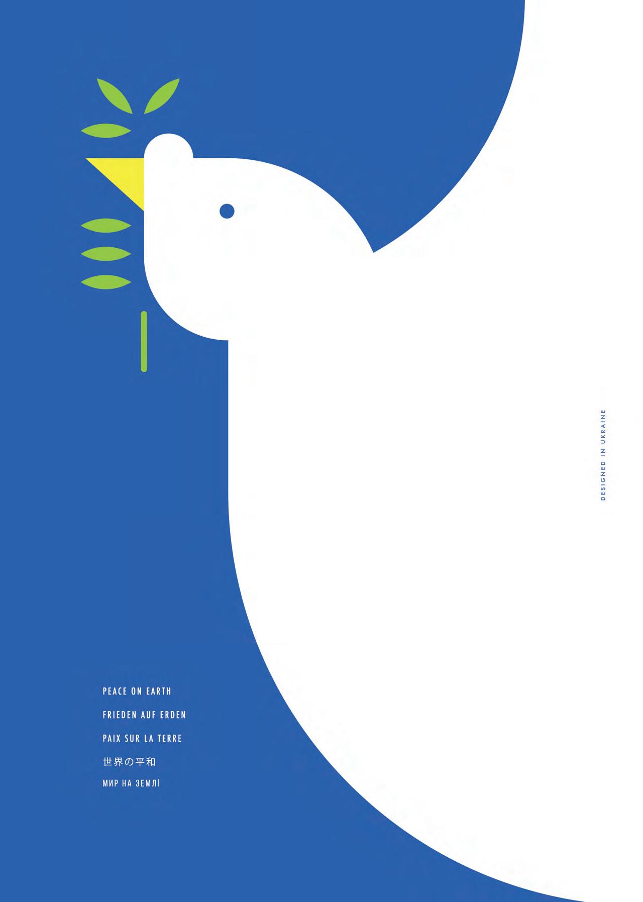
With everything that has happened throughout the world over the past few years, we thought it was important to make an effort to give back to charitable causes close to our hearts.
With the outbreak of the Russia-Ukraine war early this year; we were approached by a Ukrainian designer Andrew Nedzvedsky and embarked on a collaboration to make posters to raise some money to go directly to EFOOD.ORG, a project set up by the Non-governmental organization Izha Kharkivyanam / Food for Kharkiv Residents, founded in the Kharkiv region of Ukraine to help the residents receive food, medical supplies and much more as fast as possible.
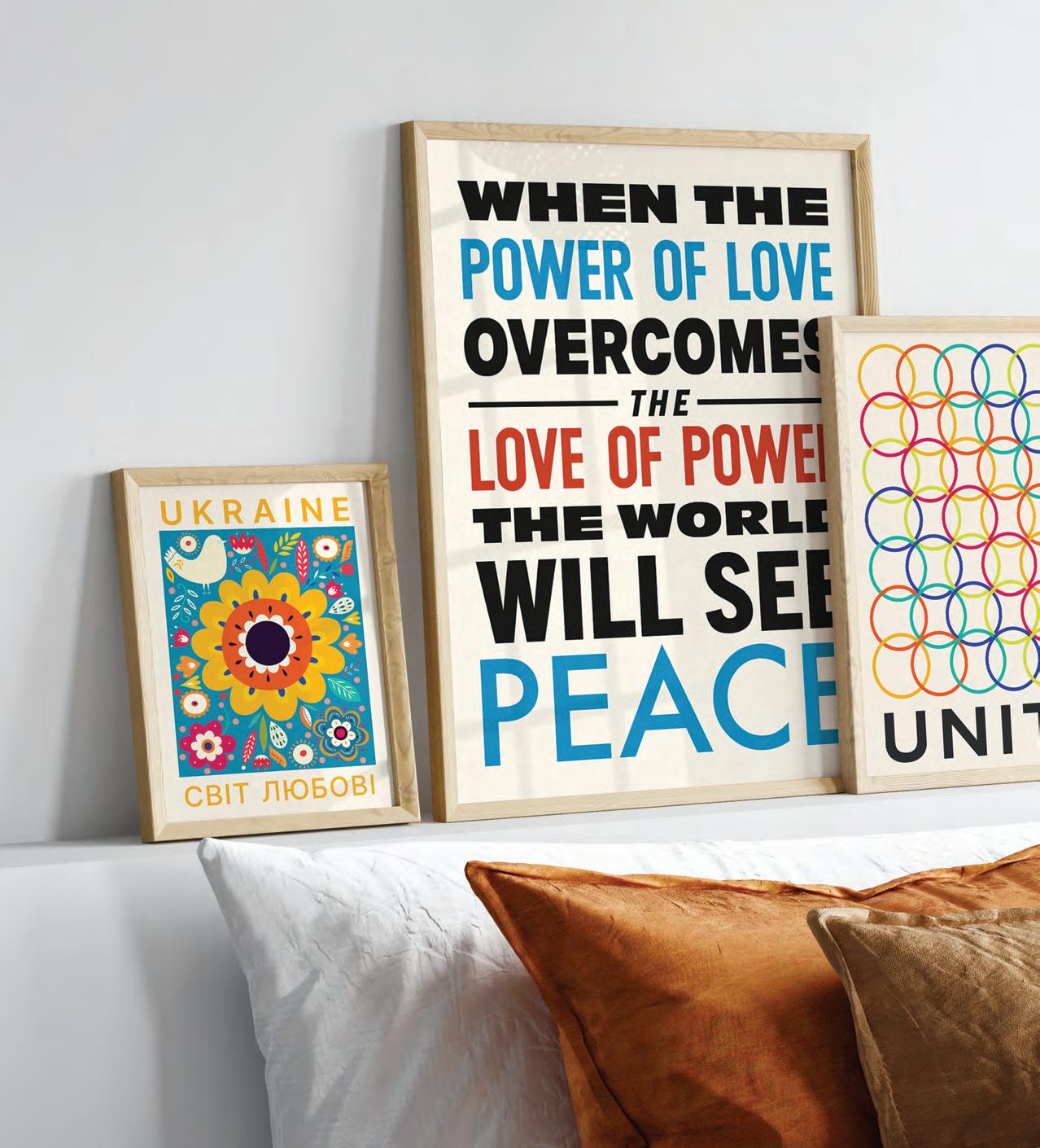
“Our goal is to help people in Kharkiv. We raise funds to buy food, medicine, hygiene products, baby nutrition, etc. We also accept humanitarian aid from all over the world. We buy or pick up food, then we pack it and deliver it around the city.”
The posters are still available at kuriosis.com, with all profits going directly to the charity. Please buy a poster today from our website, kuriosis.com & help people directly in Ukraine.

Heroes & Icons Legends
CELEBRATING ARTISTS & ALLIES WHO CHAMPION LGBTQIA+ RIGHTS

This collection, created by our talented intern, Joseph Heller, celebrates the artists and activists who have been integral to the representation of the LGBTQIA+ community in popular culture. Some have been champions of equal rights, and others have been out-spoken allies that have used their platforms to uplift the queer community and shine a light on issues that disproportionately affect them.
Thanks to the people featured in this collection, today, we are not only able to enjoy a varied and vibrant queer culture but also have increased access to fundamental human rights.
Many LGBTQIA+ people still live in extremely harsh environments; hence we have decided to donate some of the profit to a local organisation that supports international queer refugees getting the legal, financial, housing, and health help they need.
Profits from this collection will go directly to Schwulen Beratung Berlin, a non-profit charity based in Berlin that dedicate their time to supporting LGBTQIA+ people with counselling, integration & healthcare.
Available now from our website, kuriosis.com. You can also donate directly to schwulenberatungberlin.de
 Madonna Joseph Heller
GAY007
Oscar Wilde Joseph Heller
GAY010


SUPPORT ARTISTS LIVING
AN EXCLUSIVE SHOWCASE OF OUR ARTIST ROSTER
Julia Charlott Henry Hu
Marylène Madou Studio Miammmiam
Florent Bodart
Jérôme Sinoquet
Andrea Haase
Sofia Doudine
Always on the lookout for new and exciting art, we believe the best things in life come from collaboration and shared experience; this is why we provide a platform for up and coming and established independent artists and designers.
JuliaCharlott JellyfishQueen of
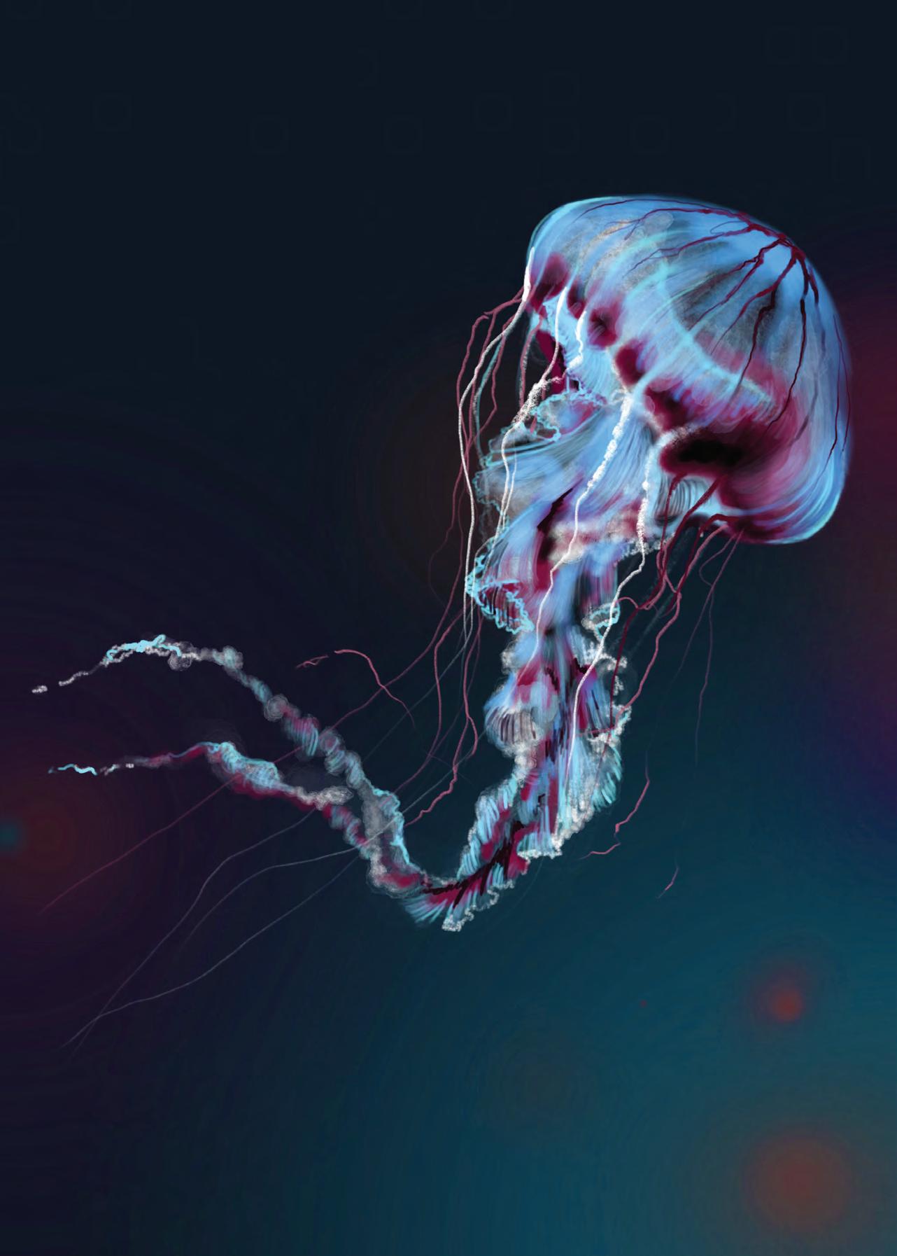

JULIA & her jellyfish
HAUNTINGLY ETHEREAL DEPICTIONS OF THE MOST ELEGANT CREATURES UNDER THE SEA
Berlin artist Julia Charlott has proven she deserves the title Queen of Jellyfish with her haunting illustrations of jellyfish. During her studies in product design at the Weißensee School of Art, Julia discovered her passion for illustration. From there, she has dedicated her life to capturing the mystery of these deep-sea creatures. The Berlin native grew up spending a lot of time near the coast throughout her childhood, instilling a strong connection to the sea, evident in her jellyfish drawings and paintings.
“This one stands for the fear of changing plans. The fear of trying new paths. Of being left alone. Of emotional pain. The unknown. It’s always worth it to put your feet in scary waters. Even if you have to swim for a while,” Julia explains her digital painting “Red Phenomena,” a fiercely red portrayal of her muse.
While she’s not creating colourful watercolour or digital illustrations in Berlin, Julia also spends her time in the northern German island Sylt, surrounded by the North Sea and finding continuous sea life art inspiration.


IN CONVERSATION WITH THE QUEEN OF THE SEA JULIA
CHARLOTT HELDNERare the epitome of freedom, lightness & the beauty of nature”
Obviously the sea has had a big influence on your work, where does that influence come from?
Back then, I regularly went to the North Sea with my father during the school vacations. We have a house there, on the island Sylt. This is where I also live and work now.
The typical vacation day consisted of breakfast and then five to six hours of beach time. So I had early contact with various sea and beach creatures that fascinated me as a child. On the North Sea, that include crabs, algae, mussels, and of course jellyfish. You can find different species, such as the moon jellyfish or the compass jellyfish and also the stinging jellyfish. The latter causes unpleasant, painful stripes on the skin due to its tentacles. In any case, once you have had contact with it, it remains in your memory.
It was common that as children we fished the jellyfish out of the sea with our nets. Then they were all thrown into a pit on the beach. When the pit was full, a thin layer of beach sand was put on top. So you couldn’t see the jelly pile underneath. We had a lot of fun watching how every now and then an adult sank into the pit, screaming and cursing... Until I fell in once myself. This is how my love for jellyfish really developed - all fear of contact was lost.
How are your personalities or influences reflected in your art?
I grew up in Berlin and am accordingly very familiar with the night and club scene there. Actually, every club is a dive into another world. You meet bizarre creatures, mystical figures and dancing beings. Loud iridescent fish and floating jellies. A group of people can appear in the face of darkness like a sea of souls. The flowing movements of bodies merge into waves in the light. I am fascinated by everything that is strange and unfounded. A little break from reality is good for everyone and leaves room for imagination. Probably my jellyfish pictures are a snapshot of these night walks. A deep sea voyage into a self-created alien world.
What is your background and how has this influenced your style and way of working today?
I am a big city plant with everything that goes with it. I was born in 1991 in Berlin-Charlottenburg, my parents have separated when I was one year old. I grew up with my mother and my father I saw mostly on weekends. We moved from Charlottenburg to Steglitz, from Steglitz to Spandau and then from Spandau to Neukölln. Here I spent my early youth. I moved out at 16 because of tensions in the family. My need for freedom as well as my own development was always very big and I am a clear stubborn person (credits to my dad). My early independence strengthened my
character and taught me to go my own way.
My product design studies at the Weißensee School of Art allowed me to reinvent myself once again. Ultimately, I don’t work in this field, but my time there opened new doors for me and showed me what I want/what I don’t want. I love my work as an illustrator and the positive response to my art, shows me that I am on the right track.
What is the best piece of advice you have received and how has it affected your career/work?
On the whole, I do not like to listen to advice and usually try out everything myself first, or like to make mistakes and learn from them. I think it’s good to do what scares me and grow from it (doesn’t always work, of course). I would pass on this advice in exactly the same way. Falling down is part of it, getting up can be practiced. However, I am personally still working on accepting help and see the cooperation with other people as enrichment. You don’t have to do everything alone and it’s okay if you can’t do everything. Talking to others and making contact makes it easier to move forward professionally.
What goals and plans do you have for the future?
Always starting new projects. The feeling of stagnation makes me restless and encourages me to look for fresh tasks. The collaboration with Kuriosis got the ball rolling and I am grateful for this opportunity. In fact, a book on hot to breed jellyfish is currently in the planning stage. It will explain even to the beginner from scratch how jellyfish keeping works and what has to be considered. Recently I had my first exhibition with the Cologne underwater photographer Marcel Panne. More exhibitions with reference to the sea and its inhabitants will follow. I like to dream big and would like to expand my collaboration internationally. My goal is to spread the fascination of “underwater” through my art and at the same time draw attention to the need for protection of this unique world.
In your opinion, what role does art play in the home and in our everyday life?
Art breathes life into a space. Nothing gives a city, an apartment, a wall more personality than visions, moments, dreams in the form of images and objects. Art inspires and is an essential mode of expression. It triggers sensations and creates atmosphere. Its diversity is limitless and opens the possibility of immersion in any desired situation.
“Jellyfish

 Dawn Dance Julia Charlott JJC002
Aurelia Lovestory Julia Charlott JJC014
HENRY HU
INDUSTRIOUS ITERATION OF COLOUR, TEXTURE & FORM
Exercising through various mediums, Henry Hu’s emerging practice commits to an infusion. An exchange. An immediacy. A link between the interior and the exterior— of a self, a being, an identity, a consciousness.
Each individual series offers an overarching narrative, steps away from the present for a spell: tasked with casting new perspectives, fresh air to breathe, and spiritual relief. Often juxtaposing the past with the future, differing forms of surrealistic fantasies unfold across his works; along with a recurring structure, the heart of all series rests in harmony.
Born and raised in Hong Kong before attending boarding school in Queensland, Australia. Henry Hu admits he was never any good at school but that at some point during his studies of architecture and civil engineering, a calling to create took hold of him, and things haven’t been quite the same ever since.
Beginning his artistic journey in the accessible realm of digital art, the quickness of ability to iterate and develop ideas in an industrious manner is something which seems true to this day of Henry’s work. At Kuriosis, we have over 150 artworks in many different series and combinations.


Having studied many of the great masters of painting, particularly Danish painters with whom he connected with the muted tones and domestic scenes, he describes himself as liking “the melancholy, the desolation of it all. It was immersive. The pieces are very hushed, very composed, very poised, sort of mystical, almost. And, I suppose, these paintings, while static, or perhaps because static, are somewhat transparent”
“Initiated from the urge to coexist physical & digital arts”
An innovator in whatever he seems to put his hand to, Henry Hu effortlessly creates photography, graphics, motion, analogue and digital works and seemingly simultaneously creates pause, chaos and captures moments throughout various media.
“Initiated from the urge to coexist physical and digital arts. I had been utilising solely digital tools until then, so it was the wish to do something concrete, dynamic, perhaps on a larger scale. With that in mind, I made new sets of digital artworks, specifically for print, onto numerous fabrics, surfaces — eager to see how they would interact with raw materials: acrylics, spray paints, threads, modeling doughs. Trials and errors charted the progress, noting the little details, alert to the little changes, without being forceful. The end result, a plunge into maximalism, a playful flux of colour. But still, traces of everything pre-existed.”
Henry HuMarylène Aesthetics
Madou Eclectic


 Painted Flowers Marylène Madou MYM039


Marylène Madou was established in Belgium early 2017, aptly named after the designer herself. Launching the brand with a very successful collection of printed scarves, print still is the ultimate starting point in each collection. Every textile print is created inhouse by the designer herself, exclusively using her own original paintings and digital illustrations. This is what makes a Marylène Madou print unique.
Coming from Belgium, a country with such an interesting history and different cultural influences, how do you think where you are from affects the work that you do?
As a textile design student, I constantly experienced this clash between the small rural town where my parents lived and Ghent, where I studied and which has such an important Medieval history. It’s typical for Belgian students to go back and forth, and then you have this mix of different languages and being able to travel easily: you are always just a few hours away from new cities and new countries. When I decided to take part of my studies in London, the surrealism of the big city and the typical little Flemish towns was even bigger. I have always been influenced by both: I loved strolling through all of the museums the cities have to offer and some of the first pieces I was highly influenced by, was a Kimono I saw in New York. But next to that, the rural countryside and simplicity of my childhood comes back to mind easily when designing.
What role do you think art and design play in our everyday lives and homes?
Collecting nice items for your home can really help you create that great energy and help you get positive emotions from your environment. I definitely believe in adding art and color to your home to keep your spirit up, and add personal touches.
Obviously your work is saturated with personality, how do you think your influences and personal experiences have impacted you and your work?
Traveling and my love for color are definitely the biggest influences in my work. It’s not easy and even more so quite difficult to
introduce color and bold patterns to Belgian customers. But I am happy to have taken up my place as the young Belgian designer who is using color fearlessly and I love to have that reputation, which has helped me to stand out, and to start working internationally.
Working in a variety of different media and product outputs, what different memorable responses have you had to the different aspects of your art?
I would say the response of Maryna and João to my work is very memorable! There are a few things that really helped me; when a Belgian performer wore a Marylène Madou outfit on The Voice, or when I was asked to design a collection for the biggest retailer in the country. I am grateful for all these opportunities, big or small.
What’s the best piece of advice you have been given and how has this impacted your career / work?
Talk to people about what you do. I was very scared to talk and contact people in the beginning. I felt that as a designer, my work had to speak for itself and that my personality was less important. But people want to know you and see you on your social media. Emailing Maryna was also a big step for me. I have come a long way in this aspect of entrepreneurship.
What goals and plans are in store for the future of Marylène Madou?
Going international! It is my biggest dream and I am working on it every day.
The future is bright for this rising star of Flemish fashion, pushing the boundaries every day with a vivacious determination and designs that are thoughtful, interesting and unapologetically bold. We can’t wait to see what she does next!
“My often eclectic and colourful aesthetic comes forth out of a fascination for historic textiles and unique objects”
IN CONVERSATION WITH THE TRAILBLAZING, & HUMBLE TALENT THAT IS MARYLÈNE MADOU


Studio Miammmiam

Studio Miammmiam is made by Julie, a French illustrator, and artist, living in Berlin. Renowned for creating a colourful bestiary, mixed with lightness and power, tinted with humour, but also permeated by more symbolic subjects: global warming, population separation, and multiculturalism, infiltration of the wildness in the urban. The digestive lines of her drawings swing between sensuality and morbid fascination, a bittersweet fantasy world, inhabited by cute creatures and mysterious beasts.
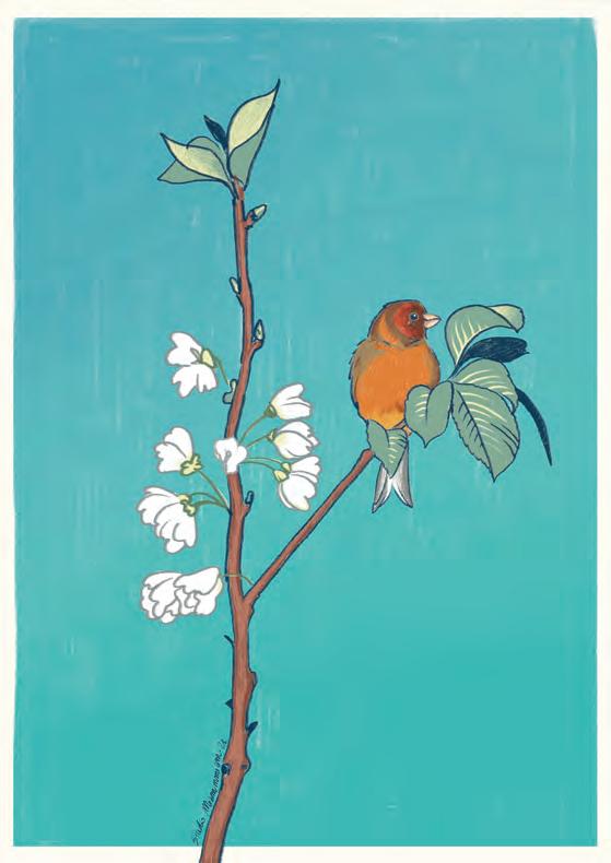

 Pink Lillies Studio Miammmiam JMM006
Gimpel Studio Miammmiam JMM003
Nostalgie Fiesta Studio Miammmiam JMM005
Bouquet Tulips Studio Miammmiam JMM002
EXPLORE THE WHIMSICAL WORLD OF FLORENT BODART TRANSPORTING YOU TO PLACES OF FAMILIARITY & NOSTALGIA

TOOLS & TECHNIQUES

Florent Bodart is a French illustrator and artist who creates whimsical artworks inspired by nature, technology, and things of the past. Growing up surrounded by art and music in a family of artists and violin makers, Florent naturally became a creator.
In fact, he still collaborates with his brother Romain in an ongoing music project called Musique Meuble, where they create interactive sound installations involving the full process from conception to construction.

Florent started his career creating T-shirt designs for the American company Threadless under the name Speakerine. Starting from there, he took the time to discover, explore and learn many other skills in graphic design and illustration.
He loves to travel in his spare time, recently completing a small tour around Europe with his wife and dogs visiting Berlin, Wien, Prague and Italy.
Florent finds pleasure in the exploration of different tools and techniques & his creative process usually includes some time drawing, painting, and working with concrete tools before further exploring the possibilities offered by computers. These different aspects of his work complete each other and offer a sense of balance.
With a strong interest in finding inspiration everywhere and trying his hand at many different things — Florent, a self described autodidact is continually fascinated by the world around him and is constantly learning by doing.

We are delighted to add some of his unique & quirky works to our ever-growing collection and now share them with you!


 Berghain Florent Bodart FRT004
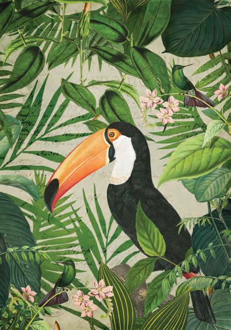
ANDREA HAASE Jungle Fever
DIVE DEEP INTO THE MAGICAL JUNGLE WORLD OF ANDREA HAASE
 Universe Spirit Julia Charlott JJC012

Andrea Haase is a German artist who has spent almost 10 years travelling and working all over the world. With a background in Interior Design, she has since focused her attention on creating — paintings, illustrations and collages. A versatile artist, Andrea’s work combines many different techniques and themes.
“What can I say? I just love art, I am passionate about it and it is the only thing I want to do.”
Andrea’s work envelopes tropical plants & exotic animals into expressive collages filled with life and multiple layers of discovery and depth.



FRENCHFantastically

Interested, questioned, anxious, worried, moved, disgusted, scandalized, horrified by social or current issues, Jérôme Sinoquet sets himself on the mission of throwing a veil of aestheticism over the ugliness, the stigmata and the discomforts of the world.
Inspired by Pop Art, Rauschenberg, Richard Hamilton, Joseph Cornell, Peter Blake and many others are the foundations for Jérôme’s work. Although using similar techniques for several decades, Jérôme has developed his own interesting alphabet of colours, shapes, materials, and the subjects that he deals with, making his creations personal and contemporary.
THE WEIRD & WONDERFUL WORLD OF

SINOQUET Jérôme

Lunatic Asylum
Jérôme Sinoquet
JER019
Expression Végétale
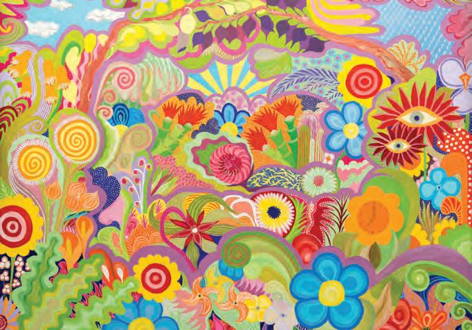
Jérôme Sinoquet

JER021

SOFIA DOUDINE
Sofia Doudine is a freelance graphic designer and illustrator from Paris, specialising in branding design and working on commercial and personal projects.
With a background in Visual Communications and many varied experiences in advertising and event agencies, Sofia has had the opportunity to extend her visual knowledge on several tools. Sofia’s accomplishments range from designing complete visual identities to illustration and motion design.
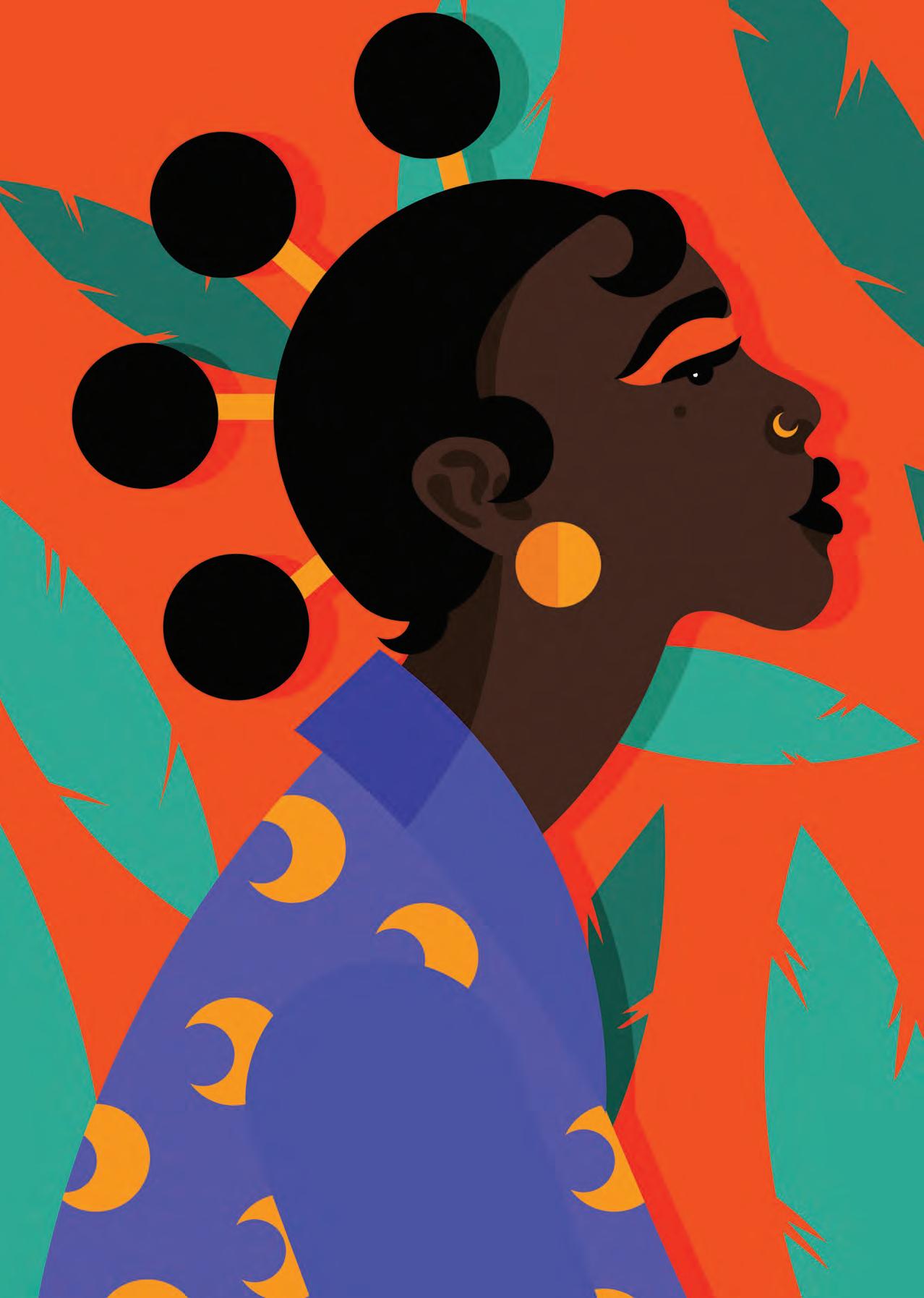
“Colours fascinate me, and I never stop studying them. I am constantly inspired by the world around me and love to capture the power, the beauty and the energy of women most of the time!”
Sofia’s illustrations are bright, vibrant, fresh, and vividly graphic — championing diversity and empowering women is her middle name. Her illustrations are enchanting to look at; smooth lines and effortless colour combinations are inspiring.
 Faith Sofia Doudine ABC041
Fascinating
Colours & Powerful Women


Sofia Doudine ABC017
Sofia Doudine ABC007
Colourful Black
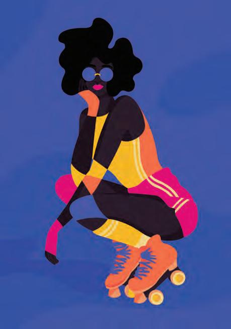

Sofia Doudine ABC004
Summer Vibe

Sofia Doudine ABC008


Made by Humans For Humans





Moments Captured
A curated collection of photographs from some of the world’s most revered photographers and institutions; including Carol M. Highsmith, Alfred Steglitz, John Margolies and NASA. Stunning images feature many different subjects encompassing places, moments, people and architecture through time, colour and form, proving how versatile and captivating the medium of photography can be.
We will delve into an exploration of some of the world’s most astounding photography collections, from the macro world of Karl Blossfeldt’s Plant Photogravures to out-ofthis-world images from the archives of NASA, as well as the highly influential work of Japanese photographers and the influence of their early colouring techniques and their profound influence on the Western World.
The beauty of photography as a medium is its ability to captivate believable realness and present us with snapshots of time which allow us to reminisce and feel nostalgia for a moment that will never be experienced again.
Special thanks to Tuan from the team for curating this beautiful selection of images.


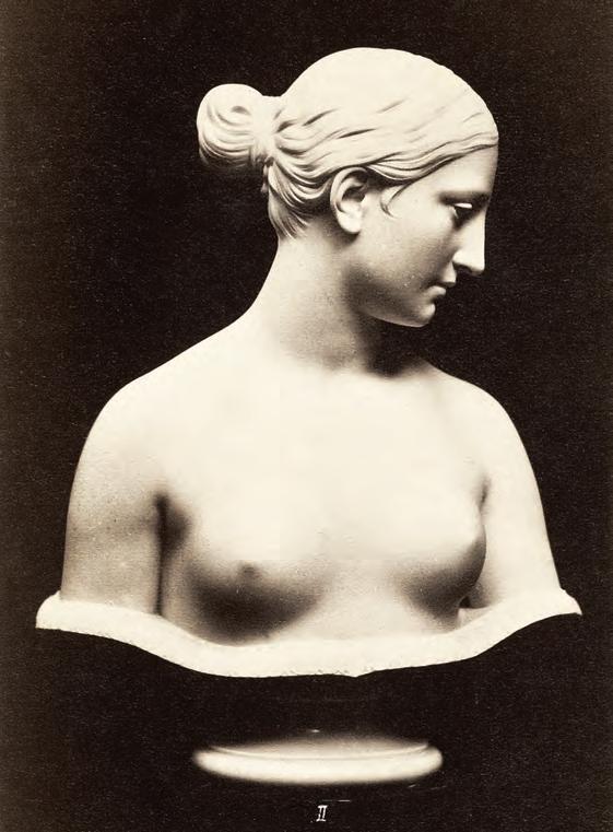


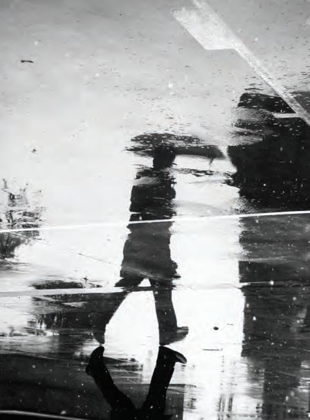


Method, Time, & Media.


Hilma af Klint Mother of Abstraction
Hilma Af Klint was a Swedish artist and mystic whose paintings were the first Western abstract art known to the current art community. Some even said she invented abstract art. She died in 1944 at 81, leaving behind more than 1,000 paintings that she kept hidden during her lifetime.
A considerable body of her abstract work predates Kandinsky’s first purely abstract compositions. She belonged to a group called “The Five”, a circle of women inspired by Theosophy who shared a belief in the importance of trying to contact the so-called “High Masters”—often by way of séances. Her paintings, which sometimes resemble diagrams, visually represented complex spiritual ideas.
But only in recent decades has the public had a chance to reckon with Af Klint’s radically abstract painting practice—one which predates the work of Vasily Kandinsky and other artists widely considered trailblazers of modernist abstraction. Her boldly colourful works, many of them large-scale, reflect an ambitious, spiritually informed attempt to chart an invisible, totalising world order through a synthesis of natural and geometric forms, textual elements and esoteric symbolism.
Throughout her life, Hilma Af Klint sought to understand the mysteries she had come in contact with through her work. She produced more than 150 notebooks with her thoughts and studies.
Hilma Af Klint never dared to show her abstract work to her contemporaries. Her major works, dedicated to the Temple, had been questioned and rejected by Rudolf Steiner. Hilma Af Klint concluded that her time was not yet ready to understand them. More than 1200 paintings and drawings were stored in her atelier, waiting for the future.
Hilma Af Klint died in the aftermath of a traffic accident, having only exhibited her works a handful of times, mainly at spiritual conferences and gatherings. Her spirit lives on in these images.


Clockwise from left:
The Dove No. 1
Hilma Af Klint HK012
The Ten Largest No.2
Hilma Af Klint HFK014
The Ten Largest No.7
Hilma Af Klint HFK012
Alterpieces No. 1
Hilma Af Klint HK003
Af Klint was born in Sweden in 1862. She studied Arts at the Royal Academy of Fine Arts in Stockholm. She studied arts for seven years there, and after finishing her studies, she dedicated herself to painting landscapes and portraits for ten years.
Indeed she was a good painter. Most of her work is remarkable and widely known, almost eighty years after her death. But, what happened with Hilma, that suddenly changed her direction regarding her painting style? To understand her work, it is necessary to talk about her interests, and her biggest one was her devotion to séances. These séances are rituals where people can communicate with higher souls and spirits from other dimensions.
Hilma met every week for ten years with a group of friends to contact these spirits. She and her other four friends started to make these realms and formed the group of The Five. Af Klint felt somehow instructed by these spirits in one of these sessions, and that is how she started the “Paintings for The Temple” series. A collection of 193 paintings was divided into groups according to the story she intended to tell.
She had an exquisite technique and painting style. She used a combination of colours to talk through the paper. Many would not understand her since people were not ready to see this level of work. In a movement controlled by men, At Klint was the first of her kind. Nowadays, many consider her the real pioneer of the abstract movement, even before Kandinsky, Mondrian and others.
“The pictures were painted directly through me, without any preliminary drawings, and with great force. I had no idea what the paintings were supposed to depict; nevertheless, I worked swiftly and surely, without changing a single brush stroke.”
Af Klint used a wide range of colours, but predominantly she used blue for female forms, yellow for male ones, and green to emphasise their unity. She intended to transmit with her style, especially in her Primordial Chaos series, the connection between two opposite “poles”, in this case, male and female and the reproduction of life, and how this was spiritually vital.
Almost eighty years have passed after her death, and people and critics still understand some of her messages to fully understand the meaning of her artworks. Art historians have done most of it. Nevertheless, some axes are still not entirely decoded, or people do not give the same interpretations to what she truly meant. Who knows? Maybe to understand what Af Klint intended to communicate, we also need to have one of these encounters.
First Impressions

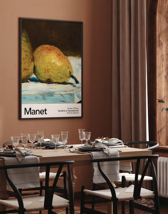
Édouard Manet The Birth of Impressionism 1832–1883
Impressionism was perhaps, one of the most groundbreaking art movements; rooted in feeling, light and colour; Impressionism paved the way for Modern Art as we know it today. Édouard Manet, nicknamed the father of Impressionism, was a crucial figure in the advent of this magnificent movement.
A pivotal figure in the transition from Realism to Impressionism, Manet began to paint life as it was before his eyes, moving away from the grandeur and fantasy of previous movements and focussing on a more honest depiction of his surroundings.
Manet’s involvement of looser brush strokes, the omission of transitional colours and the simplification of form paved the way for Neo & Post Impressionist Artists for many years to come, forming some of the wellknown names we are familiar with to this day.


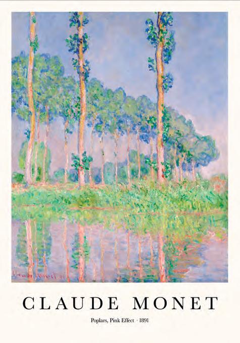
Claude Monet Capturing light in landscape 1840–1926
Master French painter Claude Monet a key figure in and credited with inspiring the name of the Impressionist movement. The most prolific and consistent of the Impressionist artists, his extensive body of work followed the “Plein air” philosophy of landscape painting, the act of painting outdoors.
Monet’s ambition to document the French countryside led to a method of iteration to capture the changing of light and passing of the seasons in the same scene many times. This sense of movement and life is evident throughout many works in his career. His unique quest to depict nature exactly how he saw it saw a rejection of European conventions regarding composition and colour.
Heavily influenced by Japanese Woodblock prints, Monet’s works feature asymmetrical compositions, blocks of colour and stylised subject matters. Working with unmediated colours and swiftness in applying colour accentuating the moving air and changing light, his signature style was born.
Moving from the typical portraits and landscapes at the beginning of his career, he found his niche in the subject matter he quickly became obsessed with; his waterlilies and pond paintings. This era of Monet’s work would later become his most well-known artwork.
The artist, however, would consider his garden to be the most beautiful masterpiece he has ever created. “I perhaps owe having become a painter to flowers,” he would say. Or: “The richness I achieve comes from nature, the source of my inspiration.” His dreamy, light-filled landscapes attempted to capture the magic of nature as he perceived it.
 The Willows Claude Monet MNT040
The Waterlily Pond Claude Monet MNT032






Strokes of Genius Neo & Post Impressionism 1886–1905
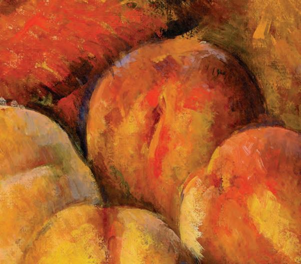
Arguably one of the first truly Avant Garde movements in Modern Art. With the advent of colour theory and founded in an environment of debate around the role of academic art in the late 19th century, Neo-Impressionism & Postimpressionism aimed to harmonise the goals of Impressionism. More deliberate colour blocking and pointillist techniques were utilised, along with further experimentation of colour and brush strokes, resulting in a movement creating an optical synthesis between the ideal and the essential.
“Harmony is the analogy of contrary and similar elements of tone, of colour, and of line, conditioned by the dominant key, and under the influence of a particular light, in gay, calm or sad combinations.” — Georges Seurat.
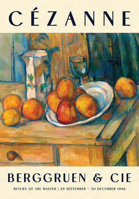
From Henri Edmond Cross, Paul Gauguin, Vincent Van Gogh, and Paul Cezanne, their radically independent styles and dedication to pursuing unique means of artistic expression, the Post-Impressionists dramatically influenced generations of artists, the impact of which we are still seeing to this day in Contemporary Art.
Moving away from the naturalism of Impressionism and focusing their art upon the subjective vision of the artists, rather than following the traditional role of the art as a window onto the world, artists of the Post-Impressionism movement focused on the emotional, structural, symbolic, and spiritual elements that they felt was lacking from Impressionism.
Similarly to the previous division of Neo-Classical and Romantic art, the division of the Post-Impressionism movement also existed in a more structural, formal, nearly scientific design style of artist Georges Seurat with his dot theory, later known as pointillism and Paul Cézanne. They concentrated their practice on the research of colour planes. In contrast, on the other, the art of French painters Gauguin, Van Gogh, and Toulouse-Lautrec emphasised the expression of emotions and sensations through light and colour. Out of these two trends of Post-Impressionism art emerged the extremes of the individual styles of 20th-century art, ranging from Cubism to Surrealism.


Still Life with Milk Jug and Fruit


Japonisme

From East to West The Influence of Japanese Art on Western Movements
Japonisme is a French term coined by French art critic and collector Philippe Burty in 1872 to describe the popularity and influence of Japanese art in nineteenth-century Europe. The French art historian Gabriel P. Weisberg was particularly drawn to Japanese art because its seclusion “appealed to their sense of exclusivity. They saw strength but restraint in the Japanese and were driven to combine those elements with French tradition and make something new.”
“Japanese art is important as a teacher. From it, we once again learn to feel clearly how far we have strayed from nature’s true designs through the persistent imitation of fixed models; we learn how necessary it is to draw from the source; how the human spirit is able to absorb a wealth of magnificent, naive beauty from the organic forms of nature in place of pedantic, decrepit rigidity of form” — Julius Lessing, Report from the Paris Exposition Universelle, 1878.
Japan was a mystery to the world for over two hundred years. The small country closed its borders in 1635 under the Sakoku policy (literally meaning “closed country”) enacted by Japan’s feudal military government - Tokugawa shogunate, known in Japan as the Edo shogunate – at the time. This policy was designed to halt colonial influence on their way of life, so relations and trade were limited, almost all foreign nationals were prevented from entering Japan, and regular Japanese people were forbidden from leaving the country under penalty of death. As a result, Japan’s way of life was a complete mystery to the rest of the world.
After William II of the Netherlands unsuccessful tried to convince Japan to end their self-imposed isolation in 1844, The Perry Expedition, led by Commodore Matthew Perry, was launched in 1853. It aimed to convince Japan to reopen its borders and engage with American trade. Known in Japan as Arrival of the Black Ships (黒船来航 , kurofune raikō, the name they gave to Western ships arriving in the county), the threat of attack initiated a successful political dialogue and Japan began trading with the West as soon as five years later, after the Treaty of Amity and Commerce was declared.
Japan experienced a massive influx of merchants, tradesmen, and tourists following its reopening. Styles and methods of art creation specific to Japan were finally available in the West. The likes of ukiyo-e (woodblock prints) and delicate ceramics and pottery became incredibly popular, particularly in France and England, where these items started appearing in curiosity shops.

People were drawn to Japanese art’s aesthetic because they were soul-searching. As Matthew Martin explains, many artists and intellectuals in the second half of the nineteenth century believed “that the rise of industrial production in the nineteenth century had destroyed taste”. They longed for a radical shift in art; they wanted to redefine what art is and what art could be. They tried to break away from the limitations of neoclassicism’s perfectionism. They wanted art for art’s sake. Japanese art opened that door.
Japanese art, the jeweller Lucian Falize said, “taught us the poetry of the world”. Their ukiyo-e, which often depicted landscapes and regular people at leisure rather than the battle epics and classic, grey-toned military portraits that had dominated the West, felt modern and expressive. Its unique aesthetic informed the emerging social-reform art movements of the late nineteenth century, particularly Impressionism and Art Nouveau.


 Lake Yamanaka & Mount Fuji Kawase Hasui


Top Left:
A Visual comparison of the clear influenc of Ukiyo-e landscape art on the work of Vincent Van Gogh.
Fuji No Yukei
Utagawa Kuniyoshi JAP099
The Poplars at Saint Rémy Vincent Van Gogh VVG003
Impressionists were enormously influenced by Japanese art’s use of flat planes, bright colours, unusual perspectives, and emphasis on asymmetry and negative space. Nancy Hass commented that it “liberated them from the strictures of hyperrealism”. Japanese art freed these artists.
One of the most famous Impressionists (and post-Impressionists) of all time, Vincent van Gogh, adored Japanese art. Throughout his life, he collected ukiyoe prints he bought from various Parisian curiosity shops and even promoted them to his contemporaries at an exhibition in 1887. The often nature-orientated, vibrant, and flat-planed style we associated with Van Gogh today is largely thanks to his love of Japanese art. Van Gogh’s motive in his move to the south of France was to more authentically capture the spirit of Japanese landscape painting.
One work that accentuates his love for it is his Portrait of Père Tanguy (1887). Van Gogh produced two versions of this portrait of his colour merchant, Julien Tanguy, featuring backdrops of Japanese prints from famous Japanese artists such as Utagawa Kunisada and Utagawa Hiroshige, considered the last great master of ukiyo-e.
Art Nouveau, like Impressionism, sought to free itself from traditional art constraints and emphasised romantic expression through its use of the natural asymmetry of plants, flowers, and animals. French architect and designer Hector Guimard stressed that “nature is the greatest builder and makes nothing that is parallel and nothing that is symmetrical”.
Bottom Left: Here we can see similiarities between the embellishments found in traditional Geisha garments and the flowing gowns of girls depicted in Gistav Klimt’s “The Virgin”
The Virgin Gustav Klimt GUS001
Blue Geisha Kuniyoshi JAP031
The short-lived movement took its name “from the Paris gallery, La Maison de l’Art Nouveau, opened in December 1895 on the rue de Provence by Siegfried Bing”. Bing was an ardent admirer of Japanese art and was one of the most influential figures in Japonisme, utilising its commercial potential. Inspired by Japan’s refusal to differentiate between high and low art, Art Nouveau “embraced the notion of the Gesamtkunstwerk —the total work of art”
Two of the greatest artists within Art Nouveau are Gustav Klimt and Ernst Heinrich Haeckel. Like van Gogh, Klimt was inspired by ukiyo-e prints and the Rinpa School of Kyoto. His work’s use of intricate patterns, vibrant colours, and gold leaf backgrounds are directly influenced by his love of Japanese art.
Haeckel was a German biologist, and his representations of deep-sea organisms and flora and fauna, characterised by whiplash curves and serpentine lines, were greatly influenced by the popularity of Japanese art. According to Cybele Gontar from the Department of European Sculpture and Decorative Arts at the Metropolitan Museum of Art, Art Nouveau’s Japonisme lines “may be understood as a metaphor for the freedom and release sought by its practitioners and admirers from the weight of artistic tradition and critical expectations”.

Water · Colour · Light The Japanese Influence
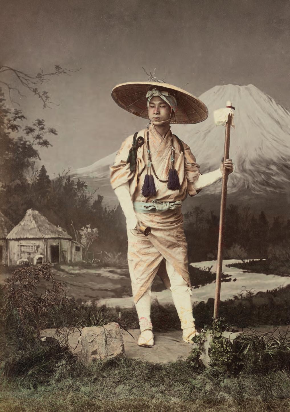
Photography was still a relatively new invention by the time it arrived in Japan in the 1850s Japanese and foreign artists were fascinated by photography’s ability to seemingly capture reality, and it became increasingly prevalent. David Odo, an anthropologist and curator at Harvard Art Museums, notes that “photography played very well into this kind of desire to learn more about Japan”. Once forbidden and beyond reach, Japan was somehow knowable all of a sudden.
The Japanese were keen to blend the style of their traditional woodblock prints— Ukiyo-e, developed in 1765, depicted scenes from everyday Japan and remained popular through the Meiji period until its end in 1912 - with this modern invention.
What makes Japanese photography so uniquely beautiful is its use of watercolour paints. The lack of colour in photographs left people feeling as if the image was incomplete, so tinted dyes and colouring soon became part of the photography process. Unlike the coloured photos produced in Europe and the US, which looked more like paintings, Japanese artists delicately painted their prints with watercolours, creating a hyper-realistic aesthetic.
Western tourists adored these photographs, and the money brought in by their purchases enabled Japan to mass-produce photographic print on paper from a negative. This process was called the albumen print, also known as the albumen silver print, and it involved creating prints from the albumen found in egg whites which bound the photographic chemicals to paper.


Arts & Crafts Movement; 1880–1920
Defined by it’s emphasis on a return to skilled craftsmanship, & attention to design in the decorative arts, from the mechanization and mass production of the Industrial Revolution.
Art Nouveau; 1890–1920
A style of decorative art, architecture, and design prominent in western Europe and the USA characterized by intricate linear designs & flowing curves based on natural forms.
Arts & Crafts Morris & Art Nouveau
William Morris was a British architect, designer, craftsman, translator, poet, novelist and socialist activist. We dedicate this chapter to one man who excelled in many different aspects throughout his life, and we will tell you why we love his work.
William Morris came from a wealthy middle-class family in Britain. Morris was aware of this, but he never felt completely comfortable in his environment. He was an avid critic of the industrial system, not because of its improvements, but the form men were administrating it, particularly their employees.
Due to this, he saw himself as influenced by socialist ideals, and he considered them a fundamental part of his life. Therefore, he took a protagonist role in the fight for workers’ rights. He firmly believed that companies should be owned by their workers instead of one person profiting from their employees and not paying fairly for their work.
William Morris was no ordinary man and the leader of the British Arts and Crafts movement, a strong movement against industrialisation in the second part of the 19th century. The Arts and Crafts current of thought was related to arts in general, but most importantly, to fine and decorative ones. This thought philosophy covered what artists wanted to use as their way of expression. This movement was a direct response to industrialisation for its mass production system and the flaws that the system had when replacing handwork by machines.
A celebration of nature and organic forms coupled to make the everyday and mundane more beautiful & accessible for all. These are all factors Morris had in creating a profound impact on the advent of Art Nouveau, and his ideologies were highly influential on the movement throughout Europe.
From the outset, artists working in the Art Nouveau style advocated the unity of all the arts and argued against discrimination between fine art (painting and sculpture) and the so-called lesser decorative arts. Art Nouveau artists sought to integrate art with everyday life, producing beautiful objects to elevate people’s lives.
As with the Arts and Crafts movement, it was held in the Art Nouveau period that aesthetic values should be combined with high standards of craftsmanship and that works of art should be both beautiful and functional.
The boundaries between fine art and the applied arts became blurred in furniture design, silverware and architecture, paintings, graphic art, jewellery, fashion and glassware.


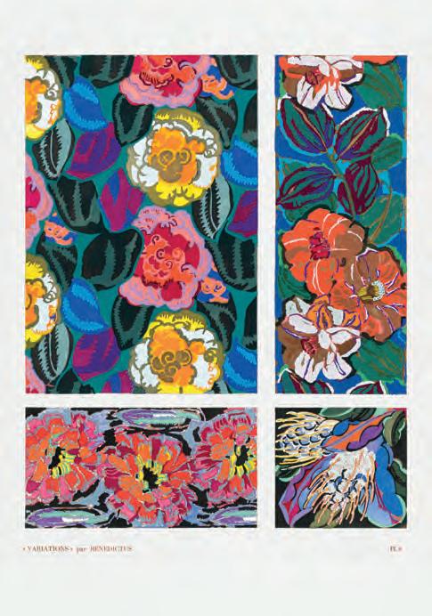


Ernst Haeckel & The Huge Impact of Microscopic Worlds
Haeckel was a famous 19th-century scientist, artist and philosopher. Through his passion for discovery, he found a calling in naturalist study. It inspired him to produce thousands of intricate drawings and illustrate his findings. The legacy of his scientific achievements, philosophic thought and artwork still captivate us to this day.
Get a glimpse into his most notable works. They reveal the journey of this unique historical figure and the beautiful discoveries that came with it. Intricate drawings of radiolarians were some of his first works. Most of them were microorganisms he had identified himself, described and drawn through years of research.
The scientist compiled them into a monograph, and its success advanced him into a lifelong career as a researcher. He continued the production of such illustrations, expanding into other species and some 100 of them ended up in his most famous book series, Kunstformen der Natur (“Art Forms in Nature”).
The dichotomy between art and science in modern times is familiar, but it wasn’t in the 19th century. Back then, true intellectuals were proficient in many subjects. Haeckel didn’t see the two realms as contradictory either and reconciled them with confidence that’s rare to find today. He wanted to explore the connections of the scientific study of nature to its inner beauty.
At the time, lithographs were the most advanced visual aids for scientific findings. They served as eye-catchers, crucial to attracting the interest of other literates. Haeckel’s creativity and dedication to popularise evolution concepts pushed him to utilise them. He wanted others to understand his work, but many of his findings were under the microscope, impossible to showcase. Illustration became the perfect medium for this aspiration.
Introducing Darwin’s theories was another critical moment in Haeckel’s career. He did his best to popularise them and provided the drive he needed to dive into his research with new rigour. The zoologist travelled to many remote regions, studied exotic habitats, and related it to Darwin’s theories. Because of it, Haeckel became known as “the German Darwin”.


Haeckel’s Art Nouveau Influence
Clockwise from left; The profound visual impact of Haeckel’s work can be seen in the work of famed Art Nouveau artists such as Maurice Pilliard Verneuil and Alphonse Mucha.
Reverie
Alphonse Mucha MCH006
Ascomycetes
Ernst Haeckel
EH076
Fishes & Pigeons
Maurice Pulliard Verneuil DEC002
Coral Reef Forest
Ersnt Haeckel SEA029
While researching, travelling and writing books, he completed other fascinating monographs with stunning pictures of microbes. Unsurprisingly, part of his success is attributed to his art. The illustrations he shared amazed Darwin, and they became close acquaintances. Haeckel exchanged dozens of letters with his superior, although he diverged from Darwin’s ideas in later years.
At its core, Haeckel’s art reveals his aesthetic aspirations. An era of enlightenment and romanticism with thinkers like Humboldt and Goethe influenced his search for order and beauty. Haeckel found it in nature, in the mesmerising geometry of organisms, and his need to capture it sometimes overshadowed scientific ideals.
That’s why he exaggerated some of his drawings for visual impact. He emphasised the arrangement of his illustrations to promote patterns and symmetry. As an artist, he focused on the forms of organisms rather than the accuracy of their scales or habitats.
Because of this, many have compared Haeckel’s works to psychedelic arts. Both contain contrasting colours, otherworldly forms and extreme stylisation. Could these coincidental parallels have an actual link? Historians would say ‘no’, but Haeckel spent his days looking at the world through a microscope.
At times, in the harsh conditions of foreign climates, he drew his findings in painstaking detail. The required concentration could have made it something akin to a psychedelic experience. Or it could be that humans across time have similar experiences while dealing with the microcosm.
Haeckel had no idea what significant future impact his collections would have. He didn’t mean for it to become artwork shared across the globe. His microbe depictions, published in “Art Forms in Nature”, inspired dozens of artists and architects. As it coincided with the rise of Art Nouveau and the surrealist movements, its followers sought to rediscover and embrace natural forms. Haeckel’s designs touched the works of many painters, such as Max Ernst, Wassily Kandinsky and Paul Klee.
Today, Ernst Haeckel’s art continues to mesmerise those who discover it. Haeckel’s wish has come true. He provided a window to the enchanting micro world unseen to the naked eye, and we understood it.

1862–1918
Vienna Secession; 1897–1905
Closely related to Art Nouveau, was formed by a group of Austrian painters, graphic artists, sculptors & architects, including Josef Hoffman, Koloman Moser, Otto Wagner, and most notably Gustav Klimt.
Glimmering Gold Gustav Klimt
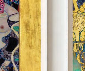
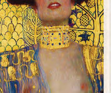
Klimt’s ‘Golden Phase’ was marked by positive critical reactions and financial success. Many of his paintings from this period included gold leaves. Klimt used gold in his Pallas Athene (1898) and Judith I (1901). However, the works most popularly associated with this period are the Portrait of Adele Bloch-Bauer I (1907) and The Kiss (1907–08).
Klimt travelled little, but trips to Venice and Ravenna, both famous for their beautiful mosaics, most likely inspired his gold technique and his Byzantine imagery. In 1904, he collaborated with other artists on the lavish Palais Stoclet, the home of a wealthy Belgian industrialist, was one of the grandest monuments of the Art Nouveau age. Klimt’s contributions to the dining room, including both Fulfillment and Expectation, were some of his finest decorative works and as he publicly stated, “probably the ultimate stage of my development of ornament.”
As he worked and relaxed in his home, Klimt typically wore sandals and a long robe with no undergarments. His simple life was somewhat cloistered, devoted to his art, family, and little else except the Secessionist Movement, from which he and many colleagues eventually resigned. He avoided café society and seldom socialized with other artists. Klimt’s fame usually brought patrons to his door, and he could afford to be highly selective. His painting method was deliberate and painstaking at times, and he required lengthy sittings by his subjects.
Klimt wrote little about his vision or his methods. He wrote mostly postcards to Flöge and kept no diary. In a rare writing called “Commentary on a non-existent self-portrait”, he states, “I have never painted a self-portrait. I am less interested in myself as a subject for a painting than I am in other people, above all women... There is nothing special about me. I am a painter who paints day after day from morning to night ... Whoever wants to know something about me ... ought to look carefully at my pictures.”
In 1901 Hermann Bahr wrote, in his Speech on Klimt: “Just as only a lover can reveal to a man what life means to him and develop its innermost significance, I feel the same about these paintings.”
Hope II


Gustav Klimt
GUS003

Judith II
Gustav Klimt
GUS026
Judith & The head of Holofernes
Gustav Klimt

GUS007









Alphonse Mucha Pioneer of Advertising
Mucha arrived in Paris in 1887. He was fortunate to be supported by a wealthy patron, and he was to enjoy this support for a further three years. With the withdrawal of the Count’s support, however, leaner times loomed. Mucha learnt to survive on a diet of lentils and beans and began to eke out a l iving by providing illustrations for various magazines and books. Once started, he was soon able to establish himself as a successful and reliable illustrator.
But on St. Stephen’s Day (December 26th) in 1894, fate singled Mucha out again. He was doing a favour for a friend, correcting proofs at Lemercier’s printing works, when Sarah Bernhardt, the star of the Parisian stage, called de Brunhoff, the printer’s agent, with an immediate demand for a new poster for her production of Gismonda. All the regular Lemercier artists were on holiday, so de Brunhoff turned to Mucha in desperation. A demand from ‘la divine Sarah’ could not be ignored.
Gismonda, the poster which Mucha created, was to revolutionise poster design. The long narrow shape, the subtle pastel colours, and the ‘halo’ effect around the subject’s head were to remain features of Mucha’s posters throughout his life. Most importantly, these elements combined with the stillness of the near life-size figure to introduce a note of dignity and sobriety to what had been up to then garish street art, qualities which were quite startling in their novelty. The effect created was astonishing, and the poster was so popular with the Parisian public that collectors bribed bill stickers to obtain them or simply went out at night and, using razors, cut them down from the hoardings.
Sarah Bernhardt was delighted and immediately offered Mucha a five-year contract to produce stage and costume designs and posters. At the same time, he signed an exclusive contract with the printer Champenois to produce commercial and decorative posters. With Gismonda, ‘le style Mucha’ was launched. Mucha was established as the preeminent exponent of Parisian Art Nouveau.


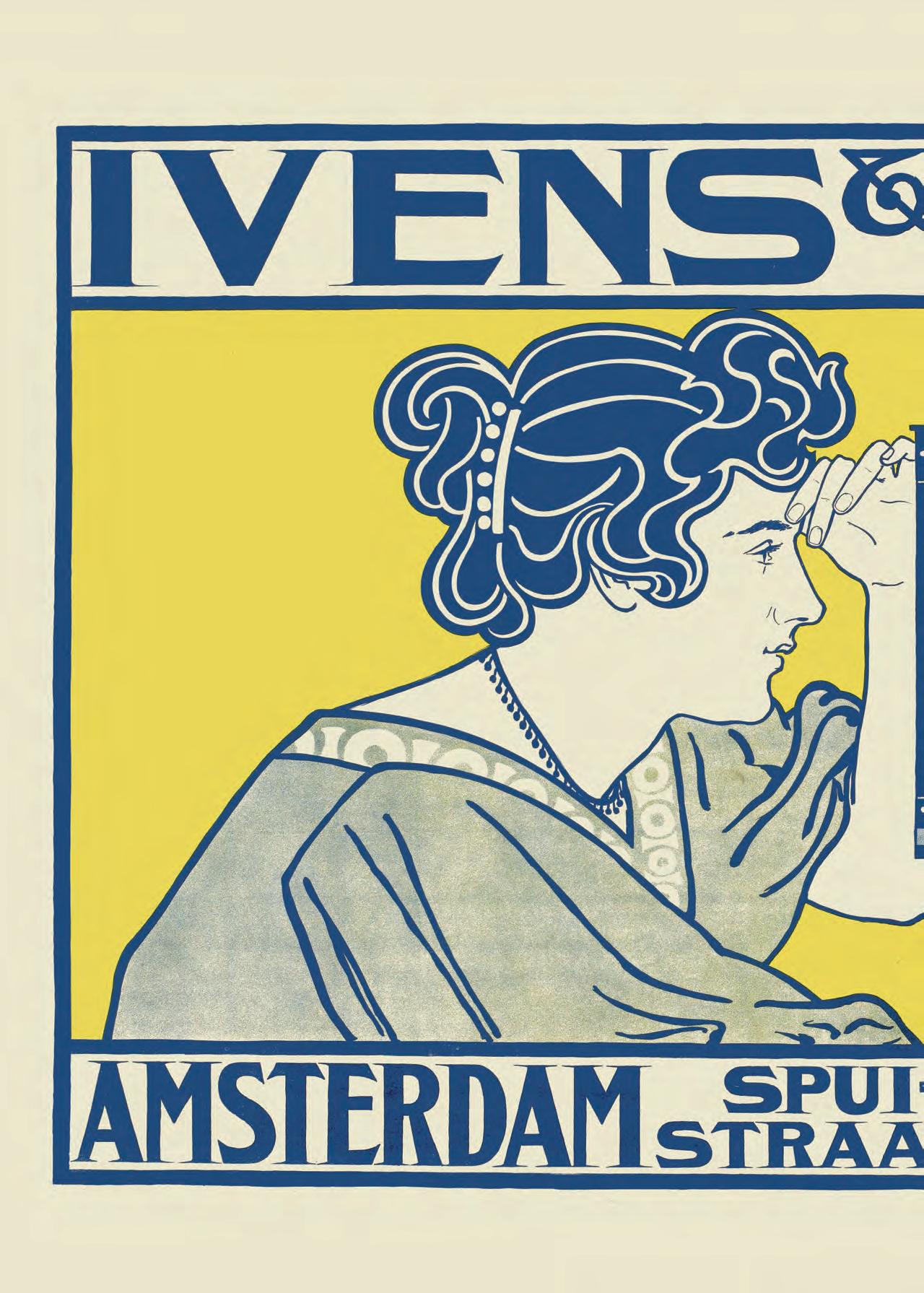
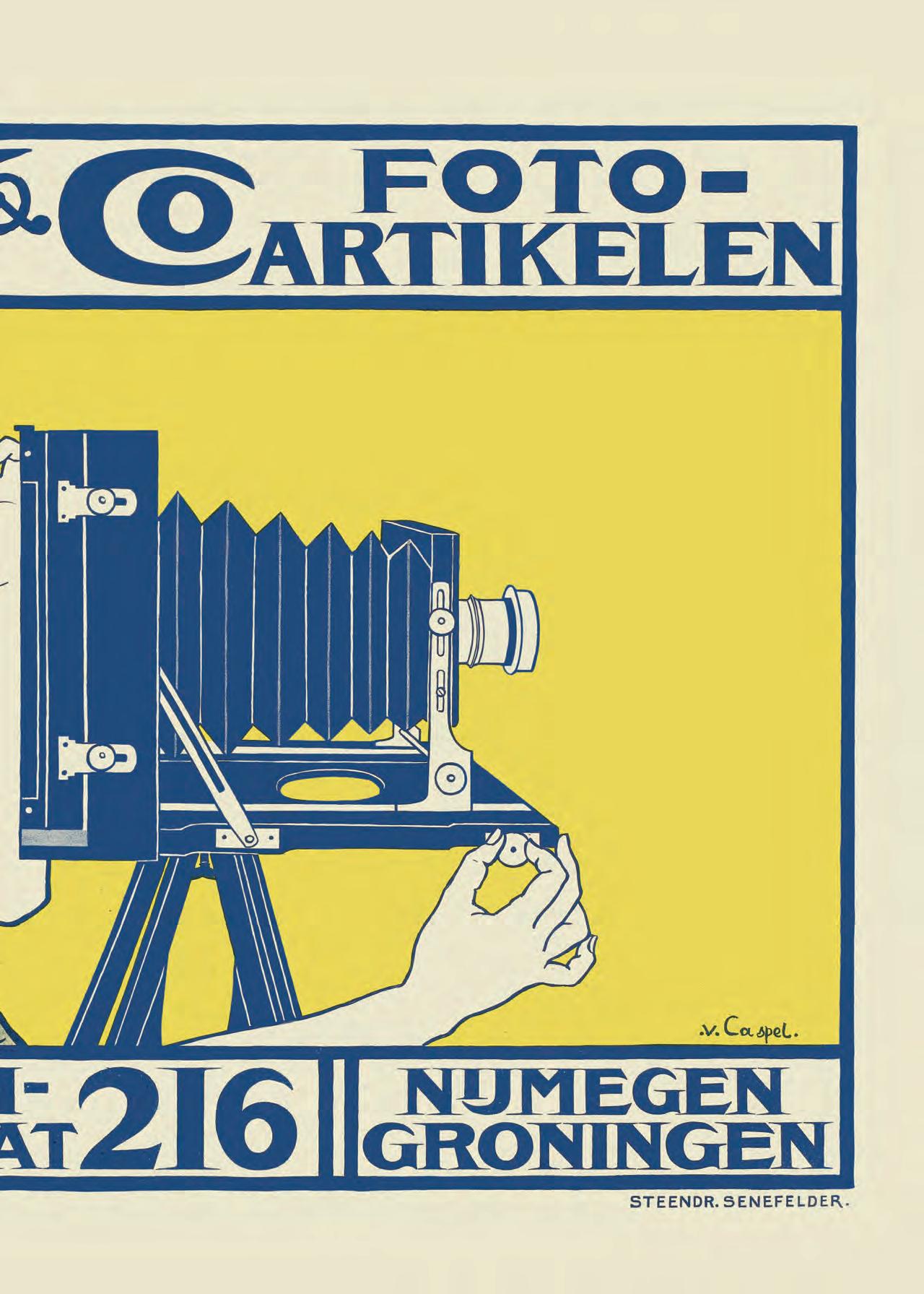

Plakatstil Evolution of Poster Design
Posters date back further than you may think. One of the earliest forms of visual advertising, they were often used in ancient Greece and Rome to make official announcements and legal texts accessible to the general public. These early posters were placed on large white wooden panels and were usually placed in town squares to ensure as many people as possible saw them. By the 16th and 17th centuries, with the development of the printing process, posters had evolved into a combination of text and pictures to advertise goods sold by tradesmen and merchants and to entice spectators to upcoming events, such as Shakespeare plays circuses, and fairs.
Lithographic posters became relatively popular in the early 1800s. Lithography, a printing process invented in the 1790s in Germany by Alois Senefelder, enabled artists to create metal and wood engravings with simple designs. Colour was possible – these lithographs were known as chromolithographs – but the process was laborious, time-consuming, and expensive. Chromolithographs were impractical for mass production, so plain monochromatic lithographs became the norm.
Posters produced by different countries bore their unique cultural preoccupations. While cabarets and cafes were popular in France, posters from Italy celebrated fashion and opera, and posters from Britain celebrated pastimes such as attending the circus and riding bicycles. Posters from Spain showcased their love of festivals and bullfighting. Each country’s individual style was also expressed in its posters. German posters were influenced by their prosperous medieval period and their culture’s directness, and Dutch posters expressed their culture’s desire for neatness and restraint. Modernism also influenced many countries and incorporated its abstract style into their posters.
While the poster was used as a propagandist tool during the Second World War, attitudes towards it had changed by the 1950s. Knowing they had to compete with unforeseen competitors such as television, poster makers adapted and embraced the new decade’s emerging consumer and corporate culture. Posters from the 1950s are characterised by two styles. The first is fanciful, bright colours designed to encourage playfulness; this style was popular in travel posters. The second is sensible and orderly informative posters, inspired by the cool, sophisticated, and no-nonsense style of the stark Bauhaus movement.

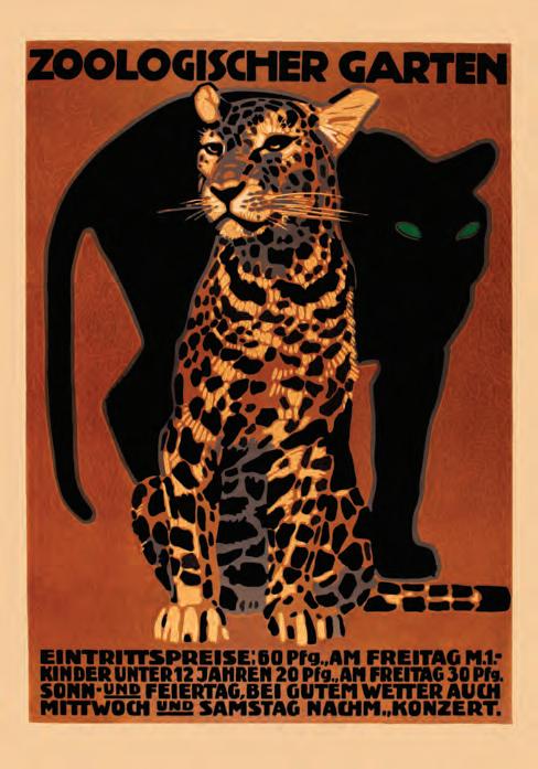


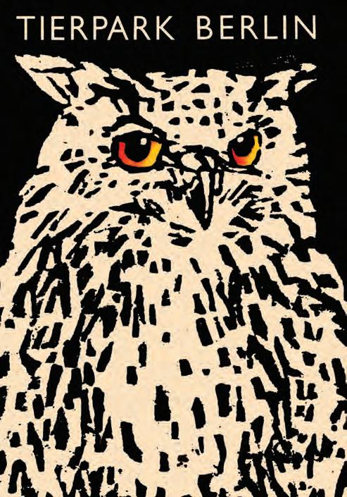


The Bauhaus Art into Industry
Bauhaus was a design, architecture, and applied arts school in Germany in the early 1900s. It is possibly the most influential modern art school of the 20th century. It was a relatively short-lived institution based in Weimar from 1919 to 1925, Dessau from 1926 to 1932, and Berlin for a few months before the Nazis shut it down in 1933.
The school was founded by pioneering architect Walter Gropius. He combined the Weimar School of Arts and Crafts with the Weimar Academy of Arts to create Bauhaus. Gropius’ vision for Bauhaus was to create an alliance between art and technical craftsmanship by hosting workshops that demonstrated various art forms and craftsmanship and how they could be applied to each other.
This sentiment was not new. As we saw earlier with The Arts and Crafts movement and the belief that industrialisation had abandoned both quality and unique, individual style in favour of cheap and quick production. To combat this, they sought to combine artistic design with high-quality handicrafts while maintaining their functional purpose.
Morris believed in art for art’s sake and asserted that everyday objects could and should be beautiful. While agreeing with bridging the gap between art and craftsmanship, Bauhaus disagreed with Morris’ fixation on beautiful things created by individual artists. Art, Gropius believed, should serve a social role as well as an aesthetic one.
Bauhaus was forward-thinking. They knew machine production was the way of the future, a future that should reflect the modernisation of society after the horrors of World War 1, and that they could commandeer it into mass-producing beautiful yet functional objects for people on a larger, more affordable scale. It was time to move from Expressionism to objectivity. The Machine Age was an opportunity, not a curse.
Bauhaus was a unique institution. It respected woodwork, metalwork, stained glass, typography, textiles, and furniture design just as much as fine art, oil and watercolour painting, and sketches.
 Klee & Kandinsky Set of 2
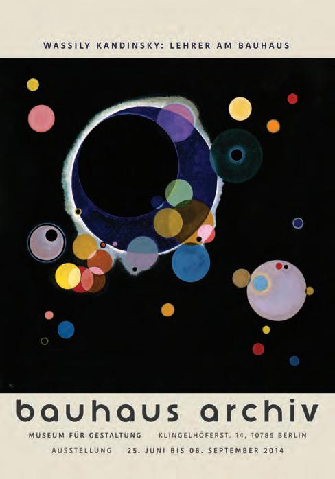
In the school’s early days, Gropius wrote: “We must not start with mediocrity. It is our duty to enlist powerful, famous personalities wherever possible, even if we do not yet fully understand them”. So, to execute his vision, Gropius invited many influential avant-garde artists and craftsmen to teach at Bauhaus. These “masters” – Bauhaus did not use the word “teachers” – included choreographer Oskar Schlemmerand, Hungarian multimedia artist László Moholy-Nagy, and Expressionist painter Lyonel Feininger, and the innovators of abstract art, Paul Klee and Wassily Kandinsky.
The school attracted extraordinary students too. For centuries, art students had to attend prestigious neo-classical academies where art was about historical representation, and most students were highly-educated young men from wellto-do families. The students at Bauhaus, however, were keen to abandon tradition. Their ages varied from seventeen to their mid-40s (the school attracted numerous war veterans). Their social and educational backgrounds were mixed; one-third of the students were women, including industrial designer Marianne Brandt and textile artist Anni Albers, both of whom would become masters.
A vital characteristic of the masters’ teaching was their preoccupation with theoretical and intellectual approaches to the study of art. Their emphasis on problemsolving and experimentation conceptualised art as a subject that could be approached scientifically, thus granting it more respect. The workshops were usually taught by two masters – an artist and an expert craftsman – so theory and technical processes were equally important.

Students at Bauhaus were required to take a variety of workshops which Gropius had visualised as a wheel of concentric rings. The outer ring was the six-month preliminary basic course, the vorkurs, introduced by Swiss artist Johannes Itten. Before advancing to more specific workshops, students first had to understand the fundamental aspects of art and design, including colour theory and materials. When they progressed to specialised workshops, students were taught to see practical objects such as furniture and light fixtures worthy of an artistic approach. “Truth to materials” was one of their central beliefs, so ornamentation and the disguising of supporting materials like metal were discouraged, while the clean, honest simplicity of modernity was welcomed. Bauhaus’s textile and metalworking workshops were exceedingly popular. The textile artists created abstract designs that decorated the building. The metalworkers successfully developed models for items such as tableware and lighting fixtures for mass production, many of which were used in and around the building.
The designs often featured geometric designs with clean lines, abstract shapes, balanced forms, and no more decoration than was necessary. Their aesthetic was brutal but elegant. Paintings, especially those taught by Kandinsky and Klee, frequently included flat planes with overlapping shapes to create an abstract dimensionality. Bauhaus typography was visually clarifying and was approached as a pragmatic form of communication; their style influenced modern corporate and industry advertising. Furniture and architecture tended to have rectangular or curved features, and much of Bauhaus’s furniture incorporated modern-looking chrome metal. Once their style was established, the school embraced the motto “art into industry”.
Heitere Gebirgslandschaft (Joyful Mountain


Expressing Existence The Rise of Expressionism
The Expressionist art movement began in the late 19th century and lasted until the mid-1920s. With roots in Impressionism and Post-Impressionism, Expressionism abandoned realistic, historically accurate art in favour of exaggerated, dark, and distorted realities. It sought to evoke feelings and moods rather than represent physical reality.
Drawing on Romanticism, it emphasised artists’ subjective ideas and experiences of intense, psychological emotions. Expressionist art encapsulated the era’s anxieties by tapping into spiritual and existential concerns.
The late 19th century was a period of tremendous change. New technology and industrial urbanisation had transformed cities and the lives of working-class people, and not for the better. Many lived in abject poverty and died young because they were subjected to dangerous and dehumanising work by companies favouring production over human life. The crime was rampant, and mental health issues were at an all-time high. Spirituality was in decline, as were feelings of authentic existence and experiences.
An existential dread hung over the world; people were anxious about humanity’s changing relationship with the world and themselves. Artists who positively dealt with this existentialism were known as Impressionists. Artists who embraced this movement, which lasted approximately from the 1860s to the 1880s, moved away from traditional art to bright and coloured work designed to highlight the natural beauty of the world and the spiritual connection they felt with and their yearning to return to it. These artists looked outwards.
However, as industrialisation and urbanisation increased, artists felt increasingly detached from their physical surroundings and were wracked with psychological turmoil. Many were depressed, anxious, and stressed. These artists, Post-Impressionists, would lay the groundwork for Expressionism.
Artists like Edvard Munch embraced the darker aspects of art by using it to infuse their thoughts and feelings into their work. They embraced thick, swirling brushstrokes, contrasting colours, and alienated subjects to explore dark themes like isolation, madness, depression, grief, and existentialism. These artists looked inward. The introspective and raw emotive style of artists like Munch paved the way for Expressionism.
While Expressionism encompasses numerous artists and styles, its origins lie predominantly in early 20th-century Germany. In the city of Dresden in 1905, a group of German students - Ernst Ludwig Kirchner, Fritz Bleyl, Karl Schmidt-Rottluff, and Erich Heckel - formed the group Die Brücke (The Bridge). These men were architecture students who wished to become painters. They wanted to break away from neo-classicism and sought to convey raw emotions instead.
They did not, however, refer to themselves as Expressionists. The term did not come into the public consciousness until Czech art historian Antonin Matejcek used it to describe work he considered the opposite of Impressionism. The result of these groups is characterised by evocative, dark, and unnatural colour pigments that conveyed the artists’ inner emotions.
They applied exaggerated, jagged (often violent), and distorted brush strokes to depict less-than-socially-acceptable subjects such as nightclubbers, dancers, prostitutes, and the city’s lower working class. Their actual paint application is also free and heavily textured to evoke powerful emotions. Their canvases were infused with highly charged angst.
Their work emphasised the grotesque horror of humanity’s growing alienation towards themselves and their fellow human beings thanks to industrialisation. Contemporary urbanisation was conveyed through art that evoked intense feelings of violence and disgust. Modern life was not something to embrace, Expressionists suggested; it was something to be feared.
Expressionism was reignited in the United States in the 1940s and 1950s with the creation of the avant-garde Abstract Expressionism. This movement utilised bright colours and spontaneous brush strokes to convey the intense emotions and ideas of the artists. One of the most famous Abstract Expressionist artists is Jackson Pollock. By the late 1970s, Neo-Expressionism had emerged in response to minimalist and conceptualist art. Drawing on their German predecessors, these artists represented subjects in visceral, evocative, and intense ways through free-flowing and heavily textured brush strokes.

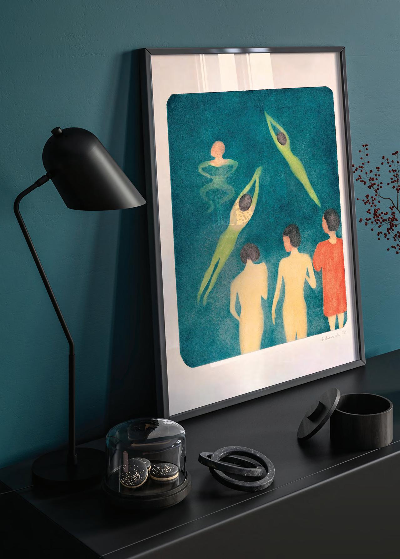


 Dancer Egon Schiele SCH013
The Scream Edvard Munch EMC019


Kind Words & Happy People A Selection of favourite reviews
EXCELLENT QUALITY
Excellent Quality! The print I chose, was the vintage peacock, very fine print. Also I was very pleased to being gifted an A2 print, which was also in a great quality and even more noticeable a print that matched in style my order. So it was not just some poster they threw ontop of the order, it was chosen with thought! I’m very happy and will recommend to my friends and family :) thanks a lot! — Tim, Germany
AMAZING QUALITY
Amazing quality, reasonably priced, and amazing service. Wouldn’t hesitate to order from again — Lacey Cooper, UK
HAPPY CUSTOMER
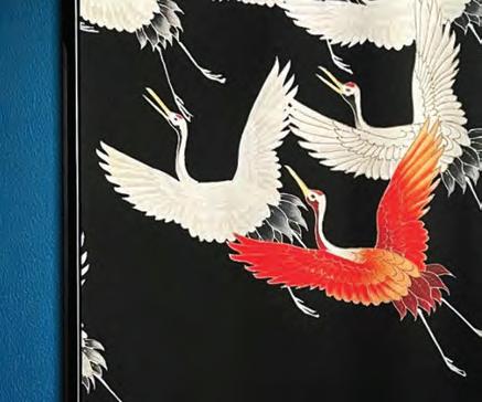
Got my print today, great quality paper and as described! Lovely of Kuriosis to send freebies with my order :) would highly recommend! — Sinead Martin, UK
BEAUTIFUL PRINTS
Beautiful, excellent quality prints, great packaging with a minimum of plastic and fast delivery from Germany to Ireland. Also, brilliant customer service. Would highly recommend and will use again. — Maureen McIlroy, Ireland
LOVE THEM, AMAZING QUALITY
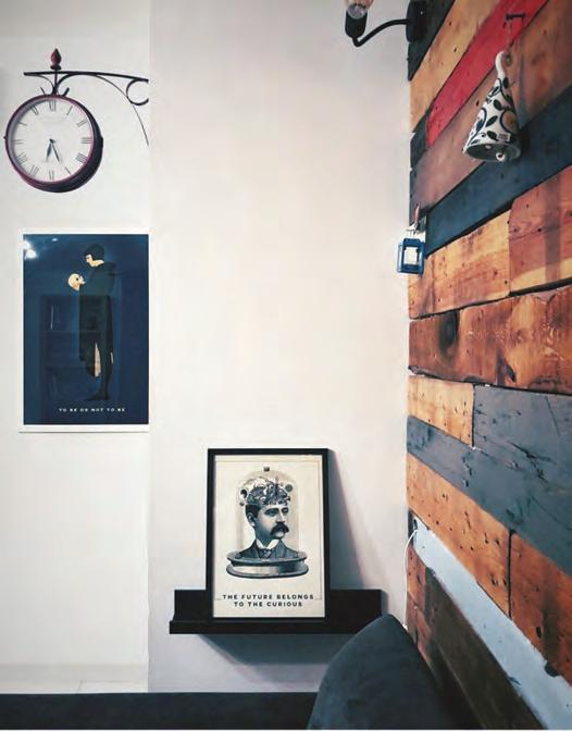
The posters are high quality on a great paper, a bit thick so it feels very durable. It also looks like it’s an original old piece of art, I had to touch the print to see if it’s printed or not. The posters are very beautiful and they also send an extra poster as a gift and some really cool holographic stickers. I recommend Kuriosis 110% and will definitely buy again. I always feel excited when I look at the posters — Marina Beldiman, Romania
SUPERB PAPER & PRINTING
I bought a large poster of The Titanic’s blueprint for my partner for Christmas. It arrived on time was incredibly well wrapped. The actual poster was wrapped in tissue paper with a beautiful sticker so I left it as it came for my partner to unwrap - they were blown away with it ! Superb paper and printing quality. Customer services are excellent too I would highly recommend using Kuriosis — Dawn Tudor, UK
BEAUTIFUL PRINTS
My prints arrived today, they are beautiful and exactly what I was hoping for. The company included a couple of freebies in the package, and when I got in touch with them about my order, they were so punctual and helpful. Easy 5 stars.
—Oliver Campbell, UKEVERYTHING WAS GREAT
Everything was great, arrived on time, good quality, even got some extra bonus stickers — Maria Melinder, Sweden
EXCELLENT QUALITY PRINTS
The prints from Kuriosis were excellent quality with very high resolution. They were well packaged (without loads of plastic) so arrived in perfect condition coming from Germany to Ireland. We also appreciated the small free print that came along as a gift - which matched what we ordered perfectly. Strongly recommend them. This is the second time we have ordered from them and will do so again — Susan Walsh, Ireland
SUPERB QUALITY
Ordered some prints from Kuriosis and after placing my order I saw a better deal. 3 for 2 on a set of William Morris prints. So quickly emailed and ask could I cancel my order and reorder the better deal. All was done smoothly I was immediately refunded my money and new order arrived promptly. The quality of the prints are superb. The paper there printed on is really good quality. I even received a free print. I’ve since ordered more prints and will definitely be ordering again soon and I would recommend Kuriosis to anyone looking for high quality prints. They have such a wide range of products to suit any bodies taste. — Vivienne McBride, UK
EXCELLENT!!
We placed an order from Greece. Our order came on time, excellent packaging , excellent product quality ,inside the package there was a gift for us , as a thank you and some chocolate candies!! Excellent professionals ! — Nektarios Angourakis, Greece











I LOVE KURIOSIS
They have very high quality canvas prints. I keep going back. Fantastic quality at a good price. Swift delivery and a super customer service!!! Everyone who has seen my prints ask me where they have come from-I have no problem recommending them. They also regularly do discounts on their webpage making it very worth while — Deirdre, Ireland
I LOVE MY PRINTS!
So pleased with my prints which are of a very good quality, the packaging was professional and they didn’t take long to arrive! Big thanks and well done, already recommmended you as well!
— Dorianne Mallia, MaltaBEAUTIFUL!
Their service was absolutely BEAUTIFUL! The posters are amazing and the quality of the paper and print work is stunning! I wish all my walls at home were empty so I could cover them up with prints from this store. Thank you!
— Luiz Gustavo Fernandes Dourador, UK100% SATISFIED
I couldn’t be more satisfied with Kuriosis. From the quick response (even on the weekend) to my questions to the advice I received and, of course, the quality of the products is unbeatable. And what a nice surprise to find little gifts in my order! Absolutely 100% recommended. Excellent customer service and product quality like no other. — Jorge Bonetto, Netherlands
QUALITY POSTERS
The quality of the posters recieved from Kurious were absolutely stunning. Simply beautiful. I ordered a Bauhaus poster and it really bought my living room area to life, as I has envisioned. It’s very clear that Kurious are passionate about what they do. Such lovely touches and thoughtful gestures too in how the packages are recieved by customers. Highly recommend Kurious. I will be buying again. — Emma Brown, UK
FRIENDLY & CAREFUL
Quick. Friendly. Really careful with your needs.
— Issabel Gallardo,Germany
SUPER QUALITY!
Very good service. Quick delivery, top quality of the prints! My home looks so much better now — Anni Arro, Estonia
GO-TO PLACE FOR ARTWORK
Kuriosis are my go-to place for artwork because of the fantastic quality of the prints, the wide range of pieces to choose from and the quick and efficient service to the UK.
— Mrs B Meeuws, UKEXCEPTIONAL EXPERIENCE
My experience with Kuriosis.com was exceptional, greatfull, and the pictures were what I han asked for, lovely. No doubt, the next time, that I want another paintings I’ll ask for it. Thanks — María José, Spain
SUPERB RANGE OF PRINTS
Superb range of prints, Very well run company. Extensive range of well designed posters and prints. I purchased the Nina Simone print in A1 size and everyone who sees it comments on it, it looks great. Very quick shipping, trouble free transaction, I’ll definitely be returning to Kuriosis just as soon as I can dedicate more wallspace. — Paul
Donaghy, UKTHANK YOU!
Thank you very much Kuriosis now! I found this poster at a reasonnable price and it highlights the right side of my bedroom today :-) I really apreciated how fast I received my article and the care and attention you put in it. I got it in a solid tube so that it stayed perfectly protected. Again, thank you very much and see you next time for another order! — Fabrica Deva,
FranceStockists — Now in over 40 stores!
AUSTRIA
Rahmenwerkstatt Thomas Eder
Döblinger Hauptstraße 43, 1190 Wien bilderrahmen-werkstatt.at @rahmenwerkstatt.thomas.eder
DENMARK
Goods And Wood
Gl. Kongevej 147 - 1850 frederiksberg goodsandwood.dk @goodsandwood
Mio Mio Vintage
Tåningvej 35, 8660 Skanderborg miomiovintage.dk @miomio_vintage
Møbelhuset
Vestergade 35-39, 6270 Tønder mobelhuset2.dk @mobelhuset2
Swanhouse Aps
Vodroffsvej 2A, 1900 Frederiksberg
FRANCE
Ana Tom Concept Store
7 rue Taison 57000 Metz @ana.tom.sallyjane
Blue Corner
8 rue Saint-Laurent, 14000 Caen blue-corner.com @blue_corner_caen
Bobazar
8 rue Saint-Laurent, 14000 Caen bobazar.fr @bobazar.inspiration
Boutique Benedict
23 Avenue Notre Dame des Passes, 33120 Arcachon
Nomad Concept Store
85 rue de la scellerie 37000, tours boutique-nomad.fr @nomad_conceptstore
Les P'tits Papiers
2 place Félix Fournier, 44000 Nantes papeterie-lesptitspapiers.com @lesptitspapiersnantes
Maison Madeleine
7 rue de Ferrare, 77300 Fontainebleau facebook.com/maison-madeleine
Sarl Boogalou Shop
7 Rue du Consulat, 87 000 Limoges facebook.com/boogaloushoplimoges/ @boogaloushoplimoges
Sas Hous'talet
25 Rue Neuve, 12000 Rodez, Frankreich houstalet.com @houstalet
Sarl Sally et Jane
14 Rue Taison, 57000 Metz, France @ohsallyjane
PORTUGAL
Perry Sampaio R. Campo Alegre 713 4150-179 PORTO perrysampaio.com @ perrysampaio
GERMANY
Auchschön
Silhöferstrasse 11, D-35578 Altstadt Wetzlar auchschoen.shop
Cosita Bonita
Collegiumsgasse 6, 72070 Tübingen cositabonita.de @cosita_bonita_mexico
Adina Hotels
Harkortstraße 10, 40210 Düsseldorf @ adinahotelseurope adinahotels.com
COSI Hospitatily gmbh
Jägerstraße 71, 10117 Berlin numastays.com
Cosita Bonita
Brüsseler Str. 45, 50674 Köln cositabonita.de
@cosita_bonita_mexico
Raumglück
Hauptbahnhof Kakenstorf, Unter den Eichen 1, 21255 Kakenstorf
Sammelwerk
Alte Dorfstr. 1 39179, Barleben, Sachsen-Anhalt sammelwerk.gmbh
Designers House GmbH
Herbartstraße 1, 26122 Oldenburg designers-house.de
ITALY
Nap Atelier Viale Piave 19, 20129 - Milano napatelier.com
@napatelier
Nave Cervo
Via Volturno 4, 63074, San Benedetto del Tronto navecervolibreria.it
@navecervolibreria
Crippacampeggio
Via del Dosso, 9, 20841 Carate Brianza crippacampeggio.it
Treedom
Viale Augusto Righi, 66, 50137 Florence treedom.net
@treedom_trees
LITHUANIA
Dosva Decor
Malūno g. 6 – 17C, 00126 Palanga dosvadecor.com
BELGIUM
Creme Fresh Comm
Gerardus Stijnenlaan 5 b2180 Ekeren / Antwerp. cremefresh.be @cremefresh.be
Pascale Bonfond
Rue de l’Hôtel de Ville 36, 4900 Spa.w
Maduro Frederiksborggade 39 1360 København K. maduro.dk
@ maduroshop
IRELAND
Press Up Hospitality Group pressup.ie @pressupgroup
SWITZERLAND
Hokta Design hokta.ch
HUNGARY
Müller Monika Enterior Budapest, Paulay Ede u. 10, 1061 mullermonika.hu
Monika Buella Architecht
HUNGARY
Pestemal
Adrianou 100, Plaka-Athens 10556 pestemal.gr @pestemalgr
POLAND
Woodland Warsaw ul. Dolna 21b/3 00-773 Warszawa inugo.pl @ inugo_pl
SPAIN
Eikyô Influencias Japonesas 13, local 3 · 08028, BARCELONA eikyo.es @revista_eikyo
Nest-Boutique
Plaza San Ildefonso 3, Local Derecha 28004 Madrid | Spain nest-boutique @nestboutiquemadrid
Art Gaudi
Calle de la Tapineria, 10. 08002 Barcelona artgaudi.com @artgaudi
DENMARK
Mio Mio Vintage Tåningvej 35, 8660 Skanderborg @miomio_vintage miomiovintage.dk
MØbelhuset Østergade 29, 6270 Tønder, Denmark
Swanhouse APS
Norddyssen 76A 1441, København K, Hovedstaden
Goods & Wood Gl. Kongevej 147, 1850 Frederiksberg goodsandwood.dk @goodsandwood
TURKEY
Sauca collection
M.K Atatürk Caddesi No:186/13, Eskişehir saucacollection.com
@saucacollection
UNITED KINGDOM
Free mile style freemilestyle.com
@freemilestyle
The Furniture Recycling Shop 1a Station Road, Bourne End, Buckinghamshire, SL8 5QE furniturerecyclingshop.co.uk
@furniturerecyclingshop
Porteous & Co
297 Byres Rd, Hillhead, Glasgow G12 porteousandco.co.uk
@porteousandco
The Saltburn Framing Company 7, Station Buildings, Station Square, Saltburn-by-the-Sea TS12 1AQ fb/saltburnframing
@saltburnframing
Vintage Frog
56 Station Road, Gomshall, Surrey, GU5 9LB. vintagefrog.co.uk
@vintagefrogsurrey
Interested in Wholesale?
If you are a store owner, architect, interior designer, or in the home decor field and would like to stock our motifs or have an exciting idea for a collaboration — we look forward to hearing from you. Get in touch easily by emailing us at info@kuriosis.com
We would like to take a moment to give special thanks to everyone who has contributed to our business over the last four years. A huge thank you to all of our wonderful customers and of course to all of our hard-working staff, past and present — None of this would have been possible without your hard work and dedication. Thank you to all the photographers, collaborators, stores, museums and artists featured in this magazine.
SPECIAL MENTION & FEATURED ARTISTS
MARYLENE MADOU
Artist
marylenemadou.com @marylenemadou
JULIA CHARLOTT
Artist juliacharlott.com @marylenemadou
JULIE MIAMMMIAM
Artist miammmiam.com @miam_m_miam
FLORENT BODART
Artist florentbodart.com @ florentbodart
JÉRÔME SINOQUET Artist @jeromequestionart
SOFIA DOUDINE Artist sofiadoudine.com @sofiadoudine
HENRI HU Artist henryhhu.com
ANDREW NEDZVEDSKY Artist @ hellmarkstudio
JOSEPH HELLER Artist @josephmheller
A Note of Thanks Contact Information
MAX POWER Photographer maxpower.photo @maxpowerphoto
NICO TRACEY Designer nicotracey.com @nicotracey
JOÃO PAGLIONE Photographer fotogravia.com
ANDREA HAASE Artist andrea-haase.de @andrea_haase
Please find below our contact information for both private & business customers. Please don’t hesitat to get in touch if you have any questions about any of our products.
ATELIER Sonnenallee 90, 12045 Berlin, Germany
+49 30 2977 9479
WEB & SOCIAL kuriosis.com / @kuriosiscom kuriosisxxl.com kuriosis.trade


