
por t fo l i o lauren fordyce // 2022
3 THE BACKSTREET...........................4-13 PARCO DEL TORRIONE...................14-25 PRENESTINO PRISMA.......................................26-37 THE FASHION SHOW......................38-41 BLOCK EFFECT..............................42-45 CONTENTS
THE BACKSTREET
SPRING 2019 -- ARCH302
PROFESSOR -- ANDREW GLEESON
PARTNER -- JAYA TOLEFREE
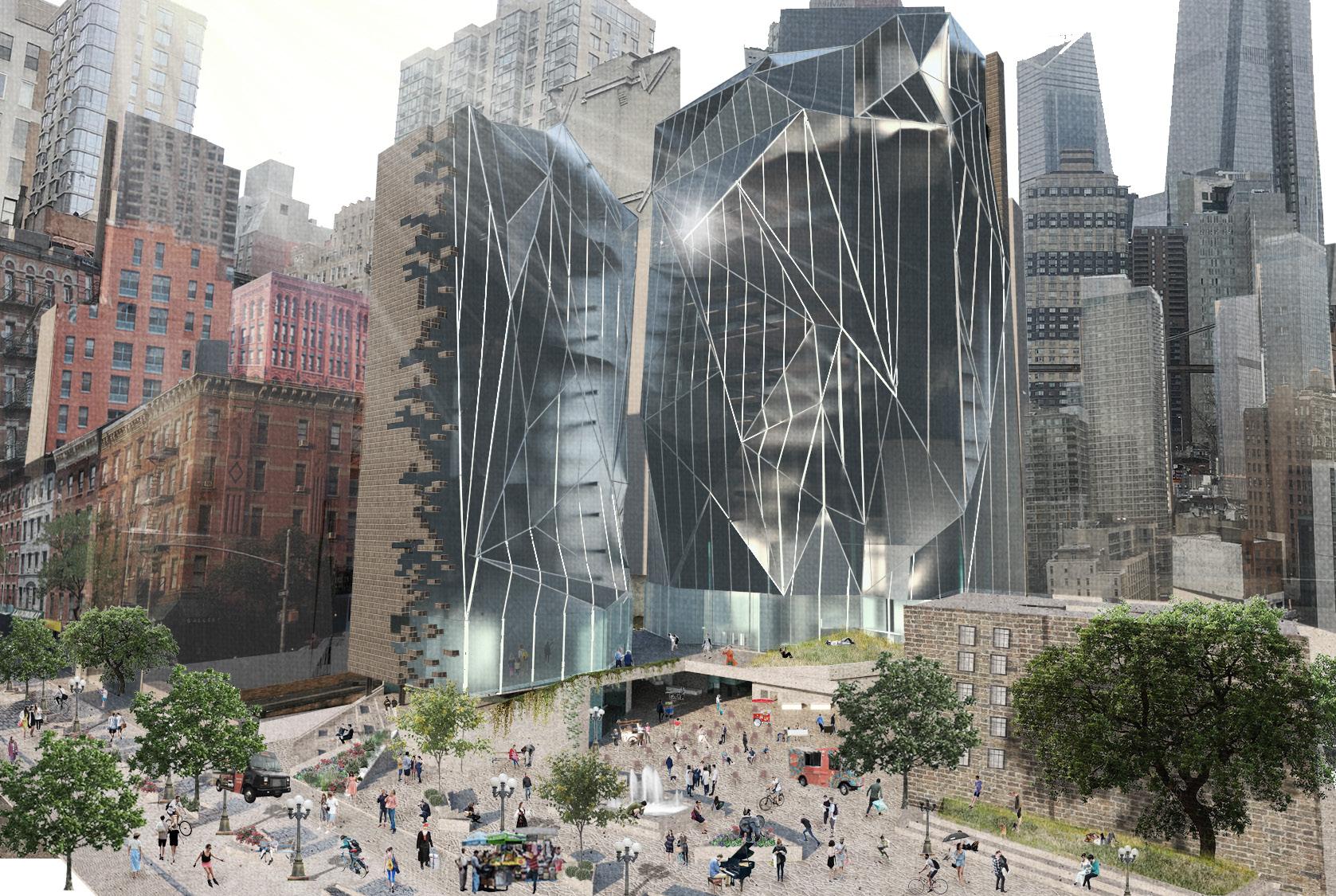
As Hell’s Kitchen becomes disrupted by the rapid uprising of Hudson Yards, culture and sociability is being driven out and replaced by deteriorating industry and unwelcoming conditions. The Backstreet is a solution to bring back the importance of the pedestrian and the neighborhood. Targeted toward youth and vibrancy, it resists the unsettling, corporate culture that Hudson Yards has coerced into the community.
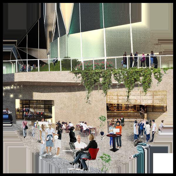
Small pop-up shops and food trucks sprinkle the plaza, street, and indoor market to allow for a laid-back shopping trip or casual meal in the neighborhood. Trendy restaurants attract visitors to the site while existing local businesses are supported through the growth of the community as well. Extensive green space and plazas promote residents to spend time outdoors and with their neighbors; local bands and bohemian entertainers have the opportunity to perform in the adaptable venue.

5
The form resembles a cracked geode: from the outside it speaks the language of Hell’s Kitchen, but as the inside opens into the site it exhibits a monumental facade as a representation of the revitalization of the neighborhood.
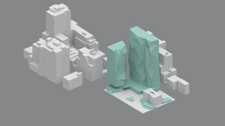
existing flow proposed flow


By introducing new traffic flows, this allows relief to the congestion of the city while also creating a refuge on 37th Street to become a full pedestrian block. United with this block is the site; built over


Programming

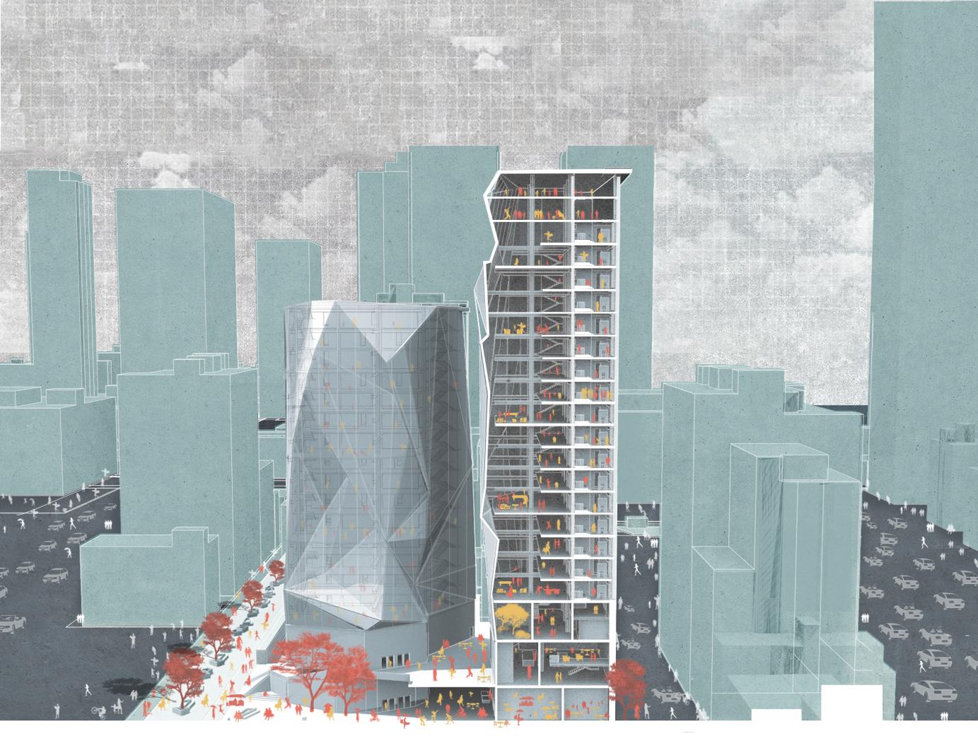
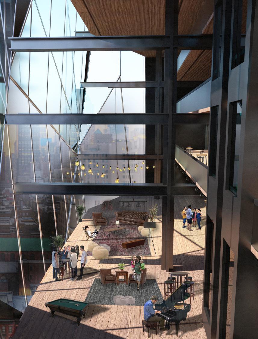
The two towers offer residents to live in a bustling neighborhood with endless amenities; moving up the two towers, space transforms into smaller communities while still exerting privacy as the units face outwards from the site.

6
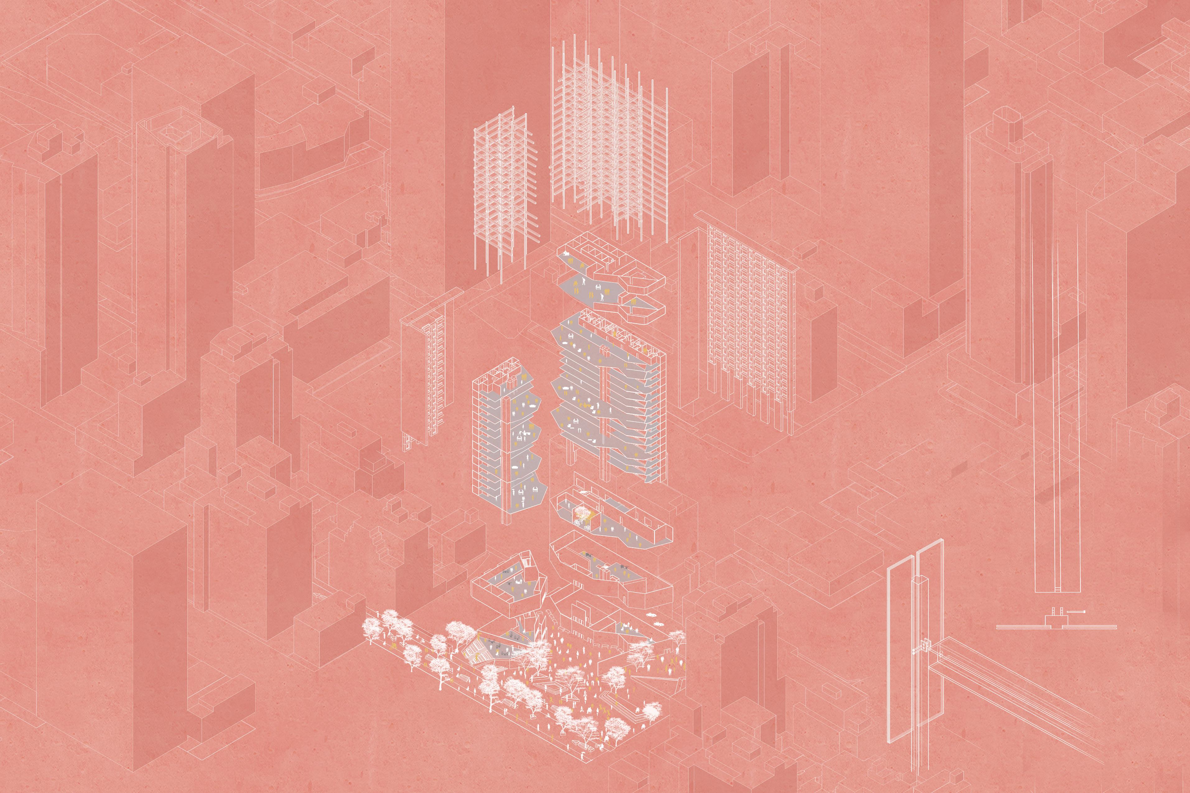
Form Derivation Form Circulation
Relocated Traffic Proposal circulation community space lobby apartment units penthouse idle space restaurant fountain base: open market restaurant bar public plaza restrooms storage mechanics circulation streets

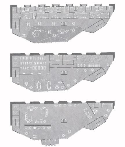
Apartment Floorplan Amenity Floorplan Lobby Floorplan
Ground Plan
The ground plan features a pedestrian street with a large central green space. This connects to the plaza, public market, cafe, and performing space.



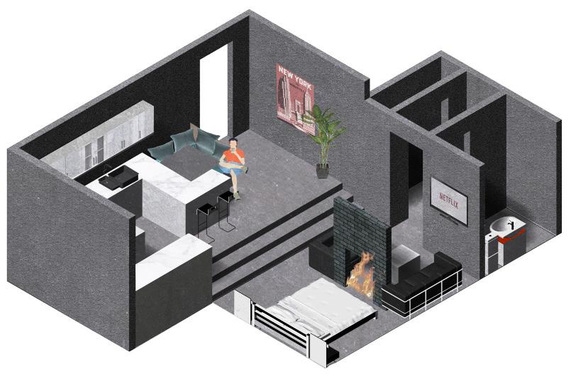
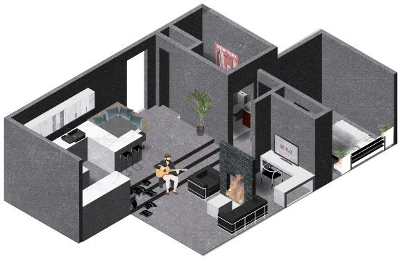
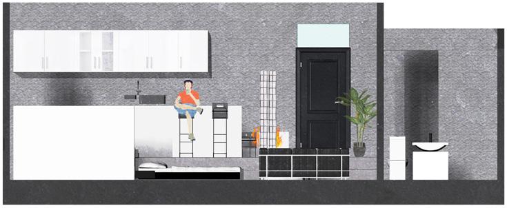

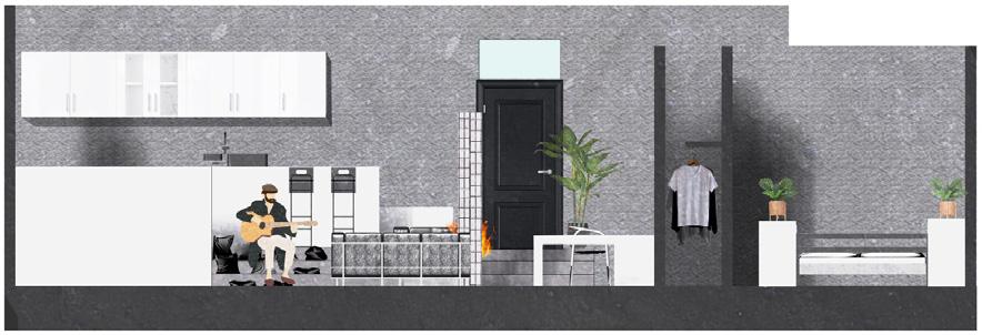


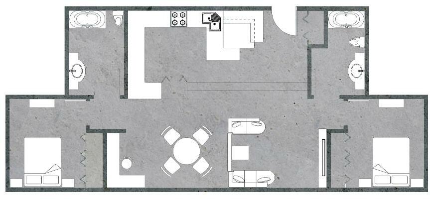
12 Studio Apartment 1 Bedroom Apartment 2 Bedroom Apartment

PARCO DEL TORRIONE PRENESTINO
SPRING 2020 -- ARCH402
PROFESSOR -- SIMONE CAPRA
PARTNERS -- JAY BORGMAN & SAMANTHA STUMPNER
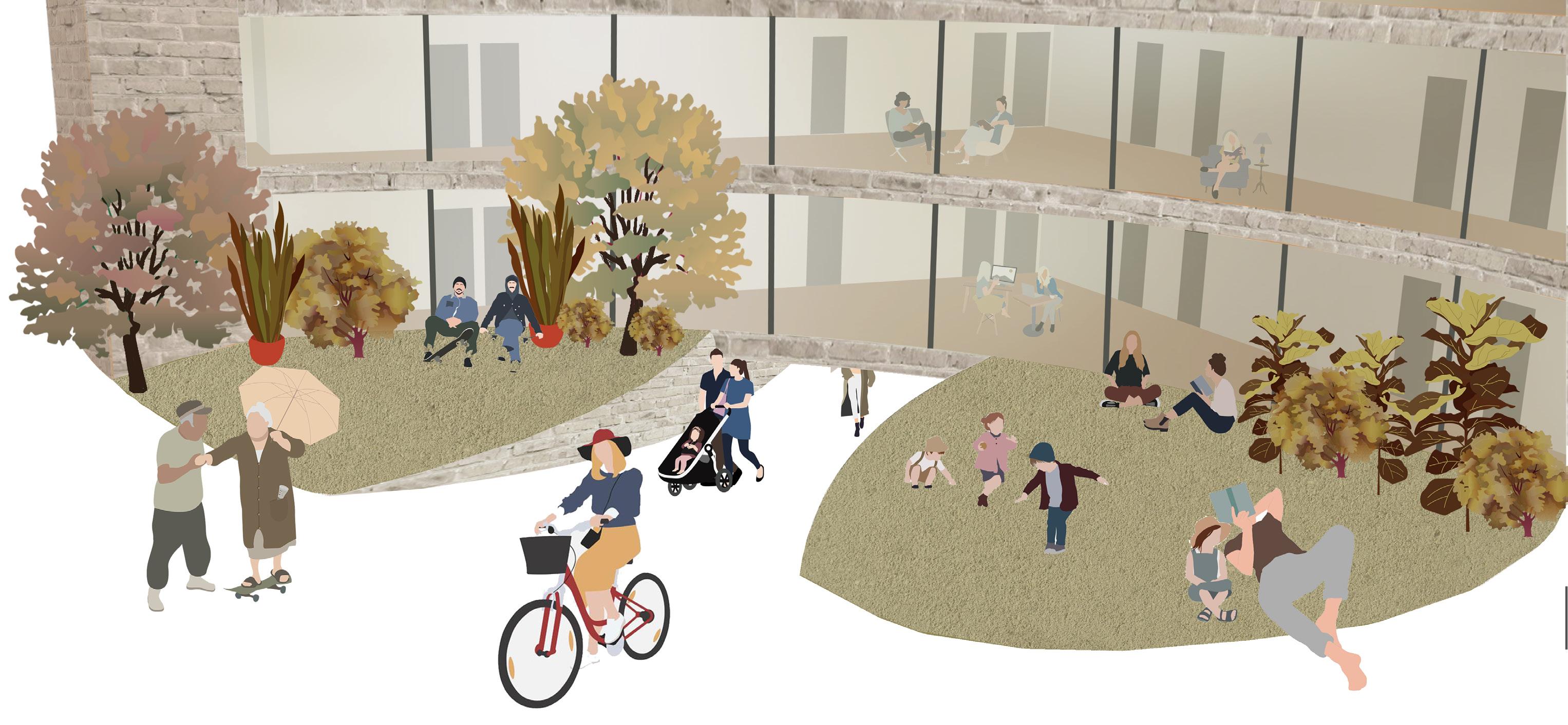
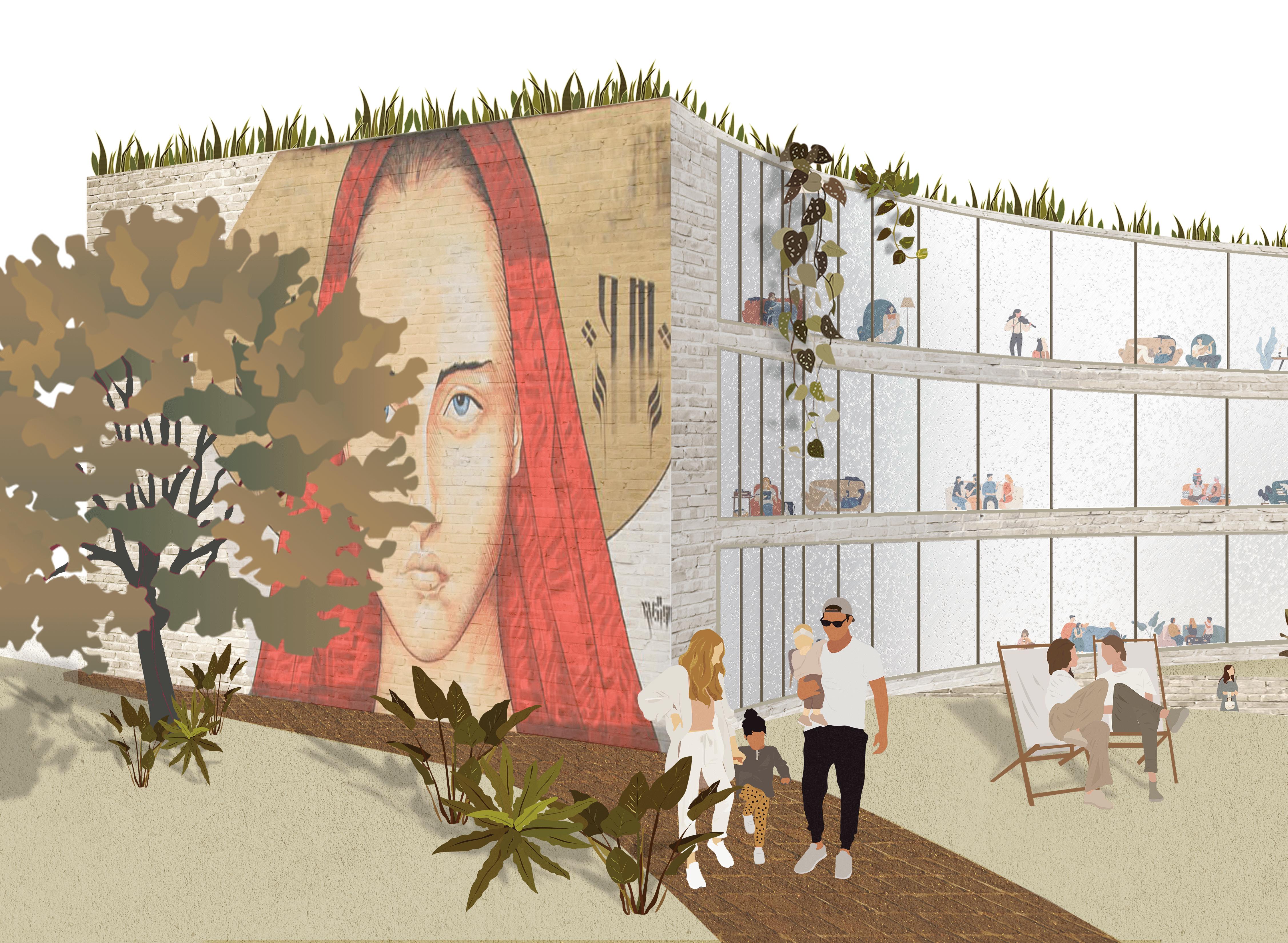
The aim of the project is to design a contemporary architecture within a multilayered site, merging together ancient history, the 20th century urban texture and the idea of urbanscape. The intention of the composition strategy is to manage the language of contemporary design in relation with the architectural grammar of the preexistence, against the idea of the site as an empty space or a Tabula rasa. The project is intended as an instrument to interpret and perform a site as well as a tool to trigger social dynamics and shape the contemporary city.
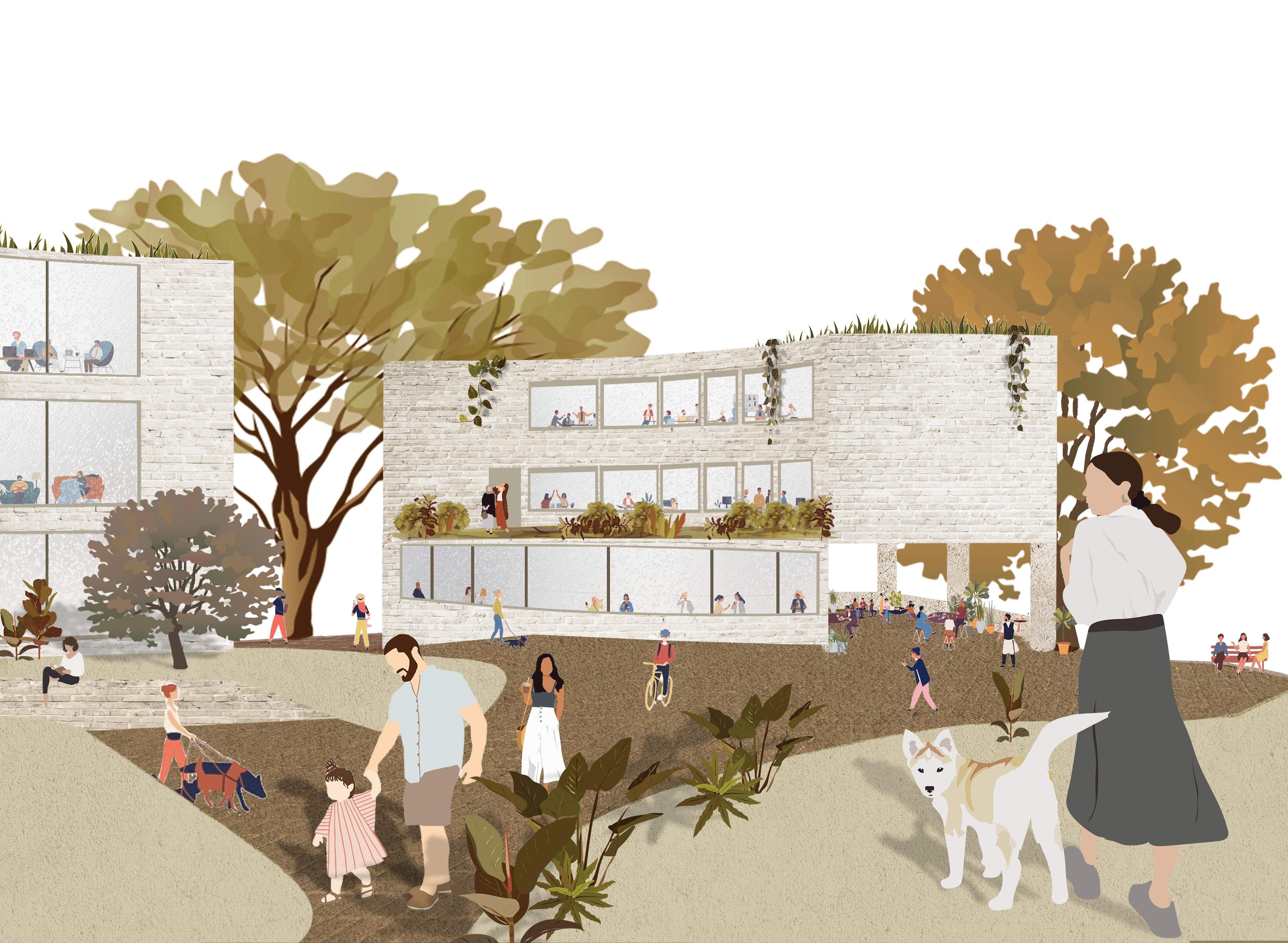
The site is in the Pigneto neighborhood, a sector of the city marked by a strong young presence, of students, young professionals, artists and craftsmen, social innovation, underground culture and association activities. We have designed a social hub: a mixed public-private facility related to the features of the neighborhood dedicated to the young people of the city.
15
Existing Site
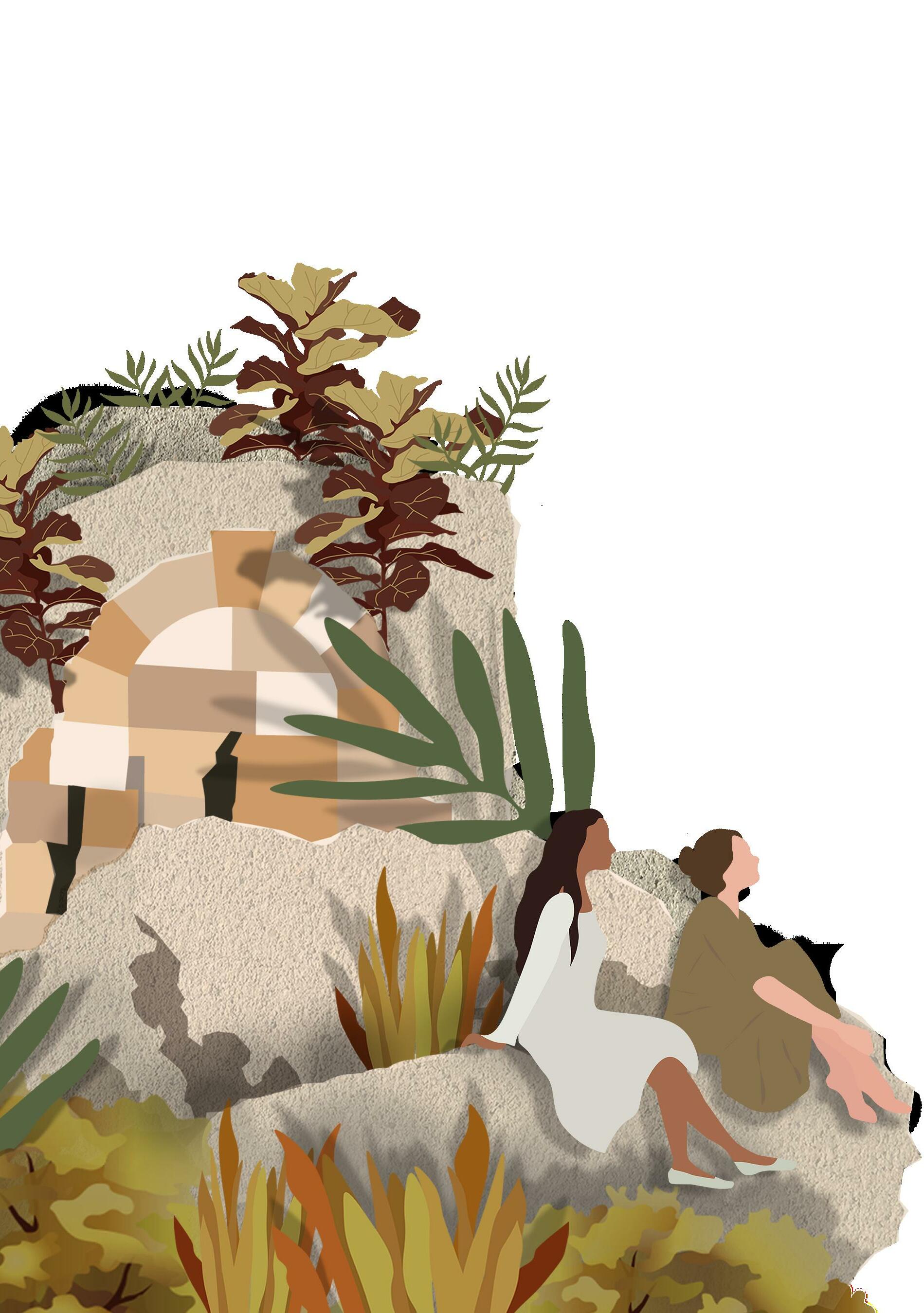
Parco Del Torrione Presentino is currently an under-utilized park that invites crime and congregates trash due to a lack of care. Visitors complain that he ruin, Torrione Presentino, is neglected in historical recognition of signage and education. Thick vegetation surrounds the site and penetrates the ruins.
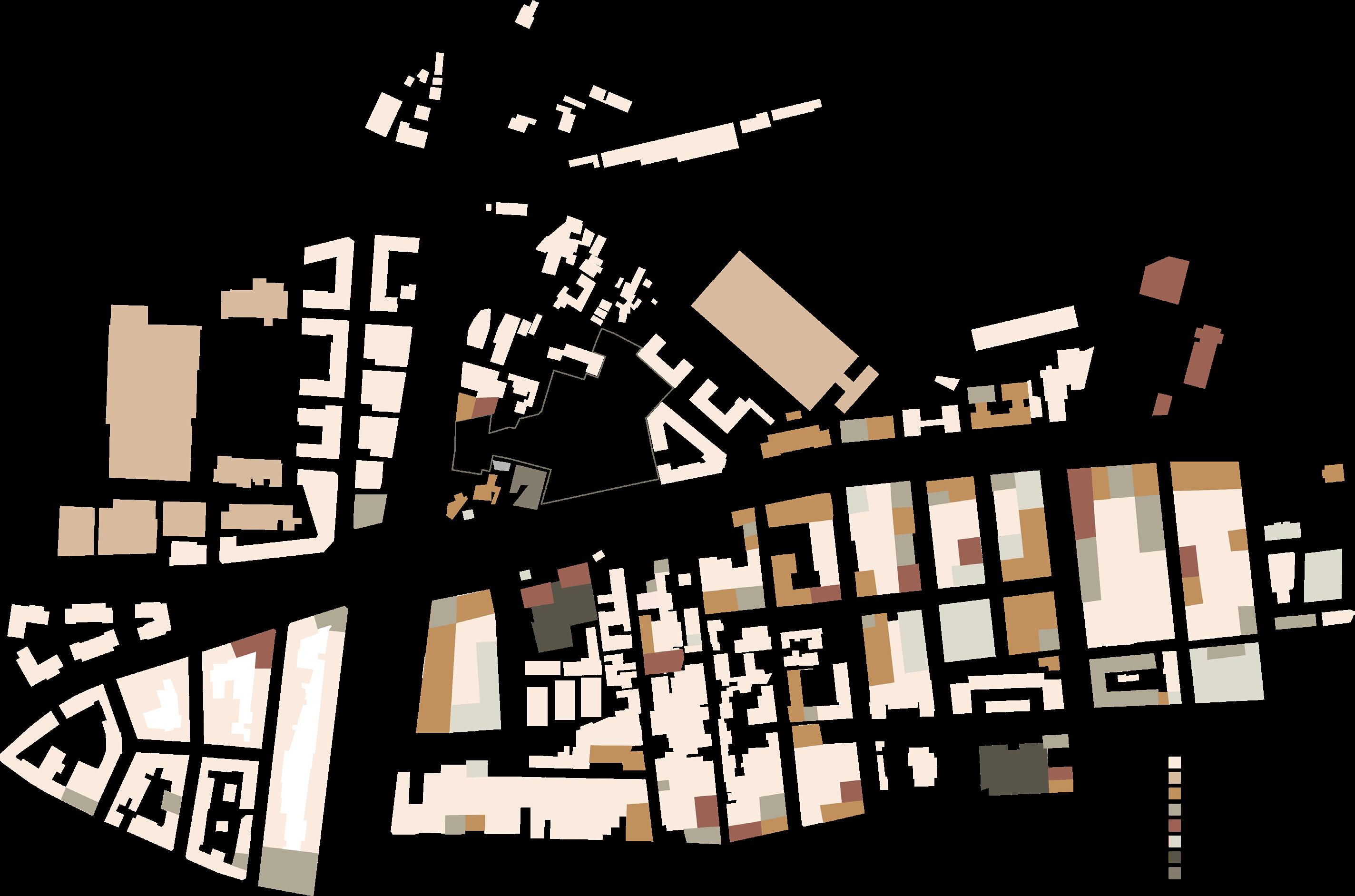
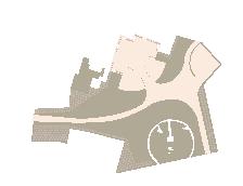
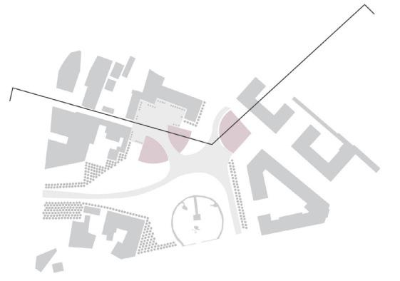
The diagram below categorizes the pre-existing building types of the area. Residential buildings dominate the surroundings.

1. Circulation
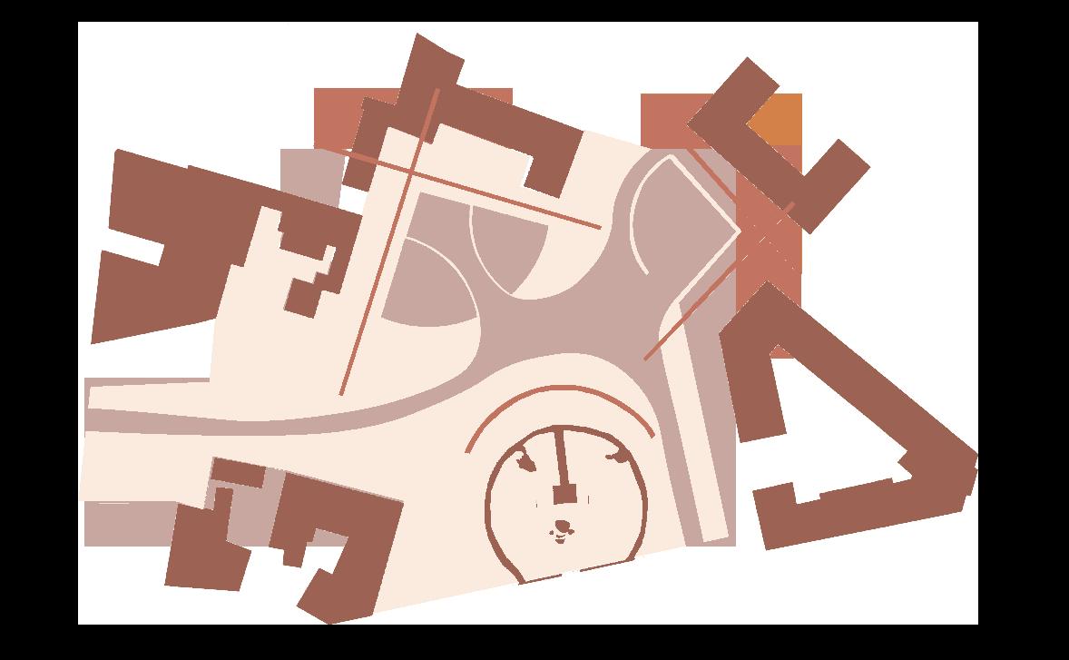
A goal in this project was to maximize accessibility to the site from all directions because of its previous isolation from the rest of the neighborhood that made it unsuccessful. Our new topography makes it an easier and more enjoyable approach to the park while also integrating the architecture and program into the circulation.
2. Green v. Built
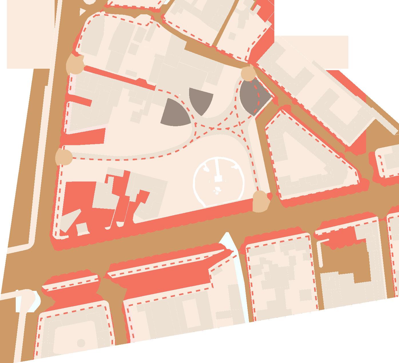
Landscaping is designed to feel natural with an abundance of green space. A flat plaza is paved between the 2 buildings to be able to host programming and be a central node. Necessary paths emerge out of the plaza in paths that are built to the natural movement of visitors throughout the space. The placement of trees and vegetation is developed in a way to use density to form both natural barriers for paths and to conceal unwanted views or buildings.
3. Responsive Form
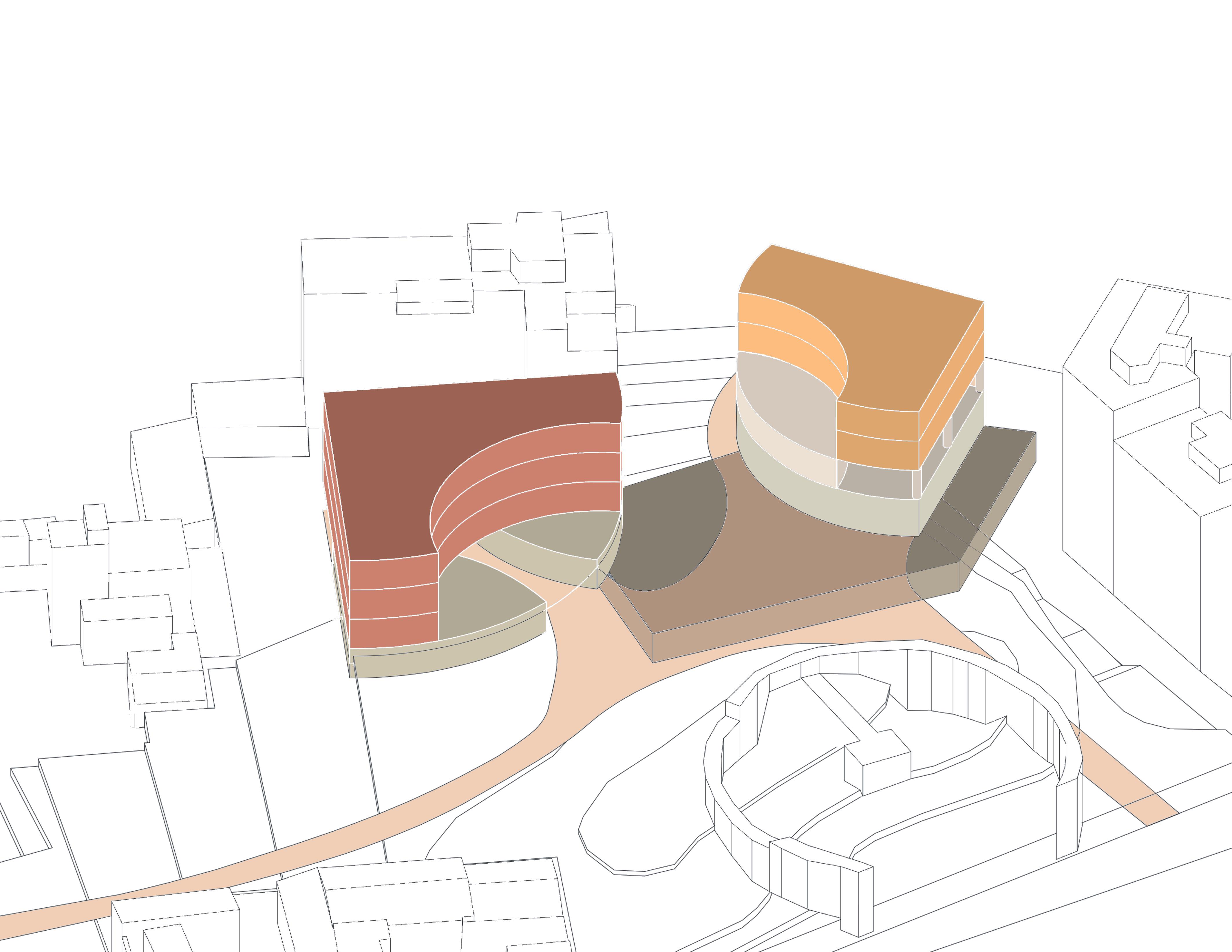
The form of the design is reactive because of its ability to respond to both the landscape and existing infrastructure. It is important to respect the pre-existing and design to these guidelines.
3.2.
1.
Programming Diagram Housing Amenity Office Food Co-working Parking
Programming
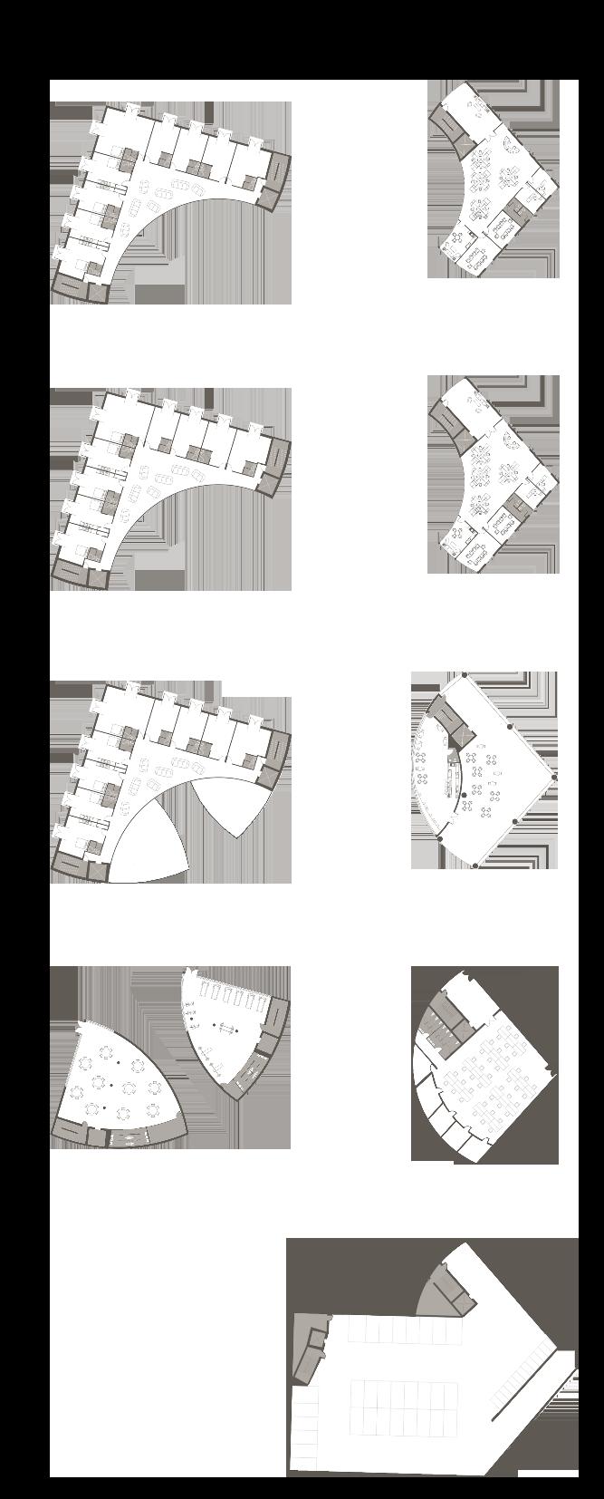
Based on the needs of the site, this determined the program of a mixed-use student housing, office space, and outdoor event space which aims at triggering a new layer of social dynamics, very much focused on public/collective spaces as reactivators and boosters of the local identity.
We firmly believe in both potentialities and responsibilities of architecture not as a tool to save or change the destiny of a city, but as a strong stimulus to enhance different ways of living by means of unique spatial qualities and feelings that only the good built environment canconvey.
Level 3 West Building - Student housing
East Building - Office space
Level 2
West Building - Student housing
East Building - Office space
Level 1

West Building - Student housing
East Building - Cafe - Public patio
Level 0
West Building - Fitness Center - Atelier
East Building - Co-working space - Atelier
Level -1
West Building East Building - Parking Garage
INSULATION
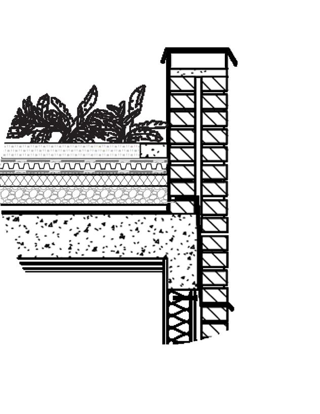
EXPANDED CLAY
CONCRETE SLAB
WALLBOARD WALLBOARD
WALLBOARD
WALLBOARD
CORROSION-RESISTANT METAL
INSULATION
WALLBOARD
CONCRETE
CONCRETE GRADE BEAM

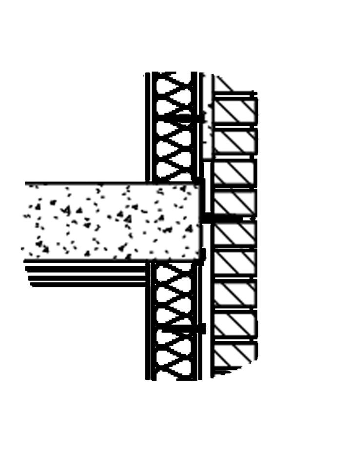
INSULATION
ZINC FLASHING WOOD BLOCK CAPPING STONE
FLASHING
BRICK VENEER
1” AIR SPACE SHEATHING
SEALANT
COMPRESSION PAD BACKER ROD & SEALANT FLASHING
BRICK VENEER
AIR SPACE SHEATHING
SHEATHING
AIR SPACE
BRICK VENEER
FULL COLLAR JOINT FLASHING
20 PERIMETER
1”
METAL STUD
CORROSION-RESISTANT METAL SCREW
1”
METAL STUD
SCREW INSULATION CONCRETE SLAB
SLAB
CORK AGGLOMERATE
DRAINAGE MAT WATERPROOFING SUBSTRATE VEGETATION PAVER 1 1 2 3 2 3


Designing for topography
1.
Terracing feature allows elevation change from street level to park level by east building
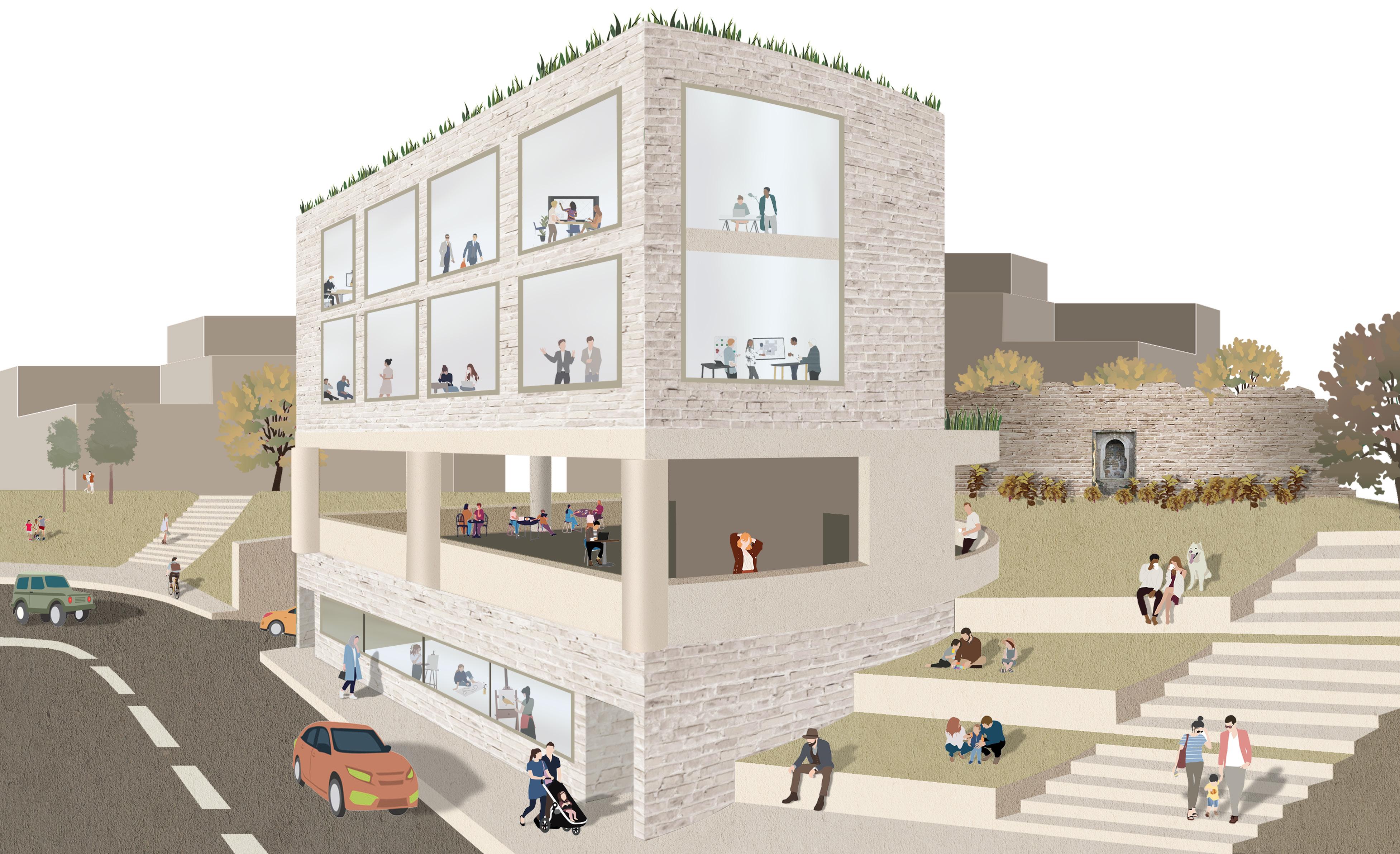
2.
Tunnel under east building allows easy access from back plaza to the higher park level

23

PRISMA
DESIGN BUILD FOR REIMAN GARDENS
SPRING 2018 -- ARCH202
PROFESSOR -- ROMAN CHIKERINETS
GROUP -- ARCH202 STUDIO
Our client, Reiman Gardens, invited our studio to take part in their Kinetic Art exhibition by using the forces of nature as inspiration for our installation.
I, along with 76 other students were to consult with Reiman Gardens to create an interactive design for their site. The project was set to open on April 13th, 2018 and we began work on January 8th to make our ideas come to life.
PRISMA introduces an interactive way to experience the gardens that all ages can enjoy.
Photo Credits: Chris Gannon
Detail Credits: PRISMA Publication
27
The Site
Our site was a 200ft by 80ft plot of land at Reiman Gardens. The site had a parabolic slope from a west facing section, and a downward sloping gradient from a north section having its highest point at the west.


The Design
The final design of PRISMA reacts to the site in its form and is a response to the natural forces that inhabit Reiman Gardens. It creates an interactive sculpture that engages all types of people. The monolithic design cretes a streamline design responsive to the site’s topography.


28
Continuous Minimal Surface

The design focuses on the use of straight lines to create undulating forms and curved modules. It is self-supporting to emphasize the hyperbolic structure and creates an illusion that it is tumbling through the site.

The rigid members of the hyperbolic form create an overall organic form while keeping in mind flexibility.

The Components
“The Primitive Hut” is a concept that explores the origins of architecture and its practice. This installation was designed to represent this fundamental concept through its representation of the 5 elements: pediment, column, wall, entableature, and furniture.
The installation explored how these elements can be transformed into the modern world.
Frame
Hammock
Cables
Panels

Footings
The method to create footings involved sight surveying equipment that marked a datum point which was used to locate all the other footings. The setup involved a tripod with a leveling device ,a laser secured on top of it, and a plumb hanging from it to mark the datum
Timber
Prisma’s main structural component is composed of 4”x4” cedar boards. Research was conducted on methods of cutting such a slot the safest, most consistent, and most efficient way possible. This research resulted in the purchase of a Prazi beam cutter attachment, a miter saw, and a drill press.


One of the key elements in maintaining the structural integrity of the installation was to have solid concrete footings. Once all the footings were accurately located a group of students worked on the assembly of all the components needed for the footings
Timber Assembly Manual


Connections

Due to the many purposes of the installation, this requires unique connections at nearly every module

Hubs
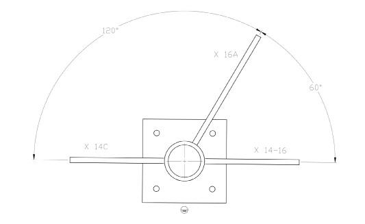
We created a hub method to hold the wood members together consisting of a 2’ 7/8” metal pipe, 3/8” thick and 3’ 1/2” wide mild steel for fins, and 3/8” and 6” wide plates for the bases.

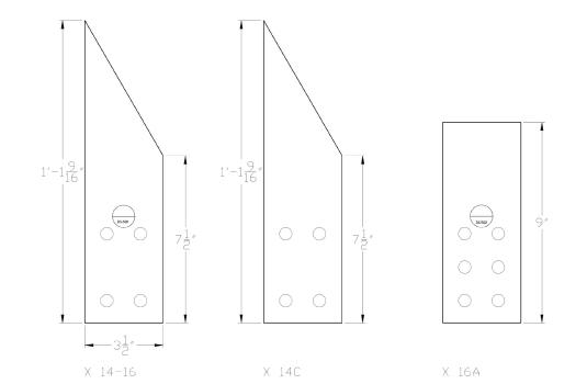


Each hub was uniquely modeled. This is an example of one hub detail that could be sent to the metal fabricator.

Timber with Infill Detail
Timber to Hub Detail
Timber with Infill Detail

Weaving


PRISMA includes two different styes of hammocks: sitting and climbing. Triangle hammocks are for sitting and the square hammocks are for climbing. For sitting hammocks, we decided to use a 3” gap distance. That size is the most comfortable for people lounging on it. For climbing hammocks, we decided to use a 2” gap distance. This smaller gap can prevent children’s feet from falling through.

All nine of PRISMA’s hammocks were made with 1/4 inch tan Poly Dacron rope. They were measured, assembled, and woven with 13,000 feet of rope.


Infill Panels


The infill on PRISMA is a powerful visual image reflective of the natural forces in Reiman Gardens. After testing prototypes, it was decided to go with iridescent acrylic panels.
In the final construction, the iridescent panels were installed vertically. We found that the wind would spin them easiest in this orientation.
Each of the over fourteen-hundred panels were installed by hand using snap swivels and cable ties. They are easy to replace when damaged and once placed become shining beacon to visitors well beyond the limits of gardens’ fence line.

THE FASHION SHOW
SET DESIGN
SPRING 2018
I worked on a team with 15 students to develop the set for the Iowa State Fashion Show, the largest student-run fashion show in the United States. Inspiration was taken from the eclectic makeup of Los Angeles; the set abstracts the animated west coast into a colorful, light-filled atmosphere.


The set is fabricated with 6 miles of string, 200 feet of chicken wire, 350 CDs, and 110 eyehooks.


THE FASHION SHOW SET DESIGN


SPRING 2018
This set design for the Iowa State Fashion show was in collaboration with the clothing company, Vans, to create a set that develops the notion that fashion runs coast to coast. The set took inspiration from New York City, urban style, and graffiti to depict the street style that the company’s line suggested. I woked along with 15 other students to create this vision.
The set is fabricated with 720 feet of wood, 100 4’ x 8’ foamcore boards, and 5 gallons of paint; students from the university were invited to help paint the panels in their own unique, abstract vision just as street artists do.

BLOCK EFFECT
A SIMPLE, ACCESSIBLE, AND ADAPTABLE SYSTEM TO ORGANIZATIONS IN NEED OF INTERVENTION
PARTNER -- SANDEEP KUMAR
Our nation is plagued with injustice in social settings, and have found that organizations do not have accessible options toward affordable and effective space of congregation.
Our efforts are aimed at the demographic who are located in areas that don’t have access to public spaces, lack the funds to afford to rent space, or the existing space just doesn’t fit their unique needs.
As two architecture students, we are compelled to use our skill set to address the issue of social inequality. We have designed a product that can serve as a medium of defining space within public spaces to make events function.
Block Effect is a kit consisting of simple construction elements in order to build an array of different infrastructural types; Block Effect will have a GoFundMe page where donors can support our company. From there, clients in need can tell us their story and product needs through an email.
43
SPRING 2021
of cube

Connectors are the essential part in linking these components together into a structurally sound network


Flats are used as infill within the grid of posts


Posts are the framework in order to make a 3D space. They make up the grid in which the structure will form

44 Fabrication


 Performance stage setup
Community lecture space setup
Public seating setup Emergency shelter setup
46 Lauren Fordyce lfordyce@iastate.edu


 Performance stage setup
Community lecture space setup
Public seating setup Emergency shelter setup