G R A P H I C

D E S
I G N


D E S
I G N
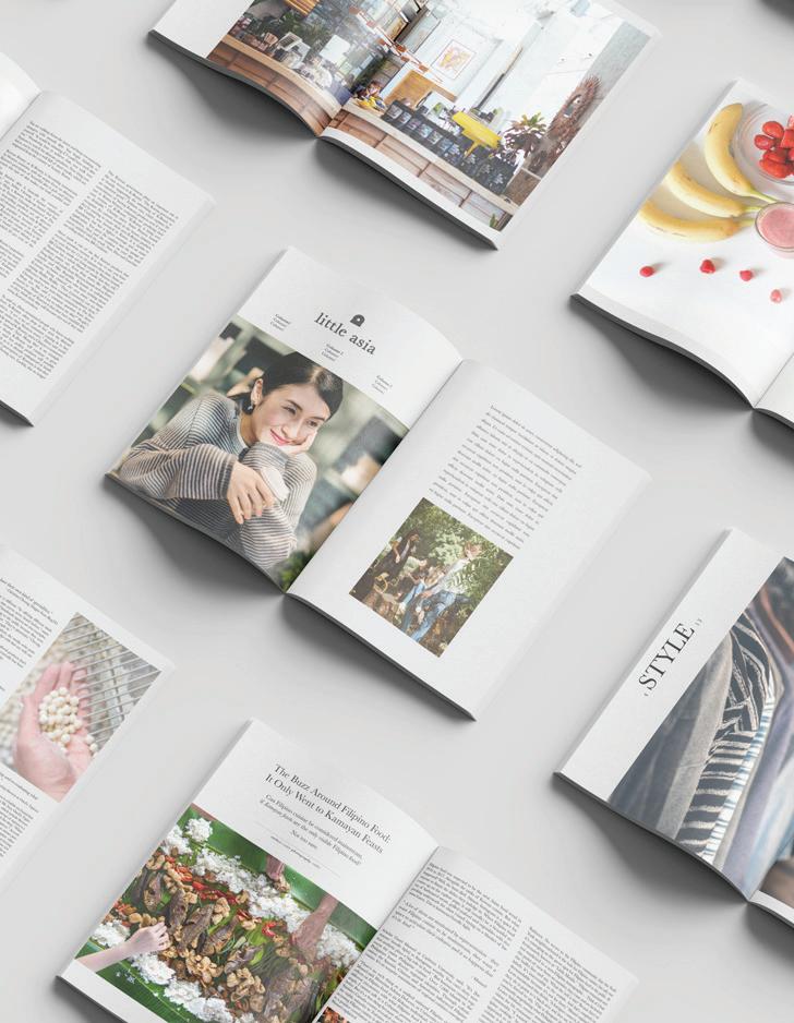
Logo & Magazine Layout
Project Completion: 01-05-2020
Collaborators: Egan Lee, Haiqa Nisar, Paul Chevall, & Janell Lin
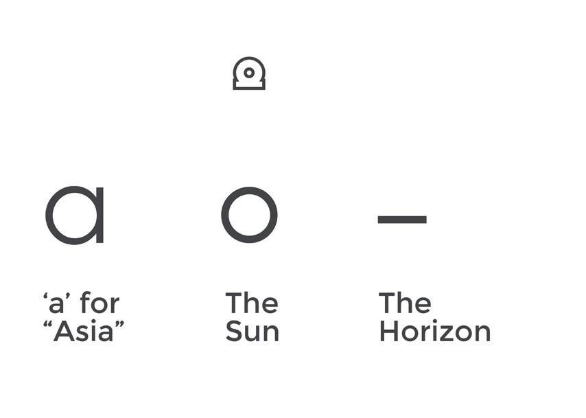
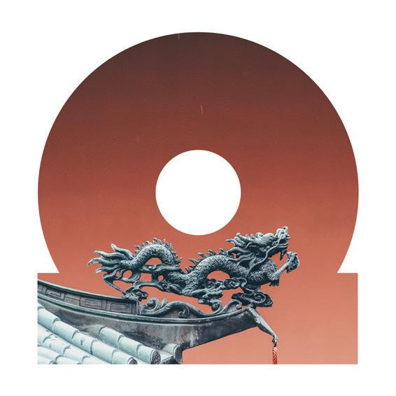
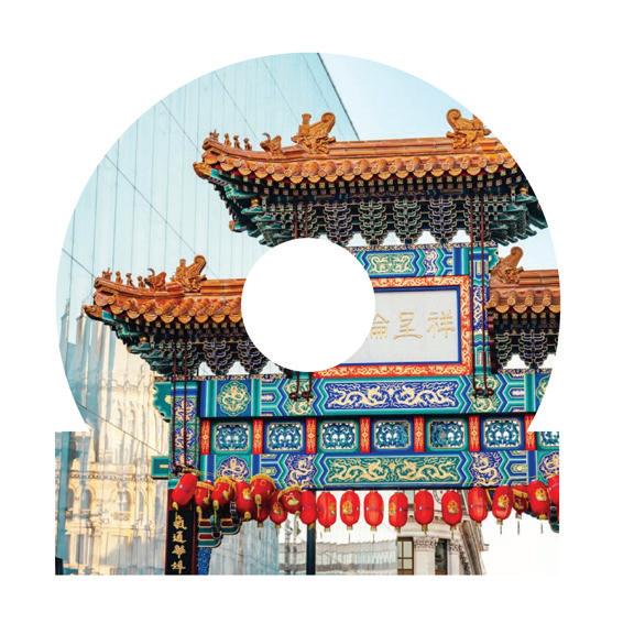
Little Asia is a student start up telling the stories of Toronto’s Asian community. Perspective stories of Filipino, Japanese, Chinese, Pakistani, Indian, and more are told each week. With a simple and clean design, the team created a template for future
The logo represents the rising sun from the East, and turned on it’s side is an ‘a‘ for Asia. It’s versatility can be used for image overlays, while maintaining the image of the brand.


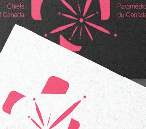
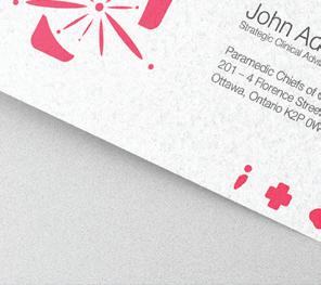


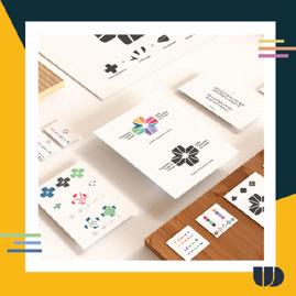
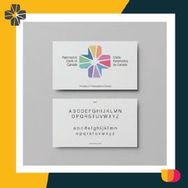
Logo & Style Guide
Project Completion: 02-04-2021
Collaborators: Sarina Wong & Johanna Zhang
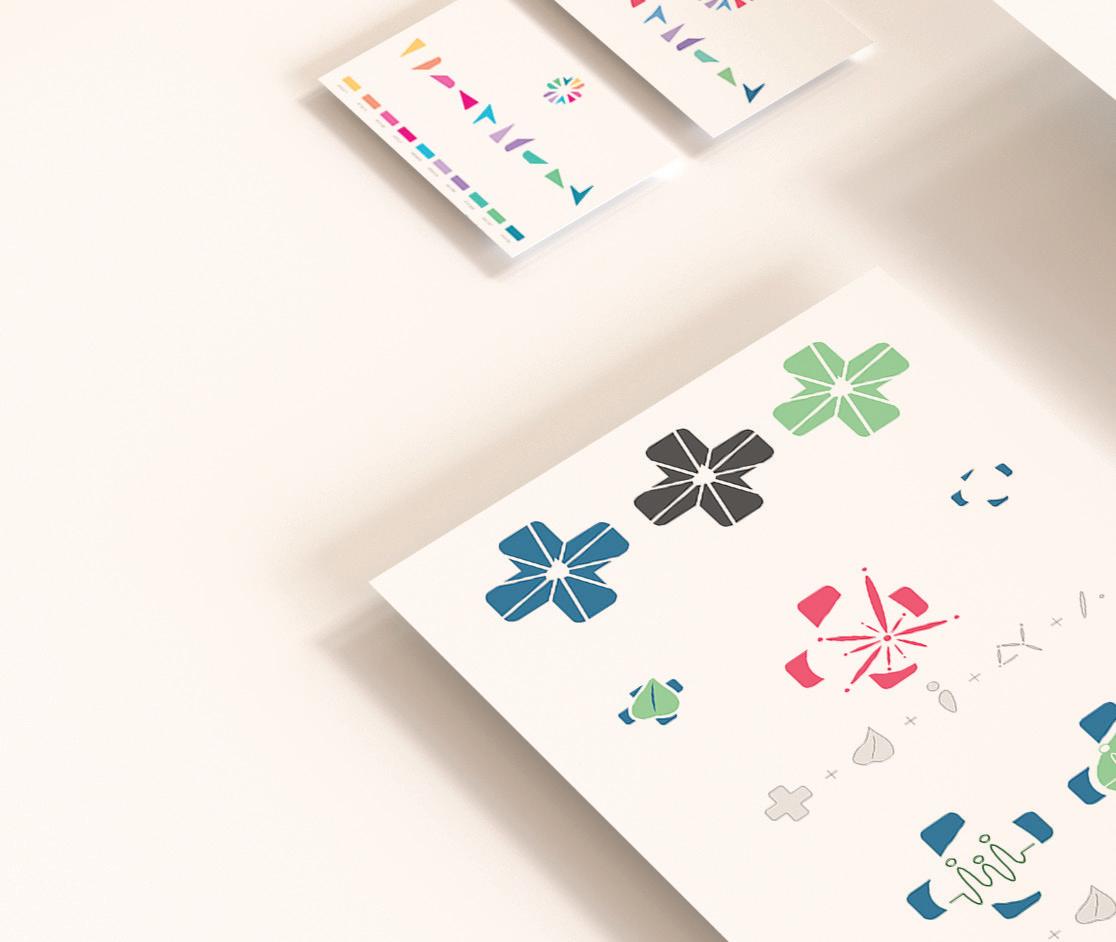
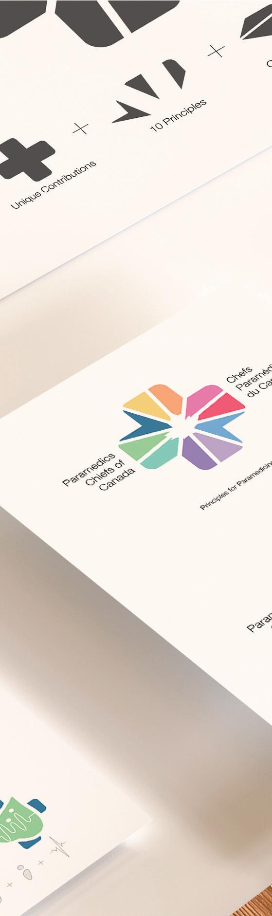
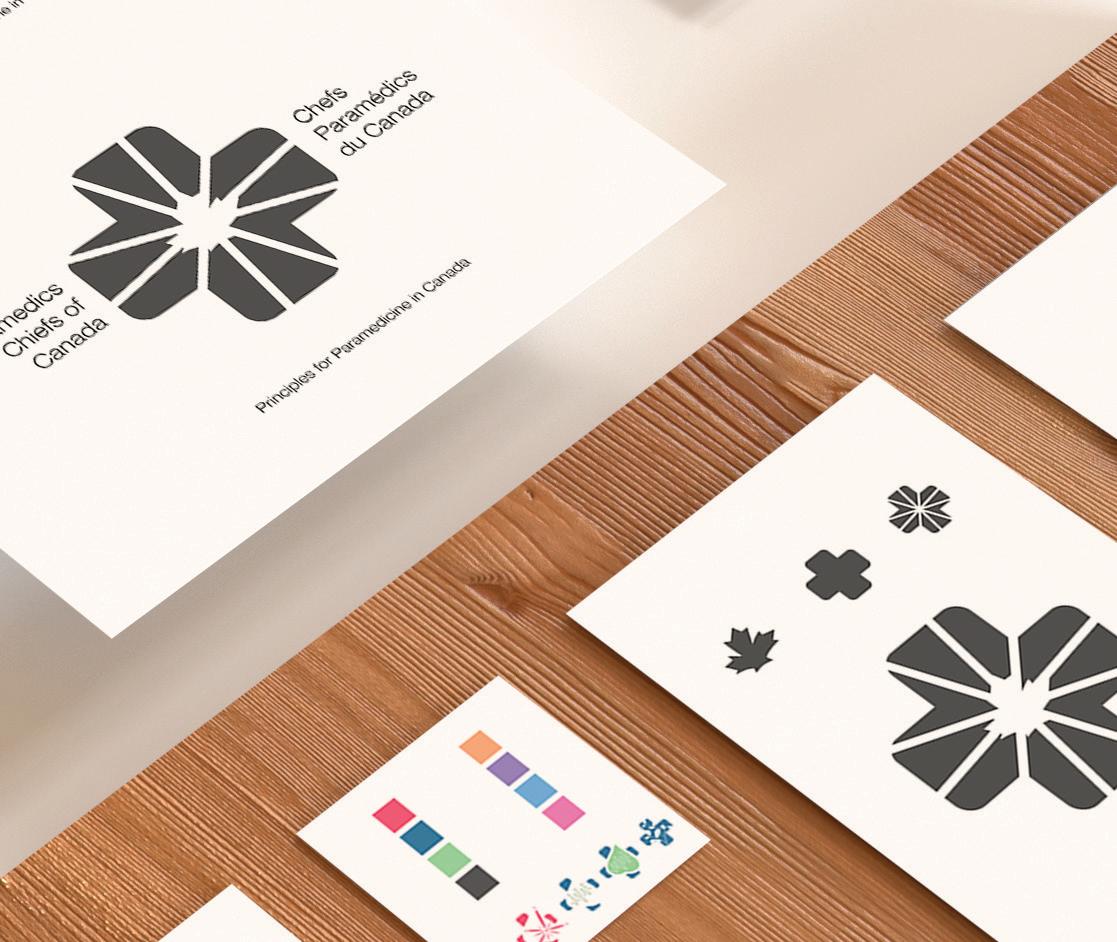
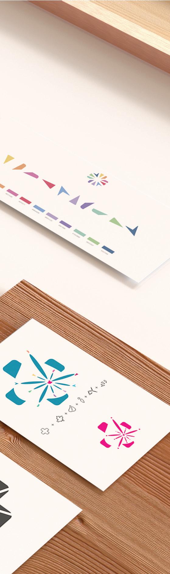
Paramedic Chiefs of Canada is responsible for paramedic services across Canada. While they have 10 guiding principles, their core message is to project that paramedicine is health care, is integrated into the larger healthcare system, and to do that while partnering across health care sectors. This logo asks to represent paramedicine in a modern, symbolically unique manner, while highlighting the companies 10 core principles:
The logo utilizes the health care cross in a modern, minimalistic way. Embedded inside is a leaf representing overlapping aspects of the 10 principles including healthy professionals and growth. The lines and dots represent both the people they serve, a social continuum, and partnering


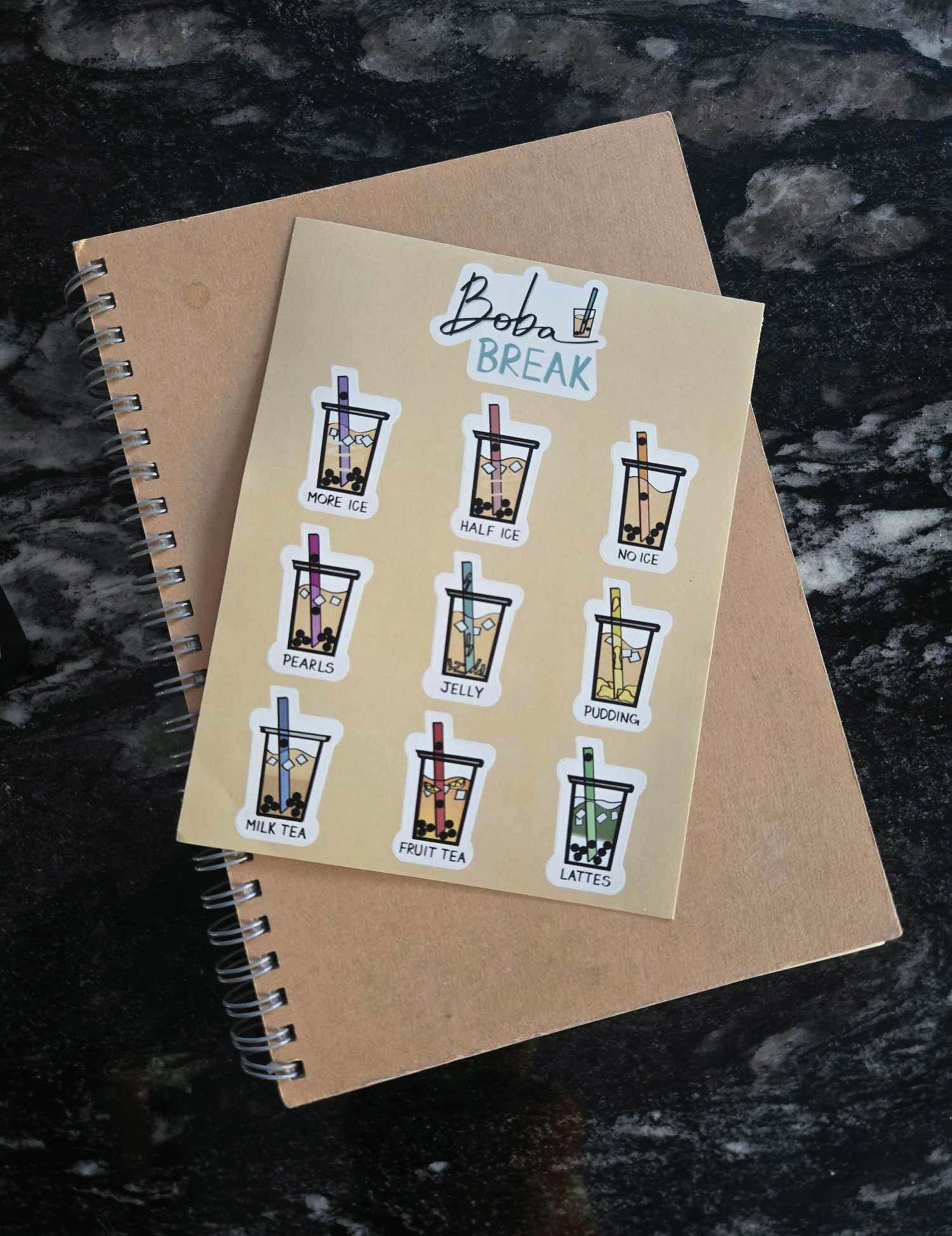
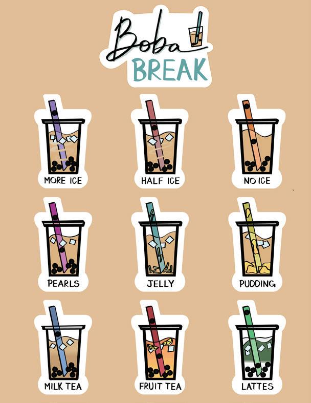
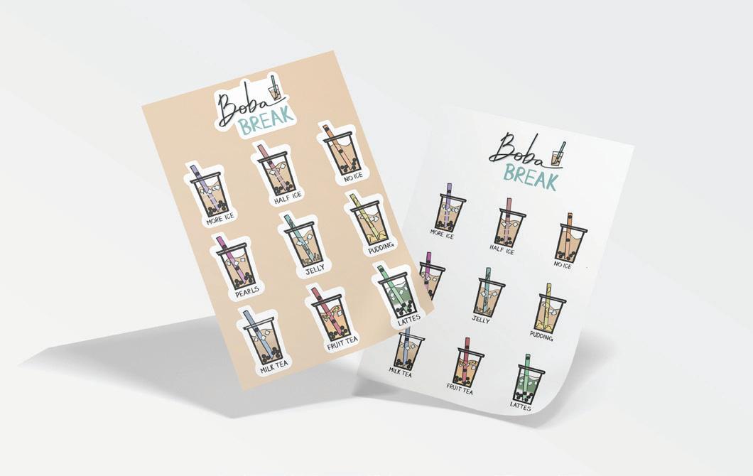
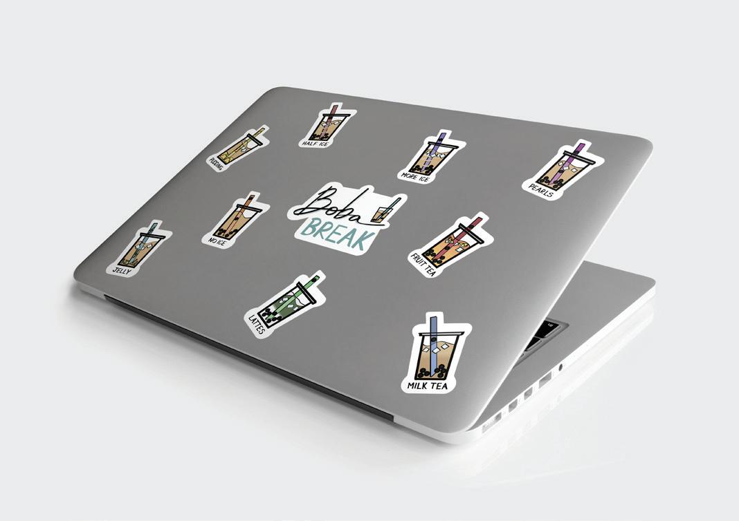
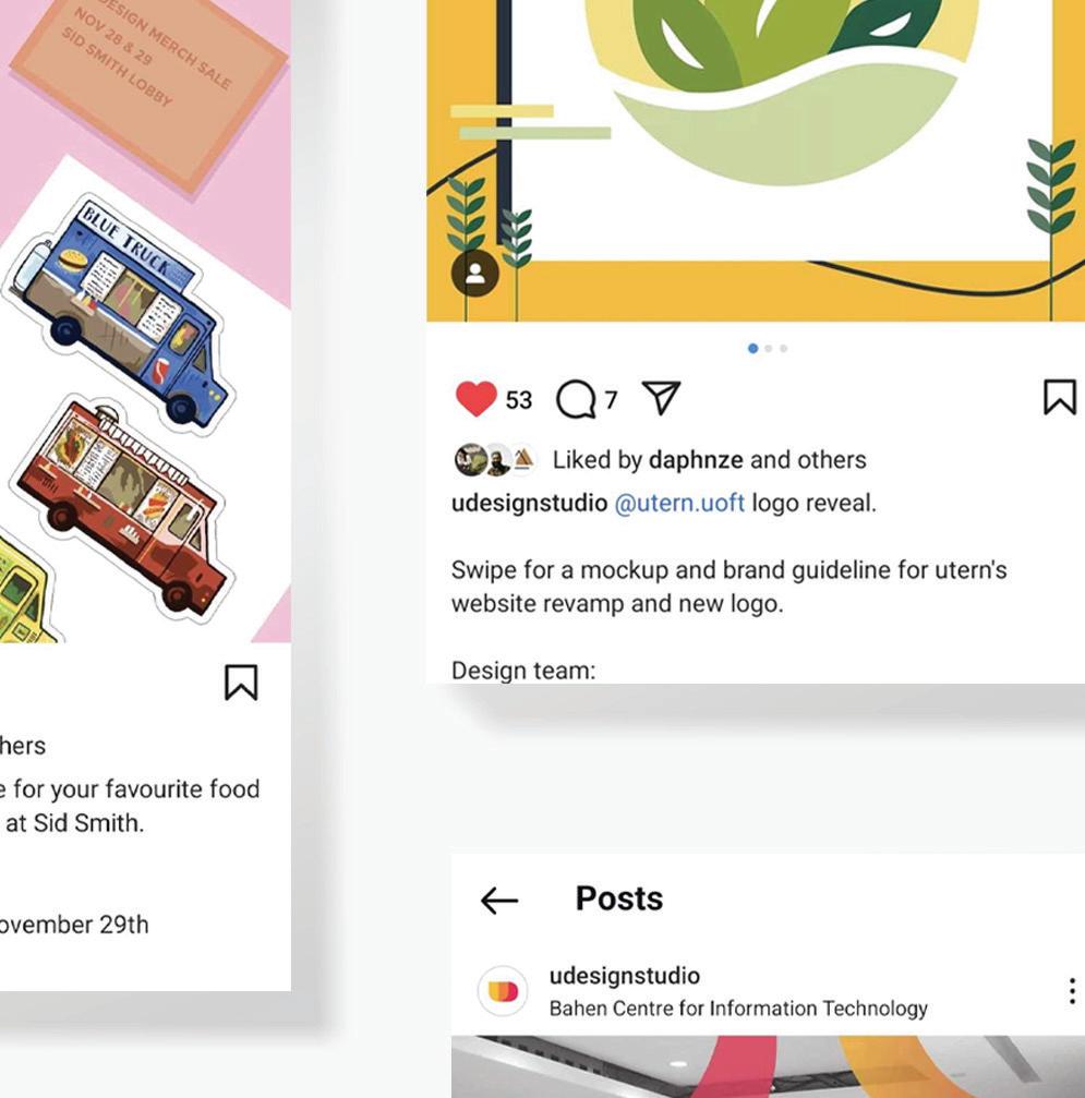
Bubble Tea Sticker Set
Project Completion: 10-15-2019
As part of a graphic design club we sold merchnadise our members would design as a secondary source for funds. This would also serve as a way to reach the student population and get more public interest. The sticker set was a play on the different customizations of a bubble tea order.
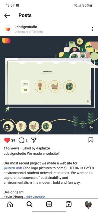
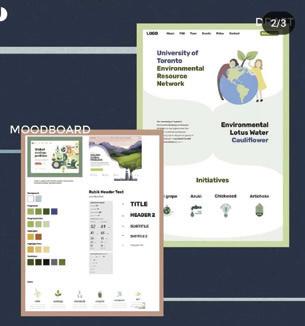
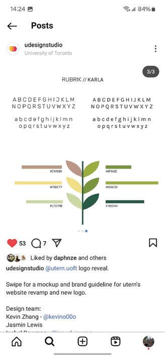
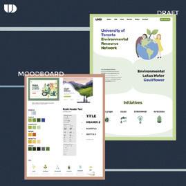
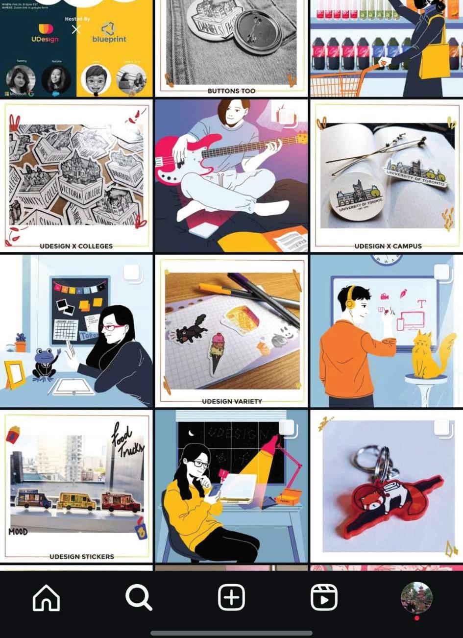
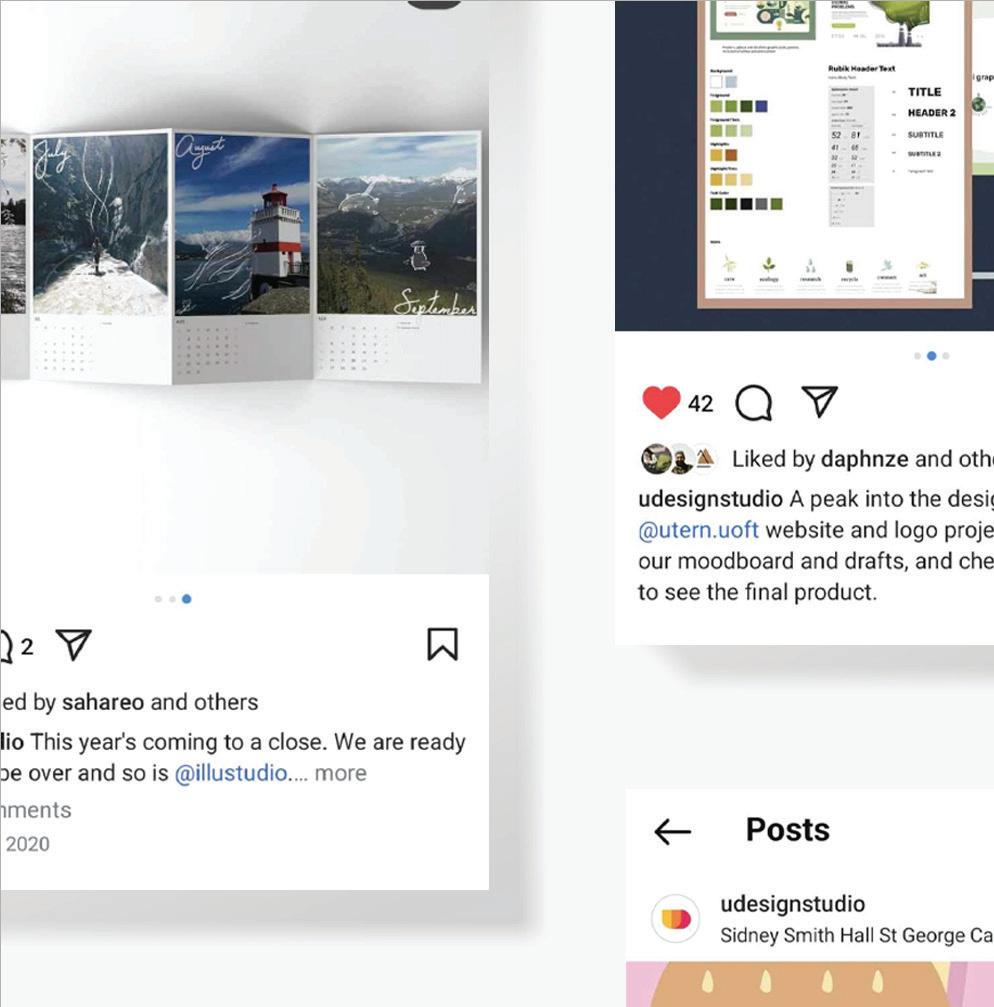
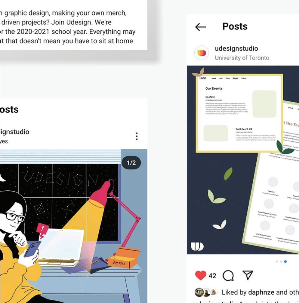
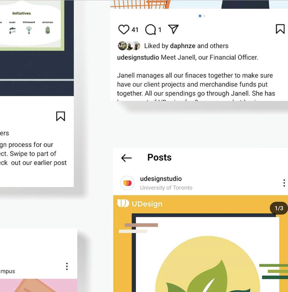
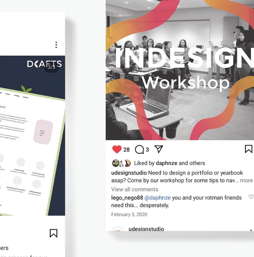
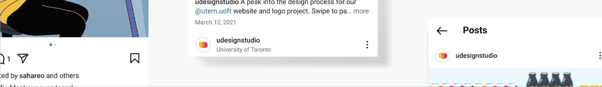
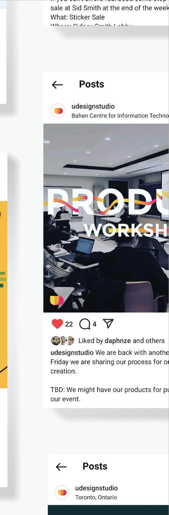
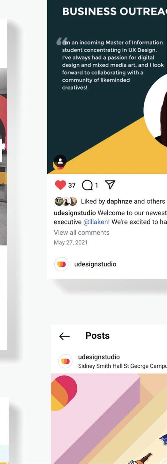
Instagram for Graphic Design Club
Duration of Management: 2019-2021
Key to the Udesign social media is to grab attention to garner interest for joining the club, advertising merchandise, gaining workshop participants, and most importantly increasing client outreach. The branding consisted primarily of 5 main colours of an orange and blue colour pallet and font utilization to register familiarity with individual posts.

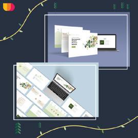


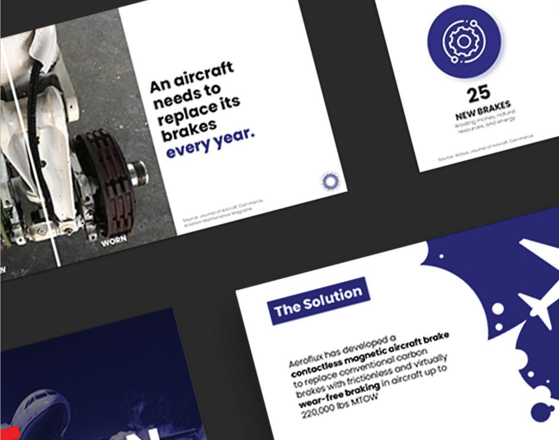
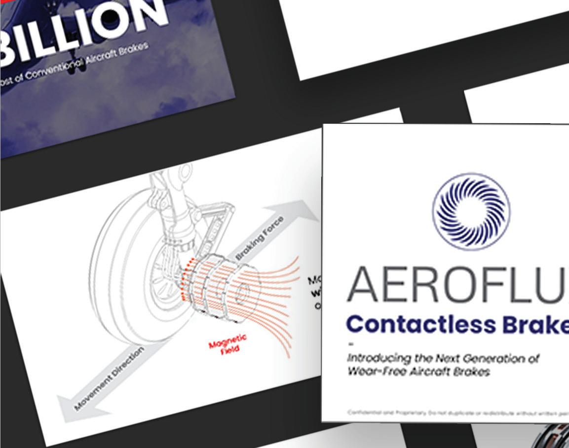


Slidedeck Template
Project Completion: 09-08-2020
Collaborators: Kevin Zhang, Jannell Lin, and Michelle Gao
Presentation
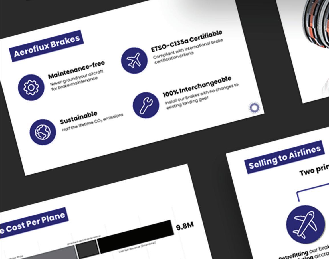
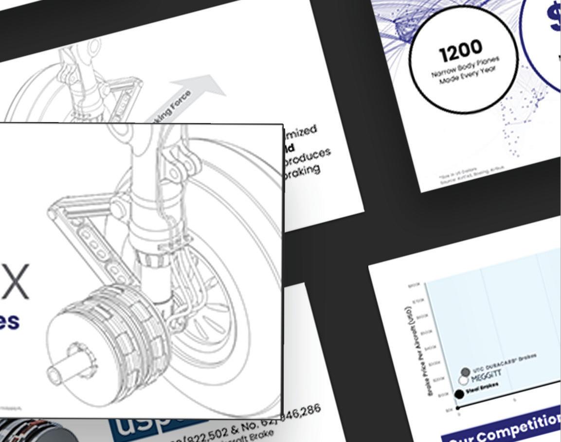
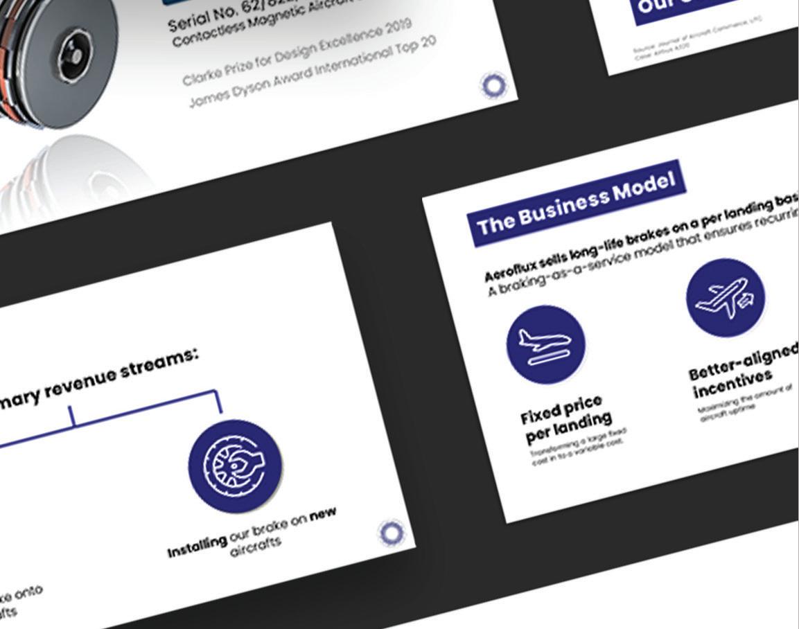
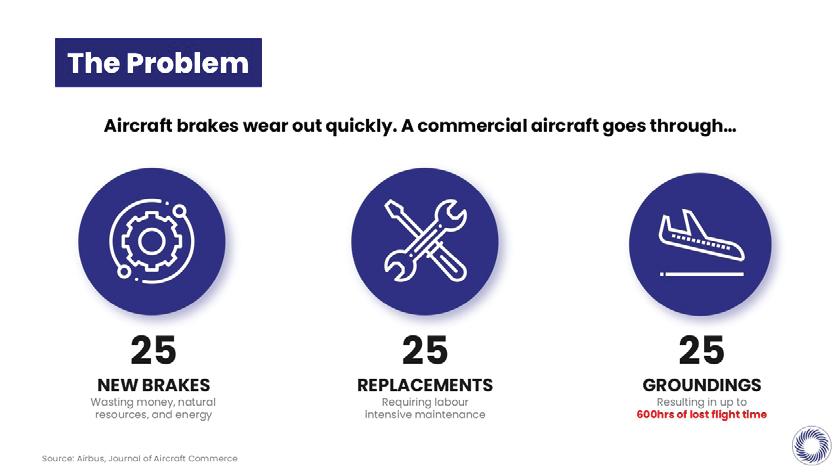
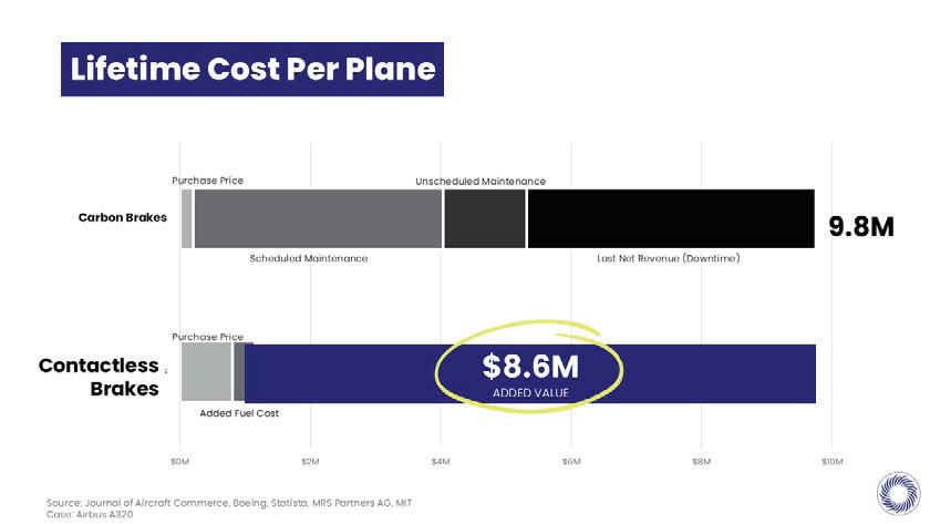
Aeroflux contacted UDesign to assist with a slidedeck presentation for their aircraft brakes. The deck would primarily be used at a UofT case competition, investors, and general public attendance; Therefore, the deck should be understood for a non-technical audience. Because of the technology the information and sources were important to keep, so while our team was focused on graphics it was important to understand what was trying to be communicated.

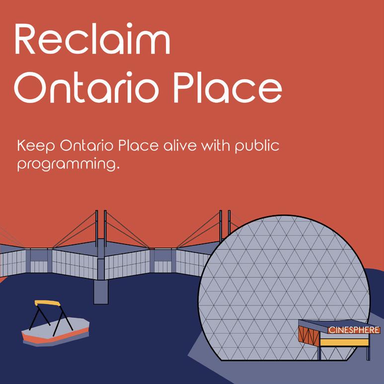
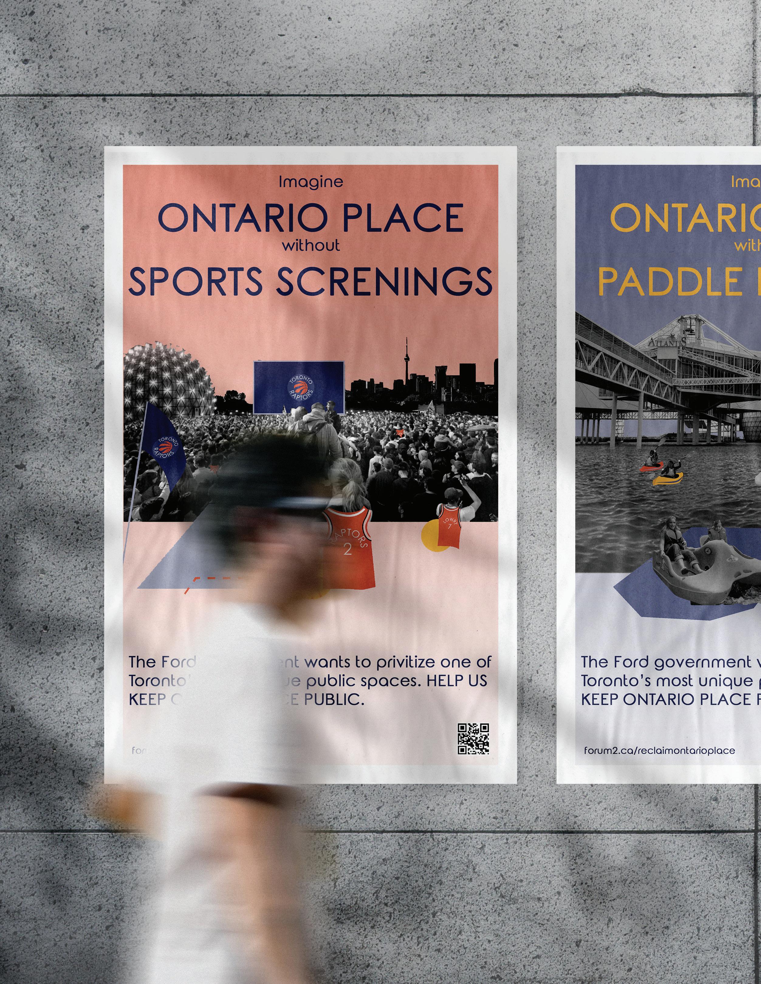
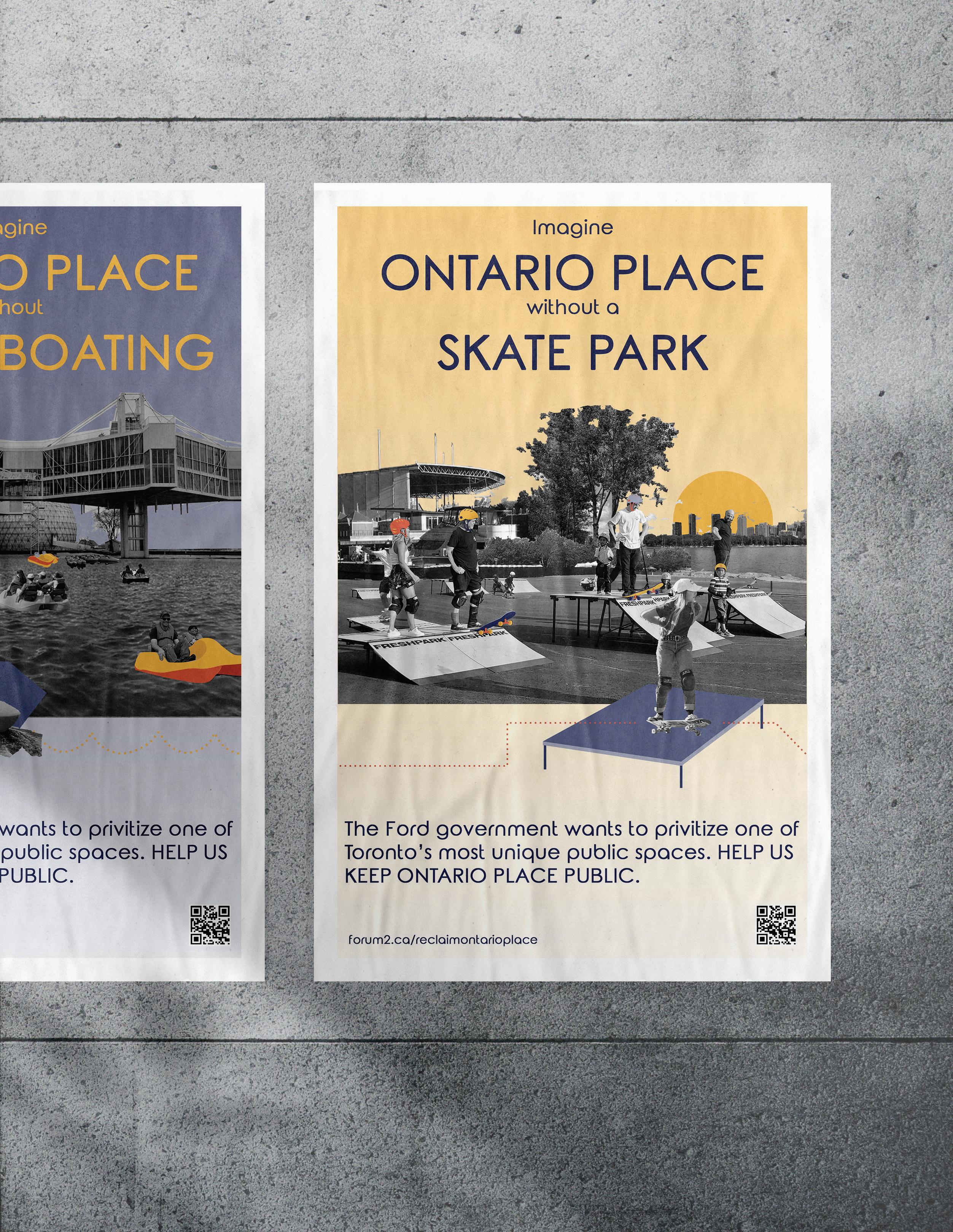
Land Reclamation Campaign
Project Completion: 01-05-2020
Collaborators: Huda Hetavkar & Tarek Mokhalalati
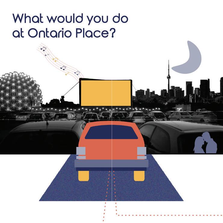
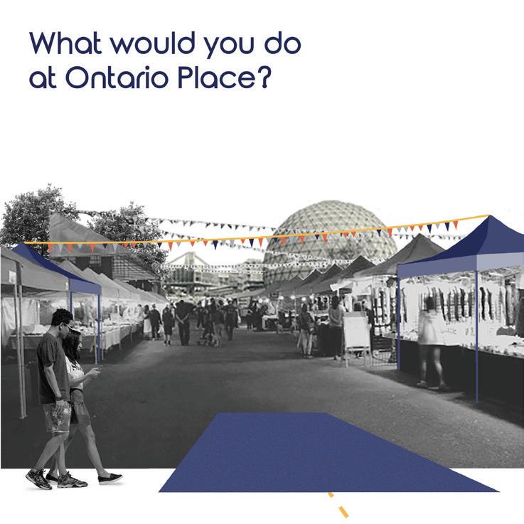
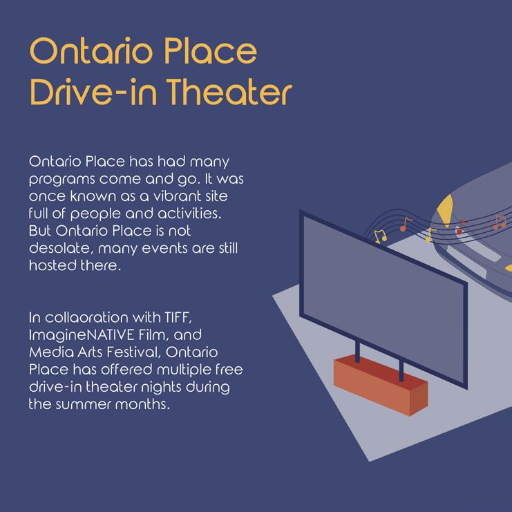
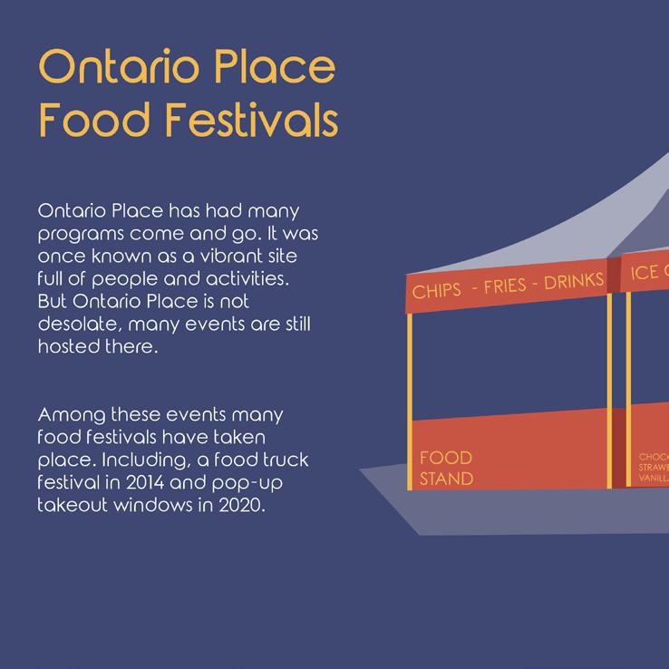
The Ontario Government had plans to demolish the historic park space and megastructure of Ontario place. This place held many memories for locals and was a shared open space for new residences. This campaign served to bring more awareness to the government’s demolish plans and urge them to enhance the space rather than remove it.
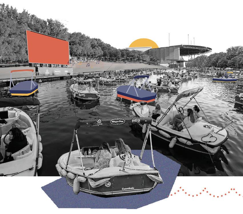
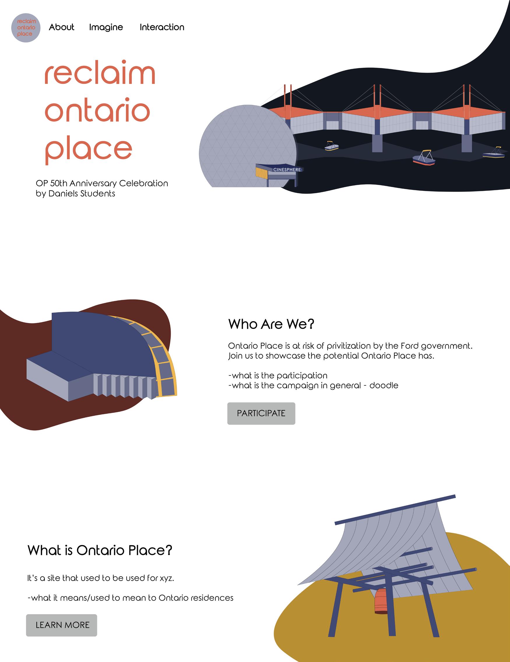
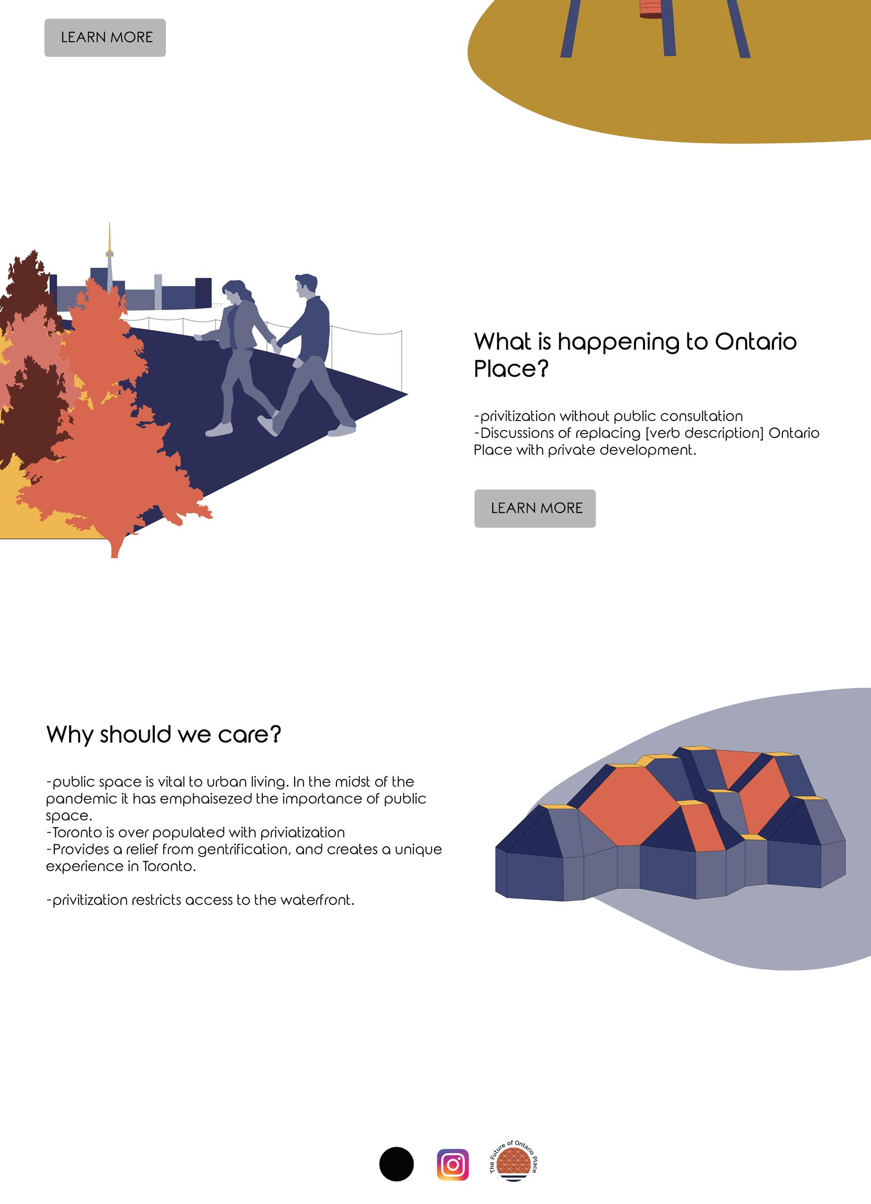
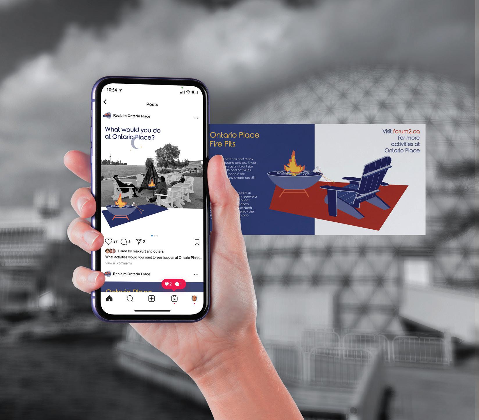
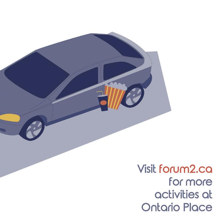
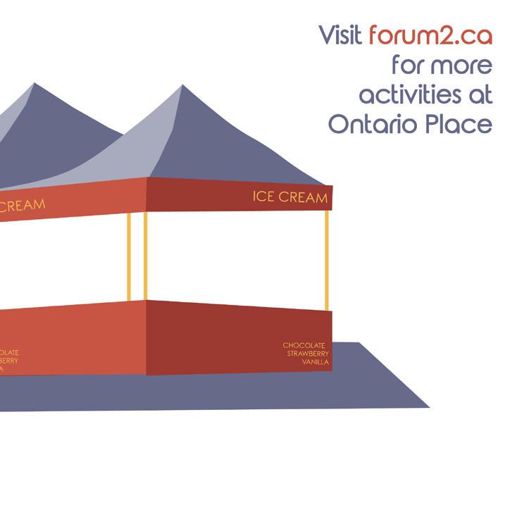
The instagram campaign is utilized to showcase the events that happen at Ontario Place and educate new Ontario Residences of the vast activities that go on in this space. It is also to show the potential of what this space could be used for, which was inspired by past activities that no longer happen.
It is also used to engage with the public and ask “what would you like to see happen in this space?” It then directs people to the interactive drawing tool that allows the public to visualize what the space means to them, just as we did .
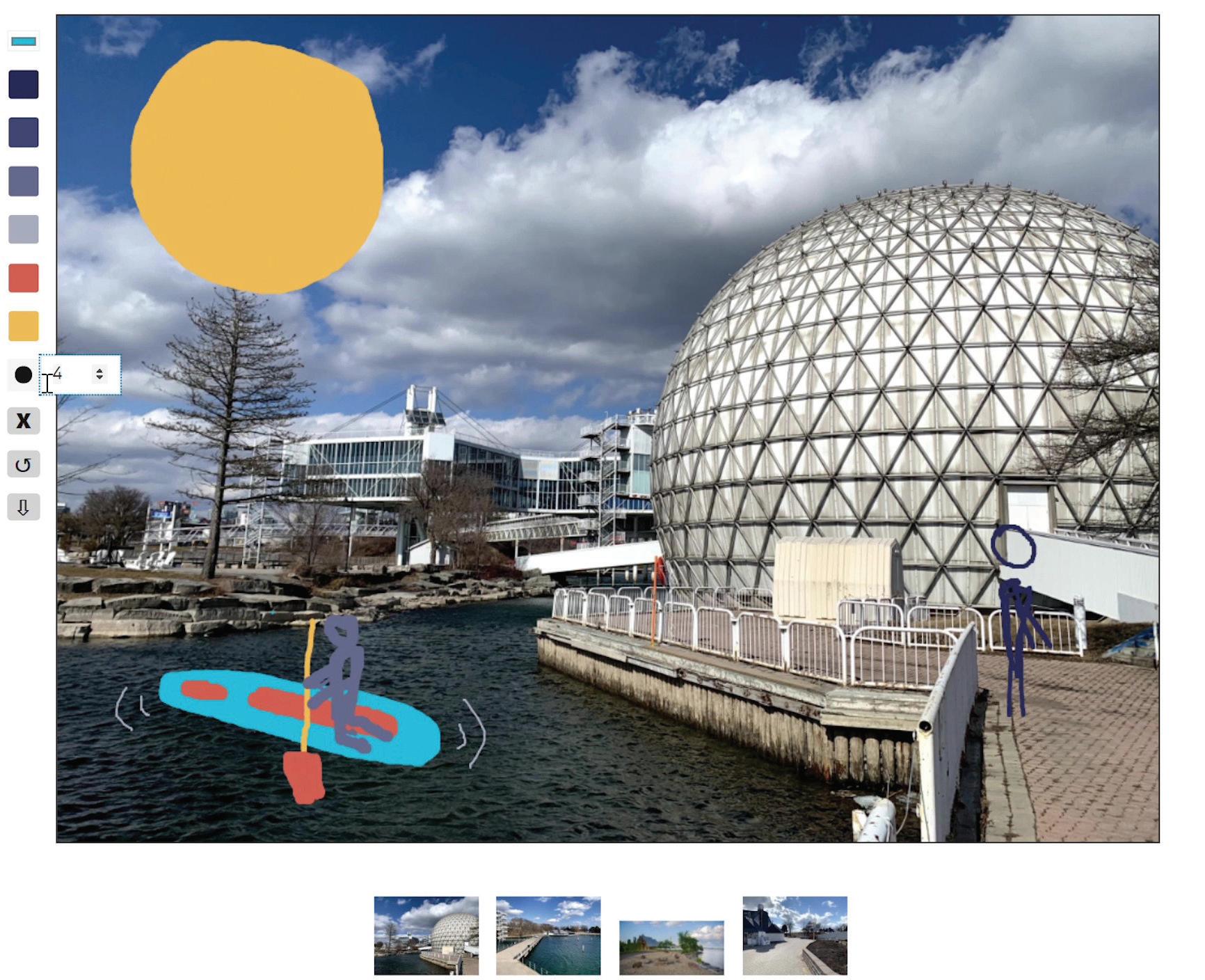
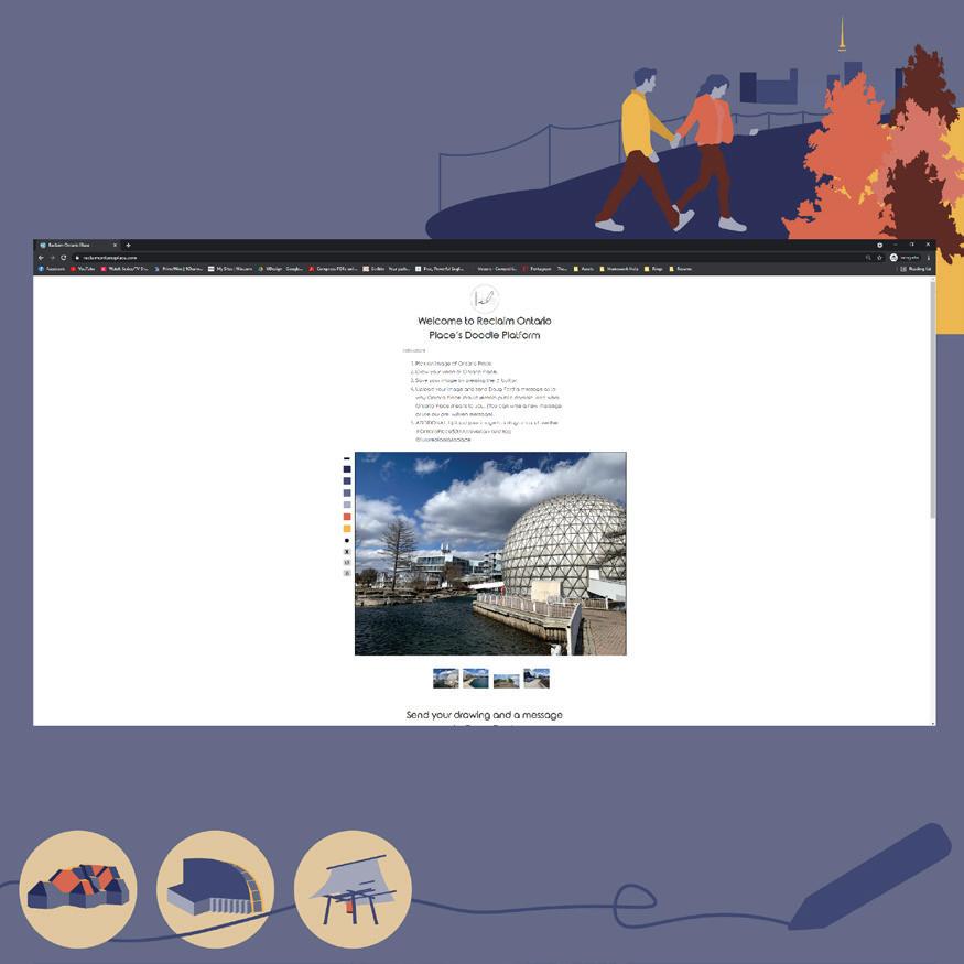
In addition to the widespread visual campaign that imagines how Ontario Place could be better utilized as a public space, we wanted people to have the ability to imagine how they see the space be utilized for the public. It can also be used to reminisce on their memories with Ontario Place and demonstrate it’s importance. These images, alongside a letter, could be sent to the Ontario Government, urging them not to demolish Ontario Place. The goal was to get users to interact and demonstrate the widespread importance of this unique.
The above drawing platform was coded uniquely for this project using HTML, Javascript and CSS. A video of it can be viewed with this QR Code.