2 minute read
Interiors
An open floor plan often begs for walls.
But carving up an old, 1,200-square-foot loft in Williamsburg, Brooklyn, was not an option for New York architecture practice New Affiliates.
Advertisement
The firm’s clients, who’d been living in the largely open-plan apartment for two years, hoped to maintain its airy feel while also introducing defined rooms. Though the space has large windows, they are all on one side, and walls would have turned the interior into a cave. Besides, “if you’re going to live in a loft, embrace an open lifestyle,” says Craig Redman, an artist and illustrator who shares the space with his partner, fashion executive Thomas Chen, and their art and design collection.
New Affiliates supported the choice. “The space, as we found it, was actually quite beautiful. They had these gorgeous
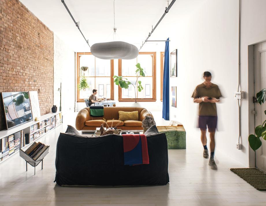
To make their Brooklyn loft (above) more livable, Craig Redman, left, and Thomas Chen worked with architecture firm New Affiliates to gently define “rooms” within the open plan. The couple’s cat, Pinot, keeps watch on Craig’s desk (opposite), which faces the sleeping alcove. A heavy curtain curves around the bed to give sleepers more quiet and privacy. A Cloud Softlight pendant by Molo helps demarcate the living area, bounded by a Le Bambole sofa by Mario Bellini.
Williamsburg Loft
DESIGNER New Affiliates LOCATION Brooklyn, New York
A Entrance B Bathroom C Dressing Area D Kitchen E Dining Area F Living Area G Bedroom G
F A E D C B
A N


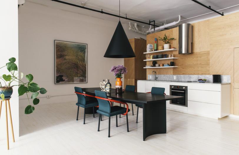
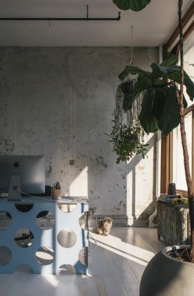
A partial wall anchors the kitchen on one side (above) and houses closets on the other (left). The structure creates a dressing area while allowing natural light to reach the far end of the loft. New Affiliates inserted a window high in the bathroom wall to let that light in a bit farther. Craig and Thomas infused the surfaces of the space with their bold taste by alternating the orientation of the wood grain in the millwork veneer panels to create a lively pattern. Craig designed the wood desk with benday–like perforations that disperse the sunlight (below).
giant windows, and it was full of light,” says Jaffer Kolb, the firm’s coprincipal. The loft retains remnants of the industrial past of its four-story, cast-iron building, including a brick wall spanning most of the space. “Our first thought,” says Kolb, “was, We just can’t mess this up. It has such great bones.”
The layout presented challenges nonetheless. “The organization of the space didn’t work,” says Kolb, adding that the kitchen was dark and badly needed an overhaul. New Affiliates solved multiple problems at once with a custom island installed toward the back of the loft. The structure has an open kitchen on one side, facing out to the sunny dining and living areas, while its backside is lined with closets and a hidden laundry area, creating a semiprivate hallway adjacent to the bath- room. “The apartment has a fluid way of transitioning between spaces,” says New Affiliates coprincipal Ivi Diamantopoulou.
Bringing natural light to the back of the space was key to the new design,


