
9 minute read
Dwell Design Awards
1
We asked an expert jury and our audience to choose the best projects of the year. Visit Dwell.com to see all the winners.
Advertisement
Barbara Bestor
Bestor Architecture Chris Cornelius
Studio:Indigenous Tosin Oshinowo
cmDesign Atelier
Kulapat Yantrasast Jared Blake and Ed Be

2
1 2
Dwellings
WINNER
CASA TER Using regional building techniques and local materials, Mesura created a sustainable retreat that blends with the Catalonian countryside.
RUNNER-UP
UC HOUSE Designed by Daniela Bucio Sistos, this brick-and-concrete residence on the outskirts of Morelia, Mexico, is anchored by a central open-air foyer that frames a library displaying the owners’ collection of more than 15,000 books.
Prefabs
WINNER
CATERPILLAR Undecorated and Studio Detroit sliced up a prefab Quonset hut to create a series of light-filled dwellings in Detroit.
RUNNER-UP
CASA MIRADOR Rama Estudio used a prefab glass-and-steel box to extend a home outside Quito, Ecuador, into the surrounding landscape.
3

—Tosin Oshinowo on Mit Chit House
3 4
Gardens
WINNER
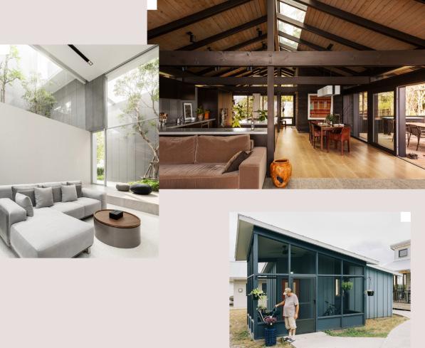
MIT CHIT HOUSE In Bangkok, this family residence by Looklen Architects features four courtyards with trees that stretch beyond the doubleheight interiors.
RUNNER-UP
CHIAPAS 168 In the Roma district of Mexico City, Vertebral designed a fourunit apartment building with verdant terraces on every floor.
Renovations
WINNER
LOOM HOUSE On Bainbridge Island in Washington, Charlie Hellstern Interior Design and The Miller Hull Partnership collaborated on the first residential remodel to achieve Living Building Challenge certification.
RUNNER-UP
CASA KEÇE In a nature preserve outside Paris, two creative directors turned an 1892 residence into a colorful country home for their young family.
5
5 6
Small Spaces
WINNER
JESSE’S HOUSE This micro-house in East Austin, Texas’s Community First! Village, a development of permanent, affordable housing, was designed by Jobe Corral Architects with input from its occupant, Jesse Brown, who previously spent 30 years without a home.
RUNNER-UP
SERORO HOUSE Minwook Choi of Smaller Architects designed a five-story tower of stacked sunlit rooms to be his family home on a 355-square-foot lot in Seoul.
Bathrooms
WINNER
HOUSE RECAST Studio Ben Allen renovated a Victorian in London, using colored concrete. One of the new bathrooms is cast in green with an arch motif that appears throughout the home.
RUNNER-UP
RIVER HOUSE For a holiday home in Hokkaido, Japan, Tomoyuki Sudo of SAAD created a bathroom with an onsen that enjoys framed views of the landscape.
7
9
—Jared Blake
10
8
8 9 10
Kitchens
WINNER
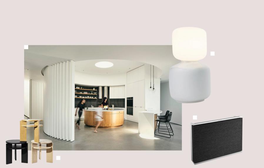
ROUND HOUSE Feldman Architecture reimagined a 1920s residence for a Los Altos Hills, California, family, placing a circular kitchen with an oculus at the center of the home.
RUNNER-UP
BENT STREET In renovating a Melbourne Victorian, designer Kim Kneipp created a curvy kitchen, using recycled wood for the cabinetry.
WINNER
THE SIDEKICK Russet’s side table, crafted from FSC-certified wood, is uncomplicated, affordable, and easy on the eye.
RUNNER-UP
BENCHMARK IKLWA LOUNGE CHAIR Mac Collins drew on his African-Caribbean heritage for this design, using ideas rooted in Afrocentrism and Afrofuturism to create the chair’s spear-shaped arms and throne-like back. Its form is meant to empower the user.
Furniture Lighting Accessories
WINNER
TALA X DAVID WEEKS TABLE LAMP In a collaboration with Tala, designer David Weeks created a series of four table lamps whose bulbs mirror their bases.
RUNNER-UP
TUTU 2.0 Available in several radiant colorways, the Tutu 2.0 by Mash.T is a striking interpretation of Xibelani skirts worn by Xitsonga women in South Africa.
WINNER
BEOSOUND LEVEL PORTABLE WI-FI SPEAKER Bang & Olufsen’s speaker features a slim profile, subverting the bulky designs that we’ve come to accept as required for high-quality audio.
RUNNER-UP
CACTUS JUG 3 Ichendorf Milano’s playful but elegant pitcher maximizes how much it can hold by using a hollow handle and takes on the color of its contents.
Book&Look. Pagnon & Pelhaître Made in France

G et t i n g i n L o c kst e p
Level Home’s smart locks pair high design with an intuitive approach to home entry.
As Mies van der Rohe once said, God is in the details. Even the most masterful architectural achievement is nothing without its finishing touches. And when it comes to first impressions, not to mention security measures, no details make a bigger impact than the most essential parts of the front door—the hardware and lock.
Whether you need to accommodate house guests, short-term renters—there are now some four million residential hosts on Airbnb alone—or just a repair person coming by for a quick job, contemporary life requires frictionless, hands-free access. Using Bluetooth and smartphone capabilities, homeowners are enjoying remote, keyless home entry without sacrificing peace of mind.
Unfortunately, most smart locks and dead bolts are bulky and unattractive. You obsessed for months over the bath fittings, tile grout, and kitchen cabinet pulls. Why would you settle for ugly front-door hardware? Enter a new wave of products from a Bay Area company that embraces both high functionality and high design.
Level is a leader in its class, with sleek locks and (coming this month) a streamlined keypad that can be placed in discreet locations away from the front door. Its products can also adapt your existing dead bolts with invisible technology, allowing you to retain the style you want while gaining smart capabilities (and you won’t need to change the battery every few months).
On the whole, those who want to bring elegant, convenient access solutions to their homes have never been in a better position to do so. It’s a good time to be obsessed with the details—best to get it on lock.
Read more at dwell.com/level.
Level’s smart locks allow for frictionless home entry, giving you extra time to primp for the party.
Grading on a Curve
A Swedish A-frame with a flourish excels in all seasons.

TEXT BY Tiffany Orvet
PHOTOS BY Staffan Andersson
Architect Måns Tham designed an A-frame cabin in Edsåsdalen, Sweden, with ample space for Anders Smedberg and his family to host large groups for year-round outdoor adventures. When the family isn’t staying there, Anders will rent out the five-bedroom home.
When outdoor enthusiast and tech
executive Anders Smedberg set out to build a mountain getaway for himself and his two teenage children among the ski slopes of Edsåsdalen in northern Sweden, he had a clear vision. He wanted a practical and comfortable alpine home inspired by the classic American A-frame, and he called on Stockholm architect Måns Tham—whose cousin designed a previous home of his—to help him create it.
Tham tweaked the basic A-frame concept to reflect the home’s Scandinavian context. He added curved aluminum dormers that swing out from the prefabricated aluminum roof and wood frame, evoking the kåta (huts) used by the Sámi, an Indigenous people of several Nordic countries, as well as the branches of the trees that surround the home. The front and rear elevations will also pick up the silvery hues of nearby birches as their Kebony wood cladding patinates over time.
The swooping roofline allows light to flow through large windows into a spacious interior discreetly divided by sliding
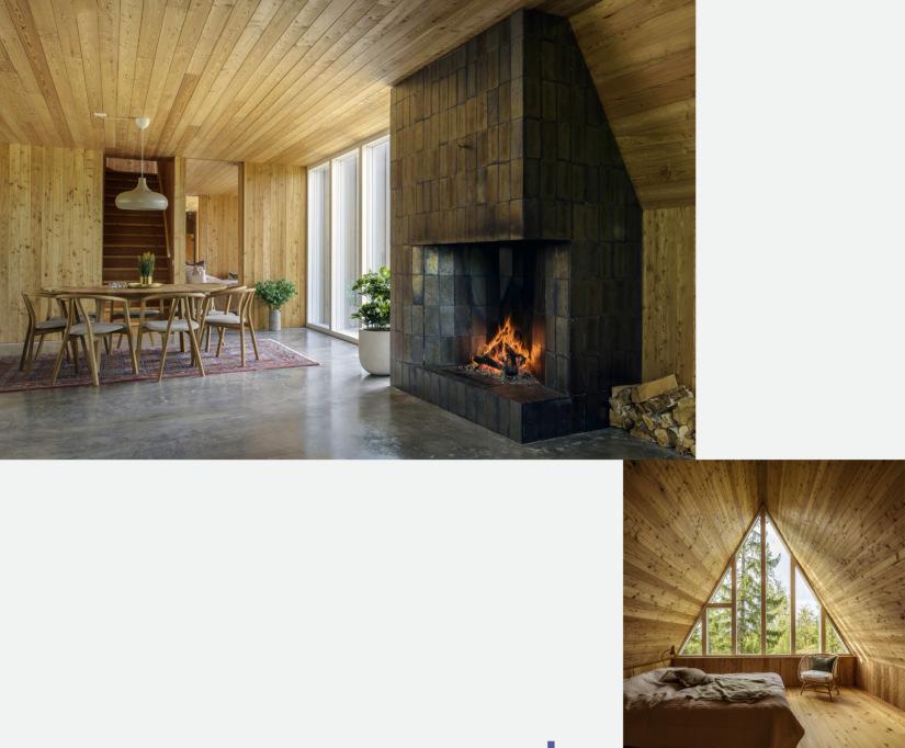
The interior walls, ceilings, and built-ins are clad in Siberian larch. Tham placed the glazed openings and doorways to maintain clear sight lines throughout the long and narrow home. A fireplace in the living room (left) features glazed clay bricks from Swedish manufacturer Tegelbolaget.
pocket doors. The roughly 30-by-82-foot two-level house includes five bedrooms and can easily sleep up to a dozen people, a capacity meant to give the home longevity. “I was thinking long-term,” says Anders, who lives in Stockholm but—like many Swedes—loves the family fjällhus (mountain house) tradition. “I can stay here with my kids even when they have families of their own.”
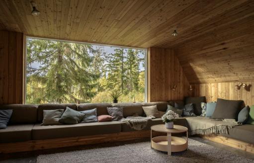
Large groups also fit comfortably in the open-plan kitchen and lounge, where floor-to-ceiling and picture windows frame impressive alpine views. The ground floor is anchored by a glazedbrick fireplace with a curved firebox that echoes the unique shape of the roofline. Upstairs, this motif returns in the central den, where the Siberian larch ceiling sweeps up to the roof’s ridge.
The window- and wood-lined interiors will be a beacon for Anders and his guests returning from outdoor activities throughout the year, be they skiing in winter or bicycling in the summer. It’s a nice place for unwinding, too: Near the entrance, a room for removing gear connects to a spa area with a sauna.
M Å N S T H A M , A R C H I T E C T
More at Dwell.com Do you have a project you’d like to see published in Houses We Love? Share it at dwell.com/add-a-home
A 1 7 t h - C e nt u r y C h ât e au i n Fr a n ce G et s a S u st a i n a b i l i t y - Fo c u s e d Re st o r at i o n
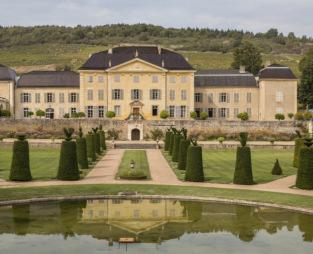
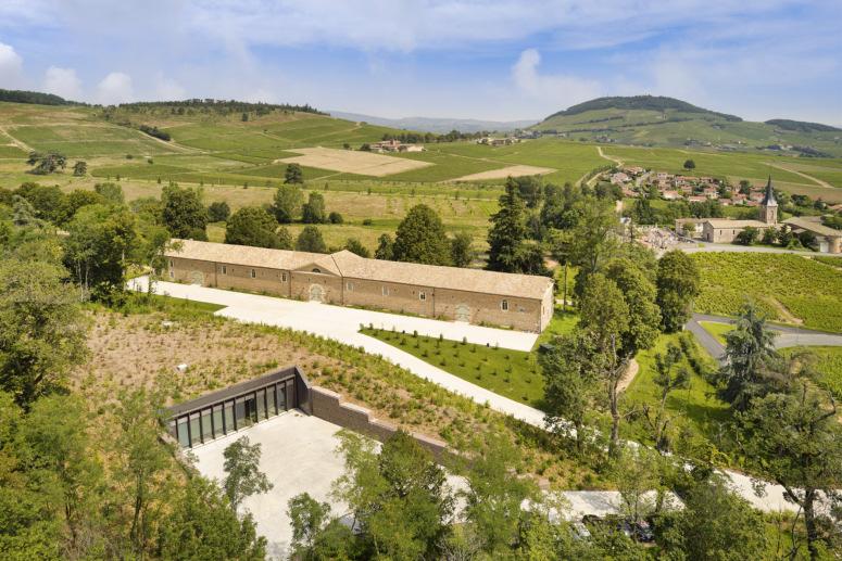
The Château de La Chaize vineyard and its newly restored chai (storeroom) are all registered as French historical monuments. Set across 990 acres of landscaped
grounds and vineyards in Burgundy’s southern Beaujolais region, the 17th-century estate and winery Château de La Chaize boasts an elegant design based on the golden ratio—a mathematical proportion commonly found in nature—and it remains a quintessential French domain.
What you don’t see, says Didier Repellin, the French architect who recently restored the property, is the brilliance of its original makers and artisans: the carpenters, the masons, the stonecutters—the engineers and painters. “We sometimes forget that historical monuments are not only a date or a style of architecture, but a celebration of human genius,” Repellin says.
So what, exactly, has been changed with the renovation? To the untrained eye, not much. (And that, says Repellin, equals success.) But under Christophe Gruy, entrepreneur and chairman of the Lyon-based Maïa Group, who purchased the estate in 2017, the adjustments to Château de La Chaize are massive. For one, the entire estate is now dedicated to introducing sustainable practices and features, including using solar power for all of its equipment, recycling to achieve zero waste, and building a geothermal heating and cooling system. When it comes to wine production, the goal is to be certified organic in time for this year’s harvest.
It’s no wonder that now, centuries later, the current architect tasked with updating the estate is more enamored of conservation than total renovation. “If it is good, why would we touch it?” Repellin asks. “On the contrary, we must amplify it. This is a true opportunity to allow the monument to continue to live by adapting it to contemporary needs.”


