
5 minute read
SISTER ACT
from fugmzxuz,oh
CLEAN CONTEMPORARY sisterAct
When one sister has a brand new custom-build home that needs decorating and the other sister is a designer...well, you can guess the rest.
Advertisement
TEXT CHRISTY WRIGHT
PHOTOGRAPHY JANIS NICOLAY
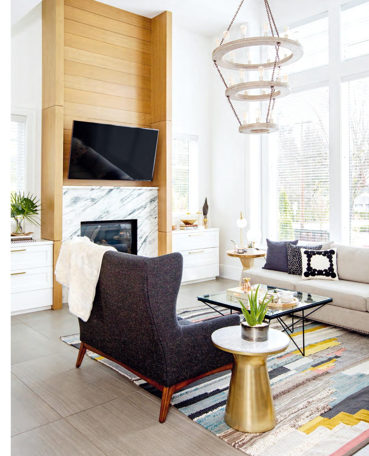
“The wooden chandelier in the living room was one of the first light fixtures my sister [designer Tanya Krpan] showed me, and I couldn’t let it go,” says homeowner Melina Maierle. “It was a definite splurge, but I love the sheer volume of it.” Tempering the big spend is the high-backed loveseat, which was bought on sale. “It really rounds out the room,” says Melina. The furniture’s neutral tones are lifted by the subtle colours in the rug.
DESIGN, Tanya Krpan Design Co., tanyakrpandesign.com; CONTRACTING, MILLWORK, Etro Construction Ltd.; Chantilly Lace OC-65 WALL PAINT (throughout), Benjamin Moore; SIDE TABLE, TABLE LAMP, RUG, West Elm; COFFEE TABLE, Roost; CHANDELIER, Arteriors Home; marble FIREPLACE SURROUND, Margranite Industry; THROW, RH Restoration Hardware; solid grey TOSS CUSHION, polka-dot TOSS CUSHION, Indigo; diamond-patterned TOSS CUSHION, The Cross Decor & Design.
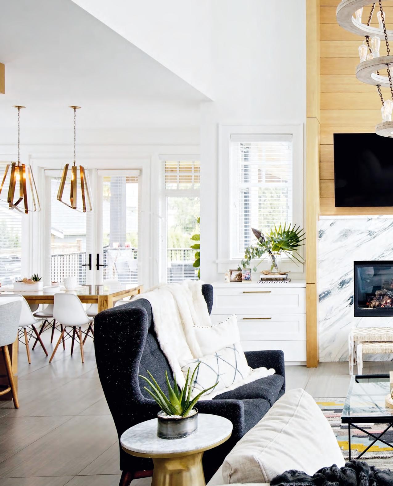
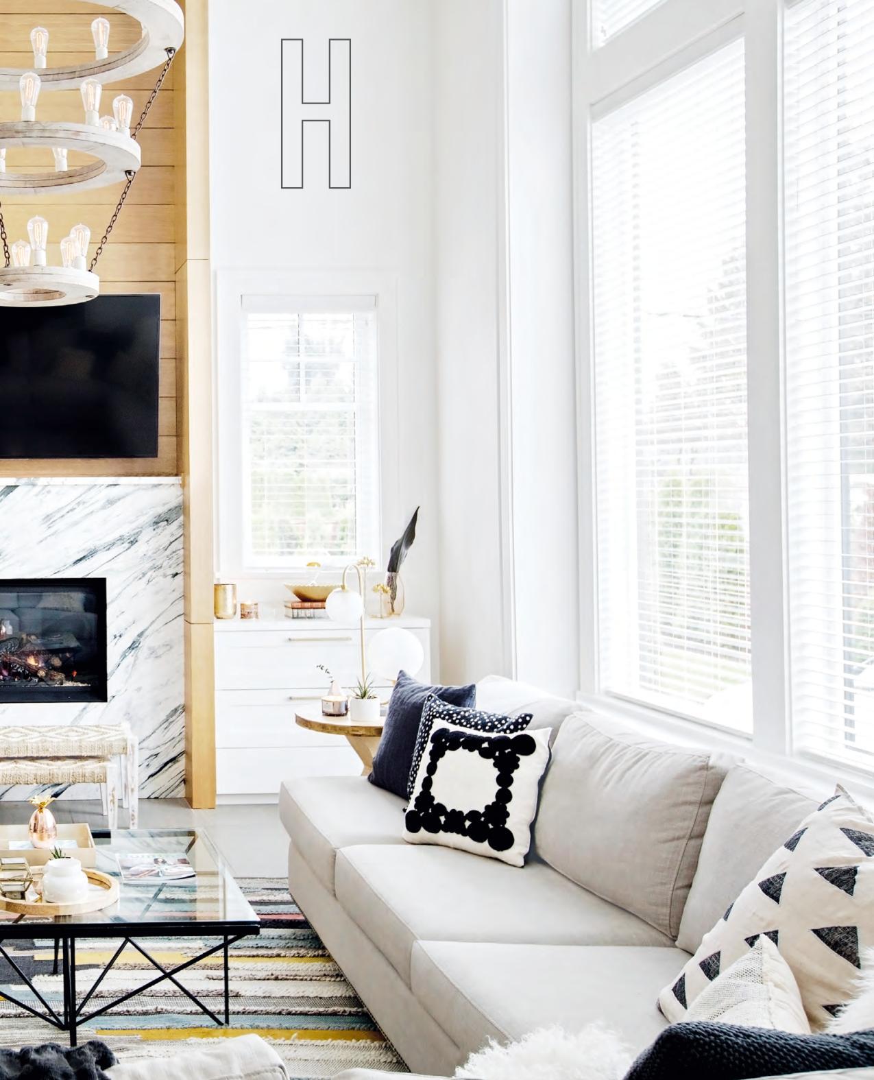
omeowner Melina Maierle was in the first trimester of a very queasy pregnancy. Her sister, designer Tanya Krpan, had just had a baby. Together, they took on a huge project: designing the 4,700-square-foot home in Port Moody, B.C., that Melina and her husband, Mike, were building. “We were designing with a baby on the hip and a baby on the way,” says Tanya. “It was rushed!” But Melina wouldn’t have had it any other way. “We’re as close as two people can be,” she says. “I can honestly say that my sister – well, her design sense – was on my ‘must-haves’ list.”
And that list was lengthy. Having just returned from a five-year work stint in the Bahamas with their son Mason (now 5) in tow and son Jude (now 2) on the way, the couple desired a forever home that reflected their family: young and modern but also warm, livable and kid- (and baby-) friendly (the couple has since welcomed a third child).
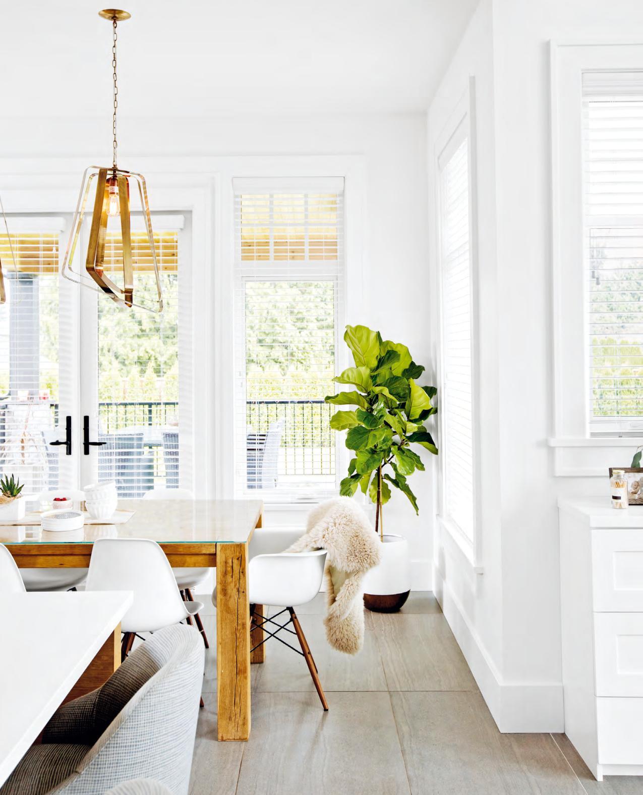
The dining room delivers an interesting high-low mix. Authentic Eames chairs and sculptural brass pendant lights share the space with cheap and cheerful window treatments. “Initially we planned on hanging drapery,” says Tanya, “but it proved to be too expensive, so we opted for blinds instead.” A sheepskin throw layers softness and texture into the area, as does the fiddle-leaf fig tree.
DINING TABLE, RH Restoration Hardware; PENDANT LIGHTS, Arteriors Home; sheepskin THROW, Serena and Lily.
ABOVE Tanya added panelling to one entryway wall. “The ceiling here is 18 feet high, so this expanse needed some visual interest to break it up,” she says. “You can also see this wall from the main living areas so it acts as a feature.” The bench and jute rug echo the door’s warm oak tones.

BENCH, POUFFE, PRINT, The Cross Decor & Design; RUG, Serena & Lily; PENDANT LIGHT, Worlds Away; TOSS CUSHION, West Elm.
RIGHT Melina (pictured with Tanya, standing) loves the personalized design that only a very close sister could perfect.
With that in mind, Tanya slightly tweaked the floor plan. “The kitchen is big so I wanted to make it feel cozier,” says the designer. “There were plans for an exposed pantry area with a sink, but I turned it into a little nook to make it more hidden. And there’s plenty of space there for baby bottles and storage.” That’s perfect for Melina, for whom organization is paramount. “My sister likes compartmentalizing,” says Tanya, “so functionality played a big part in the design.”
The remaining items on Melina’s list, other than a showstopping powder room (not shown), focused on furnishings, specifically wow-factor light fixtures and a sofa big enough for the whole family to curl up on. “The floor plan is open so all the pieces had to be interesting from every angle,” says Tanya. “We wanted a bit of colour and lots of drama. I like mixing materials, and warm and cool tones, for a striking effect that’s never static.”
This dynamic tension of warm and cool deftly punctuates the abode, from the kitchen’s backsplashes and island base to the dining table and pendant lights hanging above it, but
RIGHT Drama was the buzzword for the kitchen, and Tanya achieved it with a mix of materials and tile applications. “We contrasted the bold marble backsplash with the pantry’s light tiles, which were applied in a herringbone pattern,” she says. “You can see this wall from the island and dining area so I wanted it to be more than just drywall.” To accommodate the expense of the marble, the sisters nixed the original plan of using high-end European appliances and opted for mid-range models instead. The pairing of white-painted and unadorned oak cabinetry speaks to Tanya’s penchant for eclecticism, right down to the hardware. “The black pulls complement the grey marble and the brass ones link nicely to the dining room lights. It’s a rich look that isn’t static.”
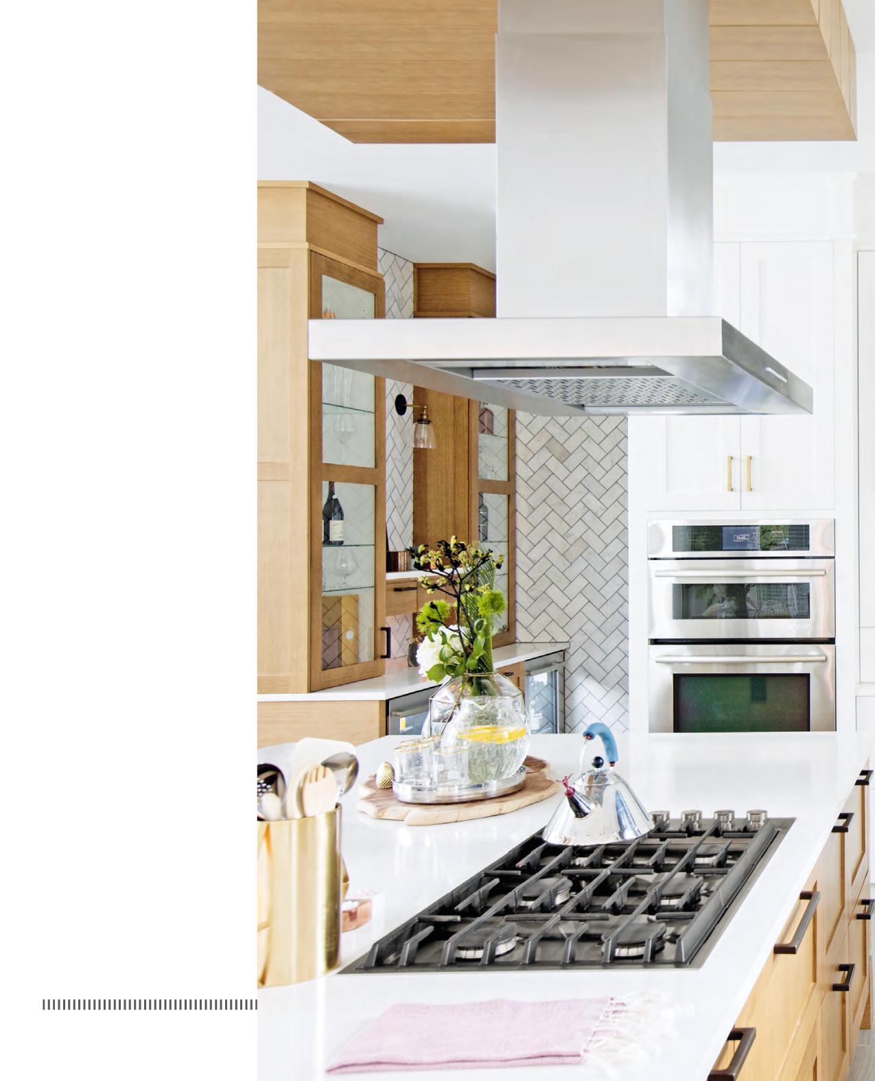
CABINETRY HARDWARE, Richelieu Hardware; BACKSPLASH & WALL TILES, C&S Tile Distributors; APPLIANCES, Coast Wholesale Appliances; FAUCET, Brizo.
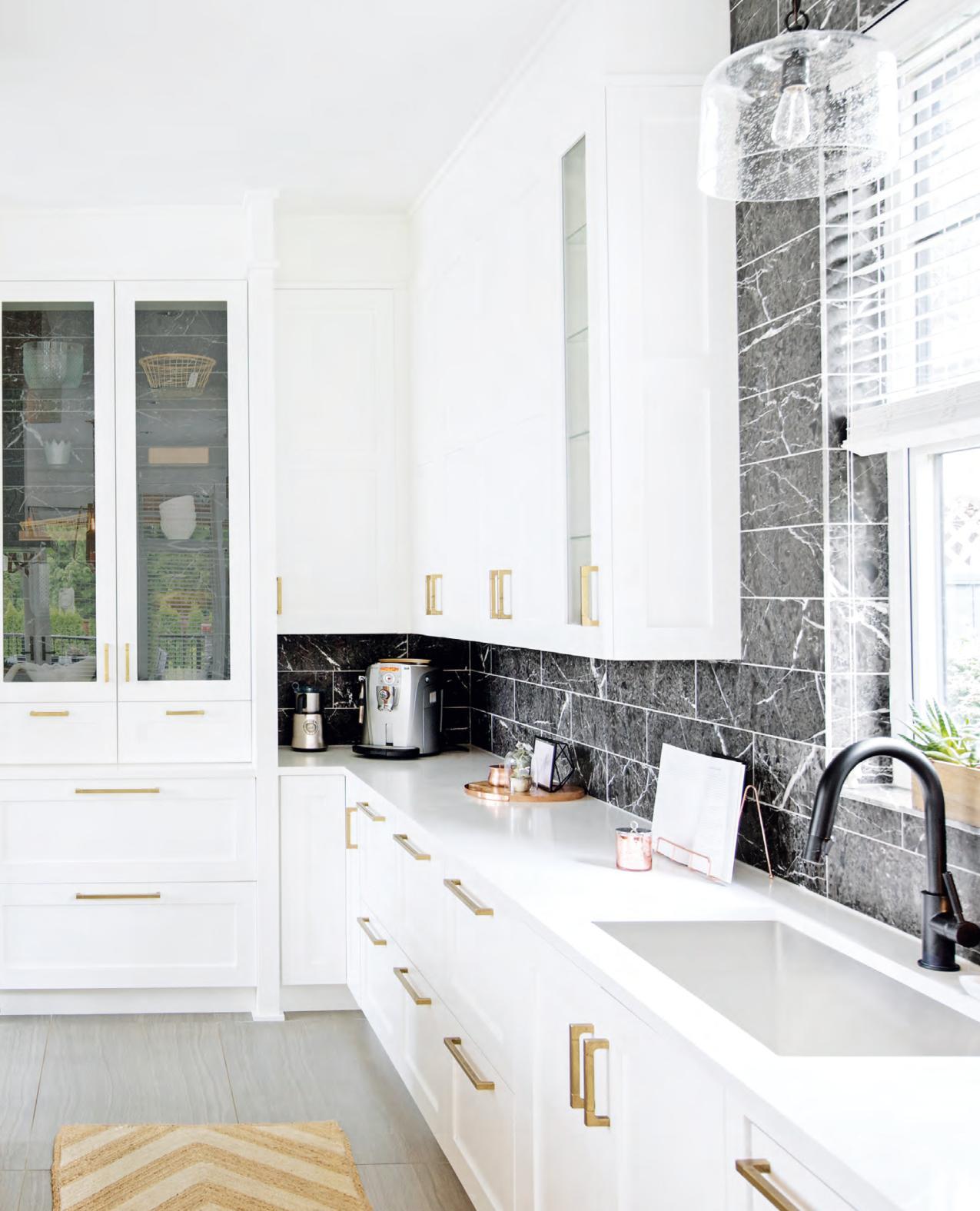

it’s perhaps most evident in the living room. “The facade of the fireplace contrasts oak with heavily veined grey and white Calacatta marble for a truly spectacular effect,” says Tanya.
But it’s not all eye candy. With Melina’s love of organizing in mind, Tanya flanked the jaw-dropping fireplace with practical white storage banks that seem to disappear into the wall and keep the hearth as the focal point.
This showpiece of form and function encapsulates Tanya’s approach to designing this house: It’s super practical and family-friendly yet so utterly gorgeous anyone would want to live in it in a heartbeat. It’s an effect not lost on her sister. “When everything was done,” Melina says, “I was like, ‘Oh wow, Tanya, you know me so well. I always knew you were good at your job.’”
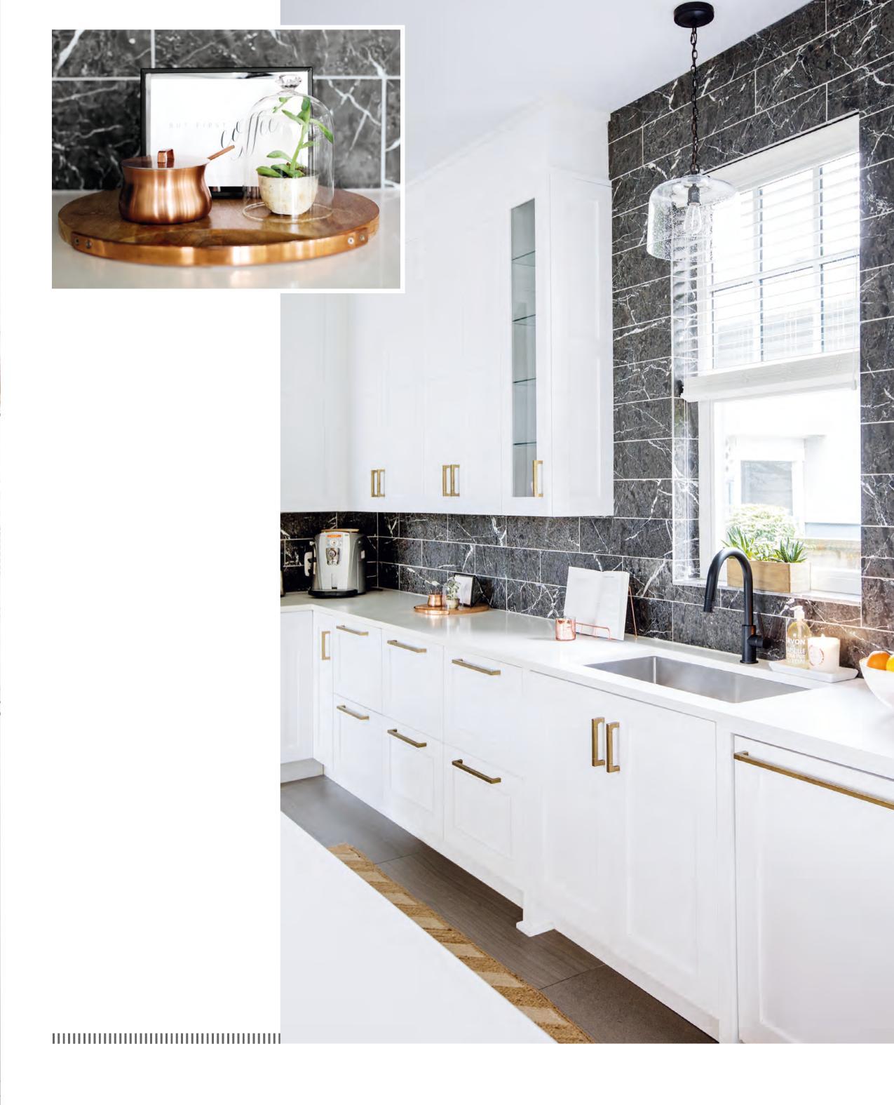
OPPOSITE The white oak ceiling treatment and island base help define the kitchen in the open-plan space. The stools reinforce the warmth with their wooden bases and nubby tactile upholstery.
STOOLS, West Elm.
RIGHT A dark grey veined marble backsplash energizes the kitchen’s main area. “It was another thing my sister suggested that I couldn’t let go of,” says Melina. “I love it so much because it’s not typical and it’s a bit dramatic.” The black faucet is also unexpected but connects to both the backsplash and the island’s black hardware.
FOR SOURCES, SEE OUR WORKBOOK


