4 minute read
THIS TIME IT’S PERSONAL
from fugmzxuz,oh
TEXT CHRISTY WRIGHT
PHOTOGRAPHY DONNA GRIFFITH
Advertisement
STYLING MARGOT AUSTIN
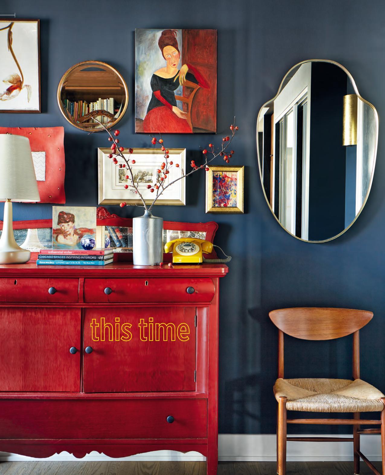
it's personal A white condo bereft of personality is recast as a bespoke abode that brims with the individuality of the couple who calls it home.
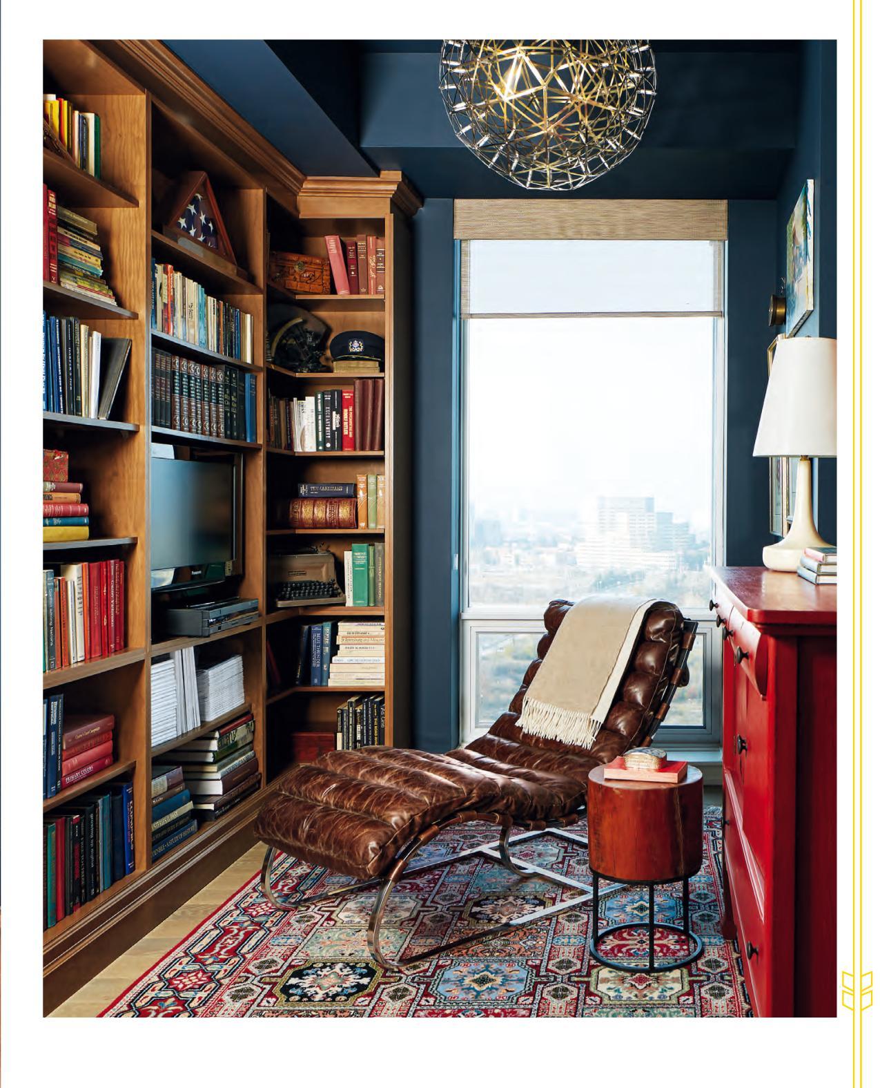
THIS PAGE & OPPOSITE The snug library features custom cherry shelving that references the woodwork in the kitchen and living room – a detail that keeps the mostly open-concept space cohesive.
DESIGN, Modecor, modecor.ca; Hale Navy HC-154 WALL PAINT (throughout), Benjamin Moore; ROMAN SHADES (throughout), Decorview; LOUNGER, ABC Carpet & Home; SIDEBOARD, Tin Barn Market; SIDE TABLE, Artemano; SIDECHAIR, Founddesign; PENDANT LIGHT, Marchand Lighting and Electrical; TABLE LAMP, The Modern Shop; red square PLATE (hanging), plant PRINT, Green Light District; vintage MIRROR (above chair), Updated Furniture.
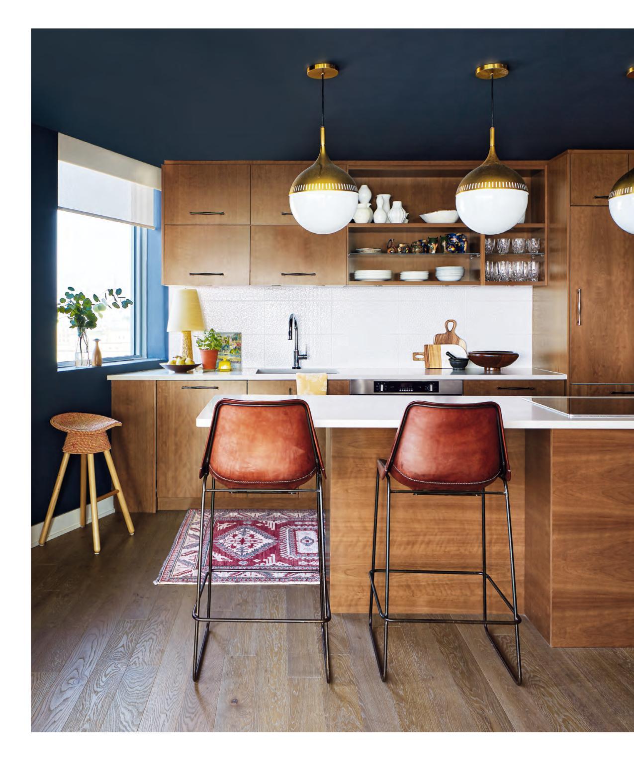
“I searched and searched for comfy island stools that would offer both back and foot support,” says interior decorator and homeowner Maureen Coates. These patinated leather beauties fit the bill, and their warmth flatters the cherry cabinetry. Burnished brass pendant lights riff on the wood and leather tones.
STOOLS, Green Light District; wooden STOOL, Umbra Shift; PENDANT LIGHTS, Marchand Lighting and Electrical; TABLE LAMP, Founddesign.
mack dab in the middle of downtown Ottawa is a robustly personalized condo that could easily act as the three-dimensional design portfolio of its owner, interior decorator Maureen Coates. With inky blue walls, bold accents and a mix of warm furnishings both country and contemporary, it’s simply riveting. Which makes it all the harder to believe that this thoughtfully composed 1,400-square-foot space began as an all-white new build.
“My husband, Michael [a former PR executive], and I were downsizing from our home in the city’s Glebe neighbourhood,” says Maureen. Official empty nesters (they have three grown daughters), the couple was drawn to this condo development. “It’s on a heritage site with unobstructed views of the Ottawa River and Parliament Hill,” she says. They purchased the suite in 2011, and it was move-in ready by 2015, but not without some pre-build design intervention. “The size and the view were perfect,” says Maureen, “but looking at the plans I soon realized they needed some alteration.”
Her decorator instincts prompted changes that included removing an entrance wall to make way for a small library and adding a living room fireplace framed in cherry to match the kitchen cabinets. Fortunately, the alterations went according to plan, but when they moved in, some- thing still wasn’t right.
“After six months in the condo, I was ready to change the white walls,” says Maureen. “I’ve never veered from using colour. It’s been a mainstay in all our homes for the past 36 years.” Inspired by the suite’s natural light, Maureen decided to go dark. “I knew navy blue would be a fantastic backdrop on the walls and some areas of the ceiling. My husband was, shall we say, less than enthusiastic about it.”
Thankfully, he came around once the walls were painted. More than a mere backdrop, the hue effectively highlights Maureen’s mix of stunning furnishings. “I love contemporary, but I always incorporate a few well-loved antiques,” she says. To perfect the mix, Maureen custom-designed many of the living room pieces. “Those elements, as well as the lighting and the window treatments, were big splurges, but I justified the cost by measuring their longevity in the space. They are quality items that are here to stay.”
The couple has only lived in the space for just over two years, yet it already seems like a storied family home rather than a city condo, thanks to Maureen’s adventurous design. “I didn’t just shop at one furniture store – I never would!” she says. “And though I’m not keen on overusing the word ‘curate’ when it comes to design, I really studied the space and spent hours and hours sourcing pieces. If I couldn’t find what I was looking for, I put pencil to paper and designed it myself.” A three-dimensional portfolio indeed.
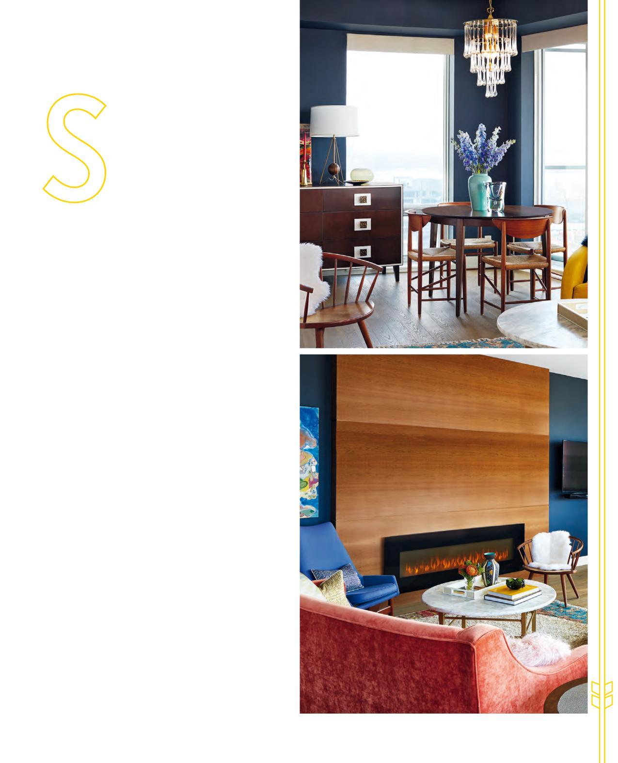
“The dining table belonged to my parents, and I disliked it growing up,” says Maureen. “But I’ve since fallen in love with it.” The area is illuminated by a striking Murano glass chandelier. “It was my very first purchase for the condo.”
Vintage CHANDELIER, Victorian Revival; DINING CHAIRS, Founddesign; TABLE LAMP, The Modern Shop.
“This wall was screaming for something large,” says Maureen. “I wouldn’t put the sofa here, facing the view, because then we’d have no place for the TV, which is an integral part of our evenings.” The stunning solution was this electric fireplace with a three-panel cherry surround.
Vintage blue SIDECHAIR, Founddesign; wooden SIDECHAIR, Aero.
The curvaceous floor lamp echoes other rounded shapes throughout the space.
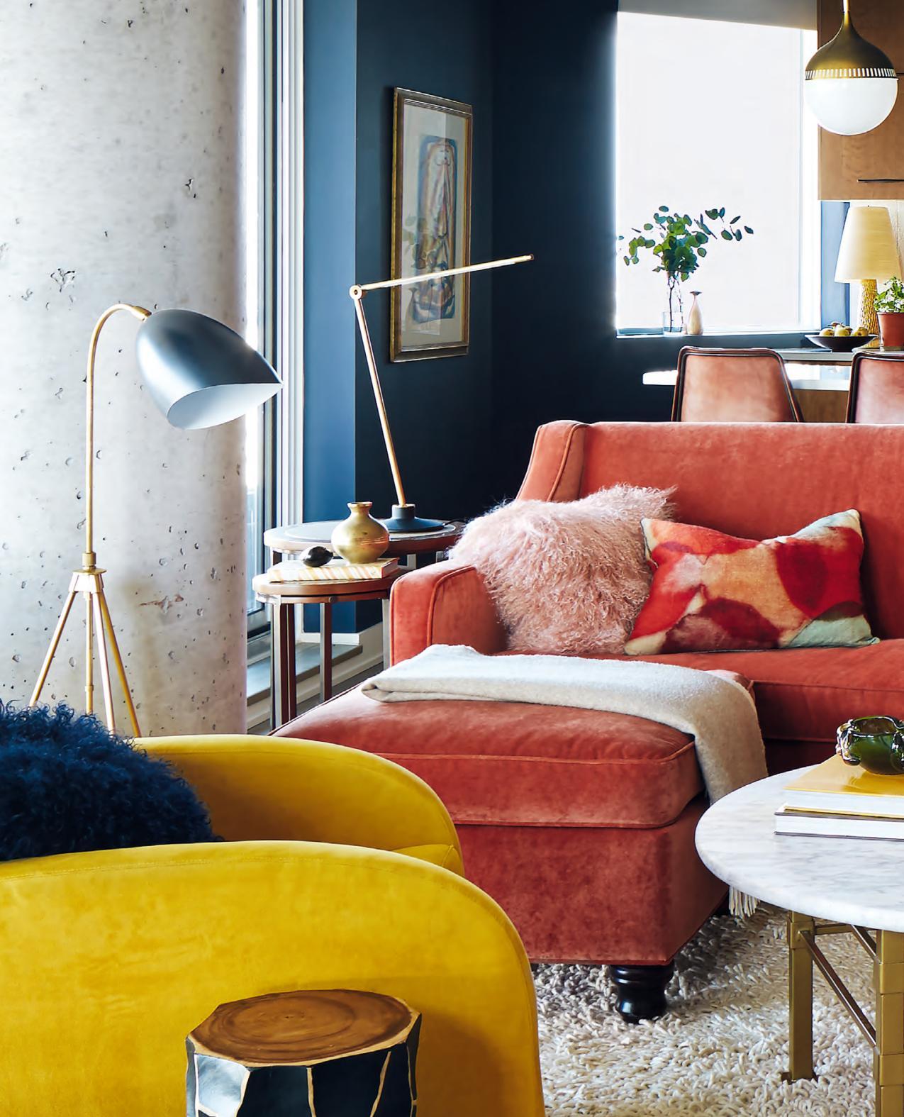
Pieces of pottery Maureen collected from Italy and Portugal were the jumping-off point for the living room’s richly hued furniture: burnt orange, mustard yellow and cobalt blue. “Because the condo is linear, I wanted to introduce curves. I designed this tight curved-back sofa, then added the slightly rounded ottoman for extra seating and lounging,” she says.
SOFA, OTTOMAN FABRICATION, Switch Studio; yellow ARMCHAIR, white RUG, Mikaza Home; SIDE TABLE, Artemano; FLOOR LAMP, Astro Design Centre; blue watercolour TOSS CUSHION FABRIC, Robert Allen.
FOR SOURCES, SEE OUR WORKBOOK


