2 minute read
DINING ROOM REDO
THEN
A bright and colourful palette with dark furnishings and bold pattern play made decorator Tim Lam’s 150-square-foot Toronto dining room feel intimate and cozy. While it was perfect for hosting dinners for friends, the space suffered from a wobbly table and lack of storage. It was time for a change.
Advertisement
DINING ROOM REDO
Sometimes decorators don’t just update a space – they completely overhaul it. Here are takes one and two of a super-stylish dining room.
TEXT BETHANY LYTTLE
PHOTOGRAPHY STEPHANI BUCHMAN

NOW
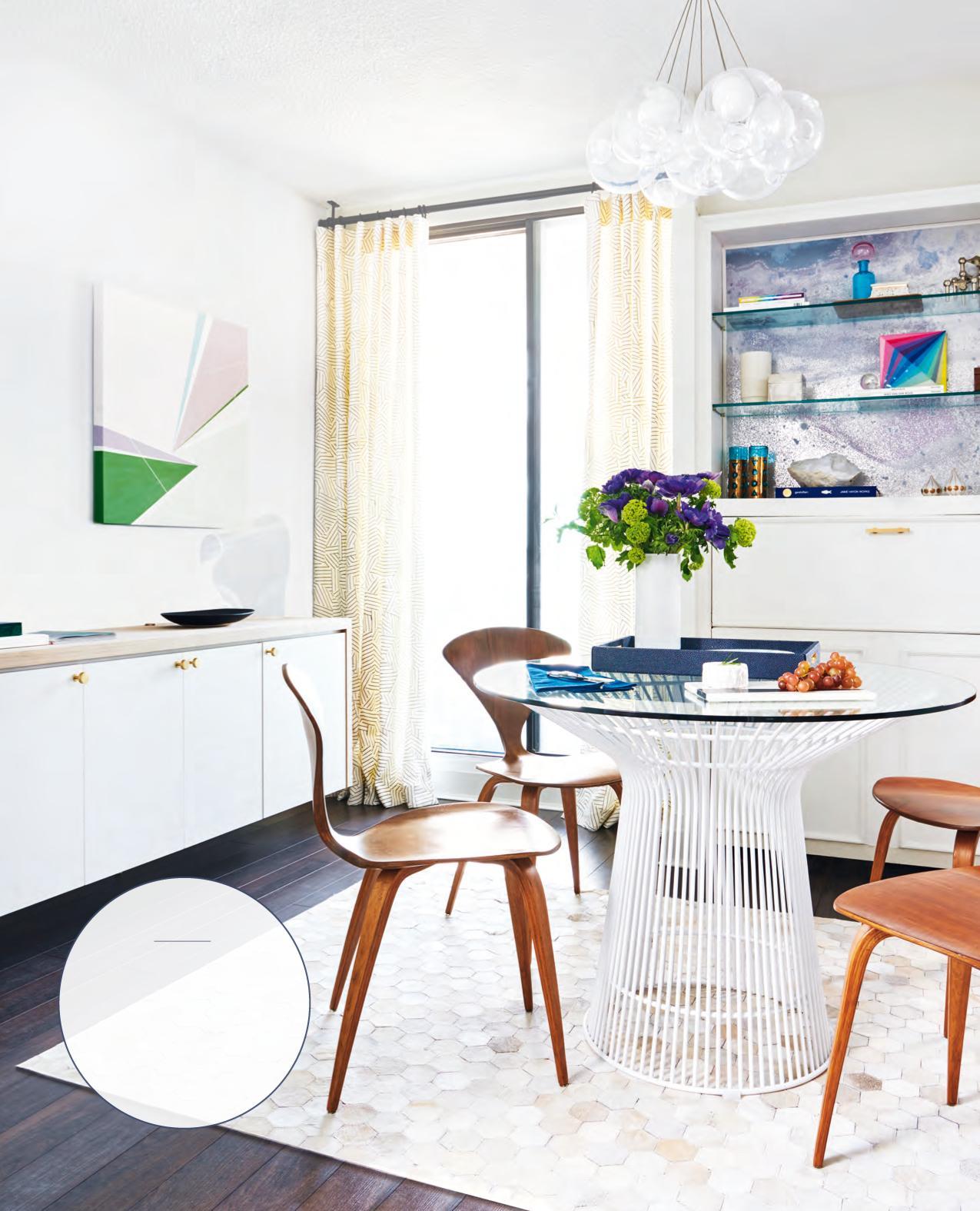
The dining room has been transformed into a bright and airy space thanks to a more subdued palette featuring subtle patterns and textures, from the drapery to the rug. Tim reused the same comfy wooden chairs. “They look great and stow easily, which is essential in such a small space,” he says.
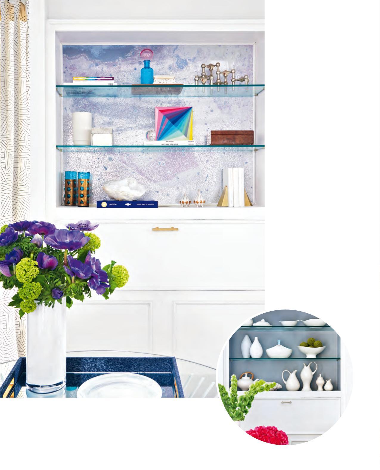
ABOVE “Originally, I was going to back the shelves with pale pink paint,” says Tim of the built-in hutch. “But I wanted more punch.” Metallic marbled wallpaper did the trick. “Not only does it catch the eye, but it also inspired me to showcase brightly coloured items. Before this, I’d only displayed white objects.” Ample closed storage keeps clutter, whether it’s dishware or computer cords, out of view. “WHEN I FIRST DESIGNED THE SPACE, it was a place for entertaining. The colours were bold. The furniture was dark. It was all about food and mood,” says Toronto decorator Tim Lam of his stylish dining room. But life changes, and with it, decor needs change, too. “When my partner [Chris Gabriel] stays here, he uses the dining table as a desk,” says Tim. So it’s often covered with paperwork and cups of coffee – not wineglasses and flowers. That’s why Tim decided to redecorate.
“The room was a disaster,” says Tim. “Truthfully, it had become one big storage locker. I’d put one stack of stuff on the table, and then, since there was already one stack, I’d add another.” In a 750-square-foot condo, desiring a dining room that serves triple duty is understandable. But Tim craved a better balance of style and function with a dining room that could easily go from “command central” to “cocktail hour.”
Airy lighting, lots of storage and a serene palette with subtle accents were central to this day-to-eveningready transformation. “My tip for anyone who is redecorating is this: Start with function,” says Tim. “Think about how you plan to use the space. Making it pretty should be the last step. Making it practical should be the first.”

BEFORE
BEFORE
FOR SOURCES, SEE OUR WORKBOOK A floating sideboard offers concealed storage yet is visually unobtrusive since it’s lifted off the floor. Tim, pictured, painted the artwork above it himself. “I pulled colours from the wallpaper backing the shelves and used other paint I had left over,” he says. “It was just a playful experiment that worked out really well. It saves money, and it’s guaranteed to be one of a kind.” In his old dining
DESIGN, DesignMaze Interiors, designmaze-tim. blogspot.ca; WALLPAPER (backing shelves & on sideboard wall), Calico Wallpaper; Expert White WH07 HUTCH PAINT, Para Paints; DINING TABLE, RUG, HomeSense; DINING CHAIRS, Design Within Reach; custom SIDEBOARD, DesignMaze Interiors; SIDEBOARD HARDWARE, Upper Canada Specialty Hardware; LIGHT FIXTURE, Bocci.

room, the bold botanical wallpaper negated the need for artwork.


