8 minute read
IT TAKES TWO
from jkybyibtutbiu
Style at Home contributors Karl Lohnes and Peter Paquette collaborate on a reboot of a traditional Toronto home.
TEXT BETHANY LYTTLE PHOTOGRAPHY PATRICK BILLER
Advertisement
t this point in my career, it’s absolutely invigorating to learn from the new generation of designers coming up,” says Style at Home’s Karl Lohnes. “And that’s one reason why I invited my colleague Peter Paquette of 1982 Design to take the lead on this project.” Their clients, a family of four, loved their neighbourhood and the 1920s home they’d lived in for many years, so moving wasn’t an option. However, their stylish, relaxed energy wasn’t reflected in the home, which was weighed down by a plethora of shiny brass, traditional millwork and
A“ dated floors. “We abandoned all that for a masculine look with a touch of hotel chic,” says Karl. Peter agrees: “It’s like a modern hotel lobby. We used different styles of furniture and a lot of textural and printed fabrics to give it a collected look that’s approachable and warm.” As the project unfolded, it was clear that certain elements had to go, such as rather odd interior Grecian columns, while other features like the signature leopard stair runner deserved a bold debut. And the redo didn’t stop there. The main bedroom was graced with a sexy dressing room, and the living room is now steps from a full-service bar. “In other words,” says Karl, “you can definitely say this house puts the ‘fun’ in function.”
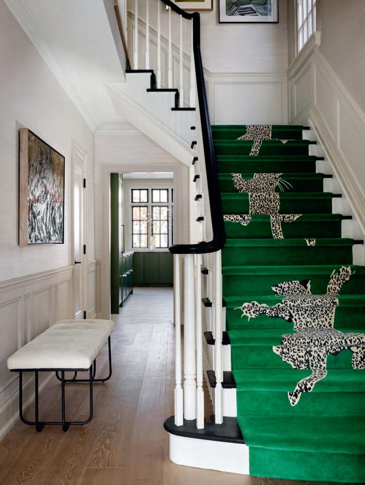
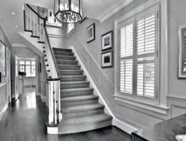
ABOVE “The home’s boldest move is the stair runner because it greets everyone,” says designer Karl Lohnes. The clambering leopards and sleek bench in Ultrasuede are a far cry from the former entryway’s formal look. Upper walls adorned in easy-care faux grasscloth modernize the classic panelling.
“ The client had seen this climbing leopard rug and really loved it, so we said, ‘Let’s go for it!’ ” – Karl Lohnes
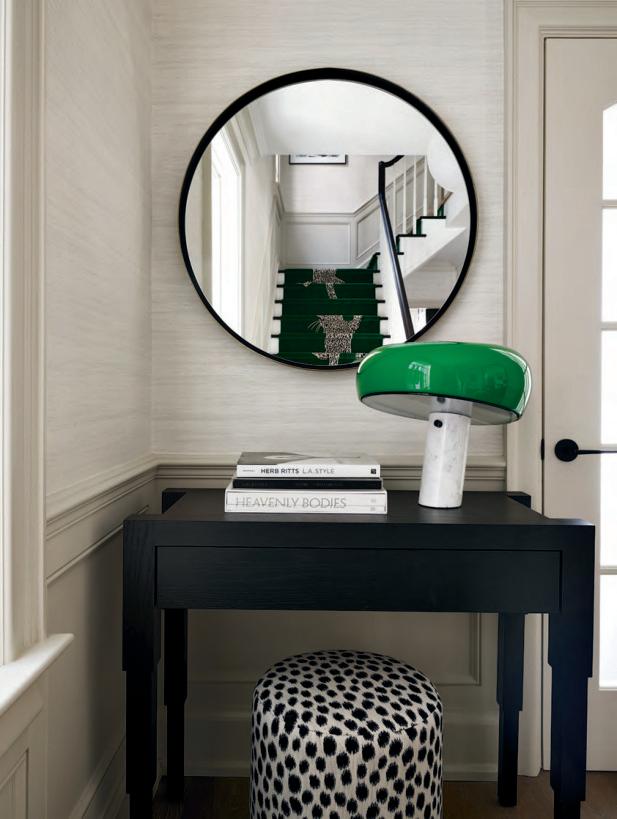
OPPOSITE Old Hollywood, anyone? A sexy green lamp and animal print pouf are pure glamour, and announce the green accents and animal prints used throughout the home. Designer Peter Paquette designed the oak credenza. “Its legs are reminiscent of Art Deco skyscrapers,” he says. The mirror bounces light from a nearby window.
DESIGN, Karl Lohnes, KL Decor; Peter Paquette, 1982 Design. Oak FLOORING, Moncer Flooring. WALL PAINT, Baby Fawn OC-15, Benjamin Moore. The Rug Company’s Diane von Furstenberg Climbing Leopard RUNNER, Avenue Road. CONSOLE TABLE, OTTOMAN, 1982 Design. Maverick BENCH, Sunpan. Ottoman FABRIC, JF Fabrics. Flos’s Snoopy TABLE LAMP, The Modern Shop. MIRROR, CB2.
B E F O R E
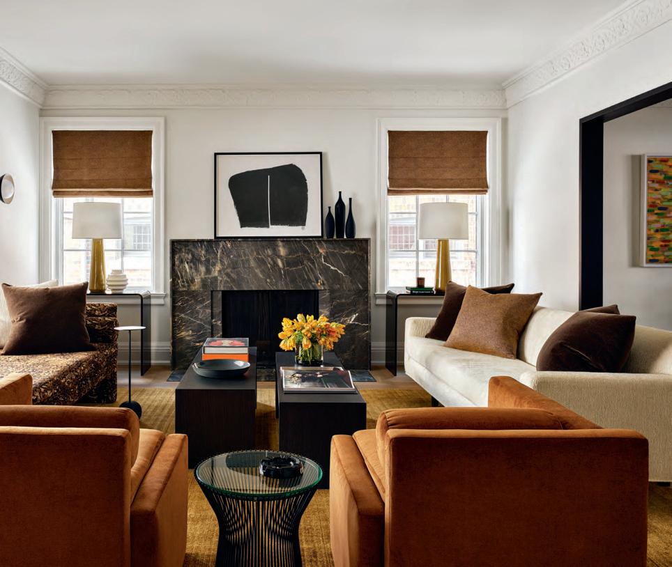
ABOVE Since Karl and Peter wanted the living room’s focal point to be the fireplace, they resurfaced the formal Georgianstyle one to create a modern marble masterpiece. To emphasize the point, they flanked it with twin lamps and window treatments. “Symmetry is the ultimate creator of calm,” says Karl. The chaise is covered in an animal print. “Fabric like that can be quite a commitment, but the clients were up for it,” says Peter. The low back on the sofa prevents the dining space from being cut off. OPPOSITE “If the clients have a party, the twin chairs can be butted together for more room,” says Karl. “Similarly, the shorter of the two coffee tables can be slid beneath the taller one.” After the French doors that separated the living and dining rooms were removed, the thresholds were rebuilt and painted in a glossy deep brownish black.
Custom CHAISE, SOFA, COFFEE TABLES, velvet ARMCHAIRS, 1982 Design. Armchair FABRIC, Maharam. PAINT, Fog Mist OC-31 (wall), Deep Caviar 2130-20 (trim), Benjamin Moore. PENDANT, SCONCES, Luminaire Authentik. Platner TABLE, France & Son. SEWING (Roman blinds and pillows throughout), Hemme Custom. FABRIC (blinds, pillows), Pierre Frey. GRAPHIC ART, wood VASES, Elte MKT. Grigio Soveraia FIREPLACE SURROUND, Stone Tile. Custom silk and wool RUG, Elte. Barbara Barry’s Athens LAMP, Robinson Lighting & Bath.
B E F O R E
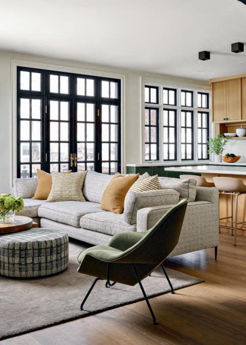
“ The homeowners had their heart set on a green kitchen. We added in the moss-coloured chair and ottoman, and olive green piping on the sofa to tie it all together.” – Peter Paquette
RIGHT “Painting the window frames black offered the clients an immediately more modern space,” says Peter. The oversized sofa has a textured weave that flatters the tactile loveliness of the nearby velvet chair. “The pouf tucks under the coffee table when not in use,” says Karl. “But when friends are over, it slides right out.”
Custom kitchen CABINETRY and all MILLWORK, Beauparlant Design Inc. Stanley SECTIONAL, Montauk Sofa. Knoll’s Womb CHAIR, Quasi Modo. Norman Copenhagen BAR STOOLS, The Modern Shop. Custom COFFEE TABLE, OTTOMAN, 1982 Design. Ottoman FABRIC, Willie Weston; PILLOWS, Caroline Cecil Fabrics; Memo Showroom. Wool RUG, VASE, Elte. FAUCET, SOAP DISPENSER, Riobel.
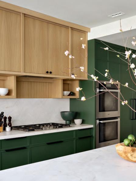
LEFT In the kitchen, oak millwork and natural honed marble were taken to the next level with green base cabinets and a pantry cupboard. Open shelves offer space for dishware that’s close at hand for prepping and serving.
B E F O R E

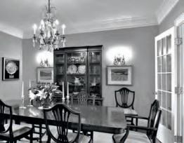
The dining room has no windows. However, by adding a new, larger curved metal entry, painting out the trim and suspending a knockout chandelier over a custom wood table, the designers created a stylish space. The warm gold waxed-linen seating has cachet but is sufficiently practical for daily use by the family of four.
WALL PAINT, Navajo White AC-95, Benjamin Moore. Custom DINING TABLE, BAR, SHELVING, Greenwood Studio. Custom DINING CHAIRS, 1982 Design. Thomas O’Brien’s Osiris CHANDELIER, Robinson Lighting & Bath. Murano glass BOWL and VASE, Elte. ARTWORK, Magnolia by Katharine Harvey, Nicolas Metivier Gallery.
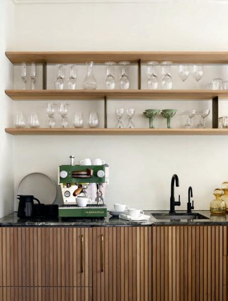
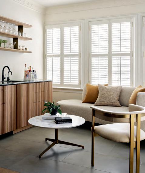
ABOVE The husband starts his day with an espresso at the custom bar, but at night this is a very cool cocktail destination. “Originally, this was a sunroom that never got any use. Its proximity to the living area made it perfect for a bar,” says Peter. BELOW The oak cabinetry in the bar has a lot of jazz thanks to ribbed-finished doors. Reaching for a glass? Look no further than the open shelves. After that, it’s time to check out the ice drawer and bar fridge before relaxing on the lounge-worthy serpentine sofa.
B E F O R E “ This is an ideal space to indulge in morning coffee rituals, as well as ambient evenings with cocktails. To me, this is an example of how good design invites clients to live a better life.” – Peter Paquette
Serpentine SOFA, 1982 Design. Sofa FABRIC, Maharam. Brass ARMCHAIR, Elte. Marble COFFEE TABLE, Home Société. La Marzocco ESPRESSO MACHINE, Sam James Coffee Bar. FAUCETS, Riobel. Amber DECANTERS, Elte MKT. Pillow FABRICS, Pierre Frey; Fret Fabrics.

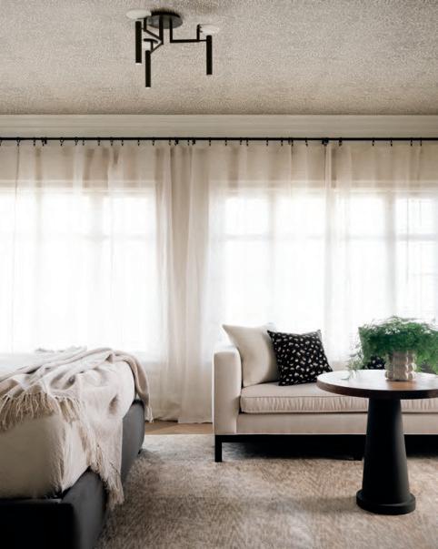
RIGHT Ready-made sheers run wall to wall. “Not only do they allow for diaphanous light, they cleverly disguise the home’s original shutters and shorter windows,” says Peter. The sofa was designed with a low back so it wouldn’t block the window and could be moved, if desired, to sit at the end of the bed.
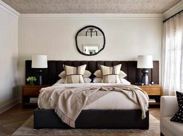
WALL PAINT, Fog Mist OC-31, Benjamin Moore. Kelly Wearstler’s Stigma WALLPAPER, Kravet. Custom upholstered BED, SOFA, PEDESTAL TABLE, 1982 Design. Bed upholstery FABRIC, Maharam. Custom NIGHTSTANDS, Greenwood Studio. Visual Comfort’s Nero LAMPS, Kelly Wearstler. Melange LIGHT FIXTURE, Elte. BEDDING, THROW, RH Modern. Zeppelin FABRIC (shams), Pierre Frey. SHEERS, HARDWARE, Crate and Barrel. MIRROR, CB2. Wool and silk RUG, Elte.
B E F O R E
LEFT Karl and Peter wanted to try wallpaper in the primary bedroom – but, where to put it? “That’s where the ceiling came in,” says Peter. “It’s a small-scale print made up of subtle creams, taupes and browns, but it’s more of a texture than a print,” adds Karl. It also plays to the pattern in the rug. The luxurious mohair headboard has vertical channelling; above it, the metal framed mirror is hung high on the wall to amplify natural light.
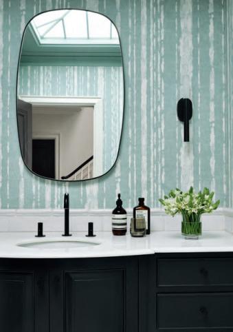
ABOVE “The son’s bathroom shows you what a little makeover can do,” says Karl. “The wallpaper was already there, and it worked!” Painting the vanity, hanging a bolder mirror and changing out the fixtures modernized the space instantly.
VANITY PAINT, Black Forest Green PM-12, Benjamin Moore. Studio S FAUCET, American Standard. Visual Comfort’s Rousseau SCONCES, Elte. MIRROR, CB2.
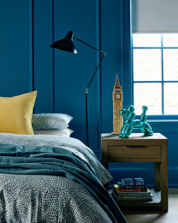
RIGHT Karl and Peter transformed what had once been a traditional-looking bedroom into a just-for-him space for the clients’ 12-year-old son. The walls, trim and window mullions are painted in a radiant blue.
WALL PAINT, Lucerne Blue AF-530, Benjamin Moore. NIGHT TABLE, RH Teen. Aerin Lauder’s Charlton FLOOR LAMP, Elte. BEDDING, THROW, IKEA.
FOR SOURCES, SEE OUR WORKBOOK
“ Navy blue is often a classic colour choice for kids’ rooms, but teal ups the ante on style and sophistication.” – Karl Lohnes
