
YUERONG ZHOU I Selected Work 2013-2024 NEU + METU + TU Delft
E-mail: yuerong_zhou@outlook.com
Linkedin: www.linkedin.com/in/Yuerong-Zhou
Gerji Co-habitable Densification 8.5/10, Global Housing Addis Ababa Graduation Studio
The City Lowland 7.5/10, Public Building Budapest Les
Interiors, Buildings and Cities
The 38th Daegu international architecture
Excellence Award
The Sea Over Our Head Gone
Evolo Skyscraper Competition 2017, Honourable Mention The Wandering House A
City / Village Projects | 城/村计划
Urban renewal of six villages in Long-gang District, Shenzhen.
Role: Architect & Researcher
The Museum and Community Centre of Qilin Culture | 麒麟馆
Renovation of a local government office building.
Role: Project Architect, whole process from UD, SD, DD to CD.
Dafen Oil Painting Village | 大芬油画村
Urban renewal of Dafen Oil Painting Village and its surrounding area.
Role: Architect & Researcher
Urban Design of Huang-Cuo Area | 黄厝城市设计
Urban renewal of three villages in Huang-Cuo area, Xiamen.
Role: Researcher & Urban Designer
Chun-Shan Middle School | 春山中学
A middle school design in Shandong Province.
Role: Architect
Hakka Tulou Society | 围屋学社
1st Prize of The Wulian Primary School Competition.
Role: Architect
Culture Commune | 文化公共体
1st Prize of The Gaoxin Middle School Competition.
Role: Architect
CONTENTS OFFICE WORK PRIVATE WORK 01 02 03 U1 U2 U3 U4 U5 U6 U7 09 10 1 1 12 13 04 05 06 07 08 1 18 26 62 68 70 76 78 34 42 50 54 60 Dwelling Public Public Urban Renewal Culture Urban Renewal Urban Renewal Education Education
Education Education View Tower Dwelling Installation Public Education Public High-rise Dwelling Structure
Chambres Liegeoises 7.5/10,
Puzzle Piece Ethiopian Satellite Preschools Competition, Final List The Tower of Bond and Boundary A Rental Unit Prototype in Urban Village Spinning Wheel Circular Visitor Centre Granny’s Kindergarten
competition,
Wind
With The
Sphere
Structure Study

GERJI CO-HABITABLE DENSIFICATION
A Neighbourhood for All
First Mentor
BT Mentor
Research Mentor
Guest Professor
Guest Researcher
Group work
Addis Ababa, Ethiopia, 2019 - 2020
Msc3&4 Graduation Studio: Global Housing Addis Ababa
Dr. go. Nelson Mota (N.J.A.Mota@tudelft.nl)
Ir. Stephan Verkuijlen (S.H.Verkuijlen@tudelft.nl)
Ir. Harald Mooij (h.a.f.mooij@tudelft.nl)
Dick van Gameren (D.E.vanGameren@tudelft.nl)
Frederique van Andel (F.M.vanAndel@tudelft.nl)
General Research on Addis Ababa
Hard Data:
http://resolver.tudelft.nl/uuid:6afcb23d-16e5-481d-a653-c38cdca7bd98
Soft Data:
http://resolver.tudelft.nl/uuid:4f55f648-9501-482e-85de-5011aebc282e
Dwelling:
http://resolver.tudelft.nl/uuid:43bf040b-9cae-4b97-9fcc-7669ef18f9f2
Spatial Mapping (Daniela Míková, Simona Subačiūtė, Wessel de Graaf & Yuerong Zhou): http://resolver.tudelft.nl/uuid:2cc7ad83-7980-43f0-ba69-a68bd9b1781e
Architecture Ethnography (Son Hei Sou, Jie Yang & Yuerong Zhou)
Oude Westen, Rotterdam & Kolfe, Addis Ababa
* With the help of students from EiABC
Primary Study & Modelling of Gerji Site (Alex Hewitson, Gavin Wallace, Jingfeng Cheng & Yuerong Zhou)

Individual work
Further research & Design

这是一个位于非洲东部欸塞俄比亚首都亚的斯亚贝巴的社会性住 宅项目,旨在提供一个系统性的,温和且可共存的致密化解决方 案。往大而言,这个方案关注的是城镇化和身处其中的个体在物 质和情感层面上诉求的矛盾-前进或归属;往小而言,则是调和新 旧居民之间的矛盾,和对如何通过建筑手段促成社区关系形成的 探讨。
This is a social hosing project in the capital of EthiopiaAddis Ababa, on a site called Gerji which belongs to Federal Housing Cooperation(FHC) and needs to be urgently densified like many of their other sites.
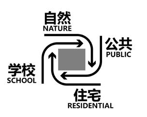
I named it with three titles following each other, as “Cohabitable Densification“ is the goal, and “Urbanization & Nostalgia“ is the one relation to discuss, and “Towards the collective welfare between original and new residents“ is what the project ends with in reality, to present.
In short, it is about a gentler way of densifying, caring more of its residents, and being systematic that could be applied in a wider scale.

1 01
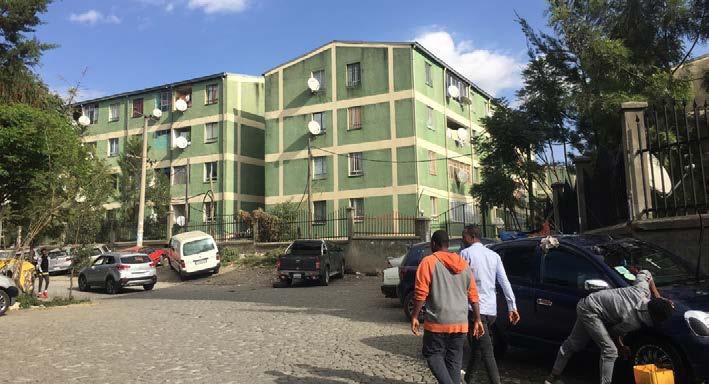
On the border of the Gerji site, the newly built 40/60 condominium project stands in the background.
Single-floor housing inside.
On the other side, there is the Gerji Condominium Site.
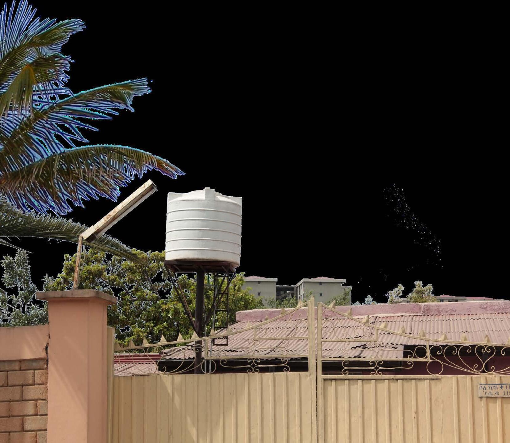
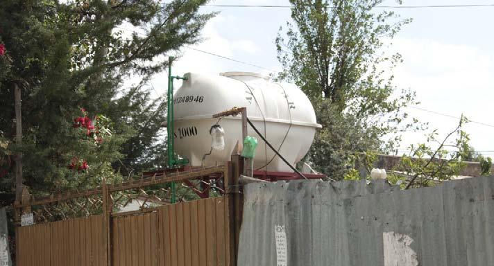
Fences, Gates & Water tanks
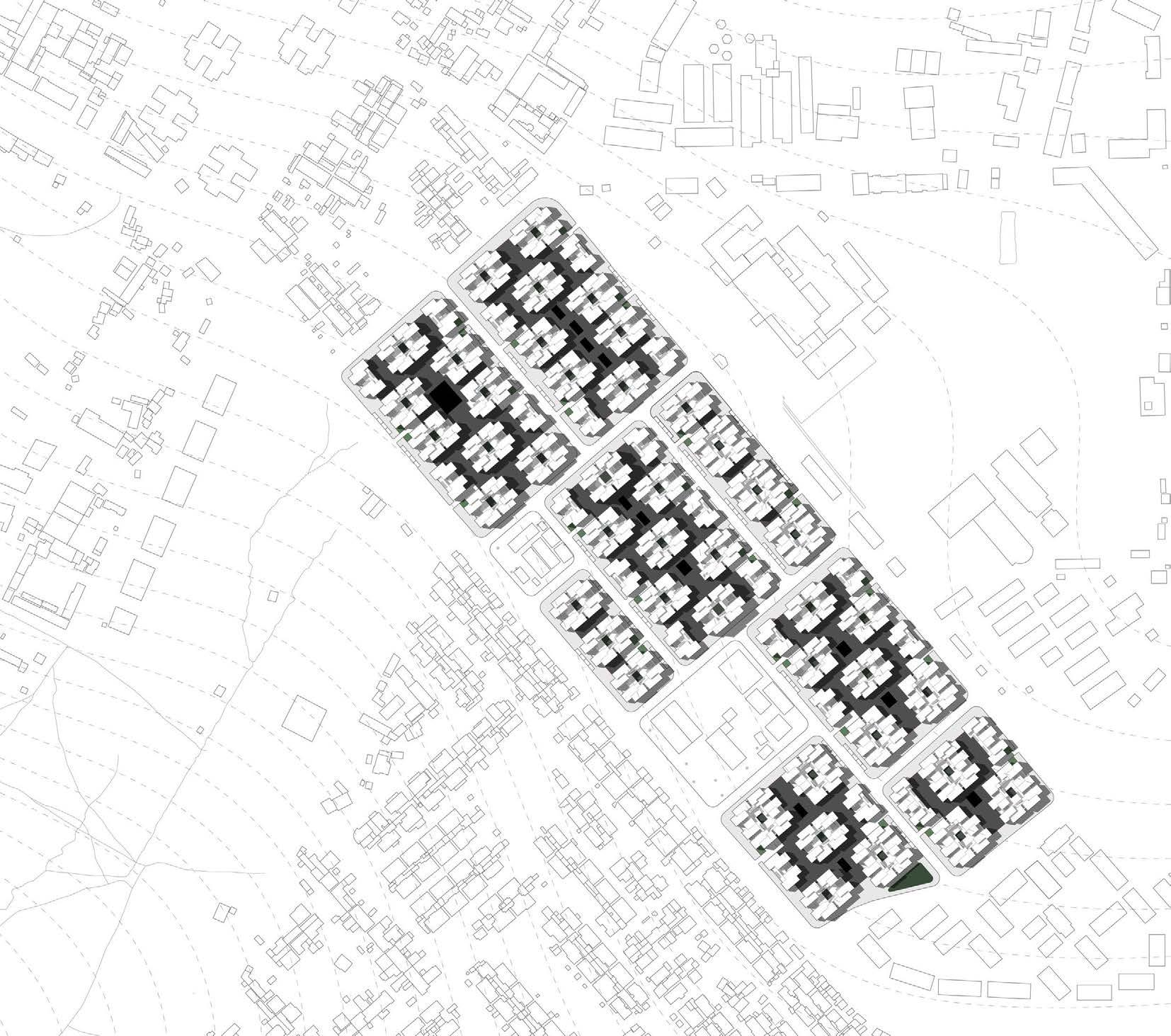
Site
Site
FAR (est.): 0.43
Plots: 318
PROPOSAL
FAR: from 0.43 to 1.417
Households: from 318 to 1679
Population (est.): from 1900 to 8000
Density: from 143 to 666 p/ha (133 households/ha)


2 3 CURRENT
area: 126,000
m2 or 12.6 ha
area
(plots): 74,745 m2
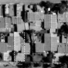
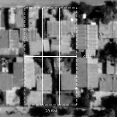
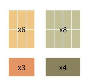
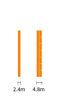
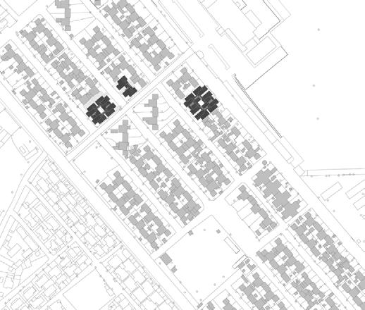
Address: Bole sub city woreda 14, Addis Ababa, Ethiopia Client: Federal Housing Corporation (FHC) Household size (est.): 6 Population (est.): 1900 Density: 143 p/ha Urban Solution HousingCondominium 40/60 KoreanHospital Unity University Bole International Airport (ADD) Adwa Park GoodNews Church SecondarySchool MCMMedical College DiplomaticHotel Workshop GerjiCondominiumSite Scale 1:4000 50m 0 100m 250m 500m Original plots (9.6m*21m) X318 Workshop Diplomatic Hotel Original Plots of The Gerji(FHC) Site Plot “6 to 1”: 48 Plot “8 to 1”: 8 Street Plot: 12 Adjustment of road intersection 1 4 5 6 7 7 2 3 2 Recombination of the original plots, in the cases of six to one and eight to one for residential use, and their corresponding half size variation. Plots reserved for street construction, with two variations of 2.4m (1/4 original plot width) and 4.8m (1/2 original plot width, with roadside parking). Plot Rearrangement The New Elements & Rules Corner block Flipped Central public space + Street corner Public Spaces Phasing Cluster Variations Central public space DistributeScatterAdjust Seven phases from outer to inner, public to private. Original residents relocate back to the site, mixing with the new residents therefore creating a new community. Secondary commerce Main commerce Tower as orientation point CentreBorder &


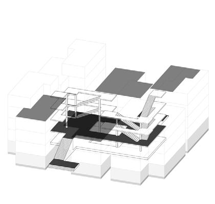
Wider Application
The
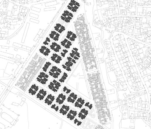
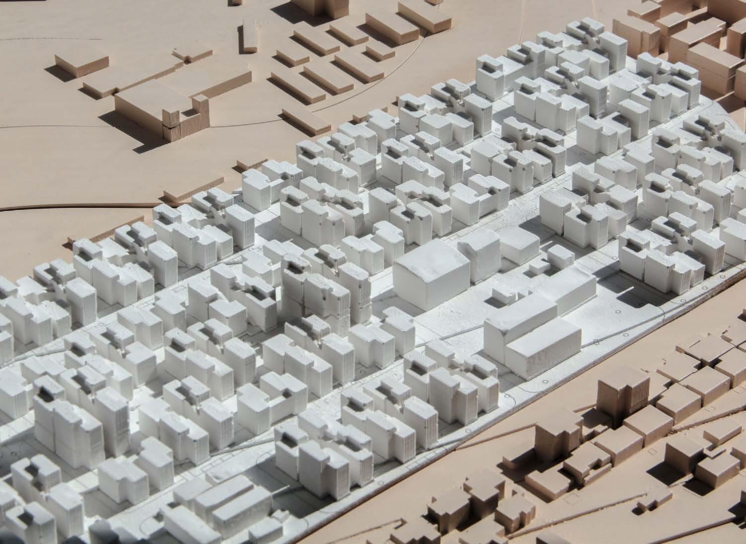
4 5 Upper Floor OD: 6 households / 709 m2 ND: 16 households / 1054 m2 & 527 m2 ( 2.7m floor height) Ground Floor Upper Floor OD: 6 households / 791 m2 ND: 16 households / 1054 m2 & 527 m2 ( 2.7m floor height) Ground Floor Upper Floor OD: 8 households / 1054 m2 ND: 20 households / 1658 m2 & 799 m2 ( 2.7m floor height) Ground Floor Upper Floor OD: 6 households / 791 m2 ND: 36 households / 2372 m2 & 527 m2 ( 5.4m floor height) Ground Floor X Type - Typical X Type - Tower X Type - “8to1” Typical
Application Possibilities on
FHC
Small Scale
Other
Sites
Adaptive Scheme Plots x 4 Plots x 5 * Site with irregular shape Plots x 6 * For Gerji site Plots x 12 Plots x 8 *For Gerji site Plots x 7 *Site with irregular shape In the urban scale: ?? ?? Apartment blocksDifferent combinations in one floor In the cluster scale:
X Type - Corner
Neighbourhood
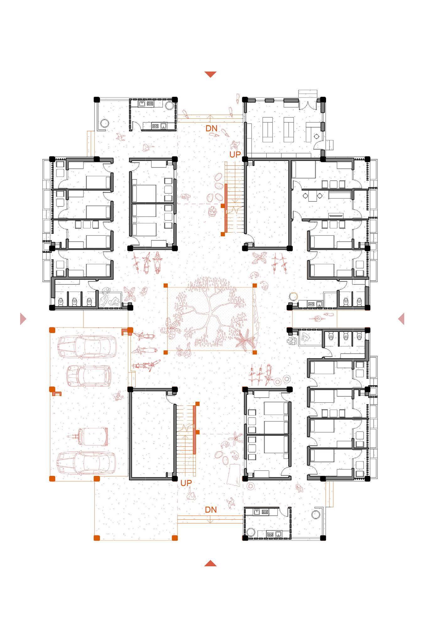
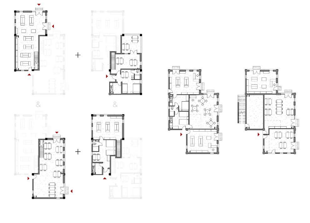


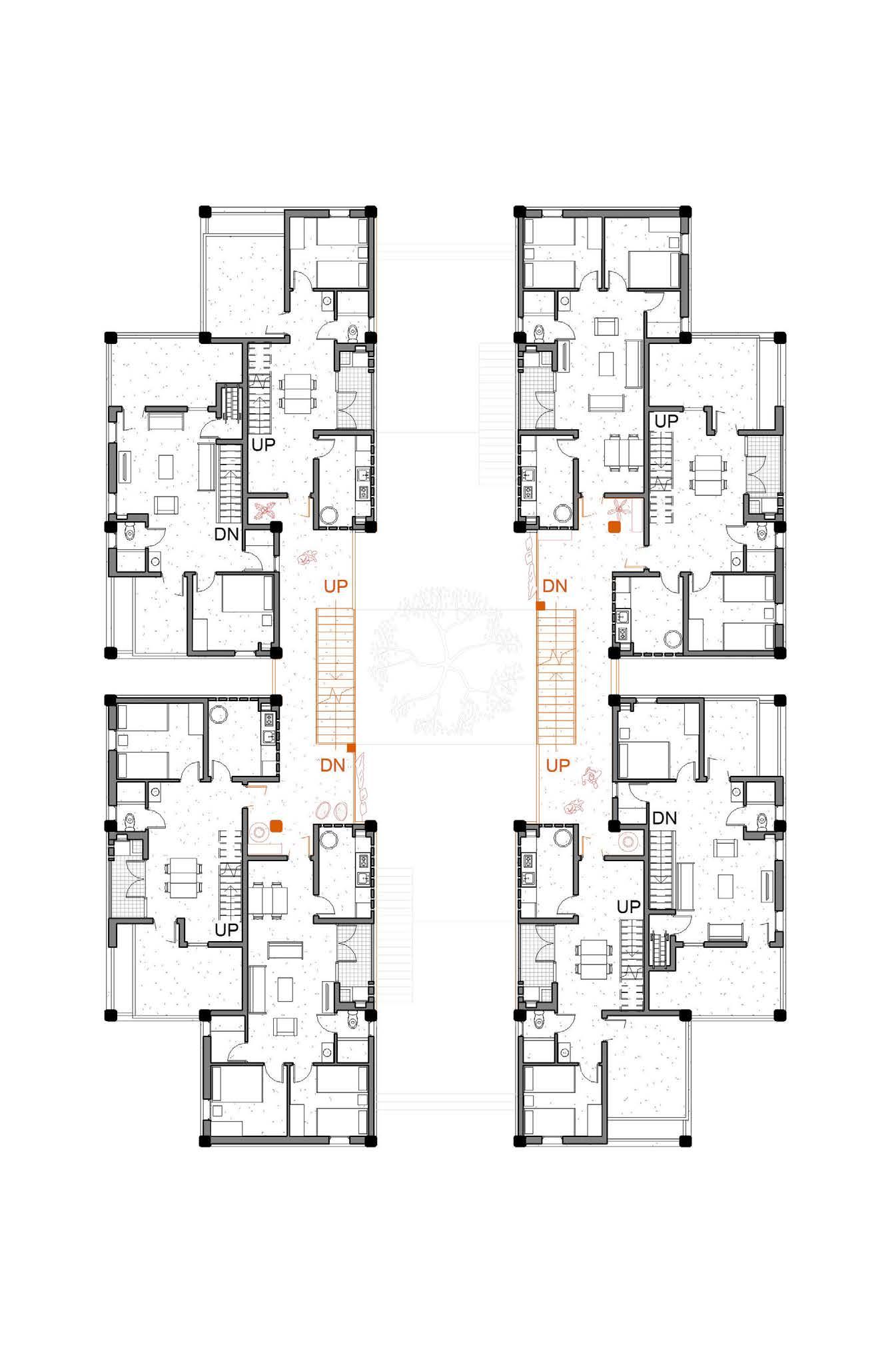
6 7 Community Poorest of the Poor Community Poorest of the Poor Ground Floor: Transition Between Public & Communal COMMERCE / PUBLIC PARKING + EMPTY BASIC RENTAL UNITS BASIC RENTAL UNITS X Type - Typical: Ground Floor Plan _ 1:200 Scale 1:200 2m 0 6m 10m 20m Cluster Prototype The combination of a communal circulation system with four residential blocks. For future public use. 78 m + 30 m2 Commercial Use: 108 m2 Commercial Use: 100 m2 + Residential Unit Above: 28 m2 Inside the neighbourhood. 30 m2 Commercial Use: 103 m Residential Unit attached: 14 m2 Commerce + Residence Commerce Duplex _ b Parking + Empty CommerceSmall Scale Commerce Two room combined. 24 m2 Unit Commercial Use: 104 m2 + Residential Unit Above: 28 m2 With shared facilities. 12 m2 Unit & 13 m2 Unit Basic Rental Units Commerce Duplex _ a Ground Floor Commerce Ground Floor Residence Possibility for future expansion Ground Floor First Floor


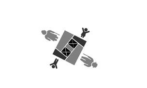
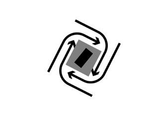
8 9 X Type - Typical: First Floor Plan _ 1:200 First Floor: The Lifted Street Level 2 * APARTMENT 2 * APARTMENT APARTMENT * 2 APARTMENT * 2 New Residents New Residents New Residents New Residents Scale 1:200 2m 0 6m 10m 20m 102 m2 With shared facilities. 12 m Unit Public Use Studio 2BR Units Basic Rental Units Corner Situation _ Ground Floor Corner Situation _ Upper Floor A Social Mix Total: 40 m2 37 m indoor + 3 m outdoor Total: 56 m 52 m2 indoor + 4 m2 outdoor Principle of The Building Cluster Circulation System = Communal space Dwelling blocks Outwards Inwards Giving space to public exterior neighbourhood Connecting to circulation system / communal space Possibility for future expansion

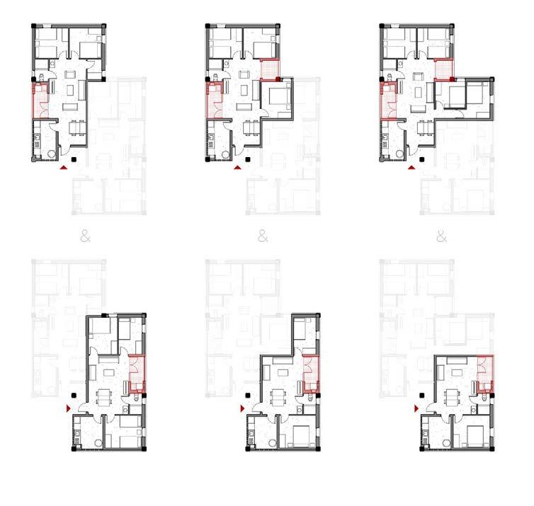
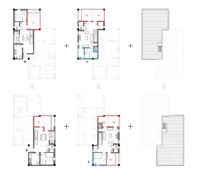
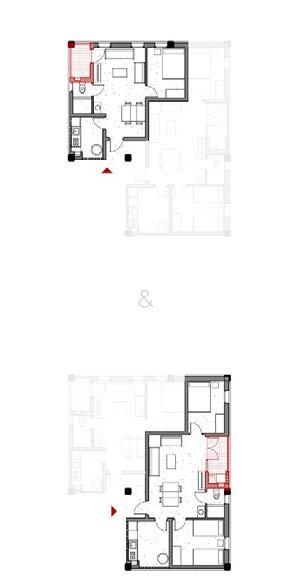
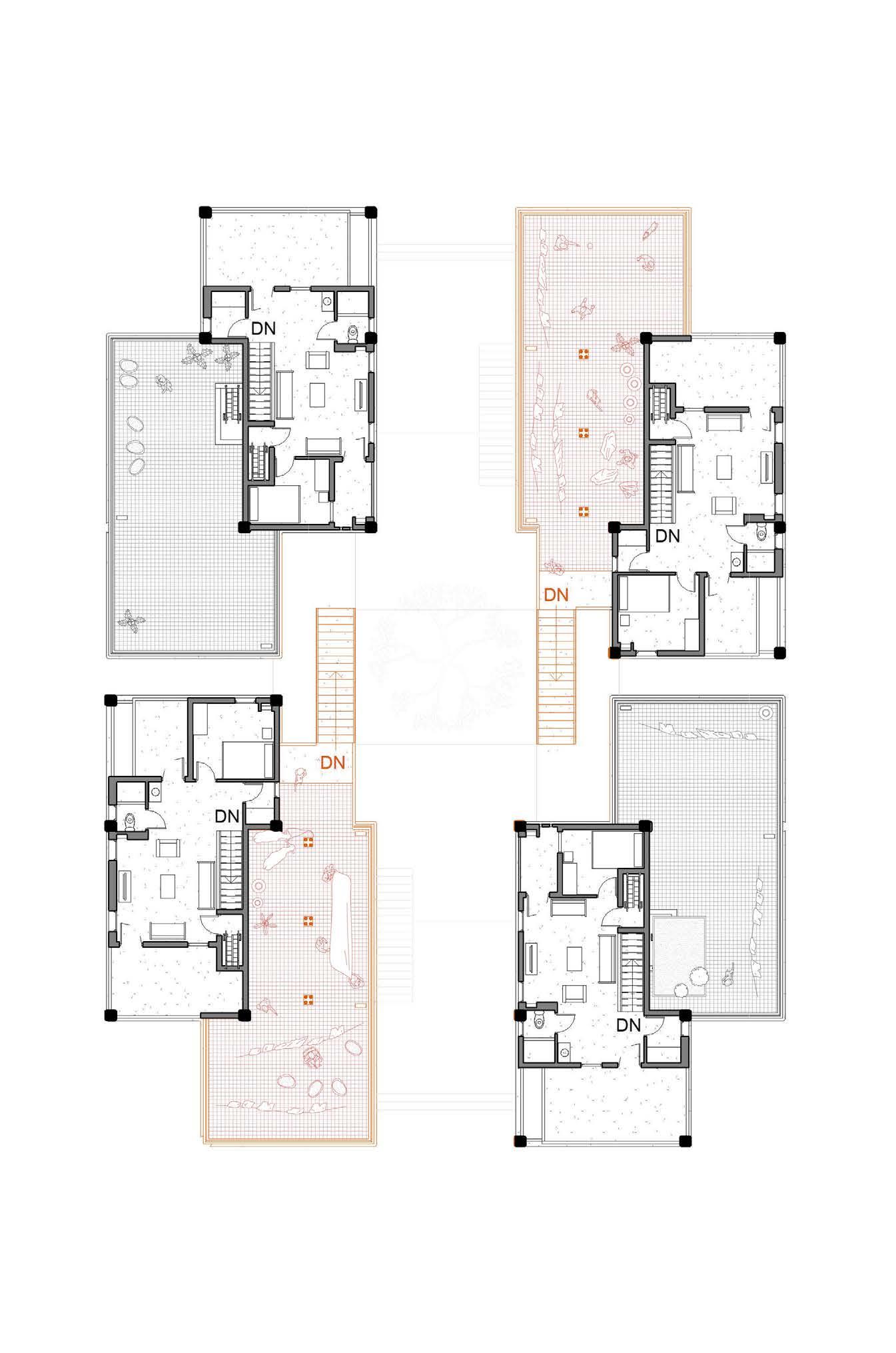
10 11 Typical Floor: Threshold of Private Realm 2 * DUPLEX DUPLEX * 2 Original Residents New + Original Residents Original Residents Original + New Residents APARTMENT + DUPLEX DUPLEX + APARTMENT X Type - Typical: Third Floor Plan _ 1:200 Scale 1:200 2m 0 6m 10m 20m Apartments for New Residents Duplexes for Original Residents Possibility for subletting Possibility for future expansion Lower Floor Upper Floor OR Duplex _ b 3-Bedroom Unit _ a2-Bedroom Unit _ b Studio Private Roof Terrace Example of two built rooms. Total: 131 m 89 m2 indoor + 42 m outdoor Total: 65 m 61 m2 indoor + 4 m2 balcony Total: 55 m 51 m2 indoor + 4 m2 balcony Total: 47 m2 43 m2 indoor + 4 m balcony Private Roof Terrace Example of two built rooms. Total: 62 m 58 m indoor + 4 m2 balcony Total: 72 m 65 m2 indoor + 7 m2 balcony Total: 80 m2 73 m2 indoor + 7 m2 balcony Total: 127 m2 89 m2 indoor + 38 m2 outdoor OR Duplex _ a 2-Bedroom Unit _ a3-Bedroom Unit _ b4-Bedroom Unit
X
Fourth Floor: Communal & Private Roof Terrace
Original Residents
PRIVATE ROOF TERRACE + DUPLEX
DUPLEX + COMMUNAL ROOF TERRACE
Original Residents + Community
Community + Original Residents
COMMUNAL ROOF TERRACE + DUPLEX
DUPLEX + PRIVATE ROOF TERRACE
Original Residents
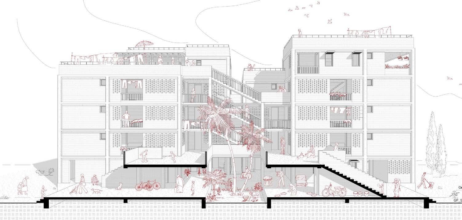
X Type - Typical: Section B- B Through Different Apartments _ 1:200

X Type - Typical: Elevation: A Free Combination _ 1:200

12 13 Scale 1:200 2m 0 6m 10m 20m
X Type - Typical: Forth Floor Plan _ 1:200
A
B
A
B
Type - Typical: Section A - A Through Communal Space _ 1:200
Standardised Elements
Opening _ Door 2340 * 800/900
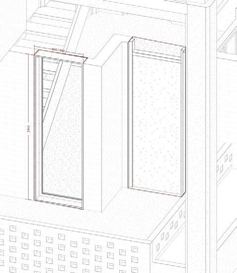
Building Technology
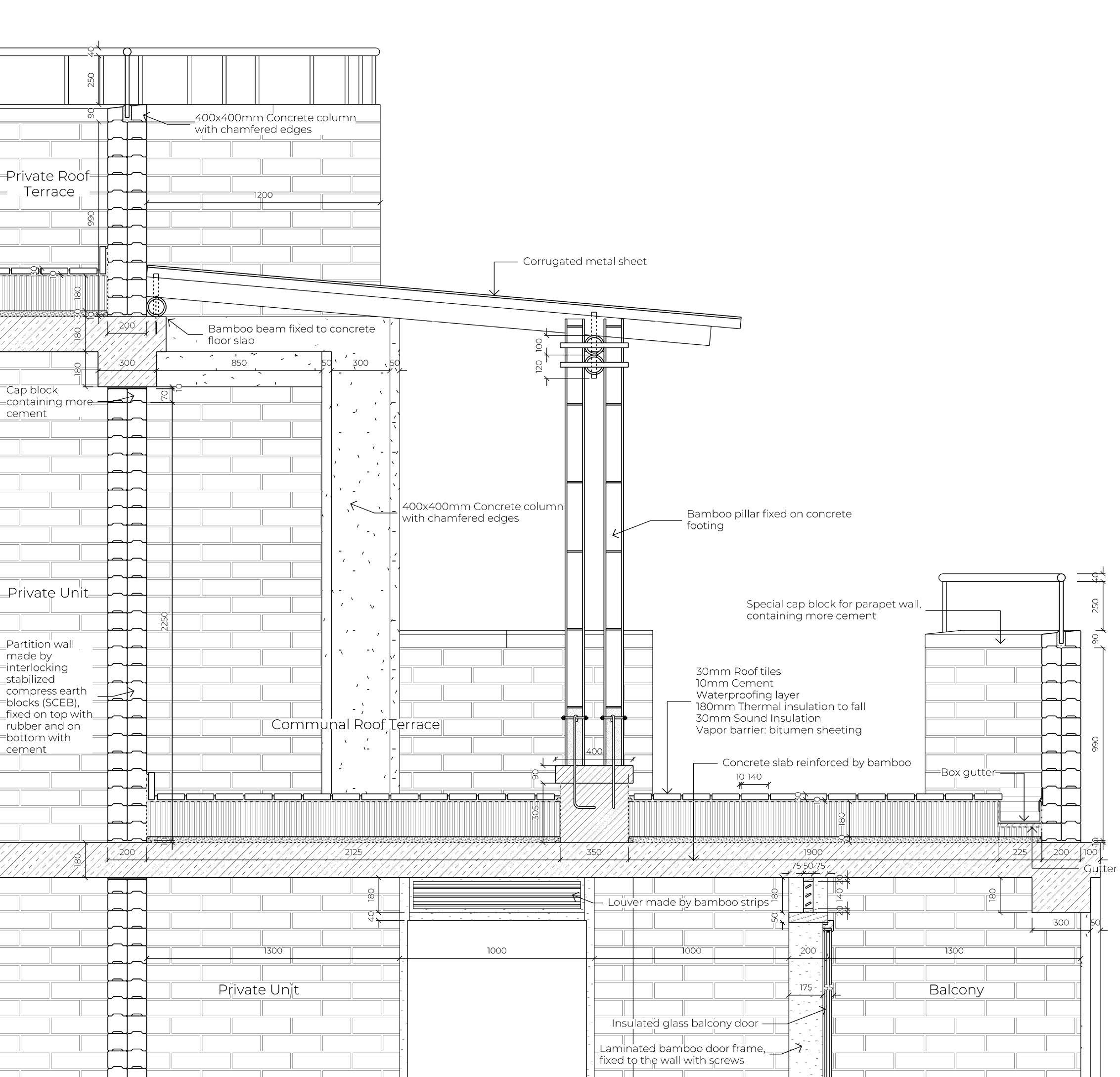
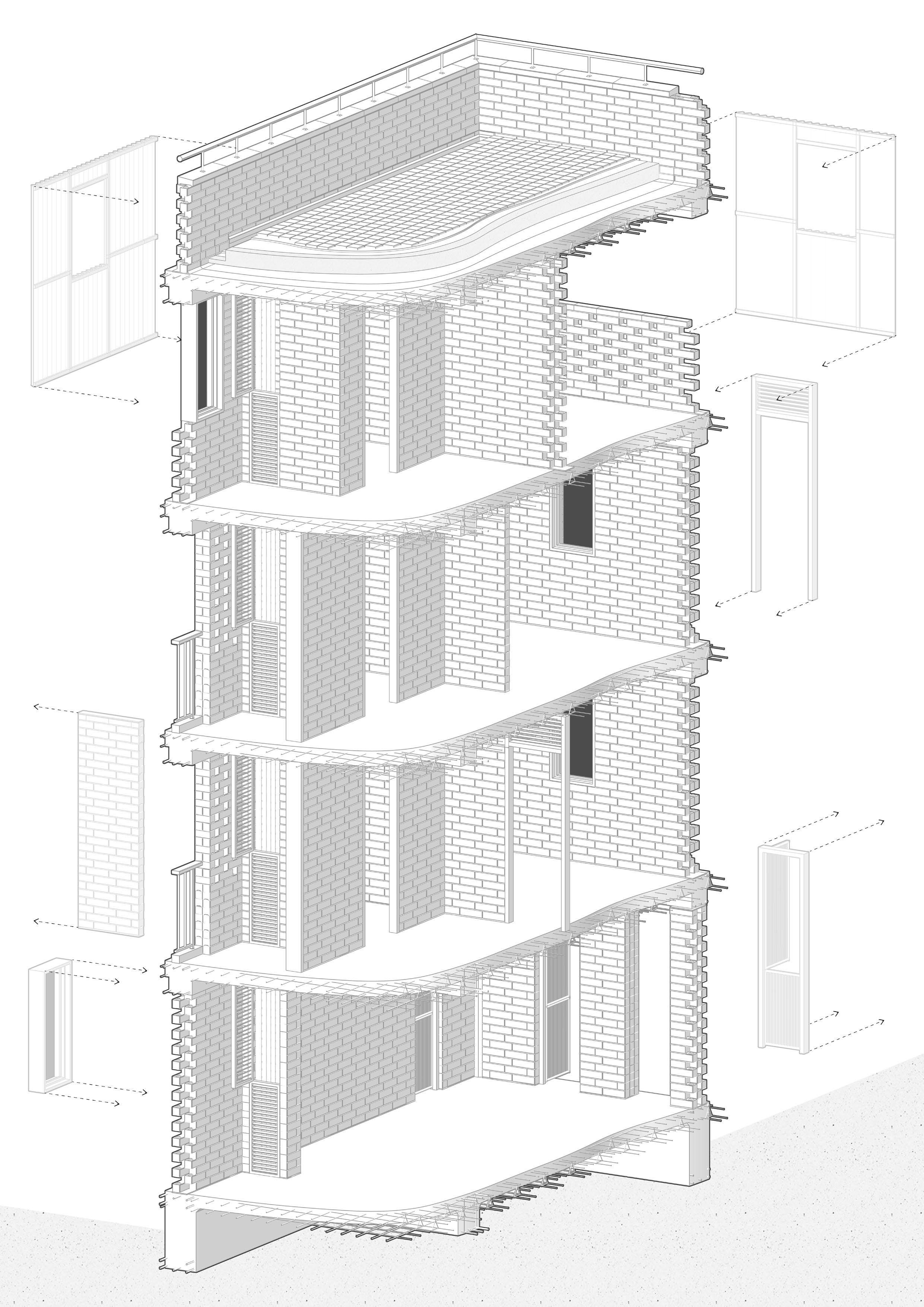
The Formal Construction & Informal Infill
Detail of The Communal Roof Terrace
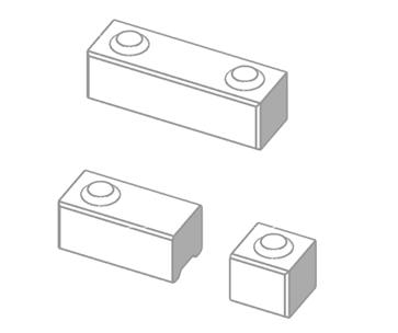
Stabilised Compress Earth Block (SCEB) 100*300*90
Opening _ Window 1440 * 800
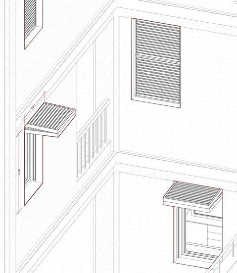
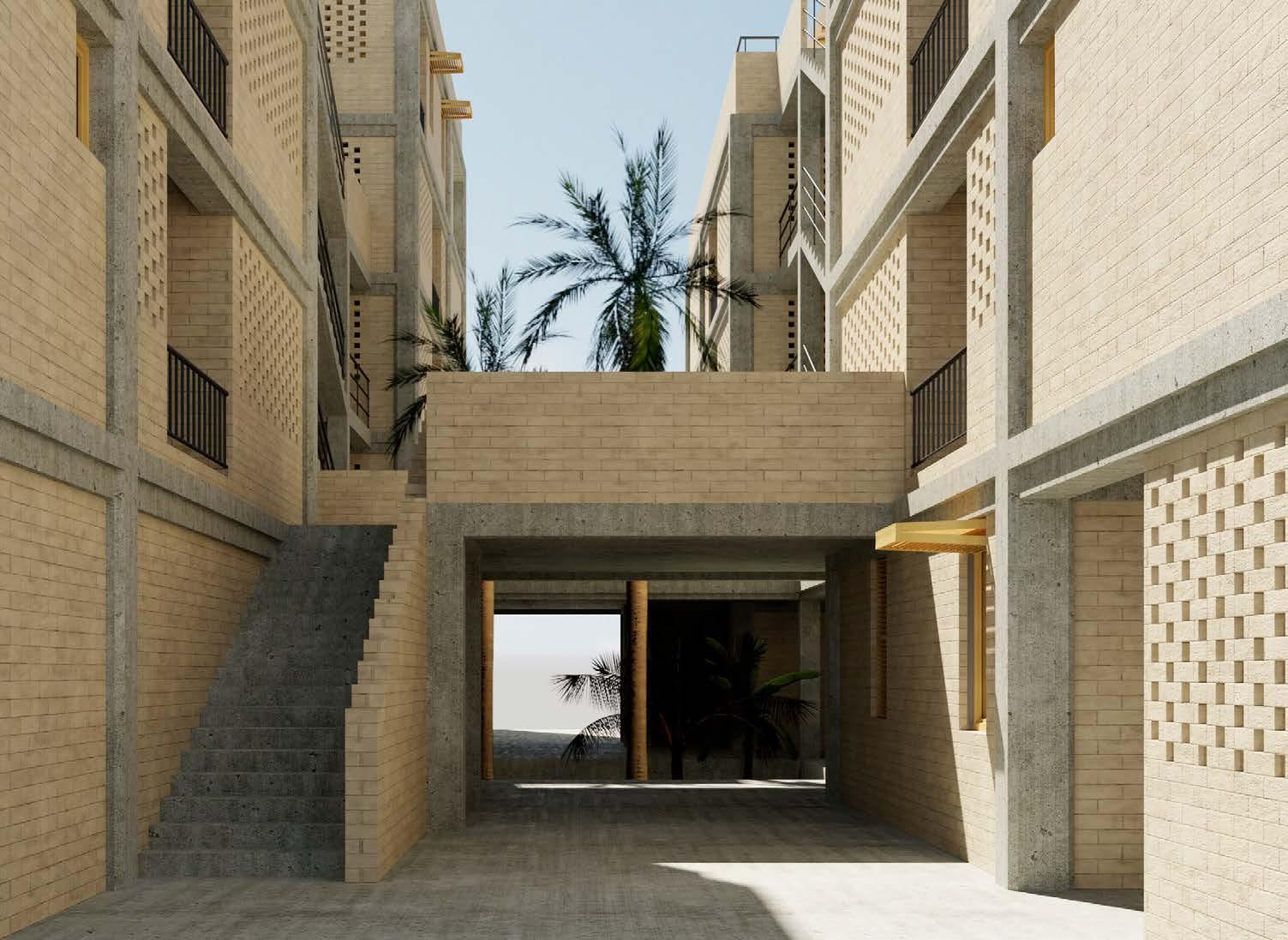
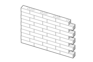
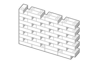
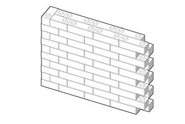
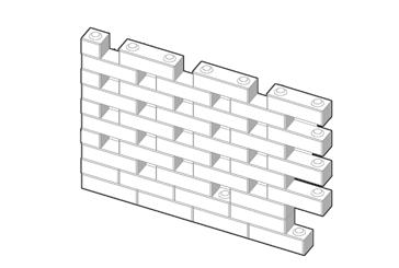
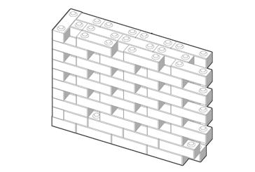
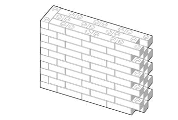
The building is constructed with localsourced affordable standard elements, which allows easy appropriation after the formal construction is done.
This fits into the current living pattern of the residents in Addis - developing and constructing their home over time.

Possibility of Appropriation
14 15
Scale 1:30 1m 0.5m 0 2m
Scale 1:50 0.5m1m 2m 0 4m
++ ++

16 17
THE CITY LOWLAND
Recreate the Border of a new Public Realm
Budapest, Hungry. 2019 Spring
Msc2 Studio: The Baths and Bazaars of Budapest (BBB)
Mentors
Group work
Individual work
ir. Sien van Dam (A.M.F.vanDam@tudelft.nl)
Dr. ir. Susanne Komossa (S.Komossa@tudelft.nl)
Research on baths and bazaars in Budapest
Primary Study & Modelling of the Site (Ludovica Beltrami, Sam Vos, Jingfeng Cheng & Yuerong Zhou)
Further research & Design

不同于布达佩斯常见的公共建筑-作为 轴线的一部分,向外指向未知的起点和 终点,这是一个内向的建筑。它通过重 新定义其位于居住区的场地的 中心和边 界,成为一块没有野心的城市低地。
而带型的建筑体量,作为一个有宽度的 边界,通过由外至内的空间变化和引 导,连接起临外、临内的两个界面。
An Unambitious City Courtyard
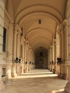
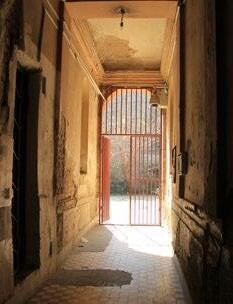
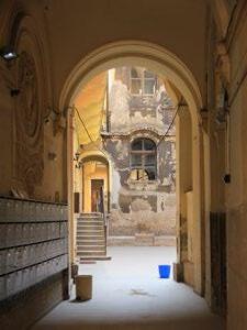
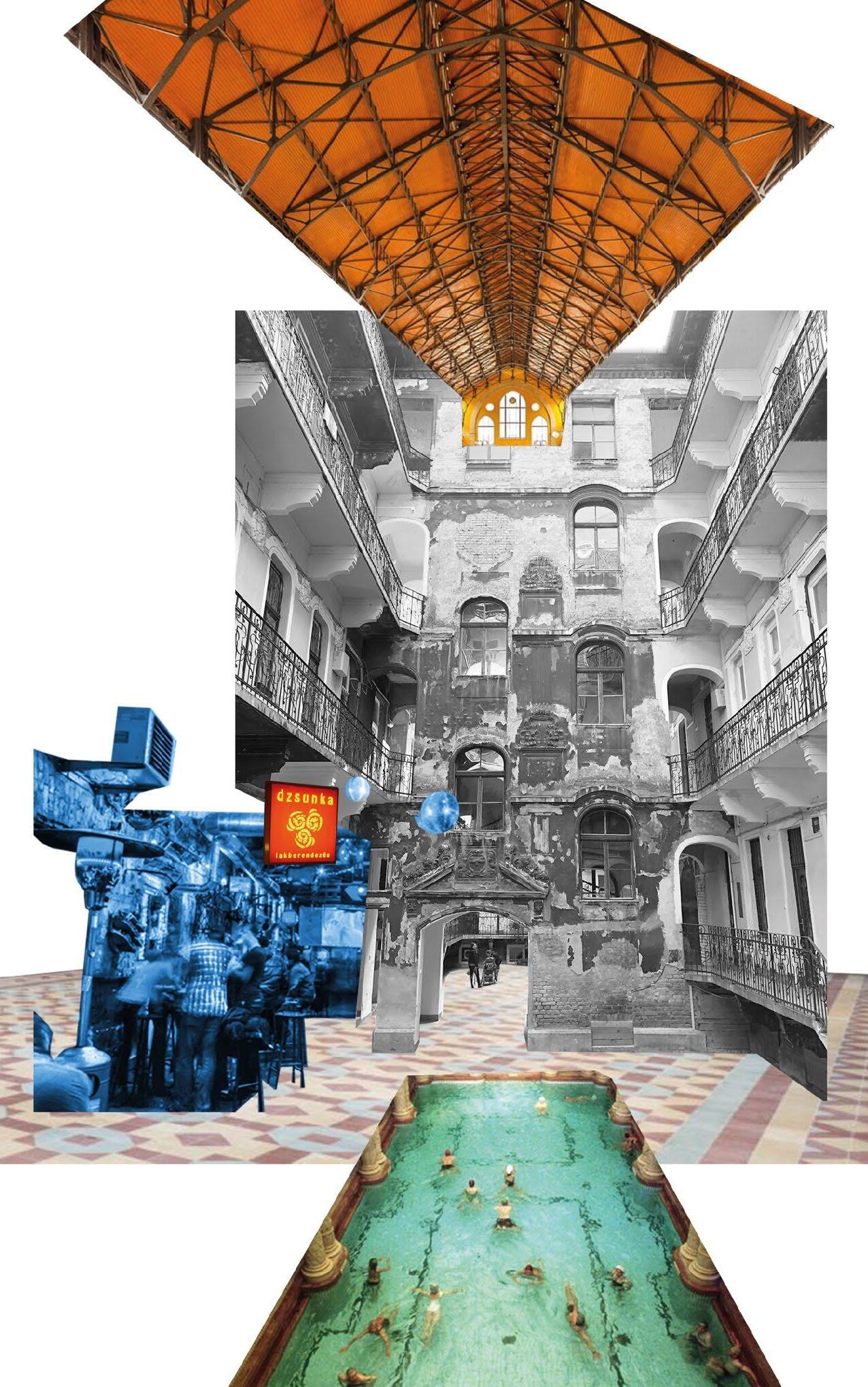
Budapest is a city of axis - in comparable large scale but often starts and ends in nowhere, and a city of courtyards - where communal activities take place.
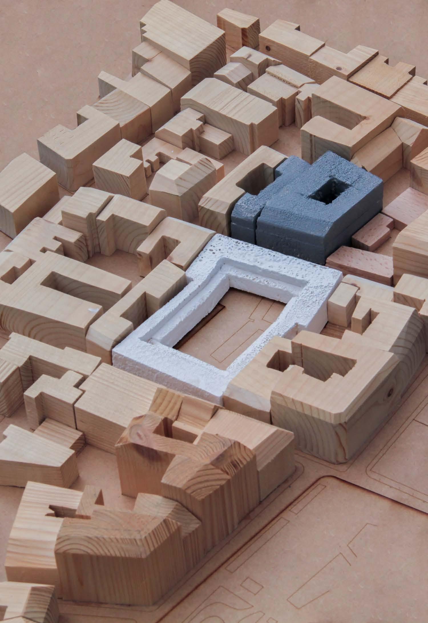
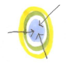
Instead of building another axis, my intention of the site is to adapt a circular system in a way of city courtyard, as it is homogeneous and enclosed in form, therefore not indicating any specific direction. I imagine it to be a lowland for the city, inviting people step into its realm with an open gesture, as if water flowing into ponds naturally in the rainy days.


Hungry Budapest
Józsefváros Központ
Józsefváros (The 8th District)
Residential Workshop + Ex. Bath + Restaurant CONNECTION AXIS AXIS AXIS AXIS DANUBE Urban Strategy _ 1:10000 Scale 1:10000 100m 0 300m 500m 1000m School Hotel Hostel Community Centre Museum Theatre Bazaar Church 19 18 02
Buda Pest
The city of arches and courtyards.
The homogeneous, centripetal circular form, accessible from all directions.

The test placement of different functions.

And to develop.


Central Market Hall New York Cafe The Yellow Church St. Stephen’s Basilica


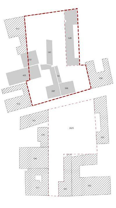
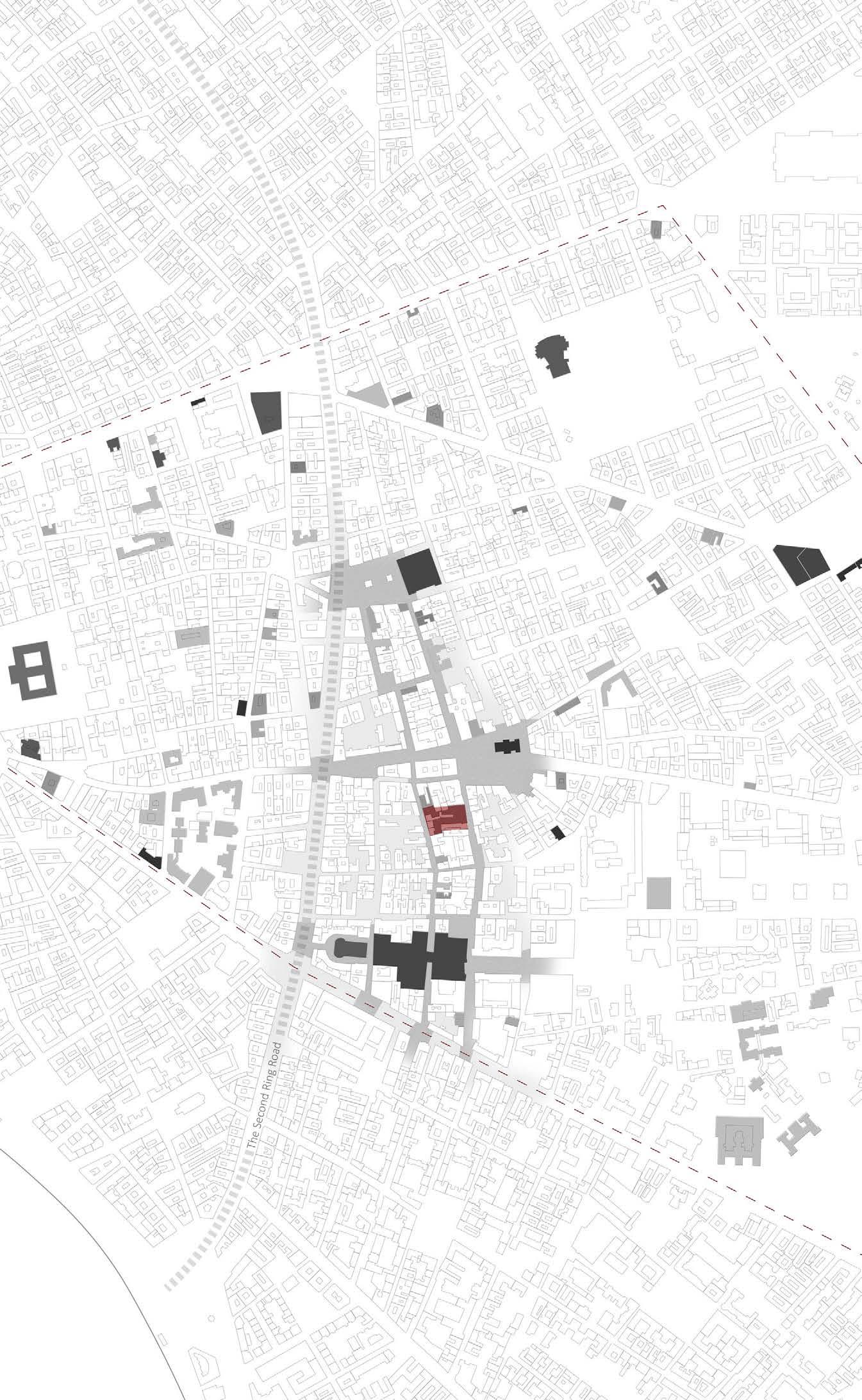
The original outline of the site are on two plots across the street - ” Vajdahunyad”.
For the purpose of unifying the current fractional site, an adjustment is made on the east part of the site. The old residential buildings in the centre of the plot will be demolished and their residents could be relocated to the plot on the west.
20 21
Blind facade
Facade with opening
+ Centre
The Blind Walls Around
Border
Hotel Street Market Four Seasons Hotel Rakoczi Market Hall Kiraly Thermal Bath Teleki Teri Market
Demolish
Relocation Rudas Thermal Bath Corvin Plaza Szechenyi Bath
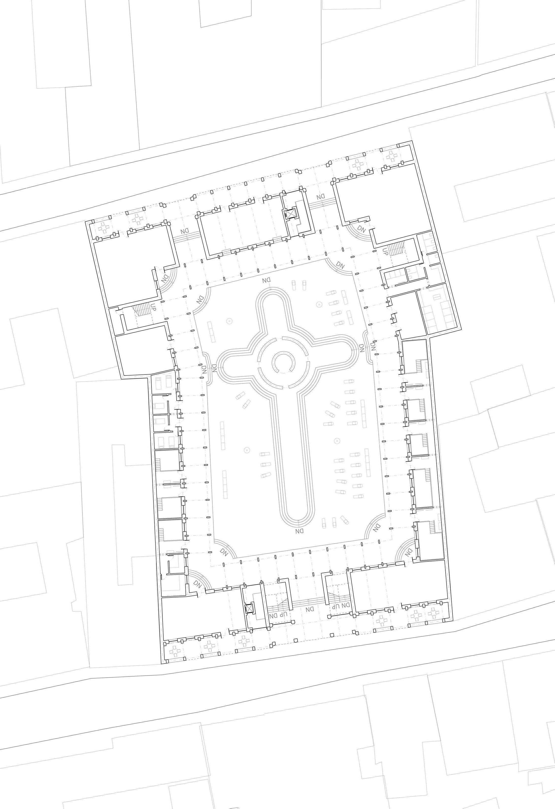

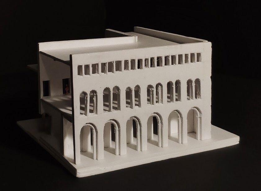
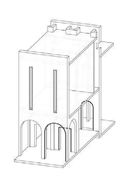
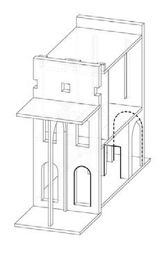


22 23 1 1 7 2 3 6 9 10 11 12 - 0.600 - 1.050 - 1.050 - 0.600 - 2.250 ± 0.000 ± 0.000 1 1 2 8 5 4 14 15 13
Restaurant
Souvenir Shop
Equipment Room
Snack House
Shower
Toilet
Locker & Cabinet
of various temperature
1.
2.
3.
4.
5.
6.
7.
8. Pool
9. Message 10. Theme Pool 11. Cold Pool 12. Sauna
area
Pool
Futó u.
Scale 1:500 5m10m 0 25m First Floor Plan _ 1:500
Piece
Piece
to Inner
to Outer
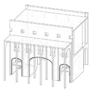
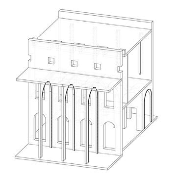
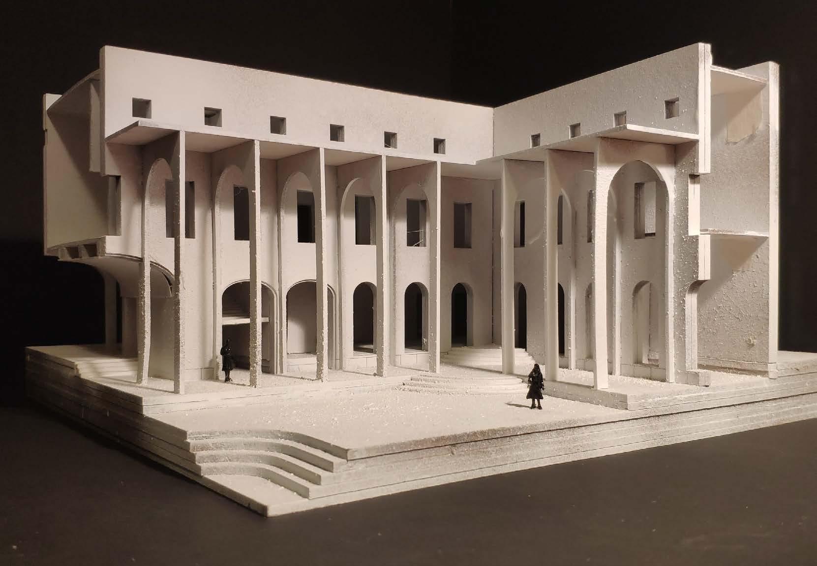
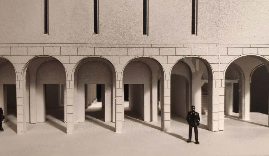
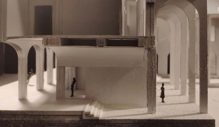
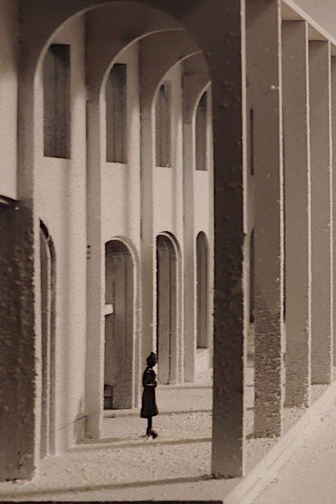
Model _ A Corner Piece
Qualities
of A New Border Inner view
with two staircases on its sides Inner view
arcade
outer facade
Traditional
Inner facade
13. Sunbathing
14. Outdoor Swimming
15. Spinning Pool Vajdahunyadu.
Vajdahunyadu.
Entrance
Regular
Outer
Inner
Working
Sketches of Spatial
Construction
Entrance
The
The
Heavy, Modest,
The
Light, Brave, Modern
17.
18.
19.
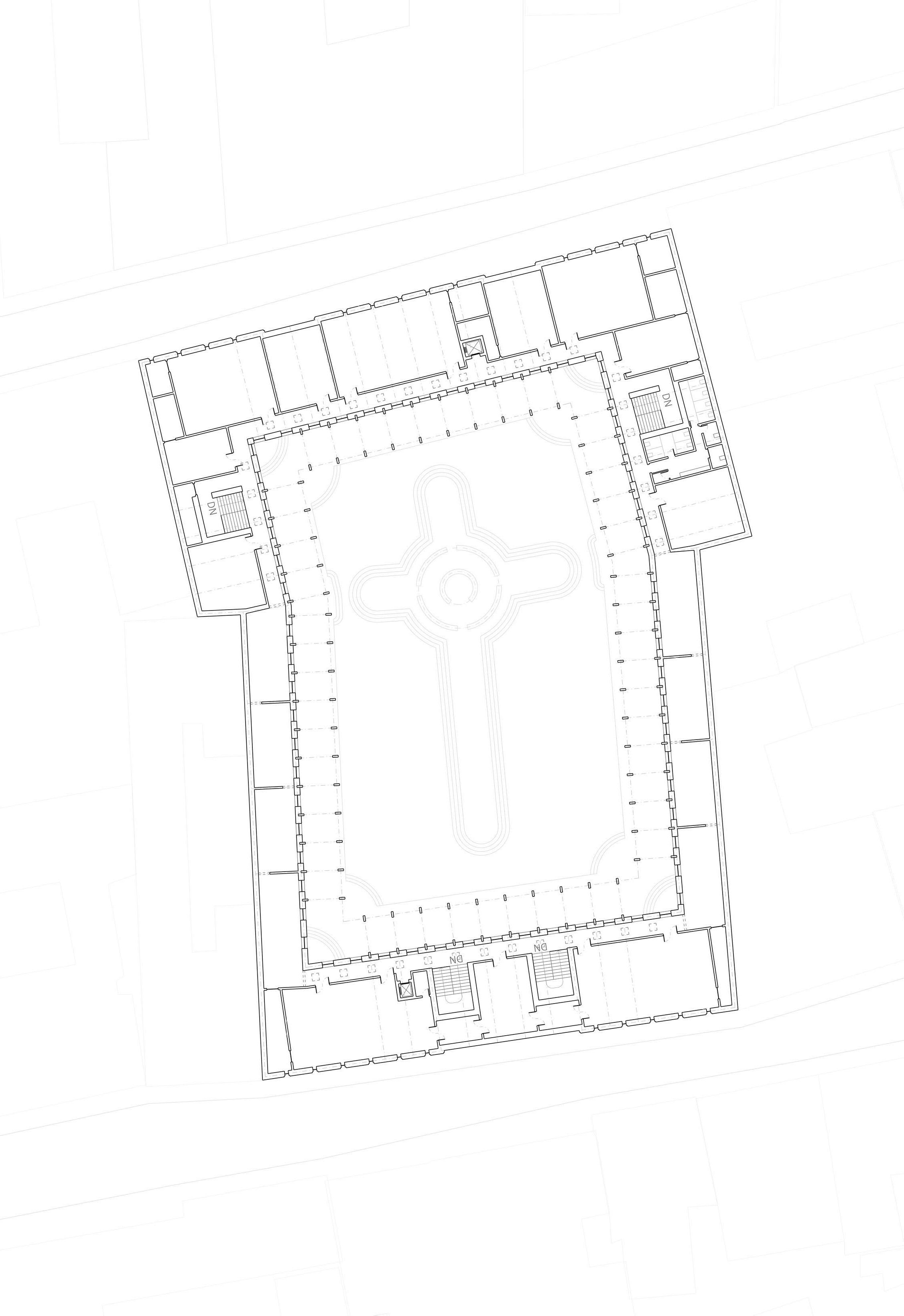
24 25 Scale 1:500 5m10m 0 25m First Floor Plan _ 1:500 +5.400 +5.400 16 16 17 17 18 19 19 19 19 19 19 19 19 19 19 19 2 2 20 20 20 20 20 20 20 16 16
2. Souvenir Shop
16. Handicraft Workshop
Artist Workshop
Event Hall
Exhibition Hall
20. Storage
LES CHAMBRES LIEGEOISES
Connecting Two Squares
Liege, Belgium. 2018 Winter
Msc1 Studio: Interiors, Buildings and Cities
Mentors
ir. Susanne Pietsch (s.pietsch@tudelft.nl)
Benjamin Groothuijse (benjamin@groothuijsedeboer.com)
Caspar Frenken (casparfrenken@me.com)
BT Mentor
Group work
Individual work
Rob van Houten (r.vanhouten@tudelft.nl)
Site Model (Michiel Ockers, Janneke Visser, Paulina Gocol & Yuerong Zhou)
Further research & Design
这是在极小地块上,一个处于连接点的房子,它为城市提供一间可容纳40人进行公共活动的房间。
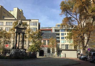
建筑的两个端点分别对应着烈日的两个城市广场,它本身则是关于两个端点之间的联系和转变(建筑内和外由二至三的转变)。
A Narrow Site and Two Squares
The site is sitting on the turning point of the street ” Rue Tournant Saint-Paul”, which connects the SaintPaul Square on the south with the Cathedral Square on the northeast, and further leads up to one of the main commercial streets of Liege. It is of a narrow morphology and surrounded by its multi-storey neighbours, notably the Saint-Paul Cathedral with giant rose window on the side.
When it comes to the question of what should be happening on such a site, my instinct goes to something small, lower in height, hiding in the corner as if it’s a little gift. Its presence should not be strong, therefore leaving the glory to the delicate ones next to it (as the little red house and the rose window of the church). But on the other hand, it should be there to contribute a comfortable and casual exterior spatial ratio or quality.

A Chamber of Connection and Inclusion
A public chamber for about 40 people, is the setted function for this site. I define it as a chamber of connection and Inclusion, as in bringing public life from the two directions to the squares together, and embrace them inside the building.
That’s the reasoning of the spatial configuration of a room in the centre, and circulation on two ends. To elaborate, the circulation is arranged on both ends of the building, which are in accordance to the two entrances on the ground floor. And those two entrances, they are the openings allow public life from the squares to flow into the building.
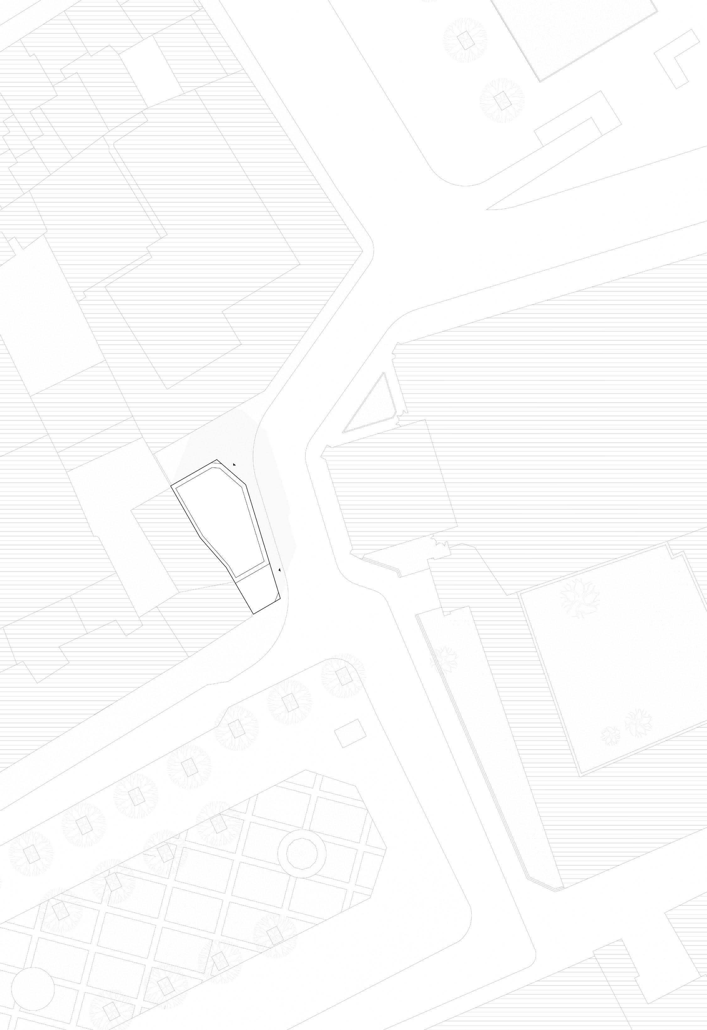
27 26 03
Site Plan _ 1:500 Scale 1:500 5m 0 15m 25m 50m Place Saint-Paul CathédraleSaint-PauldeLiège Place de la Cathédrale ZaraLiège Rue Tournant Saint-Paul HauteÉcolede laVilledeLiège
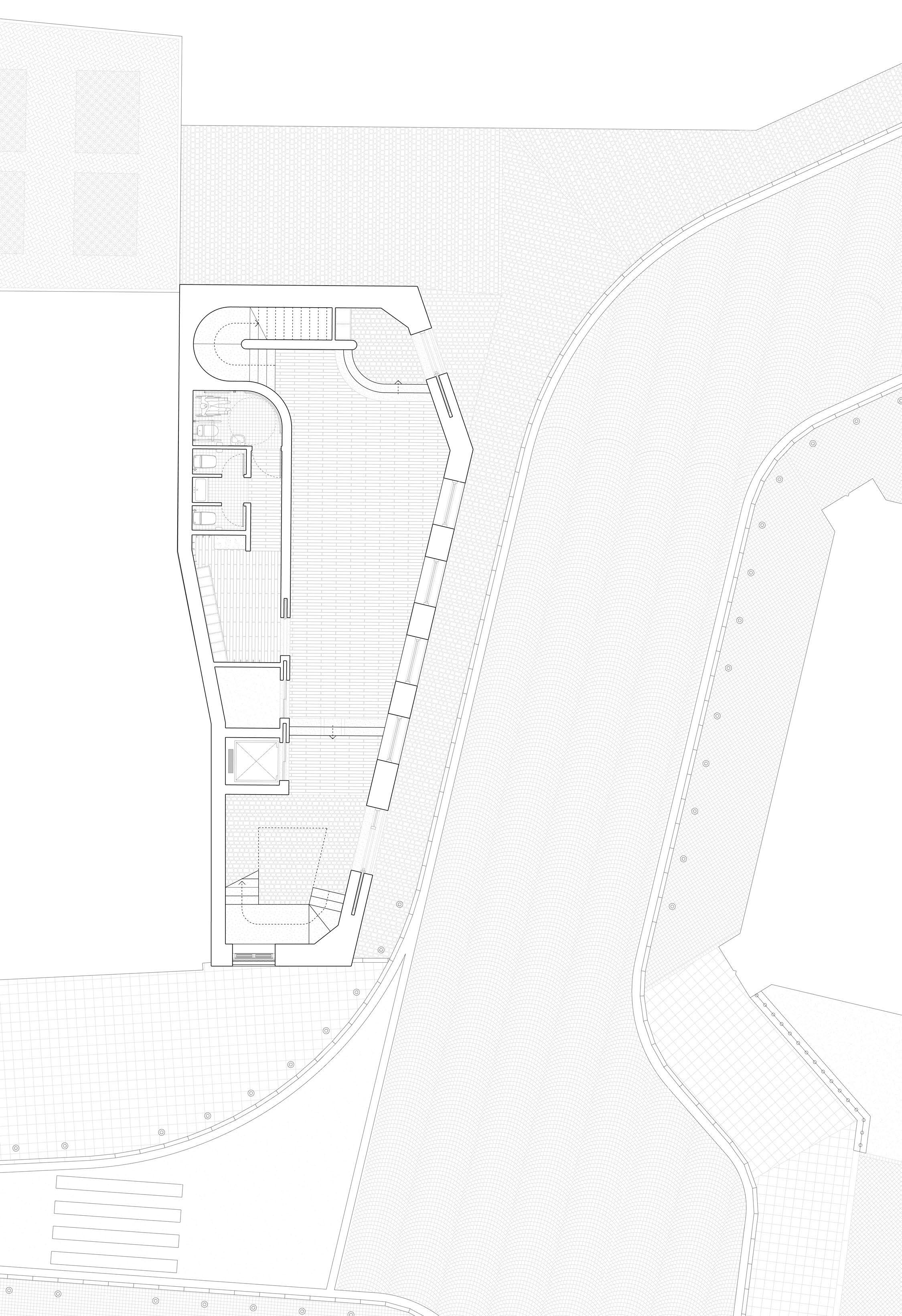
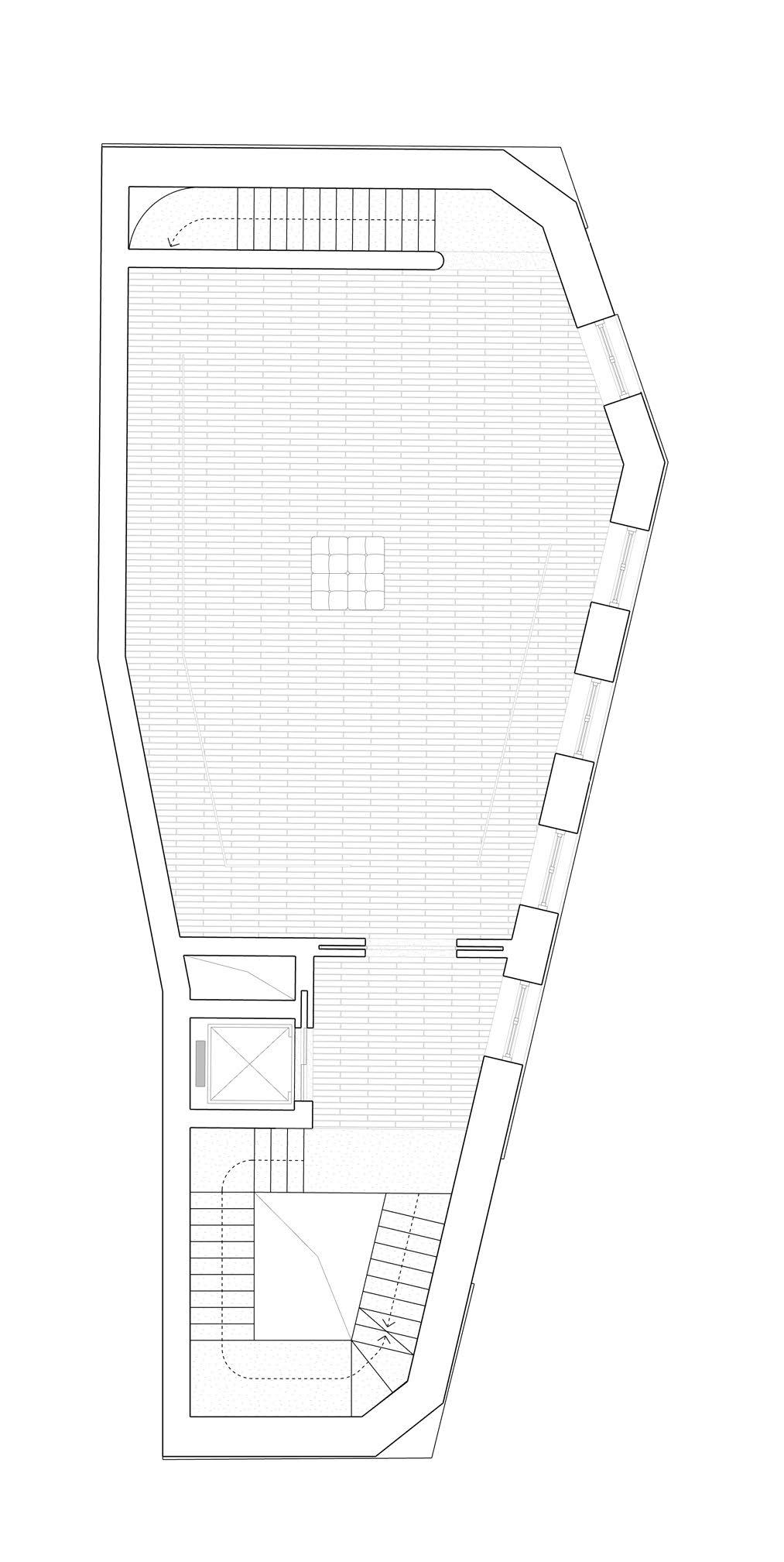
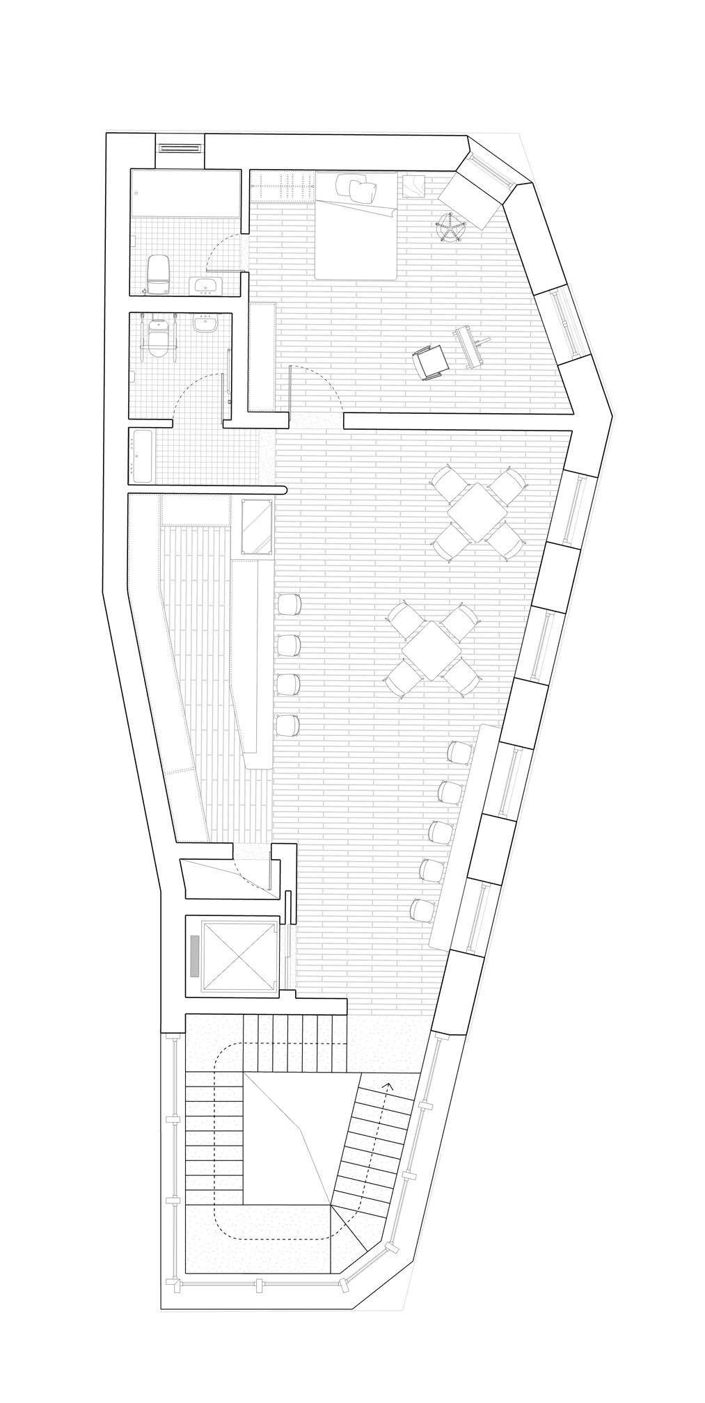
28 29 Scale 1:150 1m2m 0 5m 10m 15m Ground Floor Plan _ 1:150 1 2 3 4 5 6 7 8 Entryway with flyer shelf Accessible entryway Reception & Foyer Locker Lavatory Accessible lavatory Lift Mechanical room 3 1 4 5 6 8 2 7 A A 9 10 11 12 13 14 15 16 Front room The chamber Mechanical shaft Cafe Kitchen Lavatory Studio for Artist Private lavatory First Floor Plan _ 1:200 Second Floor Plan _ 1:200 9 10 11 11 14 15 16 13 12



30 31
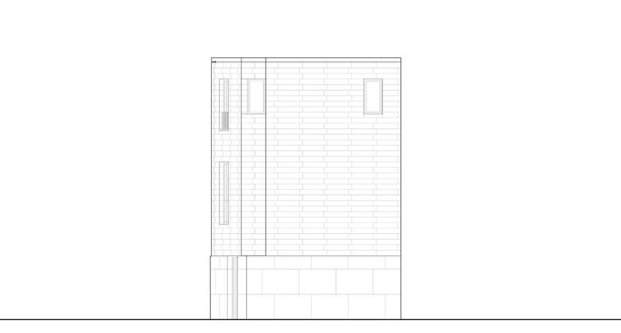
East Elevation _ 1:400
North Elevation _ 1:400
1:400 4m 0 12m 20m 40m
South Elevation _ 1:400
Scale
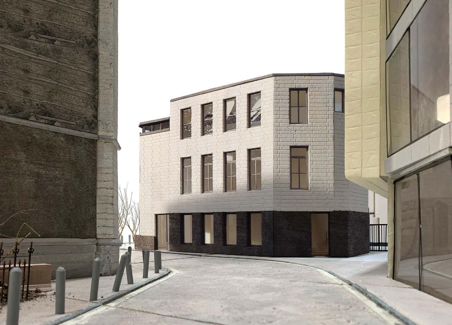
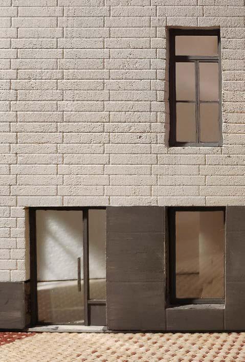
Top: Left: Right:
View from the direction of Place de la Cathédrale
View from the direction of Place Saint-Paul
Reflection of the transition from “two” to “three” on plinth

Self-supporting
Waterproofing
Thermal
Concrete
Thermal
Water proofing layer
Gravel
Thermal
Vapour
Hollow-core
Ready-to-lay
Concrete
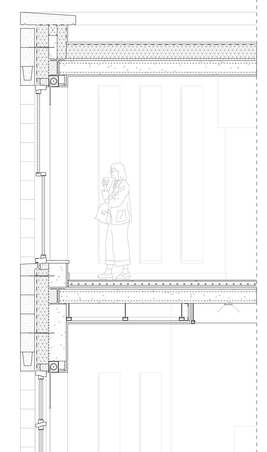

Self-supporting natural stone
Waterproofing layer
Thermal insulation
Vapour barrier
Concrete
Ready-to-lay parquet flooring
Screed with underfloor heating
Plastic sheet as separating layer
Impact sound insulation
Concrete topping
Hollow-core concrete unit
Ready-to-lay parquet flooring
Screed with underfloor heating
Plastic sheet as separating layer
Impact sound insulation
Concrete topping
Hollow-core concrete unit
Damp
Thermal
Sand
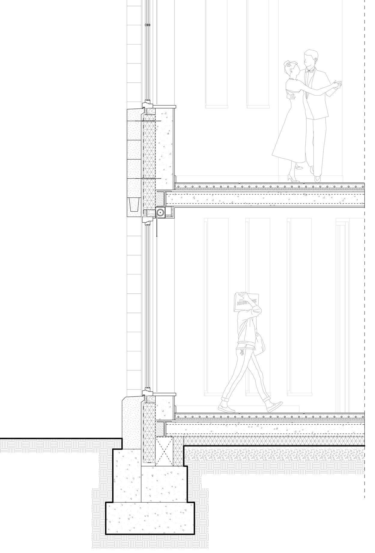
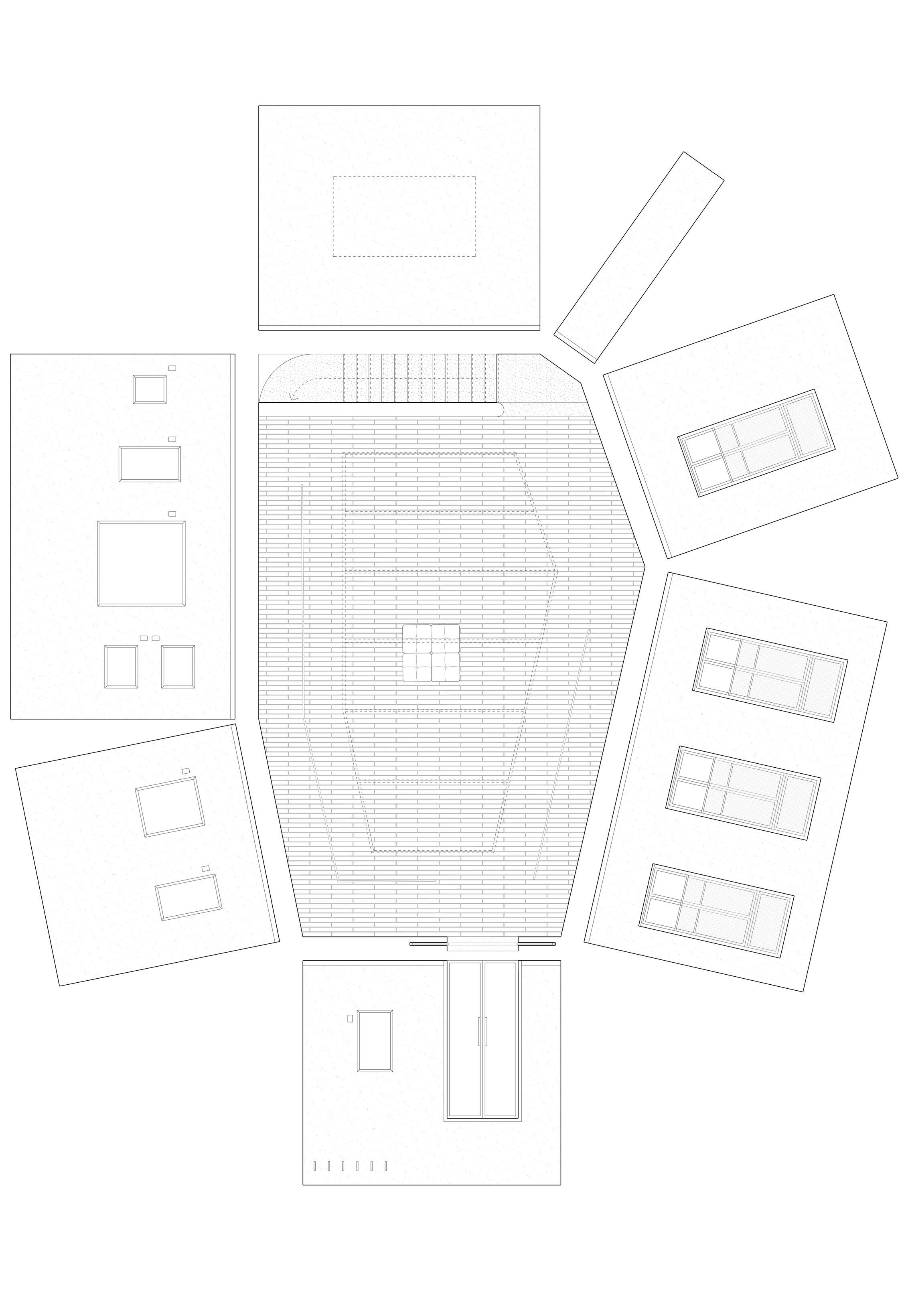
32 33 Detailed Plan & Interior Façades of The Room _ 1:100 Scale 1:100 1m 0 3m 5m 10m 3. 5. 6. 2. 50mm 200mm 30mm 200mm 20mm 15mm 60mm 1mm 25mm 30mm 200mm 195mm 50mm 25mm 20mm
Waterproofing
layer
fall
insulation to
barrier
topping
Concrete
concrete unit Plaster to soffit
underfloor heating
sheet as separating layer
sound insulation
parquet flooring Screed with
Plastic
Impact
topping Hollow-core concrete unit Cavity Ceiling Tee Ceiling board Plaster 2 6 1 3 4 5 200mm 30mm 170mm 120mm 130mm 20mm
natural
Cavity
stone
(construction tolerance)
layer
insulation
wall
parapet
insulation
Plaster 1. 200mm 30mm 170mm 240mm 20mm
Cavity (construction tolerance)
wall Plaster 4. Facade Fragment & Detailed Section _ 1:50 15mm 60mm 1mm 25mm 30mm 200mm 20mm 15mm 60mm 1mm 25mm 30mm 200mm 135mm 50mm 150mm
load-bearing
Plaster
proof membrane
Insulation
Profiled Stone Skirting Closed-cell insulation Light diffusing ceiling panel Wall tie Closed-cell insulation
blind with light fabric Lintel Insulated construction for window support Sill board Double glazed window Reinforced concrete footing
Gravel Soil Grout
Roller
GRANNY’S KINDERGARTEN Joy & Fun: The Path and The Space
Pingxiang, China. 2017-2018 Summer
The 38th Daegu The 38th Daegu international architecture competition


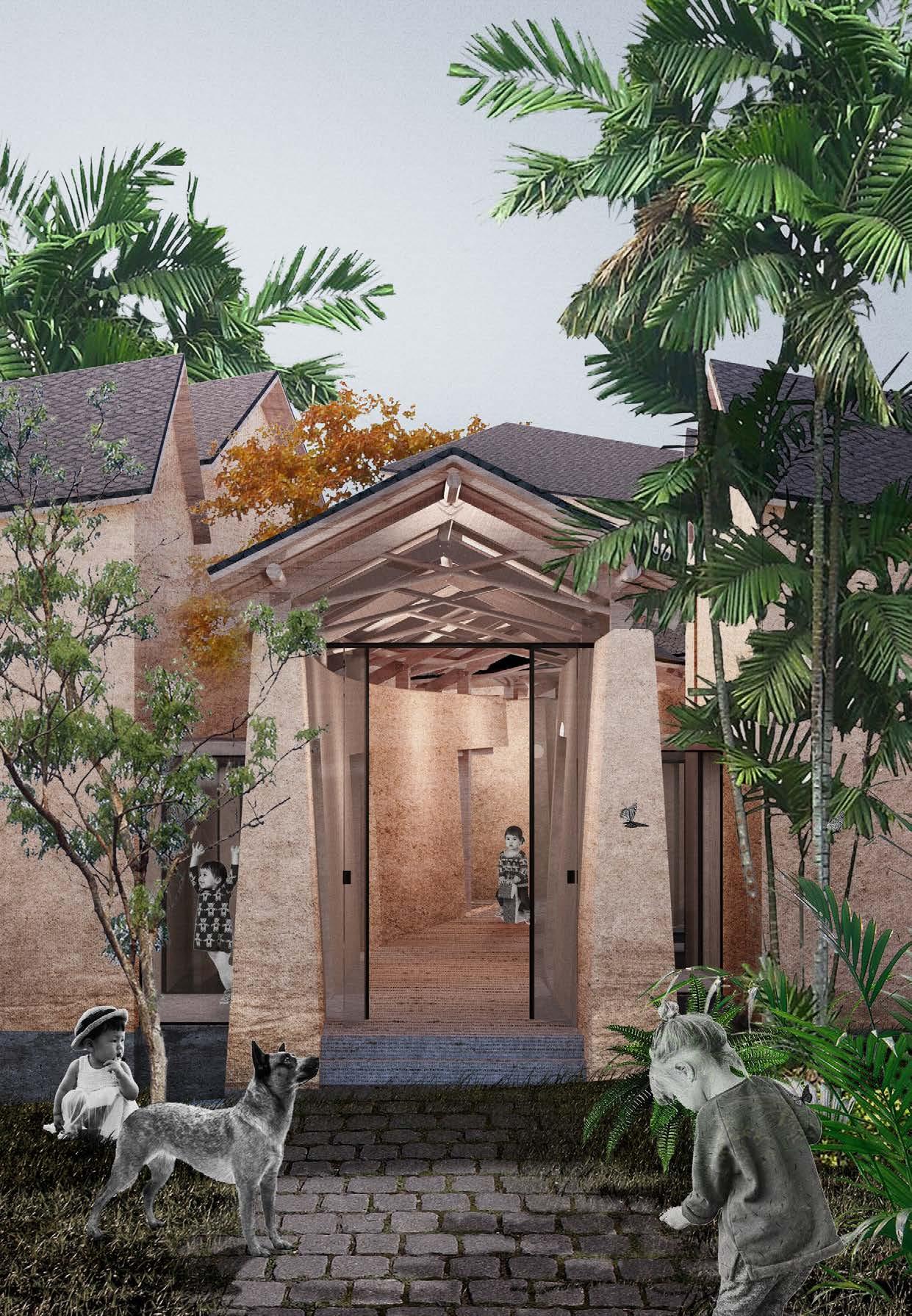
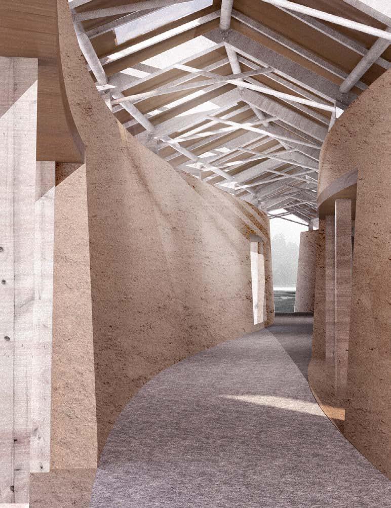
这个一个有玩心的幼儿园。
通过对通道和房间的分离和各自演变、再度连接,生成变化多端而又趣味性的空间,从而为其中孩童提供更加有趣的成长体验。
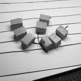
I spend my childhood at my grandparent’s house, like many other people around my age. It is a small village in south China, with low hills behind and a stream passing on the front, irrigating the along side paddy field.
Unlike the city kids nowadays, my early days of childhood is with the field, forest and animals. This experience is so precious for me, thus I wish it to continue with my newborn nephew and niece. That’s my initial motivation to design a kindergarten near my grandparent’s house - for the on-going of old memories.
There is always a strong bond in Chinese family between grandparents and grandchildren, therefore, other than providing spaces for kids, the elderlies are also concluded in this building. Without after-school classes, being away from the over anxiety, all kids shall go back to nature.

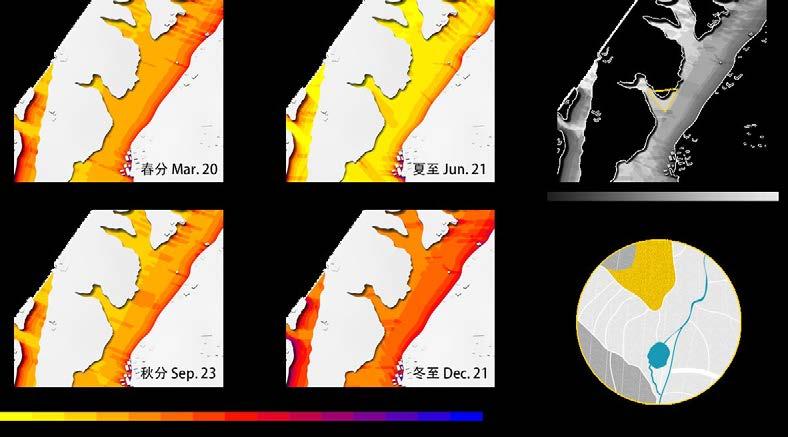
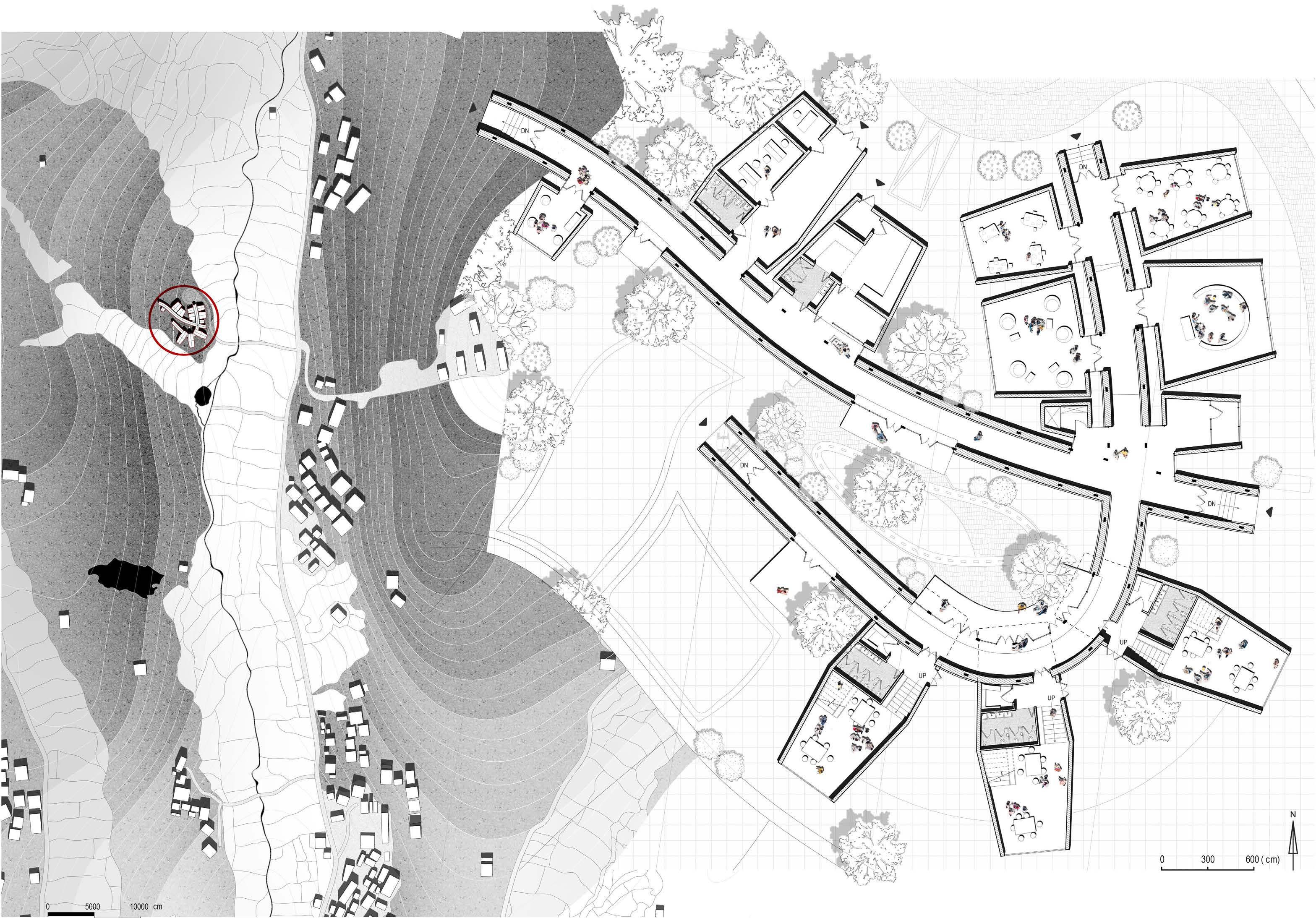
The site sits in a north-south orientated valley, surrounded by low hills covered with bamboo forest. A stream is running in the middle of the valley, and centred by it, a local living pattern is developed.
A triangle area is there between three neighbouring villages, with easy access to each of them. By overlapping the results of sunlight exposure from the typical days in the year, the exact location with most abundant sunlight is shown with the lightest shade.


35 34 04
China Jiangxi Province Pingxiang Shangli CountyPenggao Town
Mentor
Individual
work
Ming Li (mli@mail.neu.edu.cn)




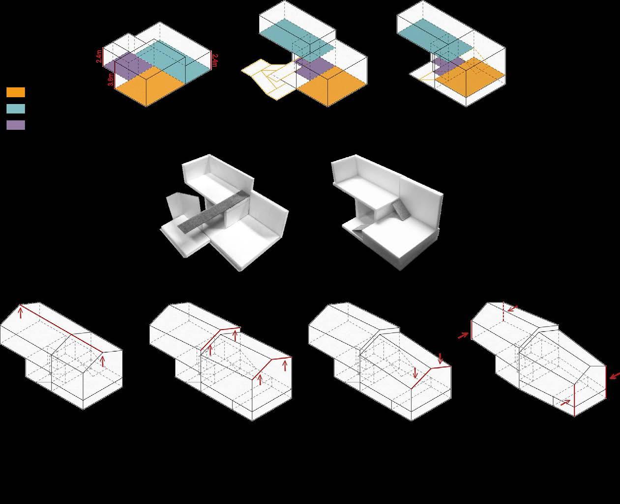
[1] The kindergarten should be formed by three main function areas -- activity room, public classroom and staff office. The fact that the activity room and public classroom should have good orientation decides the distribution of these three main blocks.
[2] According to different areas required by the functions, the size of each block could be defined.
Two corridors are formed to connect the separate units. One goes perpendicular to the contour line of the hillside, while the other goes along the boundary line between forest and paddy field.
The units are placed correspondingly. Benefiting from the original mountain slope, various level of façades could be observed from a lower point.
[3]Adjusting the roof direction.


36 37 Form Generation
Concept of “The Running Path“
The Using Space: Generation of A Classroom Unit Prototype
First Floor Plan SideEntrance 38 39 Side Entrance Site Plan 1. Duty & morning check room 2. Isolation room
Multi-purpose room 4. Library 5. Handwork classroom 6. Grandma’s parlor 7. Equipment room 8. Changing room 9. Ingredient storage 10. Non-staple food processing room 11. Staple food processing room 12. Food distribution room 13. Open meeting room 14. Principal office 15. Office 16. Toilet 17. Preparation room for forest 18. Storage 19. Children’s toilet 20. Activity room 21. Terrace 22. Outdoor play area 23. Rice field 24. Vegetable field 25. Courtyard 26. Shoes washing pool StaffEntrance 12 3 5 6 8 9 10 11 12 13 14 15 16 17 18 18 18 19 19 19 20 20 20 21 22 23 24 25 22 21 21 7 4 IngredientEntrance Main Entrance Side Entrance
3.

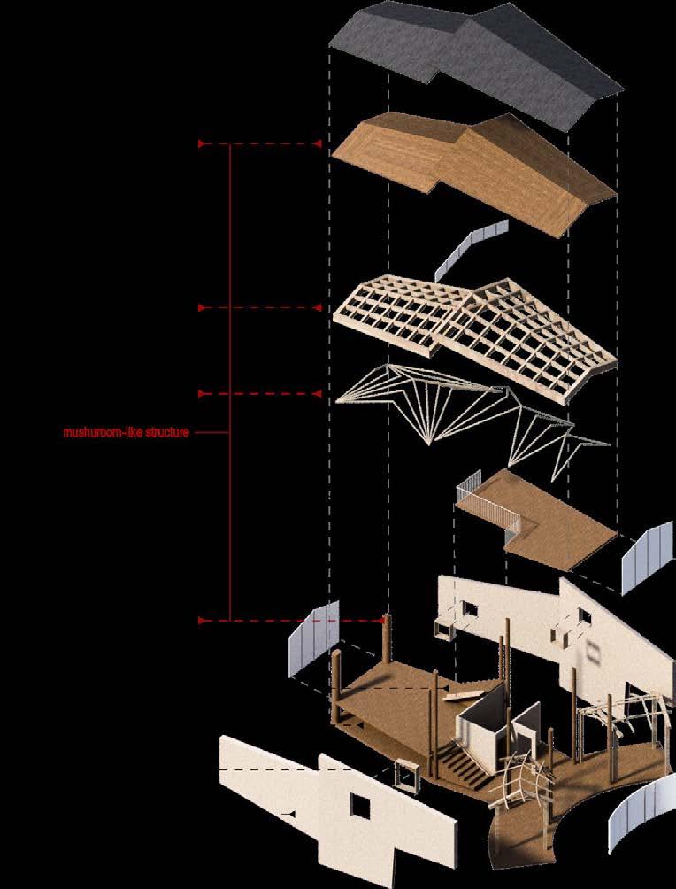
Detail_1:20

Polyester or polyurethane
floor finish
Bamboo-wood parquet
Sodium chloride preservative
Wooden keel with preservative
Polyester damp-proof
course
Cement mortar screeding
Cement cinder filling layer
Reinforced concrete floor
Bituminous grout caulking
Prepared subgrade Stone drainage ditch


40 41
Section A-A _ 1:300
Section B-B _ 1:300
1. 2. 3. 4. 60mm cobble stone 60mm C15 concrete 30mm coarse sand cushion, leaning 3%-5%
subgrade 1. 2. 3. 4. 5. 6. 7. 8. 9.
Prepared
THE SEA OVER OUR HEAD
Recreate The Roof of An Seaside Warehouse
Ayvalik, Turkey. 2015 Autumn
Third Year Studio, Middle East Technical University

Mentors
Group work
Individual work
Aydan Balamir (aydan.balamir@gmail.com)
Kadir Atabas (kadriatabas@atabasmimarlik.com)
Research on the open house & the area around.
- 18. Street facade drawing - Warehouse facade drawing - Surrounding area analysis - Noli map drawing - Typology photograph - Helping with solid cutting & laser cut - Adding trees in model
Further research & Design
你去听风,你去听雨,你听海悬浮在你我的上方。
When one looks back into the history of Ayvalik, the first thing to see is the close relationship between this town and the sea. The ports for exporting local goods, attracting tourists, are also the ones send away the homesick wanderers and fledging refugees.
The sea is like something over the head of its people, beautiful and prosperous, but meanwhile unstable, turbulent and posting a risk of falling down at any moment.
Ayvalik is a seaside town on the northwestern Aegean coast of Turkey, facing the nearby Greek island of Lesbos. It sits on a narrow coastal plain framed by low hills covered with pine and olive trees to the east, which support the local industry of soap, olive oil, animal hides and flour.
Due to its specific location, back to old times, this area was inhabited by both Turks and Greeks. It had its glory of being an important cultural centre of the surrounding district, but also the sadness of war and massacre between Greeks and Turks.
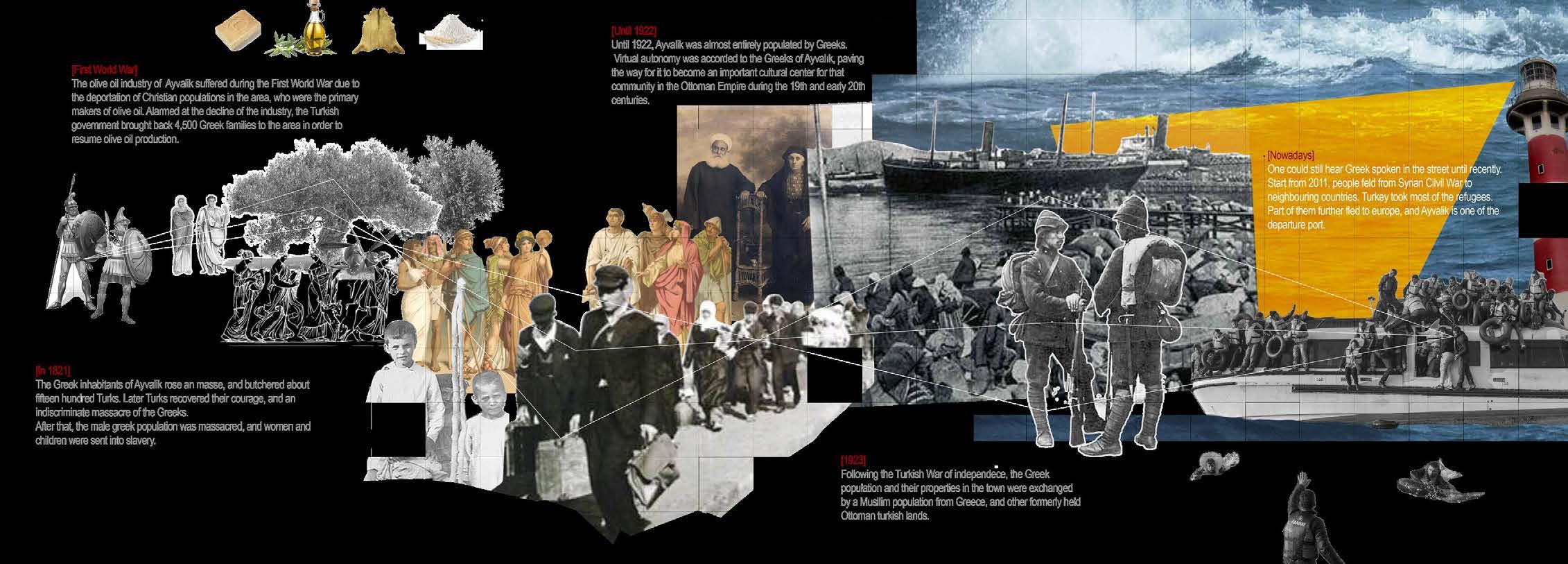
The population exchange happened in 1923 send most of the Greeks away, therefore, the majority of the local population are now Turks. But the history of immigration from different ethnic groups has left its own mark on this area, and became part of the culture of Ayvalik, which is carried on by the arrival of Syrian refugees.
43 42 05

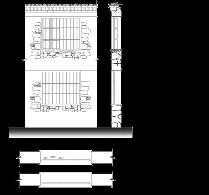
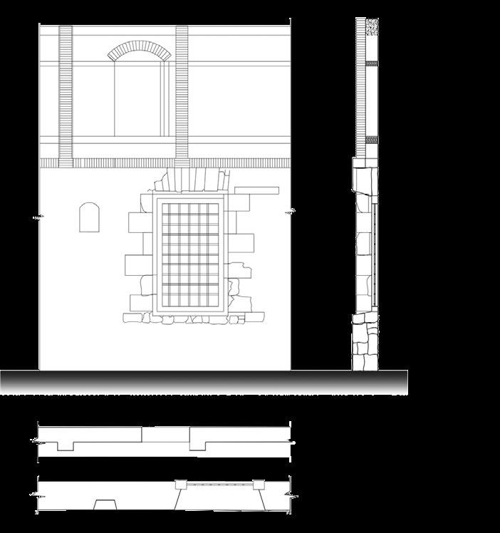
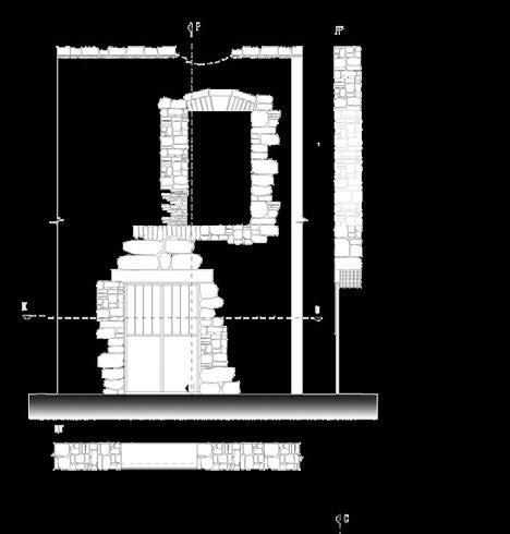
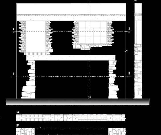
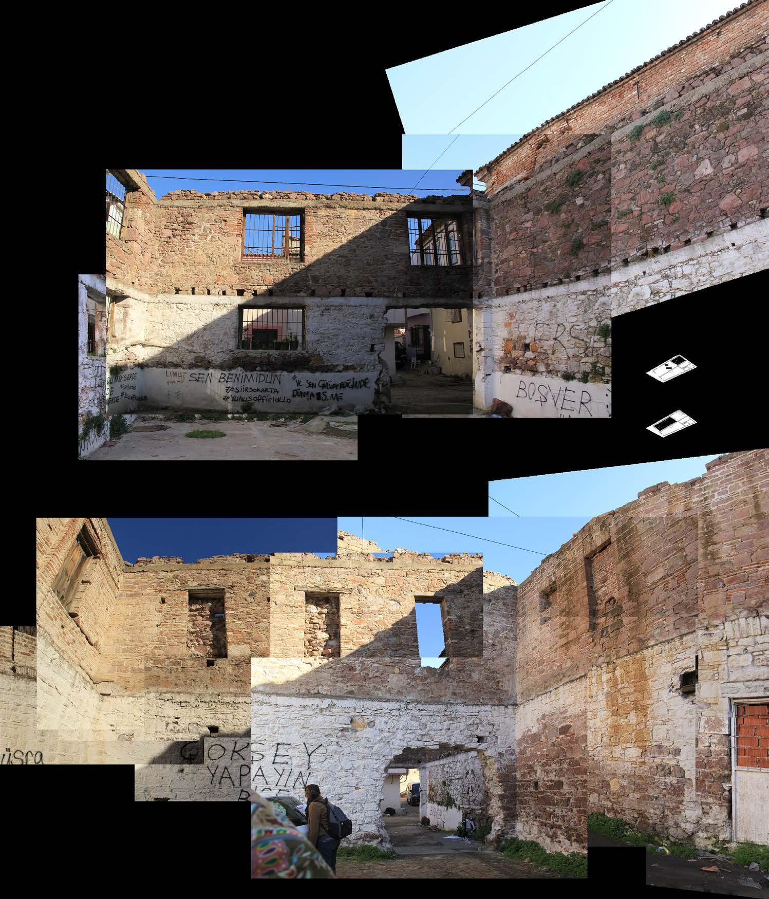
44 45 Research of The Warehouse
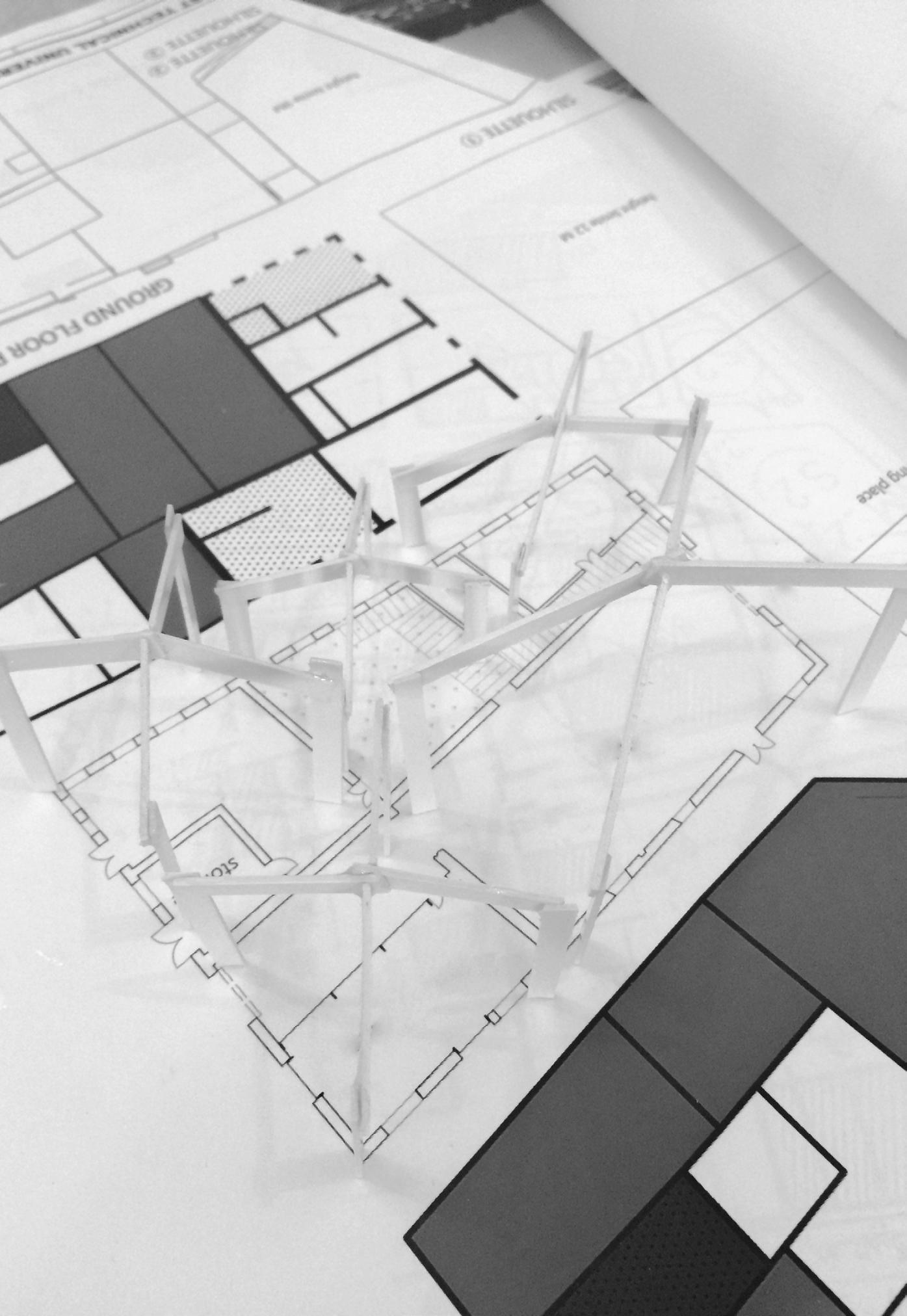


1. Outdoor exhibition hall I
2. Outdoor exhibition hall II
3. Indoor exhibition hall
4. Media room
5. Exhibition room
6. Courtyard
7. Coffee
10
11 3 4 5 12
6 7 8 9
Plan 2
8. Souvenir shop
9. Ticket office
10. Rest room
11. Storage
12. Office
13. Meeting room
13
46 47
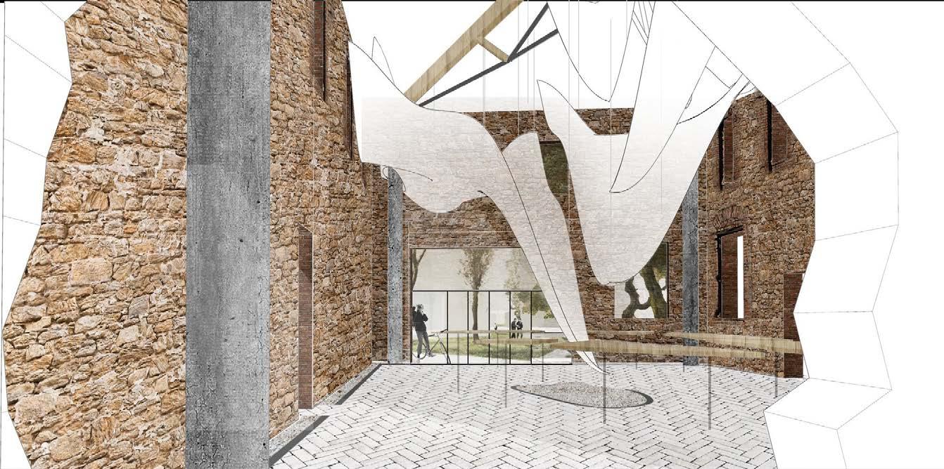
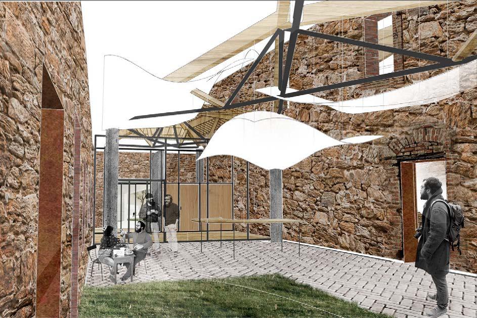
The new roof would be a symbolisation of the sea, however with a much gentler, lighter material. Despite the heavy history, the translucent material of pure white colour shows the willing for peace and happiness. 1


 Section A-A
Section B-B
Section C-C
48 49
Interior Space Analysis
GONE WITH THE WIND
Building Against Typhoon
Taipei, Taiwan. 2017 Winter
2017 Evolo Skyscraper Competition, Honourable Mention
Mentor Group work
Chen Lei (chenlei@mail.neu.edu.cn)
Shenghui Yang, Xu Pan, Yue Song, Yingxin Cheng, Binci Wang, Yuerong Zhou, Yaying Zheng, Shiman Wang - Concept developing - Architecture diagram - Writing statement
Research of Typhoon

Meranti, 2016 Taiwan, China
Soudelor, 2015 Taiwan, China
Rammasun, 2014 Philippines
Haiyan, 2013 Philippines
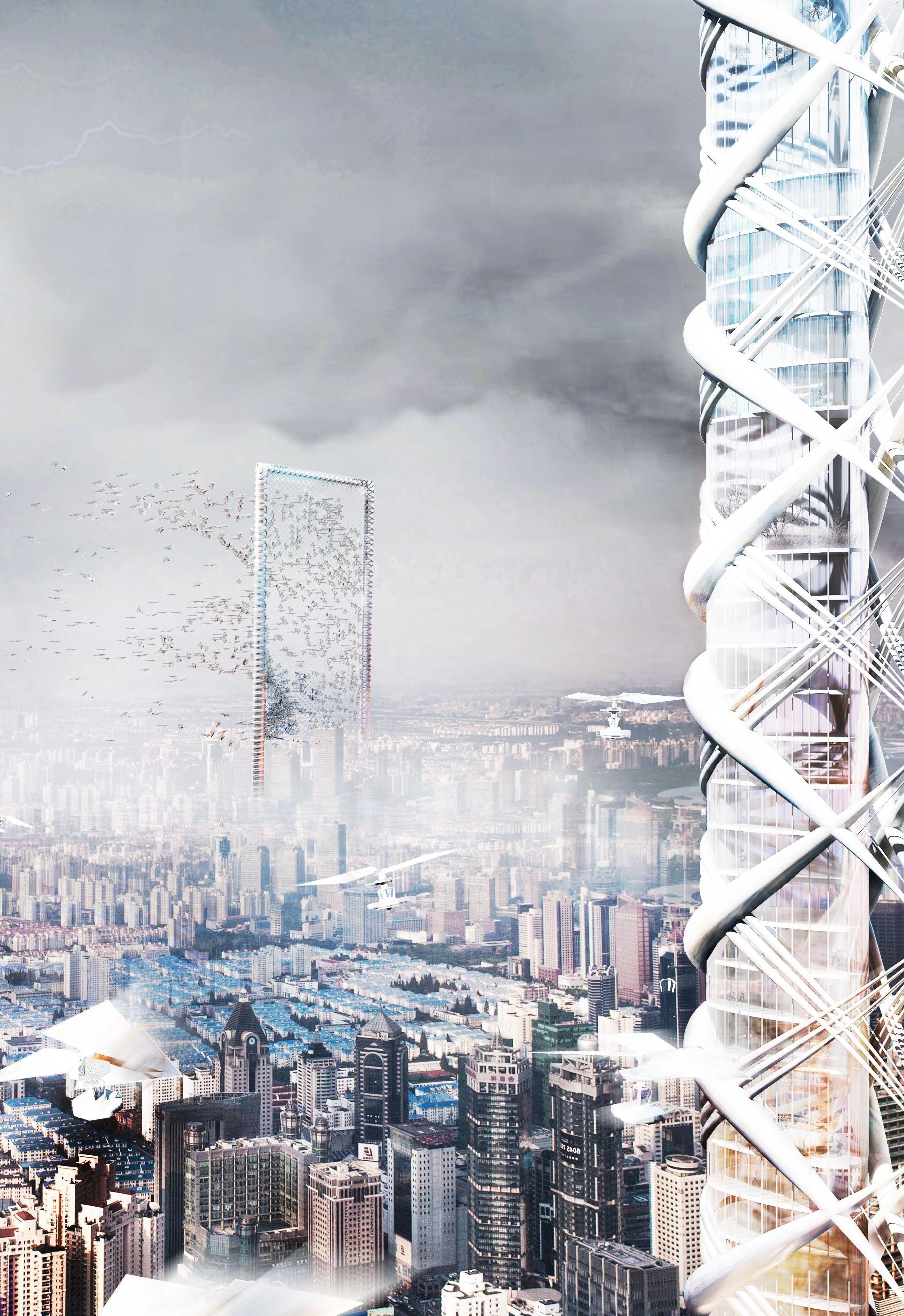
Typhoons could be considered as one of the worst natural disasters in the world. As the on-going deterioration of our living environment, we have all reasons to assume that like most of the other extreme weathers, the strike of the typhoon will become increasingly frequent. And Taipei, by its special location where the typhoon shows its horrible power most thoroughly, is regarded as a typical district in our research and design.

Concept Development

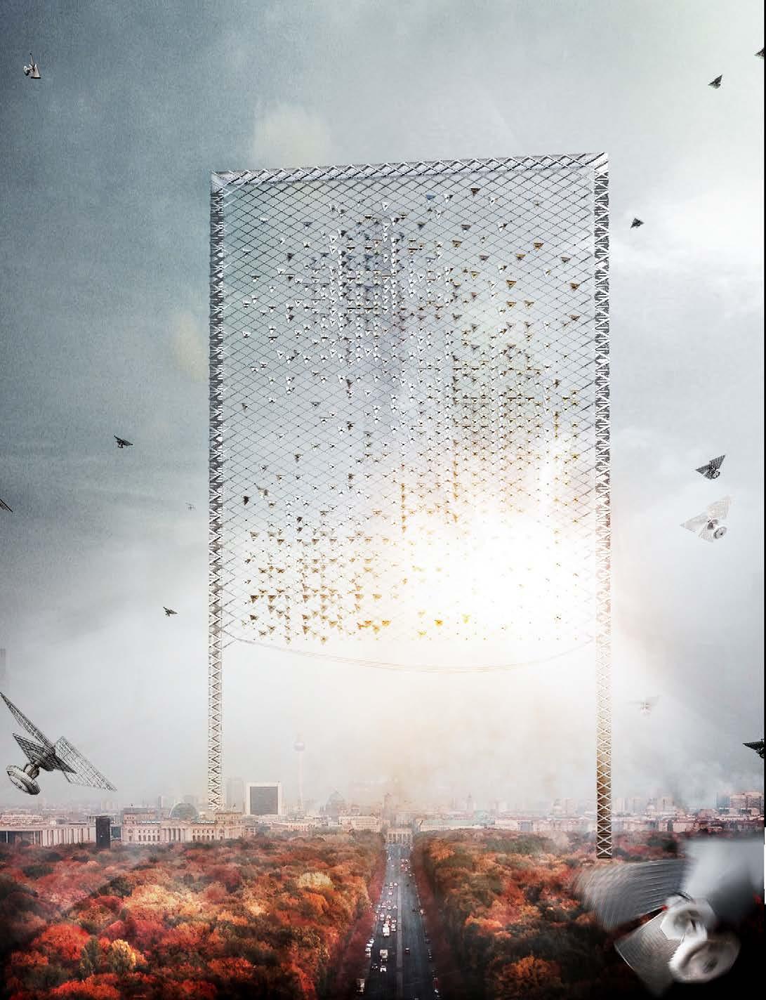
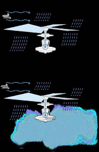
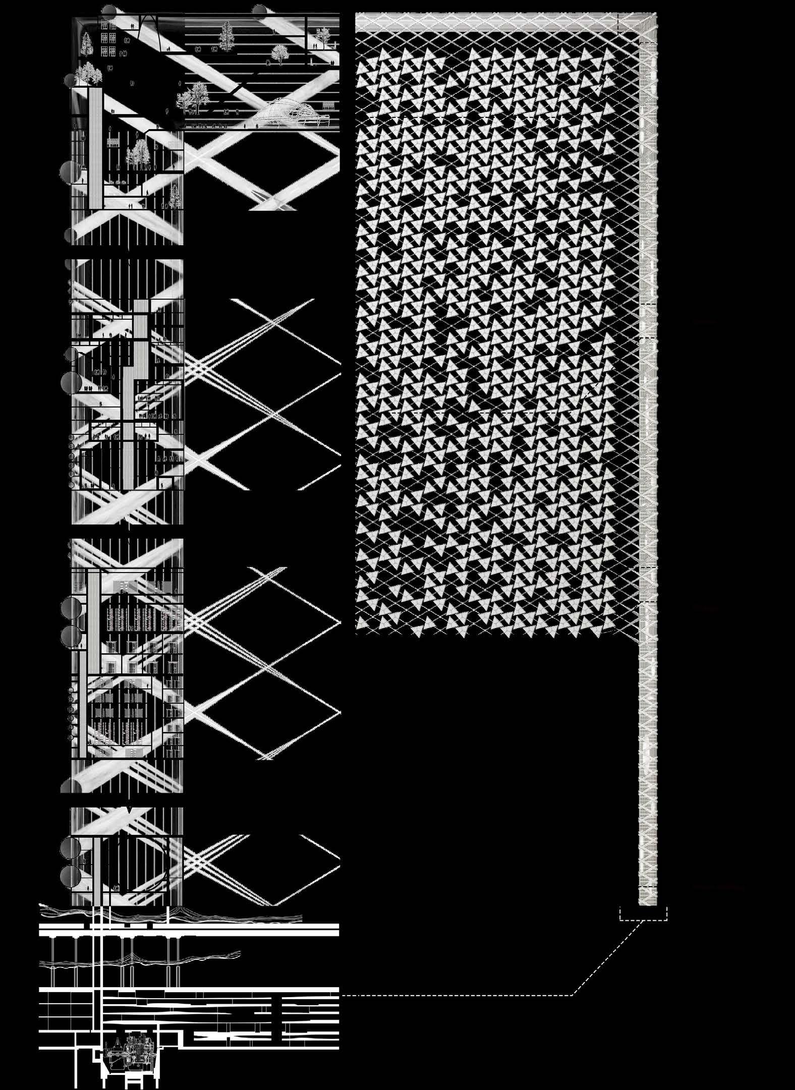
The main building serves as a view frame of the city landscape, inside which we arrange a variety of functions, including water retaining, storage, temporary shelter, research institution, and exhibition. Between the frame is a three-dimensional staggered space structure for holding numbers of devices for energy collection and typhoon intervention. Those devices are designed based on the formation of typhoons.
With both preventing and defending approaches, we see this project as an attempt for human positive intervening through architecture measures towards future disasters.

51 50 06
Site Plan


The

Building Response

The
Building
The
Devices
Devices

52 53
potential damage for human settlements by typhoon without protection.
direct and strong protection is added. Gentler resistance against typhoon by softing certain faces.
approach by breaking the surface.
A
Intervention
Timeline
Form
Generation The Device
receives solar energy in the form of a flat surface.
rest part of the building will be used for shelter.
devices fly over the city diffusely by the influence of strong winds.
are attracted to other buildings by magnetic force.
to
main building.
carry back the energy and moisture
the
THE WANDERING HOUSE
3m*3m*3m Basic Living Unit Design
Guangzhou, China. 2013 Autumn First Year Studio, NEU
Cheng Shizhuo (chengshizhuo@mail.neu.edu.cn)

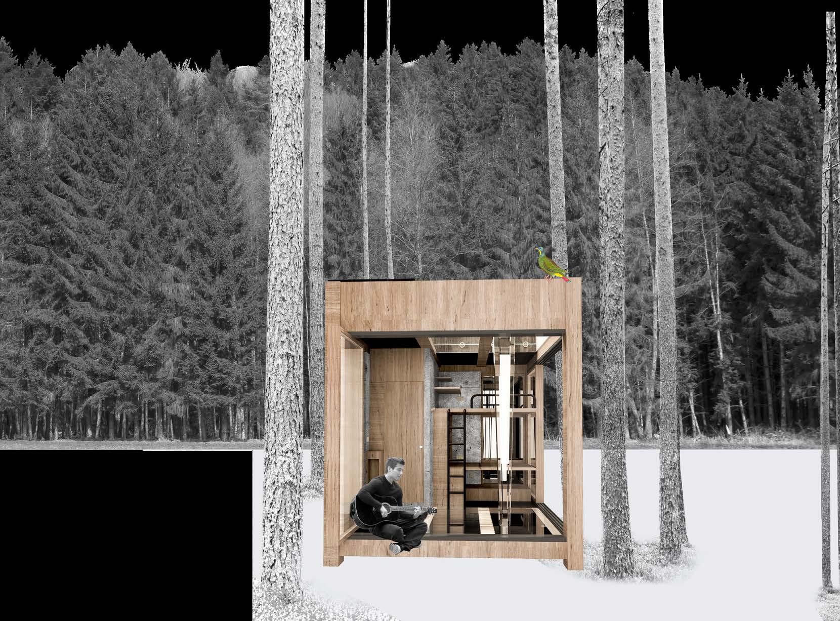
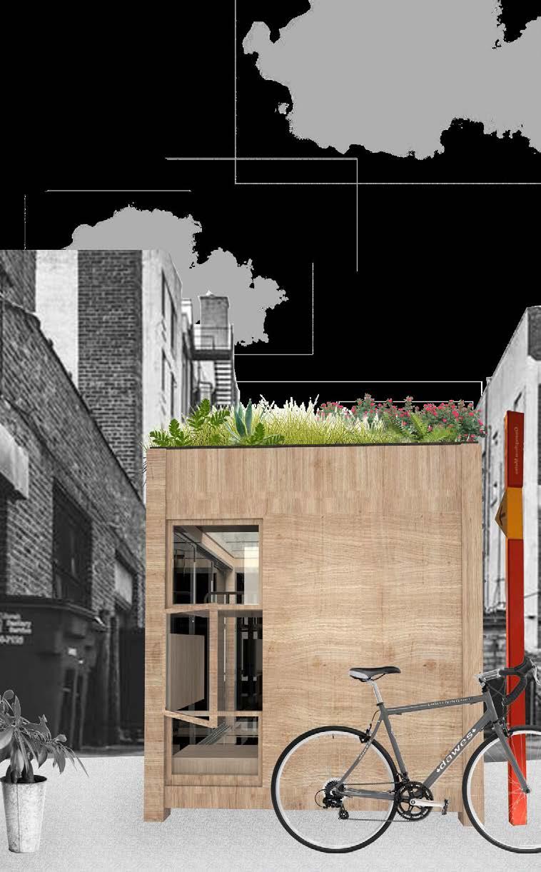
一个搬来搬去的小房子。

198019902000
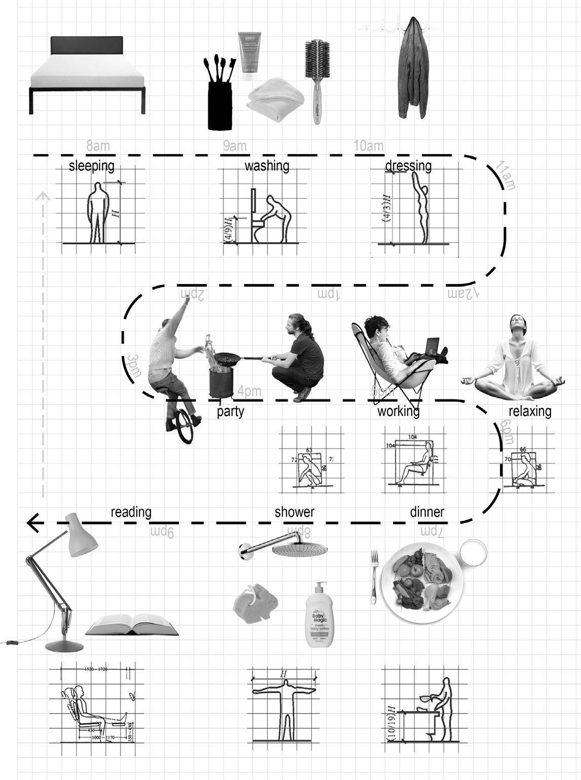
China has a really fast speed of urbanization. During the endless expanding of major cities, their nearby villages have been swallowed, and turn into so-called “urban village“.
Guangzhou is an example. It was geographically far away from central China back to old times, but dramatically increase its importance after “The Reform and Opening-up Policy“ in 1978. This brings it its most recent domestic immigration flow.

Urban Village

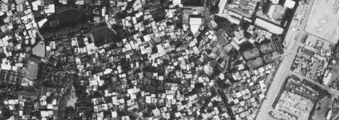
Although being surrounded by modern urban constructions, the outside prosperous seems have nothing to do with the inside world of these villages. The streets are usually narrow, as the buildings aside are too crowded, which cause the poor living situation of lacking fresh air and sunlight.
However, their comparatively low rent makes them affordable for the city newcomers, most of whom are youth pursuing better lives. They were my parents, and they could be my peer.
55 54 07
Mentor Individual work
Expanding of The Centre Area of Guangzhou
2010 2017
Satellite Map of An


The Study of Needs and Scale

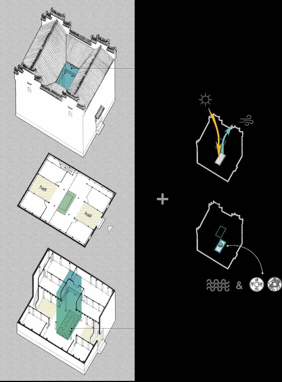
By adapting the spatial qualities of the traditional village house, the social activities used to happen in and around the courtyard could be kept in its new container.
Thus to ease the melancholy of being away from home of its residents.
Research on Traditional Living Mode
The skylight improves the lighting and ventilation conditions, creating a comfortable living situation while those high walls around protect the family from any potential danger.
For rainy days, it forms a well-like system which leads the rain falling into the courtyard and flowing away through the shallow trench around.
The way how water travels through the skylight to the courtyard is called “四水归堂“ (all water end in the courtyard). As water symbolizes money in chinese culture, people expect this will bring them fortunes and help with bringing the family prosperity.

Adaptation of Courtyard Space

Act as part of the drainage system in the rainy days, where people can sit aside and listen to the rain.

The agriculture activity has been moved to the top of building block.

Around the courtyard, the socializing space under skylight is still maintained.
56 57
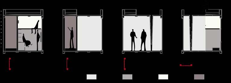
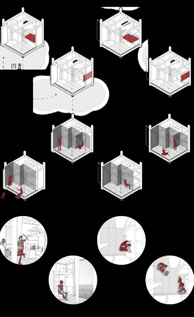
3m * 3m *3m Space for toliet. Break the wall. Struture.
Developing Concept Model
Enclose. Soft border. Inserting light and air.


58 59 A A
Plan _ 1:30
Section A-A _ 1:30
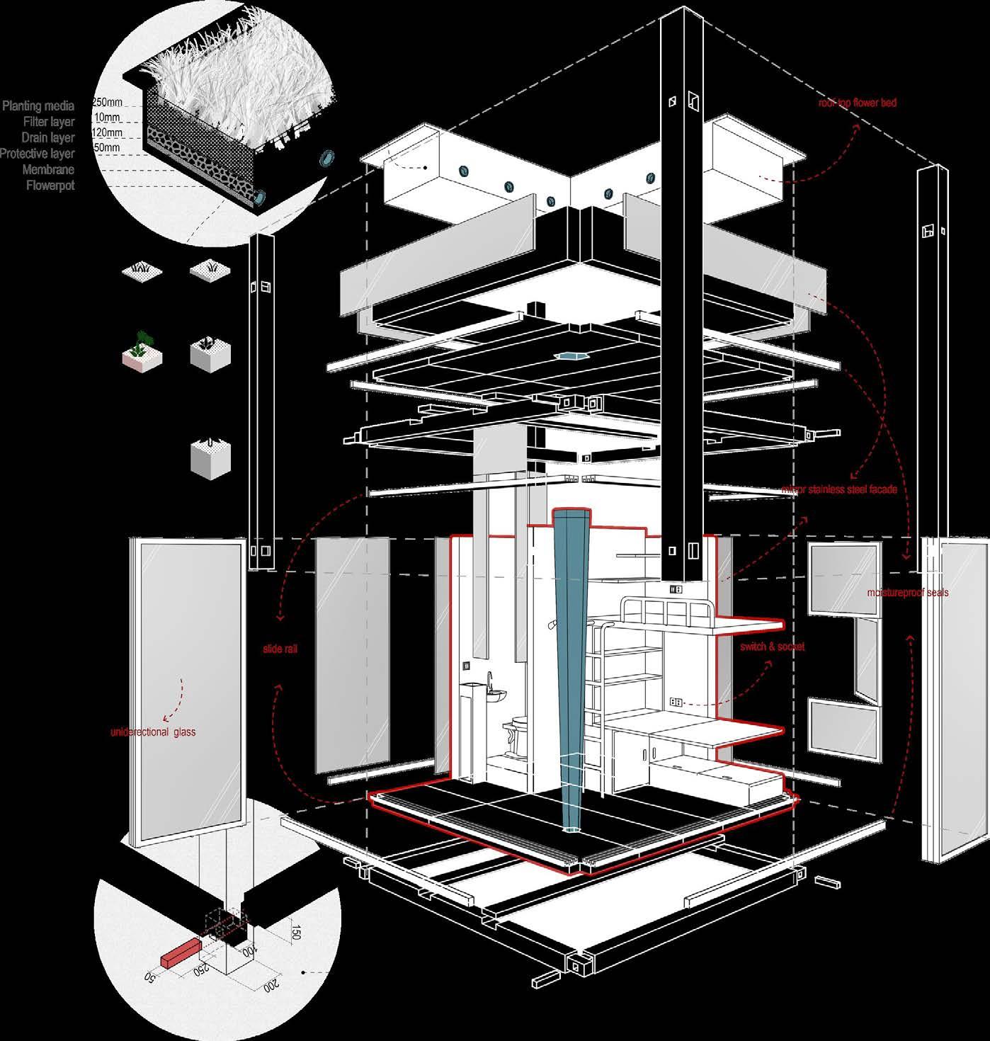
Decomposition Diagram
Water and Electricity Supply
Potable Components
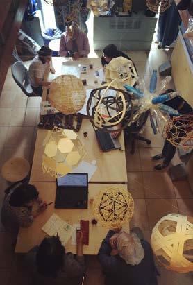
A SPHERE STRUCTURE STUDY
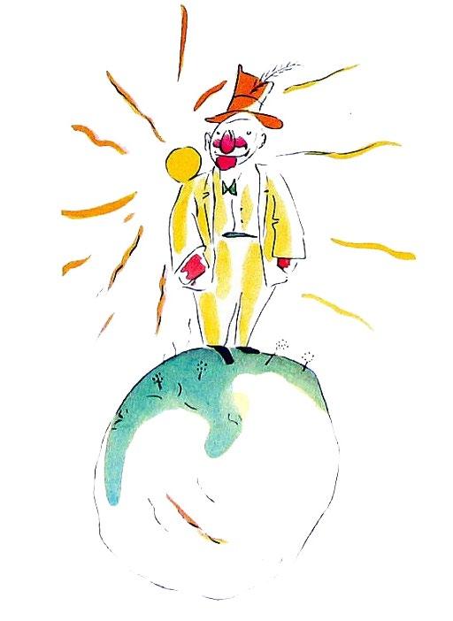
The Little Prince & The Planet of a Conceited Man
2015 Autumn
Third Year Studio, Middle East Technical University
Mentors
Individual work

Aydan Balamir (aydan.balamir@gmail.com)
Kadir Atabas (kadriatabas@atabasmimarlik.com)
The second planet was inhabited by a conceited man.
“Ah! Ah! am about to receive a visit from an admirer!” he exclaimed from afar, when he first saw the little prince coming.
For, to conceited men, all other men are admirers.
“And what should one do to make the hat come down?” he asked.
But the conceited man did not hear him. Conceited people never hear anything but praise.
“I admire you,” said the little prince, shrugging his shoulders slightly, “but what is there in that to interest you so much?”
And the little prince went away.
“The grown−ups are certainly very odd,” he said to himself, as he continued on his journey.


A conceited man is someone who thinks he knows all the things, but actually, he doesn’t. Sometimes in our culture, we describe knowledge is water, and people are the vessels to contain it.

When
On the ground.
As the conceited man cannot take in or keep water, he should be a bamboo basket. “竹篮打水一场空” (“drawing water in a bamboo basket is drawing nothing”.) USING
In the water.
* The bigger sphere structure has been strengthened.


In the air.
61 60 08
THE MUTUAL EFFECT OF THE SURFACE TO MAINTAIN ITS STRUCTURAL STABILITY.
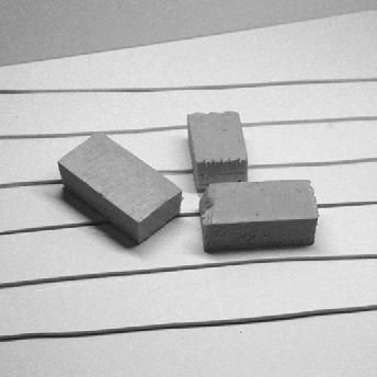
[1] two-dimension [2] three-dimension [3] sphere form
[Step-1] the attempt of weaving a sphere form
- The small sphere refers to the conceited man
- The bigger one refers to its orbit, which restricts the activity of the planets, like the cage a conceited man draw for himself.
the small sphere hit the bigger one, its loud sound is just like the pretentious voice of a conceited man.
[Step-2] Other weaving skills
:P UZZLE :P IECE
To learn, to play and to grow
Group work


Hiddi & Dillu , Ethiopia. 2021 Spring
Ethiopian Satellite Preschools Competition, Final List
Son Hei Sou + Yuerong Zhou


[Out of Box] [Contextual] [Fun & Experiential] [Flexibility & Possibility][Simple Construction]
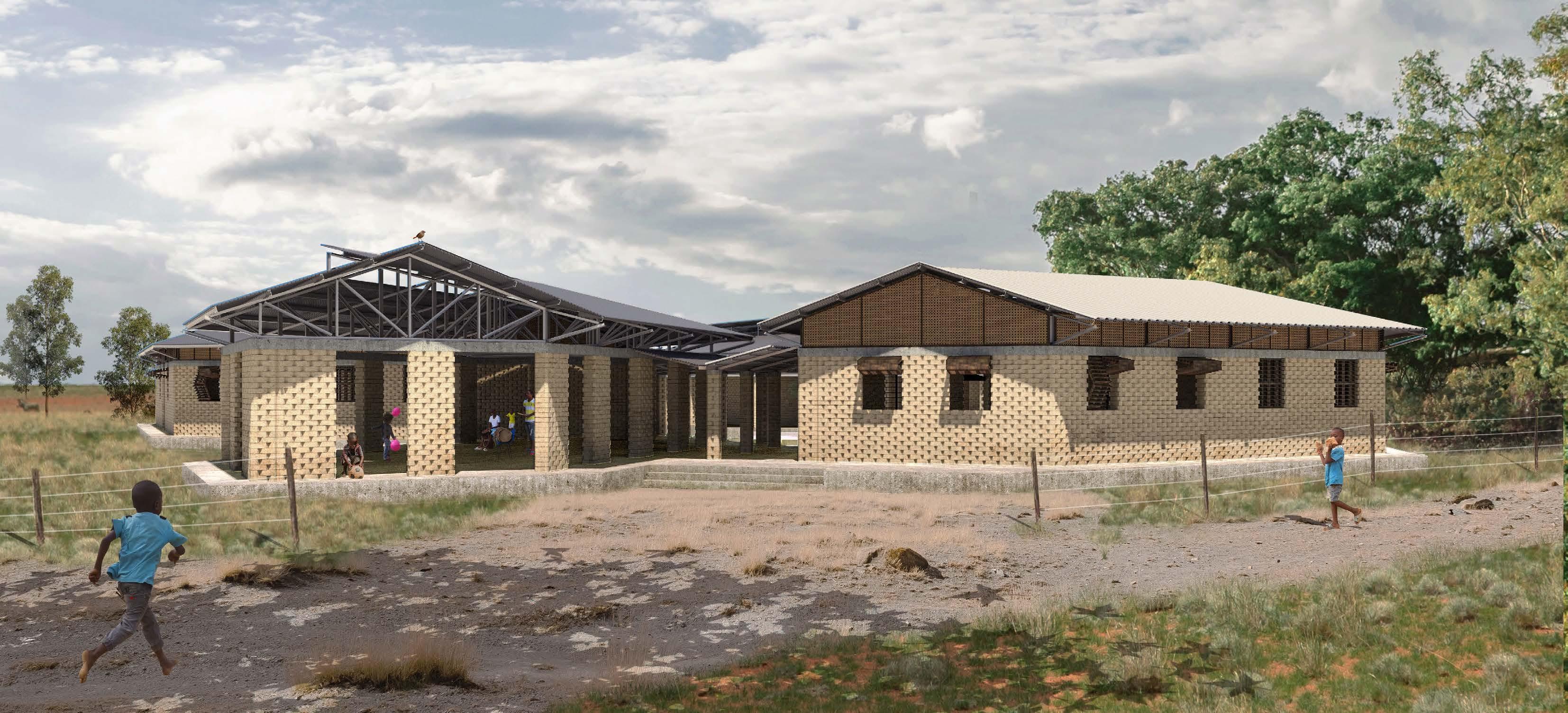
Starting with this design assignment for a flexible preschool scheme we have asked ourselves what are the most important things for children to have in a healthy upbringing. In our eyes it is the opportunities to play with friends, to run around and to discover new things both inside the classroom and out in the open air.
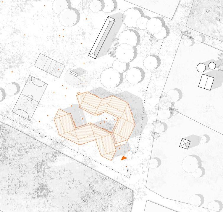
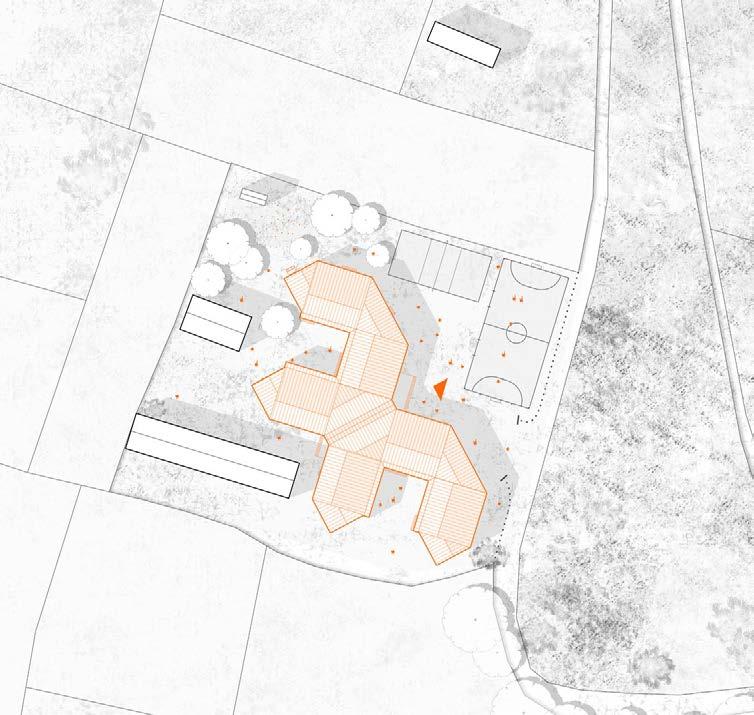
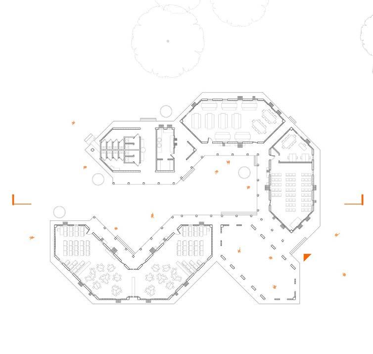
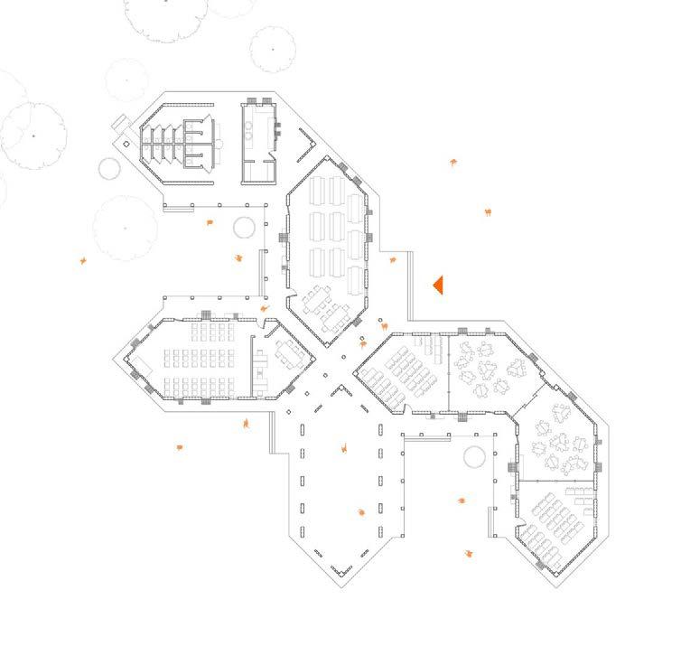
“:Puzzle :Piece” is the idea of having one base form of a hexagon (a “Piece”) and its possibility to grow into various kinds of clusters (in the way of “Puzzles”) to construct a school that is responsive and flexible.
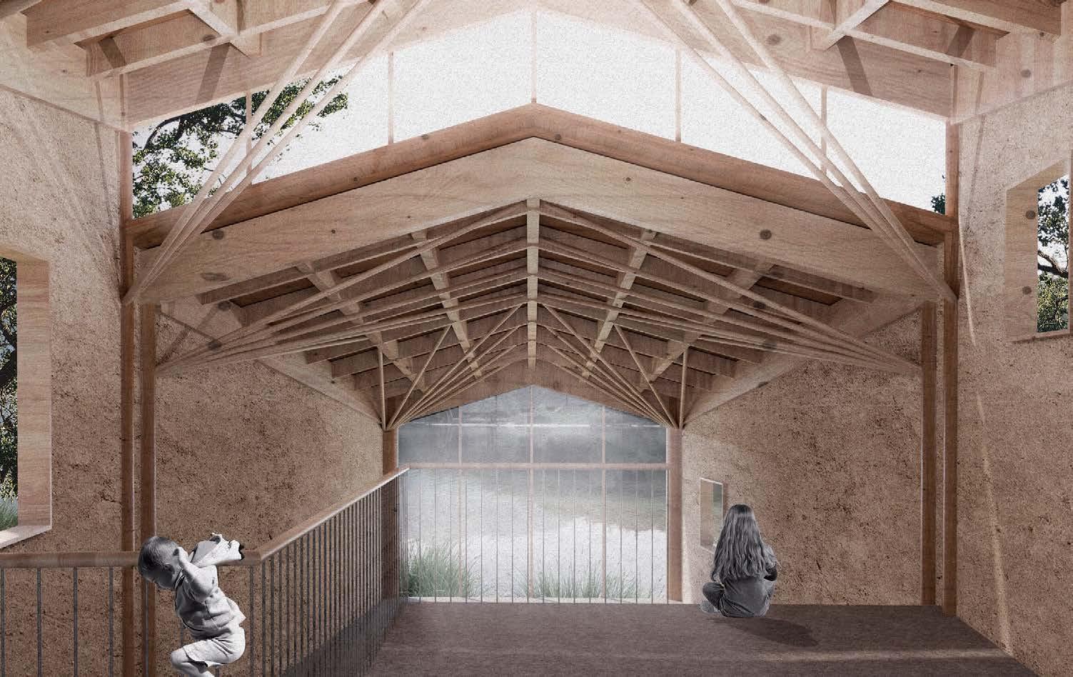
The choice of a hexagon module is to counter the idea that the only way to learn is to put children in a square box all day. Instead we try to We try to let children learn in a more exploratory environment. The hexagonal form also makes the need for interior walls obsolete. Therefore, the interior space of each module can have an open floor plan which is fun and experiential. As how different puzzle pieces coming together will create a playful puzzle, the hexagonal module can have a great variety in how the cluster could be shaped. The context of the school determines how the school cluster should be formed. In Dillu and Hiddi for example, the new school building cluster is chosen to create a more open character towards the existing school buildings. In another context perhaps a more enclosed or linear cluster would be desired. The fact that the buildings design is made up of different module means that the construction can happen incrementally. The construction can be phased with each module and because each module can be interchanged with each other it allows for more flexibility.
The construction is a marriage between vernacular materials, like interlocking CEB and eucalyptus wood, and the simple industrial materials, like corrugated sheets and steel profiles.

63 62 09
Design & Illustration


Site
Site Plan Hiddi_1:1500


64 65 Modular Spaces as Incremental Strategy
[Classroom] [Covered Courtyard] [Toilet+Kitchen] [Multi-use space] [Dining room] Section and Elevation Dillu_ 1:250
View of the inner-courtyard surrounded by veranda.
Plan
Dillu_1:1500
Plan Dillu_1:700 Plan Hiddi_1:700 ↑↗ ↑↑ ↗ ↑ Classroom Multifunctional space Dinning room Open courtyard Covered courtyard Kitchen Latrines Corral Orchard Soccer field Volleyball field 2 3 4 5 6 7 8 9 10 11 1 2 3 4 5 67 1 1 1 2 3 4 4 5 67 11 8 9 10 11 8 9 10 11

Climate Scheme
■ Wind Effect Ventilation
Windows are set on both sides of the room, encourage wind effect ventilation.
■ Rainwater Harvesting
Rainwater will be lead down from the roof to the water tanks placed in the courtyard. It could later be used for irrigation or other use.
Exploded View _ A Single Unit
■ Roof _ Corrugated Metal Sheet
The top layer of the roof is made by corrugated metal sheet, which is commonly used in the surrounding areas. It is with considerable low budget, and local accessible.
■ Truss _ Structural and Aesthetic
The truss has a basic form and simple constructing logic, made by Lightweight steel bars.
The opening on the top-side allows softer daylight projecting into the interior during the morning and afternoon of a day, meantime providing shade at noon time.
■ Bond Beam _ Concrete
To stabilised the compressed earth block walls.
■ Wall & Column _ CEB
The walls and columns are made with compressed earth blocks. It is modular, easy to construct, with abundant source material.
■ Openings _ Bamboo
The windows and doors, are made with another local abundant material - bamboo. They are designed to be fold-able, for better ventilation, lighting and most flexibility.
■ Diffuse Natural Light
The selected truss from creates a little skylight on top, which helps improve nature ventilation,while also creating a gentler diffusing lighting environment.
■ Plinth _ 450mm Concrete
The concrete plinth is set 450mm higher than the ground level. It is at a height allowing kids to easily seat on, when they need to take a rest from chasing in the curt-yard.
Compressed Earth Block and Its Applications
300 300 450 450 300 150 300 100 150 150 100 66 67
Sample Wall Corner Connection Column
THE TOWER OF BOND AND BOUNDARY
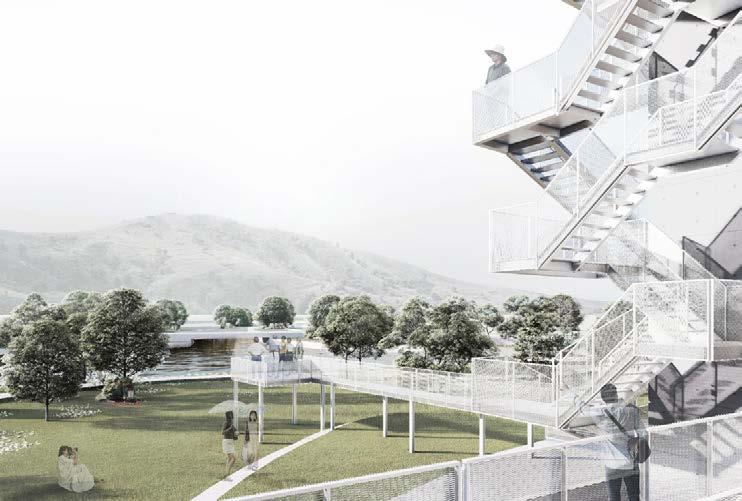
Viewing Pavilion · Micro Building | 望亭·小筑
Nanjing , China. 2022 Spring
Design Competition for the Vertical Environment-Community Unit in Nanjing
Group work Xu Pan + Su Yan + Yuerong Zhou


界定 | Define The Boundary
这是一个充满冲突的场地,城市急速扩张,卷挟着高密度的住宅片区,和宽阔平直的 道路,却止步于望亭所在的这块土地。群山环绕,绿意盎然。
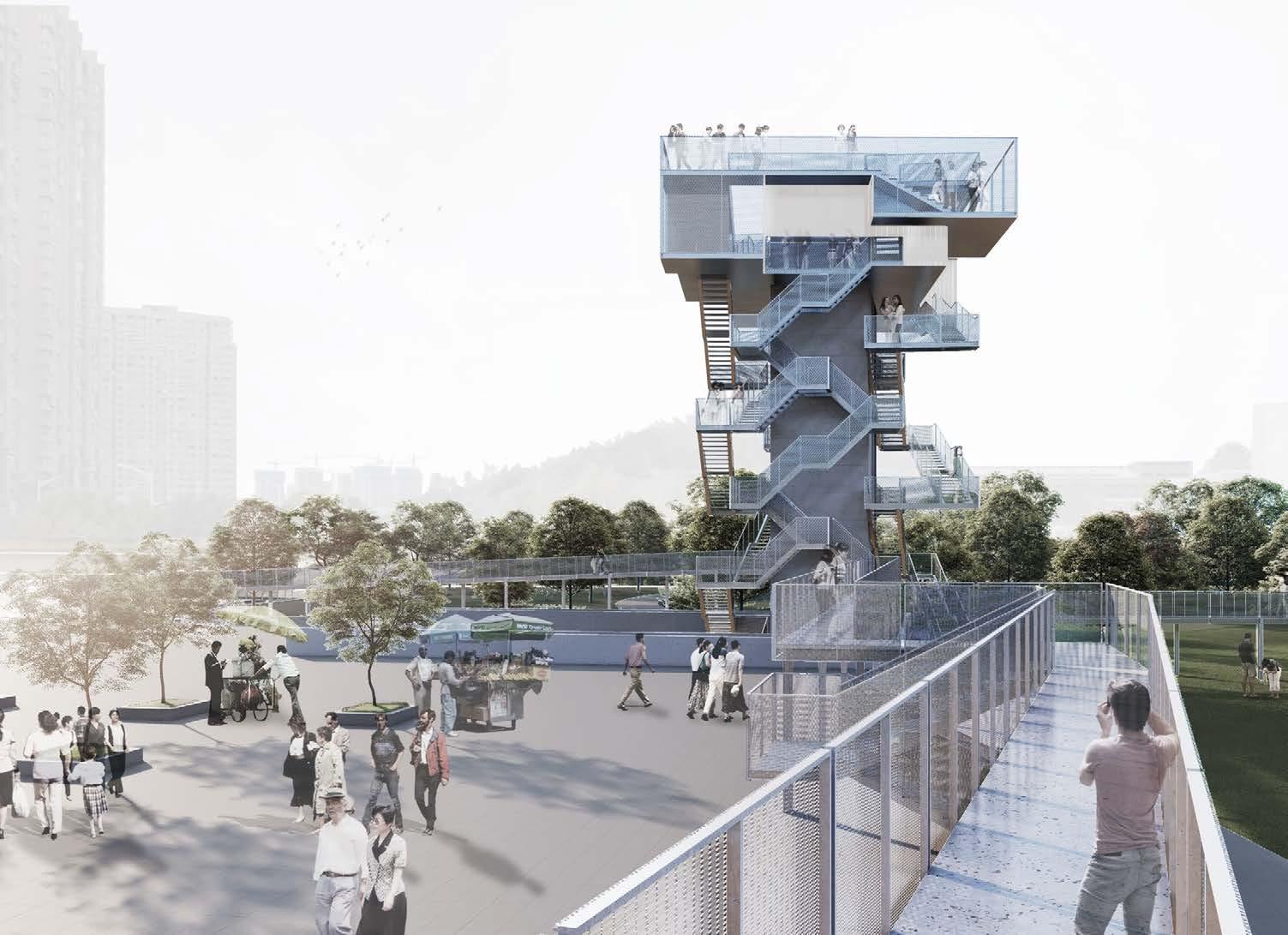
因此我们希望能够回应这一宏大的城市尺度,同时去定义和缓和自然和城市的边界。 囿于高度限制,我们选择了水平向的策略。通过不同方向的廊桥去拼合场地四周分隔 的元素,再向上旋转生成了观景的望亭。
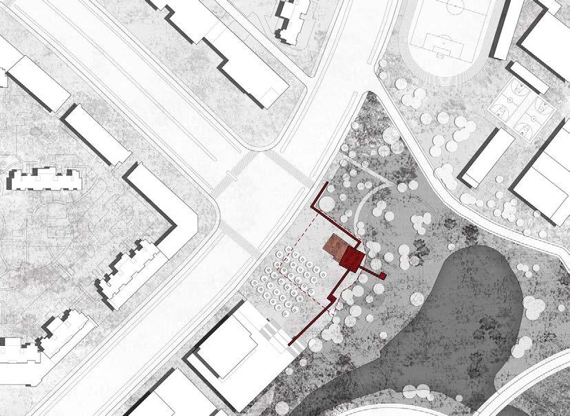
The site is a site of contradiction. We see the city expanding overwhelmingly, rushing down with its extra-high dense residential buildings, straight broad roads, but yet stopped here on this site all of a sudden. The progress is paused by the bay of nature, of the rolling mountains in the distance.
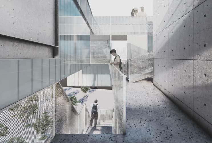
Therefore, one of our departure points is to respond to this giant urban scale and help with easing the boundary between the city and nature. We choose a horizontal approach due to the height limit. Verandas of different directions are used to connect the separated elements next to the site, and then go upwards to form the “viewing pavilion”.
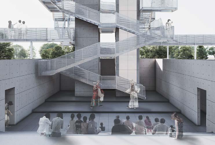
连结 :集市的文艺复兴 | Bonding: The Renaissance of Outdoor Market “结”即是四条路径相互间的连结,也是承上启下,过往与将来的连结。
岱山片区有着大片的保障房,住户中多有受城市发展影响回迁的居民。它的人口结构 中也有着很大一部分的老人和儿童。集市对于他们而言,在久远的记忆中,更像是月 初年尾,家长里短,日常的一部分。
我们希望望亭能够眺望作为“事件”的集市,但同时也可以孵化作为“日常”的集 市。从而去连结新形成的社群。因此在设计中留有了允许这一事件发生的余地。
“Bonding” means the connection of the four paths, and of the past and future. Daishan has a large area of affordable housing, many of the people there have their roots back in villages. For them, outdoor market used to be part of their daily life, instead of a yearly event which serves more for tourism.
We are expecting the Tower could provide a nice view of the “event” market, but also incubate daily market to bond local newly formed community. Thus, the market space is preserved in the design.


69 68 10
Design & Illustration
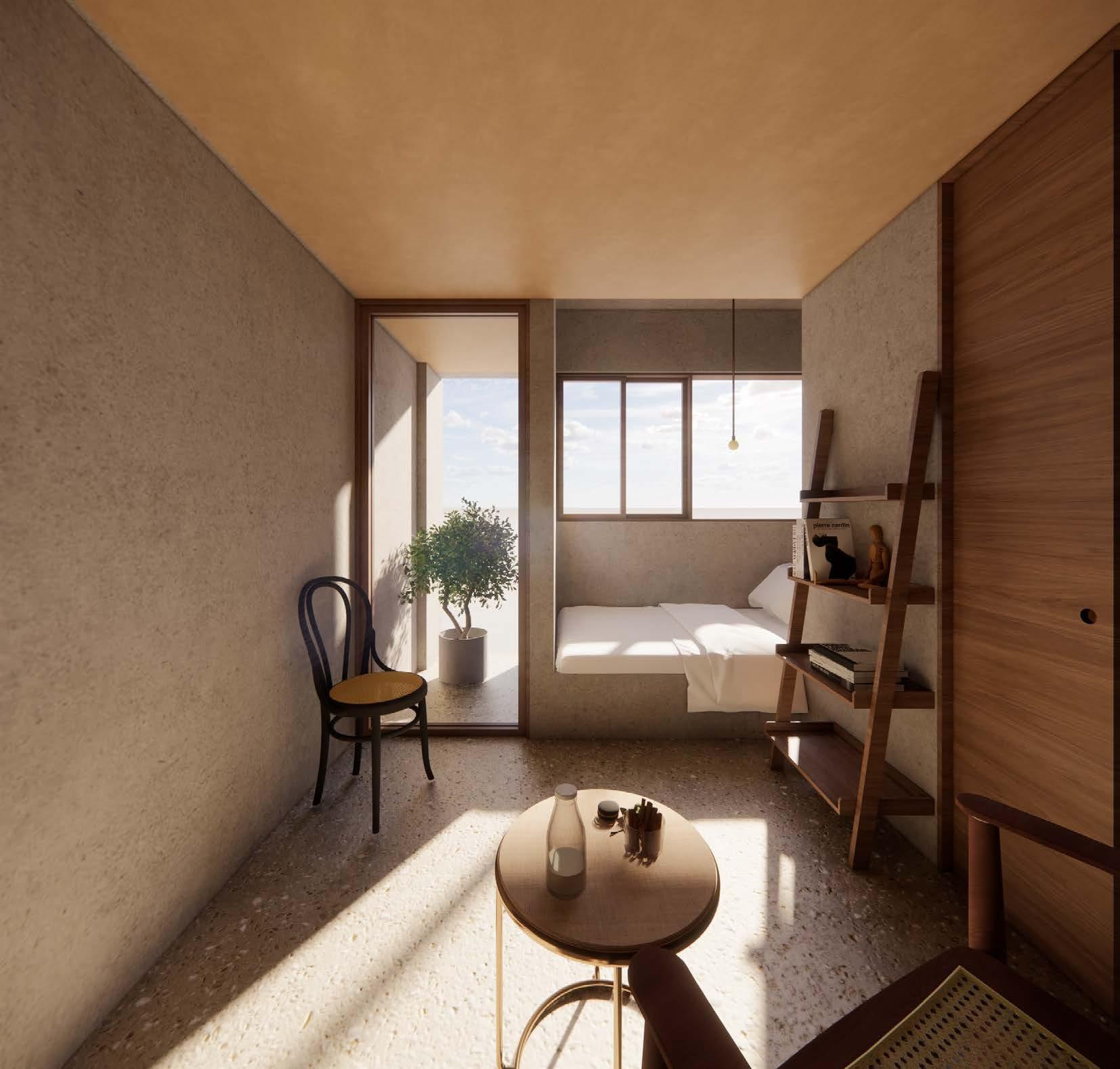
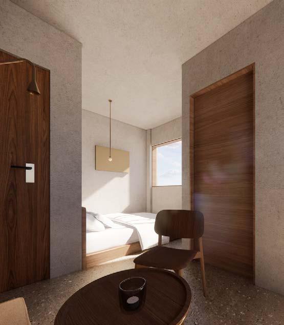
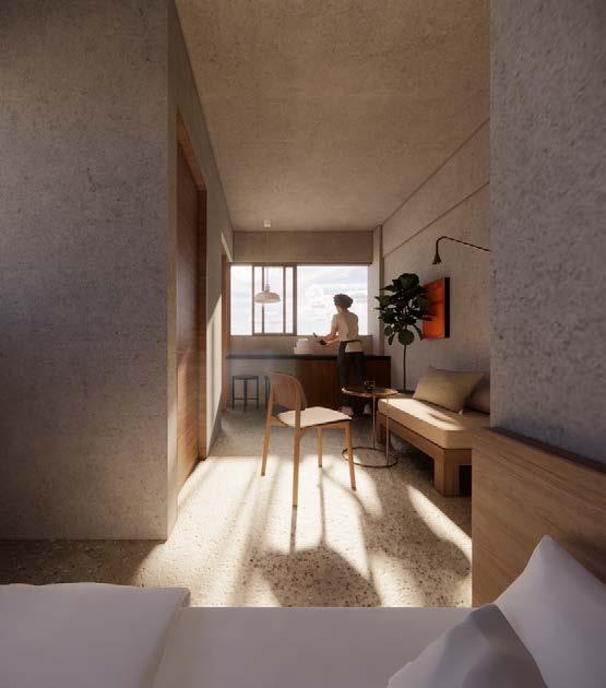
Transform an Urban Village Building to Public Rental Housing
Shenzhen , China. 2022 Spring
Competition of Affordable Rental Housing Units Design | 深圳市保障性租赁住房小户型设计
Group work Yuerong Zhou + Xinyue Liu
Kaixuan Xie + Jinfeng Chen
Architecture
1. Unit Prototype Generation
2. From Requirements to Design Output
To Stagger, defining different function areas & increasing view depth. Split the room to two. Perimeter Increased, more wall space. Leftover spaces as balcony and entrance. The Ideal Model. Preparatory Research on Needs Specific Solution for Each Design Options Pool
(
With Considerations of MEP )Selected example. Selected example.


4500.00 3000.00 3000.00 4500.00 3000.00 3000.00 3000.00 3000.003000.00 181818 27 27 1500.00 3000.00 4000.00 12 12 2727 27 181818 27 1818 18 18 12 12 12 27 12 12 12 181818 1212 12 12 12 6000.00 14500.00 27m2 27m 18m 12m2 … :) :D & More BR. LR. Unit A 12m2 4500.00 3000.00 3000.00 4500.00 3000.00 3000.00 3000.00 3000.003000.00 181818 27 27 1500.00 3000.00 4000.00 12 12 2727 27 181818 27 1818 1818 12 12 12 27 12 12 12 181818 1212 12 12 12 6000.00 14500.00 27m2 27m 18m2 12m2 :) :D & More BR. LR. Unit A 12m2 4500.00 3000.00 3000.00 4500.00 3000.00 3000.00 3000.00 3000.003000.00 181818 27 27 1500.00 3000.00 4000.00 12 12 2727 27 181818 27 1818 1818 12 12 12 27 12 12 12 181818 1212 12 12 12 6000.00 14500.00 27m 27m2 18m2 12m :) :D & More BR. LR. Unit A 12m Unit B 18m 4500.00 3000.00 3000.00 4500.00 3000.00 3000.00 3000.00 3000.003000.00 181818 27 27 1500.00 3000.00 4000.00 12 12 2727 27 181818 27 1818 1818 12 12 12 27 12 12 12 181818 1212 12 12 12 6000.00 14500.00 27m 27m2 18m2 12m :) :D & More BR. LR. Unit A 12m Unit B 18m2 4500.00 3000.00 3000.00 4500.00 3000.00 3000.00 3000.00 3000.003000.00 181818 27 27 1500.00 3000.00 4000.00 12 12 2727 27 181818 27 1818 1818 12 12 12 27 12 12 12 181818 1212 12 12 12 6000.00 14500.00 27m 27m2 18m2 12m2 :) :D & More BR. LR. Unit A 12m2 Unit B 18m 4500.00 3000.00 3000.00 4500.00 3000.00 3000.00 3000.00 3000.00 181818 27 27 1500.00 3000.00 4000.00 12 12 2727 27 181818 27 1818 1818 12 12 12 27 12 12 12 181818 1212 12 12 12 6000.00 14500.00 27m 27m2 18m2 12m2 :) :D & More BR. LR. Unit A 12m2 Unit B 18m :) :D Unit A 12m2 Unit B 18m2 Unit C 27m 71 70 11 A RENTAL UNIT PROTOTYPE IN URBAN VILLAGE
Xianyue Chen Structure
3. Adapted Room Units & Variant Communal Spaces
4. Examples
UP A A B B C C D D E E 1 1 2 2 3 3 4 4 5 5 Store 12m Lobby Store 28m2 Store 11m Store 12m Store 11m 14760 2823 4558 3688 3693 12160 3380 2700 2700 3380 DN A A B B C C D D E E 1 1 2 2 3 3 4 4 5 5 14760 2823 4558 3688 3693 Storage 12160 3380 2700 2700 3380 DN UP A A B B C C D D E E 1 1 2 2 3 3 4 4 5 5 14760 2823 4558 3688 3693 Unit C 27m2 Unit B 18m Unit B 18m Unit B 18m Unit B 18m2 Unit B 18m 12160 3380 2700 2700 3380 DN UP A A B B C C D D E E 1 1 2 2 3 3 4 4 5 5 Unit B 18m Unit B 18m Unit A 12m Unit A 12m2 Unit A 12m Unit A 12m 14760 2823 4558 3688 3693 Communal Kitchen 10m 12160 3380 2700 2700 3380 72 73 Overlapping Communal Spaces in Vertical Direction Ground Floor Plan: Stores & Entrance _ 1:200 Top Floor Plan: Sharing Facilities _ 1:200
Floor
Typical Floor Plan A: Max Living Space _ 1:200 Typical Floor Plan B: Max Public Live _ 1:200
Examples of Typical
Plan
UnitA_12m 2


A A B B 4 4 5 5 2823 3380 2503 400 750 190 500 1180 2800 4480 3843 500 2190 670 300 820 4480 300 2253 140 980 300 3973 Wardrobe Shoe Cabinet Living Room TV Bedroom Balcony Shower D D E E 3 3 4 4 5 5 500 1140 1050 670 300 2400 300 6360 3380 2700 500 3980 260 1540 6280 500 2193 260 750 190 3893 3693 300 2268 140965300 3973 Wardrobe Bedroom TV Bookshelf Washing Machine Fridge Kitchen Living Room Balcony Shower 4 5 3380 400750190 500 1180 2800 4480 140980300 Room TV Balcony D D E E 3 3 4 4 5 5 500 1140 1050 670 300 2400 300 6360 3380 2700 500 3980 260 1540 6280 500 2193 260 750 190 3893 3693 300 2268 140 965 300 3973 Wardrobe Bedroom TV Bookshelf Washing Machine Fridge Kitchen Living Room Balcony Shower 74 75
INDEX Living Room: 7.9m2 Toilet: 2.1m2 Balcony: 2.0m2 UnitB_18m 2 INDEX Living Room: 12.8m2 Kitchen: 2.1m2 Toilet: 2.1m2 Balcony: 2.0m2 Unit A Unit A Unit B Unit B
SPINNING WHEEL
A Warming Hut for Tea & Snacks
Winnipeg , Manitoba. 2022 Autumn
Warming Hut : An Art + Architecture Competition on Ice
Group work Nehal Fatima & Yuerong ZhouDesign & Illustration


77 76 12
RED RIVER ASSINIBOINE RIVER REDRIVER Sled for transport 1 2 3 4 5 Stainless steel pipes as self-standing structure. Translucent ETFE Membrane. Tea table integrated with wind turbine.

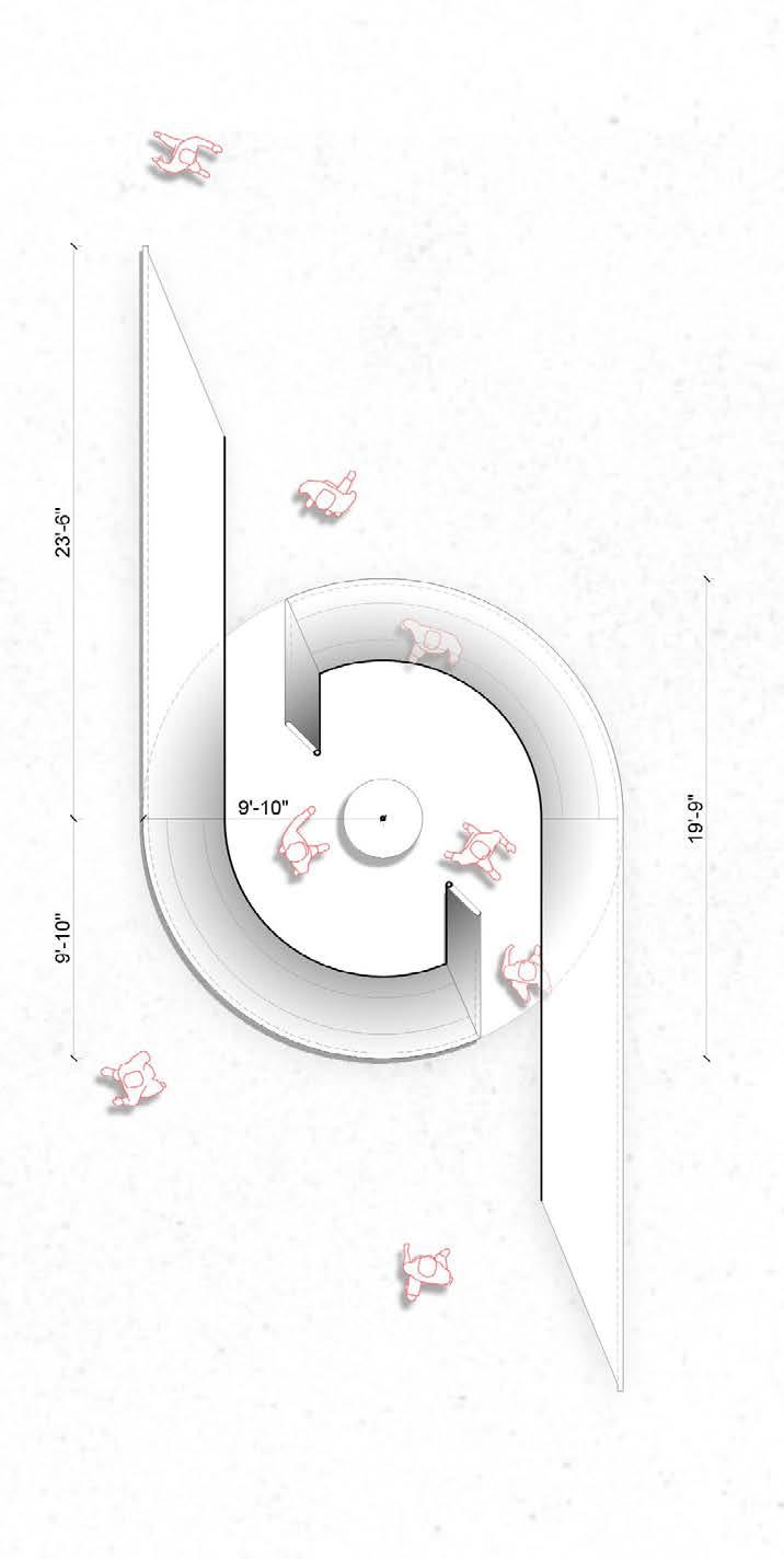
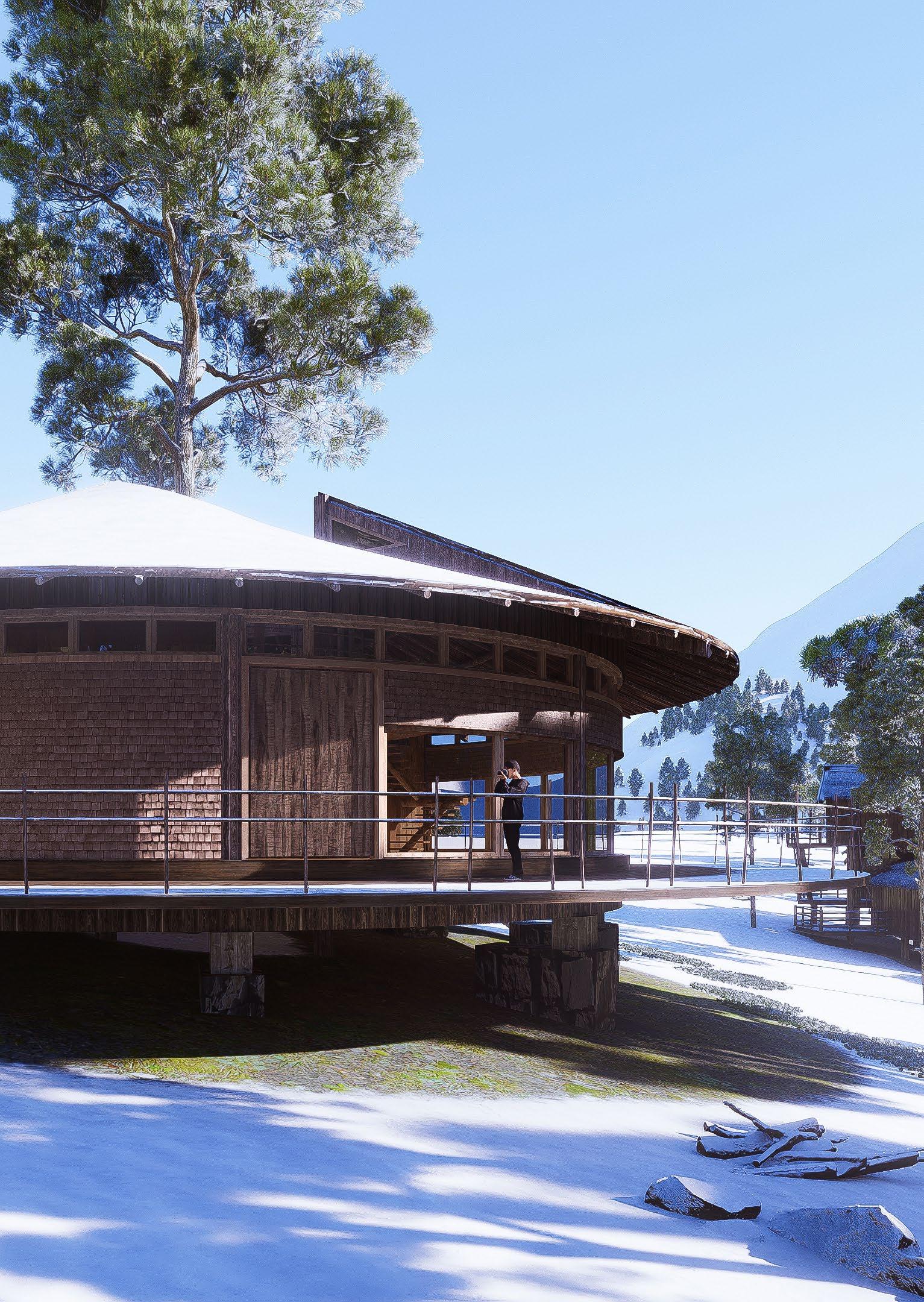
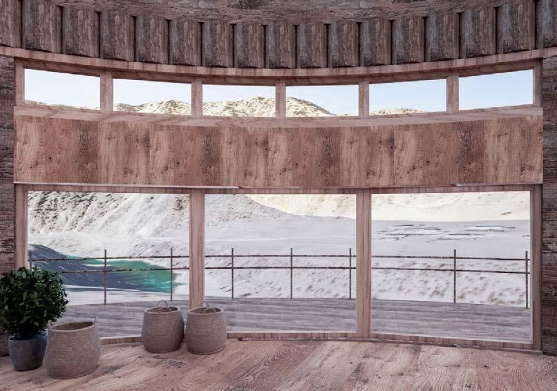
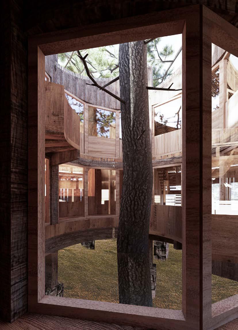
CIRCULAR VISITOR CENTRE
With The Tree, Canyon and Snow Mountain
Chamdo , Tibet. 2024 Spring
Rural Revitalization : Part of An Eco-Resort Development
2 2 79 78 13
1 2 3 4 5 6 7 8 9 10 11 1 2 10 9 9 10 12 12 11 3 4 Visitor service hall 游客服务大厅 Reception 接待问询 Dinning area 餐厅 Cashier 收银 Kitchen 厨房 Office | 办公室 Storage 储存间 Toliet 卫生间 Terrace 露台 Tree-viewing balcony | 观树阳台 Existing tree 现状树木 Casual dinning area | 休闲就餐区 Equipment | 设备 1 2 3 4 5 6 7 8 9 10 11 12 13
↓
First
Floor Plan ↑ Section 1-1


80 12 13 13 12 10 11 Visitor service hall 游客服务大厅 Reception 接待问询 Dinning area 餐厅 Cashier 收银 Kitchen 厨房 Office | 办公室 Storage 储存间 Toliet 卫生间 Terrace 露台 Tree-viewing balcony | 观树阳台 Existing tree 现状树木 Casual dinning area | 休闲就餐区 Equipment | 设备 1 2 3 4 5 6 7 8 9 10 11 12 13 Second Floor Plan ↑ Section 2-2 ↓ 6 10 9 9 10 12 12 13 13 11 8


 Section A-A
Section B-B
Section C-C


