4 minute read
Behind the print


Technique
IN ASSOCIATION WITH
Advertisement
Michael Topham Michael isAmateur Photographer ’s Reviews Editor. He’s based in Kent and thoroughly enjoys documentary, wedding and railway photography. See www. michaeltopham.co.uk
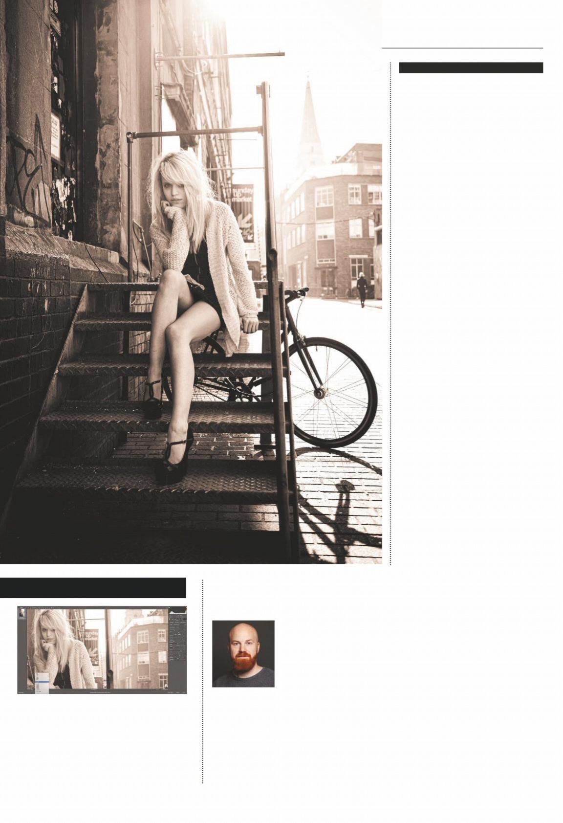
1Cropping removes distractions and creates a stronger composition
Behind the print
Michael Topham finds a long-lost image that he converts in Adobe Camera Raw ready for print
Every now and again I like to trawl through my thousands of photographs on my hard drive. Occasionally, I stumble upon shots I’d forgotten I’d taken or had dismissed as not being good enough first time around during my strict five-star rating regime. It’s rather exciting when you come across a gem of an image that you’ve never processed or printed, and I’d advise that others take a good look through their archive and do the same.
When I loaded one of my old street portrait images of a model sitting on a flight of stairs into Photoshop, my immediate impression was that it wasn’t particularly well exposed and was lacking colour and vibrancy. A quick check of the metadata in Adobe Bridge confirmed that I’d spot metered on the model, which resulted in quite a high-key image that I felt could benefit from a contrast boost and subtle split-toning effect. The result of digging out an old shot and giving it a new lease of life with some basic editing has created one of my favorite ad-hoc street images, which has since made it into my printed portfolio.
PREPARING FOR PRINTING
3Increasing the Contrast, Clarity and Dehaze sliders in Adobe Camera Raw gives the image extra impact
2Harsh sun from behind the model has helped create some striking shadows
4Spot metering on the model’s face has resulted in some blown highlights
1 Check the highlights To check for clipped highlights I loaded the image in ACR and hit the letter O on the keyboard. I retained some highlight detail by setting the highlights slider to -50. After setting the Blacks slider to -50 to darken the blacks a bit, I increased Exposure (+0.70) and Contrast (+65) to give the image much-needed punch.
2 Apply a split tone Not content by the tonality, I stripped the shot of colour by moving the Saturation slider to -100. For a more distinctive look I tried applying a split tone. In the Split Toning tab in ACR, I set the Highlights Hue to 40 and the Saturation to 30. The Shadows Hue was set to 250 and Saturation to 8 before refining Balance to +50.
3 Use the Adjustment Brush Back in the Basic tab, I increased the Texture slider to +40, the Clarity slider to +15 and the Dehaze slider to +20. Selecting the Adjustment Brush (K) tool and setting the Shadows slider to +25 and Exposure to +0.20 then brushing over the model’s face lightened it a touch and helped picked out the eyes.
Michael’s top tips
Michael reveals some of his top tips for editing in Adobe Camera Raw
1Enlarge the edit window
Ever tried entering full screen mode in ACR? Hit the letter F on your keyboard and you’ll fi nd that the interface instantly fi lls your screen –very handy if you’re editing on a laptop with a small screen.
2Learn the shortcuts Hover your mouse or cursor over the tools in the toolbar and you’ll be able to view the name of each tool and its shortcut key, revealed in brackets. Learning the shortcuts is a great way to increase your workfl ow speed.
3Refer to the histogram Remember to keep a close eye on the histogram up at the top right of the interface at all times. Turning the Shadow (U) and Highlight (O) Clipping Warnings on is a good idea if you want to check areas where you think you might be losing detail.
4The original ACR offers some great tools for checking images before and after. They’re found at the bottom right of the preview window and can be toggled through by hitting the keyboard shortcut, which is the letter Q.
5Reset the dialog If you’d like to reset the image back to its original state and dismiss any changes you’ve made, just hold Option/ Alt on your keyboard, which will turn the Cancel button to a Reset button.
WhiteWall recommends
4 Check for imperfections Before printing, it’s vital to check the image for sensor dirt or distractions. I like to do this by zooming in 100% and using the Hand Tool to scroll through the image, ensuring you don’t miss any areas. The Spot Removal tool (B) is fast and effective for removing minor distractions that don’t require extensive retouching work. For this photograph I would like to give two recommendations. First I recommend the WhiteWall Original Photo Print Under Matte Acrylic Glass with a white border. This combination gives the image a clean and cool look. The classic look with a passe-partout also fi ts this photo. In this case, I would select our solid wood frame Vienna in the Brown Alder colour. I would order the picture in a size of at least 30 x 37cm. Another good option is Original Photo Print under Acrylic Glass in our frame called Basel in walnut colour. Jan-Ole Schmidt, Product Manager, WhiteWall