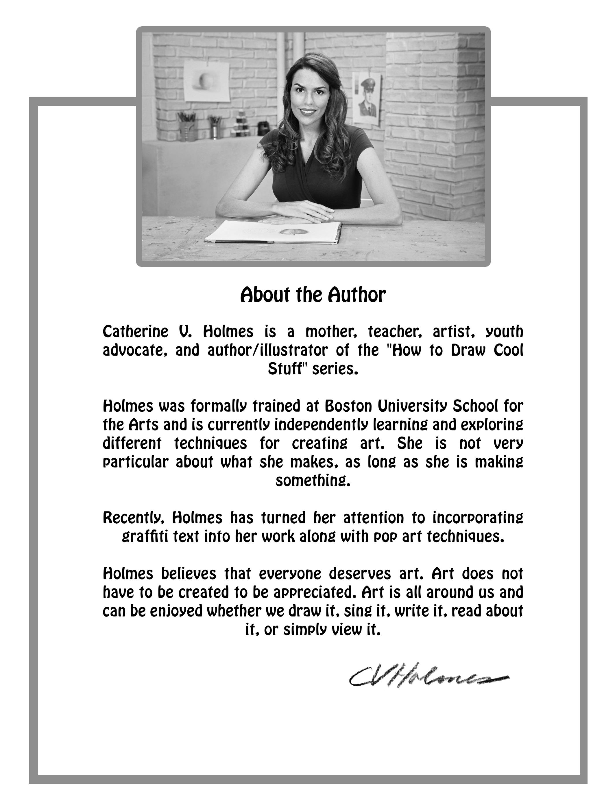
AUTHOR’S FOREWORD
Dear Artists and Educators,
It has been a remarkable decade since this journey began – a decade of inspiring creativity, fostering artistic skills, and, most importantly, bringing the joy of drawing to countless individuals across the globe. “How to Draw Cool Stuff”, which has proudly maintained its bestseller status since its release, started as a seed of an idea, a desire to make the art of drawing accessible and enjoyable for everyone. Today, it stands as a vibrant community of learners, teachers, and creators, each contributing uniquely to this ever-expanding canvas.
The essence of “How to Draw Cool Stuff” lies in its simplicity and profound understanding of the artistic process. Through step-by-step illustrations and easy-to-follow guidelines, it demystifies drawing, transforming complex concepts into accessible and enjoyable experiences for both budding and seasoned artists.
From its original foundation, the series has blossomed into seven books, each addressing different facets of drawing, including shading, textures, speeddrawing, and specific guides for kids, adults, and holiday-themed artwork. This expansion reflects our evolving artistic community’s needs and interests, continuing our legacy of making art accessible and a source of endless inspiration.
In this 2024 edition, we honor the past while embracing the future. Maintaining the beloved essence of the original, this edition integrates fresh perspectives and updated techniques, aligning with the evolving artistic landscape.
To our devoted readers, both longstanding and new, your support and feedback have been invaluable. Your artistic journeys inspire us to continually improve and expand. Whether you are picking up a pencil for the first time or seeking to refine your skills, this book is here to guide and inspire your creative potential.
To the dedicated educators shaping the next generation of artists, your adaptability, creativity, and commitment, particularly in resource-limited situations, have been nothing short of inspirational. “How to Draw Cool Stuff” has served as a teaching tool and a bridge to connect with and guide your students in their creative pursuits.
As “How to Draw Cool Stuff” enters this new era, I am excited to see how it continues to shape and be shaped by the wonderful community that has grown around it. Your creativity, feedback, and passion are the true forces that drive this book forward. Together, let’s keep nurturing this space where art is not just a skill but a shared language of expression, connection, and joy. Thank you for being an integral part of this remarkable journey.
Art, in its many forms, is a powerful tool for expression, communication, and understanding. It transcends language, culture, and time. Through “How to Draw Cool Stuff”, we aim to make this tool accessible to everyone, encouraging you to see the world through the eyes of an artist and to express your unique vision. Our hope is that “How to Draw Cool Stuff” continues to be your trusted companion in your artistic journey, helping you unlock your creative potential and explore the endless possibilities that art has to offer.
Here’s to another decade of drawing, learning, and creating cool stuff!
Catherine V. Holmes Author, Illustrator
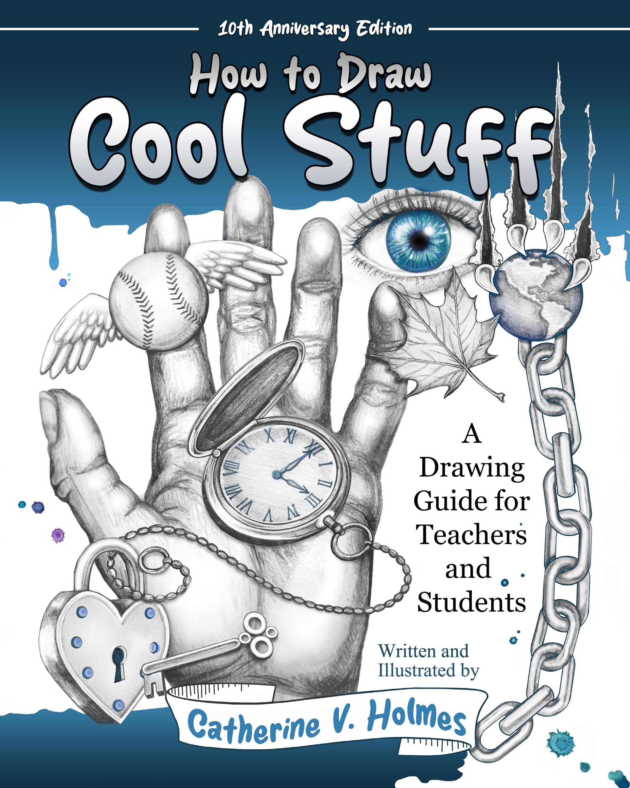
How to Draw Cool Stuff
INTRODUCTION
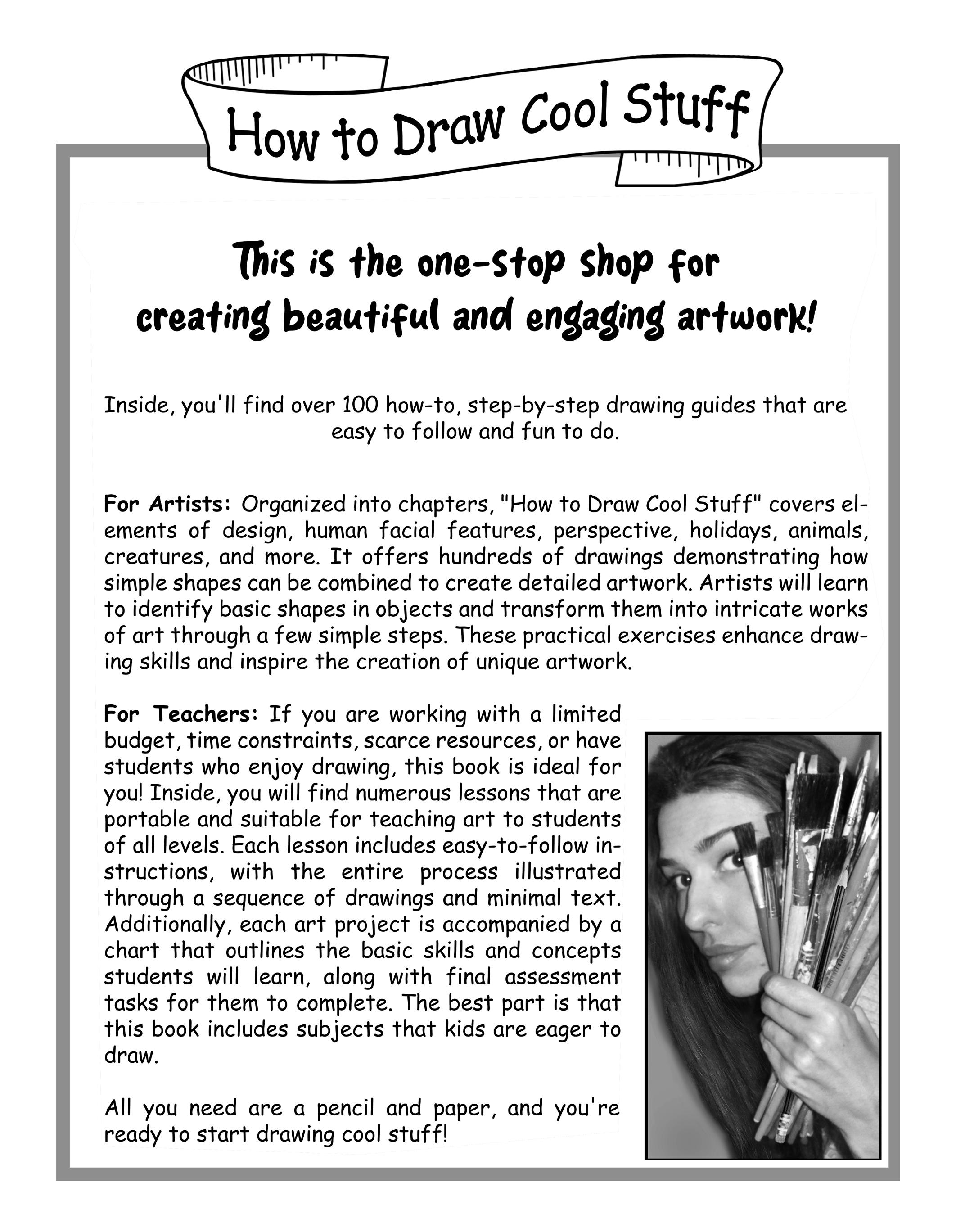
This book evolved out of necessity. After exploring art catalogs and libraries and wading through the “how to draw” section of bookstores, I found a few good resources but none that had all the qualities I was looking for in a drawing book. Some ideas were too basic and often insulting to my older, more artistically inclined students. Other materials seemed to serve as a showcase for beautiful artwork but lacked any concrete instruction.
As a “traveling” art teacher working with a limited budget and preparation time, I needed a single, easily transportable resource capable of teaching students across various levels—from middle school to high school and beyond. This book was created to fill that specific need, and I am eager to share it with teachers and artists facing similar challenges.
The projects within these pages are designed to provide engaging and informative lessons with clear objectives, fostering achievement without the necessity for expensive or multidimensional supplies. A simple pencil and eraser are all that is needed (sometimes a ruler or fine pen). There’s no need for fancy art pencils, expensive paper, or kneaded erasers to complete them. All the activities and lessons have been student-tested and approved.
The Book Details:
Inside, you will find specific exercises that offer step-by-step guidelines for drawing a variety of subjects. Each lesson begins with an easy-to-draw shape, forming the basic structure of the drawing. Subsequent steps add elements to this structure, allowing the artist to build upon their creation and make a more detailed image.
Every art project is accompanied by a chart. This chart includes information that artists should KNOW (facts, basic skills), UNDERSTAND (big ideas, concepts, essential questions), and be able to DO (final assessment, performance, measurements of objectives) by the end of the lesson.
This additional information gives these pages more power than just ‘art for art’s sake’ - not that it’s needed - because art is important enough on its own! Artists are learning about themselves as expressive souls through the process of creating beautiful and interesting work.
The best part is, this is stuff that artists want to draw.
Information for Teachers Using This Book:
Teachers can be confident that this guide utilizes instructional time in ways that significantly benefit their students. Each lesson includes easy-to-follow instructions, with the entire process illustrated through a sequence of detailed drawings. These can be connected to historical contexts, aligned with curriculum learning standards, or adapted into arts integration lessons. The intensity of each project is at the teacher’s discretion.
The projects can be differentiated to respond to students’ diverse learning styles, through a mixture of visuals and text.
For the Best Results, Here Are a Few Tips:
• Lessons are provided on a single page for easy reproduction. If possible, copy them using the photo setting on your school’s copy machine to ensure that the shaded areas retain their best quality.
• Display the “Know, Understand, Do” sheet prominently on the board so students can clearly see the lesson objectives.
• Encourage your students not to skip any of the steps. Teachers may find that many students want instant gratification and often try to skip to the last step without following the process. There are a few art students who have a “talent” for drawing or have prior experience with drawing complex forms and do not need the steps, however, most do need to follow the sequence in order to achieve their best result. For greater success, they must follow the steps! By doing so, students are training their brains to see shapes within an object instead of the object as a whole. This will simplify the drawing process.
• Tell students to draw lightly. Once they have a basic outline and a few details, then students can make their lines darker and more permanent. Getting heavyhanded artists to draw lightly can be a constant battle but the struggle is worth it once they see the benefits. Erasing becomes easier and fewer papers are crumpled up and thrown away.
• Every student will find a different level of success with these drawing guides. Encourage students to make their work different from the exercises in the book by adding “extras” and more details. This makes each work of art unique and personal.
• These simple steps can be adapted to any level - the student can put as much or as little effort into their work as their comfort level allows. NOTE: As a great art teacher, always push your students for more - going beyond the comfort zone is how we learn!
• The techniques and processes presented in this book are well within the reach of what your student can do. On occasion, some students may get frustrated and want to give up. Sometimes a student will declare defeat before even attempting the work. That is unacceptable! Remind them that creating art is a process. In cases like this, encourage your student to try just the first step. They will see that first step is quite easy and may be encouraged to try the next step, etc.
• If all attempts at drawing seem to be preventing your student from achieving success, you may want to allow that student to trace. The drawings on these pages are presented on a smaller scale in order to discourage tracing, however, it is better to allow tracing as opposed to your student doing nothing at all. Modifications for assignments can include tracing if need be, just have the student add their own unique twist by shading or adding “extras” that are not seen in the examples provided.
• This book is great for substitutes. Copy a bunch of these lessons, put them in your sub folder and take your sick day without worry.
With enough practice, eventually students won’t need a “how-to” book. A shift in the brain will occur and your students will be able to mentally break down the simpler image behind the complex one without assistance. That is when they will become Super Smart Artists!
Information for Artists using this Book:
Following these exercises is a great way to practice your craft and start seeing things in terms of simple shapes within a complex object. Professional art pencils and paper can offer a variety of results, however, the techniques discussed in this book can be successful by using everyday supplies.
This book is intuitive but you may come across a few challenging steps. Follow the tips below for best results.
• Try blocking out the information you don’t need. When you begin drawing one of the artworks in this book, cover all of the steps shown with a blank piece of paper except for the first one. Draw just the first step that is exposed. After that step is finished, uncover the next step and work on it. By blocking out the steps you are not working on, the artwork becomes less challenging to attempt. Continue uncovering each step one by one and adding to your artwork until it is complete. It is a simple tactic but it works by getting you to focus on just one action at a time.
• Patience is necessary. Don’t rush, take your time and practice patience. Don’t crumple up your paper in frustration every time you make a mistake. Look at your artwork and figure out the lines that work and the lines that don’t. Change them as needed.
This is easier when you:
• Draw lightly. Start with a light, sketchy outline and add more detail as the drawing progresses. Once all the lines look good to you, then they can be drawn darker and more permanent.
• Don’t be too concerned with trying to make your drawing look just like the one in the book or spend a lot of time trying to get both sides of a supposed symmetrical object the same. Even our faces are not perfectly symmetrical. Your unique (and sometimes imperfect) approach is what will make the artwork engaging and beautiful. If your drawing doesn’t look “perfect,” that’s OK!
• Want your artwork to look even more professional? Draw your object large then shrink it on the copier using the photo setting. The details and lines appear finer and your work looks more detailed. A great trick to try!
• Finally, don’t worry about what your neighbor’s artwork looks like. Remember: everyone can draw, but no one can draw just like you. That is what makes art so special. If we all drew exactly the same way, art would be boring and there would be no point to it. Look at the way your artwork comes out after you finish and compare it to your own previous work. You will probably be impressed with yourself!
Tips for Shading:
• “The Basics” chapter displays several different shading techniques Using heavy pressure with your pencil will leave dark lines, while light pressure will produce light marks. A combination of both with a gradual transition from one to the other is one approach to realistic shading. Practice using different pencil pressures to create a variety of tones.
• Be careful if you choose to smudge your artwork to create shading effects. The technique of smudging an artwork with a finger to create shadows can blur some intricately drawn lines and ruin a beautiful drawing. However, when done properly, smudging can be a quick and effective way to add depth to an artwork. This can be an acceptable practice, just beware of making mud! Rubbing too much will cause all of those fine lines and contrasting shades to become the same muddled, flat gray tone. This takes the depth away from a drawing and makes the work appear less detailed. For best results when shading with the finger rub technique, just smudge a little.
• You will see some examples in this book where hatching and cross-hatching are used. This technique offers a unique alternative to smudging or varying pencil pressure for creating shading effects. Try them all and see which one works best for you.
Why We Need Art
Drawing makes you smarter! Believe it or not, artists are not just mindlessly copying what they see when following the activities in this book. By completing these projects, artists enhance their creativity and artistic confidence while gaining powerful tools for understanding what goes in to creating visual works. Students are actually re-training their brains to see in a different way. This allows them to express themselves and become competent, savvy, literate, imaginative, creative and perceptive in art and in life. Let your students, coworkers and the world know that ART IS IMPORTANT!
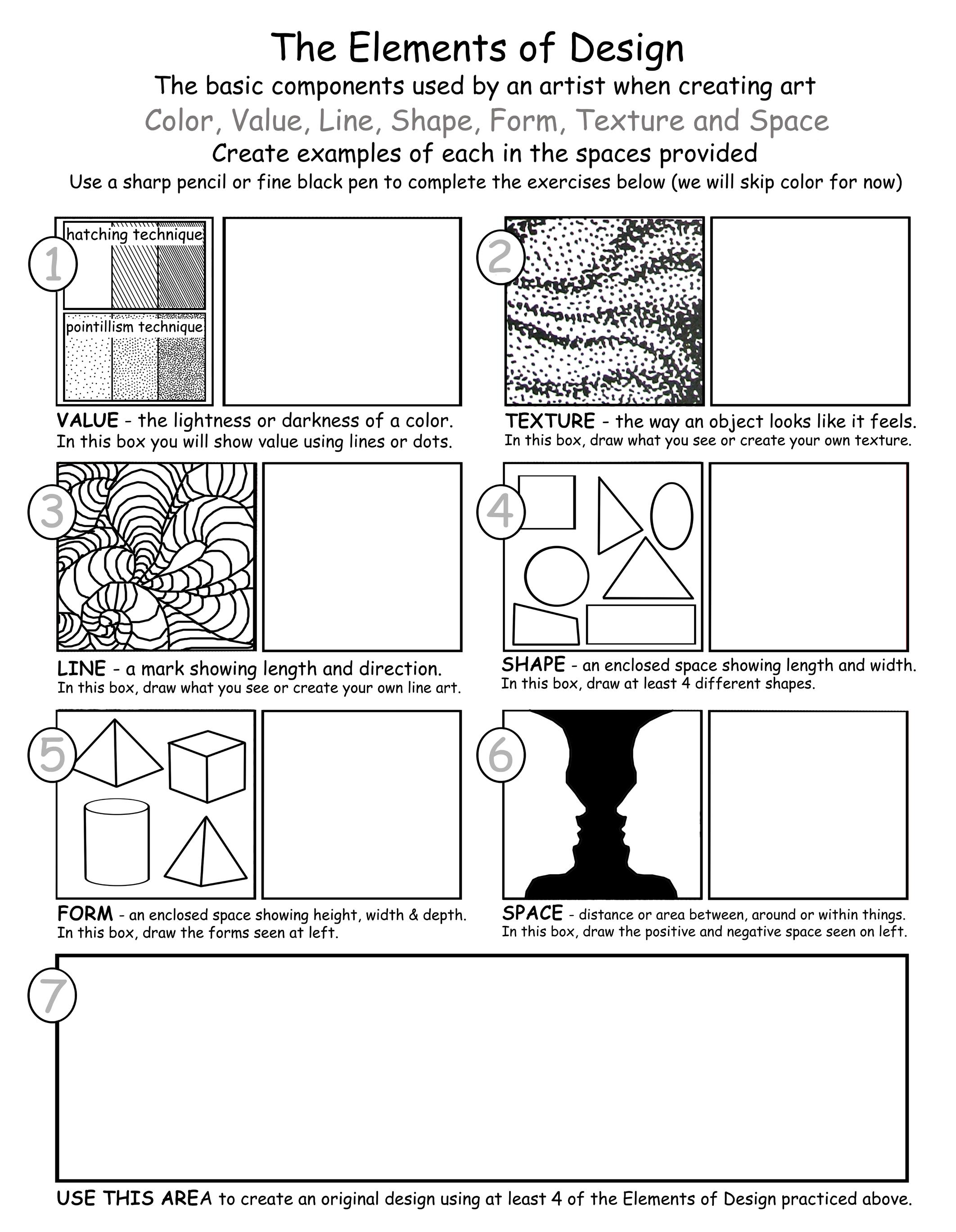
ELEMENTS OF DESIGN
KNOW:
Elements of Design: Color, value, line, shape, form, texture and space.
UNDERSTAND:
• The basic components used by artists when producing works of art.
• How these components are utilized.
• The difference between shape (length and width) and form (length, width and depth).
DO :
Practice hatching, pointillism, texture, line, shape, form, and space using a fine black pen in the space provided next to the examples. Copy what you see or create your own designs. Use the area in box number 7 to craft an original design incorporating at least 4 of the Elements of Design practiced in the boxes above.
EXTRA: Create an original artwork on a separate piece of paper using at least 6 of the 7 Elements of Design. Fill the paper from edge to edge with your design.
VOCABULARY:
Color: Light reflected by an object.
Elements of Design: Color, value, line, shape, form, texture, and space. The basic components used by the artist when producing art. The elements of art are the parts used to create subject matter in an artwork.
Form: A space that is three dimensional and encloses volume including height, width and depth.
Line: A point moving in space.
Line Drawing (Line Art): Any image that is made with straight or curved lines on a background (usually plain), without gradations in shade.
Shape: A two dimensional space.
Space: Refers to the areas around, between and within an artwork. It can also refer to a feeling of depth of 3 dimensions.
Texture: Visual and tactile characteristics added to a work of art.
Value: Lightness or darkness of a color.
For reproduction purposes, enlarge the information sheet to 115%
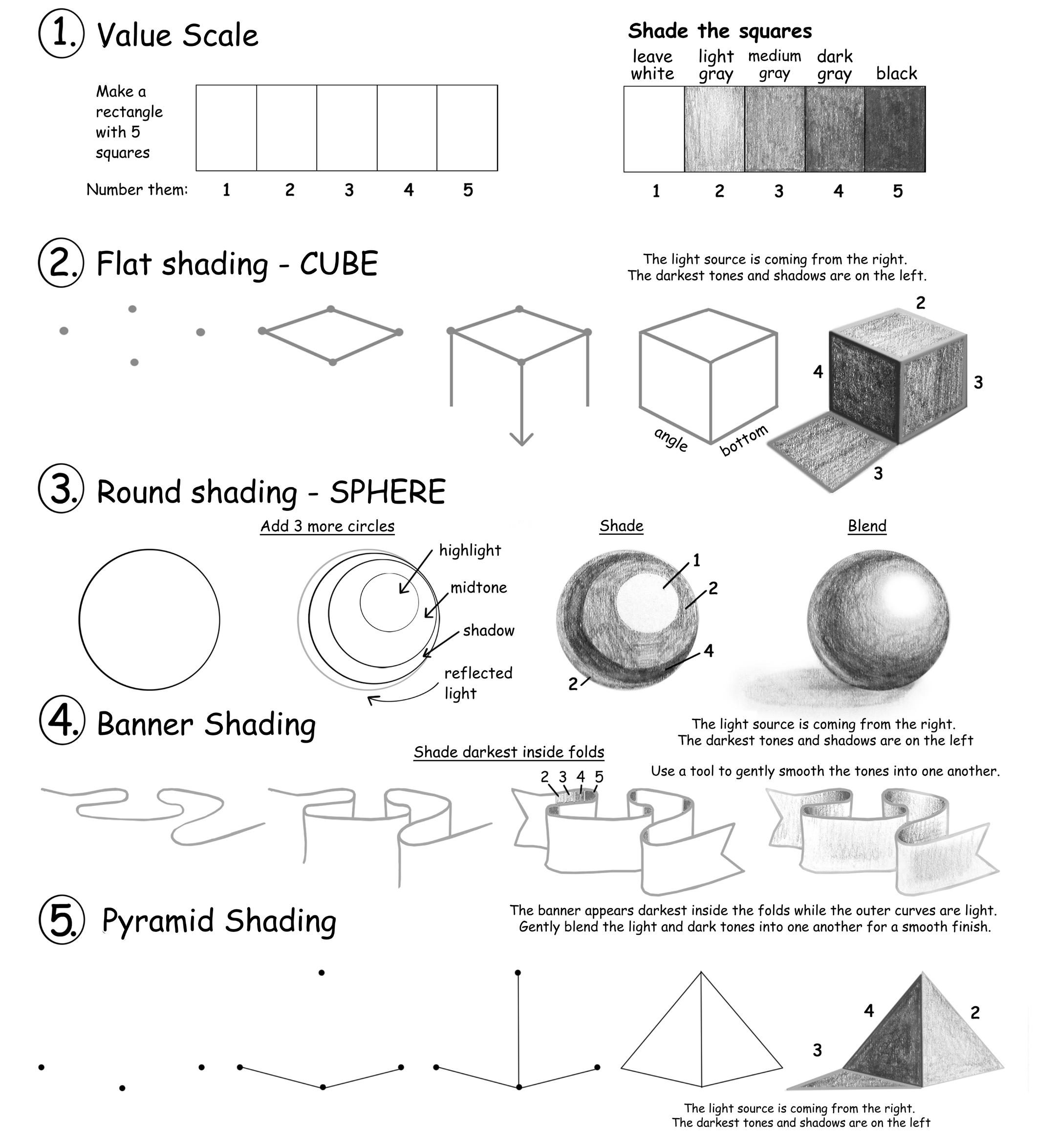
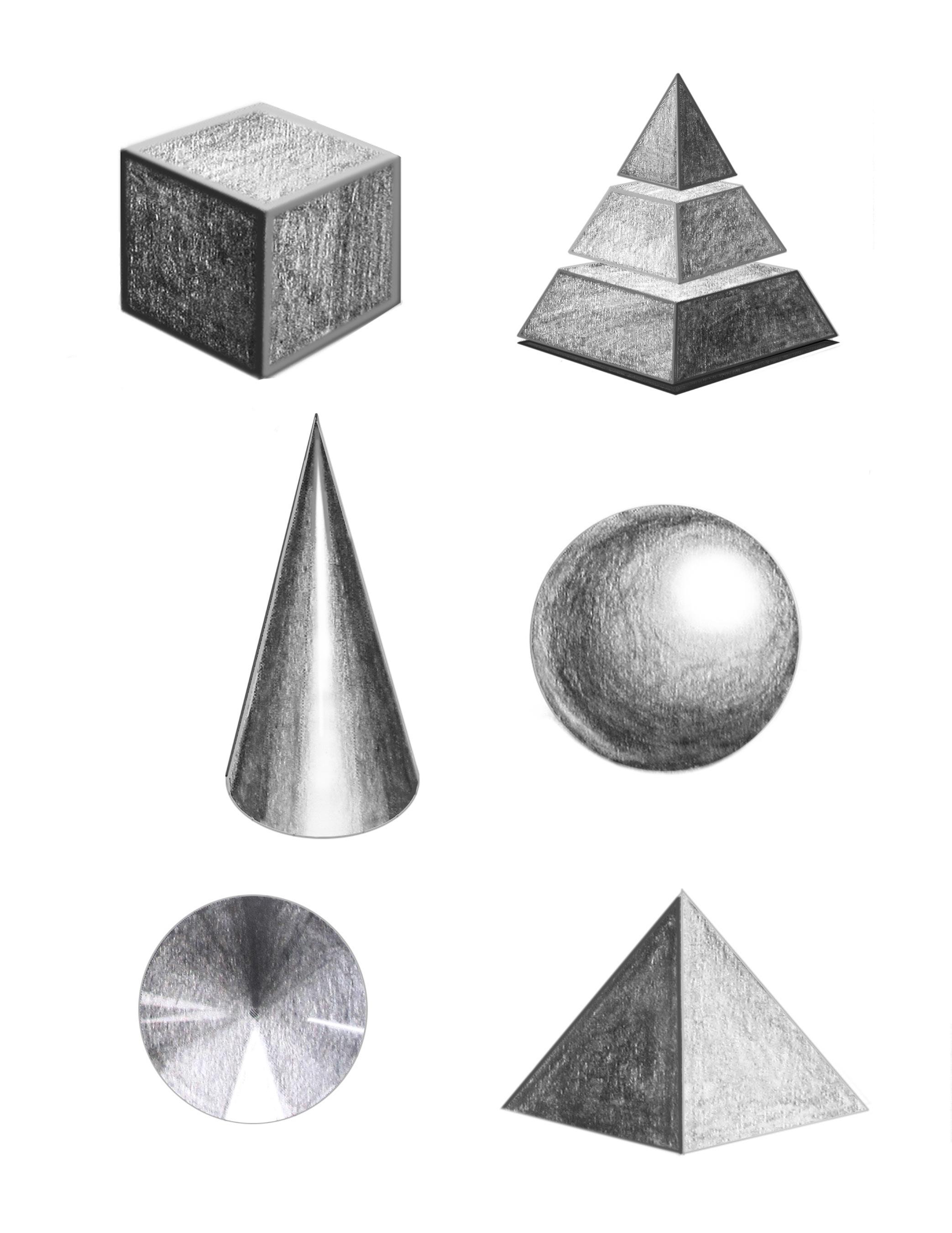
SHADING SHAPES
KNOW:
Blending, Shading, Shadows, and Value.
UNDERSTAND:
• Adding value to a two-dimensional (2D) shape can create the illusion of a three-dimensional (3D) form in drawing.
• The lightness or darkness of a value indicates a light source on an object.
DO :
• Recreate the 9 examples provided in “Shading Shapes,” starting with the Value Scale.
• Shade each object in accordance with the value scale.
• Blend the values to ensure smooth transitions.
VOCABULARY:
Blend: To merge (or blend) tones applied to a surface so that there is no distinct line indicating beginning or end of one tone. Using a blending tool such as a shading stump, tissues, or even fingers to blend the graphite will help to achieve a smooth look. Begin with the darkest tones and gradually work toward lighter areas.
Shading: Showing change from light to dark or dark to light in a picture.
Shadow: A dark area cast by an object illuminated on the opposite side.
Shade: A color to which black or white has been added to make it darker or lighter.
Value: An element of art that refers to the lightness or darkness of a color.
Tone: Lightness or darkness of colors used. Another word for value.
Value Scale: A system of organized values, usually consisting of squares that range from white to black with several shades of gray in between.
Notes about shading: Realistic shading is done with a series of tones ranging from light to dark. The more pressure used, the darker the mark. When shading the value scale and forms, practice pencil pressure control to create a variety of tones.
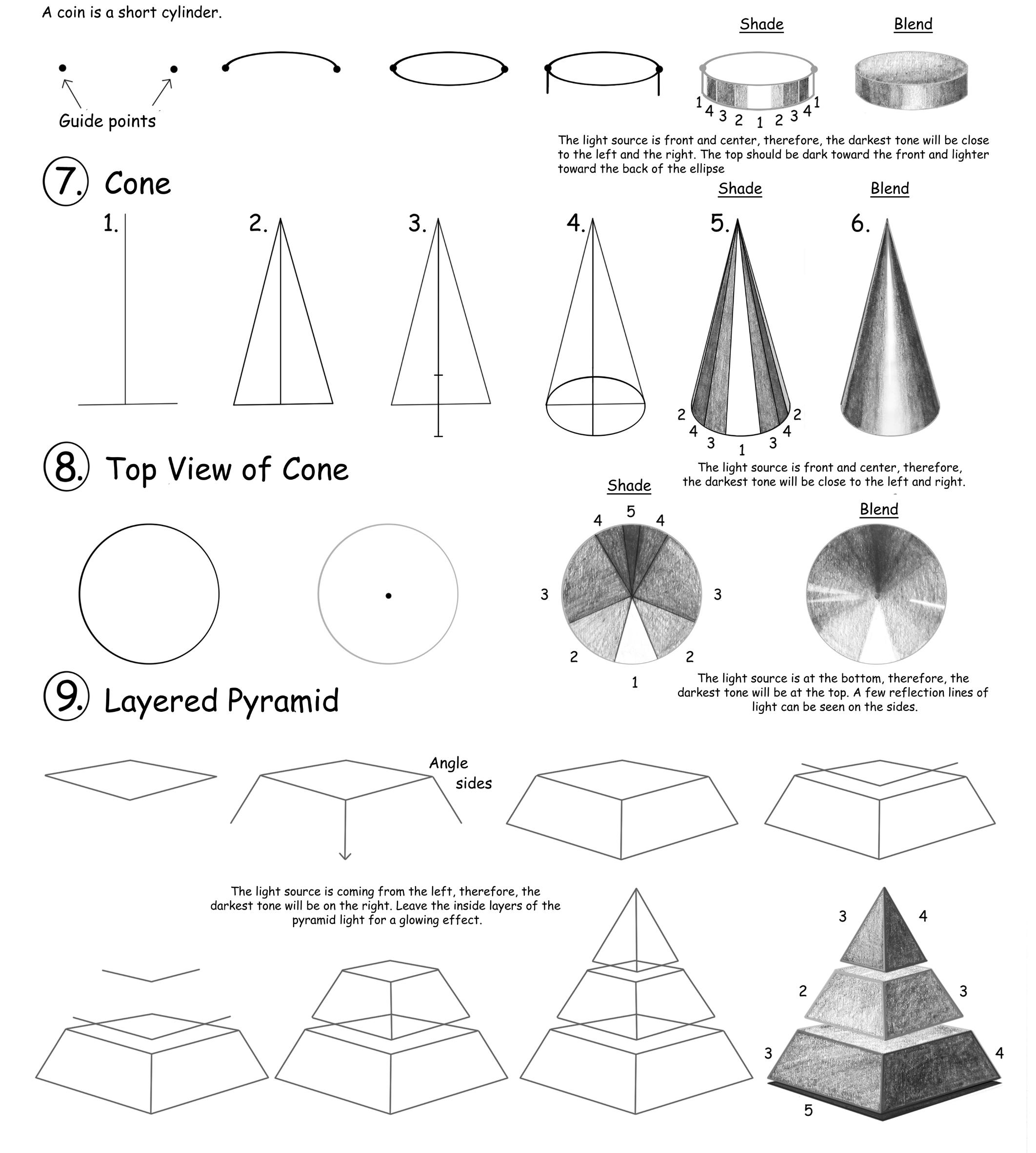
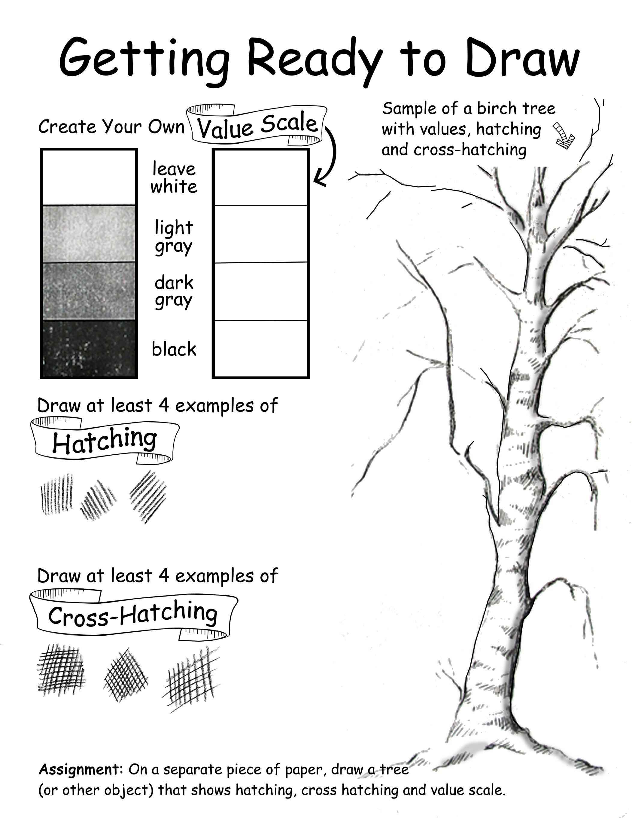
GETTING READY TO DRAW
KNOW:
Cross-Hatching, Hatching, Texture, Value Scale.
UNDERSTAND:
• Texture is used by artists to show how something might feel or what it is made of.
• Value added to a shape (2D) when drawing creates form (3D).
• The lightness or darkness of a value indicates a light source on an object.
DO :
To practice different types of shading, complete the value scale, hatching, and cross-hatching exercises in the area provided. On a separate piece of paper, draw a tree (or other object) that includes the types of shading practiced.
VOCABULARY:
Hatching: Creating tonal or shading effects with closely spaced parallel lines. When more such lines are placed at an angle across the first, it is called cross-hatching.
Shading: Showing change from light to dark or dark to light in a picture by darkening areas that would be shadowed and leaving other areas light.
Texture: The surface quality or “feel” of an object, characterized by its smoothness, roughness, softness, or any other tactile sensation.
Value: An element of art that refers to the lightness or darkness of a color.
Value Scale: A system of organized values, usually consisting of squares that range from white to black with several shades of gray in between.
TIP: A typical value scale includes around 9 squares of various tones. For simplicity, we will create a value scale using only 4 tones.
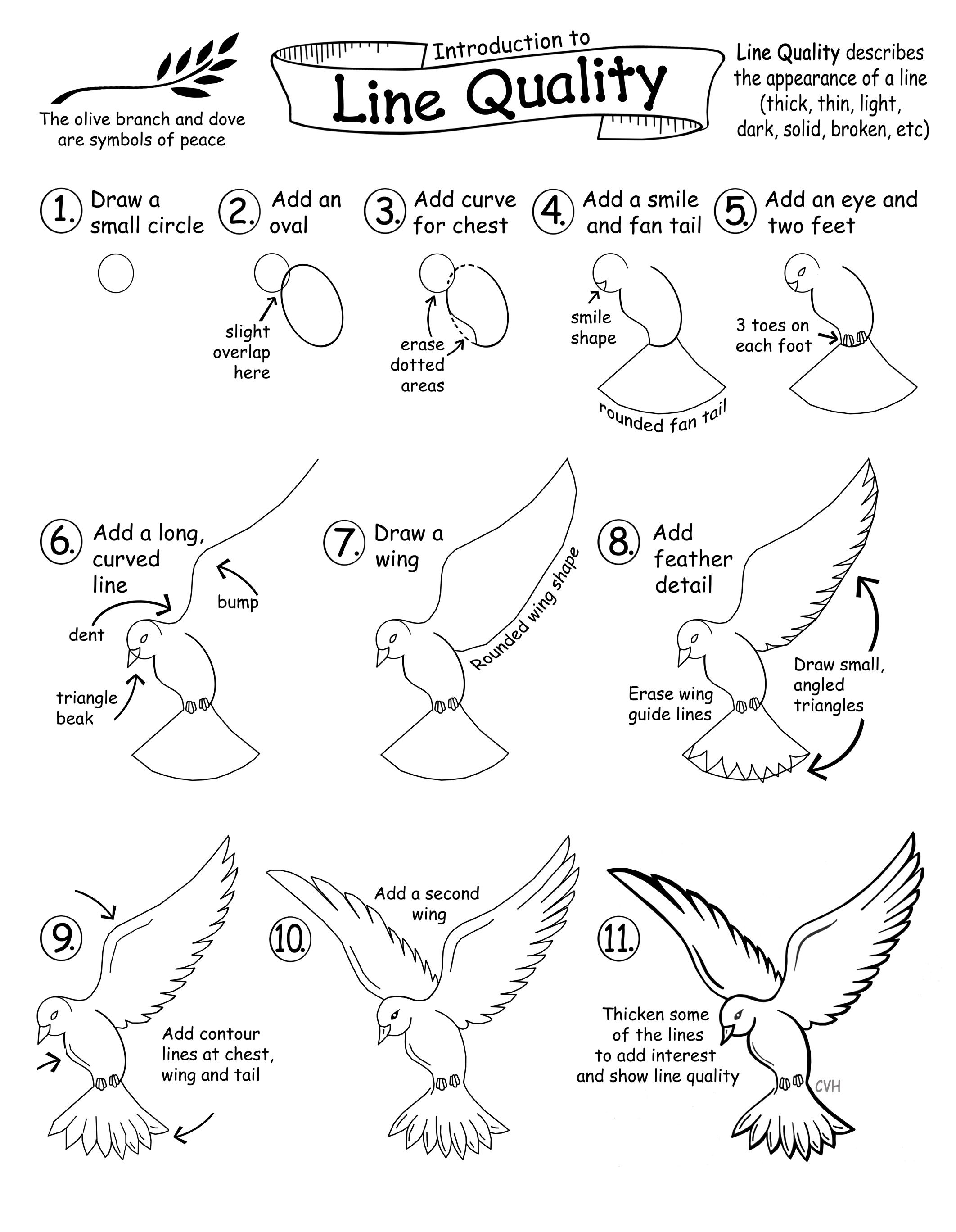
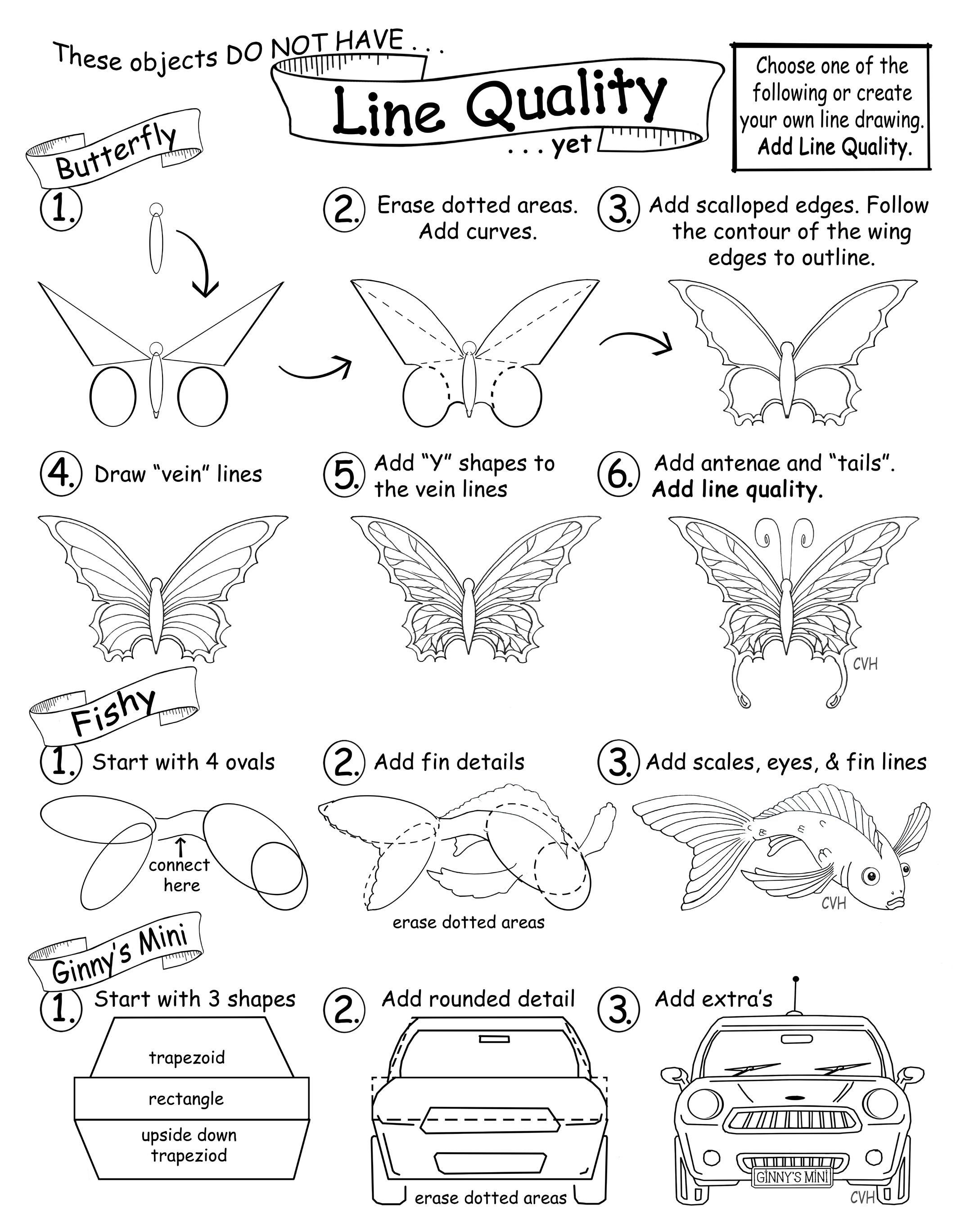
LINE QUALITY (DOVE)
KNOW: Lines are tools used for communication.
UNDERSTAND:
• Various types of line in an artwork add depth and interest, imply space, movement, light, and/or thickness.
• Range in line quality heightens the descriptive potential in an artwork (textures, movement, light, space, etc.).
DO :
Create an original image using detailed line art that focuses on line quality. Experiment by drawing the artwork of the dove provided, and add line weight in the contour areas highlighted. Next, apply this technique to an item of your choosing, making sure to vary line weight so that some lines appear to advance (thicker) and others to recede (thinner).
VOCABULARY:
Line Quality (Line Weight): The unique character of a drawn line as it changes in lightness/darkness, direction, curvature, or width; the thin and thick lines in an artwork that create the illusion of form and shadow.
Recede: To move back or go further away from a previous position.
Line quality describes the appearance of a line - its look, not its direction (i.e., thick, thin, light, dark, solid, broken, etc.).