
Choosing just the right type Typography Presented by Laura Laura.Schaub@Shutterfly.comSchaubandLauraSchaub@OU.edu

This is a confession…I’m a true type nerd. I believe the one who dies with the most fonts wins. I love to work with type to create theme logos, headlines and concepts using type to convey the message or meaning of those ideas. I call it “Thinking Visually.” So let’s look at some fun ideas.
I love to work with type

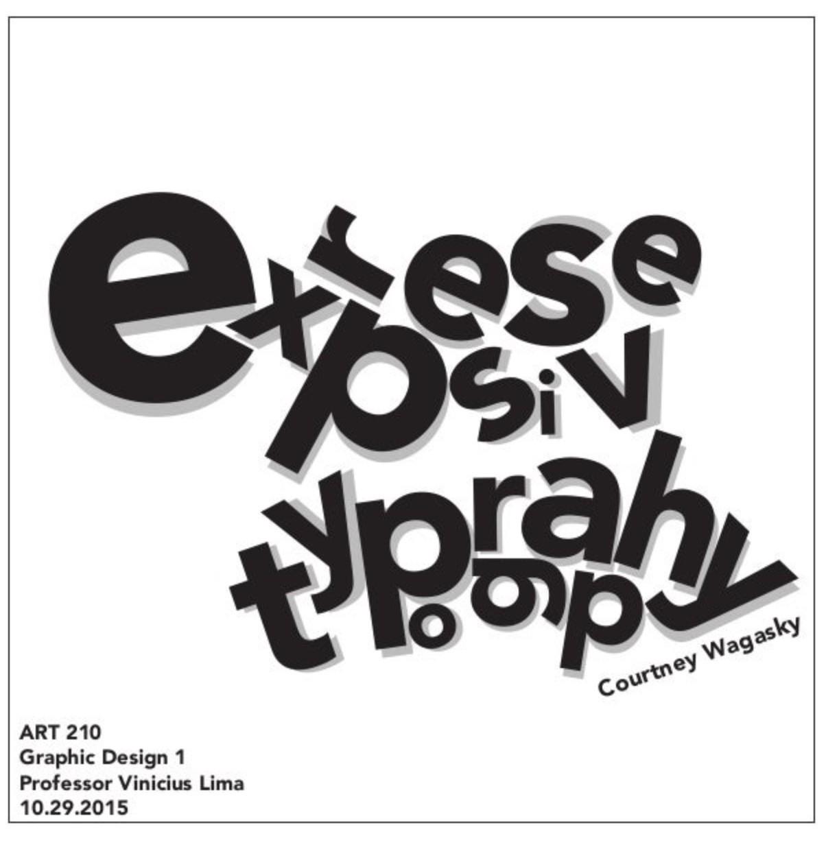
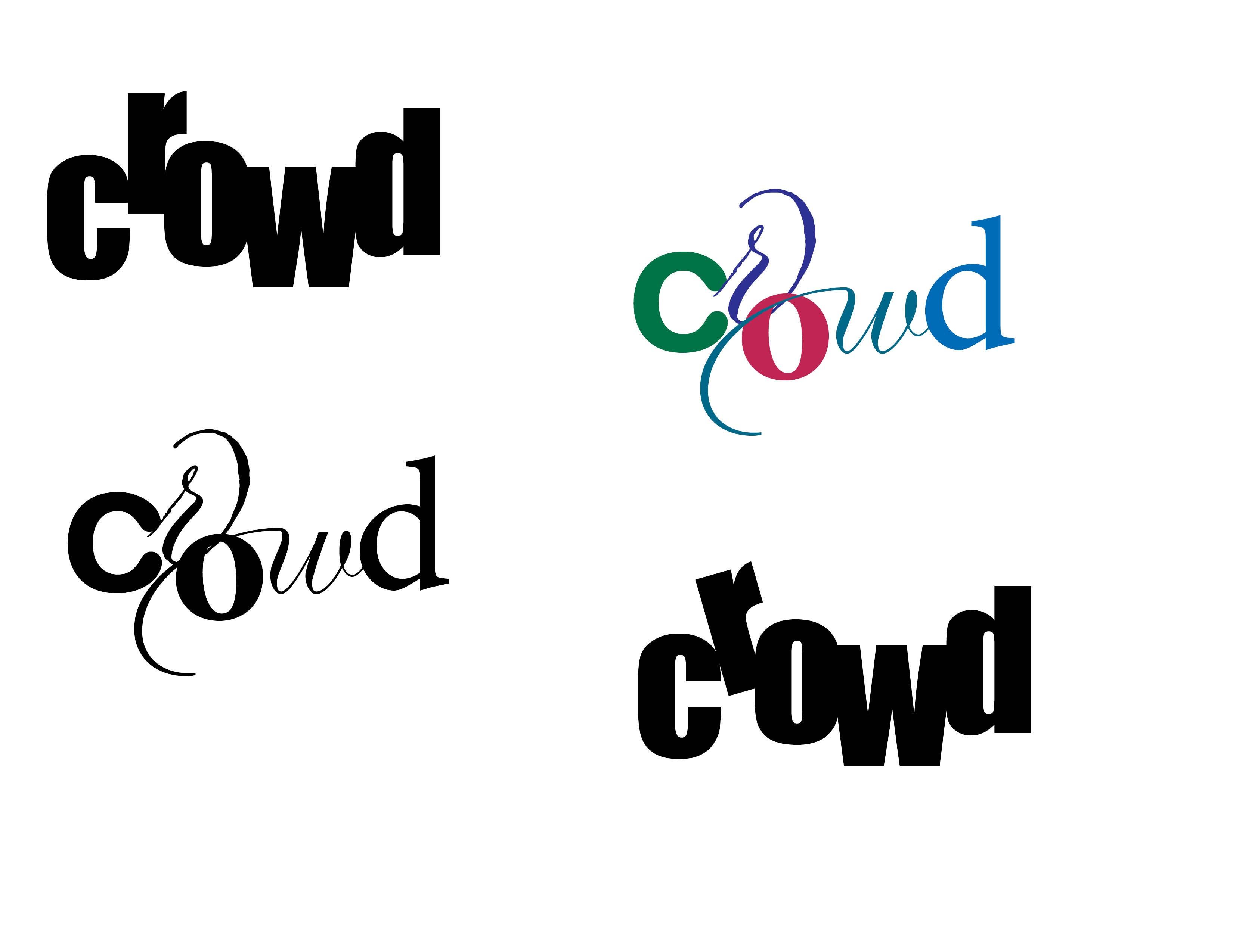
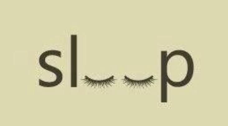
Think visually: Ask yourself, how can I say this using only type? Pinterest


Think visually: Ask yourself, how can I say this using only type? Pinterest
Think visually: Ask yourself, how can I say this using only type? Pinterest

Think visually: Ask yourself, how can I say this using only type? Pinterest
Think visually: Ask yourself, how can I say this using only type? Pinterest

Think visually: Ask yourself, how can I say this using only type? Pinterest
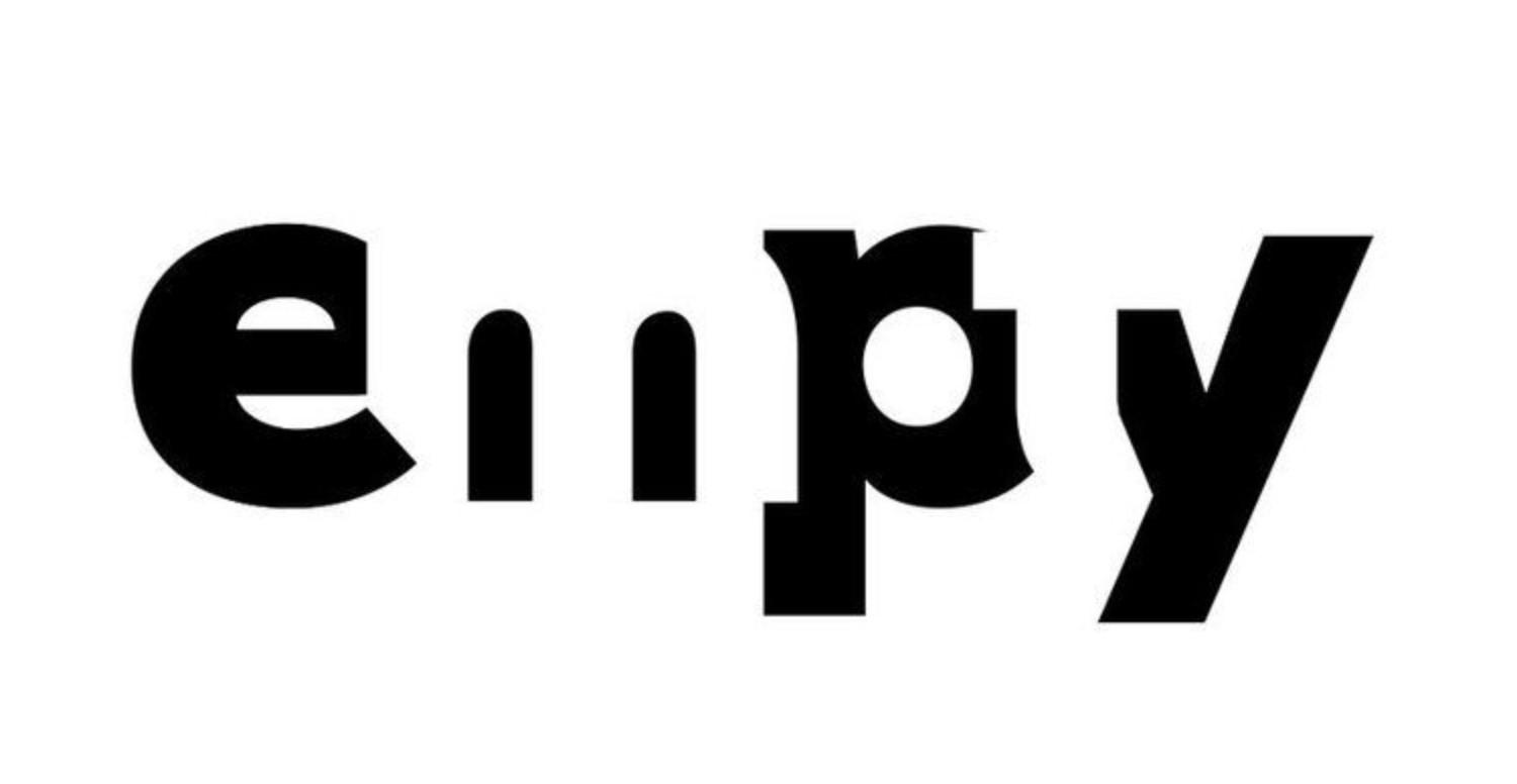
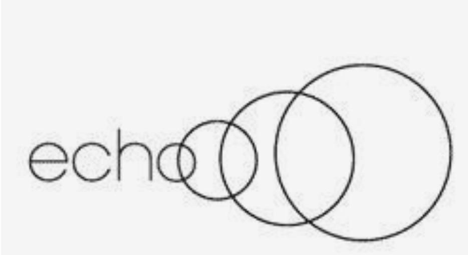
Think visually: Ask yourself, how can I say this using only type? WordPress.com

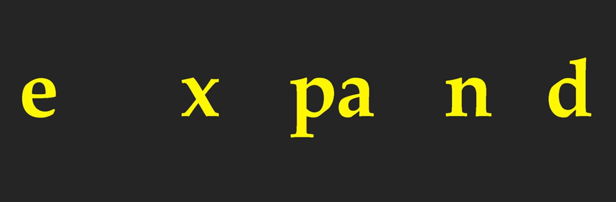
Think visually: Ask yourself, how can I say this using only type? Pinterest
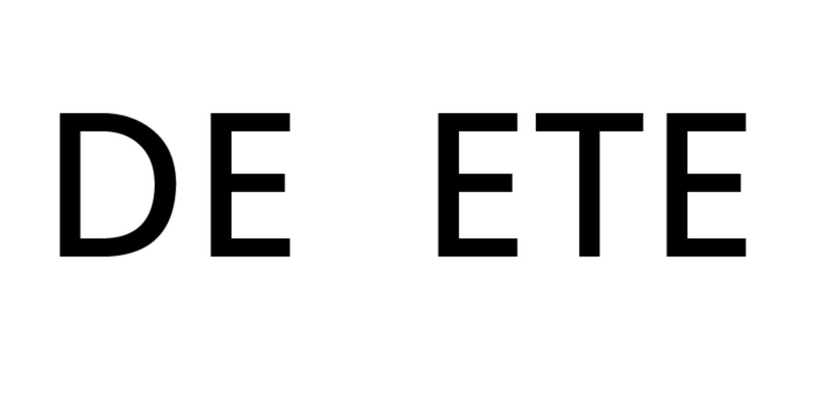
Think visually: Note how the image is the same when turned upside down Pinterest
Think visually: Ask yourself, how can I say this using only type? Pinterest

Think visually: Ask yourself, how can I say this using only type? Pinterest

Think visually: Ask yourself, how can I say this using only type? Pinterest
Think visually: Ask yourself, how can I say this using only type? Pinterest

Think visually: Ask yourself, how can I say this using only type? Pinterest

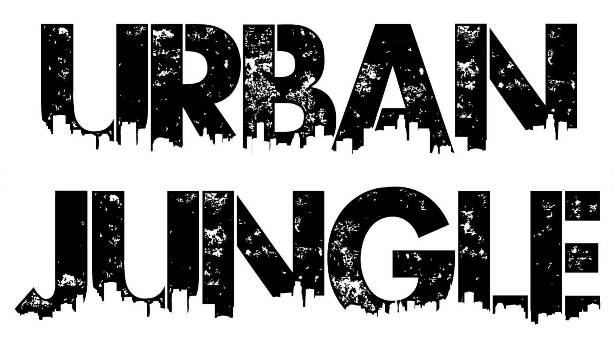
Think visually: Ask yourself, how can I say this using only type? Pinterest

Think visually: Ask yourself, how can I say this using only type? Pinterest
Think visually: Ask yourself, how can I say this using only type? Pinterest

Think visually: Ask yourself, how can I say this using only type? Pinterest
Think visually: Ask yourself, how can I say this using only type? Pinterest

Think visually: Ask yourself, how can I say this using only type? Pinterest

Think visually: Ask yourself, how can I say this using only type? Pinterest
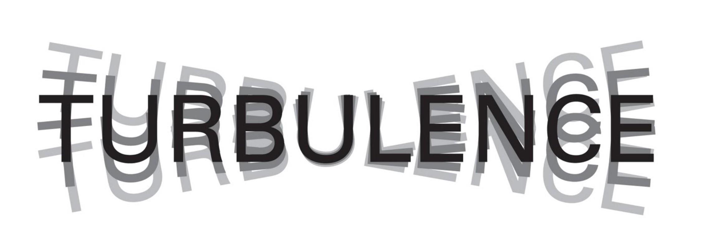
Think visually: Ask yourself, how can I say this using only type? There’s one in every
There’s one in every
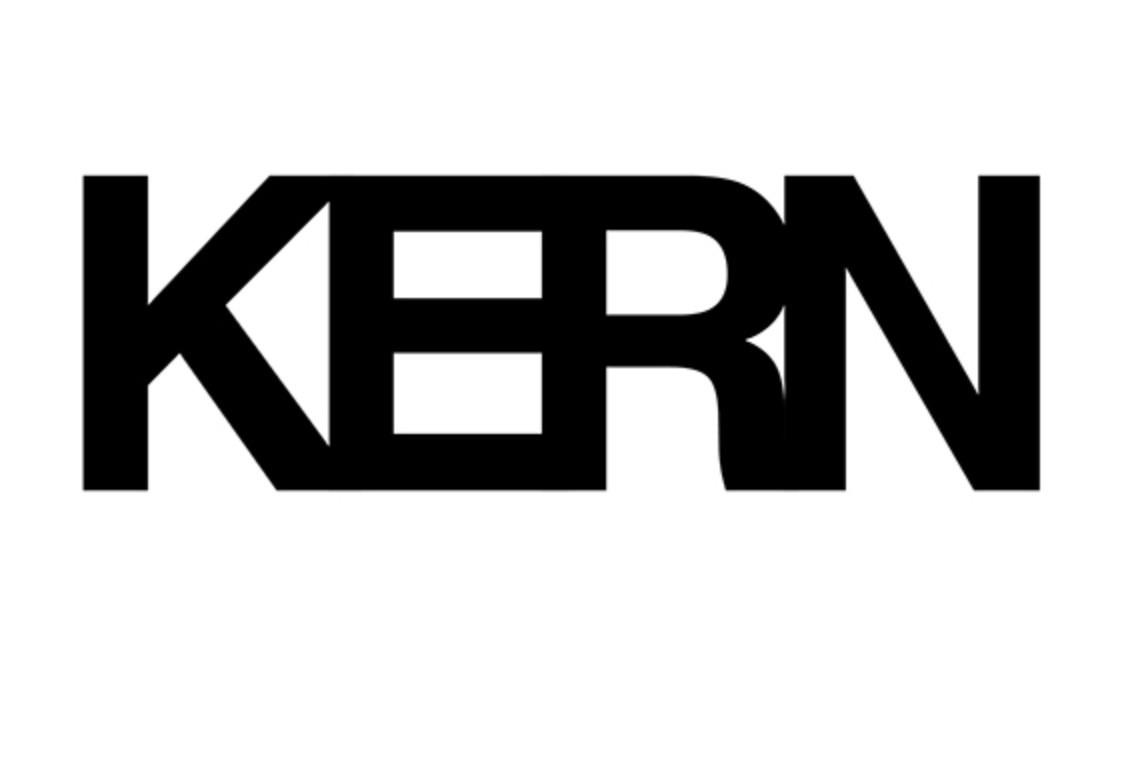
Think visually: Ask yourself, how can I say this using only type? There’s one in every
There’s more than one in every
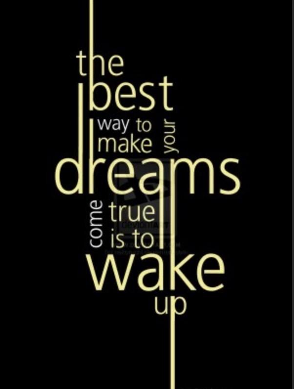
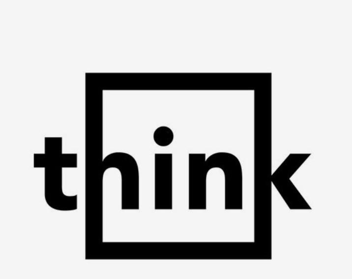
Think visually: Ask yourself, how can I say this using only type?
Think visually: Ask yourself, how can I say this using only type?
Think visually: Ask yourself, how can I say this using only type?


Think visually: Ask yourself, how can I say this using only type?


Think visually: Ask yourself, how can I say this using only type?
Think visually: Ask yourself, how can I say this using only type?

Think visually: Ask yourself, how can I say this using only type?
Think visually: Ask yourself, how can I say this using only type?


Think visually: Ask yourself, how can I say this using only type?
Think visually: Ask yourself, how can I say this using only type?


Think visually:


Think visually: Ask yourself, how can I say this using mostly type?


Think visually: Ask yourself, how can I say this using mostly type?


Think visually: Ask yourself, how can I say this using only type?


Think visually: Ask yourself, how can I say this using only type?


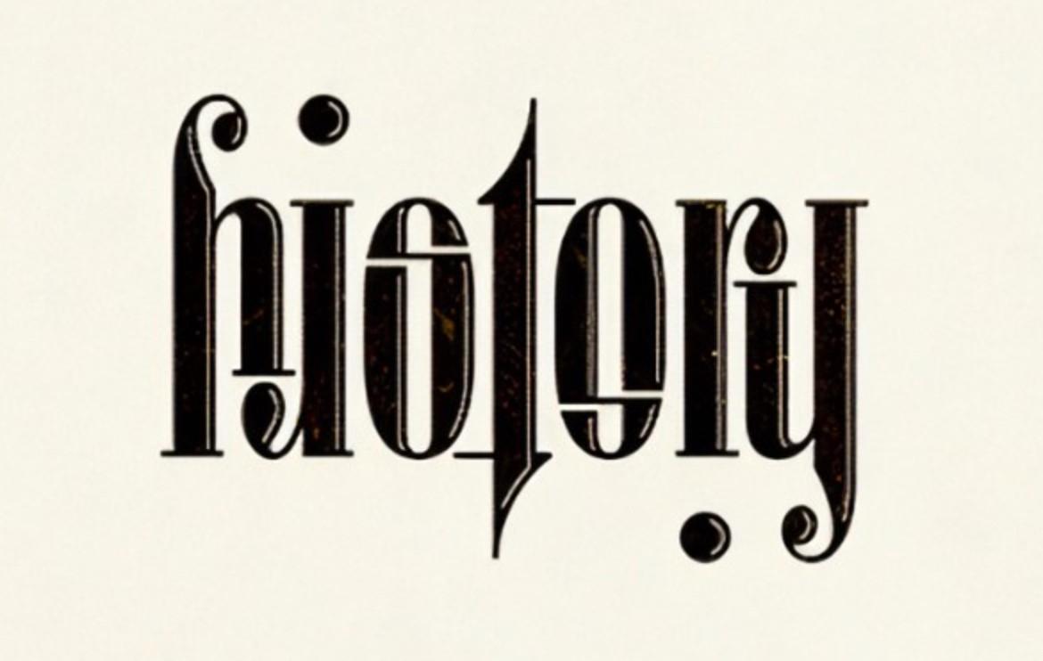
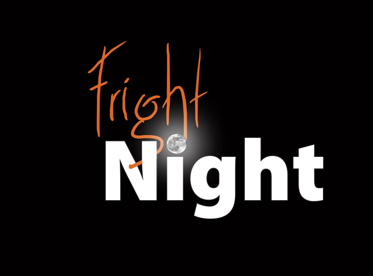
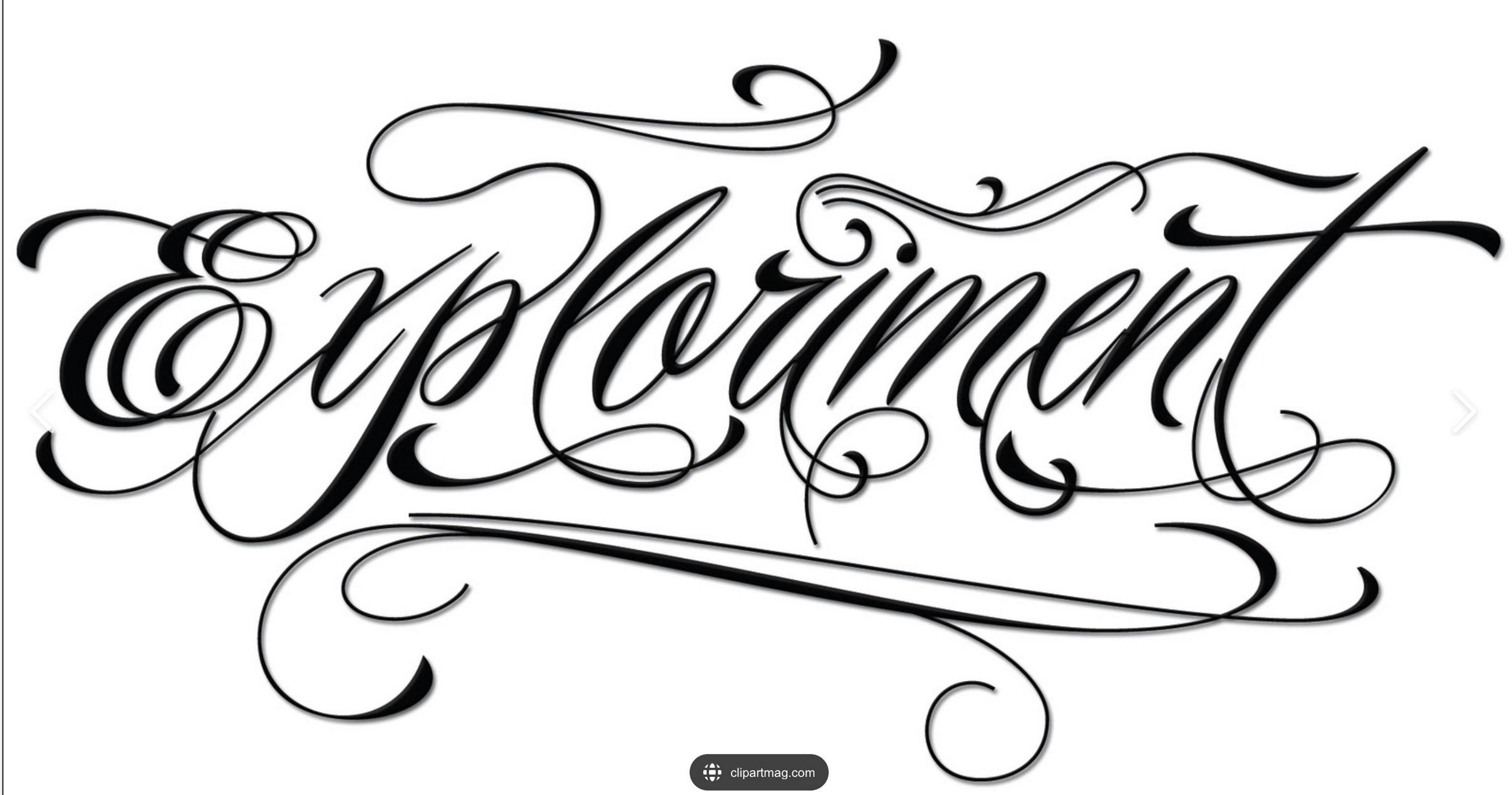
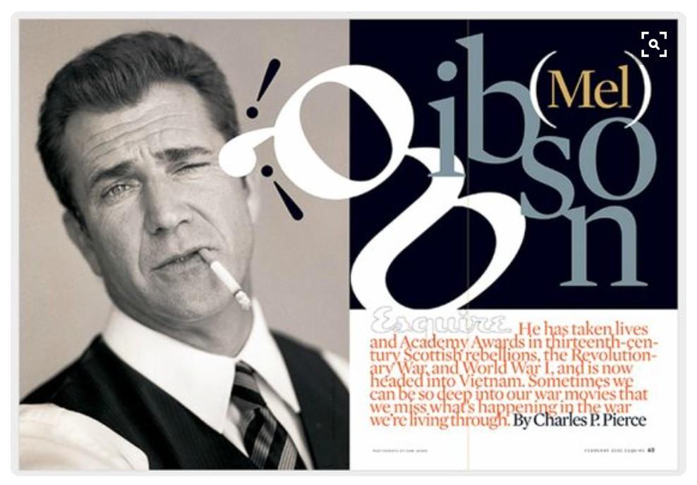
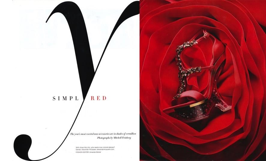
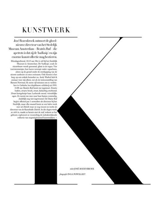
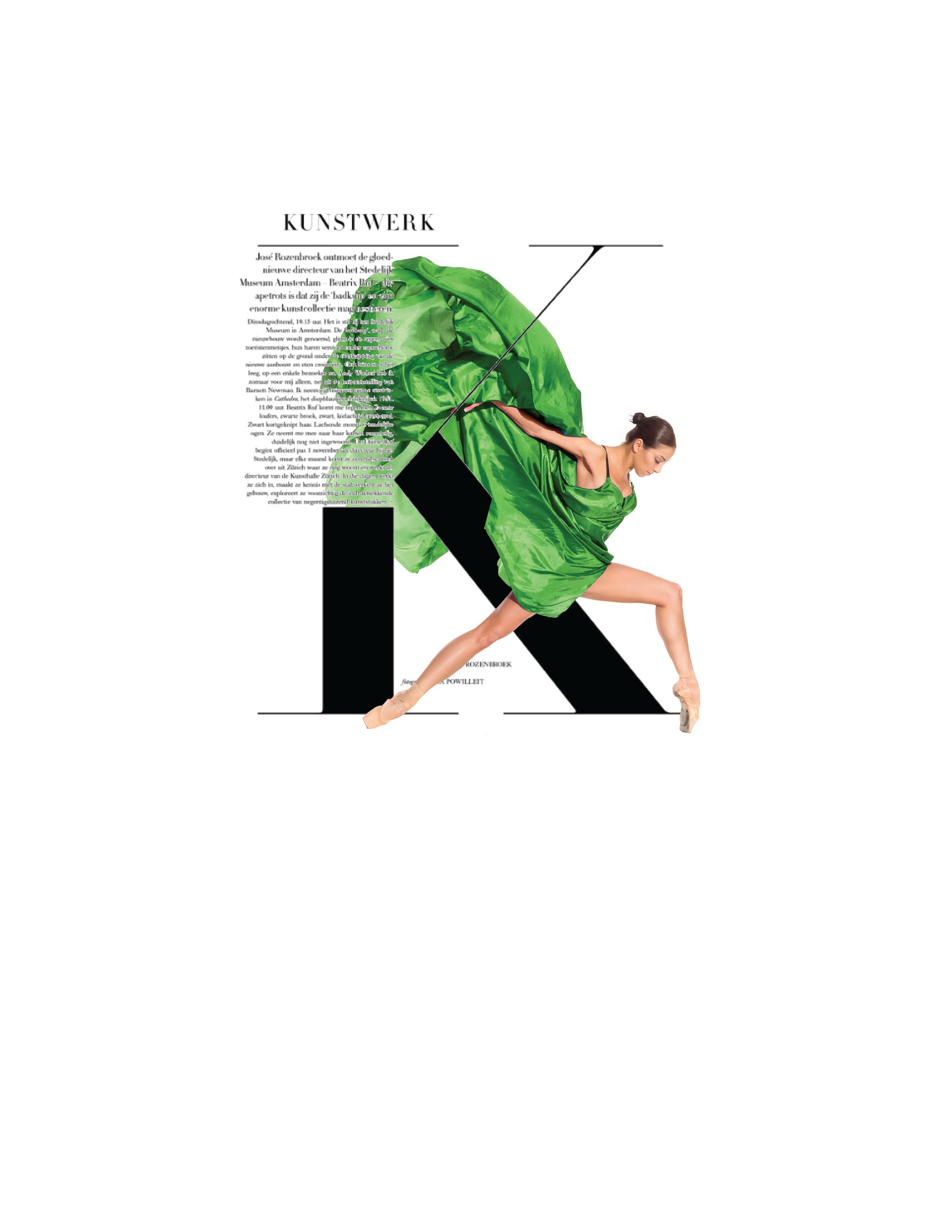
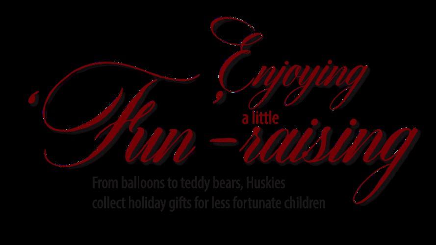
Think visually: Ask yourself, how can I say this using type with an artistic touch? Pinterest

Think visually: Ask yourself, how can I say this using type with an artistic touch? Pinterest

Think visually: Ask yourself, how can I say this using type with an artistic touch? Pinterest

Think visually: Ask yourself, how can I say this using type with an artistic touch? Pinterest

Think visually: Ask yourself, how can I say this using type with an artistic touch? Pinterest
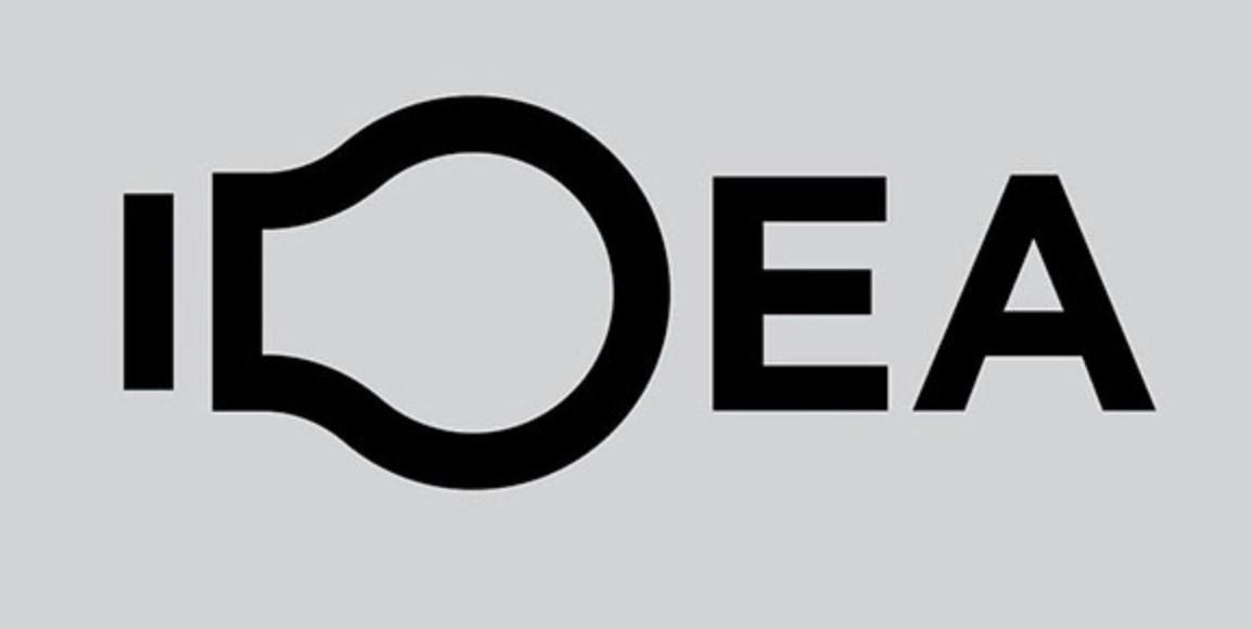
Think visually: Ask yourself, how can I say this using type with an artistic touch? Pinterest

Think visually: Ask yourself, how can I say this using type with an artistic touch? Pinterest

Think visually: Ask yourself, how can I say this using type with an artistic touch? Pinterest

Think visually: Ask yourself, how can I say this using type with an artistic touch? Pinterest
Think visually: Ask yourself, how can I say this using type with an artistic touch? Pinterest
Think visually: Ask yourself, how can I say this using type with an artistic touch? Pinterest

Think visually: Ask yourself, how can I say this using type with an artistic touch? Pinterest
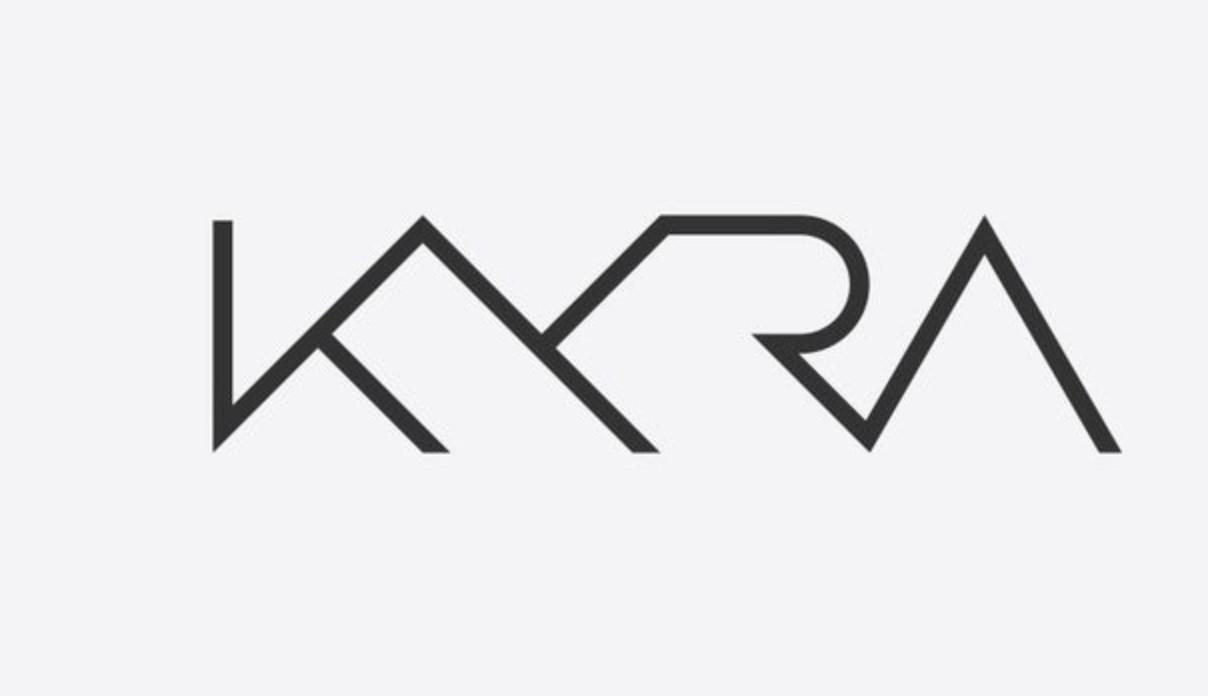
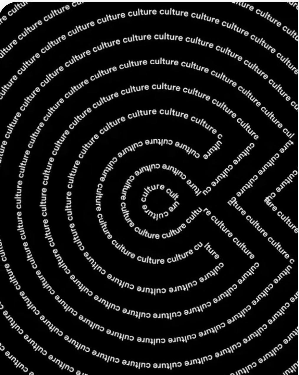
Think visually: Ask yourself, how can I say this using type with a creative touch (merged words)? Pinterest
So…what do we need to know? • There is a difference between theme logos/headlines and stories/captions • Type faces for theme logos and headlines may not work well for stories and captions • Choosing the right type faces for different aspects of your publication can be challenging • Thousands of type faces exist in today’s world, and more are added almost every day • Remember…we want a reader-friendly font for body copy and captions • We may want to add a theme-related font for thematic designs and to headline special feature stories in newspapers and magazines
Typography dos and don’ts • Learn the characteristics of the seven type groups and know which fonts work best in specific aspects of your designs • Select body copy type face that is easy to read and contrasts with the caption type face • Study how we use type in the yearbook and set style rules for headlines, captions, copy, informational graphics, special quotes, quote modules, etc. • Be creative with type in designing your theme logos, special feature story headlines and double trucks and ads
Let’s learn how to use type Seven type groups: Oldstyle Roman Modern Roman Square Serif Sans Serif Text or Olde NoveltyScripts/CursivesEnglish
All about type: Oldstyle Roman ● Seven type groups: Oldstyle Roman ○ Rounded serifs ○ Little difference between thin and thick portions of letters ○ Best type family for body copy – use 10point for stories/copy ○ Can also be used for captions and headlines Rounded serifs ThickThin
Use Oldstyle Roman for headlines and body copy
Use Oldstyle Roman for headlines and body copy
This is exampleanof Adobe Caslon Pro, a good font for body copy.
Choose one for copy and maintain unity
Use 10-point for body copy. Can also be used for captions and headlines.
This is an example of Cambria, a good font for body copy. This is exampleanof Garamond Pro, a good font for body copy. This is an example of Goudy Oldstyle, a good font for body copy.
This is exampleanof Chaparral Pro, a good font for body copy. This is exampleanof Minion Pro, a good font for body copy. This is an example of Palatino, a good font for body copy.
This is exampleanof Century Schoolbook, a good font for body copy.
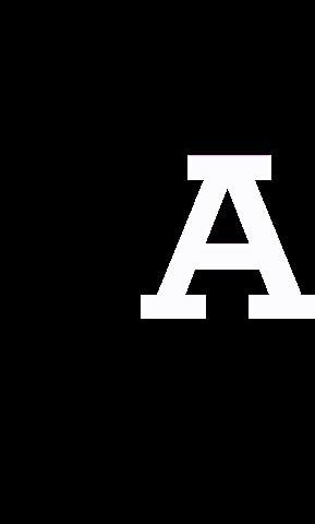
Avoid using Modern Roman for body copy. All about type ● Seven type groups: Modern Roman ○ Conveys a feeling of sophistication or high fashion ○ Serifs are precisely attached ○ Dramatic difference between thin and thick portions of letters ○ Excellent for headlines ○ Never use for body copy, as thin parts of letters may disappear when printed Precisely attached serifs ThickThin
Modern Roman: Use for headlines and logos Pinterest Never use Modern Roman for body copy
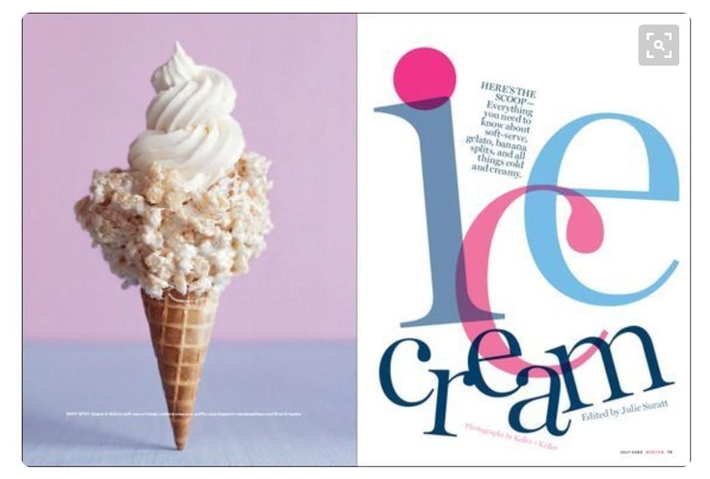
Typography Pinterest • Can weightinreaderprovidecontrastsizeand • Can be used as a graphic • Consider using this idea for a profile
Typography Pinterest • Can be an anchor for a large letter used with profilepersonalitya
Square Serif Pinterest ● Seven type groups: Square Serif ○ Conveys a feeling of ‘no nonsense’ ○ Excellent for headlines ○ Avoid using for body copy, as it’s too clunky for skimming through stories serifsRectangular-shaped
Square Serif: Strong, no nonsense Good for headlines and logos. Avoid using it for body copy, as it’s too clunky.

Square Serif: Strong, no nonsense Contrasts well with Sans Serif type groups

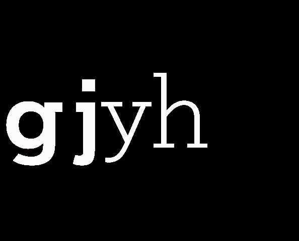
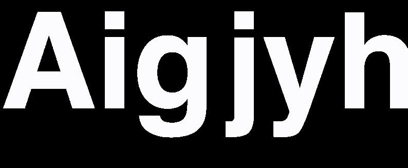
Sans Serif: Strong, no nonsense ● Seven type groups: Sans Serif ○ No serifs (‘feet’) on the letters ○ ‘Little black dress’/’Khaki pants’ type face ○ Goes with everything ○ Excellent for captions, informational graphics and headlines ○ Avoid using it for body copy; not as readable as Oldstyle Roman ○ Choose a Sans Serif type face with a variety of weights and styles to use for captions, quote areas and informational graphics No feet on letters
Text/Olde English: Conveys feeling of antiquity ● Seven type groups: Text or Olde English ○ Conveys a feeling of formality ○ Beautiful for invitations or Medieval look ○ Never use for body copy or captions Never use in all-caps
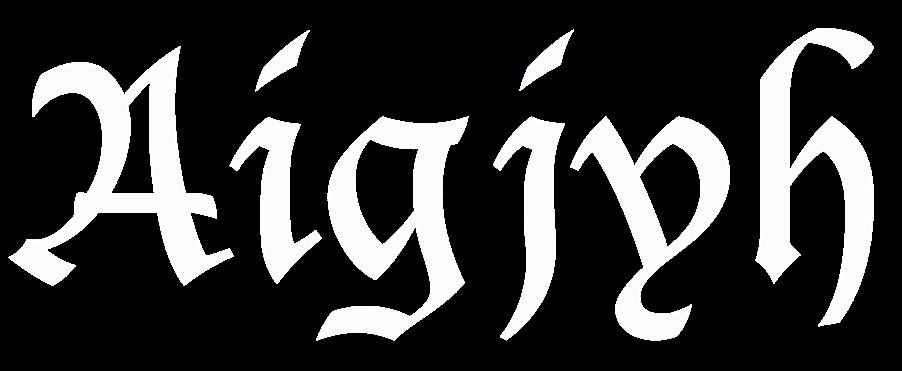
Text/Olde English: Conveys feeling of antiquity

Text/Olde English: Shows historic value

Text/Olde English: Never use in all-caps ALL-CAPS ARE TOO HARD TO READ IN THIS TYPE GROUP
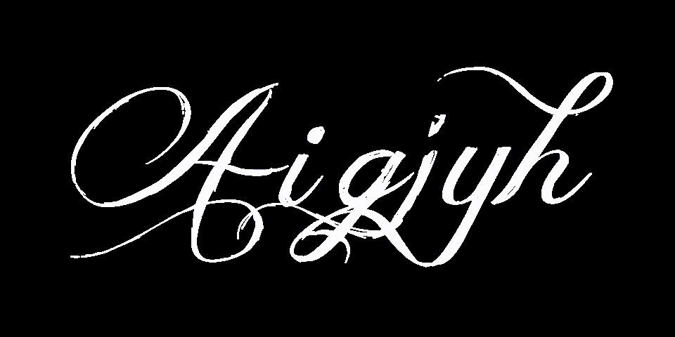
Scripts: Use for emphasis and to convey concepts ● Seven type groups: Scripts ○ Conveys a feeling of grace and beauty; also formality ○ Mostly connected ○ Use for key words in theme logo and headlines ○ Never use for body copy ○

Cursives: Use for emphasis and to convey concepts ● Seven type groups: Cursives ○ Conveys a feeling of grace and beauty; can also symbolize formality; handwritten can reflect a casual or informal feeling ○ Mostly unconnected Use for key words in theme logo and headlines

Scripts and Cursives: Never use in all-caps NEVER USE ALL-CAPS FOR DECORATIVE TYPE FACES
Scripts and Cursives: Good for key words in headlines
Scripts and Cursives: Good for key words in headlines
Novelty: Good for key words in headlines ● Seven type groups: Novelty ○ Use only for key words in headlines to convey the theme/concept ○ Never use it for body copy ○ Never use in all-caps

Novelty: Good for key words in headlines ● Seven type groups: Novelty ○ Use only for key words in headlines to convey the theme/concept ○ Never use it for body copy ○ Never use in all-caps
Novelty: Good for key words in headlines Pinterest
How we use type in the yearbook • Headlines • Captions/Idents/Quote areas • Copy/Stories • Informational graphics
Headlines Primary headline Secondary headline
Captions Caption headline 14-point Arial Narrow Bold Caption text 8-point Arial Narrow

Quote areas Title Designed as a miniversion of the primary headline Quote 8-pointtextArial Narrow

Name/Ident 8-point Arial Narrow Idents
Copy/stories Headline Primary –Secondary72-point–18-point Copy/Story 10-point OldstyleRoman Is the easiest type group to read Set it betweenand10 20 picas wide Use extra 16-20settingleadingwhentypepicaswide20picasisthemaximumwidth

Informational graphics Title Mini-version of the primary and secondary headlines over the story Text 8-point Arial Narrow Use bold for emphasis and contrast

Headlines Primary and secondary components • Establish contrast in… Type SizesStylesPlacementfaces
Contrast in headlines Square serif bold and light CursiveSans Serif
Primary headlines ● At least twice as big as secondary headlines ● Usually bold ● Could also include a contrasting type face for key words ● Designed in conjunction with secondary headline
Primary headline Secondary headline Designed headlines

Secondary headlines ● Set in 14-, 18- or 24-point type ● Usually light in contrast to primary ● Designed in conjunction with primary headline
Primary headline Secondary headline Designed headlines
Suggested type sizes and groups ● You can use up to three type groups in your book; four or more, only if you have a reason to do so ● Body copy: 10-point Oldstyle Roman (examples include Palatino, Goudy Oldstyle, Garamond and Times New Roman) ● Captions: 8-point text; 12 or 14-point caption headline – use plain Sans Serif to contrast with the body copy (examples include Arial, Myriad Pro or News Gothic)
Choose one and maintain unity ● Headlines: You can use a combination of the body copy and caption type faces. You can add a Script, Cursive, Square Serif or sometimes a Novelty type face to headlines to reflect the theme/concept ● Never use two or more type faces from the same type group, i.e., two Oldstyle Romans or two Sans Serifs This is an example of Arial, a good font for captions. This is Condensed,MyriadexampleanofPro a good font for captions. This is AvenirexampleanofNext Pro, a good font for captions. This is NewsexampleanofGothic, a good font for captions. Sans Serif: Use for captions, headlines and small copy areas like quote mods
This is an example of Cambria, a good font for body copy. This is bodyaGaramondexampleanofPro,goodfontforcopy. This is an example of Goudy Oldstyle, a good font for body copy.
Use a 10-point Oldstyle Roman type face for stories/copy
Choose one for copy and maintain unity
This is Schoolbook,Centuryexampleanof a good font for body copy. This is ChaparralexampleanofPro, a good font for body copy. This is MinionexampleanofPro, a good font for body copy. This is an example of Palatino, a good font for body copy.
This is forPro,AdobeexampleanofCaslonagoodfontbodycopy.
Loving our numbers

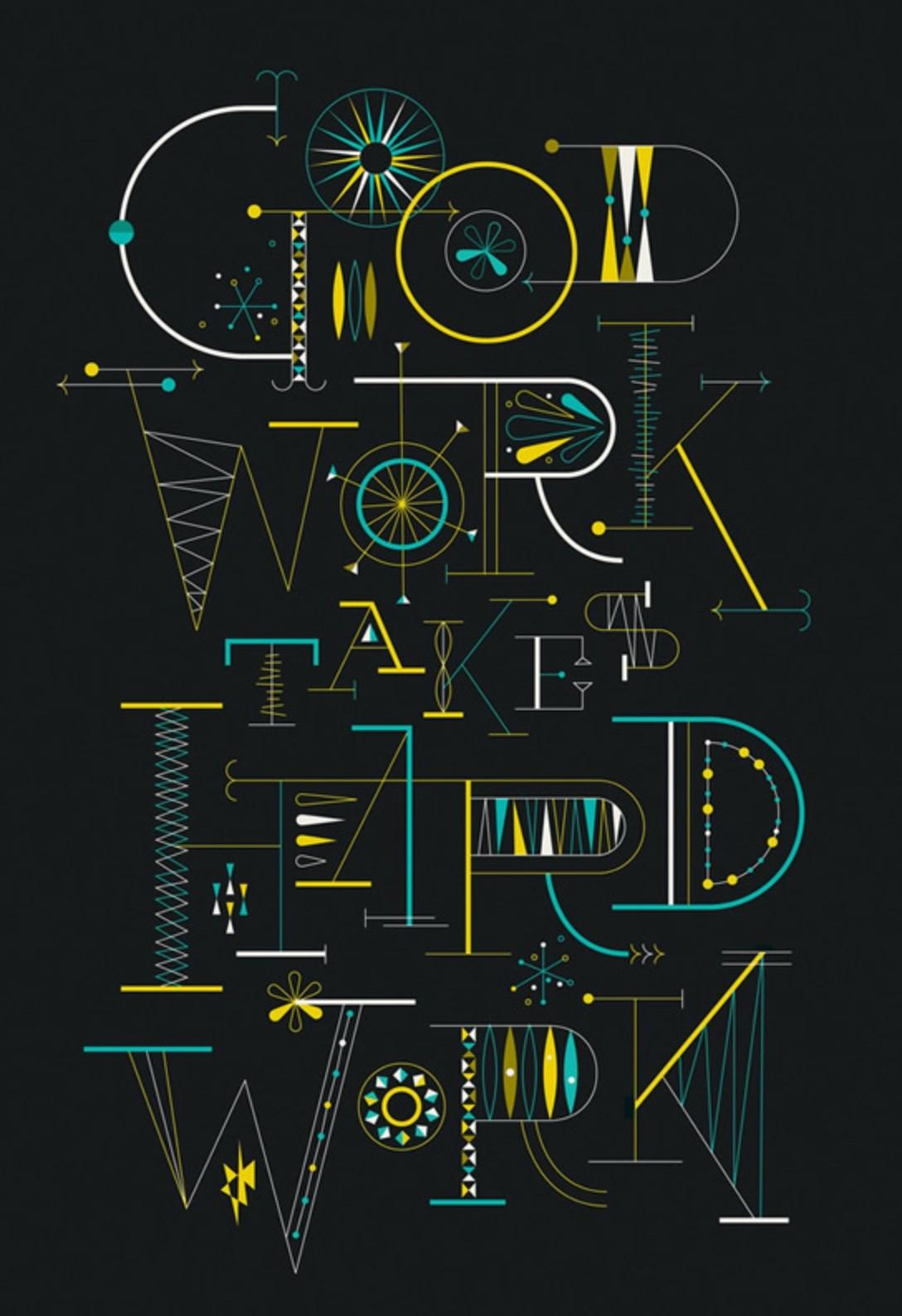
Type designs that speak the messages

Type designs that speak the messages

Type designs that speak the messages

Type designs that speak the messages

Type designs that speak the messages
Type designs that speak the messages

Type designs that speak the messages

Type designs that speak the messages

Type designs that speak the messages

Type designs that speak the messages

Type designs that speak the messages

Type designs that speak the messages
Type designs that speak the messages

Type designs that speak the messages

Type designs that speak the messages

Type designs that speak the messages

Type designs that speak the messages

Type designs that speak the messages

Type designs that speak the messages
Type designs that speak the messages
If you follow the rules… • You will have a great yearbook that’s readerfriendly • Now…let’s have some fun with type! …but you can break the rules if you have a reason to do so.
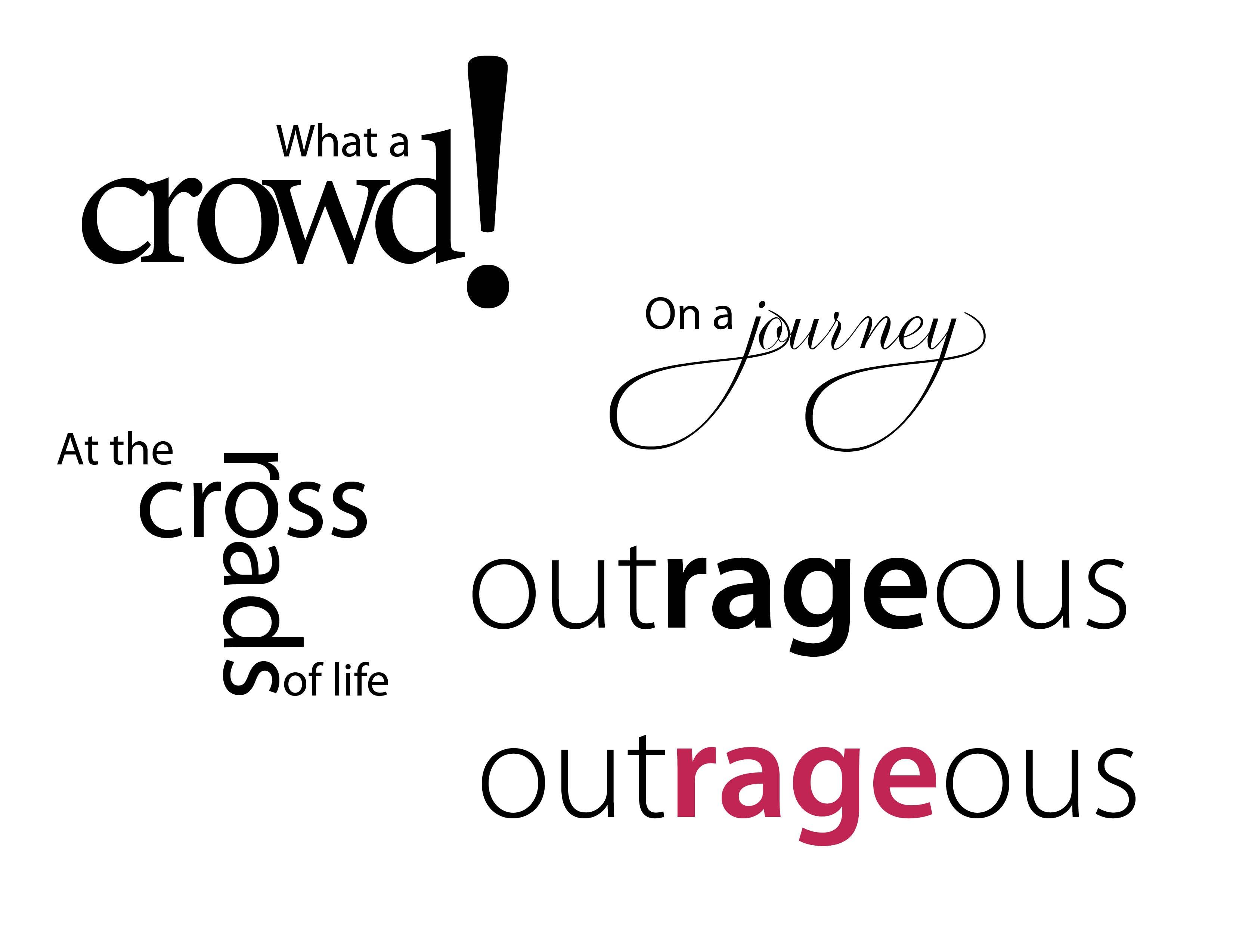
Now it’s time for you to create Headlines that “speak” the message Sketch first, then create headlines, theme logos or ad designs using the following phrases • He’s a wild and crazy guy! • It’s snowing outside! • What a crowd! • The highlights of our lives • At the crossroads • Making a fashion statement • What’s “haute” and what’s “naught” • Sharing and caring • Childhood memories • Rough and tough • Loud and noisy
Now it’s time for you to create Headlines that “speak” the message Sketch first, then create headlines, theme logos or ad designs using the following phrases • Outrageous • On a journey • He said/she said • Quiet and elegant • Peaceful and tranquil • Best in the west • Storybook romances • 100 years of excellence • Flashbacks • A night to remember • Oops! (Moments we’d like to forget)
For attending this session Thank you For more information, contact Laura Laura.Schaub@Shutterfly.comSchaub