
I designed this poster for crab themed dinner at RŌNIN - a Japanese restaurant in Hong Kong. The poster was a take on the famous Hong Kong romantic film ‘In the Mood for Love’ directed by Wong Kar-wai.
graphics

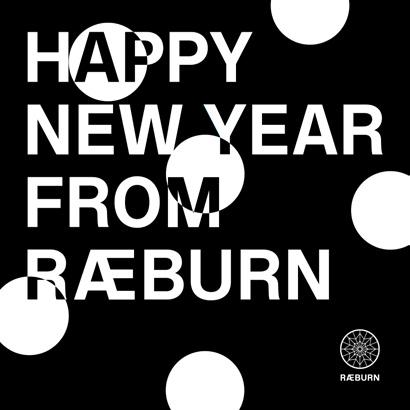
For the @raeburndesign instagram account I create graphics and story’s to launch new seasons clothing and products along with brand and cultural events.


digital campaign - Black Friday


For black Friday RÆBURN partnered up with Responsible. For this we did an in-store event and digital campaign and also launched a new buy back feature on our website. I created and designed all assets for the campaign.


 I worked with our art director to design the installation for Pride month which was out upin Covent Garden over the summer of 2023.
installation - More Joy for London Pride


logo design - Good Forever


website design - roninhk.com


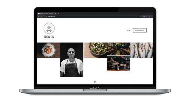
I have created several websites for brands using Squarespace and Shopify. I have adapted basic templates with custom css to create interesting interfaces and a strong brand image throughout.

website design - yardbirdyakitori.com


Other websites I have designed and created are hechomade.com & cuzbarbers.com.

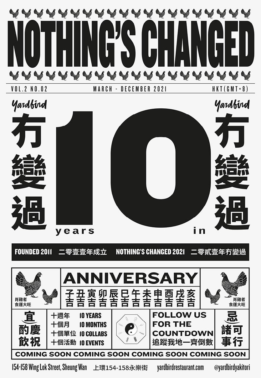
I designed these slip-on vans as one of Yardbirds 10-year collaborations. I used a simple repetitive print of the chicken drawn by Evan Hecox for Yardbird. They are currently in production.


textile design

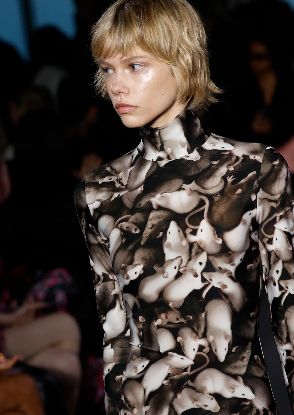
For the Christopher Kane AW23 Runway show I worked on multiple ai generated prints with our art directer. These were used across different looks in the show and put into production across commerical pieces in the collection.



For the Christopher Kane PreFall 23 Collection, I designed the botanical floral print with Christopher’s artwork.The print was used across multiple dresses, skirts and tops. I created all print files and worked with the design team to match required pattern placements on the garments.


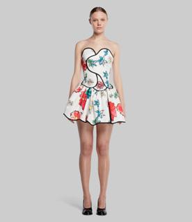


For the Painted By Collection I recoloured a seasonal print and applied it across different garment patterns.


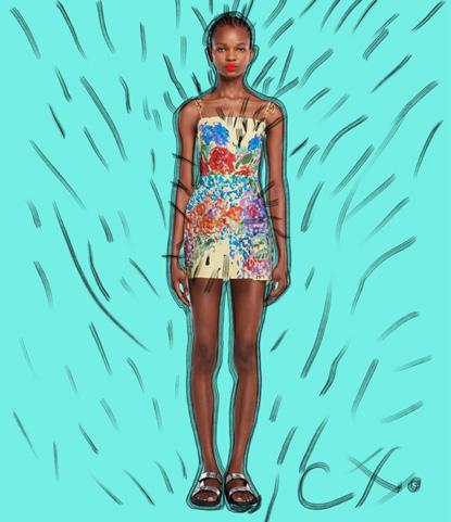
I art directed the ecommerce shoot and managed all assets.

For the More Joy Winter 23 collection I designed the gradient logo for the season which was used across the product range. I created all print files, invitations, lookbooks and all press documents required.


I shot the products in studio for the wholesale linesheet and managed and art directed the ecommerce shoot. I got all images ready to be launched online later this year.

More Joy collaborated wtih East London Violet Cakes. I designed special edition version of our Jumbo totes in the iconic Violet Cakes purple, emblazoned with the slogan ‘More Cake’. We relaunched the collaboration in a pink shade to celebrate the launch of head baker Claire Ptak’s new book, ‘Love is a Pink Cake’


I designed the More Joy x Elton John range for the UK Tour. The collection was featured in the Selfridges corner store. I created all digital assets for our website and social media in promotion of the collaboration.


For COP26 we joined up with carbon neutral drinks company Dalston’s. I designed this t-shirt as a play on words to encourage people to ditch plastic bottles. The t-shirt used natural fruit dyes in a screen print and was launched at the conference 2021.


moodboard design
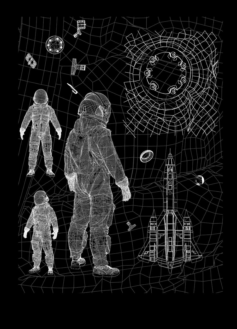
The collection focus for ST95 was ‘Abandoned Places’ focused on space station and rockets. Inspired by Henk van Rensbergen photography, I collated interesting imagery to create these mood boards for AW22 and SS23. I used focusing on space and rockets. I used multiple books, NASA, and imagery


I designed this back graphic as part of the ST95 AW22 collection. Continuing the theme of space I used an architectural design to give depth to the graphic. The piece was the highest selling whole sale jersey item in the collection.

For SS23 ST95 collection I focused on space shuttles and telescopes. With these designs I tried to consider how placement could emphasise the graphics. These designs are currently in the process of being sampled.


For RÆBURN SS23 collection I designed this back graphic. The collection is focused on the SR-71 Blackbird Plane. The design is currently being sampled.
For the re-branding of LEFT HAND - Massimo Osti’s 90’s brand. The graphics are far more elegant and simple. I used an old inside label to create a play of the logo’s typeface.
textile design - V&A Museum, London

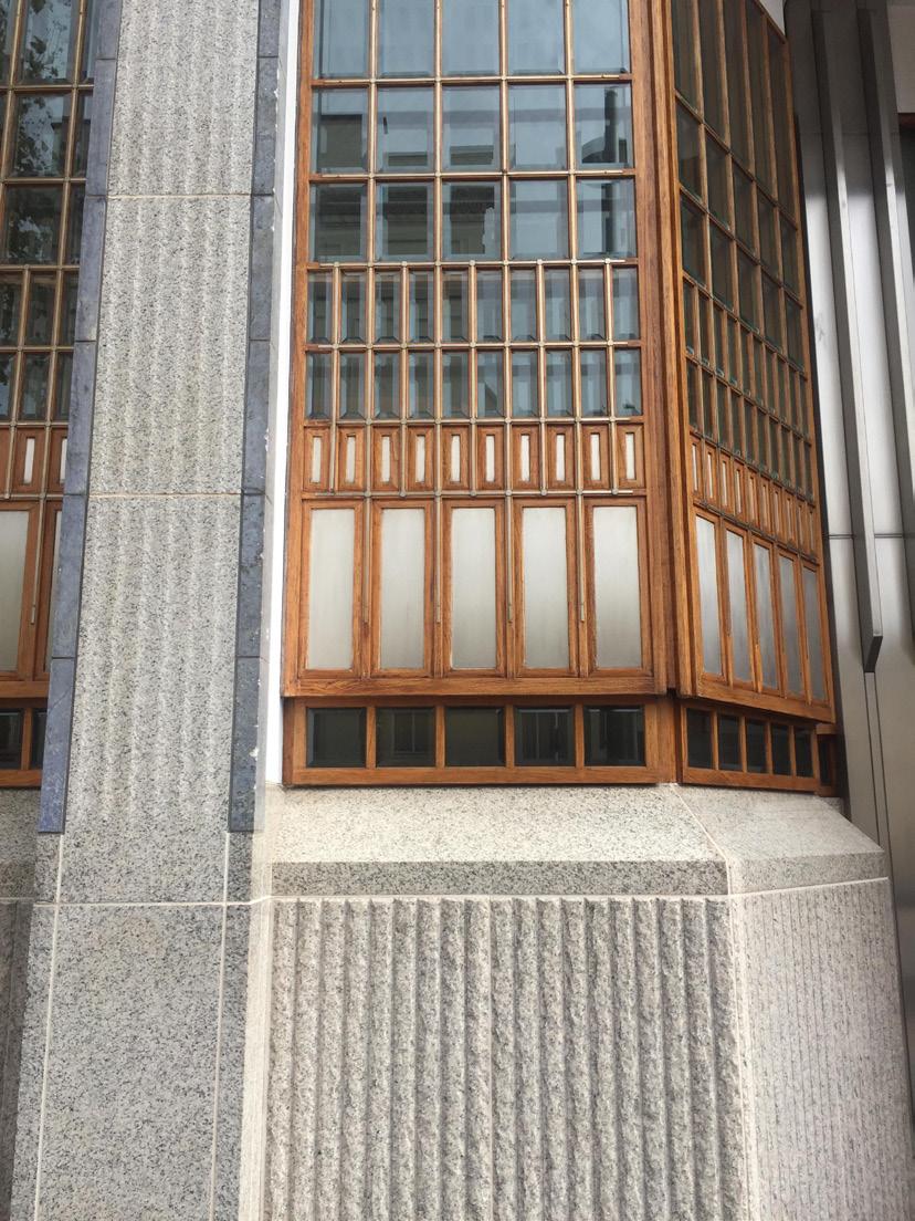
I designed this print as part of a digital textile design course I completed at the V&A. I picked out key architectural features from neighbouring buildings that were inspiring. I then enhanced the colours and repeated the print of the window arrangement. I then made the material into a tote bag to show how the material could be used.

art direction + styling
 Across is an image from the 1017 ALYX 9SM editorial shoot I styled and art directed this shoot for END. clothing.


I came up with the concept and visual idea for the SS22 Raeburn Campaign. I art directed the shoot and produce all assets for our website.


fashion styling - Central Saint Martins


I styled and art directed this shoot as part of a course I completed at Central Saint Martins. The concept ‘after office hours’ is to reflect the transition from office wear to night time.

art direction + styling - End. Clothing
This shoot was for the new collection of 1017 ALYX 9SM designed by Mathew Williams. The theme of the editorial was to reflect the new military and industrial elements in the collection. The images from this shoot were also featured on the END. blog.


footwear styling - End. Clothing


In this test shoot with the Valentino Bounce Air Sneaker, I experimented using old light fittings as a back drop to enhance and reflect the dotted pattern across the sneakers.

This was another test shoot, where I used different materials to filter the light onto the Givenchy sliders in order to create different effects. The image was featured on the END. instagram.

I did this proposal for a Stussy X End. collaboration range to combine my skills of design and interest in fashion. I chose Stussy as it appeals to both genders which I think is important as while END. is predominately a menswear company it still has a large female consumer market. In the range I used previously existing pieces of Stussy apparel and accessories and manipulated the logos. I styled and art directed the shoot.
stussy x end


End. Clothing x Stussy - unisex double S logo t-shirt
End. Clothing x Stussy - unisex black lined trench coat


End. Clothing x Stussy - unisex reversible logo l/s shirt

End. Clothing x Stussy - unisex full print vacation shirt
End. Clothing x Stussy - full print midi skirt
End. Clothing x Stussy - unisex full print bucket hat


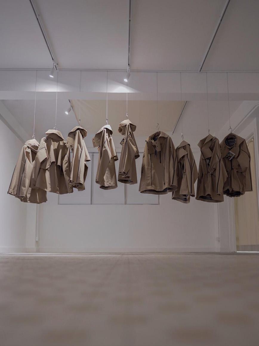
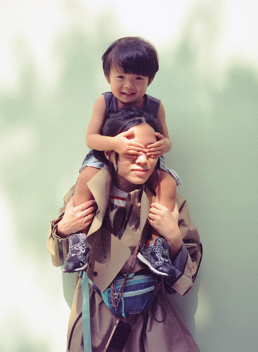
PHVLO is a sustainable lifestyle brand based in Hong Kong and the U.K. At PHVLO we focused on creating season-less garments in an attempt to change our consumption habits and reduce waste. During my time at PHVLO I worked on a collaboration with GORE-TEX. The collaboration consisted of two multi-functional jackets designed for urban adventures.
 phvlo x gore-tex
I curated an exhibition for the launch of the jacket at PHVLO HATCH. PHVLO HATCH is space in Sham Shui Po space dedicated to promoting and upskilling the local community in fashion and art. The exhibition consisted of a photography series and installation. Above is the jacket stocked in the ‘Smudge’ store in Tai Wan.
Connections through stories
exhibition - PHVLO HATCH, Hong Kong



To the right is an internal perspective from my graduation project, showing different brick perforations and atmospheric qualities in the internal space.
architecture projects

The Berwick Arts Centre
architecture second year project - Berwick Upon Tweed


Our studio brief was to design an arts centre to house and celebrate the annual Berwick music and arts festival. I chose to exhibit Peter Randall-Page’s art and process in my gallery due to the organic nature of his work.
The main concept of my building was that all areas of the building would be visible so that the visitors can feel fully emerged in the process of the art being created.
I used sandstone as my focal material as it is found locally within Berwick. I played with its texture throughout my building by exposing the adjacent buildings rough walls while making the exterior sandstone cladding smooth, as a modernist interpretation of Berwick.
I focused on the stone’s relationship to the living material and how this changed over time. I developed this concept within my building by dividing the two main masses of exhibition and production with a moss pathway seeping into the building.


architecture graduation project - Newcastle University


Elephant and Castle has undergone massive redevelopment and seen a dynamic change in its urban landscape. Our studio brief required us to engage with local communities to unpick social histories embedded in the material of the city and discover utopian fragments within the present day which we consider worth celebrating.
For my graduate project I designed a children’s library to help build and continue relationships between the new and existing community acting as a public building for people to relax, enjoy and engage with. I wanted to celebrate the materiality of the local area especially with the adjacent railway.

A key materiality concept of my project is the relationship between timber and brick. I wanted to use an exposed timber frame as the primary structure, while the non-load bearing brick walls would act as a ribbon passing through the building.

I explored how I could perforate brick differently especially in the different spaces for different aged children. So that the narrative of my programme would be reflected throughout my building’s indoor and outdoor spaces and in its materiality.


lilian.davies@ymail.com
Lilian Davies