LUCIANA PAULESCU
GRAPHIC DESIGNER

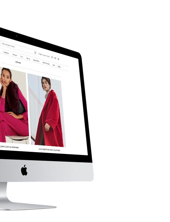
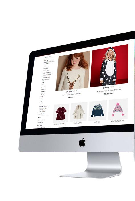
John Lewis is one of the most popular high-end department stores operating throughout Great Britain, with concessions also located in the Republic of Ireland and Australia. John Lewis began trading over 150 years ago in 1864 on London’s Oxford Street, and is a leading omnichannel retailer in the UK.
In 2018 I had the opportunity to work for John Lewis during their Rebranding project, with the new identity launched in September 2018. Pentagram was the main agency commissioned to be at the forefront of John Lewis’ re-branding. The new identity features a prominent line-based graphic device, which is used to highlight text and imagery, create patterns and shapes, or animations. These lines have been inspired by John Lewis’ diamond-shaped pattern logo that was created by Peter Hatch for the John Lewis Partnership in the 1960s.
As part of the in-house digital team, I have worked on varied projects:
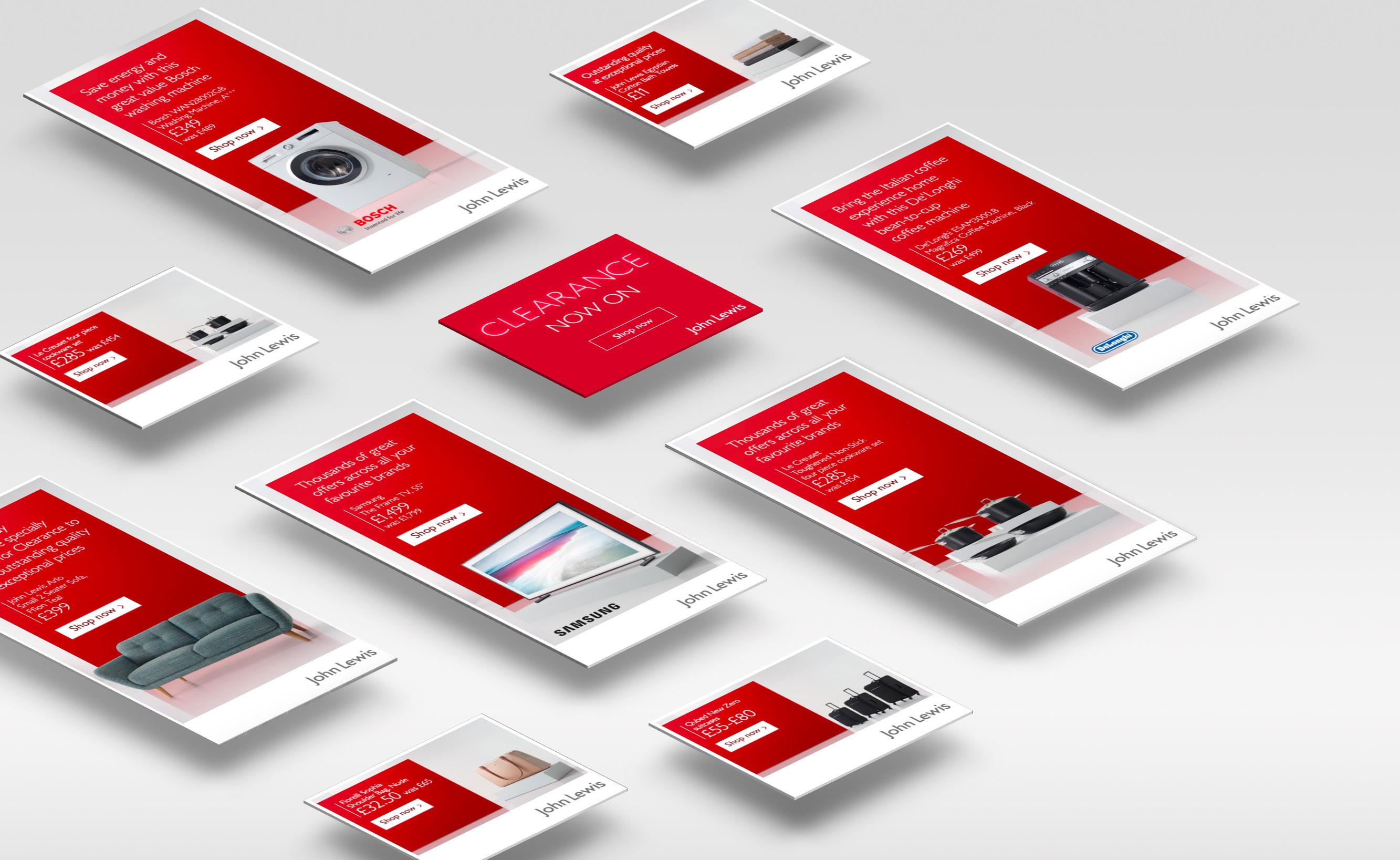
• Digital advertising: I was responsible for digital banner design (static and animated) and online affiliate ads.
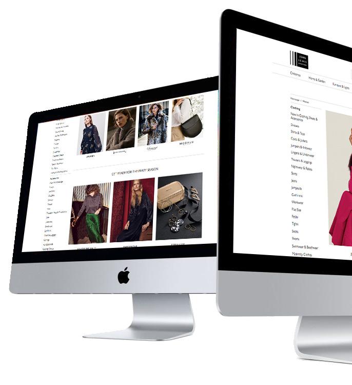
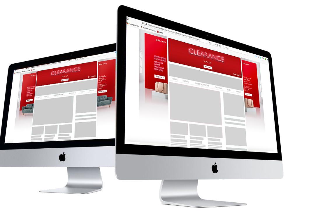
• Digital content design: using the AEM system (Adobe Experience Manager), I designed content for their new responsive website, including banners and landing pages.
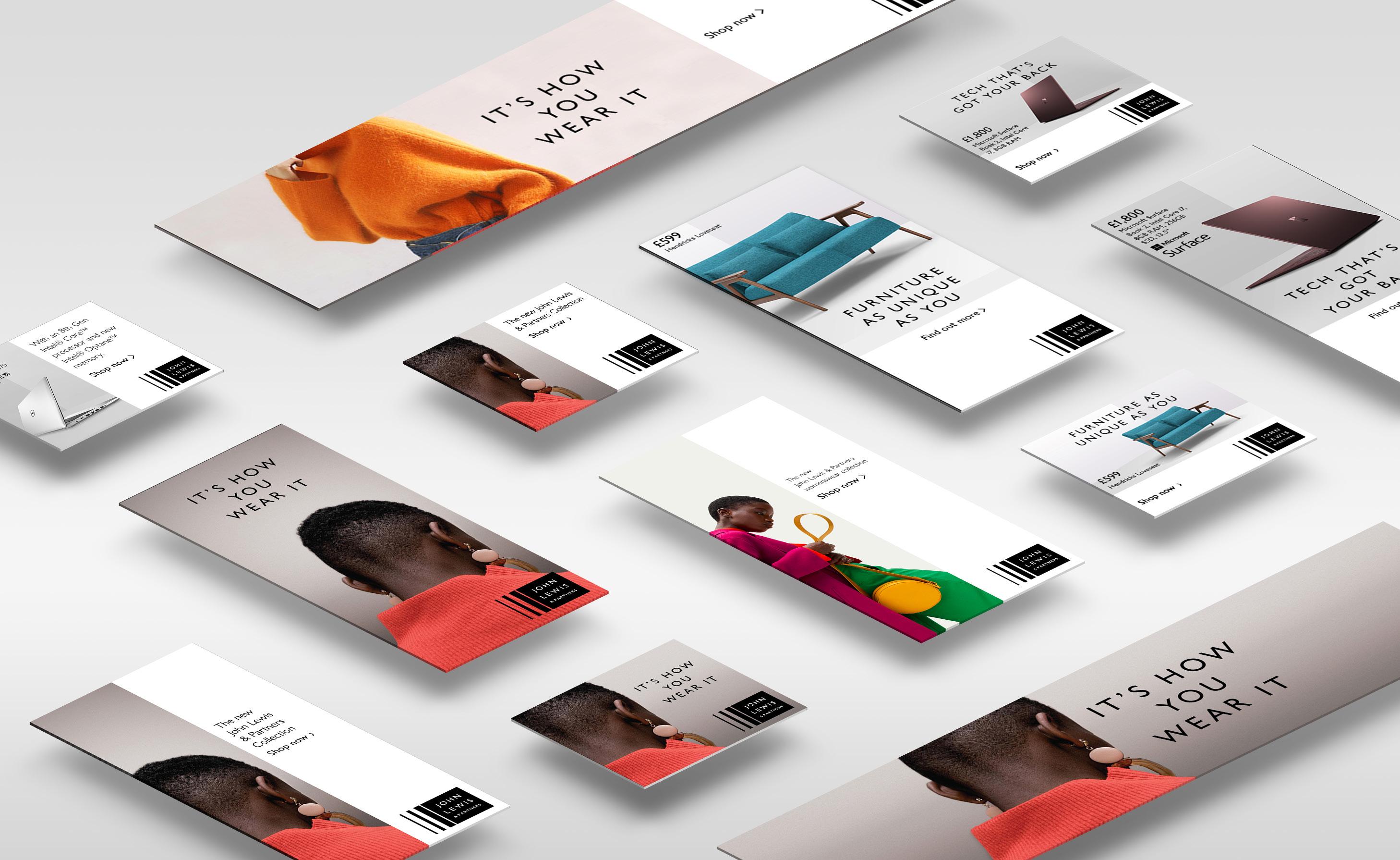
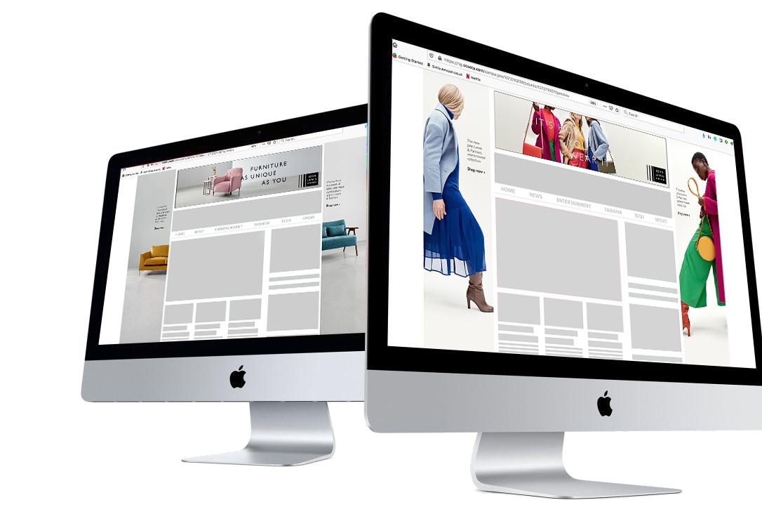
SCOOTA was the chosen platform to publish and deliver the animated shell banners.
CONTENT DESIGN
SCOOTA was the chosen platform to publish and deliver the animated shell banners.

Since 2014, I have been working as a Graphic Designer in London’s Financial sector – clients included some of the most renowned investment banks in the world: Commerzbank, Rothschild, Credit Suisse, and Morgan Stanley.
While in those roles, I used a variety of design software to create: financial magazines, brochures, adverts, posters, financial documents, factsheets, flyers, PowerPoint presentations and various marketing collaterals. My work also included designing various digital materials including animated banners, digital magazines and brochures, animated displays, web banners and emails. Some of my responsibilities were:
• Taking briefs from clients and advising them on the best possible design and layout within the corporate guidelines and according to their objectives.
• Coordinating projects, setting design standards and interpreting briefs.
• Quality checking other designers’ work, ensuring all work met the brief requirements to the highest design standards, was on-brand and free of errors.
• Rebranding and applying the New Corporate Identity styles throughout all print and online materials. Ensuring the new corporate identity was applied consistently and coherently.
• Performing retouching for various visuals and portrait retouching.
• Working remotely to offer support and high standard graphic design services to clients based in offices around the world.

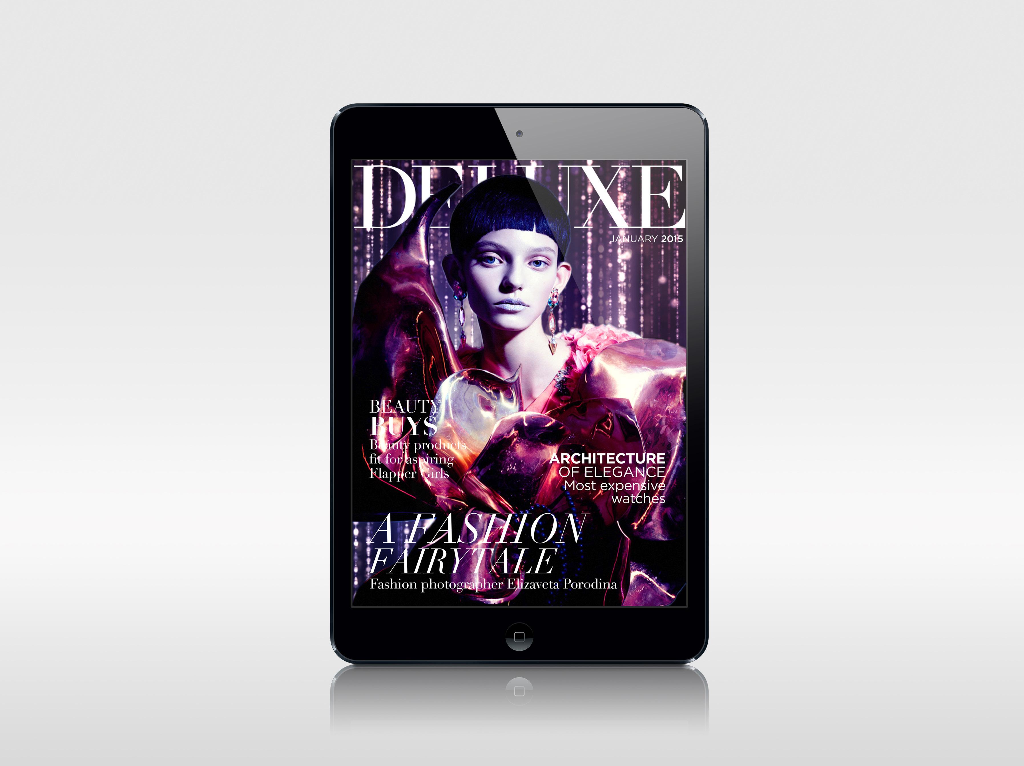
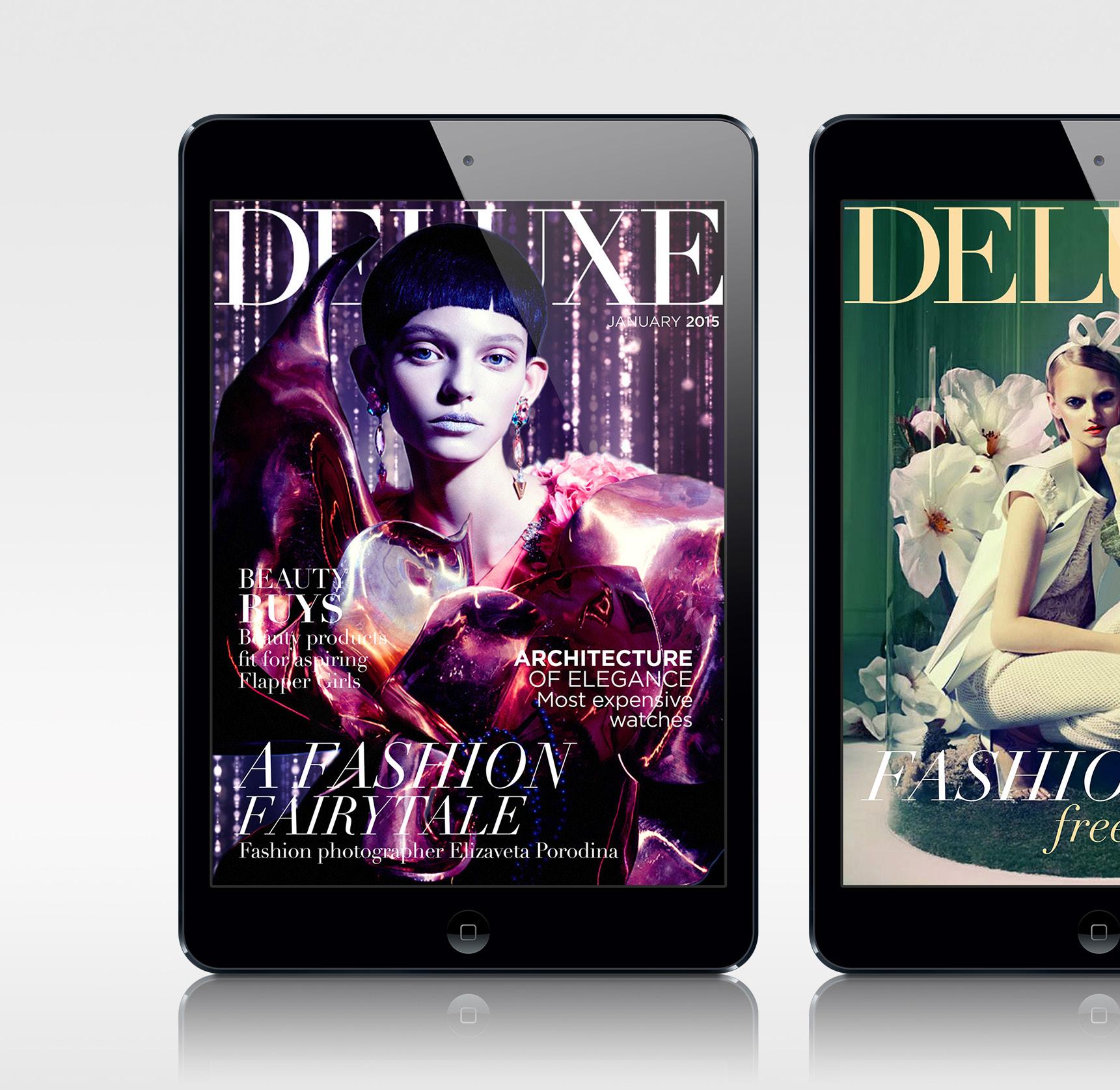
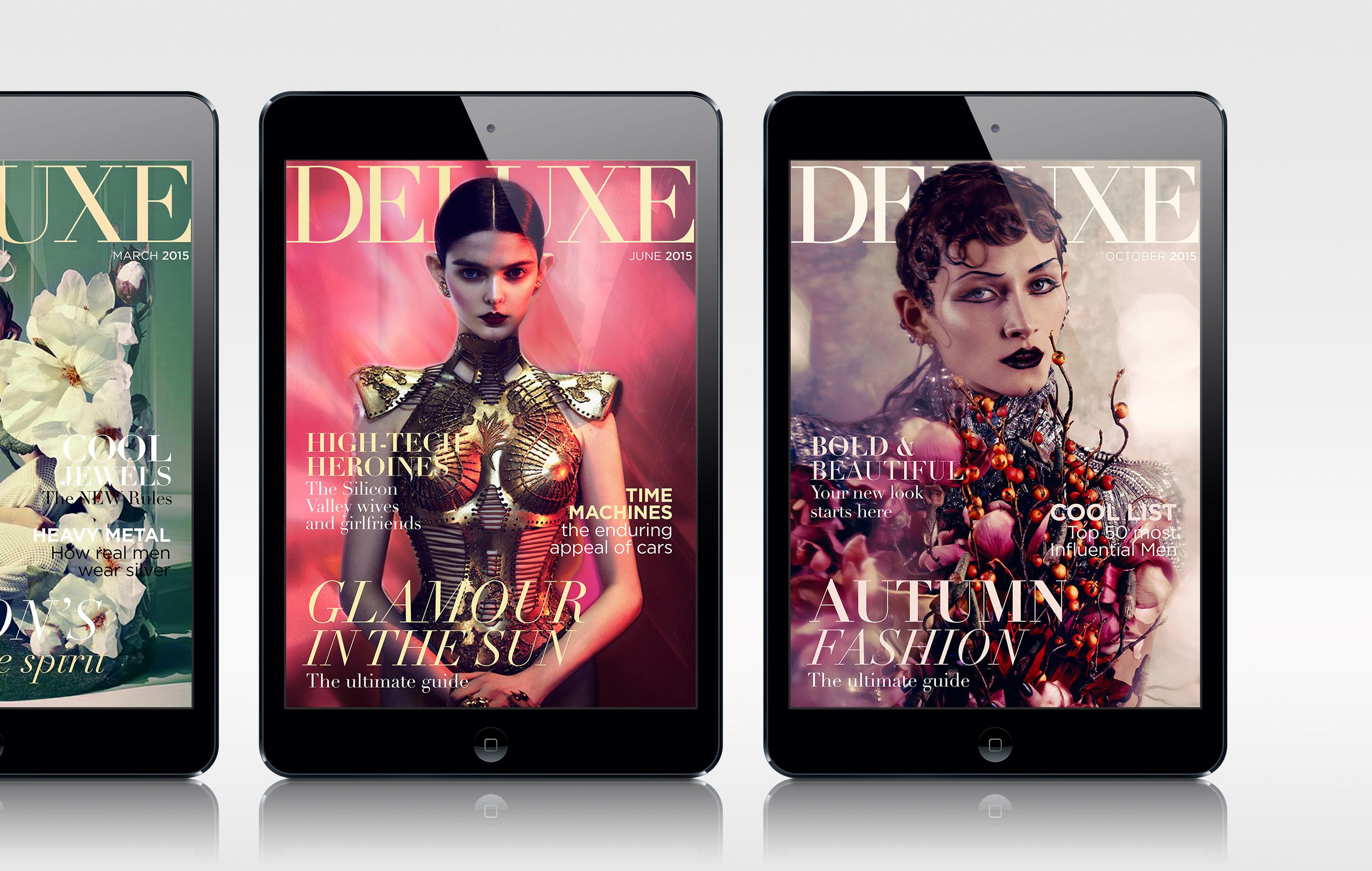
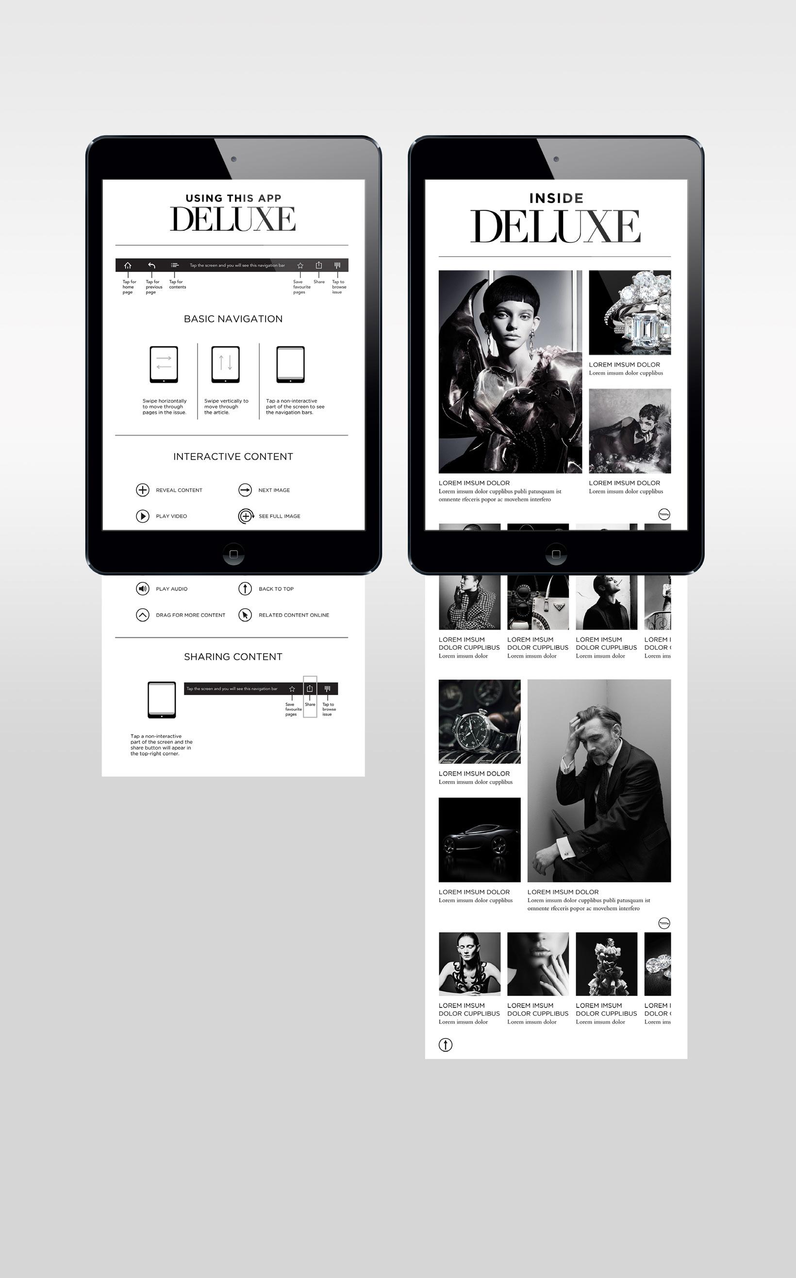
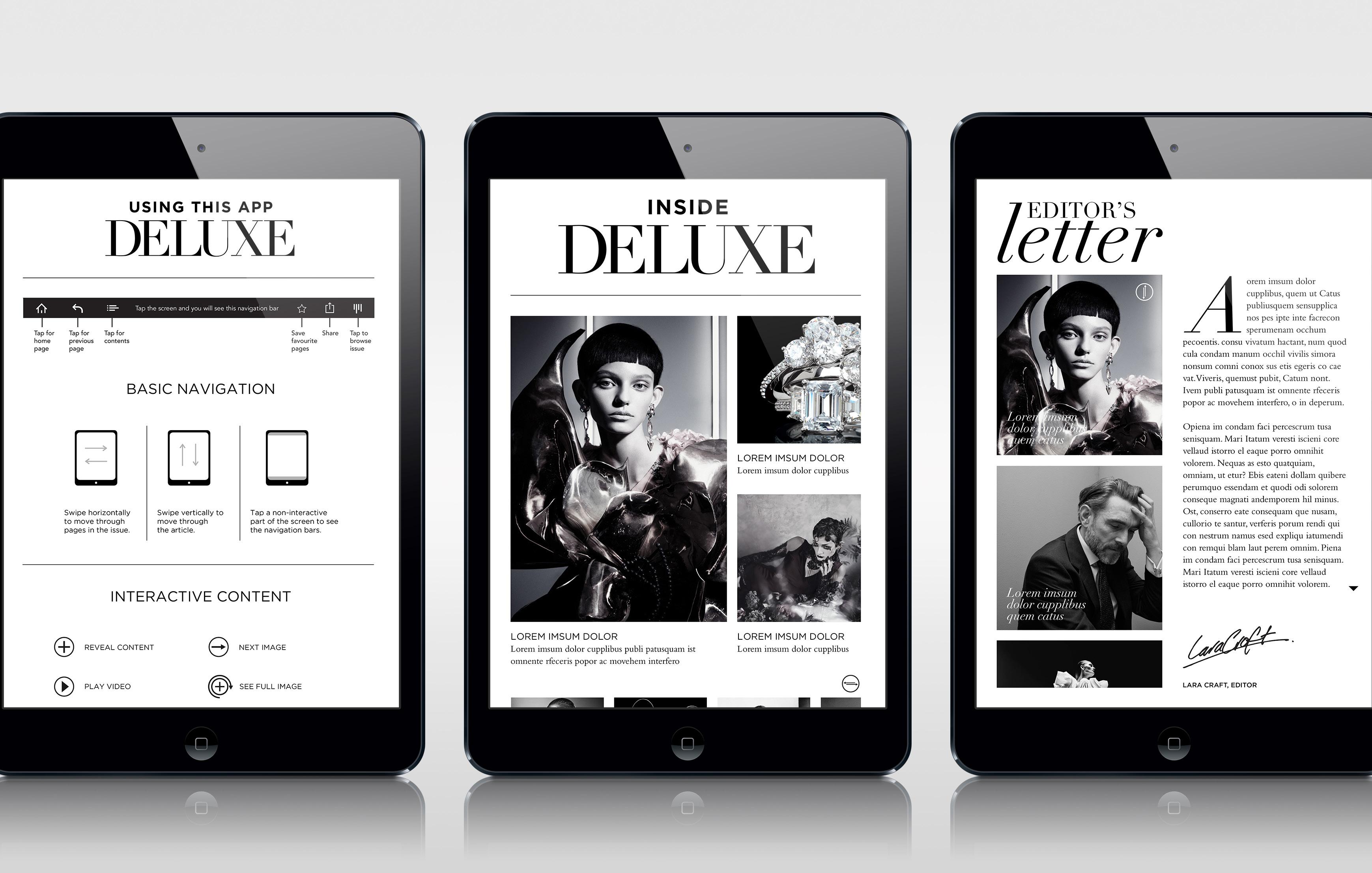
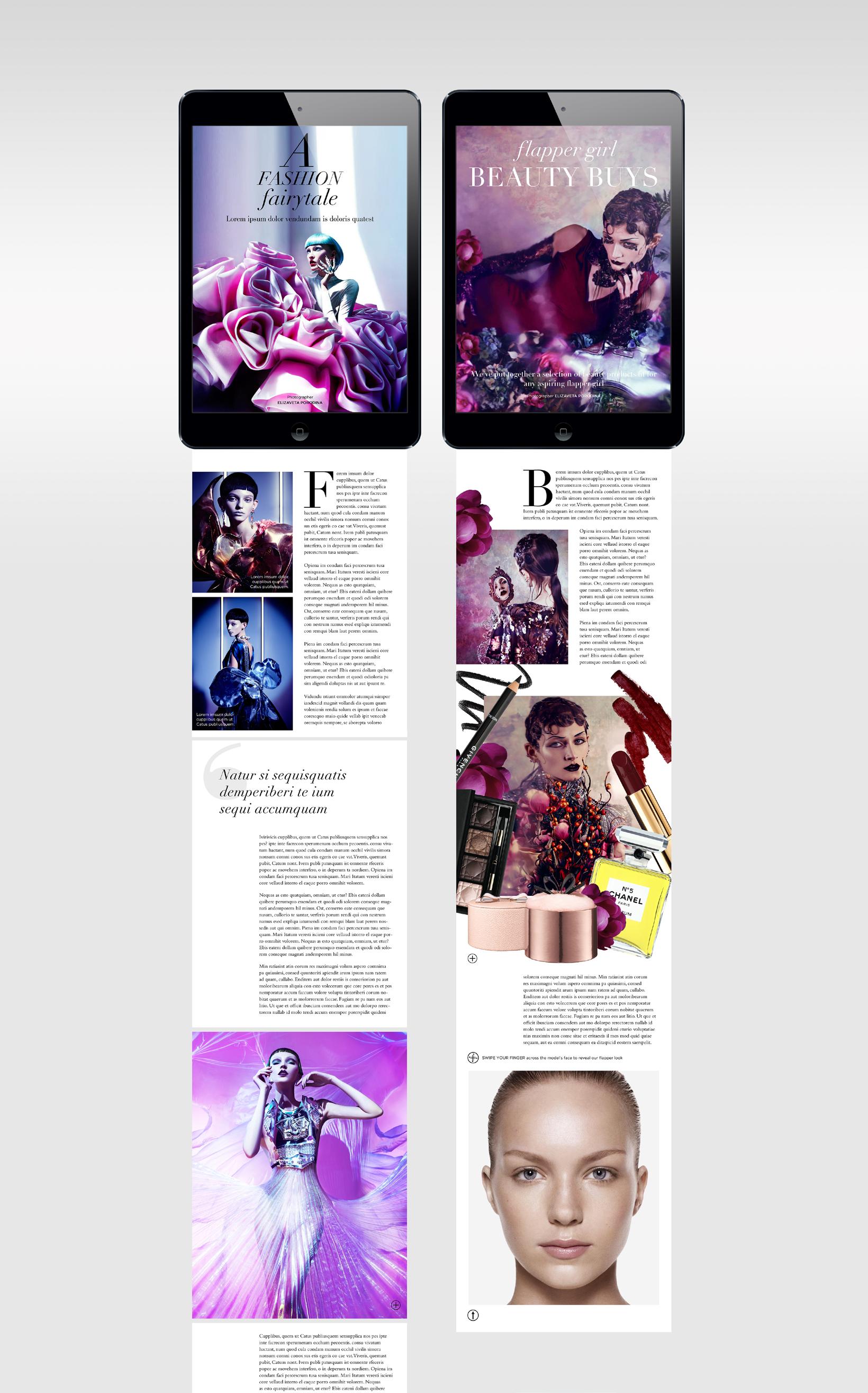
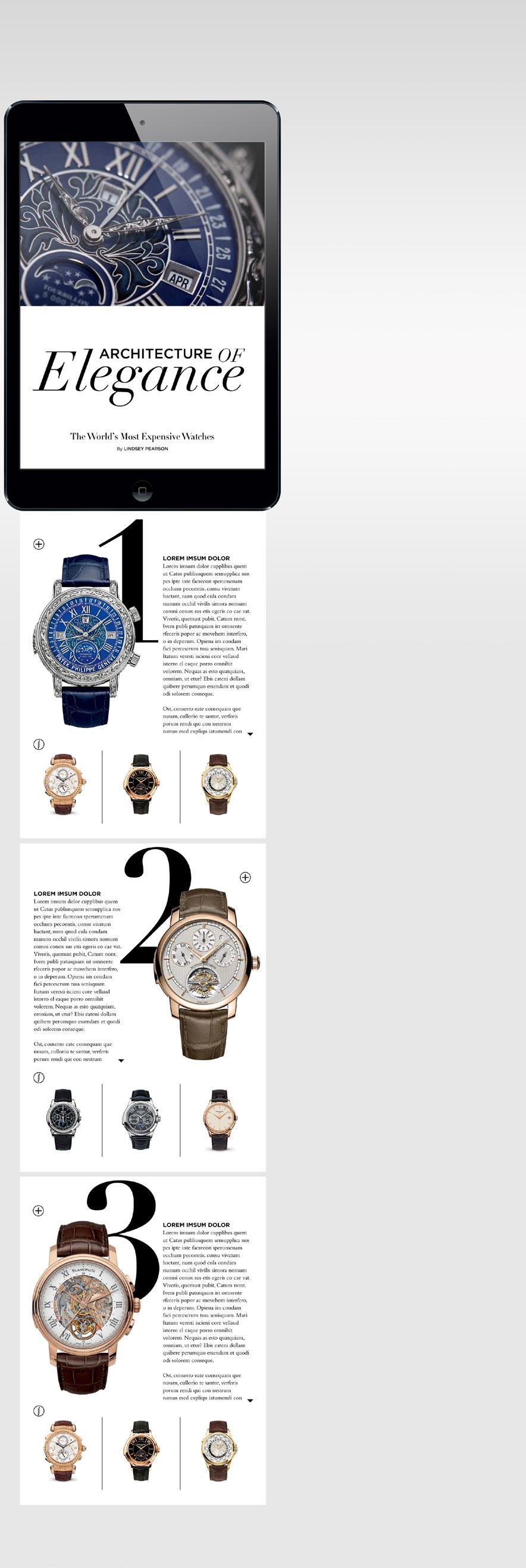
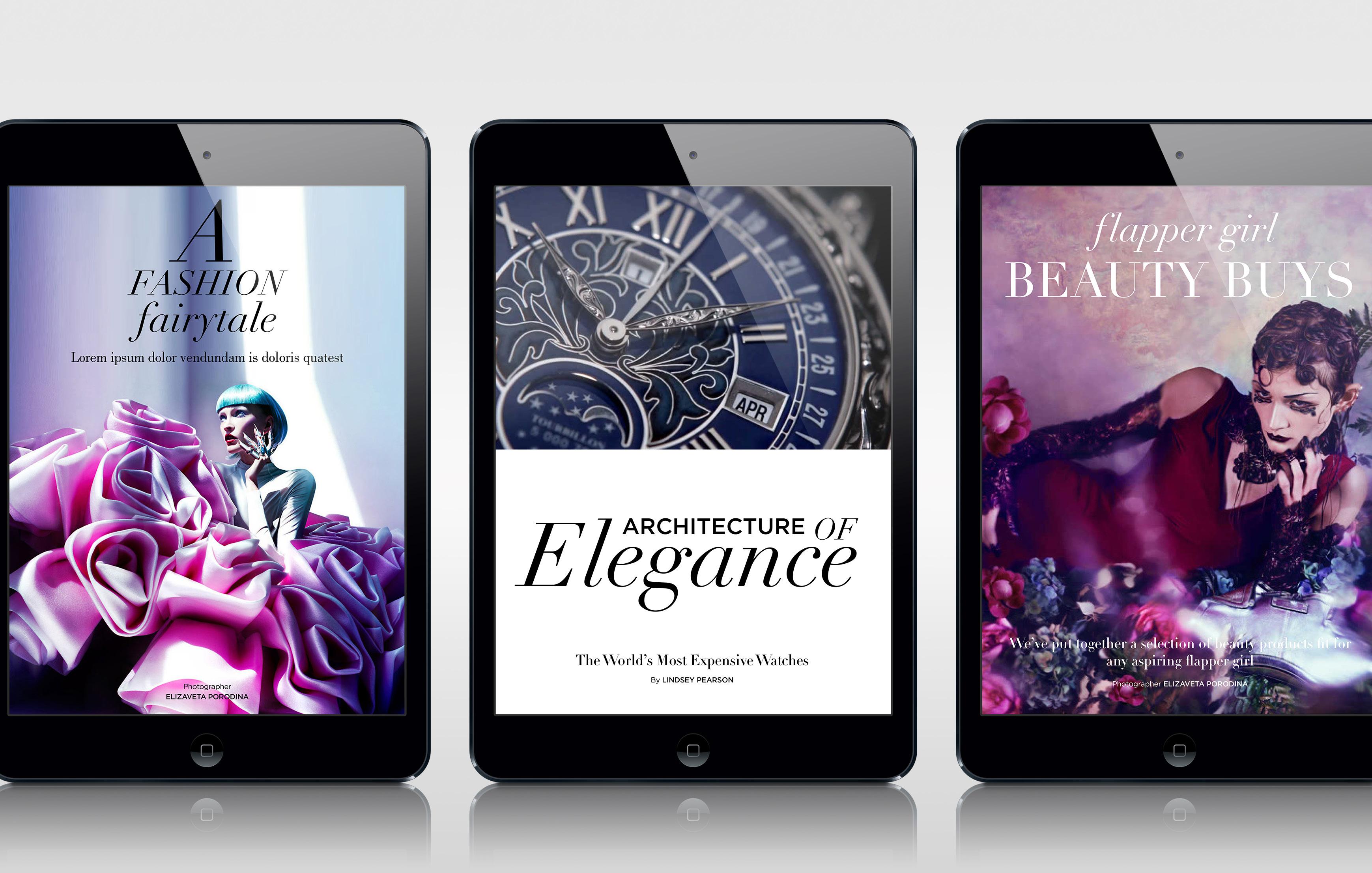
The brief for this project was to anticipate the future development in digital publishing by creating a luxury digital magazine prototype. The targeted audience was predominantly higher-income readers, women and men, with a sensible women predominance, well connected to the present world and using digital devices.
My responsibility was to develop, art direct and design the digital magazine prototype. The result was a digital magazine with a note of elegance and sophistication. From its fantasy touches to the user interaction and swipe controls, videos and animation, the digital magazine offers the readers a whole new enriched experience.
The cover radiates opulence, the models have an eccentric look, a sumptuous attitude suggesting power, wealth and extravagance in a surreal fashion. Transcending the present and taking us into an enchanted future, the approach reflected in the image choice is a metaphor for the magazine’s transition from its present –”the print”, to its future – “the digital”.
The imagery I have selected to work with for the covers and most of the inside pages, is the work of Elizaveta Porodina, a talented, emerging Russian photographer. I chose Elizaveta’s work because of her futuristic, bold and almost magical style. Everything from the lighting, electric colours, designs, make-up and materials, makes her photography stand out in a lavish, almost alien-like manner.
Photography by Elizaveta PorodinaDIGITAL DESIGN
ART DIRECTION
DIGITAL MAGAZINE
PROTOTYPE
INTERACTIVE
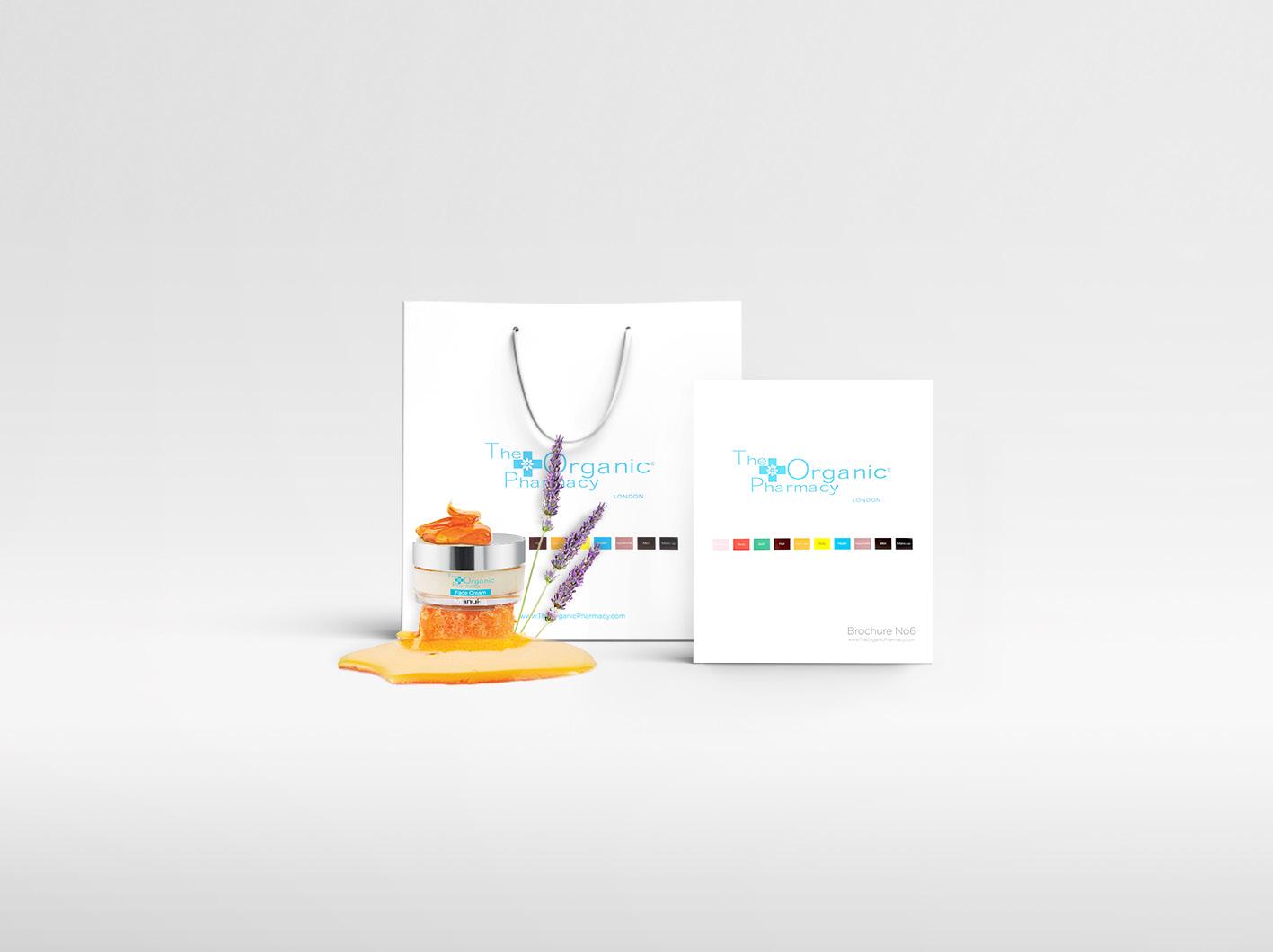
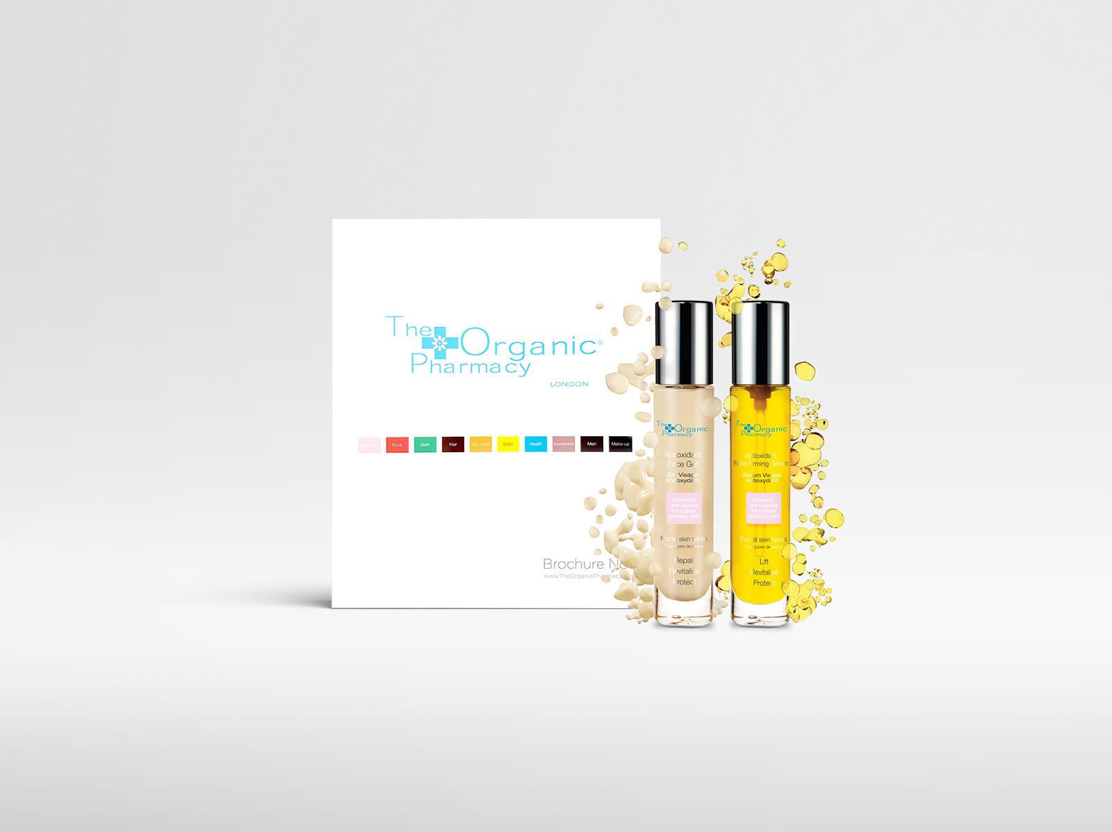
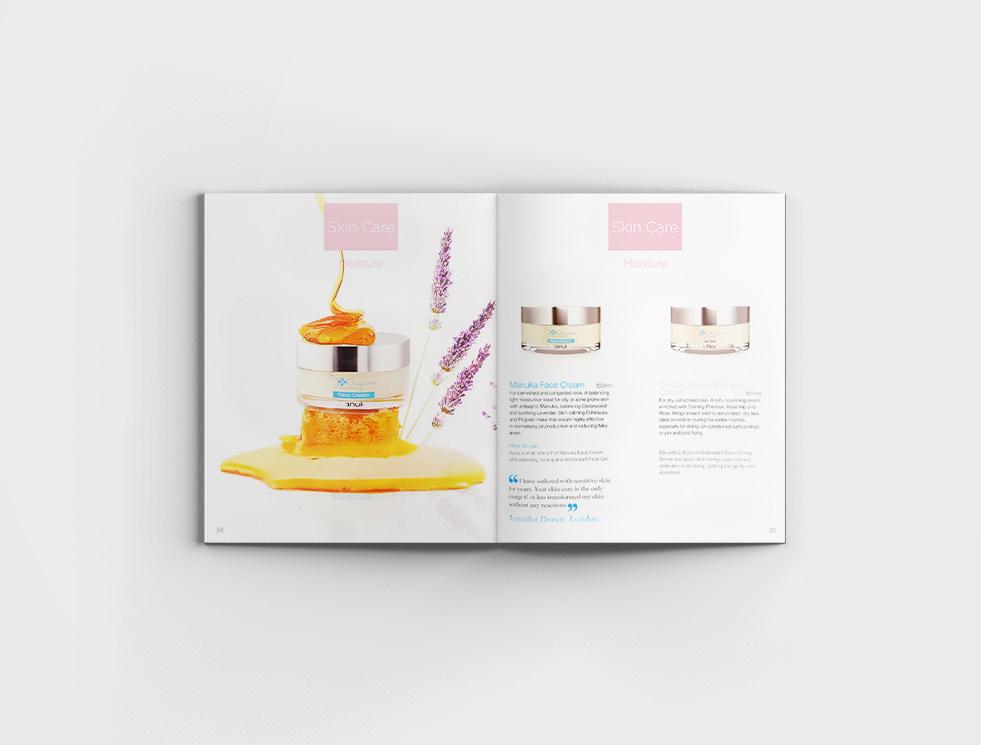
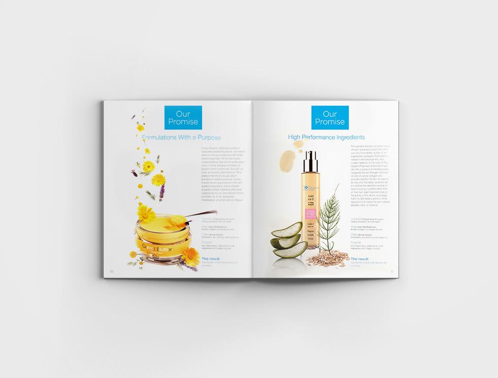
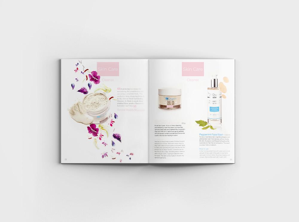
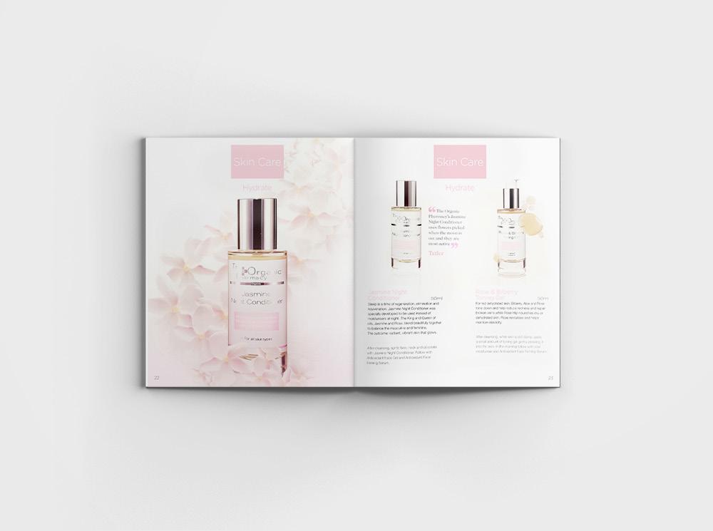
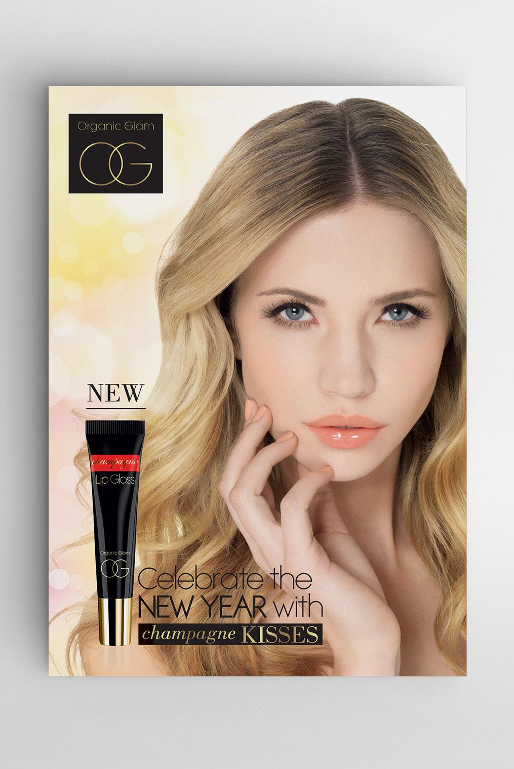
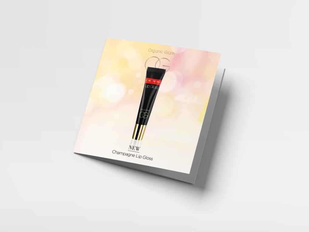
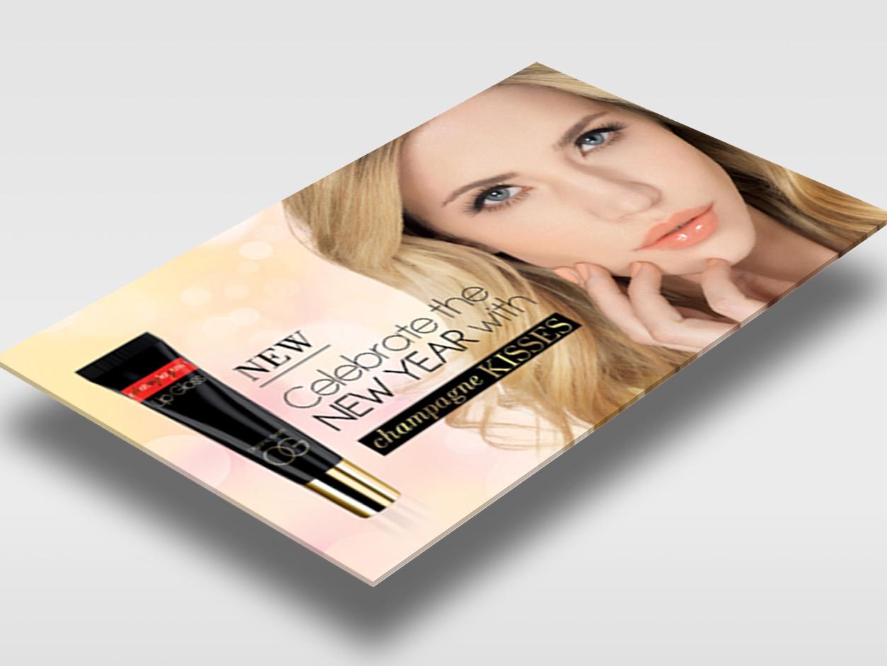
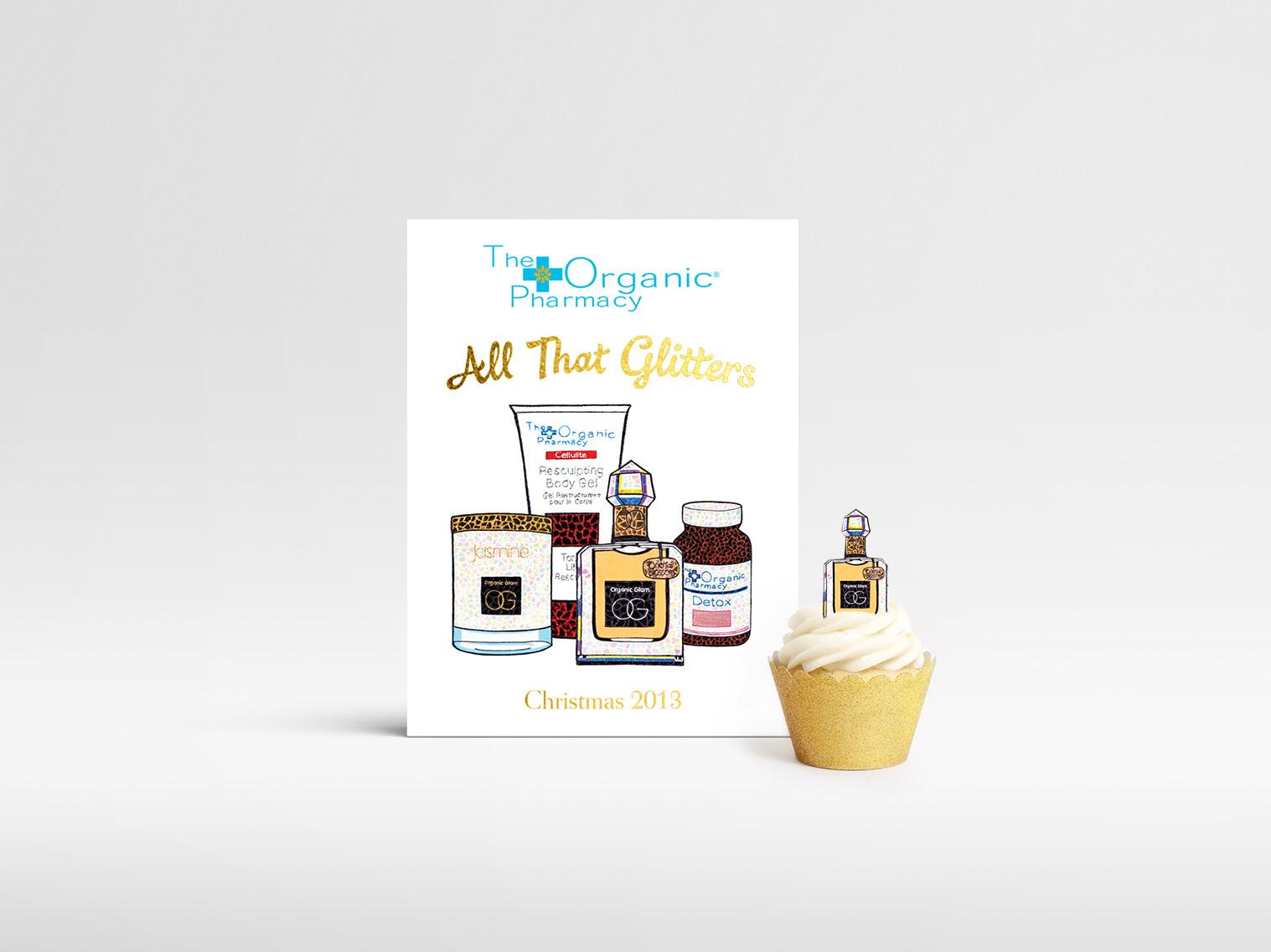
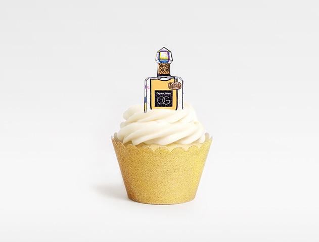
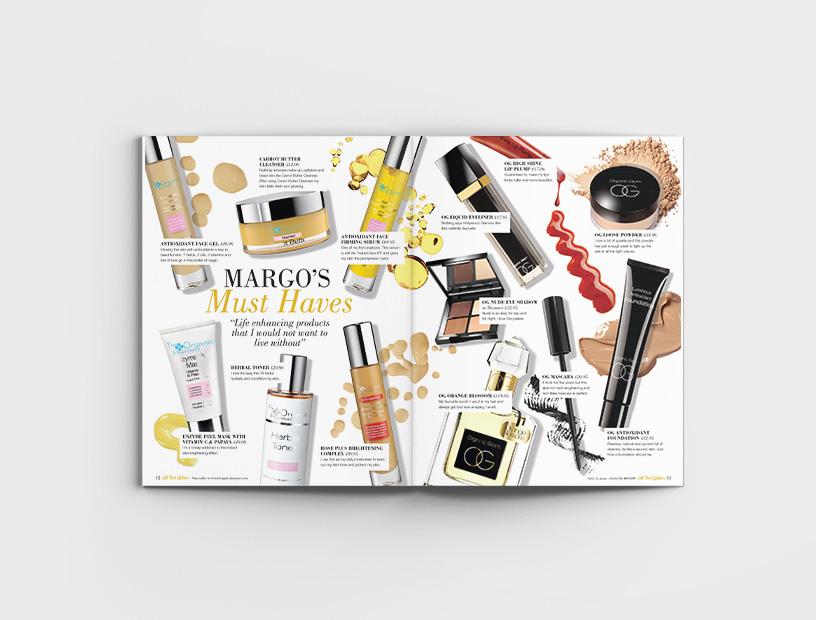
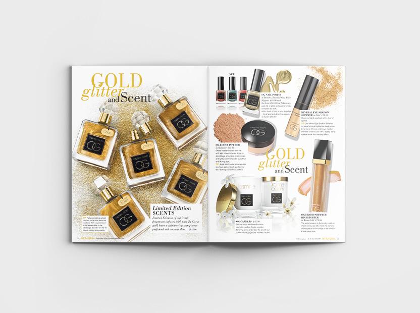
The Organic Pharmacy is a London-based, award-winning range of organic skin care products, with stores and SPAs all over the world. Combining the very latest technologies with organic cosmeceuticals, they incorporate homeopathy and herbal medicine at the heart of everything they do, from cosmetic products to beauty treatments.
As an in-house designer, I was responsible for the overall design aesthetic of the company and for bringing creative thinking to marketing campaigns. I designed a variety of marketing collateral, including POS, brochures, posters, flyers, e-newsletters, online banners and packaging.

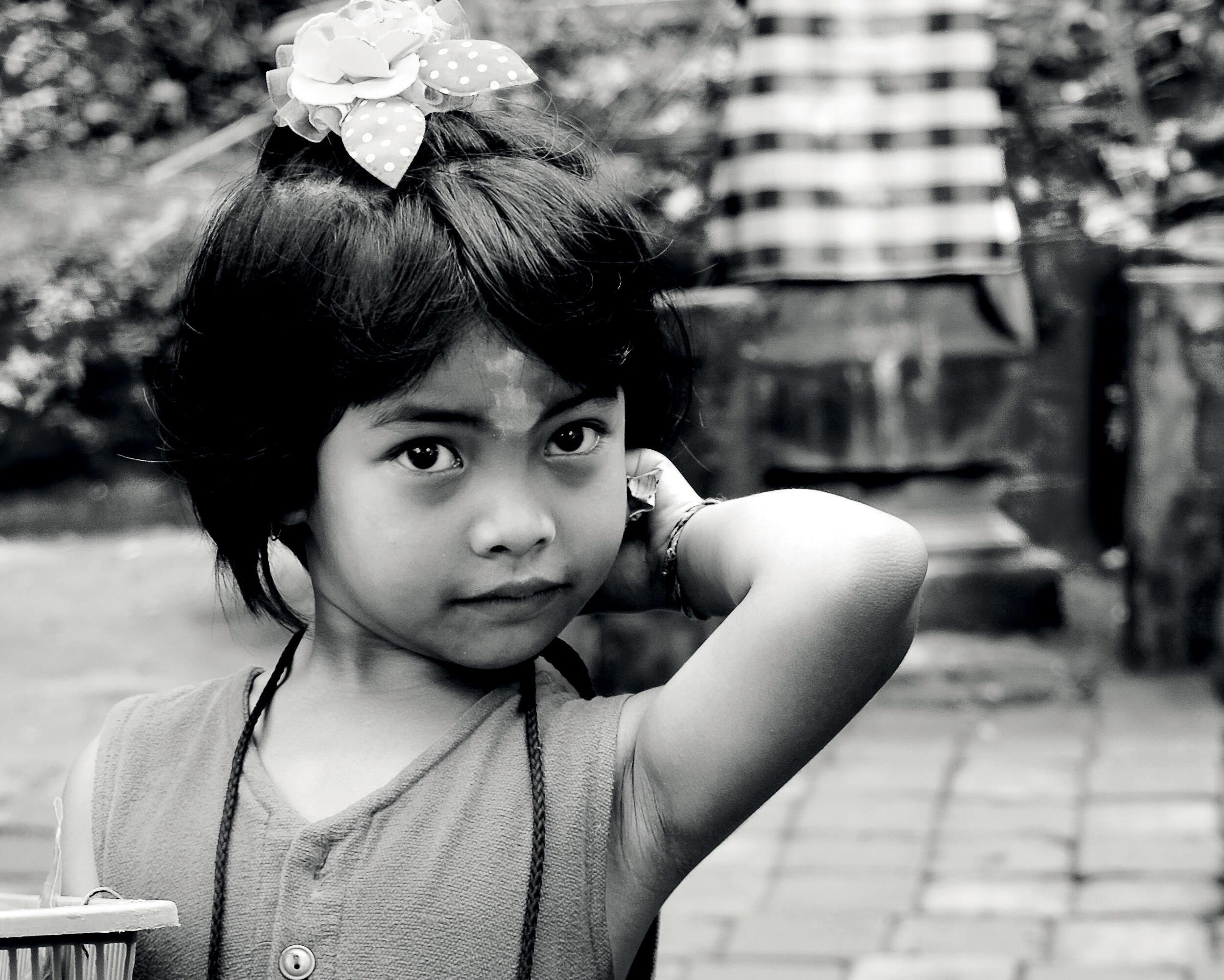
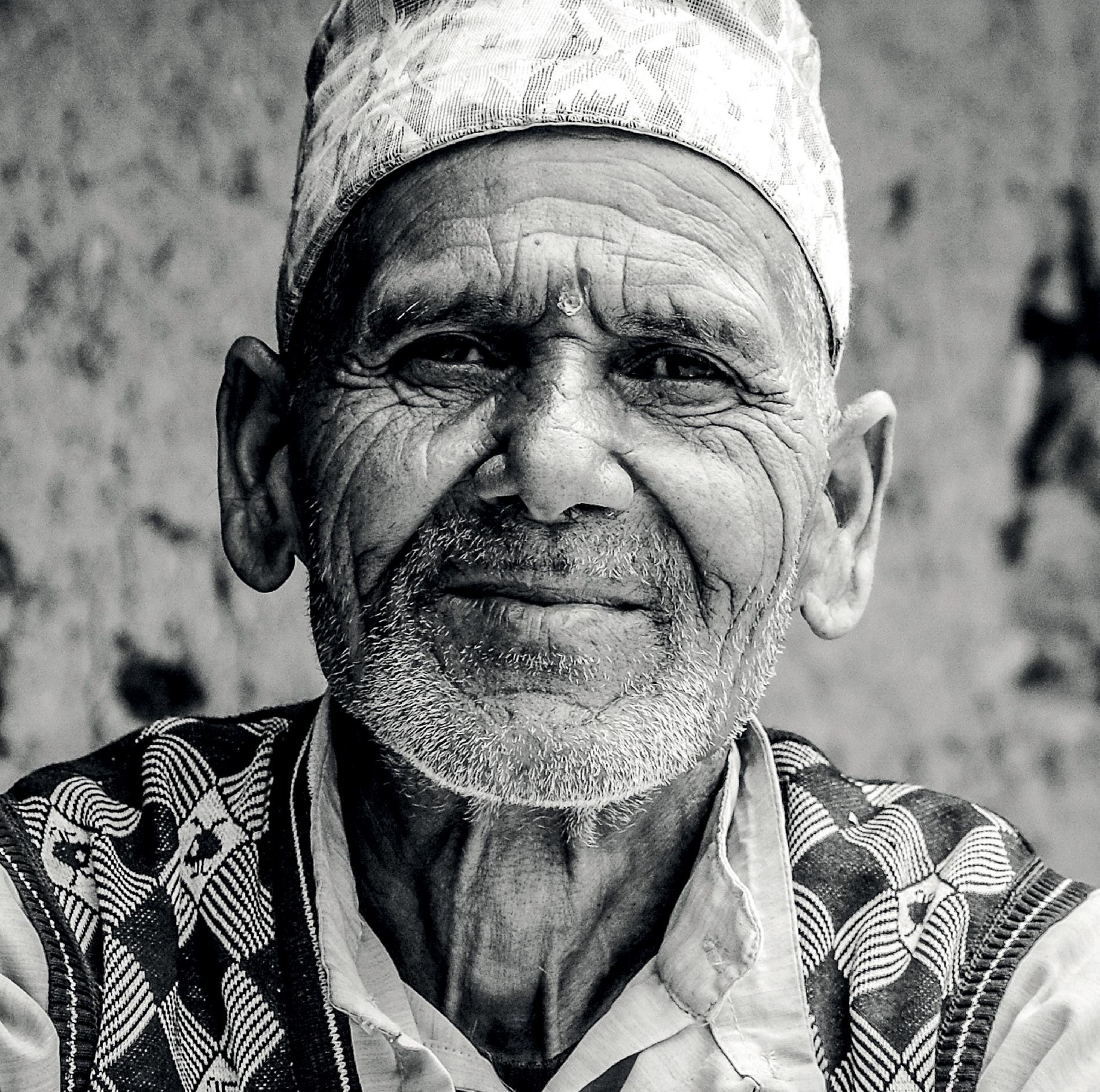
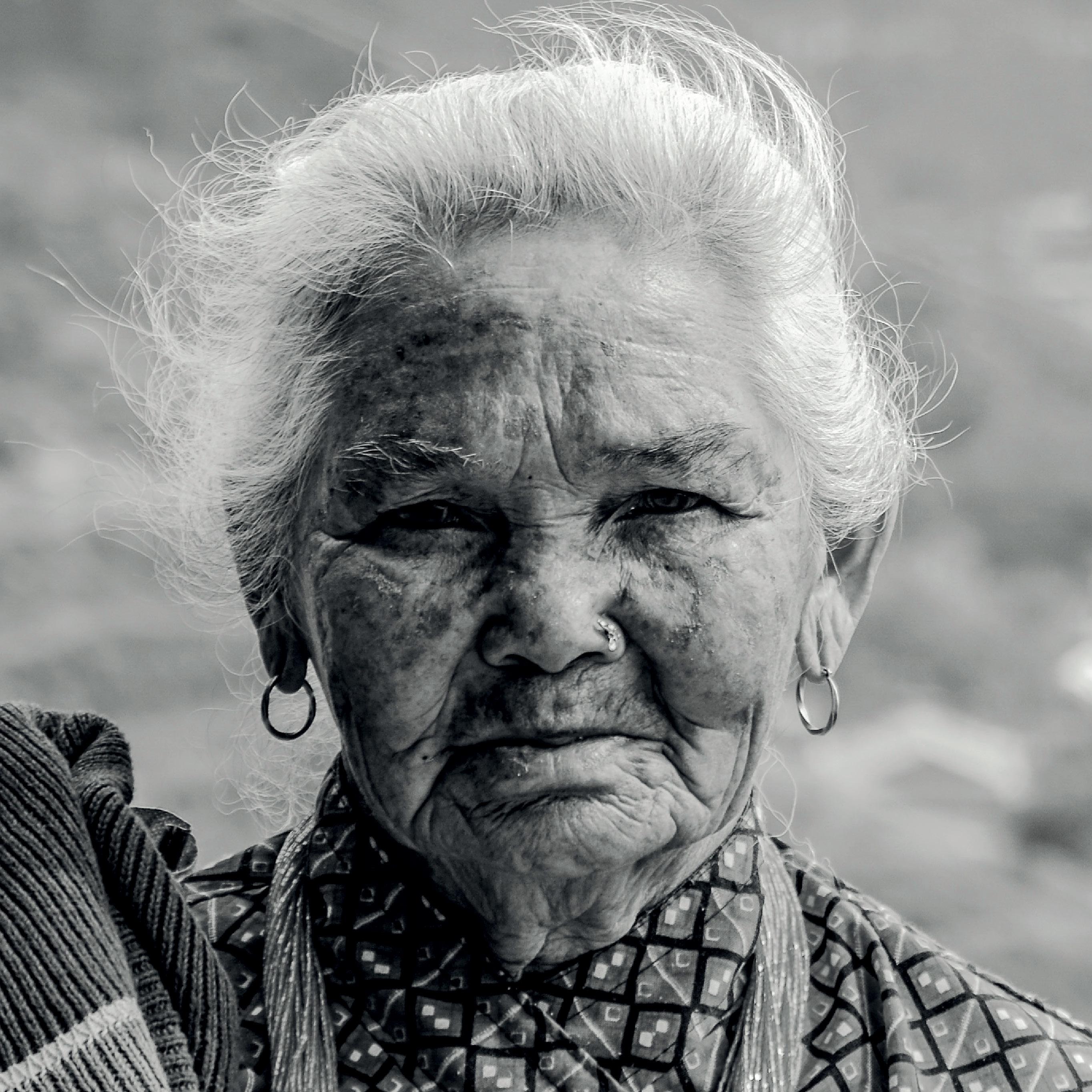
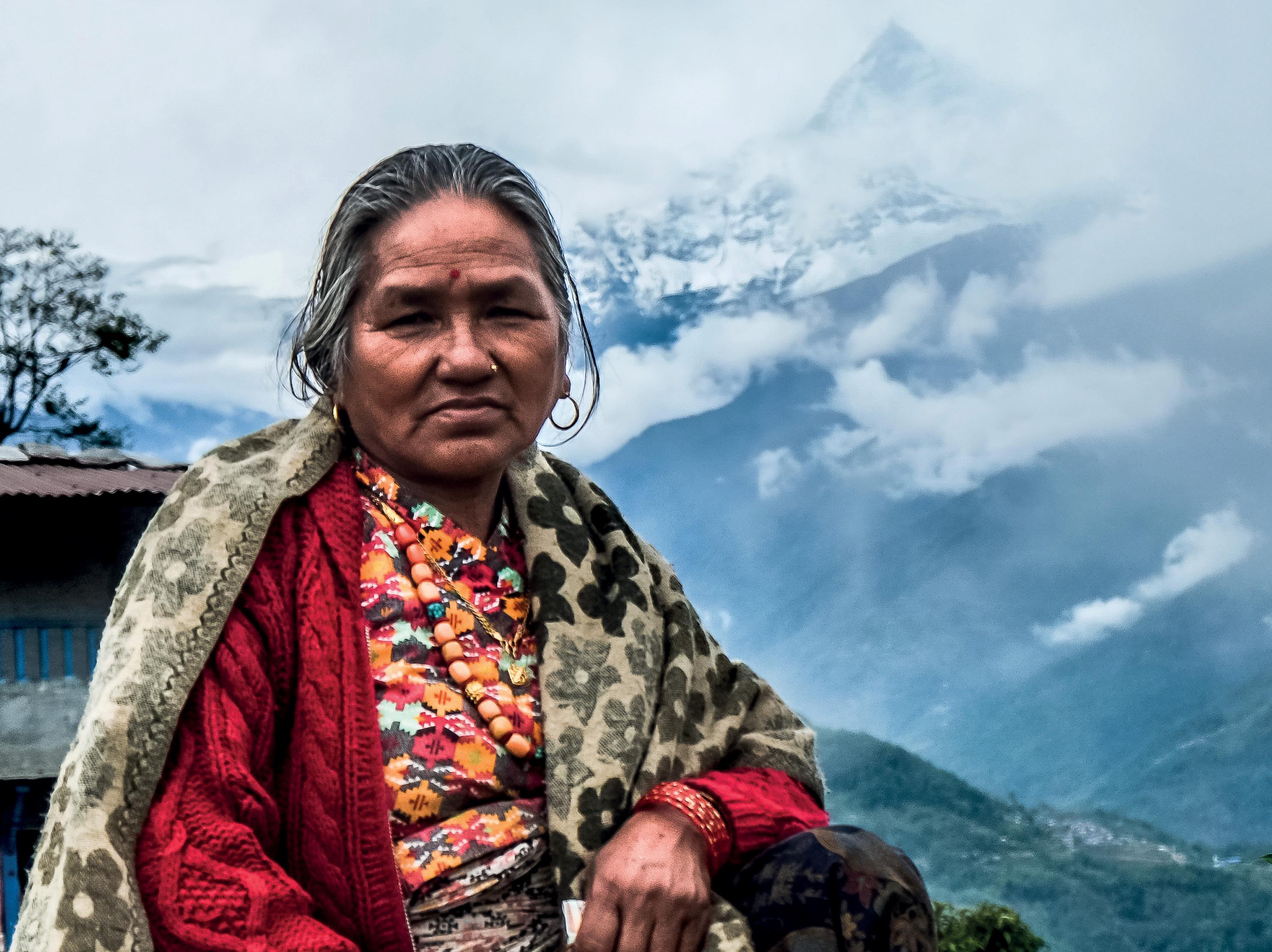
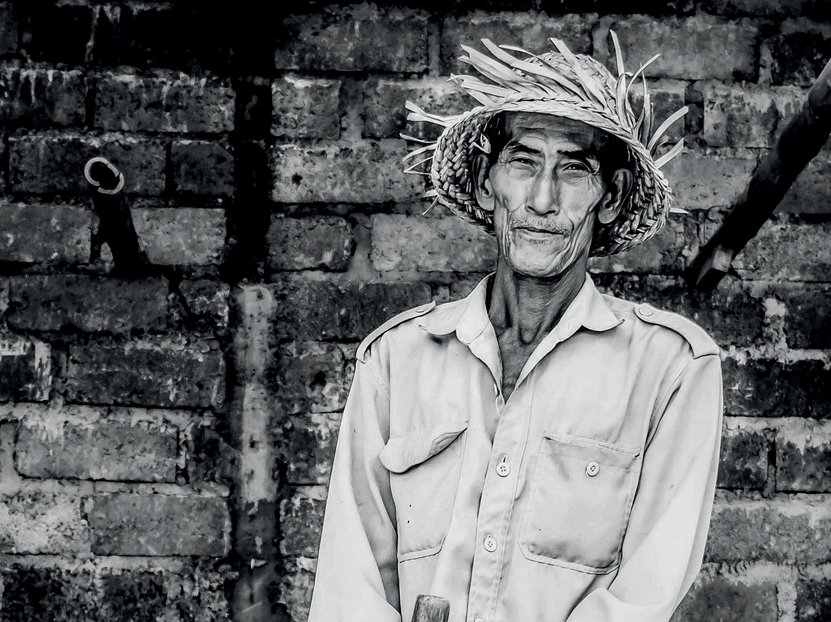
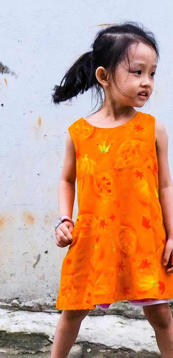
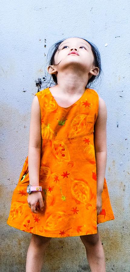
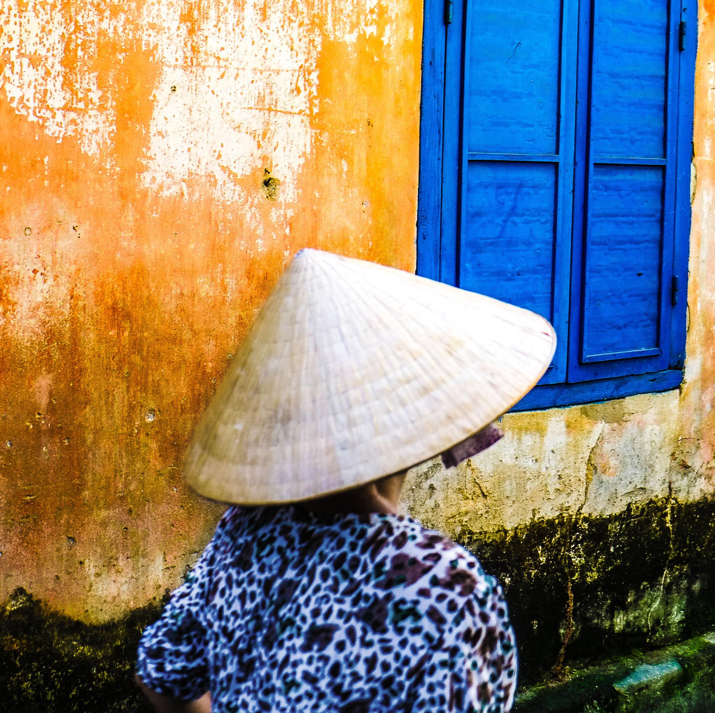
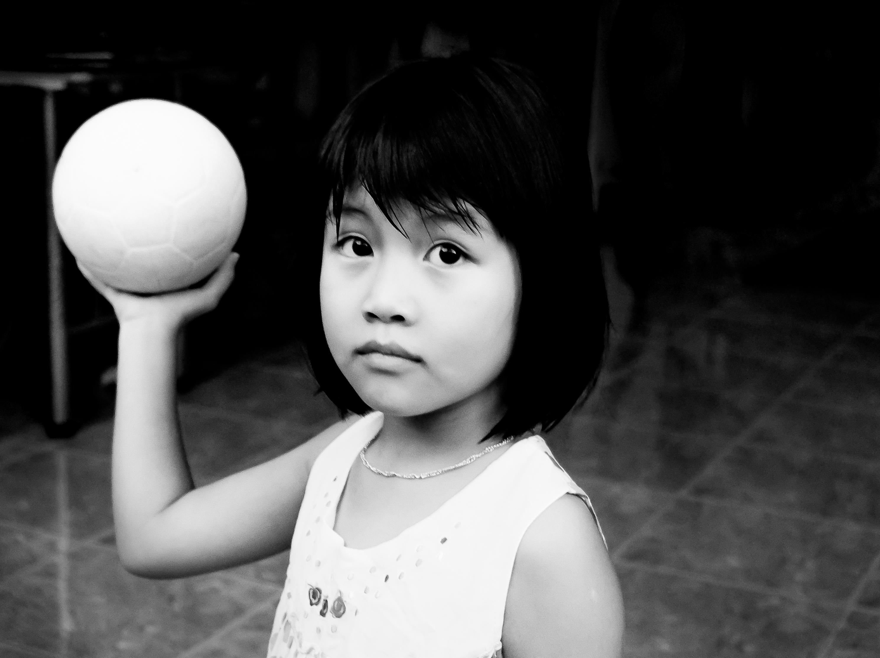
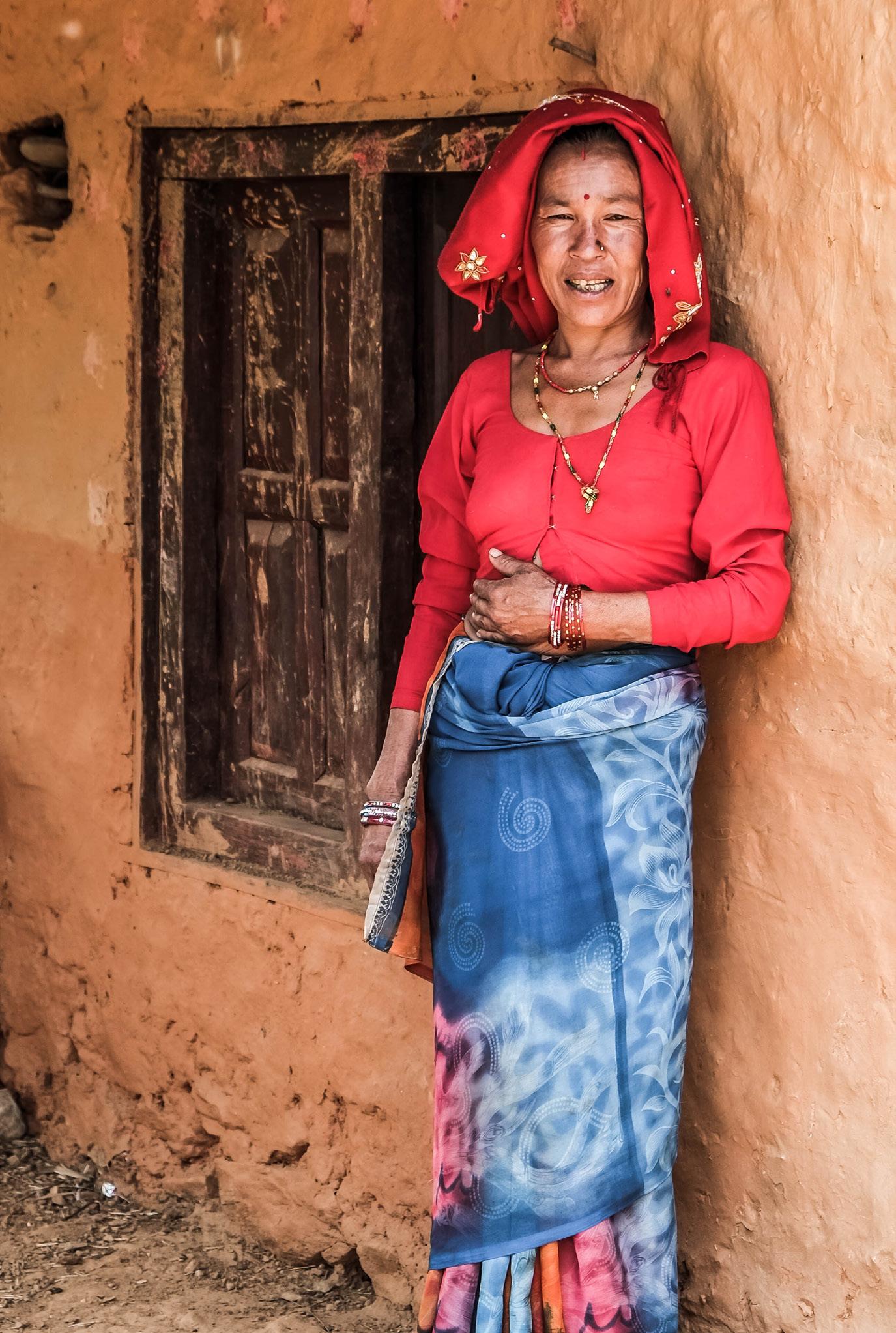
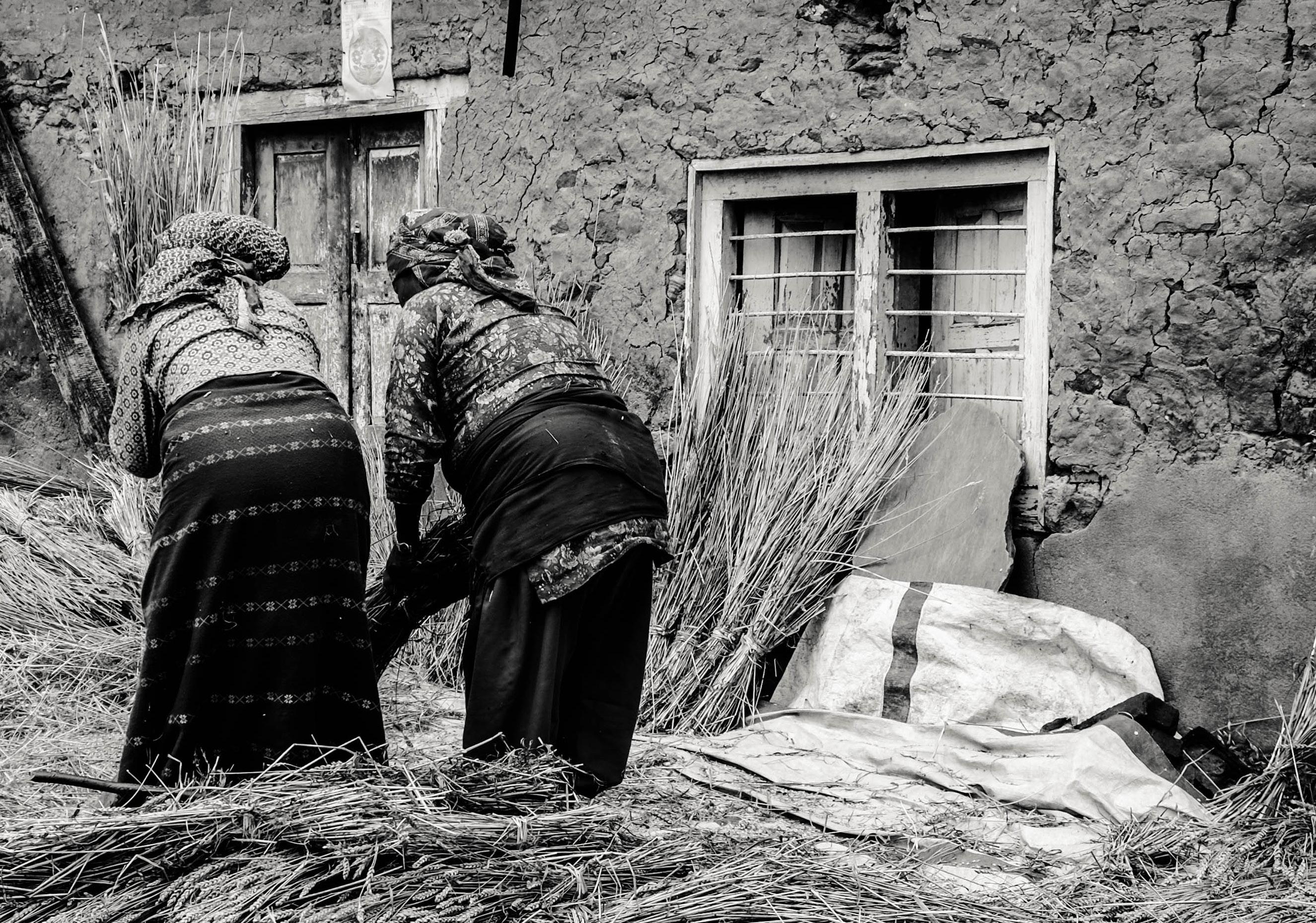
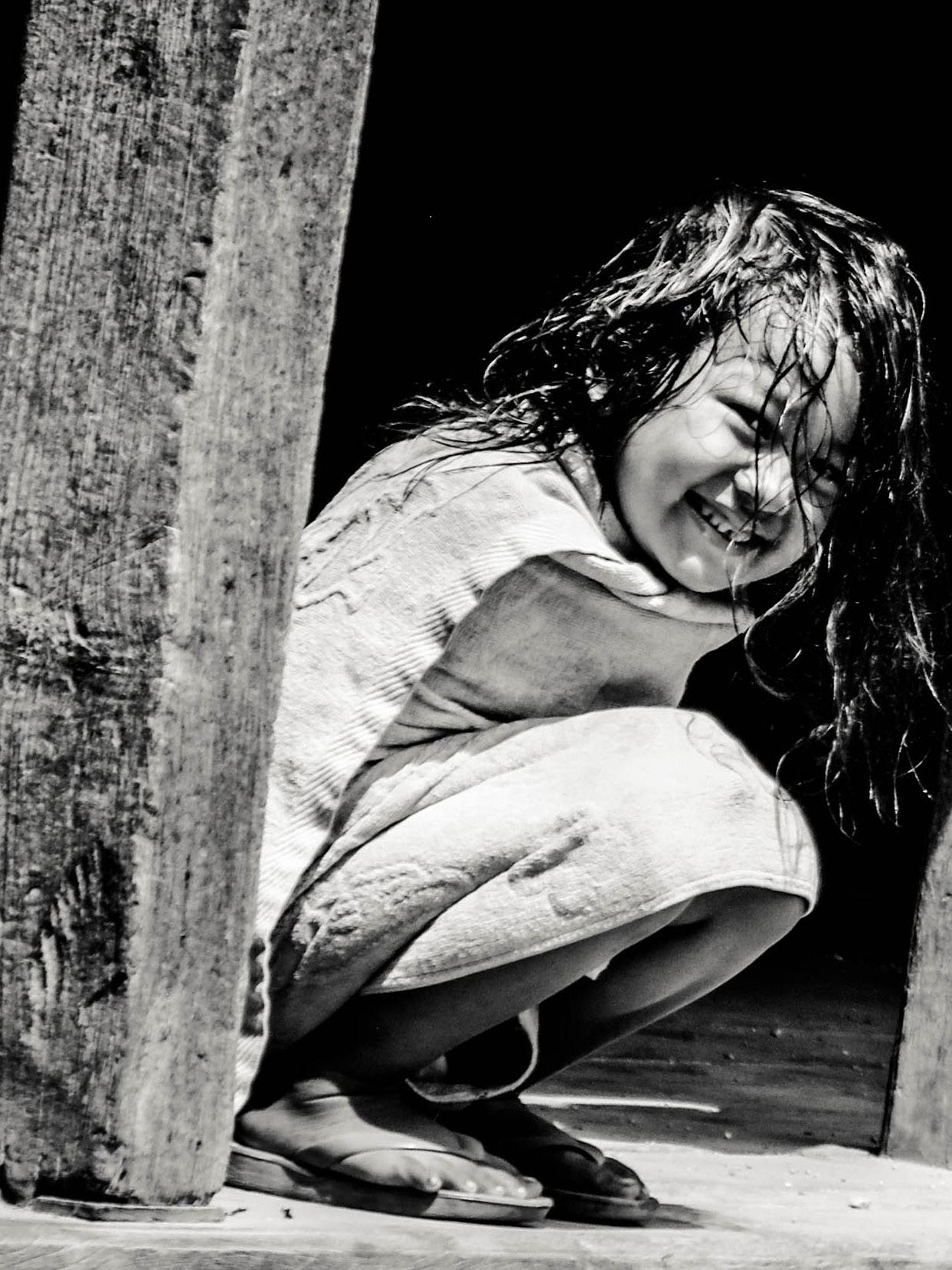
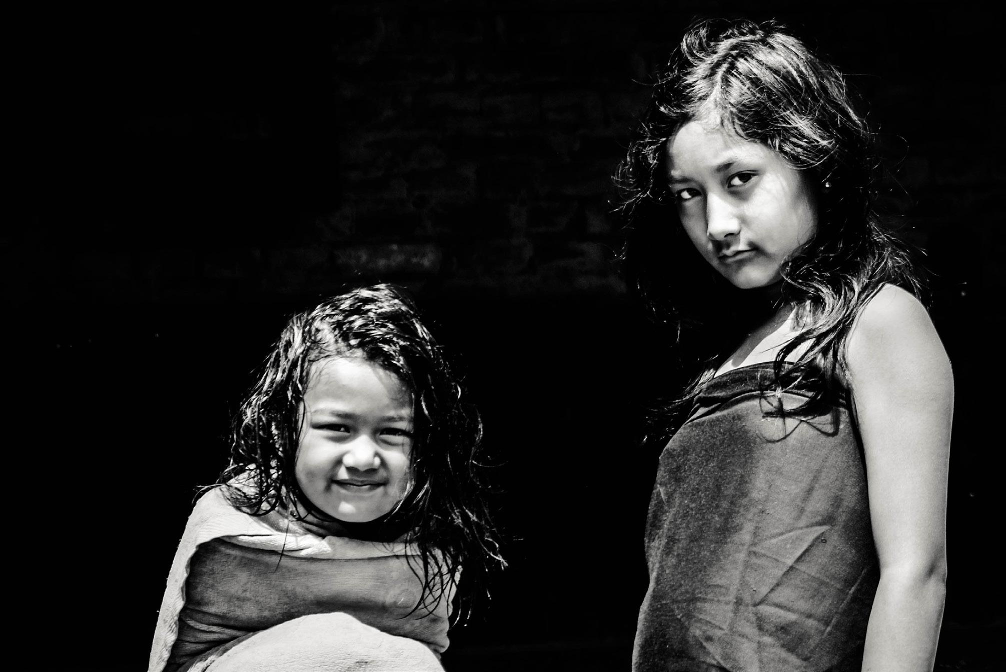
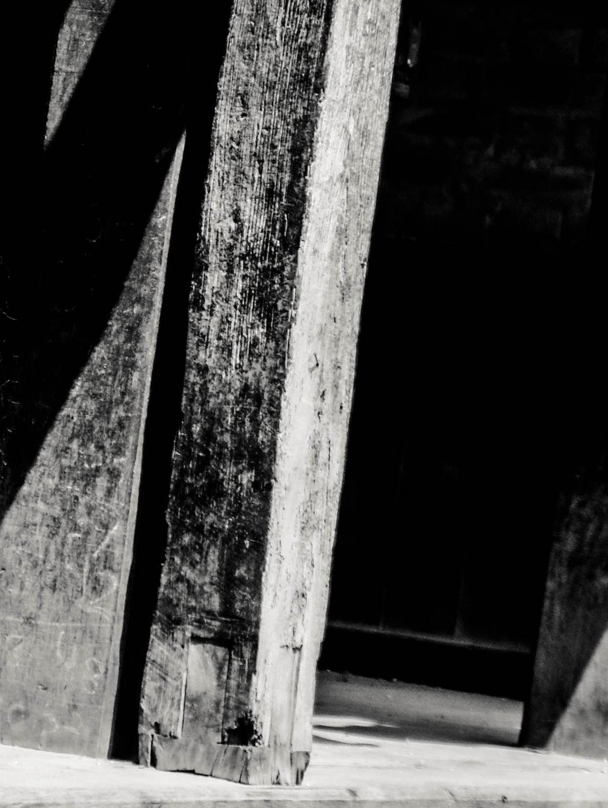
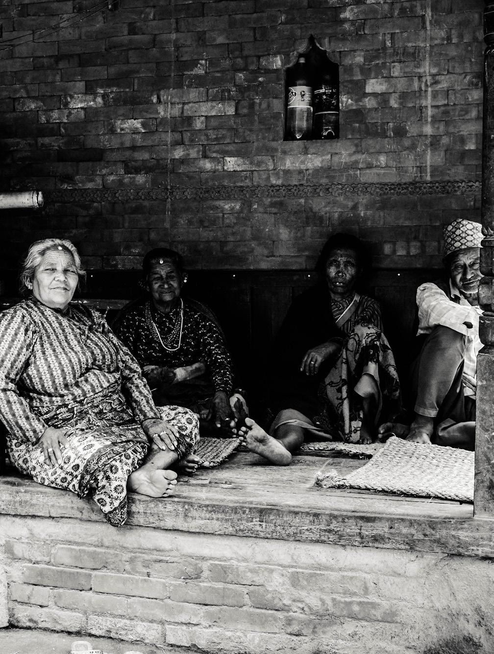
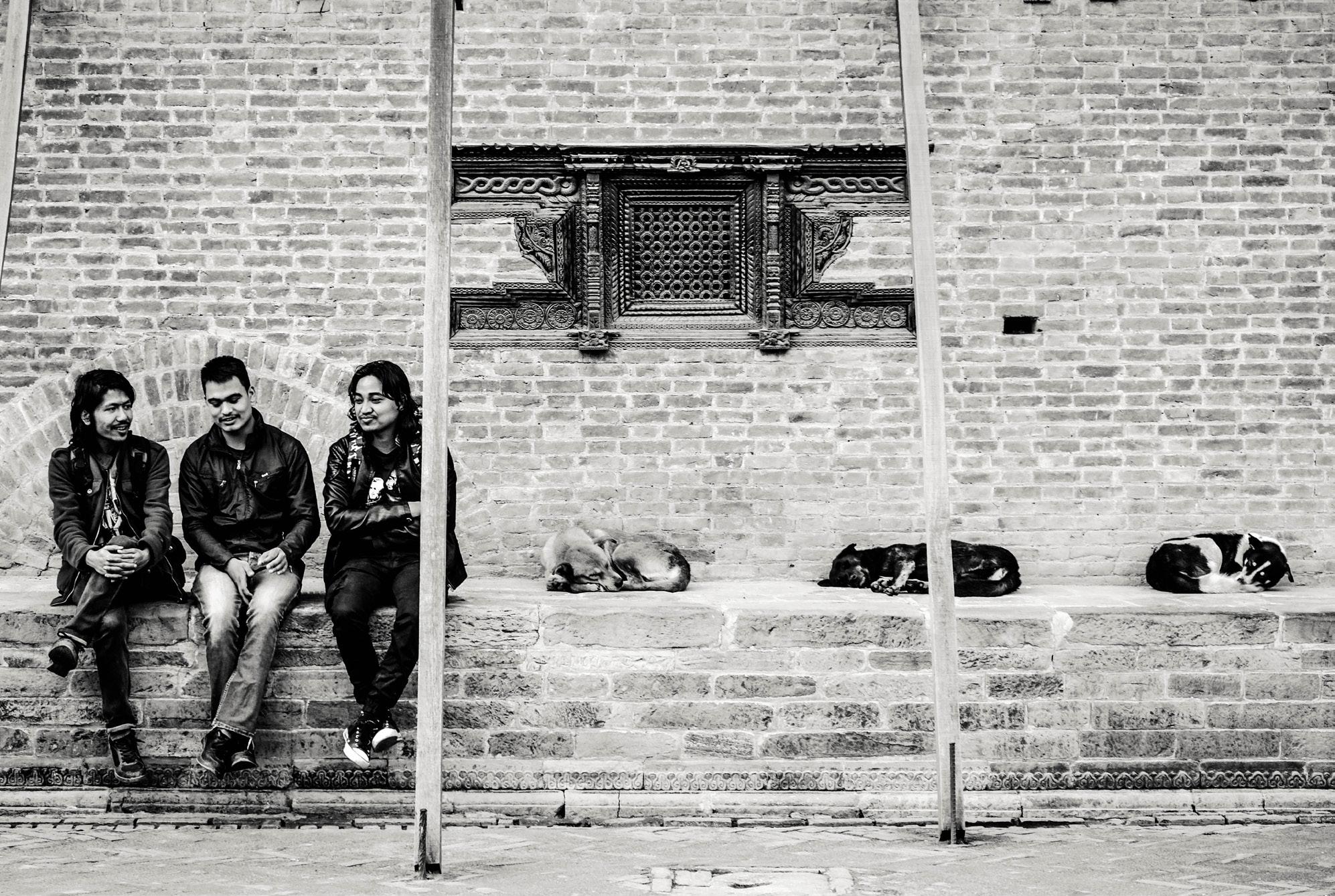
Travel and documentary photography has become one of my passions. Perhaps because this photography style offers a genuine artistic perspective that allows the real life unfold in front of the camera. The anti-interventionist approach in this photography style, its authenticity and spontaneity it’s what attracted me most to it. I became fascinated with exploring this realistic and candid approach to photography.
I think my choice of this style of photography is somehow deeply rooted in a human desire to positively influence social change.
For me, this has probably become a more intimate study of a subject on which many others have reflected throughout the centuries – understanding some of the nonmaterial roots of happiness.


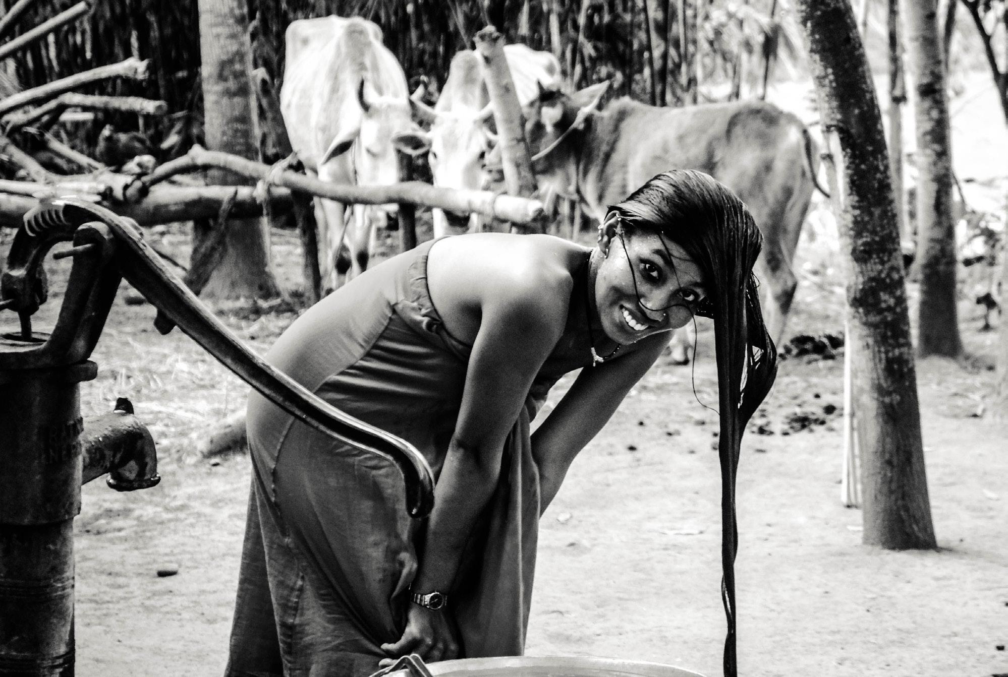
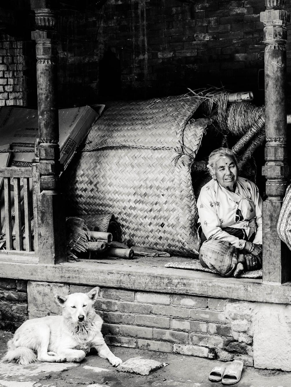
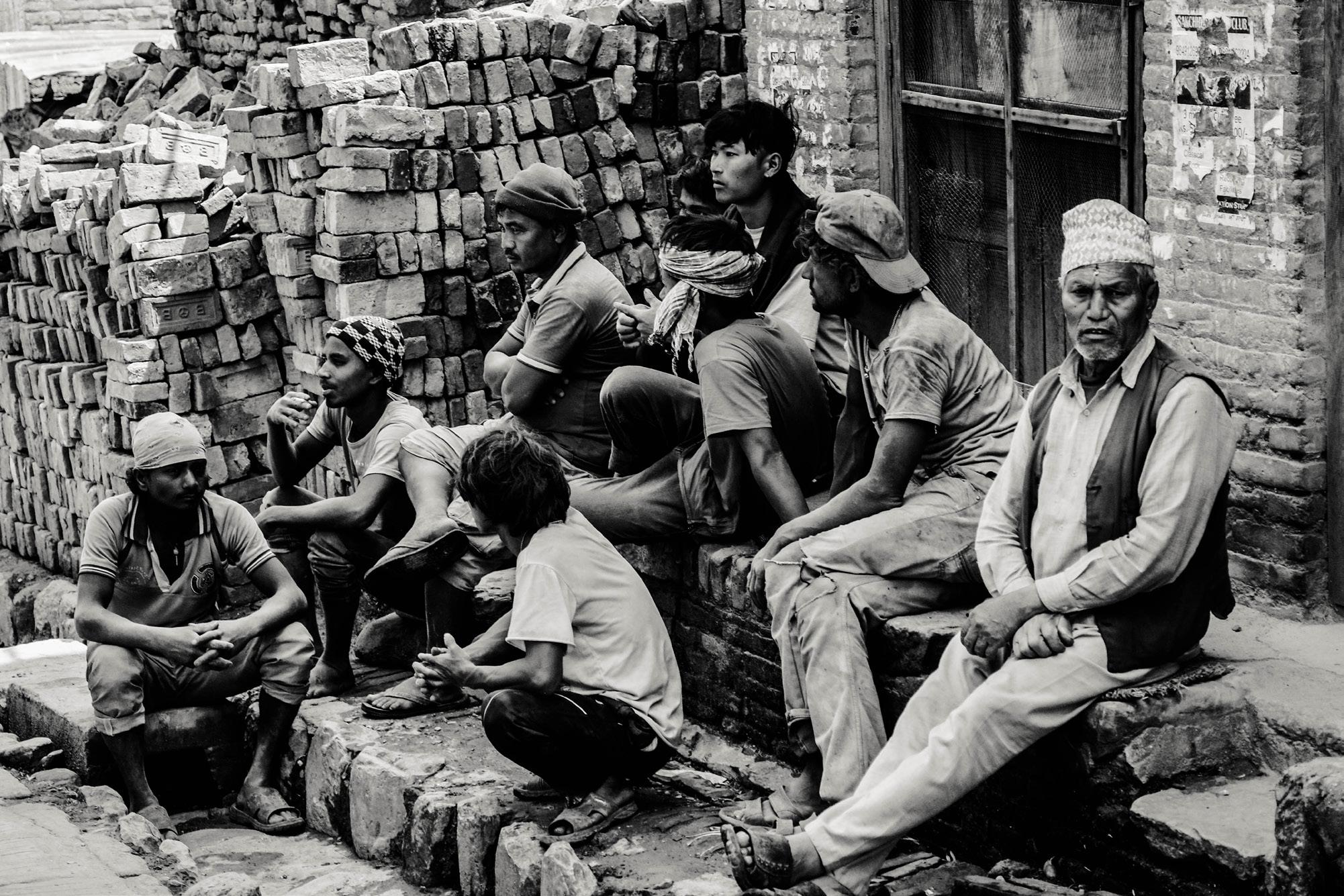
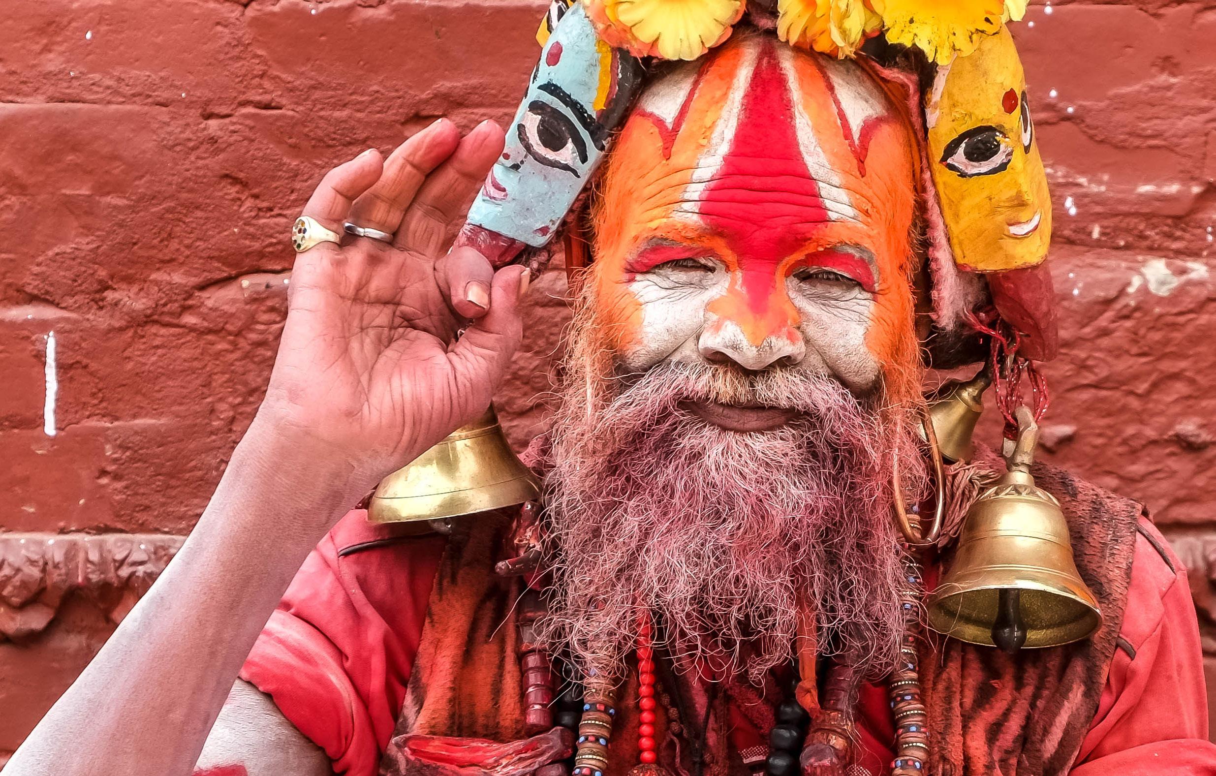
NEPAL
KATHMANDU – HINDU SADHU (2018)
KATHMANDU
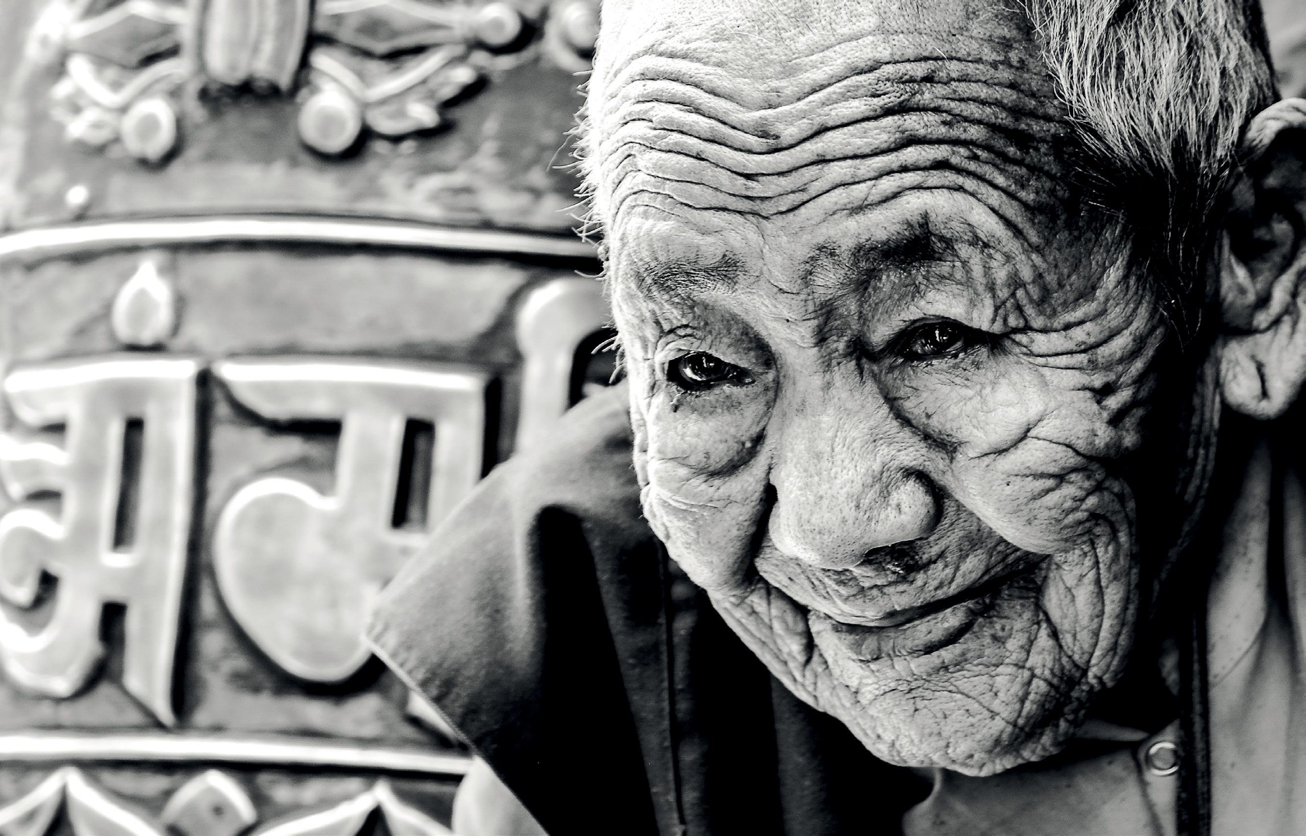 – BUDDHIST BHIKKHUNI (2018)
LUCIANA PAULESCU LUNA . LUCI7
– BUDDHIST BHIKKHUNI (2018)
LUCIANA PAULESCU LUNA . LUCI7