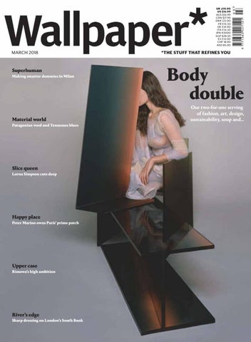
Wallpaper march 2018

Page 1

UK £10.00 US $16.99 AUS $16.99 CDN $17.99 DKK 125.00 FR €14.50 DE €14.90 ITA €14.50 JPN ¥2000 SGP $28.50 ES €14.00 CHF 18.90 AED 85.00

MARCH 2018

Superhuman Making smarter dummies in Milan

Material world Patagonian wool and Tennessee blues

Slice queen Lorna Simpson cuts deep

Happy place Peter Marino owns Paris’ prime patch

Upper case Rimowa’s high ambition

River’s edge Sharp dressing on London’s South Bank

*THE STUFF THAT REFINES YOU

Body double Our two-for-one serving of fashion, art, design, sustainability, soup and…

G R AC E A N D C H A R ACT E R


JosĂŠphine C ollection


Liens C ollection


MARCH 2018

*THE STUFF THAT REFINES YOU

…uncommon angles


calvinklein.com/205

Featuring artwork by Andy Warhol ©/®/™ The Andy Warhol Foundation for the Visual Arts, Inc.


Run by Sam Hecht+Kim Colin A collection of tables, benches and shelves. Made in America from responsibly sourced materials.

emeco.net

workchateatreadthinkwrite


D E S I G N PO R T R A I T.

Richard, seat system designed by Antonio Citterio. www.bebitalia.com B&B Italia Stores: London - Milano - Paris - MĂźnchen - New York - Washington DC - Los Angeles - San Francisco - Miami - Sao Paulo - Tokyo - Dubai


MARCH WE FIND SPIRITUAL AND SARTORIAL ENLIGHTENMENT AT THE GOETHEANUM IN DORNACH, SWITZERLAND, SEE PAGE 192 COAT, £5,050; SHIRT, £1,020; TROUSERS, £660; SHOES, £526, ALL BY JIL SANDER. EARRINGS, LEFT, €450 PER PAIR; RIGHT, €350 PER PAIR, BOTH BY ANNELISE MICHELSON

Style special Flights of fancy, daring debuts, material whirls and dapper digs

033


BAR REFAELI by Chen Man


T

H

E

A

R

T

O

F

F

U

Spirit of Big Bang Moonphase. Case in 18K King Gold set with 204 diamonds. Self-winding movement displaying big date and moon phases. White rubber strap.

S

I

O

BOUTIQUES LONDON Harrods Knightsbridge • Tel. 020 3214 1234 14A New Bond Street • OPENING SOON

N

hublot.com


LAWRENCE SEATING SYSTEM WWW.MINOTTI.COM

|

RODOLFO DORDONI DESIGN


MARCH ARTIST LORNA SIMPSON AT HER DAVID ADJAYEDESIGNED STUDIO IN BROOKLYN, SEE PAGE 104

FASHION

091 095 101 141 162 178 192 212

House swap Fashion design’s boldest transfers Smooth moves Enter the seamless shoe

ARCHITECTURE

108 118

The play maker Francesco Risso and his Marni marvels

137

Fashion maths From mop dresses to mirror balls

145

Moving parts A double take on transparency

Power house Neil Barrett on his new Milan base Block buster Why Place Vendôme is Peter Marino’s happy place Perfect shell A Bangkok jewellery showcase Different stripe Tony and Elham Salamé’s art-filled Beirut penthouse ART

Brute force London’s Hayward Gallery is back

099

Spirit level Lessons in volume at Switzerland’s vast Goetheanum

104

Lying low Furnishing our Zen den

134

Sky lines Art raises the roof for Fendi in Rome Storm force Lorna Simpson’s fire and ice After glow Post-Soviet photography shines brightly

041


MARCH FRONT OF BOOK

069 084

Newspaper Trends of the season, plant-based cuisine, a Japanese coffee kit and a horsey bag The Vinson View Picky Nicky, clean, green eating machine INTELLIGENCE

122 126

Fleece patrol To Patagonia in pursuit of the pioneers policing sustainable wool True blues The Tennessee indigo fields behind natural-dyed denim MARKETING

ONE OF THE MORE RELAXED MODELS BY MANNEQUIN MAKER LA ROSA, AT ITS FACTORY OUTSIDE MILAN, SEE PAGE 112

DESIGN

087 096 112 130

Little wonder Marco Zanini thinks small at Santoni Happy hour The Paris brand changing the face of watch design

044

156

High rolling Rimowa’s new CEO on smarter suitcases

Artist’s palate Kenzo Takada’s miso soup

WallpaperSTORE* Refined design delivered to your door Subscribers Since 1996… Where Margaret Howell keeps her Wallpaper* back catalogue RESOURCES

224

Body culture Thoroughly modern mannequins

FOOD

226

155

Stockists What you want and where to get it TRAVEL

150 153

Checking in Foster + Partners transforms a 1960s Hong Kong icon Departure info Tuck in in Turin and San Diego, sleep over in Guangdong and Copenhagen


KASHAN MONICA FÖRSTER


Wallpaper.com facebook.com/wallpapermagazine @wallpapermag Brand & Content Director Tony Chambers

@wallpapermag

Editorial Acting Editor Nick Compton Editor Sarah Douglas Executive Editor Bridget Downing Commissioning Editor TF Chan Editors-at-Large Jonathan Bell Leïla Latchin JJ Martin Emma O’Kelly Henrietta Thompson Suzanne Trocmé Quality Maniac-at-Large Nick Vinson Art Art Director Jessica Rose Senior Designer Anne-Laure Fuchs Junior Designers Ben Rimmer, Ryan Wooding Intern Ava Williams

Architecture / Design

Fashion

Wallpaper* Digital

Contributing Editors

Architecture Editor Ellie Stathaki

Fashion Director Isabelle Kountoure

Digital Director Anthony Thornton

Design Albert Hill

Design Editor Rosa Bertoli

Fashion Editor Jason Hughes

Digital Editor Bethan Ryder

Digital Nicolas Roope, Marc Kremers

Architecture Assistant Harriet Thorpe

Junior Fashion Editor Lune Kuipers

Digital Associate Editor Jessica Klingelfuss

Media Stephen Armstrong

Interiors / Entertaining

Watches & Jewellery Director Caragh McKay

Online Design Editor Sujata Burman

Typography Paul Barnes

Interiors Director Amy Heffernan

Online Fashion & Jewellery Editor Laura Hawkins

Audience Development Manager Stevie Keen

International Editors

Interiors Producer Carly Gray

Bookings Editor Leila Hartley

Senior Digital Designer Fraser Clark

US Editor Michael Reynolds

Entertaining Director Melina Keays

Fashion Coordinator Rosanna Bruce

Digital Writer Elly Parsons

New York Editor Pei-Ru Keh

Interiors Stylists Maria Sobrino, Matthew Morris

Watches & Jewellery Assistant Aylin Bayhan

Intern Luke Halls

Japan Editor Jens H Jensen

Interiors Coordinator Olly Mason

Interns Katie Meston, Nicholas Hayden

Group Digital Production

China Editor Yoko Choy

Interns Harvey Waller, Lenny Vogelzang

Beauty / Lifestyle

Product Manager Leonard Burns

Brazil Editor-at-Large Scott Mitchem

Travel

Beauty & Lifestyle Director Emma Moore

Production Manager Daniel Short

Germany Editor-at-Large Sophie Lovell

Travel Editor Lauren Ho

Interns Harriet Lloyd-Smith Sotirios Varsamis

Photography

Production

Photography Director Holly Hay

Production Editor Anne Soward

Deputy Photography Director Alex Milnes

Sub Editor Léa Teuscher

PA to Tony Chambers and Sarah Douglas Ema Janáčková

Mexico & Central America Editor Pablo León de la Barra Buenos Aires Editor Mariana Rapoport

Editorial Business Coordinator Tim Royall

Middle East Editor Warren Singh-Bartlett

Handmade Coordinator Markos Ioannides

Singapore Editor Daven Wu

Intern Lynsie Roberts

Publishing & Marketing Publisher Malcolm Young Business Director Kelly Gray Head of Events & Exhibitions Caroline Sampson Publishing Assistant Sara Esteves Tel: 44.20 3148 7724 Advertising Advertising Director Dave Harvey Tel: 44.20 3148 7722 Advertising Business Manager Amanda Asigno Production Controller Nick Percival Global Partnerships Global Partnerships Director Sarah Martin Tel: 44.20 3148 7703

Wallpaper* Digital

Advertising Offices

Digital Advertising Director Scott Lambert Tel: 44.20 3148 7726

USA Advertising Manager (Northeast) Ilaria Anghinoni Tel: 1.646 389 5554

Digital Advertising Manager Roya Farrokhian Tel: 44.20 3148 7725 Digital Project Manager Ella Levy Tel: 44.20 3148 7751 Wallpaper* Bespoke Bespoke Director Matthew Johnston Tel: 44.20 3148 7704

Advertising Manager (West Coast) Kiliaen Murphy Tel: 1.310 467 4577 ITALY Advertising Manager Paolo Cesana Fashion Executive Cristiana Catizone

Bespoke Editor Simon Mills

Design Executive Marcella Biggi

Bespoke Art Director Aneel Kalsi

Commercial Executive Paolo Mongeri Tel: 39.02 844 0441

Bespoke Producer Minna Vauhkonen Tel: 44.20 3148 7763 Bespoke & Fashion Account Manager Lloyd Lindo Tel: 44.20 3148 7786

GERMANY, AUSTRIA AND SWITZERLAND Advertising Manager Peter Wolfram Tel: 49.89 9611 6800

World Headquarters

Subscriptions

161 Marsh Wall London E14 9AP United Kingdom Tel: 44.20 3148 5000 Email: contact@wallpaper.com

Tel: 0330 333 1113 (UK) Tel: 44.330 333 1113 (overseas) Order online at Wallpaper.com

Circulation / Subscriptions CHINA Advertising Manager Maggie Li Tel: 86.10 6952 1122 FRANCE Advertising Manager Magali Riboud Tel: 33.1 42 56 33 36 HONG KONG, TAIWAN, AND KOREA Advertising Manager Herb Moskowitz Tel: 852.2838 8702 INDIA Advertising Manager Ravi Lalwani Tel: 91.22 4220 2118 THAILAND Advertising Manager Christopher Stephen Marsh Tel: 66.2 204 2699

Senior International Circulation Manager Alice Stilwell International Business Development Manager Laura Gordon Finance Management Accountant Aristotle Liu Corporate Group Managing Director Andrea Davies Corporate Public Relations Victoria Higham Production Manager John Botten Sales Director – Content Licensing & Brand Partnerships Efi Mandrides

Wallpaper*, ISSN 1364-4475, is published monthly, 12 times a year, by The Wallpaper* Group, a division of Time Inc. (UK) Ltd. © 2018 WaIIpaper* Time Inc. (UK) Ltd, 161 Marsh Wall, London E14 9AP, UK. The US annual subscription price is $190. Airfreight and mailing in the US by agent named Worldnet Shipping Inc., 156-15, 146th Avenue, 2nd Floor, Jamaica, NY 11434, USA. Periodicals postage paid at Jamaica NY 11431. US Postmaster: Send address changes to Wallpaper*, Worldnet Shipping Inc., 156-15, 146th Avenue, 2nd Floor, Jamaica, NY 11434, USA. Subscription records are maintained at WaIIpaper* Time Inc. (UK) Ltd, 161 Marsh Wall, London E14 9AP, UK. Air Business Ltd is acting as our mailing agent. Other subscriptions rates for Wallpaper* for one year (12 issues), UK £120, Europe €200, and rest of the world £210. For enquiries, contact help@magazinesdirect.com; alternatively, from the UK call: 0330 333 1113, overseas call: 44.330 333 1113 (lines open Monday- Friday GMT, 8:30am-5.30pm ex. Bank Holidays). Reproduction in whole or in part without written permission is strictly prohibited. All prices and credits are accurate at time of going to press but are subject to change. Manuscripts, photos, drawings and other materials submitted must be accompanied by a stamped, self-addressed envelope. Wallpaper* cannot be held responsible for any unsolicited material. Repro by Rhapsody. Text printed by Wyndeham Southernprint, cover printed by Wyndeham Grange.


OVERSEAS A N I N V I TAT I O N T O T R AV E L

OVERSEAS SMALL MODEL


41851 DAVID TELA LIGHT-TC FIELD JACKET IN A LIGHTWEIGHT TELA MADE WITH JAPANESE STAR-SHAPED CROSS-SECTION POLYESTER/POLYAMIDE YARNS, WHICH IS ASSEMBLED AND THEN DYED UNDER PRESSURE AT 130°C, WITH THE ADDITION OF AN ANTI-DROP AGENT. DURING THE GARMENT DYE PROCESS, THE HEAT RADICALLY TRANSFORMS THE MATERIAL HAND AND STRUCTURE. FASTENED WITH HIDDEN DOUBLE SLIDER ZIP AND HIDDEN SNAPS APPLIED ON TAPE IN THE FLAP.

WWW.STONEISLAND.CO.UK


44999 GARMENT DYED PLATED REFLECTIVE WITH NY JERSEY-R ANORAK MADE IN TWO EXCLUSIVE, STONE ISLAND ENGINEERED FABRICS; NYLON TELA BASE ENGINEERED TO BE GARMENT DYE, PLATED WITH A WATER AND WIND RESISTANT HIGHLY REFLECTIVE RESIN SUBSTANCE CONTAINING THOUSANDS OF GLASS MICROSPHERES. AND A DOUBLE LAYER OF NYLON JERSEY WITH AN INNER PERFORMANCE MEMBRANE. THE FINISHED GARMENT IS DYED WITH SPECIAL DYE RECIPES THAT COLOUR ALL THE FABRIC PARTS WHILE RESPECTING THE REFLECTIVE SURFACE. THE ADDITION OF A SPECIAL AGENT TO THE DYE RECIPE MAKES THE GARMENT ANTI-DROP. THE UPPER PART OF THE GARMENT IN NY JERSEY-R. DIAGONAL ZIP MAKES IT EASY TO WEAR.

FLAGSHIP STORE: 79 BREWER STREET_LONDON_W1F 9ZN


/VTL H[ SHZ[

30-,:;,,3 :6-( KLZPNU I` (U[VUPV *P[[LYPV -3,?-694 ^^^ MSL_MVYT P[


Harmony Maker

PHILO SOFA – DESIGN NATUZZI / TEMPO ACCENT TABLE – DESIGN MANZONI & TAPINASSI BIS OTTOMAN – DESIGN NATUZZI / AFFRESCO RUG / RE-VIVE RECLINER – DESIGN NATUZZI KUBIKA WALL UNIT – DESIGN PIERANGELO SCIUTO

NATUZZI.COM


Puglia, Italy


CONTRIBUTORS ISABELLE KOUNTOURE Fashion director One of the most passionate journalists on Team Wallpaper*, Kountoure has overseen her tenth biannual fashion issue with her signature flair. ‘It’s being involved in every story from conception through to final proof that makes it such an enjoyable challenge,’ she says. Her sartorial tour de force whisks us from the fashion powerhouses of Milan and Peter Marino’s happy place in Paris to the plains of Patagonia, the indigo fields of Tennessee, a cult luggage label in Cologne, an art-filled penthouse in Beirut and more. KENZO TAKADA Fashion designer

ESTELLE HANANIA Photographer

This month’s recipe artist (see his miso soup on page 226) has kept busy since retiring from his namesake brand in 2000, trying his hand at painting and furniture design. While he maintains a supportive presence at Humberto Leon and Carol Lim’s Kenzo shows, Takada has also found time to nurture talent of a different sort – investing in Toyo, a Japanese restaurant in Paris (and soon, Tokyo) run by his former private chef Toyomitsu Nakayama.

Hanania’s images captured the dramatic concrete curves, colonnaded corridors and cavernous staircases of the Goetheanum in Dornach, Switzerland – built in the 1920s as a base for the teachings of Rudolph Steiner – as the backdrop for our fashion story on page 192. ‘The styling and the model became part of the place,’ she says, ‘melting into the architecture.’ A book of Hanania’s work with choreographer Gisèle Vienne will be published by Shelter later this spring. GEORDIE WOOD Photographer ‘The massive scale, wide-open beauty, overwhelming landscape – Patagonia was just surreal, coming from Brooklyn,’ says Wood, who travelled there to shoot our story on sustainable wool (page 122). ‘My abiding memory is of a young girl riding around on horseback with her cigar-smoking grandfather, climbing fences, wrangling sheep. Such a badass!’ Back in Brooklyn between international assignments, Wood is busy documenting the flora in local parks.

060

LOU STOPPARD Writer

MARTA REPRESA Writer

‘Chaotic curly hair, fabulous colourful clothes. Francesco Risso is such a stylish interviewee,’ says Stoppard of Marni’s creative director, who played dress-up for us at the brand’s Milan store, while discussing his design approach, a year into the role (page 101). Stoppard, also known as a curator, editor and broadcaster, has interviewed some of fashion’s leading names. Her debut book, Fashion Together (Rizzoli), explores the industry’s most fruitful and dynamic creative relationships.

‘I’m in awe writing about designers who take the reins of an established fashion house,’ says Paris-based Represa, whom we tasked with profiling recent arrivals at A-list ateliers (page 091). ‘The talent a person must have to juggle house heritage, financial pressure, customer expectations and being able to also explore their own identity within the house.’ Represa also checked in on a fellow Parisian talent for us, watchmaker Antonin Mercier, whose brand Laps is rethinking the face of watch design (page 096).

ILLUSTRATOR: SPIROS HALARIS


T H E O T H E R C O N V E R S AT I O N

8 SOFA DESIGNED BY PIERO LISSONI. Photographed at Shore House by Mount Fuji Architects, Japan discover more at cassina.com London 238-244 Brompton Road


Sofa Mesh & Side Tables by Patricia Urquiola Cala Armchair & Centre Table by Doshi Levien

HEAD OFFICE KETTAL / CONTRACT BARCELONA: Aragรณn 316, 08009 Barcelona, Spain. T. (34) 93 487 90 90 SHOWROOMS KETTAL BARCELONA - LONDON - MARBELLA - MIAMI - NEW YORK - PARIS LONDON: 567 Kings Road SW6 2 EB. T. (44) 20 7371 5170


EDITOR’S LETTER

Clockwise from top left, a Rimowa suitcase (page 130); the ‘Galop’ bag, by Hermès (page 079); John Lobb’s seamless shoes (page 095); and the bespoke watch designed by Laps for Wallpaper* (page 096)

Newsstand cover Photography: Brigitte Niedermair Fashion: Isabelle Kountoure Dress, price on request, by Loewe. For full credits, see page 162 Wallpaper* is printed on UPM Star, upm.com

We hear more and more that the younger generations are less interested in purchasing and owning things. They prefer to spend their money on experiences. Self-improving holidays, culture, live performances, eating out, eating in, yoga retreats, hiking Machu Picchu. While forensically documenting it all on social media of course. This naturally has been sending shock waves through the luxury industries. If this continues, soon nobody will be buying their products – no matter how good they are or how seductive their marketing campaigns. But I beg to differ. I really don’t see that the love of experiences is at odds with the appreciation of well-designed, well-made goods. They are far from mutually exclusive. The stuff that surrounds the experience is still significant, if not more so. The enjoyment of a good wine is enhanced by the experience of drinking it from fine glassware. The rustle of tissue paper when you take out a new pair of socks is a pleasurable experience. Quality luggage – that should last a lifetime – makes your journey that much more pleasurable and, like your favourite watch or piece of jewellery, with time will be imbued with meaningful memories.

The best stores, the bricks and mortar sort, now offer their own sort of experiential high; part art gallery, lecture hall, social space but always dedicated to enhancing the act of retail consummation. Of course, we all now understand the endorphin surge, the quick chemical hit, of buying stuff. ‘Unboxing’ videos go viral as we enjoy the vicarious thrill of watching other people unpeel the packaging off buried treasures. And Apple and others have redefined the art and science of cellophane and cardboard boxes, given them extraordinary levels of care and attention. But the best brands, their designers, makers and craftsmen, know that a great product has to keep delivering on an experiential level, to become part of the way we do things and enjoy things, change our behaviours and enhance our experiences. I’m optimistic about the future of the businesses and industries that we continue to champion in Wallpaper*. This more thoughtful, well-educated and conscientious consumer is a good thing. They may well buy a little less, but they’ll be buying better. Less but better, to quote Dieter Rams, is the way forward. Tony Chambers, Brand & Content Director

Limited-edition cover by Lorna Simpson US artist Simpson created our special collaged covers, Older Queen and Adrift. See interview, page 104 Limited-edition covers are available to subscribers, see Wallpaper.com

Artworks: © Lorna Simpson, courtesy the artist and Hauser & Wirth

Less but better


marni.com


The sharpest trends, trailblazers and sartorial triumphs

CRAFT TECHNIQUES ALEXANDER MCQUEEN’S JACQUARD COAT IS COVERED WITH LOOSE THREADS OF SILK AND WOOL

Thread hot

This season’s key looks cut a rug at William Smalley’s opulent new Disco House in London’s Notting Hill

Hair: Yoshitaka Miyazaki. Make-up: Martina Lattanzi using Chanel Rouge Coco Lip Blush and Blue Serum Eye. Manicurist: Saffron Goddard at Coffin Inc using YSL Beauty. Models: Will Babbington at Models 1, Camilla Babbington at Models 1

PHOTOGRAPHY: VICTORIA HELY-HUTCHINSON FASHION: LUNE KUIPERS SET DESIGN: CLARISSE DEMORY

COAT; SHIRT, BOTH PRICE ON REQUEST, BY ALEXANDER MCQUEEN FOR STOCKISTS THROUGHOUT, SEE PAGE 224

069


VEST, £560, BY JIL SANDER

JUMPER, £2,280; TROUSERS, £460; SANDALS, £900, ALL BY HERMÈS

JUMPER, £810; TROUSERS, £860, BOTH BY ERMENEGILDO ZEGNA COUTURE. VEST, £33, BY SUNSPEL

‘FRINGES’ STOOL, £960, BY DANIEL DUARTE, FOR MUNNA

CRAFT TECHNIQUES HERMÈS’ BRAIDED LEATHER JUMPER ECHOES CROSSSTITCH SAMPLERS

Raw moves Designers get crafty on the catwalk Artisanal techniques were big at the men’s spring shows. Alexander McQueen’s coat took inspiration from the reverse side of a rug, and featured a distressed jacquard finish with loose silk threads. Hermès looked to its equestrian roots with the braided leather detailing of its cashmere and cotton jumper resembling the twisted stitching used in saddlemaking. Ermenegildo Zegna Couture finished a chunky two-tone sweater with a patched-in pyjama collar, while Luke and Lucie Meier also nodded to craft for their debut at Jil Sander. The collar of this cotton vest has been finished with rough rope blanket stitching, blending sophisticated and raw materials. alexandermcqueen.com; hermes.com; zegna.com; jilsander.com

070

WRITER: LAURA HAWKINS


Newspaper

Loose ends The fringe benefits of the latest runway looks

VEST, £650; SKIRT, PRICE ON REQUEST, BOTH BY PRINGLE OF SCOTLAND

FRINGES AN INTRICATE MACRAMÉ AND CROCHET SKIRT BY PRINGLE OF SCOTLAND REFLECTS A CURRENT FASCINATION WITH FRINGING


Newspaper

FRINGES CUFFS FLOWED WITH FROND-LIKE THREADS ON A KALEIDOSCOPIC JACKET BY CHANEL

D

esigners are getting trim for spring, with looks that reflect a fascination with fringing. Chanel’s kaleidoscopic tweed jacket, constructed from inky aquatic-inspired threads, has fringed cuffs with loose threads flowing like fronds of kelp. At Pringle of Scotland, an intricate macramé skirt has been constructed from lengths of knotted rayon and Japanese paper, while the swishing golden sleeves of Hillier Bartley’s sweater bring a glam rock-inspired exuberance to knitwear. And at Bottega Veneta, this shimmering top has a handwoven intrecciato panel whose weft gradually falls into fine fringing, resembling dancing rays of sunlight. chanel.com; pringlescotland.com; hillierbartley.com; bottegaveneta.com

TOP, £1,305, BY BOTTEGA VENETA

COAT, £11,080, BY CHANEL

JUMPER, £995, BY HILLIER BARTLEY

WRITER: LAURA HAWKINS

073


SHIRT, £2,650, BY TOD’S ‘MILANO 2015’ TABLE LAMP, PRICE ON REQUEST, BY CARLO COLOMBO, FOR FONTANAARTE

Double take Textural tricks at Tod’s Trompe-l’œil was the inspiration for this shirt, which forms part of Tod’s S/S18 collection, designed by men’s creative director Andrea Incontri. It has all the appeal of a relaxed workmaninspired garment, but instead of being cut from grainy denim, it’s made using a piece of soft leather. The result is a rough jeans effect printed onto soft calfskin, which sublimely blends two menswear staples into one garment. Low key yet luxurious, it should prove a touchy subject this spring. tods.com

BOOGIE WONDERLAND Our shoot location, the Disco House, in London’s Notting Hill, is the fifth collaboration between architect William Smalley and Danny Pine, founder and creative director of property investment company Pinzauer. From the shell that they found five years ago, this dynamic duo has fashioned five floors of decorative delight, using a blend of Italian and bespoke pieces. Smalley’s challenge was to recreate the character of a Victorian townhouse while incorporating 21st-century essentials, such as the display kitchen, the twin walk-through wardrobes in the master bedroom, the home cinema and a Peter Zumthor/Vals-inspired spa room in the basalt-lined sub-basement. The house is full of meticulously designed details, such as the reeded oak stair rail

074

that takes the curve of the original newel post on the ground floor, the alabaster windows or the brass fillets in the ceiling of the first-floor den that link the centre of the back window to the centre of the opening to the drawing room. Italian influences abound, with vintage pieces by Gio Ponti, Paolo Buffa and Melchiorre Bega mixed with modern classics by B&B Italia and Flexform, but perhaps our favourite room is the Villa Necchi Campiglio-inspired winter garden, all glass and polished brass, with a heated black marble floor. It may all look madly opulent, but Smalley says, ‘I think there is a clarity underpinning the richness.’ All it needs now is for Tilda Swinton to move in, dressed from head to toe in Prada. williamsmalley.com; see more at Wallpaper.com

WRITERS: LAURA HAWKINS, CHRISTOPHER STOCKS


Tradition since 1774. birkenstock.com


Newspaper

Power flowers Floral arrangements get a contemporary renovation

W

ho says that the botanical beautification of our interiors must take the form of bunches of flowers arranged classically in gaping vases? Designers are increasingly rethinking the way we style our stems. Japan-based Studio Note and Italian designer Sara Ricciardi have made a number of sculptural stands that allow flowers and fronds to become extensions of the piece, shunning the traditional reservoir of water, and allowing the vegetation to become a building block of the living sculpture. Other designers currently framing flowers innovatively include Tino Seubert, Katia Tolstykh, Davide Aquini and Brooksbank & Collins.

FROM LEFT, ‘NEPTIS’ VASE, £360, BY BROOKSBANK & COLLINS. ‘TOTEM’ VASE, €900, BY SARA RICCIARDI. ‘NARCISSUS’ VASE, £2,900, BY TINO SEUBERT. FLOWERS, FROM BLOOM & WILD, BLOOMANDWILD.COM

SINGLE MARKETS What if you could banish all those bottles from your bathroom cabinet – the one that depuffs your eyes, the one that brightens your skin, the one that irons out wrinkles – and replace them with just one serum? A number of beauty entrepreneurs have launched single cure-all serums to the market. In a bid to uncomplicate her skincare regime, Napa winery owner April Gargiulo founded Vintner’s Daughter and developed the multi-correctional Active Botanical Serum. It quickly gained cult status. Vanderohe’s No.1 Nourishing Face Serum and The Beautiful Oil by Kjaer Weis are two more with similar intent. We’ve looked into the growing choice of complexion panaceas, and found a few worth clearing our shelves for.

WRITER: EMMA MOORE

FROM LEFT, EGF SERUM, £125, BY BIOEFFECT. ACTIVE BOTANICAL SERUM, £175, BY VINTNER’S DAUGHTER. CRYO ENERGISING FACE SERUM, £140, BY 111SKIN. SUPER SEED FACIAL OIL, £70, BY VOTARY. THE BEAUTIFUL OIL, £180, BY KJAER WEIS. NO.1 NOURISHING FACE SERUM, £88, BY VANDEROHE. NUTRIENT CONCENTRATE SKIN SMOOTHING, £93, BY SUSANNE KAUFMANN. SUPREME MAINTENANCE YOUTH SERUM, £215, BY DR SEBAGH

077


Newspaper

HORSE PLAY A new Hermès bag fills us with unbridled pleasure

Hermès has been riding a one-horse race in its creation of this season’s hottest accessory. Part objet, part cross-body bag, the ‘Galop d’Hermès’ minaudière is inspired by the French brand’s equestrian Samarcande paperweight. Crafted from two metal shells covered in Milo lambskin, it draws on Hermès’ saddlemaking history: it opens by unhooking the bridle running along the horse’s nose and opening the clasp at its top. We also reckon it evokes a chess piece, and we can’t wait to take our knight on the town.

‘GALOP’ BAG, £7,330, BY HERMÈS

HOME BREWS The Japanese pour-over coffee brewing method may be a fine expression of slow living, but we never understood the fiddle of heating water on a hob or transferring hot water from a kettle that boils water to one that just pours. So we are grateful for Balmuda’s ‘The Pot’, which combines the boiling and pouring functions in one stylish gadget. Kalita’s neat new coffee grinder, Kinto’s compact brewing stand, and the brilliant filter holder and scoops by Atelier 2/F complete our Japan-inspired coffee bar. From left, tray, €225, by Brdr Krüger. ‘The Pot’, ¥11,800 ($106), by Balmuda. ‘Terres de Rêves’ cups, €16 each, by Anita Le Grelle, for Serax. Brewer stand, £180, by Kinto. Yacht filter holder, ¥3,800 ($34); long spoon, ¥2,800 ($25); triangular spoon, ¥2,200 ($20), all by Atelier 2/F, from Imagination Coffee Kamakura. Grinder, ¥59,400 ($535), by Kalita

WRITERS: LAURA HAWKINS, EMMA MOORE

079


Newspaper ‘FULL’ BOWL, £285, BY SEBASTIAN BERGNE. ‘GOA’ CHOPSTICKS, £18 FOR SET, BY CUTIPOL, FROM AMARA. ‘BROADWAY WHITE’ DESSERT PLATE, €23, BY VISTA ALEGRE. ‘FINESSE’ GLASS, £20 FOR FOUR, BY NUDE SEAWEED SALAD, £6; SPICY CARROT SUSHI ROLLS, £6; ‘INTENSE CACAO’ DRINK, £5.50; ‘INTENSE GREEN’ DRINK, £6; FALAFEL, BEETROOT AND TAHINI WRAP, £4.50; ‘INTENSE ROOTS’ DRINK, £6, ALL FROM ESSENCE EXPRESS

AGENDA: NEW YORK Creative agency R/GA’s expertise in weaving creativity with technological innovation is well established, with projects for Samsung, Google and Airbnb under its belt. Now, R/GA founder Bob Greenberg has been invited by the Cooper Hewitt Museum in New York to curate a dedicated exhibition on the topic, opening in February. He has put together an array of pieces designed by seminal figures such as Dieter Rams and Mario Bellini. Iconic items, among them the Motorola brick phone and Sony Walkman (both pictured above), are also represented. The show acknowledges technology as a driving force for change. ‘If designers don’t take into account how people live and behave, the spaces they design lack a level of functionality and lose relevance,’ says Greenberg. cooperhewitt.org. Above on desk, tape dispenser, £35; pocket diary, £25, both from Present & Correct. ‘Dialog 3’ pen, £275, by Lamy

Pulse rising A new takeaway service in London is perking up plant-based lunch options From chic Chelsea eaterie Wulf & Lamb and Marcus Wareing’s Planted tasting menu at Tredwells to the imminent arrival in Covent Garden of hip US vegan fast food restaurant By Chloe, plant-based cuisine is booming in London. Now a new vegan takeaway service is offering creative, super-healthy cuisine on the go. Essence Express launched last month at the Blok gyms in London’s Shoreditch and Clapton, and the concept should soon be rolled out at other gyms, hotels and train stations. The new venture has been launched on the back of the success of the Essence Cuisine restaurant, which entrepreneur Bart Roman originally created in 2014 as a pop-up in Belgium before opening permanently in Shoreditch last year. ‘Like many, I’m busy, and I was looking for healthy, energising food

080

that I can just grab and go. A regular wrap contains so much gluten and carbs, whereas Essence’s food is free from gluten, dairy and refined sugar.’ The Essence menu was created by US celebrity chef Matthew Kenney, who opened his first vegan restaurant in New York way back in 2004. Dishes available from Essence Express include a Caesar salad made with sunflower parmesan and shiitake anchovies, and a raw pad Thai made with kelp noodles and tamari almonds. The dishes are surprisingly delicious and redolent of the original classics. Also on the menu are starch bowls packed with healthy grains, innovative healthy snacks, a selection of cold-pressed juices and nut milks, and breakfast options such as coconut parfait with grawnola and raw coconut banana pancakes. essence-express.com

WRITERS: ELLIE STATHAKI, LAUREL IVES


Handmade Tailored Jeans

Luxury Makes a Difference


Newspaper ANKLE BOOTS, £725, BY LOEWE

Ankle biter We’re walking the dinosaur in these ridge-backed boots

BLACK MAGIC Charcoal is steadily infiltrating all walks of life. Shou-sugi-ban, the Japanese art of weatherproofing wood by charring it, has been inspiring the design world, with artists such as Arno Declercq, Jim Partridge and Liz Walmsley, and Roberto Sironi all putting a flame to their woodwork, while John Birch has used carbonised bamboo in his collection for Restoration Hardware. The detoxifying credentials of activated charcoal see the substance infiltrate everything from lemonade to pizza dough, while in the bathroom it has been fused into towels, face masks, toothbrushes, make-up sponges and soaps. With its chemicalclearing and moisture- and bugrepelling qualities, it seems singed wood is proving a blazing success.

082

FROM LEFT, KONJAC BODY SPONGE, £9, BY NOMESS. CHARCOAL AND ALOE FACE CLEANSER, $25, BY LITTLEBARN APOTHECARY. PORE PENETRATING CHARCOAL BAR, £4, BY BIORÉ. FLAT TOP VESSEL, £2,400, BY JIM PARTRIDGE AND LIZ WALMSLEY, FROM SARAH MYERSCOUGH GALLERY. ‘WYETH’ SPLIT BAMBOO NIGHTSTAND, $1,237, BY JOHN BIRCH, FOR RESTORATION HARDWARE. BAMBOO TOOTHBRUSH WITH CHARCOAL BRISTLES, $10 FOR THREE, BY BMBU. RAW COCONUT AND ACTIVATED CHARCOAL TOOTH WHITENING POLISH, £27, BY SISTER & CO, FROM LIBERTY. JAPANESE BATH TOWEL, €72, FROM MANUFACTUM. ‘EAU’ CARAFE, £35, BY BLACK & BLUM. ‘GOBLET’ VASE, £900, BY ARNO DECLERCQ, FROM WILLER. ‘REFUEL’ DRINK, £4, BY BOTANIC LAB

WRITERS: LAURA HAWKINS, EMMA MOORE

Fashion assistant: Eva Santner. Digital tech: Alex Cornes. Photography assistant: James Whitty. Lifestyle assistant: Harvey Waller. Production assistant: Sam Thompson

Jonathan Anderson’s womenswear collection for Loewe’s S/S18 season had a strong focus on patterns, prints and trinkets. We were particularly taken with this pair of pointed ankle boots, with scaly trim. Taking inspiration from ethnic patterns, the sharp protrusions also suggest some time travelling may have been done – the boots have something of a prehistoric profile, rather like the sharp teeth or scaly back of a dinosaur. loewe.com


Column

THE VINSON VIEW

Quality maniac and master shopper Nick Vinson on the who, what, when, where and why

FOOD FOR THOUGHT Maisie Café A Parisian coffee shop and juice bar serving a vegan, gluten-free, organic menu. 32 Rue du Mont Thabor, maisiecafe.com Calgary Avansino Health and lifestyle guru Avansino offers up recipes, tips, videos and Instagram inspiration. calgaryavansino.com What the Health A 2017 pro-vegan documentary written and produced by Kip Andersen. whatthehealthfilm.com Yeotown Kitchen The new London outpost of contemporary North Devon detox retreat Yeotown. 40-42 Chiltern Street, yeotownkitchen.com Yotaro A family-run tempura restaurant that has been serving heavenly bites since 1981. 4-11-4 Roppongi, Minato, Tokyo

01

Latest squeeze Picky Nicky’s growing desire for a plant-based diet

I have always been something of a picky eater, especially when it comes to meat and poultry. Like everything else, my rule is ‘less but better’, so no intensively reared factoryfarmed muck for me; in its place, I eat just a little of the good stuff. The same goes for fish – I won’t touch anything farmed. Following a series of back-to-back visits to Paris’ Maisie Café (where I discovered an alternative to the usual Fashion Week fare of bread, butter, pastries, cheese and chips), coupled with a few lunches at Yeotown on London’s Chiltern Street, a daily intake of ‘plant-based’ Instagram posts by journalist Calgary Avansino and, most importantly, watching the new pro-vegan documentary What the Health on Netflix, I beefed up the plant-based part of my diet and eliminated a hefty number of animal products. I started my new regime with a 12-day stint at the Mayr Clinic in Austria, chewing my way through a vegan diet, and now I only eat meat, fish and dairy three or four times a week. It took a few chats with my doctor and my personal trainer, plus some fresh schooling in the kitchen, to get going, but I soon discovered, among other things, that it’s much easier to make my own fresh almond milk than I thought, and that all protein originally comes from plants. Of course, this is just me exercising my quality maniac tendencies and being obsessive

084

about good health. But if you eat less flesh, then the pleasure on the palate is actually heightened. I am happy to swap a T-bone steak or veal cutlet for a 17g serving of beef sashimi at Tokyo restaurant Yotaro in Roppongi. The beef, which comes from Yamagata prefecture, is served lightly torched and wrapped around some rice, and the pleasure per gram is off the scale. I am never going to become a ‘meat is murder’ animal rights activist. When some vegans recently blockaded the meat and fish counter at my local supermarket, I actually felt like buying both just to spite them. I also love fur and leather, partly for their durability. (Yotaro, incidentally, has been using the same saddle leather Mario Bellini ‘Cab’ chairs for 37 years.) But I am far from being the only person now switching to a more plant-based diet – it’s a major shift in consumer behaviour. And although I eat out a lot, both for work and pleasure, I have no intention of dragging anyone involuntarily to a vegan eatery. However, the dining scene needs to move with the times. Pick up any breakfast menu and you will find it’s almost entirely based on eggs and dairy, while most restaurant menus are too heavy on the meat and fish. An offering of salad is fine in the summer at lunch, but side dishes are just not a satisfactory option. It’s time for the hospitality sector to step up to the plate.

02 Gift aid My current favourite hotel gift shop is Les Ateliers Courbet at Miami’s Four Seasons Surf Club, for Lobmeyr, Puiforcat, this Venini vase and more. ateliercourbet.com

03 Strap lines I love Rick Owens’ twist on the Birkenstock Arizona, in hairy cowhide with extended straps, available throughout March at Birkenstock Box in LA. birkenstock.com

ILLUSTRATOR: DANAE DIAZ


E C R I D O R For a flow of inspiration, a whirlwind of creativity or a flight of lyrical fancy, you can count on the elegance and fluency of the Ecridor. The palladium-plated body of the writing instruments in the Ecridor Chevron collection is decorated with a V-shaped pa ern. Timeless. Caran d’Ache. Swiss Made excellence since 1915.

carandache.com


Fashion

Little wonder

Santoni‘s Marco Zanini on plotting a small revolution at Piero Portaluppi’s home in Milan

‘The smallest things are always the most precious,’ says Marco Zanini. He is used to thinking big, engineering a string of successful brand relaunches, but in late 2016, Zanini downsized to design for artisanal shoemaker Santoni. On a sunless winter day, he arrives at Milan’s Casa degli Atellani – a Renaissanceera city landmark where Leonardo lived while painting The Last Supper – and opens the door

to the whimsically deco apartment of the late architect Piero Portaluppi, which served as the inspiration for Zanini’s newest collection. Portaluppi was a key figure of early 20thcentury Milan, and his style became part of the city’s fabric in buildings such as Palazzo MARCO ZANINI WITH JOURNALIST AND PROJECT CURATOR ANGELO FLACCAVENTO AT PIERO PORTALUPPI’S HOME IN MILAN

PHOTOGRAPHY: GIULIO GHIRARDI WRITER: LAURA RYSMAN

Crespi, Villa Necchi and the Libertyinfluenced renovation of Casa degli Atellani. Zanini, a remarkably tall man, passes through Portaluppi’s foyer, a room frescoed like an arboretum with fan palms, laurel, ivy and cactus, and takes a seat in the living room. ‘Small means precise. Small means agile,’ he continues, bending his knees sharply to perch on a petite ivory couch. ‘Small was the very idea that gave birth to this project.’  »

087


Fashion SMALL MARBLE SLABS – TRAWLED FROM ROME’S KEY ARCHEOLOGICAL SITES – LINE PORTALUPPI’S MILAN APARTMENT (LEFT). THE ARCHITECT’S HOME INSPIRED THE LATEST EDITION OF EDITED (BELOW)

‘The beauty of this project is its reduced dimensions. Being limited in scale makes the work more dynamic and autonomous’ The Milan-born designer, formerly creative director of Halston, Rochas and Schiaparelli, and an alumnus of Versace and Dolce & Gabbana, turned his back on Paris and New York for a home-town brand. At Santoni, Zanini’s purview has been the introduction of a carefully considered handful of designs – the top tier of the company’s footwear offerings, but also its first lines of men’s and women’s apparel, a pared-down capsule collection of timeless wardrobe essentials he calls Edited. ‘The beauty of this project is its reduced dimensions. Being limited in scale makes the work more dynamic and autonomous than at giant corporations,’ he says, rolling his eyes skyward at the thought of past frustrations. ‘Now I’m free of certain deadlines. And I’m not contending with 500 cooks in the kitchen.’ ‘Less is better,’ agrees Angelo Flaccavento, fashion journalist and Zanini’s collaborator on the Edited project. ‘Today we’re drowning

088

in products that are mostly pointless. This project is different,’ he says. At a time when designers complain of the fashion industry’s cyclical strictures and a ceaseless pressure to produce, the limited scale of the Edited collection allows the pair time to contemplate and experiment. At Santoni, Zanini kicks off each collection not with sketches but with a visual and verbal concept, put together with Flaccavento, that becomes a book when the clothing collection is complete. ‘Recounting a collection this way reveals Marco’s ideas in designing it, with his universe of references condensed into a jacket or a dress,’ says Flaccavento. ‘I could never design clothes,’ he continues, ‘but it’s important to have not just a visual person but a verbal person. And to be a curator, or to be a journalist, is the same mindset because the starting point is analysis.’ The latest outing of Edited has drawn on Portaluppi’s home, and the book features images of his kaleidoscopic marble collection that still lines wood shelves in the living room (the 1,500 little marble slabs, all cut to the same size, were assembled by a young geologist in Rome in the mid-19th century, who trawled the city’s archaeological sites). Architecture lasts. Marble lasts. To relay the story of the clothes with these images is a rejection of today’s over-evanescent fashion world, Zanini argues. The hardbound volume is filled with quasi-psychedelic close-ups of stones: the blood-red veins of a rosy marble and the painterly amber rings of a fossilised wood, interspersed with very occasional coolly moody images of the collection. It’s understatement as a communication tool, but then Zanini is motivated by rejection as much as creation, having traded glitzier opportunities for the chance to create exactly what he wants: ‘an edit of things that don’t change every six months, designed to accompany the wearer in the long term’, as he explains. There are no extraneous details, no wild cards in this soft-spoken, cerebral collection; only finely wrought basics rendered in his signature subdued palette. In an industry shackled by fast-paced production and almost instant irrelevance, it’s the brave designer who abandons the limelight to create what can endure.  Santoni Edited by Marco Zanini, santonishoes.com


R

E VO L U T I O N An entirely new class of yacht

PRINCESSYACHTS.COM


FLAGSHIP STORE - BÄRENGASSE 10 - 8001 ZÜRICH HIERONYMUS-CP.COM DESK SECRETARY | HORN


Intelligence

House swap A host of gifted movers and shakers is modernising fashion’s leading maisons Young talent has been tasked with bringing oomph and impetus to some of the biggest brands in Paris, Milan and New York, on occasion turning them on their heads (as with Helmut Lang, where Hood By Air’s Shayne Oliver has been enlisted to reboot), or at least injecting them with a healthy dose of fresh creative energy. Luke and Lucie Meier, a married couple whose previous experience ranges from Dior to Supreme, have been signed up to recharge Jil Sander. And delivered. Same goes for Carven, whose new creative director Serge Ruffieux has shown a flair for beautifully made contemporary womenswear. Here, though, is our pick of the most notable new arrivals in A-list ateliers.

NATACHA RAMSAY-LEVI CHLOÉ Ramsay-Levi had been on Parisians’ radar long before January 2017’s announcement that she would be taking Clare Waight Keller’s place at Chloé. A decade ago Ramsay-Levi was something of an it-girl and partypage fixture. She wanted to be a historian until she saw Nicolas Ghesquière’s work for Balenciaga, joined the company as his intern and graduated to a designer role. When Ghesquière moved to Louis Vuitton in November 2013, she followed him as creative director of women’s ready-to-wear, earning a reputation for translating his direction into saleable looks. He remains one of her most vocal supporters. ‘I have watched her grow into the determined and talented woman she is today,’ he said recently. ‘It is going to be very exciting to see her rise and create her signature.’ Ramsay-Levi’s insider experience and her productsavvy attitude made her the ideal candidate for Chloé at a crucial time for the house, which recently revealed ambitious expansion plans, including an

ILLUSTRATOR: MAGDA ANTONIUK WRITER: MARTA REPRESA

RAMSAY-LEVI (TOP) STAMPED VELVET SUITS WITH CHLOÉ’S PRANCING HORSE MOTIF

array of new stores and a greater product range. The first Frenchwoman to lead the brand in more than 25 years, Ramsay-Levi says of her take on the Parisian maison: ‘Chloé girls have a suave mix of sophistication and humility; they are timeless but never conventional. I want to continue to shape their course, staying true to the independent and intellectual spirit of Gaby Aghion [Chloé’s founder], and to those who perpetuated this democratic style, so resolutely feminine, so joyful.’ Ramsay-Levi’s first collection, presented last September, drew rave reviews for its sense of ease and affirmed femininity. Graphic flower-printed dresses mixed with dressage-inspired silhouettes, camel tailoring, 1970s-infused slouchy trousers and woven leather boots. ’I want to give women the opportunity to show their inner strength, not their power. That’s the personality of the woman I am drawn to.’ chloe.com

091


Intelligence

CLARE WAIGHT KELLER GIVENCHY WAIGHT KELLER (FAR RIGHT) DESIGNED OUTFITS SHOWCASING GIVENCHY’S PERFECT TAILORING, SUCH AS JACKETS WITH STRONG SHOULDERS CONTRASTING WITH SHORT HEMLINES

During her six-year tenure as creative director of Chloé, Clare Waight Keller redefined the bohemian, feminine aesthetics of the French maison with flair and considerable commercial success. So much so that, prior to her first Givenchy show last October, some even wondered whether she could adapt to the darker, sleeker look that was trademark of Hubert de Givenchy and, of course, her predecessor Riccardo Tisci. Those who doubted her had clearly forgotten her past stints at Calvin Klein, Gucci, Pringle of Scotland and Ralph Lauren, where she designed menswear. A task she has taken on at Givenchy as well. The brand’s Spring/Summer 2018 show included male models in skinny ensembles – a lot more glam, and a lot less streetwear-inspired, than Tisci’s. The silhouette was wide at the shoulders and tiny at the waist for both men and women. Functional bomber jackets, leather jeans and miniskirts were the key pieces for womenswear, with some concessions to fantasy made in eveningwear (the designer’s chiffon and lace dresses were the most critically acclaimed). Synergy between men’s and women’s collections is central to Waight Keller’s approach in her new position. As she tells us, ’I really believe that there’s an importance to that dialogue. The idea of the couple is strongly rooted in the house. That’s something I want to carry forward. Today, if you think of the people who are the most influential in the world, they’re often power couples.’ givenchy.com

PAUL SURRIDGE ROBERTO CAVALLI Of all the Italian houses known for their glamazonian legacies, few are as bold as Roberto Cavalli. Which is why the choice of Englishman Paul Surridge as the new creative director came as such a surprise. Surridge is a Central Saint Martins graduate with an extensive CV, including stints at the menswear divisions of Calvin Klein (when the founder was still at the helm), Burberry, Jil Sander and Z Zegna. The Cavalli gig is his first move into womenswear. ‘Menswear is more in the smaller details and the function, whereas womenswear is in the occasion and more of an emotional approach,’ he says. ‘I like to think that my men’s background has enabled me to work deeper in the cut, finish and construction.’ Surridge’s Cavalli borrows menswear’s mathematical precision and obsession with details, without forgetting the sexiness that defined the Florentine brand in the first place. Surridge walks a thin line between heritage and renewal, but then again, he is a man who enjoys a challenge, ‘and ultimately, it’s Roberto Cavalli’s core values of beauty and quality that inspired me’. His first collection still boasts the Cavalli essentials – zebra prints, fur, and revealing cut-outs – but these are combined with laser-sharp tailoring and a touch of androgyny, making them more accessible and current. ‘I’m dedicated to continuing to evolve a modern approach to sensuality while revisiting some of the central icons of the maison,’ explains Surridge. robertocavalli.com

092

SURRIDGE (ABOVE) HAS CAREFULLY UPDATED ROBERTO CAVALLI’S TRADEMARK ZEBRA PRINT, WHICH NOW APPEARS ON A PERFECTLY CUT COAT


Fashion THE REVOLUTIONARY NEW SEAMLESS SHOE BY JOHN LOBB COMES IN FOUR STYLES, INCLUDING LOAFERS AND OXFORDS. CLIENTS CAN THEN PERSONALISE THEM IN THEIR OWN CHOICE OF COLOUR AND FABRIC SHOT ON LOCATION AT UNION WHARF BY NICHOLAS SZCZEPANIAK ARCHITECTS. FOR MORE INFORMATION, VISIT WALLPAPER.COM

Smooth moves A revolutionary new shoe is not what it seams

Designer Paula Gerbase subscribes to the mantra that the customer is always right. Or at least should be given a good hearing. ‘One of our bespoke clients challenged us to create a shoe that fits like a glove,’ says the artistic director of British footwear brand John Lobb. This test resulted in four seamless shoe designs, from a loafer to an Oxford, which have taken two years to develop and a minimum of 80 hours to handcraft. Lightweight footwear has fascinated Gerbase since she joined John Lobb in 2014. Two years ago, the brand launched its ‘tensile’ construction, an unlined Goodyear-welted shoe designed for a ‘barefoot’ feel. ‘This is going one step further,’ she says of the latest seamless shapes, which form part of the brand’s Artisans’ Series, an annual capsule collection celebrating the craftsmanship of its bespoke workshop. ‘The first challenge was the lasts of the shoes,’ says Gerbase. In order to achieve the seamless design, Lobb’s craftsmen used a process in which calfskin is stretched over the last and fastened with 22 tension points.

PHOTOGRAPHY: XAVIER MAS WRITER: LAURA HAWKINS

A ‘higher, rounder and more voluminous’ mould was developed to prevent the leather tearing during the process. To stop creasing, a larger piece of calfskin was also required. ‘It was about using something very soft and supple that could withstand significant pressure’. The designs are also seamless on the inside, their inners crafted from multiple layers of paper-thin leather, and their internal workings dramatically shaved to achieve that lighter-than-air feel. Details include a flat sole with a gently rounding curve and raised slip-beading. ‘Because the shoes are all handmade, the potential is very different from ready-to-wear,’ says Gerbase. ‘You don’t have to think about the manufacturing process’. The capsule collection will tour the brand’s global stores this month, alongside its head last maker, so that customers can place their personalised orders. Gerbase explains that many clients have already been drawn to the seamless concept. ‘For the first season, the order book is already bursting’.  johnlobb.com

095


HAPPY HOUR Parisian watchmaker Laps is dialling up the fun factor PHOTOGRAPHY: OSMA HARVILAHTI WRITER: MARTA REPRESA

CLOCKWISE FROM TOP LEFT, ANTONIN MERCIER, LAPS FOUNDER; A BESPOKE WATCH BEING ASSEMBLED ESPECIALLY FOR WALLPAPER*, FEATURING PHOTOGRAPHS BY BRIGITTE NIEDERMAIR FROM OUR SEPTEMBER 2014 ISSUE (W*186); LAPS’ ENTIRE COLLECTION IS ON DISPLAY IN THE PARIS ATELIER, SHARING SHELF SPACE WITH A SURREALIST PHOTOGRAPH AND SOME OF MERCIER’S FLEA-MARKET FINDS, SUCH AS AN EMPIRE STATE BUILDING THERMOMETER AND AN INDIAN GANESH SCULPTURE

096

Nothing about Antonin Mercier, the founder of horological label Laps, is conventional. Starting with his pocket-sized atelier, a revamped garage just a stone’s throw from the Musée d’Orsay. ‘This is my showroom, and where I assemble most of my watches,’ he says. The space is a hodgepodge of unexpected elements: chunks of wood, crocodile skins, Cuban cigar leaves, a poster from a 1970s Thai monster movie. And then there are the watches: all the same size and shape – vintage-inspired and discreetly small – and their Japanese-made dials filled with textured materials or miniature pictures. ‘Here is Jacques Chirac jumping the barrier at the Metro,’ says Mercier of one watch face. ‘This is Nakano Takeko, a female samurai from the Edo period. Clyde Barrow at 15. And an S&M picture from the Paris-based Biederer brothers.’ The collection almost feels like a cabinet of curiosities, something he takes pride in: ‘I’m inspired by anyone who dares to be different.’ His background in art history shows through: the son of an auctioneer, Mercier worked for five years in the contemporary art market before deciding to take his career in a different direction. ‘I used to hunt for rare watches on eBay that I took to artisans to repair,’ he says, showing a piece from his personal collection, from the 1968 Nixon campaign, with a picture of the presidential couple inside the dial. As he learned more about watchmaking, he summoned the courage to start his brand. ‘It’s been an exercise in trial and error, especially since I work with materials that are not supposed to be put inside a watch. Laps is pretty much a research lab.’ One that produces wonderfully

surprising limited editions and one-off pieces, such as a watch with a dial made out of charcoal rescued from the Titanic wreckage, or the model with a 1970s painting of two cosmonaut chihuahuas. Mercier clearly has a soft spot for all things kitsch, and a sense of humour. ‘What I enjoy most is subverting the rules of traditional watchmaking. The day a Chinese lady stopped by to take off her €300,000 Van Cleef & Arpels to wear the €120 cosmonaut chihuahua watch with a bubblegum-pink nylon and perlon strap, I knew I had made it.’ For Mercier, it’s not about the price, but about crafting something brand new, ‘an accessory that is unisex, that can be hidden or shown, and passed from generation to generation’. He works with an assistant, and a freelance collaborator who helps assemble each piece. ‘Some models, considering the time they take, are seriously unprofitable,’ he tells me while showing how he presses cigar leaves to reduce their thickness to a minimum so they will fit in the dials. The process is similar with python and crocodile skins, and wood. ‘I use African sapele wood, which reflects the light almost like silk, and an oak that is 2,600 years old.’ Materials that seem even more complicated to source than the rare photographs, but totally worthwhile. ‘I get a kick out of thinking about what happened around that oak tree before it was felled. Maybe there were druids hanging out under it?’ With Mercier, the word ‘timepiece’ takes on a whole new meaning. ‘It’s about being transported in time, space and within your own imagination every time you gaze at your watch.’  Limited-edition watches, from €120, by Laps, laps.fr


Watches


Art RIGHT AND BELOW, THE ROOF OF FENDI’S HQ IN ROME WITH THE RING READY FOR CONTRIBUTIONS FROM THE ARTISTS, SUCH AS HILLEL SMITH (RIGHT) BELOW RIGHT, A SKETCH SHOWING HOW THE SIX ARTISTS’ WORKS WILL FIT WITHIN THE RING

Sky lines A sextet of artists is ringing the changes at Fendi’s Roman headquarters Graffiti’s cultural position has long been a polarising topic – vandalism to some, a valid art movement to others. Fendi is clearly in the latter camp as street art forms the focus of The Ring of the Future, a circular artwork featuring the word ‘Future’ painted in six languages on the roof of the Italian fashion house’s HQ in Rome. ‘I see the rooftop as a blank canvas,’ says Cristiana Monfardini, Fendi’s vice president of communications and the project’s mastermind. Working in collaboration with London-based agency Global Street Art, Fendi commissioned a sextet of street artists to add their own typographic style to the piece. The six artists come from the four corners of the globe and include Hong Kong artist Roes, London-based Iranian artist Cave, Korean artist Jodae and LA-based

artist Hillel Smith. Smith works in Hebrew to add a spray-painted vibrancy to Jewish storytelling. ‘He takes something old and reinterprets it with an unexpected aesthetic,’ says Monfardini. Street art made an early impression on Smith, when he used to cycle past the graffiticovered Melrose Alley in West Hollywood. When he paints, he uses tape to control the spontaneous flow of the spray paint, and his colourful, geometric designs are inspired by Spider-Man comic strips, Ed Ruscha and René Magritte. ‘My work is about making Hebrew global, fresh and exciting,’ Smith says. ‘This is an alphabet that is more than 2,500 years old. It has changed and developed. I love taking elements of other styles to make the alphabet part of the modern design conversation.’

PHOTOGRAPHY: ALESSANDRO FURCHINO CAPRIA WRITER: LAURA HAWKINS

Smith’s manifesto reflects Fendi’s bid to update its own aesthetic. The Ring of the Future is part of its F is For project, a digital platform launched last year with the intention of attracting a new generation of Fendi fans among millennials. The artwork is also part of Fendi’s drive to change the cultural associations surrounding the Palazzo della Civiltà Italiana, its HQ since 2015 (W*201). The building was originally commissioned by Mussolini in the 1930s and Fendi has found it hard to shake off its Fascist connotations. The Ring of the Future celebrates a boundary-blind art. ‘It reflects the spirit of international collaboration,’ says Smith. ‘The harmony of all the scripts is what makes it so powerful.’ fendi.com/fisfor; globalstreetart.agency; hillelsmith.info

099


Fashion MARNI CREATIVE DIRECTOR FRANCESCO RISSO MIXES AND MATCHES AT THE BRAND’S MILAN STORE

The play maker Marni’s new prince is happily going off the rails

Francesco Risso, the newish creative director at Marni, has brought a skittish, almost feral eclecticism to the 24-year-old Italian house, which suits his own boyish charm – all messy hair, clashing prints and a big smile. Once known for hardworking, vaguely conceptual separates, rendered in off-beat prints and hues – and favoured by women who care as much about being taken seriously as a professional as they do about looking fashionable – Marni is now offering a more

PHOTOGRAPHY: FRANCESCO NAZARDO WRITER: LOU STOPPARD

youthful, broken-down look. Think scraggy furs, baggy skate pants, frayed edges, dishevelled suiting. Show sets have featured metres and metres of scaffolding, while invitations have come with fabric and thread. The message? This is a work in progress. Tellingly, Risso began his design journey customising clothes. ‘I never liked to wear things as they were, I had to somehow cut a piece out of it or change it. I still do that,’ he says over coffee in Milan, where he lives.  »

101


Fashion LEFT AND BELOW, RAILS OF MARNI S/S18 LOOKS ARE EVIDENCE OF RISSO’S WHIMSICAL AND YOUTHFUL APPROACH

‘My boyfriend sometimes finds cut-up pieces at home, or hems on the floor, sleeves discarded. I can never feel comfortable unless I have made something my own. I was always like that – there was a time where I also attacked my family’s wardrobes, tearing up my sisters’ clothes and my mother’s clothes.’ Some saw his appointment at Marni as a similar act of destruction. There were disgruntled whispers about the fate of founder Consuelo Castiglioni, who left the house in late 2016, and the decision of Renzo Rosso, president of the OTB Group, which owns Marni, to bring in an outsider from Prada to disrupt one of fashion’s best-loved family businesses. Reviews so far have been mixed. ‘I had some strange criticism at the beginning, but I think it is honourable,’ says Risso. ‘This family has kept this thing going in a successful way for so many years, so it’s honourable for people to stand up for it.’ A cheerful soul, who is as obsessed with stories as he is clothes, Risso has no desire to flip the house on its head with an aesthetic U-turn. To most, Marni is synonymous with ‘intellectual’ fashion. Risso is keen that this shouldn’t change. ‘Consuelo was trying to make pieces of clothing that would stand out from common stereotypes – this is as important to me. My method starts from a narrative, and with any narrative there are meanings and layers of meaning. It can be naïve but at the same time really conceptual. For example, for S/S18 menswear, the title of the collection was Lost and Found, and it was talking about this boy finding himself through finding objects in a metropolitan environment – in that sense, it’s intellectual.’

102

‘There is a new energy in Milan. People would rather come here than Paris or London’

As the ‘Lost Boys’ story suggests, Risso favours whimsical inspirations. That menswear show all began with a photo he spotted on Instagram of a 1930s young man, with scrawled writing over it reading, ‘A rich boy falling off the hill’. It got him thinking about narcolepsy and Gus Van Sant’s 1991 film My Own Private Idaho – he thought of River Phoenix’s character suffering episodes and waking up on the street wearing a new piece of clothing that someone had put over him, hence the layered, mismatched mood. The S/S womenswear collection, his fourth runway collection for the house, was similarly esoteric. ‘I wanted to really connect with beauty and the appreciation of how things are made. I was trying to tell a story about this woman who would find objects in a house and would appreciate things that came from different generations and then she would unravel them and put that on herself.’ The focus on beauty and craft was something of a backlash against the casual mood of current fashion; the ‘extraordinary ordinary’, as he calls it. He’s adamant that people, especially younger generations, want something tangible, and he’s keen for Marni to provide that. ‘I see in kids the need for connection – something more than being social media-connected. They want to have an experience. They want something real. Marni has this incredible story with the Marni markets [travelling pop-ups with crossgenerational products] and that has brought about incredible social interactions – with people and families and kids. I would love to find new projects that allow each space we have to generate that kind of interaction.’ It’s a good moment for Italian fashion, given the buzz around new appointments and rebooted houses. ‘Five years ago, Milan was the most boring place in the world,’ Risso says. ‘There is a great new energy. The city has really made a big change in terms of what art is offering, what creativity is offering. It seems that people would rather come here than Paris or London.’ It’s a turning point in Milan as well as at Marni, I volunteer. ‘Yes,’ he smiles. To Risso, fashion is all about the new and the fresh – ideas unhindered by planning or questioning. ‘Almost like a Dadaist, where everything was put together through intuition,’ he says. ‘I like the playfulness of Marni. And I like the idea of seeing things through the eye of a younger person – sometimes even the eye of a child – it makes the objects simpler, and more naïve, and more alive.’ marni.com


New Panthella MINI Chrome

Design to Shape Light

Panthella MINI Chrome - Design: Verner Panton

louispoulsen.com


LORNA SIMPSON, OPPOSITE, PHOTOGRAPHED IN HER DAVID ADJAYE-DESIGNED BROOKLYN STUDIO, WITH ONE OF THE LARGER WORKS FOR HER NEW SHOW, ‘UNANSWERABLE’, AT HAUSER & WIRTH’S GALLERY IN LONDON

104


Art

STORM FORCE

A new show by US artist Lorna Simpson summons fire, ice and history in reverse PHOTOGRAPHY: RACHEL CHANDLER WRITER: JULIE BAUMGARDNER


Art

L

orna Simpson can’t quite say where her practice is heading. ‘I don’t know,’ she exclaims with a big belly laugh, a frequent register for the artist. ‘And maybe that’s my response to even having a response to the work.’ Don’t think for a minute, though, that Simpson is somehow lost or unsure of her position. If almost unassuming in her public profile, particularly in comparison to many of her more flamboyant contemporaries, Simpson is definitely in the top tier of contemporary American artists. Simpson rose through the ranks as a conceptual photographer in the 1980s, and has impacted the medium with her particular use of text, eventually also branching out into video. Both the Whitney Museum of American Art and the Walker Art Center picked up on early Simpson work, subsequently revisiting her mid-career, and she was the first African-American woman to exhibit at the Venice Biennale, in 1990. For the last three years or so, Simpson has swapped her camera for found photography. Images are culled from the Associated Press, as well as pioneering African-American periodicals Jet and Ebony, then incorporated in paintings, a medium that she debuted at the 2017 Venice Biennale. ‘All this painting that I’m doing is closely related to photography,’ she says. Simpson first silkscreens these found images onto fibreglass panels before gessoing and washing them in colourful expressions of paint. She insists, though, that this process is not aimed at photorealism. ‘I’m not trying to talk about photography through the medium of painting.’ Nor is it an effort to summon the classical muses. ‘I don’t know what [classical painting] is,’ she cracks, ‘and I don’t think I want to know.’

TOP, UNANSWERABLE (DETAIL), 2018, FOUND PHOTOGRAPH AND COLLAGE ON PAPER, BY LORNA SIMPSON ABOVE, SIMPSON’S LIMITED-EDITION DOUBLE COVER, OLDER QUEEN, FOUND PHOTOGRAPH AND COLLAGE ON PAPER (SEE OTHER COVER, RIGHT), AVAILABLE TO SUBSCRIBERS, SEE WALLPAPER.COM

Her latest paintings, as well as new collages and sculptures, will appear at a show at Hauser & Wirth in London in March. She signed with the gallery last April, a move that prompted her to ‘think more ambitiously about what I want to do. It was a great fit in terms of how I saw myself as an artist, and in assisting me in what I want to accomplish next at this point in my life.’ ‘It is clear that she is an artist who continually evolves,’ says Iwan Wirth, one of the gallery’s founders. ‘I believe that Lorna is a central voice in a generation of American artists. For me, the work is so compelling because she confronts the personal and public significance of past and current events while taking an intellectual approach to a variety of media.’ ‘I always think in series, not individual works,’ says Simpson. And the new works build on an installation she presented at Frieze New York last year. ‘I didn’t want to make Frieze just a one-off. I wanted to mine that work.’ Reflecting on the past two years, Simpson notes that ‘the landscape of my personal life and the landscape of the world that we’re living in now – and not to be a fatalist or victim – certainly has had an intensity to it.’ One night recently, Zora, her 18-year-old daughter with fellow artist James Casebere and something of a social media it-girl, read her a passage from The Secret History by Donna Tartt and the word ‘unanswerable’ jumped out. ‘I feel it doesn’t get used very often.’ It connotes, she says, ‘silence, and the posing of a question that, in its context or premise, makes no sense. There’s no answer, not because it’s “unanswerable”, but the nature of the question makes it unable to be answered.’ That’s the schism, possibility,


Artworks: © Lorna Simpson, courtesy the artist and Hauser & Wirth

‘There’s a lot still going on that’s the same in terms of racism, bigotry and the whole shebang’ and liminality in which Simpson finds stable ground. And it gave the new exhibition its title. Included in ‘Unanswerable’ is a photocollage of a gussied-up African-American woman with a vivacious, joyful smile, whose silvery gown melts into an iceberg, as well as a large-scale sculpture, a snowball cast in plaster with a pensive African-American woman perched on top. Simpson’s collages remix and reimagine a range of female representation, especially of black American women. ‘I think the collages will confirm that I’m crazy!’ she says, erupting again into voracious laughter. ‘They are detached from the content or from the thing they were supposed to represent,’ she explains, and by employing archival material, ‘it’s not nostalgia, but rather an alignment of how similar what we are living now is to parts of the American past that aren’t that long ago. A compression of time.’ Simpson’s grand debut at Hauser & Wirth was to be titled Black & Ice and, indeed, some of the larger works – the biggest 12ft by 8.5ft – feature cyan ink-washed glaciers and icebergs seemingly adrift in the panel itself, detached and unexplained. ‘All these natural forces in peril at the same time,’ Simpson says. ‘To me, it’s not so much an environmental thing as society, in particular America, being in peril in countless ways. It’s overwhelming, but not new. It’s a return to a past. There’s a lot still going on that’s the same in terms of racism, bigotry and the whole shebang.’ Regal and approachable, at 58, Simpson appears ageless, a quality reflected in her work, too. From her poetic photography of the 1980s – such as Waterbearer (1986) or Five Day Forecast (1988), black-and-white

TOP, UNANSWERABLE (DETAIL), 2018, FOUND PHOTOGRAPH AND COLLAGE ON PAPER, BY LORNA SIMPSON ABOVE, SIMPSON’S LIMITED-EDITION DOUBLE COVER, ADRIFT, FOUND PHOTOGRAPH AND COLLAGE ON PAPER (SEE OTHER COVER, LEFT), AVAILABLE TO SUBSCRIBERS, SEE WALLPAPER.COM

faceless portraits of African-American women with accompanying text-based inscriptions – to her latest pieces, her works are powerful metonyms of systemic institutional racism and sexism. They read as vital and visceral critiques of things as they still are, though she began producing them 30 years ago. Simpson is an African-American female artist who delves into aspects of her personal biography without making her work explicitly about her. ‘People have always said to me, “Is that you in the work?”,’ to which Simpson rolls her eyes. ‘How I create art is really important for my personal life and how I get through the world,’ she reveals, but ‘it was a purposeful thing to leave myself out of the narrative.’ She works in two Brooklyn studios, one designed by David Adjaye and built in 2009, the other a recently acquired raw space, with 60ft walls, designed by local architects Bergen Street Studio. Simpson wanted to be able to alternate between areas that are ‘completely rough’ and those that are ‘tricked out’. It’s still the Adjaye studio that feels like her creative safe place, though, a space she is ‘very emotionally attached to,’ she says. ‘We were able to create a space that spoke specifically about her own work process,’ says Adjaye. Here, Simpson has ‘the feeling of freedom that I can make whatever I want. And there are so many other things to worry about than curtailing my imagination. Without that, life’s quite sad and without joy.’ ‘Lorna Simpson: Unanswerable’ will be showing at Hauser & Wirth, 23 Savile Row, London W1, tel: 44.20 7287 2300, from 1 March until 28 April, hauserwirth.com. Lorna Simpson Collages, $30 (published by Chronicle Books, chroniclebooks.com), is available from May

107


Architecture

OPPOSITE, NEIL BARRETT IN HIS OFFICE WITH ‘RING’ STOOLS BY RIA AND YIOURI AUGOUSTI. THESE ALSO FEATURE IN THE BUILDING’S TWO CUBED MEETING ROOMS (THIS PAGE), WHICH HOVER ON IRON BEAMS


Power house Expanses of concrete and light, as well as an expanding vision for the future, characterise Neil Barrett’s new Milan headquarters PORTRAIT: PIOTR NIEPSUJ PHOTOGRAPHY: ALBERTO STRADA WRITER: DAL CHODHA

109


Architecture

A

n industrial shell with style.’ That’s what British designer Neil Barrett was looking for when he needed a new headquarters. He set up his namesake label at the turn of the millennium, after almost a decade working for Italian megabrands Gucci and Prada, and he initially bought a small studio big enough for a team of five. But, by the end of 2016, he was heading up a global fashion brand with a staff of more than 80, who found themselves spread across seven different buildings on Via Savona, in south west Milan. It was time to find bigger quarters. Barrett found his industrial shell with style in a former power plant on Milan’s Via Ceresio. It then took two years for architects Barbara Ghidoni, Marco Donati and Michele Pasini – of Storage Associati – to turn this 538,200 sq ft building into an HQ. Its vast, white foyer debuted as the backdrop to Barrett’s S/S18 joint menswear and womenswear show last June. The architects’ brief was to create something that was clean but with warmth – not a stagnant monument to minimalism, but a space in constant motion. Here, Barrett and his team work on a ceaseless flow of collections that takes in menswear and womenswear, sportswear, ski and gym clothes, plus a newly launched childrenswear line, as well as retail concepts and operations. Nothing sits still. The architects used the foundations of the power plant like a skeleton, placing a number of boxes within it. Both sides are flooded with natural light, thanks to glazed façades – the original wooden frames have been remodelled in black aluminium. Across two large floors stand banks of glass-panelled offices, set away from the front windows; two cubed meeting rooms with thick glass fronts hover on iron beams. Inside sit curvaceous chairs and tables in exotic skins by Parisbased husband and wife team Yiouri and Ria Augousti. ‘The concept was to create holes of light and elements that give the feeling of graphic architecture,’ Pasini says. ‘It made sense to use fewer materials and a reduced colour palette in a space that will change over time.’ Strikingly, the edges of the colossal concrete walls have a bumpy, artisanal grain, tempering the building’s severity. ‘This is a space where the team will work and the brand will develop, so we wanted to create a kind of softness. The walls will age over time. It’s like an architectural intervention,’ adds Pasini. ‘The larger studios can also be compartmentalised depending on the workflow,’ he continues. With the precision of an architect, Barrett subtly divides the space while overseeing islands of activity. At the height of the season, the design floor is sectioned off with large moveable grey foam board, onto which research, technical drawings and fabric swatches for each category of the collection are pinned. ‘It’s about having everything on show during the season so everyone can be more autonomous,’ says Barrett. Everything is kept within eyeshot. ‘I dislike having to ask people for information, so I’d rather be able to find it myself. And I find that works better for my team, too, so you can actually apply what you have in your mind to what you are doing.’ Fuss is kept well hidden. Fine slits that hover underneath the ceiling conceal air-conditioning units.

110

‘There are more windows than there are walls – so the light brings the building to life’

ABOVE, IN THE MEETING ROOMS AT NEIL BARRETT’S NEW HQ ARE ARMCHAIRS, ‘PEACOCK’ SIDE TABLES AND AN ‘EVA’ VASE BY RIA AND YIOURI AUGOUSTI

The brand’s archives are stored inside deep cupboards disguised as walls. Computer and phone cables are sucked into the centre of desks and plugged directly into custom-made boxes that cover sockets on the floor. Wearers of Barrett’s tailored clothes come to him for this very same restraint and rigour. ‘The concept of hiding all the functions came from Neil’s attitude,’ Pasini says. ‘He likes to have everything clean.’ When designing, Barrett puts together tight colour palettes and fabrications, editing as much as possible down to the working essentials. The materials used throughout his HQ reflect that, too – the graphic shadows that trip across the walls and floors as the day passes bring to mind one of Barrett’s iconic neoprene sweaters or intarsia knits. ‘There are more windows than there are walls – so the light brings the building to life,’ Barrett says. ‘At any time of day, you can look from any direction and you will find a beautiful frame. The architects have translated my desire for geometric perspectives, that irregular balance.’  neilbarrett.com; storageassociati.com

PHOTOGRAPHY: PIOTR NIEPSUJ


Intelligence

A Robot mannequin designed by La Rosa for outerwear brand Moncler in 2016

BODY CULTURE


An abstract head inspired by the work of Amedeo Modigliani, made in around 2012

Milanese mannequin maker La Rosa – producer of fashion display models since the 1920s – is combining artistry with modern technology to smarten up the shop dummy’s act PHOTOGRAPHY: IMAGE GROUP WRITER: DAL CHODHA

113


An abstract head handpainted by La Rosa’s craftsmen in a marble effect

F

rom Versace’s Dionysian disco to Armani’s greige getaways, Italian designers have made their name selling clothes with the lifestyle to match. This is the focus of ‘Italiana: Italy Through the Lens of Fashion, 1971-2001’, an exhibition curated by Maria Luisa Frisa and Stefano Tonchi, on show until 6 May at Milan’s Palazzo Reale. Across nine rooms, mannequins stand draped in iconic pieces by the likes of Walter Albini, Gianfranco Ferré, Gucci and Prada. They are elegant effigies and exemplars of Made in Italy know-how. Anonymous yet distinct, 150 of the mannequins were crafted at La Rosa, a company that has been hand-finishing models in Milan since 1922, thus helping shape the story of Italian fashion. The business came into the Rigamonti family in 1969, when it was bought by a busy housewife with a head for figures. Rachele Rigamonti was juggling motherhood with hours at her husband’s accountancy firm when she purchased the small factory in Palazzolo Milanese. For decades it had transformed shop windows with display dummies modelled on the beauties of silent cinema. Rigamonti modernised the manufacturing process, while proudly retaining all elements of production in Italy. Her son Gigi is now president of the company. He took over the business in the

114

A wire mannequin made for fashion house Valentino in 2014

1980s, fresh from a stint in London studying sculpture and painting at the Royal College of Art. Changing the company’s name from Rosa Manichini to the more evocative La Rosa, he was eager to create a new dialogue between the dream and display of fashion. ‘I wanted to change direction from something lifelike to something more abstract,’ he says. Gigi’s radical forms offered an alternative to the recognisable hand of Adel Rootstein, the London-based designer who made her name in the early 1960s creating lifelike replicas of famous women from Twiggy to Cher. Inspired by ancient mythology and modernist art, Gigi encouraged a new look for many luxury boutiques. In 1989, for instance, he created Tosca – an opulent, athletic bust that greeted visitors to all of Gianni Versace’s stores across the world. La Rosa’s two factories, in Palazzolo Milanese and Varedo, cover 10,000 sq m combined, with around 60 staff, and are able to produce anything up to 4,000 mannequins a month. Scattered across the reception are a number of dismembered heads, busts and hands of all sizes – from the gamine showgirls of the 1930s to the lithe supermodels of the 1990s, La Rosa has marked changing standards of beauty for close to a century. In a room dedicated to make-up and hair, an artist expertly wields both paintbrush  »

Right, plastic parts are softened in a warmer, so that they may be attached together


Intelligence Left, one of La Rosa’s mould-making machines at the factory in Palazzolo Milanese

Below, a new Robot mannequin with joints made using La Rosa’s patented Easymoving system


Intelligence

Craftsmen hold a piece of very hot plastic that has just been extruded, ready to be deposited in a mould

and hairbrush to the din of Italian pop music; elsewhere, hot liquid rubber is poured into steel moulds to form legs and arms. ‘A mannequin is a body, so over time it changes a little bit, and make-up, too. But what has really changed is how mannequins are being used,’ Gigi says. ‘Everything is much more neutral today. Architects are also more involved. Brands are opening in many countries and everything inevitably begins to look the same wherever you go.’ The power of the brand has created a culture of bland. In 1996, Gigi’s son Mattia joined the firm as CEO and instigated a quiet revolution matching modern manufacturing with an artisanal finish – everything is still touched by human hand. Mattia is as methodical as his father is madcap. ‘You need to have a passion, but we are always working on how to show ourselves in different ways,’ he says. He has made the production cycle more sustainable, too. ‘Until 2000, we were making the moulds through foundry cast, the same way you would cast bronze, but this created so much pollution that we had to find a new way.’ Today, prototypes are first sculpted by hand in plasticine and then 3D-scanned. A bank of milling machines then uses this data to create the aluminium moulds into which molten plastic is tipped. A La Rosa mannequin can cost anything between €700

116

A true face-cast head made for the 2008 EuroShop retail trade fair

‘We are using anti-shock plastic that is 100 per cent recyclable’ and €1,200. Handled with care, it will last for up to ten years. At present, La Rosa has around 800 items in its catalogue, including a new patented system that allows for a figure to be fixed in five different positions at the push of a button. The archive includes bespoke creations for Gianni Versace, Giorgio Armani, Valentino, Nicolas Ghesquière and Alber Elbaz. Set upright in the corner of Gigi’s chaotic office is a 6ft form made up of linen-covered ovals and triangles reminiscent of a sculpture by Brâncuși. Tastes may be flat-lining, but creating display mannequins in a world full of digital avatars has given Gigi a new frontier to cross. ‘In the 1960s, we introduced blowmoulded plastic, which was much more modern. Today, we’re using anti-shock plastic that is 100 per cent recyclable. We had to adjust our systems, but now we can remould and recast everything we make – we can keep remaking and remaking,’ he says. ‘Innovation is expensive. But it cannot stop.’ larosaitaly.com


CORE

www.rosenthal.de

BY CÉDRIC R AGOT


BLOCK BUSTER As he designs his seventh store on Paris’ chic Place Vendôme, New York architect Peter Marino on delivering the luxury goods

PHOTOGRAPHY: CHARLES PETIT WRITER: AMY SERAFIN

Nobody else on the Place Vendôme looks even remotely like Peter Marino. Standing in front of the square’s landmark column, he is dressed in his habitual headto-toe black leather, dark shades covering his eyes. Around his neck hang silver blade-like pendants, which he lovingly refers to as ‘biker trash’. The New York architect might be a hidebound biker from Queens, but he has felt right at home on one of the world’s most exclusive squares since the 1980s, when he often stayed at the Ritz on business. ‘I believe in karma,’ he says, ‘and certain places call you.’ By the end of 2018 he will have put his signature on seven different addresses here. Many belong to the LVMH group, with whom he has a close relationship, but there’s also Graff and Chanel Fine Jewellery. Marino is the rare architect who can design neighbouring boutiques for competing houses, making each one unique. He developed this creative adaptability early in his career, when he was working on private residences. ‘Mrs Smith would never hire you if Mrs Roberts’ home had even one table like the one she had,’ he says with a chortle. ‘You just don’t do it, because you ain’t gonna get that job if you do.’ The first Place Vendôme address he designed was for jewellery brand Fred, in 1999, though the décor has since been replaced due to wear and tear. In 2007, he unveiled Chanel Fine Jewellery, with silk-covered walls and a stunning chandelier in rock crystal and bronze by artist François Pascal, while 2010 saw the completion of Hublot, with a monumental painting by John Armleder, and Dior Joaillerie, where intimate salons encircle a central atrium, all in 56 shades of grey. Graff took its place alongside the Ritz in 2016. Laurence Graff, the company chairman, says he called Marino as soon as he found the right location. ‘We wanted to create a jewel box in the heart of Place Vendôme, and Peter brought that vision to life. He took our signature Graff Green and softened it, reflecting the glamour of the 18th century.’ Marino is currently working on a second address for Graff in the same area, near Hôtel Costes, and is also working on a new Bulgari boutique on Place Vendôme, set to open in late 2018. Last October, a magnificent new Louis Vuitton address opened on the square: two 18th-century hôtels particuliers combined, their former magnificence restored with stone floors and parquet patterns. Marino mixed old and new, contrasting a stone staircase with modern glass balustrades, playing with textures  »

118


Architecture PETER MARINO AT PLACE VENDÔME, WHERE HIS NEXT STORE, FOR BULGARI, IS DUE TO OPEN LATER THIS YEAR


Architecture MARINO SURVEYS HIS HAPPY PLACE FROM WITHIN THE LOUIS VUITTON FLAGSHIP HE DESIGNED LAST YEAR

Marino must be one of the only people who calls Bernard Arnault ‘Dude’ from bronze to straw marquetry, and nodding to house codes via details such as lacy leather logo curtains. Aside from their luxuriousness, what these spaces have in common is that they are practical and inviting, turning shopping into an appealing experience. ‘I’m more interested in the customer than the merchandise,’ he admits. ‘Peter understood that retail is not the most essential thing,’ says Michael Burke, CEO of Louis Vuitton, ‘but feeling engaged and connected is.’ At the new Louis Vuitton store, for example, clients are surrounded by comfortable seating, where they can admire museum-quality art along with clothing and accessories displayed for easy viewing. Natural light has been a priority throughout Marino’s career, ever since his wife, a costume designer, told him to uncover the windows at New York’s Barneys department store. Also key to his stores is contemporary art, often site-specific. A passionate collector, Marino has not one Rothko but two, is helping to fund the restoration of Antonio Rizzo’s statues at the Palazzo Ducale in Venice, and creates art himself, such as sculpted bronze boxes for Gagosian last year. He was given free curatorial rein at Louis Vuitton, where he chose 33 works for the space, including a portrait of young Louis Vuitton by Yan PeiMing, two colourful paintings by Kimiko Fujimura, and Rashid Rana’s composite of 20,000 photos depicting Place Vendôme. ‘When you work with artists, you get a better result,’ Marino says. ‘Pope Julius wasn’t wrong in hiring Michelangelo to paint a few ceilings.’ The architect vetted each piece with Michael Burke and LVMH CEO Bernard Arnault. There’s obviously a lot of trust there – Marino has worked for Arnault since 1995, and he must be one of the only people who dares call the luxury goods titan ‘Dude’. He says Arnault looks over each of his plans with a sharp eye. ‘He’ll say, “I hope you don’t mind, but I think this and this could use improvement.” I go, “Dude, not only

120

don’t I mind, I’m going to get the credit for having it look much better!”’ Shortly after our talk, he dashes off to a meeting about his work on the iconic Samaritaine, which LVMH is turning into a hotel and retail spaces. Though Marino makes a large part of his living designing stores, he rarely goes shopping – with major projects on the go from New York to Tokyo, a KTM 1290 Super Duke R to ride and an immense garden to tend at his Southampton estate in New York, there’s simply no time. He also designs his own leather gear, handmade by a ‘guy in the Dominican Republic’ and so stiff he can’t remove his jacket without help. Indeed, if Marino has a signature style, it’s in his own look. ‘I rarely want to buy something someone has designed for an anonymous person. I find that weird, because they have not designed it for you. When I’m into being anonymous, I will go there.’ And then there’s that infectious laugh again: ‘At the moment, I’m not.’  petermarinoarchitect.com

3 5

2

4

1

6

Peter Marino’s Place Vendôme 8 7

1. Chanel Fine Jewellery, 2007 2. Hublot, 2010 3. Dior Joaillerie, 2010 4. Louis Vuitton, 2017

5. Graff, 2018 6. Fred, 1999 7. Graff, 2016 8. Bulgari, 2018

ILLUSTRATOR: JOSHUA CHECKLEY


REQUEST YOUR COLOUR CARD & WALLPAPER SAMPLES Nationwide Stockists +44 (0) 161 230 0882 paintandpaperlibrary.com info@paintandpaperlibrary.com

London Showroom 3 Elystan St, Chelsea, London SW3 3NT +44 (0) 20 7823 7755


Intelligence

— Material world —

PART I: SUSTAINABLE WOOL

FLEECE PATROL With the power to salve the soul and sell stock, sustainability is luxury’s new holy grail. As we investigate in two special reports, it begins with the pioneers rethinking the production of raw materials, whether that means being able to trace one’s organic knit back to a happy Patagonian sheep or (see page 126) delighting in denim naturally dyed with Tennessee-grown indigo PHOTOGRAPHY: GEORDIE WOOD WRITER: LAURA HAWKINS


EL GAPON, A SMALL SHEEP FARM IN EL CALAFATE, PATAGONIA. THE SOUTHERN REGION IS ARGENTINA’S MAIN WOOL-PRODUCING AREA, AND IS HOME TO AROUND TEN MILLION SHEEP, OF WHICH 75 PER CENT ARE MERINO, PRODUCING 28,000 TONNES OF MERINO WOOL PER YEAR

Renewable, warm, odour-resistant, non-flammable, hypoallergenic, elastic, soft, wrinkle-free: wool is a natural fibre with a lot going for it. Yet according to a 2017 report by the global non-profit organisation Textile Exchange, wool and down accounts for only 1.3 per cent of the world’s fibre production. This is partly due to a communication problem: ‘Over the last half a century, consumer messaging on wool has been confusing,’ says Alberto Rossi, business development manager of Organica, a new arm of French company Chargeurs Luxury Materials, one of the world’s leading suppliers of premium wool fibre. Cheap synthetic alternatives now have a 68.3 per cent share of the textiles market. Increasingly savvy luxury consumers understand the environmental cost of producing and disposing of synthetic materials, but they are also often aware of some of the downsides of wool production, including animal cruelty, worker exploitation and pollution. Which explains why, as the luxury goods groups get

serious about sustainability and look to overhaul their manufacturing and supply chains, producers are busy polishing their environmental credentials. Chargeurs Luxury Materials promised a traceable and sustainable supply chain when it launched its Organica precious fibre last autumn. ‘Through the development of new global standards, we want to become the game changer of the luxury natural fibre world,’ says Michaël Fribourg, the Chargeurs group’s chairman and CEO. Establishing those standards means hitting suppliers with a lengthy list of protocols, covering animal and environmental welfare, land management and corporate social responsibility. This value chain begins with over 3,500 growers across Patagonia, Australia, Tasmania, New Zealand and the United States, many of whom Chargeurs has worked with for generations, and some of whom will be certified with the Organica standard. One of them is Estancia Cerro Buenos Aires, an 11,000-hectare farm in El Calafate, Patagonia, which produces 25-30 tonnes  »

123


‘To be a true luxury brand today, you have to have a strong commitment to raw materials’

CLOCKWISE FROM TOP LEFT, A FARMER DEMONSTRATES SHEEP SHEARING AT EL GAPON FARM; CHARGEURS LUXURY MATERIALS’ WOOL WAREHOUSE IN TRELEW, PATAGONIA; ROLLS OF COMBED WOOL TOPS LINED UP INSIDE ORGANICA’S COMBING MILL IN TRELEW; A SHEEP SKIN HANGS IN A SHEARING STATION AT ESTANCIA CERRO BUENOS AIRES, AN ORGANICA-APPROVED FARM IN EL CALAFATE, PATAGONIA; ORGANICA’S GROWERS PRODUCE ‘GREASY’ MERINO WOOL OF BETWEEN 14 AND 23 MICRONS

124

of wool per year, and fleeces 1,000 animals a day during the week-long autumn shearing season. Organica’s growers produce ‘greasy wool’ of between 14 (the same fineness as goat-produced cashmere) and 23 microns. This is then combed and spun into high-end yarn. Wool below 20 microns is suitable for insulating nextto-skin performance wear, while 18.5 microns is the optimum fibre diameter for a soft worsted wool suit. Organica has a two-track approach to traceability. Brands (and their customers) are able to trace the specific farm or farmers that have supplied their merino wool. Or, they can work with Organica to develop a full traceability programme, which extends across every supply chain stage from sheep to spinner, garment maker to shop floor. A third-party company is responsible for auditing each element of the supply chain. ‘Every farmer has to prove a high compliance level with our demanding Organica protocol,’ says Uruguay-based Federico Paullier, managing director of Chargeurs Luxury Materials. Textile Exchange’s Preferred Fiber Materials Market Report estimates that organic wool makes up only one per cent of the 1.2 million tonnes of wool produced globally, but demand for traceable and ethical wool is gaining momentum. Presaging Organica’s protocols, the non-profit organisation set up the Responsible Wool Standard in 2016, auditing sheep farms according to land management standards and animal welfare. This includes guidelines for preventing environmental degeneration due to animal grazing, and restrictions on ‘mulesing’, a painful and controversial procedure, used in Australia, which sees strips of skin removed from the breeches of sheep, to prevent myiasis or ‘fly strike’. Gabriela Hearst, who grew up in Uruguay on a merino sheep ranch that has been in her family for six generations, founded her eponymous sustainabilityfocused brand in 2015. Operating her fashion label from New York, she supplies Italian mills with wool from her own farm, and buys surplus deadstock fibre as part of her label’s production process. ‘I can’t stand the thought of the world’s most beautiful wool being stuck in a warehouse because it is a few seasons old,’ Hearst says. ‘To be a true luxury brand today, you have to have a strong commitment to raw materials.’ New York-based fashion label Theory launched its sustainability-focused Good Wool capsule collection for A/W17, sourcing wool from Beaufront, an ethical farm in Tasmania, which is then spun at the Tollegno textile mill in Italy, powered by renewable energy. Stella McCartney’s long-term commitment to sustainable manufacturing once looked maverick; now her views are mainstream. Still, she keeps pushing for more care and concern across the industry. Last November, the British label and the Ellen MacArthur Foundation launched the Circular Fibres Initiative, a report assessing the devastating environmental impact of the textile industry. Its findings included an estimate that by 2050, 22 trillion tones of synthetic

microfibres will have been released into the oceans. The brand’s Cradle-to-Cradle Certified Gold Level wool yarn is produced without using toxic substances, and can therefore be safely biodegraded back into soil. ‘Through every step of the supply chain we optimised chemical inputs,’ McCartney says of the process that took two years to develop. Her commitment to wool production promotes the concept of a non-linear, circular economy, where garments are reused, recycled, or biologically harnessed to regenerate natural systems. ‘Our goal was to ensure that one of our key wool yarns was a safe building block towards this idea.’ Woolmark is developing its relationship with the Fashion Tech Lab, the Miroslava Duma-founded company which aims to help brands improve their envrionmental footprints. It seeks out producers who do not use petrochemicals, toxic APEO/NPEO compound-based detergents or fluorocarbon-based finishes, and favour waterless dyes. Bangkok-based textile manufacturer Yeh Group uses DryDye, a compressed, recycled carbon dioxide to colour fabric. Pili, which operates from two laboratories in France, cultivates bacteria to produce renewable natural dye, while Colorifix has developed a new approach to dyeing from its headquarters in Cambridge, UK, which uses ten times less water than conventional practices. The high street is doing its homework, too. Last September, Control Union, a global specialist in sustainability programmes, joined forces with H&M to launch Connected, a data service that allows retailers to track complex supply chains. Connected is currently working with 600 companies, which are able to trace whether controversial practices like mulesing are being used within their supply chain, or whether wool fibre is being blended with other materials as it travels upstream. They even have the option of placing QR codes on their clothing labels, as a way for customers to digitally trace the origin of a garment. Chargeurs Luxury Materials’ target is that 50 per cent of its wool fibre meets the Organica standard by 2021, and 100 per cent in the following decade. For the company’s growers, who already operate with high production values, meeting these new standards means extra costs. Farmers may need to purchase organic, heavy, metal-free fertilisers, install new housing pens, or retrain their staff in revised lambing, shearing and slaughter practices. ‘Farmers need to do a lot of homework,’ says Paullier. However, he estimates that after implementing Organica’s protocol, farmers’ profits will increase by five per cent. ‘It’s an investment. When we grow, they grow.’ He also estimates the cost increase to the brand to be one per cent, and even less to the consumer. In order for customers to purchase high quality, traceable and renewable garments, which can be implemented into a circular economy, it’s a tiny mark-up to absorb. ‘At the end of the day’, Paullier adds, ‘the person who is really going to drive this demand is the consumer.’


Intelligence


Intelligence FROM TOP TO BOTTOM, INDIGO PLANTS GROWING AT ANSON WOODALL’S FARM IN TENNESSEE; THE INDIGO PLANTS ARE LOADED ONTO A TRUCK AND SOAKED WITH WATER BEFORE BEING TRANSFERRED TO THE PROCESSING PLANT; STONY CREEK COLORS FOUNDER SARAH BELLOS IN FRONT OF INDIGO REDUCTION TANKS AT THE COMPANY’S FACTORY IN SPRINGFIELD, TENNESSEE OPPOSITE, NATURAL INDIGO PIGMENT

G

lossy plants with distinctive purple-green stalks and knots of compact magenta flowers crowd together in a sprawling field outside Nashville. Mosquitos dart around in the Tennessee dawn as a huge machine harvests a crop of natural indigo. It’s a gathering not seen in this area for over a century, a sign of how America, the natural home of denim, is mapping out a sustainable mass-market future using small-scale, artisanal ideas. While the indigo plant was once prized by the pharaohs, Japanese emperors and administrators of the British Raj, by the early 20th century, the natural dye it produces was supplanted by a synthetic substitute. Synthetic indigo is now used to dye around a billion pairs of jeans every year. But the presence of these plants in Tennessee is not a mere function of nostalgia: it’s inspired by contemporary concerns, says the woman responsible. New York native and Cornell graduate Sarah Bellos studied resource management before becoming fascinated by the idea of using sustainable plant dyes in the fashion industry. She launched Stony Creek Colors in 2012 with the aim of re-establishing large-scale use of natural indigo in the US. The synthetic indigo used to dye nearly all of today’s denim is derived from petroleum, involving unpleasant precursors including cyanide and formaldehyde. Bellos aims to move things forward by turning back the clock: ‘Creating valuable and useful chemicals from plants as opposed to petroleum is way more sustainable. We’re helping farmers and the soil.’ This huge field is farmed by Anson Woodall, one of several farmers who supply Stony Creek. He explains that ‘indigo is our new cash crop, whereas in 2016 it was tobacco.’ Although medium-scale production of natural indigo has continued in the Far East, these fields in Tennessee – planted with Japanese indigo (persicaria tinctoria), plus other varieties including indigofera tinctoria, for research purposes – are part of a push to turn plant-based indigo from a craft hobby to an industrial concern in the US. ‘The real challenge is »


— Material world —

PART II: NATURAL DENIM

TRUE BLUE

In the US, denim manufacturers are going back to their roots to give a fresh hue to the jeans industry PHOTOGRAPHY: FARHAD SAMARI WRITER: PAUL TRYNKA

127


Intelligence

to scale up,’ says Bellos, ‘to show that natural indigo can be produced consistently, and at the volume to be used in the denim industry. But also with traceability, so you can visit the farm where it’s grown.’ Indigo is extracted from its plant leaves using warm water, rather like tea, with the resulting liquid reduced in huge vats. The factory is infused with a warm, leafy smell, along with a smoky hint of tobacco: a benign start for an evocative substance that adds a unique complexity to the denim it ends up dyeing. Given that Levi Strauss was the company that first created blue jeans as we know them, it’s appropriate that one of the first pair of jeans dyed with Stony Creek natural indigo is a painstaking replica of an 1880 pair in its archives – the XX model that predates the 501. The cut and construction of the replica mimics precisely that of the original pair, nicknamed ‘Stumpy’. The most challenging aspect of the revival was replicating the original yarn. Paul O’Neill, senior designer at Levi’s Vintage Clothing, worked in collaboration with leading yarn expert Allen Little, director of product development at innovative fabric mill Cone Denim. The natural indigo was a vital finishing touch. ‘The colours and the shading are quite unique,’ says O’Neill.

With their complex, almost purple hue, the Levi’s 1880 jeans show one interpretation of natural indigo, but the possible variations are infinite. Stony Creek research chemist Summer Arrowood sometimes turns up for work in a distinctly modern pair of Gustin jeans (a San Francisco-based brand founded eight years ago), with a heavier, more turquoise denim. Many other brands will launch jeans dyed with Stony Creek’s indigo over the next year, while mills in Asia and Europe have also committed to using the distinctive dye. It’s impossible to generalise about the final look of all the products that use Stony Creek indigo, but overall this is denim that will ‘crock’ more slowly, demanding hard work before they wear in – which is probably the one retro aspect of the whole process. Sarah Bellos’ vision of denim as a product that epitomises a modern America, rather than the mythical country of the past, is gathering momentum. Many new US-based boutique labels, from Tellason and Imogene + Willie to 3sixteen and one-man operation Roy Slaper, have built up a committed following over the last decade, while industry giant Levi Strauss seems to have executed a significant turnaround. Still, there is pressure from cheaper imports, which has resulted in Cone closing its US denim mill in North Carolina and


‘We made a promise to the denim industry to be innovative. Not to walk away, not to outsource’ moving production to Mexico. The way forward, suggests denim industry veteran Maurizio Donadi, is to think small, even if production is large-scale. Donadi is the newly-appointed creative directorat-large at AG, the LA-based label founded by denim pioneers Adriano Goldschmied and Yul Ku in 2000. Donadi loves the iconic five-pocket blue jean, but points out how one can become ‘a prisoner of that story’. AG has never been a slave to heritage, but Donadi sees the brand embodying denim in the widest possible sense: ‘There’s the world of the five-pocket blue jean and there’s another world called denim, a much bigger world. What intrigues me is how many blues one can create. That’s part of us, of nature, the colour of the sky, of reflections on water. What we’re working on is not a denim project. It’s a blue project!’ Donadi established his reputation with Diesel, Levi Strauss and Georgio Armani, before joining Ku’s label (Goldschmied left in 2004 to pursue other ventures). He sees the future of AG in global terms, incorporating European or even Japanese visions of denim. But, as with Stony Creek’s colours, he thinks of AG’s denim as rooted deep in America. It’s ‘cooked up’ close to home, he explains. In fact, it’s cooked up at Koos Manufacturing, a huge cutting-edge operation

on the outskirts of LA. The company was founded by Ku in 1985 and he’s been producing jeans for a variety of brands here ever since. As big as this modern, airy factory is, it’s intimate, with fabrics cut in small quantities to ensure precision; likewise, it can work up experimental washes, then replicate them on a large scale. It’s this intimate control that adds the magic, says Donadi: ‘We made a promise to this area, to be innovative – and also to really be present. Not to walk away, not to outsource.’ In a similar way that Bellos is upscaling a craft industry to volume production, Donadi sees himself cooking up products for AG on a human scale. His dream is ‘to be an artisan, to have the sensibility of a small company.’ For both companies, the ultimate aim can be described as sustainability; for Bellos, it’s the fact that the dye used is unadulterated, and can be traced back to a field in Tennessee; for Donadi, it’s the notion of a simple T-shirt that isn’t disposable and can last three years or more. Yet in both cases, it’s the volume aspect, that this quality is available to everyone, that’s crucial to the magic. As Donadi puts it, the aim is daunting, but profound: ‘We have to be small and big at the same time.’ stonycreekcolors.com; agjeans.com

CLOCKWISE FROM TOP LEFT, NATURAL INDIGO PIGMENT; A FILTER PRESS CATCHES THE INDIGO SOLIDS; AG’S CREATIVE DIRECTOR-AT-LARGE MAURIZIO DONADI WITH AG FOUNDER YUL KU; COOKING UP DENIM COLOURS AT KOOS MANUFACTURING, THE LARGEST ALL-THROUGH DENIM MANUFACTURING FACILITY IN WEST COAST AMERICA; PROCESSING A TEST BATCH AT THE STONY CREEK LABORATORY IN GOODLETTSVILLE, TENNESSEE

129


High rolling A savvy CEO and a slick reboot sees luggage brand Rimowa take flight PORTRAIT: ALBRECHT FUCHS WRITER: AMY SERAFIN

A worker intently studies an aluminium suitcase on the assembly line at the Rimowa factory in Cologne. He opens and closes it repeatedly, lays it flat, pounds a hinge with his mallet, stands it on its wheels and starts over again. Until this bag is perfectly balanced, it will not leave the factory. Such labour-intensive quality has been in Rimowa’s DNA since Paul Morszeck founded it in Cologne in 1898. With its immediately recognisable aluminium cases and grooved design, Rimowa is a cult brand, the type that bonds owners in a kind of unspoken club. The German company turns 120 this year, but there will be

130

no one special event, says Alexandre Arnault, the new 25-year-old CEO, who finds the idea of a party ‘outdated’. Rather, it will be a whole year of celebration, of taking a fresh look at the suitcase brand that pioneered aluminium and polycarbonate, and finding ‘a cool way to remind people who we are’. Tall, poised and impeccably dressed, fluent in French, English and German, Arnault is the third child of LVMH CEO Bernard Arnault and it was his idea that the luxury goods conglomerate acquire Rimowa. He had been using a matte black ‘Salsa’ model since age 17 or 18, when he moved to New York for an internship. ‘My family wasn’t too happy

when I travelled with it,’ he recalls. ‘But when they looked at it carefully, they understood the beauty of the product, the craft behind it.’ The family operation has high-profile luggage brands of its own, of course, but when Louis Vuitton started to modernise its suitcase line with lighter and four-wheeled models, Rimowa’s particular set of skills became clear. LVMH bought Rimowa in January 2017, after two years of negotiation, and Arnault was appointed CEO alongside Dieter Morszeck. He has been actively shepherding the brand ever since, with collaborations, new stores, a pop-up, and no sign of slowing down. ‘What I’ve learned from growing up  »


Design

THIS PAGE, RIMOWA CEO ALEXANDRE ARNAULT AT THE COMPANY’S COLOGNE FACTORY, AMID REELS OF ALUMINIUM SET TO BE MADE INTO SUITCASES OPPOSITE, THE BRAND’S NEW MONOGRAM, WHICH NODS TO THE SPIRES OF COLOGNE CATHEDRAL AND THE INDUSTRIAL FORMS OF THE SUITCASES


Design in my family and seeing other CEOs is that you have to be involved in the product on every single level,’ he says. In June he hired Hector Muelas, formerly of Apple and DKNY, as Rimowa’s chief brand officer. Early this year they unveiled a new visual identity, a collaboration with Munichbased Bureau Borsche and London-based Commission Studio. The pill-shaped frame and rounded letters of the previous logo have been replaced with an understated design, with a refined sans serif font that ‘encapsulates the timeless and considered nature of the brand’, says Muelas. The colour blue has disappeared in favour of neutral shades – black, white and grey. The team also designed a new monogram inspired by Rimowa’s original from 1898. It features sharpened vertices like the spires of Cologne’s famous cathedral, intertwined with angular curves that mirror the industrial forms of contemporary Rimowa suitcases. Both the logo and monogram appear on a redesigned range of packaging. Once an afterthought, Rimowa’s packaging now aspires to be as pleasing as that of an iPhone. There are dust bags, shopping bags with straps held in place by rivets, and gift boxes for carry-ons. Demonstrating a price tag that slides out of a little folder, Muelas says, ‘With every single piece of design, we put a lot of consideration into how it would make people feel. When you buy Rimowa it’s a magic moment. It’s got to have a ritual.’ Paper accessories such as an owner’s manual and notebooks are embossed with fine parallel lines to mirror the suitcases’ grooves. Geographic coordinates appear here and there, making oblique reference to

meaningful locations for the company, such as the factory where each case was produced. The number of meaningful locations is increasing, as last year saw a slew of new store openings in cities such as Paris, Frankfurt and Tokyo. Arnault wants each one to give customers an experience, and he plans to hire in-country architects to design individual stores for different markets. Beyond suitcases, customers in larger cities will discover unique lifestyle products made by local talents especially for the brand. In Paris, for example, the new flagship is selling chocolate bars by Patrick Roger, available until mid-February. Arnault is also excited about the pop-up concept, having launched the company’s first in Beverly Hills last December, built to look like a luggage conveyor belt and selling products such as fresh juice and travel and design books, as well as aluminium pens by Kaweco and T-shirts by German brand Merz b Schwanen. ‘A pop-up in a new place for six months allows us to try a new store concept, a new design. If it works, great, we learn from it. If it doesn’t work, we also learn from it.’ As for collaborations, Rimowa teamed up with Fendi for a limited-edition suitcase with a belt, leather handles and the double F logo melded onto the aluminium surface. Also launched last December, the cases came with a price tag of €1,700 and sold out within a week. While more such team-ups are on the horizon, Arnault is keeping the details to himself. What he does admit to is his dream collaboration, with Nasa. He plans to contact them soon. This goal reflects Arnault’s love of technology (he’s a graduate of Paris’ prestigious École Polytechnique). In 2016,

Rimowa introduced electronic luggage tags, and the young CEO is considering what other digital innovations might add value for the customer. Nothing gimmicky, he insists. A suitcase with an integrated battery charger would be heavy and unnecessary, while one with its own scale seems practical. For the 80th anniversary of its signature aluminium suitcase last year, the house produced a fully digital campaign – portraits of Rimowa cases belonging to Karl Lagerfeld, Martha Stewart and the Italian chef Massimo Bottura, among others. Reached at his recent Gucci Garden restaurant opening in Florence, Bottura recalls, ‘I bought my first Rimowa after years of luggage envy, watching other travellers wheel their metal cases around with ease. In particular I was fascinated by the Rimowa photography cases, these big aluminium boxes that protected fragile equipment. Finally, a wheel broke on a black plastic trolley I had and I bought a Rimowa silver bullet trolley at the airport to replace it. And that was the beginning of the obsession.’ At a time when many brands talk about storytelling, suitcases are natural vehicles for it. ‘They’re travel companions,’ notes Muelas, witnesses to the experiences and memories that mark a journey. Indeed, when LVMH announced the acquisition, Arnault received notes from people around the world telling him their Rimowa stories. He says, ‘There’s an amount of love that exists out there for this product that I’ve rarely seen before, and I think it’s linked to this relationship of trust. Our suitcases are so robust that people trust us with their most personal belongings, their most valuable things.’  rimowa.com

Rimowa’s redesigned identity extends to details such as a monogrammed rivet on price tags

132

The new tags see the price tucked discreetly within a little folder

A luggage tag in grey leather sits within the redesigned packaging, complete with owner’s manual

Photography: © Rimowa

‘What I’ve learned from growing up in my family is that you have to be involved in the product on every single level’


THE ITALIAN LIFESTYLE OF LIVING OUTDOORS.

Studiopiù International

Shared values have given rise to a cooperation between EMU and FAI Fondo Ambiente Italiano to protect and promote our natural landscapes and artistic heritage.

OUTDOOR DESIGN COLLECTION NEF by Patrick Norguet

Villa del Balbianello, Como, Italy

emu.it


Art

AFTER GLOW A new exhibition of post-Soviet photography brings light where there was darkness WRITER: NICK COMPTON

The designer Gosha Rubchinskiy, a hoodie-wearing Muscovite still in his early thirties, has been fashion’s big story for half a decade, closely followed by his Georgian buddy Demna Gvasalia, the design brains behind Vetements and Balenciaga. Rubchinskiy earned that attention with a celebration of Moscow streetstyle, all buzz cuts, scowls and knock-off sportswear (Adidas’ current good fortunes certainly owe something to his reimagined ‘gopniks’). But he started out as a photographer and still takes pictures, producing photo books to accompany his collections; and you could argue that Rubchinskiy is as much a multimedia creative riffing on post-Soviet style as he is a designer. ‘Post-Soviet Visions: Image and Identity in the New Eastern Europe’, a new exhibition at the Calvert 22 Foundation’s gallery space in East London, takes in the work of other young photographers across the former Soviet Union and its satellite states. And in much of their work you can see the same ambiguous, impressionistic take on post-Soviet possibility. The foundation, which also runs online magazine The Calvert Journal, is dedicated to looking at contemporary culture and creativity in what it calls

the ‘New East’. And the exhibition, says Calvert 22’s creative director Ekow Eshun, comes out of that conversation. What is marked in pretty much all the works is not nihilism and despair, but rather improvised opportunity. ‘The show is about how these artists imagine and create space,’ Eshun says. For curator Anastasiia Fedorova, ‘it’s also about youth, and youth in historical context, how the 26 years since the collapse of the USSR is a whole life for the new generation. Just like youth, this historical transition is also about growing pains, empathy and ecstasy, and the restless identity search.’ It is also a show that takes you a long way from Moscow and St Petersburg, across the vast stretch of what Fedorova calls a ‘collapsed utopia’. David Meskhi shoots the skate kids of Georgia, and Hassan Kurbanbaev the teenagers of Tashkent, Uzbekistan. Michal Korta works with the brutalist architecture of Skopje, Macedonia, and Jędrzej Franek the pop-colour post-Soviet pimping of Poland’s tower blocks. For Fedorova, the show also goes beyond the easy shorthand of post-Soviet cool, what she calls a ‘constructed fiction’. ‘We wanted to explore the new

Photographers appearing in the Calvert 22 Foundation’s exhibition in London include Ieva Raudsepa (above left and opposite, bottom), Jędrzej Franek (above right), David Meskhi (opposite, top left) and Dima Komarov (opposite, top right)


visual culture and identity coming from postcommunist countries,’ she says. Given that the post-Soviet condition is still in its mid-twenties, youth culture and the broader working out of identity in the post-Soviet space are intimately linked and carry a special weight and interest. ‘For young people, the question of a shared post-Soviet identity is huge. We have shared memories, certain shared struggles, a cultural heritage, but we also yearn to connect simply on a human level.’ The fact that people even talk about youth culture in these areas, as opposed to griping about entitled millennials, is instructive. Something different and distinct is happening. ‘In many places in Eastern Europe, youth culture retains the joy of making it up as you go along. There is a great sense of community, and potential to create a whole separate universe that exists in parallel to the mainstream. There is also a unique urban romanticism, which comes through in a lot of visuals in the show – it’s about reclaiming the seemingly bleak places and making them your own.’ Beyond the testaments of post-Soviet youth, there are also landscapes in the show; not blasted or desolate but shabbily alive. Scraps of gritty riverside become beaches and ranked tower blocks misty white cliffs. ‘This environment could seem oppressive, but it also becomes your playground,’ says Fedorova. ‘Capturing the essence of the place is not about documenting it, it’s about creating a new kind of romanticism, your own mythology. There is a certain air of wandering into the unknown – hardly a safe space, yet enchanting.’ ‘Post-Soviet Visions’ is at the Calvert 22 gallery from 23 February-15 April (calvert22.org). See our May issue for a special section on the New East’s creative revolution

‘What is marked in the works is not nihilism and despair but improvised opportunity’

135


Showroom Milan / Rome / Turin / Viterbo Paris / Cannes

Ph Bernard Touillon

Contacts info@ethimo.com +39 0761 300 444

Collection Agave design Mattia Albicini —

ethimo.com Salone del Mobile Milano / Rho Fiera, 17 – 22 April / hall 10 stand A03/B01


Jewellery

HARD LINES Contemporary jewellery’s craft, creativity and killer curves

Perfect shell A new Bangkok jewellery store takes a pared-back approach

THE NEW STORE ALLOWS PATCHARAVIPA SPACE TO DISPLAY NOT JUST HER JEWELLERY BUT LARGER OBJECTS SHE DESIGNS, SUCH ‘CIGASS’, A WORK IN BRASS AND COCONUT SHELL

Architecture is a perennial source of inspiration for jewellery designers. The Bangkok-born fine jewellery designer Patcharavipa Bodiratnangkura is just the latest to look at buildings for design cues, but from a refreshingly new angle. It’s not so much buildings, but rather material finishes that interest her – the soft, neutral tones of industrial fabrics and, in particular, the correlation between them and the organic design resources she gleans from her local environment, such as teak, coconut shells and gold. This year, she has succeeded in combining all of the above in a seriously minimalist home-town store by French architects Ciguë, creators of retail environments for the likes of Isabel Marant, Kris Van Assche and Maiyet, among others. Situated in the Ploenchit district of Bangkok, where Patcharavipa

PHOTOGRAPHY: JASON LANG WRITER: CARAGH MCKAY

is mostly based (she divides her time between Bangkok and London), the eponymous boutique, to which the workshop is annexed, fulfils the jewellery designer’s vision of ‘creating a space where I could explain and express my jewellery and the ideas behind it; a chance to design jewellery for an empty space, to create larger pieces; to explore my designs more.’ Patcharavipa is best known for her use of Siam gold and the particular textures that her craftsmen file into it. The organic geometry of her rings and earrings never looks overstyled, too fashion-driven or ‘modern’. But then Patcharavipa, who graduated from Central Saint Martins in London in 2014, has been producing jewellery since she was 13. The new boutique is housed in a 1980s building that belongs to her family. The jeweller’s »

137


Jewellery

‘The palette plays between the super-soft tones of the coloured plaster floor and the dark teak furniture’

great-grandfather, Nai Lert, was the developer who masterplanned the Ploenchit area next to what is now called Nai Lert Park in the early 20th century. ‘It’s a strange retro-modern building, with a particular vibe – 1980s obsolete, patio, tinted windows, angled concrete surfaces. It’s well made,’ says Hugo Haas of Ciguë. ‘The interior shell was already stripped down to rough concrete slabs, beams and posts, so the idea was to mix different worlds, different periods. Bangkok is partially about that, and so is Pat, whose aesthetic forms a tension between contemporary and vernacular, industrial synthetic and organic, worldwide and primitive.’ Haas and Patcharavipa first worked together for her exhibition space at Paris fashion week in 2016, where they developed a foam – or mousse – fabric that looked like concrete, as a display backdrop for her jewellery collection. ‘The foam experiment, where we created something “poor” and synthetic to oppose the precious aspect of fine jewellery was the same approach we took with the boutique design,’ says Haas.

138

CLOCKWISE FROM ABOVE, PATCHARAVIPA IN THE STORE, WITH ITS SOFT-TONED PLASTER WALLS AND FLOOR; A BRASS-EDGED FOLDING GLASS FAÇADE REVEALS THE INTERIOR, BY ARCHITECTS CIGUË; THE JEWELLERY COLLECTIONS ARE DISPLAYED AGAINST THE DELIBERATELY NATURAL BACKDROP; THE CHAIRS AND OTTOMAN, DESIGNED BY PAUL LÁSZLÓ IN THE 1950S, ARE FROM THE FAMILY’S PRIVATE COLLECTION OF ANTIQUES

‘The materials palette plays between the super-soft tones of the coloured plaster and concrete floor, and the contrasting dark teak furniture, technical LED lighting and aluminium fixtures.’ The pair mostly worked on the project remotely. Patcharavipa threw in some images of works by artists James Turrell and Rachel Whiteread, as well as a Man Ray photograph – ‘I liked the way the shadows fell in it, while in Turrell’s work I saw something surreal in its reflective qualities.’ The furnishings, which were sourced by Patcharavipa’s furniture-designer brother, Phollawud Bodiratnangkura (whose business is next door), was also an integral part of the conversation. The sum of all these richly textured parts is now a unique, organic whole – a thoroughly modern jewellery boutique. A contemporary gem of felt, wood, foam, soft-toned plaster, neoprene, brass, cloth and bulletproof glass, Patcharavipa Bangkok is blissfully free of black velvet and gilt-edged chairs, with not a statement chandelier in sight. patcharavipa.com


Painting/ Kienerk Giorgio, La Giovinezza, 1902, Pavia - Musei Civici

w w w. l u m i n a . i t

DAPHINE /design Tommaso Cimini now powered by TRI-R technology* for the best colours performance

* TRI-R LED technology of

http://trir-pj.com/


PIPER SOFA

DESIGN

PL ACE

PHOTOGR APHER

Rodolfo Dordoni

Penthouse, Milan, MI NORTH 45°28’38.49” EAST 9°14’35.01”

Andrea Ferrari

www.rodaonline.com


Fashion

Numbers game 70

The big data from this season’s catwalk creations

942

Paper lanterns lit up the Blade Runner-inspired Raf Simons show, set in a Chinatown alley

Total length in metres of the black plastic streamers, each 90cm long, that hung from the ceiling of the Dior Homme show

140

877

Camping-style quilted nylon blankets swathing the benches at the Céline show, helping the fashion pack stage the chicest sleepover of the season

5 James Jean-illustrated monkeys shining laser beams at unsuspecting guests at Prada’s comic strip-inspired men’s show

Square metres of Anaglypta wallpaper used to cover the life-size home on the Anya Hindmarch runway (W*225)

14 Types of airport apparatus, from boarding tags to travel pillows, in Maison Margiela’s runway show

80,000

Shards of mirror used to cover the fantastical, 2,200 sq m Dior women’s show set. It took a crew of 80 people more than 20 days to create

450

Metres of mop-inspired fabric used to make a spillage-handy dress in Christopher Kane’s offering for domestic goddesses

94

74

30

150

Tons of bright purple sand covering the runway of the AMI show, making the fashion crowd long for a rubber ring and a piña colada

ILLUSTRATOR: NATHALIE LEES WRITER: LAURA HAWKINS

Sprigs of parsley, along with ten bunches of carrots, carried in shopping bags by models during the women’s Dolce & Gabbana show

Weight in grams of the five miniature life buoys featured as key rings in the Boss men’s show

4

Height in centimetres of eight canvas puppets mastered by models during Phoebe English’s womenswear presentation

22

Length in metres of Saint Laurent’s open-air catwalk, tiring out stiletto-clad models as they strode beneath the twinkling Eiffel Tower

Sue Tilley-designed illustrations of desk lamps, featured as prints on bags and shirts in the Fendi men’s show, bringing a new meaning to table dressing

118

Weight in kilograms of the bouncy, sugary pink inflatable, measuring 7.92 by 9.91 metres, on which models jumped for joy after the Sonia Rykiel show

141


Fashion

85

Length in metres of the rock face at the Chanel show, featuring six waterfalls, some up to 15 metres high

180

Total metres covered by 20 acrobats abseiling down the 1930s frontage of the Lycée Camille Sée as part of the Kenzo men’s show

300,000,000

20

Estimated value in dollars of Ralph Lauren’s 50-strong classic car collection, on display during a show set in his private garage

26,298

37 1,900 Mouthwatering miniature hotdogs handed out to ravenous guests at the Tommy Hilfiger extravaganza, the final night-time show of London Fashion Week

Mirror ball-topped stripper poles, on which dancers swivelled at the Plein Sport show

33

Pieces of scaffolding used to create the 15m-high Rick Owens men’s runway, a new, industrial twist on building castles in the sky

Width in metres of the translucent shower curtain hanging above Acne Studios’ women’s catwalk

Mythological symbols seen on the Gucci runway, including a golden pharaoh, a mummy, and Thoth, the god of wisdom

85

Lines in ‘Hermès Colours’, a sing-along poem penned by Jarvis Cocker and printed on booklets left on guests’ seats at the house’s women’s show

41

Pink and yellow polyester Post-its, hanging from three looks worth making a note of at the Chalayan women’s show

3,913

226 Moncler ls on the Disco bal uge catwalk, Ro Gamme f up meters o with dia orting sp an tr , to 200cm e th to rs we front-ro tudio 54 oor of S fl ce an d

Height in millimetres of the tallest Alexander Girarddesigned wooden doll, part of a collection of 23 on the Akris runway at Palais de Tokyo

10

Height in centimetres of the highest heeled lace-up shoes at Thom Browne’s menswear show

300

Weight in pounds of twinkling gunmetal glitter used to blanket the Keith Haring-inspired New York cityscape set at the Coach show

142


Essence of Paris

Your luxury hotel in Paris A city gem in the heart of Paris, where the past meets the future. A serenity experience by the pool after a busy day. Taste cocktails at Bar N3, made with old-fashioned spirits which were favoured during the Second French Empire.

www.lavillahaussmann.fr 132 boulevard Haussmann, 75008 Paris • T : +33 (0)1 42 65 29 29 • M : reception@lavillahaussmann.fr


In Residence

DIFFERENT STRIPE Tony and Elham Salamé’s Beirut penthouse offers dizzying views, inside and out

There’s a Daniel Buren on the wall. Actually, there’s a single Daniel Buren occupying two facing walls and another in the swimming pool, but we’ll get to that. Remarkably, though, what is most noticeable as you walk into Tony and Elham Salamé’s 30th-floor penthouse is the view. Tightly packed Beirut tends towards claustrophobia, but here the sweep of city, sea and mountains is stunning. The centrepiece of the apartment is a formal living room with a triple-height hallway, a space to entertain. The real family home, intimate and domestic, occupies the floors above. Tying both parts together is the couple’s art, a collection of some of the heaviest-hitters in contemporary art. There’s a tennis court-sized Richard Prince above the sofa, a striking black-andwhite Christopher Wool behind the dining table,

ABOVE, LAWRENCE WEINER’S UNDER THE TOP, 2012, AND A TWO-PART DANIEL BUREN PIECE, 2016, IN THE SALAMÉS’ LIVING ROOM. THERE’S ANOTHER BUREN PIECE IN THE SWIMMING POOL

PHOTOGRAPHY: IEVA SAUDARGAITĖ DOUAIHI WRITER: WARREN SINGH-BARTLETT

Arte Povera by Piero Manzoni in the TV room, and vintage furniture, including pieces by Jean Royère and his colleague Nadim Majdalani, a Lebanese architect. The art spills into every area of the house, including the children’s rooms, taking in Günther Förg, Urs Fischer and Laura Owens, a Joe Bradley installation, a Tracey Emin neon, an illuminated Jorge Pardo sculpture, and a risqué Rob Pruitt sofa. ‘The kids chose what they wanted,’ Elham says, pointing at a piece from Richard Prince’s 2014 New Portraits show that hangs in her eldest’s bedroom. ‘My son sent the woman in that piece a message on Instagram. She was a bit shocked when he told her she was hanging on his wall.’ The woman in question was Kendall Jenner. The penthouse contains a fraction of the 2,500 works (by over 150 artists) that the couple own. »

145


In Residence

‘My son sent the woman in Richard Prince’s piece a message. She was shocked she was on his wall’

ABOVE, ARTWORKS IN THE LIVING ROOM INCLUDE URS FISCHER’S MASHED, 2012 (BEHIND ARMCHAIRS), RICHARD PRINCE’S UNTITLED, 2007 (BEHIND SOFA), AND SOL LEWITT’S PYRAMID#7, 1985 (FAR RIGHT). DESIGN PIECES INCLUDE A PAUL EVANS ‘CITYSCAPE’ COFFEE TABLE AND A MEMPHIS RUG LEFT, JOE BRADLEY’S MOUTH AND FOOT (ICHTHUS), 2010, HANGS ABOVE A ‘Z-CHAIR’ BY ZAHA HADID

146

When not on loan, the remainder sits in two massive  warehouses, or is displayed at their private foundation. Opened in 2015 in Jal el Dib, north of Beirut, the Aïshti Foundation occupies part of the 35,000 sq m David Adjaye-designed seafront complex that also houses a branch of the regional luxury retail chain that made the Salamés’ fortune. This is where Buren resurfaces. Once the third part of the work is installed at the Aïshti, the three parts will effectively form a single installation, spread over 7km. And as only those with penthouse access will be able to see them simultaneously (the brass telescope in the living room can be trained on the Buren across the bay), it’s something of an exclusive experience. The Salamés’ rise to megacollector status happened swiftly, their collection essentially taking shape during a decade or so of what they call a spree of ‘impulsive’ buying. Urged by their friend Dino Facchini, founder of the Byblos fashion label, to focus on ‘serious’ contemporary art, they sought out the advice of Massimiliano Gioni, currently artistic director of New York’s New Museum, and art dealer and curator Jeffrey Deitch. Together, Gioni and Deitch helped turn the couples’ impulses into more cohesive collecting, shifting their focus onto new art. Their spirited urgency remained, though. The Salamés became known for buying entire shows, »


egecarpets.com

New ege collection: ReForm Artworks Ecotrust Mark-making, collage and the aesthetics of chance transfer readily to the floorscape. The multi-level loop construction defines shapes, brushstrokes and layers in three co-ordinated patterns. Made of regenerated ECONYLÂŽ yarns from used fishing nets, Artworks is a truly green choice. Available as tiles and broadloom. THE URGE TO EXPLORE SPACE


In Residence

CLOCKWISE FROM TOP, GARY HUME’S FRAGMENT OF A RAINBOW, 2011, ON A STAIRCASE TO THE UPPER FLOORS; ROE ETHRIDGE’S GISELE ON THE PHONE, 2013; AND PREVIEW, 1988, BY ALLEN RUPPERSBERG, BOTH IN THE LIVING QUARTERS OF THE SALAMÉS’ DAUGHTER TASHA

148

lock, stock, and after several spectacular rounds of buying – one Art Basel preview netted 22 major works by the likes of Kathryn Andrews, Tauba Auerbach and John Armleder – their status as collectors solidified. ‘Business was good,’ Tony says, referring to his retail empire. ‘Maybe I was rash, but if we’d bought more slowly, we’d never have met the kind of artists we did. I acted fast. I usually do. I’m known for trying to do these big, crazy projects.’ Like the massive Zaha Hadid-designed retail and lifestyle complex rising in Beirut’s souks. Or supporting exhibitions at the New Museum, MoMA and the Whitney. Or the Foundation. ‘Sometimes, these things wake me up at night.’ Everything that Tony and Elham do is driven by their conviction that Beirut should be the region’s cultural hub. Though with less financial muscle than the neighbouring Gulf petromonarchies currently pouring their all into art, Lebanon has genuine freedom of artistic expression, making exhibitions here more conversation than monologue. Since the couple first began exhibiting through the Metropolitan Art Society, a now-defunct precursor to the Aïshti Foundation, Beirut has transformed. The city’s preeminent pre-war art museum, the Sursock, has been revived, while new arrivals such as the Beirut Art Center and the opening of dozens of new galleries, as well as events such as the Beirut Art Fair and Ashkal Alwan’s Home Works art forum, have added cultural pulling power. While the Foundation’s collection does take in contemporary Lebanese art – notably Walid Raad, Mona Hatoum, Ziad Antar, Rayyane Tabet and Fouad Elkoury – its focus on (mostly) 21st-century Western art sets it apart. And raises eyebrows. For Tony Salamé, the critics miss the point. ‘We wanted a dialogue, to bring what was happening in New York and Paris here. Not everyone can afford to get on a plane and see for themselves. The Foundation is a cultural window, so everyone can get a taste.’  aishtifoundation.com


The classic in a new light USM Modular Furniture Haller now features revolutionary integral lighting: cable-free, dimmable, energy efficient. A true innovation – get inspired!

www.usm.com Visit our authorized sales partners or our USM Showrooms in Berlin, Bern, DĂźsseldorf, Hamburg, London, Munich, New York, Paris, Stuttgart, Tokyo


Arch revival Foster + Partners reimagines a 1960s Hong Kong landmark PHOTOGRAPHY: HOSHING MOK WRITER: TF CHAN

Few locations in Hong Kong better capture the spirit of modernism than the Murray Building. Built by British architect Ron Phillips, the 27-storey tower opened in 1969 as a government office. Soaring, unadorned arches at ground level and a gleaming white façade lent it a handsome, almost austere, appearance, while recessed windows and the concrete fins that separated them kept out the sweltering heat, and made the building a pioneer in sustainability. As such, it remained a widely admired landmark long after a concrete jungle sprouted in its vicinity. And once the government moved on to newer digs in 2011, it became a ripe opportunity for redevelopment. Enter local hospitality group Wharf Hotels, which acquired the building and enlisted Foster + Partners to transform it into firstrate accommodation. Named the Murray, the new hotel opened to much fanfare earlier this year, its 336 rooms and suites some of the most spacious in the city. The famous recessed windows have been enlarged, opening up views of Hong Kong Park and its adjacent zoological gardens, as well as neighbouring skyscrapers such as the HSBC Building, also by Foster + Partners. Inside, richly textured furnishings in understated tones, and bathrooms in black

150

and white Calacatta marble, are a vision of relaxed refinement. The pared-back aesthetic continues through the well-appointed gym, indoor pool and five spa suites. Eager for guests to ‘rediscover the romance of going to a hotel’, Foster + Partners devoted special attention to the arrival experience, creating a forecourt around a majestic old cotton tree (carefully sustained through the hotel’s construction), and a generously proportioned, sunlit lobby featuring a chandelier-like charcoal work by Korean artist Seon-ghi Bahk. A grand staircase leads guests to the garden level, home to a lush terrace and two restaurants – the smart European Tai Pan, and the more laidback Garden Lounge, which offers both dim sum and French patisserie. The next few months will see more dining options open. Occupying its own glass pavilion will be a branch of Michelinstarred Cantonese restaurant Guo Fu Lou, with interiors by André Fu and an expansive terrace. And the rooftop restaurant and bar, serving cocktails and international tapas, will be the perfect spot to rub shoulders with Hong Kong’s movers and shakers, while drinking in the spectacular skyline. 22 Cotton Tree Drive, themurrayaniccolohotel. com. Rates: from HKD4,000 (£366)


Checking In CLOCKWISE ARCHITECTURAL FROM THIS PICTURE, DETAILS THE INCLUDE BUILDING’S THE SIGNATURE RECESSED RECESSED WINDOWS WINDOWS HAVE (TOP) BEEN AND ENLARGED GROUND-LEVEL AND ITS GROUND ARCHES LEVEL ARCHES (OPPOSITE), RETAINED; WHILE IN THE AIRY AIRY LOBBY LOBBY HANGS (ABOVE) A CHARCOAL HANGS A ARTWORK CHARCOAL BY SEON-GHI ARTWORK BAHK; BY AND ROOMS FEATURE SEON-GHI NEUTRAL BAHK TONES AND TEXTURED FINISHES


mic d y n a in g e h t d y of n c lu o r an e c ti o n , i g e n , o c s l i ol nc nha ew th e c n Fra Co p e N In Sa ations in celona , i, Milan, r* r n a i p ap e m t l B a l s i , a M de m W , g a , drid k yo te r d estin Ams n, LA, Ma e and To st inter pest o o ip m Lond aris, Ro ver the m ts and h ess P h o in , g c York uides un ticing si on a bus sider’s n G e in City ecture, e r you ar ere’s an t e h i tor. arch s . Wheth d break, v v y visi a t n s haun a weeke designe or trip list for th k che c

Print £8.95, $11.95, ¤10.95. Available at phaidon.com App £4.99, $5.99, ¤5.99. Available at iTunes.com/phaidon


Travel

DEPARTURE INFO The hottest openings, from a sizzling steakhouse in San Diego to a seductive Scandi stopover

Four stories SOFITEL FOSHAN, GUANGDONG

‘There’s something here for everyone’ tends to be an overused marketing tag, but in the case of the Sofitel Foshan, it is, for once, pretty much on the money. Undaunted by what must have been a challenging design brief, the Hong Kong-based studio CCD gamely divides the Guangdong property’s 325 rooms into four distinct themes – modern, postmodern, neo-Chinese and classic French, the latter featuring a particularly soigné blend of eggshell-blue tufted headboards, timber flooring, pale silk rugs and faux-Louis XV side tables. The hotel offers a full complement of diversions, not least a So Spa stocked with L’Occitane products and traditional herbal treatments, a sky bar and outdoor terrace on the 60th floor, and pasta vongole at restaurant Allegria. Daven Wu 3 Hebin Road South, Lecong, tel: 86.757 2881 2222, sofitel.com. Rates: from CNY1,000 ($156)

HIGH TIME Right, the Sofitel Foshan’s Sky Bar on level 60 features indoor and outdoor spaces and panoramic views IN THE HOT SEAT Below, leather booths at the 250-seater Born & Raised steakhouse in San Diego’s Little Italy

Raising the steaks

Photography: Cheng Chung Design, Robert Benson

BORN & RAISED, SAN DIEGO

When a designer best known for his high-end hospitality fit-outs decides to open his own restaurant, you know you’re in for something special. Paul Basile has indulged every wish with his $6.5m custom-built steakhouse, housed in a former 1930s drugstore and soda fountain: there’s a Californian walnut ceiling sourced from a single tree, bespoke oversized camel-coloured leather booths, dendriform architectural ‘blooms’, a glass-enclosed dry-ageing and butchery room, a suspended steel and curved walnut veneer staircase, a cocktail bar, and a roof terrace. Partnering with local culinary collective CH Projects, Michelin-starred executive chef Jason McLeod ensures the menu lives up to its glamorous setting. Emilee Tombs 1909 India Street, tel: 1.619 202 4577, bornandraisedsteak.com

153


Travel

Light relief BARCA’S, TURIN

It’s a little unfortunate that Turin’s attractions tend to be overshadowed by its most famous one, the Shroud. A round of applause, then, for the arrival of Barca’s bar and restaurant near the Parco del Valentino in the city’s Borgo Nuovo quarter. Architect Fabio Fantolino overcame the challenge of the small spaces in the three-storey 19th-century building with large windows that draw in both light and vignettes of the Corso Vittorio Emanuele II’s street traffic outside. The décor, meant to evoke 1970s West Coast America, is achieved with a slathering of American walnut that is coyly set off by blue fern wallpaper, aquamarine velvet screens, chrome detailing, wooden panels, Verner Panton lights and Marcel Breuer furnishings. Barca’s menu is a particular treat, its Mediterranean and regional focus tastily expressed by way of paccheri stirred through with arugula sauce, and a Fassone beef tartare paired with egg and Castelmagno cream. Daven Wu Corso Vittorio Emanuele II 24, Borgo Nuovo, tel: 39.11 1895 7621, barcas.it

Garden rooms NOBIS HOTEL, COPENHAGEN

Another level LARIOS CAFÉ, MADRID

Designed by Tomás Alía, Larios is set over two levels and includes a restaurant, cocktail bar and nightclub. While the restaurant is open for breakfast, the space really comes into its own in the evening, as hexagonal brass wall lamps cast a warm glow over the curvy low-slung mix of upholstered and rattan furnishings and the vivid palette of turquoise, dusty pinks and gleaming brass accents. Chef Nacho Garcia sends out modern Mediterranean fare, such as duck and celery risotto or monkfish served with a romesco sauce. Alvaro Castro Silva 4, tel: 34.915 479 394, larioscafe.es

154

FLOWER POWER Top, Barca’s has a 1970s US West Coast vibe, articulated by the blue fern wallpaper and Verner Panton ‘Flowerpot’ pendants SOUND SLEEPER Above, the Nobis hotel is housed in a landmark building that dates from 1903 and once housed the Royal Danish Academy of Music WARM WELCOME Left, hexagonal brass wall lamps cast a warm glow over Madrid’s new all-day venue Larios

Photography: Omar Sartor, Søren Kristensen

Seven years after launching its flagship in Stockholm, Nobis has opened its first international outpost. Steps away from the Tivoli Gardens, the 77-room hotel occupies one of the capital’s first concrete landmarks. Behind the walls of the classicist façade are understated Scandi interiors by architect Gert Wingårdh – a palette of blue, Carrara marble and parquet flooring sits alongside custom-designed furniture with curves that nod to the building’s original window arches. The 1960s annex, housing the hotel’s Niels restaurant, takes more liberties, with its glass façade and copper-plated panels representing a more contemporary Nordic luxury. Paul Sephton Niels Brocks Gade 1, tel: 45.78 74 14 00, nobishotel.dk. Rates: from £288


Design shapes up. Order online for delivery to your door €300

Shop now at store.wallpaper.com

€97

€1,850

€200

€450

€476

€865

€108

€439

€750

€1,450 €430


MARGARET HOWELL FASHION DESIGNER, BRITISH MODERNIST, NATIONAL TREASURE Wallpaper* subscriber since 1996 Howell places Wallpaper* at the heart of office affairs at her London HQ, photographed by Timo Wirsching

156

∑


Subscribers Since 1996‌

Share a picture of your Wallpaper* collection using #subscribersince and tagging @wallpapermag Subscribe today at wallpaper.com/sub18 and receive subscriber-only, limited-edition, artist-designed covers, and delivery to your door. Twelve issues for ÂŁ100. Offer closes 31 March 2018. For full terms and conditions, visit magazinesdirect.com/terms.


string shelving system. made in sweden

more space in your life. more life in your space.

string.se


MARCH IS ALL ABOUT…

OMA-designed digs for Galeries Lafayette’s art foundation in Paris Sculptural bodies – p162 Dover Street Market’s downtown LA outpost A new dawn at London’s Hayward Gallery – p178 Olafur Eliasson’s immersive landscapes at Beijing’s Red Brick Art Museum Modish meditations – p192 Chiharu Shiota entangling the Yorkshire Sculpture Park chapel The land of the rising son – p212 Nobu Hotels arriving in Marbella Kenzo Takada’s miso soup – p226 ∑

161


MOVING PARTS

We play fast and loose with form and transparency Photography Brigitte Niedermair Fashion Isabelle Kountoure


Art Jacket; trousers, prices on request, both by Dolce & Gabbana. Ring, â‚Ź170, by Idonthaveasister


Art Dress, £3,020, by Jil Sander ‘Glaciarium’ orchid vase, €3,490, by Fredrikson Stallard, for Atelier Swarovski

164


Art Dress, price on request, by Loewe ‘Shaping Colour’ console, 2015; ‘Shaping Colour’ low table, 2015; ‘Ombre’ chair, prices on request, all by Germans Ermičs

167


Art Earrings, £830, by Chanel ‘Glaciarium’ bowl, €1,990, by Fredrikson Stallard, for Atelier Swarovski


Art

Jacket, £945; overalls, price on request, both by Max Mara ‘Diapo’ dining table, from £2,730, by René Bouchara, for Roche Bobois

170


Art

Dress, £1,870, by Calvin Klein 205W39NYC


Art Dress, £3,715, by Akris ‘Glaciarium’ orchid vase, €3,490, by Fredrikson Stallard, for Atelier Swarovski. ‘Magique’ side table, price on request, by Studio Klass, for Fiam Italia. ‘Harold and Maude’ side table, price on request, by Carlo Tamborini, for Glas Italia


Art Vest, £1,425; bikini bottoms, £425, both by Salvatore Ferragamo. Scarf, price on request, by Chalayan. Glasses, price on request, by Cutler and Gross Vintage. Ring, €170, by Idonthaveasister For stockists, see page 224 Hair: Cyril Laloue at Open Talent Paris Make-up: Fred Farrugia at Calliste Manicurist: Beatrice Eni at Agence Saint Germain Interiors: Matthew Morris Set design: Chloé Guerbois Photography assistants: Corinna Schulte, Katrin Backes Fashion assistants: Lune Kuipers, Rosanna Bruce Set assistants: Raphael Emine, Julien Ziegler Model: Marlene Kohrs at Oui Management Body models: Rebecca Bagnol at Sport Models, Marine Helene Delzenne at MP Paris Casting: Julia Lange


Fashion

BRUTE FORCE

Sharp cuts are in order as London’s spruced-up Hayward Gallery enjoys a return to form Photography David Abrahams Fashion Jérôme André


A sensitive refurbishment of the Hayward Gallery by architects Feilden Clegg Bradley Studios means, among other things, that its large exhibition halls are now flooded with natural light, as originally intended. Following two years of repairs, the brutalist structure’s 66 pyramidal roof lights – which had remained closed off and unused for half a century due to technical difficulties – are now back in business. The work on the art gallery, which first opened in 1968 with a design by a group of young architects including Dennis Crompton, Warren Chalk and Ron Herron, is part of the studio’s wider and ongoing Southbank Centre renewal scheme. The gallery reopened with a show by German photographer Andreas Gursky, which runs until 22 April and kicks off its 50th-anniversary celebrations. It is Gursky’s first major retrospective in the UK and features some 60 works. Ellie Stathaki For more, see Wallpaper.com

Jacket, £1,640, by Salvatore Ferragamo. Shirt, £170; scarf, £120, both by Acne Studios. Eyewear and brooches, throughout, vintage

179


Fashion


This page, shirt, £390; trousers, £595, both by Saint Laurent by Anthony Vaccarello. Shoes, £390, by Church’s. Hat, throughout, vintage Opposite, jacket, £720, by Wooyoungmi. Shirt, £170, by Acne Studios

181


Fashion This page, jacket, £2,000; trousers, £650, both by Louis Vuitton. Shirt, £170; scarf, £120, both by Acne Studios Opposite, jacket, £1,650, by Balenciaga


∑

183


Fashion


This page, coat, £1,350, by Bottega Veneta. Shirt, £170, by Acne Studios. Trousers, £595, by Saint Laurent by Anthony Vaccarello. Shoes, £360, by Fratelli Rossetti Opposite, shirt, £315, by MSGM. Shirt (worn underneath), £170, by Hilfiger Collection Men’s. Trousers, £375, by Lemaire

185


186

∑


Fashion This page, coat, £1,660, by Pal Zileri. Scarf, £120, by Acne Studios Opposite, waistcoat, £1,100; trousers, £590, both by Dior Homme. Shirt, £170, by Hilfiger Collection Men’s. Shoes, £390, by Church’s


Fashion This page, coat, £1,125; shirt, £490; trousers, £770, all by Issey Miyake Men. Shoes, £390, by Church’s Opposite, top, £710; shirt, £365, both by Hermès. Trousers, £640, by Jil Sander


∑

189


190

∑


Fashion This page, trench, £1,495, by Burberry. Shirt, £170, by Acne Studios Opposite, shirt, £170, by Acne Studios. Shirt (worn underneath), £290, by Brunello Cucinelli. Trousers, £460, by Giorgio Armani For stockists, see page 224 Grooming: Chris Sweeney On-set producers: Jenny Wickens, Sam Haywood for East Photographic Photography assistants: Andre Vasiljev, Jess Ellis Fashion assistant: Nicholas Hayden Models: William De Courcy at Elite Management, Ben Sherrell at Supa Model Management, Linus K at Tomorrow Is Another Day Casting: David Steven Wilton Location: Hayward Gallery


Architecture

Spirit level We’re graduating in enlightened style at Rudolf Steiner’s Goetheanum in Switzerland Photography Estelle Hanania Fashion Isabelle Kountoure


Dress, £1,760, by Prada. Bodysuit, £130, by Wolford. Earrings, €450, by Annelise Michelson

193


Architecture This page, blouse, £6,335; skirt, £1,320, both by Chanel. Hat, throughout, €297, by AWAKE Opposite, jacket, £3,330; trousers, £2,250, both by Gucci. Blouse, £825, by Victoria Beckham. Shoes, £500, by Jil Sander


∑

195


Jacket, £1,760; skirt, £1,038, both by Ellery. Shirt, £875, by Victoria Beckham. Earrings, €450, by Annelise Michelson. Shoes, £526, by Jil Sander

196


Architecture


Architecture


Dress, £1,590, by Y/Project

199


Architecture


This page, gilet, £1,495, by Roksanda. Blouse, £825, by Victoria Beckham. Earrings, €450, by Annelise Michelson. Shoes, £526, by Jil Sander Opposite, dress, €1,105, by Simone Rocha. Earrings; shoes, both as before

201


202

∑


Architecture

Coat, £4,700; shirt, £1,300; trousers, £1,100, all by Dior. Earrings, €350, by Annelise Michelson. Shoes, £500, by Jil Sander


204

∑


Architecture This page, coat, £1,071, by Dries Van Noten. Dress, £750, by Zeus + Dione. Earrings, €450, by Annelise Michelson Opposite, top, €1,080; skirt, €1,620; belt, €1,600, all by Céline. Earrings, £103, by Zeus + Dione


Architecture


Dress, £3,280, by Valentino. Collar, price on request, by Emilia Wickstead. Earrings, €450, by Annelise Michelson. Shoes, £526, by Jil Sander

207


Dress, £2,850; collar, price on request, both by Emilia Wickstead. Earrings, €450, by Annelise Michelson. Shoes, £526, by Jil Sander Completed in 1928, after an earlier version was destroyed by fire, the Goetheanum in Dornach – home to the School of Spiritual Science and the Anthroposophical Society – was designed by Austrian architect and thinker Rudolf Steiner as a place from which to spread his teachings. Known for its remarkable volumes and sculptural fluidity, it was one of the largest reinforced concrete buildings of its time. For more photographs and full details, see Wallpaper.com

208


Architecture


210

∑


Architecture This page, tuxedo jacket, £5,990; top, £300, both by Saint Laurent by Anthony Vaccarello. Earrings, €450, by Annelise Michelson Opposite, shirt, £295; trousers, £385, both by Margaret Howell. Ceramic top, €545, by Ludovic de Saint Sernin. Earrings, £350, by Fay Andrada. Shoes, £526, by Jil Sander For stockists, see page 224 Hair: Yumi Nakada-Dingle at Home Agency Make-up: Anthony Preel at Artlist Paris Lighting and large format camera tech: François Coquerel Photography assistant: Julien Deceroi Fashion assistant: Lune Kuipers Model: Vera van Erp at Next Model Management Casting: Julia Lange Production: The Production Factory Production manager: Raquel Staedler Production assistant: Sergio Andrande Thanks to Hotel Eremitage, eremitage.ch


This page, jacket, £810; shirt, £380; polo shirt, £380, all by Marni ‘Cornforth White’ estate emulsion, throughout, £40 per 2.5 litres, by Farrow & Ball

212

Opposite, jumpsuit, £2,820, by Ermenegildo Zegna Couture. Shirt, £435, by Prada. Polo shirt, £75, by Fred Perry ‘Accordo table’, £3,348, by Charlotte Perriand, for Cassina


Interiors

Lying low Action man seeks Zen den for down time Photography Liam Warwick Fashion Jason Hughes


Interiors This page, jacket, £530; shirt, price on request; tie, £130; trousers, £260, all by Kenzo. Socks, throughout, £130; shoes, throughout, £630, both by Prada ‘Vase Dalle’, price on request, by Pierre Charpin, for Galerie Kreo. ‘Mini Clay’ table, from €1,050, by Marc Krusin, for Desalto Opposite, ‘Bridge’ vase, £9,086, by Lukáš Jabůrek, for Moser Jacket, £2,430; polo shirt, £315, both by Bottega Veneta. Shirt, £600, by Louis Vuitton


∑

215


216

∑


Interiors This page, jacket, £1,245; polo shirt, £555; shirt, £435; trousers, £610; belt, throughout, £475, all by Prada Opposite, coat, £2,350; jacket, £1,250; trousers, £450, all by Valentino Cube Black, 2010, price on request by Josepha Gasch-Muche, from Gallery Fumi


Interiors


This page, jacket, £715; trousers, £355, both by Paul Smith. Polo shirt, £60, by Fred Perry. Turtle-neck, £69, by COS. Bum bag, £620, by Prada ‘Castellar’ rug, £1,960, by Eileen Gray, from Aram

Opposite, jacket, £3,420; trousers, £765, both by Gucci. Polo shirt, £75, by Fred Perry ‘Bong’ table, €870, by Giulio Cappellini, for Cappellini

219


This page, coat, £2,200; shirt, £600; trousers, £700, all by Louis Vuitton. Cardigan, £610, by Prada ‘Clay’ table, from €4,295, by Marc Krusin, for Desalto. ‘Monolith Serie 01’ pots

220

(left and second from right), CLP130,000 (£158), by Rodrigo Bravo, for Bravo! ‘Bicoca’ lamp, £149, by Christophe Mathieu, for Marset, from Aram. Bowl, £40, by Anna Hodgson.

Candlestick, £280, by Jermaine Gallacher. Teapot, £58, by DesignK, from Aram Opposite, jacket, £2,115; hat, price on request, both by Raf Simons


Interiors


222

∑


Interiors This page, top, £360; shirt, £305; trousers, £490, all by Fendi Folding screen, £3,350, by Eileen Gray, from Aram Opposite, top, £520, by Lanvin ‘Castellar’ rug, as before For stockists, see page 224 Hair: Yumi Nakada-Dingle at Home Agency using Bumble and Bumble Make-up: Maria Comparetto using Sisley skincare Set design: Amy Stickland at Webber Represents Interiors: Maria Sobrino Choreography: Anders Hayward Digital operator: Nick Beutler at Format Digital Photography assistant: Ben Breading Fashion assistants: Gabriele Rizzi, Nicholas Hayden Model: Lorens Miklasevics at The Bro Models


Stockists Burberry Tel: 44.20 7806 8904 (UK) burberry.com

Dries Van Noten Tel: 32.3 221 9090 (Belgium) driesvannoten.be

Gallery Fumi Tel: 44.20 7490 2366 (UK) galleryfumi.com

A

C

Dr Sebagh Tel: 44.20 7580 3343 (UK) drsebagh.com

Germans Ermičs Tel: 31.629 053 143 (Netherlands) germansermics.com

Alexander McQueen Tel: 44.20 7494 8840 (UK) alexandermcqueen.com

Cappellini Tel: 44.20 3039 3034 (UK) cappellini.it

Akris akris.ch

Cassina Tel: 44.20 7584 0000 (UK) cassina.com

Emilia Wickstead Tel: 44.20 7235 1104 (UK) emiliawickstead.com

Céline Tel: 44.20 7491 8200 (UK) celine.com

Ermenegildo Zegna Couture Tel: 44.20 5718 2700 (UK) zegna.com

111skin Tel: 44.844 692 1112 (UK) 111skin.com

Acne Studios acnestudios.com

Amara Tel: 44.800 587 7645 (UK) amara.com Anna Hodgson anna-hodgson.com Annelise Michelson annelisemichelson.com Aram Tel: 44.20 7557 7557 (UK) aram.co.uk Atelier Swarovski atelierswarovski.com AWAKE a-w-a-k-e.com

B

Balenciaga Tel: 44.20 7317 4400 (UK) balenciaga.com Balmuda balmuda.com Bioeffect bioeffect.com Bioré biore.com Black & Blum Tel: 44.20 7633 0022 (UK) black-blum.com Bmbu bmbu-bamboo.com Botanic Lab Tel: 44.20 8981 2961 (UK) botanic-lab.co.uk Bottega Veneta Tel: 44.20 7838 9394 (UK) bottegaveneta.com Bravo! bravo.io Brdr Krüger Tel: 45.39 56 15 55 (Denmark) brdr-kruger.com Brooksbank & Collins Tel: 44.20 7739 2908 (UK) brooksbankcollins.com Brunello Cucinelli brunellocucinelli.com

Calvin Klein 205W39NYC calvinklein.com

Chalayan Tel: 44.20 7493 8157 (UK) store.chalayan.com Chanel Tel: 44.20 7493 5040 (UK) chanel.com Church’s church-footwear.com COS Tel: 44.20 3139 2450 (UK) cosstores.com Cutler and Gross Vintage cutlerandgross.com

D

Desalto Tel: 39.031 78 32 211 (Italy) desalto.it Dior Tel: 44.20 3828 7920 (UK) dior.com Dolce & Gabbana Tel: 44.20 7659 9000 (UK) dolcegabbana.com

E

Ellery ellery.com

F

Fay Andrada fayandrada.com Fendi Tel: 44.20 7927 4172 (UK) fendi.com Fiam Italia Tel: 39.0721 20051 (Italy) fiamitalia.it FontanaArte fontanaarte.com Fratelli Rossetti Tel: 39.0331 552226 (Italy) fratellirossetti.com Fred Perry fredperry.com

G

Giorgio Armani Tel: 44.20 7491 8080 (UK) armani.com Glas Italia Tel: 39.039 2323 202 (Italy) glasitalia.com Gucci Tel: 44.20 7235 6707 (UK) gucci.com

H

Hermès Tel: 44.20 7499 8856 (UK) hermes.com Hilfiger Tel: 44.20 3144 0900 (UK) tommy.com Hillier Bartley hillierbartley.com Hugo hugoboss.com

I

Jermaine Gallacher jermainegallacher.com Jil Sander jilsander.com

K

Kalita kalita.org Kenzo Tel: 44.20 7491 8469 (UK) kenzo.com Kinto kinto.co.jp Kjaer Weis Tel: 1.646 918 6168 (US) kjaerweis.com

L

Lamy lamy.com Lanvin Tel: 44.20 7434 3384 (UK) lanvin.com Lemaire lemaire.fr

Idonthaveasister idonthaveasister.com

Liberty Tel: 44.20 7734 1234 (UK) libertylondon.com

Imagination Coffee Kamakura imaginationcoffee.com

Little Barn Apothecary Tel: 1.800 317 8506 (US) littlebarnapothecary.com

Issey Miyake Tel: 44.20 7851 4620 (UK) isseymiyake.com

Loewe Tel: 44.20 7499 0266 (UK) loewe.com

Galerie Kreo Tel: 44.20 7499 4611 (UK) galeriekreo.com

NEXT MONTH

Global Interiors

Mapping out the best new design from Australia, Ireland, Japan, The Netherlands, Portugal and Turkey

Plus, model making and concrete pouring with Junya Ishigami in Tokyo; Tom Dixon’s desirable London digs; the new Noma; house-hunting in Tel Aviv; disco design; Margaret Howell’s Tate Edit; Christian Boltanski at Marian Goodman; jewellery’s new chain gang; and our German supplement revs up with innovative autos, inspiring interiors and fast-paced fashion ON SALE 8 MARCH

J

Louis Vuitton louisvuitton.com Ludovic de Saint Sernin ludovicdesaintsernin.com

M

Manufactum Tel: 44.800 096 0938 (UK) manufactum.co.uk Margaret Howell Tel: 44.20 7009 9009 (UK) margarethowell.co.uk Marni Tel: 44.20 7491 9966 (UK) marni.com Max Mara Tel: 44.20 7499 7902 (UK) maxmara.com Moser Tel: 420.353 416 242 (Czech Republic) moser-glass.com


Jacket, £270, by Oliver Spencer. Shirt, £185, by Dries Van Noten. Trousers, £375, by Lemaire. Shoes, £360, by Fratelli Rossetti See page 178

Serax serax.com Simone Rocha Tel: 44.20 7629 6317 (UK) simonerocha.com Sunspel sunspel.com Susanne Kaufmann Tel: 43.664 467 3638 (Austria) susannekaufmann.com

T

Tino Seubert tinoseubert.com Tod’s Tel: 44.20 7493 2237 (UK) tods.com

V

Valentino Tel: 44.20 7647 2520 (UK) valentino.com Vanderohe vanderohe.com Victoria Beckham Tel: 44.20 7042 0700 (UK) victoriabeckham.com Vintner’s Daughter vintnersdaughter.com Vista Alegre Tel: 351.234 320 600 (Portugal) vistaalegre.com Votary votary.co.uk

MSGM msgm.it Munna Tel: 351.220 165 782 (Portugal) munnadesign.com

N

Nomess Tel: 45.39 209 209 (Denmark) nomess.dk Nude Tel: 90.850 759 68 33 (Turkey) nudeglass.com

O

Oliver Spencer Tel: 44.20 7269 6467 (UK) oliverspencer.co.uk

P

Pal Zileri Tel: 44.20 7493 9711 (UK) palzileri.com Paul Smith Tel: 44.20 7493 4565 (UK) paulsmith.com Prada Tel: 44.20 7647 5000 (UK) prada.com

Present & Correct presentandcorrect.com Pringle of Scotland Tel: 44.20 3011 0031 (UK) pringleofscotland.com

R

Raf Simons rafsimons.com Restoration Hardware Tel: 1.800 762 1005 (US) restorationhardware.com Roche Bobois roche-bobois.com Roksanda Tel: 44.20 7613 6499 (UK) roksanda.com

S

Saint Laurent by Anthony Vaccarello Tel: 44.20 7235 6706 (UK) ysl.com Salvatore Ferragamo Tel: 44.20 7629 5007 (UK) ferragamo.com Sarah Myerscough Gallery Tel: 44.20 7495 0069 (UK) sarahmyerscough.com Sara Ricciardi Tel: 39.327 163 8680 (Italy) sararicciardi.org Sebastian Bergne Tel: 44.20 7622 3333 (UK) sebastianbergne.com

W

Willer Tel: 44.20 7937 3518 (UK) willer.co.uk Wolford wolford.com Wooyoungmi Tel: 33.1 42 71 58 11 (France) wooyoungmi.com

Y

Y/Project yproject.fr

Z

Zeus + Dione zeusndione.com

225


Artist’s Palate

KENZO TAKADA’S Miso soup Archive print, from the Kenzo S/S86 menswear collection. ‘Krenit’ bowl (seen digitally enhanced), £30, by Herbert Krenchel, for Normann Copenhagen, from Skandium, skandium.com

#90

Almost five decades after he burst onto the fashion scene with Japanese-inspired, audaciously patterned textiles, Kenzo Takada continues to draw inspiration from his home country – last year festooning Roche Bobois’ ‘Mah Jong’ sofa in kimono-like jacquard patterns, and developing cushions and vases to match. Like the designer himself, his recipe is the pride of Japan. ‘I love miso soup,’ he declares. ‘It’s a mix of complexity and simplicity. It is easy to eat, and can accompany many foods, or simply be served with a bowl of rice.’ For Takada’s recipe, visit Wallpaper.com

226

PHOTOGRAPHY: JOHN SHORT INTERIORS: MATTHEW MORRIS FOOD: LIAM BAKER WRITER: TF CHAN


margarethowell.co.uk


1 513221 513 223335132 7723 2000..72 37 - 0020.72 3222237 32 00..774449993223 220. 20 Tel.. 0020.74 Te Tel s:: T ues: que qu tiique uuti out Boutiq B d’’s Bo d’s d Tod’s T To


Turn static files into dynamic content formats.

Create a flipbook
Issuu converts static files into: digital portfolios, online yearbooks, online catalogs, digital photo albums and more. Sign up and create your flipbook.