LYDIA JUENGLING


“Only one life, ’twill soon be past, Only what’s done for Christ will last. And when I am dying, how happy I’ll be, If the lamp of my life has been burned out for Thee.”
 C.T. STUDD


“Only one life, ’twill soon be past, Only what’s done for Christ will last. And when I am dying, how happy I’ll be, If the lamp of my life has been burned out for Thee.”
 C.T. STUDD
COMFORTABLE
Adobe Suite Revit
SketchUp Enscape Lumion Salesforce (CRM)
Material investigations Contacting industry partners Teachability Eagerness to learn Flexibility Diligence Commitment Initiative
INTERESTS International culture Playing music Painting Travel + exploration Cooking
Shannon Criss
Professor of Architecture, University of Kansas scriss@ku.edu
Eddy Tavio
Adjunct Professor, University of Kansas Project Desiger, Senior Associate, Populous etavio@ku.edu
Ever since I can remember, I’ve loved drawing, learning, and exploring. By the time I was in seventh grade, I knew I wanted to be an architect because I was passionate about both logic and creativity. Since coming to KU to study architectue, I’ve become more dedicated to the profession as means to bring restoration to the world and to people. I aspire to be a life-long learner and advocate, rooted in my core values, so that I can best serve those around me.
University of Kansas, Lawrence, KS M.Arch, May 2023 expected Honors Program Certificate, May 2023 expected Gloabl Awareness Certificate, May 2021 Certificate in Service Learning, May 2021
Washington High School, Washington, MO Summa cum laude, May 2018
Four Rivers Career, Washington, MO Certifitcate in Graphic Communications, May 2018
LEED Green Associate, 2022
Portfolio Book Awards Finalist, 2022 Finalist, 2021
Udall Scholarship KU Nominee, 2021
Gilman Scholar, 2020
Phi Kappa Phi Member, 2021 - 2022
National Society of Collegtiate Scholars Member, 2019 - present
Excellence in French Studies Award Fall 2018 Spring 2019
TRIO Scholar Award 2021 - 2022 2020 - 2021 2019 - 2020 2018 - 2019
National Scholastic Press Assoc. Broadcast Feature Story of the Year First Place, 2018
OneLink Central Asia Team Team Leader, May - July 2021
AIAS - KU Member, 2018 - present Chapter VP, 2020 - 2021 Chapter Treasurer, 2020 Class Representative, 2019 - 2020, 2022 - present
School of Architecture and Design
Peer Mentor, 2020 - present Faculty Search Committee, 2020 - 2021 Student Leaders Council, 2020 - 2021 Faculty Liaison, 2020 - 2021
Dirtworks Design-build Studio Project Manager, 2020 - 2021
KU Christian Challenge
Small Group Leader, 2019 - present Worship Team, 2018 - present
Rock Hill Church Children’s Ministry, 2019 - present Worship Team, 2021 - present
American Society of Professional Estimators Student Member, 2020, 2022
TRIO SES & STEM Member, 2018 - present
Engineering Ministries International, Colorado Springs, CO; Bujumbura, Burundi Architectural Intern May - Aug. 2022
Work Group, LLC, Lawrence, KS Business Development Intern Sept. 2021 - present
Kansas Athletics, Inc., Lawrence, KS Student Athlete Support Services Tutor Aug. 2019 - Dec. 2020
LYDIA.JUENGLING@KU.EDU ISSUU.COM/LYDIAJUENGLING

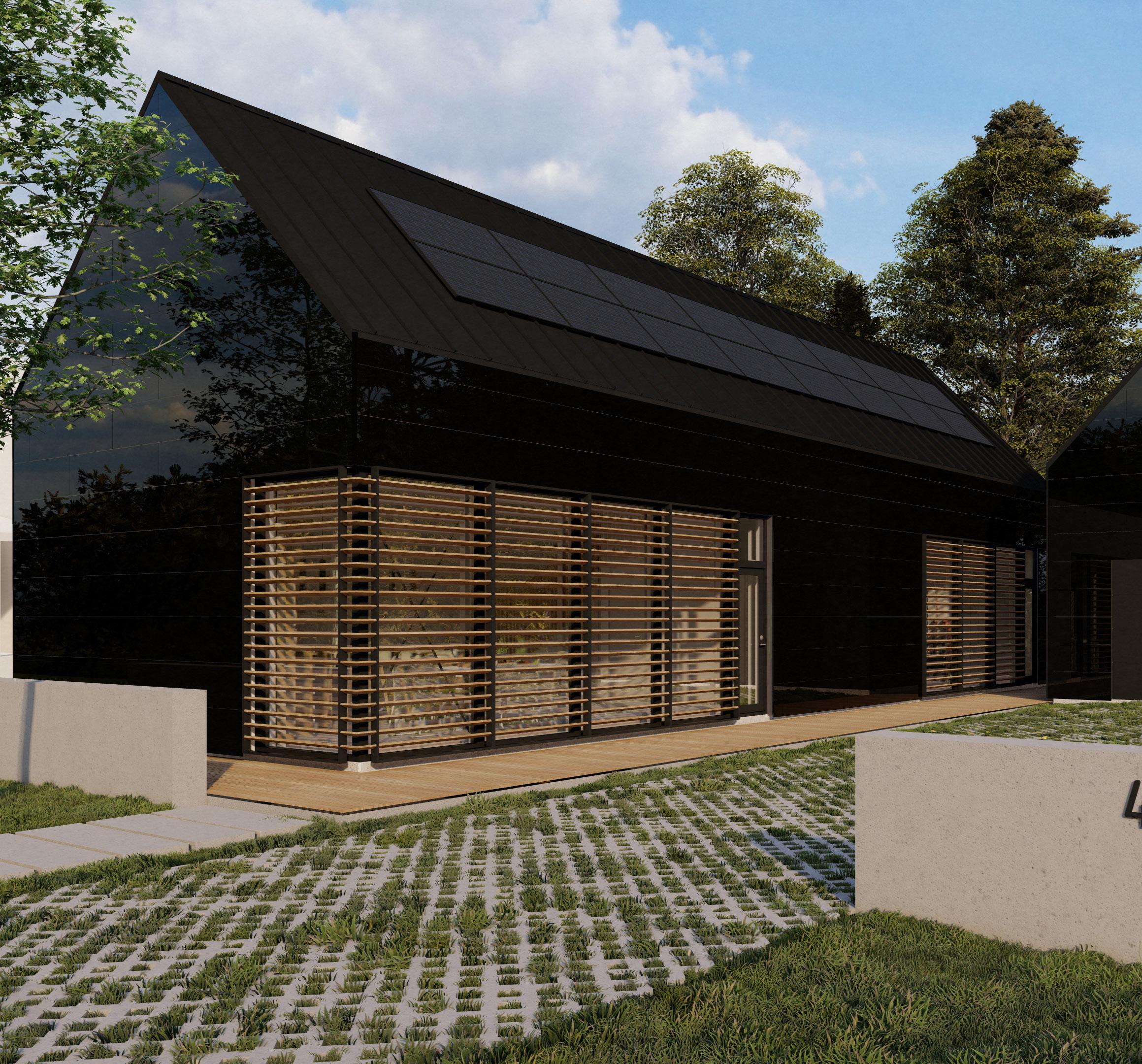
CUSTOM HOME DESIGN-BUILD 1450 SF
432 INDIANA ST. LAWRENCE, KS
DAN ROCKHILL FALL 2022 - SPRING 2023
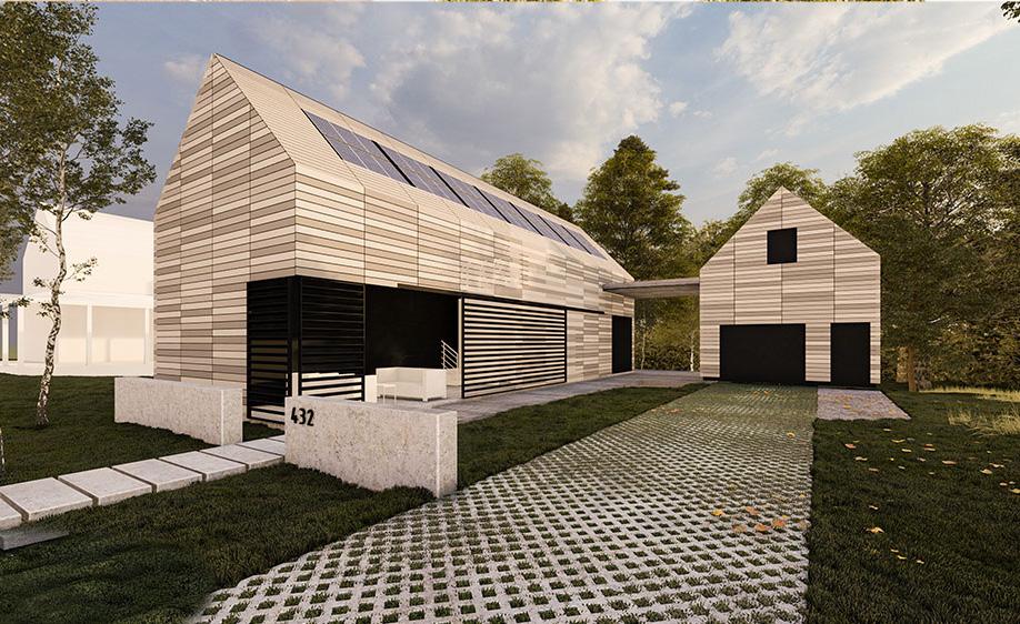
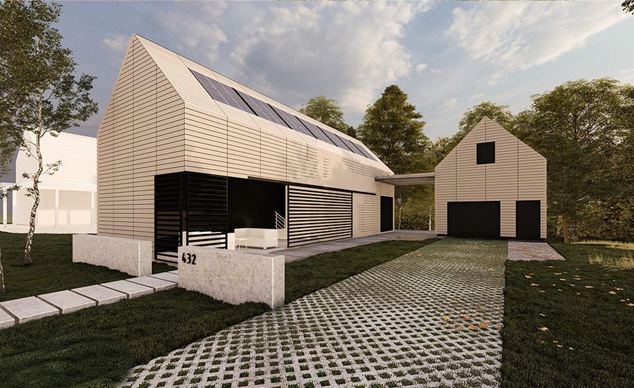
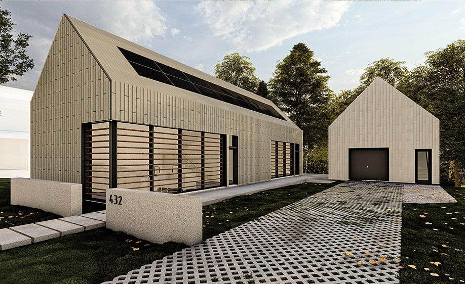
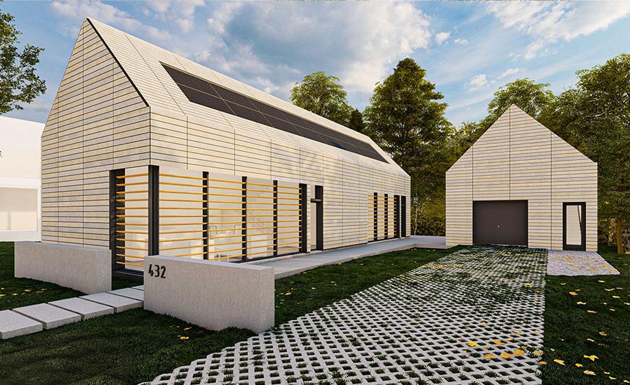
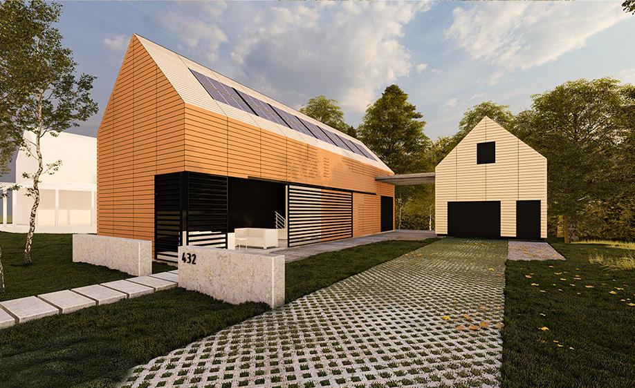
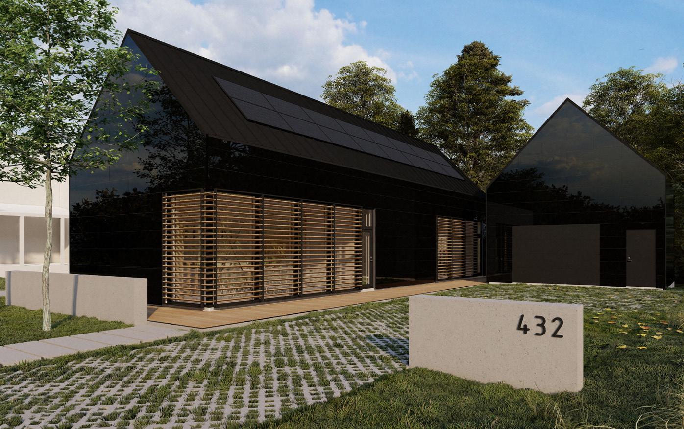
As the unique finale to the Master of Architectur program, I elected to participate in Studio 804--a worldrenowned, year-long design-build studio. In nine months, the cohort worked together to completely design and build a custom home. From foundations to ridgecap, each student had a hand in bringing the project to life. However, I led the team in two chief areas: flashing and cladding.
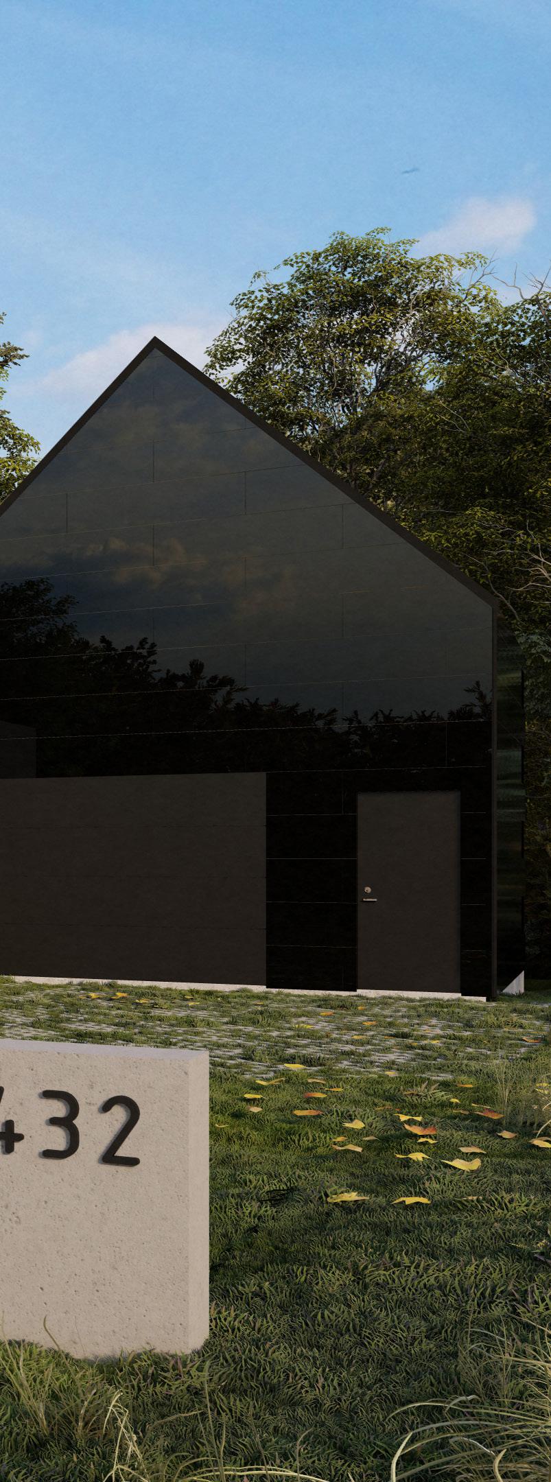
Perhaps the most valuable asset I gained in this experience was a deeper understanding of the diligence required in the pursuit of excellent architecture.
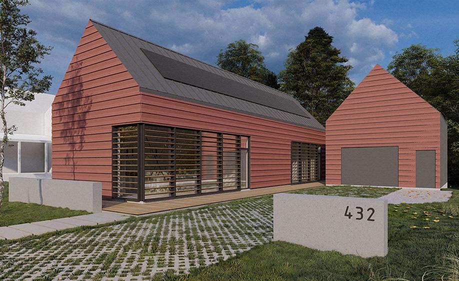
High-performance design is one of the essential pillars of Studio 804. Earning LEED Certification since 2008 has been a mark of such efforts, and 432 Indiana is no exception. The wall assembly plays a large role in the performance of the building, so the group elected to pursue a rainscreen to underscore efficiency.
Several team members contributed to various elements of the assembly—OSB sheathing, WRB, exterior insulation, etc. My efforts were directed toward securing a cladding partner, then working “backwards” to design a furring system. For the first time in my student career, I had to diligently think through how each decision would impact other parts of the building. For example, if the furring cavity was too shallow, we could not incorporate a hidden gutter detail along the eaves. But, if the furring cavity was too deep, jamb and header extensions might be too visually distracting.
After studying the requirements from our cladding partner, we arrived at the conclusion to employ three layers of channels: one securing the insulation, one giving greater depth to the furring cavity, and the last one clipping into the cladding. In the push and pull of design, I learned how to anticipate difficult details, which questions to ask of a material’s characteristics, and the importance of mocking up a solution.
1/2” GYPSUM WALL BOARD
AIR BARRIER
5 1/2” BLOWN-IN CELLULOSE
7/16” OSB
2” HORIZONTAL Z-GIRT, 24” O.C.
2” FOIL-FACED POLYISO
WEATHER RESISTIVE BARRIER
2” VERTICAL Z-GIRT, 16” O.C.
3/8” HORIZONTAL CLIP RAIL
5/8” FIBER CEMENT PANEL
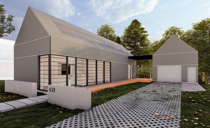
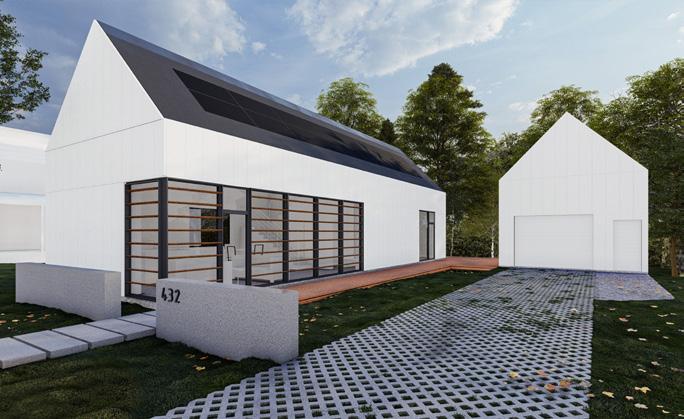
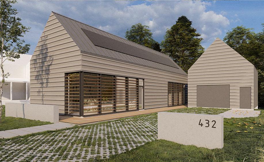
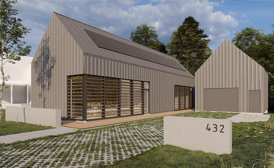
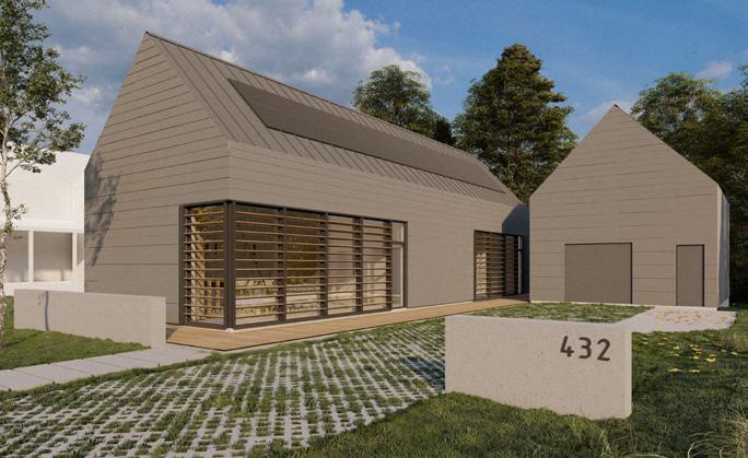
As a not-for-profit organization, developing industry partnerships for the acquisition of materials is critical to the success of the project. The exterior wall assembly is one of the largest allotments in the project budget. For the first couple months of the project, my main job was to develop relationships with potential industry partners. The strategy here was not to ask for a donation outright; it was important that they recognized the high-performance, high-quality, and long-standing work of Studio 804. The uniqueness of the program, as well as the award-winning outcomes, would provide excellent marketing opportunities. In short, I wanted them to realize the mutual value of such partnerships.
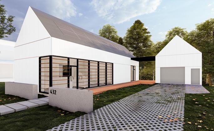
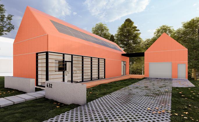
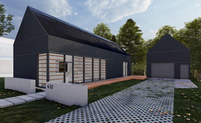
Before we secured partners for the exterior wall assembly, we went through
several “options” of the rainscreen. Numerous iterations of wall sections and renders were required to understand the application of various companies’ products within our system. Through these iterations, I learned a great deal about rainscreen wall assemblies, visual and physical material characteristics, and connection and termination details.
After several weeks of research, conversations, and re-imagining the facade, we were fortunate to receive full partnerships for the rainscreen cladding, most installation hardware, and the substructure elements. Adjacent are companies that I contacted for various components of the rainscreen assembly. Met with varying degrees of enthusiasm, I still enjoyed every interaction and viewed it as a learning experience.
Abet Laminati
Architectural Metal Solutions Armatherm
Badgerland Supply, Inc. Bauer Brothers Salvage, Inc. Benjamin Obdyke BŌK Modern CENTRIA CERACLAD Cladding Corp Cladiator
ClarkDietrich Building Systems Concreteworks East CUPA PIZARRAS Dri-Design Durable Slate Company Eagle Mouldings Envel™ Fundermax Go Finex IMETCO Knight Wall Systems Lankhorst Recycling Products MetalTech Global Metal Panels, Inc. Metal Sales Metalwest Morin Corporation New England Slate NexGen Metal Design Systems Nichiha PAC-CLAD Panelex Industries Porcelanosa RHEINZINK Sculptform STACBOND® STENI
Stonewood Architectural Panels TAKTL, LLC
Vermont Structural Slate Company VMZINC
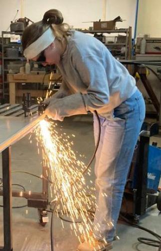
I have a passion for small details that make a big difference. When studio members were choosing roles, I was drawn to flashing because it plays an unseen yet vital role in the performance of the building. For this project, the flashing was meant to be subtle and unnoticed. This role involved designing the flashing profiles, sourcing the metal, and cutting and folding the steel as necessary.
For the flashing along the base of project, I used leftover 24 gauge Galvalume from past projects’ standing seam roofs. All other flashing was done in 26 gauge black steel sourced from Metal Panels, Inc.
I learned about some of steel’s physical behaviors as well as how to handle thingauge metal with various tools such as a plasma cutter, metal brake, aviation snips, and hand seamers.
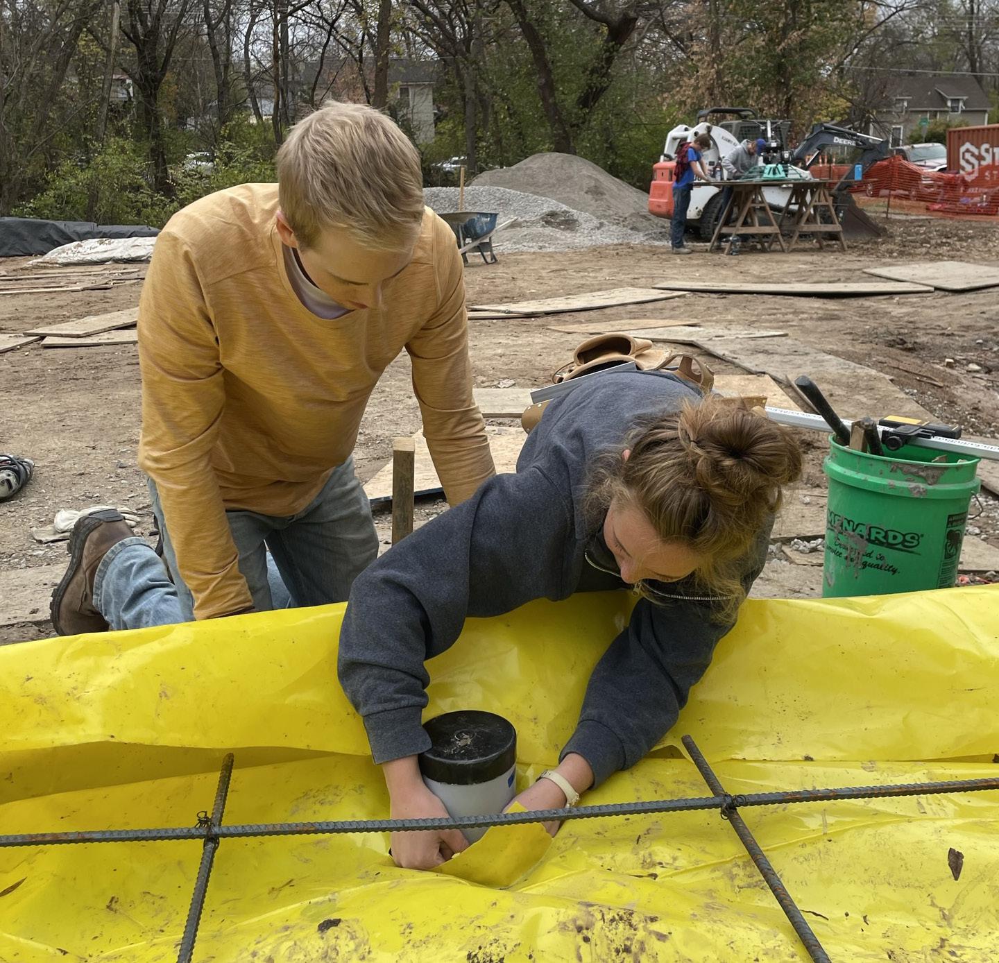
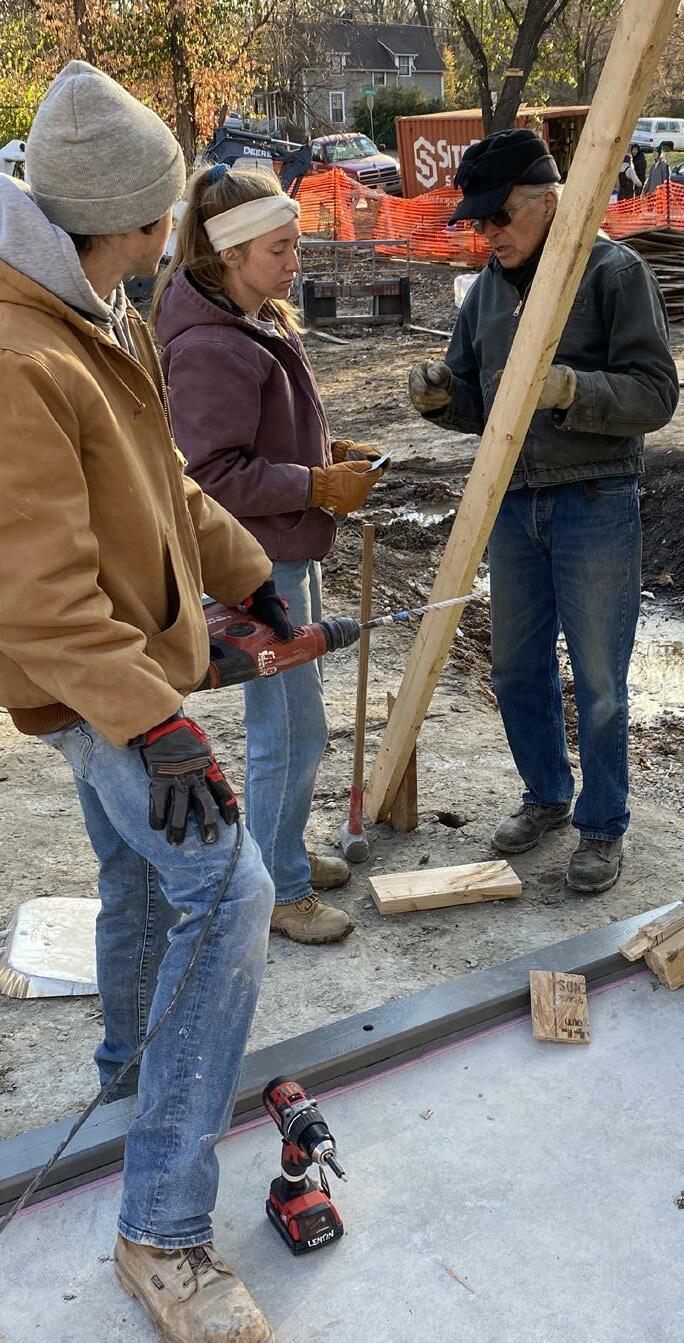
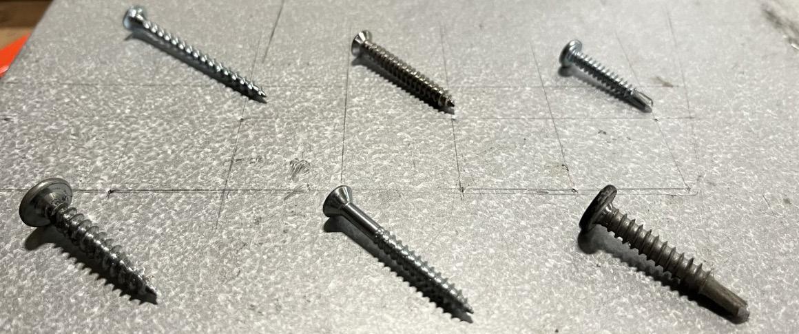

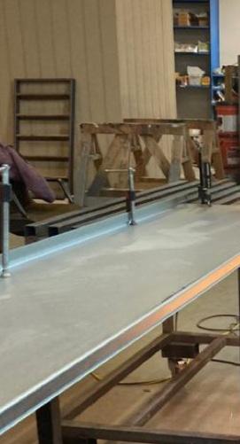
1 / 11.07.2022 / Ethan and I work to level an electrical blockout before taping it off for the house slab pour.
2 / 11.21.2022 / Thomas trims sheet metal for base flashing.

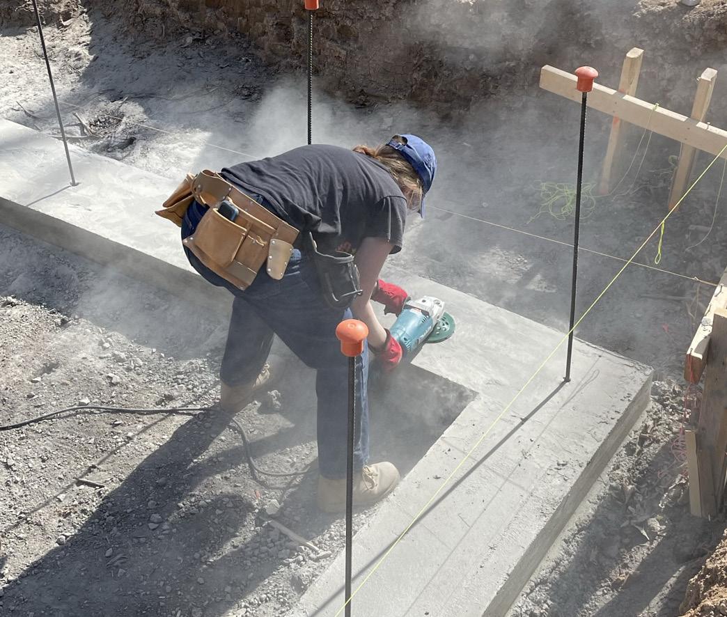
3 / 10.29.2022 / Before installing stem wall formwork at the garage, I grind down the footings to make them more level.
4 / 10.18.2022 / I experimented drilling through thin gauge metal to learn why certain fasteners work best for metal-to-wood applications.
5 / 11.16.2022 / Dan, Colin, and I discuss sequencing the installation of the curtain wall sill flashing.
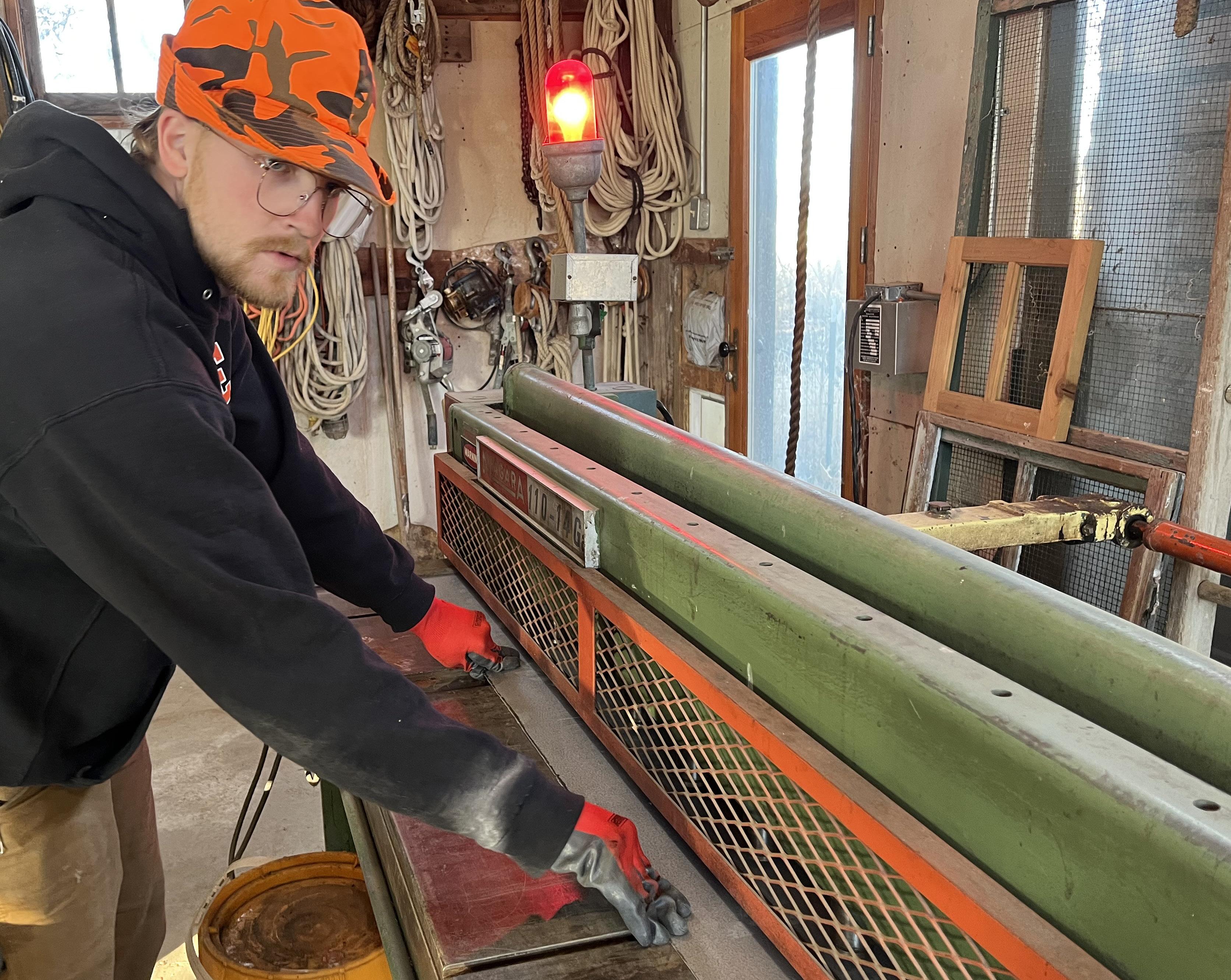
6 / 11.12.2022 / With a plasma cutter, I trim surplus standing seam pans from past projects to use for base flashing.
7 / 11.22.2022 / After the first day folding flashing, Thomas and I complete the curtain wall sill profiles.
MIXED-USE RESIDENTIAL 153,000 GSF
1480 E. 18TH ST. KANSAS CITY, MO
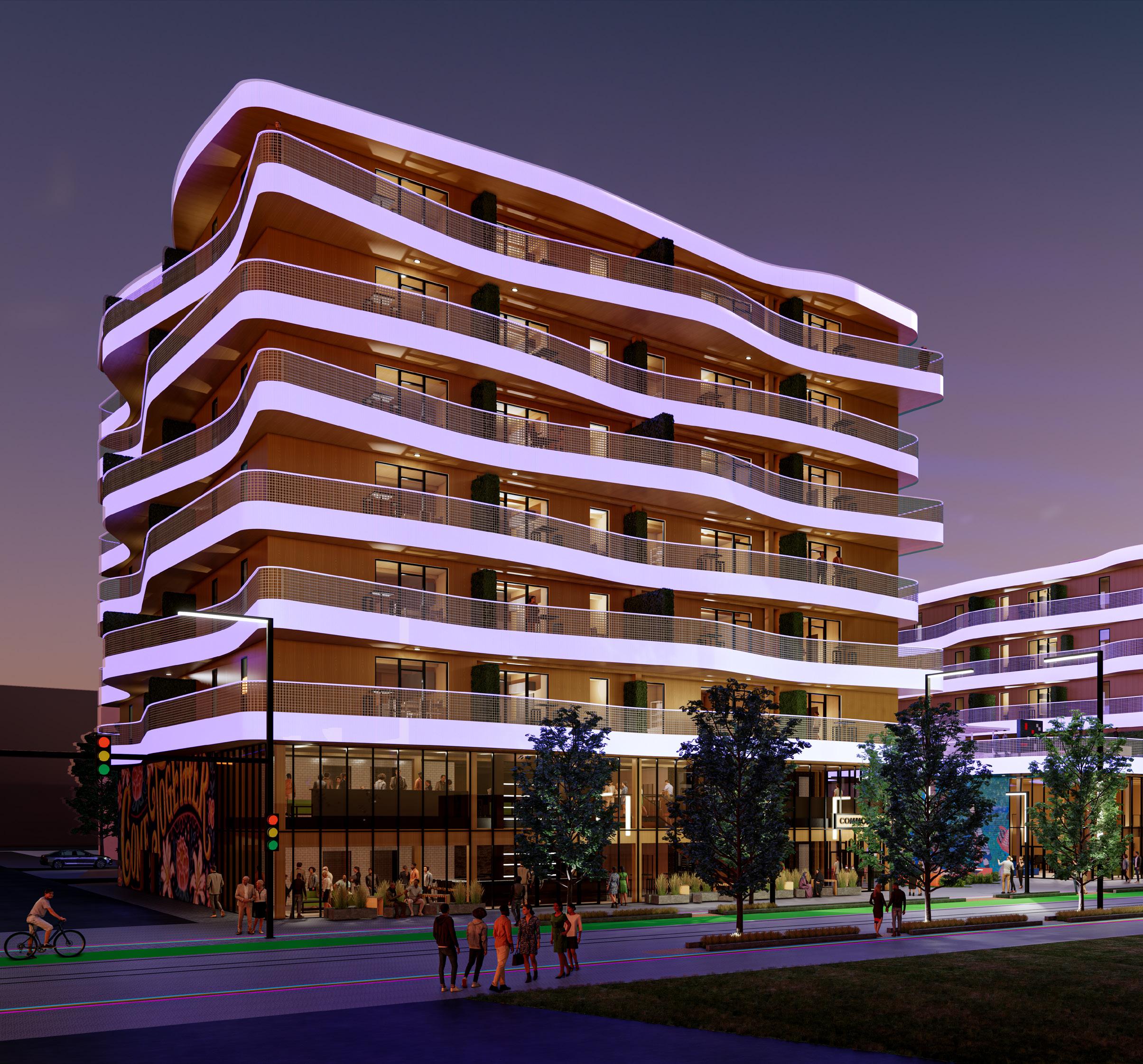
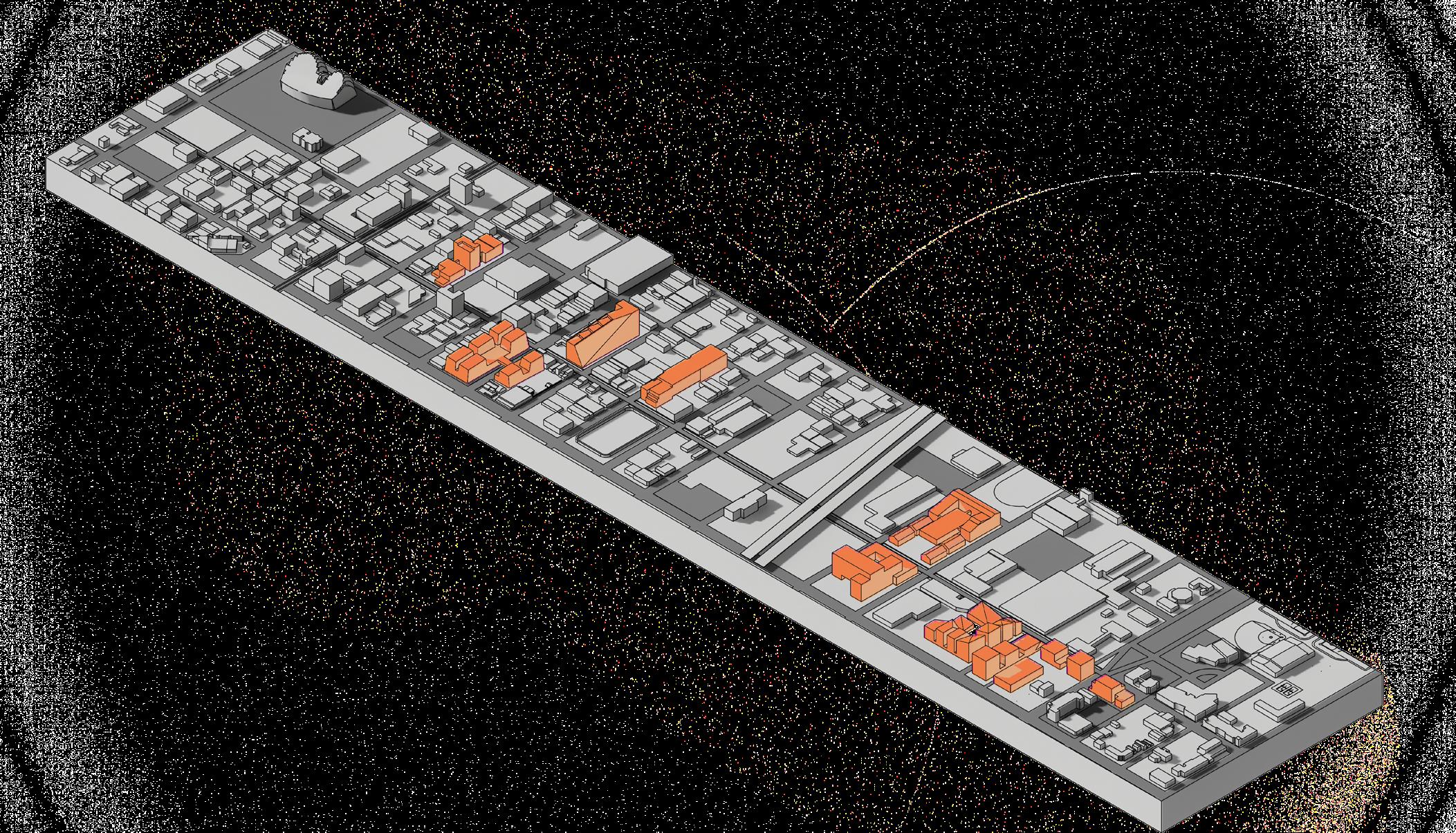
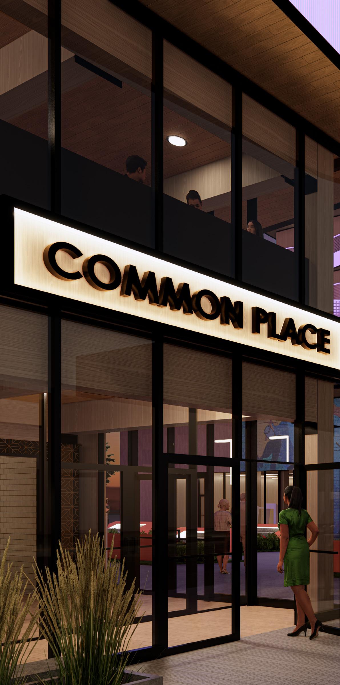
East 18th Street on the Missouri side of Kansas City is relatively undiscovered. However, that certainly does not imply a lack of potential. As a city development exercise, the studio examined 18th Street on a masterplan scale. Then, the group established goals: design a refined but exciting pedestrian experience, increase residential density, and accommodate amenity needs for the existing and proposed communities. Within those goals, Common Place adds an inclusive and interactive component to the 18th Street corridor as a piece of a larger masterplan vision.
It is vital to consider multiple scales of impact of a project, from the size of a closet to the economic implications on a city. This type of thinking helps ensure integrity and secure the purspose of a design.
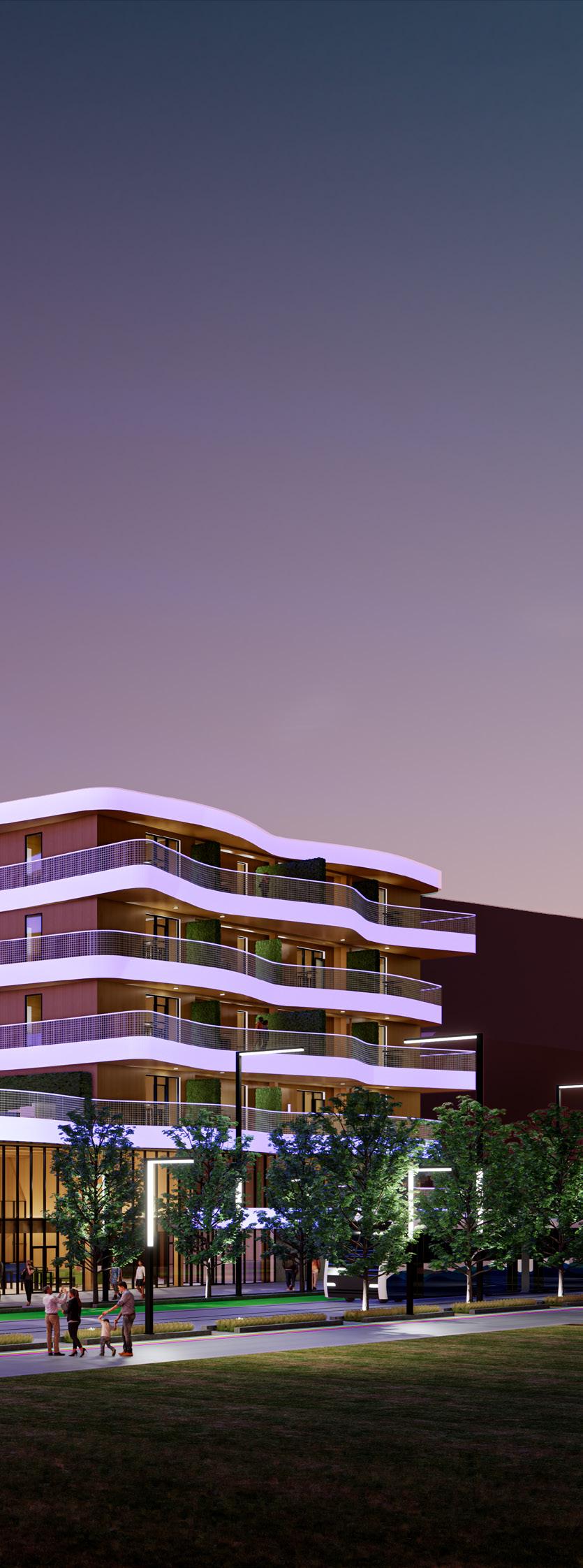
VIEW FROM ACROSS 18TH STREET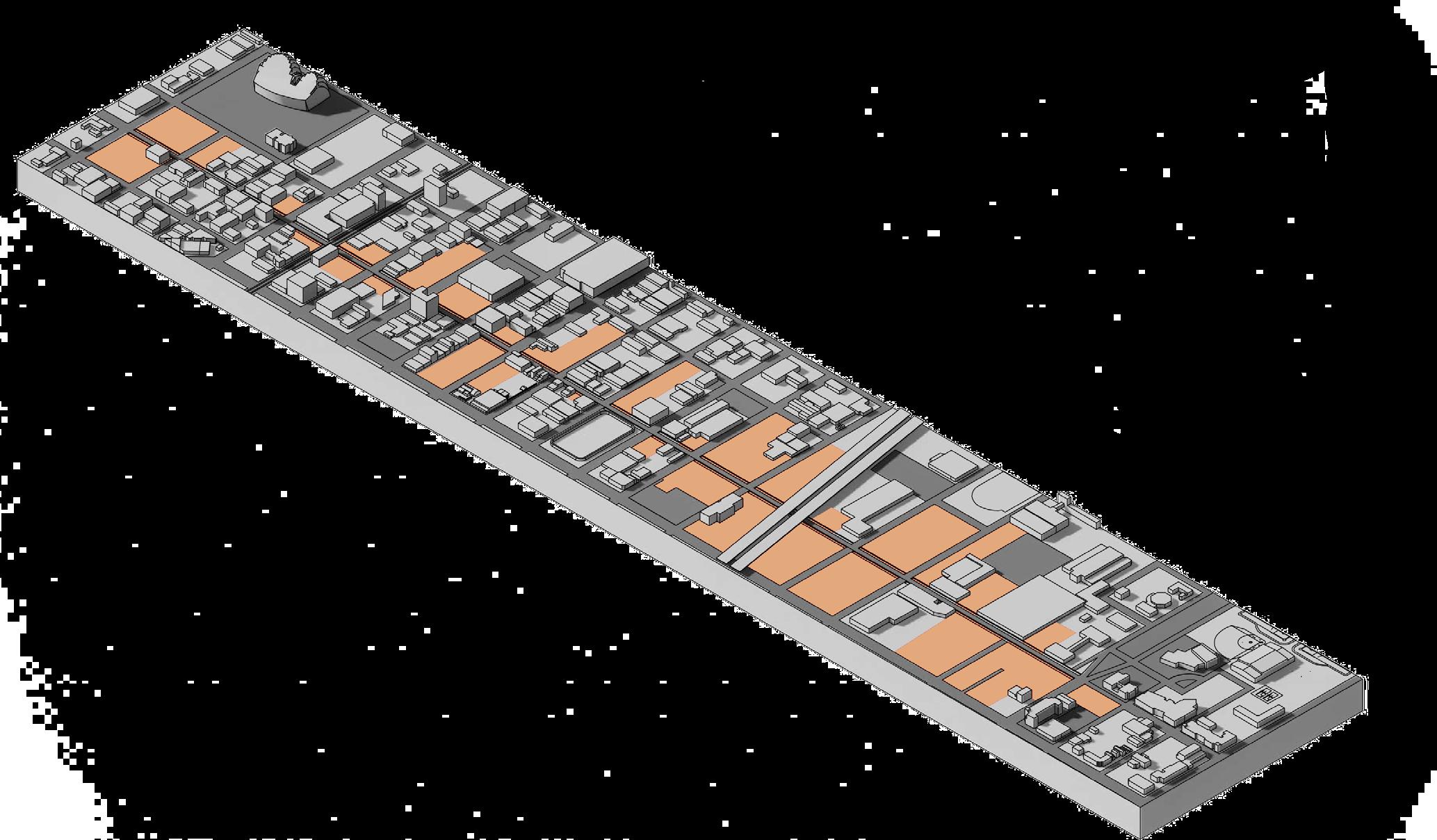
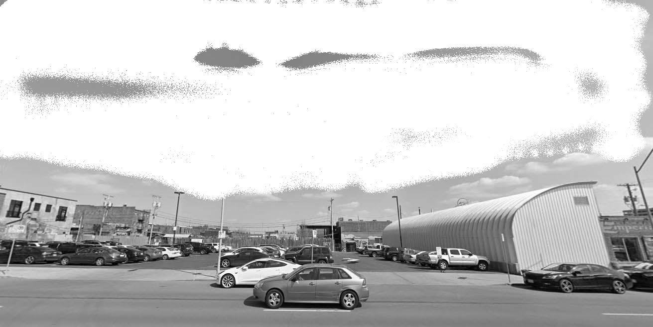
A parking lot at the east end of 18th Street is the site of Common Place. Just one block away from the start of the historic 18th & Vine Jazz District, and a few blocks from Crossroad’s Arts District, the lot is situated in a context rich with inspiration.
After conducting thorough research on every building and lot along 18th Street, the studio determined which lots could serve as sites for further development. The studio developed 10 mixed-use residential projects, all accommodating different amenity needs such: gyms, markets, event venues, restaurants, bars, and workspaces. The developments
• Rich history and culture
• Space for future development
• Existing community events
• Disconnect between districts
• Lack of green spaces
• Unfriendly pedestrian conditions GUIDING
• What is missing?
• How can a high unit count be reached without creating an impeding mass?
• Who will live here?
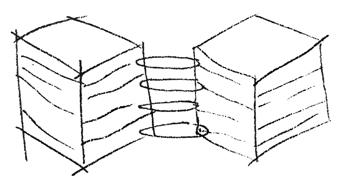
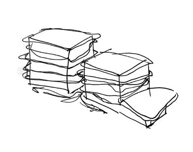
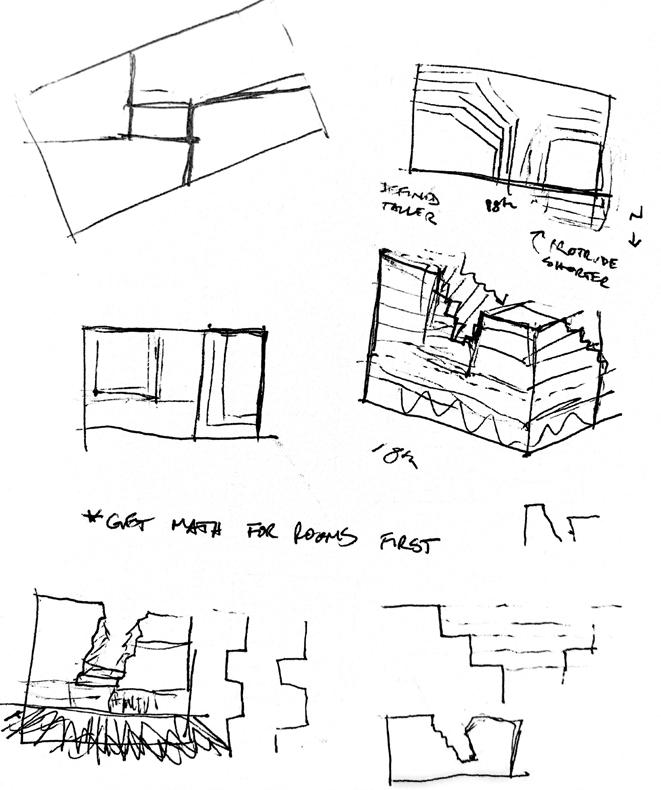
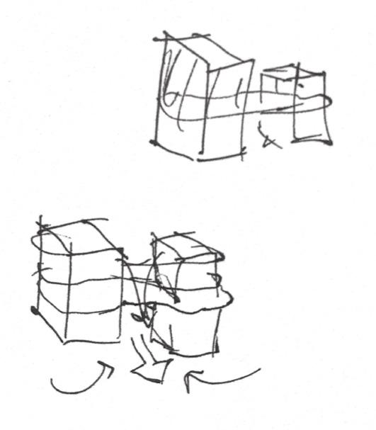
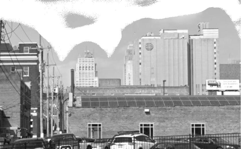
As I stood on the proposed project site on an August evening, I was struck by the music coming from the Jazz District to the east and the lights of the Crossroads District in the west. The sounds and lights represented the unique identities of each of these districts. Although one of the goals of the studio’s mixed-use residential development was to unify the 18th Street, it seemed necessary to recognize the current disconnect between the corridor’s endpoints. To that end, two towers, sisters in form but different in mixed-use program, became the anchoring concept of this project.
Two towers represent 18th & Vine Jazz District (east) and Crossroads Arts District (west).
Bringing the towers together fulfills the studio’s goal to create unity along 18th Street, but keeping two buildings resists the impulse to bulldoze existing conditions to serve a “greater” purpose.
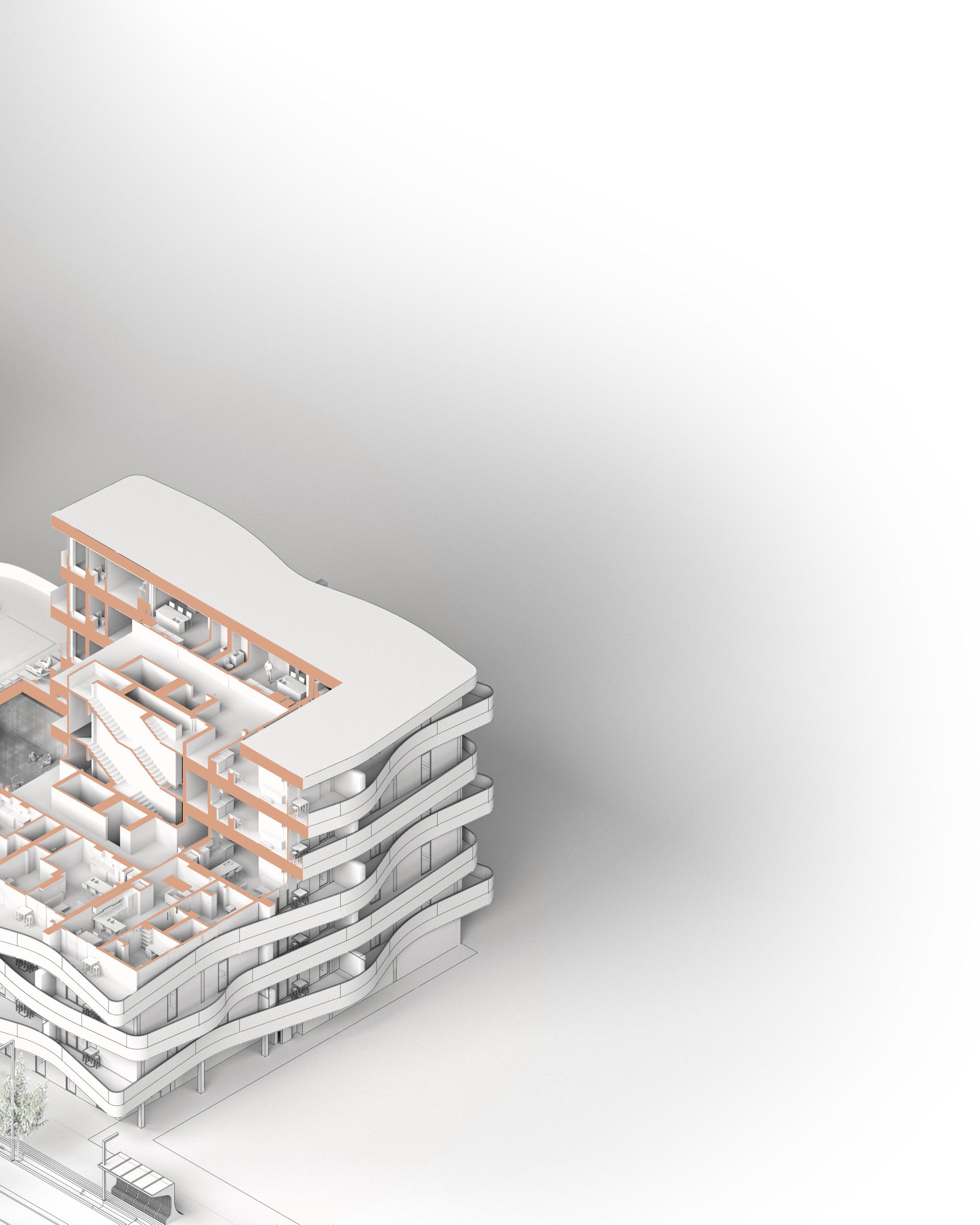
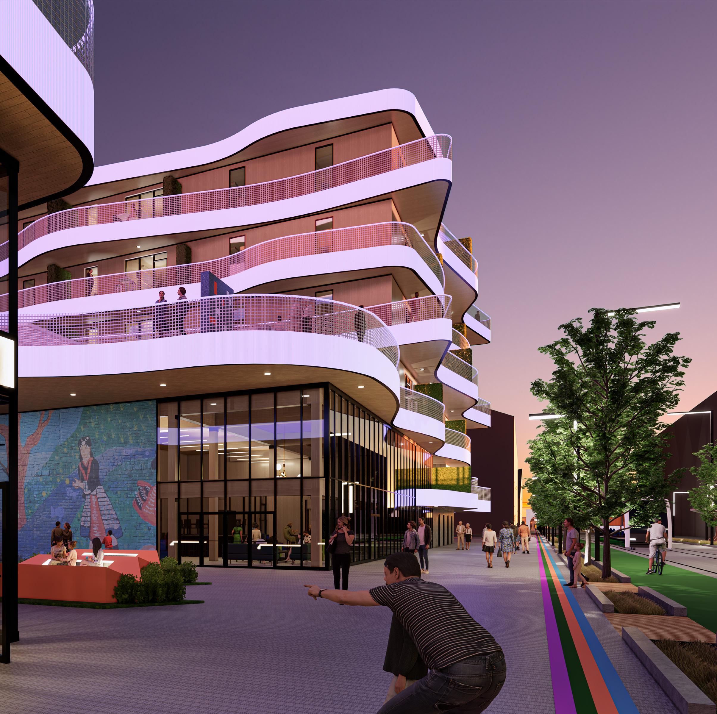
The gap between the towers becomes a secondary corridor to engage pedestrian activity (see exterior renderings). Program on the ground levels is accessible for all community members, regardless of age, mobility, or social status.
A bridge between the towers creates a common place for residents with rooftop activities (see elevation).
Centralized circulation cores are the most efficient strategy for maximizing unit counts and minimizing material used in vertical construction. This choice also provides full views around the perimenters of the towers (see plans).
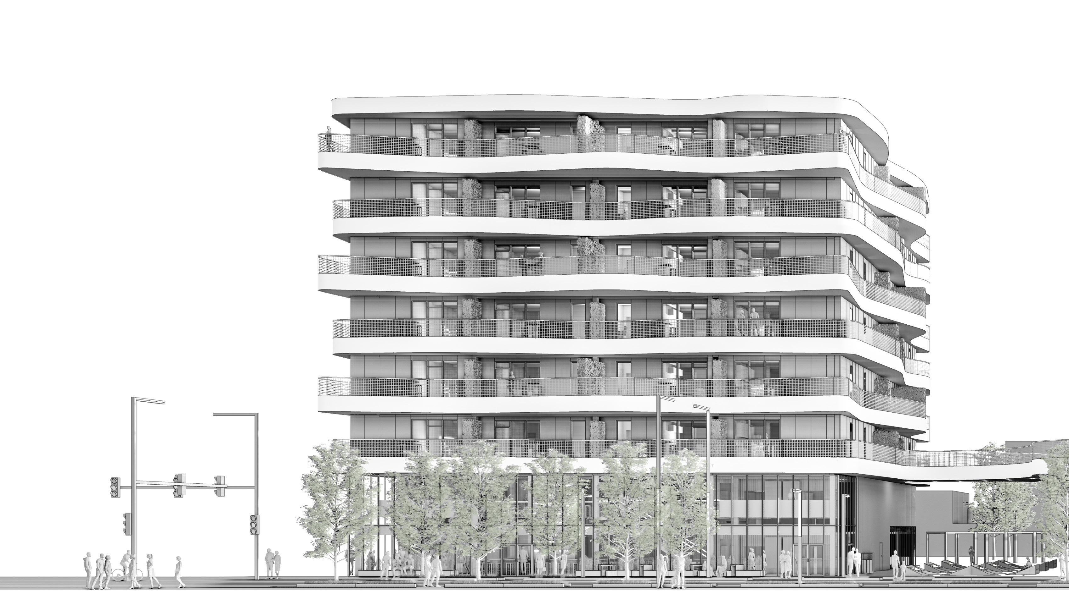
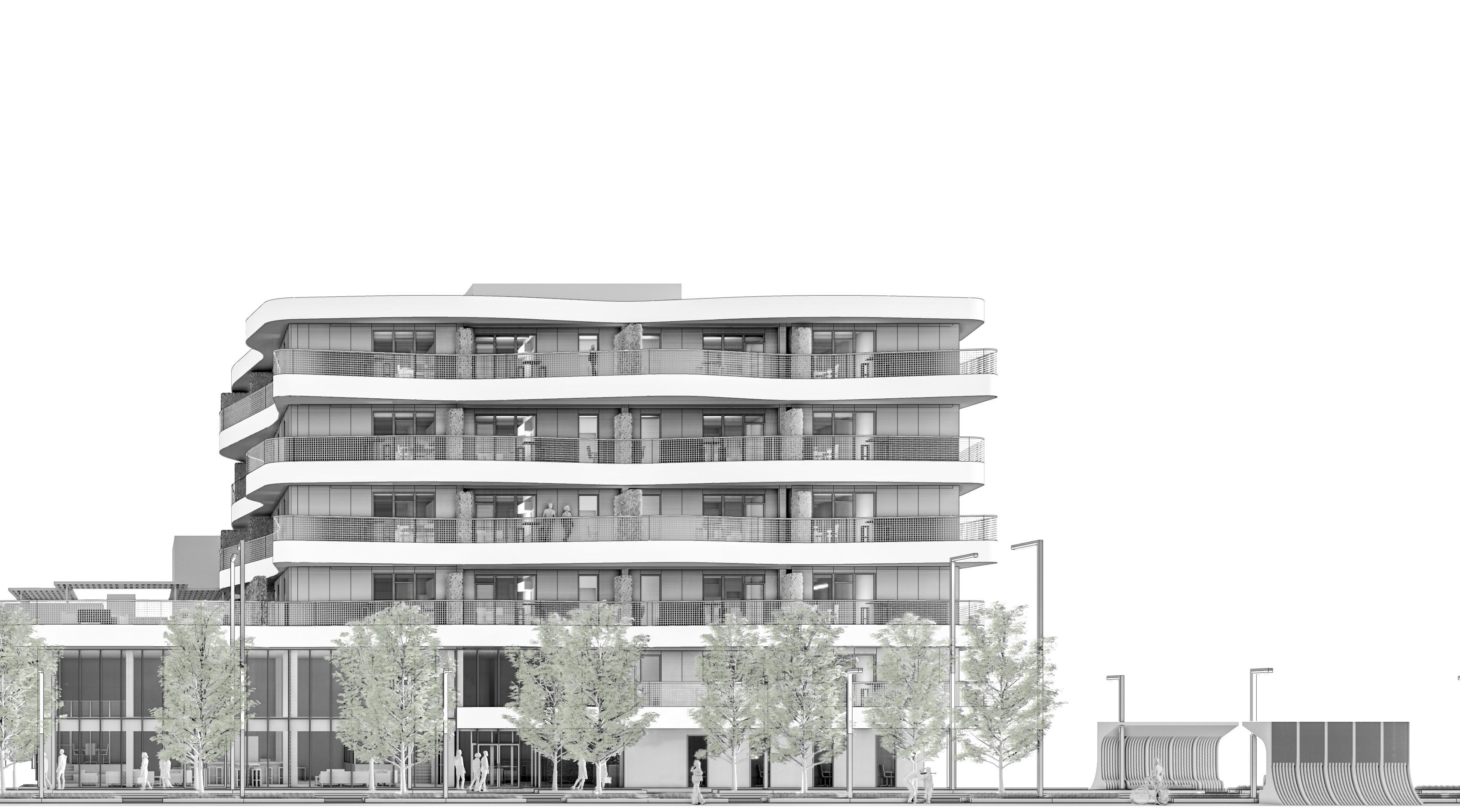
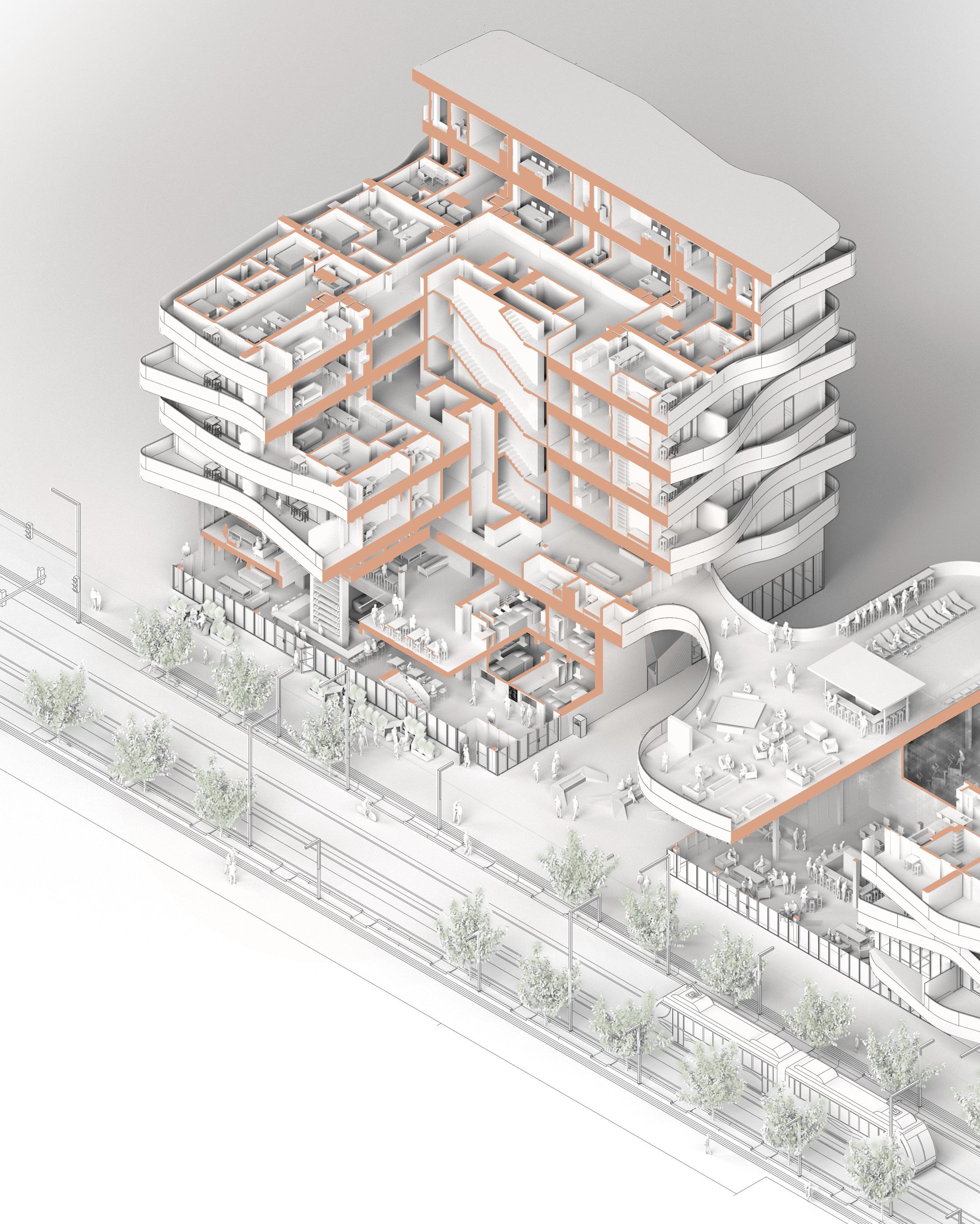
Both towers employ efficient use of space that is grounded in the original concept of creating connectivity.
1. Sober bars
2. Outdoor seating 3. Open coworking space 4. Street car stop 5. Rooftop pool, life-size board games, fire pits, and bars 6. One-bedroom apartment 7. Two-bedroom apartment







A great deal of study went into developing the program for Common Place. I began by visiting several apartment complexes in the region to observe their layouts and amenities. I also researched amenities that apartment renters expect. Aside from precedent study, the program was also derived from imagining what would be most useful to this community.
There are two mixed-use program elements that are intended to give people a common place to gather. In the east tower, two stories of sober bars offer a familyfriendly place to get a milkshake, soda, bubble tea, and the like. Many bars exist near 18th Street, but there are no spaces designed with family recreation in mind.
After grabbing a round of coffees with friends or coworkers, one could cross the outdoor seating area to the coworking space in the west tower. Inspired by the lack of togetherness in workplaces during the pandemic, anyone can come to meet with clients, virtual conference with companies, or set up brainstorming sessions. Both the mixed-use programming and the units above establish togetherness, therefore grounding the name Common Place.
1. One-bedroom apartment, typical
2. Two-bedroom apartment, typical
The sober bars, located on the bottom two levels of the east tower, foster an inclusive environment that is sensitive to the social context of the project. There are many bars surrounding the 18th St. Corridor, but there are no family-friendly places to go for a drink. At Common Place, anyone can come grab a smoothie, buble tea, latte, milkshake, or special soda.
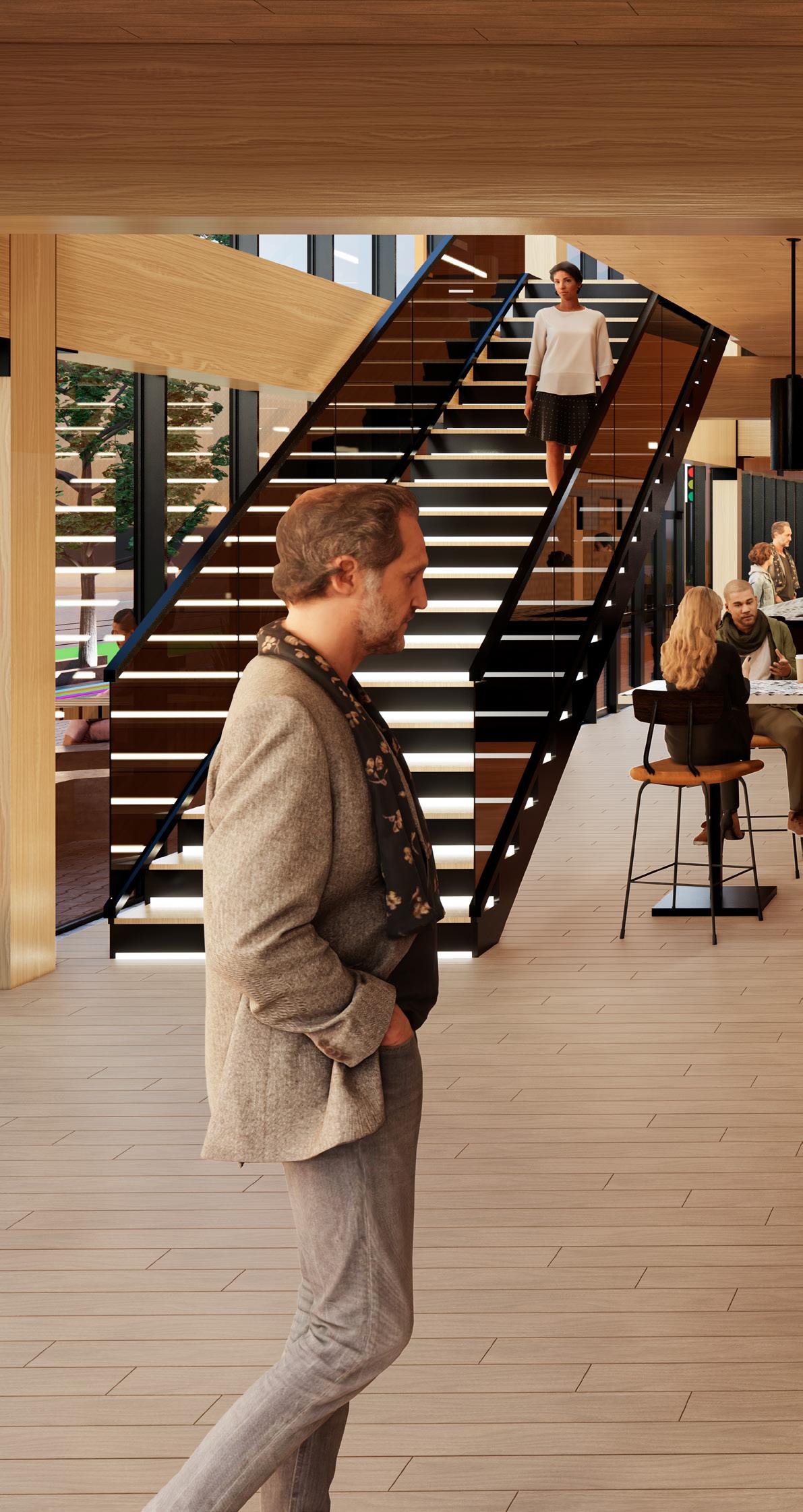
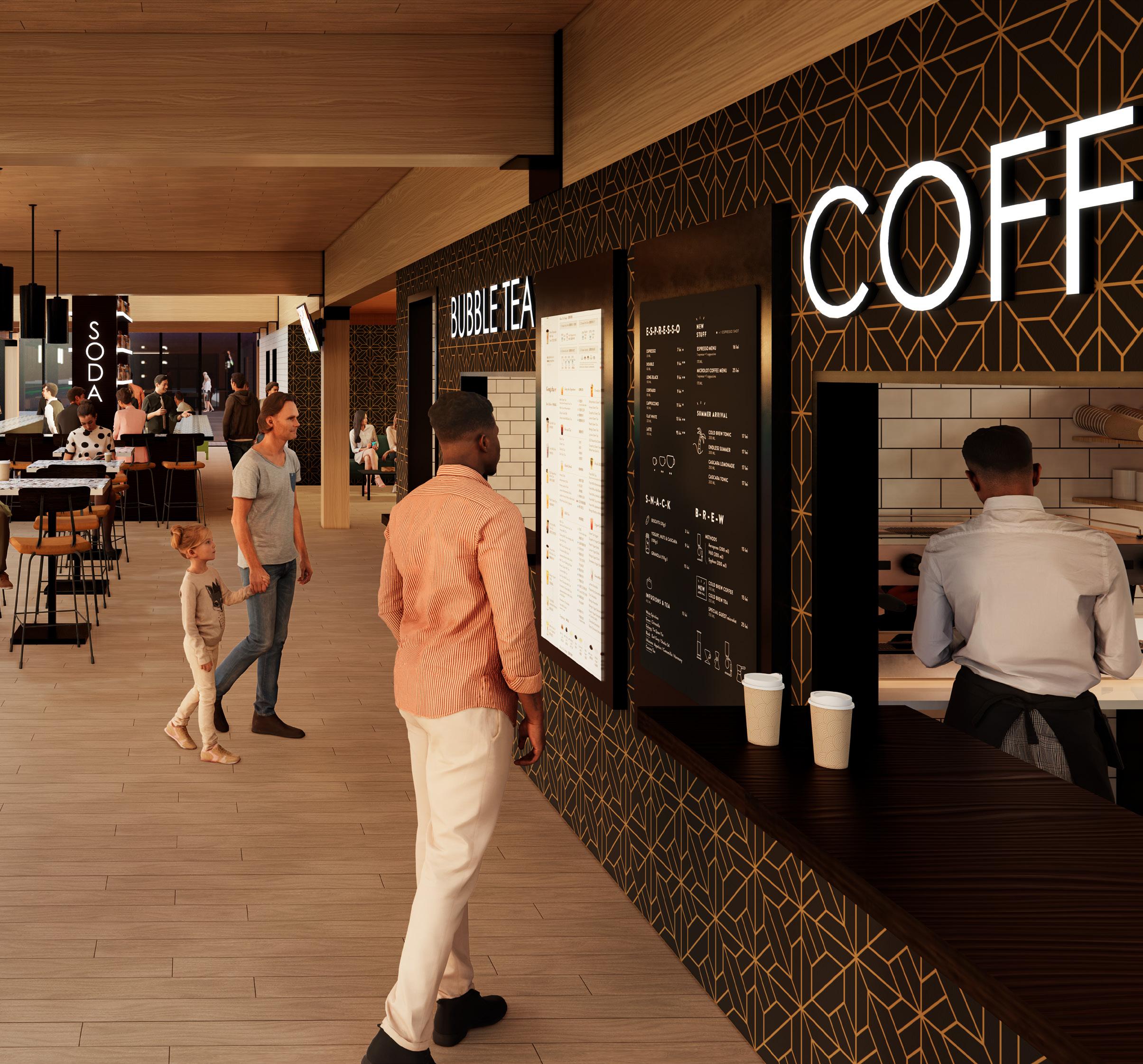
The inspiration for Common Place began standing on a parking lot, the August sun setting over an arts festival in the Crossroads District. Developing the 18th Street corridor necessitates imagining how new construction would interact with existing culture. This concluding view displays the visual and social playfulness of Common Place, inspired by the lights and music, designed for the future of the community.
 VIEW FROM 18TH STREET
EDUCATIONAL 42,800 GSF
1640 BALTIMORE AVE. KANSAS CITY, MO 64108
STEVE PADGET | BNIM | PARTNERS SPRING 2022
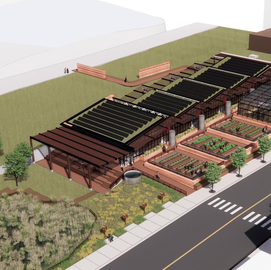
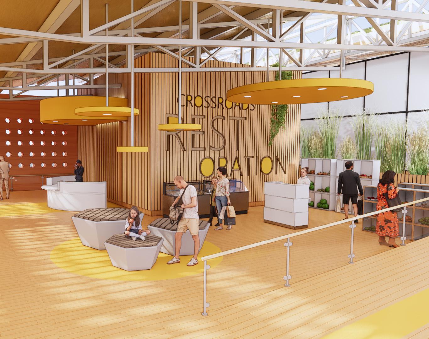
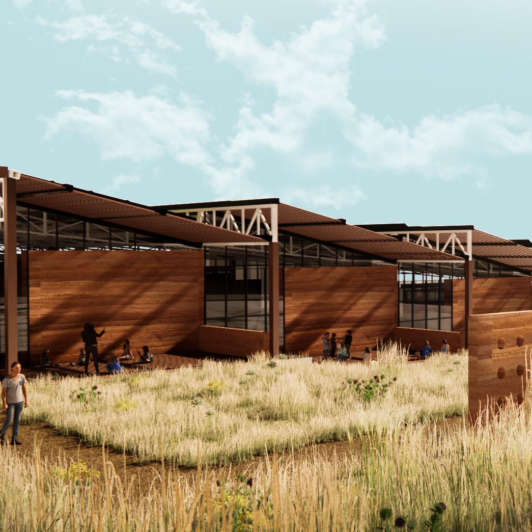
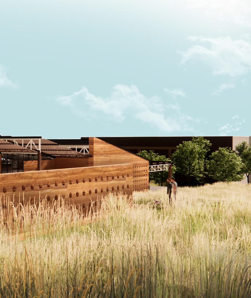
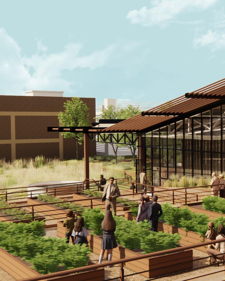
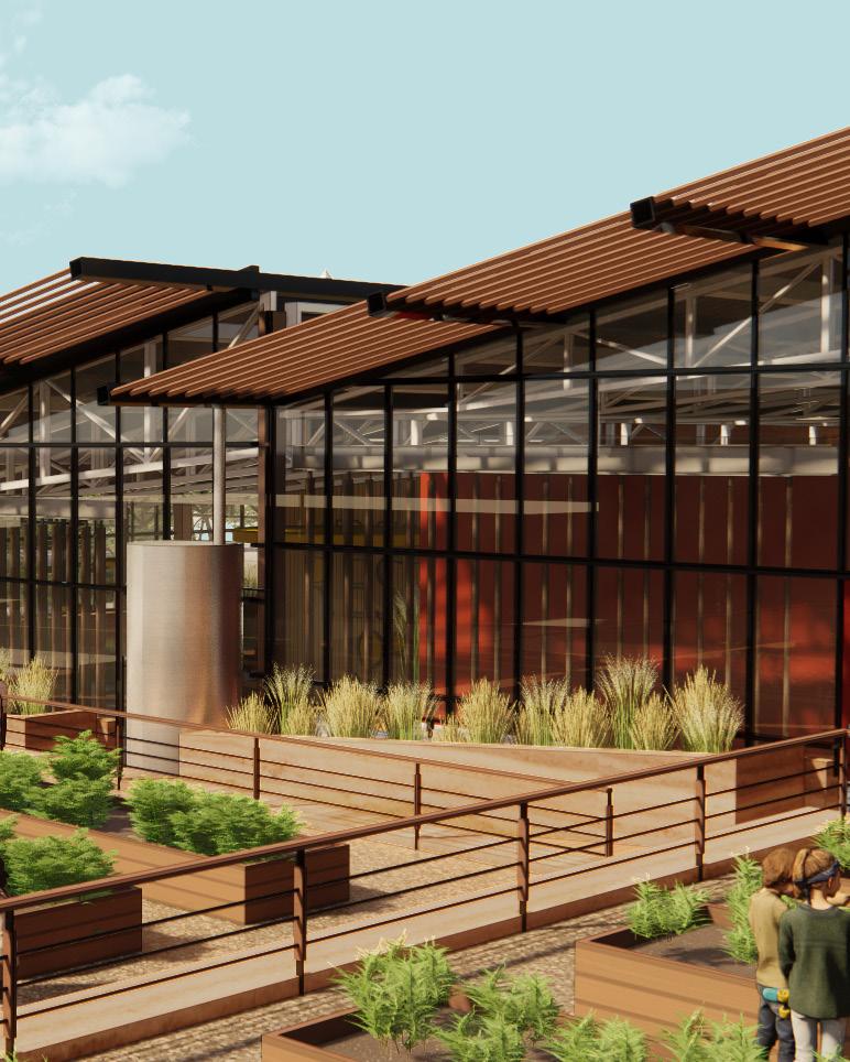
On a brownfield adjacent to the prominent Kauffman Center for the Performing Arts, Crossroads Restoration Center fulfills all the petals of the Living Building Challenge. It is itself a journey of restoration of past ecosystems, becoming a species of its own in its urban habitat. This project was completed in partnership with Madi Karlin.
The Living Building Challenge is a rigorous yet necessary level of excellent performance to pursue.
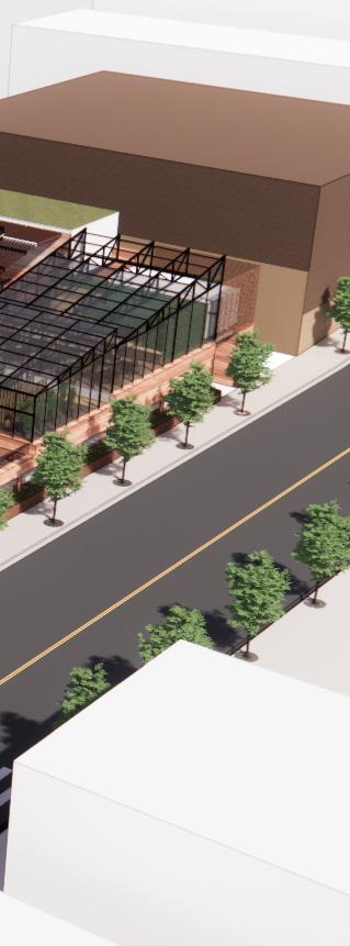
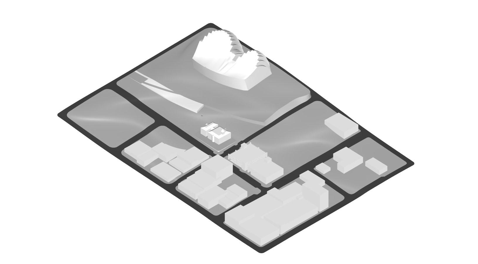
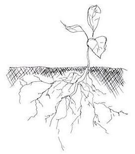
Many years ago, this site would have been tallgrass prairie. “Amber waves of grain” would have rustled in the Kansas wind, rolling out into the vast unknown. Today, it’s an urban brownfield. With both the ecological history of the site and the programmatic vision of a nature center, the idea came to design an organism rising up to realize its potential. It will take care and patience, but eventually a new ecosystem can be sustained--even in a city.
The project was slated to be built on one plot divided into two lots separated by a retaining wall that reached 20 feet at its highest. However, the western lot is owned by the Kauffman and was to remain undeveloped. Therefore, the eastern half of the block, which was also the lower elevation, became the footprint project boundary.
• Several inherent points for Living Building Challenge, especially under the Site petal
• Steep elevation change
• Relatively extreme climate
• North-south orientation (east-west more ideal)
• How does this impact our design goals?
• How does this dictate what can / cannot be included?
• How will this site be used in the “off-season”?
• How can we remain loyal to the naturally occurring ecology?
• How can we work with natural conditions to optimize and maintain occupant comfort?
• How does this provide learning opportunities and / or challenges on the site?
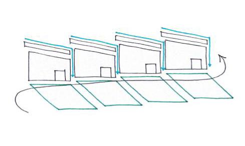
From a circulation lens, the main vine and the off-shooting branches are accessible for anyone with mobility challenges. This also means that nature itself is extremely accessible from anywhere on the project. KEY SPACES
10
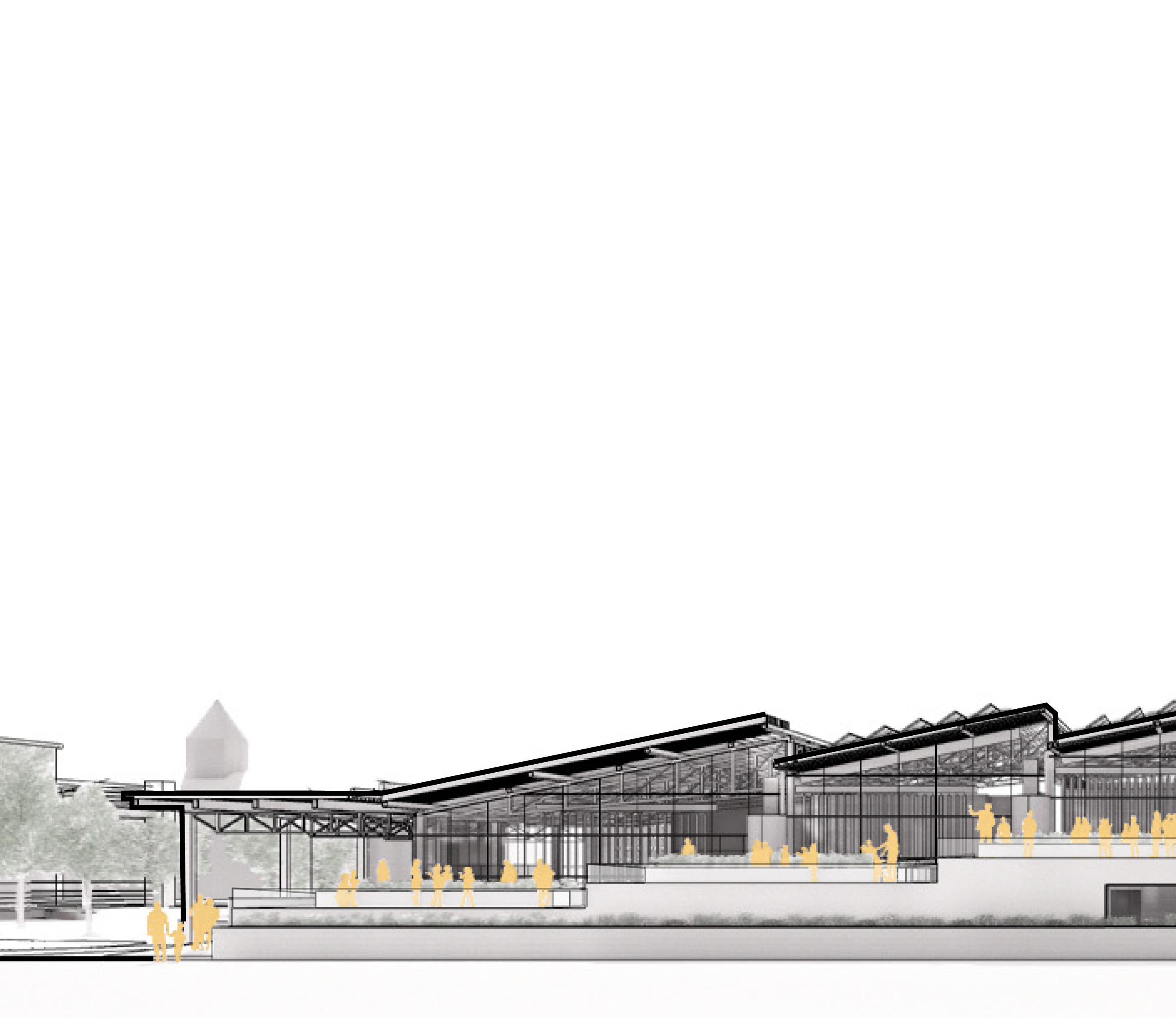
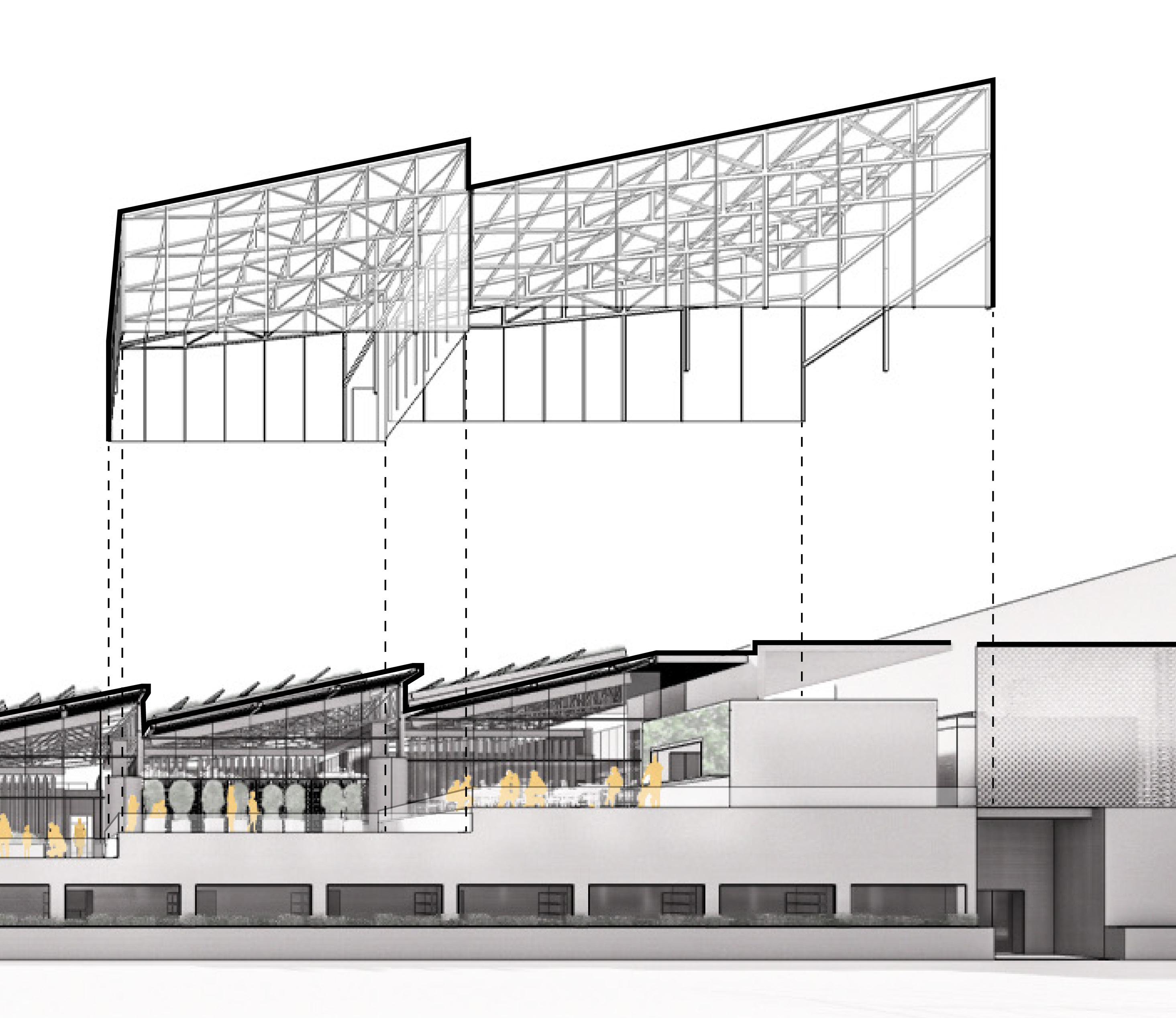
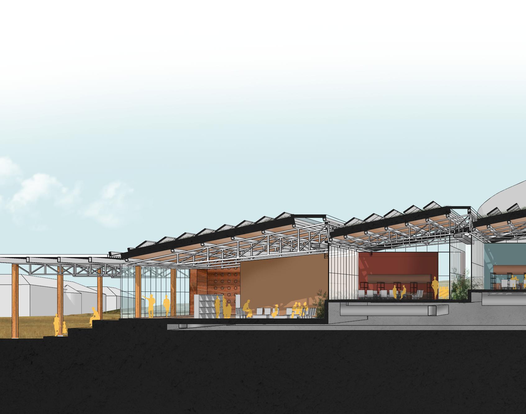
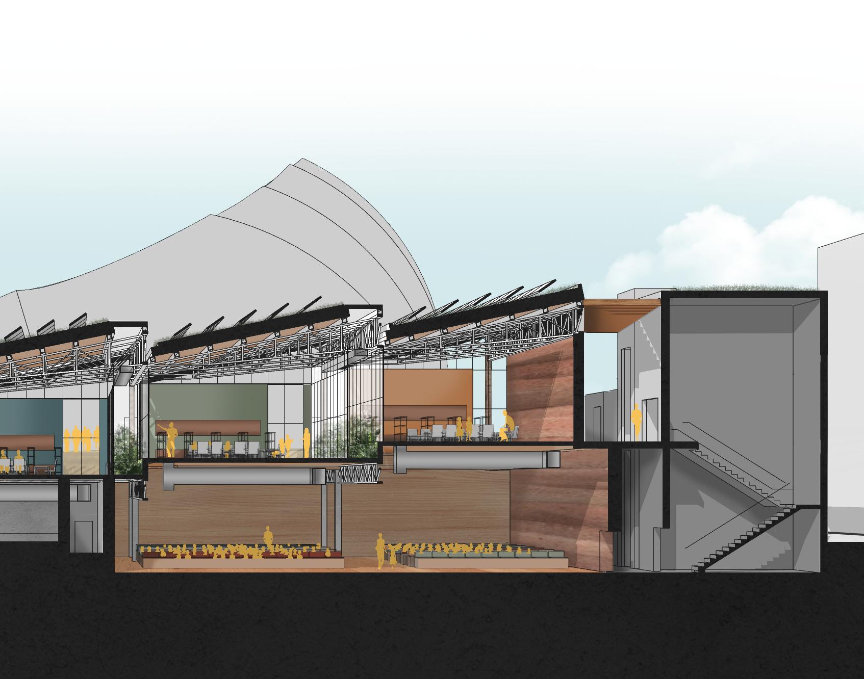
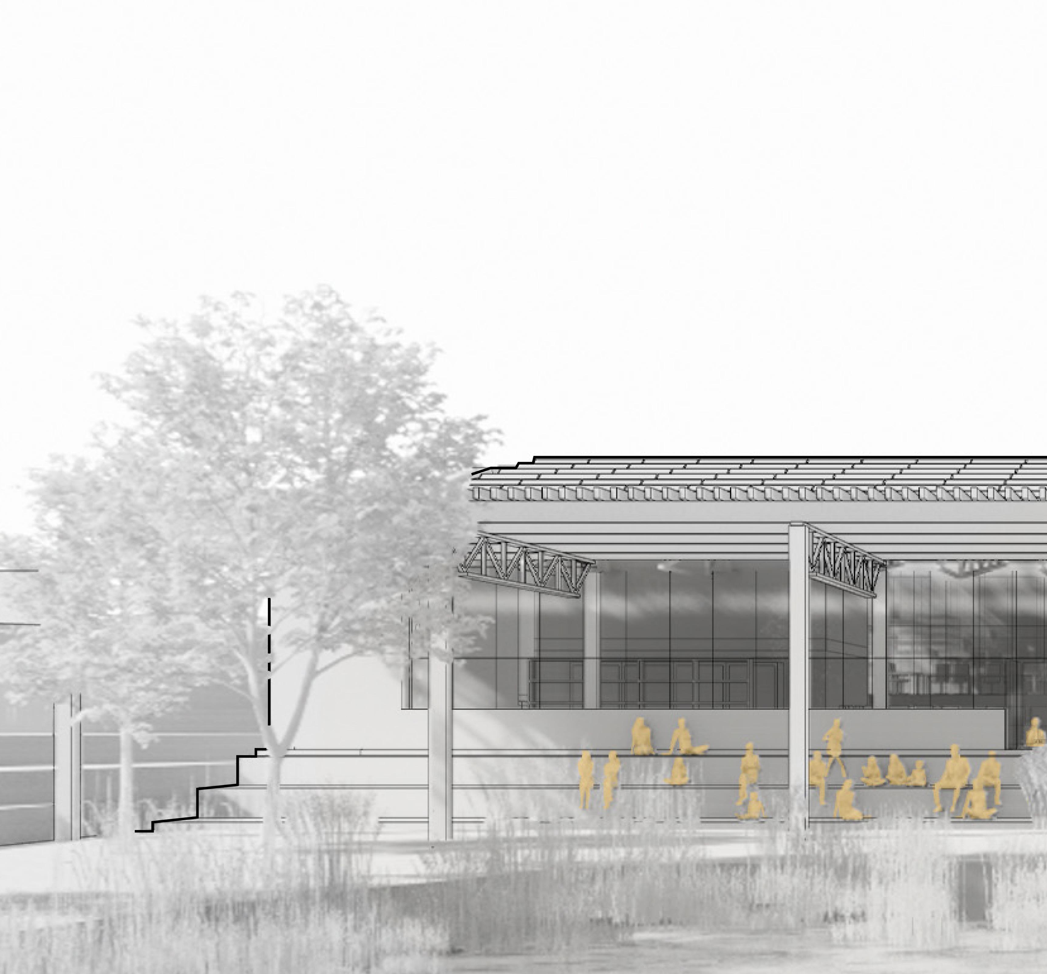
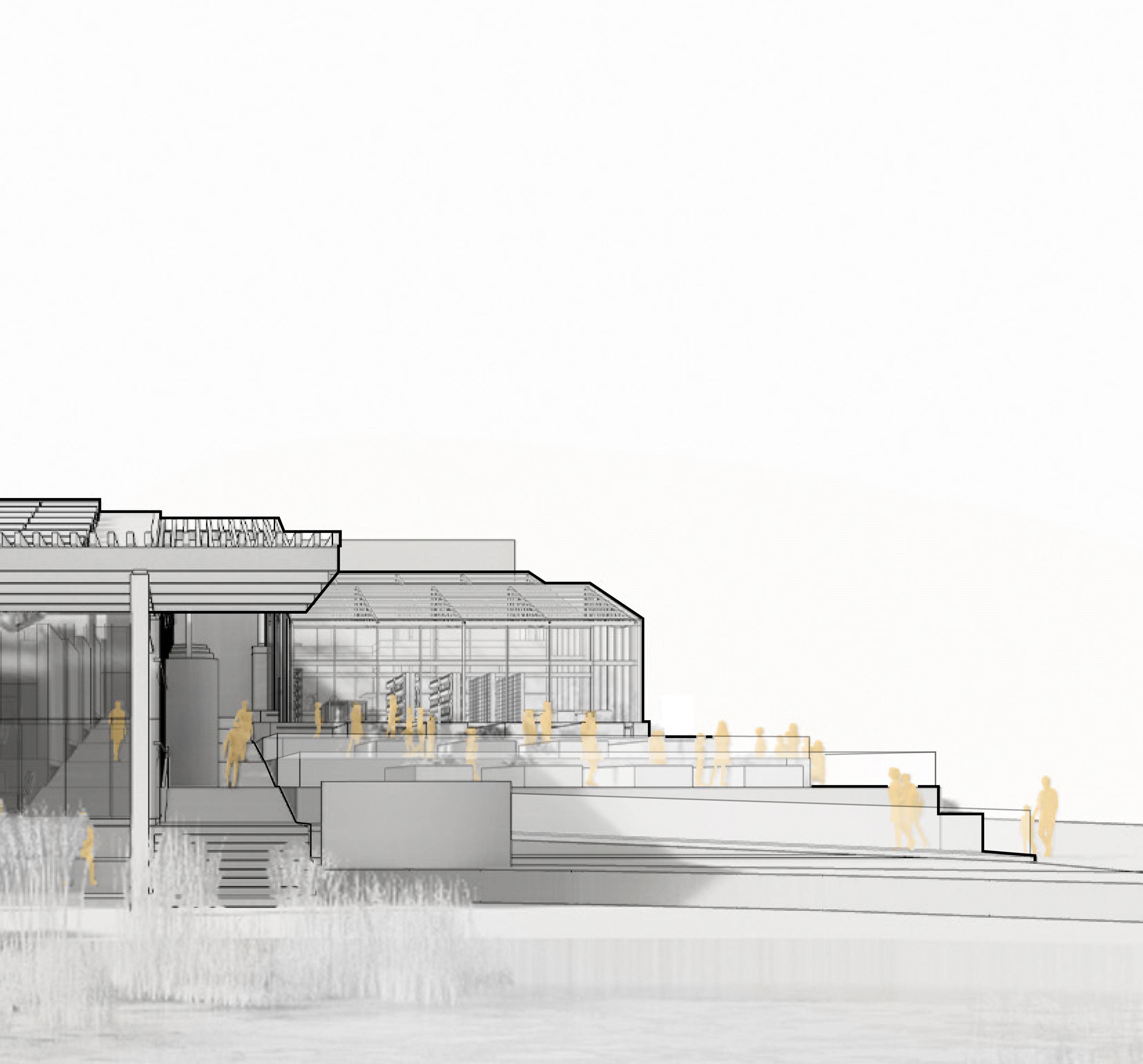
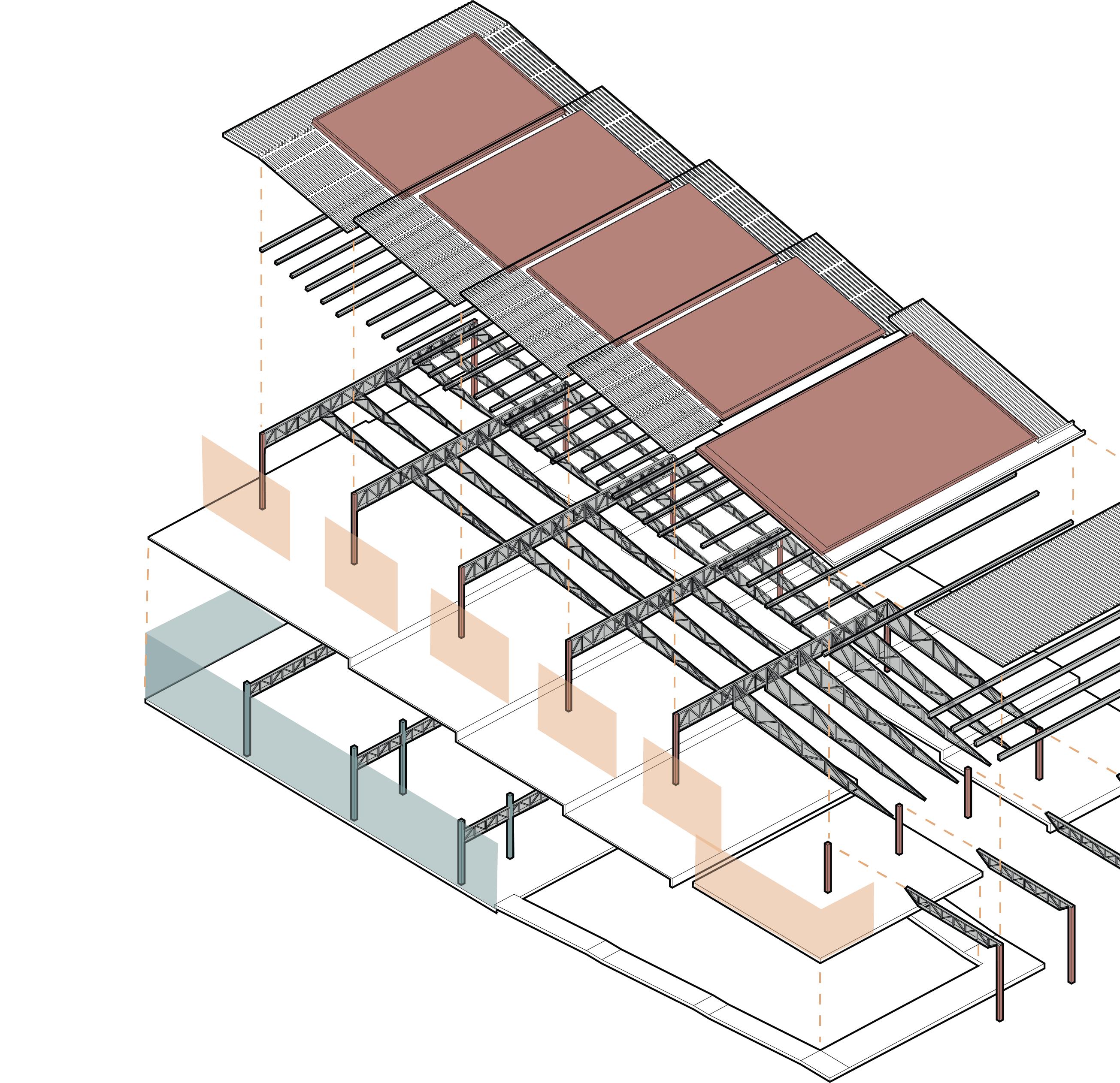
In order to be both efficient and loyal to the Materials petal of the Living Building Challenge, a variety of materials were chosen for the macro-scale structure. All of these choices are Red List friendly. The S.I.R.E. walls, which act as bearing walls, give the illustion of the earth fracturing.


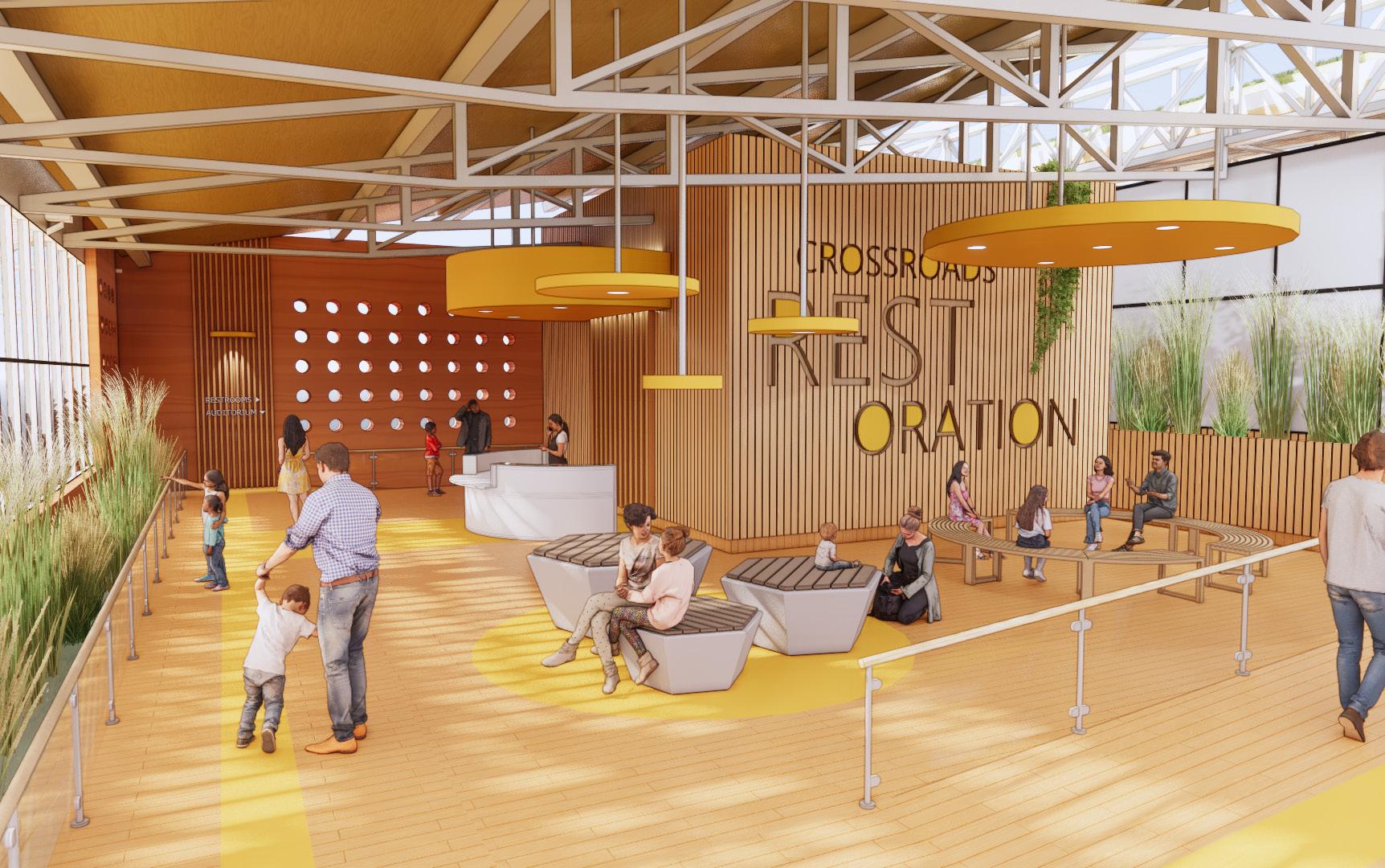
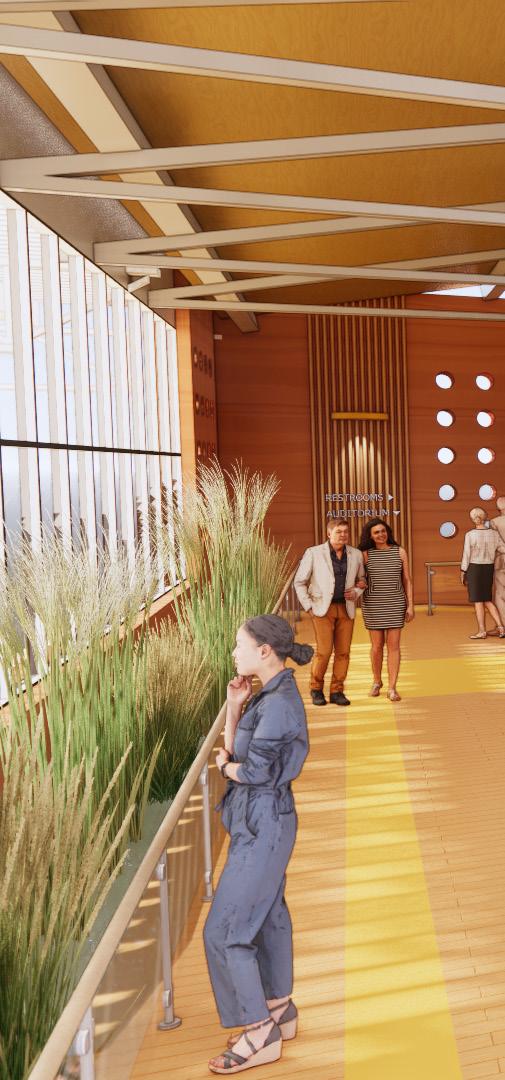
The lobby is the hub of Crossroads Restoration Center. Here, schoolchildren can gather while waiting for their first workshop. On the weekends, a farmers’ market can pop up to display the food grown on-site. This programmatic flexibility allows the Center to serve its community every day of the week.


DISTILLERY 60,000 GSF
1800 OAK ST. KANSAS CITY, MO
TODD ACHELPOHL | SPRING 2020
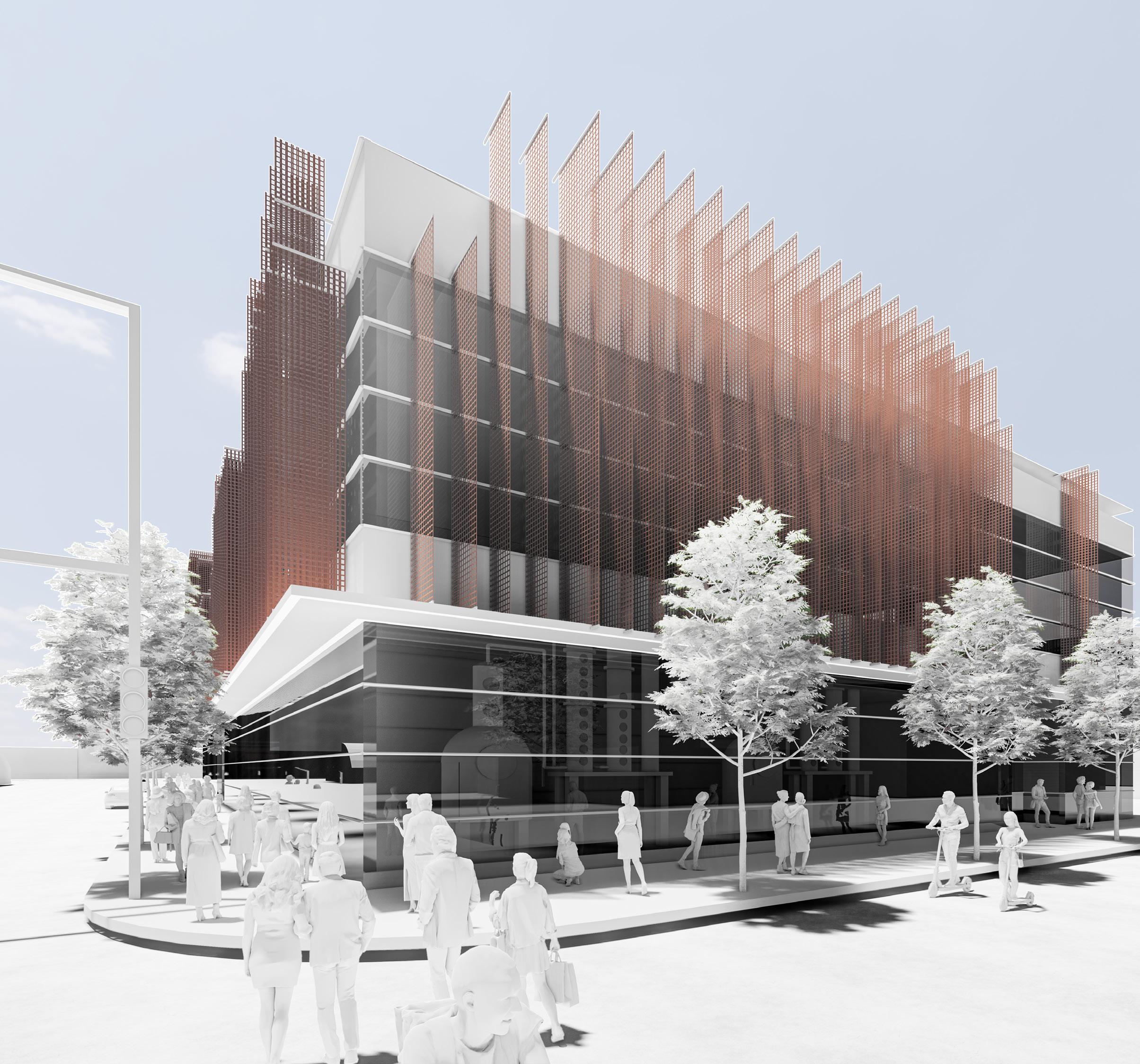
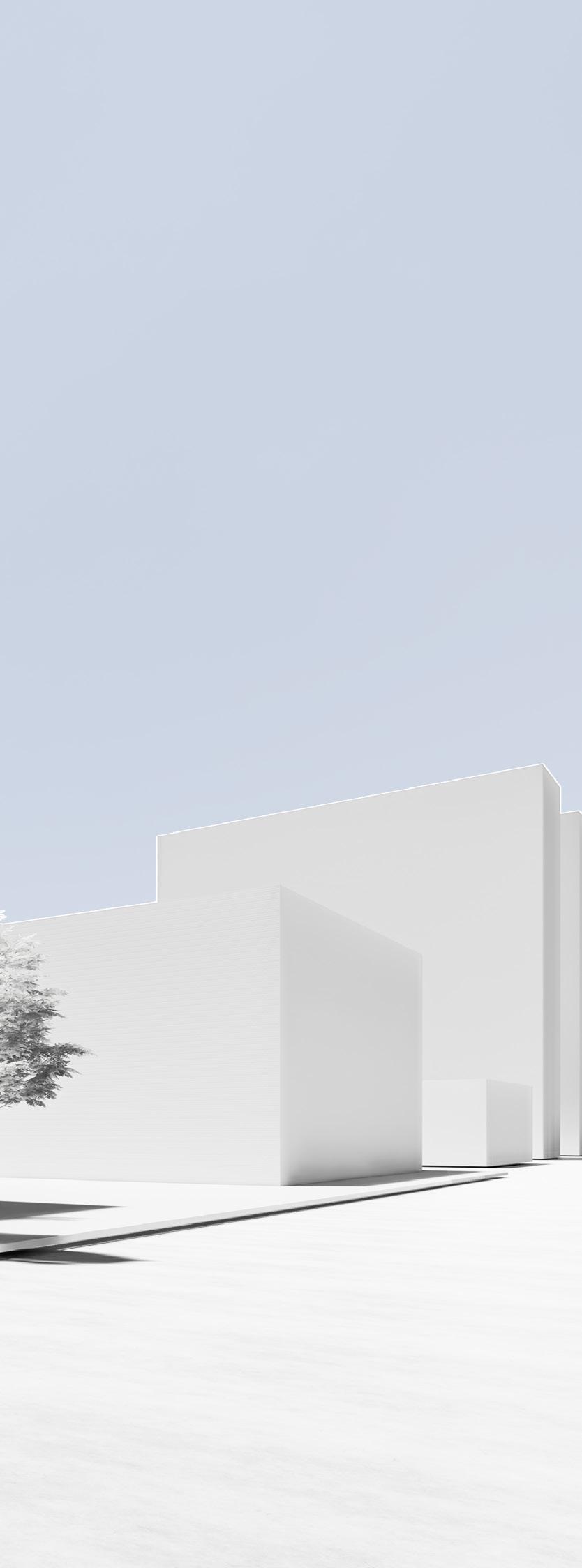
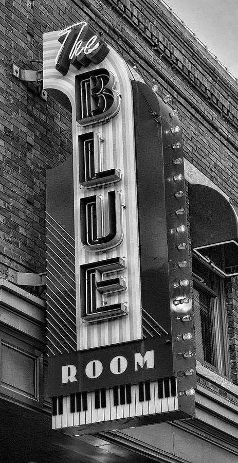
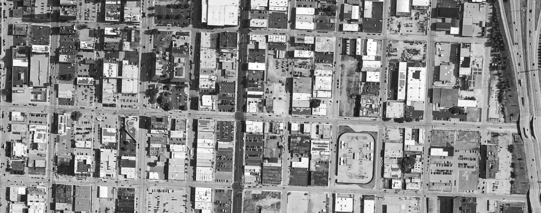
On a hot-spot corner of 18th Street in Kansas City, MO, Measure Distillery references the Jazz District a few blocks east—experientially and architecturally.
For those who come to enjoy a distilled beverage or for those who work in the production facilities, Measure Distillery is functional and poetic.
The narrative of a project must be the anchor for every decision. It is critical to remain focused on the intent of the concept.
On the initial site visit, I drove right past the lot without realizing it. That reiterated the challenge from my professor to make this corner a significant place along the 18th Street experience. Although the building program would have to be oriented along the north-south axis, it was still important to find ways to increase solar access. Key views to the south were asking to be features of the event space of the distillery’s program. A lack of any plantings made the site feel cold and sad, so brining life back to the street was also an important goal for the distillery.


•
•
•
•
•


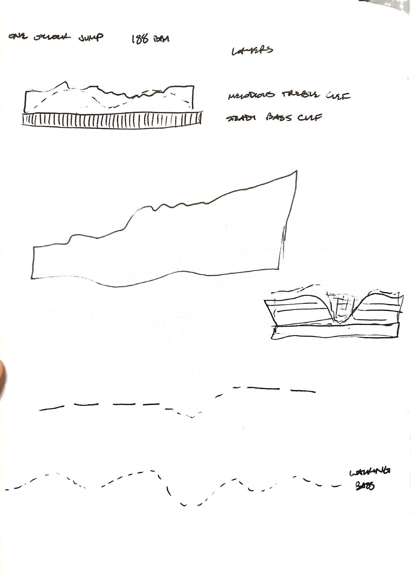
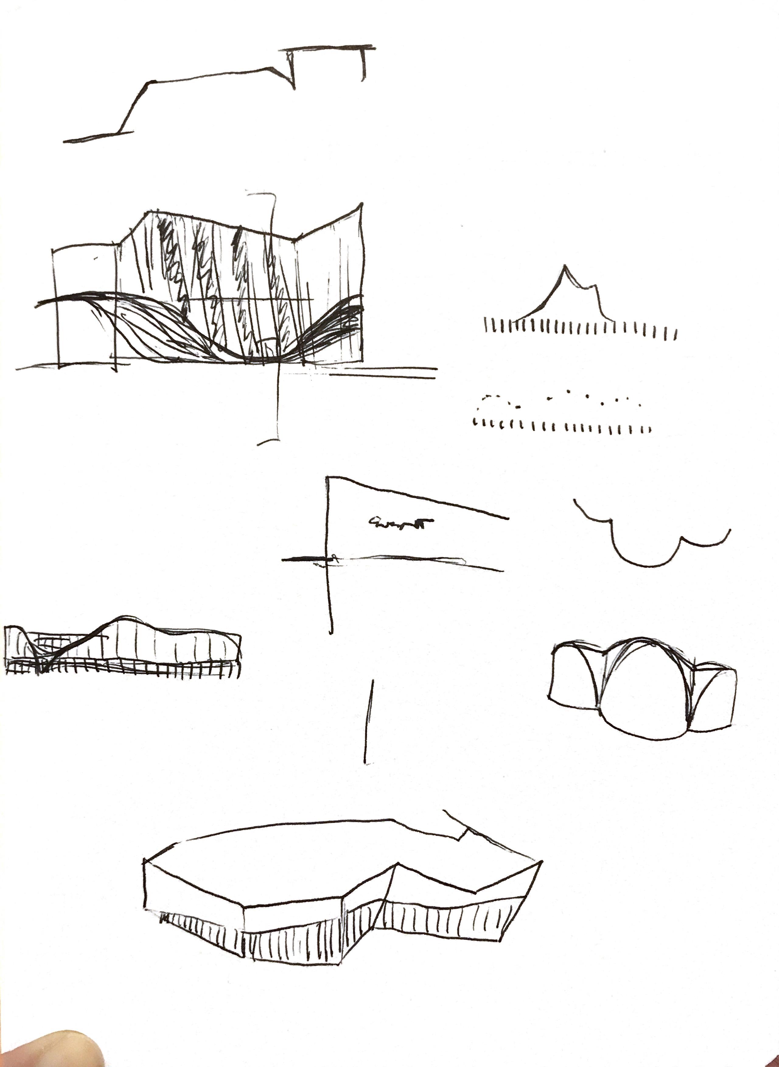
How can a distillery on the to-bedeveloped 18th Street Corridor make a connection to the isolated Jazz District? The answer to this question was directly inspired by the song “One O’Clock Jump” by Count Basie, an influential jazz artist in Kansas City. In listening to this song, the I began to see the notes in my mind as leaping vectors atop steady geometry. The form developed from there as an expressive treble clef in partnership with a lower, heavier bass clef.

The building envelope system became the articulation of this expression. The melody of “One O’Clock Jump” is mapped out on the upper story, which represents the treble clef. Each mesh panel is a note’s tone and duration. The bass clef, then, is expressed as a high performance glazing unitized curtain wall system.


A bridge between the towers creates a common place for residents with rooftop activities (see elevation).
A bridge between the towers creates a common place for residents with rooftop activities (see elevation).
A bridge between the towers creates a common place for residents with rooftop activities (see elevation).
A bridge between the towers creates a common place for residents with rooftop activities (see elevation).
The stills are the feature of Measure, visible from both Oak Street and 18th Street. The ground level spaces have more mellow, repetitive functions—just like a bassline in jazz music. The upper story, however, houses the event spaces, which connotate excitement like the trebel clef.








Production spaces, accessible only to employees, are on Measure’s west half.


Private offices upstairs have views into the still rooms, which are also visible from the street and the main lobby. The east half is designated for public use and public viewing into the distilling production.
1. Open offices 2. Private office 3. Employee locker room 4. Employee lobby from 18th 5. Stills
Solorepercia que non conecture volorum aceaquamenis sunt volum recullitas il idigendus, nonse modi doluptatis et lautem est aperspic tenimpe ruptae doles dunt porrum quos aperum ipsunto eum que est ipidebis dolecatem dolor aut veligeniamus si num enimolupta nonsenist, quibusam core la dolo et, cum, abor rentinctur? Edi omnihictem sum et et lat officimagnis excerrum quia que commoloris am volorere incitatiat est verum volupta tionem re laccate cor as abo. Et reptatur aut am, quostion cullias et, cuscia ius initae por apid minis aut apisimp oresedit molupiet porunt prepelenet officitium

In developing the design from concept to proposal, much attention was given to IBC requirements as well as how Measure Distillery would actually function. This project was my first experience using the IBC and drawing a wall section. Both the 3D and 2D wall sections show a unitized curtain wall system hung from a steel frame. Each mesh panel along the second story skin represents one note from Count Basie’s “One O’Clock Jump.” A panel’s length and width were determined by the tone and duration of its corresponding note. Measure’s “treble” envelope is a visual melody.
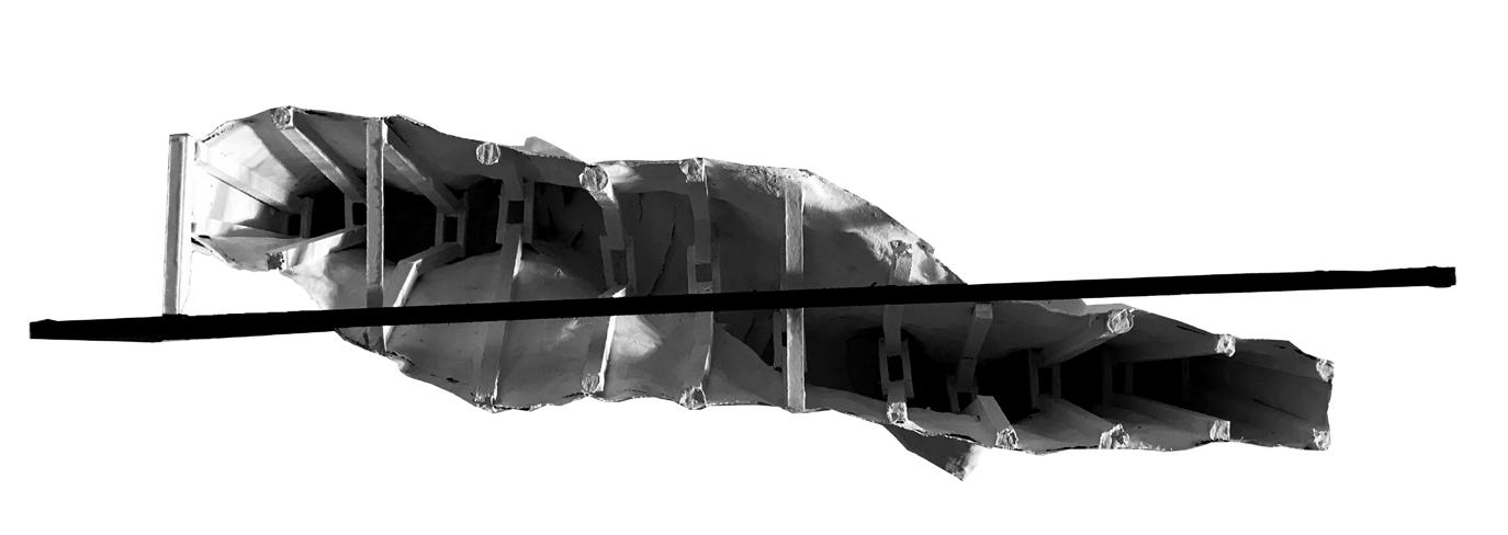
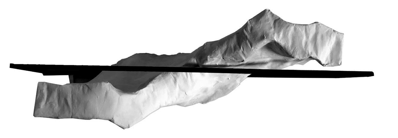
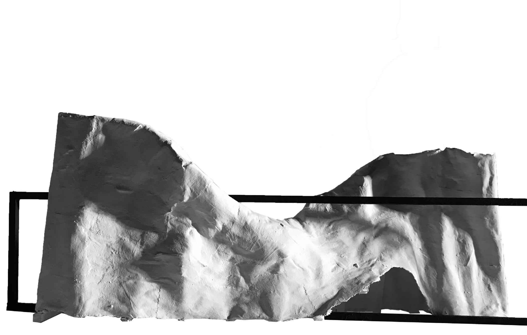
This model was completed as part of a project during first year studio. It is an abstraction of motion through time. The moving subject stood on one side of a handrail, ducked underneath, and stood again on the other side. Basswood frames represent each frame of motion. The papier-mâché shell represents the continuity of the movement.
This was completed in high school for a hyperrealistic drawing assignment. I chose to draw Matty Healy, lead singer of The 1975. I learned a lot about the effectiveness of contrast, light, shadow, and textures.

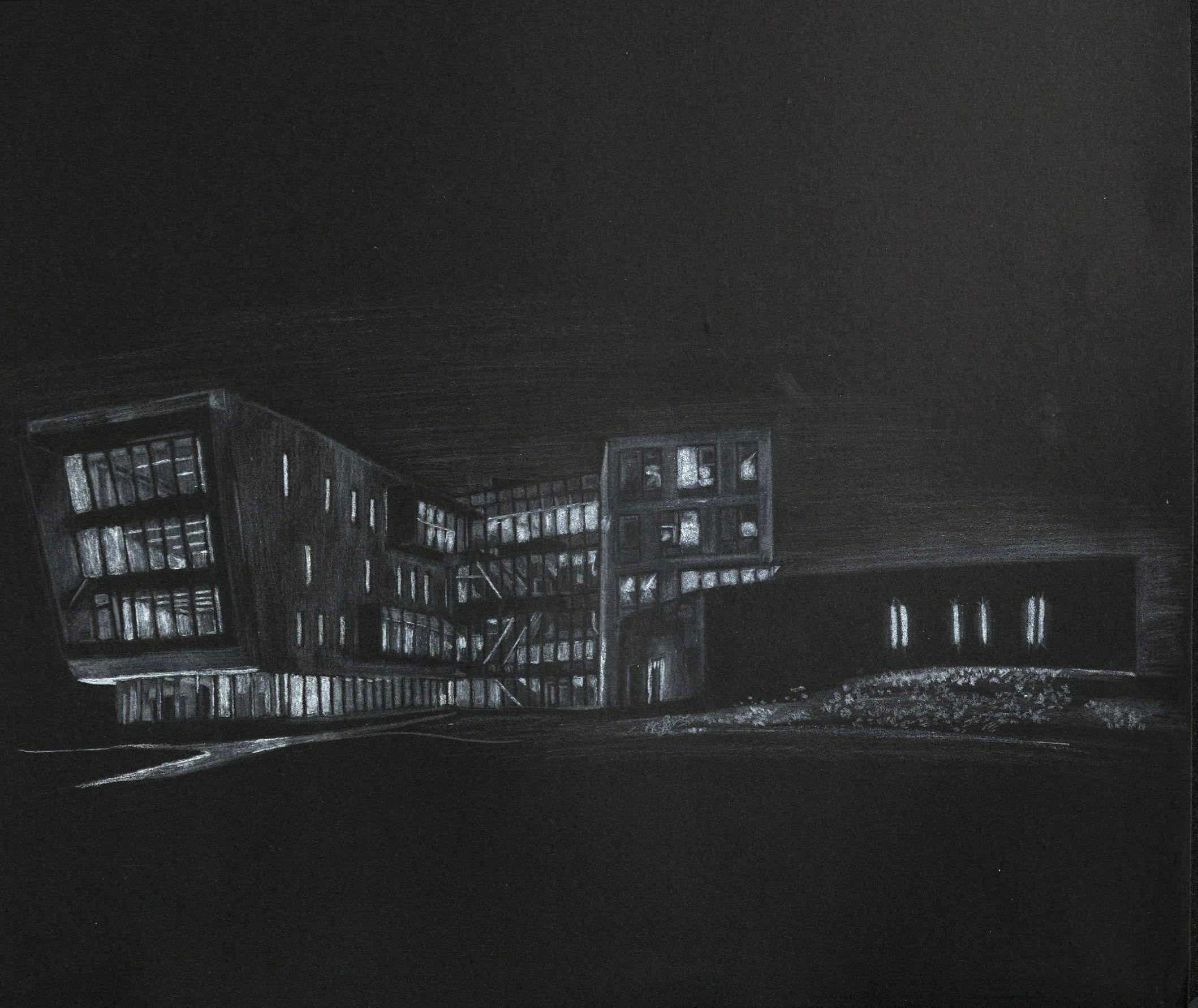
An assignment in my first studio, this drawing was an exercise in seeing and in the impact of light.
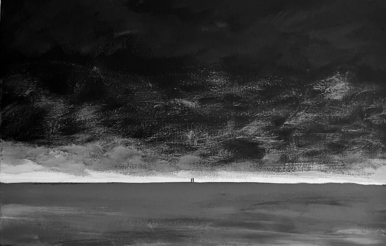
The fall of 2021 was one of the darkest times of my life. This painting expresses the oppressive, heavy clouds I felt trapped in for months. It also shows two figures, nearly enveloped but still there, walking together. One is me, and the other is Jesus, without whom I would not have been delivered from the darkness, and who walks with me through it all.
During the heightened racial tensions of the summer of 2020, my close friend Cason led a march in our hometown. This painting imagines the suffering of millions throughout hundreds of years, leading up to the present. Will the line of those walking in sorrow continue to grow?
