DESIGN PORTOLIO
MAAB ABDULRAHMAN
2021—2024
ARCHITECTURAL DESIGN
User Experience
Functionality
Innovation


2021—2024
ARCHITECTURAL DESIGN
User Experience
Functionality
Innovation
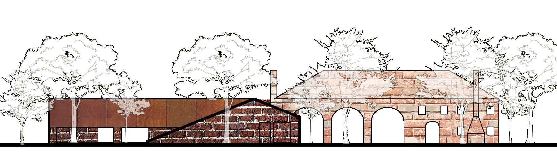
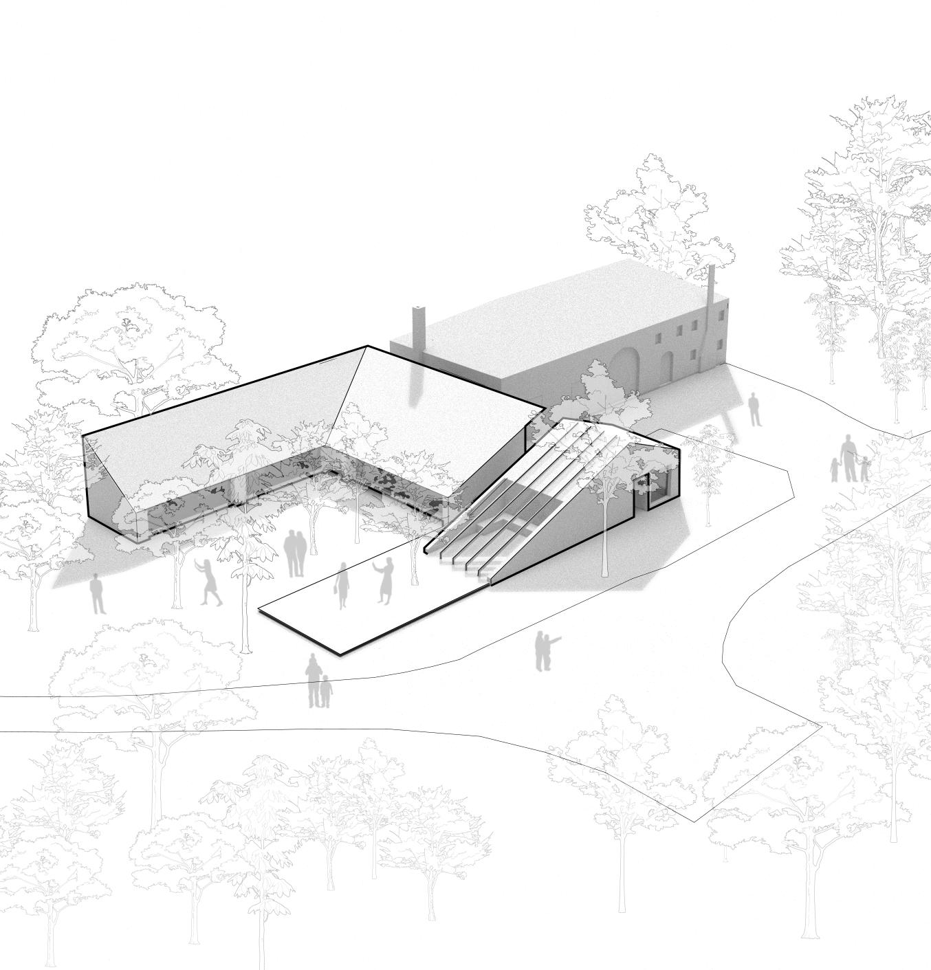
Location: Hjverfjall Volcano, Myvatan, Iceland
Type: Competition, Individual Project
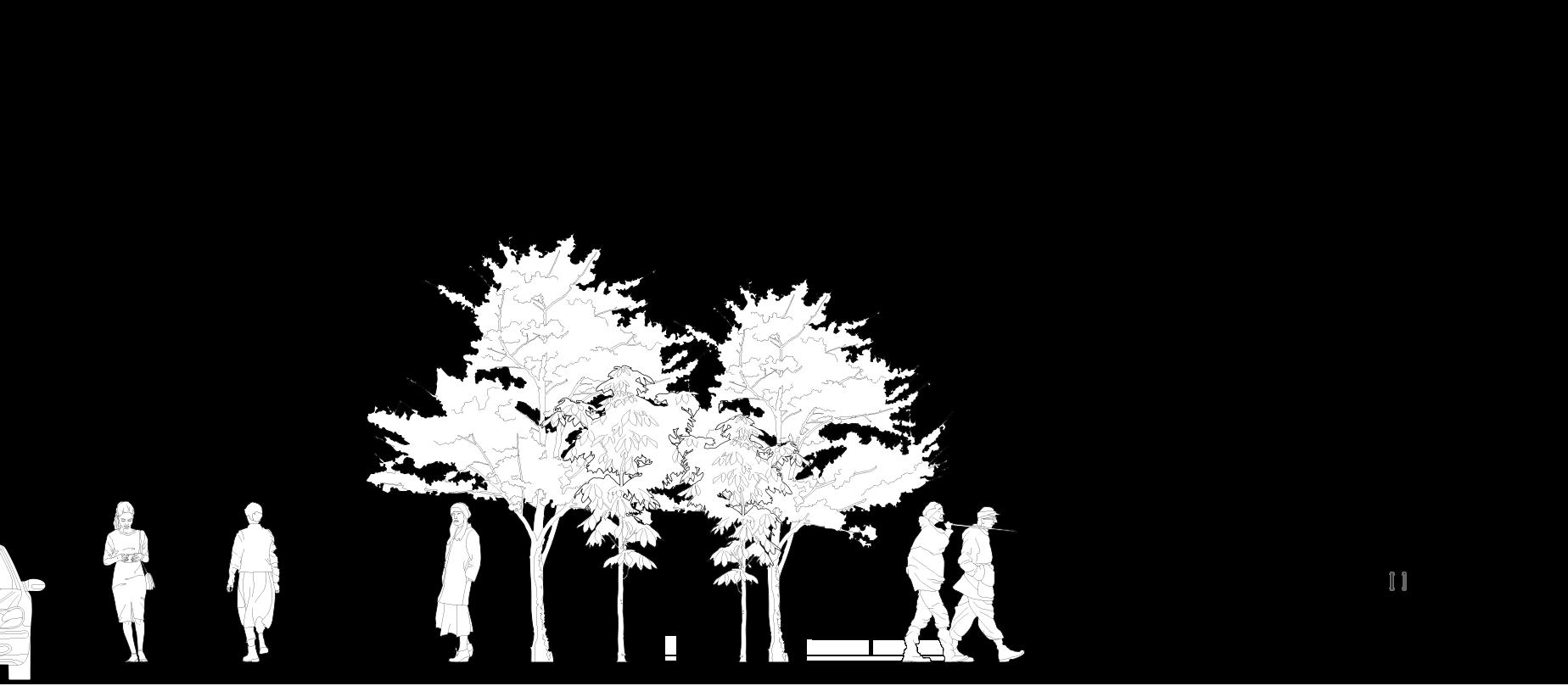
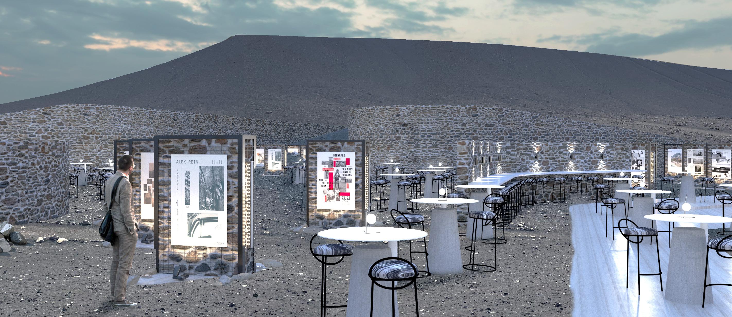
Hjverfjall Volcano is part of a bigger existing Icelandic tour and is close to several other tour spots in Myvatan. This proposal imagines Hjverfall as a center and connecting point in the area, and aims to improve the tour experience by adding an exhibition and coffee shop at the entrance to the volcano with little disturbance to the surrounding landscape.
The intervention is meant to act as a pause and interruption in the visitor’s tour for reflection and contemplation purposes; before and after hiking, the visitors are invited to explore the exhibition space or to relax in the surrounding seating areas. The open nature of the place highlights the grandiosity of the sky and landscape providing an aweinducing experience.
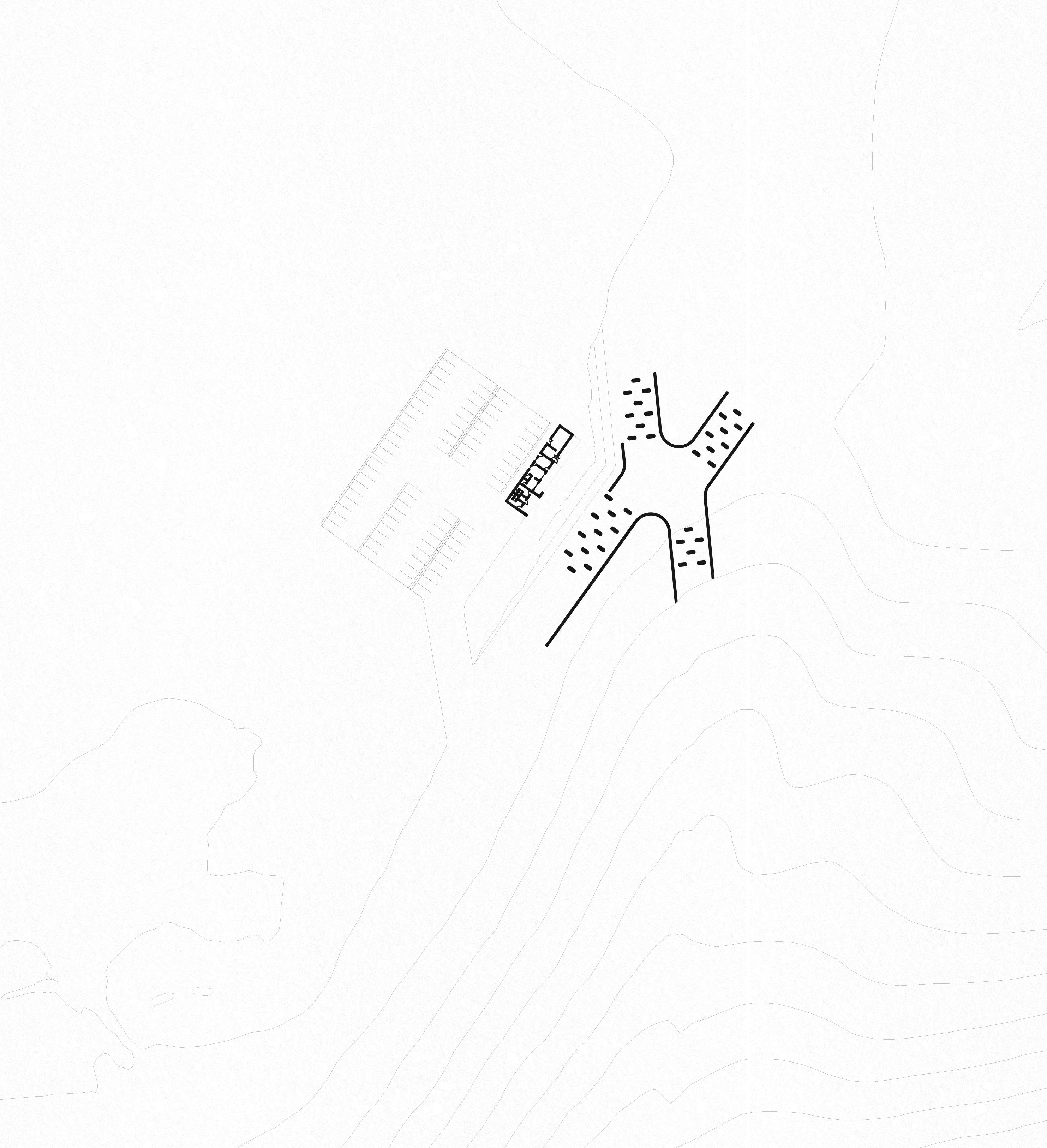
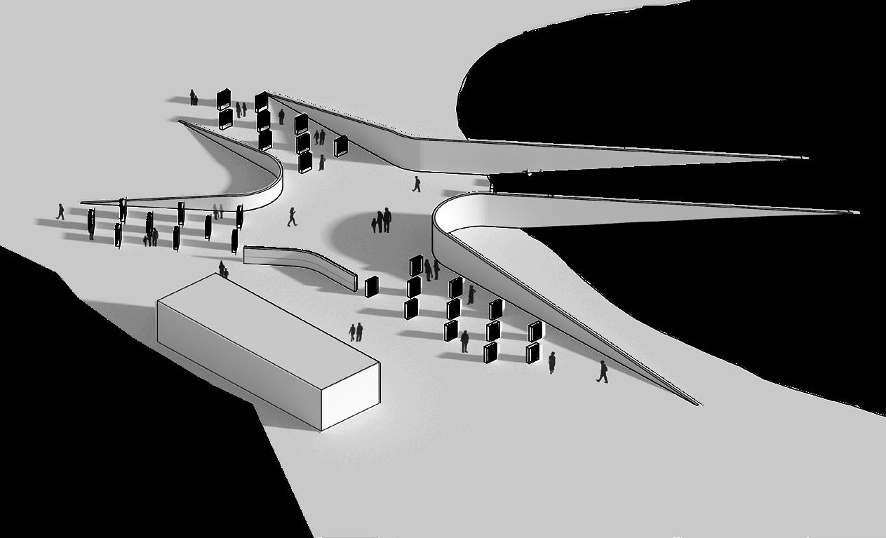
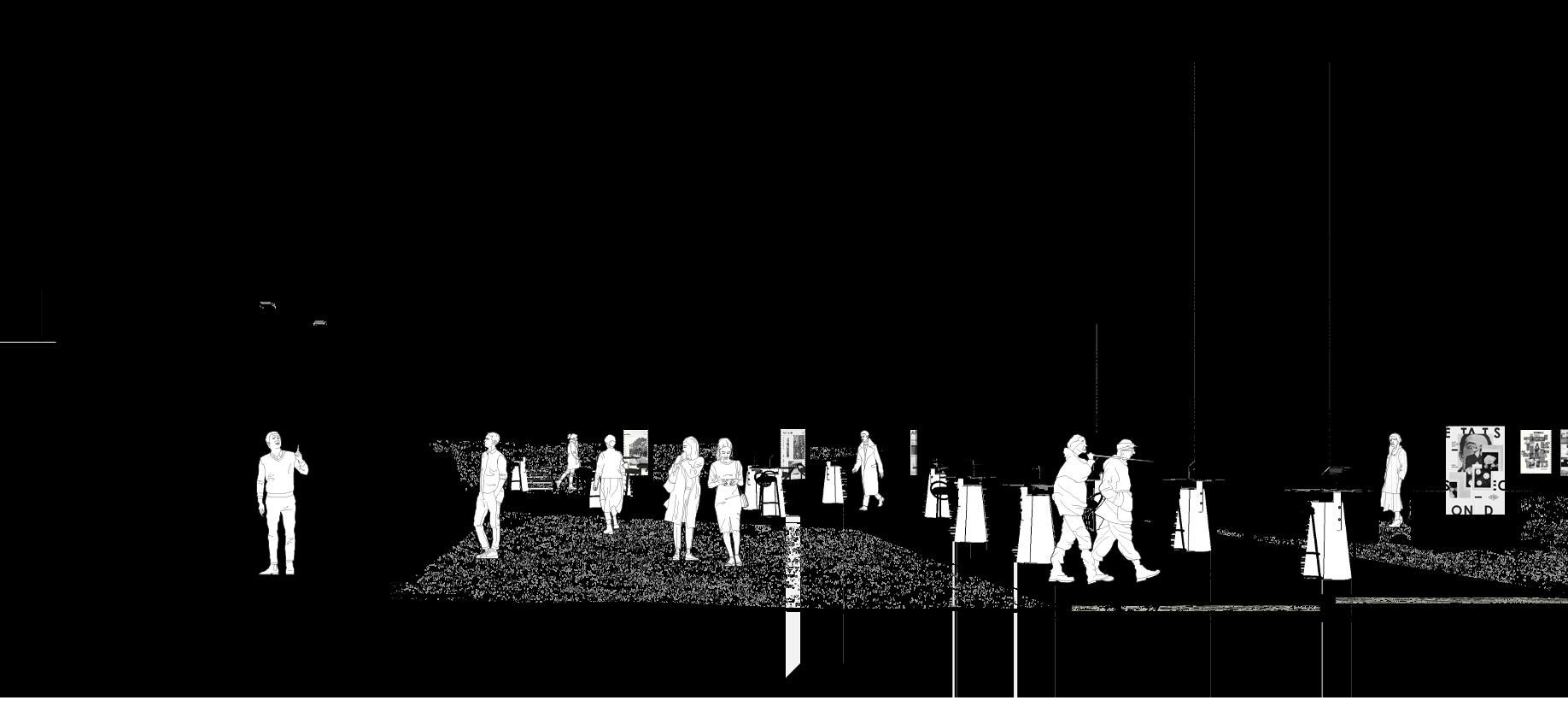
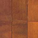
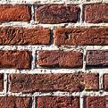
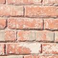
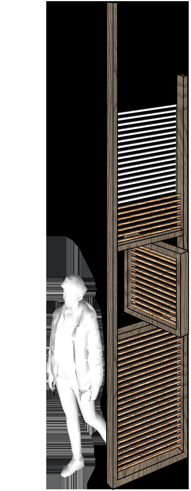
In keeping with the surroundings, the materials used are all natural and neutral in color. Stone /Gabion Walls define the exhibition space while wooden floors seamlessly merge with the soil. The coffee shop building is made of a prefabricated steel frame with thick stone and brick walls for insulation purposes.
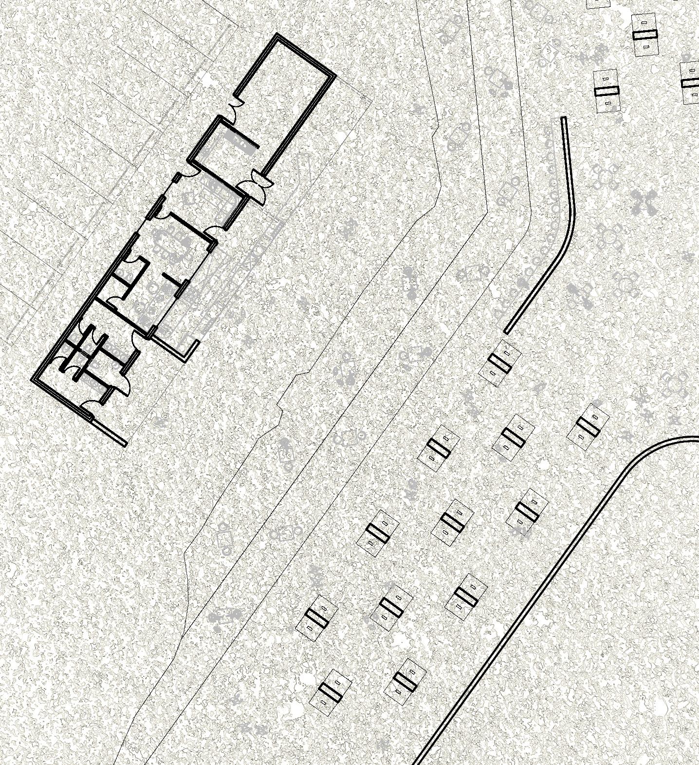
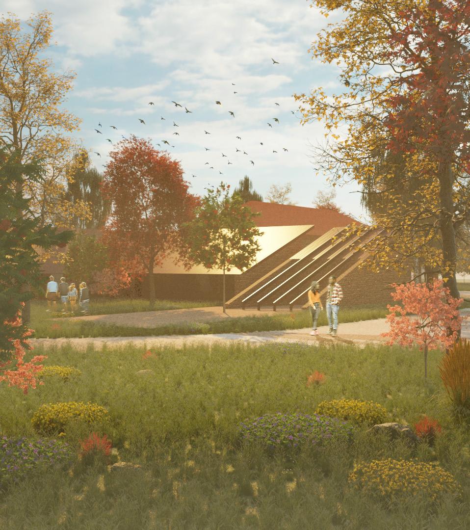
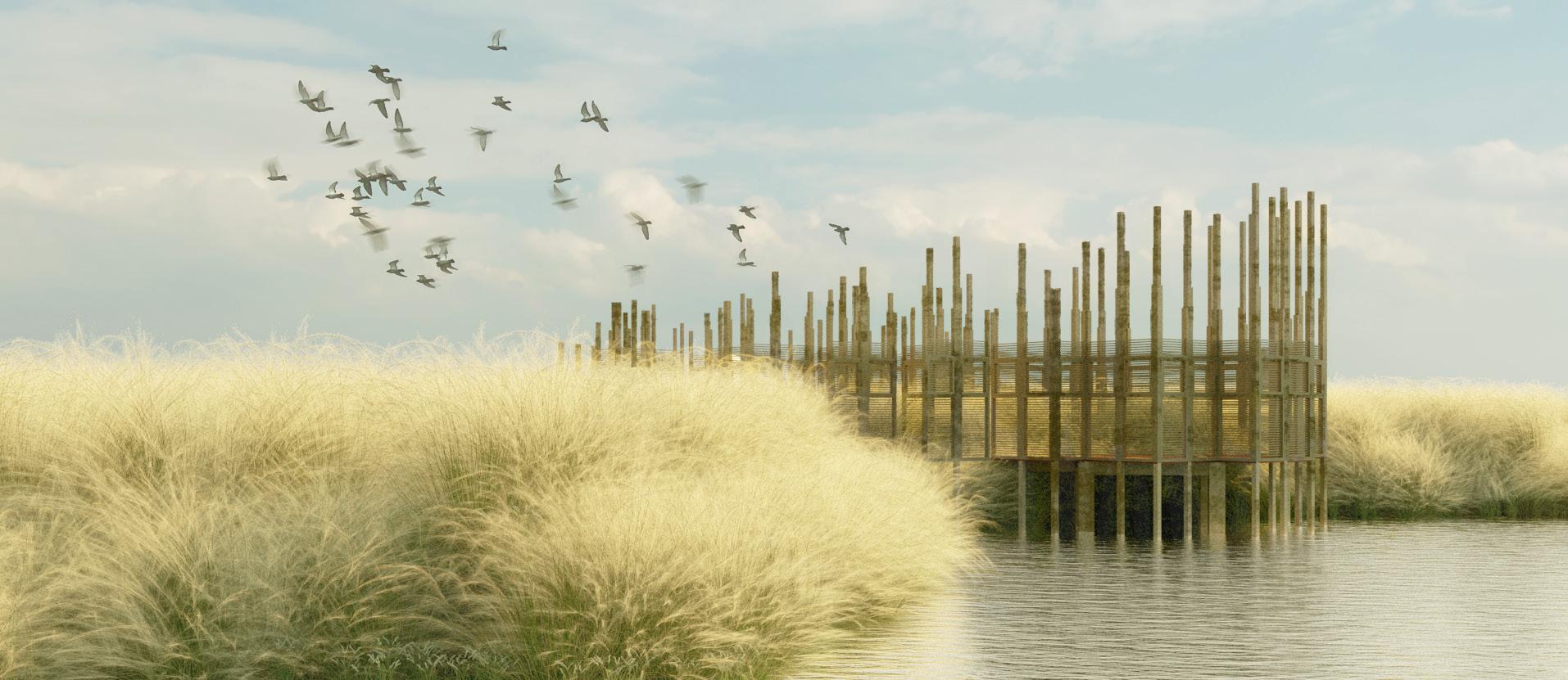
Location: Venetian Lagoon, Venice, Italy
Type: Workshop, Group Project
Supervisor: Francesca Singer, SANAA
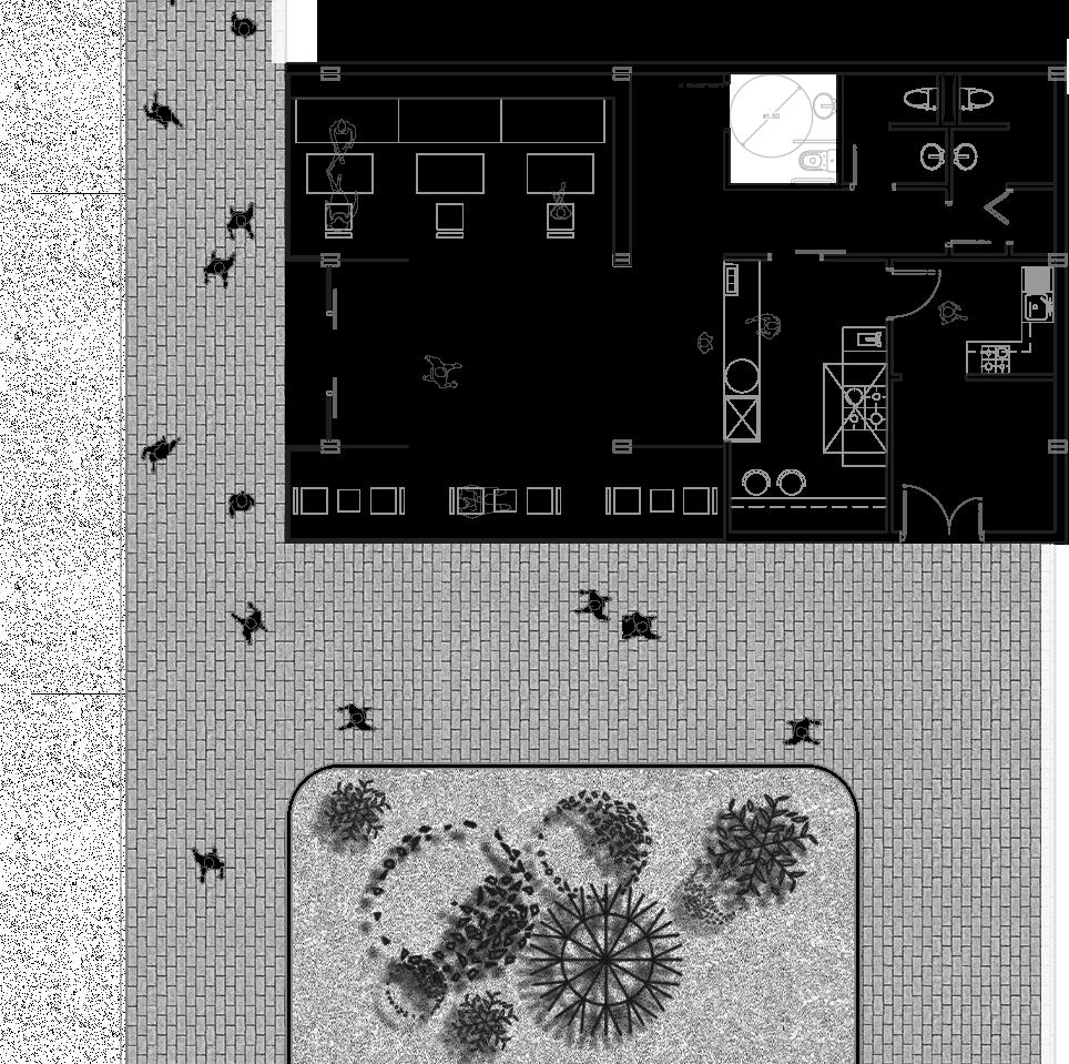
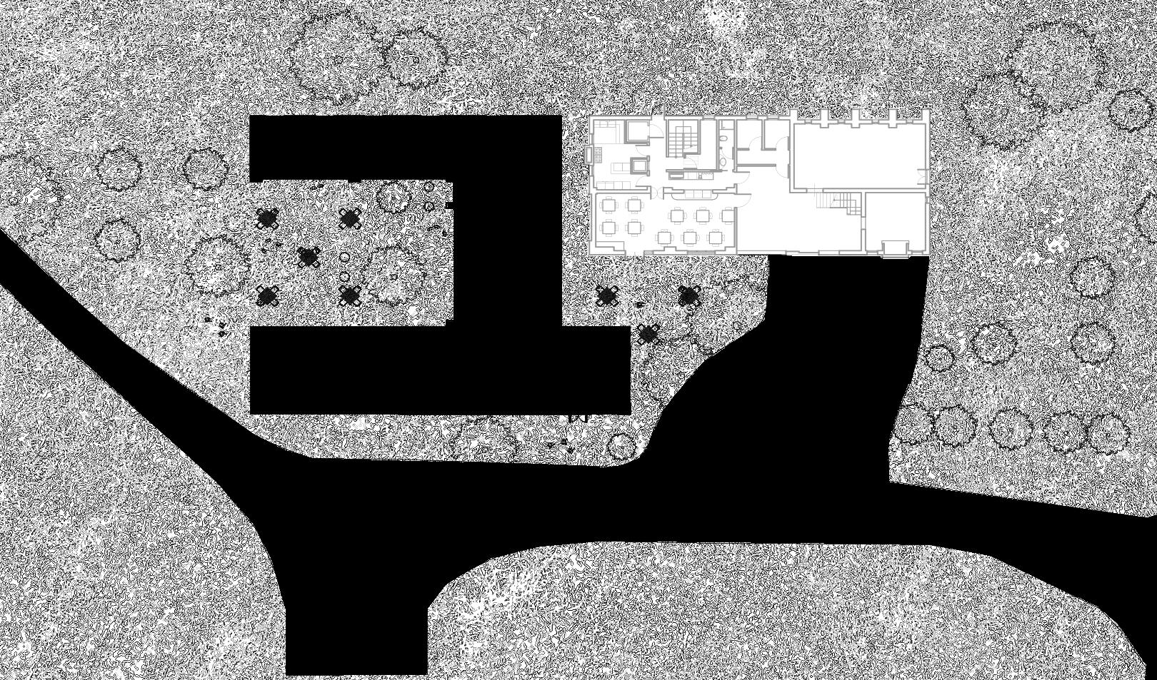
Valle Averto is recognized as one of the most important wetlands in the Venetian Lagoon for its diverse environmental variety (400 species of flora and plant habitat, 250 species of birds, and fishing valleys). This proposal envisions structures integrated with nature to highlight the special character of Valle Averto. The next few pages showcase my contribution to the project.
1
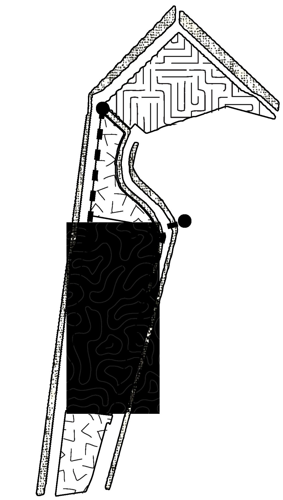
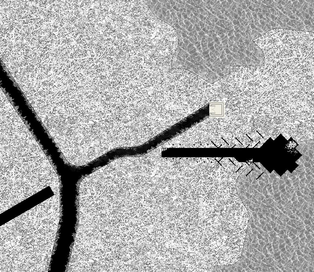
2 AREA OF INTERVENTION #2 AREA OF INTERVENTION #1 solves the erosion problem on-site with root wad revetment treatment and links existing broken paths with a new path along which 3 observation points are placed (tower, water, & ground level)
a research center located at the entrance near Ca’ Tiepola (existing welcome center)
2
3
4
5
6
7
8
9
10
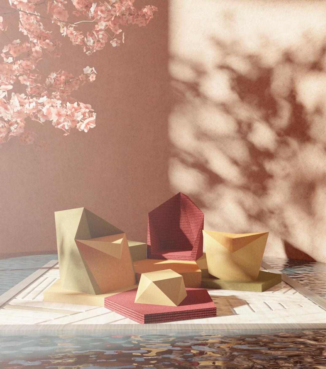
The materials, chosen for their colors and texture, are meant to complement and maintain the natural feeling of the location. Many trees located here are red, orange, and yellow.
Visitors are welcomed by the U-shaped research center where they will find an exhibition, pavilion space and a courtyard. The laboratories are located in a subbasement, allowing privacy but also maintaining a view and connection to the courtyard.
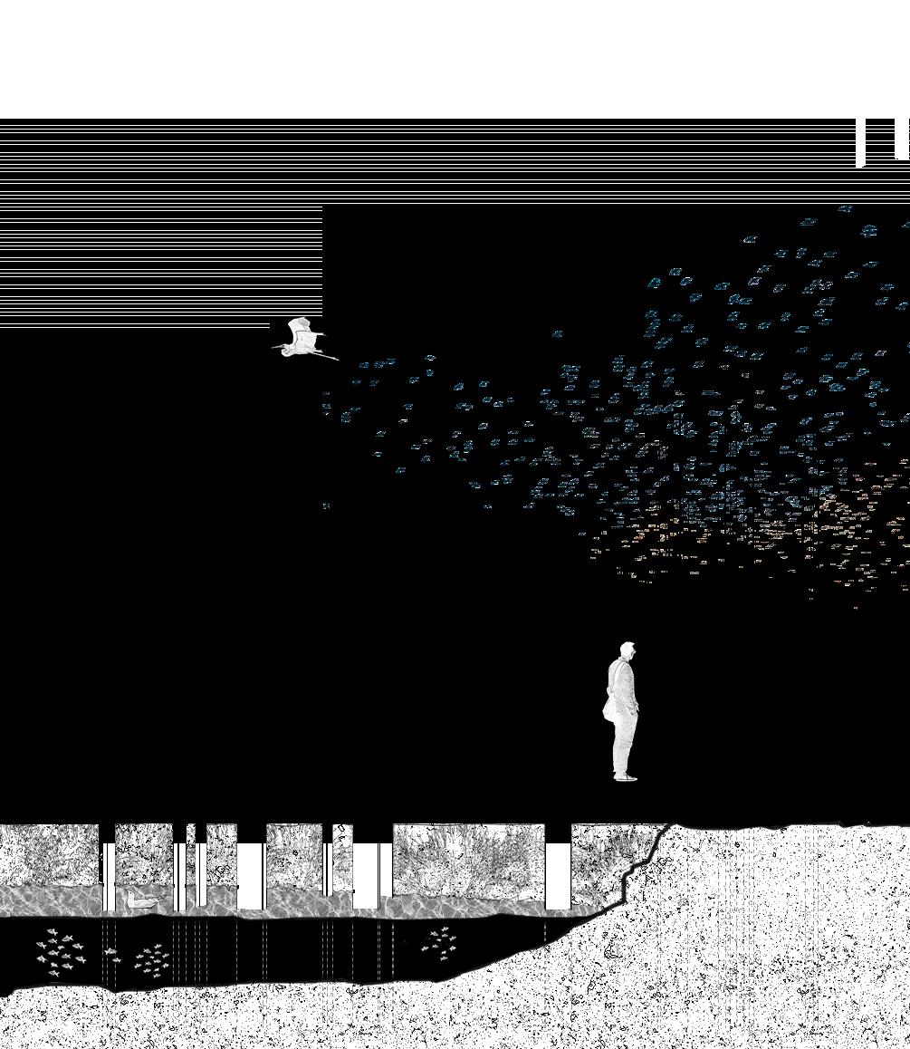
Valle Averto is one of the most important wetlands for migrant and breeding birds at both an international and national level.
Timber and reed, indigenous to the site, were used as the materials for the observation points.
A new path is proposed to link the broken existing paths. The observation points are located on the new path. This path is made of corten steel and is raised from the ground level by 0.45 m to minimize any type of physical disturbance to the land.
Using reed as inspiration for the form, the structure of the observation points is made of a shutter module that is repeated and rotated with height difference based on the location. This way, the site-sensitive design limits visual disturbance to animal life through camouflage.


Location: Milan Design Week
Type: Collaboration, Group Project
Supervisor: Melinda Matuz, and Caterina Micucci, UNStudio
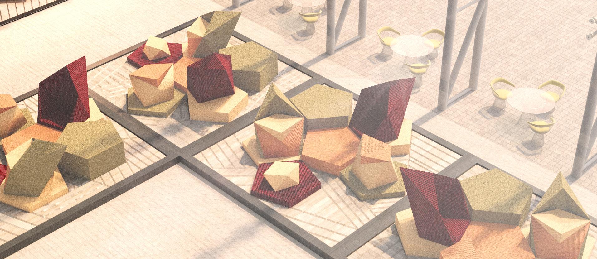
UNStudio has a new initiative to repurpose leftover products and translate them into new designs that enhance both the aesthetic and ethical values of the products. As part of an ongoing research project, we were asked to inspire our work from patterns archived within F.F.R.I. and use materials leftover from KVADRAT and Object Carpet to design collections to be used in public space. The next few pages showcase my contribution to the initiative.
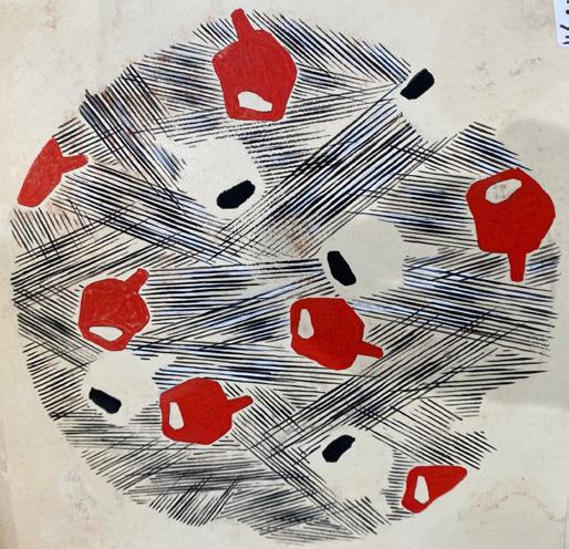
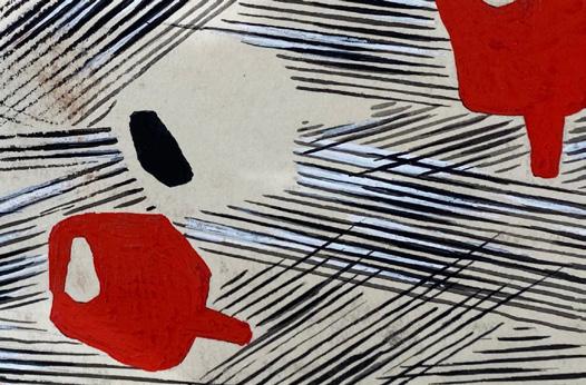
F.F.R.I PATTERN ANALYSIS AND FORMAL INSPIRATION
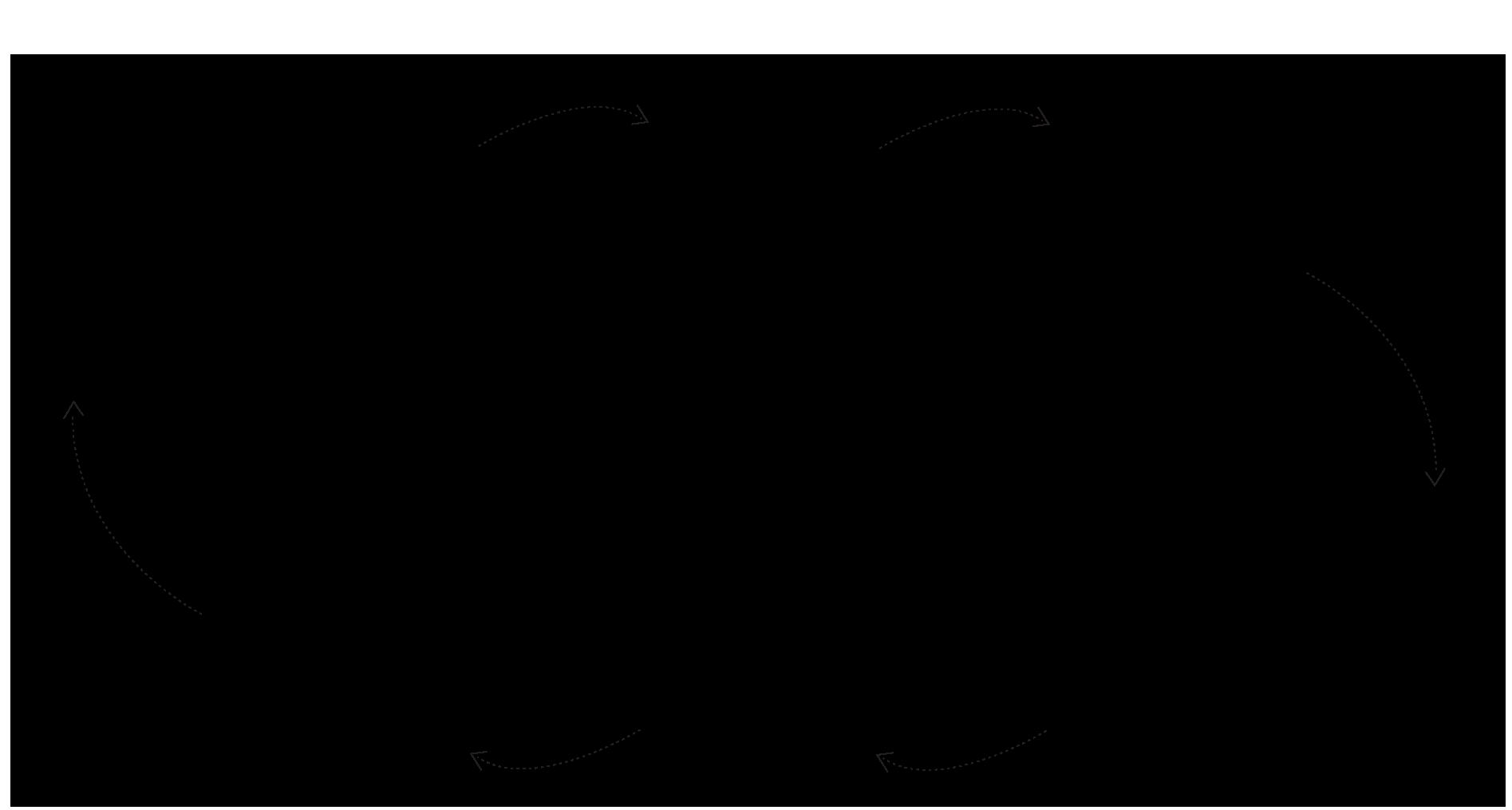
direction and movement aspect in pattern inspire the use of a dynamic shape and multiple configurations
repeated pentagon-like elements inspire the use of simple platonic shapes for the design
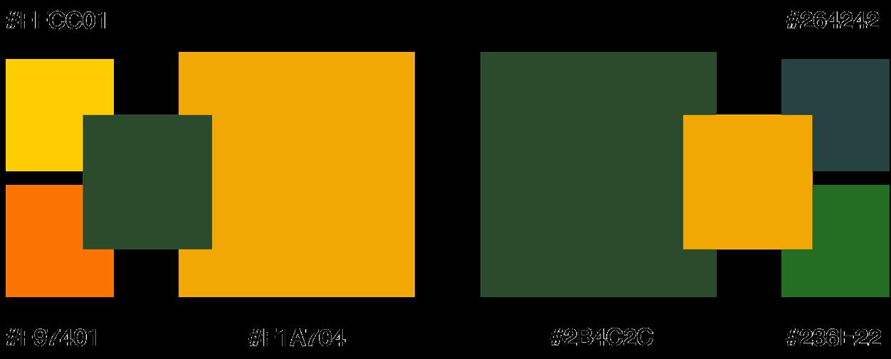
EMOTIONAL RELEVANCE COLOR PALETTE AND MATERIALS

EXPLODED ISOMETRIC DIAGRAM

1) cut materials into triangles
The pentagon-like shapes on the pattern resemble a school of fish; it represents diversity and openness; it denotes abundance, vastness, and part to whole relationship.
SEAT | CARPET FOLDING AND STITCHING PATTERN
SEAT | CARPTET PIECES AND THEIR DIMENSIONS


energy, passion, calm, focused, determined, harmonious, friendly
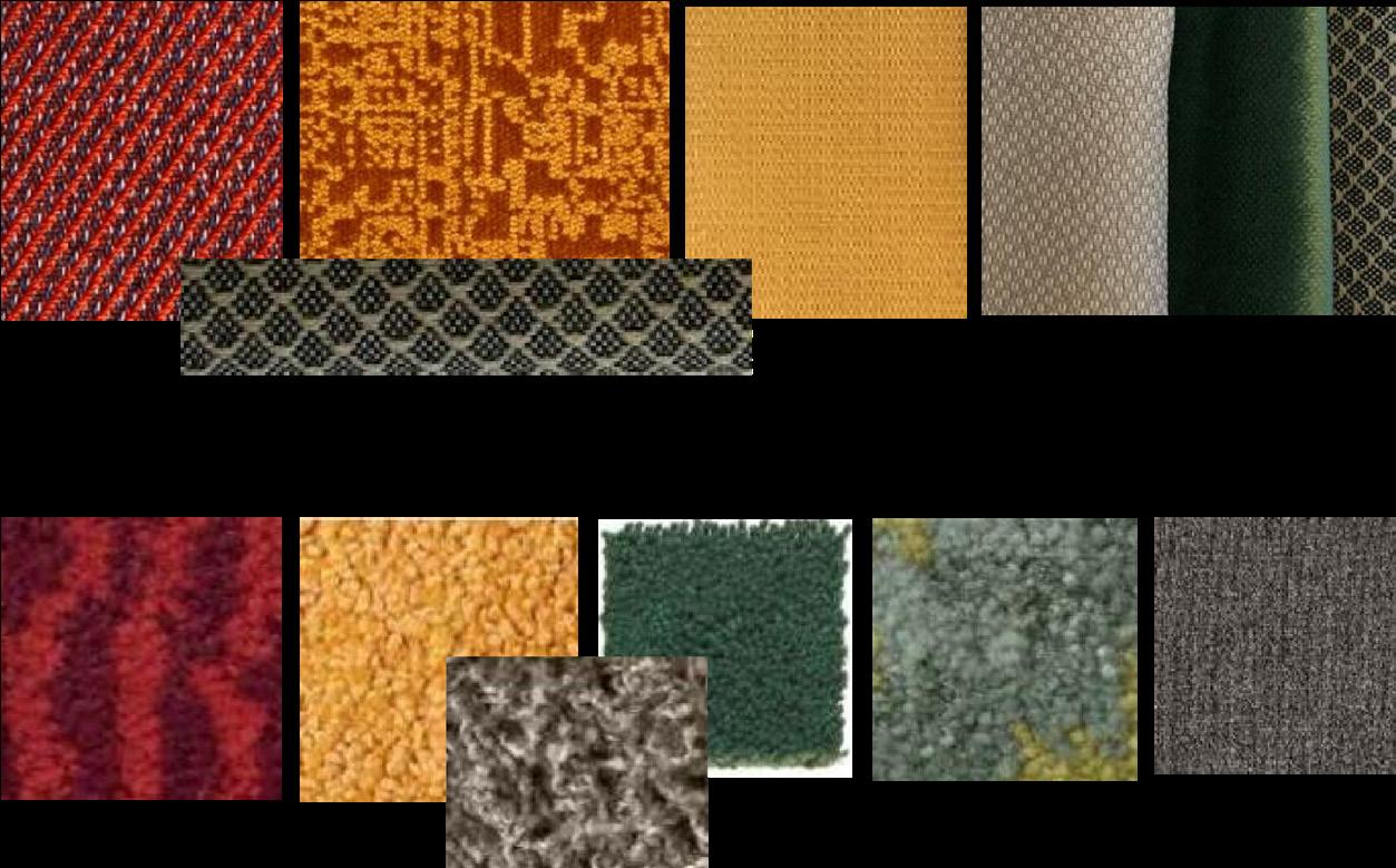
TEXTILE FROM KVADRAT
The general means through which all the elements are made is the same. For comfort purposes, the inside is either foam, or cotton according to function. In areas that require more stability and firmness, such as the lower area of the seat on the left, carpet with foam filling is used. The top part, on the other hand, is created using textile with soft cotton filling. The cut triangular pieces, in both cases, are laid in a certain pattern, inspired from origami, and stitched together to create the desired shape. thin cushions inside wooden frame 0.2m x 5.0m x 5.0m
CARPET FROM OBJECT CARPET
PRODUCT VARIATIONS
FLOOR SEAT TEXTILE COTTON FILLING

FOAM FILLING


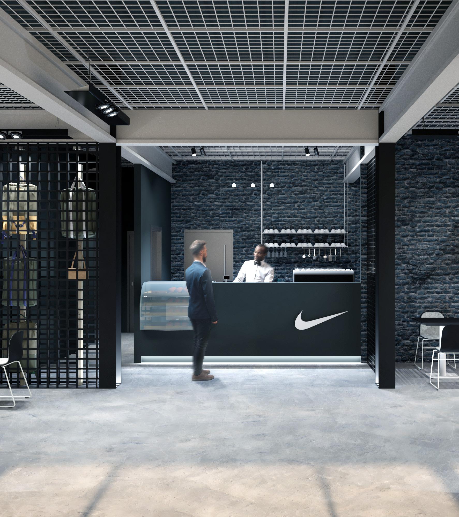
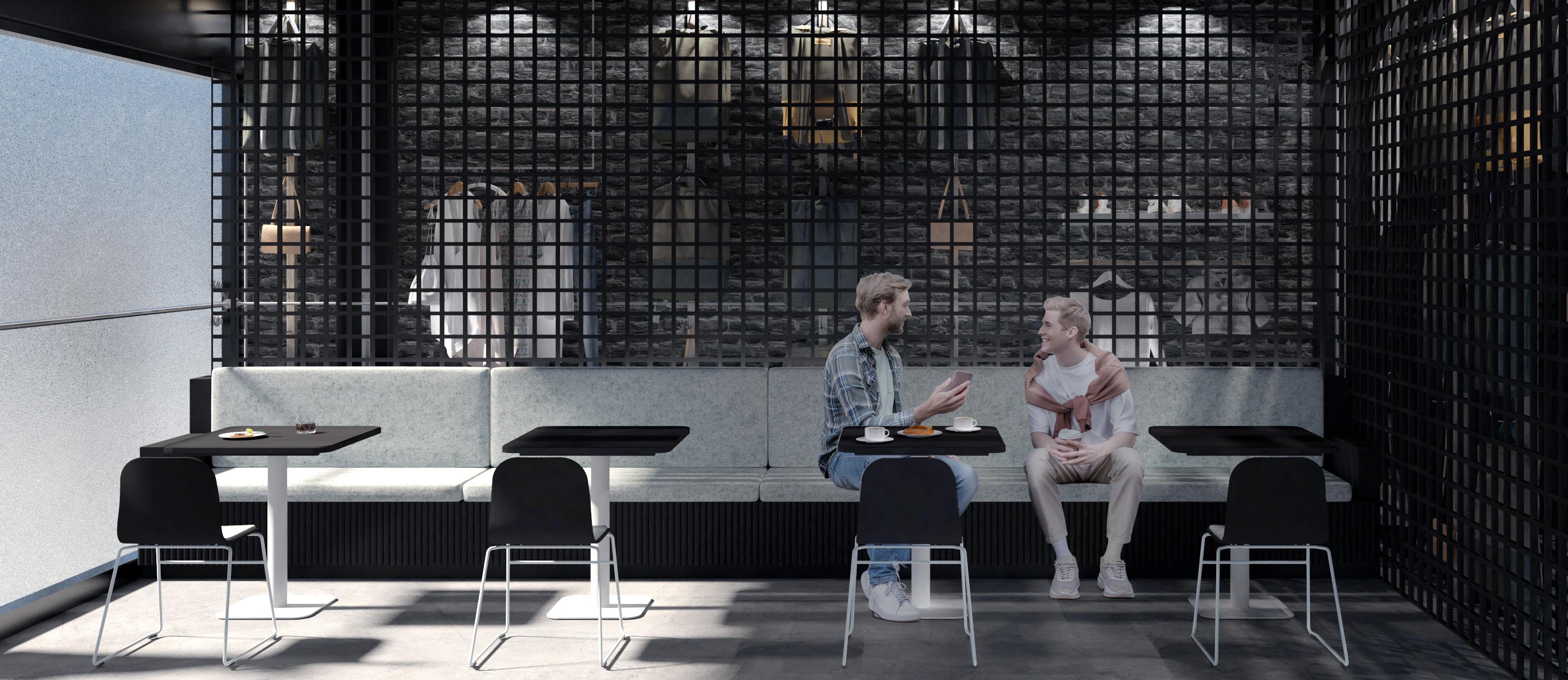
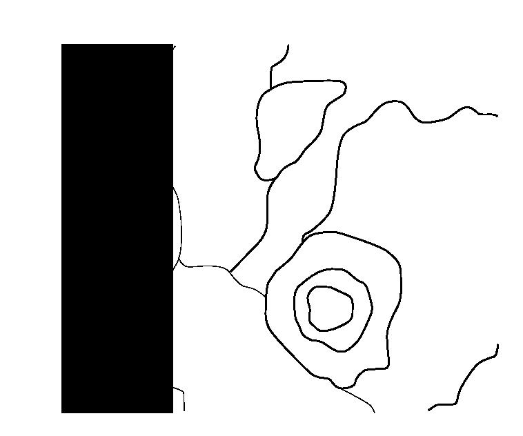
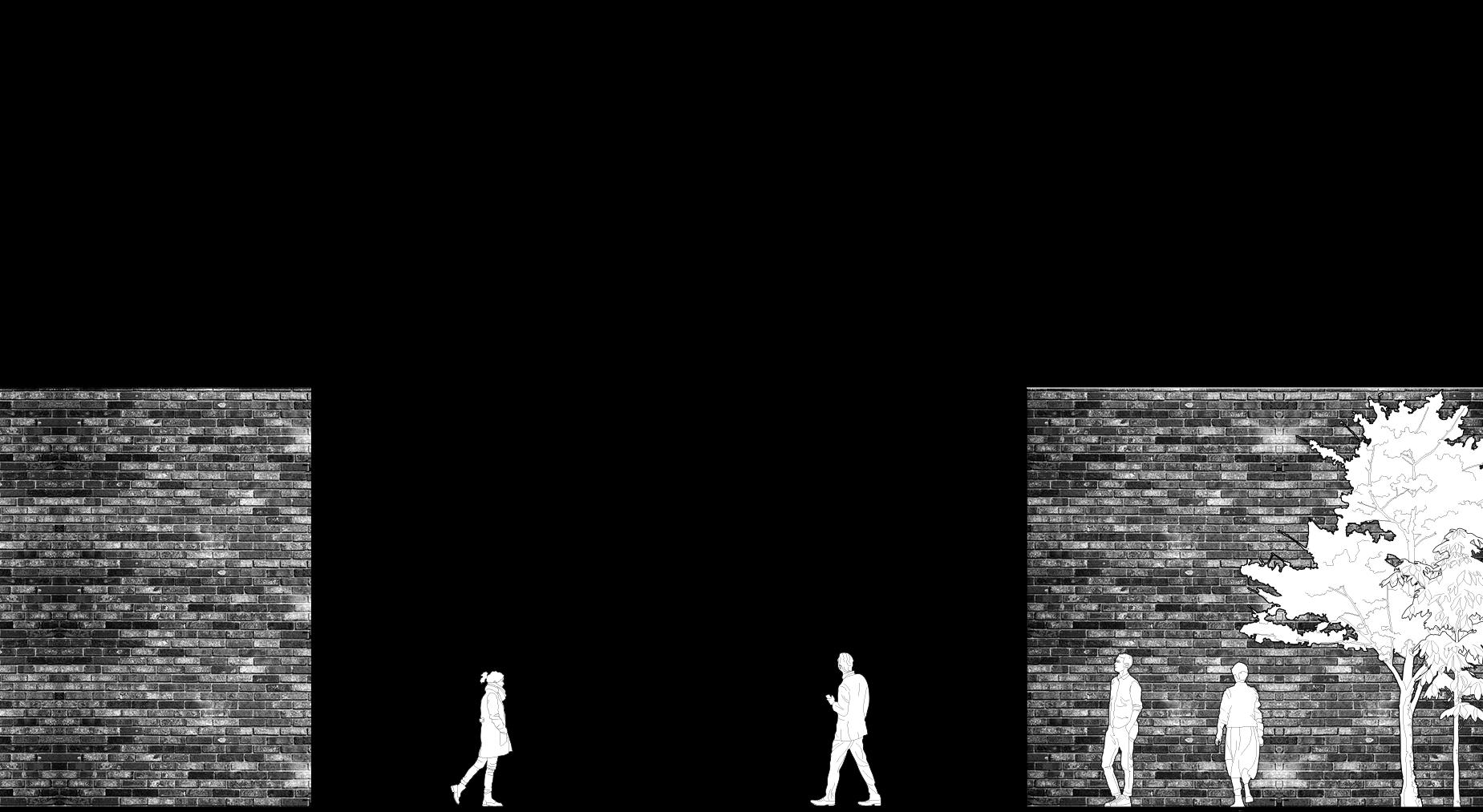
Location: Fictional City Center
Type: Personal, Individual Project
NIKE wants to strengthen their relationship with their customers by providing them with a common place to relax and recharge. Through this endeavor, it hopes to support its customers, as well as, exhibit and promote new products in a more casual and subtle way.
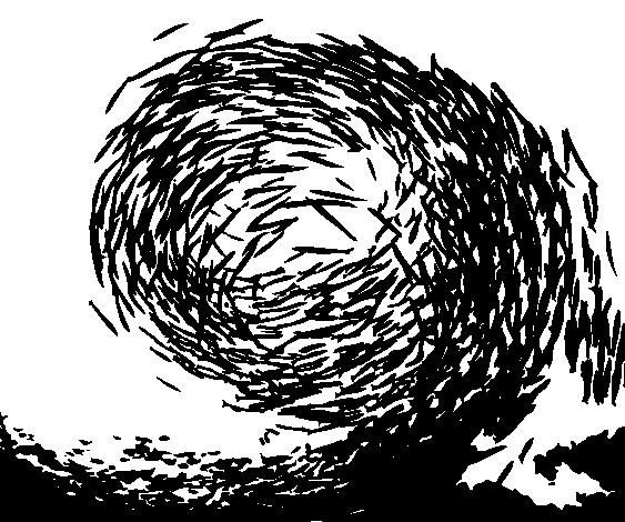
Instead of a buzzing coffee shop with a lot of activity and movement, NIKE΄s coffee shop is more timid but open. The intention is to give the coffee shop a «battery» sort of feel, or «power unit». Users are expected to use the space as a break but not an entire disconnection from the busy life in City Center. To do this, the coffee shop acts like a «black hole» luring people in with its dominant yet quiescent quality. By seamlessly exhibiting new products in the environment, the shop maintains NIKE΄s innovative and interactive initiatives without much «selling/ promoting» vibe.
INDUSTRIAL STYLE
CALM/ RELAXING

Consistent with Nike΄s retail style and brand colors

A place for recharging by using dim lighting and quiescent atmosphere
SUBTLE EXHIBIT

Products are used as part of the interior structures (partitions and accent walls)
Using Nike’s brand colors (Black and White), the design is minimalistic and simple. The dominant white simplicity of the exterior is contrasted with a more busy and dark interior where a variety of materials are used.