Summative_VIS Guide_MacyTaylor_GRAD602_V2.indd 1 10/25/23 1:25 PM
Brand Guideline Manual
02 Contents 03. Design Strategy Outline 04. Who we are 06. Where we are 08. Who we are for 10. Who is in our space 11. Where we fit 12. Best practice 15. Visual Identity System Guides 16. Our story 18. Logo guides 22. Colour guides 24. Patterns 27. Poutama mask 28. Typographic guides 29. Grid guides 30. Photography guides 32. Tonal values and brand voice 33. Application of Visual Identity System 34. Website 35. Exhibition promotions 36. Exterior signage 37. Interior signage 38. In-store ephemera 39. Membership card 40. Flyer 41. Membership box Summative_VIS Guide_MacyTaylor_GRAD602_V2.indd 2 10/25/23 1:25 PM
1. Design Strategy Outline
03
Summative_VIS Guide_MacyTaylor_GRAD602_V2.indd 3 10/25/23 1:25 PM
Who we are
Mission Statement:
It is our mission as a cultural institution to create a welcoming space for all which celebrates, informs and educates a diverse audience by sharing the cultural significance of patterns and motifs througout history.
Values: Inclusivity & accessibility
Cultural connection through open discussion
Preserving & exploring visual patterns and motifs
04
Summative_VIS Guide_MacyTaylor_GRAD602_V2.indd 4 10/25/23 1:25 PM
Characteristics:
Professional Fun & curious
Expressive
Educated & informative
Design Principles:
Minimalistic & modern Clean but earthy
Textural & visually balanced
Let exhibitions & photography shine through
Connected with the land & the iwi
05
Summative_VIS Guide_MacyTaylor_GRAD602_V2.indd 5 10/25/23 1:25 PM
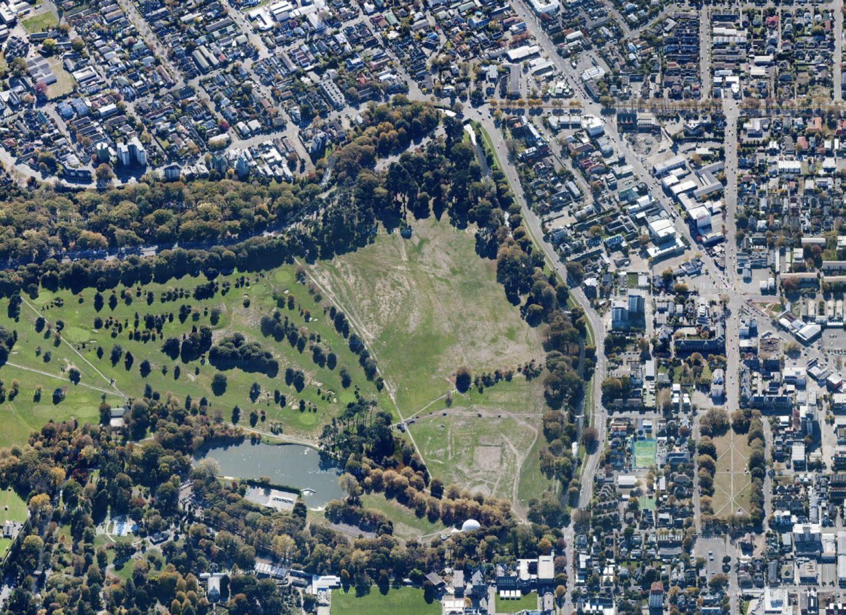
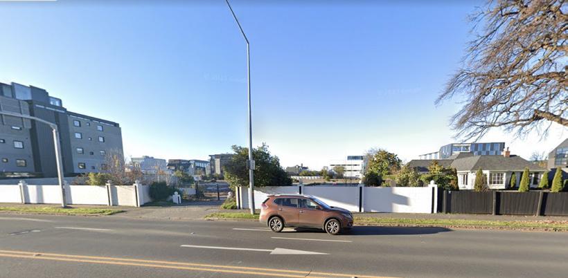
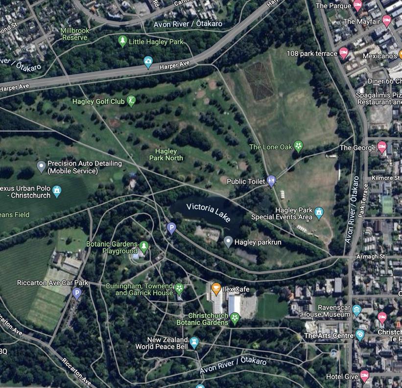
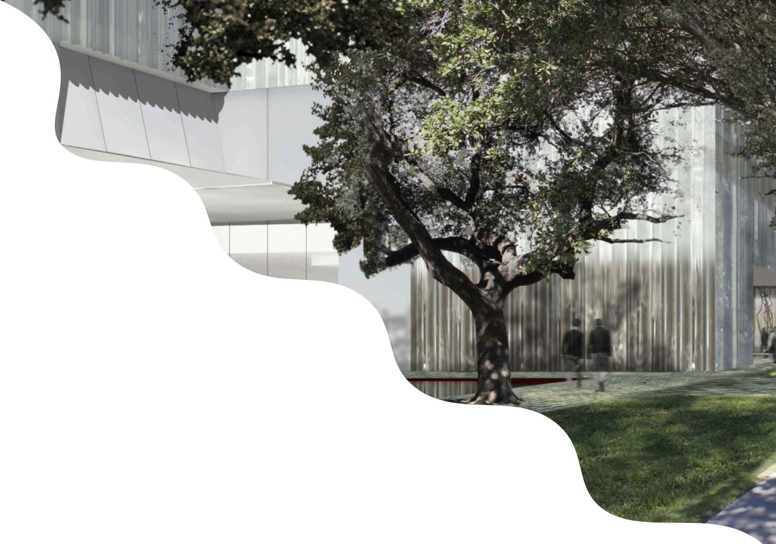
Where we are
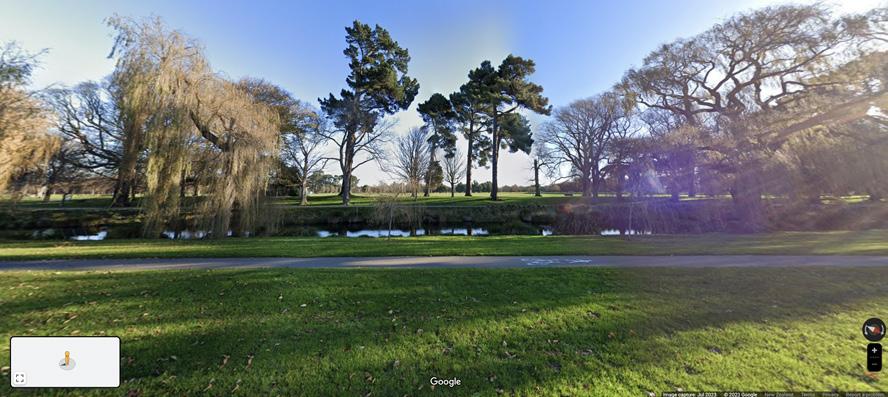
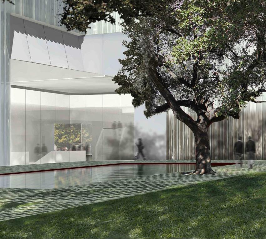
Located in the heart of Christchurch, bordering the northern end of Hagley park, 90 Park Terrace is a large plot of land located near retirement villages, shopping streets, and other cultural institutions such as the Arts Centre (800m walk away).
To the left, an image from Google Maps Streetview shows the view from the front of the property.
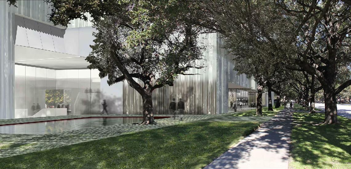
Steven Holl, acclaimed US architect who has worked on other museums in the past, creates light and airy spaces that support movement of people and energy. The exterior featured is a render of what the outside of the Poutama Museum would look like. The natural materials from the facade invite pedestrians, tourists and locals alike, in to explore the exhibitions. On the right side of this spread lies a greater perspective of the location.
06
Photo credits: Steven Holl Architects
Photo credits: Google Maps
Summative_VIS Guide_MacyTaylor_GRAD602_V2.indd 6 10/25/23 1:25 PM
07
Summative_VIS Guide_MacyTaylor_GRAD602_V2.indd 7 10/25/23 1:25 PM
Photo credits: Google Maps
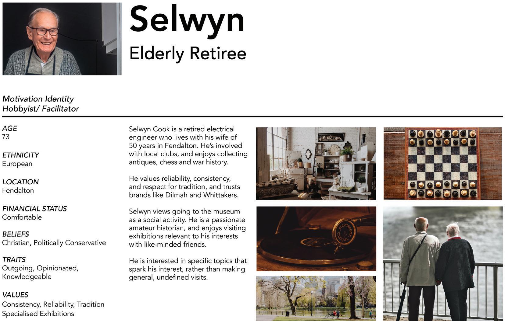
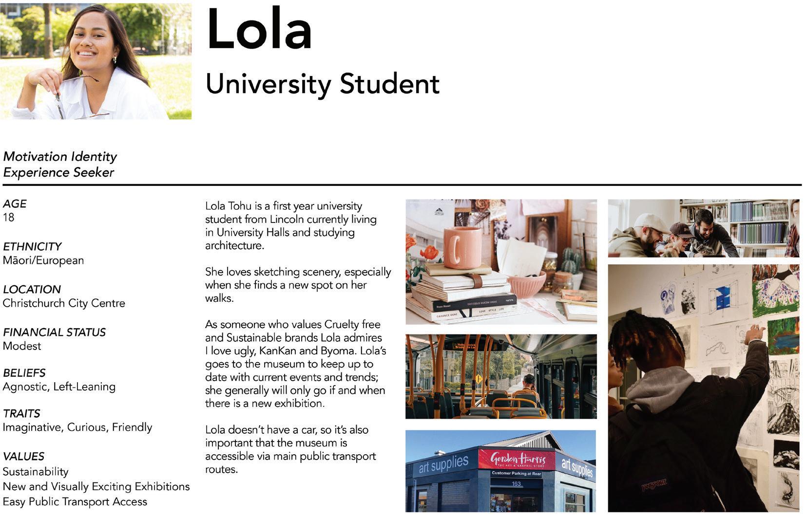
Who we are for
Audience personas for museum identity created by Scarlett Tetley-Jones & Caitlin Parker
08
Summative_VIS Guide_MacyTaylor_GRAD602_V2.indd 8 10/25/23 1:25 PM
09 Summative_VIS Guide_MacyTaylor_GRAD602_V2.indd 9 10/25/23 1:25 PM
Who is in our space
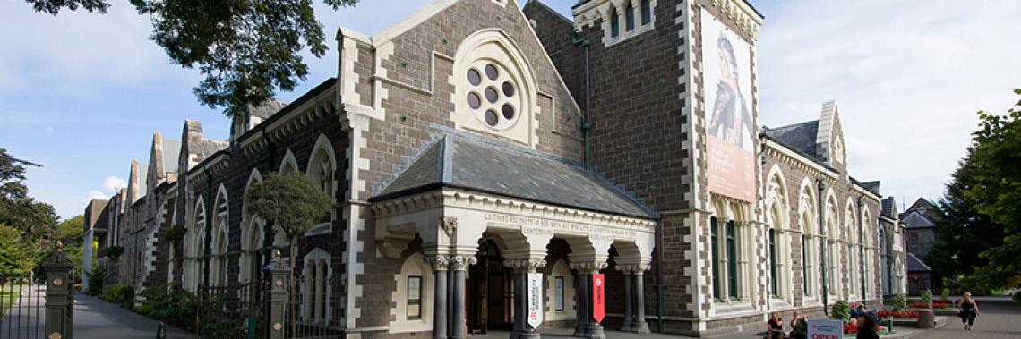
Cultural Institutions in Christchurch:
Canterbury Museum
Toi Ōtautahi
Toi Tūmatanui
Christchurch Art Gallery
Arts Centre
Fanfare Sculpture
Heritage sites
Creative sites
10
Summative_VIS Guide_MacyTaylor_GRAD602_V2.indd 10 10/25/23 1:25 PM
Where we fit
Heratige Sites
Historical
Christchurch Arts
Canterbury Museum Museum Gallery
Community Museums
Poutama Museum
Contemporary
Fanfare Sculpture
Public Arts
Arts Centre
11
Summative_VIS Guide_MacyTaylor_GRAD602_V2.indd 11 10/25/23 1:25 PM
Best Practice
12
Summative_VIS Guide_MacyTaylor_GRAD602_V2.indd 12 10/25/23 1:25 PM
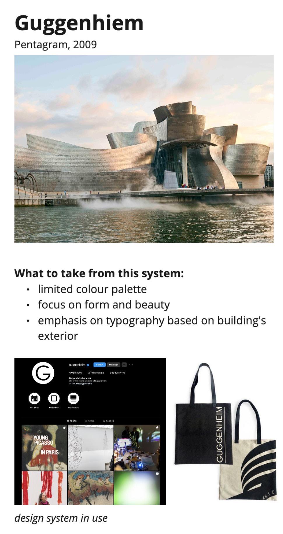
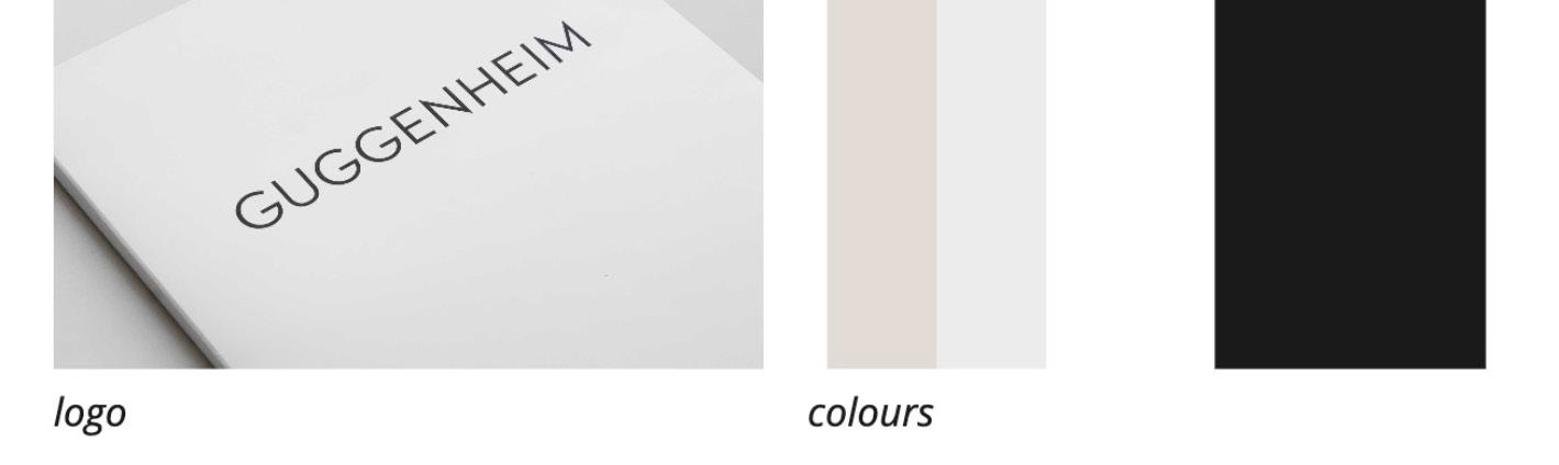
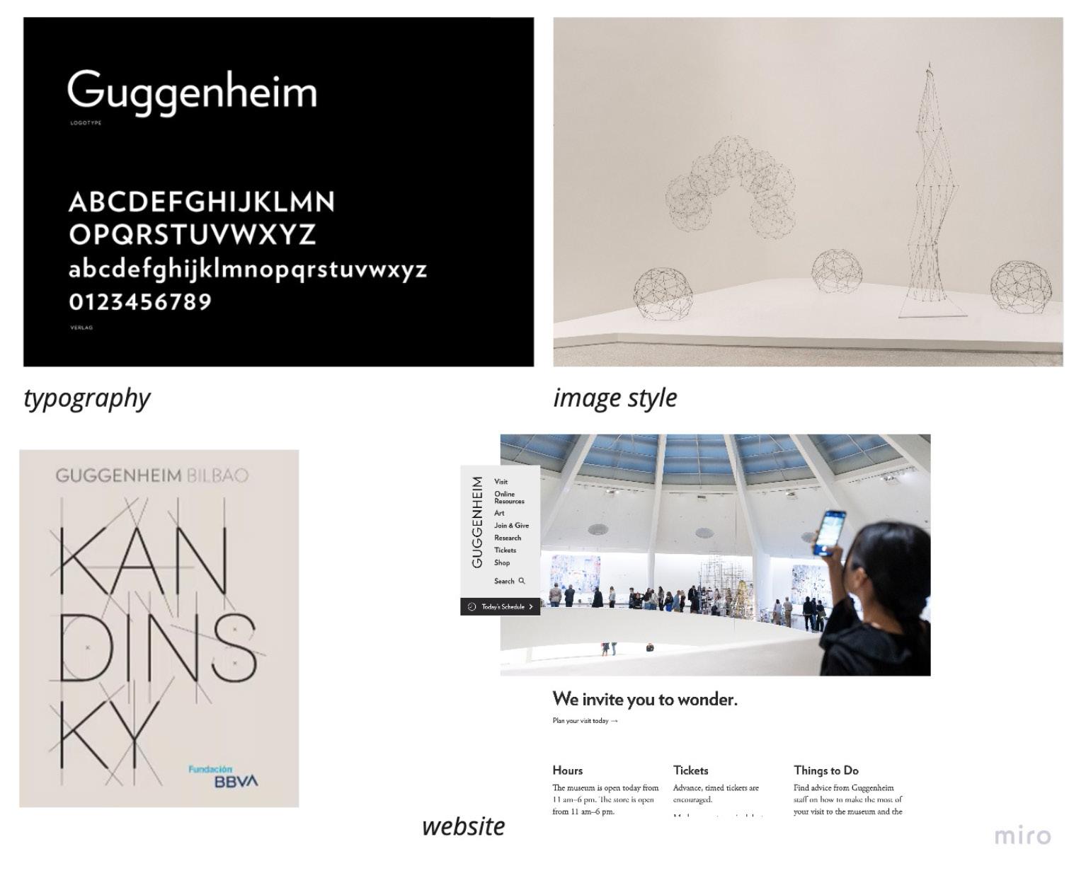
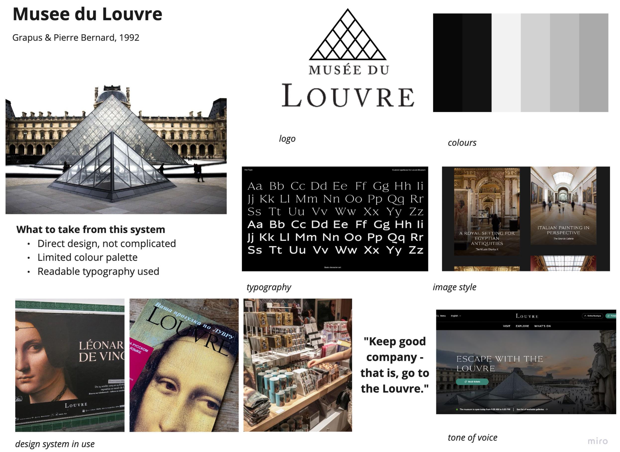
Competitor reasearch for museum identity by Charlene Anderson
13
Summative_VIS Guide_MacyTaylor_GRAD602_V2.indd 13 10/25/23 1:25 PM
14
Summative_VIS Guide_MacyTaylor_GRAD602_V2.indd 14 10/25/23 1:25 PM
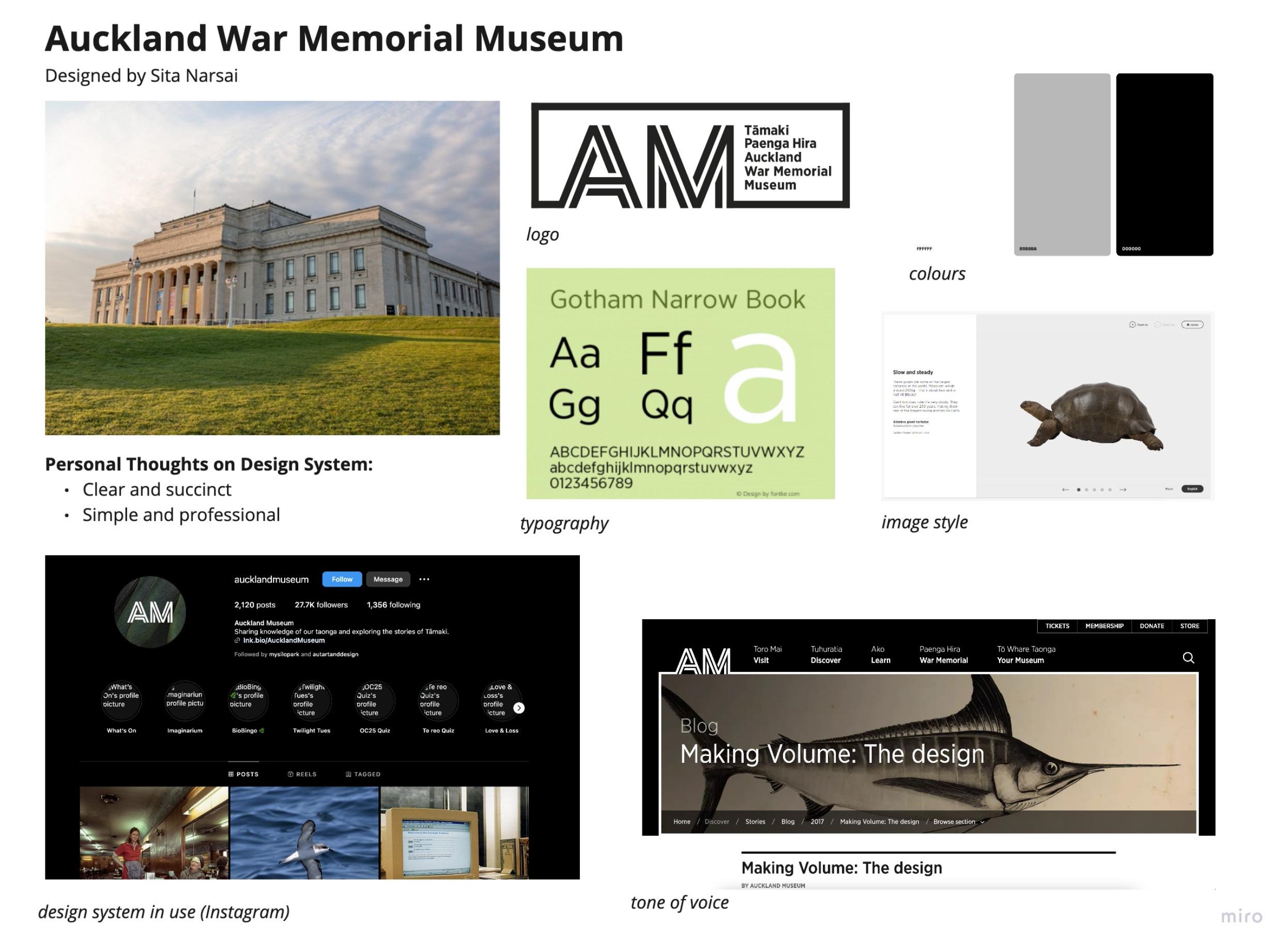
Competitor reasearch for museum identity by Reigne Eltanal
2. Visual Identity System Guides
15
Summative_VIS Guide_MacyTaylor_GRAD602_V2.indd 15 10/25/23 1:25 PM
Our Story
Our purpose is to empower people from all walks of life to learn more about the historical and contemporary use of visual communication. Our brand and visual identity is centred around the Māori ritual chant telling the story of Tāne climbing to the highest of the 12 heavens to retrieve three kete of knowledge.
This is reflected throughout key elements of the visual identity, mainly in the logo, pattern, and colour.
The colours of the brand identity are based off of Pounamu, or New Zealand Jade, which is stewarded over by the Ngai Tahu, the prominent iwi across the lower South Island. Pounamu being used in jewelry and weapons, and the mythology surrounding this, also first originated from the Ngai Tahu.
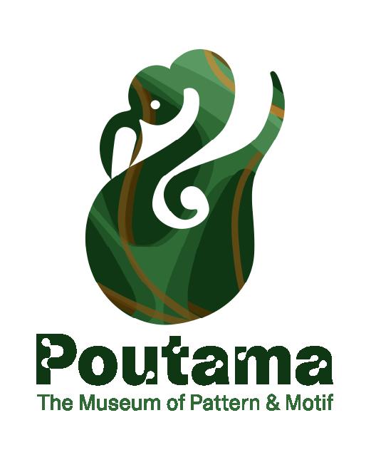
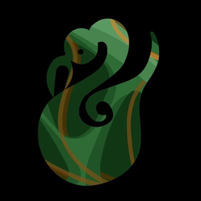
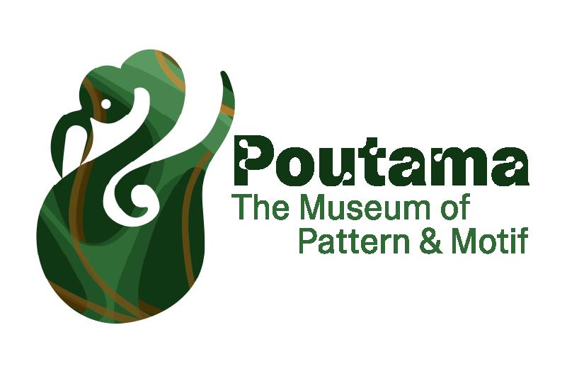
Our logo, the Manaia, is a pounamu figure based on a mythological creature that moves freely through the heavens and is our guide on the journey.
Our key pattern, the Poutama, is a tukutuku pattern which represents the journey of gaining knowledge throughout one’s life, and some say that it represents Tāne’s journey to gain knowledge and wisdom.
Our grid and layout systems are based on the three kete and twelve layers concept, splitting important concepts, visual systems, and copywriting into multiples of three.
Manaia is our guide
Poutama is the process
16
Pounamu is grounding Logo Pattern Colour
Summative_VIS Guide_MacyTaylor_GRAD602_V2.indd 16 10/25/23 1:25 PM
Tane Ascends to the Heavens
Tēnei au te hōkai nei o taku tapuwae
Ko te hōkai nuku ko te hōkai rangi
Ko te hōkai a tō tupuna a Tānenui-a-rangi
Ka pikitia ai ki te rangi tūhāhā ki te Tihi-o-Manono
Ka rokohina atu rā ko Te Matua-kore anake
Ka tīkina mai ngā kete o te wānanga
Ko te kete-tuauri
Ko te kete-tuatea
Ko te kete-aronui
Ka tiritiria ka poupoua
Ka puta mai iho ko te ira tangata
Ki te wheiao ki te ao mārama
Tihei-mauri ora!
This is the journey of sacred footsteps
Journeyed about the earth journeyed about the heavens
The journey of the ancestral god Tānenuiarangi
Who ascended into the heavens to Te Tihi-o-Manono
Where he found the parentless source
From there he retrieved the baskets of knowledge
Te kete-tuauri
Te kete-tuatea
Te kete-aronui
These were distributed and implanted about the earth
From which came human life
Growing from dim light to full light
There was life.
Te Ara Encyclopedia
17
Summative_VIS Guide_MacyTaylor_GRAD602_V2.indd 17 10/25/23 1:25 PM
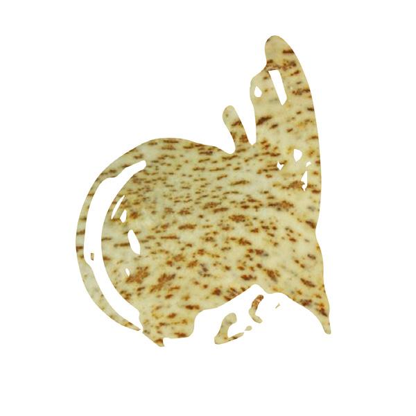
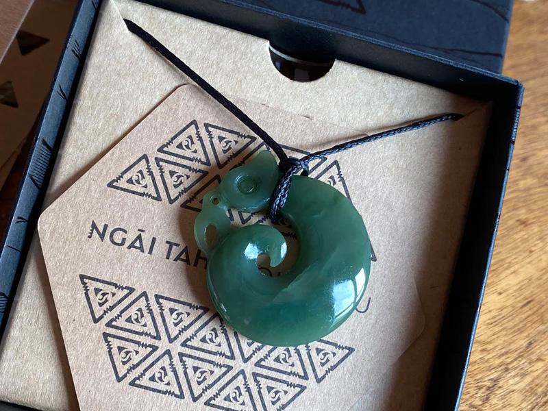
Logo
Manaia Definition:
The Manaia is a messenger and spiritual kaitiaki (guardian) of the sky, earth and sea.
Believed to be a messenger that moves freely between the spirit realm and the human world, the Manaia is a mythological creature.
Mountain Jade
18
Summative_VIS Guide_MacyTaylor_GRAD602_V2.indd 18 10/25/23 1:25 PM
Lockup

Clear space guides: Use the size of the P in Poutama to apply spacing around the logo. No other elements are allowed within this space.
19
Summative_VIS Guide_MacyTaylor_GRAD602_V2.indd 19 10/25/23 1:25 PM
Logo Variations

The lockup varitations for each exhibition over the upcoming year. These are to be used to promote each individual exhibition.
20
Pattern & Motif
Summative_VIS Guide_MacyTaylor_GRAD602_V2.indd 20 10/25/23 1:25 PM
Usage
Scaling:
Scale in proportion always. Logo size has to be at least 1/9 of the shortest side of the document. No maximum size as long as the whole lockup is showing and not cropped off, and it is within margins.
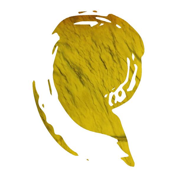
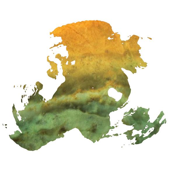
Recolour:
Only use lockup in the following colours:
White Black
Kawakawa Green
Full pattern render
Changing text:
Don’t remove, change shape or font of, or add to text unless referring to approved changes for exhibitions
Using elements:
The manaia form should only be used in the context of representing the brand of the Poutama museum. Because of the sacred nature of the brandmark, do not distort it by removing it from it’s purpose, or crop parts of a shape off.
21
Summative_VIS Guide_MacyTaylor_GRAD602_V2.indd 21 10/25/23 1:25 PM
Colours
The colour scheme is based on different types of New Zealand Jade, pounamu. This page are the colours to be used, while the next page are the origins.
Inanga
RGB: #5b9a63

Kahurangi
RGB: #2e6b35

Kawakawa
RGB: #103714

Kokopu
RGB: #cc8932
C:18

Tangiwai
RGB: #7f5115
C:37
M:64
Y: 100 K:31
Raukaraka
RGB: #583201 C:44 M:70 Y:98
22
M:49 Y:91 K:63
C:81
M:34 Y:100
C:82
K:25
K:54
M:49 Y:96 K:2
C:68 M:20 Y:78 K:3
Summative_VIS Guide_MacyTaylor_GRAD602_V2.indd 22 10/25/23 1:25 PM
Inanga
This type of stone is a highly prized type of pounamu by Poutini Ngāi Tahu. It gets its name from the juvenile native minnow or more commonly known as whitebait.
Kokopu

Kahurangi
In early times it was the most highly prized of all pounamu. It was used to make Toki
Poutangata which were usually given to Rangatira. Kahurangi is named after the clearness of the sky.

Kawakawa
Kawakawa is the most common pounamu variety and is a very popular stone for carving because of its abundance and ability to hold most shapes. It gets its name from the kawakawa leaf or Pepper tree.
Kōkopu is most recognizable by its distinctive brown spots which are very similar to the native fresh water mountain trout from which it gets its name.
Tangiwai
Translated tangi means to (cry or tears) and (wai) is water the full name kōkō-tangiwai refers to a deep sorrow that is never completely healed.
Raukaraka
This stone variety is a rare form of kawakawa pounamu. It is named after the leaf of the karaka tree because of the orange colour that the thick oxidized crust takes on from the earth’s minerals.
Tuhuru Taonga
23
Summative_VIS Guide_MacyTaylor_GRAD602_V2.indd 23 10/25/23 1:25 PM
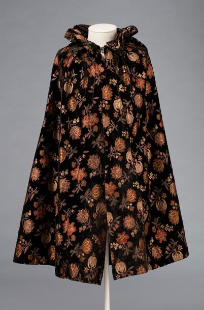
Pounamu Pattern
Pounamu Definition:
Pounamu is a term for several types of hard and durable stone found in the South Island of New Zealand. They are highly valued in New Zealand, and carvings made from pounamu play an important role in Māori culture to denote status and authority, for adornment, and for making peace.
Te Ara Encyclopedia
24
Summative_VIS Guide_MacyTaylor_GRAD602_V2.indd 24 10/25/23 1:25 PM
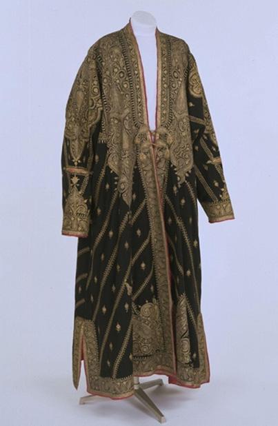
Tukutuku Pattern
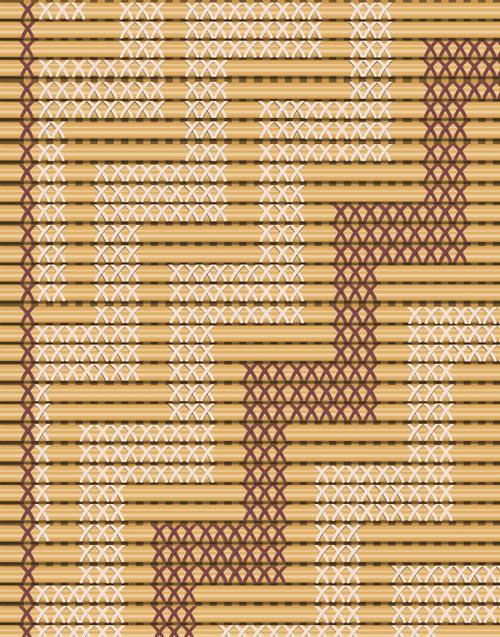

Tukutuku Definition:
An ornamental lattice-work used particularly between carvings around the walls of meeting houses. Tukutuku panels consist of vertical stakes (traditionally made of kākaho), horizontal rods (traditionally made of stalks of bracken-fern or thin strips of tōtara wood), and flexible material of flax, kiekie and pīngao, which form the pattern. Each of the traditional patterns has a name.
Te Aka Māori Dictionary

ABC Camera’s x glyph as a photography mask and motif to be used within branding and promotions.
25
Traditional poutamu tukutuku panels, Christchurch City Libraries
Modern take on tukutuku panels using ABC Camera’s x glyph.
Summative_VIS Guide_MacyTaylor_GRAD602_V2.indd 25 10/25/23 1:25 PM
Poutama Pattern
Poutama Definition:
A Poutama pattern is a stepped pattern of tukutuku panels and woven matssymbolising genealogies and also the various levels of learning and intellectual achievement.
Some say they represent the steps which Tāne-o-te-wānanga ascended to the topmost realm in his quest for superior knowledge and religion.
Te Aka Māori Dictionary
Usage Guides:
The modern take on a poutama pattern can be used across all forms of advertising and media to increase brand salience but be mindful of overusing it and removing it from it’s sacred meaning. Uses when referencing learning and progressing through stages of knowledge are ideal. Do not use with any other photography or patterns, only approved pounamu pattern.

26
Summative_VIS Guide_MacyTaylor_GRAD602_V2.indd 26 10/25/23 1:25 PM
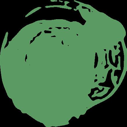
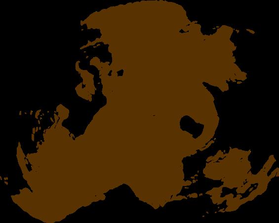
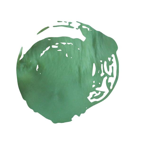
Poutama Mask
Usage Guides:
This more loose interpretation of steps is for use as a mask over photography or patterns. Either side can be used as the mask. This is a more abstracted version of the poutama pattern and therefore can be used with more freedom with other cultures’ patterns and colours. For use across wider documents and spaces.

27
Summative_VIS Guide_MacyTaylor_GRAD602_V2.indd 27 10/25/23 1:25 PM
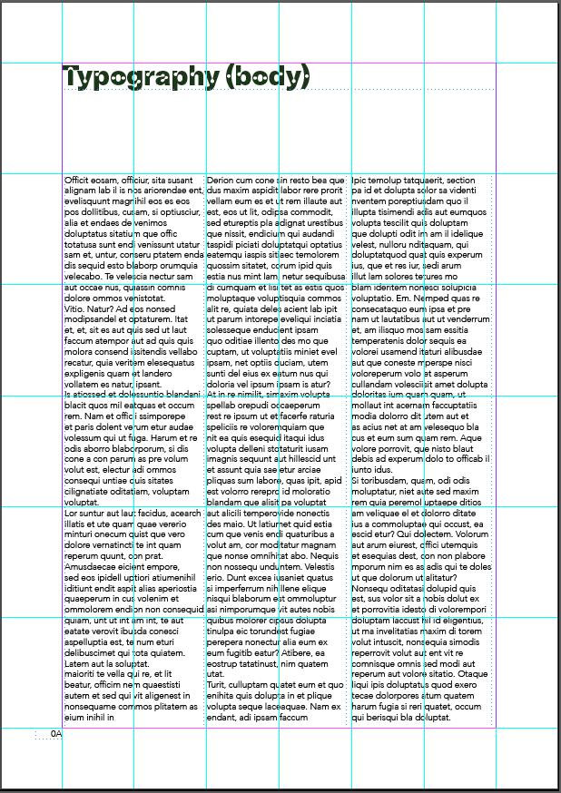
Typographic Guides
Alignment:
Left-aligned and justified only. No rightaligned or centred text.
Rotation:
Right-side up and counter-clockwise rotation only.
Columns:
Aim to have text columns take up 30% of horizontal space within margins. Allowances can be made to change the width of the text column by 10% wider or narrower.
Title
ABC Camera Heavy 30pt
Heading
ABC Camera Plain Regular 26pt
Subtitle
ABC Camera Plain Heavy 16pt/20pt
Body copy: In one tradition, the god Tāne climbed to the citadel Te Tihi-o-Manono, in the highest of the 12 heavens, known as Te Toi-o-ngā-rangi. There he retrieved three baskets of knowledge: te kete-tuatea (basket of light), te kete-tuauri (basket of darkness) and te kete-aronui (basket of pursuit).
Avenir Light 9.5pt/11.5pt
Body Copy (emphasis)
Avenir Light Oblique 9.5pt/11.5pt
Caption: Te Ara Encyclopedia
Avenir Oblique 8pt/10pt
28
Summative_VIS Guide_MacyTaylor_GRAD602_V2.indd 28 10/25/23 1:25 PM
Grids
Grid Guides:
Using 6x6 (anything smaller than A1) or 9x9 (A1 or bigger) grids, and margins that are 1/9 of the shortest length of the document, we can achieve a visually interesting and well laid out design.
There is room within a modular grid system to be playful, but enough constraints to keep the system cohesive across large bodies of work.
Positive + Negative
Space:
The goal is to hero one key image or motif and for everything else to be supplementary.
29
Summative_VIS Guide_MacyTaylor_GRAD602_V2.indd 29 10/25/23 1:25 PM
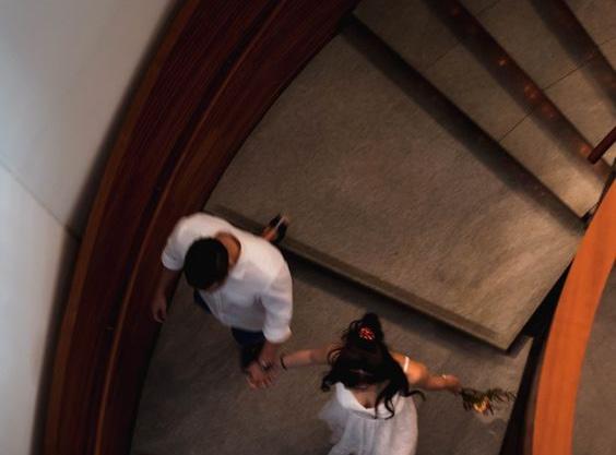
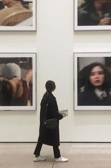
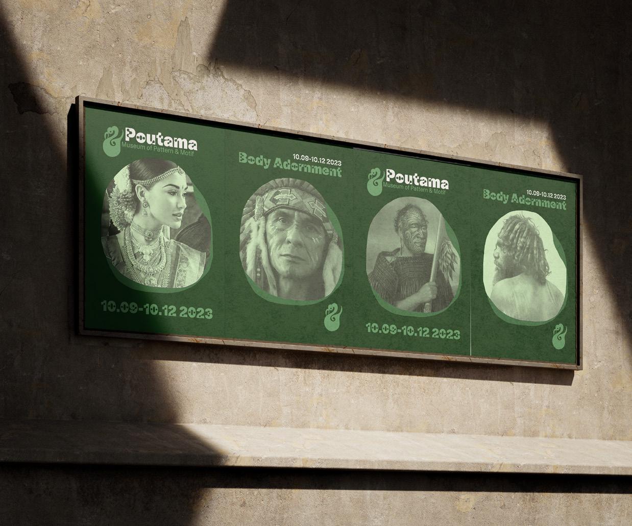
Photography Guides
Storytelling:
Photography has the potential be far more engaging than simply text, but only if it is handled correctly. To create a welcoming and modern image of the museum, focus on telling stories about learning and appreciation, and enhancing our image of being connected to the land around us.
Subject matter:
Subject matter is mainly focusing on the exhibitions, both in situ and one-shot of items (use white background for these images). Humans may feature, mainly portraiture of artists and curators. Avoid awkward and unnatural shots.
Composition:
Create one focal point so that the eye is naturally drawn without complexity to the subject of the image. Avoid busy backgrounds and aim for symmetry when available.
Palette & tone:
Low saturation images, with low contrast, high key photography in portraits. Warmer tone treatment in post-production along with potential colour masks over images.
Lighting:
Use bright crisp lighting in studio spaces, avoid the use of flash to reduce shadows. When outside, use ambient and natural lighting. Integrating trees and plants in the lighting will increase the sense of nature in our photography.
Cropping:
Use wider photography when possible to give options for layout in different use cases. Cropping may be required to fill a template.

30
Summative_VIS Guide_MacyTaylor_GRAD602_V2.indd 30 10/25/23 1:25 PM
31 Summative_VIS Guide_MacyTaylor_GRAD602_V2.indd 31 10/25/23 1:25 PM
Tone of Voice
Characteristics:
Professional
Formal & succinct
Proper grammar and punctuation
Fun & curious
Enthusiastic & passionate
Focus on learning
Encourage conversation
Expressive
Welcoming & inclusive
Pioneering
Educated & informative
Respectful
Sense of awe
Trustworthy & intelligent
Nielson Norman Groups’ Four Dimensions of Tone of Voice:
Funny, formal, respectful, enthusiastic.
Vocabulary to use:
& Come on down
Invite friends & family!
Bring a mate
Welcome, kia ora
Nga mihi
Vocab to avoid:
And or +
Bring yourself to attend
Wander over
Good evening, ma’am
We’re not surprised
Oi bruv
Wazzup
Te Reo Māori without proper usage or translation
Message architecture
Across the majority of communication platforms, such as posters, billboards and SEO advertising, and social media:
Pull quote
1-10 word intriguing title
Across email marketing, internal documents and longer copy:
1-4 word title of topic discussed
Longer 3-10 word subtitles with humor and intrigue
Minimise text to avoid blocks of hard to read content.
32
Summative_VIS Guide_MacyTaylor_GRAD602_V2.indd 32 10/25/23 1:25 PM
3. Application of Visual Identity
33
Summative_VIS Guide_MacyTaylor_GRAD602_V2.indd 33 10/25/23 1:25 PM
34
Summative_VIS Guide_MacyTaylor_GRAD602_V2.indd 34 10/25/23 1:25 PM
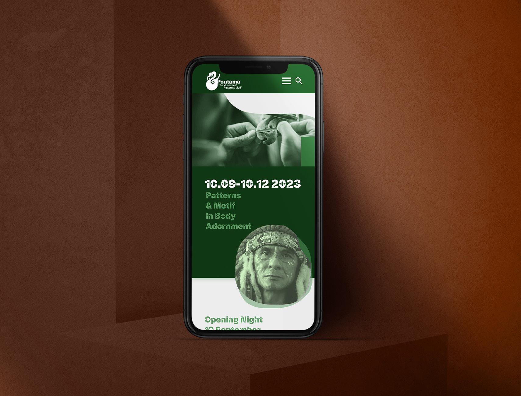
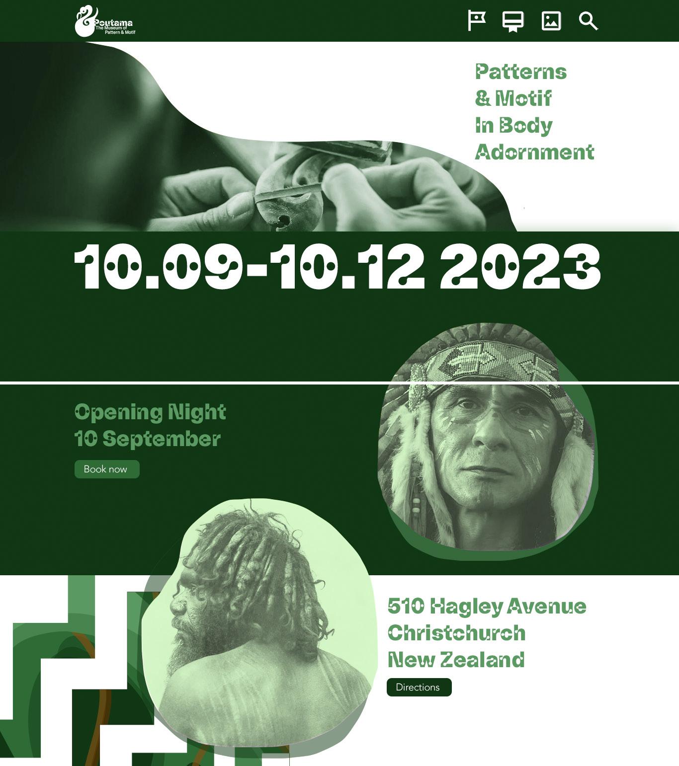
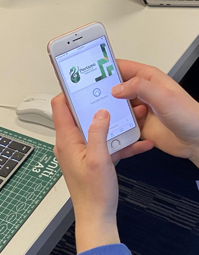
Website
Exhibition Promotions
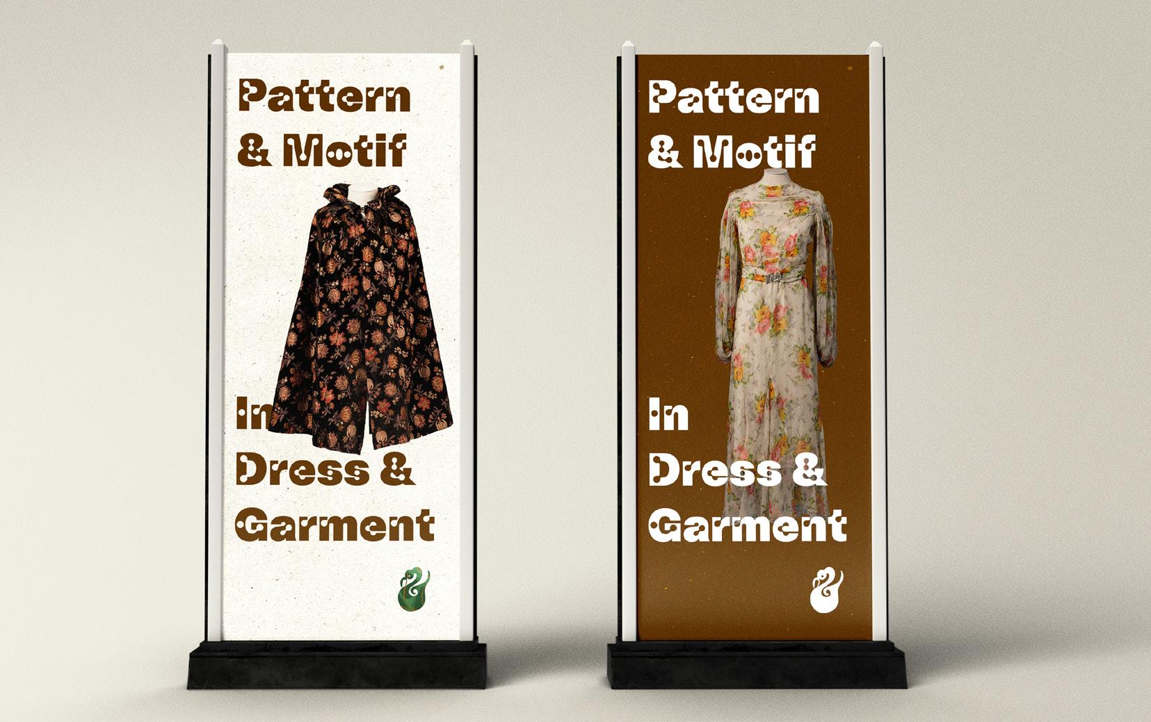
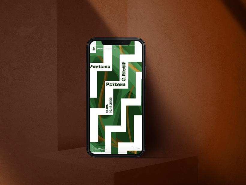
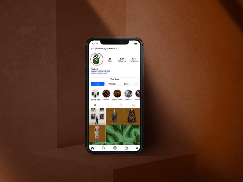
35
Summative_VIS Guide_MacyTaylor_GRAD602_V2.indd 35 10/25/23 1:25 PM
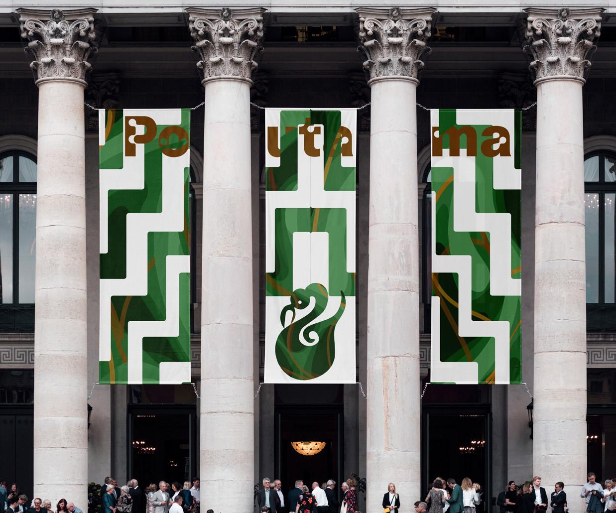
36
Signage Summative_VIS Guide_MacyTaylor_GRAD602_V2.indd 36 10/25/23 1:25 PM
Exterior
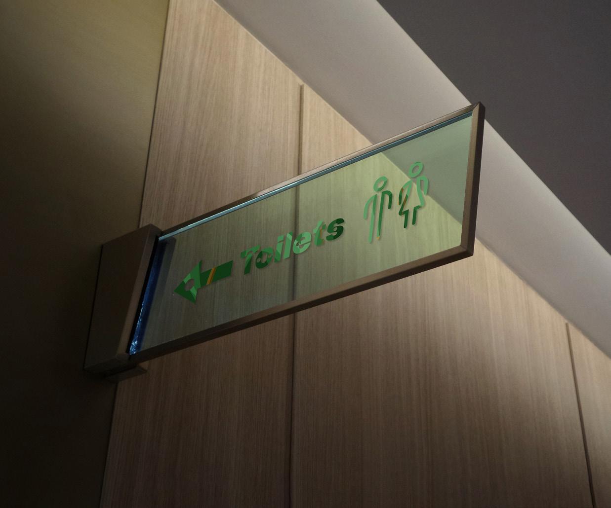
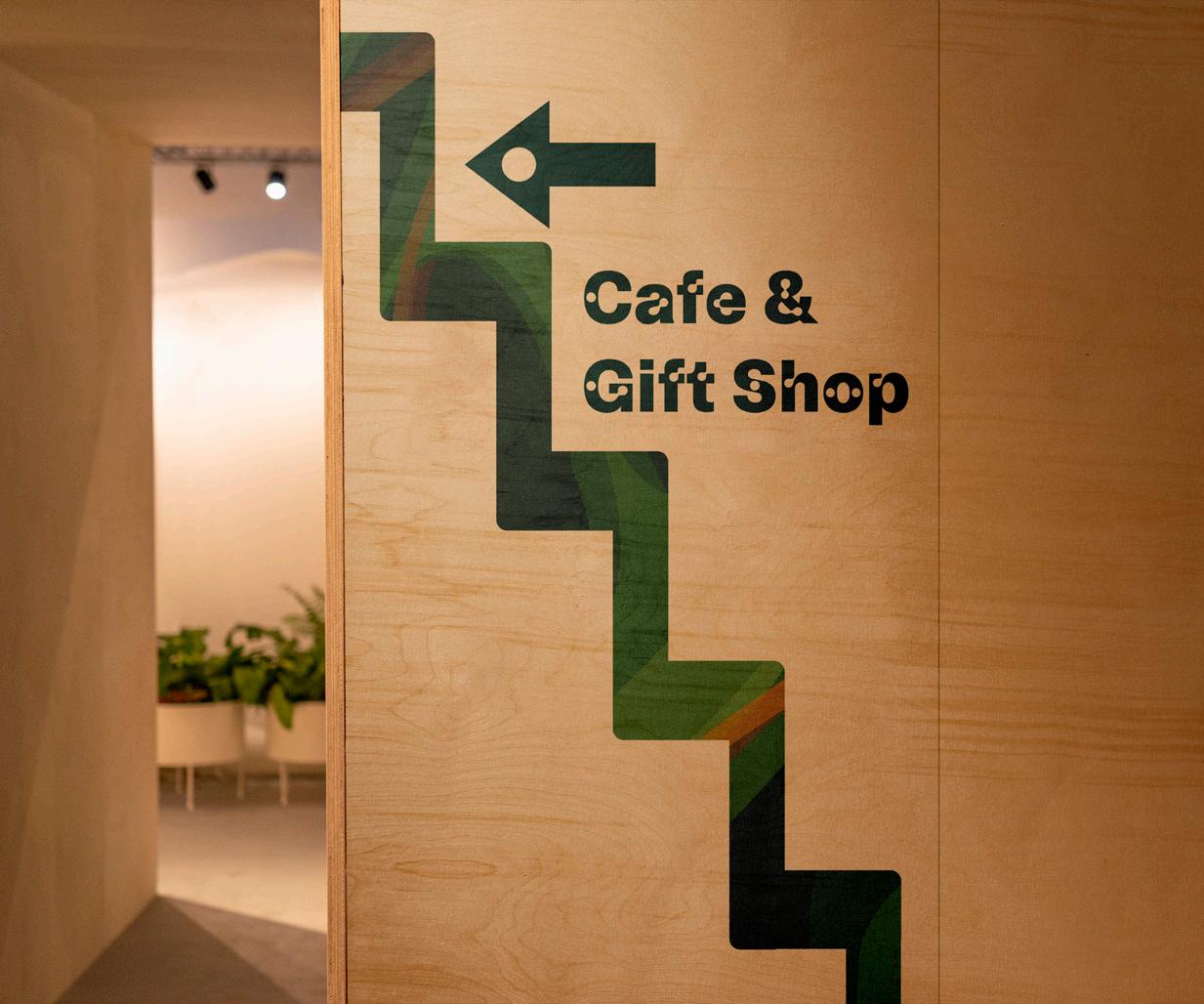
37
Signage Summative_VIS Guide_MacyTaylor_GRAD602_V2.indd 37 10/25/23 1:25 PM
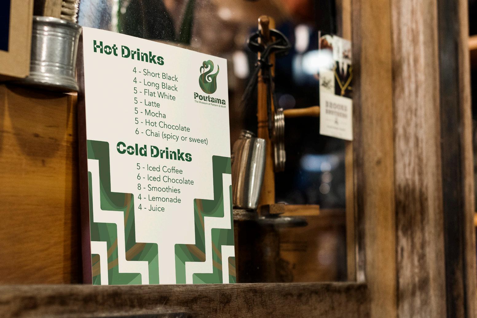
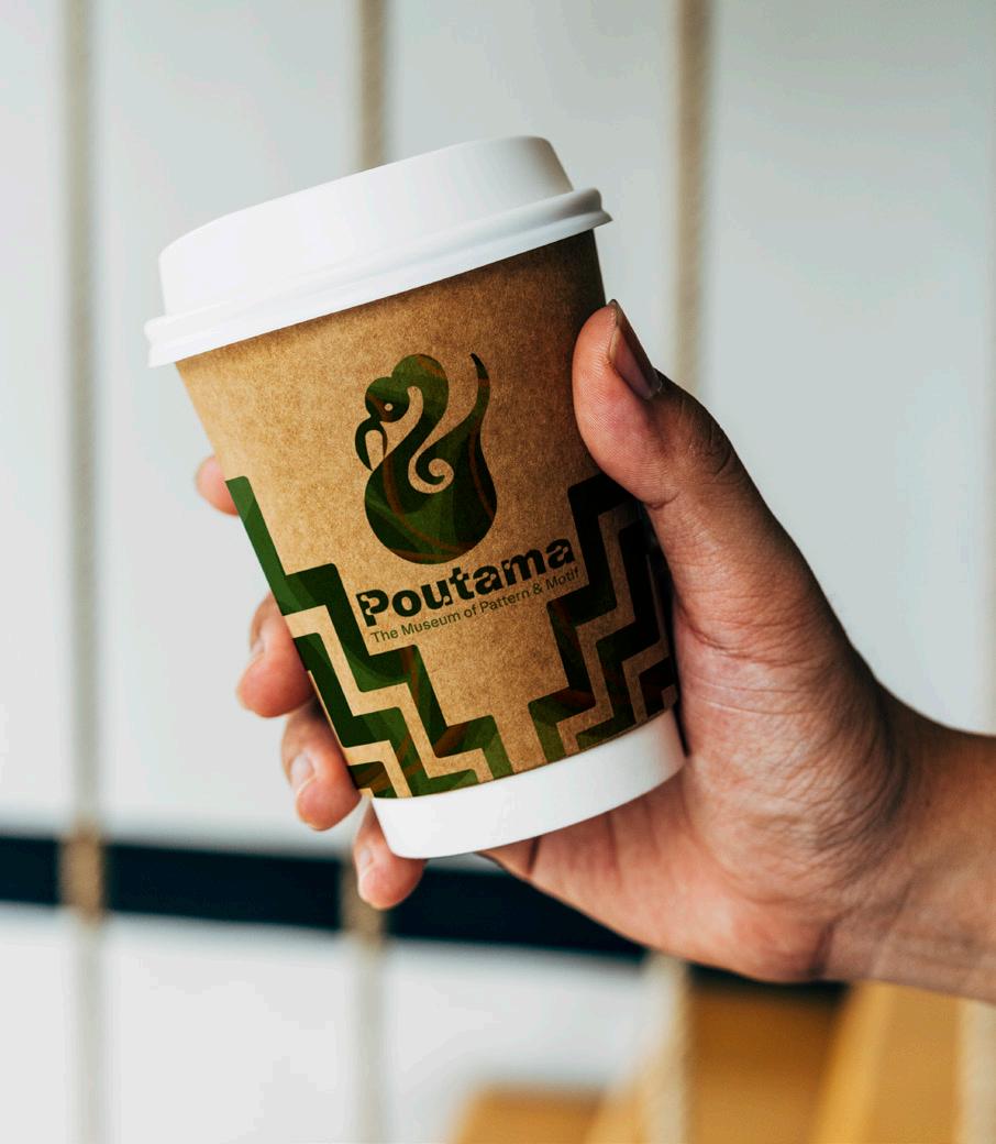
Interior
In-store ephemera
38
Summative_VIS Guide_MacyTaylor_GRAD602_V2.indd 38 10/25/23 1:25 PM
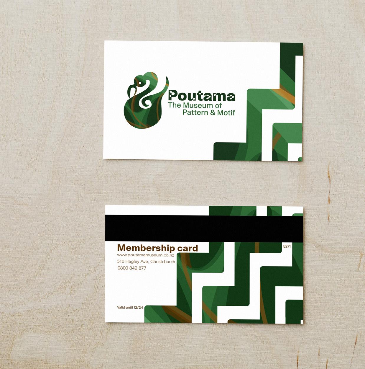
39 Membership Card Summative_VIS Guide_MacyTaylor_GRAD602_V2.indd 39 10/25/23 1:25 PM
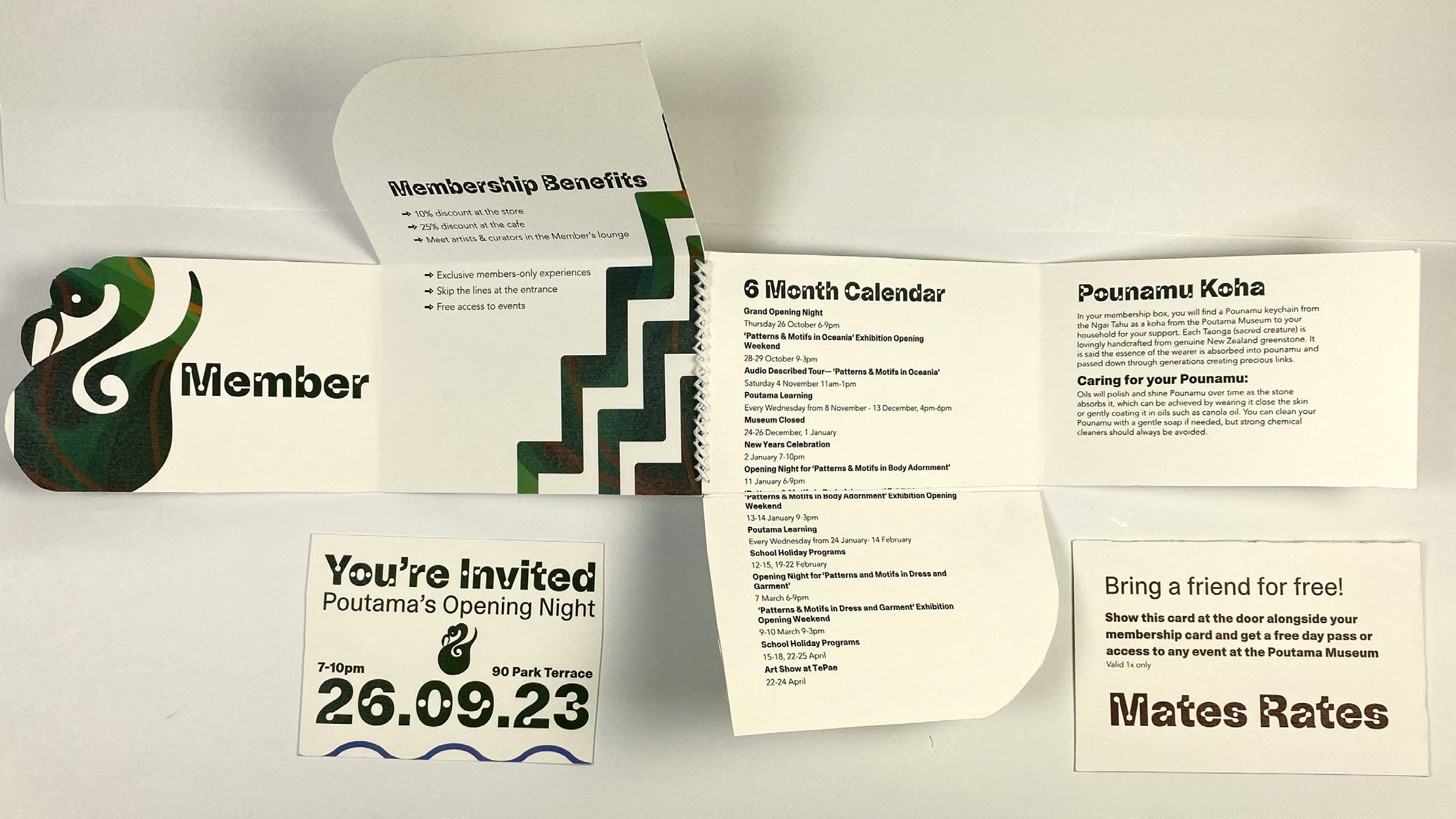
40 Flyer Summative_VIS Guide_MacyTaylor_GRAD602_V2.indd 40 10/25/23 1:25 PM
41 Summative_VIS Guide_MacyTaylor_GRAD602_V2.indd 41 10/25/23 1:25 PM
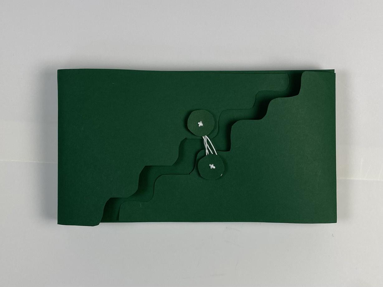
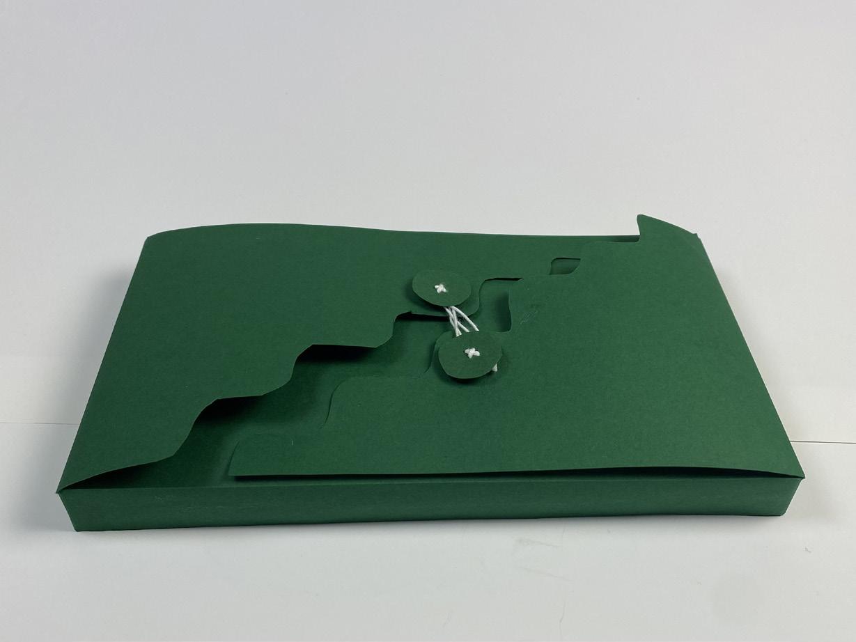
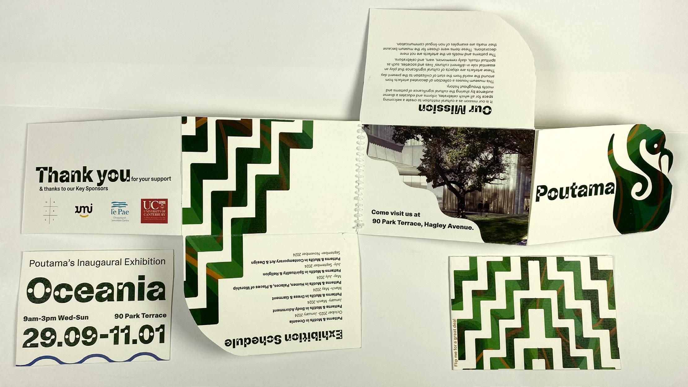
42 Membership Box Summative_VIS Guide_MacyTaylor_GRAD602_V2.indd 42 10/25/23 1:25 PM
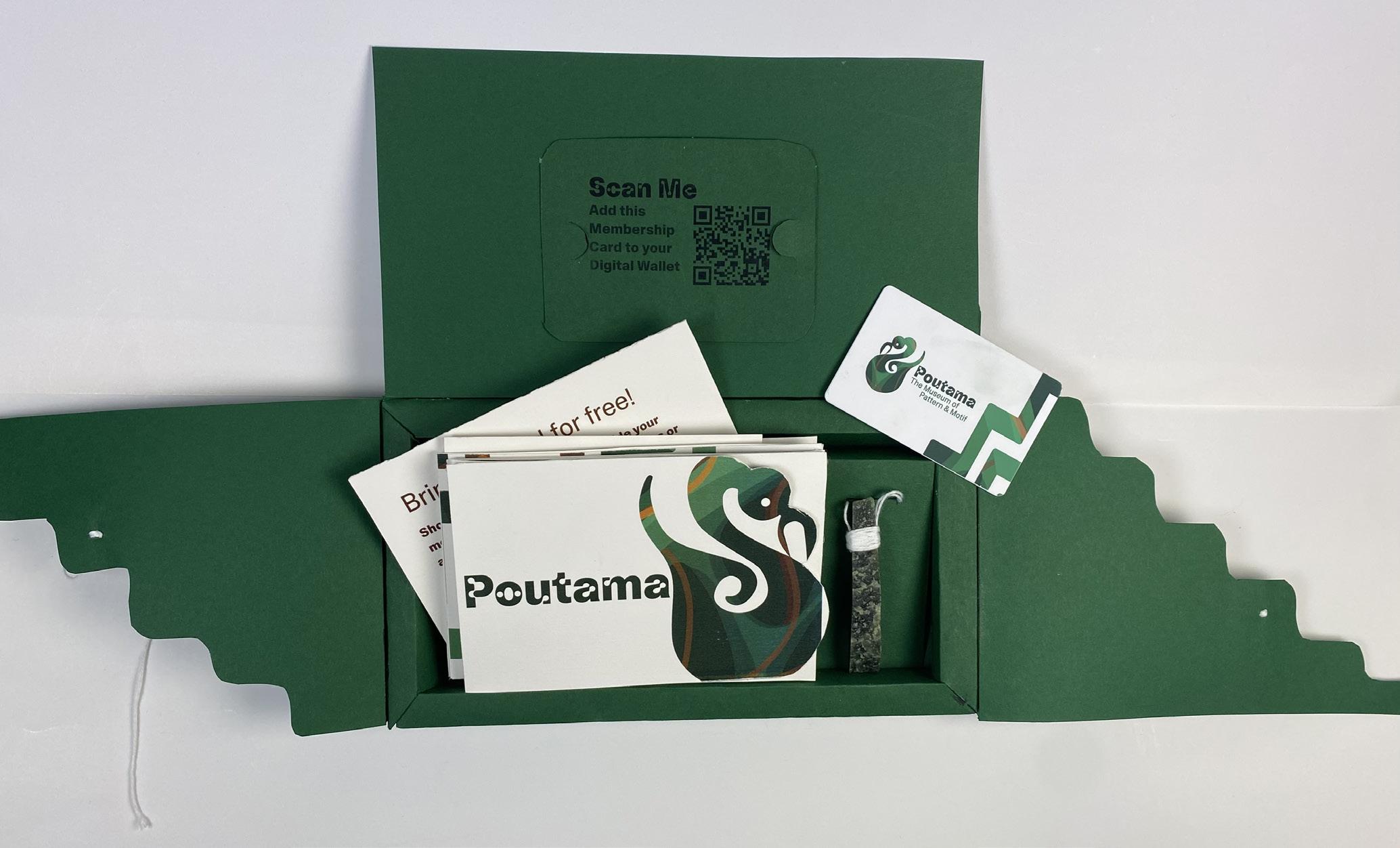
43 Membership Pack Summative_VIS Guide_MacyTaylor_GRAD602_V2.indd 43 10/25/23 1:25 PM

The Poutama Museum Guidelines, October 2023
Summative_VIS Guide_MacyTaylor_GRAD602_V2.indd 44 10/25/23 1:25 PM
