1 minute read
PART FOUR:


Optimising the landing page.
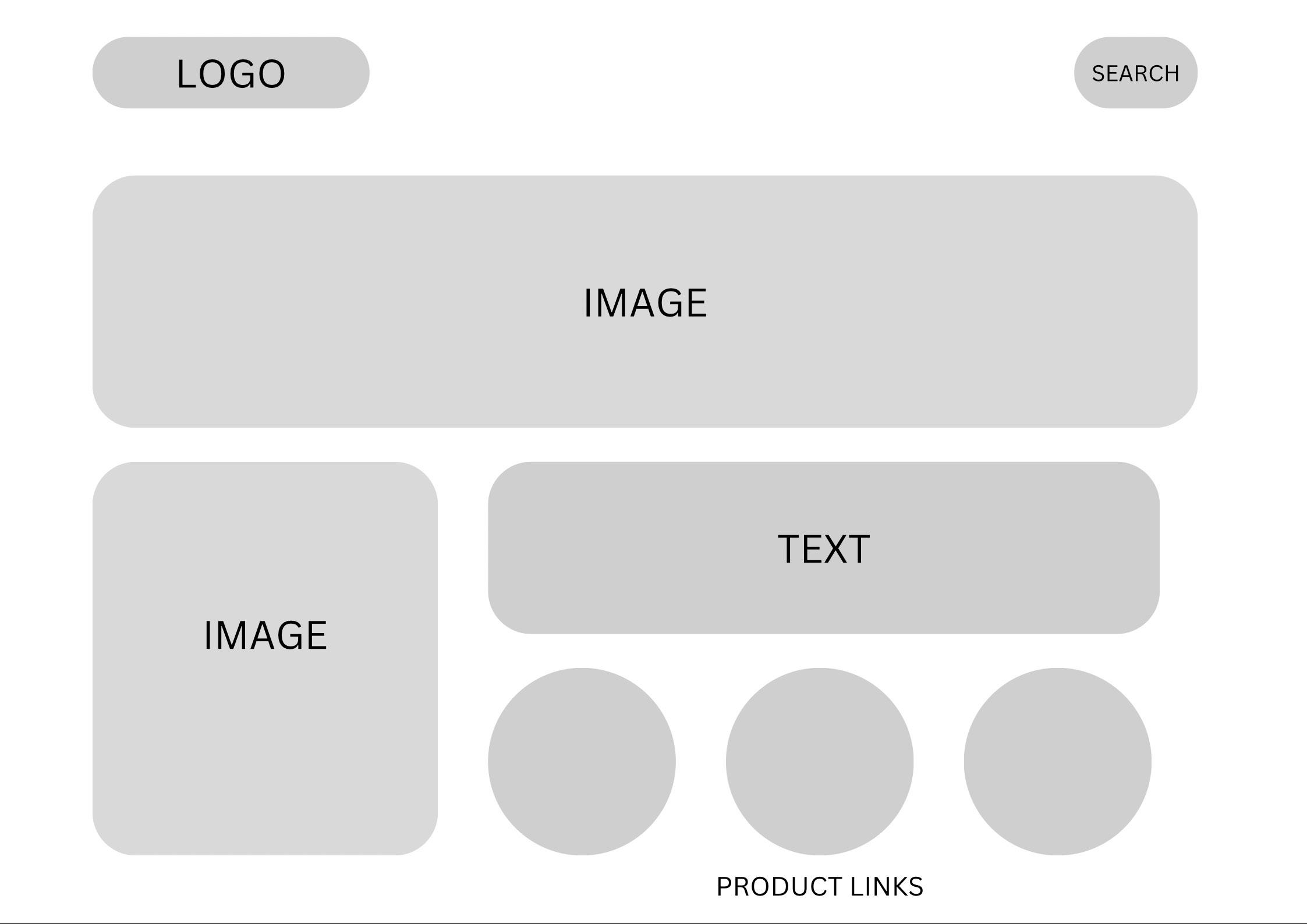
An E-commerce website should be easily accessible and understandable for a variety of online shoppers. The experience should be easy to digest, entertaining and most of all memorable for the consumer (Siddiqui, Et al., 2003). A website landing page should be created with the consumers attention in mind, and one of the most effective approaches is by using the F-shape pattern. The pattern describes the shape that consumers typically read and consume information on a webpage, from left to right and gradually working down.
Advertisement
Using this pattern, text should be in small chunks and easy to digest so that the consumer reads the key information without getting distracted (Nielsen, 2006). A landing page wireframe should optimise this shape and place key information in these areas such as click throughs and new products, creating a higher change for consumers to interact with the website.
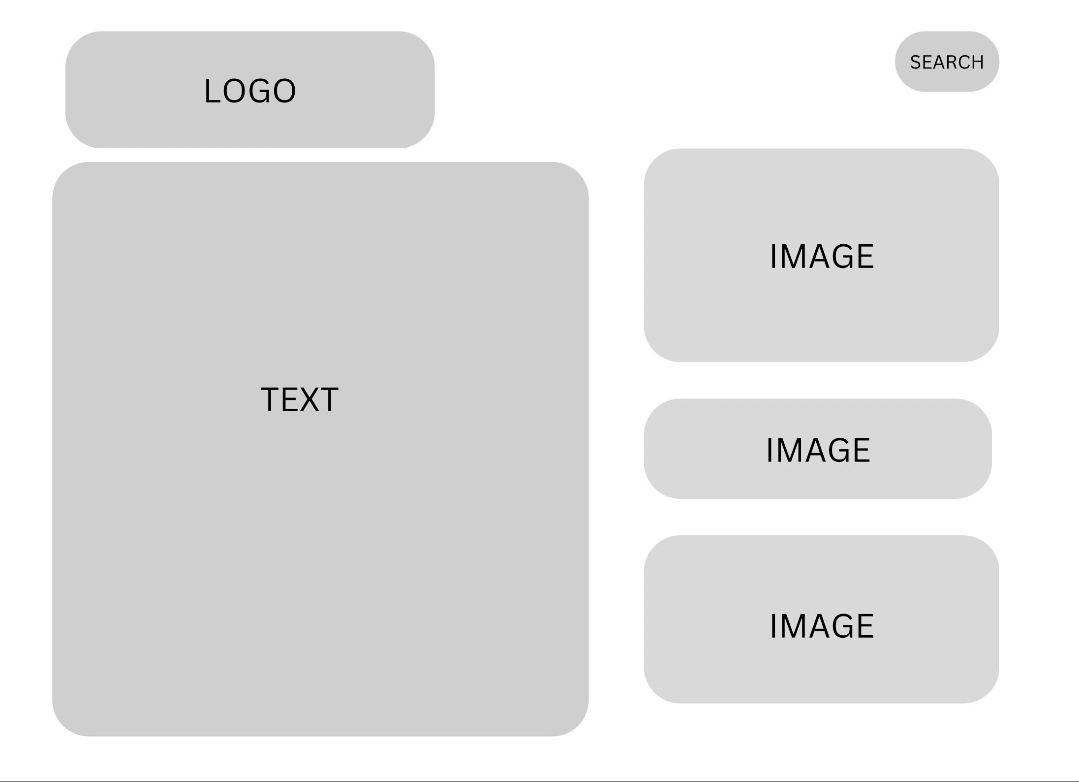
The images on the right show two examples of landing page wireframes and how effective they are. The top image shows a structure that follows the F-shape pattern with 2 product images on the right and small chunks of font along the top of the ‘f shape’. This structure instantly guides the consumers attention to new products and headers, a strategy that could get the viewer to interact and purchase from the website. The bottom example does not follow the structure and opts for large chunks of text and smaller images, making the content harder to digest and keep the attention of the consumer.