For more information about the previous editions, visit https://issuu.com/mag325

TORONTO METROPOLITAN UNIVERSITY
Department of Architectural Science
325 Church Street, Toronto, Ontario, Canada
M5B 2K3
(416) 979-5000
Say hello! arch325magazine@torontomu.ca
325 Magazine 2021-2022

Toronto Metropolitan University
Department of Architectural Science
All rights reserved
All photographs and drawings are courtesy of students and contributors unless otherwise noted. Every reasonable attempt has been made to identify owners of copyright. Reproduction without written permission of the publishers is forbidden. Errors or omissions will be corrected in subsequent volumes. The editors have made every effort to see that no inaccurate or misleading data, opinions or statements appear in this publication, and assume no liability for the accuracy or completeness of the text, or its fitness for any particular project. The opinions herein are the responsibility of the contributors concerned.
Editor-In-ChiefYiran Ma
Creative Directors
Cynthia Hua
Kathlynn Hoang
Todd Collins
Copy -
Aldona Kilikowski
Nina Zabojnikova
Sarah Tang
Tapenga Peart
Vivian Nguyen
Graphics -
Breno Gualtrr
Cesar Rodriguez Perfetti
Fan Fei
Jake Kroft
Leshin Chew
Preetul Pasha
Samantha Wu
Lam Pham
SponsorshipChris Phillips
Rahaf Alashqar
Stephen Girimonte
Chair of the Department of Architectural Science
Dr. Mark Gorgolewski
Dean of the Faculty of Engineering and Architectural ScienceDr. Thomas Duever
Vice Provost Academic -
Sean Kheraj
Director, Projects and Operations of the Provost and Vice-President Academic -
Rose Sandino
Faculty SupervisorVincent Hui
Print CoordinatorAlexandra Berceanu
Financial CoordinatorAllyne Sareno
325 Magazine Team Special Thanks
the Chair
Message from
My heartfelt congratulations to the editorial team on this year’s production of 325 Magazine.
This is an inspiring and reflective issue that deftly presents a distinct portfolio of work in the post pandemic setting. It examines learning, design and studio culture, and highlights projects that celebrate the fundamentals of the disciplines of architecture, building science and project management. The publication presents some of the best work produced by our students in the 2021/22 academic year, which speaks to the strength of our interdisciplinary program. These collaborative, context driven, creative and innovative designs showcase not just the talent and skill of our students, but also the learning process and the trajectory of student development as they go through the program.
I am particularly proud of the diversity of projects, the different points of view and the multiple ways in which students have responded to constraints. It highlights how students have used design, scholarship, technical knowledge and advocacy to explore the principles of sustainability, equity and inclusion within architectural pedagogy and practice, and shows the rigorous teaching standards and learning expectations we set for our students.
As my term as Chair comes to an end, it’s been a privilege to support the 325 editorial team as they have spent so much of their volunteer time curating the work of their fellow students, showcasing their achievements and continuing to build a strong sense of community that I know will last a lifetime.
Thank you and congratulations on all your hard work.
Dr. Mark Gorgolewski PhD, MSc, Dip ARC, BSc, LEED AP Dean, Department of Architectural Science Faculty of Engineering and Architectural Science
Message from the Editorial-in-Chief
The 2021-2022 academic year has been an exhilarating yet uncertain journey, marked by the anticipation of returning to in-person school while simultaneously preparing to maintain a foothold in the virtual academic world. Despite the preparations for the unknown period of time, in this edition of 325 Magazine, we want you to embrace the present amidst the chaos, and shift our focus to what’s here and now, in our hands this thick paperwork that presents the most intriguing and creative minds of our students.
We aspire to curate this edition of 325 Magazine in a refreshingly minimalist manner, redirecting attention to the core essence of the projects and their presentation with a refined sensation of physically flipping through the magazine. The concept of minimalism serves as our inspiration, leading us to embrace a disciplined grid system, employing unpretentious yet engaging geometries and fonts, and adopting a controlled approach to colors that optimally showcases the contents and their graphics. Meanwhile, 325 is still committed as an everlasting platform that strengthens connection, communication and a sense of community among our students and the faculty. As we celebrate the excellence of student work and projects, we also delve into the rich insights and perspectives that academic and professional education has provided our students. The invaluable wisdom gained from their experiences offers irreplaceable guidance for future generations. This thrilling purpose lies at the heart of producing 325 Magazine, driving us to continue our commitment to excellence and cohesion within our educational community.
We would like to genuinely invite you to join this captivating reading journey of 325 Magazine with us and celebrate the remarkable student works presented. On behalf of the editorial team, it has been a sheer delight to be given the opportunity to work on this edition and bring the DAS community together and beyond.
Happy reading!
Yiran Ma Editor-in-Chief
DAS
SMALL 8 12 14 19 20 24 26 28 30 A House for Writer Gabriel Garcia Marquez Inlumino S’Winter Station Collective Energy Jazz House Planting a Seed Poet’s Retreat Camp Winston Animal Paddock Editorial 01 Thomas Gomez Ospina Dinara Gataullina
Student Team
Cai Alvin Huang
Khan & Batool Alqasas
IV Gamboa Tameta
DAS
Zhiwen
Zarreen
Florencio
Student Team 325 Magazine Team
A House for Writer Gabriel Garcia Marquez
Thomas Gomez Ospina
Year 4 / ARC920 Advanced Architecture Studio

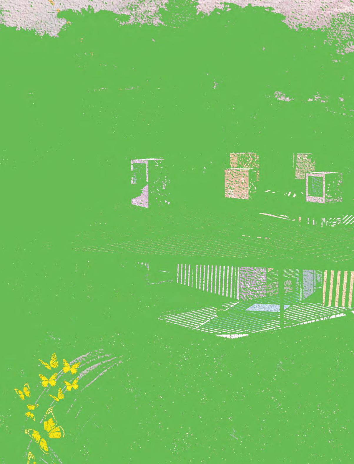
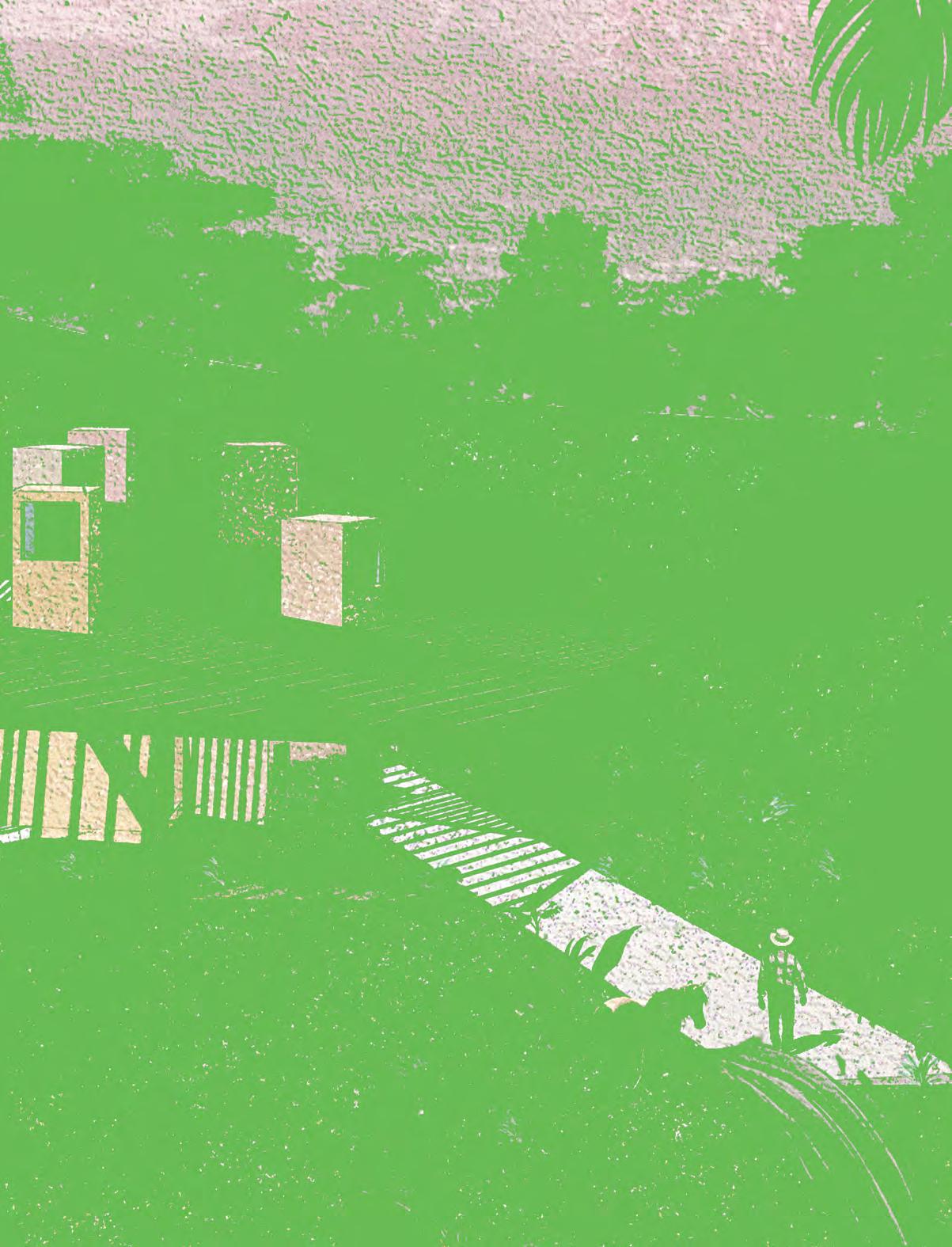
Gabriel Garcia Marquez championed Magical Realism as a Latin American literary genre that seamlessly overlaps elements of fantasy with culturally significant narratives. Gabriel’s work examines the ambiguity of our ubiquitous “reality”; it unravels the rich complexities and contradictions inherent in life itself.

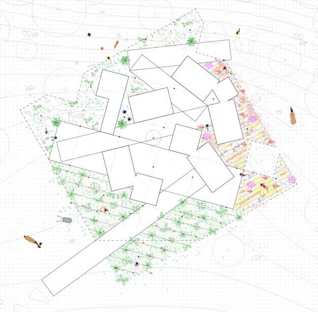
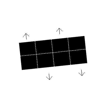
A house for Nobel prize-winning Colombian author, Gabriel Garcia Marquez, aims to implement the ambiguity and cultural richness of Magical Realism through architectural concepts. Ambiguity, in this case, is explored through the interstitial: the in-between of inside and outside, light and dark, real and fictional. Here, rooms are defined by walls, no walls, canopies, shadows, or none of the above. The house's perimeter is loosely defined, and the spaces despite being labeled for clarity—can be redefined and re-inhabited at will. The rooms of the house shift and disperse like islands; the house becomes porous and negotiates a new interior / exterior; finally, rooms are oriented in response to light and context, leaving behind an ambiguous third space.

Vol. 1
a b c 8
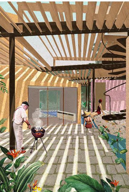
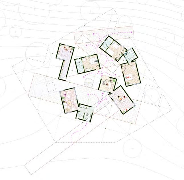
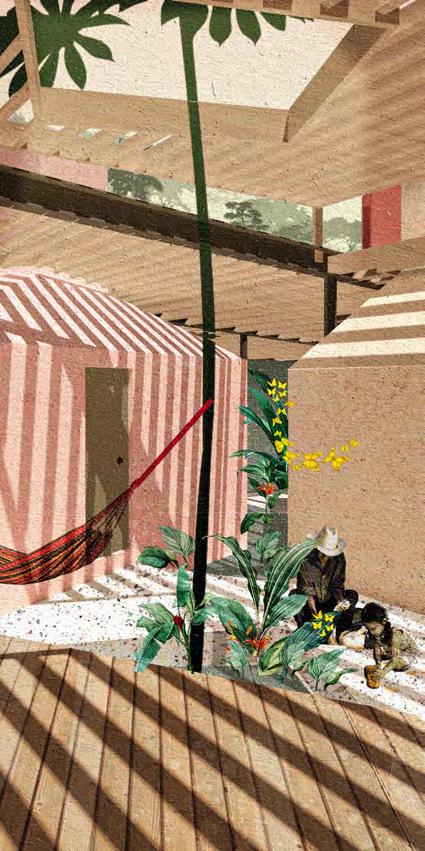
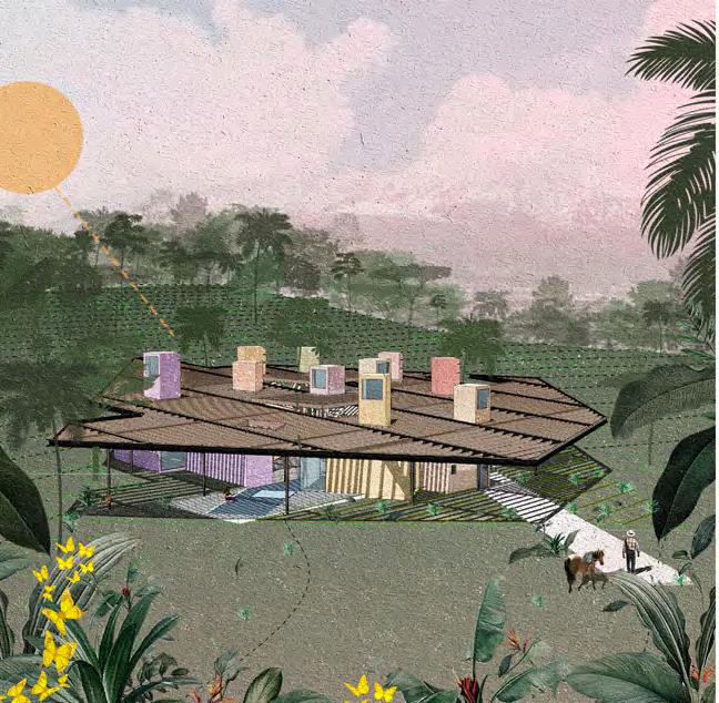
a b c d e f g north exterior view concept diagram landscape floor plan in-between space south exterior view interstitial floor plan in-between space d e g f dwell. in-between, light, interstitial, " "
a 10



 a b
c
d e f
exploded axo drawing master bedroom living room writer's studio section 1 section 2
b c
f
d e
Inlumino
Year 1 / ASC201 Design Studio I
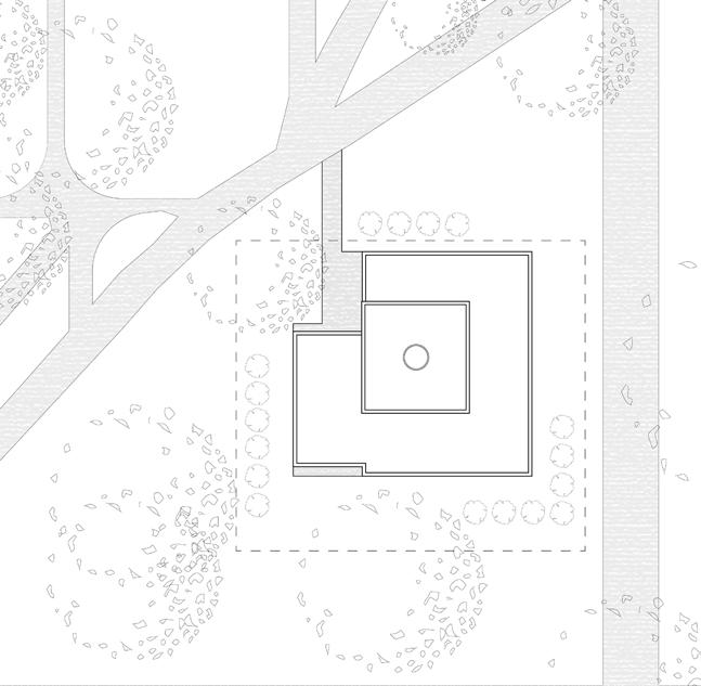
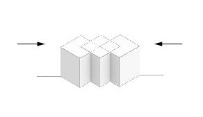
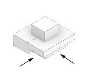
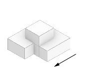
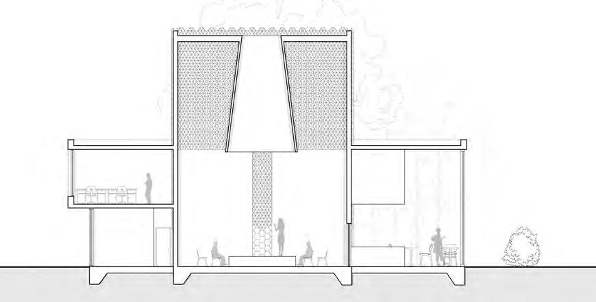
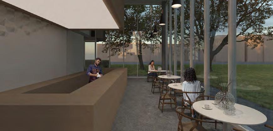
Inlumino is the building for storytelling and performances located in Allan Garden Park. This building has three primary programs: storytelling, café, and office spaces. They are mainly organized along the diagonal grid parallel to the existing path near the site lot. Principal programs are offset from each other, having a storytelling space in the middle, rising three-story space volume. Inlumino means “light up” in Latin, representing one of this project’s main concepts—the light-sensitive design. The main space of the building is the storytelling room, which is enclosed by a perforated metal façade that has a hexagonal pattern with various diameters of openings. The larger openings are generated closer to the middle of each plane and replicate the central oculus skylight opening in the roof. The oculus serves as the natural light projector to the scene, and during night times it is lightened up with artificial lighting. Therefore, lighting in this space differs during the day and creates unique patterns of shadows that add lighting effects to the performances. The office program on the second level is covered with a dark brick façade which helps to integrate new development into the existing environment of old brick houses along Gerrard Street. It stands out from the bright storytelling volume and light, almost transparent café and the rest of the spaces on the ground floor.

Vol. 1
Dinara Gataullina
a b c 12
" "
light-sensitive, storytelling, performance,
a
b
c
performative space concept sketch site plan interior render section massing diagrams exterior render e



d e f g d f g
contrast.
S'Winter Station
Winter Stations 2022
Faculty Advisor
Vincent Hui
Workshop Contributors
Jason Ramelson, Jordan So, Filip Tisler
Project Lead
Ariel Weiss
Design Team
Alexandra Winslow, Kelvin Hoang, Justin Lieberman, Evan Fernandez
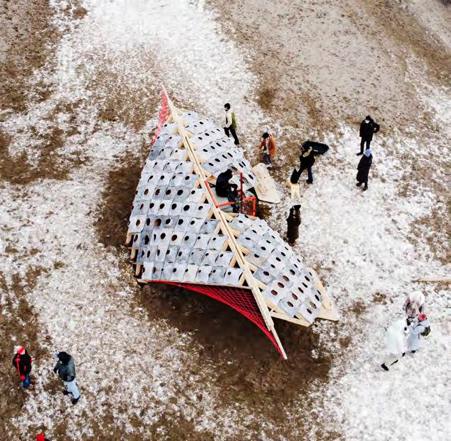
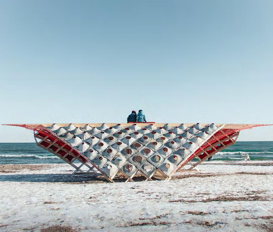
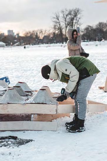
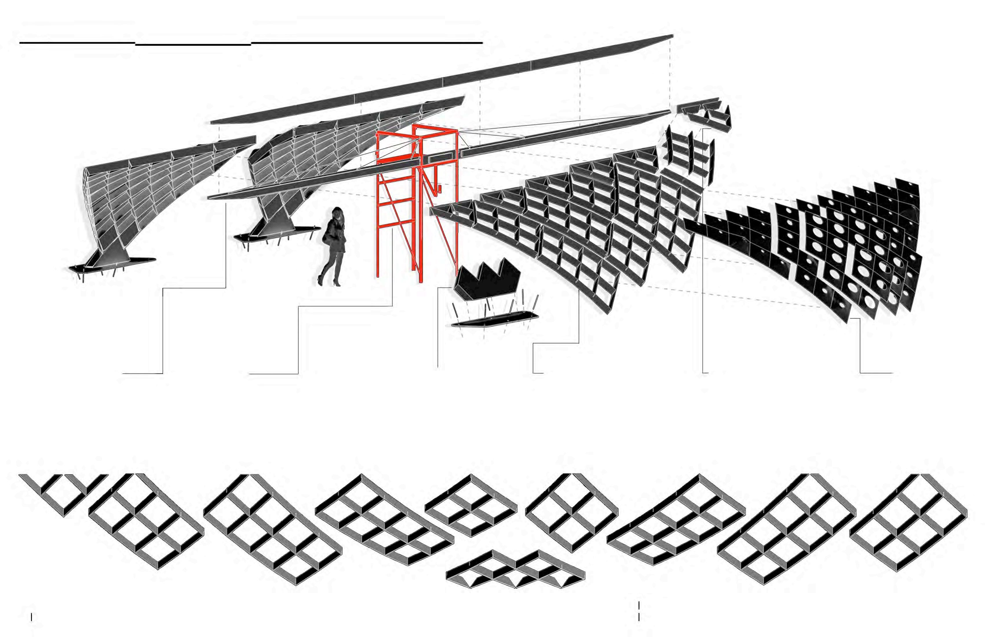
The theme of this year’s competition was resilience. The intention of S’winter Station is to express the resilience of the surrounding beach and the Canadian public through a dynamic transition between summer and winter. The forces of nature are relentless. Like the falling snow of the sky and the shifting sands of the beach, the pavilion embraces local wind, snow, and sun conditions. Following these identified directions of force, the pavilion’s wings embody movement by harnessing snow and mitigating strong winds. Beach towels have been formed into dynamic concrete panels with variable apertures. These panels control the amount of light and snow allowed to enter, while also creating unique views outwards. Together, the panels and wings protect users and encourage them to engage with their surroundings. Where the lifeguard station, beach towels, and marine ropes are more frequently used in the summer, the pavilion achieves resilience by employing these objects in the winter. The pavilion acts as a shelter for the community where winter conditions are celebrated by harnessing and adapting to natural forces.

Vol. 1
Fabrication Team
a b c 14
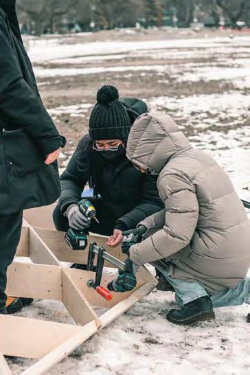
Karlie Chau, Dinara Gataullina, Jake Kroft, Cesar Rodriguez Perfetti, Breno Gualter, Noah Spivak, Liam Fujita, Evan Hills, Nicole Gabriel, Joechelle Faye Bonifacio
a


b
c
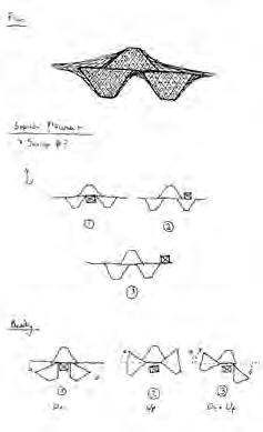
front view interior view drone view by Janathan Sabeniano original view concept sketch construction process assembly axo drawing
f
d e
x
d e f g " "
textile, resilience, concrete.

16


g
Collective Energy
Zhiwen Cai

Year 1 / ASC201 Design Studio I
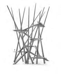

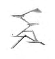
One old tree, located in Allan Gardens, is a Kentucky coffee tree that is over 100 years old. The average lifespan of this subspecies of the legume Caesalpinioideae is about 150 years. Thus, this old tree has been around for over a century. The Assemblage was given to this old tree as a gift, named “Collective Energy,” to symbolize the gathering and return of energy. At the end of life, all living things return to the universe in the form of energy. Living things such as animals, plants, microorganisms, etc., are composed of atoms, subatomic particles and energy. Living organisms constantly absorb and transform energy to exist in this world in the form of matter. However, according to the law of conservation of energy, this energy will return to the universe at the end of life and participate in the cycle of the universe and evolution. This drawing continues the idea of Assemblage by transforming the aggregated form of Assemblage into the form of physical structures and creating interlocking spaces through these structures. Furthermore, by incorporating stairs into the structure, one can reach platforms of different heights and thus further experience the space created by the structure.

Vol. 1
a b c 18

performing,
" "
a b c d elevation process sketch plan view rendered drawing d sliding,
element.
Jazz House
Alvin Huang
Year 4 / ARC920 Advanced Architecture Studio

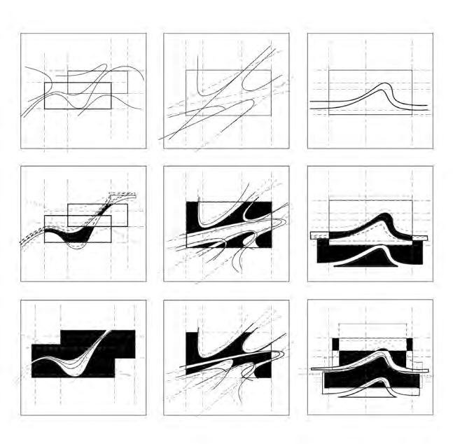
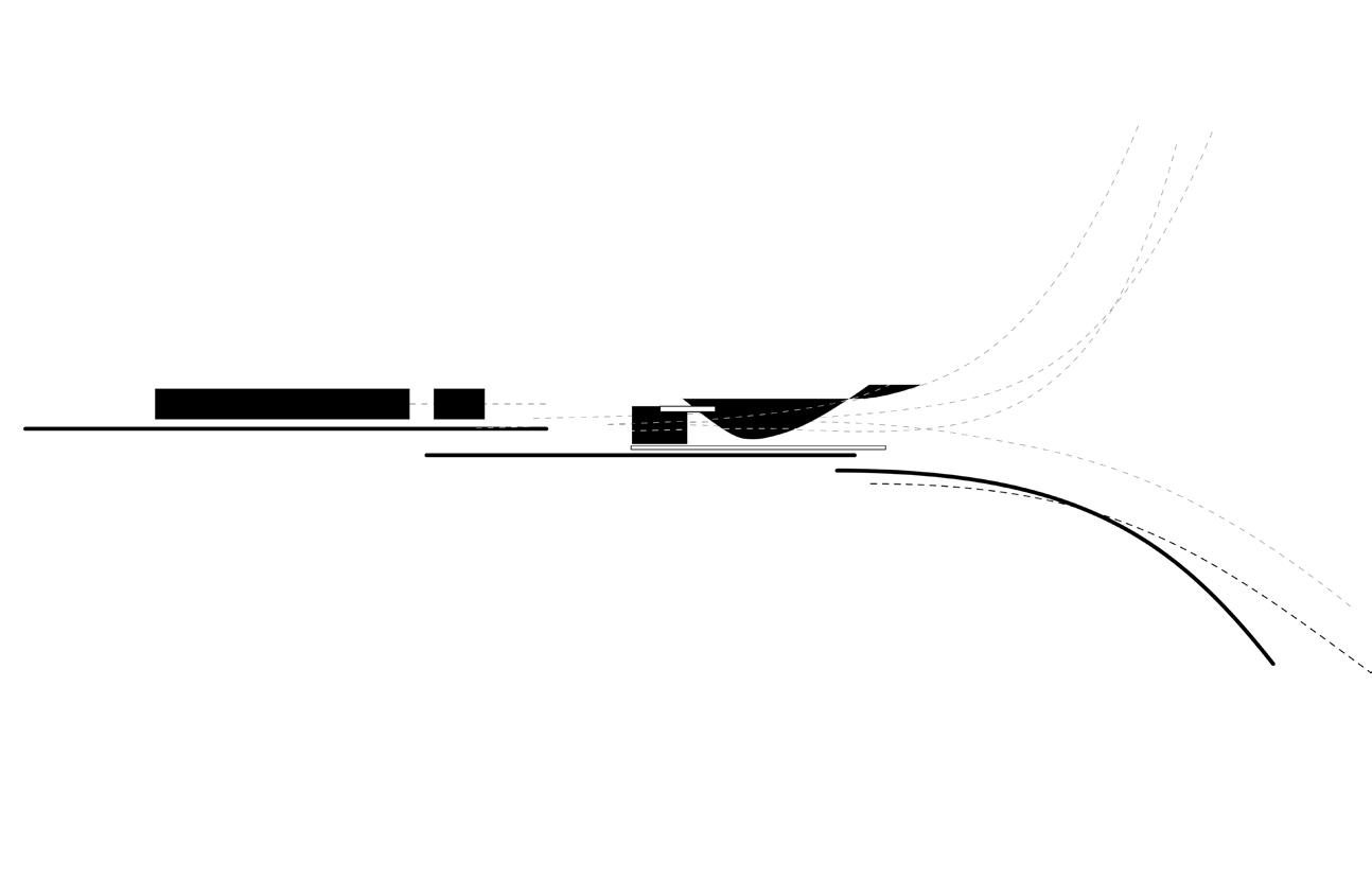
The idea of building for a jazz musician is in my interest in the rhythmic dialogue in the conversation that happens in jazz music. The interpretative style of jazz music is known for it’s solo and free-style improvisation of a chord progression. From the standard harmony, the improvisation of the phrasing is interpreted by each musician/instrument to create a dialogue of individual augmentations of the harmony. An intention of playing and creating music becomes a kinetic movement. From a base evolves tonalities and perspectives of a common idea. Located near Lake Lucerne in Switzerland, the hillside site faces a vast lake and mountainous range, with greenery curating elevated views crucial in a calming element within the experience of the house. The functional house is a subtle approach to the notions of movement formally in the curve of walls in the dining and living space, but still addresses the spatial movement in breaking up public and private spaces with a bar corridor.

Vol. 1
a b 20
a
exterior rendering
b
concept diagram
c
roof formation diagram
d
plan diagram
e f
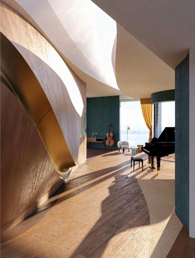
interior rendering
ground floor plan


c
" "
light, house, jazz,
organic.
d
c
e f


 a
b
c
a
b
c
d d
axo drawing interior view concept diagram section 22
b
a c
Moving from tight intimate spaces such as the corridor to the kitchen and dining area, with statement views towards the south lake. The interiors illustrate more of the different tonalities in material drawn from inspiration of jazz instruments and settings of jazz clubs in efforts to create timbre in addition to the flowing forms of walls, and apertures. Through the openings the light draws streaks, and highlights the curvature within the space.

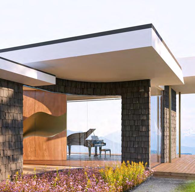

e f g living room exterior exterior viewrendering roof form
g
e g
e f
Planting a Seed


Zarreen Khan & Batool Alqasas
Year 4 / ARC920 Advanced Architecture Studio

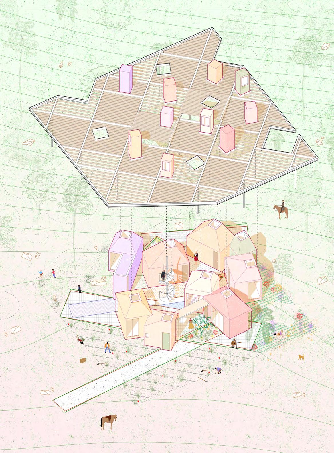
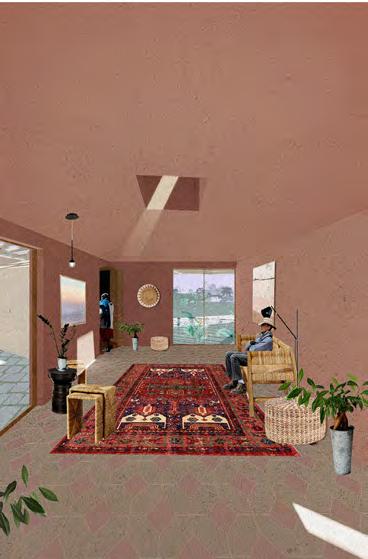
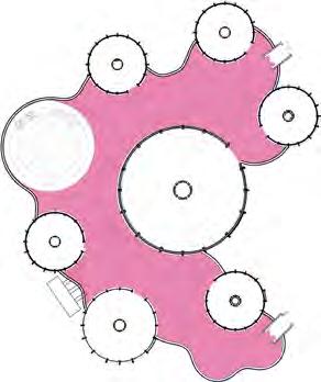
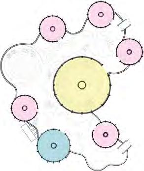
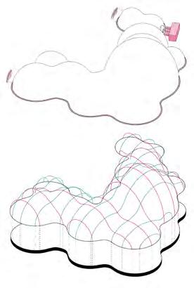
The seed of education can animate even the most neglected communities. This school is designed for Indigenous reserves across Canada, which lack basic facilities such as schools, libraries and community centres due to government neglect. As a result, children are forced to travel daily to off-reserve schools, often experiencing social exclusion and marginalization. Drawing inspiration from nomadic Indigenous architecture, the school takes the form of an adaptable miniature village. The “treelike” columns symbolize wisdom in Indigenous culture, combined with a diagrid structure that mimics the interior of a wigwam. The prefabricated modules combine with an inflatable corridor to create an elastic network of spaces that support interactive learning and promote community engagement. The program is designed to accommodate a range of activities that are otherwise not available to these forgotten communities. Learning is extended into the landscape through the use of an interstitial space, created by the inflatable structure. This enables the community to interact with the natural environment, a valued form of learning in Indigenous culture. The domed modules can be programmed in any way , they also allow for the school to both be expanded or reduced depending on the needs of the community. The inflatable structure can easily be adapted to fit variations of the design.

Vol. 1
a c b 24
d
engaging, adaptable, interactive,


"
a
b
c
d
f
e
main exterior render concept sketches floor plans interior render interior render inflatable structure section

e
g
f
g
playful. "
Poet's Retreat
Florencio IV Gamboa
Year 4 / ARC920 Advanced Architecture Studio
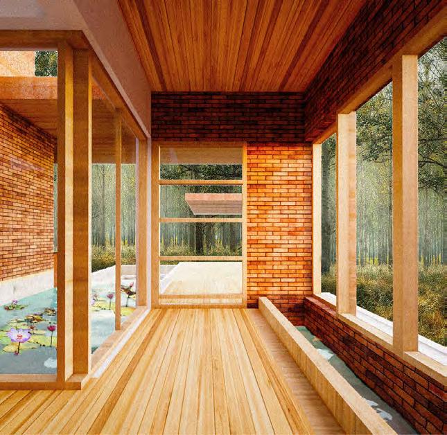
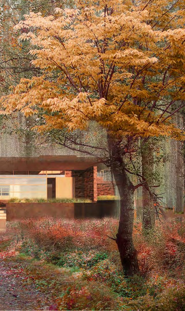
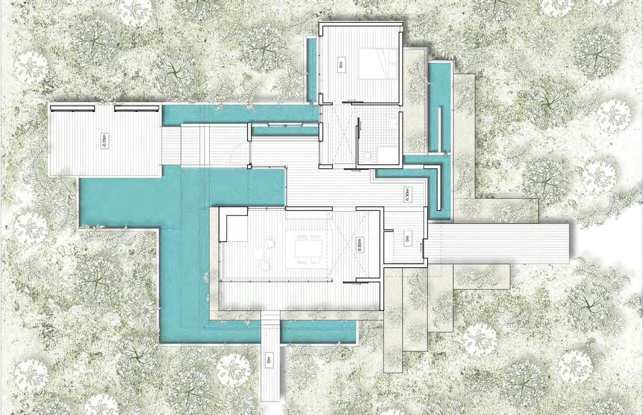
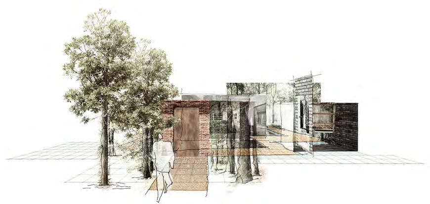
The project was initially inspired by the Japanese poet, Matsuo Basho, who was known to go on pilgrimages across Japan to spend time in nature, escape his normal life and find inspiration for his work. With that in mind, some argue his poetry aimed to capture the essence of Japanese principle, wabi sabi. The proposal is developed from three Japanese principles. The first is wabi sabi, embracing imperfection within nature. The second principle is Ma / Hashi, the idea of boundary in motion. The third principle is Yugen, the art of the unknown and mystery. These principles come together by imperfectly organizing project elements and interpreting the boundaries between inside and outside.


Vol. 1
c 26
a b
a
west exterior view
ma/hashi, yugen,
boundary.
b
d
e
c
d
f
e
g
japanese principles collage corridor 1
unfolded boundary collage floor plan
living space corridor 2


f g
sabi,
" "
wabi
Camp Winston Animal Paddock Vol.
*Participants See Appendix
Summer 2022

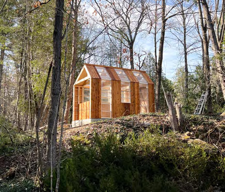
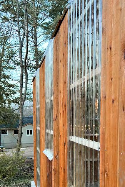
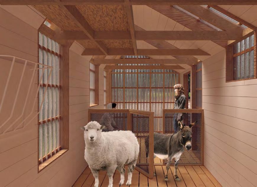
Located on beautiful Sparrow Lake in the Muskoka region of Ontario, Camp Winston is a unique retreat for children with complex neurobiological disorders who need highly specialized support. Under the supervision and guidance of Professor Vincent Hui, our team has worked to create a delicate animal paddock responding to both the needs of the children as well as their supportive animals. Our goal is to carve moments of transparency within the paddock in order to create an un-intimidating and light filled experience for both the kids and animals using it. This transparency is achieved through the use of strategic polycarbonate subtractions allowing light, air, and views into and out of the shed. Sixteen undergraduate students spent three days volunteering with two teams of students from different years in the Camp Winston Paddock Design Build. Learning physically rather than electronically, this project gave students a distinct perspective, making it simple and enjoyable to understand new construction concepts. Experimenting with new materials, such as polycarbonate, used as a translucent facade feature that gave the appearance of a window, were installed. Students started with the principles acquired in the classroom and used construction tools to make the design a reality.


1
a b c 28
e
transparency, natural.
f
Project Participants

Initial Design Team: Keanu Salimi, Nohemi Lopez Taylor, Noah Spivak, Sadberk Agma, Daniela Diaz, Ariel Weiss

Fabrication Team Hunter Kauremszky, Evan Hills, Alexandra Winslow, Nicole Gabriele, Luca Castellan, Jake Kroft, Melina Elefteriadis, Liam Fujita, Dinura Fernando, Nolan Wong, Jade Branker, Chau Nguyen (Karlie), Jake Levy
a b c d e f g light,
exterior view process work day-time view interior view night view ground floor plan facade image d " "
g
Editorial 01
This editorial piece is all about aspirations and reminiscence—two unlike concepts like in the way they allow us to reflect on our own values and identity as we continuously change into our present selves.
DAS students were invited to answer one of six questions that required them to share their thoughts and experiences regarding being in the Architectural Science program.
Emily (Young Eun) Park Fourth Year
My advice is to always make sure to get enough sleep and rest, even when deadlines and projects are crazy. Any architecture student will know that school will get tough for sure and overwhelming to the point of mental breakdowns. Your health is number one priority and schoolwork / studio comes after. To be able to manage your time well and be able to get enough sleep, always plan out your day well, so that you are not wasting time. Your health is something you should not take for granted! Even when you are young. It's not the end of your life when your studio project does not get an A or a B.
What has been the most rewarding aspect / experience in your architectural career that you have obtained through the architectural science program?
I consider the most valuable experience I have gained in my architectural career to be my proficiency in design thinking. In my final year of undergraduate studies, I came to the realization that there are numerous career paths besides being an architect, and the design thinking skills that I have acquired can be applied to various practical works. Design thinking involves creating products and services that are based on the needs of clients and continuously optimizing them to achieve the best possible solutions. This approach necessitates interdisciplinary collaboration, innovative thinking, systemic thinking, and sustainable concepts. It is applicable to problem-solving in different fields and aids in the creation of architecture, products, or services that are more human-centered. In architectural projects, we constantly practice and develop this ability and establish our own analyticaldesign-optimization process system. I believe this is an invaluable skill that can be intentionally cultivated and planned for when working on design assignments.
Fan Fei | Fourth Year
What advice would you give to future students looking to apply to the architectural science program based on your own experience?
Evan Fernandes | Co-op
The opportunity to engage and learn with students and professors with diverse architectural backgrounds has helped me grow by further enriching my academic experience. This experience has provided me with different perspectives regarding the discipline, which works to prepare students for real-life job experiences. The architectural science program has provided me with many opportunities to learn from diverse areas of study ranging from planning, construction, art, and more. Therefore, the program has increased my skill set and helped me grow as a student of the profession.
Participating in Design-Builds and international research conferences. They have made my education memorable and meaningful. They have allowed me to step outside of the classroom and experience the field of architecture firsthand. I have been able to see 2D conceptual work become a reality for people to interact with and enjoy. And I have been able to travel to places I have never been and present topics on an international stage, representing the department and university.
Jake Kroft | Third Year
View your projects as what they are—projects. While they take form through your ideas and efforts, being able to receive and apply feedback without taking any constructive criticism personally allows for design growth both in your project itself and your own critical thinking. Learning from your professors and peers makes the experience worthwhile, so it is important to gain various perspectives to help shape your own.
After completing the five-year program at DAS and gaining some practical experience in the professional field, I have come to appreciate the immense value of having vast free time during my undergraduate years. It allows one to delve into personal interests and engage in the exploration of conceptual ideas. Even though it was cruel to see that our grand ideals in design studios can never come into real life, the path of how we get to the final product, the things we carry through or obtain during the journey, have always been an invaluable experience that will company us throughout the remaining of our professional career. Thus, if there is anything I would like to change for my own experience in the program, I would say, do not be afraid, free the leash of our imagination and go ahead to explore! Because every little thing could make a difference in the future!
Yiran Ma | Fourth Year
Looking back, is there anything you would change about your experience in the architectural science program?
Kathlynn Hoang | Co-op
Vol. 1
30
How do you think you will change through the architectural science program (design values, career aspirations, etc.)?
Wilson Leung | Second Year
Before entering the program, I had a superficial understanding of architecture, only seeing buildings and structures through aesthetics. After studying architecture in Toronto Metropolitan Unviersity’s Architectural Science program, I now have a deeper understanding and appreciation of the built environment around us, seeing architecture through a new lens. I hope to continue this appreciation while further developing my insight into architecture as I journey through my architectural career.
Sarah Tang | Second Year
My greatest design aspiration is to create human centric functional spaces. A lot of the infrastructure we see in our cities are solely designed for economical reasons, which leave inhabitants isolated. By striving to design for connection, we can create more diverse and inclusive features that preserve our need for play and socialization, in secure spaces. Furthermore, the design of these spaces don’t need to be compromised by economic demands. This can be achieved by prioritizing user experience, rather than solely profit. By learning how to integrate these spaces into the fabric of our city, they become more achievable.
What do you currently have as your greatest (design, professional, career, academic, etc.) aspiration to achieve while in the architectural science program?
Vivian Nguyen | First Year
As I go through the Architectural Science program, I will gain deeper knowledge about all the components that go into creating architecture. Due to this, I feel that my design values will change in terms of thinking about how my projects will have an impact on the surrounding environment, the structure needed to ensure it stands up, and if the project is morally just to put out into the world.
I believe that throughout the program, I’d for sure gain more confidence in my workflow and my design skills, but I might also have a broader perspective on which branch of the industry to work in. Presently, I am interested in the architecture stream, however, I hope that with time I will learn more about the practical side of architecture and how different design choices can impact different aspects of a building project, such as its engineering, cost, construction, schedule, etc.
Parinaz Nabavi | Second Year
Dana Kim | Second Year
What inspired you to apply to the architectural science program?
I am here at TMU’s Architectural Science program because I had a love for the sciences and the arts!
Vince Hui
Tony Le | Second Year
32
MEDIUM 34 38 40 42 44 46 48 50 52 Architecture in Drag Off-Ramp Skate Park Baghere Children’s House Fragments Blue Skies Collaborative Core Rock on Bond Gable House Editorial 02 Michael Evola Jake Kroft James Goodeve Wincy Kong Jana Stojanovska Mayan Ebrahim Cesar Rodriguez Perfetti Jake Kroft 325 Magazine Team
Architecture in Drag
Master Year 2 / Thesis
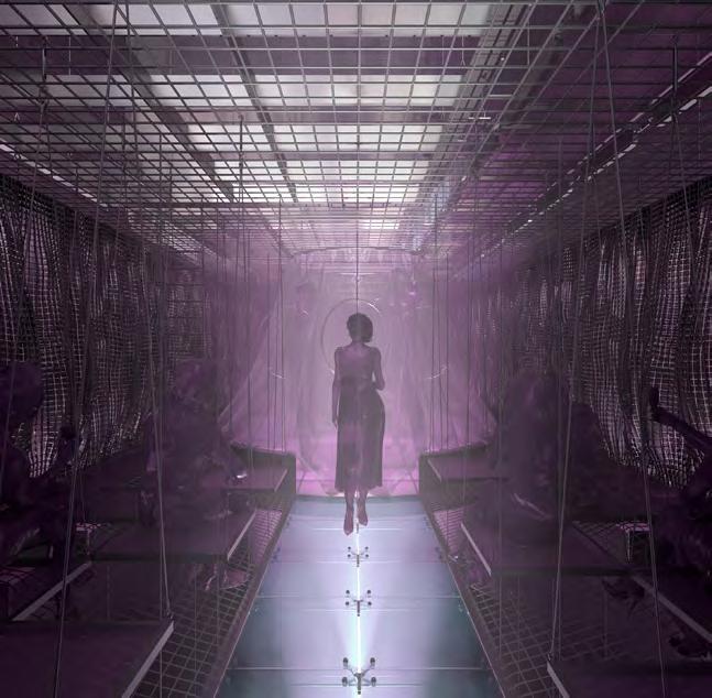
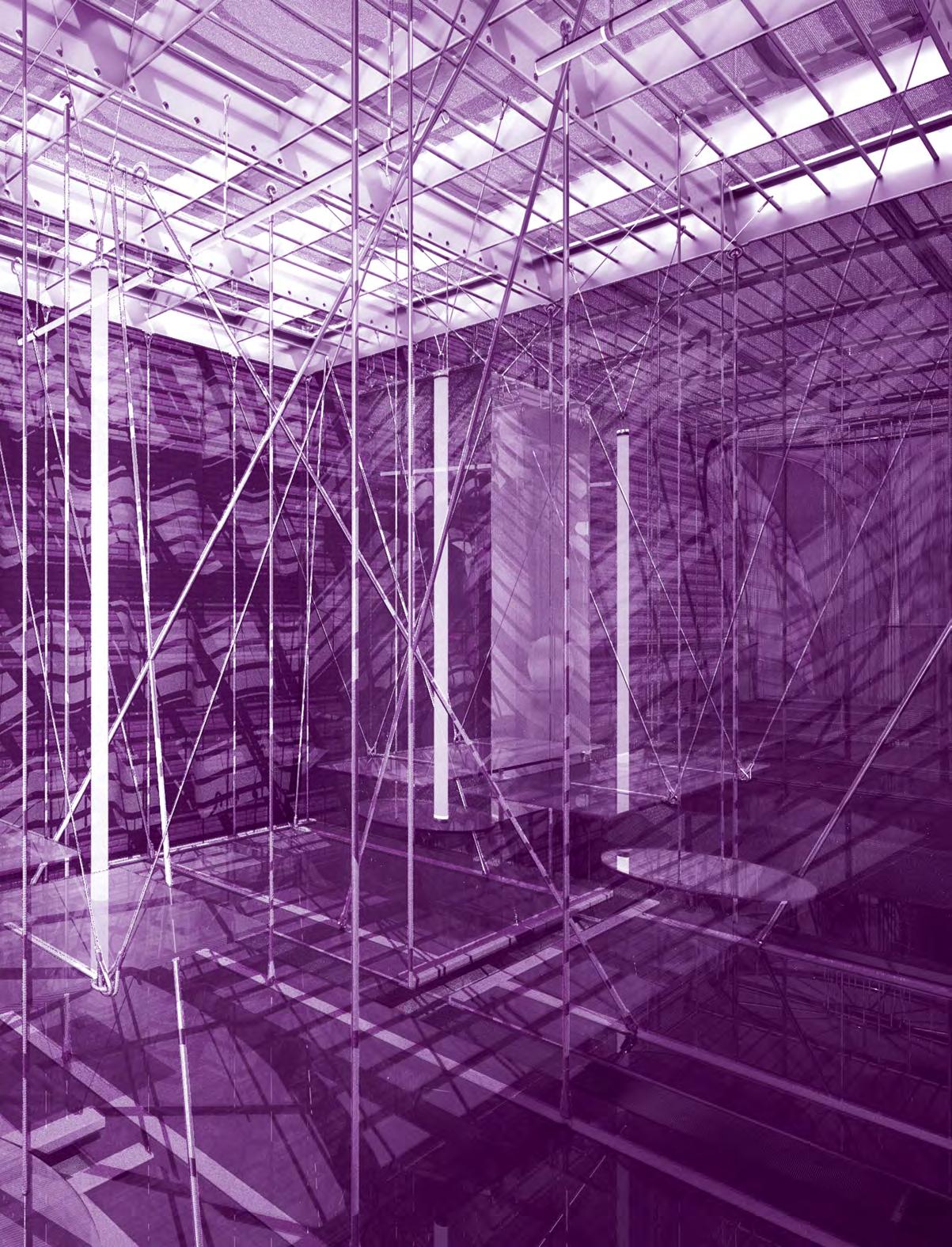
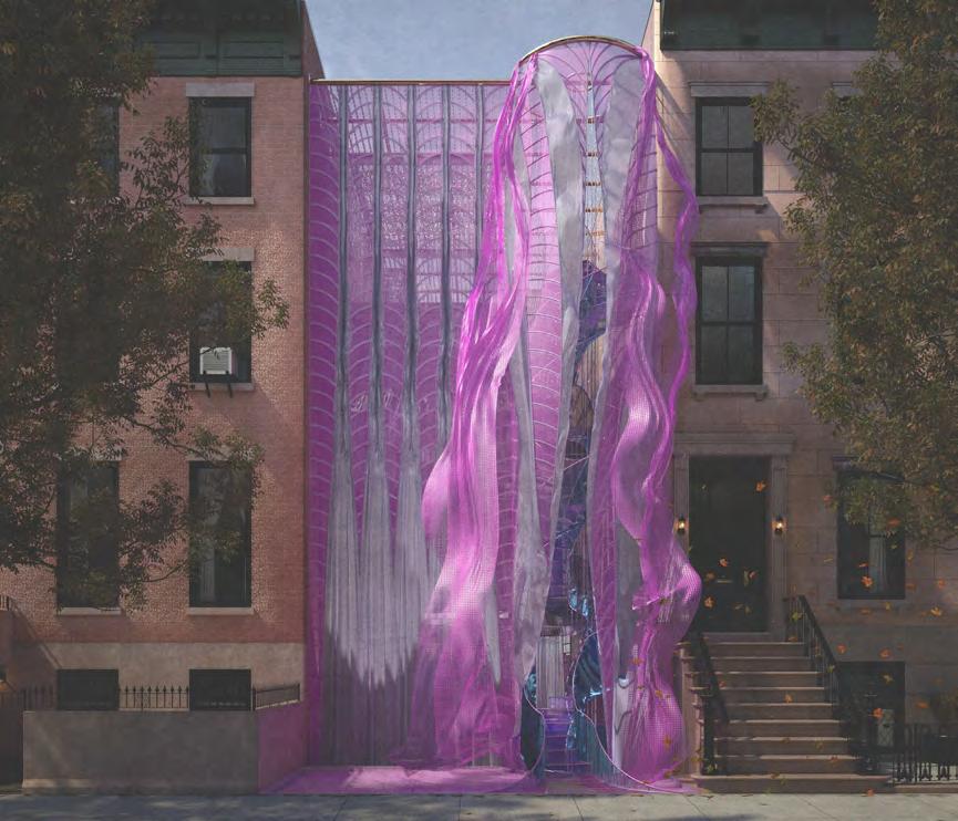
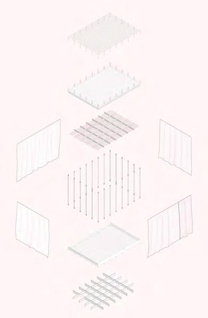
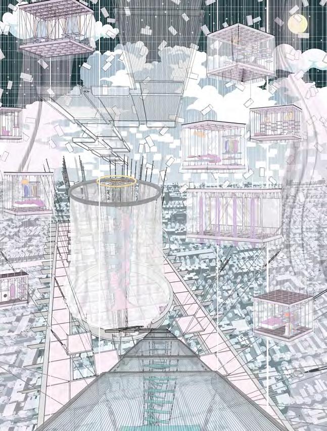
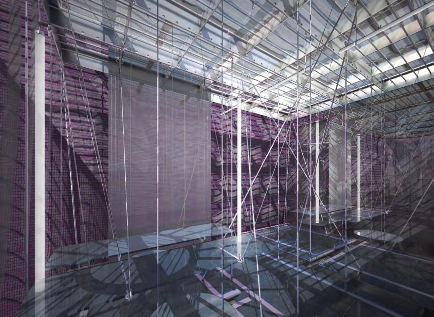
Through imitation and parody, Architecture in Drag challenges architecture’s identity. “/” is an imitation of a building, a ballroom and a home. Situated in New York City, the birthplace of modern drag culture, / begins by separating and interconnecting two rowhouses through a horizontal structural grid. From the grid, all of its characters (program and circulation), are hung and interconnected through fluid architectonics. By hanging its characters, / removes the ground on which architecture rests upon. In its place, a series of fluid spaces affect the other. In this manner, space is boundless, inviting and encompassing. Similarly, / invites its audiences to customize it. Although its characters are organized within a grid, this, like the power of the grid within architecture is a false truth. Thanks to its semi-fixed industrial characters, all of /’s characters are free to be moved and be rearranged Thereby, / has exactly half a plan. The industrial connections enabling this feature are appropriated from their intended use, like the appropriated fixtures drag performers utilize to re-arrange their identities.

Vol. 2
Michael Evola
a b c 34
bias. drag, architecture,
b
rendered elevation diagram interior view interior view collage diagram d
 a
a
e f
c d e f " "
No material should be off-limit in the construction of architectural ideas. Moreover, no idea should be considered non-architectural. Architecture in Drag challenges the ground defining truths within abstractions such as architecture and gender. / is the byproduct of this challenge, it is a performance of architectural ‘truths’ parodied as fluid.
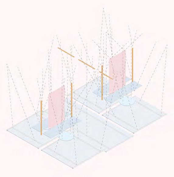

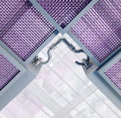

a b c d interior view diagram rendered detail 1 rendered detail 2 b d c a 36


e f interior view interior view e f
Off-Ramp Skate Park
Jake Kroft
Year 2 / ASC301 Design Studio II
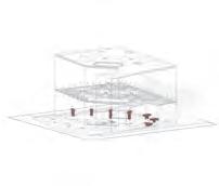


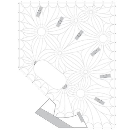
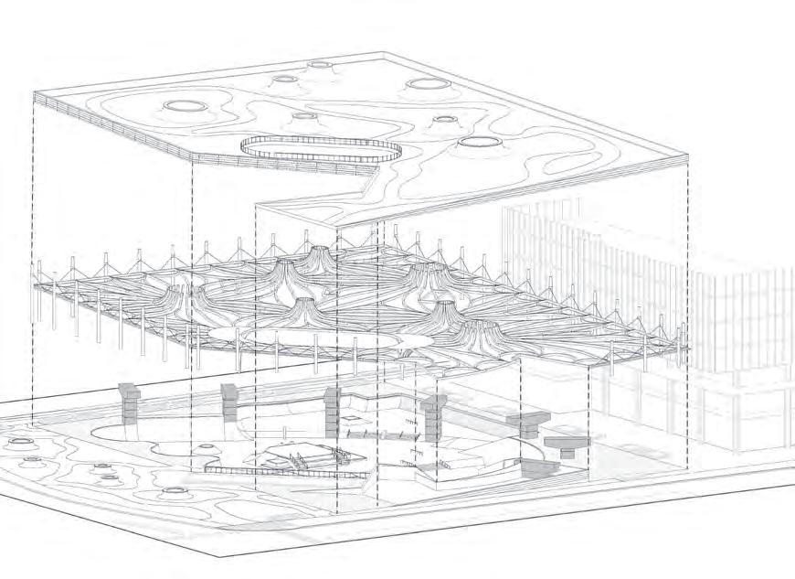
The goal of this project was to design a skate park. It is located at 96 Queens Quay W, the site of a former off-ramp of the Gardiner Expressway. My intent was to utilize the existing structure of the ramp to create a multi-level park for skaters and pedestrians to use simultaneously. The skate park is carved out of the ground plane and is sheltered by a roof deck that tilts down toward the southwest corner of the site, creating an access point. The roof plane covers the skate park to protect users from the elements and provides lighting at night. The existing structure on the site was used to support the roof deck, along with some added structure. I developed a system that would work with the existing structure to sufficiently support the roof. Free-flowing concrete ribs permit the expansive spans. The exterior columns provide support around the perimeter of the roof while not interfering with the interior space of the skate park. The reservation of the existing piers on the site limits the negative effects that their embodied carbon would have on the environment if demolished. Large existing trees were also preserved and implemented into the design of the site. The expansive living roof provides a natural habitat for biodiversity and will reduce the urban heat island effect. The skylights provide the skate park with natural light, giving users an inviting and comfortable experience below the roof deck.

Vol. 2
a c b 38
interior view structure, tree and green space diagram site sketch axo drawing site plan reflected ceiling plan section A-A d flow. community, skatepark, " "


f
e
a b c d e f g g
Baghere Children's House
 James Goodeve

Year 4 / Kairo Looro Children's House Competition
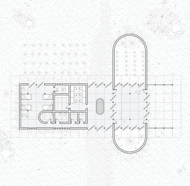
The Baghere Children’s House nestles into the Senegalese landscape, providing interactive spaces and programming to promote food security and wellness for the local children. The design carefully establishes a relationship with the site, visually reflecting the palette of natural features and materials that define the environment around it. A monolithic form of laterite earth rests upon the ground, with intermittent wooden screens which invite users into the space within. The central entrance opens to a foyer with a well which acts to benefit the entire community and welcomes all members of the area to participate in the function of this building. The foyer acts as a threshold between programming, dividing the private family spaces from the more public interactive learning spaces. The interjecting courtyard walls create a pocket of defined exterior space which is utilized for agriculture. This acts as an additional source of food for the children who use this space. The function of the entire building is to harmoniously organize the programming into a form which enhances the potential to educate and provide food security to the youth of Baghere and the surrounding area.


Vol. 2
a b c 40
d e f
laterite, integrated,


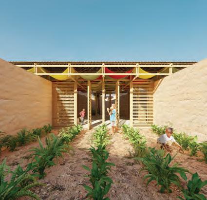
dynamic.
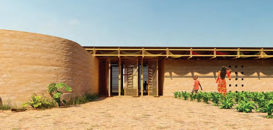
h g
a b c d e f g h vernacular,
entrance view 1 concept sketch interior view back view garden view entrance view 2 ground level plan axo drawing " "
Fragments


Wincy Kong


Year 4 / ARC920 Advanced Architecture Studio


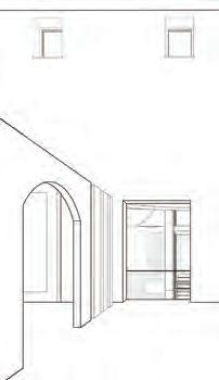

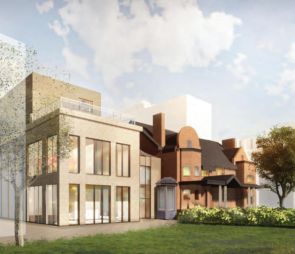
As times change, so do the ways we live and the buildings around us. This project explores the personal definition of architecture as physical evidence of our history and culture. The concept is derived from the old and new; to treat architecture as a series of fragments and objects that serve as a link to our past. Located on 39 Queen’s Park Cres. E, this site is home to three heritage buildings that are preserved. These buildings are essentially very large fragments and are treated as such; as objects that can be observed, engaged with, and interacted with. The old is preserved and the new connects to it, without overpowering, enveloping, nor replacing it. The building is divided into a series of old and new massings, with the interspace between the buildings serving as a connecting hinge that unites all the objects into one cohesive architectural experience. A lightweight, tensile roof structure connects all the massings like a wrapping blanket, giving the interspace its own unique character, with a nebulous quality that blurs the boundaries between interior and exterior, and creating the experience of being in between many large-scaled architectural fragments.
Vol. 2
a b c 42
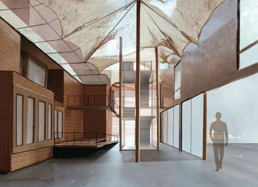


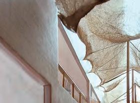
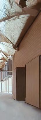


e f a b c d e f g exterior view 3D diagram elevation interior view 1 interior view 2 interior view 3 section d g
interspace. " "
connection, heritage,
Blue Skies
Jana Stojanovska
Year 2 / ASC301 Design Studio II





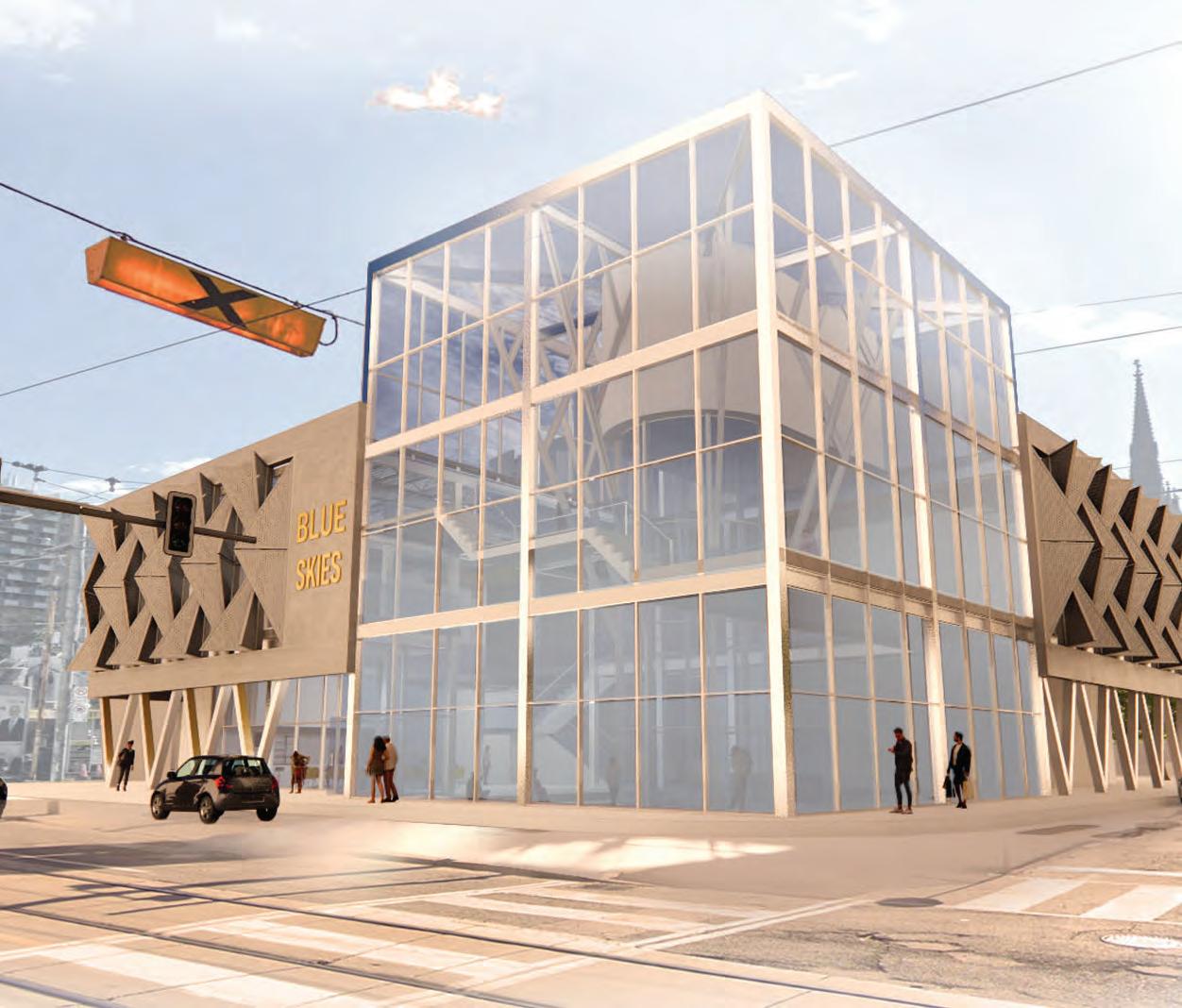
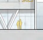
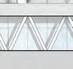
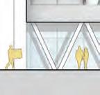
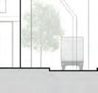
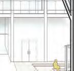
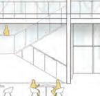
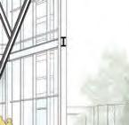
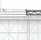
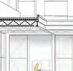
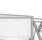
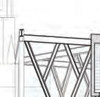
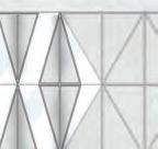
While the literal meaning of “blue skies” is a cloudless day, in skydiving, it is imbued with more meaning. The phrase is used as a greeting or blessing. Inspired by the vertical wind tunnel needed to provide the wind flow for indoor skydiving, this facility focuses on verticality. The flight chamber is exposed with a glazed curtain wall to the major elevations on Dundas and Bond, becoming interconnected with the city. The programs consist of public visitor spaces and private back-of-the-house spaces. The glass chamber housing the wind tunnel dominates the building, rising higher than the other programs. It allows light to flow down to the seating pit at the bottom of the tunnel, visually opening the space to the sky. The viewing decks wrap around the flight chamber and eventually reach the tree branches of the mullions, creating a unique circulatory experience for its viewers. This supports the social aspect of indoor skydiving, as the platforms encourage visitors to stand close to the tunnel and interact with the flyers. The façade is an integrated part of the building that creates a unique varying expression, inspired by the changing velocity of wind tunnels. The triangular steel perforated panels are reflected as interior details with the tree-like mullions supporting the vertical wind tunnel.
Vol. 2
a b c 44
exterior view concept sketch first floor plan sectional view ground floor plan interior view east elevation d




















f



e
g
a b c d e f g " "
flight. light, verticality, skydiving,
Collaborative Core
Mayan Ebrahim
Year 4 / ARC920 Advanced Architecture Studio
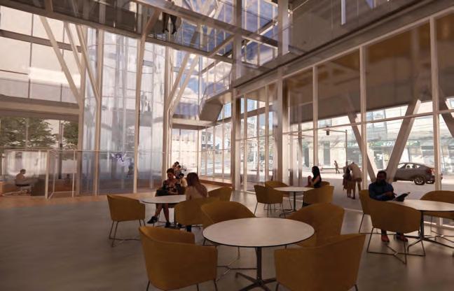
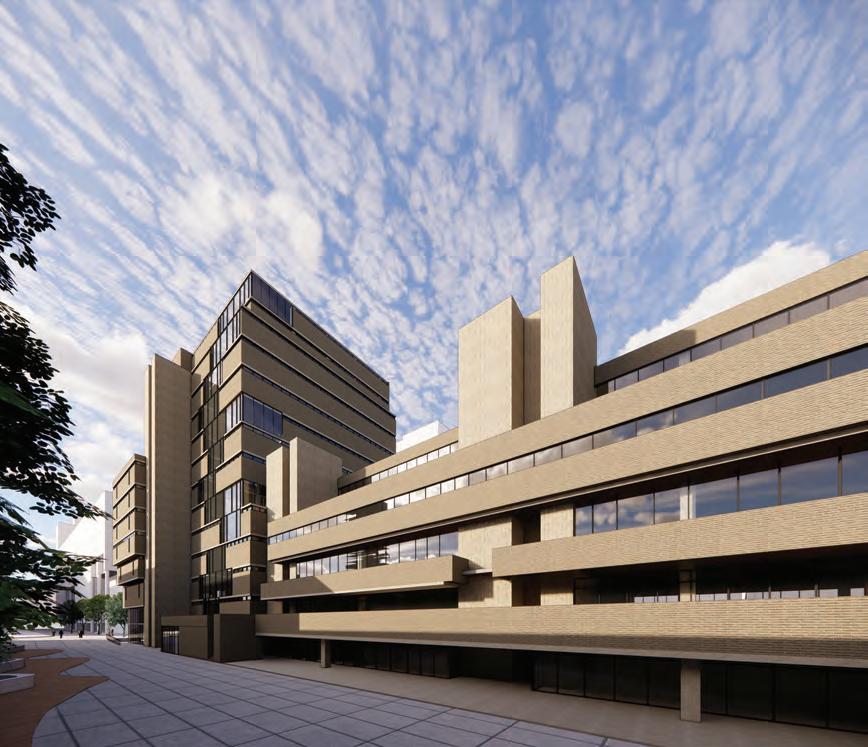
The Collaborative Core is an adaptive reuse project that reimagines a fragment / portion of the existing Toronto Metropolitan University library. The Collaborative Core proposal aims to preserve the original building’s brutalist architecture while providing opportunities to expand its programs by developing a continuous atrium running through all its floors that houses non-normative library programs. The design replaces the existing library’s typically hard, stacked, consolidated floors with a soft, collaborative core that vertically extends public and student circulation. The programs in the atrium are divided into six general clusters, creating smaller communities that allow for each department’s autonomy, yet initiate spontaneous moments and idea exchange based on their proximity. By changing the opening area on each floor and proposing rooms that cantilever within the atrium, unique learning moments, creating, and experimenting blend with the atrium. The architectural changes to the massing, most specifically the East façade, mirror the shift of voids of the atrium.

Vol. 2
a b c 46
a


exterior view
key moments diagrams


sectional view


interior view
existing section
new proposal section program diagram
e f g
" "
b c d e f g d
reuse , adaptive, exchange.
Rock on Bond
Cesar Rodriguez Perfetti


Year 2 / ASC301 Design Studio II

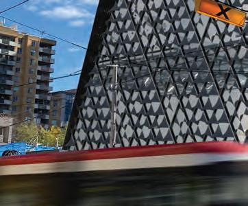
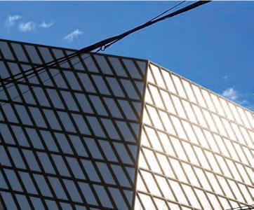
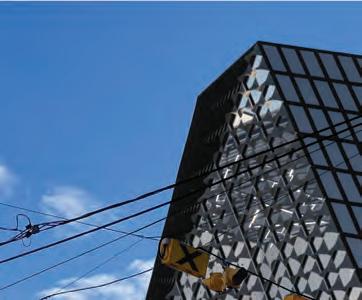
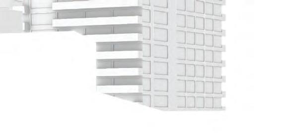
This building started by understanding the high traffic of the location. As a result, a square-based building locates, services areas of the building, requiring less complexity than the areas where the rock climbing would be located on the first floor. As the building moves up, the interaction of an upper hexagon and bottom square base of the building creates a series of volumetric conditions responding to the movement of rock climbing. Glazing opening units are part of the building envelope to the North, increasing exposure of the interior activity with the exterior context, and at the south to allow for sunlight penetration with a system of perforated metal shades regulating the light getting in. The diagrid structural system generated interiors requiring fewer structural members, allowing for greater clearance on the interior of the building, creating spaces with less interruption of structural members. The open character of these spaces would allow for a building where the 3-dimensional activity is exposed to be observed easier, and even to host competitions. As most of the rock climbing facilities in Toronto are buildings that have been re-adapted to respond to the requirement of this sport, thinking about a building how a structure that would allow for total exposure to the activity would be beneficial to host competitions and increase the way on how the athletes learn from others by observing different techniques.



Vol. 2
a b c 48











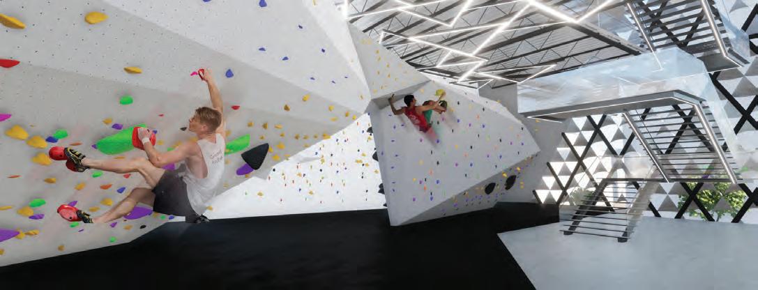
DUNDAS ST E BOND ST. Office Meeting room Staff Storage Mantainance Cafe Reception Store Up Up Warm up Boulder warm up Boulderland Seating area UP DOWN OTB a b c d e f g sectional view massing diagram interior view exterior view ground floor plan second level plan interior view d e g f movement, rockclimbing, urban. " "
Gable House
Jake Kroft
Year 2 / ASC401 Design Studio III
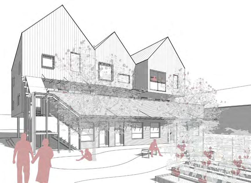
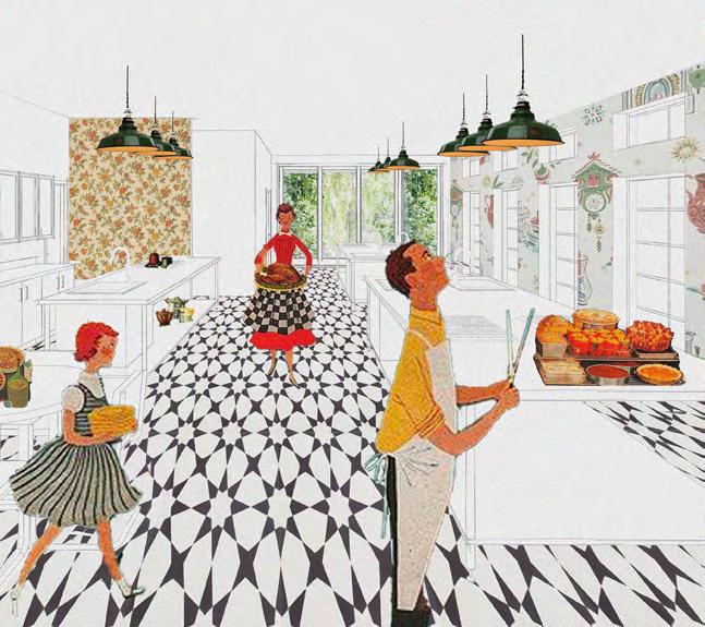
This proposal aims to give Bancroft, Ontario residents their own individual “houses” within a denser development on the corner of Hastings Street N and Station Street. A community kitchen, serviced by its adjoining community garden, is prominent on the northeast corner of the site. There are 14 residential units, comprised of 6 – 1 bedroom units, two of which are accessible, 5 – 2 storey, 2 bedroom units, and 3 – 2 storey, 3 bedroom units, one of which is a live / work unit with commercial space on the ground floor. The form of the building came from the idea of merging archetypal houses into a mixed-use residential project for the small town. The building is broken into two segments that allow for more circulation throughout the site. In front of the east block is a community garden with direct access to the community kitchen on the corner of Station and Hastings. Each of the upper units has a rooftop terrace that is cut out of the gable to provide a private outdoor space for relaxation. The goal was to maximize active frontage along Station and Hastings by placing the parking in the southwest corner of the site. Gable House provides the town of Bancroft with a denser residential development on its high street that aims to fit in with its surroundings. It is in line with the town’s aspiration of densifying its core while responding to its context.

Vol. 2
8 9 3 4 5 6 7 10 11 12 13 14 2(BF.) 1(BF.) 29 8m 29 m 332 327 CommunityGarden Dn StationStreet Hasti n gs Street N ExistngSurfacePakingLot CommunityKitchen CommercialUnit CommercialUnit Live/Work Unit Lobby Refuse BicyleStorage BF 1 BedroomUnit BF 1 BedroomUnit M a BuldingSetback Buildi n g Setback A A B B 28 32 a b c 50
a
mixed-use.
b
c
d
unit entry concept sketch site plan approach kitchen collage axonometric diagram north elevation d " "

e f g
e f g
densification, residential, archetypal,
Editorial 02.1
with the 2022 TimberFever chairs
featured
Ishkreet Merwaha | Civil Engineering Chair

Alexandra Winslow | Architecture Chair
moderator
Kathlynn Hoang
editors
Kathlynn Hoang
Sarah Tang
a Vol. 2
52
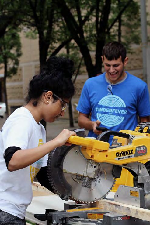
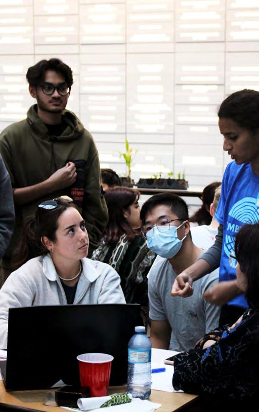
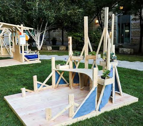
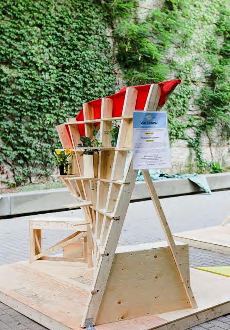
TimberFever is an annual design-build competition presented by Moses Structural Engineers and hosted at Toronto Metropolitan University. While the tradition is for architecture and civil engineering students from universities across North America to join together in teams to build a life-size structure out of wood, the competition had to go virtual for two years during the pandemic. Now in its eighth year, TimberFever finally went back to being in person, bringing students together in the creation of 16 teams that fostered 16 successful timber structures.
This editorial piece works to celebrate the opportunities provided by TimberFever in two parts. The first part is through interviewing the 2022 TimberFever chairs: Ishkreet Merwaha and Alex Winslow. Together, they led the student planning committee, Team 17, to make the competition a reality while needing to deal with the challenges faced when running an event that transitioned from being virtual to in person. The second part is through interviewing members of first-place Team 08 and second-place Team 10 to provide an alternate perspective on the competition through a participant's eyes.
325: What made you want to take on the role as a chair for TimberFever? What were you anticipating to come out of it (skill sets, experience, etc.)?
[Alex Winslow] I volunteered as a first year. I thought it was a great idea to just get involved. I wanted to participate in my second year, but it was virtual so I thought “okay, I’ll just wait until third year, hopefully I’ll get to participate.” Again, it was virtual—I ended up doing it anyway. Now that it was back in person, I was just really excited to be involved in any way. This architecture chair position really excited me. It was an opportunity for me to develop my leadership skills as well as project management skills. You could also say communication skills and delegating tasks. I was also very excited by the
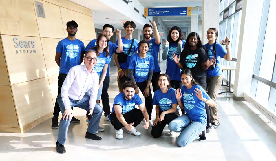
b Team 17 Team 17 and TimberFever chairs
325: Considering this was the first in-person TimberFever event since the pandemic started, what challenges did you face and how did you overcome them?

[Alex Winslow] I will start off by saying that the last in-person competition we had was in 2019. So when we were planning the competition, Ishkreet and I were referencing all the data from 2019, but things have changed significantly since then. It was definitely a bit of a struggle. There were contacts that weren’t up to date and cost estimates weren’t up to date either. Even wood prices were significantly different and we had to do a lot more fundraising for that. Our finance team did a really good job of pulling through.
[Ishkreet Merwaha] To add on that, based on our quote for timber in 2019, the prices from three years ago have doubled. So if we’re ordering the same amount of material as we did in 2019, we have to raise double the money. Inflation was insane. We raised quite a bit more money than in 2019 just to source everything. Outdated information and resources called for greater attention to planning.
[Ishkreet Merwaha] I’ve been doing TimberFever for two years, but I’ve been a participant when it was virtual, kind of the same thing with Alex. It was good virtual but it’s a different experience coming back in person, and I just wanted to be a part of that. The civil engineering chair role was open, so I went for it because I knew I was looking for something with a leadership role. I knew that the chair position was like the head of everything, so I wanted to take that on and learn project management. And then for TimberFever itself, I wanted to be a part of that because I’m a big advocate for sustainability in construction and I work in timber design. I just really like the mission statement of TimberFever—to promote timber as a building material. And then for engineers, we don’t get any timber engineering courses throughout our whole curriculum, so I feel like at TMU, TimberFever is the best way for engineers to get exposed to timber as a building material.
[Alex Winslow] Hopefully for years to come, it will be a bit more predictable in terms of planning. By contrast, we actually found that it was really easy to find students that were willing to participate just because of those two years of virtual school.
a
b
"opportunity to engage with different students from both architecture and engineering, across North America, as well as develop closer relationships with TMU students that were part of the organizing committee."
"Everyone was so excited to do some hands-on learning."
325: What was one of your favourite parts / most memorable moments in participating?
[Ishkreet Merwaha] Mine was after the awards ceremony, when we walked out and took a walk through the projects, that was probably one of the best feelings. It felt like there was a piece of Alex and I in each design and actual structure. Not taking credit away from the teams, but it was like the design brief turned everything into these 16 beautiful structures laid out. They were all different, and you could walk through the plants and everything.
[Alex Winslow] I would definitely agree with that and like Ishkreet said, a lot of time was put into coming up with this design brief and in the end we saw 16 different interpretations of what we thought up. Our intention with the design brief was to leave it openended so that we’d have these really interesting, different kinds of structures and we definitely saw that in the end. It was crazy to see how that happened in such a short amount of time. I think for me, the most exciting part was engaging with the students at the start and hearing them go “oh my goodness, I don't think I can do this” or “oh no, how does corn grow?” They’re just so panicked. But then you see them overcome challenges in the design process and succeed. I think at the end of the day, everyone won because they got through it. The design brief had different types of plants that everyone was assigned to so that all together they become a community garden. And we definitely did see that. I think it was possible with all the mentors' help too.
325: Reflecting back on the competition, what advice would you like to give people looking to join TimberFever either as a participant or as part of Team 17?
[Alex Winslow] I would say it was a really, really great learning opportunity for myself. Even when I was in first year as a volunteer, to being a participant, and then a part of Team 17.
325: What are aspects gained through having the event in person instead of online this year?
[Alex Winslow] I think the biggest thing is that the competition is advertised as a design-build. When you don’t actually get to build it, you’re not getting that learning that you’d get when you actually build it. You have to think about design very practically and functionally, and
really seeing it come to life at a one-to-one scale."
[Alex Winslow] It’s something that you don't really get to experience in school. So having the event in person allows students to learn construction on top of just design. They were able to really see their designs come to life and really think critically about why they’re doing certain things, and how it’s actually going to work, and then see it either fail or succeed, and make adjustments as needed. There are definitely some challenges given some of the limited materials and limited time as well, but
[Ishkreet Merwaha] I think that’s the biggest thing—actual constructability. In terms of collaboration online, it was kind of like the architects drive the form, and then the engineers just get the form and then put it into their computer model. But this year, it was more like when an architect designs—or whoever was doing the design—decides to make a change, I noticed that the engineers were also driving the conversation in terms of like “we should probably do this here” or “this won’t be stable here.” There was a greater involvement of the engineering students in person compared to the online events.
[Alex Winslow] I can even relate that back to my experience in the virtual year. As the architecture team, we just work together. We didn’t really work with the engineers. We just passed the design to the engineers to figure out, whereas in person, Ishkreet and I could see this collaboration happen during the design process. Engineering students were really giving their input right at the start when the structure was just a concept. So that was really, really critical to students' learning—to think about the design process differently.
[Alex Winslow] You’re meeting other students, you’re also working with industry professionals. There are different opportunities based on your availability. Not everyone can commit to spending time over the summer to work towards organizing a four-day event, but maybe you have time to take a few days off school to be a participant or you can just show up for the weekend and be a volunteer. You’re still learning, you’re still part of the excitement. I would definitely advise people to just get involved.
[Ishkreet Merwaha] Team 17 is like a little family, it was nice. Every two weeks you see your second family during meetings.
[Alex Winslow] I miss it. It's a really great way to meet people and just feel like you're a part of something. Based on previously being a participant and then seeing the event come through as a Team 17 member,
Vol. 2
"you’re
"there's an added value of being able to physically see and engage with the designs."
"I would encourage everyone to just get involved because of the learning opportunities as well as the networking opportunities."
54
"the way I think about design won’t ever be the same."
[Alex Winslow] And so the one motivation that may be there for someone to join in the TimberFever fun is that you’ll be expanding the way you think about design. All these students definitely won’t think about design in the same way they have before because even if their structure wasn’t a “success,” they’ve definitely learned how to deal with challenges that come with design and how to apply that in their design process.
[Ishkreet Merwaha] It gets you thinking. Even in third or fourth year, you don’t have much experience with a real-life project, and this is a real-life project. As part of the design brief, you have to think about how this structure is constructed. When you’re doing assignments as an engineer, you just check the moment resistance of the beam, you don't get that exposure.
 a
a
a b
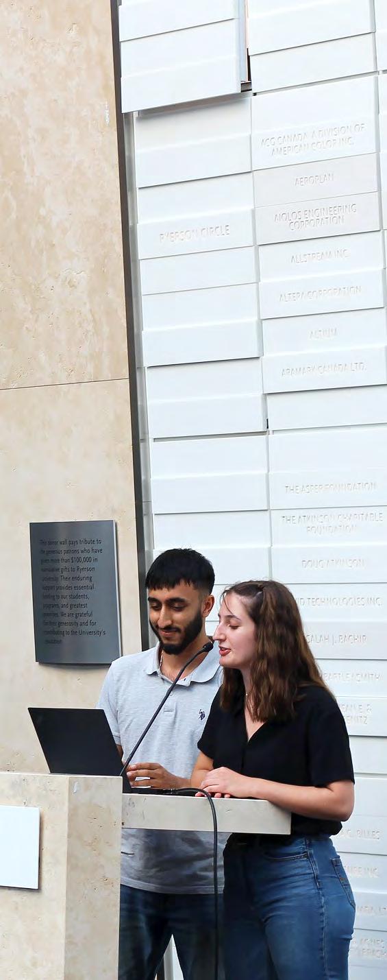
b TimberFever chairs Team 17 and David Moses
"It makes you think in a whole different way and gives you a well-rounded perspective on the design process."
Editorial 02.2
with first-place [Team 08] and second-place [Team 10]
featured
[Team 08]
Asim Ahmad | University of Toronto Civil Engineering
Dana Kim | Toronto Metropolitan University Architecture
Reyvileen Soriano | University of Calgary Civil Engineering
William (Isaak) Toleff | Toronto Metropolitan University Architecture
Jia Yi (Jennifer) Zhu | Toronto Metropolitan University Architecture
[Team 10]
Qiu Tong (Autumn) Chu | McGill University Architecture
Jumana Elamin | Toronto Metropolitan University Architecture
Luca De Angelis Geraldo | Toronto Metropolitan University Civil Engineering
Samuel Hardwicke | Toronto Metropolitan University Architecture
Marina Khajo | Toronto Metropolitan University Civil Engineering
moderator
Kathlynn Hoang
editors
Kathlynn Hoang
Vivian Nguyen
Nina Zabojnikova
a
56
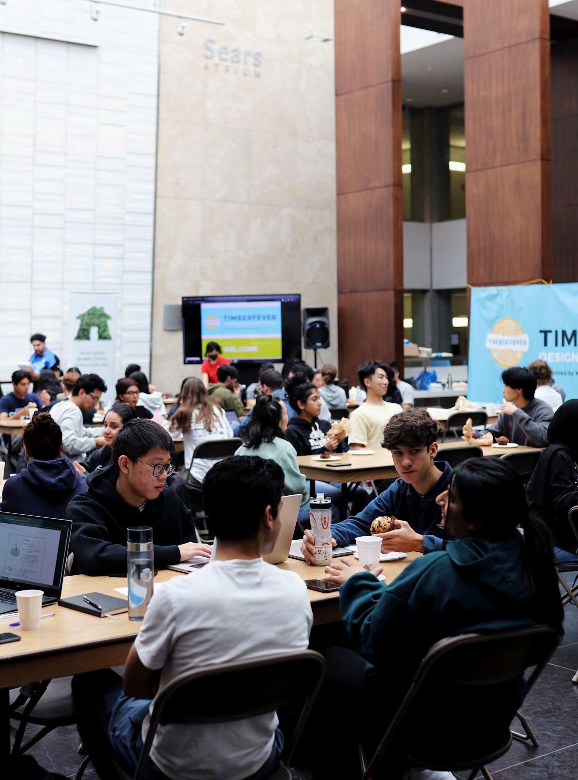
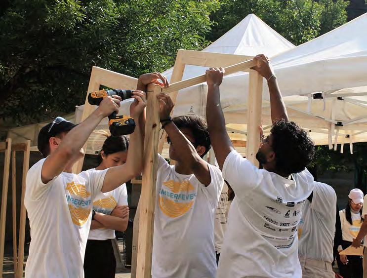
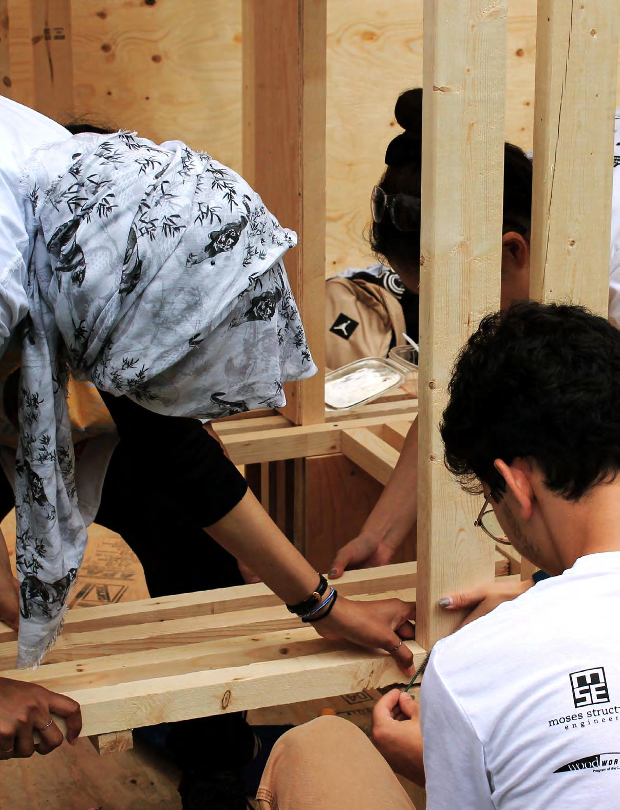
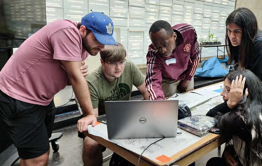
a b-d participants brainstorming design participants building design
325: What made you want to participate in TimberFever?
[Isaak Toleff] I’ve been wanting to do it, especially because I’m in my fourth year now. I haven’t had the chance and I wanted to wait and see if it was going to be online again. I was hoping it’d be in person, so that's what I’ve been waiting for.
[Asim Ahmad] I actually found out about it from my brother, who went to TMU, and was like “oh, you’re in civil engineering, it’s a cool competition.”
[Jennifer Zhu] I wanted something for my portfolio since I felt like it was a little bit lacking. Also, since it was in person, after years of being online, it was like an opportunity to actually get to experience working with your hands with various tools and things like that.
[Reyvileen Soriano] I wanted to know how and when to use certain tools and to use my knowledge from classes to actually build something.
[Samuel Hardwicke] I was having a beer with one of the other students over the summer, and he had mentioned that he was going to do TimberFever. He just thought it would be a fun extracurricular activity for our program. He convinced me to sign up and do it too.
[Luca De Angelis Geraldo] I heard about it in my first year—I'm in my second year—and I figured it would be interesting to attend to get that first glimpse of what working in the field of civil engineering and getting to work with architects would be like. Although it isn’t one hundred percent what it's going to be like in the future, it was definitely a good first experience.
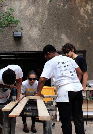
b c d
325: What inspired your specific design? What was your take on the theme?
with Team 08
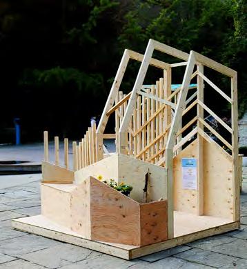
[Isaak Toleff] We had this idea initially of bringing the plant, like the garden aspect of it, actually upwards, and bringing it up to eye level to surround the occupants with whatever we were growing. The theme I think was pretty interesting because it was this mix of agriculture and leisure. There are a lot of opportunities there for where those two themes meet.
[Asim Ahmad] From an engineering standpoint, what we brought up and discussed with the architects was that we really wanted to look at functionality. When we went through how we’re placing—for example—our benches or how we’re going to integrate the garden to utilise and leave as much space as possible, we looked for ways to be the most efficient. That was a really inspiring aspect of what put everything together. We started off with super simple sketches and everyone had different ideas, then we wanted to get everything incorporated and that’s what ended up making the beautiful structure we made.

[Jennifer Zhu] We also looked at movement. Since carrots are uprooted from the ground, we wanted to show that dynamic movement and that’s what affected a lot of our form where we slanted the wood. And because of that slant, we were able to have different levels, which was great for accessibility.
[Dana Kim] Universal design was really important, like with our benches. One of them was bolted in and the other was movable so that people could create different seating arrangements based on who was going to be using it. That was really important to the competition and to us in general.

[Isaak Toleff] During a crit with one of the professors, they helped us rationalize our ideas a little bit, and that’s what mainly generated the idea of having this drip irrigation system, and having the planters stepped almost. And then, it was just refining that afterwards and working with the engineers too. They had some great ideas with how that could work.

a b c-d Team 08 Team 08's design Team 08 a b c
58
d

a 60
with Team 10
[Samuel Hardwicke] We were able to choose what vegetable we had, and we wanted to do something—either climbing or hanging—and that's where the impetus for the design started. We ended up luckily getting cucumber, which was a hanging plant. It was either cucumber or tomato that we were looking to get.
[Jumana Elamin] It started from the idea of a forest, and we were trying to keep it open and something that interacts with its surroundings. It then moved on from a forest to hanging things to a garden to where it went.
[Autumn Chu] The initial design involved a lot of vertical elements, and then we made small changes to it because of structural reasons and reasons like accessibility. But the main idea started from us trying to create a vertical garden.
[Jumana Elamin] There were a bunch of design requirements—creating a community space, making it inviting, and then dealing with your vegetable. We were trying to make it a place that's nice, but also incorporate the vegetables. Because it’s an outdoor structure, we had to have some sort of enclosure or roof, so those considerations pushed us into changing our design little by little.

325: What was the process like for creating your design? Did you find you had enough time to complete everything within the four days or did you feel rushed?
with Team 08
[Asim Ahmad] We were very concerned about how we were going to actually visualize this thing. And then Isaak, our esteemed fourth year, just stepped up and put the whole thing in 3D. I was flabbergasted. We as engineers are looking a lot for dimensions to do the calculations. Being able to see what we’re building with dimensions was a really big advantage that we had, and that was done right in the beginning. Hats off to Isaak.
[Isaak Toleff] In terms of timespan, it seemed like it was stressful but on the last building day, I remember we were all screwing things in at the very last second.
" It was almost the perfect amount of time."
[Jennifer Zhu] It was like the perfect amount of rush to push us to all have our hands on deck and it was great seeing every person contribute equally and have that consistent participation. That time crunch really pushed us to really get things done. There was some anxiety while we were designing throughout the process, but overall I feel like it really contributed to our final project. Things worked out in the end.
[Dana Kim] As architects we were like, “oh, let’s do this, let's do that,” and our engineers were creatively trying to figure out how we can actually make this instead of limiting us by saying “no, you can’t do that.” That's definitely one of the reasons why our design was successful.
[Isaak Toleff] The engineers were designers as well, especially in the beginning stages. We took everyone’s conceptual ideas right from the start.
[Jennifer Zhu] Overall, what really helped with our success was just how well our team worked together. Any problems that we did face we worked on together.
" Our team dynamic was just so strong."
[Jennifer Zhu] As we were working through the project, we always heard from our professors that it's important to work on our models because that's when we actually see things. Our initial design doesn't look like the final product. It was during the time that we started building where we started adding some elements to it and saw more potential in things. The time that we were building was when we thought everything was going in the right direction and things were turning out better.
a b participants brainstorming design participants building design
b
[Isaak Toleff] The design phase actually continued while we were building. When we started actually seeing it come together, people had new ideas, brought in things, and made small changes that really completed the project.
[Reyvileen Soriano] The mentors really helped with confidence. If we wanted to try something we were not sure about, we would ask the mentors if it's possible. They basically gave us confidence to be more creative with it.
with Team 10
[Samuel Hardwicke] It's funny looking back on it. I can't speak to how everyone else felt about this, but did we feel rushed to build it? I'm not sure. But while designing it, we were going through iterations pretty crazy until right up at the end. We were quite lucky to have two engineers who were very calm and patient, while the three of us architects tried to figure out a design. At least during the building process, it never felt like, “oh, there's no chance we're going to finish this.” I never felt super stressed about it.
[Autumn Chu] I think our team collaborated pretty well, especially during the building process. We kind of distributed the work very evenly. We didn't really have a schedule for making it, but everyone didn't stop until the end.
[Jumana Elamin] We finished ahead of time. We had like an hour of just sitting there looking at it and eating lunch. We definitely delegated the tasks pretty well. Everyone went for their strong suits, and we either worked individually or in pairs. I think we were also pretty smart about designing something that didn't require too many elements. If we made mistakes, which we did, we could fix them and not worry about our material supply and we could also finish quicker. We didn't have too much of a complicated design where it would jeopardise us being able to build it.
325: What were the primary challenges you faced or lessons you learned while participating in the competition? How did you overcome them? Would you do anything differently?
with Team 08
[Isaak Toleff] I don't really know if I want to say I'd change anything or do anything differently considering that we created a winning structure.
[Asim Ahmad] In terms of the engineering aspect, one of the problems was actually coming up with how we can make something happen. The architects had some really cool ideas and us as engineers had to somehow see what we can do to make it happen. I think the main issue was trying to figure out what the best way was to build the design because we were also limited with how much material and time we had. We really had to consider things like “we need this much leftover lumber to ensure that we are in the safe zone.” I think that was one of the first challenges we faced. But other than that, we pulled through.
with Team 10
[Autumn Chu] One of the challenges we had is that we didn't really take structure into consideration when we first started to design. So when we had chances to talk to structural engineers and architects with our first version of the design, they mentioned all of the structural considerations that we needed to add. We thought the structure didn’t really go along with what we wanted visually, but then we made changes to make the structural aspect work with the aesthetics. If we were to do this again, I think we should take structure into consideration before we start to design everything.
[Samuel Hardwicke] Totally, totally agree. I think we had some good ideas until we got a consultation from the structural engineer. He was like “yours doesn't make any sense, this is unbuildable.” We were like “that's trouble.” But would we do anything different? It's funny how it works and I talked to Autumn about this during the competition, but had we thought too much about structure, we might have felt restricted in our design. Because of all the iterations we did, we ended up having these vertical and horizontal members interact with each other in a really interesting way. It was a cool design at first, and then practically when we built it, we realized that there could be a movable portion of the pavilion itself. It created this storage space that also worked out.
[Jumana Elamin] We were kind of asked the same question when we were presenting. They were like, “is there anything you couldn't build that you conceptualized?” and our answer was the same. We said we built everything we wanted to, and I think we were pretty satisfied with what we came up with.

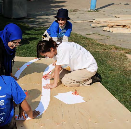
a b c
"When you don't know enough, it sometimes leads to opportunities."
62
325: What was one of your favourite parts / most memorable moments in participating? with Team 08
[Asim Ahmad] There's so many—there's so many things.
[Dana Kim] For me, right after we finished building, we were waiting to get food and we saw people walking by the pavilions. This old man came up to us and said “this is my favourite pavilion, this one’s going to win, this is my favourite one. I promise you this one is going to win.” And then we were all like “awww” and at that point we thought we might win this.
[Asim Ahmad] I think one of the main moments of bonding for our team would be the marshmallow and the spaghetti sticks icebreaker. We really got to see the whole chaos—what the team was going to be like for the rest of the competition. It was so funny because everyone was trying to split up the work for such a small thing, which was us having to build a structure using spaghetti and marshmallows. We were taking it so seriously. It was super fun and we learned about how each of the team members work.
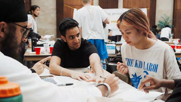

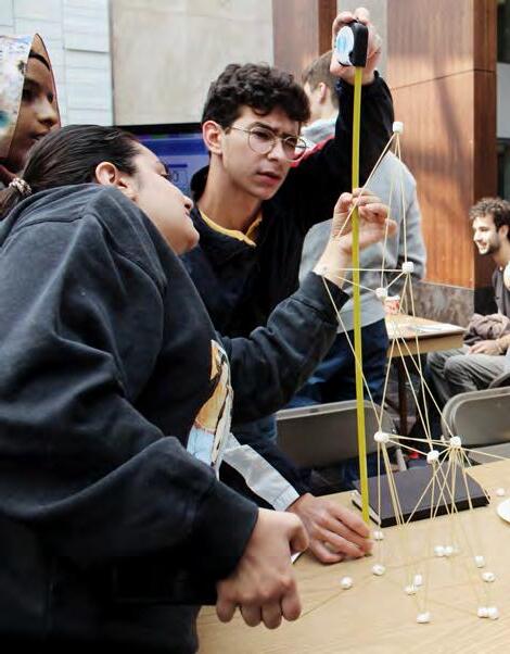
"The biggest plus side to this team was definitely the teamwork."
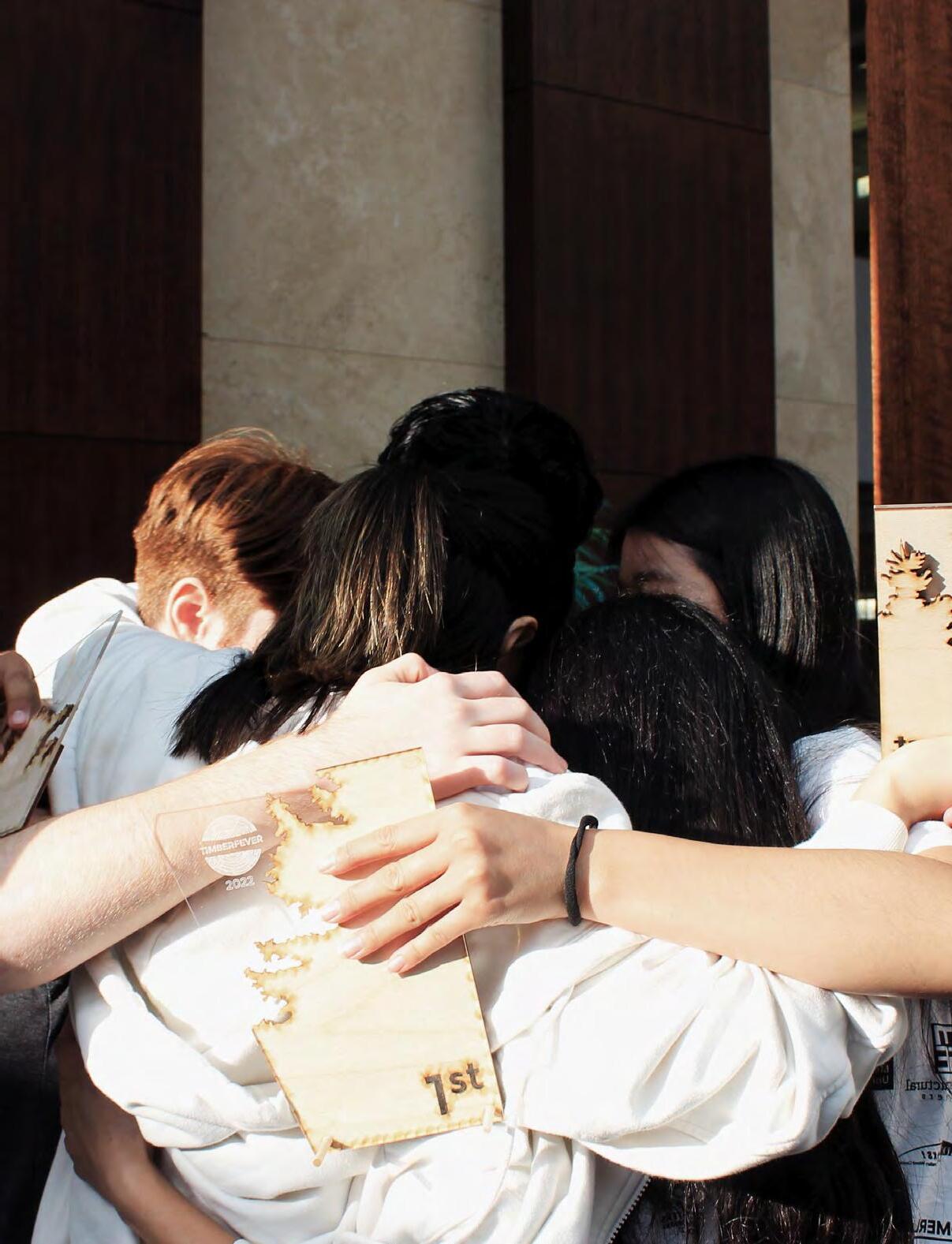
[Jennifer Zhu] My most memorable moment has to be how dramatic we all were during the awards ceremony. When we were waiting for them to call names, we were all holding each other's hands like they do in the movies and closing our eyes. When we did win in the end, we did group hugs and it was just so dramatic but it was so fun.
[Isaak Toleff] That might be my most memorable moment as well. Before they announced the third, second, and first place teams, they gave a little description about the project. When they were talking about the first place project, it was super vague, but then they said one thing that made me look over at Asim and Asim looked over at me. As soon as we looked over at each other and made eye contact, they said our team number and we were like “oh my god.”
[Reyvileen Soriano] Same with me, that was definitely a memorable moment. Also, right before that we were all talking to each other about how even if we don't win we had the best time.
"We worked really well with each other and we became really good friends."
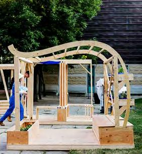
Team 06's design Team 12's design participants building design catering icebreaker activity participants brainstorming design
a b c d e
f d e f
[Isaak Toleff] Everyone just worked extremely well together. I feel like no one was left out or lagging behind. Everyone acted almost like mirrors to each other. Everyone could bounce ideas off and help each other work together. That aspect was the smoothest part of the whole competition.
[Samuel Hardwicke] The only reason this is a funny story, and it was made to be one of those had to be there moments, but it was at the end of the first day. It was nighttime. It was late. We had been building the entire day and we had figured out this name. We were just sitting there saying it over and over and over to each other—Psithurism, Psithurism, Psithurism— just to make sure that we had the name right for the presentation the next day. We were all physically and mentally so exhausted that for some reason, it just seemed so silly to have to practice saying a word, but it felt so important at the time.
[Jumana Elamin] The judges were like “oh, we learned a new word today.” It was a fun time, it really was.
with Team 10
[Jumana Elamin] For me, it was definitely the construction. It was so much fun being part of the hands-on experience and just seeing it come to life. I also really like the awards ceremony, and the food. The food was also nice.

[Luca De Angelis Geraldo] I’d say the construction as well. I like the part where—when we actually got out there and started building—we realized that things didn't work. That was a fun part, just problem solving to get to a point where we want it to be, while also learning from the carpenters. That was another fun part that I hadn't known before, especially in terms of construction, because I had no experience in timber construction before.
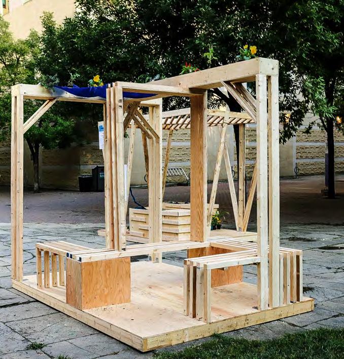
[Marina Khajo] The construction part was definitely one of the best parts while working together. Also, the awards ceremony and winning. Winning was definitely one of the best parts.

[Samuel Hardwicke] My favourite part of it was making sure that we all could say the name of our project. I made Autumn practice like a hundred times.
[Everyone] Psithurism.
a b c-d
a b c
Team 10 Team 10's design Team 10
64
d
325: If you previously competed in TimberFever during the pandemic, how did it differ from this year being done in person? Do you prefer it being online or in person?
[Reyvileen Soriano] It was my second time. So I competed during the pandemic—I think it was 2020—it was also intense. There were a lot more deliverables. We had to come up with a logo, we had to come up with a team name, and all that stuff. I also had a good time online but I think it’s so much better in person just because you actually get to build it. I prefer it in person. But they’re both fun.
[Autumn Chu] I think I would definitely not go to the online one, especially after we did this in person. During the construction process, each small group had their own thing to make. We were working simultaneously. But if you do this online, I think it's harder to work simultaneously on a Rhino model. Someone needs to finish the first part and then pass it to the next person. I think it's more efficient to work in a group in person for competitions like this.
325: Would you ever participate in TimberFever again and why?
[Asim Ahmad] One hundred percent yes. I think it’s a really good opportunity to learn about how the real world actually works. In the real world, engineers and architects do have to work like this together, while it might not necessarily be you sitting down in a room together for 24 hours trying to come up with a design to build the next day, it’s kind of the same process. You have to be able to understand what the architect is thinking and have enough knowledge to make it happen. It’s just a great opportunity to learn how architects and engineers work together.
[Dana Kim] I agree with Asim. It was really good for me because after being online for so long, doing something in person, meeting people, and also just that fact that we’re making a pavilion that lets you understand the material more and how it's built—I think that’s really important as architects and as engineers.

[Isaak Toleff] I think one of the best things was that sense of pride you get when you walk by and see other people— random people—just sitting in your pavilion and enjoying it. So if I could participate again, I probably would.
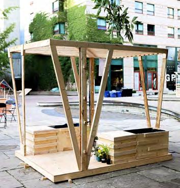
a b c d e f g participants building design mentoring Team 11's design Team 09's design mentoring Team 04's design Team 14's design a b
c d 66
[Reyvileen Soriano] If I could participate again I would because you make friends, it's a really good experience, you get to win money, and you learn a lot.
[Asim Ahmad] Learning and networking too. There were a lot of people from different companies—architects and engineers combined—who you could talk to and actually learn from. It's a good way to get yourself out there.
[Samuel Hardwicke] I'm thinking back to when you asked, “would we have changed anything?” We didn't win, but I still wouldn't have changed anything. I think I was very happy with our design, and I was very happy with what we produced. Even afterwards, going back and looking at the other designs a week later, it was fun seeing people actually using our pavilion the way it was meant to be used. Multiple groups of people were sitting on it and using it. I don't know about everyone else, but I felt like we won. It was fun gaining that experience, but I don't think I would participate again.
[Autumn Chu] I might not enter again as a candidate, but I might enter as an assistant or something because I think it's interesting to look at everyone else's design process carefully. When we were designing and making our pavilion during the competition, we were very concentrated on our own design, so we didn't have time to look at everyone else's design and see how they came to the final outcome. I think it’d be interesting to have the opportunity to observe how they start, and then how their work process goes.
[Jumana Elamin] For me, I also would not do it again, just because I would hope to get the same results and I don't think I could without these guys. Like Autumn, I’d probably want to be part of the TimberFever team and help make it happen because it was such a nice experience.
[Marina Khajo] I would probably not be a participant, maybe just a volunteer or a Team 17 member just to see how everyone's working.
[Luca De Angelis Geraldo] I'd say the same thing. I wouldn't do it again. But if the opportunity arose, maybe as a coordinator or assistant. But as a competitor, I feel like I've had my fair share. It's time to let some younger, more creative minds give it a take.
e f g
68
Kathlynn
Anna
Anjali
Florencio

Jordan
Evan
LARGE 70 72 74 76 78 80 84 86 88 90 Courtyard Home Hamilton Aquatic Center Ginhawa Symbiosis A Polyvalent City Block Set in Stone Tama Plaza Research Centre Assemblage Hamilton Aquatic Centre Editorial 03 Haoning Zhao
Spivak
Noah
Hoang & Manuel Francisco Ortega Santos
Weiss
Ariel
Halleran
Dawani
IV Gamboa Tameta
Nisenbaum
Hills
Magazine Team
325
Courtyard Home
Haoning Zhao
Year 2 / ASC 401 Design Studio III


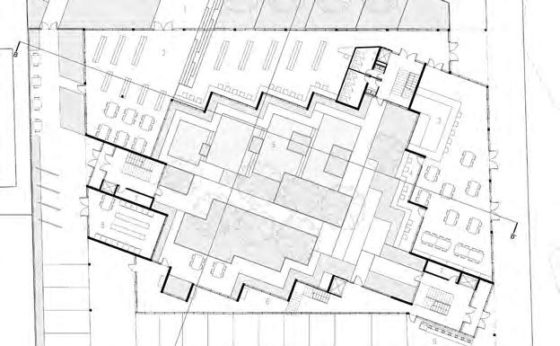
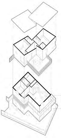
Located on 112-114 Hastings St N, Bancroft, Courtyard Home is a sixteen-unit housing complex. In the plan, the building grid differs from the orthogonal order derived from the street. It is rotated to make every unit face north-south not only for more sunlight, but also for the natural views in different directions. Based on this order, the ground floor is designed to be a public space combined with a café and a community library, which aims to create a transparent, inclusive coliving space for varieties of people. The communication steps of the library extend to the outside and are integrated into the landscape design of the park, making it possible for the community to hold various activities, such as the flea market, street performances and lectures. In the courtyard, the landscape is designed to adapt to the topography. The waterfall space and the way how trees are arrayed create a quiet and introverted atmosphere for the residents.
Vol. 3
a c b 70
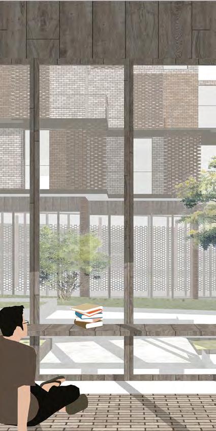

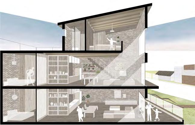

a b c d e f g exterior view axo diagram sketch & site plan bird eye view interior view section collage exterior view d g e f co-living.
" "
collective, courtyard, housing,
Hamilton Aquatic Center
 Noah Spivak
Year 3 / ASC620 Integration Studio II
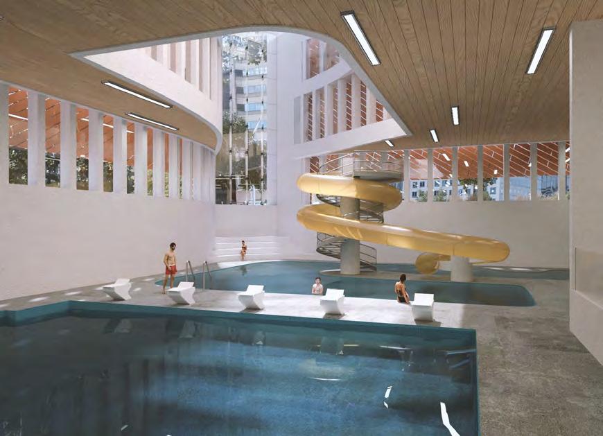
Hamilton is a city that currently reflects its past need to function as a traveler’s town. Nowadays, the need for heavy transportation has declined, yet the city is still designed to accommodate cars before people. For the architecture in Hamilton to succeed, the city must change its focus to the human scale and prioritize the pedestrian. The aquatic Centre’s role in Hamilton’s downtown core is to serve as a place for the community to come together in a safe, relaxed, and regenerative environment. The design places the person at the center of the universe as they are used to determine how the building is programmed in relation to its spaces and circulation, such that there is a humanistic emphasis on the design of the building and the way in which spaces are laid out. The façade is then used to create a connection that engages people from the street and privacy where needed to create a sense of security in this sacred space. Erosion is a driving influence behind the form of the facade taking factors such as activity, visual connections, and light as eroding forces acting upon the building.
Vol. 3
a b 72


2000mm 1200mm 1200mm 1200mm 1200mm 400 400 400 3500mm 1000mm Tongue & Groove Hardwood - 25mm Terracotta Panel Window Double Glazed Window Assembly Floor Assembly Wall Assembly 1 5 2 3 3 4 2 a b c d e f exterior view physical model interior pool view entry view facade detail wall assembly axo c d e f
,
,
"
humanistic. regenerative
together, engage
"
Ginhawa
Kathlynn Hoang & Manuel Francisco Ortega Santos
Year 3 / Turf–Student Housing Design Challenge
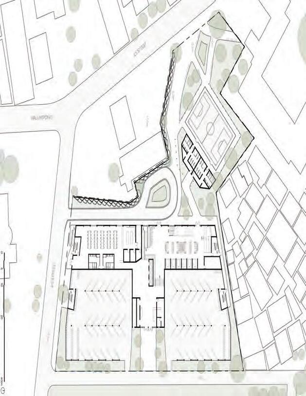
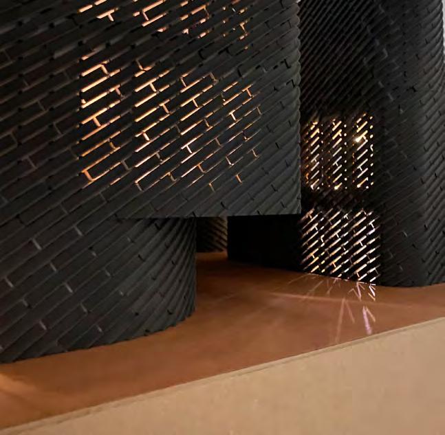
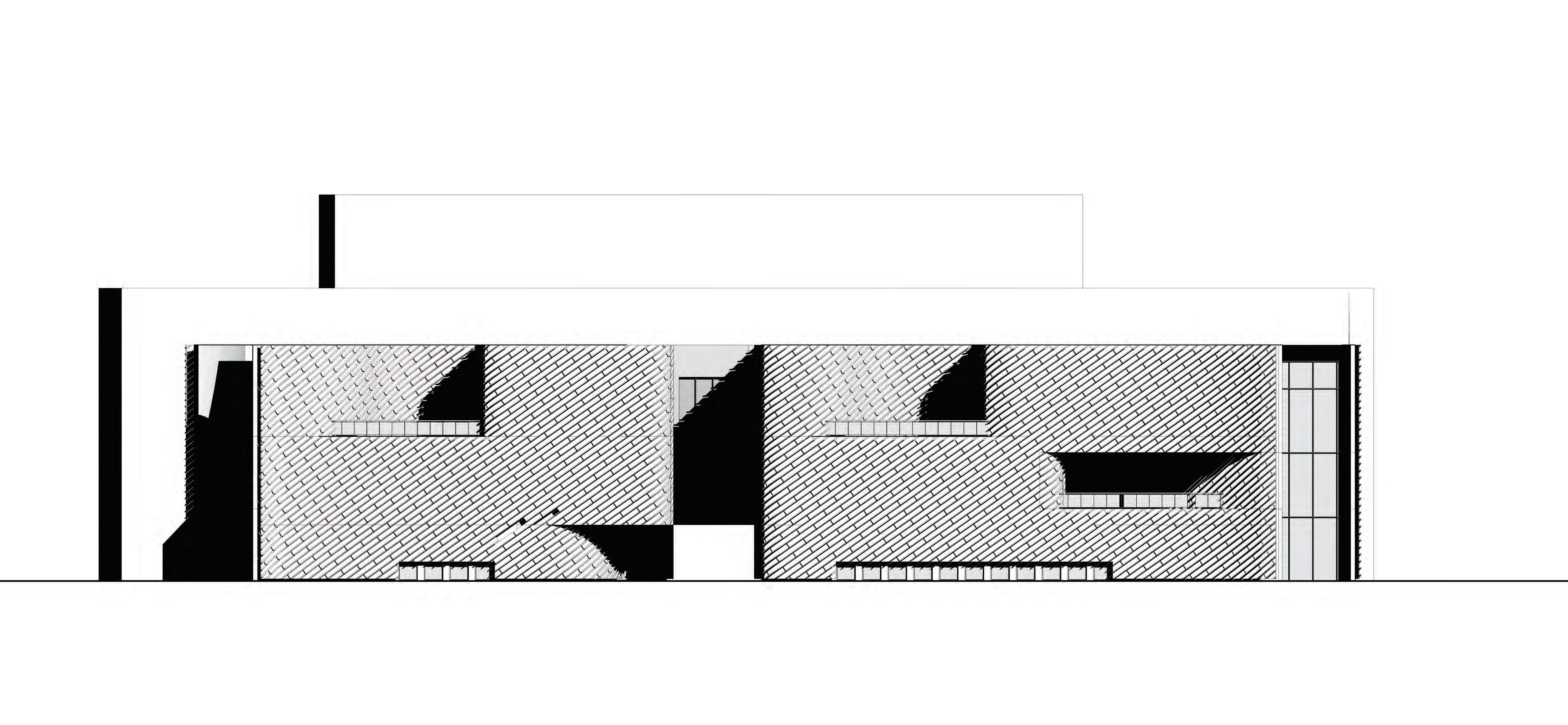
Ginhawa [Tagalog noun]: comfort; ease of living; freedom from anything that tires, troubles, disturbs, or pains. Ginhawa is a student housing complex in Manila that intends to support the needs and boost the overall wellbeing of a diverse group of students through creating a comfortable, engaging, and accessible living environment with its design. A combination of studio units and twin sharing units accommodate up to 600 students and focus on connecting occupants with nature by means of creating views to the landscaping on site and courtyard between the east and west wings. Such views and the daylight that seeps in experientially through the perforated brick work to foster a soothing atmosphere that improves students’ quality of life. Interaction among occupants is promoted through features like the communal study areas and cafeteria. Vegetated walking trails, a gym, and a futsal court add to this while also encouraging an active and healthy lifestyle with others to discourage isolation and provide an opportunity for students to destress and step away from the tires and troubles they may face as they go through their academic career. Ginhawa ends up becoming a home to students where comfort and ease of living is of highest prominence in order to support students who live in and occupy its spaces throughout the duration of their schooling.

Vol. 3
a b 74
a b c d e f g
west view ground floor plan courtyard render level 2-4 plans interior view pathway view unit plans c
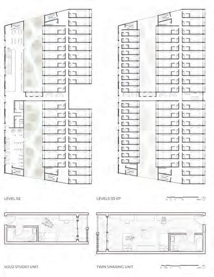


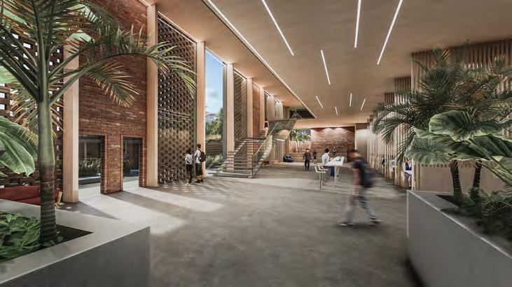
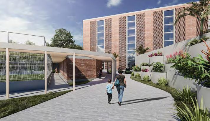
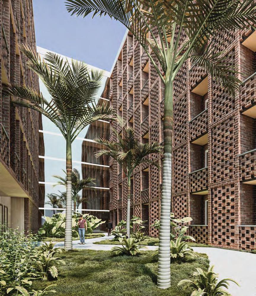
f g
d
e
" "
social interaction, nature, accessibility.
Symbiosis


Year 3 / ASC620 Integration Studio II
Growth is a fundamental element existing on all scales of life. The City of Hamilton for example is rapidly growing into a destination for younger people looking to live affordably in the city. The large-scale growth of the city happens over time and is influenced by large-scale change factors such as economy and infrastructure. On a smaller scale, a person may also grow over time. Personal growth is only different from city-level growth in the quicker and smaller-scale of changes such as body and mind. In placing a growth-oriented program (YMCA), onto a growth-oriented site (Hamilton), what is the relationship between the two scales? How can a building be conducive to not just one scale of growth, but create a symbiotic relationship between multiple? Symbiosis archives this relationship by creating a formal bridge between scales. While the aquatic space in a typical YMCA is often reached at the end of the building's hierarchy, the aquatic space in this case is expressed as a central element of the building. Serving as the center of program and growth, this concept shatters the division between small scale interior and large scale exterior. The relationship between a person and their environment is then amplified through the use of a sculpturally ETFE clad undulating steel structure which extends from the origin of the aquatic space to the facade of the street.
Vol. 3
Ariel Weiss
a b 76
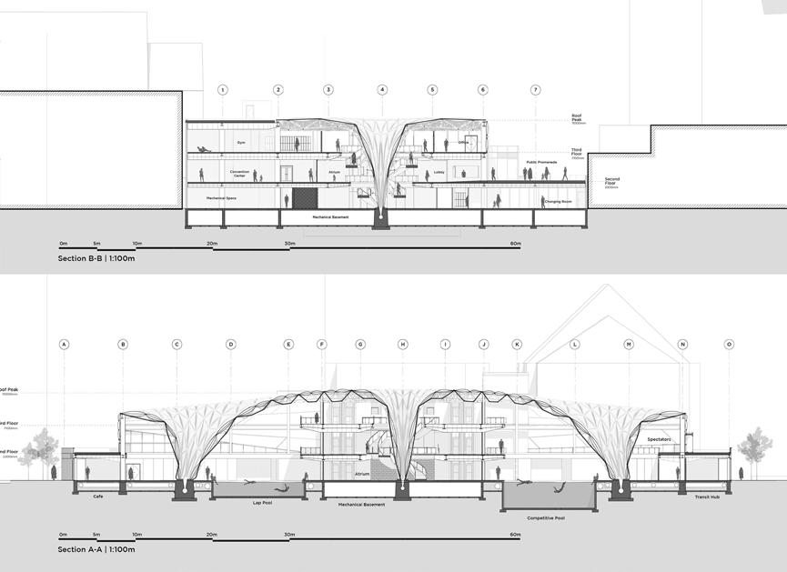
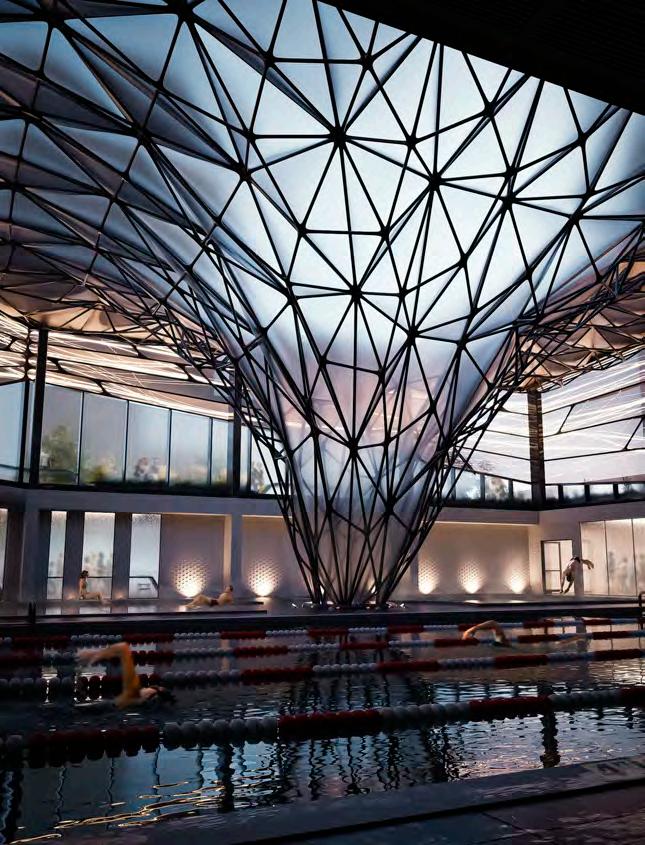


James St. South McNab St. South Ground Floor Plan 1:100m Cold Plunge B 7 03 Symbiosis Ariel Weiss James St. South McNab St. South Second Floor Plan 1:100m Viewing Viewing Spectator 04 Symbiosis McNab St. South Third Floor Plan 1:100m Storage 05 Symbiosis Ariel Weiss a b c d e exterior view physical model view sections floor plans L1, 2 &3 interior view c d e e centre. scales , growth, symbiotic , " "
A Polyvalent City Block
Anna Halleran
Year 4 /ARC920 Advanced Architecture Studio
There exists a lack of public space within Nihonbashi, Tokyo. While the streets of Tokyo initially connected city blocks, they now act as an invisible barrier isolating buildings and people. This proposal explores a massing that focuses on the quality of public space at grade and its ability to connect the public to the surrounding community and context. As a result, city street life defines the building’s form. This proposal reinvents the existing small scale mixed use block, by providing necessary services to the community including office and shared work spaces, daycare facilities, cafe and take out amenities, urban agriculture facilities, and public gathering space. This project creates a strong connection between the on-site daycare facilities and educational farming and integrates work spaces within urban farming facilities. Urban farming is at the core of the building’s design as it runs throughout the entire building through the use of hydroponic cores adjacent to the building's circulation and through a dedicated farming facility at the top floor. By reinventing the urban block and providing significant privately owned public space, this city block will become a destination for the community, as it celebrates urban life, establishing polyvalent, ever-changing spaces which create a more resilient city.

Vol. 3
a b c 78
a b c d e f g h
exterior axo view process diagram ground floor plan exterior view farming space longitudinal section kids zone patio d

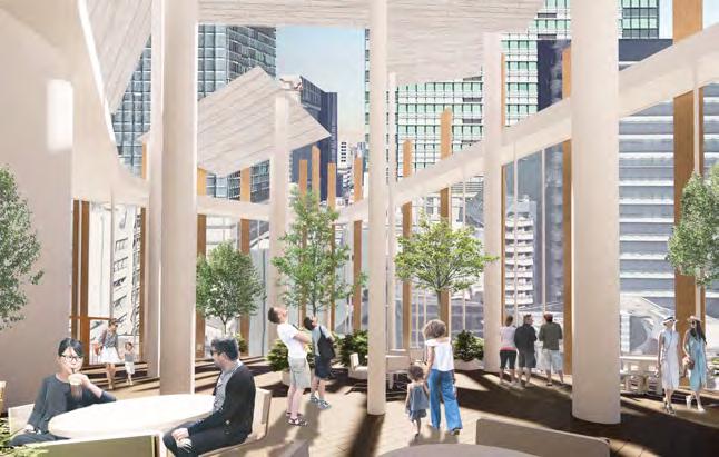
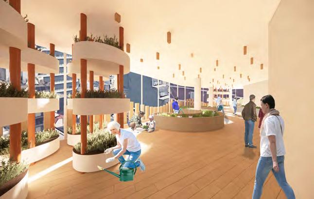
f

e h g community, urban-farm,
" "
resiliency.
Set in Stone
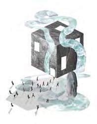
Anjali Dawani
Year 3 / ASC520 Integration Studio
Set in Stone positions itself as an aquatic centre in the heart of downtown Hamilton. Conceptually, the centre emerges as a solid stone that has landed in the city and cracked itself open to serve the community. The project aims to evoke the cultural familiarity of baths as a way to reinforce the dialogue between buildings and their users. This concept has been further developed by the idea of combining stone and water, something that has been used in baths throughout time, and how their interplay can create a harmonious relationship throughout the building. The rigid volume gradually breaks its form as users meander through the spaces, to consequentially arrive at a courtyard that opens to civic activities. The ease of movement through the building and the weightlessness defined by bodies of water render the connections, while the thresholds are realized by rigid volumes. Circulation wraps around the civic courtyard and stone garden that sits at the heart of the project, to connect between the public and private zones of the building. The building utilizes stone in a comprehensive manner to achieve unique conditions in different spaces, from solid stone, boulders, and alabaster. The boulders sit at the corners of the building to hold up cantilevering conditions and achieve a weighty experience.
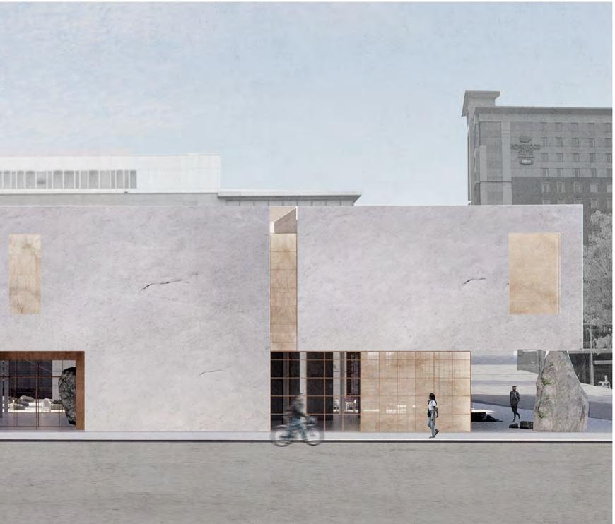

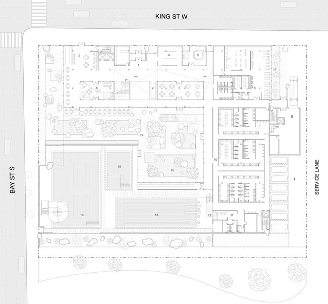
Vol. 3
c b a 80
" "
odyssey. stone, escarpment,
weightless.
a
b
c
exterior render concept diagram ground floor plan lane pool elevation section d e
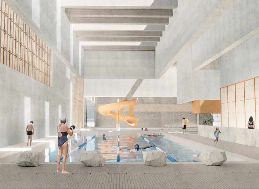
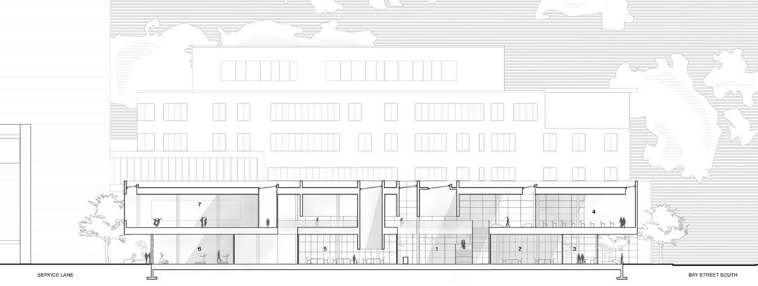

d e f f
The interior spaces comprise of hanging walls and volumes that enclose spaces, including the pool, to create a unique, dynamic and heavy appearance. Interconnectivity between spaces, materials and users intensifies the narrative of the experience and enforces a dialogue between the city and the people.
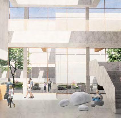


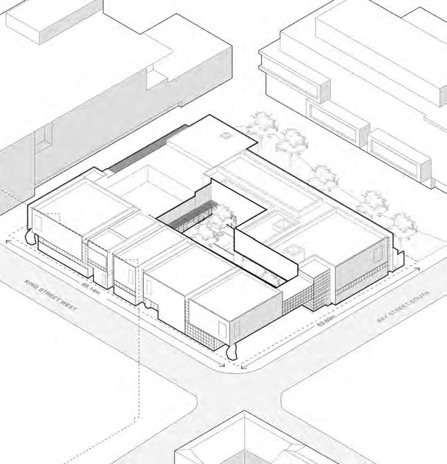
d c b a 82
poured in place concrete waffle
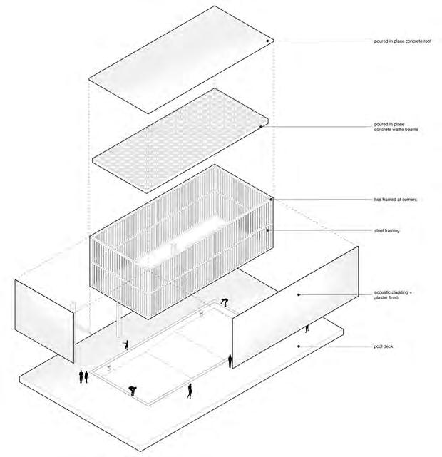
main pool view exploded axo drawing rainy evening view
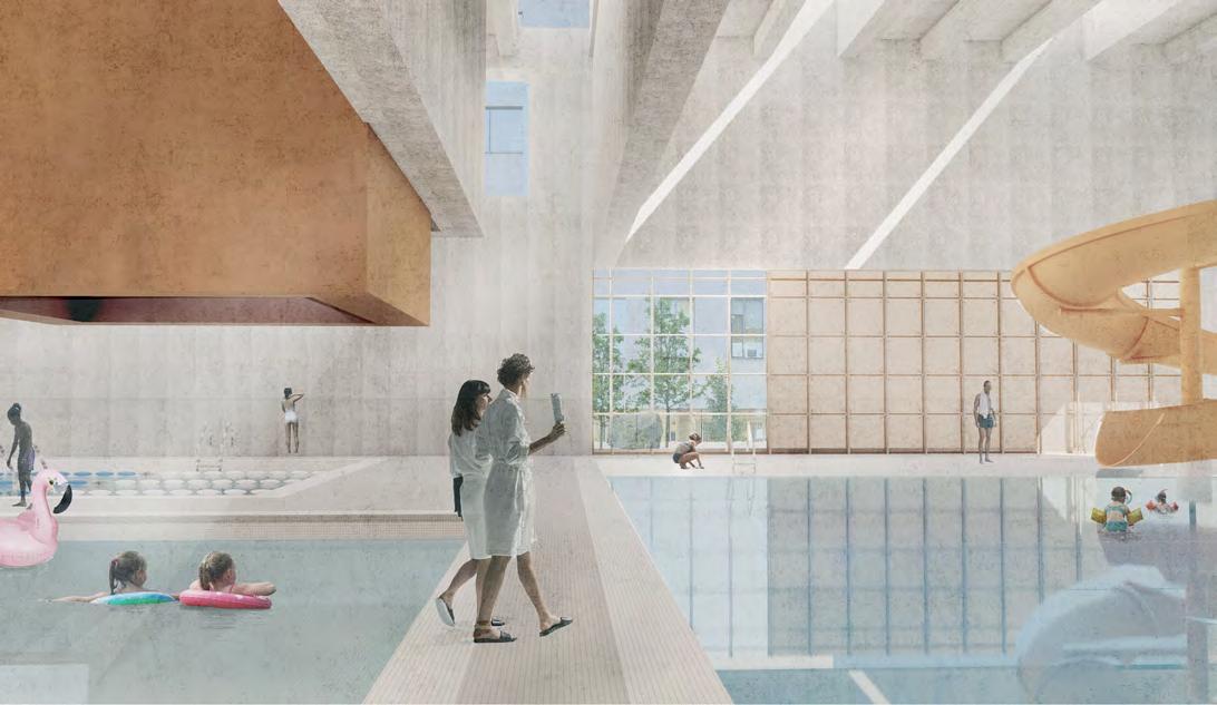
f
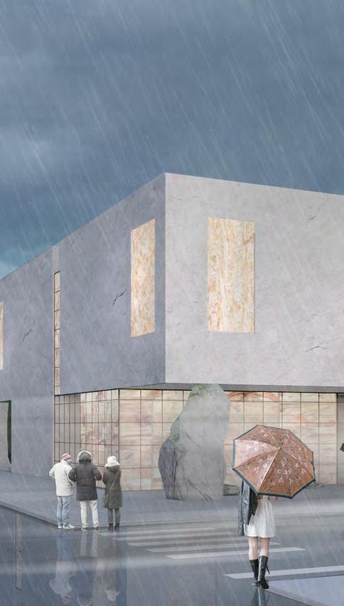
a b c d
e f g e
hall and garden view axo drawing pool view stair and entry view g
hss framed at corners steel framing acoustic cladding + plaster finish pool deck
poured in place concrete roof
Tama Plaza Research Centre
Florencio IV Gamboa Tameta
Year 4 /ARC920 Advanced Architecture Studio


Located at the current base of the WISE Living Lab in Tama Plaza, Yokohama, Japan and the project is imagined to build on the goals of implementing foodenergy-water (FEW) in future suburban developments. The Tama Plaza Research Centre aims to become an incubator for urban farming production, protoyping new practices and encouraging the development of a selfsustaining neighbourhood.

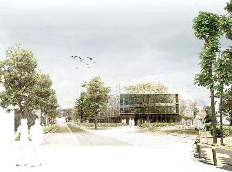
The ground floor aims to provide local-friendly spaces such as storefronts and a community garden sharing knowledge through applied learning. The remaining floors are dedicated to research spaces including offices, breakout rooms, and labs. Vertical farms are found throughout the project, extending multiple floors and being central to how researchers and visitors experience the centre.

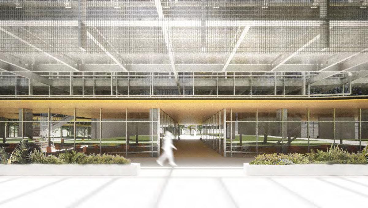
Vol. 3
5 1 6 2 8 4 exterior seating threshold screen community farm exterior paths cafe event 5 1 6 2 7 8 3 4 exterior seating threshold screen community farm exterior paths landscaping vertical farms cafe / storefronts event space 5 1 6 2 7 3 exterior seating threshold screen community farm exterior paths landscaping vertical 5 1 6 2 7 8 3 4 exterior seating threshold screen community farm exterior paths landscaping vertical farms cafe event a b c 84
f
00 - site two opposing sites located at the current base of the WISE Living Lab
00 - site two opposing sites located at the current base of the WISE Living Lab

exterior view moments perspective drawing perspective view facade view elevations and sections form development d



01 - landscape ground level is an extension of surrounding streetscape
01 - landscape ground level is an extension of surrounding streetscape
02 - research blocks
02 - research blocks
form of research blocks frame the main boulevard to Tama Plaza
form of research blocks frame the main boulevard to Tama Plaza
04 - in-between paths
04 - in-between paths

exterior paths act as a transition between community and research
exterior paths act as a transition between community and research
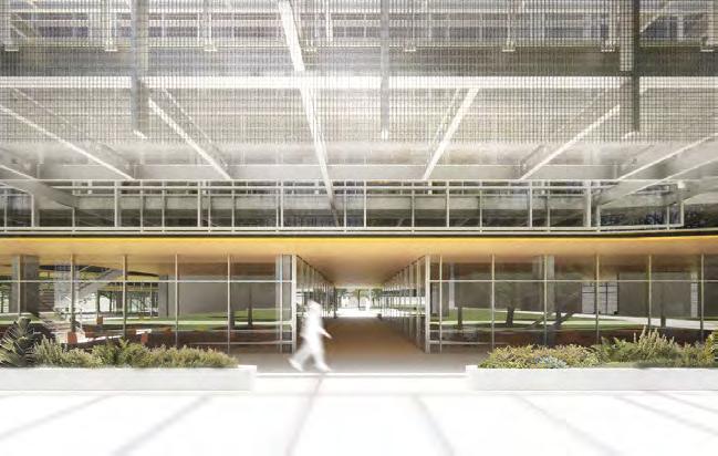
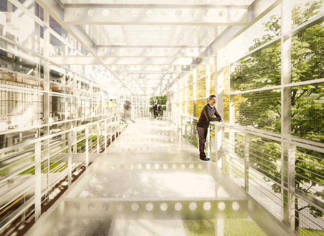
03 - urban farms
03 - urban farms
urban farms become the primary and visual focus for the community
urban farms become the primary and visual focus for the community
05 - screens
05 - screens
screens are a unifying element to demark transitions in space and form
screens are a unifying element to demark transitions in space and form
e
a b c d e f g g
in-between.
urban farm, landscape, screens ,
" "
Assemblage

 Jordan Nisenbaum
Year 4 / ARC920 Sustainable Rural Strategies

The act of assembly that is manifest in the making of traditional wares and crafts informed the composition of this live-make space aimed at augmenting Warkworth's vibrant arts and culture scene. Providing facilities for makers to live and practice their crafts allows for the preservation of techniques & practices for creating more traditional, hand-made wares that represent the culture of small town rural living. Realizing this vision in a co-housing complex acts as a draw to grow the population of artisans and craftspeople residing in Warkworth while subverting the typical suburban development paradigm to more responsibly develop the rural setting. Featuring a massing and orientation of spaces that appear as an amalgamation of connected pieces that form a whole, Assemblage seeks to contextualize the making process in built form. Situated at the foot of Warkworth's Main Street, above a live creek, the development of this ecologically sensitive site acts as commentary on the traditional approach to development within nature. Traditional attitudes toward the relationship between the natural and built environment see architecture imposing upon nature rather than engaging with it. However, the answer to respecting the natural environment is not to withdraw from it, but rather to have a more delicate approach - one must be able to touch nature in order to appreciate it.

Vol. 3 a
Screen System Natural Ventilation Overhang a c b 86
a
bridging.
b
c
exterior rendering concept diagrams axonometric diagram exterior rendering kitchen render shophouse render exploded axonometric d "
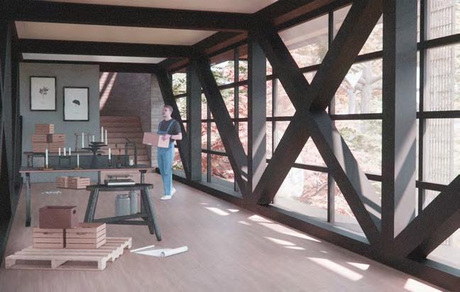


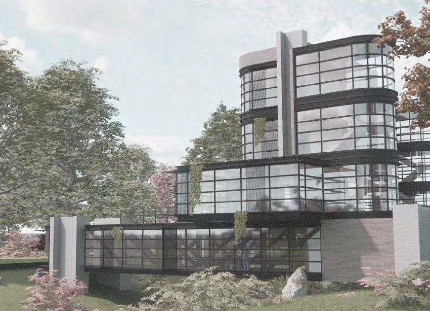
e f g
d e f g
country culture, adaptable ,
"
Hamilton Aquatic Centre Vol.
Year 3 / Integration Studio ll Evan Hills
The Hamilton Aquatic Centre focuses on the connection between exterior interaction and internal separation. In developing a prominent street corner in the city of hamilton, the project expresses the depth away from the exterior junction, developing an external concourse that, in relation, provides a disconnect from the public realm. The Aquatic centre serves as a new central space for the downtown district, programmatically opening up to athletic spaces, areas for personal wellbeing development and overall spaces for community engagement. The Aquatic centre follows a U-shaped mass, where the two external wings distinguish itself with aquatic-focused spaces with community-focused program spaces encase them. The overall mass follows back to an idea of a central space where an exterior public square is situated, dividing itself away from the external street frontage and encasing itself within the U-shaped form, giving a sense of privacy to visitors of the aquatic centre.
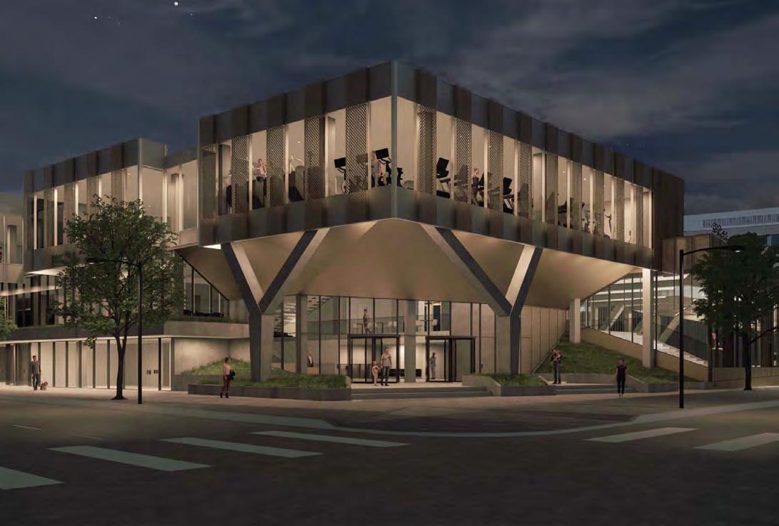
3
STRUCTURAL SKELETON ISOMETRIC VIEW 1:200 ELEVATOR MECH SHAFT PROGRAMME PUBLIC SPACES RETAIL ADMIN OFFICES DRY FITNESS AQUATIC SPACES PUBLIC SPACES RETAIL PROGRAMME PUBLIC SPACES RETAIL ADMIN / OFFICES DRY FITNESS AQUATIC SPACES CHANGE ROOMS BUILDING SERVICES a b 88









































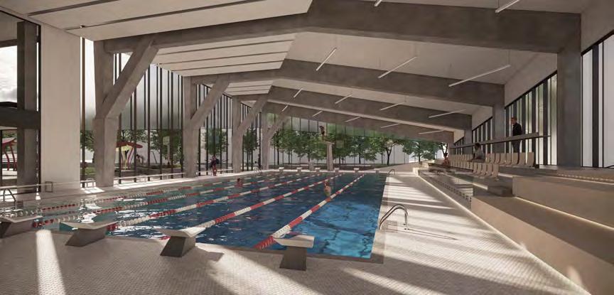




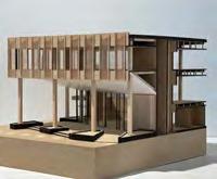

1 2 6 lane, 25m competition pool splash pad 3 1 a b b c d d a 2 G F E D 400 3,000 700 3,500 1,000 3,000 1,350 275 13,225 3,400 5,000 8,000 TURF ZONE RECEPTION LOBBY STRENGTH TRAINING SLOPED SKYLIGHT 1 15 2 LEVEL GRADE (VARIES) T/O PARAPET T/O ROOF T/O LEVEL 2 T/O LEVEL 1 T/O LEVEL 3 WALL SECTION (NORTH FACADE) 1:20 NORTH FACADE 1:20 (a) Extensive Green Roof Assembly Vegetation 110mm Growing Media Root Barrier Roofing Membrane (continuous) (c) Floor Assembly 200mm Polished Reinforced Concrete Slab Concrete Structural System (d) Interior Wall Assembly 152mm Steel Studs @ 400mm o/c Acoustical Insulation (if noted) (f) Slab on Grade Assembly 203mm Granular Capillary Break and Drainage Pad (e) Aluminum Panel Wall Assembly 19mm Aluminum Composite Paneling 19mm Air Gap 16mm DensGlass Gold Sheathing 16mm Gypsum Wall Board (b) Aluminum Spandrel Panel Wall Assembly 19mm Aluminum Composite Paneling 19mm Air Gap 41mm Steel Studs @ 400mm o/c 16mm Gypsum Wall Board 1 2 3 4 5 6 7 8 8 10 9 2. Chamfered Beam 3. Perimeter HVAC Supply Duct & Grille 4. Triple Glazed Window 6. Diagonal Steel Angle Brace 7. Rod Suspended Soffit Hanger 9. Warped Rigid Insulation 10. Weeping Tile w/ Coaras Gravel Fill (a) (e) (d) (b) (c) (f) a b c d e f exterior view program and structure wall section interior view physical model perspective section c d e f
"
connection, transparent,
separation.
"
interaction,
Editorial 03
interviews with past co-op students featured
325: What were you looking to obtain through your co-op experience prior to starting?
[Nida Hameed] I wanted experience in the transportation and healthcare sector within architecture, but I also wanted to learn more about BIM, how team dynamics work, and just what it's like to work in an architectural office.

[Alvin Huang] My big goal prior to beginning co-op was to see if what I have learned at my time in TMU DAS was applicable within the AEC industry. I had expectations that the materials, tools, and skills learned in the program would help me adapt to the industry and be useful towards real-world projects. In reflection to my experience in co-op, I would conclude that my education has been applicable within real-world projects at a junior level.
325: Have you achieved your goal? What has been your greatest area of growth experienced through co-op?
[Nida Hameed] Yes, I have achieved my goal. I think my greatest area of growth had to do with how to work in a professional setting, as well as working with different consultants and clients. You get a lot of different skills that you can only really gain from experience.
Kathlynn
The Department of Architectural Science provides selected students with the opportunity to participate in a 16-month co-op program.
This editorial piece works to give insight on working in the AEC industry as a student through highlighting the experiences and accomplishments co-op students gained during their work terms. Depending on the firm worked at, individual aspirations, and the individual person, one’s experience differs from the other and it is through this experience that one can anticipate the future.
[Alvin Huang] My greatest area of growth during my co-op experience would be with my collaboration and communication skills between my colleagues and managers. The co-op program assists greatly with interview and job application skills, and while there is support for professionalism while employed, a lot of experience in collaboration stems from the group projects completed in the core program. In addition, the office setting encouraged me to communicate more with my team members about my needs and understanding of tasks to effectively complete projects.
325: In what ways has co-op prepared you for your current career / academic aspirations?
[Nida Hameed] It has opened a new door into technicality, but also possibilities. In school, a lot of design that is done is very expressive and sometimes unrealistic, but I think working gives a good understanding of how one can create those bold ideas into real-life scenarios and how they might play out.
[Alvin Huang] My co-op experience has given me great insight for what lies ahead in the professional world of architecture. Gaining the experience of real-world projects revealed the many limitations and confines of constructing buildings, and that pushed me to be more ambitious and creative in my final year of study in the undergraduate program as I had creative freedom.

Vol. 3
Hajara (Nida) Hameed Architecture49 + Montgomery Sisam Architects
Alvin Huang Norm Li + NEUF architect(e)s editors
90
Hoang Sarah Tang
325: What is something you wish you knew before going into co-op?
[Nida Hameed] Similar to school, there is of course a learning curve and it's okay to ask for help. No one ever gets it right on their first try, and it's a whole new world compared to the academic world so of course there will be things you may not be familiar with, but that's also why you're in co-op—to learn. Embrace the challenge, and make sure you ask questions along the way if you're ever unsure or need clarification,
325: Did you face any challenges transitioning from a school to workplace setting? If so, how did you overcome it? Did you face any challenges transitioning from a workplace to school setting afterwards? If so, how did you overcome it?
"communication is key!"
[Alvin Huang] I think I held a very high regard to the co-op experience as a means of finding employment quickly and gaining industry experience before graduating. Although the co-op program does offer this benefit, it is not entirely necessary to secure a job in the future as many students with a strong portfolio secure employment without work experience from our program.
[Nida Hameed] My biggest challenge transitioning from school to work was the set work day. In school, you're allowed to work when you please, however, work at most firms is 9-5. I think working for that long of a period of time was challenging, especially if you're a night owl. However, going home after 5:00pm, making sure you relax, and having a consistent sleep schedule really helped! In terms of going back to school after working, getting back into a study zone can be difficult, especially after having your mind and body accustomed to a regular schedule. I made sure to keep up with my mental health to make sure I'm not overworking myself. I have had horrible experiences with school, and returning was very difficult, especially since in the workplace everyone is very supportive and accommodating to individual needs. Going back to school can be stressful, but remind yourself of all the fun things that can be associated with school, such as studio culture and hanging out with friends. Remind yourself of why you're there and why you started your degree in the first place.
[Alvin Huang] The largest challenge with a transition from a school to workplace setting is the adaptation of an office’s workflow—how they operate in softwares and how they develop their designs. While in school, I had my own ways of creating designs and making drawings, but offices have different standards and methods to how they like their projects to be done and the adaptation can be intimidating in the beginning. I overcame this problem by asking lots of questions and not being afraid of looking stupid for asking a lot of questions. I would rather do things right and maybe sound dumb in the beginning than pretend I know what I’m doing just so I don’t look stupid.
325: A piece of advice for students going into co-op?
[Nida Hameed] Choose places that interest you.
[Nida Hameed] Work in at least two firms to get multiple experiences, not all firms are the same. Most of all, this is a learning experience. Take the advice you get at each co-op review with a grain of salt and remember that you're there to learn, so make the most of your time as a co-op student.
[Alvin Huang] Understand that you’re a junior and that asking questions is encouraged as someone still learning the ropes of the profession. Voice your interests in your work to your employer, such as different typologies you’re interested in and different phases of design you would like to learn. Employers that care about your learning experience will most likely put you in projects of your interest, but you must let them know in the hiring stage or early days of your employment. A question I love asking during the interview stage of a job application would be “if I were to be a part of the team, which project would I be put on?” or “which team do you think I would fit best in for your office?”
"Co-op is your chance to dip your feet into the profession before taking a deep dive."
interviews with present co-op students
featured
325: What has been the highlight of your co-op experience so far? What else are you looking forward to accomplishing / achieving?
[Alexia Mereuta] My co-op experience was spent at Lanescape, where I strongly benefited from working within a procedure-focused design process that supported local homeowners. The firm is unique in that, while it pertains to the average homeowner, it still ensures a quality of work that can vary in complexity and presentation among the various professions in city planning and construction. That being said, the highlight of my experience was understanding the diverse set of architectural languages that are used when collaborating with a team, consultants, or client.
Kathlynn Hoang
325: Have you experienced any learning curves yet? How did you / are you looking to adapt to them?
[Alexia Mereuta] Despite the many painful surprises along my journey, most significantly, realizing just how easy my life would have been if I knew a certain command in Revit or how standard files can save hours or work, I believe adjusting productivity to a routine set within a day continues to be a huge learning curve for me. I think we function on a very sporadic productivity line that fluctuates depending on our mood, motivation, level of priority, etc. Perhaps one can say that this type of working is only natural for artists and further brings up a bigger question if the standard 9-5 working day is appropriate in our profession.
[Alexia Mereuta] My time at Lanescape involved presenting design options to clients, applying the Toronto by-laws to properties in the city, and working in a collaborative discourse with my fellow colleagues for design excellency. These interactions encompass the many ways we communicate in the profession, beyond the architectural drawing set. Learning to navigate this was both the highlight and greatest accomplishment for me during this work term. As for the future, I believe the procedural aspect to my work at the firm permitted me to see how architecture functions as a business module, which comes with its challenges but is nonetheless rewarded with a level of respect in the industry. Ultimately, I am very curious and consider myself a lifelong learner, which is why a major goal of mine lies in the act of applying myself to a large expanse of firms and areas of study. For this reason, I would consider finding unique opportunities in architectural research, installation work, film, and fashion to gain a better understanding of the off-streams that are endless in our profession.
[Manuel Francisco Ortega Santos] The highlight of my experience was being able to work on a variety of projects and seeing how a team functions, along with learning from each member. At the end of the day, this is a wonderful learning experience and I can't imagine a better way to learn than through interacting with architects, seeing their opinions, and having conversations with them—not just about projects, but about their philosophies and understandings in the field. I am personally looking forward to more of this. One thing I've learned is that

[Manuel Francisco Ortega Santos] and seeing this makes me very excited to be part of architecture as a whole.
[Alexia Mereuta] However, I do believe architects could benefit from a schedule in order to keep their work and responsibilities to other stakeholders more consistent. For myself and for many students, it’s a balancing act of knowing yourself and shifting daily tasks based on a consideration to one’s current head space, not just in order of priority.
[Manuel Francisco Ortega Santos] Genuinely, the largest learning curve has been communication. As a student, we are used to just listening and performing tasks, but to be an effective member of a team, you need to be actively participating in conversations. This could be as simple as asking questions about the project or just becoming more acquainted with the team. I also find it helpful to just carry casual conversation so that when I speak about the project or anything related to work, I am more comfortable approaching my colleagues. It's also important to know where you are so your colleagues know if they can come to you or if you yourself need clarification or help. Working for a firm is all about teamwork, so having clear communication is key.
 Alexia Mereuta Lanescape
Manuel Francisco Ortega Santos Snyder Architects + Perkins&Will editor
"Our architectural drawings are only as good as they are understood by the multitude of stakeholders involved in a project."
"architects are forever students, constantly expanding their horizons"
Vol. 3 Editorial 03
"I think many of us in studio are accustomed to cruising on this artist timeline—some days we will work 20 hours out of the 24 and others we avoid our project at all costs."
92
325: Which of your courses do you believe prepared you most for your job? In what ways were they helpful?
[Alexia Mereuta] Above all else, I believe any of the studio courses offered throughout our program foster the most diverse skillset to be applied in the workforce. The use of diverse architectural visualization and drafting programs most specifically. As well, our verbal language was tested greatly in the studio courses. Every desk crit, and progression to a more structured crit, reinforced our verbal communication and aided in breaking down complex decisions. You will be working in a collaborative space as a co-op student, where you will have to curate the information you present and effectively communicate. Our studio courses are ultimately a lesson in adaptability, which I think is the soft skill most put to the test in any co-op term.
[Manuel Francisco Ortega Santos] All courses have been equally as vital. The ASC 622 Documentation and Construction Contract course helped most at learning Revit, which is a standard to know, but being able to converse and understand what is happening in a project comes from everywhere else.
325: How is the culture different between a school environment and workplace environment?
[Alexia Mereuta] My specific experience was tailored to a more procedural method of design that slightly strayed away from the more iterative process that is so stressed in our architectural studies. This has to do with treating architecture as a business, which at the end of the day it is, and requires a shift in how we make design decisions. Last minute changes, complete reworks, or excessive focus on one particular detail are common occurrences in studio but a risky territory in the workplace. Many of these changes equate to thousands of dollars, additional labour, and simply a loss of productivity that can affect the course of other ongoing projects. Learning to make informed decisions early on is highly valued and makes the iterative process still applicable but to a more methodical degree.
[Alexia Mereuta] In studio, we all strive to produce the most innovative work and push ourselves while work requires us to use judgement for when its needed to use our sparks of innovation.
[Manuel Francisco Ortega Santos]
[Manuel Francisco Ortega Santos] Meanwhile at work—maybe because I am a student looking to learn from everyone else—I find that teamwork is a lot more vital and the environment towards how we perform is very much different. Sure, everyone is doing their best individually, but it's not for individual gain, it's for the quality of work we produce and for the client. That mentality and approach shifts stress and anxieties in a healthier manner towards a group goal.
325: How did you start looking for jobs and decide on the type of firm you wanted to work for?
[Alexia Mereuta] There is sort of a gut feeling that you get when you look through the various firms and studios in the city. Before the pandemic, I would always walk by firms and just the way the desks were arranged could intrigue my interest. Other than that, I first consulted Google and then slowly narrowed my search by checking out Canadian publications like Canadian Architect. Toronto Society of Architects and the OAA are also great resources that I would recommend. The most informative and accurate way to find firms that actually resonate is hearing right from the source. Ask previous co-op students about their experience, especially after the yearly co-op presentations. These students will give you an all-encompassing view of the firm.
[Manuel Francisco Ortega Santos] I tried to reach mostly outside of the co-op job portal, which I don't entirely recommend. Plenty of people do land jobs that way but I've learned now that all jobs have vital things to teach you even if you aren't attracted to what's on the co-op portal.
325: A piece of advice for students going into co-op?
[Alexia Mereuta] I think it’s hard to go into the co-op experience without asking yourself “what type of work do I want to be doing?” If I were to take away one thing I learned from this experience, it’s that the most enjoyable jobs are not those that are catered to your hobbies, interests, or passions, but rather the ones that uplift the values that you live by day to day. If the team around you is encouraging, does projects for the advancement and quality of the profession, and adheres to an environment that promotes opportunity for growth, you can learn to love and become dedicated to any type of work a firm specializes in.
[Alexia Mereuta] So don’t just look at the firm’s projects and achievements. Ask around, look at interviews with leading partners, see the type of exposure the firm deems important. A lot can be understood from a firm just by the people that make up the team and how they choose to operate under a hierarchy. P.s. don’t take anything personally. Finding a job is 90% right timing, right people, right place. A rejection is not a full representation and reflection of the quality of you and your work. Take it easy and good luck!
[Manuel Francisco Ortega Santos] There's some random quote I read once but I like to live by it:
"Do what you love, but love what you do."
[Manuel Francisco Ortega Santos] Basically, this means that you should strive for what you are passionate about, but don't be exclusive to that. It's important to understand every aspect of this field and to become passionate and effective at anything you do. Co-op is just a small stepping stone towards your career that you could skip over, so make the most of it. You have to thoroughly enjoy it and accept what comes your way so that you can learn what needs to be learned and you can go the direction you ultimately want to go.
[Manuel Francisco Ortega Santos] Now I know that the kind of work I personally want to do is one where I am more involved in conversations of the design at every level and carry responsibilities as to how a project is enacted. Before, I was happy to produce work, but being at a firm where I am treated as an active member in how something develops is far more important to me than before.
"The workplace does not hinder creativity, but the nature of the business requires creativity to not be the main priority."
"In school, it is a very competitive realm, so most of us at school are each individually trying to do our best despite others."
"My first placement was not my first choice, but it still taught me a lot about what I wanted and didn't want. Without that, I might have headed in an entirely different direction within architecture. It was a bonus that I enjoyed working there too."
"At the end of the day, passions are everchanging and temporary, but your values are unfaltering."
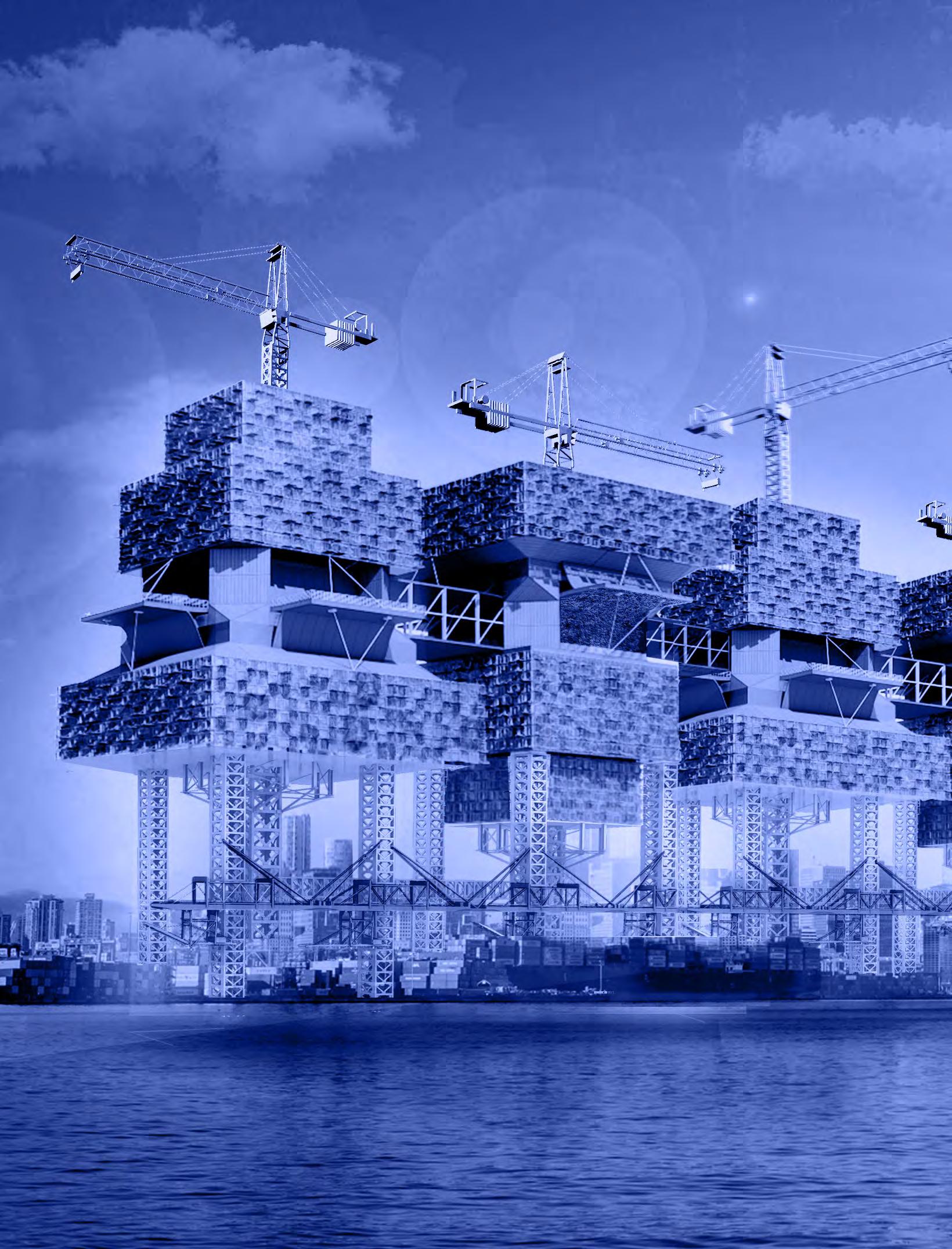
94
Taylor Marshall & Jeannette Wehbeh
Rita Wang & Nicole Li
Raymin Sidhar
Jasmin (Minji) Kim & Tanya Gradyuk
Mathieu Howard & Kristyan Calletor

Muhammad Wamiq Alam
Jessica Iozzo
Christopher
X-LARGE 96 100 102 106 108 110 114 116 120 124 Our Streets Circular Urbanism Post-Anthropolis The MURB Urban Farm-Rise Indigenous Lives Memorial The Wedge PORT[lands]
Sphenodon Punctatus Thank you sponsors!
Rhynchocephalia
Gabriel Garofalo & Stephen Chun
Cleland
Magazine Team
325
Our Streets
Gabriel Garofalo & Stephen Chun
Master 1 / AR8103 Studio in Collaborative Practice
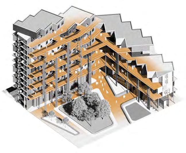
With the rapid population increase in Brampton, Ontario from just over 600,000 people in 2022 to more than 1,000,000 by 2040 brings to light the future concerns of housing. As new cultures, occupations and ages move into the region the idea of identity and social connections sparks a specific importance. How can large families, skilled workers, and entrepreneurs create social and economic sustainability nets for their future? What role does architecture and dwelling play in this relationship? The motives around the development within the Shoppers World Brampton site intend to aid these relationships through architectural elements. A realigned urban realm is one that aims to define the pedestrian realm and layers urban life for residents and visitors. By establishing circulation, leisure, and private paths of travel defines the walkability of the neighborhood and creates opportunities for interaction and view corridors towards communal spaces and parks. The proposal intends to explore defining space through 2-storey large family units to help meet the demand of the incoming population. The variety of units will also look to connect living and working spaces together to create accessible methods of starting a business or exploring means of financial stability. This incentives the feeling to encourage local individual businesses to support one another.
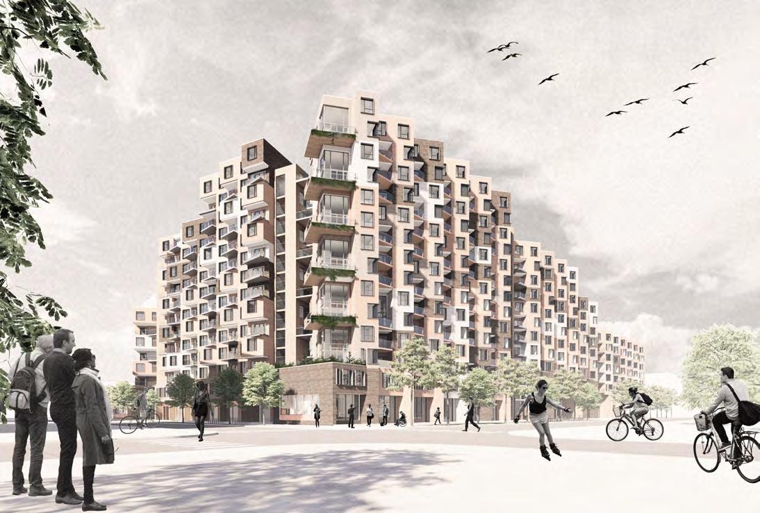
Vol. 4
a b 96


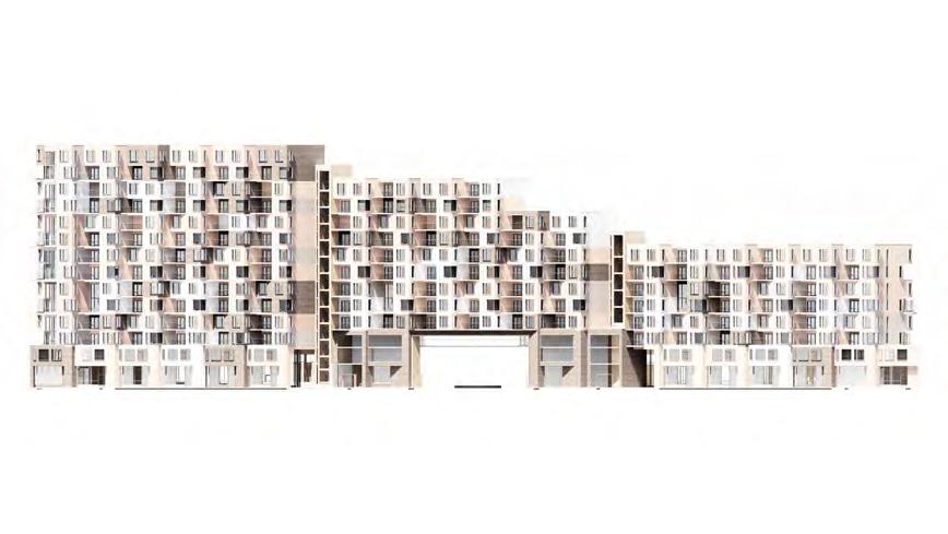
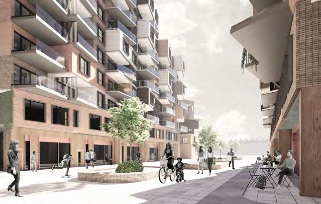
SIDE STREET SITE CENTRAL STREET
f e
a b c d e f " "
exterior view concept diagram courtyard view south elevation context plan central view c d
community, adaptability, resilience.
Additionally, the corridors and circulation can be wrapped around the exterior of the massing to create informal outdoor space and to enable natural light throughout both sides of each unit. The goal for this proposal is to build community resilience through defined spaces in a modular fashion and the ability to work and create an accessible future for incoming residents.
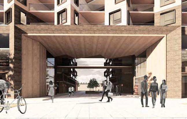
1 storey / bachelor unit axo diagram
2 storey / 3 bedroom unit axo diagram

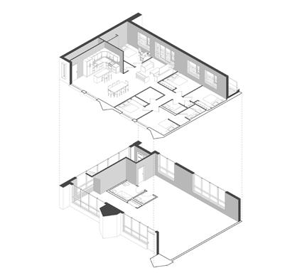
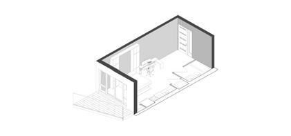
linework / 5 bedroom multi-family unit axo diagram
unit density analysis diagram
forming to the site conditions and context diagram
main entrance view
Unit Density Analysis Rotate Units for Sun Exposure Solar Paths a b c d e f
d e c b a f 98


Food Market & Eatery Child Care Centre Communal “Parks” Green Roofs Communal Courtyards Raised Pedestrian Street Network g h i j e f interior street view pedestrian streets diagram programs, amenities and unit variety diagram transverse perspective section g j i h
Circular Urbanism
Taylor Marshall & Jeannette Wehbeh
Master 1 / AR8103 Studio in Collaborative Practice
The proposed project aims to criticize the existing redevelopment of Shoppers World in Brampton by proposing a pedestrian friendly mass-timber mid and low rise park community. The residential complex proposed on this site aims to physically and visually connect the adjacent mid-rise and low-rise communities while connecting the park network to the east and west. It also aims to provide a building that not only houses its occupants but also provides them with support and opportunities to grow and expand within the development and beyond. This is accomplished by allowing for the development of many amenity and service spaces on the outside perimeter of the ground floor, such as restaurants, grocery stores, child care centers, and other rentable facilities that can support the community. The residential units are designed to accommodate growth as there are seven unit types ranging from co-op housing to 3-bedroom units. Individual units are connected via a circulation network that emphasizes connections to the surrounding site with views and connections between individuals via shared spaces such as lounge spaces, work areas, and shared kitchenettes. The urban farm and ample landscaping of the courtyard are designed to help promote feelings of biophilia among community members while also supporting biodiversity.


Vol. 4
08 CREATING PHYSICAL CONNECTIONS TO THE SURROUNDING SITE 07 CREATING PHYSICAL CONNECTIONS TO THE SURROUNDING SITE 06 CREATING PHYSICAL CONNECTIONS TO THE SURROUNDING SITE 04 04 DIVIDING THE FORM INTO UNIFORM MODULES 03 SETTING BACK ALONG THE CURB TO EXTEND THE GREEN BELT 02 DEVELOPING A STRONG STREET PRESENCE 01 CREATING VISUAL CREATING PHYSICAL CREATING PHYSICAL CREATING PHYSICAL SETTING THE MODULES APART FOR DAYLIGHTING 04 DIVIDING THE FORM INTO UNIFORM MODULES 03 SETTING BACK ALONG THE CURB TO EXTEND THE GREEN BELT 02 DEVELOPING A STRONG STREET PRESENCE 01 a b c 100
Elevation - 1:600

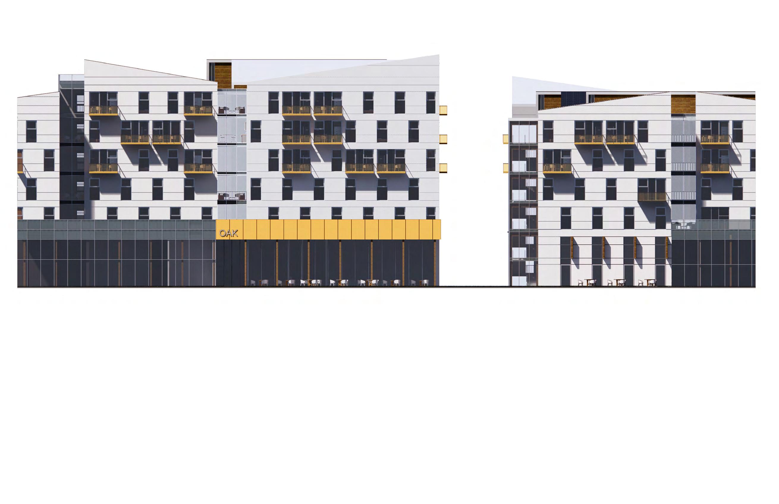
1:200
Elevation - Enlarged -
5m 2.5m 1m 3.5m 21.3 m mm a b c d e f exterior view concept diagram model ground floor plan west elevation exterior view d e f
" "
residential. mass timber, sustainable, community,
Post-Anthropolis
an interactive manual for re-imagining the post-industrial city

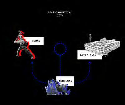
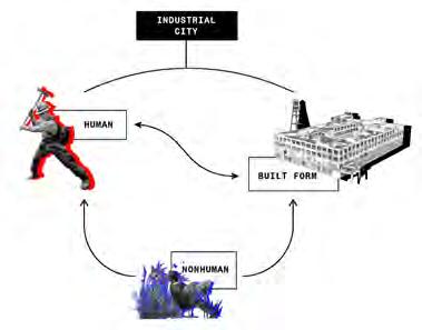
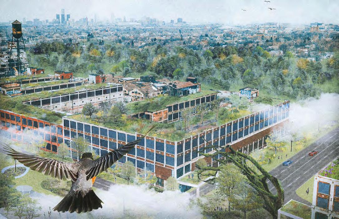 Rita Wang & Nicole Li
Master 1 / AR8103 Studio in Collaborative Practice
Within the industrial city, modernity brought forth technological innovations that have benefited the advancement of human civilization and their built forms. This has led to a deep-rooted mindset of human supremacy and anthropocentric thinking that has become embedded in our current lifestyle and the way we build. Humans and built forms have developed a relationship that succeeds at the expense and detriment of non-human forms - which caused the mass extinction of non-human life and threatens ecological stability. In the context of post-industrial cities, we can find opportunities to re-incorporate non-humans into a better relationship with humans and built forms - where our success is not based on the expense of non-human species. By redefining this framework and the relationship between humans, non-humans, and built forms, all parties can be considered equal actors and participants within a new city typology, which we call Post-Anthropolis: a postanthropocentric city. This interactive manual presents a strategy for re-imagining the post-industrial city which can be applied around the world.
Vol. 4
a b 102
d
a

b
c
packard view theme diagrams belle isle view intervention diagram birds level view belle isle section c

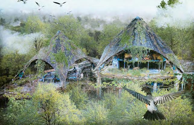

f
e
d e f , " "
symbiosis . regenerative
market view market interior view market index card section fragment a
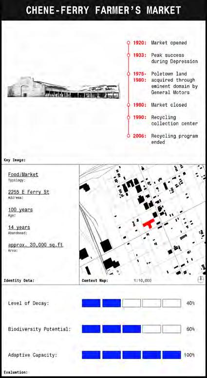
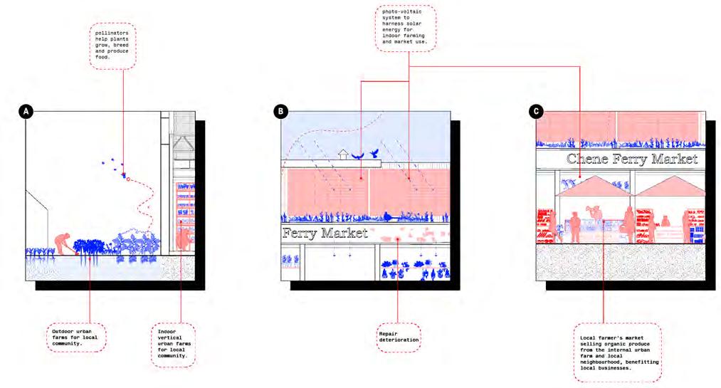
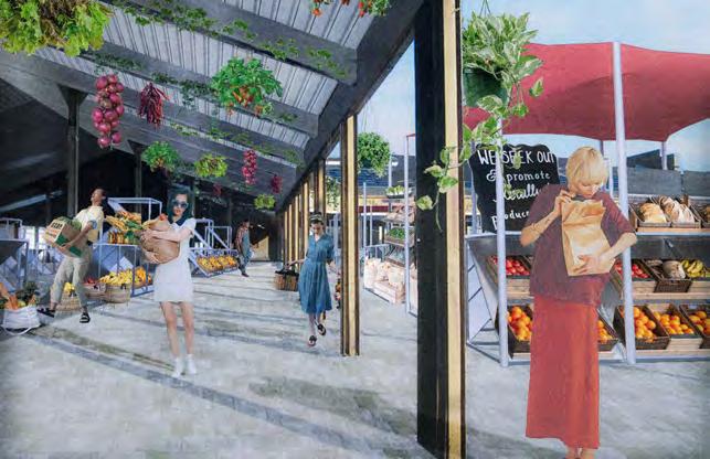
a
b c

b c
d e f d 104

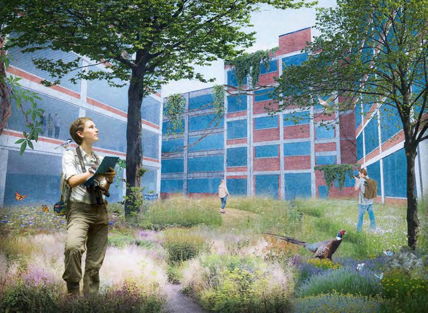

e f g church bird-eye view site analysis diagram parkard view f e g
ecological-stability, post-anthropocentric thinking. " "
post-industrial city,
The MURB


The MURB was a six-week design project for our sustainable design studio, where the exploration of the Zero Carbon Building standards was further examined through the form, function, and development of a net zero carbon multi-unit residential building. As such, the design process investigated its production and building life cycle to determine the environmental impacts on the proposed site and strategies to mitigate its impact. The MURB is situated south of the Toronto Metropolitan University campus on Dundas Street West and Bond Street. In the development of the project, various sustainable methods and technologies were incorporated into the building which include photovoltaic panels, high performance triple glazed windows, mass timber structure, geothermal heat pump for the HVAC system, a raised floor design for the mechanical, electrical, and plumbing requirements of the building and a windowto-wall ratio less than 40%. In which, The MURB consists of a four-storey podium with a ten-storey tower featuring a mixture of one-bedroom and two-bedroom units. One of the main design decisions that was made during the design process was to remove the balcony as it felt unnecessary given the direction of the project outcome. Instead, the window within each unit becomes an integral part of the living experience as it now becomes an informal space to sit, relax, and gather throughout the day.

Vol. 4
Raymin Sidhar
a b c
106
Year 4 / ARC920 Advanced Architecture Studio
a b c d e f g
exterior view concept diagram typical floor plan interior view
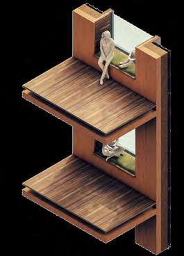

facade elevation wall section axo diagram exploded axo diagram d


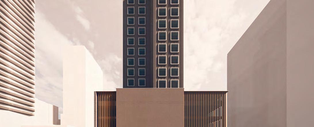
e g f
" "
net-zero, mass timber, sustainability, MURB.
Urban Farm-Rise
Master 1 / AR8103 Studio in Collaborative Practice
Urban Farm-rise envisions housing as more than a product of living, but a service which feeds back into the growth of the economy and community. The proposal will provide a framework for its tenants to be socially and culturally connected to Shoppers World Brampton’s circular food economy through a series of urban farming strategies that promote business and selfsustaining practices. Through food, the community can engage in a variety of activities which help to promote a knowledgeable, engaging, and selfsustaining community. People can participate in the process through growing, harvesting, distributing, making, educating, consuming, sharing, as well as composting and recycling goods consumed at the end of their cycle. While maintaining a sense of community enclosure, the proposal will achieve high density with a focus on the human scale relationship to the urban green landscape. Sociability is introduced through intergenerational living and flexible shared spaces of activity. The project strives to foster a sense of community and place the inhabitant’s wellbeing at the forefront through design circularity.


Vol. 4
Jasmin (Minji) Kim & Tanya Gradyuk
a b
108
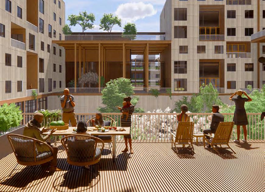

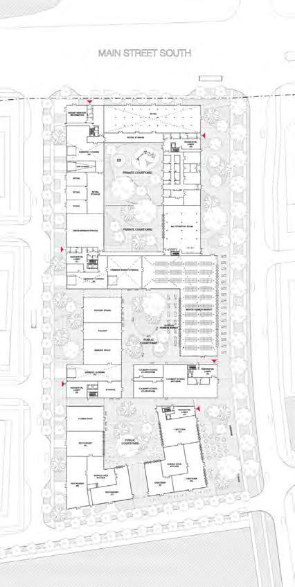

f 4 bedroom 182 m 4 bedroom 177 m 3 bedroom 155 m 2 bedroom 108 m 1 bedroom 61 m 3 bedroom 105 m 3 bedroom 105 m 2 bedroom 76 m a b c d e f g farmer's market park link diagram winter garden harvest ground floor plan single/double units materiality courtyard section c d g e
housing. urban farm, circularity, " "
Indigenous Lives Memorial

Mathieu Howard & Kristyan Calletor
Year 4 / ACSA 2022 Steel Competition
The memorial crafted seeks to create a powerful statement on the site while keeping the traditional First Nations and Indigenous design ideas of the Long House, Pit House, Tipi and Thule in mind. The memorial is an extension of the ideology put across by Indigenous Peoples to live in harmony with the whole. The memorial is incorporated into the landscaped environment of Allan Gardens Park and creates a journey leading to a balance of emotions and thought. As one walks up to the memorial from the street, a sort of chaos is visible on the outer shell of the memorial. A pattern of fish emerges once the approach continues; beauty and order emerge from chaos and disorder once view from the right angle. The fish is a symbol of not only food, but also eternal life in the mythology of the Indigenous Peoples of Canada. The memorial responds to the permanent damage made by the residential school systems in that a large part of the future generation of First Nations was erased from the history of Canada, but it also gives eternal life to the Indigenous through the symbolism of the fish and the permanence of the steel structure.

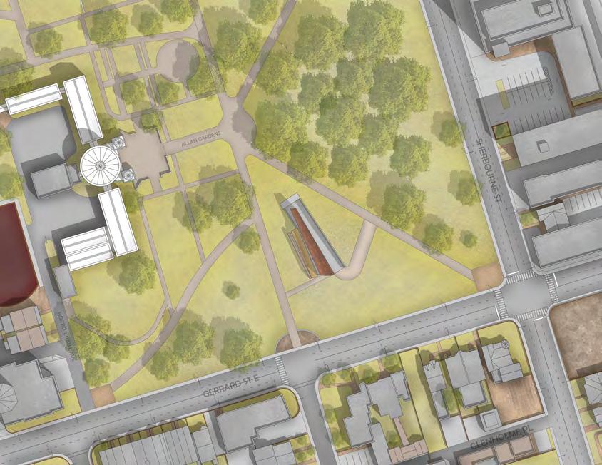

Vol. 4
a b c 110



a b c d e f g entrance view inspiration site plan axo context drawing ground floor plan sunken courtyard walk-through exhibition d e g f indigenous, place, " "
memorial.


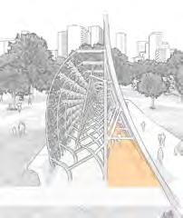

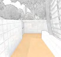
l b a i ii iii 112


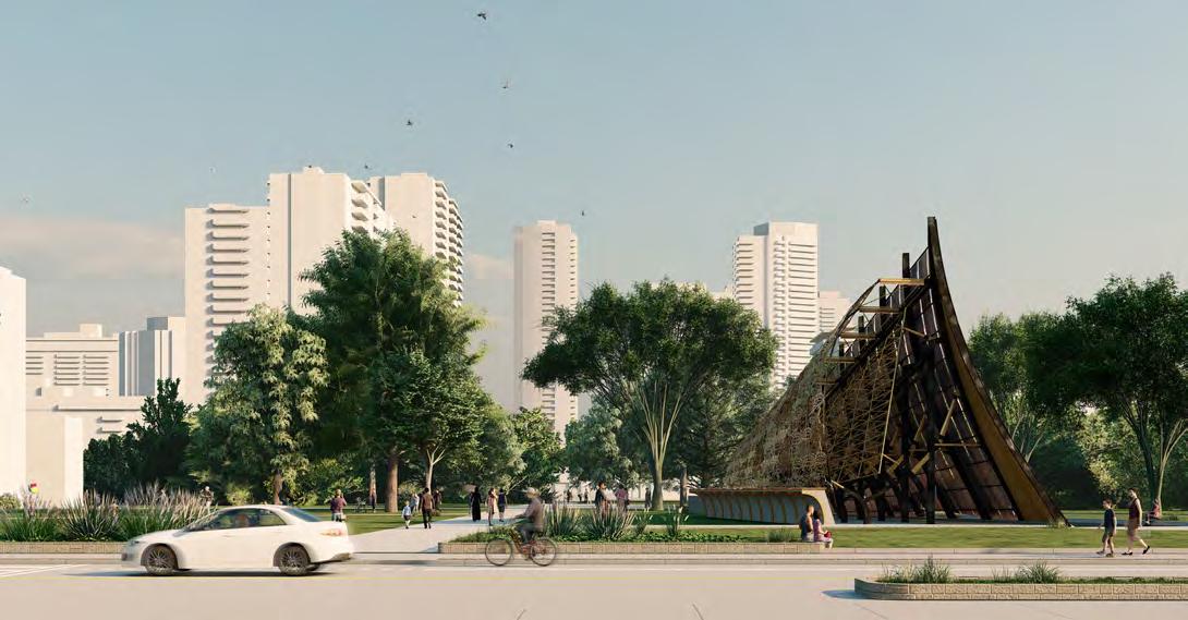




c f e d a.i a.ii a.iII b c d e f mass wall structural connection
structural connection
structural connection
main
shell
wall section
view
view
palette
section
programming &
close-up
street
materials
cross
The Wedge
The final project of Zero-Carbon Studio is a high-rise MURB building that seeks to utilize learned zerocarbon and low TEDI strategies to make a highly efficient building. Situated near TMU, the target occupants are students living in shared/single units with each one having a view to the south. Each pair of floors have direct access to double-height communal study spaces to meet other students in their building. The site runs lengthwise along its north-south axis with units facing east and west so there is an intention to increase southern daylight and views for all units. From the wedge form, each unit north of the previous steps outward provides a balcony and glazing facing south. More natural daylight in the rooms reduces reliance on the grid. Another passive strategy is building with mass timber for the majority of the building, locking carbon in the material and speeding up the construction process with pre-frabrication technologies. During the life of the building, students will enjoy a stable climate at all times of the year from the GSHP, cheaper electricity with the 250 KW batteries that charge up from the grid during off-peak hours, and hot water from the 200m2 of solar hot water collectors on the recreational patio. The facade of the building merely mimics a wood panel finish. It’s wrapped all around with Mitrex solar panels. When including the solar panels on the accessible roof onto the other passive and active methods implemented in the building, it operates with very little dependence on the grid and quickly starts paying off the cost of investing in cleaner and more renewable design solutions.


Vol. 4
Muhammad Wamiq Alam
a
b c 114
Year 4 / ARC920 Advanced Architecture Studio
a
b
c
d
e f
d
g
exterior view concept diagram
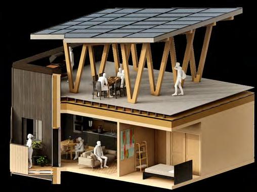
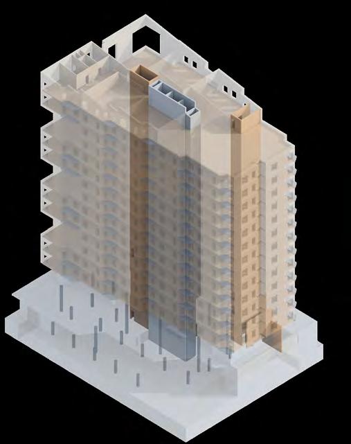
axo diagram
material close-up typical floor plan unit axo diagram
structure diagram
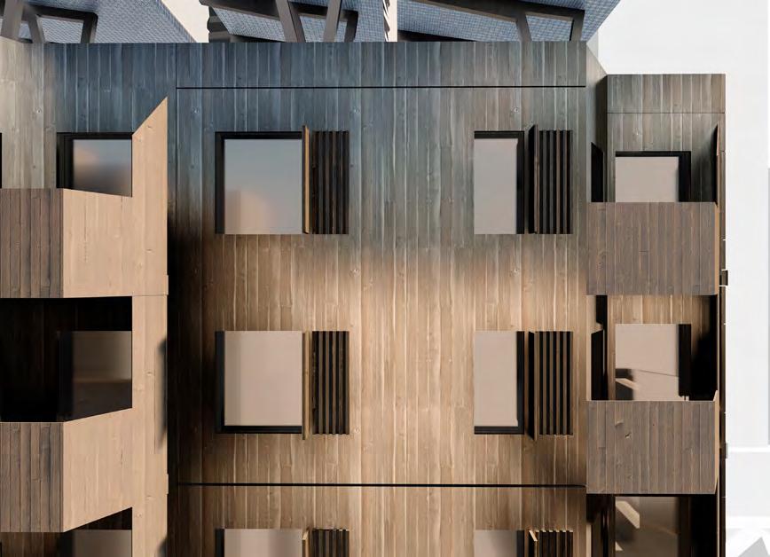
e g f
" "
net-zero,
mass timber, sustainability, MURB.
Jessica Iozzo
Year 4 / ARC920 Advanced Architecture Studio
Vancouver is in the throes of a housing crisis. Strict zoning guidelines in protection of Vancouver’s Single Family Dwellings (SFD) has led to a reliance on corporate vertical development, scarcity in buildable land beyond the city and a deeply unaffordable housing market. Rather than looking towards open market land acquisition and expropriation of occupied land, this proposal seeks to construct new ‘land’ by engaging the potential of Vancouver Harbour and its ports. Using decommissioned infrastructure and adaptive re-use of functional infrastructure, like port-cranes, to create multiuse ‘land’ will help synergize embodied potential of city assets. Shipping ports measure global economic vitality, operating as a gateway between sea and land transport. PORT[lands] housing makes use of ports and waterways as a method of construction and integration into the existing built and circulatory fabric of the city while still allowing for nautical and shipping functions to remain. The creation of quick to construct housing modules that can be augmented to grow alongside residents to reject increasingly archaic ideas of stagnant ownership and belonging to a single space.

Vol. 4
PORT[lands]
a b 116
f
elevated city, mega-scale multi-unit ,
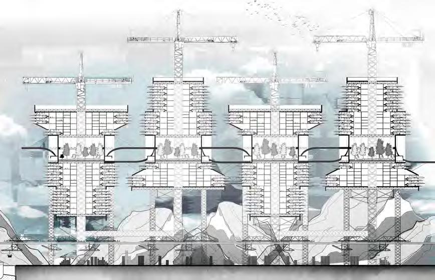


re-purpose.
f
a
b
c
d
e
g
exterior view site plan section close-up section lower floorplan upper floorplan elevation
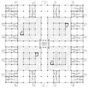
e d
x g
c " "


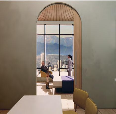
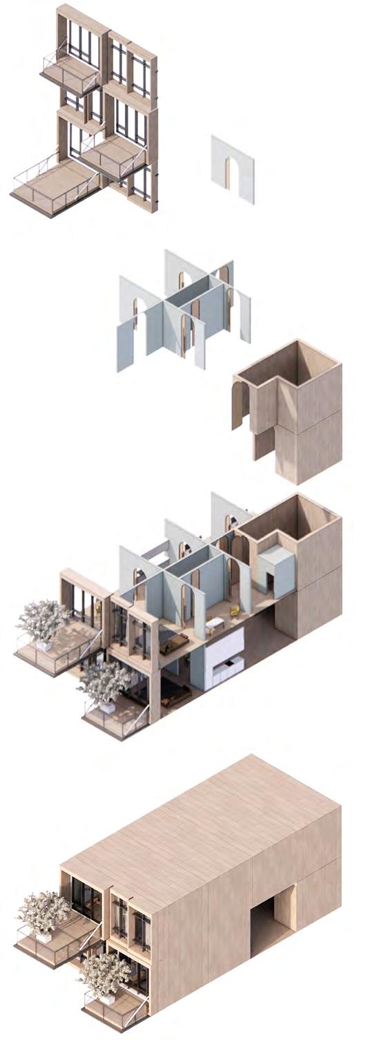
a b c d
118
a b c
d
e
port systems facade articulation interior view exploded axo drawing exterior port view

x e
Rhynchocephalia Sphenodon Punctatus
Year 4 / ARC920 Advanced Architecture Studio Christopher Cleland
This exploration considers the Rhynchocephalia Sphenodon Punctatus – also known as the Tuatara – in the Post-anthropocene condition of Auckland, New Zealand. Greed-driven tech giants have harnessed the magnetic power of supercritical water deposits beneath the earth’s crust surrounding New Zealand, but this results in a pressure imbalance that causes a series of seismic earthquakes and tsunamis that bring the mainland infrastructure crumbling down. The presence of human life in Auckland has been eliminated, and a warm and dense fog-covered environment leaves remaining life to adapt, or fall victim to natural selection. The lowvisibility environment has displaced the Tuatara’s habitat, forcing them to use their burrowing capabilities on the artificial built environment – the new ‘natural’. This new habitat exists at both the macro scale of the architecture, and the micro scale of the piles of rubble that they are forced to inhabit. This project considers the aging and mating process of the Tuatara, from copulation, to embryo, infant, youth, and adult. It considers the necessary and most appropriate size, colour, texture, and thermal exposure components of morphology for each phase of its development, in an attempt to maximize the species’s chances of survival within the Post-anthropocene.


continued building instability causes slanted buildings.
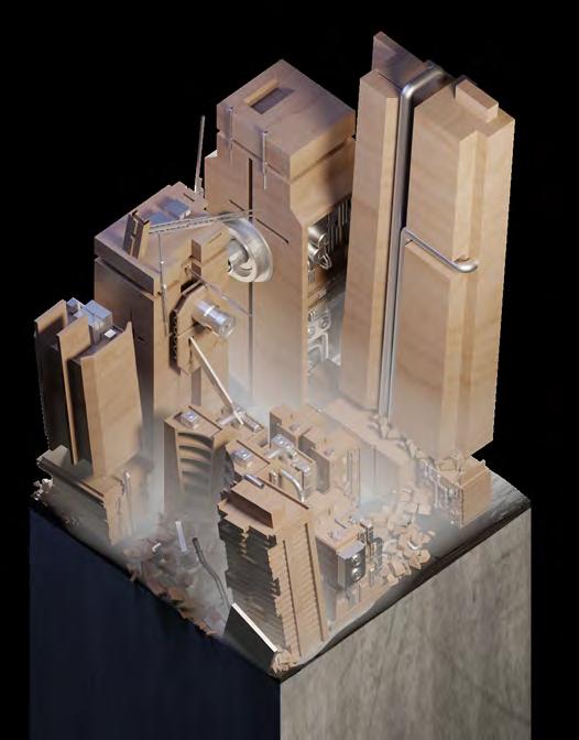

broken supercritical water taps continue to exhaust heat into the environment.
collapsed whole or portions
 INFANT PLUMBING
EDGE OF SLAB SUN-BATHING HUNTING GROUNDS
BREEDING + NESTING POOLS
volcanic eruptions have melted and created a layer of basaltic rock.
BUILDING INSTABILITY
FOG
FORCE DESTRUCTION
BASALT IGNEOUS ROCK
CONTINUED
LOW-VISIBILITY
SEISMIC
Vol. 4 a b 120
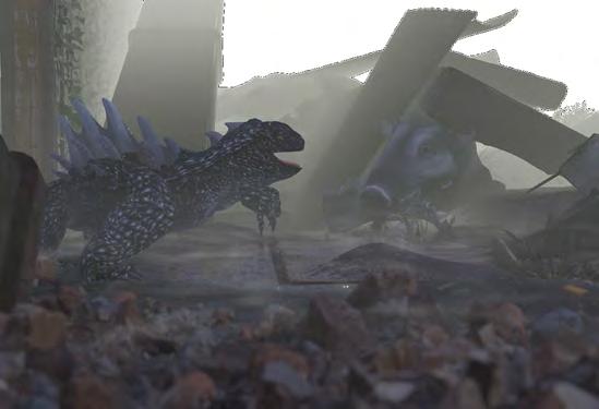
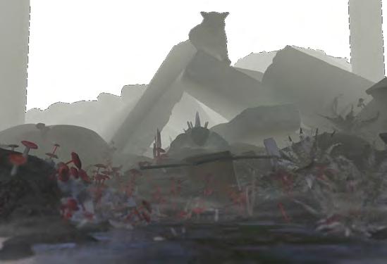






UROPETALACAROVEI D E A T H CARETTASERPENTINAEGGS SYAD54 TUATARA STAR ATEW W I L D P I G TUATARAYOUTH 1020 Y E A R S SPRING SUMMER AUTUMN WINTER marchmay juneaugust septembernovember decemberfebruary MACRO ENVIRONMENT. sun-bathing MICRO ENVIRONMENT. MICRO ENVIRONMENT. a b c d e macro axo drawing tuatara habitat axo drawing food chain circle section boar & breeding ground c d e infrared, tuatara, " " magnetism. fog,
to repurpose dormant parietal eye that is covered after birth; vision of prey through fog; males detect females by heat dissipation from spines.
dissipates heat; attracts sun UV rays; allows infrared vision to detect possible mates through fog. EXTENDED SPINES, SPINE WEBS, REFLECTIVE TISSUE
protects skin where spines cannot be present, while ensuring mobility.
only present in males, this reflective surface attracts female mates in a newly competitive landscape. reflective guanine surface attracts prey through fog environment.
in response to much darker, saturated basalt environment; absorbs UV rays more easily.
increased number of spines helps detect the Tuatara’s local environment through darkness; protects it from harmful materials and sharp objects in the low-visibility fog.


in response to navigating and burrowing in fabricated material environment. ENLARGED HIND LEGS AND FORELEGS
The Tuatara develops its spines for UV absorption, mating, and hunting, while repurposing its parietal eye for infrared vision and developing larger muscle mass in response to the deteriorating built architectural condition. Most notably, its darkened appearance increases the amount of nutrients it can acquire from the sun through such a dense atmosphere. The spines then respond to the darkened environment and increased male Tuatara presence by increasing in size, becoming webbed, and being coated in a reflective guanine surface. These act as sensors through the environment and attract female mates, as well as prey.
INFRARED PARIETAL EYE
DARKENED SKIN ENHANCED OSTEODERMS ADDED SPINES
PROPOSED TUATARA FRONT ELEVATION
PROPOSED TUATARA SIDE ELEVATION
a b 122
a b c elevation exterior view movie poster c
thank you!
There are not enough words to express our gratitude to the following university groups, offices, and departments for their dedication to supporting student education and initiatives. Their encouragement and assistance make a successful 325 Magazine publication possible every year. Thank you for supporting Toronto Metropolitan University’s Department of Architectural Science students in their path towards the avenue of design and problem solving.
We would like to acknowledge the yearly support from the following:
Department of Architectural Science arc.soc
Faculty of Engineering and Architectural Science (FEAS)
Toronto Metropolitan Provost and President’s Offices
-
124



thank you!
This publication would not have been possible without the benevolence and generosity of our sponsors. We thank them for supporting our students and their education in architectural studies. Their contributions make it possible for 325 Magazine to continue to provide a platform for students in Toronto Metropolitan University's Department of Architectural Science to feature their work. The outstanding projects showcased in this issue are only a glimpse of what can be expected to arrive for the future of the industry.
Thank you for supporting our students’ innovation and creativity!
We would like to amiably thank the following industry patrons:
-
OAA Architects Alliance
Giaimo
Perkins and Will
BDP Quadrangle
MJMA
Montgomery Sisam Architects
NEUF Architects
RAW
Zeidler Partnership
Adamson Associates Architects
Baldassarra Architects
Gow Hastings
Snyder Architects
126
AUGUST House renovation and addition that leverages the existing
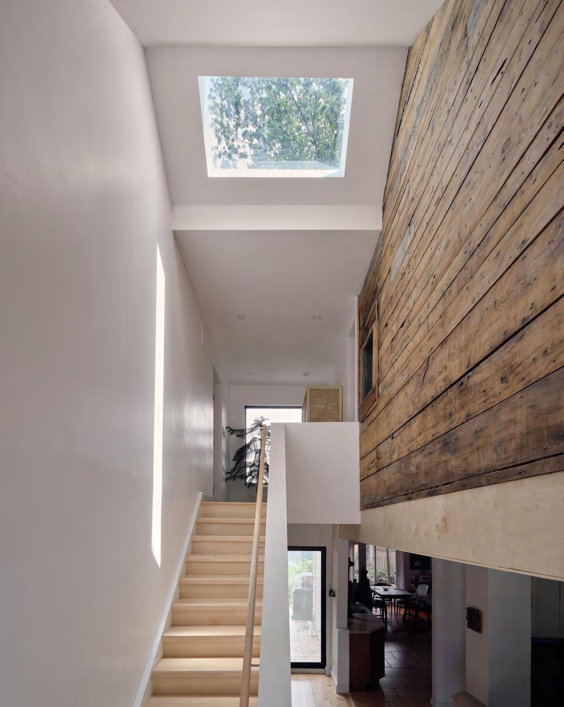
ARCHITECTS—ALLIANCE

a—A is a design practice based in Toronto engaged in the act of city building, providing full architectural services across a wide range of contexts, scales and building types—from schools and galleries, to affordable housing and mixeduse developments, to urban parks and civic precincts. We work with clients and collaborators in Canada, the United States, and Europe. We are designers, researchers and urbanists who care about the city, and take care to create spaces that give meaning and invention to the ways we live and work.


“We think something’s done and it’s never done. The interesting thing about cities is that they’re never finished.”
West Don Lands Block 8
Peter Clewes, Principal
128
Design. For good.

We are architects, designers and urbanists who create places that foster wellbeing, inclusivity and sustainable futures.
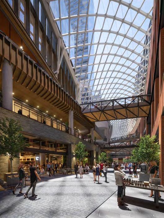
@bdpquadrangle
bdpquadrangle.com
The Well | Toronto, ON


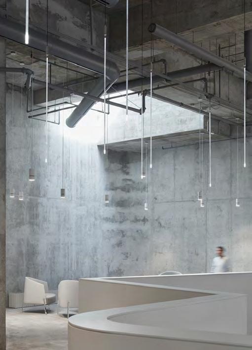
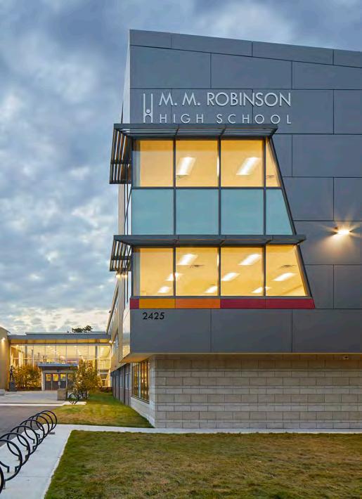 CIBC Square, Toronto
Design Architect: Wilkinson Eyre Architects
transformative design controlled outcome s 130
Executive Architect: Adamson Associates Architects


Creating spaces that shape experiences


132
Design that Empowers Communities

York University School of Continuing Studies, Toronto, Ontario
read more at...


 a b
c
d e f
exploded axo drawing master bedroom living room writer's studio section 1 section 2


 a
b
c
a
b
c


 a
a


 James Goodeve


 a
a


 Noah Spivak


 Alexia Mereuta Lanescape
Manuel Francisco Ortega Santos Snyder Architects + Perkins&Will editor


 Rita Wang & Nicole Li
Master 1 / AR8103 Studio in Collaborative Practice


 INFANT PLUMBING
EDGE OF SLAB SUN-BATHING HUNTING GROUNDS
BREEDING + NESTING POOLS
volcanic eruptions have melted and created a layer of basaltic rock.


 CIBC Square, Toronto
Design Architect: Wilkinson Eyre Architects

