5 minute read
Something for everyone
Words Jonathon Burford
MARCH 2022’S OMEGA X
Swatch MoonSwatch launch was something of a phenomenon. By combining the historic Speedmaster chronograph aesthetic with the Swatch brand’s affordability and playfulness, all for around $260, it created unprecedented demand. The world’s 110 Swatch-brand boutiques were mobbed for the opportunity to buy one.
This caused an immediate opportunity for those lucky enough to acquire one, with watches being re-advertised by dealers and flippers in the secondary market at many multiples of the original cost. For a short time, you could even buy a vintage Speedmaster at an almost comparable price point.
Initially powered by one of the best manual-wound movements, the calibre 321, the Speedmaster is among the most storied, historic and evocative watches of the postwar period. It has been in continual production since 1957, when it was introduced as the Ref CK2915 (alongside the original Seamaster 300 Ref CK2913 and Railmaster Ref CK2914) with its iconic threeregister black dial, broad-arrow hands, steel bezel and curved lugs.
The first model that introduced the classic Speedmaster aesthetic still recognised today was the Ref 2998, with its slightly enlarged case size, black acrylic bezel and updated Alpha-style hands. Of course, the watch really hit popular consciousness when NASA chose it to be worn by the Apollo 11 astronauts, with Lyre (twisted) lugs and an asymmetrical case design incorporating crown guards. The Professional watches have been the backbone of Omega for 50 years, with the Lemania-based calibre 861 still providing the base for today’s Moonwatch as calibre 1861.

Given the number produced, there really is a Speedy for everyone – and at every price point. While my favourite is the early Ref 2998-1, it’s the Ref 145.022 that gives the most varied choice. In production from 1968-83, its twisted lugs, black dial/bezel and the like make it probably the most recognisable and classic-looking Speedmaster.
As with all things Omega, the many variations and editions can seem impenetrable, but these details are important when buying. The earlier versions had a suffix -XX indicator (eg 145.022-68), although this didn’t signal the production year, which is discoverable only via the serial on the movement. From 1968-74, the dials displayed a ‘step’ between the main centre dial and the outer track of the dial, similar to those found on the calibre 321-powered predecessor.
The bezels are black acrylic, with the most desirable being the Dot Over Ninety ‘DON’ variants from the Ref 145.022-68 Transitional and the 145.022-69 only. There are also case-back variations, such as the straight text of ‘First Watch Worn on the Moon’ (145.022-69, 1970-73) and Omega Seahorse engraving and ‘Speedmaster’ written (145.022-68/69).
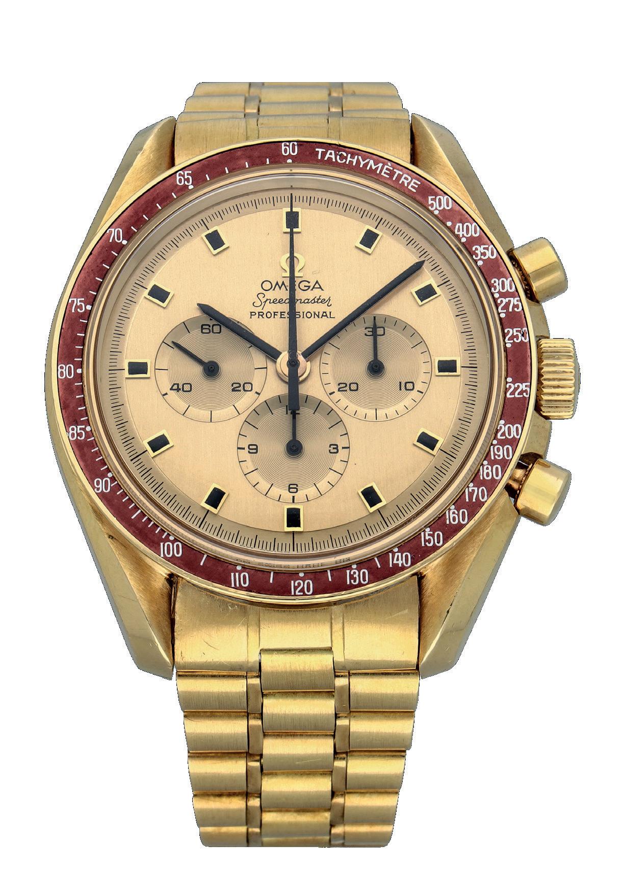
There was a gold version, too; 1014 were produced, with No 1 and 2 being offered to (and declined by) President Nixon and VP Spiro Agnew. The next 19 were given to astronauts at a commemorative banquet on November 25, 1969, with the remainder being delivered to Omega managers and retailers and, finally, the public. These had burgundy bezels and onyx hour markers, with the astronaut versions boasting a Ken Mattingly quote engraved on the case back: “To mark man’s conquest of space with time, through time, on time.”
Good places to start navigating the Speedmaster maze are Gégoire Rossier and Anthony Marquié’s Moonwatch Only or the Fratello website, but here are a few things to keep in mind. Condition is everything, yet it’s rare to find a pristine or NOS vintage example, so ensure all elements look and feel the same age (intangible but important). Avoid anything with service dials, hands or bezels, as original parts are becoming hard to acquire and often prohibitively expensive. Also, don’t overpay for tropical (brown/tobacco) dials.
Unusually, Omega has extensive records and a co-operative museum, and its Extract From the Archives service is still relatively cheap, extensive and efficient, so original papers are less imperative. Boxes are desirable but no deal-breaker. Given the large number of watches made, don’t compromise on quality; it’s always worth waiting for the best your budget can stretch to.
The 145.022 is one of the great egalitarian vintage watches; there’s one for everyone, from the causal fan through to the super-nerd. In many ways, it’s the only vintage watch you may ever need or want.
Writer Jonathon Burford is SVP and specialist at Sotheby’s watch department. For its ongoing Watches sales, see www.sothebys.com.
Motoring Art
Words Rupert Whyte
Changing names
Bryan de Grineau’s artwork was produced under many pseudonyms, but there’s no denying its singular appeal
ANYONE FAMILIAR WITH
The Motor magazine will be well aware of the illustrative artwork of Bryan de Grineau, the contemporary rival of Autocar’s Frederick Gordon Crosby.

Charles William Grineau, born May 1883 in Hornsey, Middlesex, UK, was the son of illustrator and caricaturist Charles Grineau (185299), aka Alfred Bryan. Grineau Jnr started to draw in his father’s studio, and became a pupil and assistant to Thomas R Downey, who’d been a pupil of Charles Snr. Shortly afterwards, in July 1908, drawings by him appeared in the The Motor, signed John A Bryan, which in 1909 he shortened to John Bryan and continued to use until 1914. This early work followed on from traditions established in the 1890s, using a tight linear drawing technique.
World War One saw Grineau serve as a captain in the Royal Field Artillery. He contributed his first drawing signed John de G Bryan to the Illustrated London News of January 30, 1915 – one of a series depicting incidents on the front line. Further drawings published on September 7, 1918 were signed CW de Grineau or
Charles de Grineau. Following the publication’s policy, his initial war drawings were based on information provided or on eyewitness accounts, and employed a much freer style than those for The Motor. Grineau’s first post-war work for that title in 1919 was still being signed John Bryan, but by 1920 he had finally settled on Bryan de Grineau.
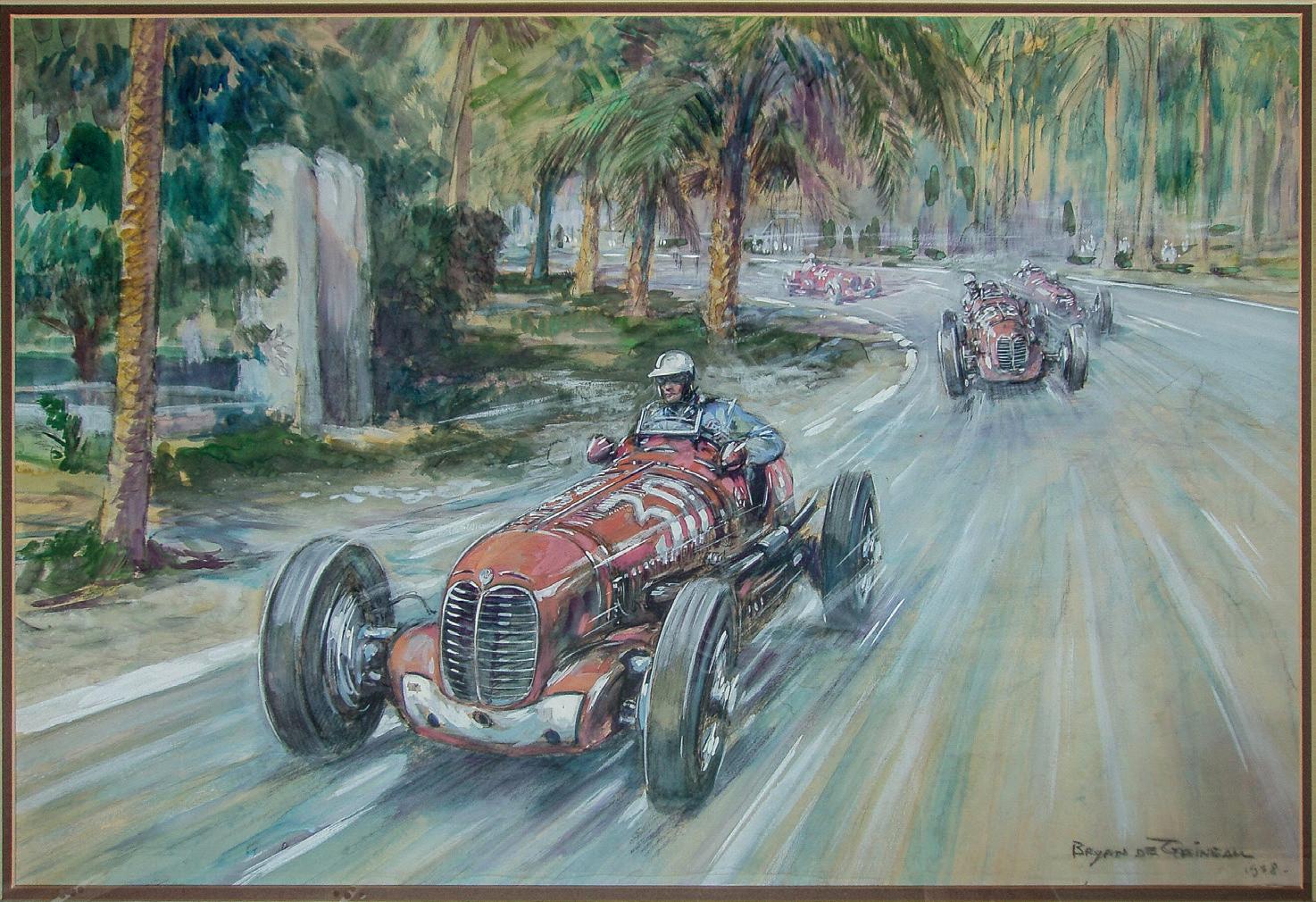
Most of the interest in his illustrations has been generated by his depictions of motor racing and social commentary on the automotive world for The Motor. These drawings returned to his pre-war style, only slowly employing the freer expression evident in his war work for the incidents and duels of the race track. He made much use of mark making to generate the sensation of speed and danger, although some have said that a visual awkwardness between cars and landscape nullified these efforts. His coloured illustrations for GET Eyston’s Flat Out (1933) nevertheless received much acclaim, and other colour works were used on race programmes. Some of his best paintings were a series commissioned pre-World
War Two by Giovanni ‘Johnny’ Lurani of his racing exploits. Several of these changed hands at the 1990 Christies Monaco sale.
Following his 1936 break with The Motor, de Grineau produced illustrations for Modern Wonder magazine and the Hornby Book of Trains, published in 1937, the same year as posters of the Coronation Scot for London, Midland and Scottish Railway, and of George VI making his way to Greenwich on the Thames for the Power Boat Company. He became an accredited war artist for the Illustrated London News, for which he followed the allied invasion of Europe in 1944-45. Post-war, he continued to work for the Illustrated London News, supplying topical and travel subjects as well as drawings of schools and universities. He died in May 1957. His motoring art is still very sought after, his colour work being the most eye catching and valuable. In the auction room, however, his pieces still lag behind those of compatriot Crosby. With thanks to Tony Clark. Writer Rupert Whyte runs Historic Car Art, www.historiccarart.net, selling original works and posters.
AUTOMOBILIA


