


Leuven, Belgium
Master (of Science) Human Settlements & Master (of Science) Urbanism, Landscape and Planning
Faculty of Engineering and Department of Architecture
Promoters:
Mircea Munteanu (Metapolis), Teodora Romanova Stefanova (Gradoscope), Thomas Willemse (Studio Thomas Willemse) with Bruno De Meulder and Kelly Shannon (KU Leuven)

© Copyright KU Leuven
Without written permission of the thesis supervisors and the authors it is forbidden to reproduce or adapt in any form or by any means any part of this publication. Requests for obtaining the right to reproduce or utilize parts of this publication should be addressed to Faculty of Engineering and Department of Architecture, Kasteelpark Arenberg 1 box 2431, B-3001 Heverlee.
A written permission of the thesis supervisors is also required to use the methods, products, schematics and programs described in this work for industrial or commercial use, and for submitting this publication in scientific contests.
03.A
04.A
04.C HOUSING
05 SWEANENBERGH
05.A OVERVIEW, A PHOTOGRAPHIC STORY
05.B INTERPRETATIVE MAPPING
05.C HOUSING ANALYSIS
05.D STRATEGIC PROJECTS
06 GASTHUISBERG
06.A OVERVIEW, A PHOTOGRAPHIC STORY
06.B INTERPRETATIVE MAPPING
06.C HOUSING ANALYSIS
06.D STRATEGIC PROJECTS
07 GALGENBERG
07.A OVERVIEW, A PHOTOGRAPHIC STORY
07.B INTERPRETATIVE MAPPING
07.C HOUSING ANALYSIS
07.D STRATEGIC PROJECTS
08 ACKNOWLEDGEMENTS
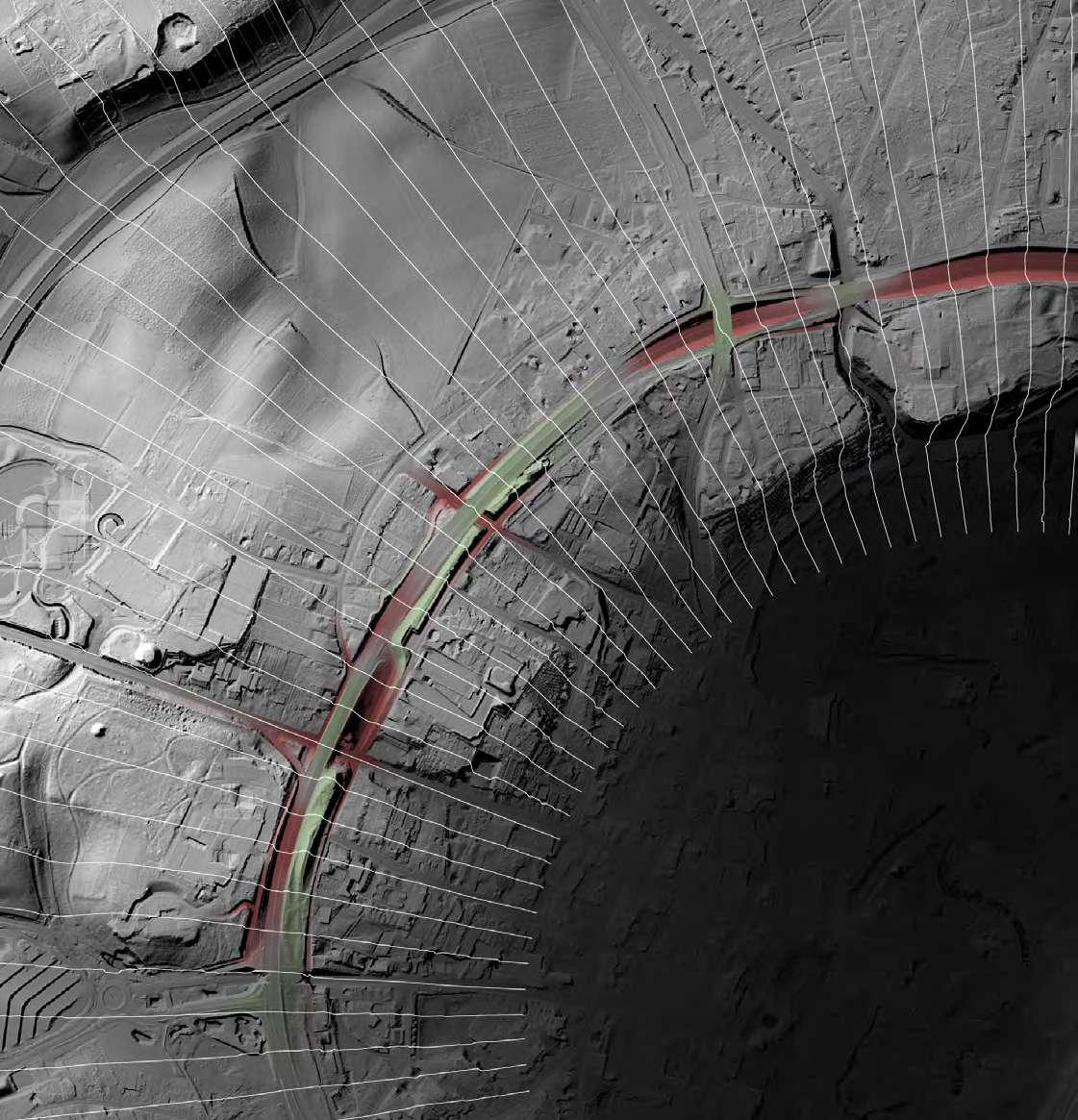
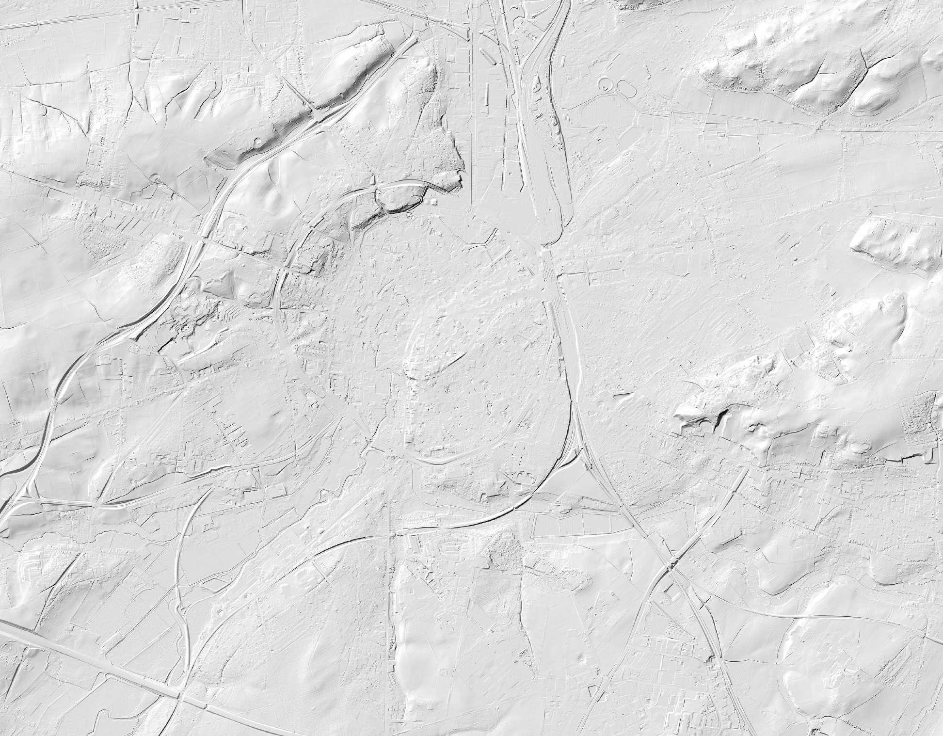
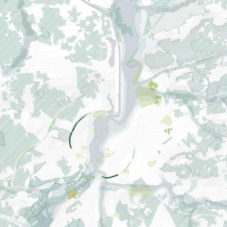
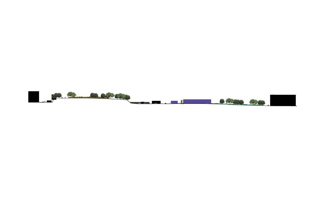
Topography and sections


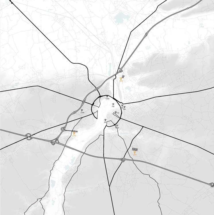
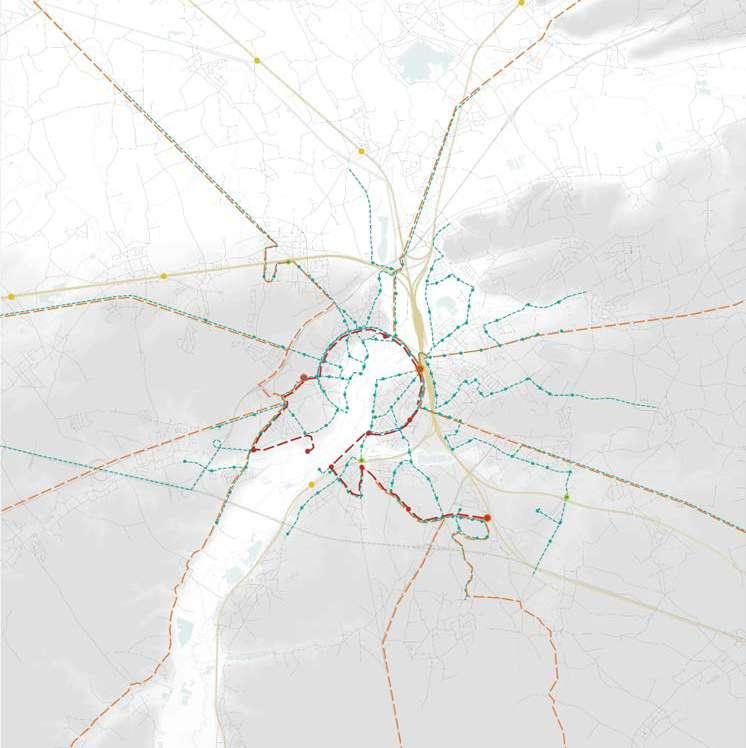
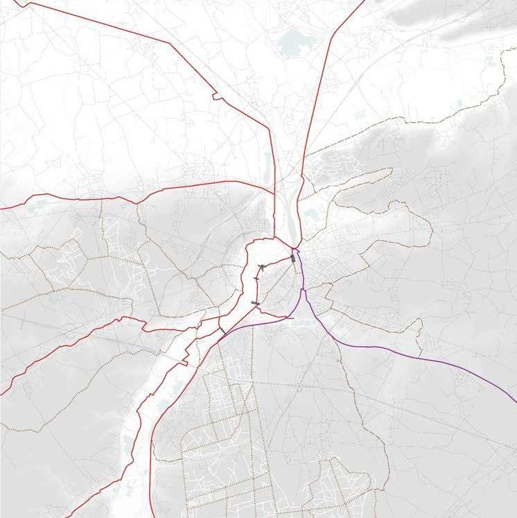
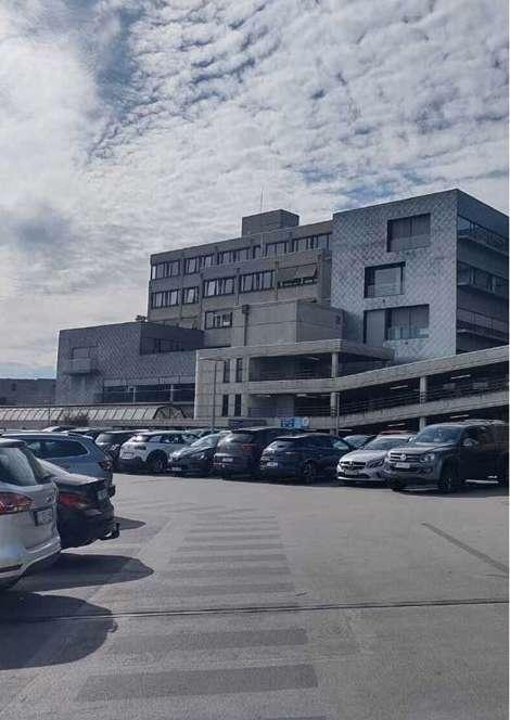
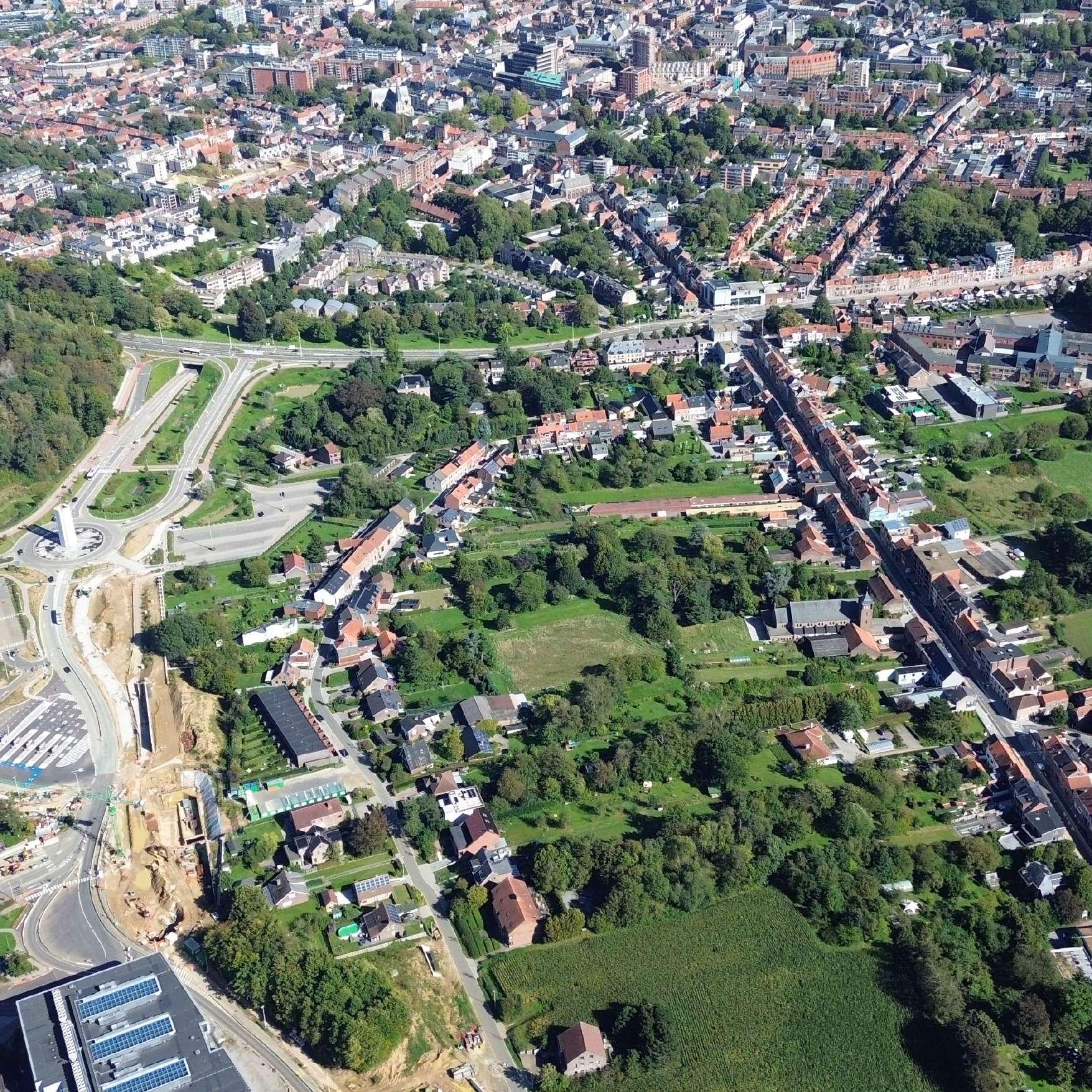
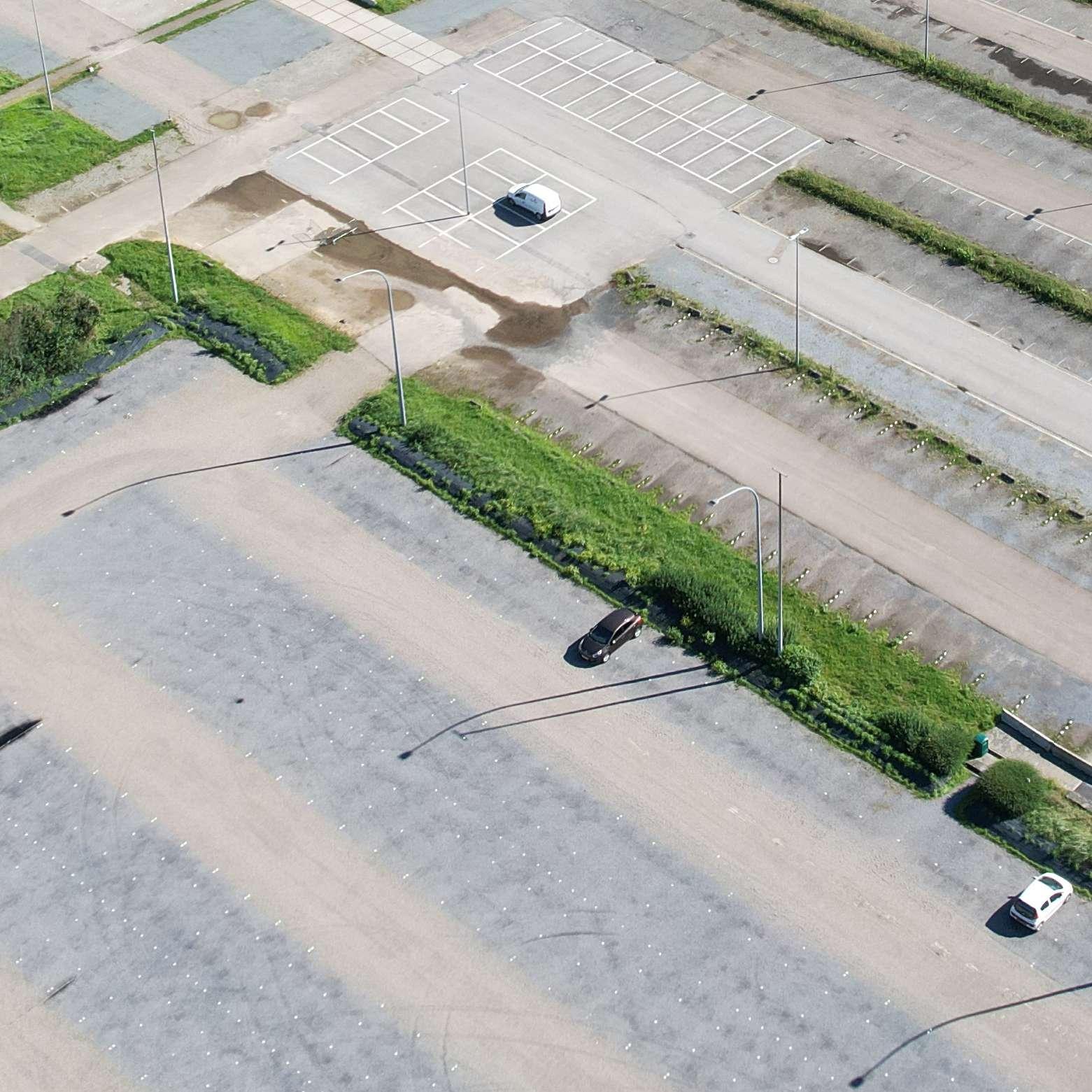
The site is comprised of fragments of urban fabrics on the western side (Witness hills) of Leuven, squeezed between the highway and ‘vesten’ (medieval earthworks) landscape (that was turned into a ring road). Since the 1950s, the area has become a dumping ground for larger institutions (university campus, university hospital, music academy, bank headquarters, big retail, etc.). The area is, in general, overinfrastructured (including large parking lots).
As a monofunctional dumping ground, the site lacks a clear structure (besides the underlying landscape) morphology and, despite its heavy programs, urbanity. The area’s potential identity and value is compromised by the dominant car-orientation and complete lack of (qualitative) public space.
Specific sites for intervention were identified due to their relationship with the university (and a broader discussion of city - (monotonous) university), the gentrifying effect of the university and major shortages in the (student) housing market). All the sites are comprised of fragments of tissues (hospital, school, convent, etc) and the strong topographical relief that characterizes this area of Leuven.
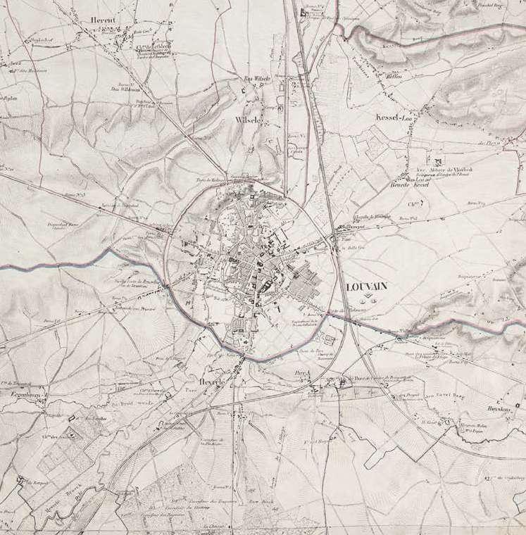
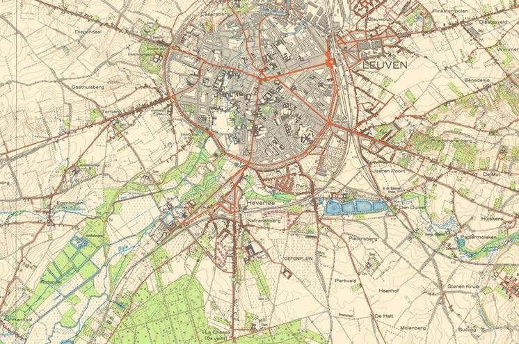
The city walls of Leuven mark a strong new artificial topography around the city. The Ferraris map of 1777 shows the clear distinction between the inner city development and the wide agricultural landscape beyond the walls. The flanks of the witness hills on the west side of the city form a strong agricultural landscape within the city walls with fields and vineyards. The steep slopes in this area explain the hesitant urban growth.
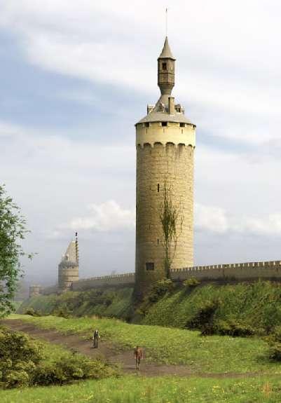
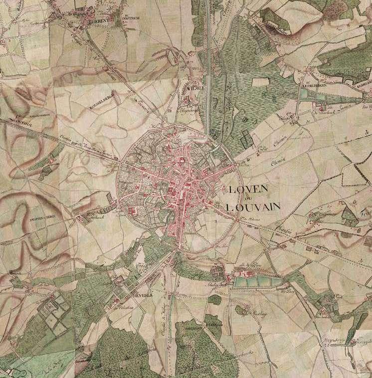
The Vandermaelen map from 1850 highlights the larger institutions that are set within the landscape. The larger estates of these institutions define figures in the landscape and often form the nucleus of car-dominated campuses of the enormous institutions that we find around Leuven today.
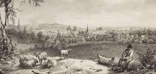
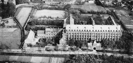
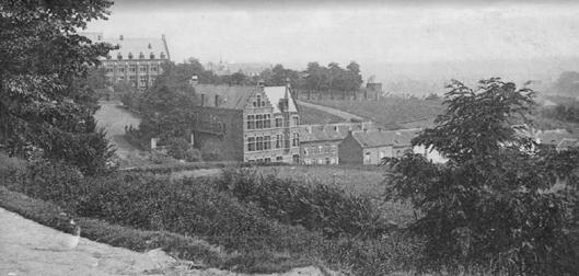
Infrastructure as destruction
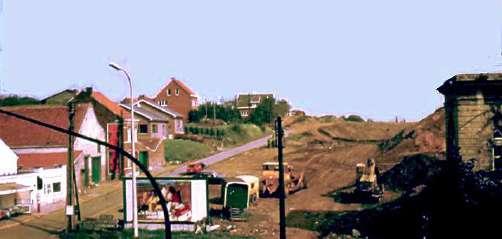
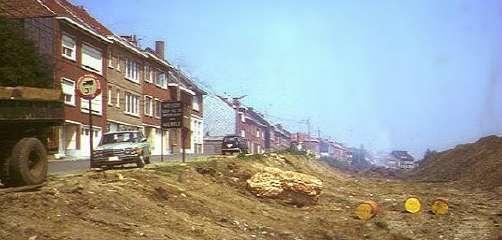
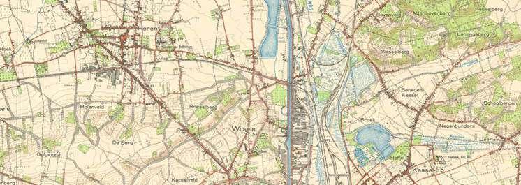
Over time the city ramparts have been transformed into a linear park like the Remy boulevard. In the 1970's this landscape was dramatically uprooted. Through highway engineering a ring road is carved into the landscape. The dominance of the car becomes all-present around the city.
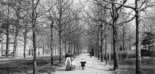

Hypotheses
1. Post-car/ post-carbon city
All sites must address the radically downgrading of car-infrastructure (including recuperation of parking lots, downsizing and re-arranging profiles).
2. Adaptive reuse
All sites include the transformation of complexes (and their parking lots) into mixed urban fabrics of (very) high density (mainly housing)
3. No new greenfield development
The consumption of landscape must not continue. On the contrary, projects must re-engage productively/constructively with the surrounding landscape.
4. Tissues of multiplicity
Tissues of multiplicity. The Univer-City is not mono-functional and it should not be segregated. Synergies must emerge from a multiplicity of functions, demographics, typologies, cultures.
Challenges based on hypotheses
Density:
For each site, the design should aim for a density with a Floor Area Ratio of minimum 2.0 in relation to the existing impervious surfaces on site (parking, roads and buildings)
Multiplicity:
The urban tissue should provide a high degree of urbanity, with mixed-use complementary functions, but ensuring that housing represents between 60% and 80% of the Total Floor Area.
Units:
The design should ensure an average floor area per inhabitant of 50 m2/p from the Total Floor Area for Housing.

GROUP A
PAOLA SALVATIERRA
CASTRO
VERMA HARSHIKA
SARAN MAIPRASERT
GROUP B
ALEXIA CHALOULI
RADHIKA RISHI
SRI KESHAVA TANGUTURI
GROUP C
EVA CLARA ATCHESON
TANVI RAJESH
BELHEKAR
GROUP D
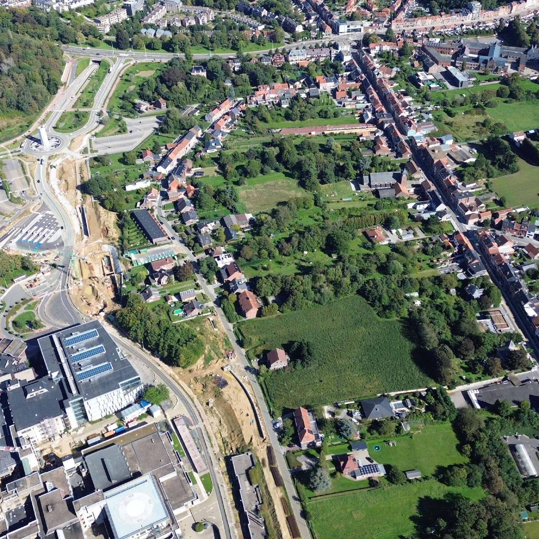
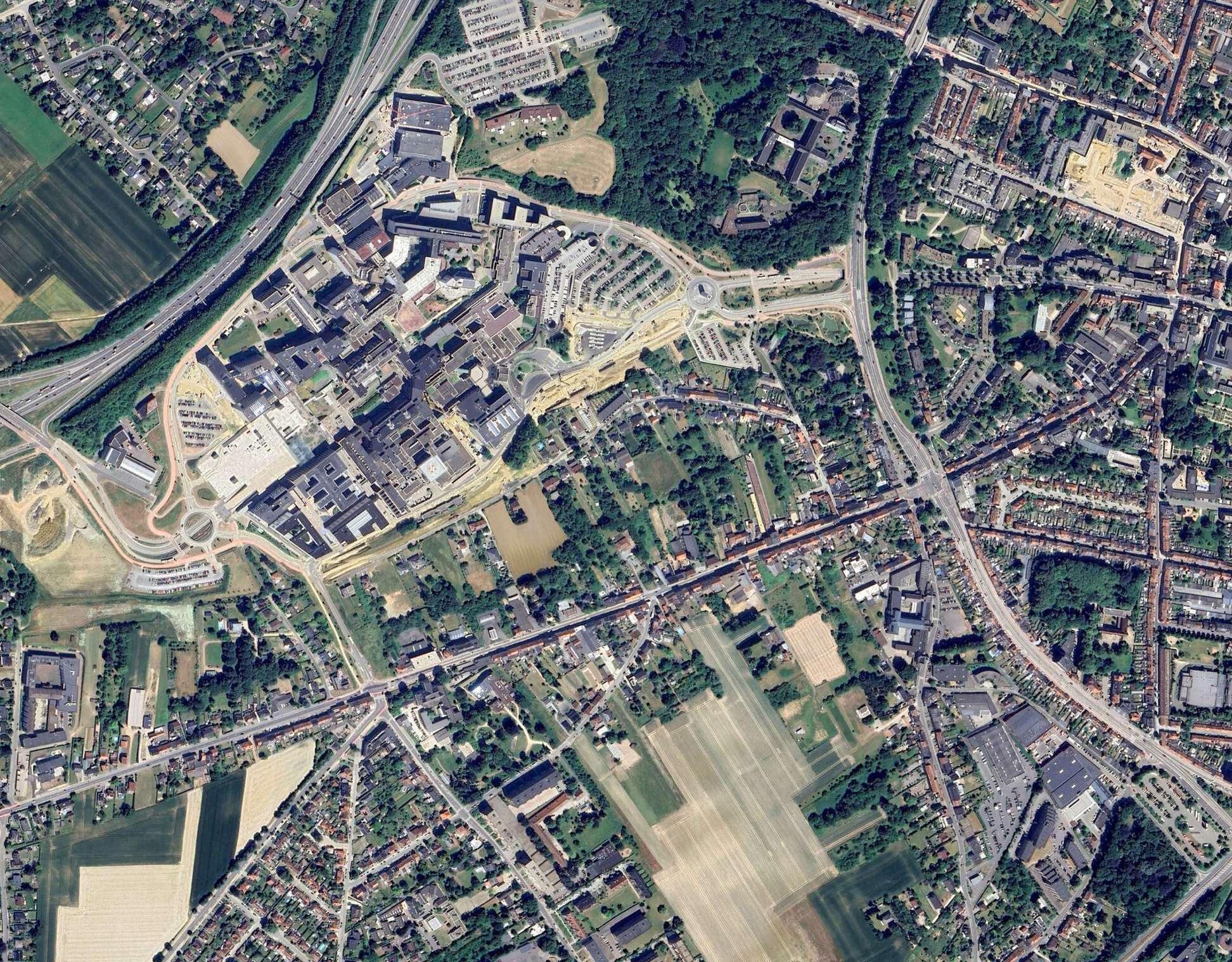
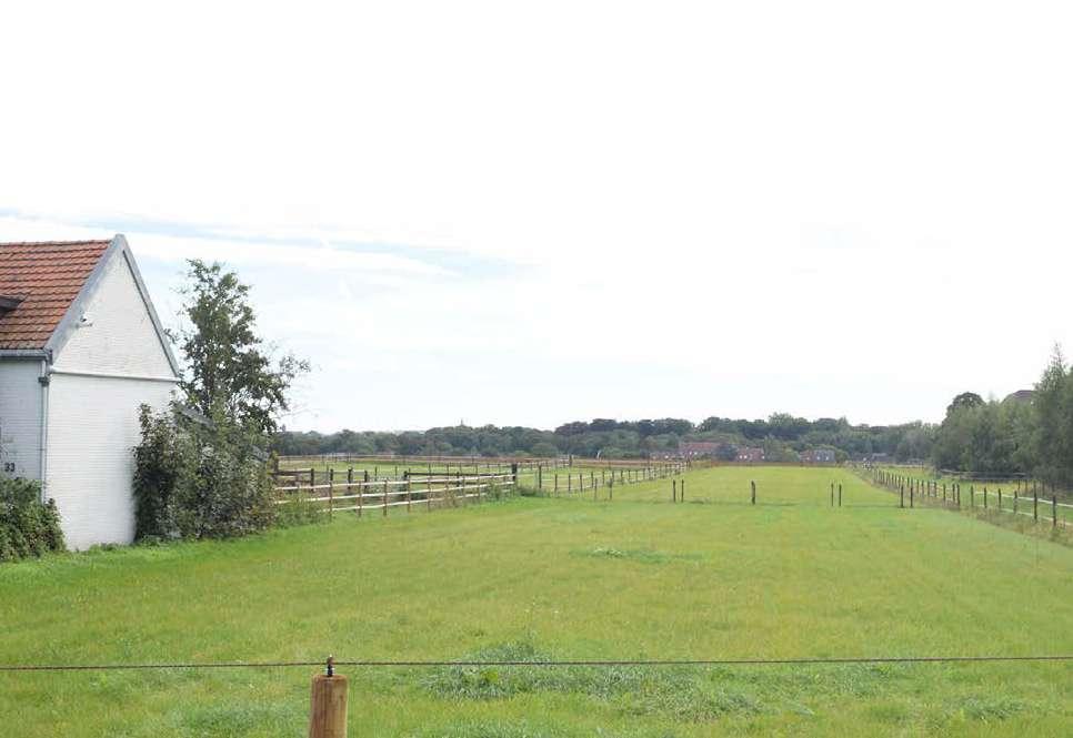
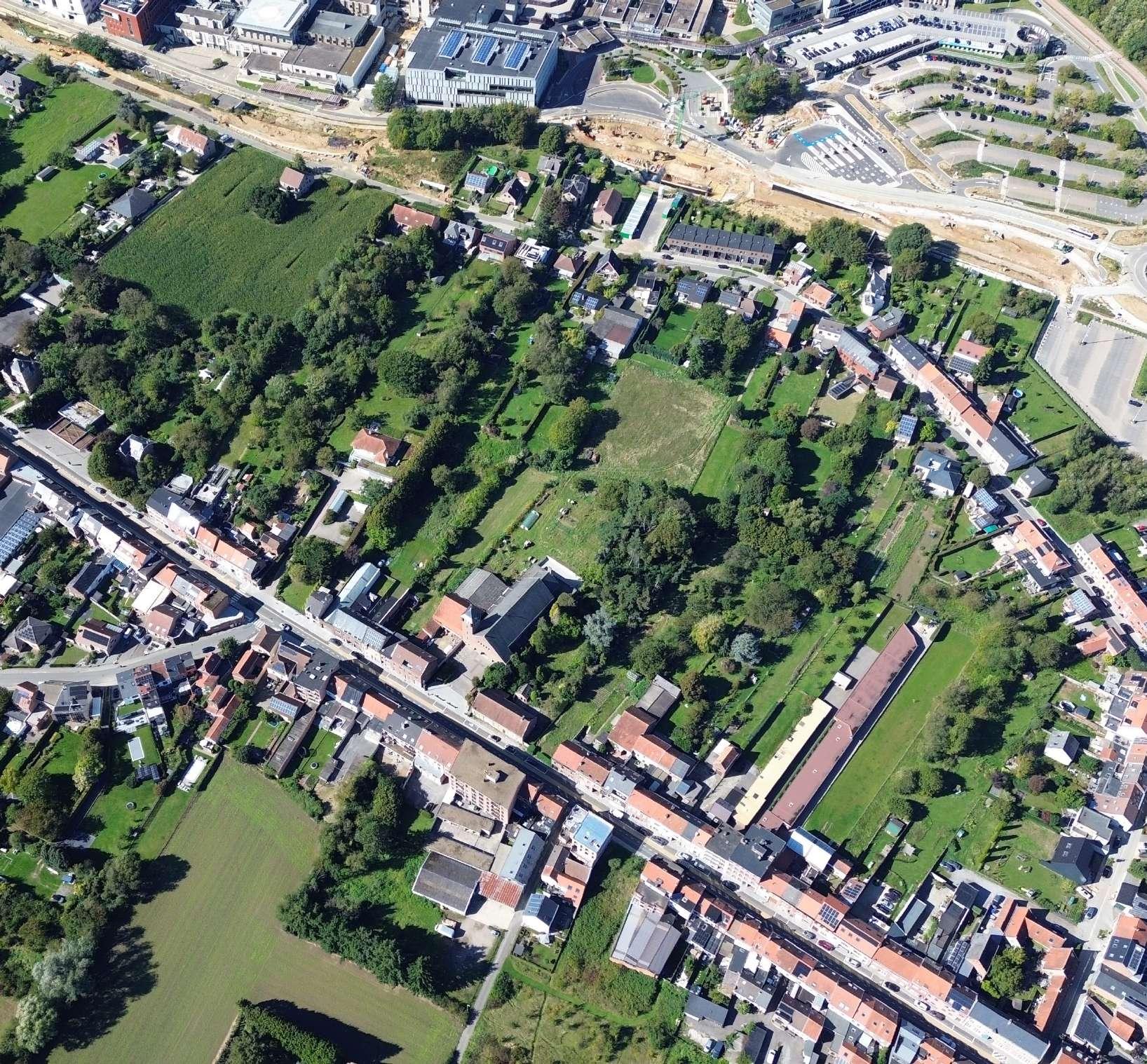
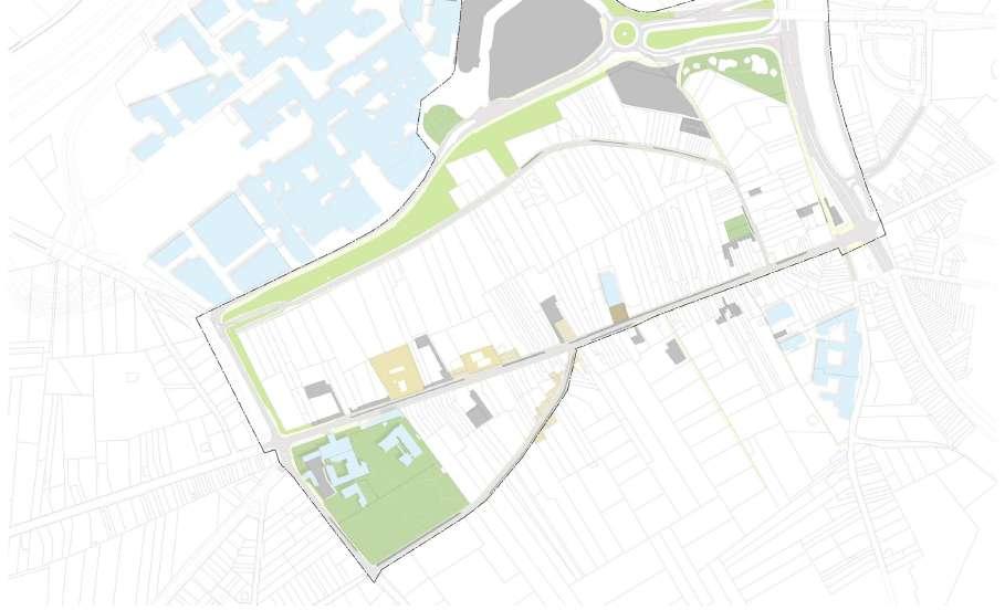
The site is located on the slope between Tervuurse steenweg and Tweekleinewegenstraat (including Terbank compound/campus).
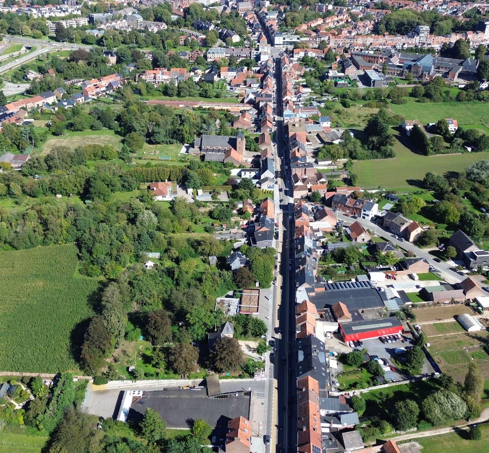
The steep topographical gesture between Tervuursesteenweg and the hospital is occupied by significantly under-occupied plots, framed by the Terbanck Institute and the entrance parking of the hospital.

Overview, A Photographic Story
CAR CENTRIC DESIGN
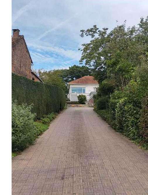
© Tanguturi
Sri Keshava SECOND ORDER EFFECT

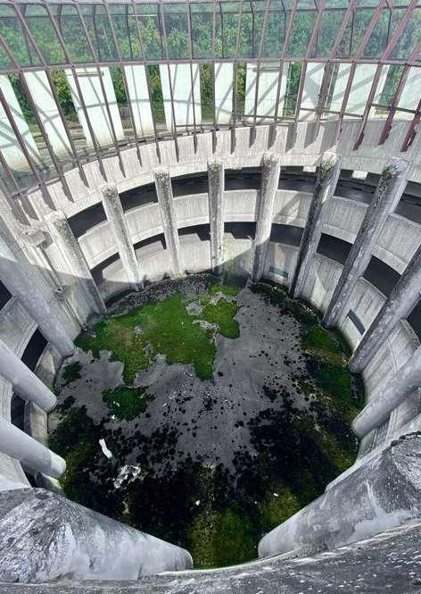
MORE IS MORE SEMI-PRIVATE © Ria Das INTIMATE STREET SCAPES
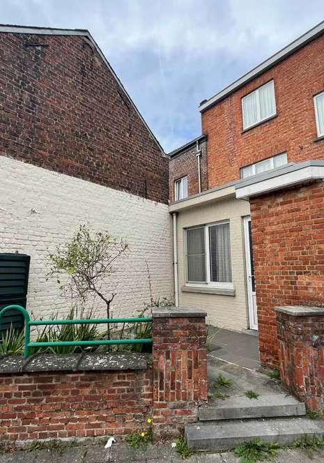
© Saran Maiprasert
ENCLOSED IN URBANITY
ENCLOSED URBANITY
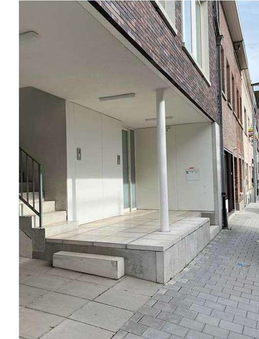
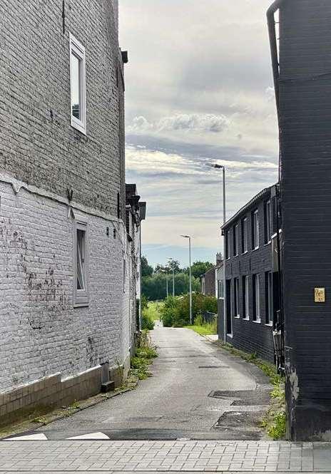
GREEN HORIZON
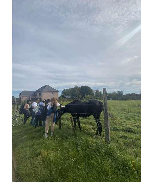
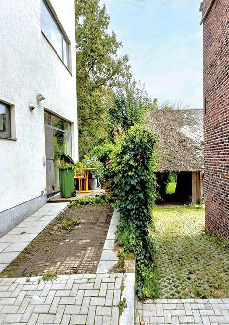
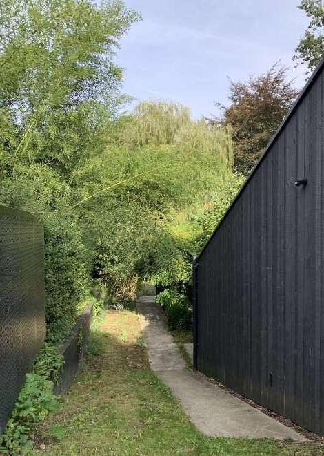
SOFTER, WETTER, GREENER,STRONGER
SOFTER, WETTER, GREENER,

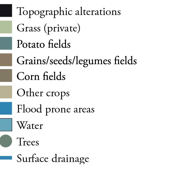
Private gardens
Opengrass
Parks
Corn fields
Grains/seeds/legumes fields
Potato fields
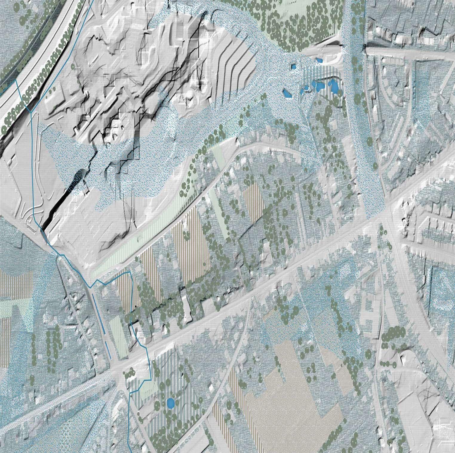
Underground water extraction
Flood prone areas
Water
Surface drainage
Trees
How does the scarcity of open permeable space in Terbank contribute to the risk of flooding?


Brick infrastructure
Concrete infrastructure
In-between impermeable spaces
How does the demand for infrastructure contribute to urban disorder through vertical and horizontal building expansions, and what untapped potential lies within this disorder?
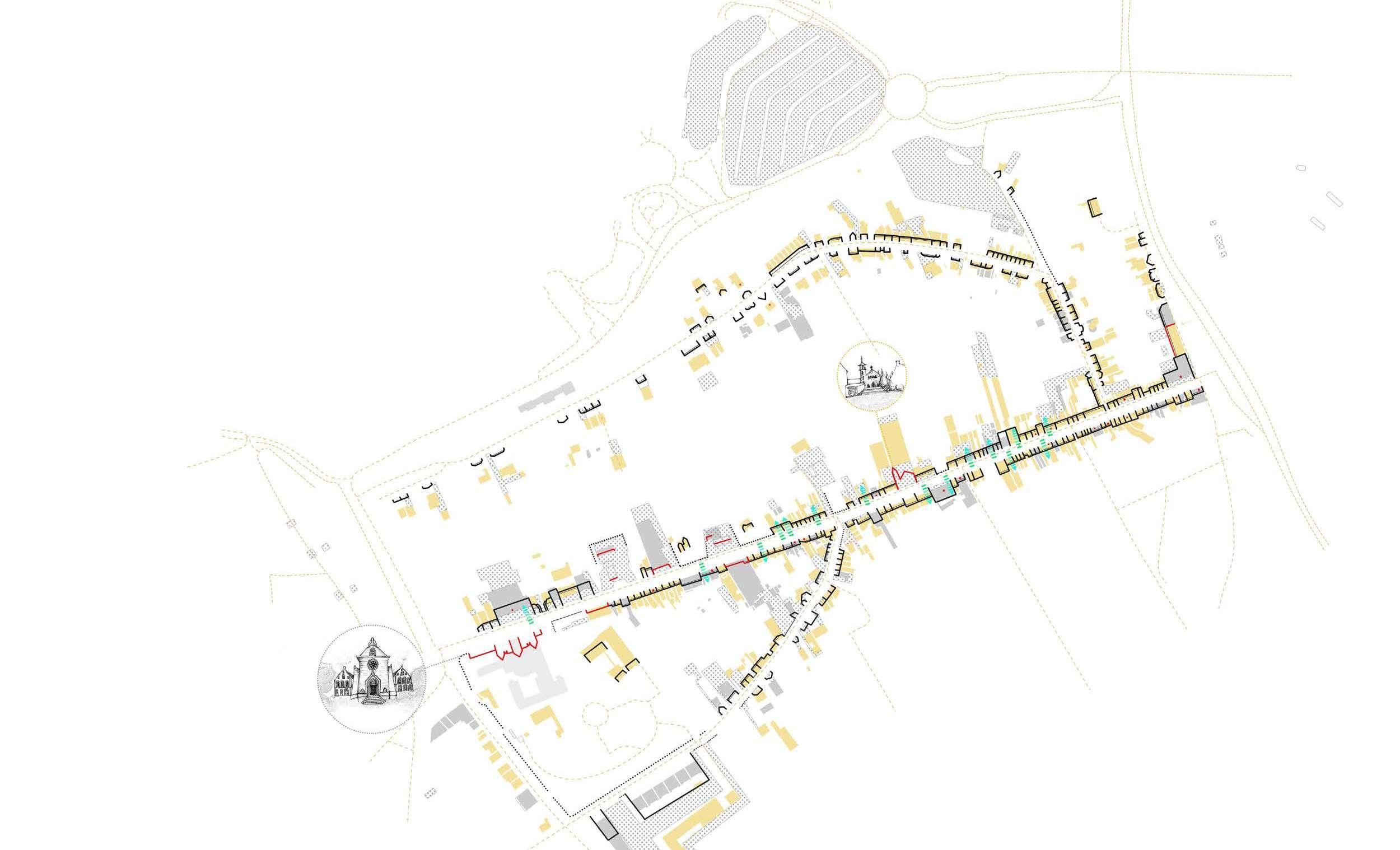

existing public space (park)
semi-public area
common-green area
footpath
plaza
car parking area
street
public building
accessible area from street (or visually accessible) or potentail area
The purpose of this interpretation map is to analyze the correlation between various types of public spaces, including public and semi-public areas, as well as commonly overlooked locations like parking lots, streets, basements that connect to sidewalks, and existing public spaces. Additionally, this study identifies underutilized or undeveloped property plots as potential areas for future development. By visually representing each typology on the map, we can explore the potential for better connecting common areas to enhance pedestrian experiences and promoting the creation of more public and green spaces to improve people’s quality of life.


Replace text with a short interpretative question. Text is in Adobe Garamond Pro, Regular, 12pt; aligned to the top margin of the page.

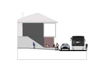
How does the alignment and orientation of buildings in Sweanenbergh is influenced by the infrastructure and its impact in social interaction and sense of community among residents?

education
Gasthuisberg hospital complex
water absorbtion in relation to terrain and permeable surfaces
AND PERMEABLE
urban fabric impermeable paved surfaces 2022 highlighted topography 1952 topography


What could be done to improve the balance between permeable and non-permeable open spaces in this context, considering both environmental and urban design factors?


How can the integration of various building typologies create a multi-faceted and diverse landscape?

How do landscape planning and infrastrcture design intervene the imbalance between public and private spaces in Tervuursesteenweg?


MaULP_Sweanenbergh
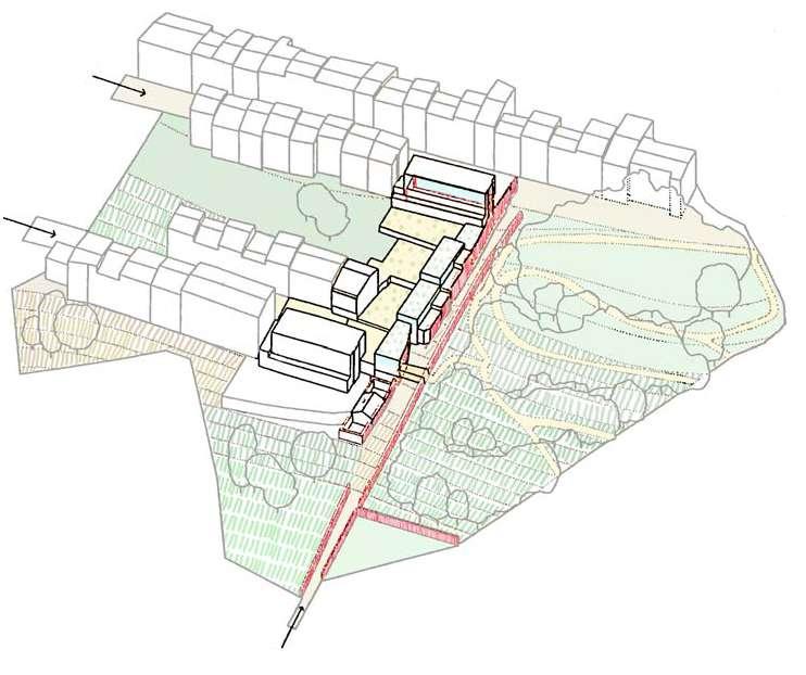
Situated along the periphery of the historic quarter, the “Housing Complex in Caramoniña” stands as a transformative urban project seamlessly uniting two distinct segments of the city—namely, the cherished Santo Domingo de Bonaval Park and a set of deteriorating urban extensions from the 1960s. It serves as bridge within an ever-evolving urban landscape while enhancing the collective living experience.
Urban Continuity: The project focuses on creating a unifying thread that bridges two disparate urban areas, seamlessly connecting the historical with the contemporary.
Heritage Resonance: The core principle of this design is the harmonious incorporation of historical elements, preserving the architectural scale and layout to create a profound connection between the past and the present.
Community-Centric Design: The design ensures a harmonious balance between individual dwelling design and social living by creating inviting and green public spaces that encourage community interaction & a collective spirit.
• Relation to Urban Tissue: It skillfully integrates with the surrounding cityscape by respecting the scale, layout, and architectural design of the historical area. The setback design allowing for views of the park transforms the buildings into public spaces, enhancing the typology of the streetscape and urban setting.
• Building Typology: The choice of collective housing buildings complements the existing architectural typology while adding a touch of modernity.
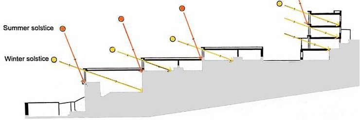
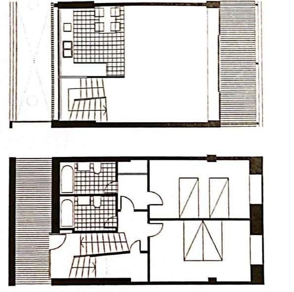
• Individual Dwelling Design: Both the duplex and standard units are strategically placed to get maximum dya light inside.
Source: Author
Source: Author
PUBLIC-PRIVATE STRUCTURE
Source: Author
Source: Author
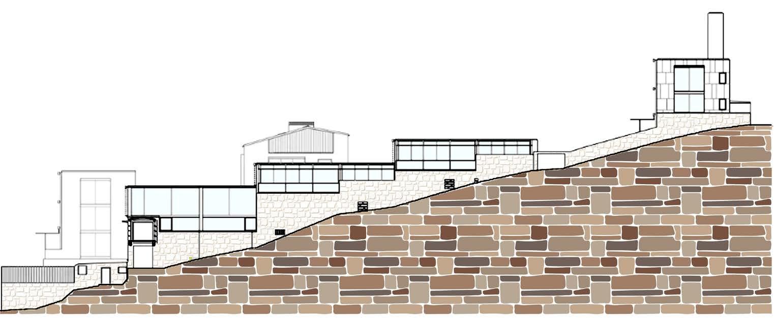
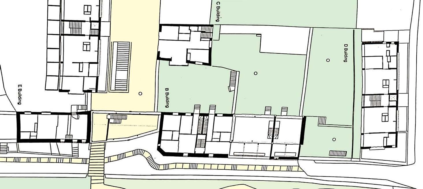
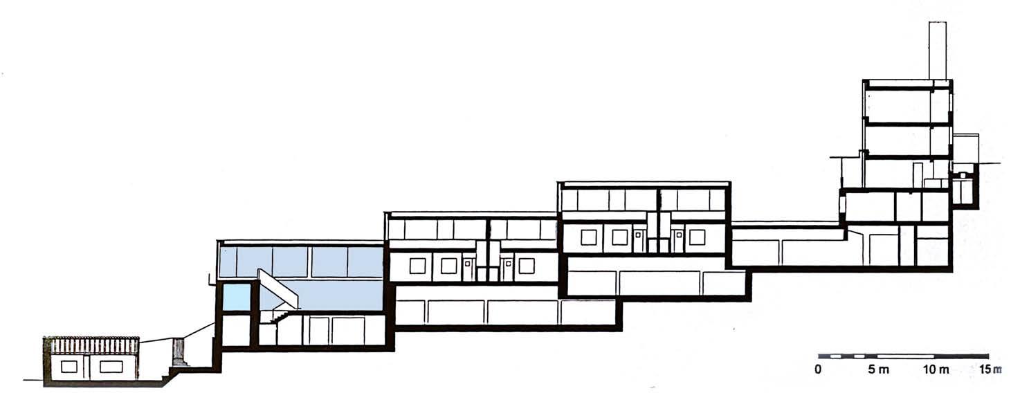
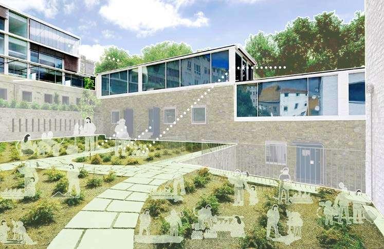
A stepped volume parallel to the park wall reinforces the linear character of existing streets and seamlessly integrates into its environment. The compact volume embracing the interior side of the street adeptly conforms to neighboring structures’ profiles and material qualities, creating a nuanced urban camouflage.
Viva, 2018)
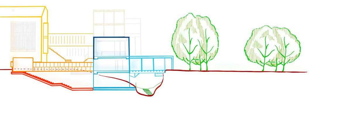
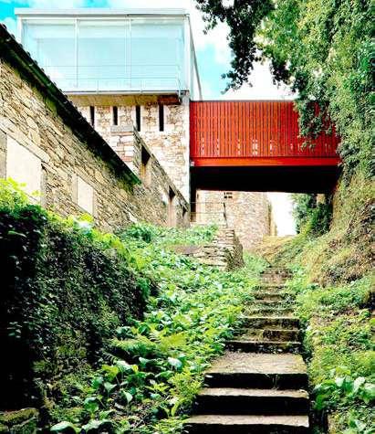
The street broadens on both axises, unfolding vistas of the city and the stepped space. The central space weaves through courtyard orchards, extending towards the park. A passageway, resembling a bridge to a communal hub, elegantly guides us into the park, seamlessly uniting urban and natural environments.
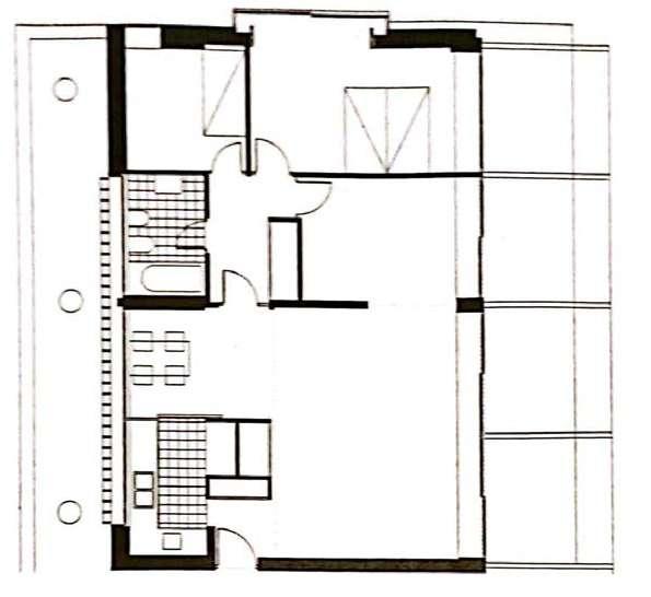
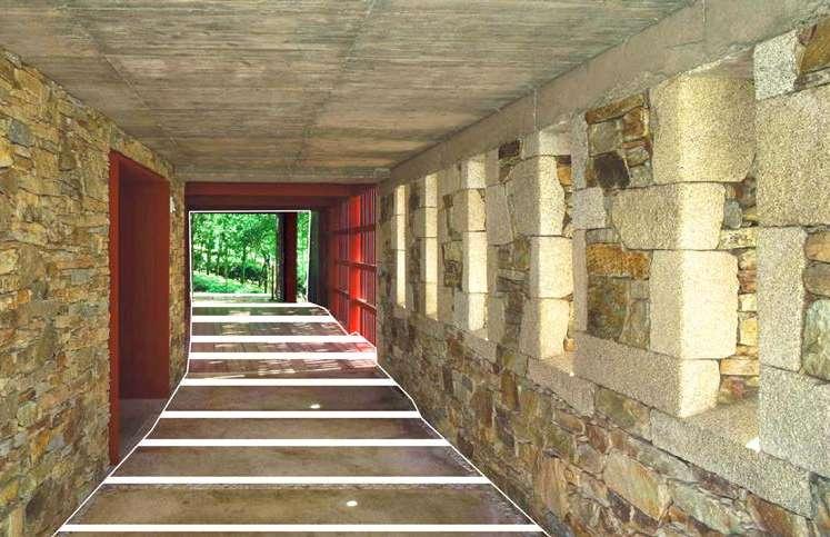
The bridge and passageway serve as a transition between historical and individual perceptions of time. They provide access to the park and create a sense of magical evocation.
https://arquitecturaviva.com/works/residential-complex-in-santiago-de-com-
added by Author).
The building volumes are thoughtfully oriented to maximize scenic views of the park and the transparent spaces open up to planted terraces and serve community purposes.
MaULP2_Swaenenbergh A
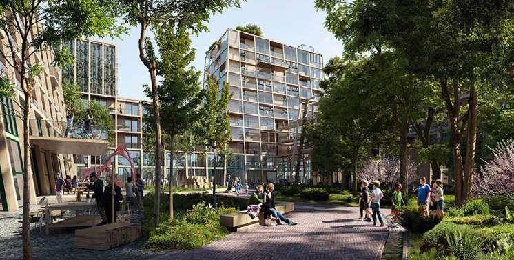
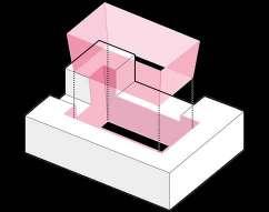
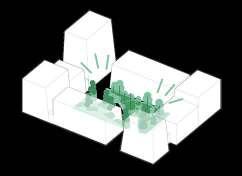
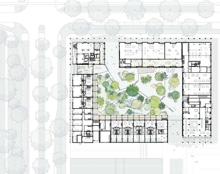
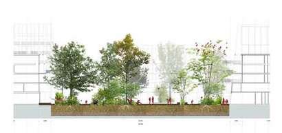
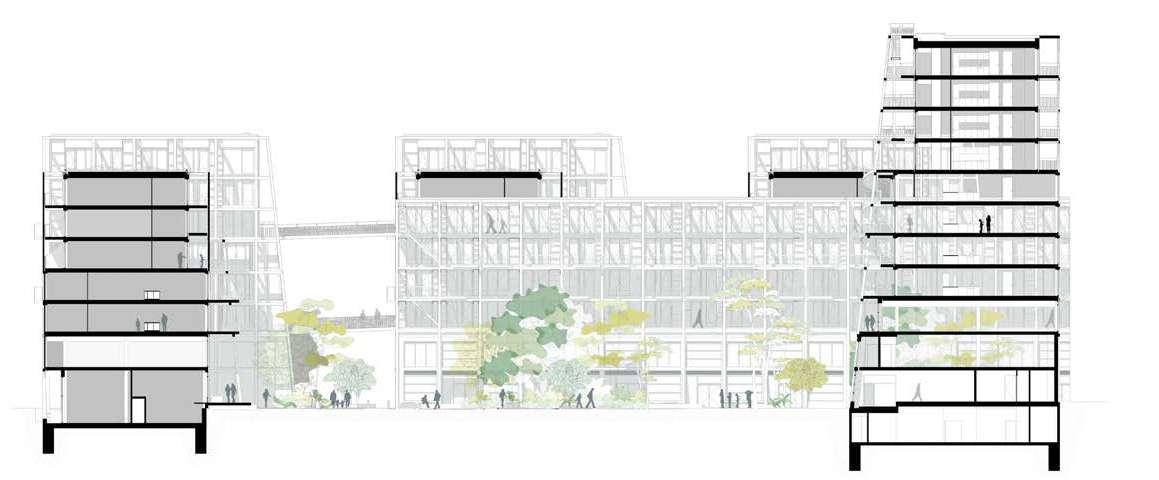
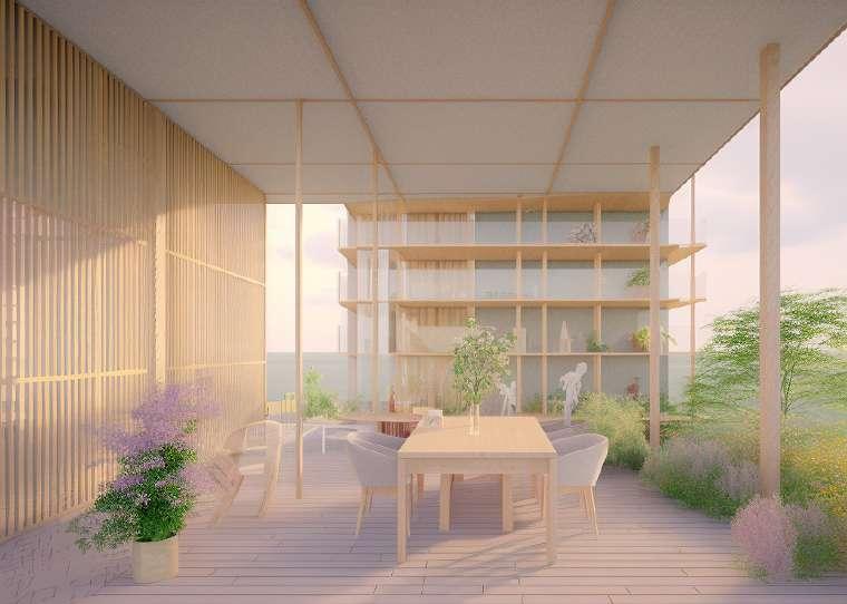
Robin Wood, stands as a testament to innovative and sustainable design. By prioritizing circular and bio-based construction, the building seamlessly blends with the environment of Centrumeiland. Its use of various timber elements, including prefabricated cross-laminated timber (CLT), showcases a commitment to environmental sustainability, with the addition of a Tiny Forest in the inner courtyard the project not only enhances the visual appeal but also provides cooling during summer.
The central concept of the project revolves around the seamless integration of sustainable practices into the fabric of community life. By using recyclable materials and bio-based construction methods, it minimizes environmental impact while creating community spaces and fostering a sense of belonging, encouraging social interaction and a collaborative living experience, ultimately contributing to a vibrant and sustainable urban community.
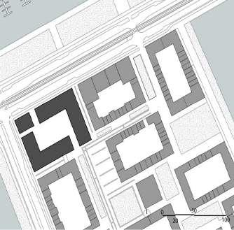
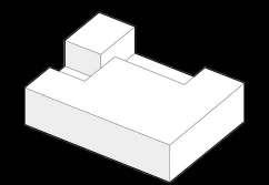
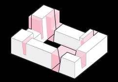
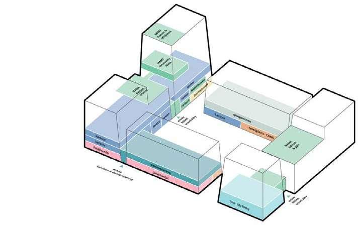
• Relation to the urban tissue; the project seamlessly integrates into the neighborhood with a distinctive architectural language that highlights its corner location. The transparent and layered design invites engagement, fostering a sense of community and social interaction within the vibrant urban environment, enhancing the overall character of the surrounding area.
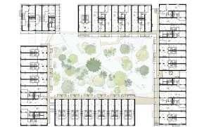
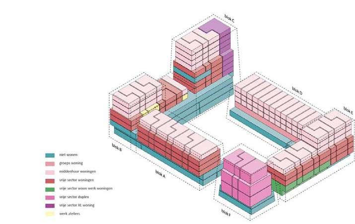
• Building typology; with emphasis on flexibility and modularity it incorporates live/work units, studio flats, and interconnected homes. The design fosters adaptability and future-proofing (based on Open Building’s principles), ensuring that the space remains conducive to the evolving demands of the community and promoting a sense of resilience and responsiveness to the changing dynamics of urban living.
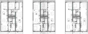
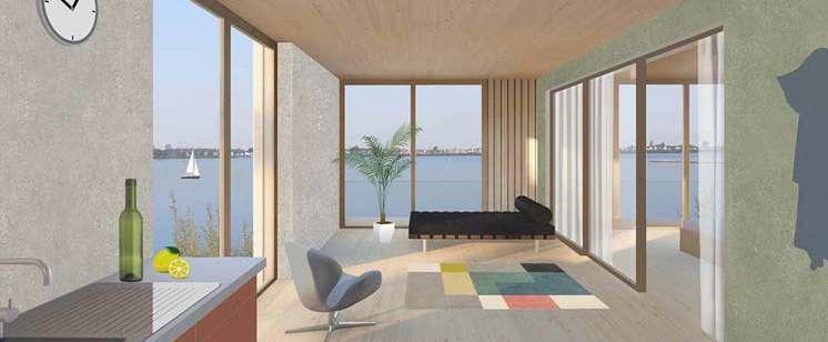
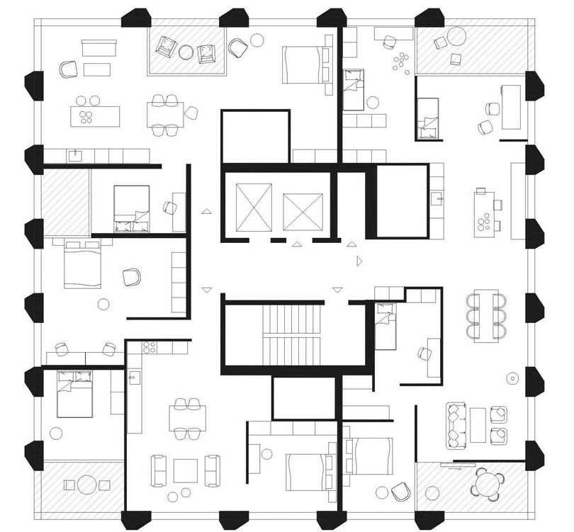
• Individual dwelling design; the floor plans are based on modular concepts, prioritize the provision of high-quality living spaces. It showcases a meticulous focus on both functionality and aesthetics. The innovative floor plans reflect a thoughtful approach to space utilization, emphasizing open layouts and strategic placement of windows to maximize natural light and ventilation. Furthermore, it incorporates communal spaces, collective roof gardens and terraces.
(Source: https://ana.nl/en/portfolio-items/robin-wood-making-an-island-together/)
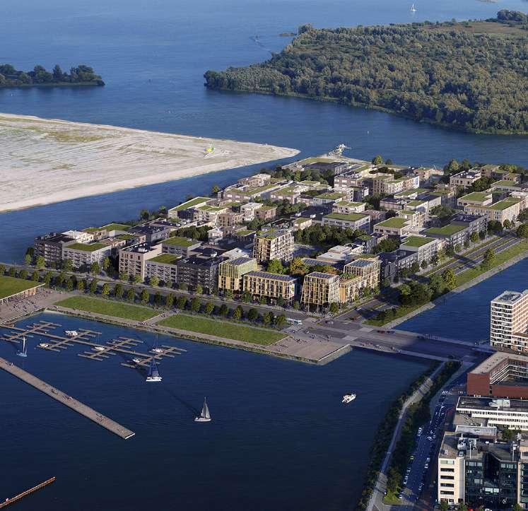
(Source: https://ana.nl/en/portfolio-items/robin-wood-making-an-island-together/)
PUBLIC-PRIVATE STRUCTURE
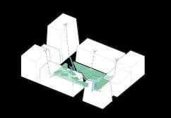
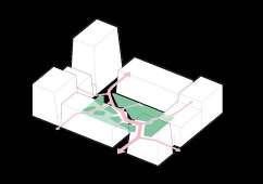
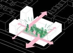
(Source: https://marckoehler.com/project/robin-wood-making-an-island-together/)
CONTEXTUALISED VOLUMETRY
(Source: https://marckoehler.com/project/robin-wood-making-an-island-together/)
(Source: https://marckoehler.com/project/robin-wood-making-an-island-together/)
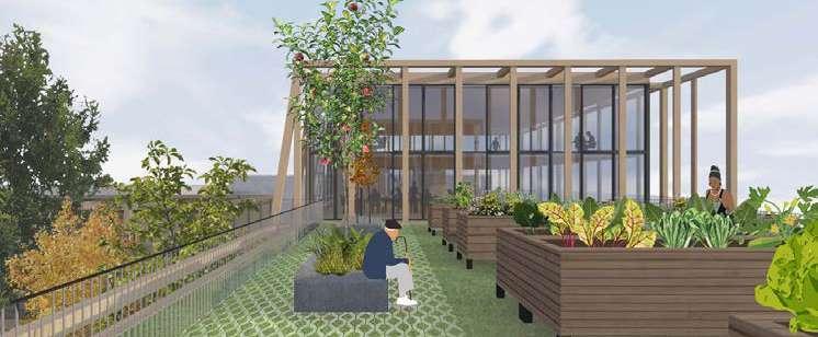
(Source: https://marckoehler.com/project/robin-wood-making-an-island-together/ and https:// www.galleo.co/project/robin-wood)
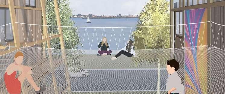
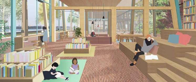
(Source: https://www.galleo.co/project/robin-wood)
MaULP2_Seaenenbergh_Group A
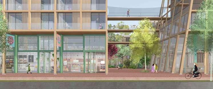
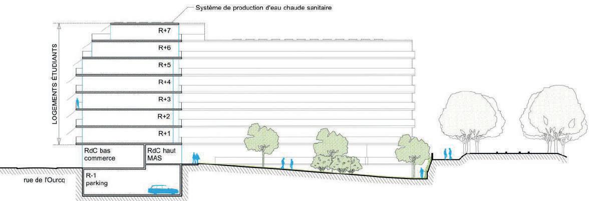
Logements étudiants & sociaux project is located in the 19th district of Paris, situated between the Ourcq canal and the unused ‘petite ceinture’ railways.
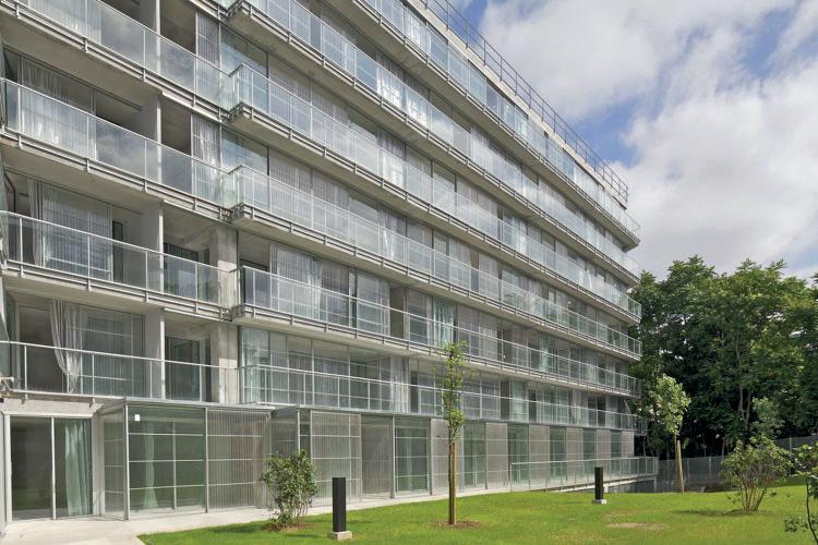
The ‘multiplicity’ concept was incorporated into this project, which features a building with both residential and social housing for students, as well as a commercial space on the ground floor. The building’s design, which includes structural elements, ventilation concepts, and materials, serves to enhance the connection between those who live in the building and the surrounding community. Notably, the building’s facade and balcony design were specifically created to encourage interaction and engagement with the surrounding area, such as the public street and inner courtyard.
The architectural layout of the building takes on an L-shape, with two sides of the façade facing the street, while the inner courtyard serves as a shared outdoor space. The addition of balconies on both sides of each floor further enhances the living experience, allowing residents to fully engage with the cityscape and the communal garden.
The building design showcases a blend of commercial spaces on the first floor, encouraging interaction with the building and generating activity in the surrounding area. Additionally, the inclusion of social and student housing creates a new social dynamic, ensuring year-round use and preventing abandonment during school breaks, which is a common issue with singlefunction student housing.
When designing individual units, the top priority is to maximize space while also ensuring that balconies can interact with either the street or garden. The winter gardens and balconies provide each dwelling with a private outdoor space that enables residents to enjoy a collective living experience while still feeling at home. Additionally, when combined with thermal and shadow curtains, they play a vital role in regulating indoor climatic conditions during both winter and summer, providing thermal comfort and energy savings within a bioclimatic framework.
(Source: https://www.lacatonvassal.com/index.php?idp=75)
(Source: https://www.lacatonvassal.com/index.php?idp=75)
(Source: https://www.lacatonvassal.com/index.php?idp=75) GRADIENT PUBLIC – PRIVATE PUBLIC-PRIVATE STRUCTURE
NETWORK CONTEXTUALISED VOLUMETRY
(Source: https://www.lacatonvassal.com/index.php?idp=75)
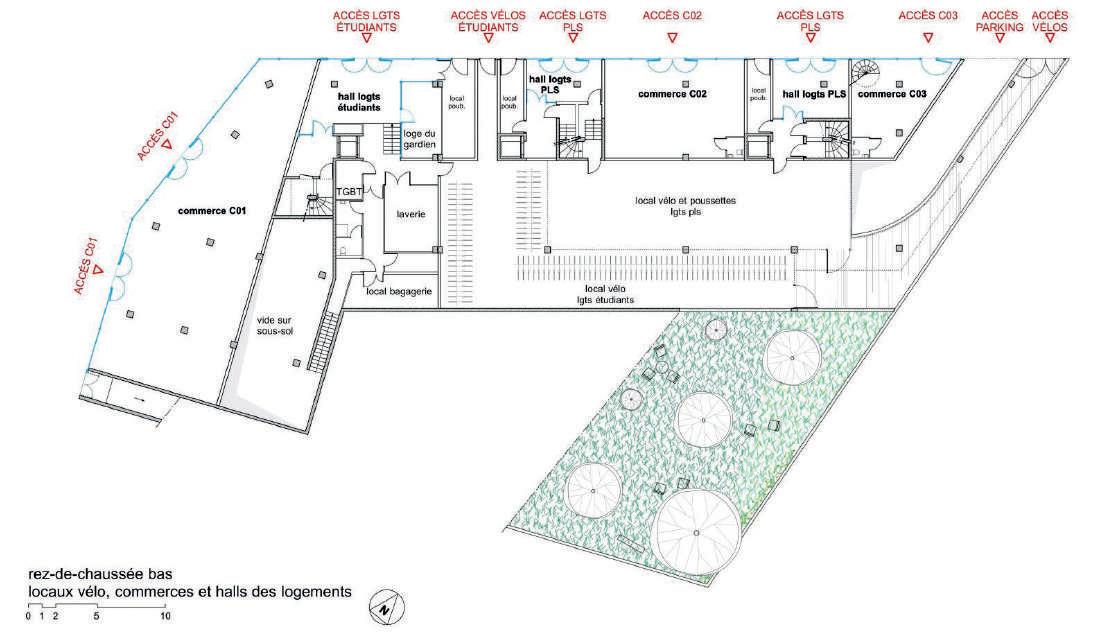


Balcony to street and inner-garden
commercial area next tot the street winter garden for residence common area
transition green wall as site boundary
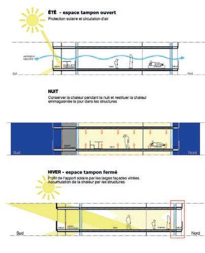
open void for wind ventilation/ capture light in winter + double curtain for seasonal change
(Source: https://www.lacatonvassal.com/index.php?idp=75)
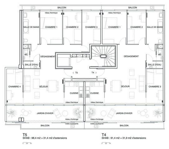
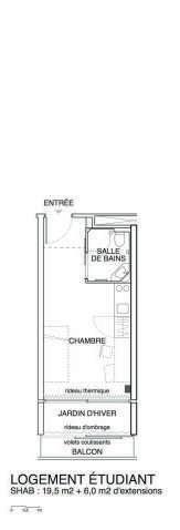
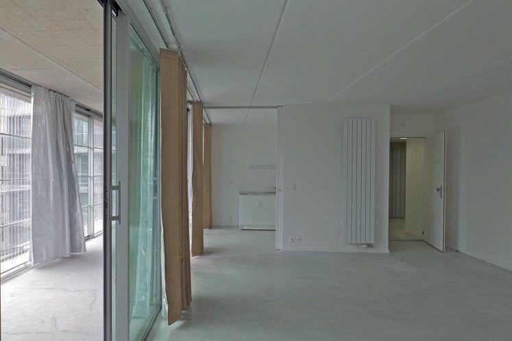
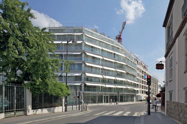
Social housing units often feature running through or double-oriented rooms, which allow families to have a view of both the street and the inner areas, while also keeping an eye on the property around them. Similarly, student rooms are designed with double balcony rooms, providing ample natural light and a comfortable living area within the room.
(Source: https://www.lacatonvassal.com/index.php?idp=75)
This project incorporates the ‘multiplicity’ concept, featuring a building with both residential and social housing for students, along with a commercial space on the ground floor. There are also rooms on the garden side that function as a care home program, accommodating 6 permanent residents.By including social and student housing and others activities, this project creates a new social dynamic, ensuring year-round use and preventing abandonment during school breaks. This solves a common issue with single-function student housing.
Analysed by Alexia Chalouli_r0934925
MaULP2_Sweanenbergh - Tervuursesteenweg
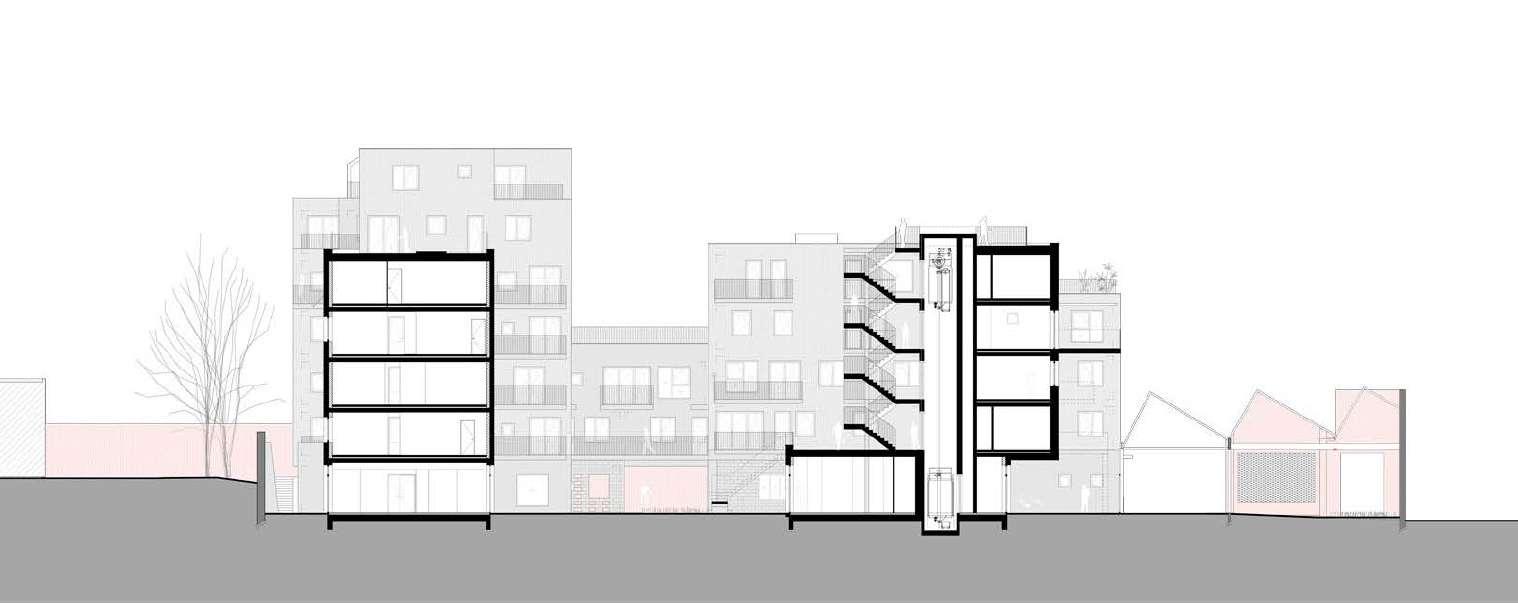
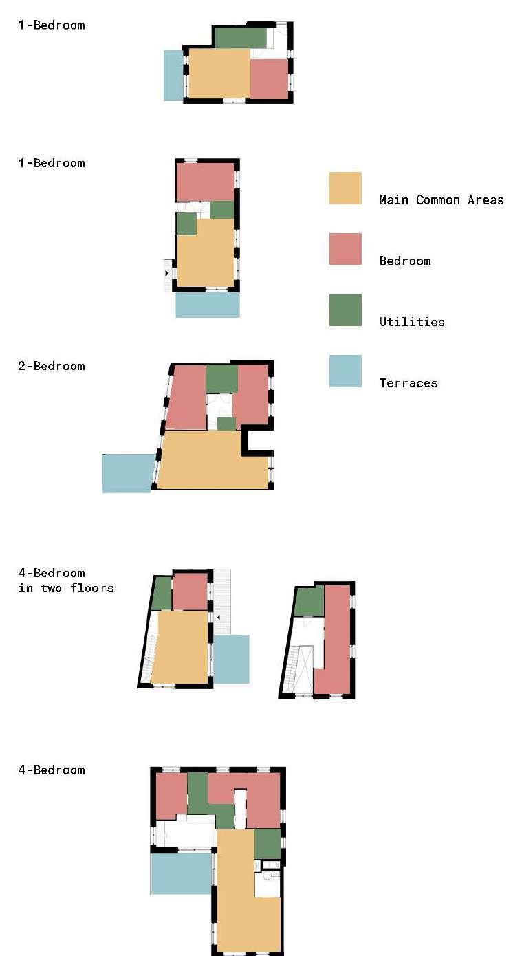
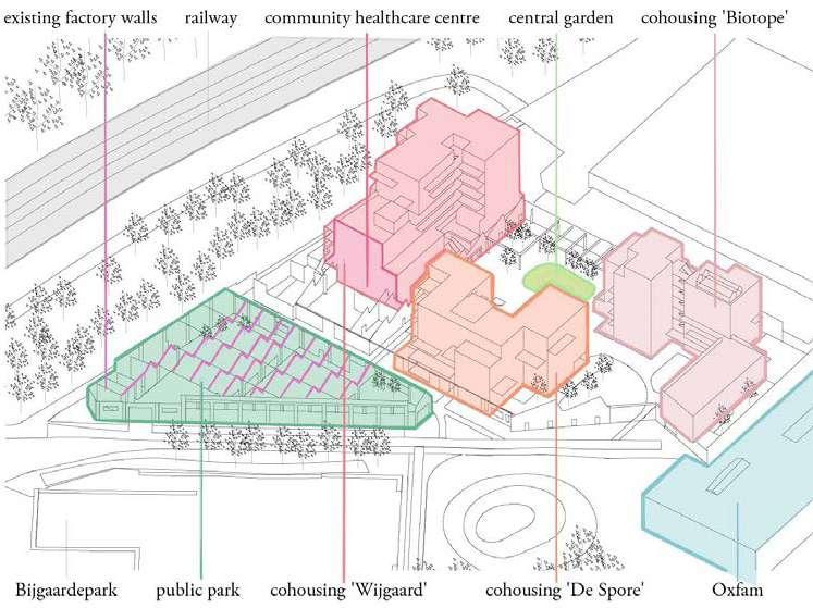
Bijgaardehof, a visionary project, has transformed an abandoned factory site in Ghent into a vibrant community. This endeavor features three cohousing groups with 59 homes, a neighborhood health center, communal indoor and outdoor spaces, and a workshop overlooking Bijgaardepark. Sustainability is at its core, aiming for urban densification, recycling, and shared functions, fostering a high-quality, eco-conscious lifestyle.
Urban Sustainability: Bijgaardehof repurposes a vacant brownfield to densify the urban area sustainably. It’s a harmonious blend of housing, shared spaces, and green elements.
Cohousing and Community: The project promotes cohousing, emphasizing shared facilities and a strong sense of community.
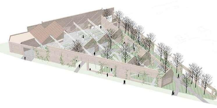
Preservation and Art: The project preserves historic factory walls and street art, bridging the past and contemporary living.
Sustainability: Sustainability is a key focus, with geothermal energy, recycled materials, and energy-efficient design.
EVALUATION
Urban Integration: Bijgaardehof enhances the urban environment by redeveloping a brownfield, promoting sustainable living, and offering excellent public transport access.
Innovative Housing: The project introduces an innovative housing typology with shared amenities, encouraging social interaction.
Diverse Dwelling Options: The dwellings balance community living with personal space, offering a variety of housing units to cater to different preferences. In summary, Bijgaardehof is an exemplary model of sustainable urban living, seamlessly blending with the city while fostering a strong sense of community and environmental responsibility.
(Source: https://references)
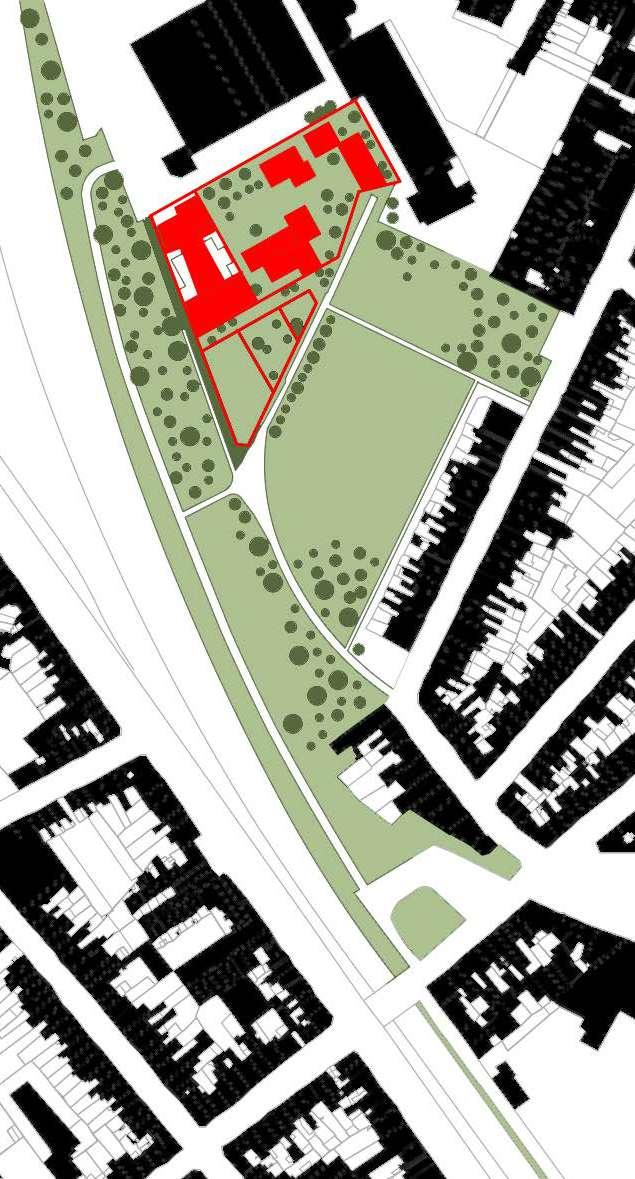
(Source: https://www.bogdan.design/projects/bijgaardehof/, Edited by author)
INTERPLAY OF ENCLOSURES_ PUBLIC-PRIVATE STRUCTURE
INTERPLAY OF PERCEPTIONS_ CONTEXTUALISED VOLUMETRY
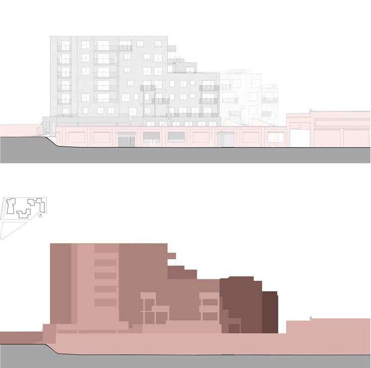
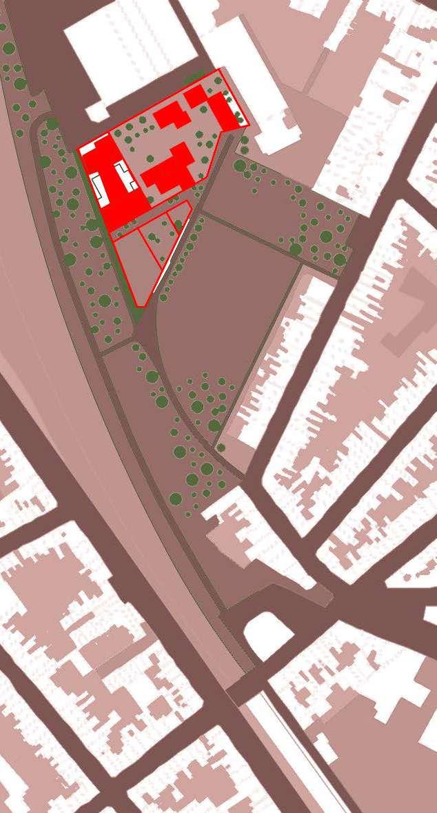
(Source: https://www.bogdan.design/projects/bijgaardehof/, Edited by author)
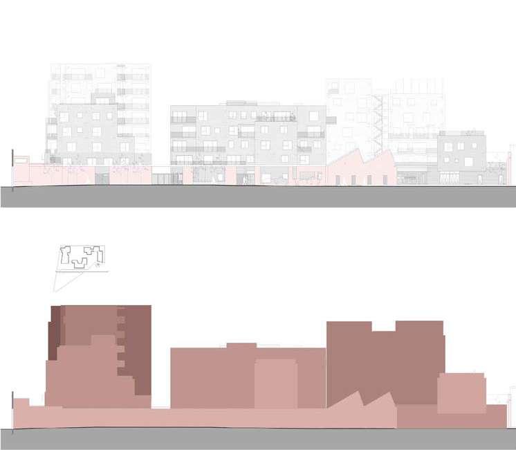
(Source: https://www.bogdan.design/projects/bijgaardehof/, Edited by author )
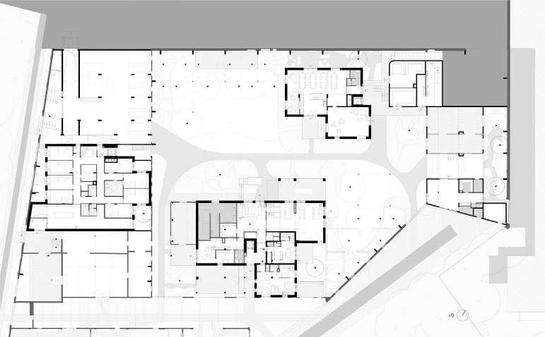
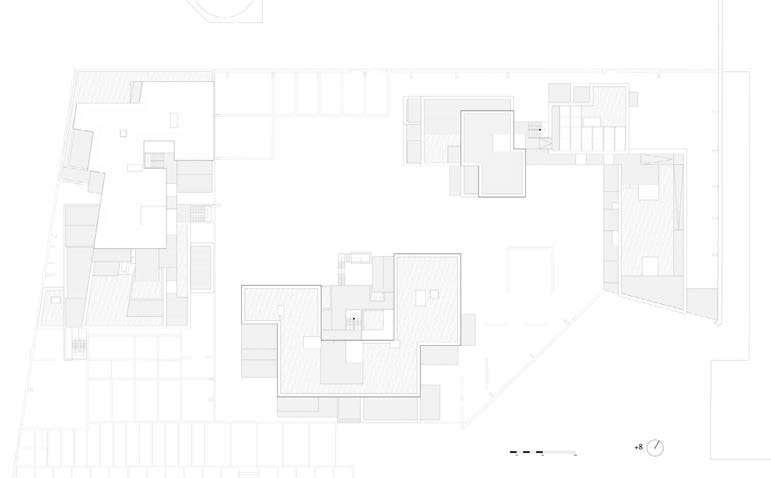
(Source: https://www.bogdan.design/projects/bijgaardehof/)
(Source: https://www.bogdan.design/projects/bijgaardehof/)
(Source: https://www.bogdan.design/projects/bijgaardehof/, Edited by author)
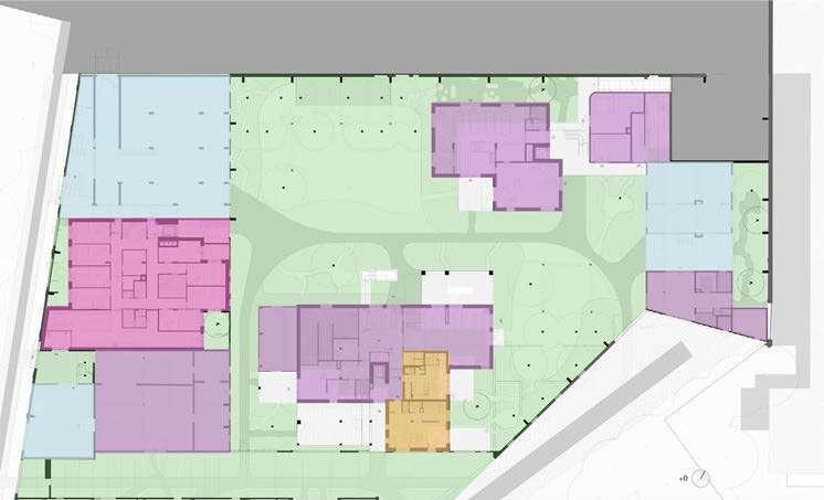
Social Housing
(Source: https://www.bogdan.design/projects/bijgaardehof/, Edited by author)
Analysed by Tanguturi Sri Keshava_r0918642
MaULP_Group Sweanenbergh [B]
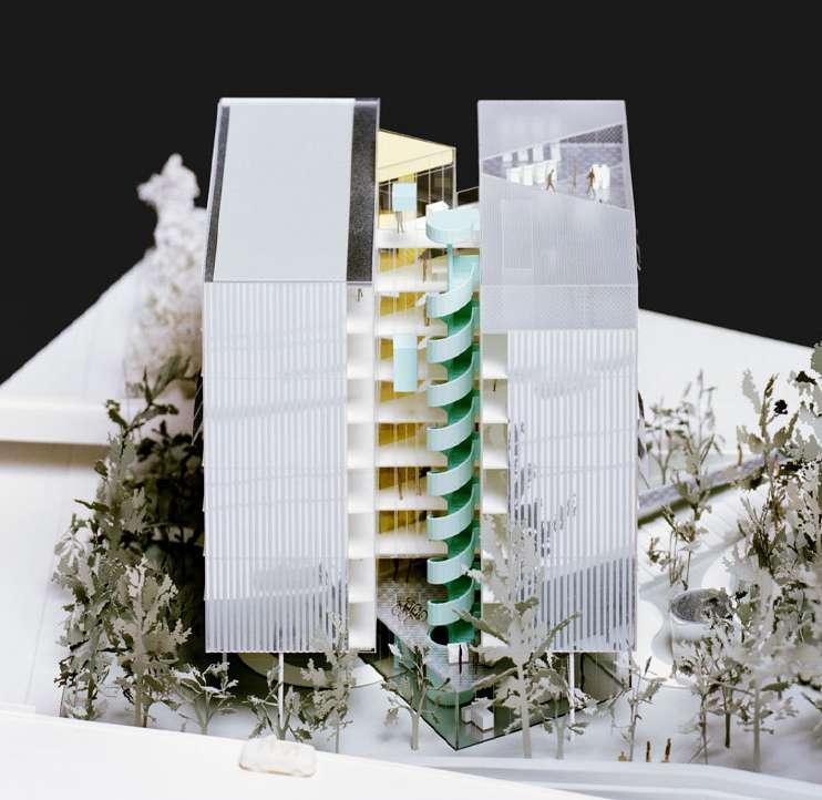
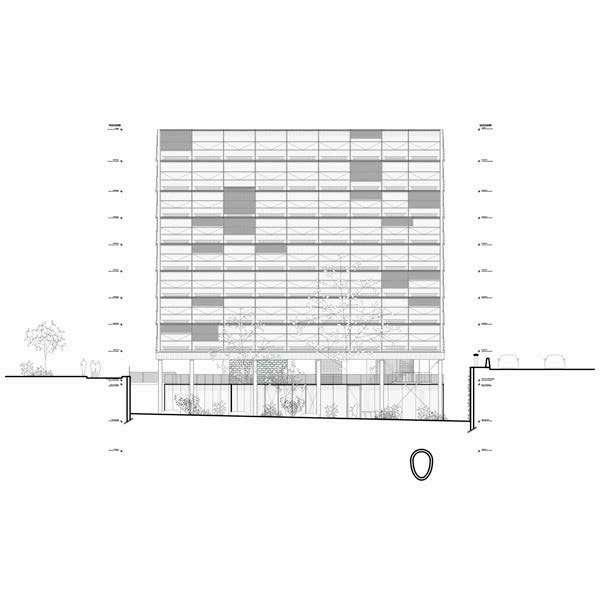
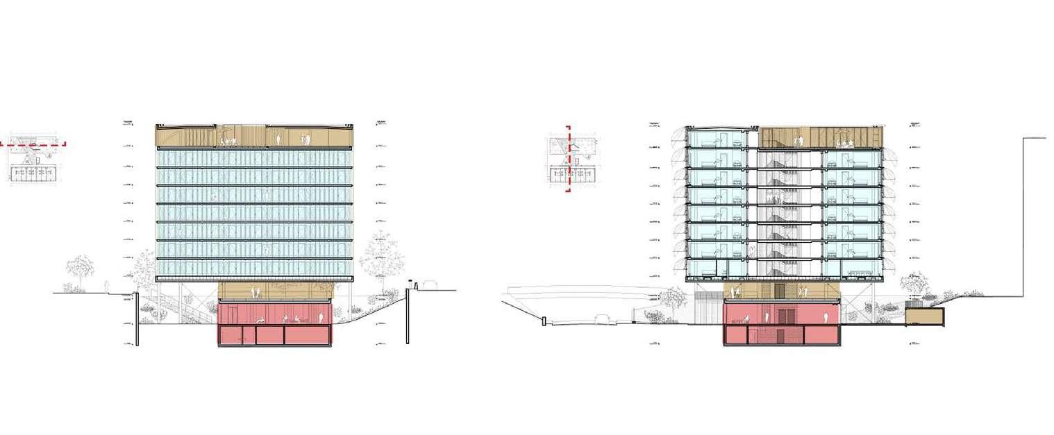
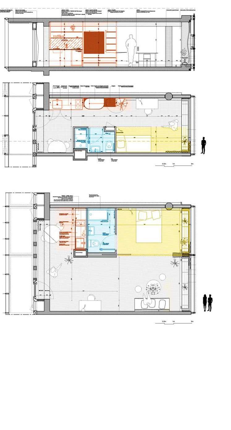
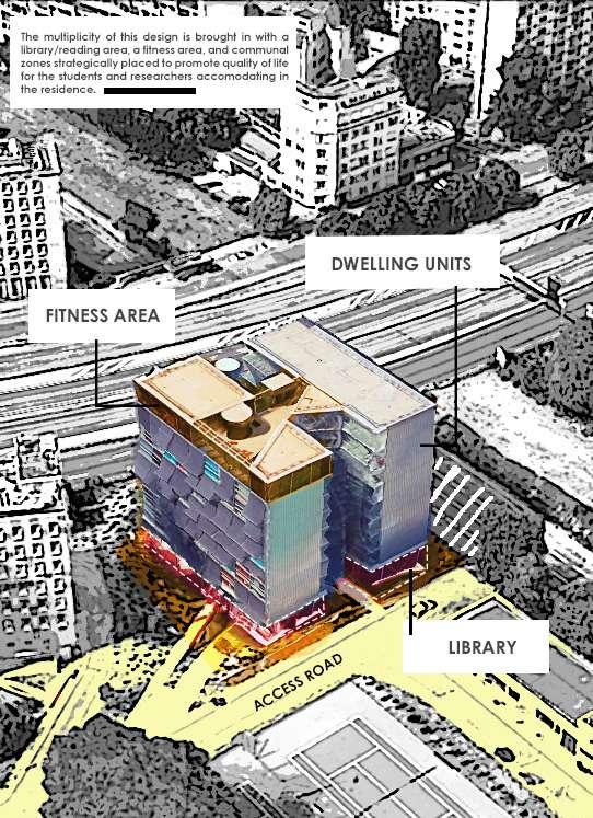
The three layers of the residence designed by BRUTHER are as follows: the first consists of the reception area/library situated on the semi-underground garden level; the second layer consists of the next seven floors housing the 106 researcher apartments; and the third consists of the top floor featuring a large collective terrace and a fitness center overlooking Paris.
The residence aims to bring the researcher’s life to serenity while facing the busy neighborhood while enhancing the existing architectural language of the neighborhood. This new dwelling is more than just a modern interpretation of the pavilion typology; it is a magnificent glass and metal casket that plays with the transparency between the outside and the inside, the building and the park, the privacy of the residence, and the dynamic spectacle of the périphérique ring road. The glass facades provide grandeur throughout the day. The structure becomes a lantern at night thanks to the lights in the apartments. This is a fresh indication of contemporaneity in the Cité Universitaire, both during the day and at night.
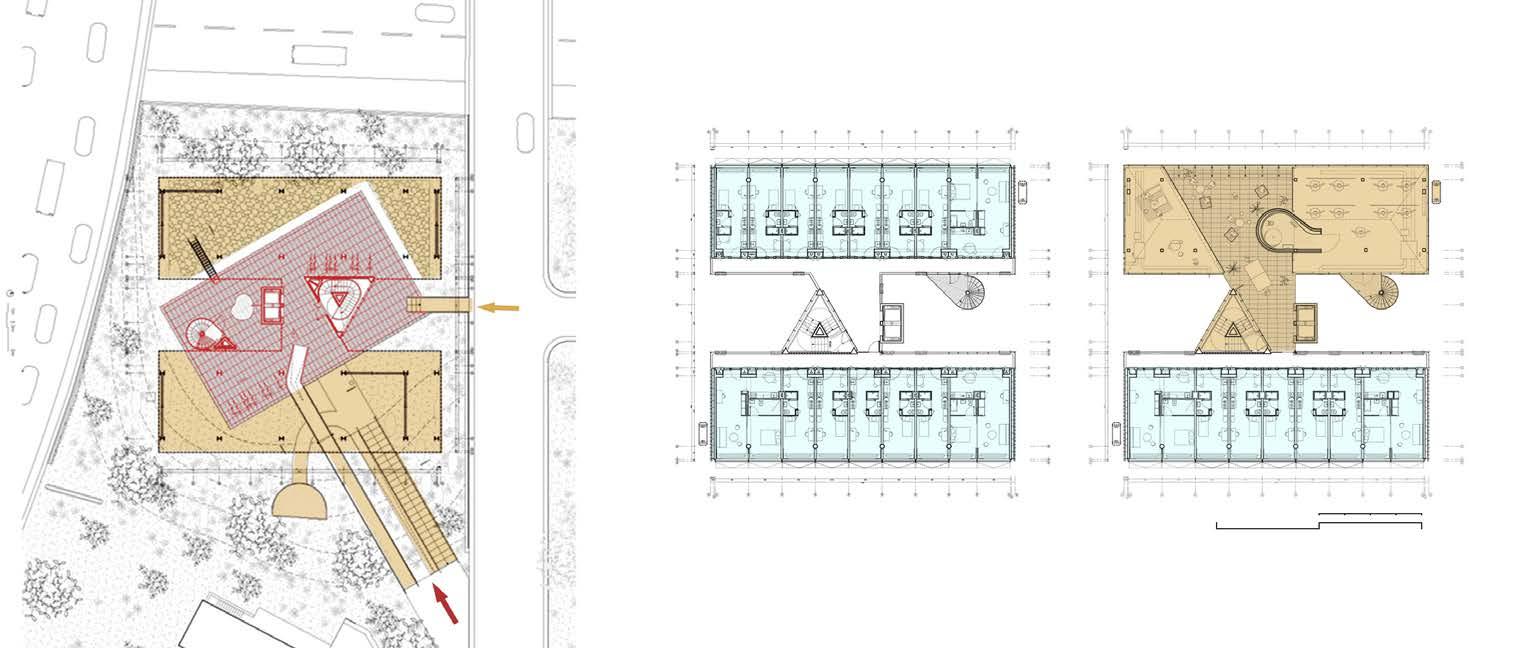
Because of the building’s proximity to the Boulevard Perpétrique, precautions against noise pollution had to be taken. Apart from the curtain wall’s exceptional performance, two choices stand out: the twisted and open bottom floors in the excavation provide natural light and shield the area from road noise; and the residential area of the building is elevated on pilotis, above the road level, and maintains a buffer zone between it and the entrance hall. The plan’s typological organization comprises three north-south parallel strips: two of them are devoted to dwelling units, while the remaining strip, which is hollow in the middle, holds all of the circulation cores. The elevator and the triangle staircase are self-assured, independent plastic volumes that defy basic functionalism.
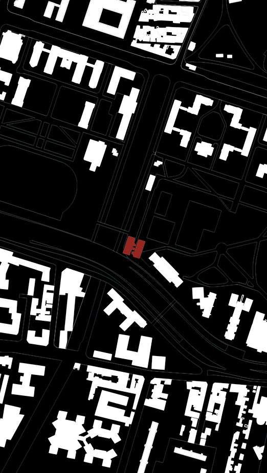
(Source: https://hicarquitectura.com/2019/04/bruther-residence-for-researchers/) (Source:https://hicarquitectura.com/2019/04/bruther-residence-for-researchers/)
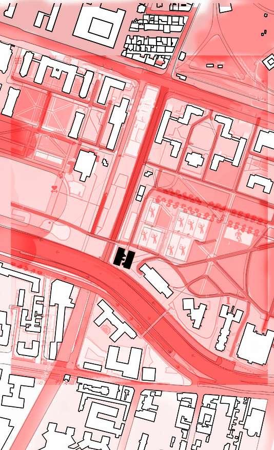
INSTITUTIONAL INFLUENCE NEARBY
PUBLIC-PRIVATE STRUCTURE
PRIVATE PUBLIC
(Source: Author, modified with open street maps)
The plot’s size being small necessitates precise volumetric compactness. In dealing with the compact nature of the plot, the residence provides the sense that it is more open to the outer world than it is protective of itself. The dwelling is readily identified as a “split and raised” cube, with its organization clearly legible from its sections.
(Source: https://urbannext.net/residence-for-researchers/ ; https://hicarquitectura.com/2019/04/ bruther-residence-for-researchers/)
(Source: modified- https://hicarquitectura.com/2019/04/bruther-residence-for-researchers/)
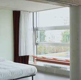
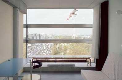
(Source: modified- https://hicarquitectura.com/2019/04/bruther-residence-for-researchers/)
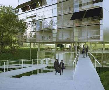
(Source: Author, modified Google Earth; https://hicarquitectura.com/2019/04/bruther-residence-for-researchers/)
Analysed by Radhika
Rishi_r0920475MaHS / MaULP_Swaenenberg 3
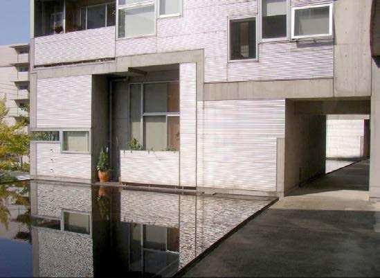
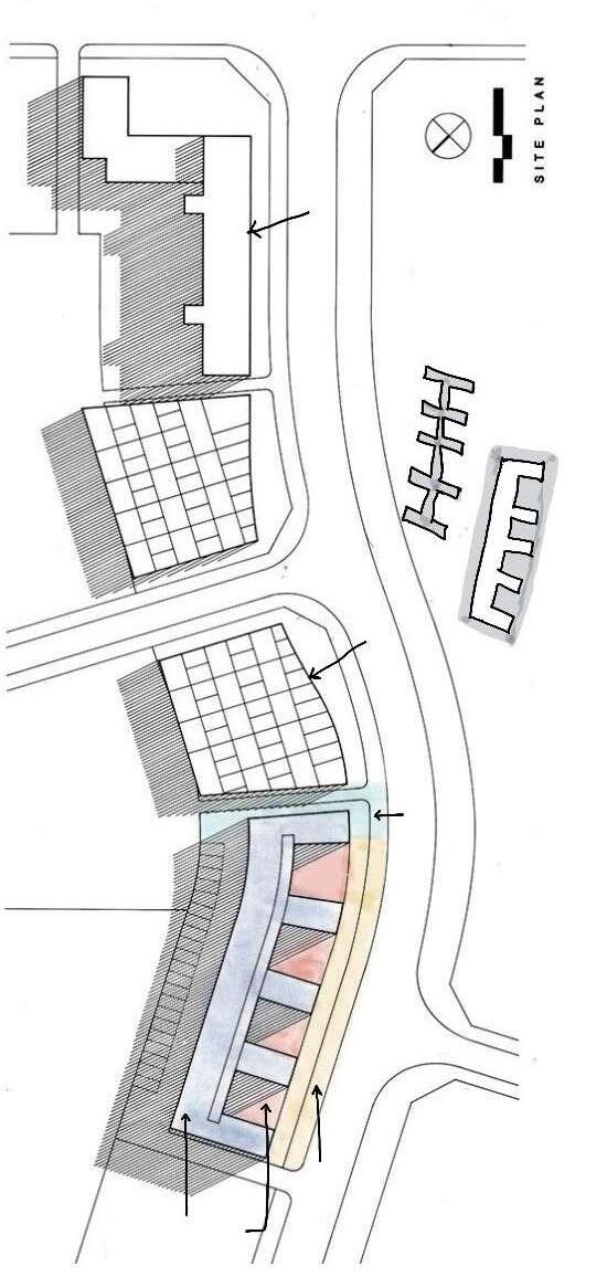
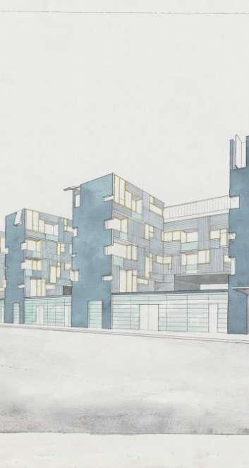
Nexus World Housing is masterplanned by a group of architects in Fukoaka, Japan. Of which Steven Holl’s void space/ hinged space housing is based on the idea of void, space and interior walls as hinges. It consists of a mixed-use programme complex with 28 residential apartments.
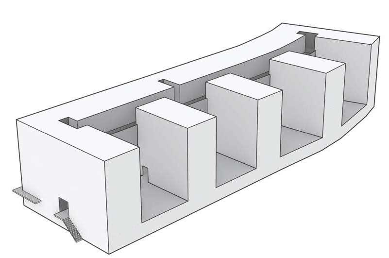
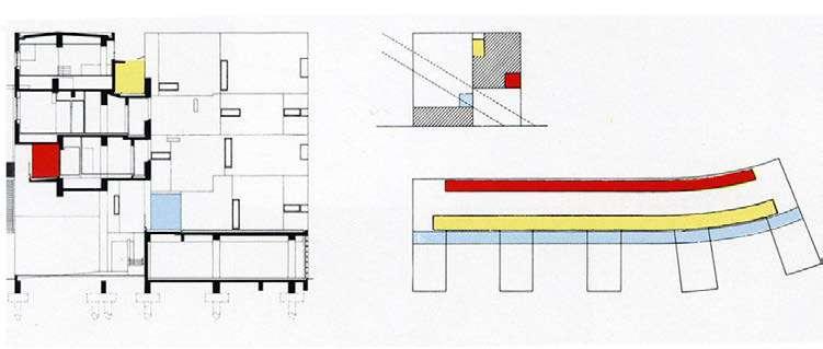
A modern interpretation based on the multi-use concept of Fusuma, of flexibility in the traditional architecture of Japan. The apartments are interlinked together like a complex Chinese box. This hinging concept allows a diurnal experience of the expansion of the living areas in the day time, reclaimed by the bedroom units in the night time.
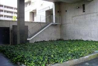
• Urban tissue: The building is free standing rigidly with ugly opaqueness due to its brutalist influence in the 90’s. However, the comb structure creates rhythm and is inviting with its U shape blocks at the street edge. It is introverted and extroverted at the same time. It seems to be an enclave with its high podium and boundary walls.
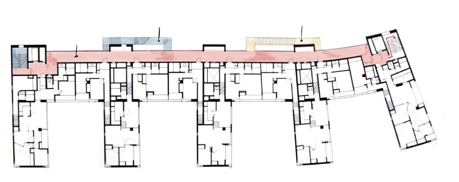
• The building typology is a mixed use fish bone slab that has complex interlocking to bring in light from every direction and to also has corridors for social interaction. The communal voids are open to sky and create a sen
• The individual dwelling design has a complex arrangement where doors and windows unhinge to bring in light and ventillation. The fenestration of the dwellings is interesting as different ways are explored creating an interesting pattern of windows in the elevation. The units are stacked on different floors to foster a greater diversity of units.
OPEN SPACE STRUCTURE
(Source: https://www.stevenholl.com/project/fukuoka-housing/
(Source: https://www.stevenholl.com/project/fukuoka-housing/
PUBLIC-PRIVATE STRUCTURE
(Source: https://www.stevenholl.com/project/fukuoka-housing/
https://www.moma.org/collection/works/456
Third Floor Plan
Section through the second floor corridor

(Source: https://www.stevenholl.com/project/fukuoka-housing/
(Source: https://www.stevenholl.com/project/fukuoka-housing/
(Source: https://references)(Source: https://www.stevenholl.com/project/fukuoka-housing/
18 variants of 5 basic L shaped units bringing in light


Store fronts (mixed-use)
(Source: https://www.stevenholl.com/project/fukuoka-housing/
MaULP2_Sweanenbergh - Tervuursesteenweg
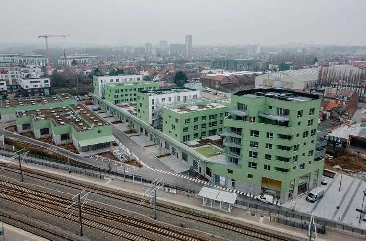
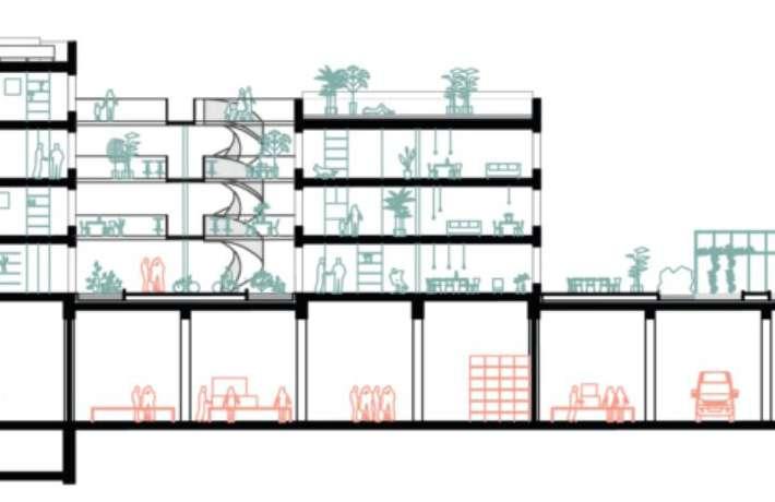
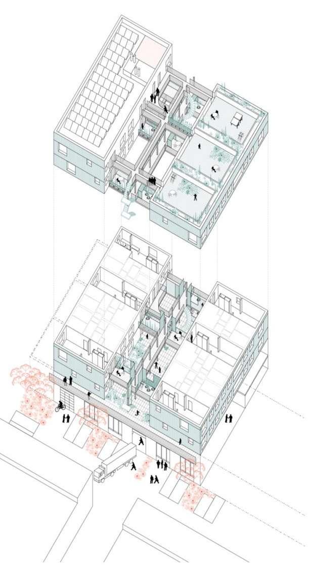
The authors strive to draw from the unique conditions of the location, which is a ‘marshy wasteland’ in Anderlecht, Brussels, in the crossroads of multiple communication axes, such as railroad, Ring and Chaussée de Mons. The project includes housing, communal spaces for residents, SME workshops and general mixed use. (DDS+, 2023)
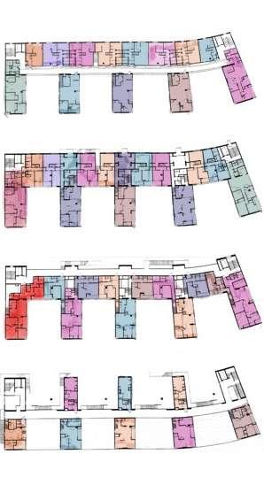
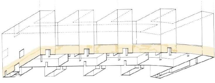
The core concept is to mix and super-impose functions and programs within the site, achieving a mélange of uses in the vertical axis. For example, Office mezzanines of the SME studios are stacked above workshop areas to create a barrier from the residential units. (Citydev.brussels, 2023) Creating a new, second street above the commercial activity on ground level, the site separates logistics necessary for the businesses from other circulation related to the housing, and makes use of the roofs to create spaces for gardening or playgrounds.
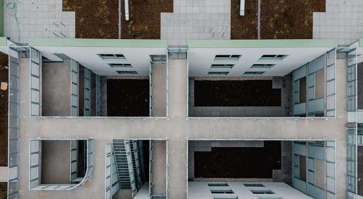
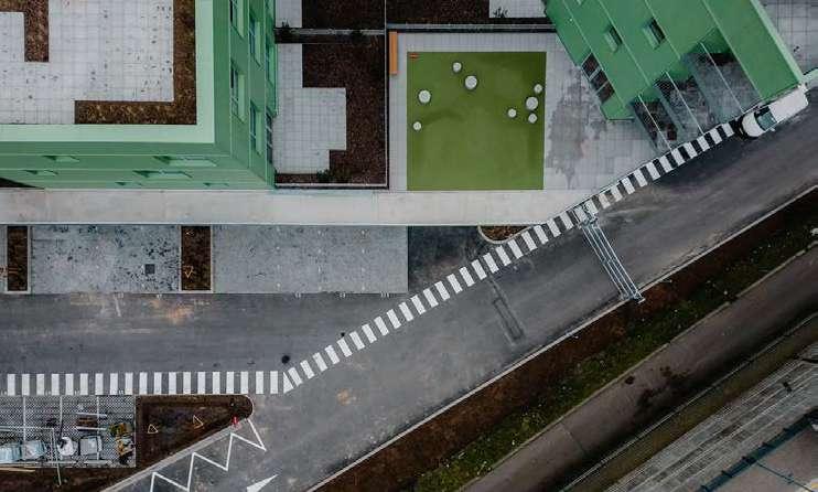
The project is very conveniently placed next to the Anderlecht train station, which makes it a desirable spot for both housing and small business, a great choice for bringing housing and work closer to eachother and creating an active site through the whole day. The second street level for pedestrian circulation is appealing, however the width of the circulation paths make this claim questionable, as they appear to be more of outdoor corridors than lively streets. Utilizing roofs for gardens and playgrounds is a good use of space, which bears the question of why this principle wasn’t extended onto the lower buildings closer to the railroad as well. Assuming this wasn’t for financial limits to the project, I would consider this an improvement. At the same token, the playground is quite small and ‘unequiped’ and generally the semi-public spaces do not as of now have many inviting features. The apartments vary in size and amenities (balcony, terrace), majority are supposedly owner-occupied (58) and 5 are rental homes. It would perhaps be interesting to also have more mixity in terms of residential types. The layouts are quite standart and don’t have much ‘added value’ in terms of connection to the shared or public space.
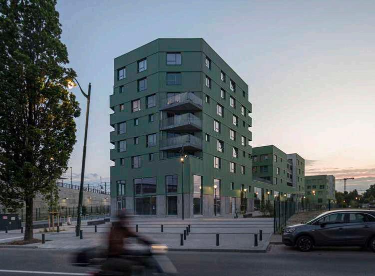
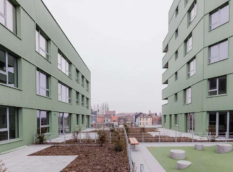
From current photographs of the site, there doesn’t seem to be a strong connection in path layout to the existing tissue and the buildings themselves also seem a bit ‘planted’. I attributed this primarily to the materiality choices which are very industrial and I personally find them disharmonious with the residential and small business functions. I wouldn’t find this problematic in a more industrial setting.
DDS+, https://www.dds.plus/projects/novacity, Accessed October 2023; Citydev.brussels, https:// www.citydev.brussels/nl/projects/novacity-0, Accessed October 2023;
https://www.citydev.brussels/nl/projects/novacity-0, Accessed October 2023
The ground level open public space, currently appearing as more of a cul-de- sac. There is a small square towards the street, perhaps unnecessarily paved and with little to no vegetation. The functionality of some of the roads is understandable, but there could be more obvious distinction between ‘residential ground street’ and the utilitarian access.
https://www.dds.plus/projects/novacity, Accessed October 2023
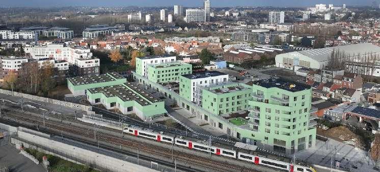
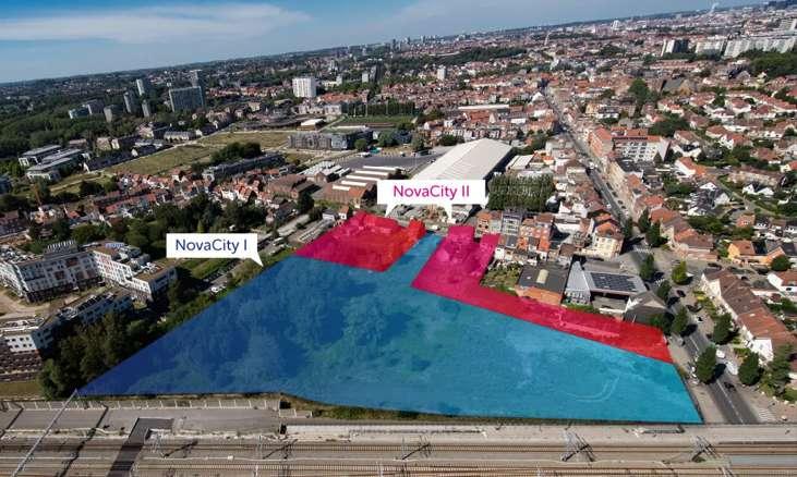
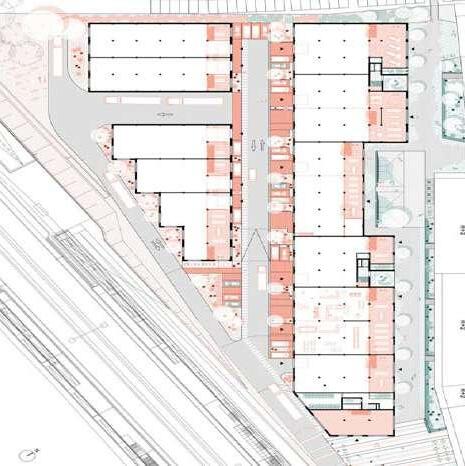
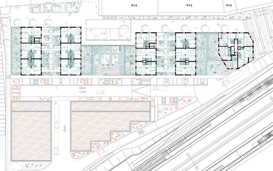


https://www.dds.plus/projects/novacity,
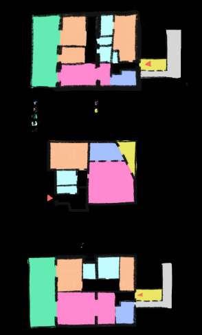
MaULP 2_Sweanenbergh - Tervuursesteenweg
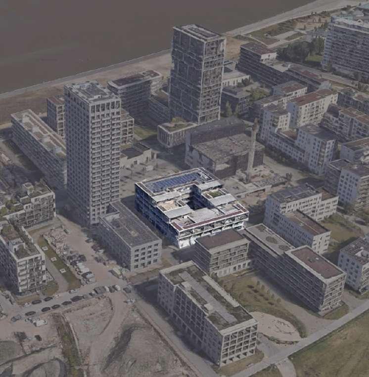
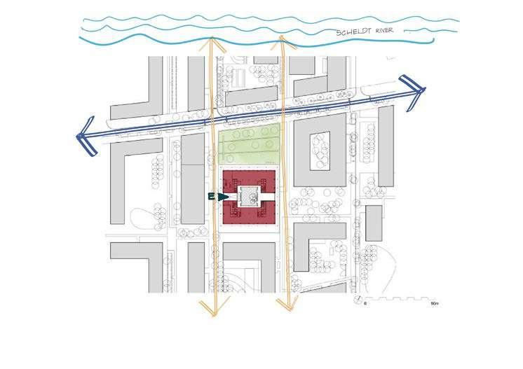
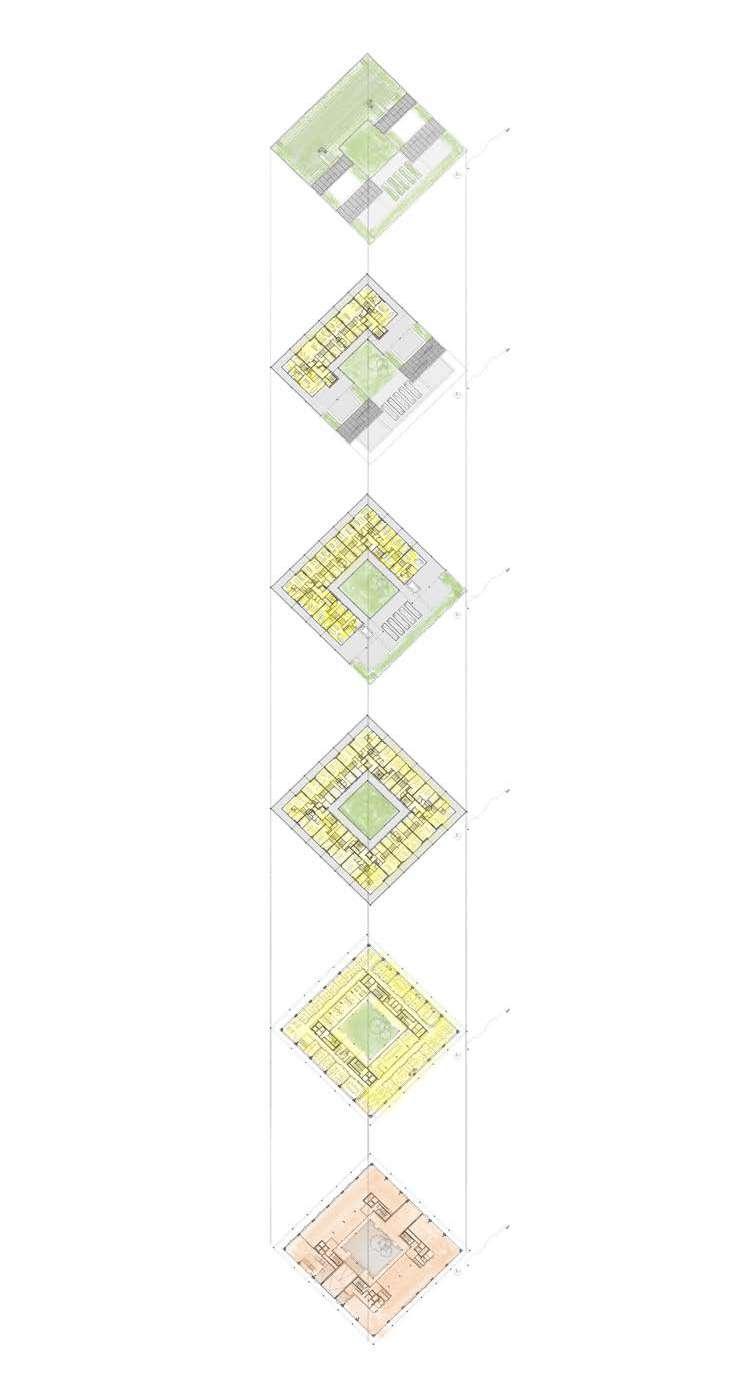
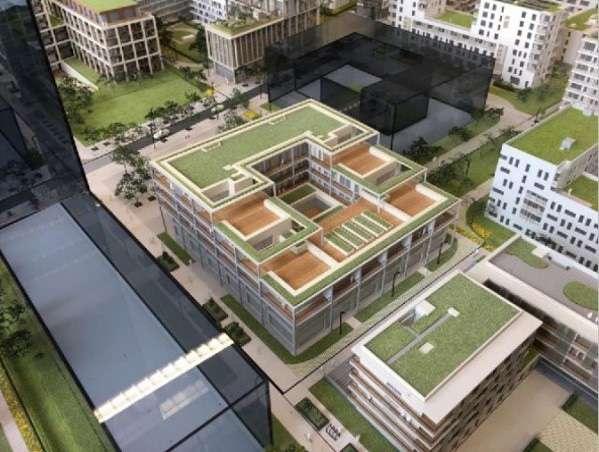
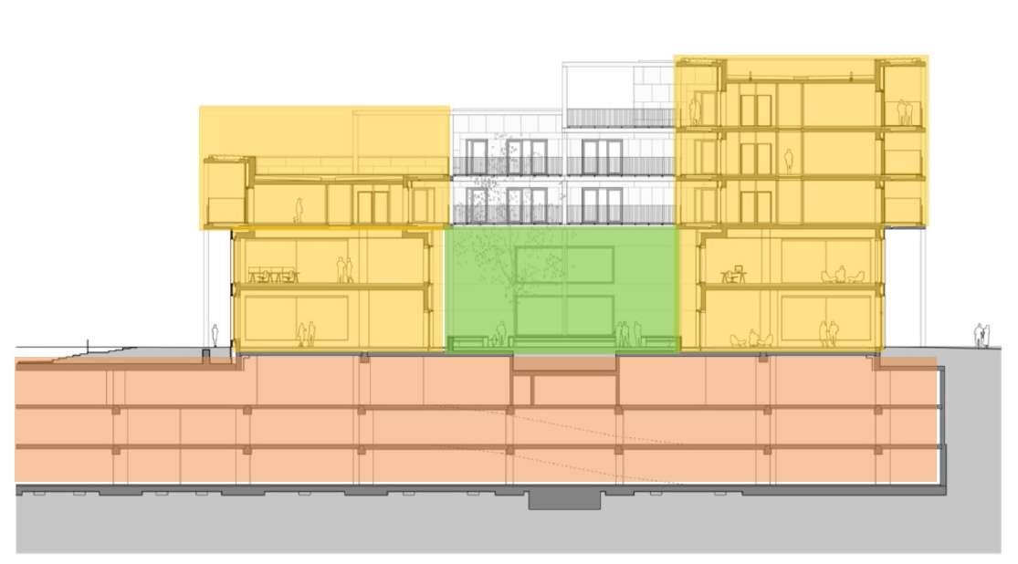
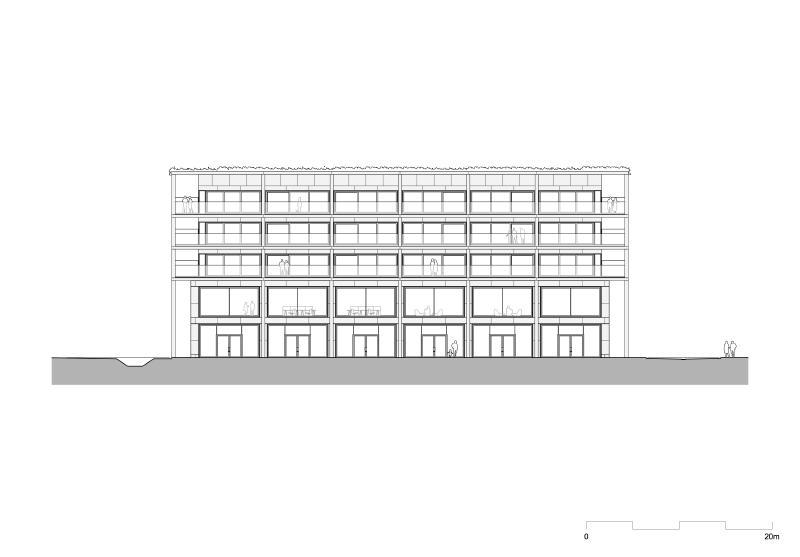
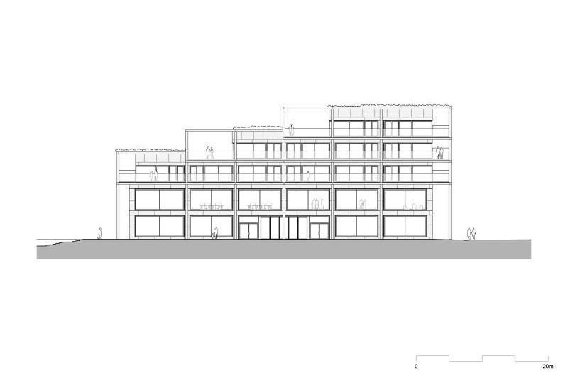
As of 2013, the new city quarter Nieuw-Zuid in Antwerp, Belgium, has been realized along the river Scheldt in the southwest area of the city as a high-quality extension of the historic city center. Zuiderplein, now completed, is Atelier Kempe Thill’s second collaboration with Triple Living. The building stands along the new central square, called Panamarenko. Zuiderplein is a mixed-use building which hosts a variety of commercial facilities, flexible office spaces, 38 luxury apartments with big outdoor spaces, and a parking garage for 300 vehicles. The new homes are built according to low-energy passive standards. (Atelier Kempe Thill, 2020)
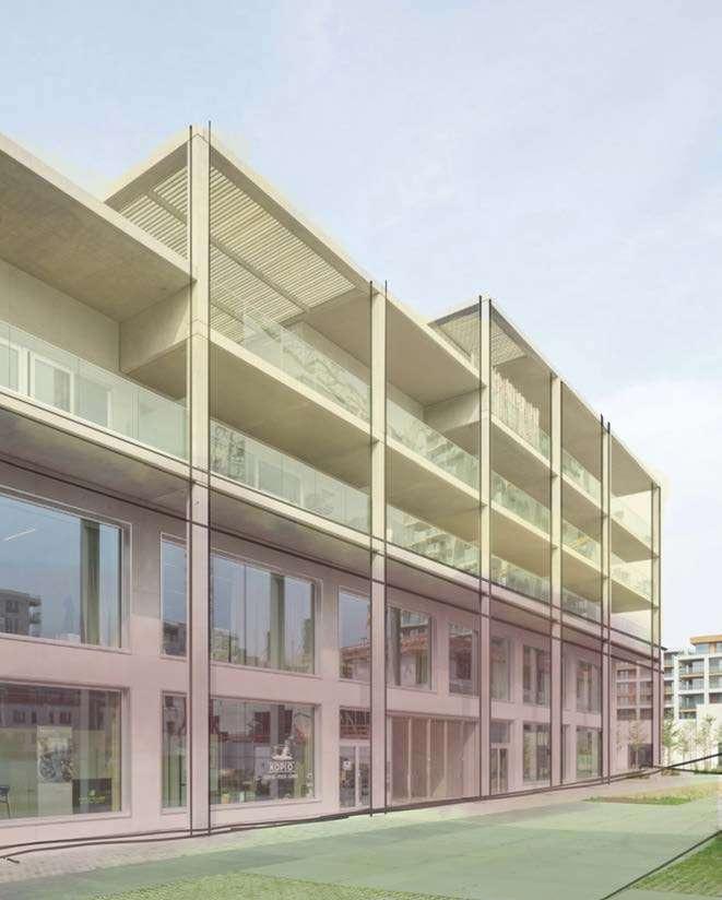
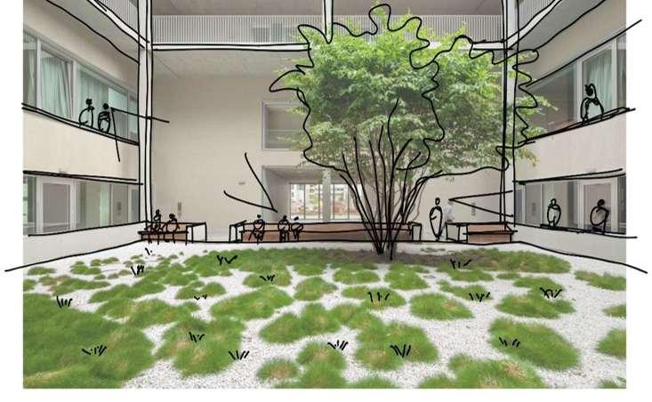
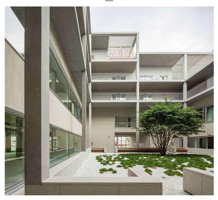
The project embodies a contemporary urban architectural approach, prioritizing its integration into the city’s fabric. This multifunctional building features an active ground floor with commercial spaces, ample windows, and a two-story arcade of slender columns, enhancing the public realm. Its hybrid layering combines commercial, office, and residential functions, while a threestory underground car park promotes public accessibility. A central courtyard design strikes a balance between privacy and community, with apartments partially accessible via open galleries. The project’s emphasis on outdoor spaces, including deep balconies, terraced flats, and shared roof terraces, promotes a sense of living as a pleasure and gives the building a distinctive identity. Highquality materials like precast concrete and natural stone, along with a subdued grey color palette, add to the building’s architectural dignity, harmonizing with the urban context.
In terms of its relation to the urban tissue, the project seeks to become an integral part of the city by harmonizing with its surroundings, providing commercial spaces that enhance the street life, and incorporating open spaces for residents and the public. The building typology is a hybrid, combining commercial, office, and residential functions within a single structure, thus optimizing land use. The individual dwelling design emphasizes the importance of outdoor spaces, such as terraces and balconies, offering residents a high-quality living experience and a sense of community within the urban setting. Overall, the project demonstrates a commitment to contemporary urban design principles, maximizing functionality, aesthetics, and public engagement.
(Source: https://www.atelierkempethill.com)
(Source: https://www.atelierkempethill.com)
(Source: https://www.atelierkempethill.com)
(Source: https://www.atelierkempethill.com)
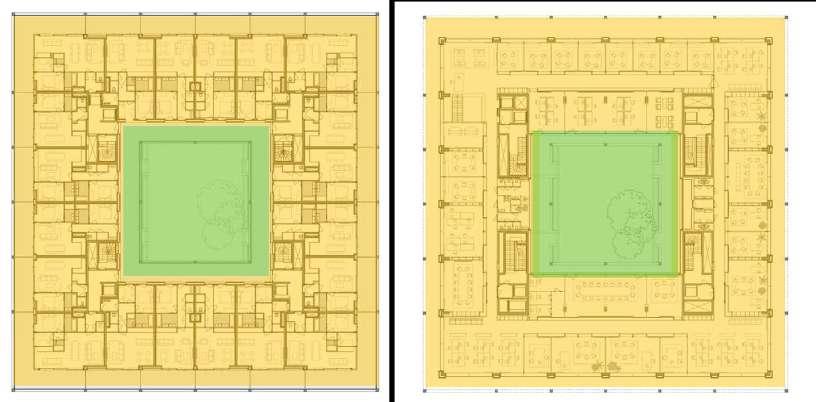

HOUSING UNITS
COURTYARD
PARKING
(Source: https://www.atelierkempethill.com)
(Source: https://www.atelierkempethill.com)
(Source: https://www.atelierkempethill.com)
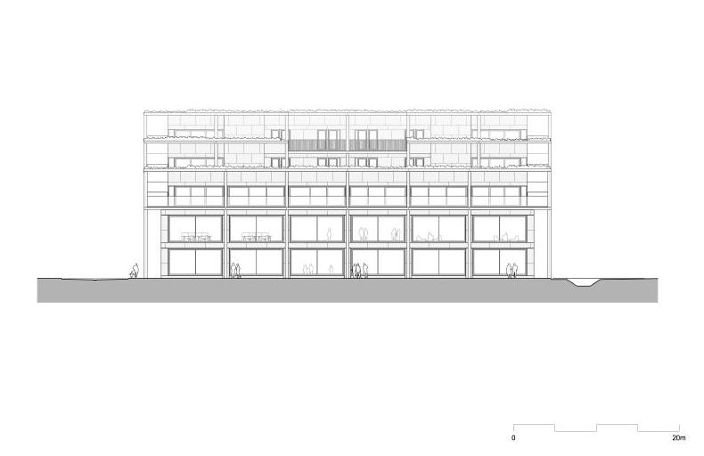
ELEVATION 1
ELEVATION 2
ELEVATION 3
(Source: https://www.atelierkempethill.com)
MaULP 2_Swaenenbergh D
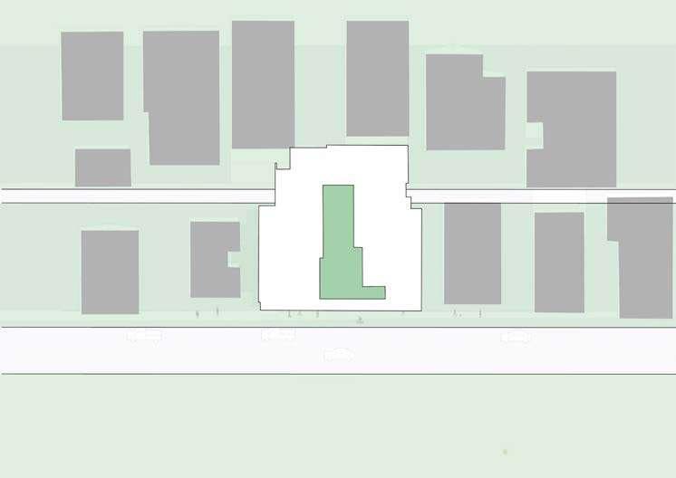
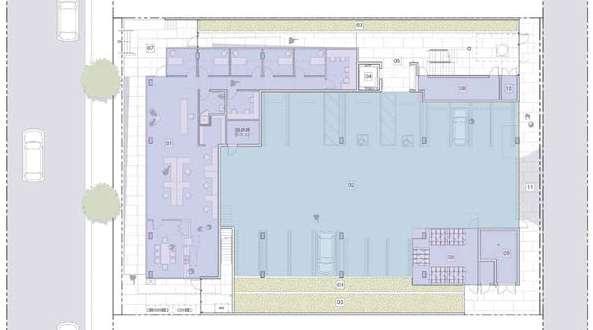
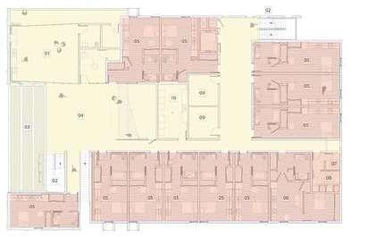
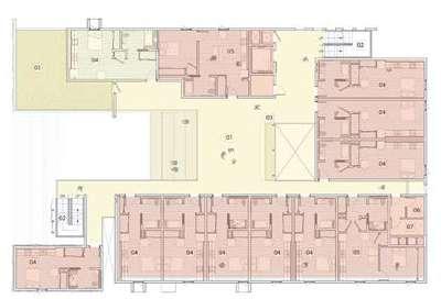
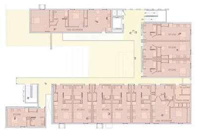
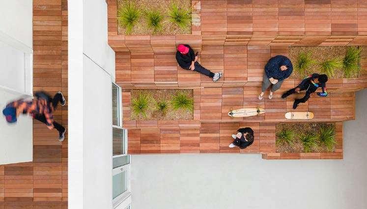
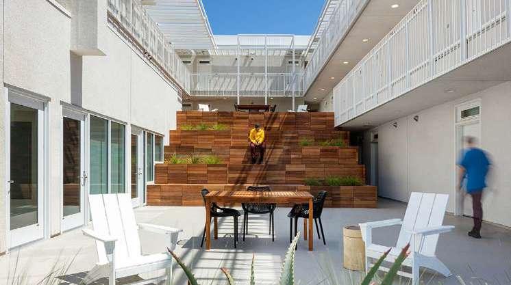
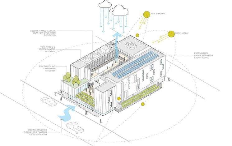
Completed in 2021, the Rose Apartments is a 35-unit mixed-use apartment in Venice, Los Angeles. Brooks + Scarpa designed the structure to house young adults that are transitioning out of group homes. It is a low-cost housing with ground floor used for commercial offices and upper floors for housing. This project provides housing in an affluent area of town where low-wage workers are critical but are unable to afford to live.
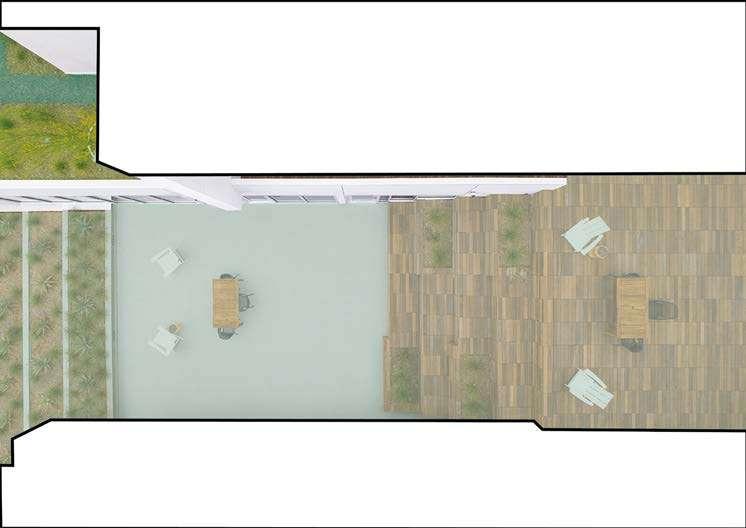
Inspired by the courtyard style of Los Angeles, the project looks at the open space which is inwards rather than outwards. This courtyard space becomes the central focus of the project with different common spaces created at various levels and ties up all the housing units. Instead of the typical neighbourhood defensive apartment buildings with solid walls and fences, it is a building which creates social space by de-emphasizing private space. Further, it promotes pedestrian-oriented neighbourhoods as an alternative to sprawl, creating usable space in the centre of the project, instead of unused, leftover space outside of the building volume.
The project goes beyond the traditional style of single story house to a multistory housing which focuses more on community spaces rather than individual garden spaces. Since the ground floor is given to office spaces, it becomes a space of exchange for the community with its neighbours. There are some car and bike parking spaces which increases the interaction of the neighbourhood with this new building on site. The courtyard on the upper floor becomes the central point of the building. It becomes a visual access as well as space for various activities for the people living in the building. This courtyard feature is not only limited to one floor but extends to other floors in the form of steps. This further provides common spaces of different sizes, making it accessible to all kinds of people. The structure houses three different types of dwelling typology - single room studios, one-bedroom apartments and two-bedroom apartments. Each unit is equipped with kitchen and bathroom facilities. Every floor has access to common garden spaces as well as trash rooms. Hence, this project provides new affordable housing typology to an affluent area of town of one-story structures.
(Source: https://brooksscarpa.com/rose-apartments)
(Source: https://www.dezeen.com/2023/01/03/scalloped-facade-housing-facility-los-angelesbrooks-scarpa/)
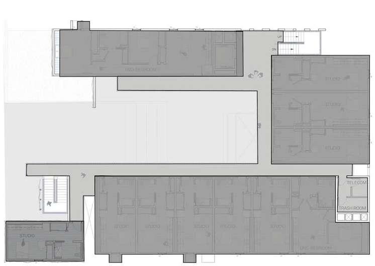
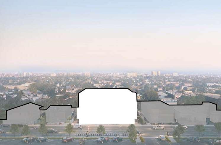
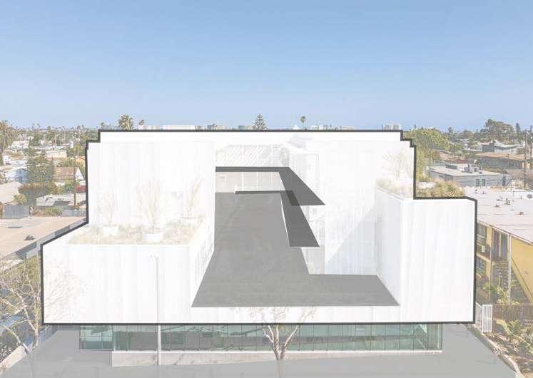
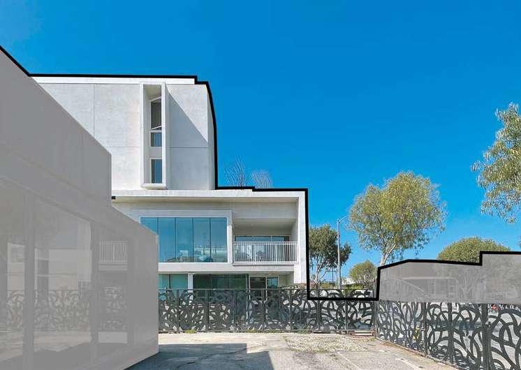
(Source: https://brooksscarpa.com/rose-apartments)
(Source: https://www.dezeen.com/2023/01/03/scalloped-facade-housing-facility-los-angelesbrooks-scarpa/)
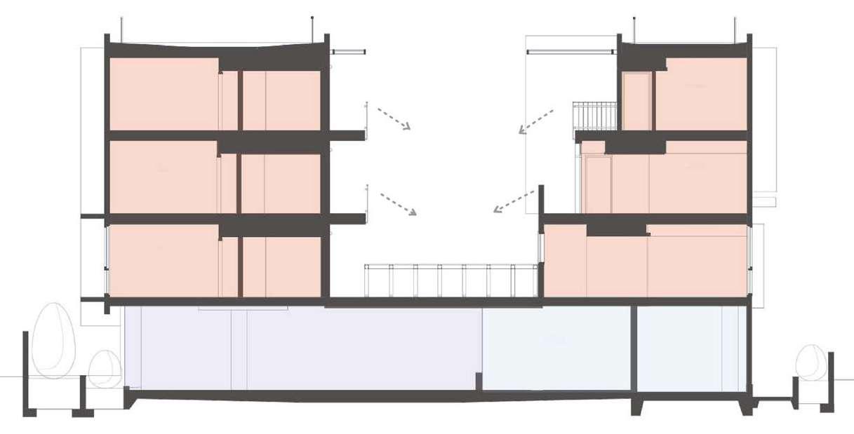
(Source: https://brooksscarpa.com/rose-apartments)
(Source: https://archello.com/project/the-rose-apartments)
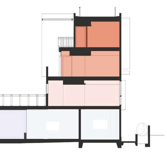
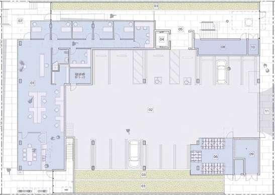
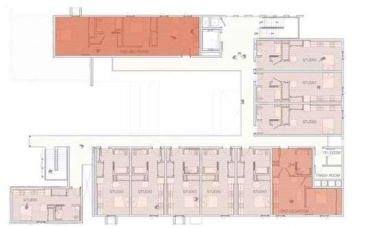
(Source: https://brooksscarpa.com/rose-apartments)
(Source: https://www.dezeen.com/2023/01/03/scalloped-facade-housing-facility-los-angelesbrooks-scarpa/)
MaULP2_Group D
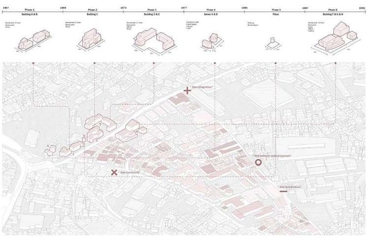
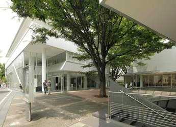
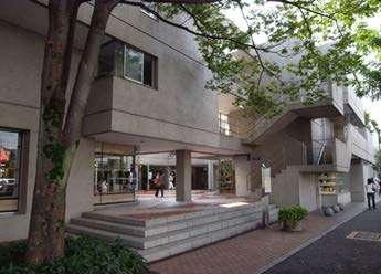
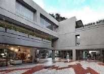
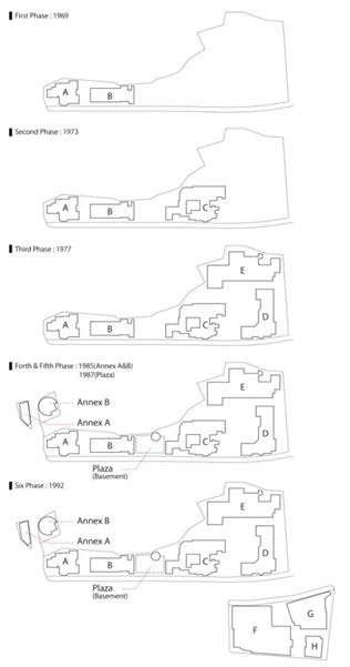
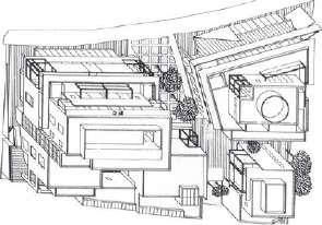
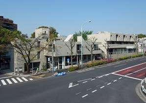
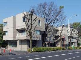
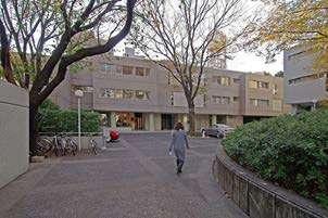
The Hillside Terrace Complex, evolving through seven phases since 1969 to adapt to Tokyo’s ever-changing circumstances, embodies a collective form. Its distinctive ambiance is crafted through diverse design strategies, such as embracing subtle topographical shifts, implementing spatial layering, and establishing sheltered outdoor communal areas. The project’s triumph can be attributed to a combination of spatial and architectural elements—scale, transparency, etc.—as well as the progressive development of public life programs. The infusion of both formal and informal events in this urban enclave contributes to the vitality of Hillside Terrace, fusing seamlessly with its architecture to shape a truly unique facet of the Tokyo cityscape.
Integration with city life especially making buildings multi-functional and high transparency to the street level and social interactions; each building has its unigue form with different materials for the construction.
• Urban tissue: The complex demonstrates a strong connection to the urban fabric by integrating seamlessly into the surrounding environment. The emphasis on lower levels with commercial programs enhances street-level transparency, contributing to a vibrant and engaging streetscape. The evolving phases of the project showcase an adaptive approach to the changing dynamics of the urban context, reflecting a thoughtful integration with the city.
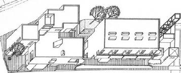
• Building typology: The modernist look of each building within the six phases establishes a cohesive and identifiable building typology. The exploration of different materials, ranging from concrete to ceramic tile and aluminum, adds a dynamic layer to the building typology, showcasing an evolution in design over time. The commitment to multifunctionality, with commercial spaces on lower levels and residential uses on higher levels, represents a versatile building typology that caters to various needs.
• Individual dwelling design: It reflects a balance between privacy and social engagement, with commercial programs at street level promoting interactions. The shift from commercial to residential as the building ascends suggests a thoughtful consideration of the residents’ need for privacy and a more intimate living environment. Maki’s exploration of different materials in construction also likely influences the individual dwelling design, creating a diverse and visually interesting living experience.
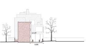
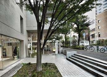
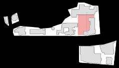
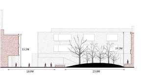
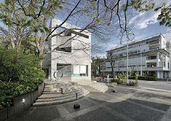
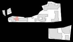
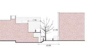
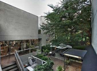
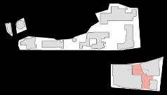
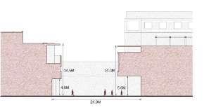
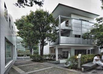
(Source: ‘Urban Design Case Study Archive’. n.d. Accessed 27 October 2023. https://udcsa.gsd. harvard.edu/projects/14.)
(Source: ‘Maki and Associates’. n.d. Accessed 27 October 2023. http://www.maki-and-associates. co.jp/details/index.html?pcd=8.)
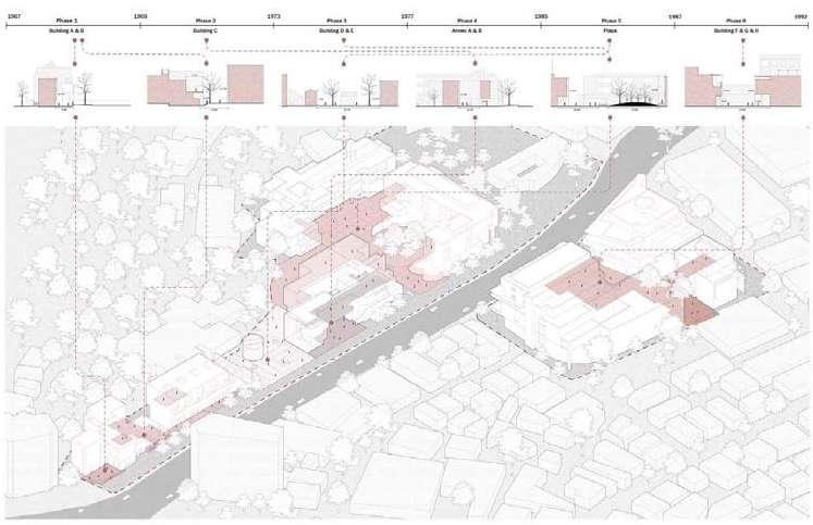
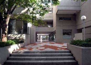
(Source: https://academic.daniels.utoronto.ca/urbanism/wp-content/uploads/sites/3/2020/11/ Hillside-Terrace.pdf)
(Source: https://academic.daniels.utoronto.ca/urbanism/wp-content/uploads/sites/3/2020/11/ Hillside-Terrace.pdf)
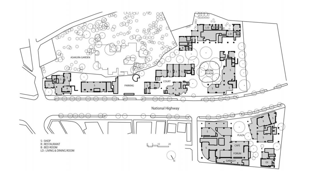

(Source: ‘Urban Design Case Study Archive’. n.d. Accessed 27 October 2023. https://udcsa.gsd. harvard.edu/projects/14.)
PHASE 1 (1969)
Building A&B
PHASE 2 (1973)
Building C
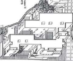
PHASE 3 (1977)
Building D&E
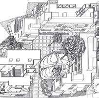
PHASE 4 (1985)
ANNEX A&B
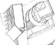
PHASE 5 (1987) Hillside Plaza
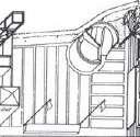
PHASE 6 (1992)
Building F G & H
(Source: https://academic.daniels.utoronto.ca/urbanism/wp-content/uploads/sites/3/2020/11/ Hillside-Terrace.pdf)
Residential/ Restaurant/ Shop
Residential/ Restaurant/ Shop
Residential/ Restaurant/ Office/ Shop
Exhibition hall/ Event Space/ Library/ Club
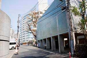
Parking/ Rental Space
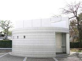
Residential/ Restaurant/ Shop/ Office/ Gallery
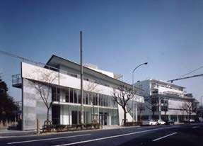
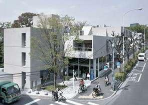
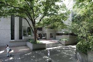
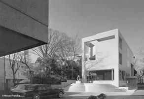
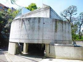
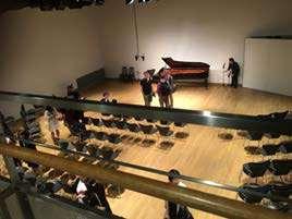
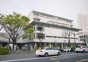
(Source: https://academic.daniels.utoronto.ca/urbanism/wp-content/uploads/sites/3/2020/11/ Hillside-Terrace.pdf)

HARSHIKA VERMA PAOLA SALVATIERRA

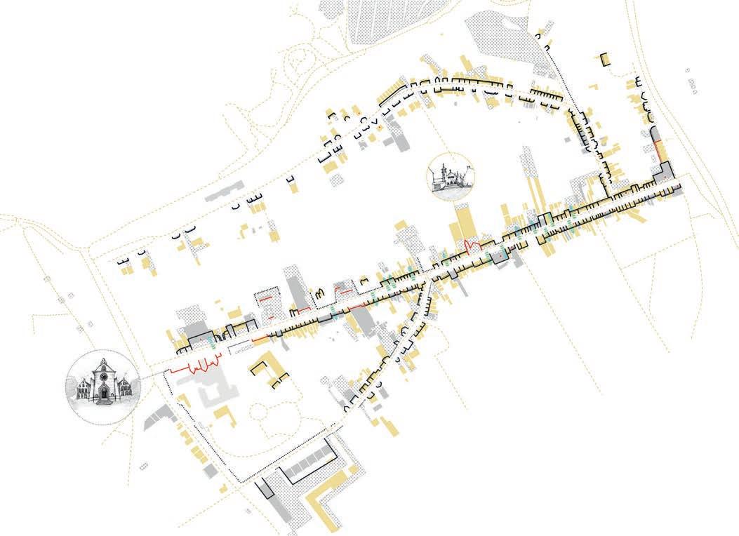
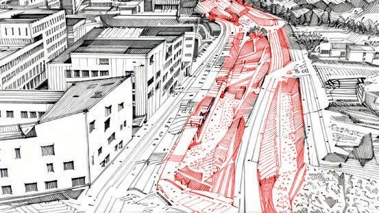
Significant changes in the terrain have disrupted surface water drainage while fragmented forest structures struggle to cope with flooding and support a thriving ecosystem.
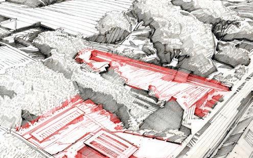
buildings have expanded horizontally, leaving unutilized spaces in between along with the creation of many parking lots increasing the impermeable surfaces that add up to the drainage problem

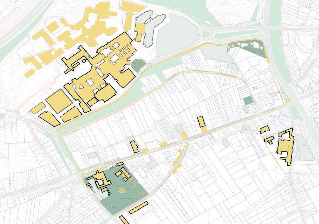
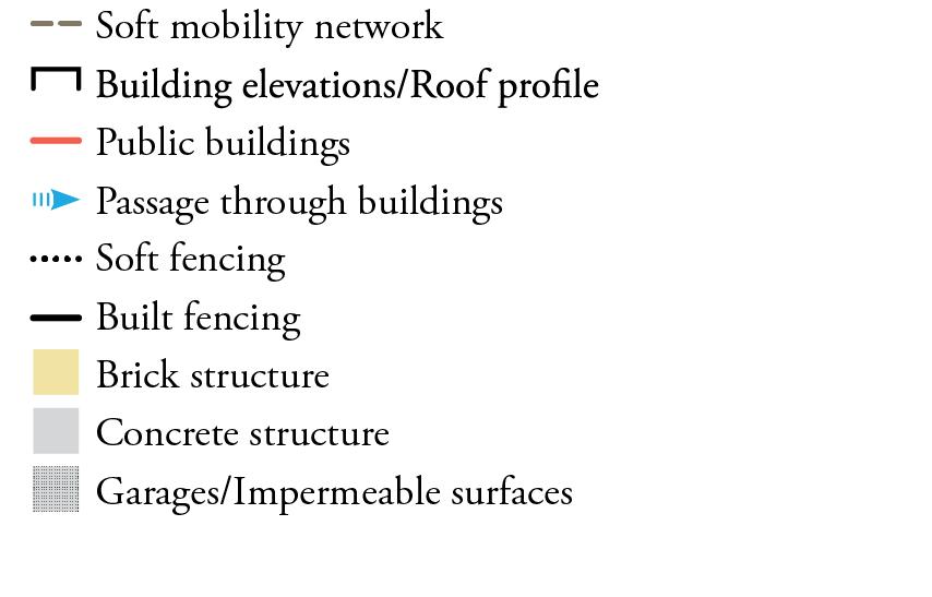
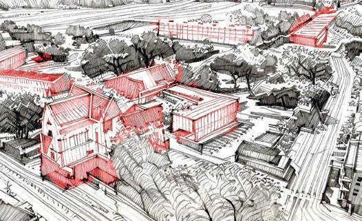
The pedestrian and street system did not provide sufficient accessibility to public facilities, and the lack of social spaces hindered community interactions.
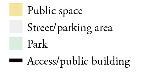

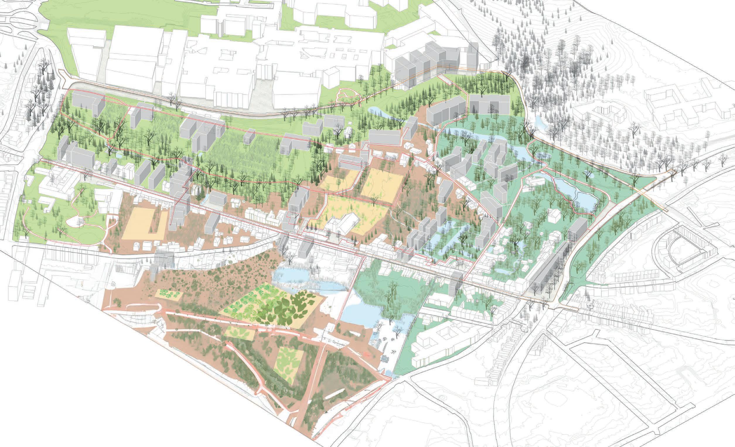
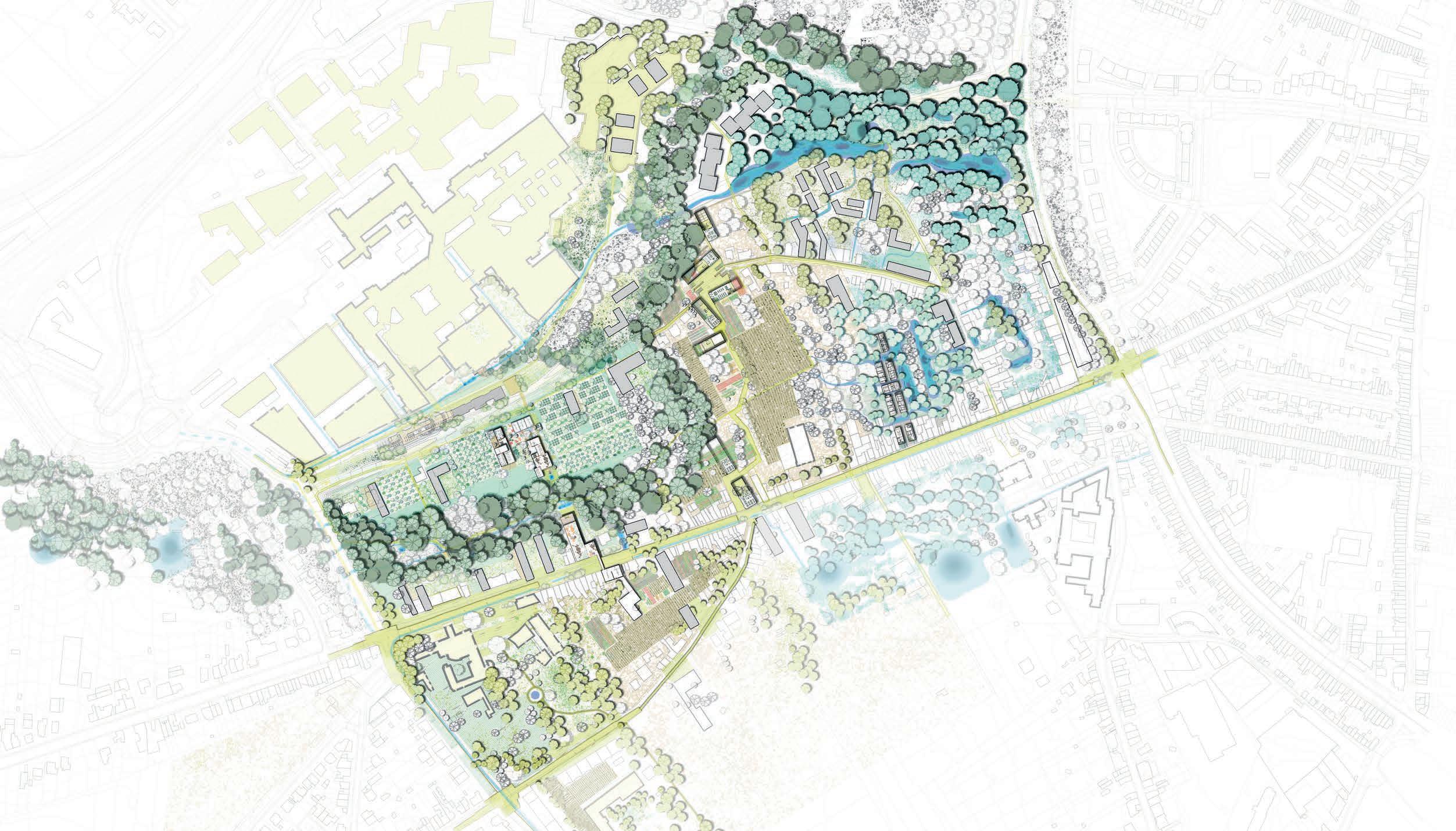
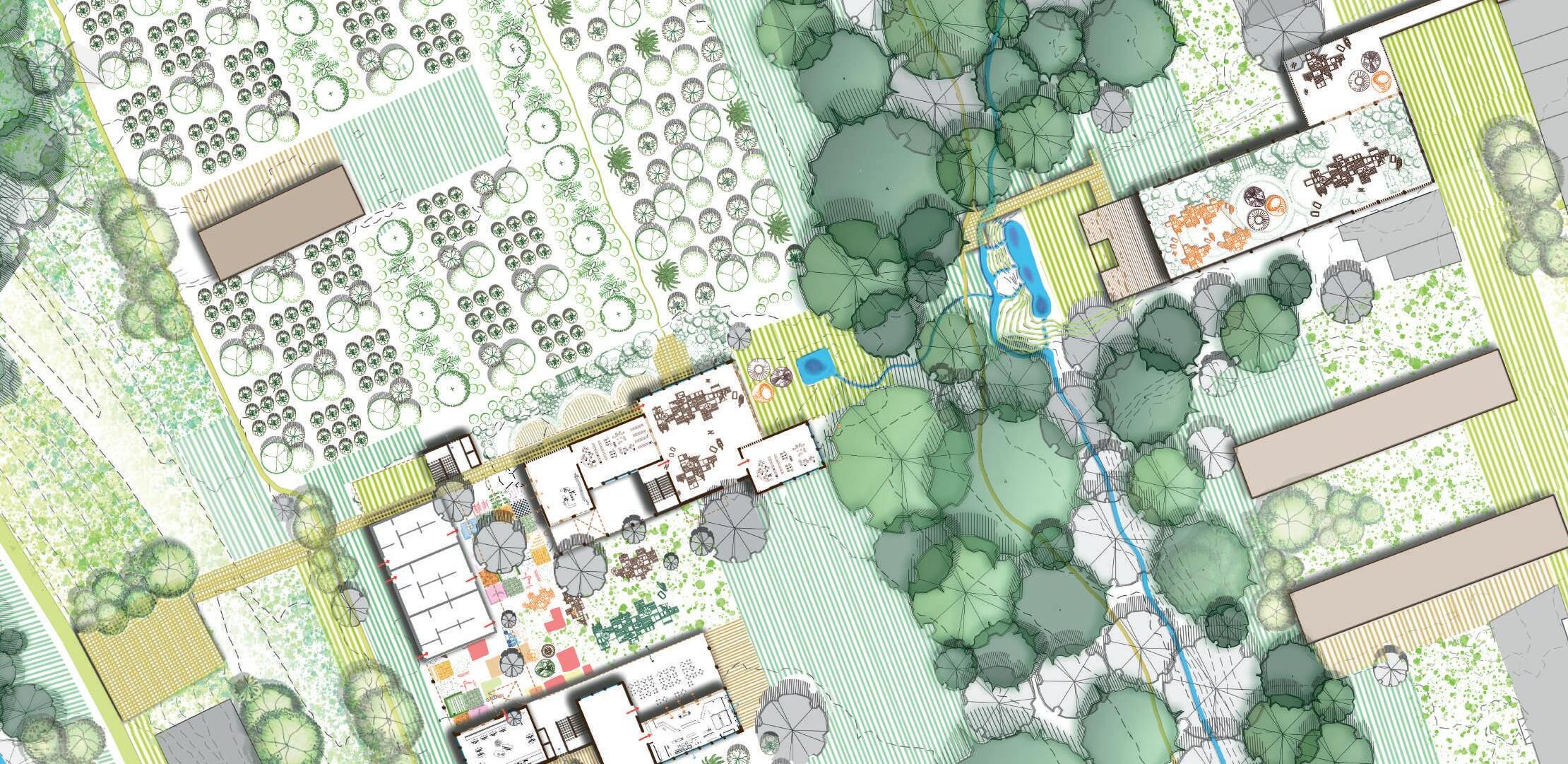
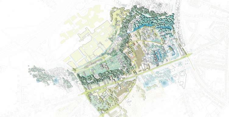
The proposed vision plan aims to enhance ecological value and water management in urban areas by dividing the landscape into three parts according to site topography and existing landscape character. The plan suggests building a new living area that seamlessly blends with the natural surroundings behind the existing structures, merging living and activity spaces into the forest structure at the center.
On the left, the living in the forest concept is recommended, which involves creating a new forest and orchard system for social activities and transportation.
In the middle, the proposal is for agricultural living. It suggests implementing a productive landscape that serves as a common ground.
On the right, living with a wet landscape is proposed. By allowing water to flow and collect, a wet landscape can be created that promotes recreation and biodiversity.

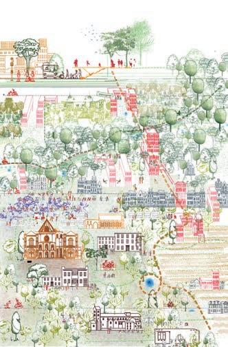
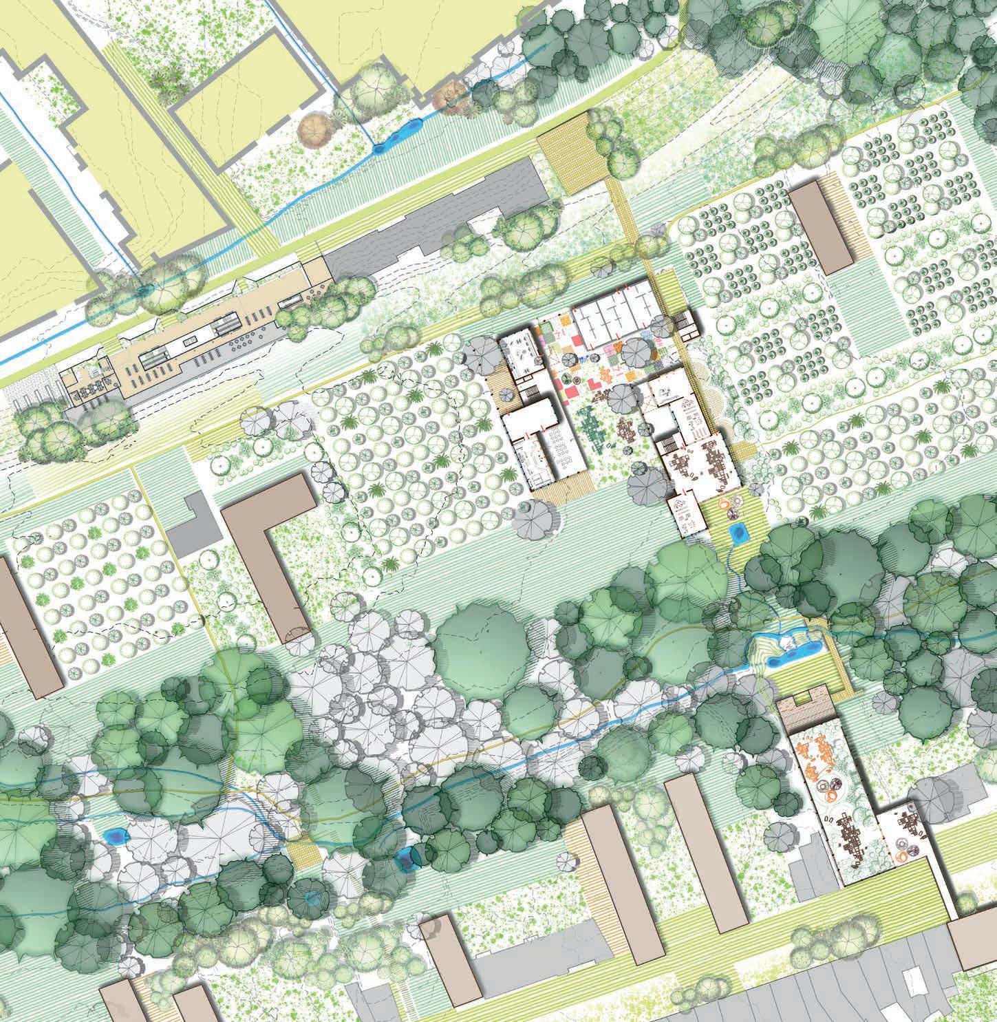
This nexus seeks to harmonize the existing rural & urban scale fabric by reimagining the huge terraces of existing built structures. It bridges the gap in the topography, facilitating a smooth connection that links the neighborhood to the hospital & intermodal terminal (north) and Church Park (south). It integrates a new forest on steep slopes and transforms gentle slopes into orchards to mitigate flooding. The envisioned buildings forms a welcoming ground that opens into the forest, offering a multi-dimensional experience of woods, shade, & foliage. The new typology warmly embraces individuals across all generations, fostering meaningful interactions. Besides, transitional spaces are strategically placed keeping in mind the requirements of diverse user group to create more inclusivity within a community.

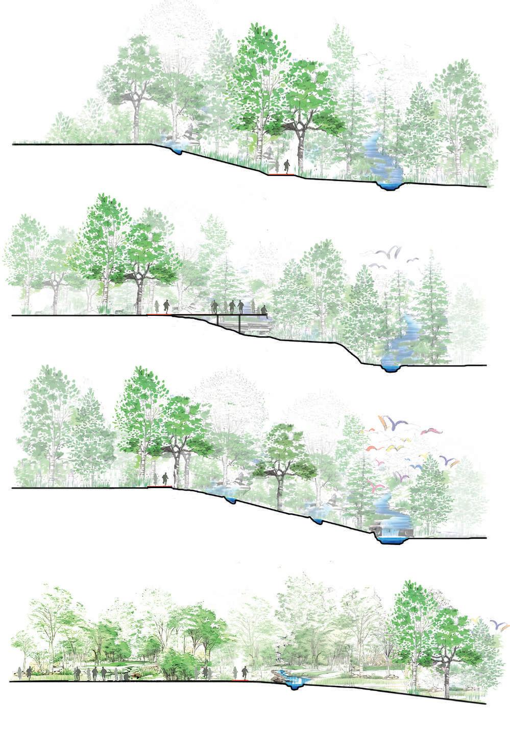
(CC') FOREST RIM TRAIL: Soft network along the ridge of the terrace
(BB') BLUE TERRACE: A Platform for Feathered Spectacles
(CC') AVIAN OASIS: An Untouched Ecological Space
(DD') HIGHLAND ORCHARD: A Transformed Productive Landscape

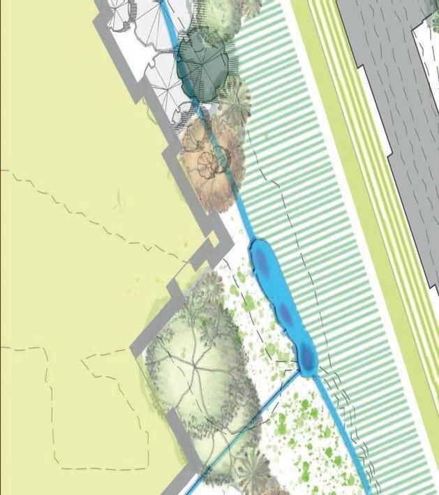
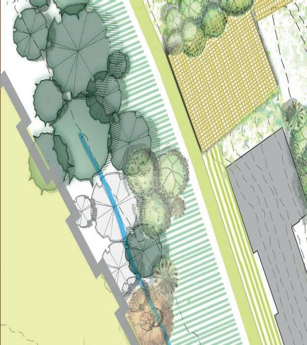
CELEBRATING MULTI DIMENTIONS OF THE FOREST LANDSCAPE.


CELEBRATING MULTI DIMENTIONS OF THE FOREST LANDSCAPE. PLAN- (1:200)
Existing Trees
Existing Public Buildings
Existing
Intermodal terminal (ongoing)
Intercropping
Proposed


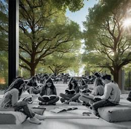
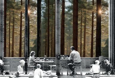
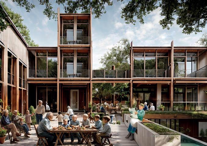
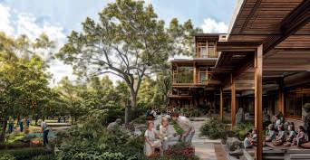
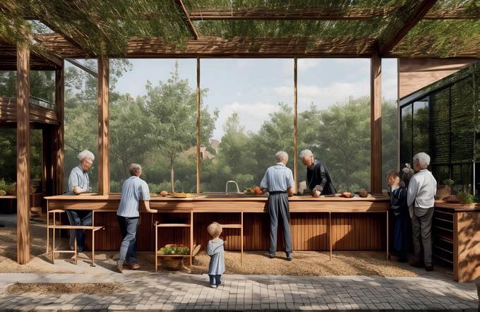
Situated within the agricultural plateau of a comprehensive vision, the agriculture nexus seamlessly links fields to uphill wetlands, creating a cohesive fabric that spans diverse landscape moments. Emphasizing sustainability, buildings align with existing footprints, with the ground floor hosting public spaces like cafes and markets amid gardens and crops. Above, a mix of housing, from family apartments to kots, features shared amenities like kitchens, dining areas, learn rooms, and communal gardens, fostering a sense of community. Throughout, the agricultural motif permeates both interior and exterior common areas, reinforcing the project's core concept.
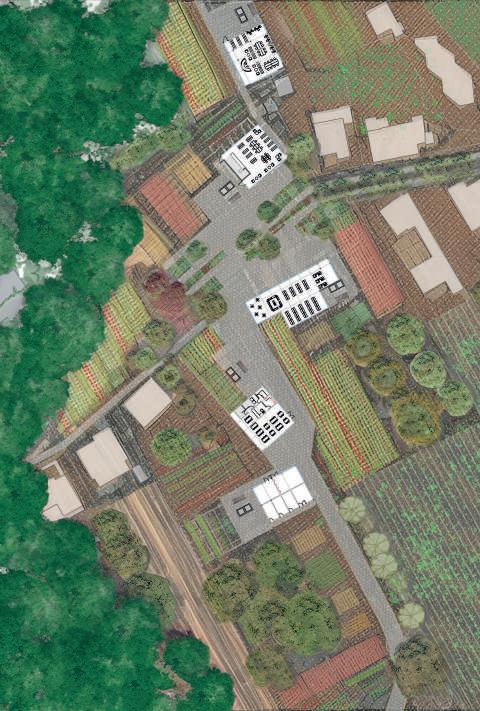

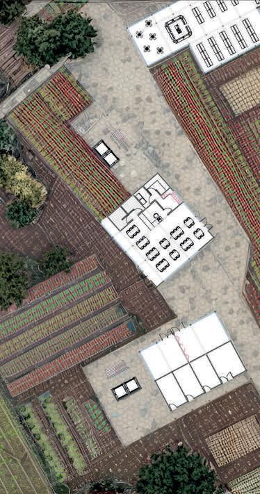
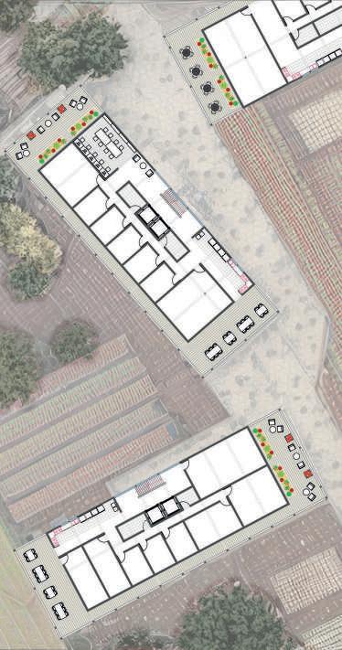
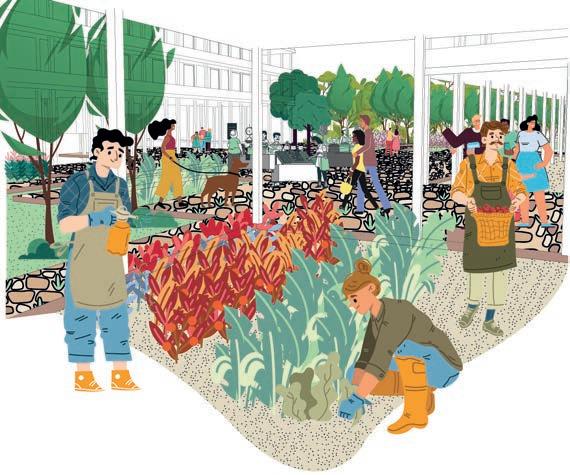
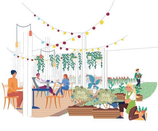
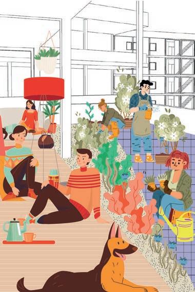
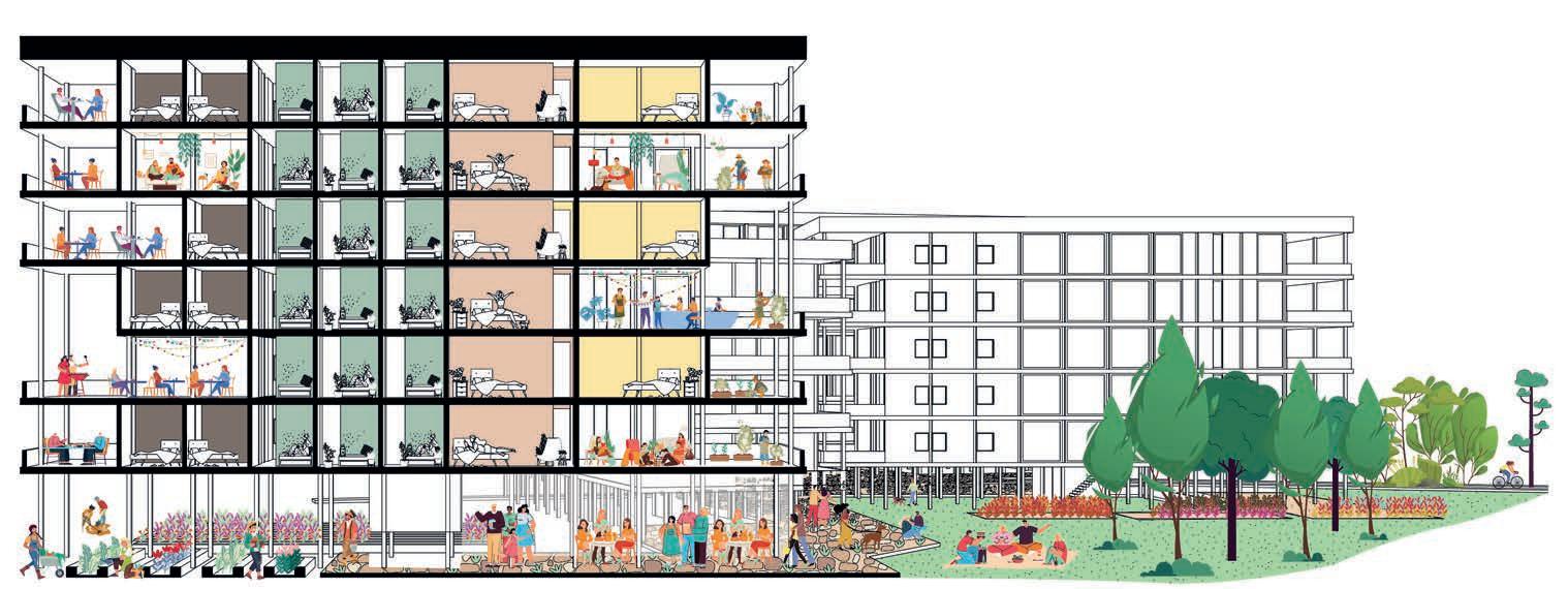
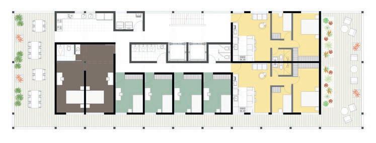
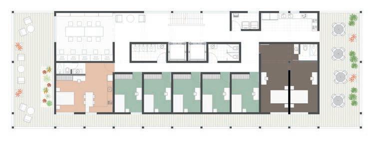
The upper levels offer diverse housing options with communal spaces, nurturing a sense of community within the building. This design provides larger shared areas for typologies without these amenities, serving various income levels and contributing to affordable housing in the current market. It introduces a new shared way of living and multiplicity within the building.
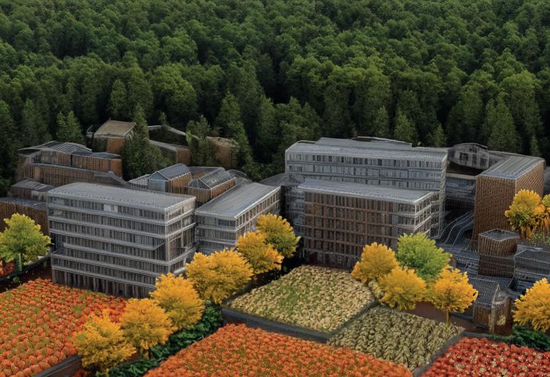

An urban tissue among the productive landscape
The agricultural theme is central to this typology, influencing both internal and external spaces. The design seamlessly integrates with the surroundings, reflecting sustainable living principles. The union of the agricultural concept with common areas creates a cohesive environment, connecting residents to the built and natural elements.
ZOOM TISSUE 3
SARAN MAIPRASERT R0919707
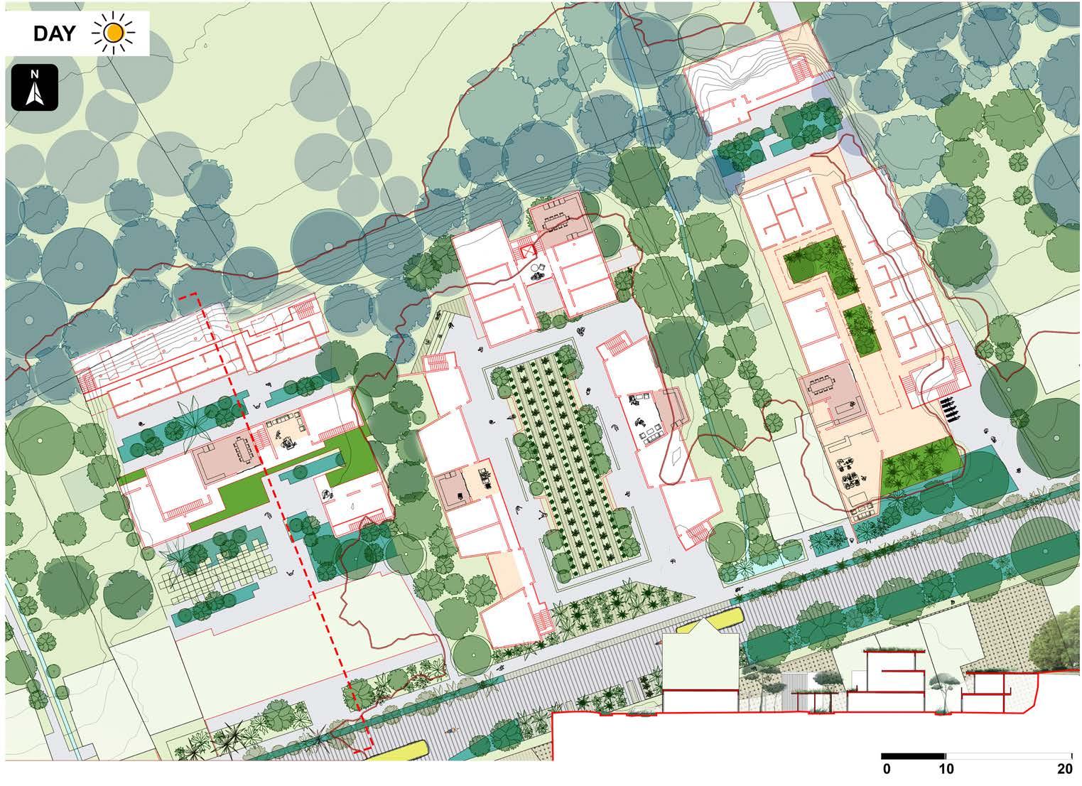
The typology in wet landscape adapts its layout to the flows of the water. In this case, the building is divided into three parts but connected with the elevated patio pathway. This patio will connect the living and common areas in each building and also expand to the public space outside. It creates a new transportation way for pedestrians in this neighborhood.

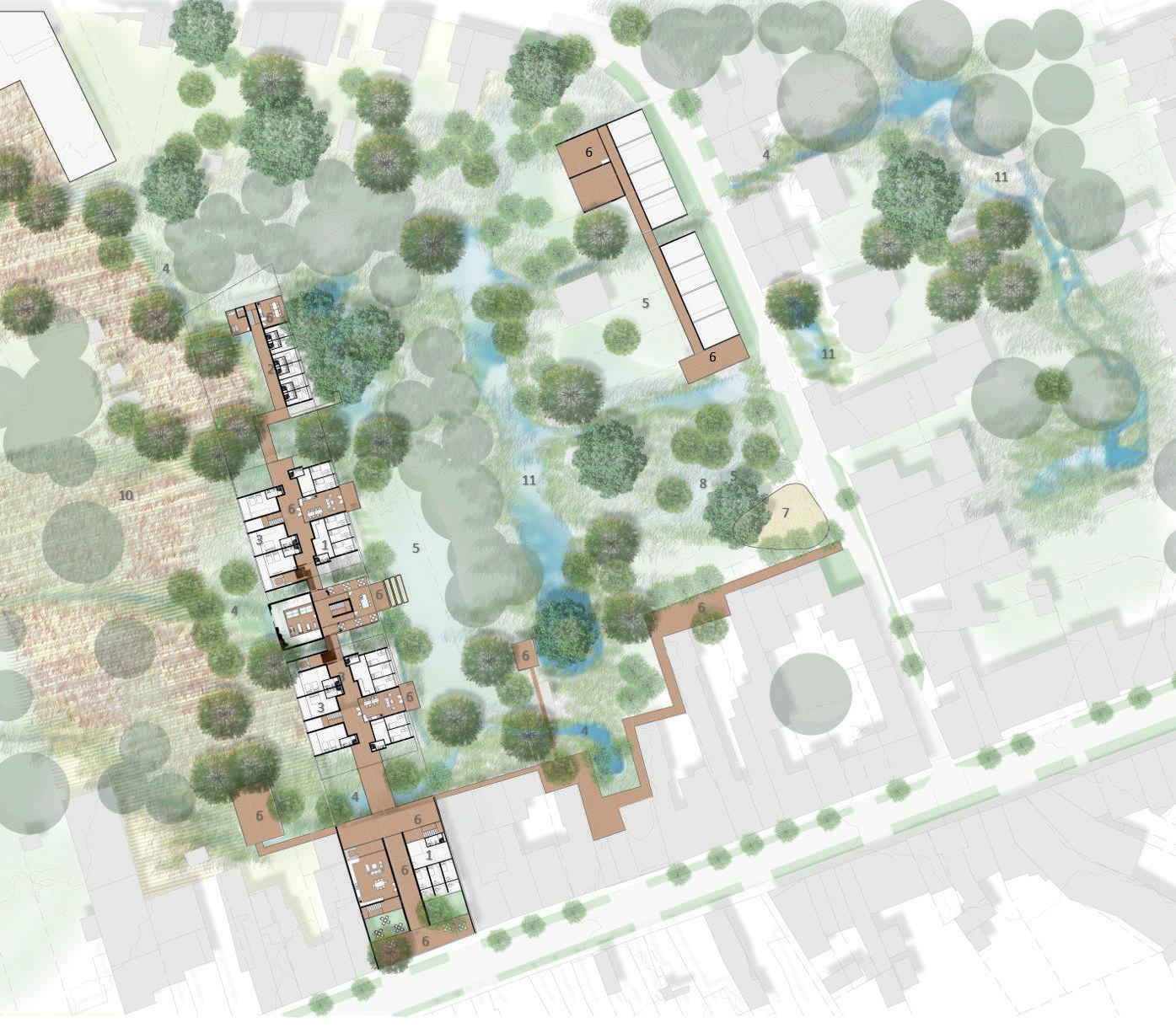
Legends
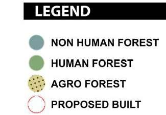
1. Student dorm
2. Single& family studio
3. Elderly flat
4. Bioswale/ wadi
5. Lawn (detention)
6. Common area
7. Playground
8. Park
9. Wet forest park (seasonal flood)
10. Agriculture field
11. Retention pond


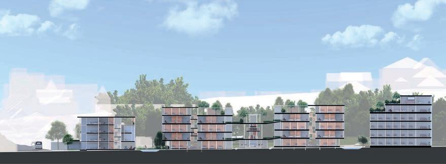
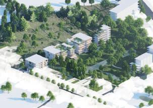
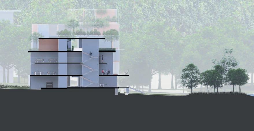
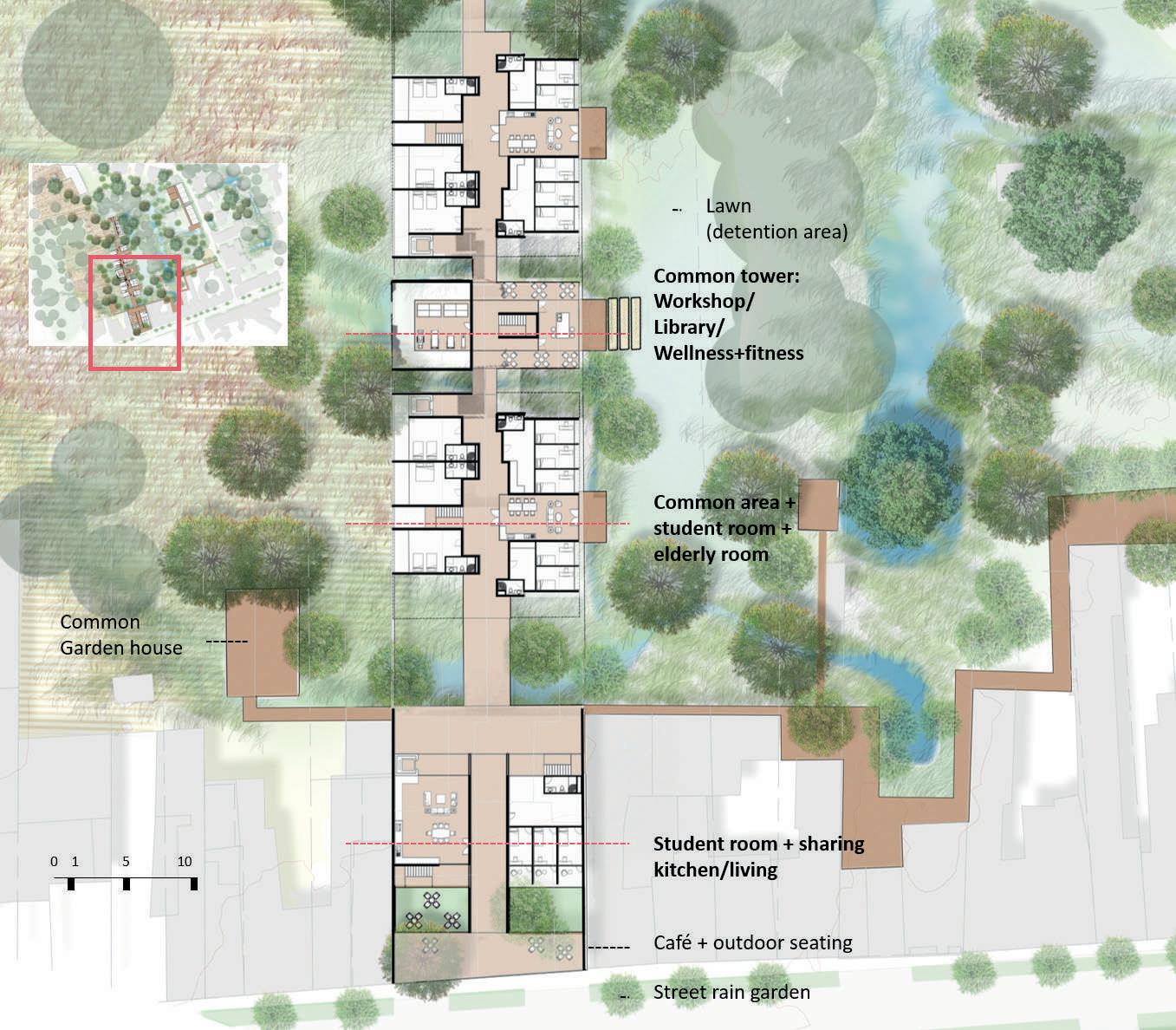
A public and active facility is proposed in the front building to give access and bring up a sense of community. It includes a cafe and common seating area with student housing. The second and third buildings are living units for multigeneration, featuring a common facility that extends to the landscape outside.
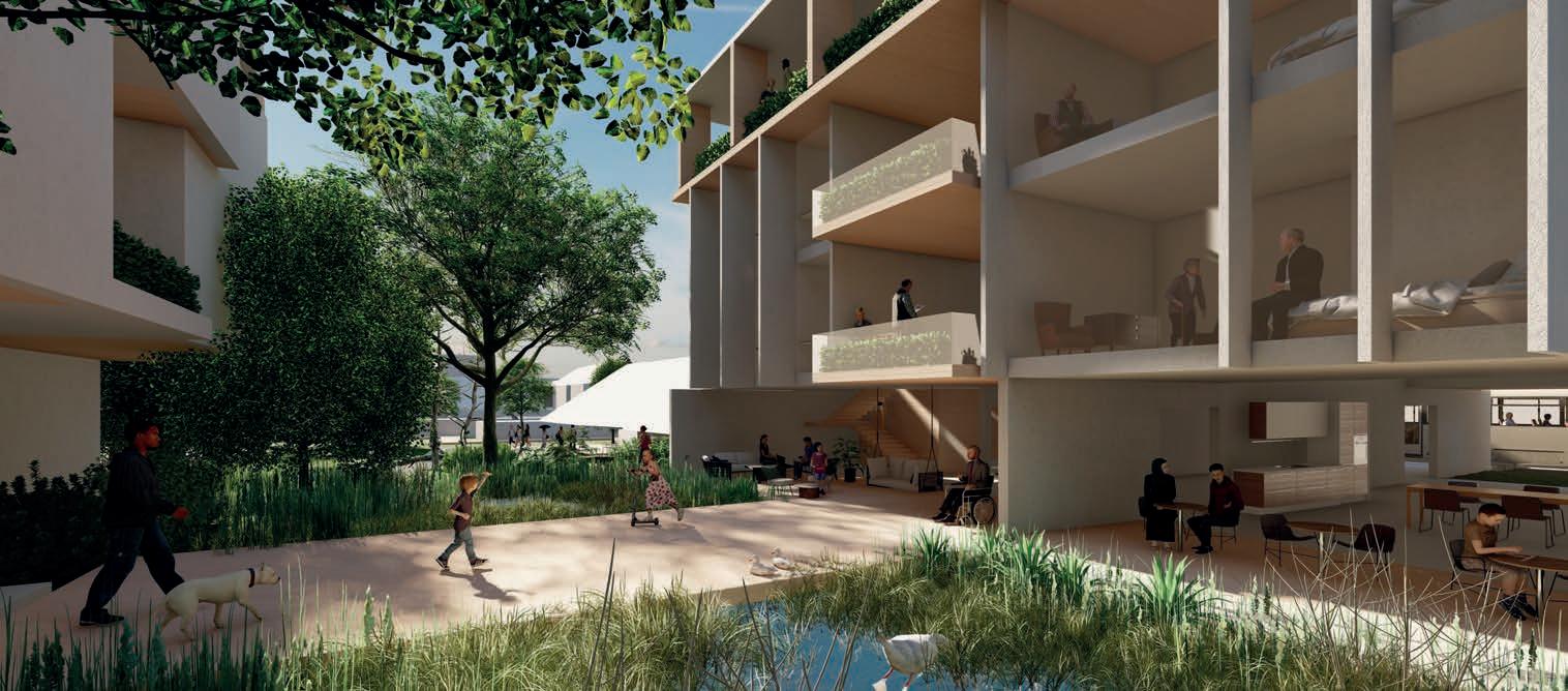
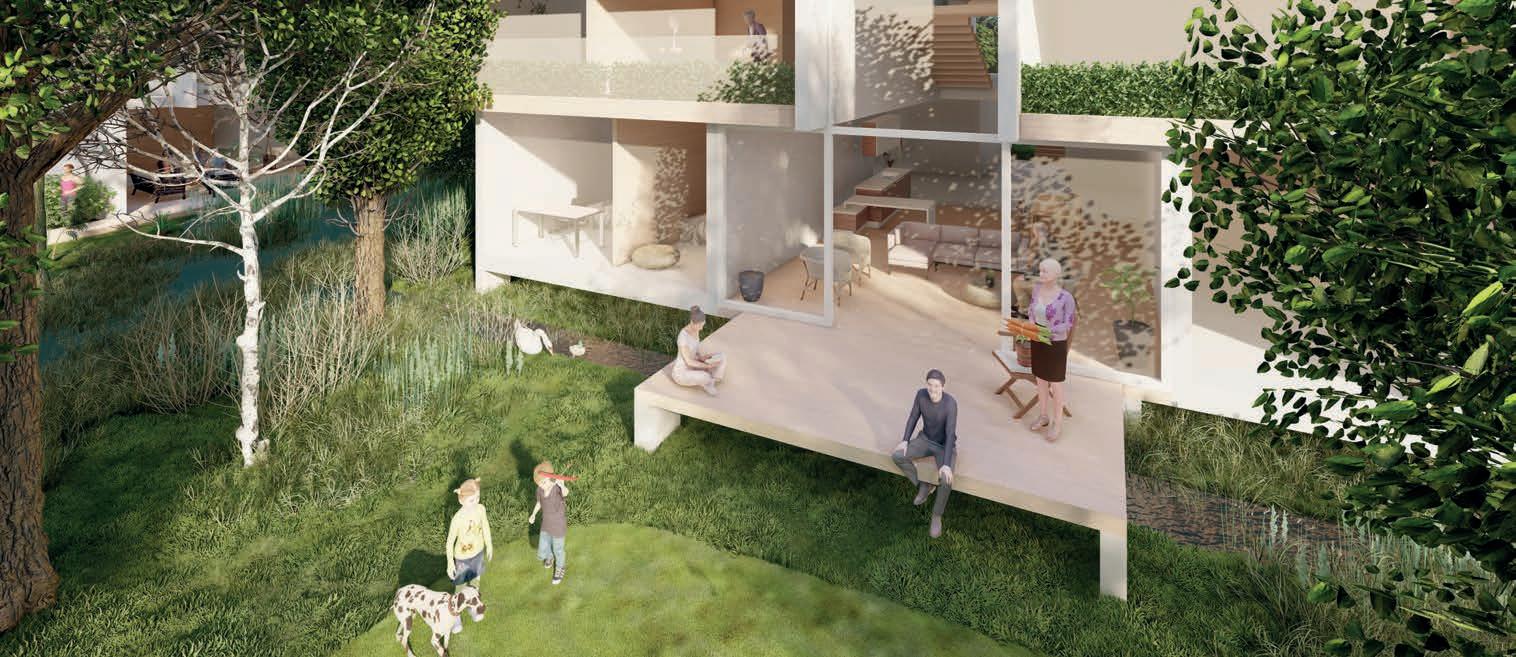
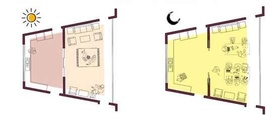
Elderly and students coexist in these residential areas, sharing common spaces that foster mutual support and a lively environment. These spaces include co-working areas, workshops, a library, and a kitchen and dining space. The gap between buildings functions as a channel for water flow and doubles as an outdoor recreational space that links to the buildings' ground floor. Buildings feature common areas in each corner, providing residents with a view of the vibrant landscape.
SWEANENBERGH _ B
ALEXIA CHALOULI
TANGUTURI SRI KESHAVA RADHIKA RISHI
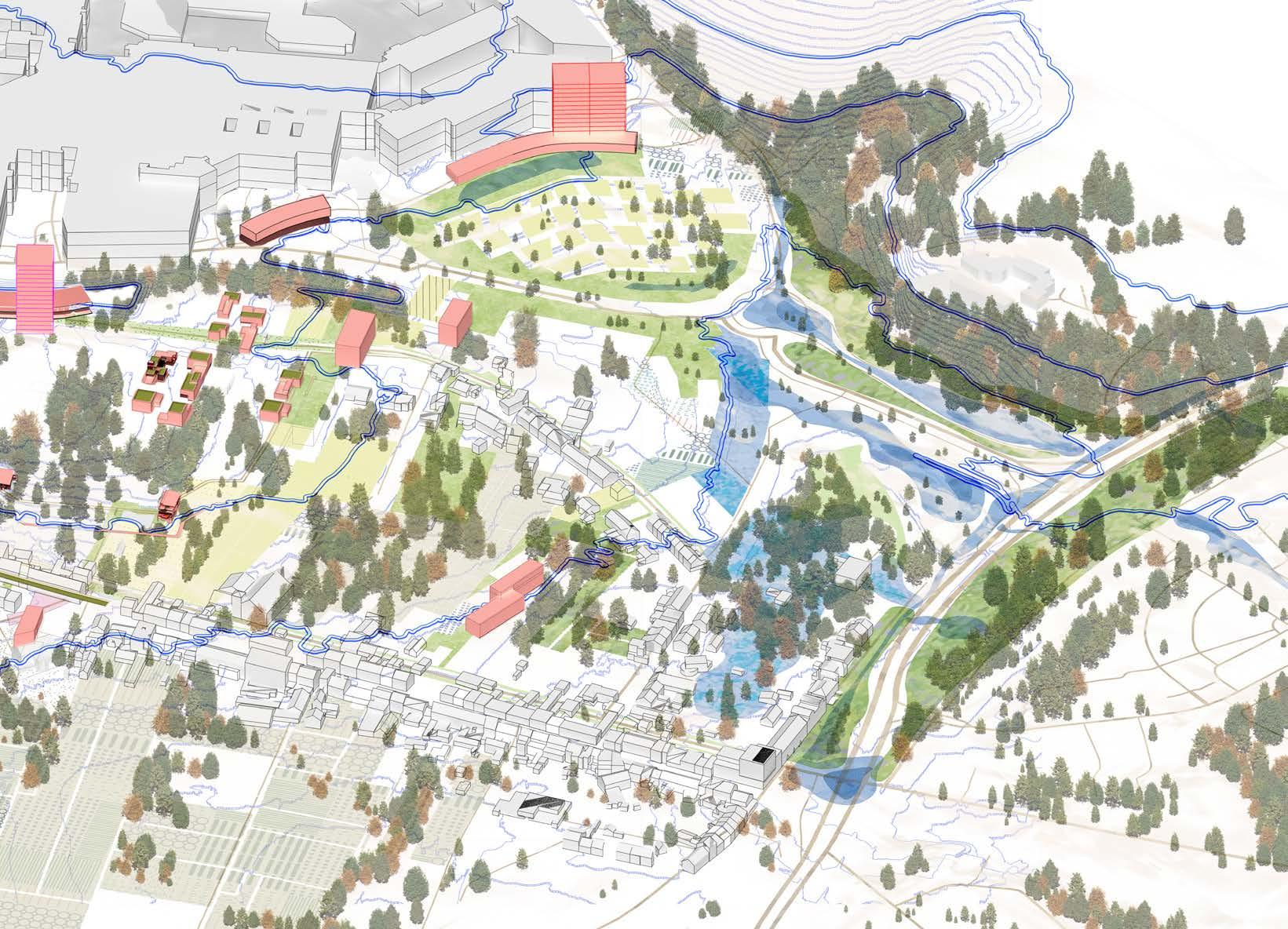
South-East Axonometric View of the Vision for the Swanenberg area.
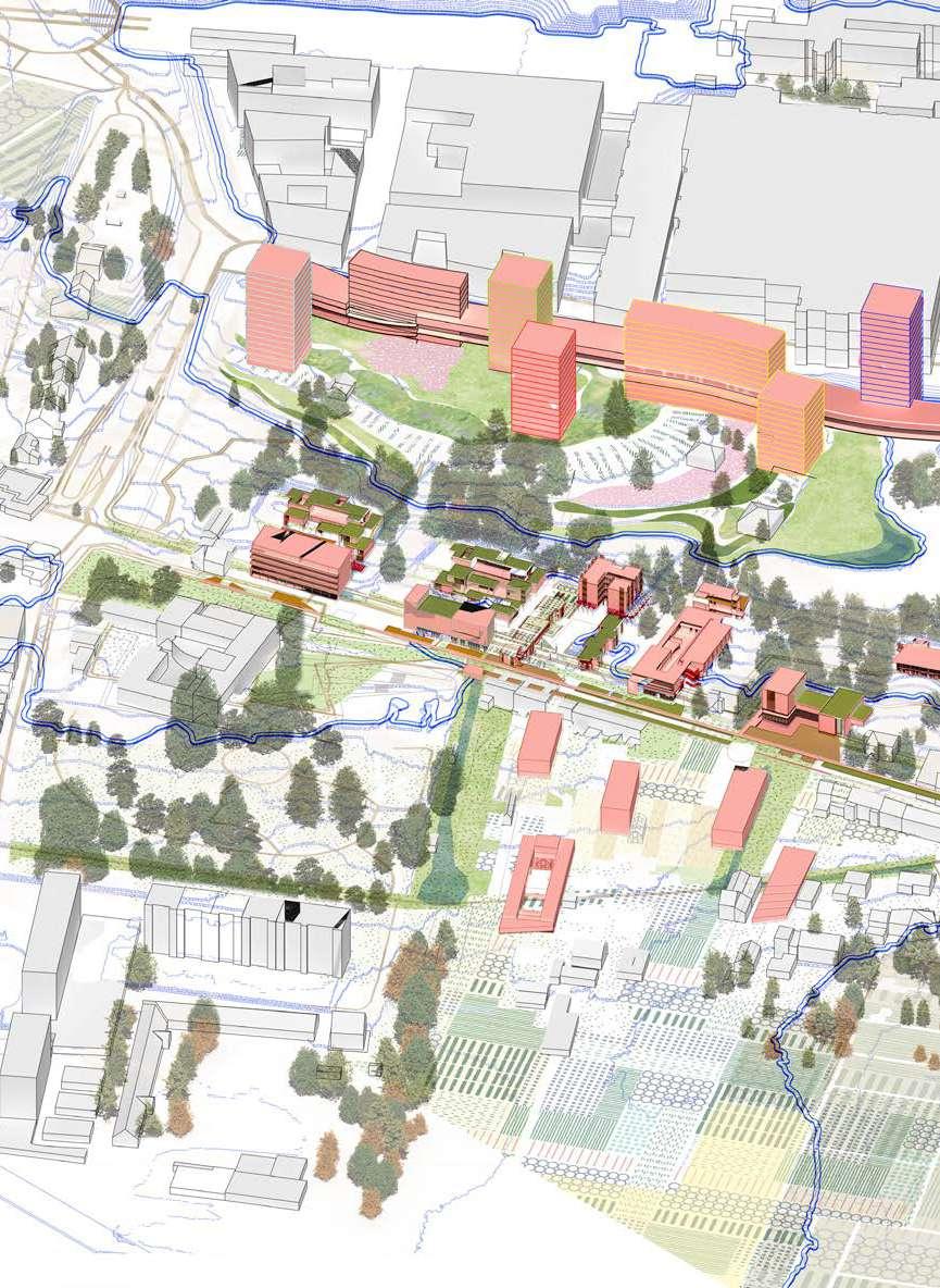
The highest plateau forming the clearing at the top and containing the vast area of the mega-hospital.

caption/image titles use - Avenir Next Demi Bold 14pt
captions and text use - Avenir Next 12 pt
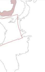
Next
A steep sloped zone containing forest systems while urbanizing along the impervious excavated lands (filling the voids)
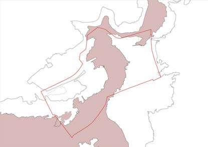
The plain with its continuity of landscape through the confluence of the forest in the north and the agriculture in the south as agro-forestry.
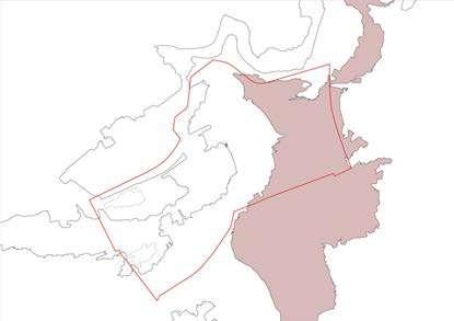
The low-plains connect to city of Leuven via the ringroad, transformed to manage different water bodies until the valley.
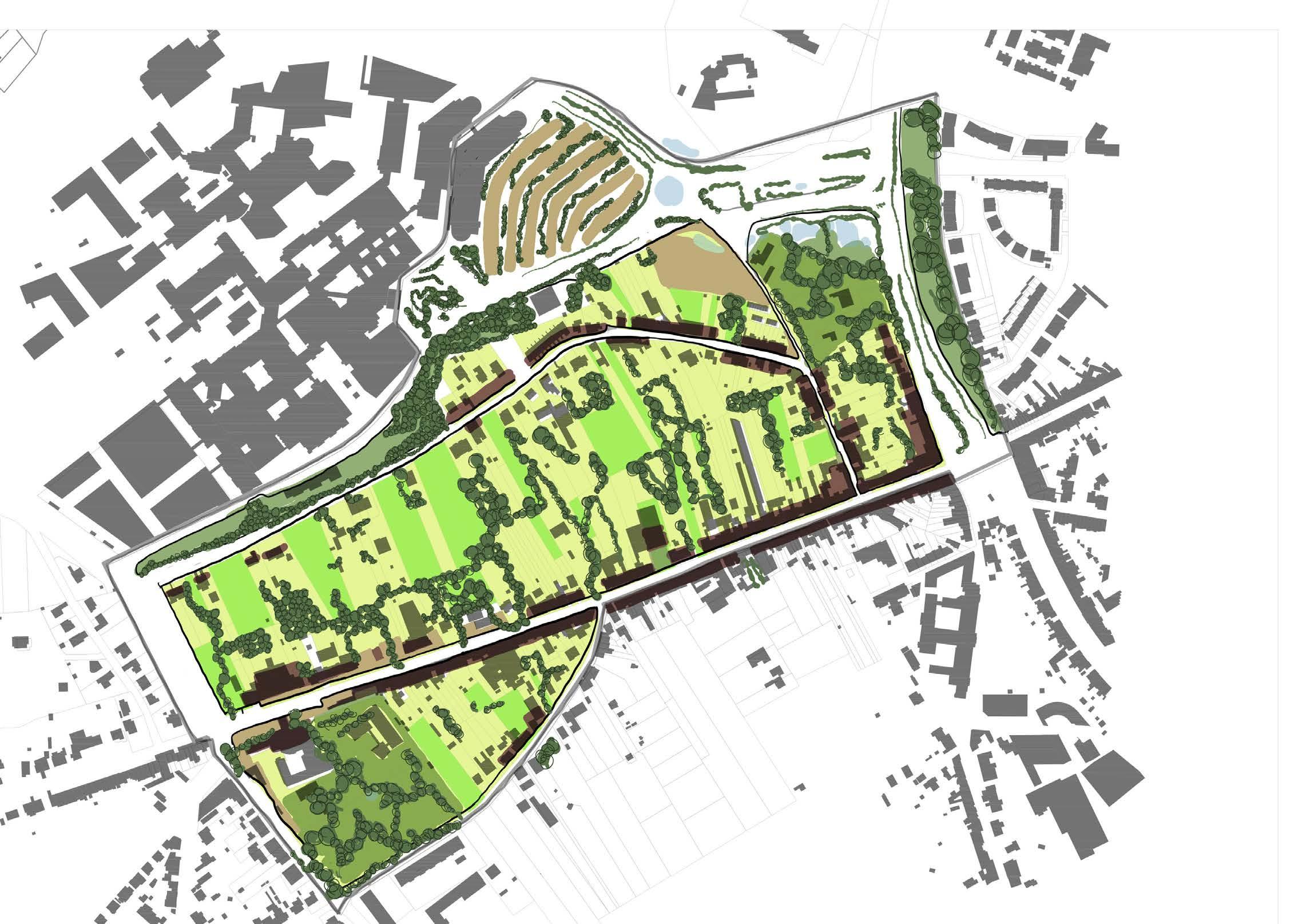
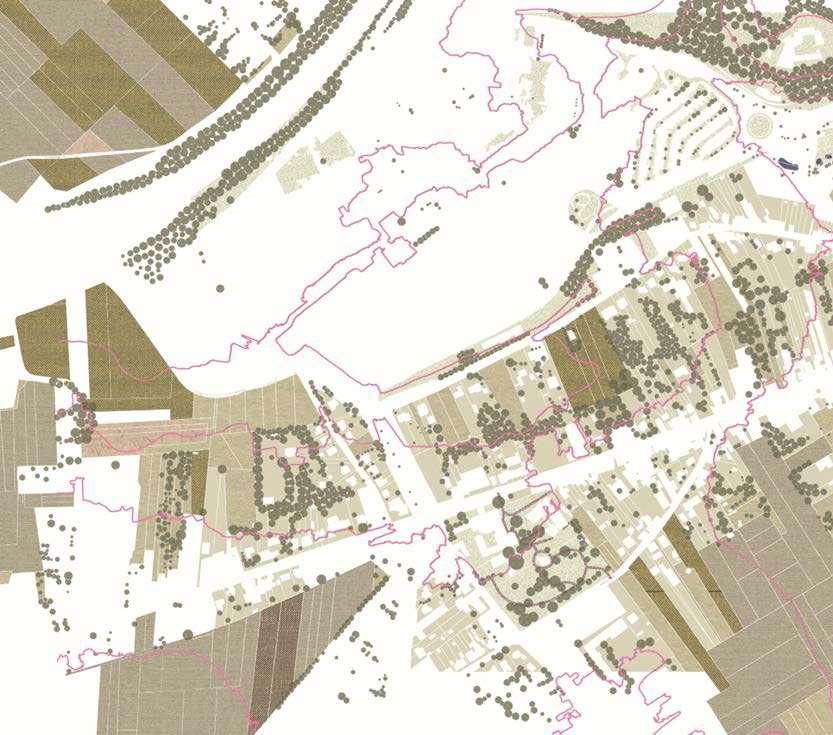
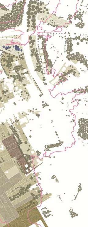
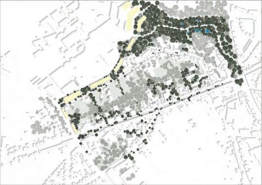
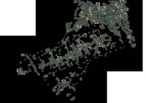
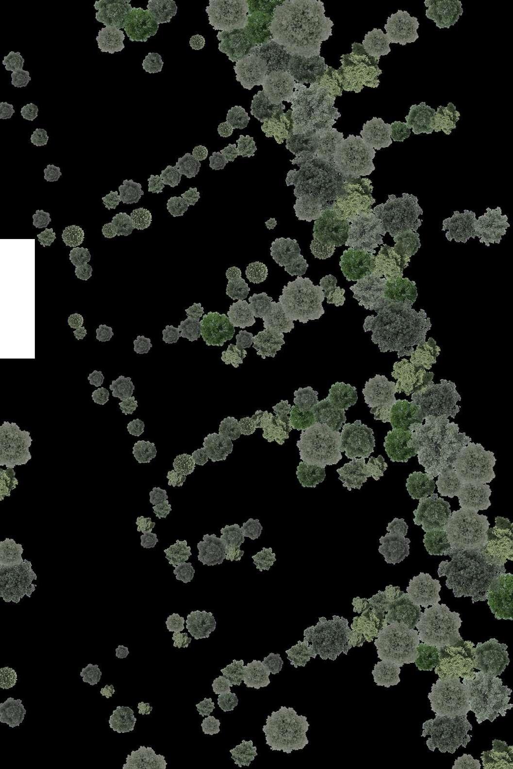
A carreful mapping of the open landscape uses (from crops to gardens and parks) along with the high vegetation in the area, allowed for a more explicit understanding of the nuances of the site and its structure. Amidst the agricultural valley in the lower plains and the surroundings, as well as the remant forest systems in the steeper hills of the Swanenberg, urbanization has claimed the places in between (mostly along axis of circulation).
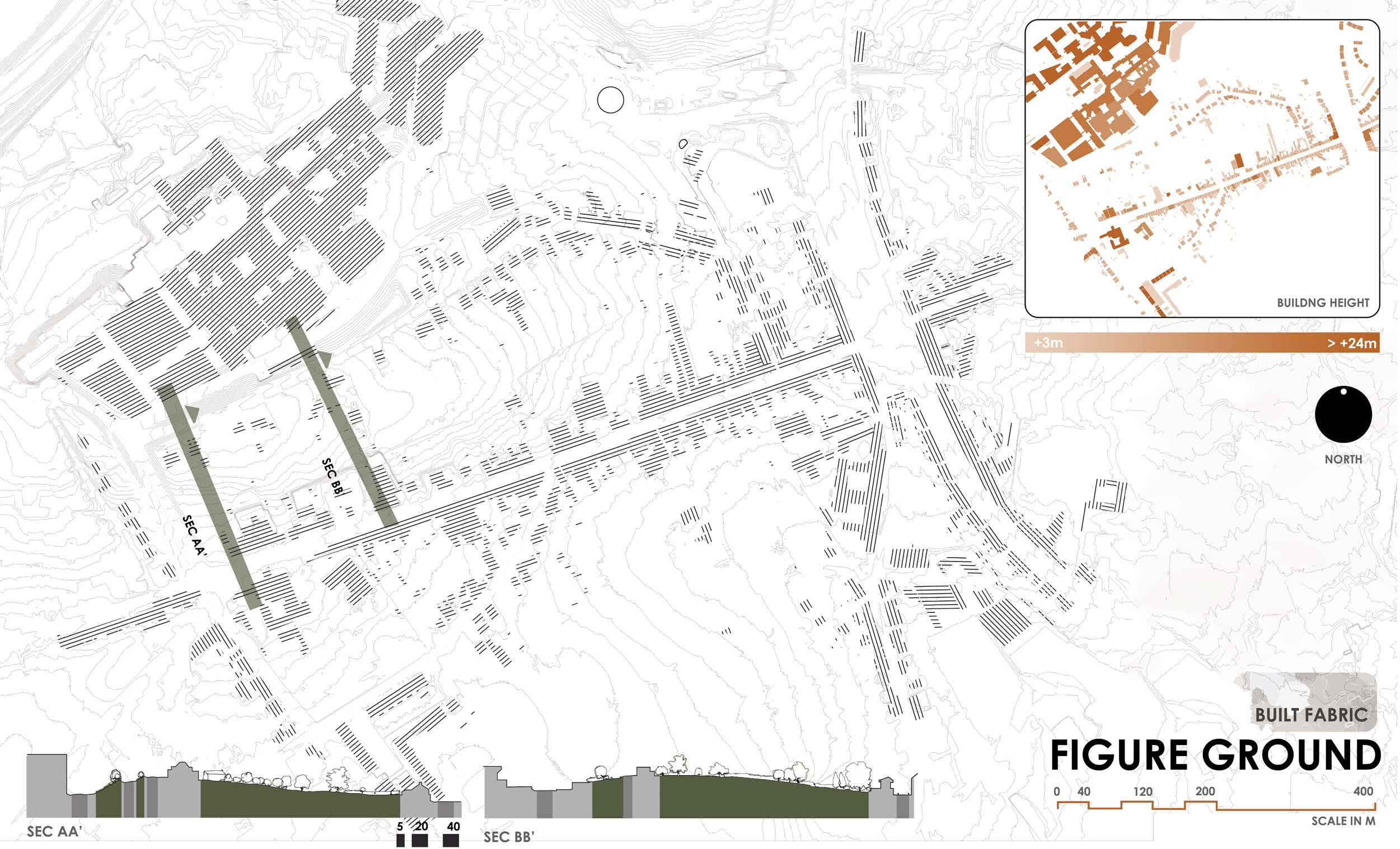
FIGURE GROUND
A interpretation on built morphology, with open spaces (greenfields), guiding the densification patterns along the underutilized impervious landscapes.
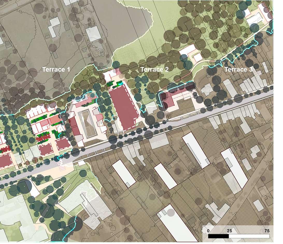
The demarcation of the four terraces with the top yellow terrace enveloping all the mountains (bergs) of Witness hills with a single contour line. Succesively followed by the ridge, the plain, the lower plain and the valley.
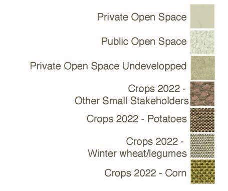

Intepretative readings of the site: Open Area (top right), Figure Ground (top left), Slope Study (bottom center)

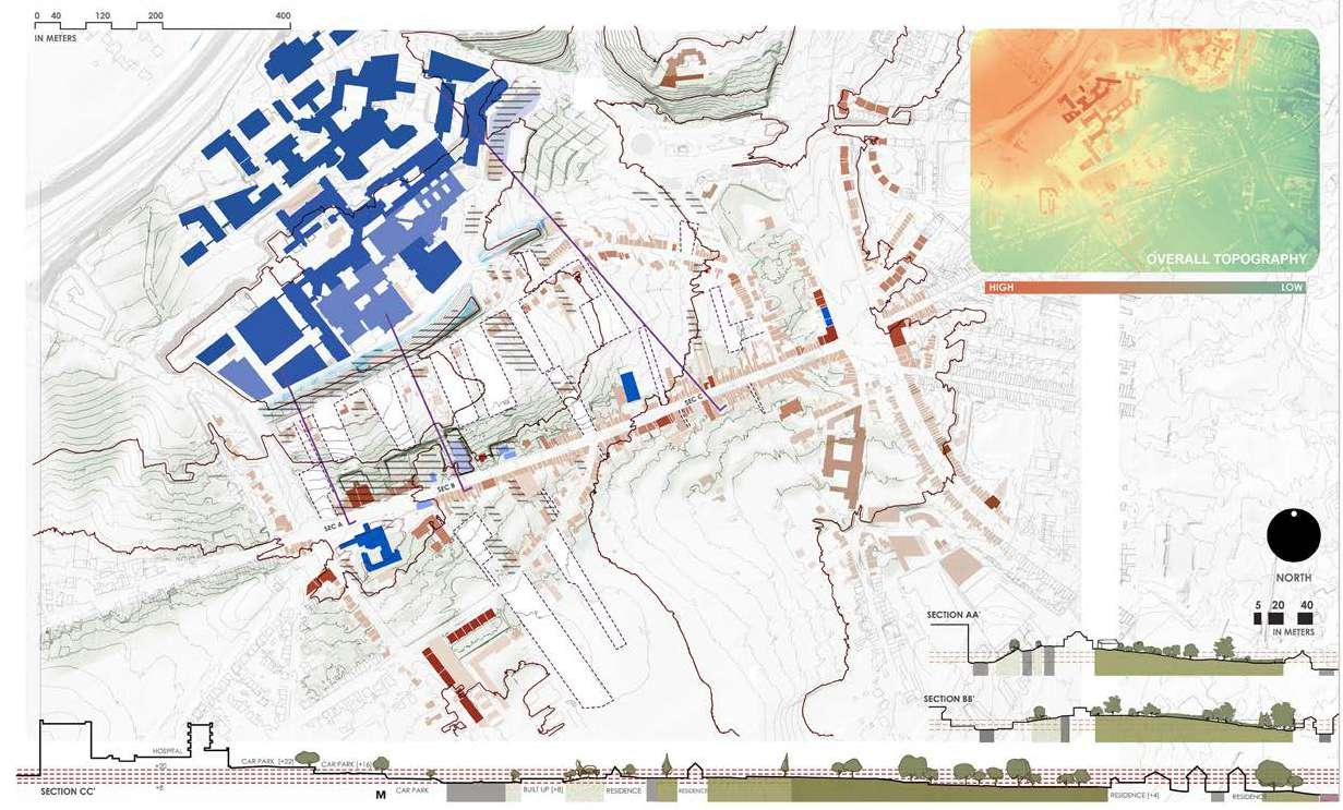
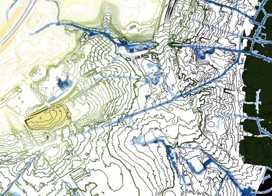
SLOPE STUDY
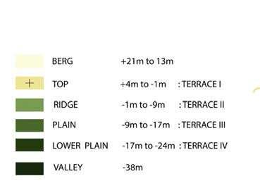
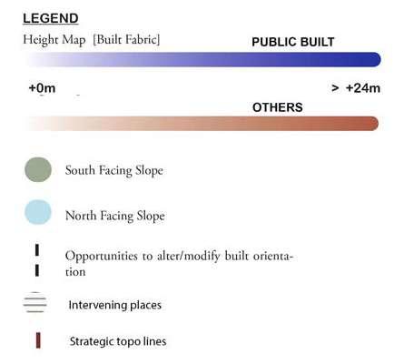
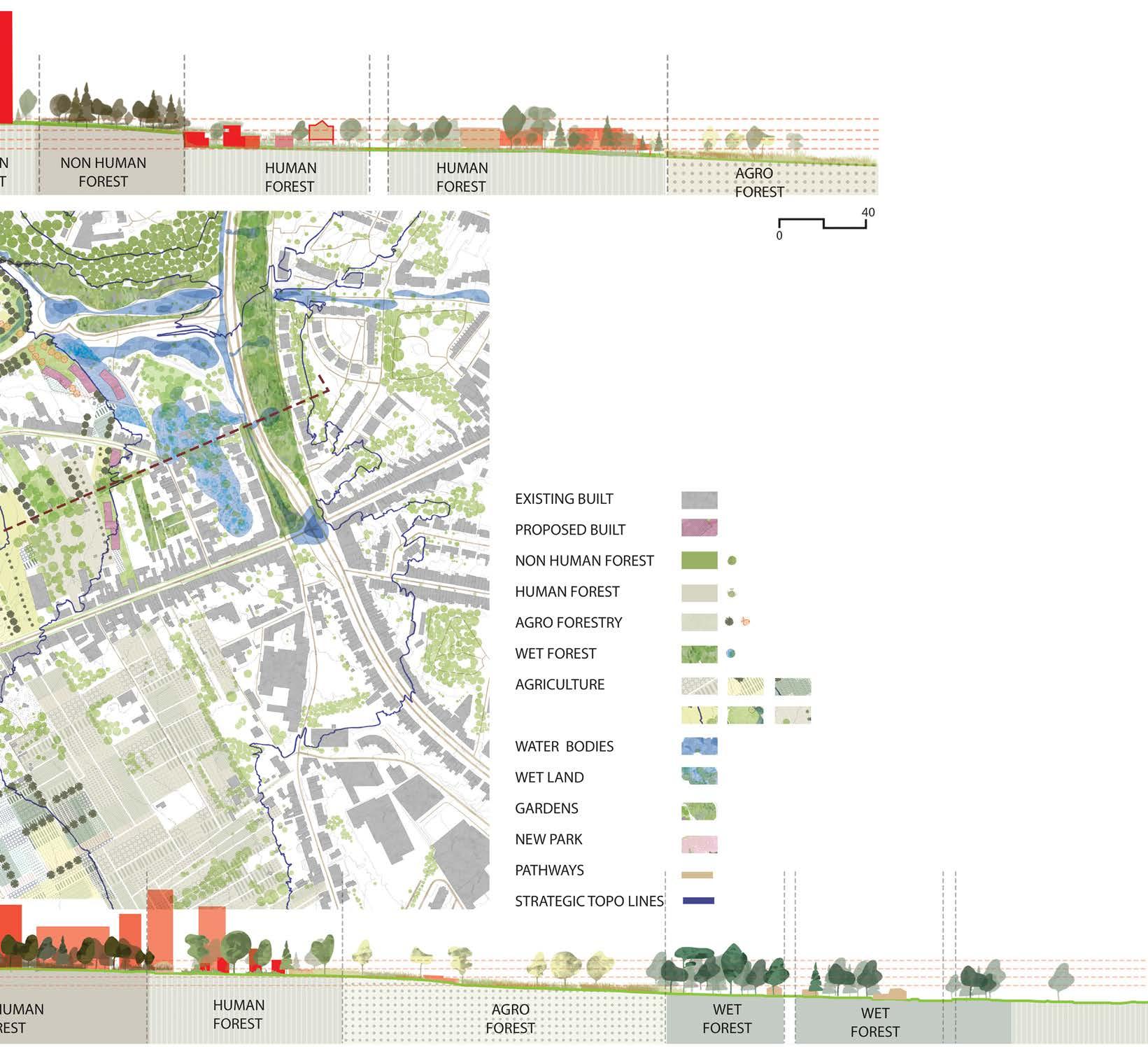
The proposal enables urbanism to go along the lines of topography, looking into soft mobility as a key urban element in the post-car context. The strategically selected contour lines (that are 7-8 meters apart in elevation) divide the site into four conceptual terraces, while being the backbone structure for bikers' and pedestrians' paths. These conecptual terraces don't result in any earthworks of flattenning the land, but rather help guide the urbanism envisioned to become weaved to the landscaping systems transervsing the Swanenberg area (as identified in the reading of the site).
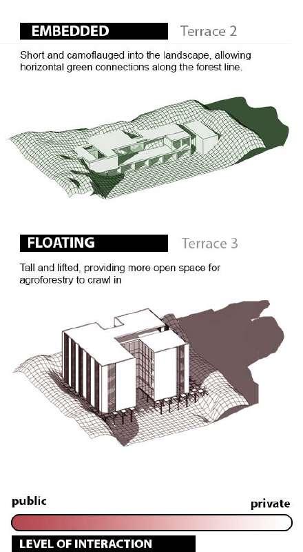
As a result, four different archtypes of landscape+urbanism are proposed for each conceptual terrace; starting for the highest, as the clearing in the forest with high density tower / continuing to the thick forested steep slope and its embedded urban form entwined with gardens / which then give way to the third terrace where agroforestry designates a sustainable type of living / before reaching the low plains of the final terrace, where the existing mobility infrastructure is transformed to respond to and manage different bodies of water coming from the steeper higher hills, allowing for a more gradual absorption of water along the soil and offering a series of wet landscapes for public appropriation and activation.
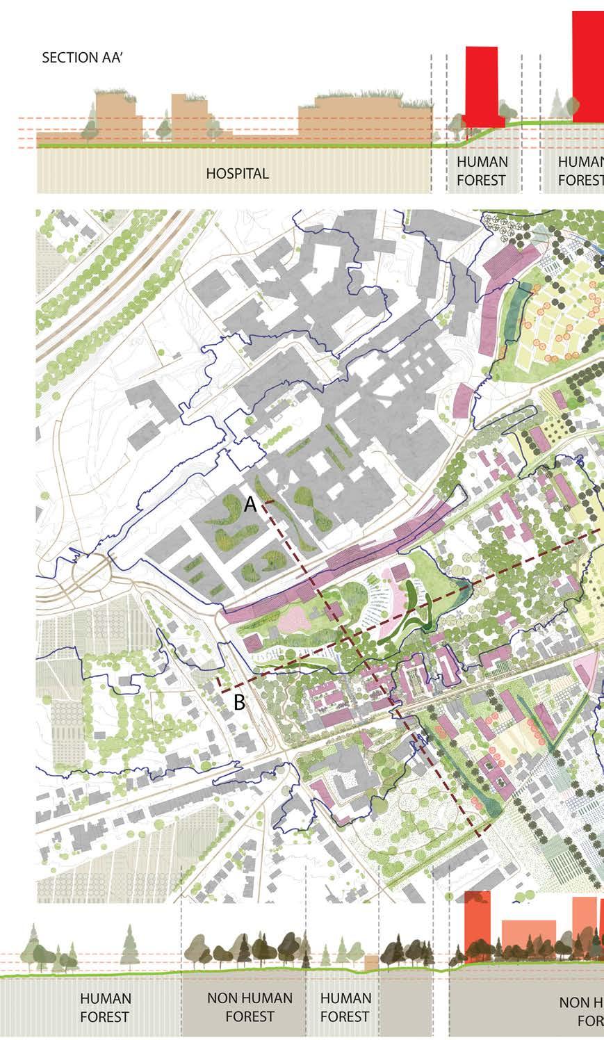

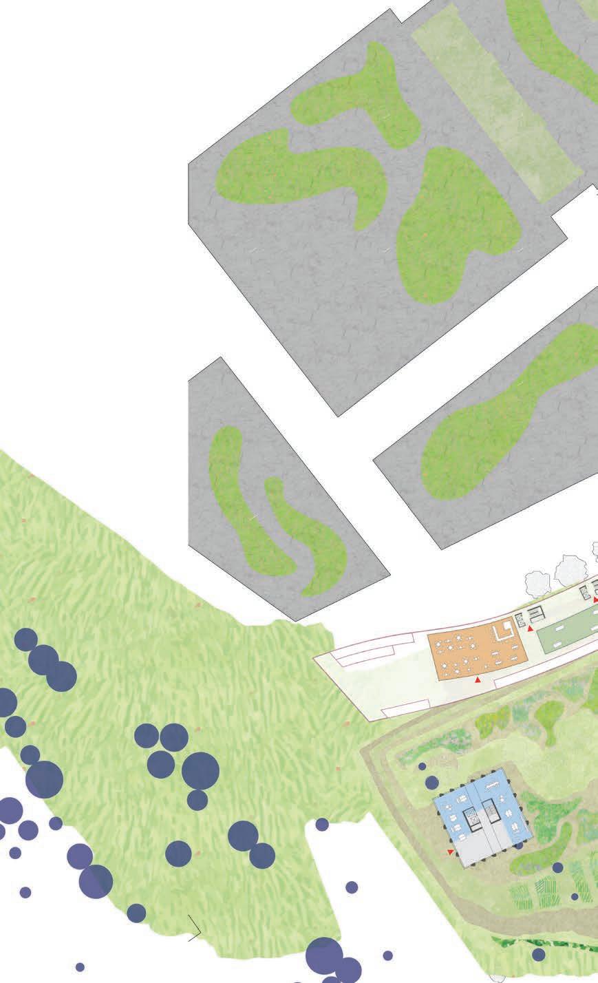
The clearing at this highest plateau is formed on the south by the remnant steepedhill forest and on the north by the monolth of the hospital. To frame the first (south) border a series of landscapes marks the terrace, re-enforcing the feeling of ascension and climax at the top. These include, grassfields and water absorption areas, sport and play activities zones, sensory gardens etc. To frame the second (north) border a 'snake' figure is envisioned to form the new urban edge, slithering along the steep north side and connecting the urban of the street with the natural of the landscape via a series of ramps and stops.
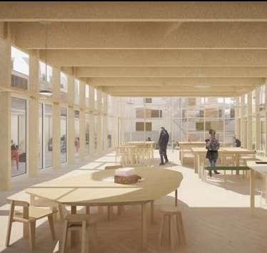
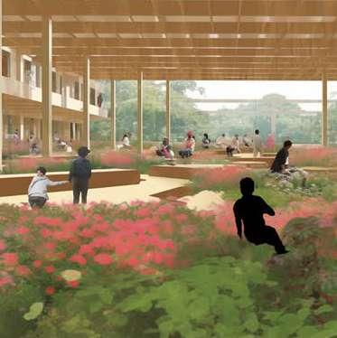
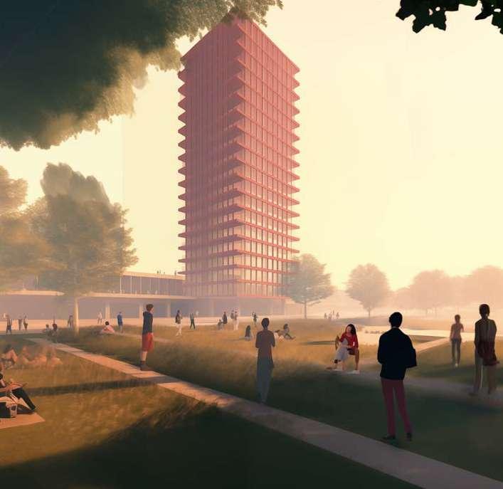
Inside the clearing, pockets of high density living and activity take place in form of timber towers.

PLAYFROUND
SENSORY GARDENS
RAMP-PUBLIC EDJE
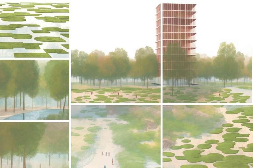
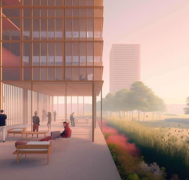
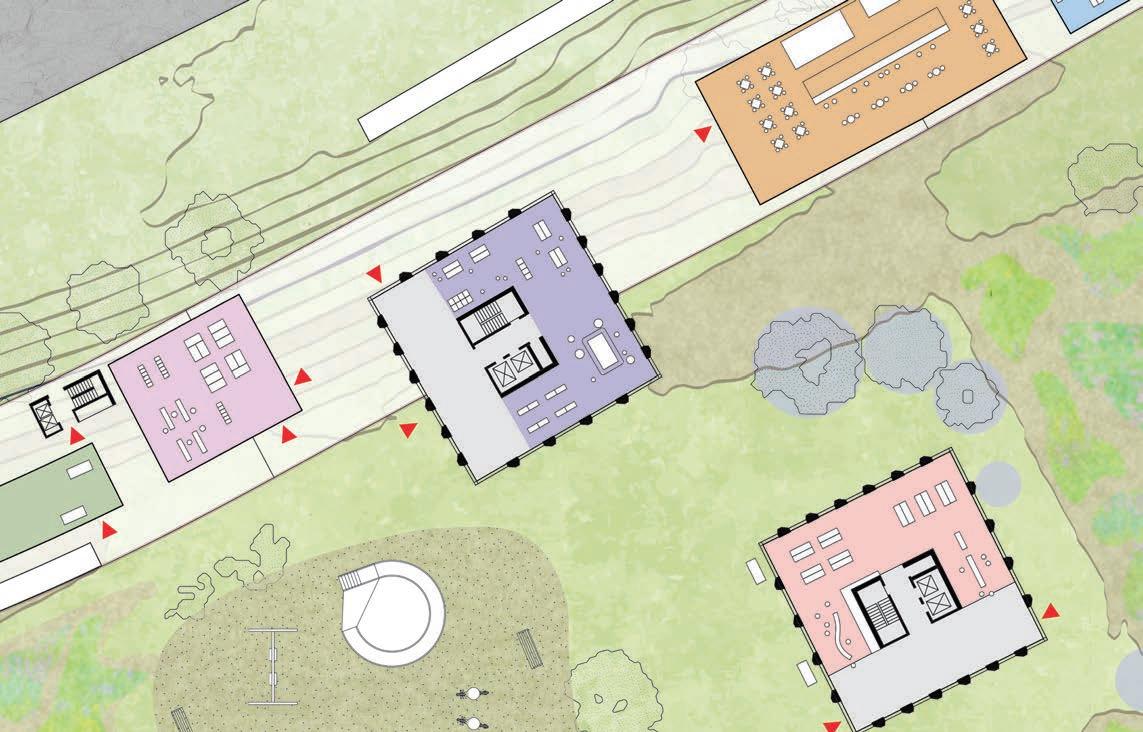
Patterns of landscape (top left), Views from the 'snake' figure (top right, bottom right), Vision Plan of Collectivity at ground floor, Scale 1:200 (bottom left). CO-WORKING
Rooms of collectivity of diffrent sorts are dispersed in the clearing: workshops, co-working spaces, study and free play areas, child-care and learning from the environment rooms, restaurants and cafes to connect and enjoy.
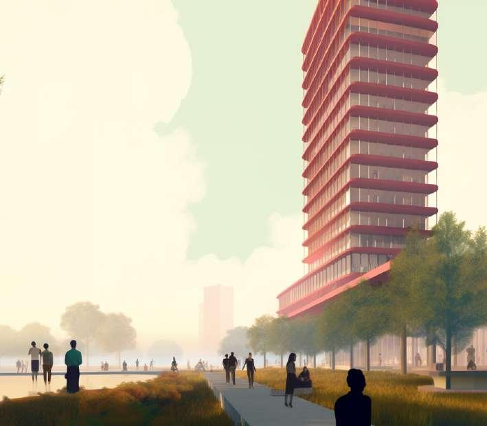
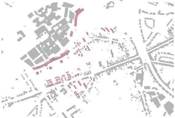
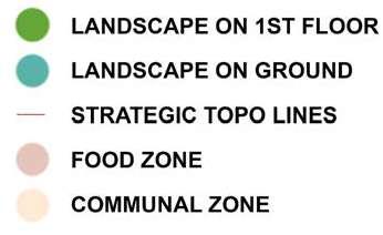
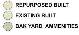
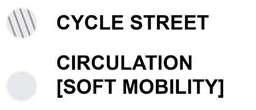
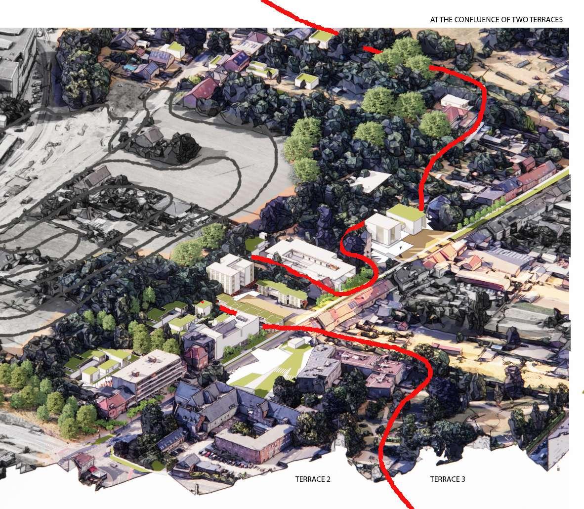
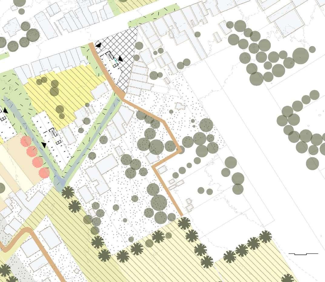
This tissue is at the confluence of terraces 2, a forest system, and 3, an agricultural system. The urban fabric is weaved into these vegetative types on the excavated impervious lands, which are underutilized. The idea here is to create a rhythemic experience of these two landscape systems filling the impervious voids along the terrace types.


1/500 and/or Axonomestric/ eye-level views ]
Weaving the Urban Fabric
At the Confluence
One could experience different landscape systems trying to encroach on each other while traveling along the roadside. This differentiation is made strong with both the weaving and architectural language of the urban fabric in the excavated rooms.
The tissue allows for continuity of the productive landscape (agro-forestry) to permeate through the morphology of the bar code. Impermeable smaller plots are parcelized where the opportunity can be maximised and are built along collective parks and orchards. The road is given away to the agriculture and parks to allow continuity.

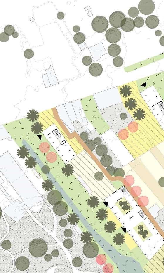
Ground floor plan: continuity of the productive landscape through the bar-code.



into a collective
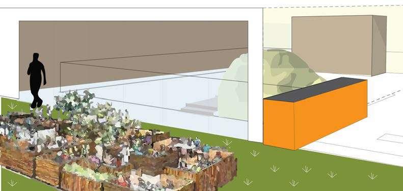
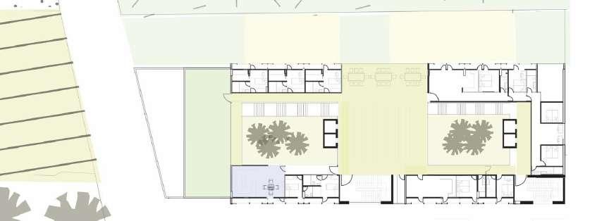
The stepped terraces facilitate terraces that open out to the south-west allowing for productive conservatories as a collective space.
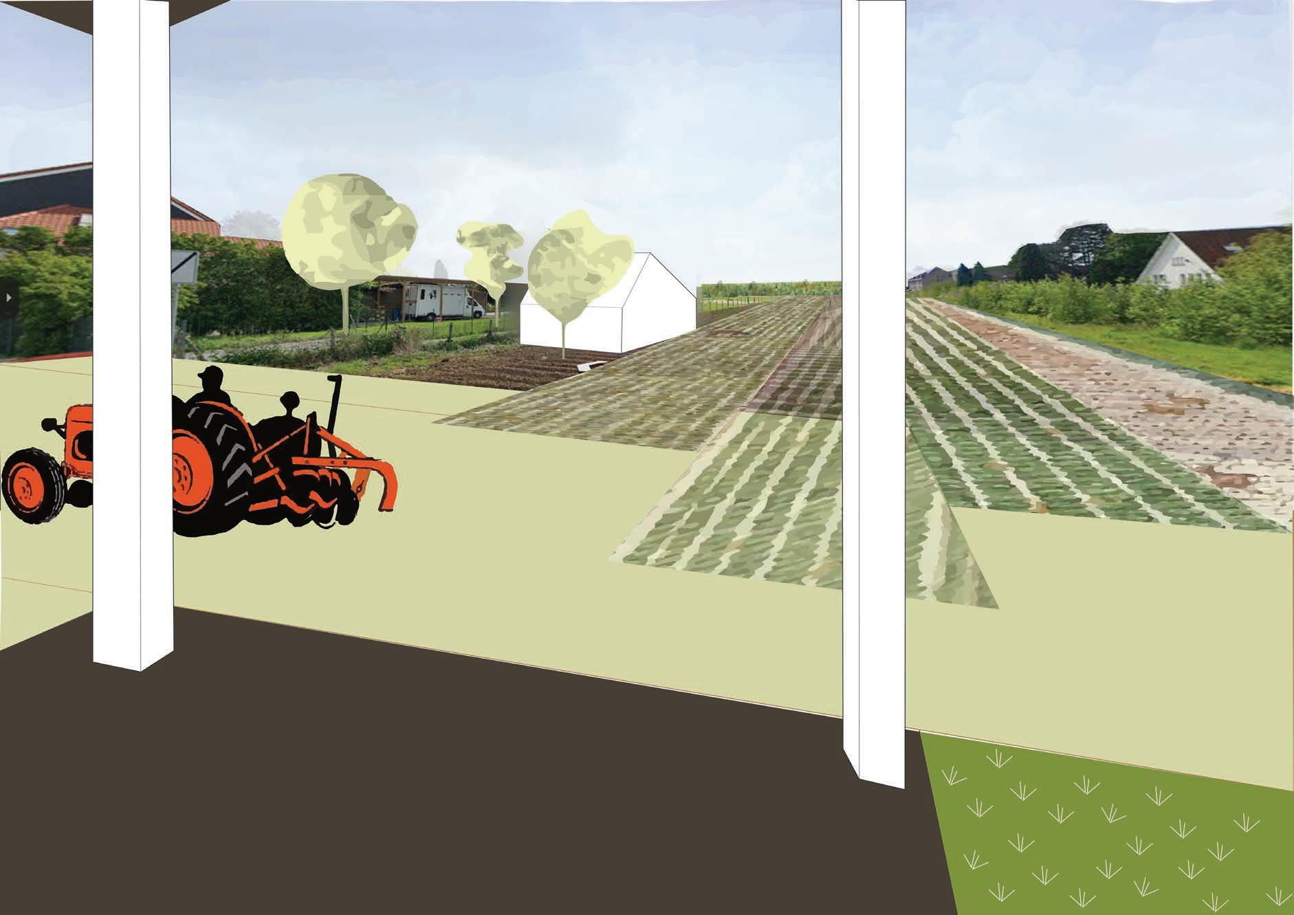
Panoramic views
The collective stilts of the building that unfold to the panoramic views of the agricultural fields.
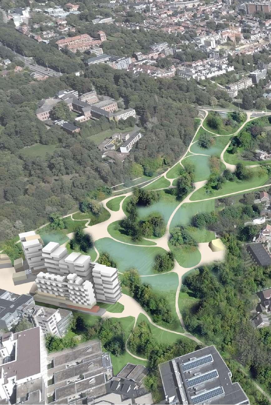
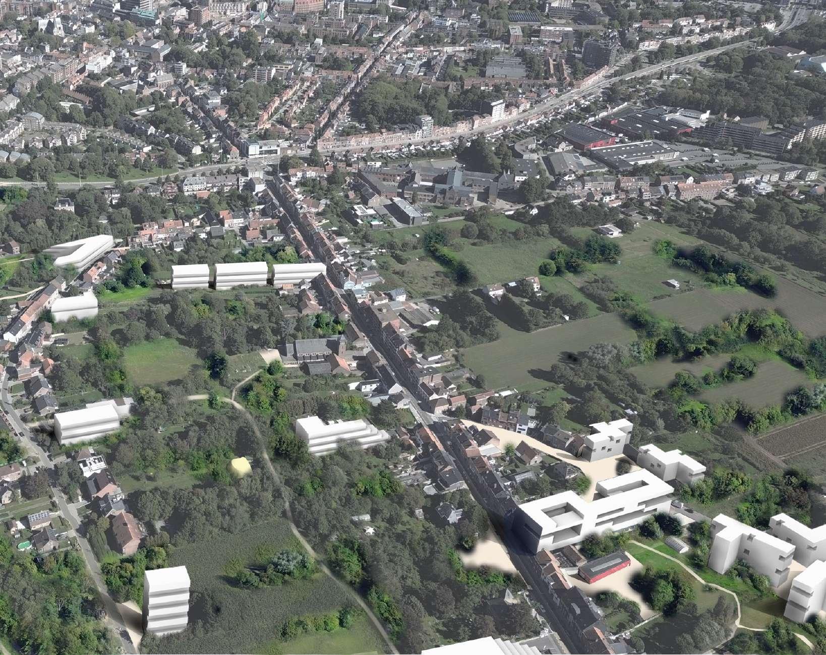


Aerial vision of the studied site, looking West to East
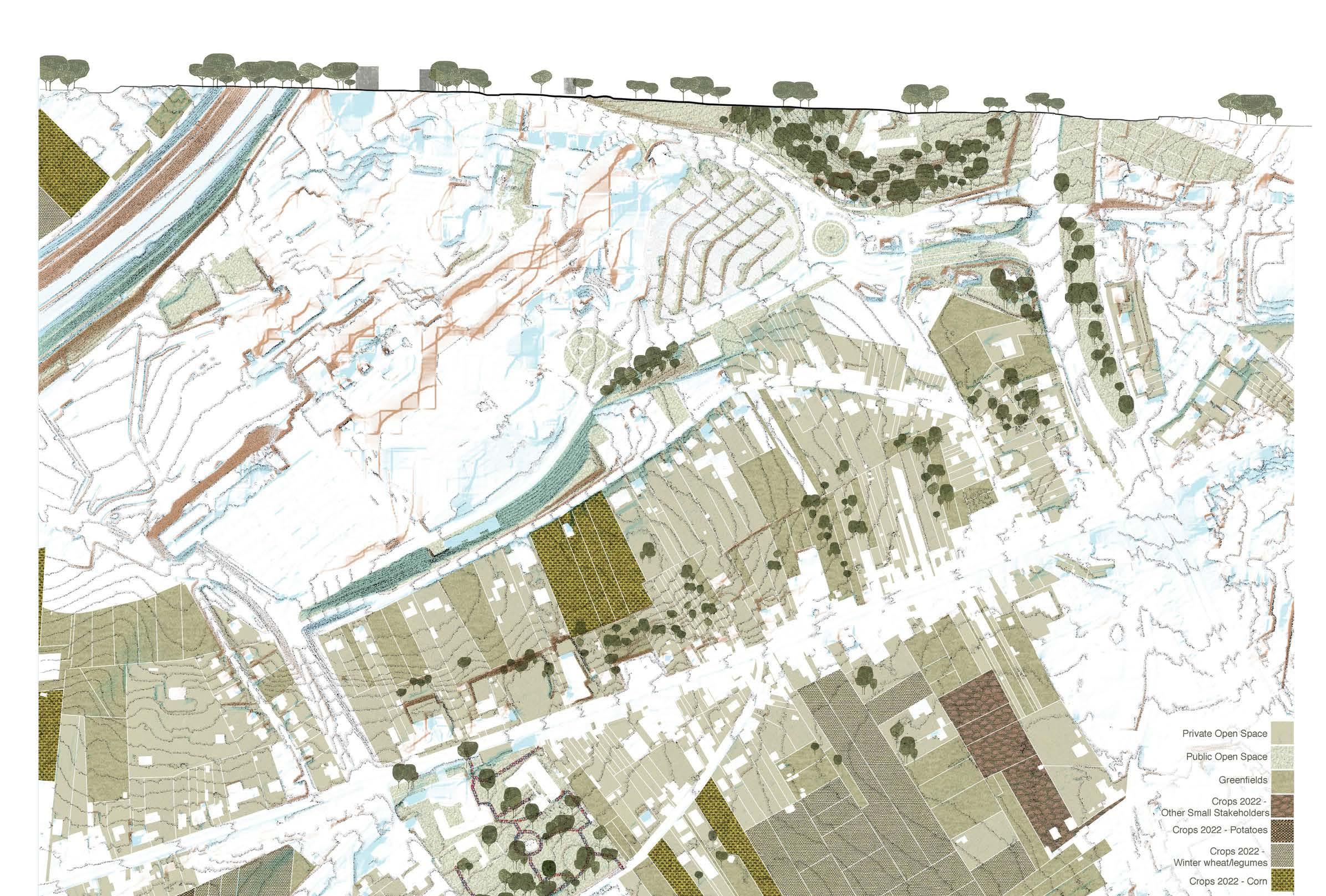
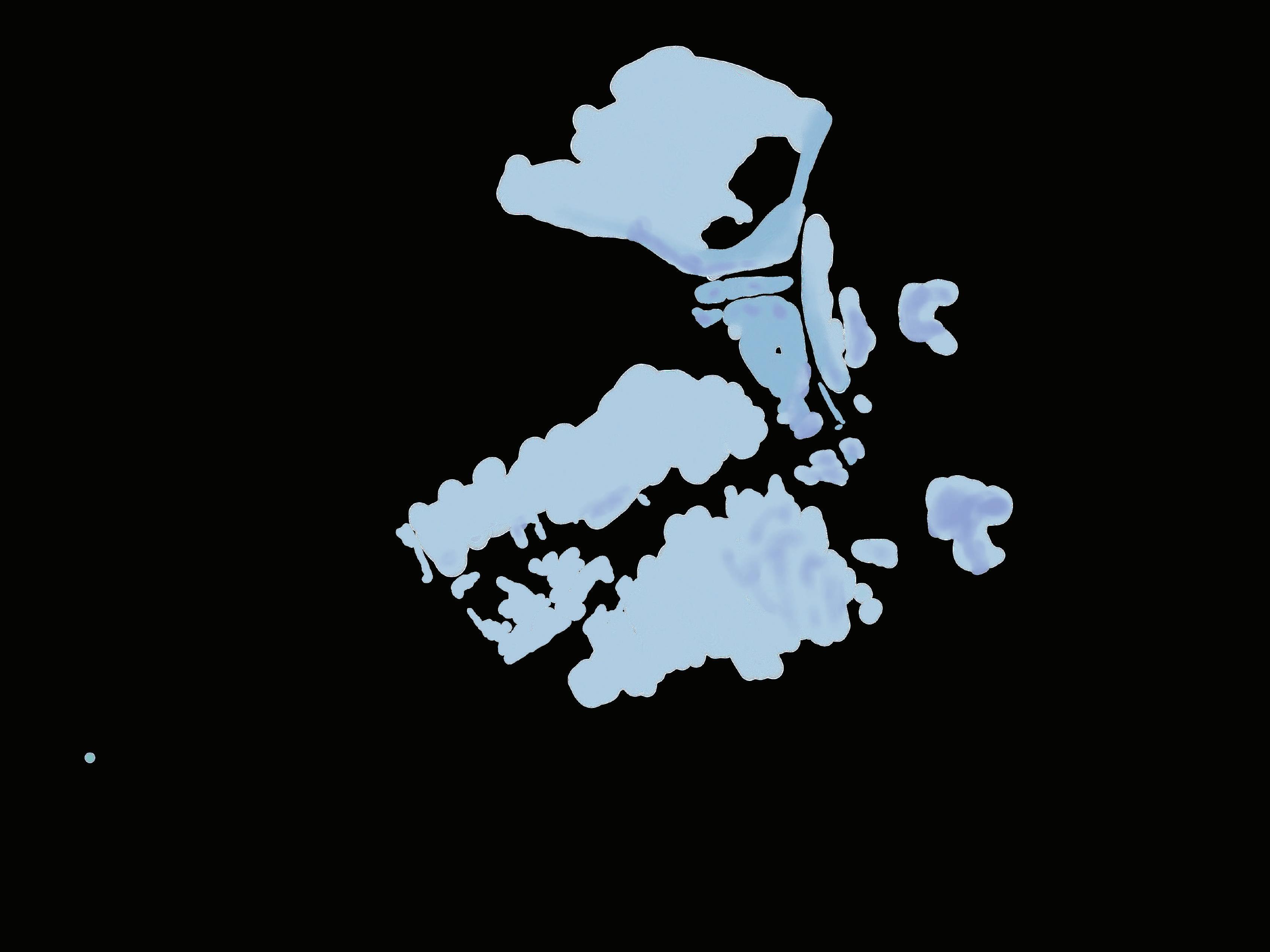
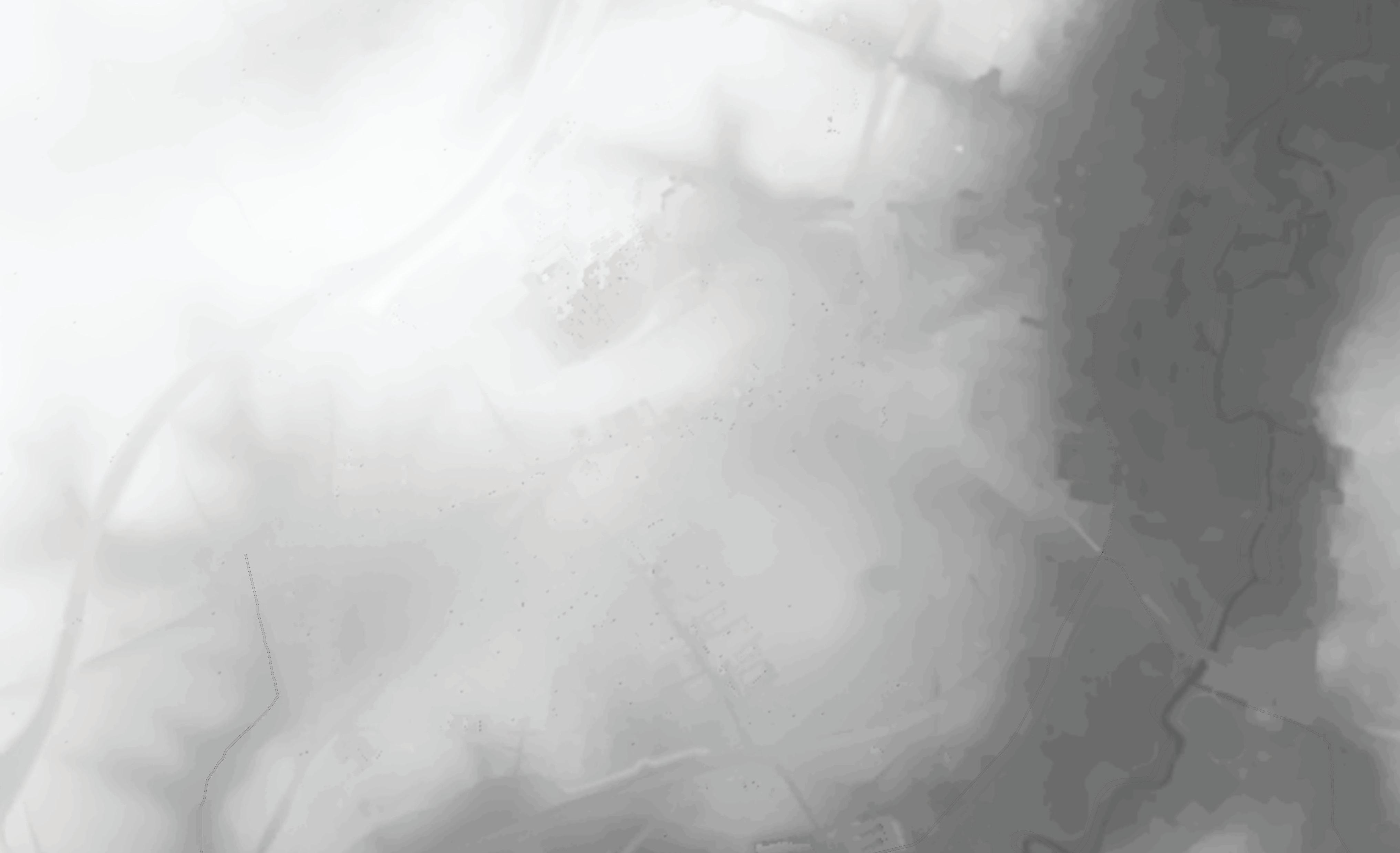
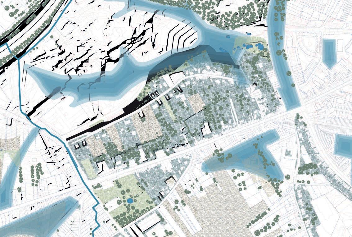
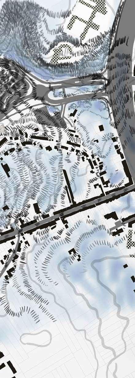
The analysis maps the relation between the site's topography, impermeable surfaces and open soil, primarily in vegetation dominant areas. The permeable areas facilitate on-the-spot rainwater absorption and retention. The map highlights the sealed surfaces, mostly in the north of the site as roads, parking and built-up parcels under a hillside, which we interpret as a kind of undesired bathtub which is drained into the city's sewage system.
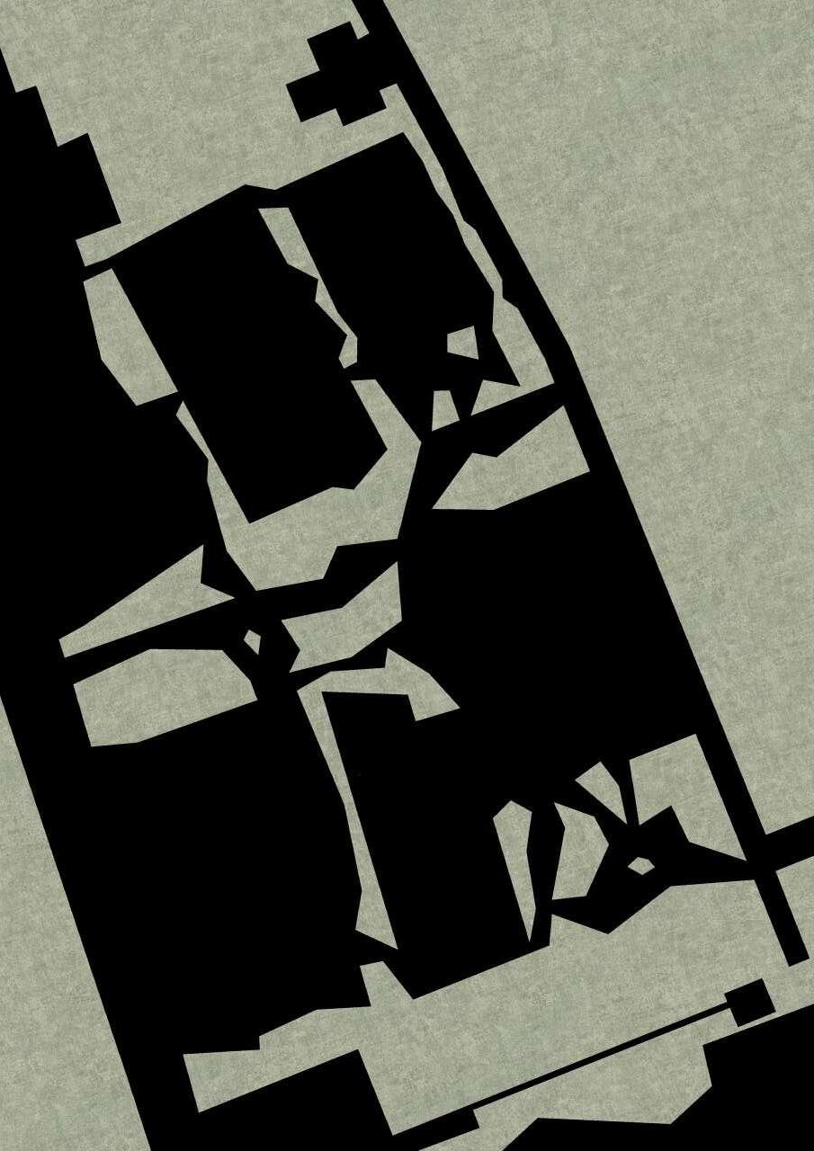
The map visually captures the spatial dynamics of the area, highlighting the cohesive alignment of continuous facades and varying building heights. This diversity contributes to both the aesthetic and functional aspects of the built environment. Additionally, the map reveals insights into the built to open space ratio, emphasizing the intentional design of voids—open spaces that break up the built landscape. In a succinct manner, the map provides a comprehensive overview of the nuanced spatial relationships within the depicted region for planners and observers.
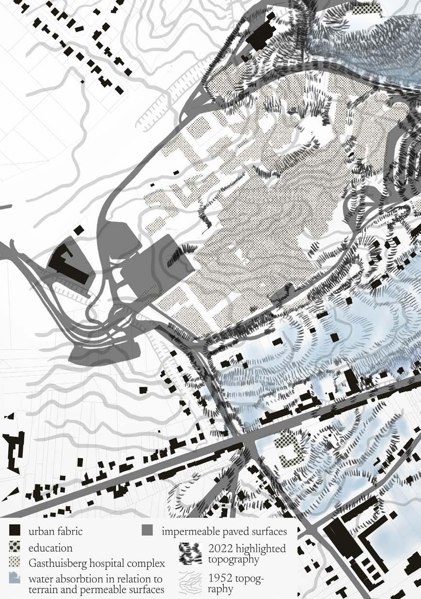
MAP 1: TOPOGRAPHICAL AND PERMEABILITY READING
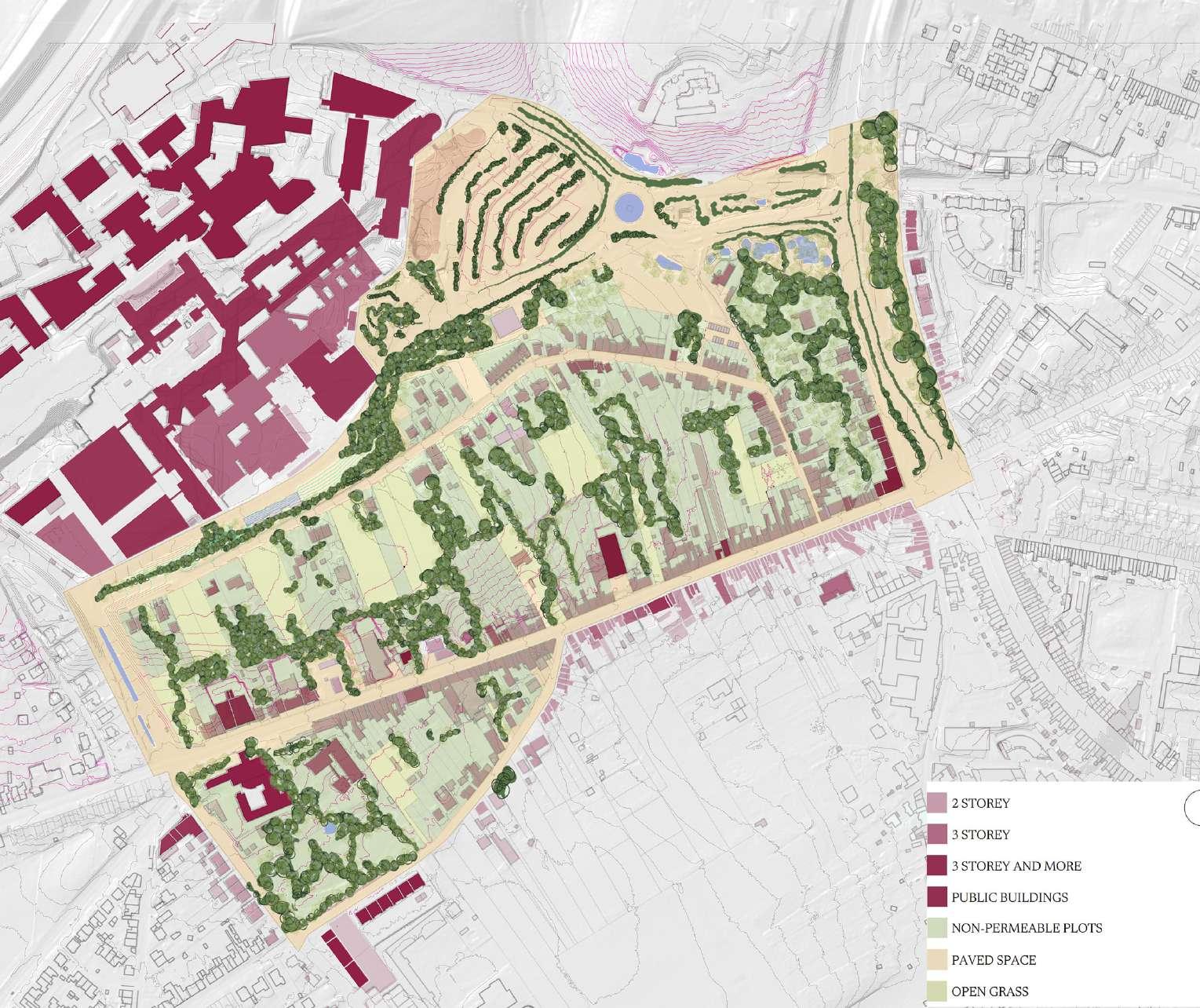


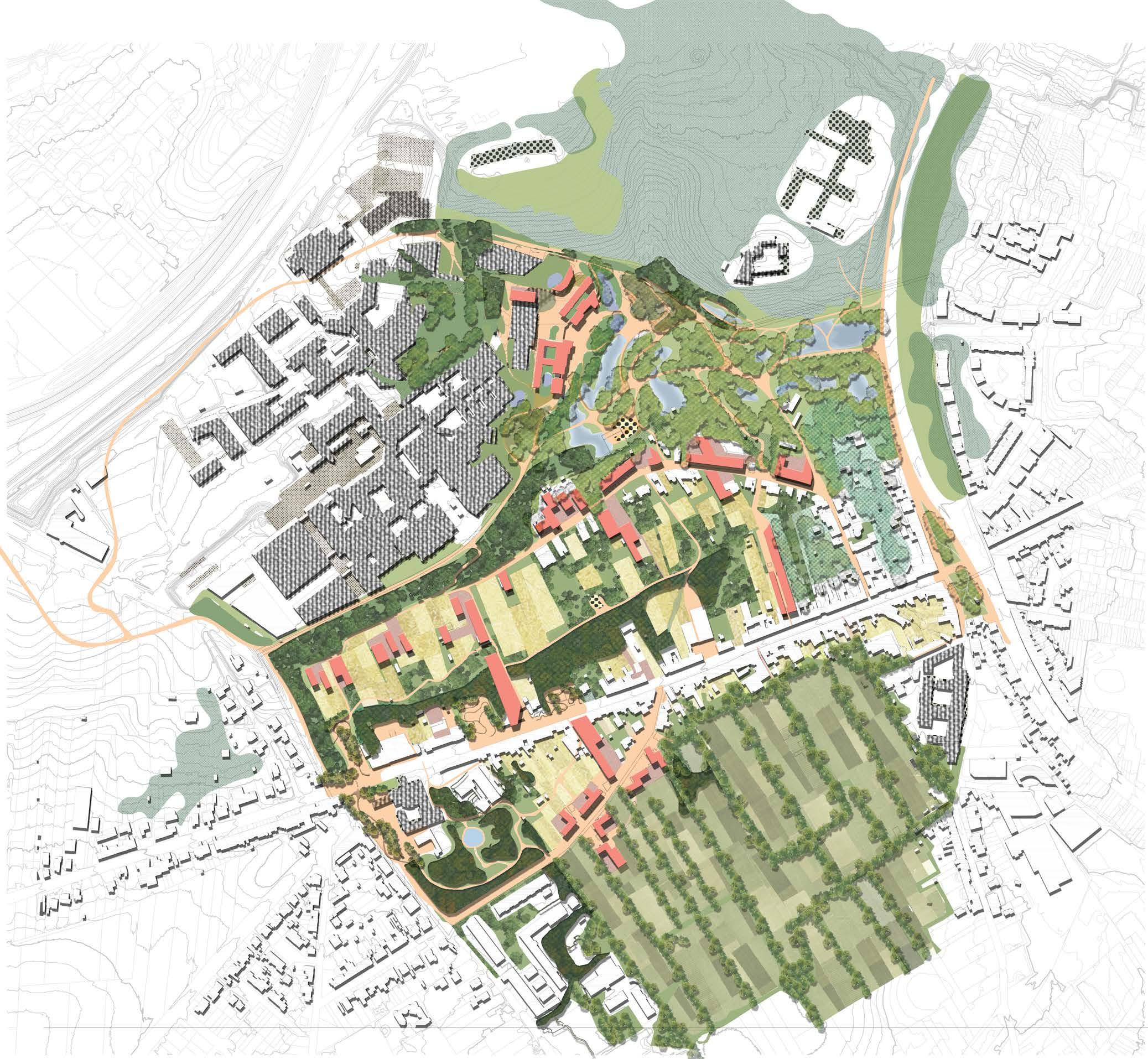
From our analysis, we drew the conclusion that our journey would be focused strongly on unsealing and opening. Both the ground surface, above which we place soft mobility boardwalks, and in breaking the line of the main street. Tervuursesteenweg is no longer a long string of continuous facades, to bike uphill along. It has beads of public spaces falling back against thick vegetation in the topography cuts.
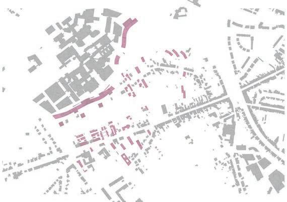
Removing the paved bathtub of parking, we have space for a large wetland city park. Larger landscape figures are framed with urban material and vegetation structures, and the fragmented urban tissue is densified by filling in certain gaps on existing building footprints, while leaving others to open out to parks, gardens, forests or new public spaces. Everything is reciprocally framed, and these edges are alive and populated.
The top of the hill views the surrounding landscape, gardens are placed within the lattice of a productive forest, as we move down the hill, kindergardens and schools tucked into vegetation, yet safely and easily accessible by the paths designed to gently bridge the hillside and connect the park basin with agriculture-adjacent neighborhoods to the south.
existing vegetation
thick inaccessible vegetation
wet gardens
park vegetation
public space proposed new educational current educational facilities top of the hill park vegetation gardens in the productive forest fields, gardens and orchards

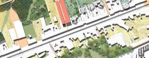

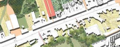

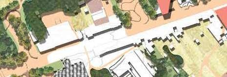
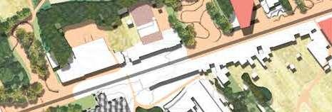
Taking topography and removed building footprints as an initial guide, a new neighborhood unfolds in the margin between the hospital and proposed city park, and slowly encroaches further into the hospital complex. A mirroring of the park-fused public space and work-oriented square, gives what would otherwise be the back of buildings a facade, and encourages all-day-long activity. Workshops, small industry, public and collective amenities, afterschool activities for the neighborhood and healthcare / service workers‘ children, the design aims to bring craft and work closer to housing and the city, while striving for interaction between different professions, age groups, work and leisure, offering adaptability and diversity of living models within the housing typologies. Housing should be understood as living, and life is more than often
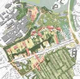
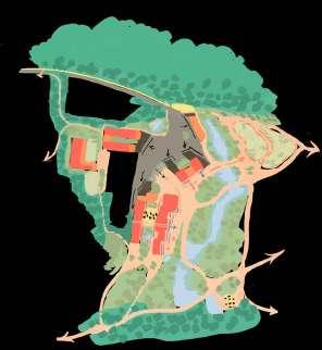
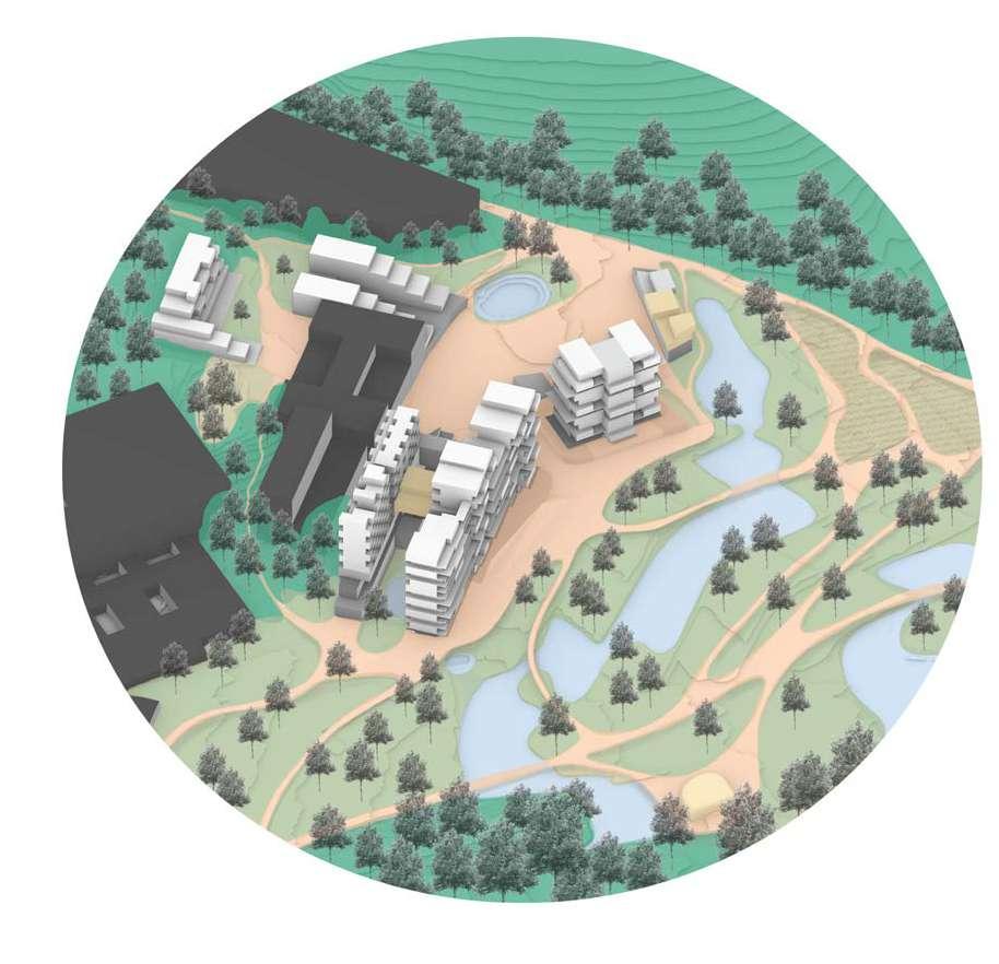
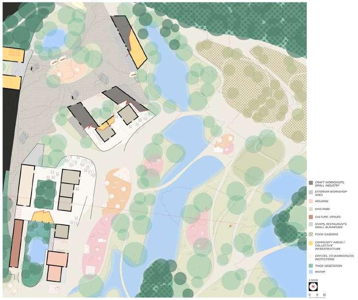

1:500 plan and section
segment of park, square and housing
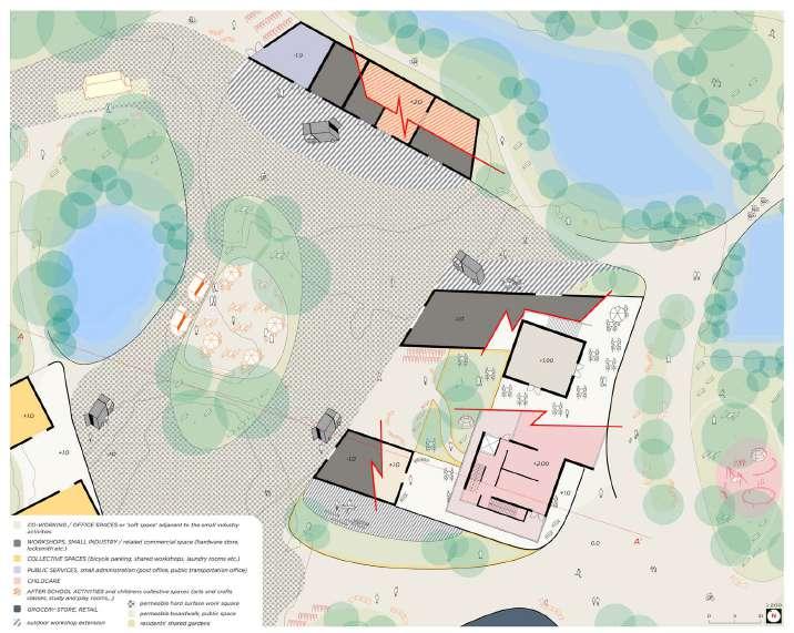
1:200 plan of the work square and it's interaction with the park and architecture
Mixity is applied both horizontally and vertically, with layering spaces that both accomodate collective necessities and intermingle the semi-privateness of common spaces for residents with public activity at the doorstep. Plenty of activity to observe or participate in.
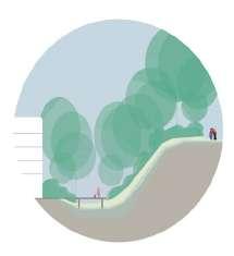
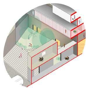
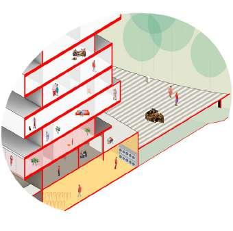
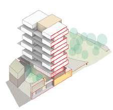
The mostly 9x9m modularity of the schematic architecture serves to underscore the importance of adaptable architecture. Although many functions, schemes, living models are suggested, the option to appropirate and alter architecture when necessary should be forseen and welcome.
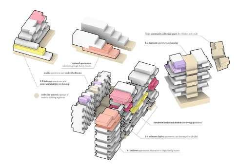
Seamlessly blending modern living with the agricultural landscape, our community redefines sustainable living. From studios to four-bedroom apartments, diverse housing units feature open planning for unrestricted views. Communal areas, thriving kitchen gardens, and collaborative spaces like a community kitchen and library enhance the user experience. Elevated green spaces on terraces host events with panoramic views. Interactive corridors foster spontaneous interactions, creating an extended family feel. This harmonious blend of sustainability and social connection sets the stage for shared experiences, forming a vibrant, close-knit community where residents truly thrive.
KEY PLAN
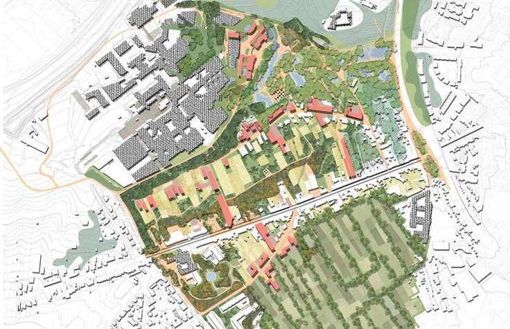
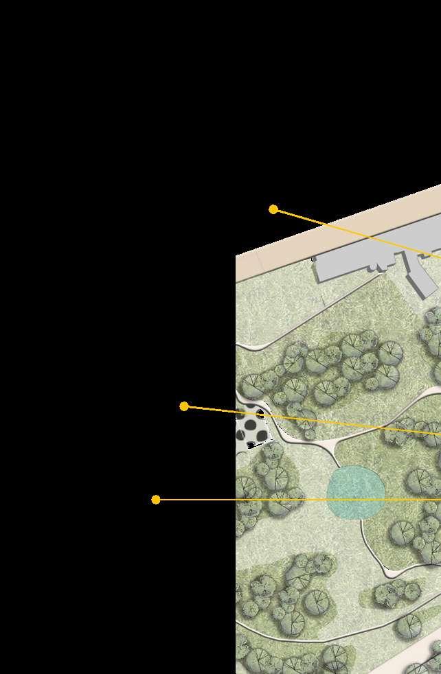
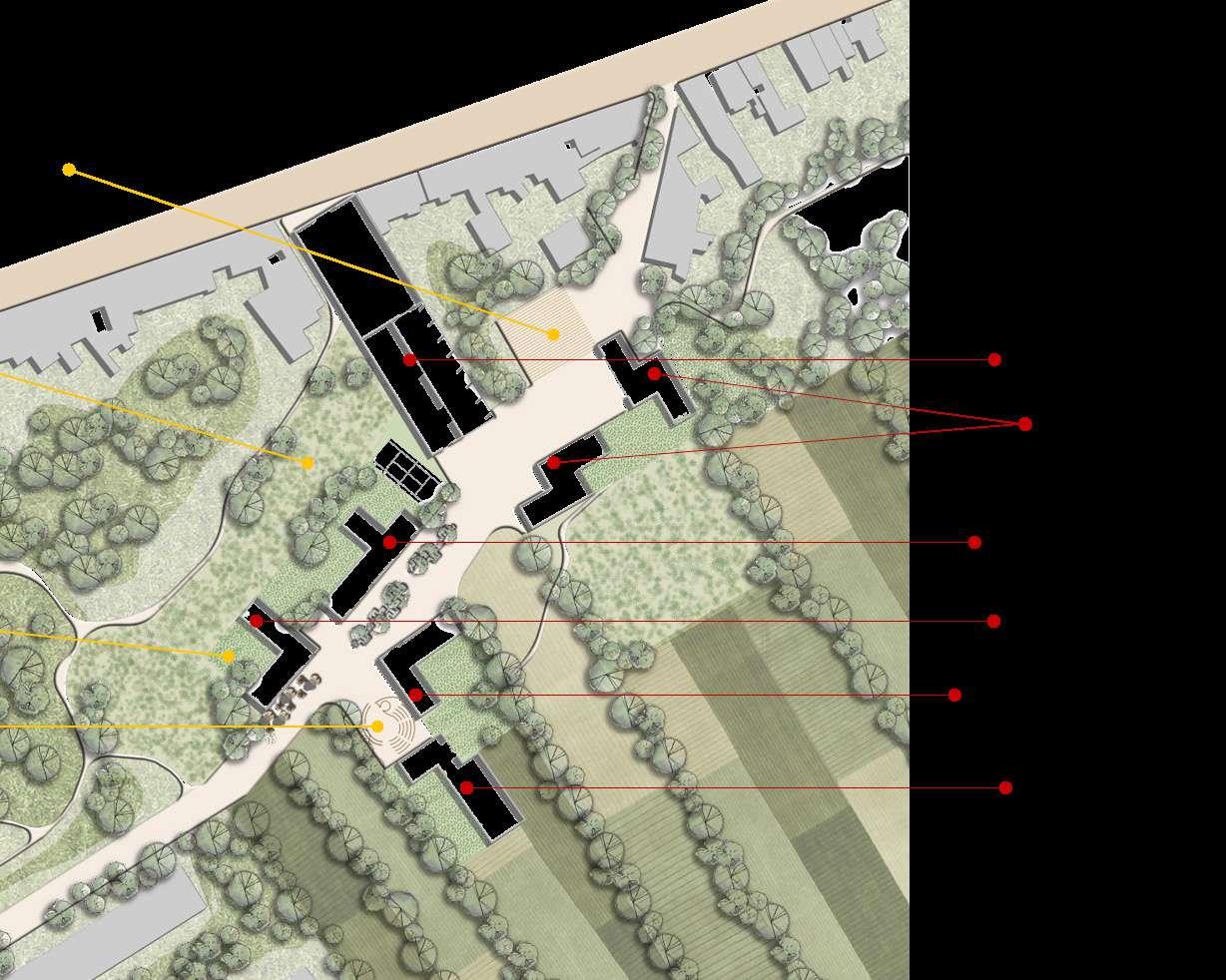
1:500 PLAN AND SECTION: Agriculture as the main landscape, housing


housing and public spine

SECTION: Agriculture as the main landscape, housing and public spine
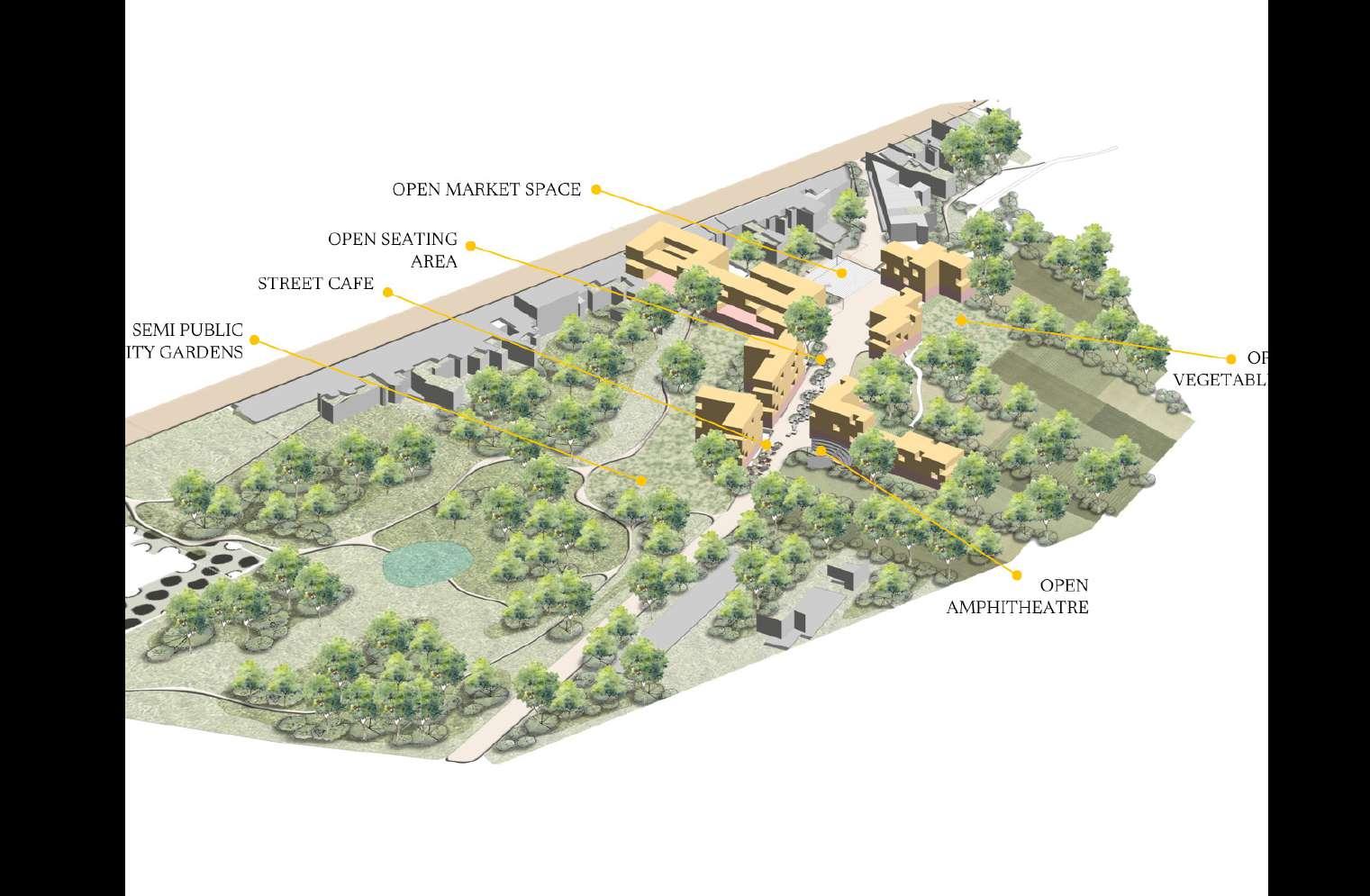
AERIAL VIEW: Agriculture as the main landscape, housing and public spine
A dynamic urban haven features a street cafe, open seating, and a market space. Semi-public gardens, orchards, and vegetable patches coalesce, surrounding an open amphitheater for community gatherings and cultural moments.
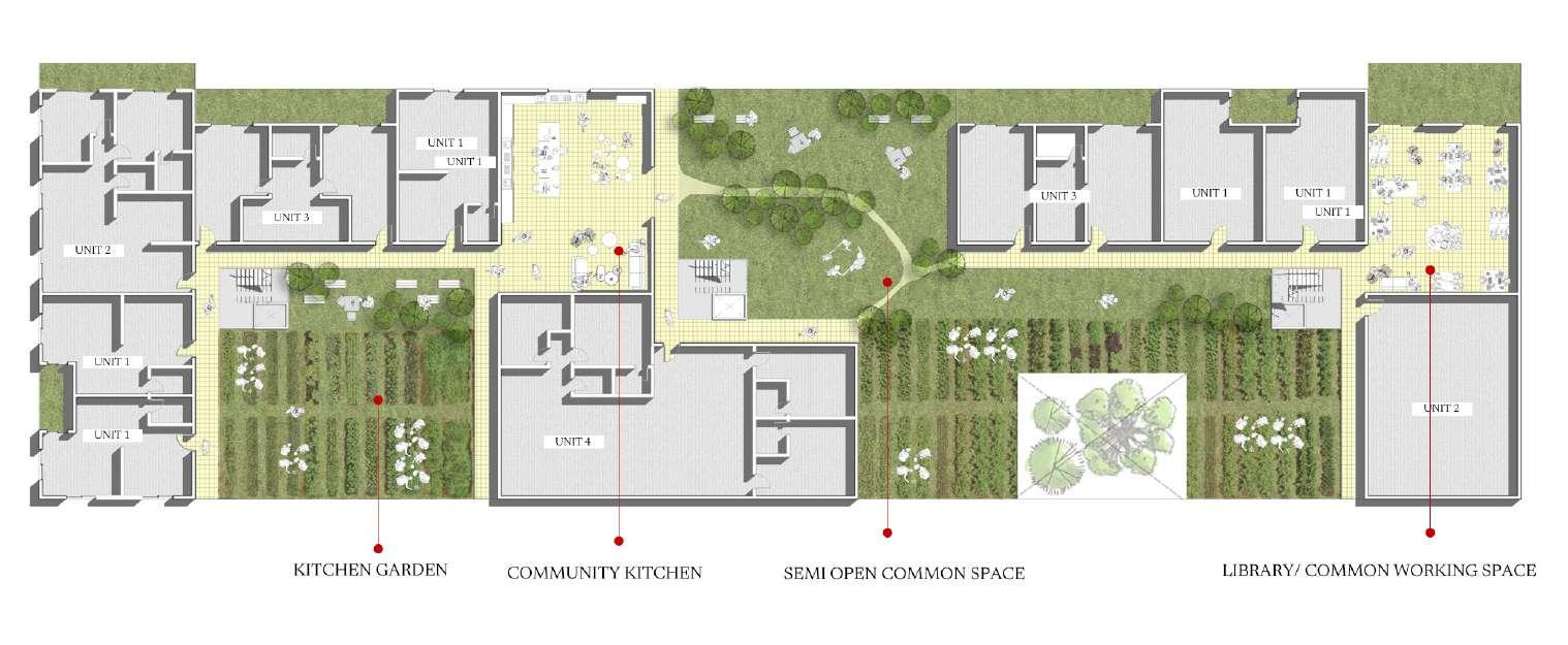
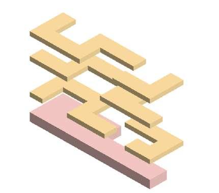
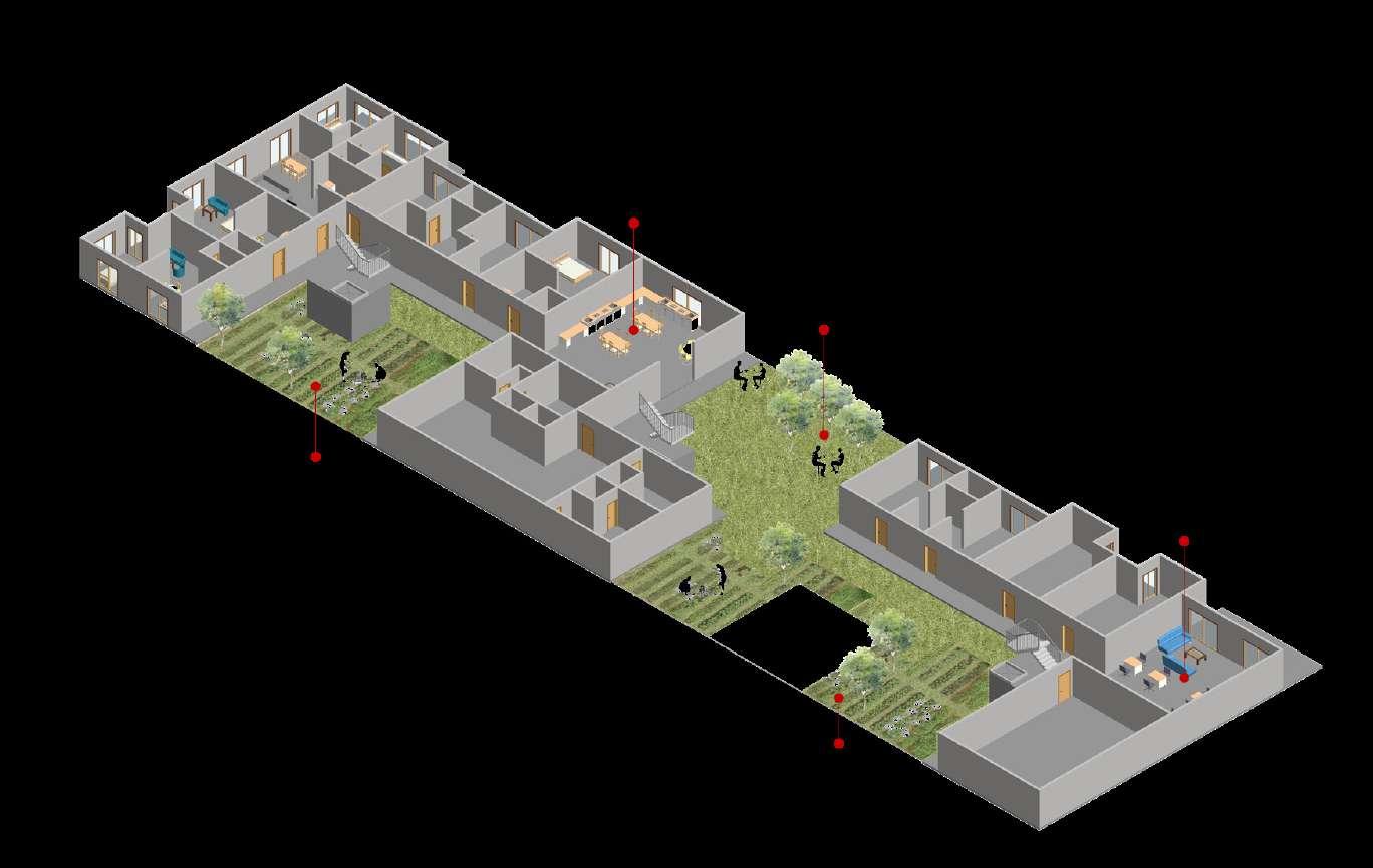
1:200 PLAN AND AERIAL VIEW: Typical Floor plan
Multiplicity of housing units with Studios, 2-bedroom apartments, student rooms, and a family apartment with kitchen garden. Community amenities include a shared kitchen, semi-open common space, and a library for collaborative work.
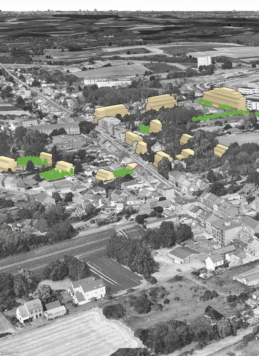
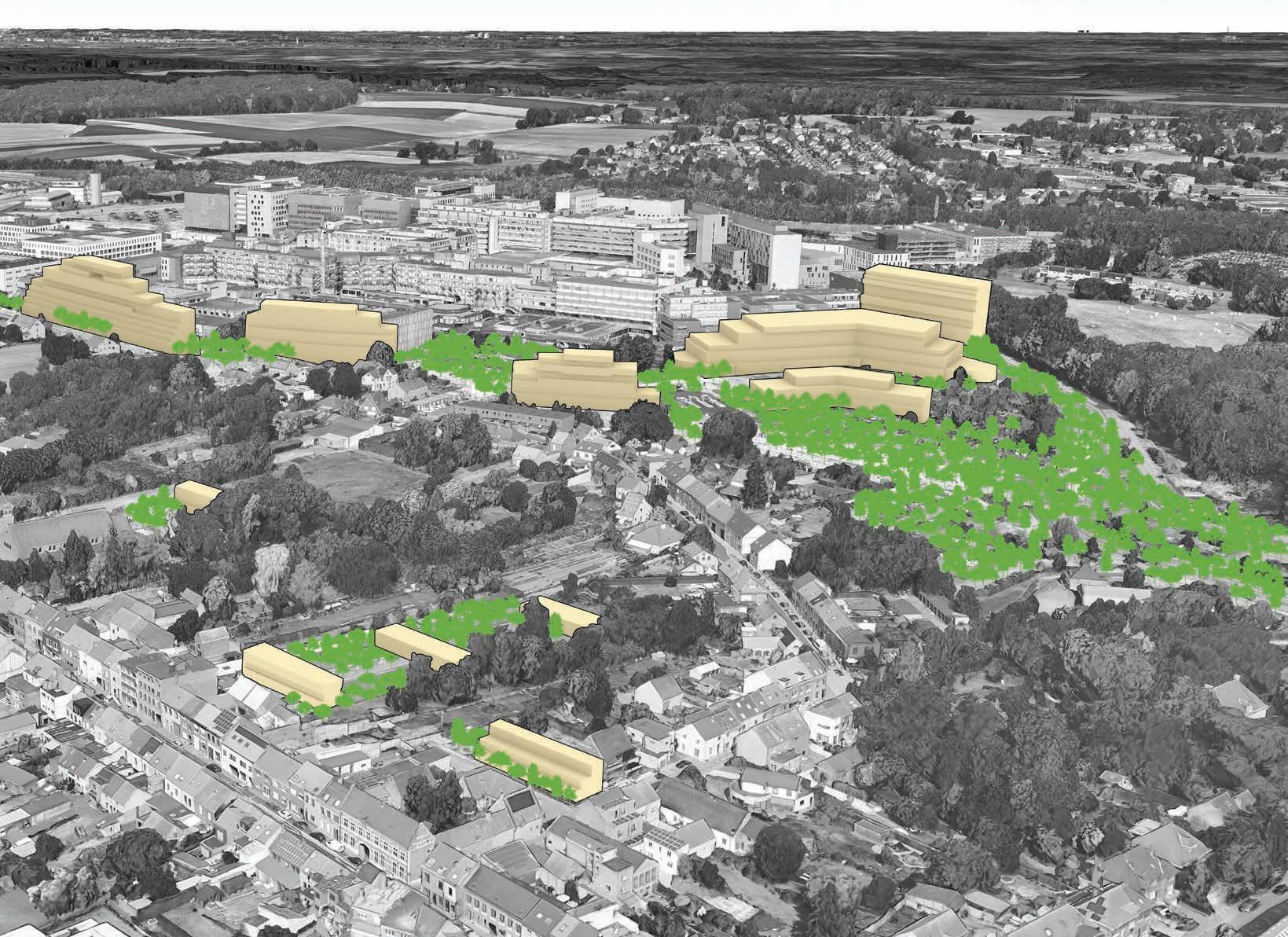
SITE VISION

caption/image titles use - Avenir Next Demi Bold 14pt
captions and text use - Avenir Next 12 pt
Next
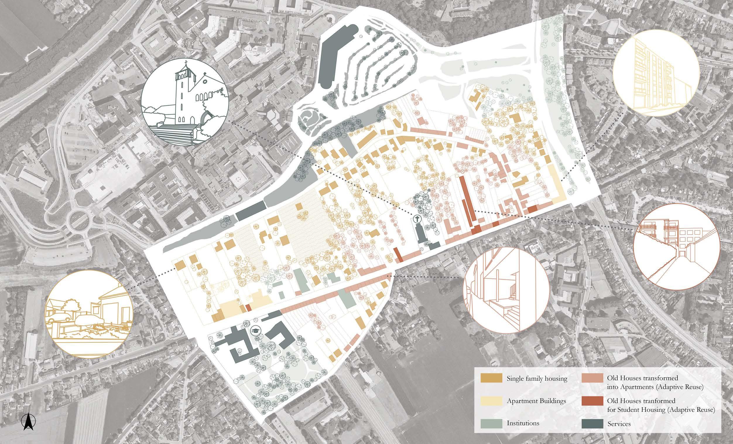
Types of Plot Demarcations
Bushes
See through fence
Non-see through fence
Car Parking
Building Typologies
Single family housing
Apartment Buildings
Institutions
Old Houses transformed into Apartments (Adaptive Reuse)
Old Houses tranformed for Student Housing (Adaptive Reuse)
Services
In this second analysis, we mapped the housing typologies in its current relation to the open spaces. We notice that due to the parcellation of the site, the deeper plots were not being used up to their full potential, further leading to public spaces like parks being inaccessible for the locals.

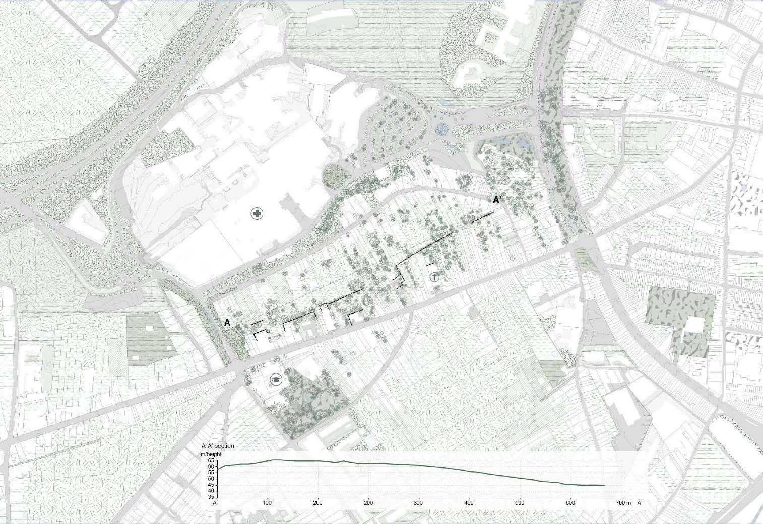
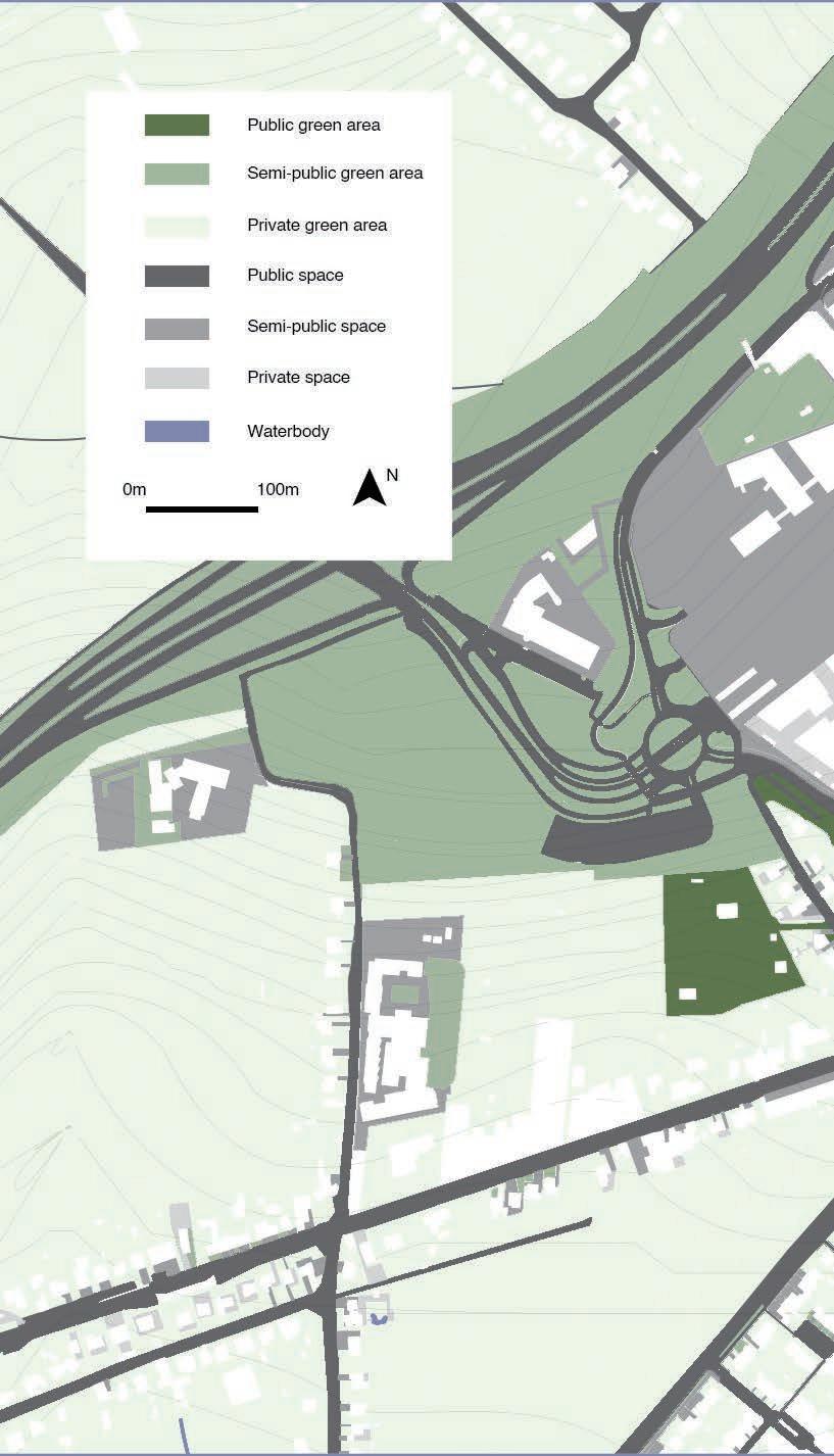
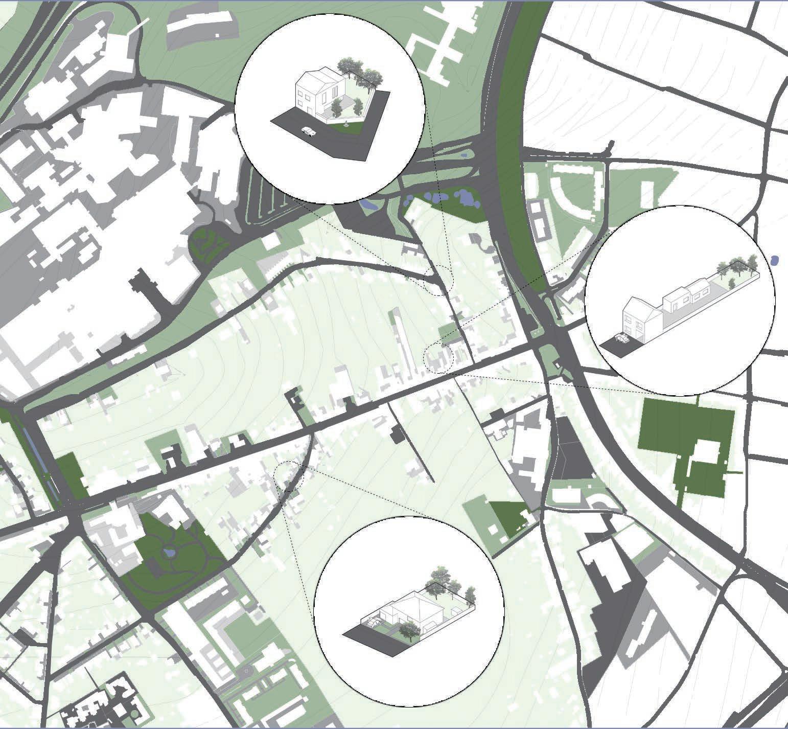
This map illustrates the degree of openness and privacy on the site, presenting intricate and varied connection typologies between public and private spaces. Additionally, it emphasizes topographical variations, resulting in distinct pocket areas that hold potential for future development.
Farmland

Public space with fence
Community shared space
Backyard system
Meadow Park
Pocket area
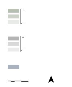
Level of publicness and privateness (Unpaved)
Level of publicness and privateness (Paved)
Waterbody
0M100M N
Our vision map unfolds as a synthesis of thoughtful analyses and innovative design elements. At its core lies the concept of the "soft centre," a term coined for the heart of the site. Here, a new centrality emerges, reshaping the community's orientation toward a proposed path. This transformation yields fragments of collective buildings nestled amid existing pockets of lush forests, fostering a harmonious integration of architecture and nature.
In stark contrast, the "hard front" represents the second pivotal element of our design, focused on redefining the hospital's facade. This new figure takes center stage, avoiding the overshadowing effect, and evolves along the engineered edge, aligning with the principles of brownfield development. It introduces a dynamic visual narrative, adding depth and character to the hospital's external presentation.
The third and integral facet of our design is the landscape strategy. This strategic approach aims at metamorphosing an overly structured land into a natural reserve. This reserve not only serves as a sponge, controlling flooding on-site, but also transforms into an accessible public space for the local community. It symbolizes a shift towards sustainability, blending functionality with environmental consciousness. Our vision map, a tapestry woven with these three key elements, envisions a community that seamlessly integrates nature, architecture, and sustainability for a vibrant and resilient future.
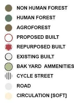
New buildings
Waterbody
New path
New-built permeable space
Old permeable space
Public space

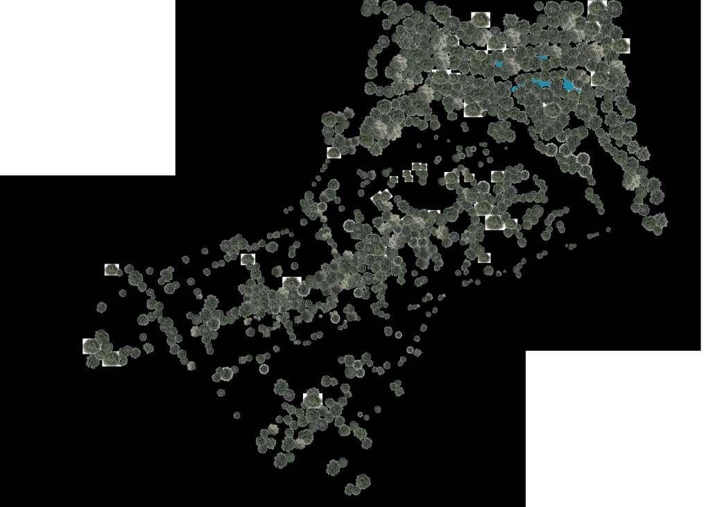



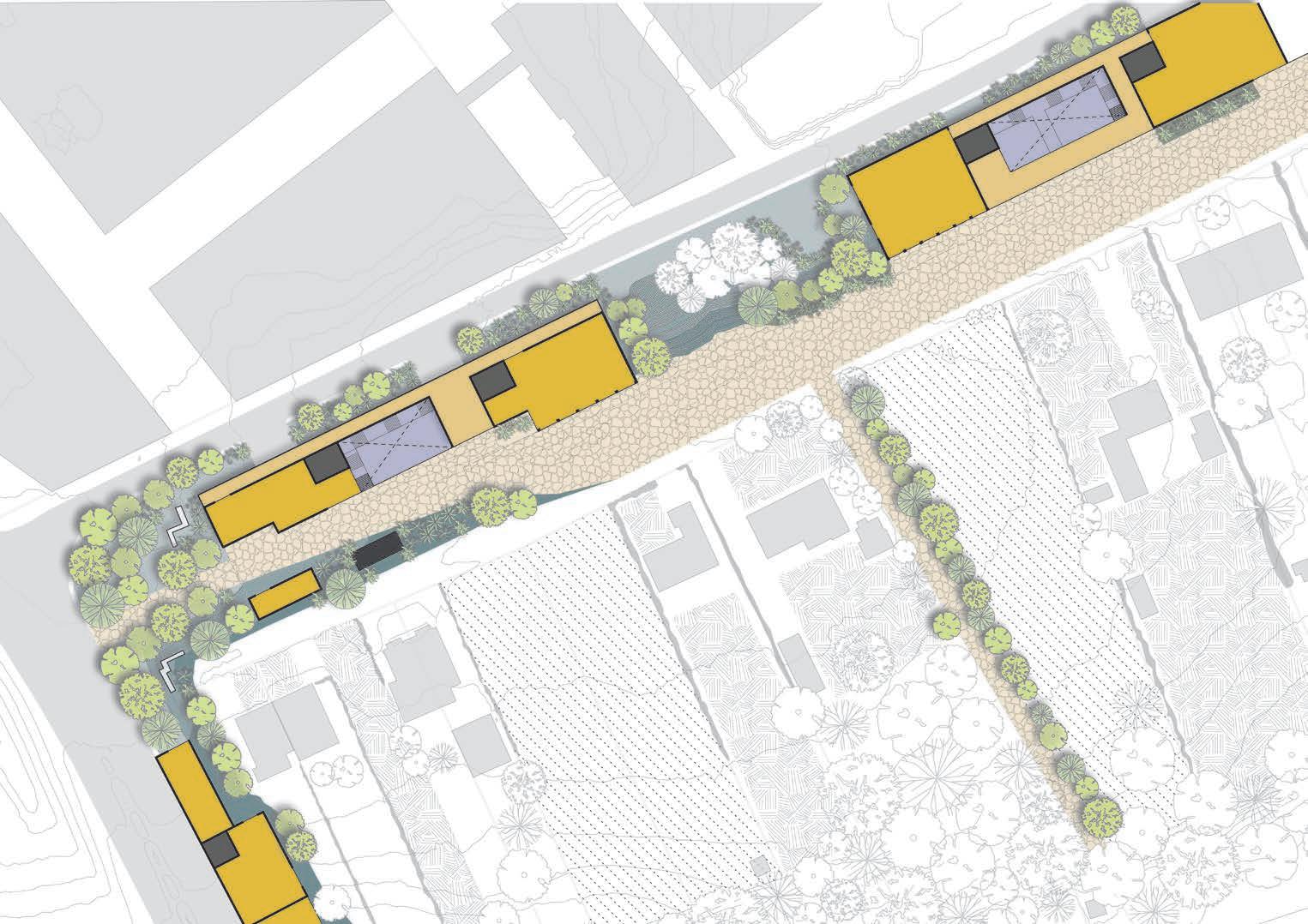
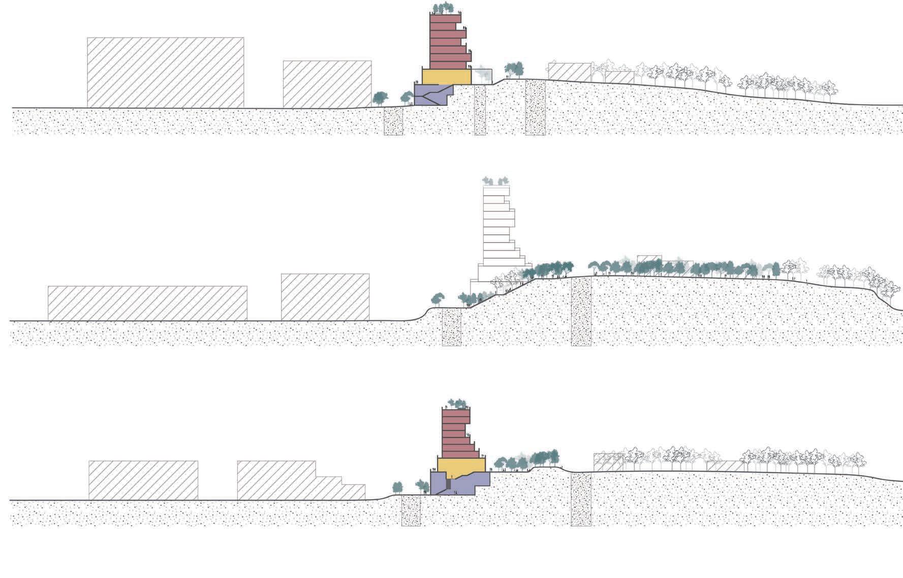
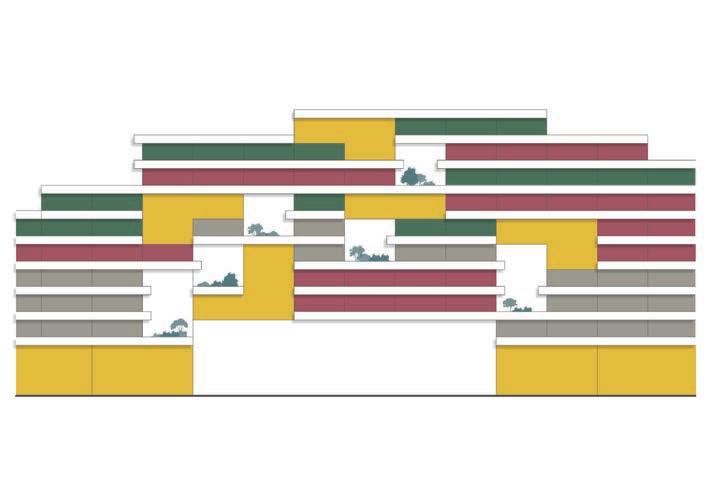
The Hard Front proposal addresses the site's topography, serving as a unifying element for disjointed movement systems. Emphasizing communal spaces, the building fosters community engagement. Its mixed-use design accommodates diverse groups, featuring shared spaces at different levels for interaction. Utilizing topography as terrace for urbanization, the proposal aims to counter the site's existing disconnection through multiplicity and inclusive housing typologies.


Shared areas
Housing for Elderly people
Student/Temporary Housing
Family Housing
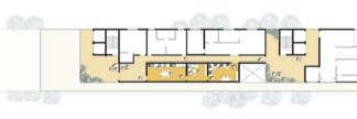
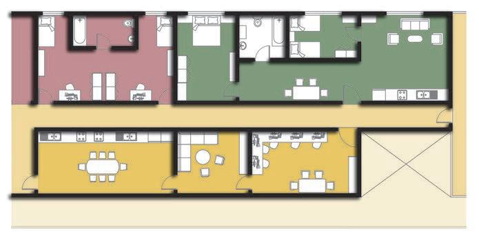
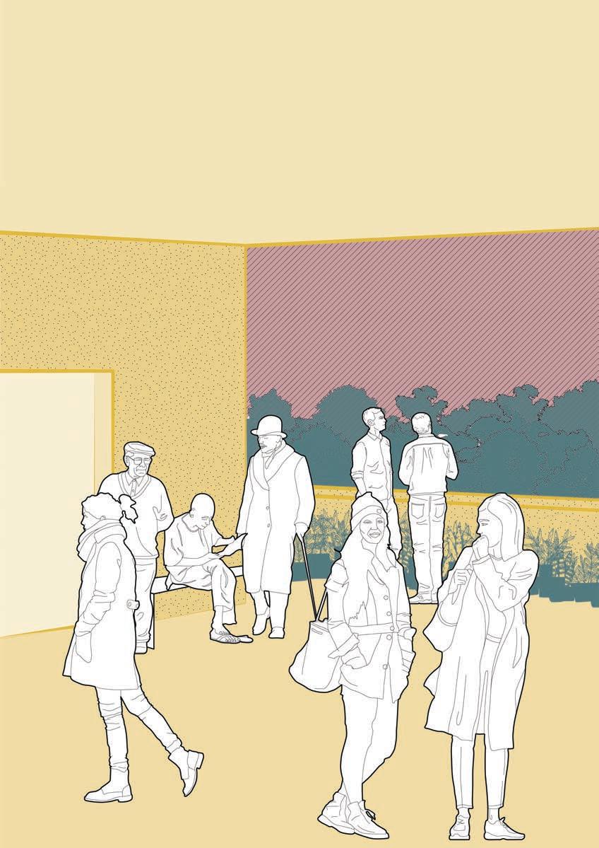
This focused initiative offers a nuanced response to Tervuursesteenweg's expansion, introducing an organic pathway in unused backyards, prioritizing pedestrians and cyclists. This shift from car-centric development restricts urban sprawl into existing forests, connecting residential zones and fostering a diverse community. Ground-level connectivity ensures shared amenities, promoting a vibrant lifestyle for residents.


0M10M20M
0M10M20M

 C’
C’


Expectation of a thriving community
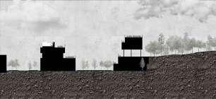
SECTION A-A’ 0M10M20M
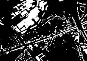
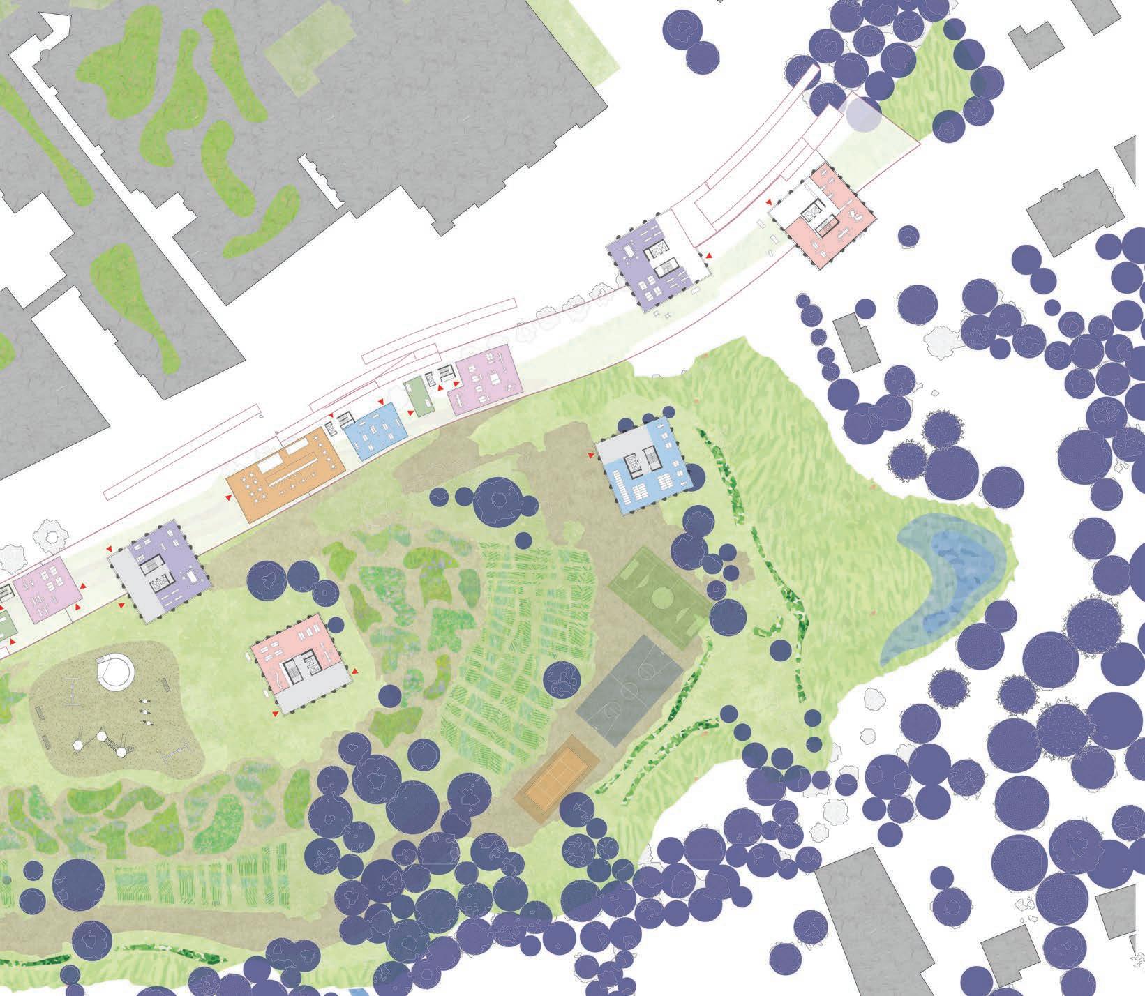
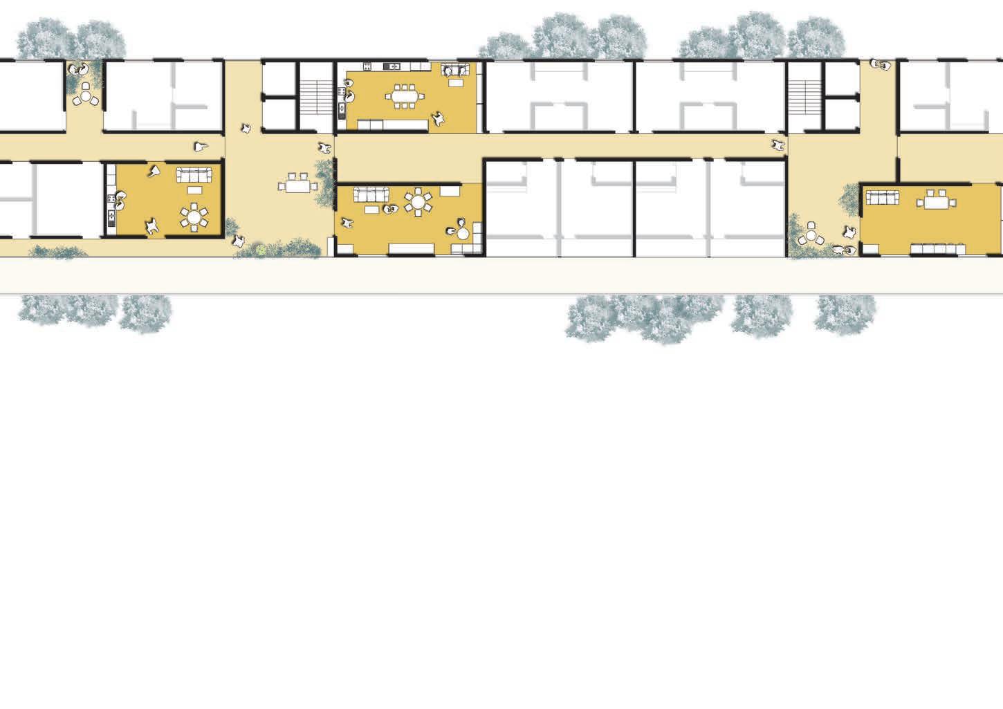
In this focused area, our vision extends beyond indoor spaces, creating a communal haven that embodies the spirit of an extensive community. The southern building harmoniously merges commercial and community services, featuring cafes, restaurants, and a community center. Adjacent, the northern structure houses student living with shared facilities. To the west, a dedicated community library stands as a hub for knowledge and interaction. The space between these structures transforms into a dynamic public realm, hosting a basketball court and skate park for community engagement. Interconnected paths ensure fluid movement, while strategically placed stairs and elevators provide vertical access to the envisioned 'soft path.' This comprehensive approach fosters a vibrant, interconnected living environment, encouraging social interaction, recreation, and shared experiences within the community.

FIRST FLOOR PLAN 1:100


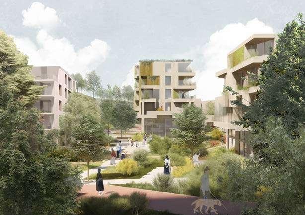
Expectation of a thriving community
The southern apartment complex introduces diverse housing typologies, catering to families with options of one, two, and three-bedroom units. Meanwhile, the northern student residence provides a communal living experience with five single rooms sharing common facilities. Within this inclusive community, the aim is to establish a cohesive and livable collective housing cluster. Prioritizing ample lighting, public spaces, and verdant area, the design promotes an environment that seamlessly integrates students and families. This intentional blending ensures that both demographics coexist harmoniously, sharing equal access to public infrastructure and fostering a sense of unity within the community. The vision is rooted in creating a space that transcends generational and lifestyle differences, fostering a shared living experience that embraces diversity and inclusivity.

Leuven, Belgium
Guests
External Jury Members
Yuri Gerrits, KU Leuven
Guido Geenen, KU Leuven, WIT architecten
Joris Moonen, KU Leuven, MIDI
Sarah Van de Velde, Bureau Bas Smets
Ward Verbakel, KU Leuven, PLUSOFFICE
Annelies De Nijs, Atelier Horizon
Cristian Panaïté, METAPOLIS
Els Van Meerbeek, KU Leuven, Carton123
Pieter Van den Broeck, KU Leuven
Ellen Verbiest, KU Leuven
Guest Lectures
Janina Gosseye, TU Delft
Yuri Gerrits, KU Leuven
Dr. Xiaoxuan Lu, University of Hong Kong
Fadi Masoud, University of Toronto
Mircea Munteanu, METAPOLIS
Thomas Willemse, Studio Thomas Willemse
Projects visits
Korbeek winners - Els Van Meerbeek, Carton123
Centrale Werkplaatsen - Tom Boogaerts, &bogdan
De Drie Kreeften - Roeland Joosten, WIT Architecten
Teaching Team
Mircea Munteanu, affiliation
Teodora Romanova Stefanova, OSA Research Group, KU Leuven
Thomas Willemse, affiliation
Kelly Shannon, KU Leuven
Bruno De Meulder, KU Leuven
Stakeholders Exercise
Pieter Van den Broeck, KU Leuven
Student Groups
FOOTHILL HEVERLEEBOS
- MAHS/MAULP 1
Group A
Alireza Mirshekari
Janno Delissen
Giuliana Paola Palaez Rodriguez
Group B
Bram Vidts
Pham Nguyen Thao
Martin Adriel Purnomo
Group C
Ella Hens
Alfonso Nava Lopez
Unnati Khanduri
Group D
Gautami Manish Kasat
Santos Albeiro Blandino
Ngoc Dieu Tran Hoang
FOOTHILL GROENVELD
- MAHS/MAULP 1
Group A
Tom Van Laer
Praveenkumar Paramagourou
Asmae El Rhazi
Group B
Huijun Liu
Trang Minh Thuy Nguyen
Group C
Gayane Maes
Saba Asir Khan
Bezawit Tekle Gasso
SWAENENBERGH SITE
- MAULP 2
Group A
Verma Harshika
Paola Salvatierra Castro
Saran Maiprasert
Group B
Alexia Chalouli
Sri Keshava Tanguturi
Radhika Rishi
Group C
Eva Clara Atcheson
Tanvi Rajesh Belhekar
Group D
Ria Das
Junyao Su
GASTHUISBERG
- MAHS/MAULP 1
Group A
Elton Kibet Birir
Konstantina Nikoletta Karasarini
Yuhan Dong
Group B
Fatima Akman
Maha Abumaria
Yingjie Li
Group C
Dimitra Makraki
Alexa Gomez Custodio
Jinhao Cen
Group D
Radhika Somani
Victor Hugo Martinez Perez
Irene Gracia Aranda
GALGENBERG
- MAULP 2
Group A
Angelos Chouliaras
Muyleng Heng
Lamia Farhat
Group B
Marie Meurice
Javier Eduardo Lazarte Remisio
Vu Linh Chi Duong
Group C
Kato Belmans
Kshipra Mangesh Deolalkar
Group D
Supanut Udomsilaparsup
Zhang Yalan
Paedar MacCarthy
Booklet Layout & Editing
Mircea Munteanu
Teodora Romanova Stefanova
Thomas Willemse
Khalda El Jack
DEPARTMENT OF ARCHITECTURE

MASTER OF HUMAN SETTLEMENTS
MASTER OF URBANISM LANDSCAPE AND PLANNING
