


Leuven, Belgium
Master (of Science) Human Settlements & Master (of Science) Urbanism, Landscape and Planning
Faculty of Engineering and Department of Architecture
Promoters:
Mircea Munteanu (Metapolis), Teodora Romanova Stefanova (Gradoscope), Thomas Willemse (Studio Thomas Willemse) with Bruno De Meulder and Kelly Shannon (KU Leuven)

© Copyright KU Leuven
Without written permission of the thesis supervisors and the authors it is forbidden to reproduce or adapt in any form or by any means any part of this publication. Requests for obtaining the right to reproduce or utilize parts of this publication should be addressed to Faculty of Engineering and Department of Architecture, Kasteelpark Arenberg 1 box 2431, B-3001 Heverlee.
A written permission of the thesis supervisors is also required to use the methods, products, schematics and programs described in this work for industrial or commercial use, and for submitting this publication in scientific contests.
03.A
04.A
04.C HOUSING
05 SWEANENBERGH
05.A OVERVIEW, A PHOTOGRAPHIC STORY
05.B INTERPRETATIVE MAPPING
05.C HOUSING ANALYSIS
05.D STRATEGIC PROJECTS
06 GASTHUISBERG
06.A OVERVIEW, A PHOTOGRAPHIC STORY
06.B INTERPRETATIVE MAPPING
06.C HOUSING ANALYSIS
06.D STRATEGIC PROJECTS
07 GALGENBERG
07.A OVERVIEW, A PHOTOGRAPHIC STORY
07.B INTERPRETATIVE MAPPING
07.C HOUSING ANALYSIS
07.D STRATEGIC PROJECTS
08 ACKNOWLEDGEMENTS

Topography and sections


The site is comprised of fragments of urban fabrics on the western side (Witness hills) of Leuven, squeezed between the highway and ‘vesten’ (medieval earthworks) landscape (that was turned into a ring road). Since the 1950s, the area has become a dumping ground for larger institutions (university campus, university hospital, music academy, bank headquarters, big retail, etc.). The area is, in general, overinfrastructured (including large parking lots).
As a monofunctional dumping ground, the site lacks a clear structure (besides the underlying landscape) morphology and, despite its heavy programs, urbanity. The area’s potential identity and value is compromised by the dominant car-orientation and complete lack of (qualitative) public space.
Specific sites for intervention were identified due to their relationship with the university (and a broader discussion of city - (monotonous) university), the gentrifying effect of the university and major shortages in the (student) housing market). All the sites are comprised of fragments of tissues (hospital, school, convent, etc) and the strong topographical relief that characterizes this area of Leuven.
The city walls of Leuven mark a strong new artificial topography around the city. The Ferraris map of 1777 shows the clear distinction between the inner city development and the wide agricultural landscape beyond the walls. The flanks of the witness hills on the west side of the city form a strong agricultural landscape within the city walls with fields and vineyards. The steep slopes in this area explain the hesitant urban growth.


The Vandermaelen map from 1850 highlights the larger institutions that are set within the landscape. The larger estates of these institutions define figures in the landscape and often form the nucleus of car-dominated campuses of the enormous institutions that we find around Leuven today.


Infrastructure as destruction
Over time the city ramparts have been transformed into a linear park like the Remy boulevard. In the 1970's this landscape was dramatically uprooted. Through highway engineering a ring road is carved into the landscape. The dominance of the car becomes all-present around the city.


Hypotheses
1. Post-car/ post-carbon city
All sites must address the radically downgrading of car-infrastructure (including recuperation of parking lots, downsizing and re-arranging profiles).
2. Adaptive reuse
All sites include the transformation of complexes (and their parking lots) into mixed urban fabrics of (very) high density (mainly housing)
3. No new greenfield development
The consumption of landscape must not continue. On the contrary, projects must re-engage productively/constructively with the surrounding landscape.
4. Tissues of multiplicity
Tissues of multiplicity. The Univer-City is not mono-functional and it should not be segregated. Synergies must emerge from a multiplicity of functions, demographics, typologies, cultures.
Challenges based on hypotheses
Density:
For each site, the design should aim for a density with a Floor Area Ratio of minimum 2.0 in relation to the existing impervious surfaces on site (parking, roads and buildings)
Multiplicity:
The urban tissue should provide a high degree of urbanity, with mixed-use complementary functions, but ensuring that housing represents between 60% and 80% of the Total Floor Area.
Units:
The design should ensure an average floor area per inhabitant of 50 m2/p from the Total Floor Area for Housing.


GROUP A
ANGELOS
CHOULIARAS
MUYLENG HENG
LAMIA FARHAT
GROUP B
MARIE MEURICE
JAVIER EDUARDO
LAZARTE REMISIO
VU LINH CHI DUONG
GROUP C
KATO BELMANS
KSHIPRA MANGESH
DEOLALKAR
GROUP D
SUPANUT
UDOMSILAPARSUP
ZHANG YALAN
PAEDAR MACCARTHY
The site centers around the KBC Bank, the Tennis and the corner of ’s Hertogenlaan/Brusselse steenweg: The over-sizes peripheral, outdated bank office complex with large parking a tennis club and the corner of the ‘vesten’ and the Brusselsesteenweg in in evident decay; the site has three misfits that can initiate radical rethinking the edge of the consolidated city.


Overview, A Photographic Story
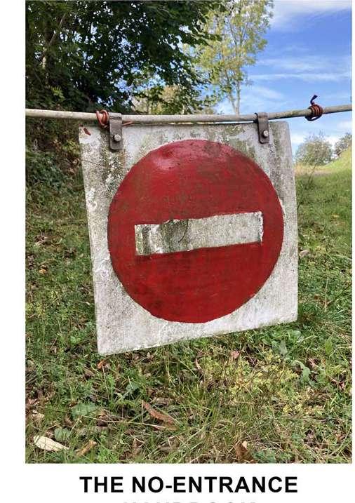


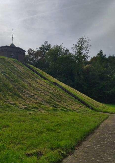

 © Angelos Chouliaras
© Farhat Lamia
© Muyleng Heng
© Christine Duong


How can we reverse these border elements of “No Entrance” to more inviting and inclusive spatial elements?


How to bring connection and vibration into the community through public space or greenspace?


How is it possible to reclaim the lost synergies from/into the site with its surrounding as well as re-activate the public realm?
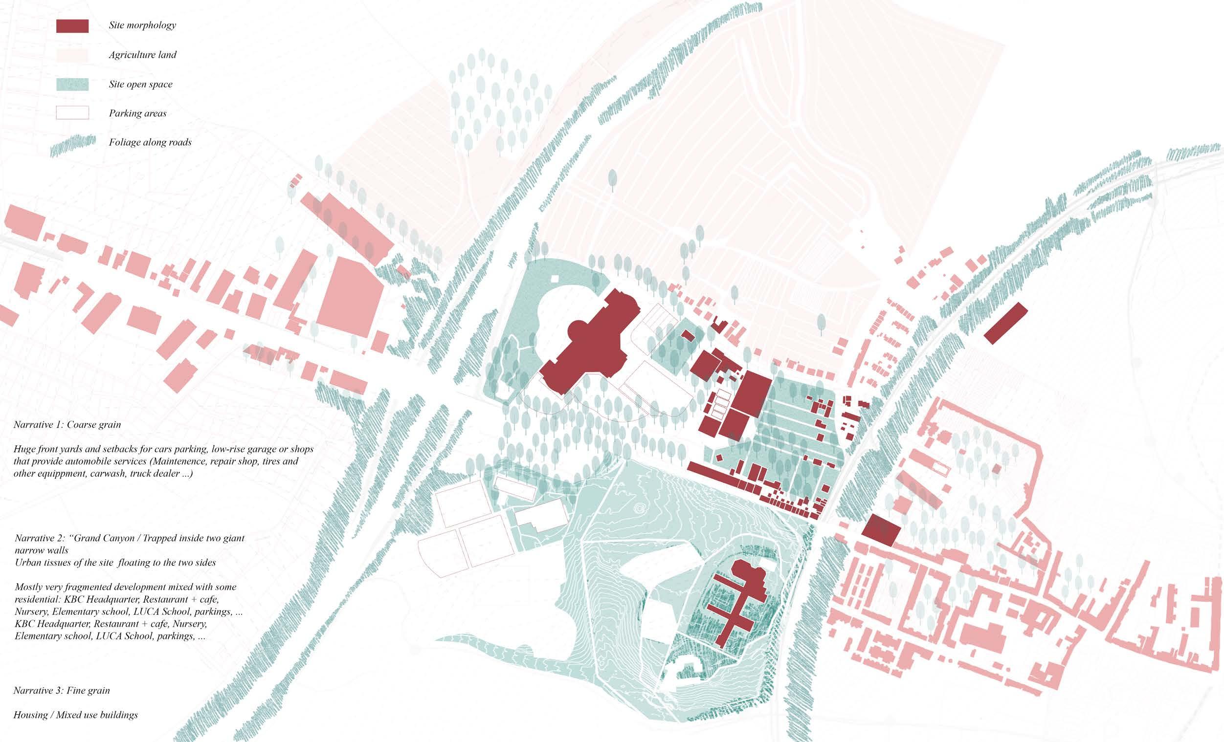

What possibilities do the platforms offer in an artificially rugged landscape, and how can they be integrated into their urban surroundings?


This map presents the structure of canopies surrounding the site. An altenrating sequence of older and younger trees; deliberately planted and organically grown trees.
A system of green massiveness interspersed with punctual appearances.
Trees appear as sound barriers, as safe enclosures, as overgrown edges, as deliberate alternations to confusion, as spontaneous sprouts along old roads, as beacons in a garden.
What can the function or purpose of this green network become?


Where can a pedestrian actually walk?
The city is full of boundaries for a pedestrian; they cannot just walk everywhere. Boundaries consist of walls, wires, facades, gates, bridges and busy roads and are often between spaces who are accessible and spaces who are ...
... accessible, accessible to specific pedestrians or accessible at specific times, ...
The boundaries act as masks, and quality places are hidden behind them. The masks break up the public space, leaving clear quality-less places for pedestrians.
In what atmosphere can pedestrians walk?


How can the site be utilised to establish a connection between the mixed typologies of the urban core and the outskirts?


Why is the Land the way it is?
• The Agricultural fields to the north of the site are aligned with the Contour Lines, potentially to minimize soil run off.
• Much of the Cut/Fill areas have trees surrounding them, potentially to hold the soil in place and minimize soil creep.
• The Forest area to the south of the site has the most variable gradients. Building on this would require huge cut/fill, so it makes sense to have a forest here.


Why is the Land the way it is?
• The Agricultural fields to the north of the site are aligned with the Contour Lines, potentially to minimize soil run off.
• Much of the Cut/Fill areas have trees surrounding them, potentially to hold the soil in place and minimize soil creep.
• The Forest area to the south of the site has the most variable gradients. Building on this would require huge cut/fill, so it suited for forestry.


How can we deal with permanent structures as barriers that disconnect the spaces in between? Can we transform the function of these barriers into linkages that connect public space instead of removing them?


XL( super big sized space)
L( big sized space)
M( middle sized space)
S( small sized space)
XS(super small sized space)
public green space
The KBC plot and its surrounding plots present different plot attributes:
1.Inside the Leuven Circle: It is mainly composed of super small sized space and some large public space, forming a very consistent spatial form.
2.KBC Bank Plot: Spaces of various scales exist and are independent of each other.
3.Western Side by the KBC: Large and medium-sized spaces composed of commercial and public spaces are arranged along the road. The houses are behind them and have a larger green space than in the leuven circle.


To a certain extent, the scale of the block reflects the development context and rhythm of the city, and how to use or break this rhythm to achieve the better development of the urban area is the problem we need to think about next


MaHS / MaULP_Galgenberg C
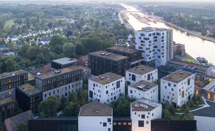
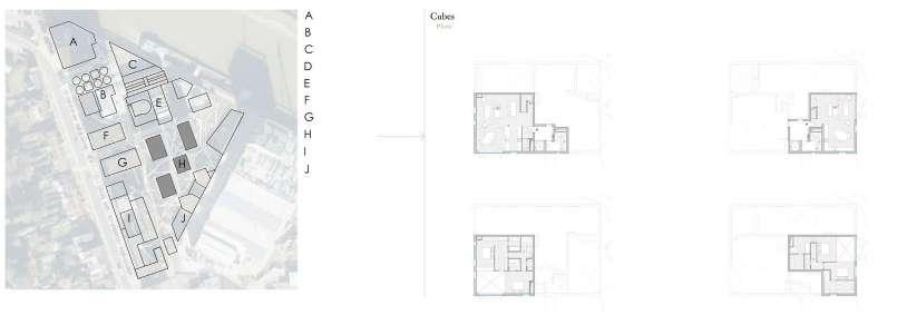
The whole project is a coversion of a former brewery and maltery along the Albert Canal near Antwerp into a mixed-use project. The conversion consist of keeping a big part of the old buildings and introducing new buildings in a strategic way on the historical site.
The old is kept but given new mixed-use functions - such as workshop spaces, offices, an underground car park and showrooms - which were placed in the old with great respect for the existing. Besides these mixed functions in the old buildings, housing will be provided amongst others in the new ‘cubes’.
- Integration of old and new- Sequence of outdoor spaces
“Nature brings everything together: Walk, wander and marvel at the grounds. The lush gardens, winding paths and open courtyards are a creative way of merging the private and public spheres of Canal. The green landscape guides visitors from one building to the next as they discover the architectural diversity.”
- Sight relations as a parameter for implanting of the cubes
“The Cubes make maximum use of its waterfront location and its relationship with the industrial constructions on the site, using deliberate visual axis lines. Architecture here is conceived as a window on the world. This notion is applied at different scales.”
EVALUATION
- Relation to the urban tissue:


By giving the historical buildings infills that are positive for the residential areas along them, these residential areas are also better connected to the canal.
- The building typology:
The cubes are a very different typology from the existing factory buildings, yet their height and rectangular shape make them fit perfectly into their surroundings.
- The individual dwelling design:
Each dwelling is a fine dwelling not only because the cubes are placed in the greenery, but also because they are individually designed according to their views and light.
(Source: https://www.kanaal.be/)
(Source: https://www.bogdan.design)

“The whole project aims to strengthen the Canal Site’s relationship with its surroundings. Three surrounding spatial structures are decisive in this respect:
- The strong line figure of the Albert Canal
- The green Schijnvallei that connects Antwerp with the outlying area
- And the residential area with detached houses
Through improved accessibility and renewed contact with the water, the site aims to become a development hub for living and working and an added value for the neighbouring residential area.”
(Source: https://www.architectura.be)
PUBLIC-PRIVATE STRUCTURE

“A harmonious relationship between the private and public spaces is diligently pursued. To that effect, carefully selected open spaces have been retained in between the Cubes that allow a clear unimpeded view upon the existing buildings, to the silos, to the Canal, and to the interspersed clearings. These open spaces are conceived as outdoor rooms with impressive views.”
CONTEXTUALISED VOLUMETRY


(Source: https://www.bogdan.design)
(Source: https://www.behance.net)

public outside chambres public walkways non-public outside chambers housing



(Source: https://www.bogdan.design)

(Source: https://www.kanaal.be/)
(Source: https://www.conceptualfinearts.com)

(Source: https:/divisare.com)


THE CUBES OF &BOGDAN
“A new housing typology was developed by stacking individual duplexes in 3 dimensions. The morphology of these duplexes results from the integration of qualities and constraints such as sunlight, privacy, view, the inclusion of winter gardens and the desire to provide each duplex with three facades.
The duplexes offer a standard of excellence in quality of habitation and, simply, in the general quality of life. Every duplex has at least three faces and features a double height space with a 6 meters high


“Kanaal is a place where life finds its personal expression. Because each apartment is built from within, very floor plan is different. The total Kanaal site includes five buildings to live and work in. These are known as the Cubes, Escher, Waterhuis, Pakhuizen, and the Silos. The Cubes are the ones designed by &Bogdan.

(Source: https://www.bogdan.design)
“Kanaal is a place to be part of the story. This creative environment embraces the past and present to define what’s needed for the future.”
“Kanaal is a place for inspiration. The mixed-use setting includes offices, apartments, workshops, galleries, and gardens that offer a unique experience.”
(Source: https://www.kanaal.be/)
(Source: https://www.bogdan.design)
Analysed by Supanut Udomsilaparsup_R0963999
MaULP_Galgenberg D
Pflegil-Areal is a housing development and remodeling project located in Zurich, Switzerland. This project integrates existing and newly constructed structures through a design method that converts the functions of a former hospital and replaces them with new programs, including offices and housing.
The primary objective was to preserve the substantial structure of the largescale hospital facility. As a result, new housing was integrated with the existing structure and the surrounding neighborhood, creating three distinct exterior spaces with unique functions. The housing in the new development consists of several apartments with various room types. Some apartments feature ‘freshair spaces’ known as ‘seasonal rooms,’ which can adapt to different functions depending on the season. Color plays a significant role in this project, reflecting the interplay between the existing structure and the new development. Only three long facades are painted, while the others showcase the natural color of the concrete material.
• This project is exciting because buildings have been transformed into two different functions, including offices and residents with 48 apartments that seamlessly relate to a neighborhood as a housing area. Meanwhile, they can still retain the character of this historical place. Interestingly, It demonstrates the integration of the existing structure and new function.
• The three new residential buildings have been remodeled to serve as housing units. It’s noticeable that certain rooftop areas have been transformed into outdoor terraces, offering residents spaces for outdoor activities. Precisely, three courtyards are positioned between the buildings, featuring varying levels that define their public and private functions. These courtyards effectively establish connections between the buildings.
• The room types are designed based on criteria distinguishing indoor and outdoor areas. Some rooms feature their own outdoor terraces, while others incorporate “Seasonal rooms,” which function as semi-outdoor spaces related to different seasons.
(Source: https://www.gigon-guyer.ch/en/project/pflegi-areal-en/)

(Source :https://www.gigon-guyer.ch/en/project/pflegi-areal-en/)

(Source :https://www.gigon-guyer.ch/en/project/pflegi-areal-en/)


Source :https://www.gigon-guyer.ch/en/project/pflegi-areal-en/)

(Source :https://www.gigon-guyer.ch/en/project/pflegi-areal-en/)
(Source :https://www.gigon-guyer.ch/en/project/pflegi-areal-en/)


(Source :https://www.gigon-guyer.ch/en/project/wbw-pflegi-areal-en/)

(Source :https://www.gigon-guyer.ch/en/project/pflegi-areal-en/)


(Source :https://www.gigon-guyer.ch/en/project/wbw-pflegi-areal-en/)


(Source :https://www.gigon-guyer.ch/en/project/pflegi-areal-en/)
(Source :https://fra.archinform.net/projekte/9636.htm)

(Source :https://www.gigon-guyer.ch/en/project/pflegi-areal-en/)

(Base Image Source :https://www.gigon-guyer.ch/en/project/wbw-pflegi-areal-en/)


(Source :https://www.gigon-guyer.ch/en/project/wbw-pflegi-areal-en/)

(Source :https://www.gigon-guyer.ch/en/project/wbw-pflegi-areal-en/)

(Source :https://www.gigon-guyer.ch/en/project/pflegi-areal-en/)
(Source :https://www.gigon-guyer.ch/en/ project/pflegi-areal-en/)
Seasonal Room provides fresh-air space in good weather, while it can transform into a heated interior space during the rest of the

(Source: https://www.gigon-guyer.ch/en/ project/pflegi-areal-en/)


Analyzed by Chi Duong _ r0964571
MaHS_Galgenberg B
The Haarlemmer Houttuinen Housing Project is a prime example of community appropriation in a residential setting. The project focuses on creating a communal environment by encouraging residents to reclaim the public street and participate in shaping the spaces outside their homes.
Hertzberger’s design approach for the Haarlemmer Houttuinen Housing Project revolves around the concept of “differentiated spheres of responsibility.” This means allowing residents to take ownership of sections of public land outside their apartments, blurring the boundaries between public and private spaces. This concept fosters community interaction, self-expression, and a sense of communal responsibility.
Urban Tissue: The project cleverly integrates into the existing urban fabric by reimagining the street as a lively community space. Vehicular traffic is restricted, making the street safer and more conducive to community interaction. The design, with its balconies, gardens, and pedestrian-friendly elements, reinstates the street as a place for local residents to meet and interact.
Building Typology: Hertzberger’s design of the housing block is sensitive to scale and rhythm, with projecting piers, balconies, and gardens that overlook the street. The use of different-sized windows and materials adds variety and intimacy to the building’s appearance. The project effectively combines residential units with external spaces that engage the street, reinforcing the idea of community appropriation.
Individual Dwelling Design: The project encourages residents to personalize the public spaces outside their homes, such as small gardens and patios. This approach allows for self-expression and creates a sense of ownership, even in the public realm. The design of the lower maisonettes, accessible from the street, and the upper units reached by external stairs fosters a strong connection between residents and the street.
https://www.miesarch.com/work/1507
OPEN SPACE STRUCTURE

Drawn by author

Drawn by author

https://www.flickr.com/photos/krokorr/5474429052/in/photostream/

https://www.flickr.com/photos/krokorr/5474429052/in/photostream/

https://www.miesarch.com/work/1507
The project includes both upper-level maisonettes and lower-level apartments with tiny gardens. These dwellings have external access from the street and balconies or patios that overlook it.
The upper units are reached by external stairs to shared landings, while the lower maisonettes can be entered from their small gardens in the street. This combination of housing types and the way they interact with the surrounding urban context contributes to the project’s success in fostering a sense of community and encouraging residents to reclaim and personalize the public street spaces.
The project features external spaces like patios and gardens that serve multiple functions. These spaces are not merely decorative but are designed for use by the residents. They act as areas for relaxation, personalization, gardening, and social interaction. The design allows residents to appropriate these spaces in ways that suit their needs, promoting multiplicity in their use.

Re-illustrated by author

https://www.flickr.com/photos/krokorr/5474429052/in/photostream/
MaHS _Galgenberg D
Habitat 67, designed by the Israeli-Canadian architect Moshe Safdie as the Canadian Pavilion for the World Exposition of 1967, was originally intended as an experimental solution for high-quality housing in dense urban environments. Safdie explored the possibilities of prefabricated modular units to reduce housing costs and allow for a new housing typology that could integrate the qualities of a suburban home into an urban high-rise.
The environmental feature of Habitat expresses the architect’s life-long commitment to creating healthy and dignified living environments, by providing every dwelling with at least one garden(located on the rooftop of an underlying residence).
The design for habitat relies on the multiple use of repetitive elements, called boxes or modules, which were arranged to create 16 differently configured living spaces, for a total of 158 residences within the complex.
The cube is the base, the mean and the finality of habitat 67. In its material sense, the cube is a symbol of stability. As for its mystic meaning, the cube is symbol of wisdom, truth, moral perfection, at the origin itself of our civilization.
This project successfully breaks down the division between high-rise buildings within the city and low-rise buildings on the outskirts of the city.
The building is the combination of two major housing typologies-the urban garden residence and the modular high-rise apartment building.
Staggered floor apartments create three-dimensional outdoor spaces and provide diverse living spaces for smaller family units.
By stacking concrete “boxes” in a variety of geometric ways, Safdie breaks up the traditional form of the orthogonal high-rise, allowing each box to step back from its neighbors. This clever approach provides each apartment with a rooftop garden, a constant flow of fresh air and maximum natural light.


(Source: https://www.archdaily.com/404803/ad-classics-habitat-67-moshe-safdie) (Source: https://iris-yee.com/habitat-67)
PUBLIC-PRIVATE STRUCTURE
Vertical elevators and horizontal corridors serve as public spaces like tree branches that will connect the apartments on each floor.
Three elevator cores direct vertical circulation throughout the complex. Elevators stop at every fourth floor to serve pedestrain streets.
The streets are continous through the project, and access to the dwelling.
The parts of the building, including the units, the pedestrian streets, and the elevator cores, participate as load-carrying memebers.

The complex is an engineering feat with its confilevering modules acting as structural members. Each component from the units and walkways to the elevator shafts of the complex act as a load-bearing structure.

Confuguration(right picture)
Each module measures a length/width/height of 38’*17’*12feet. There is a total of sixteen different configurations for the rectangular units aranging from one to three floors.
(Source: https://iris-yee.com/habitat-67)
(Source: https://iris-yee.com/habitat-67)

(Source: https://www.architectural-review.com/archive/from-the-archive-moshe-safdies-habitat-67-in-montreal-canada) Apartment

(Source: https://iris-yee.com/habitat-67)


Through manipulation of a single unit via rotations, offsets, and stacking, Safdie was able to ensure an outdoor terrace for each residence. Moreover, the strategy in which the units were stacked entailed each units’ walls to be load bearing which was what allowed for its radically unique form when compared to other housing developments of its time, and even today.
SMALL RESIDENCES


LARGE RESIDENCES
SINGLE UNIT, SINGLE FLOOR 1-2 BEDROOMS
DOUBLE UNIT, SINGLE FLOOR 2-3 BEDROOMS
DOUBLE UNIT, DOUBLE FLOOR 2-4 BEDROOMS

(Source: https://references)
TRIPLE UNIT, SINGLE FLOOR 3-4 BEDROOMS
TRIPLE UNIT, DOUBLE FLOOR 3-4 BEDROOMS
STUDIO UNIT, DOUBLE FLOOR 3-4 BEDROOMS
Windows opening in 4 unit is more playful because of corners of apartments.
Roof garden offers panaromic views of city across the river.
Privacy kept due to encompassing the wall.
Prefabricated toilet unit;
Apartments with internal staircase and solarium for each unit;
Concealed hot and cold air supply in the flooring;
Provision of window opening & ventilation


(Source: https://iris-yee.com/habitat-67)
MaHS _Galgenberg A
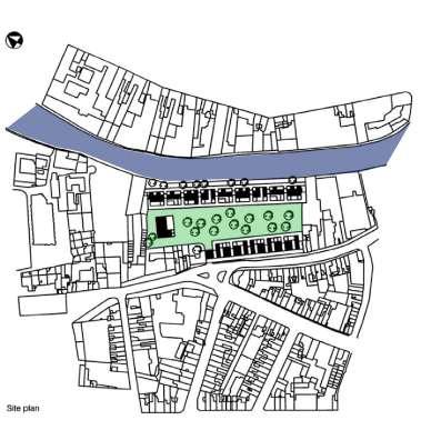
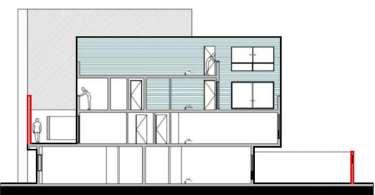
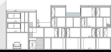
The Hollainhof is a social housing complex in the centre of Ghent. The dwellings are grouped into two strips, one bordering the street, the other the river. The two strips are composed of fifteen blocks, each containing eight to ten dwellings. The area in between has been left open as a large green space.
The aim of the project was to create an attractive habitat combining the qualities of urbanity and density with those of seclusion and tranquility. This has been achieved by updating the time-honoured typology of the hospitium. The result is an ensemble which oscillates between public and private, open and closed, and large scale and small-scale. Numerous set-backs in the plan generate a variety of dwelling types within a series of sculptural blocks, each with its own identity.
• Relation to the urban tissue:
The project aimed to integrate social housing into the urban fabric but faced challenges due to program changes. The central courtyard’s role became fragmented with additions like a day-care center and car parking, raising functionality concerns.
• Building typology:
Inspired by beguinages, a historical enclosed community, the project balances semi-public and private spaces. This typology is nicely attempting to blur the line between individuality and collectivity, historical adaptation and modern design.
• Individual dwelling design
Each dwelling was designed as an independent unit, resembling a large urban villa. The use of cedar cladding, spacious terraces, and large windows aimed to evoke a suburban dream house aesthetic. The internal organization allowed for a variety of spatial configurations, promoting flexibility. However, alterations to the design, including the introduction of more traditional layouts and shared facilities, deviated from the original vision of providing unique, contemporary living spaces.
(Source: AA Files, London / 1998 / ed. 17 / p. 3-11 / ‘Neutelings Riedijk Architects; Hollainhof projects for Hollain barracks in Ghent’)


(Source: AA Files, London / 1998 / ed. 17 / p. 3-11 / ‘Neutelings Riedijk Architects; Hollainhof projects for Hollain barracks in Ghent’ https://www-jstor-org.kuleuven.e-bronnen.be/stable/29544117?sid=primo)


(Source: AA Files, London / 1998 / ed. 17 / p. 3-11 / ‘Neutelings Riedijk Architects; Hollainhof projects for Hollain barracks in Ghent’ https://www-jstor-org.kuleuven.e-bronnen.be/stable/29544117?sid=primo)
CONTEXTUALISED VOLUMETRY


(Source:https://dimarieilarraza.com/estudio-de-caso-conjunto-de-viviendas-sociales-hollainhof-de-neutelings-riedijk/)

If project is highly mixed use, consider showing 2-3
* You can use original drawings from the project or tour own schemes. If you use the original drawings from the project (plans, sections, axos, visualizations) then work on them to clearly show (make visible) the elements you want to show.


(Source: AA Files, London / 1998 / ed. 17 / p. 3-11 / ‘Neutelings Riedijk Architects; Hollainhof projects for Hollain barracks in Ghent’ https://www-jstor-org.kuleuven.e-bronnen.be/stable/29544117?sid=primo)
(Source: AA Files, London / 1998 / ed. 17 / p. 3-11 / ‘Neutelings Riedijk Architects; Hollainhof projects for Hollain barracks in Ghent’ https://www-jstor-org.kuleuven.e-bronnen.be/stable/29544117?sid=primo)


(Source:https://dimarieilarraza.com/estudio-de-caso-conjunto-de-viviendas-sociales-hollainhof-de-neutelings-riedijk/)
(Source: AA Files, London / 1998 / ed. 17 / p. 3-11 / ‘Neutelings Riedijk Architects; Hollainhof projects for Hollain barracks in Ghent’ https://www-jstor-org.kuleuven.e-bronnen.be/stable/29544117?sid=primo)
MaULP_Galgenberg C
Hotakuba Housing has attempted to be an unusually large public housing scheme. It tries to connect 110 different families using a central open space. The focus of the project has been to add a positive way of living for the families and a sense of community.
• Hotakubo Housing tries to create a community from 110 entirely different housing units. This arrangement of structures centered around a central area was the end outcome. Its foundation was the concept of threshold. The only way to access the central open space of the site is via the units. The units act as entrances to the main clearing.
• In terms of relation at an urban level, the spatial arrangement acts as a barrier to surroundings due to its enclosing shape. The area around seems to be very disorganised and dense. This might help create a noise and privacy barrier, especially near the courtyard where most communal activities are meant to happen. The open space can be interepreted as a green oasis amidst a dense concrete jungle.
• Every residential unit has two stairways. One is for access from the side of the surrounding road, the other leads to the court. The residences are the threshold to the court. The courtyard staircases leading from each unit also provide access to common roof terraces. Family rooms face the central court and are made as open as possible, and the courtyard itself, rather than being merely an open space, has positive meaning as a place for living. In addition, each unit has a courtyard or a large terrace, allowing occupants easy access to an outdoor area.
• At an individual level, the sleeping quarters are positioned on the roadside and family quarters are placed facing the Central Plaza. On the third and all higher stories, a bridge connects the two. On the second storey, they are joined by a small inner garden space.
(Source: https://backnumber.japan-architect.co.jp/english/2maga/ja/ja0051/work/17-01.html, https://www. riken-yamamoto.co.jp/index.htm l?page=ry_proj_detail&id=41&lng=_Eng

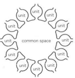
(Source: Public/Private concerning the concept of threshold research paper)
PUBLIC-PRIVATE STRUCTURE


(Source: https://pdfcoffee.com_japan-architect-housing-2-pdf)


(Source:https://issuu.com/mahsmaulp/docs/spring_2022_module_01_booklet_20220420)

(Source: https://pdfcoffee.com_japan-architect-housing-2-pdf) SPACE AND

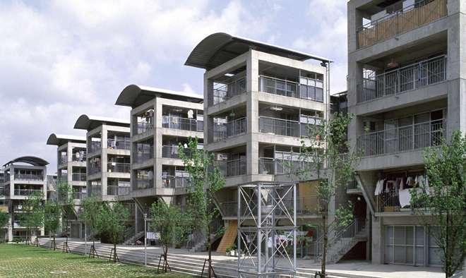
(Source: https://www.riken-yamamoto.co.jp/index.html?page=ry_proj_detail&id=41&lng=_Eng)

(Source: Japan Architect Housing Book)


(Source: https://misfitsarchitecture.com/2021/02/07/architecture-misfit-40-riken-yamamoto/#jp-carousel)


(Source: Japan Architect Housing Book)


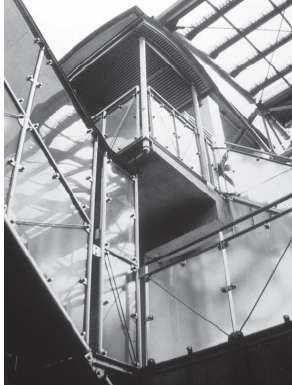
(Source: https://www.riken-yamamoto.co.jp/index.html?page=ry_proj_detail&id=41&lng=_Eng)
Analysed by Muyleng Heng_r0917023 Lacaton & Vassal
MaHS_Galgenberg A
Location: Paris, France
Year: 2014
Type: Collective Housing
Status: Buit/realized
Surface/Size: 6,734.6m²
Cost: 10.7M€ excl. VAT/net
Number of unit:
98 Student dwellings (From 9-23m²)
30 Social dwellings
6 Specialist care home residence
3 Commercial space
The special idea of this building is to dilate the maximum of interior surface of the apartments, also there is wintergardens, balconies, and terrace. The wintergardens and balconies provide each dwelling a private outdoor space that offers the possibility to live outside in a collective context, while being home. Combined with thermic and shadow curtains, they insure a function in the winter and summer inddor climatic conditions (thermal comfort) and savings on energies, within a bioclimatic approach.
• Urban tissue-The linear building volume responded to the surrounding context with a light structure and facade material, which aids a calm look in the narrow urban tissue.
• Building typology - The building is wrapping around the corner to form a courtyard garden to lay out the view of the residence in the dwelling.
• Individual dwelling design - The collective housing is designed with openings in two directions of the potential views on the street and the courtyard. The building enables different options for the dwellers to interact outside their room if they want to use a cozy courtyard garden or look at the busy city.
(Source: https://www.lacatonvassal.com/index.php?idp=75)

(Source: https://earth.google.com)
PUBLIC-PRIVATE STRUCTURE

(Source: https://earth.google.com)
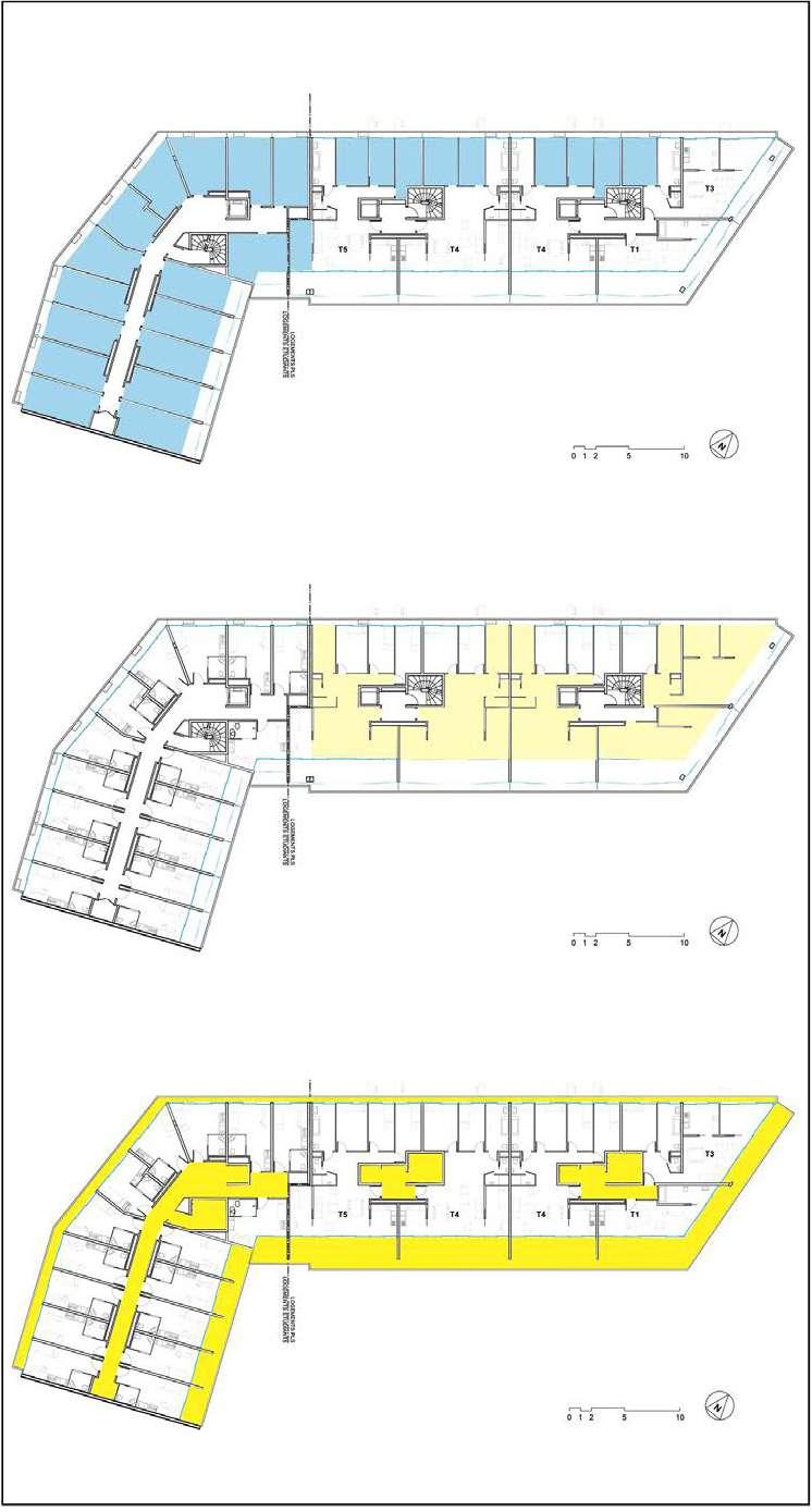
Plan
The linear building volume responded to the surrounding context with a light structure and facade material, which aids a calm look in the narrow urban tissue. Moreover, the building is wrapping around the corner to form a courtyard garden to lay out the view of the residence in the dwelling.

(Source: (1) https://www.lacatonvassal.com/index.php?idp=75, (2) https://earth.google.com)
The ground floor of the building is mostly occupied by the Commercials building service, with double height volume to give a significant remark to the shops themselves.


(Source: https://www.lacatonvassal.com/index.php?idp=75)
The semi-public space is a good place for the family to come together, regardless of which season of the year, winter or summer time. The double layers will help the residents stay comfortable in both seasons.
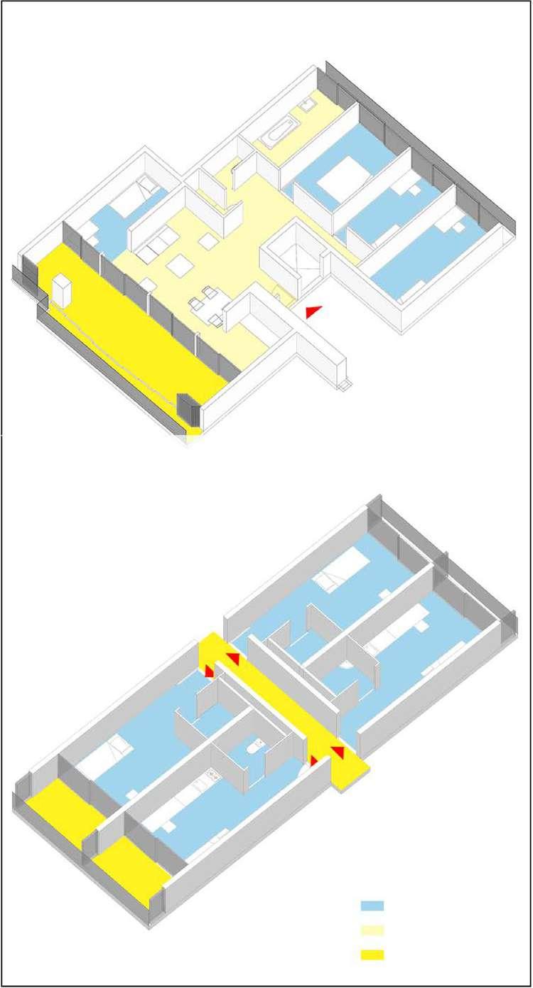
Space
Space
MaHS Galgenberg B
In 1987 the social housing project Nemausus was realised in the city of Nîmes. Jean Nouvel received carte blanche from the local authorities to develop this former factory site. He built 2 appartment blocks with various typologies all reserved for families of moderate income. By using industrial materials the project gets its radical outlook, yet most intersting is how he defines a ‘good appartment’.
The project includes 139 parking spaces and 114 appartments of various typologies with a habitable area of 10 300 square metres.
‘a good appartment, above all else, means a big appartment’
As stated the focus of the project was to provide appartments as big as possible, flexible and changeable. This was achieved by using industrial materials, dropping social housing norms and challenging the site to provide a generous amount of space.
• The surrounding urban tissue consists of low-rise housing along with small industry. On the plot the project makes sure to safeguard the existing trees. By raising the buildings on pilotis the groundfloor forms an open public area functioning as a parking and urban square.
• All appartments share outdoor walkways with their entrance, placing all collective spaces on the outside. Therefore each dwelling fills the entire depth of the building block, providing each flat with a big terrace.
• On the level of the individual dwelling the project offers a lot of flexibility, provind 17 variations to accomodate different needs. The units include one-room studios, duplex, triplex,...). Each unit has double outlook, a big terrace oriented to the south, embracing the crosscurrents throughout the appartment to provide the necessary comfort.

(Source: https://atlasofplaces.com/architecture/nemausus/)
PUBLIC-PRIVATE STRUCTURE


(Source: https://lepaveblog.wordpress.com/2018/01/24/nemausus-un-paquebot-entre-art-et-architecture/)
(Source: https://atlasofplaces.com/architecture/nemausus/)


(Source: https://atlasofplaces.com/architecture/nemausus/)
(Source: Google Maps 2023)
(Source: https://www.centrepompidou.fr/es/recherche/oeuvres?terms=nemausus)


(Source: https://atlasofplaces.com/architecture/nemausus/)


(Source: https://www.centrepompidou.fr/es/recherche/oeuvres?terms=nemausus)


(Source: https://atlasofplaces.com/architecture/nemausus/)
(Source: http://www.jeannouvel.com/en/projects/nemausus/)
(Source: https://www.nimes.fr/fileadmin/directions/culture/Nemausus.pdf)
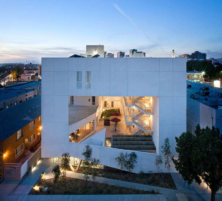
The SIX is a 52-unit affordable housing endeavor designed to offer residence, support, and rehabilitation to veterans who were previously homeless or disabled. Situated in the MacArthur Park region of Los Angeles, this project redefines the conventional shelter model by introducing a unique approach.
The project divides the area into public and private “zones,” reducing the emphasis on private spaces in favor of more extensive public areas. This spatial arrangement aims to shift the paradigm of solitary, isolated living towards a more community-focused, interactive environment, providing shelter and comfort.
• In terms of its relationship with the urban fabric, several of the plots remain vacant due to the high demand for parking in a city that heavily relies on vehicles. However, the project maximizes the utilization of the available land, creating a courtyard building typology that has been successfully employed in other projects in the surrounds.
• The building typology is a courtyard, allowing for an emphasis on passive design principles. This ensures natural ventilation and daylight in every unit while providing residents with access to natural light, open spaces, and various outdoor pathways.
• When it comes to individual dwelling designs, incorporates two typologies with some variations. The approach involves the utilization of an internal matrix for unit sizes, which slightly exceeds the minimum requirements established by the State of California Tax Credit Allocation Committee.

(Source: Author. Data: https://data.lacounty.gov/explore?collection=appAndMap&layout=grid. Accessed: 29th Oct 2023)

(Source: https://brooksscarpa.com/the-six)
PUBLIC-PRIVATE

Gradient Public-Private structure Map. Scale: 1/2500
(Source: Author. Data: https://data.lacounty.gov/explore?collection=appAndMap&layout=grid. Accessed: 29th Oct 2023)

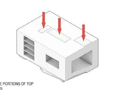
RAISE SIDE AND CORNERS

REMOVE PORTIONS OF FACADES

REMOVE PORTIONS OF TOP OF MASS


(Source: Reyes, Alejandro. Moy, Martin. “Analysis”. In: Arch 202 XL Sharing. “THE SIX, BROOKS + SCARPA | ALEJANDRO & MARTIN” February 8, 2021. video. https://www.youtube.com/ watch?v=K9iDkrhWMJA. Accessed: 29th Oct 2023)

(Source: Google Earth. Accessed: 29th Oct 2023)


Plan of Second, Third, and Fifth floor Plan (Source: https://brooksscarpa.com/the-six)

Section (Source: https://brooksscarpa.com/the-six)


Section (Source: Reyes, Alejandro. Moy, Martin. “Analysis”. In: Arch 202 XL Sharing. “THE SIX, BROOKS + SCARPA | ALEJANDRO & MARTIN” February 8, 2021. video. https://www.youtube.com/ watch?v=K9iDkrhWMJA. Accessed: 29th Oct 2023)


One-bedroom Unit A
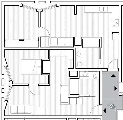
One-bedroom Unit B and C


(Source: https://brooksscarpa.com/the-six)
circulation

spaces

Functional schemes
(Source: Reyes, Alejandro. Moy, Martin. “Analysis”. In: Arch 202 XL Sharing. “THE SIX, BROOKS + SCARPA | ALEJANDRO & MARTIN” February 8, 2021. video. https://www.youtube.com/ watch?v=K9iDkrhWMJA. Accessed: 29th Oct 2023)

(Source: https://brooksscarpa.com/the-six)

MaULP_Galgenberg C
The SIX is a 52-unit affordable housing project provides a home, support services and rehabilitation for disabled veterans. It is located in the MacArthur Park area of Los Angeles.
Offering shelter and comfort, the SIX breaks the prescriptive mold of the traditional shelter by creating public and private “zones” in which private space is deemphasized, in favor of large public areas. The organization of the space is intended to transform the way people live-away from a reclusive, isolating layout towards a community-oriented, interactive space.

• In terms of connection with urban spaces, there is the most connection with parking lots, which is located in this neighborhood due to high demand. The connection and proximity to MacArthur Park is also one of the advantages of the location of the reed building.
• The ground level contains offices, support spaces for the veterans, bike storage and parking while the second level has a large public courtyard. Surrounded by four levels of housing units with balconies wrapped with a wood screen made from recycle planking the courtyard has large openings with green roofs that visually connects the space to the street on the lower level beyond. This allows the tenants to enjoy a secured open space while still connecting to the larger community.
• The planning and design emerged from close consideration and employment of passive design strategies. These strategies include: locating and orienting the building to control solar cooling loads; shaping the building to induce buoyancy for natural ventilation,etc.
(Source: https://brooksscarpa.com/the-six)


‘‘The Six’’ is located on South Carondelet Street, which is a few miles from MacArthur Park(green space). This building is built in a relatively dense urban context, with numerous parking lots around it.
(Source: https://earth.google.com/)

Private Spaces
Public Spaces

(Source: https://brooksscarpa.com/the-six)
(Source: https://issuu.com)

(Source: https://brooksscarpa.com/the-six)


(Source: https://www.archdaily.com/)

(Source: https://www.archdaily.com/)


There are 2 dwelling types in the building:
Type A:Standard Studio Units

There are 43 rooms of approximately 40 square meters on 4 floors of type A, which include a bathroom. These rooms are mostly located in the west of the building.
Unit

There are 9 rooms of approximately 55 square meters on 4 floors of type B, which includes a separate room in addition to the bathroom. The number of this type is less compared to the previous type.
(Source: https://brooksscarpa.com/the-six)


Three main activities are being carried out in “The Six”:
1- living in the Units
2- Service or Communal spaces which include lobby, laundry, conference room, etc.
3- the Hallway in the center of the building which is the meeting point of other spaces.


(Source: https://brooksscarpa.com/the-six)
Analysed by Peadar McCarthy_r0979609
MaHS / MaULP_GalgenbergD
DESCRIPTION
Zollhaus is a mixed use public/private development. The project was conceptualized and financed by the Kallbreite Co-operative and the architectural design was done by Bollhalder Eberle. The development consists of three buildings, that are connected by a common ground floor, and a first floor terrace that is located inbetween the three buildings. The eastern building, which is the shortest of the 3 Buildings consists of office space, a kindergarten, commercial space, and residential space. The central building consists primarily of residential space, with commercial space on the ground floor. The Western Building, which is the tallest building, consists of a Public Forum with a theathre, a guesthouse, commercial space, and a public courtyard in its center. The development is bordered on its south side by a valley of train tracks that traverse Zurich, and on its north side by zollestrasse and mixed use buildings of a similar typology.
The development is owned and managed by the Kallbreite Co-Operative. The Co-Operatives motive was not profit, but was rather to create a sustainable, inclusive, lively and affordable mixed use development that would garner a strong sense of community. One of the main aims of Zolhaus design was to maximize common space and minimize private space. It was decided that the foyer and the terraced open spaces would not only be accesible by residents and office workers, but also by the public to maximise inclusivity. Within the building itself common space was also maximised. Many of the apartments share their kitchen and common space and there is a common kitchen for residents and office workers.
The Zollhaus fits in smoothly with the urban tissue. Much of the surrounding buildings are of a similar size and have commercial space on the bottom floors and are residential from the first floor up. The largest building of the three, on the western side, is 6 storeys, which is slightly larger than other buidlings on Zollstrasse which are a maximum of 5 storeys, but it transitions smoothly into the existing tissue. One unique dwelling design is the ‘Hall Living’ dwelling. In this design up to 20 people co-inhabit an apartment where they have their own rooms, but a large hall space of 327 m2 and 10m height is common. The interior design of the common space is up to the residents. They decide where to place the walls, and what different areas can be used for. This is a positive way of maximizing the input of the residents, but could also of course lead to financial challenges and tension amongst residents who disagree on uses.
https://www.kalkbreite.net/zollhaus/meilensteine-zollhaus/
The project is confined to a narrow wedge of 4125m2 between Zollestrasse on the North and the valley of train tracks on the South. Given the confinements of the plot size, open space was maximized. Most developments in the area are part of a rectangular block system with large internal courtyards, mainly used for parking. Given the narrow width of the development a large open courtyard was not possible, however, a large courtyard was designed in the foyer at the ground floor level of the western building.

The roof terrace on the central building provides private open space for residents. Mobile railway wagons on top of the roof have been re-purposed as planting beds. These planting beds keep with the existing tissue of the railway to the south of the site.

The track terrace on first floor level provides space for residents and for the public to use. This space is more oriented towards residents use as it is slightly removed from street level. A light fringe of flower bushes and birch and pine trees align the track terrace creating a connection with nature.

https://www.bollhalder-eberle.ch/en/project/zollhaus-zurich
One of the main aims of Zollhaus was to maximise inclusivity and to create a link between the Cooperative building and the city. To achieve this a forum was created within the first three floors of the building on the western side of the development. The forum consists of cultural restaurant, a theater, the reception, the track bar, the guesthouse, the medical center and the flex rooms that can be rented.


The ground floor level of the three buildings consists mainly of commercial space including cafes and restaurants that can be acessed by the public. The first floor of the three buildings consists of office space that is usable by the public, a doctors practice, a bar, and a guesthouse. The third floors consist of office space and guesthouses. All other floors above the levels highlighted consist of private residential units.


The volume of the 3 buildings align with the development style of the existing tissue along the borders of the train tracks. Further from the train tracks the city is planned in a grid pattern, where each block is of a relatively consistent height and volume. However, due to confinement of space, and variability of plot sizes along the borders of the train tracks, there is less consistency of volume of developments. Developments along the track vary hugely in area and in height.
The height of the three buildings are similar to the heights of the surrounding buildings further north of the train tracks. Buildings in this area range between 5-8 storeys, and so this development, which consists of buildings with 5 and 6 storeys fits well into this tissue.

https://www.kalkbreite.net/zollhaus/architektur-zollhaus/


https://www.enzmannfischer.ch/?project_id=101
The fourth floor levels of the western building and central building consist entirely of apartments, while there is a kindergarten in the eastern building. The apartments vary in size from 1 person to 8 person on these floors.
The ground floor level of the western building consists of the theater, courtyard, and commercial space. The central building consists of commercial space and a shared canteen area. The eastern building has a bar.
The section through the western building on Zolstrasse conceptualises the central public courtyard. Above the courtyard, on the third floor is a more private courtyard with a view to the sky above.
The Elevations of each building transition smoothy from the 5 storey building on the east side to the 6 storey building on the west side.

https://www.kalkbreite.net/zollhaus/architektur-zollhaus/

The most unique dwelling type is the 20 person hall living dwelling.
The idea for the hall living concept was inspired by how some squatters lived in Zurich in the 1980’s. Groups of squatters occupied large and open industrial and commercial spaces in buildings, and adapted these spaces to suit their needs.


https://www.enzmannfischer.ch/?project_id=101


One of the core aims of the co-operative was to cobine living, working and culture. To achieve this the functions of the buildings were greatly mixed which allows living spaces, work spaces and cultural spaces to be intertwined. The Communal kitchen area was also created to promote contact between office workers and people living in the apartments.
https://www.enzmannfischer.ch/?project_id=101


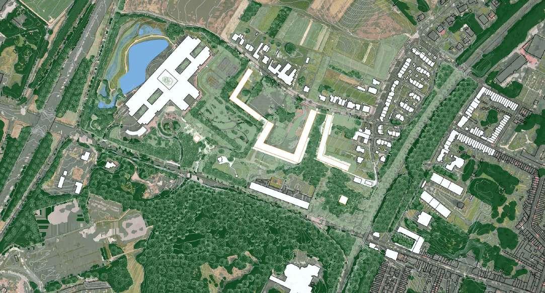
The figure ground map reveals a marked seclusion. Existing structures and topography encase the site, while ample open spaces, unfortunately, remain inaccessible negative spaces, contributing to an overall closed-off atmosphere.
The open space map details both permeable and impermeable surfaces, along with the presence of existing trees within and around the site.
The existing tree map illustrates the pattern of the green skeleton. To the south lies a forest, and to the north, open fields; our site acts as a barrier, impeding the natural flow of trees between these spaces.
By extending the existing southern forest into a park, replacing car-parking areas, we establish an ecological bridge between the forest and the open fields in the north. Monumental trees guide the design of new buildings, framing existing tree structures. The result is a harmonious blend where housing volumes interlock with the park, creating inviting public spaces.


Existing Tree Structure Map


Space Map

Concept Site Map
The existing forest, at the south, with its “branches” on our plot is enhanced and extended, by the creation of a park replacing car-parking areas, serving as an ecological link and transitional space between the forest and northern open fields. New housing seamlessly integrates with tree structures, ensuring a nature-infused urban fabric. Strategic water retentions form wadis, harmonizing with topography. Eliminating highway width brings trees closer for enhanced connectivity and natural aesthetics. The adaptive reuse of KBC transforms it into a dynamic mixed-use hub. Connecting to suburbia occurs through a blend of agriculture and communal courtyards, fostering shared living. Introducing two towers within this park-centric urban tissue adds liveliness and high-density living without compromising the landscape.
In conclusion, our vision involves creating a park, seamlessly integrating new housing with nature, implementing strategic water features, enhancing tree connectivity, repurposing the KBC building, connecting to suburbia through agriculture and courtyards, and integrating towers to increase density while preserving the landscape's integrity.
This tree structure was the starting point and what can define the shape of our

our buildings. This infrastructure can be the connector between the forest and the open land and facilitator of housing density
Monumental trees define the landscape. The existing forest, at the south, with its “branches” on our plot is enhanced and extended. The buildings are shaped by them. The design of the urban tissue typology strengthens the communality between the residents. Public spaces, communal rooms, gardens and oversized pathways are making convivial ground.


The scale of this building infrastructure


infrastructure follows the landscape and the monumentality of the trees.


This main building gesture also facilitates the circulation within the site


Urban tissue typology of living inside a park
The central section, once KBC parking, transforms into a park, bridging the forest and open lands. A unified path integrates building and site circulation, respecting the natural tree flow rather than restricting them. The ground floor of the building serves as an intermediary between public park and semi-public courtyard. A playful massing strategy intentionally disrupts the courtyard scale, making it more human-friendly and approachable.




We are establishing public access through the forest, envisioning KBC as a transitional space brimming with communal activities—a productive hub for the neighborhood. Behind the building, there is a large park, and we aim to implement a waterway to regulate the flow from the upper region, guiding it alongside the road towards the Wetlands area for occasional use.


Caption Section B


Enter through a small entrance from the forest then we will reach a pocket of jungle, there is a vibrant hub featuring a productive workshop space for students, a cafe, and a sports club that connected to the higher forest and other buildings.


Collective housing is planned for the upper floors, where we enhance the greenery on the balconies and connect them via bridges for increasing the interaction among neighbors and allows them to move freely through the jungle.
Galgenberg _ B
CHI DUONG
JAVIER LAZARTE
MARIE MEURICE
Axonometeric View


On the one hand we intensify the different landscape through the natural figures, densifying the highest plateau to extend the forest of the existing park on the other hand pulling the agriculture fields in on the northern side. While each time offering an answer to the water management through a multitude of permanent ponds and retention zones to collect water coming down from the hill.
In combination each plateau has its respective typology. On the bottom of the hill the typology opens towards the city, answering the existing fabric across the ring. On top of the hill the typology provids a balcony to the city while narrowing the footprint to benefit the forest. Past the hill the typology retrofits the existing structure.


Through our reading of the existing we understand the site as a sequence of 4 distinct plateaus, defined by both topography and existing trees. Our project therefore develops these 4 entities as an urban fabric celebrating diversity and identity, each with their own qualities and characteristics. A series of spaces rich through its variety


The plateau on the bottom of the hill provides an answer to the city; by continuing the street figure, a new urban square opens the site to the public. Through the interplay of topography, typology, and canopies, spaces alternate between public and private. Carefully chosen axes of trees knit the green landscape back together. All this is linked through a meandering road up the hill, to enjoy gardens in between the city, forest, and fields.


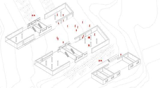
Axonometric

Situating the built in the landscape, the buildings bridge the topography in the longitudinal direction, the groundfloor moves from being present at the east to submerged in the west; organised with public functions accordingly. Transversally the built provides a series of enclaves. Each with their own character, activated by the typology.


To safeguard a maximum number of trees and maintain the uninterrupted forest canopy, a tower typology was chosen to minimize the building footprint. This location, serving as a natural city balcony, is leveraged by tall buildings. Adjacent, there's an urban sports park blending passive recreation with active sports facilities.


Ground level plan. 1/500


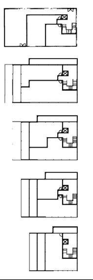
Typical plant levels 7 to 17
Feature two studios and two apartments.

Typical plant levels 2 to 6
Comprise four studio units and one apartment type.


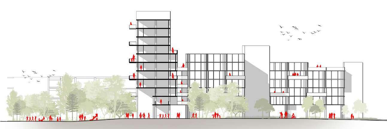
Section B-B. Eye-level view
The towers gradually diminish to meld with the lower urban setting.
The image illustrates the landscape among the towers as a natural city balcony.

aerial view
Residences not only embrace the urban panorama but also in 360 degrees. Simultaneously, the elevated street generates extensive covered spaces at the ground level, ensuring the continuity of social activities even during inclement weather.
A new water structure, shaped by topography and contour lines, features two permanent "always flooded" zones, separated by a flexible floodable platform. The terrain transforms from a mud and grassy path in normal conditions to a pond during heavy rainfall. Future-oriented designs accommodate post-car scenarios, emphasizing collective spaces and shared co-working offices.


The old KBC offices now turned into affordable housing and new offices working space


1/500 and/or Axonomestric/ eye-level views ]


Unit Configurations
The goal here is to embrace social interaction and sense of belonging of the community by having at each block a curated collective space. All the unit combination is flexible and be decided by the future residents.

The landscape from a mud and grassy path in normal conditions to a pond during heavy rainfall. Future-oriented designs accommodate post-car scenarios, emphasizing collective spaces and shared co-working offices Axonometric


Three different landscapes - the ‘forest’, the ‘terraces’ and the ‘agriculture’ - merge. To do this we let first the ‘Forest’, and then the ‘agricultural’ flow into our site of terraces, creating a mixeduse ‘terrace’-landscape with programs like agroforestry and urban agriculture. The lines of these programs, together with the buildings flow parallel to the terraces lines and emphasise them. In doing this, we also open up the ‘Flat’ zones.


The goal was to examine the various and landscapes elements around the site. There have primarily been two typologies observed, i.e forest and farmlands. The site operates as a barrier between the two, particularly due to its massive impervious surfaces. A fragmented landscape flow is observed.
The objective is to analyze the typologies and activities around the site in order to have a comprehensive understanding of how things work. The right side is largely residential, while the left side is mostly commercial; the site causes a disconnect between the two, particularly with the oversized programs of the bank and sports center.
The aim is to look at numerous flat areas (or terraces) on the site that have been formed by current or former programs. They are being used for large private or semi-private, shielded projects (such as private parking). As a result, they are inaccessible and underutilized, while being the most permeable.


The overall site is an experience of walking through different terraces providing various activities relevant to the landscape around the site. It acts as a harmonious connection between the city and its outskirts, forest and farmlands and urban and rural.
Programs like agroforestry and urban agriculture integrate the landscape settings of agriculture and forests. The ground floors of the buildings consist of workshops, shops and cafés (alternated with housing), and complete these new programs.. Every level of the terraced landscape has a small landscape with its own personality and water system to be discovered while strolling through it. All the roads lead eventually to the the highest KBC building, which will be repurposed into the neighborhood's agricultural hub.
All micro landscapes on our site (places), are managed by different kinds of growers (like houshold growers, community growers, people in training, teachers and employees), with different kinds of motivations (like environmental, pedagogical, esthetic, personal fulfillment and finencial). These places, growers and motivations come together into spatially organized entities.


The eastern part of the site faces some challenges, one of which is existing buildings, the steep slope and the access to the city center.
Due to the fact that in other parts of the site, except some parts of the bank, everything has been damaged, it has been decided to preserve most of the buildings in this part of this site.
For the problem of the difference in height, which made it difficult for pedestrians and cyclists to access, paths to solve this issue, and this also caused the creation of different accessibility on the site. The expansion of the forest also helped to solve this challenge.
As for the access to the city center, this access was given by destroying the bridge and turning it into a road that is as wide as the southern road.
Regarding the main purpose and the activities in this part of the site, it can be said that this part mainly prepares agricultural products with a workshop on the ground floor and sells these products in temporary and interior shops.
Key Plan


Master plan of zoom1 shows the integration of agricultural land and forest into


tribute to produce products.In this


The building's tapered design seamlessly blends with the landscape ,forming a terrace effect.


The central part of the site intends to merge agriculture, social interaction, and knowledge exchange. In this region, diverse terraces provide a spectrum of agro-centric experiences, while residents are actively prompted to embrace urban farming as an integral part of their lifestyle. The objective is to immerse residents and general public in a diverse array of activities and catalyze a positive transformation in their daily routines.
Key Plan

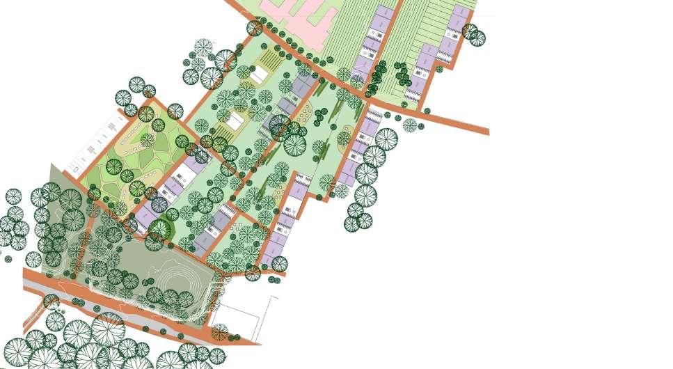
Site Plan at 1:1100

Site plan showcasing central region of masterplan, mainly consisting of leisure open spaces


Cultivated leisure experiences intertwined with natural landscape settings of forest and farmland. Open spaces are what will attract the general public to the site so it was essential for them to be enticing


Encourage residents to adopt urban farming as a part of their lifestyle and also possibly gain monetary benefits from it.



Axonometric view
Three dimensional view of the site from the mound side
With lines in the different kinds of trees, urban agriculture, shapes of pathways, of buffers, of buildings, and shape of the structure, the flowing landscapes concept is underlined. The bank becomes a hub for agriculture, health, and lifestyle, it promotes agriculture, through various educational and social services such as workshops, visible workspaces, classrooms and a flowercafé. The different kinds of outdoor spaces contribute to this educational and social services.
The KBC-hub exist of workshopspaces at the groundfloor, on top there is cohousing for people who want to live in a working environment. The New housing blocks are individual dwellings. Both KBC and the new housingblocks have fronts and backs so that there can be more open and more closed open spaces. The fronts have Gallerys, which are shared, and in the new building blocks, the backs have private outdoor spaces.


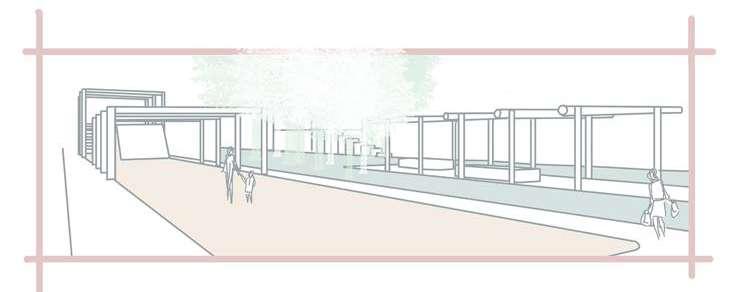


WORKSHOP / WORKSPACES CLASSROOMS


GALGENBERG _D
SUPANUT UDOMSILAPARSUP
YALAN ZHANG
PEADAR MCCARTHY


The scale of urban space gradually increases from the city center to the suburbs. The north of the site is farmland and the south is forest. However, due to urban construction roads, it is completely separated from the site.

This map interpretes the existing tissue of the land and how it has changed over time. The cut and fill and extreme differences in elevation show that different areas were cut from the original hill of the site to create flat platforms for construction. The squirrel trail shows how disconnected the wilder tree covered areas of the site are, making it more difficult for local fauna to survive.

The consequence of topographic structure is the creation of boundaries, acting as barriers along the site. These boundaries encompass landforms and retaining walls, isolating the area inside from the outside. Simultaneously, the space within and its designated functions (such as a bank, tennis club, or housing with a permanent structure) is further segmented.
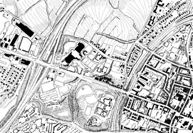


Based on three different interpretative maps, it illustrates the relationship between landscape elements such as forests and agriculture, topographic structure, and urban development, including buildings and road infrastructure.
Our vision involved removing the boundary that is the site, and extending the surrounding environmentally sustainable and healthy land types into our site.
The forest was extended from the south into our site, to strongly improve the capacity for biodiversity of the area. The biodiversity crisis is one of the biggest challenges that the world is faced with today, so improving biodiversity on the site was considered to be of utmost importance.
Agriculture was extended from the north into the site. This allows the development to be very circular in its food production and consumption. Residents could produce their own fruit and vegetables and consume them themselves, or sell them at the market area.
In our building design we allowed for a healthy, high density in the area and provided a great number of amenities and open space throughout the site for the residents. We ensured that all buildings were aligned with the existing topography to minimize cut and fill on the site, in turn minizing the negative environmental impacts of the development.

VISION PLAN
Resident Space Collective Space
SECTION A-A

Agroforestry
Following the 'Beyond Boundary' strategy, the forest boundary extends to the steeper terrain, while the new building and agricultural field occupy the less steep terrain, offering a space for food production. Within the forest, known as the 'Neighbourhood Forest,' a natural pond collects water from the steeper areas. A pathway connects to a food-productive space situated between the buildings.


SECTION A-A
The connection between the landscape function as a neighbourhood forest and the food-productive space situated between the collective buildings, including co-working space, restaurant, cafe, supermarket, and residences.


Detail Plan Living Atmosphere
The 'Beyond the Boundary' concept is integrated into the design, creating collective and shared spaces, such as courtyards, shared balconies, and roof gardens.

The 'Neighbourhood Forest,' seamlessly integrating with the landscape structure, offers a new public space for the community and city.
The integration of forest and agriculture in this area forms agroforestry. The main buildings are set followed the terrain at different elevations and connected by corridors. There are sports center, public kitchens, activity spaces and green house in the community where everyone can participate in agricultural activities and form a real agroforestry community.


GROUND FLOOR
0 10 20


The agroforestry garden between the buildings is shared by all residents, where everyone can produce, relax and communicate.

The use of sloped setback construction means that the new building will not oppress the KBC and at the same time form a large green open space.
ZOOM TISSUE 3
My aim was to continue the forest from the south, and the agriculture from the north, into the site, to create a smooth transition and strengthened organic tissue through the area. I created a dense and rewilded forest area, rewilding the concrete lined pond at the front of the building, to improve it's capacity for strengthening the local ecosystem and improving on site biodiversity.
I minimised work on the existing KBC building, to maximize practicality, feasibility, sustainability, and minimise negative environmental impacts of demolition and reconstruction. The large glass atriums atop the wings of the building were removed and the wings were converted to duplex apartments with a 25m x 70m internal courtyard in their center.
As a structural engineer, based on the structural drawings, I am of the opinion that this building was structurally overdesigned and no expense was spared, which would make these types of internal structural changes feasible, sustainable and practical.


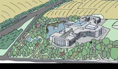
A Food and Market Hall inspired by Food Hallen was created in the central part of the building. At -1 level a gym was designed and a perimeter corridor with glass roofing and windows was designed to allow natural light to enter the gym.


The residents courtyard is 25mx70m, which provides plenty of space for leisure activities for the residents, while still offering a lot of space for areas that could be used for urban agriculture or native plant and wild flower growing to further strengthen the ecosystem conditions.


Exploded View and Sections of Residential Unit Typology and Shapes
Most of the Units are 2 levels tall in one half, and 1 level in the other half. This maximises natural light entering the apartments, and gives residents scope to design their apartment in their own way, potentially creating a second level in part of the apartment, which could be used as a bedroom level, or for workspace.


Leuven, Belgium
Guests
External Jury Members
Yuri Gerrits, KU Leuven
Guido Geenen, KU Leuven, WIT architecten
Joris Moonen, KU Leuven, MIDI
Sarah Van de Velde, Bureau Bas Smets
Ward Verbakel, KU Leuven, PLUSOFFICE
Annelies De Nijs, Atelier Horizon
Cristian Panaïté, METAPOLIS
Els Van Meerbeek, KU Leuven, Carton123
Pieter Van den Broeck, KU Leuven
Ellen Verbiest, KU Leuven
Guest Lectures
Janina Gosseye, TU Delft
Yuri Gerrits, KU Leuven
Dr. Xiaoxuan Lu, University of Hong Kong
Fadi Masoud, University of Toronto
Mircea Munteanu, METAPOLIS
Thomas Willemse, Studio Thomas Willemse
Projects visits
Korbeek winners - Els Van Meerbeek, Carton123
Centrale Werkplaatsen - Tom Boogaerts, &bogdan
De Drie Kreeften - Roeland Joosten, WIT Architecten
Teaching Team
Mircea Munteanu, affiliation
Teodora Romanova Stefanova, OSA Research Group, KU Leuven
Thomas Willemse, affiliation
Kelly Shannon, KU Leuven
Bruno De Meulder, KU Leuven
Stakeholders Exercise
Pieter Van den Broeck, KU Leuven
Student Groups
FOOTHILL HEVERLEEBOS
- MAHS/MAULP 1
Group A
Alireza Mirshekari
Janno Delissen
Giuliana Paola Palaez Rodriguez
Group B
Bram Vidts
Pham Nguyen Thao
Martin Adriel Purnomo
Group C
Ella Hens
Alfonso Nava Lopez
Unnati Khanduri
Group D
Gautami Manish Kasat
Santos Albeiro Blandino
Ngoc Dieu Tran Hoang
FOOTHILL GROENVELD
- MAHS/MAULP 1
Group A
Tom Van Laer
Praveenkumar Paramagourou
Asmae El Rhazi
Group B
Huijun Liu
Trang Minh Thuy Nguyen
Group C
Gayane Maes
Saba Asir Khan
Bezawit Tekle Gasso
SWAENENBERGH SITE
- MAULP 2
Group A
Verma Harshika
Paola Salvatierra Castro
Saran Maiprasert
Group B
Alexia Chalouli
Sri Keshava Tanguturi
Radhika Rishi
Group C
Eva Clara Atcheson
Tanvi Rajesh Belhekar
Group D
Ria Das
Junyao Su
GASTHUISBERG
- MAHS/MAULP 1
Group A
Elton Kibet Birir
Konstantina Nikoletta Karasarini
Yuhan Dong
Group B
Fatima Akman
Maha Abumaria
Yingjie Li
Group C
Dimitra Makraki
Alexa Gomez Custodio
Jinhao Cen
Group D
Radhika Somani
Victor Hugo Martinez Perez
Irene Gracia Aranda
GALGENBERG
- MAULP 2
Group A
Angelos Chouliaras
Muyleng Heng
Lamia Farhat
Group B
Marie Meurice
Javier Eduardo Lazarte Remisio
Vu Linh Chi Duong
Group C
Kato Belmans
Kshipra Mangesh Deolalkar
Group D
Supanut Udomsilaparsup
Zhang Yalan
Paedar MacCarthy
Booklet Layout & Editing
Mircea Munteanu
Teodora Romanova Stefanova
Thomas Willemse
Khalda El Jack
DEPARTMENT OF ARCHITECTURE

MASTER OF HUMAN SETTLEMENTS
MASTER OF URBANISM LANDSCAPE AND PLANNING
