SHARON MAK Portfolio 2024

Education
The Chinese University of Hong Kong, Hong Kong
Hello! I am Sharon MAK from Hong Kong, a third-year architecture student at the Chinese University
I am responsible, resilient, and committed. I view architecture better human experiences, and I believe that everyone
I am interested in life-centered design and how architecture just and sustainable future for all.
Bachelor of Social Science (Hons) in Architectural Studies
Expected Graduation in 2025
University of Auckland, New Zealand Exchange Student
The Chinese University of Hong Kong, Hong Kong
Bachelor of Arts in Religious Studies
Second Upper Class Honours
IELTS English Language Test
Overall Score: 7.0/9.0
Personality
Active Flexible
Resilient
Adaptable
Motivated Organized
Enthusiastic Committed Responsible Independent Cooperative Communicative
Sep. 2021 – Present
Feb. 2024 - Present
Aug. 2015 – Jul. 2019
Aug. 2016
Work Experiences
Domat
Full-time Winter
One Bite Design
Full-time Summer
Making On Loft
Part-time Project
ImpactHK Limited
Full-time Case Officer
Language
Technical Skills
Expert
Cantonese
Native Proficient
English
Mandarin
MacOS
Windows
Microsoft Office
Mobile/Whatsapp/Signal: +852 6779 2246
Email: makkwanyeung@gmail.com
Skype: maksheepyeung
Instagram: yeung.co
University of Hong Kong.
architecture as a means of shaping everyone deserves a decent home.
architecture can contribute to create a
Experiences
Winter Intern (Project Team)
Studio
Summer Intern (Design Team)
Project Assistant
Limited Officer
Office
Skills
Dec. 2023 - Feb. 2024
Jun. - Aug. 2023
Jun. - Aug. 2022
Sep. 2021 – Jun. 2022
Aug. 2019 - Aug. 2020
Intermediate Beginner
Rhinoceros
AutoCAD
Adobe Illustrator
Adobe Photoshop
Adobe
Adobe Lightroom
Adobe Premier Pro

01. 02. 03. 04. 05. 06. 07.
InDesign Revit ArchiCAD SketchUp
Grasshopper Salesforce

01 Restaurant


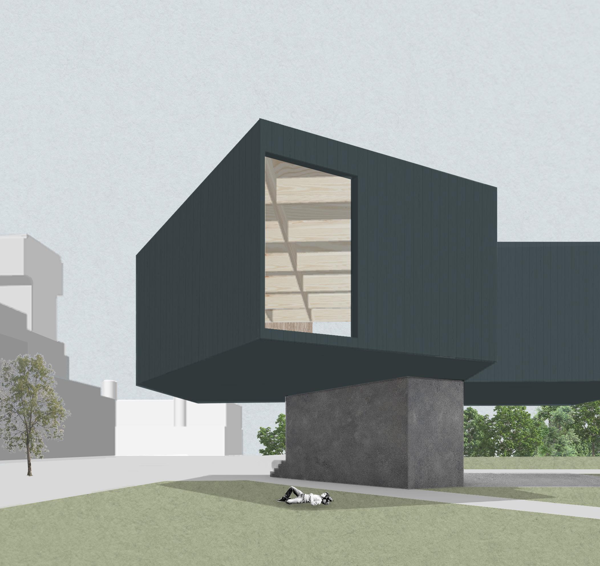
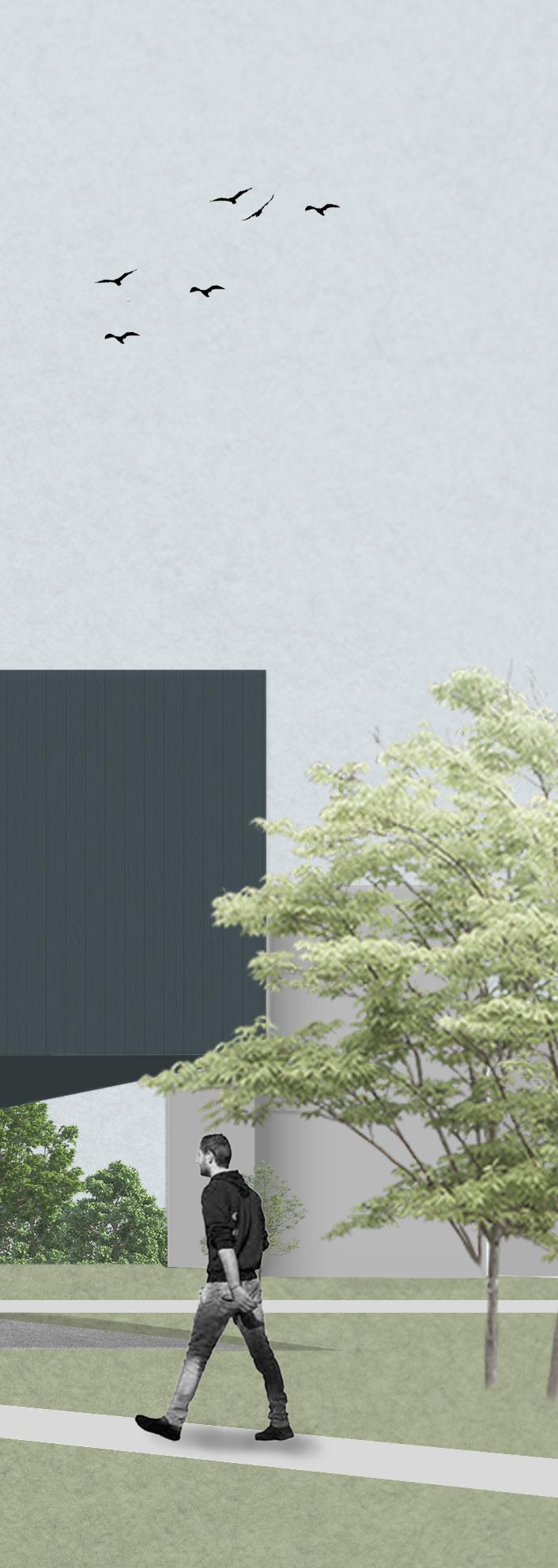
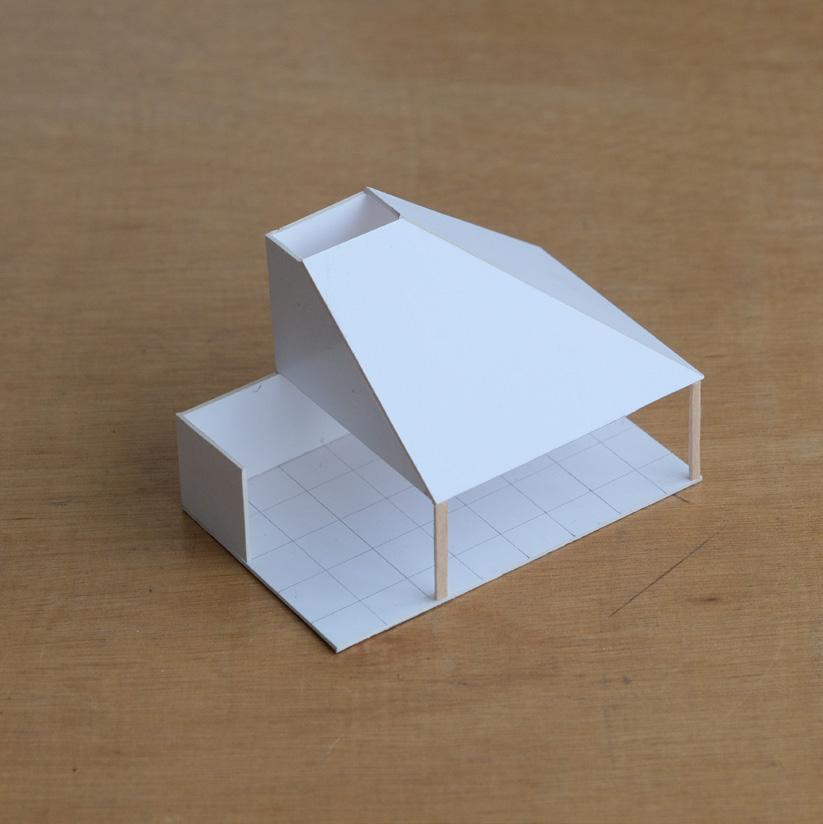
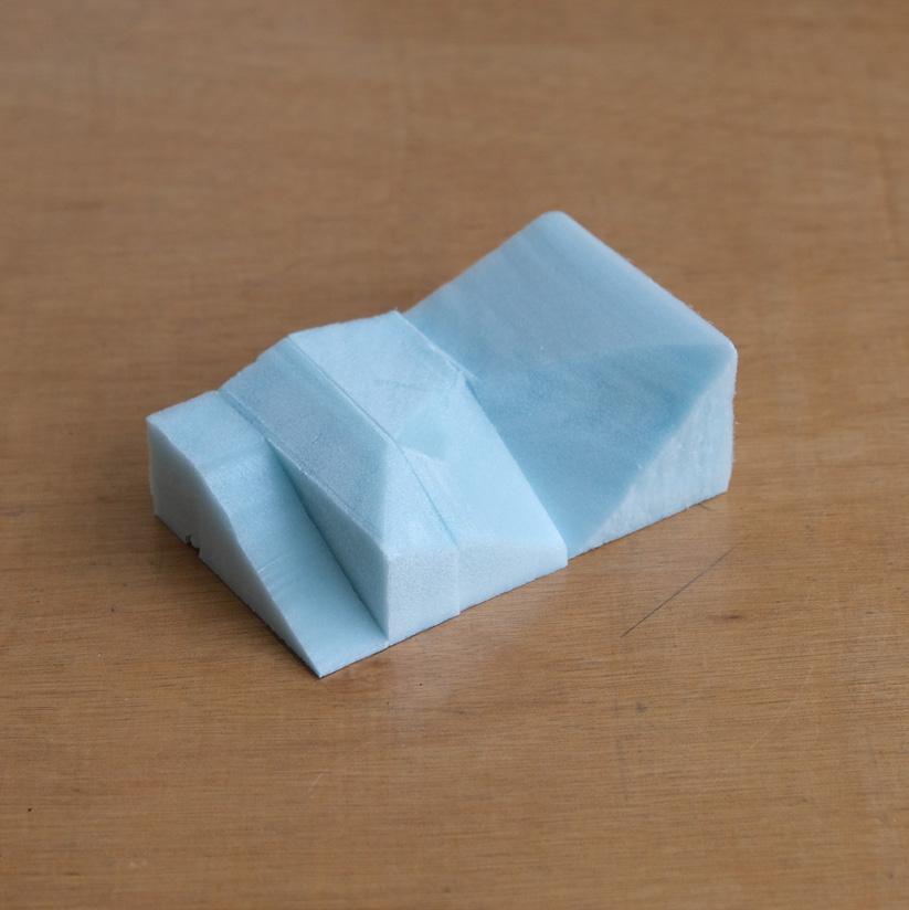
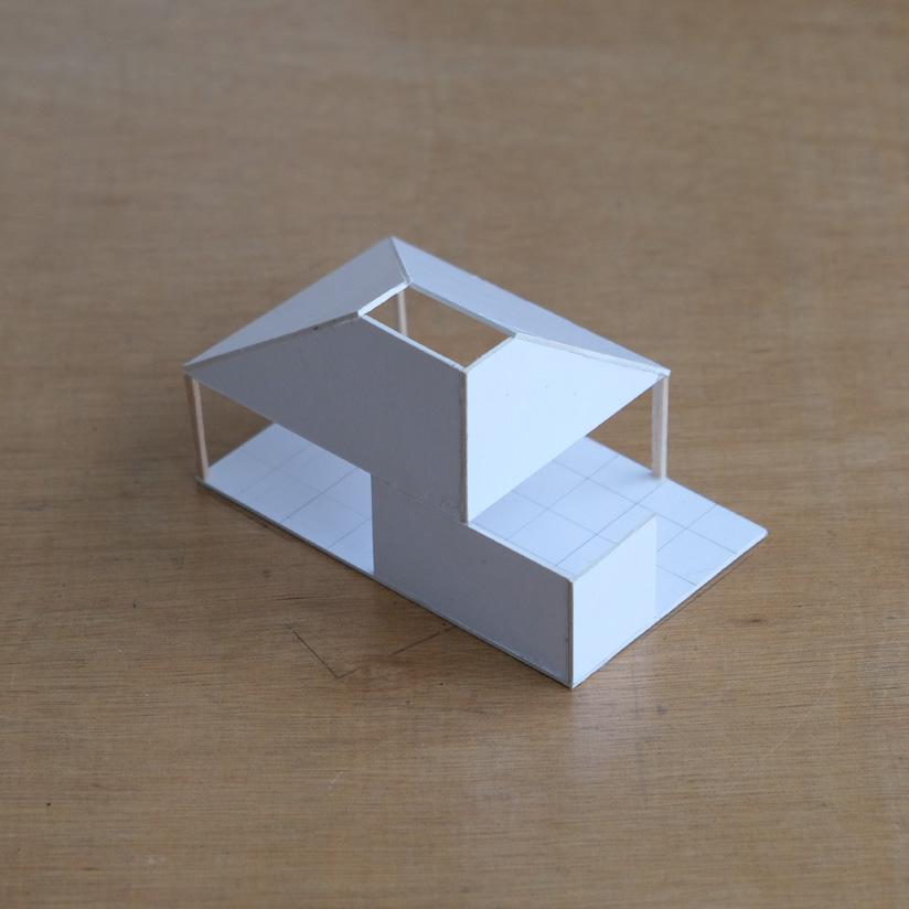
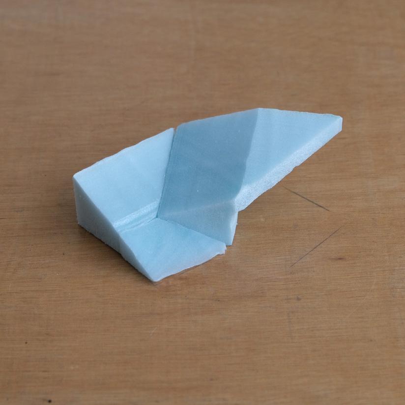
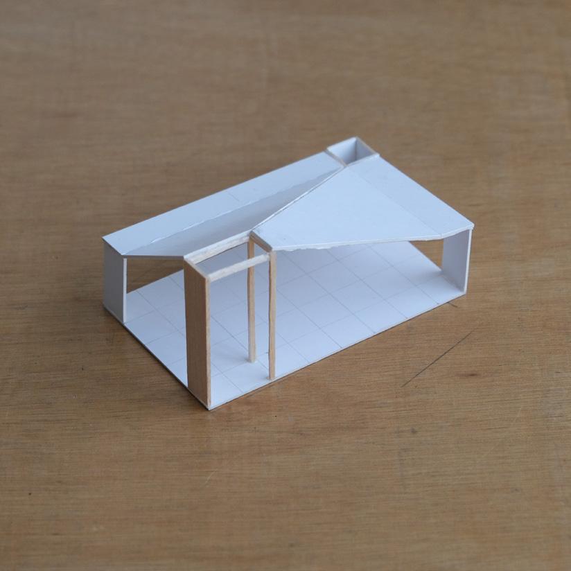
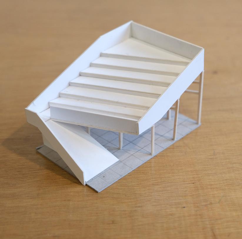
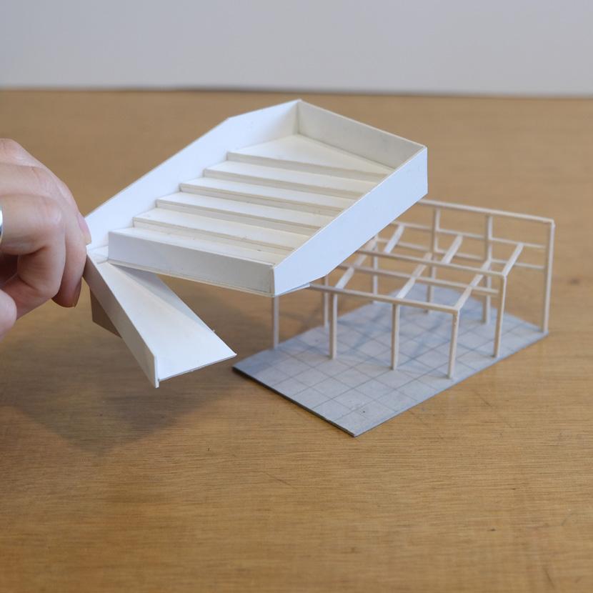
The brief is to design a canteen inside the university campus (United College, CUHK) that is anchored to the site and suitable for its users. The floor area is limited to 300 square meters.
I have designed a Poke Bowl restaurant that features a small footprint and a big cantilever, which creates shaded outdoor spaces and clear divisions of indoor spaces.
DN 6F 6F 3F
The ground floor consists of a small coffee bar primarily serving users in the shaded area. Flexible seating is arranged to match the dynamics of the lively outdoor space. The staircase entrance extends the current circulation from the ground floor to the upper floor, arriving at the service counter with a vibrant line of Poke Bowl ingredients for customers to choose from and create their own bowl.
The cantilever structural challenge provides opportunities to create binary spaces on the upper floor. Using a T-shape strategy to gather the services block and accessibility space, two dining areas with different spatial identities are created. A semi-open dining area is initiated with the use of glass folding doors, while a relatively enclosed area is formed to provide privacy.
UP UP UP A A’ B B’

Sports Center
02

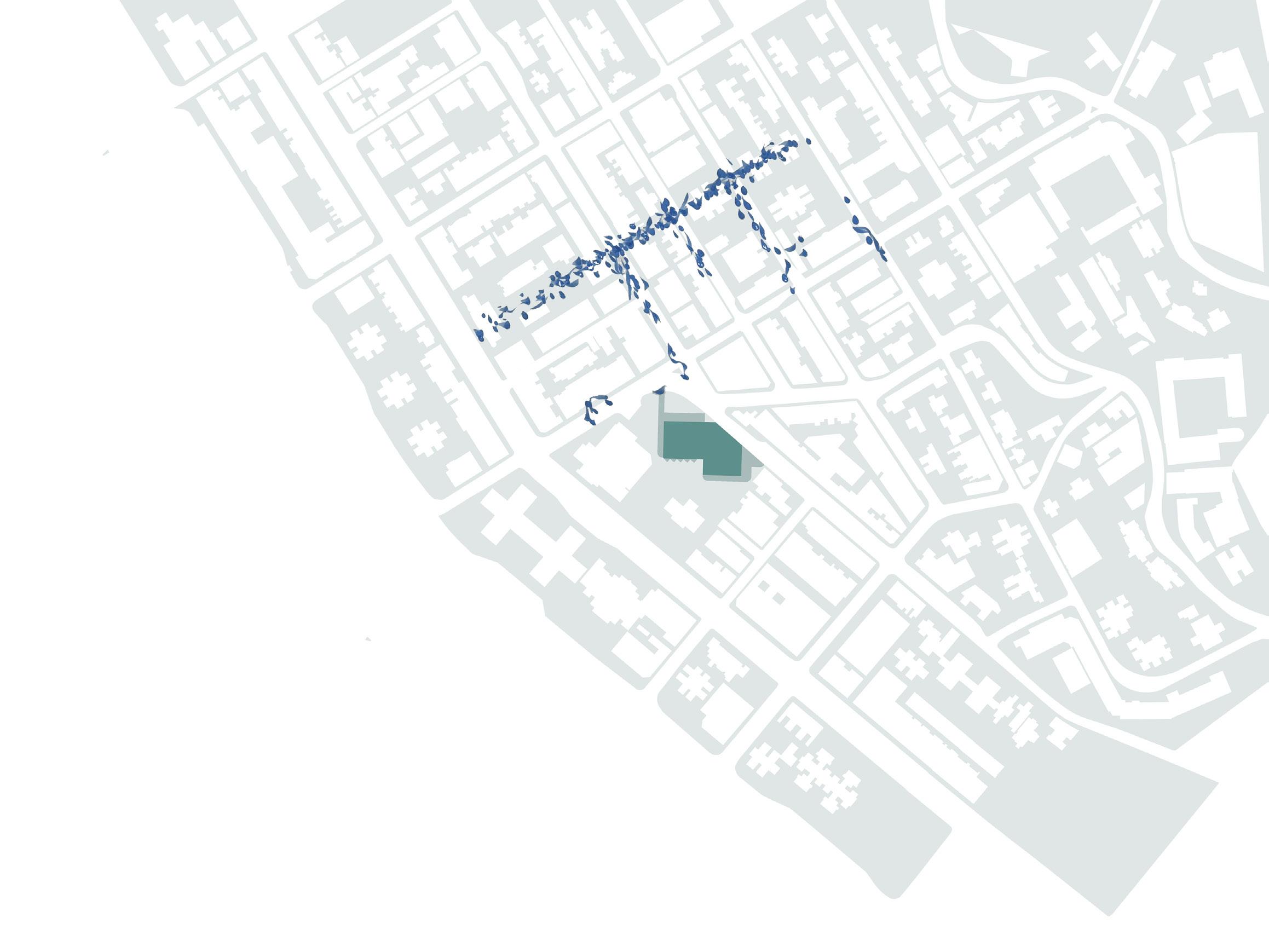
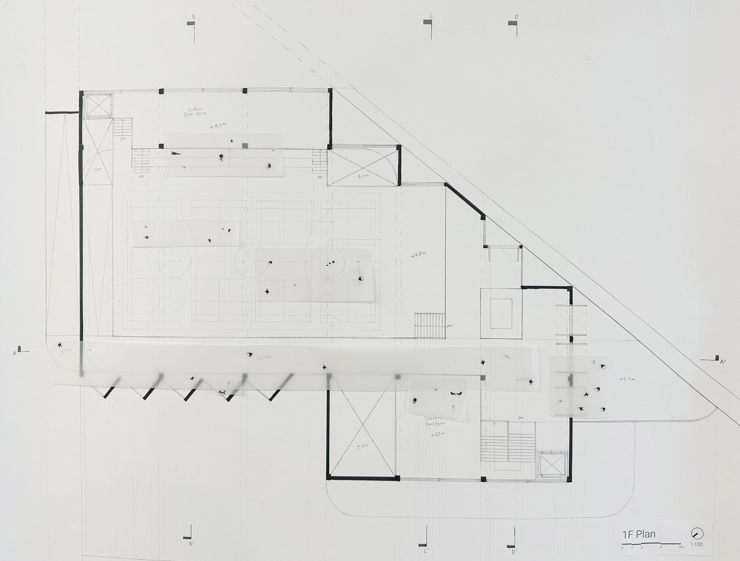
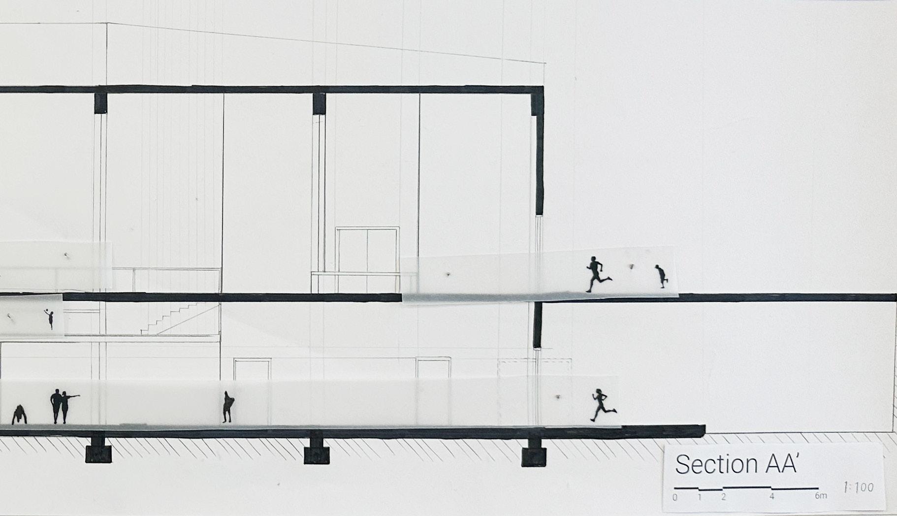
The brief is to design a community center at Sai Ying Pun Old Police Station Quarters within 1800-2200 sqm.
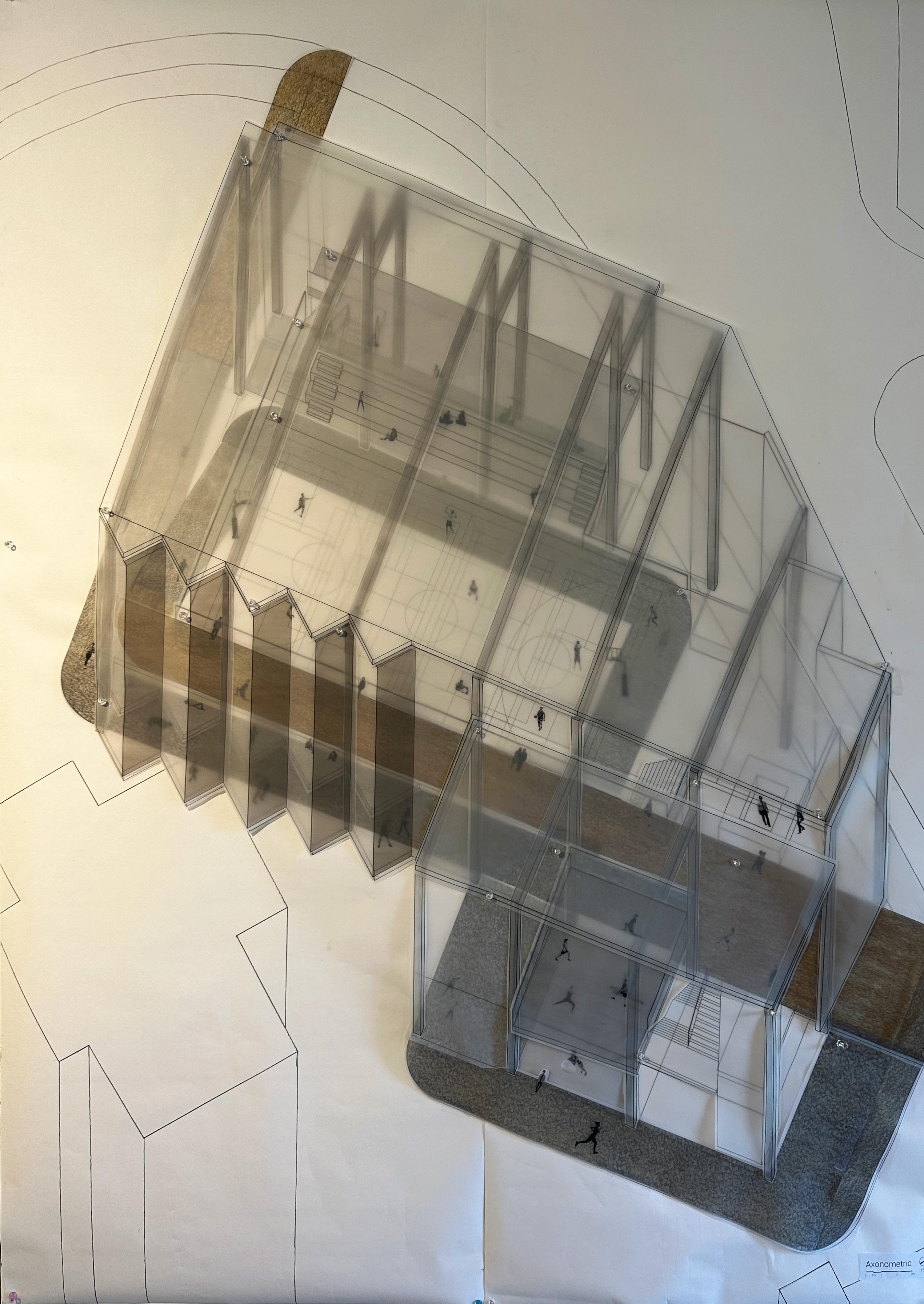
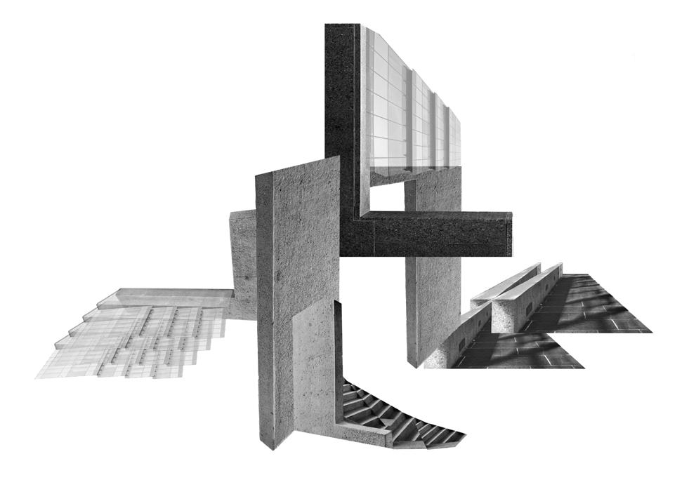
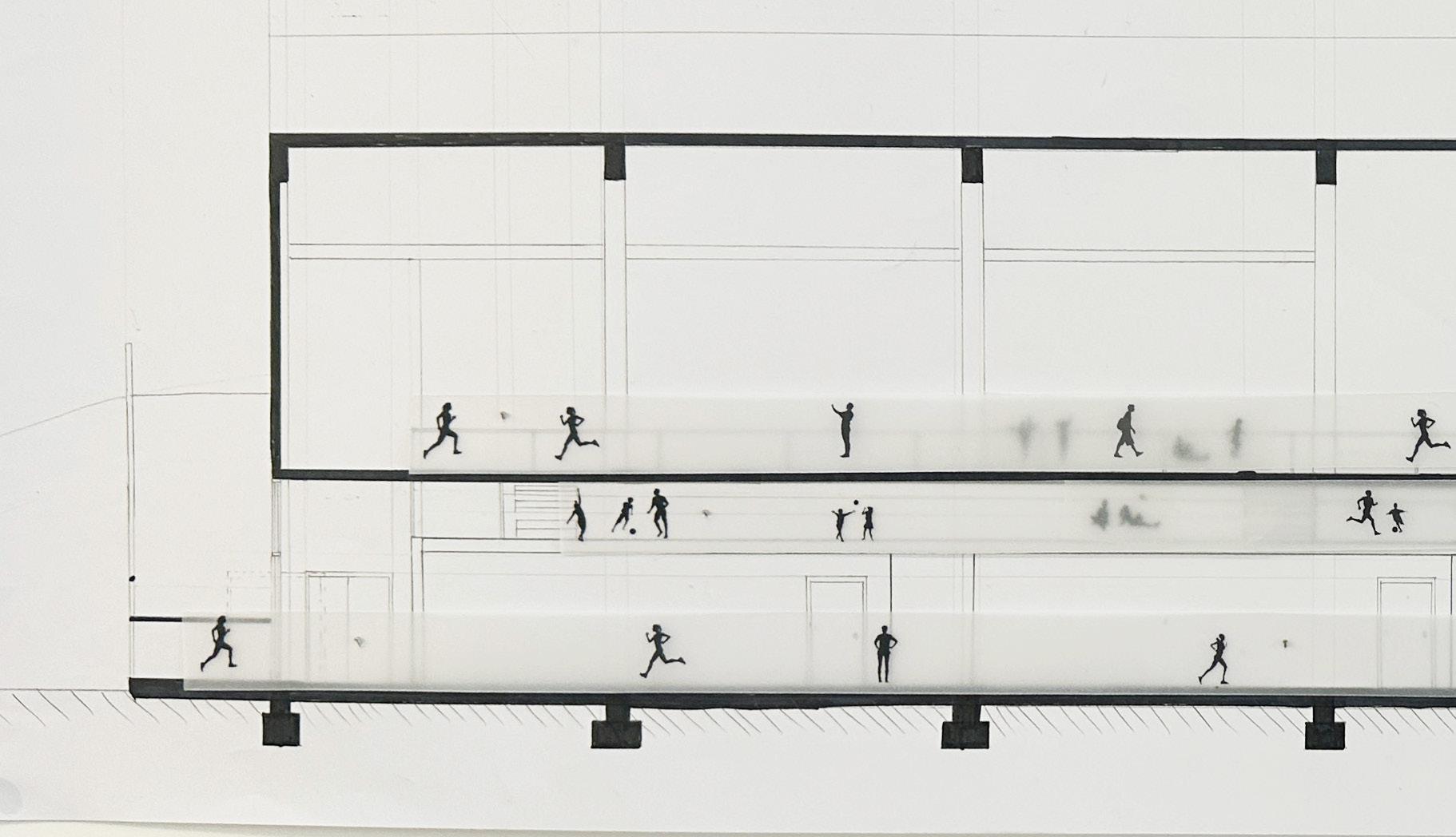
This Community Sports Complex is designed to become a focal point for the Sai Ying Pun community. It intends to break the linearlity and remain the openness of the site. It features a running track that go through all zones in the building.


The Community Sports Complex did not follow the generic axes and grid planning of Sai Ying Pun. It follows alternative axes in order to stand out in the dense urban area.
Glass wall are adopted through out the building. On top of that, even through different zones are located in different levels, users are able to see each other.
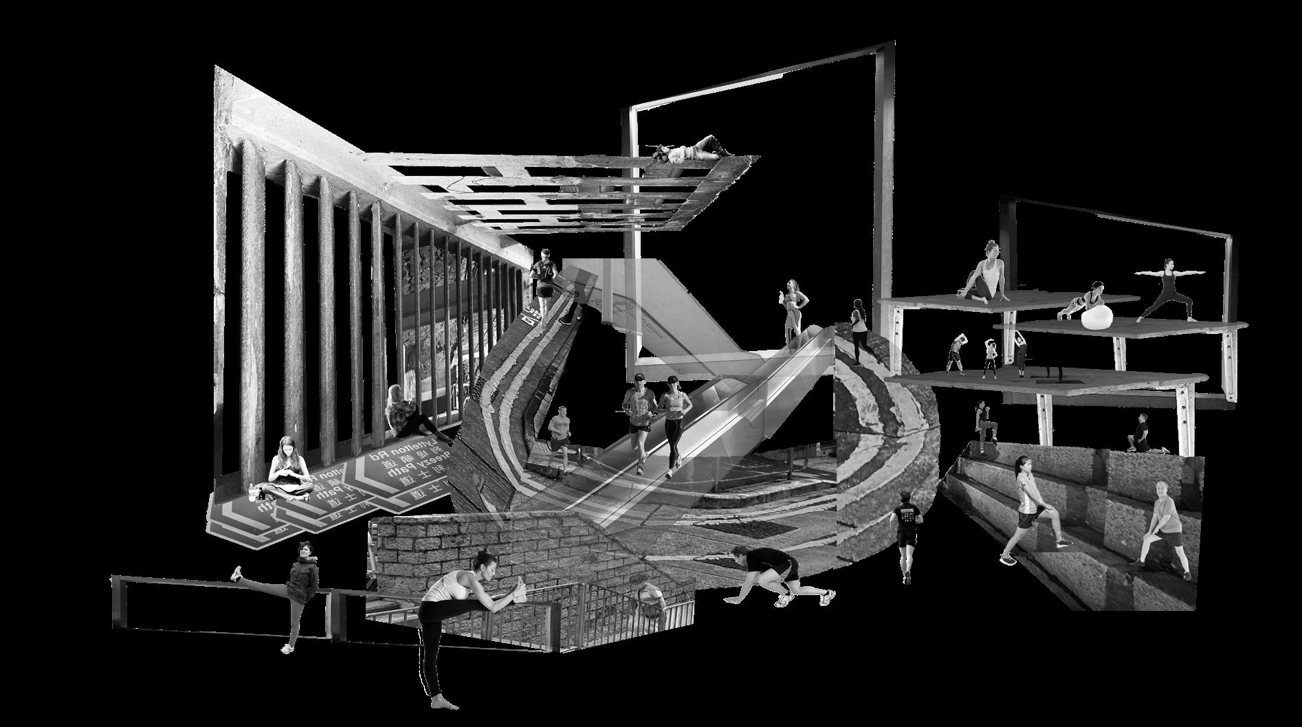
(Left) Digital collages are created in exploring the social practice and the spatial quality of sports center,


03
1:1 Urban furniture

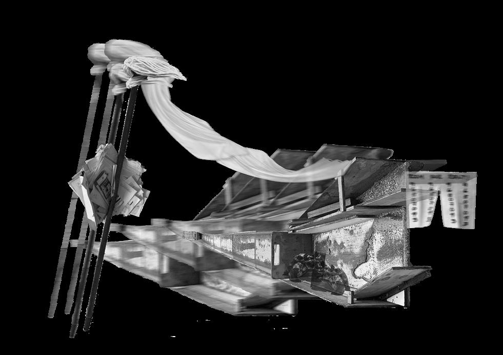
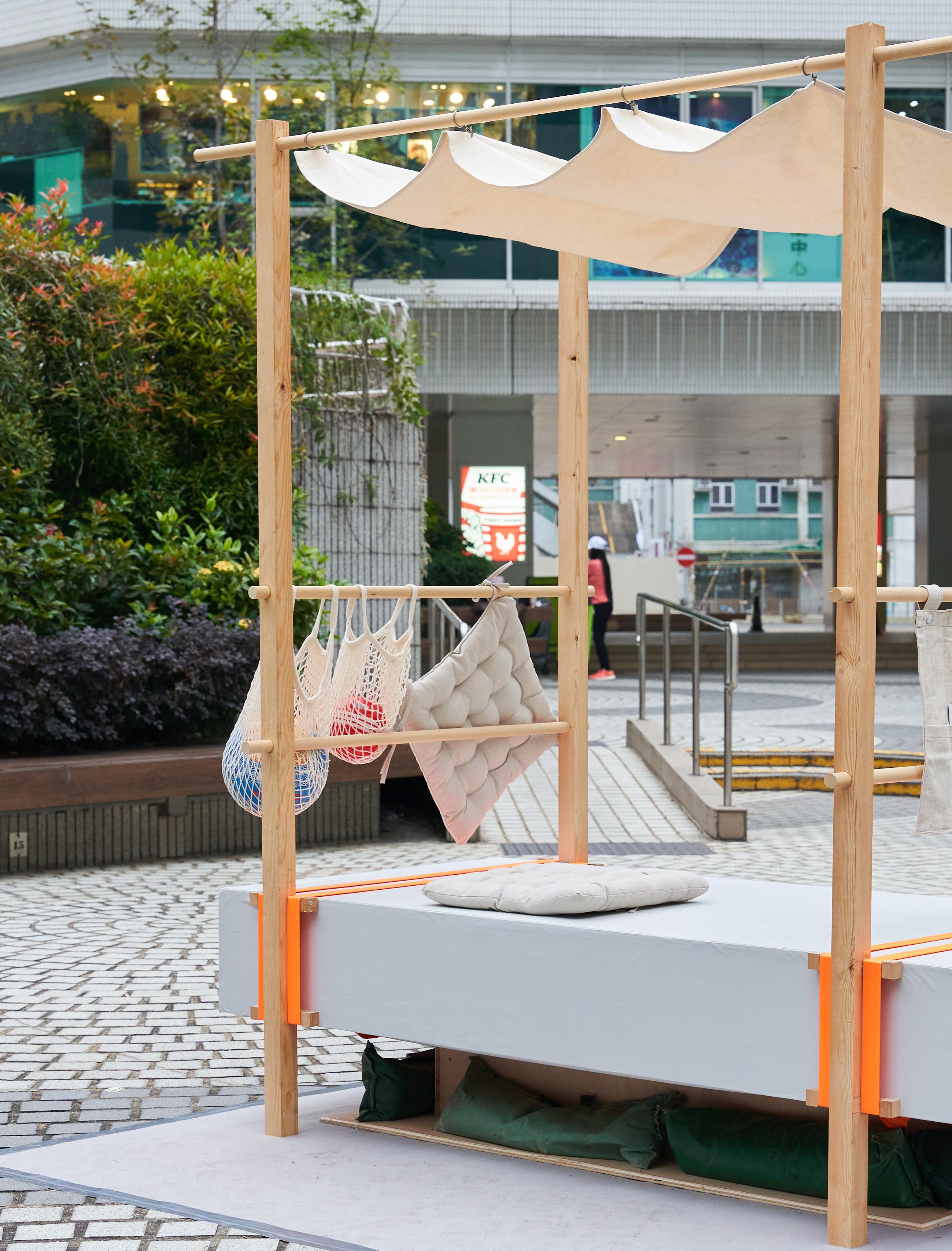
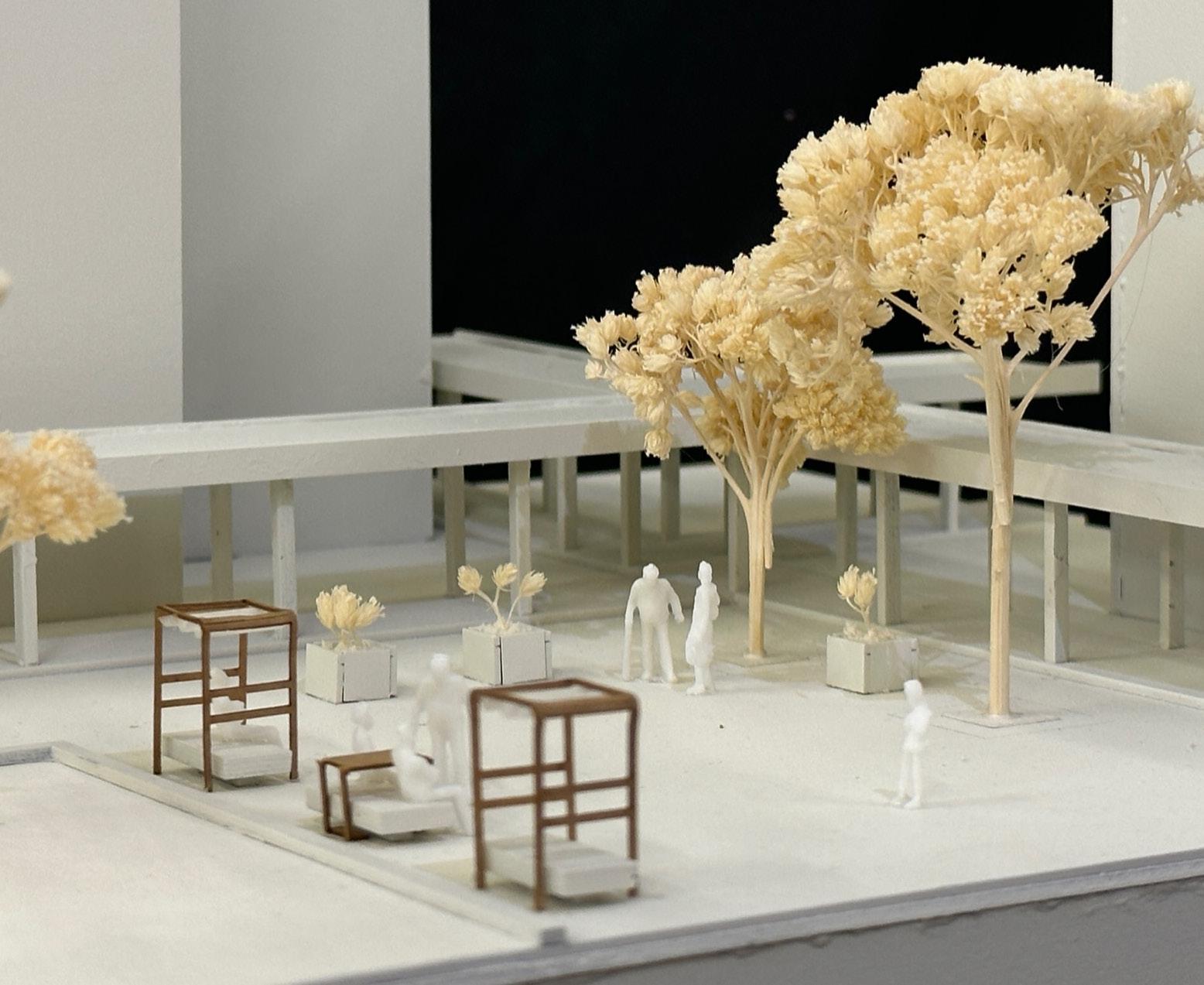
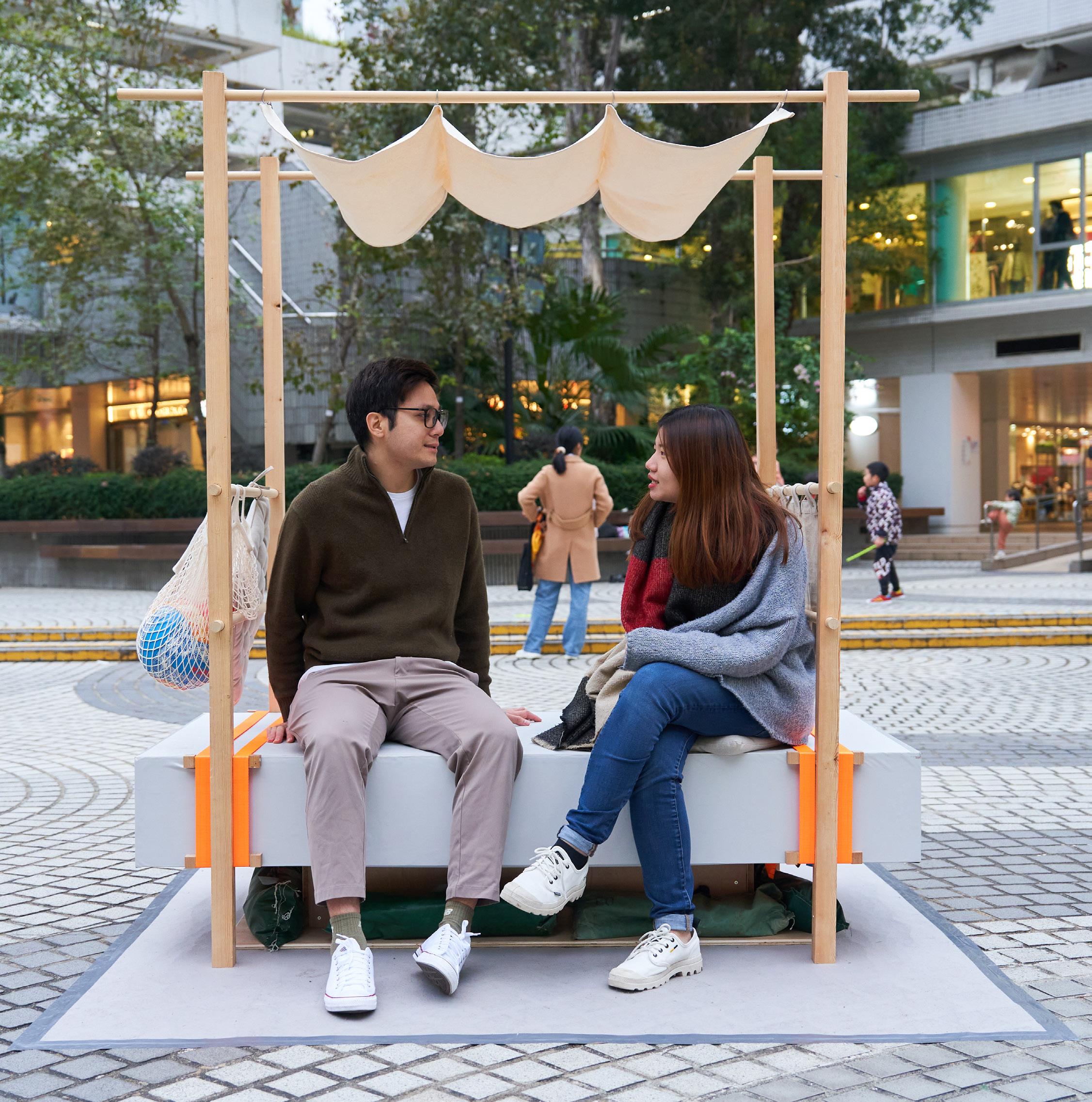
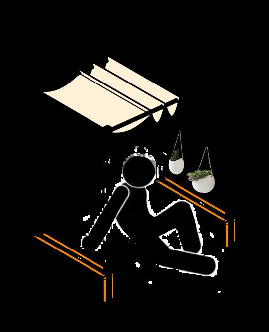
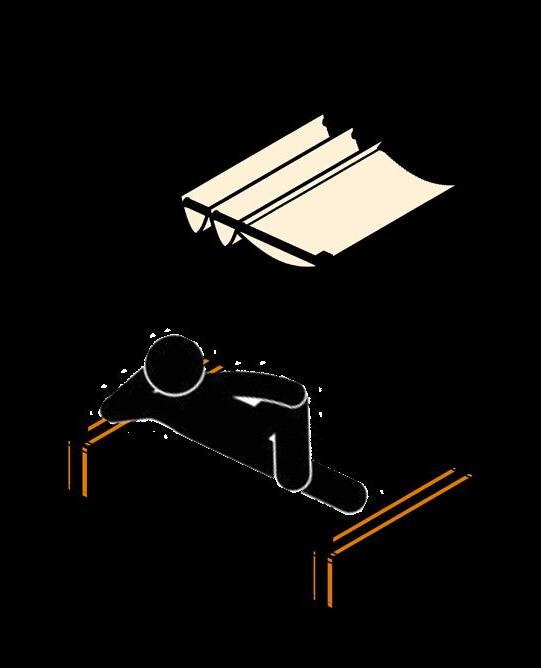
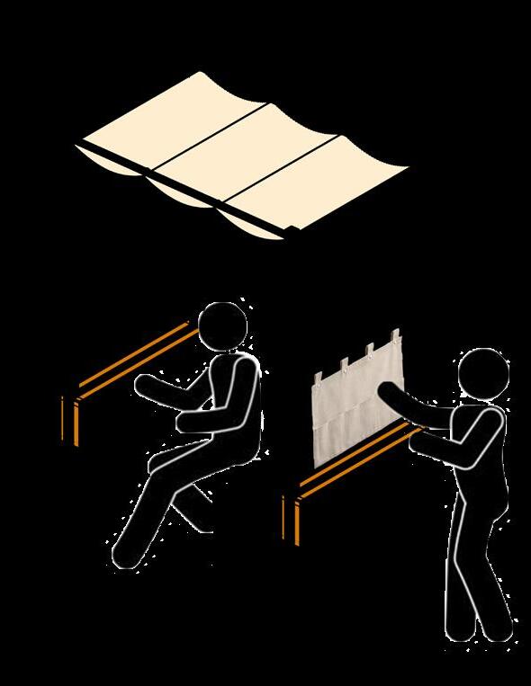
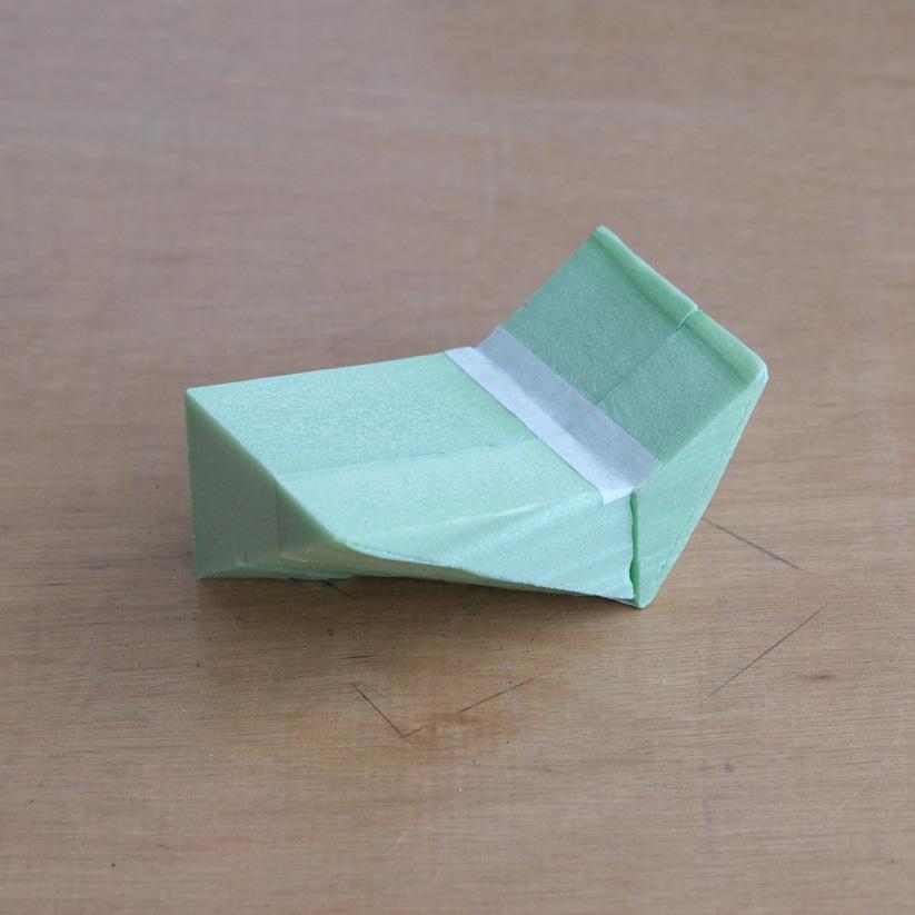
The brief is to design an urban furniture that suitable for the City One Community. Through participatory design, users’ needs are addressed.
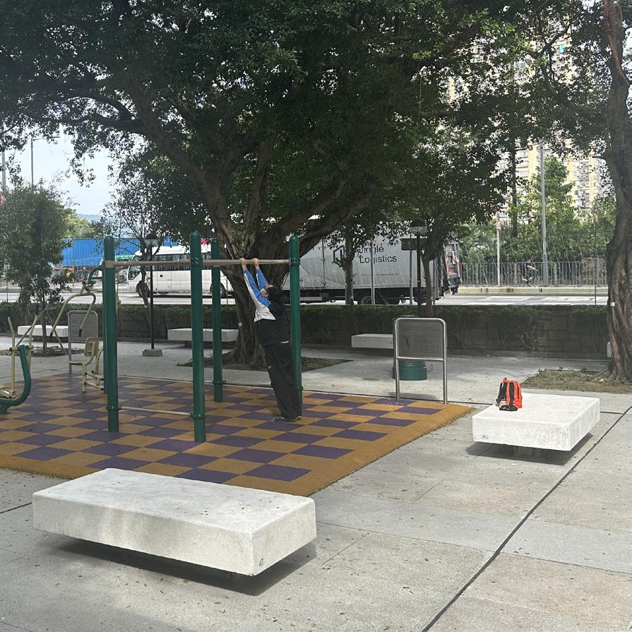
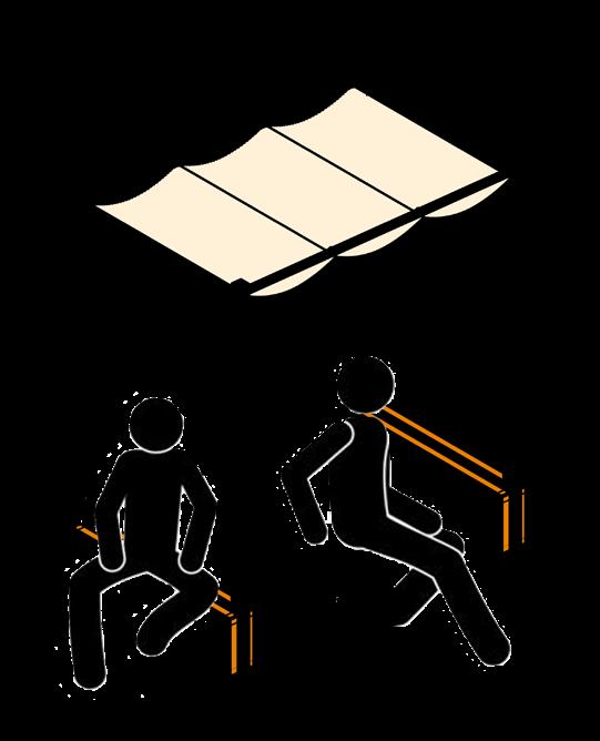
There are under-utilised stone bench in the estate becasue of the sunlight, this design primarily aims to provide shading for users to be able to use the bench.


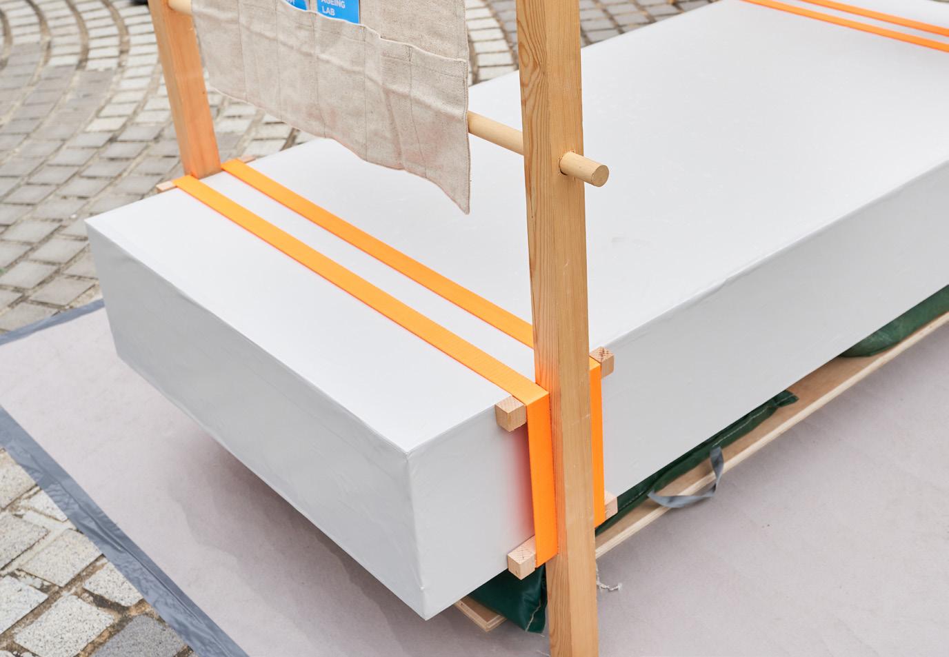
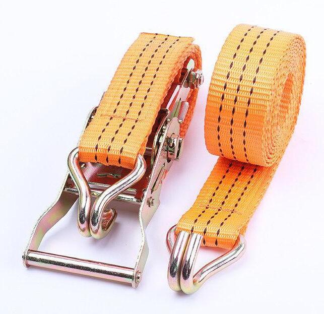
Taking the advantage of the adjustable belt, the shelter is able to hack on to existing bench. This is a mobile and modular design that intended to fit into different sizes of bench in the estate.
This is a pilot participatory design project organised by Happy Ageing Lab. It aims to promote age-friendly living environment in order to contribute in the double ageing problem in Hong Kong.


04
1:1 Pavillion


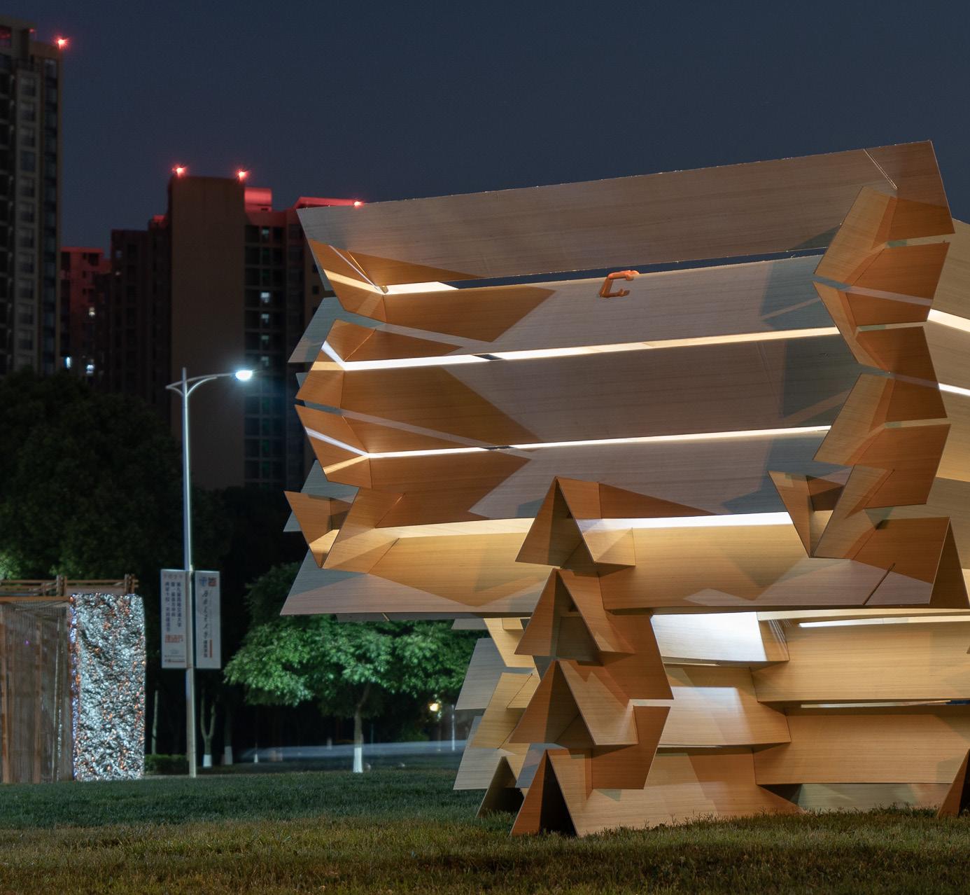
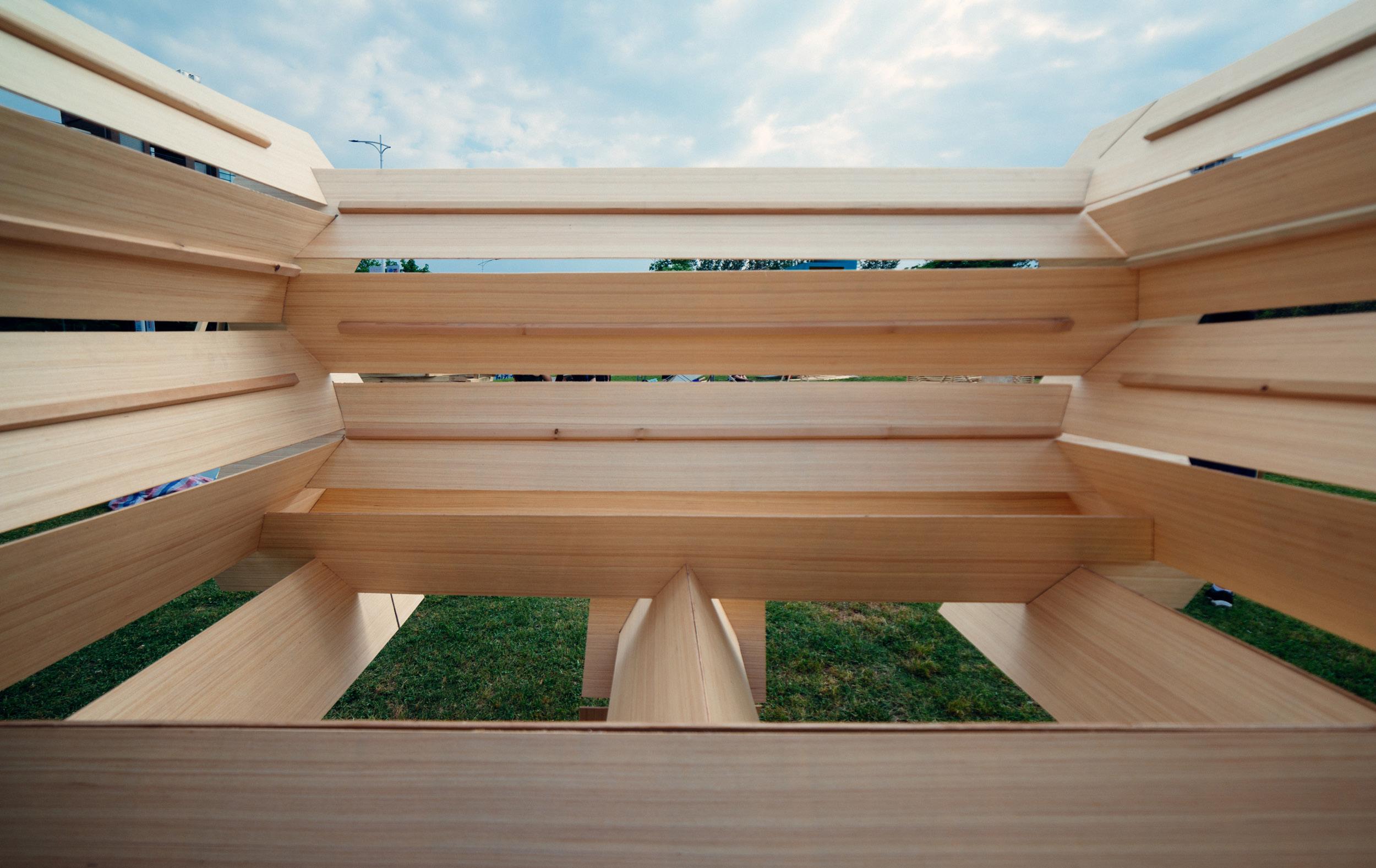
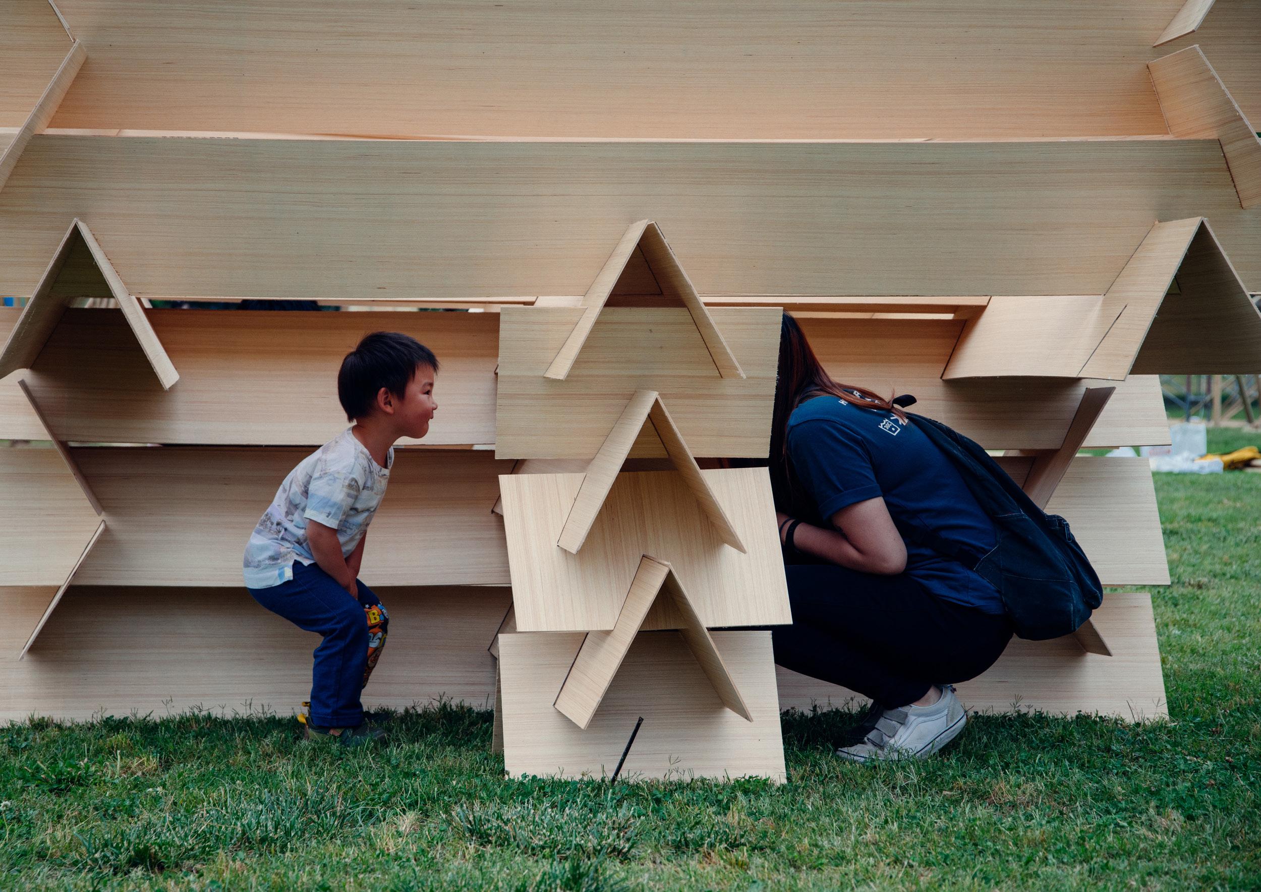
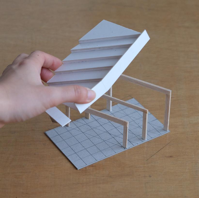
The brief is to design and build a 1:1 pavilion using timber mateiral.
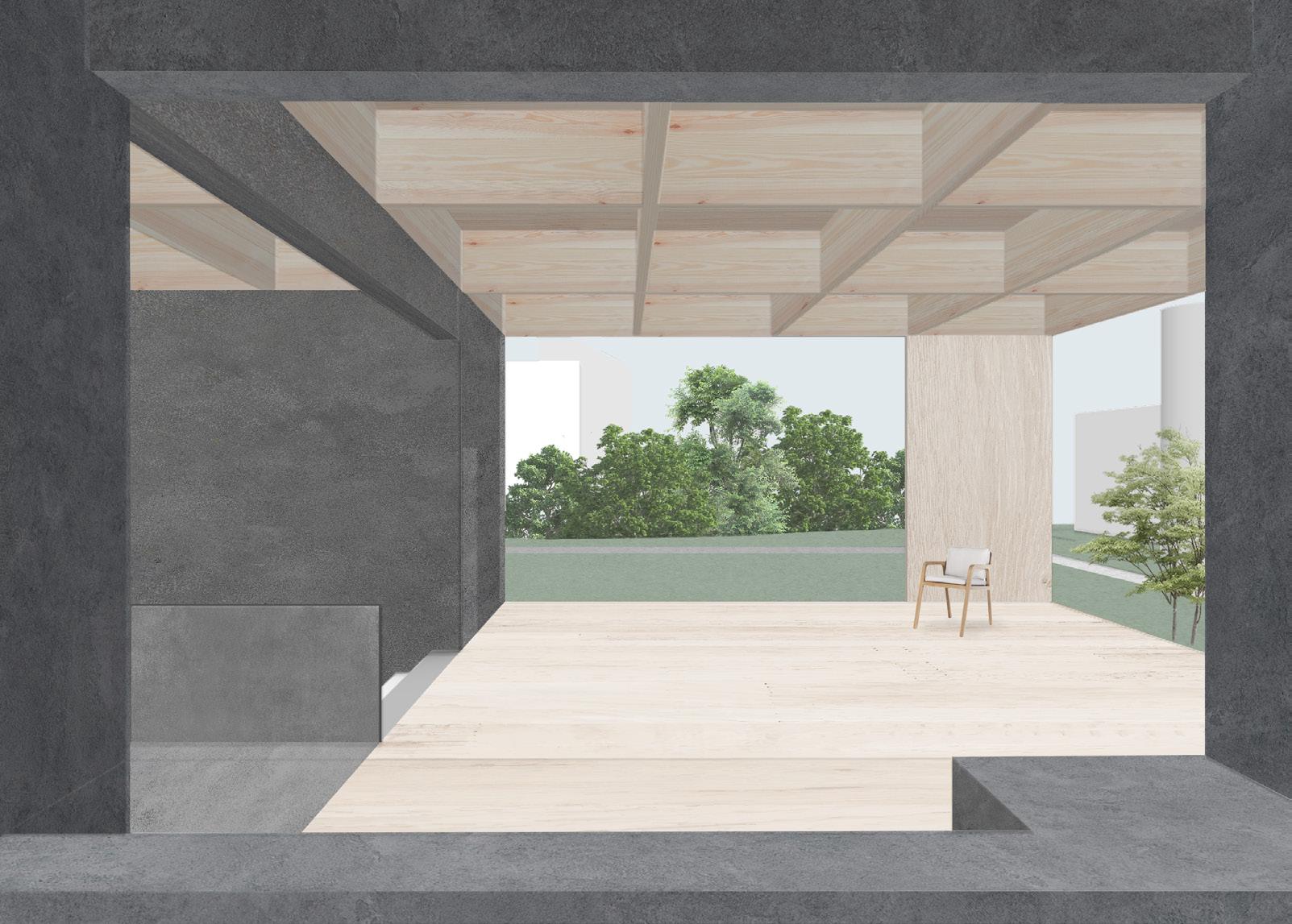
With users are inside, their lower body are exposed to the public and separated in different space. At the same time, their upper body are hidden in the private but in the same interior space. It is expected to bring people together for intimate and private conversation with an open view to the sky.
The Half Pavilion experiment a new way of building in responding to the fast-changing environment.
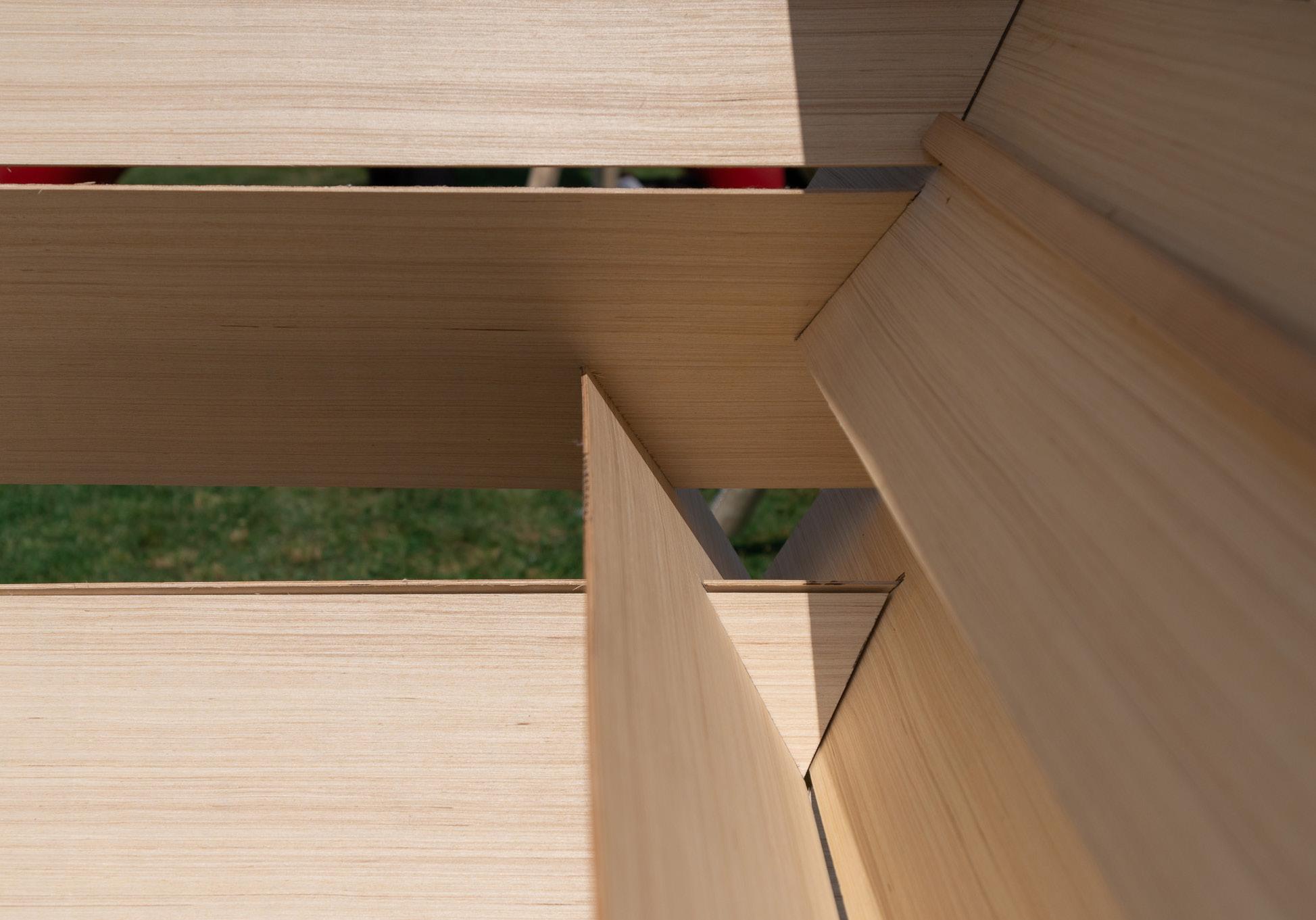
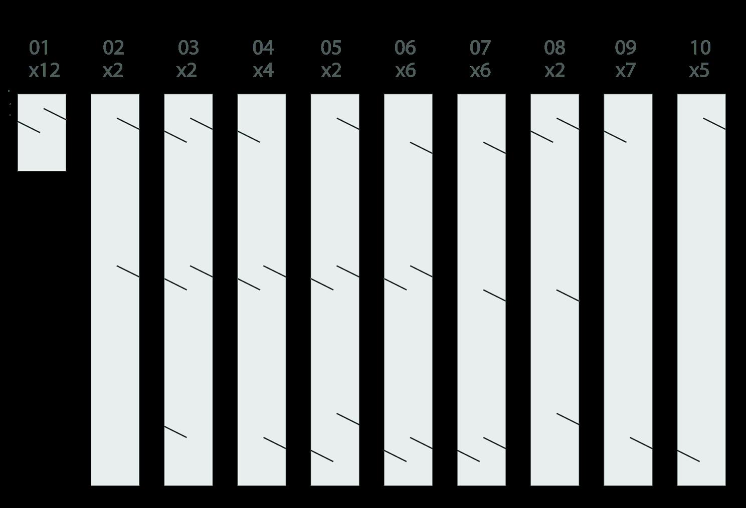
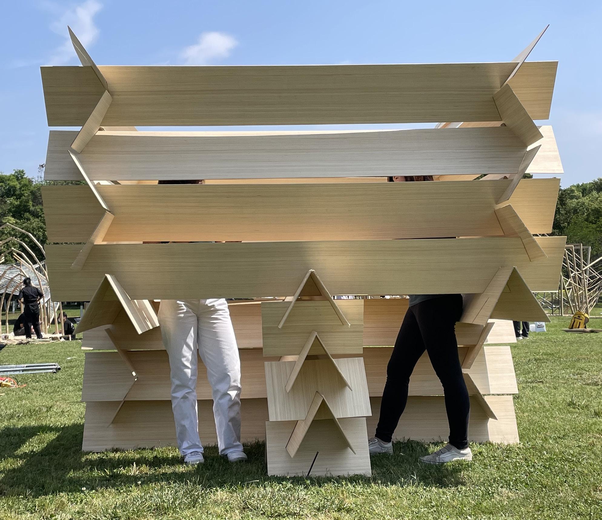
There is no screw or nail involved in the pavilion. It is constucted by only 10 types of timber panels. It can be constucted and deconstucted within 2 hours with the possibility of moving and adapting to other sites.
The Half Pavilion was crowned the second place out of 24 teams.


These are the design exploration for a pavilion that plan to build in a current trasitional housing site. It serves as a community hub for the residents.


Work projects 05
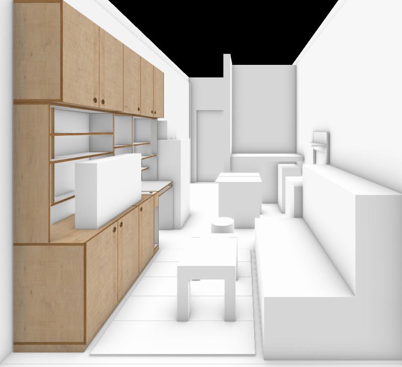
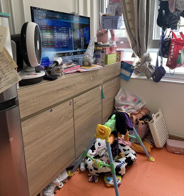
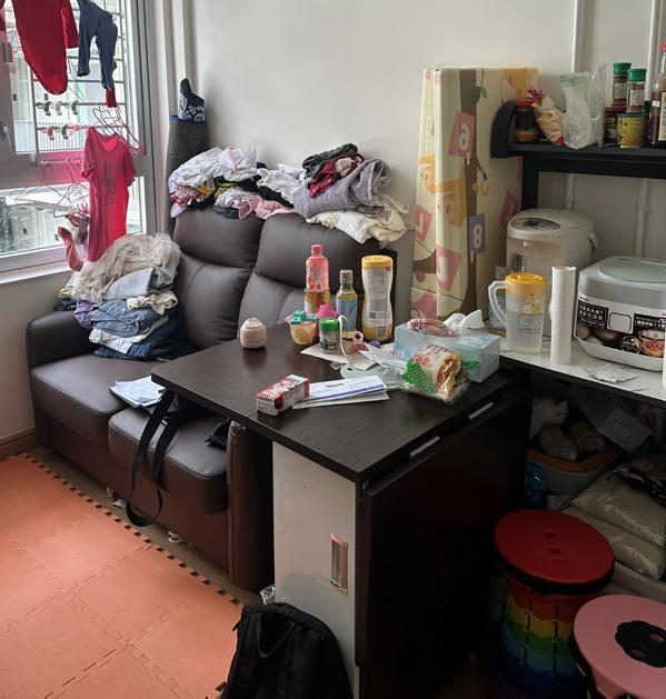
During my internship at Domat, I was responsible for home modification project in the trasitional housing estate. Spatial arrangement and new furnitures are designed for better living environment and creating sense of home.


Installation
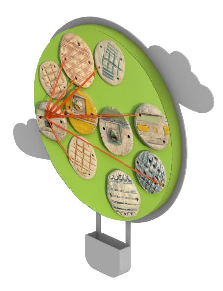
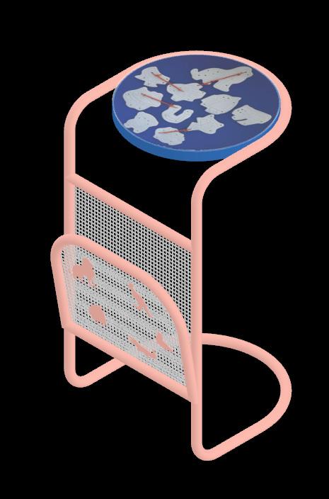
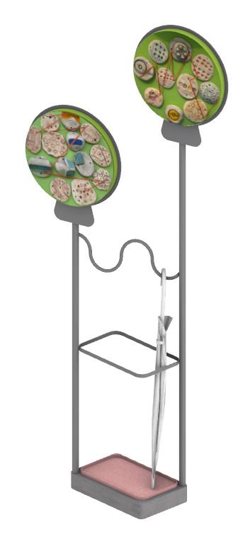
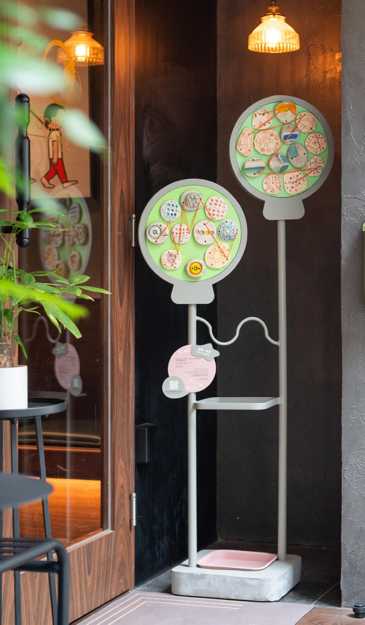
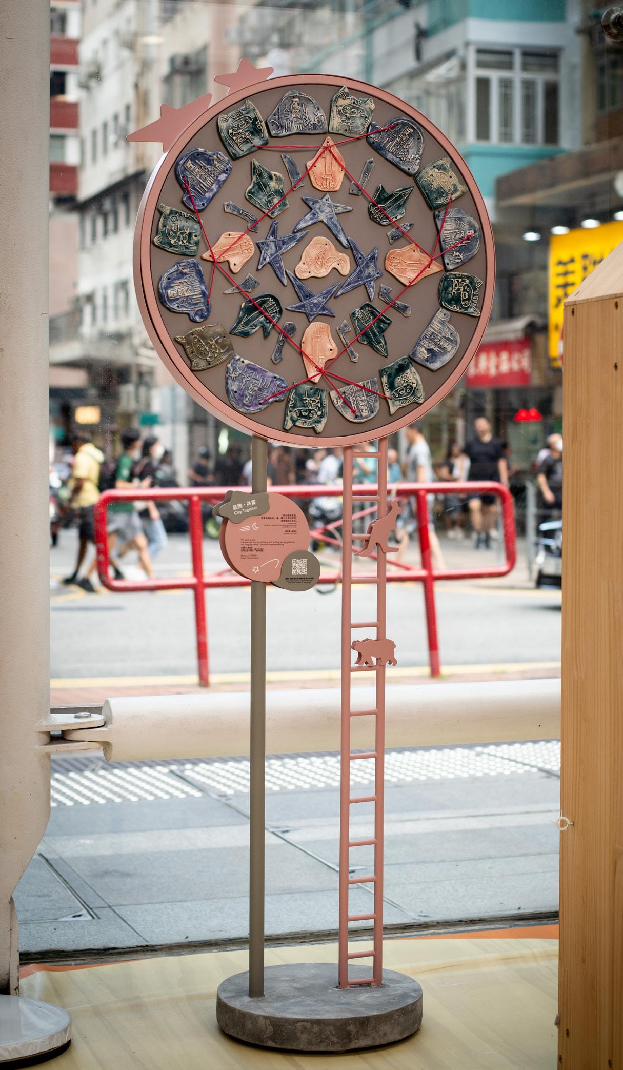
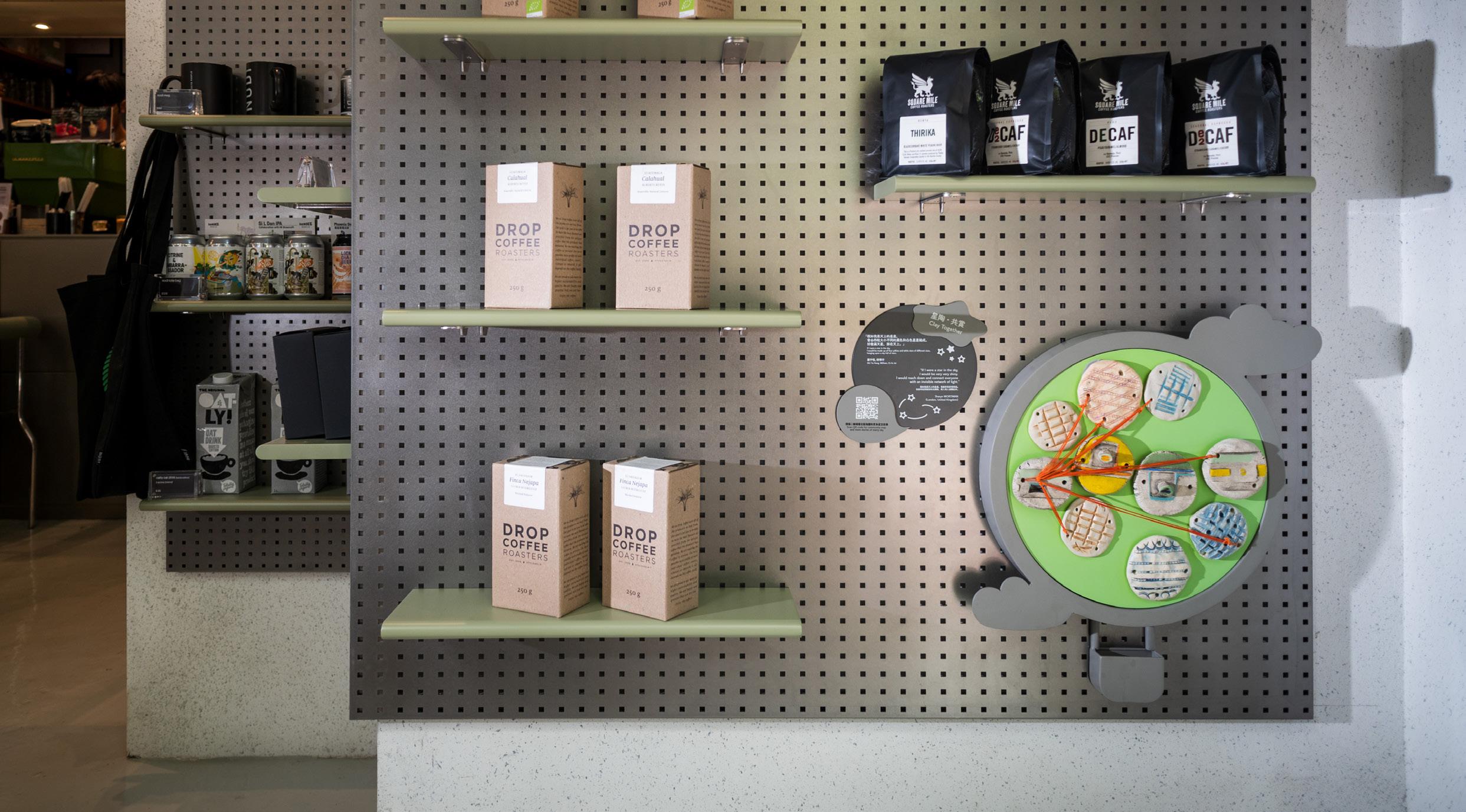
During my internship at One Bite Design Studio, I was responsible for designing installations and furnitures for a community exhibition in partnership with St. James Creation. I contributed in designing, 3D modelling and visualation.
Timber plate with ceremics pieces are the main art work that are aimed to repurpose into different furnitures that anchor to the local shops in Kennedy Town.


06


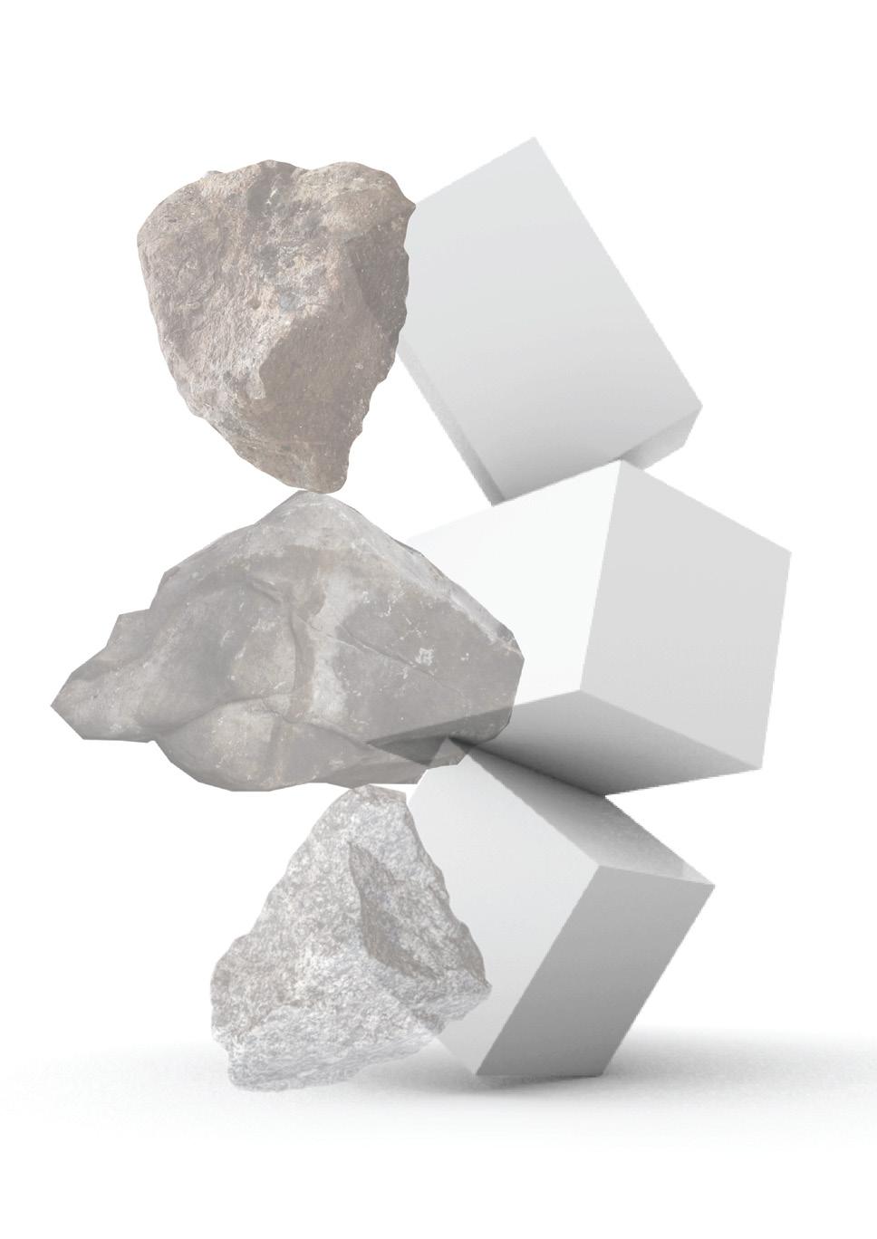
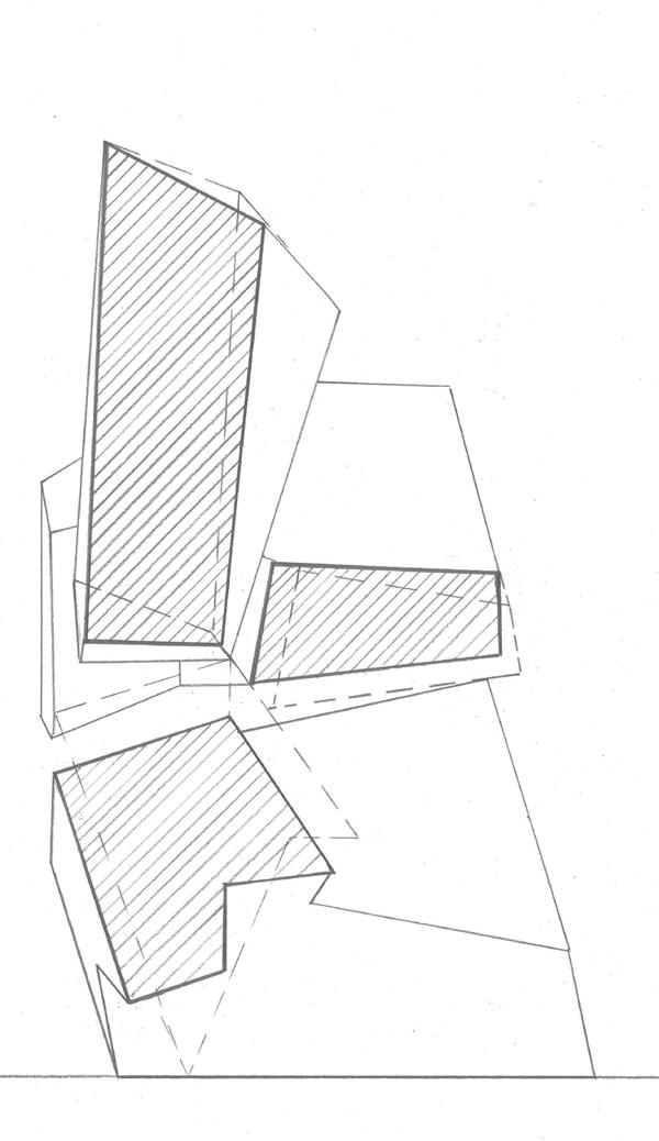
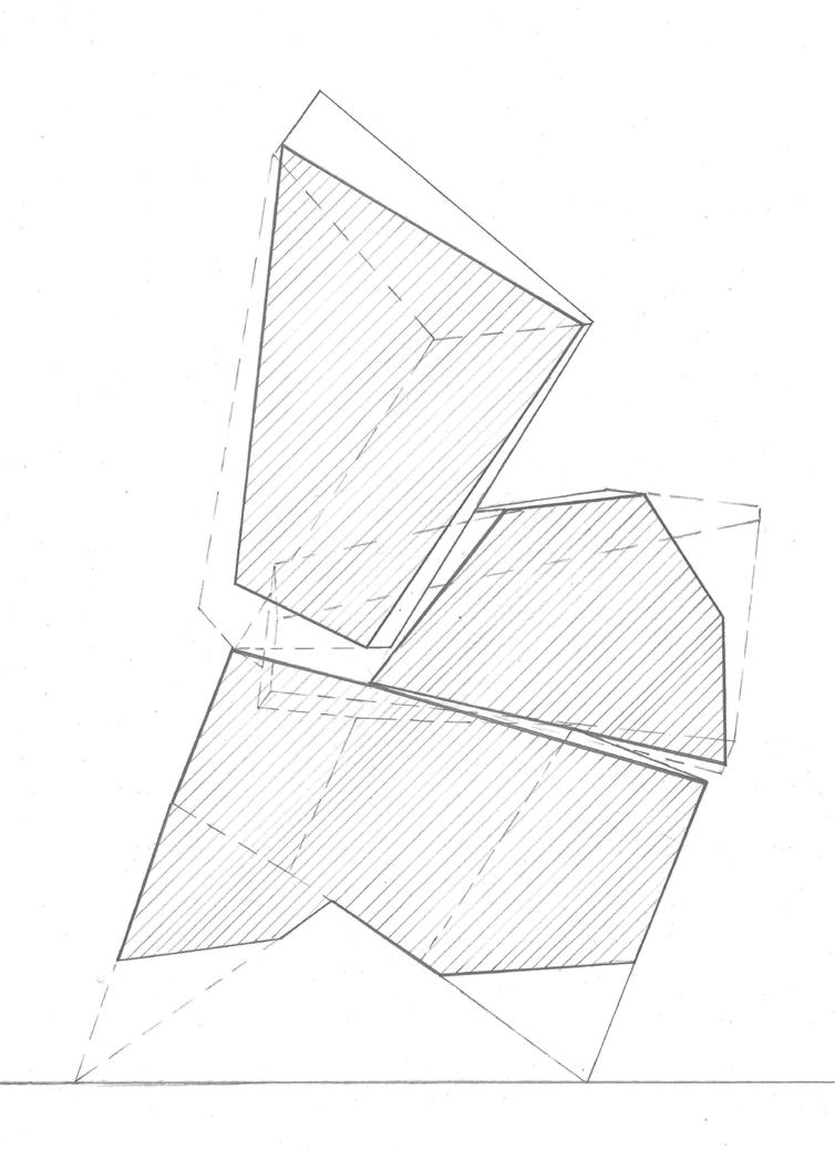
stacking 07
Stone


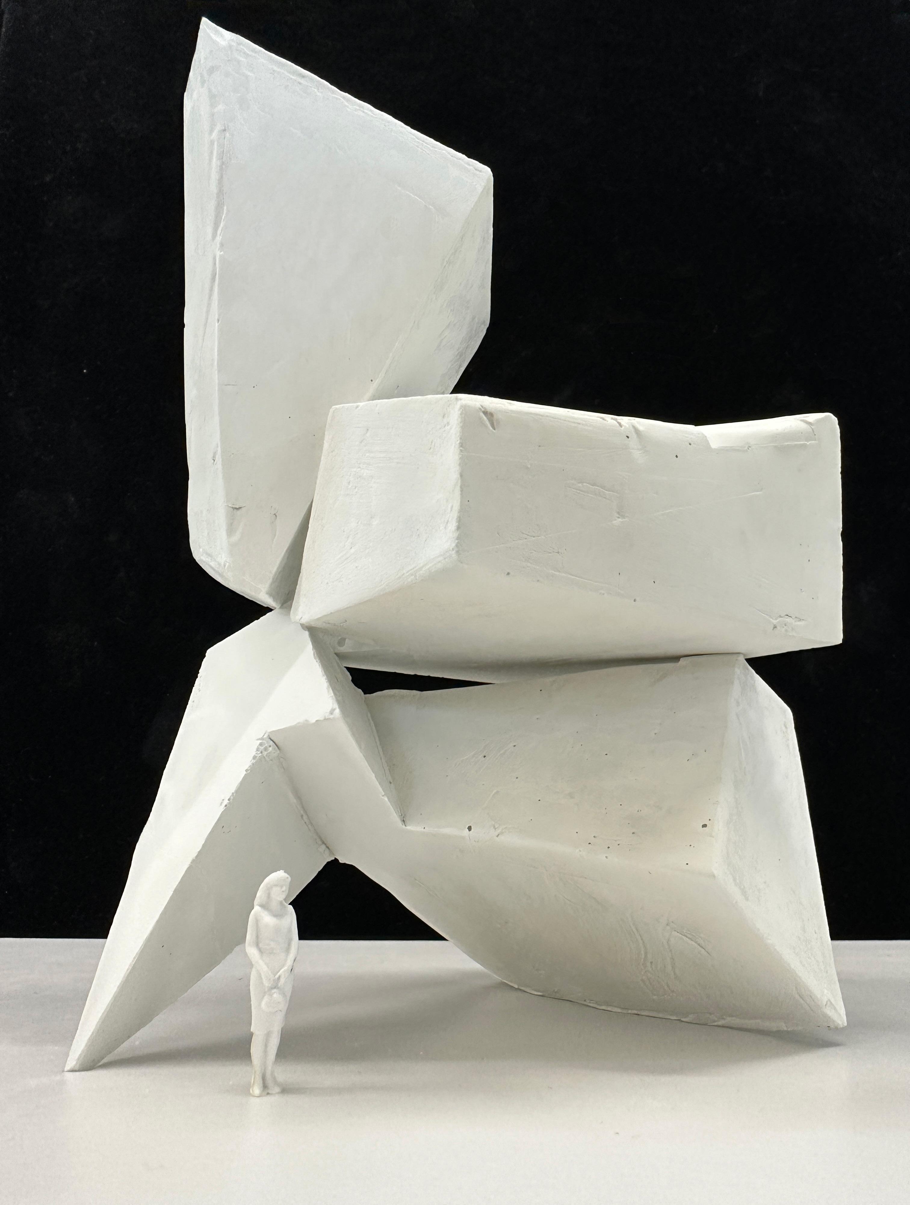
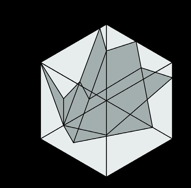
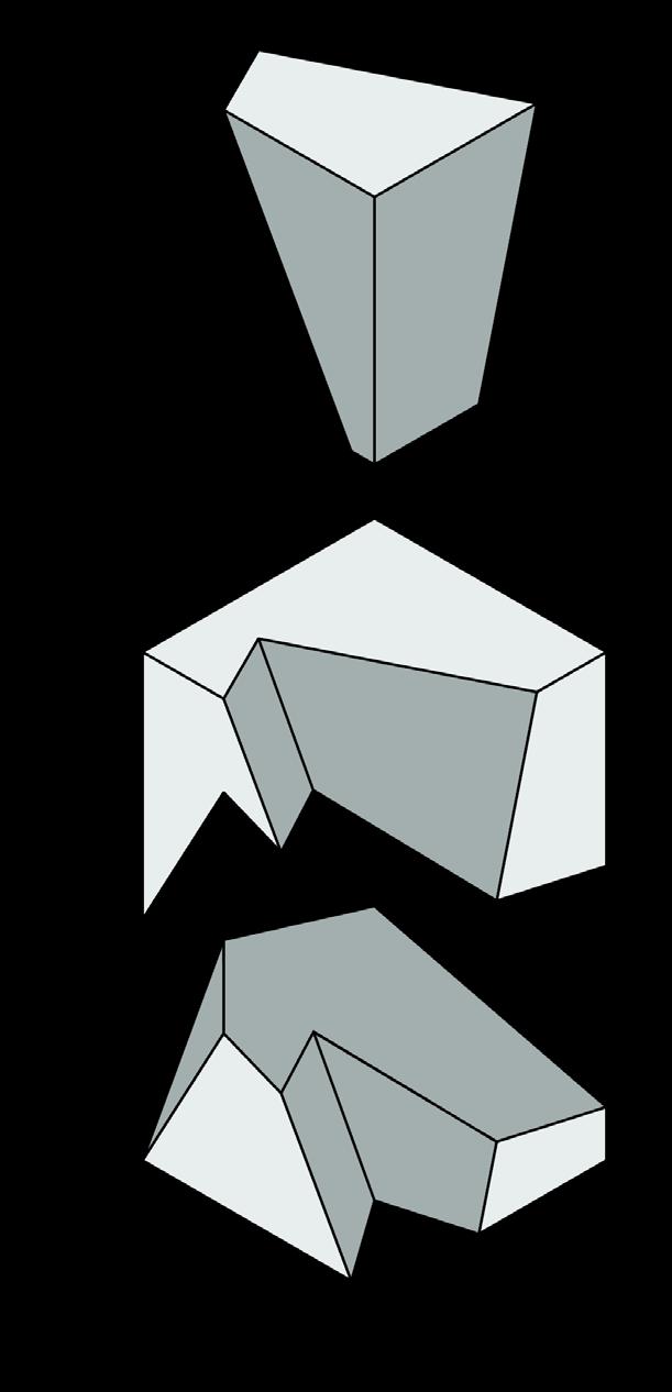
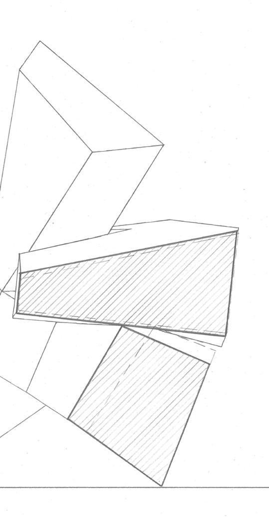
My intention is to stack the volumes together with the least amount of contact points and surface area between each volume.
Volumes are usually stacked together with two surfaces that completely touch each other. I am challenging the conventional way of stacking to see if there are any possibilities to minimize the contact surfaces while still maintaining the structural integrity of the tower.


Thank you!

Mobile/WhatsApp/Signal: +852 6779 2246
Email: makkwanyeung@gmail.com
Skype: maksheepyeung
Instagram: yeung.co
