
BEFORE &AFTER
Prepare to be amazed. These 9 transformations reveal how a smart reno will bring function and beauty home.

THE DESIGNER
Michelle Fleischhacker, Room Service Interiors
THE BRIEF
Create an elegant and serene primary ensuite with seascape colours, a feminine aesthetic and living-in-place safety features.
FAVOURITE FEATURES
Subtle yet sophisticated living-in-place touches are woven in to allow the client to stay in her home. A custom barrier-free shower, vanity with sensor toe-kick lights, temperature-controlled sensor faucets, and grab bars add functionality without compromising beauty. In the closet, it’s all about the wallpapered ceiling!
TOP TIP
Accessible spaces don’t have to feel sterile. Many suppliers offer stunning safety features that can be seamlessly incorporated.


SPA STYLE
THE DESIGNERS
Jamelya Francis and Michelle Bellissimo, Francis + Bell Design Studio
THE BRIEF
The primary ensuite lacked storage, sufficient lighting and an overall aesthetic. The designers needed to add cabinet space that wouldn’t overcrowd the room or impede flow. They wanted to create a spa-like space while also linking to the style of the main floor.
FAVOURITE FEATURE
The green tile works beautifully with the gold fixtures.
TOP TIP
With limited square footage, the designers took advantage of the nine-foot ceilings, adding cabinets all the way to the top, which maximized floor space and accentuated the ceiling height.
THE DESIGNER
Alyssa Moscovitch-Young, Harper Gray Design
THE BRIEF
Expand the primary ensuite, increase closet space and incorporate a workspace – all without compromising the ensuite’s luxurious appeal and comfort.
FAVOURITE FEATURES
The marble is a focal point in the design and is a testament to the stone’s enduring beauty. As well, the custom mirrors are actually recessed medicine cabinets.
TOP TIP
The space is cohesive thanks to the continuity of the floor and wall tiles in the shower and the rest of the space, which visually enlarges the room by eliminating boundaries. It’s subtle but impactful.


THE DESIGNER
Emilia Wisniewski, Studio 1NINE1
THE BRIEF
Update the layout to improve flow, add storage and carve out space for a small mudroom. Also include seating at the island and a small dining space that’s well integrated into the kitchen.
FAVOURITE FEATURES
TOP TIP
Inject colour and versatility into a kitchen by adding accent colours in small touches. Here, black and burgundy accents link different areas, and the artwork complements the space beautifully. CONSTRUCTION, Lowell Lyons. CABINETRY, KWR Custom Cabinetry. CABINETRY PAINT, Collingwood OC-28, Benjamin Moore. FRIDGE, Bosch. RANGE, Wolf. MICROWAVE, Panasonic Canada. HARDWARE, Emtek. FAUCET,
Running the quartz from the counter up the wall fulfills the client’s request for a “quiet” countertop and backsplash. It’s calm, sophisticated and – bonus! – so easy to clean. The other standout features are the custom table and bench, which fit into the space beautifully. Their curvaceousness softens the straight lines so common in kitchens. This is where the family now loves to gather together and hang out.


THE DESIGNER
Christine Rigby, The Dickson Design Group
THE BRIEF
The homeowner wanted better flow throughout the first floor of her home, more open space, and a bigger kitchen with much more storage.
FAVOURITE FEATURE
The island, which allows for seating on both sides. The family enjoys most of their meals there and it’s easier to communicate when facing each other; the island also offers a view of a nearby wood-burning fireplace.
TOP TIP
Take time to assess what you need to store to ensure you have the right-size cabinetry. For instance, you might have a stand mixer or extra-large pots that require taller cabinets, or you might need enough drawers with custom dividers for two sets of cutlery.


SEE THE LIGHT
THE DESIGNERS
Jamelya Francis and Michelle Bellissimo, Francis + Bell Design Studio
THE BRIEF
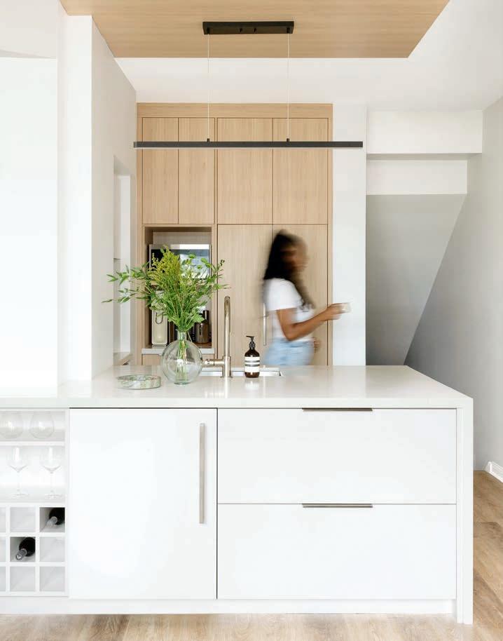
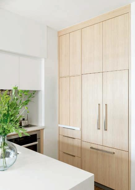
Boosting natural light, modernizing, and including more storage were priorities, as was finding a way to keep small appliances hidden but accessible.
FAVOURITE FEATURE
Adding an additional 12 inches to the depth of the island provided much-needed work surface and room for extra features, such as a wine rack, wine fridge, pot drawers and smart storage solutions.
TOP TIP
Don’t obstruct sightlines. Here, cabinets and a bulkhead that hung over the island and blocked the view to the patio doors were removed to let more natural light in. Cabinets on the back and side walls extend to the ceiling to compensate for the cabinets that were removed.

PATTERN PERFECTION
THE DESIGNER
Rebecca Hay, Rebecca Hay Designs
THE BRIEF
The designer renovated her own family’s dining room. Her mandate: an elevated but family-friendly space that works for daily use and dinner parties.
FAVOURITE FEATURE
The custom dining bench saves space, allowing the table to be moved closer to the wall, which improved flow. The bench is covered in a durable fabric and can seat up to five or six kids, if needed.
TOP TIP
Choose complementary fabrics for a cohesiveness, but avoid a matchy-matchy feel. By using fabrics in the same colourway and playing with the scale of the patterns, you can achieve interest without creating an overly busy look. Note how the rug unites the elements; opt for a flat weave for durability and a subtle pattern to hide minor stains.


THE DESIGNER
Rebecca Hay, Rebecca Hay Designs
THE BRIEF
The living room of the designer’s century home had to accommodate TV watching and entertaining. The front porch meant it lacked natural light, so Rebecca imagined a dark, cozy sanctuary that was elegant, too.
FAVOURITE FEATURES
Rebecca’s favourite feature is the wall colour. She’s also pleased that the tall ceilings enabled her to increase the height of the door openings for a grander feel. As well, big comfy furniture is covered in fabrics that connect to the adjacent dining room (shown opposite).
TOP TIP
Go bold with colour. Painting a dark room in a dark colour enhances the vibe and distracts from low natural light in the space.


THE DESIGNER
Kerry Dalton, Kerry Dalton Interior Design
THE BRIEF
Removing the dividing walls and opening the kitchen to adjacent rooms, as well as eliminating drop ceilings, were key asks that would brighten the dark space. Other must-haves included new custom cabinets (with glass-door uppers for display), a large island with book-matched quartz countertop and pendant lights, a farmhouse sink and a standout range hood.
FAVOURITE FEATURE
The custom stainless-steel range hood. The designer was able to specify its dimensions, the size and colour of the ribs, and the colour and polish level of the stainless-steel sheets.
TOP TIP
Provide a place for everything. Adequate storage, a microwave drawer, a docking drawer for charging, and more, resulted in an organized room and clutter-free countertops.
