14 minute read
THE POWER OF COLOUR
Is colour a complete mystery to you? Well, the good news is there are plenty of rules to guide the effective use of colour in the interior – you just need to tune into your room, and then you can emphasise its best qualities and minimise any detracting factors with your colour choices, says Emma Clegg, who also asks our local interior experts for their advice
Painting a wall has a transformative quality. It lifts a familiar space into another dimension. It recharges your memory, it forces you to remove everything from the room, and rethink it. It sounds simple. But what colours to use? And how to use colour within the furnishings to complement the walls and create a connected whole?
Advertisement
Colour is a p owerful tool and it has a central place at the heart of our culture and our language. The expressions ‘white as a sheet’, ‘green with envy’, and ‘paint the town red’ are just a few examples of how we use colour descriptively. The English language is peppered with colour terms – we have 11 specific words for colour as well as all sorts of associative terms such as aubergine, peach, terracotta and rose. Yet in our homes many of us treat colour with nervousness, sticking to neutrals over more adventurous choices.
Cartoonist Osbert Lancaster once said, when asked what his favourite colour was, “That’s an idiotic question to ask anyone who’s an artist. Colours only have any reality in conjunction with other colours.” Suddenly the whole issue of painting a wall becomes more complex – no colour is right or wrong un til it is considered alongside an interior. The distinctive shape of a room and the quality of its light and how it is to be used will point to the effective use of colour.
Colour and light
Colours take on a different appearance within different climates because of the varying qualities and strength of sunlight. Individual parts of the world are known for colour schemes that suit the conditions: the India n continent for example is associated with intense saturated colour hues heightened by the high levels of sunshine, or white colours that reflect the natural light. Scandinavia and the UK, by contrast, are associated with cool colours more sympathetic to the overcast northern climate and that maximise natural light and space in small rooms.
So bright, strident hues in grey, damp Britain will be subdued and act as darkening agents in our homes. Light in our region, because of our temperate but often overcast climate, is often grey, usually tinted with green once it has reflected off fields, trees and grass. Think about the quality of light in your home, and how it changes throughout the day – this depends on the direction your windows face, because the quality of light will affect how different colours are se en and experienced.
Light direction
While colour choice will be affected by personal preferences, there are useful guidelines based on the quality of light in your interior. Take an eastern window. This creates a warm, bright light with morning sunshine creating long shadows and will lose direct light from the sun later in the day. So use subtle, warm colours such as yellow or muted orange which will enhanc e the warmth of the sun and still provide a glow as the day progresses and the sun moves away.
Southern windows have the best light qualities: a warm light that constantly changes throughout the day, in winter reaching deep into the living space and in summer brighter but with a shallower reach. The brightness of the midday light from the south, closest to pure white light, can be strident and flatten out e lements in a room. Here you have the most flexibility with your colours. Cool midtones and neutrals can work well, because southern light will make any colours seem lighter and more saturated. Or if your southfacing room has uncomfortably strong levels of light, use dark and unsaturated colours to absorb more light and help balance glare.
A northern window will get very little direct sunlight, offerin g a clear, consistent light with no brilliant glare, but it will have a cold edge. This light is preferred by artists as it is most reliable and creates no distracting shadows. So for these rooms, the coldest rooms with the least available sunlight, warm colours give a more welcoming quality. If light and saturated warm colours are used, then more light is reflected into the room.
West-facing windows get s unlight at the end of the hottest part of the day in the early afternoon and this light can create glare. The later afternoon sunlight from the west then shifts to a softer illumination and the long shadows increase the feeling of depth. West light can benefit from a cool scheme of light values in colours ranging from blues to violets. If an east- or west-facing room is used mainly in the morning, decorate it in the same way as you would a south-facing room or a room to the west as if it were facing north. The same is true in reverse if the room is mainly used in the evening. If the room is used all day, a balance of warm and cold colours should complement the changing light.
Many houses are not built directly facing these main points of the compass, so observe how the light changes throughout the day in you r rooms, and remember that sky conditions vary constantly, affecting the quality of daylight that reaches your home.
Here we start to understand how colours are perceptions around the light in a space – a colour is not a standard, unchanging given, but has a fluid, ever-changing quality. This is the magic that the interior designer deals with.
Colour perception
Certain colours can be used to alter a room ’s perceived dimensions. Colours towards the red end of the spectrum (red, orange and yellow) with longer wavelengths tend to ‘advance’ towards the observer. Those towards the violet end of the spectrum (violet, indigo, blue and green) with shorter wavelengths tend to ‘recede’ away from the observer. How strongly colours do this depends on their intensity, so the purer a colour the more advancing qualities it has (such as pillar box red).
This advancing quality can be a useful device in a room that is an odd proportion, for example elongated where you can use advancing colours on the two shorter walls to balance out the perception of a room’s proportions. Or in a room with a very high ceiling, an advancing colour on the ceiling will bring the perception of it down. Or a receding
colour in a small room will m ake it feel larger. THEBATHMAG.CO.UK | january 2010
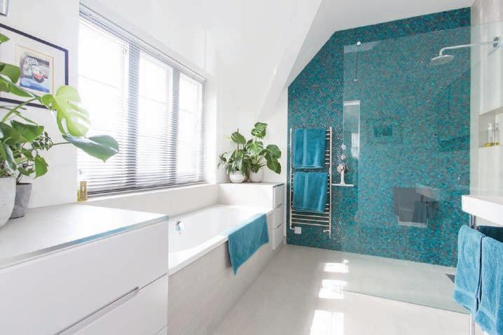
The aquamarine blue tiles in this elongated bathroom balance out its proportions. Design by Architect Your Home; architect-yourhome.com
Colour and psychology
There’s no doubt that shades of colour also have powerful psychological influences. Ancient mystics in China believed that each person has a distinctive aura that changes colour to correspond to their current emotional state. Colour healing, still practised today, treats seven energy centres or ‘chakras’ representing differe nt parts of the body with particular colours to address mental or emotional imbalances. Colour healers believe that colours have individual energies and this basis of this spiritual belief does fit with the scientific explanation of colour having different wavelengths.
Research has also shown clear changes in the human heart rate and brain activity when enclosed in rooms of different colours, with the red and orange end of the spectrum proving to be more stimulating and the blue and green end more calming. The saturation
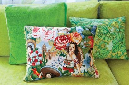
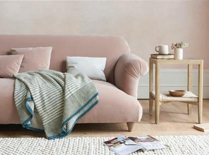
RIGHT: A simple, white interior – historically associated with the privileged classes who could afford to keep it clean –creates a striking visual statement BELOW, top to bottom: An acid green sofa is brought to life by cushions in similar and contrasting hues; a chalky pink sofa and a plaster-coloured wall keeps things neutral but warm; a white kitchen has warm elements added with a wooden table and a glowing yellow cupboard

Cushions by Sarah Millmore Upholstery;sarahmillmoreupholstery.co.uk
Sofa and throw by Loaf, loaf.com


Design by Joel Bugg; joelbugg.co.uk of a colour seems to have more impact than the actual colour, so intense colours are more arousing and low-intensity colours more relaxing, whatever the hue. These emotional effects tend to be short term, so any stimulation or calm would ease off once the viewer has got accustomed to the sp ace. This does mean, however, that colours can be used in entrance ways, hallway, reception rooms and offices to create a noteworthy first impression for guests or associates.
Fast-food outlets tend to use shades of red, orange and yellow, longer wavelength colours that are believed to make you eat more. Farrow and Ball have colours called Eating Room Red, Picture Gallery Red and Day Room Yellow, all colo urs popular in the middle of the 19th century and associated with particular rooms. Casinos also use red as it imitates the colour of evening light and makes you less aware of the passing of time. The colour blue is associated with calm and can be a powerful atmosphere creator, often used in prisons to reduce stress. Hospitals use white and other cool colours to create a fresh, healing, restful environment . It has also been shown that people feel warmer in red and orange rooms and colder in violet, blue and green rooms even when the temperatures are equivalent.
Despite all this we cannot deny that we all have very personal colour associations that may not fit with the science of light or the discoveries of colour psychologists. Many of these will be linked to our culture, upbringing and personal history. It also seems that many of us prefer colours that suit our natural skin type, hair and eye colour and choose such colours for our homes and our clothes.
Choosing a scheme
Establishing a colour scheme for a room requires the right balance of colour values in the same way as a painting or a textile design. Some interior designers think of a room as a natural landscape, imitating the balance of tones from floor to ceiling from earthy browns and dark tones to mid distance greens and mid tones to pale blues, white and light tones on the ceiling.
Designers often use colours that are chromatically and tonally weighted, creating a harmonious balance between neutral, midway and intense, and between the lights and darks within a space. Having different levels of light and dark values with middle values can serve to pro vide visual pathways between them, which opens up a person’s experience of a room. An easy way to do this is to use colour families or analogous hues (three or more colours that are adjacent to each other on the colour wheel), focusing one colour as the dominant hue and the others as accents.
COLOUR COMMENTARIES
Here are some enlightening commentaries from a few of our local interior experts.
Architect You r Home
“The ability to see colour is a sense that has a dramatic effect on our lives. It has a close connection to our emotions and can help us feel calm or energised, quiet or boisterous.

It can be stimulating or subduing but it inevitably creates an emotional response. This is the main reason why many architects and designers shy away from using colour as it invariably elicits a reaction and it takes co nfidence and experience to ensure that reaction is a positive one.
“There are many factors to consider when adding colour to a room. The size of the room, the height of the ceiling, the amount of natural daylight, the function of the room, the aspect of the windows. Then you need to think about what feel do you want. Cosy, minimal, cool, eclectic, traditional? And then how do you want to add the colour? P aint the walls, wallpaper, curtains, furniture, carpet, soft furnishings?
“Finally you need to draw on your own confidence to make a colour statement. I always advise starting gently with soft furnishings and colour on one ‘feature’ wall or a significant piece of furniture. But primarily your home should be a reflection of you and your personality, a place that gives you pleasure. It is not a show home to please visitors and so if you like mixing many colours or prefer to keep to a more select palette that’s fine, just so long as you love it.”
Woodhouse and Law
“Recent years have seen a noticeable move towards multiple layers of similar colours. Here a more impactful sophistication, particularly in monochromatic schemes of rich, saturated tones, is achieved through combining differing textures and materials , providing nuanced layers of interest.
“What has been particularly exciting to see within those schemes is a greater willingness from clients to explore a stronger use of colour and pattern. Homeowners seem to worry less about second-guessing what the next buyer might want, instead thinking more about the here and now; what appeals to them personally and what best reflects their character and style. Lockd own seems to have reinforced this further – if we are going to be spending more time at home, we should be embracing and enjoying every part of it.
“That’s not to say that clients aren’t looking to the future. We are finding however that people are turning their backs on throw-away culture, keen to create an aesthetic that is
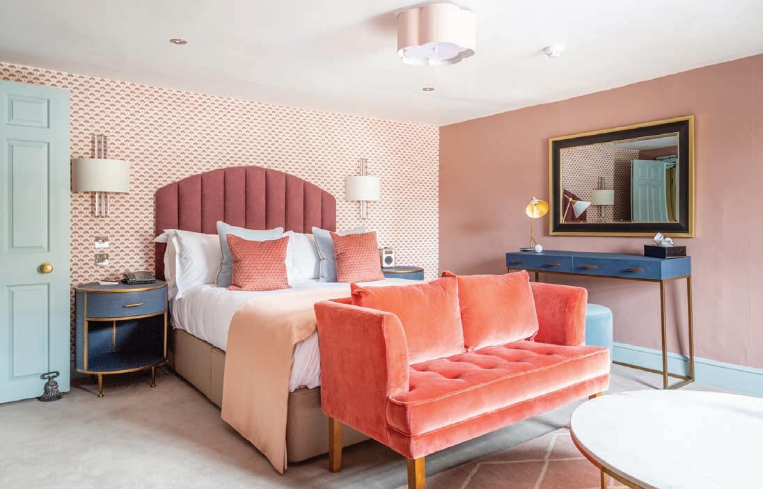
The Pink Room, Queensberry Hotel, Bath, designed by Etons of Bath, uses a scheme of dusky pinks, chalky blue and peach
more timeless and lived-in. Antiques and mid-century pieces therefore are falling back in favour; not only will they stand the test of time, but they effortlessly hold their own alongside those bold, moody paint hues.”
Etons of Bath
“The colours used in traditional Georgian houses are generally quite ‘toned-down’ or ‘muted’ colours – sage green, blue-grey and burgundy, usually in a sheened finish. As the style evolved over the Georgian era, new colours were introduced – dusky pinks, soft greys, pea-green, sky or Wedgwood blue, beiges and stone shades in matte finishes. Many of these colour combinations work really well in Georgian houses today.
“Georgians often mixed gilding or marble effect paintwork into their interiors, so don’t be afraid to add some touc hes of gold gilding or gold-framed pictures to really add the
BELOW: This interior features charcoal grey walls and a sultry green sofa from Loaf – there is plenty of natural light from the window to lift the darker scheme

authentic feel. Gold metallic paint can be picked up fairly easily nowadays and is a lot cheaper than real gold leaf gilding!
“If you are after a more classic contemporary look and feel, then add pops of colour into your schemes through bolder fabric choices or wallpapers.”

Joel Bugg
“As designers of bespoke fitted furniture and interiors, colour is a determining consideration for any project we produce. It is important to establish early on a client’s wishes on colour and materials, because it has a bearing on the detailing we would include on the furniture. We would treat the design of a painted kitchen very differently from one using natural wood. A painted kitchen, for example, is likely to have more open moulding details to allow paint to fil l the gaps and joints, whereas a natural timber design needs to take into account grain directions. Likewise, if we were to plan two contradictory colours into a painted kitchen, we would design the cabinetry differently to give greater distinction between the colours. Accent colours on one item of furniture, like an island or freestanding larder cupboard, are a great tool in creating focus in a kitchen.
“ We use colour in our space planning of kitchens too. By incorporating differing colours, we create zonal areas of use, important when planning large spaces. And it is not just a paint colour – we’re advocates of using a palette of natural materials in our designs; stone, marbles, woods, finished brasses all work to create these separations and are a great tool for lighting darker areas and vice versa.”
We ne ver shy away from incorporating dark colours into designs. A solid block of dark paint on a panelled wall can work just as well in adding depth to a room – like staring into an abyss, it can give an illusion of space. And with a well-executed lighting plan, colours can be illuminated and concentrated on or pared back in equal measure.”
Loaf
“A few years ago, it was all about neutrals, but I think now with s ites like Pinterest and Instagram there’s plenty of good inspiration out there making it easier to get stronger colours right. We’re noticing that our customers are becoming much bolder with colour and gone are the days of ‘greige’. You can really lift a room by introducing a new hue and we’re seeing warming rust and clay tones as well as mustards and blues coming through. This season, we’ve adopted colour across our smaller accessories, including colourful ceramic mugs and knitted throws, and even our first collection of scented candles. These smaller loafing supplies are perfect for adding colour into your space.” n


