12 minute read
KNOWING SHADE
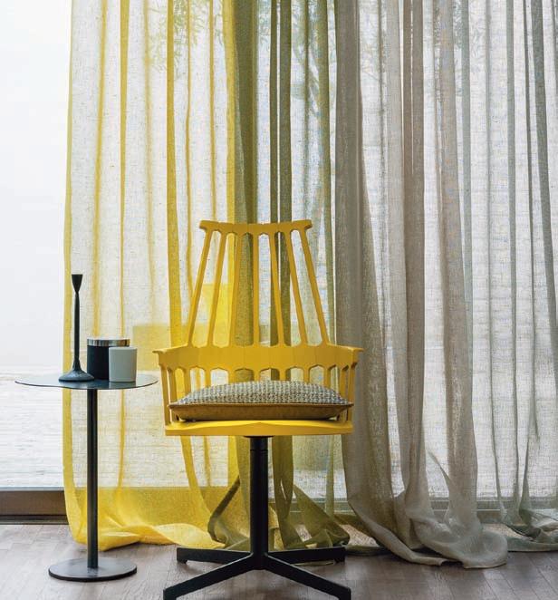
We always anticipate with interest the announcement by Pantone of their shade of the year –it provokes some animated, often divided, conversation. This year, it was a double whammy, which garnered some controversy, with the bright and hopeful ‘Illuminating’ (yellow) paired with ‘Ultimate Grey’. Leatrice Eiseman, executive director of the Pantone Color Institute, said, “The union of an enduring ‘Ultimate Gre y’ with the vibrant yellow ‘Illuminating’ expresses a message of positivity supported by fortitude. Practical and rock solid but warming and optimistic, this colour combination gives us resilience and hope. We need to feel encouraged and uplifted; it is essential to the human spirit.”
While their colour choice has the most weight, Pantone don’t have the monopoly on forecasting colours. The Dulux colour of the year 2021 is ‘Brave Ground’ (soft brown), which is described as bringing a bolstering, balancing feel to any room, a versatile shade that lets other colours shine. Graham & Brown have chosen ‘Epoch’ (plum purple), describing it as “proud, regal and luxuriously bold”. Then there is Little Greene’s recent launch of their ‘Stone’ palette, a co-ordinated collection of 36 natural colours. Eleven of the new colours included in the collection have originated from Little Greene’s ongoing colour research across the portfolio of properties in the National Trust’s care, continuing the cataloguing of original colours from key periods of interior design. Readings were taken from paint colours, architectural elements, tapestries and, indeed, stone itself.
Advertisement
In America, Sherwin Williams have opted for ‘Urbane Bronze’, a rich golden brown shade with grey undertones, designed to bring a sense of comfort to the home. The neutral colour is part of the ‘Sanctuary’ palette in the company’s Colormix Forecast, a report that predicts a need for balance in design for the upcoming year. Benjamin Moore, on the other hand, have put their money on the intriguing, balanced, and deeply soothing ‘Aegean Teal’.
Is this a masterful way of capturing the mood of the moment, or just a convenient marketing opportunity? Does having a nominated fashionable colour to represent a year work? How much does it lead the way and does it really make a difference? Our local interiors experts share their tips and insights.
Alison Bracey, Bracey Interiors
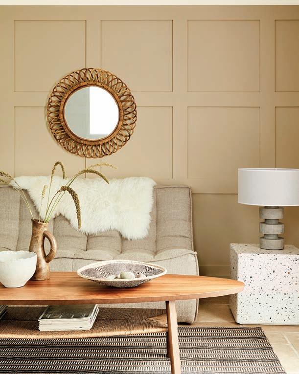
Colour of the year – I guess it does help to give manufacturers and customers a reference point but I would suggest it’s purely that and is for guidance only. Ultimately, as the consumer, you have to work with colours that you inherently like and make you feel good –colour is a very personal thing and everyone sees it differently. It’s interesting that both the Pantone colours of the year and the Dulux colour of the year –“a warm, earthy tone creating stability, growth and potential; provides firm foundation...” –forecast a neutral base tone and then allow people to be creative with a pop of colour (in the case of Pantone, ‘Illuminating’, but with ‘Brave Ground’ you could introduce cobalt blue, sorbet pinks or coral shades).
‘Ultimate Grey’ and ‘Illuminating’ are two completely different colours but ones that combine perfectly. In these difficult times it’s probably not surprising that we’re seeing such a vibrant and attention-getting colour as ‘Illuminating’. Yellow is associated with warmth and positivity and, used as an accent colour in a room, it will help to create energy, character and interest. Ultimate grey is the perfect foil for such a dramatic colour.
All the interiors manufacturers are using the same reference points so when the new collections are launched there is a similarity in terms of colours or design trends and this, in part, influences our choices. It’s interesting to note that Little Greene Paint Company have just launched their Stone Collection, featuring a co-ordinated collection of 36 natural colours. Do they ever get a colour wrong? I think that would be hard to comment on. We all have our own colour preferences that we are automatically attracted to but it’s amazing that if you see a ‘disliked’ colour often enough you begin to form an attachment to it. I think that with all the uncertainty that ➲
surrounds us, their choice of neutral, stable colours is perfect but I do agree we all need some bright sparks so a pinch of fun, illuminating colours in small doses is a very welcome addition and something we should all adopt and celebrate. After all, who wants to be referred to as ‘neutral’? • braceyinteriors.co.uk
Beth Chippindall, Honeycomb Interiors
Interiors is very like fashion –it has trends. These can be fun but are, more often than not, fleeting. Each season is given a set of colours which the powers that be have selected as current/new/fashionable. I always think about Meryl Streep in The Devil Wears Prada, telling Anna Hathaway about how turquoise came to filter into mainstream fashion. Yes, there are years that I think the colours are not useable or easy to integrate like this year’s yellow... Are they wrong? No. Interiors is personal.
We, as designers, see these colours filter into the latest fabric and paint collections. As noted, Dulux and Pantone now nominate a ‘colour of the year’. Both of these elements are a great way to bring a space into the here and now, but I am always mindful that trends pass and that the more brazen will date an interior very swiftly. Again, like fashion, not every person or interior wants to be trend led; timeless elegance is never a bad thing, especially in property. As a company we tend to use trends more for spaces like showhouse designs as they need to be current, and their lifespan is for weeks or months. I think that people should live in spaces they love –if they love blue and its not ‘in trend’ use it anyway... Be you! • honeycombinteriors.co.uk
Cloud Nine Create
The fast-paced world of social media and digital comms offers an array of inspiration to keep you en pointe when it comes to the hottest colour palette and where to apply it, but the balance has shifted from prediction to dictation as the consumer becomes more influential in what is ‘trending’, and what ‘feels’ right, right now.
The steadfast rules still apply, for example, from what direction is light entering the space? The obvious change, though, is that now, perhaps more than ever, we require our space to do so much more; our homes need to be a haven, our entertainment space, educational and working zone. Coupled with that, there is more of a biophilic sensitivity of bringing the outside in, as we connect more with nature, in the absence of other distractions and in pursuit of life’s simple pleasures and comforts. And the natural world offers the most inspiring colour palette and combinations. The fun part is translating this into your space! Keeping an eye on what is trending in the hospitality sector is also a fantastic way of staying ahead of the curve.
Some of our best known and most loved paint brands bring out their coveted key colours for the year ahead, with an array of suggestions for their application to our walls, skirting boards, doors, architraves, downpipes, ceilings. Their offerings are insightful as they are largely determined by social media artificial intelligence technology, so it’s what’s currently trending among us –the consumer. It’s what we are ‘liking’ and drawn to right now. This may be to do with what is happening in our world, or the world at large. It is said that we are attracted to certain colours because they evoke a feeling or sensation that we require more of in our lives. However, no two homes and no two consumers are the same so while it’s great to check in with what’s current, it’s important to consider your new colour preference in terms of your overall design scheme.
The fact we are demanding more from our space and requiring it to play several roles is reflected well in the 2021 colour ‘predictions’ because we have a mix of earthy browns and stone, along with Aegean seas and midday sun-lit blue skies, evoking the natural world and our resurgent connection with it. Bold colours are richly pigmented and don’t feel artificial, reminding us of the bustling cityscapes we long for to excite us once again.
That sense of bringing the outdoors into our space lends itself to a natural world palette. Whether you take a cue from coastal blues, cloud whites, stoney browns and greys and accents of yellow and orange lichen, or draw inspiration from rolling fields and evergreen forests in tonal greens, mosses and browns, with accents of self-caring pinks... if it feels like it’s what you need then it probably is. Don’t be afraid to use bold colours, it’s often better to go all in than make a half committed attempt, as this will show. The insights and offerings from the colour modellers are great for giving you that confidence. If you’re feeling cautious, start by painting a large item like a chest of drawers, units in a kitchen or a bedroom door; you’ll be surprised what a difference it can make and may even start a trend for 2022! • cloudninecreate.co.uk
Charlie Marshall, Loaf
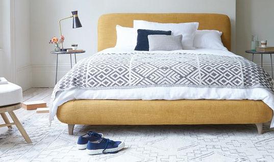
A few years ago, it was all about neutrals, but I think, now, with sites like Pinterest and Instagram, and plenty of good inspiration out there, it’s easier to get bolder colours right. Pantone’s ‘Illuminating’ and ‘Ultimate Grey’ cater for many tastes with the combo working well for many schemes. Our yellow fabrics are already proving a hit and the number of customers choosing them is up by 53%. Yellow shades look especially great with greys in a grown-up scheme, so if you have existing grey pieces, or perhaps grey walls, then why not give your room an update with pops of yellow?
To stand the test of time it doesn’t need to be trendy, but it should be stylish. Using statement colours is a great way to give a fresh take to a classic design but choose what you love; something that’s well made that will still look great in five years’ time. • loaf.com ➲
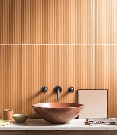
I’m a huge fan of Pantone’s colour choices for 2021. ‘Illuminating’ and ‘Ultimate Grey’ work equally in contrast and harmony when placed side by side. I see the grey as neutral solidarity and the yellow as uplifting and hopeful. The grey offers a neutral, calming base in interiors and allows stronger shades to really stand out. A single colour alone was never going to really give the true reflection of our current times.
We’ve seen a real desire for stronger, more positive colours in interiors this year and that includes yellow. It really is the most happy shade and people need that right now. While we have seen warmer tile shades becoming more popular, grey wall and floor tiles still outsell all other shades. The bathroom is a place to really experiment with colour and we love our stand-out ‘Paintbox Canary’ bathroom where yellow is used successfully over a larger area.
We like to include tile colours that are more trend led and these are great for marketing and strong imagery. However not all the more ‘trend led’ colours result in good sales –the more neutral, timeless white and grey tile ranges are the most in demand.
Graham and Brown’s ‘Epoch’ and Benjamin Moore’s ‘Aegean Teal’ both resonate as colour choices, both shades I’m seeing coming through in interiors. Green has been popular in the last year or so and it offers so many shades, from deep forest tones, to fresh mints. Pink has also been popular and warmer tones such as peach, orange and burgundy are gradually being used more. • mandarinstone.com
John Law, Woodhouse & Law
It seems fitting that Pantone have broken with tradition, in what has been a far from conventional year, to introduce not one, but two new Pantone colours. While to some extent they fly in the face of current interior trends, the sentiment behind the choice is apt. The vibrant almost canary yellow symbolises hope and positivity, while the contrasting, cooler ‘ultimate grey’ is meant to embody feelings of “composure, steadiness and resilience”; qualities I think we will all need over the next 12 months.
Soft grey tones have been the order of the day for some time but there’s been a real shift over the last year towards much warmer neutrals. It’s a trend embodied in the use of pampas and grasses as accessories, as well as artisanal ceramics in earthy pigments. So in the context of interiors at least, the new shades feel a little disruptive. Maybe that’s the intention. After all, there’s always space within a scheme for a zing of colour and this shade definitely won’t disappoint.
While such a vibrant shade of yellow can be difficult to incorporate, used carefully, a small amount provides a playful twist. ‘Illuminating’ feels reminiscent of the canary yellows seen in 1950s Formica dining chairs. Introducing retro pieces to an interior scheme could offer a way to use the shade in an interesting way, by, say, combining dining chairs in a vibrant yellow around an old farmhouse table.
‘Ultimate Grey’ is a strong but cool shade. While we wouldn’t advocate using this cooler shade in a colder, north-facing room, it does provide a great, contrasting canvas to set off the intensity of brighter shades. The French fabric houses such as Casamance have used this palette successfully in the past, perhaps because it is better suited to the light in those warmer climes. • woodhouseandlaw.co.uk
Squishmeister Loveseat Chaise by Loaf, £1195 in a classic mustard and white combo
Vicky Elmore, The Kitchen Partners
For a long time, shades of grey has been a popular choice when it comes to the kitchen and grey is ideal for both modern and traditional designs. However, some shades of grey can appear cold compared to other colours and in a room such as the kitchen, which is supposed to be warm and inviting, using this colour can be tricky. Pairing grey with an accent colour such as yellow will definitely add some cheer! • thekitchenpartners.co.uk ■
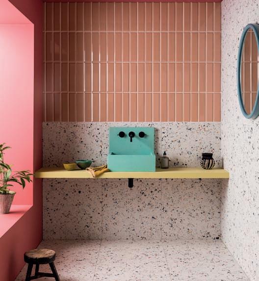
Norse Subway Terra Gloss Ceramic, from Mandarin Stone, £46.40 per m2


