MAKING
Meredith PosanskiP R O G R E S S

In this practice, we were paired up with another classmate and worked together to design a product that would help them. To do this, we discussed things that we struggle with individually, and our partner would think of creative ideas that would hypothetically help solve this problem. My partner discussed that she is in a lot of difficult classes so she is going to need to spend a lot of time studying this semester. With the criteria in mind, I proposed the idea of having a kind of digital guide to assist her with time management and schoolwork. As a class, we had to construct a model of our idea with different materials. Even though part of my figure fell apart right at the end, I was able to construct a figure that presented this idea in the shorter amount of time that we had. Through this process of planning, my partner was able to give feedback and present ideas as well, giving me different ideas and perspectives.
Engaging with another person changed the direction of my prototype because I was able to get feedback and ideas that I may not have thought of myself. Getting someone else’s perspective was very beneficial and it changed my outlook on my work overall. Showing unfinished work to another person was kind of difficult because I felt the need to explain each detail of the piece because it was not in its entirety. At first, I felt as though it would be better off when it had been completed because it would make more sense to them. As we had a time limit for our work, the pace felt really fast compared to how I normally would work. I had to pursue the first idea that came to my head because I didn’t have enough time to compare different ideas. If I had more time, I could have thought of more of a structured plan and saved myself a little more time in the process. Through this practice, I learned about the importance of thoroughly planning out projects and making rough sketches and drafts before presenting the final product.

In this project, we had to select three of the twelve listed words and create compositions that represent those ideas through the use of dots and lines. Through different sizes and shades, as well as limitations on the number of dots and lines that we were given, we constructed and drafted multiple iterations. I selected the words terror, comfort, and exhaustion. This project consisted of multiple different drafts and iterations to get a successful final product.
The idea of gestalt was exemplified in this project with the idea of taking shapes or imagery and putting them together to create something or a bigger picture. In our project, we took lines and circles and positioned them in a way to convey an emotion. This project changed my perspective of abstraction because I can really see how figurative shapes and objects can portray more than just the figure themselves. I found that throughout different projects, I was able to use this process with other ideas when creating designs because now I see that designs can have deeper meaning. I was able to be more creative and think of other alternatives to the idea.


This project consisted of multiple different iterations of a word that we selected. By printing with ink and using different resources, we had to represent the meaning of our word in different ways. With kerning, leading and different modifications, I represented the word, “slide” in multiple ways. With practice with different letterforms and multiple drafts, I was able to create three different final compositions.
When working with letter forms, I got a much better understanding of how much thought actually goes into the different forms of typography and that there are various options for representing words rather than simply stating the word. If I was to continue working with these letters, I would continue to try to push myself even more and try new ideas and be more creative with my ideas. I think using different images and combining them directly with the words could have expanded my work even further.


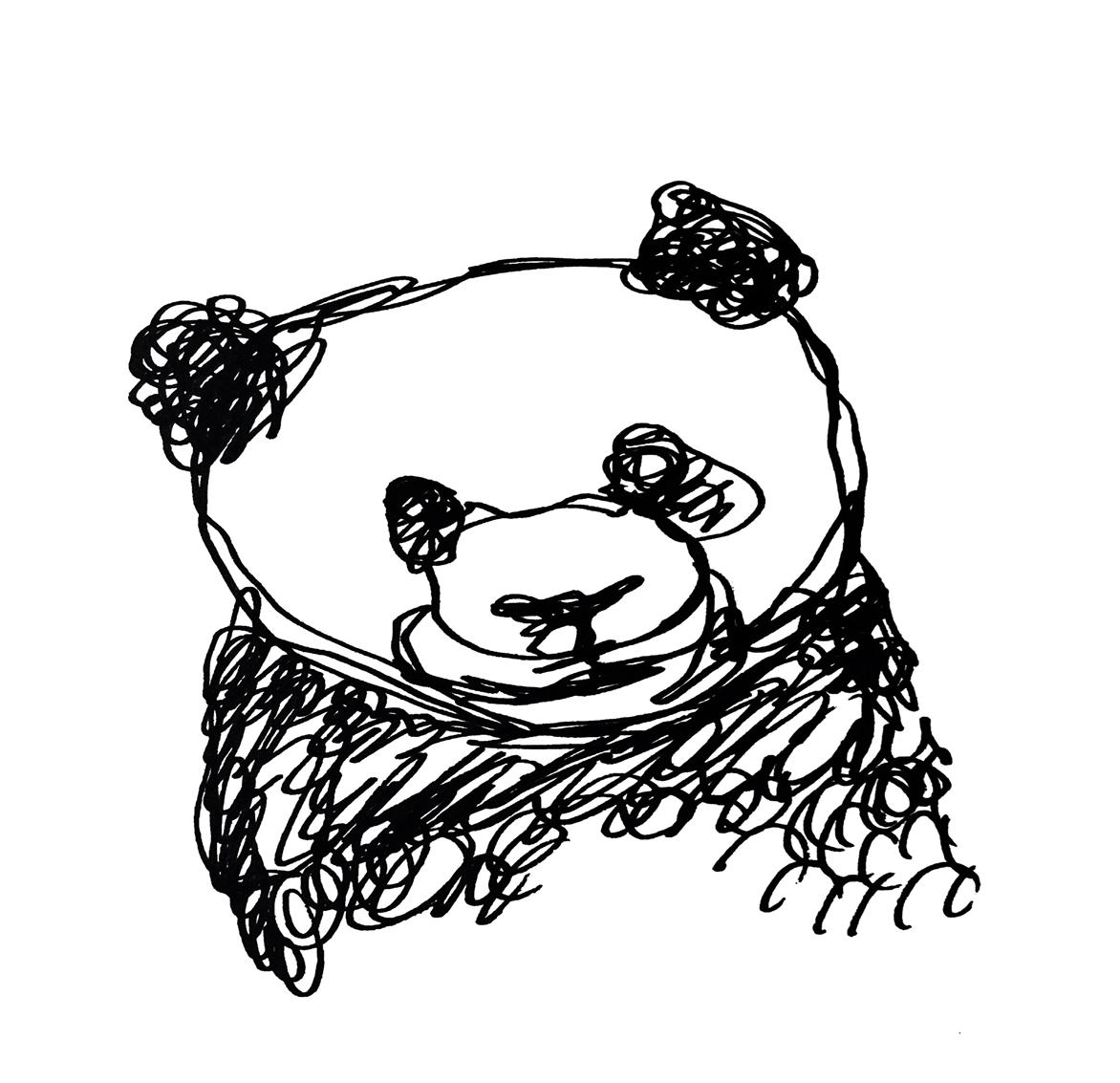
In this project, we had to make up different compositions of an animal or an object. I chose to do a Panda because I thought of a lot of different ideas for that animal. The final product had to have six final iterations including continuous line, two master artist iterations, collage, type collage, and geometric. This project took multiple drafts before constructing a final product because of all of the different and new material and ideas that we were working with. Coming up with different iterations of the different subjects was very challenging and I really had to put a lot of thought into making each composition successful through modifications. After completing each individual composition, I had to organize them together in such a way where they were visually appealing. The final product has flow as well as different contrast and unity.
Through this process, I found the geometric iterations to be the most challenging media because it took me a while to find all of the right shapes that fit in with my animal. Organizing each shape was very difficult to construct in the same way I planned. The most enjoyable was the continuous line media because I like how it was pretty free flowing and I like how it looks more loose and I could do some different experimentations with it.In the beginning, it took me a long time to really grasp the concept of InDesign. Something that was especially difficult for me was creating different layers with my animal and figuring out how to work with each layer separately. As the work progressed, I felt a lot more comfortable and confident in my ability to implement each idea with layers. If I could continue with this object, I would expand on more of the texture of the animal. I might consider really zooming in on the different parts, like the eyes or the paws, to really demonstrate the detail and all of the characteristics that make them admirable and unique. I would also consider adding multiple subjects in one iteration to show more than one panda together.


 Master Artist: Paul Klee
Collage
Master Artist: Paul Klee
Collage
 Type Collage


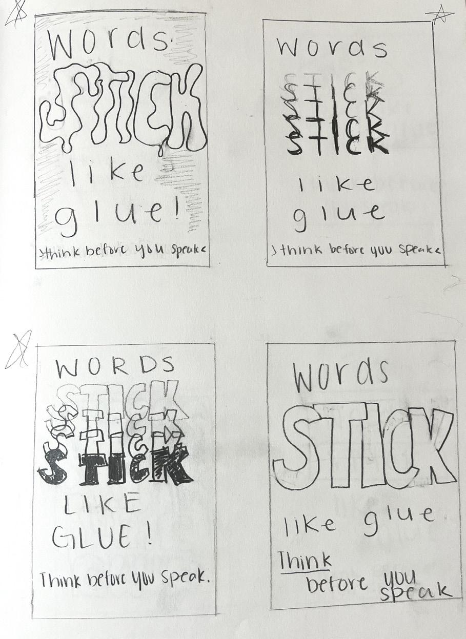
As a part of this project, everyone got assigned a partner that was considered a client. The client had come up with a topic that they were passionate about for the designer to make a PSA poster about. With a specific assignment brief and details, the designer had to create the product based on their specifications. My partner had the idea of creating a poster that promoted and reminded people to be kind to one another. The sentence, “words stick like glue” was proposed as a way to get the audience’s attention. I created multiple different iterations of this sentence with multiple layouts to reach a final product that my client preferred. My final product consisted of large bolded letters with repetition that stood out so that it would reach the audience’s attention. I also added a box around, “think before you speak” to give the poster flow as well as contrast.
As we were limited to only using text,it was pretty challenging for me because I had a lot of ideas with images that could have related to the topic of my poster. But, I connected this project to the letterforms unit, and I had to think more about using the text to demonstrate and give emotion to my topic. To create a visual hierarchy, I had the word “stick” really stand out on the poster, showing that such actions really do affect a person. With that same idea, I added multiple versions of “stick” in different opacities to give the visual of how such comments or actions stick with a person. After the critique, I also had the words take up more of the page to get rid of a lot of negative space. This project showed me the importance of making multiple drafts and trying out different ideas instead of just pursuing your first thought. With those different ideas, it is easier to see what is working and what isn’t and what can be improved. I also learned about the importance of making visuals stand out to catch a reader’s attention and to draw them in.


I made multiple iterations so my client could select one that reflected their ideas the best.

What is the difference between a good life and a significant life?
I think what one might consider a good life is a life that society might deem as good, where one may make a lot of money and have a lot of successes. I think it feeds into what one may feel like they are expected to do to live a happy and good life. On the other hand, I feel as though a significant life is a life that is more personal to each individual themselves, where they are truly happy with what they have and what they are doing with their life without the worries of what others may think.
I think that the difference between art and design is that design is a little more uniformed. From what I have experienced thus far, design follows more of a script and often has different goals and requirements that need to be met. On the other hand, I feel as though art is a bit more personal and has a lot more freedom to be more interpretative and free flowing. While both can have similar characteristics in different contexts, they often have these few differences that can distinguish them.
Introduction to Design
Art 130
Spring 2023
St. Norbert College


