Creativity has always been an integral part of my life and professional journey. From my early years, I’ve had a natural inclination toward it, driven by curiosity and a desire to innovate. It quickly became a habit to find solutions and to express whatever I was feeling through art.
Contrary to my expectations, this creative drive not only endured but also intensified as I matured. It became increasingly clear that my true calling lay in pursuing a career centered around creativity. What makes this pursuit particularly intriguing is the absence of any rigid constraints regarding the type of art I engage with. I relish the opportunity to explore various artistic mediums, always guided by my passion and fascination.
In my current professional capacity, I am committed to the exploration of the intersection between technology and art. This convergence offers a wealth of untapped potential, and I am dedicated to uncovering how this synergy can be leveraged to our advantage. Additionally, my ever-growing interest lies in understanding the profound impact of new technologies on the poetics of architecture. I am particularly fascinated by how these technologies can transform the aesthetics and functionality of architectural design.
Furthermore, I am acutely aware of the critical role that sustainability plays in our modern world. I am deeply committed to exploring how technology and creativity can be harnessed to enhance the sustainability aspects of architecture. This pursuit aligns with my belief in the importance of creating environmentally responsible and sustainable structures that not only serve our needs today but also contribute to a better future.
I look forward to continuing this journey of creative exploration, with a strong focus on the evolving poetics of architecture and the essential sustainability dimensions that emerging technologies will undoubtedly add to this dynamic field.
Time period : Summer-Fall 2023
Collaborator(s): Marc-Olivier Desjardins, Philippe Marchand
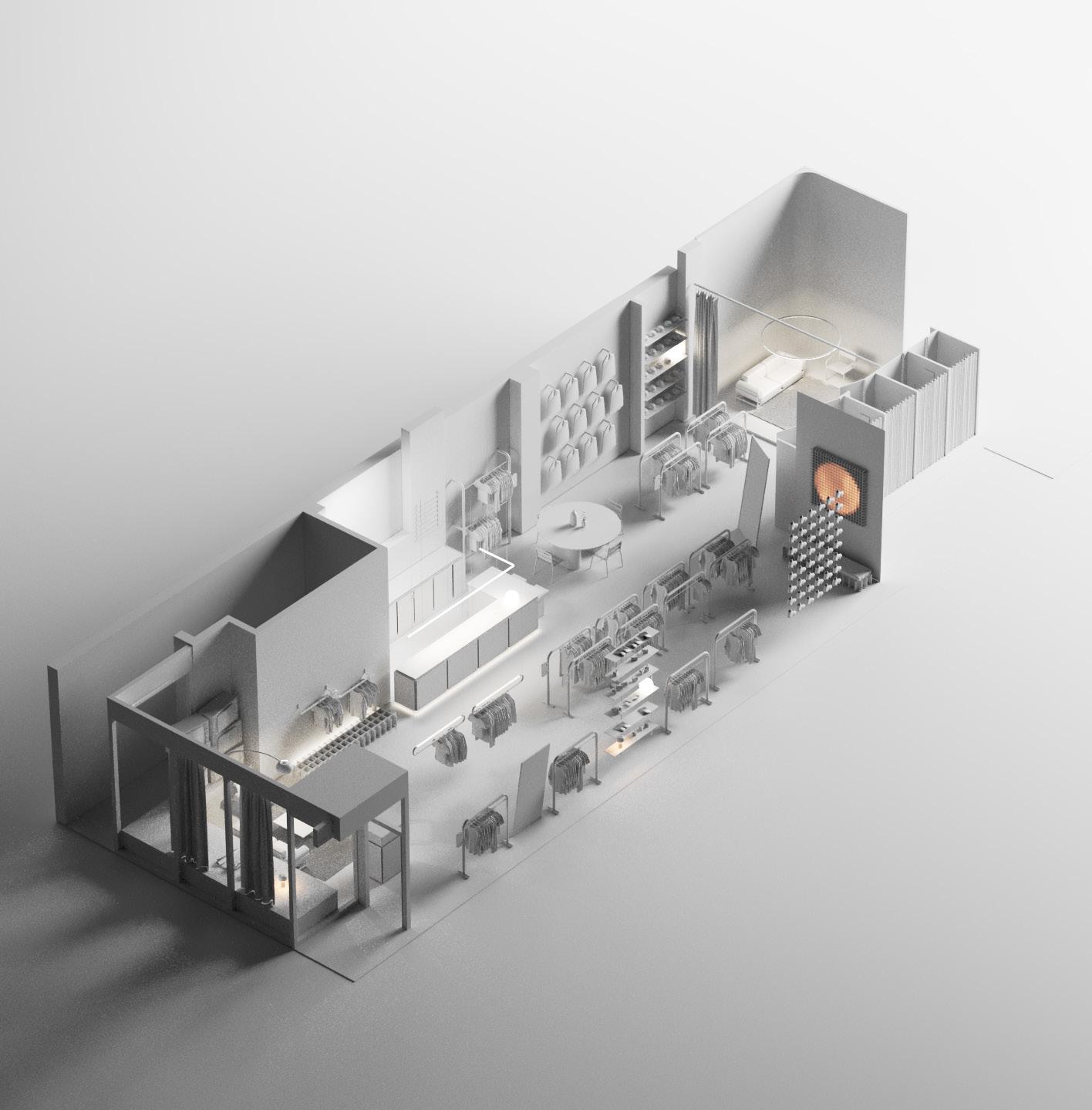
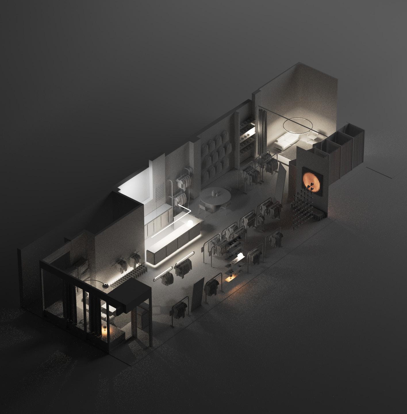
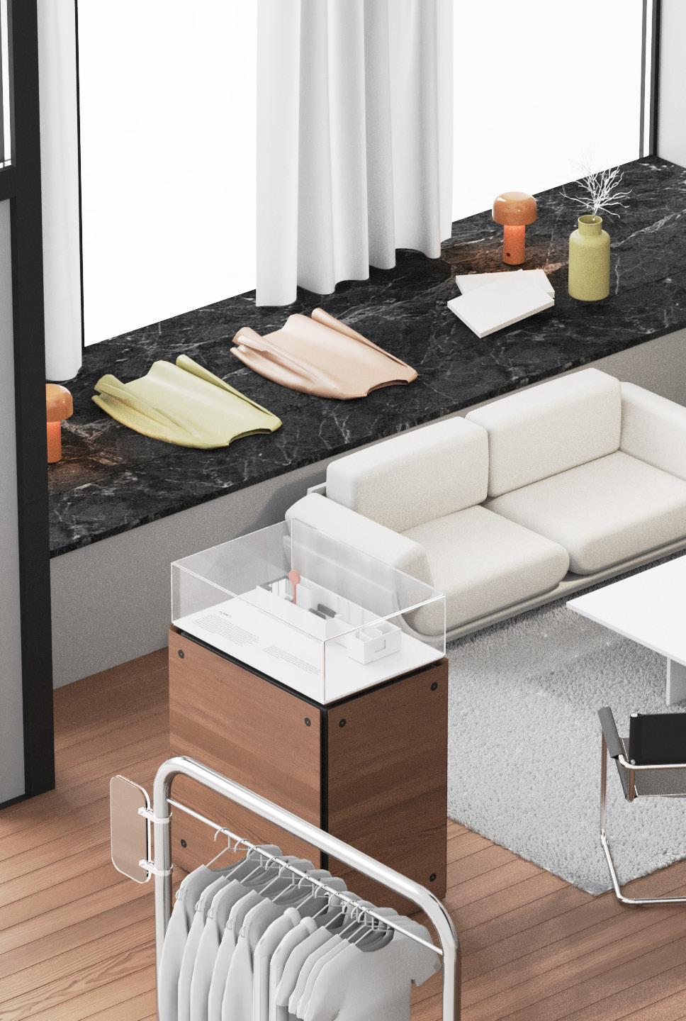
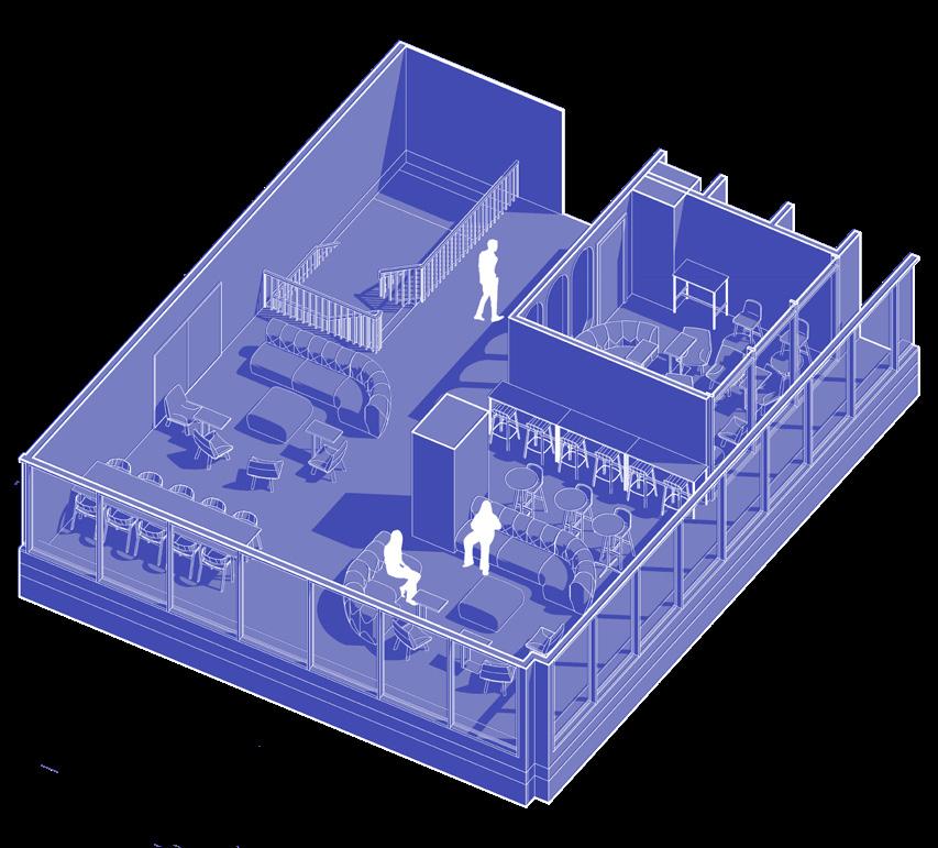
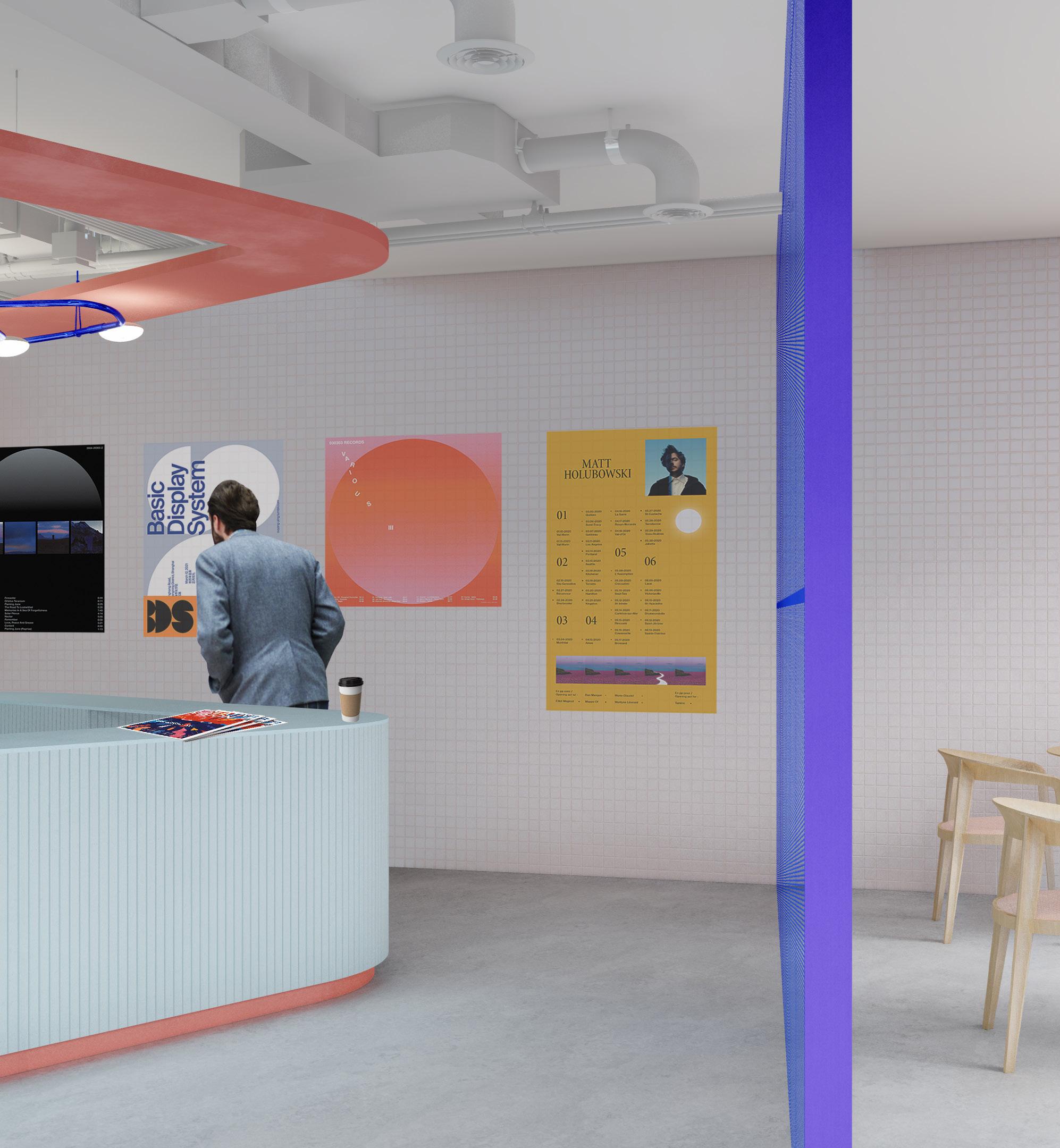
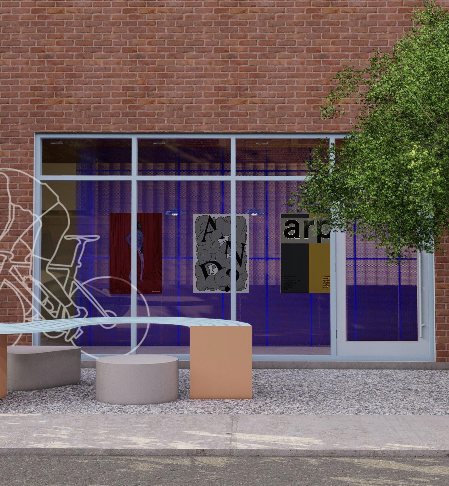
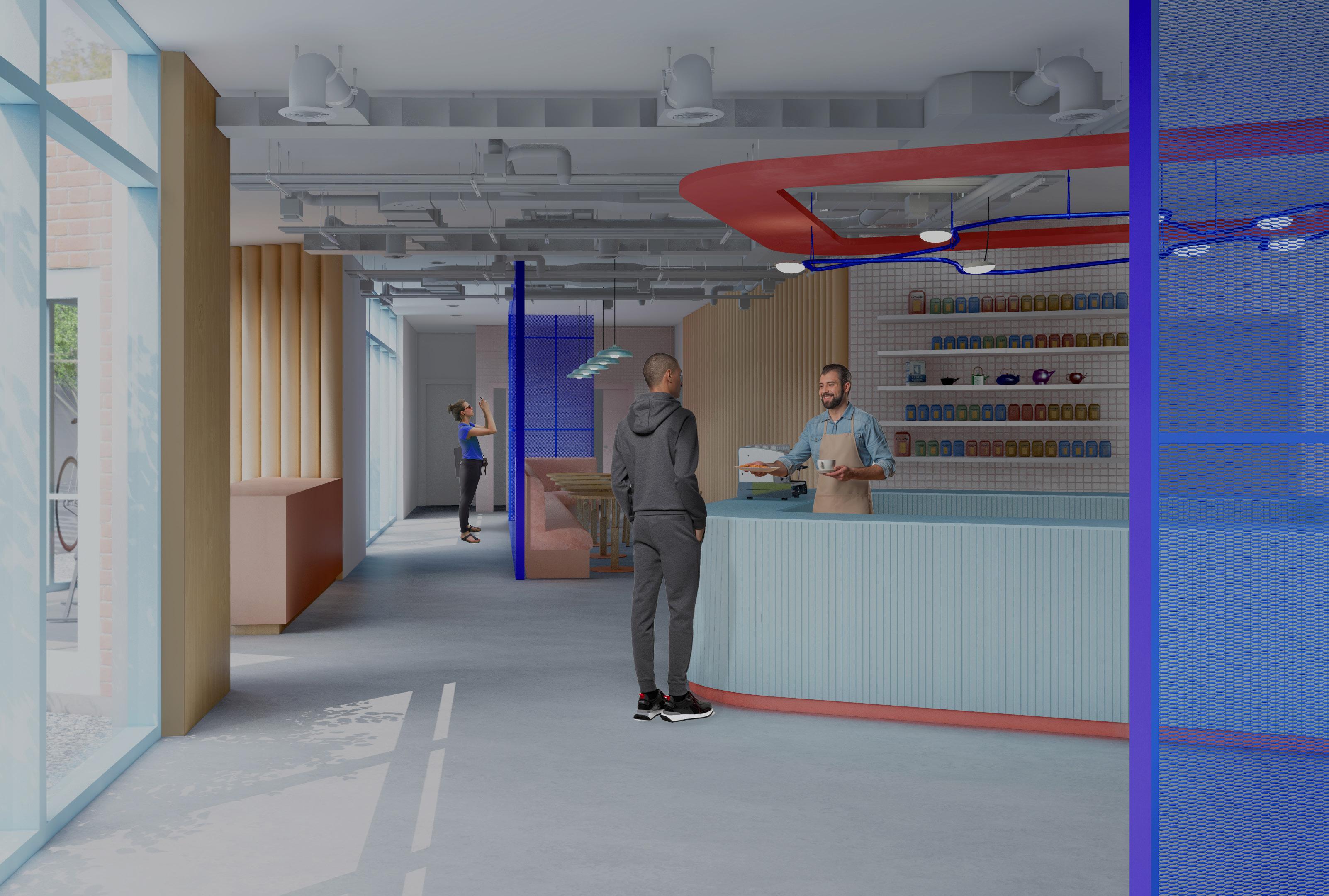
The NINETY is positioned as a multidisciplinary company, offering its clientele a vintage curation space and a venue that can be rented for events. The objective of this project is to reinvent the layout of the NINETY to better serve the ambivalence of its activities. In order to meet the multiple functions of the space, it is necessary to propose flexible layout solutions aimed at making transitions between different activities smooth and efficient.
*ALL RENDERS WERE MADE WITH THE COLLABORATION OF THE TEAM
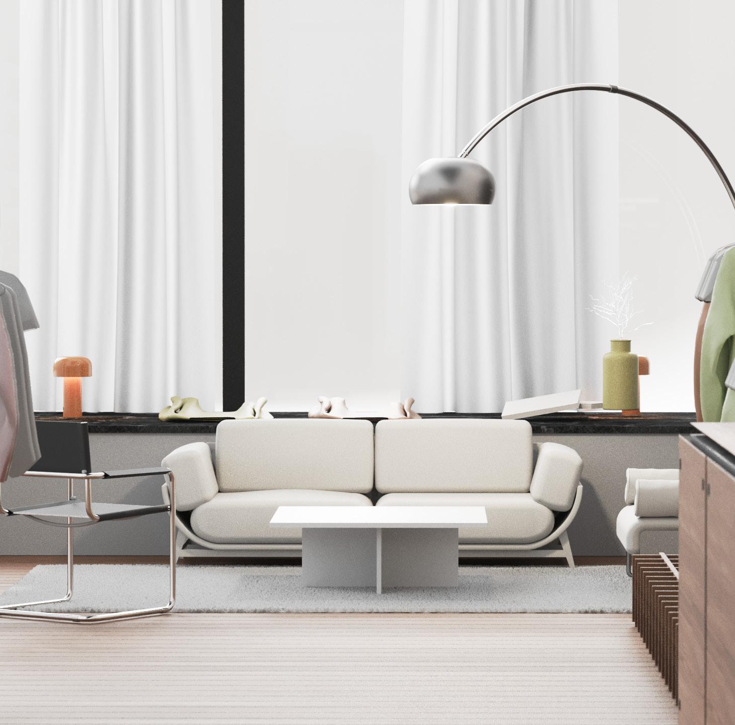
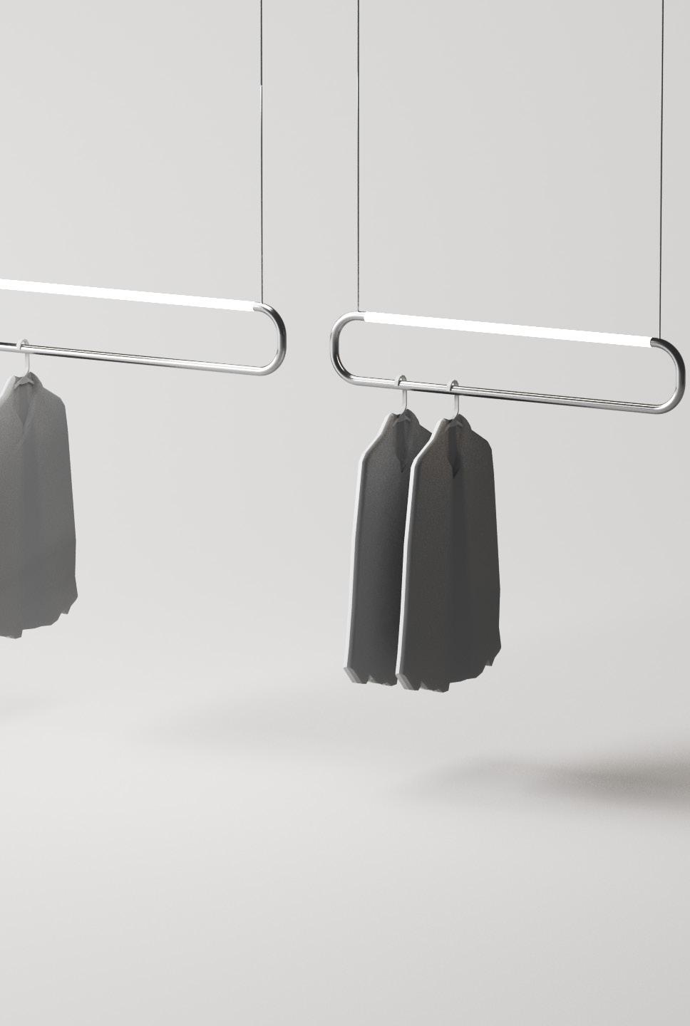
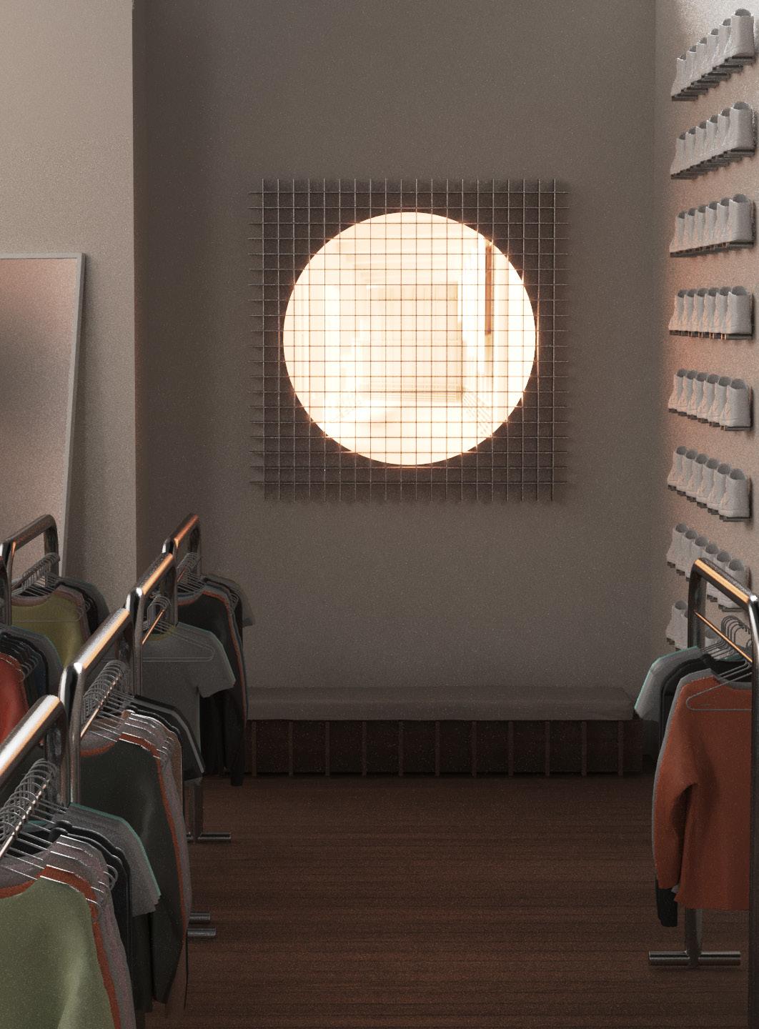
In our creative approach, we've optimized store layout and user traffic to enhance content visibility. We've designed playful and informative communication devices, standardized space for aesthetic consistency, and created unique lighting installations to enliven the space and transition between day and night functions. This makes the Ninety stand out with a strong personality.
FITTING ROOMS COAT CHECK
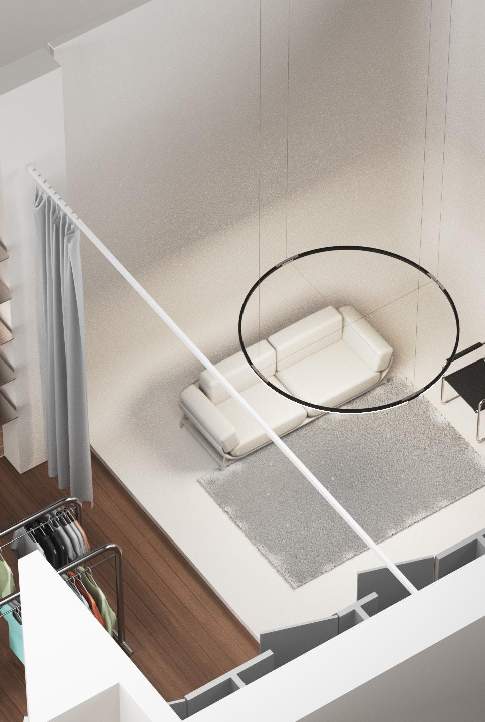
EXHIBITION WALL
LOUNGE
EXTERIOR FACADE
NUMERIC INSTALLATION
CLOTHING RACKS
CYCLORAMA
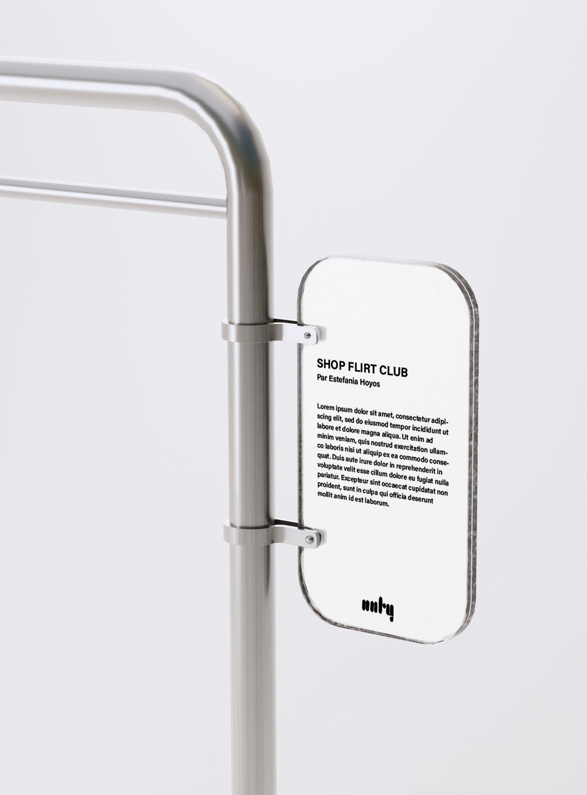
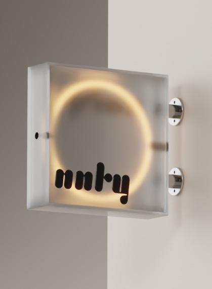
SIGNAGE
VIEW OF THE STORE BY DAY
VIEW OF THE STORE BY NIGHT
Facing a demanding client, strict deadlines, and design adjustments dictated by the tenant’s lease, our focus shifted towards enhancing the decorative elements and establishing an aesthetic flow within the space. The boutique is brimming with vibrant, colorful clothing, prompting us to opt for a neutral material palette to harmonize the environment. Additionally, we took on the challenge of revamping the store’s signage to solidify its brand identity. The design had to pass through multiple decision-makers, necessitating a medium that could be comprehensible to a client who may not be well-versed in technical plans. By adopting a more visual and numerical presentation approach, the clients were able to grasp the overall design concept and its spatial dimensions.
CYCLORAMA
The signage at Ninety helps coordinate various aspects of the store. Special attention is given to communicating the store’s intentions in writing, enabling the customer to independently seek the information they desire. The signage, therefore, adopts a clear format and an attractive aesthetic.
A strong design intent for this space is to create an inviting and intriguing journey throughout the store. By providing unique perspectives, even at the back of the store, we aim to craft an extraordinary experience for the customer, making the place truly exceptional.
Role Concepts for a system of furniture , 3D model, graphism
quatuor md
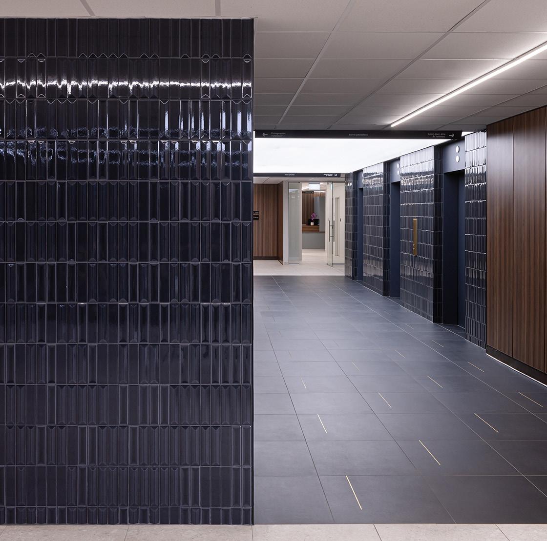
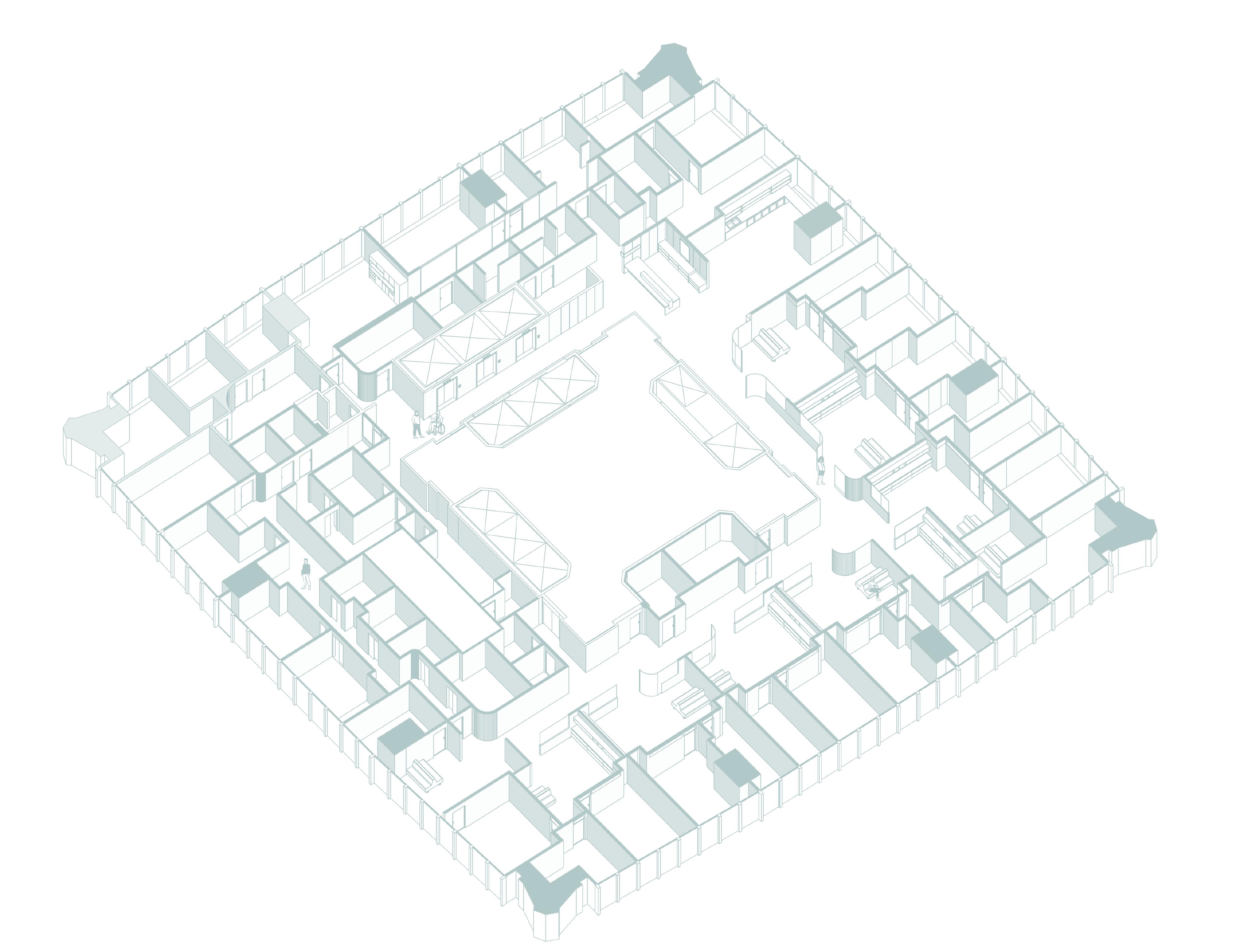
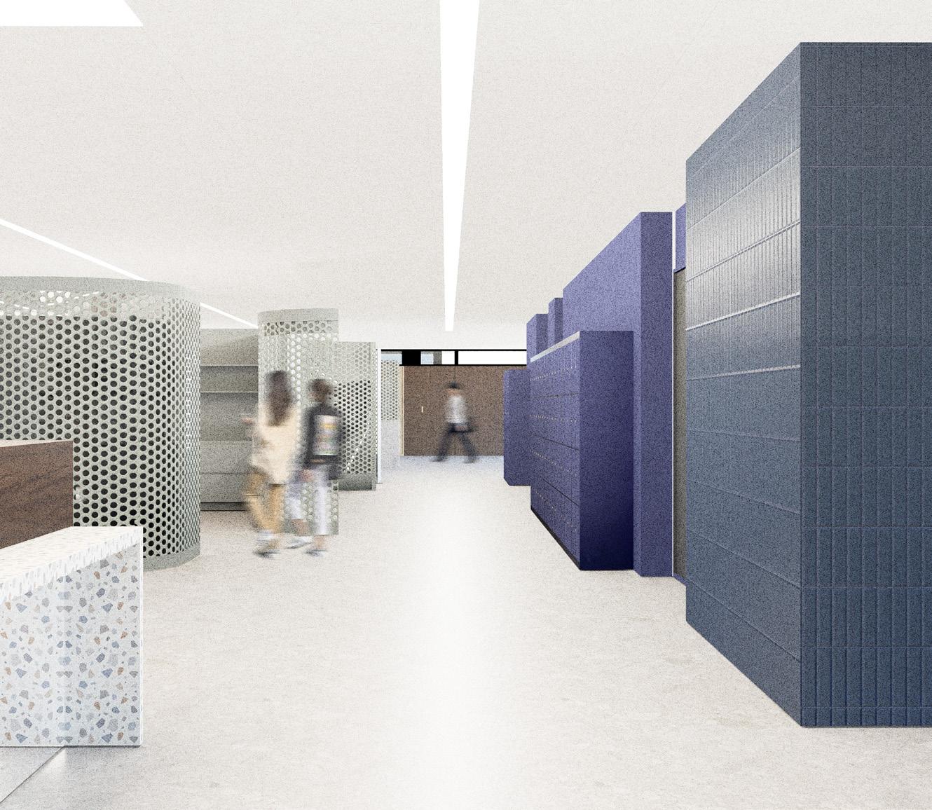
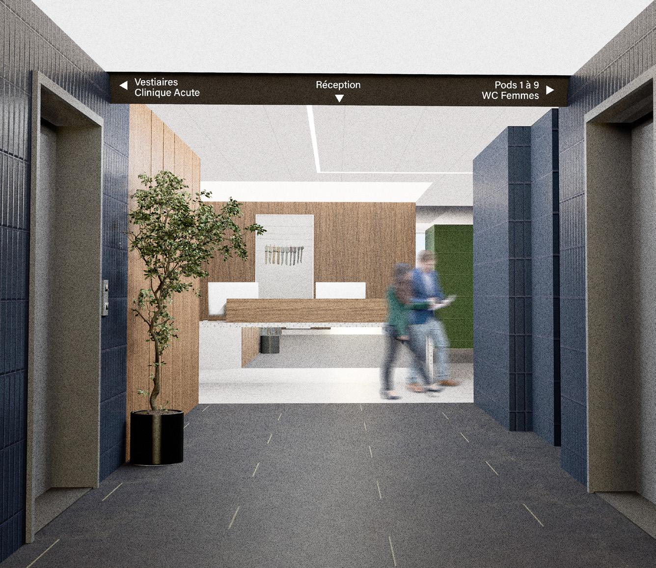
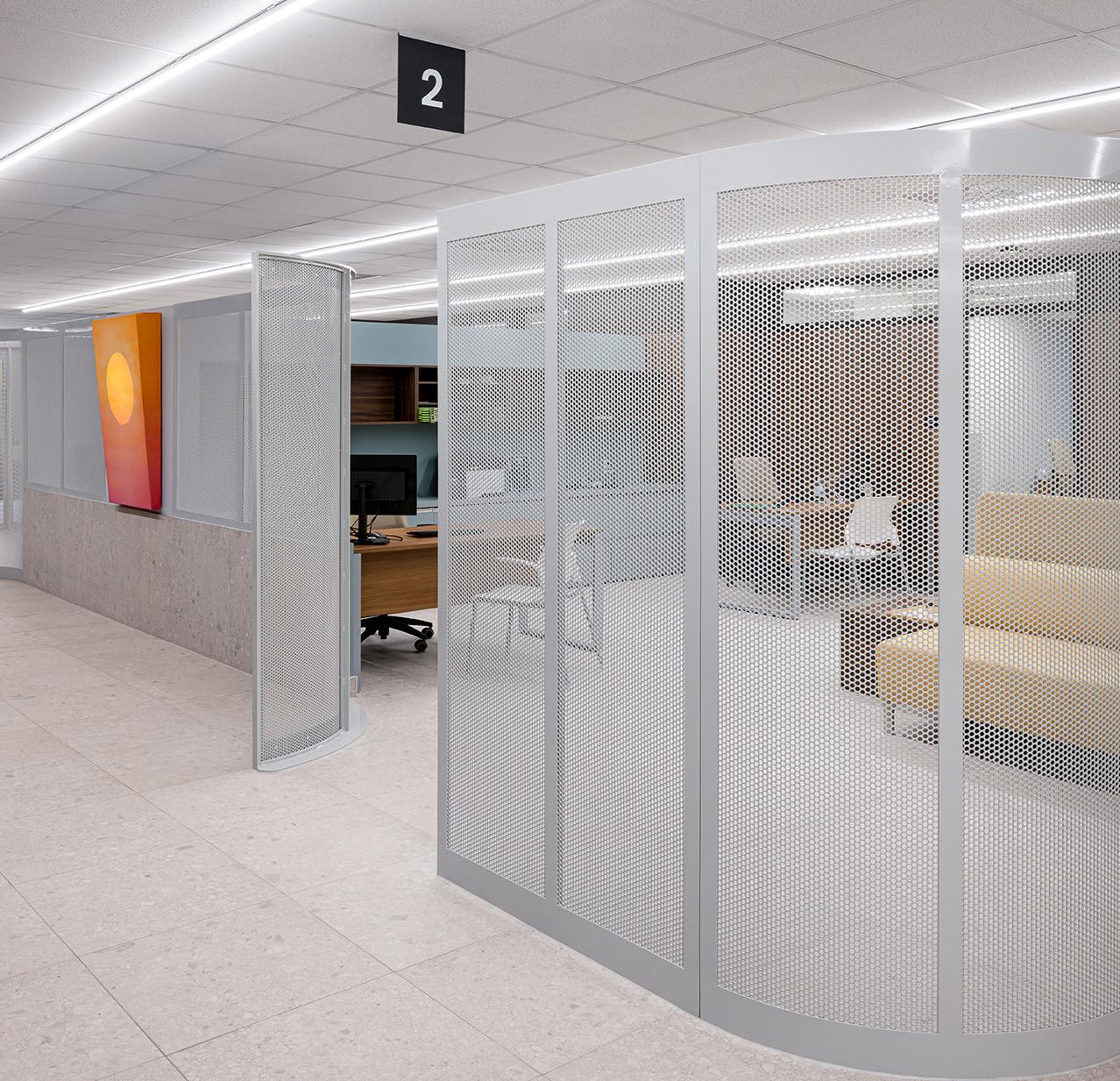
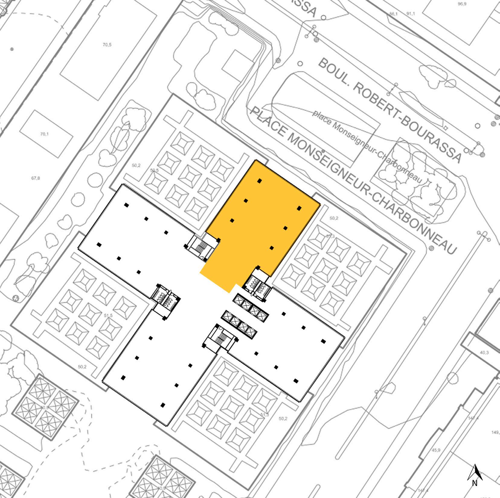
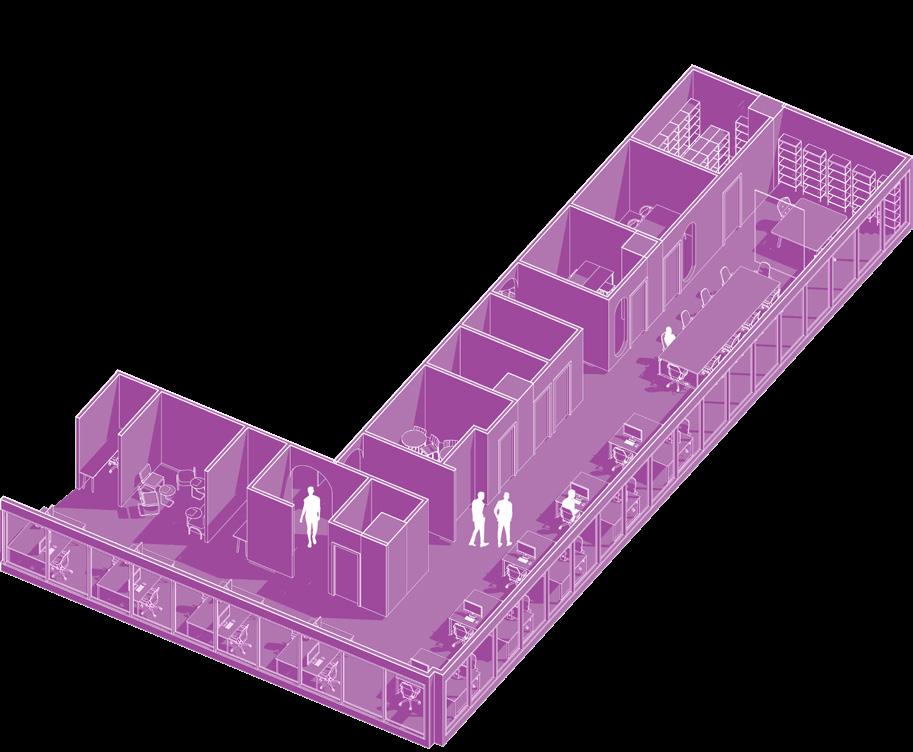
The Quatuor MD clinic is a revolutionary private medical center located in the heart of Montreal. The clinic is staffed by nine «quatuors,» each consisting of a doctor, a nurse, an administrative associate, and a health coordinator. In addition to these primary care teams, the clinic houses specialized departments, a mental health unit, an emergency department, and an in-house laboratory. This comprehensive setup ensures that clients receive complete support during their occasional check-ups. Our firm’s role was to create a cohesive environment where each department is easily accessible and identifiable. Circulation within the clinic was a primary concern. Personally, I focused on the design of the furniture system and the graphics, including signage, renders, and 3D models. All of the main pieces of furniture were custom-made. Balancing aesthetics and functionality for a medical facility presented a unique challenge.
EMPLOYEES ROOMS
MENTAL HEALTH DEPARTMENT
SPECIALISTS DEPARTMENT
IN HOUSE LABORATORY
EMERGENCIES DEPARTMENT
WAITING ROOM
The primary concept for this clinic was to craft a distinctive customer experience. The client aimed for the space to exude a homely atmosphere, steering clear of a sterile environment. Sterile cubicles were to be avoided at all costs. To achieve this, we employed perforated metal sheets to define various areas while enabling the flow of natural light.
Creating an axonometric representation of the layout was essential in order to clearly delineate the main circulation axis and provide a better understanding of the client’s journey.
QUATUORS
CLINIC’S AXONOMETRY
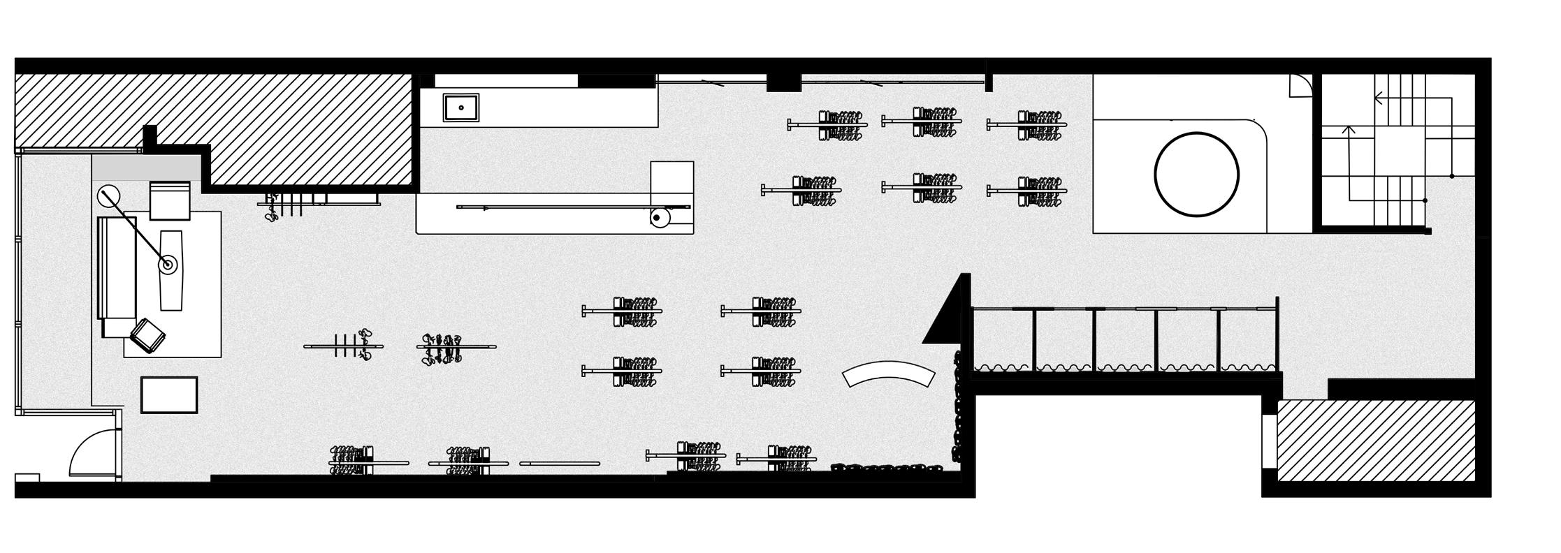
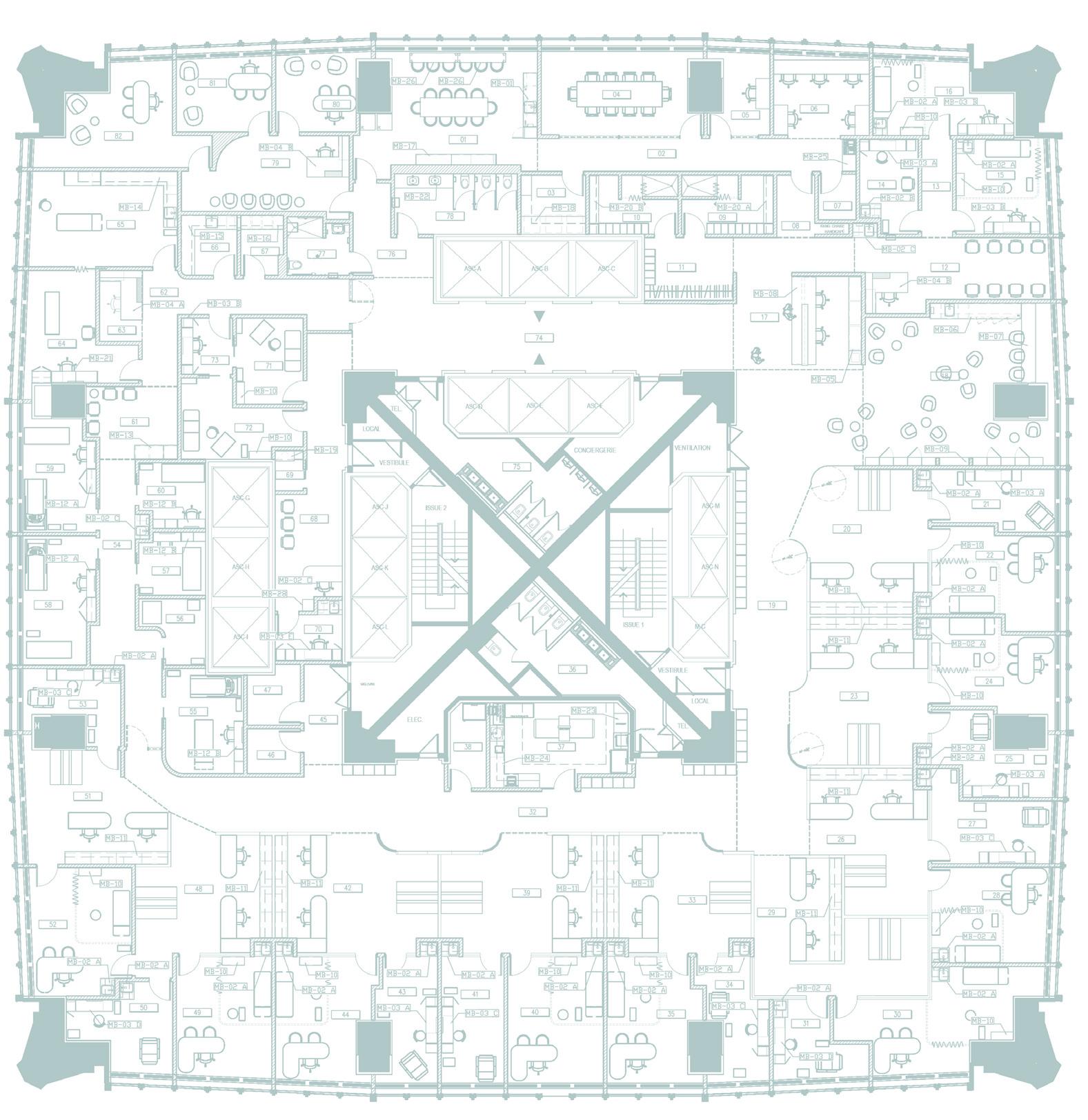
CLINIC’S FLOOR PLAN
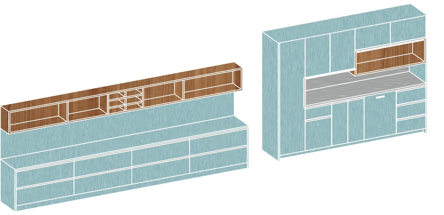
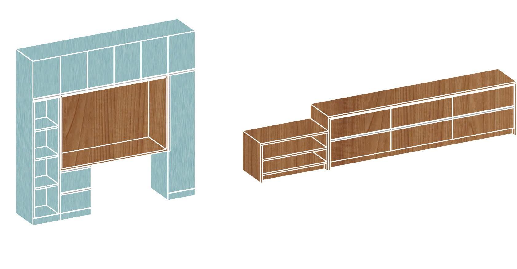
We were tasked with creating a furniture system that would embody an aesthetic appeal suitable for a clinic. One of our central concepts for this clinic was to avoid the sterile look typically associated with medical facilities and, instead, embrace a contrasting approach. This led us to draw inspiration from the cozy ambiance of lake houses, with a focus on materials and efficiency to make it suitable for a medical setting. The resulting 38-piece furniture system reflects this concept through the incorporation of wood at its core, creating small alcoves that introduce a warm and inviting atmosphere to an otherwise clinical space.
J0750 VERDE COMODORO JM STANDARD
1.4 MATÉRIAU EXTÉRIEUR CAISSON TIROIR TABLETTE COUP DE PIED EN STRATIFIÉ AGT DE LA COLLECTION SUBLIME SUPRAMAT 3027 VERT FORÊT
1.5 MATÉRIAU INTÉRIEUR CAISSON INTÉRIEUR TIROIR INTÉRIEUR COUP DE PIED EN MÉLAMINE AVEC FINI ÉRABLE
1.6 BOÎTIER EN STRATIFIÉ FINI FORMICA 3712-NG NOYER
1.7 BACKSPLASH EN CÉRAMIQUE MODÈLE ARVMT010303KG CIOT,FORMAT 0.5 X 3.6
1.8 POIGNÉES RICHELIEU CONTEMPORAINES PROFILÉES POUR PANNEAU DE 5/8 PO 1500 ALUMINIUM
1.9 ÉVIER DE CUISINE SKINDRED LBS6808 SINGLE SINK VOIR SI SOUS COMPTOIR
1.10 ROBINET GROHE SINGLE LEVER SINK MIXER 1'', MODÈLE 32665001
1.11 MODÈLE DE LAVE VAISSELLE À DÉTERMINER AVEC LE CLIENT.
1.12 POUBELLE RICHELIEU CENTRE DE RECYCLAGE CARGO II MODÈLE 8461440100.
1.13 MODÈLE DE MICRO-ONDES À DÉTERMINER AVEC LE CLIENT.
1.14 DISTRIBUTEUR DE PAPIER AMERICAN SPECIALTIES INC., MODÈLE 0215.
1.15 TOUS LES DÉTAILS SONT À VALIDER AVEC LE CLIENT FABRICANT.
1.16 TOUTES LES COTES SONT SUJETTES À VÉRIFICATION SUR LE SITE.
1.17 L'ÉBÉNISTE DOIT FOURNIR LES ÉCHANTILLONS DE TOUS LES FINIS DES MEUBLES À CONSTRUIRE.
1.18 DES DESSINS D'ATELIER DEVRONT ÊTRE FOURNIS POUR TOUT LE MOBILIER.
1.19 VALIDER TOUTES LES FICHES TECHNIQUES DES ÉLECTROMÉNAGERS ET APPAREILS DE PLOMBERIE POUR L'INSTALLATION, LE POSTIONNEMENT,
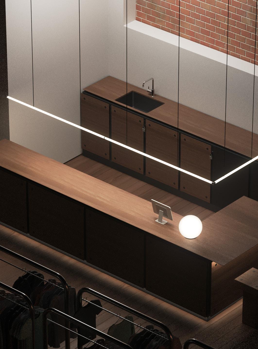
EMPLOYEES KITCHEN TECHNICAL PLANS
EXEMPLES
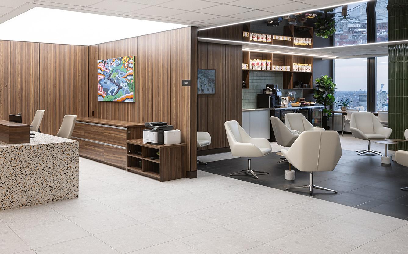
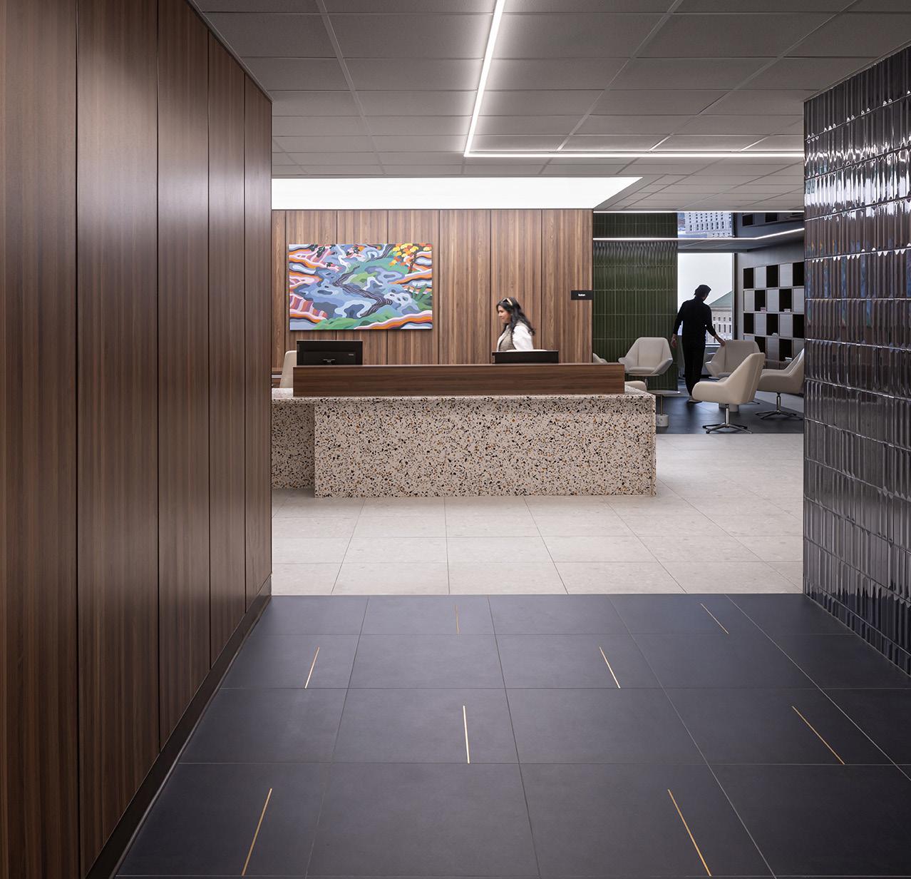
Construction concluded in the summer of 2023, and the project was awarded the Gold Prize at the Grand Prix du Design, a prestigious Canadian award for architecture and design firms, with photography by Stéphane Groleau. The clinic’s primary concept was to create a unique customer experience that breaks away from the traditional, sterile atmosphere of typical clinics. The client envisioned a space with a homely ambiance, deliberately avoiding sterile cubicles. To bring this vision to life, perforated metal sheets were used to define different areas, allowing natural light to flow freely throughout the space.
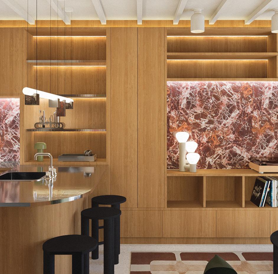
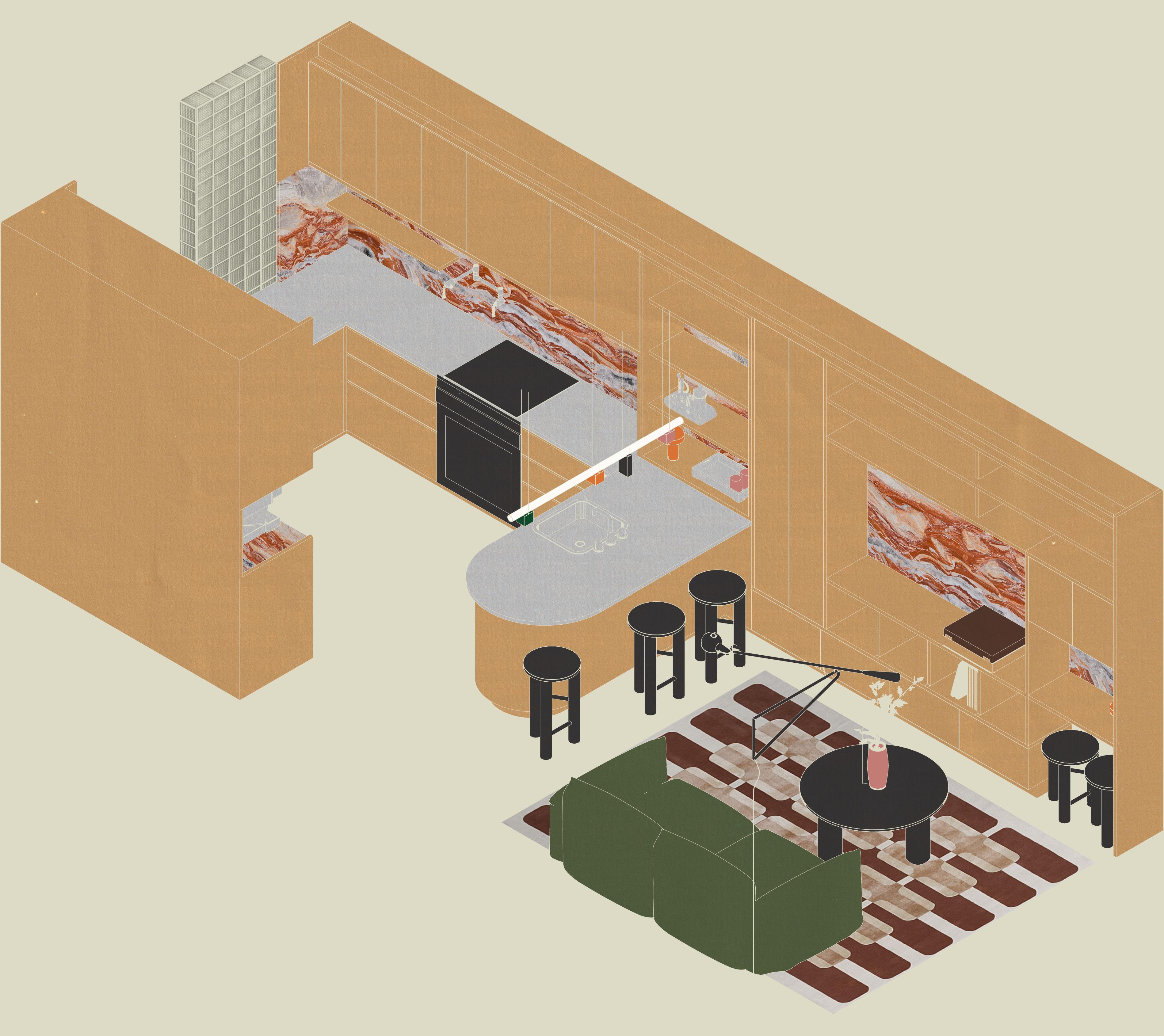
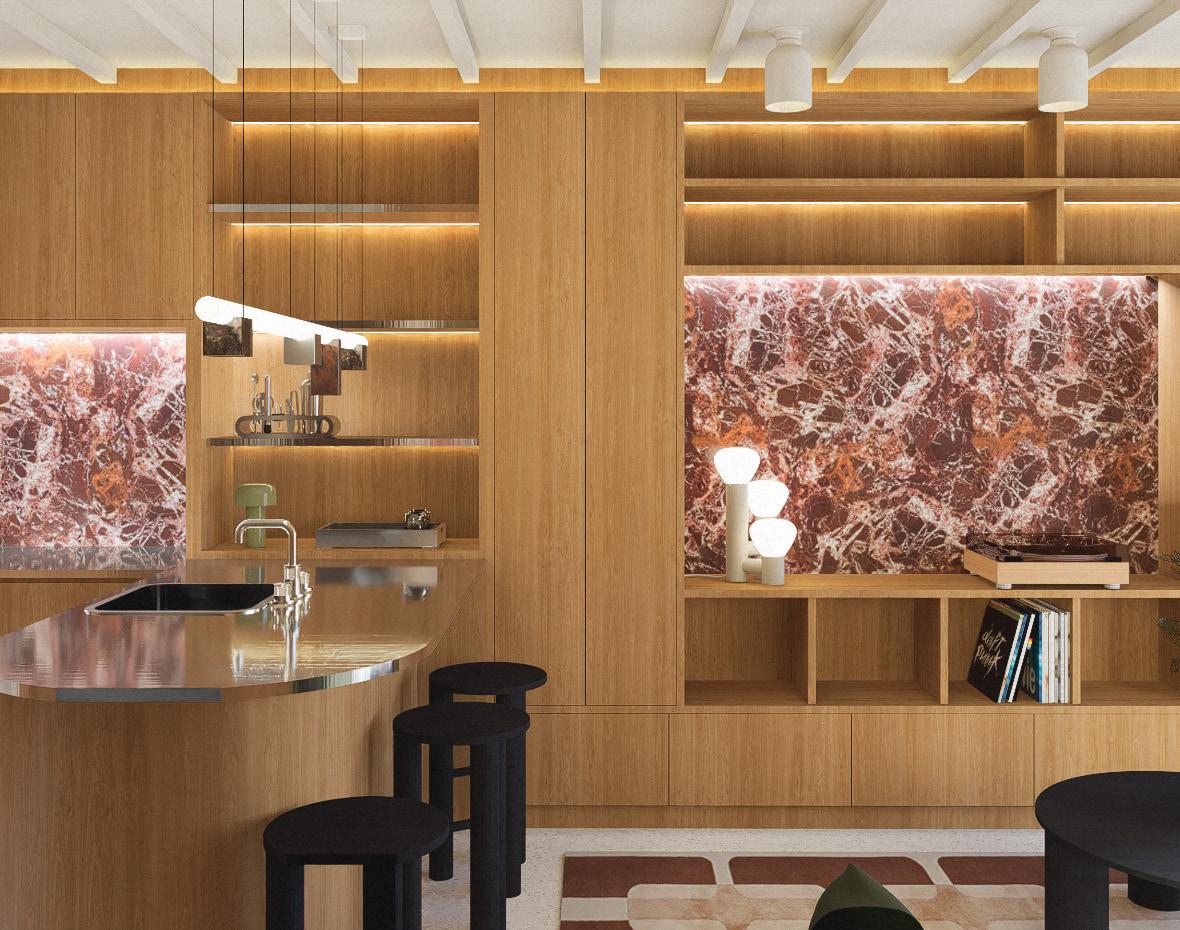
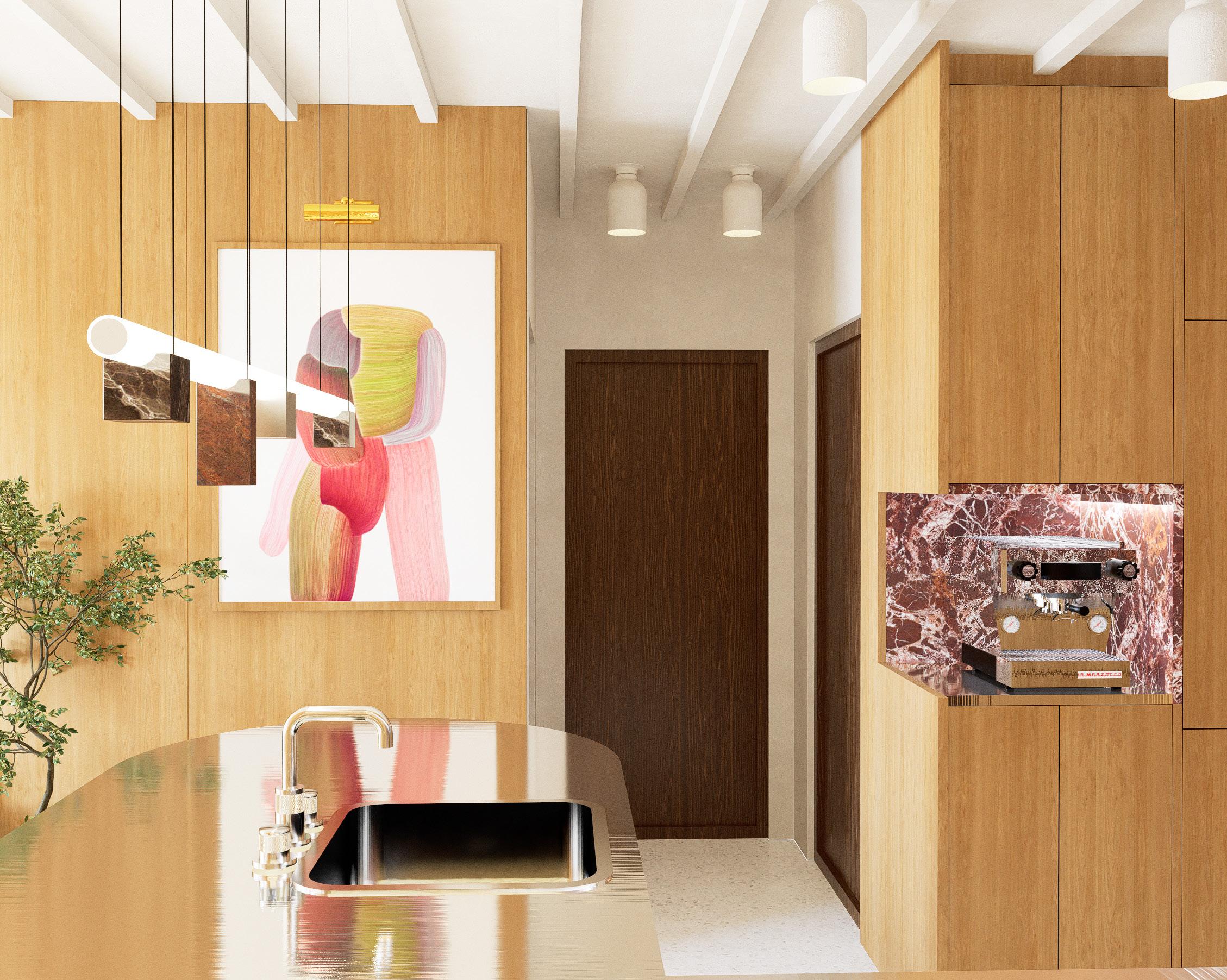
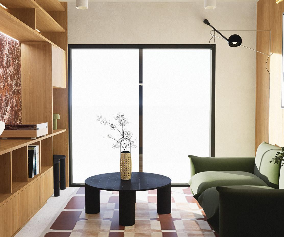
The mandate for this project was to envision the living area of an apartment designed for the writer and fashion blogger Aimee Song. Aimee is a sophisticated individual who frequently travels. By closely examining the influencer’s social media accounts, it becomes evident that she has an affinity for high-quality materials. While her fashion style isn’t excessively extravagant, her wardrobe consists of well-crafted pieces made from beautiful fabrics. For her living area, I aimed to capture a sense of luxurious warmth by incorporating warm woods and various shades of red and brown. The open kitchen design facilitates the flow of natural light, allowing Aimee to entertain effortlessly without the need to navigate through the space.
The plan depicts a furniture layout for a suite that includes a bedroom, balcony, walk-in closet (WIC), bathroom, and living area. The layout optimizes space and functionality within approximately 266.4 square feet of living area, incorporating essential appliances like a fridge, stove-oven, and dishwasher. The arrangement emphasizes efficiency and flow, ensuring each section serves its purpose while maintaining a cohesive design. The balcony and storage spaces further enhance the usability of the suite, aligning with a thoughtful, spacesaving approach.
The concept for this room was to create a lived-in space with personality and a strong sense of style, resembling a hospitality project designed as a home. Since the user is someone who likely won’t be there yearround, it was important to infuse the space with a meaningful story and make it as personal as possible. Given that it is a small room, it was crucial to incorporate as many functional elements as the space would allow, which led to the inclusion of the wall shelf system. This feature creates a sense of unity throughout the room and provides ample storage for the user.
Role : Concept, system of furniture , 3D model, graphism
goodee office
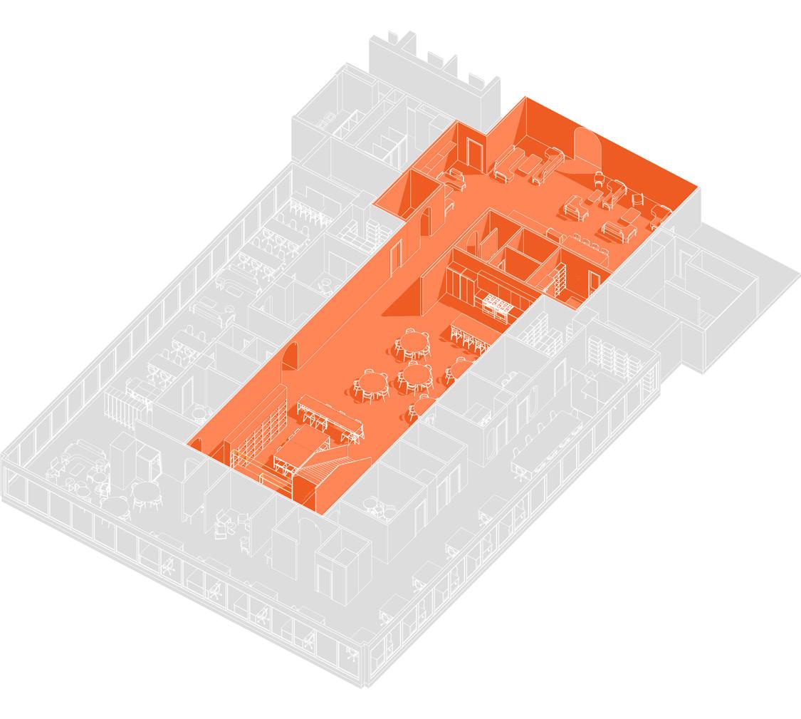
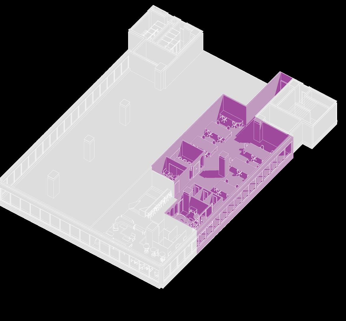
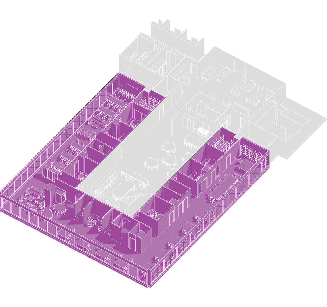
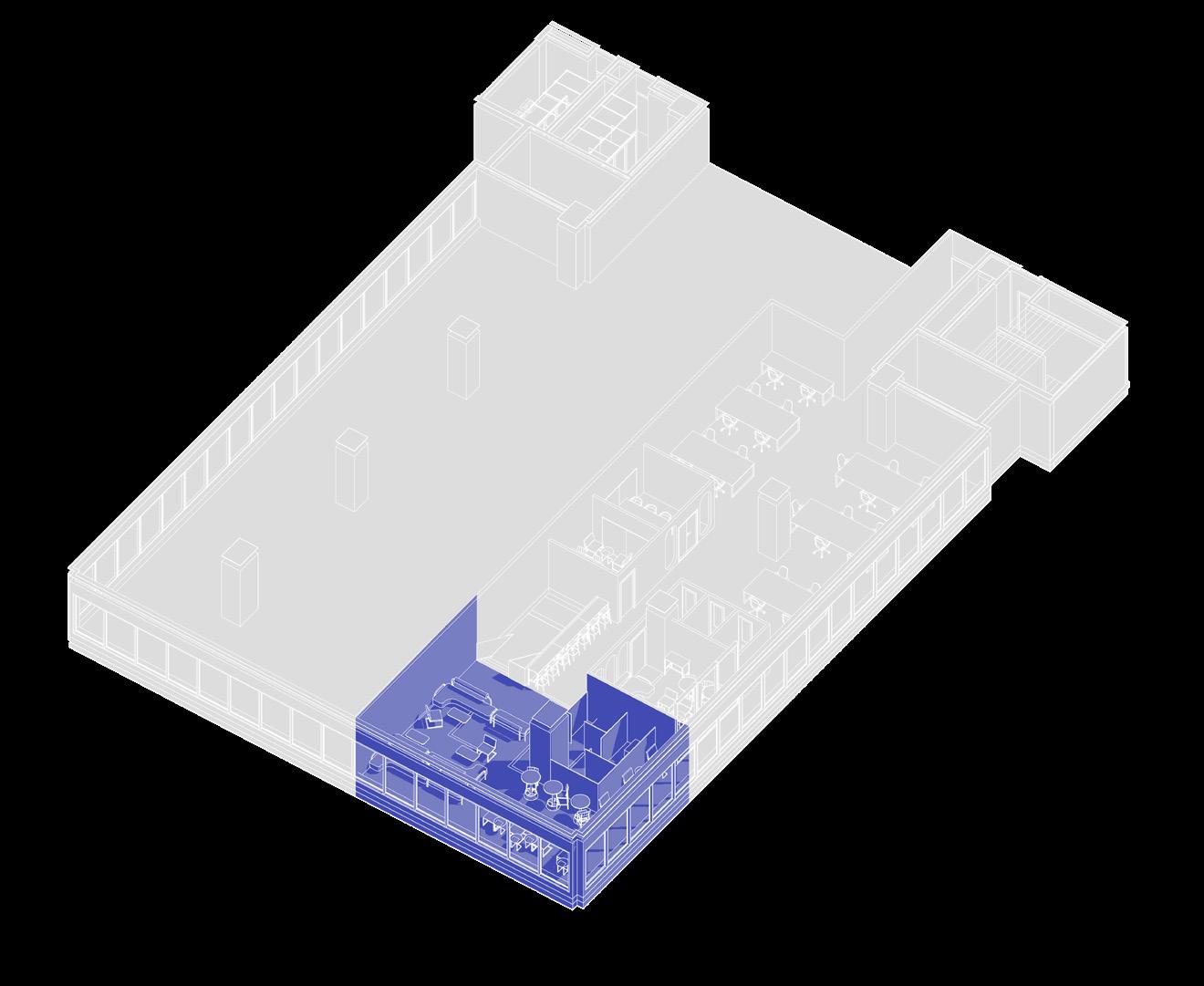
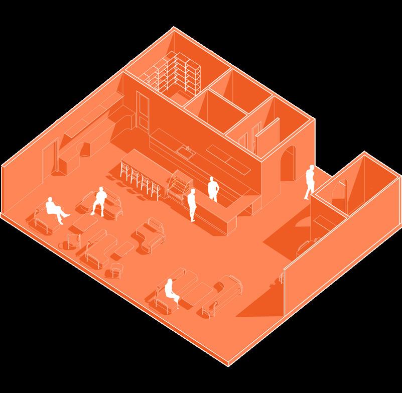
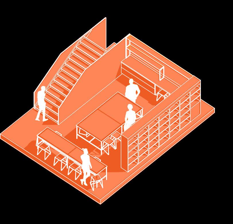
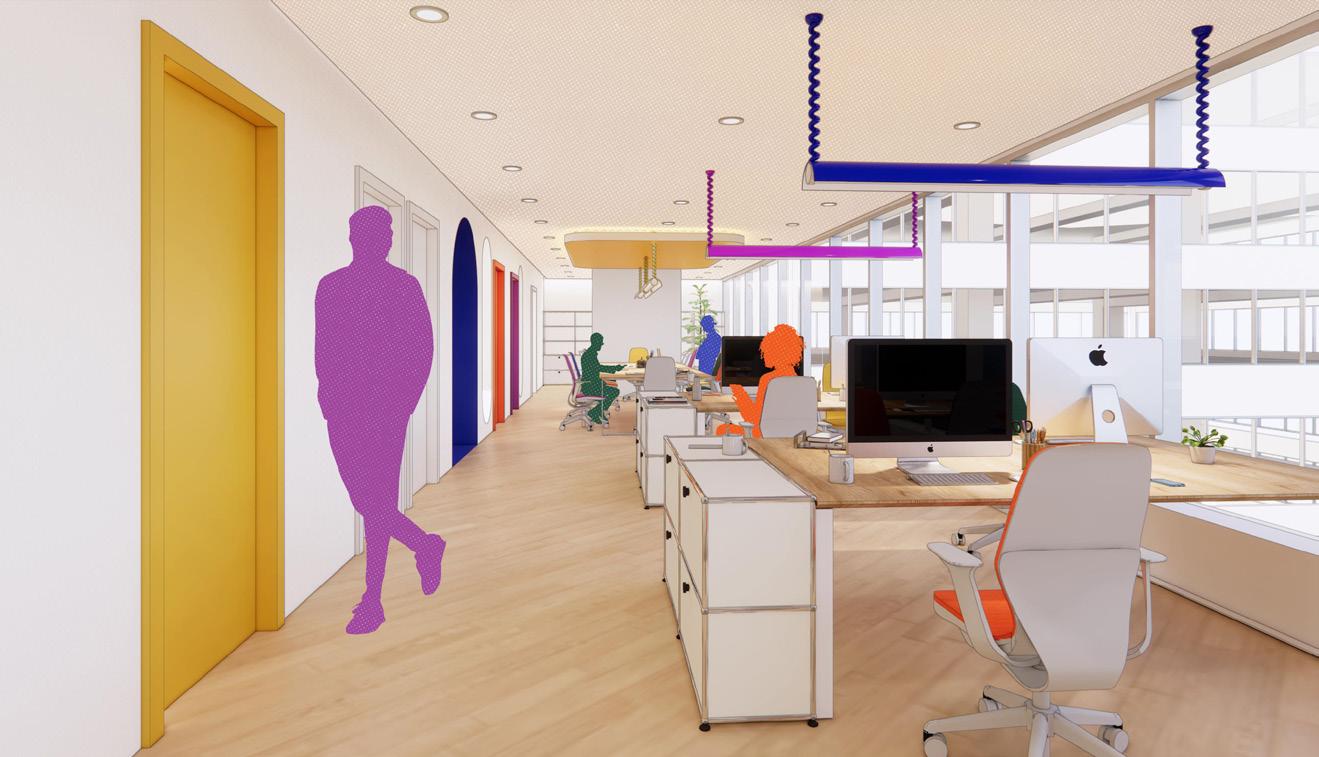
As part of a course on work environments, we were assigned to imagine what the offices of Goodee, a lifestyle objects company founded in 2019 that seeks to counter mass consumption and offers a new way of buying, could look like. Goodee stands out in its identity by focusing on the supplier-customer relationship and 12 ecological, socialcultural and economic commitments. That’s why it seemed ridiculous to propose a traditional office. Furthermore, the pandemic context forced to imagine how the dynamics were going to change when people would return to the office. We were constrained to fit these offices in a wing of 1 Place Ville Marie, which is a financial and commercial hub. Goodee’s way to promote a more ethical consumption seems to clash with Place Ville Marie, which is why our challengewas to transform our very traditional given premises into a space that reflects the brand’s image.
Instead of organizing the office by functions, we decided to twist things around by creating different zones for the different dynamics observed in the office. It was observed that some departments could work mostly from and some others needed the structure of an office to be able to be creative. Which is why we decided to imagine four different dynamics that could offer a different vision of the traditionnal office.
HIGH DYNAMIC : HUMAN RESSOURCES, RESEARCH AND DEVELOPPMENT, MARKETING, COWORKING, CLEANING STAFF
MEDIUM HIGH DYNAMIC : DIRECTION, RECRUITMENT AND TRAINING, SALES, WEB MARKETING, PERMANENT SUPPLIERS
MEDIUM LOW DYNAMIC : FINANCES, ACCOUNTING AND IT DEPARTMENT
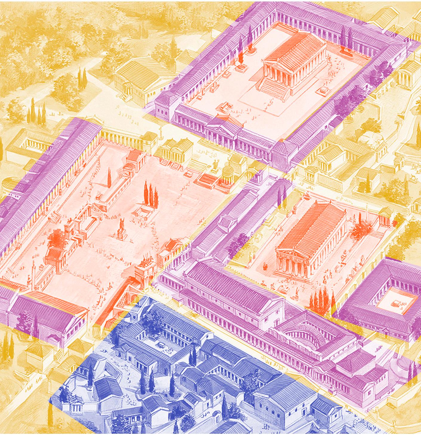
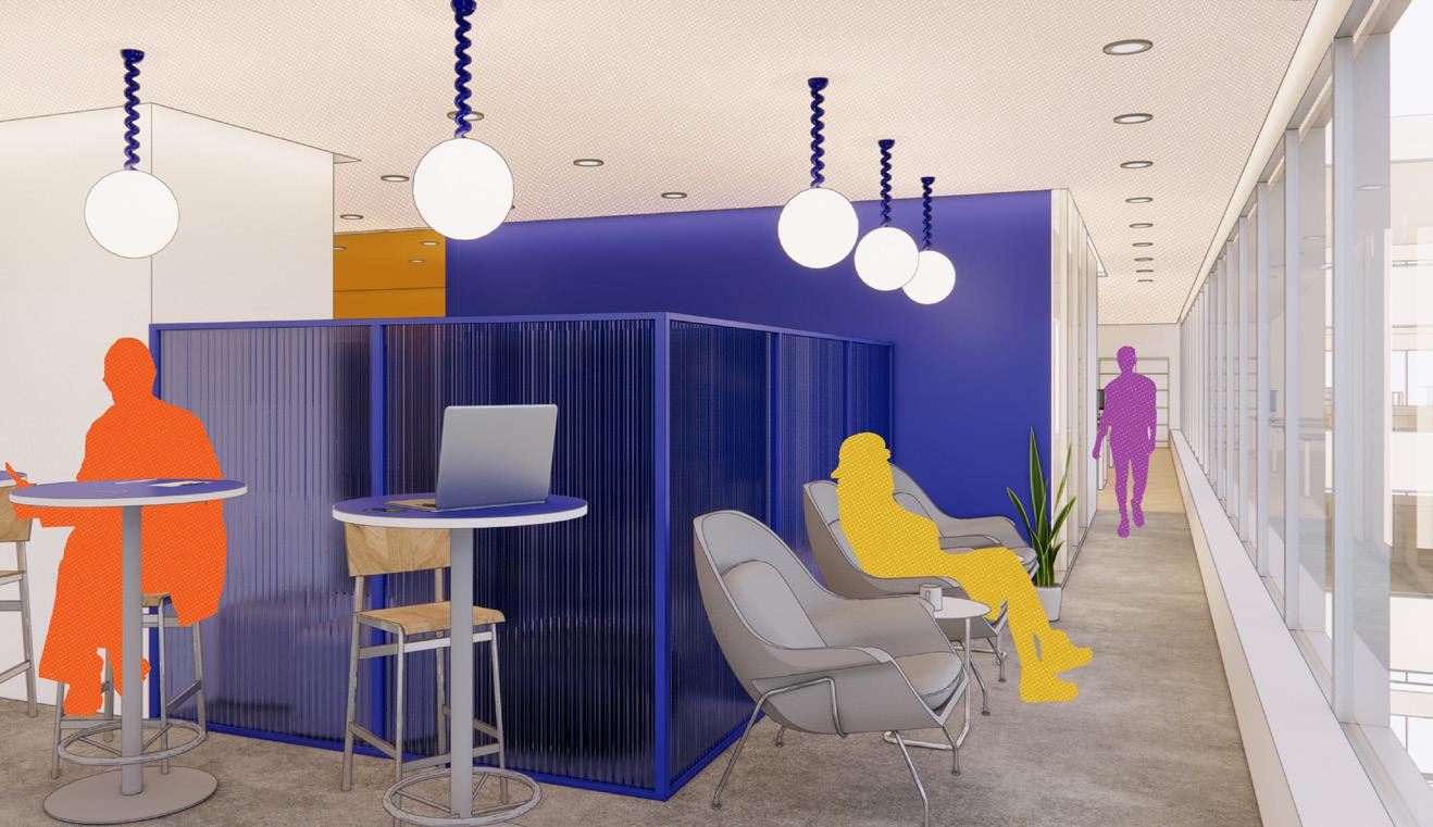
This structure based on dynamics was inspired by the organization of Athens during the antiquity. The city was built around areas that implied a social commitment and this center was surrounded with more intimate spaces such as thermal baths.
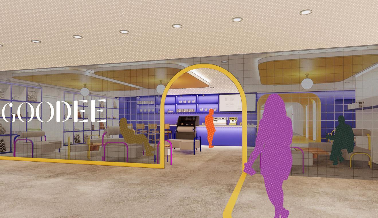
AGORA
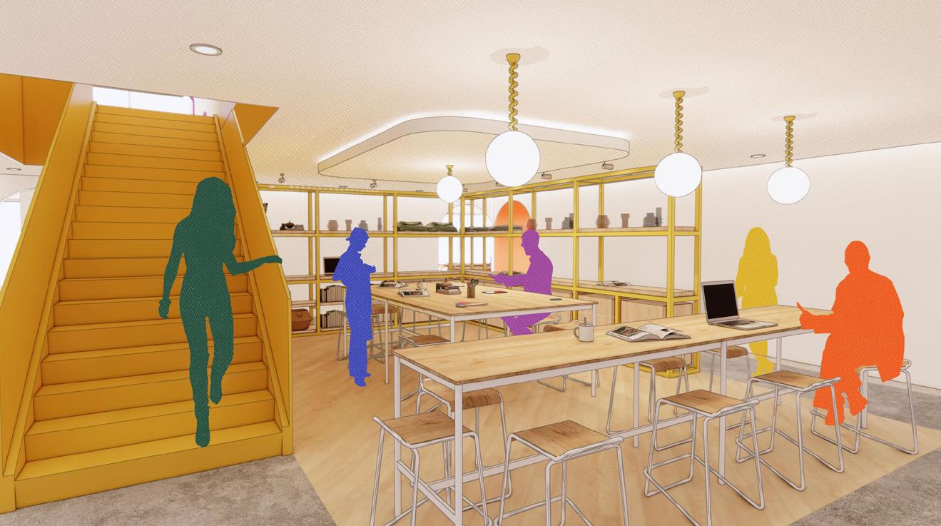
WORKSHOP
BATHS
PRIVACY
AGORA
Time period : Winter 2021
Collaborator(s): William Cloutier
Softwares : Autocad, Revit, Lumion, Photoshop
Client : School project
Role : Concept, technical plans 3D model, graphism
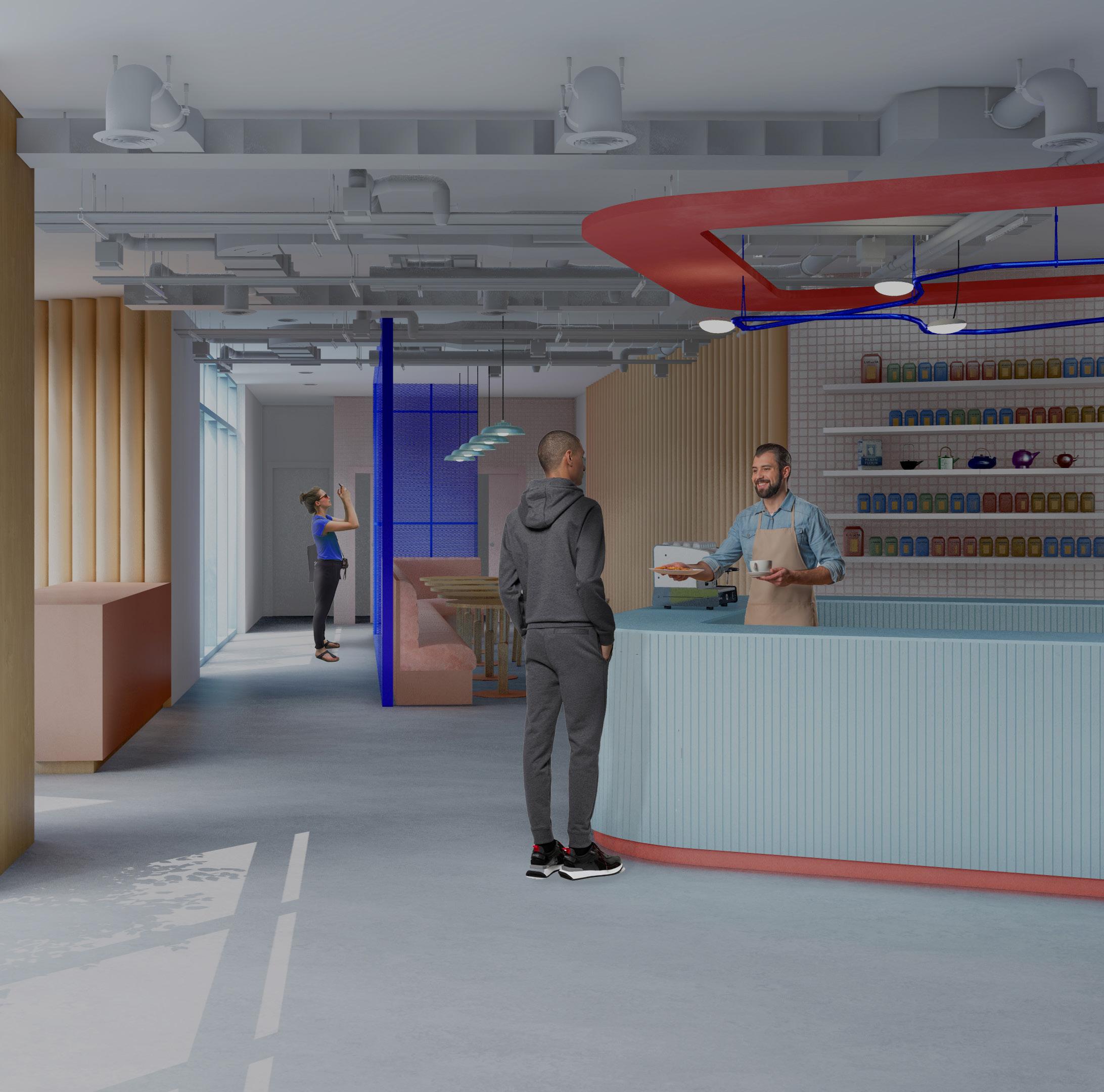
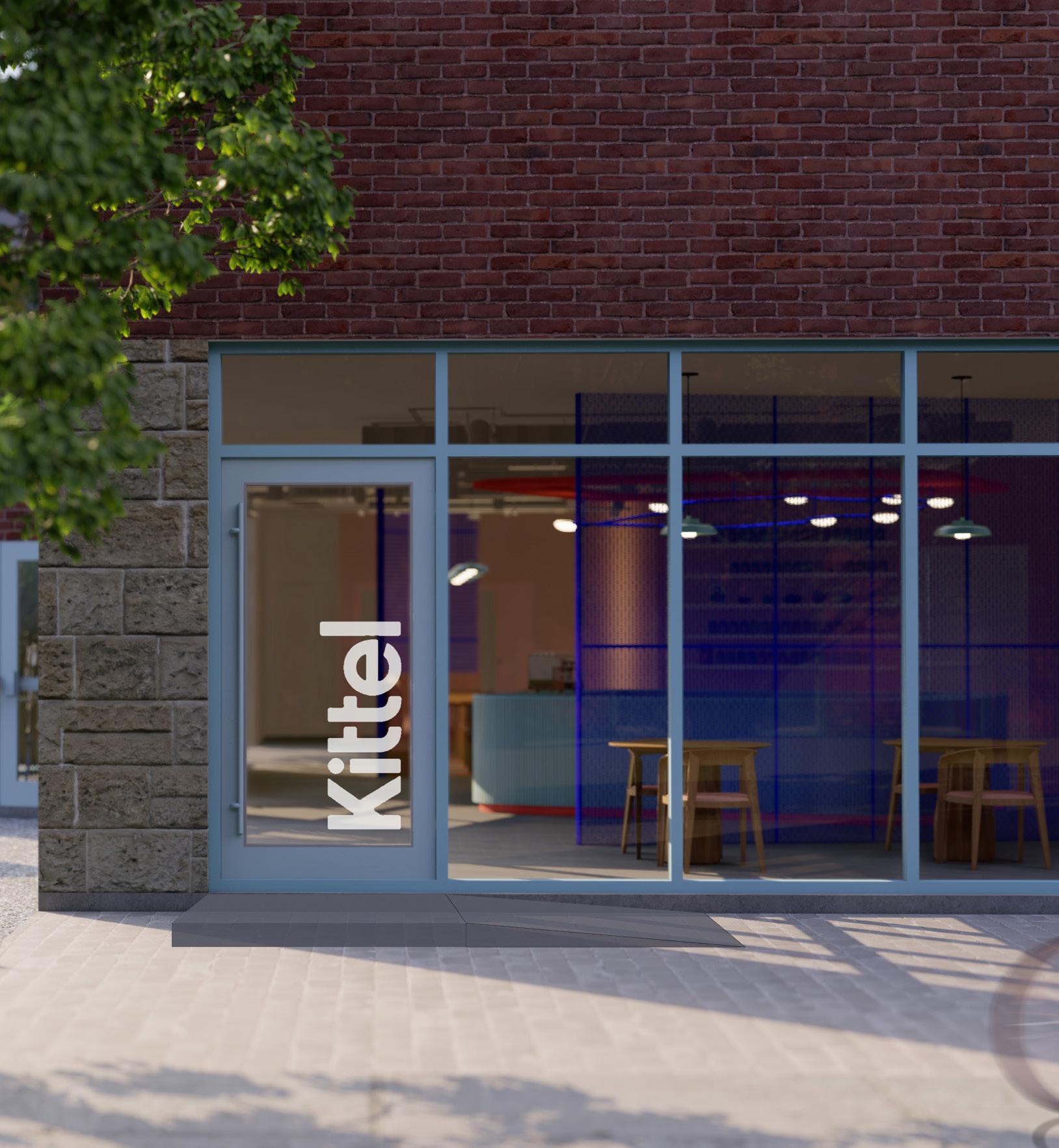
kittel café
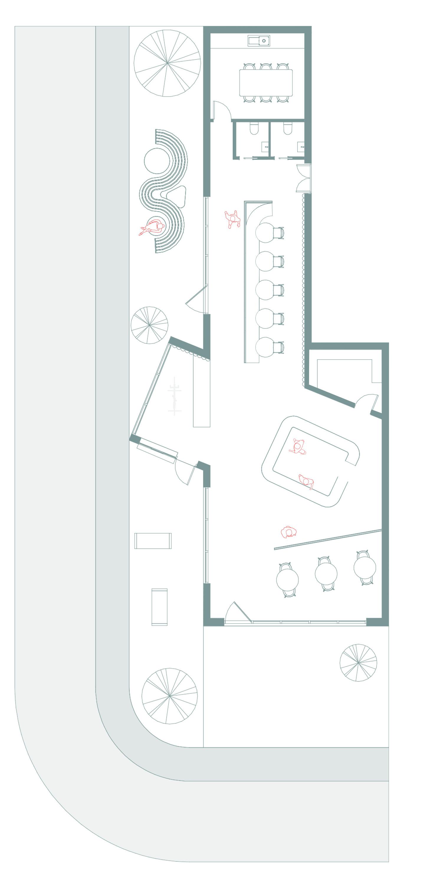
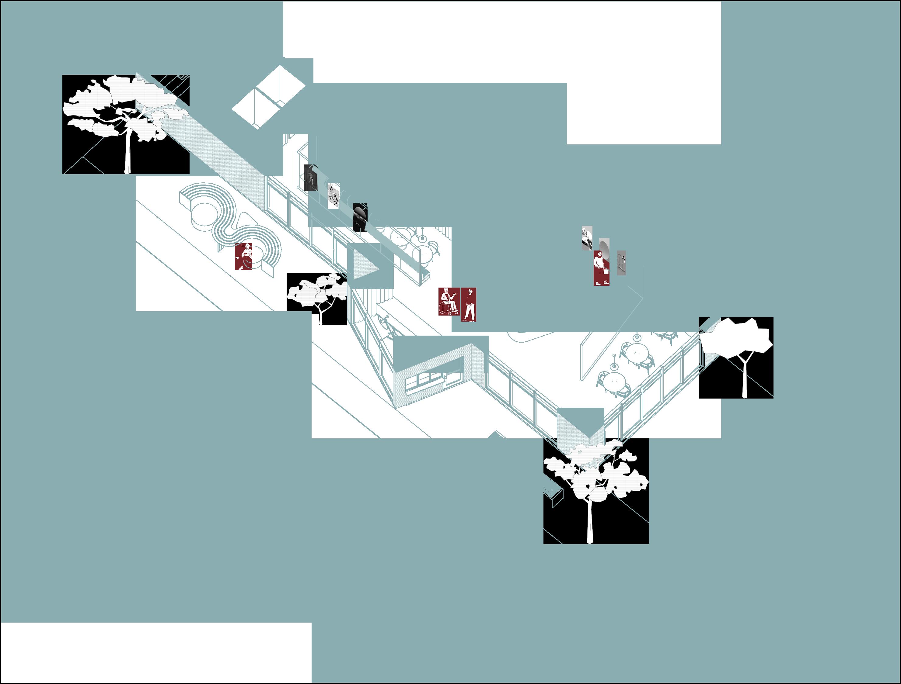
For this project, the mandate was to design a cafe in collaboration with the Montreal-based coffee brand Kittel. Kittel is a specialty coffee roaster located in Montreal. They make the effort to transparently source their coffee often through direct trade partnerships from organic farms. The location of the cafe is in the Plateau neighborhood of Montreal, which is a trendy neighborhood. It was necessary to both maintain the identity of the brand and give it a unique purpose that would serve the community. By studying the location demography, we decided to focus on two activities dear to the residents of the Plateau: cycling and community life. To do this, we added a bike repair space to the cafe as well as a drive-through. For community life, we integrated local product displays and walls with posters created by local artists in order to create a space to share and exchange and get to know your neighbors .
1 ENTRANCE
2 SEATING AREA
3 COUNTER / BAR
4 LOCAL ARTISTS GALLERY
5 BIKE REPAIR SHOP
6 COWORKING SPACE
7 TOILETS
8 EMPLOYEES ROOM
9 GARDEN
for the plan, we decided to prioritize circulation and allow the customer to walk around freely and allow the furniture to create a different journey for every person. we try to make a connection between the outside and the inside and between the different dynaimcs inside the cafe.
It was important for us to represent graphically our intentions. we wanted our concepts to be concise enough that they could be simply drawn or explained.
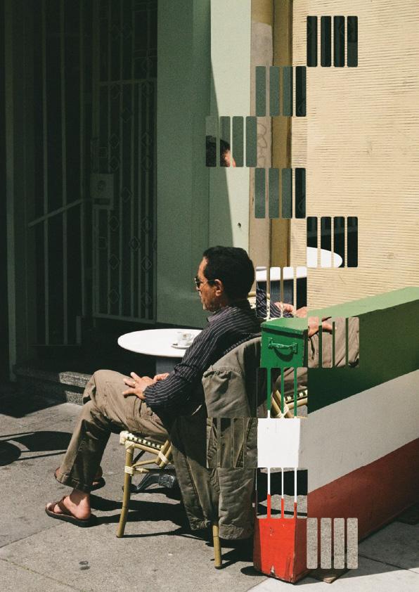
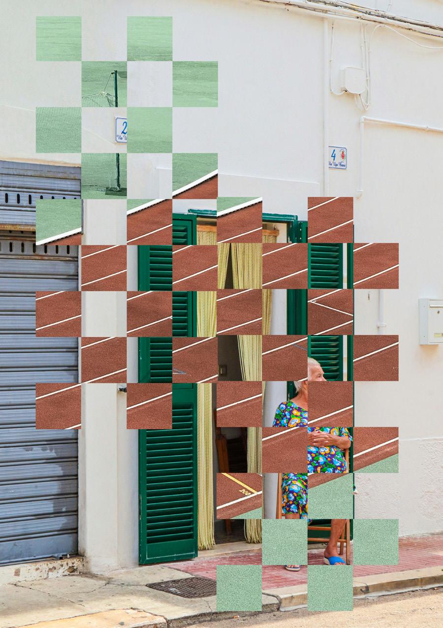
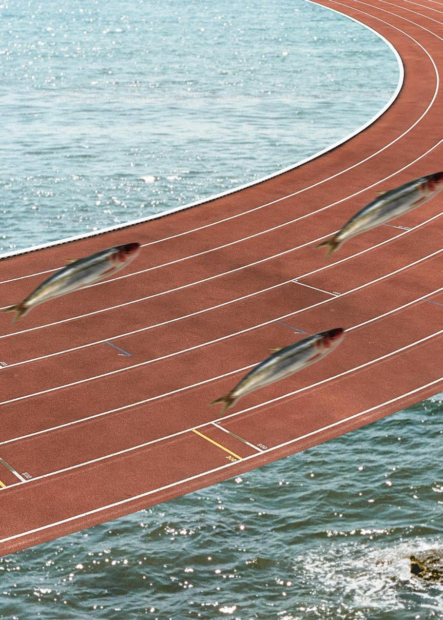
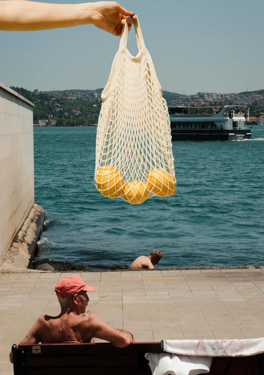
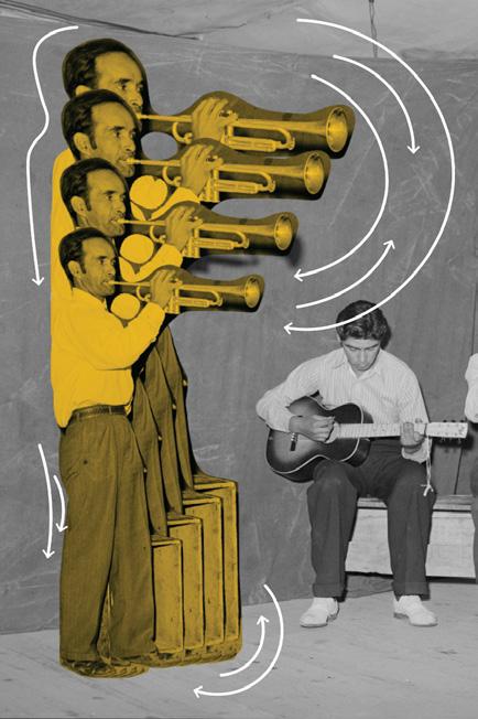
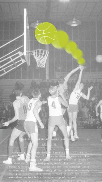
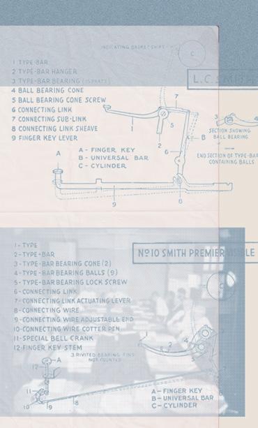
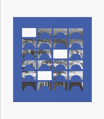
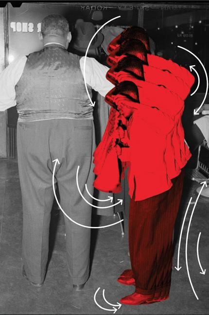
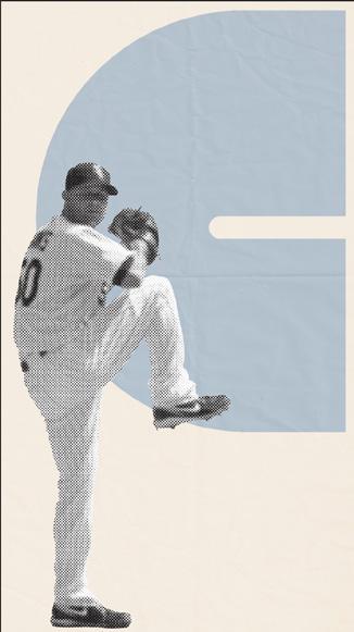
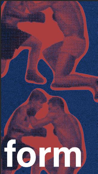
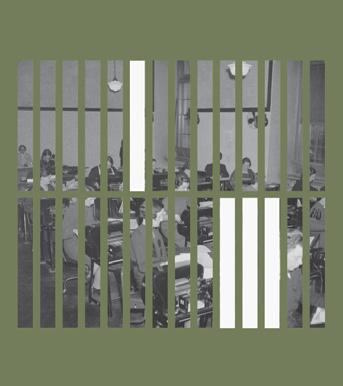
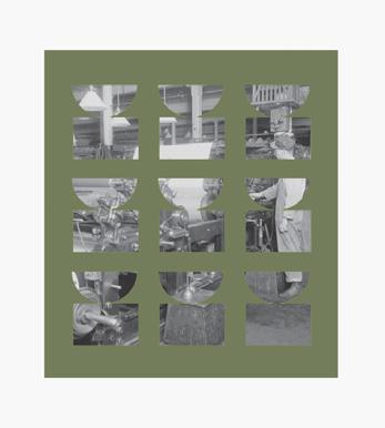
During my studies, I discovered a special interest in exploring graphic design and experimenting with various software tools. What began as a personal passion quickly transformed into tangible creations, as I took on the design of posters and flyers for professional purposes, whether for internships or school events. In each of these works, I strived to reflect my personality, blending creativity with effective communication. This dedication and attention to detail eventually opened doors to real-life projects as an art curator and director. I was fortunate to lead artistic direction and production for hospitality projects across Canada and the US, further enriching my design experience with real-world impact.
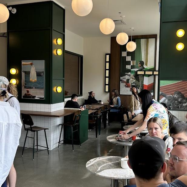
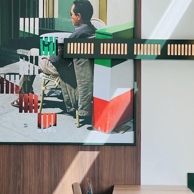
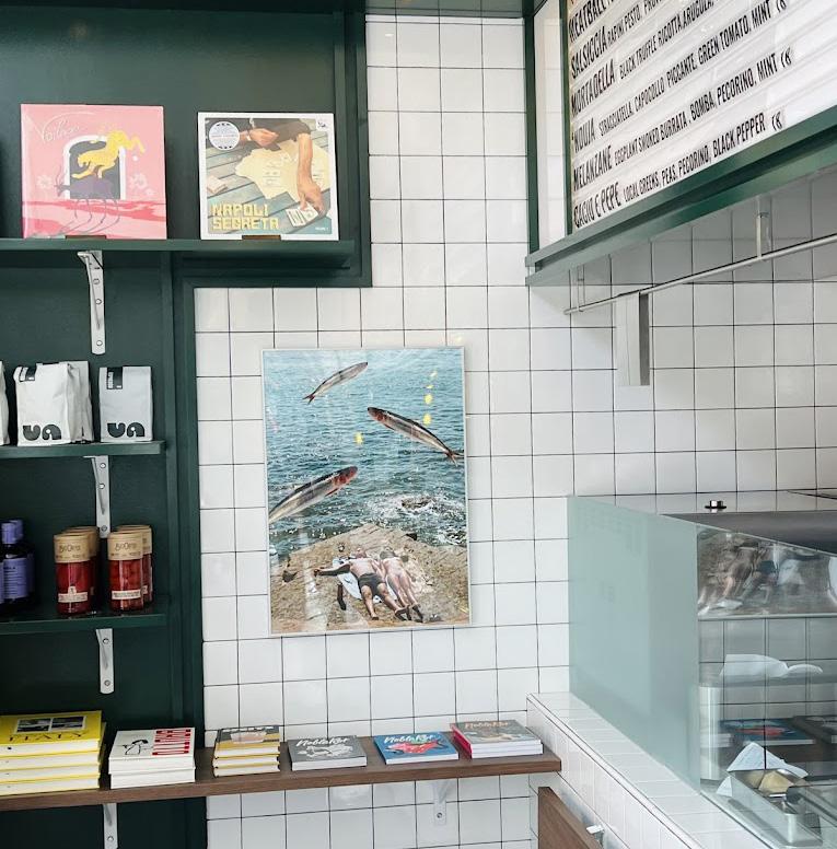
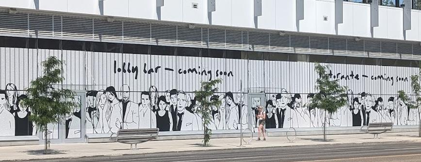
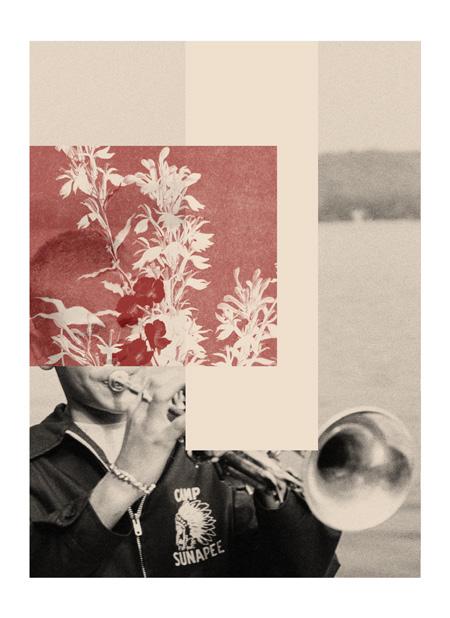
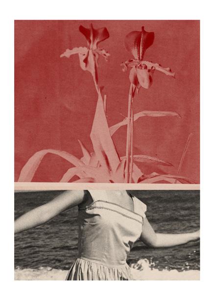
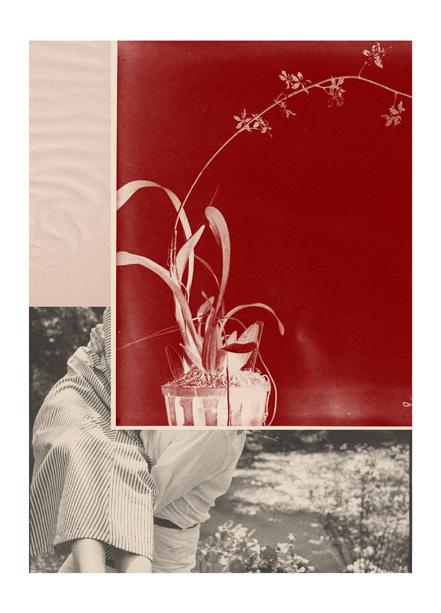
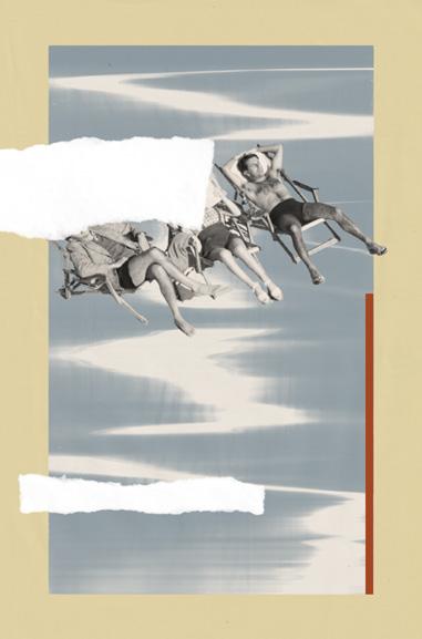
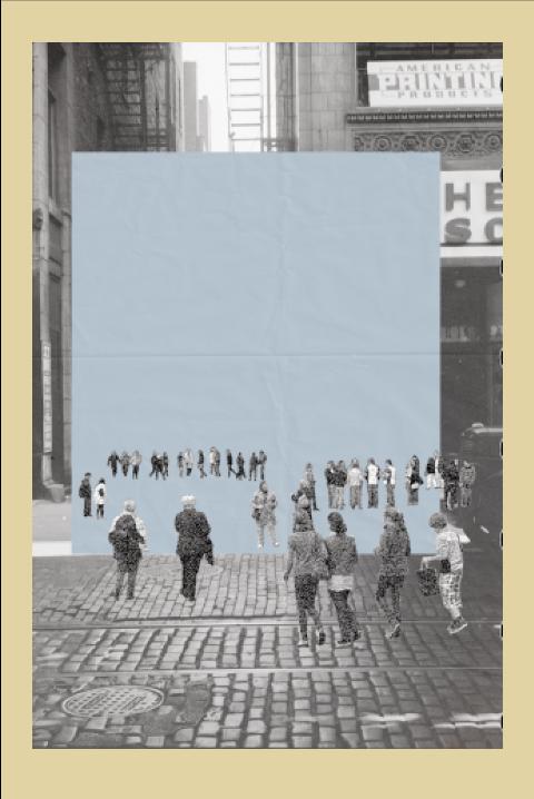
I was commissioned by Ste. Marie to produce artwork for the coffee shop VA!, which opened this summer in Edmonton, Canada. For this project, I sourced archival imagery and crafted a summery Italian dreamscape. Subsequently, I was also tasked with creating a large mural, as seen on the lower left, to conceal ongoing construction from the public for three months. ITERATIONS
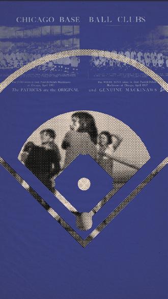
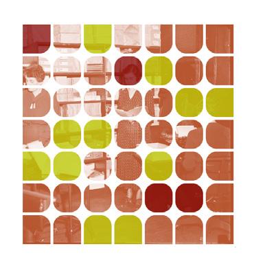
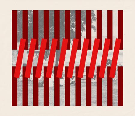
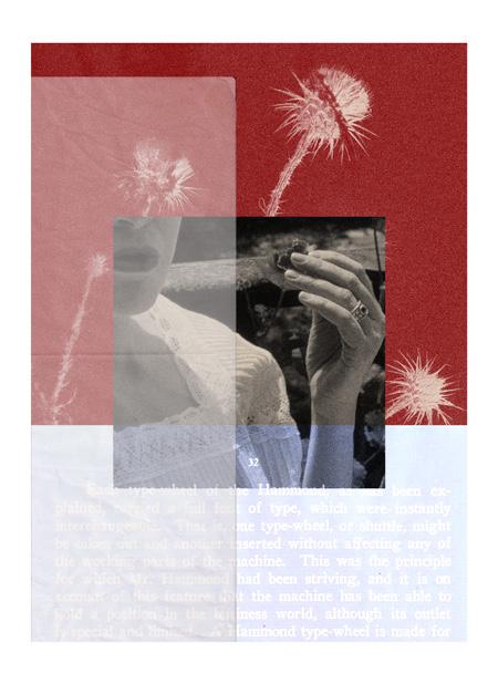
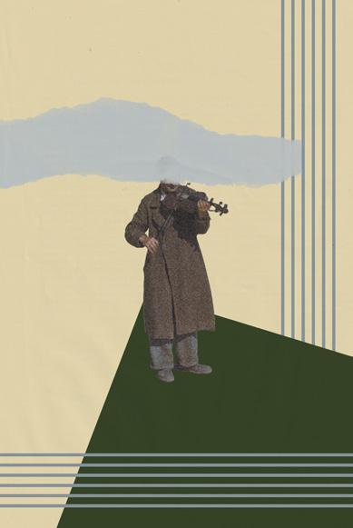
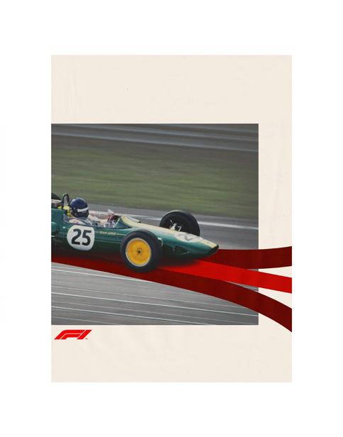
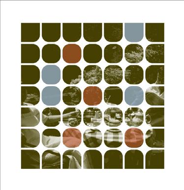
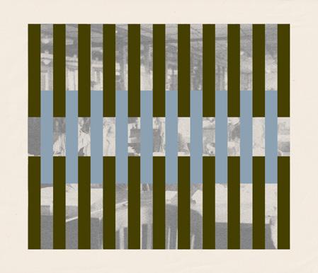
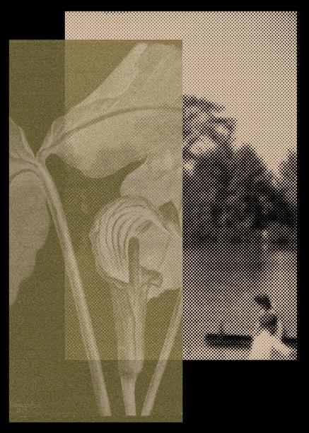
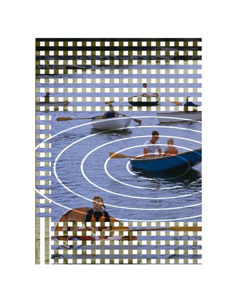
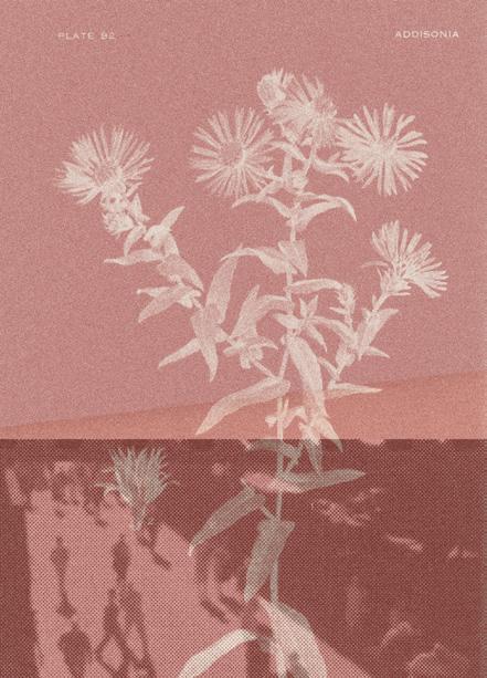
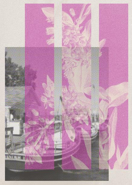
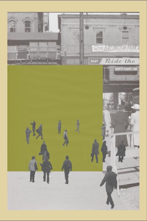
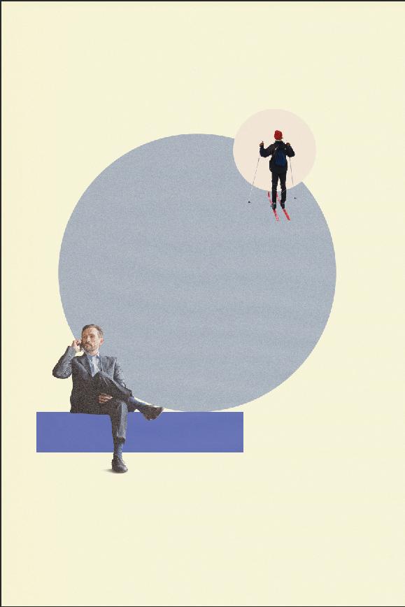
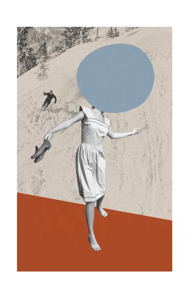
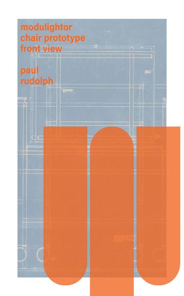
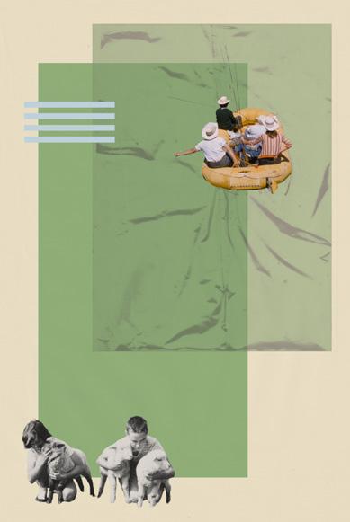
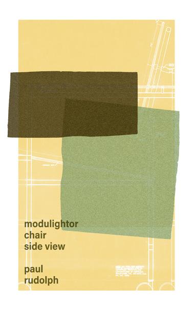
The project involved creating over 60 artworks for an office space located within a historical building in the center of Chicago, designed with a mid-century modern aesthetic. The overall vibe of the posters conveys a blend of nostalgic charm and contemporary sophistication. The designs exhibit a cohesive mix of bold colors, dynamic typography, and layered imagery, reflecting mid-century inspirations while retaining a modern edge. The artwork showcases diverse themes, from abstract patterns to scenes reminiscent of classic Americana, all interwoven with a vintage yet vibrant touch. This thoughtful combination results in a harmonious collection that adds character and a touch of whimsy to the space, perfectly complementing the building’s historical essence.