


DESIGN THE FUTURE
Products 2024




DESIGN THE FUTURE
Products 2024


Building
that make a positive impact














Resilient
WE WANT IT BACK
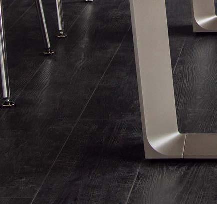
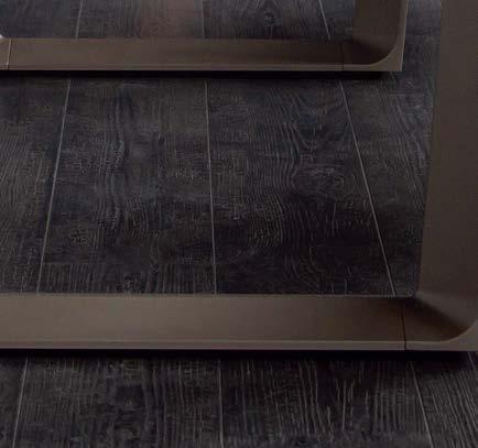
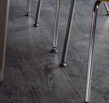
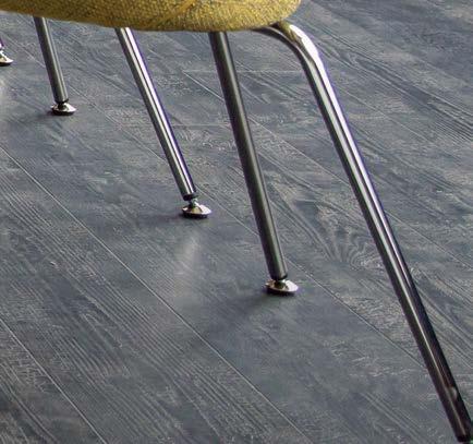
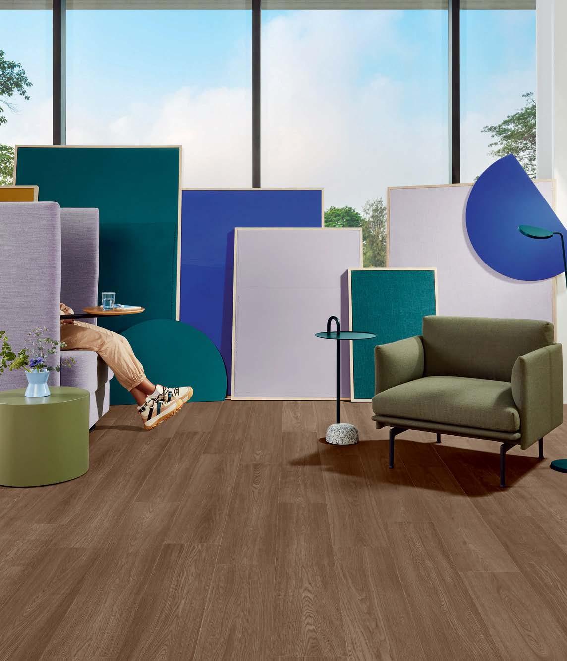
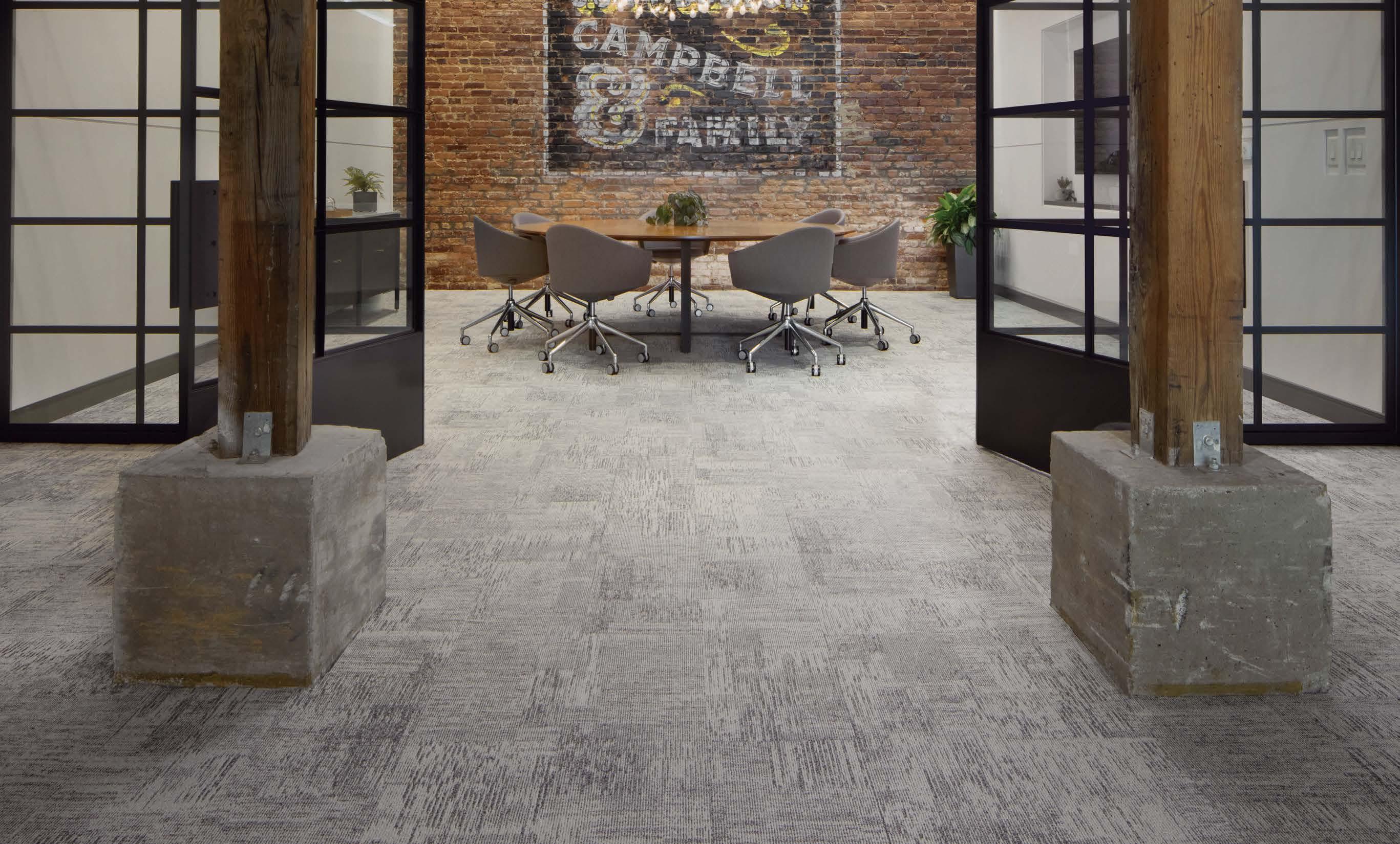
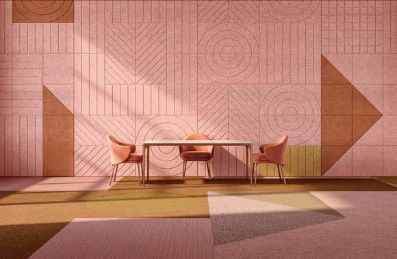
At the end of its useful life, Art + Science can be recycled through our re[TURN]® Reclamation Program and made into new EcoWorx flooring. We’re committed to a circular economy.






Four distinct personalities. All carbon neutral.
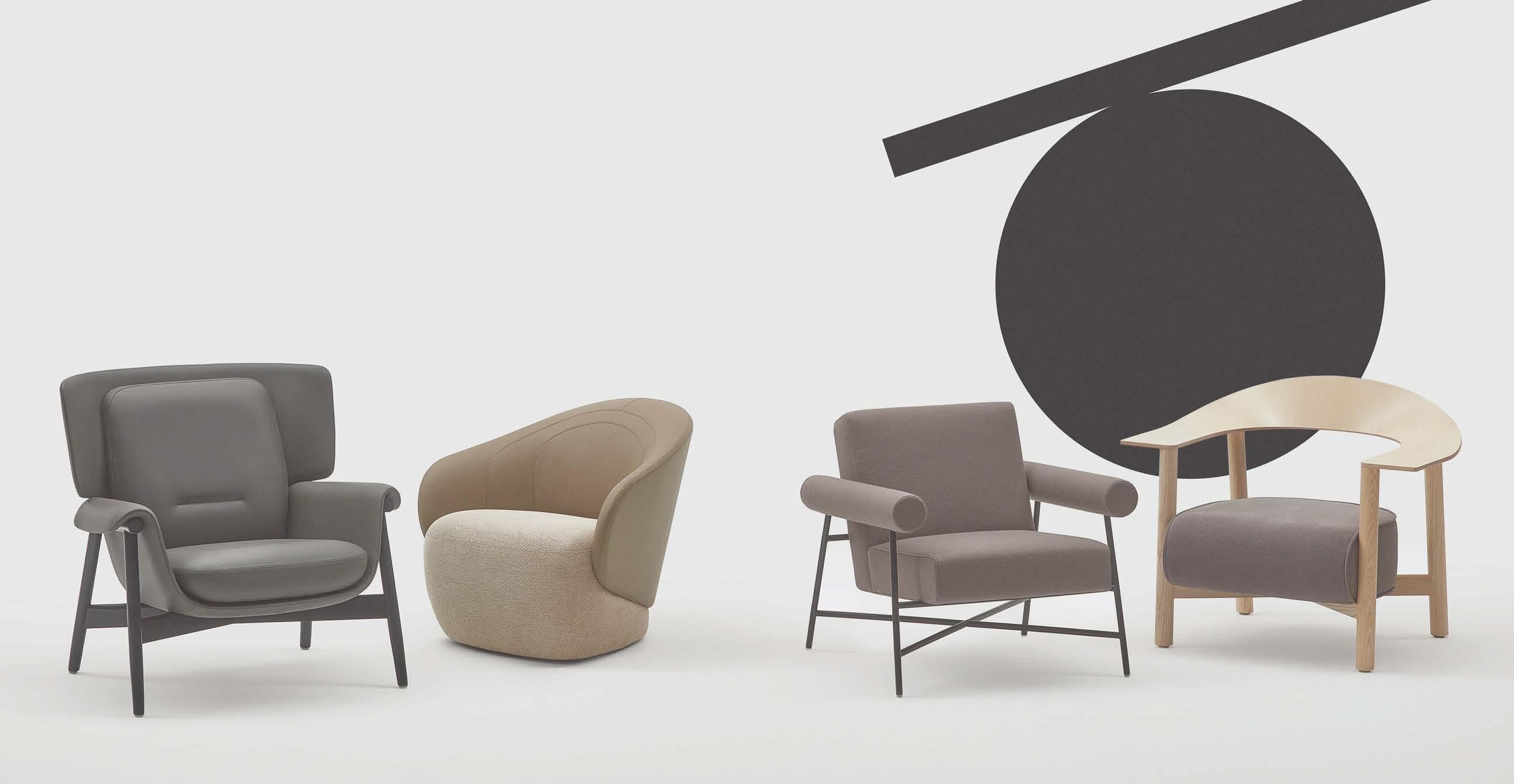
ABL
Created for moments of reflection and focused flow. Designed by EOOS. Made by Keilhauer.
SWISH Built for social interaction. Caster, swivel or glide base. Designed by EOOS. Made by Keilhauer.
TOOB
Crafted at the intersection of comfort and geometry. Designed by EOOS. Made by Keilhauer.
The fluid blend of beauty, functionality and sustainability. Designed by Form Us With Love. Made by Keilhauer.
DAIS




Plush comfort and flexible style.
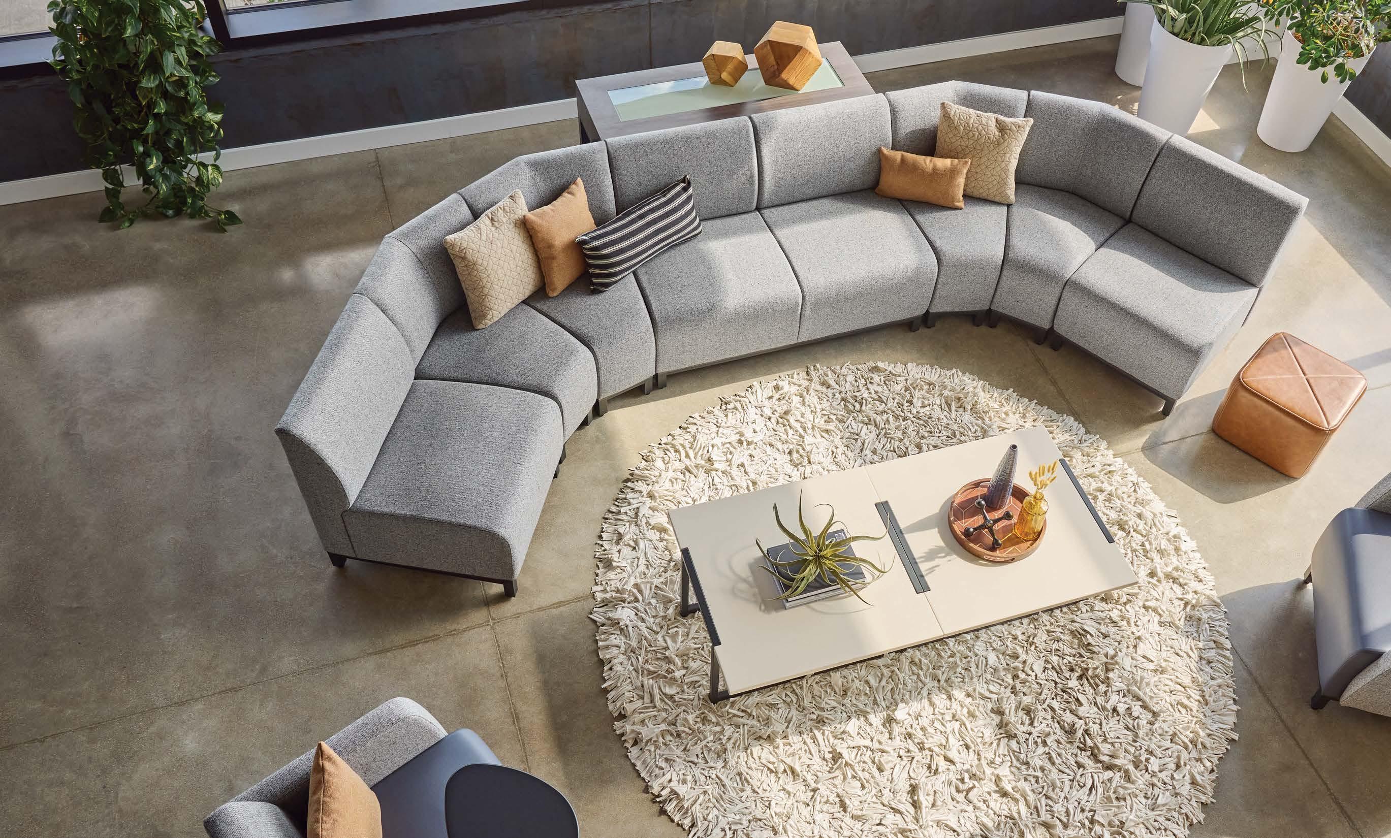
Create straight or serpentine solutions for grand or modest spaces with Swift’s modular lounge collection. With an extensive portfolio of lounge seating and table components, it easily delivers endless configurations and versatility for dynamic spaces.





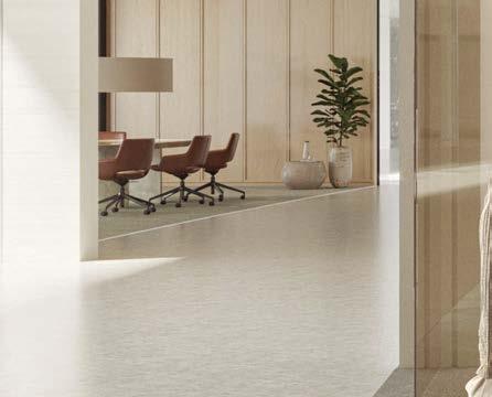
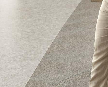
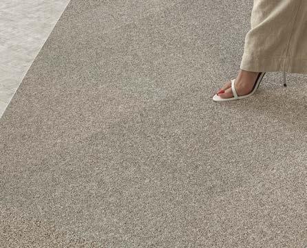


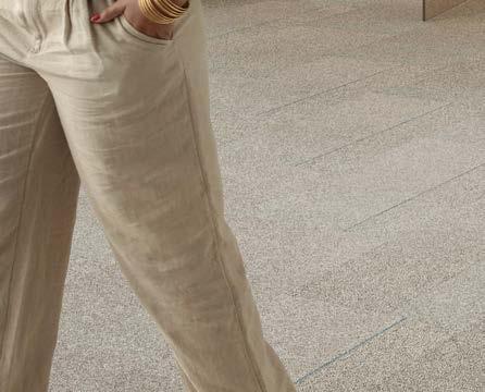

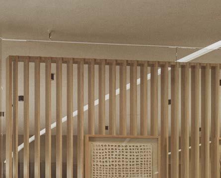
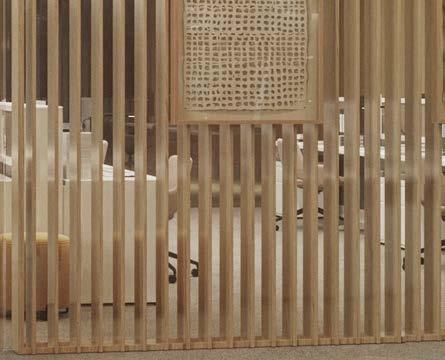
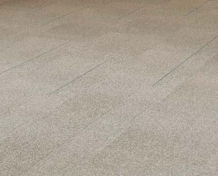
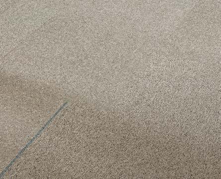


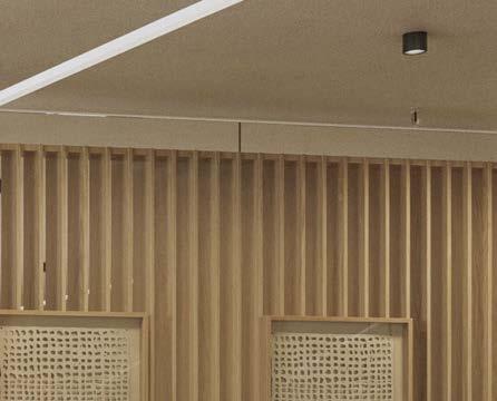
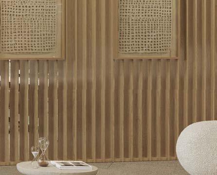
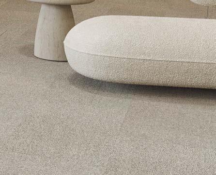




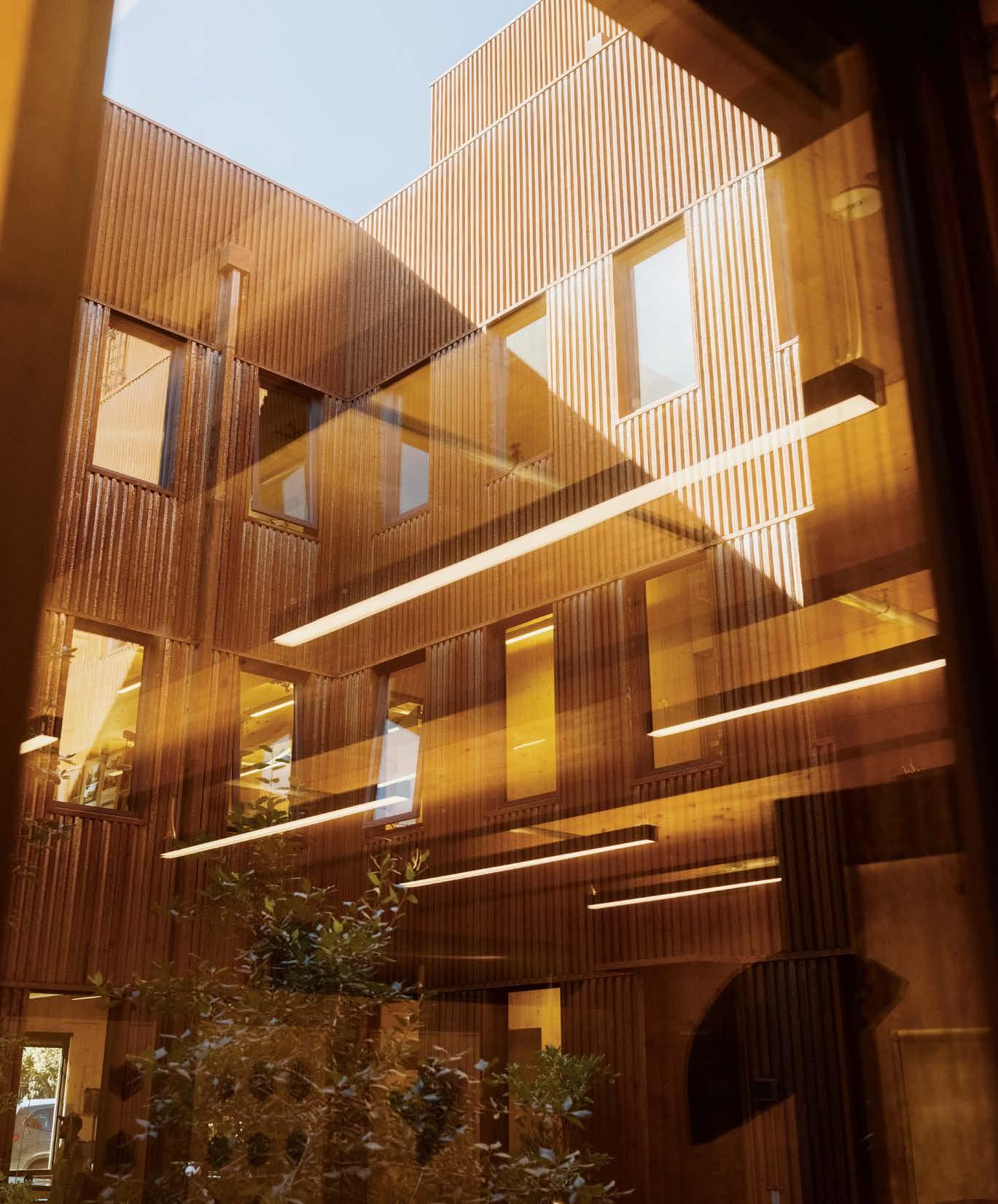
There is a decisive shift towards sustainability in architecture in 2024. The urgency to reduce the construction sector’s CO emissions is driving this change and the solution lies in embracing wood for more than just aesthetics: it’s increasingly recognized as a fundamental architectural material. With its significantly reduced carbon footprint, wood is not just an alternative; it is leading a revolution in sustainable architectural practices.

All-day battery-power integrated into moveable walls and workspaces that liberate you from grid dependency and spatial constraints. Experience the fluidity and flexibility of the Giraª Workplace Collection for today’s dynamic office environments.









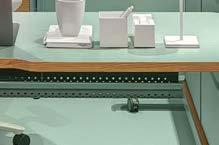


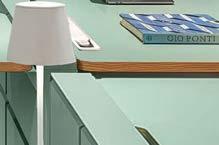
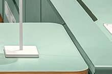











Join Material Bank as a professional member to unlock access to the largest online material library for designers and architects. Order by midnight for next-day delivery, seven days a week.


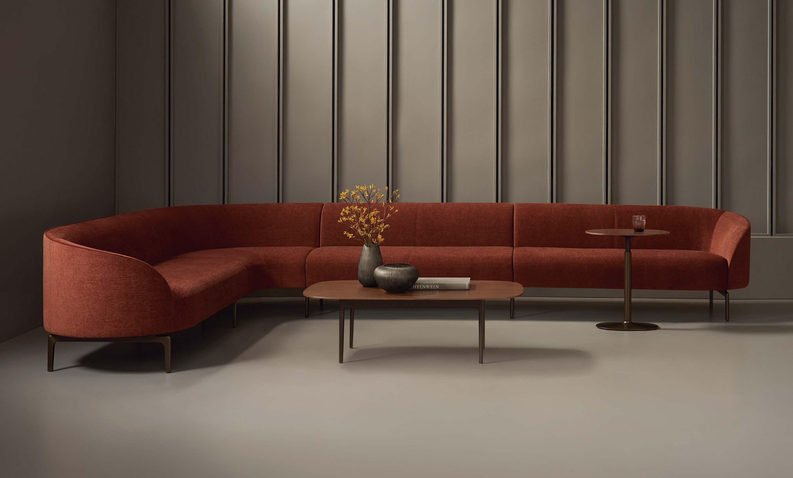
 Arcular Lounge by LucidiPevere
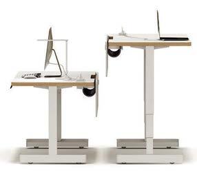
UpToo Laptop Table by jehs+laub
Casen Occasional Table by Anderssen & Voll

122 Framery’s Smart Pods Prioritize Sustainability and Employee Wellness
124 From Ergonomics to Anthronomics: Meet the Anthro Chair
126 How the Furniture Industry is Stepping Up on Circularity
130 Chris Adamick Designs for Life
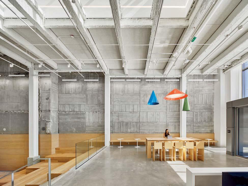
134 Second Act: Google's New York Home
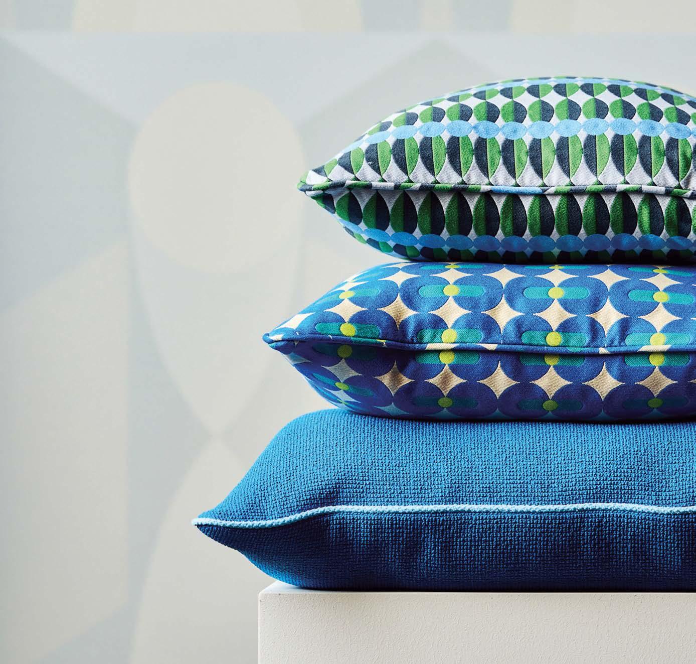
142 Your Brain on Color: Design Trends for Neurodiversity
148 Dreaming at Work: Yinka Ilori Brings Color to the Office
156 A Coworking Space Captures a Community's Creative Spirit
Alder Collection combines biodegradable plastic derived from sugarcane with coffee waste and wood fibers.













EDITOR IN CHIEF Avinash Rajagopal
DESIGN DIRECTOR Tr avis M. Ward
SENIOR EDITOR AND PROJECT MANAGER Laur en Volker
SENIOR EDITOR AND ENGAGEMENT MANAGER Fr ancisco Brown
ASSOCIATE EDITOR AND RESEARCHER J axson Stone
DESIGNER Rober t Pracek
COPY EDITOR Benjamin Spier
FACT CHECKER Anna Zappia
EDITORS AT LARGE Ver da Alexander, Sam Lubell
VICE PRESIDENT, MARKETING & EVENTS Tina Brennan
ADVERTISING DIRECTOR
Tamara Stout tstout@sando wdesign.com 917.449 .2845
ACCOUNT MANAGERS
Julie Arkin jarkin@sandow design.com 917- 837-1344
Meredith Barberich meredith.barberich@sando wdesign.com
Daniel Colunio daniel.colunio@sando wdesign.com
Ellen Cook ecook@sando wdesign.com 423.580.8827
Gr egory Kammerer gkammer er@sandowdesign.com 646.824.4609
Laury Kissane lkissane@sando wdesign.com 770.791.1976
Julie McCarthy jmccarth y@sandowdesign.com 847-567-7545
Colin Villone colin.villone@sando wdesign.com 917.216 .3690
PRINT OPERATIONS MANAGER Olivia Padilla
SENIOR MANAGER, MARKETING + EVENTS
Kelly Allen kkriwko@sando wdesign.com
SOCIAL MEDIA COORDINATOR Zoya Naqvi
GRAPHIC DESIGNER, CREATIVE SERVICES Paige Miller
METROPOLISMAG.COM @metr opolismag

As part of the SANDOW carbon impact initiative, all publications, including METROPOLIS, are now printed using soy-based inks, which are biobased and derived from renewable sources. This continues SANDOW’s ongoing efforts to address the environmental impact of its operations and media platforms. In addition, through a partnership with Keilhauer, all estimated carbon emissions for the printing and distribution of every print copy of METROPOLIS are offset with verified carbon credits.


CHIEF EXECUTIVE OFFICER Erica Holborn
CHIEF OPERATING OFFICER Michael Shavalier
CHIEF DESIGN OFFICER Cindy Allen
CHIEF GROWTH OFFICER and EVP, CLIENT STRATEGY Bobby Bonett
EXECUTIVE VICE PRESIDENT + DESIGN FUTURIST AJ Paron
VICE PRESIDENT, DIGITAL Caroline Davis
VICE PRESIDENT, HUMAN RESOURCES Lisa Silver Faber VICE PRESIDENT, BUSINESS DEVELOPMENT Laura Steele
DIRECTOR, VIDEO Steven Wilsey
CHAIRMAN Adam I. Sandow
CONTROLLER Emily Kaitz
DIRECTOR, CORPORATE FINANCE Jake Galvin
DIRECTOR, INFORMATION TECHNOLOGY Joshua Grunstra
METROPOLIS is a publication of SANDOW 3651 FAU Blvd. Boca Raton, FL 33431 info@metropolismag.com 917.934.2800
FOR SUBSCRIPTIONS OR SERVICE 800.344.3046 customerservice@metropolismagazine.net
SANDOW was founded by visionary entrepreneur Adam I. Sandow in 2003, with the goal of reinventing the traditional publishing model. Today, SANDOW powers the design, materials, and luxury industries through innovative content, tools, and integrated solutions. Its diverse portfolio of assets includes LUXE INTERIORS + DESIGN, INTERIOR DESIGN, METROPOLIS, and DESIGNTV by SANDOW; ThinkLab, a research and strategy firm; and content services brands, including The Agency by SANDOW, a full-scale digital marketing agency, The Studio by SANDOW, a video production studio, and SURROUND, a podcast network and production studio. SANDOW is a key supporter and strategic partner to NYCxDESIGN, a not-for-profit organization committed to empowering and promoting the city’s diverse creative community. In 2019, Adam Sandow launched Material Bank, the world’s largest marketplace for searching, sampling, and specifying architecture, design, and construction materials.
THIS MAGAZINE IS RECYCLABLE.
Please recycle when you’re done with it. We’re all in this together.


Evan Jenkins is a freelance photographer based in Chicago. Since graduating from the School of the Art Institute of Chicago in 2010 he has built a varied client roster that includes several commercial clients as well as leading arts and culture publications. His unique approach to portraiture and use of vivid color help bring depth and complexity to human interest stories. When he's not busy with photography he's making music, reading, and drawing inspiration from classic films. Jenkins’s photographs of Yinka Ilori are featured in “Dreaming at Work” (p. 148) and on this issue's design-focused cover.


Nigel F. Maynard is a freelance journalist who covers the architecture, design, and construction industry. He spent 14 years at Hanley Wood’s Builder magazine and Residential Architect, was the founding editor of the now-defunct Residential Building Products + Technology, and most recently was editor in chief of Custom Builder and PRODUCTS magazines. His writing has appeared in The Washington Post, Architectural Record, and The Architect’s Newspaper, among other publications. Maynard is also an amateur woodworker and cabinetmaker. For this issue Maynard covered Elkus Manfredi Architects’ transformation of a Cold War–era bunker into a children’s health institute (p. 62).
Audra Melton is a documentary and portrait photographer based in Atlanta. Her work often focuses on social issues and always relies on an earnest connection with her subjects. Her photography has been recognized by Graphis, PDN, Communication Arts, and Sipa Press; and appeared in The New York Times’ and The Wall Street Journal’s year-in-pictures collections in 2018 and 2020, respectively. Melton’s photographs of Shannon Goodman, executive director of Atlanta’s Lifecycle Building Center, are featured in “Squaring Circular Design” (p. 116).

Debika Ray is a writer and editor specializing in the arts, with a keen interest in the Global South, diasporic communities, cities, and material culture. She has 20 years’ experience writing for publications, from the FT, Guardian, and Al Jazeera to Wallpaper, Kinfolk, and Elle Decoration She is currently editor of Crafts and head of editorial at the U.K. Crafts Council. She was previously senior editor at Icon and deputy editor at Disegno In 2017 she founded Clove, a magazine about the culture of South Asia and its diaspora, and the agency Clove Press. Ray penned this issue’s profile of London-based designer Yinka Ilori (p. 148).
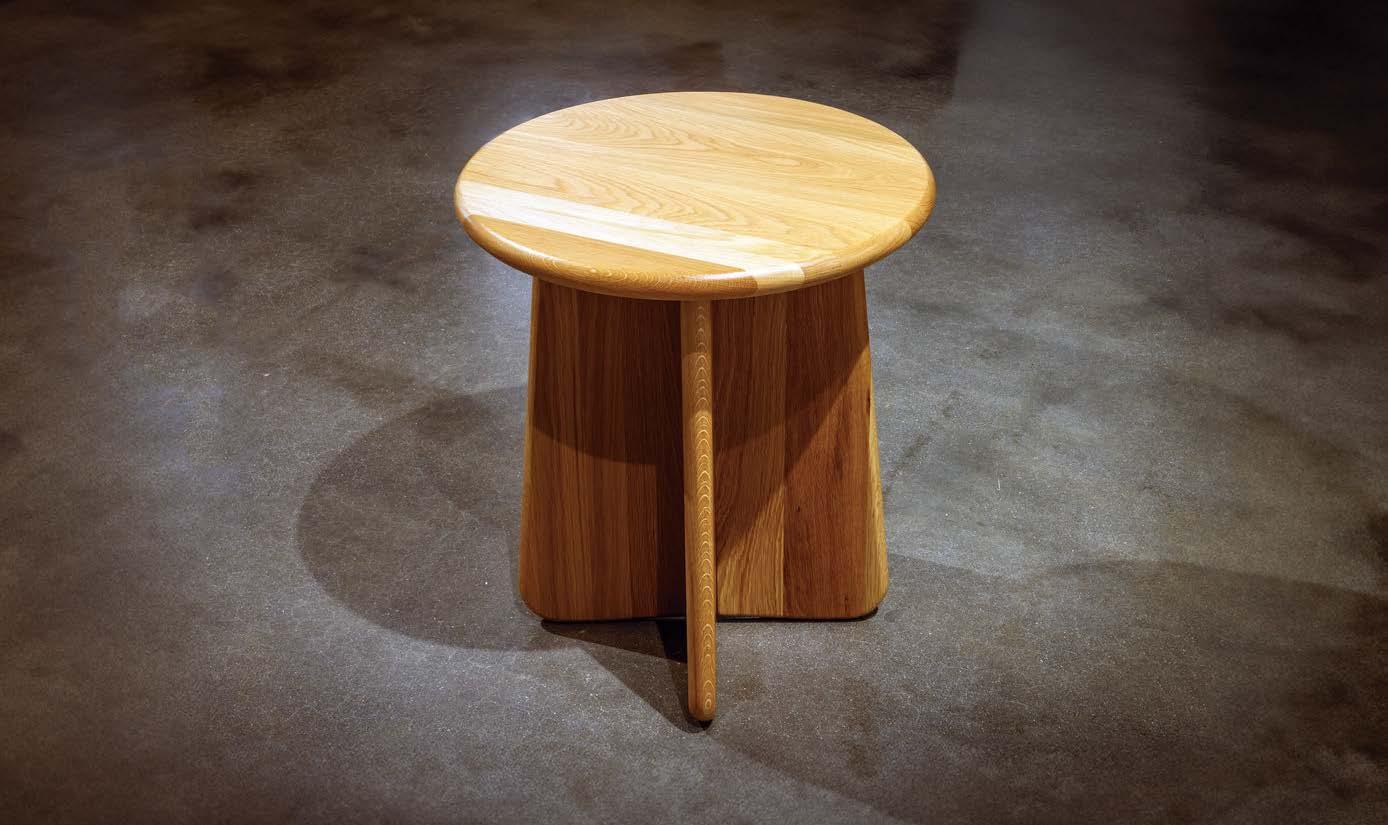
Meet the Unity Collection. Solid American hardwood tables that combine heirloom quality with a carbon-reducing flat-pack design.


A MEETING I HAD AT HOK’S NEW YORK OFFICE this spring gave me goose bumps. Christine Vandover, principal and senior project interior designer, and Elizabeth Baxter, senior sustainable design specialist, took me behind the scenes on the firm’s Sustainable Material Tracking initiative—a comprehensive effort across HOK’s global offices to move material selections in interior design toward sustainability, health, and equity. Now in its fourth year, the initiative persuaded 26 offices to track nearly 5,900 materials and products over 134 projects, with astounding results: 60 percent had Environmental Product Declarations (EPDs), 95 percent used FSC-certified wood, and, most surprising of all, 20 percent of products were categorized as reused or biobased.
Those are truly heart-gladdening numbers, but that’s not what thrilled me. I was excited, rather, to take a peek at the rigorous but simple-to-use working sheets the team behind the initiative had created; to know about the hours spent in helping and coaching teams around the world; and to learn about the resources they had created to support their peers, including a set of training videos, “so when we have new staff we direct them to those videos so that they can get up to speed quickly,” as Baxter explained.
I felt privileged to get this peek behind the curtains at HOK, but I also know that scores of architecture, design, and construction firms across the country have their own initiatives under way. Not all of them are as comprehensive, perhaps, but each initiative is tailored to the firm’s needs and context.
Some architecture firms are signatories to the 2030 Commitment, and are working hard on drawing down the carbon emissions of their work (only six years to deadline!). Others have signed on to the AIA’s Materials Pledge to adopt a multidimensional approach. But many practices are starting small, and that is equally laudable.

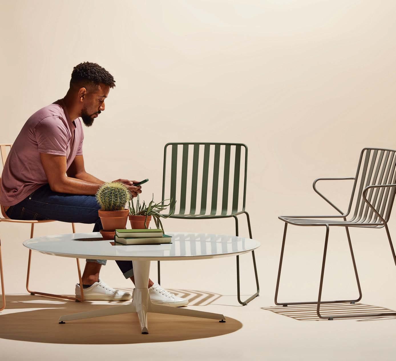
Simply Sophisticated Seating
Every Day Chair: Refined design for adaptable outdoor space. Designed by Landscape Forms
Landscape Forms | A Modern Craft Manufacturer
At an event METROPOLIS organized with Crypton this past May, Luke Lasky, studio director at hospitality design firm Parts and Labor Design, shared that his team now pushes clients to prioritize “real, honest materials”: wood and stone, not their synthetic imitations. The room burst into “aah”s and head nods at this—every single sustainability expert immediately appreciated how this simple criterion could translate into a powerful impact.
We are in the thick of a materials renaissance in the built environment. It is a long-overdue and painstakingly complex undertaking—and it has an enormous importance to the future of all life on this planet.
The issue you hold in your hands is METROPOLIS’s latest contribution to that renaissance.
Every product you will see in the pages that follow is thoughtfully conceived and responsibly manufactured. We’ve included deep dives into how some product collections were conceived—see how Yinka Ilori has used sustainable materials as a platform for joy, optimism, and cultural innovation (“Dreaming at Work,” p. 148). Materials expert Kenn Busch provides an easy guide to forestry management, reclaimed wood, and carbon sequestration in “How to Specify Wood Sustainably,” (p. 102), while associate editor Jaxson Stone provides some product picks at the intersection of color trends and neuroaesthetics (“Your Brain on Color,” p. 142). Helpfully, every story is tagged with the CSI Master Format Divisions for each product, so you can easily use this issue to supplement your list of preferred products.
If you’re already on the journey to more sustainable specification, thank you and Godspeed! If you’re starting to change the way you select products, use this issue to pick one better option, at least, and don’t hesitate to ask METROPOLIS for help—we’re always just a message away on Instagram and LinkedIn, @MetropolisMag. Let’s build for a happier, regenerative world, together!
AvinashRajagopal, editor in chief
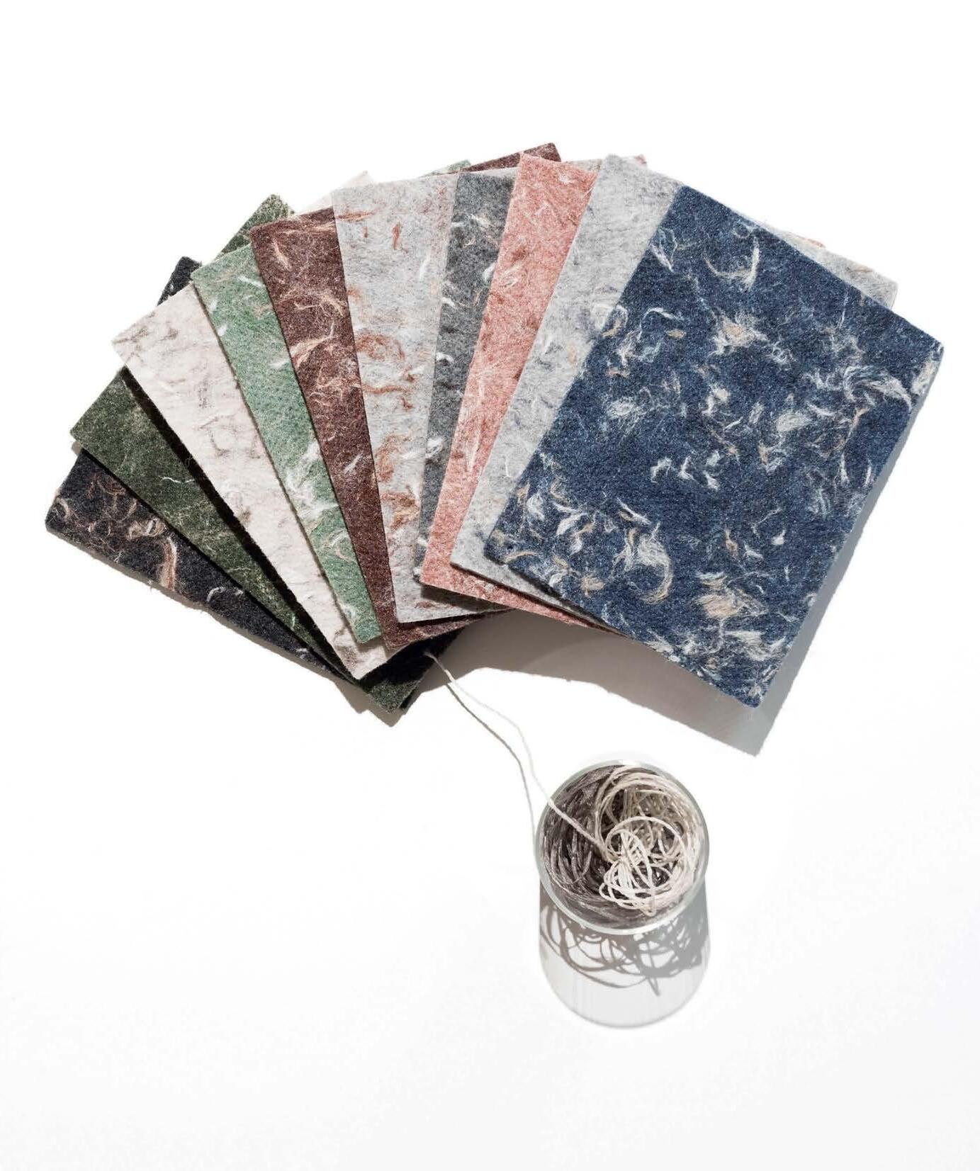
waste knot. want more.
Material reimagined. The journey of circularity begins with the process of looking at materials as what they with are and being inspired by what they might become. Waste Knot is a hybrid flooring collection designed on the ReWorx on ® platform, offering the performance of a hard surface and the comfort and acoustic benefits of a soft surface. Constructed of 100% PET, it can of be recycled in its entirety at the end of its useful life. Uncover the beauty of the independent elements –fibers, yarns, textiles – as they come back together with new purpose and creative reuse.
At ThinkLab we spend our days researching the ecosystem of the built environment. We geek out over the product specification process and the changes happening at the intersection of product and design. Here’s the tension we’ve uncovered when it comes to prioritizing sustainability in projects:
ThinkLab’s latest U.S. Design Industry Benchmark Report found that 84 percent of commercial architects and designers say client demand for healthy spaces and sustainable products has increased or greatly increased. At the same time, sustainability is rising in product-attribute importance, jumping from seventh to fifth place.
Additionally, among the specifier archetypes identified in ThinkLab’s industrypersona study, which it first introduced in 2022, the “Sustainability First” persona now constitutes 10 percent of the design population (double its share in the previous year).
Seeing these stats, you may think, “Wow, a move in the right direction for sustainability!” And while that may be true, it may not be in the way you’d expect. Here’s why:
We asked those making decisions—for their own spaces or on behalf of clients— what their top priority was when selecting products. “Ease of doing business” was the core concern for end users, dealer designers, and traditional architecture and design firms.
The reality is, and research tells us, that “ease of doing business” has to be foundational for end users, followed by “financial goals.” You could think of it like Maslow’s hierarchy of sustainable specification needs. Unless that foundation is there, sustainability considerations become challenging for most clients. While the first few stats I shared feel warmer and fuzzier, we think understanding the reality of product selection can empower you for these reasons:
The average designer now has 40 times more specification power than the average American consumer has buying power. And it can be as high as 140 times for INTERIOR DESIGN Giants of Design (specifiers from the top 200 firms). Additionally, METROPOLIS has found that by 2050, the interior design industry will have influence over almost one-tenth of the world’s carbon emissions, owing to how often interior spaces are renovated throughout the life cycle of a building.
If it were as easy as toggling a few filters to find the most sustainable choices, we wouldn’t see as much tension as we currently do. While there are great resources for designers to search and compare across different impact categories for new products, the bigger picture of the selection process is more nuanced: Is reused better than new when considering embodied carbon? Reused products can be harder to find, and my billable hours are finite. I want to use biobased products, but will they be durable enough for this application? Here are a few resources that can help with decision support:
• Comparing products: The mindful MATERIALS platform includes details such as material composition, environmental certifications, and health-related information, allowing users to compare and evaluate products based on their sustainability criteria. Visit mindfulmaterials.com.
• Sourcing reused: All for Reuse has created a Reuse Ecosystem Map to help connect architects and designers with
suppliers and organizations that offer reused building products or related services. Explore at allforreuse.org/ecosystem-map.
• Measuring impact: One Click LCA is life cycle assessment software that measures embodied carbon in your projects. Learn more at oneclicklca.com.
ThinkLab’s latest industry research has centered on changes in customer decisionmaking. We’ve found that getting to consensus is harder than ever, and clients will go to great lengths to reduce their risk in an increasingly complex process.
Even if your firm has a strong stance on sustainability, remember that your client’s career may depend on the success of this project. And success may not mean the same thing to them as it does to you. Should we all care about health, wellness, and sustainability more than anything else? A resounding yes. But given that the most sustainable option is not building anything, we’re all living in a gray area.
How can you make a client care about sustainability? We believe the more powerful question is, How can I reframe the sustainability conversation around what matters most to my client? That’s where the magic happens. M Meredith Campbell is the applied research strategist at ThinkLab, the research division of SANDOW DESIGN GROUP. At ThinkLab we combine SANDOW Media’s incredible reach to the architecture and design community through brands like METROPOLIS with proven market research techniques to uncover relevant trends and opportunities for the design industry. Join in to explore what’s next at thinklab.design/join-in.
Average American consumer buying power
Average specification power for INTERIOR DESIGN Giants of Design (specifiers from the top 200 firms)
Average designer specification power
This year’s hub invites you to relearn, reset, recharge, and leave inspired to redefine design for tomorrow.
,
METROPOLIS’s Sustainability Lab returns to NeoCon this year with programs, activations, and, of course, information on products and initiatives that help the A&D industry make a positive impact on people and the planet.
This year, the lab invites you to explore the latest innovations and concepts for circular, regenerative design with its showcase of design manufacturers’ progress toward a healthy future. Alongside these brand initiatives and product spotlights, the lab raises questions and provocations for a more sustainable future through two special exhibits and a Leadership Summit.
Carnegie will be launching its Changemakers experience at the lab in partnership with METROPOLIS, offering
educational trips for designers interested in making an impact on sustainability and wellness through their work. And Model No. will showcase its 3D-printed and compostable Asker chair featuring a carbon-negative black pigment from OurCarbon.
METROPOLIS-curated resources and readings will challenge you to rethink design models and processes. Meanwhile, spaces designated for rest, including The ReCharge Room by Mohawk Group, will offer respite and an opportunity to prioritize well-being at NeoCon. We hope you leave the lab feeling refreshed and inspired to redefine design for tomorrow.
Find out more about the lab and register for the events by scanning the QR code on this page. M
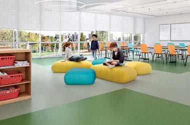
AMERICAN BILTRITE
ABPURE INFINITY
ABPURE Infinity is a cradle-to-gate carbon-neutral rubber flooring that features an elegant tone-on-tone chip visual in 20 earth-centric colors. It is produced with renewable natural gas (RNG) made from organic waste, which has already reduced greenhouse gases at the source, to offset ABPURE’s carbon footprint as measured in its EPD. american-biltrite.com
ANDREU WORLD
CIRCULAR DESIGN CHALLENGE
The Circular Design Challenge is a call to adopt practices such as eco-design, zero-waste management, embodied carbon calculation, and the selection of sustainable materials. Andreu World has set the goal of achieving circularity by 2025—five years before the 2030 Agenda—and we want to extend this challenge to the entire global design industry. andreuworld.com
ECONYL NYLON
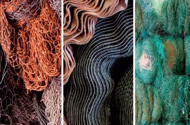
ECONYL nylon unlocks endless opportunities for design excellence and environmental stewardship. Available in many forms, including carpet fiber, textile yarn, polymer chips for injection molding, and 3D printing for furniture, accessories, and more—the possibilities are truly endless. aquafil.com
Inclusive design considers the full range of human diversity with respect to ability, language, culture, gender, age and other forms of human difference. It also considers the neurodiversity of people, creating spaces that are thoughtful about sensory sensitivities and adaptable to different preferences. Sustainable design considers the living world, and since humans are part of the living world, one cannot exist without the other.
When brought together as one philosophy, designing for sustainability and inclusivity is responsible design. We must reimagine our designs to be functional, inclusive and constructed for easy disassembly and recycling at the end of life.
Introducing the TOCCO Collection by pba, an inclusive hardware collection made with ECONYL® nylon designed to address sensory sensitivities. Made to be easily disassembled and 100% recycled, the collection offers multiple options for visual stimulation and way finding - including a wide choice of colors - two tactile options – smooth or faceted grip - and a comfortable thermal sensation resulting from the softness of the grip and the ambient room temperature.

“When we design spaces, we must think about the way people perceive and interact with the environment. We must also think about how the things we create can impact the planet, from how materials are sourced, to where they end up at the end of their service life.”
— Erica Anesi, CEO of pbaAquafil and pba invite you to experience the TOCCO Collection at NeoCon 2024 in the ECONYL® by Aquafil showroom, 11-107.
Pba’s Tocco Collection made with ECONYL® nylon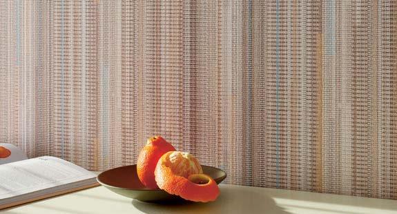
CARNEGIE CONSCIOUS COLLECTION
The Conscious Collection combines Carnegie's authentic commitment to the environment with versatile functionality through materials like biobased Xorel, beautifully imperfect embossed vinyl alternatives, and printed silicone hybrids. The Conscious Collection is a flexible, holistic design system for walls, panels, furniture, and windows. carnegiefabrics.com
CARNEGIE ACOUSTIC SOLUTIONS
HYPER SONIC
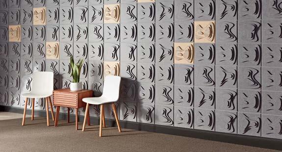
Break the sound barrier between acoustic performance and iconic design with the new Hyper Sonic collection from Carnegie Acoustic Solutions. With five new Kirei recycled PET products and four new Xorel Artform products, you can elevate the design of any space while delivering exceptional sound. carnegiefabrics.com/carnegie-acoustic-solutions
If left unaddressed, interior design might end up contributing 10 percent of global emissions by 2050.
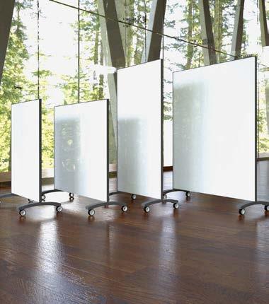
CLARUS
GO! MOBILE
GO! MOBILE is a mobile glass writing surface that’s customizable to your needs. Select from a diverse palette of colors and styles, magnetic or fixed acoustic panels, and more, ensuring you discover your ideal rolling glassboard; GO! MOBILE is sustainable and comes with EPD, Indoor Advantage, and Declare Labels. Clarus is committed to the environmental sustainability of its products and manufacturing processes, and will continue to build on its certifications. clarus.com
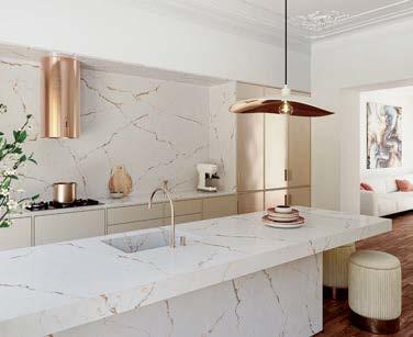
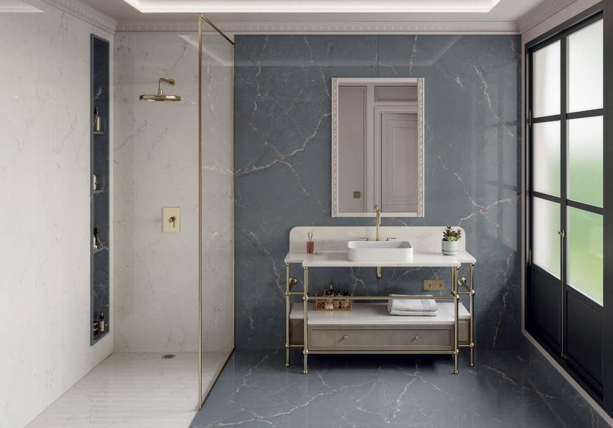
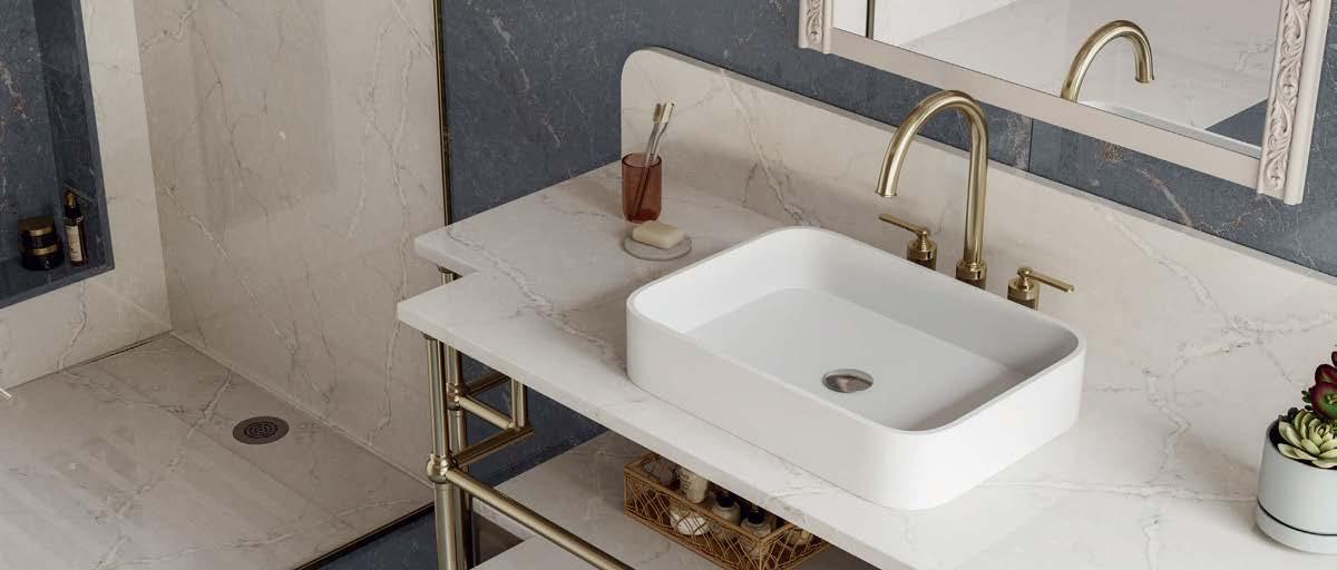
Silestone XM is redefining mineral surfaces with exclusive Hybriq technology, enabling the creation of surfaces with a maximum 10 percent of crystalline silica content, while maintaining high performance and excellent finishes. A carefully selected range of new minerals chosen for their design and capabilities give Silestone XM its nuances, shine, color, depth, and resistance. cosentino.com/usa

Marmoleum connects with modern nature through climate-positive floors that foster well-being and form the basis of healthy spaces to work, learn, heal, play, and relax in. The Solid collection is minimalist, pure, and timeless, providing a long-lasting foundation that connects living spaces with nature and never goes out of style. forbo.com
Discover Clean Break, the latest addition to our environmentally conscious portfolio. Created with recycled content and equipped with our standard PVC-Free WellBAC® Comfort cushion backing, Clean Break excels in a diverse range of environments. Crafted with our proven commitment to excellence, this collection not only elevates spaces with its aesthetic grace but also honors the earth with its intrinsic sustainability and reduced environmental impact.
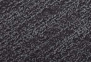

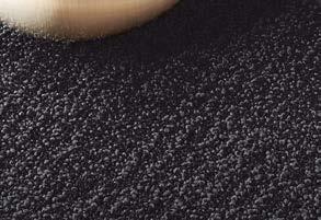




FENIX
FENIX innovative materials utilize next-generation acrylic resins and electron beam curing to create ultra-matte, anti-fingerprint surfaces. With thermal-healing properties and low light reflectivity, FENIX offers a versatile, cutting-edge solution aligning with smart materials and matte design trends for diverse interior environments. formica.com
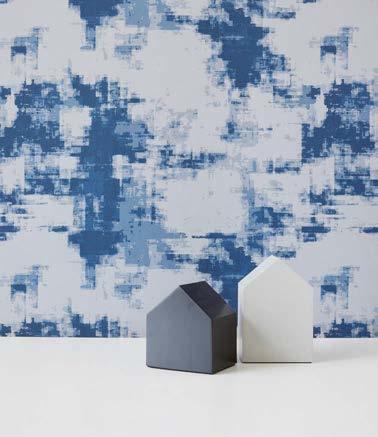
HBF
DIGITAL BLOOM 2.0, SKIM COAT, AND CRUMPLED PAPER
HBF Textiles has launched three textile patterns made from 100 percent postconsumer recycled polyester. Better yet, the three contain a catalyst that makes them 91–93 percent biodegradable. HBF Textiles patterns Digital Bloom 2.0, Skim Coat, and Crumpled Paper were all recently introduced with these innovations in materials technology. hbftextiles.com

Polygood is a versatile, high-end surface material made from 100 percent recycled and recyclable plastic suitable for large-scale commercial projects, from retail fixtures to exterior cladding, furniture to flooring, and kitchens to bathrooms. With low-emission manufacturing processes and material sourcing, Polygood has an unbeatable global warming potential: eight times lower than materials made of virgin plastic and six times more ecofriendly than leading solid-surface materials. thegoodplasticcompany.com
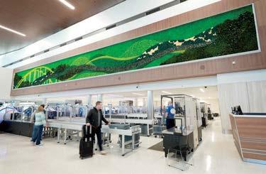
Garden on the Wall is the world’s only turnkey preserved garden/moss wall provider with 16 third-party tests and credentials to ensure the sustainability, transparency, safety, and material health of its installations. GOTW’s creations with highest longevity standards help designers build environmentally and behaviorally healthy humancentric environments with biophilia and circular economy in mind thanks to a take-back program for garden panels. gardenonthewall.com

IMPACT ACOUSTIC
ARCHISONIC COTTON
ARCHISONIC Cotton is made from natural raw materials and enables a closed-loop system through the use of cellulose. Unlike conventional acoustic materials, which rely on synthetic binders that are difficult to recycle, this solution allows the acoustic materials to be fully reintegrated into the production process at the end of life. impactacoustic.com
Twelve million tons of furniture and 2.4 million tons of carpet and rugs end up in U.S.
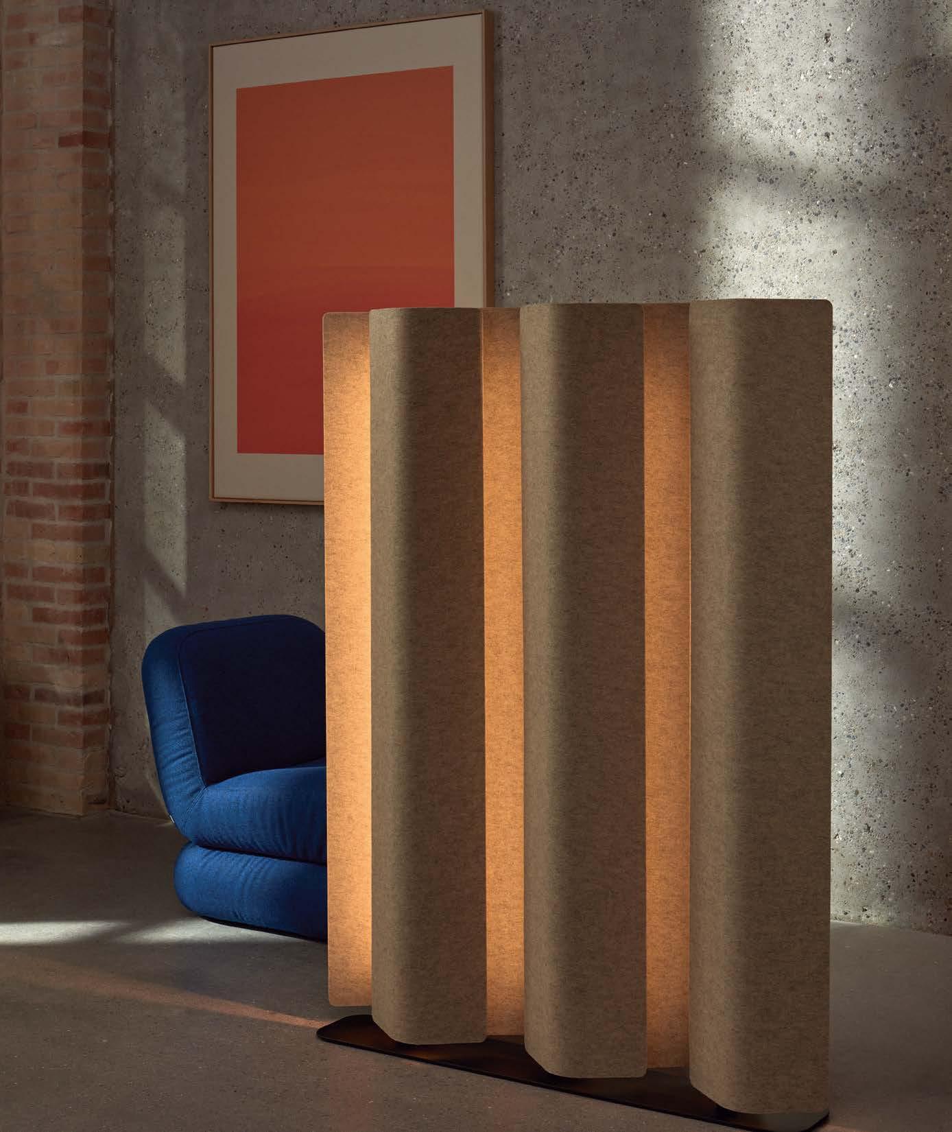

Working with world-renowned designers, Keilhauer thoughtfully manufactures seating and tables for commercial spaces to make work comfortable for all. Sustainability has long been at the core of its operations, designs, and materials, and it continues to achieve new milestones. Keilhauer’s four new lounge chairs are a blend of beauty, function, and sustainability. All four chairs are Certified Carbon Neutral, made of FSC-certified wood, and were purposely designed with the environment in mind. keilhauer.com
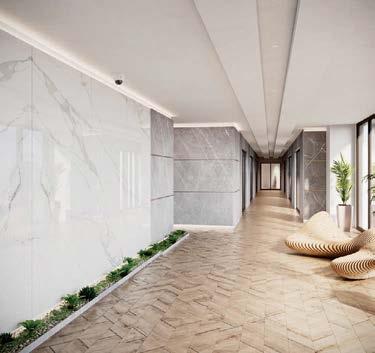
Introducing HFLOR, the resilient flooring solution by LX Hausys. HFLOR offers SPC, LVT, and sheet products that achieve a natural look with innovative technologies such as C-EIR (Continuous Embossed-In Register), M-EIR (Multi-Gloss Embossed-In Register), TrueMatte, and TrueView. lxhausys.com

Milliken’s carpet tile products have full transparency, are fully recyclable, carry Environmental Product Declarations, and can contribute up to 14 points toward the WELL Building Standard. Milliken’s Merge Forward PVC-Free Resilient Tile is Declare Red List–free of harmful materials, while all production waste for Milliken LVT is granulated and recycled into backing production to create an internal closed-loop recycling process. milliken.com
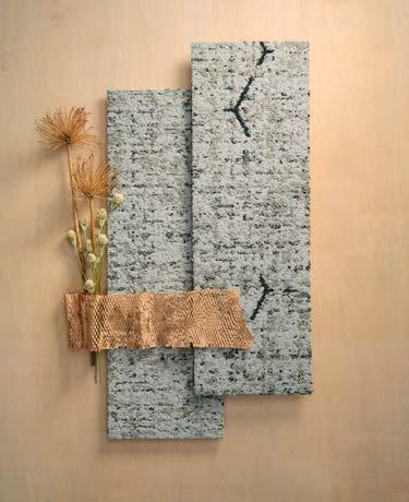
MOHAWK GROUP PATHMAKERS
How can design nurture a culture of care? Pathmakers carpet by Mohawk Group finds inspiration in bees, whose collective pollination helps sustain all life. Designed to support multifaceted communities with sustainable materials, Pathmakers creates nurturing paths of connection between people, the built environment, and our natural world. mohawkgroup.com
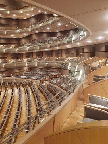
Nydree manufactures a new Red List–free version of its world-renowned acrylic-infused wood flooring that meets the most stringent environmental standards. This engineered hardwood is 300 percent more durable than traditional wood, making it durable enough for some of the most high-traffic projects in the world. Acrylicinfused wood is made from natural wood that is a resin for a stronger, tougher floor. Nydree invented the process in 1963 and continues to perfect it. nydreeflooring.com

With unmatched sustainability, ultimate durability, and a high-end aesthetic, REGUPOL commercial flooring is a high-performance blend of postconsumer recycled tire rubber, postindustrial EPDM, and low-VOC binder. REGUPOL upscale, luxury rubber tile and planks serve as an alternative to terrazzo, ceramic tile, and LVT. REGUPOL revolution offers 46 colors in rolled-sheet format. regupol.us

In the ideal circular design approach, we would apply our design abilities in areas where proven, clean, and regenerative extraction, manufacturing, construction, and reclamation processes are available.
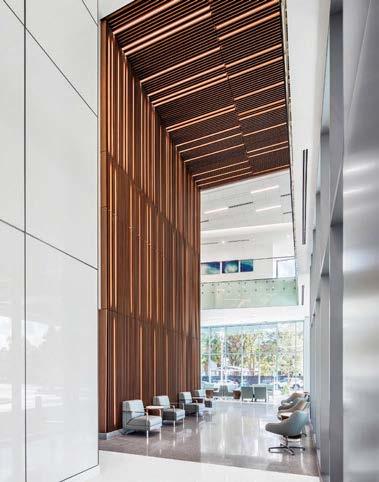
RULON INTERNATIONAL
WOOD PRODUCTS
While wood is often seen as inherently ecofriendly, its environmental impact depends on factors like harvesting methods, processing techniques, and chemical treatments. At Rulon International, we’re dedicated to ensuring that every project we embark on adheres to the most stringent transparency standards. Together, our commitment to sustainability is unwavering. rulonco.com
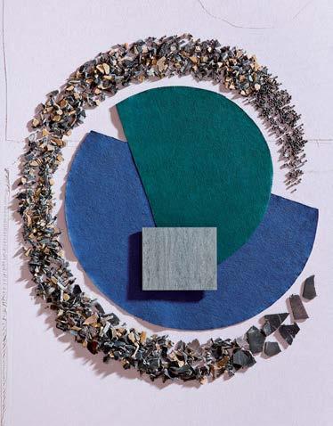
SHAW CONTRACT
ART + SCIENCE
Art + Science is changing the way we think about hard-surface performance and sustainability. With a material chemistry similar to that of Shaw Contract’s EcoWorx carpet tile backing, this new EcoWorx Resilient collection is PVC-free, fully recyclable, low embodied carbon, and carbon neutral. shawcontract.com
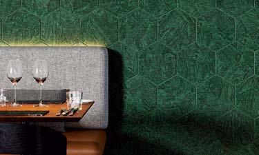
TURF STONE TEXTURES
An expansion of Turf’s texture finishes, Stone Textures is a curated collection of nature-inspired, digitally printed patterns. Each texture—Marble, Travertine, and Granite—pairs with the exclusive Hues palette, highlighting Turf’s mastery of its 60 percent recycled PET felt as the textures embrace its color and materiality. turf.design

ULTRAFABRICS
VOLAR BIO
Debuting in 2019, Volar Bio reflects Ultrafabrics’ sustainable vision with a 66 percent mix of recycled, rapidly renewable, and biobased content. The collection’s evolution includes certified REPREVE recycled polyester, ECOVERO viscose, and Susterra propanediol biobased resin. Volar Bio showcases a commitment to high-performance materials that are both ecoconscious and innovatively designed. ultrafabricsinc.com
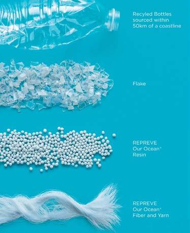
UNIFI
REPREVE OUR OCEAN
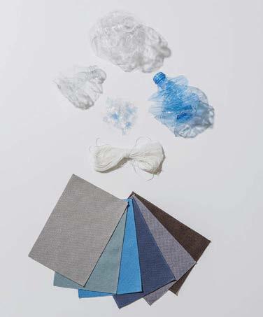
REPREVE Our Ocean is a recycled polyester option that sources postconsumer plastic bottles at high risk of ending up in the ocean. The bottles are collected from areas within 50 kilometers of coastlines without formal waste or recycling systems and certified by an independent third-party organization. unifi.com
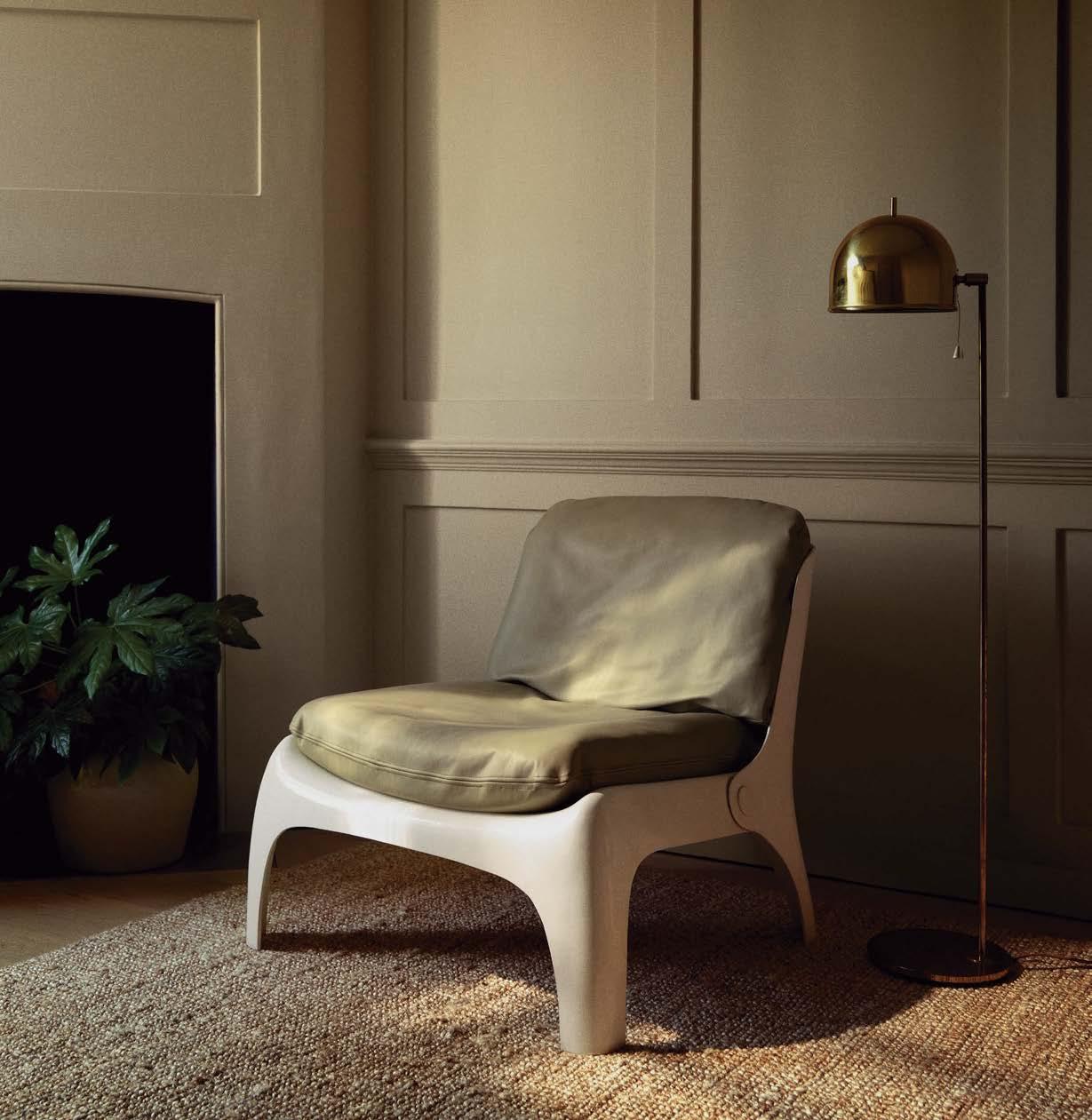
This year’s product releases at NeoCon and Design Days signal a transformation in interior design.
By METROPOLIS Editors
ACOUSTIC ARCHISONIC COTTON
Archisonic Cotton acoustic tiles are made from cotton cellulose, a 100 percent natural by-product of the textile industry that would otherwise go to waste, without the use of harmful synthetic binders and chemicals. Unlike conventional acoustic materials, which rely on synthetic binders that are difficult to recycle, these tiles can be seamlessly returned to production at the end of their life. impactacoustic.com
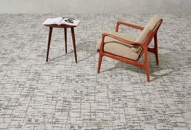
BENTLEY PACIFIC STANDARD TIME
Pacific Standard Time celebrates California with three carpet styles—Now/Then, Chronologies, and Lot 45—all available in tile and broadloom. Like all Bentley carpet products, Pacific Standard Time is PVC- and Red List–free as well as Cradle to Cradle Certified, is produced in a carbon-neutral facility, and carries Declare labels, EPDs, and HPDs. bentleymills.com
THINKLAB’S U.S. DESIGN INDUSTRY BENCHMARK REPORT for 2024 shows that 73 percent of designers feel it is their responsibility to recommend sustainable products to their clients. And the manufacturers have heard this signal loud and clear. The 40 products on the following pages were selected out of 169 submissions by brands showing at NeoCon or Design Days in Chicago this June. Here are some of their sustainable attributes: 11 winners utilize significant quantities of biobased, bio-sourced, or natural materials. If the products use wood, it is always FSC-certified. Many are either certified carbon neutral or made from carbon sequestering materials, and the majority offer sustainable end-of-use or end-of-life solutions—designed to be 85 to 100 percent recyclable, biodegradable, or compostable.
Never before has there been such an abundance of beauty and responsibility in furnishings and fixtures. The sustainable evolution of interior design is sure to flourish! M
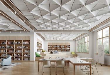
TURF ARCADE
Arcade is a new compression molded ceiling tile available in five Gothic architecture–inspired tile shapes that can be combined to form vaulted panels. They have a noise-reduction coefficient of 0.95, enhanced by hollow chambers inside each tile that are created by their unique shape. turf.design

HMTX INDUSTRIES TEKNOFLOR HEALTHSCAPES
Uniquely engineered with a thermoplastic polyurethane (TPU) as a vinyl alternative, Healthscapes TPU Flooring offers enhanced durability and infection control, helping protect the health and well-being of occupants in healing and learning environments. The collection is Red List–free and easy to maintain with a “No Buff, No Wax” regimen. hmtx.global

ABPURE INFINITY NEUTRAL
ABPURE Infinity is a 3 mm rubber sheet flooring that is carbon neutral without purchasing carbon credits. Organic waste is fermented in biomethanation farms to generate renewable natural gas, which is then turned into a flooring material. ABPURE Infinity is easy to maintain and disinfect without the use of harsh chemicals or wax, and comes with the best colorfastness guarantee on the market. american-biltrite.com

MANNINGTON COMMERCIAL LIMINAL SPACE
A new collection of carpets available in both modular tile and broadloom, Liminal Space is inspired by thresholds and transitions, a brief interlude before the next phase of life comes to pass. The collection includes five styles, is CRI Green Label Plus certified, has a third-party verified EPD and HPD, and is 105 percent carbon offset (cradle to gate). manningtoncommercial.com
Breathe optimism and collaboration into environments with Shape Theory, a carpet tile collection that combines geometric shapes, organic grounding and bold colors to create an engaged, supportive culture.
Experience a culture of care during Design Days at our pop-up space (“the Hive”) at 817 W. Fulton.

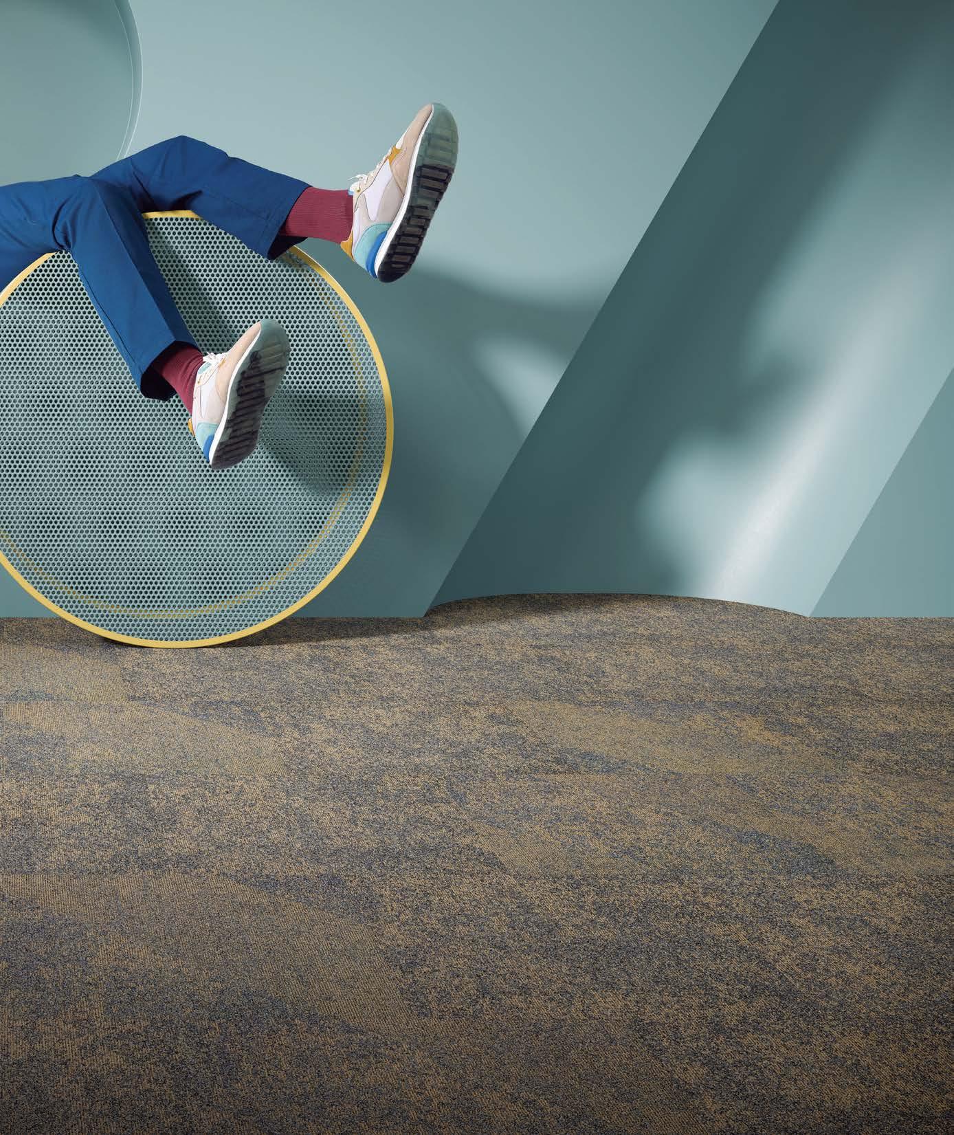


Consisting of two distinctive but coordinating product lines, and available in 14 colorways, Shape Theory can be configured or customized to create floors that make a positive impact. Shape Theory, like all Mohawk products, is Red List–free and Living Product Challenge petal certified, supports net-zero carbon emissions by 2040, and can be salvaged with the company’s take-back program. mohawkgroup.com
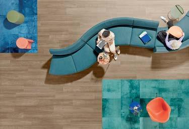
SHAW CONTRACT ECOWORX
Art + Science is Shaw Contract’s first-ever EcoWorx Resilient collection, a PVC-free flooring product line that is fully recyclable and covered by Shaw’s Environmental Guarantee through its Re[TURN]® Reclamation program. EcoWorx Resilient has a PSI rating of 2500, with one of the highest static load limits on the market. In initial stain testing, it performed 40 percent better than LVT. shawcontract.com

An interpretation of Arper’s Catifa 53, the Catifa Carta has a seat crafted from PaperShell, which is made out of paper, steam, and bio-resin, a natural alternative to adhesives. At the end of its life, Catifa Carta can be returned to Arper to be turned into biochar, effectively rendering the chair carbon-negative. arper.com

Waste Knot combines the benefits of both hard and soft surfaces in a 100 percent PET hybrid flooring material that can be recycled in its entirety. The collection is available in 12” x 48” planks and is offered in 12 total colors, including neutral and saturated tones that coordinate with other collections within Patcraft’s ReWorx platform. patcraft.com
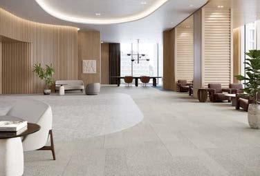
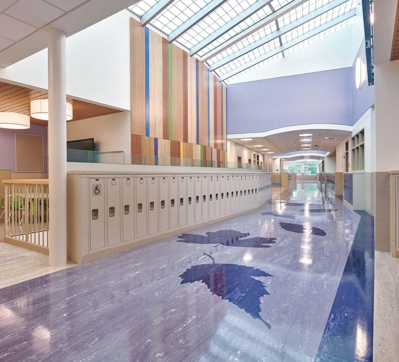
Layered Duality features a collection of four soft-surface patterns and two non-PVC plank and tile patterns. The collection’s soft surfaces are treated with Eco-Ensure, a chemistry with a C2C Certified Material Health Certificate™ at the Platinum Level that resists soiling from oils and organic materials. The entire Layered Duality collection is part of Tarkett’s ReStart® take-back and recycling program. commercial.tarkett.com
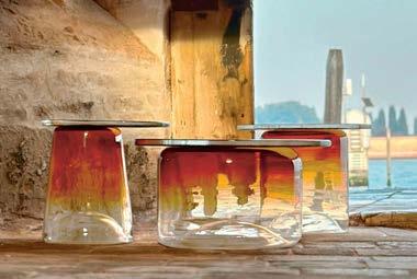
Designed by Daniel Germani, this collection bridges art object and commercial product. Handblown in glass, the Ice tables are instant conversation starters to enhance any room. The collection comprises tables in three sizes and three colors—cobalt blue, amber, and smoke. bernhardt.com

REGUPOL Upscale offers two unique commercial flooring products—luxury rubber tile (LRT) and luxury rubber plank (LRP)—made from recycled rubber. This new line is an alternative to terrazzo, ceramic tile, and luxury vinyl tile and plank. A blend of postconsumer tire rubber, vibrant postindustrial EPDM chips, and low-VOC binder, Upscale is available in two standard sizes: 4 mm x 8” x 36” and 4 mm x 12” x 24”. regupol.us

Mat is a chair crafted from highly renewable, durable hemp and eelgrass. The collection encompasses dining chairs, armchairs, and several bar seating variants, all of which come in two versions of hemp or hemp with added eelgrass. All options are available with full or front upholstery in numerous options. allsteeloffice.com
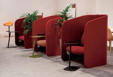
From the option to stow bags underneath the seat to the seamless integration of accessories, every aspect of this focus pod has been crafted with the user in mind. Frida is also easy to disassemble at its end of life for recycling purposes. An average unit contains 10.95 percent recycled materials, while 85.19 percent of its materials can be recycled. bossdesign.com













DIVISION TWELVE CRUX
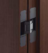
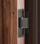
Created in collaboration with design duo Afteroom and inspired by their Swedish roots, the Crux collection consists of a café chair, a stool available in two heights, and two tables available in three heights with square or round tabletops. Crux is a certified carbon-neutral collection, BIFMA Level 2 certified, and made with FSC-certified wood. division12.com

KEILHAUER DAIS
Designed by Form Us With Love for Keilhauer, Dais is a certified carbon-neutral chair. From its elegantly simple FSC-certified ash frame to its distinctive bio-based foam seat, it proves that style and sustainability can coexist in harmony. keilhauer.com

MODEL NO. ESKER CHAIR
The Esker Chair is 3D printed in one continuous and wasteless process using resins upcycled from plant waste that fully biodegrade or recycle at the end of life. This year OurCarbon is partnering with Model No. to use its biochar material as a carbon-negative pigment in the Esker Chair. model-no.com


Breck features a weight-activated mechanism that easily responds to the way you sit and recline. Breck is manufactured and assembled in an ISO 14001, zero-landfill facility and is Greenguard Gold Certified. Each chair contains 58 percent recycled content, is 94 percent recyclable, and weighs only around 30 pounds. haworth.com
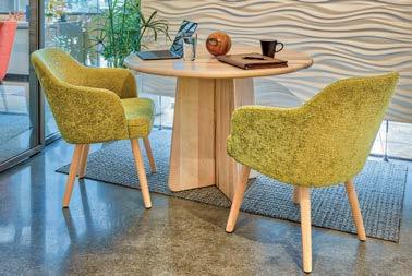
MANTRA INSPIRED FURNITURE UNITY TABLE COLLECTION
Unity is a collection of elevated solid wood tables designed with easy assembly and carbon abatement in mind. The base is composed of two pieces that slide together with a simple joint, and the tables are designed to be flat-packed. Unity is salvageable and reusable in its entirety, 100 percent biodegradable, compostable, and Red List–free. mantrainspiredfurniture.com

TEKNION AAREA
Designed by Pearson Lloyd, Aarea unites circularity and human comfort. The chair is composed of five parts—a tubular steel frame, a bespoke 3D textile knit, an upholstered seat cushion, recycled plastic arm pads, and a recycled aluminum star base—which intelligently come apart so that the chair can be serviced or repaired easily to extend its life, and then be fully recycled at the end of its life. teknion.com
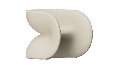
HELLER FORTUNE CHAIR
Design duo JUMBO’s first project for Heller invites joy, luck, and a modern sensibility to indoor and outdoor spaces alike. The Fortune Chair was heavily influenced by designer Monling Lee’s background growing up in Taiwan, and references a fortune cookie. It is 100 percent recyclable and made using a high percentage of recycled postconsumer plastic. hellerfurniture.com

Designed by Alyssa Coletti, Azusa tables make a big statement using just a few parts. The tabletops float above gently folded aluminum panels and can be specified in solid ash, solid walnut, stone, quartz, and solid surface. The wood tops come from sustainably managed forests with FSC certification, while the entire product is formaldehyde- and PVC-free. martinbrattrud.com
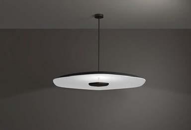
FOCAL POINT POLINA
A state-of-the-art acoustic luminaire, Polina is designed to create stunning ceiling or wall arrangements or to function independently. Its unique, patent-pending dual-density PET shade design absorbs sound over a broad frequency spectrum. The luminaire is available in two sizes and offers a variety of installation options. focalpointlights.com
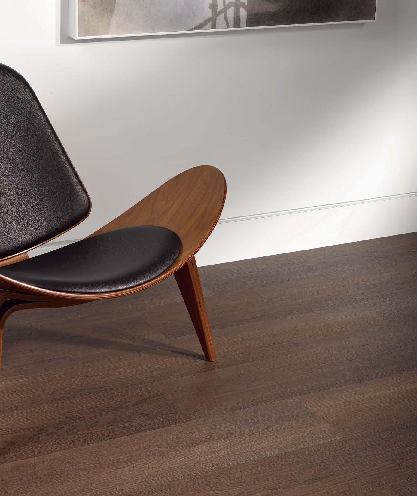
SRP™ TPU flooring is an alchemy of responsible beauty that is designed to transform waste plastic bottles into innovative, circular flooring. Two plastic bottles are upcycled into each square foot of SRP TPU Flooring and built into a simple chemistry that allows the planks to be upcycled into new flooring post use, while maintaining optimal performance and quality.


JANUS
Chill, a collection of exterior seating and accessories with clean lines, includes two backless benches, a stool, and a large garden planter. Composed entirely of JANUSstone, a proprietary material that reinforces concrete with fiberglass for the look and longevity of solid stone at a fraction of the weight, Chill is available in four natureinspired matte colors. janusetcie.com

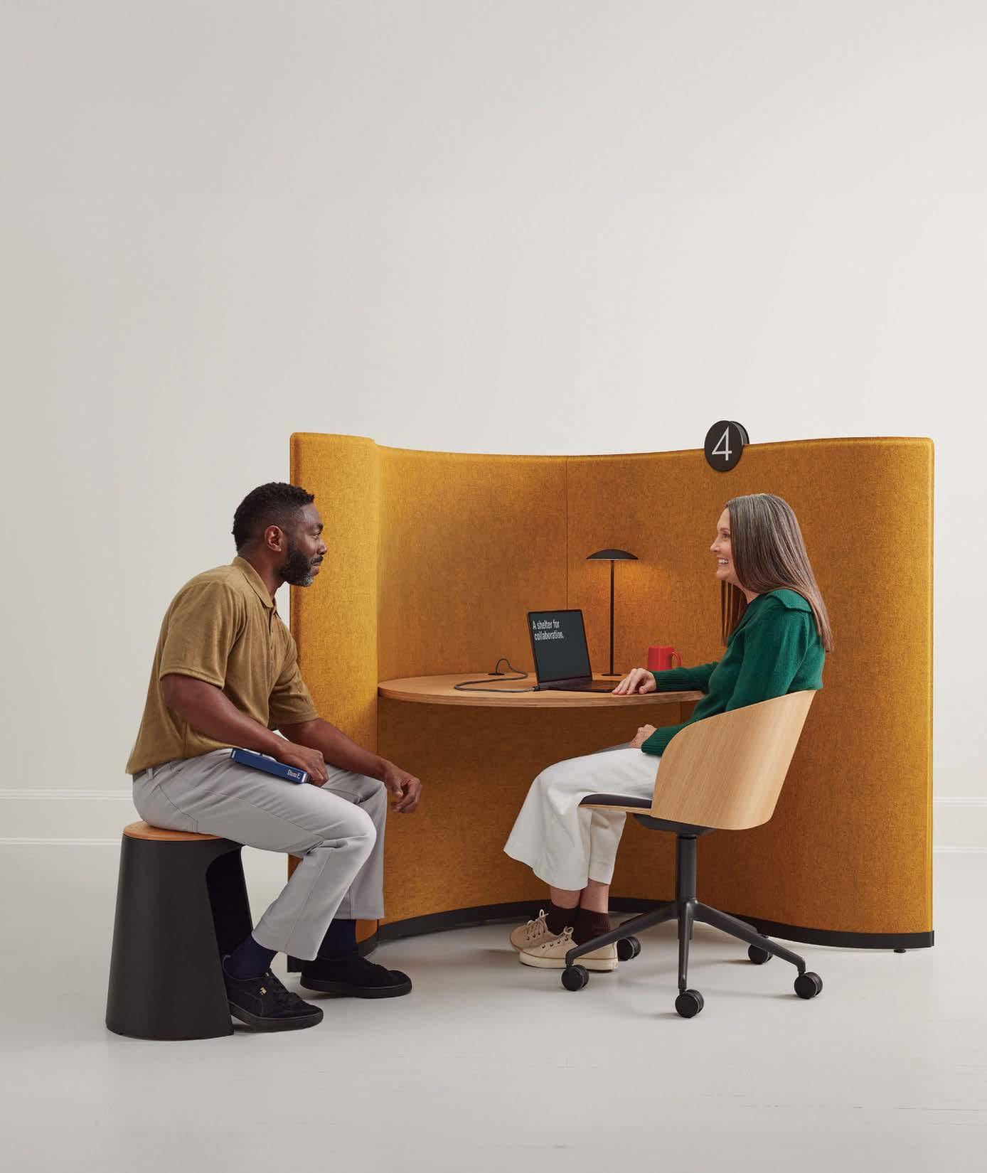
This all-new generation of smart pods provides private, fully connected spaces that are easy to book and automatically adapt to the preferences of any user. They feature sophisticated technology such as precision sensors, mmWave radar, automated lighting, and adaptive ventilation technology, while providing class-A soundproofing. frameryacoustics.com
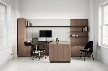
Designed by Dan Grabowski, Cove Collection by Knoll is a minimalist collection for private offices that can be scaled to meet the needs of a range of workspaces. The collection takes full advantage of the Knoll wood finishing process, including the careful selection of pieces of veneer from the same flitch, and the processing of individual components all at once. knoll.com
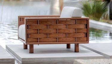
Designed by Dougan Clarke and suited for hospitality, commercial, and restaurant settings as well as large residences, the Meritage Collection offers a multitude of seating options, classic and deep seating size options, different arm details and styles, and two back cushion options. tuuci.com
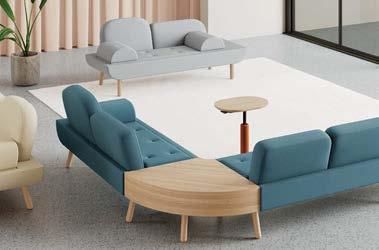
This collection features two standalone sofa variations as well as a modular system with 17 unique modules and three tables to be combined for unique configurations. Hightower is a certified B Corp and all its products adhere to the guidelines of the Living Building Challenge Red List 4.0. hightower.design
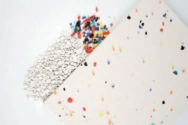
Polygood is a sustainable material made from 100 percent recycled plastic, ideal for retail fixtures, displays, furniture, flooring, cladding, and other design elements. Polygood® is also 100 percent recyclable, and clients can return used panels and offcuts at the end of the project’s life span through a free take-back program. thegoodplasticcompany.com
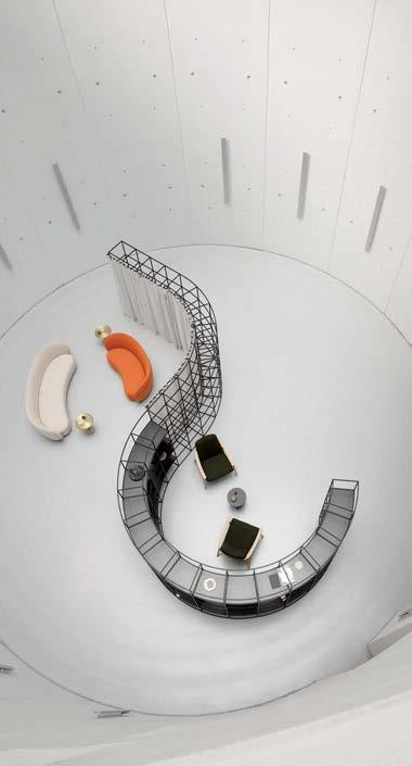
Crate Divide Curved is an adaptable structure that allows users to create zones in open-plan spaces. The steel structure, which contains 50 percent recycled content and is 99 percent recyclable, can curve around a space or even enclose a circular area. It can also take on fluted curtains to add visual and acoustic privacy. allermuir.com

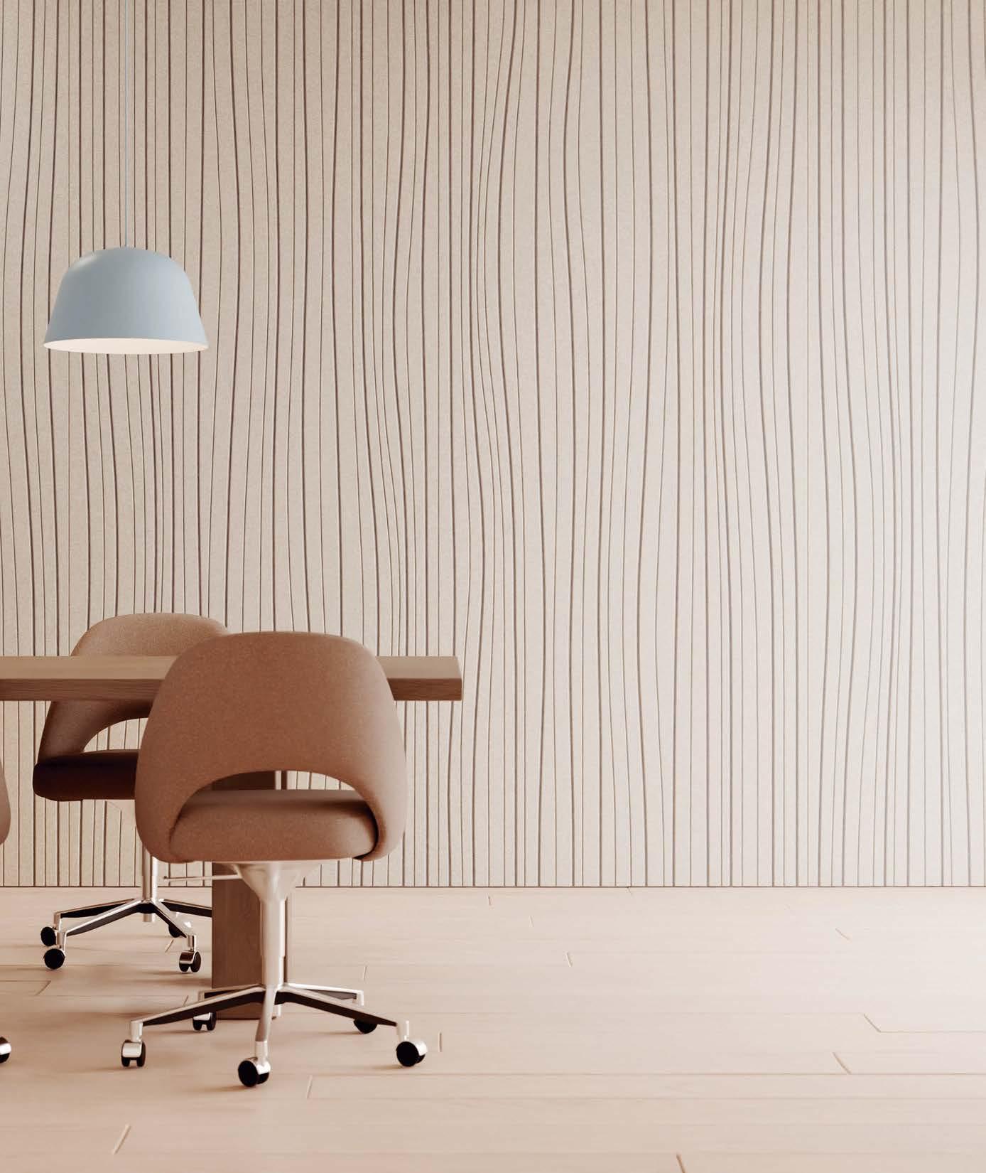
The Dimant Medallion Wall Panel translates the tradition of wood wall paneling into a modular system that is easily customizable for vertical or horizontal scaling, and is simple to install. It is made in the USA, Declare Label Red List Approved, and manufactured with solid wood and MDF that exceeds the Eco-Certified Composite Standard. urbanevolutions.com


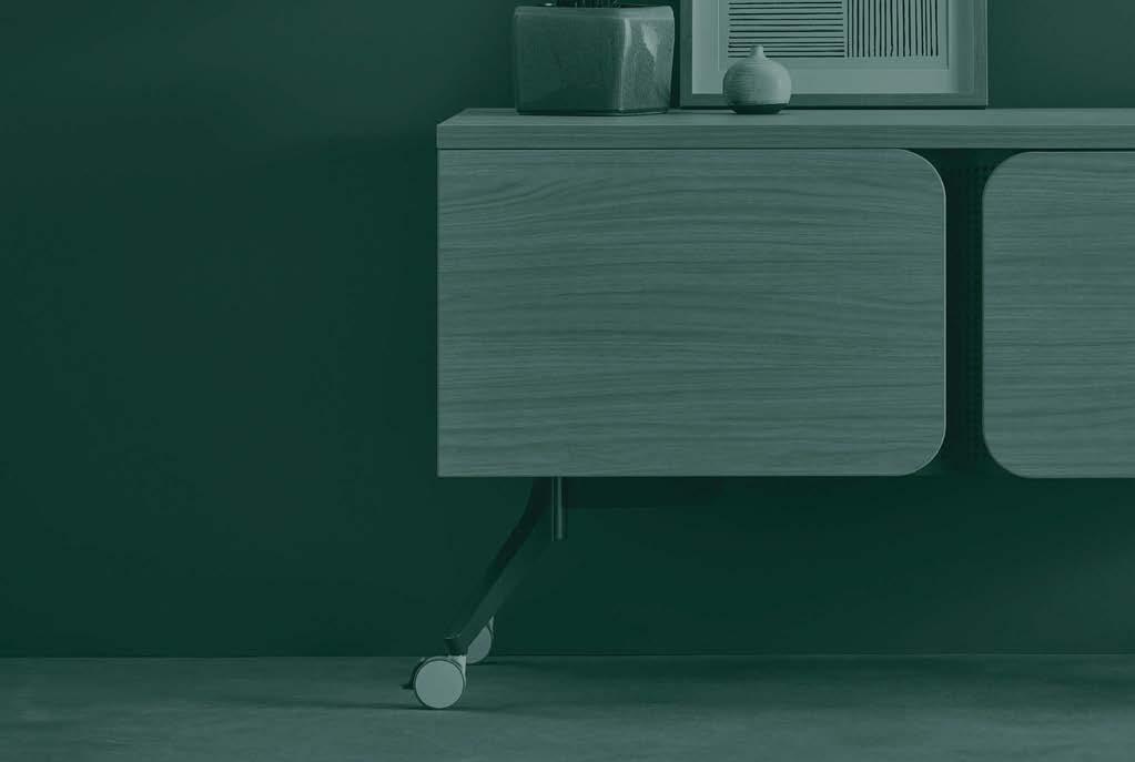
Drawing inspiration from the graceful movement of water, Tributaire offers visually stunning yet widely functional tables, storage and more.
Experience our most expansive collection yet. NEOCON 2024 | SHOWROOM 1181 ki.com/tributaire
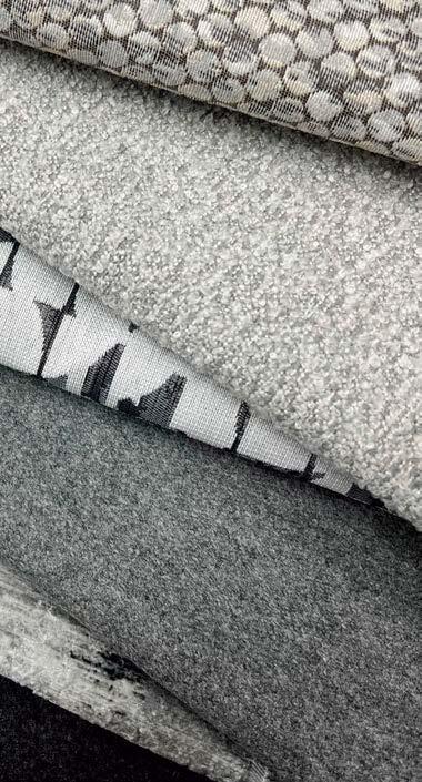
This collection is inspired by imagery of the cosmos and its constantly evolving atmospheric conditions. Andromeda is a printed velvet, Moon Phase explores the cycles and surface of the moon, and Rover is a mid-scale pattern. All three patterns are LBC Red List–free, REACH compliant, Prop 65 compliant, and AB-2998 compliant, and meet the criteria for the Healthier Hospitals Initiative. arc-com.com
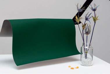
ULTRAFABRICS VOLAR BIO
The Volar Bio line of fabrics has doubled its sustainable content with a 66 percent mix of recycled, rapidly renewable, and biobased ingredients. The backcloth not only includes certified REPREVE® recycled polyester and ECOVERO™ viscose but also has Susterra® propanediol biobased resin made from regeneratively farmed U.S. dent corn. ultrafabricsinc.com
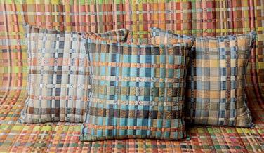
BRENTANO PATCHWORK
This fresh pattern is light and airy, with a pillowed effect like a matelassé, belying its complex construction. Patchwork is made from 45 percent postconsumer recycled polyester and 55 percent cotton. It comes in a 53-inch width and four colorways, lending itself to many applications. brentanofabrics.com

HBF TEXTILES MEMORABLE COLLECTION
Designed by Mary Jo Miller, this collection consists of Daydreamer, a fabric with ethereal swirls made from 100 percent postconsumer recycled plastic; Hefty Herringbone, a comfortable textured upholstery fabric; and Glovely, a leather produced at one of the most recognized sustainable tanneries in the world. hbftextiles.com

WOLF-GORDON CROSSINGS BY DOROTHY COSONAS
Acclaimed textile designer Dorothy Cosonas has developed an upholstery collection consisting of four patterns for Wolf-Gordon. “Crossings,” named after the vertical and horizontal intersection of warp and wefts, consists of four patterns—Fable, Dreamweaver, Odyssey, and Sampler—that are all highly durable and suited to a variety of environments. wolfgordon.com
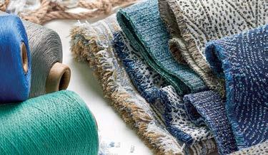
CF STINSON SEA CHANGE
Sea Change is an inspired collection of six artisanal textiles that reflect the depth and beauty of the oceans. All fabrics in this collection utilize SEAQUAL YARN®, a high-quality, 100 percent postconsumer recycled polyester containing reclaimed ocean plastic. Every fabric combines the soft hand preferred in residential applications and the durability required in commercial spaces. cfstinson.com
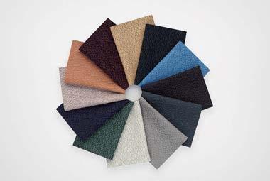
KVADRAT AME
Ame is an upholstery textile designed by Teruhiro Yanagihara that embodies longevity and mindful reuse in its construction and aesthetic. It is the first Kvadrat textile woven with recycled polyester made entirely from textile waste, and features a design inspired by sashiko, a traditional Japanese mending technique. kvadrat.dk
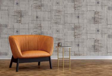
MOMENTUM TEXTILES & WALLCOVERING CIRCON
Momentum Textiles & Wallcovering has introduced the first-ever bio-sourced, carbon-neutral wallcovering substrate: Circon. Produced in partnership with Versa Designed Surfaces, Circon has dramatically lower fossil fuel–derived PVC content compared with conventional vinyl wallcoverings, but with pricing, durability, and aesthetic options comparable to conventional vinyl options. momentumtextilesandwalls.com


with Nfuse® technology


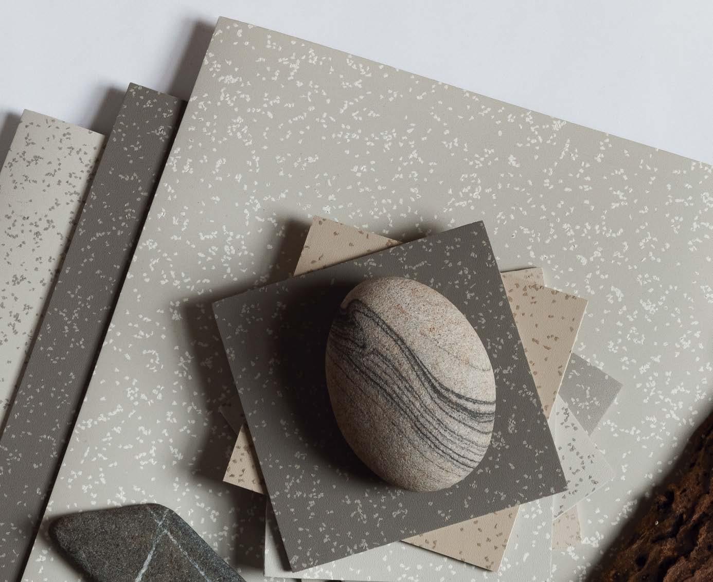
ABPURE® Infinity is a cradle-to-gate Carbon Neutral rubber sheet flooring collection featuring an elegant tone-on-tone visual in 20 earth-centric colors. It is produced with renewable natural gas from 100% organic waste that reduces greenhouse gases at the source. It is a no-wax, easy-to-maintain flooring, featuring PURE colors that last and contributes to the reduction of the embodied and operational carbon footprint of buildings. fl i
Watch the video:
ABPURE® Infinity, a Carbon Neutral flooring collection respectful of mother nature


Elkus Manfredi Architects transforms Washington, D.C.’s defunct Walter Reed Army Medical Center into the Children’s National Research & Innovation Campus.
By Nigel F. MaynardESTABLISHED IN 1909 , the Walter Reed Army Medical Center in Washington, D.C., was a storied institution that provided care to princes, presidents, and military personnel. But as wear and tear took its toll, the medical center lost its luster. Eventually a government commission voted to close the facility in 2011 (as part of the Base Realignment and Closure Commission process) and consolidate operations with the National Naval Medical Center in Bethesda, Maryland.
The closure wasn't the end of the campus, though. Much of the 113-acre site is being redeveloped into a complex, mixed-use community of parks, residential housing,
commercial, retail, and research institutions, with a more seamless connection to the adjacent neighborhoods. But a 12-acre section with four historic buildings and a parking garage was transferred to Children’s National Hospital, which hired Boston-based Elkus Manfredi Architects to execute a master plan and renovate the structures.
“Children’s National set out to build a research ecosystem and clinical spaces to address some of the most challenging cases in pediatrics, which often come through the Rare Disease Institute and are studied at the Center for Genetic Medicine Research,” says Irene Thompson, executive director,
Elkus Manfredi Architects was selected to provide the master plan for the 12-acre Children’s National Research & Innovation Campus, the architectural renovation of all of its historic buildings, as well as the 970-car parking structure. As visitors approach the main entrance of the research institute, they walk through Dogwood Plaza with landscaping by Mikyoung Kim Design.
real estate and capital planning, for Children's National Hospital. “We also wanted the campus to be a welcome space for members of the community to be seen in our primary care clinic.”
While the buildings, ranging in architectural styles and spanning various eras, had become obsolete, “the existing architecture was really quite outstanding,” says David Manfredi, CEO and founding principal of the firm. The architects took a respectful approach to the design. The largest buildings in the collection—buildings 54 and 54x—received a significant renovation. “We basically took it down to the slabs,”
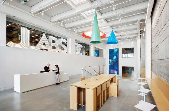
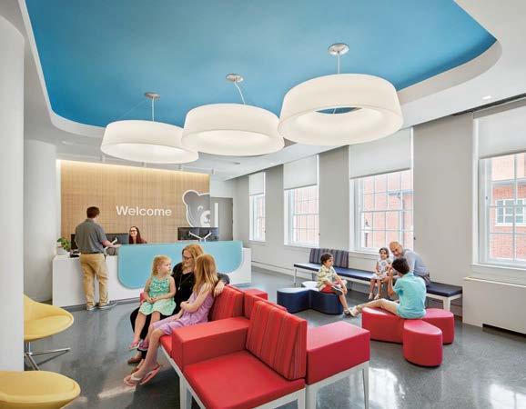
Manfredi says. “Everything, all the infrastructure and mechanical systems, was removed and completely rebuilt.”
Building 54 was completed in 1953 and was essentially a windowless Brutalist bunker with 18-inch-thick walls, designed to contain highly sensitive government research and able to withstand a hydrogen bomb blast on the U.S. Capitol. Needless to say, bringing in light with new windows was a priority. Unfortunately, the preservation board limited the work to the east facade only. “We cut through the 18 inches of concrete to add windows,” Manfredi says, adding that “the proportion, even the
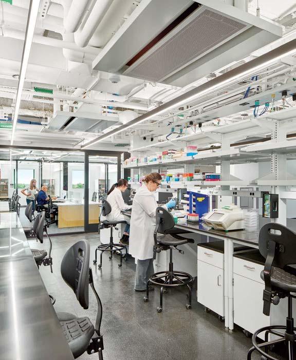
The Children’s National Research Institute includes JLABS, a global network of open ecosystems that is an initiative of Johnson & Johnson Innovation. The lobby (left) of the Children’s National Research Institute Building pays tribute to the building's original 1950s architecture and materials while modernizing the space with warm planks of light wood and playful geometric lamps. The building now houses 112,000 square feet of wet and dry laboratories, bioinformatics, a vivarium, and rare disease research laboratories (below).
shape, of the windows was informed by the checkerboard pattern of the board-form concrete exterior.” In all, the firm added about 6,000 square feet of new windows.
Naturally, the architects updated all the systems and created ADA-accessible interiors. The material palette, to a certain extent, celebrates the history of the building. “We brought some of the board-form concrete inside, but wherever we could, we used wood to make it warm and added pops of color,” says Manfredi. “There's certainly whimsy in some of the graphics in the building.”
The state-of-the-art mechanical systems significantly improved the
project’s sustainable bona fides. “At the time we were designing it, which was 2019, the average national EUI [energy use intensity] for a lab building was 370,000 BTUs per square foot per year,” Manfredi explains. “Building 54 was designed to achieve an EUI of 108,000 BTUs per square foot per year.” A parking garage incorporates a 1.64-acre, 1.148-megawatt solar array that feeds power to the local community.
For Thompson, “we set out to create world-class health-care and research facilities, and we are delighted with how the buildings meet that mission.” M


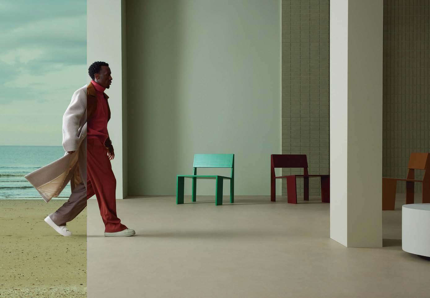
Marmoleum connects with modern nature through climate positive flooring and contributes to everyone’s well-being. An endless source of inspiration, from the natural materials we use, to the colors and designs we offer.
We invite you to create sustainable spaces that have a positive impact on everyone and everything.
View our new Marmoleum Solid collection at www.forboflooringna.com/marmoleum creating better environments 1-800-842-7839 | www.forboflooringNA.com | email: info.na@forbo.com

From seamless surfaces to a precise color selection tool, these advancements help us appreciate the beauty, capabilities, and sustainability of all elements of the built environment.
By Elissaveta M. Brandon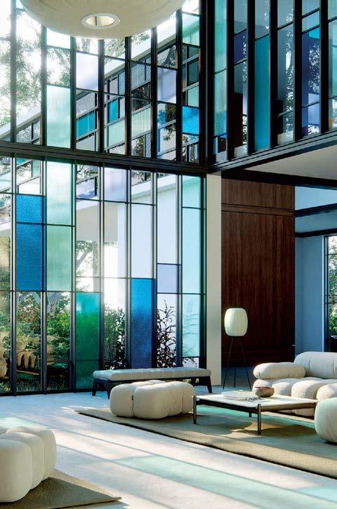

If rendering software exists to convey your design to someone who can’t see inside your head, then it should do that in the most realistic of ways. Lumion’s 2024 release comes with enhanced ray-tracing capabilities that simulate how light behaves when it hits materials like glass, translucent materials like onyx, and natural elements like grass or tree leaves. The latest version includes color glass shadows, new glass material properties, and parallax interiors to help you render windows and create the illusion of a 3D interior. In a bid to remove any friction between your imagination and the final product, the system has also been enhanced to produce video renders five times faster than the previous version. Ultimately Lumion 2024 wants to blur the line between reality and rendered image, offering unparalleled photorealistic render and real-time visual feedback on your 3D model. lumion.com
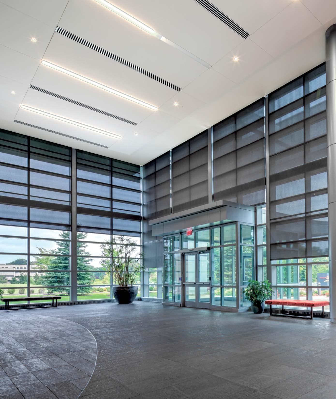


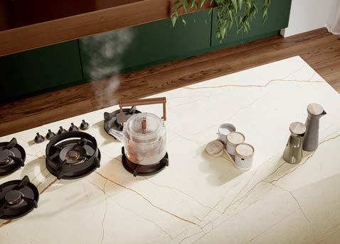
Porcelain countertops are having a moment in the kitchen. They are durable and easy to clean, and thanks to their fabrication at over 2,000° F, porcelain surfaces can hold their own when you place a hot pan on them. Caesarstone’s Ooak Porcelain Collection lets you do exactly that, except instead of simply resting your hot pan on your countertop, you can actually cook on the countertop—any surface from the collection can be paired with an invisible induction system underneath. You can turn the burners on via a discreet control tucked away in the drawer below, guide your pan on the surface until you hear a beep, and start cooking your meal. When the guests arrive, turn that same countertop into a full spread with drinks, appetizers, and absolutely no sign of a burner. caesarstoneus.com
Color matching has come a long way. The Nix Spectro L is a spectrophotometer that lets you measure the color of any surface on the go. The device is small enough to fit in the palm of your hand, but despite its compact size, it packs all the features of a standard spectrophotometer. You can pair it with a free app, create custom libraries, scan down to 16 mm samples, and leverage data like delta-e, spectral reflectance curve, ink density, RGB, CMYK, and over 300,000 paint colors from a multitude of brands. Its size and affordable price ($479) make it an ideal companion for creative professionals in the print and packaging industries, as well as graphic artists and designers. Think of it as the real-life equivalent of the Photoshop eyedropper tool—one that happens to look cute too. nixsensor.com
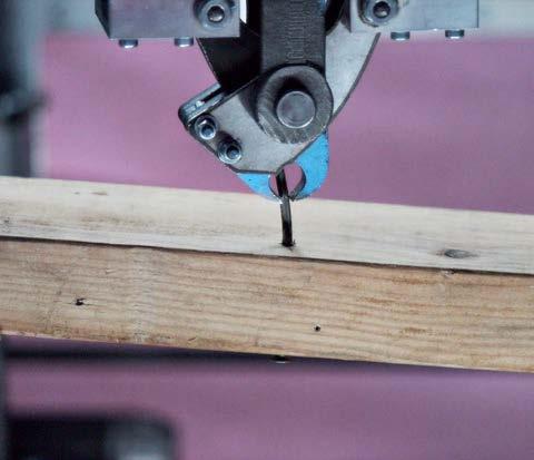
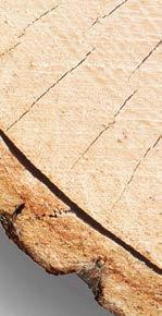
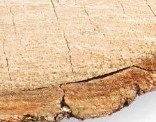
Timber is one of the most sustainable materials architects can build with, but in the quest to decarbonize the built environment, global demand for wood could grow fourfold by 2050. Reclaimed wood offers an interesting alternative as it helps lower the carbon footprint associated with virgin wood and helps architects salvage timber that would otherwise end up in a landfill. Urban Machine uses AI and robots to remove old nails and fasteners from lumber so it can be reused in other buildings. Dubbed “The Machine,” it consists of a portable system that can process lumber directly on construction or demolition sites. First, a machine learning algorithm calculates the quantity and quality of wood that can be recovered from each site. Then the system uses metal detectors to locate metallic elements for the robotic hands to extract. Finally, wire brushes polish the surface and “The Machine” performs a quality check to ensure the lumber is ready for a second life. urbanmachine.build






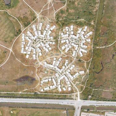
The built environment is responsible for 39% of global greenhouse gas emissions. What if we could curb those emissions before building projects even begin? Such is the aspiration of Urban Decarb, a new digital tool that helps landscape architects and urban planners calculate the carbon footprint of their designs, site and context considered, as early as the 3D modeling phase, then visualize which elements of their design have the highest carbon footprint and which have the lowest. Danish architecture firm Henning Larsen designed Urban Decarb, which is meant to aid in analyzing carbon footprints at the urban scale, using built-in assemblies for buildings and infrastructural elements like pavements, roads, and landscapes. It even considers projects’ geographical location and helps designers compare various scenarios—and their respective carbon footprints—in real time. The ultimate goal? To encourage designers to continually question their decisions and help them reassess before the concept has left the computer. henninglarsen.com/projects/urban-decarb

Ten solutions make an impact with their visual character and ease of use.
By Lauren Volker
01
With its light aqua hue and three layers of diffusion, Signify’s new 3D-printed pendant Riverstone evokes the soothing ambiance of gently moving water. At 18 inches wide and 8.25 inches high, the pebble-shaped fixture can be hung as a stand-alone piece or in statement-making groupings. Additionally, its outer shade is made from 50 percent recycled water jug material, and the inner shades are made from 55 percent ISCC PLUS–certified bio-circular materials. signify.com

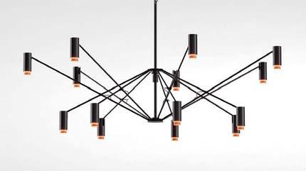
SCULPTURAL FORMS, DISTINCT OUTLINES, LUXURIOUS DETAILS and superior functionality—make this year’s lighting launches shine. Take Marset’s The W, which captivates with its bold lines and shape shifts to suit the variable illumination needs within large spaces. Or LightArt’s Acoustic Wing, which delicately floats above workspaces, providing both soft illumination and sound absorption. METROPOLIS gathered these and several other creative offerings from some of today’s most innovative manufacturers.
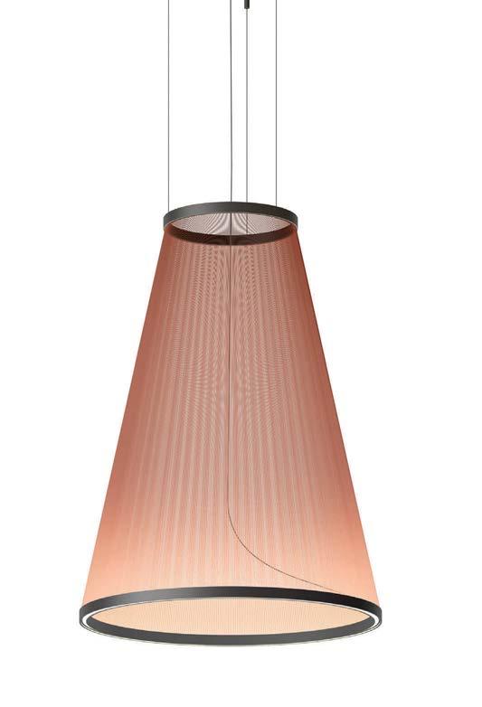
02
Designed by Umut Yamac, Array pendant lights get their conical and cylindrical silhouettes from fine threads strung tightly between two aluminum rings. Their unique construction creates solid yet translucent volumes that make an elegant statement without being overbearing. Available in various sizes, the largest of which is approximately seven feet tall and four feet wide, the lights are ideal for commercial spaces with high ceilings. vibia.com
03 POLTRONA FRAU NYMPH
Marking the debut of German designer Sebastian Herkner’s collaboration with Poltrona Frau, the Nymph table lamp collection draws inspiration from the mythical female spirits of nature. Featuring a pleated blown-glass lampshade and a leather-covered base, Nymph is available in two sizes and two glass shades: Pearl and Fumé. When turned on via its brass switch, the luminaire transforms into an elegant sculpture, reminiscent of its ethereal namesake. poltronafrau.com

04
The latest from PerezOchando for Marset, The W is a flexible, large-format pendant lamp with 14 spotlights joined by a black metal structure. As the rods and suspended spotlights move up or down, the fixture grows to a diameter of 80 inches or folds up to a diameter of 47 inches, simultaneously expanding or focusing the light. The cylindrical spotlights’ inner rings are available in ivory, terra-cotta, or gold. marset.com
05
The Lutron Luxury Experience App takes users on an immersive virtual journey through the brand’s lighting, shades, and control offering. Using the application’s innovative camera functionality, users can visualize products within projects, blending digital with reality and aiding decisionmaking. In addition, features like the interactive dynamic light and shades openness simulators allow users to visualize how different selections will optimize light balance. lutron.com


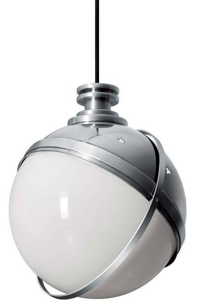
Designed by Nahtrang Studio, the Compass collection includes wall, suspension, floor, and reading lamps. The line features clean, simple structures and playful compositions: spherical heads attached to perpendicular stems, circular wall mounts, or suspended from wires, each offering unique rotation and adjustability. It's available in three metallic finish options: black, terra-cotta, and beige. estiluz.com
Cassina introduces the Eames Lighting Collection, developed in close collaboration with the Eames Office and Form Portfolios. Based on designs by Charles and Ray Eames, the line, which includes the Galaxy pendant and Helena (shown) lamps, marks the influential duo’s debut in the Cassina iMaestri collection, which this year is celebrating 50 years of authentically reissuing some of the most iconic pieces of 20th-century furniture. cassina.com 08 USAI
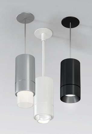
LittleTwos is USAI’s newest collection of two-inch-aperture pinhole recessed fixtures and two-inch-diameter cylinders. The pinholes install from below or with housing options designed to address most ceiling types. Ideal for residential, commercial, hospitality, and more, these minimal fixtures provide a clean ceiling appearance with superior visual comfort and low glare. usailighting.com
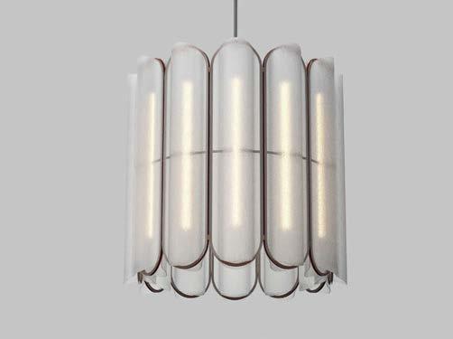
Composed of cast acrylic lenses joined edge to edge by an aluminum frame, the Vale Chandelier is available in configurations of 3, 6, and 12, and three canopy finishes: Anthracite, Rust, and Silica. The lenses’ prismatic surface and undulating profile create a soft, multidirectional gradient effect. a-n-d.com 10
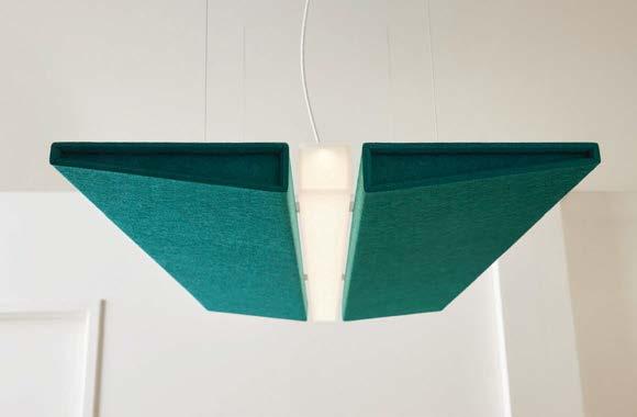
LightArt introduces two new size options for its Acoustic Wing fixture. At four by two feet and six by four feet, the new additions offer leaner, slimmer, and more accessible profiles. The center of the fixtures incorporates the company’s latest Casper Beam, which provides soft, even illumination with tunable white and RGB options. lightart.com
Eight new releases reflect a desire for authenticity—in material and style.
By Lauren VolkerTHE LATEST KITCHEN AND BATH introductions signal that consumers are looking for products that feel both natural in their aesthetic and genuine in their ability to reflect individual taste. Many of the offerings shown here emphasize craftsmanship and earthfriendly materials and features while offering that extra personalized touch. Products like Kallista’s 002 tout artisan assembly with lever handle options that adorn natural stones like rose quartz and zebra jasper. Or take RainStick Shower, a circular system that boasts an 80 percent reduction in water and energy usage but doesn’t skimp on luxury—a smart home connection allows users to curate their shower experience. This year’s standout releases echo a growing focus on sustainability and personalized living experiences in kitchen and bath design—here’s a glimpse of a few. M

Inspired by travertine, Daltile’s Calligo blends the natural essence of stone with the durability of porcelain tile. The tiles are offered in a dimensional 12 x 24 fluted wall option that plays with light and shadow, or 15 x 30 floor tiles and 1 x 6 mosaics for a clean, modern look. They also feature Daltile’s proprietary DEFEND™ powered by Microban technology, which continuously eliminates 99 percent of bacteria on the tile surface. daltile.com
ROCKY MOUNTAIN HARDWARE PHASES COLLECTION
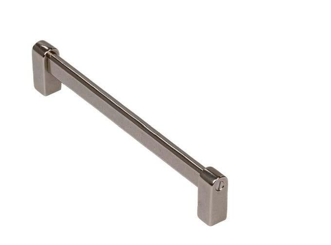
A collaboration with Suede Studio, Rocky Mountain Hardware’s Phases collection blends contemporary design with functionality. The bath and kitchen accessories— including cabinet pulls, towel bars, hooks, and more—are crafted with curves and angles, marrying cast bronze with modern aesthetics for an edgy “yin and yang” style. rockymountainhardware.com

Kallista’s 002 Collection includes a widespread faucet, shower trims, and a freestanding bath filler in five luxurious finishes. Inspired by the classic pill shape, the line reimagines soft modern forms with clean edges and subtle surfaces, blending seamlessly into any space. Handcrafted by global artisans, the faucet features a no-profile aerator and Italian stone handle options, offering timeless elegance for minimalist or luxurious settings. kallista.com
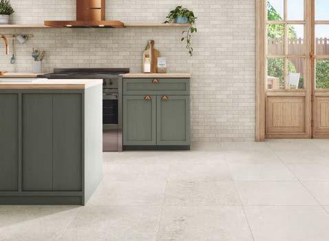


Crossville Beljn is a new porcelain tile collection from AHF Products, embodying Belgium's grandeur and limestone heritage. Handcrafted in the United States, it blends old-world charm with modern flair. With five hues, two finishes, and various sizes, Beljn suits indoor and outdoor spaces, offering durability, low maintenance, and ecofriendliness. ahfproducts.com

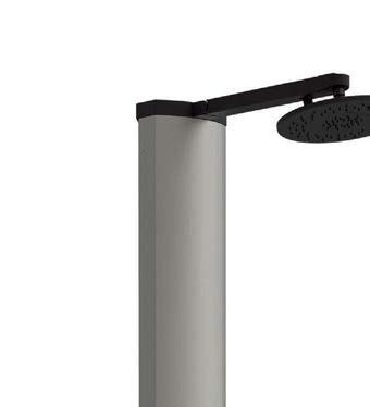
RainStick Shower reduces water and energy usage by up to 80 percent while effectively doubling the flow rate of a traditional shower. Additionally, its smart technology enables personalized experiences, with users able to monitor water and energy usage and enjoy luxury and ecoconscious features. While the original creates a statement piece, a new RainStick Lite option can be installed behind the wall, offering a more discreet look and allowing for design freedom and adaptability. rainstickshower.com
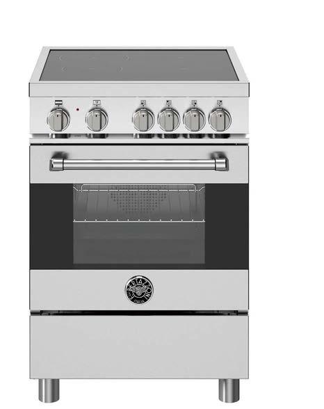
Designed for smaller spaces, Bertazzoni's 24” Induction Range offers a seamless black glass cooking surface with embedded touch controls. Catering to homeowners and designers seeking functionality and style, this range delivers performance and easy cleanup. us.bertazzoni.com
LX HAUSYS TERACANTO
LX Hausys has expanded its TERACANTO Porcelain Surface line with seven new colors that celebrate nature’s beauty. From Calacatta Lincoln's warm tones to Asgard's exotic vibes, each addition is created with organic earth-based ingredients and blends opulence with versatility, ideal for residential and commercial spaces. lxhausys.com
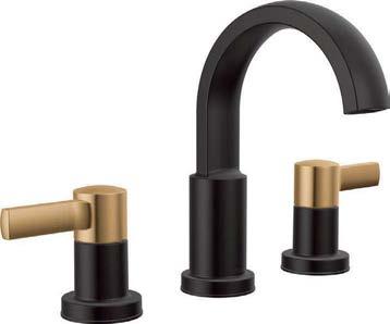
Drawing inspiration from modern architecture, Delta Faucet’s Albion Bath collection (available in fall 2024) blends soft curves with angular geometries for dimensional style. The line, offered in five finishes, includes single-handle, centerset, widespread faucets, along with the In2ition Two-in-One Shower, which combines an overhead with a handheld for a flexible shower experience. deltafaucet.com

A new generation of carbon-neutral and recycled concrete products are bringing foundational change to the world’s most common building material.
By Brian LibbyAnew era for the world’s most ubiquitous building material, concrete, is beginning to solidify. And it’s a glaring need. The material is responsible for over 7 percent of global carbon dioxide emissions, nearly all of that coming from the built environment. Concrete’s key ingredient, Portland cement, is made from heating limestone and clay into clinker (a process known as calcination) at very high temperatures, which is doubly damaging to the environment: the energy emissions from heating calcination kilns and in the carbon dioxide generated along the way.
Today, manufacturers and architects are exploring innovative alternatives that transform concrete and cement from culprits to contributors to global sustainable design and construction. Some of these products rely on recycling concrete itself, while others cultivate new, less energy- and carbon-intensive recipes—or both. Here are four products ready to leave the laboratory and become part of mainstream building.
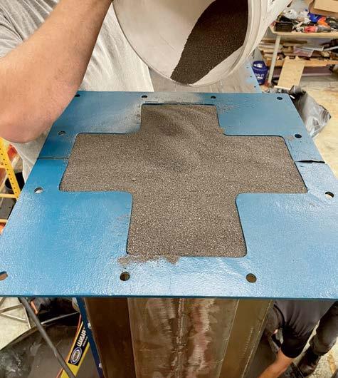
A collaboration between North Carolina–based Biomason and Copenhagen, Denmark, architecture firm 3XN’s research studio, known as GXN, this product uses Biomason’s proprietary Biocement, which uses nonmodified bacteria to grow a cementlike material that is 20 percent lighter than concrete blocks, yet three times stronger. Introduced at the Copenhagen Contemporary Museum’s 2023 exhibit Reset Materials — Towards Sustainable Architecture, the collaborators created an architectural column grown from bacteria with minimal human intervention in just 72 hours. The process requires significantly less energy than manufacturing cement and can make use of natural aggregates (sand, soil) or recycled concrete, brick, and glass.
“We’ve been looking at Biocement for more than ten years, but it’s not been at a stage where people were interested in investing, or in bringing it up to a scale for the built environment,” says architect Lasse Lind, a partner and head of consultancy at GXN.
“Whereas now we’ve arrived at a moment in time where that’s changing. It’s dawning on a lot of people that we actually have to change.”
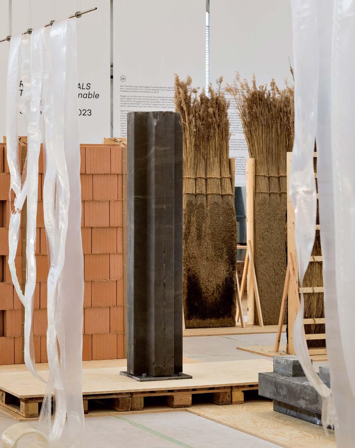
Opposite: Biocement transforms the traditional column using bacteria metabolism to grow cementlike material in 72 hours with minimal human intervention. This page: Bioconcrete column exhibited at Copenhagen Contemporary (CC) between July and October 2023.
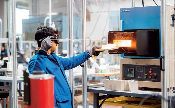
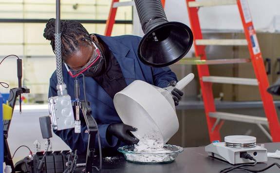

Brimstone produces industry-standard Portland cement with carbon-free calcium

Instead of baking limestone to make Portland cement, Oakland, California–based Brimstone uses carbon-free calcium silicate rock to make its cement, which does not release carbon dioxide. Brimstone’s is the first product to receive third-party certification from the international standards organization ASTM International, proving it meets the same specification guidelines as traditional cement.
"Massive industrial change typically only happens when technical advances or economic shifts make a new product cheaper or more efficient,” says Brimstone CEO and cofounder Cody Finke. “In some places, supplementary cementitious materials are also becoming scarce, leading to high prices and creating co-product markets. Because of the rising price of co-products like SCM and other market conditions incentivizing lowcarbon innovation, our idea is only recently economically sound—and we were lucky to think of it first. Brimstone’s deeply decarbonized process is more efficient and lower cost at scale than the status quo.”


After first building the temporary Striatus bridge at the 2021 Venice Architecture Biennale using 3D-printed concrete blocks assembled without mortar or steel reinforcement, collaborators Zaha Hadid Architects, manufacturer Holcim, and the Block Research Group at Swiss research university ETH Zurich have created a follow-up, the Phoenix bridge, at Holcim’s Lyon, France. Made partly by recycling material from the Striatus, Phoenix contains 40 percent less embodied CO2, reducing its carbon footprint by 25 percent compared with reinforced concrete structures. Phoenix demonstrates a circular system allowing Holcim to upcycle 100 percent of demolition materials into new building solutions, from aggregates and sand to decarbonized cement paste.
Whereas Striatus is temporary, “Phoenix will stay in place, and we want to use the service life here within our premises to monitor how it evolves,” says Hélène Lombois-Burger, Holcim’s head of research and development for concrete and aggregates and digital fabrication. Utilizing 3D printing, she adds, allows greater precision. “You are saving up to one-third of the concrete and one-half of the steel versus a conventional reinforced bridge.”


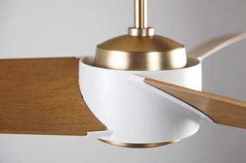
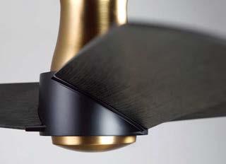

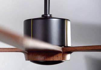
Why settle for ordinary when you can choose something exceptional?
The Modern Fan Co. is the original and premier source for modern ceiling fan design, offering solutions that are as tasteful as they are functional. From long-standing, iconic designs to newly inspired interpretations, our assortment of quality products is the result of unwavering focus on the little details that make all the difference.
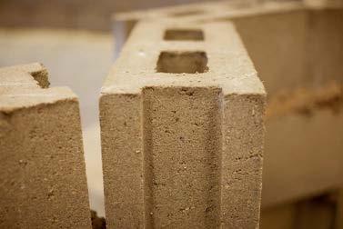
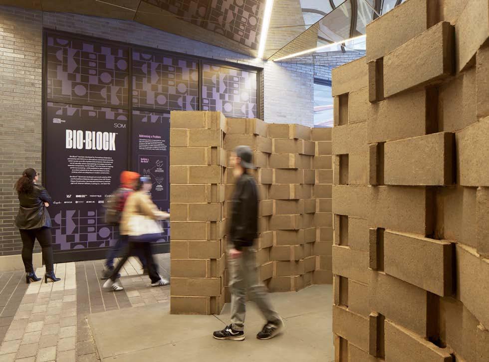
Bio-concrete can be colored, textured, and shaped like traditional concrete. As development progresses, it achieves compressive strengths comparable to conventional concrete.
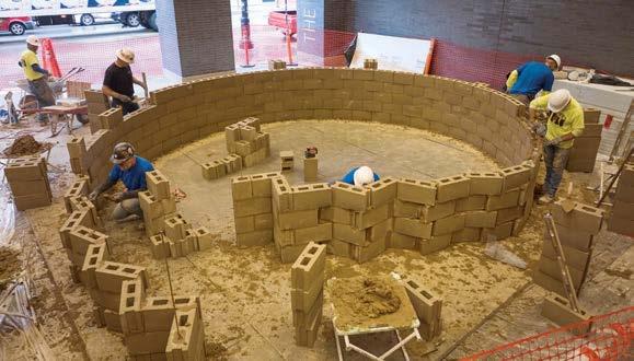
Concrete blocks are one of the industry’s most ubiquitous products, as common to Home Depot aisles as to large-scale building projects. Boulder, Colorado’s Prometheus Materials recently collaborated with Chicago-based mega-firm Skidmore, Owings & Merrill at the Chicago Architecture Biennial to introduce the zero-carbon Bio-Block—made primarily from algae-based bio-concrete—at a public installation called Bio-Block Spiral. Constructed by skilled local masons, it is another step in making this alternative product mainstream.
“We saw the promise in it, which is easy to do,” says SOM design partner Scott Duncan, who sees potential for the firm’s skyscraper projects. “Bio-Block dampens sound more than CMU [concrete masonry units], and it’s lighter. When that gets used over dozens of floors, it has an accumulated positive effect on everything else. Your beams can be lighter, your foundations can be smaller. That has a collateral impact on foundations and overall structural frame sizes.” M



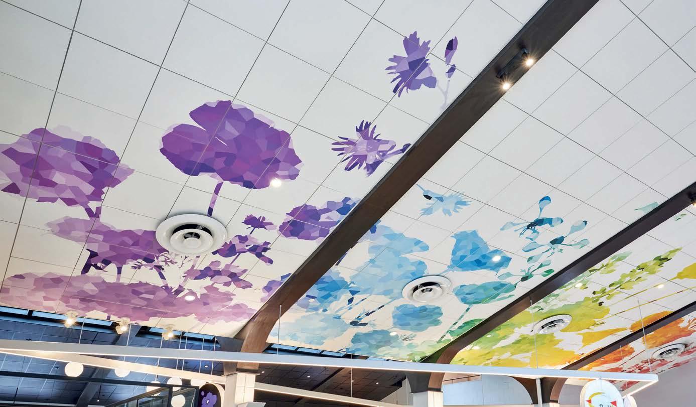

one-of-a-kind think.
Turning a standard acoustic ceiling into a colorful one-of-a-kind bouquet is a lot easier than you might think. Create!™ ceiling panels become your blank canvas for artistic expression. Start with Ultima® or Optima® panels for the best performance benefits in your space. Then we transfer your images and patterns onto the panels for an acoustical masterpiece. Your unique visual sets the stage for a memorable space with the flexibility to fine-tune the acoustics. Let your creativity bloom at armstrongceilings.com/create
 AIA24 Booth 3609 Washington DC June 5-8
Optima® Create! Vector® & Optima® Panels with Axiom® Classic Perimeter Trim Blossom Market Hall, San Gabriel, CA > Office42 Architecture, Los Angeles, CA
These solutions for walls, openings, and cladding are each best-in-class in some way—offering environmental benefits, aesthetic choices, and design possibilities like never before.
By Avinash Rajagopal
GUARDIAN GLASS CLIMAGUARD 55
Targeted at residential architects, builders, and owners trying to stay ahead of changing energy standards, ClimaGuard 55 coated glass offers superior solar heat gain performance among mid-range VLT glass products—it has a solar heat gain coefficient of 0.258, with a U-value of 0.243, and visible light transmission of 55 percent. Adding Guardian ClimaGuard IS 20 interior surface coating will improve those numbers even further. With this offering, Guardian Glass is trying “to help customers meet ENERGY Star Version 7.0 and other codes that drive energy conservation,” adds Suresh Devisetti, the director of product management. guardianglass.com
OLDCASTLE BUILDINGENVELOPE
RELIANCE-TC LT
For better thermal protection against climate extremes in the United States and Canada, Oldcastle BuildingEnvelope (OBE) has extended its Reliance range of curtain wall solutions with the slim Reliance-TC LT. With a two-inch sight line, this double-pane wall provides great seismic performance, is lightweight and cost-competitive, and performs at a U-factor level of 0.29, making it ideal for buildings in IECC Zones 4–8. “And because it comes from OBE, installers can enjoy the convenience of a single-source solution for both framing and glass,” says Julie Schessler, product manager at OBE. Reliance-TC LT is Red List–free. obe.com

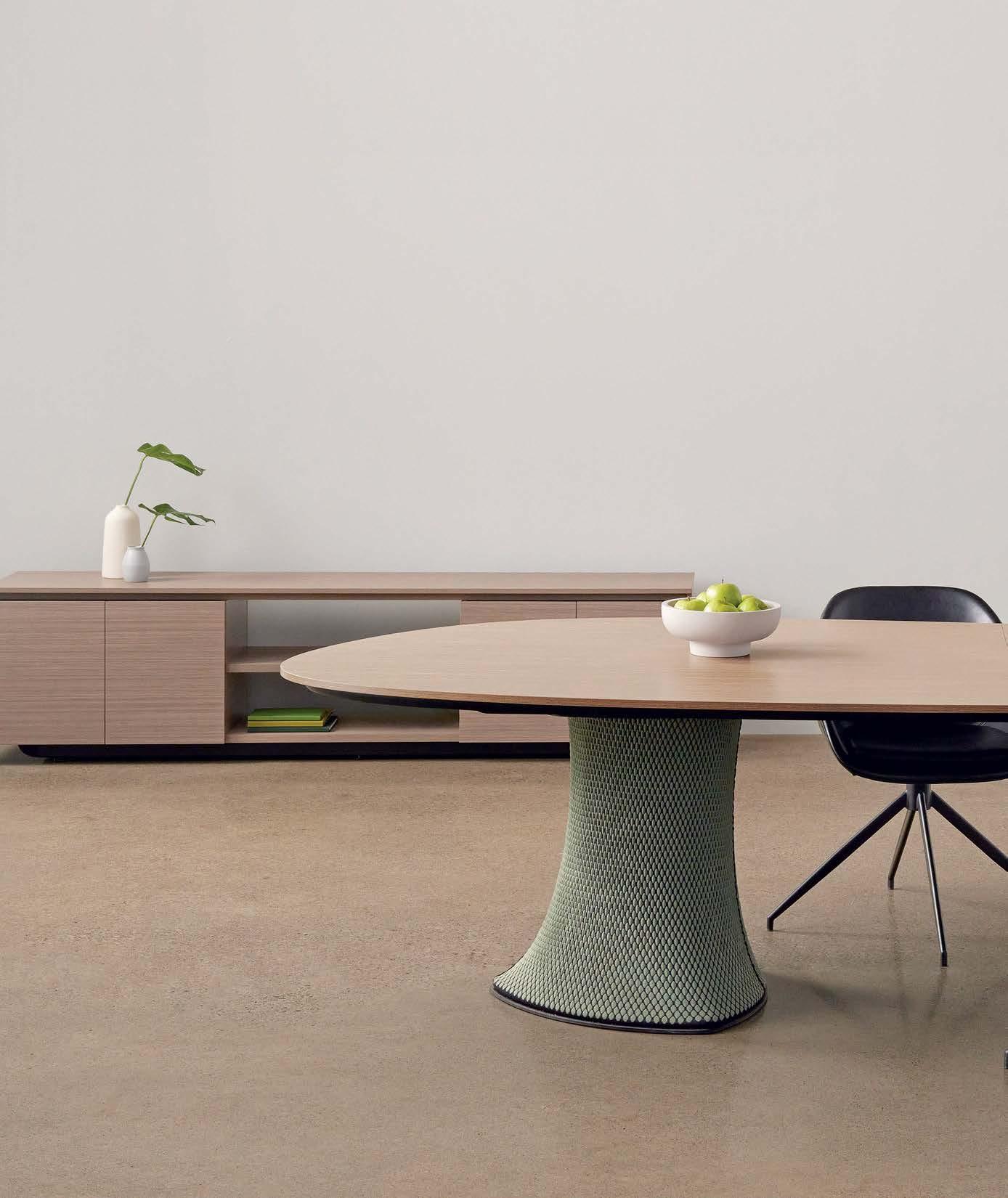
ThreeH.com Tables
Stone company Borrowed Earth sees its raw material—stone from quarries in India, Iran, or Portugal—as merely “borrowed” from the planet. Founder and CEO Ruchika Grover understands a thing or two about that because her first job was as a block marker, selecting stone for her father’s marble and granite trade. The waste she saw in those quarries inspired Borrowed Earth’s latest offering—Stone Bricks made out of the remnants and discards from the process of cutting slabs and tiles. The bricks come in eight colors, and can be previewed in any configuration using the company’s AR app. “There are so many patterns and textures you can create with it,” Grover says. borrowedearthcollaborative.com


In addition to being an ancient building material and having many positive environmental impacts, brick today offers a mind-boggling array of aesthetic choices. Brick manufacturer Glen-Gery has so many options, in fact, that the company announces an annual Brick Color of the Year. 2024’s choice is Blue Smooth Ironspot, produced from the clay deposits of the Loess Hills in Iowa. “We foresee designers still having a desire to bring nature indoors but with a shift toward bolder colors, especially deep blue tones that add a fresh sense of tranquility,” says Glen-Gery’s marketing manager Denise Smith. Blue Smooth Ironspot is one of the company’s many brick lines that have a significant amount of pre-consumer recycled content, including sawdust, sludge, and metallic oxides. glengery.com


Introducing our premium architectural grade aluminum, crafted with a minimum of 75% post-consumer recycled content.
Our use of Hydro CIRCAL® aluminum boasts an impressively low carbon footprint of 1.9kg CO2e/kg of aluminum, ensuring sustainability without compromising quality.
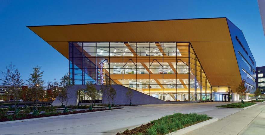
LONGBOARD
LONGBOARD ECO
Producing aluminum from ore uses a lot of energy, but it is also one of the most easily recyclable metals. Longboard, a leading producer of aluminum cladding for buildings, is leveraging the circularity potential of the material to offer ECO, a suite of products with at least 50 percent recycled aluminum (the industry average is currently about 33 percent). This means embodied carbon savings of about 45 percent compared with standard aluminum products. ECO is also fully recyclable, VOC- and Red List–free, made using chrome-free pretreatment, and manufactured using hydroelectric power. longboardproducts.com
While metals, ceramics, and plastics have all become popular cladding materials in recent decades, natural slate has been used on exterior walls for centuries.
Extracted from the world’s largest tectonic slate reserves in Spain, Cupaclad slate rainscreen cladding systems are handcrafted, receive no chemical treatments, and are significantly more sustainable than other cladding materials—requiring a tenth of the energy needed to make clay facades, for example, and resulting in a fifth of the pollution caused by fiber cement manufacturing. The system is impact- and earthquakeresistant, and comes with an EPD and a carbon-neutral certification. cupapizarras.com
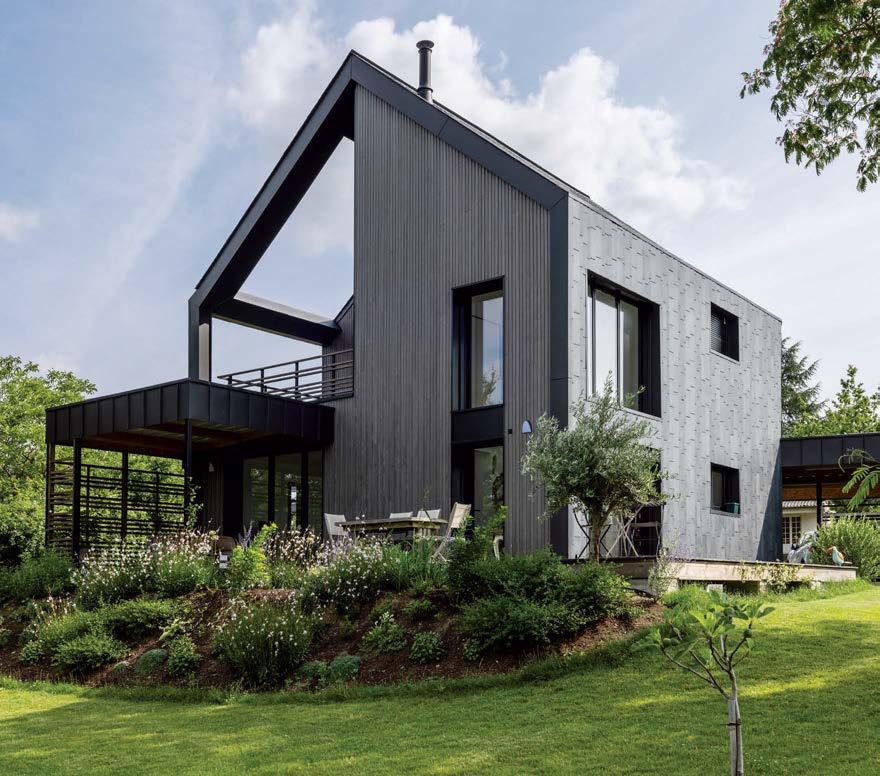
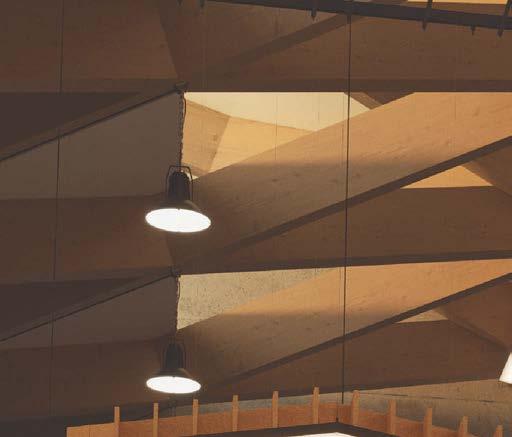

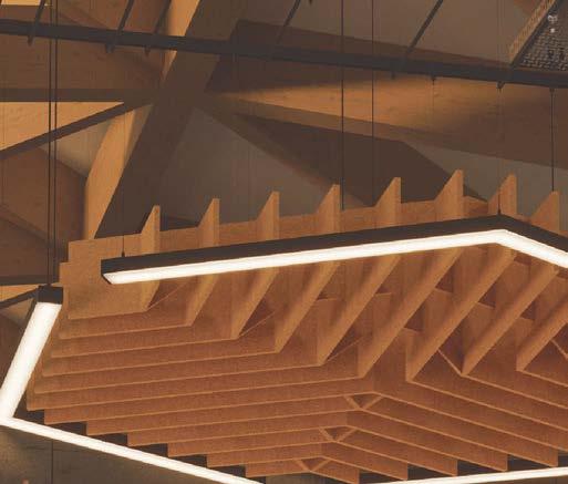


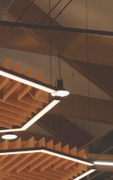


The Charlotte, North Carolina–based window and door manufacturer Jeld-Wen has set two sustainability goals—using only fully recycled or harvested materials, and sourcing only sustainably certified wood for all its products. The Second Nature collection is in line with both goals. Recycled wood fiber (including waste from Jeld-Wen’s own mills) or wood fiber from FSC-, PEFC-, SFI-, or ATFS-certified forests make up 80 percent of all the content in every door. The solid-core construction of these doors means they transmit less sound and are extremely durable. Every offering in the Second Nature collection also comes with a five-year limited warranty. jeld-wen.com
KAWNEER
250T/350T/500T INSULPOUR THERMAL ENTRANCES
As energy codes continue to get more stringent, and as buildings reach for higher efficiency goals, managing thermal performance becomes absolutely critical.
“A lot of our R&D investment goes into understanding how thermal breaks can improve the performance of our products,” says Chris Shultz, Kawneer’s product manager for storefronts, entrances, and framing. The company’s Insulpour Thermal Entrances use new polymer isolator technologies within the tried-and-tested pour-and-debridge system to provide superior performance in commercial and multifamily buildings. When infilled with triple-pane insulating glass units, these entrances can provide U-factors as low as 0.42 BTU/hr./ft.2 /°F. Insulpour Thermal Entrances are Declare Red List–free and come with EPDs. kawneer.us
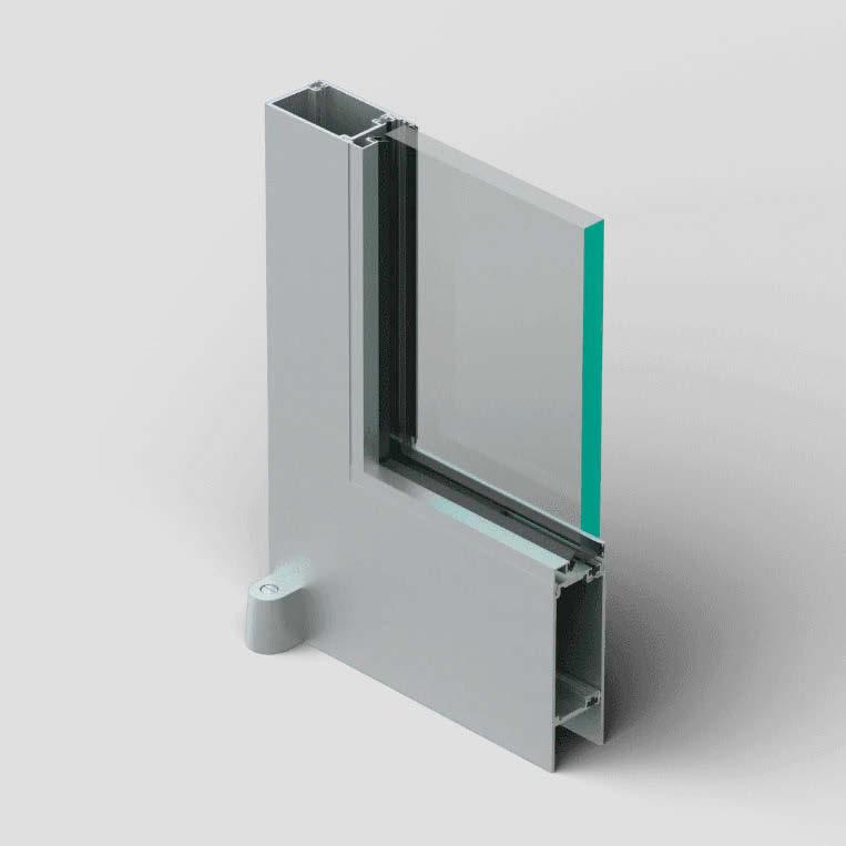


MOBILE SURVEILLANCE


Security Design is currently based on restricting access and protecting perimeters. Invisible security in contrast foresees free access.
Invisible security uses data, technology and design to secure places. Everywhere and at any point in time.
While putting security at its core, it respects public acceptance, privacy and convenience, in order to make physical spaces not only safe, but also frictionless, trustworthy, and liveable.


CONTINUOUS AUTHENTICATION




VIRTUAL PERIMETER


BEHAVIORAL ANALYTICS


CONSENT-BASED IDENTITY MANAGEMENT


Through its applied research on all-mass-timber construction, Waechter Architecture designs with simplicity in mind.
By Francisco BrownMASS TIMBER HAS BEEN A CORE PART of Waechter Architecture’s (WA) practice over the past decade. The Portland, Oregon–based firm has been studying and developing projects to expand knowledge of this increasingly popular material in the region and test its construction efficiencies, energy performance, and cultural and market adoption across design typologies. WA’s research on mass timber architecture received a grant from the USDA/U.S. Forest Service Wood Innovations Program, with additional support from the Softwood Lumber Board.
The firm’s studio space, the Mississippi Workshop, is a three-story prefabricated mass timber structure designed, developed, and built by WA as a test bed for its in-house all-wood construction research. The building is the first commercial project in Oregon to use mass timber construction for all building components. Except for the sheathed metal exterior and the integrated radiant concrete flooring, the firm used exposed wood for all surfaces, purposely avoiding hybrid systems. “The idea with this building was to do a modern and high-tech building, but also a primitive one,” says the firm’s founding partner Ben Waechter.
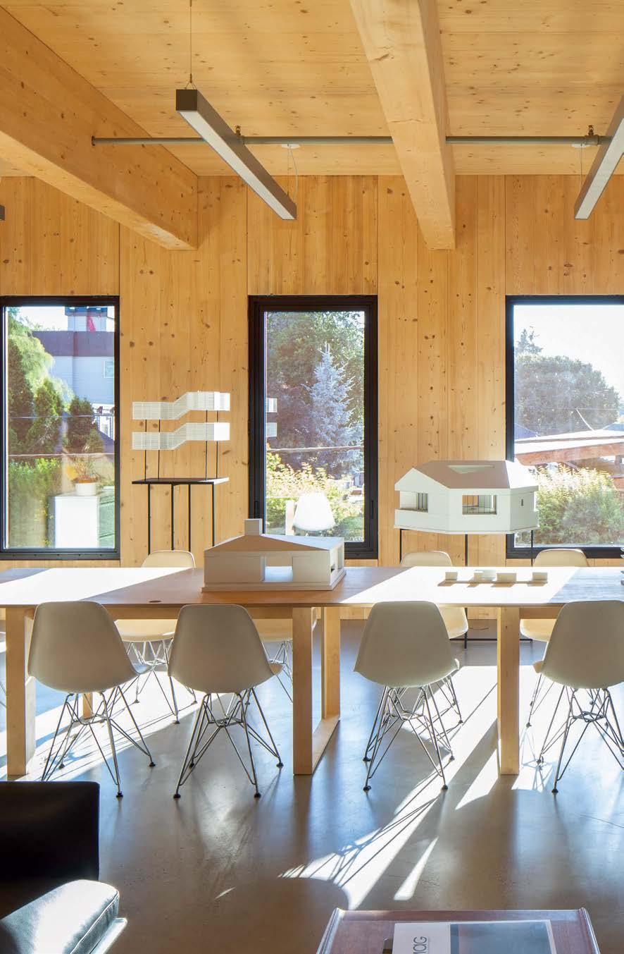
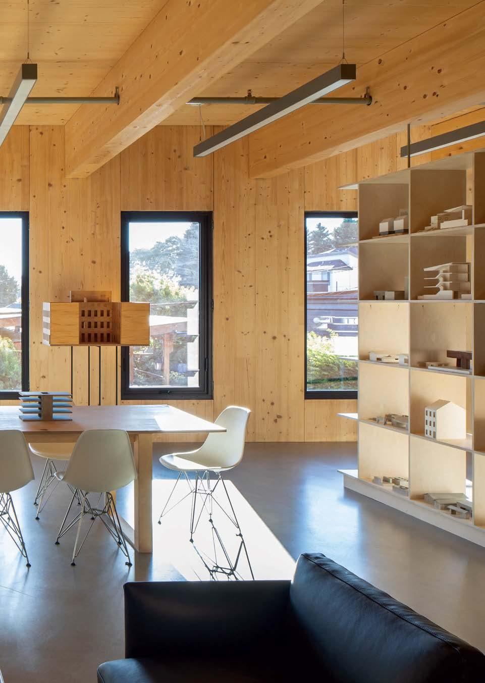
Mississippi Workshop, Oregon's first all-timber commercial building, is a three-story, 9,555-square-foot structure. Waechter Architecture founding architect Ben Waechter's residence occupies the third floor. The second floor houses the design studio, while the ground level features a coffee shop, bike storage, makerspaces, and public areas that open to a courtyard, forming a semi-private civic space for informal gatherings.
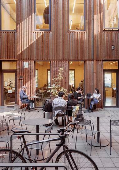


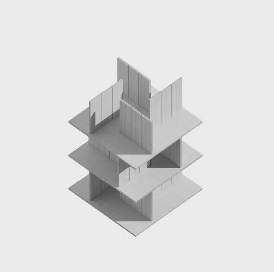
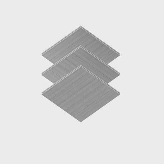
This building has helped WA confirm early design assumptions and address challenges along the way. “It’s a really tight envelope, with a tilt-up system with panels that go from the foundation to the roof with no horizontal breaks in the wall, so there’s no air leakage,” Waechter says. “There’s a concern with having systems so fully integrated into the body of a building. Because the power, data, and mechanical systems are going to fail at some point.” This reality led them to rethink future iterations more like “primitive vessels” that, through their rational simplicity, allow maximum spatial and systems flexibility. Another exciting breakthrough was in fire protection. Coordinating with Code Unlimited as a code and fire protection

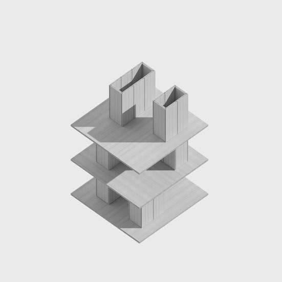

The studio's in-house research led to a taxonomy of structural approaches for all-wood buildings (left). For their final projects (below), University of Oregon Design Studio students prioritized singular systems to achieve more integrated built results.
Opposite: For an all-wood speculative design series, the studio made an infill housing type (left) with platform structures creating shifting openings for ground-floor bedrooms and upper-floor living spaces, along with shared gardens and courtyards beneath upper patios. Another project (right) featured an all-wood office building with a cassette structure that spans and cantilevers beyond platform cores for rapid construction.
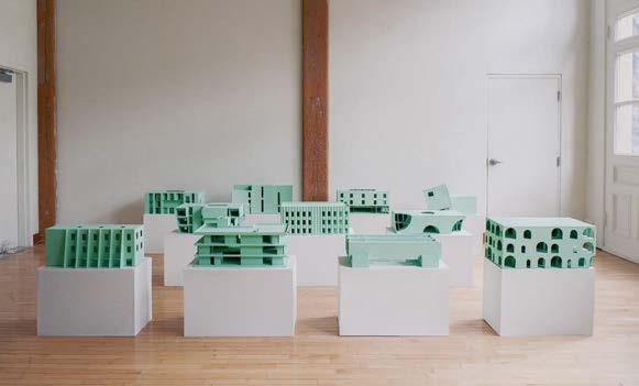
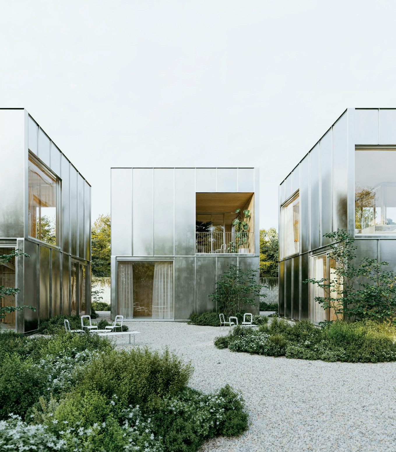
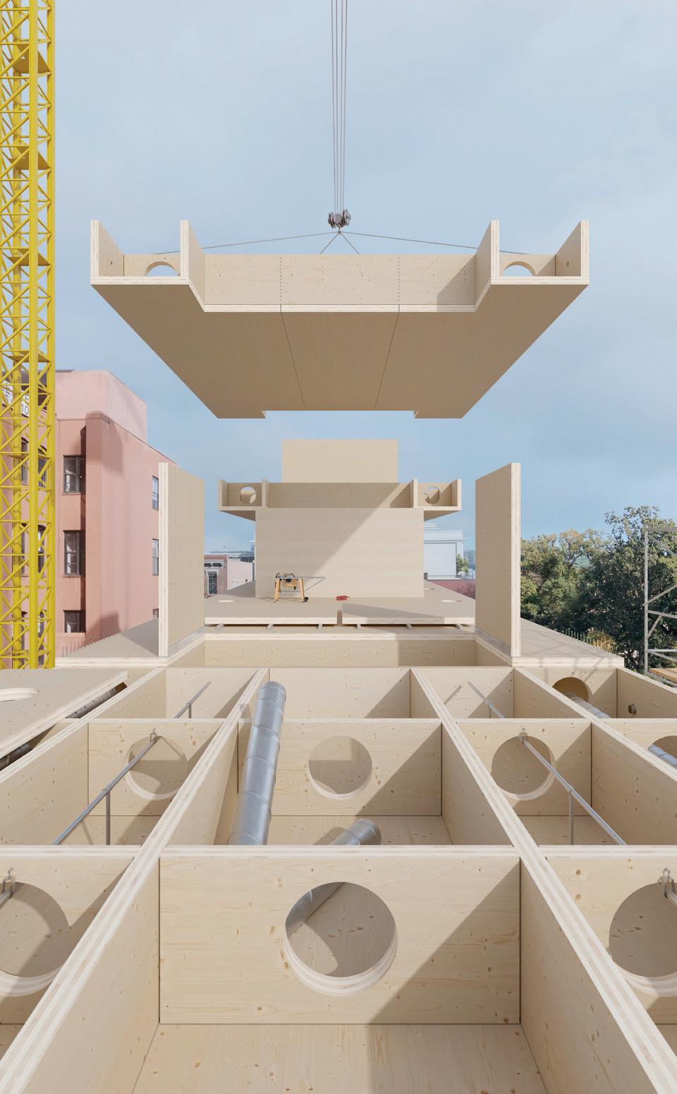
consultant, WA created new fire protection details to avoid the mandatory hybrid system requirements as fire retardants, creating new opportunities to expand local construction codes. “This was not just for this project but for future mass timber projects,” says Waechter. WA and Codes Unlimited together proved that the mass timber and wood-onwood alone were enough to limit the spread of fire and that joints met construction criteria. “I think Waechter took a uniquely stubborn stance of what wood can do, and even with pressure put on code and structure to achieve that aesthetic experience, it turned out it was doable,” Will Smith, a project lead at WA.
The studio’s research-based design approach also helped it develop an all-timber
structural components taxonomy. Divided into standard scenarios, the classification system is further defined by three main categories: the exterior structure at the envelope of the building, the inner structure throughout the floor plate, and the horizontal structure that supports the floor plate. WA took this exercise and translated it into an architecture studio at the University of Oregon, inviting its students to develop a project by choosing a single system. “In many of our projects, we aim to avoid hybrid systems in general. So, not having columns and then walls and then cores, but picking an approach for the architectural production of a building benefits the understanding of design as an integrated architectural system,” says Smith.
Now WA is developing a series of speculative design exercises to incorporate these structural and mechanical system taxonomies in all-wood projects. The hope is to create a multitude of typologies to demonstrate the material’s versatility within different constraints and to expand the notion of primitive specificity in architectural design by truly understanding the wide range of possibilities of all-wood architecture. As Waechter puts it, “The ambition or the idea is that there could be a world where we perfect what the building is made out of. Where what changes from project to project is really form and composition, that it’s a result of just trying to create experientially clear spaces that have a heft even though we’re building out of framing material.” M
Four recent titles highlight the past and future of timber, from forest to building products.
By Jaxson Stone
SPECULATIONS ON CLT
By Jennifer Bonner (Editor), Hanif Kara (Editor)
Applied Research & Design (January 2022)
240 pp., $49.95
Jennifer Bonner and Hanif Kara’s Blank: Speculations on CLT explores the cultural, spatial, and technological significance and potential of cross-laminated timber (CLT) and its material unit, the CLT blank. The volume offers up a “close reading” of CLT and is positioned as an antidote to current conversations, “which are fixated on its mass production and carbon footprint, portraying it as a bland product rather than an enabler of design.” The book features contributions by editors Nelson Byun, Victoria Camblin, Sean Canty, Courtney Coffman, Sam Jacob, Christopher C. M. Lee, Erin Putalik, Nader Tehrani, and Yasmin Vobis, in addition to a series of student work from a joint design studio at the Harvard GSD.

THE FOREST AND OTHER MASS TIMBER FUTURES
By Lindsey Wikstrom
Routledge (March 2023) 246 pp., $39.95
In this book, architect and Columbia GSAPP professor Lindsey Wikstrom poses the question, What role could mass timber, with its potential to replace concrete and steel, have in ensuring the planet’s survival? Tracing wood’s passage from forest to construction site, the book navigates readers through various aspects of mass timber, from its harvesting to its production, transportation, and disassembly. Along the way, Wikstrom debunks common mass timber myths from carbon sequestration to fire safety. The book serves as a comprehensive, non-extractive guide for architects and engineers who are interested in designing and saving the planet with wood.
INNOVATIONS IN MASS TIMBER: SEQUESTERING CARBON WITH STYLE IN COMMERCIAL BUILDINGS
ByBoyce Thompson Schiffer (May 2024) 224 pp., $45
From the world’s tallest mass timber building in Milwaukee to a fairy-tale experience at the Hans Christian Andersen Museum in Denmark, Innovations in Mass Timber focuses on 16 global projects that represent innovation and style through sustainable mass timber design in the commercial sector. From carbon sequestration to moisture control, acoustics to millwork, Thompson’s book conveys the environmental benefits of mass timber through a rich array of photography, technical diagrams, and prose.
TOUCH WOOD: MATERIAL, ARCHITECTURE, FUTURE
By Carla Ferrer (Editor), Thomas Hildebrand (Editor), Celina Martinez-Cañavate (Editor)
Lars Müller Publishers (March 21, 2023) 303 pp., $45
Through an extensive selection of essays, both “practical and visionary” projects, and over 200 illustrations, Touch Wood showcases how architects and designers are harnessing wood’s natural beauty, sustainability, and structural properties to create inspiring spaces. From Swiss timber architecture to Japanese joinery, it highlights wooden architecture’s aesthetic, environmental, and cultural dimensions.


June 10–12


“Start with the rising sun and work toward the setting sun, but take only the mature trees, the sick trees, and the trees that have fallen. When you reach the end of the reservation, turn and cut from the setting sun to the rising sun, and the trees will last forever.”
—Chief Oshkosh, the Menominee
Your questions about sustainably specifying wood in the United States, answered.
By Kenn BuschBased on recent focus groups, dozens of conversations with A&D speci ers, and research I’ve done creating CEUs on materials and sustainability, here is a story of the impacts of forest products. Through science, practical wisdom, and historical context, let’s explore our relationship with the only in nitely renewable building material we have—wood.
01
How is wood sourced?

02
What about reclaimed wood and wood composites?
03 How does wood help with decarbonization?

In the early 20th century, U.S. forests were hurting. Extensive logging, lack of effective management practices, and widespread clearing for agriculture had decimated many of our mixed forestlands and threatened the wildlife that depended on them. The modern conservation movement was launched because Americans recognized that these practices were unsustainable. However, it wasn’t until the 1980s that the age-old wisdom of Indigenous communities was recognized as a highly effective model for achieving the goals of the U.S. Forest Service: maintaining ecosystem health, preserving habitat diversity, preventing large-scale wildfires, maximizing yield to satisfy demand, and ensuring healthy forests for future generations.
Widely considered one of the best-managed forests in the world, the Menominee woodlands in northern Wisconsin have thrived since they were incorporated in 1854. The tribe’s management philosophy is based on a prescription written by Chief Oshkosh 170 years ago:
“Start with the rising sun and work toward the setting sun, but take only the mature trees, the sick trees, and the trees that have fallen. When you reach the
end of the reservation, turn and cut from the setting sun to the rising sun, and the trees will last forever.”
And so they have. The Menominee forest has more wood now than in 1854, is still rich in biodiversity, and provides an important economic engine for the tribe.
Chief Oshkosh’s 1854 prescription was not a breakthrough. He merely wrote down what the Menominee, and many other communities, had been doing since before recorded history. This is the difference between living on the land and living with the land.
The Menominee Tribal Enterprises practice selective harvesting, where loggers choose specific trees to remove, maintaining the overall structure and function of the forest while being careful not to harvest more than the forest can generate.
One type of selective harvesting is single-tree. “This is where we’re thinning out individual trees to open up the canopy to allow the sunlight to hit the seedlings and saplings,” procurement forester Steve Pilgrim told me last fall. We were in a forest in northern Wisconsin being managed by wood-products company NWH, not far from the Menominee lands. “Without full sunlight, trees can never mature healthily.”
“A shelter-wood cut is a little different,” Pilgrim continued. “We’re allowing the young trees to grow in the shelter of mature trees. As the new growth takes hold, more of the mature trees can be taken.”
Procurement f oresters like Pilgrim work mostly with private landowners to help them manage their forests for their specific goals. Even though few landowners invest in FSC (Forest Stewardship Council) or SFI (Sustainable Forestry Initiative) certification, the same management standards and practices apply. By some estimates 99 percent of all wood harvested in the U.S. is from forests managed to these standards.
It’s important here to address a common misperception. Many
designers say that when they hear “managed forestry,” images of tropical deforestation come first to mind. Forest management in North America is literally the opposite of deforestation—it aims to sustain forests indefinitely; deforestation involves the permanent clearing of natural forests for development, mining, bamboo plantations, or conversion to agriculture or grazing.
Clear-cutting is a managed forestry practice that involves removing entire stands of trees at once and is most effective for the long-term health of areas with species that thrive on full sunlight, like aspen, birch, lodgepole pine, some types of spruce, and Douglas fir. This is how most plantation wood is harvested. Plantation forests get a bad rap, but they take a lot of stress off natural forests in meeting the demand for products like toilet paper, newsprint, packaging, sawlogs for construction and furniture frames, veneers for plywood, mass timber, and fiber for engineered panels like particleboard and MDF. These fast-growing forests still inhale carbon dioxide and store it until the wood is burned or decomposes. Unless a natural forest or other sensitive ecosystems have been purposely cleared for plantation trees, plantation forests are still considered a positive for the environment, and for the wood-products value chain.
Every forest ecosystem has its own natural rhythm of disturbance and renewal and the best harvesting methods mimic that rhythm. Singletree selection and shelterwood harvests mirror disturbances like disease, insect damage, and localized windstorms like tornadoes and derechos. Prescribed burns, another staple forest management tool perfected by Indigenous peoples around the world, aren’t a harvesting method, but they are an important part of managed forestry. They’re used to strategically reduce fuel loads, boost nutrient content, manage invasive plants and insects, open up areas for larger game animals, and, of course, spark forest regeneration.


Alder, a foundational species in the lush Pacific Northwest, epitomizes NWH’s commitment to sustainability. Thriving in the region’s water-rich lowlands, this remarkable hardwood completes its life cycle in about 60 years. Its natural ability to regenerate reduces the need for replanting and helps combat soil erosion. This wood is increasingly popular with fine-cabinetry makers and is a great choice for custom furniture. nwh.com
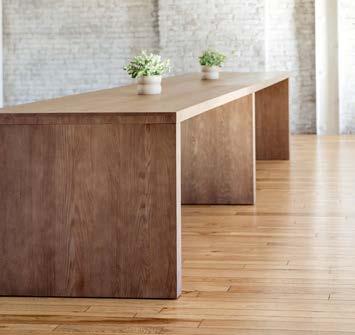
The solid red oak timber used to create the Loci product line is responsibly grown, milled, and finished within 200 miles of the KFI Studios factory in Kentucky, in a commitment to reducing the carbon footprint of the product and supporting local workforces. Designed by Union Design, the Loci table is available in multiple heights and sizes. It doesn’t have laminates or veneers and can be refinished time and time again. kfistudios.com
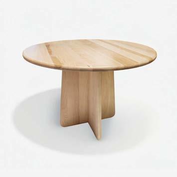
Mantra IF makes its furniture from solid hardwood sustainably sourced within the United States through selective harvesting. The Unity tables are a flat-pack solution suitable for collaboration areas, meeting rooms, and conference settings, and adapt to various spatial requirements. Backed by a ten-year warranty and finished with nontoxic varnishes, Unity promises longevity and durability. mantrainspiredfurniture.com
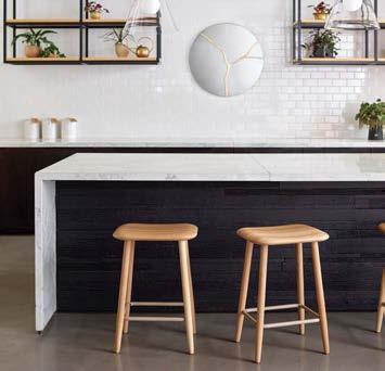
Over the past five decades, OFS has reclaimed 7,000 acres of FSC-certified forests and planted tens of thousands of trees. The Rory collection, designed by Brian Graham and released in 2023, builds on this legacy, as do all the company’s wood products. ofs.com
Solid wood isn’t the only kind of forestry product that can be used in buildings.
There’s growing interest in sourcing wood from urban areas in two ways: by recovering felled trees for lumber and veneers, or by salvaging wooden beams, joists, posts, and decking from the demolition of factories, warehouses, and other large buildings to be re-machined into structural or decorative elements, stairs, railings, ceilings, wall paneling, and even furniture.
Urban Evolutions in Appleton, Wisconsin, has been working with reclaimed wood for over a quarter century. Co-owner and creative director Robin Janson says these time-capsule materials often inspire the design of an entire project. “Our process is to flip the script on material aesthetics. Rather than designing the look of a building and then hunting far and wide for materials that meet that aesthetic, we start with identifying the materials at hand and let them
shape the building’s look and feel,” she says. “A key principle in circular design is to circulate products and material at their highest value for as long as possible. There’s no better way to achieve this than using reclaimed wood.”
The other avenue for forestry products is composite wood materials like particleboard and MDF, which, in a testament to the frugality of the wood-products industry, can sometimes be manufactured entirely from postindustrial waste wood. Before these materials were invented in the 1940s and 1960s, respectively, 50 percent of the fiber from trees harvested for furniture and construction—sawmill scraps and shavings—was destined for landfills and incinerators. Now utilization of that fiber tops 99 percent.
This waste is processed, combined with resins and waxes, and pressed into panels engineered for a variety of furniture and millwork applications. They offer dimensional

stability and consistency at a lower price than most other wood-based materials and are compatible with highly automated manufacturing technology. The key sustainability consideration with these materials, of course, is the health impacts and emissions of any additives used in their manufacturing.
“We’ve developed lighter products with outstanding physical properties that reduce our carbon footprint and help reduce emissions in production and transport,” says Don Raymond, vice president of marketing for panel producer Uniboard Canada. “All our regular particleboard and MDF products meet CARB Phase 2 and TSCA TITLE VI emissions standards, the most stringent environmental guidelines in North America.”

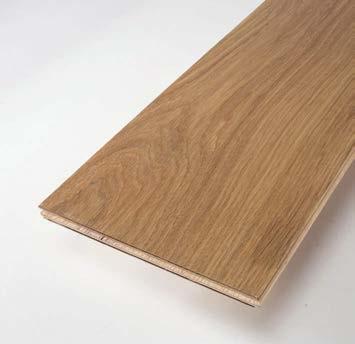
NYDREE FLOORING
ZERO COLLECTION
Nydree’s engineered wood flooring has a top layer infused with acrylic to make the product thrice as durable as standard wood flooring. The Zero collection utilizes lamination adhesives, finishes, and core materials that are all Red List–free. nydree.com
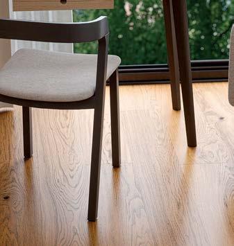
BJELIN
WOODURA CONTRAST COLLECTION
These durable hardened wood floors celebrate FSC-certified Slavonic oak and come in five colors: Silver, Vapor, Ivory, Granite, and Desert. They are ideal for heavy-duty commercial spaces. Bjelin’s products are certified by Nordic ecolabel Svanen for a high proportion of renewable and recyclable content, and are also UL Greenguard Gold certified. bjelin.com
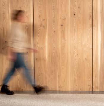
URBAN EVOLUTIONS
SELECT HEART ASH PANEL
Ash for these panels is sourced from fallen city trees, sourced through a collaboration with municipalities, and has an unedited, character-rich grain appearance that sets it apart from traditional veneer. The panels are made in the USA, Declare Label Red List Approved, and manufactured with reclaimed wood veneer and MDF that exceed the Eco-Certified Composites Standard. At the end of life, Urban Evolutions will accept the panels as part of its take-back program. urbanevolutions.com
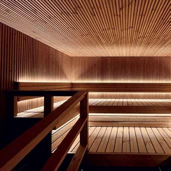
LUNAWOOD THERMOWOOD
Thermowood is sourced from renewable Nordic forests, enhanced with heat and steam at mills in Finland. Lunawood products are dimensionally stable, weatherproof, and resin-free, completely without harmful chemicals. The material doesn’t necessarily require surface treatments, and stores five times more carbon than is emitted during production.
lunawood.com
Temperate and boreal forests, where we source most of the wood for construction and furniture, together cover about 1.9 billion hectares globally and account for about 46 percent of the world’s forest carbon storage, underscoring the importance of these forest types in mitigating climate change.
Trees inhale carbon dioxide from the air, release oxygen, and convert carbon into glucose, which provides energy and building blocks for growth. We learned about this process—photosynthesis—in school, and that’s how a tree makes cellulose, the primary component of wood and the most abundant organic compound on Earth.
The chemical makeup of wood is 50 percent captured carbon by dry weight. This carbon is not released back into the atmosphere until that wood decomposes or burns, which means significant amounts of carbon are stored in solid and composite wood products for decades, even centuries.
Managed forests, where selective logging, replanting, and
thinning are practiced, can sequester carbon more effectively than unmanaged forests because of enhanced growth rates from younger, healthier trees.
Owing to product category rules for wood products, life cycle assessments (LCAs) for these offerings cover cradle-to-gate impacts. In composite wood, the LCAs find that the materials are storing about 40 percent more captured carbon than is released in the harvest and conversion into panels, rendering them truly climate positive.
Putting numbers to it, according to the Construction Material Pyramid developed at the Royal Danish Academy’s Center for Industrialized Architecture, one cubic meter (or about 35 cubic feet) of MDF has a carbon footprint of –783 kilograms of CO2; glulam is –664 kilograms; construction timber, –680 kilograms. Aluminum, on the other hand, has a carbon footprint of positive 28,890 kilograms; glass, 4,580 kilograms; and vinyl flooring, 3,802 kilograms.
Any topic as important and emotional as forests and their role in carbon capture and sequestration will generate controversy. Recently some academic articles have questioned the positives of forest carbon. According to Brent Sohngen, professor of environmental and resource economics at The Ohio State University: “There are some studies that measure only the carbon impacts of harvesting trees, but you have to recognize that the only way wood is available to harvest is because it grew.”
Sohngen points out that harvests in slow-growing or old-growth forests will lead to net emissions, while harvests in fast-growing forests and areas where new plantations are being established will lead to net sequestration. “Some researchers

are missing all the richness of forest management by assuming that all forest management boils down to harvesting trees when in fact the objective of most managed forests is growing trees to harvest.”
Billions are spent every year on planting, nurturing, and managing trees, as well as obtaining new land on which to establish forests, many of which are never harvested in their entirety without the addition of new growth. “Without this global investment, wood harvesting would be a source of net emissions,” Sohngen says. “However, with these investments, wood harvesting creates a large forest [carbon] sink.” M


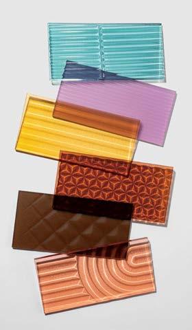
01 3FORM TEXTURES COLLECTION
Materials innovator 3form presents a solution with the launch of Know New Plastic—an initiative using molecular recycling methods to bolster traditional mechanical means to increase the company’s material palette. Its first release, the Textures Collection, consists of 100 percent recycled content at no additional cost to the consumer and no compromise on its architectural resin quality. 3-form.com

02 ANDREU WORLD GALA PURE ECO COLLECTION
The surface of Andreu World’s Gala Pure Eco Chair bends and dips to form an ultrathin, highly ergonomic chair. Designed by Piergiorgio Cazzaniga, the chair was made using gas-assisted, advanced injection technology on 100 percent recycled and recyclable thermopolymers. Biophilic in aesthetic, the shell surface is etched with a wood-inspired vegetable finish for a sensory experience suggestive of the resource it is saving. andreuworld.com
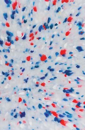
03 THE GOOD PLASTIC COMPANY POLYGOOD PANELS
The Good Plastic Company views postconsumer and industrial plastics as a ubiquitous resource rather than waste. This international manufacturer of sustainable surface materials is expanding into the North American market with its flagship product Polygood. The 100 percent recycled and recyclable range turns the likes of refrigerators, single-use cutlery, household appliances, and manufacturing components into a new material language for applications in interior design, architecture, furniture manufacturing, and retail displays. polygood.com
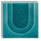
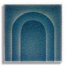


04 KOHLER WASTELAB X NADA DEBS TRANSCENDENCE TILES
Kohler’s WasteLAB—the brand’s environmental initiative to transform landfill-bound materials from manufacturing into functional products—has teamed up with Lebanese artist and designer Nada Debs to create Transcendence, a bespoke tile collection made from nearly 100 percent recycled waste materials. The tiles are handmade by artisans, ceramicists, and engineers who rely on factory waste—slag from molten iron, excess glaze from spray booths, and pottery wastewater—as primary ingredients in a multistep process. kohler.com
Despite the A&D industry’s penchant for sustainability buzzwords, much of the trade has yet to confront its propensity for waste. But don’t fret—while statistics are sobering, these eight design disruptors present solutions that are both beautiful and ethical. With product compositions ranging from 100 percent recycled material to 100 percent recyclable, consumers have an even greater opportunity to participate in shifting the paradigm, fashionably.
By Joseph P. Sgambati III
05 MUUTO FIBER CONFERENCE ARMCHAIR
The Fiber Chair Family by Copenhagen–based design duo Iskos-Berlin now includes a Conference Armchair. Its sculptural shell seat features an innovative composition of 100 percent recycled plastic with a strengthening additive of up to 25 percent FSC-certified wood fibers. More noteworthy still, the plastic material production process uses renewable energy, exclusively. muuto.com
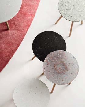
06 SCANDINAVIAN SPACES TINNEF TABLE
Equal parts chic and cheeky, Scandinavian Spaces’ contract furniture line has expanded its Tinnef occasional table series to include dining height options, and its 100 percent recycled plastic top in four new contemporized colorways and dazzling one-of-a-kind patterns. The saccharine hues from cosmetics packaging, reflective foil from yogurt containers, linework from barcodes, and typography from labels imbue the table with unique human lore as they conspire to create beguiling surfaces that are fun, utilitarian, and durable for high-traffic interiors. scandinavianspaces.com

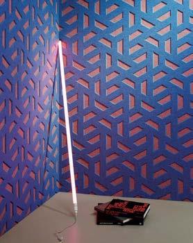
08 WOLF-GORDON GATHER ACOUSTICAL MATERIALS
Shaw Contract’s EcoWorx is a premium PVC-free carpet tile backing made from postindustrial recycled content. It boasts Cradle to Cradle certification at the Silver level along with superior material health, and is eligible for the company’s reclamation program. Despite weighing 25 percent less than traditional backing, it outperforms its predecessors in tensile strength. And the savings in weight means a significant reduction in carbon emissions during transport. shawcontract.com
Post-pandemic social behaviors have changed the way people inhabit public interior spaces, whether for work or play, and what they’re willing to tolerate from the experience. Commercial wallcovering company Wolf-Gordon’s recent launch GATHER Acoustical is a lightweight, semi-rigid sound mitigation panel system made of 100 percent recycled PET. Designers can customize or access this kit of parts, currently offered in 20 configurations, to add rich color, texture, and dimension to their projects while reducing noise pollution. wolfgordon.com
07 SHAW CONTRACT ECOWORXWhat if the materials of the building industry weren’t sourced from mining and extraction, but rather from agriculture and animal husbandry? This dream—that we could someday grow our building products—is represented by the new wave of bio-derived offerings for interior design and architecture. Some bring ancient materials back into vogue, while others utilize the properties of hemp and eelgrass.
By Avinash Rajagopal

This chair comes in two versions. In one, 75 percent of the shell is hemp, a rapidly renewable crop; the other version is manufactured from hemp and a type of marine plant called eelgrass. Both versions can be upholstered partially or fully, and the chair can stand up to intensive use in restaurants and educational facilities. normann-copenhagen.com


LINGROVE EKOA VENEERS
This revolutionary biobased material for interiors started as a challenge to make a guitar with the performance of carbon fiber and the sound of old wood, without cutting a single tree or using any toxic inputs. Ekoa’s veneers and panels can replace wood, plastics, laminates, and metals for all kinds of interior surfaces—they mimic the look of wood but have a higher strength-to-weight ratio than steel. lingrove.com
KOUKOS DE LAB KOUKOUTSI ECO MATERIAL
This hard, durable, water-resistant material is derived from the waste of olive cultivation on the Greek island of Lesbos, which has the largest olive grove in the world. The material has two ingredients—the hard, light-colored olive pip and the dark, crumbly olive core. When they come together, they become durable enough to make furniture, objects, and surfaces. koukosdelab.com
MODEL NO. ASKER CHAIR
3D printed on demand from 100 percent regenerative bio-resins that are manufactured from agricultural waste, these chairs can also biodegrade rapidly under the right conditions, making them fully circular. Plus, the facility where they are produced operates solely on wind and solar energy. model-no.com
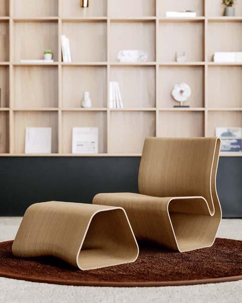

Patricia Urquiola designed this indoor-outdoor furniture collection out of Matek, a patented material developed by Mater, which combines biodegradable plastic derived from sugarcane with coffee waste and wood fibers. At the core of each Alder piece is a 94 percent recycled steel frame. The two components, the Matek shell and steel frame, can be disassembled easily at end of life to be composted and recycled, respectively. materusa.com
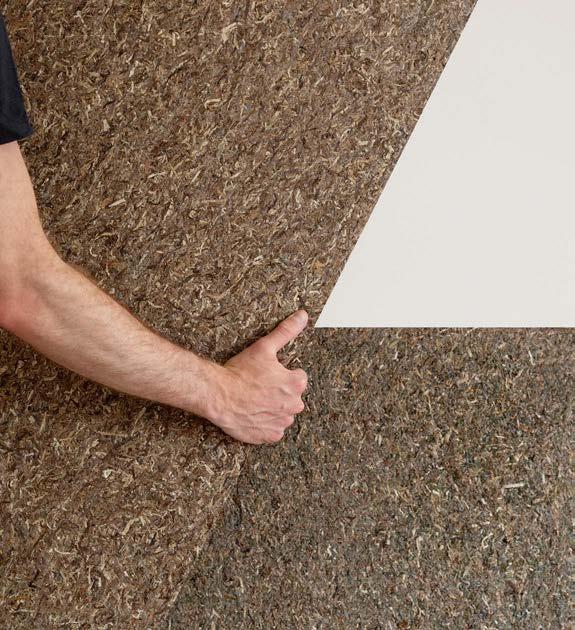
This new acoustic material is made from eelgrass, collected from the shores of Denmark and dried naturally. Once dried, eelgrass endures for more than 300 years, so these acoustic products can be fully recycled into other products at the end of their use. Søuld offers an NRC rating of 0.65 when directly mounted on walls or ceilings. spinneybeck.com, filzfelt.com
EGE CARPETS SHE COLLECTION
Created by Danish design duo Laura Bilde and Linnea Blæhr, SHE is a 100 percent wool carpet collection that pays tribute to the pioneering women artists of the 1930s and ’40s. The yarn for these carpets is spun from extra-long fibers in Ege Carpet’s own spinning mill, and the carpets are rated for heavy commercial use. egecarpets.com
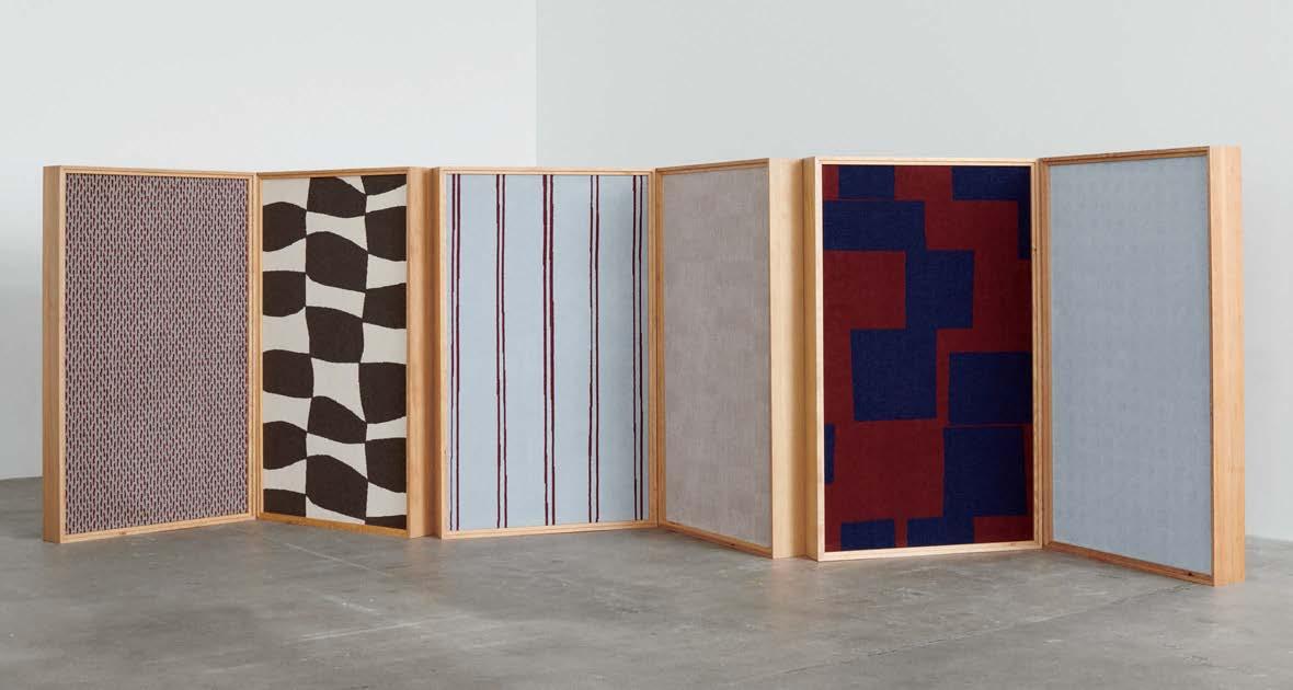
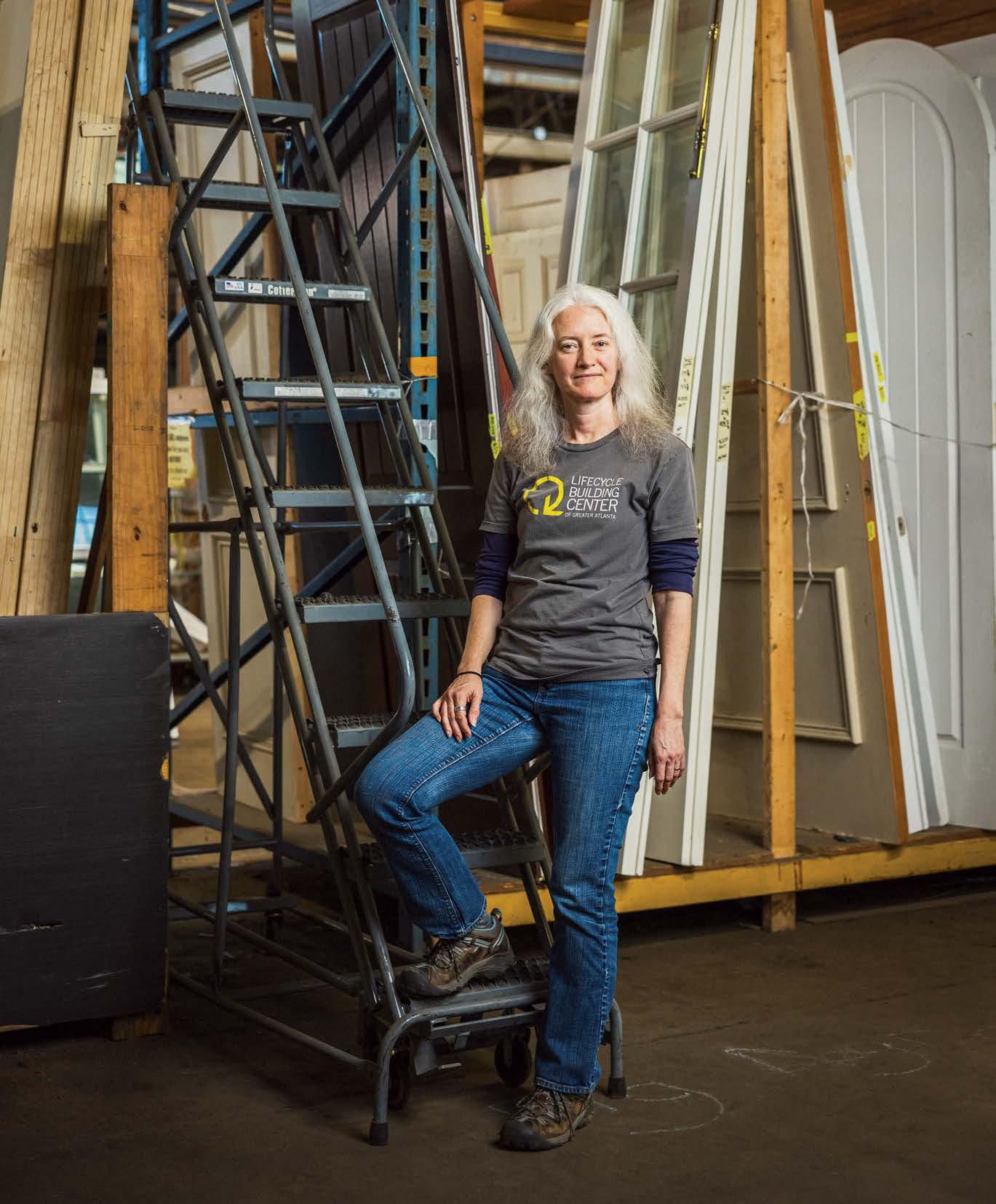
Former Perkins&Will architect Shannon Goodman is part of a community-focused mission to break systemic barriers and make building material reuse the norm.
By Laura Raskin Audra MeltonIN 2009 architect Shannon Goodman was involved in a firmwide sustainability initiative at Perkins&Will’s Atlanta office, where she helped educate colleagues and clients on green building rating systems, material health, and civic policies. Goodman had worked at several smaller studios after earning her M.Arch from the Georgia Institute of Technology, but at Perkins&Will her eyes were newly open to the inextricable links between natural and built environments. “I got very inspired and interested. I was just like a sponge,” says Goodman.
Simultaneously the Atlanta office had doubled in size and was straddling two separate spaces, divided by the city’s infamous Peachtree Street. To accommodate its growth, Perkins&Will purchased an existing 1980s building a block away— 50,000 sq uare feet of Class A office space with perimeter offices and drop ceilings contained by a concrete structural frame. But the firm wanted open floor plates, flexibility, and radiant heating and cooling. Almost everything had to go.
Though the demolition contract had already been signed, Goodman—feeling a surge of courage and clarity after a six-month yoga teacher training—surprised herself by speaking up: Couldn’t some of the building’s original materials be salvaged for reuse, especially since Perkins&Will’s leadership was targeting LEED Platinum for the renovation? “Why would we only think about grinding this up and recycling? It didn’t make sense!” recalls Goodman. Working closely with the demolition contractor, Goodman went from assuming the endeavor would
be a good exercise but not a “needle mover” to diverting 80 percent of demolition and construction waste (60 tons) from landfills and distributing it to more than 20 local nonprofit organizations.
“That was the beginning of everything,” says Goodman. Inspired and propelled by the office project, Goodman went on to cofound Atlanta’s Lifecycle Building Center (LBC) in 2011, with the help of private donors and supporters at the U.S. Green Building Council, the U.S. Environmental Protection Agency, and other organizations that were equally compelled and captivated by Goodman’s passion. “If one commercial office building could have that impact, what could we do if we had that every day?” says Goodman.
The LBC has been answering that question for the past decade-plus from its headquarters in two 100-year-old warehouse buildings totaling 70,000 square feet on Atlanta’s industrial corridor Murphy Avenue. With a $70,000 operating budget, Goodman and her team of seven assess projects for deconstruction, help salvage and collect materials, store and redistribute those materials and products to nonprofits and disadvantaged communities, lead job trainings to create a workforce of people who are skilled in deconstruction and construction, and more. During the COVID-19 pandemic, Goodman also ran a $3.5 million capital campaign to renovate the warehouse. “It’s constant triage,” she says. “Though we’ve been around for 12 years, we are very tiny. Our industry is so grossly underinvested, and it will only change if there is an interest to expand to service the commercial sector.”
Despite its small size, the LBC’s challenges are emblematic of those embracing the growing deconstruction movement— or a circular economy—in the United States. The idea is simple enough on its face: To reach net zero by 2050 and avert the worst impacts of climate change—as called for in the Paris Agreement—building trades need to go beyond energy efficiency to address embodied carbon. Globally, cement and steel production alone account for 10 percent of CO2 emissions. In a 2022 report and circularity toolkit, Arup and the Ellen MacArthur Foundation put it this way: “In a circular economy, renewable materials are used where possible, energy is provided from renewable sources, natural systems are preserved and enhanced, and waste and negative impacts are designed out. Materials, products, and components are instead managed in loops, maintaining them at their highest-possible intrinsic value.”
But the stumbling blocks are many: There is no clear road map or framework for stakeholders, policymakers, and others for developing, financing, or operating these “managed loops.” In some cases, cities are taking the lead. Ithaca, New York; Portland, Oregon; Baltimore; Palo Alto, California; and San Antonio have all adopted deconstruction ordinances. And some, like San Antonio, have material collection programs similar to the LBC's, as well as contractor training.
But Atlanta, said Goodman, is not going to lead from the top down. “It will have to be incentivized,” she says. Because of that Goodman helped develop ReBuildATL, a coalition of more than 40 local nonprofits, academic institutions, industry


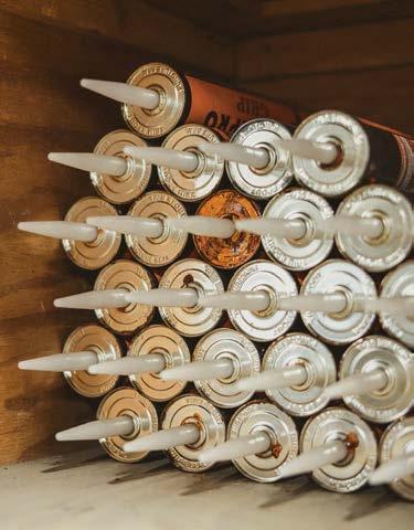
The heart of the LBC is its Reuse Center & Store in southwest Atlanta. The center accepts material donations—from kitchen and bath cabinets to countertops, tile, flooring, windows, doors, and more—and redirects them back into the community through resale to the public at deep discounts and through donations to nonprofits.
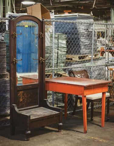

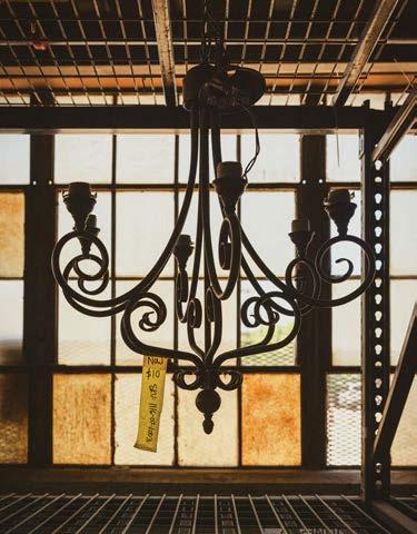

partners, and government agencies dedicated to community and industry outreach and education, as well as paid vocational training for disadvantaged individuals, enabling them to find longterm, living-wage jobs in construction, demolition, remodeling, facility management, and more. “The long-term moonshot for this whole initiative is to enable low-income homeowners and residents to address deficiencies and issues in their homes, like a hole in the roof or an inefficient building envelope,” says Goodman. “They most critically need access to renewable, lower-cost energy, and are the least positioned to access it.”
Another area where Goodman hopes to see progress is in what those in the industry call “material passporting”—the standardized system through which suppliers, contractors, and architects can more easily log and specify reclaimed materials from deconstructed buildings. Europe has gone much further in this area: Madaster is used by at least six European nations as an online registry of materials and products from the built environment, with insight into how they could be used again. In the United States, Goodman says, companies like asset management and exchange platform Rheaply are aiming to do something similar.
To that end, Goodman is expecting to hear this summer whether Build Reuse—a nonprofit empowering communities to
reuse construction and demolition waste, where Goodman is on the board—will receive a $6.7 million grant to help develop Environmental Product Declarations (or EPDs) for reclaimed materials. EPDs tell spec ifiers about the environmental impact or performance of a material over its lifetime, allowing them to choose the most sustainable option. “Reclaimed building materials have really low embodied carbon, but how can you quantify that?” asks Goodman. “Build Reuse will lead this process to create this EPD system for a dozen or so categories to begin to give reused materials a seat at the table.”
Finally, Goodman wants to be telling more stories about reclaimed materials and where they end up, or the jobs created in the process (such as the five formerly incarcerated people whom the LBC was able to hire full time, with benefits, to help clean up the warehouse’s site, a former brownfield). The more people c an see that through line, the more inspired they will be to adopt and engage in deconstruction. There’s also a “yuck factor perception”—the moment that something is treated as trash, it loses value. “Our systems aren’t designed for that value to be utilized,” says Goodman. “Nothing is going to change systemically if we’re focusing on making people feel bad. We have to give them a reason to do something different. They have to see those stories of impact.” M
In November 2023, Mannington Commercial announced its Build Reuse membership, making it the first flooring manufacturer to join the national organization, for which Shannon Goodman serves on the board. The nonprofit is dedicated to the recovery and reuse of building materials, and Mannington joins a growing membership network that includes Rheaply, Urban Machine (p. 66), and Elkus Manfredi Architects (p. 62), among other groups from real estate developers to construction companies, reuse retailers, deconstruction contractors, and salvage companies.
Through the partnership, Mannington's associates working with customers on projects can now contact Build Reuse when projects require the removal of carpet products. Build Reuse then collaborates with its local market partners to determine the most environmentally responsible removal method and identify reuse outlets for the recovered carpet.
According to Goodman, Build Reuse is currently focused on facilitating the expanded reuse of carpet tile, but the model will be adaptable for other product types, such as LVT, in the future. “Through this collaboration, we are demonstrating how a product manufacturer can proactively change not only their own behaviors to expand reuse practices but also create behavioral shifts in the marketplace by inspiring other manufacturers, clients, specifiers, and others in the built environment ecosystem to choose material recovery and reuse as an alternative to disposal,” says Goodman. Lauren Volker
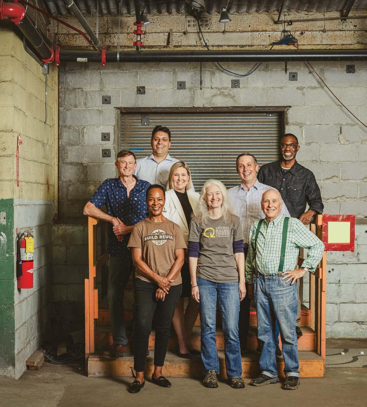
The Finnish brand reduces material usage and carbon emissions with its new Smart Office Pod Collection.
By Petra Loho
Framery, the pioneering Finnish brand renowned for its soundproof pods, introduces its latest innovation: the Smart Office Pod Collection. Crafted with sustainability in mind, this collection features components made from certified wood, recycled steel, aluminum, glass, and fabric incorporating 80 percent recycled plastics.
Upholding its distinctive design DNA characterized by soft, rounded edges, Framery debuts a line of four models tailored to accommodate one, four, or six persons. Thanks to a modular design that enhances durability, these built-to-last pods are easily disassembled, refurbished if necessary, and reassembled at new locations.
To reduce material usage, Framery has replaced plywood with recycled sheet metal for the pod walls. Sheet metal’s malleability makes it well-suited for mass production and generates less waste than wood. As a result, the new collection features a 23 percent weight reduction compared with previous designs.
The integrated digital features of the smart pods help employees locate and reserve available workspaces as required and collect anonymous occupancy data that empowers businesses to monitor employee facility usage and optimize arrangements for efficiency.
“People require spaces where they can concentrate or collaborate without impeding others’ ability to focus on their work,”
says Framery CEO Samu Hällfors, emphasizing the enduring significance of office pods in the evolving workplace landscape. “I believe companies and architects will face increased pressure to delve deeper into understanding human demands and the needs of people within office spaces.”
Moving forward, one of Hällfors’s challenges will revolve around achieving the strategic goal of an additional 50 percent reduction in emissions, particularly given the significant strides Framery has already made in sustainability.
The firm achieved an impressive production material efficiency rate of 94.9 percent as early as 2022. All pods are manufactured in Tampere, Finland, where 100 percent renewable electricity is utilized. Additionally, the factory logistics are powered by biogas and renewable diesel, further diminishing environmental impact across the production process.
However, Framery could benefit from a significant shift Finland’s steel industry is working on. The steel industry is the largest contributor to carbon dioxide emissions in Finland, constituting approximately 7 percent of the nation’s total emissions.
Transitioning to carbon-neutral steel production will be pivotal for Finland to achieve carbon neutrality by 2035. M
Engage with the Next Generation of Architecture Talent
April 24 Boston, MA
July 10 Atlanta, GA
September 19 Dallas, TX
October 23 Los Angeles, CA
December 4 Washington, D.C.
Targeted Meetings with Specifying Architects Workshops to Tackle One of Today's Biggest Design Challenges An Exhibit of Sustainable Design and Products
July 18—19 Virtual, Workshop #1
August 7—8 Virtual, Workshop #2
September 15—17 Dove Mountain, Marana, AZ
December Webinar
Interior Designers Experience Their First NeoCon
June 10—12 Chicago, IL at NeoCon June 10—12 Chicago, IL at NeoCon
Professionals Chart the Future of the
June 10 Chicago, IL at NeoCon
November 12 Philadelphia, PA at Greenbuild
September 25—26 New York, NY
November 20—21 Austin, TX
November Virtual and regional events
May—June Partnership Program with Virtual Roundtable
A brand-new task chair comes out of decades-long evidence-based research into wheelchair design and the human body.
By Jaxson StoneWHEN YOU LOOK AT OR SIT IN an Anthros chair, its name makes sense. Anthro is a prefix that means “human,” and Anthros chairs are clearly designed with every part of the human body in mind.
The Anthros chair launched last September and is the first offering from the Grand Rapids, Michigan–based company founded by Steven DuFresne and Eric Murphy. Prior to launching Anthros, DuFresne spent decades working with wheelchair users, some of “the most complex sitters on the planet.” Leveraging its background in wheelchair design, Anthros offers a science-backed, evidencebased, and research-focused ergonomic chair perfect for everyday use, whether in the office or in front of a gaming setup.
“We had to help people sit all day, every day, and not get hurt,” explains DuFresne. “People who are paralyzed from the waist down can’t sense pain. They can’t say, ‘Oh, my back hurts.’” But there are a lot of chairs out there. “In 2019, we sat in every chair at NeoCon,

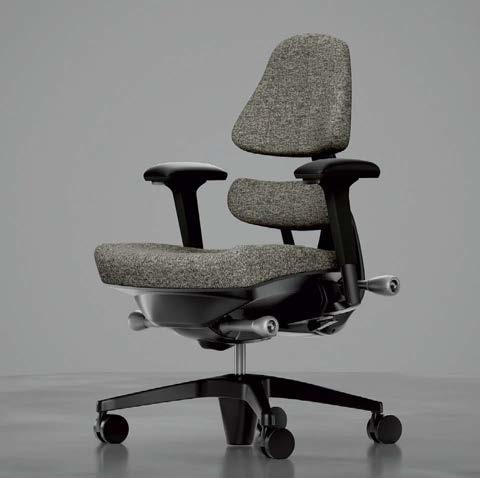
and we left there and had a moment where I turned to Eric and said, ‘Let’s do something; I think there is room for just one more chair.’ ” And so they did.
Anthros prioritizes user comfort and health. Its adjustable two-part back system features a dynamic lower-back pelvis support (rather than a traditional lumbar support, which results in slouching over time) that adapts to the natural curvature of the spine, promoting proper posture and reducing strain on the back, even during extended periods of sitting. This thoughtful design is further enhanced by adjustable armrests and seat height, allowing for customization to individual preferences and body types. The chair also incorporates a unique tilt-and-swivel mechanism that encourages fluid motion and flexibility.
For Anthros, ergonomics is an overused word in the industry. Instead, the company offers up “Anthronomics,” a word it defines as an understanding of biomechanics, ergonomics, and anthropometrics, “in the pursuit of optimal posture and support of the human body in the standing and sitting postures.” It all illustrates how the brand sees “seating at a different level.” M


METROPOLIS’s Planet Positive Awards recognize the most creative projects and products from around the world that benefit people and planet, as well as firms and professionals leading the way to a better built environment.


Responding to new studies that spotlight the environmental impact of furniture, manufacturers, dealers, and start-ups are accelerating transparency, reuse, and decarbonization.
Justin R. WolfTO UNDERSTAND the holistic carbon impacts of our buildings, we need to look inside them. Specifically, we must direct our attention to interior renovations of commercial spaces, the frequency at which they occur, and what happens to all the discarded task chairs, ceiling tiles, floor coverings, casework, and more once these items are deemed obsolete. In a 2022 study conducted by MSR Design, the firm highlights an EPA estimate that some 8.5 million tons of office assets end up in U.S. landfills annually. “As a result, it is critical to normalize salvaging, reusing, and refurbishing in the design process to reduce furniture embodied carbon,” the authors note.
One answer to this problem is circularity. This buzzword is displacing the furniture industry’s past focus on recycling, which can be costly, energyintensive, and, despite its name, a mostly linear process. Further, built-in adhesives and volatile organic compounds (VOCs) embedded in many products—typical of fast-furniture brands like Wayfair and Ikea—make any attempt at recycling this stuff more trouble than it’s worth. Functioning circular economies, meanwhile, rely on sequential and symbiotic relationships between manufacturers, designers, and consumers on dematerializing furniture design and reusing furniture before resorting to recycling.
“What does it really mean to be circular?” asks Jenn Chen, a partner at LMN Architects. “It means anything that still has a service life and is used as is, preferably on-sit e or as close to the site as possible. Something with recycled content is less good than a chair that’s already been manufactured and can still be in use.”
LMN’s work in this arena is comprehensive. The firm’s own studies have concluded that the accumulated carbon impact of a building over 60 years due to repeated interior renovations can exceed the up-front (i.e., embodied) emissions associated with the building’s structure and envelope. Several furniture producers have tried in earnest to tackle the issue with EPDs, something Chen admits is good for comparing one task chair to another, for example, “but it doesn’t help me say this one or that one truly has lesser impact.” Chen wants strategic longe vity, not more third-party verifica-
tions, because only one of these helps divert more stuff from landfills. She cites ongoing discussions at LMN to provide clients with project-specific end-of-life manuals, which can guide better decision-making when it comes to disassembling, salvaging, or even reselling unwanted furnishings rather than calling their local junk removal service. Landlords can even write waste diversion clauses into their leases, she says. “That’s something that at least prompts some forethought.”
Brandi Susewitz is in the second-life business. Her California-based company Reseat, which operates a marketplace platform for corporate clients looking to buy and sell secondhand furniture, was founded in the summer of 2020, when o ce buildings were ne arly vacant, and tenants were already planning for a downsized future. What prompted Susewitz, an industry veteran, to launch
this company at such a time was learning that according to EPA gures, “less than 2 percent of contract furniture is actually receiving a second life or being properly recycled,” with the rest heading to landlls. “That seemed so crazy,” she says.
Having a software partner to assist in managing large inventories is a huge asset for companies, as is having a navigable second-life market for any corporation that deals with sizable overhead. But arguably, the true value of this SaaS comes down to its receipt ID cards, or life cycle passports, that are provided for each chair, table, carpet tile, and more. An electronic file composed of dimensions, manufacturer, and other specs, including the item’s e stimated embodied carbon, enables customers to calculate carbon reductions for a given project. This should also prove invaluable for corporations that need to comply with California’s new climate disclosure law, which will require reporting of scope 3
TABLE
WORKSTATION
LOUNGE SHELVING
Conference Task
High density stacker
Guest / study
Barstool
Stool (18’’ height)
Height adjustable
Conference / study table
Flip top
Laptop
Co ee/ occasional
6x6 station
Private o ice
3 seat sofa
Ottoman Highback Low/mid back
66’’H double face shelving
66’’H single face shelving
Metal typical end panel
Metal typical canopy top
An in-depth study of the embodied carbon of commercial furniture published by MSR Design in 2022 analyzed documents from various manufacturers to provide the ranges of embodied carbon emissions for different offerings within a number of furniture types available today.
emissions starting in 2026. “It’s got everything you need to know about the product in order to resell it or do anything with it in the future,” Susewitz says. The platform also gives users a “Renew” option, in which they can obtain estimates for refurbishing services, and a forthcoming “Repair” option, which will provide detailed warranty information.
When it comes to new products entering the market, a growing cast of furniture manufacturers are practicing what could be called a culture of forethought. Since Keilhauer launched its first carbon-neutral product, the Swurve office chair, in 2020, which incorporated recycled metals and nylon and was designed with replaceable components, the compan y has added more than 20 certified carbon-neutral product collections to its portfolio, according to sustainability officer Joshua Belczyk.
“We have a very robust waste minimization program within [our] facilities,”
Belczyk says. He calculates the company maintains an 84.5 percent diversion rate, which extends to charitable donations, its popular take-back program, and other means. The company also provides end-of-life guidelines for its products, with instructions for proper disassembling, repurposing, or recycling. We select materials that can be reused, Belczyk says. “Keilhauer is a zero-waste-to-land ll operation and has been for a long time. Whatever is not being diverted to recycling is going into energy production.”
For larger manufacturers with bigger footprints, the risk of s uccumbing to “greenhushing” is very real. Within HNI, which maintains a family of brands including Allsteel, Gunlocke, and others, the corporation is nearing completion of its in-house database that acts as an evolving chemicals library that can be cross-referenced with EPDs, ILFI’s Red List, and other benchmarks. “Our goal is to understand everything so we could build any product off of that,” says Lisa Brunie-McDermott, HNI’s director of
corporate social responsibility. “We’re starting to transition [the database] from a library inventory to a product perspective, which is going to be really valuable.”
As a large, integrated company, HNI benefits from owning “a significant portion of its manufacturing footprint,” says Andrea Gauss, director of client solutions. This enables them to know supply chains intimately as well as compare products with EPDs and Declare labels with other products in their portfolio, which, according to Gauss, is preferable to measuring one company’s declaration against another’s because calculations differ across brands. “We have to design in a way where reusing and recycling makes sense,” Brunie-McDermott says.
The desired endgame is to have clients who understand the intrinsic value of the circularity mantra and have the necessary incentives to act accordingly. According to Brandi Susewitz, “We can’t save everything, but reuse has to be part of the conversation.” M
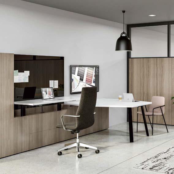
Developed with IDA Design, the Silea series consists of a host of solutions for private workspaces, including integrated height adjustability and smart storage. A life cycle assessment of Silea was conducted in 2017, and many offerings in the line have a valid Environmental Product Declaration. allsteeloffice.com
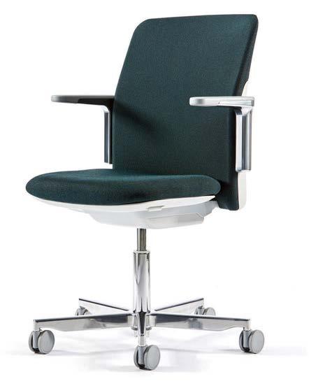
Designed by Todd Bracher and released in 2022, Path is a carbon-negative chair. Twenty-two pounds of recycled materials go into each chair, and rather than consuming energy the manufacturing operations of each chair prevent about 15 pounds of carbon dioxide from entering the atmosphere. humanscale.com
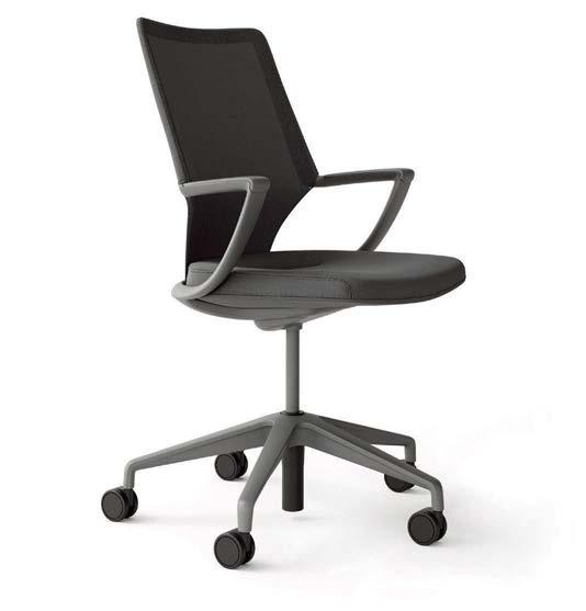
Released in 2020, this carbon-neutral chair designed by Andrew Jones has five parts that are easy to disassemble. The chairs are manufactured in a zero-waste-to-landfill facility, and Keilhauer invested in carbon reduction and climate change mitigation projects to compensate for any unavoidable carbon emissions, such as those released during transportation. keilhauer.com

Originally introduced in 2004 as a breakthrough in design for disassembly, Think received an update in 2013 to be more comfortable and dematerialized. It was the first chair to receive Cradle to Cradle certification, and it can now be purchased with CarbonNeutral certification as well. steelcase.com
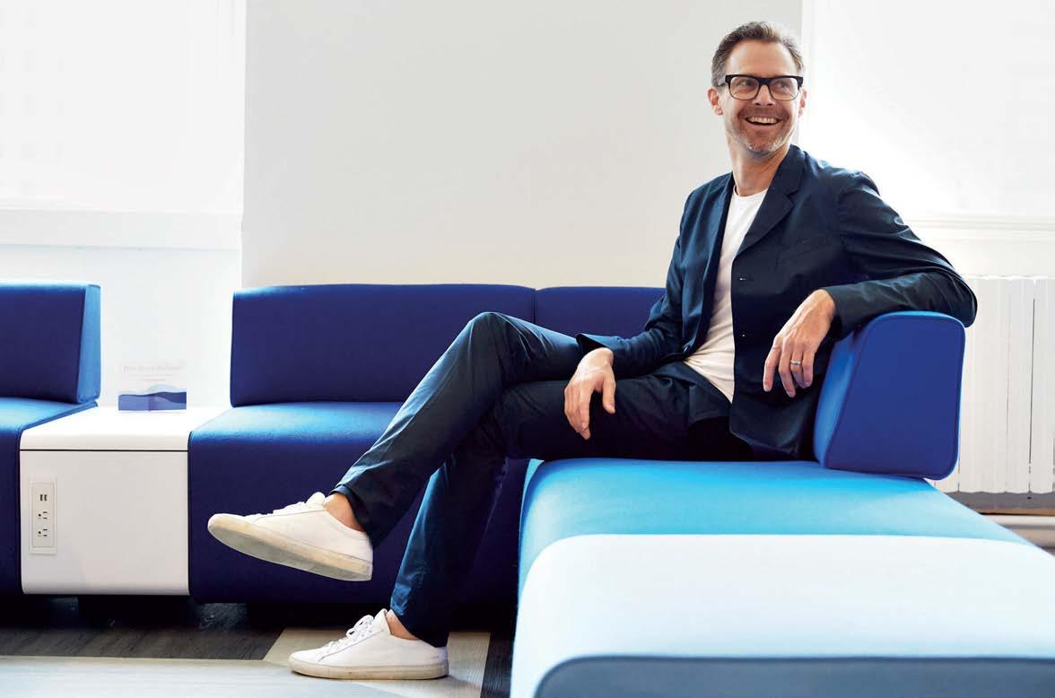
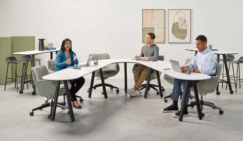
The Los Angeles–based product designer launches the paradigm-shifting Admix table system with Allsteel.
By Adrian Madlener
develops behaviorshifting designs for a wide range of brands, including the Recharge modular lounge system for Iowa office furniture producer Allsteel. His latest collection, Admix, is Allsteel’s latest adaptable conference table and workstation launched at NeoCon 2024.

The Admix collection is a light-scale table system that takes away the power dynamic of a traditional rectilinear table and promotes collaborative work. Its range of configurations makes it ideal for the evolving workplace.
Chris Adamick approaches design with X-ray vision. For the Los Angeles–based industrial designer, objects and spaces have the ability to suggest what they could be and the ways of living that they might shape. It’s all about challenging the status quo. “You can learn a lot by simply slowing down and asking questions,” he says. “Design allows us points of entry into the deeper meaning within our everyday lives, and as a designer I get to shine this light on life for other people.”
Adamick developed his penchant for creative pursuits at an early age. While his father was a successful contractor, his mother ran the finances of their family construction business. “The experience of seeing my parents create their own compan y and build buildings from the ground up gave me practical examples of creativity,” he says. “I always wanted to be an artist from my earliest memory, and I didn’t feel that there was any distinction between art and the rest of life.” For him, he says, his father’s antique cars, Surfer magazine, Pee-wee’s Playhouse , and Black Flag album covers were all equal “forms of creativity.”
He went on to study fine art at UCLA, and under instructor Jorge Pardo—the famed Cuban-American sculptor who often incorporates elements of design in his work—he was convinced to continue his education at ArtCenter College of Design, where everything came together. With a master’s degree in environmental design, he landed a job at RIOS in Los Angeles and eventually found himself at influential graphic design firm Pentagram. While helping imagine a family experience for a multinational retail client during his time at the former, he helped develop a
wayfinding scheme for a Tadao Ando–designed building in Mexico in his capacity at the latter.
“Working at Pentagram was a dream, but it required hard work,” the designer reflects. “I felt very encouraged and welcomed because I had a great rapport with some of the partners who I found to be curious, unique, and independent. They inspired me to envision a life working for myself rather than as an employee.”
Branching out on his own and making a foray into the previously uncharted waters of commercial furniture, Adamick got his first big break with the development of the Audio chair for Bernhardt, which the company’s president Jerry Helling chose to emphasize at the brand’s Milan Design Week showcase. Other major collaborations followed, including the Constellation Table for Corral and the Toluca armchair for Martin Brattrud.
Admix, his latest collection developed for Iowa-based office furniture manufacturer Allsteel, is a new system of radically flexible tables aimed at collaborative work. “The post-pandemic world has represented the most significant change in our work lives since the Industrial Revolution,” Adamick explains. “We thought, what if hybrid work schedules allowed businesses to hire a wider range of people such as new parents, neurodiverse individuals, physically disabled people, and those who live far away?”
The resulting suite of products flattens hierarchies, affords multiple postures, and facilitates remote participation in a sensitive way, allowing teams to be more creative and resilient. The tables were configured so that no one ends up assuming the traditional position of power or being put on the spot. Easily interchangeable components allow for adaptability and personalization, which—according to the designer—people are craving. The collection officially debuts at NeoCon 2024 and is his first comprehensive collection to hit the contract market.
“Designing this type of commercial furniture is challenging because of the need to balance our deeply personal relationship with these items with the complexity of manufacturing,” he concludes. “There is also a symbolic dimension to furniture where we can explore and communicate value sets through forms and materials. I feel that there is a mysterious quality to great furniture. It’s not just beauty paired with functionality but something else entirely. I think it needs to feel like it has its own life or soul.”
For him, it comes down to uncovering and clarifying problems so that they can be properly addressed: “The best outcomes are those that are beautiful because they improve life in subtle ways.” Adamick has spent the past 20 years making paradigm-shifting design decisions—like the complete lateralization of conference room tables—that respond to major changes in society and, in turn, have longer life spans. M

St. John's Terminal was sliced off south of Houston Street, which involved removing an existing tunnel. This project reestablished the pedestrian connection between the Hudson Square neighborhood and the westside waterfront. Additionally, it unveiled the original rail beds from the previous industrial warehouse.
Google, CookFox, and Gensler have renovated Manhattan’s historic St. John’s Terminal in an innovative adaptive reuse project that is designed to evolve.

Principles of biophilic design, or incorporating nature into architecture, guided the renovation of the Terminal. There are one and a half acres of vegetation in the project, from its front porch to rooftop gardens. The building also harvests rainwater and relies on a solar array.
By Diana Budds
With such a large undertaking, coordination was a challenge. To streamline materials selection, Gensler’s sustainability team prescreened 130 finishes and 760 different products that all adhered to the project goals for carbon and indoor air quality. The project was designed from this set selection.
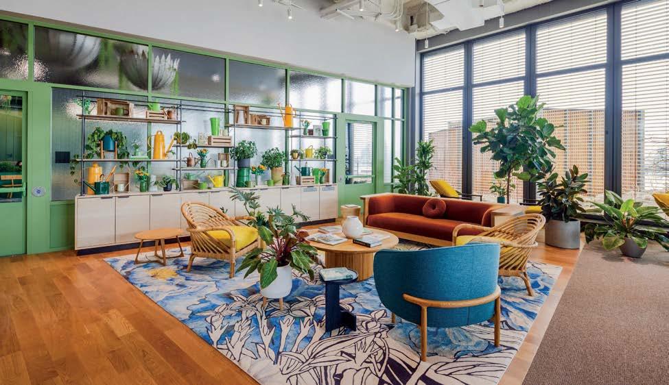
Dematerialization, or using as few materials and products as possible, guided the project. For example, the team often used felt baffles instead of acoustic panels, since the material is more environmentally friendly.
tall buildings typically steal the spotlight, but the unsung prime real estate in the city is actually the groundscraper—a building with an unusually broad footprint. These wide and long structures are rarities, prized for their tremendous flexibility inside. One of them is St. John’s Terminal, the last stop for the freight trains that rumbled along the High Line. When it was built in the 1930s, the three-story building had the largest floors in Manhattan. Miraculously, the hulking building, which straddled two city blocks, managed to survive even as the area around it, now named Hudson Square, shifted from heavy industry into a blue-chip district. After a $2 billion renovation, St. John’s Terminal now stands as one of the finest examples of how to recycle a building thoughtfully—and ensure that it never becomes obsolete.
St. John’s Terminal is now home to Google, which bought the building in 2021. Thanks to a collaboration between CookFox on the architecture and Gensler on the interiors, St. John’s Terminal has transformed from an austere industrial workhorse into a gleaming 1.3-million-square-foot, high-performance, LEED Platinum workplace.
Sustainability has been the guiding ethic of the building’s revamp since before Google entered the picture. Rick Cook, the cofounder of CookFox, started studying the building in 2007 and was intrigued by the opportunities it posed from the perspective of “experimental preservation,” borrowing the term from Columbia professor Jorge Otero-Pailos. “I think it’s an evolving art form, this idea of adaptive reuse,” Cook says. “We’re riffing off the existing building fabric and creating ideas about a new type of architecture and how we evolve as a city.”
“The building is full of wonderful references and Easter eggs that bring you back to the essence of New York,” says Carlos M. Martínez Flórez, the co–managing director of Gensler’s New York office. Among them: a jagged line down the center of the ground floor’s main hallway, which demarcates Manhattan’s shoreline before the Hudson River was filled in to expand the island, and a lawn on the 12th floor that “almost feels like you're in Bryant Park,” Flórez says.
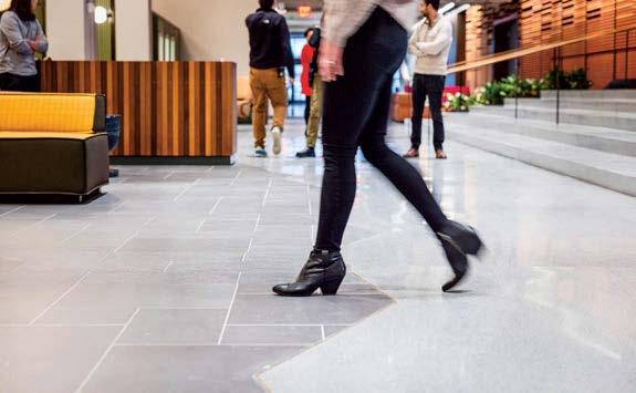
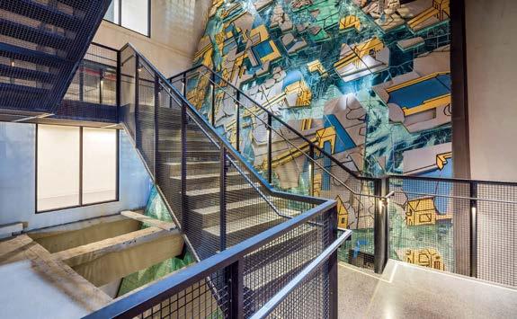

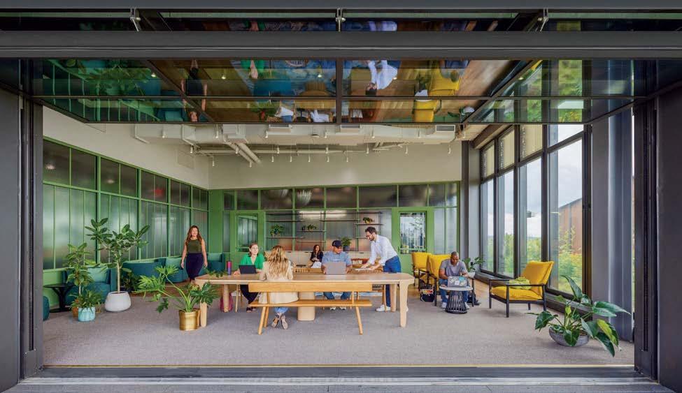
Electrochromic glass—architecture’s equivalent to Transition lenses—automatically adjusts to regulate the light and temperature inside the building without blinds. “The whole idea is how do we keep people connected to nature, connected to that beautiful view, and at the same time have the comfort of glare control,” Cook says.
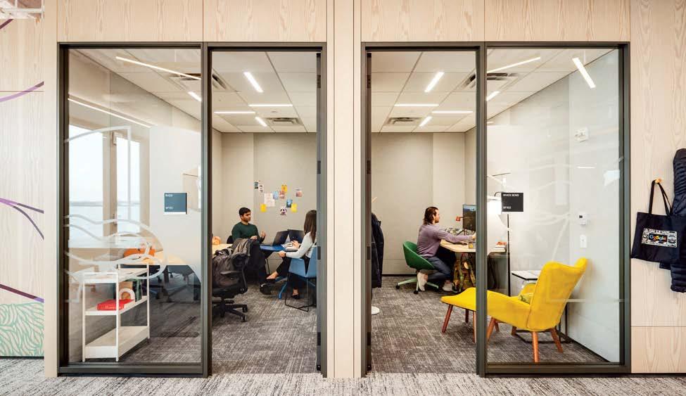
The masterstrokes involve knowing what to cut and what to keep. Cook was fascinated with how the terminal’s heft, engineered to carry the load of 227 freight-train cars, could support a taller structure. The building has a north-south orientation—rare for a groundscraper—which would be a compelling amenity to future tenants. “What we said at the time was it will have the widest sunset in Manhattan,” Cook says. During land-use community engagement sessions, residents in the area said they wanted better connections to Hudson River Park, which was blocked off by a portion of the building that straddled West Houston Street. That could go. Slicing off the northern edge of the building revealed the old rail beds, and CookFox designed around this Gordon Matta-Clark-esque feature. Recycling the bulk of the building prevented an estimated 78,400 metric tons of carbon dioxide from entering the atmosphere.
Central to the project, from the way that Google’s teams will work to how the building sits within the city, is the idea that “architecture is an art of connection,” Cook says, “The building now connects Hudson Street with the Hudson River, people with nature, people with people, and ultimately the past with the future.”
Inside, a similar spirit of environmental sensitivity—specifically the goals of reducing carbon, cultivating healthy spaces, advancing circular systems, and positively affecting people, says Mallory Taub, Gensler’s sustainability director—guided the design. Google’s in-house t eam, CookFox, and Gensler met weekly in person for over a year during the design phase (before the pandemic) to ensure that all decisions supported these goals.
To keep the floor plan fluid, Gensler relegated as much infrastructure as possible to the ceiling. The custom lights, done up in vibrant yellow, can easily be rotated if the layout changes from an open plan to an intimate room. Power runs from the ceiling (instead of through the walls and floors) down to workstations via movable masts.

“We’re riffing off the existing building fabric and creating ideas about a new type of architecture and how we evolve as a city.”
Google’s workspaces have evolved considerably since its quirky designs of the aughts. Now, instead of novelties like Ping-Pong tables and slides between floors, the focus is on healthy spaces that will make it easier for people to do their jobs more effectively. The design team used biophilic principles—design that takes its cues from the natural world—to create spaces that will “reduce stress, refresh the brain, improve mood, and enhance creativity,” Katie Scallon, real estate project executive at Google, says.

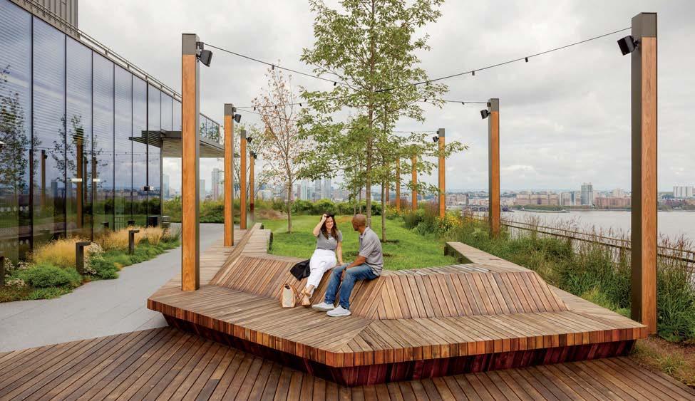
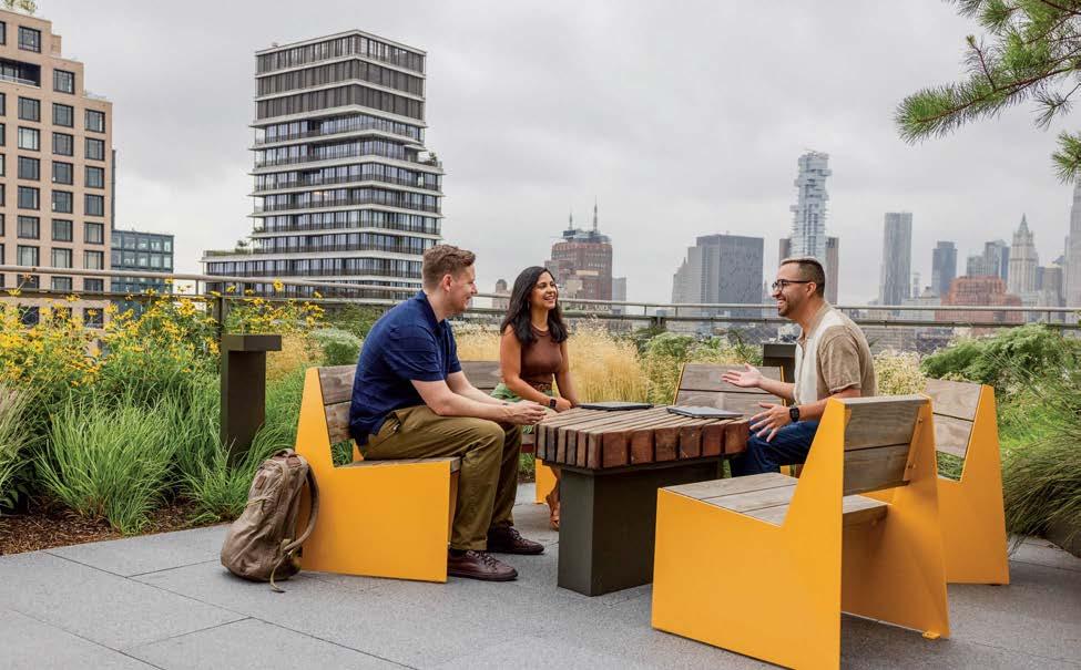
“The interior includes live plants and wooden materials that enhance connections to nature, water references that represent the site’s original Hudson River shoreline, and nature-inspired ceiling installations that evoke tree canopies and foliage.”
Another crucial design element that helps employees work more effectively is choice. In St. John’s Terminal, as in its Mountain View headquarters, Google has a flexible “neighborhood” seating model that can accommodate all the unique ways that a team works and places where they want to work. This also helps future-proof the interiors. The designers and Google know that workplaces aren’t going to look the same tomorrow, so they should design with flexibility and agility in mind for the interiors. To achieve this, Google’s R&D team, Gensler, and the modular interior wall company DIRTT developed a custom demountable room system. If a phone booth needs to become a small meeting room or a larger conference space or vice versa, all Google will need to do is add or remove panels. “From an embodied carbon perspective, you’re increasing material life span,” Taub says. The architects’ theory of designing flexibility into the building was tested during the COVID-19 pandemic. While nothing about the structure changed, Google modified some interior arrangements. The process was seamless.

“Many of us, and especially young people, are committed to doing what’s responsible”
St. John’s Terminal is now a better neighbor to Hudson Square and the city as a whole. “I’d like to think of a building like this as being restorative and regenerative,” Cook says. To wit: 95 percent of the landscape, designed by Future Green Studio, consists of native plants, which support the local ecosystem of birds and insects. A new mid-block crosswalk from the Hudson River Greenway to St. John’s Terminal, which leads to an entrance off Charlton Street, has a 500-space bike parking area. However, focusing on sustainability, health, and wellness isn’t just about quantifiable elements like carbon emissions and physical details like natural light. There’s an emotional element too. “Many of us, and especially young people, are committed to doing what’s responsible,” Carlos M. Martínez Flórez says. “Realizing ‘Hey, I’ve done my part by actually living up to my values’ is very important.” M






KURTAIN ACOUSTIC PENDANT
Kurtain doesn’t just illuminate; it also helps reduce ambient noise. This acoustic pendant light from Luxxbox features a high-performance dimmable LED light and is available in three sizes and 77 colors. Crafted out of responsibly sourced Camira Blazer wool, Kurtain’s form was inspired by the flowing forms of drapery. luxxbox.com
THE HUMAN EYE CAN DETECT MORE than 10 million colors. Yet each color, depending on its perceptual attributes of hue, saturation, and lightness, has a unique effect on our brains as it passes through the visual cortex. You may have heard that blues and greens are calming, while reds and oranges are activating. But recent research into the neuroscience of color and the burgeoning field of neuroaesthetics suggests that color has not only psychological and emotional effects on us but a biological effect as well. Colors can affect our breathing, our blood pressure, and even our body temperature. Red, for instance, raises our galvanic skin response, determining how our sweat glands react, whereas blues and greens are shown to reduce stress and foster creativity through their cooling attributes.
In their new book Your Brain on Art: How the Arts Transform Us (Random House, 2023), Google’s vice president of hardware
design Ivy Ross and Susan Magsamen, founder and executive director of the International Arts + Mind Lab, Center for Applied Neuroaesthetics at Johns Hopkins, write, “Because color transmits at different frequencies and vibrations, practitioners are able to use a color’s specific properties to shift the energy—and frequencies—within our bodies.”
By examining the trending hues of today’s most innovative products, we can lean into the energizing properties of turmeric and gold, feel the cozy warmth of terra-cotta and burnt orange, fuel creativity with lavenders and lilacs, and relax and rest with sage and forest greens. In a world awash with color, the intersection of neuroscience and interior design offers a vibrant reminder that the products and colors we choose not only reflect our personalities but shape our moods, memories, and somatic experiences. M
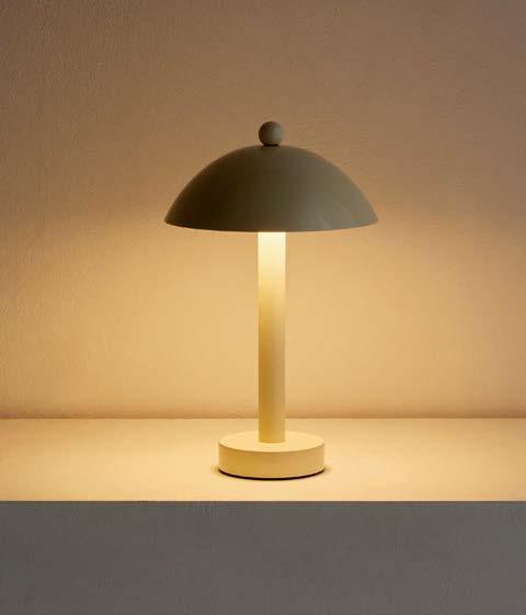
DUNE TABLE LAMP
Named for “sand formations that migrate with the wind,” In Common With’s new Dune Table Lamp embodies flexibility and function. Its distinctive, durable sculpted and painted metal base and frosted glass shade create a warm ambient glow suitable for both indoor and outdoor spaces. With a touch-activated dimmer, it’s easy to set the mood. The lamp is available in five muted earth tones including Turmeric and Pool. incommonwith.com
The color yellow helps release a chemical in the brain called serotonin. This means yellow is a great color for uplifting mood, improving concentration, and increasing metabolism. However, yellow can also tire the eye due to the amount of light reflected, and should be used in small doses to avoid “color fatigue.”
SOWDEN PL4 PORTABLE
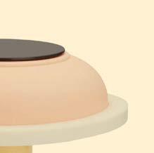
LAMP
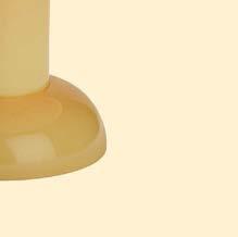
SOWDEN, the brand of Milano cofounder George
SOWDEN, the design brand of Memphis Milano cofounder George Sowden, has a new exclusive with MoMA Design Store. The PL4 Portable Lamp is a USB-chargeable lamp with a dimmable 160-lumen LED as well as a unique silicone shade for soft light diffusion, and is suitable for indoor and outdoor use. store.moma.org

Created by Canadian furniture designer Nicole Marion, the Percy Lounge Chair for British manufacturer NaughtOne features a bold tubular frame form available in 16 colors and over 100 upholstery options from bubblegum pink to daffodil yellow. naughtone.com
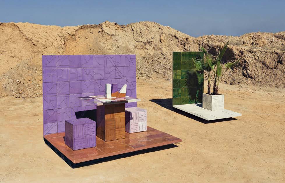
Shades of purple, like pinks, are said to calm the human mind, and increase creativity, inspiration, and introspection. Hues like violet have the highest vibration in the visible spectrum. Because of these attributes, purple symbolizes spirituality or royalty in various cultures.
Valencian artisans Maora Ceramic have teamed up with design studio Masquespacio on the Maora Collection, a collection of 20 x 20 cm tiles that can be applied to floors, walls, and furniture. Ana Hernández, cofounder of Masquespacio, says, “It is a celebration of craftsmanship and the beauty that lies within handmade creations." masquespacio.com
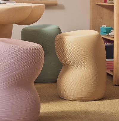
Created from reclaimed ocean plastic in collaboration with the New Raw, Heirloom’s 3D-printed Flump Stools made waves at Alcova during this year’s Milan Design Week. The design of the stools is optimized to utilize postconsumer material, and the muted colors and distinctive textures were a result of the robotic processes. Prototypes can be remelted and reprinted, making the stools fully circular products. heirloom.design
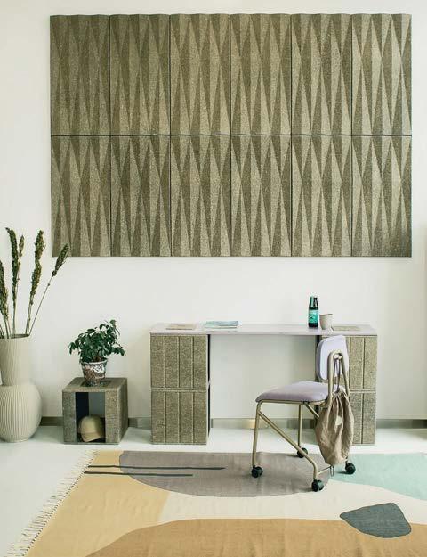
The VANK_CUBE is a flexible, modular cube system of desks, tables, poufs, storage, and sideboards. CUBE is crafted from an innovative biomaterial derived from flax and hemp—fast-growing plants that absorb more CO2 than trees. This design promotes creativity and teamwork and also aims to eliminate harmful synthetic materials in the workplace. vank.design
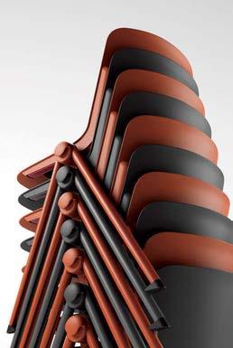
Allseating's Allora is an adaptable seating solution designed by SF+M, inspired by in-between moments such as waiting, learning, or meeting. Perfect for lobbies, cafeterias, or meeting rooms, Allora’s stackable single-shell design comes in a range of configurations—armless, with armrests, or with a tablet arm. Choose from five shell and frame finishes and two leg configurations to suit your style, with an optional upholstered seat pad for added comfort. allseating.com
Warm colors such as oranges, pinks, and reds can be motivating and energizing, while if they are too intense they can be activating. Muted, pinker hues such as peach or more earthy tones such as burnt orange can be employed for their calming effects be employed for their effects
Designtex and the Frank Lloyd Wright Foundation have developed a collection of three woven upholstery textiles that capture the essence of Frank Lloyd Wright’s architecture. Pentimento draws inspiration from the architect’s Usonian philosophy, geometric systems, and natural color palettes. Through Designtex’s Digital Studio tool, patterns can be customized with unique colors and scales, providing a versatile array of design possibilities. designtex.com

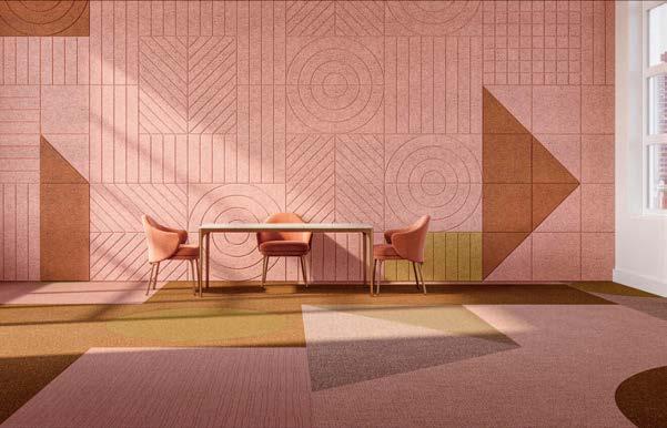
BAUX X TARKETT
BAUX Acoustics and Tarkett flooring have teamed up to design a synchronized color palette where both manufacturers’ products can be used together to create wonderfully healthy interiors where people can rest and play. BAUX Acoustic Wood Wool tiles and DESSO AirMaster flooring technology work in tandem to reduce noise and improve air quality. The color range includes Midnights, Neutrals, Minerals, Oceanic, Florals, and Forests. baux.com


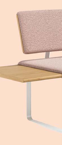


COLLECTION
Designed by Gemma Bernal, the Flipside Collection by Arcadia offers a versatile solution for modern workspaces. Two-, three-, and four-unit combinations are available and can be specified with or without backrests. Integrated end tables are available in white oak veneer, laminate, Corian, and Fenix, and Arcadia has a variety of upholstery options from select partners. arcadiacontract.com
FLIPSIDE ALLORA COLLECTION


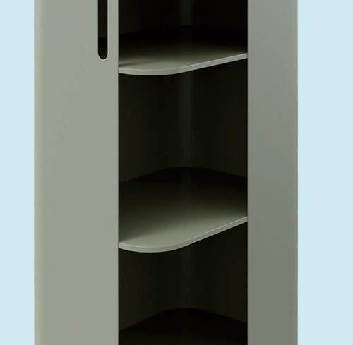
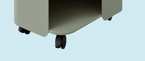
Form Furniture’s solution, the Stash Series,
Form Furniture’s inaugural storage solution, the Stash Series, includes a cart, a tower, and a drawer made of powder-coated steel with lockable casters. The muted natural palette of Red-Brown, Grey-Green, Grey-Beige, Graphite, and Perfect White makes it a modern and flexible solution for a variety of workspaces. form-furniture.com
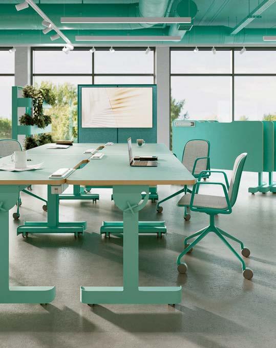
The TilTable collection from Gira Workplace Solutions by B+N revolutionizes office furniture with its adaptability and mobility, perfect for today’s hybrid workspaces. These innovative work surfaces tilt up to 90 degrees with a simple pull and quarter turn, allowing them to be rolled and stacked. Equipped with Volta Removable Battery Packs, they provide reliable power for all-day productivity without the need for 120-volt outlets. bnind.com
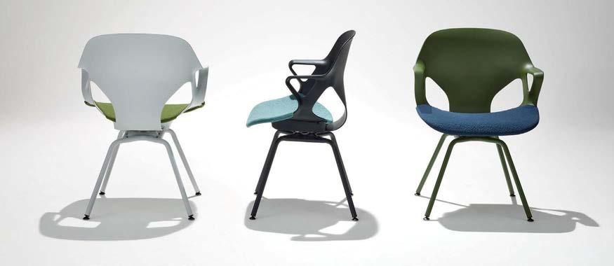
This April, Berlin-based Studio 7.5 introduced a colorful new task chair to Herman Miller’s Zeph seating family. The Zeph Side Chair’s ergonomic mono-shell seat can be fitted with a 3D Knit seat covering made from 50 percent postconsumer recycled content, and is available in 20 textile color choices, forming a palette they call the “crayon box.” hermanmiller.com

Green is considered an emotionally calming color. It gives a sense of refreshment, harmony, and equilibrium, likely due to the brain’s association of the color with nature. Blues have similar calming attributes, and just like reds have been found to raise blood pressure, blues can lower it. The color blue opens neural pathways and enhances those cognitive processes, also making it a highly creative color.
FENIX’s surface materials are designed to transform interiors through modern aesthetics and advanced technology. The surfaces are anti-fingerprint and resistant to scratches, heat, and household chemicals. Their matte finish and soft touch offer a luxurious feel, and they are durable enough for kitchen and bathroom applications.
fenixforinteriors-na.com

Drawing inspiration from cyanotype photography, Calico Wallpaper’s latest Sunprints collection embodies the sun’s radiance. The intricate floral designs were created using large-format digital photography and scanning. The delicate details of the foliage evoke a sense of serenity that is perfect for creating a calming atmosphere in homes or businesses. Cofounder Rachel Cope says that the collection “is an artful tribute to the ever-changing dance of light, color, and the natural world that continues to enchant and connect us.” calicowallpaper.com


 By Debika Ray


 by Evan Jenkins


London-based designer Yinka Ilori is on a mission to unleash our creative potential in the o ce and ll our professional lives with colorful hope and joy.

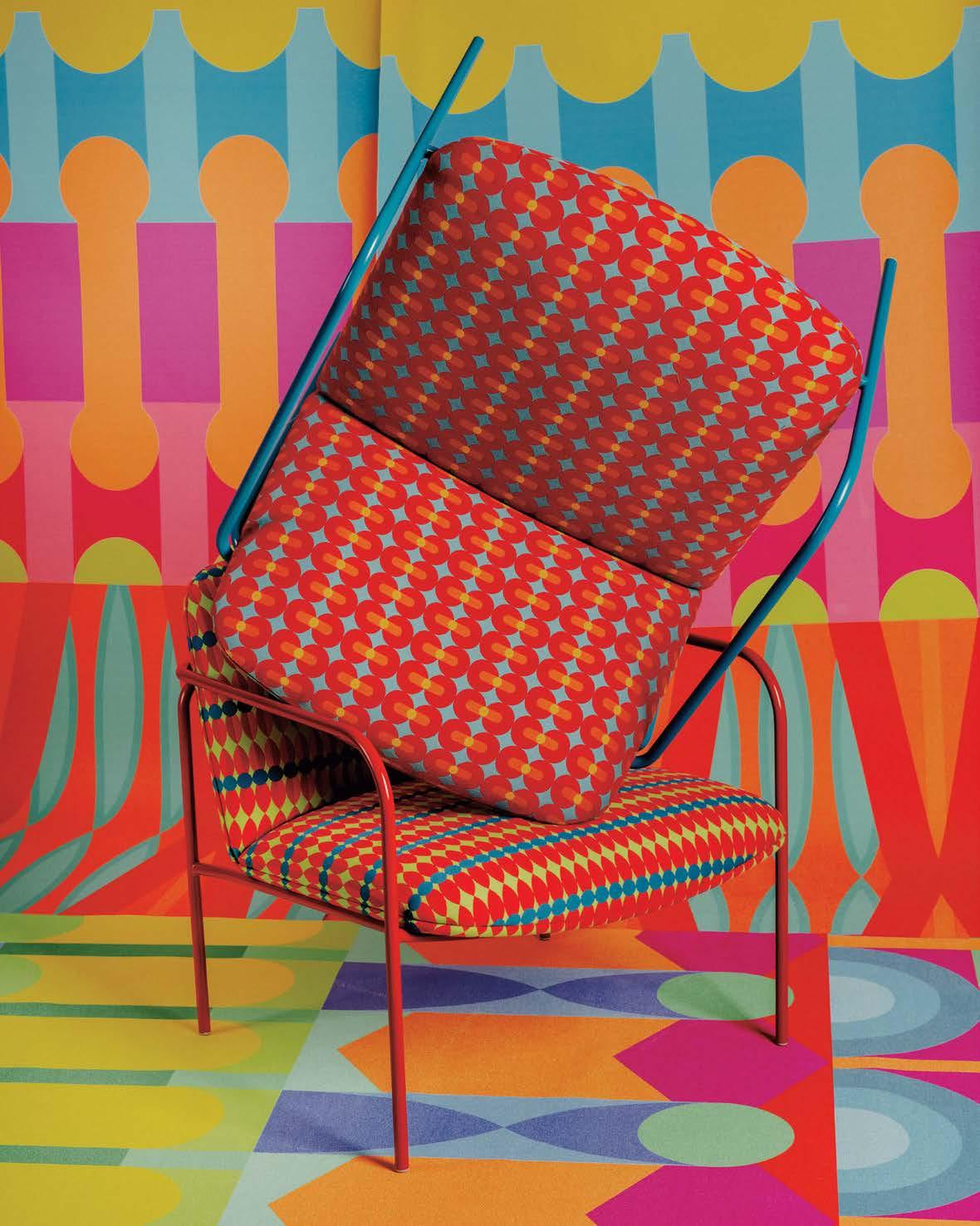
for Yinka Ilori to persuade his team to come to work. His west London studio—created in collaboration with architect Sam Jacob in 2022—is a joyful space, rich with the kinds of vibrant candy-floss colors he’s known for. A large table at the center, overlooked by a display of his furniture, doubles as a space for communal lunching and hosting guests. Nearby, a gentle translucent curtain gives partial privacy to an office flanked by storage units on which objects and books are neatly placed as decoration.
“We spend a lot of time at work—it’s a huge part of our lives,” the multidisciplinary designer and artist says. “The workplace should be a place where you feel happy and make memories, because it can be quite a tough environment. When I come into my studio, I always want to leave with a feeling of optimism.”
It’s certainly food for thought: Since the COVID-19 pandemic, many of us have realized that we could work just as easily from home as in the office, and it’s now incumbent on employers who disagree to convince us otherwise. Transforming workplaces into appealing environments is essential to this—which is why Ilori’s first collection of textiles and wallcoverings designed specifically for commercial spaces feels timely.

An inspiring workplace is certainly not a given, even for creative businesses. Ilori is often struck by this when visiting the studios of architecture firms in London, with their gray walls, black chairs, and white t abletops: “I’m always like, ‘Wow, how do you guys work in this space?’ Everyone has to exercise a level of creativity, and if a circle or orange wall can spark that, it would really change the way we work.”
The new collection, produced with the textiles and wallcoverings brand Momentum using all healthy or circular materials, will launch at the NeoCon contract furnishings show in Chicago in June—an explosion of bright colors, geometric patterns, and natural motifs. Names like Dreamcatcher are in keeping with Ilori’s desire to evoke good feelings in unexpected contexts. “The idea of dreaming at work struck a chord with me—we do that a lot, whether it’s thinking about our next project or our next holiday. For me, this is about trying to inspire dreamers.” Along with his trademark
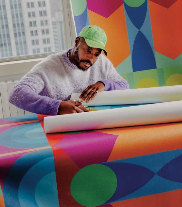
yellows, oranges, and blues, he has incorporated softer tones—whites and grays. “Color is such a personal thing, and hopefully I’ve offered something for everyone.”
It’s certainly personal for Ilori himself: His love of color was inspired by his family, who came to the U.K. from Nigeria. “My parents were happiest when they were wearing colors to special occasions,” he says. “My dad recently gave me a school report from when I was 8 or 9, which says, ‘Yinka has a great use of color, and enjoys drawing snails and mushrooms.’ ”
Having found this creative spark early, Ilori went on to study furniture and product design at London Metropolitan University. After graduating in 2009, he worked for the furniture and lighting de signer Lee Broom, with whom he found his feet in the design industry. But he already felt like something was missing. “I didn’t see a lot of conversation about culture,
heritage, dual nationality, or storytelling that I could connect with,” he observes.
A visit to Lagos shortly after graduating had solidified these thoughts. “Everything made sense to me on that trip—I was like, ‘Wow, this is who I am, this is what I want to talk about in my work.’ ” He has since become known for work that draws on his cultural heritage—taking inspiration from Nigerian textiles and Lagos life to convey his own feelings and the things that bring him joy. One of his most eye-catching projects to date was the Colour Palace pavilion, created in 2019 in the gardens of south London’s Dulwich Picture Gallery—a celebration of multicultural London that sat in glorious contrast to the early-1800s building b y architect John Soane.
Ilori has since had a meteoric rise, working around the world and moving from furniture and homeware to collaborating with the likes of


“Color is such a personal thing, and hopefully I've o ered something for everyone.”




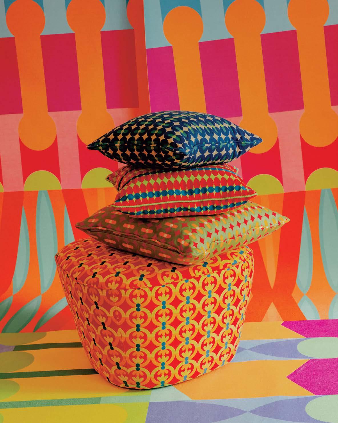
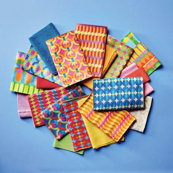
drinks brand Courvoisier, as well as creating playgrounds, skate parks, public installations, typographic posters, and regular pop-up shops. Now that he jumps so easily between disciplines, he has given up worrying about being labeled: “If you feel connected to my work, whether it’s a chair or a painting, that’s enough for me.”
It’s not hard to see why he names the late Virgil Abloh as an inspiration for his ability to turn his hand to any creative discipline, from architecture to fashion to music. Ilori has recently been exploring ideas with a ballet company—he has loved the art form since seeing Swan Lake as a child—and is intrigued by the possibilities of bringing together dance, music, architecture, and costumes.
Thematically, he feels he’s moving beyond his earlier focus on identity and heritage to a more expansive interest in human well-being: A film he’s working on for Chicago’s digital public art project ART on THE MART, for example, will explore “themes of unity, peace, nature, and
spirituality.” He explains, “I’m always trying to find a different purpose, and I think I’m finally finding it. We’re always going to need peace.” It’s hard to imagine that his own working life has always been peaceful, given how in-demand he is. Ilori says he has learned to be more selective about the projects he takes on now and to prioritize those that give him creative freedom, rather than being led by the vision of those who commission him. “I feel very confident within myself now and the work I do,” he says.
Ultimately it’s that sense of contentment and positivity he hopes to instill in others. A largescale public installation in London created during the pandemic in 2020—adorned with the words “Better days are coming, I promise”—is a particularly poignant example of his intentions and the impact he knows he can have. “When people look at my work, they say they feel hopeful,” he notes. “The biggest thing for me is to remind people that your dreams are valid and important, and if you keep holding on to them you can achieve them.”
The colorful adaptive reuse project is a collaboration between Oficina de Diseño Colaborativo, Maye Colab, and Atelier TBD.
By Lauren Jones

When you Google images of San Miguel de Allende, historic buildings awash in a rainbow of colors are likely what you’ll find. The UNESCO World Heritage Site is unsurprisingly enchanting, bringing in over a million visitors annually. Yet gentrification has made some central spaces more affordable for expats and tourists than for its residents.
To create Santa Tere Espacio, a coworking and social hub geared toward locals, Oficina de Diseño Colaborativo teamed up with Maye Colab and Atelier TBD to transform a once-abandoned six-room home in the city’s San Antonio neighborhood.
“From the beginning, we conceived a space where Maye [Ruiz of Maye Colab] and I could share offices but also a space that the c reative community of San Miguel can use for any purpose,” says Nadyeli Quiroz Radaelli, founder of Oficina de Diseño Colaborativo. Since
Opposite: The central courtyard serves as a multipurpose open space inviting visitors to patio exhibitions, community meetings, or simply for lunch.
This page: The entire project is organized around the central courtyard, which distributes users and visitors along the site.
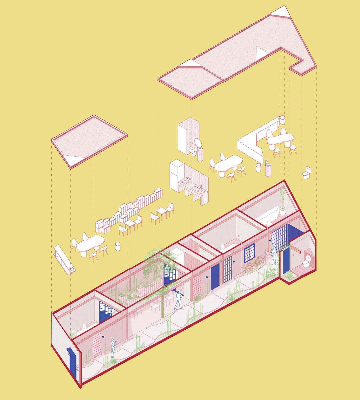
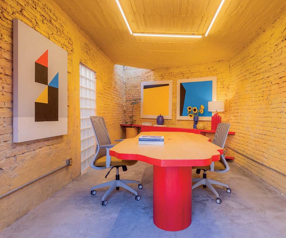
opening last year, Santa Tere Espacio has hosted several workshops, book clubs, photography exhibitions, and LGBTQ+centered events. There’s even a bookshop, Camila, Una Boutique de Libros, run out [of] one of the three studios.
To execute their vision, the team leaned into the spirit of adapting, recycling, and reusing, something well in line with the property, which the original homeowners informally built. This type of construction is typical in Latin America, especially in low-income areas, yet “is usually disregarded and seen as irrelevant,” Radaelli says. “Neighborhoods change so fast due to development, and we wanted to honor and acknowledge what was already there.”
However, what was already there was in need of a major cleanup. The 18-by-80-
“Neighborhoods change so fast due to development, and we wanted to honor and acknowledge what was already there.”
During construction, the team maintained a significant portion of the original structure and utilized materials discovered on-site, integrating them into the interior design color scheme.

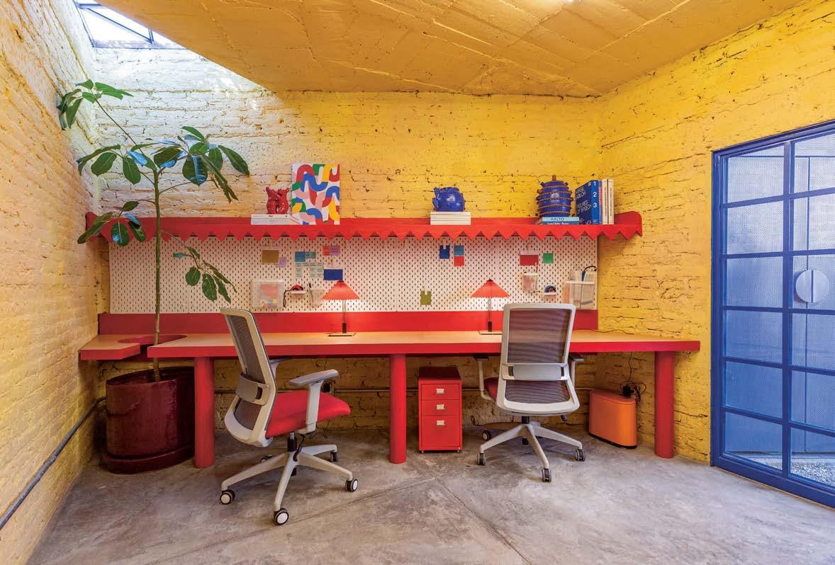
foot site was “full of trash with walls and roofs, but no windows, doors, or floors,” but today has been radically converted thanks to colorful interventions and thoughtful design. It is also one of the first adaptive reuse projects in the area. Its cramped floor plan and lack of natural light have been replaced by a more open space featuring large windows, a geometric skylight, a central courtyard with native plants, and a vibrant tiled kitchenette. Some elements, like the facade, were left untouched, with bits of paint and rustic brick peeking through.
Over a six-month construction period, the design team rehabilitated the property and unearthed patches of paint, which ultimately informed the bold color palette finessed by Maye Colab. “It’s as if
the people that lived there got one or two liters of paint at a time and painted sections of the walls,” Radaelli notes. To preserve the essence of the site, those same colors have been proudly displayed via saturated yellow walls, modern red furnishings, and locally sourced blue steelwork for doors and windows from Crónica Estudio.
While the hand-built structure has been brought up to code, the collaborative process hasn’t stripped it of its unique character. In fact, it’s hard to feel anything less than joyful upon arrival as the narrow patio unveils an “explosion of color and plants.”
“It was very experimental,” Radaelli says of the design. “It’s bold, crazy, and something that not any client would likely
want to do. Now that we have proof of concept, maybe they will.”
Santa Tere Espacio, which Radaelli refers to as a creative playground, has been not only a source of inspiration but a welcoming light to the area’s creative community. “We never did a formal opening, but the neighborhood has been very supportive and we never had any issues during construction,” she adds. Like the informal nature of the building’s roots, its opening has been in a similar fashion. “People reach out to us to host events through word of mouth.”
Like the rest of San Antonio, Santa Tere Espacio has embraced the eclectic and one-of-a-kind nature of its rich community and is looking to the future. For Radaelli, “it’s like a little gem.” M
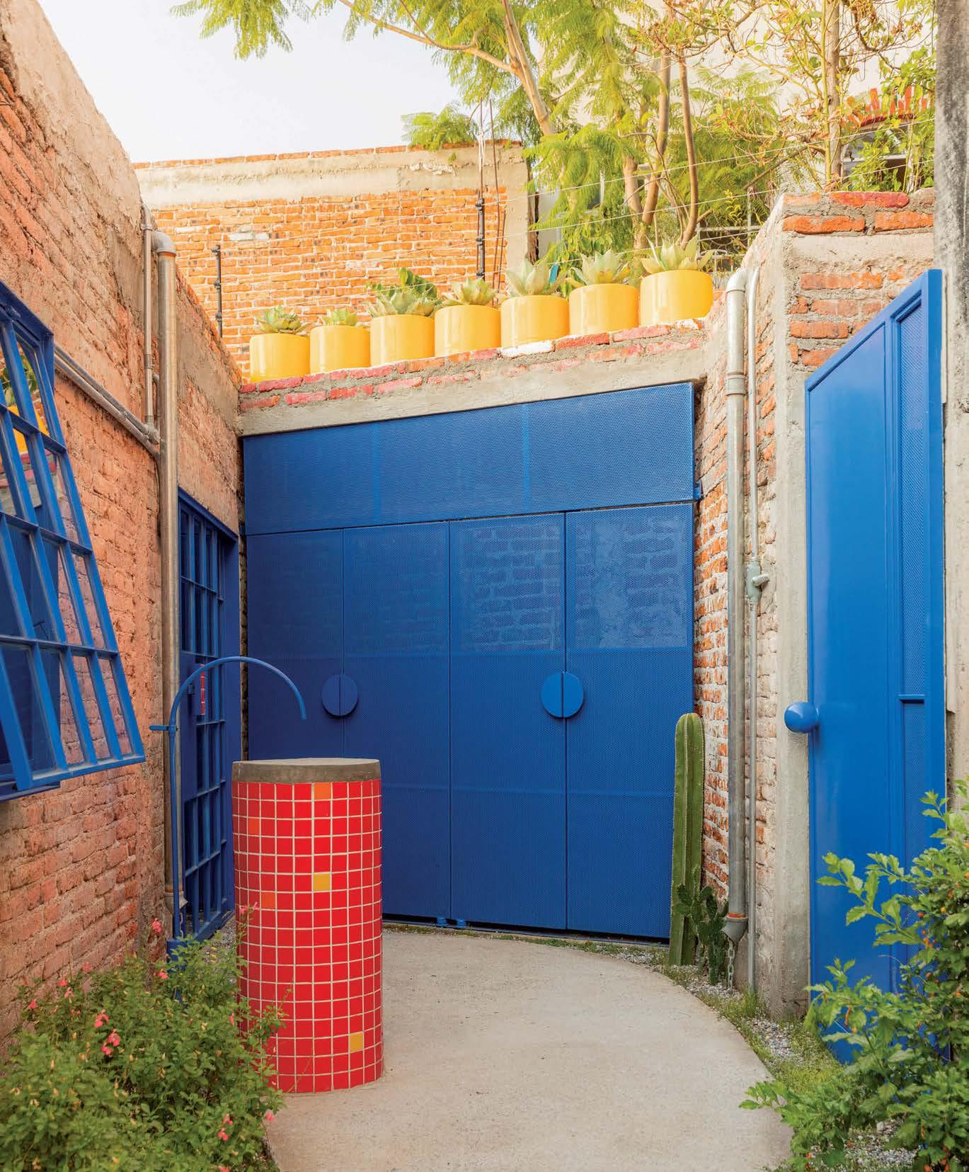

Films like Poor Things and Blade Runner rely on design icons and architectural references to imagine different realities.
By Jaxson StoneScience fiction is everywhere. What once were visions solely to be found in mass-market paperbacks now populate our everyday. After all, the opening scene in the 2023 blockbuster Barbie wouldn’t have been instantly recognizable to so many without the widespread cultural impact of 2001: A Space Odyssey. From students crafting spaces in the metaverse to world-renowned firm Zaha Hadid Architects’ Science Fiction Museum in Chengdu, China, it’s clear that designers have always been, and will continue to be, fascinated by visions of the future.
“Science fiction describes a way of thinking and perceiving, a toolbox of methods for conceptualizing, intervening in, and living through rapid and widespread socio-technical change,” explains media and cultural studies scholar Sherryl Vint in her book Science Fiction (MIT Press, 2021). “The struggle to shape the future is not only material: it is equally affective and imaginative.” It should come as no surprise that science fiction, with its ability to envision the future and explore alternative realities, has significantly influenced architectural thinking and practice. But speculative films and television often come full circle, drawing upon real avant-garde architecture and arcane historical references to depict buildings and places of another time and reality.


01 Through May 2025, Vitra Schaudepot presents a new exhibition titled Science Fiction Design: From Space Age to Metaverse Over 100 objects from the museum’s collection will be on view in a futuristic display by the Argentine visual artist and designer Andrés Reisinger (this page).
02 Zaha Hadid Architects completed the Chengdu Science Fiction Museum in Chengdu, China in late 2023. The city is a leader in Chinese science fiction writing and showcases the genre’s evolution and popularity across the world.
03 Courtesy of The Vitra Design Museum Archive, this book cover from 1956 is on view at Science Fiction Design
Take Yorgos Lanthimos’s 2023 film Poor Things, for example. Within its sets, the creative team collaged together cities and interior worlds that take viewers on a tour of the decorative arts in fin de siècle Europe as seen through a steampunk lens. The retro-futuristic, Frankensteinian film is gorgeously grotesque, and the creative time drew from sources ranging from the eclectic decor of John Soane to the visceral paintings of Egon Schiele. The baroque interiors of the film’s brothel evoke Claude Nicolas Ledoux’s phallic fantasies for his French neoclassical pleasure palaces combined with Antoni Gaudí’s Modernisme and the Secessionists’ sinuous decoration. The designers also cite architect Ricardo Bofill’s Postmodern megastructure Espaces d’Abraxas as a point of inspiration. The designers’ interest in Bofill may not be the most obvious visual reference, but its inclusion points to one of dystopian fiction’s most beloved motifs: the megastructure.
04 In Yorgos Lanthimos’s 2023 film Poor Things, production designers James Price and Shona Heath created intricately designed sets from a variety of influences—from John Soane to Egon Schiele.
05 With Poor Things’ grotesque mix of fantastic classical design elements and utopian imagery, it’s hard not to see parallels in the plans of 17th century French architect Claude Nicolas Ledoux’s Oikema House of Pleasure.
06 Poor Things’ critics have referred to the movie’s aesthetic as “Antoni Gaudí on acid” and even, “Gaudí on DALL-E.” We see it, and we’re here for it.


07 Ricardo Bofill’s 1978 design for Les Espaces d’Abraxas in Noisy-le-Grand, France, is another one of Poor Things’ architectural reference points. The high-density housing complex was designed to offset the rapid urbanization and insufficient housing in Paris and utilizes classical postmodern design motifs. The building itself has also been used as the backdrop in other dystopian science fiction films such as The Hunger Games.
08 Poor Things’ sets were built in Budapest and constructed on vast soundstages. The Lisbon set in particular was a marvelous feat for production design, featuring full-scale steel-frame buildings, cobblestone streets, and a 60-foot-high painted backdrop.


In movies such as Blade Runner , the megastructure takes the form of an evil, monumental megacorporation that holds power over the dystopian Los Angeles society. It can also take the form of artificial planets, fortresses, domed cities, or spaceships. Take the self-sufficient domed city found in Logan’s Run (1976) for example. Because of overpopulation and environmental destruction, the film’s residents live in a hedonistic domed city complete with high-speed trains zipping around in translucent tubes, metallic interiors finished with a mirrored, neon-lit room called the Love Shop, and colorful gemstone implants in their palms that indicate age (because here no one i s allowed to live past 30, and the “runners” who try to escape their fate of dying in a public ritual face a different set of consequences).
While it may appear hokey by today’s standards, the Logan’s Run interior world was not only a marvelous feat of 1960sera production design, model-making, and special effects but a direct reflection of the rise of American mega-malls and the massive interior spaces that architects were able to achieve through glass-andsteel structures. The exterior shots of the domed city were achieved through
intricate small-scale miniatures. Many of the “interiors” were largely filmed at Dallas’s Market Center, a 4.8-millionsquare-foot complex consisting of six ultramodern structures that form the largest single wholesale merchandise mart in the world as well as Philip Johnson’s 1974 Fort Worth Water Gardens. According to the science fiction blogger and “nostalgia curator” David Weiner, Logan’s Run star Michael York once said in an interview: “It’s identifiable. It prefigured many things, like the malling of America, these great, giant indoor spaces that were soon anywhere, and plastic surgery on demand. There was a certain prophetic truth to what it was positing about the future.”

11 The elaborate sets of Michael Anderson’s 1976 film Logan’s Run were certainly a product of their time. Set in a 23rd century megalopolis hermetically sealed off from the outside world by giant translucent domes, the exteriors scenes in Logan’s Run were created using a massive table-top miniature that was filmed with the Kenworthy Snorkel System, which gave a greater fluidity of camera movement and made it possible to get a low horizon on a small miniature.
12 The interior shots of Logan’s Run, however, would have been impossible without the state of Texas’s unique architecture. Anderson utilized Dallas Market Center, a 4.8 million-squarefoot complex consisting of six ultramodern structures that formed the largest single wholesale merchandise mart in the world. In its Apparel Mart, Logan’s Run utilized futuristic backgrounds of the West Atrium, a five-storied terraced space featuring an entire wall of mirrored plexiglass and the Great Hall, a five-level, 4,500-person arena.
Midcentury Modernism has undoubtedly shaped our present-day view of the future. From Eero Saarinen’s TWA Flight Center and Tulip furniture to Googie coffee shops and Oscar Niemeyer’s master plan for the city of Brasília, the sleek interfaces, sterile surfaces, and ergonomic modular design of space-age furniture and interiors demonstrate the late 20th century’s fascination with technologically advanced and user-efficient design.
Nothing illustrates this better than the celestial sets of films such as Stanley Kubrick’s 2001: A Space Odyssey (1968) and series such as Star Trek: The Original Series and The Next Generation . In 2001 ’s Hilton Hotel scene, design-savvy viewers might recognize the array of bright red Djinn Chairs by Olivier Mourgue, designed in 1965. As for the Trekkies, Saarinen’s Tulip Chairs may come to mind as “the Star Trek Chair”; however, set designers actually employed a cheaper knockoff version of the chair designed by Maurice Burke owing to a low budget.
“I think one of the main things that sets Star Trek apart from other science fiction is how aspirational it is,” says devoted Trekkie and design enthusiast Eno Farley. In March 2020, Farley turned a COVID-19 pandemic hobby into an Instagram account that posts all the design objects he has identified in the Star Trek enterprise. His Instagram account @startrekdesign has over 13,000 followers, and he has since launched a web page to keep an even more thorough catalog complete with designer information, episode details, etc. Farley has identified more than 300 objects, including tables, lamps, glasses, and over 130 chairs from The Original Series and beyond.
“The genre is saturated with futures or alien worlds where the earth reaps the inevitable consequences of unchecked capitalism, technological hubris, investment in surveillance and militarization, and environmental devastation. Star Trek , by comparison, offers, ‘What if we made the right choices now?’ and shows us a future where Earth has already solved the climate crisis, ended capitalism and scarcity, moved beyond racism and sexism, and helped found an interplanetary democracy of hundreds of alien species.”
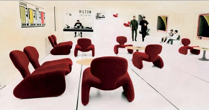
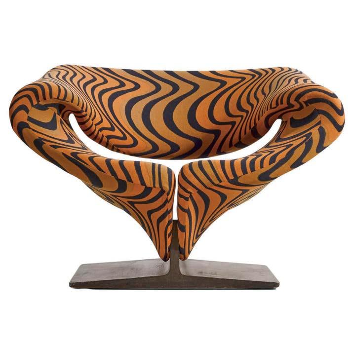

15

So what does that mean for design? For Farley, “Well, the inclusion of designer furniture on Starfleet ships and Federation planets makes sense—nice things are available to all in a post-scarcity society.” He points to French designer Pierre Paulin’s Ribbon Chair (1966 ), which has been featured not only in Star Trek: The Original Series but also in the sci-fi TV series Space: 1999 (1975–77) and the film Blade Runner: 2049 (2017).
“Paulin chairs are always used to denote luxury,” Farley notes. “The Ribbon Chair first appears in the Original Series episode ‘The Cloud Minders,’ in the cloud city of Stratos. On Stratos the Ribbon chair becomes a symbol of unearned privilege and highlights the hypocrisy of a ‘progressive’ society maintained through the exploitation of a dispossessed underclass.” However, he adds, “the chairs are also used extensively in The Next Generation, but no longer represent exclusivity, but the comfort and luxury accessible to all Federation citizens. To use an internet cliché, it’s ‘Fully Automated Luxury Space Communism.’”
This past May, Vitra put on an entire show about the relationship between science fiction and design, highlighting its relevance today by placing iconic retrofuturistic furniture in conversation with design objects that have been conceived exclusively for virtual environments. Science Fiction Design: From Space Age to Metaverse showcases over 100 objects from the Vitra Design Museum’s collection, from Joe Colombo’s Sella Chair to NFT designs by André s Reisinger.
Studying the relationship between architecture, design, and science fiction shows us that sci-fi isn’t just a genre, it’s a practice—a tool for rethinking our surroundings, from how we live with artificial intelligence to how we reflect on the catastrophic implications of climate change. Just as the dominant narrative of science fiction is to show us what it means to be human, the built environments and objects found within these imaginative worlds can help us speculate on new forms of social structures and new ways of being. M
METROPOLIS partners offer creative solutions for architecture and interior design projects. These new releases are tailored to your specification needs, designed to help you create beautiful, healthy spaces.
For a digital version, go to metropolismag.com
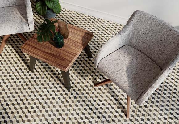
Indiana Furniture
Peace + Versatility. The Serenity collection offers subtle and understated upholstered chairs with a sweeping form to provide superior comfort. Personalize the design through integrated arm and armless models, five base options, and an expansive selection of finishes, upholsteries, and leathers. Serenity uses renewable and recyclable materials and complies with the mechanical standards that focus on safety and durability.
@IndianaFurniture | IndianaFurniture.com
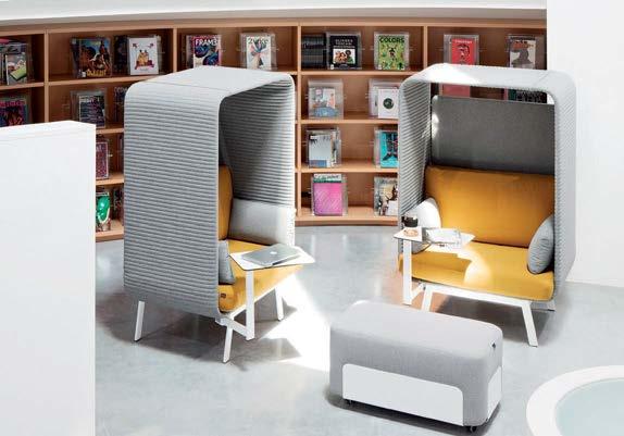
Discover your ideal workspace with Privée lounge seating. Choose from a variety of options, including open sofas, armchairs, and ottomans, all designed to foster creativity and comfort. Privée's canopy offers unparalleled acoustic comfort, reducing noise by over 15 dB for clear conversations and focused work. With modular components and swivel tables, Privée adapts to your needs, transforming furniture into architecture.
@BorgoSeating | borgo.com

LaBastille
Hand-crafted Metal: Countertops, Range Hoods, Wall Panels, Custom Furnishings Exquisite one-of-a-kind design. Luxurious, timeless, and versatile.
LaBastille.com

Dauphin
Experience the sleek, modern design of Bevva, crafted with sustainable practices and customizable dimensions for versatile workplace settings. Elevate your space sustainably with Bevva.
@DauphinAmericas | dauphin.com/products/bevva/
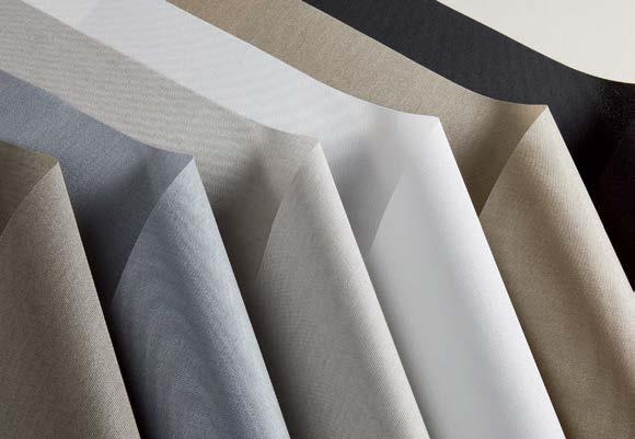
Mecho
Meet EcoGlass, the latest addition to Mecho's sustainability shade cloth collection. Woven from 100% glass yarns, EcoGlass achieves significant sustainability certifications like Cradle to Cradle and Greenguard Gold without compromising on style or performance. Its unique recyclable composition ensures a luxurious look that's lightweight and durable. EcoGlass is the ideal choice for those seeking eco-friendly, sleek, and effective shading solutions.
@mecho_shade | mechoshade.com
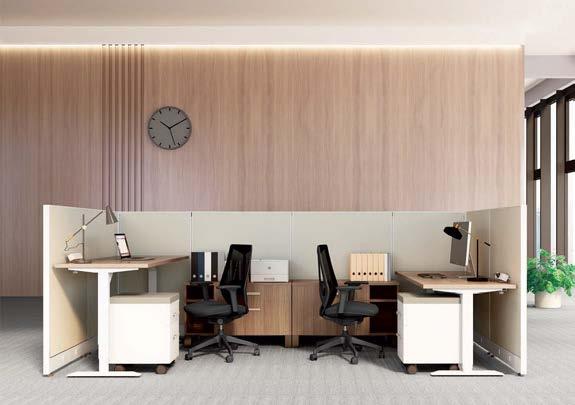
Friant & Associates
Ergonomic workspace designed with wellness and workflow in mind. Recreate the look: Novo, My-Hite 3 Stage, Ignite Task Chair.
friant.com
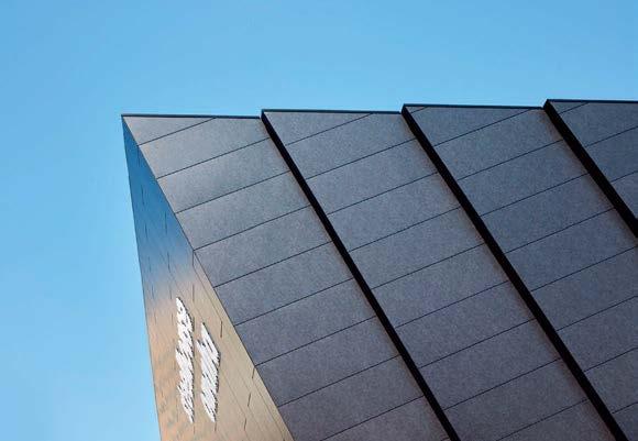
Pure + FreeForm
Ultra High Performance AluminumTM Brooklyn Steel is a blackened aluminum with a textured white pearl in a patina effect. This neo-industrial take on blackened steel allows for optical texture to appear in the material when light diffuses off the surface. Brooklyn Steel can be used in numerous UHPA systems including, flat lock, slab edge, flush reveal and many more.
@purefreeform | purefreeform.com
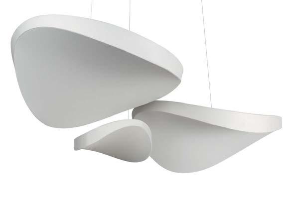
The Dune Acoustic Cloud is a modern, sculptural solution for noise reduction in lively spaces. Made of 80% post-consumer recycled content, the Dune is available as a suspended cloud, wall mounted panel or even a light fixture. A wide range of custom options are always available. Contact us for more information on our sculptural design products for modern interiors.
@studiolilica | studiolilica.com
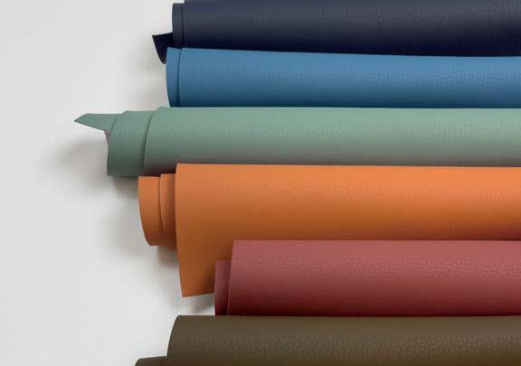
Volar Bio by Ultrafabrics now has a 66% mix of recycled, rapidly renewable, and biobased content. The collection's evolution includes certifed REPREVE® recycled polyester, ECOVERO™ viscose, and Susterra® propanediol biobased resin. Every yard of Volar Bio includes approximately 8.3 recycled plastic bottles.
@ultrafabrics_inc | ultrafabricsinc.com
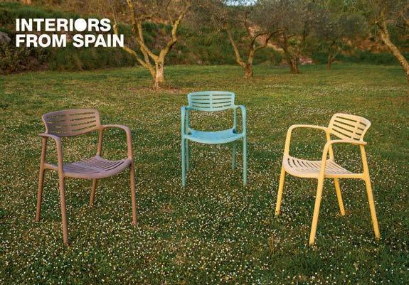
At Resol we think green, because it’s the only way to move forward. Our #greenthinking project is a circular economy model that is developed through innovation in the area of sustainability. The creation of the formula for GRITEK®, the material we use to manufacture the items in our Green Edition range, is one example. This range is made from 100% recycled and recyclable materials..
@resol_furniture | resol.usa/com
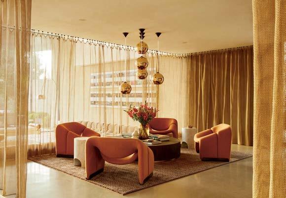
Whiting & Davis drapes are not just static decor but dynamic elements that transform with the changing light. As sunlight filters through the mesh, it casts intricate patterns of shadow and shine, creating an ever-evolving tapestry of beauty. This interplay of light and texture adds depth and dimension to any room.
Project: Madison Desert Club by Kovac Design Studio.
WDMesh.com


A unique material like glass, expertise that has been consolidated from the continuous research and development of proven processing techniques, to transform it into a design tool for contemporary architecture.
Decorative glass makes up the DNA of OmniDecor, as does its ability to interpret its essence in order to meet the requests expressed by the design world, and to shape spaces and settings with added value, both in the definition of the architectural reference elements and to characterise interior designs.
OmniDecor has developed a privileged partnership with international designers and architects, providing its expertise and ability to innovate, its drive to conduct research and experimentation, but also the guarantee of an industrial concern capable of ensuring constant supplies that meet deadlines.
The ability to customise its solutions, to personalise decorations,
colours, to work on the three-dimensionality of the glass pane, today enables the company to be the perfect fit for the most important international projects both in the residential field as well as in the world of hospitality, or retail. The versatility of the material and the possibility of generating almost infinite geometric shapes, gives each project a distinctive identity.
OmniDecor meets the need for contemporary decorations involving glass surfaces, overcoming the absolute minimalism of a few years ago. An understated decoration that accommodates the functional requirements but at the same time makes every setting exclusive with a significant aesthetic impact.
As demonstrated by the new Pure Lines collection designed by Lidia Covello which extends the DecorFlou Design glass by OmniDecor to break free from the norm and to embrace experiences and forge new glass projects.
Learn more about the topics you’re interested in as you explore the Products 2024 issue of METROPOLIS.
ADAPTIVE REUSE
62 Once a Cold War Bunker, Now a Children’s Health Institute
134 Second Act
156 A Coworking Space Captures a Community’s Creative Spirit
CIRCULARITY IN PRODUCTS
40 The Dynamics of Sustainability in Decision-Making
42 Sustainability Lab at NeoCon
52 The Winners of the MetropolisLikes 2024 Awards
88 8 Products to Help You Push the Envelope
102 What You Need to Know About Specifying Wood Sustainably
110 8 Products Shifting the Recyclability Paradigm
112 These Biobased Products Point to a Regenerative Future
116 Squaring Circular Design
126 How the Furniture Industry is Stepping Up on Circularity
148 Dreaming at Work
CLIMATE ADAPTATION
88 8 Products to Help You Push the Envelope
EMBODIED CARBON
40 The Dynamics of Sustainability in Decision-Making

ACADEMIC RESEARCH
100 Put These Timber Architecture Books on Your Shelf
CULTURAL ANALYSIS
164 Chairs in Space: When Design History Inspires Science Fiction
DIVERSITY AND REPRESENTATION
148 Dreaming at Work
EMERGING TALENTS
124 From Ergonomics to Anthronomics
HISTORY
164 Chairs in Space: When Design History Inspires Science Fiction
REAL ESTATE AND INVESTMENT
62 Once a Cold War Bunker, Now a Children’s Health Institute
52 The Winners of the MetropolisLikes 2024 Awards
66 5 Technologies for Material Lovers
122 Framery’s Smart Pods Prioritize Sustainability and Employee Wellness
126 How the Furniture Industry Is Stepping Up on Circularity
EQUITY AND ACCESS
116 Squaring Circular Design
130 Chris Adamick Designs for Life
HEALTHY MATERIALS
40 The Dynamics of Sustainability in Decision-Making
42 Sustainability Lab at NeoCon
52 The Winners of the MetropolisLikes 2024 Awards
66 5 Technologies for Material Lovers
72 The Latest Lighting Maximizes Form and Function
76 It's All About the Details in Kitchen and Bath
112 These Biobased Products Point to a Regenerative Future
122 Framery’s Smart Pods Prioritize Sustainability and Employee Wellness
148 Dreaming at Work
NEURODIVERSITY
142 Your Brain on Color
REGENERATIVE DESIGN
102 What You Need to Know About Specifying Wood Sustainably
RESPONSIBLE RENOVATIONS
62 Once a Cold War Bunker, Now a Children’s Health Institute
116 Squaring Circular Design
134 Second Act
156 A Coworking Space Captures a Community’s Creative Spirit
WATER
76 It's All About the Details in Kitchen and Bath

BIOBASED MATERIALS
80 Cementing Possibilities
96 Primitive Specificity
100 Put These Timber Architecture Books on Your Shelf
102 What You Need to Know About Specifying Wood Sustainably
112 These Biobased Products Point to a Regenerative Future
CALCULATORS, SOFTWARE, AND PLUG-INS
66 5 Technologies for Material Lovers
126 How the Furniture Industry Is Stepping Up on Circularity
CONSTRUCTION MATERIALS
80 Cementing Possibilities
96 Primitive Specificity
100 Put These Timber Architecture Books on Your Shelf
102 What You Need to Know About Specifying Wood Sustainably
LARGE-SCALE ADDITIVE MANUFACTURING
80 Cementing Possibilities
PLASTICS
42 Sustainability Lab at NeoCon
52 The Winners of the MetropolisLikes 2024 Awards
110 8 Products Shifting the Recyclability Paradigm
112 These Biobased Products Point to a Regenerative Future

Quanta Max poly shells are low-waste injection molded using an energy efficient process. The biocompostable material contains recycled content and is 100% recyclable at end of life. Specify with metal frame and non-transparent powder coat for maximum material efficacy.
Visit Quanta Max Made in America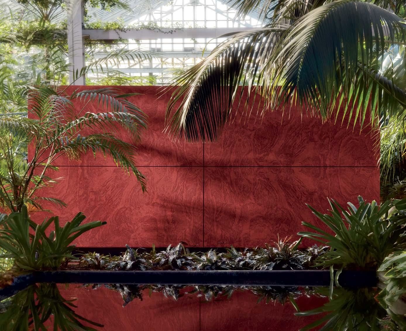
Introducing our new family of Stone Textures that capture the beauty of natural stone. Inspired by nature, designed for felt, and stunningly unique.