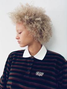
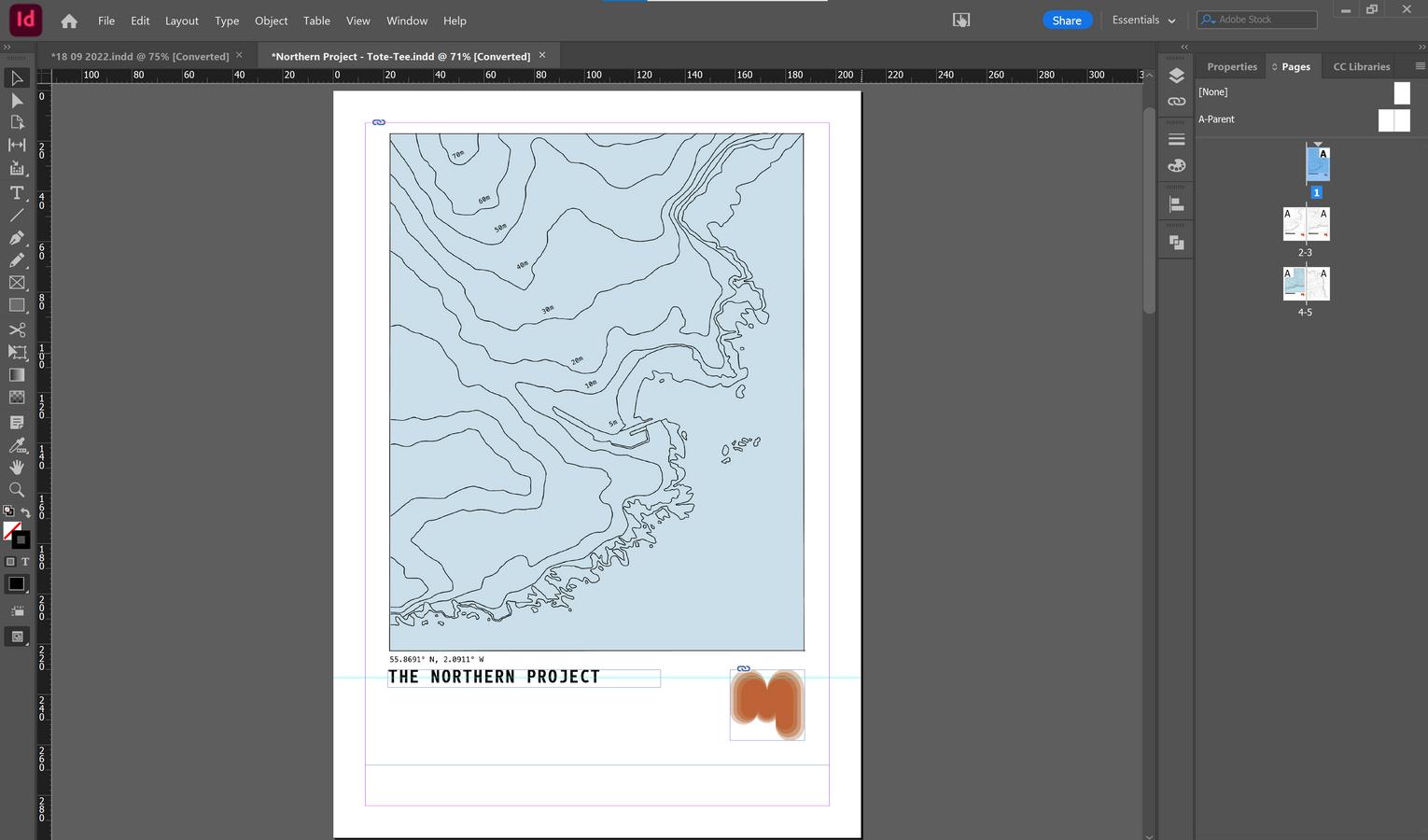
THE NORTHEN PROJECT
The Northern Project is the first official collection produced by the brand Mhari Dougal
A design assignment designing and developing my personal brand Mhari Dougal with and aim to grow my brand and audience for my future career
Under this assignment the following will be demonstrated: Logo Design, Product Design, Graphic Design, Merchandise Design and Packaging Design which will all be executed through research, ideation, refinement to produce a final product

TABLE OF CONTENTS 01 Mindmap Design Brief Collage Peter Saville Logo Design Logo Design Albert Watson Photobook Design Collage Logo Design Photobook Design Stussy Logo Design 2 0 Photobook Design 02 03 04 05 06 07 08 09 10 11 12 13 14 15 Merch Design Merch Design Packaging Packaging Bibliography 16 17 18 19 20 Own Work digital illustrations / pencil sketches
DESIGN BRIEF:
The goal of this assignment is to develop my photography brand to assist in building and gaining a larger audience and to produce products that will prove beneficial for kick starting my career These products will contribute to a large portion of my folio as a photographer and will demonstrate my skills and enthusiasm for future opportunities such as applying to Uni's jobs
GOALS:
BRANDING:
Build the branding by graphically designing various elements
Logo x2 for both the brand and the collection
Colour Palettes
Business cards
Potentially website and Instagram account
MERCHANDISE:
Using the branding (colours, logos and graphics) design and produce various elements of the merchandise
2x graphic t shirts 1 for brand and 1 for a unique collection
2x tote bags 1 for regular brand and 1 for unique collection
PHOTOBOOK:
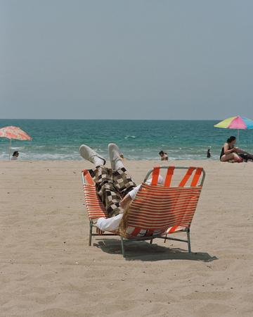
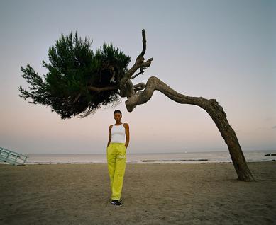
Compile the best of my work 35mm and film photography
Through this assignment, I want to design and produce a variety of products such as a photobook, posters and prints, and merchandise like totes and t shirts With these products, specific and unique packaging will keep design keeping sustainability and the environment in mind with the intention of minimising and limiting waste and utilising environmentally friendly materials Other elements of the brand are going to be designed such as the logo and branding.
Research design layout that is best suited for displaying photos Print and bind a book for production
PRINTS:

From the photo book I will select 2 4 of my favourite and best photos to be scaled up and printed as posters/prints
PACKAGING:
For all of the products that I will be designing and producing, I am going to design specific and unique packaging
This will include packaging for the merchandise, photo book and prints I want to be sure that the packaging limits the waste produced and is made to be as environmentally friendly as possible
Whilst ensuring sustainability, I was to be able to keep the aesthetic of the brand to make sure everything is consistent Packaging like poster tubes, fold out boxes, thin poster packaging and stickers
The target audience of this project is everyone who appreciates and enjoys viewing and supporting my work This includes the art of photography and the design process of designing each aspect and element of the brand Another audience to take into consideration is universities as I want to include this in my final folio for applications The purpose of these items is mainly for expanding my status as a photographer with the added use of decoration that individuals enjoy.
FINAL PRODUCT:
After completing these goals, I want to be able to display each item as I envisioned I want the display to provide the viewer with the feeling as though they are viewing something at an art gallery with the sensation of an additional gift shop
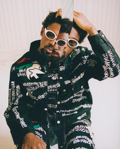
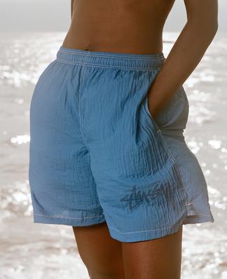
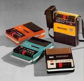
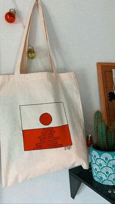
The brand Stüssy is the main inspiration for my brand with the way that they were able to grow organically and incorporate an artistic flair to a clothing brand, something that is not typically considered “artistic”
The overall goal of this project is to successfully and effectively design a brand and create products that appropriately memorialise and portray my brand in order to gain a larger audience.
RESEARCH AND ANALYSIS:
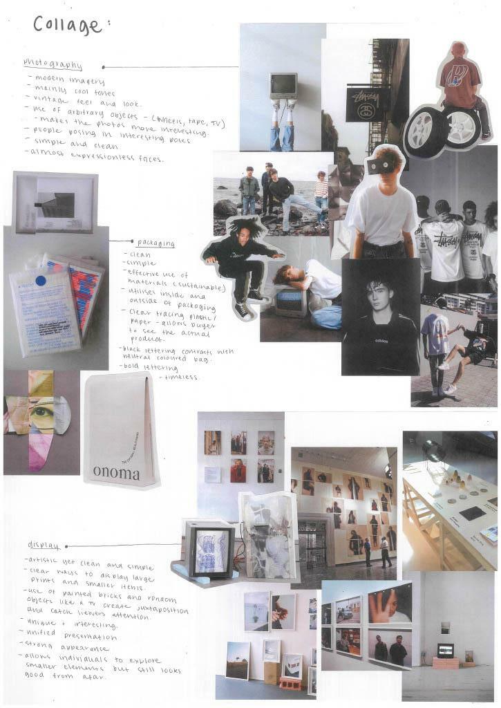
COLLAGE:
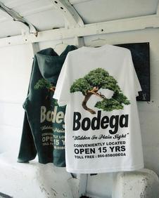
Stüssy is a brand established in the late ’80s and early ’90s by Shawn Stüssy, on the coast of California Stüssy has been known to redefine the look and ideology of everyday wear The brand was originally focused on surfboard shaping with the addition of t shirts, all with the same iconic logo Shawn's last name in a graffiti style type


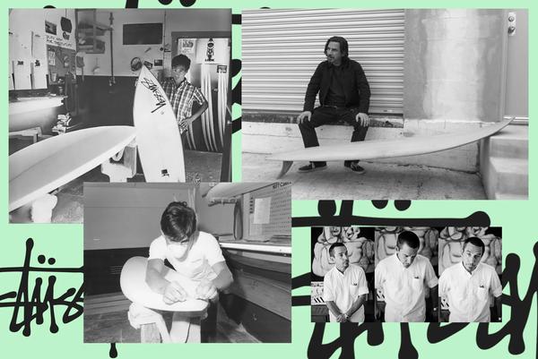
The brand started getting more attention within the small community of surf and skateboarding in and around Laguna beach. Shawn began presenting stores that he respected with his designs hoping to further grow the brand
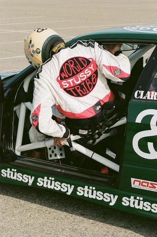
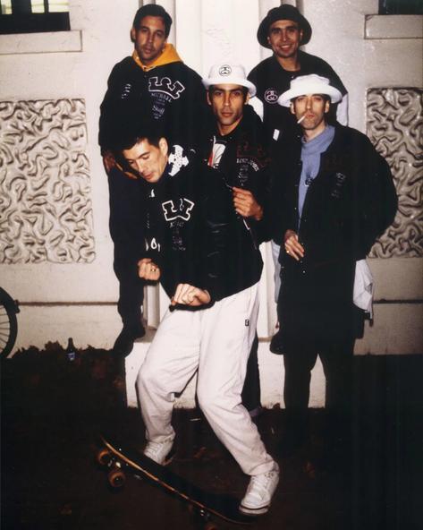
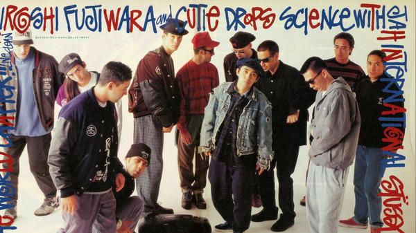
Stüssy grew organically, largely from the influences of various youth movements. However, another large factor in the brand's growth was the approach towards the methods of promotion The main way of promoting his brand, Shawn and his friends, including Mick Jones, Hiroshi Fujiwara and Alex Turnbull, wore Stüssy’s pieces to events and parties that would get a large amount of press release More people began recognising the brand and labelled this group the “International Stussy Tribe”
Another approach Shawn took for this quickly growing brand was to make sure everything was done in house A large aspect of the brand Stüssy is staying strictly original, as it was a streetwear brand and an aesthetic The main step taken to stay true to “Stüssy'' is by keeping everything in house and not choosing the commercial route For example, every campaign had a different artistic director and photographer handpicked Despite this, they still managed to keep the image of Stüssy unique, timeless and cohesive whilst maintaining a nostalgic feel, making it difficult to differentiate between old and new shoots
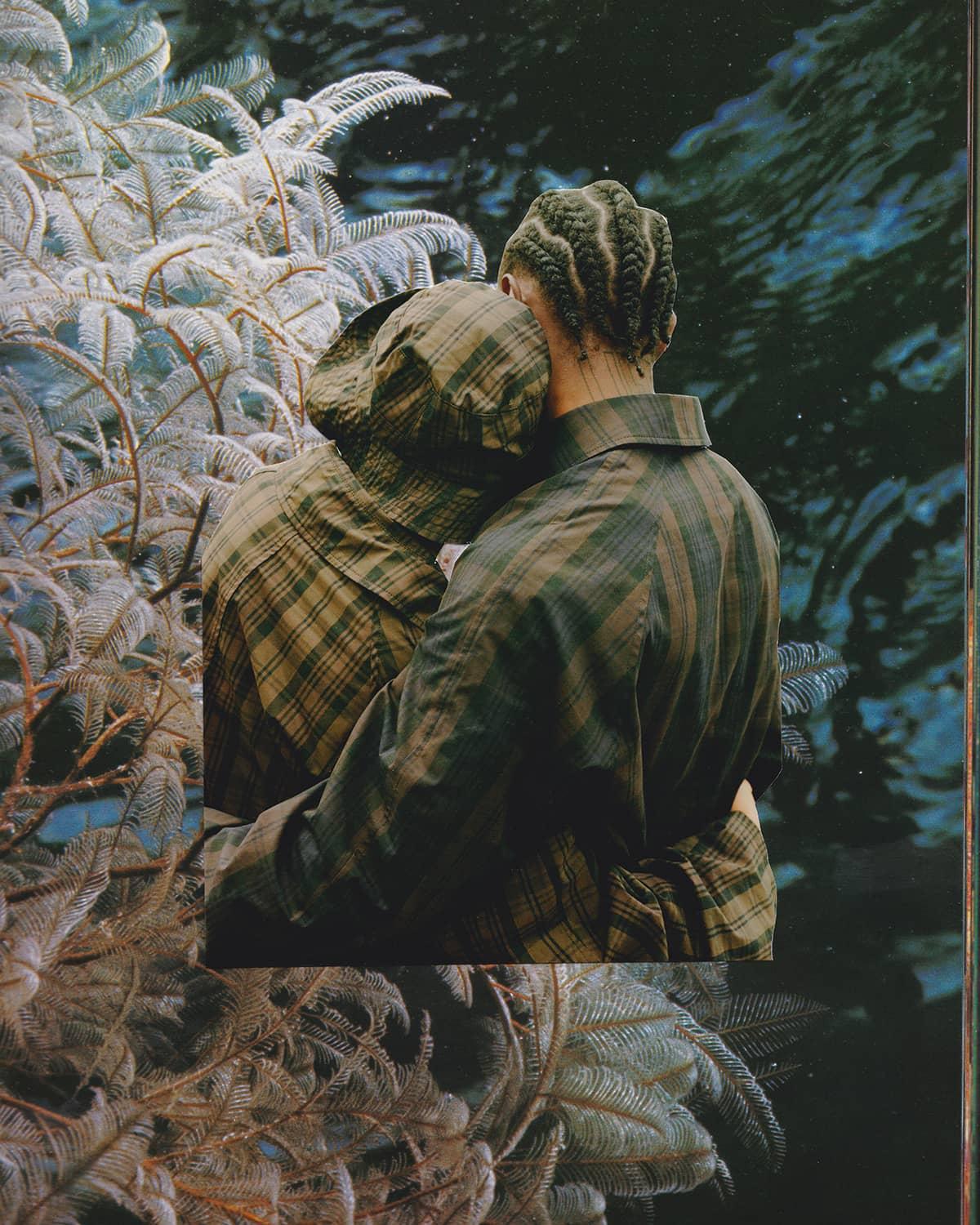
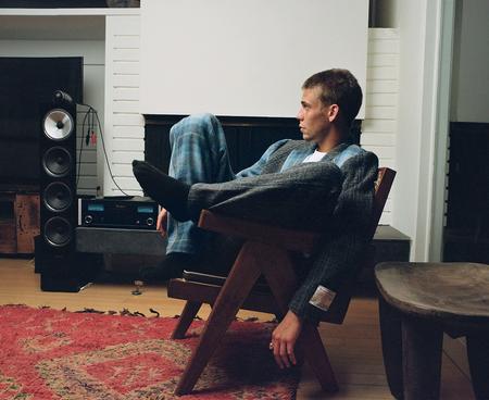
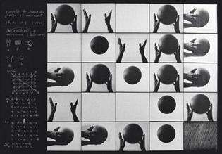
By prioritising the creative elements of the brand, it allowed the team to push the boundaries not only of the fashion industry but the creative industry Shawn initially established the brand's aesthetic when creating one of the first campaigns which involved a punk rock inspired photo collage Photo collages are still being used for recent campaigns, continuing the originality of the brand
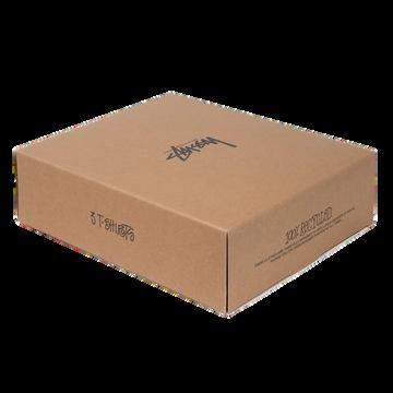
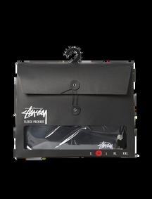
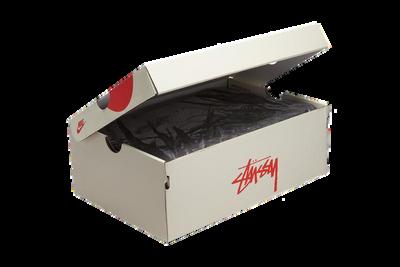
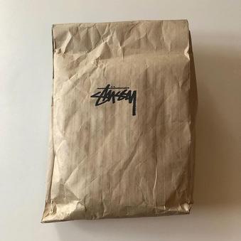
PACKAGING.
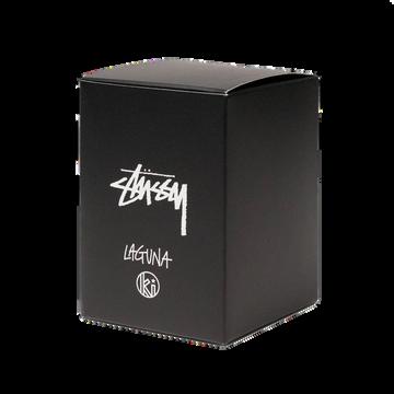
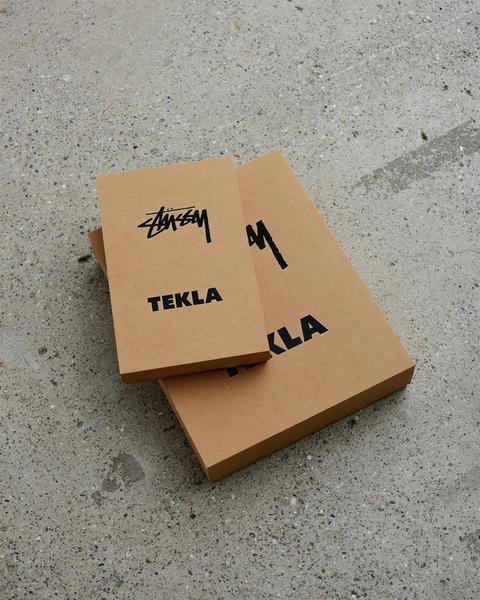
The packaging design for Stüssy products is kept to a minimalistic level, prioritising the function of the design which is to transport the goods without being damaged The main recognisable and consistent feature of each packaging piece is the iconic “Stüssy” logo
RESEARCH AND ANALYSIS:
THE INTERNATIONAL STUSSY TRIBE
ORIGNAL COLLAGE 2020 COLLAGE
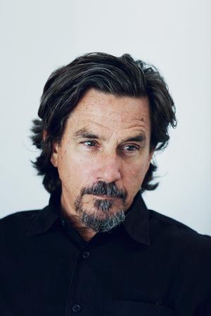
PETERSAVILLE.

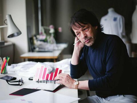
Peter Saville is a very well known graphic designer from Manchester who has created some of the most recognisable and celebrated logos and designs
Peter grew up in Manchester and graduated from Manchester Polytechnic, now known as Manchester Metropolitan University, studying graphic design before beginning his career Just after graduating in 1978, Saville met Tony Wilson who owned a record label amongst many other things This was his way into the music industry as a designer Tony was working at the label when Peter's first poster was officially commissioned

During
Peter Saville's designs re appropriated art and design in various ways that were sometimes seen as controversial With over 50 years of experience, Peter has become one of the most influential designers and established an aesthetic of diversity His work occasionally follows the same aesthetic but features a lot of diversity making his work exciting and unique for his audience Peter's approach to design is also unique, approaching each project conceptually rather than with a perceived notion of the end result [Epochs Menswear, 2015].
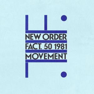
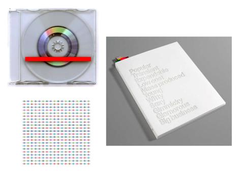
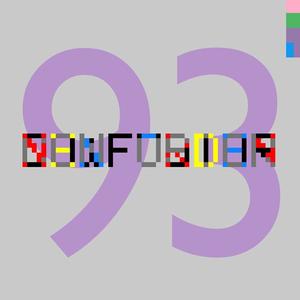
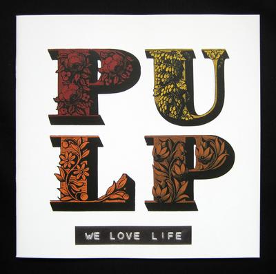
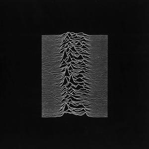
Through Factory Records, Saville produced some of his most recognisable and famous designs, those being the record sleeves for Joy Division and New Order
After creating these extremely famous and iconic record sleeves, Peter moved on to a different record label, Dindisc where he continued to create pieces for musicians like King Crimson, Ultravox and Peter Gabriel
Other well known musicians, he designed record sleeves for include, Paul McCartney, Bjork, Sex Pistols, Pulp, Duran Duran and Suede
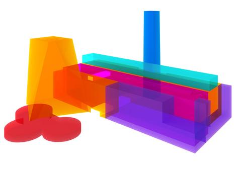
Not only was Peter successful within the music industry but he is also renowned for the logo designs of multiple high status brands His first introduction to the fashion industry was when he collaborated with Yohji Yamamoto in the 1980s
He then went on to collaborate with John Galliano for Dior in 1990
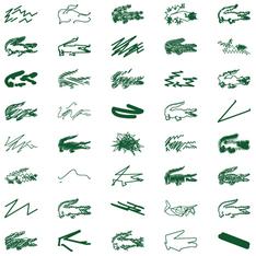
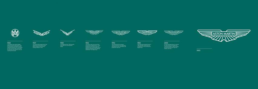
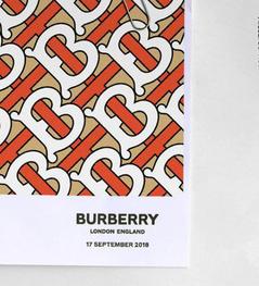
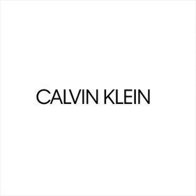
Over the course of the next 10 years, Peter redesigned the Givenchy logo and collaborated with Raf Simons and Paco Rabanne He was also commissioned to redesign the logos of Calvin Klein (2016), Burberry’s new logo (2018), Lacoste's logo for their 80th anniversary and most recently the Aston Martin logo
RESEARCH AND ANALYSIS:
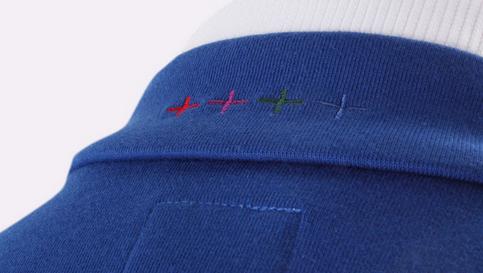
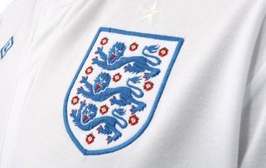
this crazy period of his life he was also appointed the role of creative director of his hometown Manchester and redesigned the England National football teams home kit
|
| |
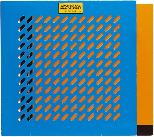
| New Order | New Order | BOTTOM:
|
|
Left
to right, TOP: Joy Division
Factory Records
MIDDLE: New Order
Pulp
Sex Pistols
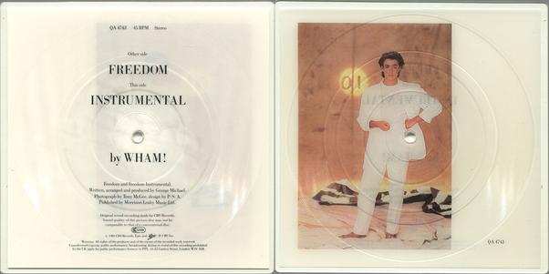
Wham!
Left to right, TOP: Burberry Logo (2018) | Lacoste 80th Anniversary Logo
|
Calvin Klein Logo (2016) | BOTTOM: Evolution of Aston Martin Logo
bold and
design Graphic
Unique and interesting shapes used to keep the audience's attention Strong yet simple fonts doesn't take away from the logos/graphics Use of patterns lines, letters, repetition
Bright and contrasting colours Thick
fonts Use of patterns and textures Balanced design
Clear
simple
directly relates to the company name factory graphic
Uses the simplicity of the cross on the English flag elsewhere on the design to create consistency and unify the design Modern taken on a traditional emblem
and large
LOGO DESIGN RESEARCH AND ANALYSIS:
PICTORIAL LOGOS:
Uses meaningful graphics making it a primary identifier for the brand
Directly or metaphorically represents the essence of the brand
Diverse way of projecting detailed concepts
Due to complexity, these designs are most commonly paired with simple typography as it makes the design less overwhelming
Well designed pictorial marks are when the brand can be recognised solely through the graphic without the accompanying text
LETTERFROM LOGOS:
Graphic represents an initial letter of the brand
This letter conceptually, metaphorically and systemically represents the brand
These logos carry minimal visual letters (only consisting of a single graphical letter)
Timeless due to simplicity
MONOGRAM LOGOS:
Combination of two or more letters directly related to the brand
Common in the fashion industry
Various letters have interesting ways of intersecting with one another visually
Usually, simpler letters are more difficult to make look technical and interesting
For example, the structure of letters such as I are too simple and lack richness W and S pair well with more complex letters
PICTOGRAM LOGOS:
Described as part of the writing system (pictures that represent words and ideas)
Symbols act as a universal symbol of the object it resembles
Have a degree of fluidity no specific version for each symbol and can be edited and modified as needed
Modifying pictograms can enhance the overall meaning of the object
Universality is a key factor of pictograms, important to use primary design elements
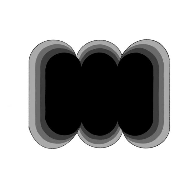
NEGATIVE SPACE LOGOS:
Surrounding space around a silhouette is the negative space
Dark Silhouette = Bright space = negative space | (vice versa)
Well designed negative space logos involve two or more strongly recognisable silhouettes harmoniously merged (one of these is positive and the other is negative)
To make a good logo two elements have to be cleverly combined with easily recognisable silhouettes that are conceptually related to one another
LOGO DESIGN ELEMENTS:
COLOUR GRADIATION:
The less visual information, the more clear and memorable it becomes
Gradation contains thousands of seamless hues which makes it unclear and graphically overwhelming
Reducing the number of hues is recommended as it becomes simpler and cleaner whilst maintaining the same effect When reducing this, it will remain clear and appear more seamless.
LIGHT AND SHADING:
Not everything simple is attractive but when made properly they can look sophisticated
If they lack content they can look plain as some shapes are too simple to be interesting
By adding additional elements it can bring a logo to life
A key way to make a logo look more interesting is by adding a light source as it creates depth and dimension
GRAPHIC DEVICES:
A graphic device is a visual element that surrounds a logo to separate it from the background image
Mainly achieved by outlining the logo with a thick and bright stroke creating a border around the shape

This makes the logo more visible and clear
It is important to use the right shapes for the graphic device of a logo as it can be detrimental to a pleasing result

SOLID VS LINE:
Solid logos have a very stable and strong appearance compared to line logos which are light and elegant
Each one is appropriate for specific projects
Solid logos, when scaled down remain clear with the concept still visible, are more visible from afar and can appear clearly on various mediums
Line logos are seamless, useful for passive design (web and app icons), and not overwhelming but lose clarity when scaled down and cannot be seen from a distance
SHARP VS ROUND:
Sharp edges appear more threatening and authoritarian compared to round which makes logos more inviting and friendly
Humans tend to avoid sharp edges as they can seem harmful and are attracted to round edges as they are safer
Logo design needs to consider these responses limiting sharp, using round Wherever use rounded shapes unless sharp is appropriate for the project
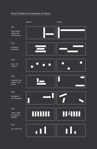
BALANCING:
COMPOSITION:
Making the smallest adjustments can achieve balance
Stability: not unnecessarily tilted, sense of gravity, the base of the logo should be heavier and wider to appear firm and grounded
Proportion: aim to be square over rectangle as they can become inconvenient to use
Consistency: equally spaced, consistent thickness of strokes shouldn't vary
Scalability: must look good and clear when enlarged or scaled down
Aim to create something interesting that keeps the viewer engaged and connected Infinite outcome by arranging colours, text and shapes slightly differently
Good composition is an arrangement of elements that has a certain order that corresponds in some respect to reality. Important to understand how shapes behave and interact differently which can either create harmony or tension
LOGO DESIGN RESEARCH AND ANALYSIS: EXSISTING LOGOS

(INSPIRATION):
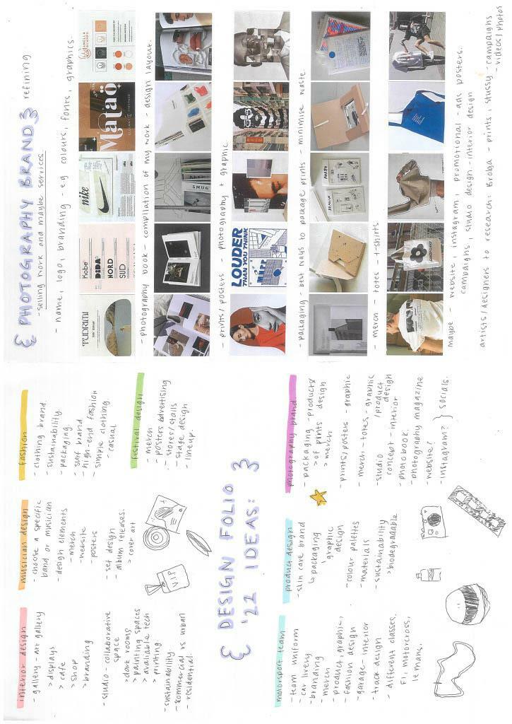
IDEATION:
BRAND NAME IDEAS:
Studio Dougal Studio June
September Studios
Northern Studios Studio North
The June Project Project Dune Project Dougal
The Dougal Project Project Tuath
The Tuath Project Mary and the moon Mhari and the moon
The Northern Project
The North Star of the Sea

Northern Star

Gaelic: Rionnag a tuath na mara
Gaelic: Am proiseact a tuath
FONTS
Signal Light Creative Market
Special Argument Creative Market
My name is a traditional Gaelic name translating to Mary but also meaning North Star of the Sea So I have experimented with different names that relate to this I also translated some of the names into Gaelic to see what they would look like visually
After doing this I decided on The Northern Project for the collection name as its easily recognisable and still relates to my Scottish heritage
For my personal brand, I decided to keep the name as my own Mhari Dougal as I want it to become recognisable so that people can instantly associate it with my work and brand
Lines are mostly bold and thick which allows for the logos to stand out Shading can be done using negative space, thin and thick lines and through the use of gradients
Text within these examples are all presented in uppercase stronger and bolder appearance more visible and clear

Mainly consists of black but the colours used in others aren't overwhelming and would show clearly on most backgrounds and images
COLOURS
These colours are to be used for the logo and overall branding packaging, merchandise, business cards etc
Blont Creative Market
Botanika Mono Adobe Fonts
Infister Creative Market

Black Mango Creative Market
Interstate Mono Adobe Fonts
I experimented with various fonts to get an understanding of what kind of logo I wanted to achieve as the font determines the aesthetic All of the fonts above I liked but for the logo of my collection I wanted to make it more graphic so I feel like the bolder and stronger looking fonts will work better for that. It also works with the underlying theme of my heritage being Scottish/Gaelic which is known for being strong and stoic which can be portrayed using a bolder and heavier font
Whatever font I choose for the Northern Project logo I will match it with my regular logo However, for the Mhari Dougal logo, I want to design a letterform logo that can be identified without text next to it, so I won't necessarily need a font for this logo
INSPIRATION (THE NORTHERN PROJECT):
FAVOURITE COLOURS IN DESIGN:
Mainly consist of bright colours that pair well with neutral colours or darker colours like black and navy blue pop and easy to associate with a brand
Silhouette/outline
Would
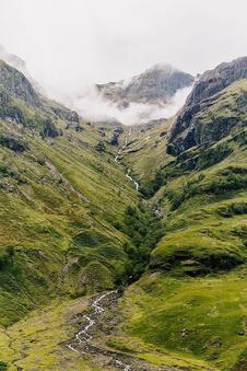
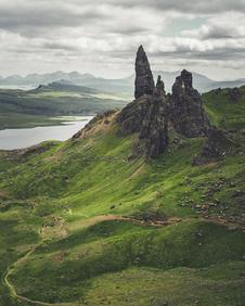
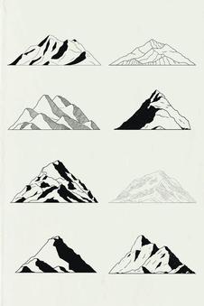
Rugged Terrain Mountains/cliffs
of natural elements
pair well with a bold / heavy font
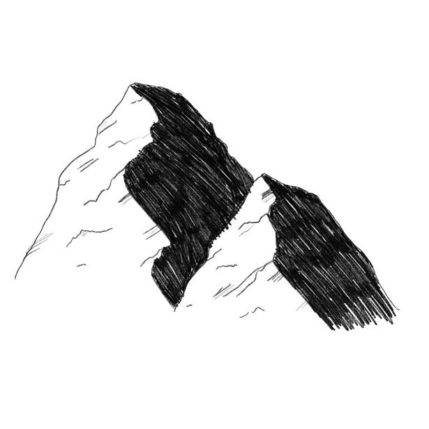
1. 2.
Detailed but lines may be too thing to stand out
Simple form but interesting because of shading
Could pair well with multiple fonts bold and fine
Detailed but lines may be too thin to stand out Simple form but interesting because of shading
Could pair well with multiple fonts bold and fine
REFINEMENT:
3. 4.
If refined it would look good on items like tote bags and t shirts
Could put text inside the design to balance out the elements
Can be seen from afar and would pair well with a bold font Flows well and is recognisable
Could add shading or another element to make it more interesting
REFINEMENT:
Balance of dark and light elements
Balance of thin and thick but lines may be too fine
Contrast of white and black Would pair well with a font
3. 4.
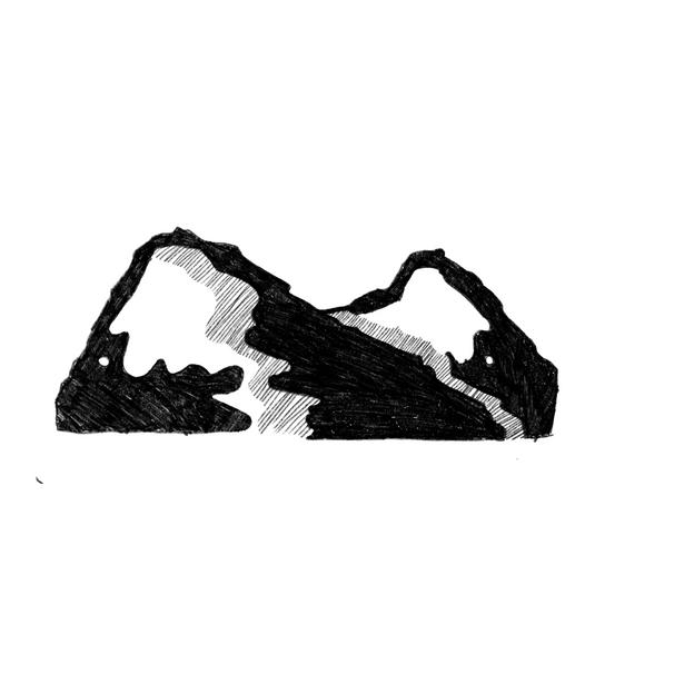
Most of this one is good but I think there's not enough balance too much black (maybe not enough shading)
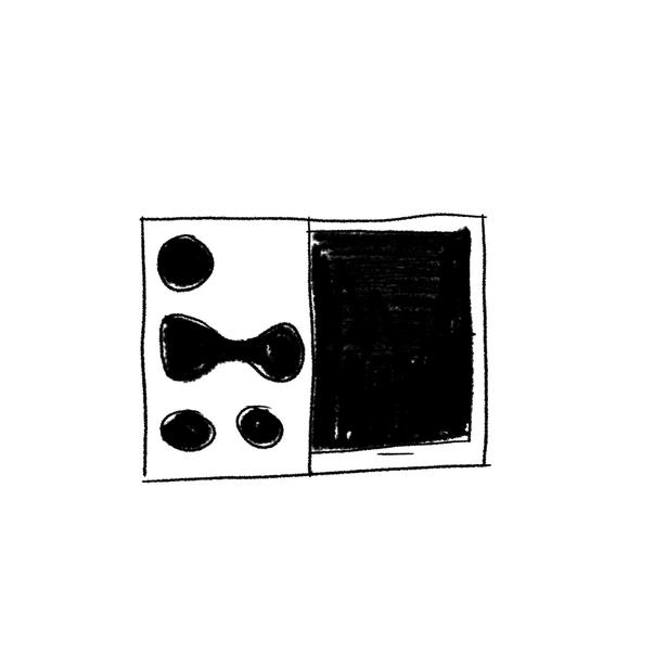
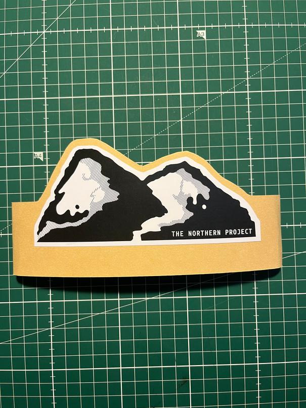
FINAL GRAPHIC:
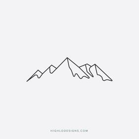
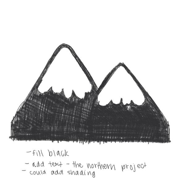
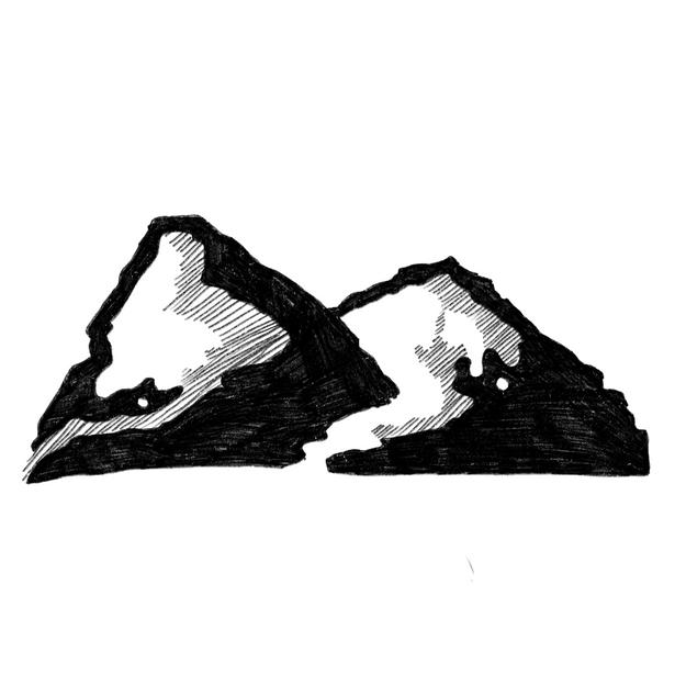
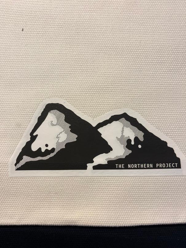
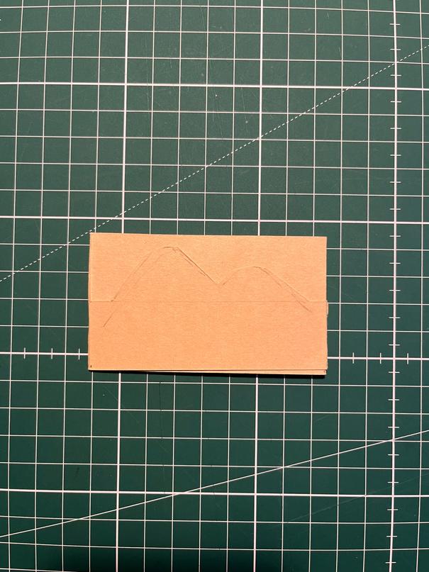
Out of all of them, I think this one is the best most balanced, still identifiable as a mountain and graphical Might make the white dot on the left a black one
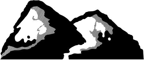
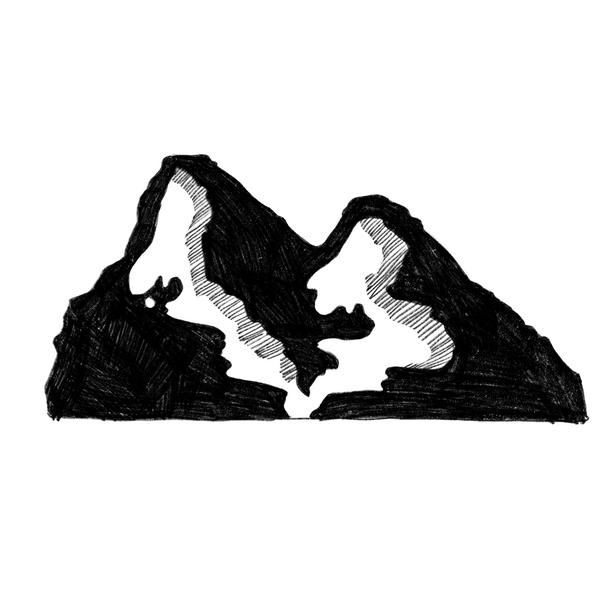
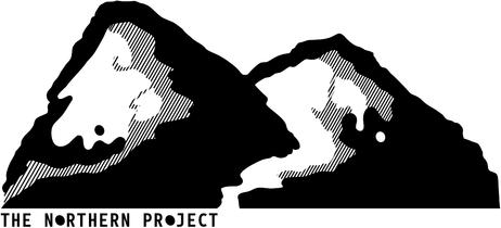
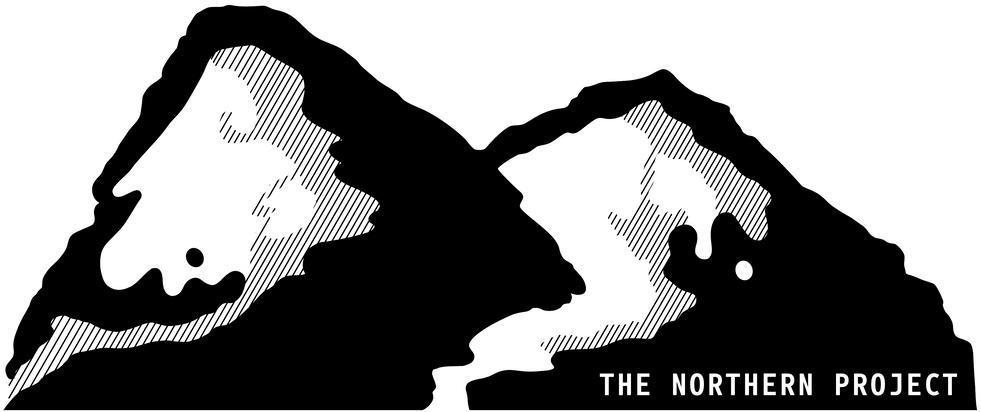
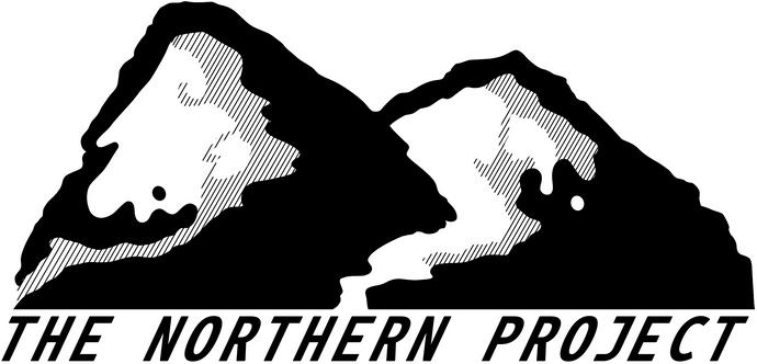
The final graphic for my logo consisted of a merge of No 3 and 4 as I felt they balanced each other well. Using lines for the shading took the graphic from a flat one to one with dimension and depth without affecting the simplicity and clarity
FURTHER REFINEMENT:
1.
The font beneath was too big and made the logo look clunky overall Using Italics clashed with the diagonal of the shading Was not aligned correctly
All Three
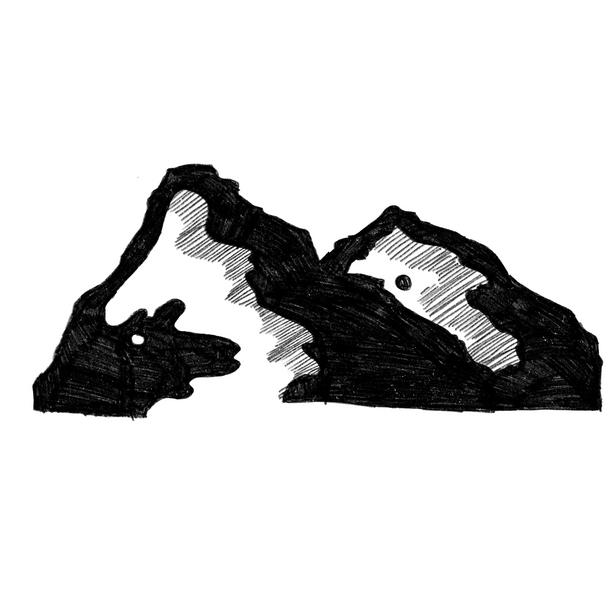
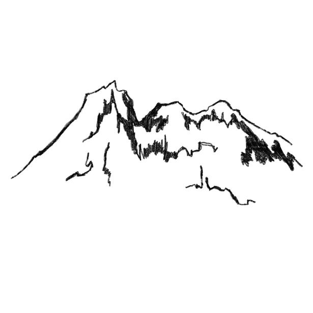
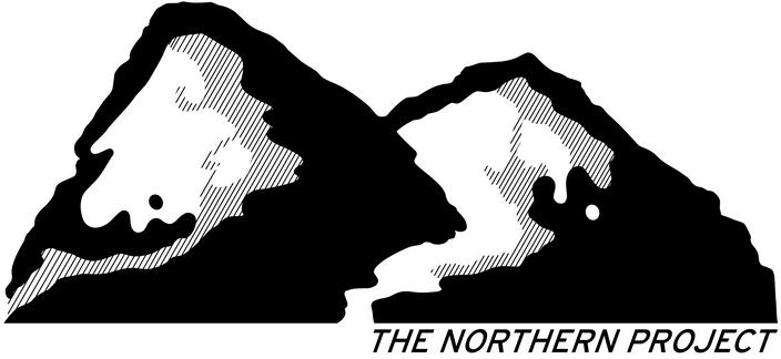
Originally, I was going to make the collection logo the above Although I began to not like it as it was too simple and I felt like I hadn't put enough detail into it like my research found the shapes were too simple making the logo not engaging and interesting I also couldn't decide which version I liked better because I preferred the first one but the mountains were too curved and repeating the collection name confused a few people
So I decided to rework the logo to make it look more detailed but still include the graphics elements like the curved and streamlined snow with the white dot, whilst creating shading with lines to add a bit of dimension and depth
CHOSEN FONT: FINAL LOGO:
1. 2.
Looks confusing but I like how they meet in the middle
Shape of the mountain is lost as they don't join in the middle like that usually overlap at some point
Used a glacial mountain picture as a reference for the shape Everything works except the shading behind the first mountain
Used the black dot within the graphic as the 'O's within the text to create repetition and unity Although instead, it made the text unbalanced Font: Botanika Mono
Font: Botanika Mono 2. 3.
Used a different font underneath the right side in Italics Still clashes with the diagonal lines of shading and the font doesn't work as well as the previous ones.
Font: Interstate
Decided on Botanika Mono as I feel it works well with the boldness and graphical elements of the logo Gives the logo a prominent and recognisable look
F LOGO DESIGN IDEATION: THUMBNAIL SKETCHES:
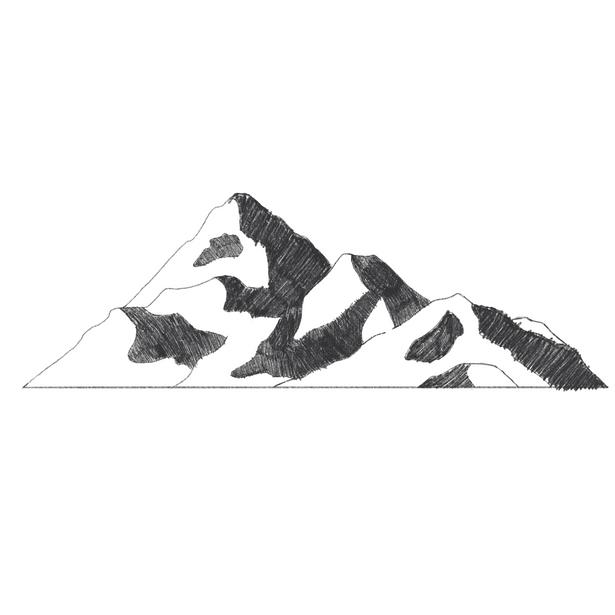
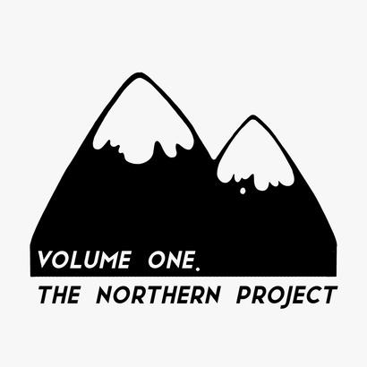
The final logo includes the refined graphic from my ideation with the selected font of Botanika Mono Semibold placed in the lower right corner of the graphic The white text complements the white of the snowy peaks and contrasts with the black background
From my ideation of logos I actually really liked this one particular design
I like the shape, its boldness yet simplicity and feel as though it has the opportunity to become recognisable with my name and brand
COLOUR SCHEME:

As this is my personal brand I wanted to use my initials or my given name in some ways as stated previously

The logos above utilise negative spaces to create other interesting shapes and dimensions

They are all extremely graphical and allow the eyes to follow the shapes with ease
The colours are very subtle but provide the logos with an extra element creating depth and making viewing more enjoyable and interesting
THUMBNAIL SKETCHES:
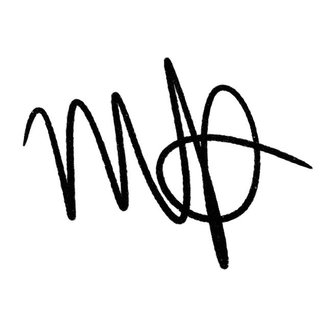
My first idea was to just keep my logo as my signature as it is a large part of my identity
The letters 'M' and 'D' are quite graphical letters and work well together

Although, I fell like this is almost too personal and could be developed further
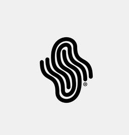
Using the idea of my initials, I created a graphic 'M' that was bold yet simple and flowed well
I decided to not use the 'D' as it would have made the design too bulky and not as balanced
I placed the 'M' within a simple line drawing of a globe to represent my love for travelling, although I feel as though it would need more dimension to become a strong logo
As there is a gradient, I needed to select a colour I believed would allow my logo to pop and contrast from the elements or products it is placed on, such as photos on my Instagram or tote bags I will eventually design and develop

When researching logo design I discovered that in order to successfully create a gradient on a logo it is better to split the gradient into sections rather than have a colour that blurs from dark to light This is because it will generate thousands of hues making the graphic overwhelming and unclear
However, if the gradient is split into around four to five colours the graphic reads better making the logo or graphic clearer and more balanced Another benefit of doing this is that if the size of the logo is decreased or increased dramatically it will remain seamless.
The colours above are some of the colours I had previously selected as some of my favourite colours in design The first four would create a nice gradient that would complement yet contrast against most things it is placed on packaging, online, photos
Using illustrator, I turned my logos from a thumbnail sketch to a refined graphic
I think the colours work really well together and the gradient element adds depth to a graphic that without it could look very simple, 2D and boring

The colours are bright and eye catching and don't take away from the graphic itself, complimenting the curves of the shape whilst still effectively portraying the 'M' letter
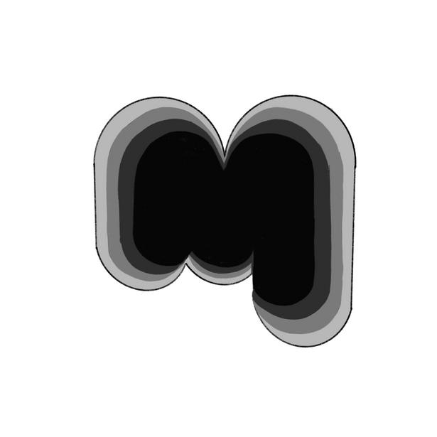
I created this logo using basic shapes to get the curves whilst trying to replicate the silhouette of the letter 'M' although this was not successful.
This graphic ended up looking too much like the ABC logo, however, I did like the graphic element of this design
This idea used the same silhouette shape of the letter 'M' but by adding a gradient it adds more dimension and depth, amplifying the graphic as a whole
The 'M' is directly related to my name and the gradient allows for experimentation with unique and interesting colours
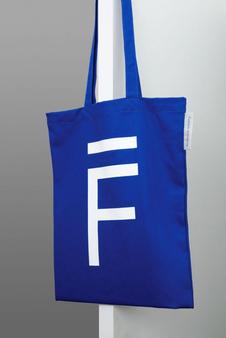
FINAL LOGO:
For the final logo design for my personal brand, I decided to keep it simple and clean When experimenting with different fonts underneath I felt it unbalanced the logo and created unwanted tension between the two elements
Keeping it an individual element logo means that I can use it for multiple things without having to consider the background or how the font will look in various sizes. This also means that the logo can become instantly recognisable and associated with my brand as it is a unique shape with interesting colours and patterns
1.
F
2.
Infister Creative Market
LOGO DESIGN 2.0 INSPIRATION: REFINEMENT: 3.
4.
Signal Light Creative Market
Botanika Mono Adobe Fonts
Whole page
All Three
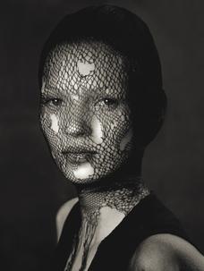
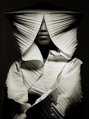
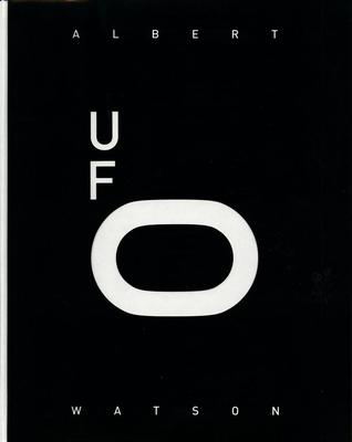
ALBERTWATSON.
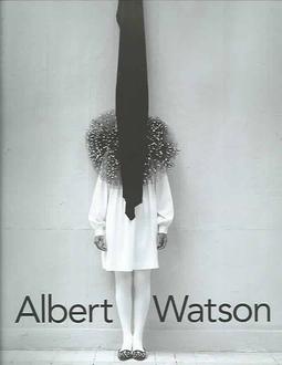
Albert Watson, well known Scottish fashion, celebrity and art photographer grew up in Edinburgh, Scotland Watson studied graphic design at the Duncan of Jordanstone Collage of Art and Design in Dundee and Film and television at the Royal Collage of Art in London [PND, 2010]. His background in design has had a large impact and influence on the way he composes photographs, creating a very recognisable style of photography
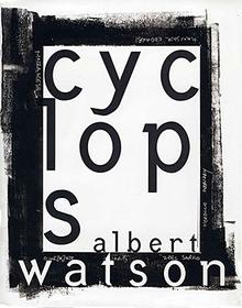
His first book, and one of his most recognised ones, Cyclops is what got him known by the world Being permanently blind in one eye since birth he believe the name 'Cyclops' for his first book was fitting as it was about getting his image out there
'Being blind in one eye, Cyclops fitted me perfectly. Also, you have one lens, and you don’t use two eyes to look through a viewfinder"
Albert Watson, 2017
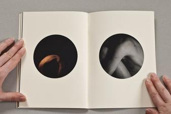
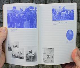
In Cyclops and many of his other photo books, Watson experiments with unique and unusual layouts of images He juxtaposes dramatically different images but somehow makes them make sense to the viewer He creates chaos by mixing various photographic genres
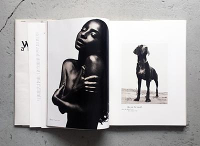
Black and White Images of a dog and a woman
Traditionally these images wouldn't work together but there are elements that Watson draws connections to make them make sense in an interesting way For example, the highlights and shadows are both very dark and light contrasting
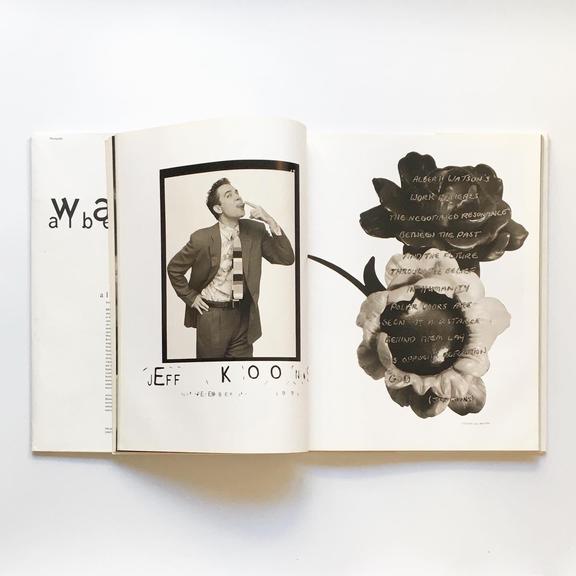
Black and white image of a man and flowers with text
Traditionally aren't associated with one another Similarly, the tones, highlights and shadows are very similar
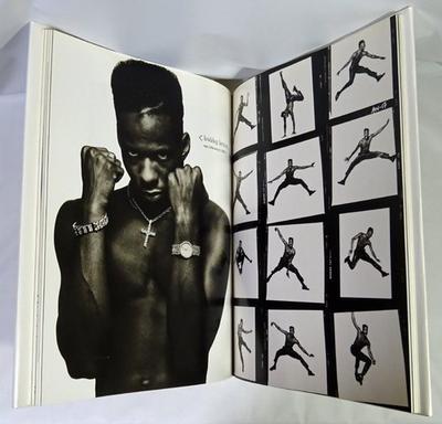
Layout image in a frame paired with a cutout image
Using a single image against a collage of various action shots makes the images contrast against one another
In a strange way, it creates balance with the shades and blacks within the image
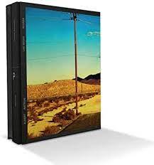
PHOTOGRAPHY BOOKS:
Watson
Eye catching, bold, clean
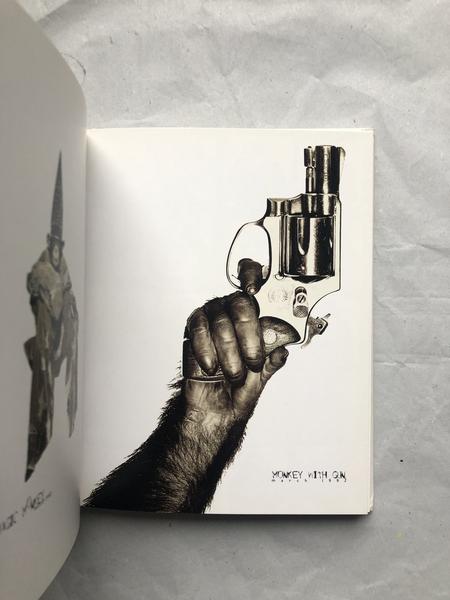
Watson also utilises text to help provide further context to an image He says that "some images need words If you have a photo on a page with no type, the image has to stand on its own" [Digital Photo Pro, 2010] and make sense It is important that people understand his photographs as they are usually conceptual pieces
mage of a monkey hand with a gun captioned; "Monkey with a gun"
The process of curating his books is a lengthy one, with his book UFO taking over four and a half months of purely sourcing the chosen photos and arranging them until they were perfect He essentially compacts thousands of photos from his decades of work into a 400 page book
Albert Watson's photography books are about sharing his work and getting individuals to understand and know him He claims that up until he published his first photography book in 1994 no one knew who he was or what he did His books are about people understanding who he is
RESEARCH AND ANALYSIS:
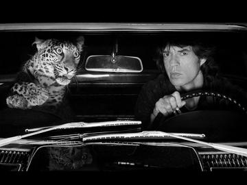
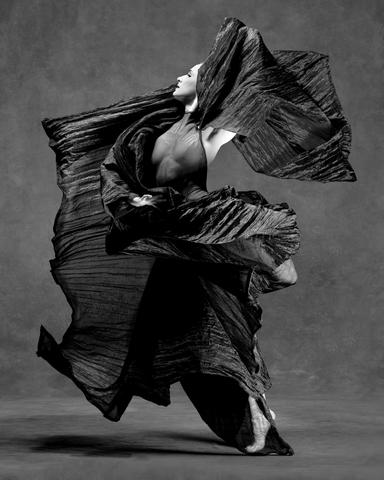
His photographic work mainly consists of black and white imagery It wasn't until recently (around 2008) that Watson began to shoot more digital imagery Watson experiments with various textures and uses his design background and knowledge to visualise and curate his well thought out shoots, producing stunning images like these above.
has not only become very well recognised for his actual photograph but largely for his various published photobook from across the four decades of his photography career
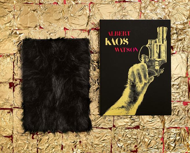
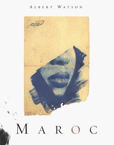
UFO (2010) Strip Search (2010) Kaos (2017)
Cyclops (1994) Maroc (1998)
Albert Watson (2002)
"In the end it all looks like me because it is me"
PHOTOBOOK DESIGN RESEARCH AND ANALYSIS:
IMPORATNCE OF GRIDS:
Grids are an easy way to achieve an organised design Grid systems assist with aligning page elements based on rows and columns Images and text are placed accordingly to these rows and columns which helps to achieve a design that is pleasing to the eye that is also functional and clearly delivers information to the reader Grids create hierarchy organising and prioritising specific elements to create a structured design, balance adding consistency to the composition (symmetry and asymmetry) and allowing for easier distinguishing of where elements need to be placed and the spaces they will occupy
IMPORATNCE OF PACING:
Pacing refers to the layout, size and orientation of the images within the book It's good to have consistency throughout the book, however, if there is too much it becomes repetitive which eventually becomes boring Having a consistent size of images throughout the book is important for viewing pleasure but it also benefits the reader if you switch up the orientation or how many images are displayed on a two page spread. For example, for most of the book, you could have a single image on a page but at one point there may be a landscape image across a spread which helps to keep the viewer engaged
INSPIRATION:
Front Covers and layouts
Mixture of large, small, portrait and landscape images
Use of mixed media text over images or even illustration
Balancing images with text
Collages or sequences of multiple images fill a page but make it more interesting than just a single image
Using cutouts to mask an image and keep the viewer engaged
Layering paper adds texture and dimension
For front covers use tracing plastic to allow the image underneath to be displayed with text on top of it but on separate pages
Limited text
Exposed bound spine add texture and a raw element
Use of natural papers
Colour washing an image to make all tones, shadows and highlights different shades of a single colour e g blue Clean and simple design
IDEATION/REFINEMENT:
THUMBNAIL SKETCHES:
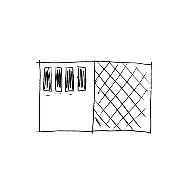
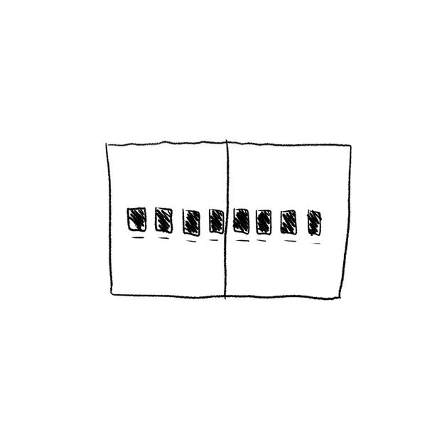
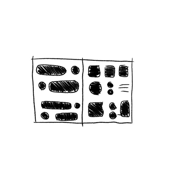
Black squares represent where photographs would go Experimenting with masking different photos, using cutouts, different interesting shapes, and sequences over spreads to get an idea and understanding of how I wanted my book to look Although after experimenting with these I realised that for my first photobook I wanted it to be fairly simple so that the main attraction would be the photos alone.
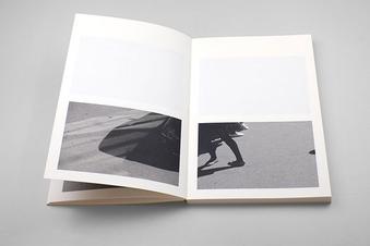
SELECTING IMAGES:
Sorting through images
Examples of images included
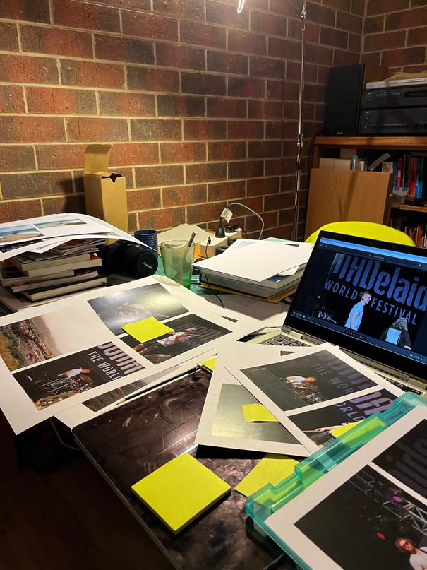
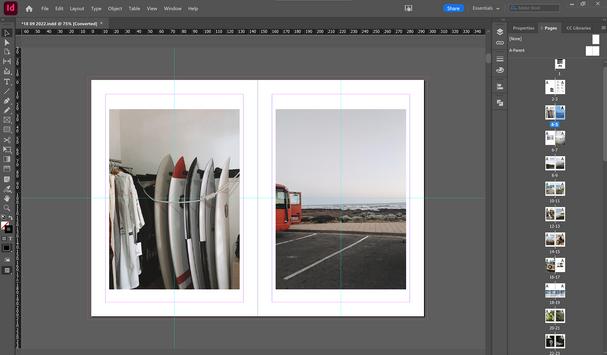
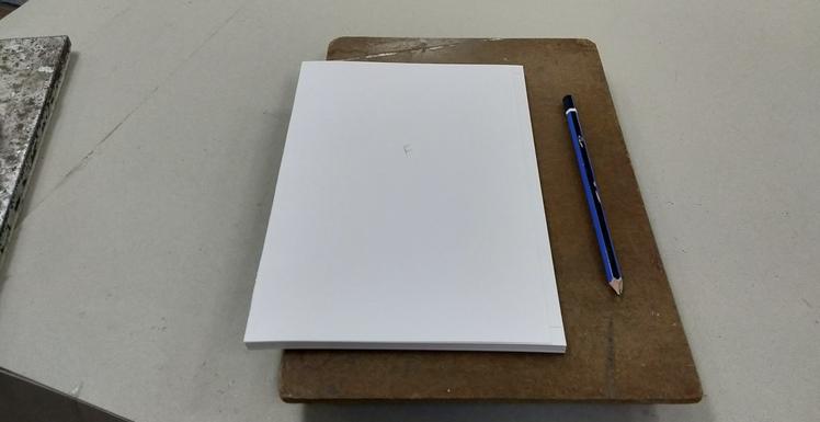
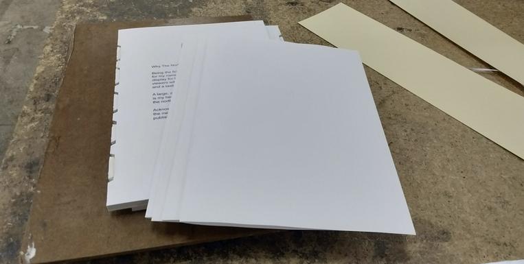
After playing around with layouts I decided that I needed to collate my images and decide which ones would make it into the final book This was a long process as I kept discovering new images or deciding I didn't like them after doing various test prints Eventually, I narrowed it down to 64 photos and the next long process of pairing and figuring out the layout began
Again, I wanted to keep the layout of the book fairly simple with the occasional layout that contrasted against other pages to juxtapose the normality and create an interesting pace for the book
All Nine
PHOTOBOOK DESIGN
REFINEMENT:
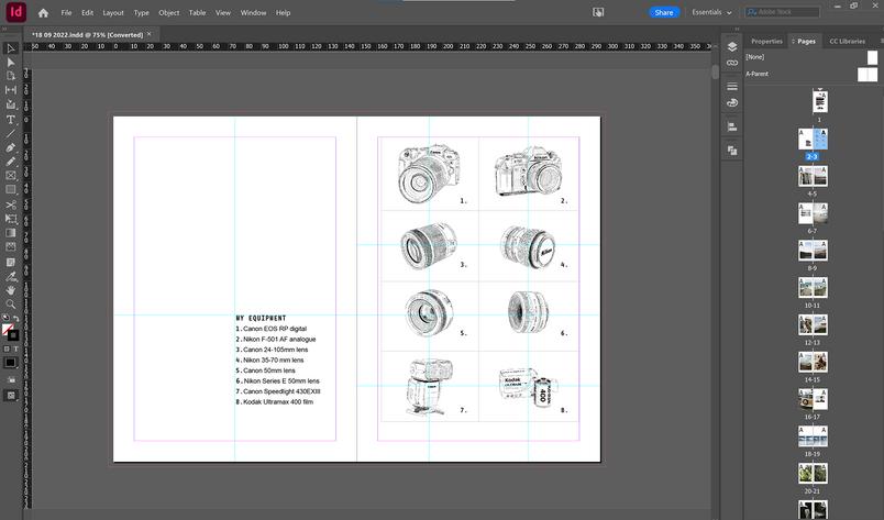
EQUIPTMENT PAGE:
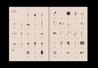
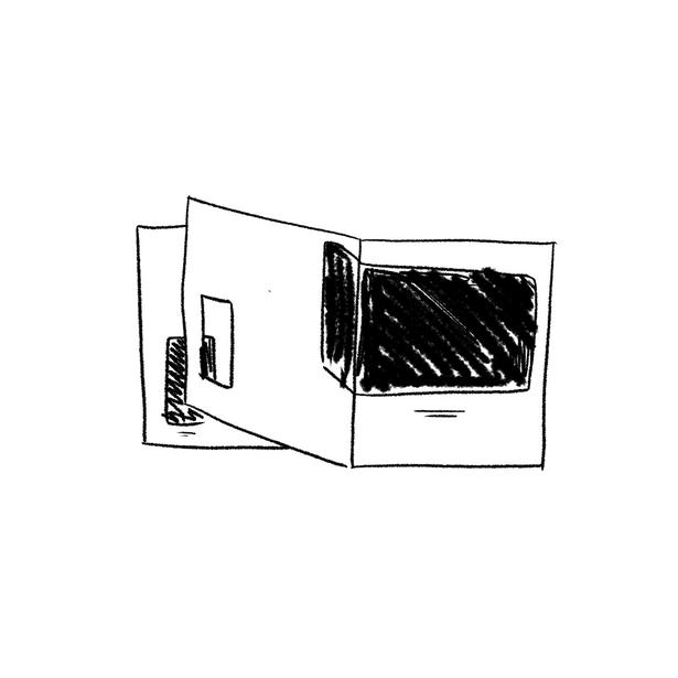
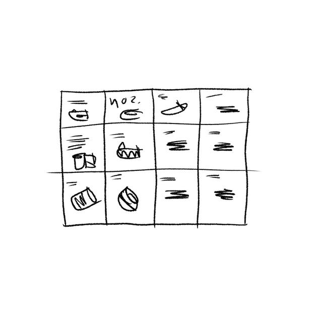
At the beginning of the book, I thought that it would be appropriate to have a list of the equipment I used to take the pictures that would be featured in the book I felt there had to be a visual element for this so I digitally illustrated each piece on the Ipad adding another personalised element.
The final equipment page layout
REFINEMENT:
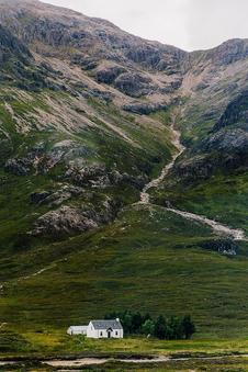
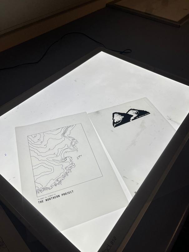
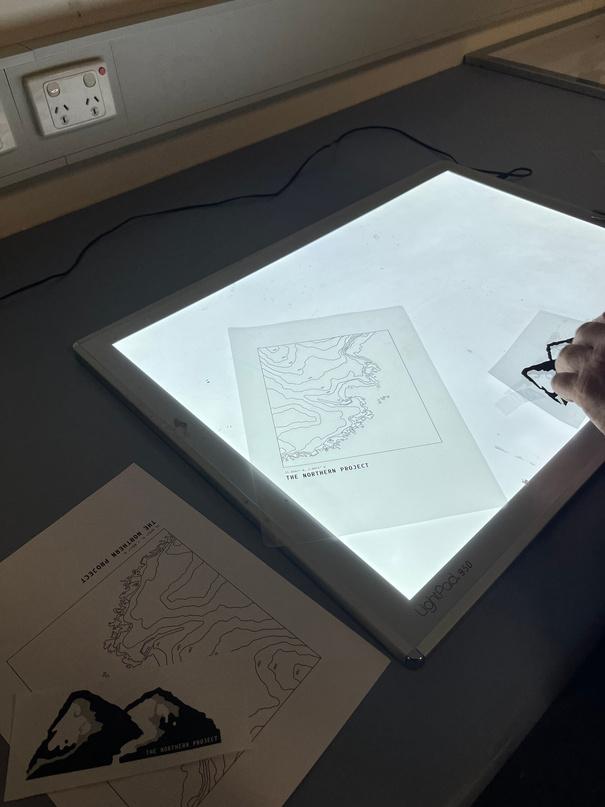
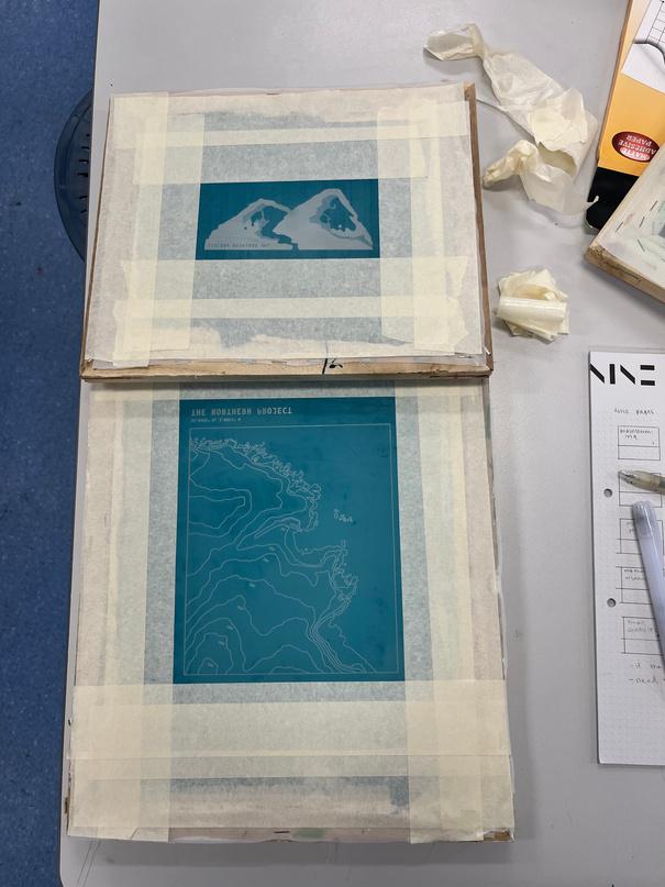
Eventually, I decided to relate the cover back to the origins of this project, being about me and where I am from
I decided to illustrate Schiehallion, a well known mountain in Scotland making a connection to the logo that I had fond memories of and draw its contour lines to see what it would look like
schiehallion Mountain Contour Lines Illustration
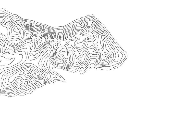
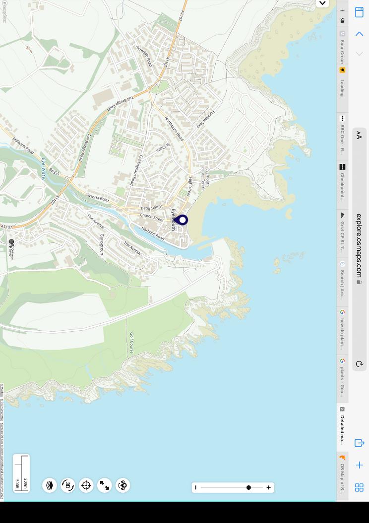
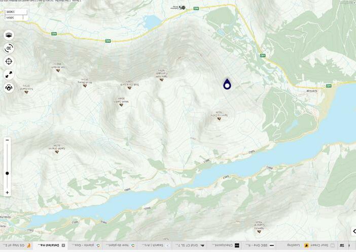
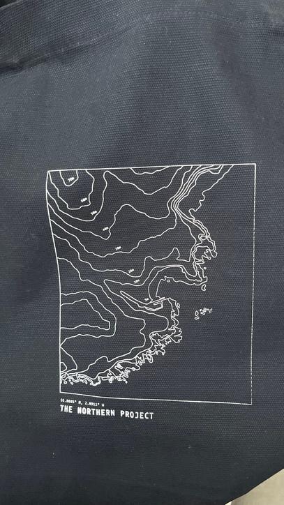
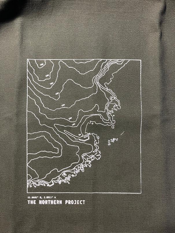
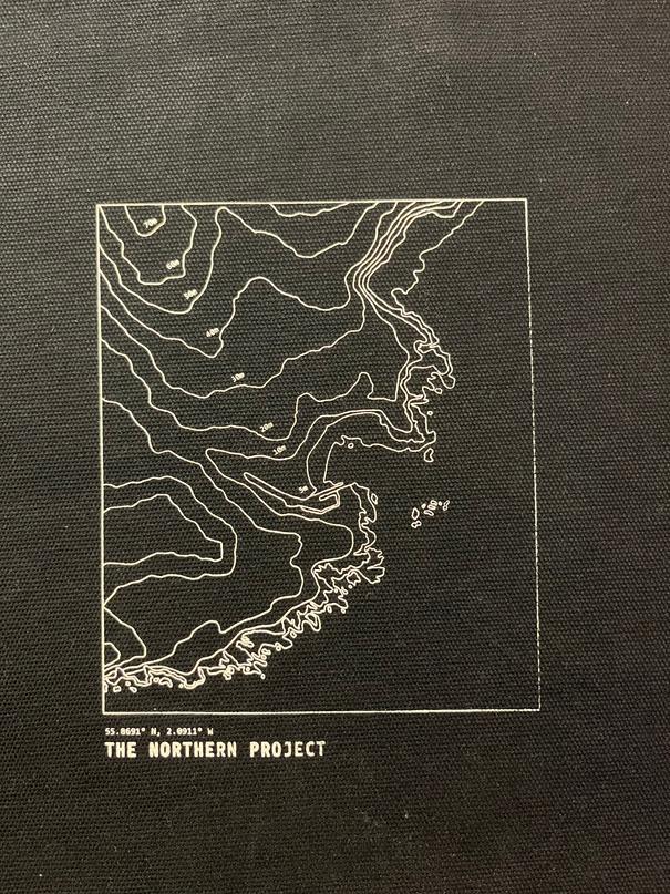
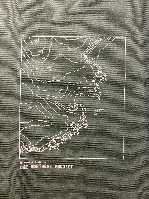
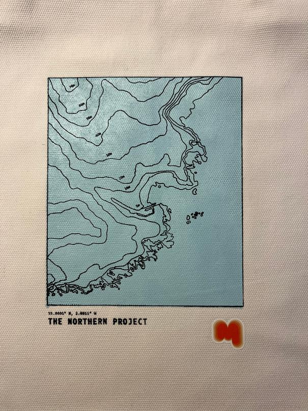
But this became too detailed and didn't flow as well as I wanted it to Using the idea of contour lines, relating the cover back to the origins of this project and fond memories, I decided to find a map of the coast and contour lines of my Gran's fishing village, Eyemouth


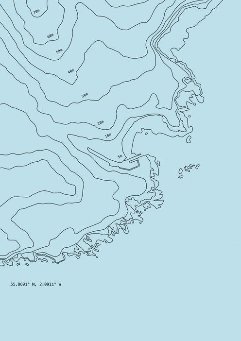
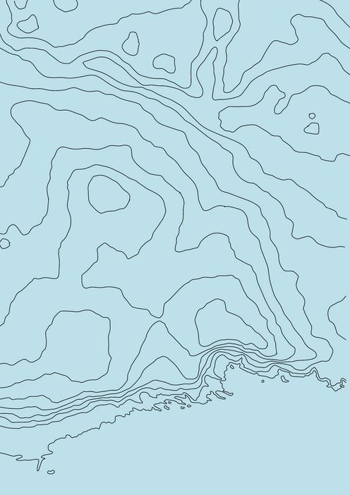
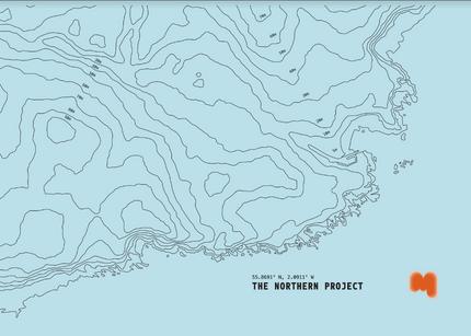
Eyemouth Contour Lines Illustration
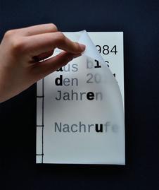
INTRODUCTION PAGE:
I also added a page before the equipment one explaining the reason behind this project and the name to provide readers with more context
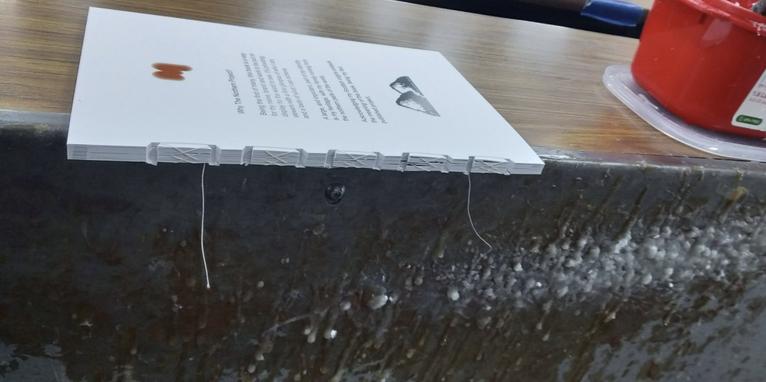
This page contained the 'M' logo, the 'Northern Project' logo and a simple paragraph of text
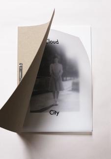
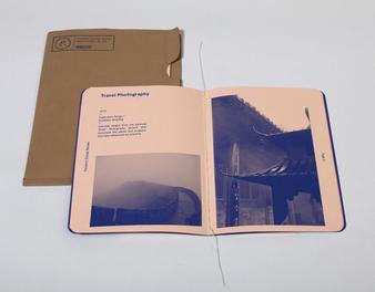
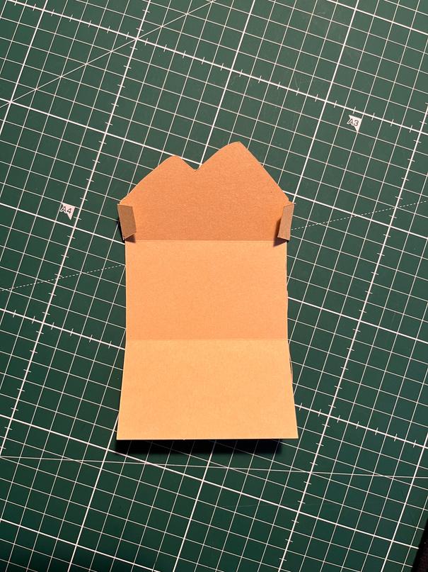
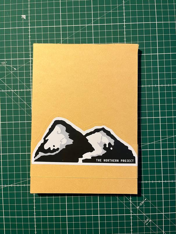
COVER PAGE:
My original idea for the cover page was to have a paperback cover with one of my photographs and an exposed spine Although none of this was actually included in the final design This is mainly due to the fact that the company I went with wasn't able to do this sort of dinding but I also eventually changed my mind
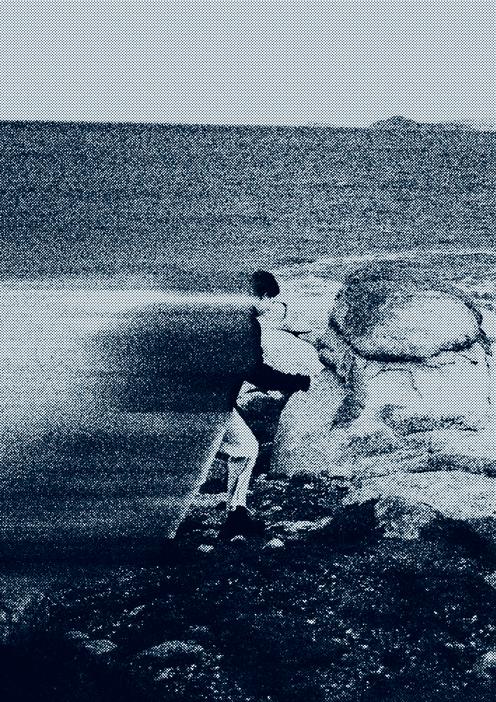
Using the Photoshop filter gallery, I blurred, added grain and halftone dots to create an image that was still recognisable but different This image was originally going to be used for the front cover, although after looking at it for too long I decided against it
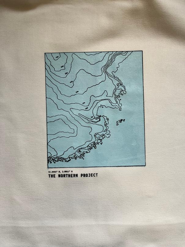
Added Blue Background symbolises the water that surround the village
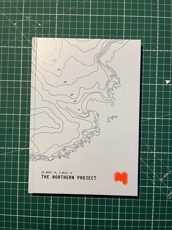
FINAL COVER DESIGN:
Extended the map to be able to wrap around the book
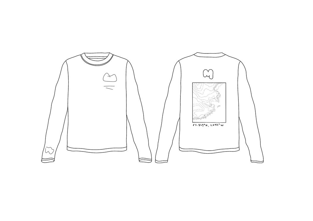
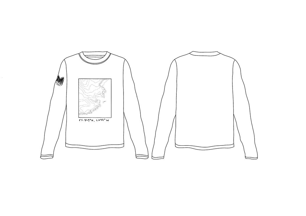
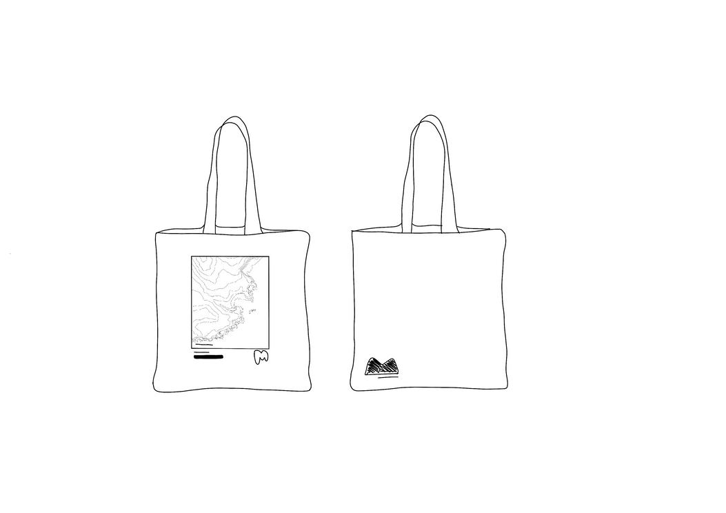
For the final cover design, I added the same font as the 'Northern Project' Logo to make reference to the logo, the fishing village map graphic and my 'M' logo I didn't add the 'Northern Project' logo as it became too busy but I decided I would use it on the packaging
This illustration was designed so that it wraps around the front and the back seamlessly
Original Image Manipulated Image
All Six
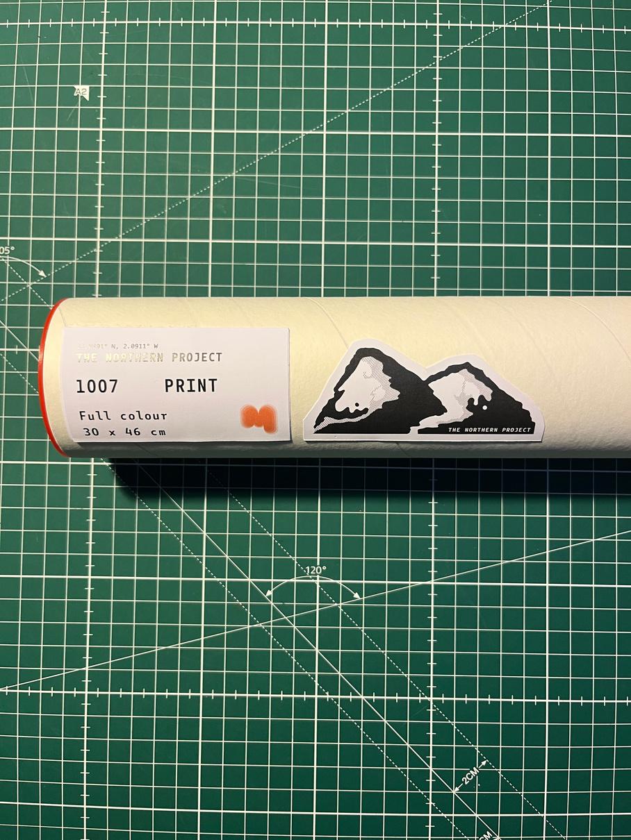
PRINTS:
PHOTOBOOK DESIGN PROCESS:
for printing.
prints coming out for proofing
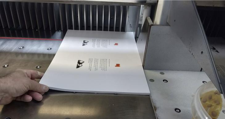
all the pages to ensure perfect cuts by guillotine
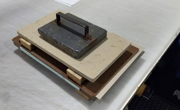
stitching on spine in binding process
cover boards
up cover boards and inside cover.
external cover to cover boards
the cover and bound book under weights
bound hard cover copy of The Northern Project
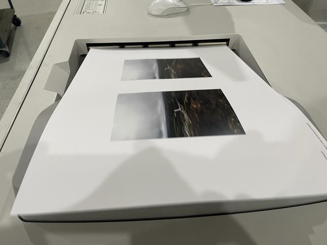
my book I decided to get a set of images printed large scale to further showcase my work
Loading the 170GSM Knight Smooth uncoated paper
First
Aligning
Initial
Measuring
Setting
Gluing
Setting
Final
From
DISPLAY.
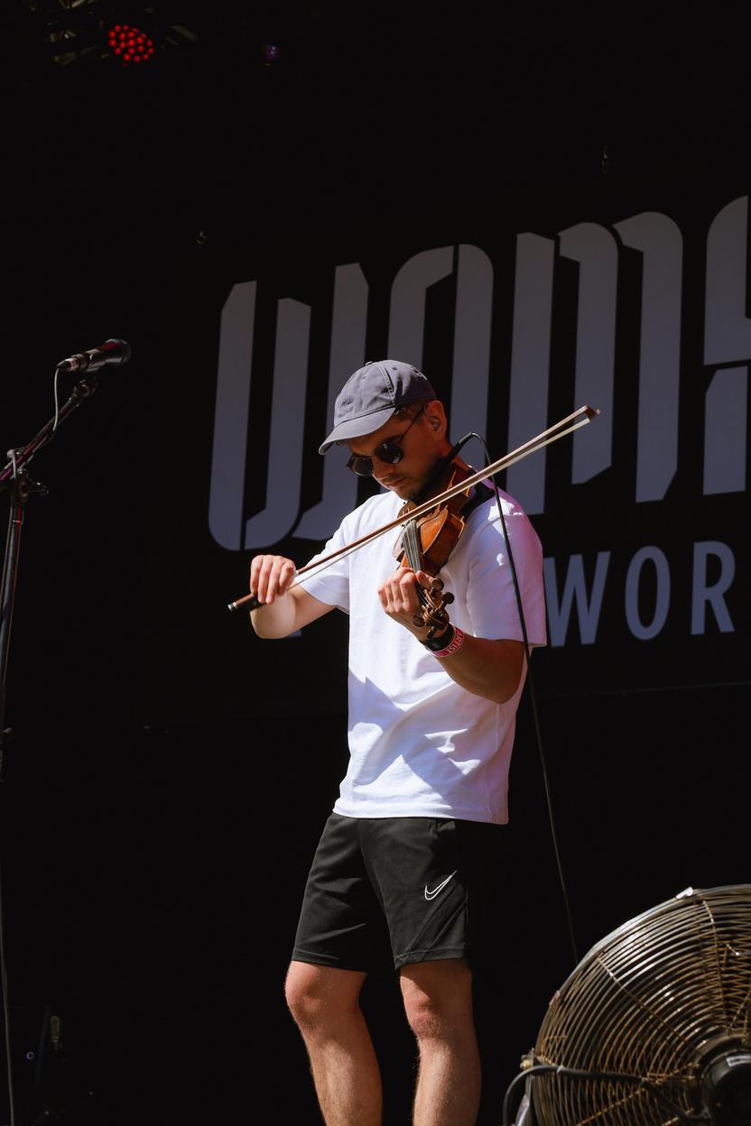
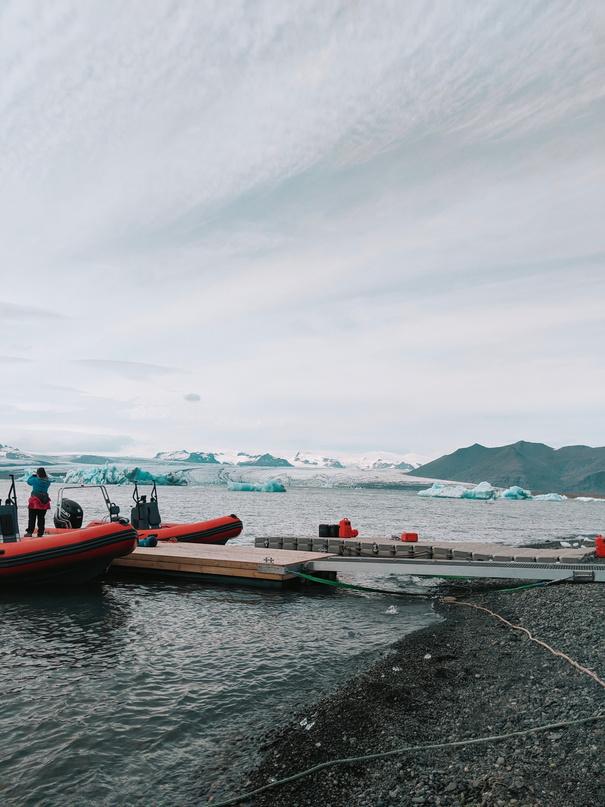
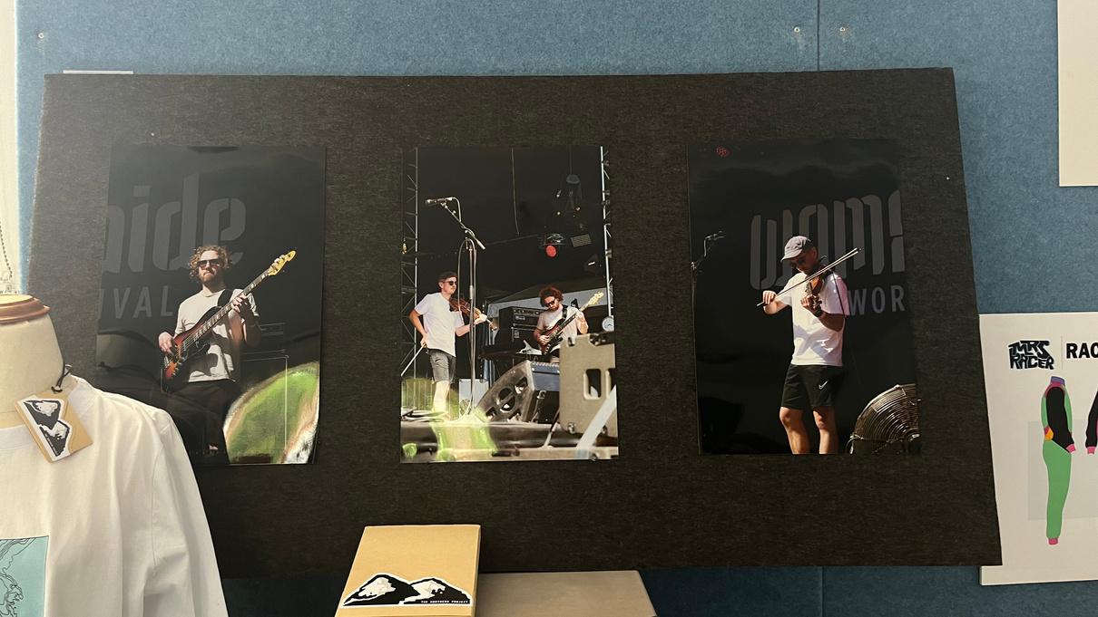
Photos of Elephant Sessions at WOMAD printed on 35 x 40 cm Glossy professional photographic paper
FINAL PRINTS ON
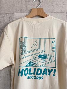
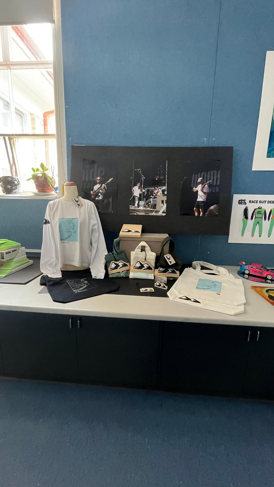
MERCH DESIGN RESEARCH AND ANALYSIS:
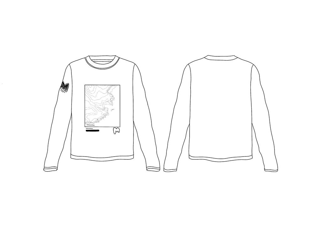
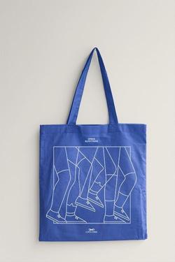
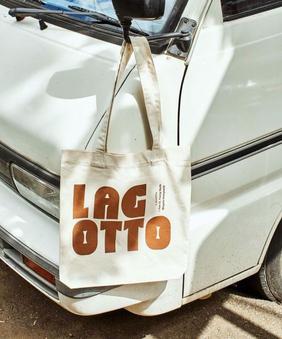
For the pieces of merchandise for The Northern Project, I decided to do two pieces, being t shirts and tote bags as they're simple yet effective
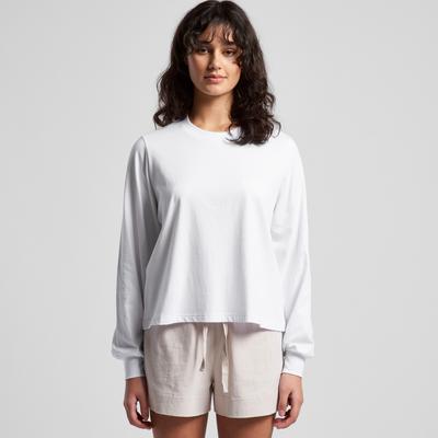
T SHIRTS:
Bold, timeless and readable fonts
Mixtures of illustration and lettering
Simple graphics and pleasing illustrations/graphics
Photo transfer with text

Readable from afar. Colourful and unique
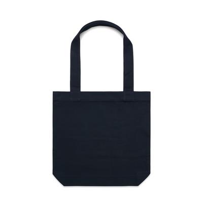
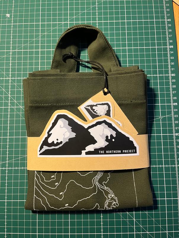
TOTE BAGS:
Large,
Extra large font in various styles and colours interesting and read Timeless design simple and clean Simple line graphics and illustrations not graphically overwhelmin
IDEATION/REFINEMENT:
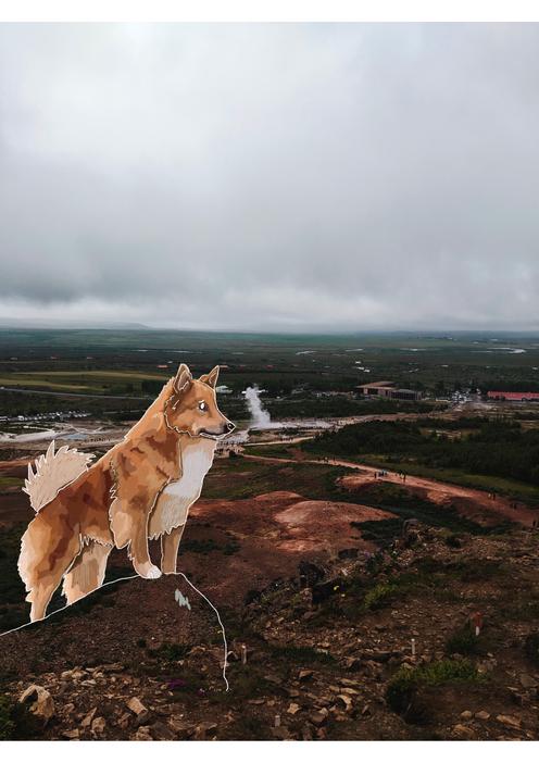
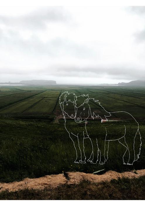
Before creating the illustration for the book, I had originally planned to do some illustrations over photographs I had taken When doing this I was combining four things that I loved, photography, travelling, animals and illustrating However, I decided against this idea as it meant the collection wouldn't have been consistent and unified Icelandic Sheepdog illustration on top of one of my Icelandic Photographs
Icelandic Horses illustration on top of one of my Icelandic Photographs
I ended up using the book cover design and playing around with my four elements; The Northern Project text, the 'M' logo, the map illustration and the Northern Project logo
Number three was my favourite design, so I applied this to a tote bag to see if the design would be universal or if anything had to be altered
Only alterations included moving the Northern Project logo to the back
bold and contrasting graphics composed of simple shapes circles, squares
2
1
Moved all elements so they could be seen from the font although 3 Added The Northern Project and Eyemouth coordinated below illustration, kept The Northern Project logo on the shoulder and placed the 'M' logo beneath the illustration This design was the most balanced and readable
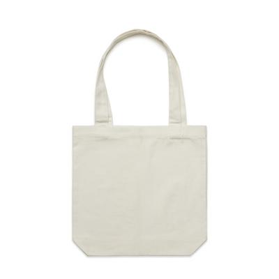
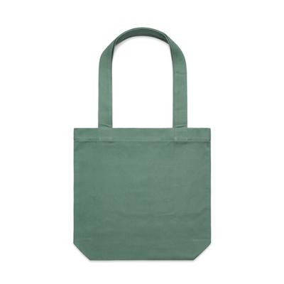
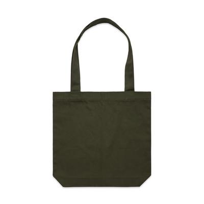
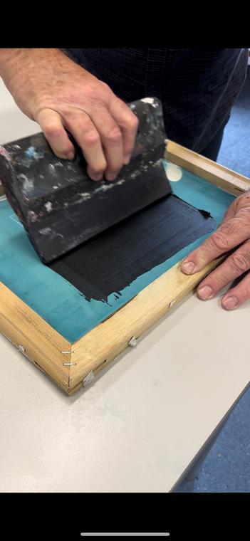
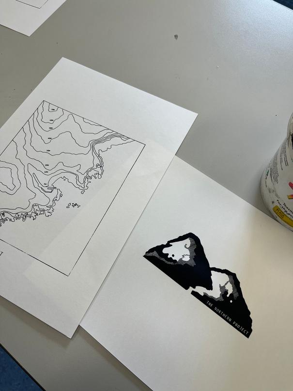
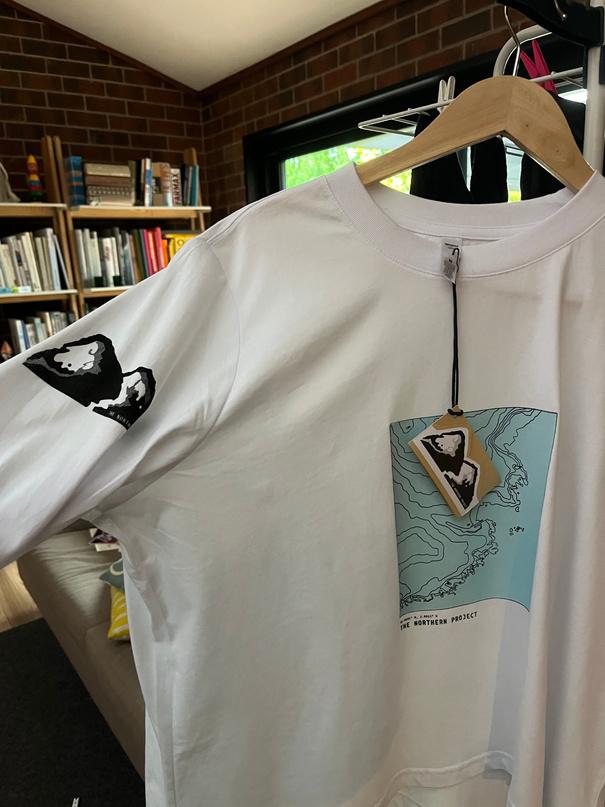
MERCH DESIGN REFINEMENT: Final Tote Bag and T shirt design: PHYSICAL BLANK PROCUTS: 3x Cream 1x Sage Green 1x Olive Green 1x Navy Blue 1x White ALL FROM AS COLOUR: Carrie Tote Bag WO'S SOFT L/S TEE PROCESSES: S NG: Printed designs onto transparencies Aligned transparencies Covered silk screen in emulsion and dried in a dark room so UV couldn't affect it Placed transparencies on to emulsion and exposed designs to UV rinsed with water to get rid of unwanted areas. Placed ink onto the screen and tested designs on paper before the actual products Paper Tests Printed white onto darker coloured totes Screened a blue square before design so it could look as close to the book cover design Then printed iron on transfers and transferred the 'M' logo and 'The Northern Project' logo on to some of the products F
Green Tote with white screen print Navy Blue Tote with white screen print Cream Tote with coloured screen print and transfer 'M' logo
Green Tote with white screen print Back of Cream Tote with transfer Northern Project logo Long sleeve Tee with coloured screen print and black Northern Project Logo
Olive
Sage
Neutral and natural coloured packaging simple and doesn't draw attention away from the actual physical product

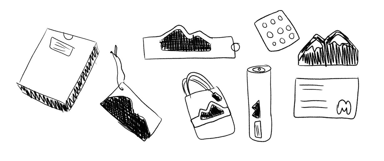

Simple yet readable text various fonts; bold, elegant, sans, serif Small pops of colour use solid colours stickers to seal Most of the materials used seem to be recyclable which makes the packaging environmentally friendly and conscious
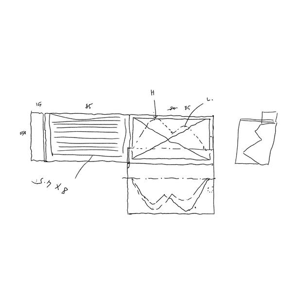
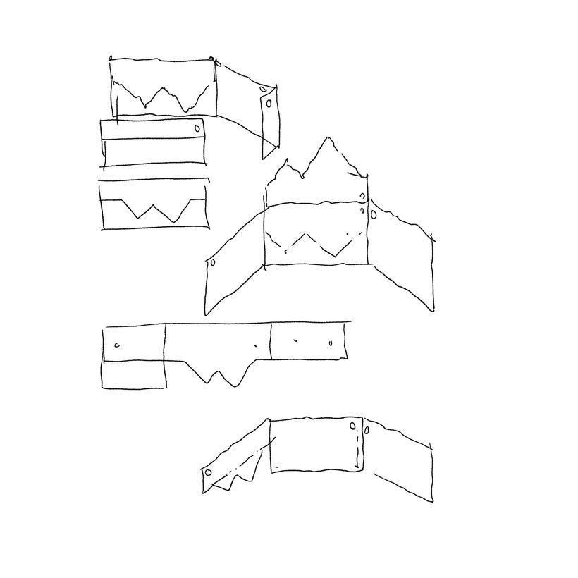
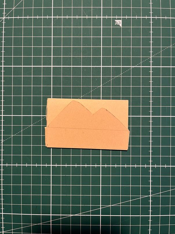
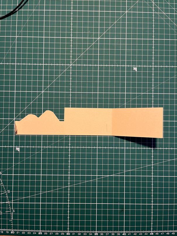
PACKAGING DESIGN RESEARCH AND ANALYSIS: INSPIRATION: IDEATION: TUMBNAIL SKETCHES: Swing tag Ideas Multiple packaging elements, boxes, slips, joins PROTOTYPES: ELEMENTS TO BE MADE: Box for photobook Swing Tags Slip for book box, tote bag Stickers for poster tube, swing tags, slips and sealing Poster Tube 1. This prototype worked well and was compact Plenty of room for logos and product information but impractical for a swing tag too difficult to open on a product Northern Project logo would be extremely visible 2. Nice to open to the Northern Project logo Compact, simple and clean H N th P j t l is 't i ibl t l 3. Compact Northern Project logo visible at a glance, room inside for more product details, logos
REFINING:
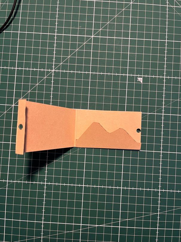
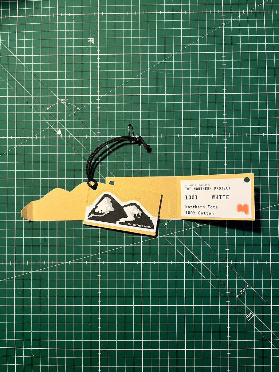
FINAL SWING TAGS:
SUSTAINABLE CONSIDERATION:
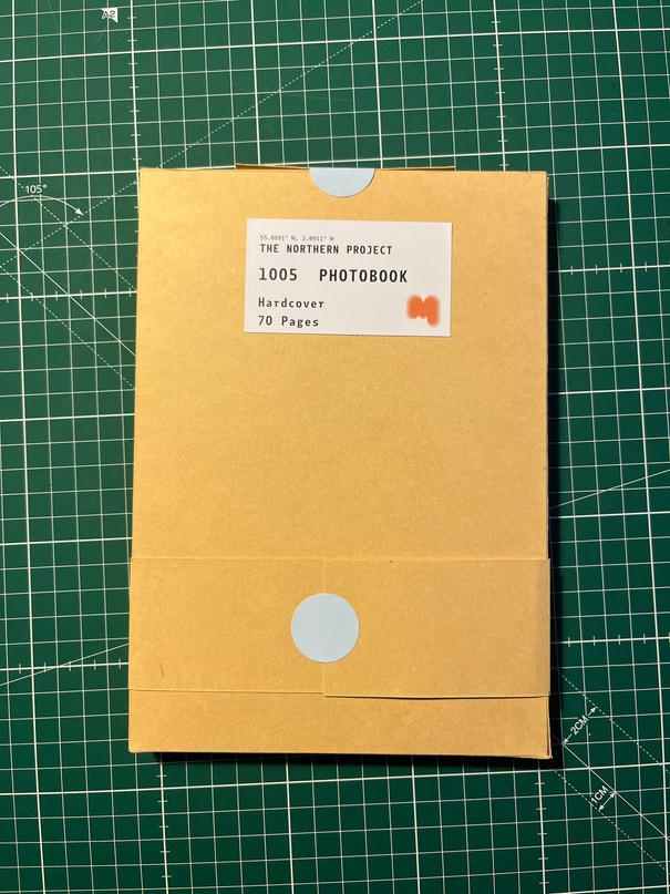
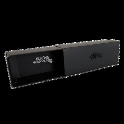
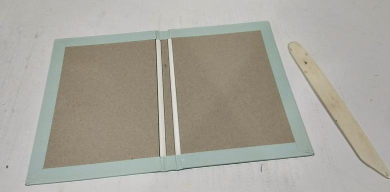
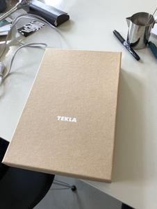
FINAL BOOK BOX:
FINAL
From the prototypes of swing tags I was able to design and create a bunch of packaging products inspired them using similar features
The front view is of the Northern Project logo recognisable from afar Unfolds to display a sticker label that has more information on the product, including the name, materials
product
seals
cover
The front is plain but the universal slip goes over the front of the box to showcase the Northern Project logo The back has a sticker label providing the buyer with further information regarding the
clean, simple and easy to understand Blue circle sticker
tab same blue as book
slip is designed to fit around almost all of my products so that I am not wasting excess products by catering for the dimensions of each product
FINAL UNIVERSAL SLIP: The universal
same
as the book box
Showcases The Northern Project logo matches the swing tag Sealed at back with
blue sticker
For my packaging, I decided to make everything out of recyclable cardboard and paper based stickers so that every element can either be reused or recycled The string loop and pin were reused from older products but if they were to go into production these would be bought in bulk and produced in
DISPLAY:
“A Stüssy Advert Retrospective ” Bored of Southsea, 2021, www boredofsouthsea co uk/blogs/blog/a stussy ad retrospective
Abdihakim, Mohamed “Keep Your Past Close: A Brief Look at Stussy History ” Cultedge, 2018, cultedge com/stussy history/ “ALBERT WATSON PHOTOGRAPHY INC | NYC | SHOWS ” Albertwatson net, 2021, albertwatson net/books catalogs
“Albert Watson: Pulling Beauty out of KAOS ” Digital Photo Pro, 31 May 2018, www digitalphotopro com/profiles/albert watson/ “All about Stüssy ” Stüssy com, 2022, www stussy com/pages/history of stussy andy “New England Kit / Peter Saville Interview ” Designboom | Architecture & Design Magazine, 5 Sept 2010, www designboom com/design/new england kit peter saville interview/
“Peter Saville X Umbro : New England Home Kit ” Designboom | Architecture & Design Magazine, Sept 2010, www designboom com/design/peter saville x umbro new england home kit/
“AS Colour | Quality Basics | T Shirts, Singlets, Shirts, Sweatshirts, Jackets, Pants, Shorts, Hats, Bags | Blank, Plain, Wholesale | Home ” Ascolour com au, 2022, www ascolour com au/ Barker, Nat “Peter Saville Unveils “Subtle but Necessary” Update to Aston Martin Logo ” Dezeen, Dezeen, 20 July 2022, www dezeen com/2022/07/20/aston martin logo rebrand peter saville/ Berry, Craig “The Art & Design of Factory Records Craig Berry Medium ” Medium, Medium, 18 Oct 2017, craigberry93 medium com/the art design of factory records 6456b9ac8112
“Botanika Mono | Adobe Fonts ” Adobe com, 2020, fonts adobe com/fonts/botanika mono Bradley, Laura “#WordWeek: Five Favourite Fashion Logos ” AnOther, AnOther Magazine, 27 July 2014, origin anothermag com/fashion beauty/3778/wordweek five favourite fashion logos
“Burberry Enlists Peter Saville to Redesign Its Logo for First Time in 20 Years ” Itsnicethat com, 2018, www itsnicethat com/news/burberry rebrand peter saville graphic design 020818
“Creative Market: High Quality Stock Photo, Graphics, Fonts, & Design Templates ” Creative Market, 2019, creativemarket com/ Draper, Juliette “Social and Digital Marketing Stussy ” Issuu, 21 Oct 2020, issuu com/juliettedraper/docs/social and digital marketing stussy Epochs Menswear “Profile in Style: Peter Saville ” Epochs Menswear, Epochs Menswear, 20 Dec 2015, epochs co/articles/profile in style peter saville “Eye Magazine | Feature | Reputations: Peter Saville ” Eye Magazine, 2022, www eyemagazine com/feature/article/reputations peter saville “Factory Records: Designers ” Factoryrecords org, 2019, factoryrecords org/designers php Ferrier, Morwenna “Graphic Artist Peter Saville on Creating Burberry’s New Logo ” The Guardian, The Guardian, 14 Feb 2019, www theguardian com/fashion/2019/feb/14/graphic artist peter saville on creating burberrys new logo Flask, Dominic “Peter Saville : Design Is History ” Designishistory com, 2022, www designishistory com/1980/peter saville/ Gordon, Calum “How Stüssy Foresaw the Future of Fashion ” AnotherMan, AnotherMan Magazine, 24 Aug 2017, www anothermanmag com/style grooming/9984/how stussy foresaw the future of fashion Heather “STÜSSY UNDERSHIRT 3 PACK ” Stüssy com, 2022, www stussy com/products/stussy undershirt Highsnobiety “Stüssy: What You Need to Know about the Clothing Brand ” Highsnobiety, Highsnobiety, 2012, www highsnobiety com/tag/stussy/ Howarth, Dan “Key Designs by Peter Saville ” Dezeen, Dezeen, 20 Sept 2013, www dezeen com/2013/09/20/design by peter saville/#: :text=Saville%20went%20on%20to%20create,Joy%20Division%2C%20and%20Roxy%20Music &text=His%20most%20iconic%20cover%20is,taken% 20from%20an%20astronomy%20encyclopedia
“Peter Saville Colour Codes London’s Tate Modern ahead of Extension Opening ” Dezeen, Dezeen, 27 May 2016, www dezeen com/2016/05/27/peter saville design london tate modern colour logo graphic extension opening herzog de meuron/.
“Peter Saville Interprets Lacoste’s Crocodile Logo for Holiday Collector Polo Shirts ” Dezeen, Dezeen, 22 Nov 2013, www dezeen com/2013/11/22/peter saville abstracts lacostes crocodile logo for holiday collector polo shirts/ Ilka Perea Hernández “Importance of Grid in Graphic Design ” Ilka Perea Studio, 4 May 2019, ilkaperea com/2019/05/04/importance of grid in graphic design/ “Jens Müller Picks Five Logos Worth Revisiting from 130 Years of Branding History.” Itsnicethat.com, 2022, www.itsnicethat.com/news/jens muller logo beginnings graphic design 260422 Luntz, Holden “Dialogues with Great Photographers Albert Watson ” Holden Luntz Gallery, 2 June 2015, www holdenluntz com/magazine/dialogues/albert watson/ Mads Soegaard “The Grid System: Building a Solid Design Layout ” The Interaction Design Foundation, UX courses, 3 July 2020, www interaction design.org/literature/article/the grid system building a solid design layout#: :text=The%20grid%20system%20helps%20align,grids%20we%20find%20in%20maps marchese “Burberry Unveils New Logo under Riccardo Tisci Designed in Collaboration with Peter Saville ” Designboom | Architecture & Design Magazine, 2 Aug 2018, www designboom com/design/burberry rebrand logo update riccardo tisci peter saville 08 02 2018/ Mick McStarkey “From New Order to Pulp: Peter Saville’s Ten Greatest Album Covers ” Far out Magazine, 10 Nov 2021, faroutmagazine co uk/peter saville ten greatest album covers joy division new order pulp/. PDN Admin “Albert Watson’s Reflections on Style PDN Online ” PDN Online, 2 Oct 2010, pdnonline com/featuredin print/albert watsons reflections on style/
“Albert Watson’s Reflections on Style PDN Online ” PDN Online, 2 Oct 2010, pdnonline com/featuredin print/albert watsons reflections on style/ “Peter Saville ” Ideasondesign, 2022, ideasondesign net/speakers/speakers/peter saville/ “Peter Saville & Yohji Yamamoto, a Colourful Collaboration.” Agnautacouture.com, WordPress.com, 22 Feb. 2015, agnautacouture.com/2015/02/22/peter saville yohji yamamoto a colourful collaboration/ “Peter Saville | Biography, Designs and Facts ” Famous Graphic Designers, 2019, www famousgraphicdesigners org/peter saville Petridis, Alexis “Peter Saville: The UK’s Most Famous Graphic Designer ” The Guardian, The Guardian, 8 Sept 2013, www theguardian com/artanddesign/2013/sep/08/peter saville uks famous graphic designer “Quick Design History: Peter Saville #ThrowbackThursday Shillington Design Blog.” Shillington Design Blog, 22 June 2016, blog shillingtoneducation com/peter saville tbt/ Saville, Peter “Peter Saville Is Part of the BoF 500 ” The Business of Fashion, 20 July 2022, www businessoffashion com/community/people/peter saville#:~:text=Saville%20grew%20up%20in%20Manchester,entry%20into%20the%20music%20industry
“Stüssy | Worldwide since 1980 ” Stüssy com, 2022, www stussy com/ TASCHEN. “Albert Watson. Kaos. TASCHEN Books.” Taschen.com, 2020, www.taschen.com/pages/en/company/blog/1169.albert watson kaos.htm. Tashjian, Rachel “How Stüssy Became the Chanel of Streetwear ” GQ, GQ, 10 May 2021, www gq com/story/stussy revival 2021 “THE INTERNATIONAL STÜSSY TRIBE, CREATING INFLUENCE ” Sivasdescalzo com, 24 June 2019, www sivasdescalzo com/en/blog/the international stussy tribe creating influence#:~:text=They%20were%3A%20Hiroshi%20Fujiwara%2C%20by,Acupuncture%20and%20guilty%20of%20making Wray, Adam “Peter Saville: How to Rebrand a Fashion Label ” Vogue Business, Vogue Business, 31 Jan 2019, www voguebusiness com/companies/peter saville fashion logo design burberry.
BIBLIOGRAPHY
