WORK SAMPLE OF SEN CHAI
P rofessional and Academic works 2017-2024
UMASS SCHOOL OF PUBLIC HEALTH & HEALTH SCIENCES
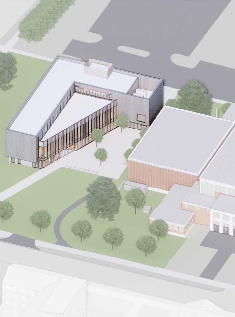
The Campus Addition Hub: A space for learning, gathering, and sharing
Site : Amherst, MA
Time : 2023.2-2023.9
Professional work : Leers Weinzapfel Associates SD DD , CD
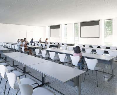
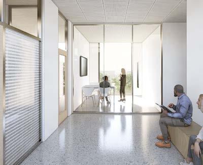
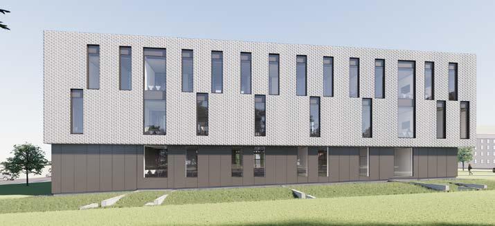
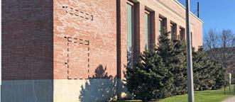
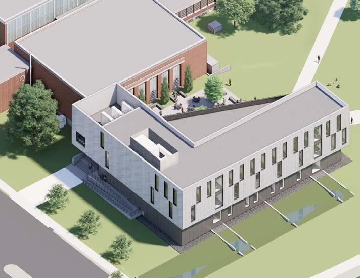
This project is a school addition project located on the Umass campus in Amhest, Massachusetts, providing a place for students to learn, gather, and share.
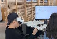
I participated in the preliminary design and development stages of this project. In the project, I mainly participated in the design part. I participated in the early site planning of the building, the volume refinement, the design of the west facade of the building, and combined with parametric software. Participated in the design of facade brick layout, animation director and VR live demonstration.
01



1
BRICK
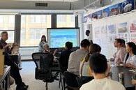
VR/AR TOUR ANIMATION DESIGN LUNCH PRESENTATION CLIENTS MEETING
STUDY
NEW BUILDING
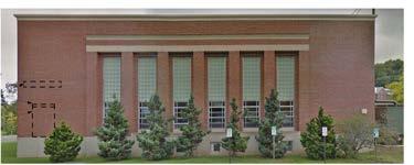
ORIGINAL BUILDING
NEW BUILDING
COLLAB INTERIOR
TEAM BASED CLASSROOM INTERIOR
FLOOR PLAN
WENTWORTH INTERIOR RENOVATION
Create more identifiable spaces within campus building
Time : 2023. 6-2024. 3
Professional work : Leers Weinzapfel Associates
Site : Boston, MA SD , DD
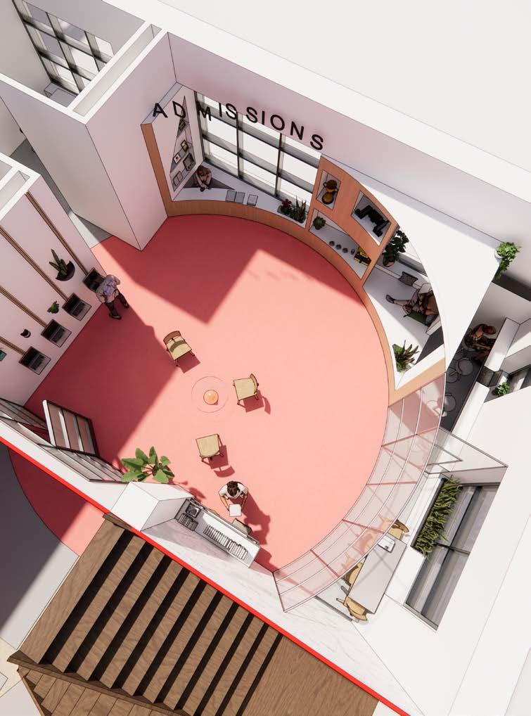
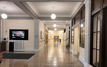
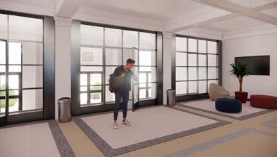
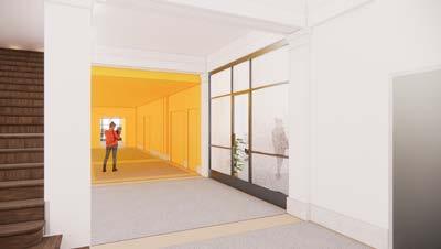
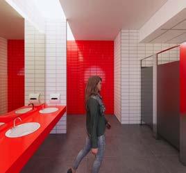
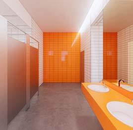
The project is an interior renovation of Wentworth Hall at Wentworth Institute of Technology. It consists of three main areas: corridor, restrooms, and the Admissions Office.
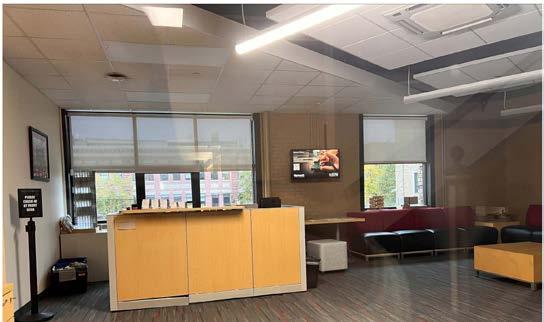
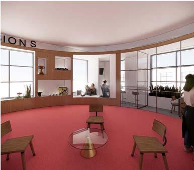
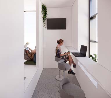
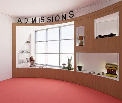
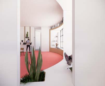
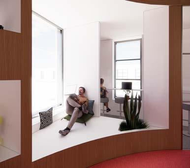
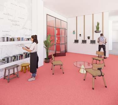
I participated in the entire process, from conceptual design to design development. My primary focus was on the design aspect, where I proposed branding solutions for the corridors and designed four sets of restrooms that complemented the corridors. In the design of the admissions office, I divided the space into shared and semi-private areas to enhance flexibility in space utilization. I also designed a self-service area, shared meeting rooms, a mini library bar, and a coffee dessert bar. Additionally, I integrated a reception desk and increased display space. In this project, I also participated in the FF&E work of the interior design, selecting samples of the building’s wall tiles, carpets, etc.
02

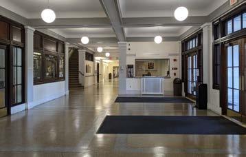
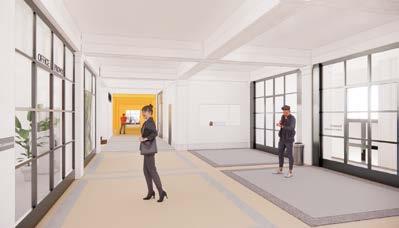
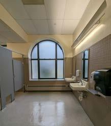
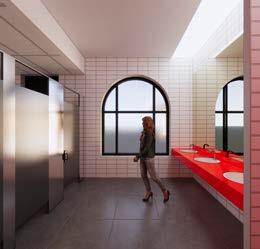
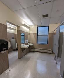
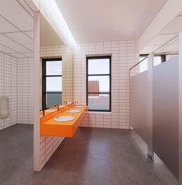
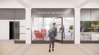
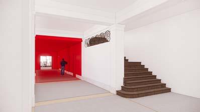
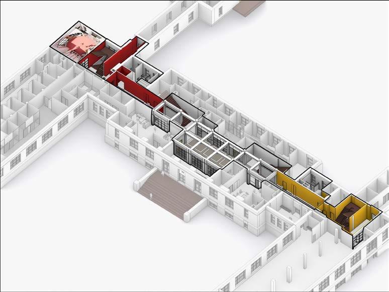
2 Admissions Office renovation Corridor renovation Restroom renovation Restroom renovation
ORIGINAL WOMEN'S ROOM
ORIGINAL CORRIDOR FACING DOBBS
NEW CORRIDOR FACING DOBBS
New Office of the Provost
NEW ENTRANCE
ORIGINAL CORRIDOR FACING WILLISTON
NEW CORRIDOR FACING WILLISTON
NEW CORRIDOR FACING WILLISTON
MEN'S
NEW MEN'S
NEW WOMEN'S
NEW MEN'S ROOM NEW MEN'S
AXONOMETRIC DRAWING
ORIGINAL
ROOM
ROOM
ROOM
ROOM
New Corridor Facing Dobbs




Original
Original
New Admissions Office — Reception New Admissions Office — Show wall, coffee, donut bar New Admissions Office — Reception, flexible seat area New Admissions Office — Entrance New Admissions Office —Self-service computer, small book lab New Admissions Office —Small conference room New Admissions Office — Facing flexible seat area New Admissions Office —Semi-private seating area
Original
ORIGINAL ADMISSIONS OFFICE NEW ADMISSIONS OFFICE
Admissions Office
Admissions Office Axonometric Drawing
Original Admissions Office
Admissions Office
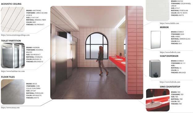
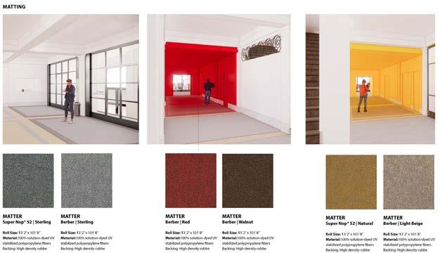

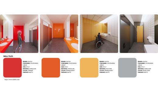

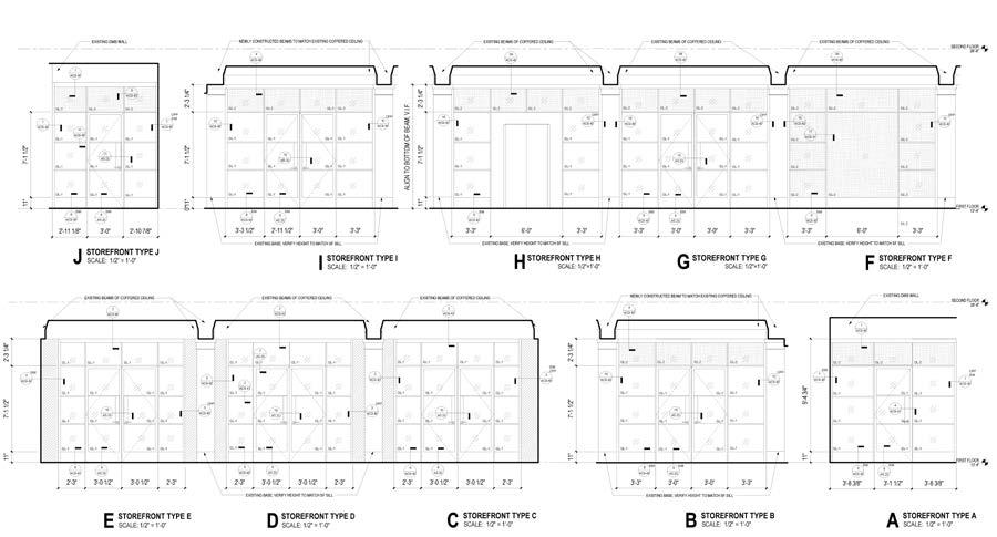
3 FINISHES SECTION DETAILS STOREFRONT AND DOOR DETAILS SECTION DETAIL AT SF HEAD - GWB WALL SECTION DETAIL AT SF HEAD - NEW BEAM

REPLACEMENT THE CORE AND REBIRTH
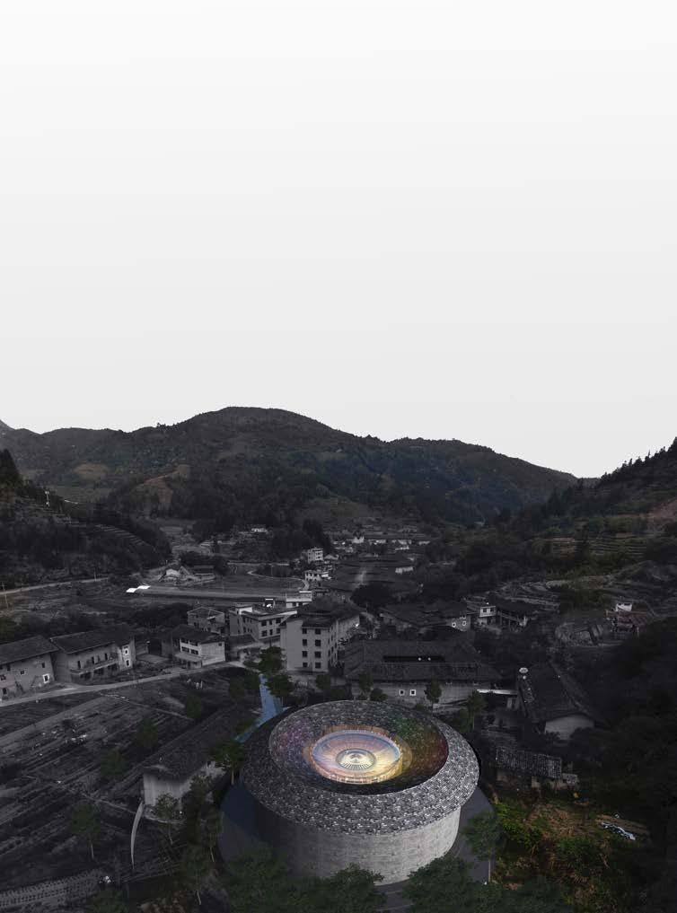
Fujian Tulou (Nanjing) Protection and Revitalization International Architectural Design Competition
Site : Fujian, China
Time : 2021 Summer
Private Team competition (leader) Excellence Award, Top 20
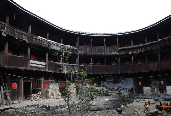
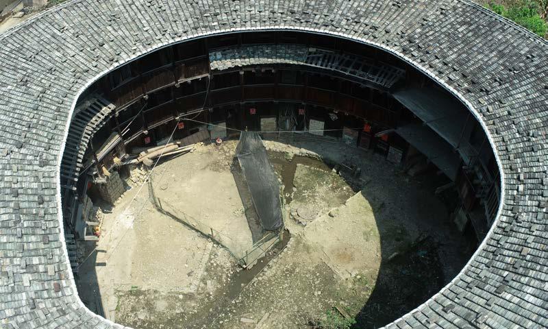
Traditional Chinese earth buildings are arranged centripetally, and the "core" is often the most sacred and cohesive place of a family, which is often used for family sacrificial activities. However, with the passage of time, the closed earth buildings have also exposed many problems that cannot be ignored, such as poor ventilation and sanitation problems caused by poultry and humans living together at the same time.
In recent years, the residential function of Tulou as a large family has gradually lost. Generations of people have left the tulou and even left their own villages. How to revitalize the tulou and integrate fresh elements into the original tulou is what we focus on in this project.
03
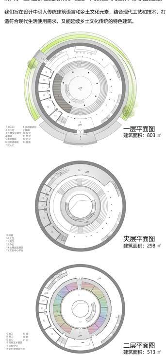
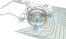
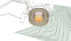

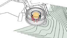
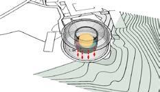
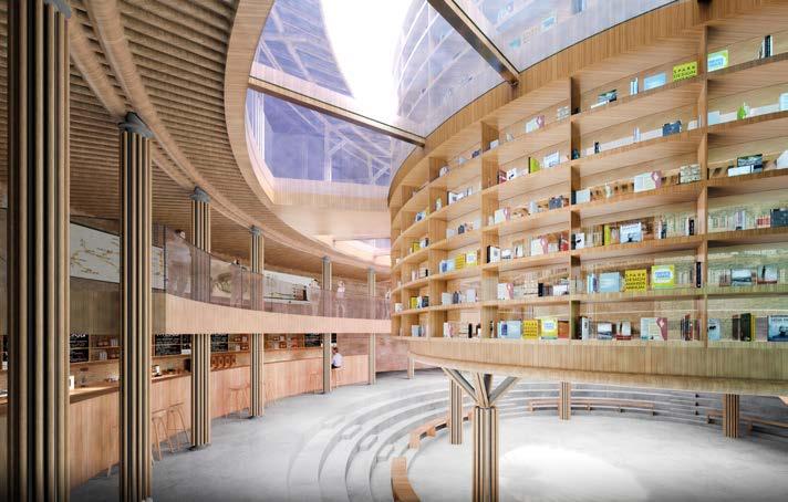
Traditional earth buildings were once homes with ancestral halls as their centerpieces. Now, these buildings have transformed into public spaces, with the ancestral hall becoming a cultural hub. Our design marries modern and traditional elements, breathing new life into these historic structures.
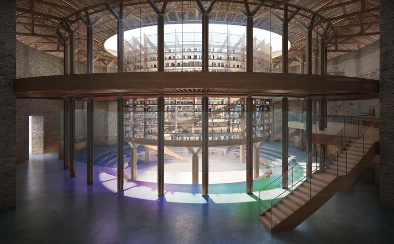
In our design process, we prioritize a central shared area, bringing light into the enclosed spaces. Colorful light corridors brighten up the traditionally dim halls, enhancing both aesthetics and functionality.


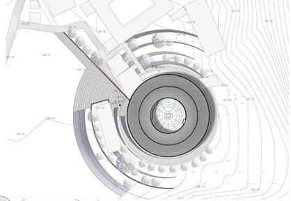


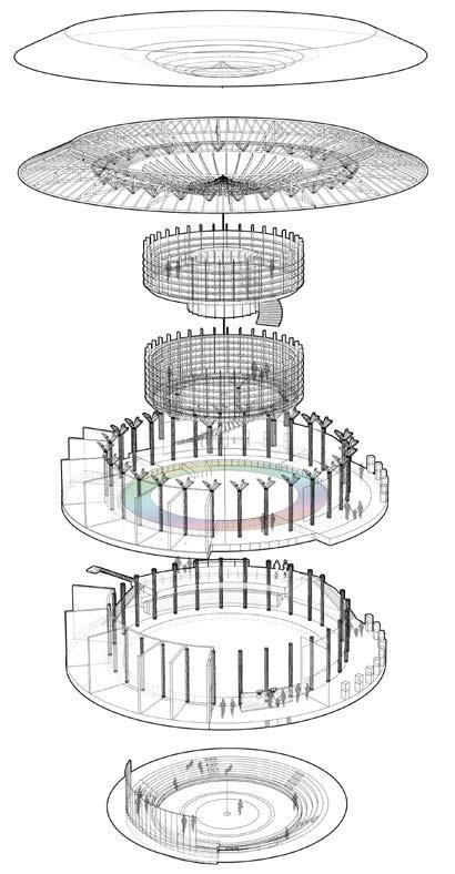
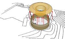
Visit The Entrance Office Entrance Sunken Atrium Visit circulation Office circulation Office Space Exhibition Mezzanine Library Iridescent Glass Roof Cultural and Creative Center Preserved Roof Truss New Atrium Dome Gutter Original Roof MEZZANINE FLOOR PLAN SECOND FLOOR PLAN FIRST FLOOR PLAN SPACE RESEARCH AND FUNCTIONAL REPLACEMENT 2F 1F -1F Original 3F Original 2F Original 1F REMOVE Remove the damaged floor slabs and interior walls, retain the rammed earth walls, and build new floor slabs and partitioned roofs. Integrated space is 5.8m on the first floor and 4.2m on the second floor. 4 COMPARISON CHART OF ORIGINAL AND NEW SECTIONS DESIGN STRATEGY INVITE invite colored light to enrich the atrium space and increase the interest of the space. LIFT Elevating the circular public space creates a connected shared space on the first floor. DECLINE The atrium space on the first floor is sunk 1.5m to form a small theater, which is used to hold traditional folk activities in Tulou. OPEN Open the internal closed space and introduce glass as the enclosure structure to increase the communication between the earth building and the internal environment. Original Base Entrance Space and Circulation Design Landscape Design The entrance is blocked by the existing building and is not eye-catching enough. The main building is surrounded by buildings on both sides, with less displayable facades and a negative site environment. The new perforated aluminum partition wall is used to separate the original building, defining the new entrance area and minimally disturbing the old building. Implant greening to create a new external space environment The design of the canopy creates a rich entrance gray space Current Road PLACE A central book tower is integrated into the atrium to create a dynamic literary and artistic space. The new visiting paths and squares will not interfere with existing buildings. Current Building SITE PLAN
SITE ANALYSIS· EXTERNAL ENVIRONMENT DESIGN
CONSTRUCTION AND MATERIALS
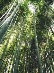
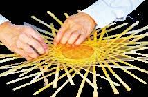
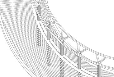
The design preserves the essence of traditional earth buildings by retaining their signature rammed earth exterior walls while introducing modern elements like transparent glass and steel, creating a captivating blend of tradition and innovation. The internal structure relies primarily on steel for support, complemented by the flexible and gentle qualities of bamboo, which not only serves as decoration but also as an integral part of the structure.
Our approach prioritizes the preservation of the rammed earth walls as the focal point, reinforced by strengthening the main structure. For minor damages, detachable and independent structures are employed to isolate affected areas, followed by the use of new materials with superior properties and locally sourced fillers for repair. Additionally, for larger damaged sections, an "addition" approach is adopted to seamlessly integrate indoor and outdoor spaces, bridging the gap between the old and the new.


ORIGINAL BUILDING
NEW
Original Courtyard Interior
New Courtyard Interior
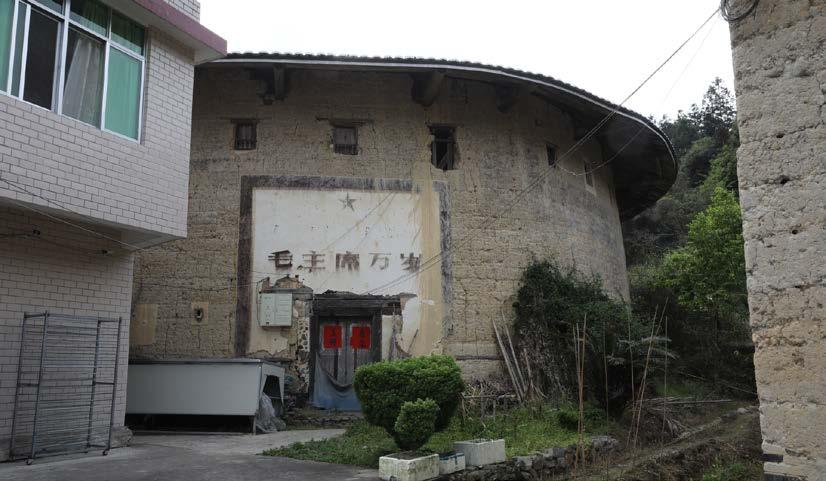
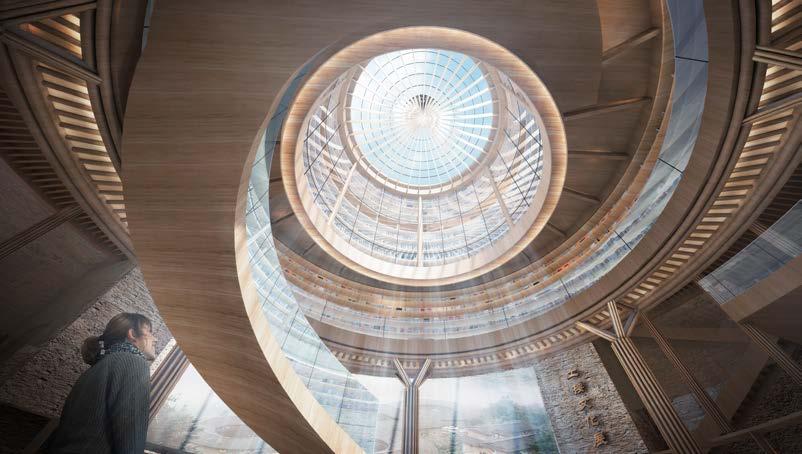
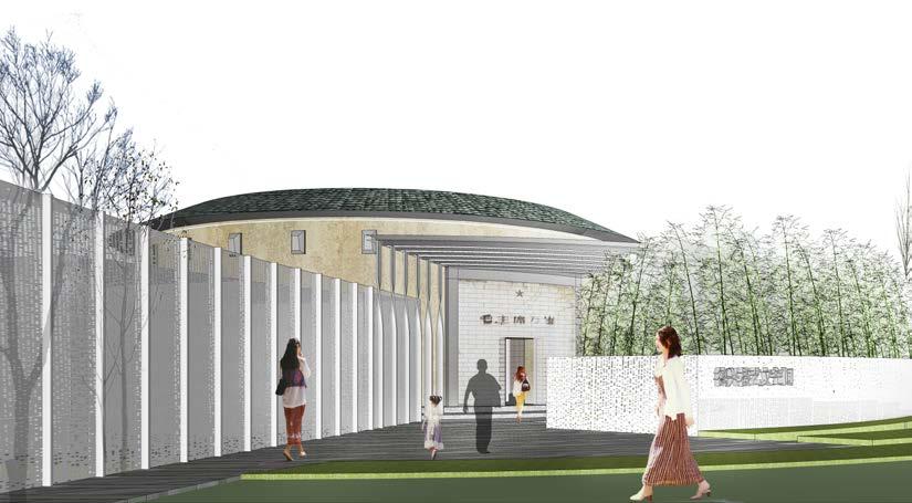
5
Original Skylight
Original Entrance
New Entrance
New Skylight
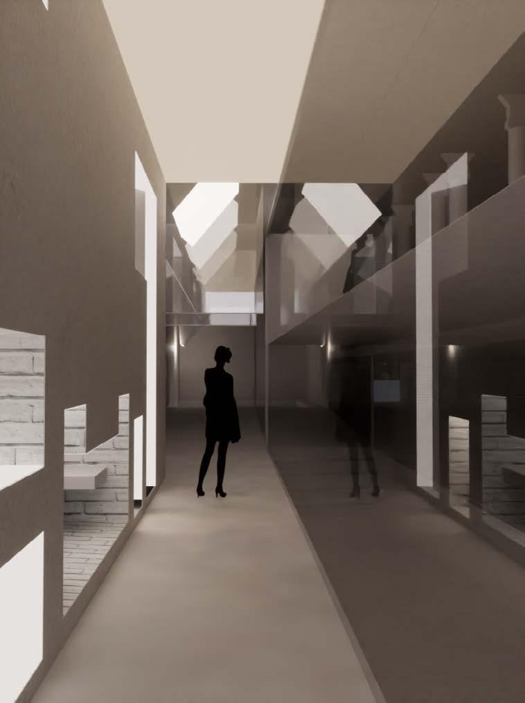
LIGHTING OASIS
An adaptive reuse space to ease Scandinavia's winter blues
Site : Copenhagen, Denmark
Time : 2022 Summer
Adaptive Reuse, RISD
Group Research Work
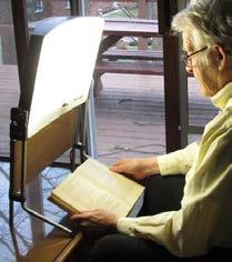
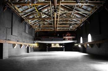
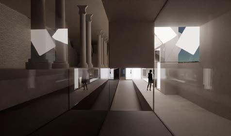
The project is envisioned as a place to be a remedy for the seasonal depression caused by the local climate, delighting people’s minds and protecting their bodies from extreme weather. The local climate in Copenhagen is always changing with unpredictable precipitation, and also people have to experience a long time of short daylight, especially in winter. It is indicated that there is a specific mental depression in the winter season, especially in Nordic countries, and they have special Light Rooms where people can receive more naturally scattered Light as the therapy. Therefore, the project is aiming at curing the winter blues for the locals through the immersive experience and some social spaces related to light.
We hope the project can serve as an oasis for escaping from the long dark days in winter in Copenhagen, which is not a physical oasis for the urban context, but for people. Delighting the everyday life they are experiencing in the brightness, reflecting on their thoughts and confusion in the darkness, and inspiring them when they are standing in between.
04
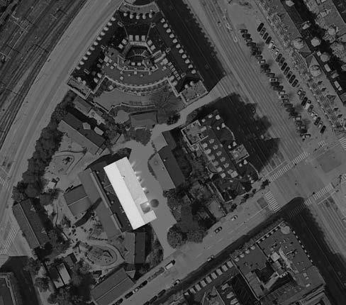
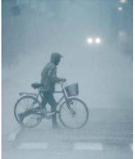
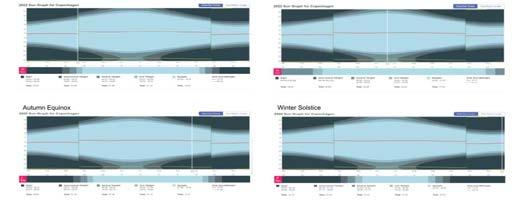
These are sun charts showing the times of daylight in different seasons in Copenhagen. As you see, two-thirds of the daytime in winter is spent in darkness. This can be harmful to people’s mental well-being. Some symptoms are difficulty focusing and forms of depression.

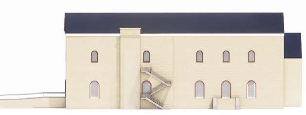
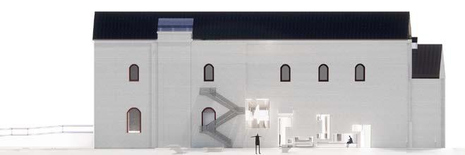
ORIGINAL FACADE NEW FACADE 5
N Spring Equinox Winter Solstice Autumnal Equinox
Hans Christian Andersen Boulevard Studiestraede
COPENHAGEN SUN GRAPH
Site
Intense Artificial
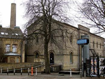
Original Outside Photo
Plan
Light
Original Inside
Original Inside First Floor Original Inside First Floor ORIGINAL SECTION NEW SECTION ORIGINAL PHOTOS Summer Solstice 6
Insufficient Lighting in Specific Seasons
Second Floor
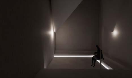



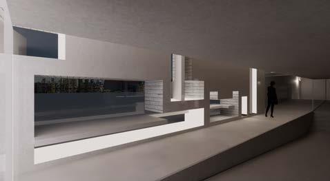
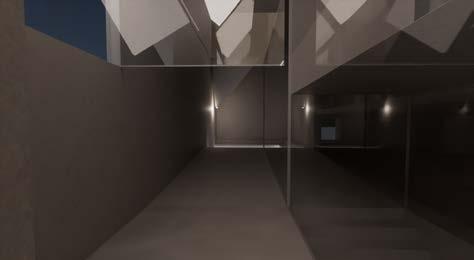
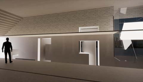

REVOLVING OPENING
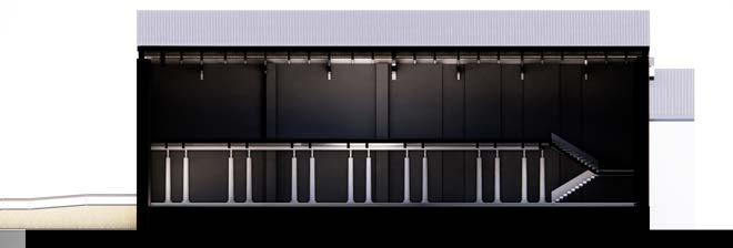
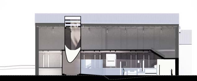
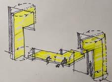
Creating openings in this corridor letting the natural light come in, and revolving panels can be used as tables and chairs sitting here to have a coffee or small talk.
In one corridor, we lowered the floor to match the outside, guiding traffic smoothly. In the other, we extended the original floor upward to serve as a visible roof, providing a direct view for those on the second floor. This creates a visual link. Lowering the floor in this area adds depth to the space, offering a varied experience for visitors.

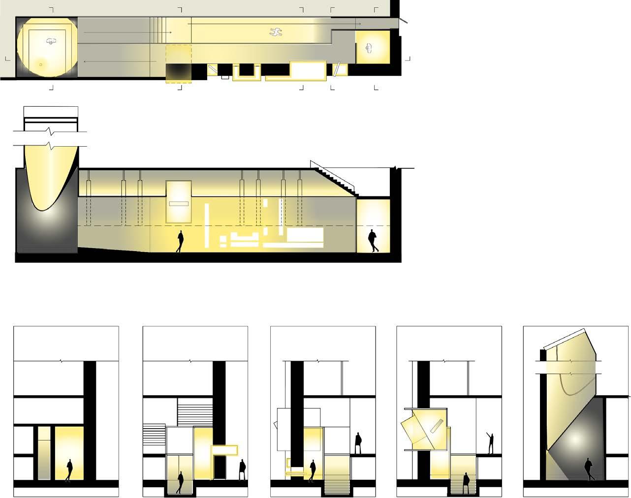
1-1 Outdoor Gradient Light Corridor White Cube Light Sculpture OR OR Meditation Room 5 A 5 Corridor Lighting Sculpture White Cube Entrance 4 3 2 1 A 4 3 2 1 Outdoor Indoor -1.00 ±0.00 PLAN Meditation Room Second Floor Corridor Facing the Entrance Use phone Use VR Helmet Use Google Virtual Reality Box /Google Glass
7
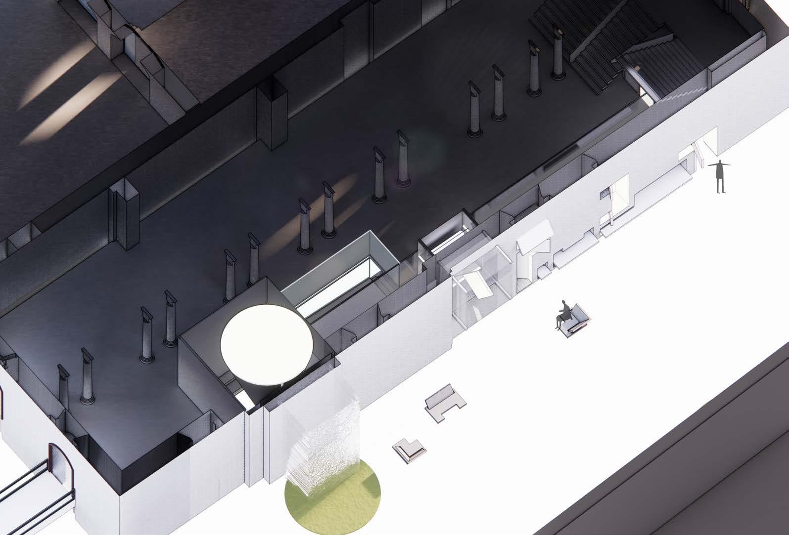
AXONOMETRIC DRAWING

CULTIVATING BODY,MIND AND SPIRIT OF RHODE ISLAND’S YOUTH
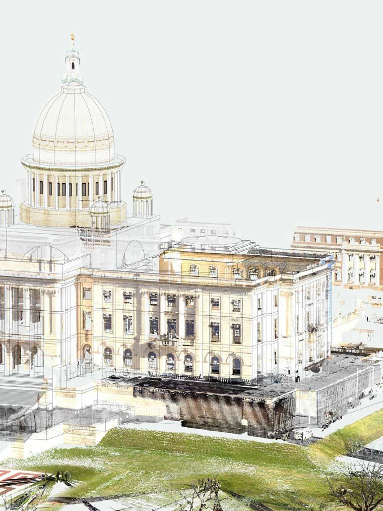
Adaptive Reuse on Rhode Island State House
This project is inspired by Cory Booker, who said “Young adults deserve a government that represents their interests, which is why we are calling for the creation of a Presidential Youth Council.”
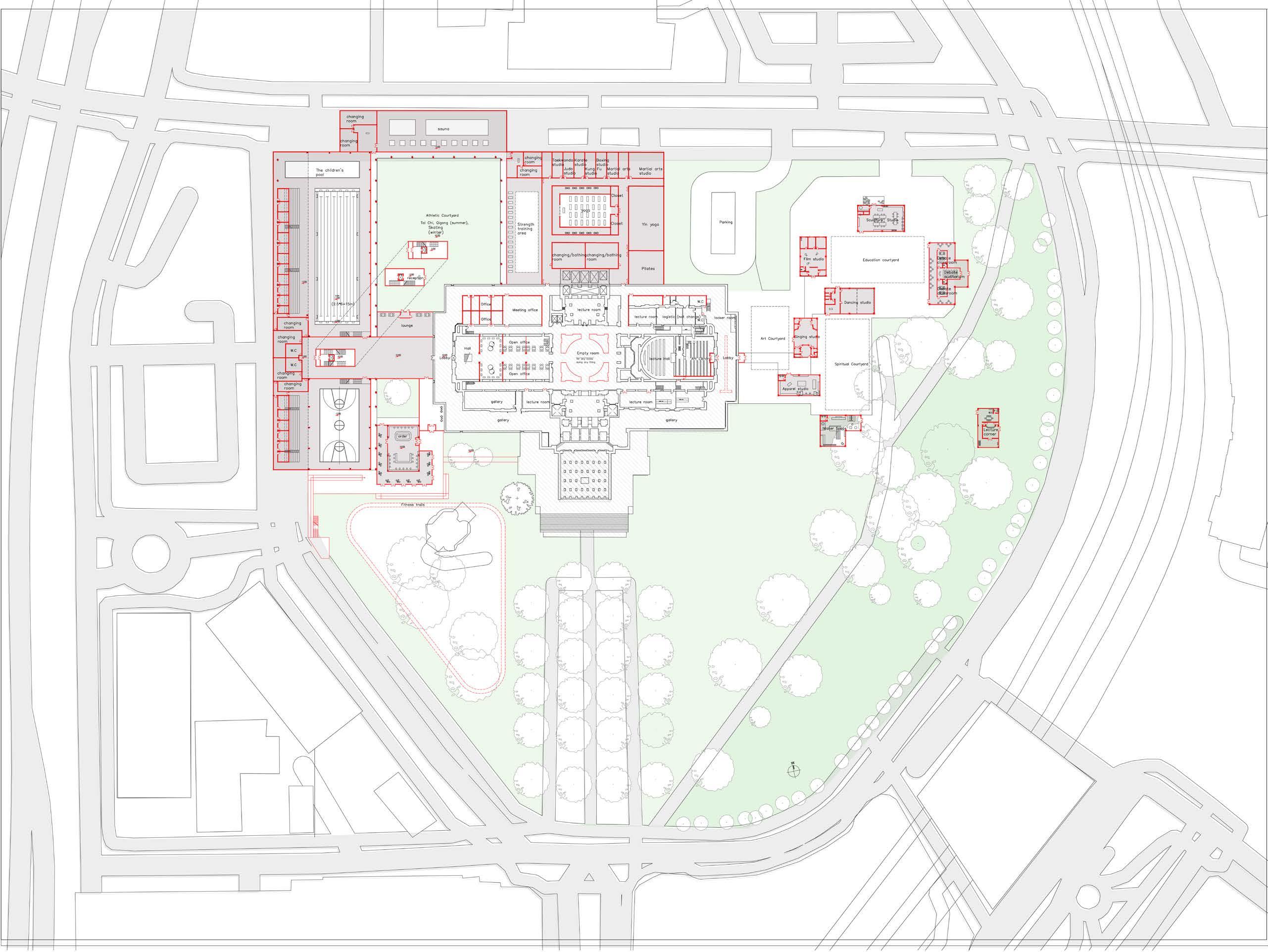
First, physical development focuses on people's needs for fitness and exercise. As a representative of the people, if the State House is more open-minded, it can provide citizens with a sports venue that can be used by more citizens, including basketball gyms, swimming pools, saunas, yoga, judo, taekwondo, karate, and fitness trails.
Secondly, it is unfortunate to have a strong body without a rich brain. Creating a base for youth activities, Involving multiple studios such as music, art, movies, life, etc., at the same time creating a maker center, so that young people can have a place to practice while receiving the edification of art. Open debate halls and speech booths to allow young people to exercise and participate in current affairs Political analysis and discussion, exercise their speaking skills and speak up for their group.
Site : Providence, Rhode Island Individual Research Work Time : 2022 Spring Adaptive Reuse, RISD 05

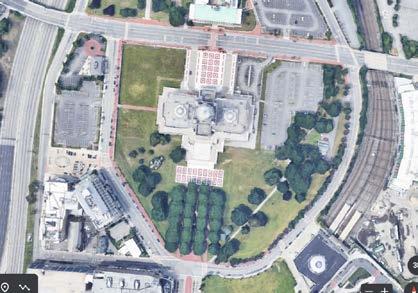
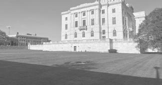
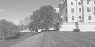
The Rhode Island State House, the capitol of the state of Rhode Island, is located at 900 Smith Street just below the crest of Smith Hill, on the border of downtown in Providence. The building was located at Smith Hill and constructed from 1891 to 1901.
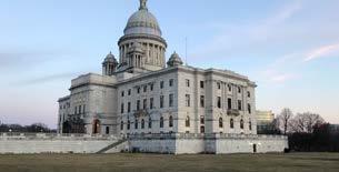
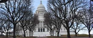
Narrow Hallway, Height Difference, Barely Ventilated
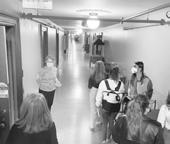
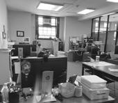
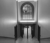
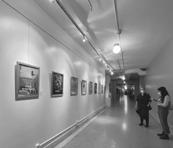

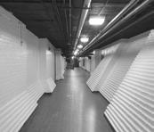
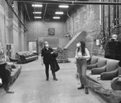
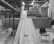
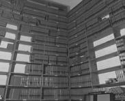
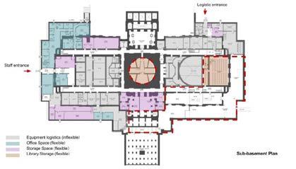
ORIGINAL STATE HOUSE ANALYSIS ORIGINAL SUBBASEMENT PLAN ORIGINAL BASEMENT PLAN BASEMENT SUB BASEMENT
Huge
8
Base, Height Difference, Limited Available Space


Roadway Sidewalk Original fence Bleacher Swimming pool Working flow (up,down) Exercising flow Atrium Ⅱ-ⅡSECTION 8.50 7.00 4.00 ±0.00 -5.00 Original yard Terrance Third Floor Second Floor First Floor Basement Sub-basement Atrium Basketball court Platform Fence State House Front Square Ramp CIRCULATION REDESIGN Ⅱ Ⅱ Ⅰ Ⅰ
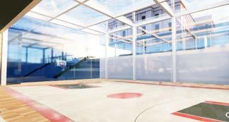
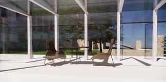
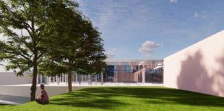


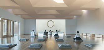
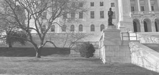
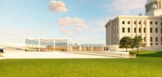

 A.VIEWS IN BASKETBALL COURT
E.VIEWS IN PLATFORM
C VIEWS IN CAFE
TOWARDS CAFE
B.VIEWS IN SWIMMING POOL
F. RAMP ATTACHED TO PLATFORM
D YOGA UNDER THE PLATFORM
NEW STATE HOUSE F A B D E C 9
ORIGINAL STATE HOUSE

FLOOR PLAN CONNECTED TO SUB BASEMENT OF STATE HOUSE Altered wall Altered space Original building
ADAPTIVE REUSE OF THE SQUARE

1-1 SECTION 2-2 SECTION Taekwondo studio Strength training area Judo studio Karate studio Kung fu studio Boxing studio Fencingstudio Martial arts studio Yoga studio Yin yoga Pilates Changing/bathing room Changing/bathing room Changing/bathing room Changing/bathing room 1 2 2 1 10
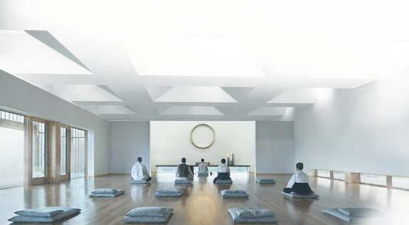
YOGA ROOM UNDER THE SQUARE
SUB BASEMENT PLAN UNDER THE SQUARE

TWO VOICES, TWO CENTURIES
A furniture exhibition where one interprets the other
Site : Madrid, Spain
Time : 2021 Fall
Exhibition Design, RISD
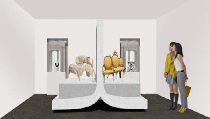
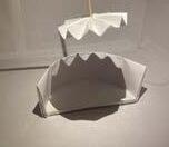
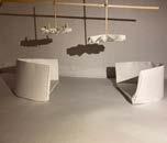
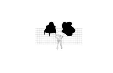
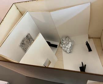
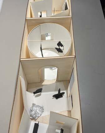
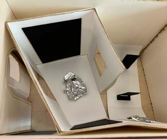
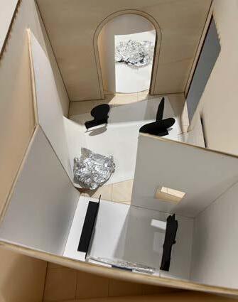
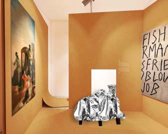
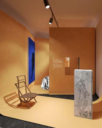
“Two Voices, Two Centuries” is an exhibition design for The National Museum of Decorative Art of Spain in Madrid, Spain comparing furniture from two centuries. Viewing furniture outside of an aesthetical object this studio looked at how furniture can be displayed architecturally, thereby informing the way it has the power to shape a space. The project is an actual exhibition project that, if passed, will be shown in Spain in 2023.
One concept is called“in between”, which means to dialogue the traditional and contemporary artworks in a space, and use one to translate the other one. With a very metaphorical way to reinterpret and define the relationship between. The other one is Domestica shaped the design narrative, we creating a domestic landscape that turns the inside out and makes the invisible visible.
06 Group
Work
Research
SITUATION ANALYSIS


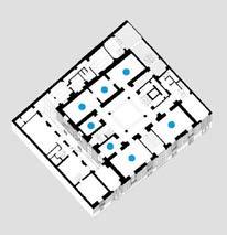
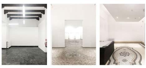
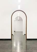
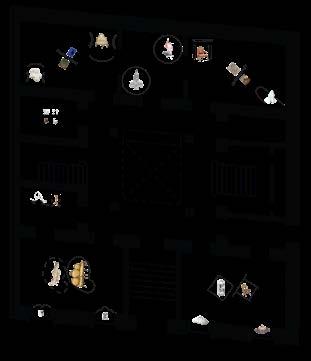
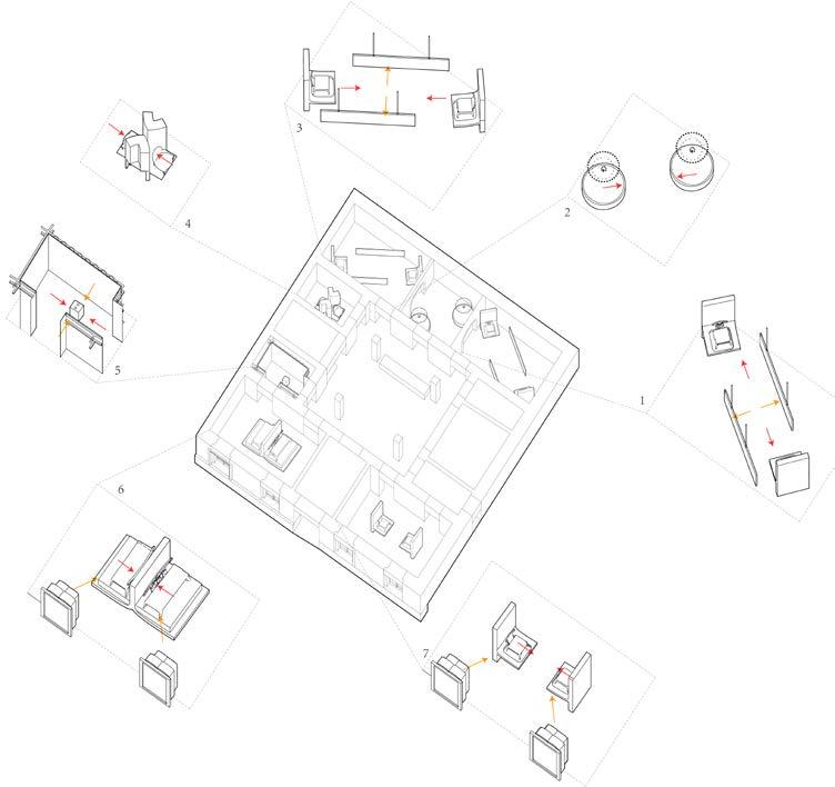
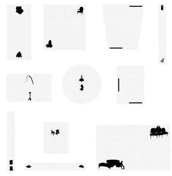
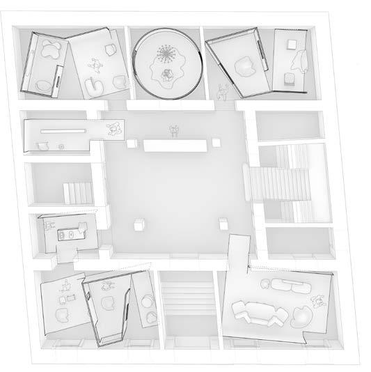
The exhibition will be held in The National Museum of Decorative Art of Spain in Madrid. 7 adjacent rooms on the first floor are connected in series to form the entire exhibition hall of this exhibition. 12 pairs of classic and modern artworks to look forward to talking here in a refreshing way


NARRATION
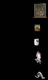
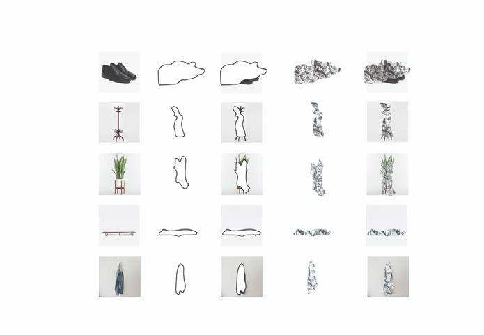
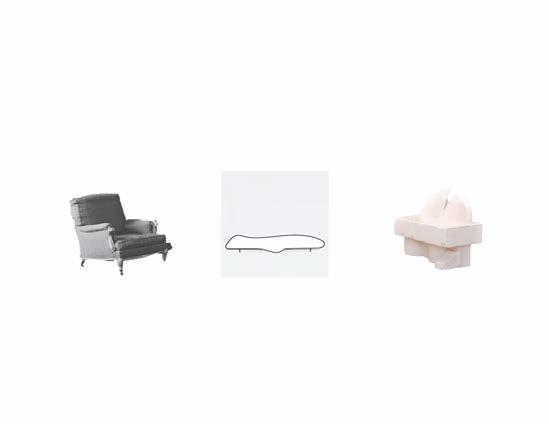
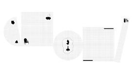
We abstract and pictorially transform 12 pairs of artworks and explore them as spatial narratives. We also cataloging them, thinking about the ways to show them, whether they can be hanging putting, or lifting. And with which medium to better display them.


6.2 1.2 6.1 1.1 7.2 2.2 7.1 2.1 8.2 3.2 8.1 3.1 9.2 4.2 9.1 4.1 10.2 5.2 10.1 5.1 1.1 1.2 2.1 2.2 4.1 4.2 3.1 3.2 5.1 5.2 .1 6.2 CATALOG 11.1 11.2 7.1 8.1 8.1 7.2 10.1 10.2 9.1 9.2 12.1 12.2 CATALOG
FLOOR PLAN CIRCULATION 11
CATALOGUING ABSTRACTING


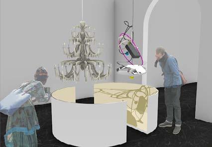
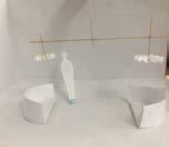
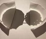
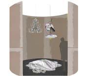
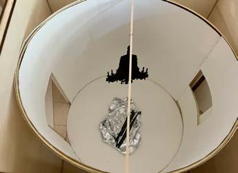
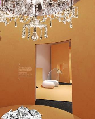
Our concet is called in between, which means to dialogue the traditional and contemporary artworks in a space, and use one to translate the other one. With a very metaphorical way to reinterpret and define the relationship between. Such as these two chandeliers, we use two bowls to represent them, when the light falls from above them, their shadows become blended together. THE CONCEPT OF
SPATIAL
APPROACH


INTERVENTION
<> OBJECT
INTERVENTION
<> VISITOR
INTERVENTION
<>
EXISTING SPACE
MATERIALITY
<> EXPRESSION
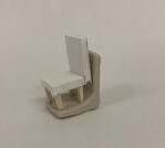
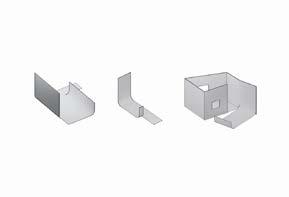
MOCK UP ///// Make sure your diagram fits in this square, keeping a similar scale to the rest of the diagrams


INTERVENTION ON STOOLS
INTERVENTION ON SOFAS
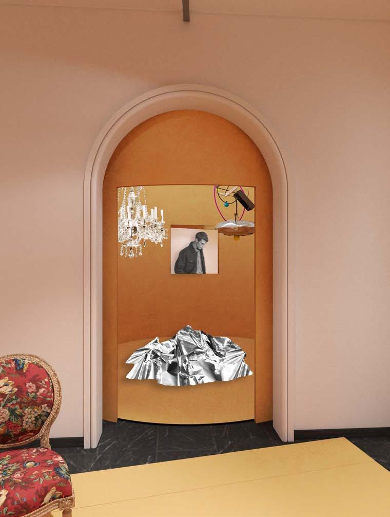
INTERVENTIONS ON CHANDELIERS
1. Spatial approach
2. Relation between your intervention and the displayed objects
3. Relation between your intervention and the visitor
4. Relation between your intervention and the existing space
5. Materiality and material expression.
6. Image of your intervention
BETWEEN AXONOMETRIC
IN

Gesturing to vestiges of domestic environments while activating tension between objects through the use of props.
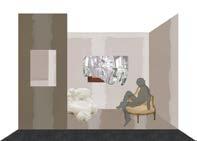
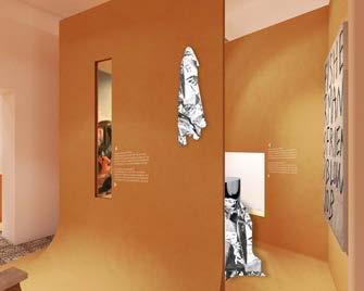
Think of the showroom you are in as a huge family gathering, with living room, bedroom, kitchen and bathroom. We recreate interior surfaces through abstracted and expressive materiality, we expanded outward from the objects it contains, and the exhibition spills into the museum at large, creating a domestic landscape that turns the inside out and makes the invisible visible.


Redefine the space with original and creative elements


Concept 1: furniture as architectural element
Rethinking how furniture pieces have been traditionally viewed as aesthetic objects and displayed, “Two Voices, Two Centuries” exhibits furniture and architecture as congruent forms - both capable of creating a space.
Concept 2: defining context

Gesturing to vestiges of domestic environments while activating tension between objects through the use of props.

Concept 3: continuous navigation
Creating an intuitive and continuous space through the use of environmental clusters


concept 4: peeling
Transforming intervention geometries into an element that shapes and connects all architectural components: wall, floor and furniture

DOMESTICA NARRATIVE REDEFINE
SIGHT ANALYSIS
12

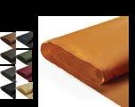
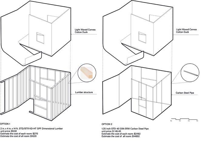
Waxed canvas
Estimated cost: $58, 880.95

Low density eva foam estimated cost:
$24,929.44


DETAIL PLANE

AND MATERIAL
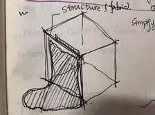
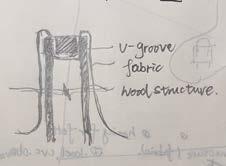
STRUCTURAL
DURAWAX LIGHT WAXED CANVAS COTTON DUCK 12 oz. 57" FABRIC 38X89mm WOOD STRUCTURE (40cm O.C. TYP.) 403 (TYP.) 38X89mm WOOD STUD (TYP.) 40X25mm ALUMINUM "L" CHANNELS - SECURED TO WOOD STRUCTURE & WAXED CANVAS (TYP.) 40X25mm ALUMINUM "L" CHANNELS - SECURED TO WOOD STRUCTURE & FLOOR (TYP.) R475 3500 (TYP.) 38X89mm WOOD STRUCTURE (40cm O.C. TYP.) DURAWAX LIGHT WAXED CANVAS COTTON DUCK 12 oz. 57" FABRIC C.1 C.1 C.2 C.2 1 2 D.1 W2 W1 W2 W1 F1 F2 F2 F1 D.2 18.0° 1062 683 1032 684 1351 995 56.1° EXISTING PLASTER PORTION OF EXISTING WALLS DURAWAX LIGHT WAXED EXISTING TILE FLOOR EXISTING WALLS CANVAS COTTON DUCK 12 oz. 57" FABRIC DURAWAX LIGHT WAXED CANVAS COTTON DUCK 12 oz. 57" FABRIC 1804 243 2894 3465 121 66 4050 1749 3562 71.3° 162.4° EXISTING BASEBOARD 1813 4049 6088 3150 1138 C D 6154 756 1836 831 464 9 1454


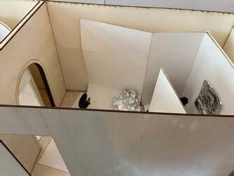
PERSPECTIVE MODEL 13


THE WALLS
A Community Center for Post-war Restoation “Baghdad Design Center,” international architectural competition
Site : Baghdad,Iraq
Time : 2020 Fall
Individual Research Work
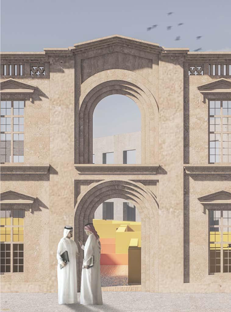
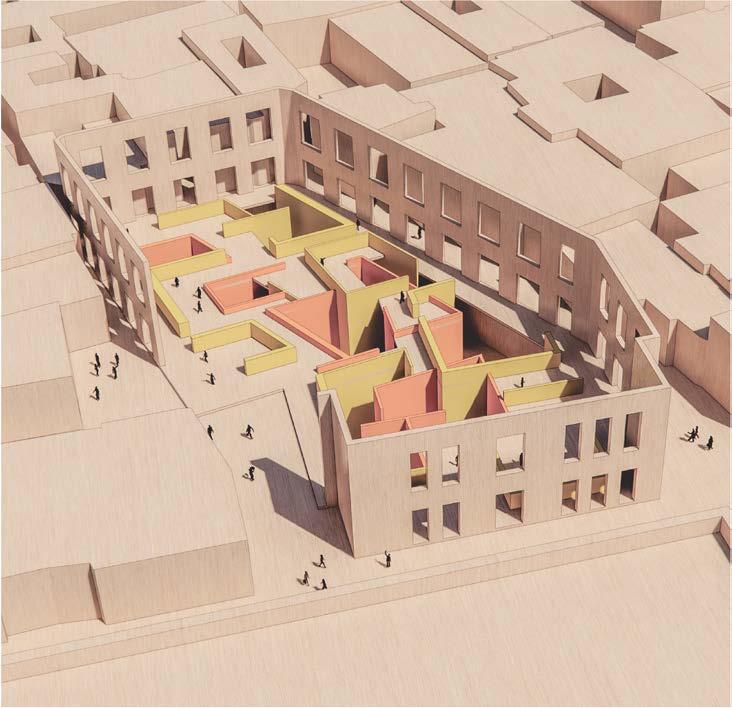
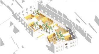
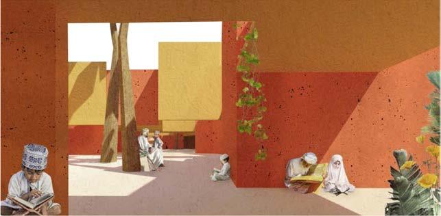
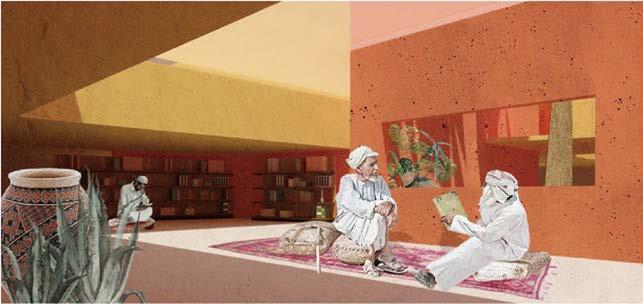
The site is in the old Al-Rusafa neighbourhood, the historic centre of Baghdad and has a long history going back to more than a thousandyears. The buildings that were blown up, the old walls left with crack, the former city hall, are now exposed to the blazing sun. The public needs a meeting point before going to the nearby book stores and grocery market with friends.
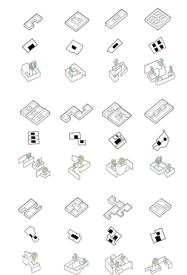
I found three typical urban models from the urban texture of Baghdad and extracted the combination of 12 typical Baghdad courtyards. Some are interlaced, some are juxtaposed, and some are separated, which is a very inte restingcombination.I zoom out them to a certain extent and placed them underground. The staggered sections form a floor that can be raised and lowered to meet different space requirements. When you stand in the courtyard on the second floor of the base, you will perceive the new and old dialogues of time and space. Two different walls are intertwined in the background of the blue sky.
07

AERIAL VIEW
I want to make the site return to people's lives in a low-key manner. So,I put all the building functions underground, giving the citizens a city plaza to communicate. Perhaps outside this wall, you will think that this is a small park, and even the palm trees only show an unremarkable height. And when you come in, you will find that this is the entireminiature city exhibition, a city within the wall.

STEP 1:Extract Courtyard Formation From Urban Texture
STEP 2:Convert To Basic Space Prototype
STEP 3:Combine The Site Plan To Form Interior Space PROTOTYPE GENERATION
14
Intersected
Interlaced Inclusive Fractured Shared Wall Heteromorphic Carved
Quarter Arraied Interlocked Staggered Wall
Juxtaposed
Pinwheel-shaped


GROUND LEVEL PLAN 01 Exhibition 08 08 08 07 09 01 02 03 04 N 06 05 02 Cafe 03 Gallery 04 Office Space 05 Auditorium 09 Library 06 Meeting Room 07 Private Meeting Space 08 Outdoor Platform 0 3 5 10M For the treatment of the old wall, hope it can be exposed as much as possible, so as to continue the open public space enclosed by the old wall. The new square is formed around the gap in the old wall, and the building is formed by linear offset from the old wall Volume, and the rest is the square The underground space provides sufficient daylight for the underground space through the setting of courtyards of different scales. Flexible layout of the building to accommodate different building functions The space of the 2nd underground floor also uses the courtyard prototype to provide the local residents with a familiar architectural environment. The central 2-storey courtyard space can accommodate more residents to gather and communicate here. Existing Wall Underground Level 1 Underground Level 2 Gallery Book Stack Auditorium Classroom Cafe Deck Study Room Collective Work Reading Room Media Center Forum

A CITY IN THE WALL
I put all the building functions underground, giving the citizens a city plaza to communicate. 12 typical urban texture prototypes bring rich spatial experience. Perhaps outside this wall, you will think that this is a small park, and even the palm trees only show an unremarkable height. And when you come in, you will find that this is the entire miniature city exhibition,a city within the hall.


can communicate.

The construction materials of the building use local raw earth materials. Raw earth construction has a strong subversive potential as it possesses eco-responsible values and virtues. It remains close to nature as it is barely transformed, and its use means saving rarer, nonrenewable resources, as well as reducing industrial pollution and the use of fossil fuels. Due to the placement of the courtyard, sufficient lighting and natural ventilation are brought to the lower space, making the building suitable for people to live in.
Skylight enters the room from the transparent roof, bring soft and bright sunlight to library so that people can sit on the flloor and gather together to read books.
The underground space is connected by the courtyard, forming a semi-open space where people
Double Height Wall
Single Hight Wall
Percepetive From Courtyard
15
Percepetive From Public Space


MENTAL DIARY
Empathy installation for bipolar disorder
Site : ShangHai, China
Time 2020 Fall
Individual Research Work
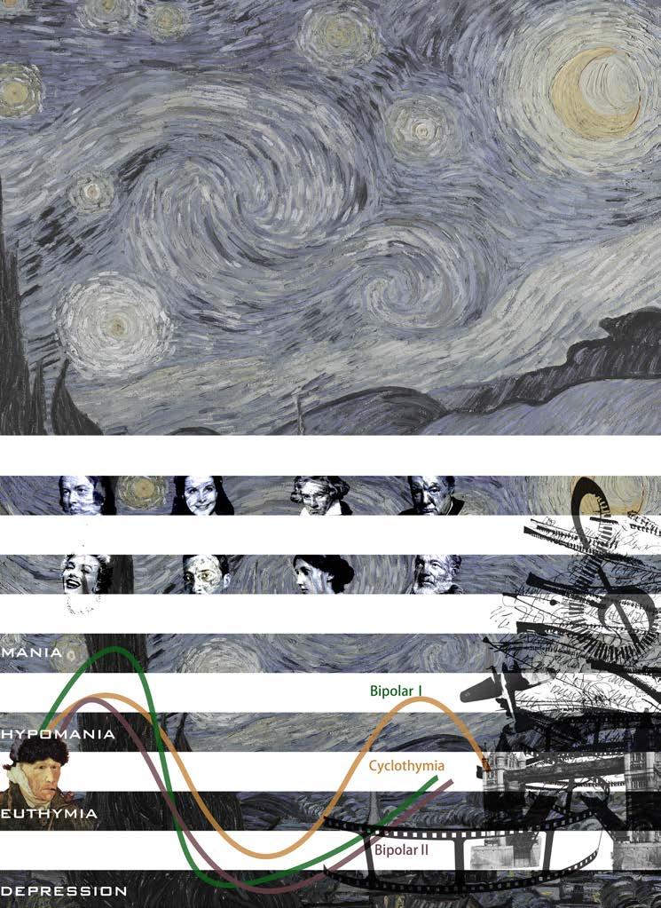
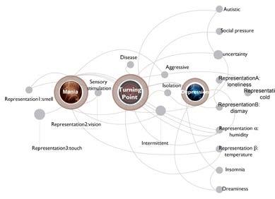
The project is an empathy device designed to demonstrate bipolar disorder, Van Gogh’s birthday is Bidirectional Affective Disorder Day, and the history of Churchill, Monroe, Beethoven, Hemingway, Schumann... All of these celebrities have had bipolar disorder, which is often referred to as a “genius disorder.”
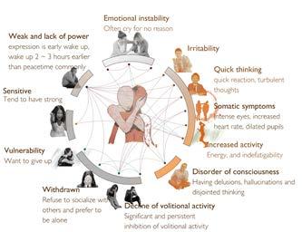
But the reality is not as beautiful as it literally describes. In terms of symptoms, patients with bipolar affective disorder switch randomly between depression and mania. They cannot study, work and even live normally. This patient and his family have brought great pain.others.
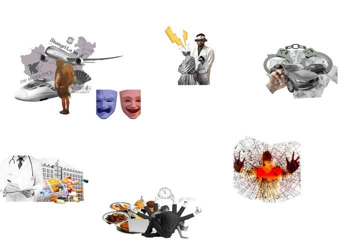
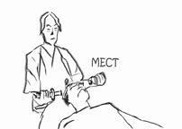
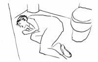
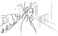
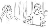
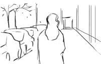
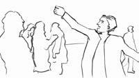
This is based on a true story that happened to me. In the summer of 2020, I met a guy with bipolar disorder. I didn’t know it at first, but then I found out that it was not as simple as I thought. He kept chatting with me, trying to ask for help, I watched him struggle, but everything was so powerless. In the end, his family took him home for electric shock treatment, and this treatment will randomly delete your memory, maybe he has forgotten me, so I made this device after leaving him, hoping to let more people experience and understanding how people with this disorder feel.
08
Different from simple depression, which refers to a mood disorder that switches back and forth between depression and mania. Bipolar disorder is considered to be a serious mental illness in medicine. Patients often feel a deep stigma and are shy about complaining to others and seeking help. The following is a partial summary of the research on this disorder.

3:00 AM
MENTAL DIARY
I met him this summer. After he texted me about his upcoming fourth MECT(electric shock therapy to forget the sadness), he never heard from me again. It was like he disappeared from the world...


Quit my job, bought a plane ticket and suddenly wanted to go to Alaska to see the aurora 7:00 AM Beat the doctor for being grounded and received electric treatment in the hospital

PM A confrontation with a neighbor over parking downstairs,Because of my violent attitude, the police arrested me on suspicion of a drug attack
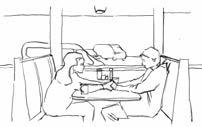
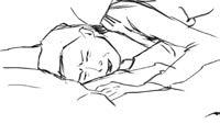
We were from different cities, and the day he left he admitted to me that he had bipolar disorder, which seemed to solve my long doubts, at first I thought he just depression, until I visit him one day, found that he has been in bed for three days and three nights, bed filled with McDonald's bag, in the end of the bed ashtray cigarette butts to spill out, I didn't know it was his depression. The curtains were always open, and the sun rose and fell outside the window...
It was a far different person from the one I had known when I first met him, the confident, talkative, and accomplished student who seemed like two different people...

He has been quarantined in hospital for a MECT treatment

The mood of depression always comes suddenly, without any precaution

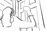
knocked at the door for a long time but no one answered

It was like two different people from the one who had excelled at school when I first met him

Before he left, he confessed to me that he was a bipolar disorder

The body is not controlled by the brain can only lie in bed

I felt confused and sad

He used to be confident that he was talkative and humorous

He often suffers from a rapid switch between mania and depression

The sun rose and set, and he had been in bed for three days and nights

had no choice but to leave

Missing that confident and wonderful him. I hope he can get better soon
16 BIPOLAR DISORDER
00:00
begin
death,
if it were the real relief 12:00
The depressed mood has caused me to not want to eat or study or work 05:00 AM had a sudden depressive episode because was deliberately taking drugs, lying on the bed and could not move a muscle BIPOLAR
MANIA
DEPRESSION MANIA DEPRESSION What is the effect of diagnosis and treatment after illness? Do you usually want to suicide? Anxiety disorders Schizophrenic disease What triggers this emotion? Age of disease Who is usually asked for help? 20%23%18%39%15% 20% 49.3% 30.7% 4.7% 2.7%284 mil 3.8% 0.31% 20mil 0.26% 0.25% 10% 20% 20% 35% 25%30%20%15%10%30% 29%12% 20% 30% 10.7% 11.9% 9.3% 0.9 bil DataQuestionnaire integration others A stranger DoctorsFriends studystress Lack of physical appearance work stress femaleproportion Proportionof globalpopulation Numbermaleproportion ofcases Number of cases male proportion women proportion yes,StrongemotionsHaveacontrol Notparticularly Under 18 Incompleteremission recurrentEaseAfullrecovery part Proportionof Chinese Thefamilyabove3515-19ages20-30ages others 25-35ages Number of cases male proportion female proportion Proportionof global population The triviality of life Any mental illness
22:00
AM At this time of day
to fantasize about
as
AM
DISORDER: MENTAL ILLNESS THAT SWITCHES BACK AND FORTH BETWEEN
AND
DESIGN CONCEPT
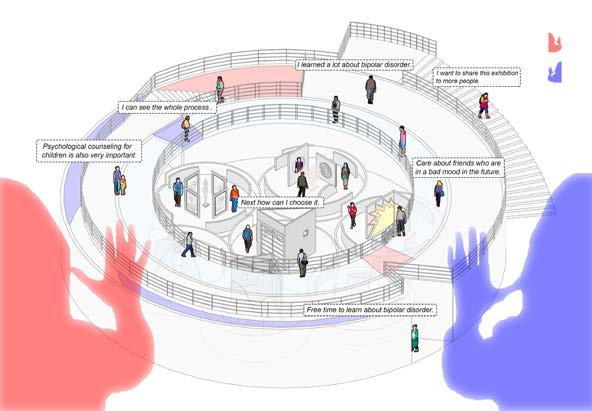
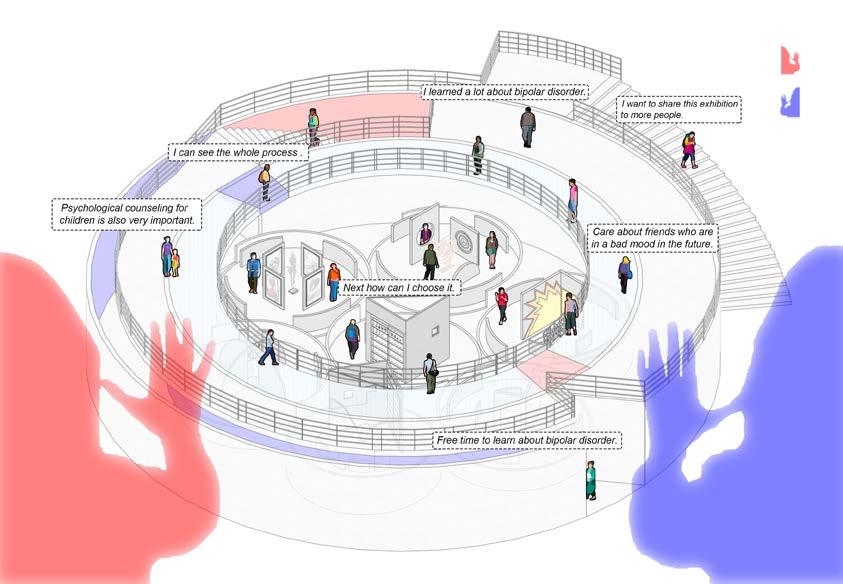
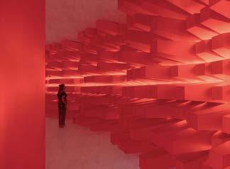
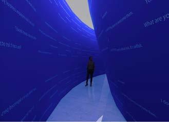
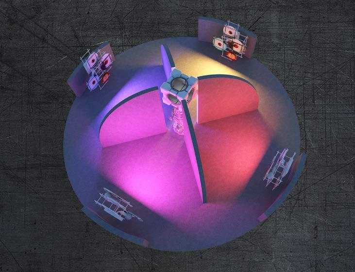
The device is designed to demonstrate manic depression, by rotating the stages of manic depression and manic disorder in random alternations through a turntable, so as to ensure the randomness of the audience's experience. The device can be divided into three parts. The first part is the emotional corridor. In order to help the audience enter the role, the second part is composed of seven rotating devices to express different emotions respectively. The third part is a presentation of god's perspective, in which the audience can see the performance of the audience they are experiencing.


You can watch the video I made at this link, In this video simulates the rotation of each module in a real exhibition environment, in which people can experience the emotional ups and downs of bipolar disorder without cause.


The end corridor consists of a touchlit pole that represents the high risk of bipolar illness. The pole lights up with every casual touch, mimicking the high risk of bipolar in everyday life.


The hallway is made up of a wall of comments that we might not expect to hurt someone with bipolar disorder on a regular basis. At the same time, the reflection of light can bring the audience into a depressing atmosphere.


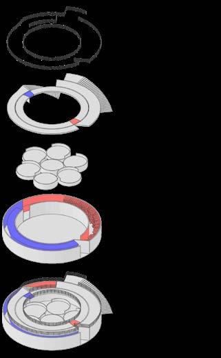
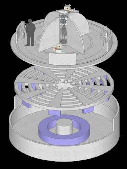
Safety Barrier Circulation Hub Wheelwork Manic corridor Depression corridor Installation Installation parts Paving Steel frame Wheel Pump pit Concrete foundation MANIC CORRIDOR DEPRESSION CORRIDOR
ROTATE MANIA DEPRESSION
https://youtube.com/shorts/tP5A5e7JVwY
VIDEO


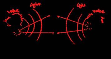
Sound and light are two major factors affecting human emotions. The device simulates the repeated alternating and complex emotions of bipolar disorder people through constantly changing bands of sound and color light.
Each wheel has a different emotional experience. Some are more depressive than manic (similar to Bipolar I), some are more manic than depressive (similar to BipolarⅡ), and some switch back and forth between the two emotions (similar to cyclothymia). Each turntable brings a different experience to the visitor.


According to Goethe’s color theory, color stimulates emotions. Warm colors such as orange and red can be interpreted as energetic, avant-garde, and explosive. Neutral colors, represent mystery, neutrality, and peace. Cool colors such as blue, green, and cyan represent depression, melancholy, or sadness.


17
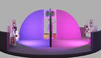
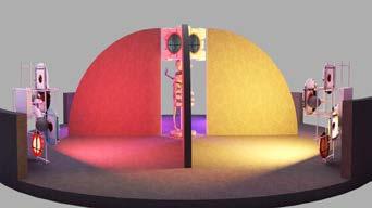
RENDERING OF MANIA SCENE
LIGHT EXPOSURE ANALYSIS
RED AND YELLOW SCENE
PURPLE AND PINK SCENE
LIGHT
SOUND
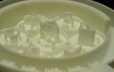
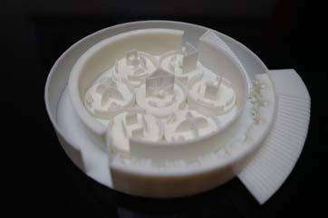
3D PRINTER MODEL
AFFECTING EMOTION
FACTORS
LANDSCAPE INTERIOR ARCHITECTURE

COLLABORATION STRUCTURE
DURATION
MATERIALS EXPENSES EQUIPMENT
Design process draft collection

FLOWER OF WUMENG
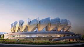
Design of Yunnan Zhaotong Olympic Sports Center
Site Yunnan, China
Time 2016-2018
Professional Work
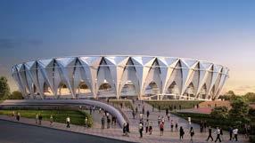
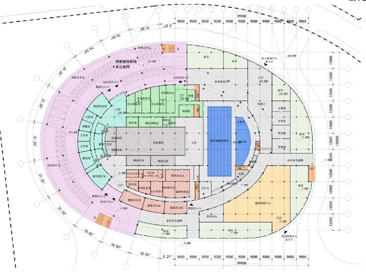
(The overall scheme facade design of the three stadiums and the plane design of the single building of the natatorium)
Part of the completed
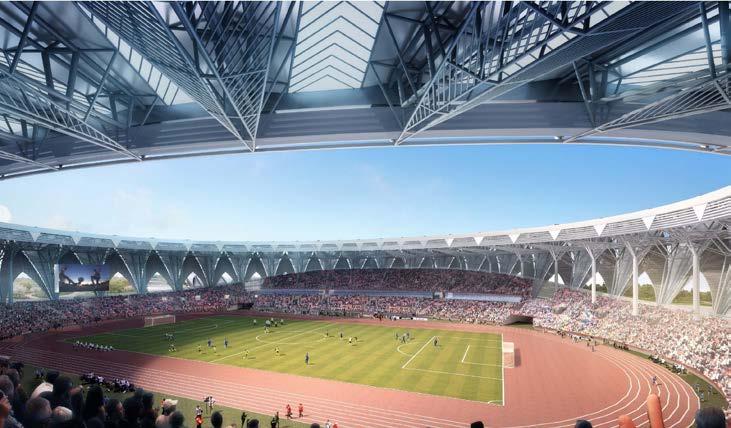
Not all buildings have a stunning facade, as you can see in this building, perhaps it is so unpretentious. But she still condenses my thinking and effort in a year’s work.
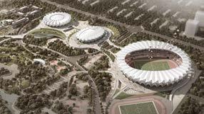
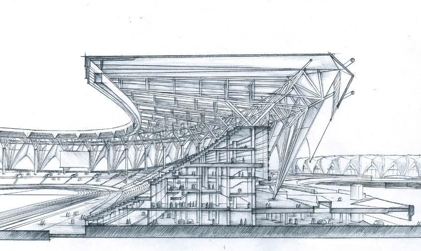
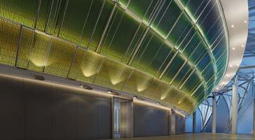
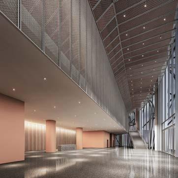
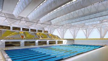
In this project, As the chief designer, I designed three main venues, namely stadium, gymnasium and natatorium, and cooperated with the professionals of architecture, structure, landscape, equipment, engineering cost and sports technology for nearly a year. From sketching over and over again on the paper to drawing all the schemes, I spent most of the year in torment and anxiety. As for a completely unfamiliar design field, I fumbled a little from looking through the materials until I became a designer who could sit down and discuss deeply with the sports technicians. It’s probably a growth for me...
09
I, ARCHITECT, GROW UP
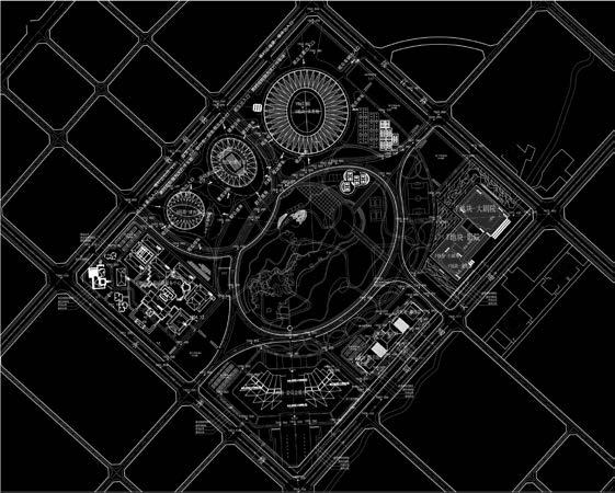
This is an actual engineering project, located in Zhaotong city, Yunnan Province, China. It is the key livelihood project of Zhaotong City, Yunnan Province in 2017, and has been the representative work of my former employer for the past three years.
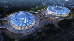
The project includes seven important stadiums such as the gymnasium, the natatorium and a central park with an area of about 33.29 hectares. The main purpose of the project is to welcome the local agricultural expo, to show the image of Zhaotong city and to enhance the cultural and sports life of the local people. The project is now partially completed.
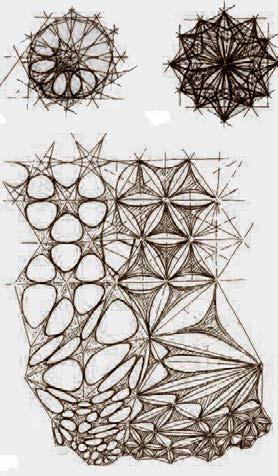
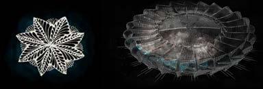
In ancient Times, Zhaotong was called “Wumeng”. Wumeng is a place where “flowers bloom”. The three pavilions are shaped like budding flowers, symbolizing the infinite vitality of the city. The large platform below connects with the Central City Park like a green or grassy field holding up flowers in full bloom.
Sources of Concept


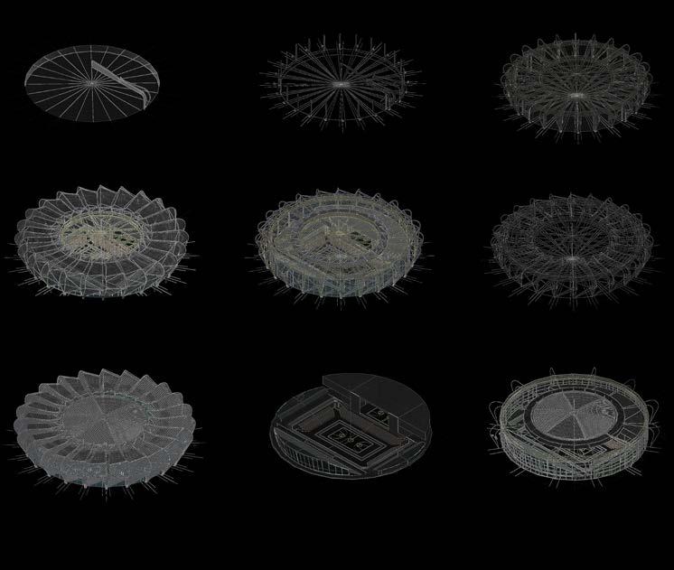
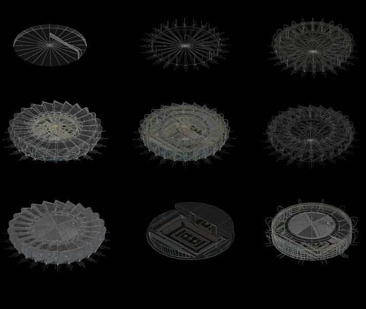
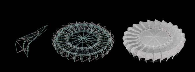
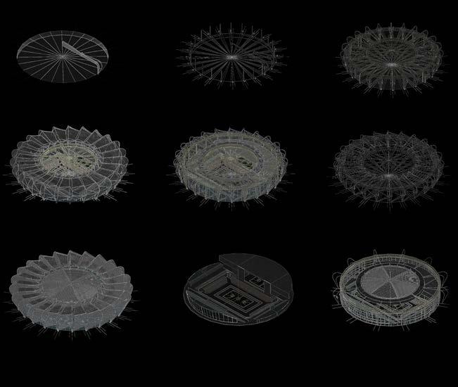
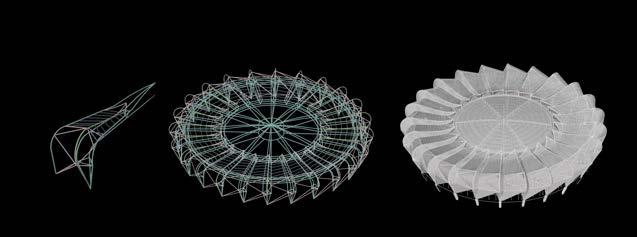
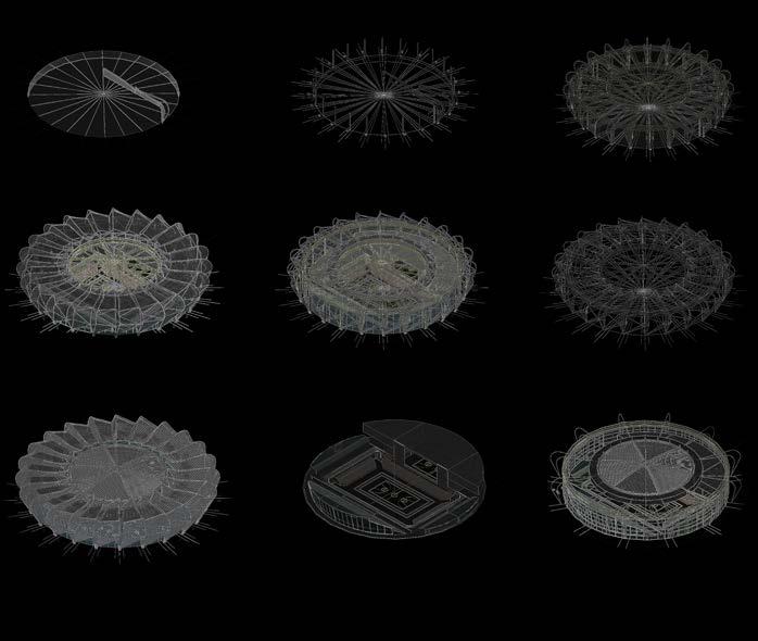
Step 4. Add skin and color At last, I chose 40 equal parts to divide the stadium facade. The figure is a comparison with the scale of human body I chose to study a single petal as the motif How to determine the size of the petal is a process that needs to be tried. imagine, from the perspective of a real person, whether the single petal felt comfortable when he stood in the entrance of the stadium, or whether it was too large and oppressive. The scale of entrance is deduced from the scale of human, and then the scale of single petal is deduced from the scale of entrance. I need to choose a way to divide equally so as to maintain a comfortable scale of top view and human view at the same time. When I have a single petal scale that fits, I then array it to create the overall effect. This is a dynamic balancing process that needs to be tried and tried. 3M 5M 12 Equally divided 24 Equally divided 30 Equally divided 36 Equally divided 40 Equally divided Scale Analysis 45 Equally divided People scale People scale 18
WuMeng, The City of Flower


 A.VIEWS IN BASKETBALL COURT
