4 minute read
PSA POSTER
Coming up with different variations of comps was difficult because I did not want them all to look the same.
Public Service Announcements (PSAs) are messages distributed to inform the public about a variety of issues, often related to health and safety. Their purpose is to encourage people to a change their action through moving posters. We were to choose an issue of importance, research it, draft an all text poster, and create a creative brief outlining ideas about the poster. The brief was then given to a fellow design student to carry out. After recieving the brief, for being open-minded, I made 20 thumbnails sketches of text layouts. Then sketched 5 –7 rough compositions of layouts to show my classmates. We had to use scale, opacity, rhythm, orientation, and negative space to create visual hierarchy. When I started to think of designs for my poster, I thought about what the reader was going to read first, the heading. I had to make sure that the heading was visibly larger than the body sections, but then I had to ensure the call to action was large but not too large. The poster had to have a nice flow, so that the heading drew you in, the call to action intrigued the reader more, then they could read the body paragraph parts to find out more information. I did not want my poster to be too cramped so adding the negative space between each sub section should give it the breathing room it needed.
Advertisement
These are the comps that I decided to expand on, I would alter some of the spacing and where the darker shaded side would be and how much space it would take up.
Orinally the black triangle was in the opposite corner and it was changed because if it is on the top of the page, the eye is drawn to it then the main heading is directly next to it.
It was challenging using only text to create a PSA poster. I am used to creating images to get a point across that I struggled at first. Trying to create a poster that would have the same powerful and moving effect using only text was difficult. It got easier as I created more compsositions because I was experimenting and broadening my understanding of fonts and styles. During this process, I developed more of an understanding on Indesign and that even if a person is limited text, it can still be just as influencial an image. Deciding the type of text was difficult because there were many options. I knew that I wanted the font I chose to have a few subtext, ie. italics, bold, italic bold etc., so that I could work with the same font, but styled differently if neccessary. Backround color was another factor that I had to decide whether it would benefit or hurt my poster. The topic for my poster did not have a color that directly related to it such as a recycling or warning poster, but I wanted to experiement and see if a color would match.
The black section was dividing the page in half, but with the way it is now there is a clear division between the call to action and the main information.
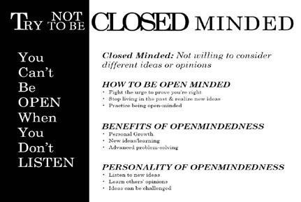
When designing this, I knew that I wanted to decrease the amount of space between the letters in the word ‘closed’ because that would effectitbely but subtibly show the point of the poster. When deciding how to present the information I decided main headings with bullet point lists. This would effectively show the information with ease to reader to know the information they are reading. I decided that color was not needed for this poster because it would distract the audience from the material being presented.
As with the previous poster, I wanted the same concept of decreasing the space in the word ‘closed’, but increase the space between the letters in the word ‘minded’. I felt that this would show the vastness of the mind that contradicts the word ‘closed’. I still decided that the information would be best represented throught bullet points, but the headings are blocks that draw the eye to them. Instead of the headings being aligned the same, it goes with the flow of the black triangle guiding it down the page until it ends then the information aligns. As with the last poster, color would divert the audience from the information on the poster.

For the final iteration, I decided that the landscape poster, with some changes from in-process critque, would be the more successful poster. The heading did not change much, the only exception is the word ‘minded’. From the portrait poster, I liked the idea of expanding the space between the letters so I increased the spacing a bit from what it was priviously. The changes made on the main information was I increased the size of both the headings and the bullet pointed information, aligned all of the information to the left. and spaced out the information to add some negative space. I felt that the font size be increase because I wanted to make the audience would be able to read it from a better distance, but still ensuring that the main heading and the call to action was larger. With all of the information aligned, it gives the poster a neater look and the information is presented in a easier way to read through. For the in-process poster, the information did not take up the whole page. It was squished together, so for the final iteration I expanded the space resulting in using the whole page effectively while leaving some negative space for ‘breathing’ room.


