23 minute read
KRIS KOLODJIEJ, CHIKAKO SASSA, SUSHILA MAHARJAN
THE BOSTON INDUSTRIAL ARCHEOLOGY MAPPING PROJECT
KRIS KOlODJIEJ Massachusetts Institute of Technology Department of Urban Studies + Planning
CHIKAKO SASSA Massachusetts Institute of Technology Department of Urban Studies + Planning
SUSHllA MAHARJAN Massachusetts Institute of Technology Department of Urban Studies + Planning
ABSTRACT
In an ongoing pilot project initiated in September of 2001, the Boston Public Health Commission (BPHC), in collaboration with the Department of Urban Studies and Planning at the Massachusetts Institute of Technology (MIT), has developed a methodology to superimpose historical and present-day industrial land use datalayers with demographic information and public health data to map areas of substantial environmental risk within the city of Boston, Massachusetts. Historic datalayers showing location and type of industries known to emit hazardous substances were interpreted from Sanborn Fire Insurance maps in the years 1888 and 1962. These historic industries, along with current-day industries listed under the Massachusetts Department of Environmental Protection Tier 21 and Major Facility databases, were classified according to the Standard Industrial Classification Manual (SIC) published by the U.S. Department of Labor, and linked to tables of hazardous chemicals associated with each type of industry. Using a Geographic Information System (GIS) (ArcView), the historic datalayers were then overlaid with present-day census and public health data, and a customized "spatial filtering" function was developed to highlight "hot spot" areas of significant industrial activity and combined risk potential accumulated over time. The result is an "archeology" of risk. The intent is to produce a planning tool for strategic environmental health intervention to serve professionals in government and the private sector, such as public health professionals, legislators, city planners, and environmental designers.
BACKGROUND
Despite improvements over the years owing to technological innovations and increased emphasis on multi-stakeholder input, decision-making processes involving land use planning are often conducted with little or no consideration of a site's history. A parcel of land used for residential or commercial building might once have been a leather tannery, lead smelter, or foundry. Add to this historic patchwork of successive industries the current mix of residential, commercial, and industrial zoning and land uses, and the result is a complex tapestry of in situ conditions with potential environmental health problems.
As the use of land changes over time, remnants of prior land use are either demolished or buried beneath new construction and are effectively rendered invisible. It is essential that we penetrate the invisibility of historical land use in terms of the chemical makeup of the land that has resulted from previous uses. This is because some chemicals may remain on the land long after their initial discharge. The threat of chemical contamination from previous land uses presents a critical need for public health intervention to prevent environmental hazards from adversely affecting today's susceptible populations.
Efforts to unmask this chemical invisibility currently lack systematic methodology. In addition, information on exact types and amounts of chemicals used historically in industries of the past, and actual measurements of contamination found on any given parcel of land due to such prior land use, are currently undocumented and unavailable. Formal recording of data by relevant governmental agencies, such as planning departments and assessors offices, supply quantitative information about historical zoning codes, and, to a minimal extent, types of industries previously present. Such information is, however, limited by its decentralized, unsystematic, and generally inaccessible nature, and is not effectively incorporated into land use decision-making processes today.
This paper, then, advocates a systematic methodology for documenting and analyzing the chemical invisibility of past industrial activities, in an effort to better understand present-day environmental risk. This pilot project has been developed jointly by the Department of Urban Studies and Planning at the Massachusetts Institute of Technology (MIT) and by the Boston Public Health Commission (BPHC). The use of GIS was crucial and catalytiC to our project, which not only enabled the visual superimposition of historical and present-day industrial land uses, but also facilitated a time-series analysiS of degrees of "hotness," or possible con-
tamination levels, over our study area. Note that our research lies in the realm of qualitative analysis; not enough data were available to give reasonable estimates of chemical use or release in past land uses.
STUDY AREA
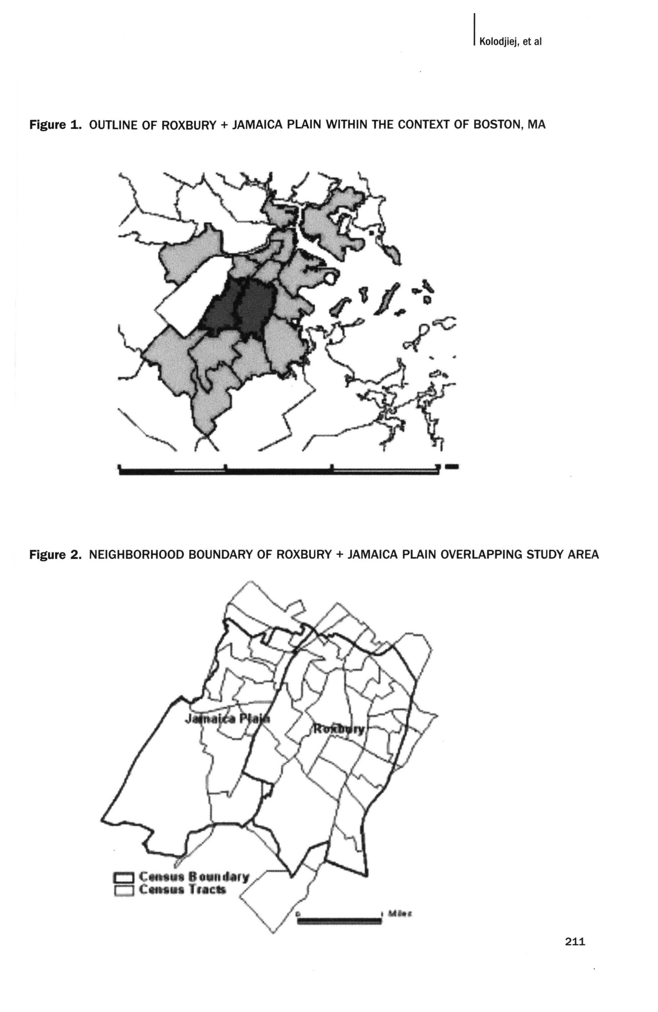
Our study area for this pilot project involved the neighborhoods of Roxbury and Jamaica Plain within the city of Boston, Massachusetts. Boston has had a rich and extensive history of varied industries and land 'uses beginning in the 17th century, when initial waves of industrial development traveled from the Shawmut Peninsula frontier toward inland neighborhoods of modern-day Roxbury and Jamaica Plain. Boston's location on the eastern seaboard made it an important transfer pOint for both commerce and technology, and provided a stimulus for innovations by local craftsmen, mechanics, entrepreneurs, and engineers (Stott, 1987). Boston has since spawned numerous industries ranging from shipbuilding, distilling of rum, breweries, cordage, textiles, ice, and granite to pianos and organs, iron foundries, shoes, furniture, and Italian confectionery. Contemporary Boston retains many of its historical artifacts to a
degree paralleled by few other American cities. While skyscrapers abound in the business district and along the spine of the Back Bay, they have not yet destroyed the spatial integrity of the nineteenth-century city (Bergen, 1990). This spatial integrity of Boston lends ease, as well as delight, to the industrial archeologist imagining the city at an earlier time.
Our study area is a cluster of census tracts located within the neighborhood boundaries of Roxbury and Jamaica Plain as defined by the Boston Redevelopment Authority. In due consideration of historical discrepancies in jurisdictional definitions, we have considered a few tracts that lie beyond the modern BRA-defined boundaries of Roxbury and Jamaica Plain to reflect their broader geographical implications. The unit area for our analysis is a census tract, which is the smallest unit used by the Census Bureau to aggregate demographic data. We used the 1990 census tract boundaries to map risks of industrial facilities that existed at three different times: 1880, 1960, and 1997. 1880 was the earliest year in which a comprehensive map of Roxbury and Jamaica Plain was documented, and was thus chosen as the starting point in our exploration of Boston's industrial history. The year 1960 very roughly marked the midpoint between 1880 and the current year of 2002, and also reflected a time when Boston's industrial activity rose to great heights.
Figure 1. OUTLINE OF ROXBURY + JAMAICA PLAIN WITHIN THE CONTEXT OF BOSTON, MA
Figure 2. NEIGHBORHOOD BOUNDARY OF ROXBURY + JAMAICA PLAIN OVERLAPPING STUDY AREA
METHODS
This project was composed of three phases: (1) digitizing and data entry of location and type of industrial facility present over three time periods; (2) identifying chemical pollutants that were likely to have been generated by each historical industrial facility, and determining their relative hazard levels; and (3) GIS data analysis.
Sanborn Fire Insurance maps from the years 1888, 1962, and 1968 were used as our primary source of historical data. They provided detailed and comprehensive information on the type of industry present at the time and its inferred land use, building typology, building footprint, and limited physiographical details about the landscape, such as presence of bluffs and streams. The digitizing process began with a careful surveillance of Sanborn sheet maps to identify any industrial facility that was suspected of having relevant effects on public health. Facilities that were considered potentially harmful included metal foundries, breweries, auto-repair shops, sheet metal works, gasoline stations, and hospitals, to name a few. Then, using ArcView, these industrial facilities were each entered as pOint features at geographical orientations that roughly corresponded to the original Sanborn maps. Perfect correspondence between geographical locations on the Sanborn maps and the digital map in ArcView was difficult, given the altered matrix of streets and blocks over time. The 1888 datalayer consisted of facilities found in the 1888 Sanborn map, and the 1962 data layer resulted largely from the 1962 Sanborn map, but also from a nominal portion of the 1968 Sanborn map in the interest of achieving the spatial integrity of our study area. Both the 1888 and 1962 datalayers were comprised of three base themes: 1997 Boston parcels, 1997 TIGER roads, and Ortho-photos. Then, a third datalayer containing information on current (i.e., 1997) .industrial facilities was created using the Massachusetts Department of Environmental Protection (DEP) Tier 21 and Major Facility databases. The attributes of each point included a unique identifier, the name of the facility, and the type of facility, according to the Occupational Safety & Health Administration (OSHA) Standard Industrial Classification (SIC) codes.
After classifying each industrial facility by SIC code, we tabulated types of chemical contamination associated with each SIC code using data from the federal CERCLIS (Superfund) and ARIP (Accidental Release Information Program) databases and the Massachusetts TURA (Toxics Use Reduction Act) database. For the purpose of this research, we used the entire historical CERCLlS, 1999 ARIp, and 1997 TURA datasets. Specifically, look-up tables were prepared in which historically recorded contamination and spills were tabulated by SIC code. Having identified
the historical sites in the study area by SIC code, we then linked commonly associated pollutants with each SIC code using the lookup table.
Ranking Hazards of Place
Starting with the mapping of historical facilities and linking them to their associated contaminants using the chemical lookup table, we then proceeded to develop a qualitative ranking methodology. We devised two ranking systems, each tailored to suit different ways of analyzing the resultant panorama of industrial archeology. One ranking system involved applying similar ranking scales to facilities in all three datalayers, regardless of the passage of time since the chemicals were originally discharged. This ranking system is amenable to observing snapshots of the
Figure 3. CUMULATIVE HAZARD RANKING SYSTEM
Hazard Rank 1 Hazard Rank 2 Hazard Rank 3
1888 obsolete obsolete
1962
obsolete active active active obsolete = 0 point; active = 1 point
1997
active active active
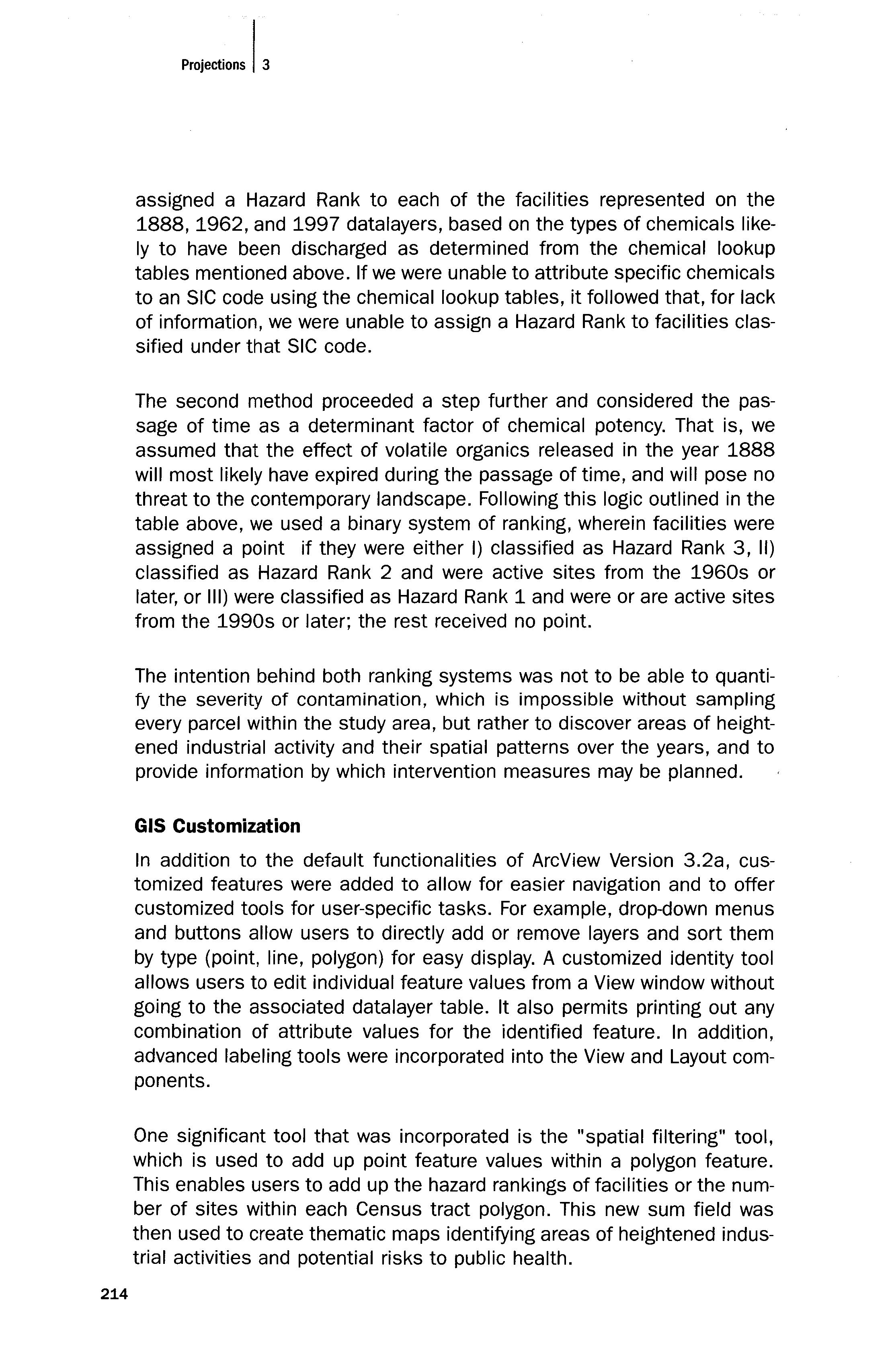
Figure 4. CUSTOMIZED GUI SHOWING BUnONS + TOOLS
Get Orthos tool
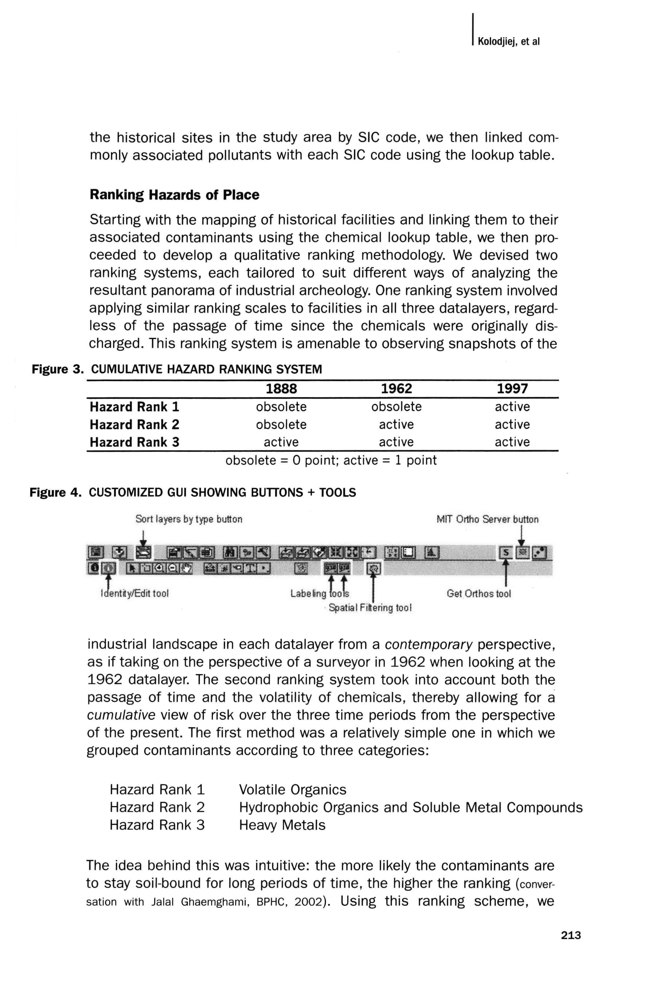
industrial landscape in each datalayer from a contemporary perspective, as if taking on the perspective of a surveyor in 1962 when looking at the 1962 datalayer. The second ranking system took into account both the passage of time and the volatility of chemi'cals, thereby allowing for a cumulative view of risk over the three time periods from the perspective of the present. The first method was a relatively simple one in which we grouped contaminants according to three categories:
Volatile Organics Hazard Rank 1 Hazard Rank 2 Hazard Rank 3
Hydrophobic Organics and Soluble Metal Compounds Heavy Metals
The idea behind this was intuitive: the more likely the contaminants are to stay soil-bound for long periods of time, the higher the ranking (conver-
sation with Jalal Ghaemghami, BPHC, 2002). Using this ranking scheme, we
assigned a Hazard Rank to each of the facilities represented on the 1888,1962, and 1997 datalayers, based on the types of chemicals likely to have been discharged as determined from the chemical lookup tables mentioned above. If we were unable to attribute specific chemicals to an SIC code using the chemical lookup tables, it followed that, for lack of information, we were unable to assign a Hazard Rank to facilities classified under that SIC code.
The second method proceeded a step further and considered the passage of time as a determinant factor of chemical potency. That is, we assumed that the effect of volatile organics released in the year 1888 will most likely have expired during the passage of time, and will pose no threat to the contemporary landscape. Following this logic outlined in the table above, we used a binary system of ranking, wherein facilities were assigned a point if they were either I) classified as Hazard Rank 3, II) classified as Hazard Rank 2 and were active sites from the 1960s or later, or III) were classified as Hazard Rank 1 and were or are active sites from the 1990s or later; the rest received no point.
The intention behind both ranking systems was not to be able to quantify the severity of contamination, which is impossible without sampling every parcel within the study area, but rather to discover areas of heightened industrial activity and their spatial patterns over the years, and to provide information by which intervention measures may be planned.
GIS Customization
In addition to the default functionalities of ArcView Version 3.2a, customized features were added to allow for easier navigation and to offer customized tools for user-specific tasks. For example, drop-down menus and buttons allow users to directly add or remove layers and sort them by type (point, line, polygon) for easy display. A customized identity tool allows users to edit individual feature values from a View window without going to the associated datalayer table. It also permits printing out any combination of attribute values for the identified feature. In addition, advanced labeling tools were incorporated into the View and Layout components.
One significant tool that was incorporated is the "spatial filtering" tool, which is used to add up point feature values within a polygon feature. This enables users to add up the hazard rankings of facilities or the number of sites within each Census tract polygon. This new sum field was then used to create thematic maps identifying areas of heightened industrial activities and potential risks to public health.
Methodological Limitations
Many assumptions were made in the processes described above, which compromised the robustness of our analysis in the following section. First, the problem of consistency was inevitable when much personal speculation went into the process of assigning SIC codes to industrial facilities. Sanborn maps often did not provide enough information about the preCise nature and magnitude of industrial activities at specific sites, thereby requiring the researcher to make her best educated guess. These guesses were invariably biased, and we tried to bridge these differences to the best of our abilities by convening regular meetings to rectify or challenge each other's assignment of SIC codes. The problem of documentation is further complicated by the fact that not all hazardous facilities were documented both by the Sanborn maps and the DEP databases. The Sanborn maps were commercial in purpose, catering to the needs of insurance companies assessing the risk of fire hazards when insuring properties. This meant that Sanborn maps only documented areas where people could and would invest in fire insurance; thus, underpopulated or economically disadvantaged communities were likely not to have been documented for lack of demand. It is precisely in areas of poor socioeconomic status that hazardous facilities are often located, and this proves to be another compromising factor in our analysis. In the future, other sources of historical information such as assessors' data and real estate maps need to be considered in order to more accurately capture the scope of contamination in disadvantaged communities. Finally, we recognize the problem of generalization in all stages of assigning risk to each facility. Not all facilities having the same four-digit SIC denomination are likely to follow identical methods of production and thus emit identical chemicals; also, not all chemicals will behave in the same manner and persist over equal lengths of time. Our project did not take into account probable variations in the fate and transport of chemicals, which require closer inspection in future research.
ANALYSIS AND DISCUSSION
Overview of Time Series Maps and Composite Maps
The methodology described above produced maps showing the magnitude and spatial orientation of industrial activities over three points in time, which translate into environmental risks likely to have accumulated over time on present-day parcels in Roxbury and Jamaica Plain. Our analysis mainly consisted of two parts: Time Series mapping and Composite Overlay mapping. Time Series maps look at the number and spatial orientation of noxious facilities, the extent and spatial orientation of hot spots, and indicate other relevant analyses at different points in the
industrial history of our study area. In essence, they represent snap shots of past industrial landscapes as seen from a contemporary perspective. Thus, an 1888 data layer showing hot spots is seen from the perspective of an observer situated in 1888, which could then be compared to a 1962 datalayer seen in 1962, and so on, enabling planners and historians to peer into the history of land use and spatial patterns of change. Through the use of Time Series mapping, we can investigate various environmental planning and public health problems. One practical application would be to determine efficient allocation of funds toward brownfield remediation, in a manner that would target only those tracts having Hazard Rankings above a certain threshold.
The Composite Overlay, on the other hand, results from the second ranking method, wherein the passage of time becomes a factor in determining the potency of certain chemicals. This allows all three layers to be superimposed onto one map that suggests the cumulative effect of industrial activities over time and highlights areas of heightened environmental risk in our contemporary landscape. This tool is extremely useful for public health professionals in determining intervention strategies in an efficient, need-based manner. Through these analyses, we addressed some of the most commonly asked planning questions, such as:
Where are the areas that have the highest concentration of hazardous facilities?
Which are the tracts having the highest number of people exposed to environmental risks posed by these facilities?
What spatial patterns are indicated over a period of years? Are the current hot spots located in the same area as in previous years?
How are hot spots distributed over time?
Overlaying Demographic Data
Once having mapped the hot spots, we can further investigate the abovementioned problems by overlaying different present-day environmental and health datalayers. Layers showing blood lead ratio and asthma rates in children are some examples. The overlay of these layers over the hot spot layers can display overlapping areas between these maps and indicate whether these overlapping areas are correlated. However, this is just an informational tool. It is not correct to assume causation between these sites and health problems that occur in and around them, because of the complexities of health data. First, the populations are mobile, and
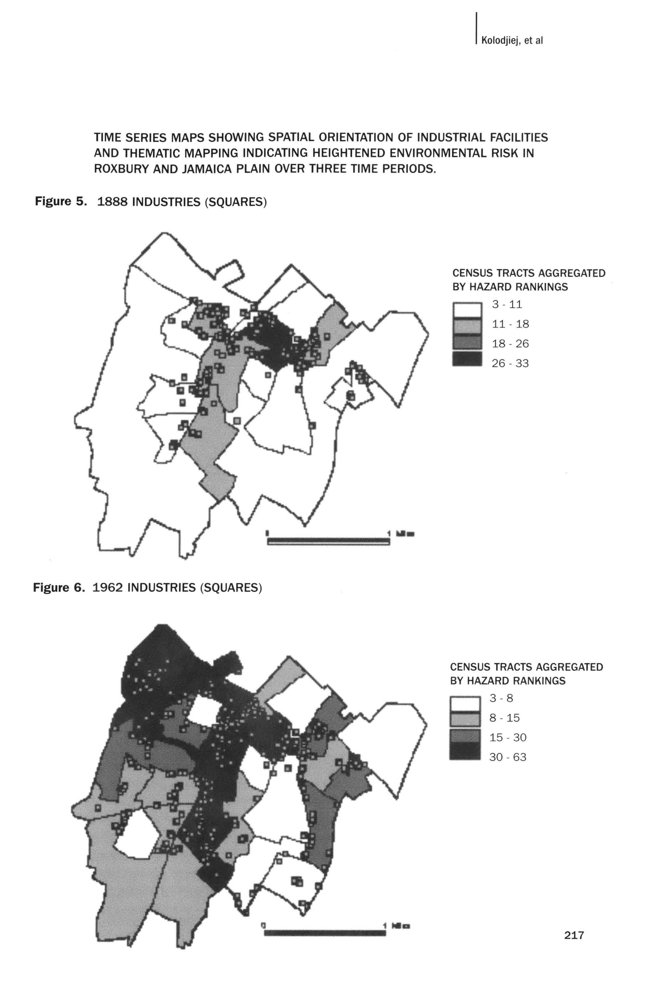
TIME SERIES MAPS SHOWING SPATIAL ORIENTATION OF INDUSTRIAL FACILITIES AND THEMATIC MAPPING INDICATING HEIGHTENED ENVIRONMENTAL RISK IN ROXBURY AND JAMAICA PLAIN OVER THREE TIME PERIODS.
Figure 5. 1888 INDUSTRIES (SQUARES)
CENSUS TRACTS AGGREGATED BY HAZARD RAN KINGS
3 - 11
11-18
18 - 26
26 - 33
Figure 6. 1962 INDUSTRIES (SQUARES)
CENSUS TRACTS AGGREGATED BY HAZARD RAN KINGS
3-8
8 -15
15 - 30
30 - 63
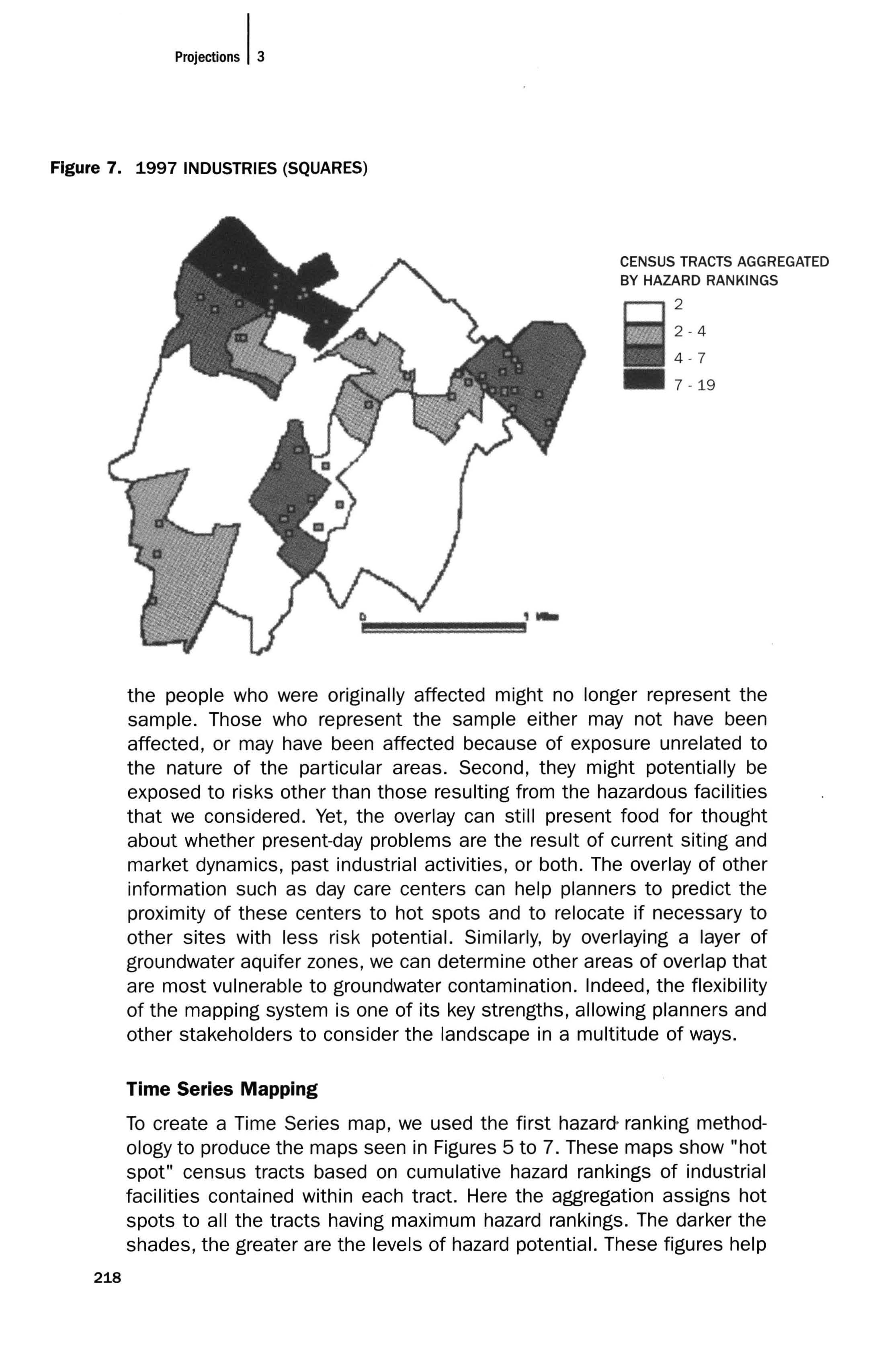
Figure 7. 1997 INDUSTRIES (SQUARES)
CENSUS TRACTS AGGREGATED BY HAZARD RAN KINGS 2
2-4
4-7
7 -19
the people who were originally affected might no longer represent the sample. Those who represent the sample either may not have been affected, or may have been affected because of exposure unrelated to the nature of the particular areas. Second, they might potentially be exposed to risks other than those resulting from the hazardous facilities that we considered. Yet, the overlay can still present food for thought about whether present-day problems are the result of current siting and market dynamics, past industrial activities, or both. The overlay of other information such as day care centers can help planners to predict the proximity of these centers to hot spots and to relocate if necessary to other sites with less risk potential. Similarly, by overlaying a layer of groundwater aquifer zones, we can determine other areas of overlap that are most vulnerable to groundwater contamination_ Indeed, the flexibility of the mapping system is one of its key strengths, allowing planners and other stakeholders to consider the landscape in a multitude of ways.
Time Series Mapping
To create a Time Series map, we used the first hazard- ranking methodology to produce the maps seen in Figures 5 to 7. These maps show "hot spot" census tracts based on cumulative hazard rankings of industrial facilities contained within each tract. Here the aggregation assigns hot spots to all the tracts having maximum hazard rankings. The darker the shades, the greater are the levels of hazard potential. These figures help
Figure 8. 1962 HOT SPOTS NORMALIZED BY CENSUS TRACT AREA
AGGREGATED HAZARD RANKINGS PER CENSUS BLOCK NORMALIZED BY AREA 0.000004 - 0.00002
0.00002 - 0.000048
0.000048 - 0.000075
0.000075 - 0.000132
HAZARD RAN KINGS OF 1962 FACILITIES
• • 1 2
• 3
Figure 9. 1962 HOT SPOTS NORMALIZED BY POPULATION PER CENSUS TRACT
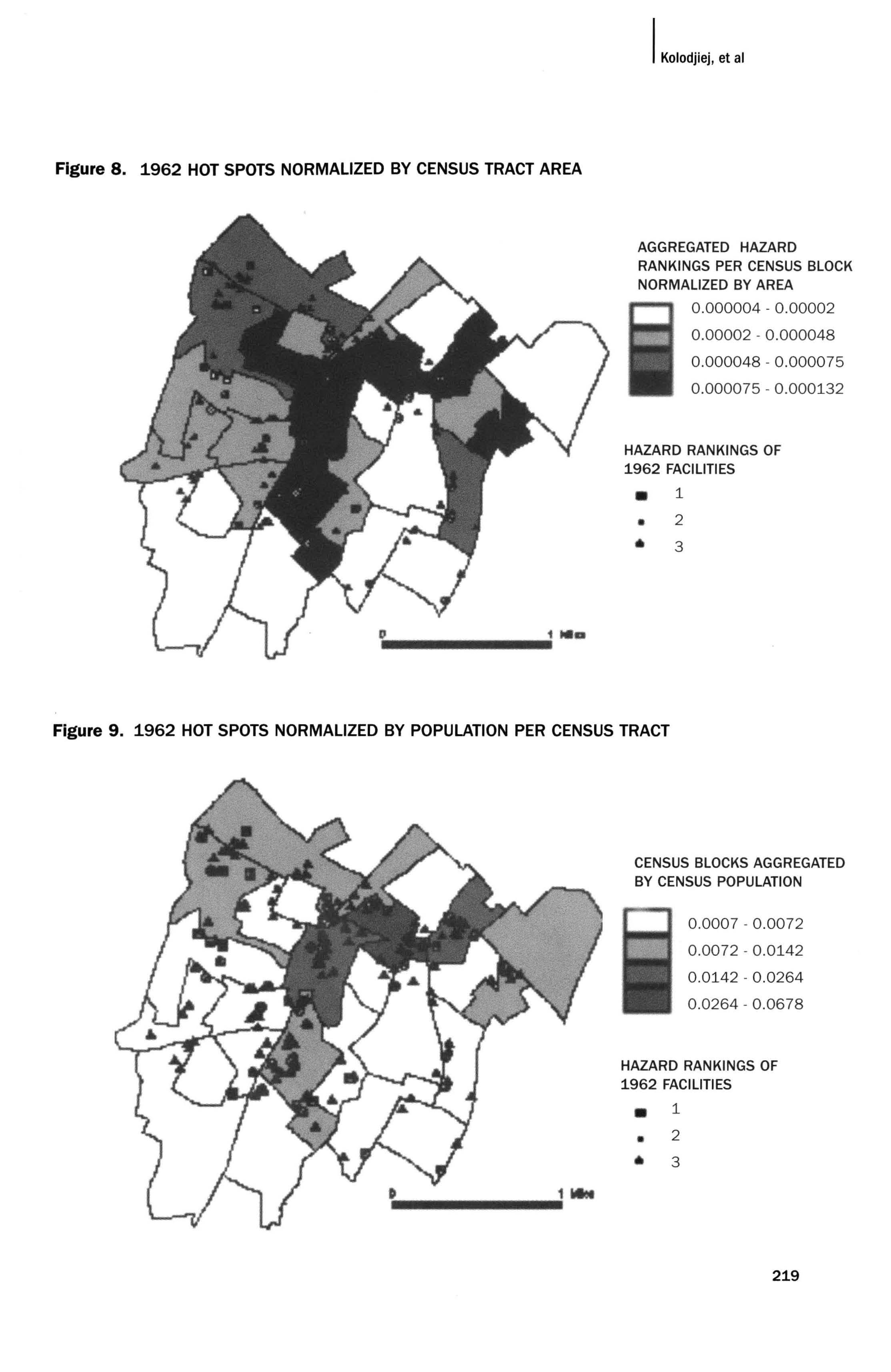
CENSUS BLOCKS AGGREGATED BY CENSUS POPULATION
0.0007 - 0.0072
0.0072 - 0.0142
0.0142 - 0.0264
0.0264 - 0.0678
HAZARD RAN KINGS OF 1962 FACILITIES
1
2
3
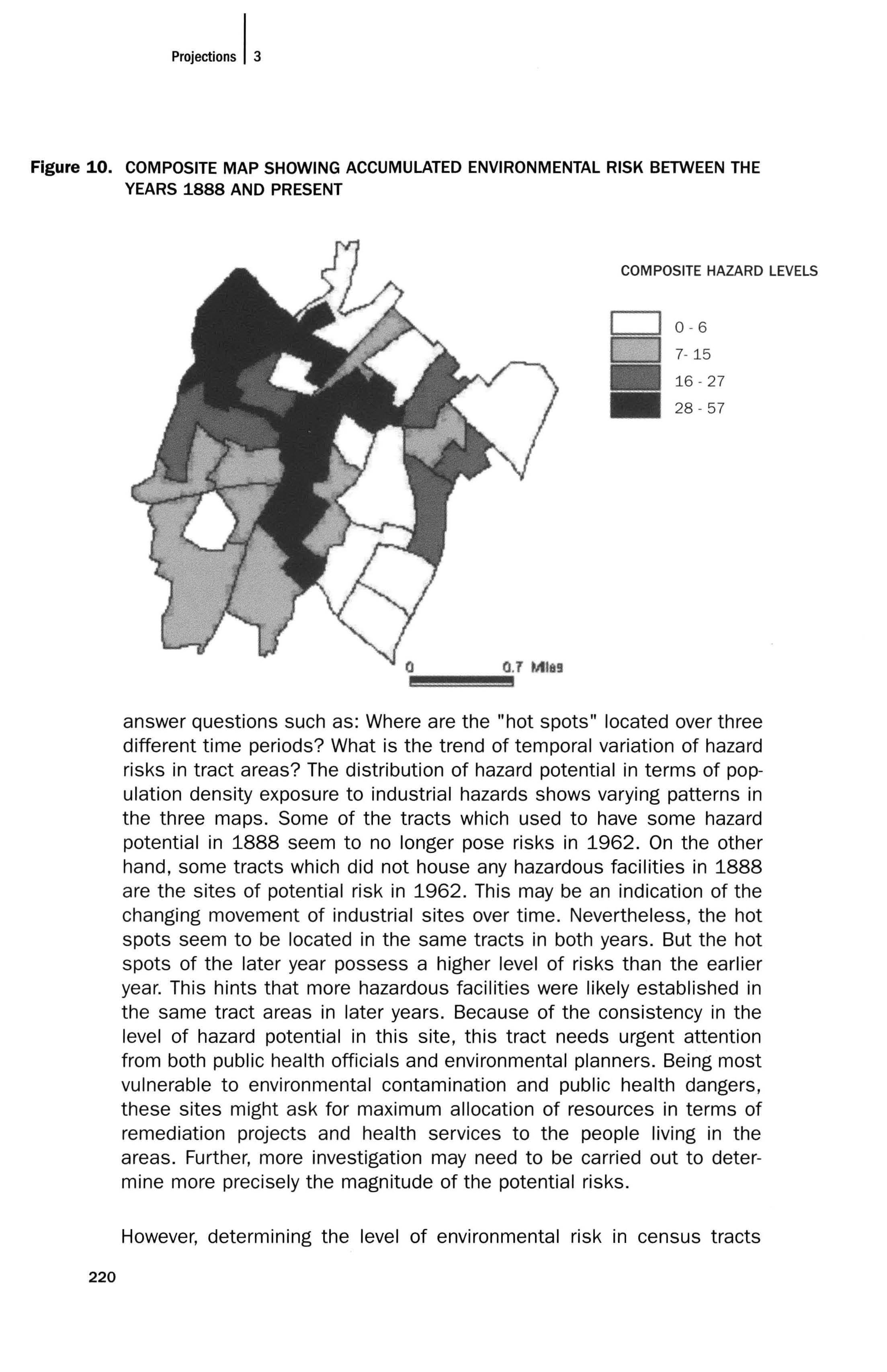
Figure 10. COMPOSITE MAP SHOWING ACCUMULATED ENVIRONMENTAL RISK BETWEEN THE YEARS 1888 AND PRESENT
COMPOSITE HAZARD LEVELS
0 - 6
7- 15
16 - 27
28 - 57
answer questions such as: Where are the "hot spots" located over three different time periods? What is the trend of temporal variation of hazard risks in tract areas? The distribution of hazard potential in terms of population density exposure to industrial hazards shows varying patterns in the three maps. Some of the tracts which used to have some hazard potential in 1888 seem to no longer pose risks in 1962. On the other hand, some tracts which did not house any hazardous facilities in 1888 are the sites of potential risk in 1962. This may be an indication of the changing movement of industrial sites over time. Nevertheless, the hot spots seem to be located in the same tracts in both years. But the hot spots of the later year possess a higher level of risks than the earlier year. This hints that more hazardous facilities were likely established in the same tract areas in later years. Because of the consistency in the level of hazard potential in this site, this tract needs urgent attention from both public health officials and environmental planners. Being most vulnerable to environmental contamination and public health dangers, these sites might ask for maximum allocation of resources in terms of remediation projects and health services to the people living in the areas. Further, more investigation may need to be carried out to determine more precisely the magnitude of the potential risks.
However, determining the level of environmental risk in census tracts
according to the sum of hazard rankings will not be amenable to comparison between tracts that have differences in area, population density, income levels, and other social indicators. In order to obtain the comparable distribution of hot spots across the study area, we normalized the aggregated hazard ranking by the indicator by which we wanted to measure the hazard potential. For example, for producing risk mapping based on density of hazardous facilities, we normalized the aggregated hazard ranking of the tract by its area. Figure 8 shows the outcome of this normalization and narrows down the hot spots to only those areas having high-density hazard potential, i.e., high concentration of hazard facilities.
Some census tracts have higher population density than others, and as such these areas have different levels of population exposure to the risks. Therefore, we normalized the aggregated hazard rankings by the number of people in each tract, and produced the map shown in Figure 9, which quantified risk in relation to the number of people exposed to the hazardous facilities. Again, the darker the shade, the greater is the degree of population density vulnerable to the unit of risk. This layer can be used as a mapping of areas for designing health related programs, for example building health facilities. By picking the darkest-shaded tracts having the highest degree of risk and the largest population density, we can now efficiently allocate resources to build health facilities that serve the largest affected population. Similarly, by normalizing by other indicators, we can answer other questions, such as: Which tracts have the highest level of child exposure to environmental hazards? Are the most at-risk tracts located in low-income or minority areas? These tools promise to open a new debate regarding disproportionate exposure, providing new evidence that goes beyond cross-sectional analysis of present-day facilities and surrounding populations.
Composite Mapping
Using the second of the two ranking methods described above, a composite map was created. The areas darkest in hue represent those census tracts suffering the highest levels of environmental risk accumulated over the past 200 years; incidentally, the areas highest in risk form a corridor down the middle of our study area, directly overlapping with the railway system. The hot spots contain various modern land uses including residential areas, and may warrant further investigation into the health of residents occupying areas of potential threat to themselves and their children.
CONCLUSION
This pilot project has succeeded in producing a mapping tool for professionals in government and private industries to use to better gauge environmental risk accumulated over time. The investigators of this project explored various uses of such a tool to conduct research and design health intervention programs in a way that enables them to target the zones of greatest concern. Moreover, communities can utilize this mapping tool as a community information system in an attempt to mobilize around issues of health and potential risk. Developers and communities, in partnership, can use the mapping to make better investment decisions and to allocate funds more aggressively for clean-up.
This pilot project has shown that digital cartography, and the spatial database that goes with it, can greatly aid public health officials in visualizing risk, identifying hot spots, and devising policy interventions accordingly. In addition, this project was an effort to move mapping beyond representations of concrete, immediate spatiality and onto other complementary logics; whereupon we realized, upon reflection, that mapping has always been about more than just representing the physical. Overall, the maps
have the potential to enhance the understanding of how many communities find themselves having to bear a history of neglect and, more importantly, to increase the possibility of creating a better and healthier future for the public.
Acknowledgments
The authors express their gratitude to Raul Lejano, who directed the project and provided valuable assistance throughout. We would also like to thank the Boston Public Health Commission (BPHC) for funding this project. Most importantly, the authors wish to thank Thomas Plant, Jalal Ghaemghami, Paul Shoemaker, and John Shea of the BPHC Environmental Health Division for their insight, input, and support. Portions of this article were taken from the text and figures in User's Manual: Boston Industrial Archeology Trial Mapping Interface, Version 1.0 (MIT, 2002), a technical report submitted to the Boston Public Health Commission.
REFERENCES
Bergen, P. (1990). Old Boston in early photographs, 1850-1918: 174 prints from the collection of The Bostonian Society. New York: Dover Publications.
Gustafson, P. (2001). Meaning of place: Everyday experience and theoretical conceptualiza-
tions. Journal of Environmental Psychology, 21, 5-16.
Stott, P. (1984). A guide to the industrial archeology of Boston proper. Cambridge: MIT Press.
United States Department of Labor, Occupational Safety and Health Administration. (2002). North American industry classification system search. www.osha.govjoshstatsjsicser.html (visited 2002, October 24).
