MIT Architecture
Volume 02 Imprint 01: Intro + 02: Foreword + 03: Stuff + 04: Space + 05: Site + 06: Closing
Massachusetts Institute of Technology
Imprint is a publication designed and compiled by graduate students at MIT Architecture. A collective document that makes space for every student who submits work, Imprint privileges breadth and inclusion. It is a material trace that documents the Department of Architecture over the course of one year. Each issue encapsulates current critical and creative work produced across discipline groups and formats.
2022
Imprint 03 marks a return, an arrival for some, and a reunion for most. This third issue is the first volume to collect and bind together work that has been produced with full access to our studios and shops. Sprinkled throughout are interviews that reflect not only the research being done within the Department but also the indispensable day-to-day work that is all too often overlooked. This issue is a spotlight on material artifacts, physical interactions, and sites of encounter. By gathering the objects that we make, spaces that bring us together, and places that we imagine, it asks: How should we engage with topics, groups, and locations outside of ourselves? Ultimately, Imprint 03 is a reflection on work through a celebration of collective discourse, exchange, and collaboration.
Imprint 03 Volume 02 MIT Architecture
Advisors
Miko McGinty + Nicholas de Monchaux + Aidan Flynn
Designers & Editors
Tejumola Bayowa + Patricia Dueñas Gerritsen + Jay Maddox
Proofreader
Zachariah DeGiulio
Fonts
Tartuffo designed by Bouk Ra, Lift Type Victor Serif designed by KOMETA
AG Book Pro designed by Günter Gerhard Lange, H. Berthold Typefoundry
Image credits
p. 19, p. 21 (top), pp. 32–33, p. 34, p. 36, p. 37 (top), p. 69 (top right), p. 70, p. 71 (top), p. 75 (top right), p. 77 (top), p. 80 (top), p. 83 (bottom), p. 83 (top left), p. 86, p. 89 (middle right), p. 89 (middle left), p. 89 (bottom), pp. 90–91, p. 93 (top right), p. 93 (bottom left), p. 93 (bottom right), p. 95 (bottom left), p. 101 (bottom left), p. 101 (bottom right), pp. 109–111, p. 112 (top), p. 114 (top), p. 115 (top), p. 115 (middle), p. 116, p. 117 (bottom), pp. 118–119, p. 125 (top left), p. 125 (bottom), p. 126 (top left), p. 228, p. 229 (top), p. 241 (top), 311 (middle), p. 311 (top), pp. 314–317, pp. 323–325, p. 326 (top), p. 329 (bottom), p. 330 (top), p. 331 (bottom left), p. 331 (bottom right), p. 332–333, p. 336 (top), p. 339, p. 340 (top), p. 340 (middle), p. 342 (middle), p. 342 (bottom), p. 344 (bottom), p. 345 (top), p. 347 (top), p. 348 © Andy Ryan
pp. 6–11, p. 15, pp. 191–192, pp. 200–207, p. 225, pp. 382–385 © Daisy Ziyan Zhang
p. 179 (bottom) © Stewart Haotian Wu
Printed and bound in Mexico
© MIT Architecture
All rights reserved. No parts of this book may be reproduced in any form by any electronic or mechanical means, including information storage and retrieval systems, without written permission from the publisher.
Course descriptions were provided by the instructor of the course or studio; project descriptions were provided by students. All text has been edited by the editorial team. Visual material was provided by the author unless otherwise stated.
Contact
Massachusetts Institute of Technology
School of Architecture and Planning
Department of Architecture
77 Massachusetts Avenue
Room 7-337
Cambridge, MA 02139
arch-pub@mit.edu
Imprint 03
Content 001–003: 004–012: 013–176: 177–222: 223–381: 382–389: Intro + Foreword + Stuff + Space + Site + Closing 3
Like some of the best things at MIT, the volume you are holding hopes to fulfill a promise while at the same time conducting an experiment.
The promise is twofold. Imprint has its origin in a commitment we made as a community during the pandemic lockdown of 2020 and 2021, as the result of its (still-reverberating) effects on our well-being and creative connection to each other. In the summer of 2020, a group of students, supported by the department, developed the concept, and eventually the layout, for Imprint—a publication that would make students’ work visible to each other, and the world, at a time when we had lost the ability to connect creatively in real space. As the pandemic recedes (somewhat) and we (reluctantly) accustom ourselves to its lingering effects, there is a second part of this promise, too. This is a commitment we have made to learn as much as we can from the stresses and (rare) opportunities of pandemic learning, to improve and expand our sense of the possible in the day-to-day running of our department for years to come. As a part of this commitment, then, is Imprint 03: this volume records the work and activity of a transition year, 2021–2022, when we were here, and not here; engaged, but not always together; and most of all, rebuilding our shared experience and what we hope for it.
This is the sense in which this volume is an experiment, too—not least because all the work it contains was produced, experimentally, during our full-time return to our studio spaces and was part of a process of reimagining what these spaces, and the work they contain, could be. Imprint also experiments here, with itself. How can the publication of our work be a resource to our community? How can it help us better connect with each other, and the larger communities we are connected to? If you are reading this—now, or even fifteen years into the future—we hope you’ll let us know what you think.
Envisioning this printed record has been a shared effort, with dozens of students joining workshops, lectures, and conversations on print and architecture, and undertaking the conception and layout of what you hold. Thanks go to our guests and collaborators in these conversations in the spring and summer of 2022: Christy Anderson, Tejumola Bayowa, Ai Bui, Mara Diavolova, Patricia Dueñas Gerritsen, Nina Huttemann, Jay Maddox, Romy Saint Hilaire, Emily Wissemann, and Ina Wu. Thanks go also to Amanda Moore, Communications Strategist in the Department of Architecture, to Aidan Flynn, who played a crucial role in this work as a postgraduate fellow, and to Lecturer Miko McGinty, who facilitated and supported these conversations, beginning in the summer of 2020. And thanks finally to the students who conceived and created this publication, and all the work within.
With appreciation, Nicholas de Monchaux01
01: MIT Architecture Department Head
Foreword
Letter from the Editors
As we look back on this past year, we are struck by our new appreciation for the quotidian. Full access to our studios and shops, being able to interact face-to-face, and opportunities to travel were once parts of our education that we took for granted. Yet it is precisely because of this that the thematic chapters for this issue— stuff, space, and site—are quite general. The return to in-person work has not been a simple “back to normal,” as it has pushed us to critically reconsider established pedagogies, histories, and routines.
In our curatorial approach, we return to the etymology of the word curate—to care for. Our intention is to curate by bringing people together. In this issue, the individual is represented through their relation with others; work does not come from a bubble but through conversation and collaboration. Rather than attempting to portray an individual through a set of drawings on a spread, project thumbnails highlight what we have in common and also make necessary room for contrasting approaches and aesthetics. Although the individual might be harder to identify through this shift, the grouping of this work represents our communal production and experience.
In the center of this issue is a shared space, unified by a single color and offset by a smaller page size. Gathering content from student groups, personal reflections, lectures, and gallery events, these records of our shared values argue for a more inclusive and ethical practice of architecture. Dispersed across all three chapters are conversations with faculty and staff on essential administrative labor, shared physical space, design education, and details of personal research.
Imprint 03 is a collective endeavor. We want to thank everyone who made this issue possible and whose hard work is included in this publication.
Warmly,
Tejumola + Patricia + Jay
5

02 01

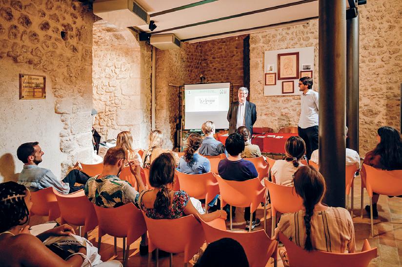
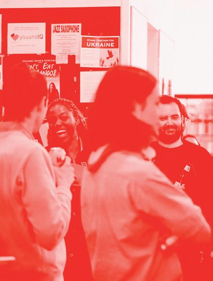
01: Amanda Ugorji introducing a lecture. 02: Thresholds Keller Gallery event. See p. 205 for more information. 03: Long Lounge during a lecture. 7 03
04
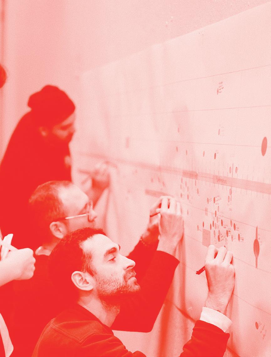
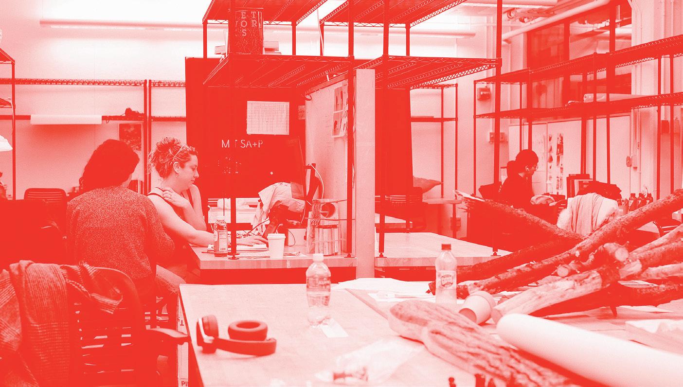
04: Emily Wissemann + Susan Williams in studio. 05: Students completing an exercise in the Preparation for M.Arch Thesis course. 9 05
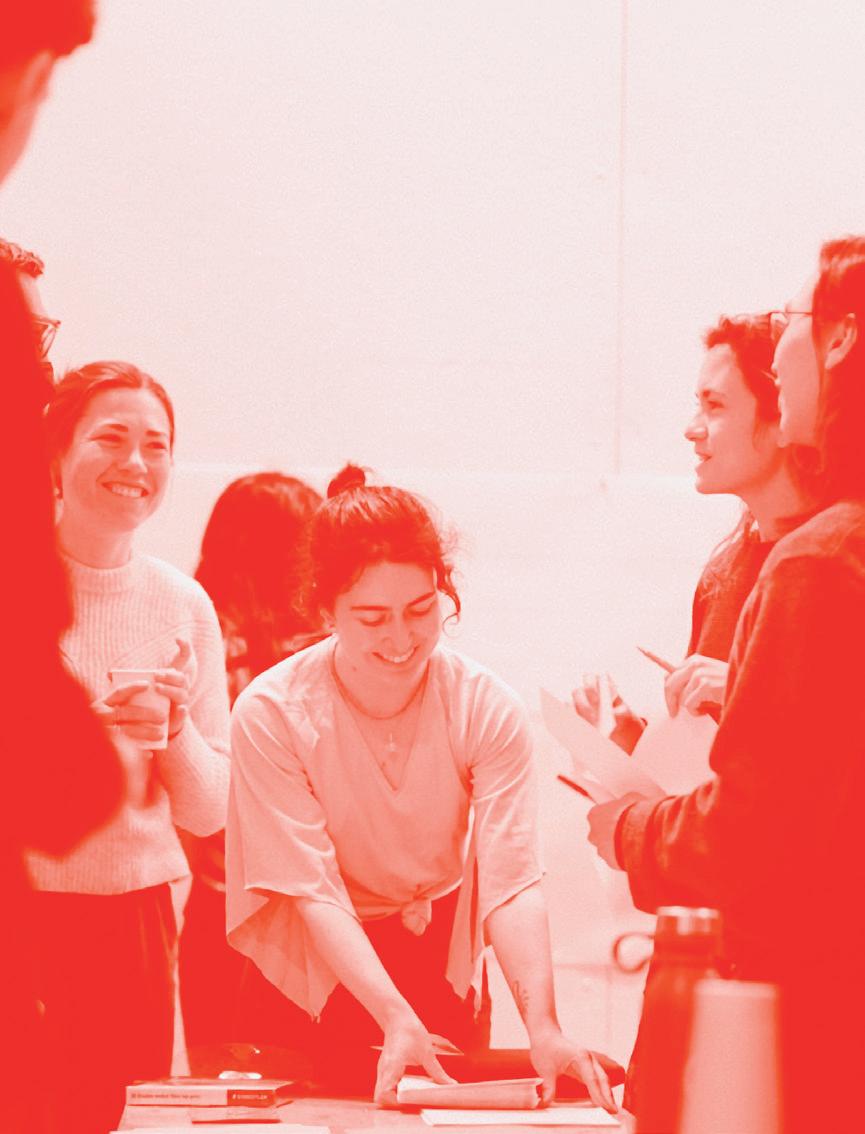
06
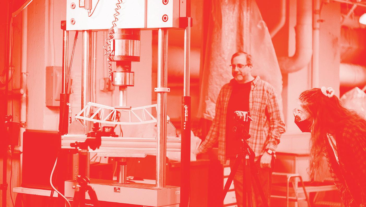
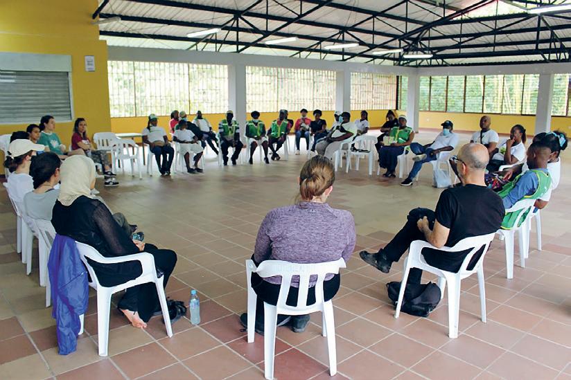
06: Students completing an exercise in the Preparation for M.Arch Thesis course. 07: Column load test in Basic Structural Design. 11 07

Stuff
Stuff is a collection of objects: material research, architectural models, furniture, speakers, clothing, large-scale installations, tectonic assemblies, and robots. This chapter emphasizes that making and the stuff inside is a part of architectural production, even though it is often deliberately not architecture. An interview with Brandon Clifford, M.Arch Program Director, describes the work that went into planning for this academic year, a shift from instruction to mentorship, and the funniest object he encountered on campus. A conversation with Axel Kilian brings up questions about the changing relationship between people and material artifacts through his research on autonomous architectural robots.
Thesis
Computational Structural Design + Optimization
Introduction to Structural Design
Warm Wood
36 Chambers
Matter to Data
Intelligent Skin
Carbonfjord
On Vessels
Making Ingredients
Core Studio II
Interview with Brandon Clifford
Core Studio I
Geometric Disciplines
Interview with Axel Kilian
Creative Computation
Advanced Product Design
Undergraduate Work
014–037 038–047 048–059 060–067 068–073 074–081 082–087 088–093 094–099 100–107 108–119 120–123 124–133 134–143 144–151 152–155 156–159 160–173
Image by Ina
13
Wu
Graduate Thesis
SMArchS Thesis varies by Discipline Group
M.Arch Course Coordinated by Deborah Garcia with Teaching Assistant James Heard
STUFF

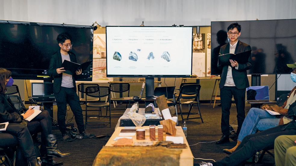
01–02: Thesis Final Reviews 4.THG 15 01 02
Beyond the Brick by Laura
Maria Gonzalez
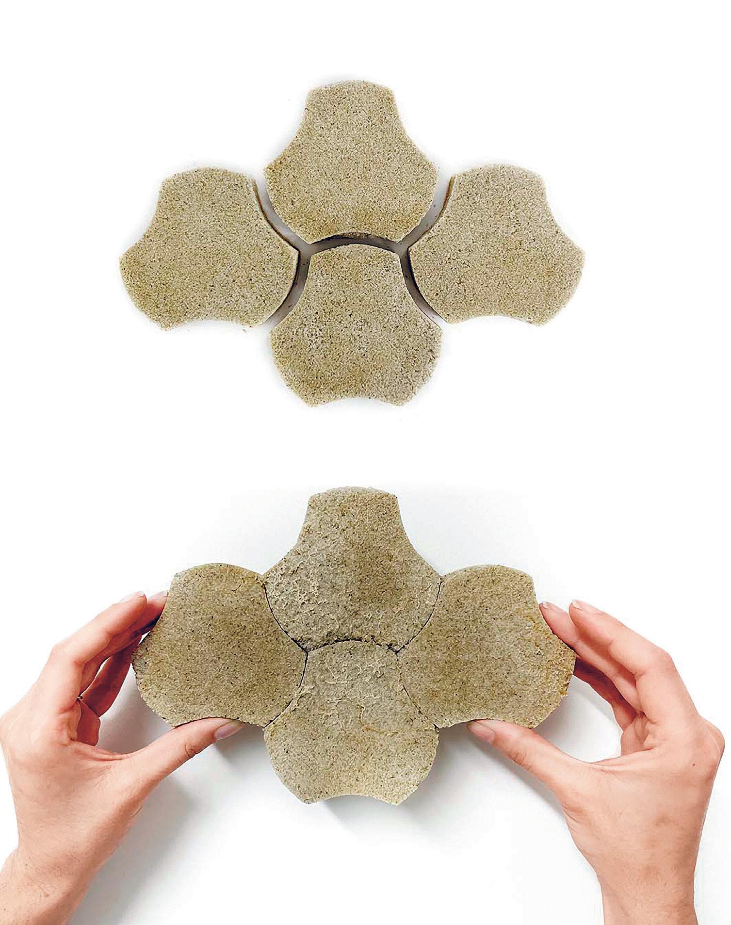
Rectifying the damage caused by buildings requires an ideological shift, one that involves working with invisible microscopic systems the very same living organisms that have helped shape the Earth’s ecosystems over billions of years. In Beyond a Brick, living materials offer a path to address the repercussions of the built environment while also transforming how we interact with buildings over their lifespan all made possible through a collaboration with these microscopic living organisms.
 Advisors: Skylar Tibbits + David S. Kong
01
Reader: Sheila Kennedy
Living brick modules were grown with biocementing bacteria. This engineered living material has the potential to mitigate the excessive use of concrete. The bacteria remain alive in the bricks and can communicate with colors in response to environmental factors such as pollutants, helping to map our ecohealth. This design and fabrication process presents the ability to redefine buildings from static entities situated in a landscape to living systems integrated within their ecosystems.
01: Biocemented bricks (top) can be joined together (bottom) by continuously feeding the living bacteria in the brick.
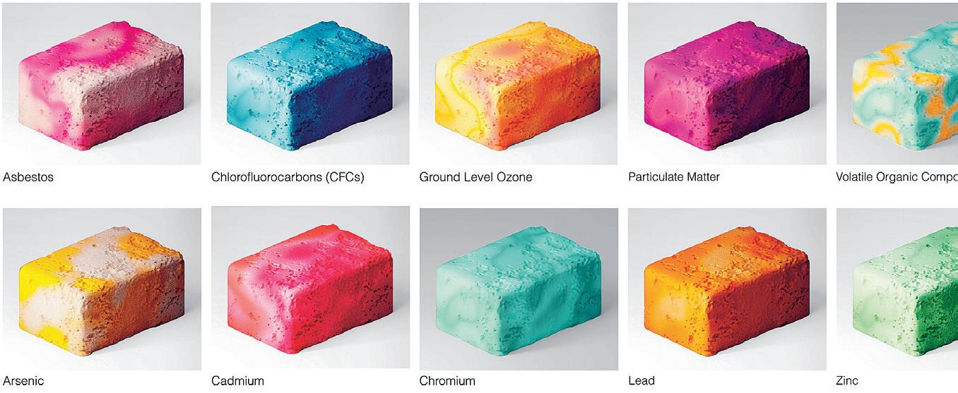
02: Genetically engineered bacteria express a bright blue color when a chemical is sensed.

03: Render of the modules in a planter configuration. The blue color indicates a contaminant present, suggesting that water be added to the bricks to trap pollutants.
04: Conceptual render of a colorful biocemented living material palette.

17 02 03 04
Bernini Started It by Charlotte Matthai + Ryan Clement
Bernini’s altar at St. Peter’s Basilica is a sacred focal point and manifestation of divine power and glory the Church at the height of its power and an authoritative flaunting of papal infallibility.
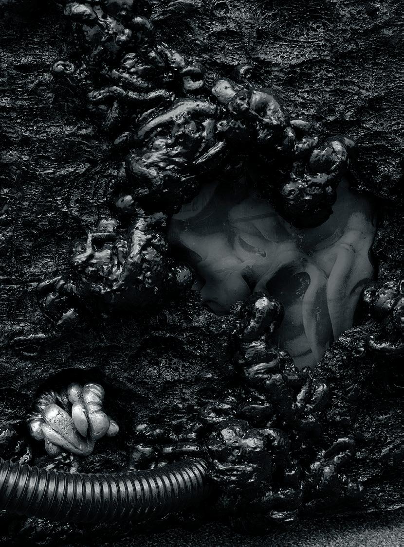
The altar rests upon the tomb of St. Peter, from which the Pope traces his legitimacy. At this place of sacrifice, wine is transubstantiated to blood and bread to flesh. Yet beneath the sacrificial locus at the foot of the Pope are lurking flesh and fluids not-so-divine. Sculpted into the Barberini crest on the piers of the Baldacchino are the face and genitals of a woman in labor. Viewed in a circumambulatory procession, the rhythms of contractions are depicted through her facial contortions and vaginal transmutation. Her genitals are thinly disguised as the face of a satyr that emerges in the final scene, no longer a virgin and hungry for more.
This is not the vagina of Mary; this was not an immaculate conception.
Bernini has inserted an other, a queer, an abject form of the revered sacrifices upon the altar. They’re all fluids; they’re all flesh. Yet the ones above hold a godly and masculine power, whereas the feminine fluids below are execrated and
feared within the Western Catholic heteronormative tradition.
The altar provokes fantasies of queer desire and expression, yet it is stunted and entangled in a tradition of Western sexual monolingualism. What would it look like to unleash the altar from these constraints, to reorient “straightness” by centering the queer? How can we tap into this papal-sacrificial-dogmaticlineage of legitimacy? How can we seize ecclesiastical power and appropriate TRANSubstantiation to affirm earthly human bodies, to legitimate bodies beyond the binary, and to acknowledge the sacrifice of bodies beyond human?
Advisor: Mark Jarzombek
01–03: Model Details
Readers: Yolande Daniels, Timothy Hyde + Deborah Garcia


19 02 01 03
Fourth Dimension by
Angie Door
Advisor: Timothy Hyde
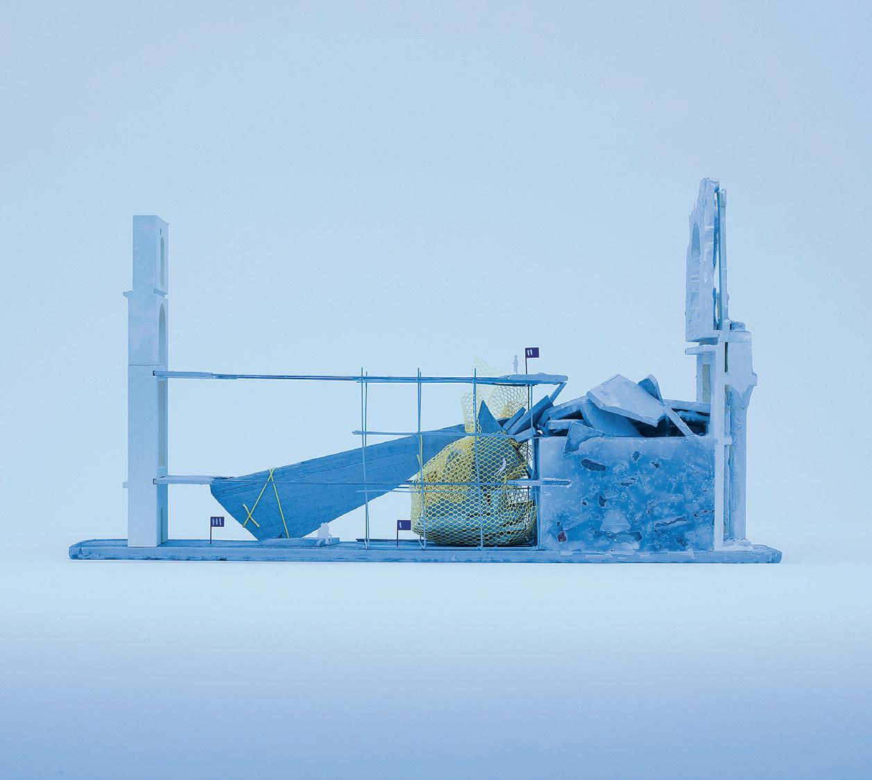
Like an ouroboros, buildings have been built and demolished on a site within the footprint of Berlin’s earliest fortifications. Like the anthropogenic change from swamp to infill, the metabolism of architectural construction affects an atmosphere of air, dust, moisture, and heat, alongside the woven timelines of human goals. To (mis)use Fukuyama’s words, perhaps the end of history means that we are now allowed to leave linearity and enter a multiplicity of post-history. In this state of emerging time, used to describe the postcolony by Mbembe as an “interlocking of presents, pasts, and futures,” one can only contend with this thick density of data and time through fragmentary encounters. Immediate acts of care can interrupt the projective sequence of demolition, planting seeds in ground rubble and wrapping exposed I-beams to create a soft space that smells like ancient moss.
As the German Federal Ministry assesses lost revenue to colonial artifact repatriation, Preservation Agency LLC has been asked to find other uses for the site’s Ethnological Museum. Agency conducts a meticulous survey to find what Boym calls Architectures of the Off-Modern, which already exist in the murky space parallel to the site’s past. Agency presents three Acts in the site’s history as possible Off-Moderns:
Act I shows the Palast Der Republik rehabilitated instead of dismantled; Act II rebuilds directly from the bombed rubble of the stadtschloss; and Act III visits a state of perpetual construction at the Humboldt Forum.
Agency proposes an epilogue where tactics from Acts I–III become an index to be used on the existing structure. Actors who have worked on the site use these to develop a gradient of conditions within its shoddy Prussian casting. Through this orchestration, history is no longer a survey but a specter of operations which direct the ouroboros of the site to savor its next material era as an indeterminate dance of humans, fauna, and material upon its surface.
Readers: Rania Ghosn, Caroline Jones + Nicholas de Monchaux
01: Fourth Dimension Model 02: Drawing

21 01 02
Medium Resolution
by Gil Sunshine
Extrude, saw, turn, repeat. During the industrial revolution, machines and techniques were invented and advanced for forming materials into standardized shapes. This would lead to the development of the industrially mass-produced standardized building materials used today and left an indelible mark on architectural thought. The architecture of modernism, especially the international style, embodied the logics and efficiencies of the factory while the endless linear and rotational processes of industrial production were quite literally imprinted on its geometries. To an unprecedented degree, architecture became a practice of blind trust in superficially dimensioned materials specified from afar. This intertwining of mass manufacturing and architecture has only intensified over time, even finding its way into the tools of architect: “extrude,” “trim,” “revolve,” “array.” The 3D modeling software used by the architect contains analogs to the machine processes and abundances of industrial production. Today, however, as we increasingly face the effects of the excesses of the Anthropocene and related disruptions to the building material supply chain, architecture must develop a broader material palette
to include the found, the unwanted, the offcut, and the wasted. This produces a new relevance for an architecture of underprocessed and irregular materials. Given architecture’s proclivity towards the standard, how might this new material paradigm make its own mark on architectural thought?
Rather than operating solely with the mindset of material predictability under an industrialized global supply chain, the architect must also learn to accommodate materials as they come. In order to adapt to material irregularities, architects have adopted various 3D scanning techniques to produce digital representations of materials, which can then be manipulated in 3D modeling software to derive digitally informed fabrication and assembly processes. By the nature of their discrete sampling, however, these representations vary in their precision. What the architect encounters in the 3D modeling environment is not the material itself in its infinite specificities, with its weight, moisture content, and smell, but rather a surface representation composed of a large but finite set of points. This surface might be called medium resolution. This thesis operates within the medium resolution surface condition,
accepting it as a geometric paradigm necessary to respond to emerging material realities. In doing so, it replaces the predictability and relative surface precision of the standardized material palette with the specificity and precision of actions made possible by medium resolution representations.
01–03: Medium Resolution Interface
Advisor: Axel Kilian Readers: Brandon Clifford + Caitlin Mueller


23 01 02 03
(Re)Turn to Stone
by Nare Filiposyan
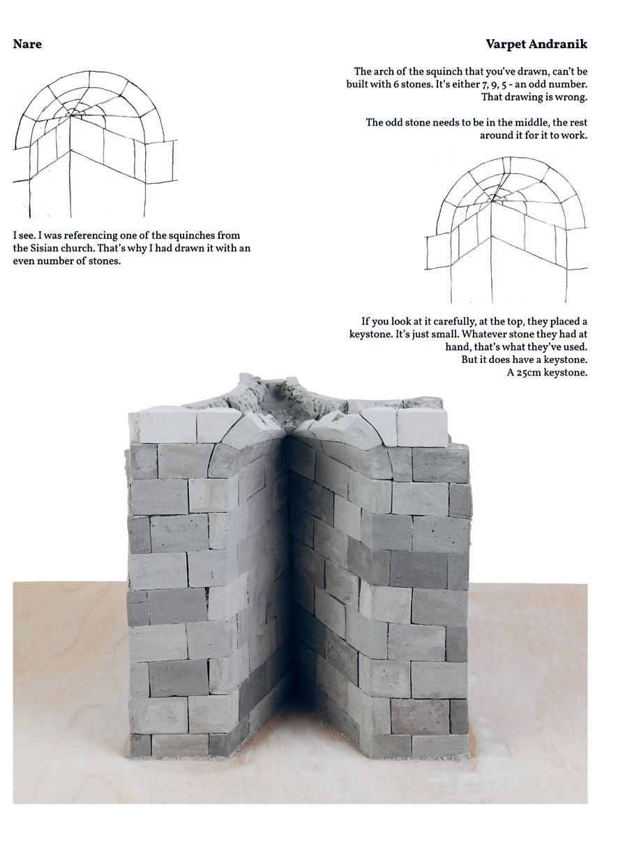
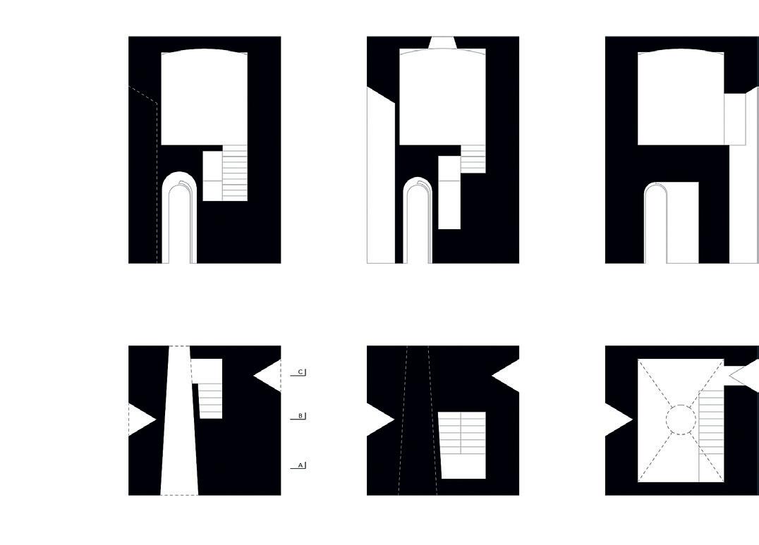
In contemporary Armenia, stone is ubiquitous from street furniture to the home, from thousands of public water fountains to thousands of medieval churches, from municipal buildings to Soviet housing blocks disguised under stone tiles. Stone is a vital part of the cultural fabric, holding both physical as well as intangible cultural heritage. Though the appearance of stone is pervasive, certain stonework techniques tracing back to the 4th century are dying out.
The techniques that are disappearing are inherently monumental. This thesis proposes an architecture that consists of monuments with embedded domesticity a design innovation that can produce cultural continuity while maintaining existing possibilities. It is an attempt to perpetuate a culture of stone and re-prioritize the knowledge of the masons that has been rendered obsolete as a byproduct of standardization. It is a cultural inquiry mediated through conversations with masons. The provocation of the thesis is an ongoing dialogue between architecture as an artifact and the embodied skills and techniques that produce the architecture.
01
 Advisor: Timothy Hyde
01: Conversation With a Mason. Still from a film. 02: Domestic Monument Drawings + Model 25 02
Readers: Axel Kilian + John Ochsendorf
Seeing Labor
Fabrication Porn from Behind the Scenes
by Danny Griffin + Inez Ow
The notion of high-tech oftentimes inadvertently expresses the conviction that industrial progress means the abolition of manual labor from our industry. Within the last 20 years, this veil has been maintained by one prominent body of work in particular: the experimental research pavilion. These 1:1 works allege to be beacons of progress, signaling novel directions for future constructions. Though they are marketed as hightech, video documentation available on YouTube and Vimeo reveals that they are assembled manually on site, often by large teams of people who receive minimal recognition for the repetitive actions of their bodies. We classify many of these works as “fabrication porn,” semantically hinging upon the similarly exploitative dynamics that exist in the worlds of porn production and theatre stage sets.
Backstage labor has become overwhelmingly disassociated from the very conventions by which we have been trained to present and consume architecture. Plans, sections, elevations, axonometrics, renders, and detail drawings they represent the artifact to be built, but not the actions or subjective experience required to build. When we are able to recognize labor’s potential for value-adding, instead of reducing it to semi-automatic manual execution,
it becomes clear that labor constitutes a large part of building authorship that the prevailing culture of sensationalism fails to properly credit. Worse still, when operating under this system which thrives on cropping inconvenient realities of labor out of view, we become complicit in propagating abuse, neglect, and injury.
Our thesis recognizes that a more sympathetic relationship between architectural output and labor cannot be realized under the classical model of authorship in architecture and contends that it is within the agency of the architect to embed labor accounting within the design of the physical artifact itself. We enter our thesis as test subjects in a series of self-administered labor accounting studies, as a way of attuning ourselves to the fact that every architectural design move necessarily implicates bodies. We then propose an architectural take on labor accounting, where physical artifacts serve as ledgers. Our vision: every trace of labor becomes non-fungible the experience of architectural space and the experience of implicated laborers are rendered inseparable. Seeing Labor is a case that every architect should retrain themselves, to use their role in the organizing of bodies for advocacy, rather than exploitation.
01: Injury Report,
Advisor: J. Jih Readers: Axel Kilian, Brandon Clifford + Deborah Garcia
Hand and Body


27 01
Specious Materials
by Zhifei Xu + Jie Wu
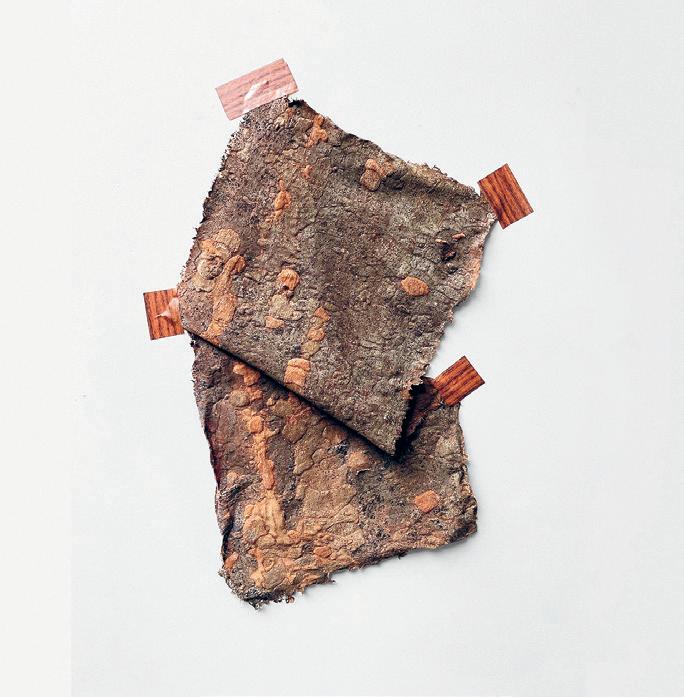
Our world is saturated by digital media that’s manipulated, spread as facts, and sorted algorithmically, creating many different “facts” for each niche community and increasingly blending the “faked” into our physical reality. As a result, the modernist sense of truth is on the verge of collapse.
As solid and real as architecture might have always been conceived, the field of architecture is not immune to the question of reality. The faking of one architecture material with the image and texture of another has long existed in our field for various purposes, but uncritically thought about and indifferently perceived. Today, digital media adds another dimension on top of the simple binary of real and fake, making the authenticity of the building increasingly confusing.
This thesis proposes to see fake materials not as an ethical problem (the betrayal of the classical modernism paradigm of “truth to the materials”) or as ready-made industrial products made for their economic or performance benefits, but instead as contemporary mediums that blend digital media into physical reality. This provides new design areas for architects to intervene with agencies. Then what we like to explore becomes
a question about what we would make of a material that embodied multiple different materialities? Can fake material stand its own ground against its “real” counterparts? Freed from the real vs. fake dichotomy, can these specious materials bring forth a new aesthetic and convey critical meaning?
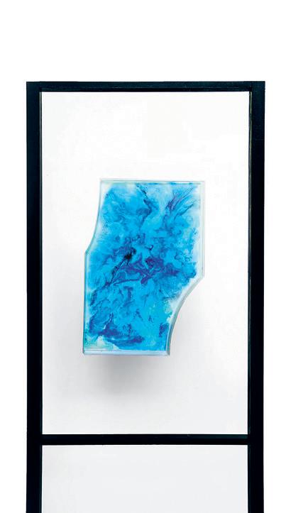

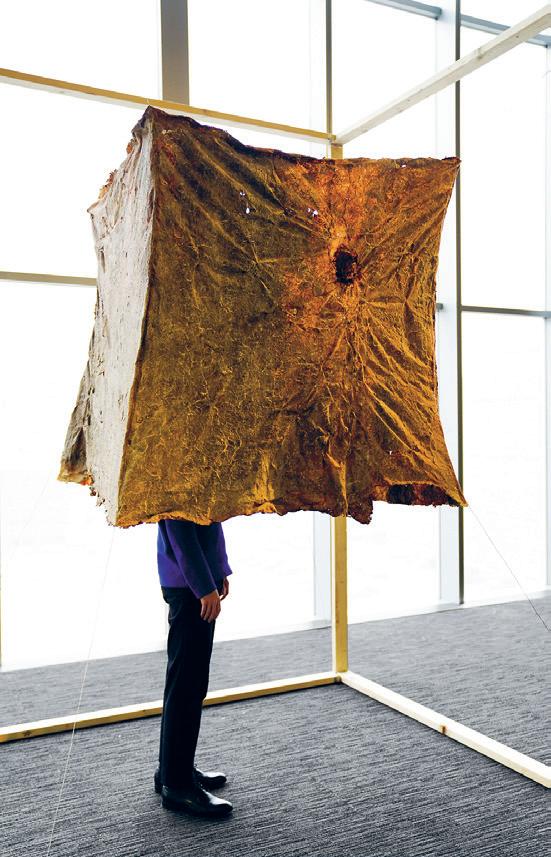
01: A Specious Marble Material Sample 02: A Specious Bark Material Sample 03: Models of Specious Materials at Different Scales 04: Specious Bark Pavilion 05: Material Sample 06: Detail of a Specious Marble Assembly 02 01
Advisor: Brandon Clifford Readers: Axel Kilian + Timothy Hyde


29 03 04 05 06
The Incomplete Domestic Landscape
by Florence Ma + Taylor Boes
Our environments are failing us. Modernism’s relentless pursuit of efficiency, control, and purity has birthed a sterilization that has weakened our bodies bit by bit, little by little, to the point that they have almost been lost.
We seek to unpack our relentless reality: its cold corners and its hard edges, its celebration of virtual futures and its endlessly scrolling present, its crumbling concrete and rusting rebar, its fluorescent lighting and dying house plants, its unflinching march towards a singular Progress.
We question the modernist notions of control and efficiency as tools for better living.
We are Duo.
We seek to squat, to occupy, to co-opt. We are subversive. We operate on and within.
We are soft surfaces and unexpected jungles.
We are talking about your house plants and your pillows, the faux fur you walk by in the fabric store and caress but never purchase, the fake Ficus in your mom’s entry way that she’s been watering for
years, that carefully placed curtain that undulates between your back and your bed as your Zoom call drones on, and the things that call for you to hold them and be held by them.
But we are not tame nor subtle. We may love soft things, but this is not a soft touch. It is an explosion. We design, cultivate, and share supplements: shifts in viewing, entanglements, soft creations, and strange installations. We work through examinations and operations within archives. Open to all, the resulting landscapes do not require heavy machinery, and perhaps you should be impaired when you try them.
We want to feel. We want you to feel.
While you have been otherwise occupied, so have we. Here is that occupation.
We invite you to join us. To touch, to play, to imbibe with us and our spaces
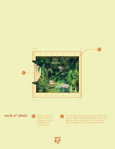
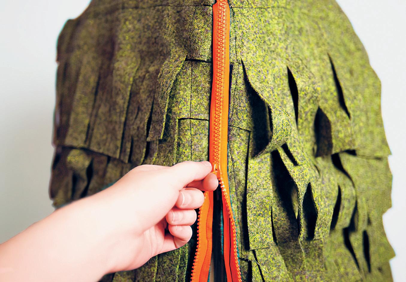
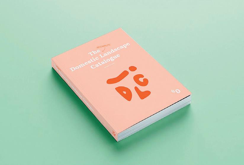
Advisor: Ana Miljački + Deborah Garcia Readers: Nicholas de Monchaux + J. Jih 01: A Page from the The Incomplete Domestic Landscape Catalogue 02: Domestic Landscape Catalogue 03: Model Detail 01
31 02 03
The Third Teacher Architecture as Enabler of Active Learning
by Carolyn Tam
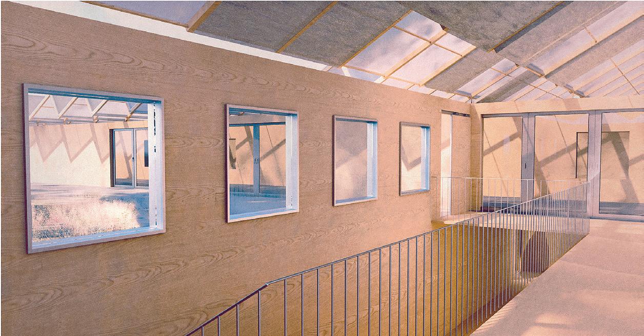
In the industrial era, schools were designed as highly controlled environments to instill discipline and conformity to thrive in a machine age. Today, as architectural education evolves its mission away from producing factory workers and towards producing creative contributors, the buildings that serve education’s mission have remained stagnant our learning environment is still rendered passive and figures as a utilitarian design of the factory model, reinforcing the unhelpful boundaries between space and active learning.
This thesis challenges the manner in which architectural education works, not only in broader pedagogy but also through the built form. Rather than fixing a same batch of learners in a rigid container, this thesis proposes a series of deployable systems that can plug into various urban conditions to form dispersed learning environments. Learning is not separated from daily life. It could occur in a park, on the street, or in the most unexpected of spaces fostering greater diversity and creative possibilities.
A key concept in active learning that can extend to architecture is the wilderness education, where students are taken outside the classroom and use
full-scale tools to create, play, and test boundaries with their environments. This thesis asks what if learning opportunities found in these instruments can be expanded to architecture? Architecture can be structural and systematic but at the same time playful and engaging, crossing many disciplines from geometries and surveying to physics and assemblies. Instructors and books are no longer the only teachers; the hands, the ears, the eyes, in fact the whole body and the architectural space itself, become sources of information. Viewing students as active constructors of knowledge, the proposed architecture encourages students to use their spaces and full-scale play instruments to imagine and create their own environments to open up new learning discoveries.
 Advisor: Brandon Clifford Readers: Caitlin Mueller + Deborah Garcia

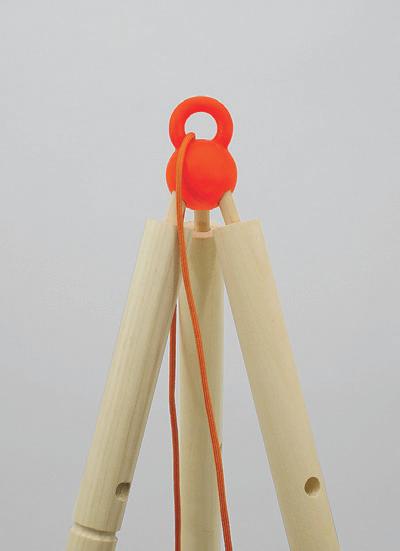

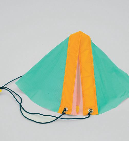
01: The Third Teacher Model 02–04: The Third Teacher Model Details 33 01 02 03 04
Under (De)Construction by
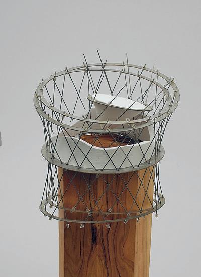 Ellen Wood
For each palette of Spanish glass or Pennsylvania steel that arrives at a Manhattan block under construction, a truckload of rubbled concrete and mangled steel debris containing the remnants of a pre-existing structure is hauled away. The building industry in New York City is a machine for material exchange: constantly importing materials in for the construction of new structures and exporting materials out in the form of waste, often to meet their ends in out-of-state landfills or to be recycled down as low-grade aggregates. So, despite its seemingly reliable solidity, New York City’s built environment can be characterized as much by its willful impermanence as it can by its staggering monumentality. Buildings rise and then fall over a matter of decades, often reaching their premature obsolescence in the face of shifting ownership, real-estate speculation, and amendments in planning policy. Blocks are continuously transformed to make way for new developments, often soaring higher than their individual predecessors. And as a city whose grid reached maximum capacity 70 years ago, nearly each new act of construction is preceded by acts of demolition.
As key stakeholders in the processes of building, architects do not often take
Ghosn Readers: Yolande Daniels, Cristina Parreño Alonso + Roi Salgueiro Barrio
Advisor: Rania 01 02
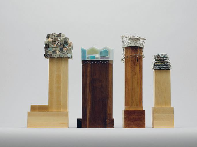
part in the processes of unbuilding. This thesis speculates on a scenario in which architects take agency over the other end of a building’s life, its demolition. In doing so, salvaged and rubbled materials are seen as resources for building, rather than as waste. This thesis imagines new relationships between these materials and the processes of architecture within the patterns of assembly and disassembly within the urban environment. 01: Model 02: Collection of Models 03: Axonometric Diagram

35 03
Who Cares?
by Emma Jurczynski
We source, process, and build with standardized wood and, just as easily, discard it. Rubbish, scraps, the wasted, the junked are assumed to be undesirable due to a lack of knowledge about the structural capacity of second-hand timber. Deemed unusable, approximately 36 million tons of dimensional lumber and plywood end up in U.S. landfills because few people know what to do with it and there is nowhere to store it.01
This thesis presents a methodology that reuses these construction materials through a system of assemblage that maximizes the amount used and catalogs these materials in a prototypical storage warehouse that not only stores discarded standard timber but also is itself built from it. The more material used, the less sequestered carbon dioxide is released into the atmosphere. I am taking an excessive approach to use as much leftover wood as possible to be inefficiently efficient.
This methodology is a care-and-repair system that re-assigns value and extends the lifespan of used materials. In this instance, repair means returning a material to its original function, not form. Repair is an act of assembling layers of material from multiple sites and environments with inherent histories and memories from various moments and places.
With the planet in need of “critical care,” this method is proposed as a necessary near-future reality in order to minimize our footprint and carbon emissions.02 The proposed act of caring towards our materials creates a culture of inefficient construction systems and celebrates the social and environmental efficiencies that grow from it.
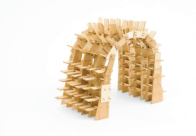
01: Dovetail Partners, The Current State of Wood Reuse and Recycling in North America and Recommendations for Improvements , p. 5, https://www.naturespackaging.org/wp-content/uploads/2016/01/current_state_wood_reuse_recycling_namerica.pdf 02: Fitz, Angelika, and Elke Krasny, C ritical Care: Architecture and Urbanism for a Broken Planet . Vienna: Architekturzentrum Wien, 2019. 01

 Advisor: Sheila Kennedy
01: Model 02: Conceptual Model 03: Collection of Wood Structures 37 02 03
Readers: Caitlin Mueller + Timothy Hyde
Computational Structural Design + Optimization
This research seminar focuses on emerging applications of computation for creative, early-stage structural design and optimization for architecture. It incorporates computational design fundamentals, including problem parameterization and formulation; design space exploration strategies, including interactive, heuristic, and gradient-based optimization; and computational structural analysis methods, including the finite element method, graphic statics, and approximation techniques.
Instructed by Caitlin Mueller with Teaching Assistant Yijiang Huang
STUFF
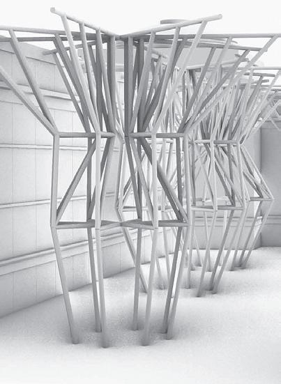
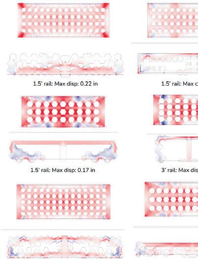
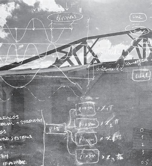
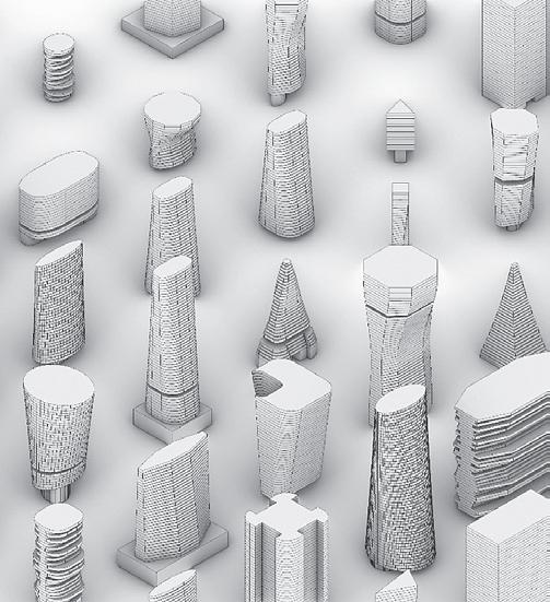
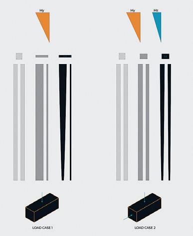
01: 3–4 Ways to Use a 4' x 8' Sheet of Plywood by Alex Steelman 02: Resisting Hurricanes through Curves by Sacha Moreau 03: Form-finding of Dendriform Supported Long Span Roof by Carene Umubyeyi + Stephanie Baez 04: Optimizing Urban Representation for Design Impact Evaluation by Sarah Mokhtar 05: Investigation of Embodied Carbon Reduction in Reinforced Concrete Columns by Nebyu S. Haile 4.450 39 03 01 02 04 05
An Investigation Into the Functionality and Performance of British High-Tech Architecture of the 80s
by Julian Andrew Escudero Geltman
The High-Tech architectural wave, based predominantly out of Britain, is a late-modernist design style that is exemplified by the use of intricate, cutting-edge design systems integrated into a high performing whole. Perhaps most salient about this movement, though, is its essentialization as a style. As such, it is understood aesthetically, and not instrumentally or heuristically as hightech. That is to say: what is not important about the categorization of hightech is not as much its performance as its expression and expressive these projects are! They can be defined by dynamic shading systems that are mechanized, the removal of environmental services from the interior of the building to the exterior, or even by the consolidation of these services vertically in towers exterior to predominant programs, as seen in Lloyds. And if they exceed a certain vertical scale, it of course becomes necessary to feature a number of cranes on top of each volume. What is missing, then, is a historical understanding of why these buildings came to be known as high performing. This project proposes an investigation into the “hightech”-ness of these buildings through an examination of whether they optimally used material in such a way as to garner their reputation or were designed such that forces were minimized in members.
In a sense, I am asking: are these projects really that high-tech, and thus high performing? Is there a basis to their historical stylistic and formal grouping in quantitative analysis?
For this project, I propose a case study: first, Richard Rogers and Ove Arup Partners’ PAT Centre in Princeton, NJ.
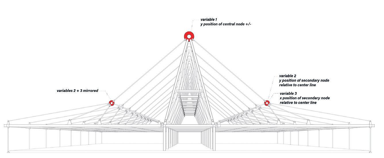
Rendering of the PAT Centre Structural System.
The three variables to optimize across are: the Z axis location of the central A-frame node, and then the Z and Y Axis locations of the secondary node to which all tension rods are connected above each wing.
Is High Tech high tech?
01:
02:
Critic: Caitlin Mueller TA: Yijiang Huang

41 01 02
Wild Wood Gridshells by Tim Cousin, Latifa Alkhayat + Natalie Pearl
Wild Wood01 Gridshells utilizes computational design and mixed-reality construction methods to build structures using a constrained inventory of non-standard wooden elements.
This research proposes a design-to-fabrication workflow for building architectural structures with non-marketable bifurcated tree branches. Tree forks have numerous features considered to be defective in the timber industry, such as small diameters, knots, and kinks, each of which makes them non-standard, and therefore, difficult to build with using traditional methods. While tree fork structures have been extensively explored in previous works, this research aims to move away from heavy machining processes and digital fabrication equipment. It proposes a reproducible design-to-manufacture workflow that only requires a computer, a smartphone, and a saw (power or manual).
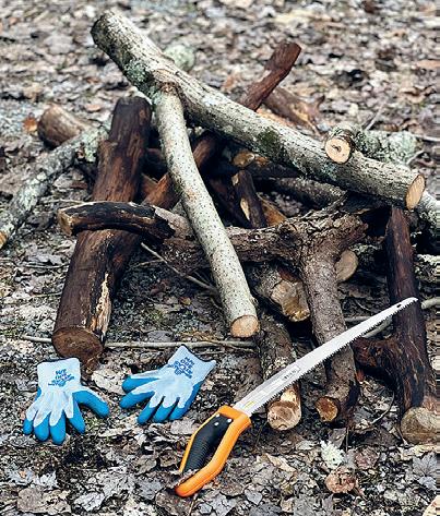
To do so, this research leverages 3D scanning and a geometry matching algorithm that allows precise work with the very irregular shape of the elements in the design of the structure. In addition, a mixed environment construction protocol enables one to accurately cut the joints with hand tools and position the pieces on the construction site.
The contributions of this paper include:
(1) a digital approach for the characterization and management of irregular three-chord branch inventory; (2) a computational design method to generate gridshell topologies and parametrize the displacement of their vertices;
(3) a matching algorithm to optimize the target design based on the geometric features of the inventory; (4) a fabrication method that leverages augmented reality to manufacture the joints and place the elements accurately on the construction site. A full scale prototype concludes the research, demonstrating the effectiveness of the design-to-fabrication methodology and the potential to build structures using irregular and non-standard wooden elements.
This work is part of a larger research project with the Digital Structures Lab that was worked on during the subject 4.450.
UROPS: Angela Zhang + Hailey Quinn Critic: Caitlin Mueller TA: Yijiang Huang
01: Sheila Kennedy in “What Would Wood?” ( Harvard Design Magazine #45) disentangles the monolithic modernist notion of standard dimensioned wood. In the radio program “Breakfast with Trees,” ( MIT WAWD?Radio , Spring 2020) she develops the concept of wild wood and explores the scientific and cultural ‘turn’ away from the plant kingdom in favor of the animal kingdom.
In the “Wild Wood: Timberland Research Center” design proposal done with the KVA team, architectural and structural applications of minimally processed local tree thinnings, or varying diameters, are used in their wild wood form.
01
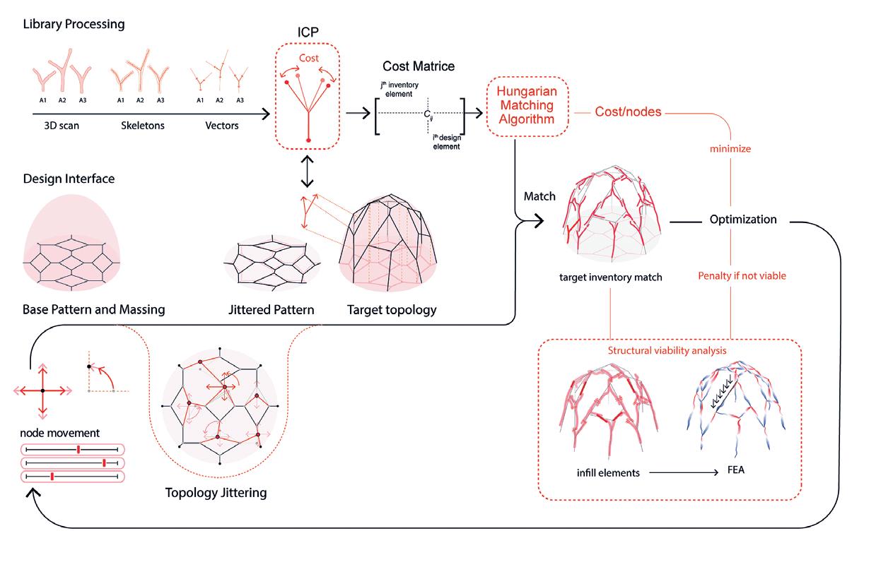

01: Collected Tree Forks 02: Workflow Diagram 03: Real-time Mesh Matching 43 02 03

04: Joint Detail 05: Wild Wood Dome 04
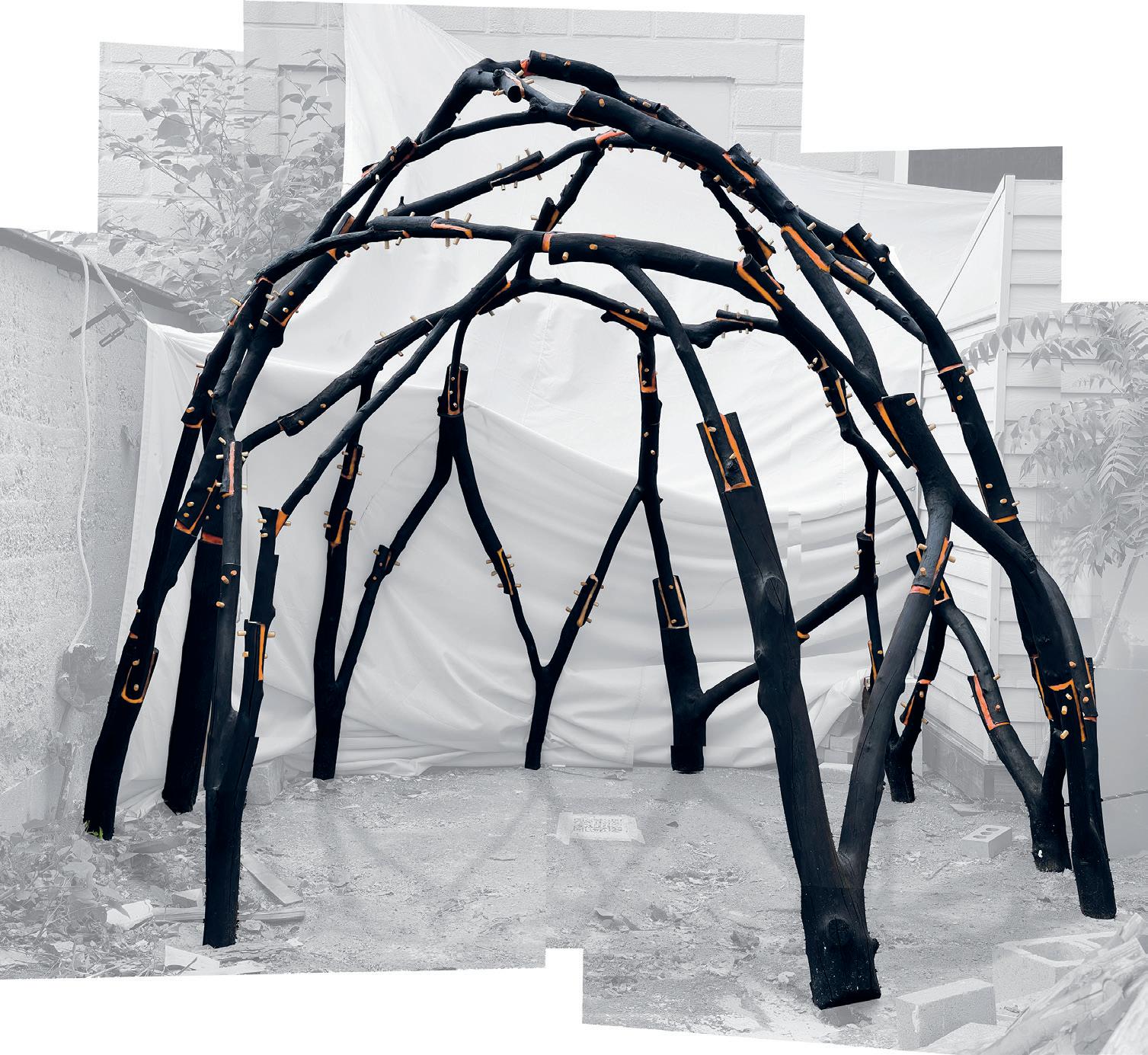
45 05
A Multi-objective Method for Jiashan Optimization
by Stewart Haotian Wu
Jiashan ( 假山 ), literally translated as “fake hills” in Mandarin Chinese, is a significant spatial typology as well as a cultural symbol for classical Chinese gardens. Traditionally the material to compose Jiashan is quarried from rocks that naturally evolve in lakes. Therefore, the current research projects that attempted to create Jiashan with computational methods mostly focus on simulation of natural conditions such as water flow and rock structural topology. The most recent computational project

with Jiashan is by Feng et al. who used a BESO algorithm to generate the naturally looking forms of Taihushi. However, this project will focus of the cultural essence of Jiashan , exploring how a contemporary space that interacts the public can be inspired by this classic typology.
The traditional standard to evaluate Jiashan is mostly with aesthetics. Despite varying systems, there have been four aspects that most scholars agree for a
desirable Jiashan : shou ( 瘦), lou ( 漏), tou ( 透) and zhou ( 皱), literally translated as lean, leaking, through, and wrinkle. In order to explore the interactive potential of the space, this project will include four functional evaluative mechanisms: sitting score, see-through score, walk-in score, and climbing score. Also, for the classic aesthetic objectives, this essay interprets the four traditional standards as two contemporary terms that can be more easily analyzed and iterated: porosity and complexity.
Fake
)
Fake-hills (Jia Jiashan
This work was further developed in the Spring course, 4.453 Creative Machine Learning taught by Caitlin Mueller 01
Critic: Caitlin Mueller TA: Yijiang Huang
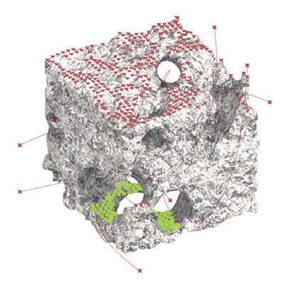
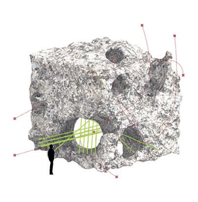


.01: Rendering of Jiashan in use. 02: Sitting Score 03: See-through Score 04: Walk-in Score 05: Climbing Score 47 02 03 04 05
Introduction to Structural Design
Introduces the design and behavior of large-scale structures and structural materials. Emphasizes the development of structural form and the principles of structural design. Presents design methods for timber, masonry, concrete, and steel applied to long-span roof systems, bridges, and high-rise buildings. Includes environmental assessment of structural systems and materials. In laboratory sessions, students solve structural problems by building and testing simple models.
Instructed by John Ochsendorf with Teaching Assistants Demi Fang + Mohamed Ismail
STUFF
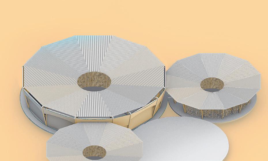
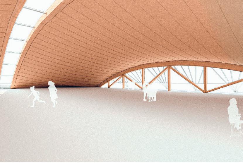

01: Minyoung Kim + Bolurin Adedipe 02: Timber Catenary Roof by Jeonghyun Yoon + Tejumola Bayowa 03: V-Shaped Columns by Mingjia Chen + Suwan Kim 4.462/4.440 49 01 02 03



04: Cape Three Points Turtle Preservation Center by Dzidula Kpodo + Nikita Klimenko 05: Pavillon aus Glas by Karla Tamez + Karissa Wenger 06: Billow of Bamboo by Ning Zhong + Nina Li 07: Train Terminal by Evan Ortiz + Sam Wolk 08: Timber Frame Vault Structure by Sesil Lee + Ina Wu 04 05 06

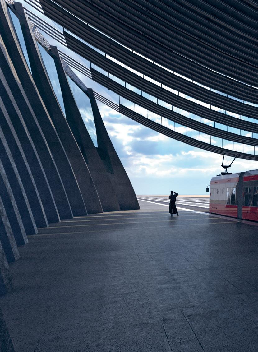
51 07 08
by Gabriel Andrade + Charlie Janson


Ismail Hverfjall Composatory 01 02
Critic: John Ochsendorf TAs: Demi Fang + Mohamed
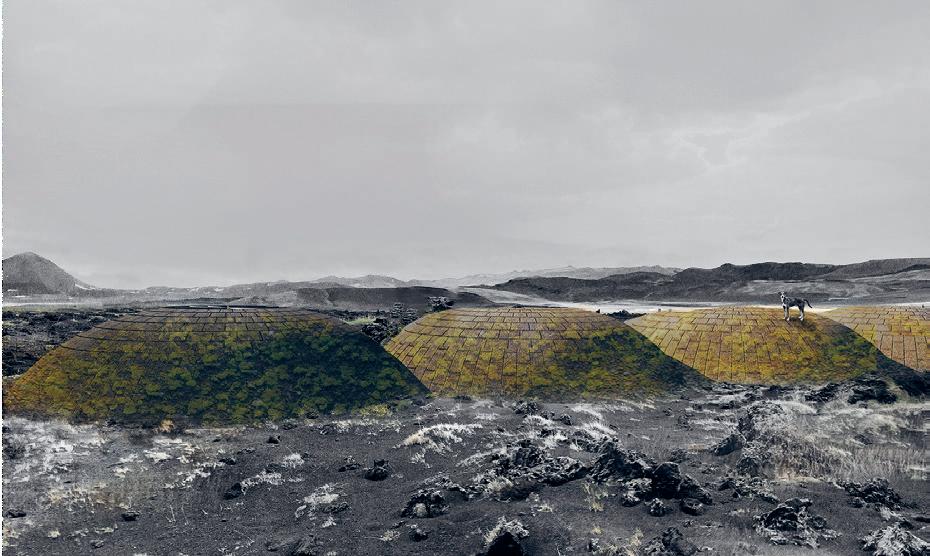
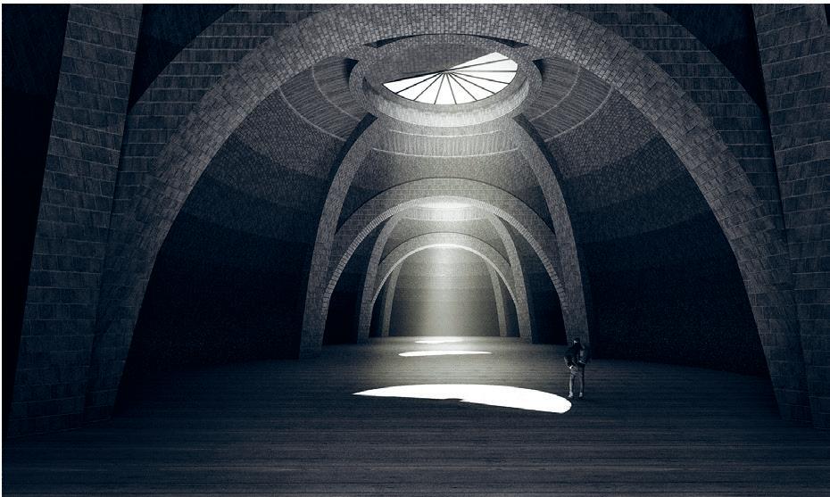
01: Moss Growing + Mortar Attachment on Extra Coarse Brick 02: Section of Pozzolanic Masonry 03: Exterior Rendering 04: Interior Rendering 53 03 04
by Sloan Aulgur + Azania Umoja

Haute House is a long spanning roof that features one 20,000 square foot enclosure framed by two open air pavilions. Within the enclosure, there is programmatic cross between a greenhouse and a stage. It is located in the Denver Botanic gardens, a 23-acre park in Denver, Colorado. They frequently host summer concerts in their outdoor amphitheater and we hope to complement this programming by offering a structure that not only provides additional space for outdoor events but also, since it’s partially enclosed, has the ability to host shows and provide access to plants/flowers within the enclosed greenhouse/stage year round.
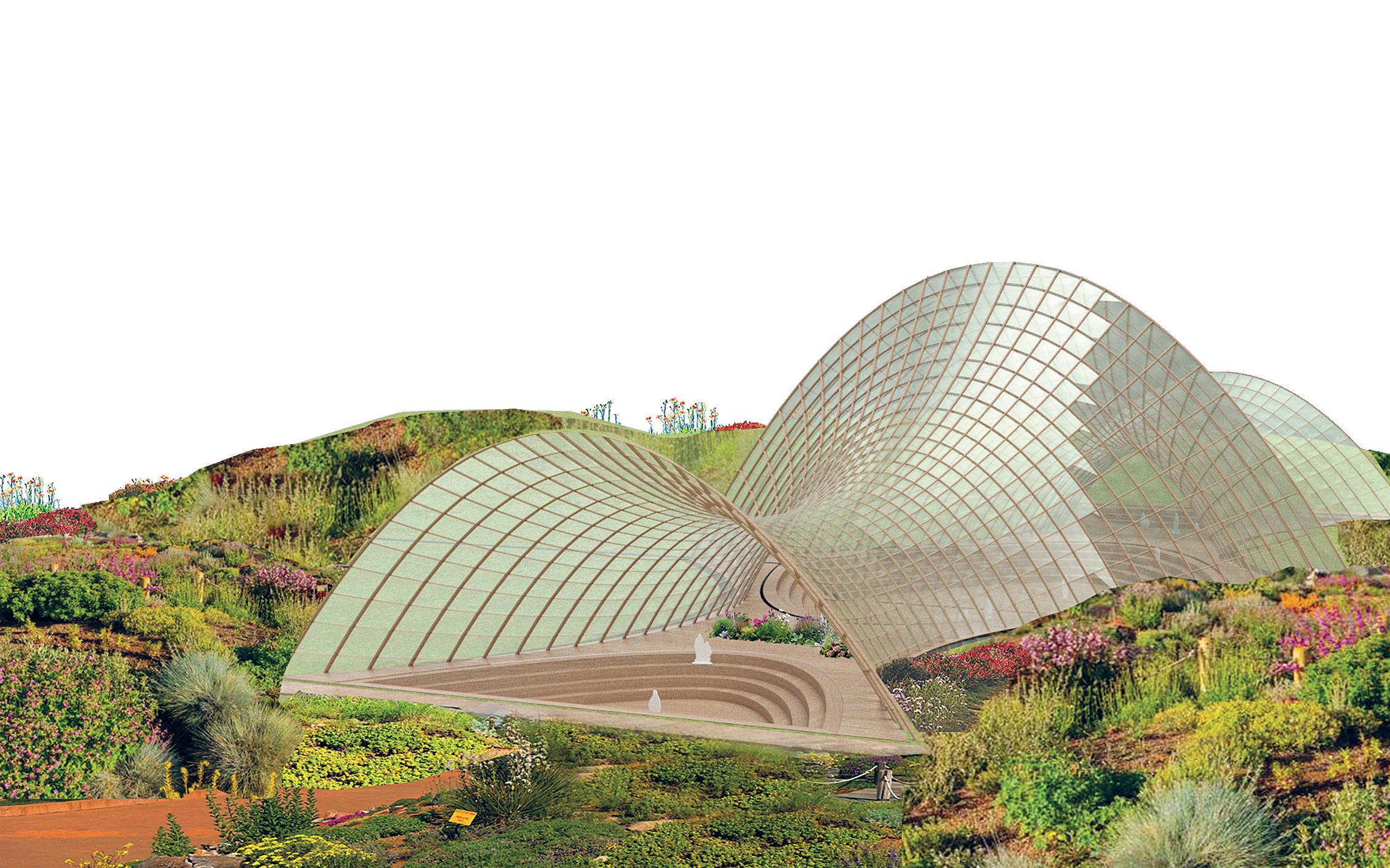
Critic: John Ochsendorf TAs: Demi Fang + Mohamed Ismail 01: Connection Detail 02: Rendering of Haute House Haute
House
02 01
Thin Cantilevered Half Arch
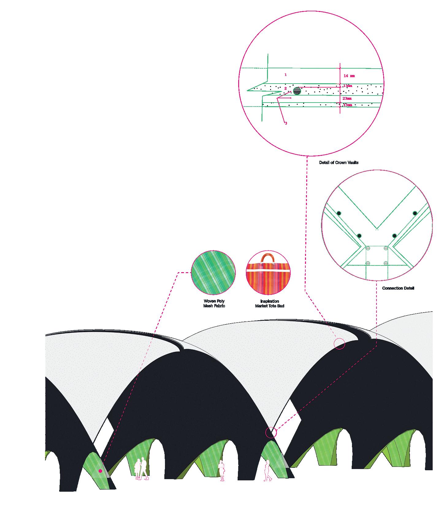 by Brenda Hernandez + Alicia Delgado-Alcaraz
01: Perspective of Thin Cantilevered Half Arch with Structural, Connection, and Material Details.
55 01
Hanging Timber Roof in Romania
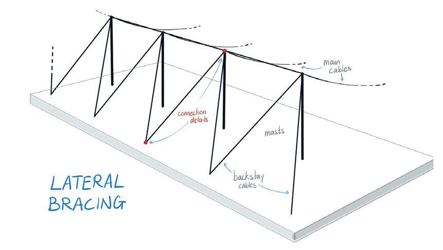 by Arusha Nirvan + Dila Ozberkman


Critic: John Ochsendorf TAs: Demi Fang + Mohamed Ismail 01
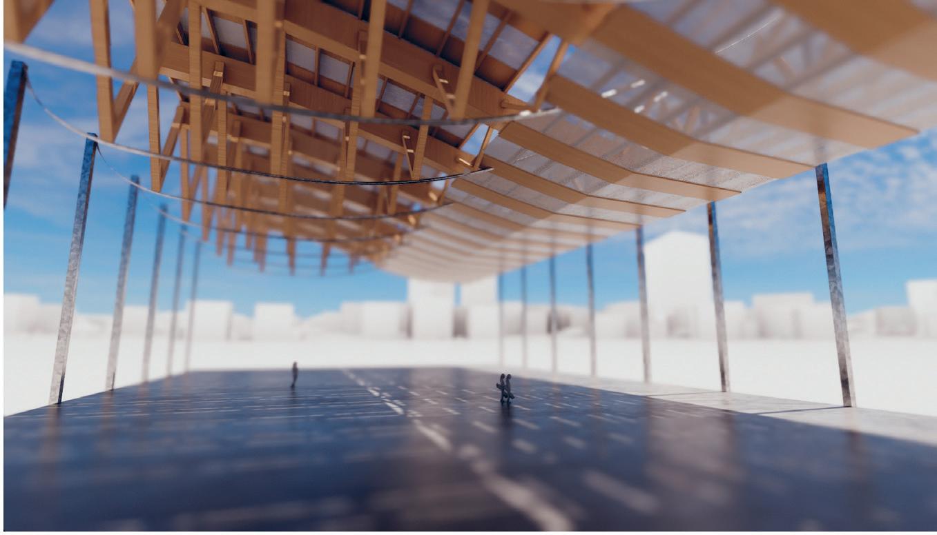
01: Cable Connection Details 02: Interior Rendering 57 02
Transformable Pavilion
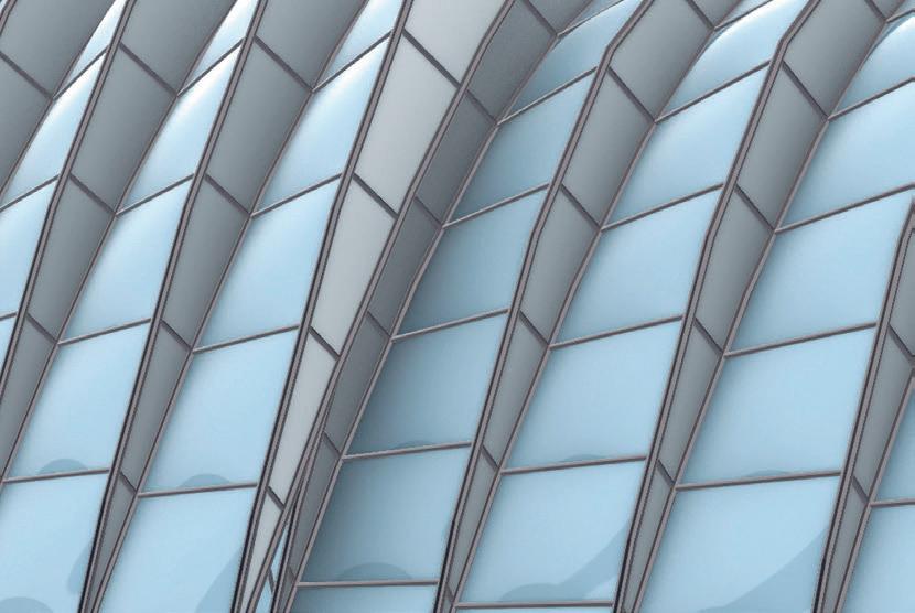 by Emily Liu + Charlotte
Chen
The project originated from an idea to create a transformable, multi-purpose arena structure to host various social and community events. We envision that the structure is designed to serve as a graduation ceremony pavilion at the Killian Court, which can be opened when the weather is ideal and closed when it rains. The pavilion could also serve as an outdoor market in the heart of the city. In terms of materials, we propose a combination of steel tubing, ETFE, and small pieces of glass to maximize natural light and minimize the structure’s weight.
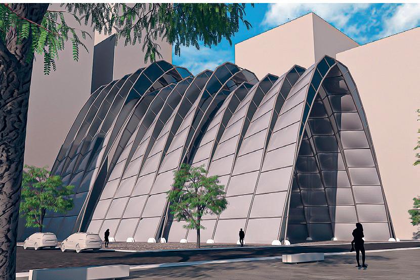
Ochsendorf TAs: Demi Fang + Mohamed Ismail 01: Rendering 02: Detail rendering of primary and secondary structure. 02 01
Critic: John
Long Span Roof
 by Vicky Chen + Feng (Aron) Qiu

Our long-span roof design is inspired by the repetition of sand dunes in the desert and serves as an oasis for the community. We employ a series of slanted timber arches and beams as the primary structure to support the interesting geometry of the roof.
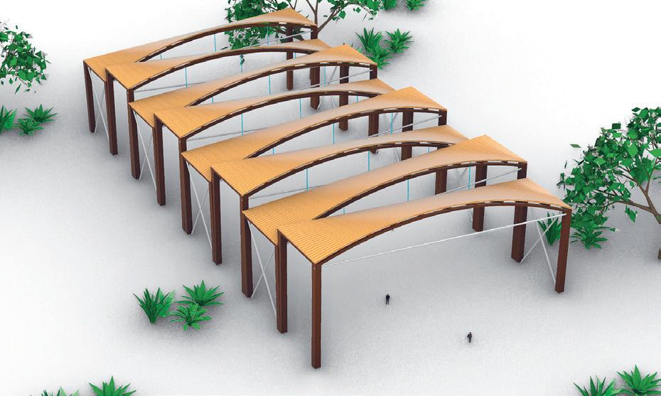
01: Side Elevation 02: Roof Plan 03: Perspective View 59 03 01 02
Warm Wood
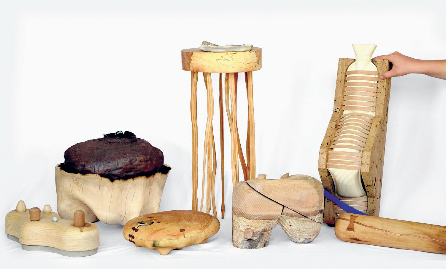
Warm Wood is an experimental, hands-on workshop where students will work with local wood milling and manufacturing processes and hardwood ‘thinnings’ small diameter trees and logs that are typically cleared and left to waste in forest clearings. This workshop will investigate a thermal paradigm shift in architecture, where heating (and cooling) may be provided through and integrated into solid wood (mass timber) radiant surfaces. Foreshadowed perhaps in Archigram’s 1961 proposal for an electric “plug-in” log, the workshop explores the aesthetics, thermal performance, and possible forms of hydronic, radiant Warm Wood. This may include designing the ‘Stack’ as a wood/form composed of layers and densities of hardwood species, pushing the boundaries of what Knot/Not wood can be and exploring Effective/Defective wood.
Instructed by Sheila Kennedy
STUFF
4.185 61 01
01: Objects shown made by Caroline Amstutz, Natalie Pearl, Tim Cousin, Patricia Dueñas Gerritsen, Emily Wissemann, Susan Williams, + Lauren Gideonse.
Out and Width
A Family of Forest Objects
by Lauren Gideonse + Susan Williams
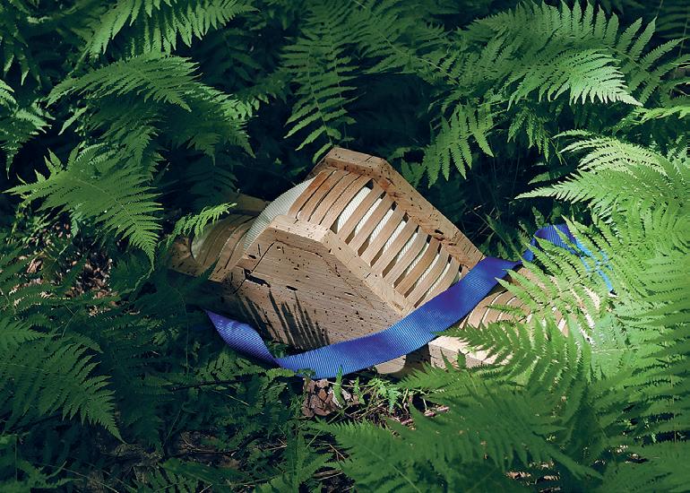
A small group walks out into the forest, to stay for a while. They carry an assortment of objects. Some are recognizable: matches, kindling, a camp kettle, a notebook, a pencil. Another set of wooden objects is less recognizable.
They have taken this walk many times. Over the years the forest has changed; drought has left the ground thirsty, and clearings from loggers have opened new barren openings.
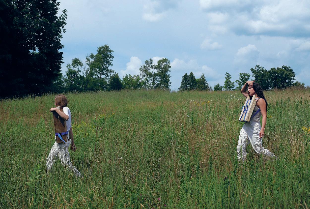
As they walk through the forest, the unrecognizable objects that are braced against the body become heavy. Hands hook under straps to ease the burden and contact to the body is adjusted.
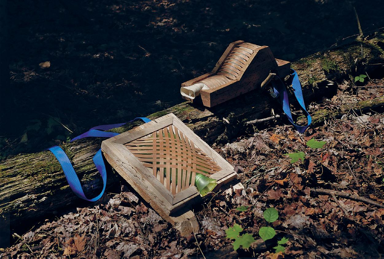
The group arrives at a clearing by a stream. They set down their burdens and gather some wood to start a small fire. Each object holds a vessel. Water is heated and poured inside.
Each member of the group takes their object and finds a seat within the clearing. The heat relieves while the wood supports. What was once a burden transforms to comfort.
01
Critic: Sheila Kennedy 01: Toddler Baby on the Forest Floor. 02: A Walk Into the Woods. 03: Baby Bjorn Baby (Left), Toddler Baby (Right) Lounging in Woods.
63 02 03
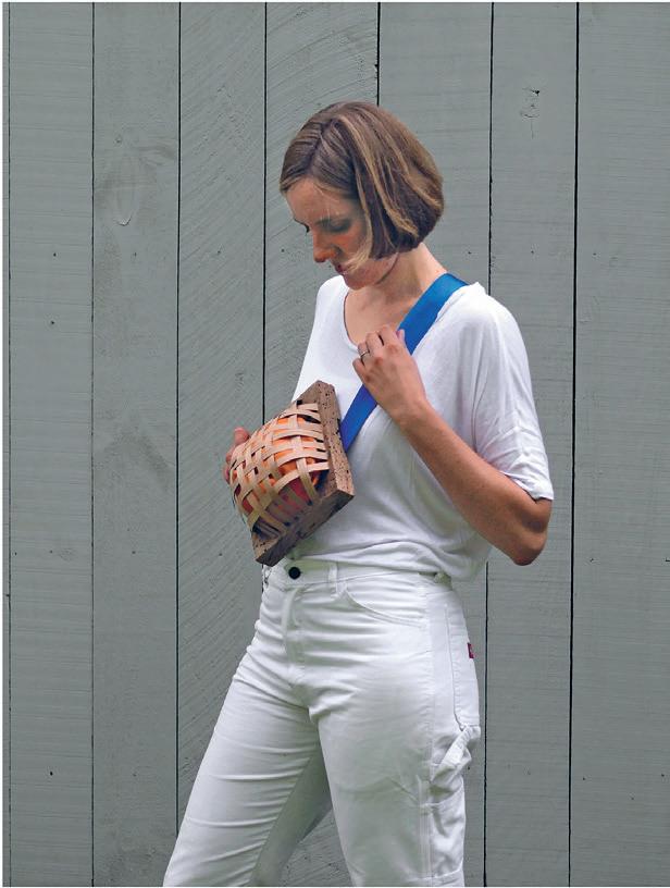
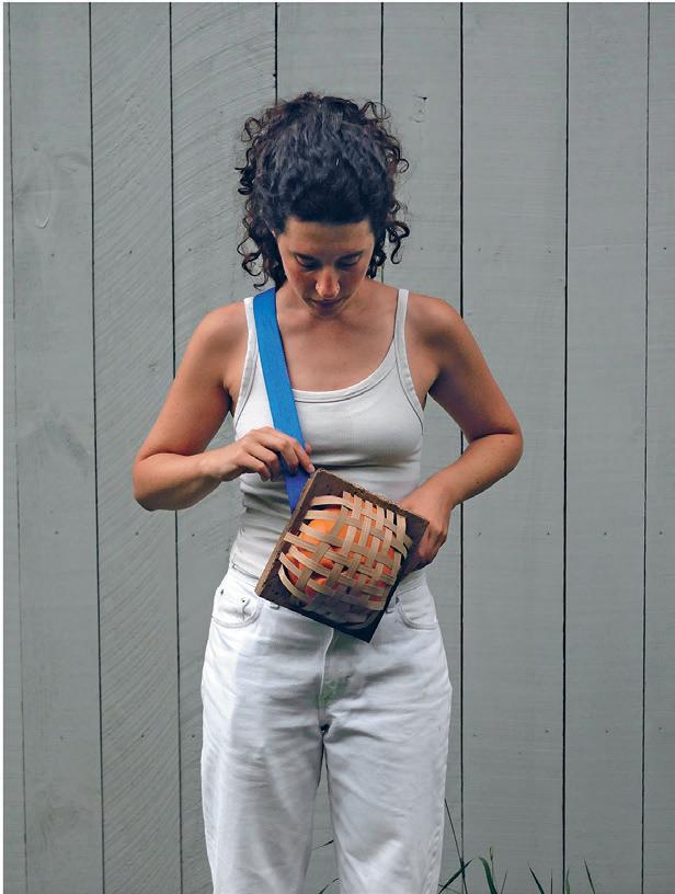
04 + 05: How to wear Womb Baby. 04 05
Co-authoring with Knotty Wood
 by So Jung Lee
This workshop challenges the notion of ‘defectiveness’ in timber and explores different values. Knots often hinder structural performance and thus its market value as a structural member. On the other hand, wood with knots is valued aesthetically as a finished surface. For sculptors, knots bring artistic inspiration for excavation or accentuation.
Between three different stances in dealing with knots, this project departs from the third position and seeks to replace the artist with the wood stock itself. Thus, the design is authored by the past life of the tree and the machine in charge of its fabrication.
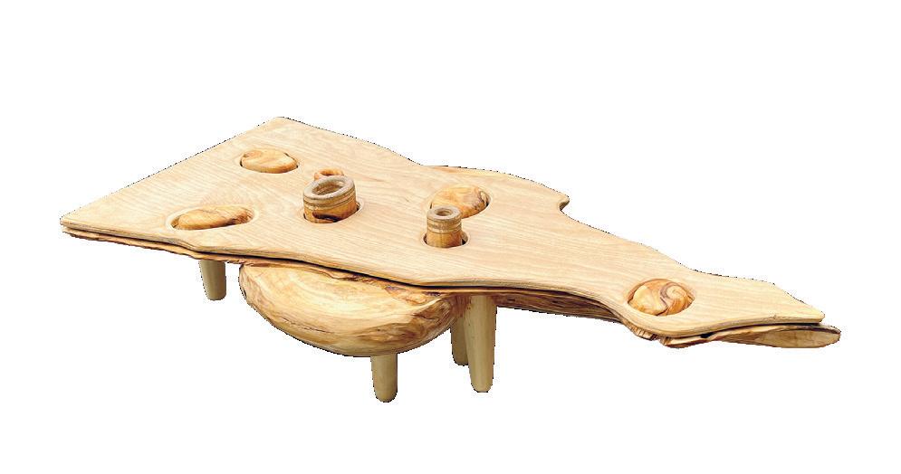
With 3D models and 3D printing, knots were studied in terms of scale, proportions, and function to make a wood tureen. The size of a typical knot and fabrication limits with CNC machines at the shop led to a certain aesthetic of an object. Moving on to the real stock, knots were identified and marked every 5cm and became a determinant for forming a vessel in the body.
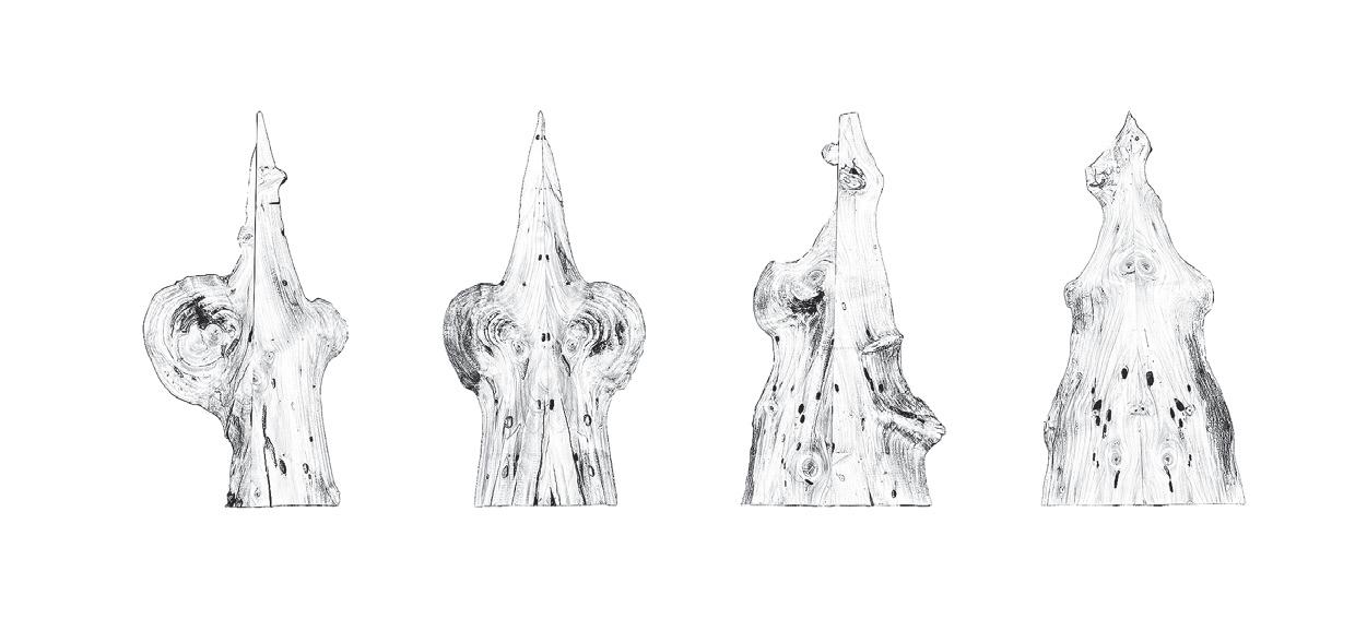
Critic: Sheila Kennedy 01: Knots on Four Surfaces. 02: Preparing the Wood. 03: Final Object. 65 01 02 03
Stowaways by
Inge Donovan + David Pankhurst
Critic: Sheila Kennedy + Christopher Dewart
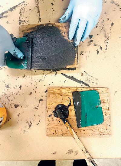
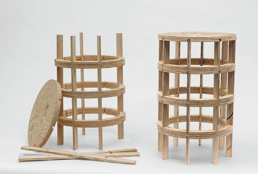
“Stowaways” uses local worm-eaten butternut wood to create a chair that is capable of conducting warmth.
The chair consists of a steam-bent cherry laminate frame and milled butternut vessels, which are capable of not only being removed to be filled with hot water but also being interchanged. As such, the chair nods to early industrial chairs such as the Eames’ molded plywood chairs, while also suggesting a highly personal relationship to the human body in its ability to provide a mobile heat source.
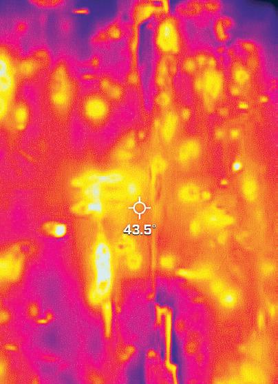
The chair is a play on the highly industrialized process of plywood manufacturing, in which the tree is unrolled, cut and laminated, with imperfections detected via scanner and stamped out instead, the non-standard, “infested” stock rejected out of the commercial wood supply chain creates a collaboration between forest, producer, and consumer. The wormy wood is layered with high-carbon content materials (graphite and ashes from wood burnt for parasite control) to create a high thermal conductivity that leverages the naturally occurring channels in the wood, viewing them as productive, rather than defective.
Note: This project was designed and built in conjunction with 4.120 Furniture Design Workshop. This course provides instruction in designing and building a functional piece of furniture from an original design and develops woodworking techniques using traditional hand tools, woodworking machinery and digital fabrication. The course gives students the opportunity to practice design without a building program or code and includes surveys the history of furniture making.
02 01
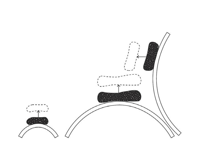
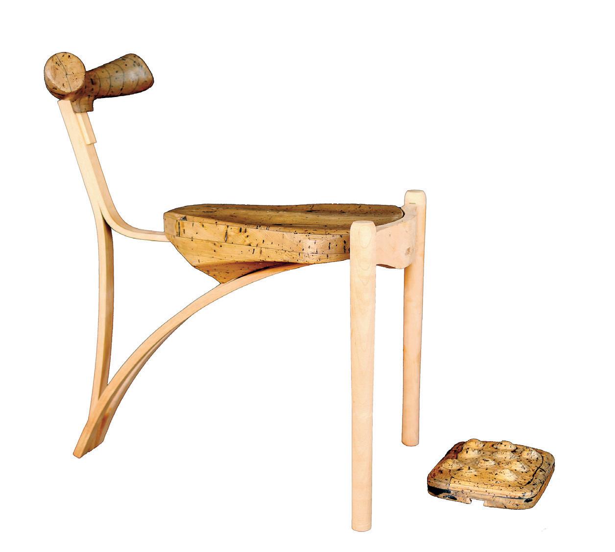
01: Process image of Butternut Laminations with Intermediate High-carbon Layers. 02: FLIR Thermal Image Showing Pockets of High Thermal Conductivity in Carbon-filled Wormholes. 03: Removable Warm Vessels are Mounted on Steam Bent Frames. 04: Photograph of Chair 67 03 04
36 Chambers
Instructed by Deborah Garcia Studio Collaborator + Electronics by Nickolas Peter Chelyapov with Teaching Assistant Cloe Yun Wang
36 Chambers: Exploring Deep Knowledge of Site and Implementing Audio Technologies in Architectural Representation will design audio-focused building interventions, focusing on sites near or around the traditional territory of the Wampanoag Nation. We will consider site and landscape as narrative mediums. In the same way that we think of museums, galleries, monuments, and archives as vessels of knowledge, we will equally acknowledge the stories that exist outside of them. We will inquire into the existence of counter-narratives in the land around us that require new forms of interpretation, display, and communication. This studio will emphasize site analysis, the development of building drawings, and the expression of an architectural character that intervenes in the physical environment, while incorporating an education in the fundamentals of electronics and acoustics. Students will learn how sound reproduction works, how to build circuits, and how to design and build loud-speaking architectural models. The studio will be divided into weekly topics including soundscape ecology, acoustic epistemology, oral history, digital materiality, and others. Screenings, readings, and discussion are supported by hands-on workshops in capturing, manipulating, and reproducing sound for integration into architectural models. The live remix, as both media state and storytelling technique, will be employed as a presentation methodology as the studio will culminate in a listening party.
STUFF


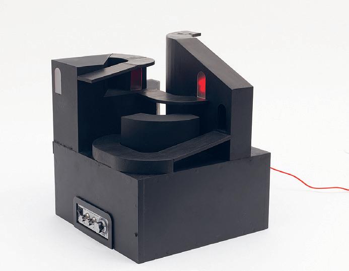
01: Album Cover
02: Speaker Mode
03: Section Rendering
Boscoli Salas Rodrigues 4.154 69 03 02 01
by Paul Gruber
by Paul Gruber
by Arthur
Soup to Smooth Epochs of the Plastisphere by Caroline Amstutz
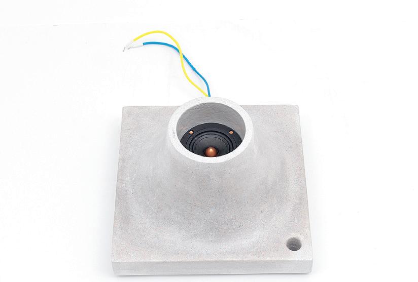
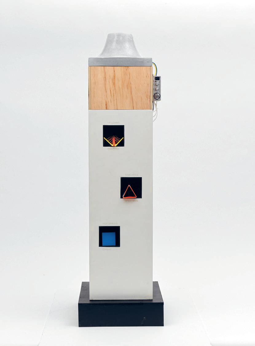
Critic: Deborah Garcia TA: Cloe Yun Wang 01: Concrete Speaker 02: Speaker, base and pedestal, displaying plastic sound devices, ‘digesters.’ 01 02
Model No. JLE003
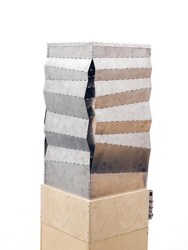
 by Susan Williams
01: Speaker Model 02: Elevation 71 02 01
Meet-Ball by
 Sahil Mohan
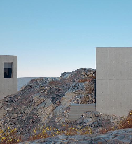
Queer people are consistently left being unsupported in their identity, their health, their relationship with past versions of themselves, or the passing of queer loved ones. In turn, this creates a hostile environment for queer bodies— take for example the HIV crisis or current legislation being passed that denies education about gender in schools. So, taking a cultural and spatial nod from the ball scene as a place for black queer people to create community through performance and nighttime celebration, this project proposes a sacred space for queer bodies shielded by an underground club. After all, the underground club is one of the only architectural and safe spaces in the queer arsenal. This project chooses to be sited in the Charles River, right next to the Harvard Bridge, for the fact that the Charles River represents the beginning and end of a timeline—it is the reason Boston exists, but it is also the reason Boston will end. By situating the project in the river, the narratives of queer mourning have a final place to rest. As you enter the club, you enter the sacred space where you record your message into a fountain. Through the transformational processes of water, audio convolution, and electronic music composition, the message becomes the music for the club—a representation of the message transforming and becoming part of the water and part of a finite timeline.
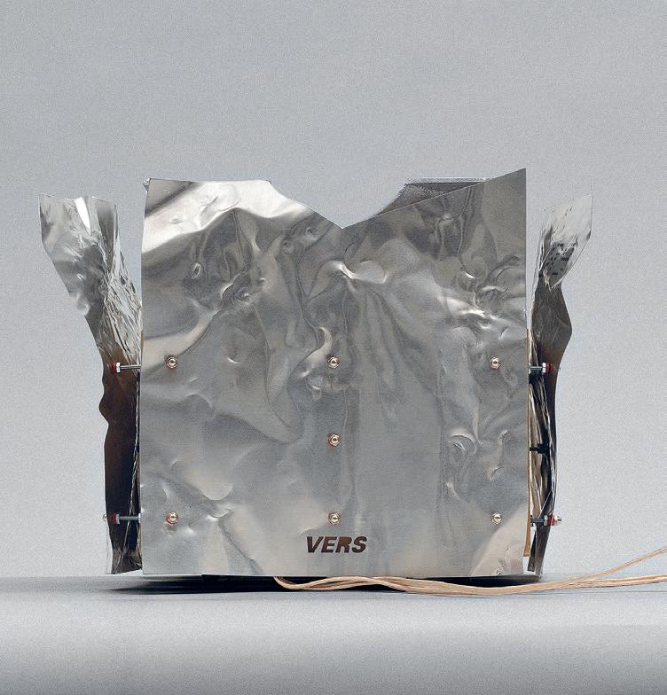
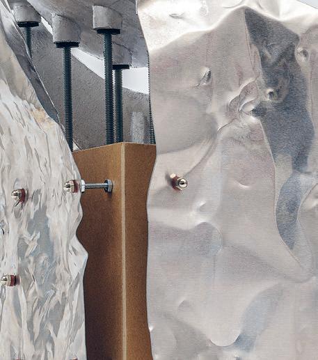
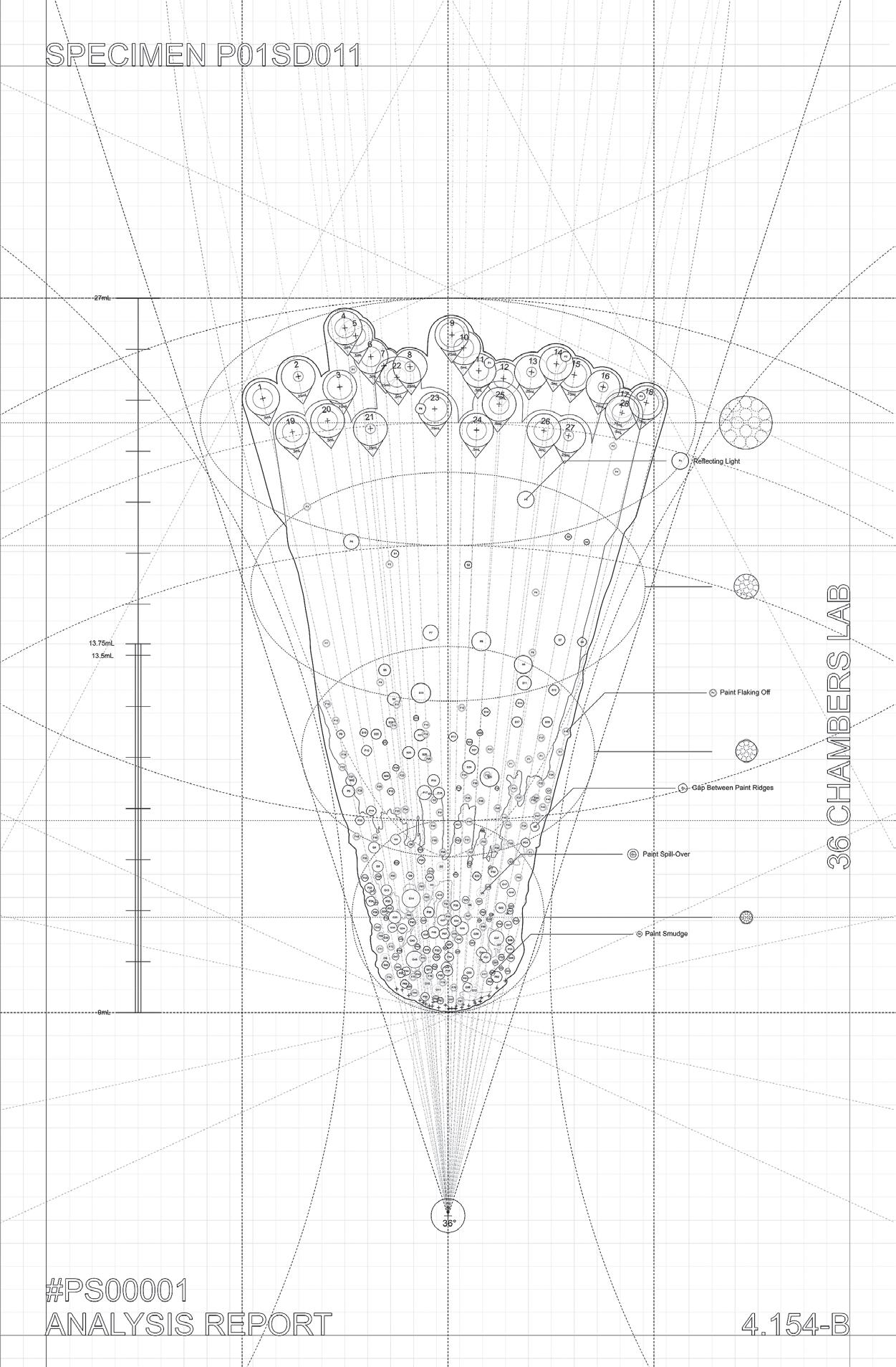
Critic: Deborah Garcia TA: Cloe Yun Wang 01: Speaker Model 02: Speaker Model 03: Specimen
01 02
73 03
Matter to Data
Matter to Data seeks to create a space where experimentation through the manipulation of matter can encourage participants to push the boundaries of architecture. It is a testing ground for connecting our heads with our hands, and our hands with the materials that make up architecture . . . It is through this intimate encounter that we are capable of comprehending, learning, and unlearning. It is a space for action. It is in data where the architectural innovation lies, and after the engineering and detailing, documentation can be produced. This back and forth process of design will allow students to push the boundaries of matter. Architects learn to interpret the places generated by the methodology and how to turn them into data through observation and analysis. This fall the studio will set out the task of imagining a student residence in La Illa del Rei (King’s Island), Menorca. An ancient hospital island that encapsulates the complexities of Menorca’s history to the present day has become an art destination.
Instructed by Antón García-Abril with Teaching Assistant Il Hwan Kim
STUFF


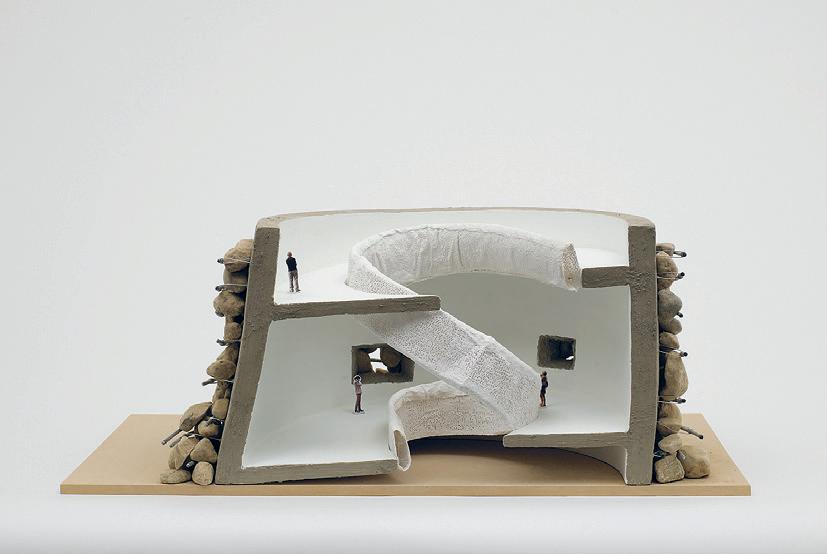
01–02: Talayots Past & Future Katie Koskey 03: Digital Model by Jayson Kim 04: Rendering by Jayson Kim 4.154 75 03 01 02 04

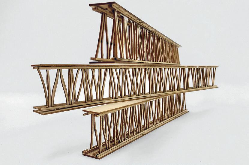
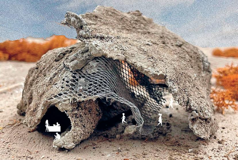
05: Talayot Archaeological Museum Render by Sam May 06: Constructive System Model by Sam May 07: A Procession in Menorca by Jola Idowu 08: House of Cards by Benjamin Tasistro-Hart 09: Reimagine the Megalithic Narrative Section by Stewart Haotian Wu 05 06 07
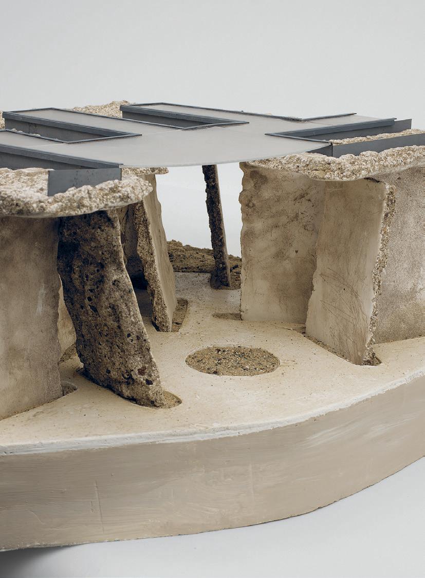

77 08 09
by Nada AlMulla
Terrene Tectonics
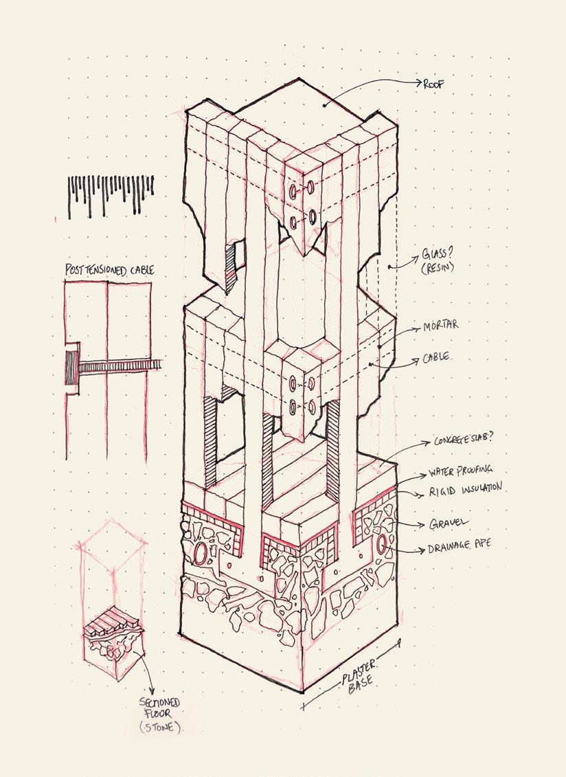
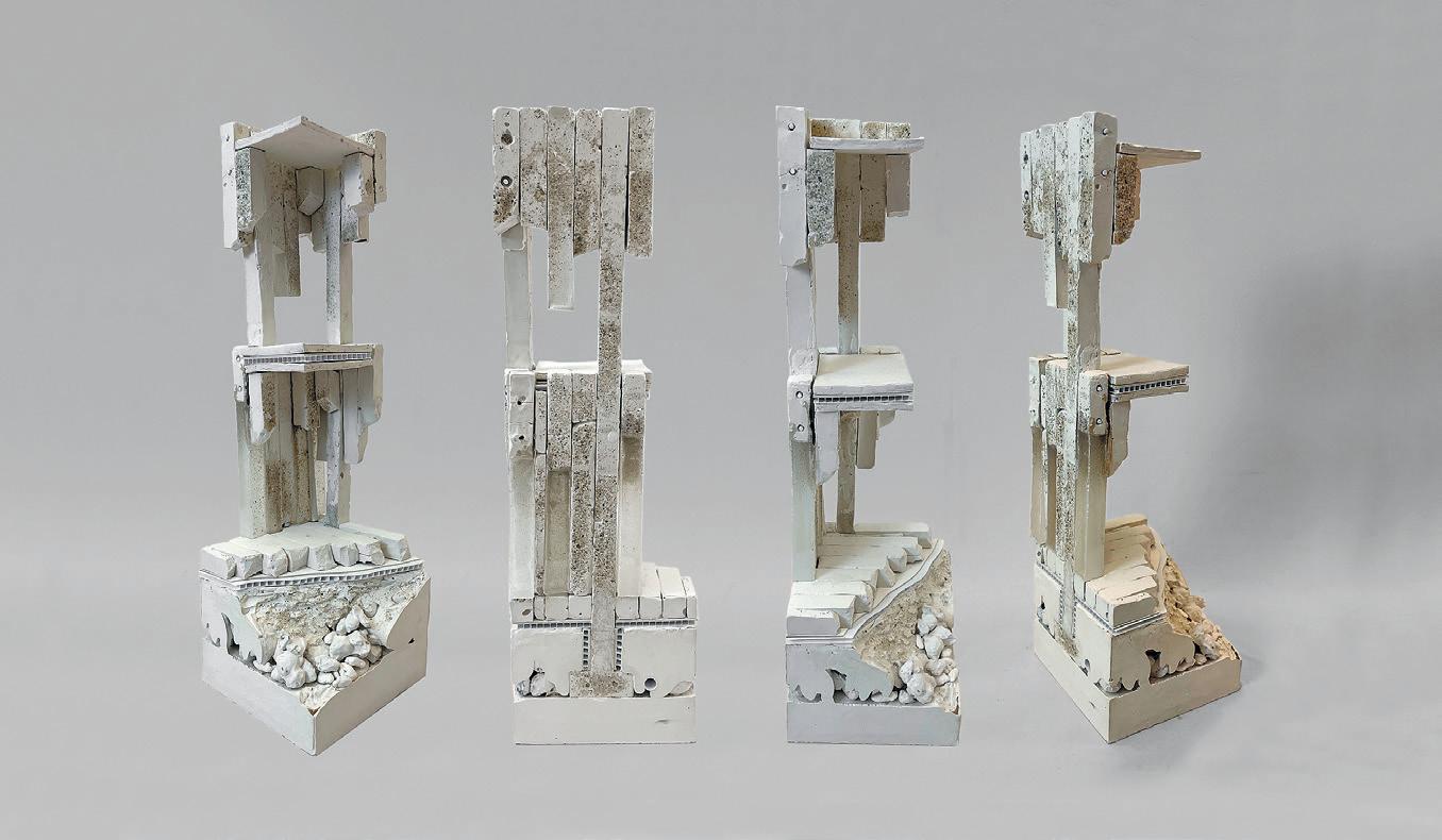
Critic: Antón García-Abril TA: Il Hwan Kim 01: Diagram 02: Wall Section Sketch 03: Section Model 04: Relief Model 01 02

79 03 04
Constructing a New Horizon
 by Cloe Yun Wang
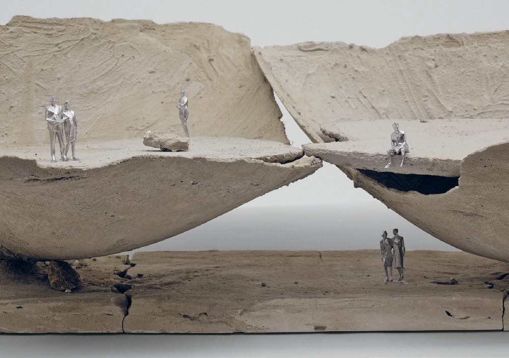
Critic: Antón García-Abril TA: Il Hwan Kim 01: Model 02: Section Elevation 01 02

01: Drip Garden Plan 02: Drip Detail 03: Model Tests Drip by
Oh 81 02 03 01
Yoonjae
Intelligent Skin
This studio will bring together the worlds of fashion, design, and technology by exploring the topic of an ‘interactive intelligent skin.’ This studio will be taught as a collaboration between HTW in Berlin + MIT. The aim of the studio is to bring together students across both institutions, as well as faculty and invited guest presenters, to help conceptualize and materialize a future intelligent skin. The collaborative studio will prompt students to imagine, design, and create design projects materializing their unique perspective on the topic. Students across both institutes will collaborate, work together, share ideas, and present in group reviews to help advance their projects. The studio will be the conceptual and experimental vehicle to design and investigate the digital skin and will be part of a large multi-year collaboration with MIT, HTW + Hussein Chalayan.
For decades, fashion designer Hussein Chalayan has been pioneering the use of interactive, kinetic and transformable fashion in his studio and on runways around the world. More recently, they have begun exploring the notion of an interactive and sensory digital skin, as a fabric and/or material surface, which can detect and respond to environmental, physical and physiological stimuli. Simultaneously over the past several years MIT’s Self-Assembly Lab and various other researchers around the world have made a number of advances in materials and fabrication that enable a field of highly active and programmable materials that can sense and actuate based on embedded logic. This begs the question can we now create truly intelligent materials that can go beyond a sense/response behavior, towards seamless human interaction, embodied intelligence, and even form their own materially creative expression.
Instructed by Skylar Tibbits + Hussein Chalayan with Teaching Assistant Ganit Goldstein
STUFF



01: Christina Meyer 02: Therapeutic Garment by Thaddeus Lee. This 3D-printed hood is reconfigurable, providing a privacy screen in this format, while also allowing it to be formed into a neck cuff for stretching and physical therapy exercises. 03: Another variant of the garment by Thaddeus Lee, this features bump-like geometries of varying hardnesses. It may be used as a massage surface, or when rolled up, provide comparable resistance to a typical foam roller. 04: Guillermo Herrera-Arcos 4.154/4.s01 83 02 03 04 01
Turgor Fashion
by Arthur Boscoli
Salas Rodrigues
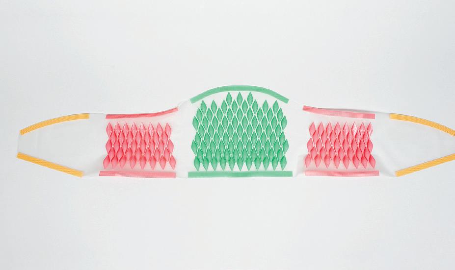
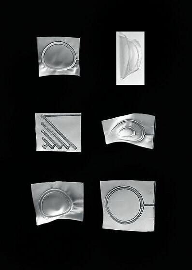
The project develops and studies the application of phase change materials and their application in wearables.

02 01
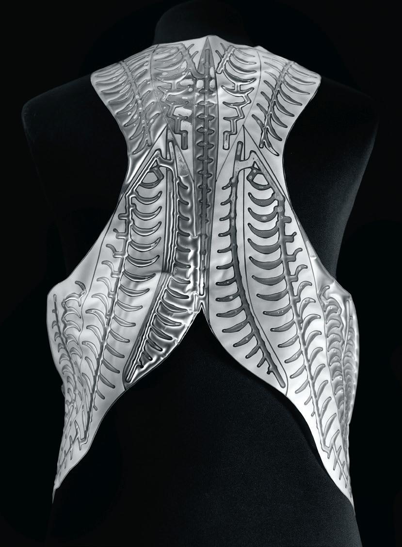
Critic: Skylar Tibbits + Hussein Chalayan TA: Ganit Goldstein 01: Material Study. Curvature studies of pressure induced flexion. 02: Detail. Parametrically defined study of pressure induced flexion. 03: Concept Mockup. Back detail of Turgor Vest. 85 03
Cycles & the Ritual of Repair
by Natalie Pearl
Prompted to construct an intelligent skin or garment, this work looked to cycles or rituals associated with what we wear that are reminiscent of geologic processes, specifically physical and chemical weathering. Rather than focusing on the subtractive and how what is washed away reveals raw materiality or form, this project gives purpose to what remains post-erosion. This project harnesses that which is washed away as a means of resetting the weathering process. The ritual act of wearing and washing is rough on our clothing. Our dryers’ lint traps expose the eroded particles and fibers of our clothing. These are the remains used to reconstruct material through needle felting. The fabrication process entailed designing and 3D printing a needle holder that could be fixed onto a jigsaw, which could then be fixed onto a CNC Onsrud. A large sheet of material was needle felted through this process. It was then cut and constructed into a jacket with the handheld jigsaw needling setup. The entire garment is created through felting, with collected laundry lint and some wool to help act as a binder.
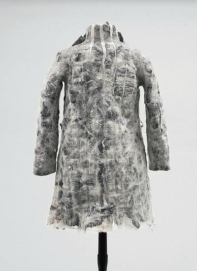
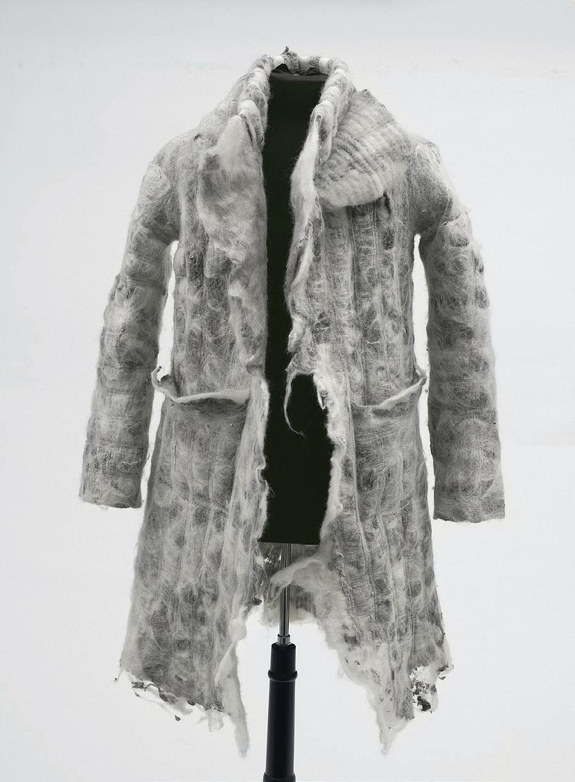
02 01
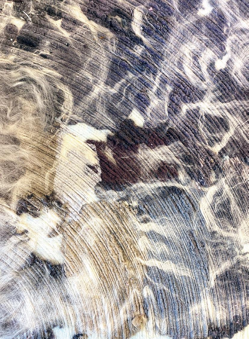
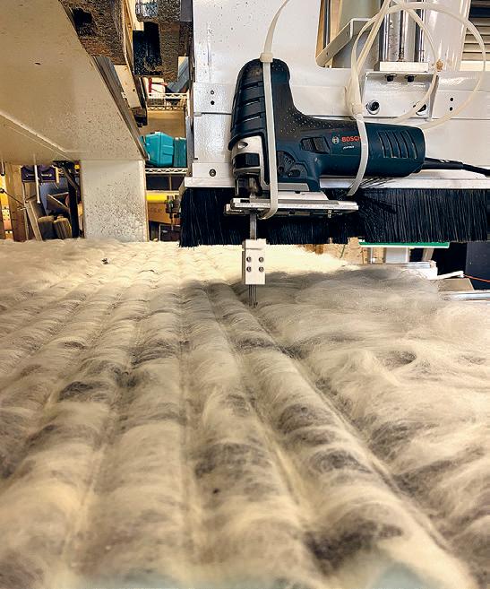
Critic: Skylar Tibbits + Hussein Chalayan TA: Ganit Goldstein 01: Back of Garment 02: Front of Garment 03: Detail Image of Felt Patterning 04: Custom Felting Tool Attachment at Work 87 04 03
Carbonfjord
The Carbonfjord site will be the Arctic coastline of Norway’s stunning but desolate Lotofen archipelago, recently subject to a government moratorium on exploratory drilling for oil, owing to the environmental advocacy of young Norwegian activists. However, the history of the region is animated by successive commercial exploitation of natural resources, from fish to timber to whales and now to hydrocarbons, each time facing economic hardship as reserves have been depleted, often forcing innovation to remain competitive. Here, we seek innovation well in advance of depletion in response to the looming environmental threat posed by hydrocarbons. Norway’s ultra-low-footprint hydropower lifestyle is in fact critically supported by the export of its vast oil/gas reserves. Mindful of the hypocrisy, we here seek to build with rather than burn this precious organic legacy.
Students will devise a carbon research institute, akin to the Aspen Institute (humanitarian issues), the Rocky Mountain Institute (energy/CO2 policy) or the Salk Institute (biomedical research) all serene research retreats that have exerted profound influence on their respective fields. But this will be a Center for Biogeochemistry in the Anthropocene (CBA), looking to instantiate a carbon architecture as a means to lock carbon in solid form to help restore the magisterial but increasingly fragile carbon cycle described by the Norwegian biologist, Dag Olav Hessen, who heads the CBA. It is poignantly sited in an evidently fragile and despoiled ecosystem, housing environmental activist scientists.
Supporting the studio is the ongoing CarbonHouse research initiative funded by ARPA-e (the Advanced Research Projects Agency of the US Department of Energy) that involves MIT and nine groups of international scientists, researchers, and composite fabricators, all focused on emerging forms of carbon for their holistic use in benign, high-performance buildings. The lead MIT architecture team is tasked with inventing a new material/production potential as a means to supplement hydrogen production at vast scale. Only the building sector is held to be able to absorb carbon at the scale of C21 projected global energy production, with renewables seen as falling well short of global demand.
Instructed by Mark Goulthorpe with Teaching Assistant Dimitrios Chatzinikolis
STUFF
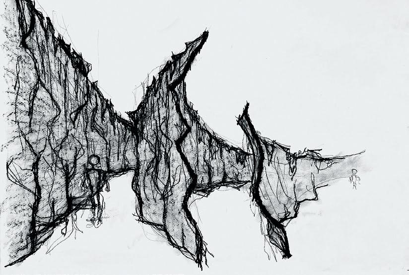
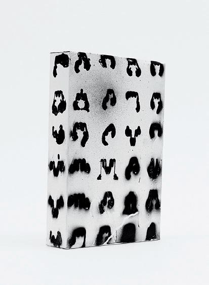
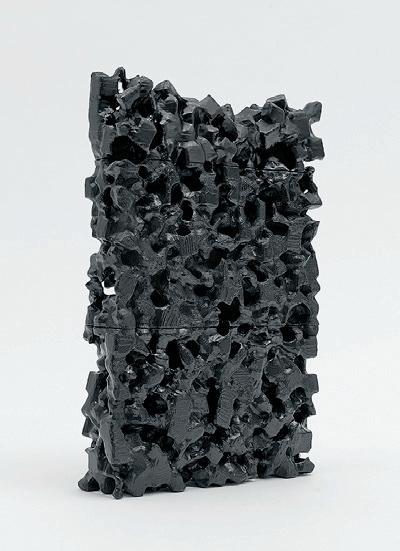
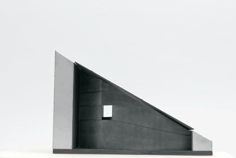
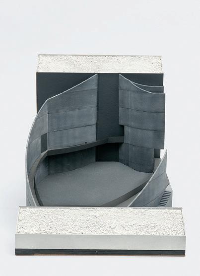
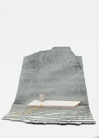
4.154 01:
02–03:
04–06:
89 01 02 03 06 05 04
Drawing by Wilson Marshall
Models by Ardalan SadeghiKivi
Models by Jenna Schnitzler
An Institute of Unapplied Research
by Benjamin Tasistro-Hart
Sited in the remote Lofoten Archipelago, the center for unapplied research brings together disciplines from the mechanical and liberal arts to create forms of inquiry that engage all human senses. Each discipline anchors an expanding concentric band of carbon that supports and is supported by its neighbors. Together the cluster creates a levitating laboratory of exploration where curiosity or un-applicability could be a source of discovery.

Critic: Mark Goulthorpe TA: Dimitrios Chatzinikolis 01: Exterior Rendering 02: Interior Rendering 03: Spatial Kit of Parts 04: Massing Study Model 05: Detail of Carbon Band
01
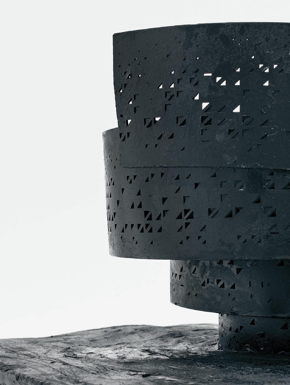
91 03 02 04 05
On Vessels
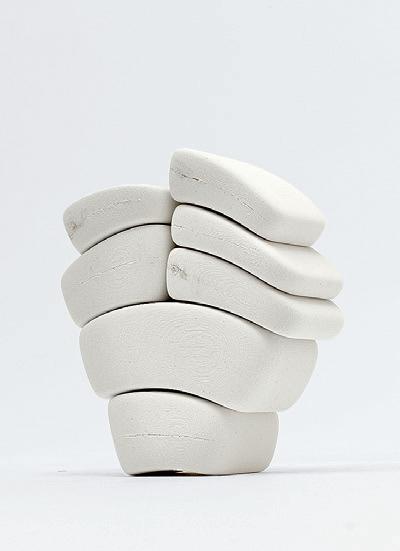
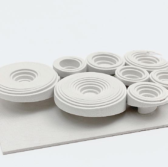
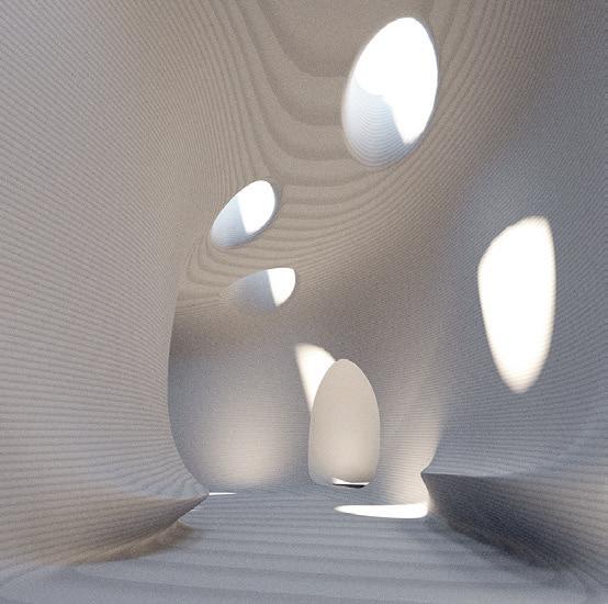
On Vessels is a studio concerned with architecture as an act of subtraction and the articulation of voids, rather than a process of addition and the making of objects. Space-making will be conceptualized as acts of removal, displacement, carving, sculpting, excavation, and erosion of material in contrast to the more typical methodologies associated with building those oriented toward the assembly and orchestrations of parts, products, and constructions systems. The studio will find inspiration outside of the western canon of architectural precedents in order to ground the studio’s research in, for example, industrially designed objects, works of land art, and subterranean spaces not typically deemed “architectural.” At the outset of the studio, we will explore the vessel as a conceptual model for the containment of space that will expand the way we imagine the shaping of space at an architectural scale.
The emphasis on the designing of voids is, in significant part, a pedagogical apparatus to draw focus to, and bring new modes of formal/figural rigor to, a relatively yet-undisciplined (this term to be unpacked and debated throughout the semester) realm of form-making in subterranean architecture. Historically, underground space-making has been informed by industrial, utilitarian, militaristic, apocalyptic, and sacred motivations. The studio will eschew programs that are deterministic and/or singular in their means to generate underground space and instead identify programs that are more more pliable, ambiguous, and enigmatic in order to prompt students to develop new forms of discipline/guiding principles for the design of voids.
Another important aspect to the pedagogical apparatus of the studio is the aim to distill the architectural problem to fewer, yet more fundamental layers of consideration within architecture studio pedagogy. On Vessels is a studio intended to focus students’ attention and effort on the conjuring of form, light, experience, atmosphere, and the engagement with myriad modes of representation that will aid in bringing students’ imaginations to life. Although this studio is one which is ultimately concerned with voids, the studio will be heavily invested in the modeling of objects as a way to depict the voids students are conceptualizing, designing, and developing. The reciprocal relationship between the making of casts and the making of molds/ formwork will provide a conceptual space within which students will revel during the testing of, the rehearsal of, and the refining of underground worlds.
Instructed by William O’Brien, Jr. with Teaching Assistant Louna Bou Ghanem
STUFF
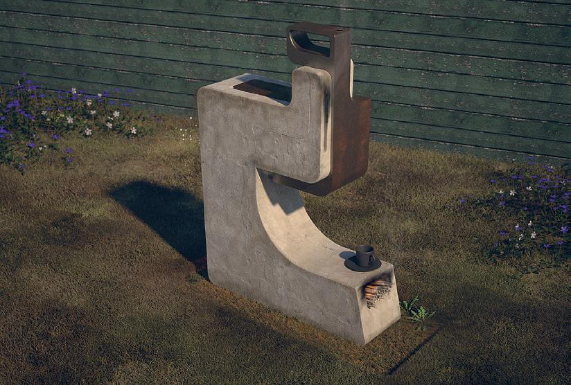
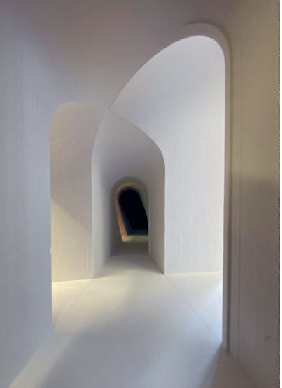
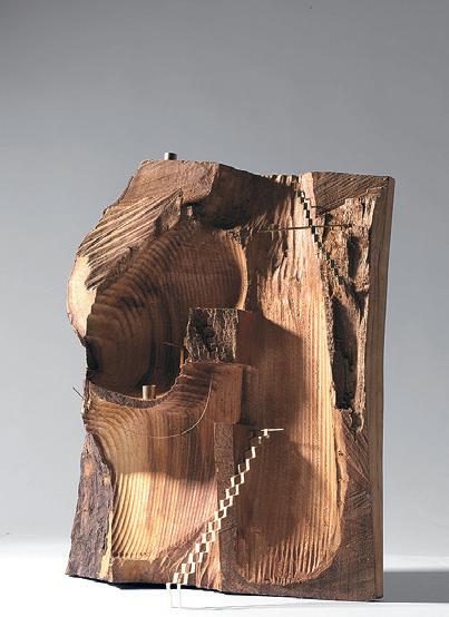
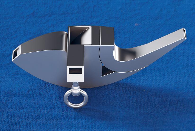
01: Vessel
02: Reverie
03: Latifa
04:
4.154 93 01 02 03 04
by Ous Abou Ras
by Ous Abou Ras
Alkhayat
Jayson Kim
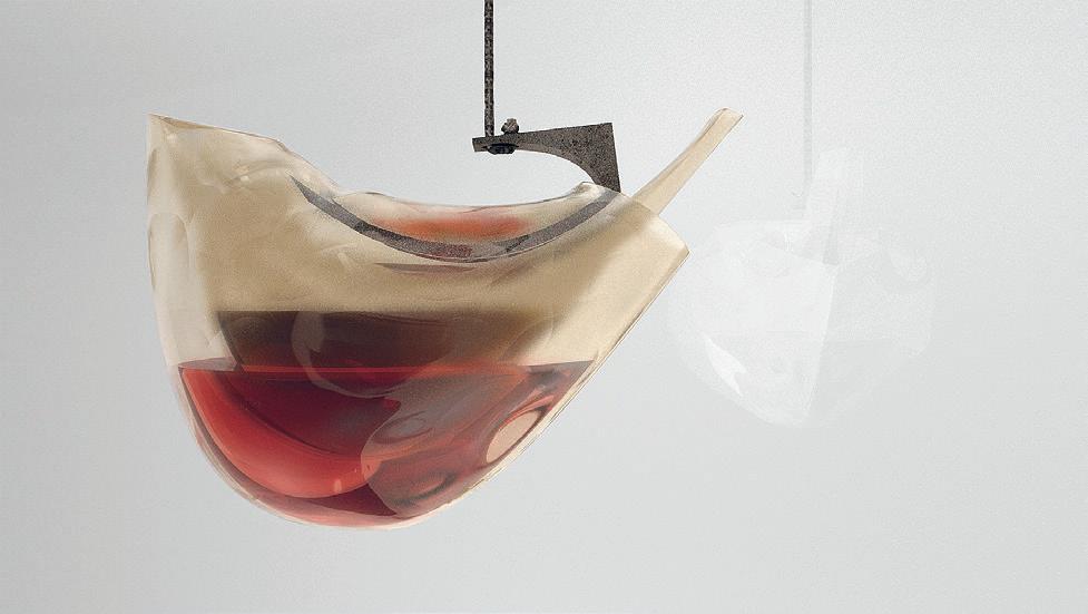

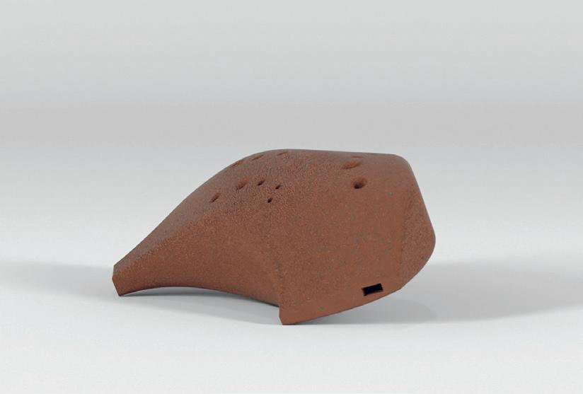
05: Katie Koskey 06: Natalie Pearl 07: Sasha McKinlay 05 06 07
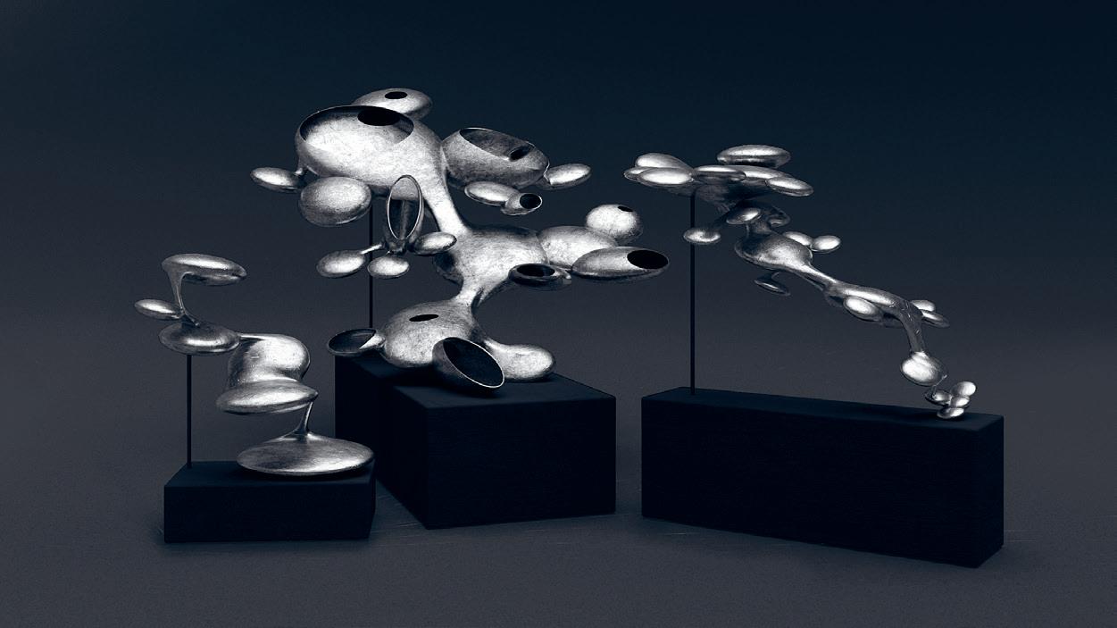
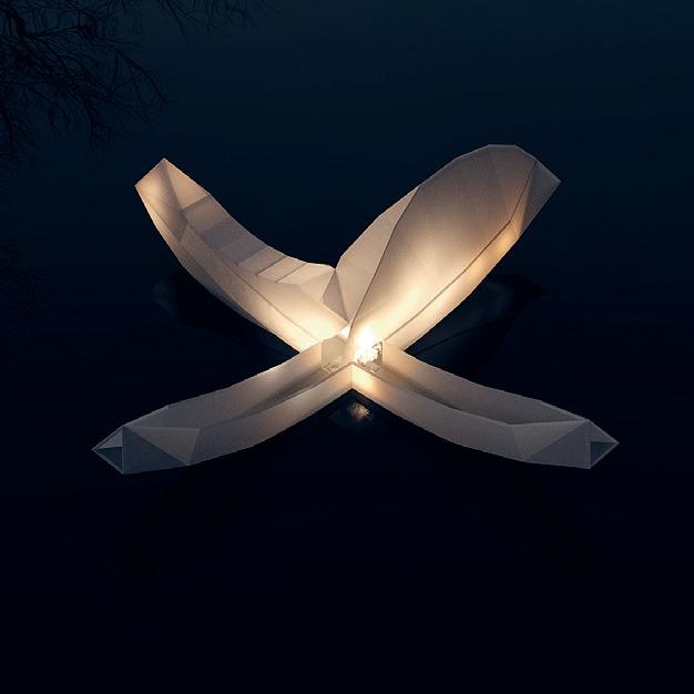

08: Sasha McKinlay 09: Paramita by Yiqing Wang 10: Dwelling on Dew Study by Cloe Yun Wang 95 08 09 10
Choreographed Chambers
 by Yiqing Wang
A series of choreographed chambers evolved from subtractive modules challenges the reading of space within the orthographic. New spaces can be crafted in the subterranean world with the vocabulary of constructive surfaces, which reveals the removal of the material and the limits of gravity. Here, an order in projection is not for the convenience of production and reproduction but for richness and uniqueness. A datum is not horizontal, a partition is not vertical, and an entry is not an end condition.

Critic: William O’Brien, Jr. TA: Louna Bou Ghanem 01: End Condition 02: Top View of the Subterranean Chambers 01 02
A Little
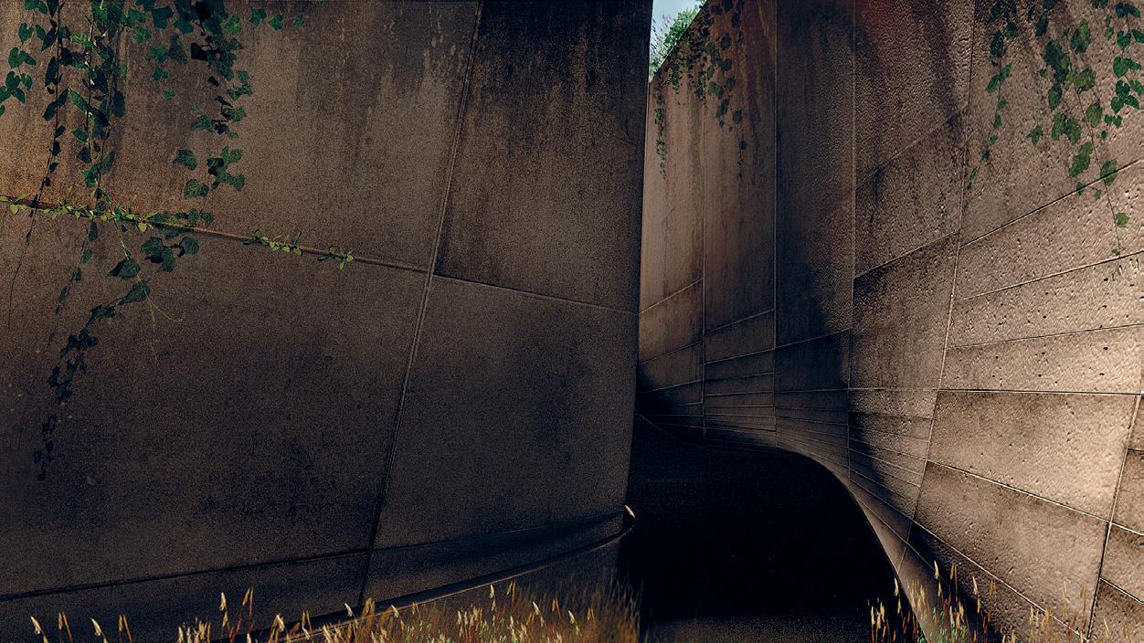 by Daisy Ziyan Zhang
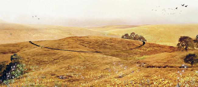
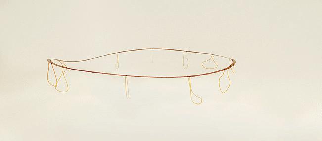

01: Site Plan 02: Conceptual Diagram 03: Landscape 04: Experience 97 02 01 03 04
Making Ingredients
Instructed by Lavender Tessmer + Diego Pinochet with Teaching Assistant Gil Sunshine and Guests Maya Hayuk + Joseph Choma
Making Ingredients celebrates reinhabiting our space at MIT after experiencing the absence of physicality in design and making during multiple semesters of remote learning. Through explorative fabrication, the studio draws on references from architectural research and street art to transform the built environment through temporary spatial interventions. The studio is joined by semester-long guest critics Maya Hayuk and Joseph Choma who provide their expertise from the realm of large-scale public artwork and research in design computation.
The studio investigates ways in which digital fabrication is highly contextual by defining constraints such as material economies, fixed mechanical resources, and resources of time and labor. Through a series of fabrication and discussion exercises, students establish a critical standpoint for negotiating the interdependencies of design, automation, expertise, and the digital tools that are now ubiquitous in architectural education. Students develop techniques of physical making that engage the externalities of physical production while evaluating these through full scale construction.
STUFF
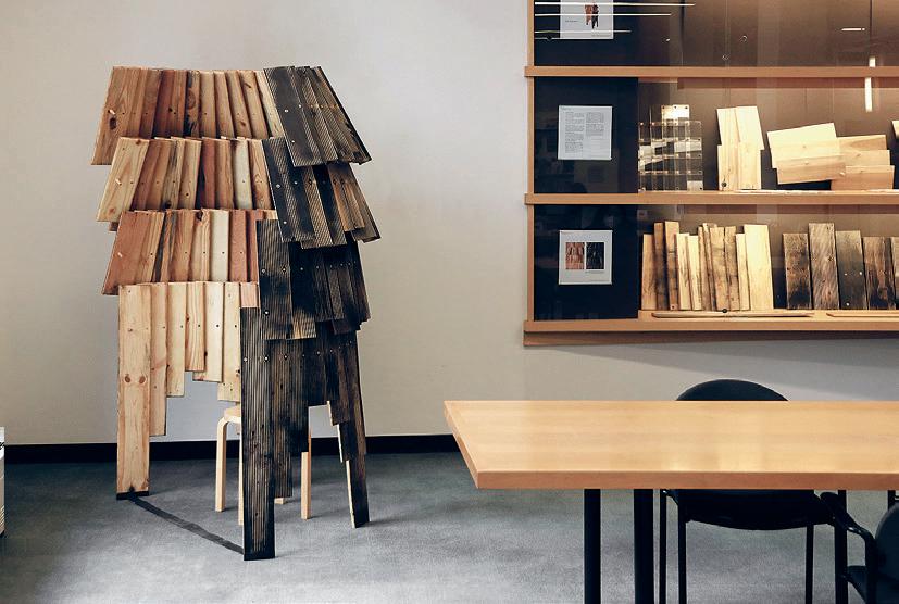
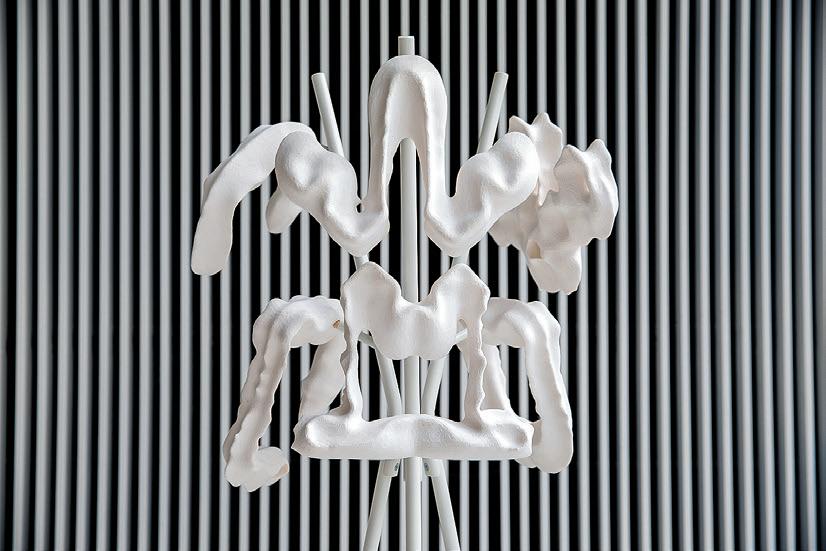
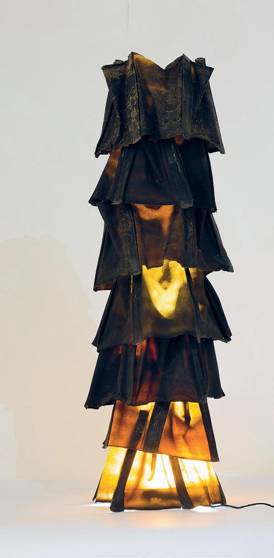
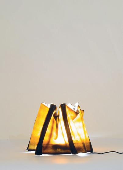
01: Shingle Nest
02: Vijay Rajkumar 03: Ardalan SadeghiKivi 04: Vijay Rajkumar 4.154 99 01 03 04 02
Wood by Tim Cousin
The Peel by Latifa Alkhayat
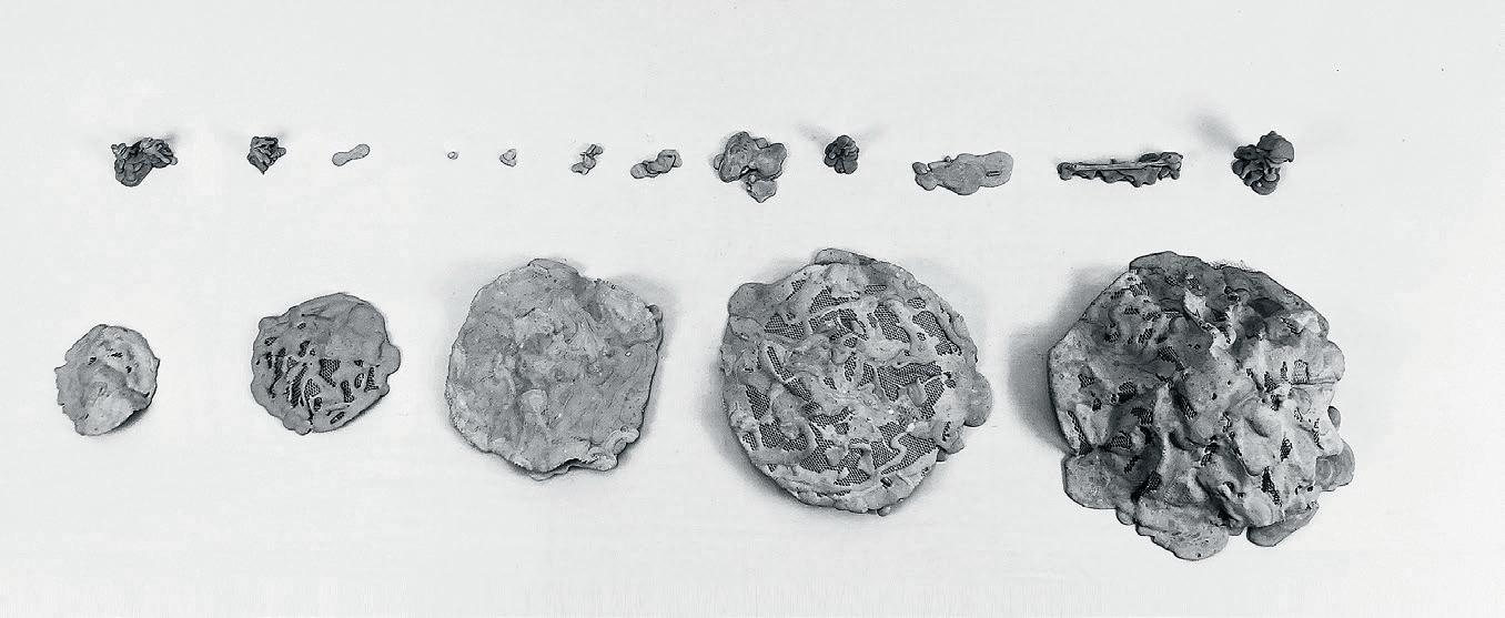
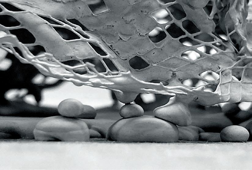
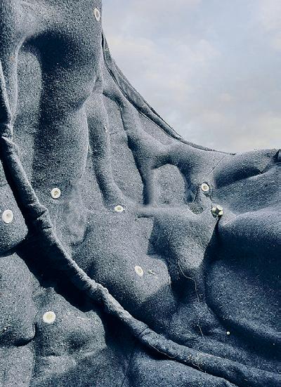
Denim in the clothing industry is arguably as ubiquitous as concrete in construction. This makes it an almost universal material, consequentally making this project context a global one. Some of the recycling streams for denim result in the shredding and felting of its cotton fibers at an industrial scale. The intensity of this felting defines how fluffy, fuzzy, or rigid the material becomes. The shelf products we find with this nonwoven material range from cotton batting used for insulation to temporary frozen food transporation bags to the moving blanket.
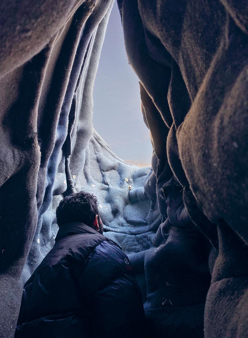
The Peel utilizes the moving blanket, or denim felt, as an articulated contraption for foam. Overall, the project looks into acheiving complex curvature using sheet material, and in doing so, celebrates insulation. Often hidden away beneath layers in the flesh of buildings (for good reasons), insulation is the invisible skin regulating building temperature. However, rarely is its structural value considered.
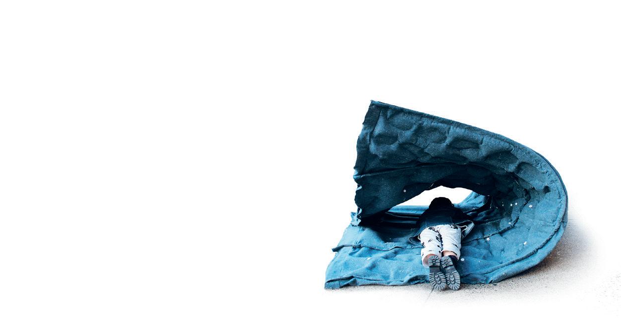
The Peel is a test for using PU Spray Foam as a scaffold for the next step in a larger layering building process. The material used is imagined as a composite, and its making involves a multistage transfer process to acheive precise and prescribed articulations.
The intention was to coat the structure with a layer of concrete and felt, forming a concrete-felt-foam composite.
Critic: Lavender Tessmer + Diego Pinochet
TA: Gil Sunshine Guests: Maya Hayuk + Joseph Choma 01: Resting 02: Grommet details of inlets and plugs used to inflate the felt fabric with expanding foam. 03: Collective repositioning of the foam structure from resting to standing.
Collective repositioning of the foam structure from resting to standing.
Standing, revealing hints of the structural pattern.
05:
04:
01


101 02 03 04 05
Can I Learn Without Producing Waste?

 by Olivier Faber
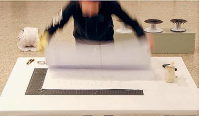
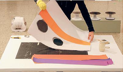
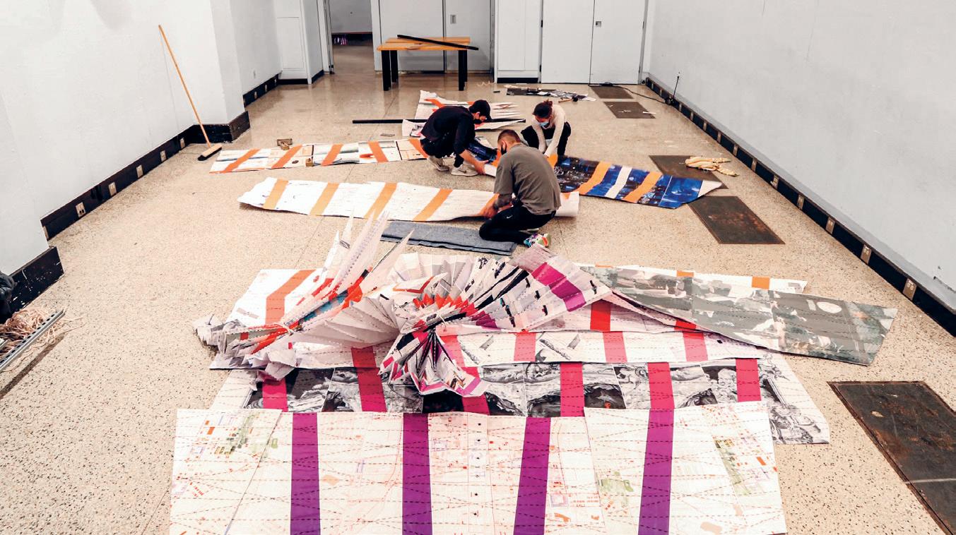
This project is an attempt at transforming our understanding of waste and material use, taking the culture of plotting in architecture school as a case study. Over the course of a semester, I collected about 70kg of discarded plotter paper throughout MIT School of Architecture and Planning and decided to build a student exhibition pavilion out of it.
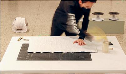
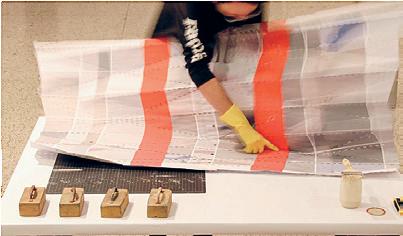

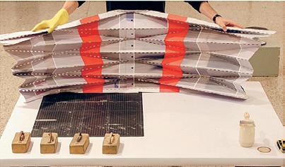
I developed a homemade flour-based glue to laminate the paper and bind it together, offering it structural properties while preserving its recyclability. As I wanted this pavilion to showcase a combination of work from the entire department, I looked for folding patterns that allowed certain seriality and allowed every studio to be given the same display. I used a combination of physically folded models (30+) and Grasshopper scripts to iterate in the form-finding process.
After a few days of exhibition in the MIT Architecture building, the pavilion was disassembled, the 100 metal eyelets removed, the up-cycled climbing rope discarded, and the 75kg of paper recycled.
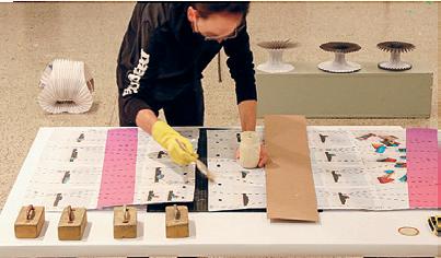

Critic: Lavender Tessmer + Diego Pinochet TA: Gil Sunshine Guests: Maya Hayuk + Joseph Choma 01: Lamination Process 02: Assembly Process 03: Final Installation
01

103 02 03
Soap Opera
by Paul Gruber
Soap Opera explores a fabrication strategy for casting glycerin with string, to create a temporary architecture installation with this unconventional material. The sheet consisted of 672 individually cast soaps that were cut from the sheet and given away to be used as a bar of soap. The installation celebrates the material properties of the glycerin (color, texture, scent) and creates a dramatic effect in the space in honor of classes resuming in physical space after twoand-a-half remote semesters.


Critic: Lavender Tessmer + Diego Pinochet TA: Gil Sunshine Guests: Maya Hayuk + Joseph Choma 01: Detail Photograph of Soap 02: Soap Opera installed in Steam Cafe 03: Reviewers + author stand behind the installation.
01 02

105 03
Core Studio II
Core II builds on Core I skills and expands the constraints of the architectural problem to include issues of urban site logistics, cultural and programmatic material (inhabitation and human factors), and long span structures. Two related projects introduce a range of disciplinary issues, such as working with precedents, site, sectional and spatial propositions for the building, along with the performance of the outer envelope. This studio emphasizes the clarity of intentions and the development of appropriate architectural and representational solutions.
Instructed by Anda French, Silvia Illia-Sheldahl + Cristina Parreño Alonso with Teaching Assistants Tim Cousin, Olivier Faber, Il Hwan Kim + Kevin Malca Vargas
STUFF
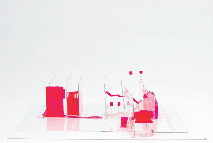
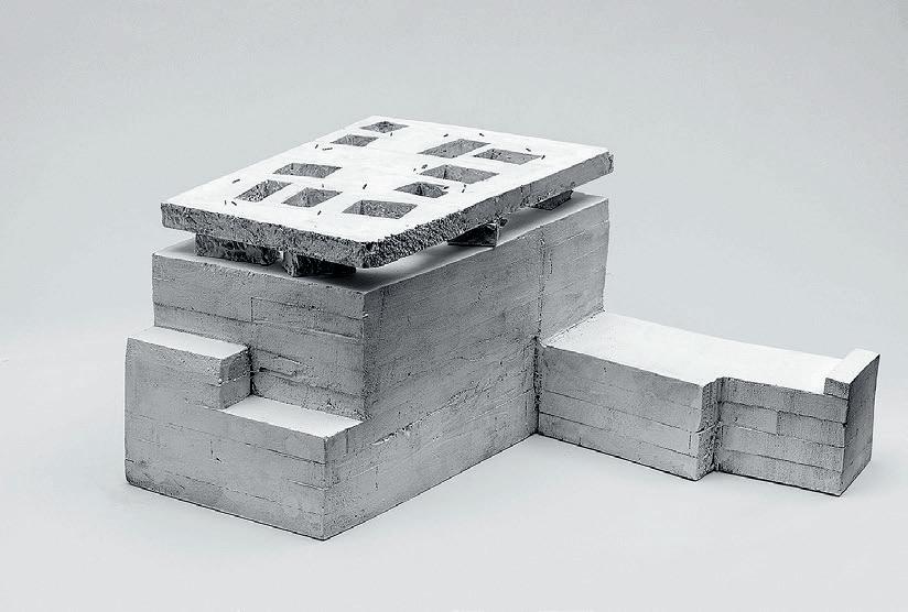

01: Soala Ajienka + Jeonghyun Yoon 02: Tejumola Bayowa + Evan Ortiz 03: Tanya Estrina + Sloan Aulgur 4.152 107 01 02 03
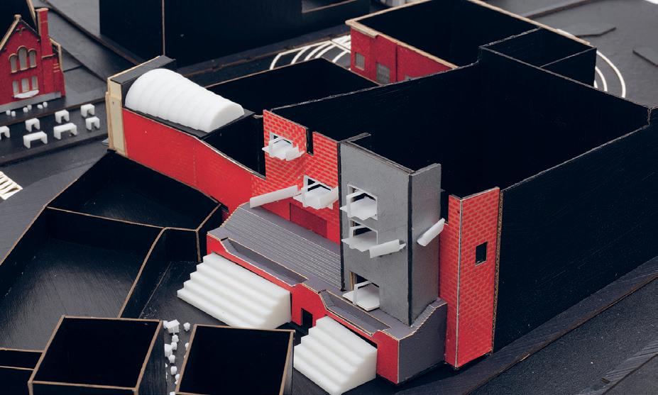
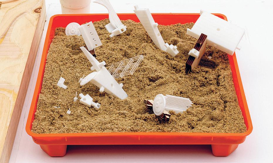
04: Gabriel Andrade + Ina Wu 05: Bolurin Adedipe + Harris Chowdhary 06: Juan Hurtado Salazar 07: Sesil Lee + Minyoung Kim 08: Alicia Delgado + Brenda Hernandez 04 05


109 06 07 08
The Market on the Strand?
 by Azania Umoja + Dzidula Kpodo
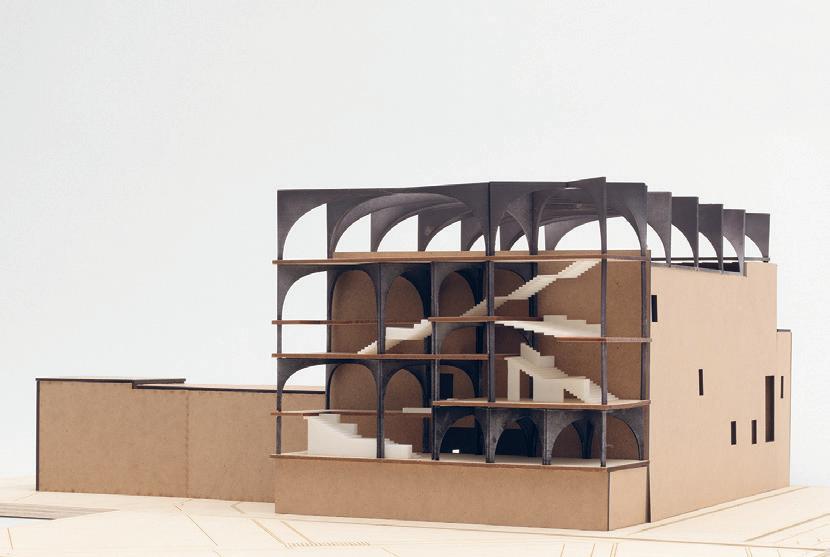
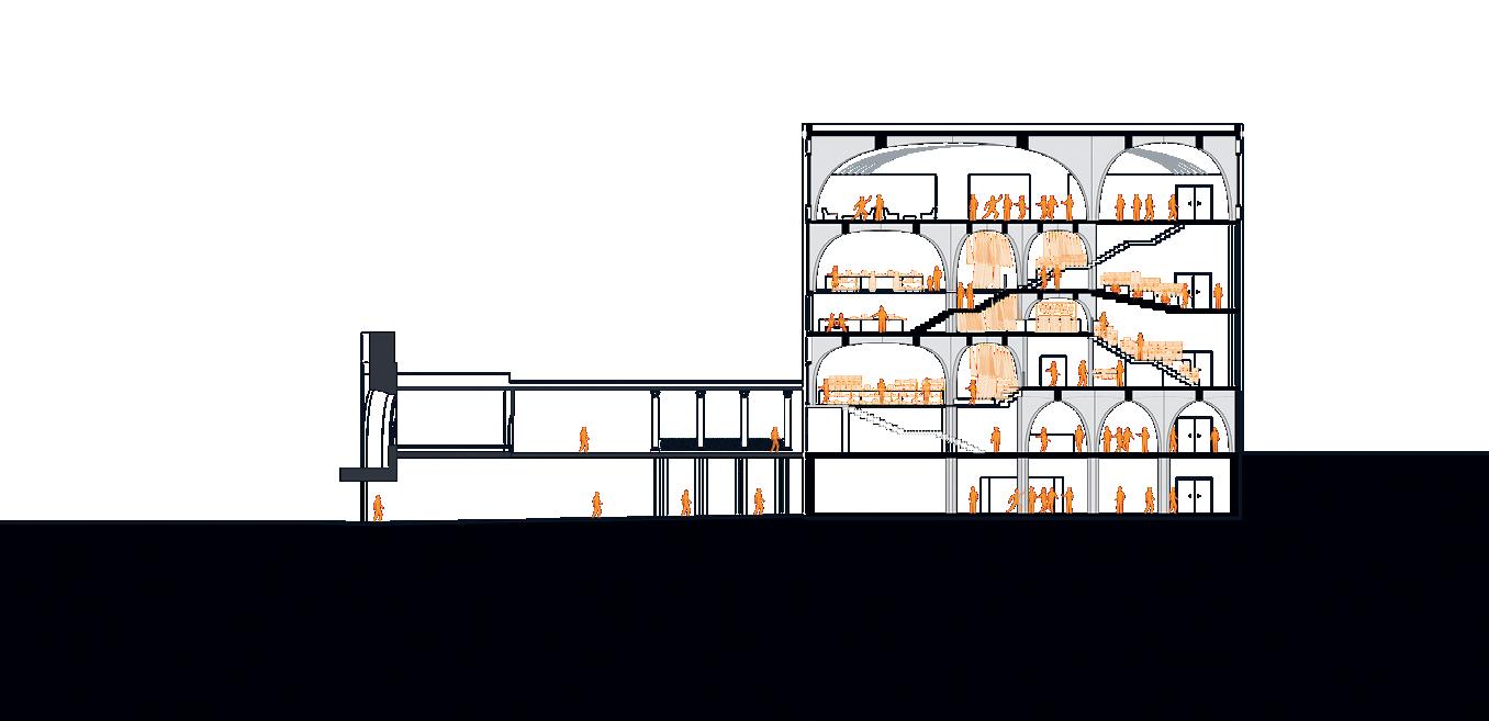
Critics: Anda French, Silvia IlliaSheldahl + Cristina Parreño Alonso TAs: Tim Cousin, Olivier Faber, Il Hwan Kim + Kevin Malca Vargas 01: Physical Model 02: Section 01 02
Rail-Stairs by Jingyun Ma
In the structural system of a railway, the enormous pressure of the train’s movement, which is carried by the steel rails, is transmitted to the sleepers and dispersed to the gravel. In this system, from top to bottom, the forces gradually disperse and become smaller.

My design flipped the material position of the steel rail and placed it under the sleepers.
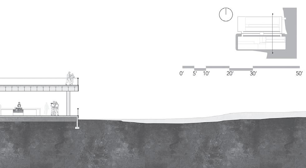
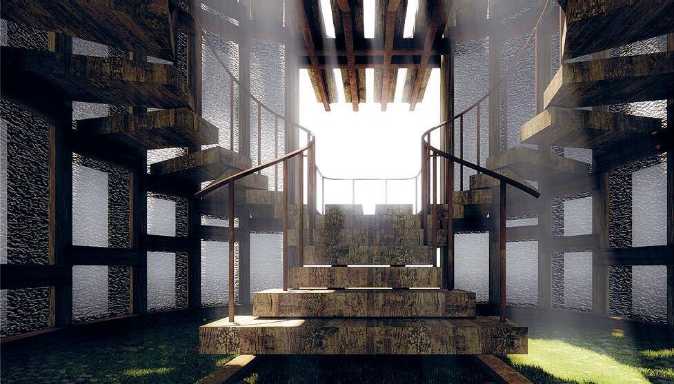
Therefore, the sleepers became the stairs, and the rails became the main load bearing structure. This pavilion, converted from abandoned railway materials, was placed on the abandoned railway. With this pavilion composed of multiple platform heights, people can stand on a high place to enjoy the scenery of railway tracks and the surrounding landscape. Abandoned rails form new spaces, and new spaces activate abandoned rails.
They all get a new life.
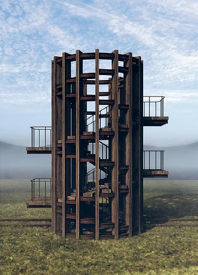
01: Spiral Stair Material Integration 02: Frontal View of Spiral Stair Material Integration 03: Interior Render 111 01 02 03
The
Gut
by Mara Diavolova + Charlie Janson
Drawing on the logics of the theater a tension between flexible use and preservation, a constant shifting present and a heavy past our proposal follows in lock step with The Strand, working within these rhythms. The Gut recycles timber materials that make up the city, an intervention that operates to embrace and encourage decay as an act of maintenance.
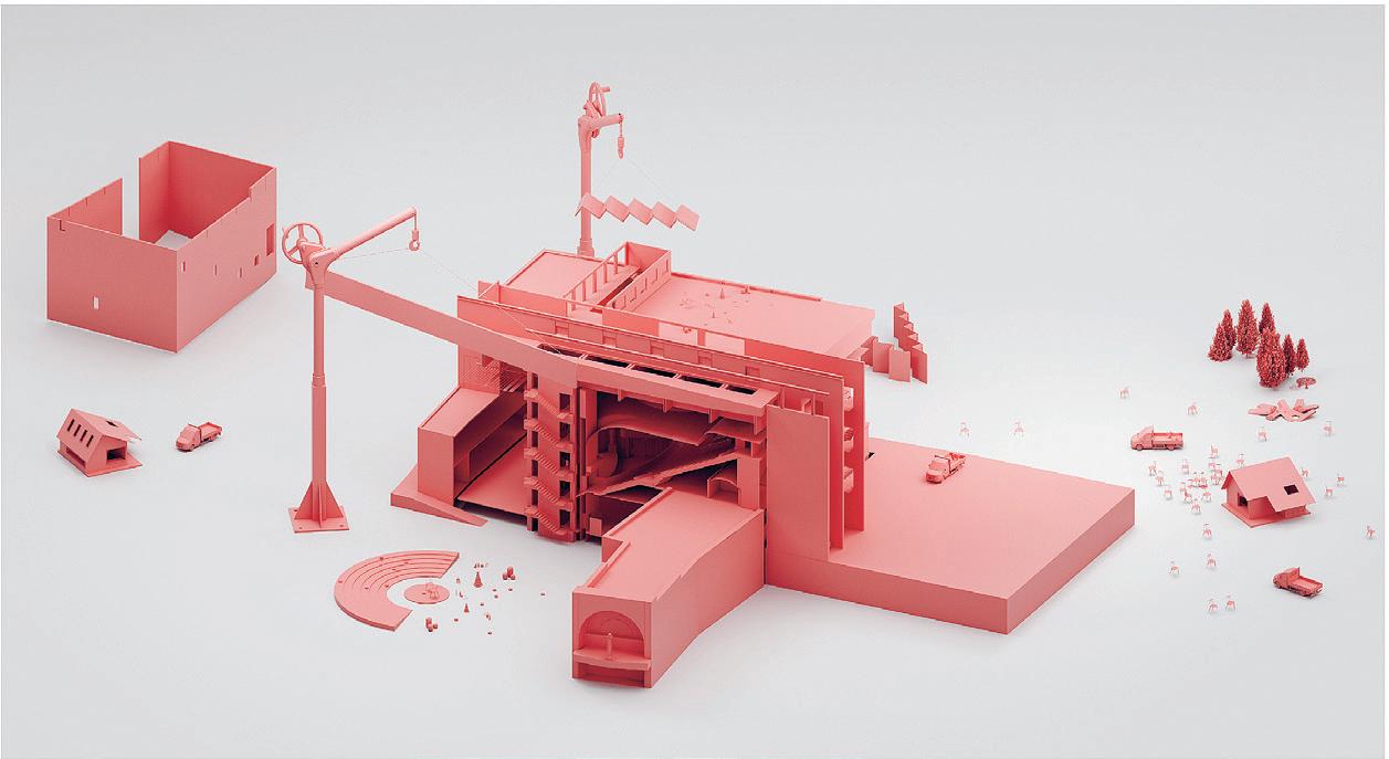
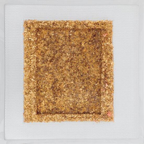
The fine tuned, fragile production of mycelium necessitates a linear flow distinct environmental needs. Altogether, this lends itself to the need for a barrier between above and below. We propose a series of pods, each facilitating a stage of the mycelium production, that are suspended over the existing ceiling and sandwiched between the theater’s existing trusses that we rein-
force. The human program of the gut, then, is about the experience of production. The roof is accessible to the public, creating an osmosis between material renewal and one’s own agency over that phase change.
01 02

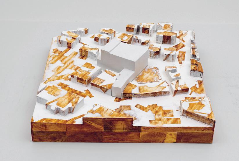
Critics: Anda French, Silvia IlliaSheldahl + Cristina Parreño Alonso TAs: Tim Cousin, Olivier Faber, Il Hwan Kim + Kevin Malca Vargas 01: Material Study 02: Intervention 03: Section Model 04: Site Model 05: Workshop View 113 03 04 05
Assembling Strand Theatre
by Suwan Kim + Nikita Klimenko
Having studied material cycles and radical reuse, we became interested in how the taxonomy of found, reused material parts may reverse the design process and make the assembly processes guide the design logic, eventually contributing to the circulation of materials and matter on the local scale around urban environments.
Our intervention is a community machine workshop and performance space that is built from the construction parts found across the Dorchester community. Its design and assembly methods are driven by the properties of the found parts, and its programmatic logic loops upon itself within the local material and economic cycles: the workshop space is served as a construction shop for the assembly of the latter part of the building, as a maintenance space and subsequently as an educational space to the reuse cycles. Similarly, the construction on top of it is both technical circulation infrastructure and a live-feed structure under ever-evolving maintenance.
As we considered the Dorchester community as an ever-evolving system of parts and demands, we were looking for modular, scalable items that may be standardized and support a novel assembly logic. Because of the recent
massive renovation of the obsolete gas pipe infrastructure, with 121,000 miles of Boston gas pipes being replaced, schedule 44 steel pipes became the first modular option. Recent demolition projects, including the Government Center parking garage or the Cambridge Courthouse, provided concrete slabs as another reusable part, due to the modular repetitive items in those projects. The renovation and demolition of the rail tracks across Boston suburbs opened doors for another component. Finally, we observed the demolition of parking lots or erasure of abandoned fenced sites, adding chain link mesh to the list of components.
In the project, we are exploring the notion of excess through the development of rule-based and self-guided assembly, because materials that are sourced from the neighborhood would be discarded and go to the infill otherwise.

Critics: Anda French, Silvia Illia-Sheldahl + Cristina Parreño Alonso TAs: Tim Cousin, Olivier Faber, Il Hwan Kim + Kevin Malca Vargas 01: Model Detail 02: Material Assembly Diagram 03: Section Model 01


115 02 03
Dismantling the Fourth Wall
by Tejumola Bayowa, Minyoung Kim + Evan Ortiz
This project analyzes the presence of the fourth wall in the Strand Theater of Dorchester, in relation to the absence of it in the Fun Palace, an ambitious unbuilt project conceived by Joan Littlewood and Cedric Price. In the more traditional Strand Theater, the fourth wall is spatially reinforced through the ordered circulation and physical demarcations that separate stage from audience, public from private. Whereas in the Fun Palace, the fourth wall is intentionally absent, with the removal of the fourth wall came the removal of hierarchy and a promotion of flexibility.
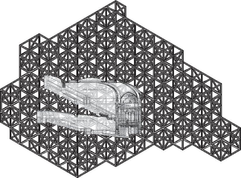
To spatially explore the fourth wall, two operational techniques, unfolding and layering, were used to uncover what upholds the fourth wall within the traditional theater. The plan of the Strand Theater was unfolded and the theater space blocked out, creating a void that exposes the back-of-house spaces. Through this operation, the spaces that uphold the fourth wall and hierarchy that separates viewer from actor, and vice versa, were revealed. In our model we began the process of layering. By taking a longitudinal section of the Strand Theater and layering the structural trusses of the Fun Palace over the service spaces, the stripped down structural quality of the Strand readily reflects the
Fun Palace. In our final model, we translate the section into a physical form. The voided theater space is translated into a white solid void, while the service spaces that surround the theater are modeled as a series of acrylic scaffolding that wraps around the entire void of the theater, implying the physical form of the theater itself.
Critics: Anda French, Silvia IlliaSheldahl + Cristina Parreño Alonso
TAs: Tim Cousin, Olivier Faber, Il Hwan Kim + Kevin Malca Vargas
01
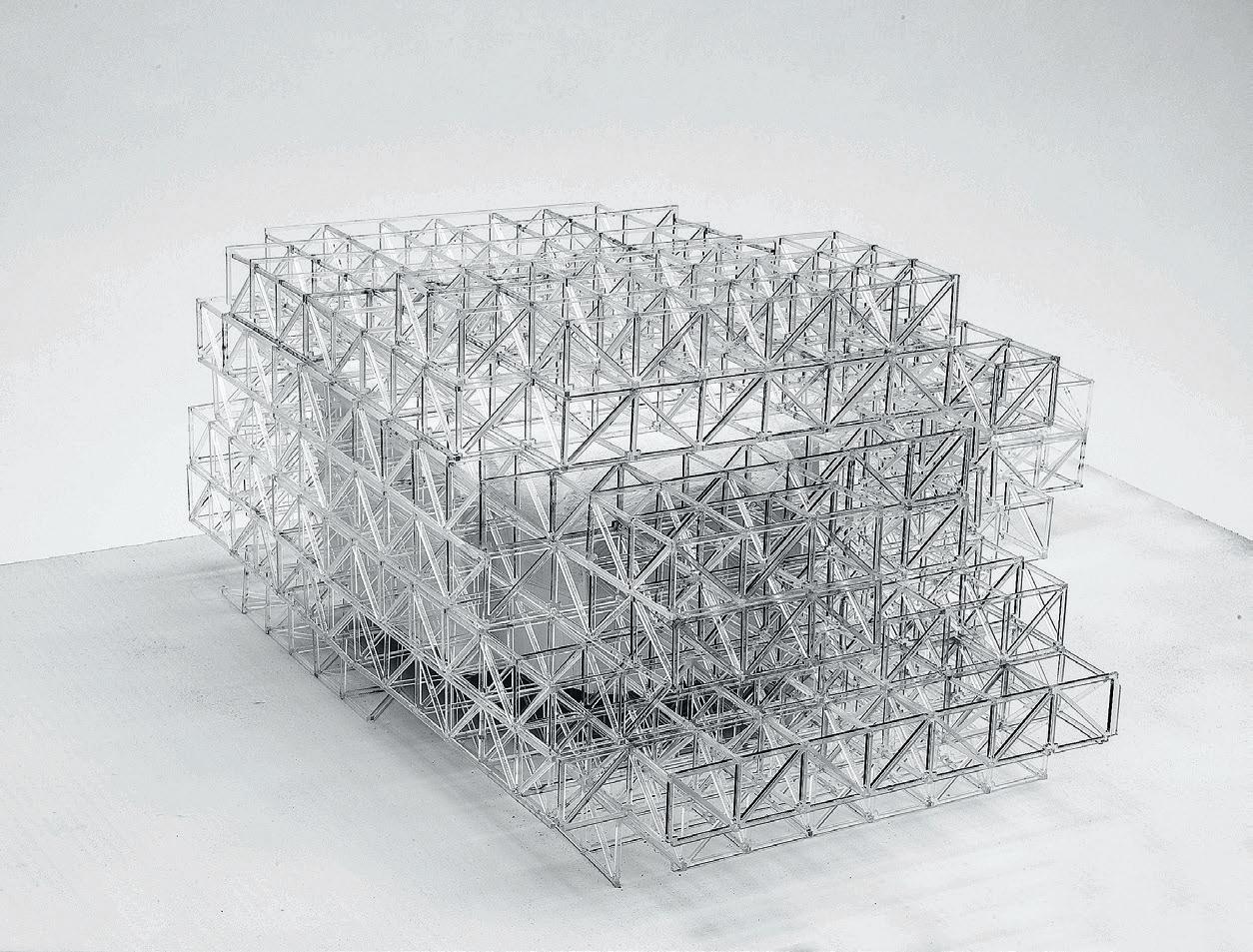
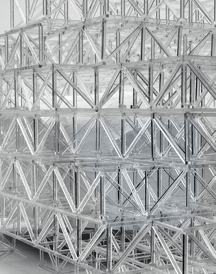
01: Collage Section of the Theater Embedded within Axonometric Grid 02: Perspective View Model of the Strand Theater’s existing programmatic structure broken into a binary of the Theater and what upholds it. 03: Model Detail 117 02 03
Into Directing MIT’s M.Arch Program
During the Pandemic and Beyond
Degree Design
How would you describe your role in the department over the past year?
BC: My primary responsibilities for the department over the past year included directing the M.Arch program, chairing admissions, coordinating Core I, and overseeing thesis. Conceptually my time was dedicated to focusing on who’s entering the program, what their experience will be upon entry, and where our students are heading beyond the program itself.
What was it like planning for an uncertain return in the fall?
BC: This question hits home for me primarily in thinking about coordinating Core 1.01 The previous year was a definitive moment to reconsider how we teach because at that point in time, we at least knew we were going to be online. For me, it was an opportunity to think about restructuring the system and rethinking the convention of dividing into studio sections. Instead, we introduced the idea of circuits as one way of being able to move through and engage all the faculty that are teaching in Core I. In an interesting way, that stress test taught me a great deal about how to expand the Core I process.
What is your view on the role of Core I?
BC: It certainly is incredibly challenging to conceive of teaching any studio remotely. The prior pandemic year was already challenging. The following year, the degree of uncertainty about whether we would return and to what level, constantly shifted over the summer. But it was clear to me that we needed to have a contingency plan no matter what. Teaching the class in a way that it could be picked up remotely was already in the back of my mind. And I thought the things that we had learned in the previous year were applicable to Core I, regardless of whether pandemic restrictions remained. I think it was more organizational than it was intellectual insofar as making sure there’s enough space in the schedule. It wasn’t so much from me about whether we were going to have to change the syllabus. It was about making sure that there was space and schedule so that if any one student got sick it wouldn’t be detrimental. And the biggest shift was to move away from the
Clifford
Insight
Brandon
Offers
Brandon Clifford is an Associate Professor in MIT’s Architecture Department. He serves as the M.Arch Program Director. His work focuses on drawing modern design and architecture lessons from ancient knowledge.
idea that everything builds towards a final review and that there’s one moment to evaluate your progress to more incremental moments, so that if you missed one circuit you could pick it back up and continue your education.
Was it difficult to get students to think that way? The final reviews are all scheduled together and it’s a big sequence of events.
BC: It’s baked into the Institution. I mean, it’s hard to get away from the idea that the final review is a final review. We tried branding it as an exhibition, as a celebration instead of a review. But ultimately, it’s still the last thing you’re doing in the semester before you’re taking a break. It was difficult. I would say not just for the students, but for the faculty also.
Pedagogically, we were hoping to charge the students with more agency in thinking about how they want to engage their work. There’s a standard mode that we all know in architecture schools, where the critics sit in the front row and speak to the work after it’s been presented with the rest of the class behind the critics. That is one way of engaging a body of work. Even just having to have the challenge of thinking about how I want someone engaging in my work so that I can get feedback was one step away from saying there might have been a student who was having a challenging moment. Had they been out for two weeks, having a formal review at that moment is not productive. There are other ways of having more intimate conversations that have stretched out across longer periods of time that are more helpful.
What do you think was most successful in this iteration of the studio? What did you learn from coordinating and teaching it?
BC: Maybe it would be useful for me to step back and talk about how I see MIT and Core I. I don’t pretend to speak for everyone when I say this, but above all else, the pandemic forced a clarity and distillation of what should be valued, what should remain, and what should be reconsidered. And in turn, that exercise helped me better understand the parts of our structure at MIT that make teaching Core I uniquely challenging. First, we’re a three-anda-half-year program, and we’re the only school that doesn’t accept students with advanced placement. What that means for Core I is students with backgrounds in architecture are not bypassing the first year. We’re the only school that takes the position that you can’t place out of Core I. And that means that Core I isn’t rudimentary. It’s not like you have to learn these things before you get to Core II and Core III and Option Studios. It’s that there’s something fundamentally MIT that’s happening in Core I and Core II.
The other thing that I think is unique about MIT’s Core I is partially because of the structure, but also because of the culture that’s been cultivated. You have students that are coming here from a diverse range of backgrounds that are interested in a diverse range of possible outcomes upon graduation. From my point of view, it is not about indoctrinating students into one way of thinking about practicing architecture. It’s about structuring an environment where students can find their own unique contribution to the world. I go back to the idea that you’re bringing in people from a vast range of backgrounds.
01: See p. 125, “Core I Studio” 119
Some students have four-year degrees in architecture. They may have even worked for another 3 to 5 years before entering the M.Arch. And then you have students who have no experience in an architecture studio and are bringing entirely different experiences to the table.
I think most educators in an architecture school, at this period of time, have a relatively common experience in their foundations education. A lot of it came out of the Bauhaus model. We’ve relied upon that common education as a way of introducing certain skills in the design process. There are figure drawings, collage, composition, and formal analysis. If we really go into the Bauhaus, there’s color theory, even though we don’t teach that today. But the vast majority of people that have gone through a foundations education are going through that education with other people that are of the same skill level in architecture. And that’s what makes Core I at MIT so challenging, because not only do you need to introduce these foundational skills to students who could really benefit from them, but you also have to challenge students who already have a background in architecture to critically evaluate these methods and figure out how they transition that into a master’s education. During the pandemic, I shifted from thinking about Core I as making sure that fundamentals are instructed to ensuring the individual student is returning their focus on what they want to do in their masters so that they have that clarity.
Let’s touch on the “Making Ingredients”02 studio. Who had the idea and how did you help facilitate it? What went into making that studio?
BC: I think COVID had the idea really, because it was conceived by a range of people. I’ll talk about my perspective on this. But definitely Nicholas and I were conceiving this at a broader scale together. With the pandemic, there was a definitive hunger for wanting to touch materials in person. How are we going to do that remotely? Zain Karsan became instrumental for the first version of this course.
The idea was that we could invest time and energy in making materials on campus and also bring visiting critics in who could critically evaluate so that it’s not exclusively a technical exploration. You could bring in visual artists. You could bring in other fabricators who have approached fabrication through a critical lens. So instead of having one professor, you can have a lot of activity and then have a team of people that are giving you different ways of viewing it. Lavender and Diego03 were ideal instructors. As PhD candidates here at MIT, they have both taught previously, and they’re both very passionate about instructing hands-on experiences. They were a perfect fit for the kind of experiences necessary to do a fabrication studio. The combination of Joseph Choma and Maya Hayuk came from Lavender and Diego. Nicholas and I were thinking about the structure. How could we break down the idea that there’s one faculty member that flies in from London to teach an option studio that you see every two weeks, to this more hands-on, but broader experience. We went to Lavender and Diego and said, give us a list of names of people who, first of all, would be complementary to the way that you’re thinking of the studio, but at the same time could challenge you and your education. Through that list we landed on Joseph Choma and Maya Hayuk. I would say that’s
pretty much the level of engagement other than my own passion for the studio, coming to see what was happening, and talking to Lavender and Diego.
How do you think the return of studio spaces has affected the work produced?
This is not unique to MIT. My colleagues at other institutions are echoing this as well. We essentially have a limited amount of time in the studio. You’re wearing a mask in the studio. It’s uncomfortable. Our studio spaces already don’t have a whole lot of ventilation or daylight, and the experience of working in there is not as fluid as you would want when facilitating a creative process. This is where I think my pedagogical approach shifted dramatically during the pandemic, because we tried to move away from that communal, creative experience to focusing on the individual much more and having more one-on-one conversations with students in a way that really did happen during the pandemic year. When you’re on Zoom, you’re having a lot of these relatively intimate conversations about what students want to get out of their education in a way that you don’t get if you’re teaching a class via instruction instead of mentoring. That shift away from instruction and towards mentorship was one of the components that shifted studio work last year. But we certainly saw less in-person studio activity. I think a lot of people will finger wag at that. I don’t know that that’s necessarily a bad thing. My hunch is that it should be addressed, considered, and shaped. But a return to normal is also not on the table because I would like to know what normal is: pulling all-nighters? Critiquing on weekends? Generations change and just because things are not done the exact same way doesn’t mean that less is being done. It’s just being done in a different way.
What was the funniest or weirdest thing you saw on campus last year?
BC: I don’t know that I have anything on that end because there were hilarious things happening on MIT’s campus before the pandemic, like ballroom dancing adjacent to a LARPing practice and all kinds of club groups. Usually, the strangest things that happen at MIT are when I’m leaving campus and walking through the other lobby corridor spaces. But last year during the pandemic, everything was so serious about being inside with your mask on that a lot of those activities weren’t happening anyway. So the funny things had more to do with projects that were happening. From the “Making Ingredients” studio, coming in for the review and seeing Paul’s magnificent stained glass window of soap was probably for me the funniest experience. Not ha-ha funny, but in a year of seriousness, there was just so much joy in that project.04
This interview has been edited for length and clarity.
02: See p. 100 for more on the “Making
03: Lavender Tessmer and
Pinochet
in Design and Computation at MIT. 04: See “Soap Opera” by
Gruber on p. 106. 121
Ingredients” studio.
Diego
are PhD candidates
Paul
Core Studio I
Core I explores the foundations of design through a series of bracketed methods of production. These methods exercise topics such as form, space, organization, structure, circulation, use, tectonics, temporality, and experience. Students develop methods of representation that span from manual to virtual and from canonical to experimental. Each method is evaluated for what it offers and privileges, supplying a survey of approaches for design exercises to follow. The course is the first in a sequence of design subjects, which must be taken in order.
Instructed by Brandon Clifford, Deborah Garcia, Jeffrey Landman, Mohamad Nahleh, and Sanford Biggers with Teaching Assistants Taylor Boes, Maryam Aljomairi, and Yaara Yacoby
STUFF
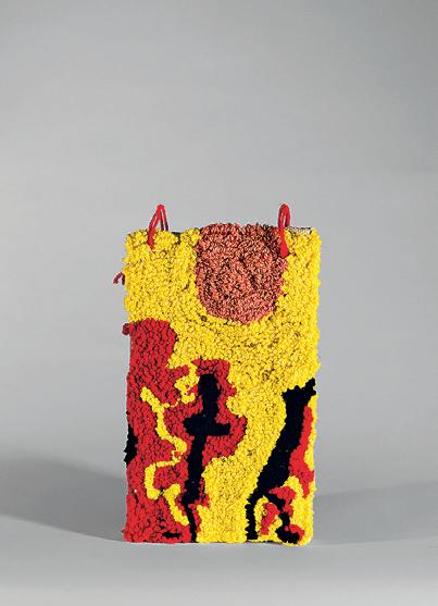
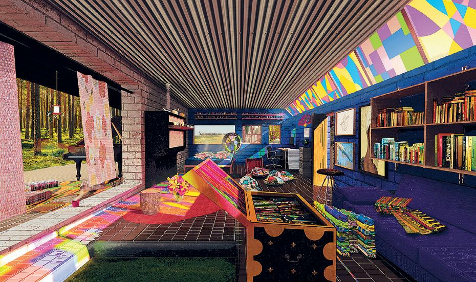
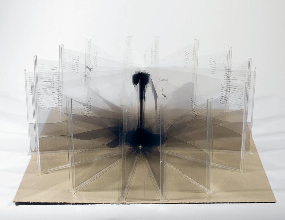
01: Soala Ajienka 02: Gabriel Andrade 03: Charlie Janson 4.151 123 01 02 03
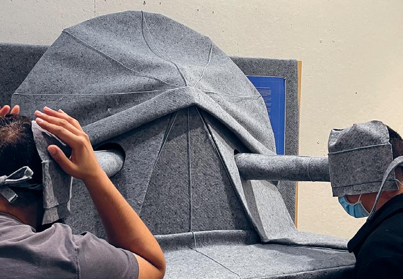
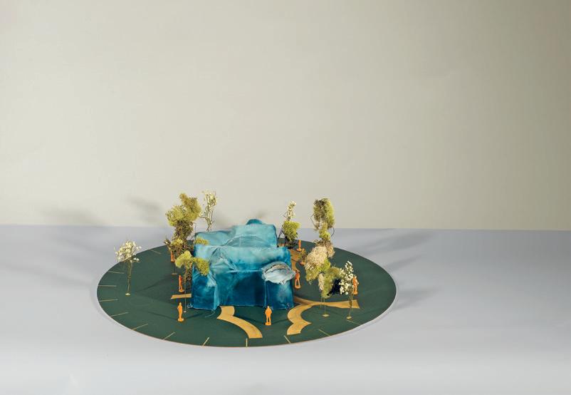
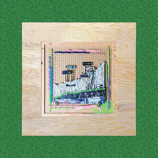

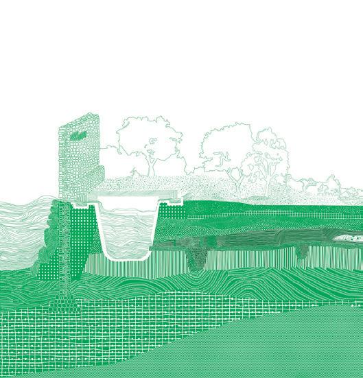
04 06 07 08 05
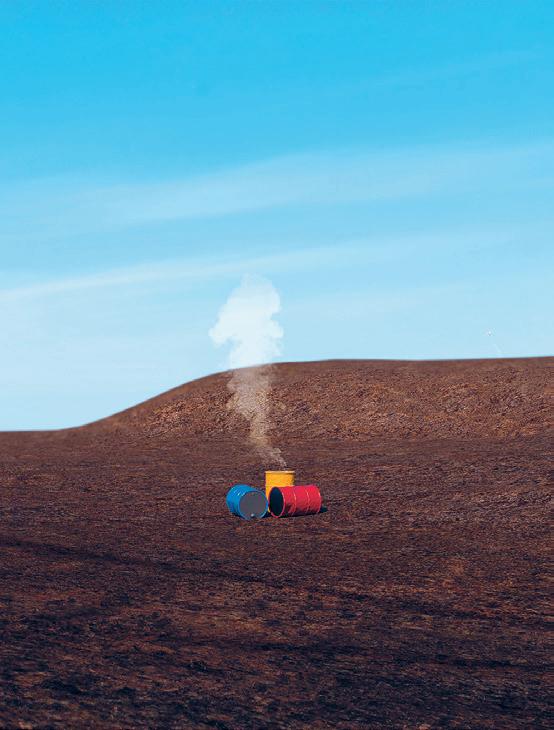

04: Mara Diavolova 05: Dzidula Kpodo 06: Sloan Aulgur 07: Alicia Delgado 08: The Water Collector by Soala Ajienka 09: Tejumola Bayowa 10: Tatiana Estrina 125 10 09


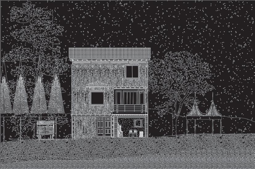
11 13 12
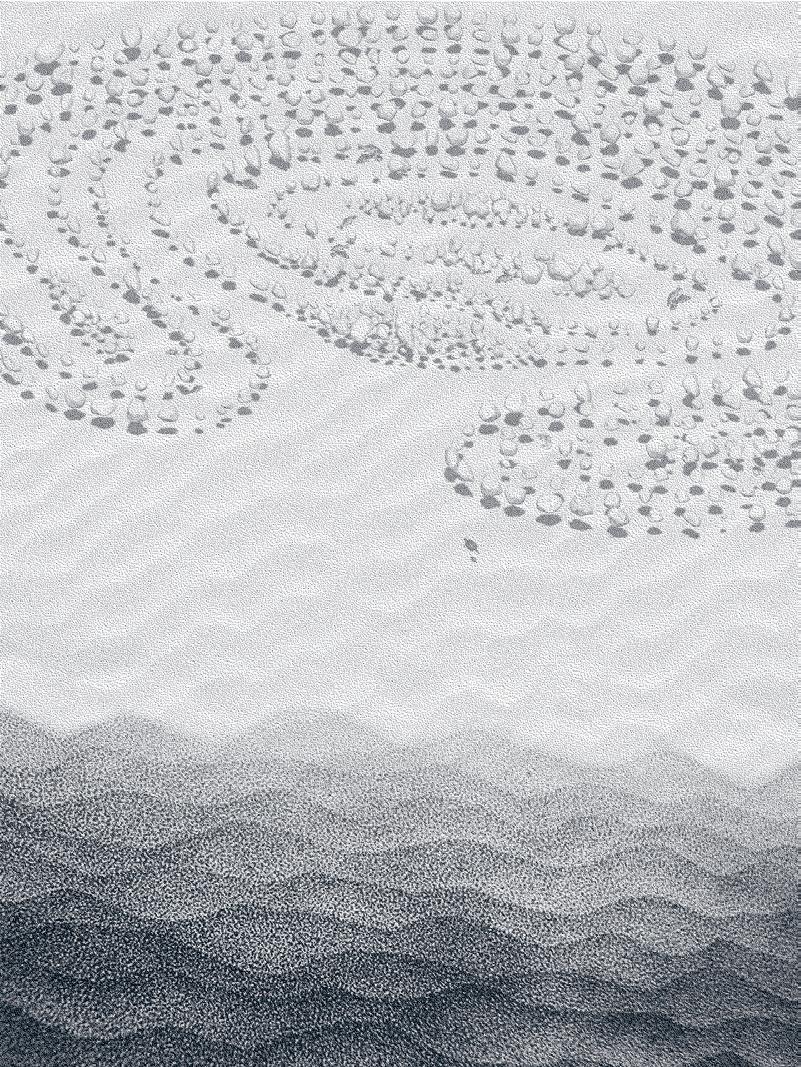 11: Suwan Kim
12: Brenda Hernandez
13: Minyoung Kim
127 14
14: Evan Ortiz
Wet Process by
Mingjia Chen
Critics: Brandon Clifford, Deborah Garcia, Jeffrey Landman, Mohamad Nahleh, and Sanford Biggers

Wet Process deploys techniques of cutting and stitching to negotiate the relation between wetness and dryness of personal memories. Simultaneously acting as both clothing and a medium, printed shirts are carriers of personal taste and intimacy. During thrifting, the curious shopper sorts through a massive volume, tapping into briefly and materialistically the once-significant memories of the garment donors. The project started from a garment haul at a local thrift store. The shirts are manipulated doubly chopped up, flattened and stitched together physically, and animated and juxtaposed digitally. Two artifacts representing collective memories are produced: a tactile piece inviting people to sit together and a digital quilt floating over Jamaica Pond. The two processes (one dry and crispy, the other fluid and viscous) become saturated in the video through cutting and stitching different video clips, implying one ambiguous and messy process proposing the production of the quilt at the landscape scale.
TAs: Taylor Boes, Maryam Aljomairi, and Yaara Yacoby
01: Sorting through the garments
02: Digital Quilt
01
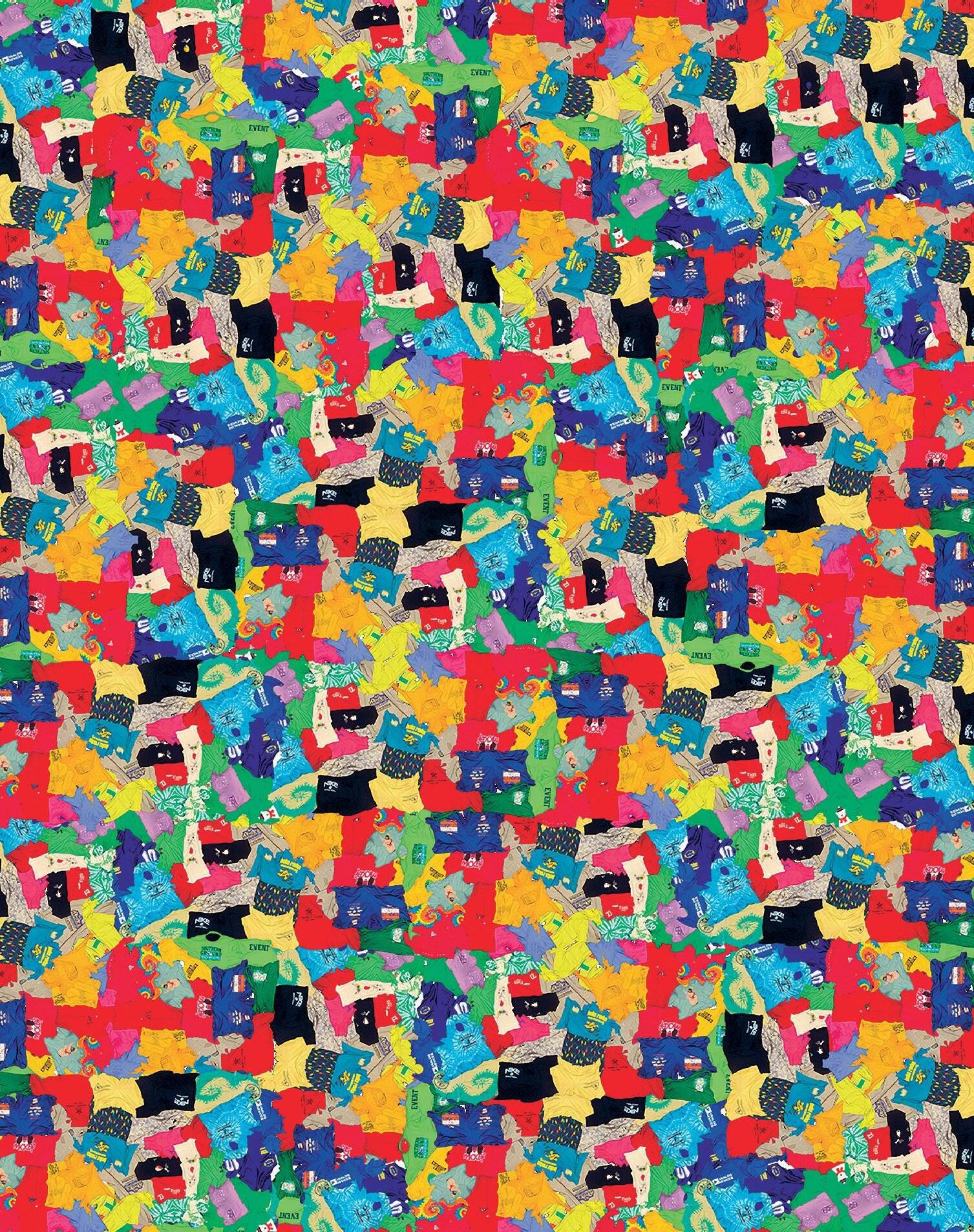
129 02
Archaeology of the Lost Civilization
Jamaica Wall City
by Ina Wu
A map is a frozen narrative of compiled, inaccurate spatial qualities. It is the site in which lines are actors that represent the power dynamic and negotiation process between human, built structure, and landscape. The idea of unknown lands appeals to our basic human desire to venture beyond the attainable, a shared yearning to conquer the unknown and escape the humdrum reality of everyday life. Reflecting on the Emerald Necklace’s blurring reality between nature and man-made, the project takes advantage of the fictional and temporal quality of maps and questions the convention of the line in cartographic tradition. What if the built environment is drawn in a typographical way and the landscape as static confinements? What type of society would this be? What will this inform us about? By questioning the convention of lines, the project imagines a society where the landscape takes agency of its own and reconstructs building forms. The collection reveals our fascination with mythical places, the attraction of blank spaces, parallel universe on maps, and the power of drawing to contain stories.
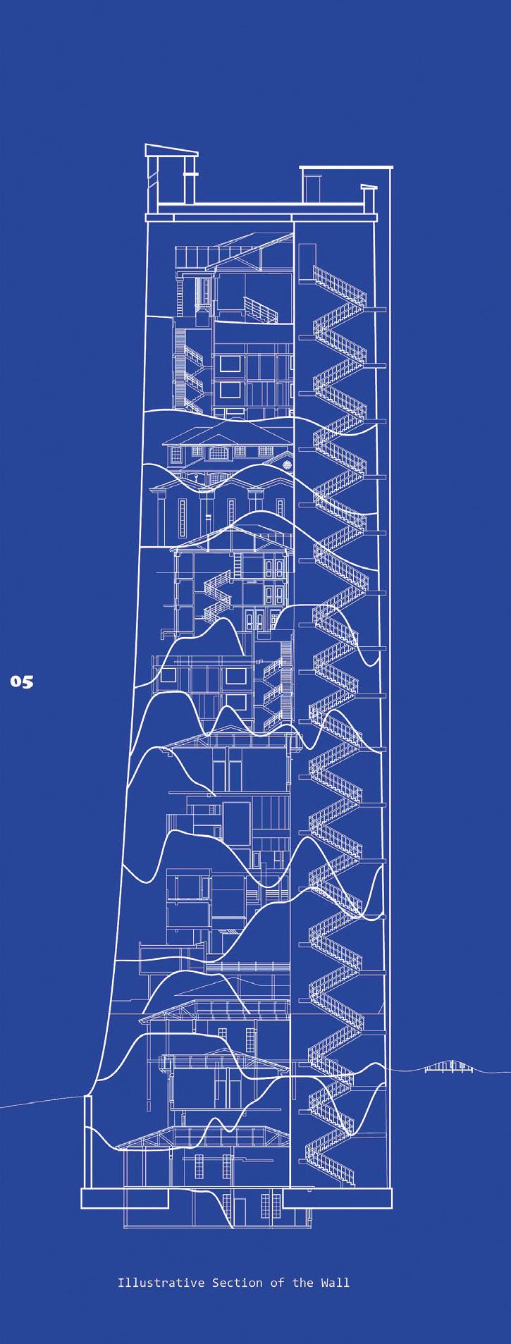 Critics: Brandon Clifford, Deborah Garcia, Jeffrey Landman, Mohamad Nahleh, and Sanford Biggers
01
TAs: Taylor Boes, Maryam Aljomairi, and Yaara Yacoby

01: Illustrative Section of the Wall 02: Photo Documentation 131 02
Geometric Disciplines
Instructed by J. Jih with Teaching Assistants Katherine Koskey and Latifa Alkhayat
Geometric Disciplines + Architecture Skills is an intensive introduction to the architectural design process, learned primarily through a series of weekly or bi-weekly exercises and centered around the notion of figure. In understanding figure as form, we will explore the ways in which we read, produce, rationalize, and represent geometry, from conventional orthographic drawing to digital modeling, physical maquettes, and prototypes. In understanding figure as numerics, we will engage computational, simulative, and analytical tools for the refinement of those geometries, acknowledging the representational aspects of our processes, while cultivating a deep understanding of the geometry that underlies those tools. And in understanding figure as process, we will center on the translations between form and material, object and drawing, digital and physical, producing an expansive space for the unfolding of various tectonics, systems of assemblies, materials, and workflows.
STUFF

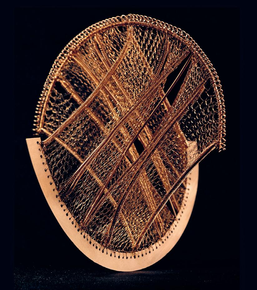

01:
02:
03:
4.105 133 01 02 03
Soala Ajienka
Sloan Aulgur
Tejumola Bayowa

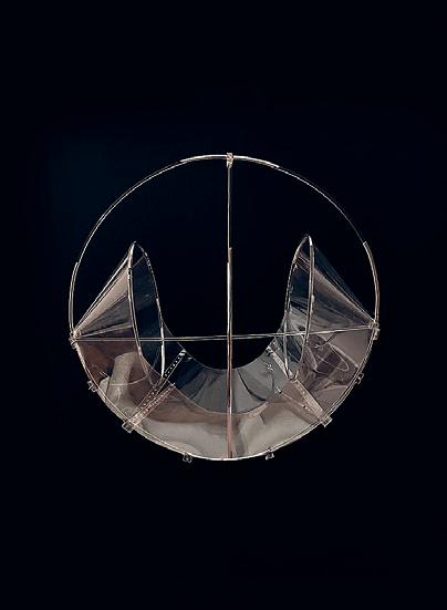
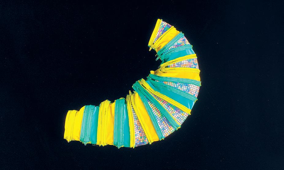

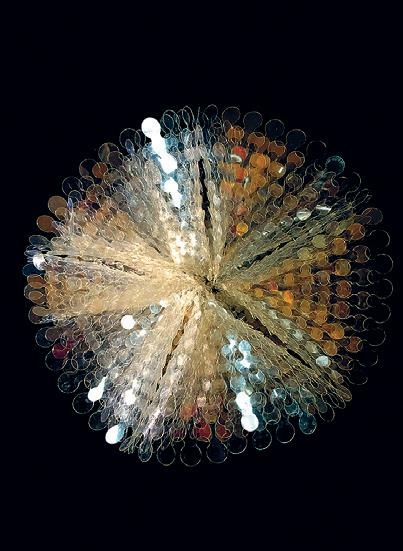
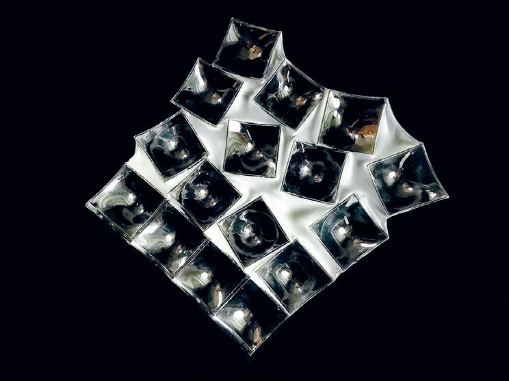

10 04 05 07 06 09 08

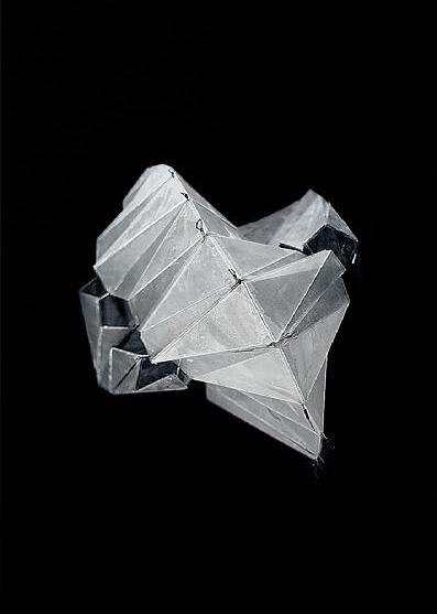
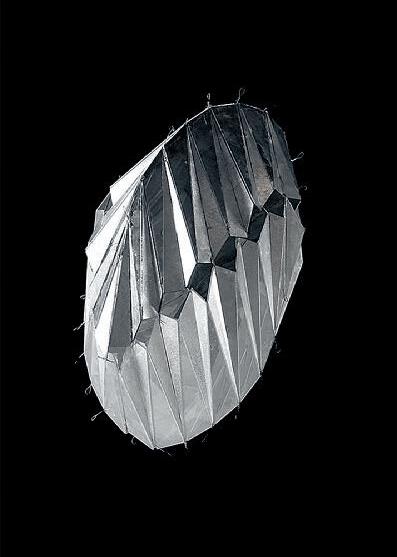
04: Mingjia Chen 05: Azania Umoja 06: Emotion Hieroglyph by Ina Wu 07: Tatiana Estrina 08–09: Minyoung Kim 10: Alicia Delgado 11: Gabriel Andrade 12–13: Foldable Oloid by So Jung Lee 135 11 12 13
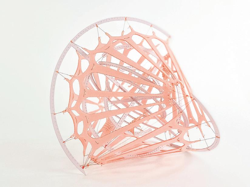

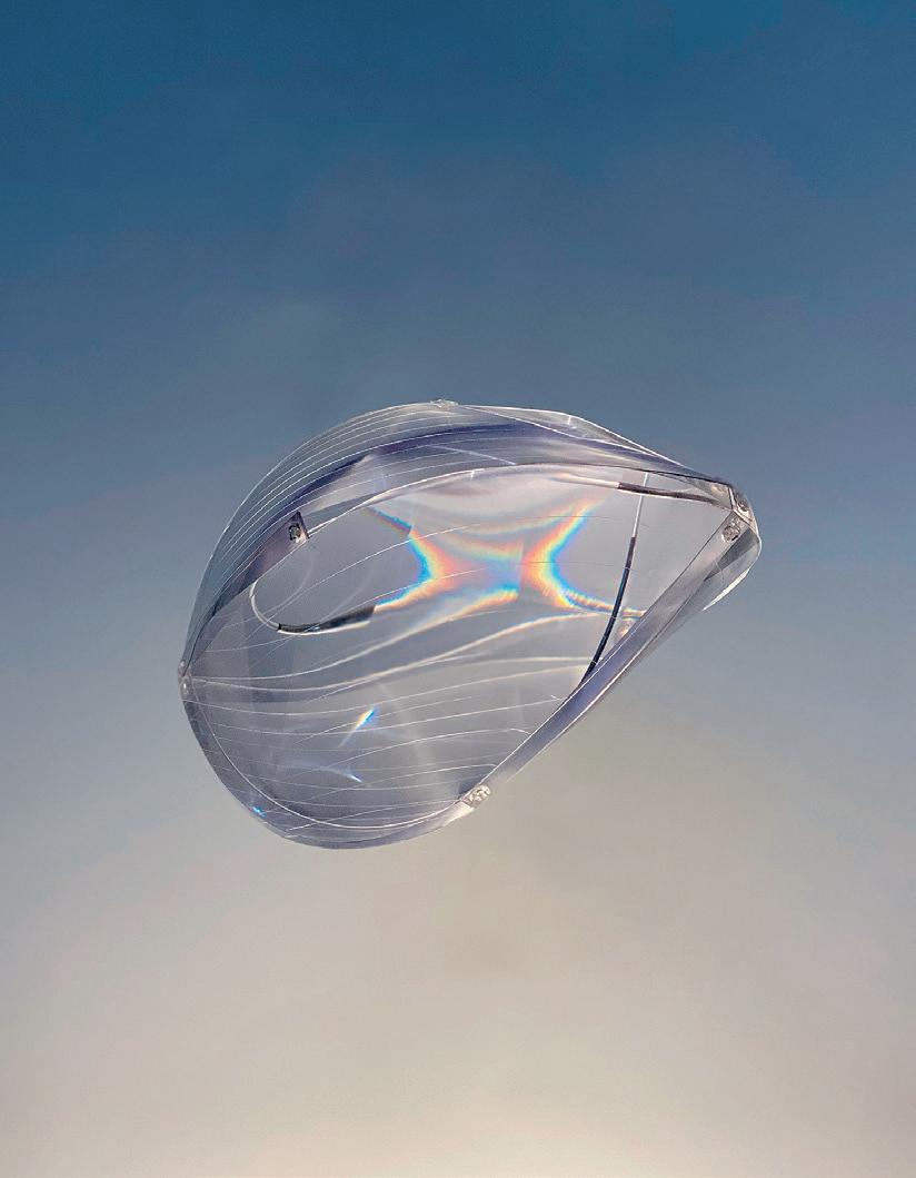
15 14 16
14: Juan Hurtado Salazar 15: Tatiana Estrina 16: Jeonghyun Yoon 17: Mara Diavolova 18: Brenda Hernandez 19–20: Charlie Janson 21: Bolurin Adedipe
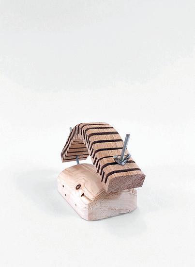
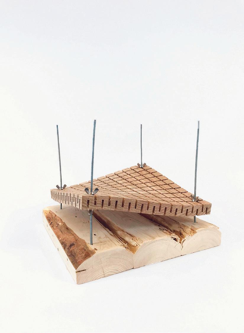


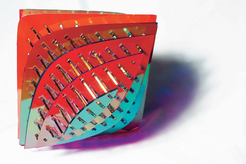
137 19 20 17 18 21
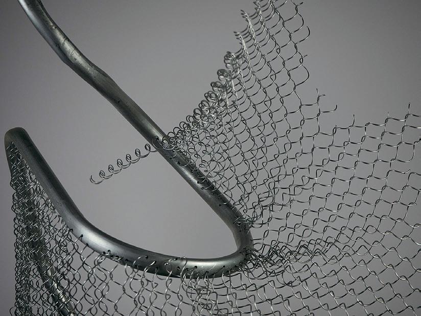
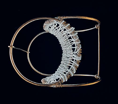


22: Tejumola Bayowa
23: Nikita Klimenko
24: Suwan Kim
23 25 24 22
25: Harris Chowdhary
Sankofa
by Dzidula Kpodo
Sankofa is a Ghanaian word that literally means “go back and take.” Symbolically it is about the return to learn from what has been ignored.
In this project, my interests lay in creating from discarded sheet metal. The project includes two forms explored sequentially. Both forms are some configuration of a hyperboloid of revolution. The hyperboloid of revolution’s bi-directional attributes bear affinities to the graphic representation of the Sankofa.
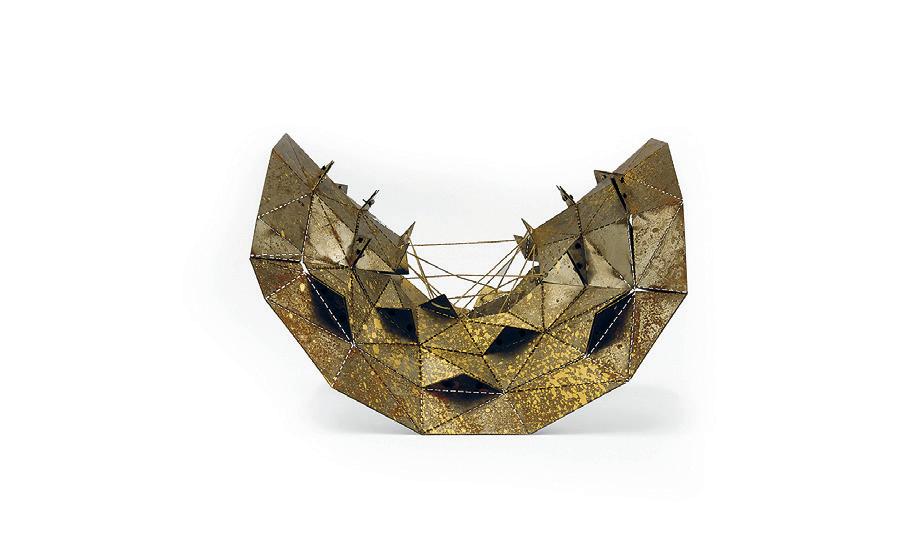
Rust, as a representation of decay, is essential to the project. It is about giving new life to discarded objects and an ongoing process in the life cycle of the final form produced. Rust is an indication of the impermanence of the produced form and with time, the form erodes and evolves.

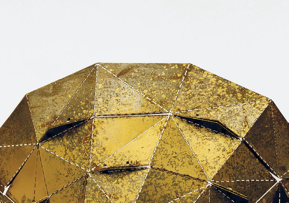
Critic: J. Jih TA: Katherine Koskey and Latifa Alkhayat 01: Geometry containing four hyperboloids of revolution with two lines of tangency. 02: Detail Image 03: Detail Image of Rust
139 01 02 03
Between Two Lines
 by Evan Ortiz
Between Two Lines explores ways to utilize heavy and light timber construction techniques to create doubly curved geometry. Through the aggregation of forms familiar to a contractor or builder, this project looks to simplify inherent complexity. These particular expressions bridge between two lines to form two non-orientable structural mutations.
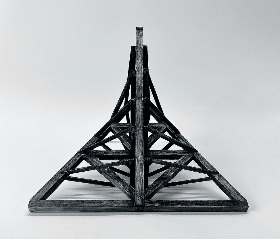

Critic: J. Jih TA: Katherine Koskey and Latifa Alkhayat 01: Plan View 02: Perspective View 03: Elevation 01 02 03
The Other Method
An Analog Mechanism for Reproducing 15th Century Digital Perspective Construction Techniques
by Sam Wolk
The machine on display, though handmechanical in operation, only accelerates the calculation and computation of the various subroutines within Piero’s algorithm for construction of perspectival projections of orthographic drawings. It does not change the underlying nature and is thus just one possible instantiation of the implicit sampling function defined by Piero and recovered by Evans.01 It is merely an image of the digital process that is Piero’s Other Method it transduces his algorithm into an embodied logic, a device for facilitating the construction of perspectival projections. The Other Method is itself encoded within the machine’s geometry and rules for alignment.
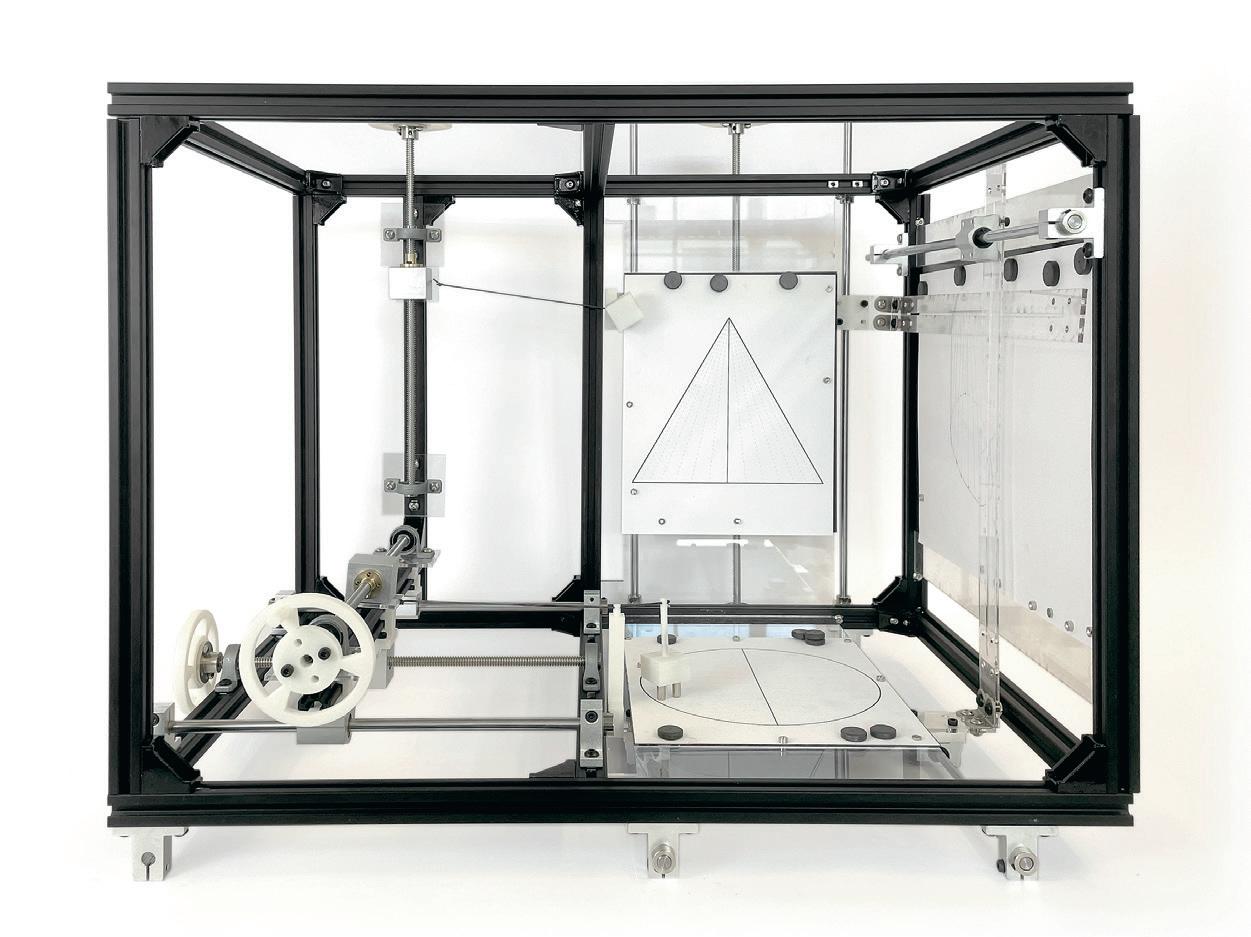
141 02
01: Evans, Robin. The Projective Cast: Architecture and Its Three Geometries Cambridge, Mass: MIT Press, 1995. 02: Machine.
Creative Computation
The relationship of shaped material artifacts and people is changing with the ubiquity of computation. Mechanical solutions relying on analog computation are increasingly replaced with algorithmic feedback and control systems and even learned control strategies. This shifting of some parts of design to the intangible makes it harder to spot bias and easier to scale up deployment with little scrutiny, having far reaching consequences. But the effects are not equally distributed, with, for instance, bias in AI, as discussed in “Gender shades“ (Buolamwini 2017), affecting women and BIPOC disproportionally and further contributing to systemic racism. But also, purely material based design embodies agendas through form.
In the shift to the intangible, single purpose-built artifacts disappear and are incorporated into apps displayed on generic touchscreen devices. To counter that in architecture we focus on developing designs that reclaim the physical-digital hybrids as embodied computation critically and expand it into architecture. We revisit the potential of the spatial relations that computational-physical hybrids can develop with people at the architectural scale. Edward T. Hall (Hall 1969) introduced the term Proxemics to describe the effect of human use of space. Ray Birdwhistell (Birdwhistell 1970) created the term Kinesics (body language meaning the nonverbal communication of the body and the face). The hypothesis is that with a shifted focus in the design of artifacts from form to behavior through computation, the human-architecture relationship can be redefined, and architects can be empowered as critical designers of spatial relationships. How do we develop non-verbal forms of architectural articulation to embrace emerging autonomy at an architectural scale? How can we develop alternatives to formal primitivism and superficial anti-tech notions in design by exploring an expanded conceptual design canon rather than getting stuck in stylistic camouflage? It is crucial to build computational fluency in design to create awareness of bias built into both physical and computational control and develop critical alternatives through design from within architecture and through a diverse set of authors driven by their own concerns, agendas, and sensibilities.
Instructed by Axel Kilian with Teaching Assistant Han Tu
STUFF
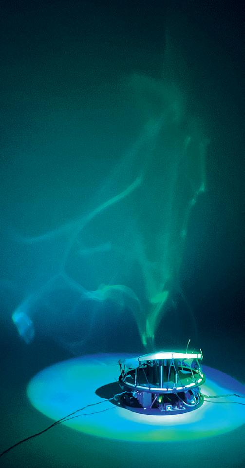


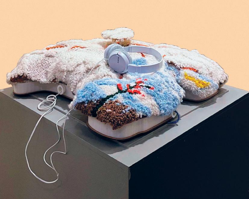
01: Em-brace by Sloan Aulgur. 02: TextileSense by Ganit Goldstein. 03: Canvas: The Tactile Artefact for Immersive Storytelling by Soala Lolia Ajienka. 04: Caustic Atmospheres: Light Reflected on Actuated Surface by Kevin Malca Vargas. 4.117 143 01 03 02 04
SilenceTop
by Reina Suyeon Mun
SilenceTop is an interactive microarchitecture that responds to silences in both social and non-social settings. It explores how an object converges the scales played in both the field of architecture and furniture. It does so by reframing the landscape of domestic spaces by constructing an alternate form of interactivity around the subject of silence.
Silence does not exist in a distinctive form. It gets recognized when the apparent social activities and sound fade out. The reading of silence varies from person to person based on their cultural background and the circumstance it is situated in. It can be regarded as a sign of respect to one while bringing awkward and anxious emotions to the others. The experience and the reading of silence the object conveys are not fixed.
The object has two modes: social and lone mode.
Social mode is active when two or more people sit around the object. When silence persists for a certain amount of time in social mode, it intervenes by plucking the kalimba, consisting of lowpitch semitone tines. The tones may be appealing or annoying depending on the people, but the only way to stop listening to the semitones is to open a con-

versation again. The aggressiveness and speed of the semitones plucked are increased with each repetition of social silence occurring in one sitting.
Lone mode is active when a single person is in the vicinity, or nobody is in the same space. During lone mode, SilenceTop regards silence as a need to last and appreciate. When silence occurs in lone mode, the object generates mists that permeate the room over time, creating an atmospheric and relaxed ambiance.
Critic: Axel Kilian TA: Han Tu 01: SilenceTop in Use 02: Detail Photograph 03: SilenceTop 01

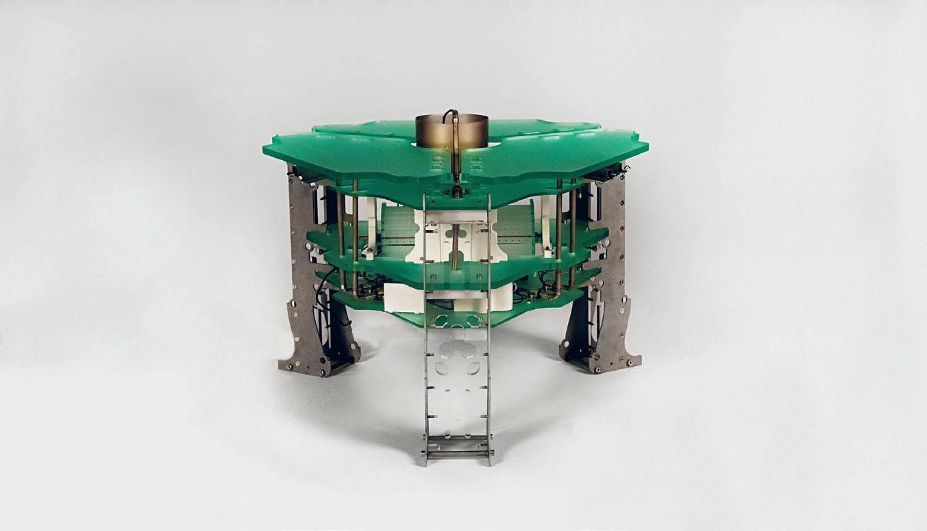
145 02 03
Houses Without Roofs and Walls but With Diverse Cable Connections
 by Harris Chowdhary
Deployed across the world to produce and govern boundaries, chain-link fencing exerts a quiet form of control. The material emerges from various experiments of the long-nineteenth century in textile manufacturing equipment retooled for the creation of woven wire fabrics: textile alchemy metal-head remix steampunk. A system of rigid singular transverse wires bent into flattened helicoid forms and slotted together meets the corresponding kinks in the next member and creates a strong sheet material: unrollable wall, infinite edge. The individual spirals’ linearity lends the material to a variety developable geometric forms, though it is rarely deployed as such. This performance is one of a series of engagements with chain-link and its material potentials. The objective is to facilitate the expression of the material’s tectonics, moods, and poetics, locating within the very same rigidity and regularity the potential for something beyond borders. The hand-woven sheet of full spirals is actuated by a system of sensor-motivated cables, floating through distortions and choreographies both sensitive and indifferent. By inviting the fence to dance, one hopes it may lead us towards escape.
Critic: Axel Kilian TA: Han Tu 01: Installation. 02: Detail of Motor. 03: Chain-link Detail. 01


147 03 02
Hostile Caesar Salad An Experiment in Proxemic Actuation of Plating
by Tatiana Estrina
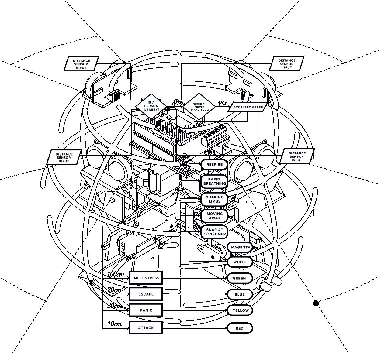
Critic: Axel Kilian TA: Han Tu 01: Map of Proxemic Responses 02: Plated Hostile Caesar Salad 03: Hostile Caesar Salad Opening 04: Detail of Hostile Caesar Salad
01
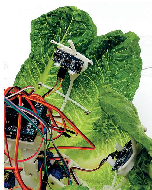

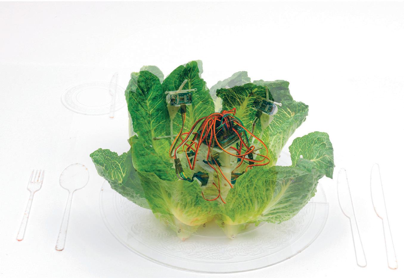
149 02 03 04
Axel Kilian on the Limits and Possibilities of Computational Design
Autonomous Architecture
How long were you at MIT in the Department of Architecture?
Axel Kilian: Four years in my last role as a Visiting Assistant Professor. Years ago, I was also a student in the Master of Science program and completed my PhD in Computation at MIT. I also taught at MIT as a post-doc for one year and then was an Assistant Professor elsewhere for 11 years.
What have been some of your favorite aspects as an instructor or student at the Institute?
Axel Kilian is a researcher and was previously a Visiting Assistant Professor at the Department of Architecture at the MIT. He has held positions as Assistant Professor at the School of Architecture at Princeton University as well as at TU Delft and was a postdoctoral Associate at MIT. In 2006 he completed a PhD in Design and Computation at MIT on design exploration. In addition he holds a Master of Science from MIT and a professional degree in architecture from the University of the Arts Berlin. Axel Kilian has lectured widely and published extensively. His publications include Architectural Geometry and he has been involved in the organization of conference series such as SmartGeometry, Design Modelling Symposium, and Advances in Architectural Geometry. His latest research focus is on embodied computation, the continuation of computation in the physical realm.
AK: MIT is an amazing place in its depth and breadth. As a student I very much appreciated the quality of the Institute that gives the chance to basically cross-connect disciplines. My studies were in research focused degrees, and therefore I had more academic freedom than in a professional degree like the M.Arch program, which I had completed in Germany before coming to MIT. At MIT I had much more freedom in terms of constructing my own curriculum, which I took full advantage of. As an instructor, I encourage students to take advantage of the offerings of the Institute as much as possible and connect their ideas with what is out there.
I looked into your thesis from when you were at MIT, and I was interested in the trajectory from those early explorations into the digital realm to your more recent research on embodied computation. Do you view that trajectory as an evolution? Or was there a certain break in your thinking and approach to computation?
AK: When I first arrived at MIT as a student in the 90s, I came with a strong agenda of wanting to explore genuine generative digital aesthetics. At the time in Berlin, where I had studied, it was very contested between the groups using the digital for retro photorealism and those driving for expressive novel forms. Photorealistic reconstruction did not interest me, but I was drawn to the unfamiliar in the digital realm—more alike to what you imagine in your mind with cognitive-driven visuals: spatial and temporal experiences that one could generate through the digital. I had a drive to learn programming and break out of the existing software tools which seemed to be completely
focused on the photorealistic reconstruction of reality, similar to what is happening now with VR and the Metaverse. But I was curious, if I’m dreaming or if I’m experiencing something else that isn’t real I have much more freedom and much more fluidity in visual thought. That was my first two years at MIT and became my thesis on visual space. When I started my PhD, and coming back to architecture and MIT, I decided I wanted to connect the realms of the computational and the physical—to use the digital, in a computational approach, generatively to define physical constructs. I explored alternatives to Cartesian modeling for digital fabrication, focusing on programming to define geometry. How can we approach computational design as a way to explore what we’re looking for rather than limiting it to problem solving in architecture? This especially occurred in the obsession with complex form—I have this complex thing I created; now how can I resolve it with digital tools. I was more interested in looking at how we can construct selective prototypes that provoke us to rethink what’s possible in that domain, some of which I was able to construct. This was the beginning of what I am currently working on in my research creating physical things that we can experience as spatial prototypes and I refer to as Embodied Computation.
What teachers or people have influenced your way of teaching or outlook on engaging with students?
AK: I’ve always tried to find my own path. I am probably modeling my own teaching somewhat on how I tried to find ways to support what I wanted to do as a student. Teachers that influenced me and I appreciated the most were teachers that supported me without trying to indoctrinate, but would listen and give enough freedom to experiment, while also creating a context of support for making more difficult discoveries. John Maeda, for instance, is someone that was influential in terms of how he operated and supported his group in having a very open, collegial, and supportive group of individuals that were quite different and were allowed to do their own explorations. They also, however, had high standards in terms of wanting to see something done, but not defining what that exactly is, while being critical about what’s being developed. They were not confusing freedom with anything goes, but rather setting an expectation of being curious about what one has to say. Another person of influence was Bill Mitchell who was also very open to ideas in collaborative group settings. The support and critical discourse was encouraging and inspiring. A certain pushback in a constructive sense is crucial in teaching and research, which makes you want to do better, but it also gives a context in which you feel you’re being heard. I think that is one of the most crucial things about being in an academic or educational environment—to support students in developing their own voices. Some people can operate more independently, but most people benefit from constructive criticism in this sort of freer environment.
What is the role of form in autonomous architecture? Because you describe a need for design to shift from not just fabrication or the aesthetic of the building, but into its continuous use. What’s the role of form?
AK: At some point in my PhD I became critical of form as a way to freeze or capture in a material state a particular design response. And especially in the early 2000s, that felt like a dead end when that sort of complexity of form
151
was equated with complexity of thought, implying a building is better if its shape is more complex as a material construct. But I think it is, in a sense, about nudging the potential for form to be many things, which is the more open-ended and more complex question. Not so much how to make it just a generic thing, but to find a material state which is open enough to allow this. So, I don’t want it to be an architecture that is all about multi-purpose functionalism in which everything can be adjusted—everything can be kinetically changed and shifted. Rather, I’d like to have a balance between adjusting space and architecture along with the ability to influence architecture through the behavioral adjustments that could be influenced by intangible qualities like temperature. Ultimately, for me, design is a process of discovery over the lifetime of the structure rather than one where you sculpt your design in material form at the time of construction.
What is the role of constraints in the learning process or the creative process?
AK: To me, constraints are very crucial in the sense of being starting points. Some people are annoyed with that, calling for design with no boundaries, freedom, etc. Sure, but if there are no constraints, then there’s nothing really to work up against. So, to work with constraints is not to say we need to limit ourselves. Some people may misunderstand that with constraints the design itself can not evolve. But to the contrary, constraints can be crucial to work with in defining design, and I have incorporated them in my research for some time. But one can also redefine constraints, if that is helpful to see something about the design more clearly, and constraints can also be helpful to make the design that doesn’t exist yet become more tangible and visible. So, to me, constraints are more like posts that you put in the landscape that allow you to start to define something and see something, similar to landmarks—and then also selectively overcome or step over or redefine them. For me, it’s an open-ended productive device—not problem solving—and an open-ended active design definition approach can also be leveraged computationally for exploration.
This interview has been edited for length and clarity.
01: The Flexing
as
Room: Space as Interface—Architecture
Gesture by Axel Kilian
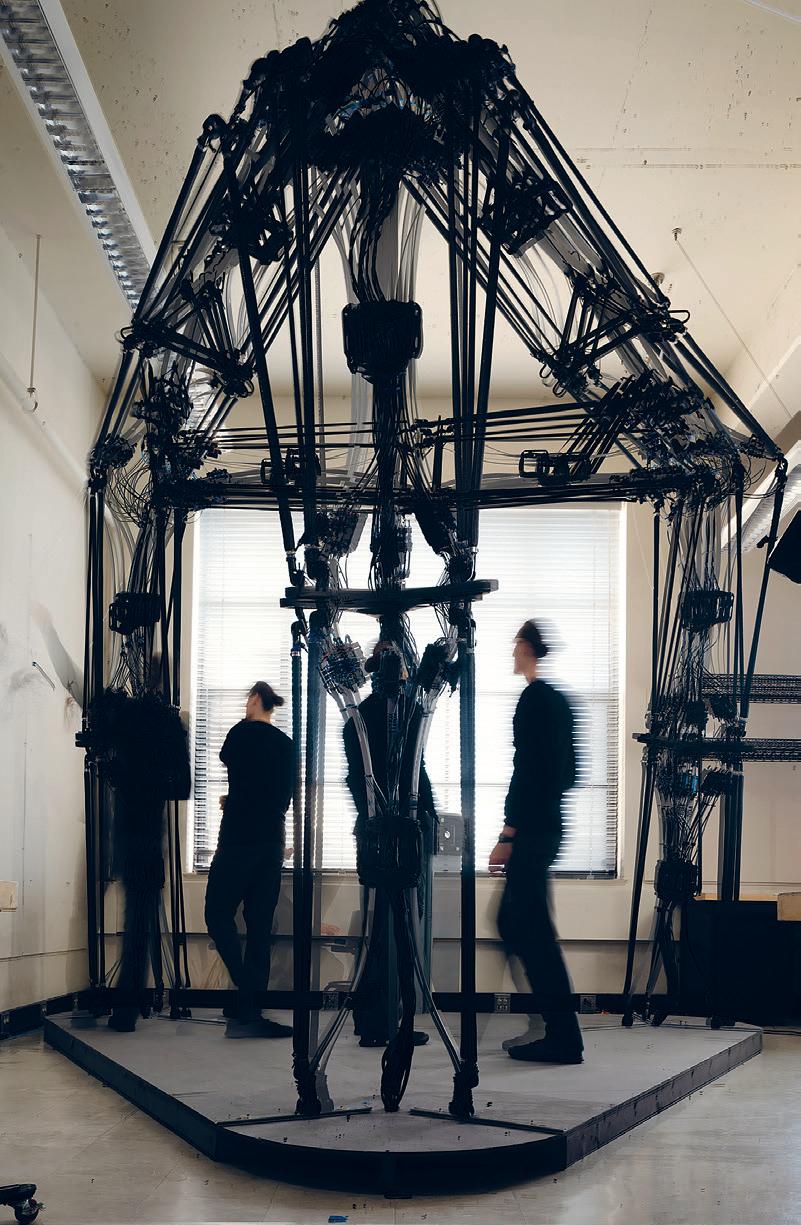
153 01
Advanced Product Design
This studio focuses on producing a small series of manufactured products. Students develop products that address specific user needs, propose novel design concepts, iteratively prototype, test functionality, and ultimately exhibit their work in a retail context. Stemming from new research and technological developments around MIT, students try to imagine the future products that emerge from new materials and machine intelligence. The course provides an in-depth exploration of the design and manufacturing of products through narrative, form, function, fabrication, and their relationship to customers.
STUFF
Instructed by Jeremy Bilotti with Teaching Assistant Lavender Tessmer
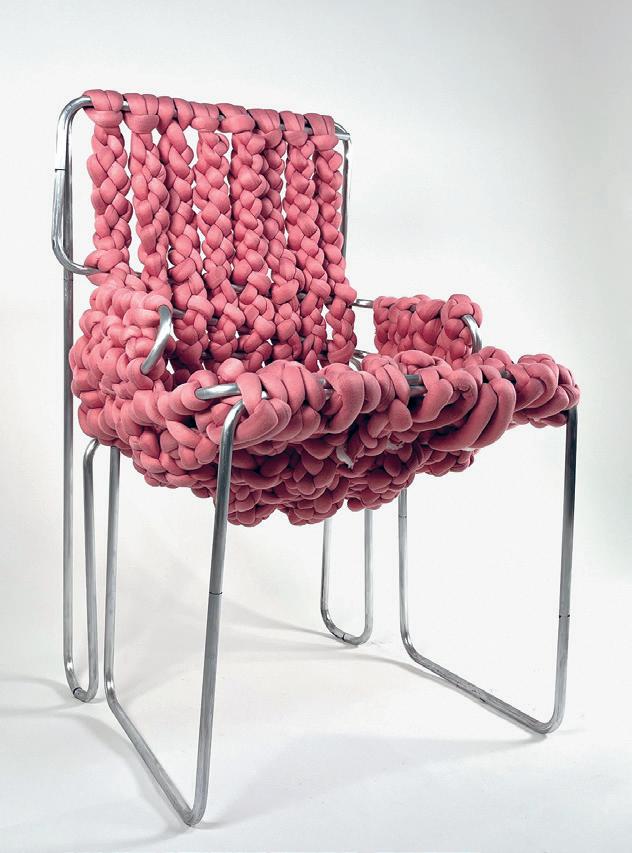
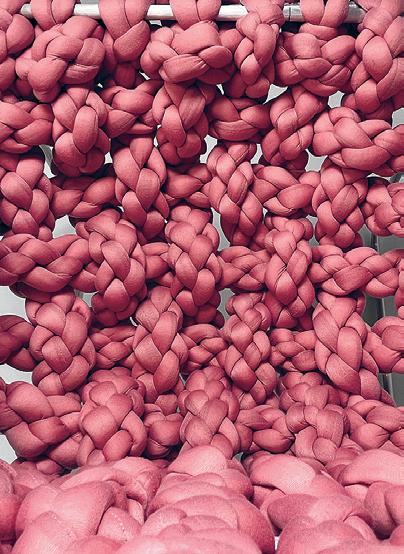

01: The ReWoven
02: Material Detail of the ReWoven
by Faith Jones 03: La Junta by María Risueño Domínguez 4.041 155 01 02 03
Chair by Faith Jones
Chair

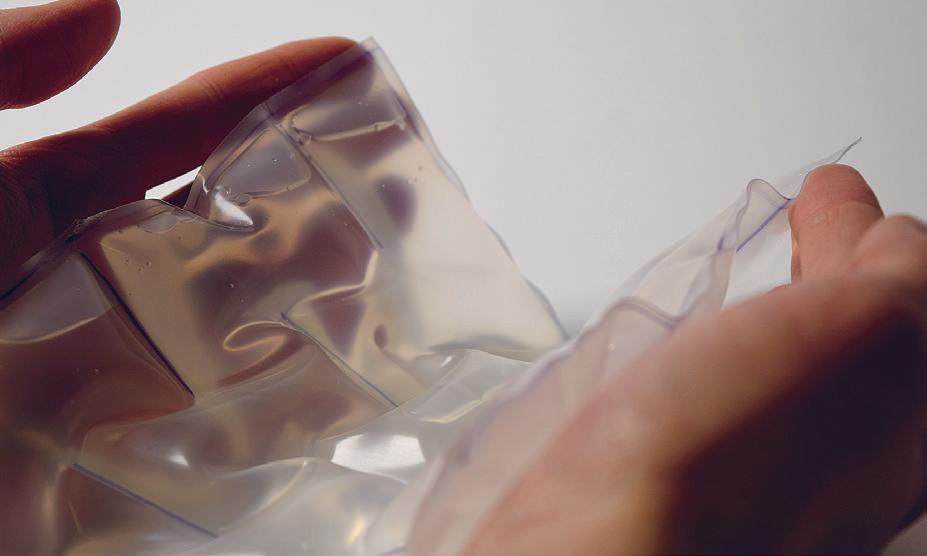
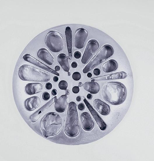
04: La Junta Detail by María Risueño 05: Enhanced Privacy by Jo Pierre 06: Material Detail of Enhanced Privacy by Jo Pierre 04 05 06
Liquid Metal Design
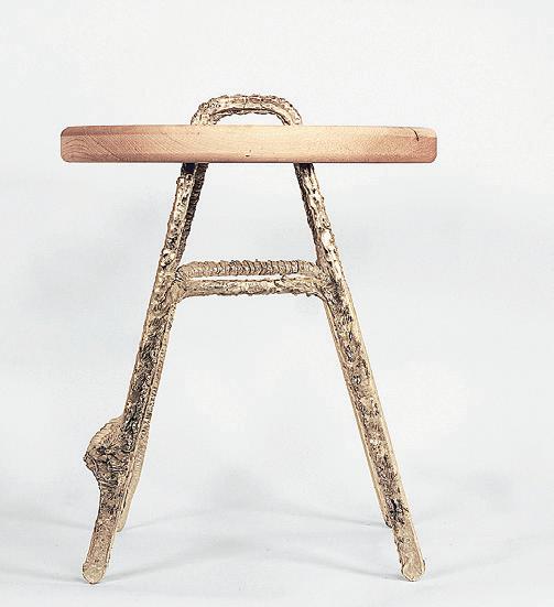
 by Zain Karsan
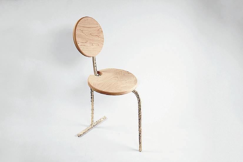
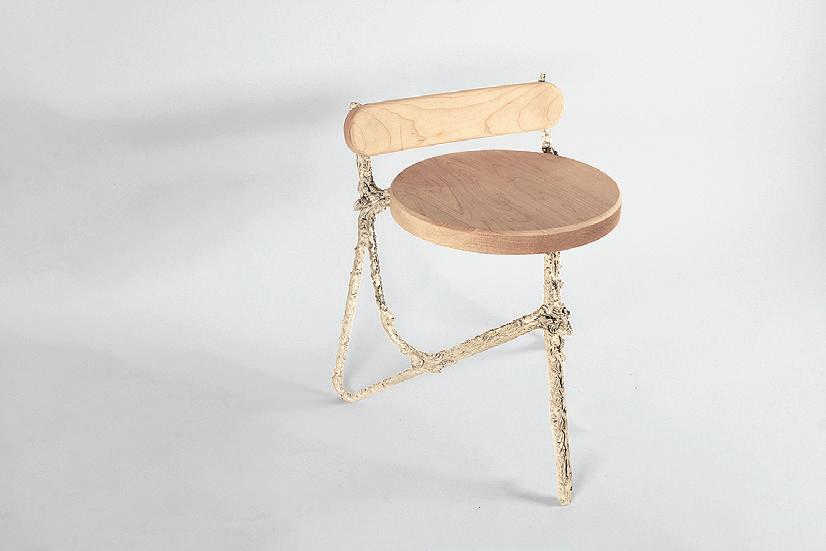
Critic: Jeremy Bilotti TA: Lavender Tessmer 01–04: Design Iterations
157 01 02 04 03
Undergraduate Work
4.021 How to Design, Taught by Jeff Landman and Paul Pettigrew with Teaching Assistants Lauren Gideonse and Pimpakarn (Prim) Rattanathumawat
This studio introduces fundamental design principles as a way to demystify design and provide a basic introduction to all aspects of the process. It stimulates creativity, abstract thinking, representation, iteration, and design development while also equipping students with skills to have more effective communication with designers so they can develop their ability to apply the foundations of design to any discipline.
4.022 Intro to Design, Taught by J. Jih with Teaching Assistant Rohit Sanatani
This course introduces the tools, techniques, and technologies of design across a range of projects in a studio environment. Students explore concepts related to form, function, materials, tools, and physical environments through project-based exercises. They develop familiarity with design process, critical observation, and the translation of design concepts into digital and physical reality. Utilizing traditional and contemporary techniques and tools, faculty across design disciplines expose students to a unique cross-section of inquiry.
4.031 Objects and Interaction, Taught by Marcelo Coelho with Teaching Assistants Thaddeus Lee and Jayson Kim
This course considers design as the giving of form, order, and interactivity to the objects that define our daily experience. Instruction follows the path from project to interactive product through lectures, hands-on workshops, and studio assignments. Students gain an understanding of the overall design process with an emphasis on design development and constraints, preparing them for work in a studio environment. Topics include the observation and critique of objects; interaction design and user experience; design methodologies, representation, and source material; economies of scale versus economies of means; designing for human behavior; and the role of technology in design. The course provides a foundation in prototyping skills such as carpentry, digital fabrication, electronics, coding, and interaction. Lectures provide context and exposure to current dialogues in the design, production, and significance of objects.
STUFF

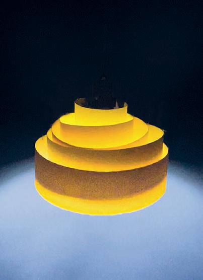

Critic: Jeff Landman and Paul Pettigrew TA: Lauren Gideonse and Pimpakarn (Prim) Rattanathumawat 01: Kiki Chen 02: Ethan Chang 03: Kelly Lu 4.021, 4.022 + 4.031 159 01 02 03
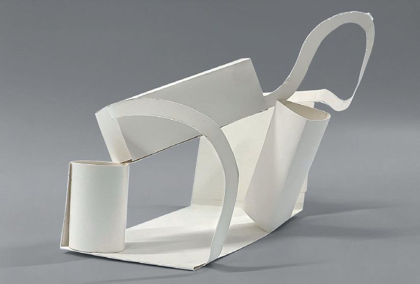
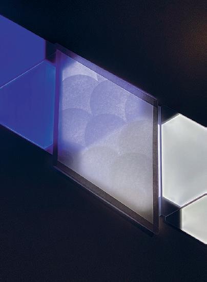
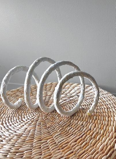


04: Ghassan Aljawi 05: Faith Bulan 06: Sabrina Hu 07: Nour Al Maalouf 08: Sophia Friedman 04 05 06 07 08
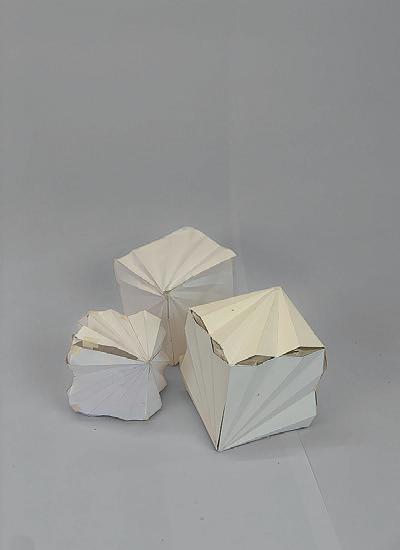
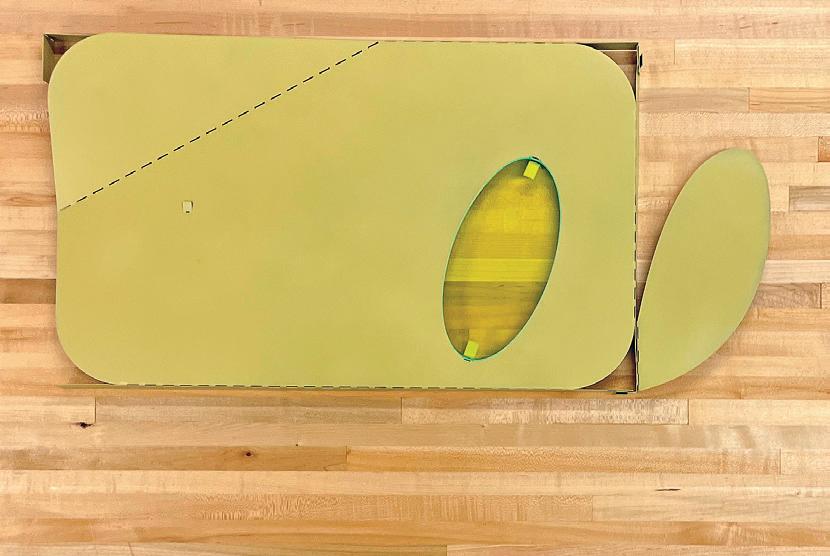

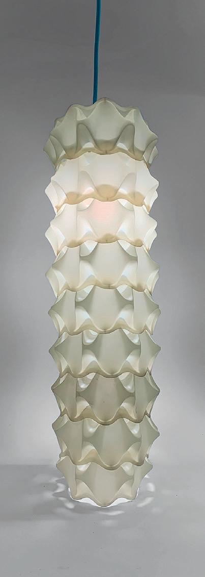
161 09 10 11 12
09: Preseton Hess 10: Noble Harasha 11: Muriel McWhinnie 12: Jasmine Chen
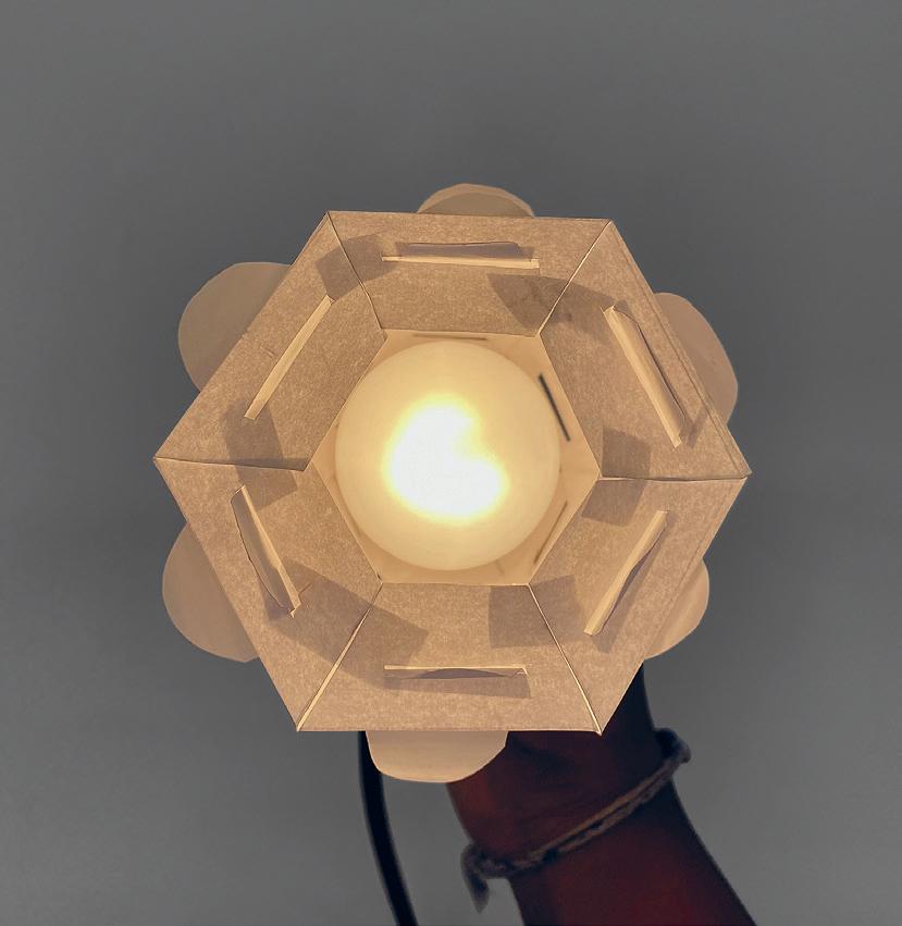
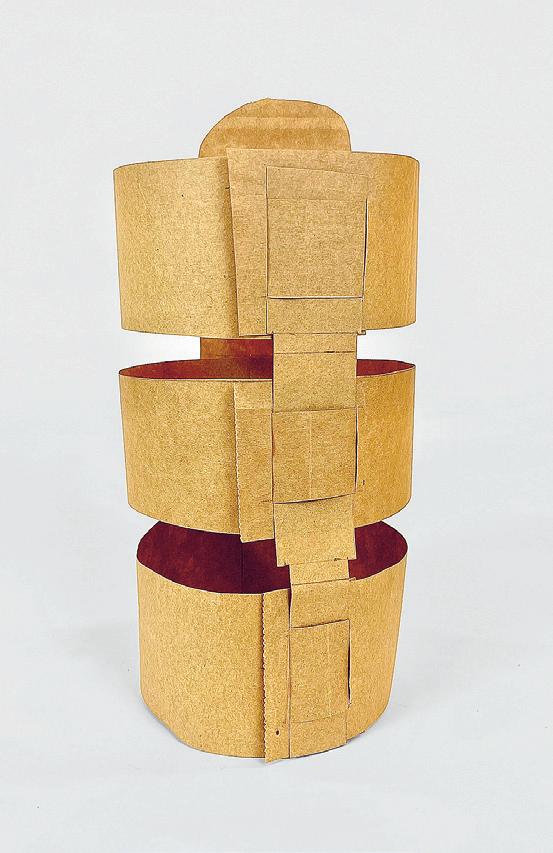
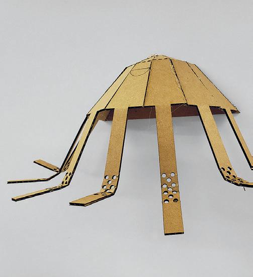 13: Eghose Ohenhen
14: Dila Ozberkman
15: Brandon Worrell
16: Emma Wickline
13 14 15
17: Bryan Sperry
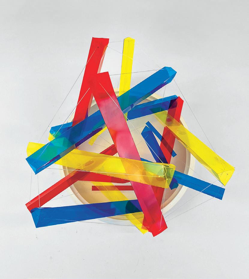
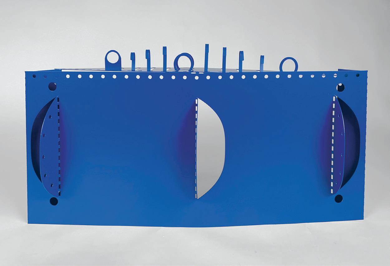
163 16 17

Critic: J. Jih TA: Rohit Sanatani 01: Trevor Ching + Arusha Nirvan 02: Feng (Aron) Qiu + Ning Zhang 03: Catalina Monsalve Rodriguez + Sangita Vasikaran 04: Charlotte Henry + Jessica Pan 01 02 03 04
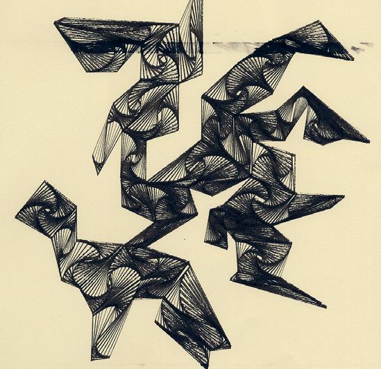


05: Emilio Ahuactzin-Garcia, Yizhen (Jim) Chen + Franky Schulte 06: Salma Islam + Maha Yaqoob 07: Christy Huynh + Jocelyn Yu 08: Annie Dong + Quentin Rael 165 05 06 07 08
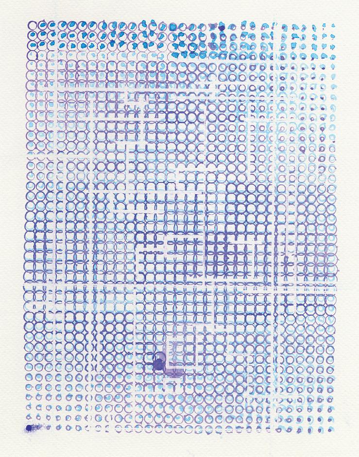
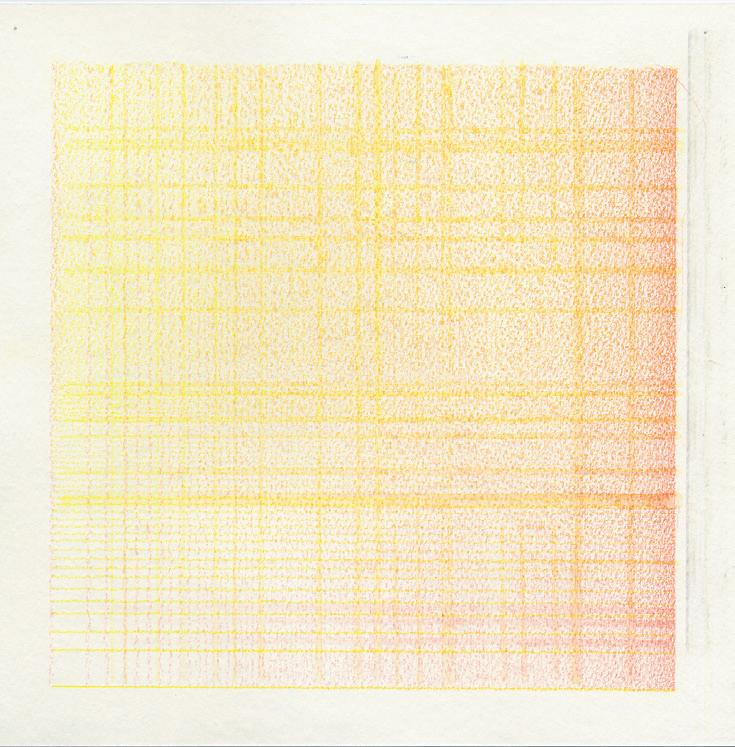
09–10:
09 10
Michelle Escobar + Claire Moreland
Balloon Corals by
Sangita Vasikaran
Inspired by coral growth, this project studied the surprisingly interesting behavior of pigment and glue polymers on the surface of deflating balloons.



Critic: J. Jih TA: Rohit Sanatani 01: Long Blue Coral 02: Brain Coral Stripes 03: Yellow Coral 167 01 02 03
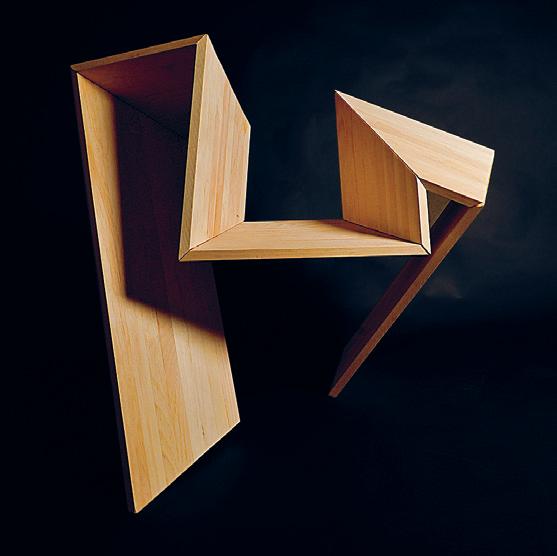
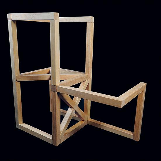
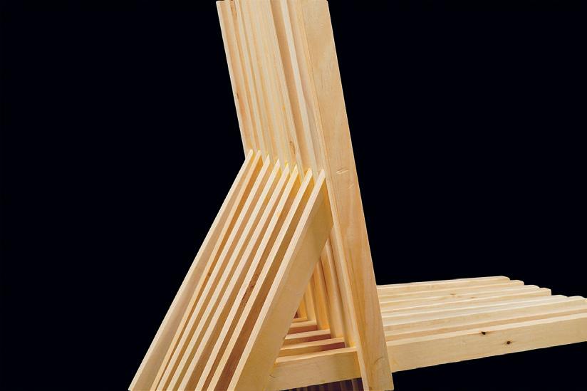
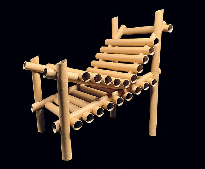
01 02 03 04


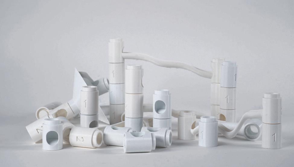
Critic: Marcelo Coelho TA: Thaddeus Lee and Jayson Kim 01: Sophie Chen 02: Evan Hostetler 03: Audrey Gatta 04: Sabrina Hare 05: Emily Genevriere 06: Sabrina Hare 07: Katherine Guo 169 05 06 07
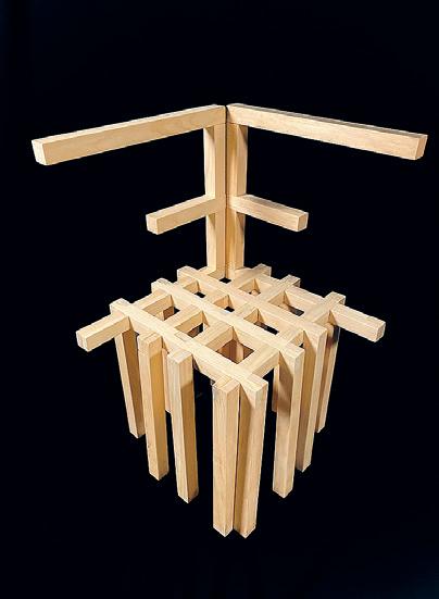

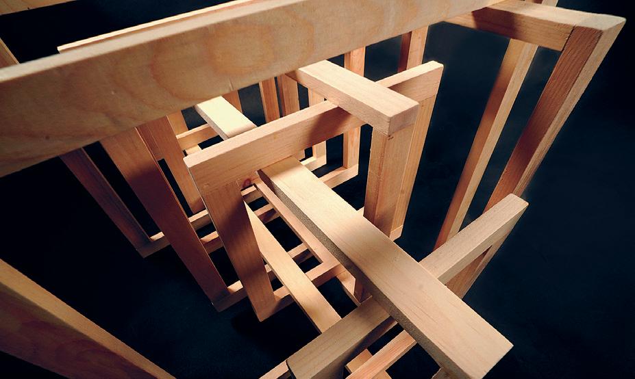

08: Emily Kiley
09: Felix Li 10: Lila Wine 11–12: Emma Rutherford
13: Rebecca Slater
08 09 10 11
14: Ibuki Iwasaki



171 12 13 14

173

Space highlights physical encounter. This chapter contains moments of working, talking, making, and playing through a selection of student groups and campus spaces. Happy hour posters, sound waves, janitorial work, black space, queer space, collaborative architecture, and other-than-human worlds are brought together in an effort to represent MIT Architecture. Conversations with shop staff Jen O’Brien and Chris Dewart point to the importance of having a dedicated space for making. An interview with Jim Harrington, Director of Facilities, offers a longer-term view of the Department and a reminder on the importance of communication.
Queer
Lecture Series
Interviews with Shop Staff
Jen O’Brien and Chris Dewart
Keller Gallery
Wiesner Gallery
The ACT Cube
Interview with ppppress
Interview with Jim Harrington
from Lodgers
178 179 180–181 182–183 184–187 187–189 190–193 194–199 200–207 208–211 212–213 214–216 217–219
Student Council China SA+P NOMAS
of Frame
Space Image
Exhibit.
Architecture
WAWD?Radio Out
Space
175
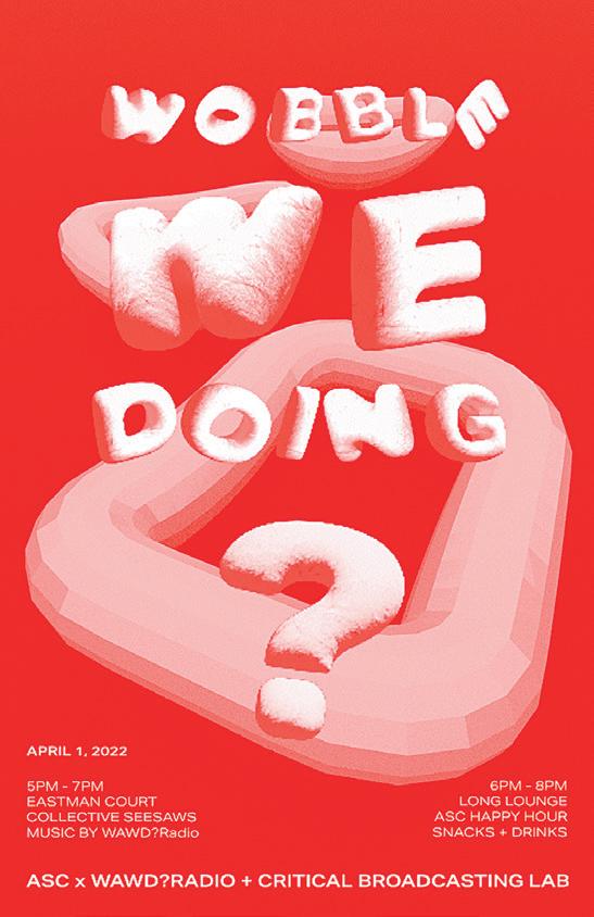


Architecture Student Council ASC Presidents: Calvin Zhong + Deborah Tsogbe Poster Designs for Spring Semester Events. 01: Julian Andrew Escudero Geltman, Emily Wissemann + Calvin Zhong 02 + 03: Calvin Zhong 03 02 01


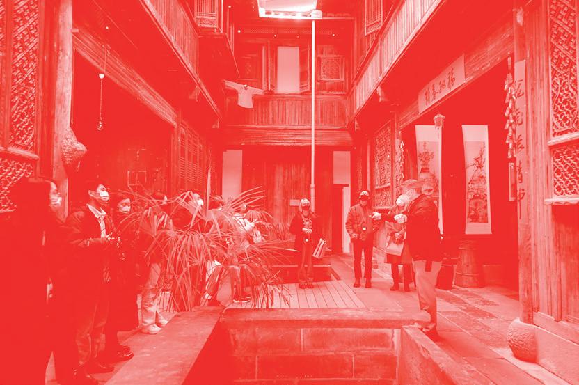
China SA+P Student Association 04–05: Selection of BlindBox Event Series Posters 06: Tour of Peabody Essex Museum. 177 04 05 06

01: NOMAS
Idowu,
Ismail,
Kettner. 01
Executive Board class of 2022, bottom row, L–R: Alice Jia Li Song, Ruth Moyers, Ina Wu, Chris Masahiko Moyer; top row, L–R: Vijay Rajkumar, Leilah Sory, Amanda Ugorji, Jola
Mohamed
Katharine
We, the members of the Massachusetts Institute of Technology chapter of the National Organization for Minority Architecture Students, are committed to the idea that our community can be strengthened by the active practice of diversity, equity, and inclusion within the Department of Architecture. We champion diversity in design by calling for equality and fairness in our education, celebrating excellence in our discipline, and providing community members with resources to develop personally and professionally.
As minority students and allies, we aim to provide a source of support and camaraderie through communal gathering, open discourse, and lasting mentorship. We challenge misconceptions surrounding minority representation and emphasize the importance of diverse communities through dialogues with the MIT community, a lecture series highlighting minority designers and researchers, open letters, and advocacy. We are in support of systemic change to an exclusive profession that for centuries has created barriers for those outside the canon, but we also choose to exist as a space for dialogue, change, and care.
NOMAS
179



Radio Show Posters 01: Radio Nite Mix by Harris Chowdhary 02: Empathy Hour by Deborah Tsogbe 03: Doomy Boi by Nina Palisano 04: Ahata/Ahanata by Iridescence Research Lab 05: The Moment by Sahil Mohan 06. Dihydrogen Monoxide by Bella Carmelita Carriker + Iris Zeng 07. DJ J’s Small Batch Jams by Justin Brazier 08. Cacophonoise by Felix Li 09: Myles Plays Miles by Myles Sampson WAWD?Radio 03 01 02 04 05
What Are We Doing? Radio was born out of the MIT Architecture Department grappling with how to sustain a feeling of community during the first few months of the pandemic. Over 2021–2022, it transitioned into a permanent and wider MIT SA+P digital radio station. WAWD? strives to cultivate an active audio community, sharing music, thoughts, and more through the digital airwaves. We aim to provide a platform to broadcast voices that are not always represented in architecture or in the wider disciplinary umbrella at MIT.



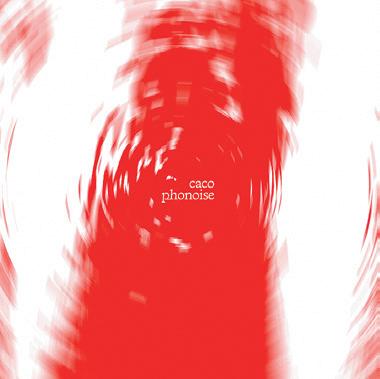

wawdradio.cargo.site
181 09 08 06 07
What Is Black Space?
 by Jensen Johnson
What Is Black Space? is a social study I conduct to provoke thought about the field of architecture as we know it, raise awareness about the inequities found therein, and to create a space through dialogue that celebrates ambiguity, identity, and representation. Through engaging this work so far, I have enjoyed visiting the minds of others and gaining perspective on their lived experiences relating to the built environment.
Out of Frame Columns 01: What Is Black Space?
Jensen Johnson 02: Green, Sinking, Drought & Drowning from the column Margins & Bleed (in Focus)
Out of
by
by Selin Sahin
Frame
01
Margins & Bleed (in Focus)
by Selin Sahin
Invisible, unnoticed, or deliberately overlooked, they are not simply on the peripheries; they inhabit and fill in the gaps between wor(l)ds. They bleed in and out of our consciousness.
From paper collectors of the Middle East to collective urban forestry in Mexico, this column brings into focus workers and urban dwellers in the margins. Artifacts reveal the story, my mind wanders, and narrative gets interlaced with facts.

Growing up, the mysterious figures with two-wheeled carts and, more recently, ancient retrofitted cars with enormous sacks filled with stuff, have always been a curiosity. I would watch in awe as sun-kissed people would fly past me, up a steep slope, dragging a mountain by the side of the road as they went along. I would wonder who they were, what they were doing, where they were headed. Besides their super strength and speed, they seemed to have one more superpower: “They are invisible too!” I remember thinking as a small kid. It seemed like no one noticed, made eye contact, or even came close to them: They were immaterial.
Later, one summer, while living in Istanbul, I became friends with Abbas, who passed by my street in Beşiktaş like clockwork every day as I returned home from work. Abbas had fled Syria many years ago with his mother and two siblings. After spending some years in the southeast, they had
decided to make their way to Istanbul in search of more opportunities. After working for a boss for two months without receiving any pay, he had decided to try waste picking. “I am at least my own boss,” he told me, “I don’t have to listen to anyone. I do whatever I want, work as much as I’d like—and I get to hum along to my favorite songs while working. Also, see what I found the other day!” He was showing me the golden-colored Casio F-91W watch on his wrist.
In an economy where unemployment is high and identities become subject to othering and exclusion, one can immediately get into this work as long as you are healthy and can purchase or rent a cart. Although most paper collectors are young men, children are often seen working in the streets to support their families while they should be in school. Women are spotted much less. Unfortunately, the collectors lack social security and health insurance in an occupation that is highly prone to risk.
183
Excerpt from Mountains, Paper Money & Valleys:
02
Through the lens of . . .
by Daisy Ziyan Zhang
“In one sense there is nothing more simple and more obvious than everyday life. Nothing could be more superficial: it is banality, triviality, repetitiveness. And in yet another sense nothing could be more profound. It is existence and the ‘lived.’”01
Through the lens of… is an ongoing research project that borrows the camera as a spatial tool to investigate architecture, time, and the stories held within, offering a different view towards what is otherwise overlooked and forgotten. As we live and work in these MIT buildings every day, have we ever stopped for a second and wondered who cleans them? Who are they?
Martha is a short film dedicated to a great human being, whose generosity, kindness, and trust allowed me an unexpected glimpse into the vicissitudes of her life, and to share joy, love, loss, and grief, all of which unfolded in an MIT dormitory.
01: A
02–04:
quote by Henri Lefebvre
Through the lens of . . . by Daisy Ziyan Zhang. Still from the film Martha
Out of Frame


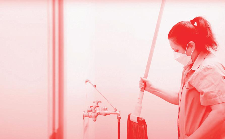
185 04 02 03
“There is no queer space. There are only spaces used by queers or put to queer use. Space has no natural character, no inherent meaning, no intrinsic status as public or private… it is always invested with meaning by its users as well as its creators, and even when its creators have the power to define its official and dominant meaning… users are usually able to develop tactics… to use the space in alternative, even oppositional ways that confound the designs of its creators.”04
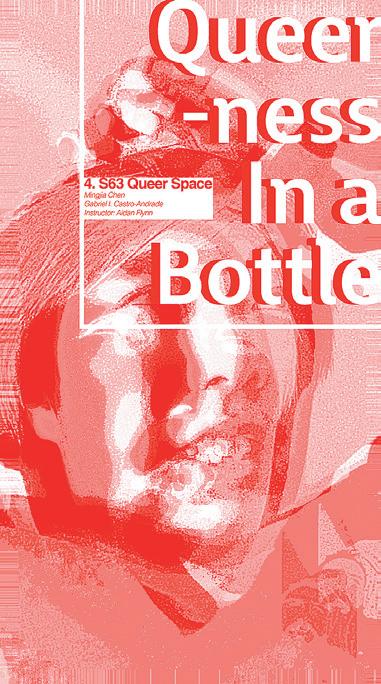

Queer
01 02 03
Space
4.s63 Queer Space: A Reflection
by Aidan Flynn
Queer Space is challenging to create, to enter and exit, to study, and to live in. Yet its challenges are also the very things that foster a fascinating beauty. At the academy, we have the privilege of theorizing space and spatial practice in abstract ways. Space is created by us or others, and it’s maintained by one or many authorities. Its meaning is always linked to the intentions of its maker(s). This intentionality to define spatial meaning real and imagined, physical and immaterial produces a dangerous binary of who can enter versus who must stand outside: Those invited may benefit from a certain space, while others are trespassers whose very selfhoods, practices, or beliefs are restricted access.
I created a Queer Space class to invite students to study these complex ideas through historical and contemporary architecture and art, theory, and criticism. Queer methodologies of inquiry framed the seminar, and especially our focus on positionality as a rich investigative tool, in both academic research and the practice of everyday life. We privileged personal introspection to study the sociopolitical, historical, public/private, tactile, and psychological spaces that one creates, steps into, and out from.
Practicing and engaging with queer methodologies was and is not limited to queer-identifying people. Rather, queer research techniques allow many individuals (within and beyond academia) to recover from traditional approaches to art and architecture, instead searching for what’s been overlooked and underrepresented.
Anne Carson’s poetic introduction to her play Antigonick frames these queer methodological goals well: “It’s not that we want to understand everything, or even to understand anything… it’s that we want to understand something else.”05 What is queer method if not “something else”? Responding to traditional, learned patterns and historical consciousnesses, we sought to (un)learn, to create something else. Beyond the canons that largely shape academia, the course built community through a productive negotiation of shared ephemeral moments of joy and vulnerability as we navigated theory, physical space, and personal reflection.
Congratulations to the students in this inaugural course! It was a pleasure to work with all. I could not be prouder of the fantastic final projects you produced in various media, published, and archived herein another Queer Space.
Aidan Flynn is currently a Teaching Fellow in the Department of Architecture, where he teaches seminars on queer space, architectural design, and advanced writing workshops that span urbanism, history, and computation. His research is concerned with the complex relationships between gender, sexuality, and architecture in the early modern world through queer and feminist theories.
+ 02: Front and Back Cover of Queerness in a Bottle Booklet by Gabriel Andrade + Mingjia Chen
Diane Mwizera, Safe Queer Spaces (2022). Watercolor on paper.
George Chauncey, “‘Privacy Could Only Be Had in Public’: Gay Uses of the Streets,” (1996).
Anne Carson, “Anne Carson: Performing Antigonick ,” filmed August 25, 2012 at the Louisiana Literature Festival, Humlebæk, Denmark, video, 0:00:31–0:00:42, https://youtu.be/BEfJKjOg3ZU.
187
01
03:
04:
05:
Sanford Biggers
Situated Computations, Craft + Technology
Vernelle A. A. Noel
Harnessing Extraordinary Mechanics for Structural Design
Sigrid Adriaenssens
Spaceship in the Desert
Gökçe Günel
Conversations on Care
Mpho Matsipa with Ana Miljački
A Research Studio Conversation
Joseph Choma + Maya Hayuk
A Decolonial Architecture? America’s Gift of “Freedom” to the Philippines
Diana Martinez
Defiant Optimism
Tod Williams + Billie Tsien
Boundary Conditions: Architecture, Simulation, Cinema
Transmedia Storytelling Initiative
Fischer von Erlach to Banister Fletcher: Writing Islam into the World’s Architectural History
Sussan Babaie
BlocPower Tech & Environmental Justice
Donnel Baird
Fall Lecture Series
Oracular
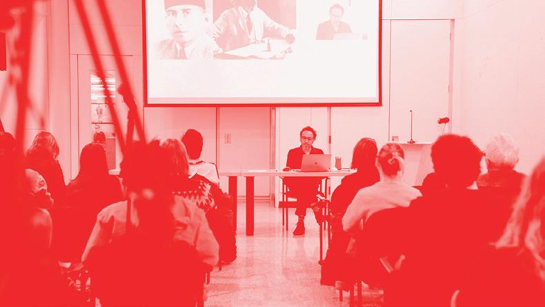

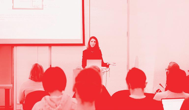

A
04:
189 01 03 04 02
selection of images from in-person lecture events. 01: Dorit Aviv 02: Maya Hayuk + Joseph Choma 03: Xiaoji Chen
Nida Sinnokrot
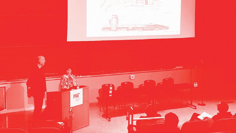
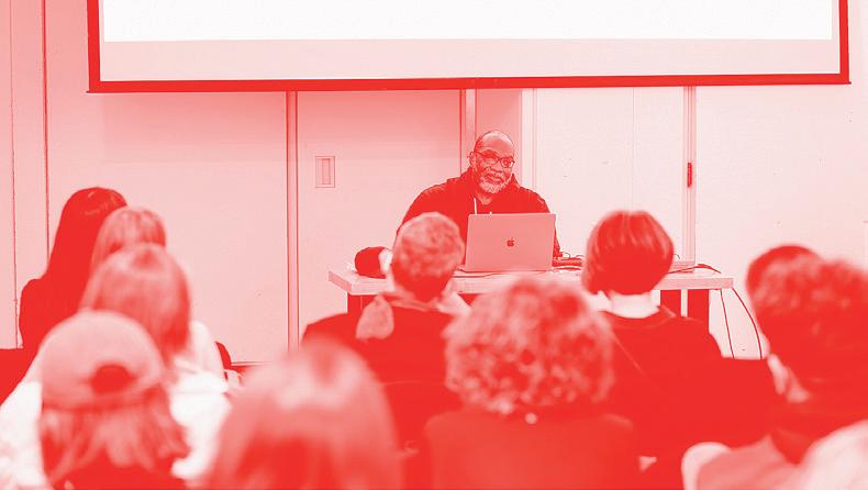

Spring Lecture Series 05 06 07
Thermal Architecture
Dorit Aviv
Building | UnBuilding
J. Yolande Daniels
From Sectarian to Muslim Ecumenicalism: Changing Contours of Muslim Sacred Landscape in 19th Century Kashmir
Hakim Sameer Hamdani
Building and Bildung und Blackness: Some Architectural Questions for Fela
Frederick Moten
Our Own Legacy: From Passion Projects to Sustainable Solutions with Open Source Community Building
Xiaoji Chen
The Profession’s Vanguards: Arab Architects in Mandate Jerusalem
Nadi Abusaada
Abstract Unions
Marlon Blackwell
Palestine is Not a Garden
Nida Sinnokrot
The Profession’s Foundations: Architects and Architecture in the Modern Middle East
AKPIA@MIT Workshop
The Ubiquity of Asia
Hentyle Yapp
05: Tod Williiams + Billie Tsien 06: Frederick Moten 07: Mpho Matsipa with Ana Miljački
191
Conversation with JEN O’BRIEN
How long have you been at MIT?
Jen O’Brien: I’ve been here for just about 13 years now.
What did you do before joining the department at MIT?
JO: I was a custom, high-end furniture and cabinet maker, which I continued to do for the first couple of years that I was also here, when my job was part-time. I worked for a couple of individual designers, making bespoke pieces from drawings through to finish and sometimes installation, in the case of built-in cabinetry. I was just starting to do work for my own clients when I was first hired at MIT. I have a BFA with a concentration in painting from years before, and I also spent several years gaining life perspective as a bike messenger downtown.
What is your favorite part about your role as Shop Manager and Technical Instructor?
JO: I’ve always been driven to be creative in a productive way, to pick apart complex problems as well as to absorb information about the world around me. However, it was only later on, years out of college, that I discovered woodworking and my own mechanical aptitude. It completely changed my life, and so now when I can help a student find even a little bit of that sort of experience for themselves, it’s one of the most gratifying things I’ve ever known. I’ve met many students who have never before had an opportunity to learn to use tools and machines or think about making in the context of what those tools are capable of, and many are initially intimidated. They have never considered their own potential affinity for machine or hand tool use, or were never given the chance. Sometimes I can be that first good learning experience for them, and they discover that not only are they capable, but also they really enjoy doing it. That’s definitely the most meaningful part of the work, to me. For many, using
Jen O’Brien trains and supervises shop users; performs machine operation, maintenance, and repair; co-manages and trains student shop employees; plans projects; coordinates with EHS and facilities; manages space access for all users; and performs other shop management and instruction tasks.
our equipment is just a means to an end, but for some, it can really be a profound perspective shift.
What is your least favorite part about your role as Shop Manager and Technical Instructor?
JO: On the face, this question sounds uncomfortably negative but if I had to say, it would be just that we have many students who I just don’t have the time to really work with in much depth, and I feel like it’s a big missed opportunity for me and for them. We have hundreds of students on the access list every semester, and most are very sporadic users. Thorough shop experience is very time intensive, so this is inevitable, but if it were possible, I’d love to be able to spend more time actually teaching and giving more students the kind of thorough foundation that becomes a skillset that can be applied to so many things in life.
What is your favorite thing you ever made or like to make?
JO: In terms of physical objects, I think furniture is the answer, currently but that may be influenced by the relatively small scale of freestanding furniture, which means it’s easy to work with. I prefer making things that can be used simple, purely functional design that tends to overlap with mid-century modern, though I’m not strictly a fan of that style. A near second is natural indigo dyeing, and just this summer I had the opportunity to make my own skin-on-frame canoe from wood, ballistic nylon, and synthetic gut string. That was a really enjoyable and unusual experience, being so different from the type of project I’m more practiced with.
Do you have a favorite material to work with? If so, what is it and why?
JO: Air-dried walnut is probably my favorite material. It looks and smells amazing. Unfortunately, walnut fades over time with exposure to sunlight and oxygen—but working with it is very addictive.
What is your favorite thing about MIT?
JO: The culture. I have always been a massive nerd and I love being able to have a career in a place devoted to learning (and making) that is also known for embracing weirdos like me.
Who are your favorite musicians?
JO: Wow, these are really hard-hitting I'm leaving so much out. On one hand, I want to say I've been a fan of the Punch Brothers for many years now. On the other, I’ve been playing Uematsu Nobuo’s compositions (arranged for piano) daily for nearly five years now. He is a musician as well as a composer, so maybe that counts.
This interview has been edited for length and clarity.
for taking the time to sit for the interview.
Gratitude to
Jen
193
Conversation with CHRIS DEWART
You were a furniture maker before coming to MIT?
Chris Dewart: From 1978 to 1980, I apprenticed with furniture maker Kingsley Brooks while simultaneously we did design/research for furniture company C.I. Design in Medford, MA. After apprenticing, I had a furniture making business for 10 years, making furniture and cabinets and putting furniture into arts and crafts galleries and shows, barely making a living. It was very tough. When the opportunity to manage the N51 Shop and teach came along, I embraced the steady income.
How long have you been in the Department of Architecture?
CD: I arrived in November 1986. Jack Myer, the Department Head, asked me to renovate what had been the Media Lab film editing rooms and convert it into a wood shop. Initially, I was working on setting up the shop. Jack asked me if I would manage the shop. At the time the department was in transition. Most of the studios were on the 3rd and 4th floors of N51 and N52. There were Building Technology classes, Bill Hubbard’s undergraduate design studios, and the Aga Khan Program in N52. I started teaching Furniture Making in 1987 or 1988.
Who was the department head that asked you to stay?
CD: Jack Myer. He was a founder of Arrowstreet, Inc. and Department Head of from 1982–87. He asked me to manage the shop after I made some furniture for him. The Architecture Department’s shop at the time was a small room in Building 3, where studios are today, across from the present-day wood shop. There was a tiny model making table saw about
Chris Dewart has taught Furniture Making in the Department of Architecture at MIT since the late 1980s and assisted students in building large and full scale models for architecture studios, Building Technology, ACT, and visual art classes. Recently he worked with architect
Reconstructions: Architecture and Blackness in America and
Yolande Daniels on her pieces
Topographies: The BLACK City .
Restrictive
the size of a laptop computer that never worked, and tools were dull or broken. It was managed by students, but they wanted a real woodshop. That’s what got built in N51, and it’s still here today. When I left my shop in Medford, I brought my machinery to N51. Originally, some of the machines and tools were my tools.
Did you stop your own independent practice?
CD: No, because I was part time at MIT, I supplemented my income by running my business out of the N51 Wood Shop. In the 1980s, I’d run the shop Monday through Thursday with students. Then I’d close the shop on Friday and do my own work. I was running a cabinet shop out of N51.
Let's talk about your furniture making course. How long have you taught that course?
CD: Since about 1987–88. It was pretty obvious to me that architecture students need to be making. Having worked on construction sites as a finish carpenter and with architects, it was obvious when an architect had no building experience.
Making furniture can be very much like making a building or a bridge. You’re creating a structure supporting a weight. The beauty of the design is the elegance of the engineering.
My sensibility: What’s beautiful is simple—shaker furniture, vernacular furniture built by the people who use it.
Do you still have time to do anything for yourself?
CD: When I didn’t have many children, there was time to make furniture. But Sarah and I had so many kids, we didn't know what to do. I build one or two pieces a year. Before we had children, I was producing dozens of pieces a year. My furniture was either in a gallery or custom built for clients.
What essentials do you need for your job?
CD: Flexibility. One minute you’re designing and the next minute mixing concrete, repairing a machine, or picking up a big mess. It’s a wonderful mix of many different opportunities—using acquired skills and learning new techniques makes it such an interesting job. One minute I’m explaining something technical and then the next demonstrating carving wood with a chisel. I love that. When computers came into the department in the mid 1990s and when CAD and CAM followed, it just made it more intriguing.
You also need patience in understanding what a student’s idea is that they want to make. And you have to have an open mind: Let students do the talking and be receptive while accounting for everyone’s safety. You can constrain the program—saying we can’t do that because it’s dirty or
195
messy or dangerous—or you can figure out a way to create that is safe and the student will enjoy.
What is your favorite thing you've ever made?
CD: My wife’s aunt Olive died some years ago. Olive’s family asked me to make a box to hold her ashes. She lived on an island in Maine. I took a picture of an island off the coast and laser cut the image into the face of the pine box. I dovetailed the box, which was made of pieces of wood that came from the island where Olive was to be buried in Maine. It was important and personal, for someone I loved and her family. There was nothing like the joy I got making the box. I understand why people in the old days made caskets for their loved ones.
This interview has been edited for length and clarity.
Gratitude to Chris for taking the time to sit for the interview.


01: The funeral box made of Maine spruce for a family relative who lived on an island in Maine where the box with her ashes is buried. 02: A photograph of a recent chair Chris built. 197 01 02
The Architects Collaborative 1945–1995
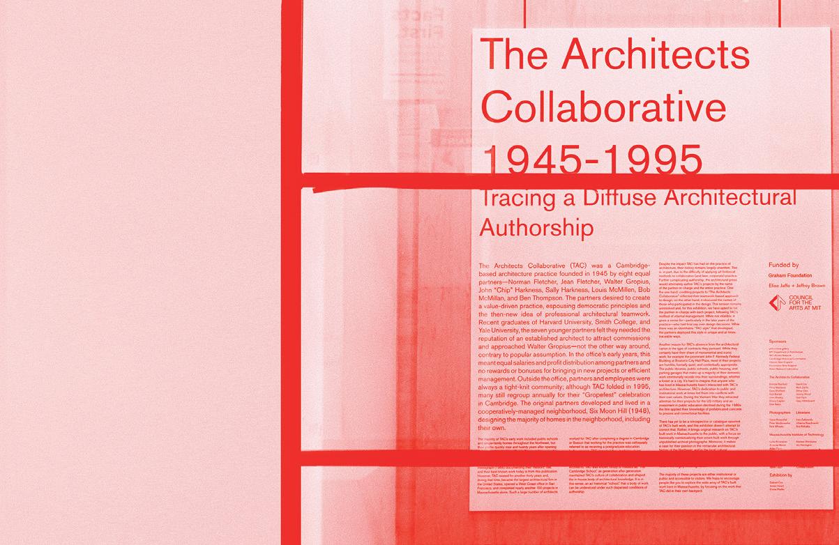
The Architects Collaborative (TAC) was a Cambridge-based architecture practice founded in 1945 by eight equal partners Norman Fletcher, Jean Fletcher, Walter Gropius, Chip Harkness, Sally Harkness, Louis McMillen, Bob McMillan, and Ben Thompson. The partners desired to create a value-driven practice, espousing democratic principles and the then-new idea of professional architectural teamwork. Recent graduates of Harvard University, Smith College, and Yale University, the seven younger partners felt they required the reputation of an established architect to attract commissions and approached Walter Gropius not the other way around, contrary to popular assumption. In the office’s early years, this meant equal salaries and profit distribution among partners and no rewards or bonuses for bringing in new projects or efficient management.
The majority of TAC’s early work included public schools and single-family homes throughout the Northeast, but their profile quickly rose and twenty years after opening their doors, they had an office in Rome and were working on commissions in Iraq and Germany, pioneering the model of global practice for architects in the United States. It was at this time that TAC produced its only monograph (1966) documenting their meteoric rise, and their best known work today is from this publication. However, TAC existed for another thirty years and, during that time, became the largest architectural firm in the United States, opened a West Coast office in San Francisco, and completed nearly another 100 projects in Massachusetts alone. Such
a large number of architects worked for TAC after completing a degree in Cambridge or Boston that working for the practice was colloquially referred to as receiving a postgraduate education. In the process, TAC imparted their model to young practitioners spinning off a number of local practices, including Ben Thompson Associates, Stull & Lee, Graham Gund Architects, Sasaki, and Elkus Manfredi Architects. TAC was known fondly to insiders as “The Cambridge School,” as generation after generation maintained TAC’s culture of collaboration and shaped the in-house body of architectural knowledge. It is in this sense, as an art historical “school,” that a body of work can be understood under such dispersed conditions of authorship.
There has yet to be a retrospective or catalogue raisonné of TAC’s built work, and this exhibition doesn’t attempt to correct that. Rather, it brings original research on TAC’s built work in Massachusetts to the public, with a focus on historically contextualizing their extant built work through unpublished archival photographs. Moreover, it makes a case for their position in the vernacular architectural history of the Northeast, and in the local cultural unconscious. At the time of this writing, several of these projects are under threat of demolition TAC’s historic contributions to both local and international architectural culture are largely unrecognized.
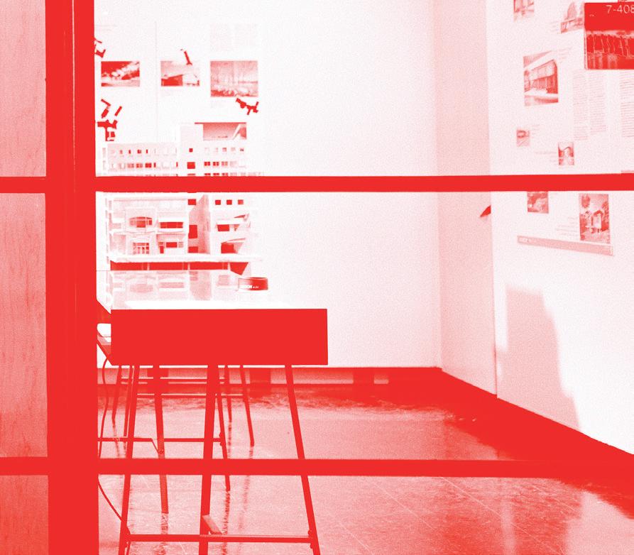
01: The Architects Collaborative 1945—1995: Tracing A Diffuse Architectural Authorship was an exhibition
199 01
at Keller Gallery by Gabriel Cira, James Heard, and Emma Pfeiffer.

02: Keller Gallery 03: Informational Booklet + Postcard 04: Model 02 03
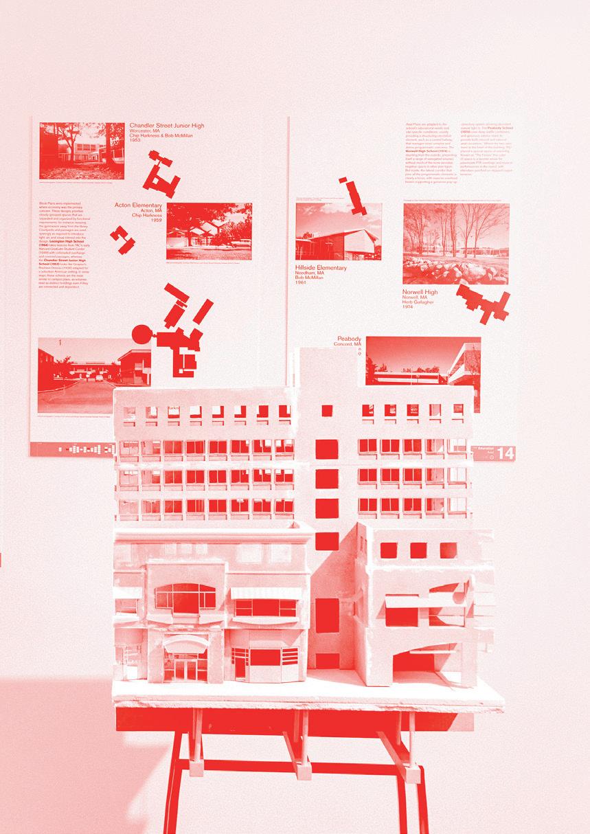
201 04
Thresholds 50: Before | After 01
On the occasion of its anniversary issue, Thresholds 50: The Exhibition invited readers to join the editorial team of Thresholds 50: Before | After to look backwards and forwards at pasts, futures, and present possibilities. Featuring new research, creative interventions by contributors past and present, and the republication of past articles, the exhibition brought together voices and perspectives from across Thresholds’ thirty-year history.
The exhibition seeks to complicate the implied linearity of the phrase “before and after,” turning to the medium of the journal itself as a site of layered, spontaneous, multidirectional, and reflective encounters, which are never quite complete or resolved even at the moment of printing and publication. By turning the history of the journal inside out and engaging the text with readers and visitors, the exhibit sought to “rewrite” key moments in time through the shared perspectives and experiences of new audiences.
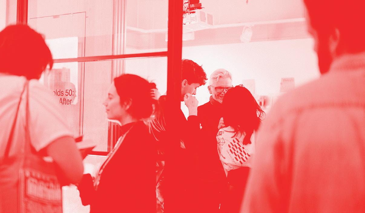
01: Thresholds 50
02: Opening Event 203
poster design at the entrance of the Keller Gallery.
02
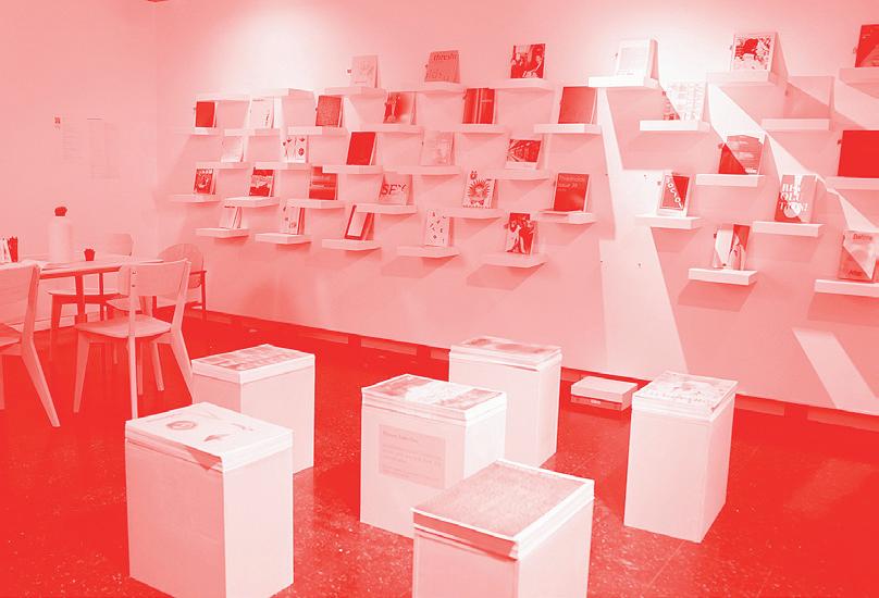
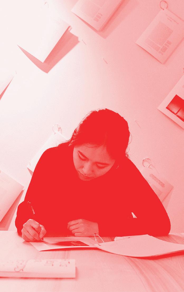
03 04
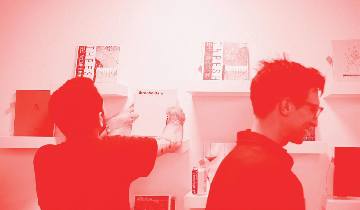
03: Keller Gallery 04: Annotating Articles 05: Opening Event 205 05

Lodgers: Friction Between Neighbors 01
An Exhibition at MIT Wiesner Gallery April 2022, supported by MIT Council for the Arts, Department of Architecture, Land Art Generator Initiative, and the Burning Man Project.
The exhibition showcased three years of research conducted in the Pyramid Lake region in Nevada focusing on the site of study, Fly Ranch. It highlights the question of how we “cope” with friction between “neighbors.”
The Wilderness and Land Reclamation Acts and indigenous land stewardship represent two ways of approaching the land. The two perspectives are situated at two different moments along a spectrum of knowledge production on the land. The former approaches the land from a top-down perspective that foregrounds the land’s static, immediate utility, while the latter is derived from Traditional Ecological Knowledge (TEK) of the land, which does not differentiate between people, species, and the land.
This exhibition invited TEK into our institutional approach to architecture and acts as an invitation to voyage into a different worldview, a native mode of knowledge production previously shunned by architectural higher education. This exhibition offers an unsolicited but much-needed “wrinkle” in the institute’s false state of equilibrium and attempts to integrate knowledge forms.

Project Lead: Zhicheng Xu + Mengqi Moon He. Fabrication Lead: Calvin Zhong. Sound Artist: Wuyahuang Li. Fabrication Assistants: Emily Wissemann + Julian Escudero Geltman. 01: Rendering 02: Installation Table View 207 02
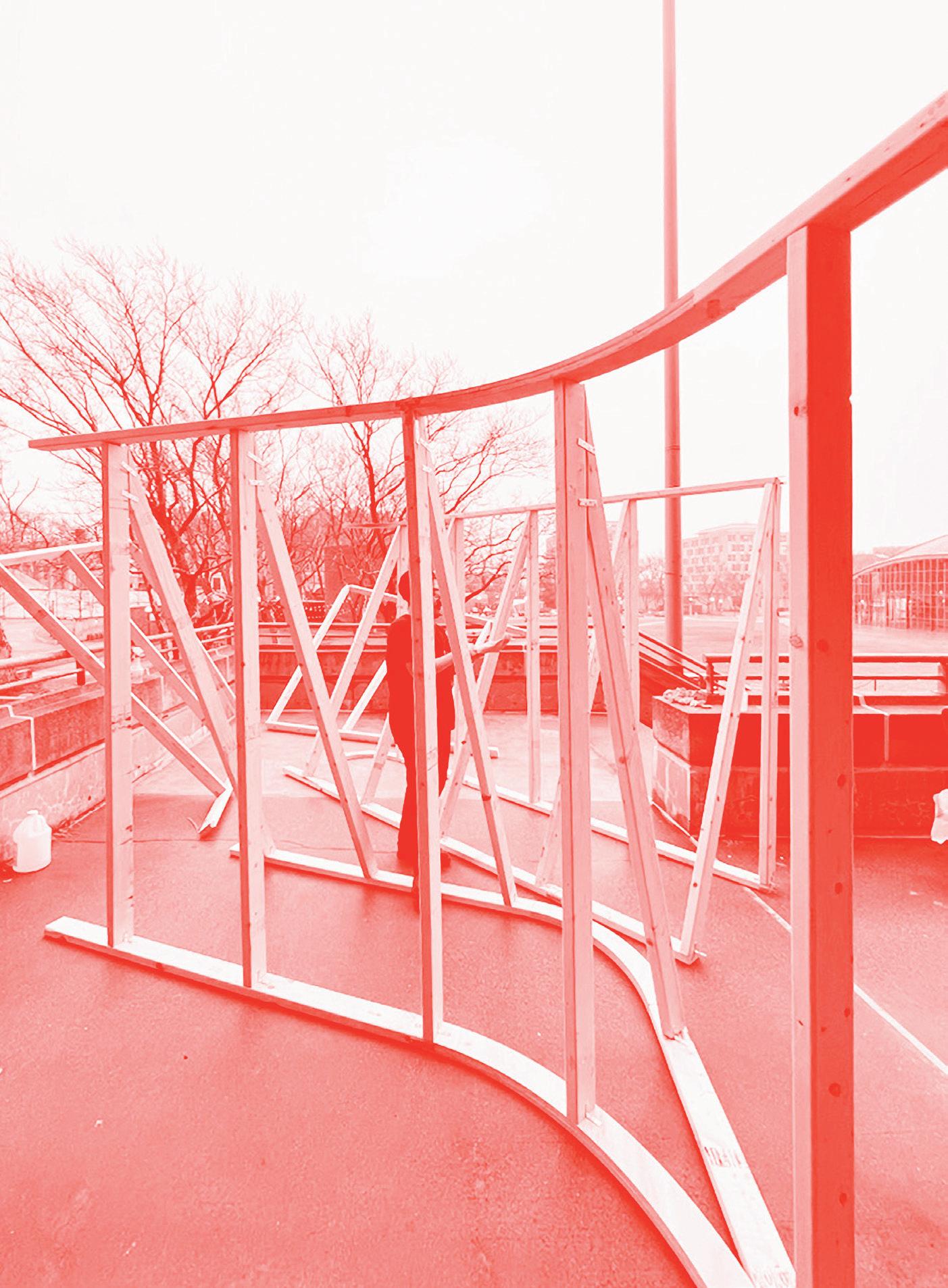
03
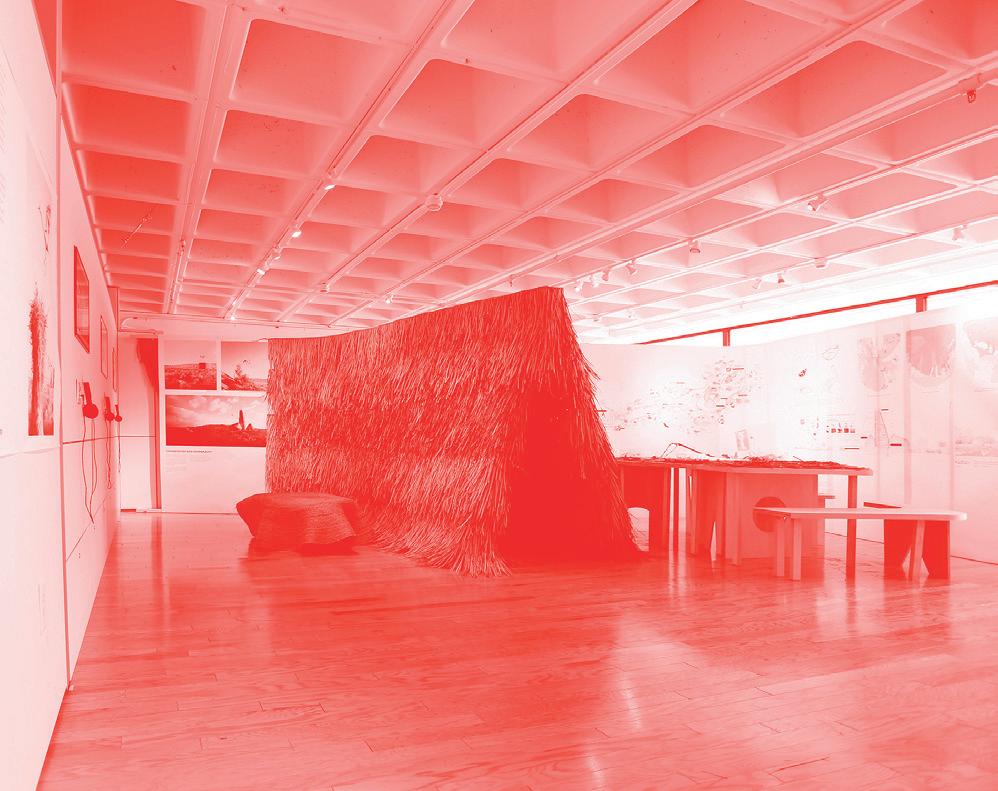
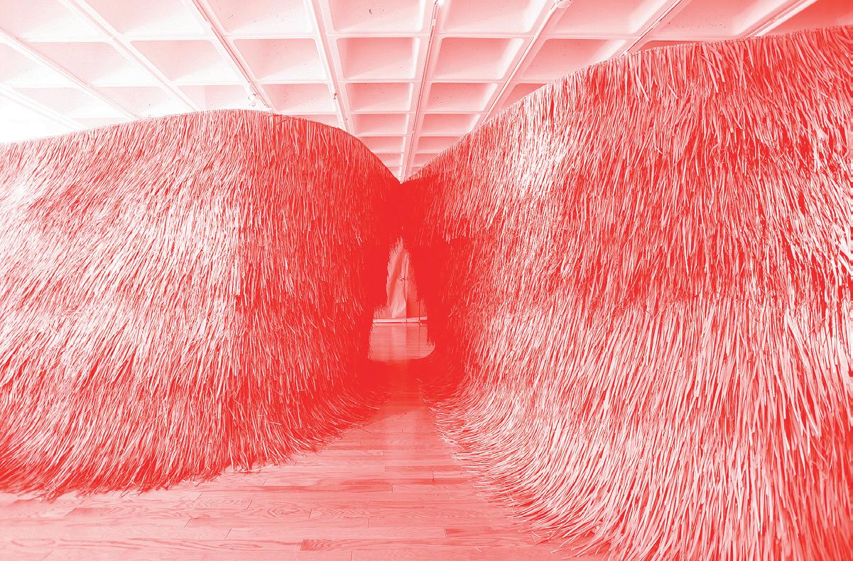
03: Assembly Process 04: Thatch Structure 05: Exhibit 209 04 05
Life List by Alejandro Medina
“Life List (Prayer Candles)” is one component in a larger body of work that I started developing at MIT in the fall of 2021. It consists of a series of wax sculptures, which involve casting “prayer candles” based on 3D scans of recently extinct bird species. To do so I’ve been working with the collections of various natural history museums, which often have vast collections of specimens of species that we’ve recently lost.
The group of sculptures is meant to be performed as a communal ritual, in which participants can each light a candle as an exploration of climate grief and mourning for all of the species that will be lost because of the ongoing mass extinction/climate crisis.
The project came about from an interest in conceptually exploring the form of the prayer candle as both a tool for collective grieving and also as a symbol for hope in the future that can potentially begin (in the collective and individual) the healing process from the anxiety and trauma inflicted by the climate crisis. The project hopes to create a moment of respite and spark a desire to take action within participants.
Paraffin wax (the material the candles are cast in) is one of the byproducts of the refinement process of crude oil, directly linking the extinction of these birds to petro-capitalism (which of course is largely the reason for the extinction of many of these species). The choice of using birds interests me on many levels. They are usually the first animals to leave an ecosystem when it’s on the brink of collapse (as they can easily fly long distances and migrate). Their absence/loss is a bio-indicator of a struggling ecosystem.
Alejandro Medina is a research-based artist and architect pursuing a Master of Science in Art, Culture & Technology. Building on his studies of architecture, photography, 3D visualization, and computational design, his work explores the relationship between humans and nature, particularly through the lens of the architecture and technologies that we build and use reflecting critically upon our exploitation and manipulation of living systems, non-human beings, and the biosphere at large.


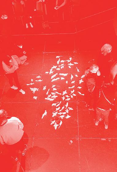
01: Candle Detail 02: Render 03: View on Installation in the ACT Cube 211 01 02 03
Conversation with PPPPRESS
Describe what ppppress is and give a brief description of each of your backgrounds.
Chucho Ocampo: For me, ppppress is a student, alumni, and most importantly friend-run press that came out of the curiosity or necessity to publish or self-publish, duplicate, and print ideas that emerged around MIT and within an art program like ACT. It came out of our cohort, and, for me, ppppress is a way of blending all of those floating ideas into a form that is artistic and craft-based enough for us to have certain freedom. My background is in architecture, and I transitioned to art through research. I try to mix in architecture, design, art, and different methodologies through research.
Aarti Sunder: One thing I should say is that each of us came at ppppress from completely different spaces and for completely different reasons. Our practices are so different and the concerns so different, as much as they are very similar. Bookmaking is a super physical process and it’s a super hand-based process. It also emerged during peak COVID, when the shops were shut and we had very restricted access. Even the lab computers were not that easy to use. It was a big mess. I think there’s a huge need to make books at some level, some kind of printed matter, because regardless of COVID, there is always a tendency to move towards printing. There was some kind of need to bring in different kinds of art practices to a space.
The way you describe bookmaking or printed matter, it shows how powerful it is as a method or as a practice. Do you see it as a tool? What are its potentials as this thing that can be spread and duplicated?
AS: Duplication if you have a protest, you need paper, you need a pamphlet. The book is not the kind of tool that it once was. I think it’s changed. It is dissemination, but it doesn’t necessarily have to be dissemination anymore. We have internet and all that. But at the same
time, it is a big tool. The need to make books hasn’t disappeared yet, but it has changed. Nevertheless, regardless of that, it still exists. It exists in different places for different reasons. But I think that the role of the book is an interesting question. Is it craft? I don’t know. Why would you buy a book now?
CO: Why would you make one?
AS: Why would you make a book? It’s so nice to make a book.
CO: For me, bookmaking is perhaps even a more pedagogical tool. Bookmaking forces a certain narrative, it forces you to think about the craft of the book. Bookmaking is a very hands-on process because, on InDesign or however you design your books, you have to think of compagination. It’s a very technical thing that, when you teach or learn, is incredible. It has to do with narrative, it has to do with technique, and it has to do with the machines that you have available. It has to do with the amount of paper, how many copies, and that relates to the type of work or book or pamphlet you want to make. First thing we ask is, okay, what’s the format of your book? Then everyone has to come back to zero. I think bookmaking is a very brainy, hard-to-understand, mathematical, precise procedure we are not the best at grasping everything, by the way, but we are getting better.
ppppress began during the pandemic period. The website described it as a way to bring people together during that period. Now that we’re maybe past the peak of the pandemic, is there a new role that you view for ppppress playing within MIT or outside MIT?
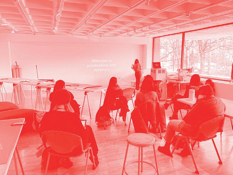
Gratitude to ppppress for taking the time to sit for the interview. 01: Printmaking with ppppress IAP workshop.
213 01
CO: We are still figuring out a very big question that I think we all share. We have this project and whatever buttons you press, it costs a certain amount of money. You have to maintain it in a way. But at the same time, there’s a huge difference of making it inside a huge institution like MIT, where, in theory, we don’t have certain pressures. It’s not a business. We don’t have that pressure. It’s a project within an institution. We don’t have that pressure of becoming a business and creating certain titles that will sell. For me, that creates other questions of structure. By not being burdened by its being a business, can we make different organizing structures for the press? Can it be more collaborative? How can we make it more horizontal, for example? Is it really possible? I think it is and we still have to test those things. But for me, that opens up how collaborative it can be. Because we’re still making physical objects.
At the same time, I think we start having the same rules as a shop if you’re using the machine. It’s not that we are the owners. We’re just kind of like co-founders, organizers of the idea. We’re in charge of the machine. We’re in charge of getting the supplies. For me, there are two questions. One of it is how can we open it more for collaboration? How can we maybe have a board or different ways of organizing this complex task that is not burdened by money matters or is not burdened by making money to sustain itself because it already sustains itself by its own, by being inside an institution.
And the other thing is, of course, we’re trying to have a certain editorial line of ppppress. We’re not printing everything we see. We collaborate with specific artists. We are interested in certain things and we are trying to make certain collections or a series of different topics for each year. And there’s so many people at MIT that are doing incredible stuff that it’s almost impossible to choose what we’re doing next. When we thought of the IAP course, it was amazing. It was super nice. We got a very good response. I think we’ve got like 60+ people interested in the workshop, and we ended up teaching ten people because of COVID. The result was incredible. I was very happy with the results, because the learning curve is not so steep. And once you get a hold on it, it’s super nice. I think that part is also very important: how to make it more accessible in a way or how to open it more.
What is the vision for ppppress? You discussed how you envision it as something that’s passed on, instead of a business model.
CO: I would dare to say that ppppress only works inside MIT. And it only works if you teach others and care about the collection of things that is the press and then step aside and move on. I think we are all in the process of doing just that, and we are understanding as we go. I think the difficult part of this is that even if this sounds very nice and ideal, I think it’s super hard. Collaborating is not easy. Sharing is not easy. Renouncing authorship is also not easy. And stepping away is not easy as well. We still need to figure out what is that thing and how to do it properly and in a good way.
AS: In a way that carries it on in the spirit of collaboration not in the spirit of non-structure but to offer a diffuse structure where you say that the assumption is to not have an authority. MIT’s a gigantic institution, and I do agree that this can only exist there. But I also think that if it’s a student-run space, it has to retain a certain level of informality and a certain level of structured informality not the absence of structure. There is structure, but it is something that is collaborative, is informal, and can shapeshift. If it does not shapeshift, there is no point to it. And I think that is super hard to put into place, only because it takes years for something like that to come together. We’re just beginning. This is the second or third year. We’re just starting off this thing. We need to still find a group of people who are willing to take on the role. It’s an enormous responsibility. Whoever takes it on a group or whatever it is has to be able to respect the idea that it will shift. It will shift into something else. It will become something else. And that’s perfectly fine, as long as it retains that ability to bring people together and enable them to collaborate. And it’s a free platform. It’s 100% free. It’s great, and there’s a couch where you can even nap in between.
215
Conversation with JIM HARRINGTON
Could you tell us your background?
Jim Harrington: I‘m from Boston originally. I went to the Boston Public Schools and graduated from Boston Latin. I went to undergrad at Harvard. As an undergraduate I was a geology major, and I went to UMass for grad school. I was a groundwater hydrologist and worked for the federal government for a while.
All my life I’ve really been interested in working with my hands, and I had an opportunity to work in construction when I was in between jobs. I got really deep into carpentry and ended up in Local No. 33 doing high rise work in downtown Boston. That is where I decided to pursue architecture.
How was your experience returning to school for architecture?
JH: My parents didn’t go to college or anything to them, you don’t become an architect. For someone from my background, it was a little bit radical, actually. It makes more sense for someone like me to be a carpenter or aspire to be a doctor or lawyer rather than an architect. I got into Yale and decided to go there. I was fairly well received because they liked my background both in construction and geology. I was interested in relating my two backgrounds at Yale. For instance, I’m quite interested in earth shelter architecture.
My first job out of architecture school was at Moody Nolan in Columbus, Ohio. I came back to Boston after that and worked for Elkus Manfredi and developers, which was a completely miserable experience. That’s when I started looking around at construction and facilities management jobs.
I assume that is when you made the switch to MIT. What attracted you to the school?
JH: Bill Mitchell was the dean at the time, and I was quite interested in computers when I was in architecture school. So I was totally enamored with the idea of working for Bill.
Jim Harrington serves as client representative on major renovation projects, oversees safety and security, acts as liaison with the MIT Department of Facilities, oversees all building systems and non-computer equipment, oversees the maintenance and upkeep of all spaces, and coordinates special events requiring space considerations.
The culture of the school completely changed when he came in. There was a tremendous amount of opposition, because he really wanted to try to change things. He had this big emphasis on computing. When I applied to architecture school, I looked at MIT and the spaces were completely derelict. But Bill Mitchell had come in, and he completely changed it. It went to the opposite extreme. When my wife first walked through, she said “Gosh, it’s so corporate.”
I’ve seen quite a bit of generational change here. It’s been interesting to see how things change, but I think we’re in a good place now, and I guess I’ve played my part in it.
What are the essentials you need for your job?
JH: The most important thing worth everything else combined is communication. I went to a really good high school and I learned how to write there. I’ve forgotten everything I learned at Harvard. I use the stuff I learned in high school every day, especially the writing. You’re communicating with a wide range of people here. It’s the complete education spectrum.
Just being able to communicate is so important. It’s been difficult in my life because I’m from a modest background, but I’m well educated. At times, I’ve felt like I really don’t fit in anywhere. The way I grew up, I can’t go back to doing that, but I don’t really fit in with the overeducated elite crowd here, even though now I’m well-educated and part of it, too. I feel like I’m a transitional generation and that has actually helped me in this job. I go from one extreme, like a meeting for the warehouse project all this brain power and huge salaries in the room. Then ten minutes later, I’m talking to painters. You have to know how to treat people with understanding and tact. Communication is so important.
I think you can’t take things personally around here. People are under a lot of stress. You have to understand that and you don’t always see people at their best. So you’ve just got to try to be professional at all times. You’ve got to try to be tolerant, but you also have to care.
You need to be interested and enthusiastic about the field where you work. I don’t want to work in any other department but this one here. It is my field, and intellectually, it’s just great. I’m completely in awe of our students and faculty, too. I get to see cutting edge cool stuff daily and it helps to share some of the same passion.
My next question: How did you get the name Lord Jim?
JH: It’s always interesting to see people’s reaction when they see my email. I wanted something that was distinctive and easy to remember. Joseph Conrad is my favorite author, and there’s a novel Lord Jim, which is a story of redemption.
217
The story of this Lord Jim is a story of a young man who’s really naïve and optimistic and goes to sea and has a crushing experience and winds up discovering things about himself that are lot less than positive. And he spends the rest of the book trying to redeem himself for that. Coming to MIT, I feel I’ve redeemed myself career-wise.
When I was young, some of the jobs that I had were just miserable. I was hoping that I’d get to MIT and this would be different and that I would be inspired by it and want to go the extra mile and look forward to going to work every day and get to see and do some cool stuff. And that’s exactly the way it worked out. I’m very happy now with that choice of my email. I think some people think it’s like I’ve become royalty. But actually it’s not. It’s a complete expression of modesty and vulnerability really.
What has your role been in the Met Warehouse project? How will this shift to a different building impact the Department?
JH: My role has been varied. I’ve been the point person in many ways. When something controversial comes up because of budget or space constraints, someone’s got to be the first person to present it and to get the initial blowback. There’s been quite a lot of that. My job is to communicate the needs and aspirations of the users and to make sure we get these in the drawings and that I give a fair representation of what we want for this project and what we’re expecting. I’m trying to keep people in the loop on our progress and, when things directly impact them, inform them about it and have a chance for discussion.
When I first came here, I wasn’t happy with our position in all the rankings. Of course, everyone pretends that those don’t count for anything, but I always wanted to beat Harvard’s brains out. I think the big thing that’s been holding us back has been the limits of our space. It’s okay. We’re functioning and doing excellent work, but I want the research to really take off. To do that you really need a space that’s well-located, accessible, and available one that integrates with the studios and teaching, so that it’s just all in one place.
My big hope when we get over to the Met Warehouse is that people will get past the “Where’s my office?” and “How much square feet do I have?” and just appreciate the benefit of all being together in one place that’s been designed for the Department. The students and research will take off like a rocket. Our courses will become more popular across the whole Institute and it really will be a center of design and put us on the map. Some people think architecture is an afterthought here. They don’t even know we have an architecture department. The school and the department will become much more of a brand, and a recognizable one within MIT, because we have the locus and there it is. It’s us and we’re over there. And that’s what I’m hoping for.
Gratitude to Jim for taking the time to sit for the interview.


221

Site
Site brings attention to our relationships with the places we travel to and speculate on. These relationships are both necessary conditions of architecture and planning and ones fraught with frictions and difficult questions, whether in Boston or across the globe. This chapter emphasizes cross-disciplinary collaborations with the Department of Urban Studies and Planning through joint studio courses and workshops. An interview with Ana Miljački discusses the importance, and sometimes necessary difficulty, of collective work and coauthorship. A conversation with Larry Sass reflects on complications caused by global logistics and the potential of digital workflows in reducing construction labor costs. Lastly, a group interview on the workshop Rebuilding the Edge held in Italy shares the importance of multidisciplinary approaches to regional issues.
Thesis
Building Sites
Orientalism, Colonialism, and Representation
Understanding Modern Architecture
Advanced Photography
Collectives: Mexico City
Contemporary Urbanism Proseminar
World Heritage, Climate Inheritance
Augmented Historical Pedagogies: Berlin Urbanism Studio
Collective Architecture Studio
Interview with Ana Miljački
Serra da Capivara
Repositioning
Core Studio III + Structures and Envelopes
Biodiversity and Cities
Dwelling & Building
H22 Design and Digitally Fabricated Community
Interview with Larry Sass
Undergraduate Work
Rebuilding the Edge
Image
by Zhifei Xu
224–247 248–253 254–257 258–263 264–269 270–275 276–285 286–295 296–301 302–307 308–317 318–321 322–327 328–337 338–349 350–353 354–357 358–361 362–365 366–371 372–381
223
Graduate Thesis
SMArchS Thesis Coordination Varies by Discipline Group
M.Arch Course Coordinated by Deborah Garcia with Teaching Assistant James Heard
SITE
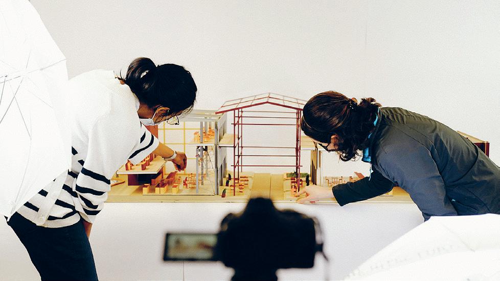
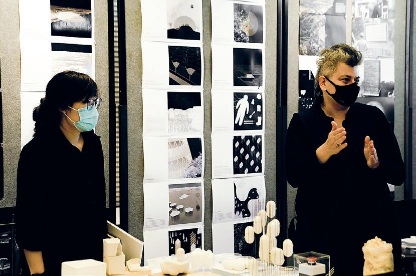
4.THG 01–02: Thesis Final Reviews 225 02 01
Professionals in a Soviet America
Federal Housing Policy, the Popular Front, and Architects in Los Angeles, 1919–1947
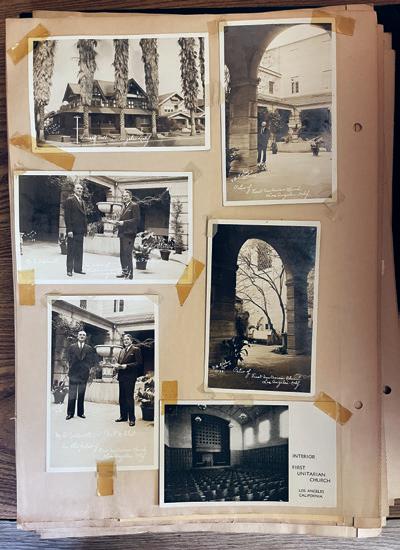
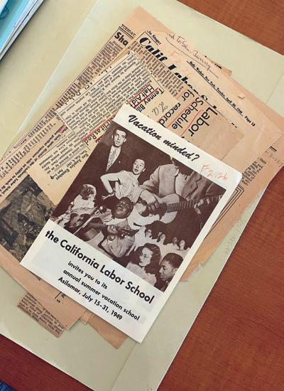 by James Heard
In the wake of the first Red Scare, Marie Meloney, editor of the women’s magazine “The Delineator,” founded Better Homes in America, a national organization to promote the ideal American home through publications, model homes, and local events. Herbert Hoover, the then-Secretary of Commerce, served as the organization’s first president, operated it as the propaganda wing of the United States’ Commerce Department, and relied on it to rhetorically hitch “American values” to detached, single-family dwellings. After becoming President in 1929, Hoover began to intervene in housing through increasingly direct measures. The complementary trajectories of propaganda and policy coincided at the President’s Conference on Home Building and Home Ownership in 1931, out of which the Federal Home Loan Bank Act was drafted, legislatively establishing the national framework for mortgage lending and normalizing the detached single-family dwelling. This conjunction of form and finance reverberated through congressional discourse and eventually influenced housing restrictions established through the Federal Housing Administration particularly racial, formal, and stylistic controls.
By the mid-1930s, galvanized by the Great Depression, the Communist Party USA had started organizing a left-liberal Popular Front with architects figured as a vanguard of the professional class. Over the following decade, this network challenged the increasingly hegemonic suburban model of housing. This included labor unions like the Federation of Architects, Engineers, Chemists, and Technicians union, which agitated for public works provisions in New Deal policy and the Hollywood Independent Citizens Committee of the Arts, Sciences, and Professions, a cultural organization that incited architects alongside other professionals to protest for an alliance between the United States and the Soviet Union, global nuclear disarmament, and modern housing throughout California. As the second Red Scare accelerated in the postwar period, institutions like the First Unitarian Church of Los Angeles intervened to provide meeting spaces for embattled organizations. While the Popular Front coalition in Los Angeles unraveled by the mid-1950s under the burden of state and federal surveillance, it left behind a built legacy of politically motivated developments throughout the city.
01 02
Advisor: Arindam Dutta Readers: Ana Miljački + Mark Jarzombek


01: A flyer for a Summer Vacation School in Asilomar, California hosted by the Los Angeles Division of the California Labor School, an educational institution operated by the Communist Party of the United States in collaboration with organized labor and local organizations. “Vacation minded? the California Labor School invites you to its annual summer vacation school, Asilomar, July 15–31, 1949,” n.d. Box 3, F2.26-A California Labor School, Los Angeles Division, 1945-49, 93-04-12. California State Archives, Sacramento, CA. 02: A scrapbook held in the archives of the First Unitarian Church of Los Angeles. 03: Biking through East Hollywood. 04: Baldwin Hills Village. Built in 1942 by Wilson, Merrill, & Alexander with Reginald Johnson, and Clarence Stein. 05: A friendly cat. 227 03 04 05
ACCURATE-ISH
by Ruth Blair Moyers
Looking at contemporary American historical sites, this thesis writes an operational epilogue on the highly constructed landscapes of memory in the United States. The current models of preservation in practice are centered on addition and expansion of what has value, but there is a hesitation that lingers around the notion of deconstruction, or devaluation of historical places. In practice, acts of removal or reconstruction come from moments of rupture, rather than a continuous process of reevaluation. This thesis is interested in the design of collapse, in revealing, and in allowing the uncanny to exist in ways that begin to make place for subaltern narratives to leak into and overwhelm spaces of colonial history.
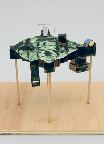
This thesis sits within Colonial Williamsburg®, a 301 acre open air “living-history” museum in Virginia. It is a destination for heritage tourism, located within a two-hour driving radius of Washington, D.C., Richmond, and Charlottesville—all central sites of historical myths of the United States, and all of which have recently become sites of rupture (protest, rallies). The reconstruction of the colonial town in Williamsburg originally began as the passion project of a local clergyman and was realized with the support of J.D. Rockefeller, Jr., among others invested in its narra-
tives. The goal of restoration was to bring history to life, but it also conveniently served in repairing the self-image of a place that was experiencing economic and cultural instability following the Great Depression and the end of Reconstruction in the American South. These plays for settler-colonial nostalgia led to a highly constructed and deeply amnesic experience designed by and for a singular audience to be easily dramatized and repeated.
This constructed imaging of history has been retained in much of Colonial Williamsburg®’s programming as a tourist destination with contemporary retail, hospitality, and entertainment venues. And while time seems to be frozen in this place, there are already subtle insistences of difference in moments of landscaping, planning, and structures. By proposing a series of canny and uncanny alterations to Colonial Williamsburg®, this thesis will begin to pull at the seams of a place that holds “accuracy” at the center of its operations, not through a restorative nostalgic criticism, but through a series of reflections, refractions, and destabilizing realities. What might happen if we hold a mirror up to a place, and ask it to see itself?
Advisor: Deborah Garcia
01
Readers: Garnette Cadogan + Nicholas de Monchaux
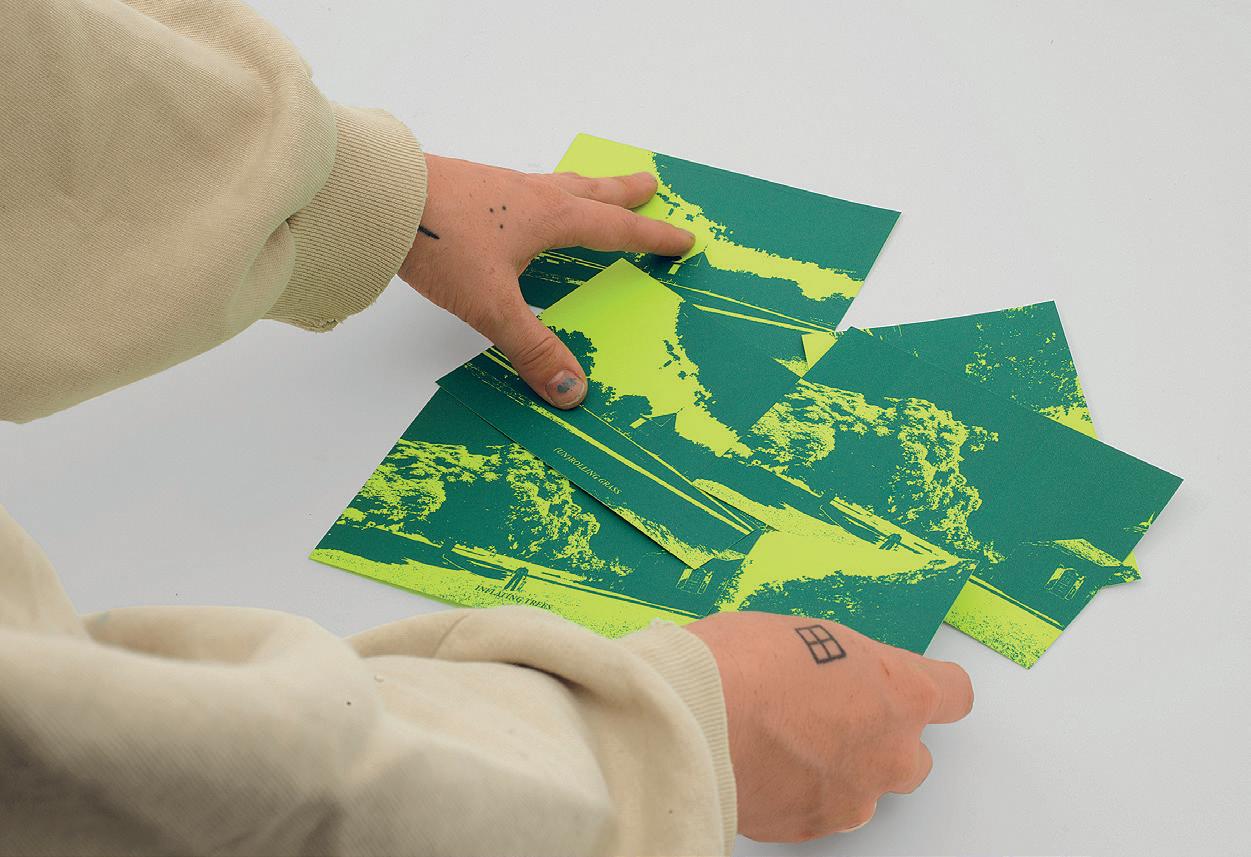
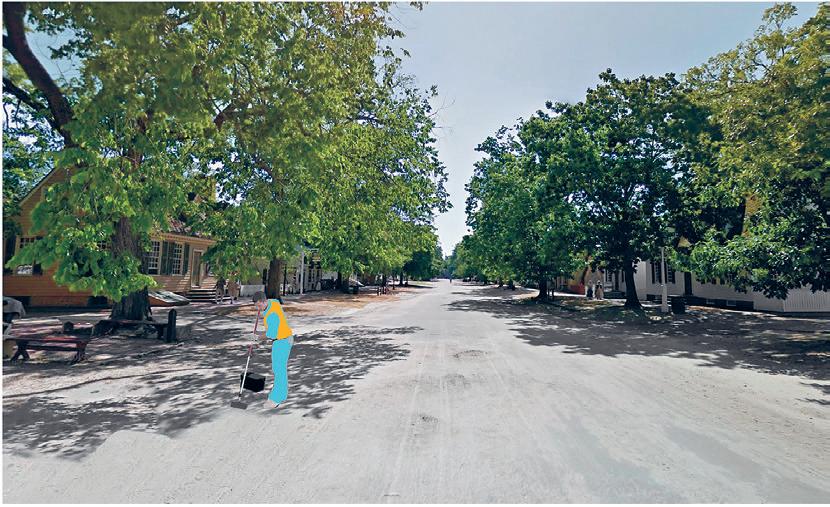
01: Model 02: Detail Image of Cards 03: Street Perspective 229 02 03
a taste of home
by Ana Arenas +
Carol-Anne Rodrigues
A border is both a physical location and a political condition that divides two countries. A border, however, is not impassible, nor is it only a fixed location; it is also an immaterial trace that is carried forth by everyone who crosses one. The border lives beyond the thin demarcation between nations, and thickens to accommodate the stories of all those who wear its mark as they travel from their origin point to final destination. This thesis proposes that the border does not only exist at a land’s edge, but also within our immediate surroundings, where we see borders all across the city of Boston.
From newly formed migrant groups to the communities of locals who have lived here for years, Boston’s diversity defines its inner neighborhoods and outer suburbs. Across the city, we cross borders when we enter neighborhoods, enter a store, dine at a restaurant, or arrive at a home. These stories of borders manifest in the collective sharing and exchange of food at the table. Immigrant-owned restaurants across Boston offer their cuisine to celebrate their culture and create a sense of home in an unfamiliar place.
On the other hand, borders are also experienced across the city through the inequitable access to food. Charitable organizations throughout the Greater
Boston area work to bridge the gap between food excess and food scarcity, but there is still a divide. In a city rich with diverse cuisines and a lack of access to food, how can architecture help bring equality to the sharing of food and dignify the experience of immigrants?
This thesis proposes a network of “Food Embassies,” a new institution that celebrates food from across borders and bridges the gap between excess and scarcity. As an embassy serves its people in a foreign place, we propose Food Embassies across Greater Boston to provide accessibility, to create community, and to provide tastes of home.
Ochsendorf 01: Table 02: a taste of home
03: Site Plan
Advisor: Ana Miljački Readers: Cristina Parreño Alonso + John
Market Scene Model

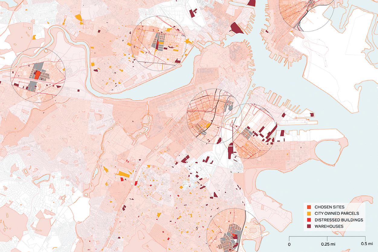

231 01 02 03
Coping With Neighbors & Other Entanglements
by Zhicheng Xu
This thesis explores how two ways of “seeing” landscape might be integrated through a set of design interventions for the Kooyooe fish and the people from the Paiute nation. Situated in the state currently known as Nevada, where the Paiute people have lived for over 9,000 years, Pyramid Lake is the Kooyooe’s home. The 1905 Truckee River damming and ensuing history of water rights struggles have endangered the Kooyooe, a cultural icon in the Paiute community. Such a struggle represents the violence of colonialism in the landscape and inequitable distribution of resources.
Contemporary land management that supports damming/extraction and indigenous land stewardship are situated at two moments along a spectrum of knowledge production and land perspectives. The former approaches the land from a top-down perspective that foregrounds the land’s static, immediate utility. The latter is derived from traditional ecological knowledge (TEK) embedded in the land, which does not differentiate between people, species, and the land on which they are located.
The purpose of this thesis is twofold. In addition to designing the storytelling place, the hatchery, and the series of fish hiders as part of an experiment that
attempts to integrate knowledge forms, this thesis is also a journey of self-discovery and a reflection on the institutional architectural pedagogy students experience in American higher education.
The thesis allows the TEK of Paiute people to enter the project and become an invitation to voyage into a different worldview, a native mode of knowledge production previously shunned by architectural higher education. However, expeditions are often accompanied by mishaps and accidents. This project has fractures and failures that the author must fully embrace, as they are critical reminders of what is currently missing in the modes of learning and teaching architecture.
01: Fish Hider, Fish Eye View 02: Numana Detail Zoom
Advisor: Sheila Kennedy Readers: Rania Ghosn + Caroline Jones

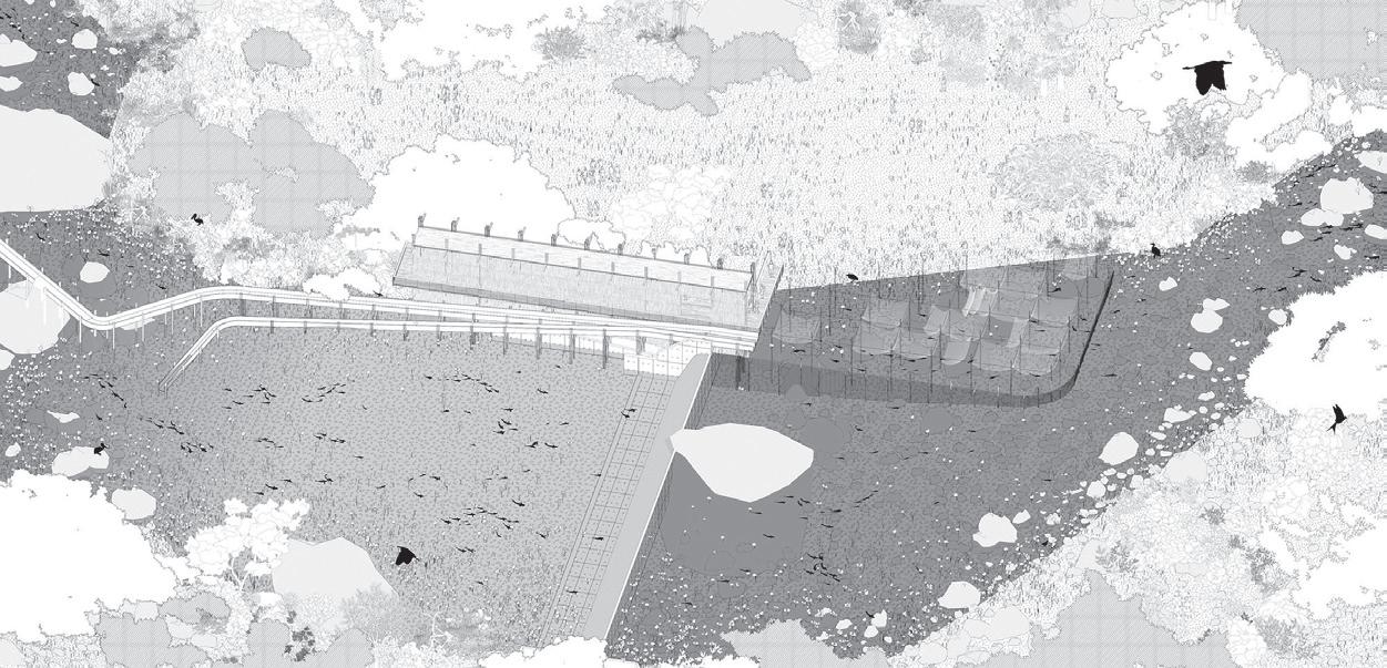
233 02 01
Forest Framing by
Jitske Swagemakers
This thesis reimagines forest and architecture through the design of a set of mutual relationships. It integrates wood research with local knowledge and tools to restore forest ecology and boost rural economies. The proposal is situated in the context of Sweet Home, Oregon, a former logging community on the edge of the Willamette National Forest. Like many small towns across the United States, Sweet Home is in a state of social and ecological crisis, combating high poverty rates and dwindling resources. Industrial mills are abandoned, homes are patched in varying states of decay, and the surrounding forest is reduced to arrays of Douglas Fir.
Through a close reading of the reciprocal relationships between forestry and wood construction, this thesis outlines a series of wood construction techniques to repair buildings and restore forest habitat. These techniques provide accessible and economical systems of framing, placing special emphasis on the diverse materialities of wood in its natural form, wild wood. Driven by the natural properties, the thesis outlines categories of wild wood, found in the Willamette National Forest. The harvesting of wild wood helps prevent the risk of wildfires, allows for cultivation of fire-adapted plants, and does not contribute to deforestation.
This thesis imagines a restorative future for Sweet Home through deploying wild wood in the gradual adaptation of local buildings to the time scale of the tree. The first intervention is the transformation of the abandoned mill into a collective wild wood shop, in which wild wood construction techniques are implemented and executed by a cast of Sweet Home community members. The wild woodshop offers a site for wild wood prototyping and experimental forestry that enhances the material and ecological qualities of wood, feeding back to the forest in the process.
The second series of wild wood adaptations is at scale of the home. Simple interventions in and on the surfaces of the building create symbiosis between the town of Sweet Home and the forest. Plates detailing the technical elements of a wild wood wall and roof systems, along with construction manuals, build on the community’s receptivity and proficiency to work with wood and are informed by ethnographic research consisting of site visits and interviews.
This thesis contributes to a reappropriation of wood in architectural construction and offers an economical solution that promotes symbiosis between forestry and architecture. It mobilizes
local community members and serves as a catalyst for social empowerment to revitalize the town and its surrounding forests. Wild wood architecture must acknowledge the contributions made by forces that are non-human. This project proposes that wood is an actor as well as a source, and as an actor, it provides for the shared futures of forests and forest communities.
01: Site Section 02: Collage Image
Advisor: Sheila Kennedy Readers: Mark Jarzombek + Paul Mayencourt
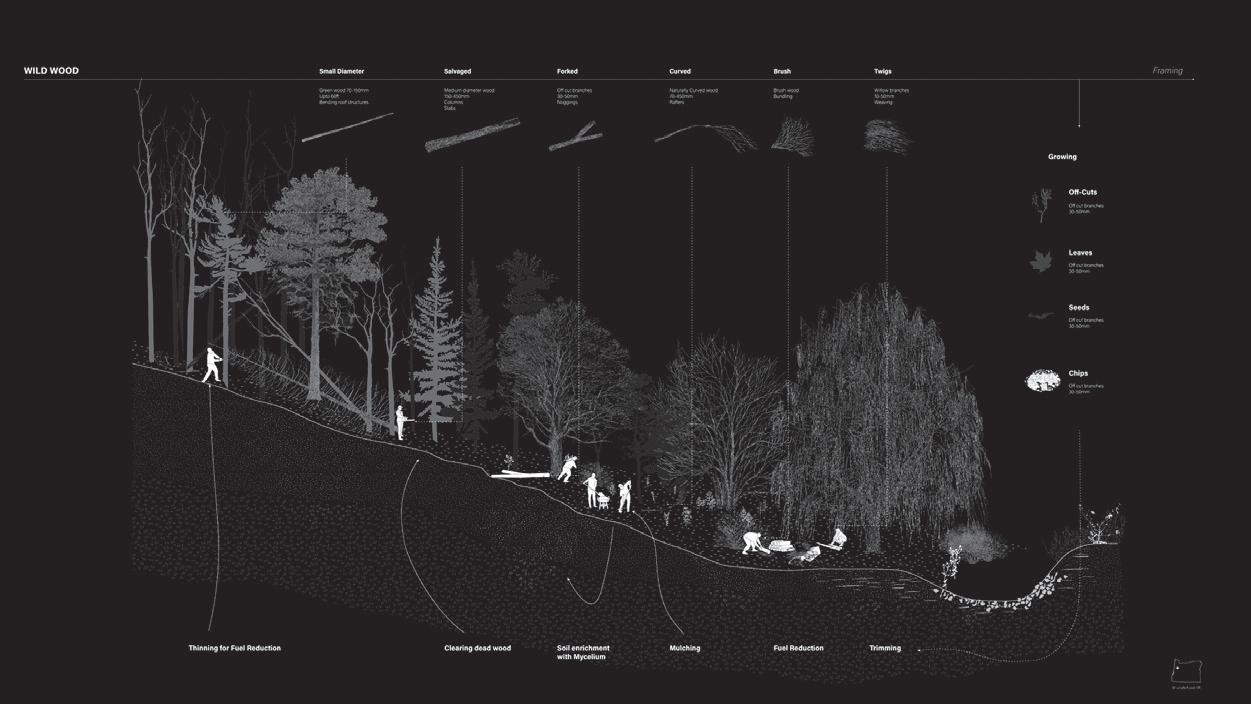
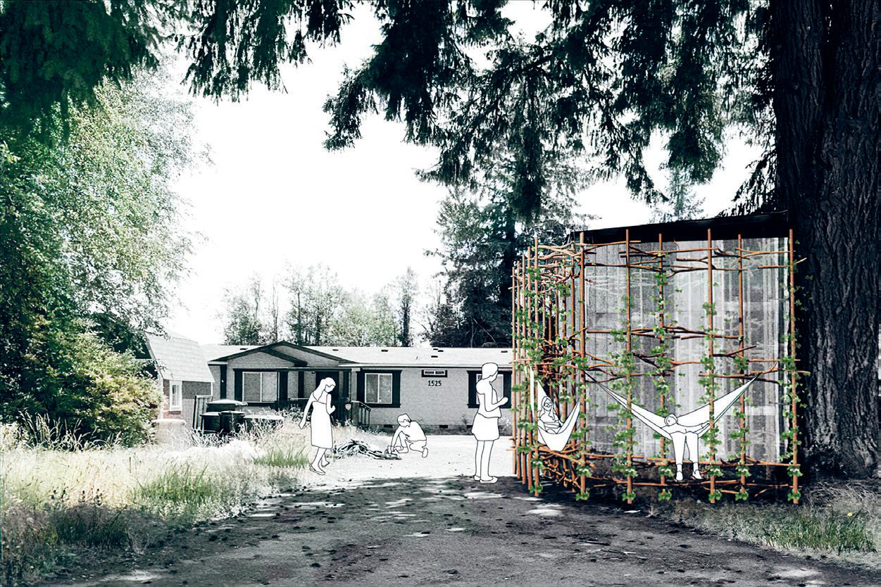
235 02 01
Fukushima Exclusion Zone Survival Handbook
by Mengqiao Zhao
Ten years have passed since the 2011 Fukushima nuclear accident in Japan, but its devastating impact has not subsided and may never end, given the radioactivity from the long-term decay period. As one of the most serious nuclear accidents in human history, this is a disaster not only for Japan but for the whole world. Radioactivity has no boundaries, whether for countries or species: Both humans and nonhumans are impacted.
Challenging traditional problem-solving methods that focus on overcoming, solving, remediating, and isolating, this thesis proposes an unconventional method of coexisting with radiation in a survival handbook. “The Survival Handbook of the Fukushima Exclusion Zone” is a fictional and imaginative guide that describes how to coexist in a future radioactive world. It is designed for humans—residents and visitors returning to the site—and nonhumans, including flora, fauna, and nuclear waste itself. Based on an investigation of both traditional and promising new materials, this book offers schemes for imagining the future in this radioactive world. Organized around future daily life in the Fukushima Exclusion Zone, this project investigates whether all forms of life can live in a radioactive world and how
we might do so. At the scale of atoms, bodies, buildings, and landscapes, the timeframe of the design proposed in this thesis ranges from an almost negligible nuclear reaction time to the whole nuclear waste decay period of more than 10,000 years.
 Advisor: Ana Miljački
Readers: Rania Ghosn + Gediminas Urbonas
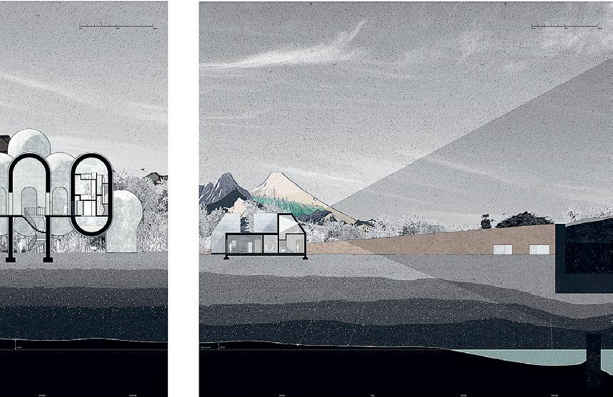
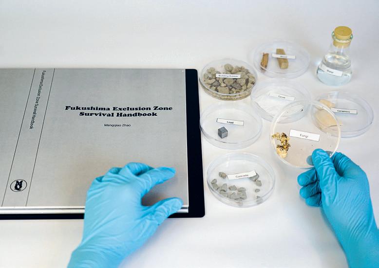
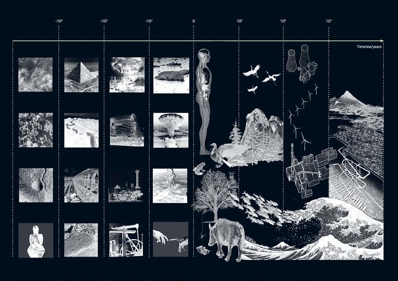
01: Lab Setup 02: Timeline 03: Section Drawings 237 01 02 03
Inhabiting Wetness
by Ana McIntosh
This thesis is an exploration of the condition where water meets urban edge in Asunción, Paraguay, proposing an architectural response that considers water not as a challenging force but rather as a powerful asset for the maintenance of ecosystems and health of the city. It makes a case to consider the humedales (wetlands) as an important constituent in imagining the future of Asuncion in the face of climate change, a future in which the value of the wetlands has been ignored. The development of the city at the water’s edge is inextricably tied to the destruction of wetlands and extraction of river sand for the construction of highways and private and public developments. This is the approach of the binary: the separation of wet and the dry. What it might mean instead to inhabit a gradient of wetness by exploring possibilities for resilient living at the edge? What might it look like to design for the ebbs and flows of the Rio Paraguay instead of against it to meet the demand for growth?
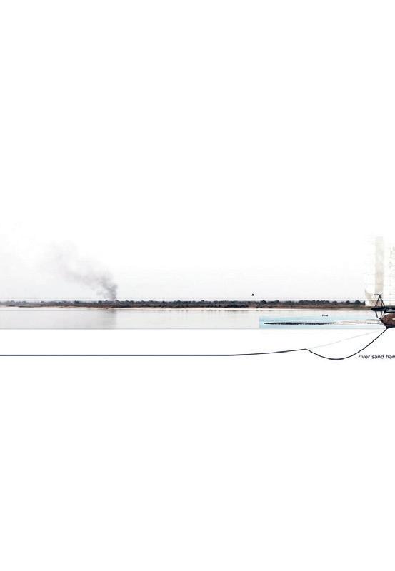
Sited in the Bañado Sur, this project considers these questions in a zone of informal housing that experiences hazardous flooding from heavy rain and river surges. These inundations often lead to the disruption of life, loss of work, and the evacuation of inhabitants to temporary camps with inadequate living conditions. This thesis speculates as to how one
might design and build using buoyancy to provide for housing, working, common use, and storage spaces for wet, dry, and in-between conditions. The proposed vivienda typology explores how uses and spaces might expand, contract, and change over time and in different water levels while still supporting basic needs. At the same time, the house itself becomes a vessel for the movement of water: Water consistently falls on, flows through, washes away, and evaporates as the home is used over the course of a day. Palimpsest, symbiosis, and layering become guiding terms that inform not only how to think about the spatial conditions at the water’s edge but also the diverse narratives and histories that exist in a place like the Bañado Sur. It is a place of great complexity, resilience, culture, and tradition. Although adapted for this specific context, the thesis is an invitation to question the line of the wet and dry, where city meets water around the world. In the words of Anuradha Mathur and Dilip da Cunha, “If water separated to be somewhere is in crisis today, wetness negotiated everywhere holds the way forward.”01
Advisor: Cristina Parreño Alonso
01: JAE 74:1 March 2020 02: Urban Map 03: Section 04: Context Image
Readers: Miho Mazereeuw + Sheila Kennedy
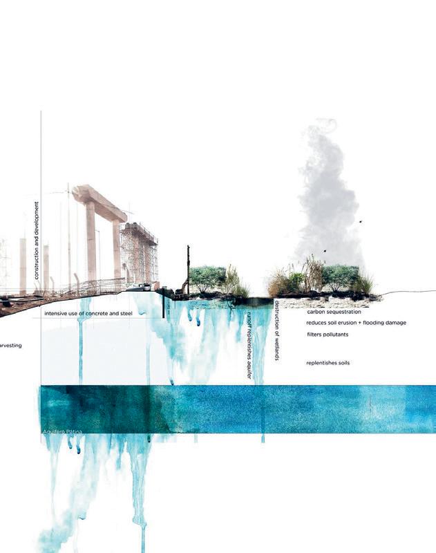
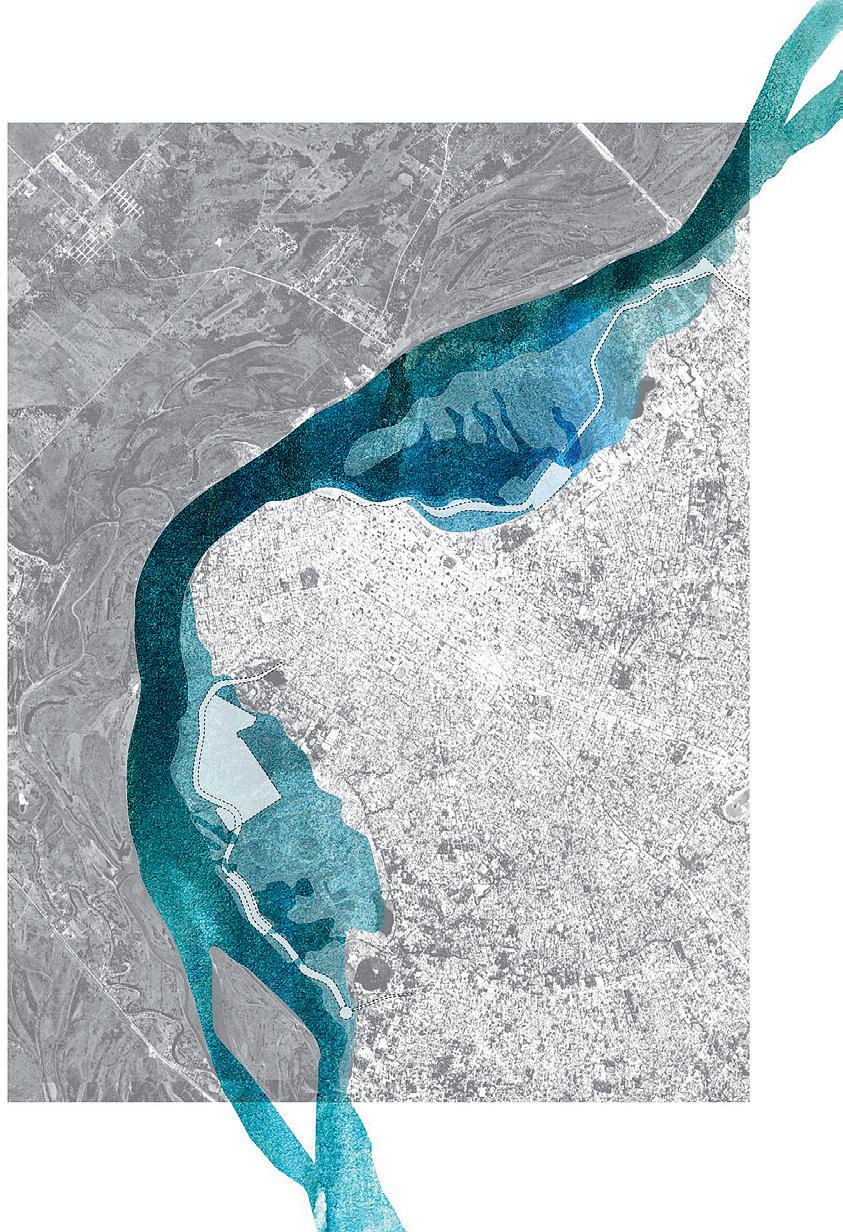
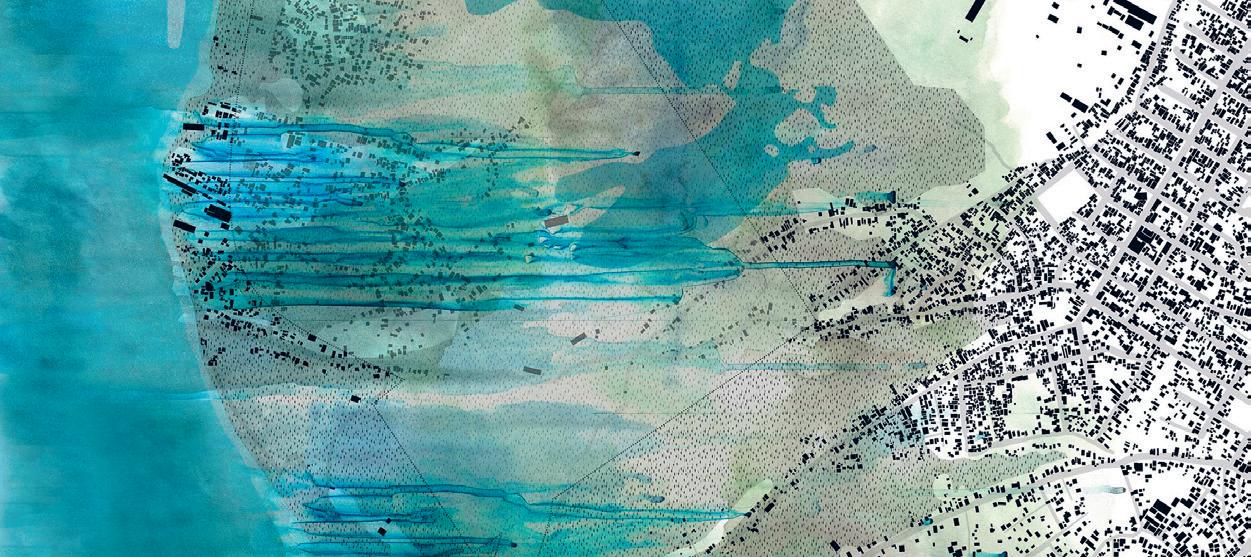
239 02 03 04
Pronounced Absurdity
The Wedding-scape Outside a Conical Field by Yutan Sun
Usually taking on an exotic appearance and occurring as a defocused and cropped backdrop in a picture frame, a wedding park is an architectural complex that provides spectacular and romanticized scenes—like a proscenium stage for wedding photographs. In order to satisfy the bourgeois lifestyle fantasy, architectural symbols out of the in situ context are extensively deployed to create a sense of elsewhere in a wedding park, leading to a misalignment of a wedding park’s pictorial presence and physical reality.
A wedding park as a real estate typology is an architectural response to both the prosperous wedding economy and the visual consumption fever in China. Xiamen, a city branding itself as the international wedding capital, expects a new typology of wedding park that conforms its highly dense urban fabric and city image around weddings.
The double-image phenomenon in a wedding park is paralleled in a dummy cake, a cake whose sponge has been wholly or partially replaced with polystyrene blocks. The dramatic counterpose between its sumptuous profile and inedibility becomes a metaphor for the duality of wedding spaces.
This thesis understands a dummy cake as a political and cultural artifact that echoes the double-image of architecture and critiques the misalignment of imageability and physicality in Xiamen’s wedding spaces. This thesis imagines a set of wedding infrastructures inserted in the highly dense urban fabric of Shapowei district, building up fantasies with the appropriation of architectural symbols. The concentration of diversely themed wedding scenes signifies an efficient, inhumane, and consumeristic image-making mechanism. By replicating alienated symbols and juxtaposing the fantasized construct and the realistic urban context, this thesis creates spectacles for visual consumption and simultaneously foregrounds the absurdity of both the construct and its uncanny collision with the existing urban ambience. In this way, the rationality of wedding infrastructures only exists in the conical field of a camera, and the dysfunctional, disordered, and obscure physical reality behind a flawless wedding photo becomes a critique of visual consumerism.
01: Site Model 02: Concept Drawing
Advisor: J.Jih Readers: Axel Kilian + William O’Brien, Jr.
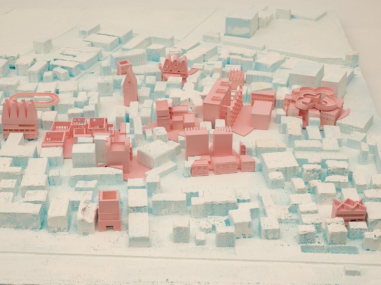
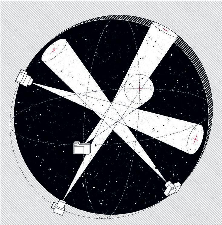
241 02 01
Rebuilding the Edge
by Ginevra D’Agostino
Rebuilding the Edge takes as its point of departure a social reality that directly impacts the built environment: the depopulation of small centers in Italy over the last century and its consequences for citizens and the country at large. The thesis examines how to look at the depopulation of inner and southern areas of Italy by exploring the interrelations between three distinct components of architecture: its methodologies of research, its social responsibility, and its design process. Rebuilding the Edge investigates how architecture can make a contribution to issues usually tackled by politicians, policymakers, economists, and engineers.
This thesis applies GIS mapping and photogrammetric tools to register the rural realities along an abandoned rail line in Central Italy. It interprets available data at the territorial scale and generates original data more granularly through the use of contemporary technologies. Combined with stakeholder interviews and policy framework analyses, this sets the stage to generate considerations regarding architecture’s role in this context.
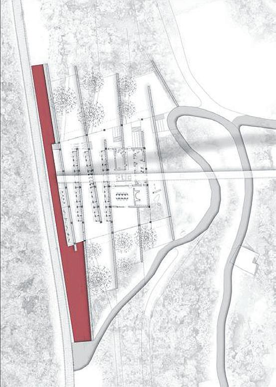
From a disciplinary perspective, the thesis proposes that architecture has a relevant role in the articulation and reso-
lution of larger initiatives that seek to address the challenges faced by towns across Italy. It does not attempt for architecture to act as a ‘savior,’ but rather concludes that architecture must operate in the company of other fields with unique forms of expertise.
Rebuilding the Edge employs this research methodology and disciplinary reflections to test the impact that they may have on the design process. The outcome is a proposal for a building and a piece of infrastructure that connects with efforts at the regional scale. By offering a carefully considered vision for a train station in one single town on the Italian Apennines, this thesis uses architecture as the last-mile solution that tends to make, or usually break, the success of nation-wide infrastructural investments.
Advisor: Miho Mazereeuw Readers: Caitlin Mueller + Sheila Kennedy
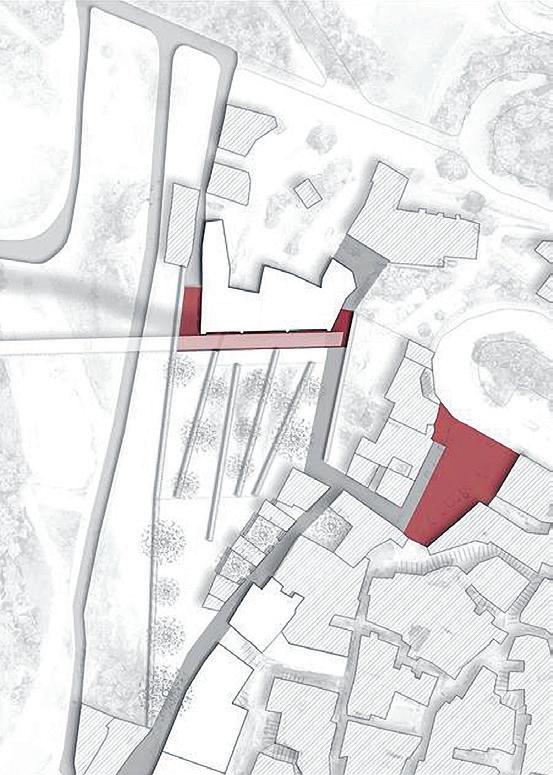


01: Section 02: Site Plan 03: Exterior Collage 243 01 02 03
Speculative Friction
by Alice Jia Li Song +
Yaara Yacoby
Speculative Friction uses storytelling to explore the line between fact and fiction, implicating the construction of reality in the construction of speculative futures. This project is interested in the Geneva Freeport (Switzerland) as its central character. This Special Economic Zone legally operates outside of global trade taxation laws as a free-market tool to expedite the import and export of commercial goods. While there are hundreds of modern freeports around the world, the Geneva Freeport is unique in allowing “passing” objects to be stored indefinitely in its storage spaces. As a result of this state of stasis, as well as Swiss confidentiality laws, the Freeport has been the storage facility for anything considered to be of value. Grains, gold bars, art objects, and illegally extracted antiquities are all stored in the Freeport without public access and without taxation, even as ownership is exchanged. It is estimated that there are as many as 1.2 million objects in storage.
The Geneva Freeport was first established as a grain elevator in 1888 and was transformed into a modern freeport gradually over the next century. Despite its long history, the Geneva Freeport rose to public prominence following media attention in the 1990s when it was discovered to be storing looted antiquities for the infamous Giacomo Medici
tomb-raiding circle. Medici’s operation smuggled thousands of Roman and Etruscan artifacts from Italy through the Freeport and sold them to private collectors and public institutions, including the Getty Museum.
In 2016, the Geneva Freeport was cast in a new light as a result of the Panama Papers leak. The leak originated from the Panamanian law firm, Mossack Fonseca, and gave a first comprehensive view of the operations of the offshore world. The Freeport was uncovered as both a financial instrument and a perfect hiding spot. A 30-million-dollar Modigliani painting was also uncovered by the leak, hidden in the Freeport after being looted by Nazis from a Jewish art collector in Paris.
This thesis opens the conversation to the banal and absurd capitalist reality at the Geneva Freeport and look at this uncanny world from within. What are the objects and their entanglements with the world outside? What happens when the objects begin to push back on their container?
Advisor: Nicholas de Monchaux
01: Combined Sand
Readers: J.Jih + Caroline Jones
Collage,
Seed Collage, Antique Collage + Elvis Collage


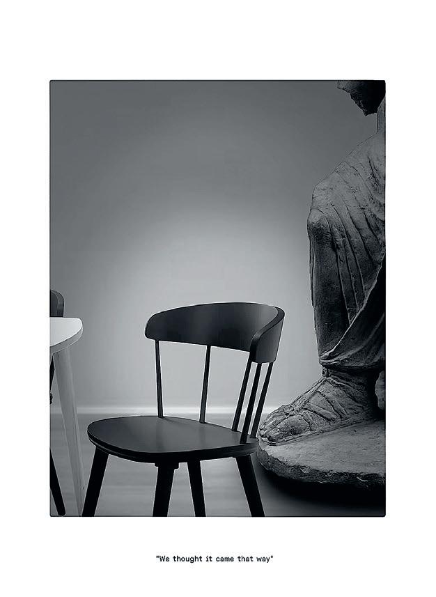

245 01
Building Coastal Resilience in South Izu Peninsula
by Evellyn Tan
Bōsai is a Japanese term, which comes from “Bo,” meaning prevention, and “Sai,” disaster, commonly associated with disaster preparedness and the necessary actions against such catastrophic events. In Japan, Bōsai is critically embedded in the Japanese culture, where children learn it in school from an early age. It is also regularly promoted in public by the government as a reminder for citizens to stay vigilant against disasters. Instilling preparedness to citizens on a daily basis is a significant effort to build the nation’s social resilience against disasters.
Located in the Circum-Pacific of “Ring of Fire” and surrounded by sea, Japan, with an extreme range of topographic and geomorphological landscape, is highly prone to disasters. The south coastal belt of the islands is incredibly vulnerable to mega-tsunamis as the country is situated at the collision plate forming active troughs capable of generating forcefully destructive tsunami waves. The Great East Japan Earthquake that hit the Tohoku region in 2011 exposed disaster planning challenges and a looming demographic crisis in Japanese coastal towns. In the face of a disaster, many vulnerable elderly living in super-aging
coastal towns struggled to evacuate to higher grounds in time before the first wave arrived.
Despite the elaborate network of tsunami barriers constructed by the government to protect the coasts, many coastal settlements will still be significantly affected by L1 tsunamis of ten meters or higher in the future. Thus, further building disaster-resilient capacity of social and ecological ecosystems against tsunamis is vital to the survival of lives and livelihood of Japan’s coast. This thesis highlights the importance of socio-ecological design strategies of coastal towns through improving urban connectivity of coastal forest as coastal hydraulic barriers, increasing porosity of evacuation routes connecting different tsunami evacuation spaces, and strengthening evacuation spaces with dual-design for emergency and everyday lives.
Tsunami Bōsai
01: Axonometric and Section 02: Context Map 03: Site Map
Advisor: Miho Mazereeuw Readers: Caitlin Mueller + Cristina Parreño Alonso

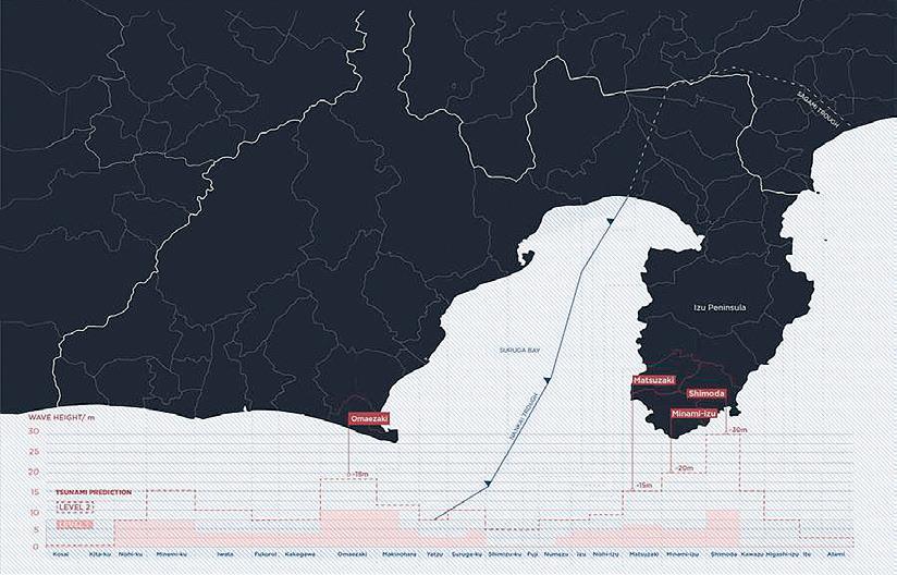

247 01 02 03
The Building Site
What is the history of the building site?
The paradox of the building site lies in the fact that although the building site is inescapably essential to the realization of architecture, it must inevitably vanish, superseded by the durable forms of the completed building. Such traces that remain, in documents, photographs, or physical marks upon the building, have been of passing interest to architectural history for the information they reveal about the realized object, but the building site itself—as a place, as an event, as a design—has largely been ignored by architectural history and theory.
This seminar will take the building site as its focus of inquiry. Readings and discussions will develop several approaches to a knowledge of the building site as a point of organization, material transformation, and intellectual and physical work. These approaches to the building site will address questions such as the valuation of tools and techniques, the legal armature of contracts and regulations, the social conventions of race, class, and gender, and the cultural appraisal of work and craft.
The goal of the seminar will be to develop prototypical approaches to the history of the building site, with a series of experimental digital histories. Students in the seminar will carry out detailed and speculative research into selected building sites, and will use that research in digital representation to create model histories that will expand the historical accounting of a building site to include information extending from wages to weather reports.
SITE
Instructed by Timothy Hyde with Teaching Assistant Eliyahu Keller

4.646 01: Building Site Archive: Drawing Overlay by Samuel Dubois, Nida Ekenel, Lauren Gideonse, So Jung Lee + Susan Williams 249 01
Double Sited
by Inge Donovan, Paul Gruber, Jenna Schnitzler, Emily Wissemann + Calvin Zhong
The Boston Custom House was built from 1837 to 1849, choreographing shipping routes, quarry work, railway lines, timber felling, hands wielding tools, and labor routines.
In 1911, construction for the Custom House tower began, and the building itself became a construction site. In this recurrence of building site, latent conditions re-emerged: Stones had to be quarried and brought to the site, marble was polished, labor rights were fought and won, tools were wielded, and parts were once more assembled.
Double Sited is a framework for shifting our imagination of historical objects away from the final form of the object and toward an understanding of its means: The twinned drawings center around an object that persisted through both sites.
These historical reconstructions blur the boundary between the sites, resisting an episodic or centralized understanding of the building site. Independently, each layer describes a re-emergent condition of labor, material, tools, or costs, and by the end, the layers are codependent, demonstrating many interdependencies and convergences of the building site.
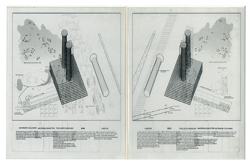 Critic: Timothy Hyde
01: Open Columns 02: Open Foundations 03: Open Rotunda 04: Open Symbols 01
TA: Eliyahu Keller

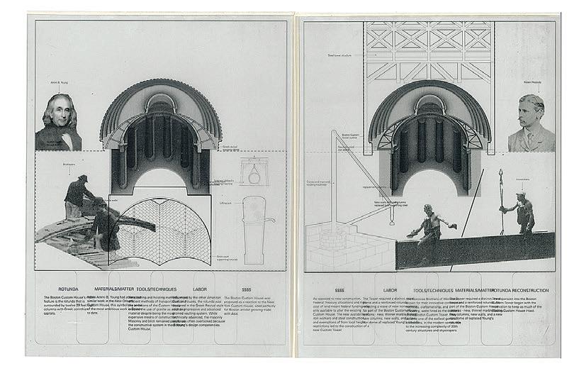

251 02 03 04
Boston Public Library
Building Site Disappearances
by Samuel Dubois, Nida Ekenel, Lauren Gideonse, So Jung Lee + Susan Williams
This collective research project critically examines the history of the building site of the Boston Public Library’s McKim Building. The project consists of a prototypical model history whereby new archival records were created to showcase various “disappearances” from the library’s construction site. Generally overlooked in official historical records, these disappearances are grouped into five categories in the project: 1) demolition, 2) excavations, 3) pilings, 4) tools, and 5) scaffoldings and temporary structures. The new archival records feature existing archival documents that were annotated to reveal or emphasize certain disappearances deemed of historical importance with regards to the library’s building site. The records also include contemporary technical drawings and multimedia files as a means to fill in the historical gaps of the building site. By combining annotated historical archives with contemporary visual means, the goal was to achieve an experimental and more comprehensive understanding of the Boston Public Library’s building site.
 Critic: Timothy Hyde
01: Pile Driver Specifications 02: Crane Arrangement for May 31, 1890 03: Building Site Archive: Technical Drawings 04: Building Site Archive: Historical Photographs 01
TA: Eliyahu Keller
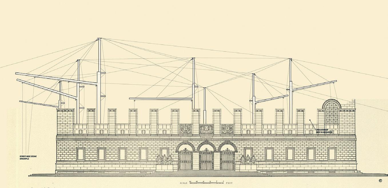
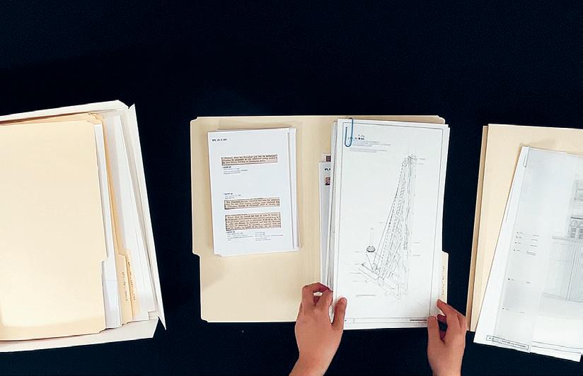

253 02 03 04
Orientalism, Colonialism, and Representation
Instructed by Nasser Rabbat
Assisted by Xuan Luo
This is a seminar on the politics of representation. It examines how political, historical, ideological, and religious notions influence—and sometimes dictate—the production, representation, and codification of knowledge. The focus is on Orientalism, a discursive, learned tradition formed over the long history of encounter between the “West” and the Islamic “Orient” from Antiquity to the present. The seminar explores select instances of the encounter and reviews associated texts, images, architecture, and institutions that shaped Western knowledge about the Islamic world and informed modern Islamic self-representations as well. Examples include Greek views of the “Barbarians,” Crusaders’ perceptions of the “Saracens,” the Renaissance conceptions of the “Turk,” and the colonial classifications and depictions of the “Indigenous” or “Native.” Finally, the seminar investigates how these accumulated representations still affect the image of the “other” today. The aim is to gain a historically grounded awareness of the complexities of cultural identities, which, though appearing to be fixed, always defy and sometimes subvert the representations that purport to depict and define them.
SITE
al-Dīn Shāh’s Photographs of his Harem
A Critique of Self-Orientalism
by
Boshra Moossavi
Photography was a new means of art in the nineteenth century, which was embraced by Iranians soon after its advent. Being bolstered and propagated by Nāsir al-Dīn Shāh, the king of Iran (r. 1848–96), photography took over painting in a short time and became the most important means of representation in Iran. It is believed that Europeans’ a priori to this new means of representation caused early photography in Iran to be informed by Western Orientalist beliefs and aesthetics. Therefore, by mimicking Orientalist representation methods, Iranian photographers, such as Nāsir al-Dīn Shāh, repeated certain Orientalist stereotypes and therefore, self-Orientalized.01 However looking at the wider perspective of Iran’s painting and photography shows otherwise. In this study, I compare Nāsir al-Dīn Shāh’s photographs of his harem with pre-Orientalism Persianate paintings as well as Orientalist paintings. I will also contextualize those photographs considering nineteenth-century European and Iranian aesthetics. Therefore, I demonstrate that photographs of Nāsir al-Dīn Shāh were a combination of Iranian and European’s criteria for beauty. Consequently, the influences from Europe do not put those photographs into the category of self-Orientalism.
Ali Behdad argues that since the first photographers in Iran were Europeans who taught this art to Iranians, their Western Orientalist outlooks influenced the themes of photography. Therefore, European photographers in Iran, such as Antoin Sevruguin, as well as Iranian photographers, such as Nāsir al-Dīn Shāh and Prince Qāsim Mīrzā, mimicked those methods and reproduced those Orientalist stereotypes in their works. Behdad compares Nāsir al-Dīn Shāh’s photographs of his harem with the Orientalist paintings of JeanAuguste-Dominique Ingres, Ludovico Marchetti, and Lecomte de Noüy, which depict the Oriental woman as a lustful figure, adorned and ready for the voyeuristic pleasure of men (Figs. 01 and 02). Consequently, he claims that photographs of Nāsir al-Dīn Shāh of his wives were following these certain Oriental themes.
The photograph that Behdad uses to compare to the Orientalist paintings of Ingres, Marchetti, or Noüy is the picture of Anīs al-Dawla, Nāsir al-Dīn Shāh’s wife. 02 However, the Safavid painting by Mīr Afzal of Tūn, “a reclining woman and her lapdog,” belonging to two centuries before the advent of photography, elucidates that the theme in Nāsir 01: Behdad, “The Power-Ful Art of Qajar Photography.” 02: See: Behdad: P1. 3: Nasir al-Din Shah, Anis al-Dawla, ca. 1880. Black and white
4.621
Nāsir
255
photograph. Yahya Zoka’s private collection.
al-Dīn Shāh’s photograph has precedents in the paintings of the time before Orientalism.03 Clearly, the photograph of Nāsir al-Dīn Shāh is more similar to the Safavid painting of Mīr Afzal of Tūn than the mentioned Orientalist paintings. This shows that in this photograph, Nāsir al-Dīn Shāh was not following the Orientalist stereotypes but he was following the Persian tradition of painting.
Moreover, the photographs that Behdad has chosen for his study are certain ones that can fit into Said’s theories of Orientalism. However, the photo of Anīs al-Dawla has one common theme with Orientalist aesthetics: lustfulness. However, lustfulness also exists in the painting of Mīr Afzal, but this is not enough evidence to consider that photograph as an instance of self-Orientalism.
Nevertheless, I do not deny the influences from Europe’s aesthetics in Nāsir al-Dīn Shāh’s photographs. These artworks are a synthesis of European and Iranian aesthetics. The portraits of ‘Ismat al-Dawla, Nāsir al-Dīn Shāh’s Daughter, with the ballet skirt or in a European dress and in a European mise en scène (Figs. 03 and 05), demonstrates the European influences in his artwork. On the other hand, other aesthetic elements such as being fat, 04 having a round face,05 wearing a mustache on the face,06 having joined eyebrows,07 and wearing a large headscarf are signs of Iranian aesthetics.08 This can be understood in the context of Nāsir al-Dīn Shāh’s personality. Since he was a “modern-minded” ruler who was fascinated by new technologies and arts, he had a look toward the newest means of representation.09 Consequently, he borrowed the newest artistic forms from Europe and combined it with his aesthetics. This can be seen as a form of cultural exchange, which is different from reproducing Orientalist stereotypes.
In conclusion, both the photographs of Nāsir al-Dīn Shāh and contextualizing his artwork show that Nasir al-Din Shah’s photographs of his harem were not indicative of self-Orientalism in early photography of Iran. Moreover, they demonstrate a cultural exchange in art and representation, and they are a combination of native and Western aesthetics.
Edward Said points out the late-eighteenth century and nineteenth century as the starting point of Orientalism. Said, Orientalism , 3. 04: Being fat was a sign of prosperity and beauty. See Nāsir al-Dīn Shāh’s description of women in his trips to Europe.
05: Gaspard Drouville, in his travelogue mentions that having a round face is the highest degree of beauty in Iran. Drouville, Voyage en Perse , 1:67.
06: Afsaneh Najmabadi, in her book, states that in Qajar period, wearing mustaches by women was a cherished sign of beauty.
Najmabadi, Women with Mustaches and Men without Beards , 232. 07: The insignia of Hamāyil-i Āftāb (the sun medallion), which Nāsir al-Dīn Shāh gave to his favorite wife, Anīs al-Dawla, demonstrates the desirable beauty for women, a round face, like the sun, with continuous eyebrows.
08: Gertrude Bell also mentions the fat face, connected eyebrows, a mustache, and a headscarf as the features of an Iranian princess in Qajar court. Bell, Safar Nameh , 100.
09: Behdad, “The Power-Ful Art of Qajar Photography,” 147.
03:
01: Lecomte du Noüy, Jean Jules Antoine. L’Esclave Blanche . 1888. Photo © RMN-Grand Palais / Gérard Blot 02: Jean-Auguste Dominique Ingres. Odalisque . Circa 1830. Oil on canvas. Overall: 55/8 × 9 9 / 16 in. (14.3 × 24.3 cm) Frame: 111/4 × 151/2 × 21/4 in. (28.58 × 39.37 × 5.72 cm). Los Angeles County Museum of Art, Gift of the 2014 Collectors Committee (M.2014.64). Photo © Museum Associates/ LACMA. 03: Mir Afzal Tuni. Portrait, A beautiful woman reclining with dog and crockery and calligraphy on border . circa 1640. On paper. Asset number: 14219001. Photo © The Trustees of the British Museum 04: Nāsir al-Dīn Shāh. Ismat al-Dawlah (Nāsir al-Dīn Shāh’s Daughter). mid/late 19th century. Institute for Iranian Contemporary Historical Studies ( ع 3-5232). Photo © 2012 IICHS. 05: Theatre Costume 18th century-19th century . Fashion plates, 1790-1929. Plate 044. Photo repository: Metropolitan Museum of Art (New York, N.Y.), gift of Woodman Thompson 06: Nāsir al-Dīn Shāh. Ismat al-Dawlah (Nāsir al-Dīn Shāh’s Daughter). mid/late 19th century. Institute for Iranian Contemporary Historical Studies ( ع 3-5216). Photo © 2012 IICHS. 07: Forster, Francois (engraver) and Winterhalter, Franz (artist). Portrait of Queen Victoria . 1846. Print. © Victoria and Albert Museum, London

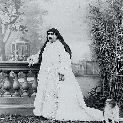


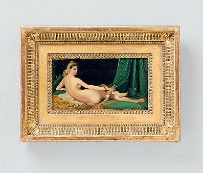

257 01 02 03 04 05 06 07
Understanding Modern Architecture
This course examines modern architecture, art, and design in the context of the political, economic, aesthetic, and cultural changes that occurred in the twentieth century. It presents foundational debates about social and technological aspects of modern architecture and the continuation of those debates into contemporary architecture. Students incorporate varied techniques of historical and theoretical analysis to interpret exemplary objects, buildings, and cities of modernity.
SITE
Instructed by Timothy Hyde with Teaching Assistant Samuel Dubois
Byker Redevelopment Housing
by Stephanie Baez
[...] The Byker redevelopment project emerged in post-World War II Britain, at which point mass housing was a primary concern to the government. In addition to bombings that had destroyed many neighborhoods, studies were conducted on the state of dwellings and reported the dismal, unsanitary conditions that most people lived in. Large scale slum clearance and redevelopment became the post-war strategy for solving these housing issues.
In contrast to previous urban renewal, however, City Council sought mass housing solutions that would bring about environmental improvement and greater social stability.01 It was within this context that Ralph Erskine, an architect known for his social ideals and commitment to environmentally driven and user-driven design, was appointed to design Byker’s redevelopment.02 The area was inhabited by thousands of people with strong community ties, and because housing conditions were so dilapidated, 80% of residents preferred entire renewal over rehabilitation.03 [...]
Byker challenges us to ask ourselves: Are we placing too much importance on the role of design in social cohesion and stability? Or have we just not found the right framework for resilient housing design? Once again, Byker may have been too ambitious, too optimistic for its own good. At its onset, it had the luxury of support from City Council, sufficient oversight and funding; the same cannot be said for a lot of the community archi-
tecture movement in the U.S., for example, that held similar social ideals.04
Part of Byker’s legacy was also the architects’ commitments to blurring the edges of their professional role into one that engaged the site as citizens and residents. This kind of process requires acknowledging the building as a dynamic site, never fully in the control of one entity, rather than as a static final product with a straightforward design method. Although Byker’s architects attempted great levels of user participation, it prompts questions like: What does user-driven design truly mean? Is it simply feedback from residents after the fact? How may a resident and an architect work through ideation together in a way that equally utilizes both of their knowledge domains? [...] Preserving Byker allows us to examine its participatory process and perhaps radically shift our assumptions in order to innovate future housing.
Or maybe the lesson we learn from Byker is that design cannot be the savior to social problems, nor can it be a static vessel immune to all the political and economic contexts that it encounters. No matter how much user participation or how good the architect’s intentions, there are always limitations that will leave us wondering years down the line about the what ifs—all of the things that could’ve been done that may have prevented an issue. Permanent success is never guaranteed. [...]
01: Rowe, Peter G. “Three Projects in Three Places.” Modernity and Housing . MIT Press, 1995.
02: Erskine, Ralph. “DEMOCRATIC ARCHITECTURE — THE UNIVERSAL AND USEFUL ART: PROJECTS AND REFLECTIONS.”
Journal of the Royal Society of Arts 130, no. 5314 (1982): 642–59. http://www.jstor.org/stable/41373445.
03: Erskine, Ralph, Yukio Futagawa, and Mats Egelius. Byker Redevelopment: Byker Area of Newcastle Upon Tyne, England, 1969-82 Tokyo:
4.603 Revisionist History
A.D.A. Edita, 1980. 04: Comerio, Mary C. “Design and Empowerment: 20 Years of Community Architecture.” Built Environment (1978-) 13, no. 1 (1987): 15–28. http://www.jstor.org/stable/23286240.
259
Saving the Bank
Rescuing Argentina’s Architectural and Cultural Legacy from the Wrecking Ball
by Natasha Hirt
From the corner of Bartolomé Mitre and Reconquista streets in Buenos Aires rises an architectural monument. With pillars broad as rubber trees, the Bank of London and South America imposes itself upon the cityscape. It is truly one-of-a-kind, a bold architectural pronouncement written in steel, glass, and naked concrete, as controversial as it is dramatic.
The threat of the building’s demolition grows more acute with every passing year, as the calls of its critics grow louder. A response from the architectural community and the citizens of Buenos Aires is urgently needed: The Bank of London and South America must be saved. It is deeply rooted in Argentinian history, culture, craft, and technological ability, an immense sculpture dedicated to the country’s resilience and resourcefulness. The loss of the Bank would not only deal a crippling blow to Argentine heritage, but also it would blow a gaping hole in world culture.
Brutalism does not require tough love— it demands it. The Bank of London and South America is one such building. At first glance, it almost seems to overwhelm and reject the human presence. An array of vast concrete flanges dominates the Bank’s façade, reaching
upward and outward to exert an overwhelming, even suffocating force on the street below. Pedestrians shrink to insignificance before its immensity. It is true béton brut, a raw expression of material that forces us to radically re-evaluate our authority and individualism. In an era where social liberalism and political correctness are the norm, such a building can leave a frightening impression.
Yet for those who stay, who hesitate a moment and allow the physical force of the Bank to wash over and through them, the craftsman’s sensibility possessed by its chief architect Clorindo Testa begins to reveal itself. The dramatic façade is not monolithic and expressionless, but porous, punctuated, and carved like clay.
Like a protective carapace, it envelops and shields the interior of the Bank from the hot sun and onlookers alike, preserving the sanctity of the interior spaces. These, in turn, are open, not just to the public, but literally and spatially. The main atrium is clad in bright colors and artfully finished wood. It is lofty, up to three stories in height, a place of stark geometries and enchanting details such as the central staircase coiled from ground to ceiling. Being inside the Bank is an experience of security, safety, and permanence.
The Bank of London and South America was always intended to be a building of international importance. Its namesake institution was, at the time, one of the only banks operating between Europe and Latin America, and in the 1950s it had aspirations to expand its business to the rest of the continent.01 It was a time of new beginnings and the reaffirmation of old partnerships. Under the leadership of a new president, Dr. Arturo Frondizi, Argentina was rapidly pushing towards westernization in a ‘great leap forward,’02 and Britain seized the opportunity to invest in burgeoning Argentinian industries. Relations between the two nations were reaffirmed by Prince Philip’s visit to Buenos Aires in March 1962. 03 On the 24th, he laid the foundation stone for the new head office of the Bank of London and South America. It would be the crown jewel of a newly strengthened cross-Atlantic partnership. To this day, the Bank is a key financial center in Buenos Aires. Construction on the Bank officially began on the 15th of December 1962 and carried on for four years until its inauguration in August 1966. The project was an immense accomplishment, employing up to six hundred workers in two nine-hour shifts on-site, alongside several off-site craftspeople.04 With the exception of some particularly tricky challenges, like illuminating the spacious
Critic: Timothy Hyde
TA: Samuel Dubois
interior, most of the Bank was designed and constructed using Argentine expertise and materials. [...]
A building is more than just its history, however: Its presence amidst the urban fabric must be justified formally and architecturally as well. Herein lies the crux of the arguments of the Bank’s detractors. Lightly put, the presence of a concrete building in the centre of Buenos Aires—a city known for its art nouveau and neoclassical aesthetic— is rather unusual. Some would go so far as to call it offensive. These critics, however, refuse to step beyond their initial impressions of the façade and are remiss in acknowledging their bias toward more conventional, less daring architecture. They fail to appreciate the qualities the building was designed to highlight, and instead insist on judging the Bank by aesthetic standards it was never intended to uphold (and indeed, could hardly have anticipated sixty years ago). To appreciate the Bank of London and South America and understand the critical role it plays in the cityscape, we must venture beyond historical context to understand the architects’ vision.
structural members, eliciting a visceral response from those who observed them. The style, which would be dubbed “brutalism” in later years, was at the time seen as a demand for political and cultural clarity and a response to material shortages in post-war Europe. Architects sought to remove themselves from the frippery of neoclassical architecture and instead highlight the material, tactile, and technological qualities of their buildings.06 Brutalism, seen this way, is an open- faced and honest, even heroic architectural style.07 [...]
Head Office: Buenos Aires, 1960–1966.” AA Files , no. 34: 24–44.
The current form of the Bank has its origins in the brief itself. In a competition brief detailing its expectations for a new head office, the Bank of London and South America requested a building that would reflect the “integrity and efficiency” of its organization, making it “clearly essential, in the design of the façade of the new building, to avoid historical styles but, equally, to avoid contemporary clichés that would in turn become dated.”05 The desire for expressive novel architectural approaches was not unique to the Bank, nor to Argentina. Across the ocean in Europe, architects were rejecting classical forms as they sought out a new understanding of spatial rhythm. Le Corbusier and the Smithsons, for instance, were experimenting with raw surfaces and exposed 01: Liernur, Jorge Francisco. 1997. “The Bank of London and South America
Jorge Francisco. 1997. “The Bank of London and South America Head Office: Buenos Aires, 1960–1966.” AA Files , no. 34: 24–44.
ibid.
02:
03:
04:
05:
06:
07:
British Pathé. 2014. Duke In Argentina (1962). https://www.youtube.com/watch?v=GiFF0FrRFmA.
Liernur,
Summa 6/7. “Bank of London and South America,” December 1966.
Banham, Reyner. 2011. “The New Brutalism.” October 136 (May): 19–28. https://doi.org/10.1162/OCTO_a_00034.
Pasnik, Mark, Chris Grimley, and Michael Kubo. 2015. Heroic: Concrete Architecture and the New Boston . New York, NY: The Monacelli Press.
261
Revisionist History
Marcel Breuer’s Whitney Museum Building
by Helen Lu
As a New Yorker, the Breuer building on 75 th Street and Madison Avenue has always caught my eye. The brutalist inverted triangle-like structure stands out starkly from the surrounding “classic” New York architecture. Known during my lifetime for being home to the Whitney Museum of American Art, the Met Breuer, and soon the Frick Collection, this building has served as a sanctuary of art. Although the flux of museums in recent years has raised doubts about the future of Breuer’s building, this fivestory granite form should remain as it stands. Not only is it a unique instance of Bauhaus Brutalism in New York City, but its very existence reflects a shift in architectural and visual art perceptions: Architecture can be considered art, and modern art has a place with “traditional,” “classic” art. [...]
The Breuer building today encapsulates a new relationship between architecture and visual art that Breuer himself may not have proposed (or necessarily agreed with): that architecture may be a form of visual art. A key tenet of brutalism is the distinction between visual art and architecture. Brutalists such as Breuer made intentional choices to minimize ornamentation and focus on function because of their belief that architectural forms were not meant to be visual art.
When the Metropolitan Museum of Art opened its Met Breuer museum in 2016, however, it deliberately took an artistic approach to the restoration. The firm
Beyer Blinder Belle focused on emphasizing the materialism of the architecture, “[leaving] the image of human touch” such as “the leaving of the patina of the bronze railings [...] as if nothing has been redone, and then to redo all the other pieces where there is not that sort of focalization of attention, where you don’t put your hand.”08 This decision, argues historian and preservationist Jorge Otero-Pailos, draws parallels to some of the Met’s most iconic artwork exhibitions: the period rooms. According to Otero-Pailos, the lobby of the Met Breuer has been treated like one of the Met’s collected interiors: “[The Met] has a very large collection of period rooms, where you have a Frank Lloyd Wright period room and you have an early American Colonial period room and a French parlor period room [...] The Met Breuer is probably the biggest period room of the Met [collection].”09 Although originally designed to highlight and display the modern works of the Whitney Museum of American Art, the Breuer building has now pushed the relationship between architecture and art to expand. A demolition of the building now would retract this notion that architecture may also be art, challenging the thesis that art and architecture remain separate entities. To fully reap the rewards of this period of questioning and grow to a new understanding of architecture, the Breuer building must continue to serve as a platform for dialogue through artistic experimentation and placement. [...]
Critic: Timothy Hyde
01: Matt Shaw, “Why the Met Breuer Matters,” last modified March 18, 2016. https://www.archpaper.com/2016/03 /why-the-met-breuer-matters/#.Vuxc0eIrKUk. 02: Ibid.
TA: Samuel Dubois
A Revisionist History of Marina City, Chicago
Waterside Innovation Becomes Washed Up Corncob
by Grace Zheng
Being from the Midwest, it is almost offensive when people ask if I’ve been to Chicago. Of course. There is something endearing about the river boat tours of the Windy City. One obligatory stop on those tours is Marina City, a corncob-like pair of expressionist towers downtown. They feature around 900 residential units across 64 floors, an abundance of on-site amenities (pool, gym, ice rink, bowling alley, roof deck, auditorium, etc.), and more commercial use areas across hotels and retail space. To a tourist, it is not hard to grasp the scale and cultural and architectural significance of Marina City, which in 2016, was named a Chicago Landmark destination. However, the time has come for these twin towers to be taken down. It is now time to make room for bigger and better works.
Nowadays, we see plenty of instances of a “city within a city.” Whether it be The Venetian Resort in Las Vegas where there is literally a manmade river within the building to imitate the real Grant Canal in Venice, Italy, or an indoor ski resort complete with snow generators and chairlifts, we are so used to these wonders that we take them for granted.
However, when architect Bertrand Goldberg first designed Marina City for 1960s Chicago with this concept,
it was mind blowing to all. Interestingly enough, the towers were built as an urban experiment; middle-class folk had been escaping to the Chicago suburbs for nearly a decade and Goldberg aspired to attract them back. The experiment turned out to be wildly successful: 2% of residents worked within the building and 80% would walk to work.
A student of Ludwig Mies van der Rohe, Goldberg innovated on top of his mentor’s modernist principles. Instead of boxy high rises, Goldberg phased out perpendicularity in favor of roundness. Corners were not natural and encompassed wasted space. He much preferred “modular prefabricated curved forms,” which resulted in the sunflower petal-esque exterior with maximized living space and exposure to views. 01 Despite diverging from pre-existing modern buildings, Goldberg was still able to sustain the key objectives of the period— low-cost housing with amenities to draw in middle-class families. However, viewing the buildings with a modern lens requires us to reconsider whether this mixed-use architecture is still sufficient for today’s needs, both tangibly and theoretically. Does this structure still function as it was designed for, and does it inspire future architects with its style? [...]
01: Osmond, Lynn J. “Marina City.” Encyclopædia Britannica. Encyclopædia Britannica, inc. Accessed December 9, 2021. https://www.britannica.com/topic/Marina-City.
Critic: Timothy Hyde
263
TA: Samuel Dubois
Advanced Photography + Related Media
The course is designed for students who wish to explore photography and related media as tools for artistic practice. Students are encouraged to explore analog, digital, and new technologies while researching and studying visual strategies used in photography, film, art, and visual culture at large. The course fosters critical awareness of how images in our culture are produced and constructed. It includes individual and group reviews, field trips, and visits from outside professionals. Topic focus changes each term; coursework centers on student-initiated project with emphasis on technical, theoretical, and conceptual development.
SITE
Instructed by Lara Baladi
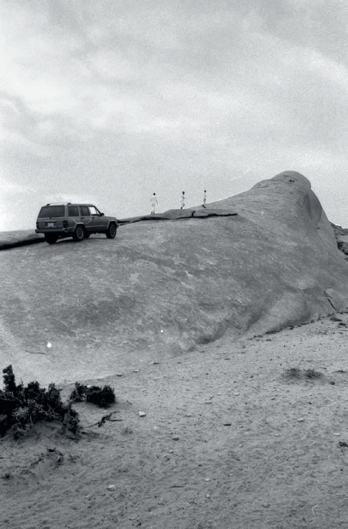
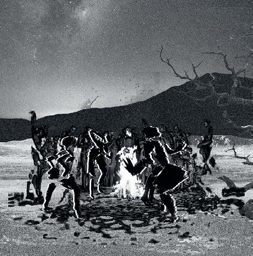
4.344 01:
02:
265 01 02
Melissa Isidor
Pascal Menoret


03: Tristan Searight 04: Jehanzeb Shoaib 05: Christopher Masahiko Moyer 06: Julian Zulueta 03 04


267 05 06
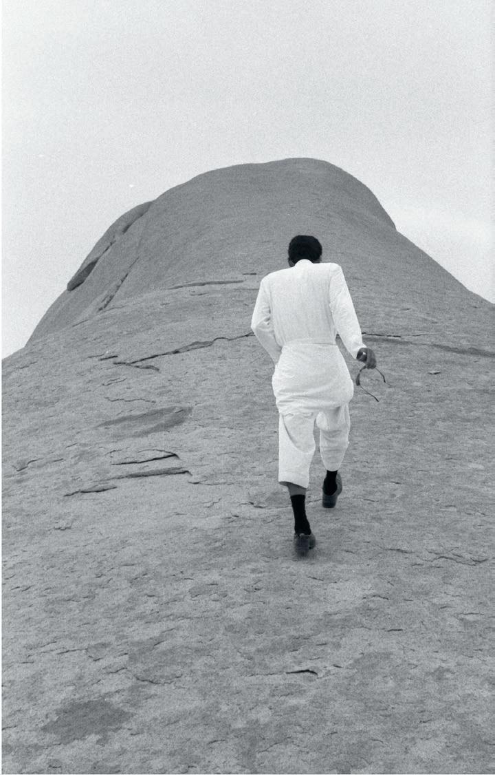

07:
Menoret 08:
Isidor 09:
10:
07 08
Pascal
Melissa
Areti Kotsoni
Alwyn Spencer
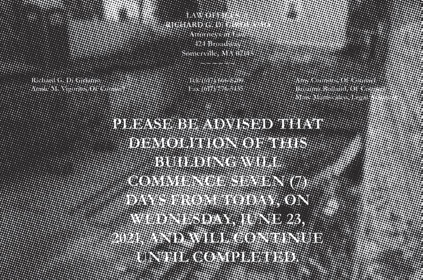

269 09 10
Collectives: New Forms of Sharing— Mexico City’s Urban Innovation Playground
Instructed by Rafi Segal with Teaching Assistant Gabriela Degetau Zanders + Research Assistant Maria Rius Ruiz
The site of Mexico City’s iconic La Feria is to be re-designed as Parque Aztlan—an urban ‘innovation playground’—a new park/expo typology that combines recreation and education-demonstration programs to celebrate the city’s past and help shape its future.
Parque Aztlan, located in the heart of Chapultepec, one of the largest urban parks in Latin America, will combine attractions, public/community programs, and demonstration and prototyping sites of diverse scales and kinds (landscapes, objects/structures, short film, VR and more) to raise awareness and inform people of Mexico City’s environmental and socio-economic challenges while also exploring its future urban life and culture.
This spring’s Collectives class will be structured as a collaborative research-design workshop involving prominent Mexican architects, planners, city government (Ministry of the Environment), developers, journalists, and community members. Building off the MIT SA+P and Leventhal Center for Advanced Urbanism engagement to set up a future city lab for Mexico City, the Collectives workshop will be organized in two parts: an exposé of present and future challenges the city faces and a design exercise to envision possible interventions—architecture-urban-landscape elements within the park.
SITE
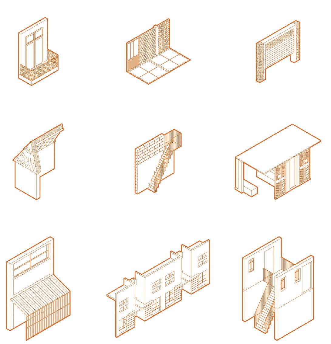
4.229 01: History of Residential Architecture in
Dueñas
271 01
Mexico City by Ana Maria Perez + Patricia
Gerritsen
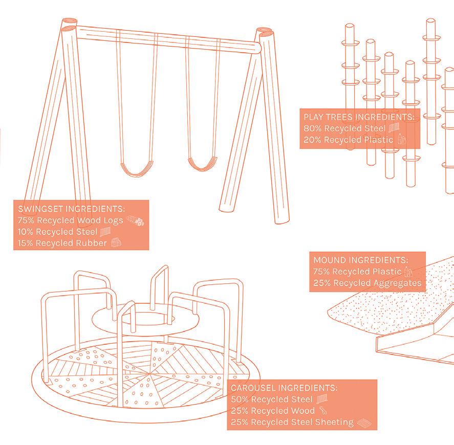
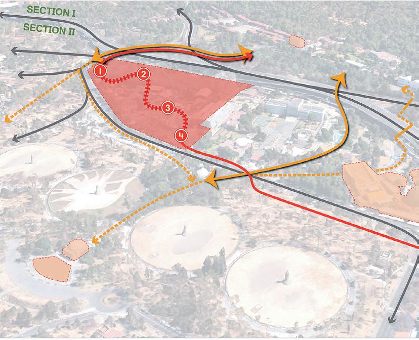
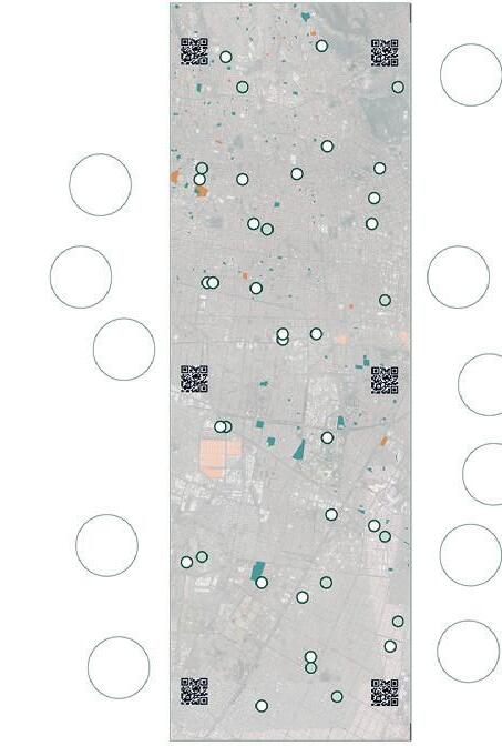
Critic: Rafi Segal TA + RA: Gabriela Degetau + Maria Rius Ruiz 01: Axonometric on Reusing Waste for Playground Equipment by Katie Rotman 02: Mapping of Mobility Intervention by Shannon Hasenfratz + Alicia Delgado 03: Mexico City Sobremesa by Tara Mohtadi 02 01 03
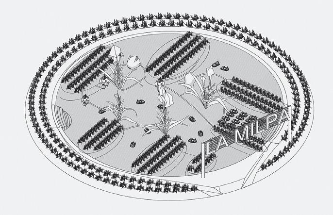
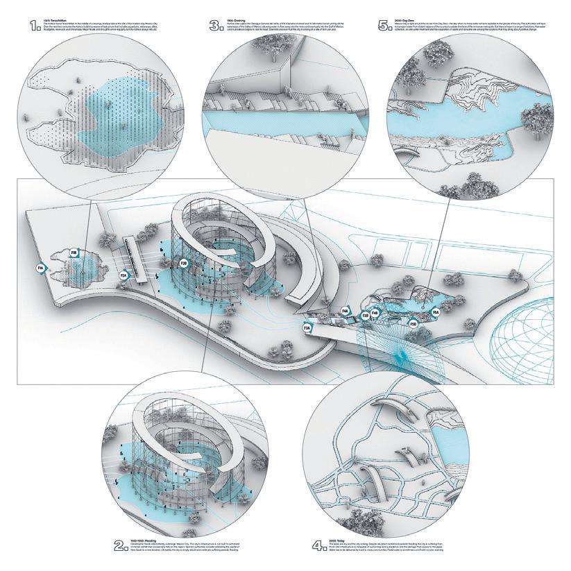

04: Educational Water Features by Alek Dojnow + Rajan Joyle 05: La Milpa by Vijay Rajkumar 06: Waiting in Line by Tara Mohtadi 273 06 04 05
Airpod
by Melissa Isidor + Caroline Amstutz
Airpod is an immersive educational experience housed in the capsules of La Feria’s iconic 60-meter Ferris Wheel. Taking advantage of the 15-minute circular journey through the air, the Airpod invites users to interact with the topic of air quality in Mexico City through a haptic touch handrail and translucent LED screen, overlaying information onto the views of the city. Ascending and descending in height, the Airpod experience is tailored to the elevation of each pod, providing interactions that engage the visible elements at various altitudes of the ride.
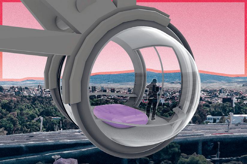
Divided into five radial sections, the users experience a variety of multidisciplinary topics related to air quality— each topic corresponding to the types of geographic and urban features seen at that elevation.
Upon entry, users are briefed with an audio clip about how to engage with the Airpod. In the first radial section, users are given an overview of the history of air in Mexico City. As the ascent begins, the Airpod raises the topic of urbanization and the impact of industry, transportation, and sprawl on air quality. At the top of the wheel, the issue of monitoring and geography are addressed as the whole city can be seen at the peak height of the ride. On the descent, users are posed with the topic of greenery as the capsule descends over Chapultepec Park. In the last section, users are asked to speculate on the future, applying what they have learned throughout their ride to understand how they can impact the future of air.


01 02 03
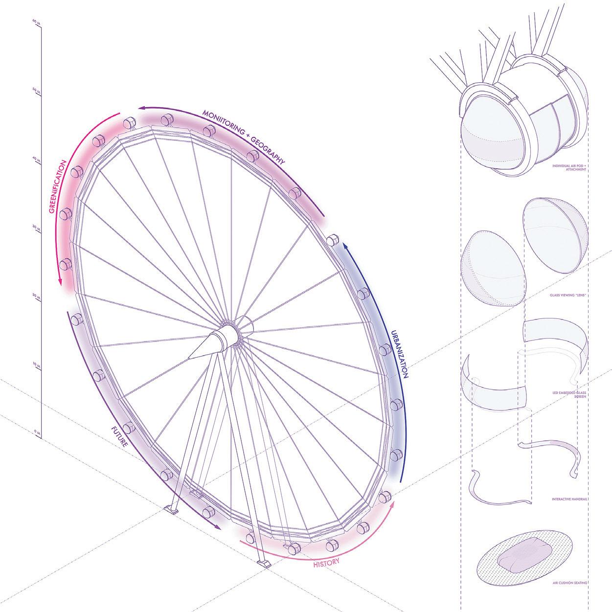
Critic: Rafi Segal TA + RA: Gabriela Degetau Zanders + Maria Rius Ruiz 01–03: Educational Storyboard of Air Pollution 04: Axonometric of Ferris Wheel 275 04
Contemporary Urbanism Proseminar
This course is a critical introduction to key contemporary positions in urbanism to the ends of researching, representing, and designing territories that respond to the challenges of the twenty-first century. It provides an overview of contemporary urban issues, situates them in relation to a genealogy of urban precedents, and constructs a theoretical framework that engages the allied fields of architecture, landscape architecture, political ecology, geography, territorial planning, and environmental humanities. Comprised of three sections, the first section articulates a framework on the urban as both process and form, shifting the emphasis from city to territory. The second section engages a series of related urban debates, such as density/sprawl, growth/shrinkage, and codes/exception. The third section calls upon urban agency in the age of environmentalism through the object of infrastructures of trash, water, oil, and food.
SITE
Instructed by Rania Ghosn with Teaching Assistant Mona VijayKumar


4.228 01: Desert Drawing by Tamar Ofer 02: Section Conditions by Shubhekshya Bhandari 277 02 01

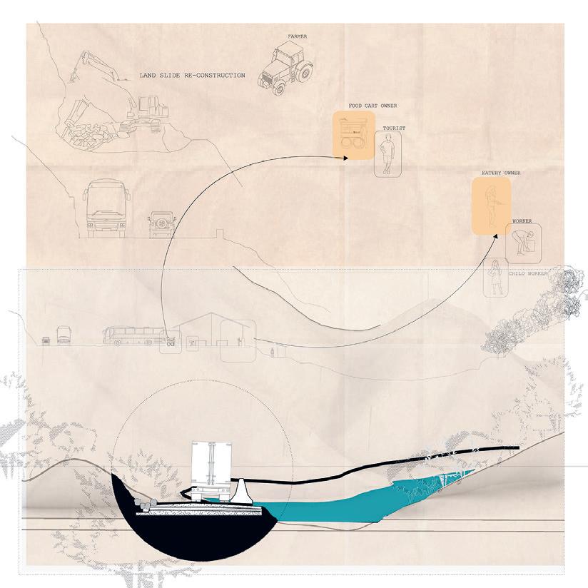
03: Memory, Commemoration, Tracing, and Spatial-Temporal Collapse by Christopher Allen 04: Highway Sections by Shubhekshya Bhandari 05: Master Capture and Permissions by Joris Komen 03 04
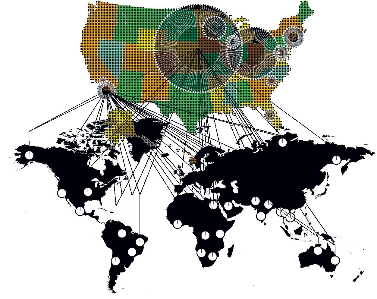
279 05
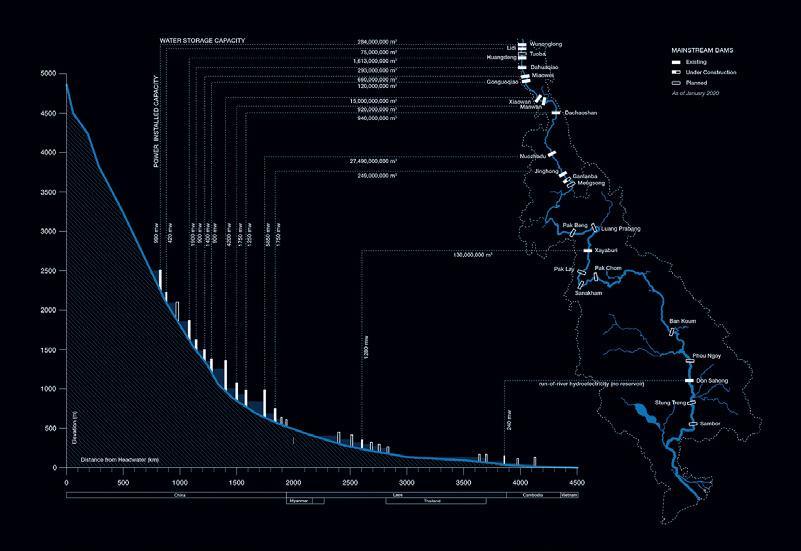
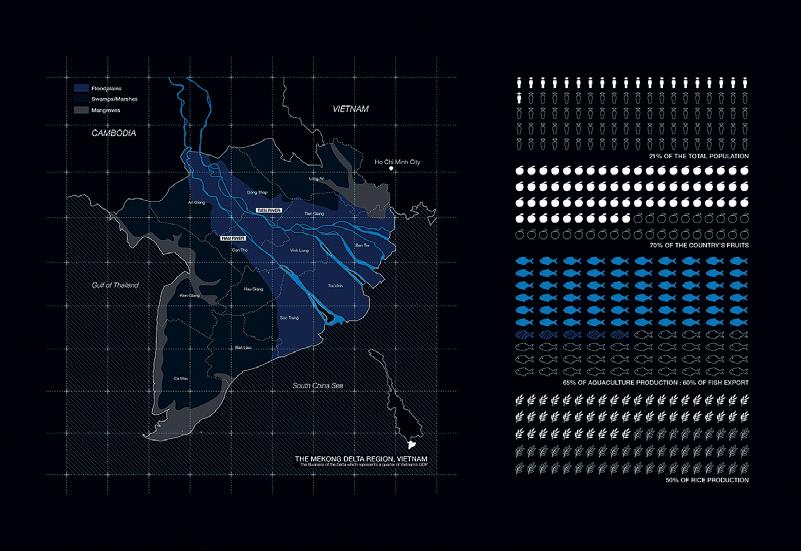
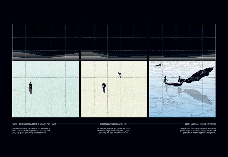
06–08: Triptych
09:
06 07 08
by Pimpakarn Rattanathumawat
Forest Drawing by Tamar Ofer
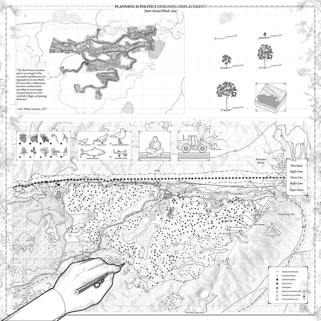
281 09
COVID-19 Quarantine Hotels in China
An Emerging Yet Temporary Infrastructure That Shifts the Reading of Urban Core
by Doris Duanmu
COVID-19 has influenced society at all levels, permanently and temporarily, from essential sanitary habits to the policymaking of public health. We are now entering a new era of co-living with the pandemic. As soon as COVID-19 hit Wuhan city at the end of 2019, quarantine hotels in China emerged as a paradigm to adapt to new rules and requirements in a public health crisis and had been one of the most significant urban changes affecting Chinese cities during the pandemic. Intending to eliminate the virus and maintain a zero infectious rate within the country at all costs, quarantine hotels across China have deployed a high level of uniform imposition of confinement rarely seen in other countries. Specifically, the politically centralized policymaking institutions that order unnegotiable quarantine rule, the demand to sustain utter governance and surveillance over citizens, the openness in sharing personal information and medical data, the daily dependence on digital infrastructure and personal devices, and the availability to access robust public service networks together draw a unique picture of the quarantine hotel system in China. This project focuses on investigating the quarantine hotel’s impact on multiple scales, from national to individual. In addition, it works analyze the urban factors that enable the proliferation of
this newly converted medical infrastructure, continuing to facilitate and sustain a quarantine hotel ecology in the densely populated city. When the continual sprawl of quarantine hotels shifts post-pandemic urban fabrics, the delimitation between the quarantine hotel zone (contaminated) and the daily urban life zone (clean) starts to diffuse. As an emerging yet temporary infrastructure in combating the COVID-19 pandemic, the quarantine hotel has marked the transitional state in reading a co-existing medical and non-medical urban life
Critic:
01: Guangzhou Baiyun International Airport COVID-19 Precautions and Protocols: Arriving in China from International Destinations 02: Overlapping of Guangzhou Yanling Quarantine Hotel and Surrounded Services
Rania Ghosn TA: Mona VijayKumar

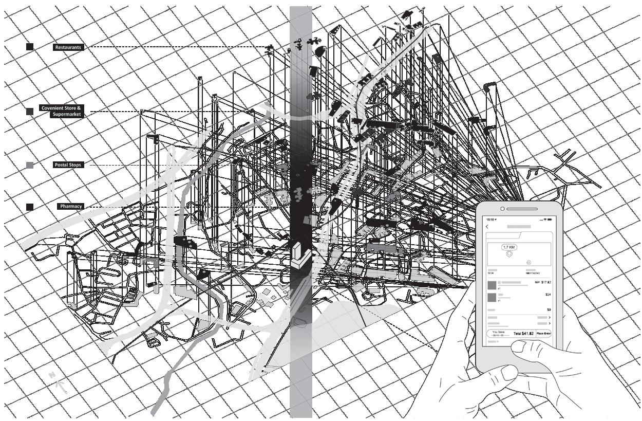
283 01 02

01: Strategies 02: Tactics 03: Pullman Strike 04: George Floyd Protest 05: Democratic National Convention Critic: Rania Ghosn TA: Mona VijayKumar
01
What Do We Want? When Do We Want It? Three Examples of Protest and Infrastructure in Chicago by Jola Idowu

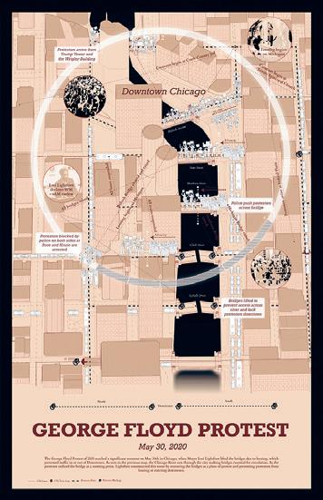
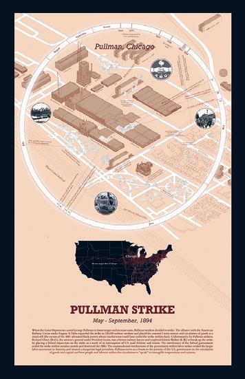
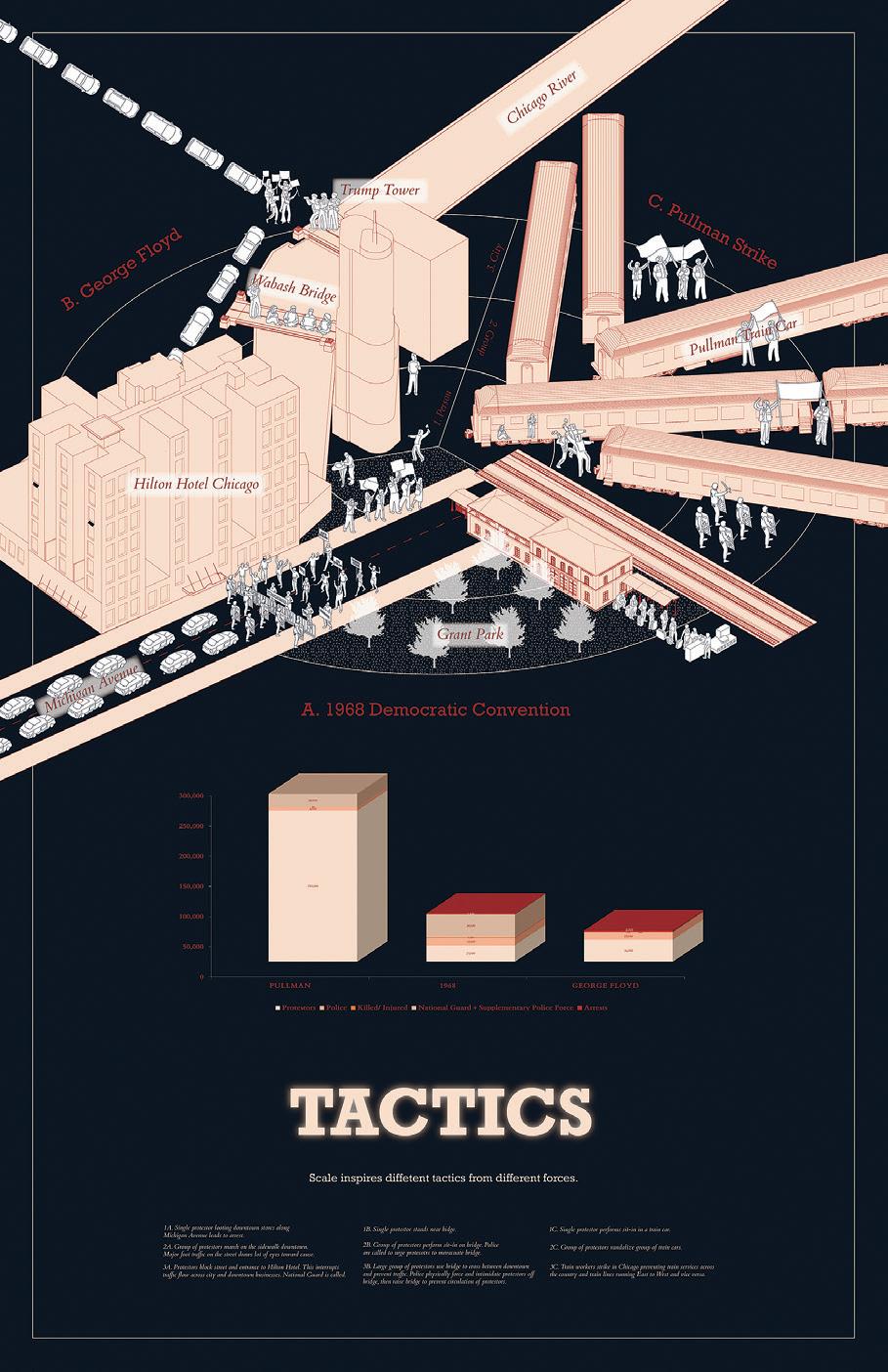
285 02 03 04 05
World Heritage, Climate Inheritance
The impacts of climate change on World Heritage—from floods in the Venice Lagoon to extinction on the Galápagos Islands—have garnered attention in a world that has mostly otherwise failed to respond to the urgency of the climate crisis. In UNESCO reports, climate change has emerged as a top threat impacting the conservation of hundreds of heritage sites, with an array of risks including rising sea levels, wildfires, extinction, droughts, air pollution, melting glaciers, material vulnerability, unchecked tourism, and the massive displacement of communities.
What world and heritage are possible through the climate crisis? Heritage sites are designated for their natural or cultural significance, considered to be of outstanding universal value, and protected for the benefit of future generations. However, the climate crisis renders it unclear what that future is and how to curate a world with inherent uncertainty and disaster. At a moment when the promises to arrest or reverse further decay are unsustainable in the face of planetary destruction, what are other possible experimental preservation practices—material and semiotic—both to live on a damaged planet and to imagine other worlds that are possible, urgent, and necessary? How does one devise a plot and give it a certain direction or intent of meaning when climate change actively eludes, confounds, and evades narrative closure?
How do designers inherit a world in crisis?
“World Heritage, Climate Inheritance” is a design research and speculation workshop that investigates how to conceptualize, visualize, project, and narrate the impacts of climate change on World Heritage.
SITE
Instructed by Rania Ghosn
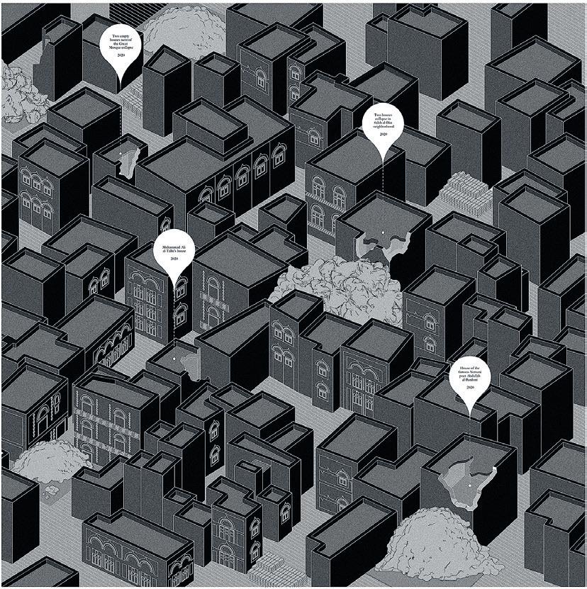
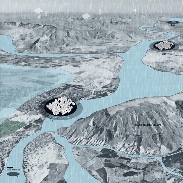
4.183 01: Nada AlMulla 02: Yoonjae Oh 287 01 02
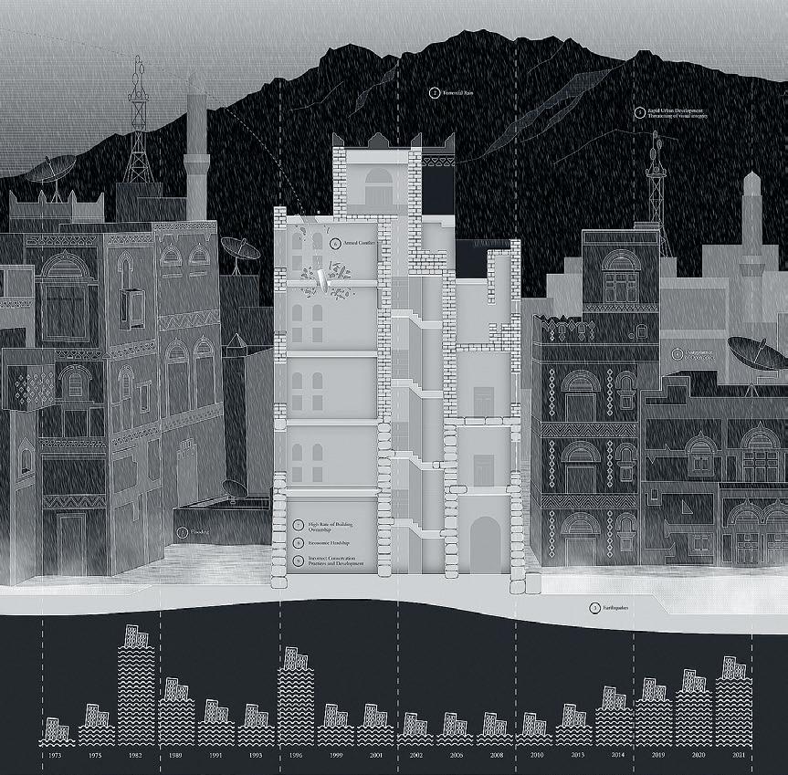
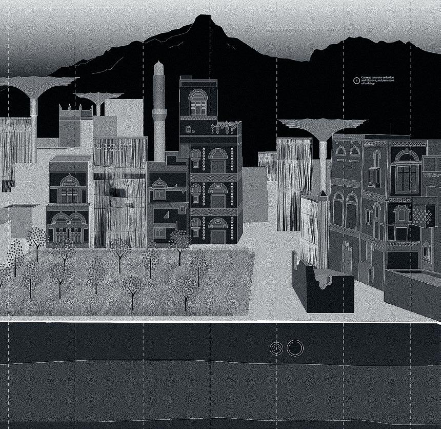
03–04: Nada AlMulla 03 04


05: Maria Vollas 06–08: Sasha McKinlay 289 05 06 07 08

09:
Triptych by Katie Koskey
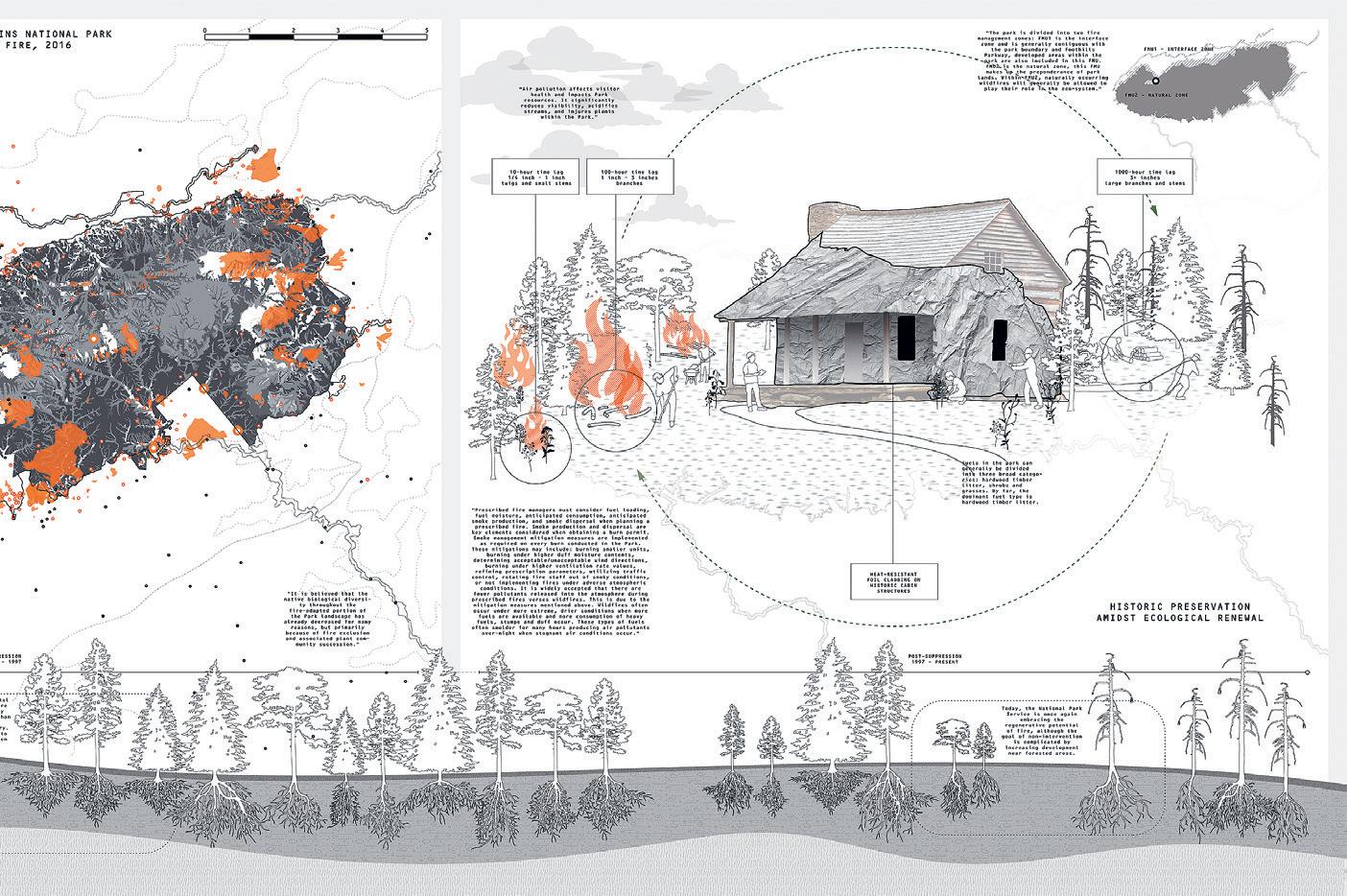
291 09
Second Life of Concrete Debris in Heritage
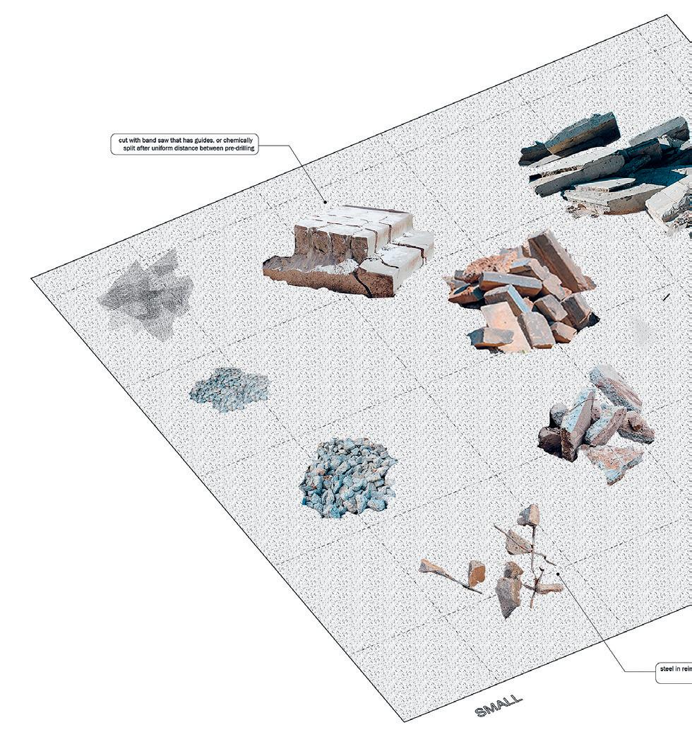 by So Jung Lee
This project thinks about the past, present, and future of Seokguram Grotto in Gyeongju, Korea from a critical perspective on heritage restoration. The addition of concrete in heritage sites worldwide in the industrial era is now known to be easily problematic, mainly for structural and aesthetic reasons. In the case of Seokguram Grotto and many other heritage sites in Korea, the issue is mostly associated with sentiments of anti-colonialism and anti-dictatorship.
The prevalent practices of heritage restoration are heavily focused on removing and discarding the layers of the colonial era. There are accumulated public emotions for the delay of erasing the vestiges of colonialism, and the process is often halted without much discussion on how.
The triptych of Seokguram Grotto imagines a future where monks can bring back the culture of craftsmanship in Buddhist temples lost during modernization, while giving a second life to concrete debris from demolition by converting it into pavement and overhangs for the site to cope with climate issues and tourism.
Critic: Rania Ghosn
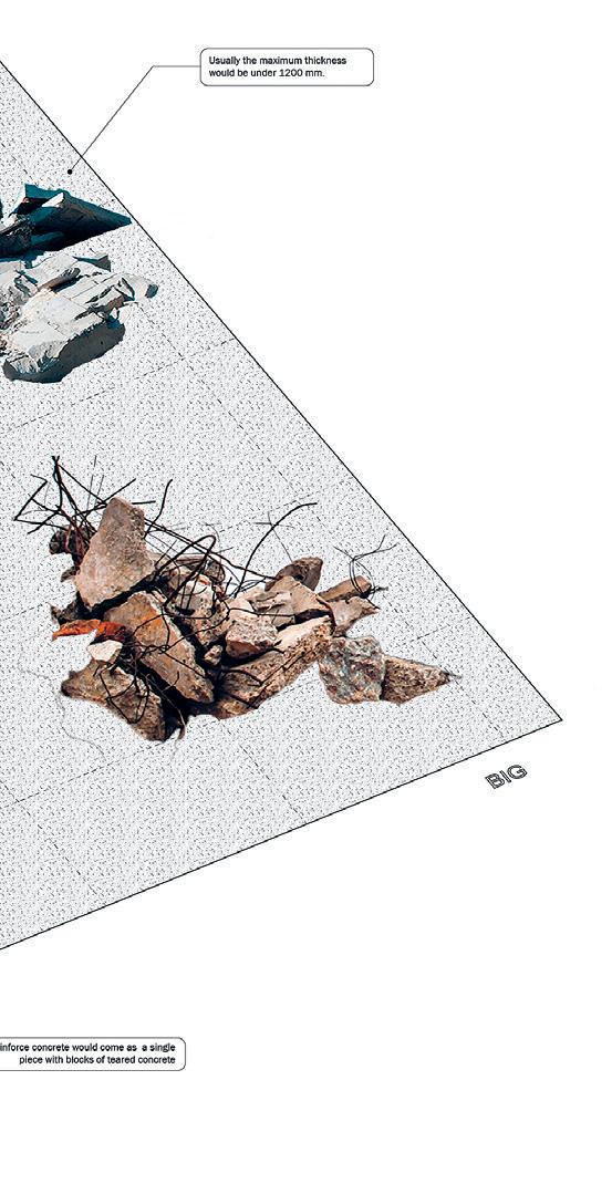
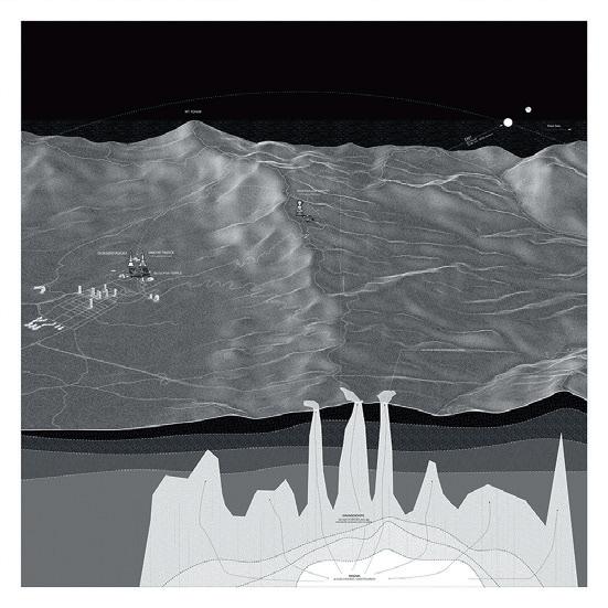
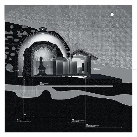

01: Concrete Debris 02: Triptych of Seokguram Grotto 293 01 02
Eco-cultural Heritage
La Sierra Nevada de Santa Marta
by Bella Carmelita Carriker
The highest coastal mountain range in the world, the Sierra Nevada contains samples of all the biomes present in Colombia and provides vital ecological functions to the region (including supplying millions of people with clean water), yet it is threatened by climate change and development.
The region has been nominated as a UNESCO World Heritage Site as a mixed Natural/Cultural site, due to its biodiversity and the presence of the so-called Lost City inhabited by the Tairona people since approximately the fifth century, an inhabitance which was always inextricably linked to surrounding vegetation and its larger ecosystem.
This project envisions a framework for indigenous stewardship over preservation, implementing an eco-cultural practice of intertwined land, vegetation, and architectural maintenance, understanding that a continued relationship with a cyclical ecosystem is also a cultural endeavor.

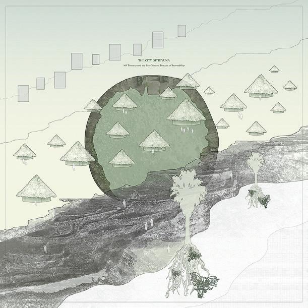
01 02 Critic: Rania Ghosn 01: Cyclical Ecosystem 02: Lost City 03: Highest Coastal Range
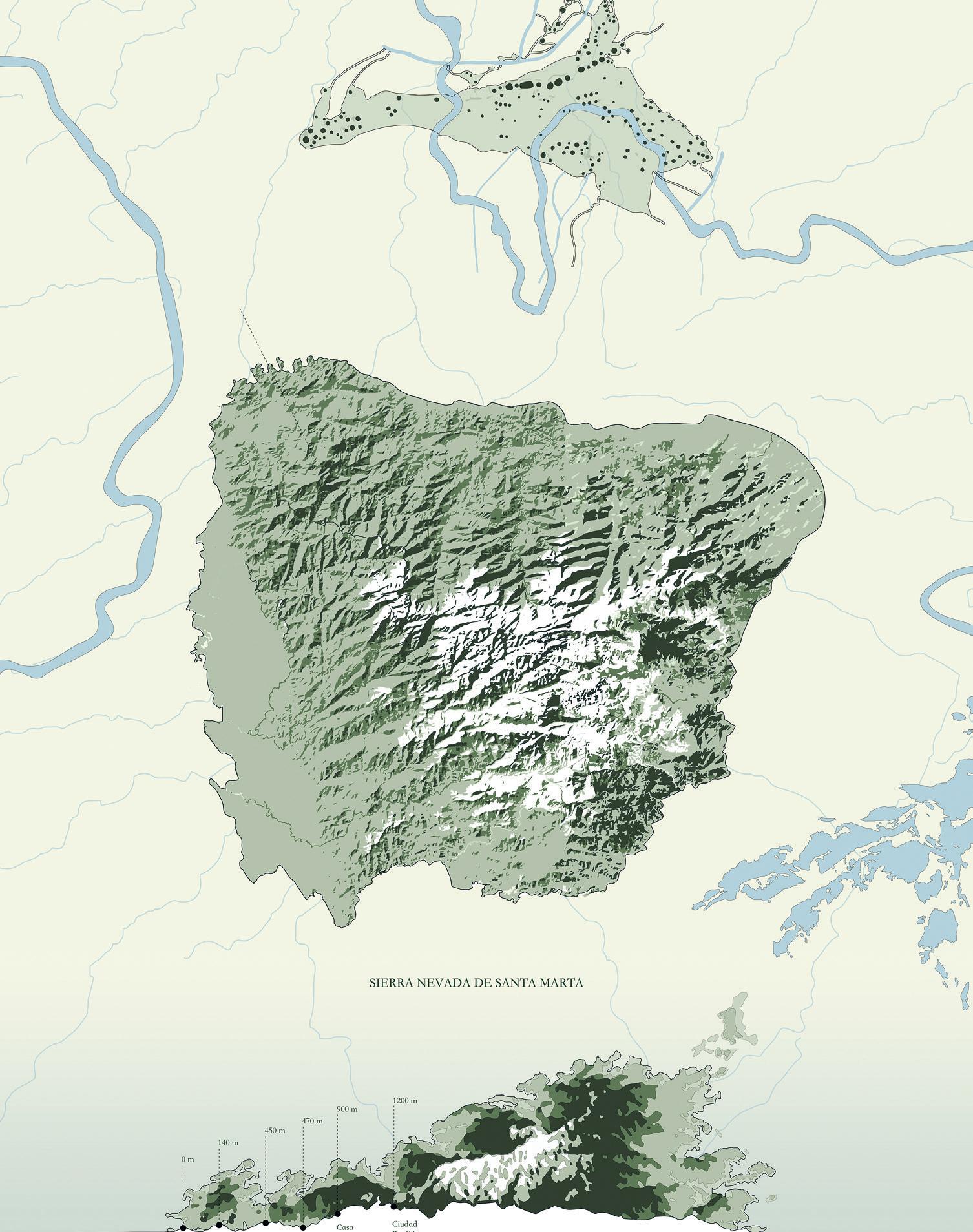
295 03
Augmented Historical Pedagogies
This collaborative design research workshop will be conducted in Summer 2022, where the students of MIT will visit Berlin to collaborate with the students of TU Berlin and continue working on their research of exploring hidden urban narratives of the Tiergarten in Berlin. This site with its long and complicated history serves as an apt urban landscape to provide a wide inventory of archives to develop narratives and ideas. The workshop enables the students to explore ideas regarding the meaning and value of historical and contemporary archives and how to engage with them using technology. This workshop serves as a continuation of previous explorations conducted at MIT with the idea of creating a living ‘archive’ of Tiergarten. This living archive is a central part of the design project as it consists of a hundred or so small ‘piles’ that, as in a mosaic, flesh out aspects of the Tiergarten’s history. There is no hierarchy to the piles. Some contain poems, while others contain images, photographs, or sound recordings. Each pile, however, has a title that, as Georges Perec would have it, gives a sense of the content. Many piles are still empty, as this ‘archive’ is by no means meant to be comprehensive.
Using elements from the ‘archive’, students work in small teams to create a narrative that is then set and visualized within a VR space. Drone and camera photogrammetry, as well as LiDAR scanning of parts of the garden serve as staging for these narratives. Each project is thus part historical and part fictional. When placed together they begin to open up unexpected conversations about the garden and about Berlin, its history, and the contemporary world.
SITE
Principal Investigation by Mark Jarzombek, Aaron Sprecher + Jörg H. Gleiter Instructed by Eliyahu Keller, Klaus Platzgummer, Eytan Mann + Cagri Zaman with Teaching + Research Assistants Adriana Giorgis + Lauren Gideonse
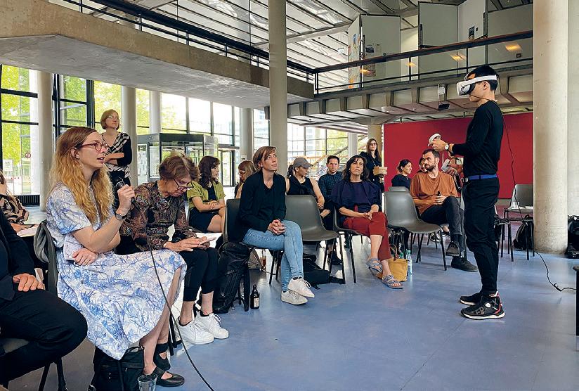

4.182 01: Final Review 02: Group Lunch 297 01 02
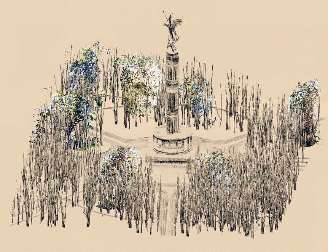
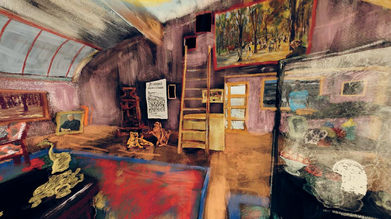
03 04
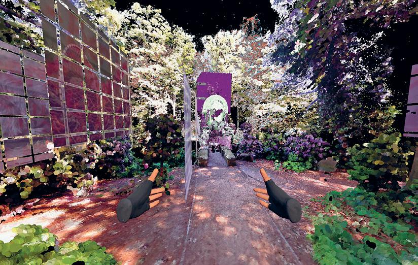
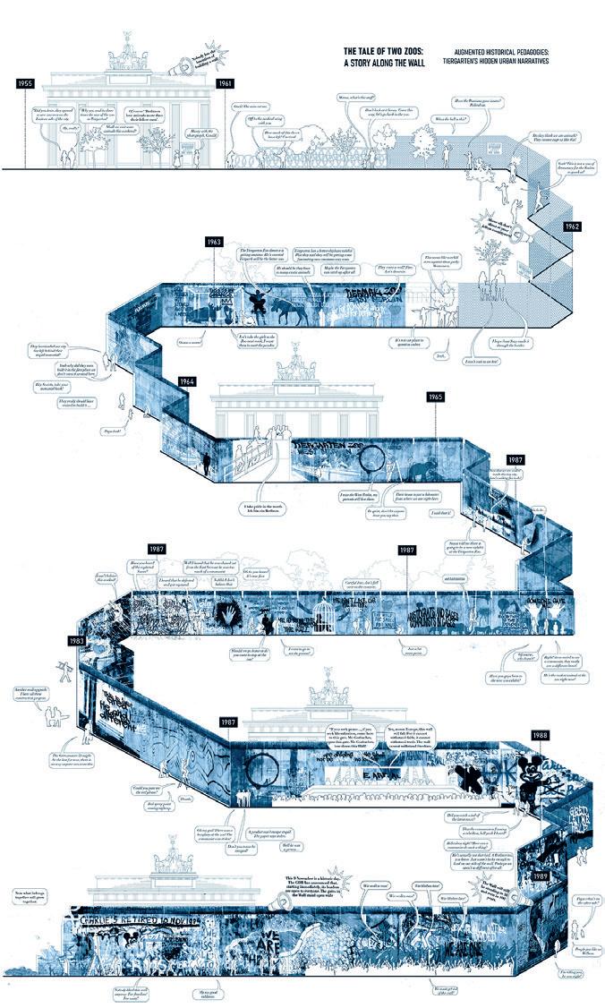
03: Hidden in Plain Sight by Jayson Kim 04: Curio by Soala Ajienka + Masha Obodan (TU Berlin) 05: Lila — Bridging the Binaries by Jehanzeb Shoaib + Jann Wiegand (TU Berlin) 06: Displaced Wall by Tatiana Estrina + Antonia Bäcker (TU Berlin) 299 05 06
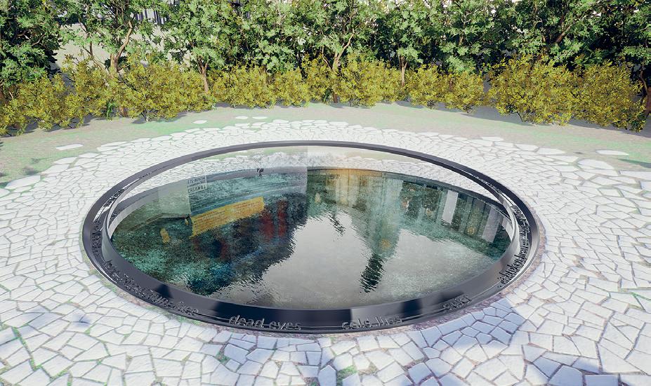
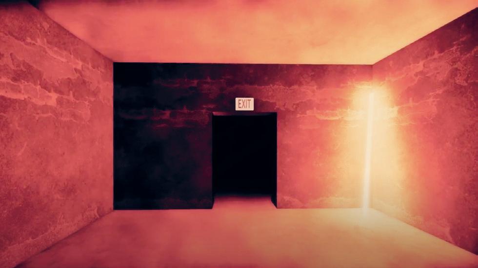

07:
02:
Wesseler
08: Displaced
Bäcker
09:
07 08 09
Reflections by Demircan Tas, Kate Lupitiuk + Susan Dodd (TU Berlin)
Untergarten
by Cloe Wang, Calvin Zhong + Lisa
(TU Berlin)
Wall by Tatiana Estrina + Antonia
(TU Berlin)
The
Sleeping Beauty by Ganit Goldstein, Yinying Cong (TU Berlin) + Lisa Wesseler (TU Berlin)
The Sleeping Beauty
by Ganit Goldstein, Yinying Cong
Lisa Wesseler
For 113 years the rose garden has represented beauty within Tiergarten, from when it was first planted in 1909 up to how it appears today after the restoration in 2005. Within a Virtual Reality experience, six different scenes are presented within a 3D scan of the rose garden, where a viewer can explore the different moments in time which had impacted the rose garden significantly.
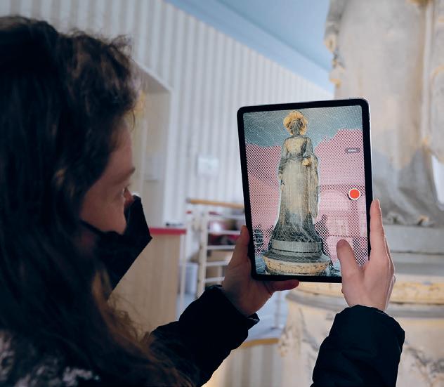
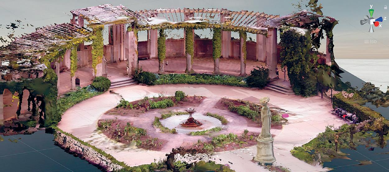
+
Critics: Mark Jarzombek, Aaron Sprecher + Jörg H. Gleiter
Eliyahu Keller, Klaus Platzgummer, Eytan Mann + Cagri Zaman TA + RA: Adriana Giorgis + Lauren Gideonse 01: Scanning a Stone Sculpture 02: Virtual Reality Scan
Instructors:
301 02 01
Urbanism Studio
The joint Urban Design Studio and Site and Environmental Systems Planning practicum investigates an equity-driven approach to planning and designing for East Boston, focused on the Condor Street and Border Street waterfronts. The goal is to create a framework that responds to community needs, builds off and complements current planning studies, and integrates planning and design to envision climate resilient strategies and affordable housing for the neighborhood. In addition, the joint studio will explore connections between the idea of Climate Corps in cities, and physical and social resilience at the community level. It will build on existing and new partnerships between MIT’s School of Architecture and Planning, the City of Boston, and East Boston organizations.
The structure of the studio is conceived as an interplay between community partner engagement in East Boston, the potential role of design/planning projects, and an exploration of the idea of an expansive vision of a Climate Corps as it could apply to the context of the neighborhood.
SITE
Instructors: Miho Mazereeuw, Mary Anne Ocampo, Lisbeth Shepherd, Larisa Ovalles + Flavio Vila Skrzypek with Teaching Assistant Mona VijayKumar

4.163 / 11.332 01:
303 01
Photograph of the studio and NOAH youth group.
Socio-ecological Design for a Resilient Water Edge
by Pramada Jagtap
Critic: Miho Mazereeuw, Mary Anne Ocampo, Lisbeth
The project is envisioned as a tool for advocacy and communication in the form of a neighborhood map that the community can draw upon. The proposals laid out in this project draws heavily upon the existing needs of the local community and focuses on creating a living shoreline while adopting naturebased solutions to treat land and water pollution, preserve waterfront access, enable marine species resistance, and empower the local community through new jobs. The project is envisioned as a phased development prioritizing research and policies to promote phytoremediation for polluted land and then making such parcels accessible to the local community. The project focuses on building flood resilience measures by creating multi-use strategies and vertical zoning proposals that combine natural and built measures such as berms, natural flood walls, commerce, housing, boardwalks, and parks. The various strategies together target land-river pollution, 36-inch flooding, and green gentrification.
Shepherd, Larisa Ovalles + Flavio Vila Skrzypek
TA: Mona VijayKumar
01: The various organic and inorganic pollutants on the land parcels at site that can be treated in a period of 1–10 years by way of phytoremediation strategies that are adopted in the design proposal.
02: A proposed vision for Eagle Hill in East Boston that combines all projects from the joint studio as a working board for community to edit/adapt and engage with. 03: Sectional perspective combining design strategies.
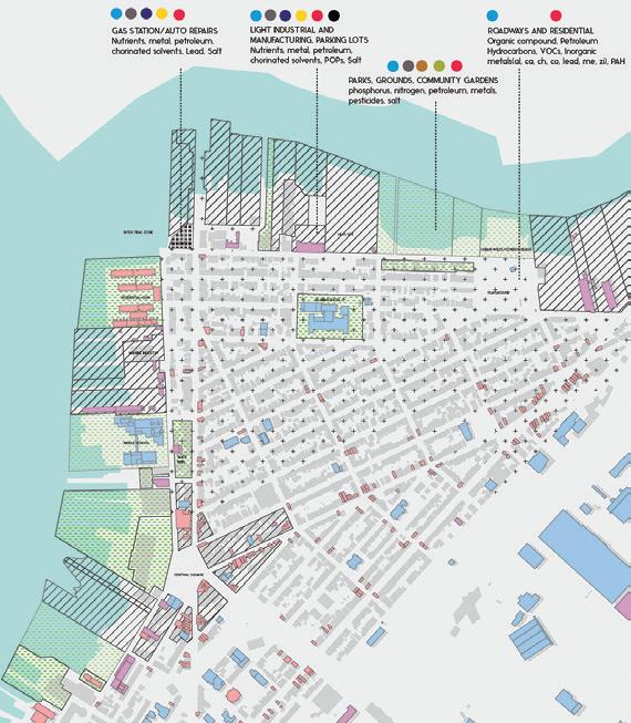
01
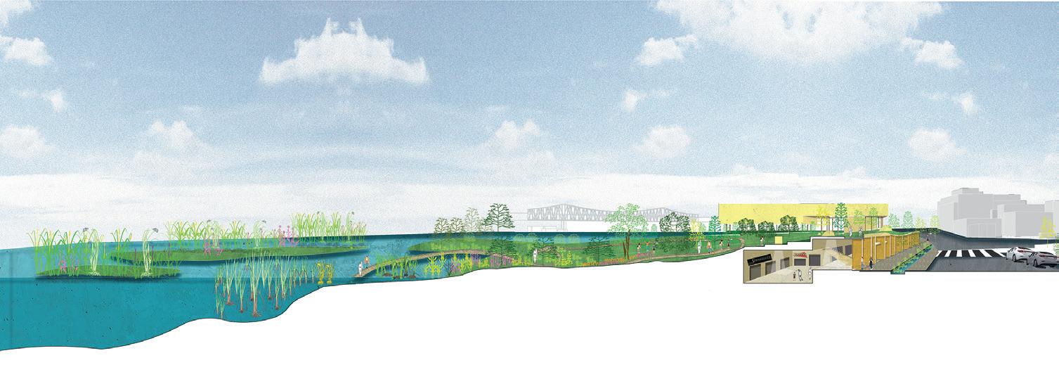
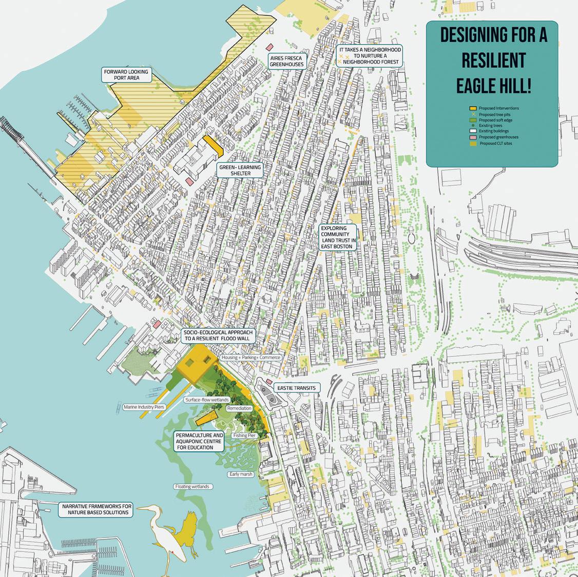
305 02 03
It Takes a Neighborhood to Nurture a Neighborhood Forest

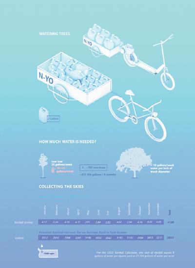 by Selin Sahin
Trees are essential to a healthy urban environment, as they cool temperatures through shading and transpiration. They also help filter pollution and increase porosity for stormwater runoff. However, it takes a neighborhood to nurture a neighborhood forest. This project envisions a Neighbor Corps, working together with existing grassroots initiatives of care to increase resources and expand efforts to increase the tree canopy in East Boston as a way of addressing some of the environmental justice issues that are aggravated by climate change and air pollution caused by Logan Airport. It starts by identifying potential locations for new tree pits in the neighborhood and geolocates them on an open-access map. It then proposes a new framework of partnerships and possible collaborations with federal, state, city, and neighborhood level organizations. This framework also includes rainwater collection for watering, the creation of new green jobs, collective care, and management of fruiting trees.
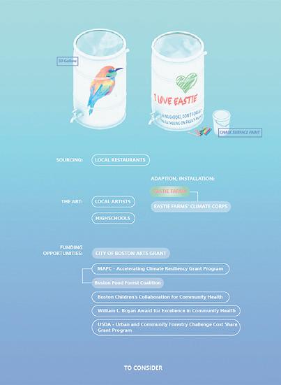
01: Watering Trees 02: To Consider 03: Rainwater Diagram 04: Possible Water Access Critic: Miho Mazereeuw, Mary Anne Ocampo, Lisbeth Shepherd, Larisa Ovalles + Flavio Vila Skrzypek TA: Mona VijayKumar 01 02 03

307 04
Collective Architecture Studio
Instructed by Ana Miljački with Teaching Assistant by James Heard
15 minutes southeast of MIT (a short trip on the #1 bus plus a bit of walking) is a Roxbury neighborhood of mostly small residential houses, white and pastel colored—wooden New England triple-deckers and some single-story, single-family homes—as well as a few brick apartment buildings. At the time when other parts of Roxbury, Mattapan, and Dorchester were hit hard by the housing and market crisis in 2007–2009, the area around Dudley Street fared well. Here, in the urban triangle governed by the Dudley Street Land Trust (Dudley Neighbors Incorporated—DNI) and the Dudley Street Neighborhood Initiative (DSNI), relative resilience to the housing market dive was secured by the existence of over 200 “permanently affordable” housing units provided in the form of those single-family (as well as multi-family) structures. They are owned in a particular way, as stipulated by the Dudley Street Land Trust, such that the Trust continues to own the land underneath them in perpetuity, while the equity to owners accrues more slowly than elsewhere. Both mechanisms enable the land trust and DSNI to develop the neighborhood without displacing its inhabitants and thus (with their collective involvement) stave off gentrification. There is also a lovely park, a community green house, an urban farm, as well as commercial and non-profit spaces. It might be hard to grasp the importance of all this from street-view, but the radical imagination convened for the formation of DSNI and DNI in 1984 is legend for a reason—important not only for what it has already achieved, but also for what it continues to effect.
From the 1950s to 1980s, this part of Roxbury, the heart of Boston’s African-American community, suffered the dire consequences of redlining—the Federal Housing Administration’s discriminatory mortgage insurance policies, swindling contract mortgages, widespread vacancies, and neglect. In response, this trailblazing campaign, led by the inhabitants of this corner of Boston and the sustained political organization (and commitment) that followed, seeded and now maintain this particular US model of social ownership and urban stewardship.
The Collective Architecture Studio will work to understand, internalize, and celebrate this model as we begin to work alongside DSNI and its partners: The Food Project and The Boston Plan for Excellence.
SITE
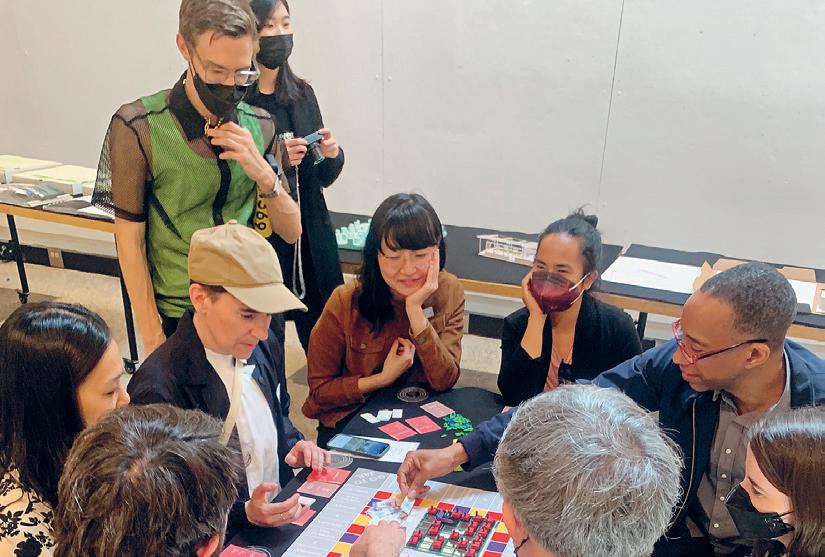


4.154 01: Round Table Final Review 02: Reviewers Playing Polyopoly 03: Reviewers Playing Marble Wobbble 309 309 02 01 03
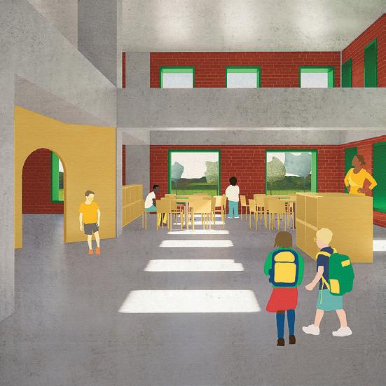

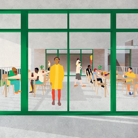
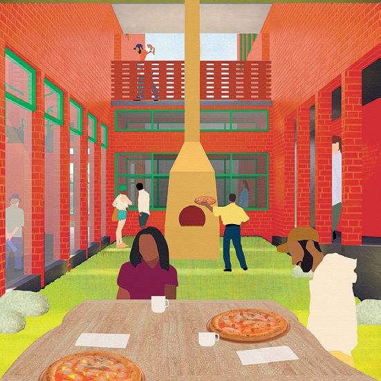

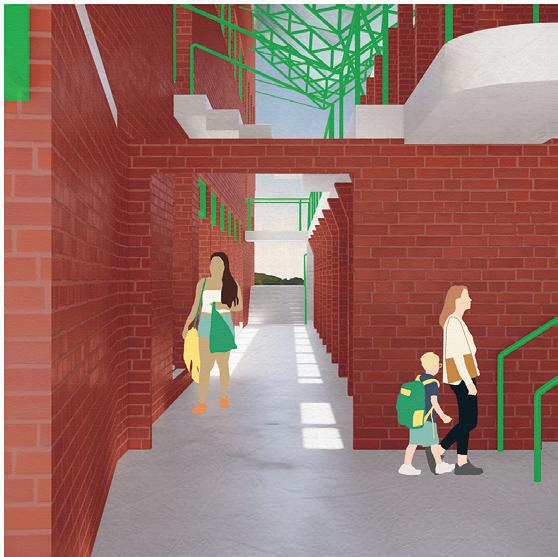
Critic: Ana Miljački
Heard 04–05: 690 Dudley Street
Katie Rotman
Justin Brazier 06–07: 530 Dudley Street
Patricia Dueñas Gerritsen + Calvin Zhong 08–09: Miller Park
Gideonse
Julian Andrew Escudero Geltman 04 06 08 05 07 09
TA: James
by
+
by
by Lauren
+
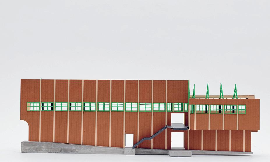

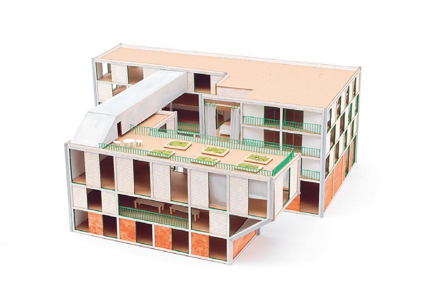 10: West Cottage Street Farm by Lan Xuan + Huiwen Shi
11: Miller Park by Lauren Gideonse + Julian Andrew Escudero Geltman
311 11 12 10
12: 530 Dudley Street by Patricia Dueñas Gerritsen + Calvin Zhong
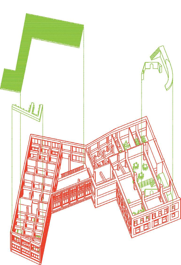

14 13
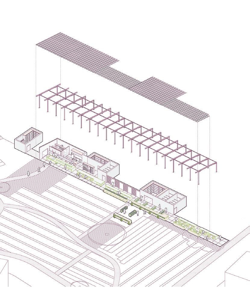
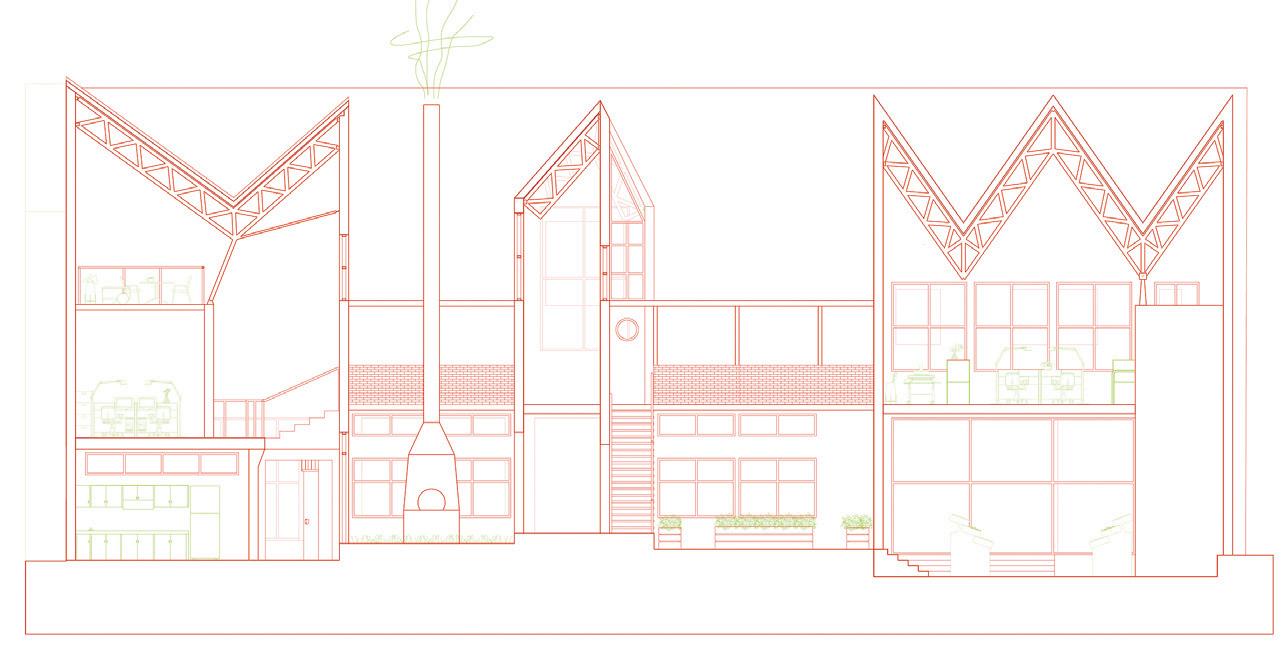 13: 690 Dudley Street by Katie Rotman + Justin Brazier
14: 530 Dudley Street by Patricia Dueñas Gerritsen + Calvin Zhong
15: West Cottage Street Farm by Lan Xuan + Huiwen Shi
313 15 16
16: Miller Park by Lauren Gideonse + Julian Andrew Escudero Geltman
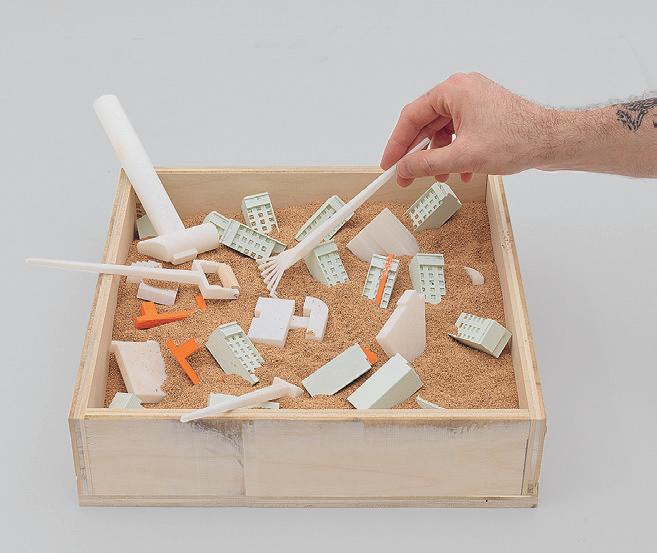

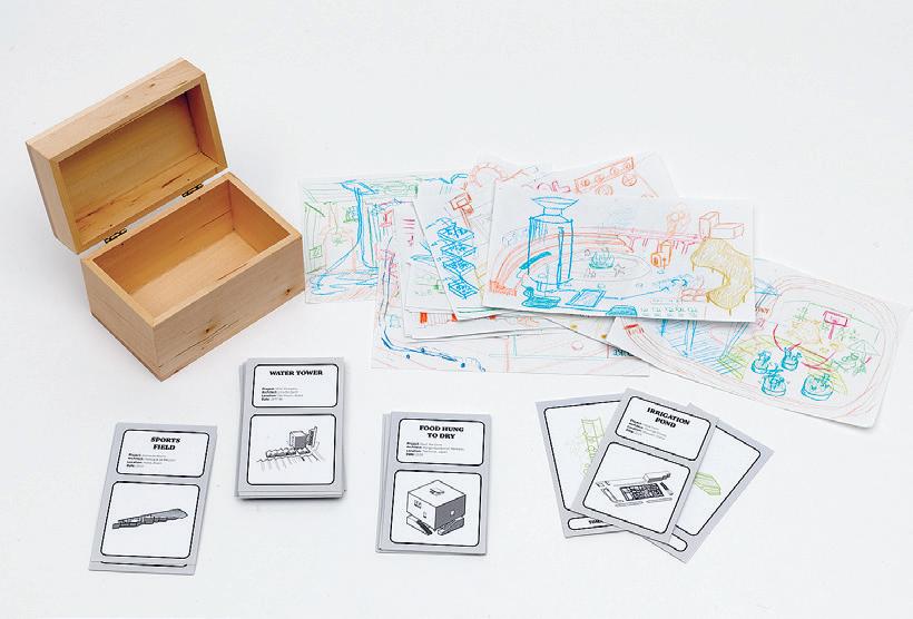
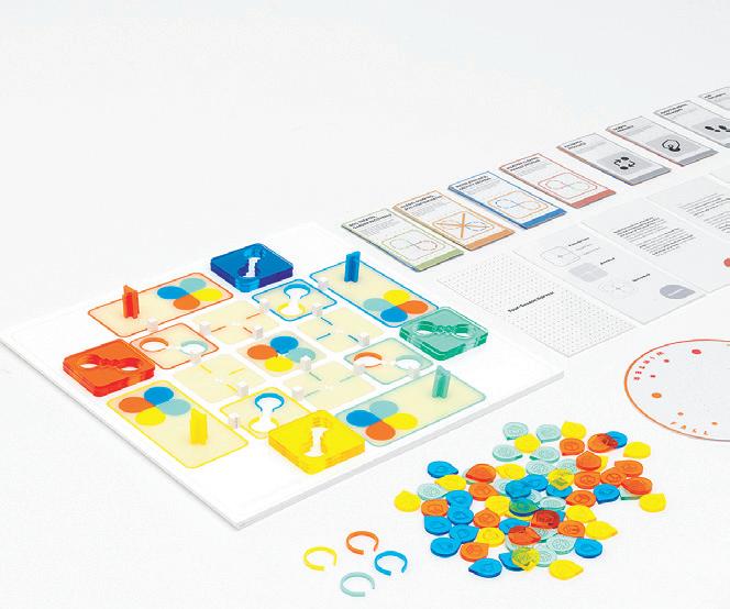 17: The Drawing Game by Justin Brazier +
Patricia Dueñas Gerritsen
18: Four Seasons by Lan Xuan + Huiwen Shi
19: Urban Renewal Sandbox by Julian
Andrew Escudero Geltman + Calvin Zhong
20 19 18 17
20–21: Marble Wobble by Lauren Gideonse + Katie Rotman
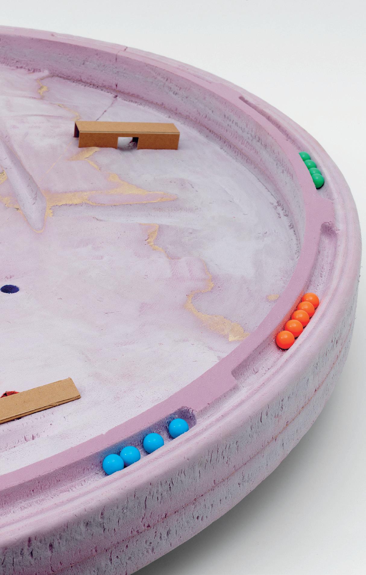
Critic: Ana Miljački TA: James Heard 315 21
Polyopoly by Zak DeGiulio + Doris Duanmu
Polyopoly, an iteration of the original Landlord’s Game (the game that inspired Monopoly), is designed within the context of the Dudley Street Neighborhood and Boston’s cityscape. The game reflects the spirit of collectivity, recalling the history of DSNI (Dudley Street Neighborhood Initiative), one of the nation’s oldest community land trust models. Players begin by owning several private properties, and as the game moves forward, players are encouraged to explore different forms of development through personal and collective ownership. Unlike Monopoly, Polyopoly allows players to collaborate, consider, and negotiate the benefits and implications of collective ownership, while exploring alternative possibilities of city building.
 Critic: Ana Miljački
01: Polyopoloy Game Detail 02: Polyopoly Game 03: Polyopoly Game Detail 01
TA: James Heard

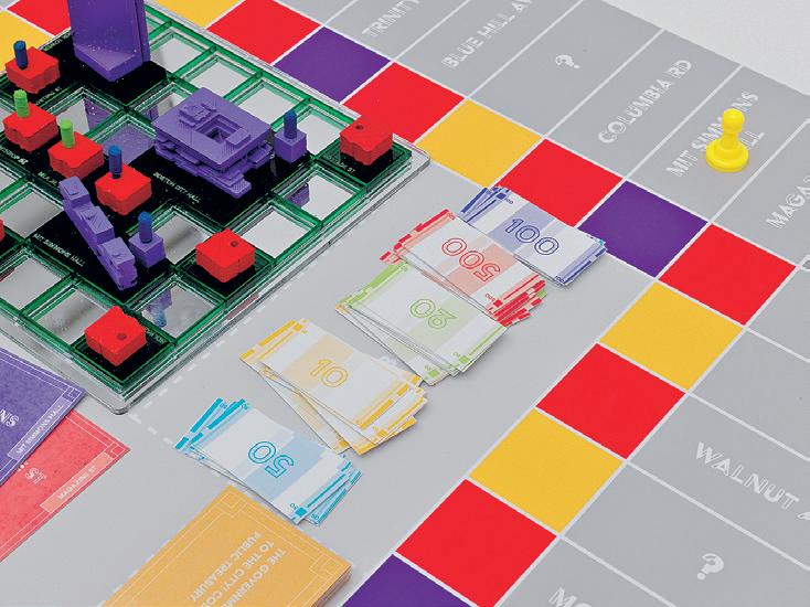
317 02 03
Ana Miljački Reflects on the Collective Nature of Architecture and Design
Collective Endeavors
How would you describe your role at MIT and in the department over the past year?
Ana Miljački: I feel like my role has been versatile and expansive over the years. In comparison to that, last year has been an attempt at making it simpler, smaller, maybe clearer for myself. And in the year, it always involves the first semester history/theory course, which I take very seriously as a class where the incoming M.Arch cohort gets socialized intellectually. That is the number one task in that moment. And then, the Collectives studio01 requires a very particular way of teaching.
You co-edited the most recent issue of Log (Winter/Spring 2022), which is titled “Coauthoring.” You describe the process of co-authorship as a carrier bag, drawing from Le Guin and Fisher, and imagine that its contents are both its carriers, and with, here I quote you, “all the friction, tact and tenderness that enables these exchanges.” Could you describe how working on this Log issue relates to your teaching?
AM: The “Coauthoring” Log is very directly related to the Collectives studio. It’s a bit of a chicken and egg thing for me. I’ve been testing and teaching along some of these lines maybe before I was articulating or beginning to articulate what I think about authorship and co-authorship. Some of this also emerged from thinking about who owns architectural ideas over a longer span of time. But I do think this is one of the key lines of inquiry and transformation that is necessary in the field and in pedagogy. For me, those are always related.
The tests we do in pedagogy are always aimed at hoping for certain kinds of transformations in the field. At the very least, they seed some of those ideas in that small group of people who actually exit into and find themselves practicing at some point, hopefully with a little bit of the values—or if not values, then at least wisdom—about what it might mean to work together or not. And some of this for me, I can now say in retrospect, is certainly related to growing up in socialism and considering what it might mean to operate
Ana Miljački is a Professor in the MIT Department of Architecture. Her research interests include the role of architecture and architects in the Cold War-era Eastern Europe, the theories of postmodernism in late socialism, and the politics of contemporary architectural production.
otherwise. It may be based in the very romantic idea of socialism itself—now from a certain distance, temporal and geographical.
What do you think the most difficult part of collective work and co-authorship is?
AM: Right now, I think the most difficult aspect is that it is still operating against everyone’s deeply ingrained expectations of labor division, credit, and self-satisfaction. By the time we get to experiment with these topics in studio, the individuals in the studio have very specific baggage, and that baggage is not always aligned. Another thing is that I think we’re now in a moment where there’s a lot of language that has been provided to talk about what it might mean to work together. And language, we need it, but it is not the same as actually negotiating and caring for quality of the work.
What I don’t know how to do yet in this context is how to uphold certain kinds of standards of production. And maybe they shouldn’t be upheld because they come from a different set of values. Or maybe they don’t. That’s my internal struggle. But also, I think it's a struggle for everyone in that context. How do we produce the best work together is actually a slightly different question than how do we produce our happiest work together. And I don’t know yet to what extent that is a circumstantial question and to what extent it is a systemic and structural question.
In this mode of working together, how do you think that this return to studio has affected the work produced by students? Did you notice a shift this year that made it especially challenging?
AM: On one hand I think returning to being together physically was very useful. I think it was a good thing to allow for an experience—that collective buzz—and to be responsible to one another in a way that is a little more than in another kind of studio where you’re working on your own. On the other hand, I think the two years of being away and not experiencing making together are affecting all architecture schools. Across the board, we are having to recover something that takes time to make across the board.
It’s not possible to just tell someone to have self-confidence in your making when you haven’t been making, seeing outcomes of your making, and judging the outcomes of your making and your friends’ making. I do think that is something that has affected the generation. I think it’s recoverable, but we have to think long-term. This whole Master of Architecture is such a blip in one’s life when you think about a career in architecture. Some of those things that we wish people experienced in the first years of their studio will happen somewhere along the way. There’ll be different kinds of anxiety graphs that will track this generation, but I think it will all even out.
I want to ask you about your other work, because you’ve been producing a lot of work this year. Not just Log, but also your podcast, and fabricating the Wobbles. You’ve been busy. Could you share some of your other projects and research that you’ve been involved with?
01: See work from the Collectives Studio on p. 308. 319
AM: For me, part of that simplicity I was explaining at the beginning has meant that I had more time to actually focus on a few things that are outward-facing, even when they are inward-facing like the Wobbles. We were the subjects of that in some way. But as a test subject. For me, that’s still a prototype of something else, but also a prototype at a particular moment in time when I thought we should enable more in-person play.
There are all kinds of different registers of my production that I managed to hit in this one year. It was pretty great: the Critical Broadcasting Lab, the Wobbles.
In particular, I've enjoyed working on the interviews that we’ve been doing for “I Would Prefer Not To.” I’m super excited about that as a collaboration with the Architectural League, because I had started that project five years ago or so. I had a pilot that I recorded with some people thinking at that time that it would be an exhibition of sorts. When the pandemic hit and everyone started using Zoom, it made no sense to project talking heads from Skype, which is how we had begun it.
I was really looking for an institutional backing for that material so that it could be an archive. In my mind, it’s basically a production of an oral history project that is infinite. Nobody wants to get on board with an infinite project. But in my mind “I Would Prefer Not To” can go as long as architecture goes. I started with a group of friends, more or less my generation, for the first pilot. But now, because we’re working with the League and because it has now become a more visible platform, we can reach out beyond. The League generally thinks of what they’re doing within the terms of the North American continent.
At the moment we’re thinking that way, too. But again, it’s an infinite project, so we’ll see how that goes. I’m also now starting something with the Lab that I’m excited about: looking at a series of anti-fascist monuments in ex-Yugoslavia, with the help of the collective archive of digital images and A.I. I don’t know where it goes, but part of what we’re testing is the extent to which a fairly simple A.I. algorithm can produce something that has both aesthetic and emotional value. In this case, it’s dealing with a real set of historical objects that were made for a specific reason and then have been destroyed over the last three decades, also for very specific reasons in the region.
Would you want to have the same sort of emotional response within a digital work when compared to on site?
AM: For me, it’s not a question of same emotional response. Just to give you a little bit more, some of these monuments were built in the sixties, seventies, and eighties. And my generation of people from that context is probably one of the last ones to have seen it the way that they were meant to be seen: on pilgrimages that we were taken on with school. There was an idea that it would also be a more solitary tourist experience for some people. In any case, many of us experienced them collectively with explanations about fascism and anti-fascism.
They’ve been in disrepair since the early nineties, and in fact, not just disrepair. This summer one of the key monuments, a partisan cemetery in Mostar, was completely destroyed. It was done by a very important architect. It was included in MoMA. Everything in it was destroyed this summer. That prompted me into thinking about this. For me, I was ambivalent about many things about that period and even that sense of awareness of collective indoctrination that I am sure many of us had as we were doing that. But I feel now, in this moment, where all kinds of local and large fascisms are percolating up back to the surface in that region, I can choose to uphold this project or to re-present it for others to experience—as if a memory, though not theirs. Someone else’s. Or maybe a collective one. This is where the fact that it’s a collective set of images is important. It’s not just a single shot that someone took, but many of them.
When it comes to the Wobbles, for me, mentally at least, they were collective seesaws.02 That’s a kind of extension of a few things that we were doing, both in that last Collective Architecture Studio and that we were doing even in this semester in the Collective Architecture Studio. It was important to find ways to negotiate and play, such that we embodied that negotiation and play at the end of the event. They were something that we started when we produced the project for the São Paulo Biennial a couple of years ago. We produced these inflatable chairs. We wanted seesaws then, but they ended up being inflatable seats where you had some very basic negotiation. If you sat on it and someone sat next to you really hard, you would jump off.
The idea with this was to find something that could, in the era of the pandemic, allow for physical interaction at a safe distance if necessary. What was amazing to M. Arch student Julian Escudero Geltman—who was working with working with me on this—and me, is that we thought a lot about what is and isn’t safe for the age group we were involving. And they were abused way beyond our imagination. We never engineered them for standing on them.
This interview has been edited for length and clarity.
02: See poster of a Happy Hour Wobble event on p. 178. 321
Serra da Capivara
Instructed by Angelo Bucci + Roi Salgueiro Barrio with Teaching Assistant Luca Smith-Senise
The proposal of the studio builds upon Amazonia Studio 1, carried out last year, which engaged the archaeological site of Monte Alegre in the State of Pará in the Amazon region. That previous studio relied on the participation of archeologist Edithe Pereira, who has been researching Monte Alegre for three decades, and Raoni do Vale, who researches rupestrian inscriptions (rock markings) with an anthropological lens alongside indigenous researchers. In addition, we had the support of the University of Manaus, through Professor Marcos Cereto.
The accumulation of information gathered in the last year, primarily through our guests’ lectures, as well as the collection of projects developed by the students during the studio for the Monte Alegre site, combined with the wealth of archaeological information organized by the Museu do Homem Americano, FUMDHAM in Serra da Capivara, make it now possible to advance the elaboration of architectural propositions in this significant frontier between artifacts and landscape, architecture and geomorphology, between the vastness of archaeological time and the immediacy of our environmental urgencies.
The studio will work in The Serra da Capivara National Park—created in 1979 and expanded in 1990—located in the south of the state of Piauí, on the eastern margin of the Brazilian Amazon, just outside the Amazon biome. With an area of 135,000 hectares, the park is surrounded by the municipalities of São Raimundo Nonato to the south, Coronel José Dias to the southeast, João Costa to the northeast, and Brejo do Piauí to the northwest. The park is located between two important hydrographic basins, 100km north of the Sobradinho dam lake, on the São Francisco river in state of Bahia and 250km south of the Nova Esperança dam lake, on the Parnaíba river and on the border between the states of Piauí and Maranhao.
The studio will take architectural facilities already installed in the park as a given. In other words, the purpose of the studio is to add new elements, devices, and, above all, an architectural approach that considers the comprehensive set of human actions organized inside and outside the park, to act with minimal architectural elements that can contribute to the crystallization of a desirable consciousness for the future of the issues involved there and for the construction of a sense of belonging and a sense of citizenship.
SITE
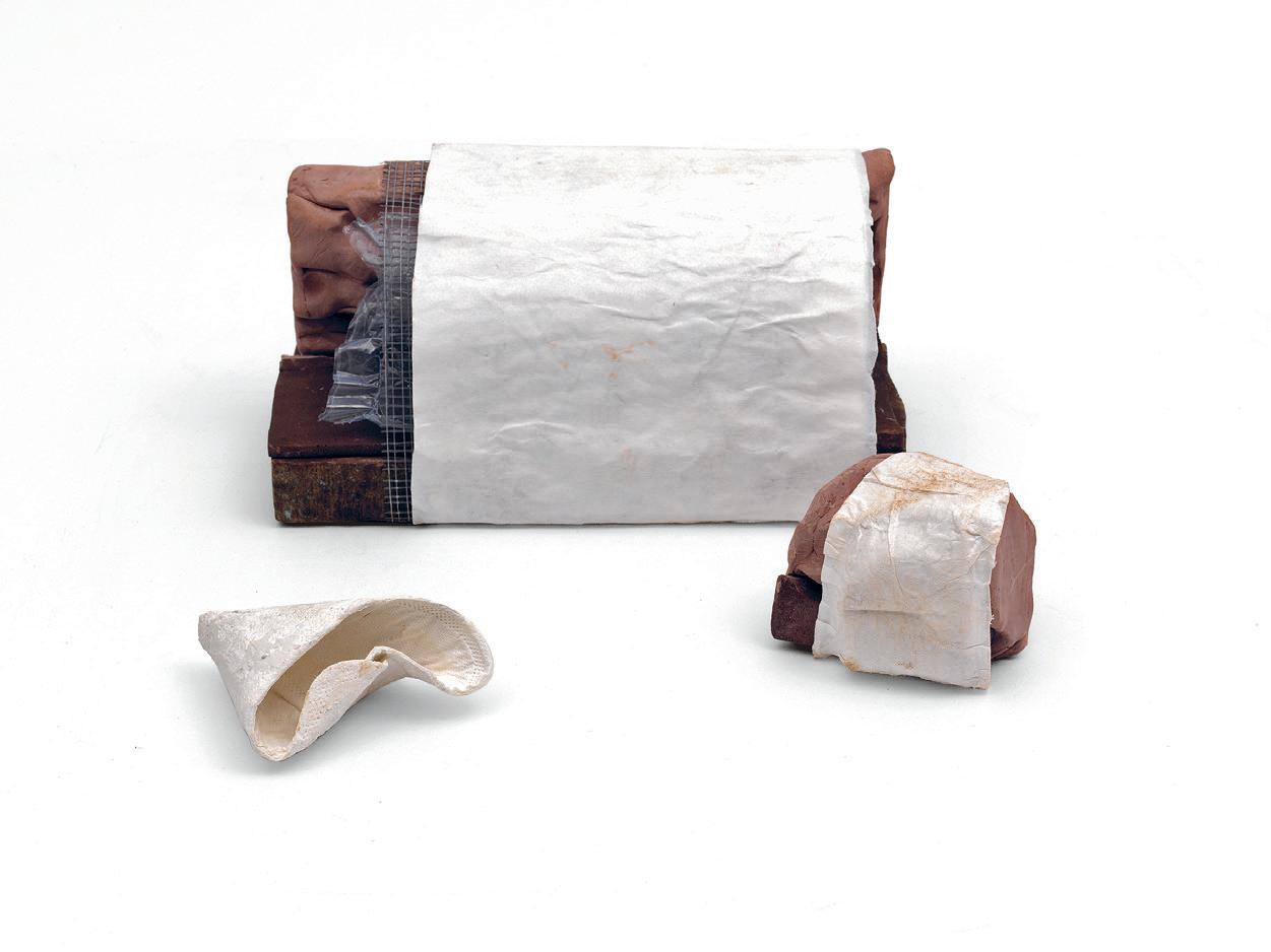
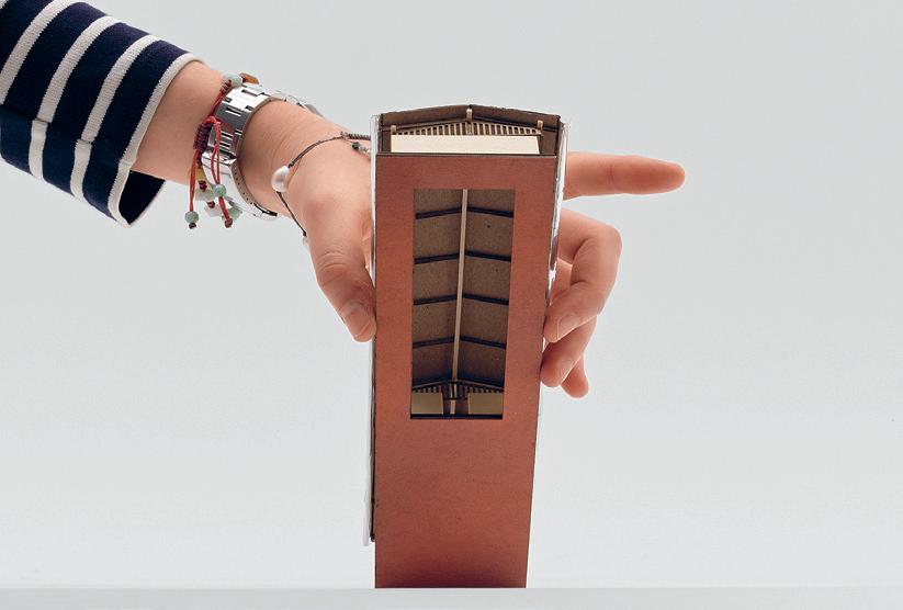
4.154 01:
02:
Model by Iris Zeng
323 01 02
Model by Adriana Giorgis

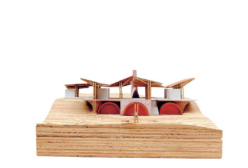
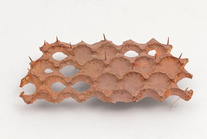
Critic:
Salgueiro
03:
04–05:
06:
07–08:
Pankhurst 09–10: Models
Adriana Giorgis 03 04 05
Angelo Bucci + Roi
Barrio TA: Luca Smith-Senise
Model by Iris Zeng
Model by Inge Donovan
Drawing by Iris Zeng
Model by David
by
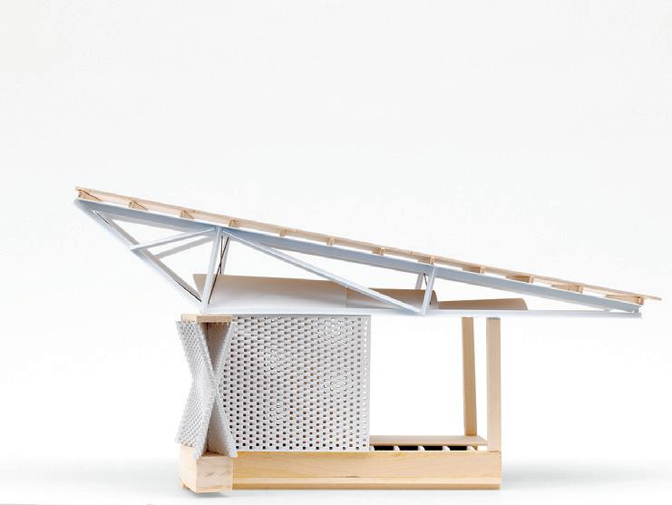
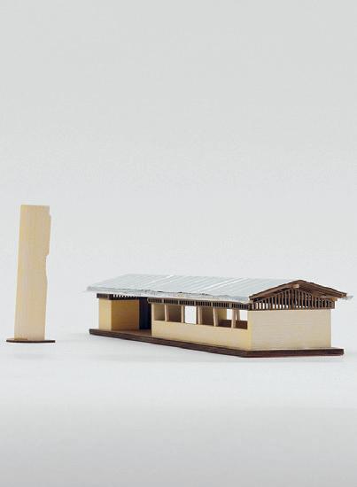


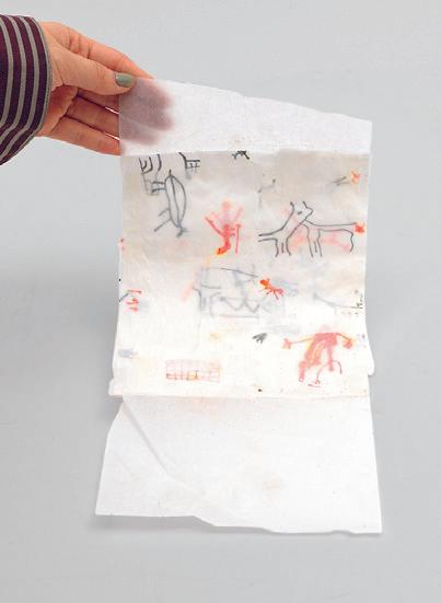
325 06 07 09 08 10
Wilding Infrastructure by So Jung Lee
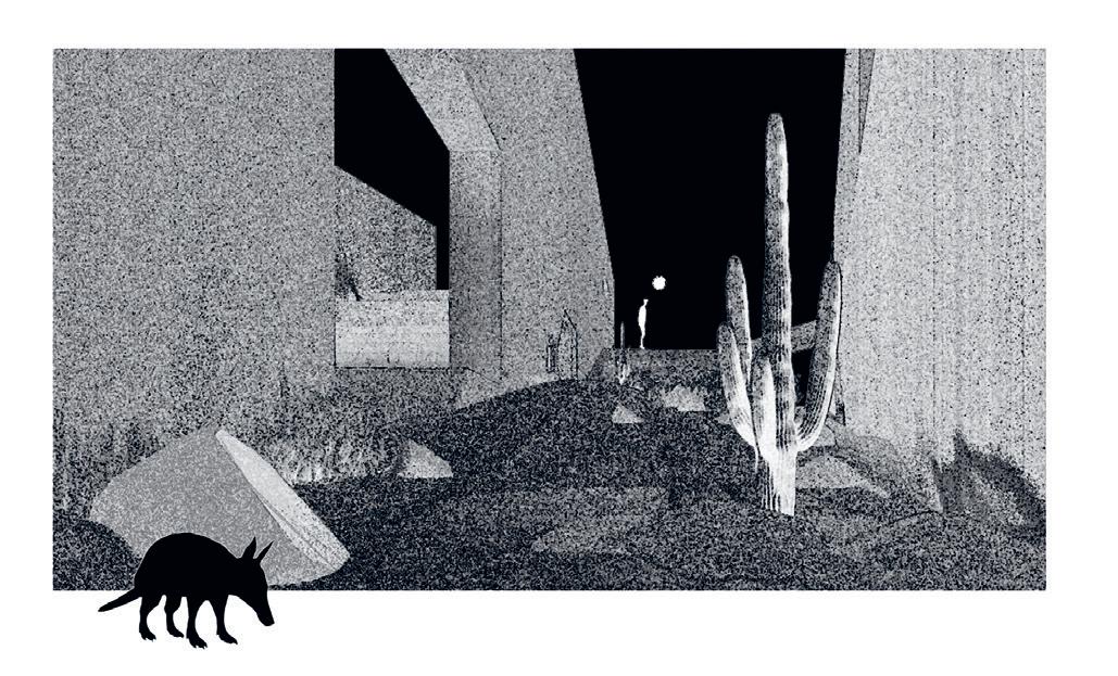
Despite its reputation as a UNESCO world heritage site, the Serra da Capivara National Park is faced with maintenance issues due to its vastness and unstable sources of funding. Three interventions, an Armadillo Tunnel, Capuchin Monkey Bridge, and Macaw Tower, seek to support the economy of the less developed southern part of the park by leveraging its touristic value, all while giving primary importance not to these human visitors but the non-human residents of the park. The ecological niches of armadillos, monkeys, and macaws inform a human infrastructure that hopes to challenge anthropocentrism and open possibilities of cohabitation.
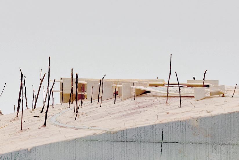 Critics: Angelo Bucci + Roi Salgueiro Barrio
01: Site Model 02: Concept Image 03: Site Plan 04: Site Models 01 02
TA: Luca Smith-Senise
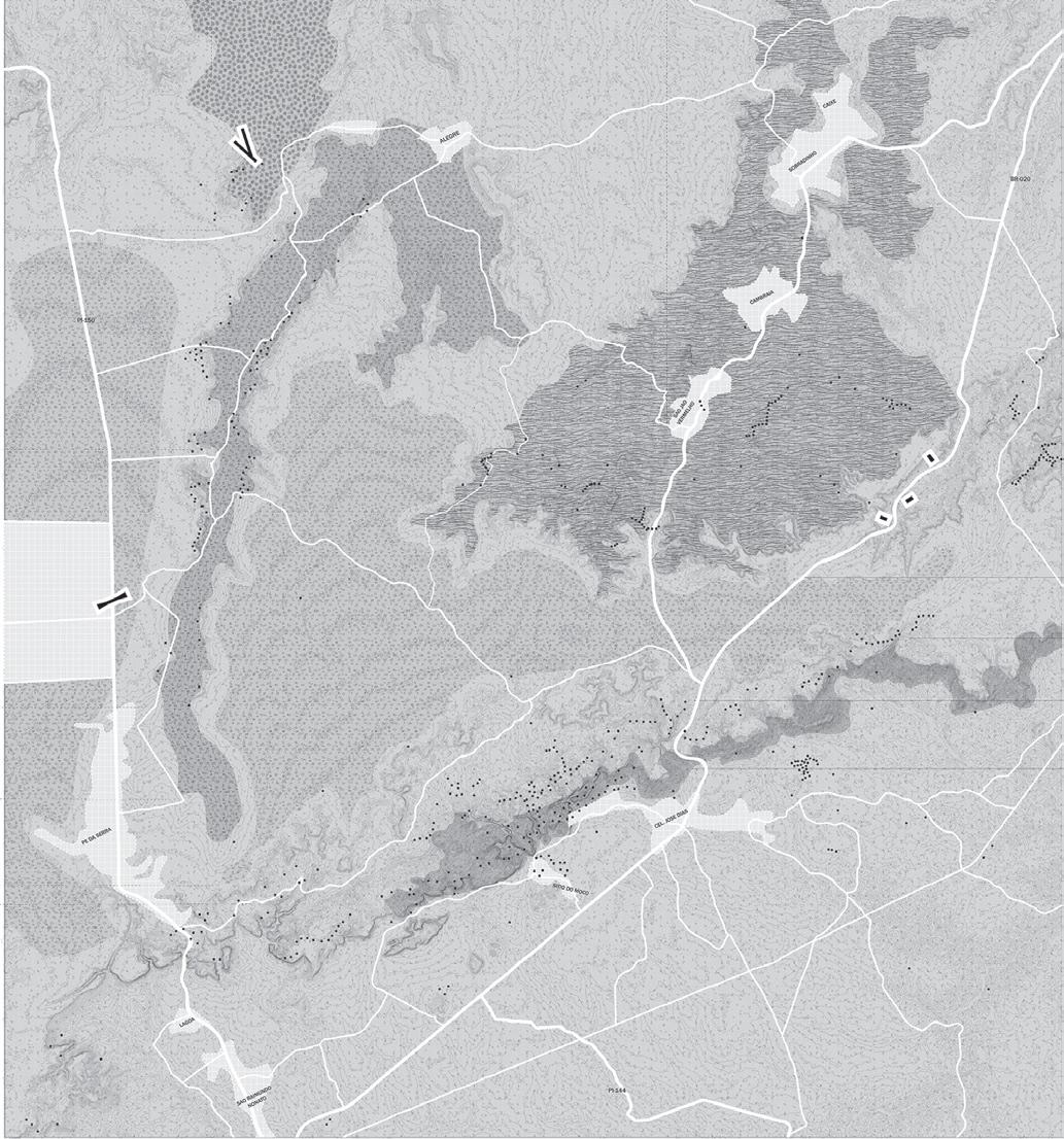

327 03 04
Repositioning of Skyscrapers in NYC
This past century we have seen skyscrapers proliferate throughout cities worldwide. The realities of climate change, the global pandemic, and the drive for renewable energy and their corollary in high-performance, energy efficient electrified buildings have precipitated a massive, unprecedented movement towards the comprehensive repositioning of skyscrapers. Whether necessitated by obsolete and failing mechanical systems and building envelopes, by structures that require remediation and augmentation, or by spaces and environments that are outdated and fail to meet contemporary market expectations, there are now powerful cultural, technical, and economic forces that have catalyzed the need and desire for the radical transformation of existing tall and large-scale buildings. A global design and construction industry has emerged around the world to meet these fascinating opportunities.
SITE
Instructed by Marc Simmons with Teaching Assistant Stewart Haotian Wu
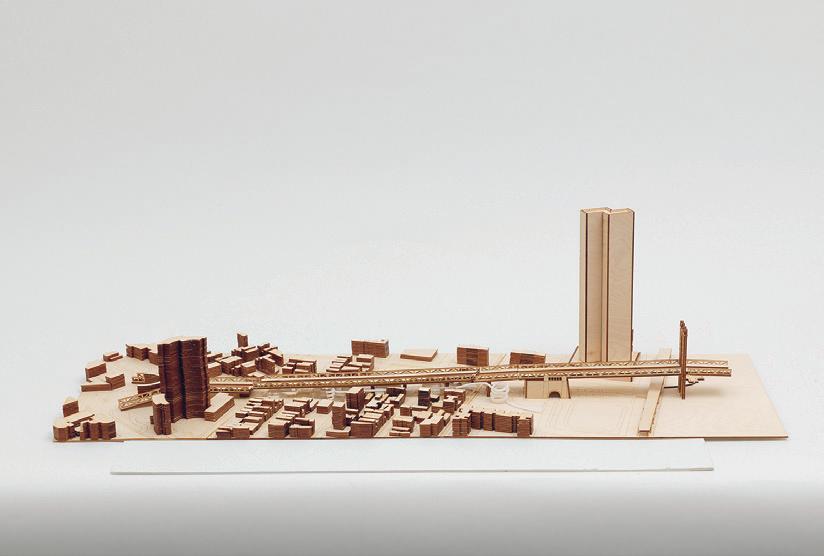
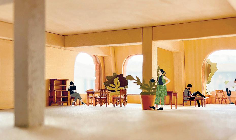
4.154
329 01 02
01:
Interior Model Perspective by Tim Cousin 02: Site Model by Yufei Chen + Jin Gao

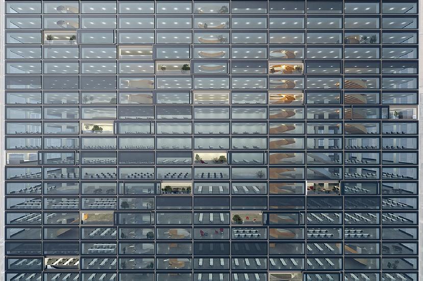
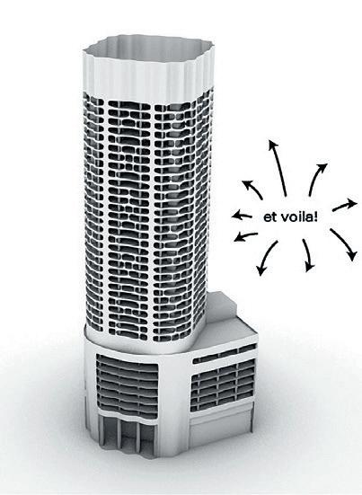
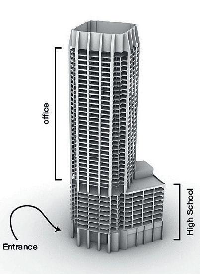
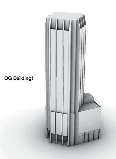
03:
Gao 04: Concept
Dojnow 05: Exterior Render
May 06: Massing Diagram
Wang-Xu 07–08: Model
03 05 04
Model by Yufei Chen + Jin
Image by Alek
by Sam
by MacKinley
by Ellen Reinhard
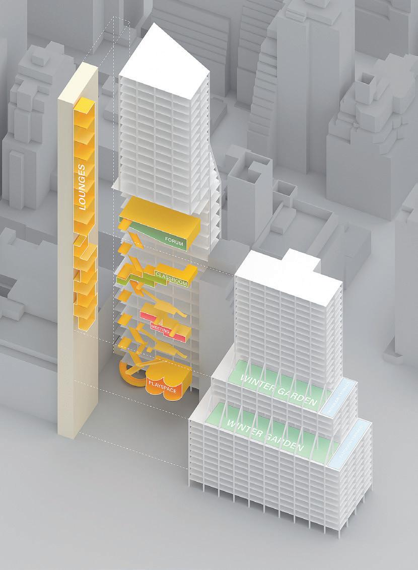
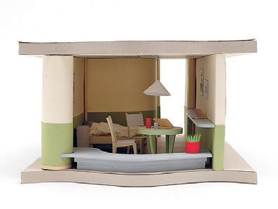
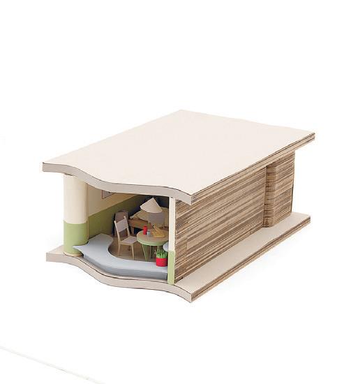
331 07 06 08
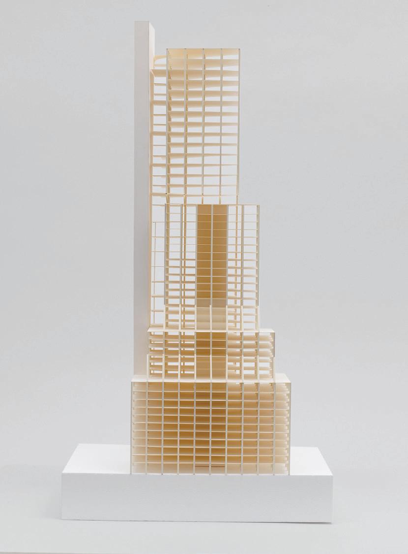
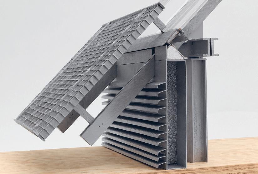 09: Model by MacKinley Wang-Xu
10: Detail Model by MacKinley Wang-Xu
09 10
11–13: Model by Olivier Faber


333 11 12 13
Repositioning The Summit Hotel
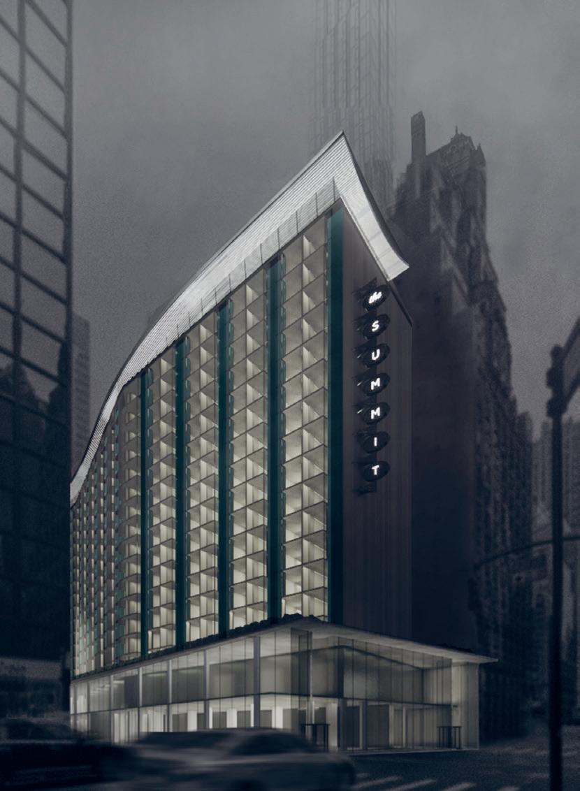 by Yoonjae Oh
Admired for its unusual shape, color and stainless steel sign, the Summit Hotel is an important work designed by Morris Lapidus. In 1959, it was the first hotel built in Manhattan in three decades, and it was the architect’s first project in New York City. The hotel opened in August 1961 and received considerable media attention. Some writers greeted the new hotel with disappointment or amusement, while others saw it as a disharmonious addition to the streetscape.
By repositioning the Summit Hotel, this project focuses on material conservation and appreciation of Morris Lapidus’s design legacy. Instead of neglecting and eradicating the trace of the Morris Lapidus design, this project tries to not only appreciate the existing materials and unique design features but also take into account building constraints such as low ceiling height and dense column grids.
Critic: Marc Simmons TA: Stewart Haotian Wu 01: Main Image 02: Model 03: Floor Plans 01


335 02 03
by Tim Cousin

The project looks at the retrofitting of the mid-century “wedding cake” office building, a typology found in Midtown Manhattan characterized by a high embodied carbon concrete skeleton and a low-performance, stick-build glass curtain wall. The project questions the glass curtain wall in its material and spatial dimensions and offers an alternative facade that produces a different ethos—moving from the corporate abstract paradigm to a domestic, materially expressive and lower embodied carbon alternative. The new facade has a lot of depth and creates many different kinds of inside/outside relationships. The whole massing of the building is manipulated to break the scale of the podiums and create more domestic volumes, while the extensions are in cross-laminated timber. Eventually the repositioning project moves the abstract glassy prism to a domestic, mineral, and porous urban mastaba.
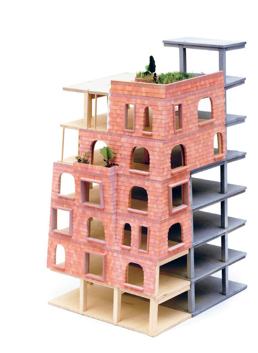
260 Mad. Ave.
02 01
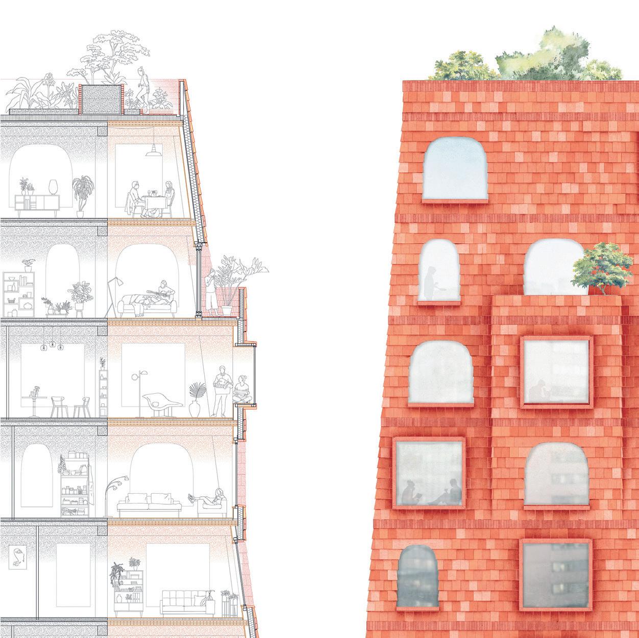
Critic: Marc Simmons TA: Stewart Haotian Wu 01: Massing Model 02: Detail Model 03: Section + Elevation 337 03
Core Studio III + Structures and Envelopes
The Core 3 Design Studio at MIT offers an opportunity to explore and test the development of an architectural design proposal with an integrated understanding of a building’s structural and spatial performance in response to the ongoing climate crisis.
In Fall 2021, Core 3 focused on The Plant, an architectural design proposal for a community owned collective workspace for seaweed processing located in Maine. The seaweed harvesting program, with its specific thermal requirements for cold storage, a seaweed hatchery, and drying spaces engages design in section and through seasonal and tidal cycles, while also raising questions of how an architecture might position itself along the gradient between natural and industrial materials and processes.
SITE
Instructed by Sheila Kennedy, J. Jih, Rami el Samahy, and Caitlin Mueller with Teaching Assistants Daniel Griffin, Emma Jurczynski, Jitske Swagemakers, and Yijiang Huang
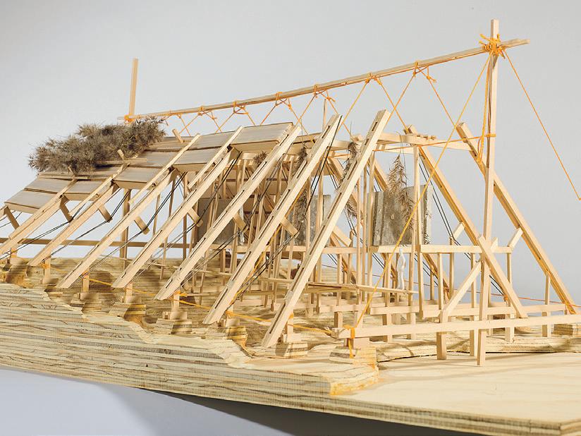
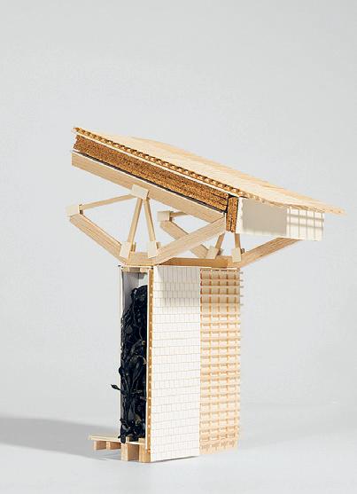
4.153 + 4.463
01:
Model by Caroline Amstutz + David Pankhurst 02:
339 01 02
Model by Christopher Allen + Adriana Giorgis
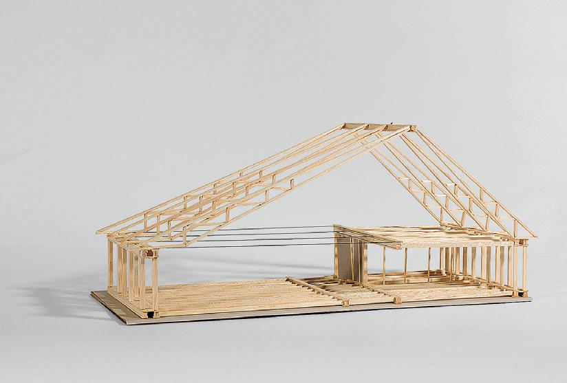
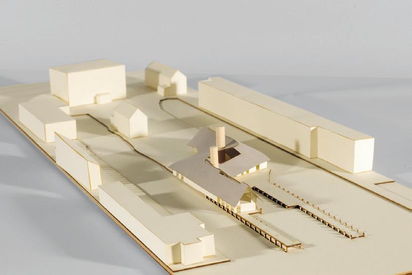

03–04: Model by Christopher Allen + Adriana Giorgis 05: Model by So Jung Lee + Alek Dojnow 06: Site Plan by Caroline Amstutz + David Pankhurst 07: Site Plan by Christopher Allen + Adriana Giorgis 04 05 03
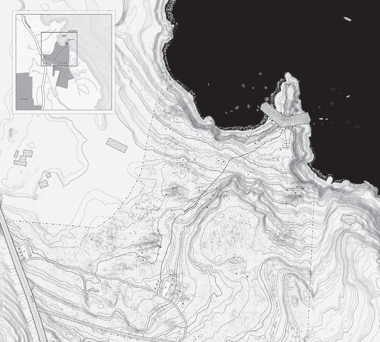

341 06 07

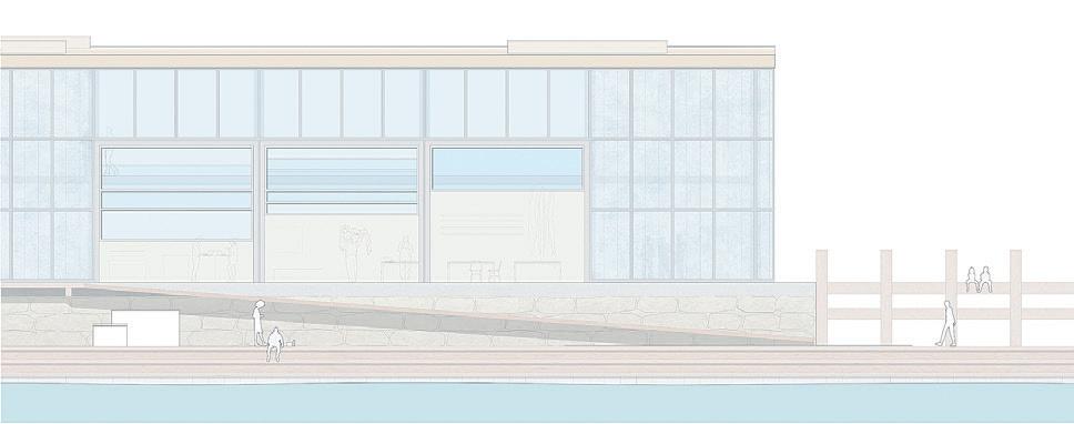
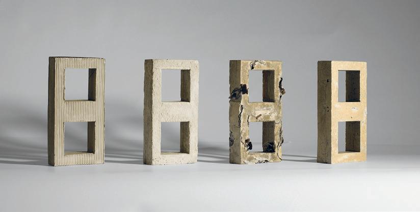
08:
10:
08 09 10
Elevation by Justin Brazier + Ellen Reinhard
09:
Model by Justin Brazier + Ellen Reinhard
Material Test by Sahil Mohan + Katie Rotman
11:
Site Plan by Bella Carmelita Carriker + James Brice

343 11

 12: Site Plan by Susan Williams + Alena Titova
13: Model by Susan Williams + Alena Titova
14: Model by Lauren Gideonse + Calvin Zhong
15: Elevation by Sahil Mohan + Katie Roman
12 13
16: Section by Yiqing Wang + Iris Zeng
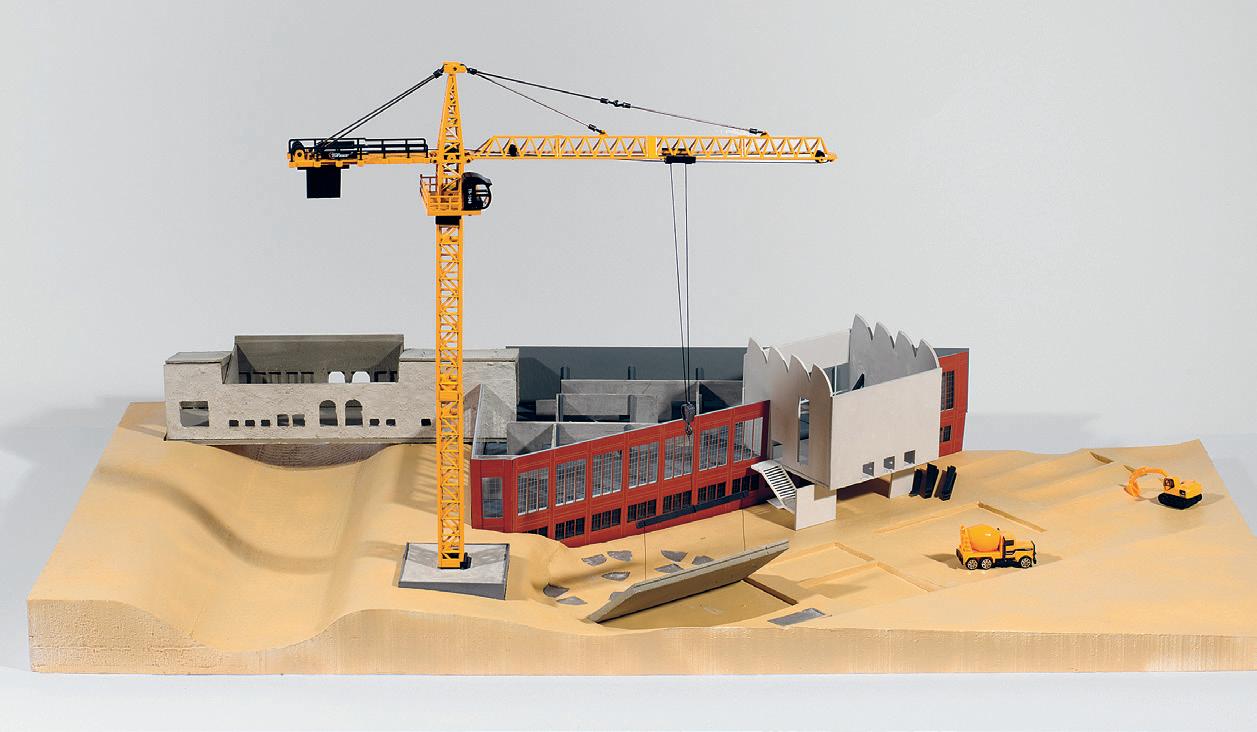

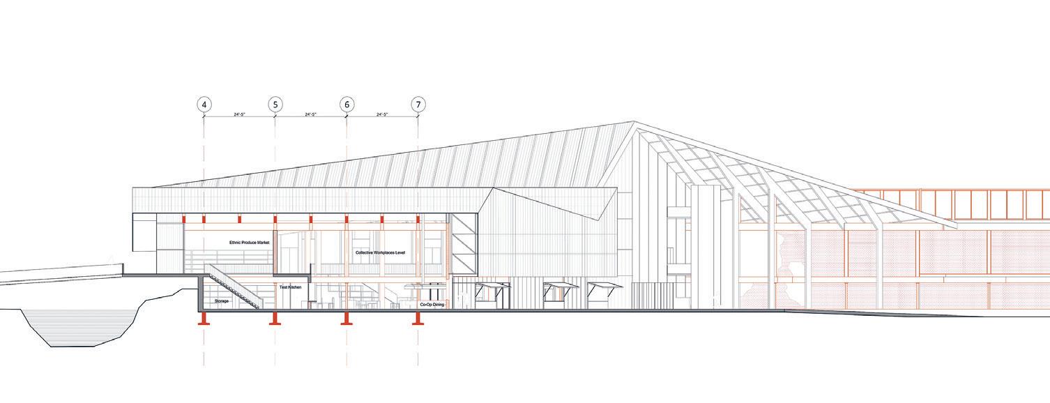
345 16 14 15
Power of Play
A Seaweed Nursery in Portland
by Amanda Ugorji + Mackinley Wang-Xu
Power of Play is a seaweed nursery and co-op that centers around play. It uses play space to encourage feelings of ownership for building occupants—of both the building and their local food systems. In the project, we focused on creating adjacencies of play and work that destabilize the societal standards of how one should relate to their surroundings. We created viewsheds into private spaces, hung seaweed in circulation areas, and made direct connections between spaces of play and spaces of production. Something we learned in the process is the potential for reciprocity between age groups. Children can learn from adults how their food is made, and if given the chance, adults can follow the example children can set when they are invited to play with their food systems.
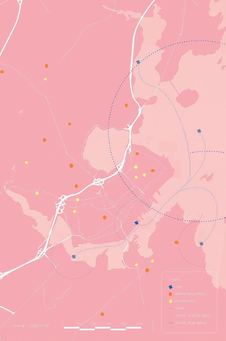 Critics: Sheila Kennedy, J. Jih, Rami el Samahy, and Caitlin Mueller
01: Site Map 02: Model 03: Elevation 04: Section
TAs: Daniel Griffin, Emma Jurczynski, Jitske Swagemakers, and Yijiang Huang
01


347 02 03 04
Soften, Expand, Shift, and Settle
by Inge Donovan + Jenna Schnitzler

Critics: Sheila Kennedy, J. Jih, Rami el Samahy, and Caitlin Mueller
The Portland Harbor is a site of high variability—the artificially constructed shoreline has grown and shifted as prevailing economies fluctuate from fishing to tourism and on-site production operations, like our proposal for a seaweed Plant. The ground shifts with the tides and when the sea level inevitably rises, creating a need for a way of building that can absorb change. To build a more resilient and stable waterfront, this project proposes the use of a crib structure, normally an infrastructural tool used for retaining walls, whose roughness increases the surface area to break strong flows of water and increase ecological stability. The crib, constructed out of reclaimed granite curbs discarded by various infrastructure projects in New England, displaces the existing wharf structure, which is composed of five primary materials: marine timber piles and boards, concrete decking, and steel and rubble infill. These form the material inventory for the building’s structural system. This reclaimed material is absorbed into novel material assemblies. The piles are planed into dowel-laminated timber columns and beams, the boards are refinished into the floor assembly, and the concrete is broken down and used as infill. Old materials then have new lives—to serve communities that change over time.
TAs: Daniel Griffin, Emma Jurczynski, Jitske Swagemakers, and Yijiang Huang
01: Model 02: Material Vignette 03: Elevation
01


349 02 03
Biodiversity and Cities
Biodiversity is declining worldwide, driven foremost by the intensification in land management and the transformation of natural areas for agriculture, production forestry, and settlements. Urban areas have doubled since 1992 and, in comparison with 2020, are projected to expand between 30% and 180% until 2100, depending on the scenario applied. Notably, most of the urban growth is often located in regions of high biodiversity and affects ecosystems far beyond urban areas through resource demands, pollution, and climate impacts. Therefore, biodiversity conservation in urban areas needs to be shaped in a way that supports global conservation efforts. This course introduces the relationships between urban environments and biodiversity, how urban biodiversity influences ecosystem functions, and underlying services that affect human wellbeing and whether urban habitats are hotspots or ecological traps (or neither) for biodiversity. The course will focus on six key topics: socioeconomic and social ecological drivers of urban biodiversity, urban biodiversity response to technological change, relationships with ecosystem services, urban areas as refugia, spatiotemporal scale in urban biodiversity assessment, and ecological networks. The course will answer several questions such as which synergies and trade-offs among biodiversity and ecosystem services exist in urban areas, which factors drive the relationships between socioeconomic and environmental drivers with biodiversity at different spatial scales, and how urbanization-induced changes in ecological network complexity and diversity affect ecosystem functions.
There are gaps in our understanding that are critical to improving biodiversity conservation policies and management in urban areas that need to be filled to improve global biodiversity outcomes. Students will work on developing strategies for improving and managing biodiversity in the Colombian city of Quibdó.
Working with Quibdó as a case study and “client” students will review urban and development plans to understand existing biodiversity policies, design a framework to assess biodiversity management strategies, and develop recommendations to highlight ways forward at the science-policy interface. Throughout the class, students will gain skills to understand how to improve urban habitat mapping; integrate multiple urban gradients in the biodiversity assessment framework; use satellite data and A.I.-based methods to improve our mechanistic understanding of the relationships between biodiversity and ecosystem functions and services; and design approaches to extend the involvement of citizens in biodiversity management in urban areas. The course is meant to provide a solid framework, broad overview, and a rich set of references for future pursuits involving urban biodiversity.
SITE
Instructed by John E. Fernández, Marcela Angel, Norhan Bayomi + Alessandra Fabbri


01: Meeting with the Tutunendo Community Council on a visit to eco-tourism facilities. 02: Workshop at the Pacific Environmental Research Institute (IIAP) with local entrepreneurs. 4.s23 351 01 02
City Within a Jungle Quibdó as a BiodiverCity
The Biodiversity and Cities class worked closely with the Ministry of Environment and Sustainable Development of Colombia, specifically supporting the BiodiverCities Program’s goals for the city of Quibdó. Quibdó was selected as a case study for this class due to its location in one of the most biodiverse and carbon-rich ecosystems in Colombia, the Pacific tropical forest, and its pressing socio-economic conditions that pose significant threats to biodiversity and sustainable urban development. These threats include rapid urban expansion, lack of waste management infrastructure, and unsatisfied basic needs. While these conditions challenge the preservation of the ecosystems around Quibdó, there are several ways to turn these challenges into opportunities to strengthen biodiversity management through urban planning strategies.

Throughout the semester, students developed a research framework and recommendations to promote biodiversity conservation within and beyond urban areas in Quibdó, synthesizing research informed by semi-structured interviews with several stakeholders in Quibdó and Bogotá. The final report summarizes the findings of the class and outlines policy and planning solutions that provide multiple and simulta-
neous co-benefits to the environment, residents, and biodiversity. This report is divided into three sections: introduction and stakeholder analysis, thematic analysis, and conclusions. The four themes for the analysis are: (1) community knowledge and engagement, (2) sustainable development, (3) biodiversity monitoring, and (4) environmental planning. The report also aims to serve as a framework for other medium and small cities participating in the BiodiverCities program to create more equitable and research-driven biodiversity management projects and strategies.
Quibdó has natural wealth and a strong cultural identity tied to biodiversity that form the latent foundation for its identity as a “city within a jungle.” Using this report as a starting point, the co-instructors of the class hope to continue turning the findings into additional research projects with community members that help Quibdó continue to evolve and promote biodiversity management strategies that respond to the community’s needs and that elevate Quibdó on a global stage as a model BiodiverCity.
03


Final Report available at environmentalsolutions.mit.edu/wp-content/uploads/2022/07/ Resumen-ejecutivo-Qiodbo-una-ciudad-en-armonia-con-la-selva.pdf. 03: Map of potential Green Corridors in the Urban Area by McKenzie Humann 04: Engagement with the Environmental Youth Network, Quibdó. Photo by Yujie Wang 05: Client-facing Executive Summary
Fabbri 353 04 05
Instructors: John Fernández + Marcela Angel + Norhan Bayomi + Alessandra
Dwelling and Building
Dwelling and Building: Cities in the Global South examines the contemporary challenges and history of city planning in the Global South on three continents—Africa, Asia, and South America. Students study a number of city plans, from the ‘informal’ settlements of Delhi and Nairobi, the modernist master plans of Brasilia and Baghdad, to climate action plans in various cities. The objective of the course is to understand the relationship between dwelling and building in the design of cities in conjunction with the environmental, social, political, and intellectual environments at the time of their planning.
SITE
Instructed by Huma Gupta with Teaching Assistant Maitha Almazrooei


4.s69 01–02: The Reimagination Project: The Reassimilation of Indonesia’s Constitutive Outsides through the National Plastic Action Partnership by
355 01 02
Sasha McKinlay
Making Traditional Systems of Water Management Visible in the Dense Urbanism of Pune
by Pramada Jagtap
The decline of groundwater is a global concern. According to the American Geophysical Union, drier climates like the US high plains, Ganges basin, and parts of Australia are anticipated to have depleted groundwater by the 2050s. In the specific context of India, the water tables are currently as deep as ten to forty meters below ground level, steadily increasing in depth from south to north. Due to a largescale agrarian shift from subsistence crops to cash crops, the extraction of groundwater in drier parts of India has increased manifold since the twentieth century.
This project narrates the stories of vulnerable communities impacted by groundwater extraction in the Pune district, Western India. It maps the geomorphology of the upper Bhima basin, within which lies Pune, to highlight natural factors impacting groundwater recharge in the basin. It then maps out the influence of man-made water management techniques such as large scale “formal” infrastructure of the twentieth century and

the traditional systems of the eighteenth century on the groundwater table. The Peshwas of the Maratha empire dominated a large portion of the Indian subcontinent from 1674 to 1818. During this time, they constructed numerous small scale water systems such as canals, stepwells, and temple tanks, with close attention to community and the geomorphology of the context. The story-maps project studies in detail the effect of
growing material boundaries of Pune on three specific instances—a temple tank, a stepwell, and a natural spring (one of 32 that still exist in the city). While the project also maps during the Peshwa era the caste and class segregation that resulted in unequal rights to water, it argues for a revival and restoration of decentralized modes of water management that currently lie in a state of decay and despair.
Critic: Huma Gupta TA: Maitha Almazrooei 01: Drawing depicting scales of water infrastructure within one square mile of an urban region.
01
Contradictions of the Bagmati River
by Shubhekshya
Bhandari
01: The constant urban negotiations surrounding the Bagmati river. What was once a host for gatherings and community is now a urban alley occupied by urban waste and the urban poor. Objects rendered in color represent echoes of morning temple bells and prayers followed by waves of flower petals, offered to various Hindu gods juxtaposed with the gray, symbolizing the decades of neglect that has degraded the holy river into a state of irreversible contamination.
The origin myth of Kathmandu is linked to the cultures and ecologies of the Bagmati river. Multiple realities, which sometimes exist in contradictions, manifest along this riverine landscape. The river and its parallel territories are diverse sites which are crucial to understanding the instabilities and vulnerabilities of Kathmandu’s current social and ecological frameworks. This story is about the transformation and contentions of the Bagmati River as the areas around it transform from sites of holiness to sites of impurity. As the river continues to degrade from rapid urbanization, cultural practices surrounding religious rituals along with agrarian livelihoods of rural migrants to Kathmandu are simultaneously being lost. I argue that there is a cultural disconnect that is occurring due to the transformation of what was once considered the source of life into an ecological alleyway.

357 01
H22 Design and Digitally Fabricated Community
Instructed by Larry Sass with Teaching Assistants Myles Sampson + Emily-Yanjun Liu
Seif Eses, Nina Huttemann, Stephanie Li, Erica C. Liu, Nicole A. Teichner, and Isabel M. Waitz designed three small shelters that intend to evoke childhood feelings of curiosity and excitement through physical engagement. The shelters were designed to be part of the H22 festival in Helsingborg, Sweden during summer 2022, sponsored by IKEA. Each shelter encourages the user to notice and reflect on their surroundings in the forest by engaging the body, the eye, and the mind. The shelters were fabricated from thick interlocking plywood components assembled with clamps, mallets, and crowbars. No power tools were used to assemble the shelters on site. This page chronicles the project’s development from conception to final assembly in Helsingborg. Most importantly, each shelter was designed, prototyped and assembled by two students as part of a twosemester research course.
SITE


4.s50 01–02: Students assembling shelters.
359 01 02
Critic: Larry Sass TA: Myles Sampson + Emily-Yanjun Liu


03: Students assembling shelters. 04: Nina Huttenmann assembling a shelter. 05: Shelter 1, Reflection space with lighting from above, designed by Nicole Teichner + Stephanie Li. 06: Shelter 2, Observing + engaging in the forest by view scope and mirrors, by Nina Huttenmann + Isabel Waitz. 07: Shelter 3, Embedding in the forest, by Seif Eses + Erica Liu. 04 03


361 05 06 07
A Conversation with Larry Sass on Fabrication, Design Pedagogy, and a Nerve-Racking Encounter with Plywood Supply Chains
Student Assembly
How would you describe your role over the past year?
Larry Sass: I would say I have three positions. One is at the university level, or the Institute level, which is being the head of one of the dormitories. The second one is in the School of Architecture + Planning where I’m head of the Faculty Diversity Committee. There I get to see the School as a whole. My role in the Department is one of being a typical professor. In general, I play more of an Institute role, more so than I do in the Department.
You taught a course01 where you built plywood shelters for the Helsingborg 2022 Festival in Sweden. Could you tell us more about that experience?
LS: It was a bizarre project. They had four schools that they asked to build these pavilions for this festival called H22, future ideas for Sweden. In many ways, I see it as more of a marketing opportunity for IKEA. But it was still supposed to be new ideas. They don’t mind trying to do something with fabrication. Little did I know, they had never seen fabrication like these techniques before, because it was the corporate-level people that we dealt with. They really had only heard of 3D printing but had never seen 3D printing.
They asked us to design pavilion shelters that the students could sleep in and co-mingle. It was supposed to happen in the woods. They were supposed to experience them in the forest. And over time, I’m not sure what happened, but it ended up getting moved to the waterfront. Then it ended up moving from four shelters to three, and then the sleeping components went away. By the time the sleeping component went away, they had already designed the shelter and figured out what they should do. And we had already figured out its size. We had to re-design it many times over.
But the hardest part of the project was coming up with the ideas for what the shelter should be. That was fun, but it was also socially difficult. Number one, I think the students were afraid to express themselves individually. I think when they started trying to work as a group and to figure out what the four shelters should be as a group, I think they were really worried about hurting
Larry Sass is an Associate Professor at the MIT Department of Architecture. Since 2002, he has taught courses in digital fabrication and design computing. His research focuses on digital delivery of housing for low-income families.
each other’s feelings. I’m really not sure why. I think they were really nice to each other. It was two students working on each one of the four shelters. Then it narrowed down to six students designing three shelters and two students doing support work.
Did this happen all over the Spring, or was it Fall and Spring?
LS: It was Fall and Spring. Actually, they could have designed the entire project, prototyped it, and built it in one semester. The problem was more of the emotional part of getting them to decide what the shelter should be. That took the entire semester.
Because you think there weren’t enough opinions and everyone was being quite cautious?
LS: I realized that would have been the difference between an M.Arch class and an undergraduate class. In an M.Arch class, they would have been grand and bold in their presentation of ideas. I think it would have been less cautious because you’re older. People already have had many years of ideas, whereas the undergraduates only have one year of real design experience. Most of my classes I’m dealing with undergraduates who have never taken a design course—I’ve simplified the design part in order to get through my classes. There are three things that you have to focus on: an experience, which has to be physical; a function, which has to involve the body; and a form, which has to bring together the experience and the function.
All my classes have three exercises for those three things. It’s in stark contrast to modernist ideas of design. The modernists liked the purity of space and the purity of form, and they weren’t concerned about the experience. The experience was something that happened as a result of making good form that was somewhat functional. But they hated the idea of experience as part of design. I include it because it is part of today’s design. There are companies that just do experience design, without the form or the function.
What were the logistics like?
LS: It was an extremely painful experience. April was when we realized what the design shape was going to be. We had to get approval from the city for that, because the maximum height was supposed to be three meters. We had to make sure everything worked on paper. And then we made these 3D prints at that time. I had to make puzzle piece parts out of everything, and I knew they weren’t going to check them—engineering-wise, I knew it. I have software that I’ve worked on now for about seven years with another professor from Singapore, which makes puzzle piece parts out of 3D models, but it can only make puzzle pieces out of models that are maybe a meter high.
Anything that’s over a meter, you have to draw all the puzzles. But I have a system of 12 steps. Each one of them—in any CAD program, like Rhino or AutoCAD—goes through the exact same 12 steps. Because you’re modeling it, the problem is you have to physically make a prototype model out of it to check for all of the parts that are either overlapping, not connecting, or have
01: See p. 358, “H22 Design and Digitally Fabricated Community” 363
geometry relationships that you just don’t expect. You can’t see all of those relationships on the screen. You have to physically put it together.
Here’s where the problem came in. IKEA has a factory in Poland. And Poland had problems with getting plywood from Ukraine. They were able to get most of the plywood. And we asked them to paint the plywood before they cut it. By the time they got back to us with a prototype—a corner that I just asked them to make—we were already a month away from the opening of the festival. I couldn’t do the puzzle piece parts for all of them until I got a prototype back. In a month, I made puzzle piece parts out of the three by myself. This was the month of May, so we still had stuff going on here and that was a nightmare. I think I actually sent them the last set of files a week before we were going to arrive.
And lo and behold, they cut everything for when we arrived. Almost all of the things were there once we arrived. All the parts were shipped. I literally stayed awake and got six hours of sleep for a month doing the puzzle piece parts because they waited so long. I think it’s because they just didn’t understand what I was asking them to do. I think they were so used to making furniture where you have one CNC file and you make a thousand of them. I think they didn’t understood that every single plywood board was going to be different—and there were a total of about 300 boards.
Unfortunately, the setbacks—which I saw as normal—were not things the students were prepared for. Fortunately, all the parts arrived, and we put them all together. We started putting parts together from the time we got off the plane at two o’clock on a Tuesday afternoon. We put parts together all the way up until 10PM the night before our flight, and then we got on our flight at 6AM. After a while, you’re going to sleep with banging in your head.
This interview has been edited for length and clarity.


Images from 4.501/4.511 Tiny Fab: Advancements in Rapid Design and Fabrication of Small Homes taught by Larry Sass. 01: Azania Umoja + Minyoung Kim prepare for bridge test. 02: Azania Umoja, Brenda Hernandez, Minyoung Kim + Alicia Delgado-Alcaraz 03: Mara Diavolova, Evan Ortiz + Charlie Janson 365 01 02 03
Undergraduate Work
4.023 Arch Design Studio I, Instructed by Miho Mazereeuw and Cherie Abbanat with Teaching Assistants
Jonathon Brearley and Nare Filiposyan
Provides instruction in architectural design and project development within design constraints including architectural program and site. Students engage the design process through various two-dimensional and three-dimensional media. Working directly with representational and model making techniques, students gain experience in the conceptual, formal, spatial, and material aspects of architecture. Instruction and practice in oral and written communication provided.
4.025 Arch Design Studio III, Instructed by Cristina Parreño Alonso with Teaching Assistant Carolyn Tam
Provides instruction in more advanced architectural design projects. Students develop integrated design skills as they negotiate the complex issues of program, site, and form in a specific cultural context. Focuses on how architectural concepts and ideas translate into built environments that transform the public sphere. This studio prepares students for graduate studies in the field.
SITE


4.023
Critic: Cristina Parreño Alonso
367 02 01
TA: Carolyn Tam
01:
Model by Seif Eses
02:
Model by Nicole Teichner


03: Interior Render by Isabel Waitz 04: Exterior Render by Isabel Waitz 05: Interior Render by Simon Ganeles 06: Painting by Michael Tan 07: Model by Michael Tan 08: Exterior Render by Michael Tan 09: Site Plan by Eva Knaggs Critics: Miho Mazereeuw and Cherie Abbanat TAs: Jonathon Brearley and Nare Filiposyan 03 04 05


369 06 07 08 09


01: Interior render
Liu 02: Section
Nina Hutterman 03: Floor
Stephanie Li 04: Model
Teichner 05: Model
Eses Critic:
TA:
01 03 02
by Erica
by
plan by
by Nicole
by Seif
Cristina Parreño Alonso
Carolyn Tam


371 04 05
Rebuilding the Edge
Rebuilding the Edge was a summer workshop offered by the MIT Department of Architecture for MIT students that took place in June 2022 in the Italian region of Abruzzo. Through an on-site experience, the workshop invited students to think about the future of Italian inner and southern areas, as well as the relationship between regional infrastructure projects and small communities affected by them.
Rebuilding the Edge is the result of a partnership between Liminal A.P.S., MIT’s Urban Risk Lab and Digital Structures research group, MIT-Italy Program, and Fondazione Ferrovie dello Stato Italiane—the foundation of the Italian state railway system. The workshop focused on the issues faced by small municipalities along the Sulmona-Carpinone rail line, where a public-private partnership is beginning to revive rail activity after decades of disinvestment. For two-and-a-half weeks, students had the opportunity to experience the territory traversed by the rail line, working out of a pop-up research outpost within the recently renovated station at Roccaraso.
Rebuilding the Edge allowed students to engage the particular circumstances along one rail line in the Italian Apennines. Students took away from the experience larger lessons about methodologies of design research and the degrees to which design can play a role in addressing issues of social consequence.
SITE
Instructed by Miho Mazereeuw, Caitlin Mueller, Ginevra D’Agostino, Nicolás Delgado Alcega, Carmelo Ignaccolo + Chiara Romano Bosch

4.s44
373 01
01: Map by Ginevra D’Agostino, Liminal


02: Group presentation at Roccaraso Station pop-up lab. 03: Students working at the Roccaraso Station pop-up lab. 04: Group share from the tracks of the Roccaraso station pop-up lab. 02 03 04


05: Liminal Co-Founders 06: Pettorano sul Gizio 07: Meeting with Pettorano sul Gizio Mayor at Castello Cantelmo 375 05 06 07

08: Train track bridge in the valley of Pettorano sul Gizio, where students lived. 09: Angela Loescher-Montal, Tritsan Searight, So Jung Lee 10: Mapping the Stations by John Devine, Tejumola Bayowa + Natasha Stamler 08


377 10 09
Instructors and Students Look Back at the “Rebuilding the Edge” Summer Workshop in Abruzzo, Italy
Rail Revival
Ginevra, can you give a very brief overview of the summer workshop?
Ginevra D’Agostino: The summer workshop focused on a railway—originally called the Transiberiana d’Abruzzo and now known as Ferrovia dei Parchi, which means Railways of the Parks. Students got together to look at the phenomenon of depopulation, most commonly found in inner and southern areas of Italy, and work with different communities from the towns situated along a historic rail line that transverses the regions of Abruzzo and Molise. In the first week of the workshop, the focus was on getting to understand the territory by meeting with a variety of stakeholders and visiting the archives of the Fondazione Ferrovie dello Stato Italiane. During the second week, we focused on understanding and starting to give shape to proposals based on a clear understanding of what were the challenges and opportunities faced by each community. We utilized the station in the town of Roccaraso as a pop-up co-working space. I would like to point out that it was actually through that fieldwork and the repeated visits to farmers, migrant integration centers, trail hikes, etc. that students were able to understand the main opportunities and challenges. Students documented them, and in some cases started to make preliminary proposals of what the future for this territory could look like.
Could you talk about the origins of “Rebuilding the Edge”? I know it came from your M. Arch thesis.
GD: While I was at MIT, Carmelo Ignaccolo, Nicolás Delgado Alcega,01 and I were looking at rural depopulation in Italy, working on different aspects of the phenomenon. While I was in my second year, I took the class “Self Work,” and in that class, I was trying to understand exactly what my place was within this really broad set of complex issues that go beyond the architectural realm. Ultimately Carmelo, Nicolas, and I founded a nonprofit called Liminal to bring together people from different backgrounds and different perspectives to address the challenges that come from the exodus of small and medium-sized municipalities. In the context of the thesis semester, I realized that working only in one town wouldn’t effectively address the phenomenon. During my thesis, I was aiming to elaborate on how a network of towns connected through infrastructure such as the railway could potentially foster a future of cross-collaboration and common socioeconomic growth. That is
Ginevra D’Agostino is the co-founder of Liminal, “a research, design, and consultancy group that uses a multi-disciplinary approach to tackle the challenges that lie ahead for the Italian countryside in the coming century.” She graduated from MIT’s M.Arch program in 2022.
Caitlin Mueller is an Assistant Professor in MIT Architecture’s Building Technology Program. She leads the Digital Structures research group and co-directs the Structural Design Lab.
John Devine is a Master of City Planning candidate in the MIT Department of Urban Studies and Planning.
Amanda Ugorji is a M. Arch candidate in MIT Architecture and co-founder of just practice.
Natasha Stamler graduated from MIT in 2022 with a Bachelor’s degree in both Mechanical Engineering and Urban Studies and Planning.
where the railway infrastructure came in and where I started developing the different tools that would allow me to understand this issue at different scales—from the national, to a regional, then to a more local scale. Caitlin was a reader of my thesis, very present in the process of understanding the role of infrastructure in this region.
Caitlin Mueller: The area that I work in is structural engineering. On paper, I’m in some sense far away from some of the themes of Ginevra’s work. But on the other hand, I’m personally really interested in interdisciplinarity and system-level design. I think both of those are really key themes in Ginevra’s work that I found really interesting, inspiring, and connected with some of the ideas that I’m also thinking about in my own work related to infrastructure. I think we’re going to see in the coming decades a necessary revolution of infrastructure globally—transportation infrastructure, energy infrastructure, internet access infrastructure. And a lot of that is digital, obviously. But there’s also a huge physical component, and that means it will be part of our rural and urban landscapes. The human experience of space and design has a huge impact on that. So historically, infrastructure has played various roles, some positive, some negative in communities. I think design has a huge role to play in this. So I’m really interested in how people who are interested in design from different perspectives—from architecture, from the urban scale, from engineering—can collaborate to promote high-quality design solutions for the future of infrastructure. And I think this workshop is a really exciting example of how to do that on the ground.
To the students, could you each share some reflections the workshop? Describe what your most valuable experience was.
Amanda Ugorji: Probably the best part of the workshop was spending enough time in Abruzzo around people who live there to recognize a difference in value and lifestyle. I think about how I feel about that as related to the American context and what I want to bring back to the U.S. Academically, this workshop was a really good example of how to start a project with the mindset of longevity. Occasionally, a professor is doing a multiple-year studio or something like that, but a lot of the time it’s meant for students to get certain skills. There is a theme, which is basically the medium to learn the skills, and then it ends where you want it to end. This was nice because Liminal is taking it forward and using a lot of the information. I know they applied to some grants. You could tell in the structure of the studio, in the way that we were engaging with people, that there was a sense of accountability and a focus on longevity that I really appreciate.
John Devine: I think one of the biggest takeaways was definitely the planning perspectives, seeing how Italy just has a completely different value system for how they make infrastructure planning investments. At least for me, it was such a shocking contrast to the American context. Completely different things are prioritized in terms of how they assess the value and impact of projects. It could not be more different from the American system of what’s your return on investment in pure dollar-and-cents terms. And I think just getting to spend a full month immersing myself in a very different approach to things is definitely a big thing I’ll take back to the work I do in the States.
01: Ignaccolo is a PhD candidate at MIT DUSP and Delgado Alcega is a recent M. Arch II graduate from Harvard GSD. 379
And along with that, I appreciated getting to work alongside a lot of architects and engineers for a month. It was really neat to see all these sites from a couple of different disciplinary lenses—just a very cool way to experience a new place.
Natasha Stamler: Yeah, I definitely agree with that. I think it was also just simply the value of going to these places and talking to the people. Sometimes it is easy to look at a screen and say you can quantify this and determine the potential value. But there’s so much information that you get just by talking to someone there. It’s partially because we’re coming from an American context and not as familiar with the place, but just talking with people and seeing what they value and how things can work—it’s a completely different mindset.
GD: I think the fieldwork component was probably the most important part of the workshop. And what Natasha was saying resonates a lot, because through my thesis, and in general during my time at MIT—which has been great and brought a lot of opportunities—I always felt a little bit of frustration looking at issues from afar. Actually getting on the ground and looking closely at a site is an effective way to understand and test your research and assumptions. Through fieldwork, we can record the nuances that don’t come across when we’re just looking at issues very far away and from a very distant perspective.
I might be from Italy, but I’m not from those communities. And so even though you might assume that I would be more entitled to an answer because I’m Italian, actually there’s a variety of aspects that I might not be paying attention to. Growing up in a city, the perspective I have might not be the same as that of people that lived most of their life in a town. It was interesting to see that local stakeholders appreciated the perspective of the students and the ability to see the territory through their eyes. There was an exchange. And I think this feedback loop between the local community and outsiders is very productive for both and has the potential to advance everyone’s mission as well as bring clarity as to why we are working here as opposed to somewhere else.
Now that you’ve gone through the workshop, how optimistic are you about an intervention like this and its ability to change circumstances or “rebuild the edge”? This isn’t a question about the workshop per se, but about architecture and design’s ability to enact change in the world.
CM: I think we have to try. It’s really hard. The students saw much more than I did. There are so many challenges and there are so many barriers. People have tried things before that haven’t worked. But I think the energy of everyone coming together is really inspiring. If nobody tries, we’ll definitely not get anywhere. And I think the energy was really, really positive and productive here. And I think I am personally a very optimistic person by nature. I found this workshop really buoyed some of my enthusiasm for the future of humanity. I don’t know what everybody else thought. I think it’s very hard but we have to try.
AU: Because of the focus on longevity, each of the six teams were working on something that could easily be carried forward. A lot of the interventions weren’t purely architectural. Only one team had that kind of focus. But I think the opposite of Caitlin. I think the actual interventions are not hard interventions—they’re actually very easy and straightforward things. It’s more the implementation that is hard. Our part, the designing part, is actually not that hard. It’s how to get it done.
NS: One of the tangible things that gives me a lot of optimism is that they’re still actively maintaining these trains, which was surprising coming from the American perspective. Just talking with people in the towns and also from MIT, there is a lot of momentum and excitement. Each of these towns had some kind of advocate or local leader really pushing for these things: applying for and getting funding, engaging other people. We were there really to facilitate ideas that they already had and to provide an additional perspective. They have a lot of good momentum and it was exciting being there, hearing from them, and trying to help them as much as we could.
JD: For me, it really reignited my passion for planning and design. Seeing Ginevra, Nicolas, and Carmelo starting to set up Liminal, I think it was a really inspiring example. To see people addressing a problem in their home country and using all these opportunities and resources at a place like MIT to start addressing them in a creative way was very cool to see.
I do have to hear about these techno parties.
AU: The town that we were staying in called Pettorano sul Gizio had a Friday night techno party at the bar/cafe—the place you go for breakfast, coffee, and probably lunch if you want to. It was the bar in the single plaza in the town. We’re talking about depopulation, so there’s some young people but mostly older people. Usually, you only see one or two people at a time together. And then Friday, all the young people in Sulmona apparently drive up this winding, one-lane road that can only fit really small Italian cars. They fill the plaza and they play really loud techno until 2AM. It was lit.
This interview has been edited for length and clarity.
381


01–04: Graduation Events 03 02 01

383 04

05: 2022 M.Arch Graduates 06: Carol-Anne Rodrigues accepting her diploma. 05

385 06
Acknowledgments
This issue of Imprint would not have been possible without the support of so many. Thank you to Nicholas de Monchaux for your valuable advice and trust throughout this whole process. Thank you Aidan Flynn for your edits, generous words of encouragement, and always quick replies to our queries. Thank you Amanda Moore for your crucial insight on the Department. Thank you Miko McGinty for all of your guidance, endless knowledge, and for inviting us to New York. Thank you to all the interviewees who shared their work and opinions with us: Chucho (Jesús) Ocampo Aguilar, Jen O’Brien, Brandon Clifford, Ginevra D’Agostino, John Devine, Chris Dewart, Axel Kilian, Ana Miljački, Caitlin Mueller, Larry Sass, Natasha Stamler, Aarti Sunder, and Amanda Ugorji. Thank you to Andy Ryan for taking many of the wonderful model photographs present in this book.
Thank you to everyone who participated in the making of this book. Thank you to previous editors of Imprint for establishing the groundwork and to all the members of the 2022 spring course, “Curating the Page: Building Media for Ourselves & Others,” taught by Nicholas de Monchaux, Aidan Flynn, and Miko McGinty. Students proposed myriad ideas, many of which—in some form or another—made their way into this book, and for that we are thankful.
Lastly, thank you to everyone who contributed work and put up with our endless emails, texts, and reminders. This publication is entirely dependent on your research, making, and writing. Thank you for sharing it with us and others.
Spring Course Participants
Tejumola Bayowa
Ai Bui
Mara Diavolova
Nina Huttemann
Jay Maddox
Romy Saint Hilaire
Ina Wu
Guest Speaker
Christy Anderson
Editorial Team
Tejumola Bayowa
Patricia Dueñas Gerritsen
Jay Maddox
RA TA
Emily Wissemann
Patricia Dueñas Gerritsen
Administration
Eleni Aktypi
José Luis Argüello
Kateri Bertin
Kathaleen Brearley
Jackie Dufault
Marissa Friedman
Gina Halabi
Tessa Haynes
Doug Le Vie
Inala Locke
Tonya Miller
Amanda Moore
Alan Reyes
Archiving Team
Tatiana Estrina
Aidan Flynn
Matthew Harrington
Muhammad Hasan Nisar
Amanda Moore
Nanase Shirokawa
Jie Wu
Communications Team
Bella Carmelita Carriker
Mingjia Chen
Joel Cunningham
Tatiana Estrina
Aidan Flynn
Angela Loescher-Montal
Amanda Moore
Angie Door
Carol-Anne Rodrigues
Nanase Shirokawa
Deborah Tsogbe
Ellen Wood
Daisy Ziyan Zhang
Teaching Assistants Archiving Support
Maryam Aljomairi
Latifa Alkhayat
Maitha Almazrooei
Taylor Boes
Jonathon Brearley
Dimitrios Chatzinikolis
Tim Cousin
Gabriela Degetau Zanders
Samuel Dubois
Olivier Faber
Demi Fang
Nare Filiposyan
Louna Bou Ghanem
Lauren Gideonse
Adriana Giorgis
Ganit Goldstein
Daniel Griffin
James Heard
Yijiang Huang
Mohamed Ismail
Emma Jurczynski
Eliyahu Keller
Il Hwan Kim
Jayson Kim
Katherine Koskey
Thaddeus Lee
Emily-Yanjun Liu
Xuan Luo
Kevin Malca Vargas
Natalie Pearl
Myles Sampson
Rohit Sanatani
Luca Smith-Senise
Gil Sunshine
Jitske Swagemakers
Carolyn Tam
Lavender Tessmer
Han Tu
Mona VijayKumar
Cloe Yun Wang
Stewart Haotian Wu
Yaara Yacoby
Volume 02 Imprint 03
Faculty + Staff
2021–2022
Department Head
Nicholas de Monchaux
Architecture and Urbanism
Cherie Abbanat
Marcela Angel
Norhan Bayomi
Sanford Biggers
Jeremy Bilotti
Angelo Bucci
Garnette Cadogan
Mario Caro
Yung Ho Chang
Brandon Clifford
Dariel Cobb
Marcelo Coelho
Yolande Daniels
Christopher Dewart
Aidan Flynn
Anda French Benjamin Fry
Deborah Garcia
Anton García-Abril
Rania Ghosn
Reinhard Goethert
Mark Goulthorpe
Jessica Helfand
Silvia Illia-Sheldahl
J. Jih
Rania Kaadan
Sheila Kennedy
Axel Kilian
Art Culture and Technology
Azra Akšamija
Lara Baladi
Judith Barry
Mario Caro
Lisa Crafts
Georgie Friedman
Renée Green
Jeffrey Landman
Benjamin Markham
Miho Mazereeuw
Miko McGinty
Ana Miljački
Kiel Moe
Mohamad Nahleh
William O’Brien, Jr.
Mary Ann Ocampo
Cristina Parreño Alonso
Paul Pettigrew
Tobias Putrih
Brent Ryan
Roi Salgueiro Barrio
Carlos Sandoval Olascoaga
Adèle Santos
Hashim Sarkis
Susanne Schindler
Andrew Scott
Rafi Segal
Lisbeth Shepherd
Marc Simmons
Anne Winston Spirn
Oana Stanescu
Skylar Tibbits
Lawrence Vale
Sarah Williams
Cagri Zaman
Marisa Morån Jahn
Jesal Kapadia
Tobias Putrih
Nida Sinnokrot
Rasa Smite
Raitis Smits
Gediminas Urbonas
Staff
Darren Bennett
Kateri Bertin
Suela Caushi
This publication and the community it seeks to both represent and build is indebted to the faculty and staff that make up MIT Architecture. Thank you for making the transition back to in-person as smooth as it was. Thank you for being there alongside us through all the uncertainty. Thank you for your continuous support and for all of the hard work that we don’t see. It is greatly appreciated.
Building Technology
John E. Fernández
Leon Glicksman
Benjamin Markham
Caitlin Mueller
Les Norford
John Ochsendorf
Christoph Reinhart
Computation
Terry Knight
Takehiko Nagakura
Lawrence Sass
George Stiny
Skylar Tibbits
History Theory and Criticism
Arindam Dutta
Huma Gupta
Timothy Hyde
Mark Jarzombek
Caroline A. Jones
Marilyn Levine
Nasser Rabbat
Kristel Smentek
Fabrication
Jennifer O’Brien
Christopher B Dewart
Shah Paul
Taylor Boes
Jackie Dufault
Eduardo Gonzalez
Gina Halabi
Jim Harrington
Matthew Harrington
Tessa Haynes
Oliver Herman
Douglas Le Vie
Tonya Miller
Amanda Moore
Andreea O’Connell
Gerard Patawaran
Alan Reyes
Lauren Schuller
John Steiner
Thera Webb
Architecture and Urbanism
Eleni Aktypi
Christopher Jenkins
Art Culture and Technology
Marion Cunningham
Marissa Friedman
Mikaela Joyce
Kevin McLellan
Nina Palisano
John Steiner
Thera Webb
Graham Yeager
Building Technology
Stacy Clemons
Jennifer Roesch
Computation
Inala Locke
History Theory and Criticism
José Luis Argüello
Kathaleen Brearley
389
2021–2022
MIT Architecture
03: Stuff is a collection of objects: material research, architectural models, furniture, speakers, clothing, large-scale installations, tectonic assemblies, and robots. This chapter emphasizes that the stuff that comes from making is a part of architectural production, even though it is often deliberately not architecture.
MIT Architecture
04: Space highlights physical encounter. This chapter contains moments of working, talking, making, and playing, through a selection of student groups and campus spaces. Happy hour posters, sound waves, janitorial work, black space, queer space, collaborative architecture, and other-than-human worlds are brought together in an effort to represent MIT Architecture.
05: Site brings attention to our relationships with the places we travel to and speculate on. These relationships are both necessary conditions of architecture/planning and ones fraught with frictions and difficult questions, whether in Boston or across the globe. This chapter emphasizes cross-disciplinary collaborations with the Department of Urban Studies and Planning (DUSP) through joint studio courses and workshops.


 Advisors: Skylar Tibbits + David S. Kong


 Advisor: Timothy Hyde


 Advisor: Brandon Clifford Readers: Caitlin Mueller + Deborah Garcia


 Ellen Wood


 Advisor: Sheila Kennedy


 by Brenda Hernandez + Alicia Delgado-Alcaraz
 by Arusha Nirvan + Dila Ozberkman


 by Emily Liu + Charlotte

 by Vicky Chen + Feng (Aron) Qiu


 by So Jung Lee


 by Susan Williams
 Sahil Mohan


 by Cloe Yun Wang


 by Yiqing Wang

 by Daisy Ziyan Zhang


 by Olivier Faber


 by Azania Umoja + Dzidula Kpodo


 11: Suwan Kim
12: Brenda Hernandez
13: Minyoung Kim


 Critics: Brandon Clifford, Deborah Garcia, Jeffrey Landman, Mohamad Nahleh, and Sanford Biggers


 by Evan Ortiz


 by Harris Chowdhary


 by Zain Karsan


 13: Eghose Ohenhen
14: Dila Ozberkman
15: Brandon Worrell
16: Emma Wickline


 by Jensen Johnson


 by James Heard


 Advisor: Ana Miljački
Readers: Rania Ghosn + Gediminas Urbonas


 Critic: Timothy Hyde


 Critic: Timothy Hyde


 by So Jung Lee


 by Selin Sahin


 10: West Cottage Street Farm by Lan Xuan + Huiwen Shi
11: Miller Park by Lauren Gideonse + Julian Andrew Escudero Geltman


 13: 690 Dudley Street by Katie Rotman + Justin Brazier
14: 530 Dudley Street by Patricia Dueñas Gerritsen + Calvin Zhong
15: West Cottage Street Farm by Lan Xuan + Huiwen Shi


 17: The Drawing Game by Justin Brazier +
Patricia Dueñas Gerritsen
18: Four Seasons by Lan Xuan + Huiwen Shi
19: Urban Renewal Sandbox by Julian
Andrew Escudero Geltman + Calvin Zhong

 Critic: Ana Miljački


 Critics: Angelo Bucci + Roi Salgueiro Barrio


 09: Model by MacKinley Wang-Xu
10: Detail Model by MacKinley Wang-Xu


 by Yoonjae Oh


 12: Site Plan by Susan Williams + Alena Titova
13: Model by Susan Williams + Alena Titova
14: Model by Lauren Gideonse + Calvin Zhong
15: Elevation by Sahil Mohan + Katie Roman


 Critics: Sheila Kennedy, J. Jih, Rami el Samahy, and Caitlin Mueller


