
About me
Quick backstory
An ambitious creative, devoting my life towards crafting deep and meaningful products. No matter what I'm designing, being driven by the user is at the front, back and centre of my design process.

Why UX design?

Being able to influence someone's life in a positive manner is my motivation, and UX design has the ability to change human behaviour in a slow but progressive manner. Being able to craft the world of which we inhabit is a huge responsibility and requires smart and impactful solutions
My passion for creativity
As well as design, I take my love for innovation across the arts. Music production and live shows are a big part of my life and enjoy working on my skills to impress the crowd.

Hospitality work
Various pub chains and bars 2019-2022
Festival volunteer
Boundary Brighton 2021-2022
Concept Ideator
Cast Iron Cad 2022-present
Product design bsc
University of Sussex, 2:1 2019-2022
Clerk
Plus X, Brighton 2021-2022
Digital content

Blueprint records 2020-2021

Design skills
Technical & Software
Miro & Lucid spark
Research and insight synthesis


Adobe Creative Suite


Wireframing & prototyping
Team collaboration & pitching
Visual design Figma User testing analysisBounce.
Progress with music by keeping your resources tidy


Project Overview
The product
Bounce is a responsive web design for start up music producers and passionate learners. This product eliminates wasted time on finding resources and insight. So spend more time writing and less time scrambling.
Our target customer is primarily bedroom producers and start ups. Market is left quite open to user interpretation and offers benefits for producers of all skill.
My role
UX designer, providing innovative website design for a convenient learning hub.


The problem
Martijn finds that he doesn’t learn much from self taught music tutorials, since the video is subject to specific assets the artist has used.
Responsibilities
Conducting interviews, paper and digitial wireframing, low and high fidelity prototyping, conducting usability studies, accounting for accessibility, and iterating on designs
Crafted through 1 to 1 discussions
Having a broad range of interviews was a huge success in creating something personal and stress free. Producers small and large gave their story with learning the ropes, providing a sparse collation of data insight.
Martijn Van Sonderen

Age: 21
Education: Graduated higher education
Hometown: Amsterdam
Family: Lives with friends
Occupation: Gig promotion
Martijn is a recently graduated music producer and DJ, having studied music technology. Twice a week they produce ont their own, in order to take fresh music to the clubs and perform live. As a job he is an event promoter and seeks to improve his music as a hobby. Martijn finds it challenging to apply knowledge to their own projects and that online self taught education doesn’t seem to stick.
As a start up music producer and overal enthusiast, I want to have access to dedicated samples and videos, so that I succesfully recreate what I’m being taught”.
Unsuccessful recreation
Pain points
Not having appropriate sample selection can hinder you ability to follow a tutorial
Forced commitment
Lack of noticeable progression
Small breadth of skill level
Pack purchasing that forces you to buy undesired sounds
Content purchased can be unorganised and offer a sense of worthlessness
Video’s suitable to personal desires are hard to find
Design sprint
From paper to figma
With this project, iteration techniques were explored to create an array of possible designs to take forward. Drawing tasks such as the crazy 8’s and storyboarding was insightful, when understanding a typical user journey.

Digital mockups
When establishing initial ideas, 6 different iterations of a parent page were produced. This allows for consistency throughout frames as well as exploration for the best design.


Data insight & testing


“Insight produced from usability studies”
Pattern identification 02. Changes made. Being able to select specific videos to purchase is a desired feature, therefore users should be presented with the option when checking out


When completing a transaction, user is able to customise their order and only pay for the videos they want.
Participant found it slow finding the video he wanted, and had to siff thorugh a lot of content to find a specific video.
Pattern identification 04. Changes made. Looking for specific content, that’s personalised to the user takes more time than it should.

Having drop-downs that filter your search dramatically decreases the time taken to complete a user journey.


Pattern identification 01. Changes made. Users felt unsatisfied at the checkout and confused as to how they can store and watch for later use.


When order is confirmed, more options have been added. Such as add to playlist, continue browsing and similar videos.

Mockups
Final design decisions
My design needed to create a simple process for producers when writing music. Therefore the visual interface needed to accompany that goal. Pages have been well utilised, based on usability studies, the user shouldn't find himself lost or overwhelmed with information.


Prototype
The way a user interacts with the product is just, if not more important than the visual design. The way the product moves based on user interaction has been carefully thought out; Framer was used to create more intuitive movement, feeling more natural to the user when navigating.


Design system


Keeping my work organised
Having a well established design system was crucial in retaining page consistency and familiarity. This proved to be beneficial when prototyping, as frame order and symmetry affects Figma’s smart animate feature. Furthermore, having a design system that is adaptable allows for quicker refinement, allowing the designer to explore different design styles, but keeping it consistent with the established user journey.
Current trends and styles
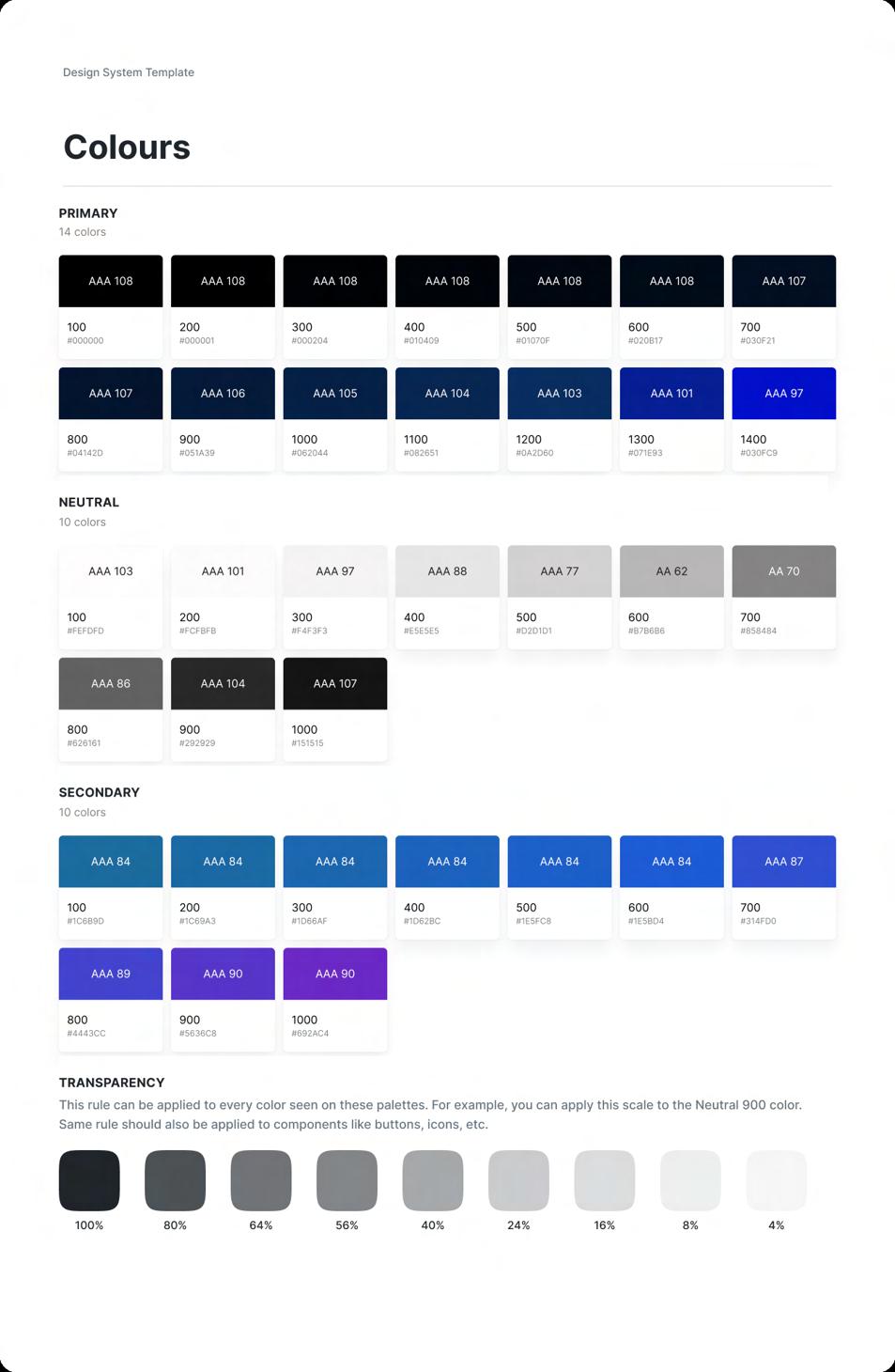
When applying colour, the 60, 30, 10 rule was applied. Taking this further, a gradient was used as my 30%. This creates a more advanced look and fee, but can still be visually sound to the user.


Hop Shop
Menu ordering app, featuring group pay


This project was successful in turning valuable insight into a functional solution. Improving my understanding for a full length design process, I believe this product stands out visually, allowing my established user flow to feel natural and enjoyable.
Designed by Max Morkel


Method’s and Process
U er jour ey a d Prototyping App i teractio a d a imatio De ig y te i al moc up
value propo itio I formatio architecture Low-fidelity prototype
Paper a d digital wireframe
U ability tudie Goal tateme t Affi ity diagram Storyboard’
figm
Case study
Project ratio ale a d future tep
Hi-fidelity
mockups
Vi ual de ig App i teractio a d a imatio U ability tudie
January 2023
Wire-framing and prototyping
Putting insight into action was enabled by completing a series of paper and digital wireframes, as well as storyboards and usability tests to keep the designs aligned with project goals and user feedback. When creating initial designs, several iterations were reviewed for parent pages. This was important as subsequent pages would follow a similar design.

Digital wireframes were then created in order to better visualise the final product. This also provided prototypes to test with users in a more realistic scenario


Visual design
Clear heirarchy Consistant iconography & colour
Techniques such as containment and colour contrast were applied in order to establish a clear pathway when navigating
Clear iconography was important in order to create a simpler method of ordering. Not to mention creating a more accessible app. A 60/30/10 colour scheme was used
When focusing my attention to the visual aspect, Gestalt principles such as proximity and similarity were applied to create a visually sound interface. My target market was international students and supports users who want to pay as a group. Therefore, my app adapted a fun and colourful style


