amyhirsch.com
203 661 1266 A MY AIDINIS HIRSCH INTERIO R DESIG N

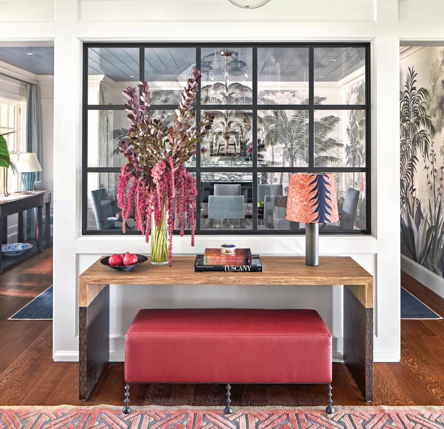
TEL. 203.622.7000 WWW.VANDERHORNARCHITECTS.COM 41 WEST ELM STREET GREENWICH, CT


CALL, VISIT A SHOWROOM, OR FIND US ONLINE TO SCHEDULE YOUR COMPLIMENTARY DESIGN CONSULTATION Connecticut 565 Westport Ave, Norwalk 203.924.8444 Westchester 16 Saw Mill River Rd, Hawthorne 914.592.1001 @caliclosetsct CALIFORNIACLOSETS COM MAKE ROOM FOR ALL OF YOU

©2024 California Closet Company, Inc. Each California Closets ® franchised location is independently owned and operated. CT HIC #0657205

30 CALL OF THE WILD
38
A
46
Ryann
56
66
10 EDITOR’S NOTE

12 GET THE GOODS
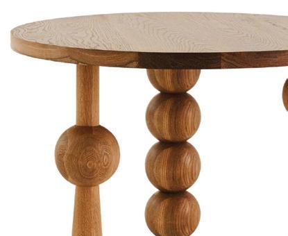
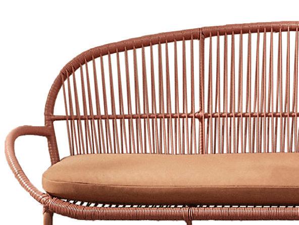
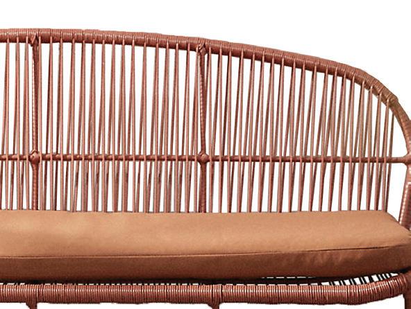
Color: Terracotta; Modern Bobbin; Chic Cleaning Tools
18 GETAWAY

Dive into the soulful spirit of Faraway Martha’s Vineyard
22 HOUSE PARTIES OKA x Palomino Interiors
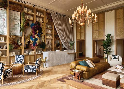
24 SHOP TALK
Local design news, the latest collections, haute happenings and more
80 ATHOME WITH Elisa Bulgrin of Longfield Farm
athomefc.com 6 features departments contents MAR/APR 2024 ATHOME IN FAIRFIELD COUNTY MAR/APR 2024, VOL. 19, NO. 1. ATHOME IN FAIRFIELD COUNTY (ISSN 1941-9503) is published five times annually (Mar/Apr, May/Jun, July/Aug, Sept/Oct, Nov/Dec) by Moffly Media, Inc., 205 Main St, Westport, CT 06880. Periodical postage paid at Westport, CT, and additional mailing offices. POSTMASTER: Send address changes (Form 3579) to ATHOME IN FAIRFIELD COUNTY, PO BOX 9309, Big Sandy, TX 75755-9607. US subscription rates: $19.95/1 year, $34.95/2 years; Canada and foreign US$40/1 year, US$70/2 years. vol. 19 | issue 1
56
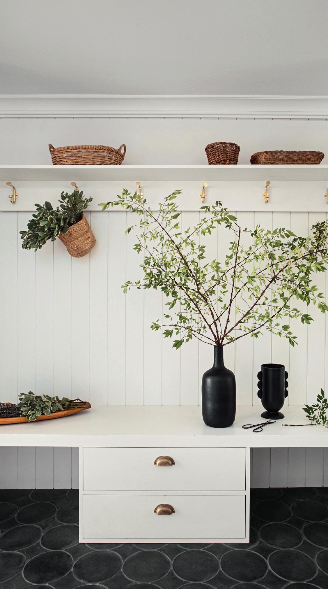
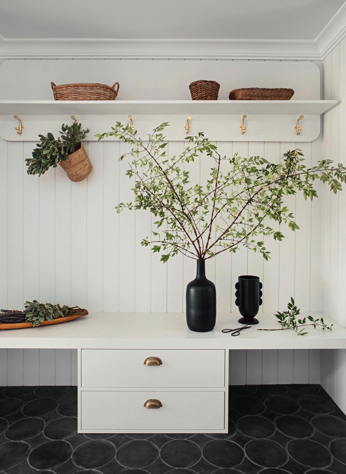
A mudroom by Stewart-Schafer.
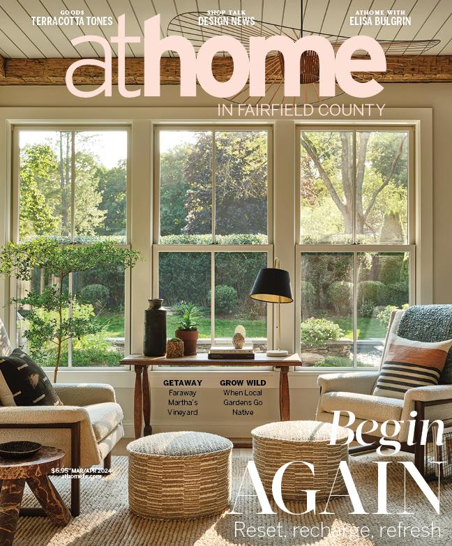
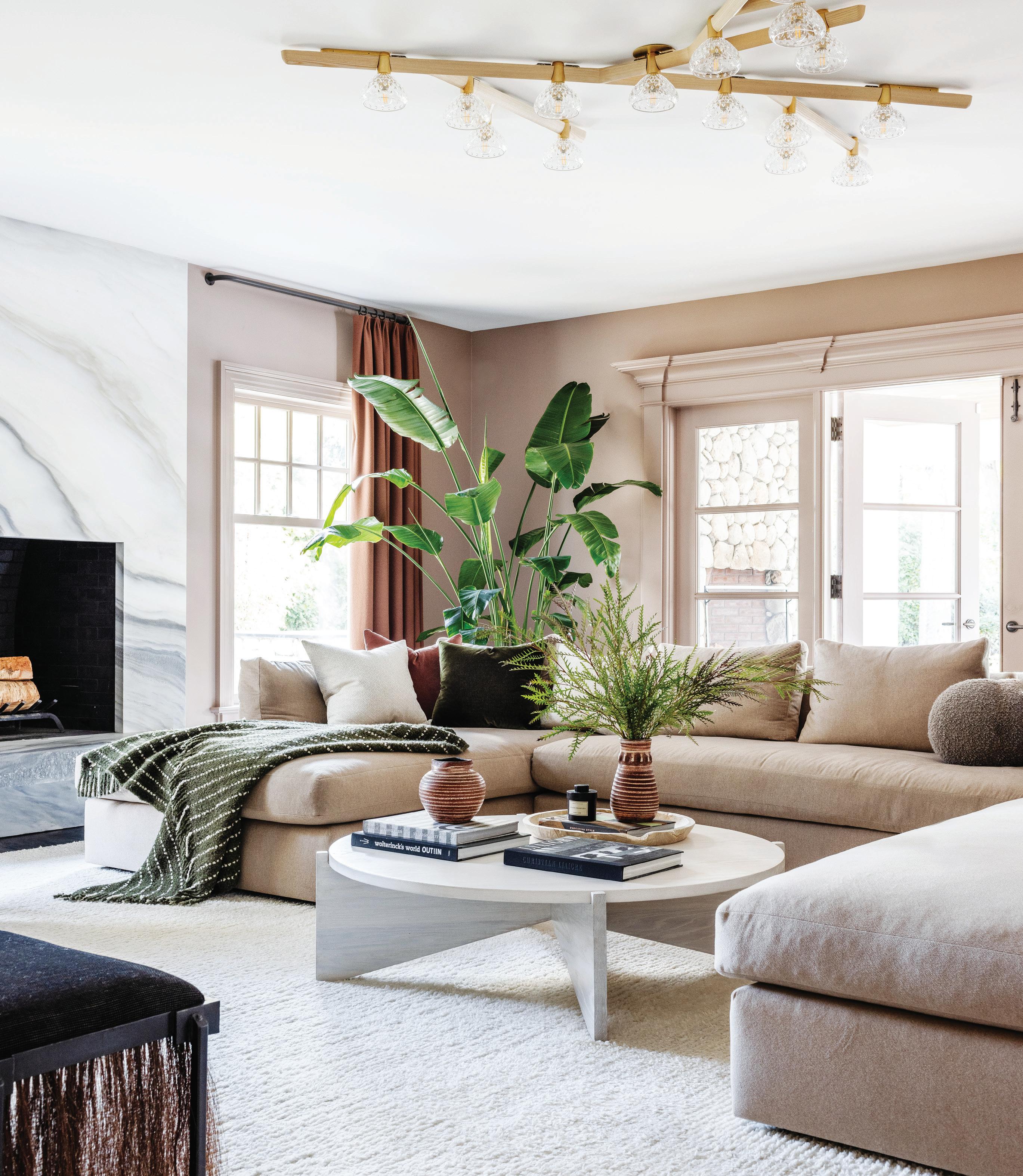
on the cover terri ricci interiors | photography read m c kendree / jbsa
on growing
spaces.
tom connor
Landscape experts weigh in
trends for backyard
by
TURNING THE PAGE
couple finds
new point
view
a
of
in Rowayton.
BURB APPEAL
Swan helps a family feel at home in Old Greenwich.
LESS IS MORE Traditional meets contemporary in this thoughtful farmhouse edit.
STAYING POWER
interior designer’s home is a testament to her core principles.
An




Tel: 203.489.3800 | IG: @charleshiltonarchitects | hiltonarchitects.com VIEW MORE IMAGES HERE
editorial
Megan Gagnon megan.gagnon@moffly.com
advisory editor
Donna Moffly donna@moffly.com
contributing editors
editorial director
Cristin Marandino cristin.marandino@moffly.com
editor, custom publishing Elizabeth Hole elizabeth.hole@moffly.com
editor, new canaan•darien
Eileen Murphy eileen.murphy@moffly.com
editor, stamford Melinda Anderson melinda.anderson@moffly.com
editor, westport•weston•wilton Samantha Yanks samantha.yanks@moffly.com
art
senior art director
Garvin Burke garvin.burke@moffly.com
production director
Tim Carr tim.carr@moffly.com
assistant art director Lisa Servidio lisa.servidio@moffly.com
digital
digital marketing manager
Rachel MacDonald rachel.macdonald@moffly.com
audience development editor
Kaitlin Madden kaitlin.madden@moffly.com
digital assistant
Lloyd Gabi lloyd.gabi@moffly.com
digital assistant
Jeffrey Garay jeffrey.garay@moffly.com
sales & marketing
publisher, greenwich, athome, stamford, ocean house Jonathan W. Moffly jonathan@moffly.com
publisher, westport•weston•wilton Gabriella Mays gabriella.mays@moffly.com
publisher, new canaan•darien Gina Fusco gina.fusco@moffly.com
account executive Hilary Hotchkiss hilary.hotchkiss@moffly.com
account executive
Morgan Howell morgan.howell@moffly.com
partnership and big picture manager
Kathleen Dyke kathleen.godbold@moffly.com
sales assistant
Lemuel Bandala lemuel.bandala@moffly.com business assistant
Eillenn Bandala eillenn.bandala@moffly.com
business president
Jonathan W. Moffly
editorial director
Cristin Marandino business manager
Elena V. Moffly elena@moffly.com cofounders
John W. Moffly IV & Donna C. Moffly founding creative director Amy Vischio

athomefc.com 8 vol. 19 | no. 1 | mar/apr 2024
PUBLISHERS OF GREENWICH FAIRFIELD LIVING NEW CANAAN • DARIEN • ROWAYTON WESTPORT STAMFORD and athome magazines 205 Main Street, Westport, CT 06880 . P hone: 203-222-0600; email: mail@moffly.com ADVERTISING INQUIRIES: Lemuel Bandala: call 20 3-571-1610 or email advertise@moffly.com TO SUBSCRIBE, renew, or change your address, please email subscribe@athomefc.com, call 877-467-1735, or write to athome in Fairfield County Magazine, 111 Corporate Drive, Big Sandy, TX 75755. U.S. subscription rates: $19.95/1 year (5 issues); $34.95/2 years (10 issues); $44.95/3 years (15 issues). Canada and foreign, US $40/year. Prices are subject to change without notice. ALL RIGHTS RESERVED No part of this periodical may be reproduced without express permission of the publisher. ©2024 athome in Fairfield County Magazine is a registered trademark owned by Moffly Media. The opinions expressed by writers commissioned for articles published by athome in Fairfield County are not necessarily those of the magazine. FOR QUALITY CUSTOM REPRINTS/E-PRINTS, please call 203-571-1645 or email reprints@mofflymedia.com
editor

TISCHLER WINDOWS AND DOORS. UNCOMMON. UNCOMPROMISING. Tischler und Sohn (USA) Ltd. Six Suburban Avenue, Stamford, CT 06901 Telephone 203/674/0600 • Telefax 203/674/0601 ARCHITECT: MARK P. FINLAY ARCHITECTS, AIA, PHOTO BY WARREN JAGGER
editor’s note / SPRING FORWARD



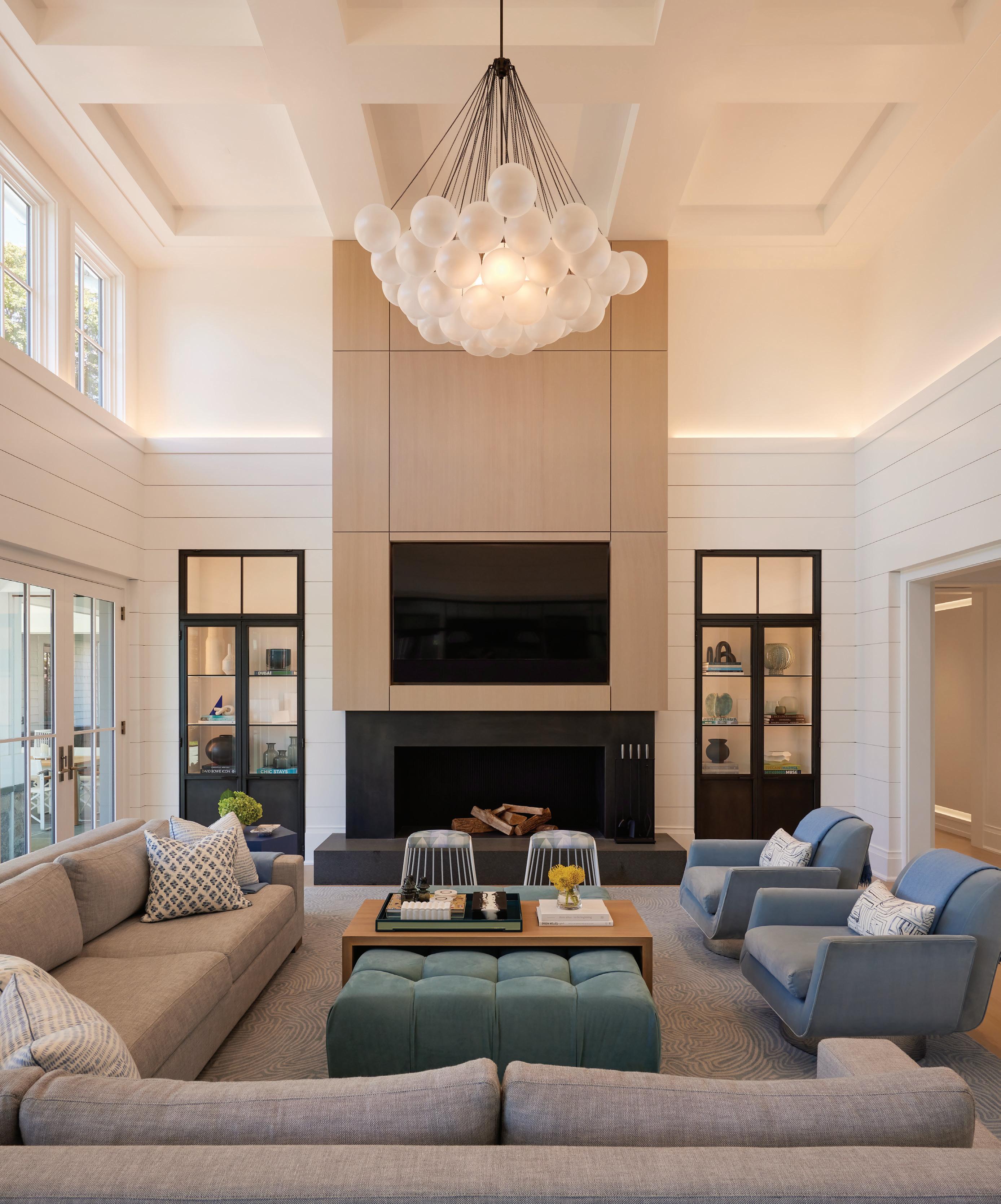
The sun will come out tomorrow, right? Writing this letter on another cold, gray February day, it feels like we still have a long way to go. But working on these pages—filled with lush gardens and homes photographed in much warmer weather—gives me hope. Each project is a visual reminder that, yes, the grass always gets greener. And it’s important to be able to look forward with an attitude of embracing what’s next: a new season, a new chapter, maybe even a new house.
We start outside, where landscape experts share their insights on gardens gone wild (p. 30). Right now, it’s all about growing to love the imperfect, trading mowing and manicuring for a more untamed path, and favoring the ecological benefits of pollinator-friendly landscapes. The same attitude is echoed in our cover story, with designer Terri Ricci growing to love her own imperfect home (p. 66). After years marked by renovations and raising kids, Ricci realized that this place she’d poured so much of herself into was, in fact, pretty perfect. In Rowayton, Krista Fox’s clients got a whole new view (p. 38). The house looks out onto Farm Creek—a magical backdrop for coffee at sunrise and sunset cocktails—but the home represented more than just a change in scenery. This was a place where Fox’s clients would be settling into a different phase of life, a departure from their larger, more formal family home. Her goal was to reframe their focus, delivering a calm space to make new memories, curating experiences instead of square footage. In Old Greenwich, a young family hired Ryann Swan to help them acclimate, after trading the sounds of New York City for a (much quieter) Sound Beach neighborhood (p. 46). The house— with its picture-perfect exterior—was instantly charming, but it would take a close collaboration between designer and client to create the rooms that made it feel like home. When husband-and-wife Christine Stucker and James Veal of Stewart-Schafer visited their Weston project for this first time, they were struck by the visual noise in a house with too much of everything, from extraneous staircases to multiple entrances (p. 56). But the design team saw potential, not problems. This would be a transformation of subtraction, editing the ornamentation to reveal clean lines, before layering the timeless finishes that balance the contemporary farmhouse with European-inspired tradition.
I’m stealing this lesson of muting the noise from my own chaotic life, and letting my home serve as a sanctuary of stability and evolution (or attempting to, anyway). Whether you’re facing an empty nest or a new beginning, I hope you’ll also look to these stories and see them as celebrations of transition. With tomorrow comes a new day, fresh with possibility, filled with the potential for reinvention, and hopefully, a little brighter than the day before.
 MEGAN GAGNON Editor megan.gagnon@moffly.com
athomefc.com 10
ENTRIES OPEN ON MARCH 1!
www.athomealistawards.com
PHOTO: BOB CAPAZZO



1599 Post Road Eas t , Westport CT 0 68 80 | Office: 203-259-3333 | Fax: 2 03-255- 1199 | info@garrettwilsonbuilders.com GARRETTWILSONBUILDERS.COM 1599 Post Road Eas t , Westport CT 0 68 80 | Office: 203-259-3333 | Fax: 2 03-255- 1199 | info@garrettwilsonbuilders.com GARRETTWILSONBUILDERS.COM

goods/COLOR


1

4
5



6
7


3


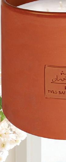



Laurent candles; starting at $68. Bungalow, Westport; bungalowdecor.com
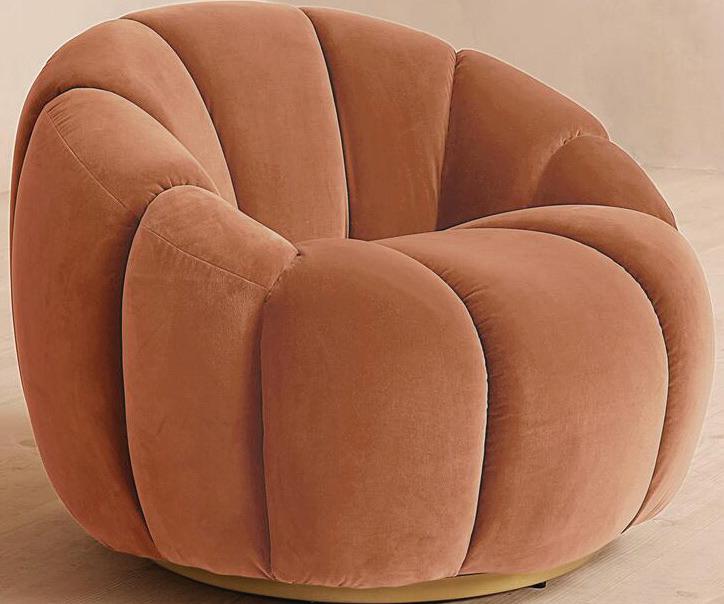
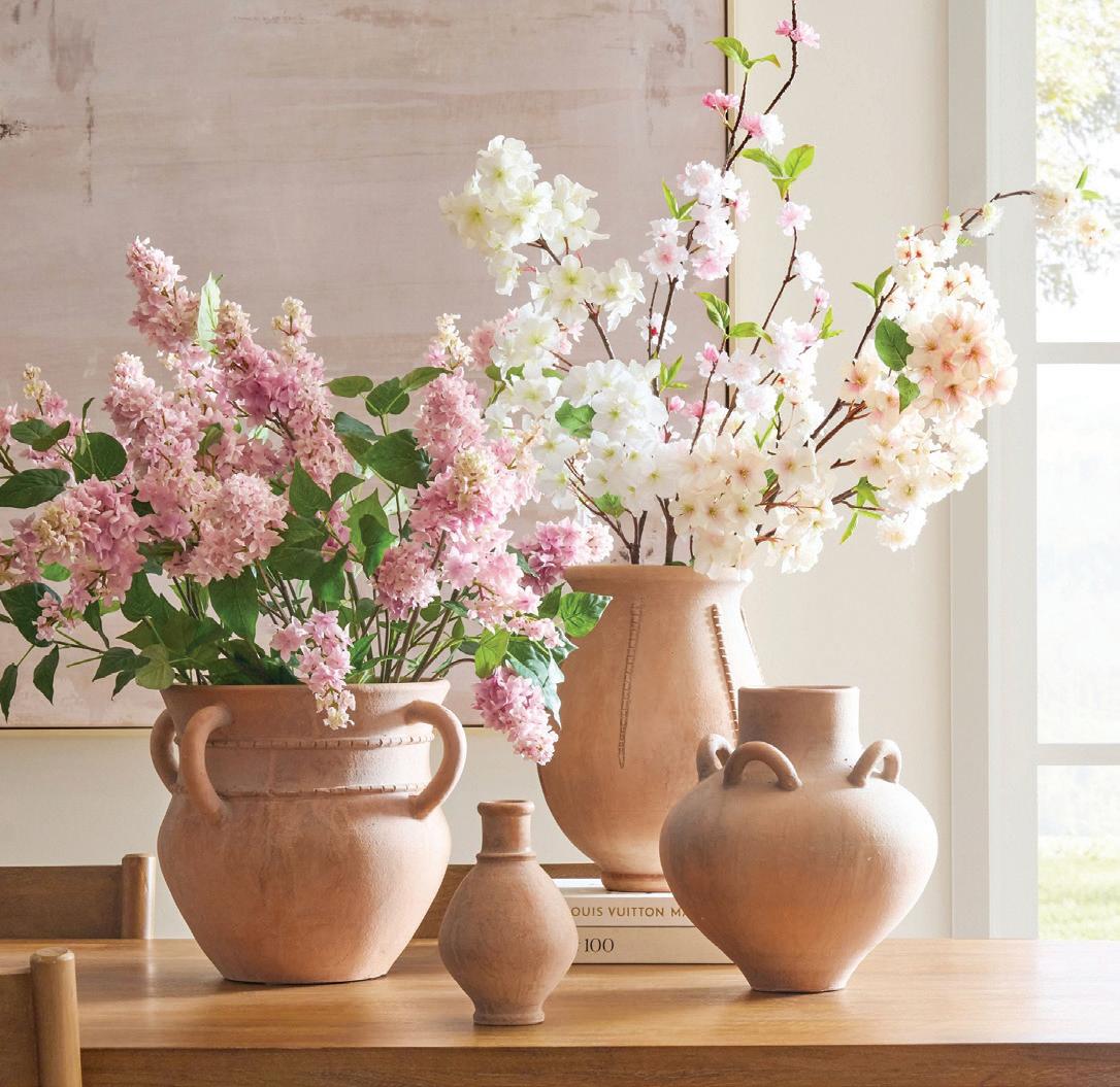
“terracotta is definetly the new blush. it’s warm, earthy and rich. it adds history and complements warmer wood tones.

by megan gagnon athomefc.com 12
INVITE WARMTH WITH SUN-BAKED TERRACOTTA TONES
—michelle morgan harrison, morgan harrison home
FLAT VERNACULAR
Folded wallpaper in Peach Melba; $65 per yard. flatvernacular.com
POTTERY BARN
Halldale terracotta vase collection; starting at $29.50. Westport; potterybarn.com
OYOY
Maki plant box in Nutmeg; $178. oyoy.us
CÔTÉ BOUGIE Rue Yves Saint
IMAGES COURTESY OF DESIGNERS/BRANDS
Westport; shopterrain.com
INDUSTRY WEST Pim console table; $1,995. industrywest.com
SOHO HOME Garret armchair in Velvet Antique Rose; $2,995. sohohome.com

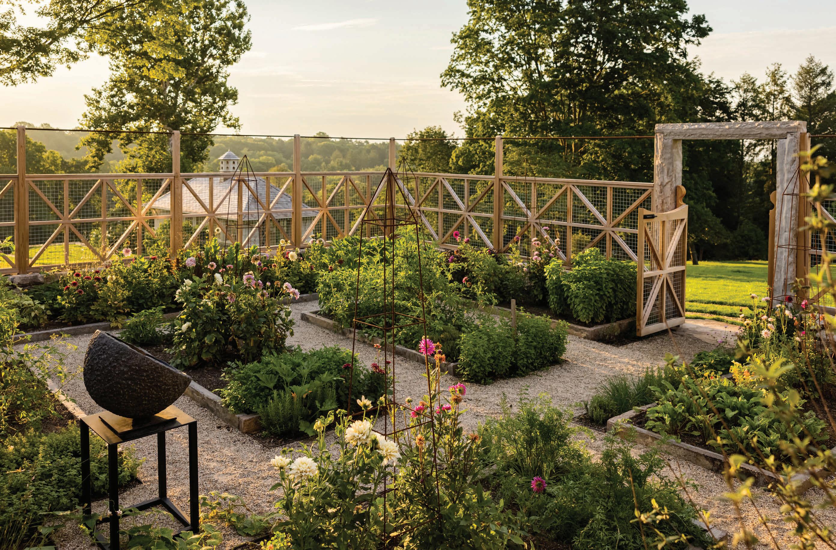
Words rarely used to describe vegetable gardens. Words frequently used to describe ours. Your property is an extension and reflection of your lifestyle and impeccable taste. Homefront Farmers understands this. The organic gardens we design, build, and maintain are works of art that blend seamlessly into your landscape. Our expert farmers take loving care of your ‘homestead’ to produce exceptional tasting vegetables, fruit, flowers, and honey, all season long for your family.
Delight in the joy and satisfaction of growing your own food at home… effortlessly.
203.938.0900
info@homefrontfarmers.com
Exquisite.
Experiential. Effortless.
: homefrontfarmers.com : @homefrontfarmers
A RIVERSIDE FENCE COMPANY YARD TO TABLE SINCE 2011
goods/BALL CHANGE
















IMAGES COURTESY OF DESIGNERS/BRANDS
1 IN COMMON WITH Gemma sconce in blackened brass; starting at $1,500. incommonwith.com
2 PARK EUN-KOOK KoKo table; $7,680. 1stdibs.com
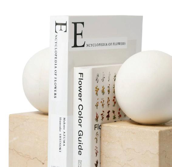
3 AERIN Odette bookends; $695 for set of two. aerin.com
4 AND OBJECTS Leckford Stool; $4,084. andobjects.com
5 NOIR Cooper mirror in metal with brass finish; $2,085 Beehive, Fairfield; thebeehive fairfield.com
6 TROY LIGHTING Miela floor lamp by Loft & Thought; $990. Chloe Winston Lighting Design, Norwalk, 203-9578686; chloewinston lighting.com
athomefc.com 14
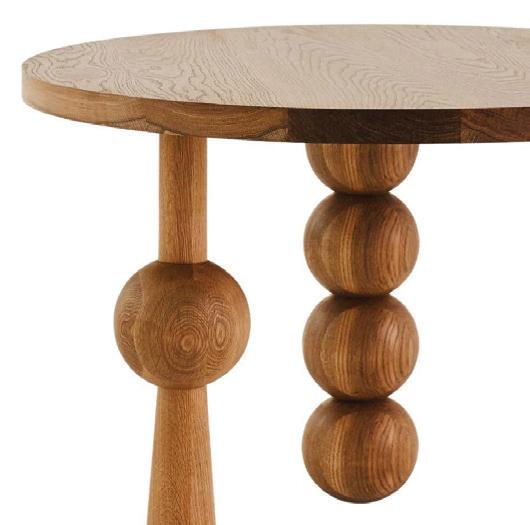
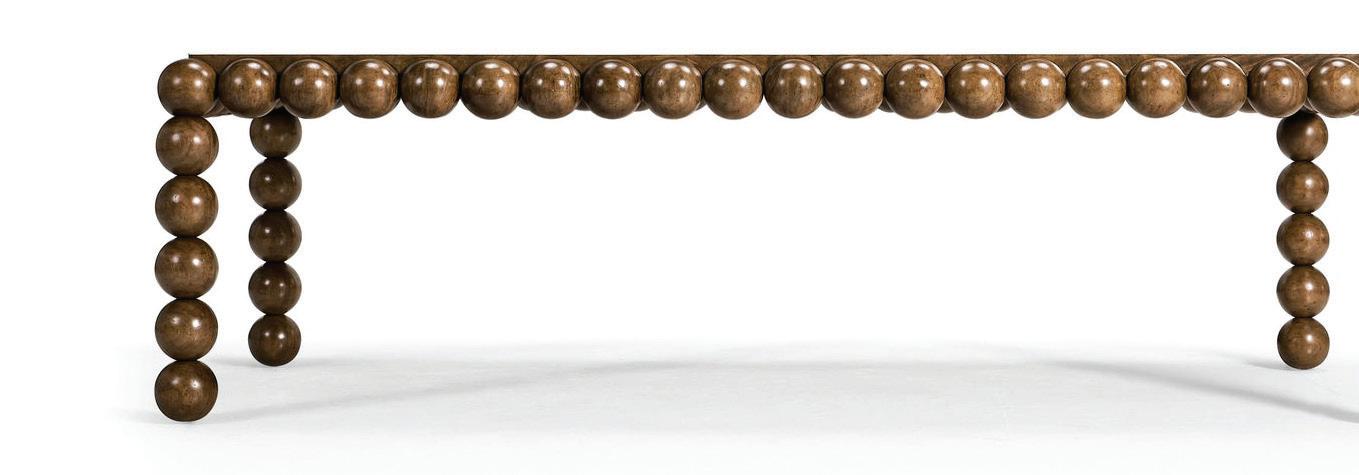
7 JONATHAN CHARLES Orb dining table; $6,560. Schwartz Design Showroom, Stamford; schwartzdesign showroom.com
1
3 5
MODERN BOBBIN DETAILS ADD A PLAYFUL POP
6
2
—alexis varbero, owner + ceo, schwartz design showrooms
“modern bobbin designs seamlessly intertwine the essence of traditional craftsmanship with a contemporary twist, skillfully reimagining its form across diverse categories in unexpectedly innovative ways.”
7 4



www.yankeecustombuilders.com Building the Contemporary Home
goods /COOL TOOLS
















3


Interiors, New Canaan; cobblecourt.com
STEAMERY



2 tool 5

5


“we aimed to design our new redon toilet brush holder in a way that complements an array of bathroom designs. it’s an attractive cleaning tool that redefines form and function, blurring the lines between beauty and domestic chores.”


1 7


Pilo 2 fabric shaver; $65. Williams Sonoma, Westport; williamssonoma.com
HAWKINS NEW YORK


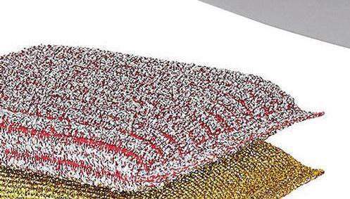
Lurex sponges; $6 for set of three. hawkinsnewyork.com


NORMANN
COPENHAGEN x OLE

JENSEN


Dustban + broom; $35. aplusrstore.com

CURIO


The ionic palm brush; $38. curiohomegoods.com

ALESSI


Handheld vacuum cleaner; $240. us.alessi.com

GARRETT WADE


Better whisk broom; $15.95. garrettwade.com

CB2


Squeegee in brass or black metal; $39.95. cb2.com

ANDRÉE JARDIN


French standing broom sweep set; $189. Pottery Barn, Westport; potterybarn.com

IMAGES COURTESY OF DESIGNERS/BRANDS SPRING CLEANING NEVER LOOKED SO GOOD athomefc.com 16
—keyana pratt, pigeon and poodle
9

EXCLUSIVE

10years
FURNITURE WARRANTY ON ALL SNAIDERO PRODUCTION ITEMS

BY
CUSTOM KITCHEN SOLUTIONS
SNAIDERO
1046 POST RD E. WESTPORT CT 06880 203.900.GOLD WWW.GOLDANDHOME.COM OPENING APRIL 2024
DISTRIBUTOR OF SNAIDERO FINE ITALIAN CABINETRY IN CONNECTICUT, NEW YORK AND NEW JERSEY
getaway
Gypsy Soul
A storied hotel is reborn as FARAWAY MARTHA’S VINEYARD, a bohemian haven that celebrates the island’s rich history
by megan gagnon
Every summer, visitors arrive at Martha’s Vineyard hoping to fall into the restful rhythm of easy island living. From the gingerbread cottages in Oak Bluffs to the cobblestone streets of Edgartown, the local architecture and historic landmarks create an atmosphere that feels like a step back in time—the perfect place to disconnect and unwind. And now, nestled steps away the harbor, Faraway Martha’s
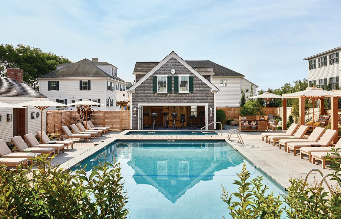
Vineyard lures travelers with yet another reason to leave the mainland.
Building on the success of Faraway Nantucket, Bostonbased Blue Flag Partners has delivered another boutique hotel destination; a refined retreat that reflects the laid-back charm of the coastal community. The site for their renovation was the iconic Kelley House, a 300-year-old former tavern, which served sailors in the island’s earliest days as a settlement for whalers.
DESIGNER-APPROVED DESTINATIONS
athomefc.com 18
above: Workshop/APD pulled their lobby inspiration from early Georgian libraries. below: Spend some time on a lounger or in one of the cabanas at the property’s pool. PHOTOGRAPHY:
MATT KISIDAY



WESTPORT SHOWROOM 203.227.5181 gaultstone.com Exceptional Products, Personal Service. BETHEL SHOWROOM 203.790.9023 STONE & LANDSCAPE SUPPLIES
getaway
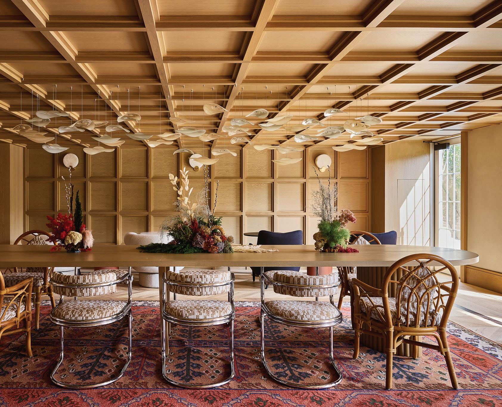
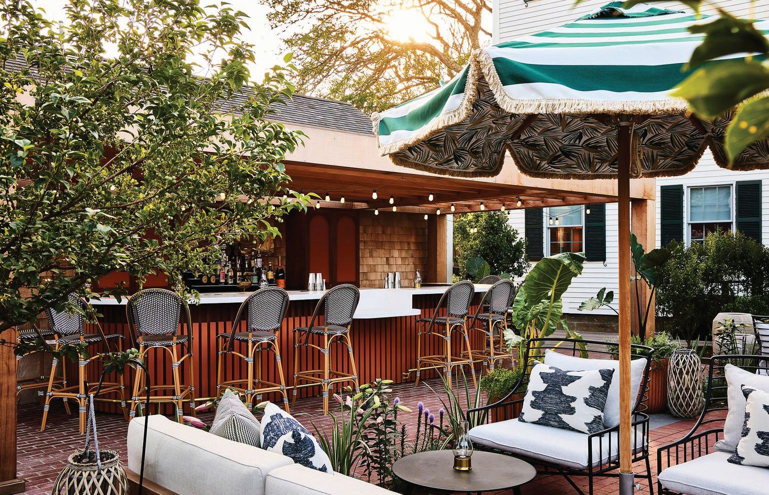
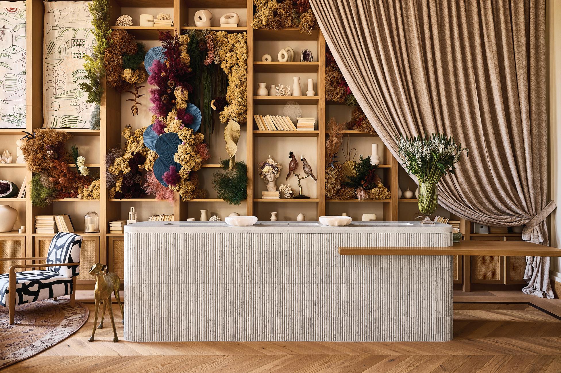
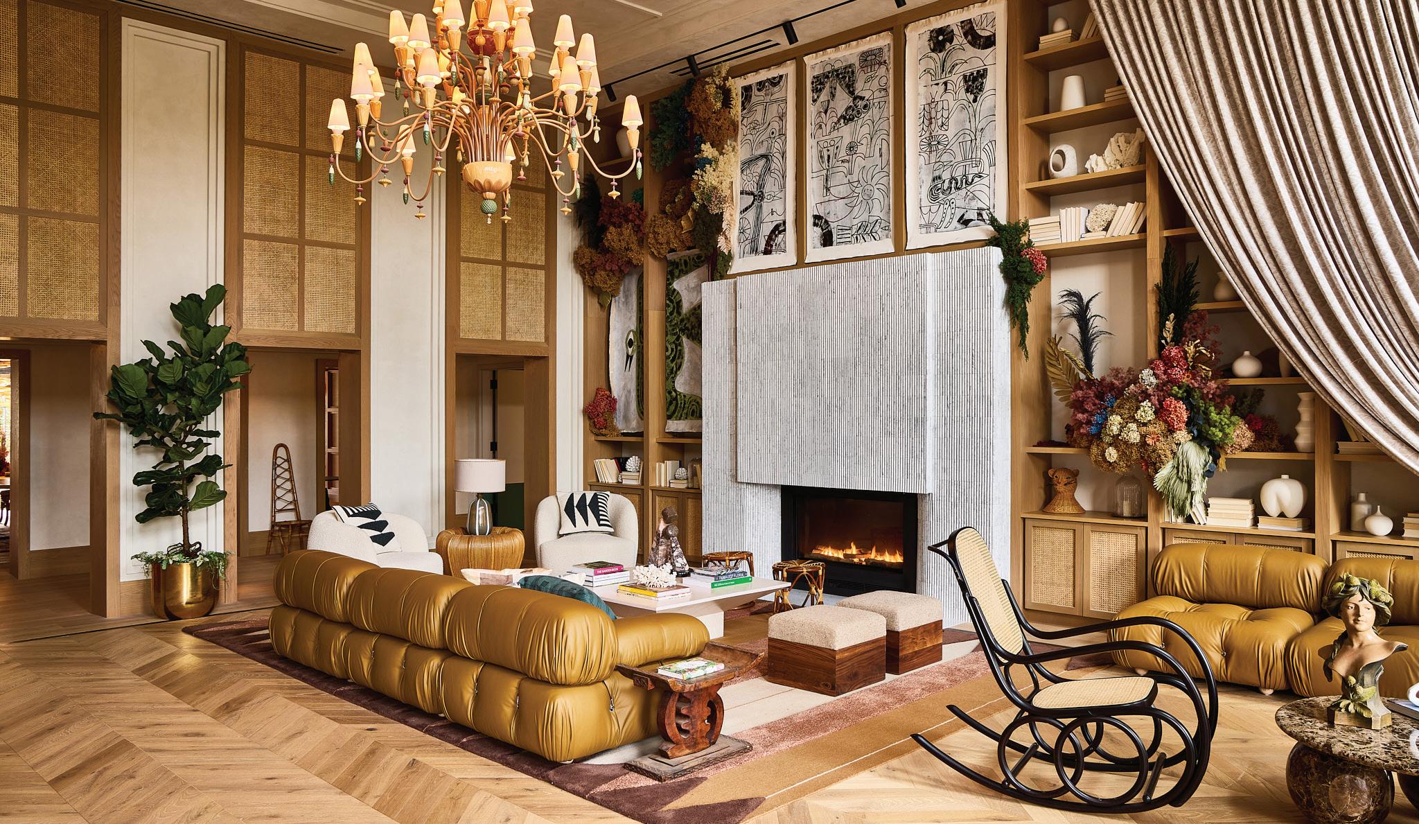
Workshop/APD was recruited for the project, with a focus on crafting an experience that honored the local history while carving out a unique design narrative. “We spent months working on uncovering the property’s true soul, and were immediately drawn to the island’s inseparable association with flowers as well as the free spirits that attend to them,” said Blue Flag’s managing partner, Brad Guidi. The botanical boho vibe is balanced with midcentury styling, which comes to life in the dreamy lobby. Stepping in from the exterior’s classic Georgian architectural façade, guests are greeted with an immersive space, complete with bold furniture pieces, statement lighting and soaring shelving, blooming with custom installations by artists and floral designers. From there, exploration is encouraged via landscaped pathways that connect to 58 guest rooms, a gym, a courtyard pool and two restaurant options: an outdoor sushi spot called The Pelican Club and a reopened version of the beloved The Newes From America, serving locally sourced favorites. Each space echoes the larger design narrative— an earth-tone palette punctuated by impeccable finishes—for what Workshop/ APD associate principal Andrew Kline calls “seamless connectivity between spaces, eras and even aesthetics….”
Explore Edgartown’s quaint shops and pristine beaches, then return to the property for inspiration, awakening your inner artist or budding gardener. Faraway is a state of mind, after all, and this escape is just a ferry ride away.
Faraway Martha’s Vineyard 23 Kelley Street Edgartown, MA 02539 farawaymarthas vineyard.com
GET A ROOM
These Vineyard vibes are laid-back and luxe.
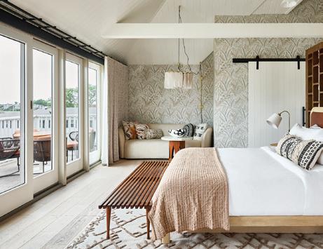
CHAPPY DAYS
Settle into a suite in Chappy House, where guests can take in views of the Edgartown Harbour and Chappaquiddick Island from the bed or balcony.

BETTER BUNKS
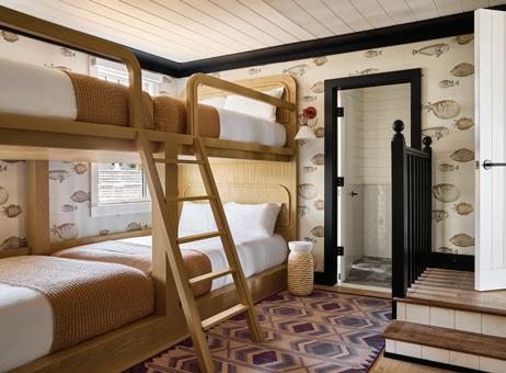
The setup in this Court House suite includes two full-size bunk beds, a kitchenette and a deck overlooking the pool. Fish wallpaper adds to the fun factor, for guests of any age.


SLEEP SOUNDLY
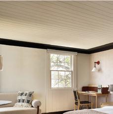
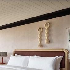
Take advantage of the Bluetooth-enabled turntable from a king-size bed in Kelley House, an ideal spot end your evening.

athomefc.com 20
PHOTOGRAPHY: MATT KISIDAY
top: Lightened wood provides a backdrop for the playful layers of pattern and texture throughout. middle: Dive into a cocktail, and order from a fresh sushi menu at The Pelican Club. bottom: The check-in desk gives guests a view of the custom floral installations and art works.


Eat, Drink, Celebrate Greenwich! KYLE NORTON; WINE: KRAKENIMAGESUNSPLASH.COM; KYLE NORTON Bianca Restaurant & Bar . Coffee for Good . La Taqueria . Little Pub Greenwich OG Social Club SoNo 1420 Tony’s at the J House and many more! Some of our participating restaurants include: 2024 SPONSORS Bar • In-Restaurant Dining • To-Go Special Offers One Week Only! Mon, April 1 – Sun, April 7 Opening Night Party Restaurant Week 6:00-8:30PM Tony’s at the J House Tickets: $95 Early Bird Sale (Limited tickets available. Sale ends 3/25. $125 regular price) Tuesday, April 2 RESTAURANT WEEK 9TH ANNUAL Scan or visit GreenwichRestaurantWeek.com for event details, purchase tickets and view the full list of participating restaurants. *All ticket sales via Eventbrite, no cash/ credit card purchase at event/door.
OUT AND ABOUT
house parties

athomefc.com 22
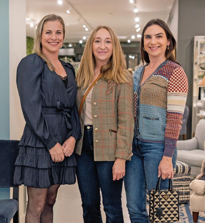
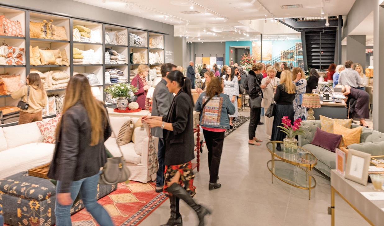
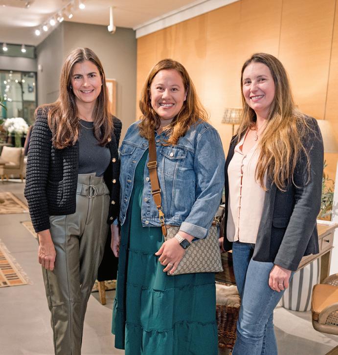
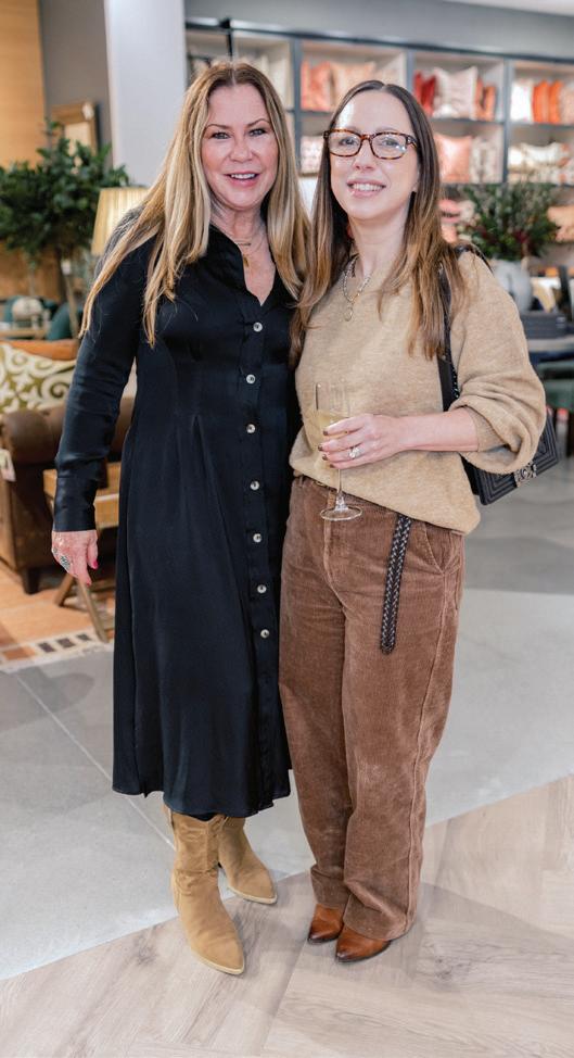
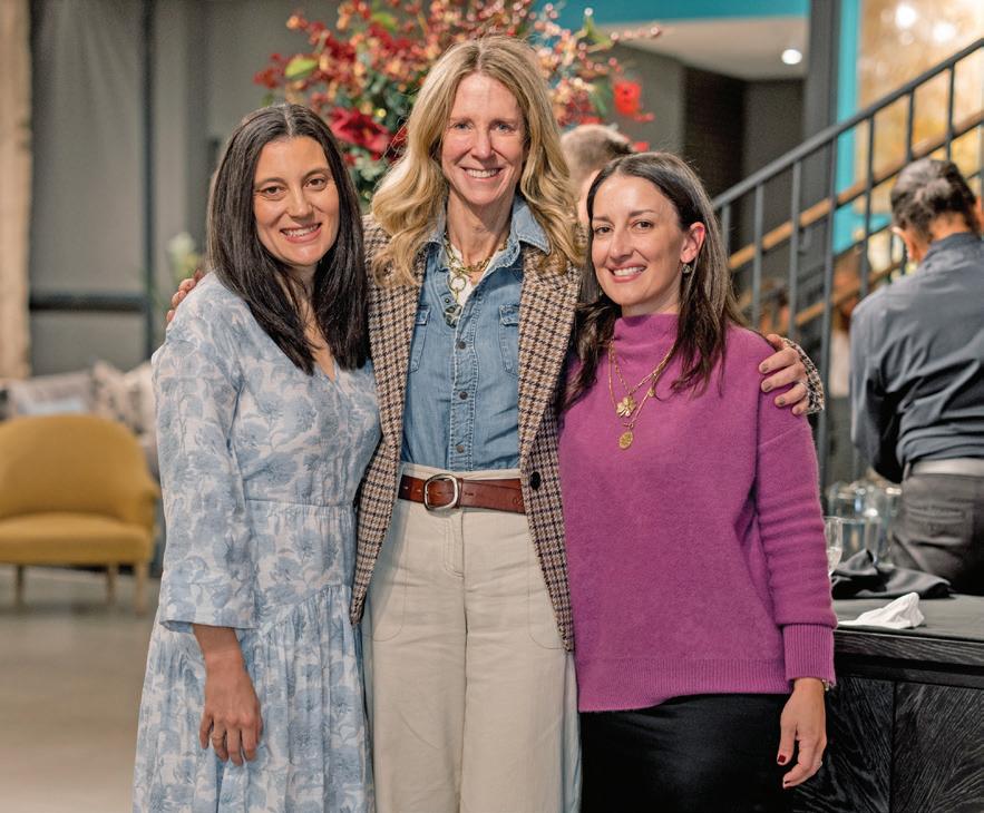
OKA x PALOMINO INTERIOR DESIGN HOLIDAY FÊTE OKA, Westport
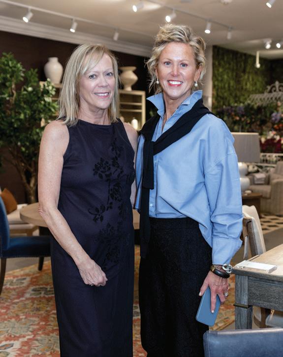
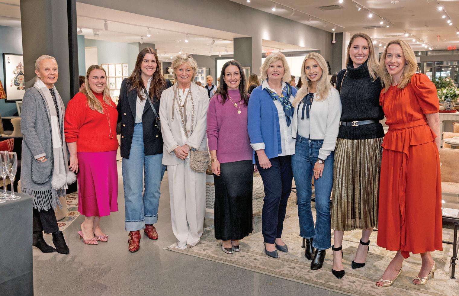
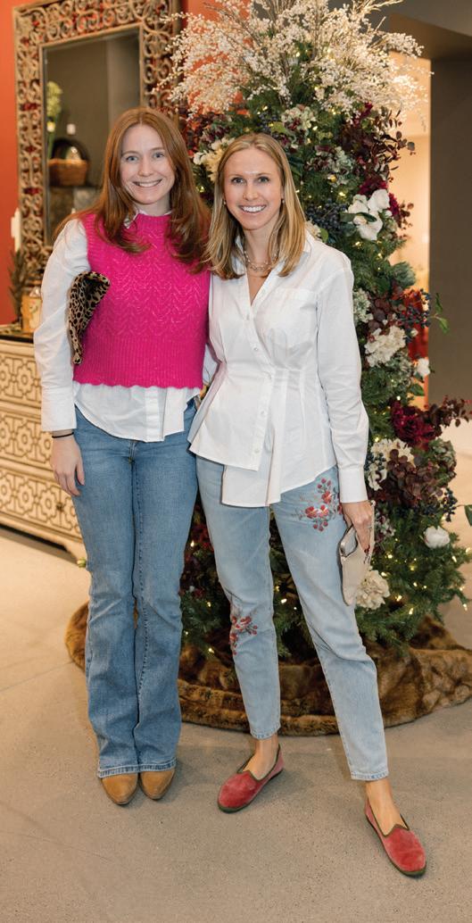
1 Sarah Van Zanten, Christy Quinn, Molly Patton
1 2 5 6 8 9 4
2 Terri Reilly, Roberta Anderson 3 Karri Lee 4 Jenny Zoog, Alicia Meyer, Jennifer Dorington 5 Gabriella Mays, Meghan Boswell, Megan Gagnon, Sue Jones, Kate Ferguson, Susan Benedetti, Sophie White, Taylor Anne Crane, Elizabeth Ethridge McGann 6 Hannah Warriner, Claire Doyle 7 Tara Kelly, Tara White 8 OKA shoppers 9 Erin Kestenbaum, Susan Petrie, Kate Ferguson
3 7


All New. All You. VOTING ENDS MARCH 13 EVERY VOTE COUNTS! YOU PICK THE WINNERS! BESTOFGOLDCOASTCT.COM Who will be voted THE BEST? Scan and Vote Now! Presented by:
shoptalk
HOME SWEDE HOME
ELEISH VAN BREEMS HOME RETURNS TO LITCHFIELD COUNTY, BRINGING SCANDINAVIAN STYLE TO NEW PRESTON
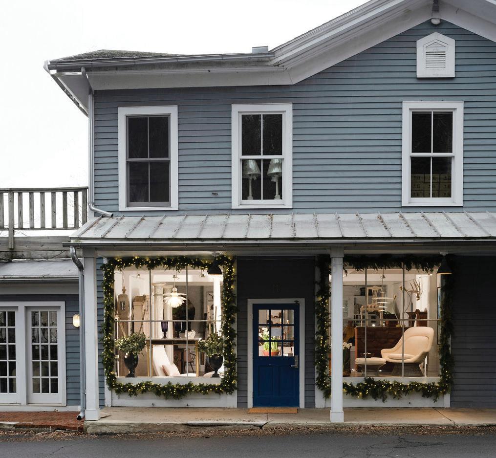
RNearly three decades ago, the best friends set up shop in an 18th-century house and barn in Woodbury, Connecticut. Since that time, they’ve expanded their furnishings and antiques brand with locations in Westport and Nantucket, each site a restoration project that reflects their commitment to honoring historic design. When Dawn Hill Antiques on New Preston’s Main Street became available, they knew the former post office and 1900s-era market belonged in their family of stores.
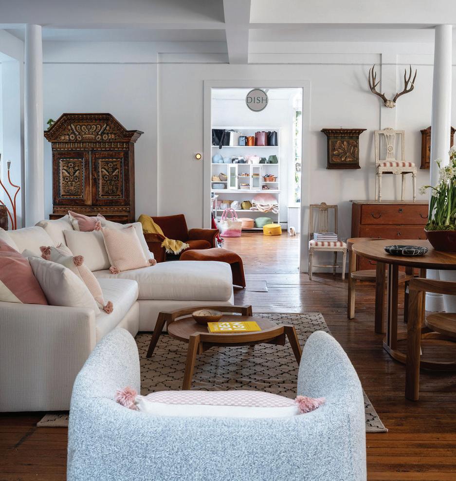
Eleish reflects on their newest venture as “a dream come true and really coming full circle.” She and Van Breems will continue to champion Scandinavian design with expertly crafted offerings that embrace the simplicity and charm of country living. Gustavian and Rococo antiques are styled alongside midcentury finds and contemporary pieces from Verellen, CaneLine and Thayer Coggin. In the DISH room, Nordic tableware, linens, gifts and home goods take center stage, with time-honored brands like Gustavsberg, Marimekko and Skultuna sharing space
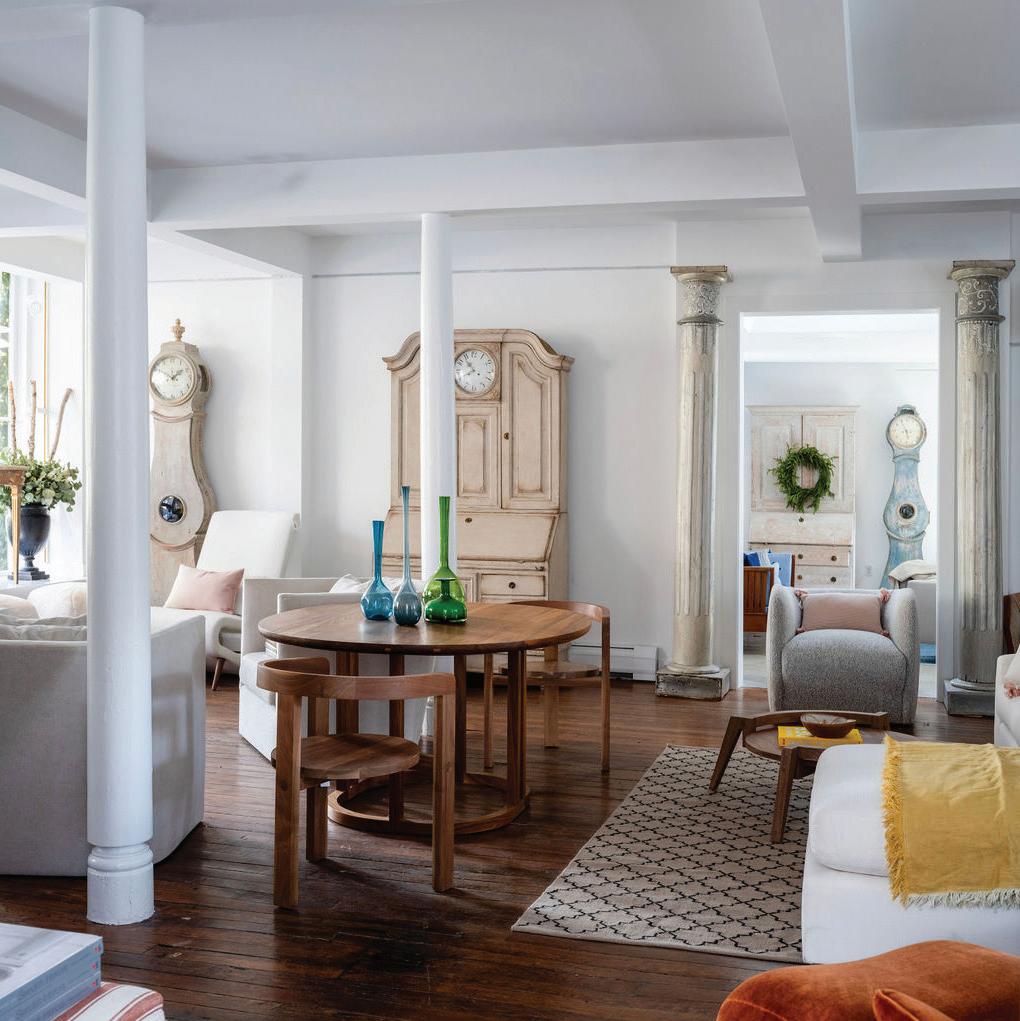
with newer design visionaries like Denmark’s Hein Studio.
Plan a visit to the picturesque village—a design destination worthy of a day trip—and see why the pair have returned to such a special place.
Eleish Van
11 Main Street, New Preston Thursday-Sunday 11-5 or by appointment evbantiques.com


BY
LANDINO
PHOTOS
NEIL
honda Eleish and Edie Van Breems have returned home.
Breems Home
above: The design duo has long been known for their antique curation.
left: A peek into the DISH room, where accessories and tabletop finds await.
this photo: Sofas and chairs are upholstered in fine Belgian linens. below: The store sits at the base of the village across from a roaring waterfall.





Visit athomealistawards.com to learn more about getting on the 2024 A-List. Enter beginning March 1st! You have to be in it to win it ! PLATINUM SPONSOR GOLD SPONSORS the premier home design competition awards in fairfield count y VENUE SPONSOR
Prints Charming
Fresh off their U.S. launch, LITTLE GREENE unveils new wallcoverings from historic archive
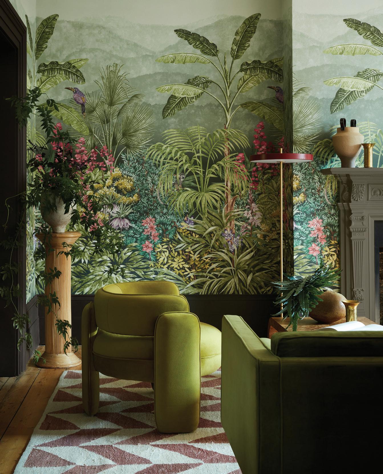
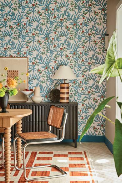
The British brand renowned for its heritageinspired paints and wallpapers, has once again joined with the National Trust— Europe’s largest conservation charity—to introduce a new collection. National Trust IV includes eight meticulously adapted designs, featuring a range of botanical scenes and floral motifs sourced from iconic properties like Montacute House and Standen House, and one design that comes straight from Little Greene’s own archive, adding a personal touch to the mix. Available across 42 colorways, there are options to match any modern aesthetic. Visit the Greenwich store to see them all and bring some British history into your next project.
Little Greene
9 East Putnam Avenue Greenwich, 203-485-0433 littlegreene.us
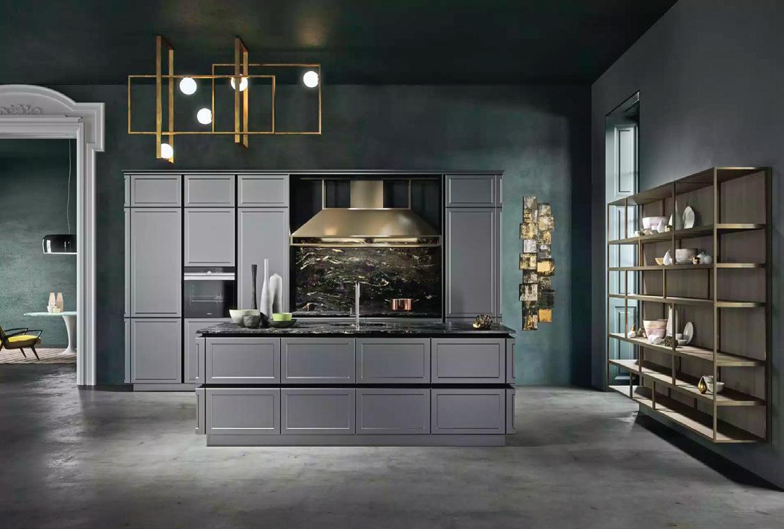
CUSTOM CUCINA
A NEW WESTPORT SHOWROOM DELIVERS THE BEST IN ITALIAN KITCHEN DESIGN
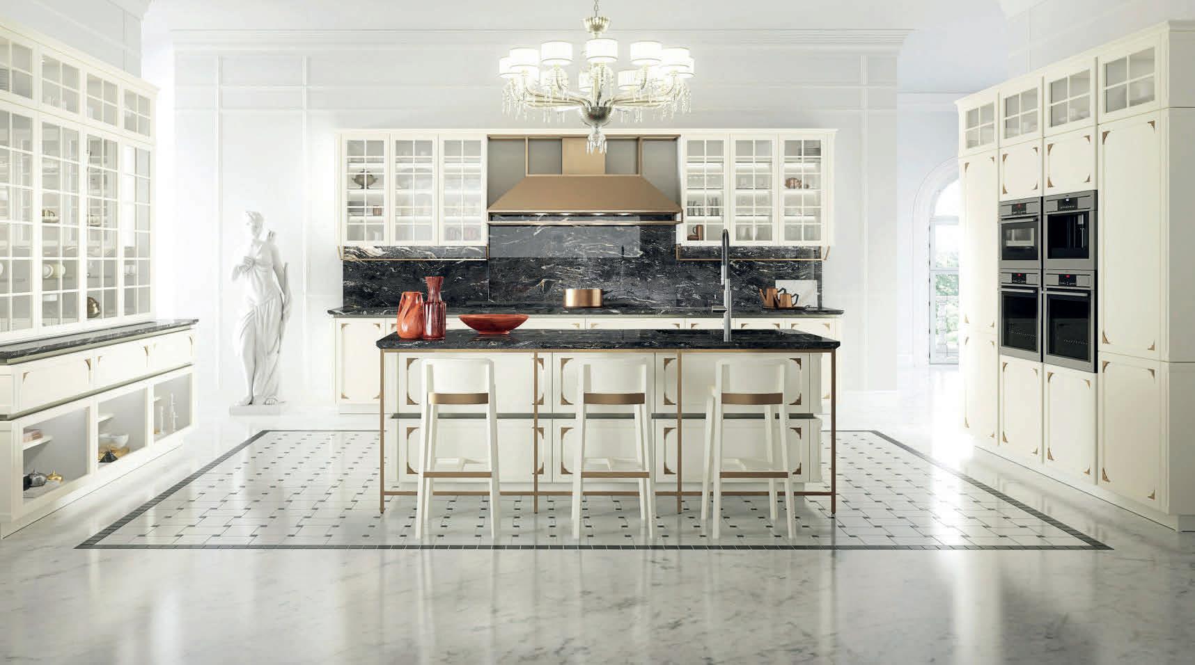
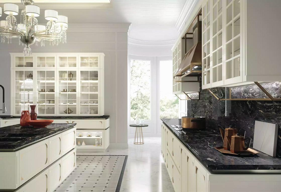
Alittle slice of Europe is coming to the Post Road. With the opening of Gold & Home, customers can shop the full line of Snaidero kitchens, a globally recognized brand crafting award-winning cabinet systems from their Italian factory. For over seven decades, Snaidero has redefined the art of kitchen design, collaborating with designers and architects to create offerings that blend today’s trends with classic sophistication, all with a steadfast
commitment to style and sustainability. Gold & Home’s exclusive introduction (serving as far as New York and New Jersey) of Snaidero to the American market means you’ll have access to see and feel their high-quality, eco-friendly materials in person. Be sure to stop in and say Ciao when they open their doors in April.
Gold & Home
1046 Post Rd E. Westport, 203-900-4653 goldandhome.com
 above: The Capricorn mural is inspired by sections of historic early 19th-century panels by Velay and Zuber.
above: Bamboo Floral is based on small painted sections of Chinese wallpaper found at Kingston Lacy Estate in Dorset.
above: Contemporary meets traditional in the Kelly series.
above: This Frame design skips the hardware for a streamlined effect.
PHOTOS COURTESY OF LITTLE GREENE, GOLD & HOME
shoptalk athomefc.com 26


MEET FLOWCODE, THE NEXT GENERATION OF QR CODES





Go ahead, try it out. Point your phone’s camera at the Flowcode to scan.

STYLE SHEETS
A BELOVED HOME STORE FINDS A FRESH SPACE TO SET UP SHOP
For 20 years, Fig Linens and Home has been Westport’s premiere location for luxury bedding, towels and table linens.
Now, the iconic shop has made its way to Church Lane. The idyllic brick lane houses many beloved 06880 businesses, including Sorelle Gallery and Pink Sumo Sushi, and offers the kind of quiet charm that draws people from all over the state to downtown Westport. Fig Linens and Home’s relocation has added another gem to its ranks.
The new Church Lane location offers Fig Linens and Home the exciting opportunity to expand its custom offerings. “We are so thrilled about the space for a design center in our new store. Our range of custom bedding and bath linens has so much room to grow in the spacious location, and the team is excited to work on more bespoke designs and monograms in this space. Even better, the new shop is full to the brim with natural light, perfect
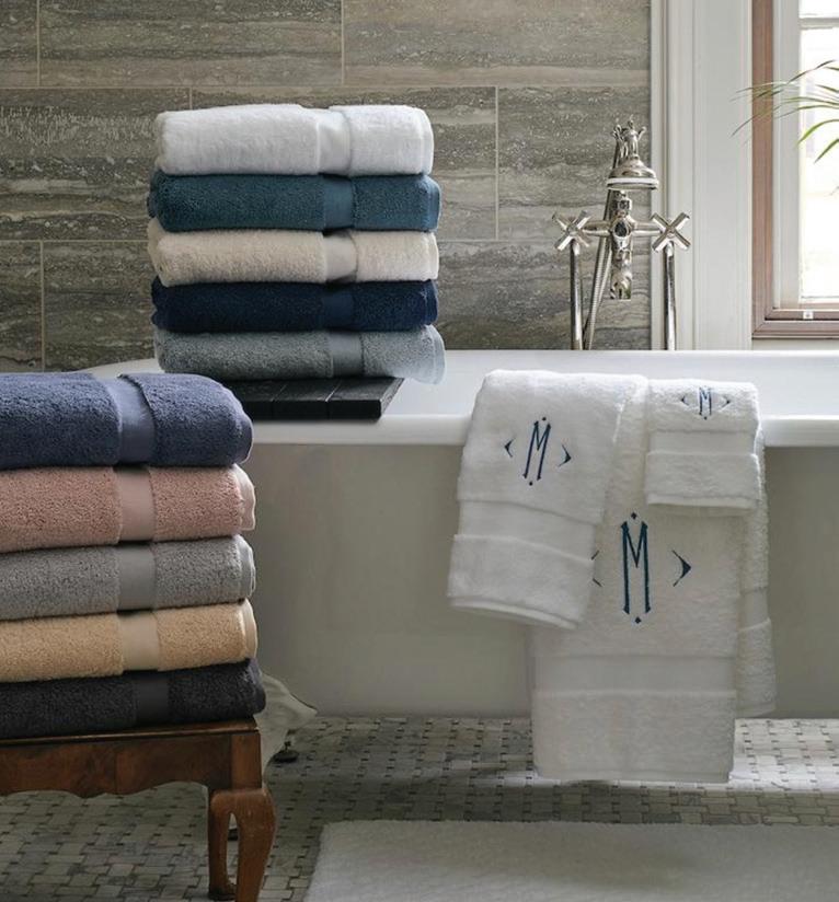
Matouk, Sferra and Frette. Special orders and custom bedding are Fig Linens and Home’s bread and butter, with thousands of fabric samples offering seemingly endless home textile options.
Furthermore, Fig Linens and Home is design-led, meaning that you can expect much more than white sheets in this linen shop. The shelves are full of bright colors and stylish patterns from celebrated designers, including John Robshaw and Ryan Studio. Best of all, it’s a one-stop shop, where you can source everything from down comforters to duvets, and sleep pillows to silk masks all within the homey walls.
for comparing fabric samples and paint chips to help you find the perfect match for your home,” says Fig founder Carlin van Noppen. “We can’t wait to welcome new and familiar faces to Fig on Church Lane!”
Anyone who has visited Fig over the past two decades knows the shop is a joy. The cozy, womanowned boutique is home to walls and walls of beautiful linens featuring some of the most coveted names in the industry: think
Despite the big names on the shelves, Fig Linens and Home retains its charming brick-andmortar feel. A visit to the shop is likely to land you in conversation with Van Noppen, the owner and brains behind the brand. With her quick wit, sharp eye and Southern drawl, Carlin offers unparalleled expertise in the industry. A Fairfield County local for over 20 years, she has worked with many of the area’s best interior designers and homeowners to decorate beautiful local homes.
We can’t wait to see what this next chapter holds.
7 Church Lane, Westport, figlinensandhome.com
PHOTOS COURTESY OF FIG LINENS AND HOME
by sophie i. edwards
shoptalk
above: John Robshaw’s Zoya bedding features traditional Indian block printed patterns. top right: Matouk towels make any bathroom better.
athomefc.com 28











Moffly Media is one of the leading providers of professional event photography and marketing services in Fairfield County. We capture compelling, high-quality images of individuals and groups at meaningful events. With our wide range of capabilities, Moffly will customize a marketing program that’s just right for you
at Kathleen.Godbold@moffly.com or 203.571.1654

MAR/APR 2024 29 hobbsinc.com 203.966.0726 HOBBS, INC. D I STI NCTIVE H OME S, AD D ITION S & R ENOVATIONS Architecture: A pparatus Architecture Interior Design: Pimlico Interiors Photography: Amy Vischio Photography
•
•
•
PHOTOGRAPHY
PHOTO BOOTH
VIDEO
SOCIAL MEDIA
LEARN MORE!
KATHLEEN
Contact
GODBOLD
The
CALL of the WILD
This spring, as native and ornamental grasses continue to replace demanding lawns, borders of pollinator plants and islands of wildly colorful flowers are signaling all creatures—including us—back to nature. Here, local landscape experts share just how our gardens grow in 2024.
by tom connor
athomefc.com 30
the chicest
the
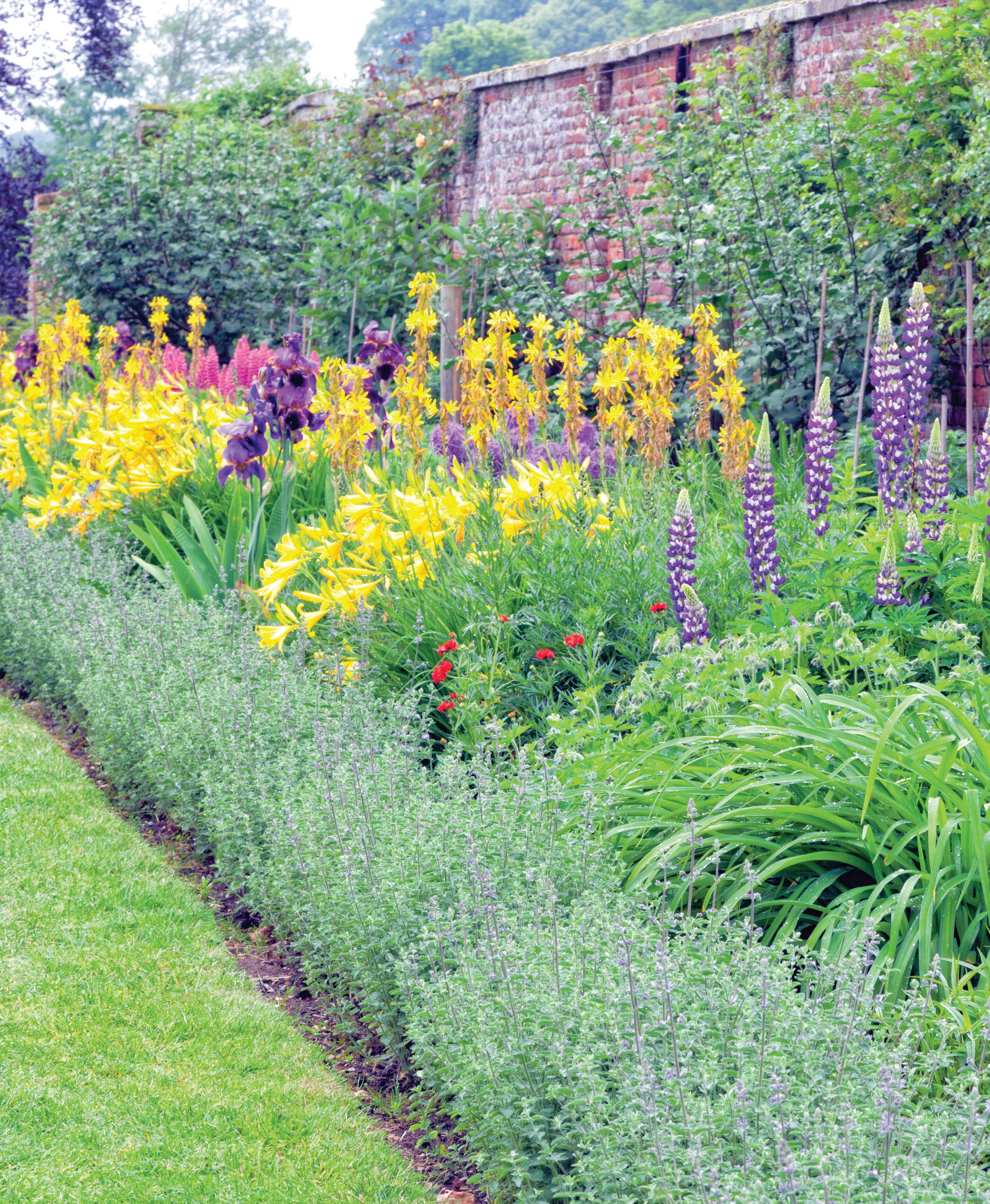
opposite Riots of color are popping up in
gardens across
county.
PHOTOGRAPHY: YOLSSTOCK.ADOBE.COM
ne of the great natural pleasures of spending time outside on warm spring and summer evenings is listening to the free outdoor concerts performed by the All-Star, All-Insect, All-Night Orchestra. This gardening season, as members of the rhythm section—the tree crickets and land crickets, the cicadas and katydids—magically
appear, the big band promises to crank up the volume and be in full swing for the first time in decades.
That’s because all across Fairfield County, many of the top landscape architects and designers have been preaching best practices to an increasingly committed congregation of environmentally conscious homeowners.
While buffalo grass and other native and ornamental grasses are kicking Kentucky blue and fescue off golfclub-like lawns (or at least out of sections of them), pollinator plants and brightly colored flowers are attracting birds, bees, butterflies and other creatures by the kabillions.
At the same time, paradoxically, something of a return to order and formality is underway, and why not? There’s a hard, clean look to arborvitae walls and boxwood borders, precisely edged garden islands and shrubs sharply pruned into statuesque topiary. They’re complementing both modern houses and formal mansions but also providing a kind of architectural structure for disorderly rows of perennials and annuals.
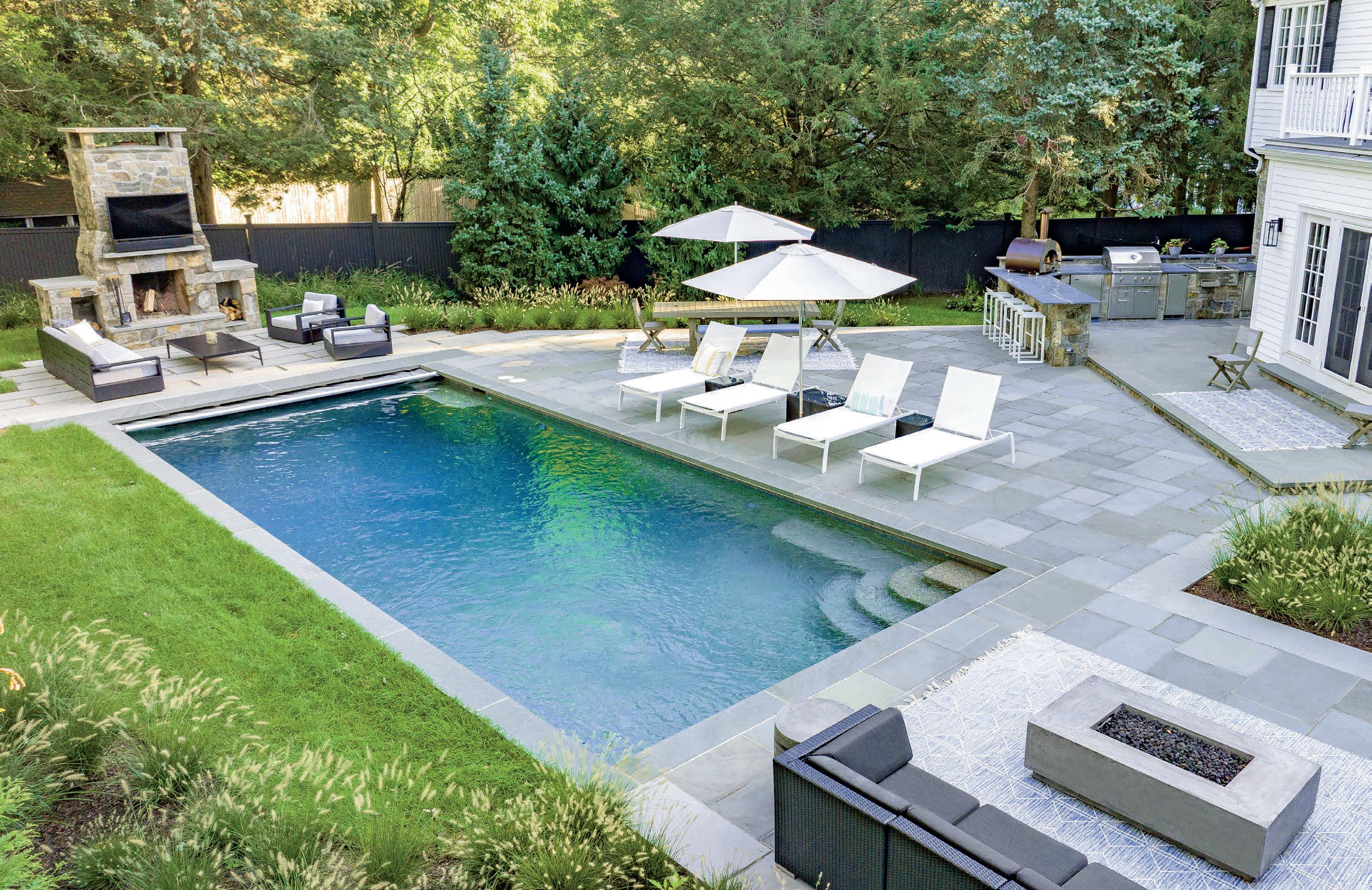
Which is not to say the backyard is no longer the place to chill after long, hot, summer days. Popular this year are plunge pools—small, shallow respites to soothe and restore sore bodies.
From Greenwich to Westport homeowners are heeding the call of the wild, staying true to tradition and taking care of themselves as well as their garden companions.
Where the Wild Things Are
For decades Fairfield County homeowners have been obsessed with golf course–quality grounds. Blame can be laid on Thomas Jefferson, whose Monticello estate boasted one of the earliest American manicured lawns. Since he set that style, cultivated grasses have dominated suburban yards as well.
In the past few years, however, a number of local landscape designers have convinced customers to go native instead.
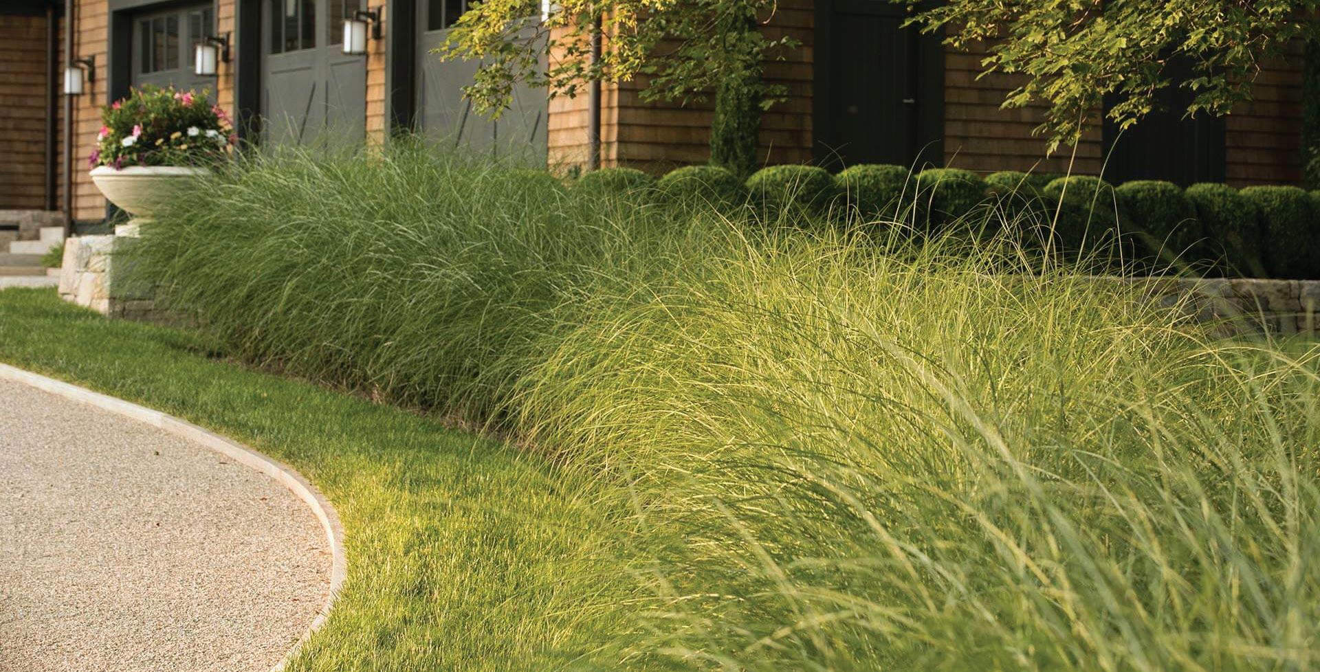
Wesley Stout Design Associates, a New Canaan landscape design firm, has installed native and ornamental grasses both at the residential and the commercial level for environmental reasons: “It’s staggering the amount of water bluegrass turf grasses require,” founder Wes Stout says. “It takes a full swimming pool to water a typical yard for a week!”
For a large commercial property in the area, the firm removed every blade of traditional turf grass and replaced it with species like Little Bluestem (Schizachyrium scoparium), a prairie grass admired for its cool-hued color during the summer months and reddish-bronze tones in autumn. (“Skipper” butterflies like it, to boot.) It demands little watering, thereby aiding local reservoirs, and though it can grow up to three feet high by fall, lawns planted in the grass need to be cut back just several times a season.
Other designers confirm the trend’s rise. Sam Bridge Nursery & Greenhouses in Greenwich has reported an uptick in orders for native seeds and plantings as well as perennial meadow garden material.
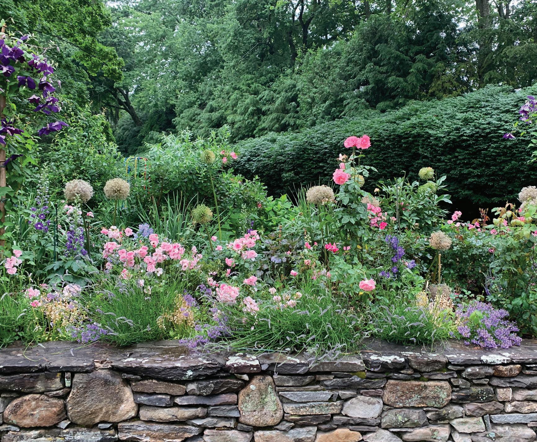
“People are using their spaces differently,” notes Maggie Bridge, a partner in the family firm that has been on the same North Street parcel since King George I of England bestowed it as a land grant in the 1600s. “Where traditionally you would see a giant lawn, we're now starting to see more requests for wildflower meadows and pollinator gardens.”
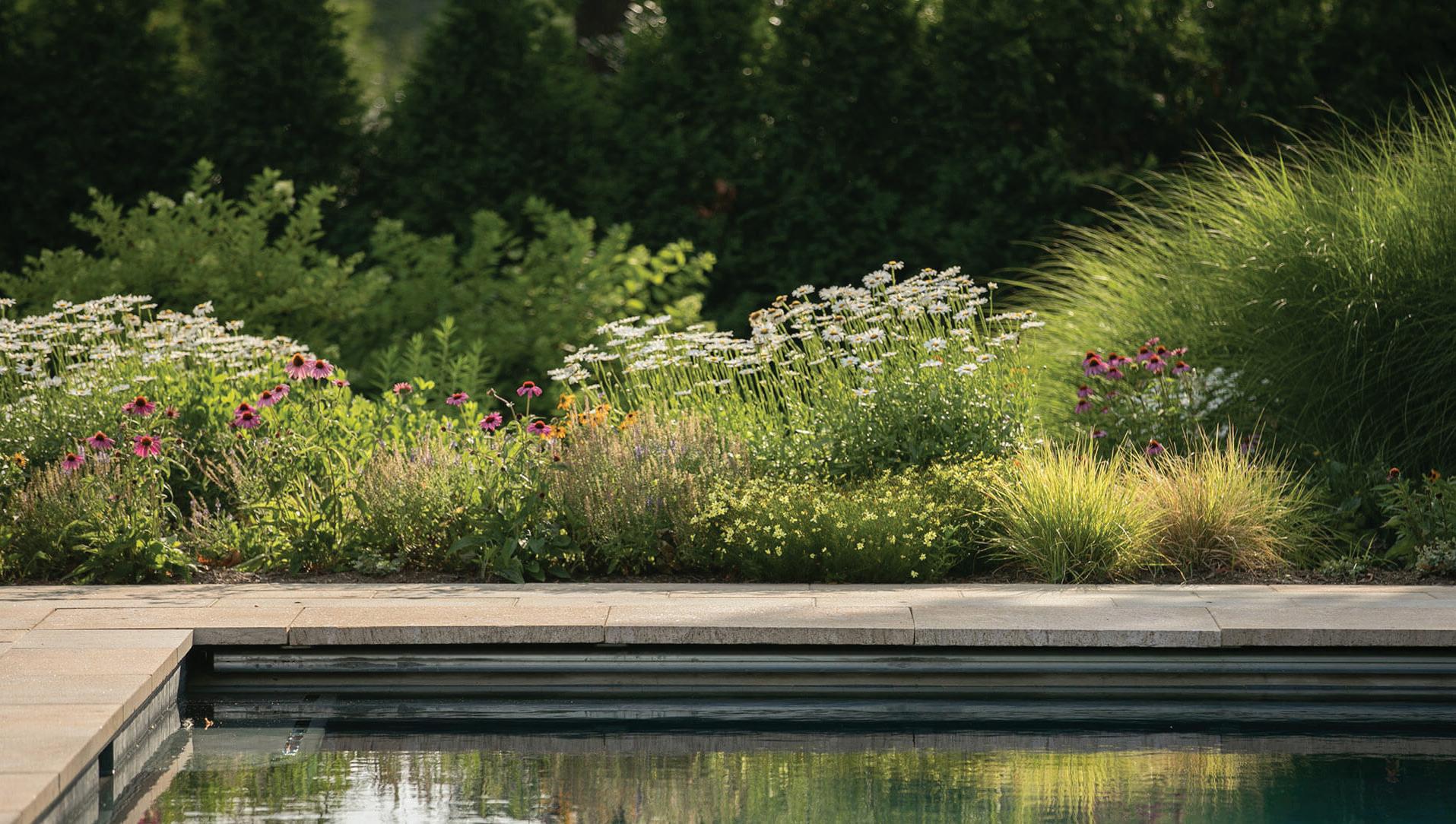
(Pollinators are plants that attract insects which, in turn, transfer pollen from one plant to another. Here in the Northeast, they include milkweed, sunflowers and wildflowers, sweet alyssum, black-eyed Susans and some zinnias and verbena, as well as many herbs.)
At the Chelsea Flower Show in London last May, Sandy Lindh of English Gardens & Designs in Greenwich took note of a turn toward the rewilding of formal English gardens and a more naturalistic approach to landscape design. Back in Greenwich, she found her customers requesting the same. Last year, her company installed some half-dozen pollinator gardens in addition to open meadows of wildflowers.
“I think [homeowners] are beginning to realize that we need to make space for nature and that having pollinator-friendly flower beds with no chemicals is the way to go,” Lindh says. This spring she’s encouraging clients to reduce their lawn footage and expand their blooming plots.
Other options exist, however unnaturally. For the father of three very active young boys, who was tired of patching the back lawn, Lindh tore it up and, in its place, laid a quarter-acre of Astroturf. It’s not beneficial for the bees— or some say even the knees. Yet it’s so lowmaintenance that perhaps we’ll see the rise of these truly “no mow” yards in the coming years?
Silent Spring
In keeping with some landscape designers’ preference for electric leaf blowers and the “No Noise” ordinance that went into effect in the state last October, these wild lawnsubstitutes are, in effect, silencing commercial mowers to combat noise. They’re also helping reduce air pollution since big, multi-wing, gaspowered rigs operate outside of EPA emissions regulations.
athomefc.com 32
o
“People are using their spaces differently. We're now starting to see more requests for wildflower meadows and pollinator gardens.”
Maggie Bridge,Sam Bridge Nursery & Greenhouses in Greenwich
 right and below Native grasses and gardens planted like full-of-life meadows are taking up space alongside—and sometimes even replacing— traditional manicured lawns.
below Insectattracting pollinators are all abuzz for spring and summer.
PHOTOGRAPHY: GRASSES AND POOL BY NEIL
LANDINO; BEES AND WILD FLOWERS © ALEKSANDRSTOCK.ADOBE.COM
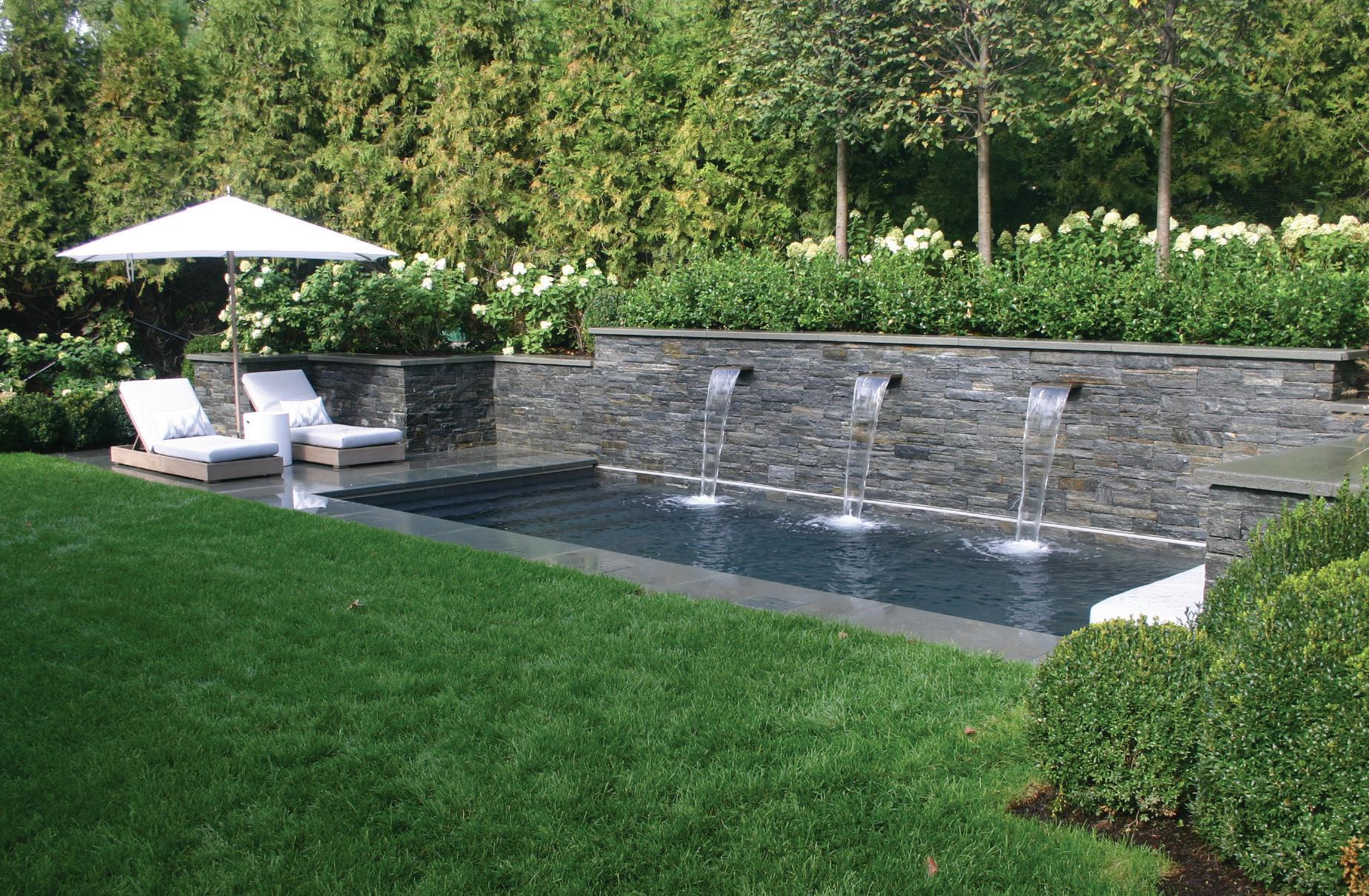
“The appeal is socialization. With the heater on in cooler weather, you can get in there and wallow with your friends all year round."
Sandy Lindh, English Gardens & Designs in Greenwich
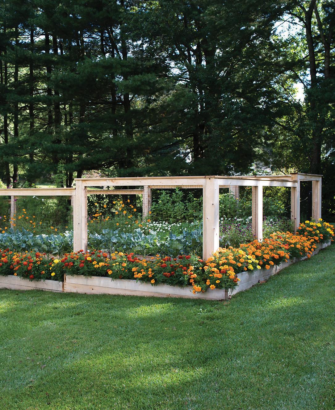
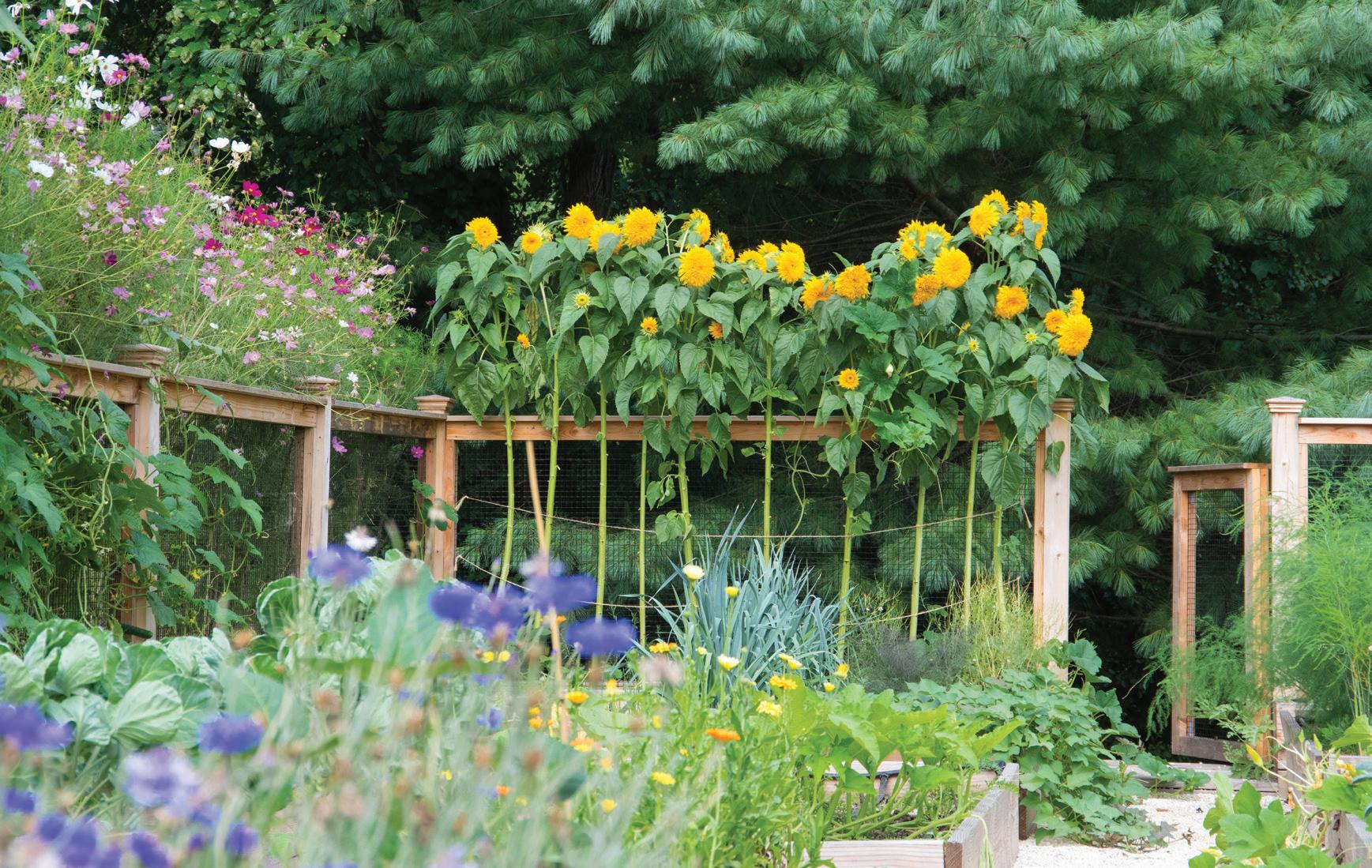
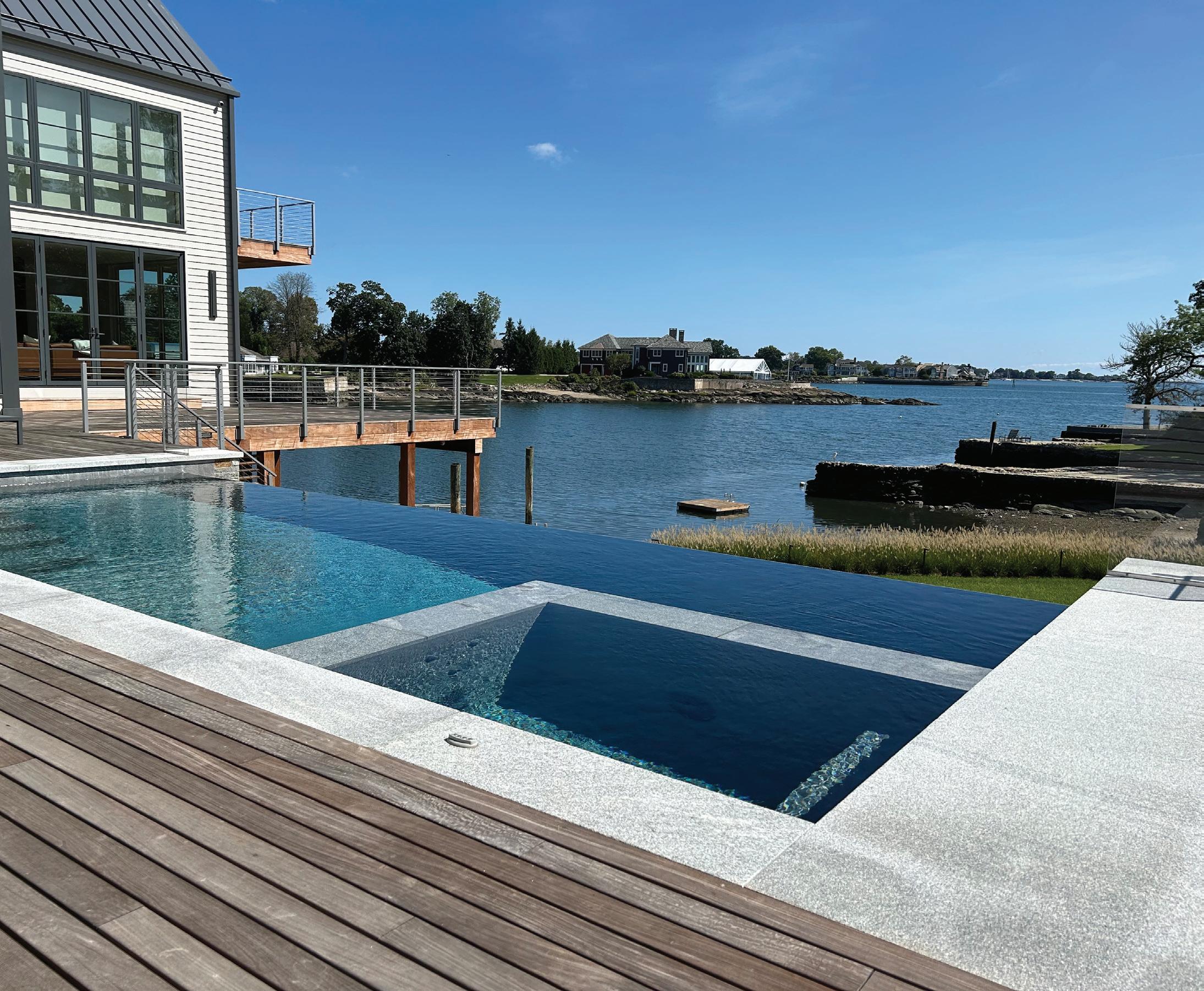 this page Posh pools boast sun shelves, heating units for winter and plunge options for cold immersion therapy. opposite Flowers are the ultimate accessory in well-appointed vegetable gardens.
During the peak summer season, according to Stout, “the commercial lawn mower that’s going around your two-acre yard every week is the equivalent of something like 18 automobiles on the road.”
Like him, Heather O’Neill of Second Nature Landscape Design in Norwalk encourages clients to incorporate native grasses, pollinators and other thoughtful plantings on their properties. But she’s also keenly aware of Fairfield County sensibilities.
“Replacing a lawn either in part or whole with native and ornamental grasses is great on paper, but a lot of homeowners want green grass that looks like a putting green,” she says. “We're trying to do the best of both worlds.”
O’Neill also adds that native seed and plants can be more expensive than non-natives and remains skeptical of any immediate widespread adoption of battery-powered leaf blowers due to their perceived inefficiency compared to their gas or electric counterparts.
But on one thing homeowners throughout the county have needed no convincing—filling their properties with tons of flowers. Maybe it’s the lingering gloom hangover of the pandemic driving the trend, but bold, bright colors are widely believed to bring joy and signal hope. If that’s the case, we’re in for a joyous, hopeful gardening season.
Rainbow Valley
Late last fall, O’Neill’s crew planted thousands of bulbs on a three-acre property in backcountry Greenwich to appease the owner’s seemingly insatiable desire for continuous color.
From earliest spring to late in the fall, the property is lined with blooming borders, even down to the edge of a pond, and dotted with blossoming islands. The plantings have enticed legions of insects, amphibians and reptiles to feel at home, as well as at least one bald eagle O’Neill spotted on one of her regular visits to the property.
“Honeybees are swarming over the flowers,” she says, “and there are tons of fish and frogs and more snakes than I’ve ever seen in my life. It’s as if St. Patrick drove all the snakes out of Ireland and they came to Greenwich!”
Flowers are also being mixed into vegetable gardens, bringing visual sustenance to the dinner table.
At Homefront Farmers in Redding, towering sunflowers line the edges of the handsome raised and fenced gardens the company constructs for clients. “We’ve always grown
a lot of native plants that we intermix into our vegetable gardens, but more people are asking for them today,” says Miranda Gould, Homefront’s director of client operations.
Dahlias, the large-headed, showy members of the family of flowers that includes sunflowers, chrysanthemums and zinnias, are the prima donnas of the gardens the company creates. Blooming in late-summer and well into the fall, the blooms come in a range of sizes— “Café au Lait,” the Queen of the tubers, is a dinnerplate dahlia that can grow to ten inches in diameter!—and a prism-full of colors.
Dahlias have become so much in demand that orders for them are crashing supplier websites and blowing up availability to a degree perhaps not seen since tulip mania in 17thcentury Holland.
Hot Water
All the while, swimming pools continue to be in high demand, with landscape designers scrambling to line up contractors who’ve been
booked for as long as a year in advance of construction. Driving demand has been a trend toward viewing them anew.
“Pools have become more for pleasure than just for swimming and diving,” says Roger Haggerty of Haggerty Pools in Norwalk. “We're doing a lot of shallower pools. Diving boards have pretty much become obsolete.”
Adapting to the latest trend, Haggerty is building sun shelves in the shallowest ends of existing traditional pools for sitting and chatting. And, along with other pool companies, they’re installing a whole other kind of hole in the ground for serious runners and athletes as well as for the owners of small properties. In what sounds like the opposite of entertainment, Soake plunge pools typically range between seven and 15 feet long and are equipped not only with heaters but also with chiller units that can plunge water temperatures to as low as 37 degrees. Cold-water immersion is believed to help muscles recover quickly from strenuous exercise, heat and stress—and fast.
“We’ve always grown a lot of native plants that we intermix into our vegetable gardens, but more people are asking for them today.“
Miranda Gould, Homefront Farmers in Redding
MAR/APR 2024 35
PHOTOGRAPHY: GARDEN CONTRIBUTED; OPPOSITE PAGE: POOLS CONTRIBUTED
Because they don’t overwhelm a backyard in the way traditional pools can, plunges can be tucked into a corner of a property, leaving space for gardens. They range from a third to half the cost of a standard swimming pool and can convert to hot tubs at the end of summer for year-round use.
“The appeal is socialization,” observes Lindh. “With the heater on in cooler weather, you can get in there and wallow with friends all year round!”
The Perks of Being a Wallflower
For all the talk of wild meadows and explosions of color, Fairfield County is still home to some of the most exquisite examples of formal, classical architecture in New England, and on a grand scale. Landscape designers here are as attuned to gardens that reflect these places as they are to horticultural trends.
As such, reports of the demise of boxwood, prompted perhaps by a blight in recent years,
has been clearly exaggerated (with a nod to Hartford’s Mark Twain).
Sandy Lindh uses sharpened, finely crafted British pruning shears to handcut evergreen shrubs and trees towards a range of goals: screen properties from neighbors; frame gardens overflowing with flowers; maintain allees of hornbeam and linden trees; and shape boxwood into stunning topiary.
When well-maintained, borders and walls of these evergreens provide a sense of tradition and dignity befitting the grand mansions and estate homes that dot Fairfield County’s Gold Coast and backcountry. They work to marry the wild and the tamed, giving large properties a sense of enclosure and focus.
As with other landscape designers working the grounds of formal homes, Lindh favors boxwood-lined gardens close to the main entrances and around foundations.
“For big mansions in backcountry Greenwich, you might have topiary hedging leading the way
to the main entrance,” she says. “They don’t have to be boxwood—they can be hornbeam or linden trees–to lead the eye to a courtyard or fountain or formal garden in front.”
Behind stately homes like these, Lindh also creates topiary courtyards that can be more whimsical, with boxwood shaped into spirals, balls or animals.
And yet boxwood borders and boundaries also fit more contemporary abodes, too. For its clients in modern farmhouse-style houses, Putnam Landscape Associates, a design and high-end property maintenance firm in Weston, installs boxwoods to deliver clean lines and define uncluttered flower beds.
“It’s not necessarily an English garden effect,” says Grant Putnam, who cofounded the company while still in high school, “but more of a modern design with fewer elements than in the past.”
In many cases, that calls for tiers of boxwoods to add structure and accentuate the architecture of a contemporary house. “There’s nothing like boxwood to achieve those ends,” Putnam says. “It’s a timeless plant.”
Showcased within boxwood borders this spring are perennial cultivars that have been bred to bloom more than once a season and to maintain staying power. “The new cultivars of plants, like hydrangeas, are superior genetically to past versions,” says Putnam. “They’re real bloomers, rather than once-and-done, that rebloom later in the season.”
Other plants popular at Sam Bridge Nursery & Greenhouses in Greenwich this season include the European hornbeam (carpinus betulus), a short-trunk tree than can be planted close together and pruned like a hedge.
“Hornbeams’ sleek lines look great outside modern homes but they also work in English gardens and in traditional spaces,” says Maggie Bridge.
With a little luck and a stretch of good weather, the bulbs planted last fall are emerging from the warming earth and the new pollinator plants are sprouting light-green leaves. We’ve brought back out the patio furniture and stacked the firepit with seasoned or kiln-dried hardwood.
Listen! The opening act of the outdoor concert season, The Fabulous Spring Peepers, is warming up. Now, after a winter spent mainly indoors, let’s gather family and friends outside to take in all that nature has to offer.
athomefc.com 36
PHOTOGRAPHY: CONTRIBUTED; OPPOSITE PAGE: © YOLSSTOCK.ADOBE.COM
above Blooming in never-ending cycles of pretty, meadow-like gardens feel like being surrounded by a field of flowers in the English countryside. opposite Estate homes maintain a sense of tradition with a more formal focus.
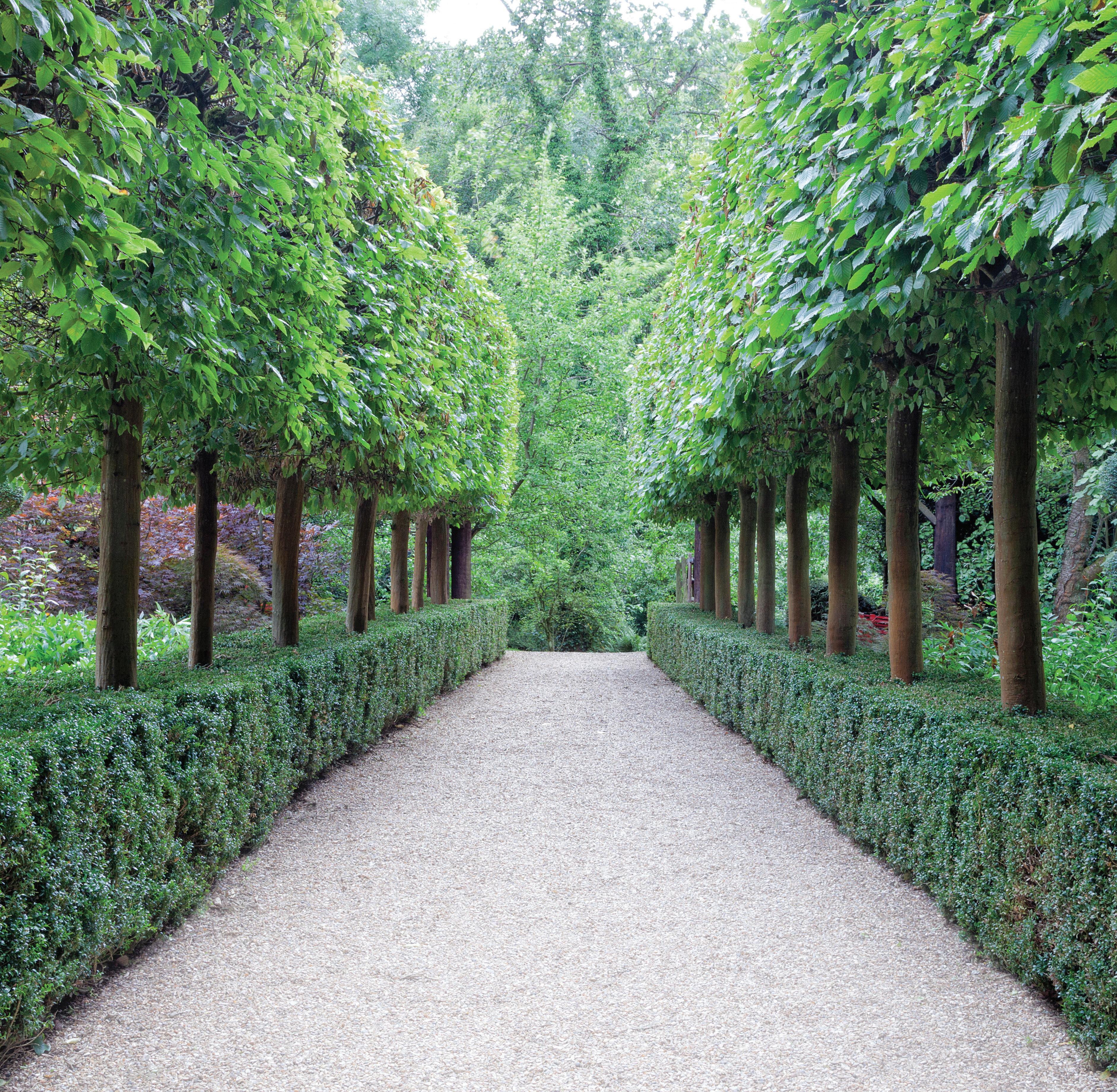
“For big mansions in backcountry Greenwich, you might have topiary hedging leading the way to the main entrance. They don’t have to be boxwood—they can be hornbeams or linden trees—to lead the eye to a courtyard or fountain or formal garden in front.”
Sandy Lindh, English Gardens & Designs in Greenwich
MAR/APR 2024 37
T URNING THE PAGE
For their next chapter, a couple looks to Krista Fox to reimagine their rowayton retreat
interview with krista fox, krista fox interiors photographer neil landino
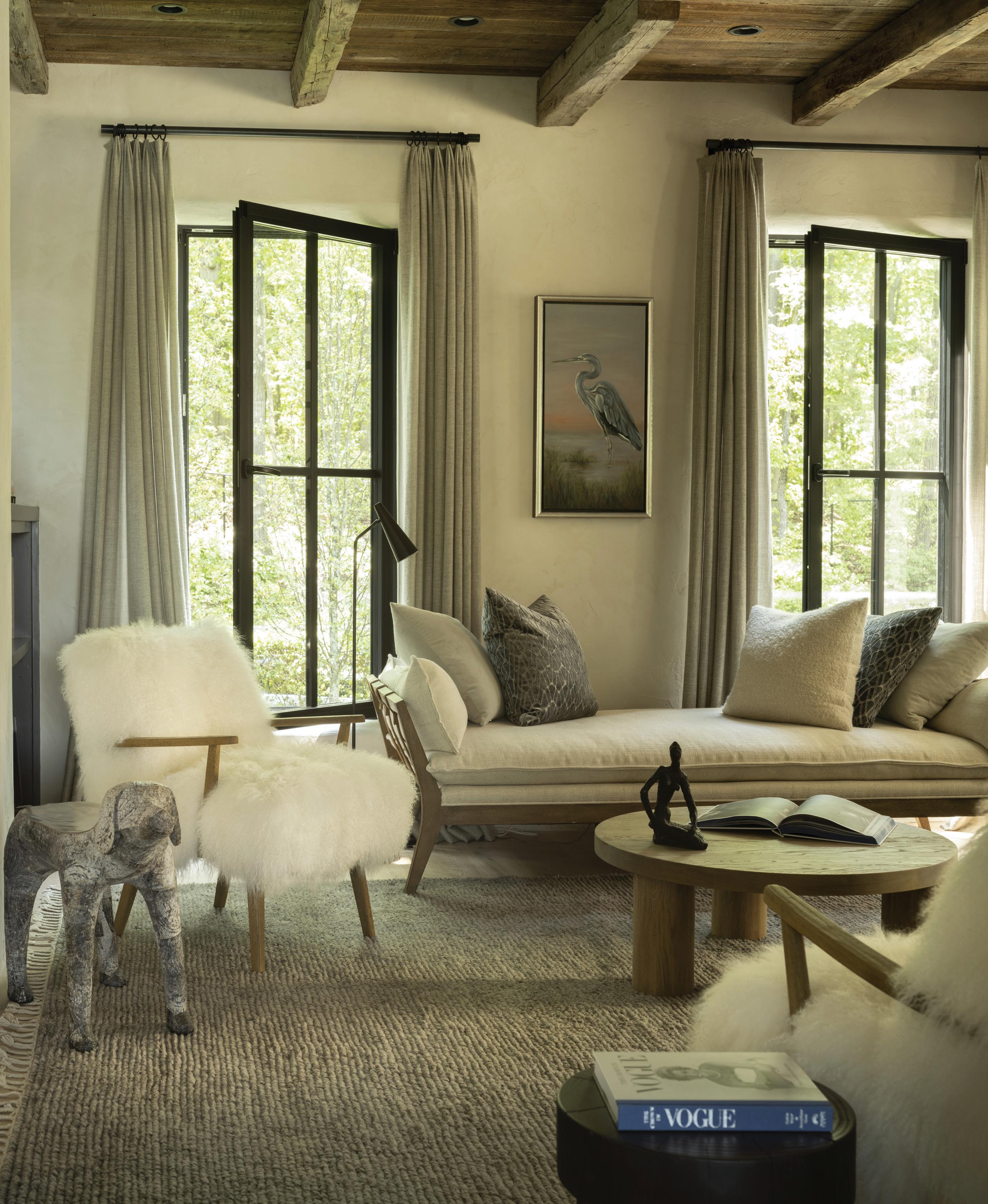
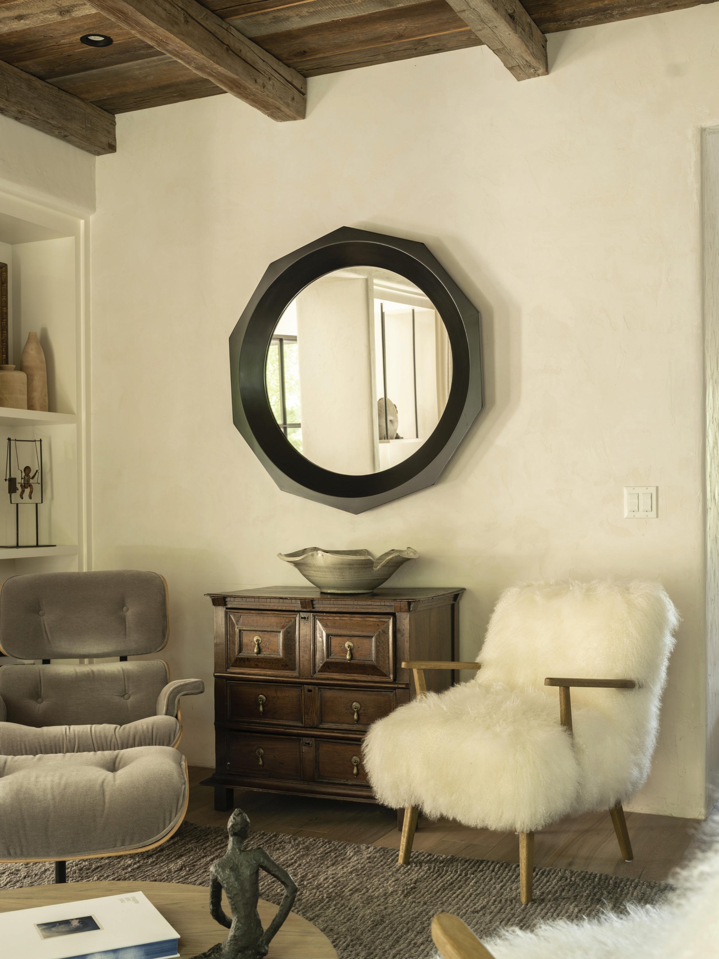 this page: An Eames chair by DWR and Alpaca fur chairs by Four Hands create cozy seating in the living room. opposite page: Fox wanted to capture the serenity of this shaded spot, a perfect place for relaxing or reading. Great Blue Heron is a commissioned piece by artist Mary Morant.
Tell us about this client.
They are a lovely couple. They had sold their big family home in New Canaan and relocated to Rowayton to connect with a different, next chapter, but were still wanting a different kind of family home as their kids get older. We’re doing a fair number of homes like that right now— Rowayton in particular, seems to be a place where this is happening—and it’s great fun to see people looking to create new spaces for a different kind of family dynamic. This home is still very welcoming, very connected, and speaks to their aesthetic, but it’s different. We used this new space to dive into what they wanted home to feel like, especially after not thinking about that for a long time. It’s not about downsizing but rethinking, transitioning, especially as needs change.
What was their vision for this project?
They didn’t want to leave their past behind. It wasn’t about going out and buying everything new. They wanted to incorporate some of the pieces from their previous home, like antiques and furniture that had a
resonance with them. They wanted to grow into this space and celebrate the layers as they came. They loved the bones of the home: the family space, more of an open plan with the connection of the kitchen to family room, the connection to nature. They’re big on taking walks, they have pets. It’s a beautiful place to have coffee or a cocktail in the evening.
How much did the waterfront location inform your design plan?
It’s always something that informs us as far as nature in general. For wellbeing, as creatures, it’s always been a drumbeat for our work. For the main spaces, looking out on the water, it’s so dynamic. It could be the grayest of days, and it has this moody wonderful feel to it, or its bright and sunny, and there’s a lot of activity. We kept the palette natural, not trying to compete with it. The husband is a bird person, and we had that heron artwork custom done for the living space. It’s a wonderfully quiet room. The back of the house gets more sun, but this is facing south and the street, and it’s more shaded. That’s where they want to read and relax.
athomefc.com 40
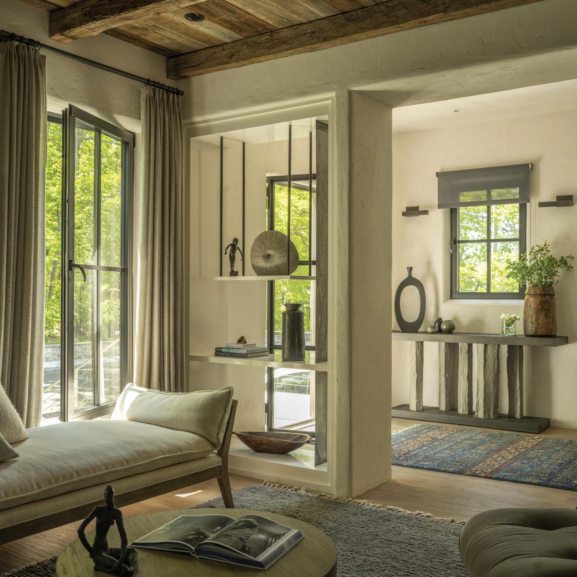
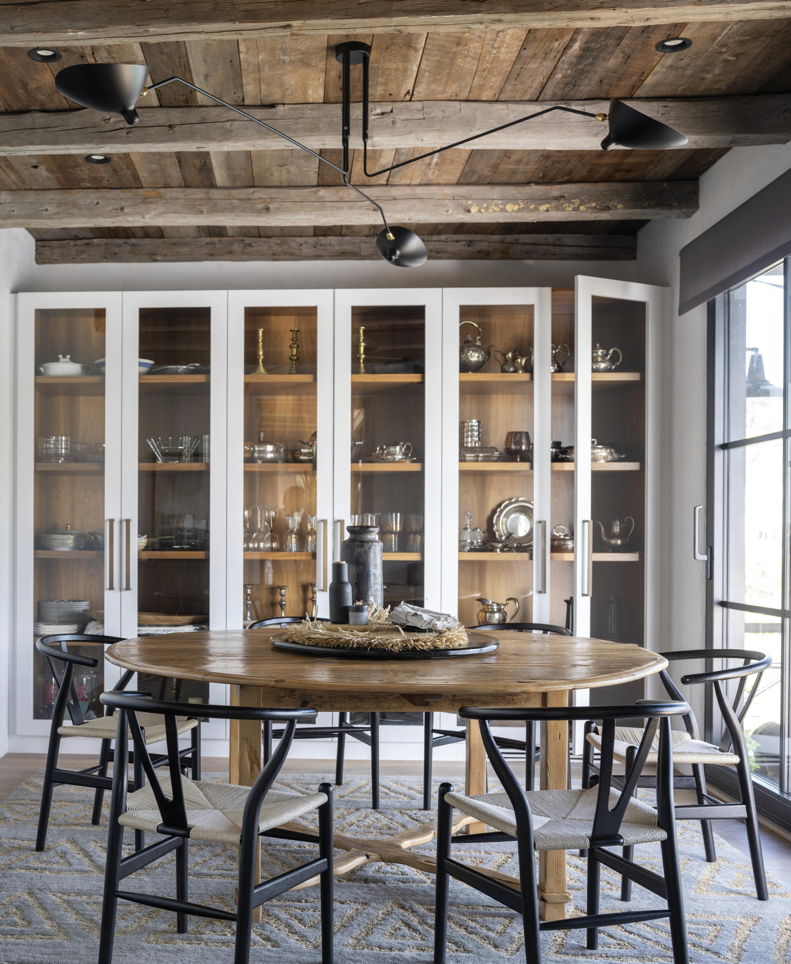
above: The story of this home is about connections to both nature and the views, as well as the community just outside their front door. Light flows through the open shelving, finished with decor from Westport’s Bungalow. opposite page: The clients’ custom table was refinished for this dining space, which looks out onto the ever changing backdrop of Farm Creek.
“They wanted to grow into this space and celebrate the layers as they came. They loved the bones of the home: the family space, more of an open plan with the connection of the kitchen to family room, the connection to nature . ”
—krista fox, krista fox interiors
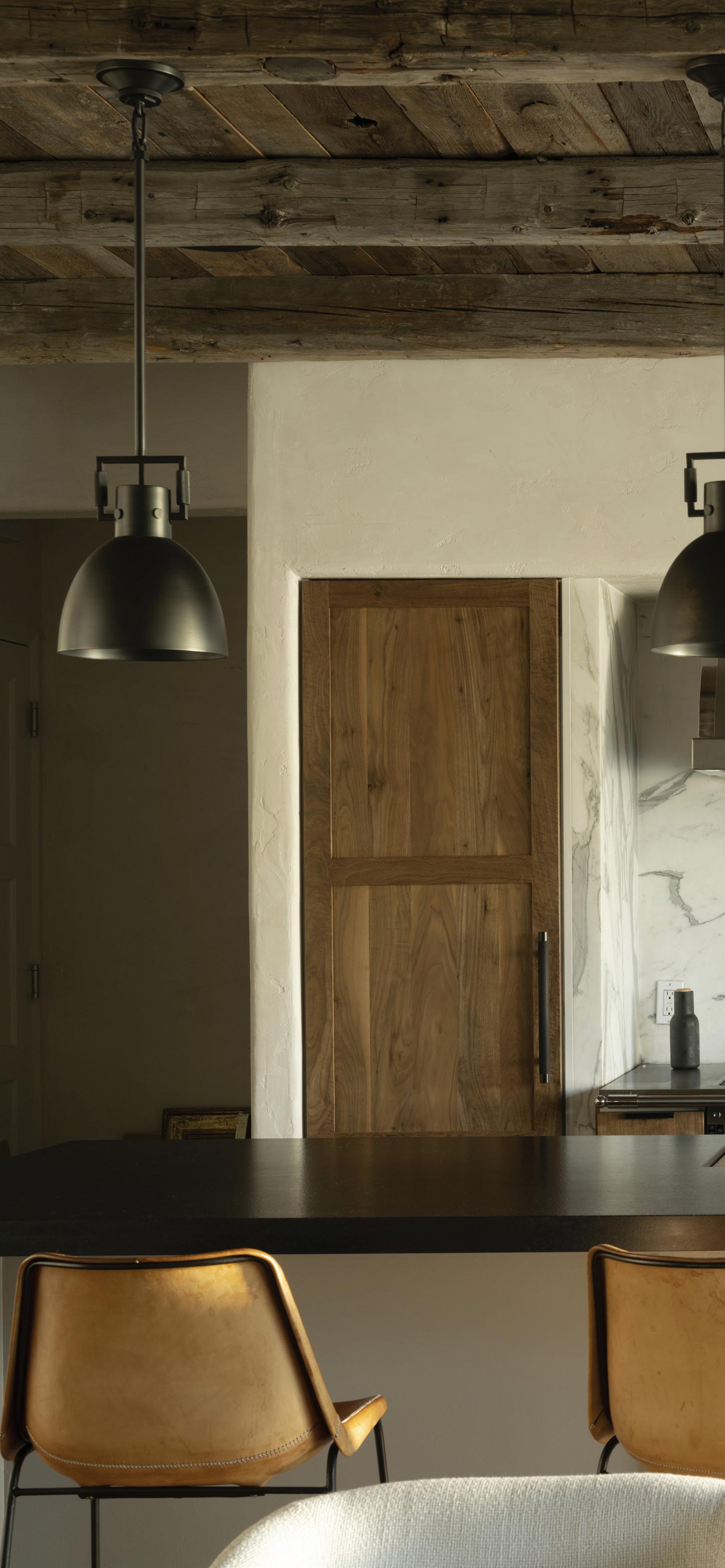
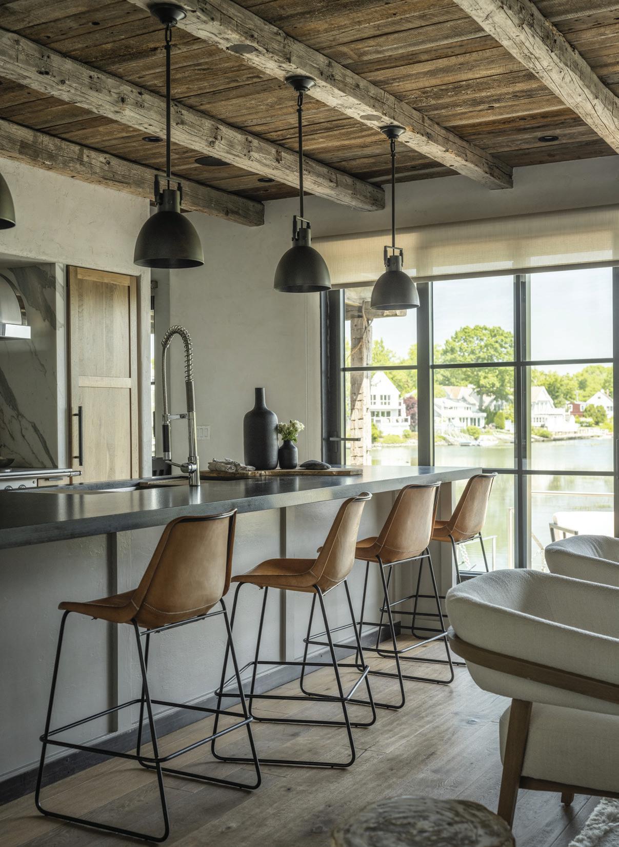
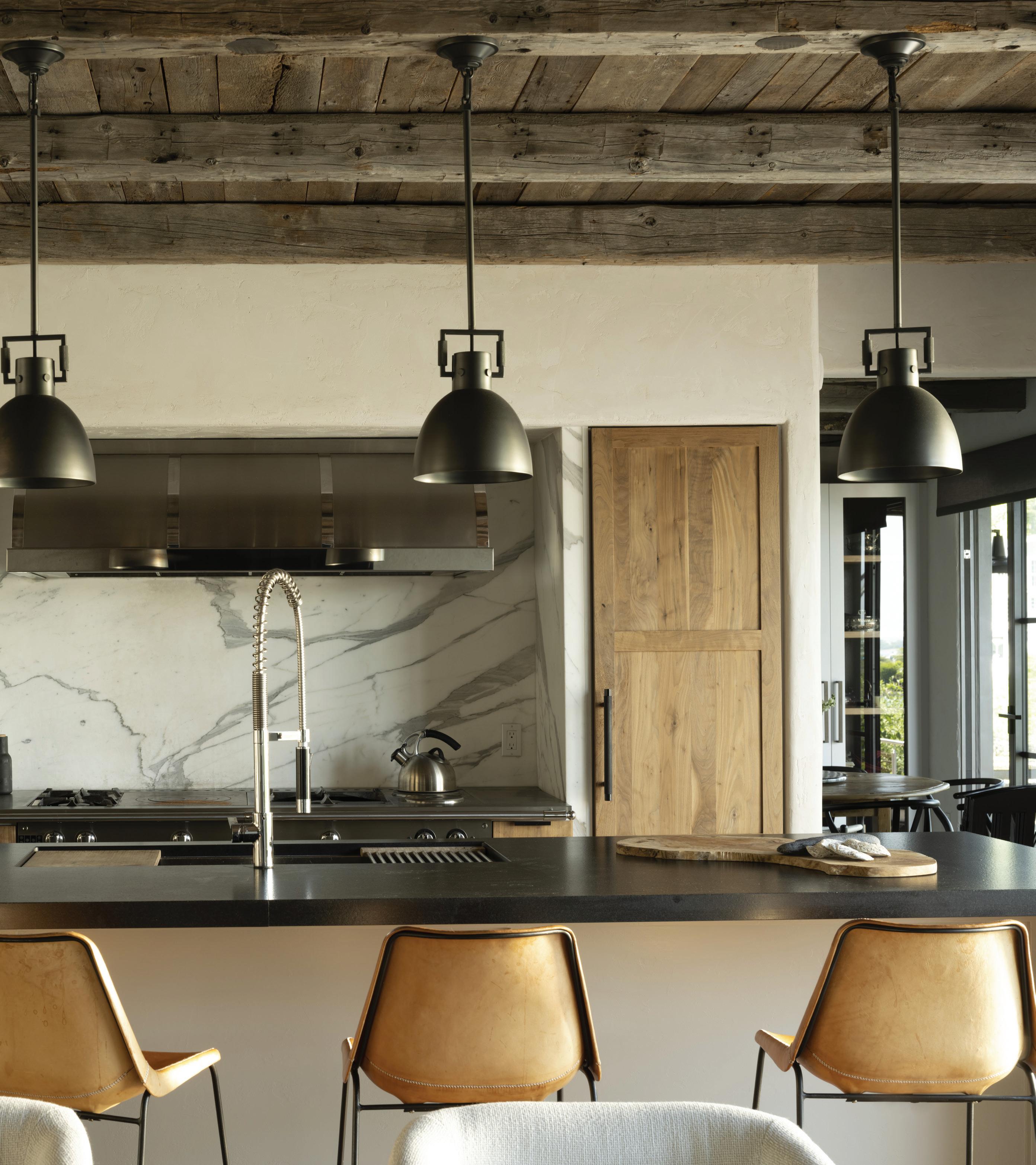
left: Each change in season or time of the day has a beautiful effect on the palette of the room, something Fox wanted to capture. this photo: The kitchen is a dialog of sophistication and approachability all at once. Streaming light highlights the custom oakwood cabinetry, Calacatta backsplash and leathered black granite counter top.
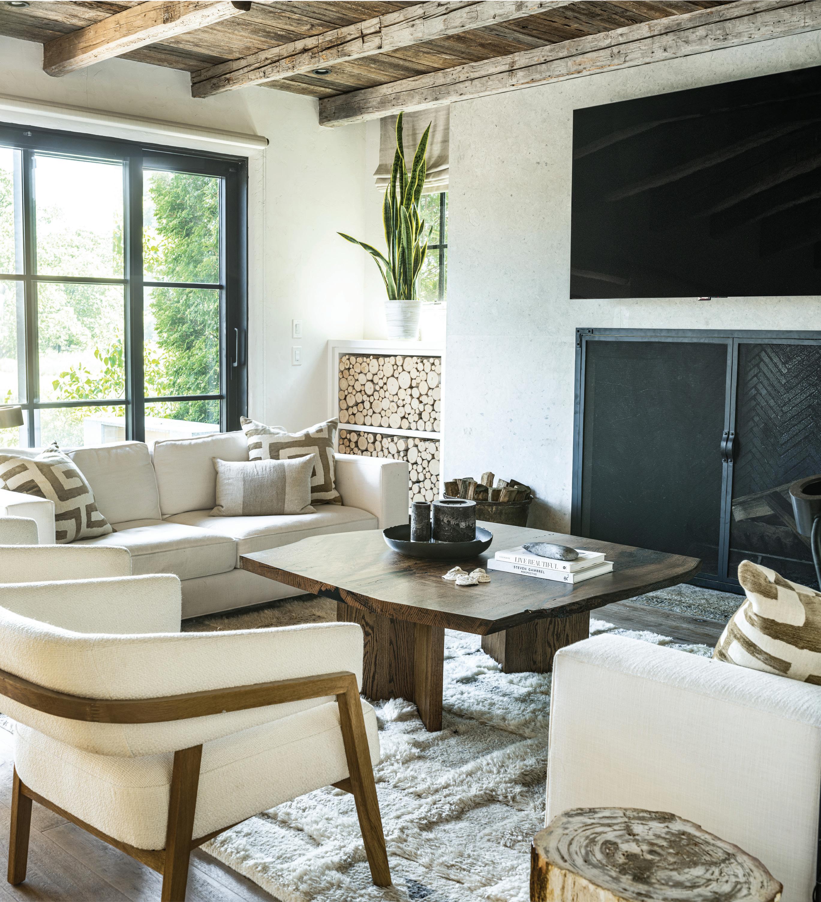
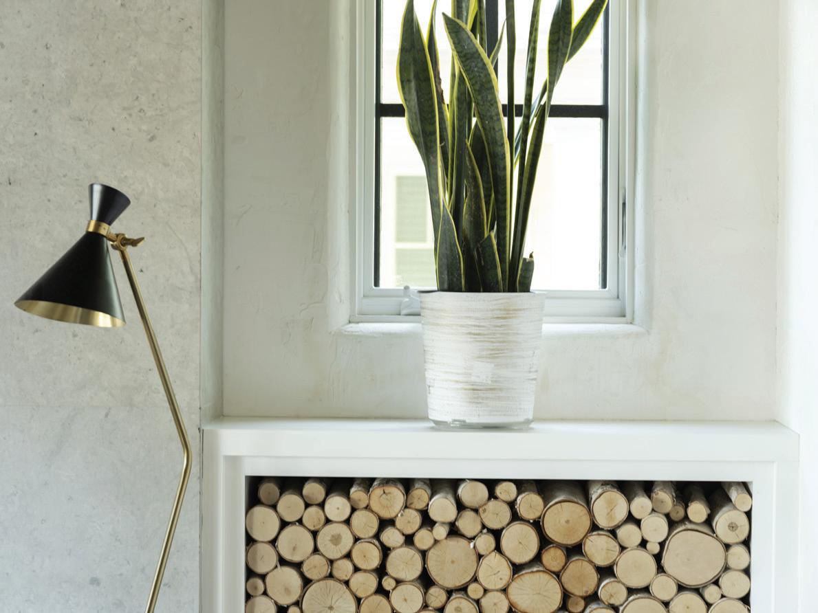
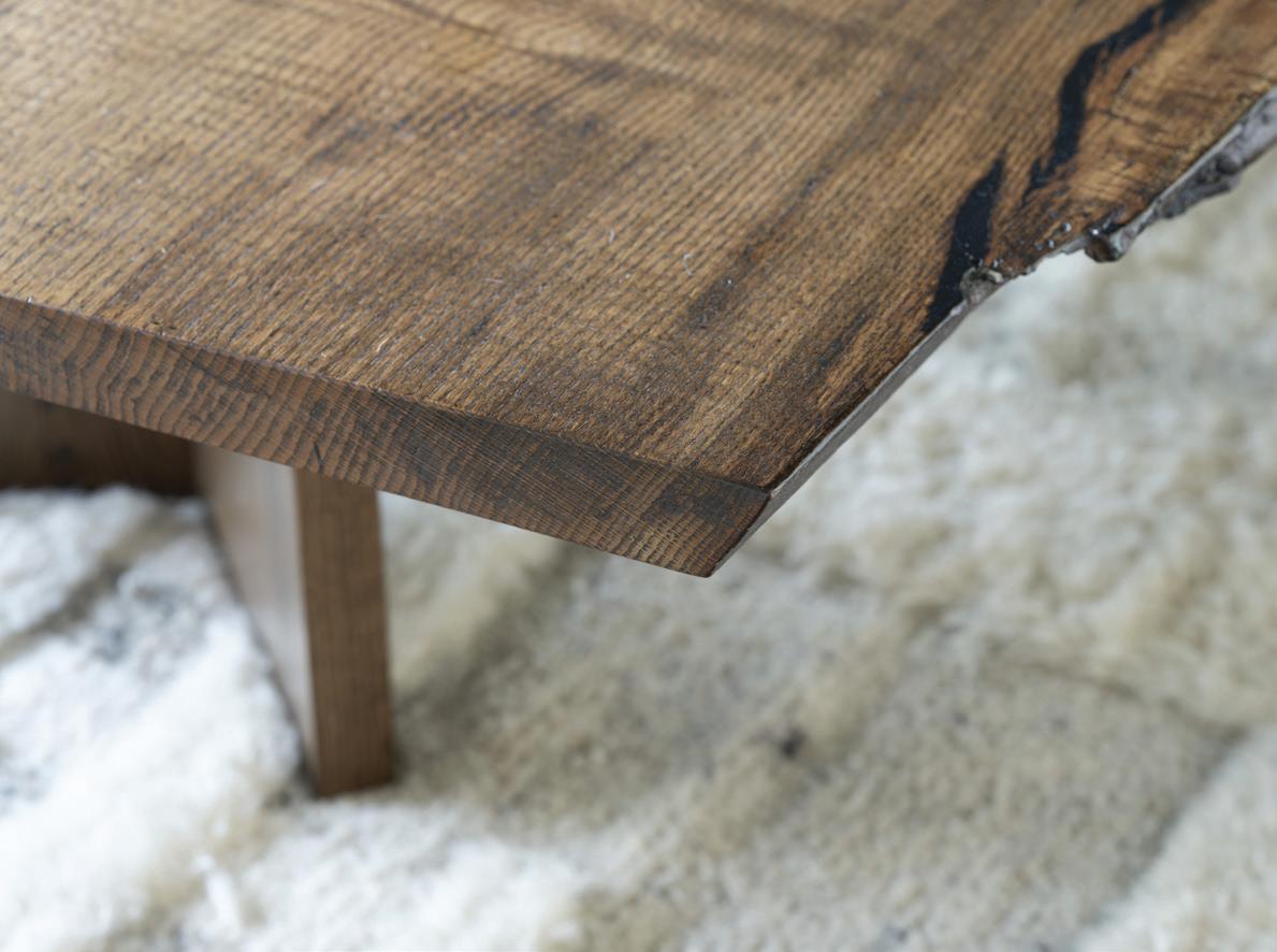
this photo: This area is all about texture. The clients use it for everything from coffee in the morning to movies and entertaining at night. Fox used the soft natural textures of wool, alpaca, linen and cotton as well as a custom liveedge coffee table to be the center of the room.
Rough-hewn beams create a warm canopy above the communal spaces.
Tell us about the kitchen space. They didn’t want it to be unapproachable. It’s not supposed to be something that is just passed by. They use it. They love it. It’s connected to the family room and very communal. It’s very connected to the water that’s right outside. It’s definitely integral to the home.
With a limited color palette, how important is texture in the way you look at the layering of design elements?
It’s totally important, just as it is in nature. You can look out on a gorgeous spring day, and everything is green, but the texture is what makes it all sing. The wife was not afraid of color, she wasn’t the one saying stay away from it. But it became more about bringing it in with flowers or things that felt more seasonal. And again, I think this was different from their previous place.
Do you have any favorite features of the finished project?
I like the dialogue of textures for sure. I think that worked out really nicely. The space is elevated and sophisticated but in a casual environment. Even the barn-type finishes don’t smack of industrial or country. You just can’t help but relax there.
How would you describe your style?
What I’d prefer to say rather than a style, is more of a way of working with clients. It’s listening. It’s listening to the space. It’s listening to the surroundings. We start there. If people don’t really know what they want, it’s about asking the right questions. What we do is try to discover what you want in a space and elevate that experience, for you. We bring the design tools and experience but the thing that always compels me and lights me up when it comes to this business is that you’re creating a place for someone to celebrate every day. It can’t be one style because it so depends on that.
The important things right now in this field is it’s gone from something where a designer just comes in and makes their mark, to something where the importance is in how a space feels to you. There is scientific research of how a home and environment has such an impact on you. What we try and do is discover that, develop that and then celebrate it.
Professionals:
Interior Design: Krista Fox Interiors, Norwalk; 203-912-3103; kristafoxinteriors.com
MAR/APR 2024 45
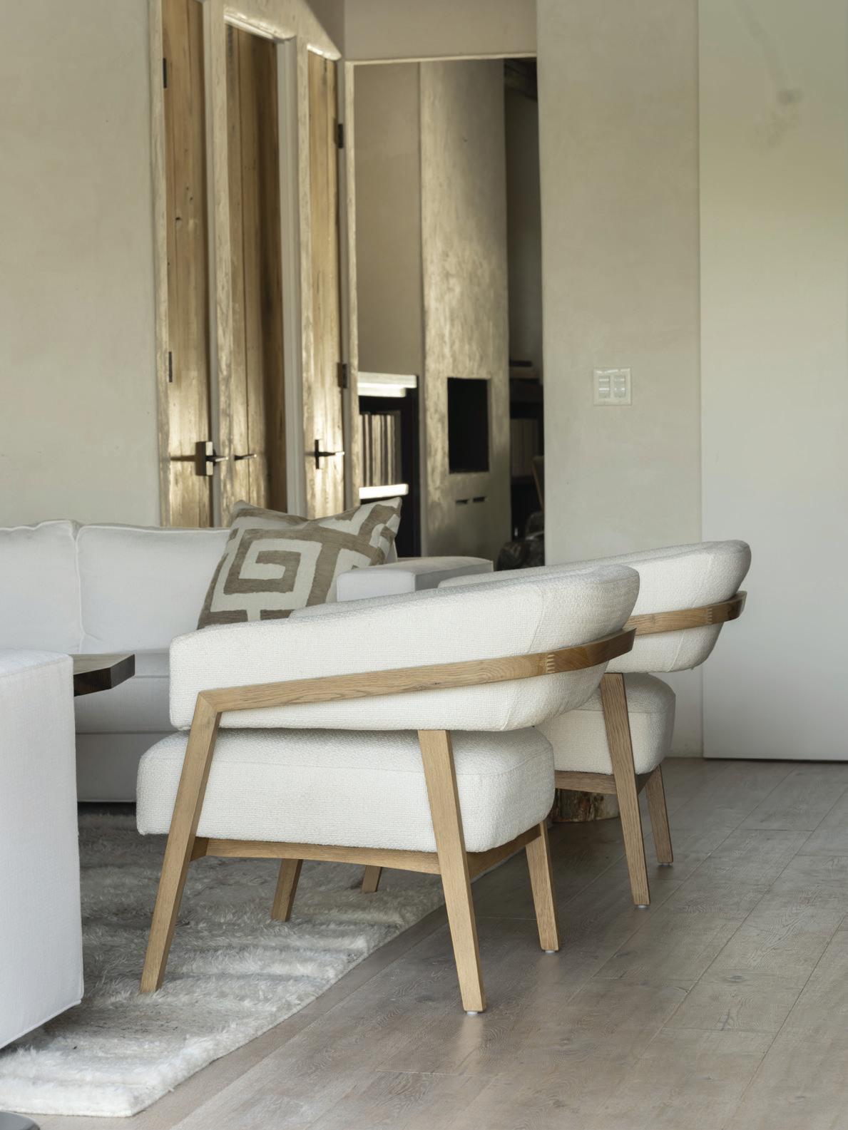
top right: Textured walls and layered materials add depth to the neutral palette. middle right: Armchairs with curved shapes invite guests to sit comfortably. The open layout encourages easy gathering while allowing for visual space. bottom right: A soft custom Moroccan style rug woven in natural undyed wool grounds the room.
BURB Appeal
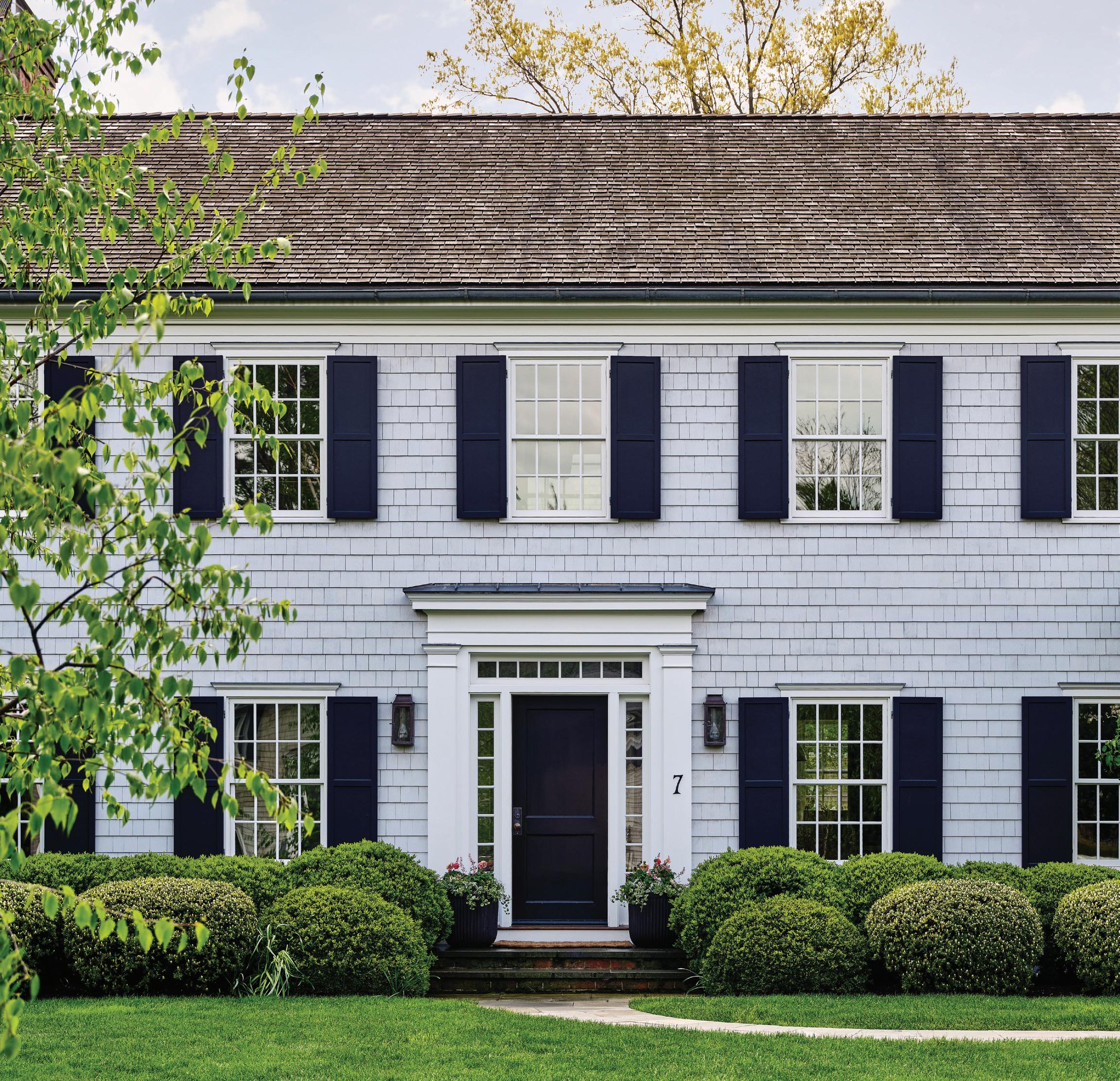
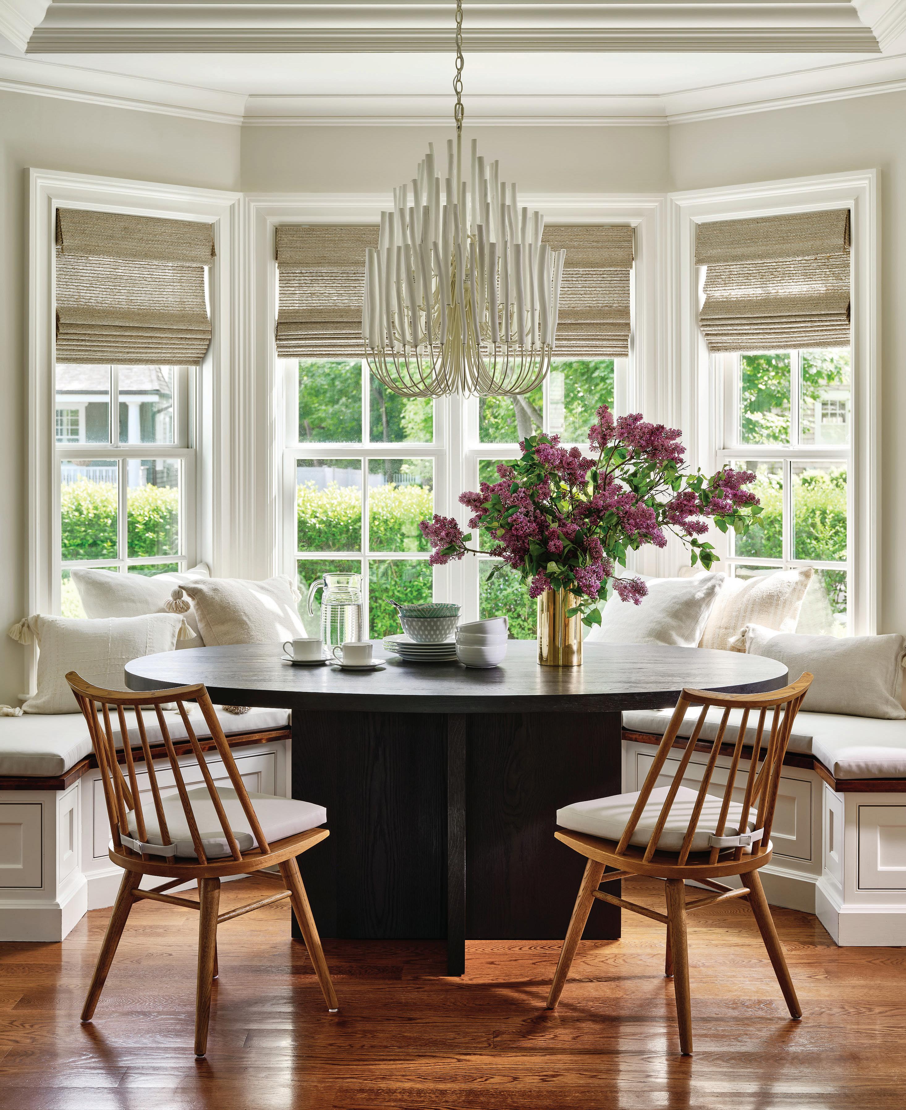
this page: After leaving New York City mid-pandemic, the owners fell in love with this picture-perfect Old Greenwich home. opposite page: An Arteriors pendant hangs over the custom black dining table in the breakfast nook, where seats are covered in mess-proof vinyl.
A young family trades city living for an old greenwich charmer , transformed to reflect their eclectic tastes
interview with ryann swan, ryann swan design // photographer read m c kendree / jbsa // stylist frances bailey athomefc.com 46
Who lives here?
It’s a lovely family. We met in Manhattan and then ended up moving out to the suburbs at the same time (mid-pandemic). We were in the same empathetic life cycle. They had come to Old Greenwich and rented to test it out—like most people did—and then found a great home on a picturesque birch-lined street. The house had been done to the previous owner’s aesthetic very well, but they had a pretty strong aesthetic of their own, which was fun to understand and dig into. They gravitated toward things that reflected them; travels they had been on, textures, patterns. We worked around understanding who they are and understanding their perspective, but then filtered that through my lens.
What was your jumping off point for your design plan?
Our firm always does a pretty heavy concept phase. A lot of the images we pulled were of ground-up spices and some beautiful natural wood. The first space that we dug into deeply was the dining room. I think coming
from the city, we all remember those sexy dining rooms that, when the lights went down, they would envelop you, but you could still go back for Sunday brunch. So we thought about those two phases. We found that Celerie Kemble for Schumacher grasscloth wallpaper, which adds that sense of whimsy, and we painted all the paneling that midnight blue, which grounds it and gives it that nighttime sex appeal. We recovered the chairs in John Robshaw fabric and then found the pretty patterned rug. It’s a lot of pattern, which is reflective of what they like.
There are lots of fun patterns happening—between the fabrics and the wallpaper. Tell us how you chose them.
The wife had a pretty strong view in terms of patterns and wallpapers she liked and didn’t. Moreso than I’ve probably done with other clients, we went through multiple series of papers and just looked at them together, seeing how they looked full scale, and she would think about that. I gave her a pretty narrowed-down selection to figure out what she liked, in her
athomefc.com 48
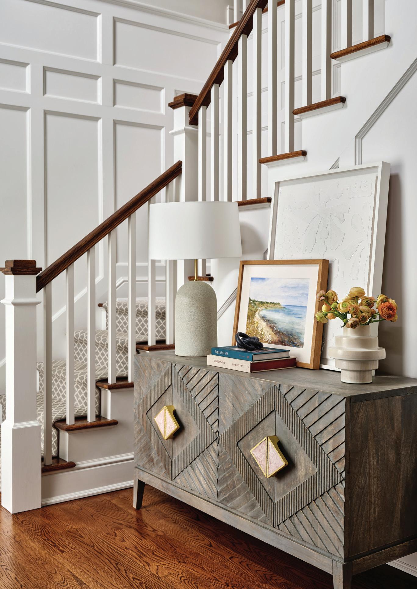
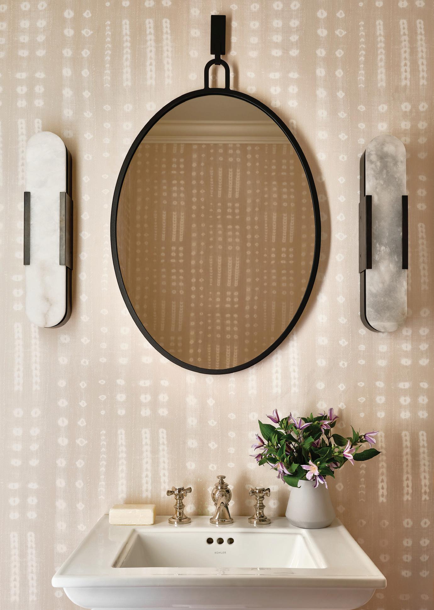
above, left: The entry sets the tone for the rest of the home, featuring a mix of curated finds that reflects that owners’ distinct personalities. above, right: Swan’s plan for the powder rooms was to keep them playful. Kelly Wearstler for Visual Comfort sconces add a modern glow against the patterned wallpaper. opposite page: Landing on the Celerie Kemble for Schumacher paper for the dining room was a major collaborative moment. Swan and the homeowner looked at many samples before opting for this winner.
“We found that Celerie Kemble for Schumacher grasscloth wallpaper, which adds that sense of whimsy , and we painted all the paneling that midnight blue, which grounds it and gives it that nighttime sex appeal .”
—ryann swan, ryann swan design
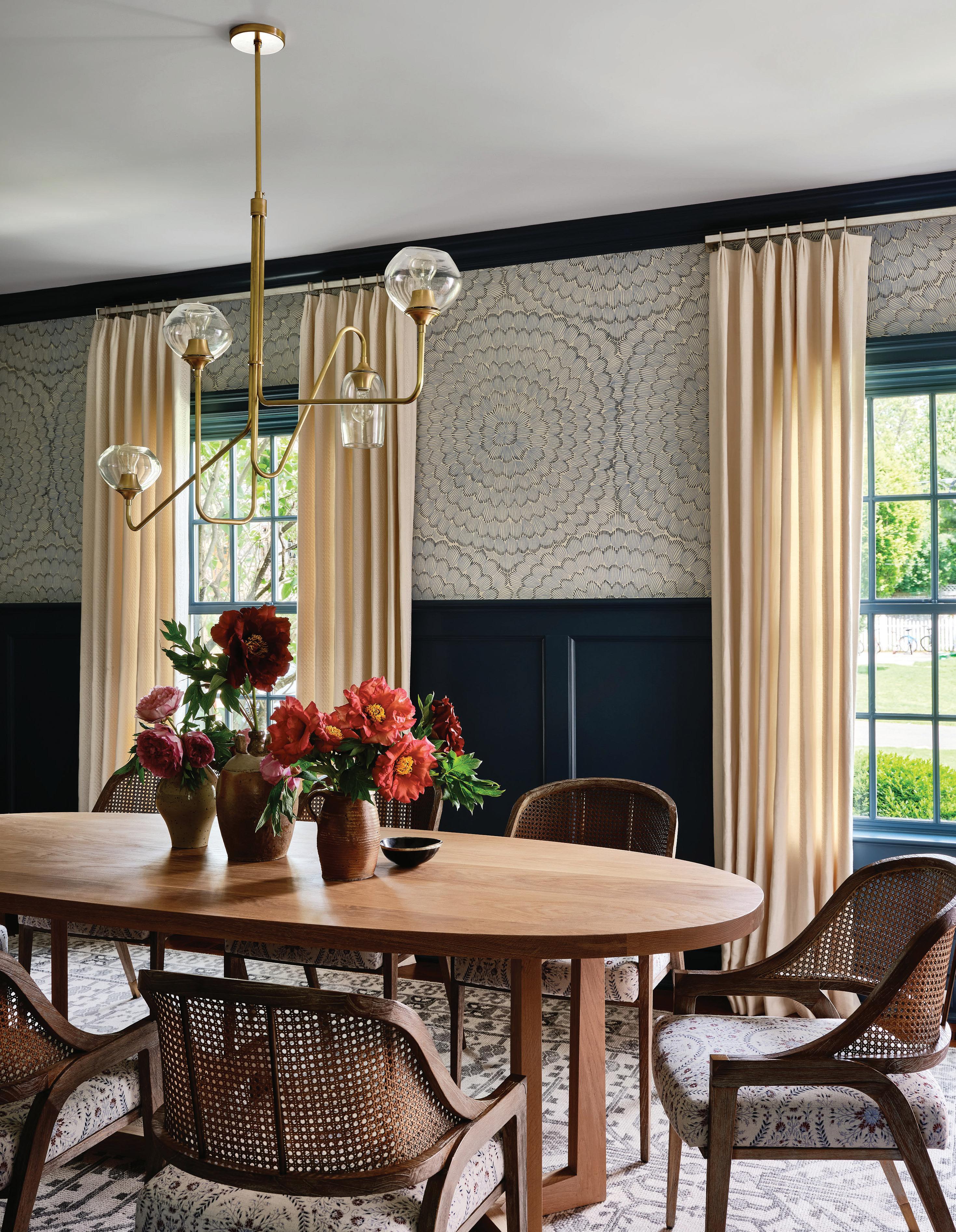
own words. For the dining room, this is one she kept returning to. Old Greenwich is a beach town, and it does have that grasscloth note—and the cane-backed chairs also speak to that nautical element—but it’s definitely not beachy. We took our time. It was more of a conversation, which was fun to do.
Tell us about the kitchen.
The kitchen opens into that breakfast nook and the family room. They’re always circulating between these three spaces, and the kids zoom back and forth with their toys. That console behind the sofa has toy storage so they can access it easily themselves.
How do you manage creating elevated spaces for families with small children?
My background is in hospitality, so that applies very well to designing for kids. I also have three young boys of my own, so I can speak to those spaces in multiple ways. We didn’t pick all perennial fabrics; we focused
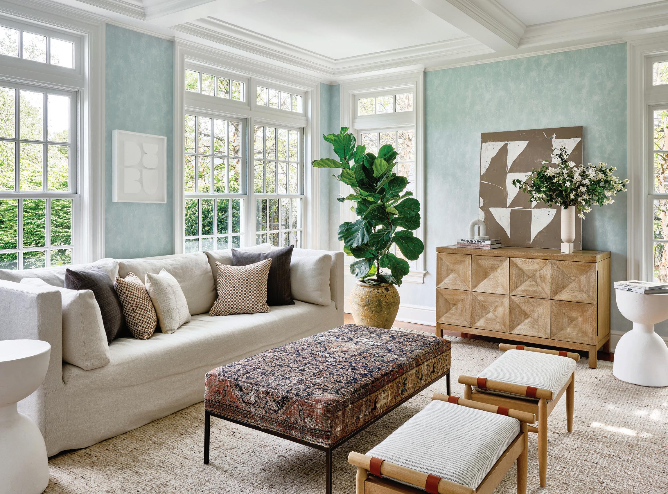
more on natural fabrics. Linens are naturally stain-resistant, same with wools. We went more that route, which was pleasant to explore. In the sunroom, the sofa is a lighter linen, but the ottoman has that dark texture, so you can sit there and put your feet up, and it’s going to hide some sins. Even though the sectional sofa in the family room is that lighter blue color, it’s a marled texture, so that weave helps to hide, too.
In the breakfast nook, we covered the cushions with resistant vinyl. I think when designing with kids, a lot of people make the mistake of saying, “We won’t spend the money on stuff, because they’ll just ruin it.” But I’ve found that you’re so much better off spending your money on a solid wood piece versus ones with a veneer. It’s so quick before your kids drop something and chip that veneer versus solid wood, which will just take a dent. Eventually you can refinish it, you can sand it down. A black dining table with young kids is the way to go. If there’s permanent marker on it, nobody knows.
MAR/APR 2024 51
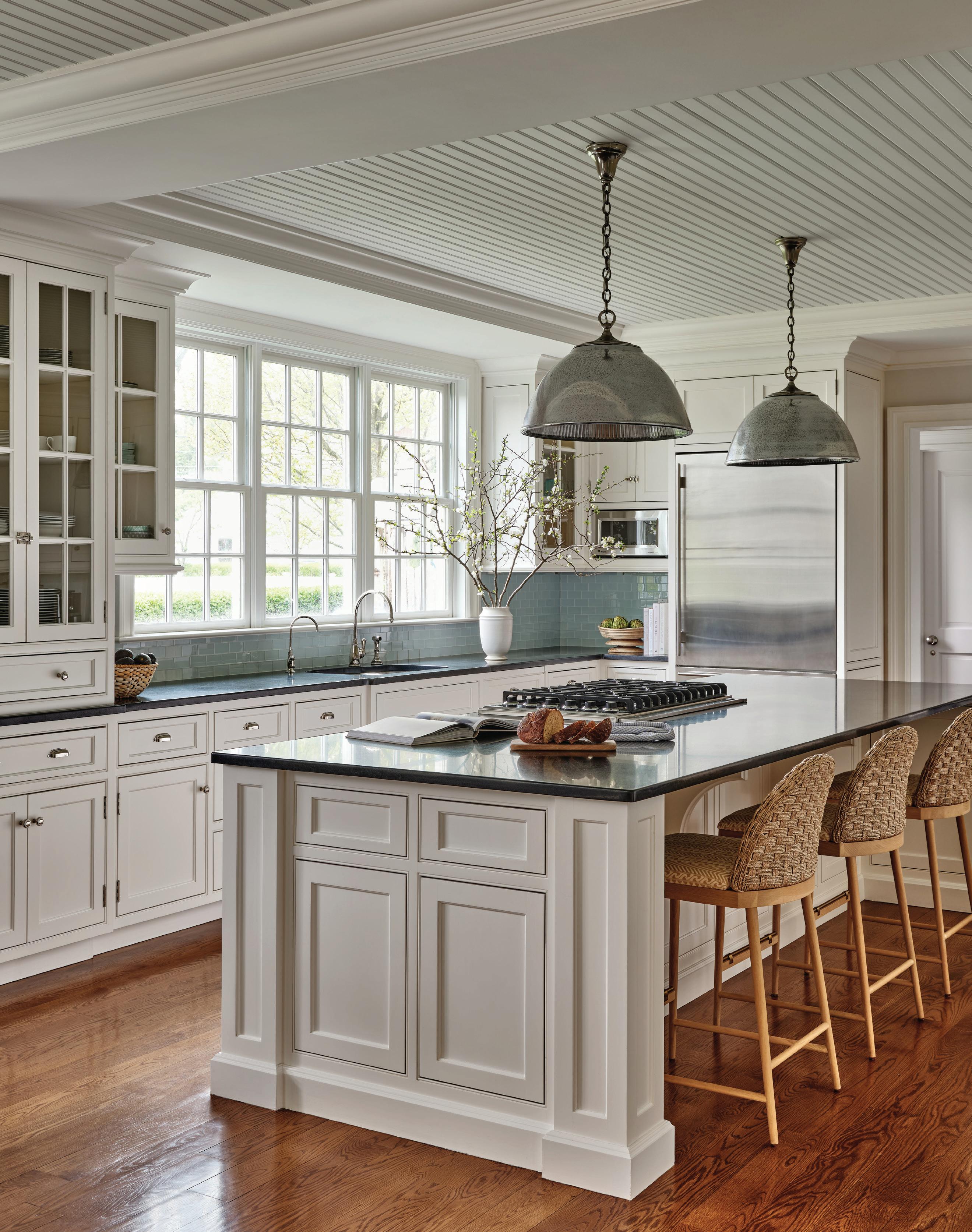
above: The ottoman in this sunroom is covered in an antique rug, an inviting spot for family members to put up their feet. Swan kept the design open and adaptable to the kids who spend time in here. opposite: The clean and bright kitchen nods to the coastal neighborhood. McGee & Co. barstools were recovered in a custom mustard fabric.
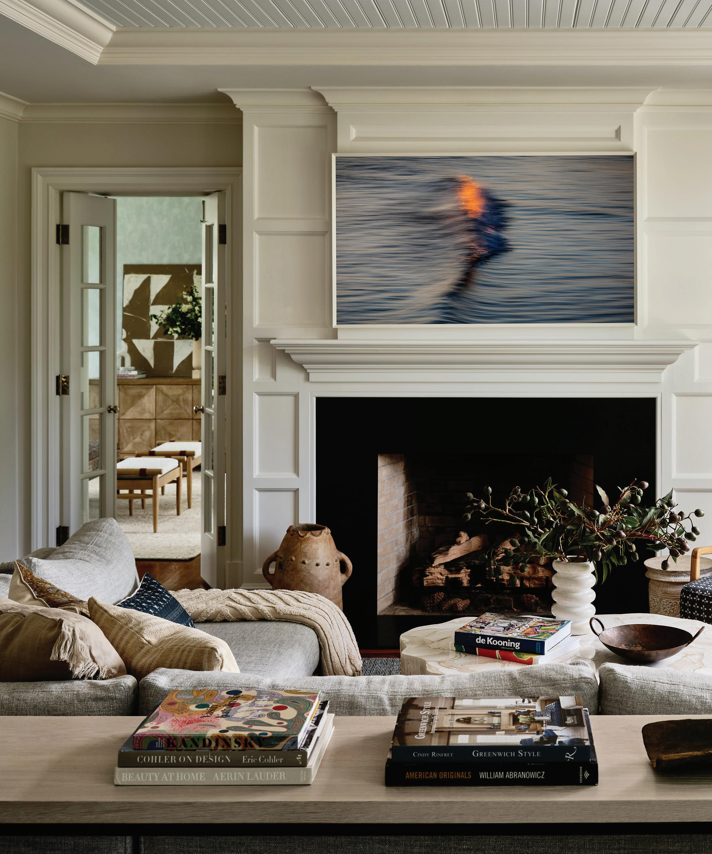 this photo: The family room is the hub of the home, with a design that’s warm, approachable, functional and, most importantly, durable. opposite page: A view of the sunny yard can be seen from the Serena & Lily sectional.
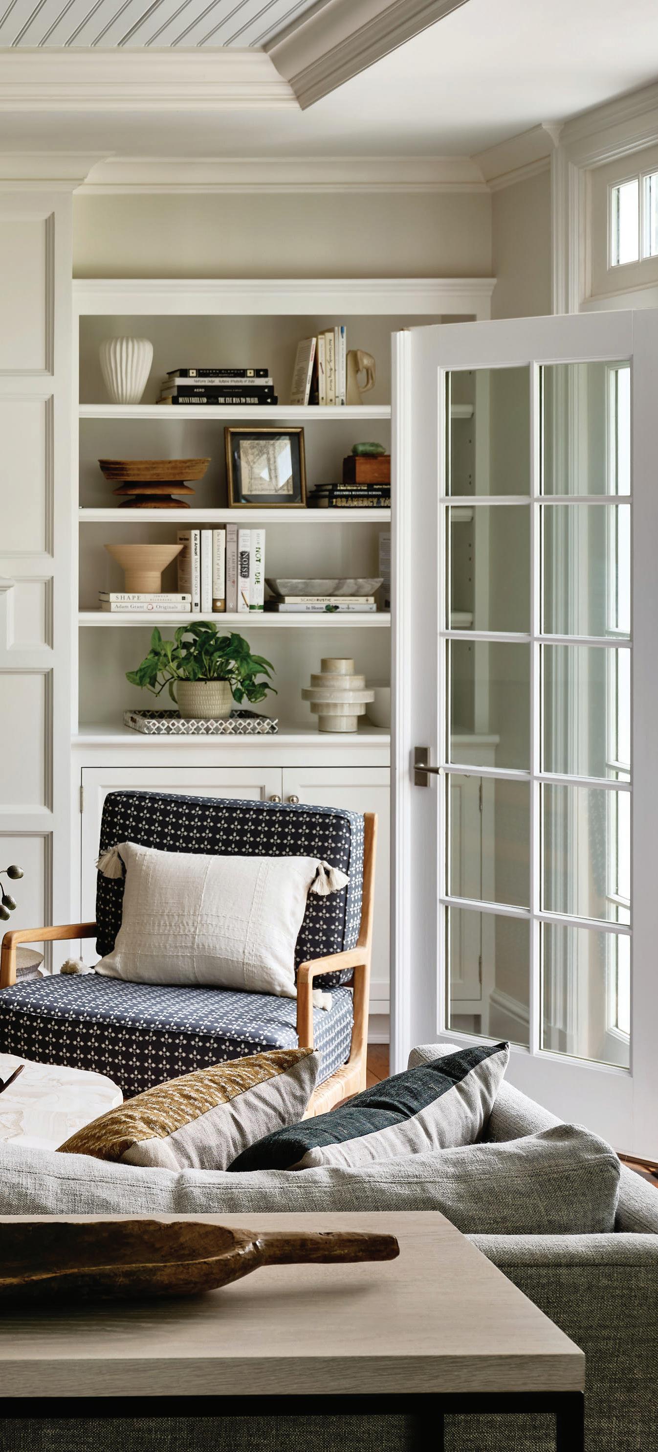
“We worked around understanding who they are and understanding their perspective , but then filtered that through my lens.”
—ryann swan, ryann swan design
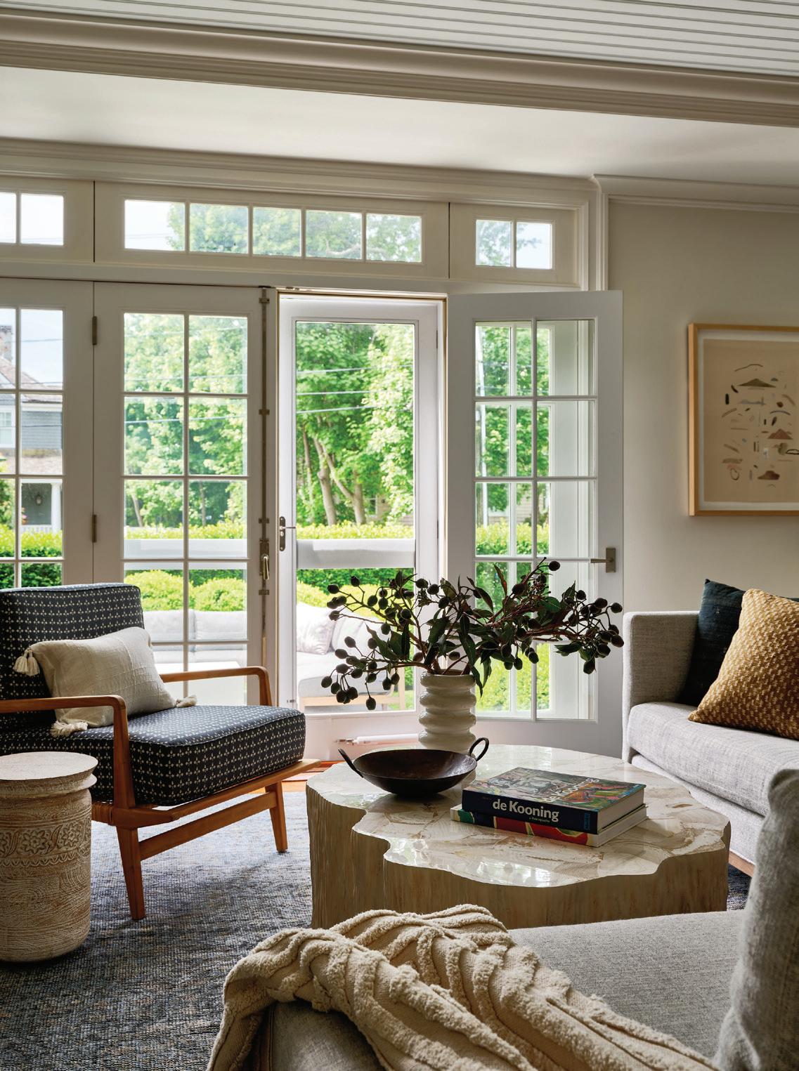
What was the most dramatic transformation in this project?
I think it has to be the dining room. It was very traditional coastal New England before, with a sheen on the wallpaper, a lot of silver and blue. It was lovely, but it just wasn’t who they are. We stripped all of that out. Now it’s a little more playful, but it’s also more grown up, sophisticated, elevated. The patterns are more thoughtful.
There was also the space that served as an office for the previous owner. It was all cerused wood paneling and built-ins. For this couple, they needed the room for the grandmother, who visits for a month at a time. It needed to be a hotel room suite for her, where she could sit and lounge, watch TV and have privacy. There’s a desk to work at and a full closet to use. It was a major transformation to something brighter and airier, with some fun patterning. This is a place that she’s comfortable in.
What was the biggest challenge?
I think it was fitting all of the functional requirements into the spaces. The young kids need toy storage, a place where they can sit and do art, a place to play. Inside the sunroom credenza, we were able to store all of their art supplies and some of the toys. We didn’t put two chairs opposite the sofa, which I think would’ve been a more natural layout, because we wanted
to be able to move those benches if the kids needed more space to play. I think the home was originally intended for an older family, so for us, it was trying to make it work for a family with a newborn, a two-year-old and a seven-year-old.
What was your favorite part?
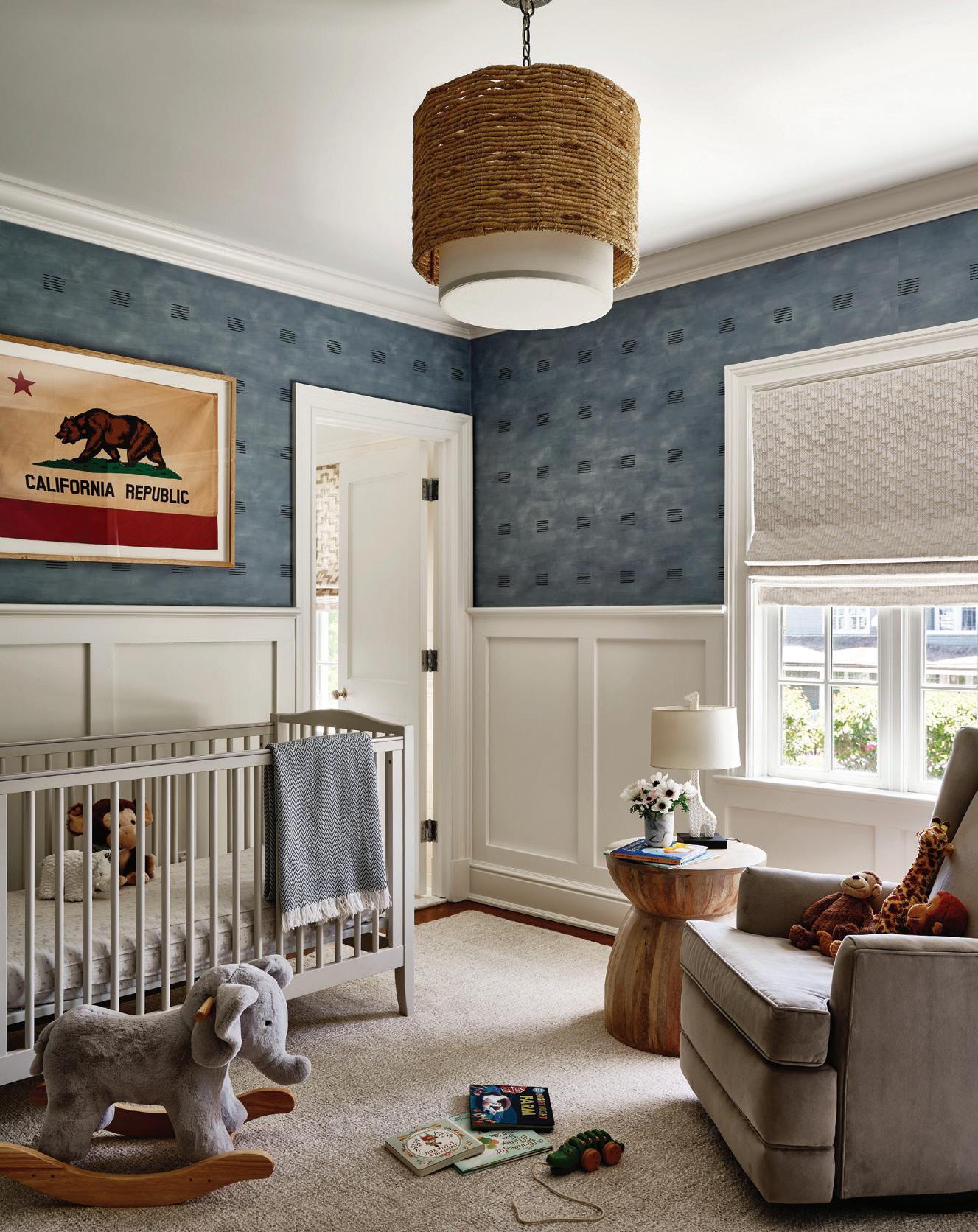
I love the kids’ rooms. I always love designing them. I find it so magical to be able to create a space where a little kid goes to sleep and to create the backdrop where they play. One boy asked for an outer space room, so we did the stars on the ceiling, and then we worked with an artist to commission a custom piece that depicts a spaceship that’s also a skyscraper. In the nursery, we had the nod to the dad’s California roots with the MadeGoods light, wallpaper and vintage flag over the crib.
Professionals:
Interior Design: Ryann Swan Design, 203-293-8455; ryannswandesign.com
General Contractor: VP Construction, Greenwich, 203-496-8105
athomefc.com 54
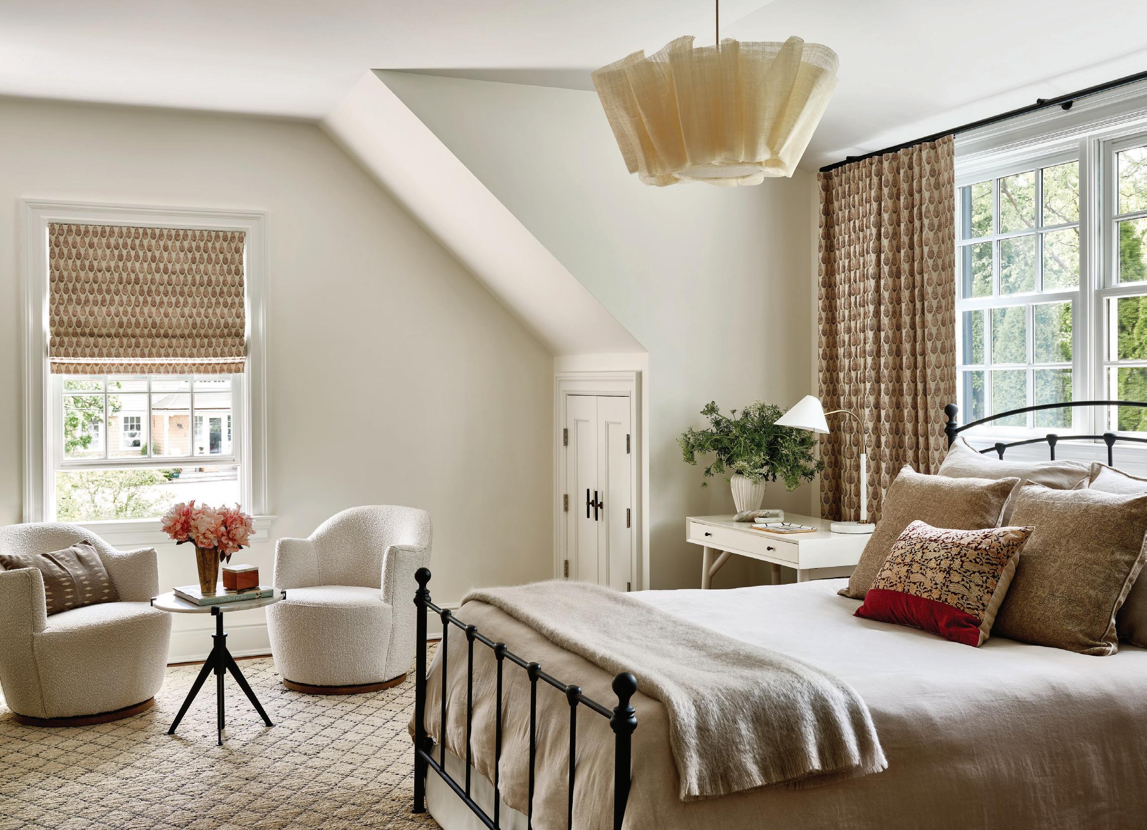
above: Based on the family’s needs, Swan transformed what was originally a home office into a welcoming guest retreat. A Pinch Design pendant hangs over the king-size bed, which is layered with textural neutrals.
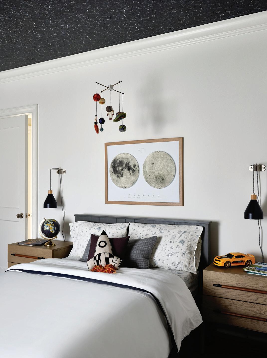
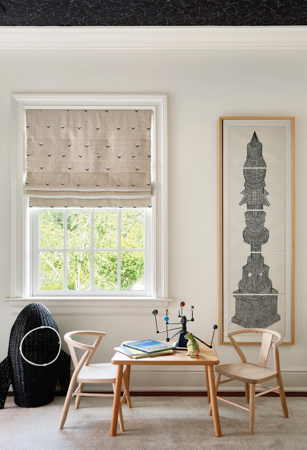 left: Stars cover the ceiling in the older boy’s spaceinspired room. right: A commissioned piece of art by Michael McGuire speaks to the space theme and the family’s prior New York City home.
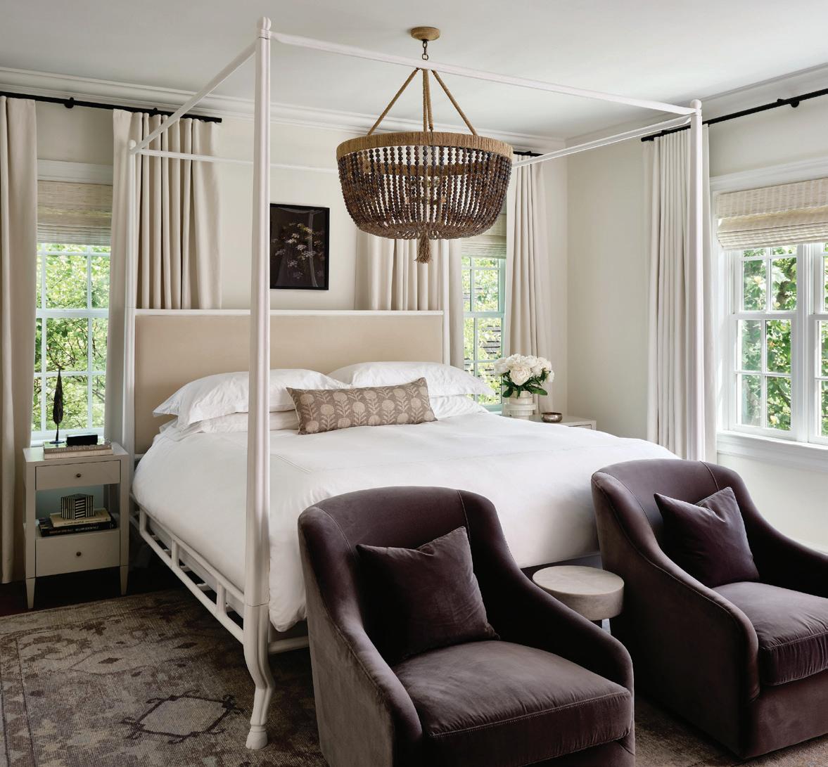
below, left: In the primary suite, Swan solved for asymmetric window placement behind the bed by installing off-centered drapery panels.
below, right: The California flag that hangs over the crib is a nod to the husband’s West Coast roots.
interview with christine stucker, stewart-schafer photographer sarah elliott
LESS IS MORE
A STREAMLINED VISION for a Weston farmhouse marries CLEAN LINES with European tradition
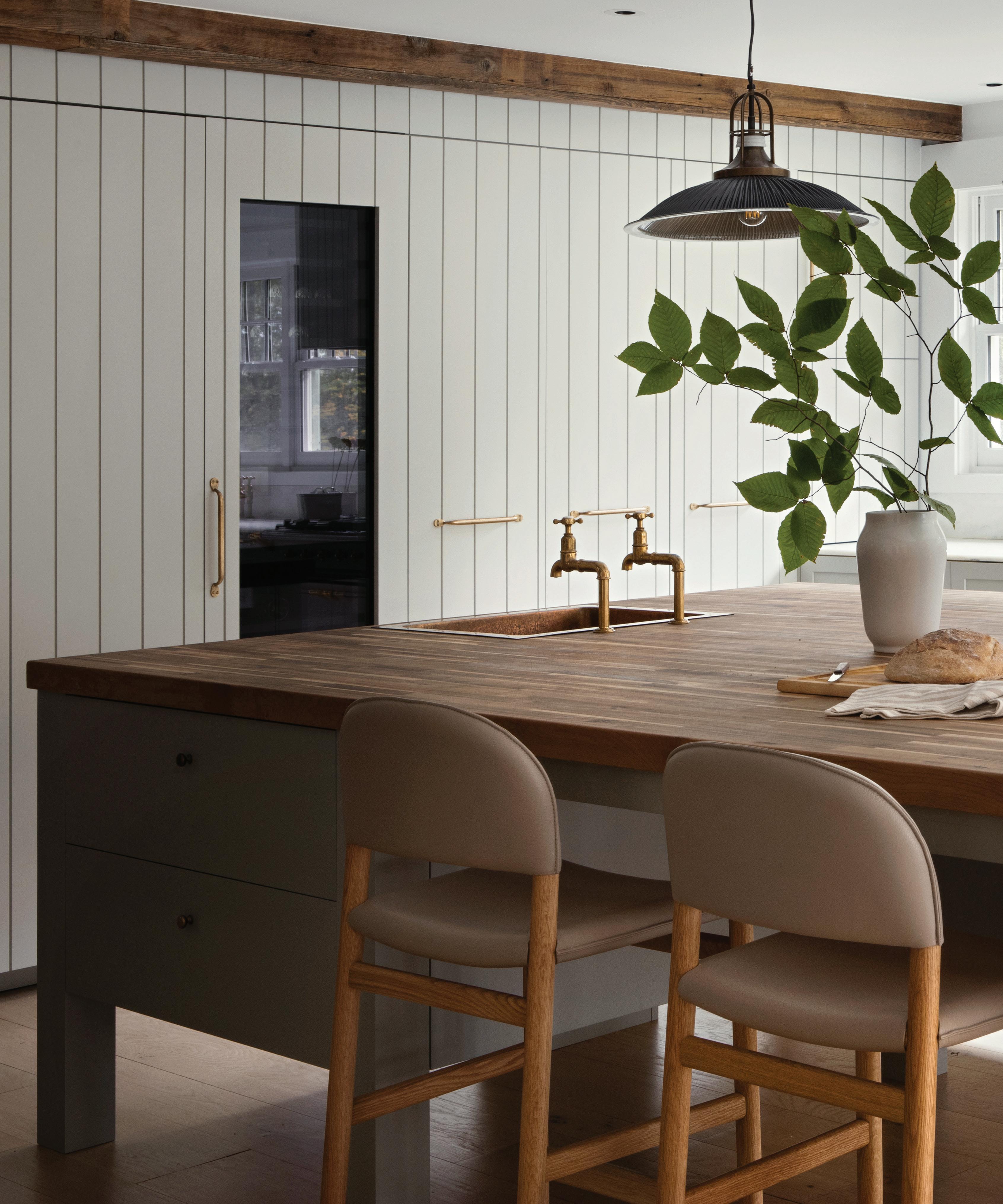
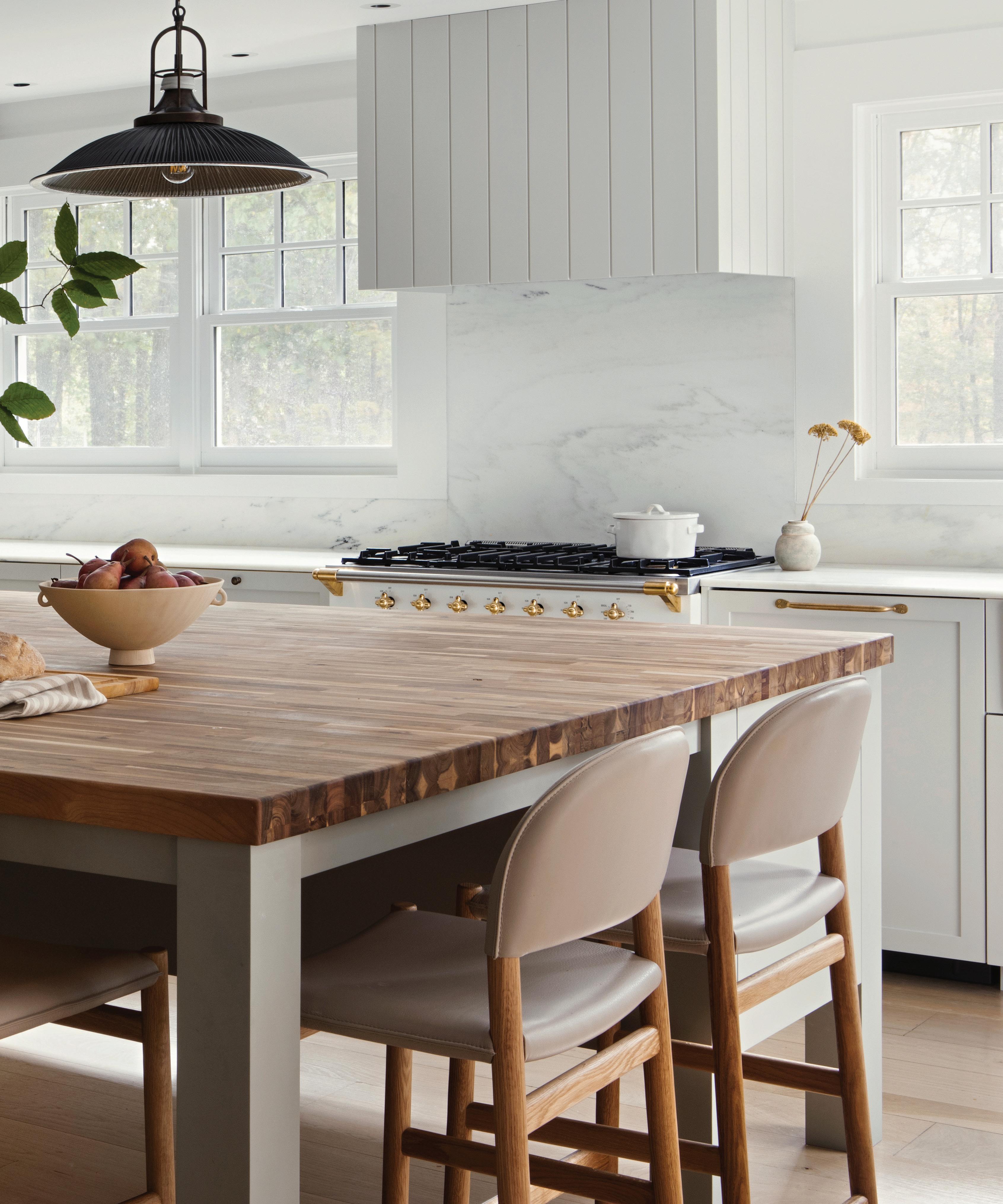
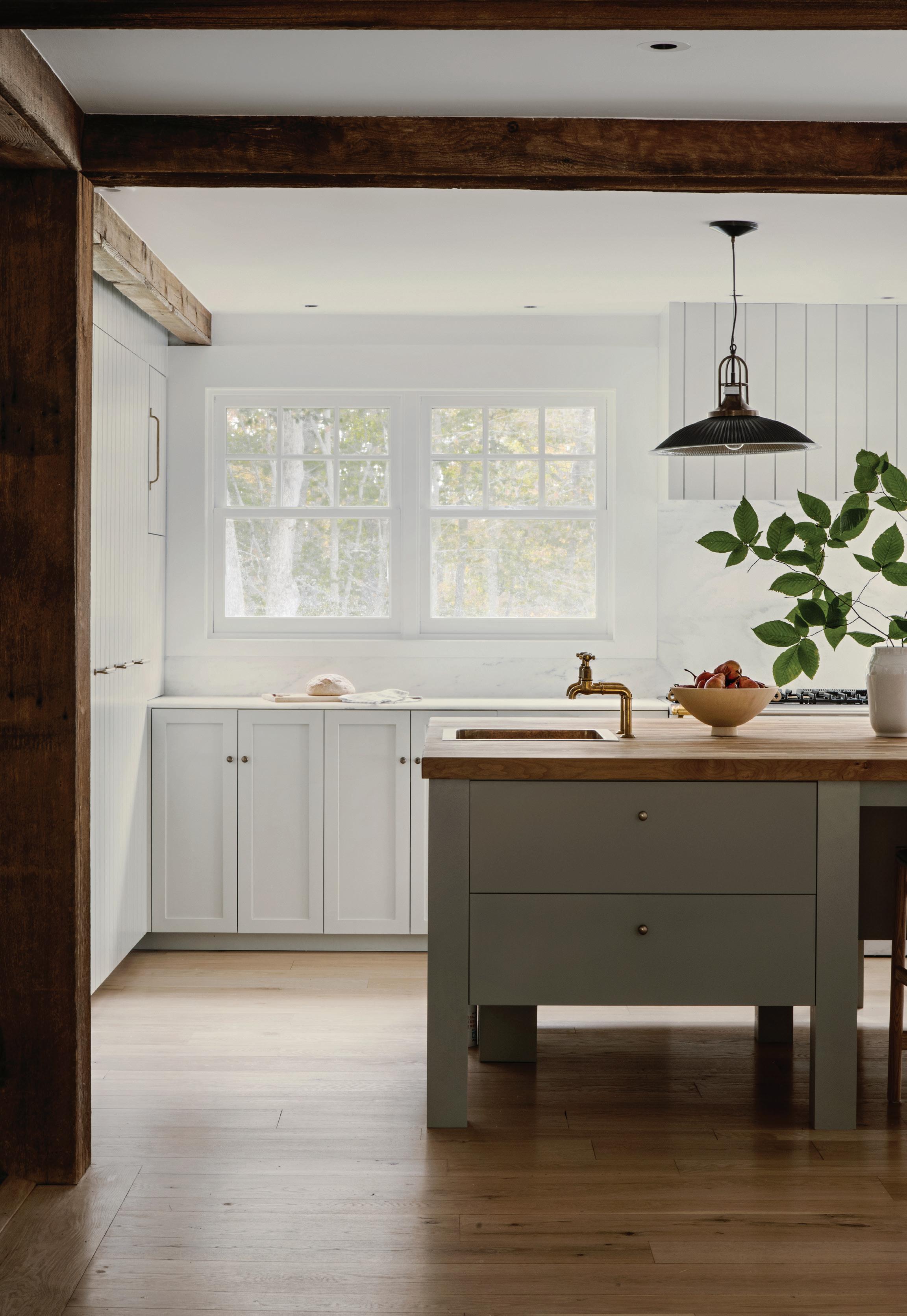
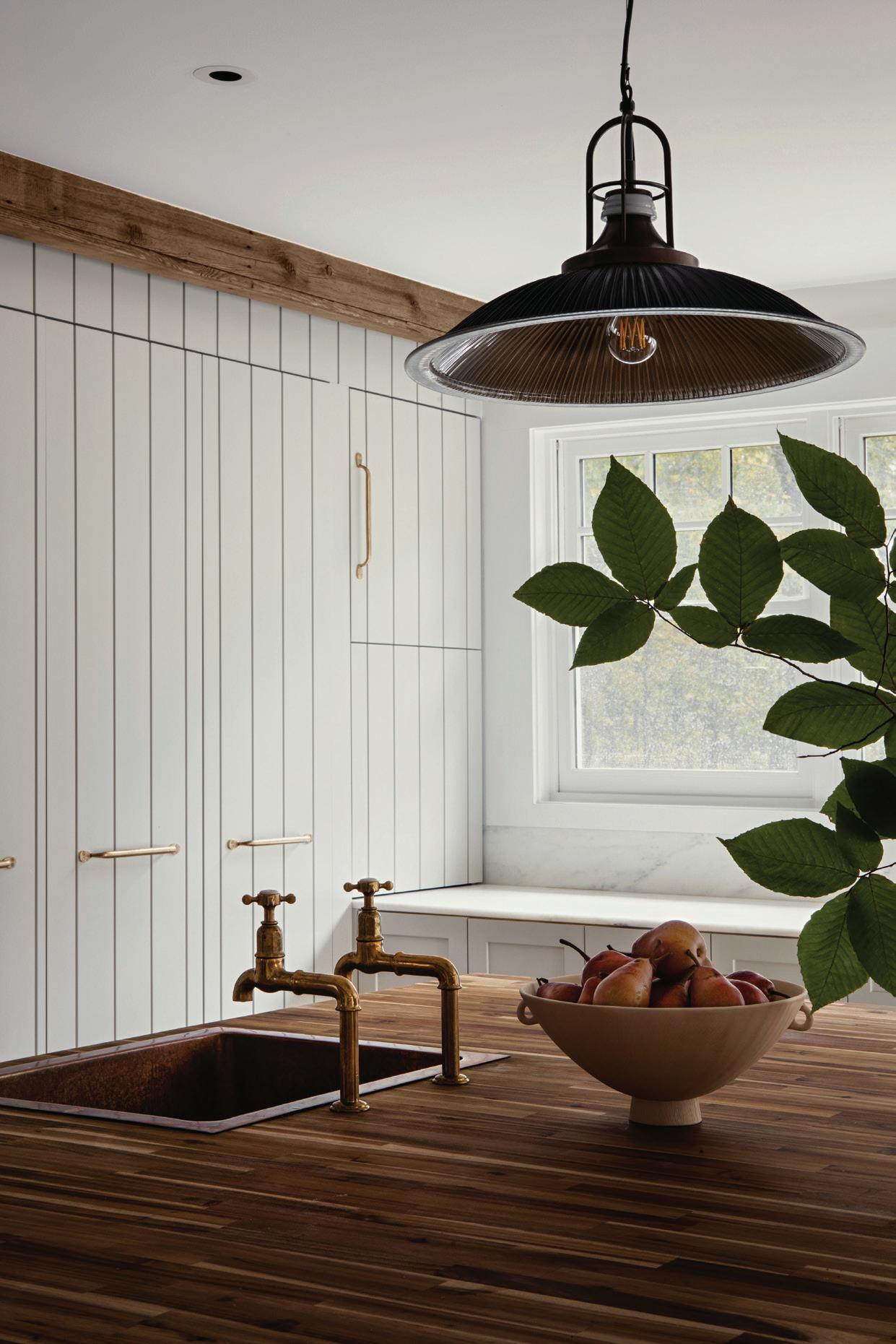
this page: In addition to designing a large butcher-block topped island where the family can gather and entertain, Stewart-Schafer created additional storage, wrapped in vertical shiplap.
athomefc.com 58
this page: The design team added patina to the newly built kitchen by incorporating elements like vintage lighting and unlacquered brass fixtures.
Who lives here? They’re a lovely family who moved from Brooklyn. The parents are both therapists, with young kids. They bought the house, and we started work right away, with a tight timeline.
What was your first impression when you saw the house?
We walked through, and there were so many entrances and unnecessary staircases. The kitchen was overwhelming, but I could already imagine where we could go with it. There were some good elements, but we really had to strip so much away and remove so much excess and confusion to bring it to its glory. The clients were great, because they gave us full creative reins.
What was the scope of the project?
It was pretty much a gut. We redid the floors throughout and painted the entire house inside and out. We redid one staircase and removed another, added some windows, changed the main entrance. We redid the bathrooms, all the bedrooms, all the fireplaces. We really changed the program of the space. We touched every surface in that house.
Tell us about the kitchen.
They have a big family, and they entertain a lot. There was the space and opportunity to create this huge island (the original layout included a massive triangular island). We got rid of everything, down to the studs, and then built custom millwork. We gave them multiple sinks, a bar and the butcher block island. We wanted it to feel very European. This house had Dutch undertones, and we’ve spent a lot of time in Amsterdam. I think that was a major influence for the design, going for that European farmhouse vibe. I didn’t want to do a tile backsplash; I really wanted it to look timeless and feel like it really could be a 100-year-old kitchen. I thought about what materials they would’ve been using, all while modernizing it but still looking classic.
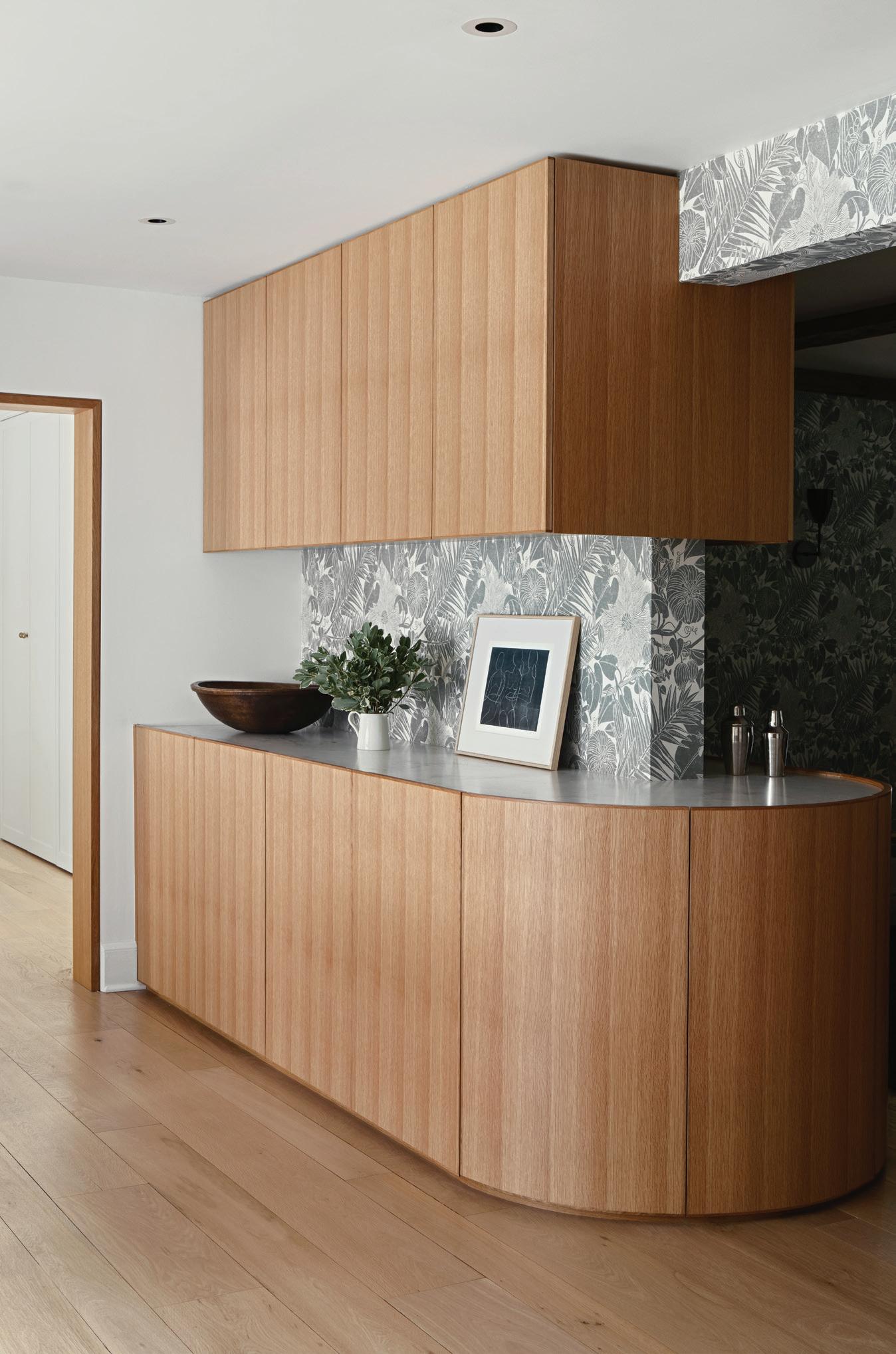
And we wanted it to flow really well. When you’re in the kitchen, you get a hint of what’s to come in the dining room with that amazing wallpaper. We created the circular bar that divides the dining room from the kitchen area. It was heavy on the custom cabinets throughout the house. We changed the entire storage situation, knowing they have kids and a ton of stuff.
You mentioned that wallpaper in the dining room. How’d you choose that?
I’m obsessed with the woman who makes it. Her name is Marthe Armitage. She’s an older British woman who makes these prints. I think it’s so beautiful. I’m not a big wallpaper fan, but when it makes sense, it’s such an “Aha” moment. The dining room felt very much like an afterthought in the original plan. It was not inviting, so we wanted to make it a destination space. We redid the fireplace, added new lighting and the wraparound bar. We also put the paper on the exterior beam, so it gives you a peek of what’s happening in that room.
“I really wanted it to look timeless and feel like it really could be a 100-year-old kitchen . ”
—christine stucker, stewart-schafer
MAR/APR 2024 59
“The dining room felt very much like an afterthought in the original plan. It was not inviting, so we wanted to make it a destination space . ”
—christine stucker, stewart-schafer
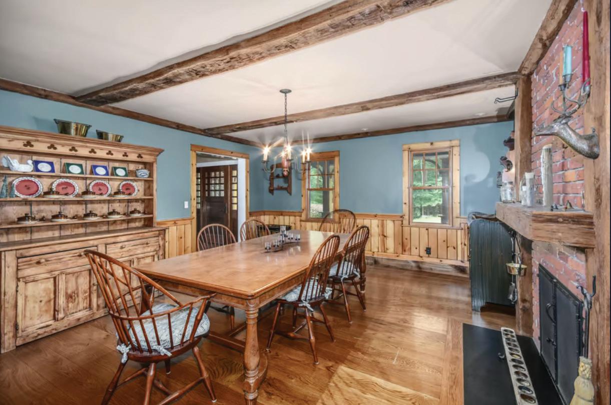
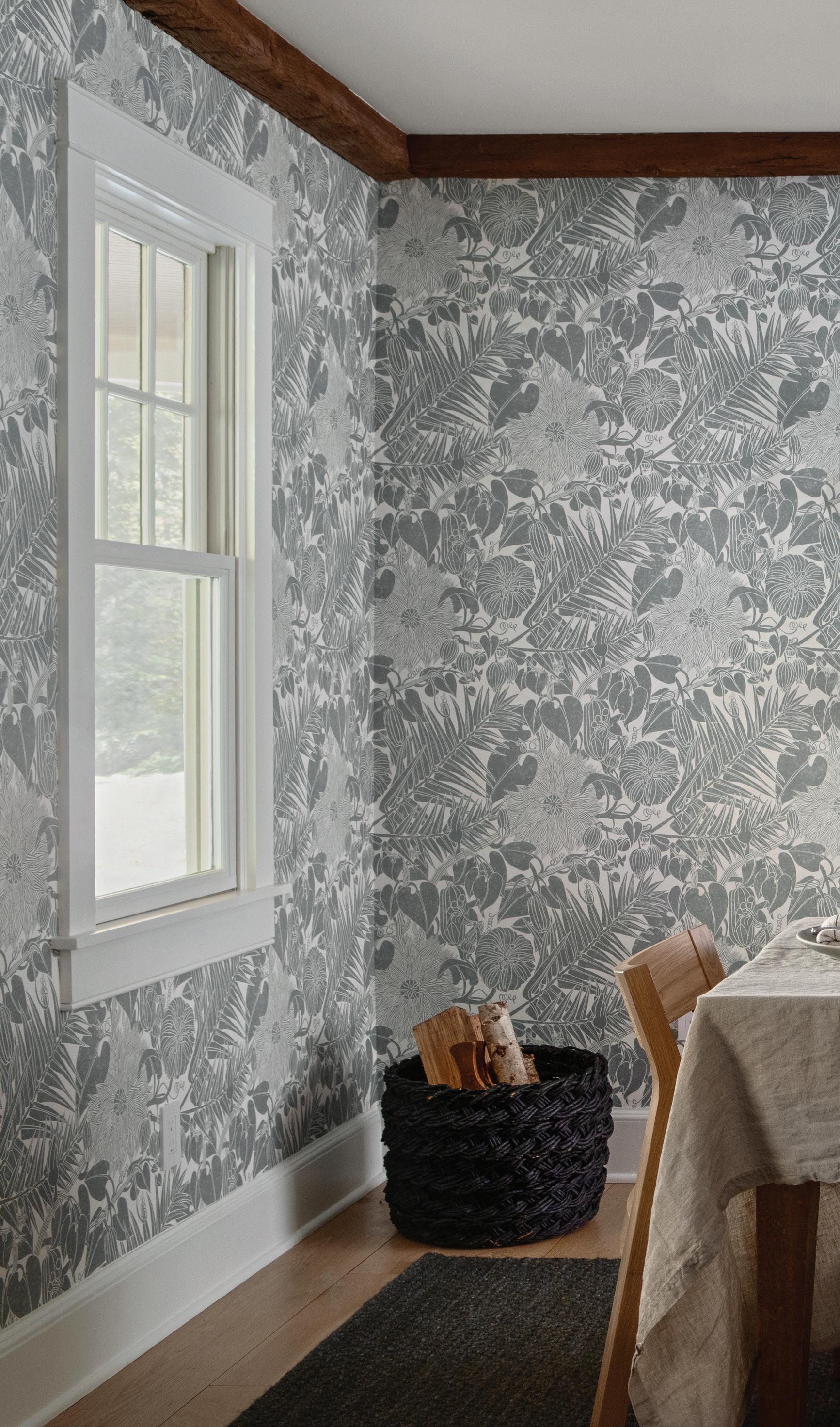
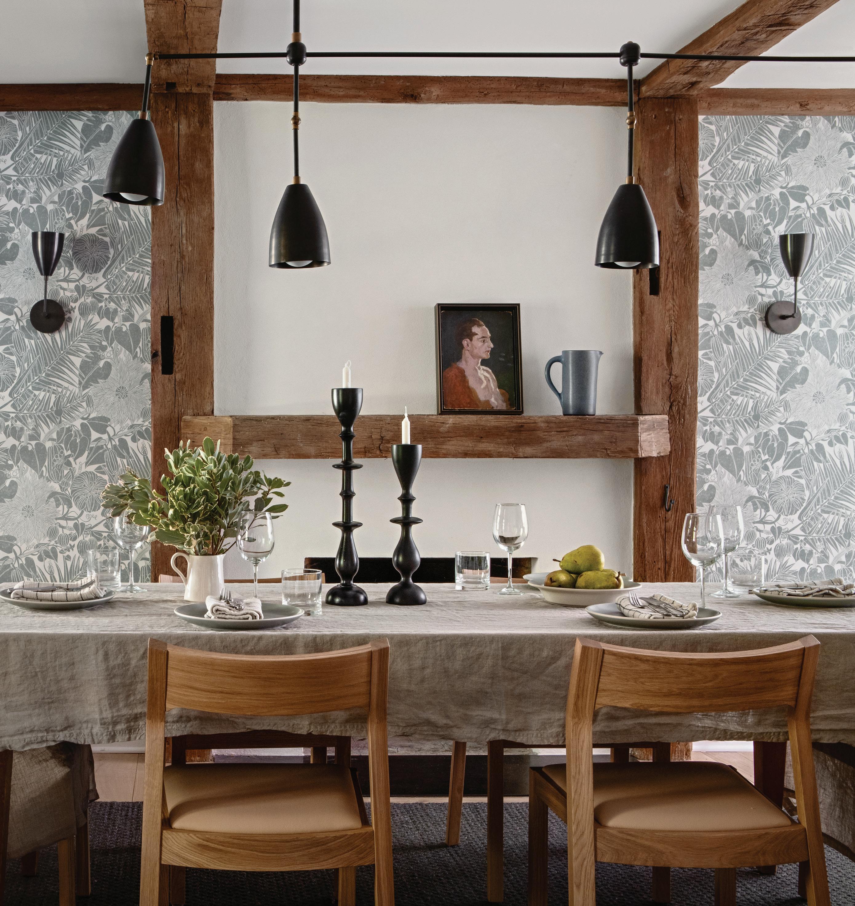 this photo: Apparatus lighting hangs in the dining room, where the walls are dressed in a botanical wallcovering by Marthe Armitage.
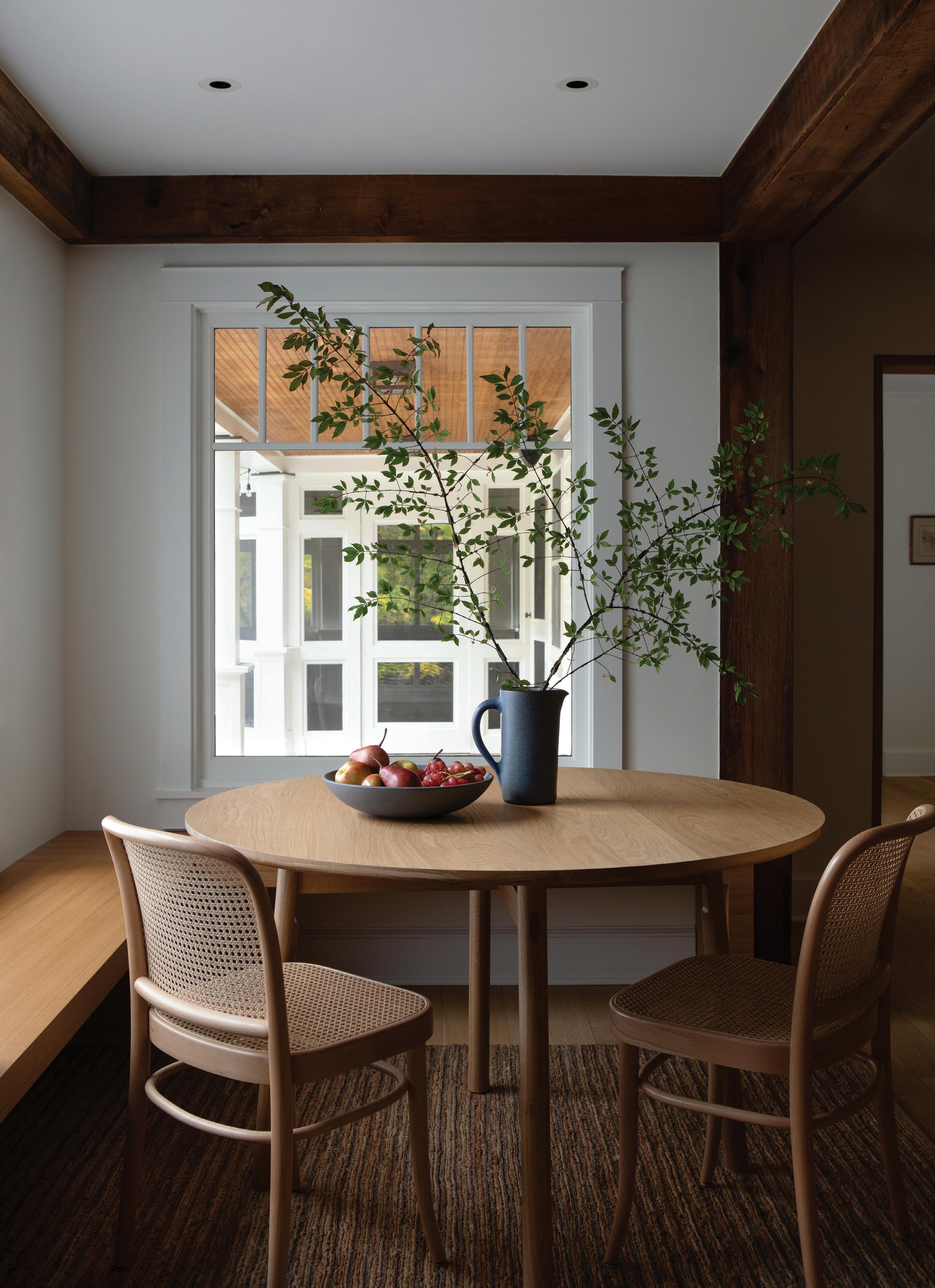 this photo: The breakfast nook captures the new mood of this house, which Stucker refers to as clean and uncomplicated.
So much of this house was about removing and editing what was there before. What was that process like?
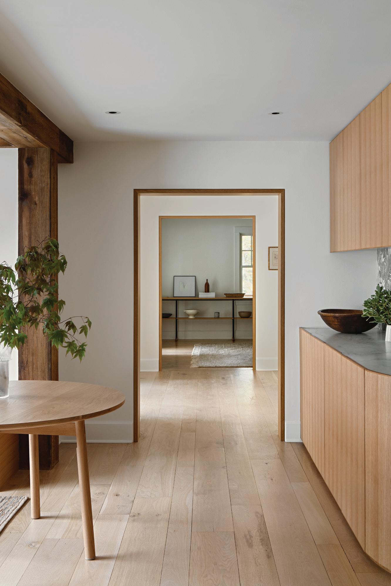
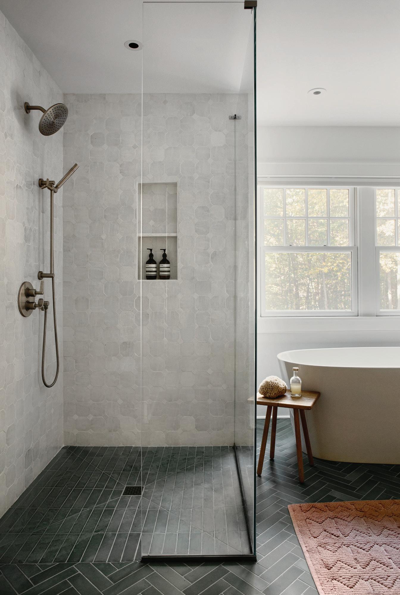
It’s similar to how you get you get dressed, considering all the accessories. For me, it’s about finding the main focus of the space, and then you’re guiding the eye through that. I get stressed in overly cluttered, overly embellished, overly decorated environments. It’s not relaxing to me, or kidfriendly. We wanted this house to feel clean, usable and uncomplicated. We exposed the beams and worked from there. The whole house felt so dark when they bought it, with too many genres and materials that were competing. We brought in all that natural light, lightened the wood. And throughout the house, we kept the same palette. When you go up the primary bathroom, that tile ties back down to the wallpaper, and the wallpaper has the same tone as the kitchen cabinets. We really make an effort to make the whole house cohesive. We want that vibe to be consistent.

MAR/APR 2024 63
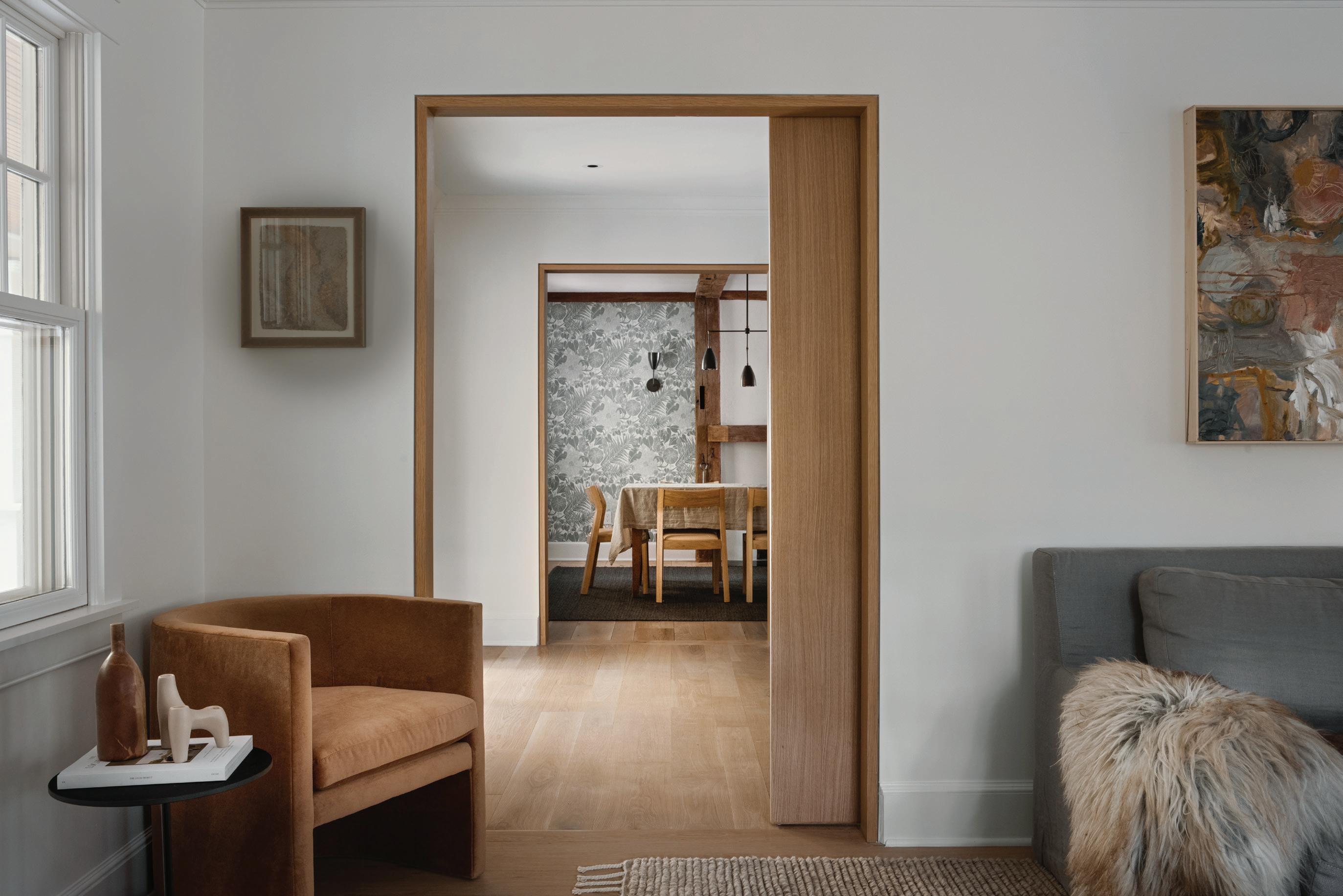
this photo: Reframing doorways, removing trim and refinishing the oak flooring reveals a lighter, contemporary farmhouse feel. left: A custom bar with ample storage serves as a clever transition from the dining room space.
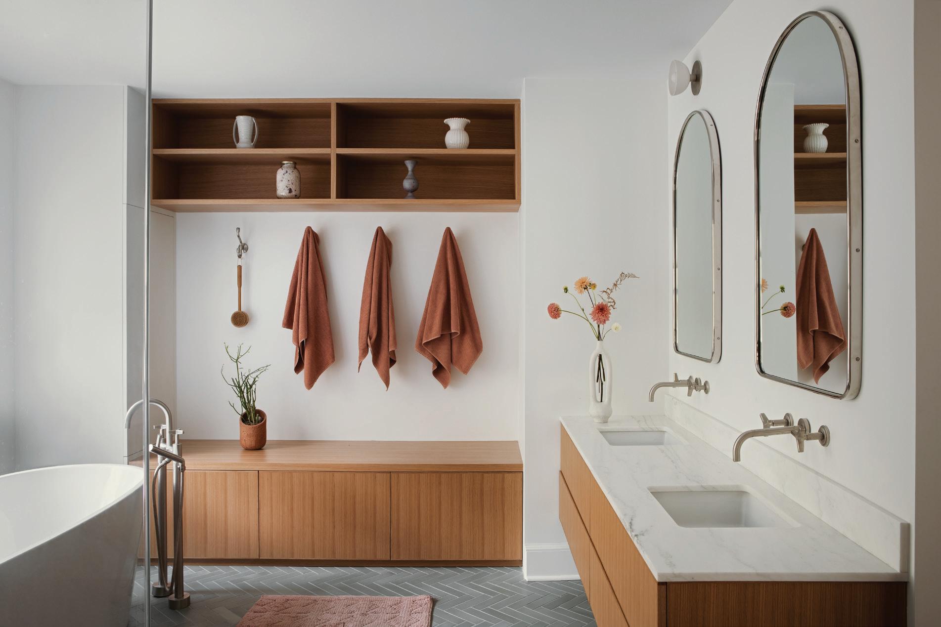
this photo: Once the house was reconfigured to maximize ease and flow, the team focused on impactful details like custom pocket doors and reveals. below: Rejuvenation mirrors reflect the finished spa-like bath space, finished with silver-tone fixtures and hardware.
“The clients really believed in us. We spent a lot of time in the house, really listening to what it wanted to be . You could see the story of where it could go.”
—christine stucker, stewart-schafer
What was the biggest transformation?
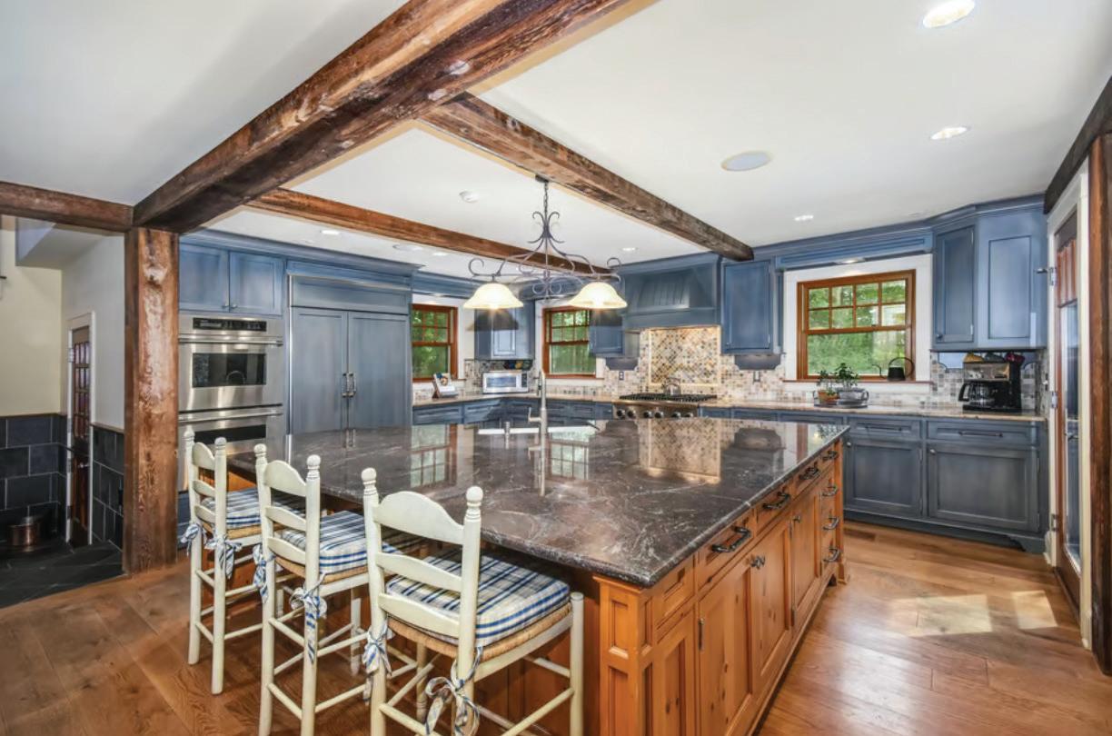
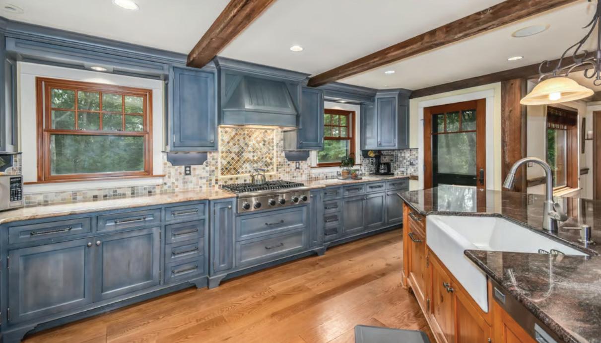
It would probably be the kitchen, where the original cabinets where a bright blue. Now, it’s one of my favorite kitchens that we’ve done to date.
What was your favorite part of the project?
The clients really believed in us. We spent a lot of time in the house, really listening to what it wanted to be. You could see the story of where it could go. For me, I could envision in my mind where this house should be, and I feel like it completely landed on our vision and what we had hoped for it.
Another thing that was awesome is that they let us furnish it and decorate, from the rugs to the art. It really made it all come together. The furniture really needs to complement the environment and vice versa. We mixed a lot of old and new. The light fixtures in the kitchen are vintage. And the materials throughout the house were important. I used a lot of unlacquered brass, and we wanted these imperfections, and that patina, so things could age with the house and everything has its own personality. It was all about those little details—like the custom reveals around the doorways—that make such a difference and really elevate the space.
Professionals:
Stewart-Schafer, Easton, 718-522-2508; stewart-schafer.com
above: More vertical shiplap meets concrete circular tile in the mudroom. left: A nowserene primary bathroom includes a standalone tub, clé tile and plenty of natural light.
STAYING POWER
This house was not love at first sight for designer Terri Ricci, but after multiple renovations and years of memories, her flip project became a forever home
m c kendree / jbsa
interview with terri ricci, terri ricci interiors // photographer read
66
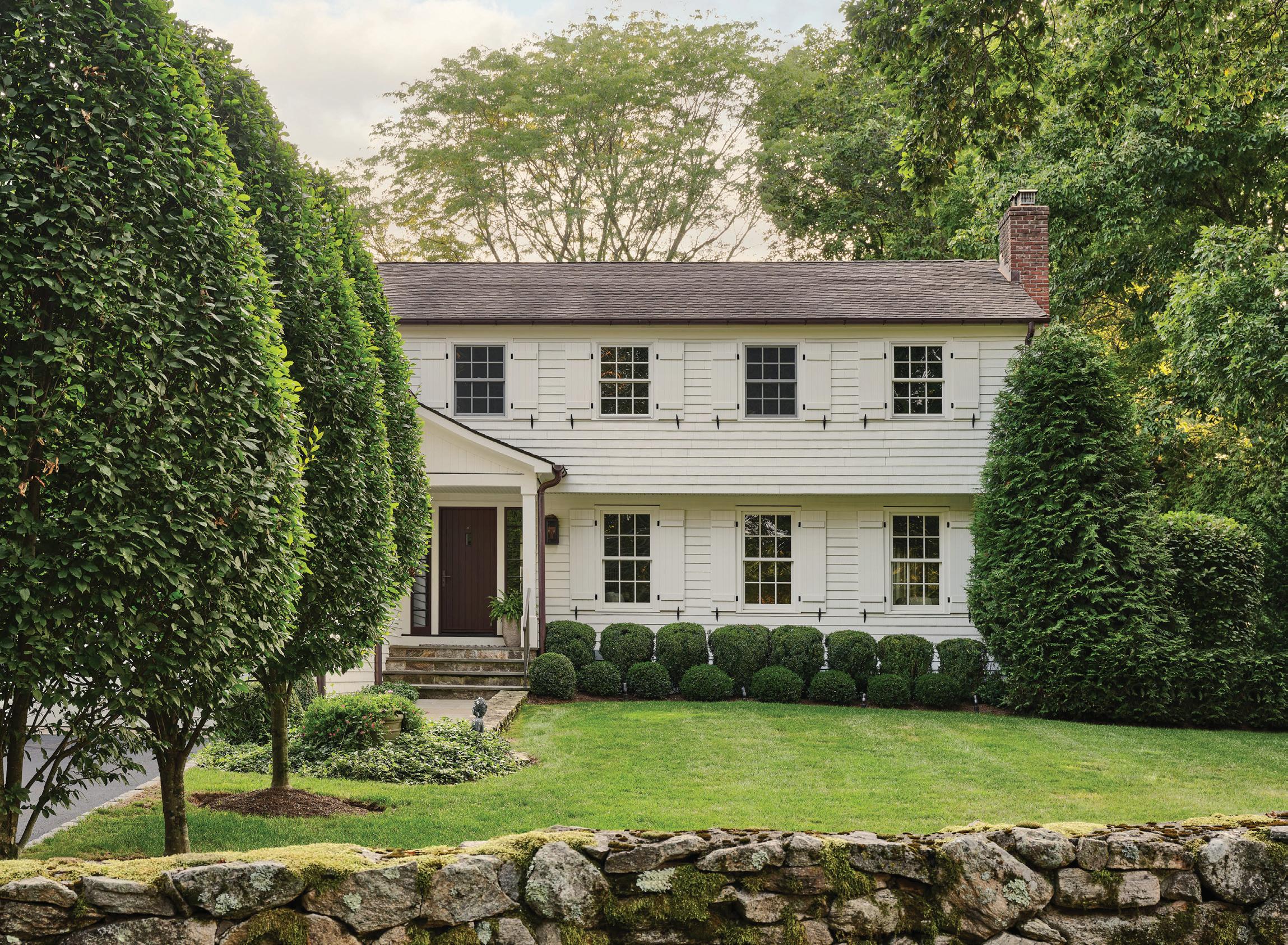
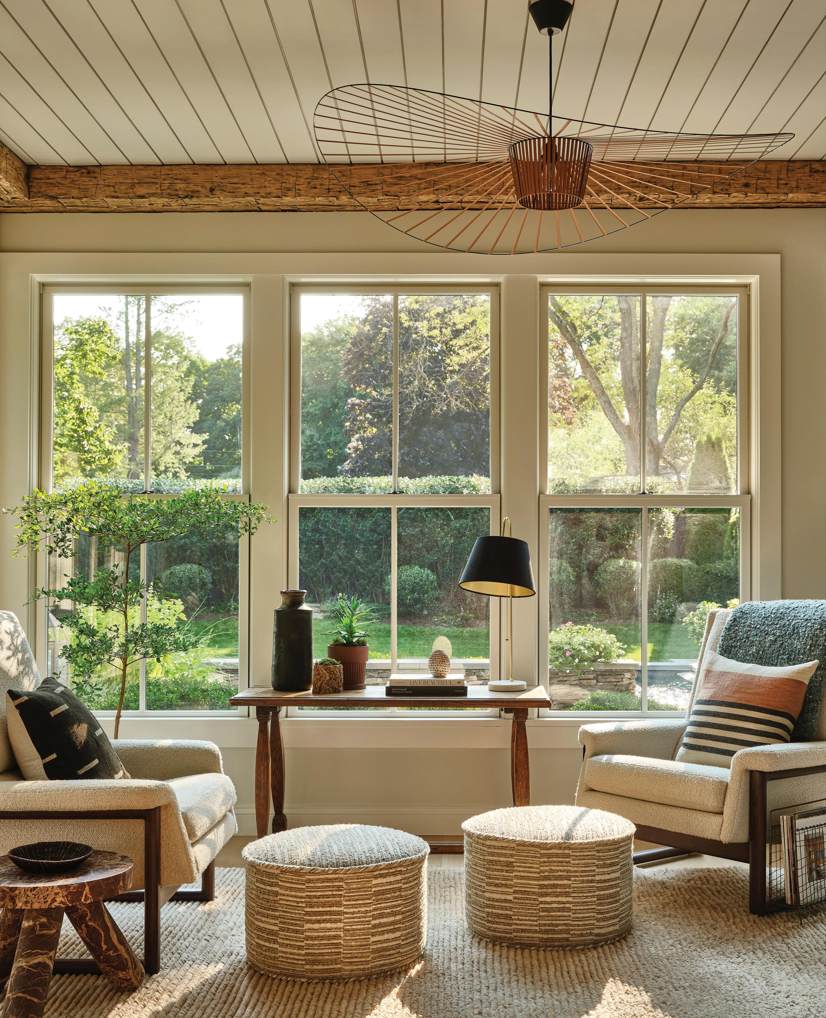
above: Ricci’s husband immediately fell for the home’s charming exterior, now painted in Benjamin Moore Swiss Coffee. opposite: A Vertigo fixture hangs in this sunny spot, with custom ottomans covered in Romo fabric and restored vintage chairs.
athomefc.com
athomefc.com 68
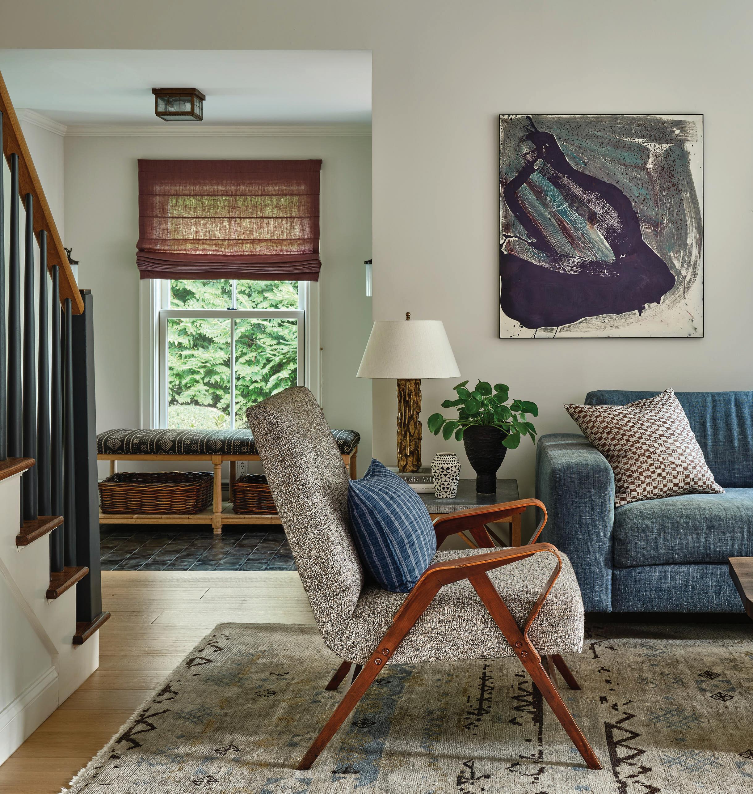
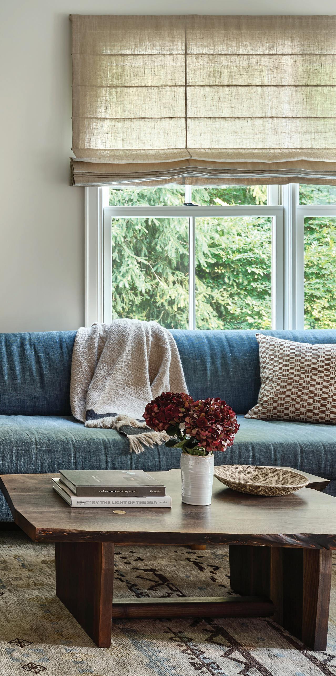
this photo: Seating in this inviting room includes a reupholstered vintage plywood side chair and a custom designed sofa upholstered in denim Belgian linen under art by Ryan Sullivan.
How long have you lived here?
We’ve been here for twenty years.
What made you fall in love with this house?
I actually didn’t. My husband did. We found it in a snowstorm, and everything had a nice coating of snow, and there’s a stone wall along the property. It was very classic Connecticut. The property size was just the right amount. My husband does construction, special finishes, restoration work, and he said, “That’s the house we’re going to buy.” I was surprised, but he mentioned that all the work would be interiors, which is my specialty. We hadn’t even seen the inside.
Over those twenty years, how many renovations have you done?
After we moved in, we were going to renovate and flip it. And then I helped with the renovation, helped install tile in the bathroom, and as time went on, I realized that this is perfect amount of house. I’m a big promoter of spaces that feel cozy and comfortable. We’ve renovated three times now, with the interiors. It’s a great location, right between the Merritt and I-95, the right amount of property. So we stayed.
Our first renovation was all about making the primary bedroom feel like a suite. We replaced all the trim and doors throughout the house. And that’s how we elevated our home, by adding thicker doors that were timeless but not too traditional. We beefed up the trim, redid the materials in the bathrooms and the kitchen. And then we stayed with a neutral palette. At the time, dark floors were in, and we ended up doing that. We have Southern exposures in the back of our house, it’s very sunny so you saw everything. In 2018, we did another renovation where we redid the kitchen, made the primary suite even larger, went with lighter floors. And then we introduced more plaster into the house.
Who’s lived here over those years?
We have two sons and a dog. We raised both of them here. Right before COVID happened, we were looking at properties, and then we decided to stay. We’re both so busy. We explored putting a pool in, and when we learned we were going to be home all summer, we added one.
How would you describe your style?
I do have a consistency of always remaining classic. I do it with my own fashion, and I do it with my interiors. I put so much thought into things that I don’t want to have to be changing. If I’m going to do a trend, it’s going to be with something I can replace, but the foundation has to be something classic. I like it clean; I don’t like clutter. But I like a home that shows that somebody lives in it. It’s always warm and textural.
At a young age, all my previous employers all came from a different design aesthetic, but the one that I most connected with was Naomi Leff. We were always mixing ’40s French with modern, Arts and Crafts with modern. There were all the different movements, and I have an eye for that, but we always liked straight lines. And then there was a calling for curves eventually, but everything was linear. I carry that through, because I see that it never really goes away. Everything comes back.
MAR/APR 2024 69
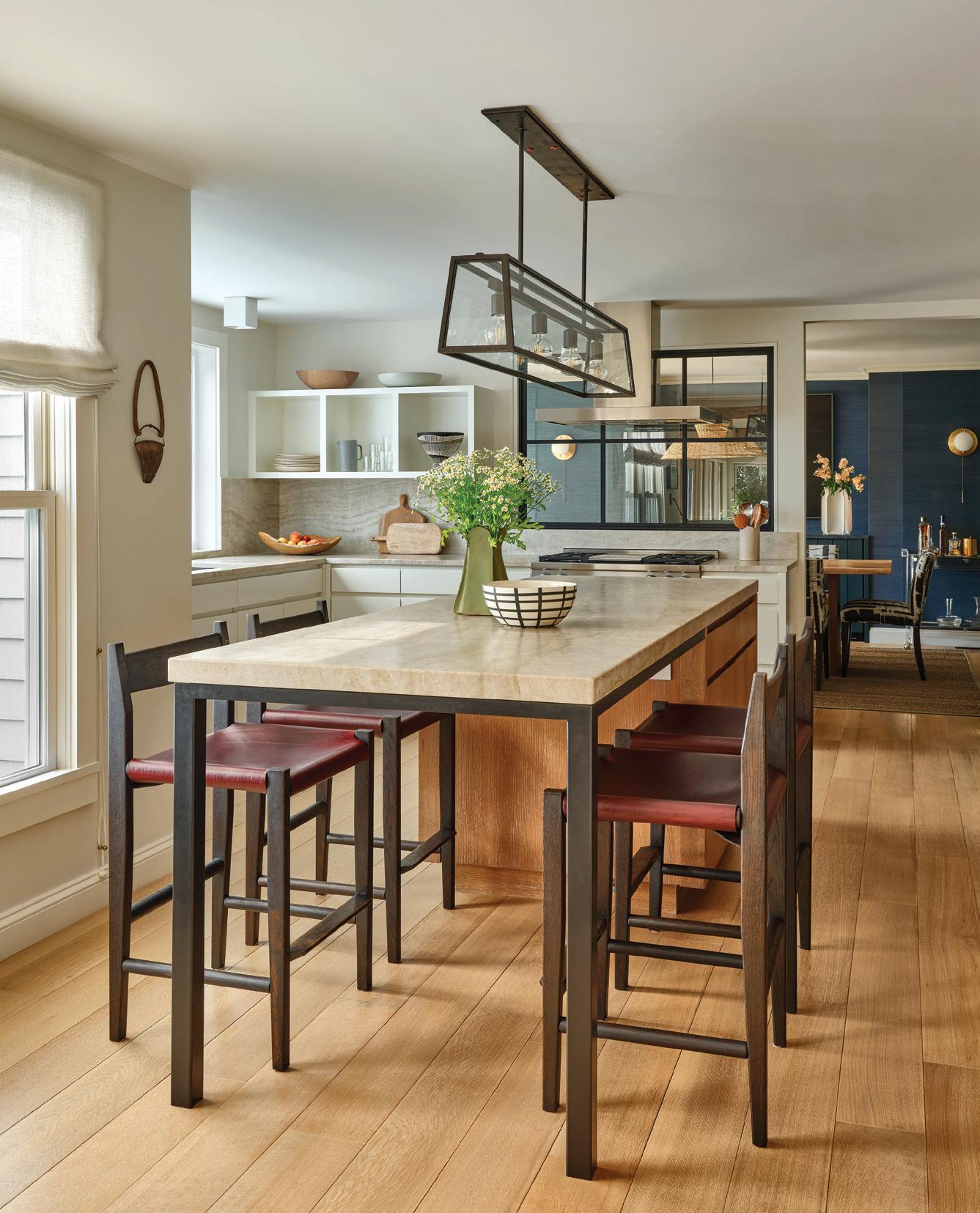
Talk about the kitchen design plan.
It was very traditional colonial style kitchen. I always wanted to have an island, because I felt like I was cooking in a position that wasn’t comfortable or felt uncomfortable for people approaching me. I wanted to be engaged with the rest of the house. We had to work backwards, because we had redone our backyard with a pool and landscaping and I had to be mindful of pushing out the back of the house without disrupting that. So we pushed out the kitchen five feet, which was reflected in the kitchen, dining and primary suite. And that allowed for another bank of windows along the back of the house. It created some zones. I added a coffee station with all the smaller appliances, and then I did a wall of pantry. I felt like I had a dining, kitchen and a breakfast room, and it was too much. We added a steel window between the kitchen and dining room to open it up and make us use the space. The formality in the dining room is gone.
Do you do a lot of entertaining?
I do a lot of casual, impromptu entertaining.
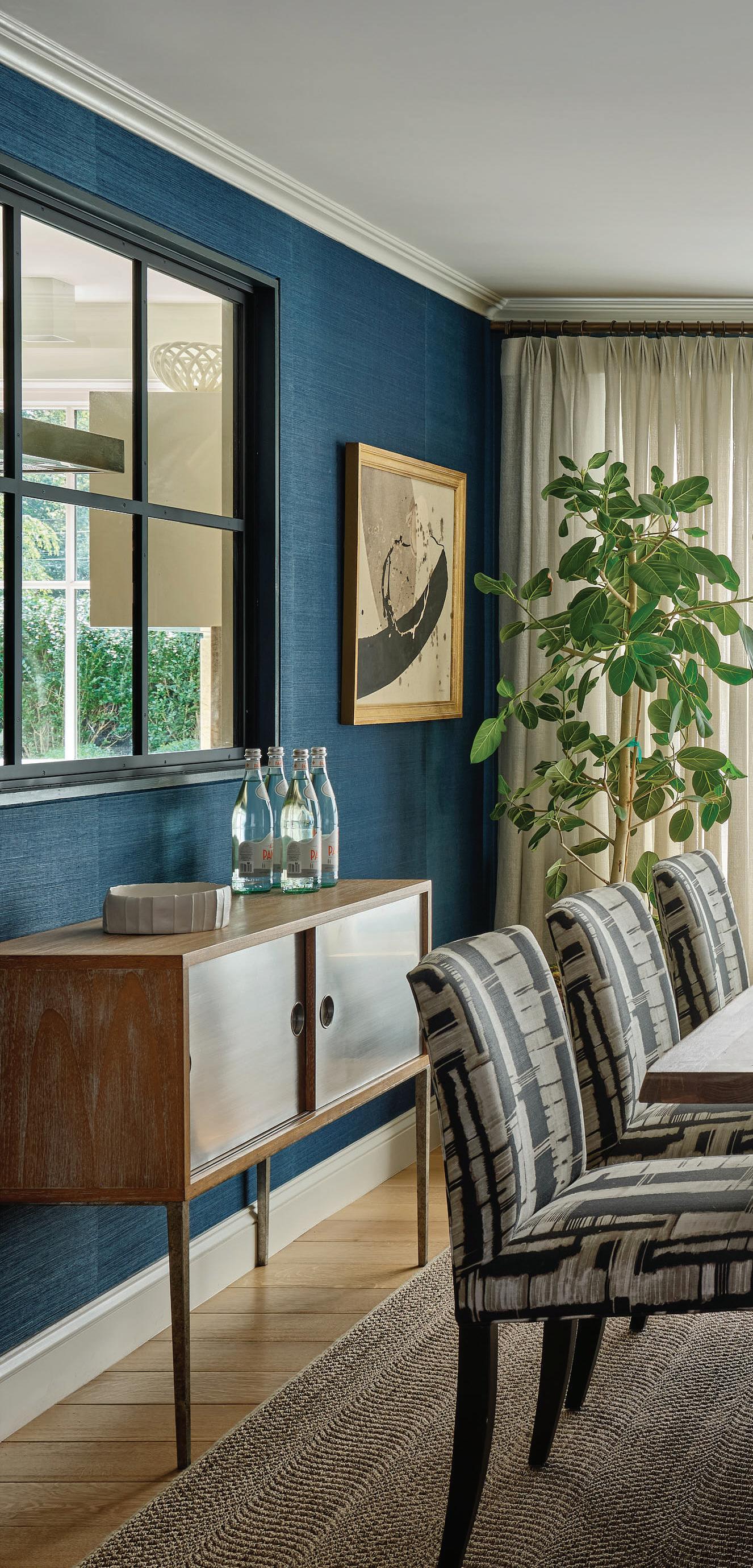
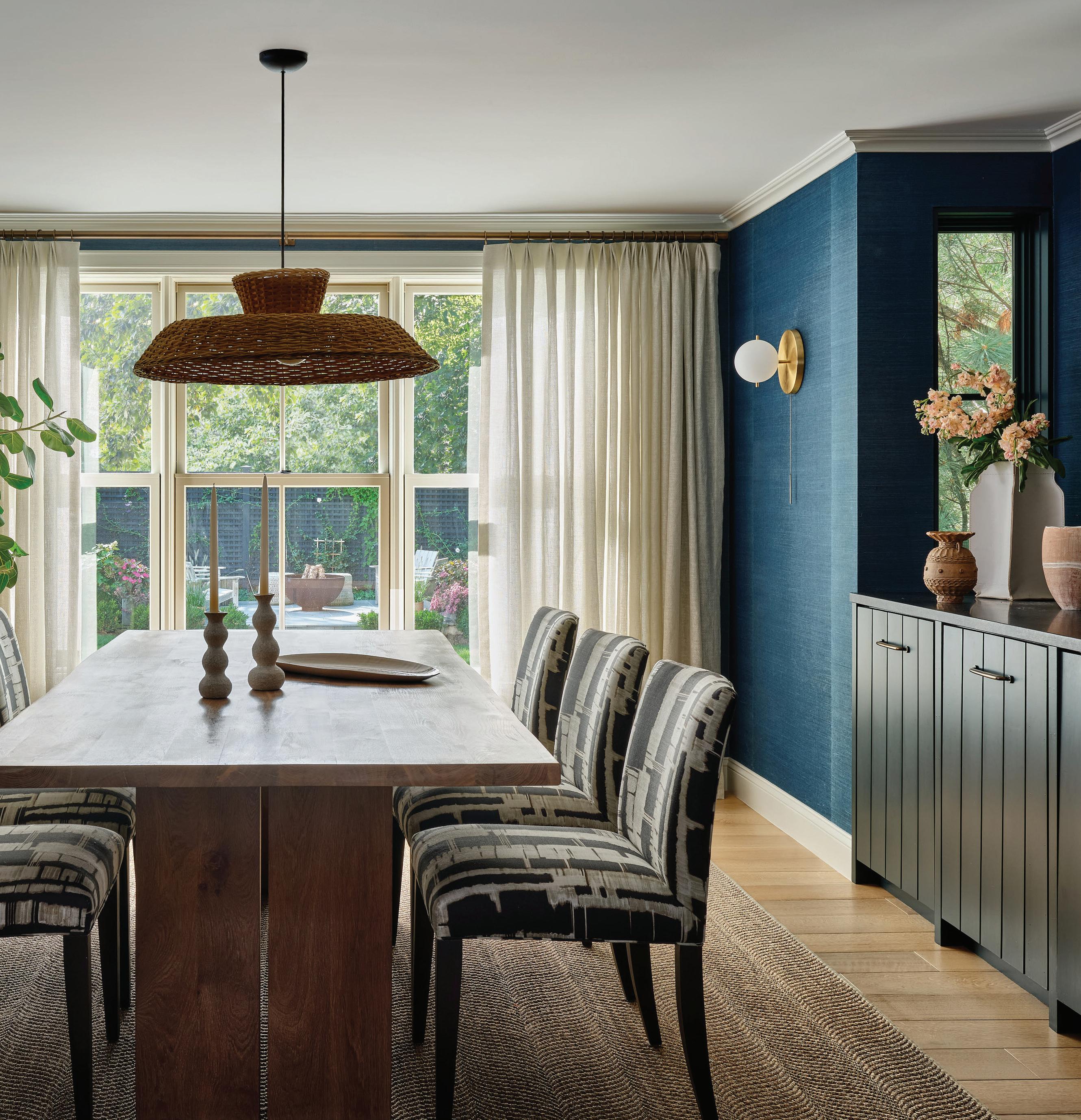
Tell us about that dining room.
I wanted to ground that area of the house and make it a little bit more saturated so it drew you in and felt connected to the kitchen, because the kitchen has the lighter tones. But we also realized we needed wine storage. We ended up bumping out that niche, which brought in natural light with the sidelights and gave us the storage. Then I just felt like the dining room could be minimal and little bit more moody.
athomefc.com 70
MAR/APR 2024 71
this photo: The blue grasscloth in the dining room serves as a contrast to the brighter kitchen. Plenty of light streams in, helped by Workstead sconces and Faina pendant. left: Ricci cleverly added the steel window to visually open the spaces between the kitchen and dining spaces.
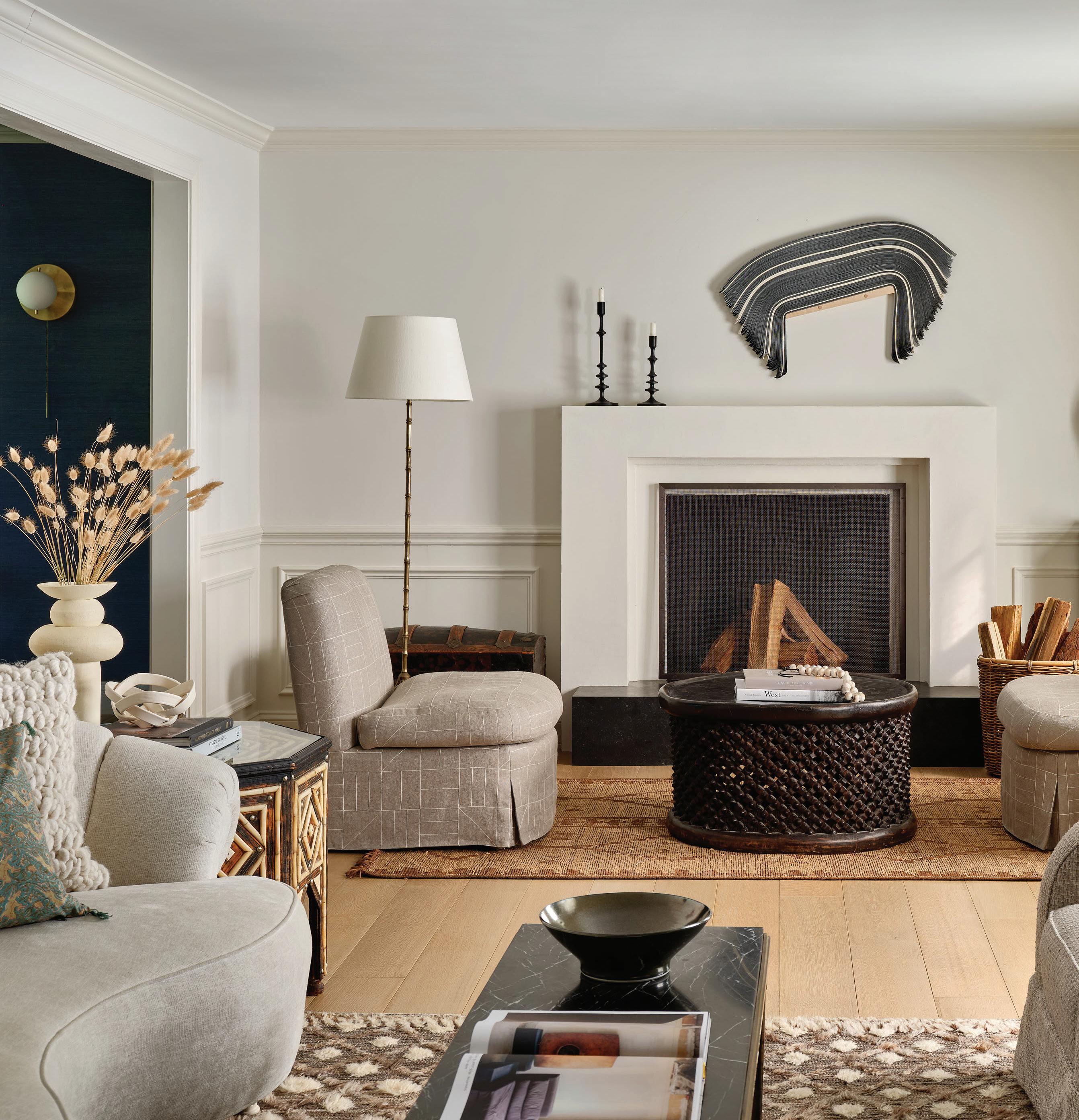 this photo: During the most recent renovation, Ricci applied more plaster to the house, adding depth to neutral walls. A Derrick Velasquez piece takes center stage over the fireplace, on view from the mix of custom and vintage seating options. right: Heather Gaudio Fine Art helped source pieces for the home, including the two smaller pieces over this side table, next to a painting by Landon Metz.
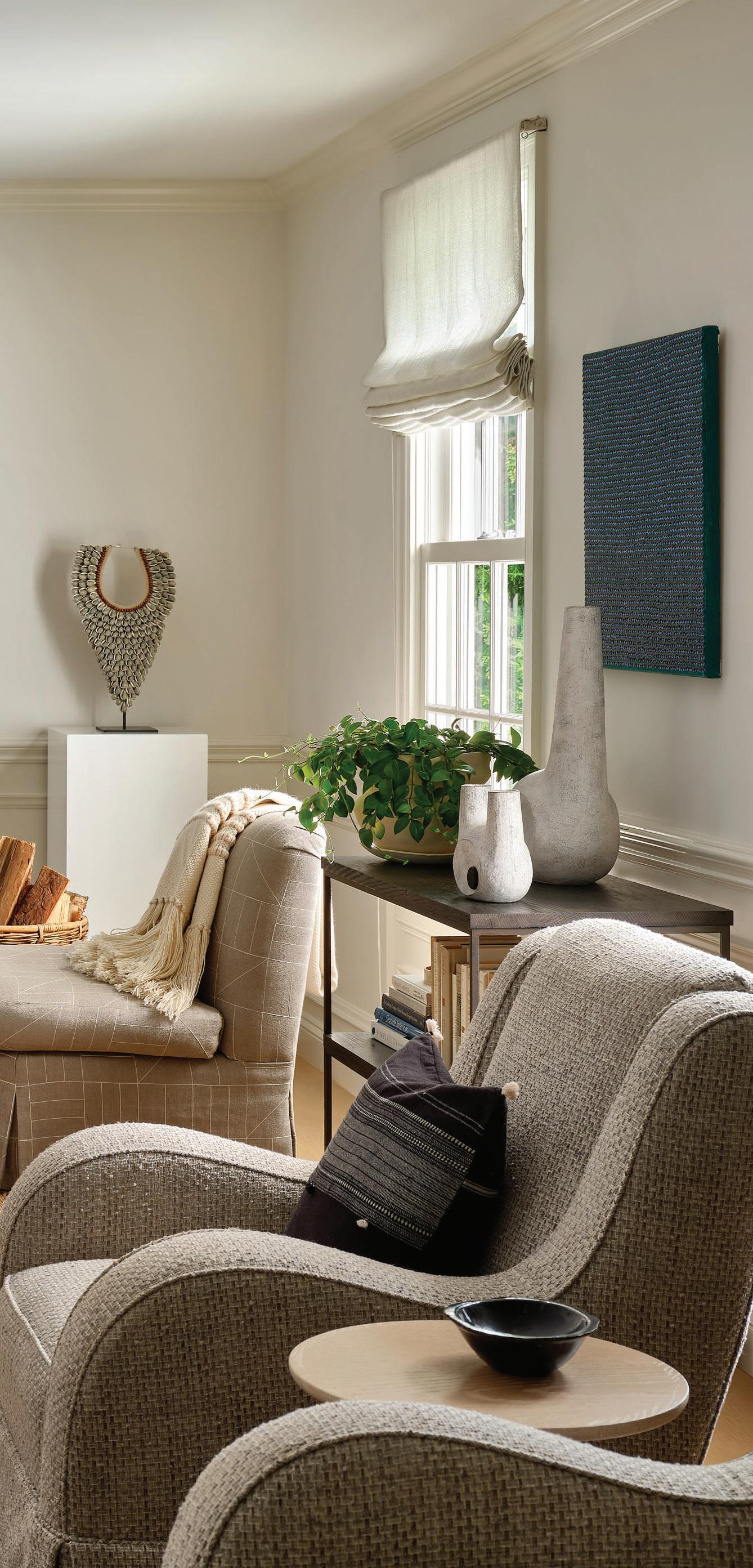

“I’m a big promoter of spaces that feel cozy and comfortable .”
—terri
ricci, terri ricci interiors
“If I’m going to do a trend, it’s going to be with something I can replace, but the foundation has to be something classic .”
—terri ricci, terri ricci interiors
 this photo: Custom Schumacher drapery frames the window of this calm primary bedroom.
Handmade ceramic lamps by Victoria Morris sit on the nightstands, and a Revival Home chandelier makes a sculptural statement.
There are many interesting art pieces throughout the house. Can you tell us about some of them?
The piece in the dining room, I found through an art advisor. It played into the mood of the room, and I just loved that sense of not knowing what’s around the corner, when you look at that image. I like the element of surprise. In the living room, a piece by Landon Metz hangs over the sofa. I like how it made the room feel more modern and light.
Because I’m so textural in my interiors, I find that I’m drawn to more graphic inspirational art. Whether its paintings, works on paper, threedimensional. I love how the art gallery put the collections together so it’s not just the traditional one piece over the sofa. I like a mix.
Tell us about the bathroom.
I was gifted that vanity 21 years ago from one of my millworkers. When we renovated, I couldn’t part with it, because the quality and construction was amazing and it will hold up for another 50 years. So I painted it, added new hardware and a new countertop. It held itself to the traditional elements of the house, but then all the walls are plaster and I used marble for the shower and the floor.

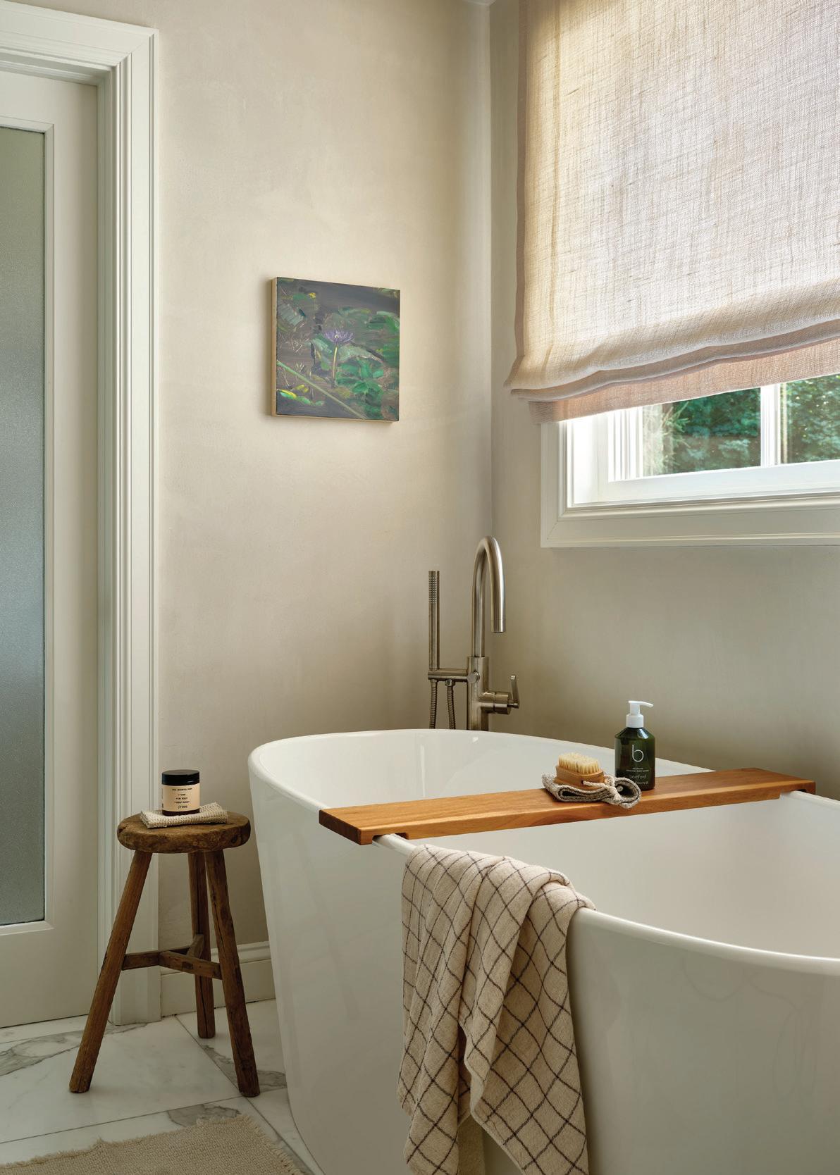
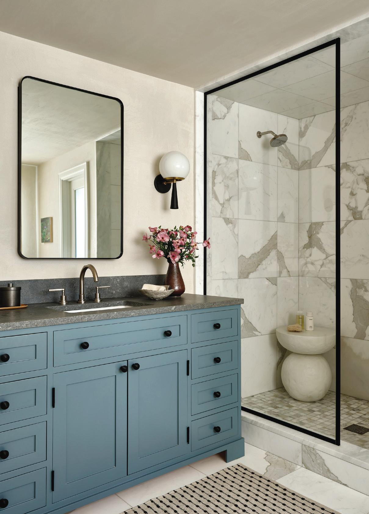 above: A vintage chair offers the perfect spot to read, relax or take in the Kim Keever art. top right: The modern soaking tub is an invitation to unwind. bottom right: Ricci was happy have a spot for the custom vanity that Frank Debono Construction had crafted for her twenty years prior.
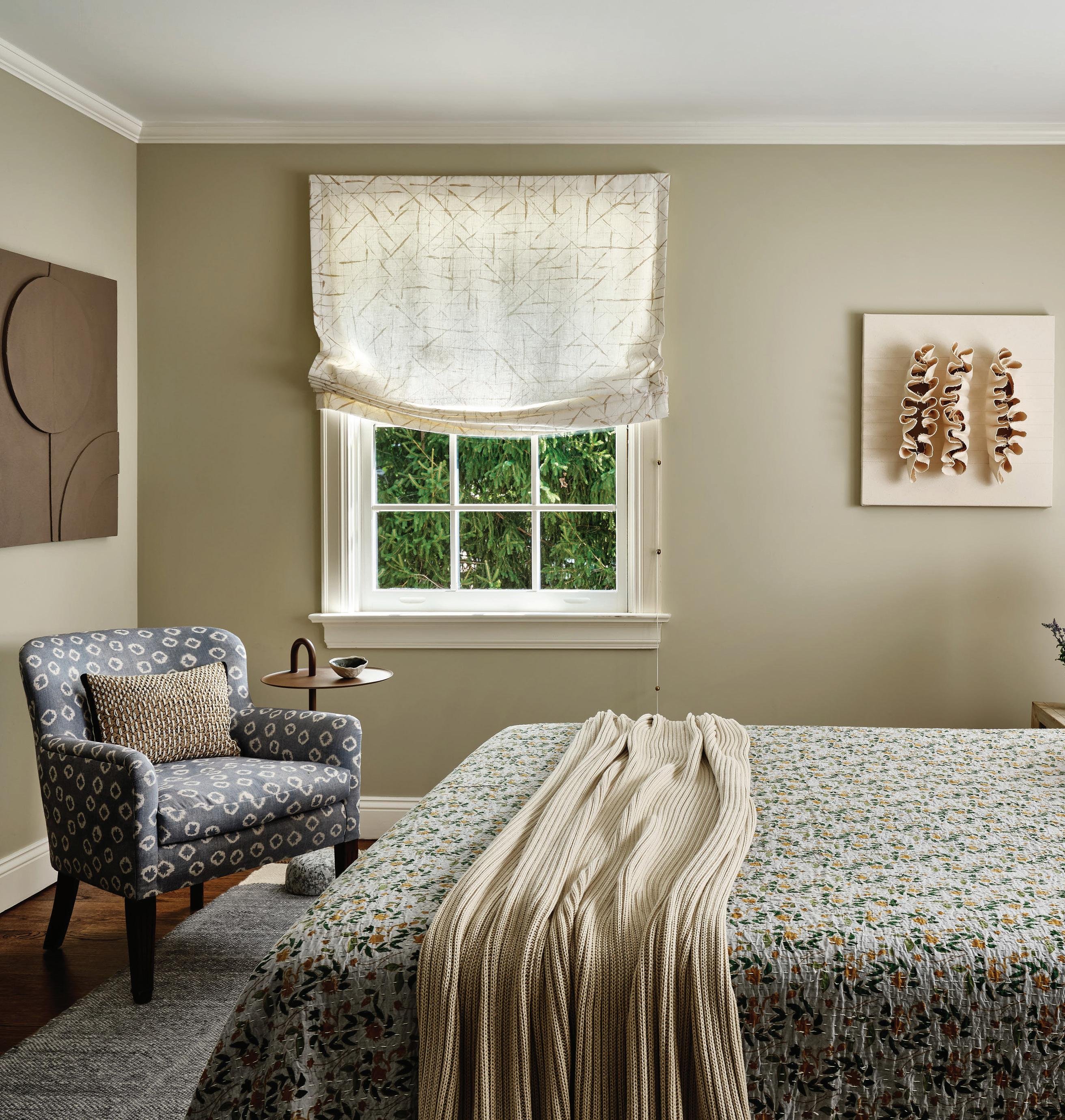 this photo: This cozy room includes a bed made with a Collective Co. quilt, Parachute throw and pillows from Bungalow.

“I love the way the house makes me feel....For me, it’s my little sanctuary . ”
—terri ricci, terri ricci interiors
Is art the last layer for you?
It has become the last layer for me. Clients can’t get their heads around it from the beginning.
It’s tricky, because everyone sees it from a different perspective, from aesthetics to value. Because I like clients to focus on quality pieces, I focus on that. And as we’re winding down, we bring in the art.
What is it like designing your own home versus client projects?
Some people will say they love designing for themselves. I go back and forth. There are so many ways of doing things, and I do like to mix different styles.
I actually make it collaborative with the office and use it as an opportunity to see how my team presents; what they’re thinking about. And then I’m acting as a client. It’s nice to see how it gets reflected on that side, and notice what we can be doing better. But ultimately, I’m making the final decision (laughs).
What was the biggest transformation in the house?
I’d say it was blowing out the back for the kitchen. But, when we first did the renovation, and friends would come over, everyone wanted to do what we were doing to make it look so different. I just cleaned it up, neutralized the colors, beefed up the trim, doors and redid the floors. They couldn’t figure out what it was.
What do you love most about living here?
I love the way the house makes me feel. Clients laugh when I tell them that they do not need a 10,000 square foot house to be happy. I’m always downsizing them a little bit, and they end up appreciating it. At the end of the day, it’s those small spaces that make them feel great. And then I have the ability to navigate the difference spaces; how they work and they flow. For me, it’s my little sanctuary. I splurged in certain areas on things—like the bedding and the countertops—and they just make me feel so good. My carpet feels like I’m walking on a sweater.
Professionals:
Interior Design: Terri Ricci Interiors, Norwalk, 203-642-3202; terriricci.com
Builder/Painter/ Plaster: Polart Group, Norwalk, 203-979-0707; polartgroup.com
DECORATING & HOME FURNISHINGS
athomefc.com 78 BUILDING & HOME IMPROVEMENT California Closets, californiaclosets.com 4, 5 Charles Hilton Architects, hiltonarchitects.com 7 VanderHorn Architects, vanderhornarchitects.com 2, 3 Gault Family Companies, gaultstone.com 19 Garrett Wilson Builders, garrettwilsonbuilders.com 11 Hobbs, Inc., hobbsinc.com 29 KLAR Studio-Windows and Doors, klarstudio.com Cover 4 Gold & Home, goldandhome.com 17 Tischler und Sohn, tischlerwindows.com 9 Yankee Custom Builders, yankeecustombuilders.com 15 LANDSCAPING & LANDSCAPING ARCHITECTURE Homefront Farmers LLC, homefrontfarmers.com 13 James Doyle Design Associates, jdda.com Cover 3
Amy Aidinis Hirsch Interior Design, amyhirsch.com Cover 2, 1 EVENTS A-list Awards, athomealistawards.com ........................................................................................................................... 25 Alzheimer’s Association Event, celebratinghope.givesmart.com 79 Greenwich Restaurant Week 21 MISCELLANEOUS Best Of Gold Coast Connecticut 23 Big Picture 29 FlowCode 27
insiders’ list


Save Save SaveTHE DATE


11th Annual


Please join the Alzheimer’s Association for an evening of dinner, dancing and storytelling as we highlight our impact in the community, celebrate a new era of treatment and recognize those affected by the disease.


6:30 - 11:00 PM


Celebrating Hope Celebrating Hope Celebrating Hope


Friday, April 26th, 2024
500 Steamboat Rd, Greenwich


Delamar Greenwich Harbor


For tickets, sponsorship and additional information, celebratinghope.givesmart.com.


For information & resources, visit alz.org/ct or call our 24/7 Helpline: 800.272.3900
Chairs Chairs
& Kelly Helstein & Tim & Kelly Helstein Chairs
Event Chairs Event
Tim


ELISA BULGRIN of Longfield Farm
FAMILIAR FACES SHARE THEIR LOCAL FAVORITES
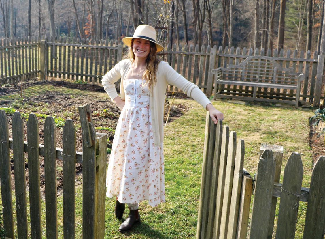
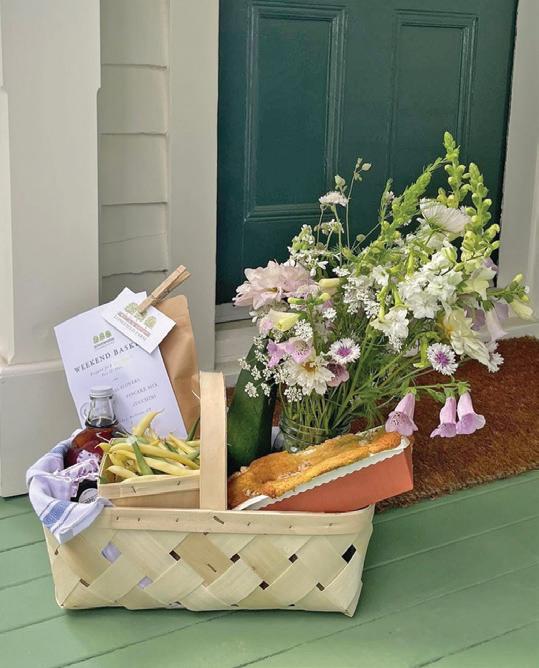
With each basket that she lovingly assembles, Elisa Bulgrin shares the bounty from New Canaan’s Longfield Farm, the bucolic land that she’s cultivated and now calls home. In between time arranging fresh cut flowers, harvested produce and a selection of her favorite local provisions into extra-special gifts, we asked the Australiannative about growing to love her Connecticut farm life.


of my own childhood on
I always feel at home when … barbecuing sausages over a fire at the bottom of our field with my husband, kids and dogs. It reminds me of my own childhood on the farm in Australia.
Favorite weekend activity … Our biggest projects are usually spontaneous. And I love when the stars align, and we break ground on something new.


This spring, I’m excited about planting … lots of new varieties of dahlias, but I’m actually most excited about what I planted last fall. In particular, thousands of foxgloves for cutting. They’ll bloom in early June.
enjoy. Worst case, you’ll have spent some time in nature and gotten some exercise. And always build bigger; you’ll inevitably want more space.
Five favorite things in my house …

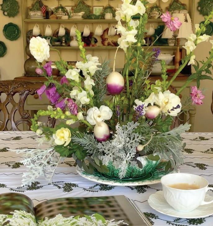
My guilty pleasure is … making a big arrangement of flowers from the garden, just for me.


1. Our enormous four-foot kitchen sink
2. My growing collection of vases


My best gardening advice is … Give it a go! Best case, you’ll have beautiful flowers and vegetables to
3. Treasured Christopher Spitzmiller lamps

When it comes to interiors, I’m inspired by … the work of Ben Pentreath, Rita Konig, Beata Heuman and Virginia Tupker. But no one has inspired me more than my godmother Janie Marshall, and her sister, Nan Sefton, who owns Pigott’s Store in Sydney.

My favorite place in the world is … Australia’s Southern Highlands, and Sydney will always be “home.”


My favorite thing about living here is … experiencing the charm of the Connecticut countryside, just an hour from the best city in the world. And the community— it’s unparalleled.
My latest local obsession is … takeand-bake cinnamon rolls from Flour Water Salt Bread in Darien.


4. Worn sofas (dogs are welcome)

5. View of the land


The idyllic grounds at Longfield


longfieldfarmct.com @longfieldfarmct


PHOTOS: PASTRY BY GARVIN BURKE; COURTESY OF ELISA BULGRIN. QUEENS ANN LACE © EXQUISINESTOCK.ADOBE.COM; PINK FLOWER WS © ANASTASIIA MALINICHSTOCK.ADOBE.COM
One of Bulgrin’s custom gift baskets
top: Flour Water Salt Bread’s treats are worth the trip bottom: An artful arrangement in Bulgrin’s home
Farm


THE MARKET LEADER OF CUSTOM , E UROPEAN WINDOWS + DOORS WWW . KLARSTUDIO . COM NORWALK , CT ( 203 ) 9085833 SOUTHHAMPTON , N ( 631 ) 961173 NEW ORK CIT , N ( 917 ) 9209821 FOREST HILLS , N ( 6 6 ) 6 06792 SHOWROOM SHOWROOM @ KLARSTUDIOWINDOWSDOORS C n r Harri an Ph t ra h Martin Architects


 MEGAN GAGNON Editor megan.gagnon@moffly.com


 above: The Capricorn mural is inspired by sections of historic early 19th-century panels by Velay and Zuber.
above: Bamboo Floral is based on small painted sections of Chinese wallpaper found at Kingston Lacy Estate in Dorset.
above: Contemporary meets traditional in the Kelly series.
above: This Frame design skips the hardware for a streamlined effect.
PHOTOS COURTESY OF LITTLE GREENE, GOLD & HOME


 right and below Native grasses and gardens planted like full-of-life meadows are taking up space alongside—and sometimes even replacing— traditional manicured lawns.
below Insectattracting pollinators are all abuzz for spring and summer.
PHOTOGRAPHY: GRASSES AND POOL BY NEIL
LANDINO; BEES AND WILD FLOWERS © ALEKSANDRSTOCK.ADOBE.COM

 this page Posh pools boast sun shelves, heating units for winter and plunge options for cold immersion therapy. opposite Flowers are the ultimate accessory in well-appointed vegetable gardens.


 this page: An Eames chair by DWR and Alpaca fur chairs by Four Hands create cozy seating in the living room. opposite page: Fox wanted to capture the serenity of this shaded spot, a perfect place for relaxing or reading. Great Blue Heron is a commissioned piece by artist Mary Morant.


 this photo: The family room is the hub of the home, with a design that’s warm, approachable, functional and, most importantly, durable. opposite page: A view of the sunny yard can be seen from the Serena & Lily sectional.


 left: Stars cover the ceiling in the older boy’s spaceinspired room. right: A commissioned piece of art by Michael McGuire speaks to the space theme and the family’s prior New York City home.
below, left: In the primary suite, Swan solved for asymmetric window placement behind the bed by installing off-centered drapery panels.
below, right: The California flag that hangs over the crib is a nod to the husband’s West Coast roots.


 this photo: Apparatus lighting hangs in the dining room, where the walls are dressed in a botanical wallcovering by Marthe Armitage.
 this photo: The breakfast nook captures the new mood of this house, which Stucker refers to as clean and uncomplicated.


 this photo: During the most recent renovation, Ricci applied more plaster to the house, adding depth to neutral walls. A Derrick Velasquez piece takes center stage over the fireplace, on view from the mix of custom and vintage seating options. right: Heather Gaudio Fine Art helped source pieces for the home, including the two smaller pieces over this side table, next to a painting by Landon Metz.


 this photo: Custom Schumacher drapery frames the window of this calm primary bedroom.
Handmade ceramic lamps by Victoria Morris sit on the nightstands, and a Revival Home chandelier makes a sculptural statement.


 above: A vintage chair offers the perfect spot to read, relax or take in the Kim Keever art. top right: The modern soaking tub is an invitation to unwind. bottom right: Ricci was happy have a spot for the custom vanity that Frank Debono Construction had crafted for her twenty years prior.
 this photo: This cozy room includes a bed made with a Collective Co. quilt, Parachute throw and pillows from Bungalow.

