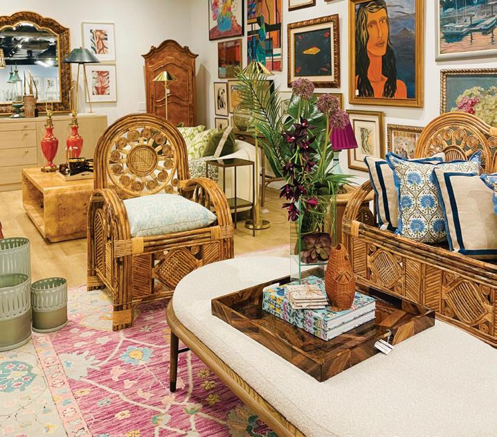


A MY AIDINIS HIRSCH INTERIO R DESIG N amyhirsch.com n 203 661 1266
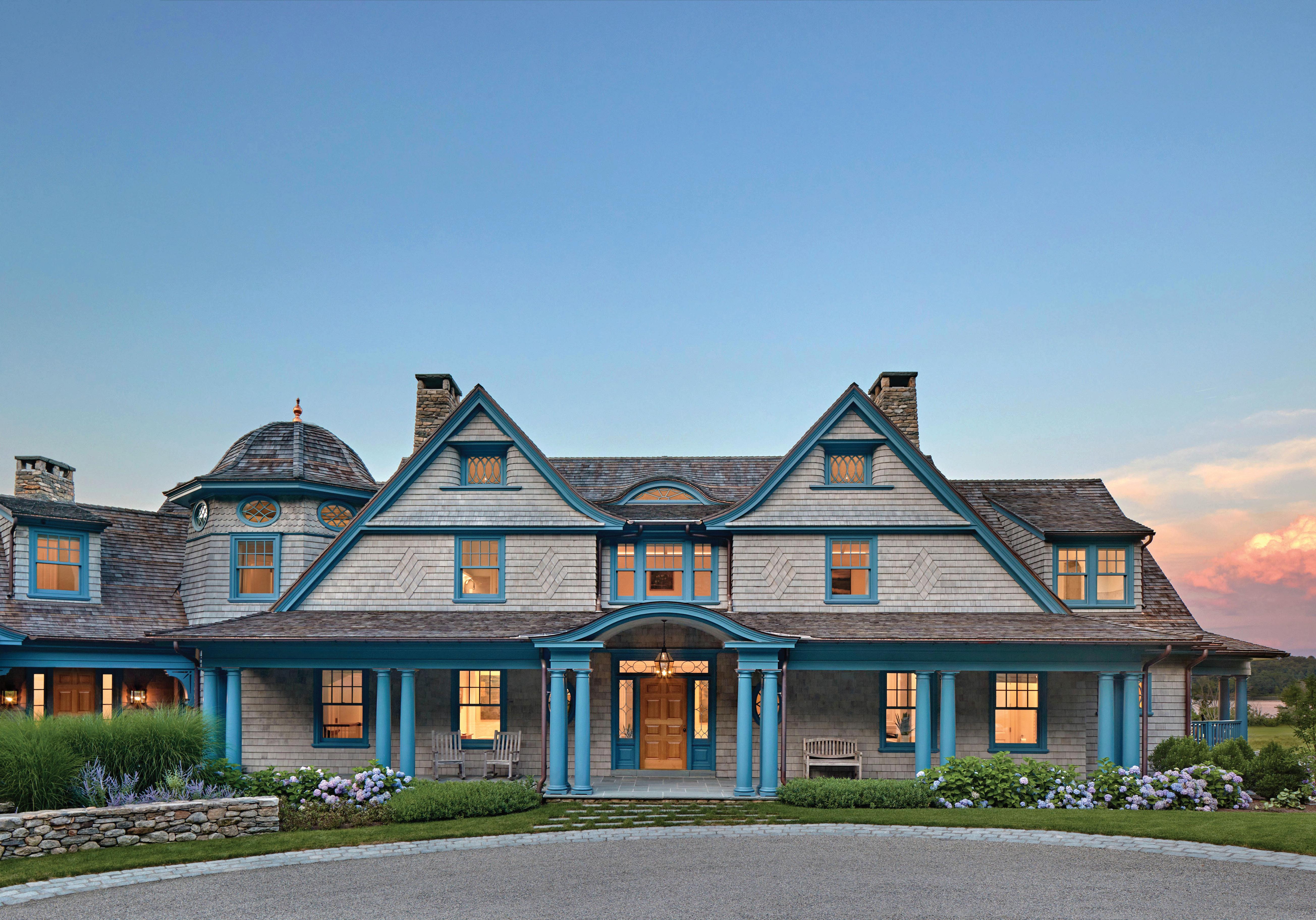

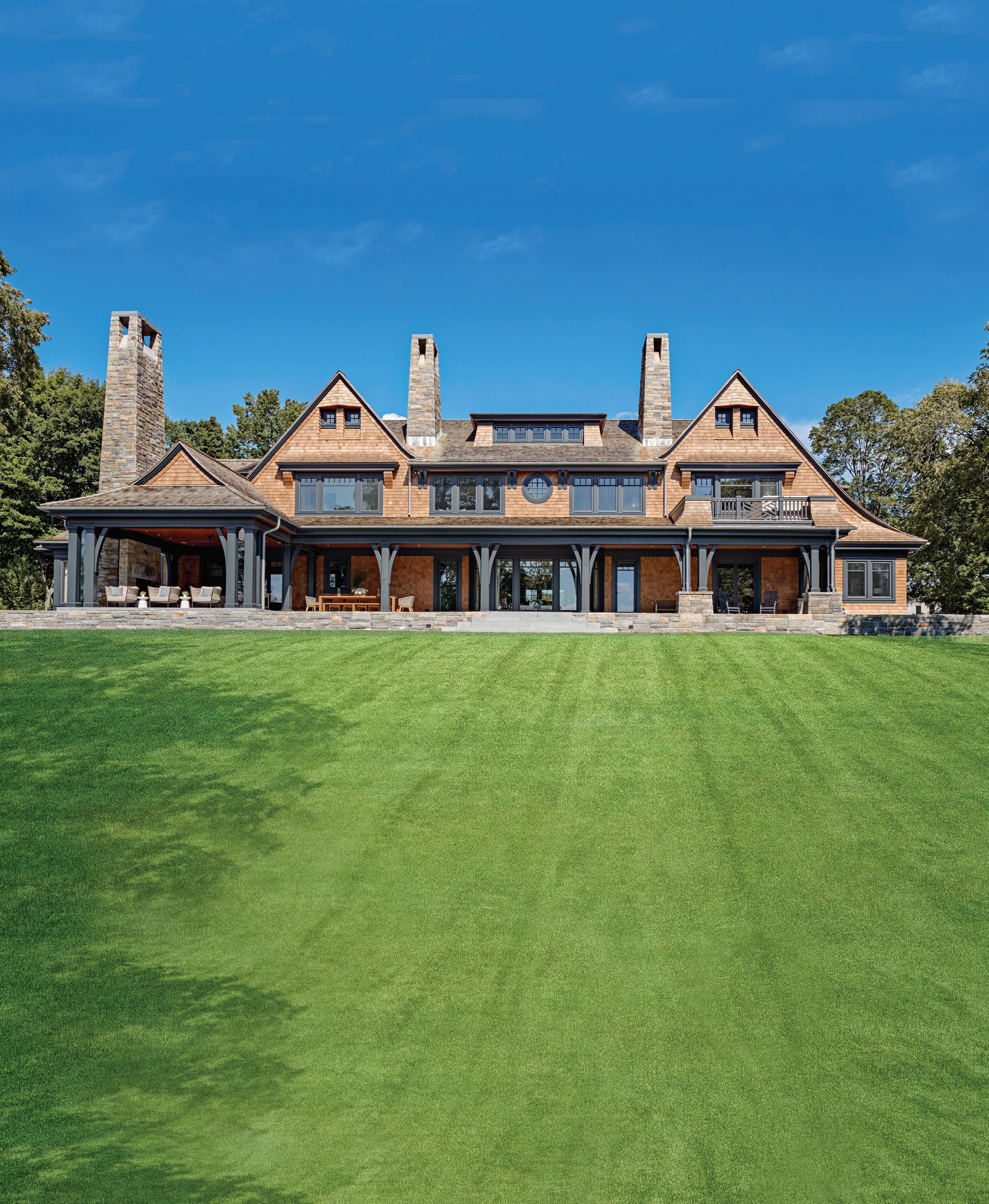
TEL. 203.622.7000 WWW.VANDERHORNARCHITECTS.COM 41 WEST ELM STREET GREENWICH, CT


10 GET THE GOODS Color: Fruit Stripes; Marbleized Prints; Bright


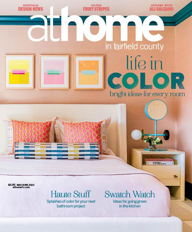
athomefc.com 4 features departments contents MAY/JUNE 2023 ATHOME IN FAIRFIELD COUNTY MAY/JUNE 2023, VOL. 18, NO. 2. ATHOME IN FAIRFIELD COUNTY (ISSN 1941-9503) is published five times annually (Mar/Apr, May/Jun, July/Aug, Sept/Oct, Nov/Dec) by Moffly Media, Inc., 205 Main St, Westport, CT 06880. Periodical postage paid at Westport, CT, and additional mailing offices. POSTMASTER: Send address changes (Form 3579) to ATHOME IN FAIRFIELD COUNTY, PO BOX 9309, Big Sandy, TX 75755-9607. US subscription rates: $19.95/1 year, $34.95/2 years; Canada and foreign US$40/1 year, US$70/2 years. vol. 18 | issue 2 46 8 EDITOR’S NOTE A sunny breakfast spot by Amy Aidinis Hirsch.
of retro color
bathroom on the cover chango & co. | photography finn m c clendon Local design news, the latest collections, haute happenings and more 72 ATHOME
Galgano of Serpentine Jewels 28 PRINTS CHARMING Elliott Interiors goes bold and bright for a New Canaan family. 36 NEW TRADITION Custom pieces come together with antique finds in Lisa Hilderbrand’s project. 46 SHADES OF SUMMER Amy Aidinis Hirsch’s Shelter Island design is swimming in color. 58 BOLD & BEAUTIFUL A Westport home gets a modern makeover, courtesy of Chango & Co.
Tabletop 16 HAUTE STUFF Splashes
for the
WITH Ali
californiaclosets . com MAKE ROOM FOR ALL OF YOU CALL OR VISIT US ONLINE TODAY TO SCHEDULE YOUR COMPLIMENTARY DESIGN CONSULTATION CONNECTICUT 56 5 WESTPORT AVE, NORWALK 20 3.924.8444 WESTCHESTER 16 S AW MILL RIVER RD, HAWTHORNE 91 4.592.1001 @caliclosetsct ©2023 California Closet Company, Inc. All rights reserved. Franchises independently owned and operated. CT HIC #0657205
editorial editor
Megan Gagnon megan.gagnon@moffly.com
advisory editor
Donna Moffly donna@moffly.com
contributing editors
editorial director
Cristin Marandino cristin.marandino@moffly.com
editor, custom publishing Elizabeth Hole elizabeth.hole@moffly.com editor, new canaan•darien
Julee Kaplan julee.kaplan@moffly.com editor, stamford
Kate Hogan kate.hogan@moffly.com
editor, westport•weston•wilton

Samantha Yanks samantha.yanks@moffly.com art
senior art director
Garvin Burke garvin.burke@moffly.com
production director
Tim Carr tim.carr@moffly.com
assistant art director
Lisa Servidio lisa.servidio@moffly.com
digital
digital director of content strategy
Diane Sembrot diane.sembrot@moffly.com
digital marketing manager
Rachel MacDonald rachel.macdonald@moffly.com
digital assistant
Lloyd Gabi lloyd.gabi@moffly.com
sales & marketing publisher, fairfield living publisher-at-large, greenwich
Jonathan W. Moffly jonathan@moffly.com
publisher, greenwich
Andrew Amill andrew.amill@moffly.com
publisher, westport•weston•wilton Gabriella Mays gabriella.mays@moffly.com
publisher, new canaan•darien Gina Fusco gina.fusco@moffly.com
publisher, stamford Karen Kelly-Micka karen.kelly@moffly.com
associate publisher, athome Robin O’Hara robin.ohara@moffly.com
account executive
Hilary Hotchkiss hilary.hotchkiss@moffly.com
account executive
Morgan Howell morgan.howell@moffly.com
partnership and big picture manager
Kathleen Dyke kathleen.godbold@moffly.com
events director
Rachel Shorten rachel.shorten@moffly.com
sales assistant Lemuel Bandala lemuel.bandala@moffly.com
business assistant Eillenn Bandala eillenn.bandala@moffly.com

business president Jonathan W. Moffly
chief revenue officer Andrew Amill
editorial director Cristin Marandino
director of content strategy Diane Sembrot
business manager Elena V. Moffly, elena@moffly.com
cofounders John W. Moffly IV & Donna C. Moffly
athomefc.com 6
vol. 18 | no. 2 | may/june 2023 PUBLISHERS OF GREENWICH FAIRFIELD LIVING NEW CANAAN • DARIEN • ROWAYTON WESTPORT STAMFORD and athome magazines 205 Main Street, Westport, CT 06880 . P hone: 203-222-0600; email: mail@moffly.com ADVERTISING INQUIRIES: Lemuel Bandala: call 20 3-571-1610 or email advertise@moffly.com TO SUBSCRIBE, renew, or change your address, please email subscribe@athomefc.com, call 877-467-1735, or write to athome in Fairfield County Magazine, 111 Corporate Drive, Big Sandy, TX 75755. U.S. subscription rates: $19.95/1 year (5 issues); $34.95/2 years (10 issues); $44.95/3 years (15 issues). Canada and foreign, US $40/year. Prices are subject to change without notice. ALL RIGHTS RESERVED No part of this periodical may be reproduced without express permission of the publisher. ©2023 athome in Fairfield County Magazine
a registered trademark owned by Moffly Media. The opinions expressed by writers commissioned for articles published by athome in Fairfield County are not necessarily those of the magazine.
QUALITY CUSTOM REPRINTS/E-PRINTS, please call 203-571-1645 or email reprints@mofflymedia.com
is
FOR


SCAN TO EXPLORE


What’s your favorite color? It’s a question my three-year-old asks me almost every day. Sometimes I’ll say it’s emerald green, other times it’s lilac or magenta. But for someone who claims to love such vibrant shades, you’d never know it from looking around my house. Even my monochromatic closet betrays me—although all the blue jeans have to count for something. The reality is that bold moves require more deliberation, or at least they should. I blame my mostly neutral surroundings on my indecision; dragging my feet to avoid committing to a cohesive design plan. What I should be doing is paying better attention to projects like the ones in this issue and realizing that the delicate balance of coordinating a punchy palette throughout the various rooms in a home is best left to the professionals.
Plus, they make it look fun. Take sisters Sara Haydock and Zan Young of Elliott Interiors, who took a fixer-upper in New Canaan and transformed it with wallpaper, patterned upholstery, and tons of textured layers. Using the owners’ Bahamas-based wedding as a touchpoint, the design duo was able to create a cohesive space that recalls that breezy island vibe. Across town, we a get a behind-the-scenes look into Lisa Hilderbrand working her magic. Her project is packed with storied antiques, custom pieces, bursts of bright lacquer, and a contemporary art collection, all deftly woven together from room to room. The lower level (don’t call it a basement) deserves its own spotlight, given what she was able to turn out from the existing concrete and sheetrock. Amy Aidinis Hirsch had the pleasure of working with existing Greenwich clients to update their older Shelter Island home, quirky elements and all. Of the splashes of deep-sea blue—and welcome but unexpected melon shades—Hirsch says it’s the most color she’s used in a long time. And it all works, especially against the backdrop of quiet architecture and with the addition of some artful lighting fixtures. We end in Westport, where a stately home got the Chango & Co. signature treatment: modern and sophisticated spaces, punctuated by delightfully hued rooms. Typically, it’s the colorful kids’ rooms that clients request, creative director Susana Simonpietri told me when we spoke. And seeing these sweet spots—like the joyful one on our cover—I understand why. It’s serious work, crafting something so playful, and you’ll want to take a closer look at all the details that went into each design.
We want to see all your A-List Awards-worthy work—multi-colored or not— submitted before our May 26 deadline. Head to athomealistawards.com to see all the answers to your questions and meet our 2023 judging panel (most are new to the program this year). Make sure to get your entries in and get your best projects in front of them!
MEGAN GAGNON Editor megan.gagnon@moffly.com


athomefc.com 8
editor’s note / COLOR STORIES
HOW TO SCAN: OPEN, AIM & TAP
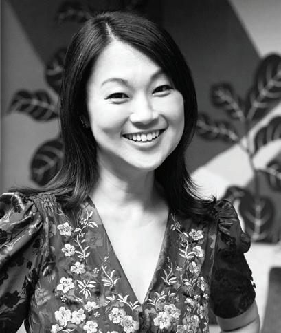
PHOTO: BOB CAPAZZO
203.594.7875 morganharrisonhome.com New Canaan, Connecticut FRESH | LIVABLE | PERSONAL Award-winning, full-service design & architectural interiors s MORGAN HARRISON HOME
goods/
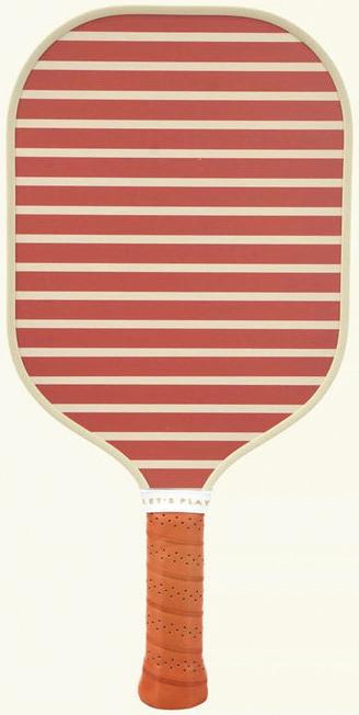
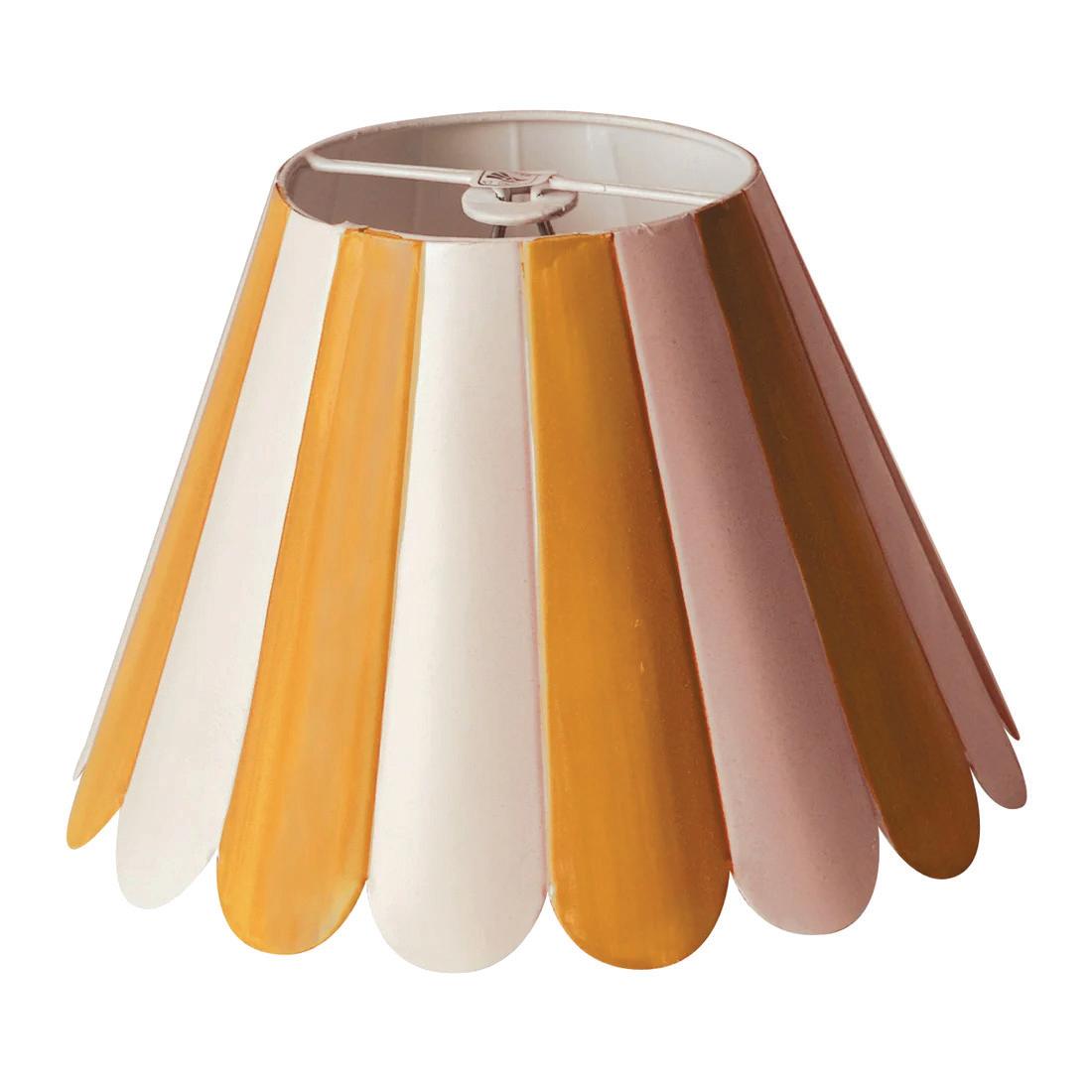
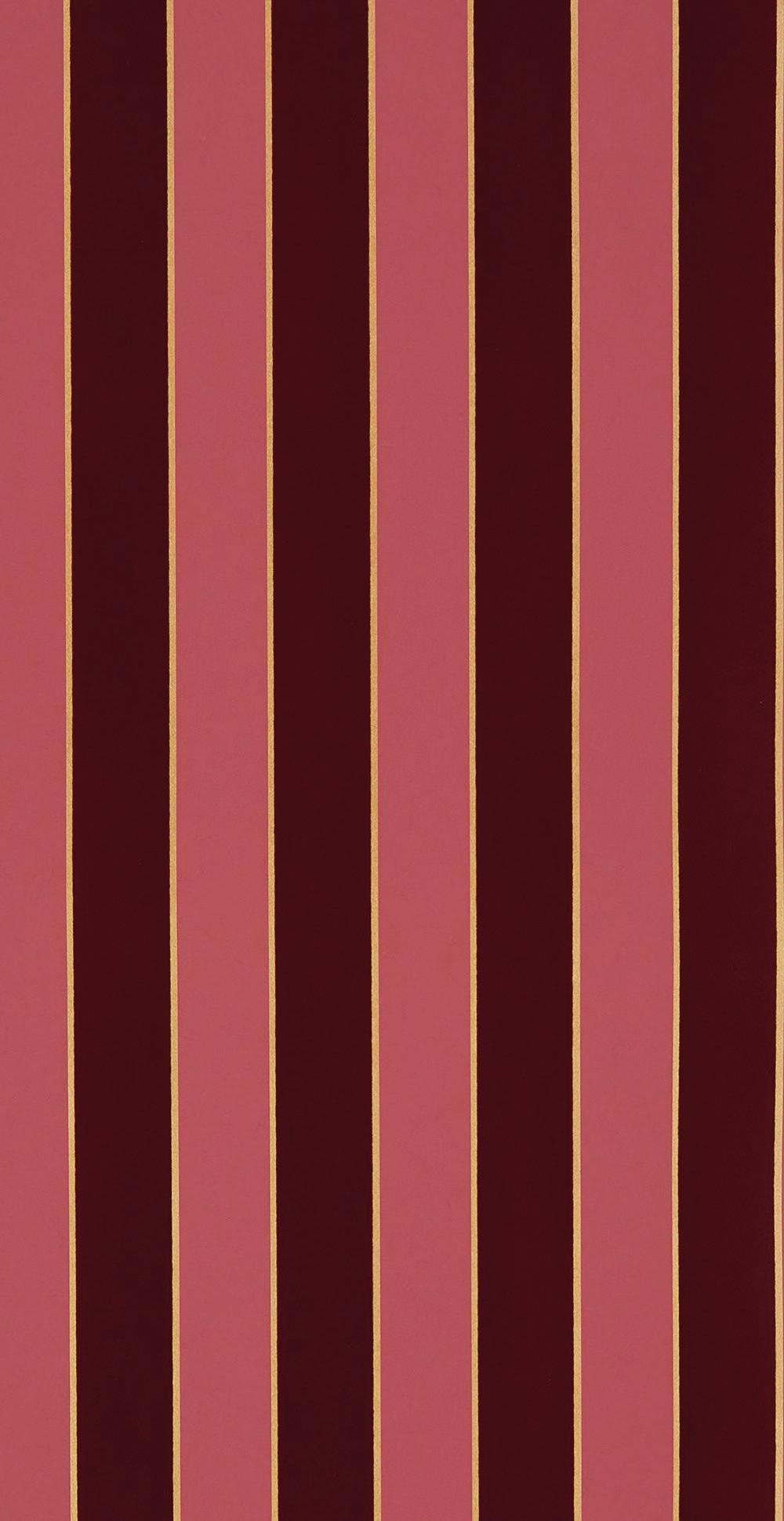
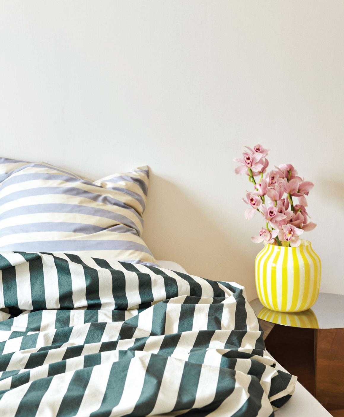
“colorful stripes can bring a graphic crispness and vibrancy to any room. i particularly like using the richly saturated designs offered through malabar and les toiles du soleil; both companies offer these in the perfect heavy-duty woven cotton twill.”

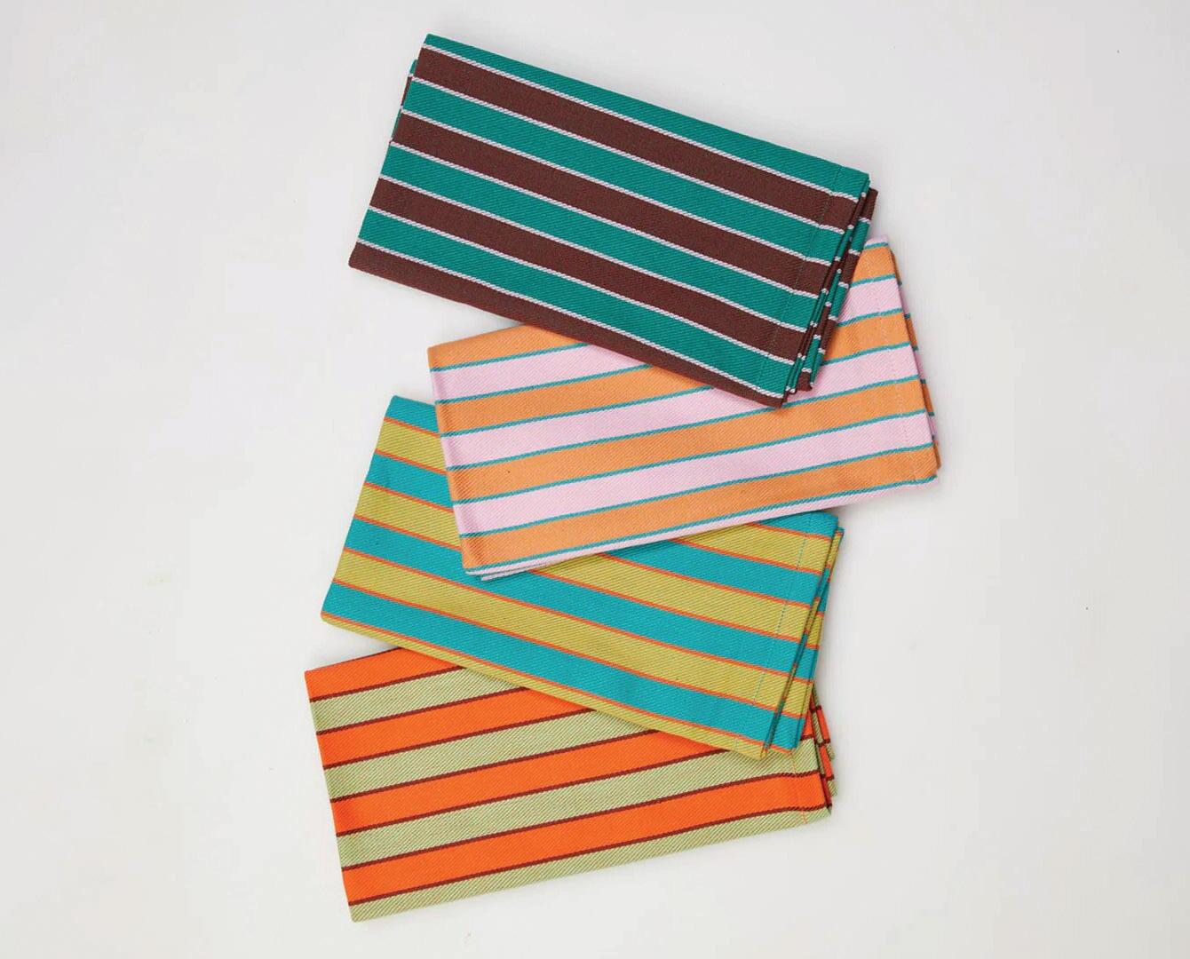

IMAGES COURTESY OF DESIGNERS/BRANDS 10
—patrick mele, patrick mele
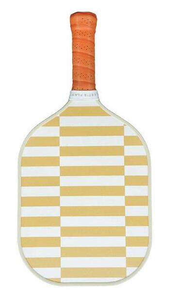
RECESS Pickleball paddles; $86 each. recesspickleball.com
1
OSBORNE & LITTLE Regency Stripe wallpaper in W7780-13; price upon request. Stamford; osborneandlittle.com


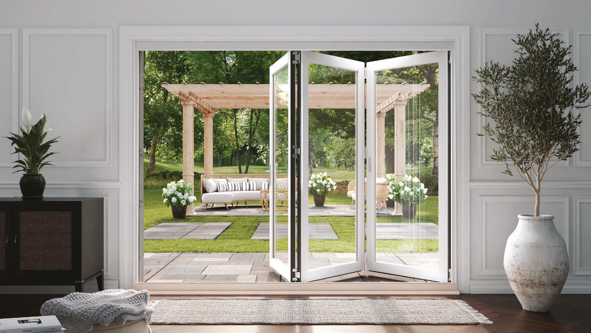
Your Inspiration. Our Expertise. RingsEnd.com | 800·390·1000 Bethel | Branford | Darien Lewisboro | Madison | New Milford Niantic | Wilton Marvin Elevate Bi-Fold Door
goods/SWIRL POWER
ADD PAINTERLY PATTERNS WITH MARBLEIZED PRINTS

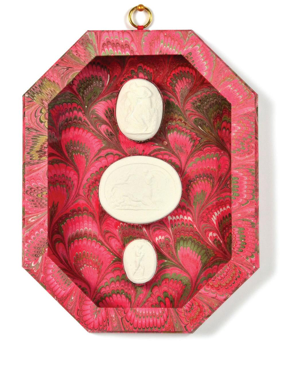
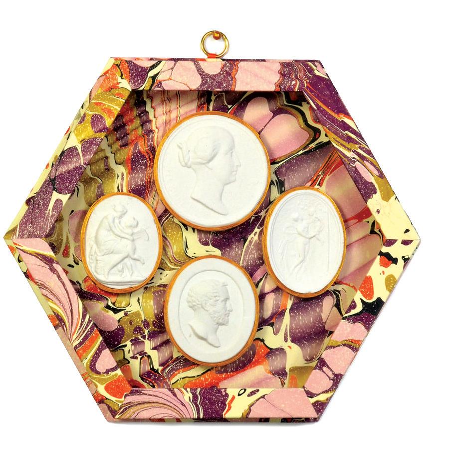
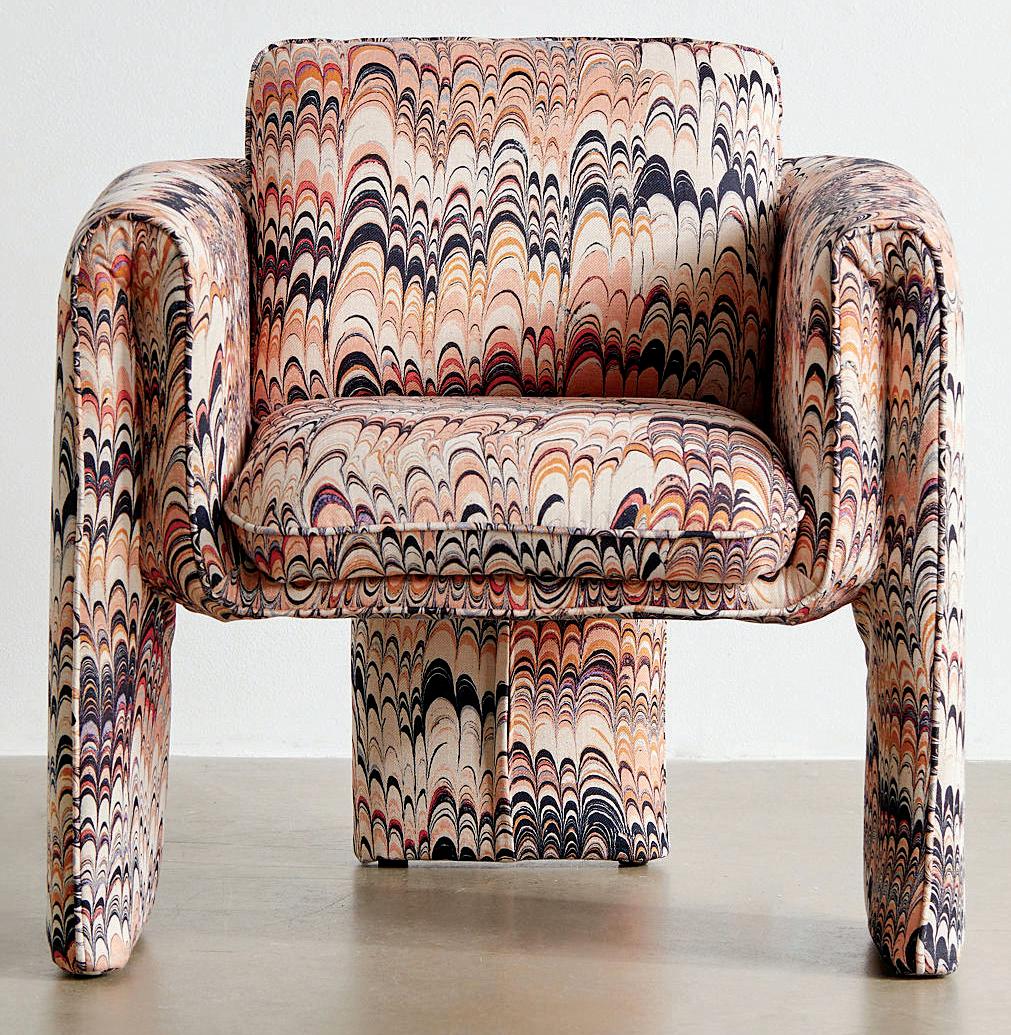
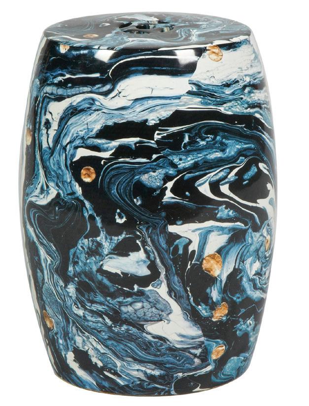


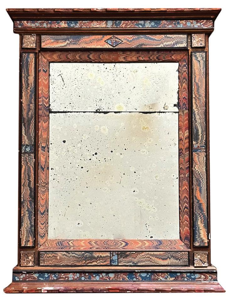
“i love using marbleized paper sheets in the backs of bookcases for color, depth, and, of course, some added history to a space.”
IMAGES COURTESY OF DESIGNERS/BRANDS
1 STUDIO FORMATA Cocktail tray; $30. anyondesign.com
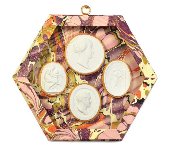
2 PARVUM OPUS Shadow boxes with intaglios; starting at $280. parvumopus.com
3 THE URBAN ELECTRIC CO. Esme sconce with Beata Heuman marbleized paper shade; starting at $1,406. urbanelectric.com
4 JOHN DERIAN 19th-century Italian marbled mirror; $1,200. johnderian.com
5 CURATED KRAVET Nitin stool; $500 danielhouse.club
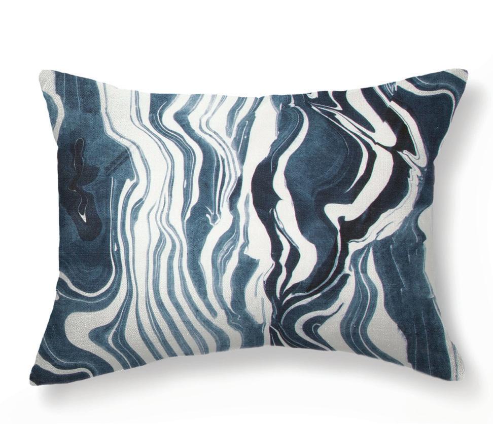
6 REBECCA ATWOOD Marbled stripe pillow in navy; $249. rebeccaatwood.com
7 URBAN OUTFITTERS Floria marble chair; $749. Westport; urbanoutfitters.com
—stephanie woodmansee, henry & co design, llc
2 6 4 1 5 athomefc.com 12

SERVE UP BOLD STYLE IN A FULL SPECTRUM OF SHADES
3 4 6
1 MEPRA Fantasia Italian flatware; $89 for set of four. MoMA Design Store, New York, store.moma.org


2 PATRICK MELE x NICHOLAS NEWCOMB Cake stands; starting at $395. Greenwich; patrickmele.com



3 LILY JULIET Pearl’s pitcher; $650. Grayson De Vere, Greenwich; graysondevere.com

—joanna buchanan, joanna buchanan
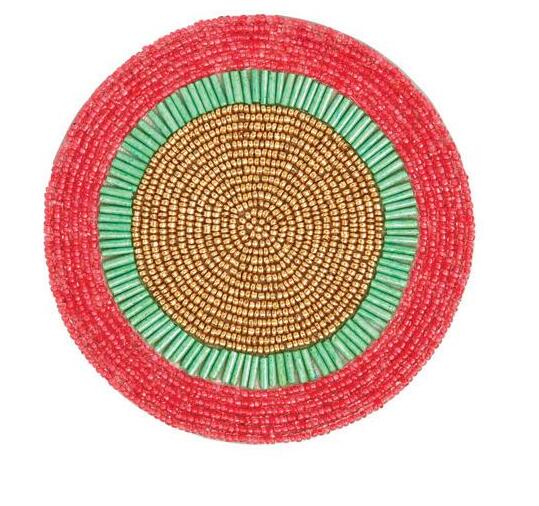
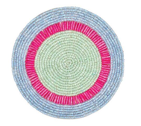
4 JOANNA BUCHANAN Bright stripe coasters; $84 for set of four. Hoagland’s, Greenwich; hoaglands.com


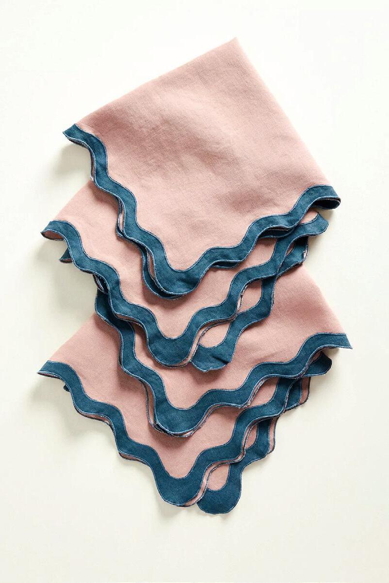
5 BED THREADS
Scalloped linen napkins; $70 for set of four. Anthropologie, Westport; anthropologie.com
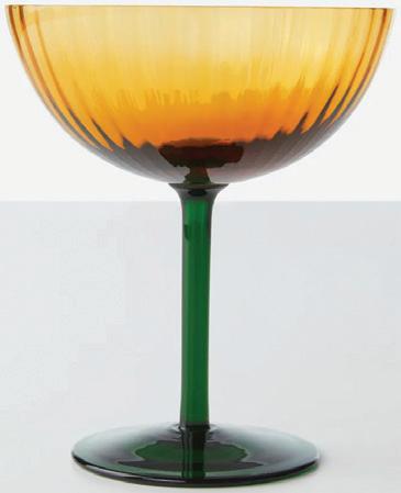
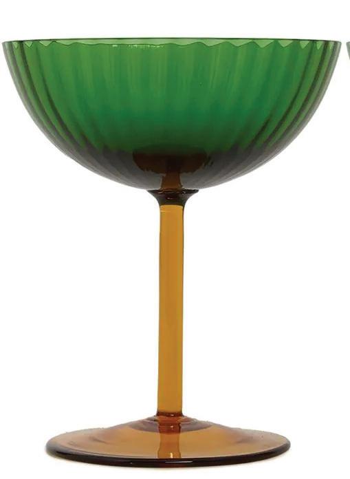
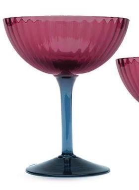
6 LA DOUBLE J Champagne coupes; $930 for set of four. net-a-porter.com
7 PAOLA C. Cuppone by Aldo Cibic; $495. Design Within Reach, Westport; dwr.com
IMAGES COURTESY OF DESIGNERS/BRANDS
goods /TECHNICOLOR TABLE
1
2
“strong color for the table makes your guests feel optimistic and welcome. be bold and brave, and don’t forget to have your flowers match the mood.” 5 athomefc.com 14
 by megan gagnon
haute stuff / COLOR WASH
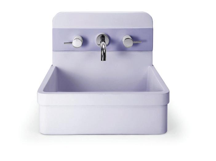
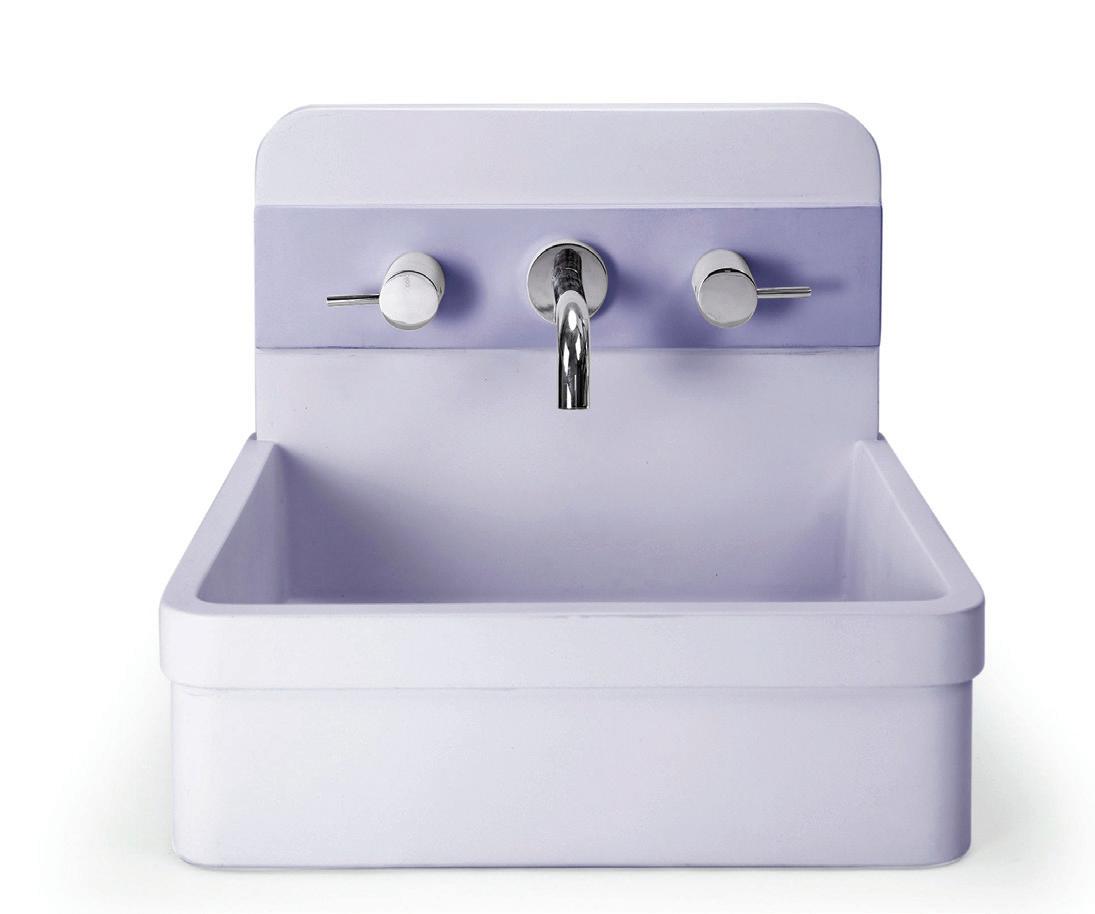
MAKE A SPLASH WITH BATHROOM FIXTURES IN RETRO SHADES
OF
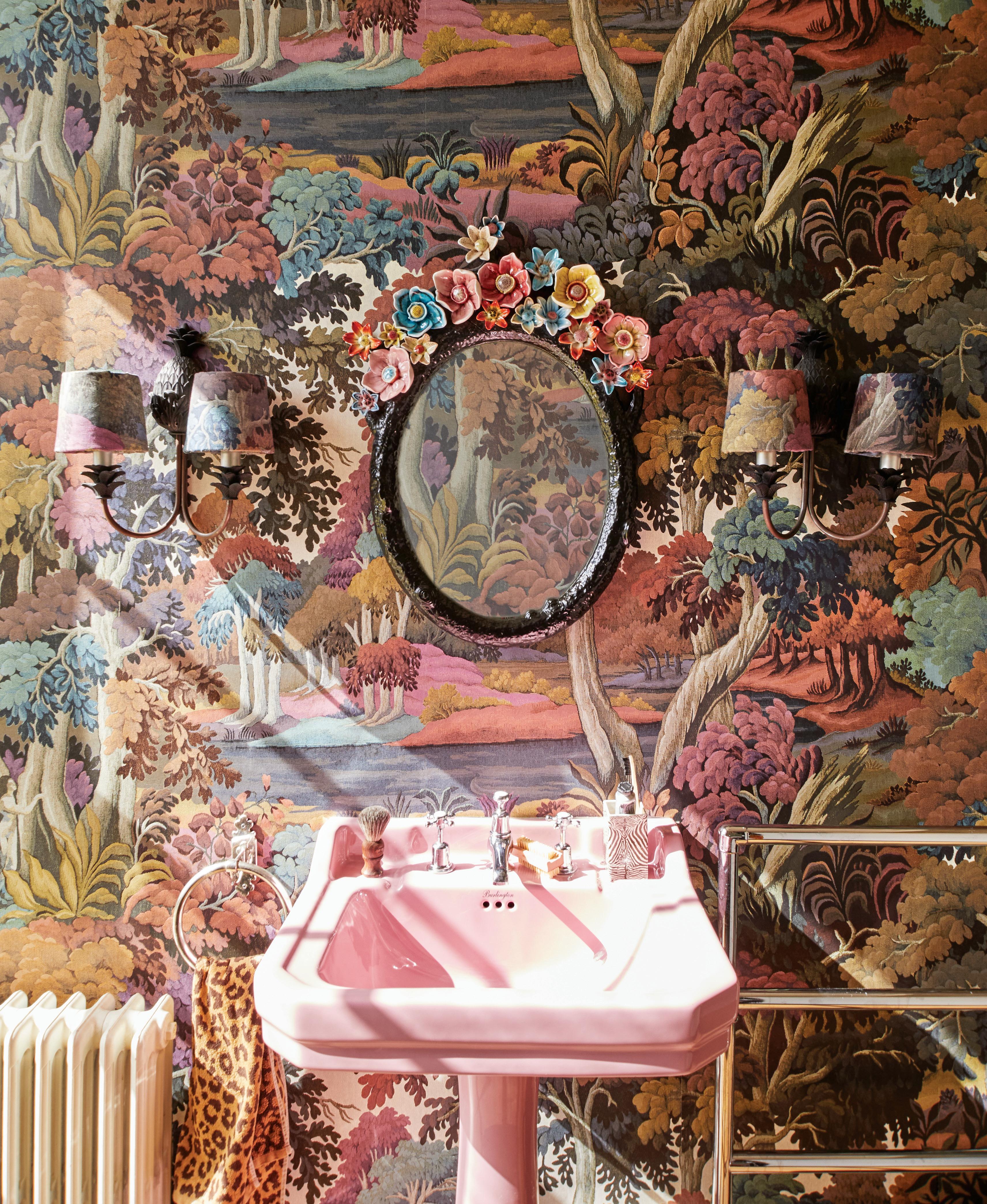
this photo: House of Hackney Plantasia wallpaper sets a bold backdrop for this playful powder room. PHOTO: COURTESY
OF HOUSE
HACKNEY; ALL OTHER IMAGES COURTESY OF DESIGNERS/BRANDS
8 9
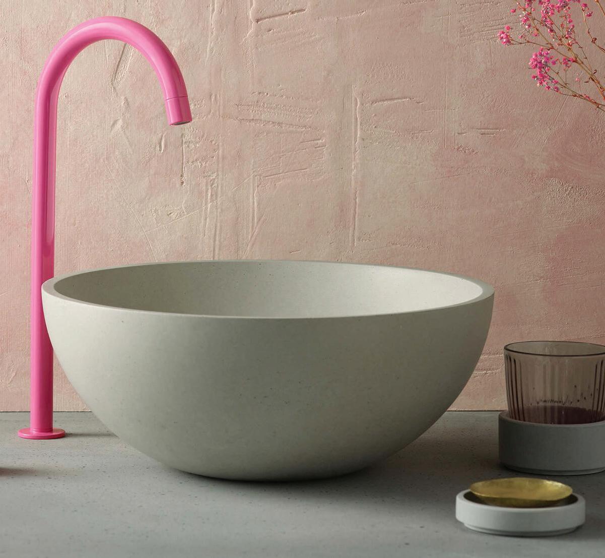
2


wash bowl; $1,930. Bender, Norwalk; benderplumbing.com
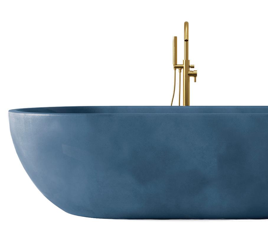
Maui freestanding bathtub; $5,999.99. concrettidesigns.com
Herbert basin; $1,350.
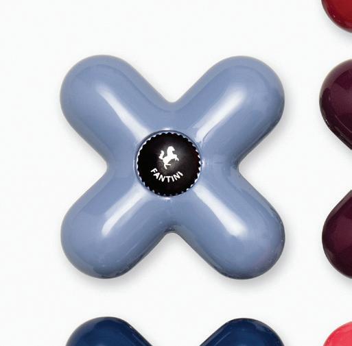
I Balocchi taps; price upon request. Torrco, Stamford; torrcodesigncenter.com
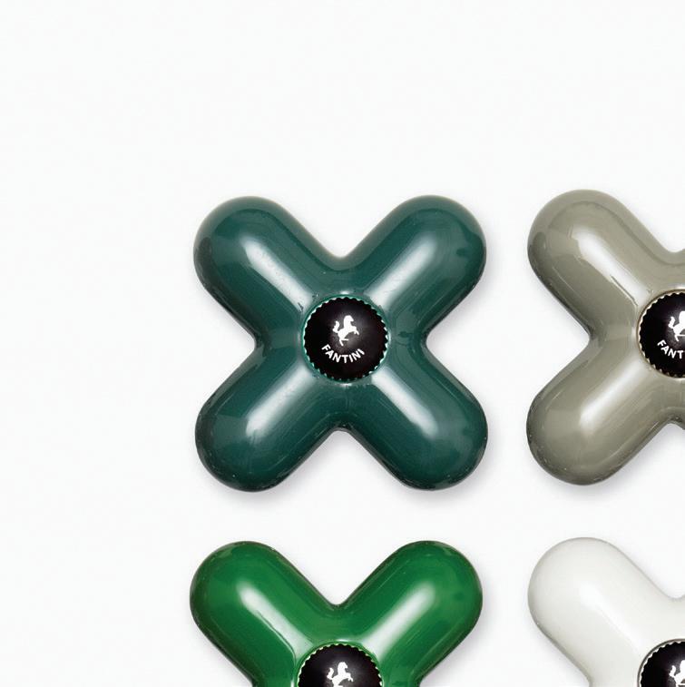
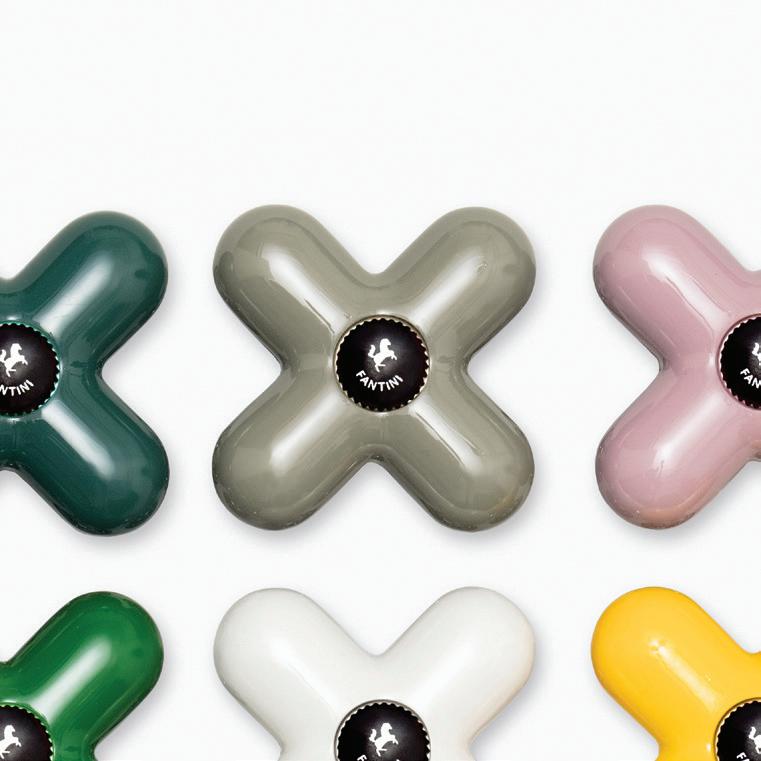
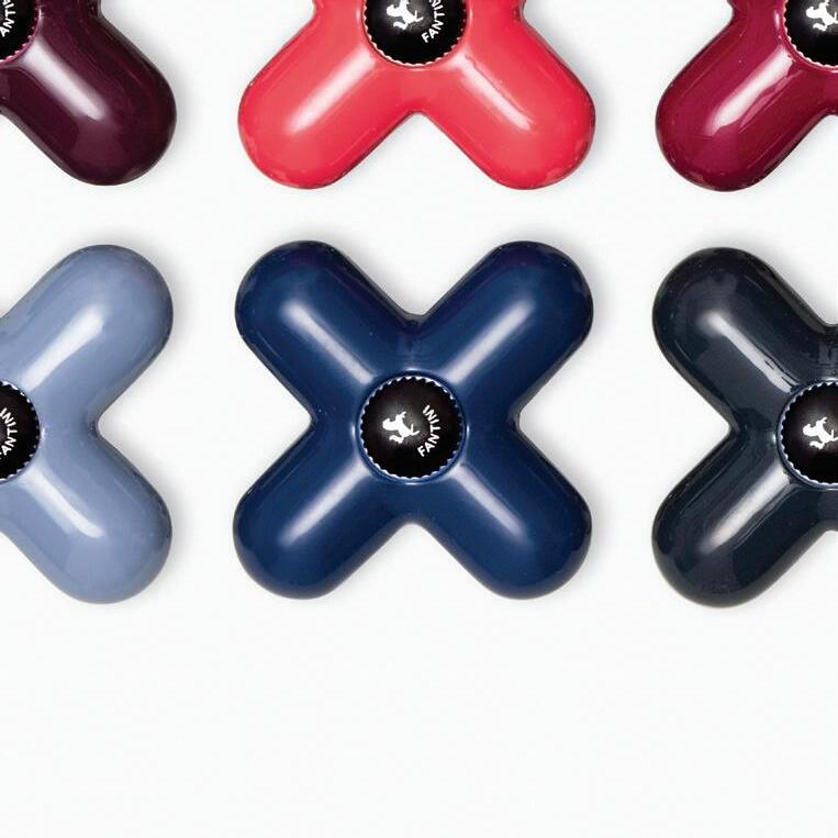
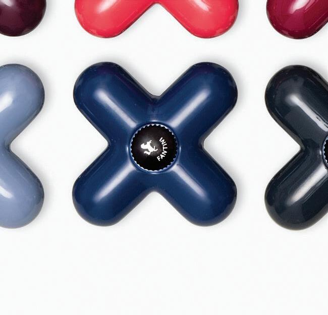
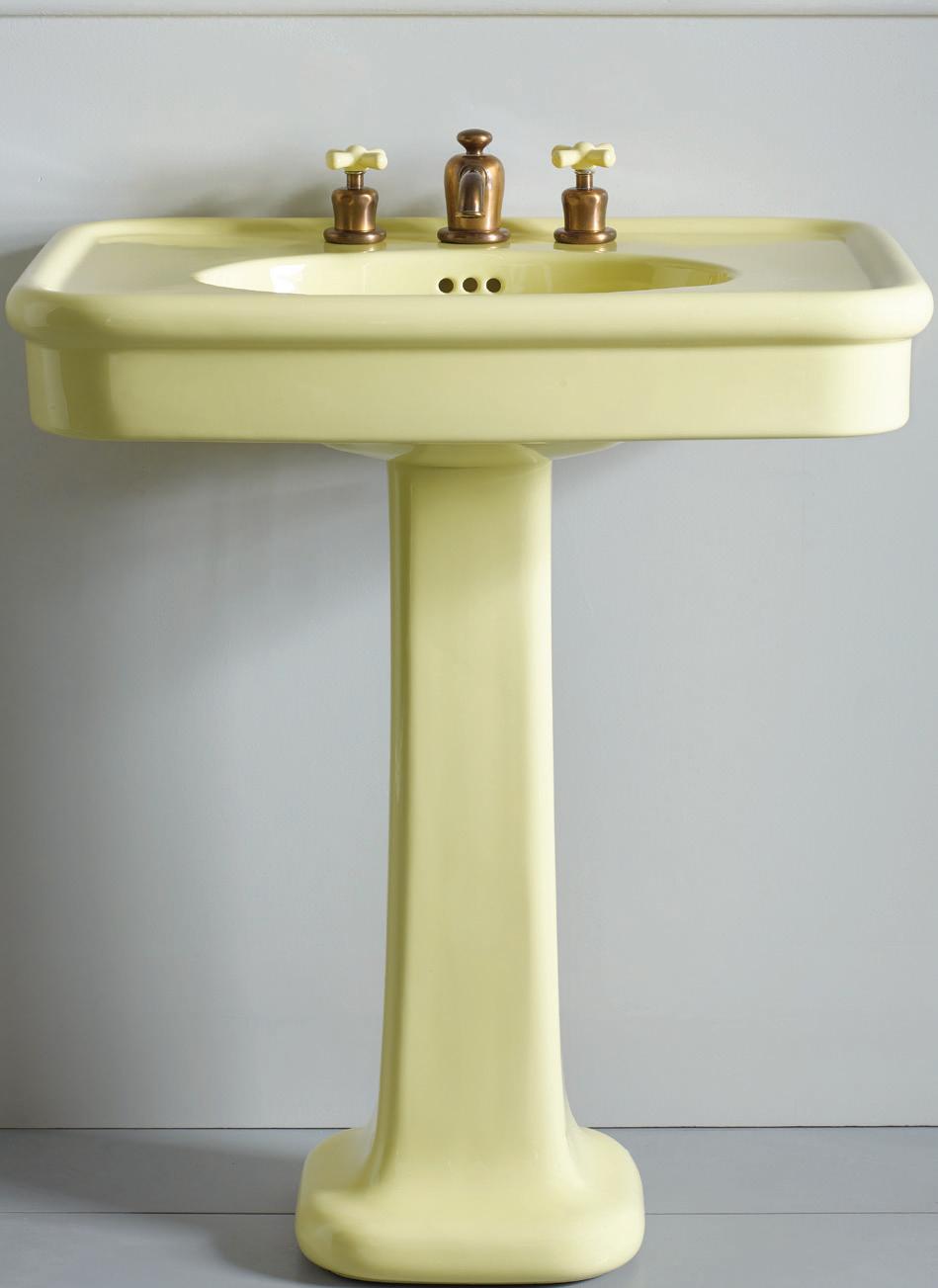
5 THE WATER MONOPOLY Rockwell pedestal basin; price upon request. thewatermonopoly.com
6 WATERWORKS Highgate ASH NYC Edition thermostatic control valve; $1,275. Lavatory faucet; $1,090. Greenwich; waterworks.com


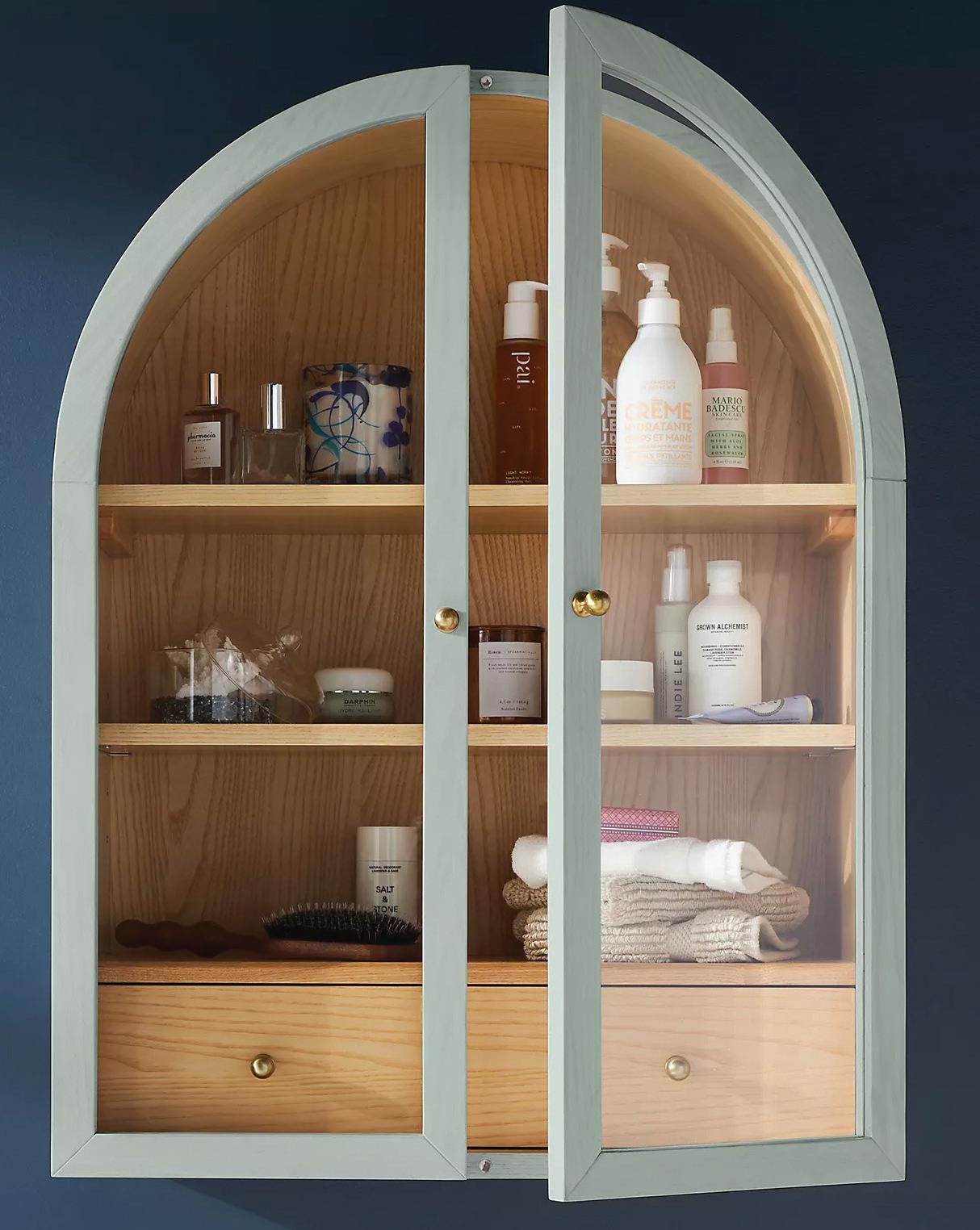
7 ANTHROPOLOGIE Fern wall cabinet; $698. Westport; anthropologie.com
8 KOHLER Peachblow Memoirs® two-piece concealed toilet; price upon request. Westport; kohler.com
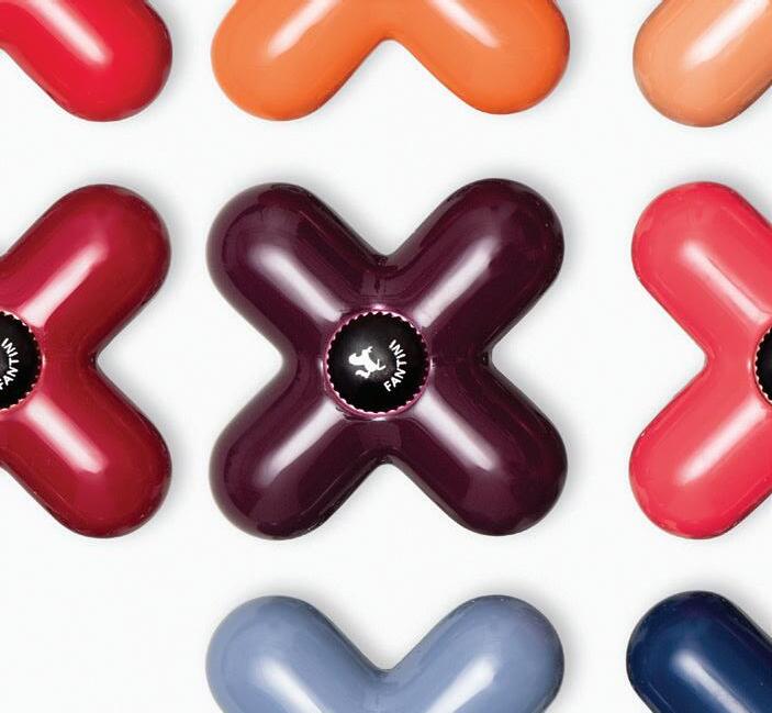

6
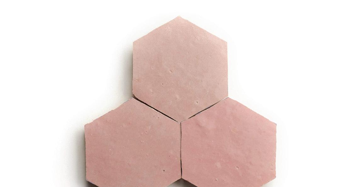
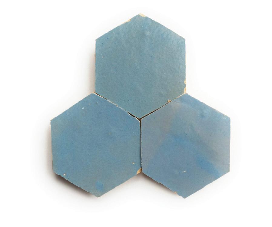
9 CLÉ Zellige hex tiles; $ 32.78 per sq ft. cletile.com 3
7
FRESH TAKE
COLOR COMBOS TO GIVE YOUR KITCHEN NEW LIFE THIS YEAR by diane sembrot
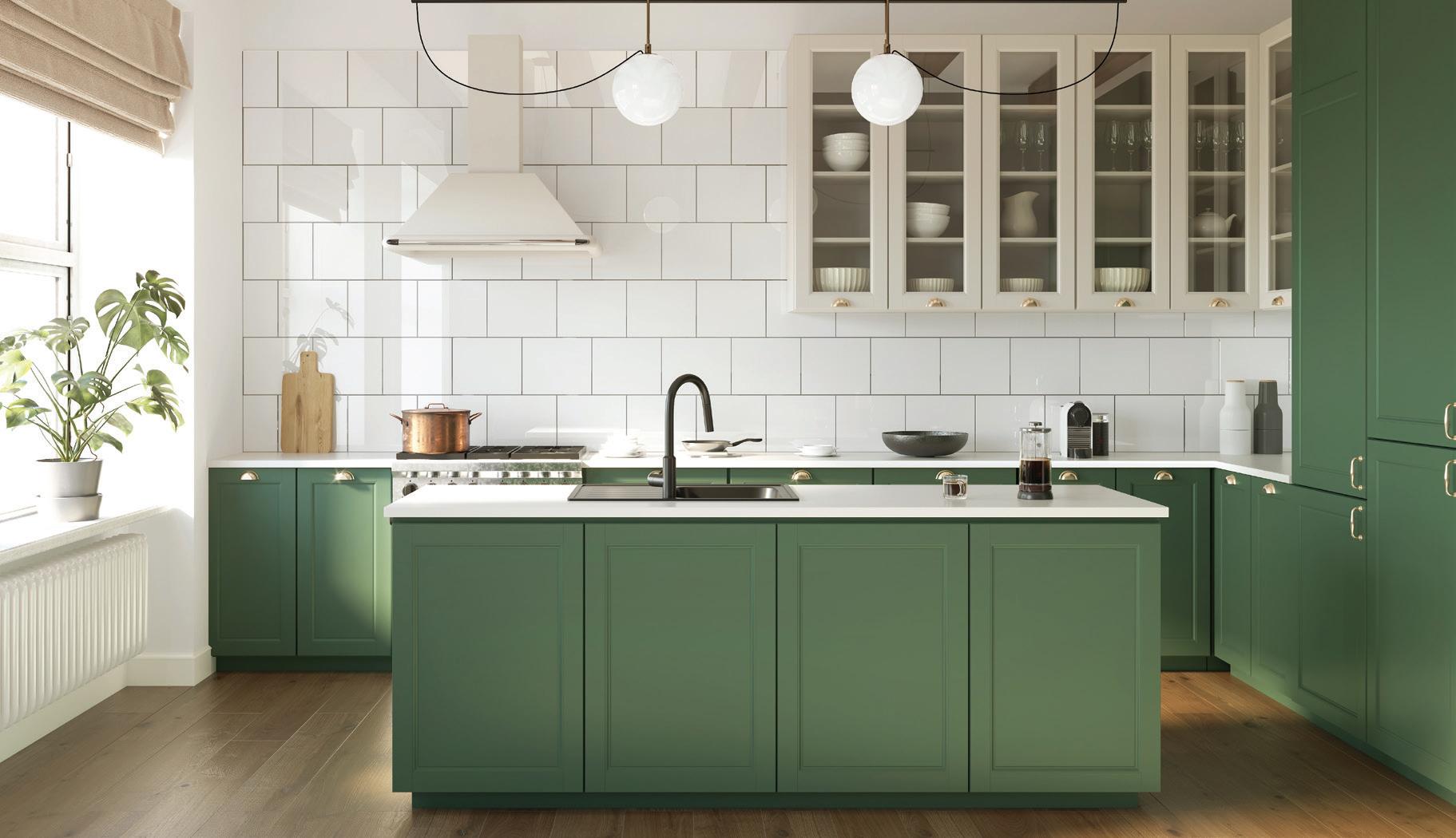
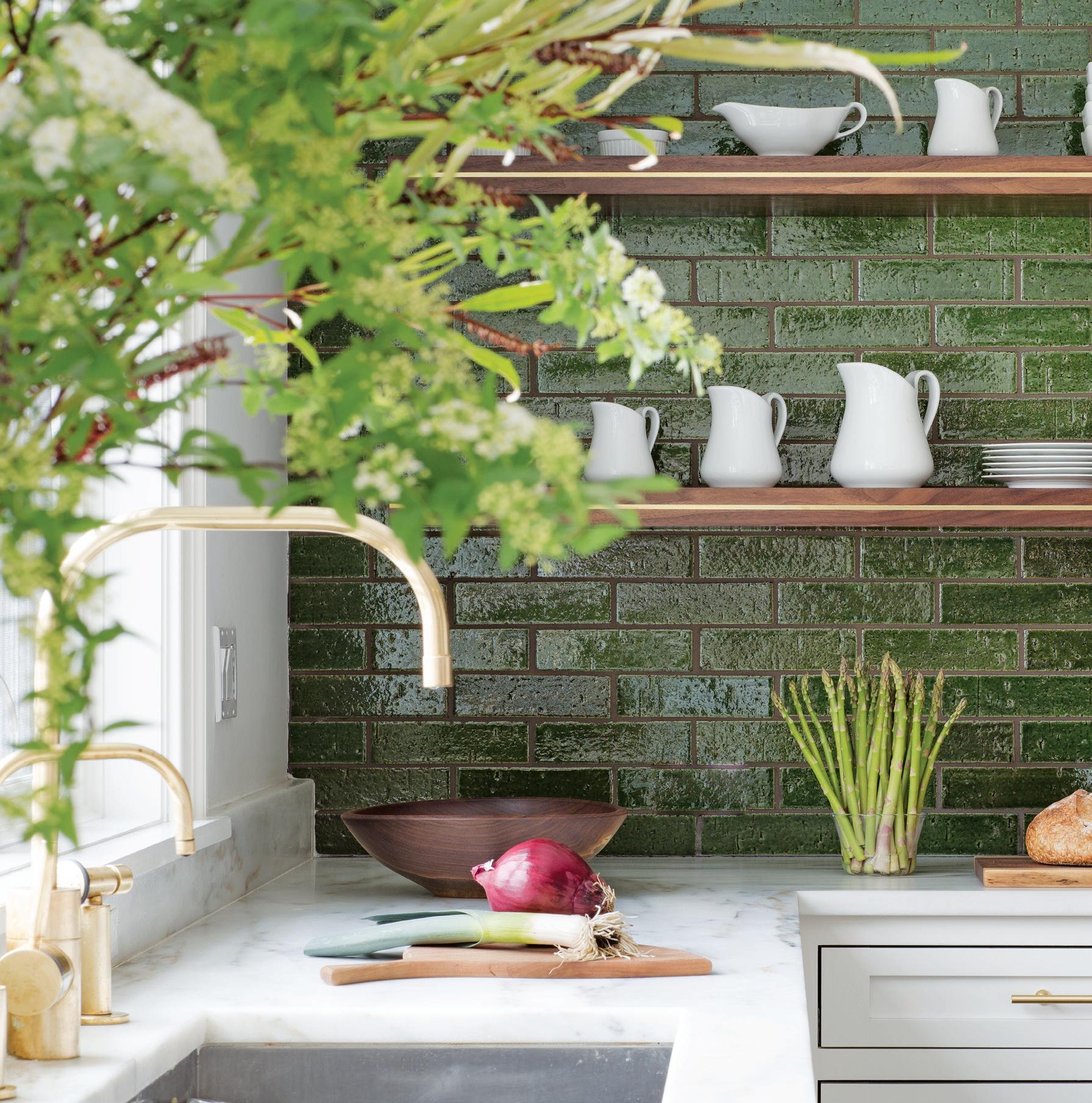
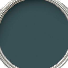
Early spring! You know what that means. The flowers will begin to emerge— and homeowners might feel the urge to freshen up the look of their homes. That doesn’t mean they’re all doing renovations. A change can have impact without being a major project; changing just the color in one room could do the trick. Take, for example, the kitchen. Everyone, including visitors and party guests, loves to gather in this room. So, when we reached out to Anna MacDonald, color and design sales associate for Ring’s End, we asked her to suggest colors to try in the kitchen.
“When choosing kitchen cabinet colors, it’s important to consider the kitchen’s natural stone and tile elements—like the backsplash and countertops,” she says. “We want to select a paint color that works with and enhances those features. We continue to see customers selecting deep hues for their kitchen cabinets, for all of them, or just the island or a section of cabinetry, like the refrigerator wall or coffee nook.”
One color, in particular, seems to be enjoying the spotlight these days. “Among the recent more commonly used colors is deep green,” MacDonald says, “such as Benjamin Moore’s
EARTHY SHADES OF GREEN
Narragansett Green, Salamander, Hidden Falls or Amazon Green, and Farrow & Ball’s Green Smoke or Studio Green.”




She adds that she might understand why people are attracted to this earthy color now. “As customers continue to incorporate more organic elements in their décor, these deep greens coordinate nicely with natural wood tones and seagrass elements. They also work well with a wide variety of architectural hardware options in gold, steel or nickel tones. And, of course, green looks great with traditional white.”
athomefc.com 18
PHOTOGRAPHY: KITCHEN © MICHAELSTOCK.ADOBE.COM; BENJAMIN MOORE, CONTRIBUTED
Farrow & Ball’s Green Smoke 47 Farrow & Ball’s Studio Green 93
above: The bold new look around the house this year is rich, earthy green.
Benjamin Moore’s Narragansett Green HC-157
Benjamin Moore’s Hidden Falls 714
Benjamin Moore’s Salamander 2050-10
Benjamin Moore’s Amazon Green 2136-30
paint/ SWATCH WATCH

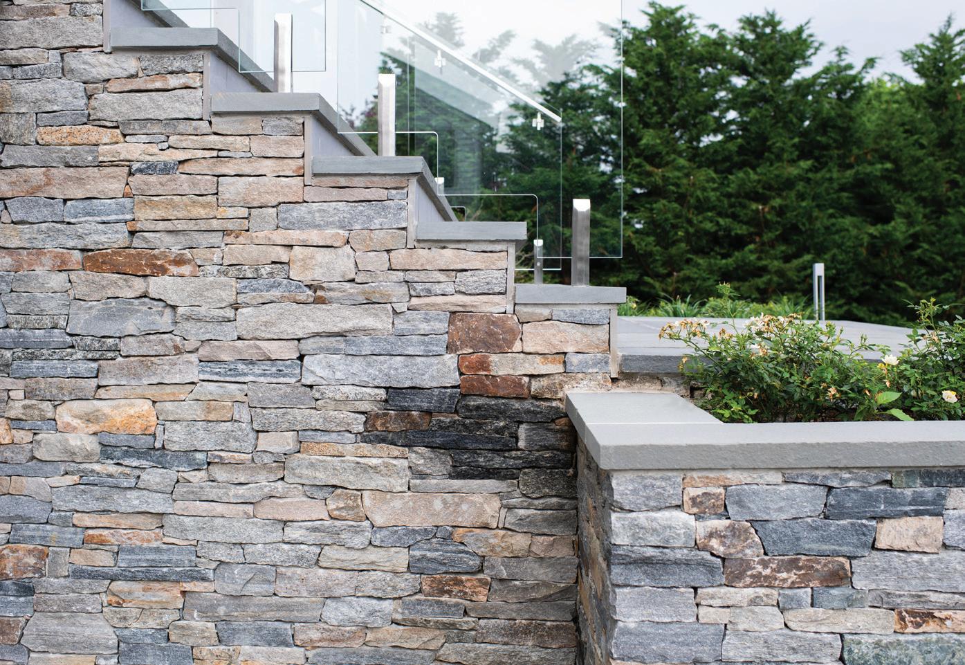

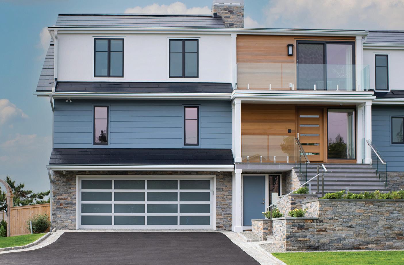
Stone lasts for generations. Celebrating 160 years. WESTPORT SHOWROOM 203.227.5181 Exceptional Products, Personal Service. BETHEL SHOWROOM 203.790.9023 gaultstone.com STONE & LANDSCAPE SUPPLIES
shoptalk
PURE IMAGINATION
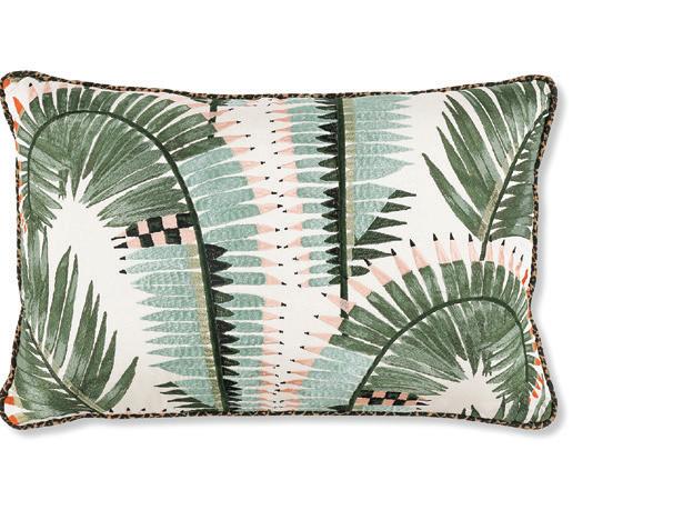
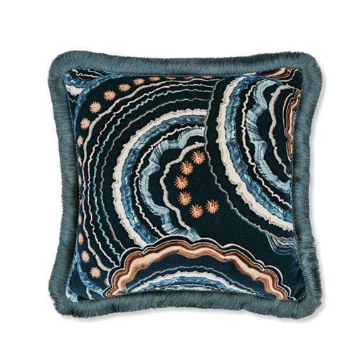
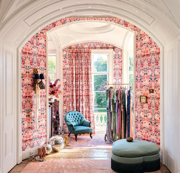
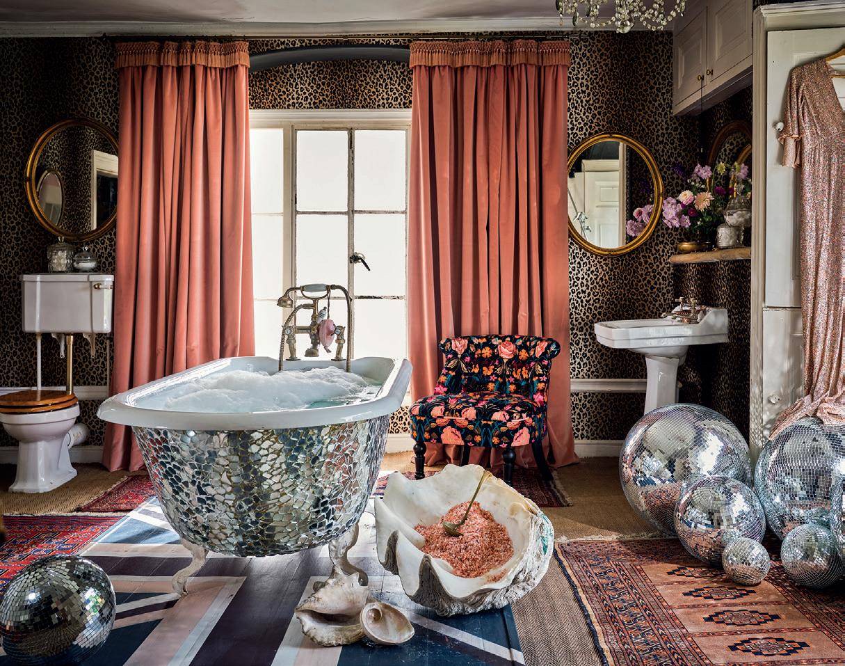
The world of Alice Temperley is full-blown fantasy; bold prints, boho styling and luxe velvets in a kaleidoscope of jewel tones. And now, she’s bringing her romantic vision to Romo, with help from the studio’s design director, Emily Mould and the introduction of Temperley London x Romo. From dramatic wallcoverings to exquisite upholstery options, the selection of painted patterns and intricate embroideries encourages artful print-mixing, where oversized florals work with animal spots, and swirling marble motifs meet blooming palms. Add whimsical brush fringe and key tassels for even more embellishment. “More is more” is your mantra here. The idea is to indulge in your playful side, whether or not you’re dressing a historied country house or a London flat (although both work as dreamy backdrops for the collection). Mould likens her reaction to the finished product to “being a child in a sweet shop, seeing all these beautiful fabrics and intricate details that had been carefully hand stitched.” Get lost in all the eye-candy at Schwartz Design Showroom in Stamford and at romo.com.


athomefc.com 20
THE LATEST DESIGN NEWS
PHOTOS COURTESY OF ROMO
above: Bonita Chateau Rose covers the walls and drapes in front of this dressing room’s windows.
left: A bed upholstered in Mimi fabric features ombré leopard spots. right: The luxe velvets were inspired by the tailored suits that Temperley favors.
Fantasia (with fringe) and Farrah cushions right: Alice Temperley MBE (left) and Romo’s Emily Mould joined their design houses for this collection.
ROMO TURNS TO THE RUNWAY FOR ITS LATEST COLLABORATION
WINDOW SHOPPING
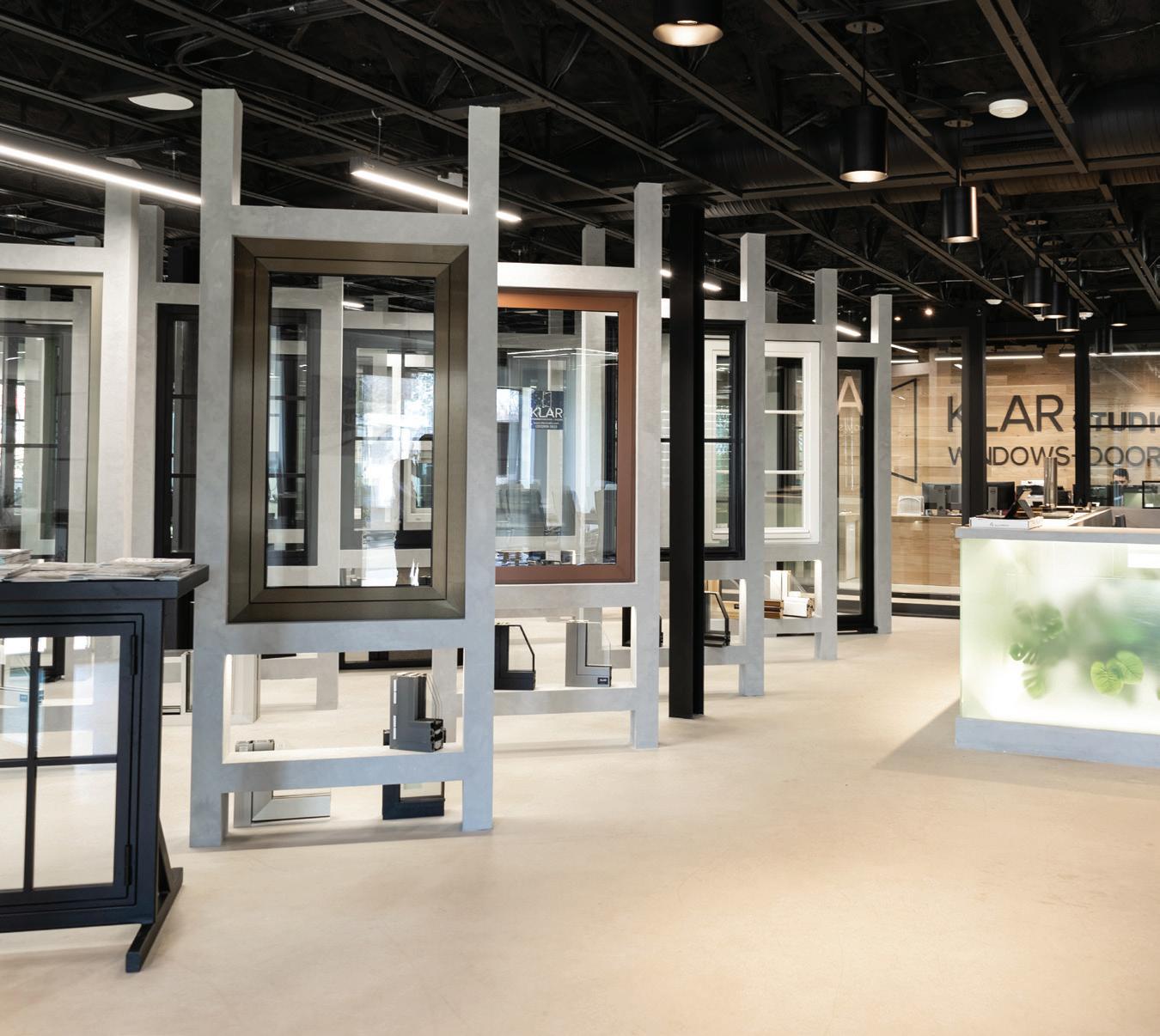
KLAR SHARES A GLIMPSE OF WHAT’S POSSIBLE WITH THEIR NEW NORWALK STUDIO AND OFFICE SPACE
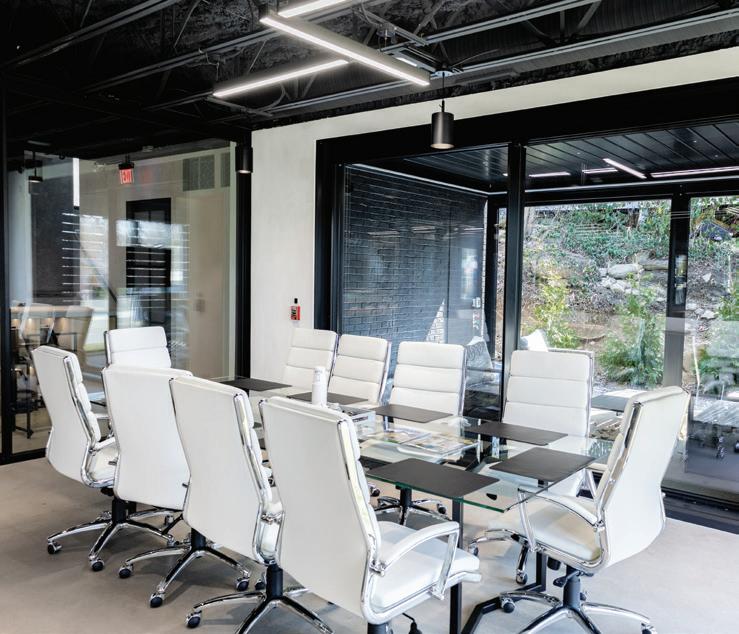
Looking to embrace spring’s blooming landscape and bring the outside in? KLAR Studio has you covered. Their flagship space in Norwalk has all the best in European window and door design, right here in our backyard. The industry’s leading manufacturer and installer has long been known for their exceptional quality and customer service—and you can expect nothing less at their new studio location. “At KLAR, we believe that a showroom should be more than
Magdalena Salamon Sales Project Manager
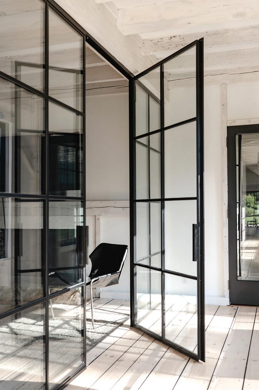
just a place to see products: it should be a place to imagine and bring to life the possibilities for any project,” says Magdalena Salamon, sales project manager. Showcasing premium steel and aluminum windows and doors, KLAR’s displays illustrate the harmonious balance between function and aesthetics. Being in the new showroom is an immersive experience, and knowledgeable design consultants are available every step of the way, guiding you through the myriad of top-notch customization possibilities the brand offers. “Our design services embody elegance and practicality. We collaborate with architects, designers, builders, and homeowners to create bespoke solutions tailored to individual tastes,” Salamon adds. The windows aren’t just pretty to look at, though; cutting-edge designs offer customers optimized energy efficiency and increased value for any space. Each and every window and door is built with
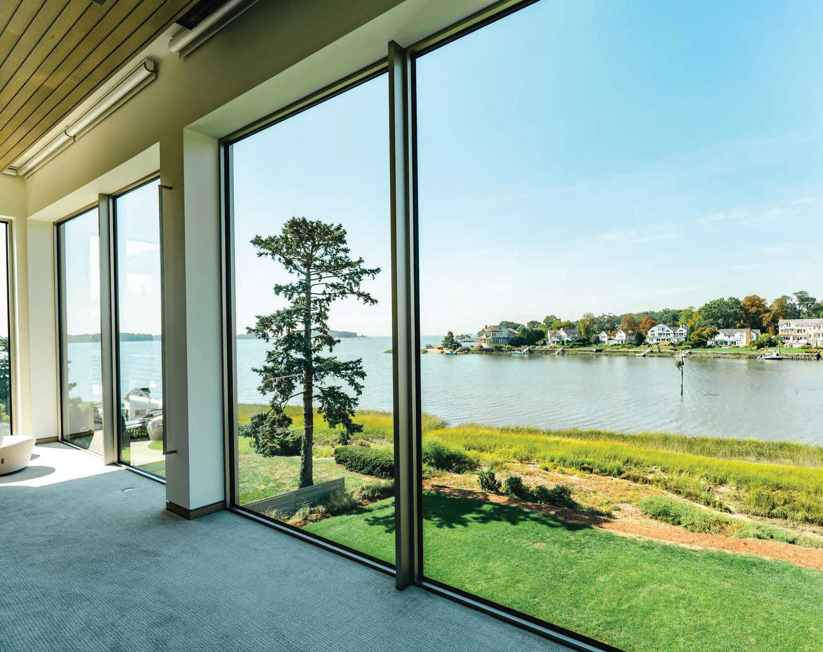
European precision and is guaranteed to last—and the options are endless. Aluminum, PVC, steel, and wood products are available, along with any and every accessory you could need to complete the project of your dreams. Whether you’re looking for traditional steel-paneled windows or modern, floating glass for an office, KLAR can deliver on your vision.
258 Main Ave, Norwalk; klarstudio.com —Veronica Schorr
athomefc.com 22
STUDIO shoptalk
PHOTOS: BIG SWELL MEDIA (LEFT), CARINA SKROBECKI (RIGHT); COURTESY OF KLAR
this photo: A wall of glass allows for full views of this Old Greenwich coastline. right: Calla Cane utilized Klar for interior doors in a Greenwich project.
At KLAR, we believe that a showroom should be more than just a place to see products: it should be a place to imagine and bring to life the possibilities for any project.
this photo: The studio floor displays the window and door offerings. below: Plan your next project in their sleek conference room.
MEET FLOWCODE, THE NEXT GENERATION OF QR CODES


Go ahead, try it out. Point your phone’s camera at the Flowcode to scan.


CHIC PEEK
A SURPRISE BEHIND EVERY DRAWER
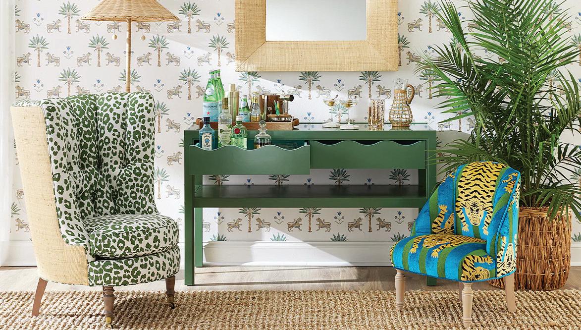
Oomph is no stranger to color. Devotees and designers rely on the Greenwich-based brand for a playful pop, whether it’s on one of their signature Tini Tables or from a bespoke one-of-a-kind piece. With their newest Wave Collection, they’re offering the chance to utilize even more options from the color wheel. Soft close drawers on a desk, console, or side table open to reveal a complementary shade in high gloss lacquer. The hardest part will be deciding which combination to go with (Parakeet + Hinting Blue is a great place to start).

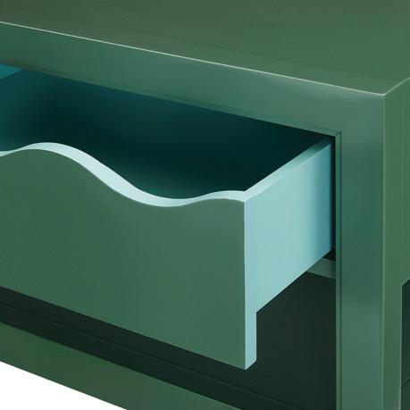

21 West Putnam Avenue, Greenwich; oomphhome.com
Master of Fun
Designer PATRICK MELE brings new life (and vintage finds) to Black Rock
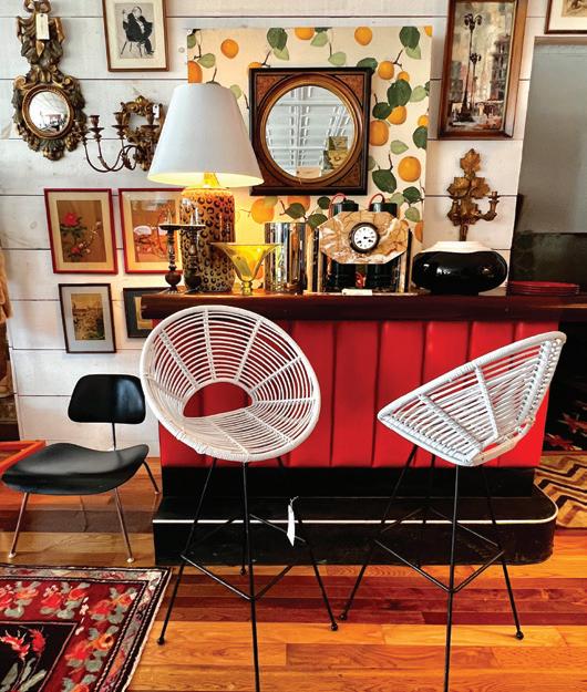
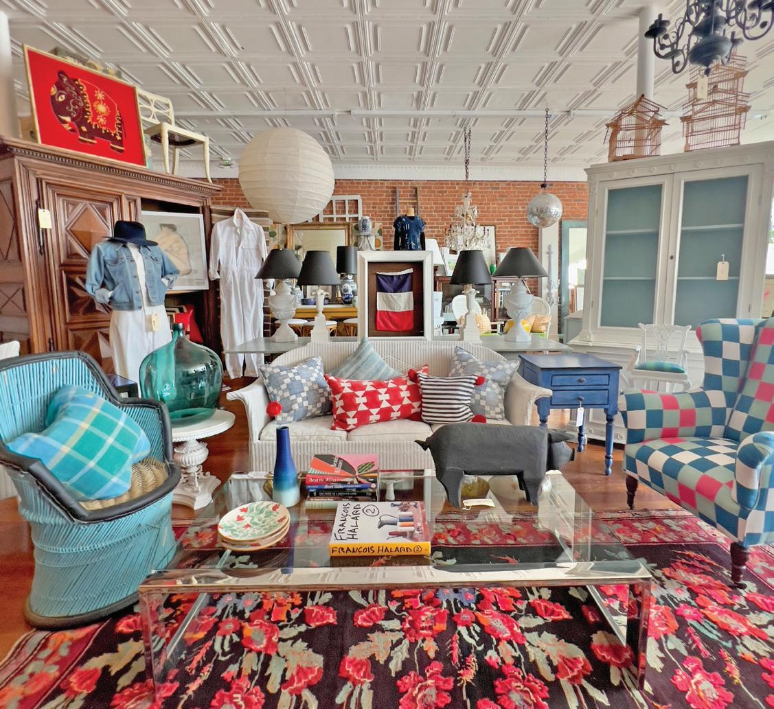
Interior designer Patrick Mele has reinvigorated homes from London to New York City to Greenwich with his singular style of rich colors, bold, intricate patterns, and enchanting, often unexpected textures. His eponymous brand’s second retail and office location is now open in Black Rock, Fairfield County’s up-and-coming hotspot of art, culture, music, food, and more. “Like so many, I found myself part of the exodus from NYC during the early days of the pandemic. After taking the plunge to purchase my first home along the water’s edge in Black Rock in 2019, it seemed a natural progression to anchor my design business closer to home,” says Mele. And lucky him: the largest retail space in the heart of Black Rock became available one year later. Situated next door to the much-loved, vibrantly reimagined Park City Music Hall, the historic Black Rock Department Store location dates from the 1950s and has all the right elements: tons of natural light, wood floors, an original tin ceiling, and exposed brick walls. “It felt like the kind of raw, blank-canvasgallery-space that’s so hard to come by these days,” he says. Mele’s Black Rock Department Store combines vintage and antique furniture, clothing by collector Carol Santini, Turkish and Moroccan rugs from Wendy Cooper, lighting, art, accessories, and more.
And their inventory, set across over two thousand square feet, is constantly growing with new finds you can discover weekly. In the future, Mele and his team hope to host art shows and partner with local growers to host a seasonal farmers market along the shop’s street frontage. “We’re excited to be a part of a small city undergoing a rebirth. Bridgeport, and in particular Black Rock, is a hub for artists, foodies, creatives, and makers—take a ride and come visit!”
2948 Fairfield Ave, Bridgeport; patrickmele.com —Veronica Schorr
athomefc.com 24
above: Bright colors, daring patterns, and exuberant textures are a feast for the senses in the Black Rock Department Store.
above: A glimpse into Wave’s unexpected flash of color. below: The Wave console makes for an easy entertaining spot.
above: The new storefront features a curated, continually updated collection of home décor inspired by the designer’s taste for the unexpected, with a dash of maximalism.
PHOTOS: COURTESY OF OOMPH & PATRICK MELE
shoptalk






the premier home design competition awards
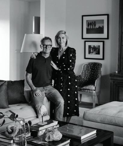
you have a project or firm in CT, go to athomealistawards.com to learn more about getting on the 2023 A-List! Award Celebration / September 12, 2023 PLATINUM SPONSOR GOLD SPONSORS LAST CALL! A-List Awards deadline is May 26 2023 JUDGES
If
DOUGLAS WRIGHT Douglas C. Wright Architects
JASON & KATIE MAINE Maine Design
JOSH GREENE Josh Greene Design
MELISSA REAVIS Hollander Design
YOUNG HUH Young Huh Interior Design PHILIP GORRIVAN Philip Gorrivan Design
Winning Combination

OKA + CABANA aim to transport with table lamps
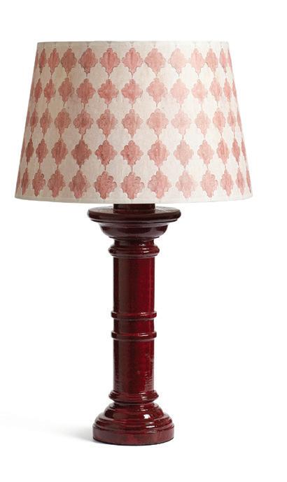
Teaming up to celebrate their mutual passion for travelinspired color and pattern, Sue Jones (OKA co-founder and creative director) and Martina Mondadori (Cabana magazine founder and editor-in-chief) have launched a new lighting collection. The range includes artisan-made lamps and shades, in a variety of hues and prints—from Persian paisley to Arabesque embroidery—that are meant to be mixed, for maximalist effect. Each hand-turned wood base is crafted to resemble an antique lamp owned by Martina’s late mother, before being painted in four signature tones. “I think it should be like buying a pair of jeans and then changing blouses,” Martina says. “Once you’ve got the base, you can change the lampshades with the seasons.”

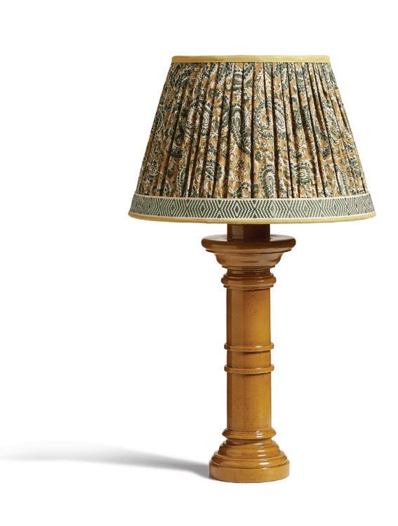
See the potential pairings on display at the Westport store, and start your collecting your shades now.
44 Main Street, Westport; oka.com
HAUTE HELP
WORDS OF WELL-DESIGNED WISDOM FROM LESLIE BANKER
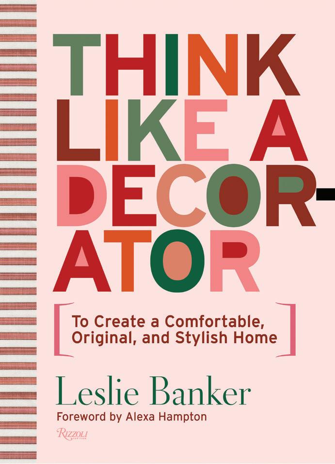
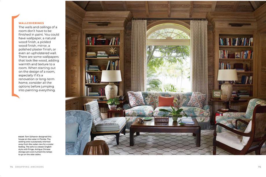
Often, the hardest part of any home project is figuring out where to start. Luckily, Leslie Banker is here to offer her advice, tips, and tricks to cracking the code on stylish design and decorating. In Think Like a Decorator, Banker draws on her own experience as the child of a designer and now, as principal at Leslie Banker & Company, to lead readers from a starting point all the way through the maze of issues that inevitably arise when tackling interiors. She has the help of fellow designers Alexa Hampton, Tom Scheerer, Amanda Nisbet, Katie Ridder, and Christopher Spitzmiller to add their own voices of reason and answer the questions we’re all looking for answers to. $45; Rizzoliusa.com
athomefc.com 26
above: Banker’s bright book cover makes it styling-ready.
above: Adding wood to your walls will add warmth and have you rethinking wallpaper.
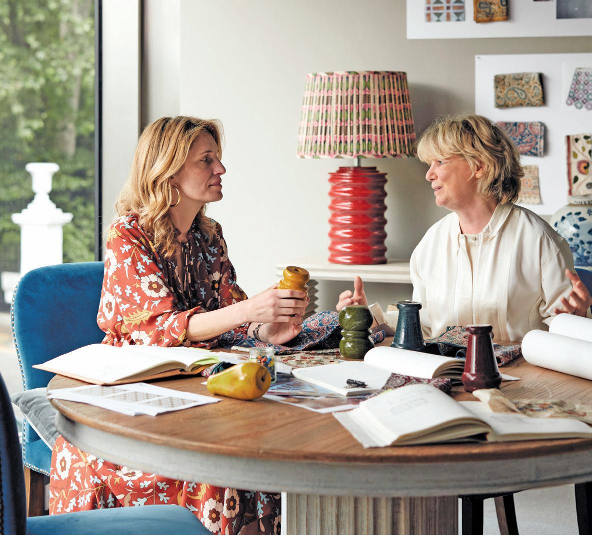
above: Martina Mondadori (left) of Cabana and OKA’s Sue Jones right: The burgundy Pilastro lamp with Veneto Collato shade.
right: Arabesque features handembroidered tussar silk.
left: An ochre base pairs well with the Ambi shade in the same colorway.
shoptalk PHOTOS: COURTESY OF OKA & RIZZOLI

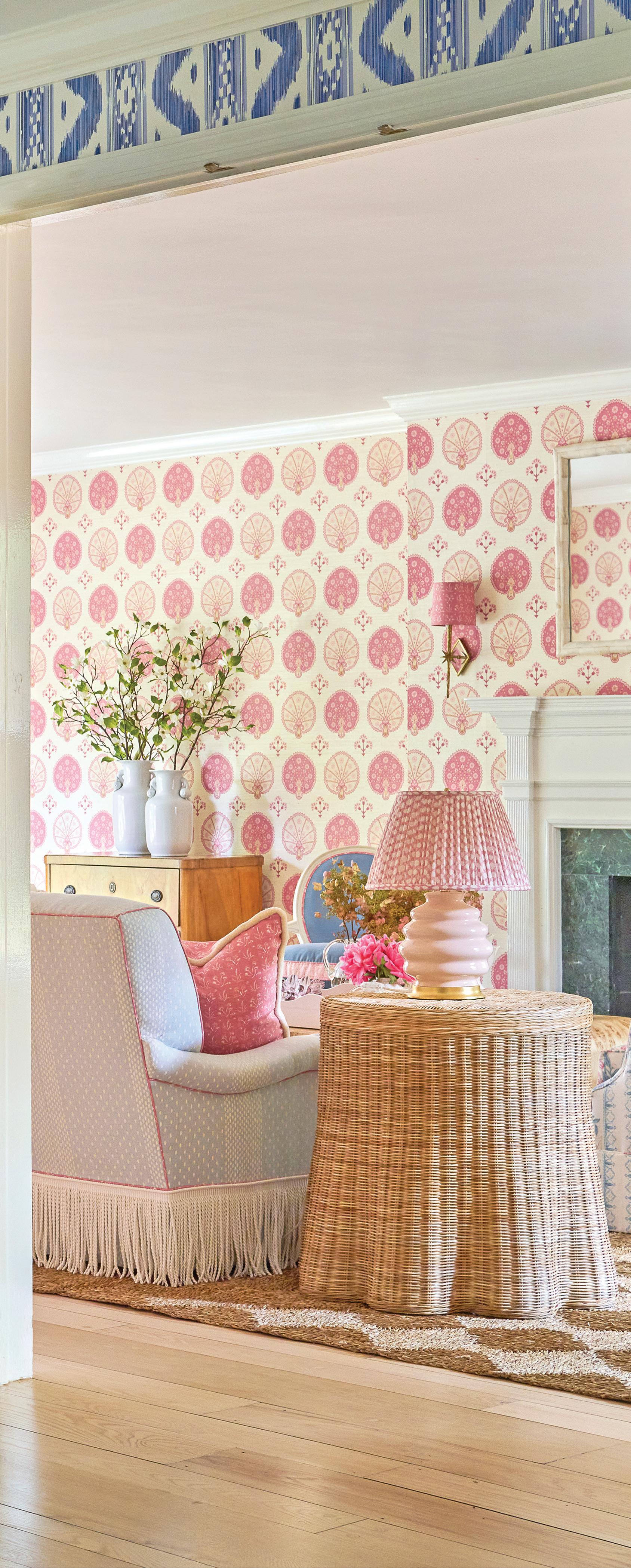
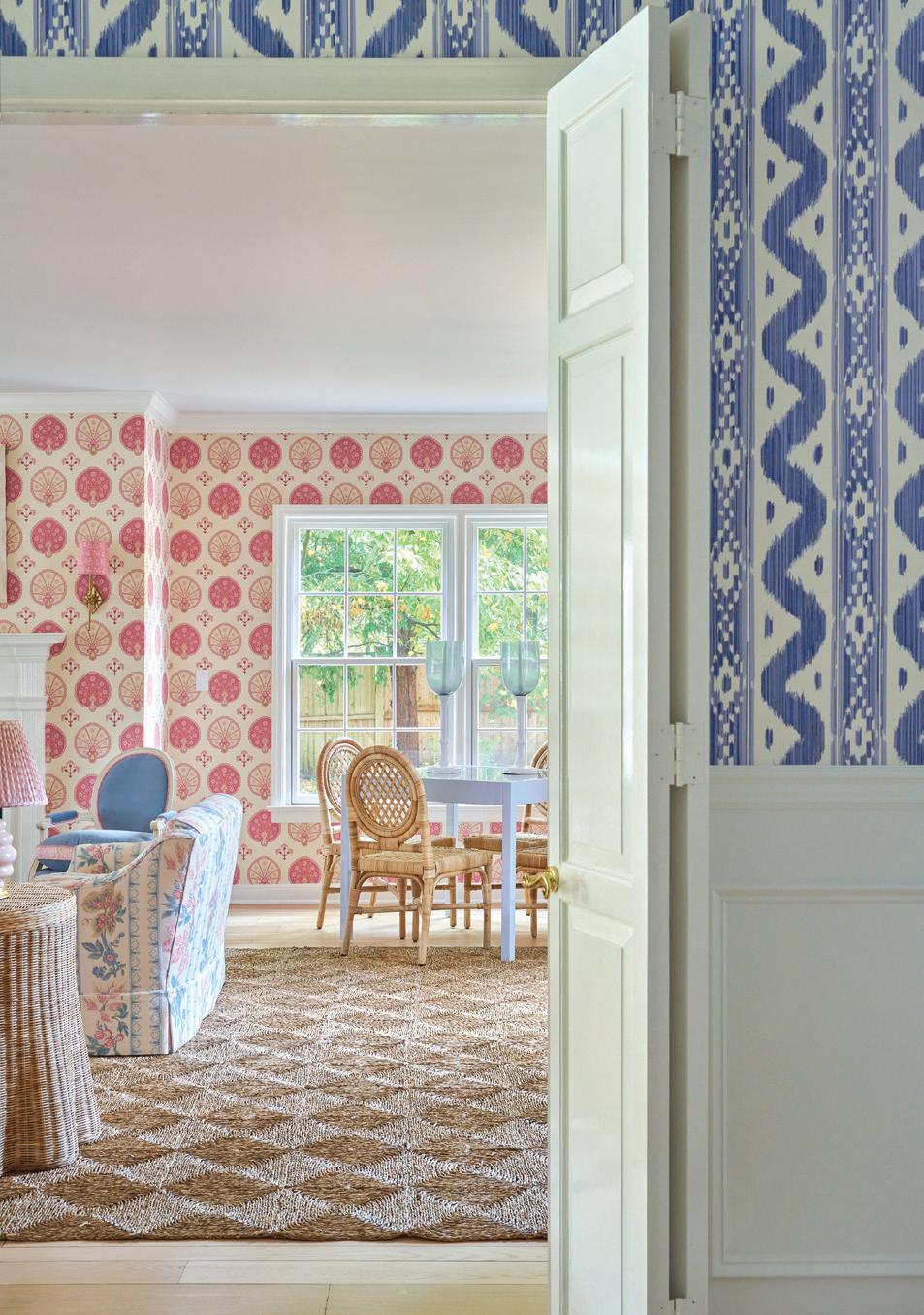
 this photo: Quadrille Bali Hai wallpaper wraps the entry, where a Coleen and Company lantern hangs over a Thibaut table. A peek into the lliving room reveals more bold pattern and color choices.
PRINTS CHARMING
The Elliott Interiors team transforms a fixer-upper into a bold and colorful escape

 interview with sara haydock & zan young, elliott interiors
portrait by andrew baris // interiors by jane beiles
above: Sisters, Sara Haydock and Zan Young of Elliott Interiors
above: A corner game table by Oomph is surrounded by Mainly Baskets Home chairs. The loveseats were recovered in vintage Bennison fabric, and side chairs were given new life with Pindler velvet and Schumacher tape. below right: Ottoman fans and flowers create the living room print in this Schumacher wallpaper. below left: Custom pillows by Lake August feature Samuel & Sons trim and sit on a fringe sofa upholstered with Sister Parish fabric. A pair of Hwang Bishop lamps with Fermoie shades flank the sofa, on scalloped side tables by Mainly Baskets. Burl coffee table is by Oyster Creek Collection.


athomefc.com 30
Tell me about the client. What did they want, and what was your (working) relationship like with them?
Zan Young: We were so lucky to have clients who very much knew what they wanted! Our clients came to us after being overwhelmed by the purchase of a fixer-upper that had not been touched in years.
Sara Haydock: Everything needed an overhaul. Our client has impeccable taste and had a strong vision right from the start. This provided a jumping-off point and made it easy to create a scheme that spoke to the end goal: a family home layered in classic pattern and light, bright colors.
We’re in love with the wallpapers used throughout this home. It’s a bold direction. How did you get there? Was this something the client wanted, or your own input?
SH: Our client was clearly drawn to classic and traditional design but wanted to make sure the home felt bright and fresh. For us, the design process always starts with wallpaper and textiles. It’s where we find our biggest inspiration. The fabric and wallpaper scheme really informs our other choices thereafter. Our clients know from working with us that this pattern mixing is our forte.
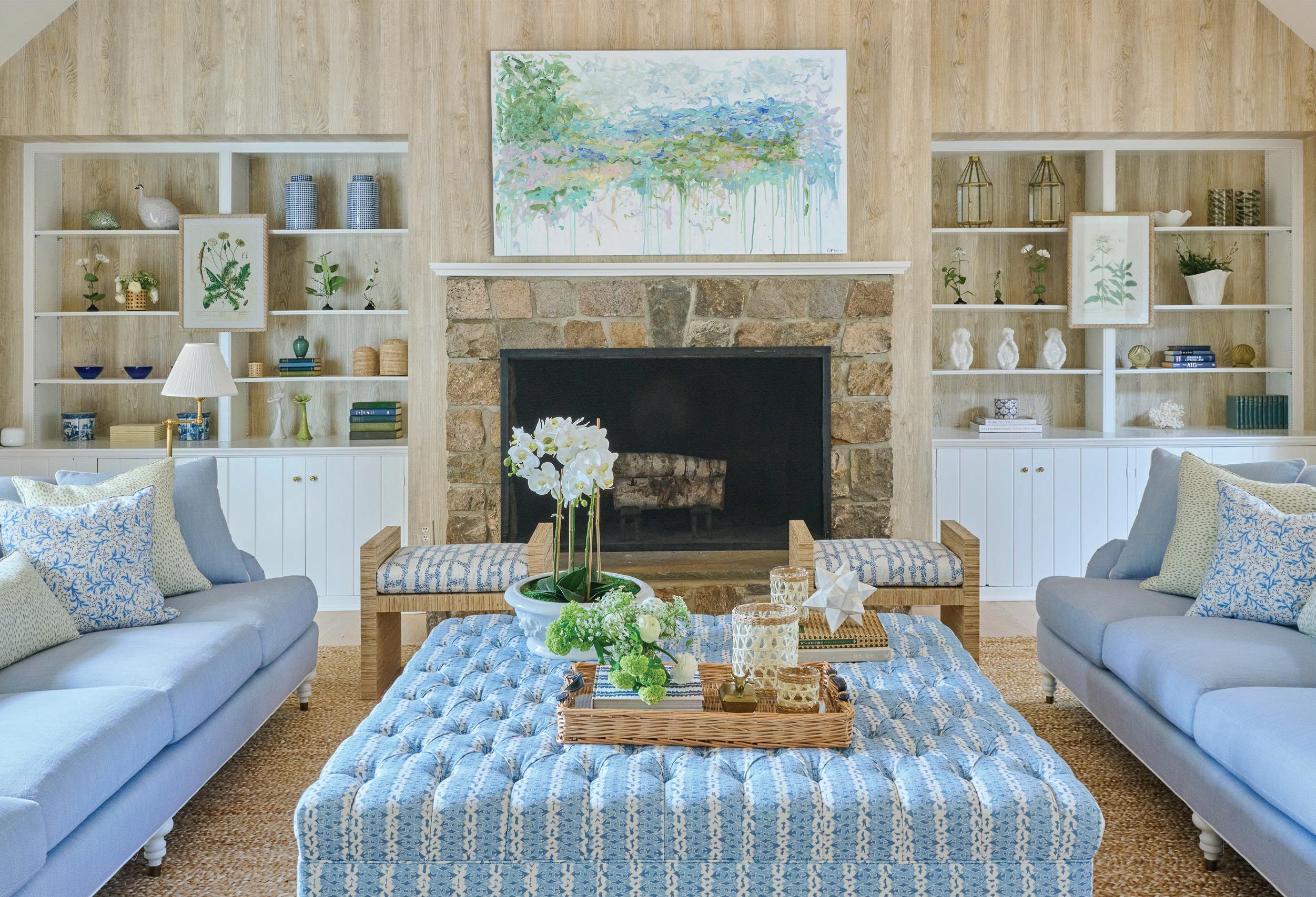
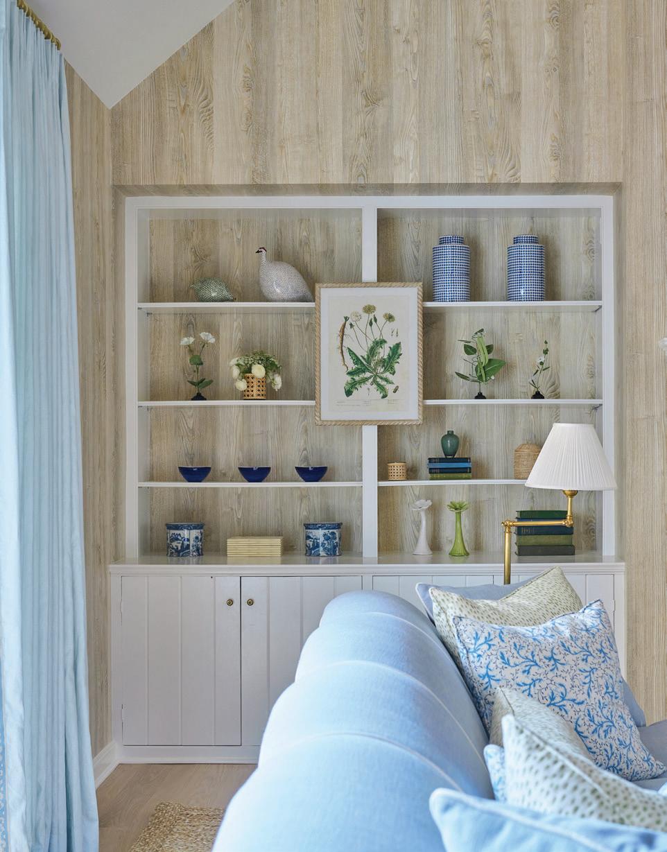
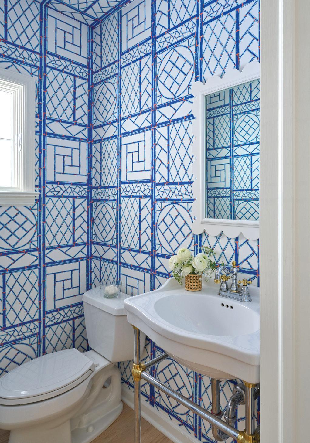
ZY: Quadrille’s Bali Hai was chosen for the entry, and it really felt like a major starting point for the rest of the rooms. It’s a classic, never-fail pattern in a cheerful blue and white. We chose Nobilis’ Faux Bois paper in the family room. The room is very large in scale, with a high, vaulted ceiling. We wanted to keep it feeling light and airy, but it definitely needed
some texture, warmth, and coziness. Faux Bois paper, in a light wash finish, always adds just that. We were so pleased that these clients were along for the ride, as we believe nothing transforms a room faster than wallpaper and layers of pattern playing off one another.
How would you describe your aesthetic?
SH: I am always inspired by rooms that mix finishes and materials in an interesting way. A relaxed wicker side table next to a velvet sofa; a pair of vintage lamps on a fresh, lacquered console; aged brass with polished marble. Sometimes, unexpected combinations create the depth and interest a room is missing.
ZY: There is a notable shift in the current design world away from gray, industrial, minimalist spaces. We find people are longing for interiors rooted in comfort and hominess. People want the old with the new. This creates depth, warmth, and the feeling of a space collected over time. It’s a more personal approach to design and one that I think people are craving right now. These kinds of homes have always inspired me and my aesthetic intent.
How did you source your furniture for this project? Some pieces (like everything in the “blue room”) seem truly unique.
ZY: It’s a real mix! Our client had some beautiful pieces in need of a little love. We are always in favor of reupholstering and bringing life to old pieces.
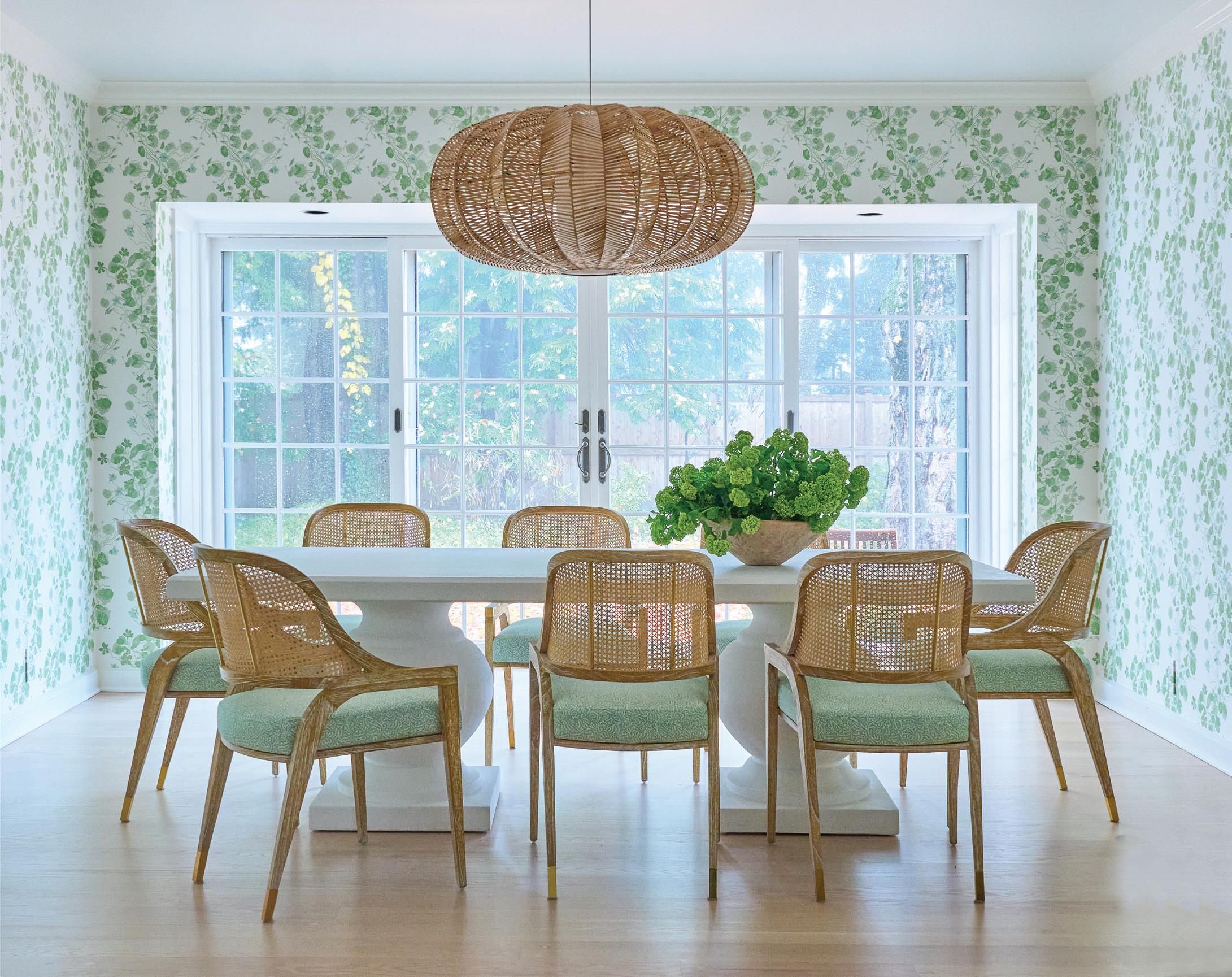
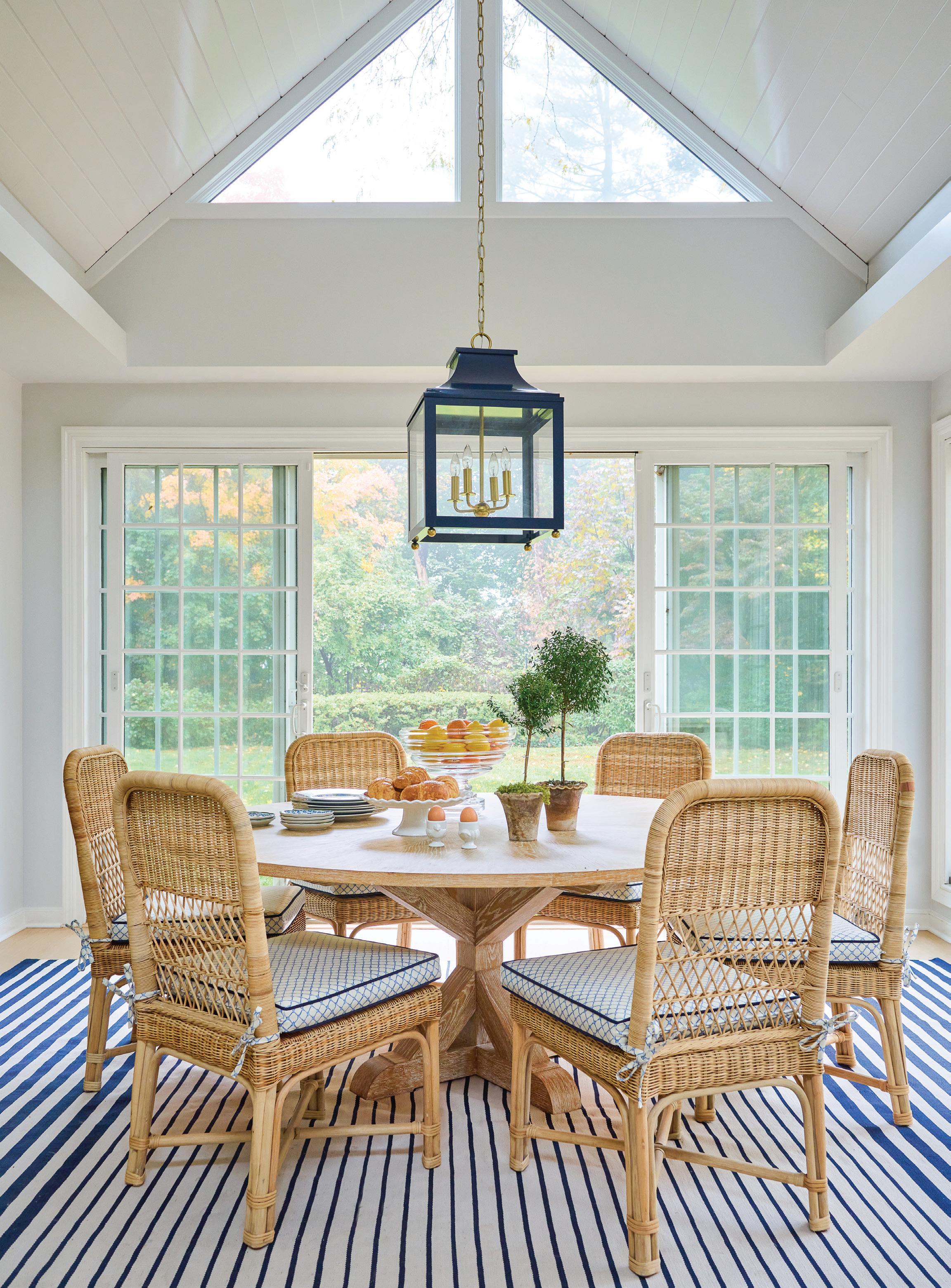
left: A verdant print from Waterhouse Wallhangings coordinates with the greenery outside. Villa & House chairs with seats upholstered in Soane Britain fabric are arranged around the Serena &Lily dining table. A woven statement pendant from Mainly Baskets Home hangs overhead.
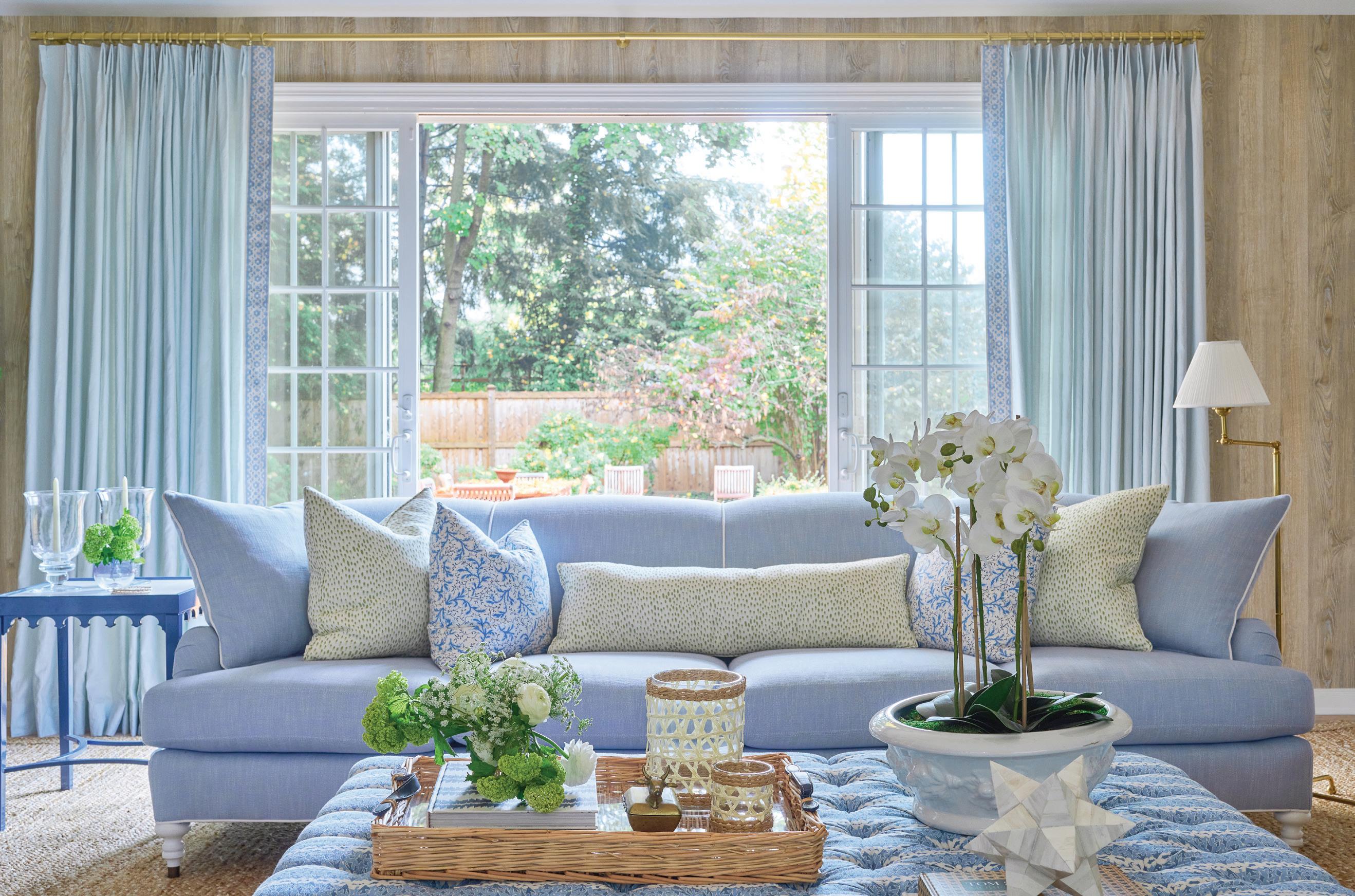
SH: Some of the pieces were custom, like the large ottoman in the family room (the “blue room”). We love how an ottoman can tie a space together. It’s functional yet unique. Here, the tufted design and fun pattern elevate the space.
ZY: The scale of the room needed something to cozy it up.
What’s it like working together, both as sisters and as a design team?
ZY: The best!
SH: The formation of our business happened very organically. While we have both always been design-obsessed, we have also both always relied on one another for bouncing aesthetic ideas off of each other and for
making decisions.
ZY: A little co-dependent in that way, in fact!
SH: When we formed Elliott Interiors, there was no question that we would both be 100% involved in all the designing.
ZY: We always work together on scheming and sourcing—not independently—and our clients’ homes are a result of that creative process.
How do you respond to color as designers?
ZY: We love it! Oftentimes, we think people hear “color” and think bright or bold. We hear “color” and think cohesion. Every house, even one done mostly in neutrals, needs a color story.
athomefc.com 32
below: For this room, the designers opted for Nobilis Faux Bois wallpaper. Lee Industries sofas are covered in Perennials fabric, while the custom ottoman features a playful pattern from Marika Meyer, and Villa & House benches include cushions wrapped in Ferrick Mason fabric. A painting by Erin Fuge hangs over the fireplace.
“People hear ‘color’ and think bright or bold. We hear ‘color’ and think cohesion. every house , even one done mostly in neutrals, needs a color story .”
—zan young
MAY/JUN 2023 athome 33
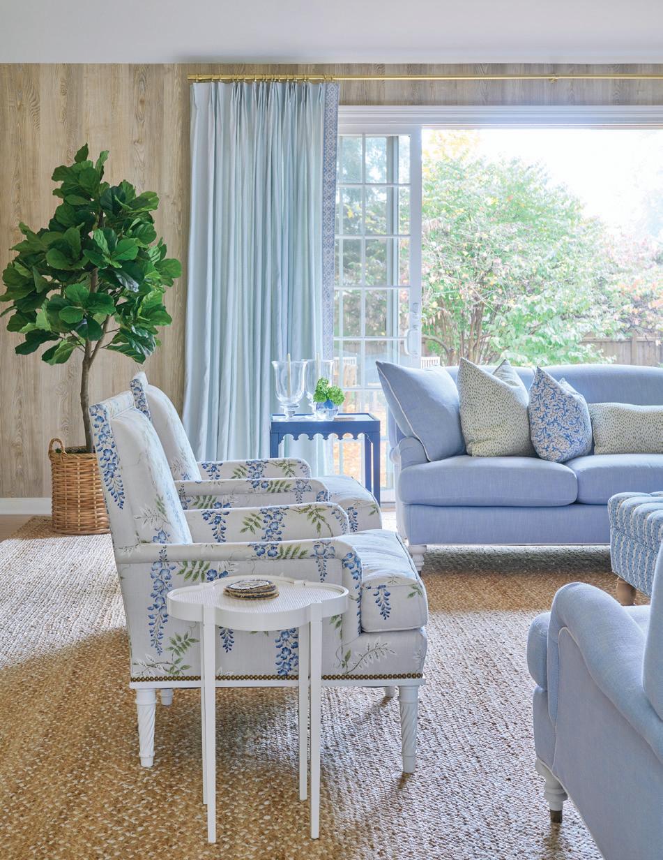
above: Complementary shades of blue and green appear in the pillows and with an Oomph side table. below right: Styled shelves include accessories in the same palette.
below left: Blue florals appear in Cowtan & Tout fabric on Bunny Williams chairs. The fig tree is by Diane James Home.
SH: Our goal is to create a color palette for a home that works throughout the entire home. Colors should play off of one another, change, and yet reference each other throughout a home and its different rooms.
ZY: For us, color really creates the story and makes things cohesive.
How can our readers at home achieve balance in their spaces by using a wide array of colors? What advice would you give them?
SH: Start with a color you love, and make it dominant—but don’t be afraid of the mix. The home bar, the powder room, the moulding, and trim…these are places to experiment with a complementary color.
ZY: Also—don’t just rely on painting! Layer with textiles to create interest. Color and pattern together are what it’s all about!
What was your favorite room to design in this home? Why?
SH: The living room. We love that we were able to use pink in such a central and “grown-up” room. Our clients were married in Lyford Cay in the Bahamas. The whole home hints at their ties there, but this room really embraces the island feeling without feeling out of place.
ZY: While it’s no secret we love green and blue, we were thrilled we had a
client willing to stray! We wanted this room to feel special and stand out from the rest of the home. The home has many places for the family to gather, but this room was geared more toward the grown-ups. It’s more formal and features furniture that is a bit more precious.
SH: The walls are punchy and fun but mixed with classic, traditional fabrics from Bennison and Sister Parish.
Spring is in the air. What colors are you loving right now?
SH: Ochre, eggplant, and mossy greens. We are feeling so inspired by organic, saturated colors that reference nature.
ZY: Moody colors, but not gloomy!
interview by veronica schorr
Resources:
Interior Design: Elliott Interiors, 87 Clinton Road, Bedford Hills, New York, 917-520-9410; elliottinteriorsny.com
MAY/JUN 2023 athome 35
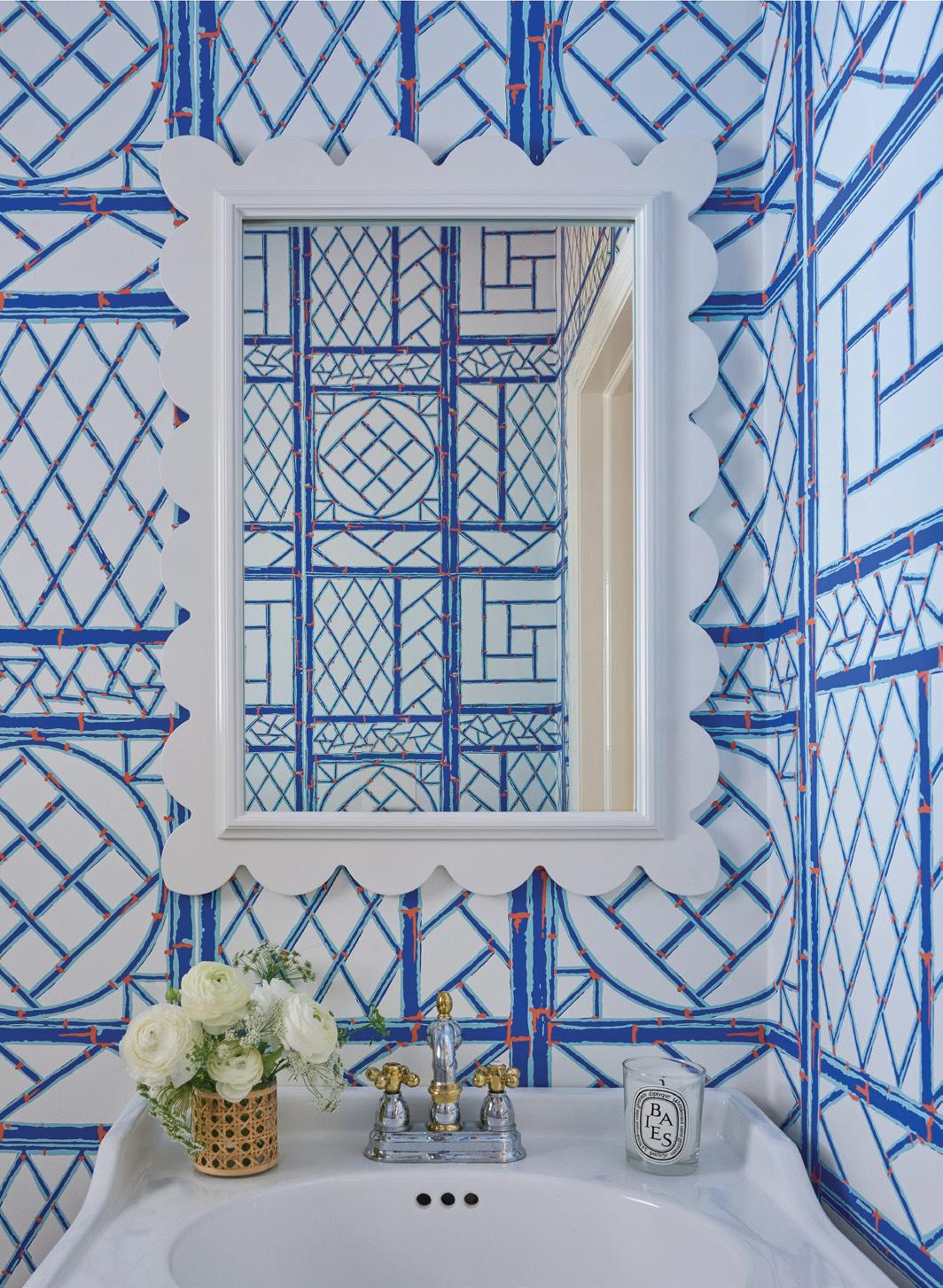
left: A scalloped mirror from Oomph gets playful in the powder room. right: In a nod to the owners’ Bahamas wedding, Quadrille’s Lyford Trellis was chosen for the bathroom walls. opposite page: An Annie Selke rug grounds the room, where breakfast is waiting on a Made Goods table. Custom cushions in a Pindler fabric add color to the Mainly Baskets Home chairs, and a Hudson Valley Lighting lantern adds elements of aged brass.
new tradition
Designer Lisa Hilderbrand curates a layered look for clients settling into their forever home
 interview with lisa hilderbrand, hilderbrand interiors // photographer john bessler
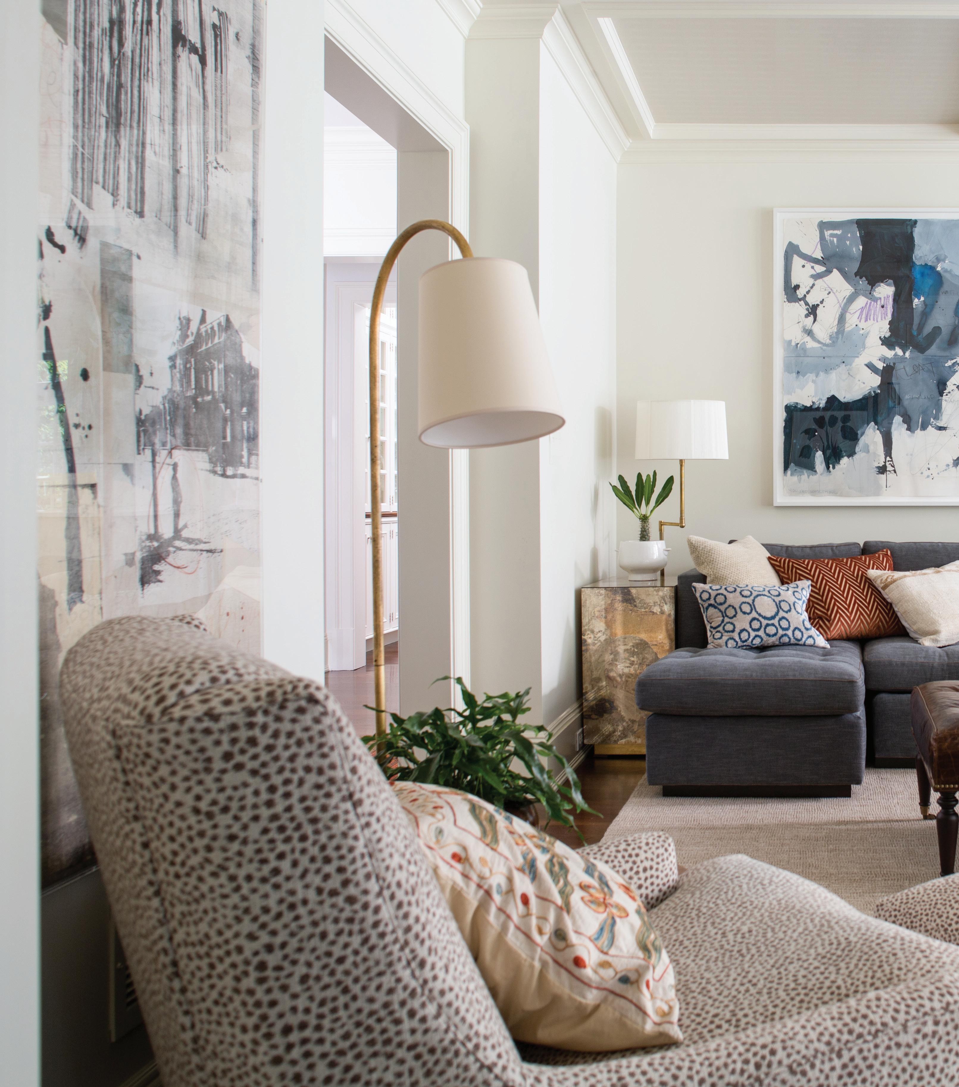
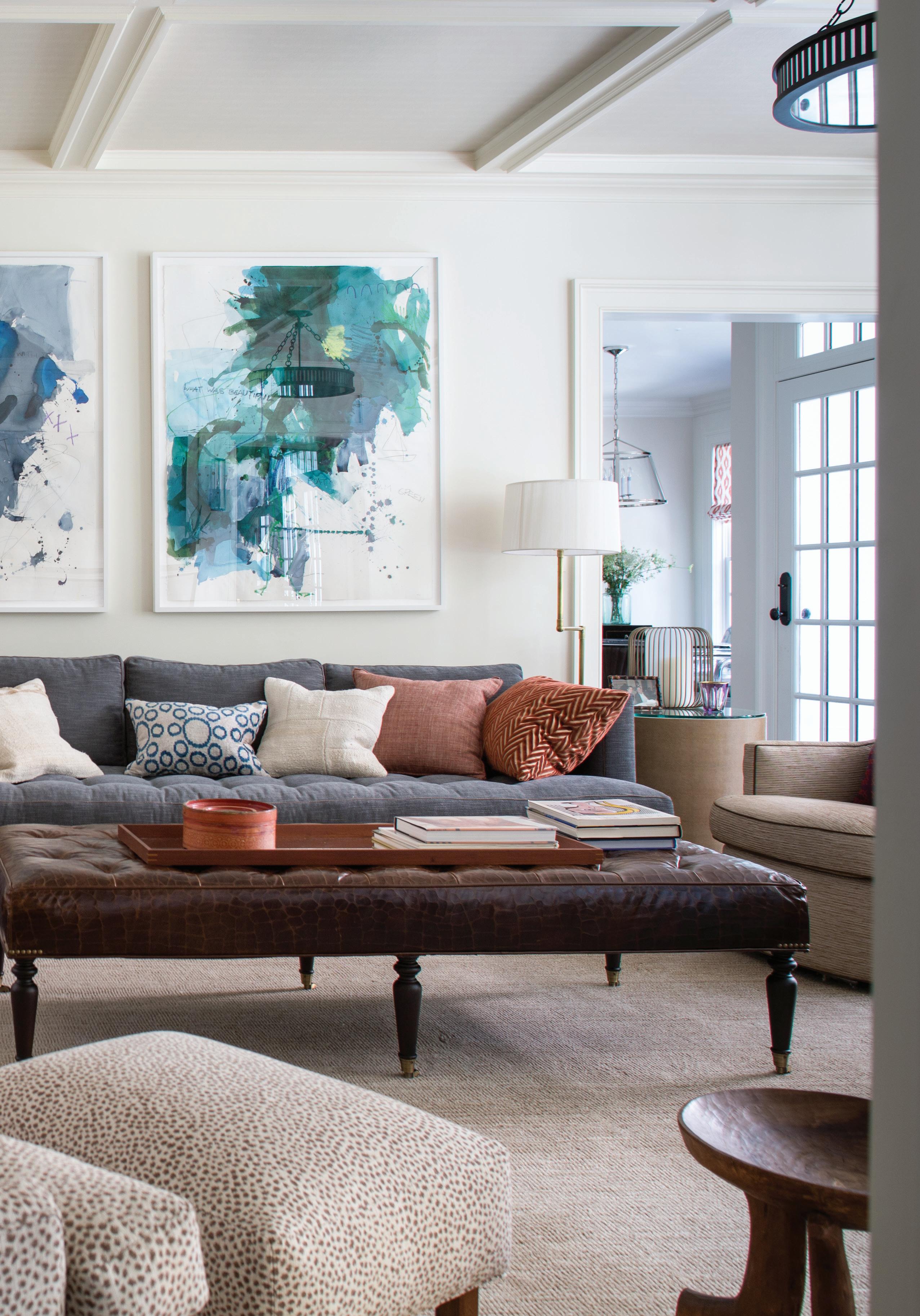
left: Hilderbrand added color to the family room with abstract art over the custom sofa. Float (left) and Boat of Sea Foam Green (right) by Michael Rich were acquired from ARC Fine Art LLC in Fairfield.
Tell me about the client.
My client was a family with two school-age children. They had moved locally several times over the last few years and were ready to settle into a long-term home where their children could grow up. We wanted this house to really be theirs; a space that felt interesting and collected, with a balance of classic and cool.
Whose idea was it to go bold with color?
We all agreed that we wanted color, but we didn’t want it to drive the design for the sake of bold color. Importantly, the client was interested in collecting art, so we based the overall palette in neutrals and kept the big anchor pieces more quiet (warm gray sofas in the living room, softer slate blue sofa in the family room) so we could build and lead with color in the art, leaving the door open for their collection to evolve over the years. If we found art they loved, we would let that piece take the accent colors in one direction or another.

How did you land on that ultra-gloss, vibrant yellow wet bar?
The bold color (Babouche by Farrow & Ball) evolved as we designed the room. We laid out the paneling to accommodate a basic existing closet but removed the doors, converted the base, and fitted the interior as a bar; when closed, the wall looks like paneling with base moulding that carries around the room. We thought it would be fun to open seemingly innocent panels and reveal a sexy bar, which has bold impact when you want it. Since it’s not a full-time feature, the client has the option to keep the room rich and mellow. The saturated blue (perennial favorite Hague Blue from Farrow & Ball) is the perfect backdrop for the black-and-white art.
 above: Layered neutral pieces ground the space, while fixtures from The Urban Electric Co. (wall sconces and ceiling pendant) provide handsome lighting sources. below: An antique 19th-century chest is topped with a Christopher Spitzmiller lamp and framed by drapery in Chablis Bay Blue by Rose Tarlow.
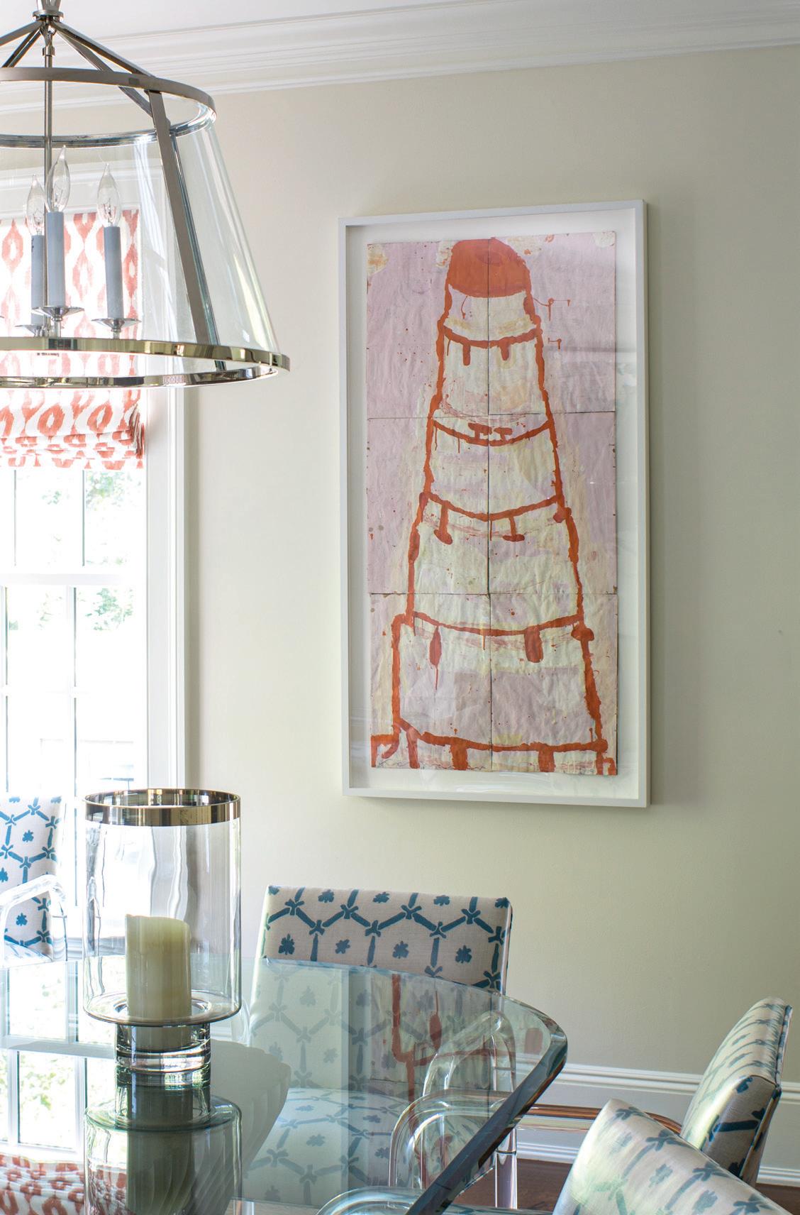
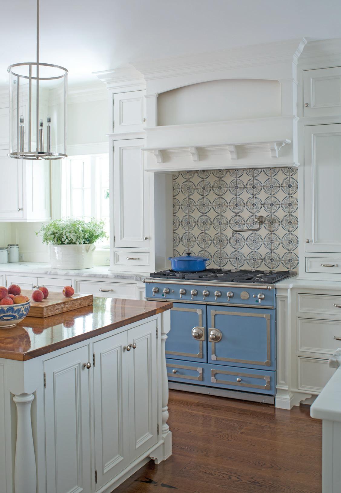
above: Tabarka tiles add a graphic pattern over the blue La Cornue range. this photo: Cake Stacked Orange on Pink by Gary Komarin hangs over the eat-in kitchen, where vintage Lucite chairs were covered with vinylized Plumwich fabric.
There’s lots of pattern in the kitchen. What was the direction there?
The kitchen was in good shape and came with a gorgeous, blue La Cornue range. Renovating the kitchen wasn’t in our scope, but we did make some key upgrades, which made a huge difference: we replaced the backsplash over the range with a hand-painted terracotta tile, added new cabinet hardware, and hanged pendants over the island. We continued with blues in here for upholstery and a painting, and then added some vivid orange for more life and to continue the color story of the Gary Komarin painting. Adding some fun color and pattern to the breakfast area kept things fresh and complimented the art.
Tell me about the art throughout the home.
The client was eager to build a collection of art, and as we developed the plans for the interiors, we kept that in mind. In most rooms, we didn’t tie ourselves to a palette that would limit us too much. We knew they wanted bold pictures in various media, both modern and abstract, as opposed to a traditional landscape aesthetic. We started with a trusted advisor and dealer I’ve worked with for many years, Adrienne Conzelman of ARC Fine Art in Fairfield. Along with Heather Gaudio Fine Art in New Canaan, we were able to try things to see how they felt in the rooms at different times of day. We wanted the pieces to not just look good with our colors or fabrics, but feel right in the rooms where an active family would be living every day; to really pull the aesthetic together by guiding the eye towards delight or rest.
Each room in this home feels like it has its own, markedly different “aesthetic.” Was this intentional?
We wanted each room to have its own personality but still flow from one to the next—more like a mood shift than a different aesthetic. With a neutral foundation, the colors could ebb and flow, emphasizing an accent color here or there—like the aubergine lacquered sideboard in the dining room, which pulls from the kaleidoscope art, or the plum vinyl on the game table chairs, which we pick up again in a pillow. The plum doesn’t really “match” anything; it balances the blues in the art and sofa and the browns and neutrals throughout. We didn’t want a blue and brown room, so the warm plum gave us some warmth and made the room more interesting. The game chairs complement other elements in the room and balance light/dark, warm/cool, and mellow/bold. We pulled some threads of similar colors from room to room but didn’t want rooms to feel like they matched; rather, we just wanted each to have a reminiscence of the others. In the den, of course, we flipped this script and let color tell the story. We started with a basic sheetrock room with a closet—lovely windows and doors to the patio, but no millwork to speak of (besides basic crown and casing), and only access through one door from a side hall. In terms of function, we wanted this room to flow with heart of the house but also be private when necessary. With thoughtful planning, we added a back-to-back fireplace between the family room and the den and opened up a pair of doors on each side of that fireplace. The depth of the fireplace gave us room for a wide jamb at each door, so doors could open into the jamb, rather than intrude into either room. The doors are super-custom. They’re inlaid with brass and clad with leather to match the paneling around the room.
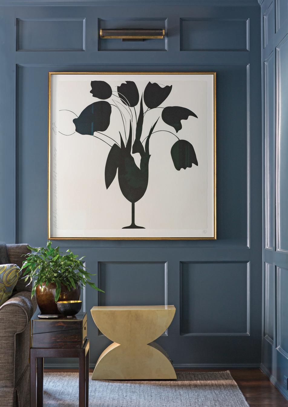

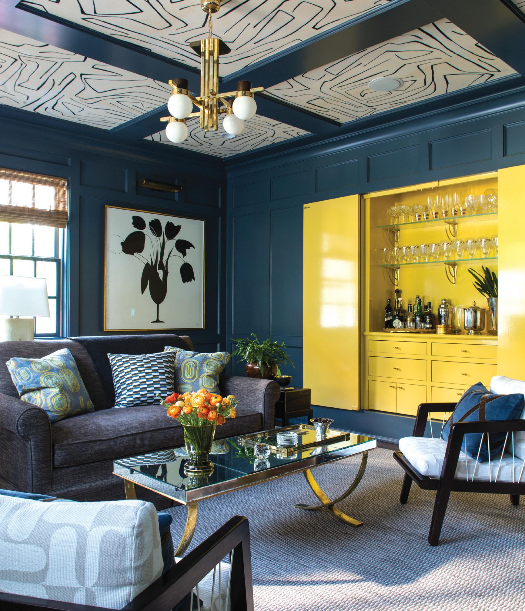 above left: Hilderbrand opted for two Farrow & Ball colors in the study: Hague Blue on the walls and Babouche for the bar interior. A vintage mirrored coffee table sits in front of a custom sofa. above right: Black Tulips and Vase by Donald Sultan was sourced from Heather Gaudio Fine Art. below left: Custom leather doors were created for this room, along with the fireplace screen, crafted from steel, bronze, and brass.
“We thought it would be fun to open seemingly innocent panels and reveal a sexy bar , which has bold impact when you want it .”
—lisa hilderbrand, hilderbrand interiors
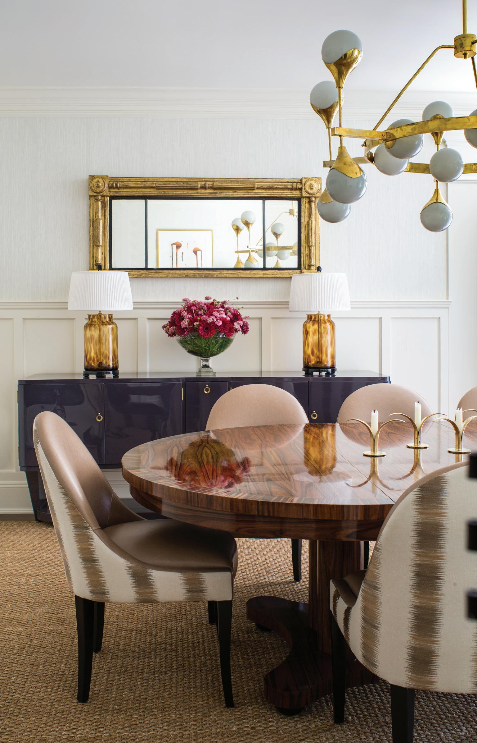
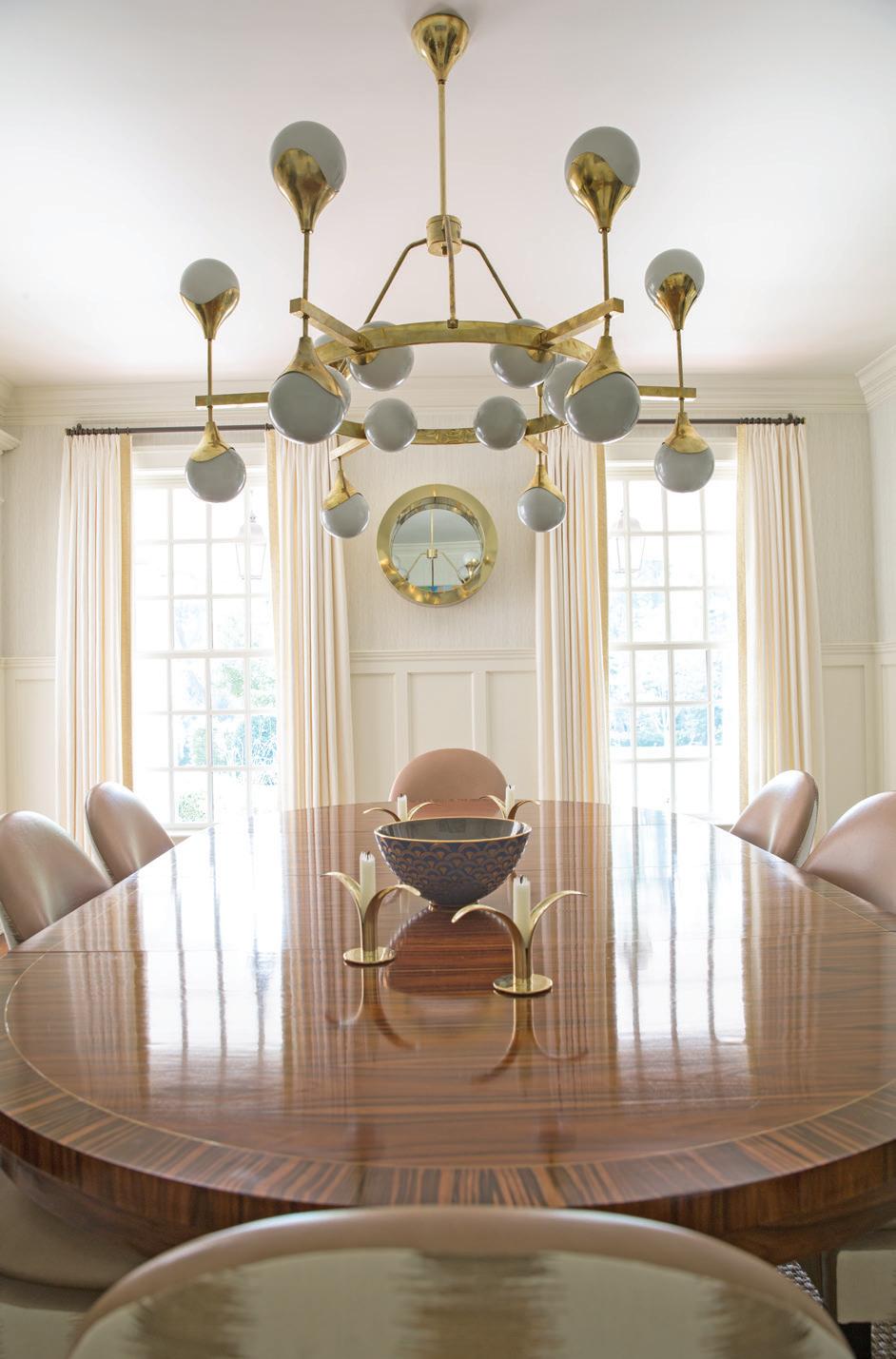
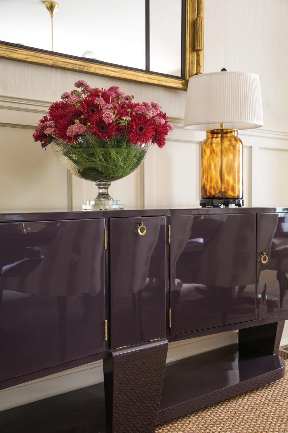 this photo: A Regency giltwood mirror, c. 1810, reflects a vintage Italian brass and glass chandelier. The custom rosewood and zebrawood table is surrounded by Artistic Frame chairs dressed in Holland & Sherry leather and Zimmer + Rohde fabric. above left: An antique Italian walnut sideboard was given a coat of aubergine lacquer. Tortoiseshell glass lamps are vintage. below left: The table is set with Swedish brass candlesticks and a Fortuny bowl.

“color is part of almost every decision i make as a designer : I decide where to push it , where to show restraint , and how it will work with light as it moves across a room or with adjacent rooms”
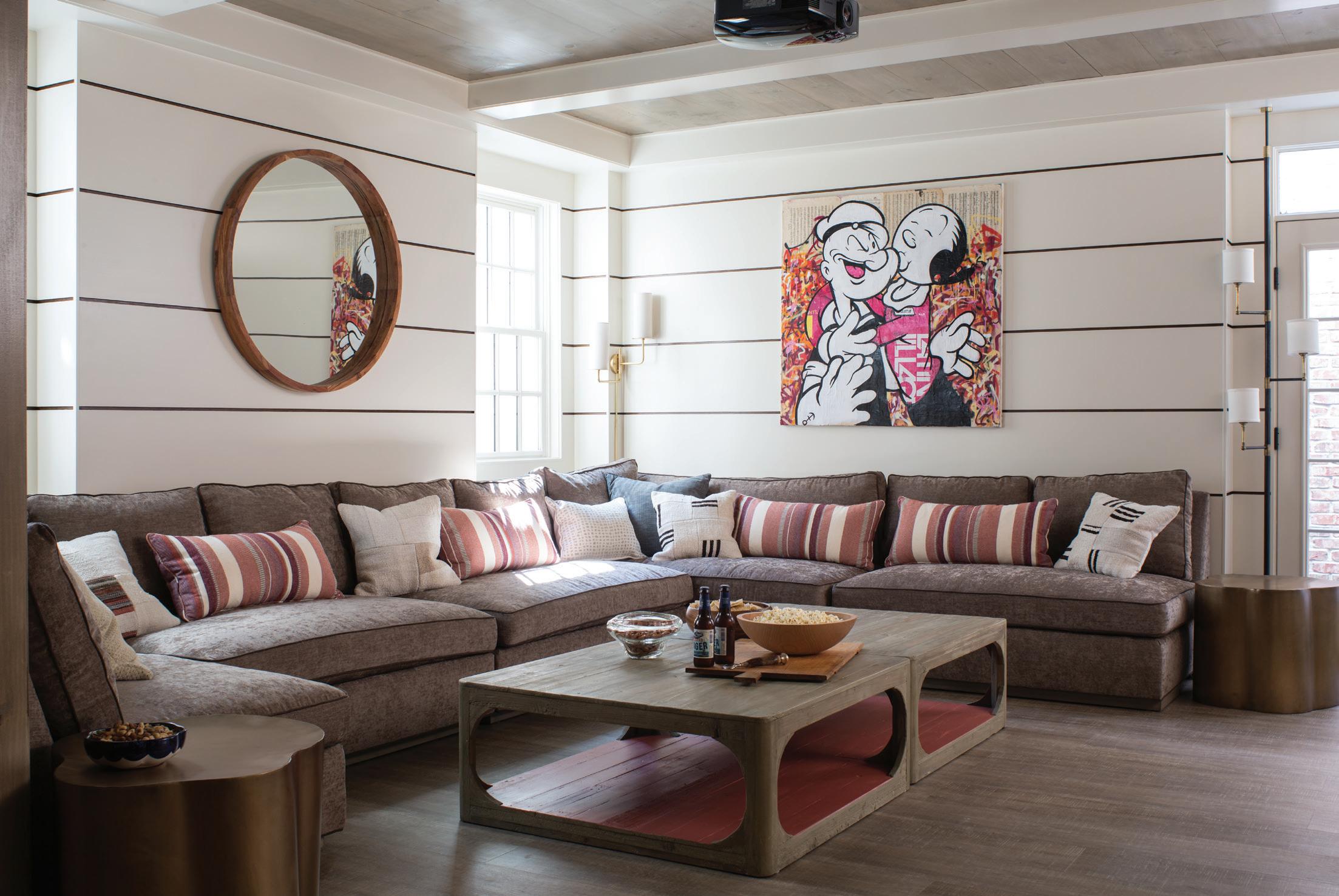
left: A large Kravet sectional was custom-created for the lower-level space. below: The designer found the pair of mid-century round lounge chairs at Stamford’s Antique & Artisan Gallery.
—lisa hilderbrand, hilderbrand interiors
Tell me about the basement. This part of the house was a 180-degree transformation, and we wanted it to feel like an escape. We started with a typical “vanilla box” basement— white sheetrock throughout, beige wall-to-wall over concrete. We wanted to keep the palette light and neutral and embraced interesting surfaces that were intentionally non-basement. Ceilings and cabinetry in the bar/ kitchen area are clad in wood planks finished with a multi-step stain/ whitewash process, lending a custom, warm feeling. We built the custom island at counter height so stools could be pulled away when having a large party, or so the island could act as a tall, communal table with counter stools all around it for dinner party. The walls are a sleek, wide horizontal plank with stained wood in the deep recessed gaps between the planks. Large sliding barn doors open to a big game room but easily close
that area off (so you don’t have to look at toys and the plastic kitchen all the time). We treated the doors exactly as we did the walls so they would disappear when closed. We added a modern fireplace into the wall in the lounge area; a large movie screen is concealed in the beams, which frame the ceiling. The floors are a super-durable, faux wood vinyl—they can take a beating from kids coming in from the pool, or a late-night party. Form and function were equally important in the basement, and the space was carefully thought out.
What was your favorite outcome of this project?
I think the renovation of the wall between the family room and the den was particularly successful. Functionally, it makes total sense, because it opens up and connects two beautiful spaces, and the addition of a
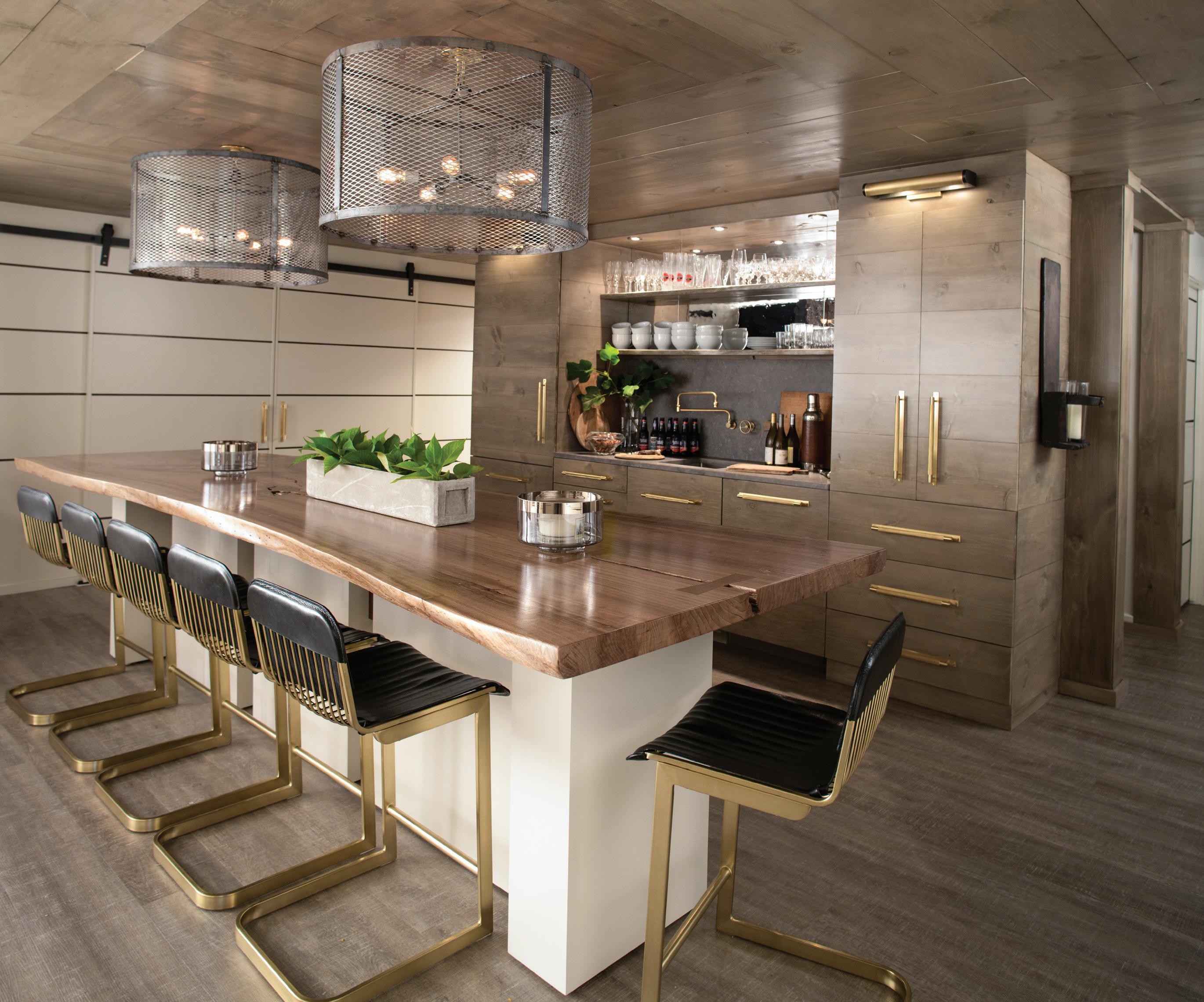 left: A sleek entertaining setup includes a bar surrounded with brass and black leather CB2 stools and rustic steel mesh lights overhead.
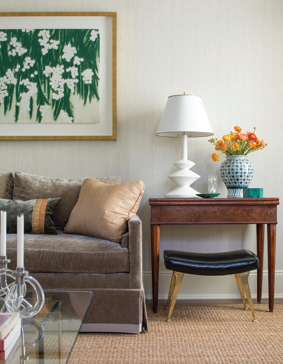
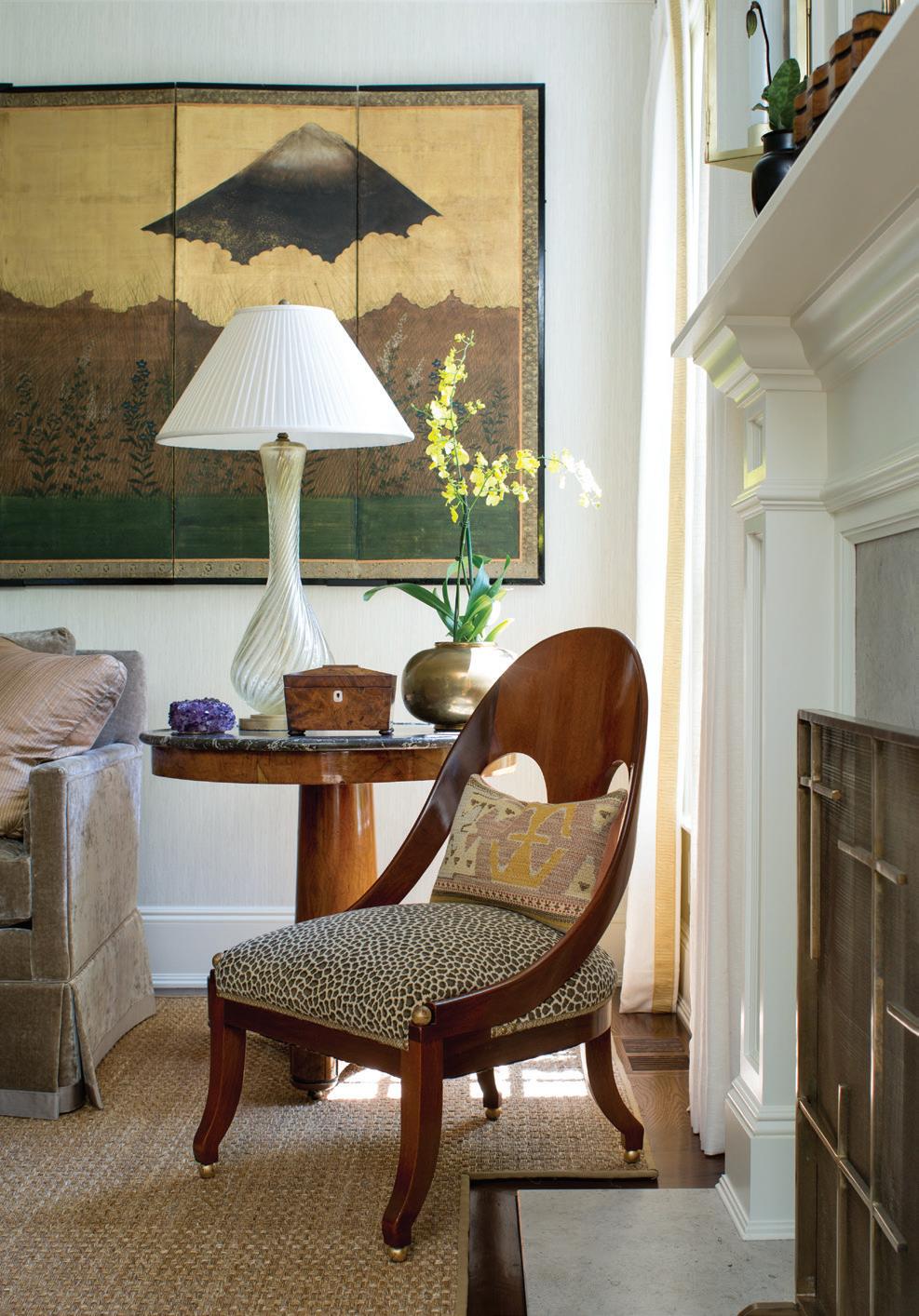
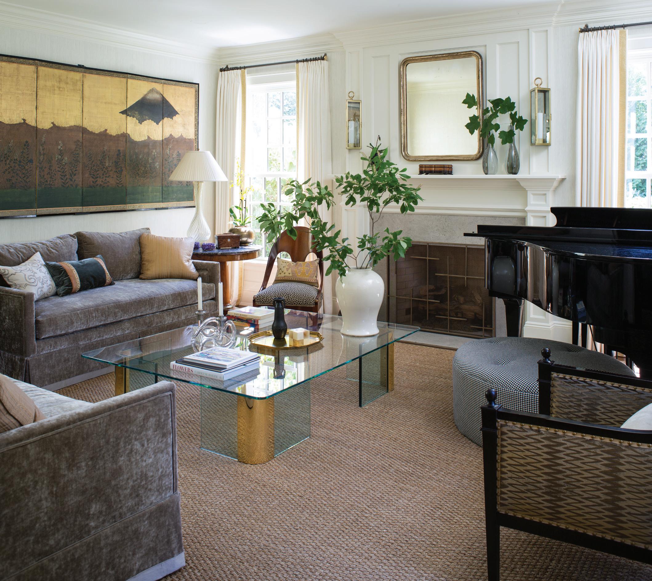
above left: Donald Sultan’s Mimosas pulls grass green color into the living room. A plaster Giacometti-style table lamp sits on an antique mahogany flip-top table. above right: The Michael Taylor spoon back slipper is vintage, as is the Murano glass table lamp. right: Hilderbrand deftly blends old and new; Urban Electric Co. sconces flank an Antique & Artisan Gallery-sourced Louis Philippe giltwood mirror, and a vintage Pace brass and glass coffee table sits in front of custom sofas covered in Cowtan & Tout fabric.
fireplace to each room is a major upgrade. Visually, the renovation looks completely natural, because our layout for paneling and trim is seamless. Creatively, the pairs of leather doors are very special.
What would you say to a homeowner who loves bright colors but is afraid of “clashing” going on in their space?

Things “clash” when they don’t work. You can have a mix of bold, daring colors; they just need to play nicely together and not fight with what’s around them. Don’t use bold color for the sake of using it, or it will look contrived. Forcing a color will probably never feel natural and will make a space feel off. If something isn’t working right, regroup and move on. I’m not moved by color trends and try to avoid cliches like needing a “pop of color” or a bold accent wall.
What role does color play in your life as a designer?
Color is part of almost every decision I make as a designer: I decide where to push it, where to show restraint, and how it will work with the light as it moves across a room or with adjacent rooms—even how it will work with practical living, as in, “We can’t have a light-colored sofa, because we wear dark-dye jeans,” (true story!). Color with respect to design is
also constantly running around my subconscious mind; inspiration is everywhere: a movie, a vacation, a painting, an outfit, a magazine ad…
Do you have a favorite space from this project?
Personally, I love the living room, where the mix of custom, vintage, antique, and modern is just right. The incredible antique Japanese screen, which depicts Mt. Kilimanjaro, is particularly special, because the client climbed it. It’s both beautiful and striking, but also personal, and functions as a touchstone for memories and conversation. I also love that basement. It was such a transformation and is both cool and extremely functional. Lots of creative problem-solving went into it, as well as tremendous attention to detail: we had structural elements we had to incorporate into the design or choose to bury; we reworked the stairs; mixed half a dozen versions of the wood stain treatment. It was an adventure. What a fantastic space to have through the pandemic, too!
interview by veronica schorr
Resources:
Interior Design: Hilderbrand Interiors, New Canaan, 203-722-9642; hilderbrandinteriors.com
MAY/JUN 2023 athome 45
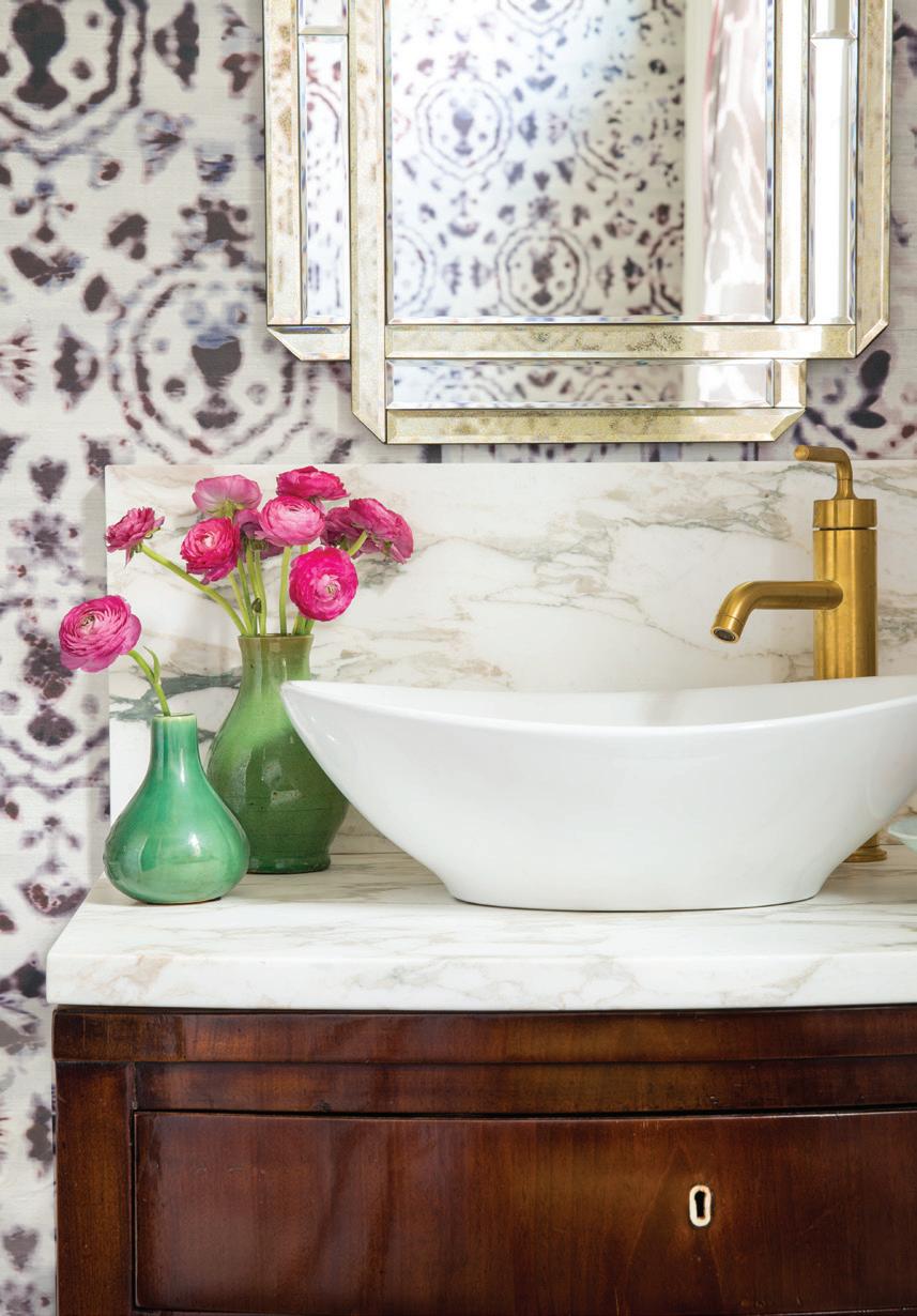
left: Schumacher’s Cubist silk panels create a geometric statement behind the custom bed. below: The powder room is papered in Kandy by Elitis. Villa & House’s Ribbon mirror hangs over an antique English mahogany bowfront chest.
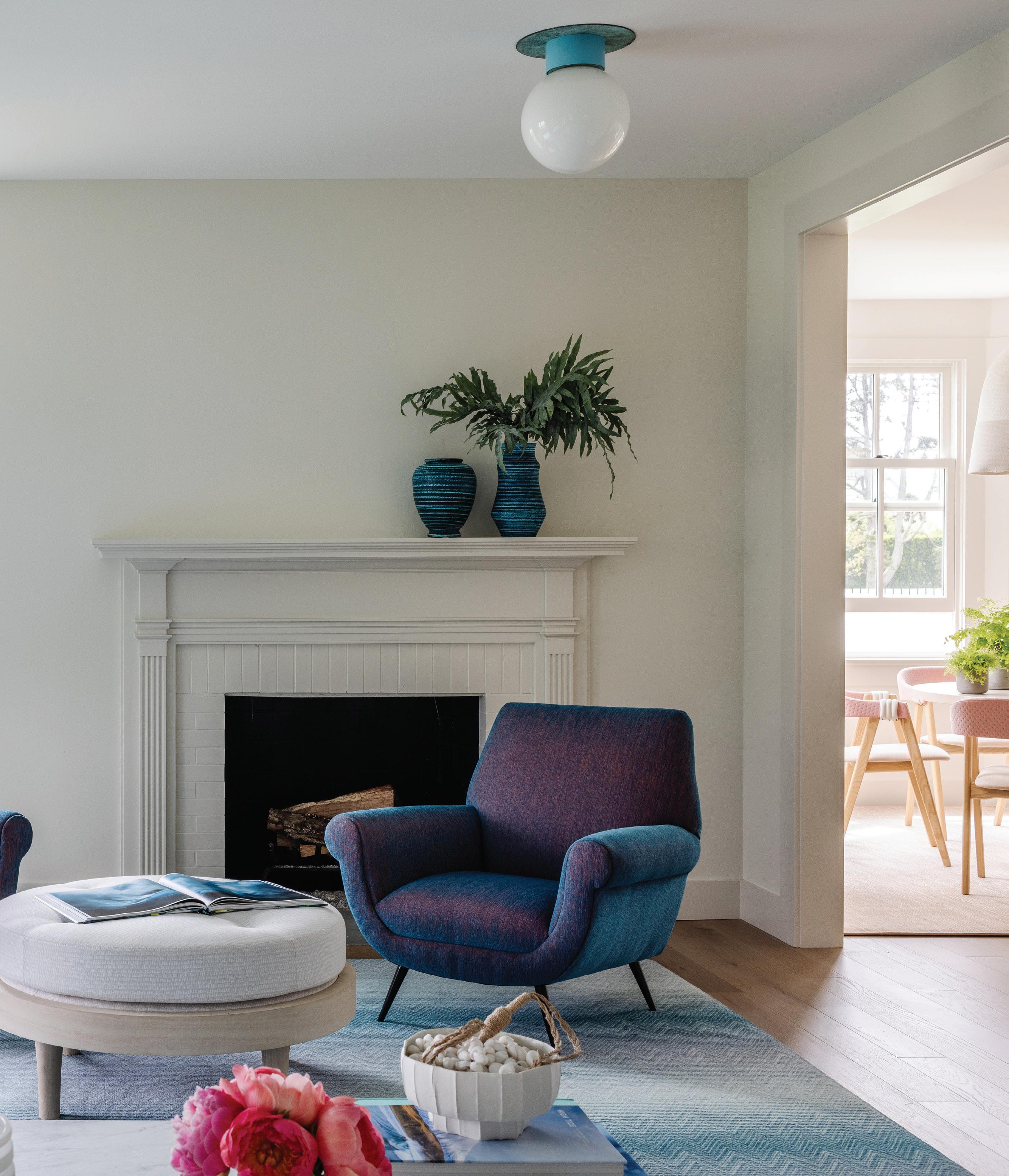
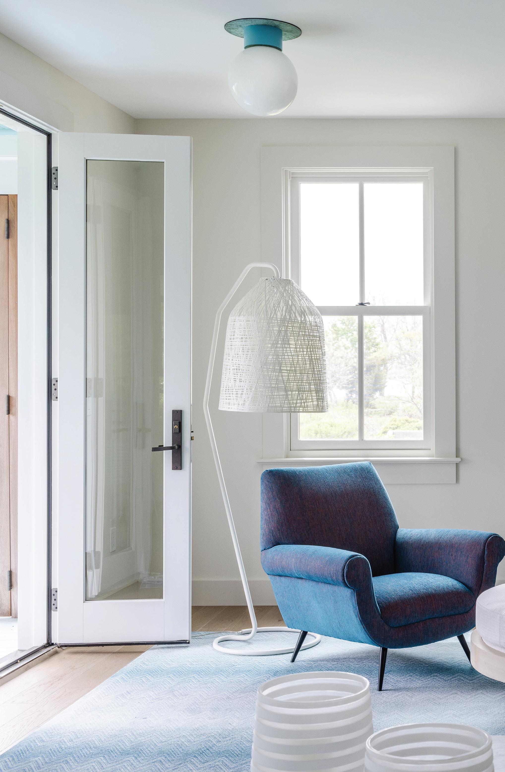 this photo: Hirsch proves that stylish design can stand up to beach house living. A Jonathan Adler Marcello lounge chair upholstered in Sunbrella fabric pulls indigo tones from the ocean’s depths. Pipe flush mount fixtures from The Urban Electric Co. in verdigris include custom turquoise contrast paint.
Amy Aidinis Hirsch dives deep into the color pool for this shelter island retreat
 interview with amy aidinis hirsch, amy aidinis hirsch interior design // photographer amy vischio
shades of summer
Who lives here?

This family lives in Greenwich and we had done their house there. The husband sails, they have two daughters, and they’re a super-busy family. They had been going to Shelter Island for many years and bought this older house (1888) that they lived in for a long time prior to the renovation. They engaged with the architect (Steve Schappacher) who did a lot of work on older homes, and that’s how this progressed. When I worked on their home in Greenwich, it was not a renovation. It was a straight interior design and cosmetic update to a new home. Shelter Island was the complete opposite, with an old home that needed to be refurbished. It’s got the most incredible view of the Sound, and they have their own dock, beach, and a guest house that connects with the main house. It’s a mini compound.
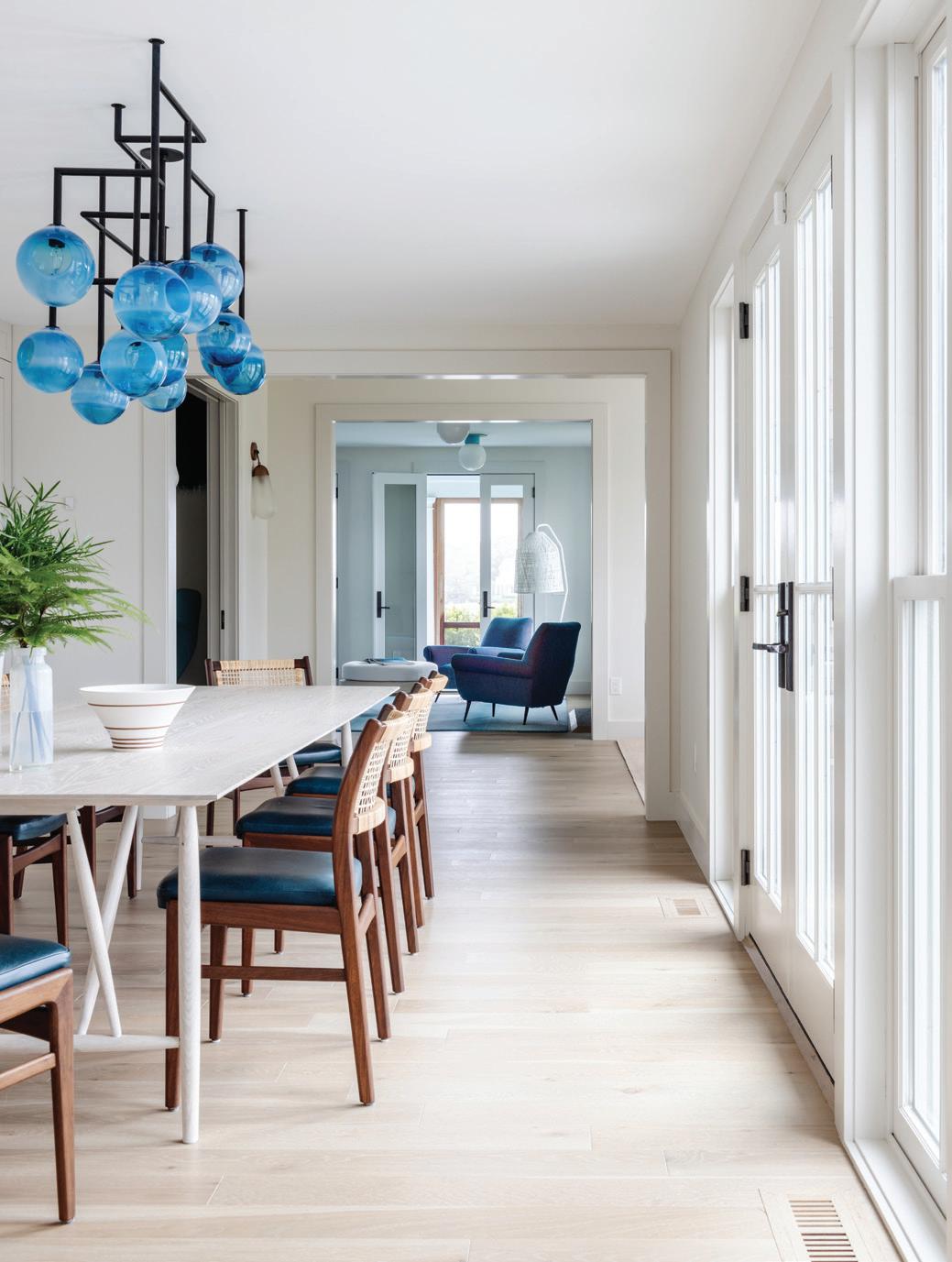 above: A Dutch door allows for Bay breezes to blow through the living room. The inviting Verellen sofa has a thin mattress cushion detail, upholstered in Perrenials fabric. A turquoise Missoni carpet is made of nylon and holds up to sandy feet. below: The view from the kitchen—past the dining table and into the living room—reveal the home’s pops of blue. Tribute modern dining chairs by Craft Associates show off walnut frames and are inspired by Sylvie Stenquist. opposite page: Jamie Harris’ 13 Globe Circle and Lines ceiling fixture includes aqua alabaster globes and was customized for this space.
How different is the design in this house, compared to Greenwich?

The Greenwich home is on a larger scale, where these rooms are much more intimate. For the color palette, this is certainly much more colorful and impactful. This older home is just so quaint, and there are all these old, quirky elements. The contractor refurbished it in a way that you still hear the creaks, but it’s a very sound house. I would say it’s a completely different feel. It’s one of the houses I’ve done with the most color, in a really long time.
What was your jumping-off point for the palette?
When you do houses like this, you have to consider the durability. You have the beach and the sand to plan for, but they also influence the color. There are definitely those ocean and beach shades, but to introduce the salmon was a playful punch. There’s a lot of things in there that I didn’t foresee happening initially, like the colorful lanterns and light fixtures and baskets (in the kitchen). The rug in the living room is a nylon Missoni carpet. They didn’t want any maintenance. And finding that was an also initial platform for color.
MAY/JUN 2023 athome 49
“You don’t need to live with a lot of things. you just need to live with the key things .”
—amy aidinis hirsch

athomefc.com 50
above: Doug Johnston’s sculptural fixture is crafted from stitched cotton and nylon cord. Flutter embroidered fabric panels in flamingo by Hella Jongerius for Maharam soften the space.
“There’s beauty in the relationship between natural light and something that has a zest of color .”
—amy aidinis hirsch
Tell me more about the kitchen.
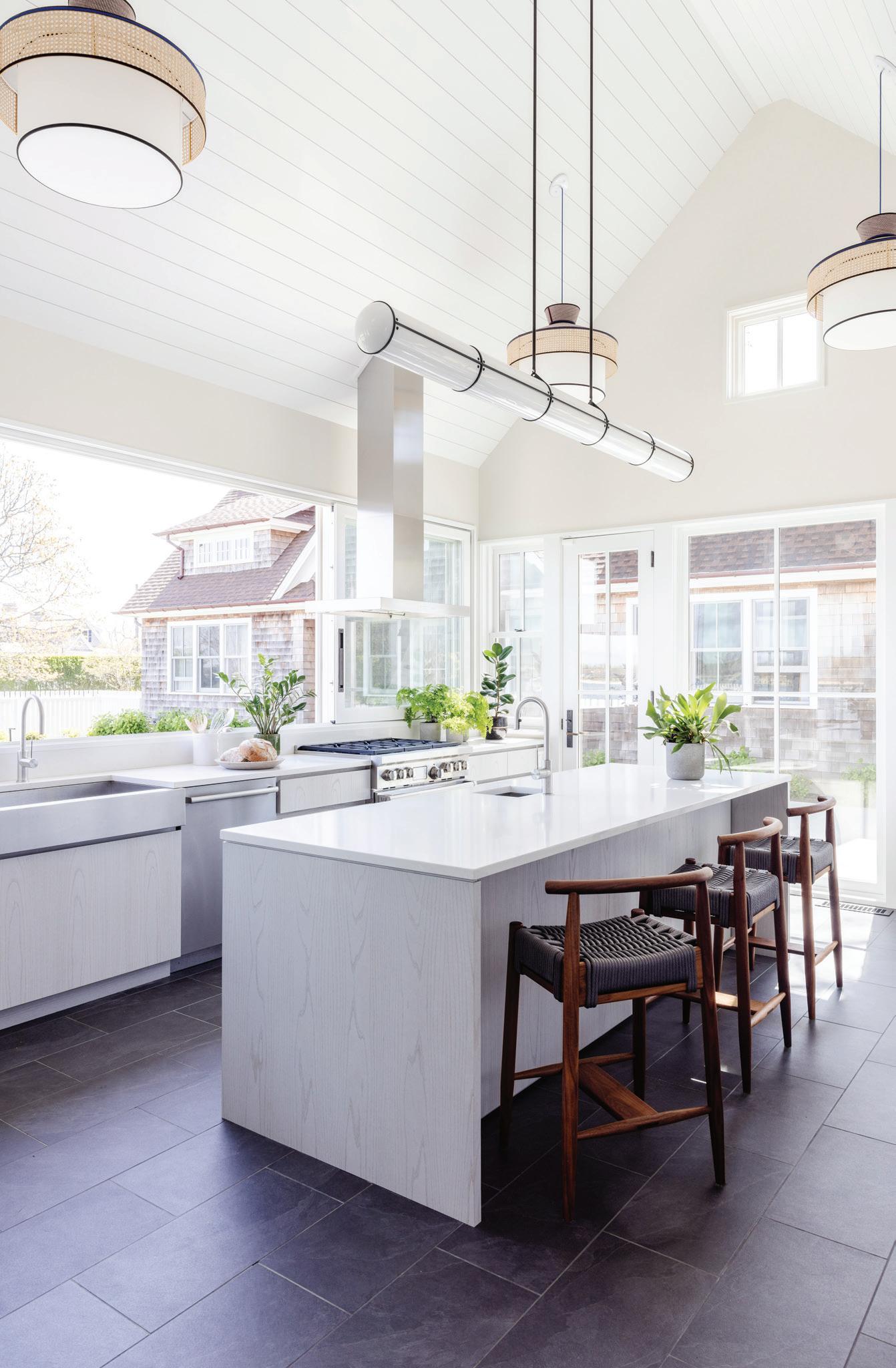
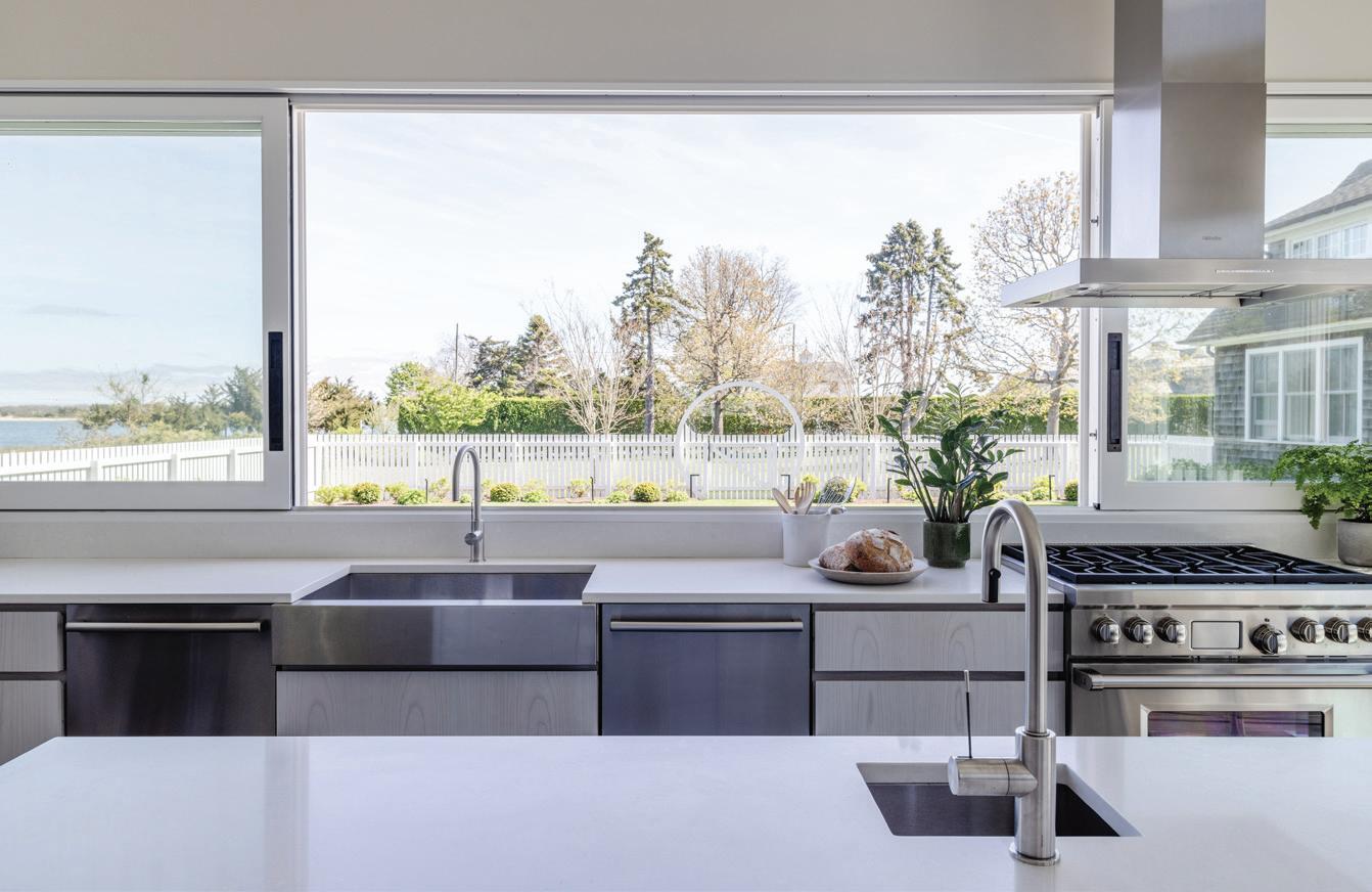
It was really the architect’s masterpiece. He re-orchestrated bringing in all the light and created the pass-through. Having that window there opens up so you can service the pool—which is right there—and it’s just so amazing to allow in the sea and the sand and the salt and the smell of everything around. I think he played an ingenious part in taking something that was so old and then revamping it. There’s very little storage there, but they clearly wanted the windows for the light and the view, which looks out into the bay.
I would say your color choices were bold for this house. Were the clients on board from the start?

They were totally on board. When we engaged in this, we were coming from their Greenwich project, which was turnkey and had no architectural stuff. This one was about tying our choices together with what was already there and had been done. We had to make sure that everything that we added on, aligned with the initial vision. The beauty is that the architectural stuff is really pretty quiet, and everything was allowed to be brighter, louder, and bolder.
MAY/JUN 2023 athome 51
above: The modern kitchen relies on clean lines and tons of natural light. above right: Large windows provide unobstructed views and easy access as a poolside pass-through. right: Roll & Hill’s Endless cylindrical fixture spans the length of the Caeserstone island.
athomefc.com 52
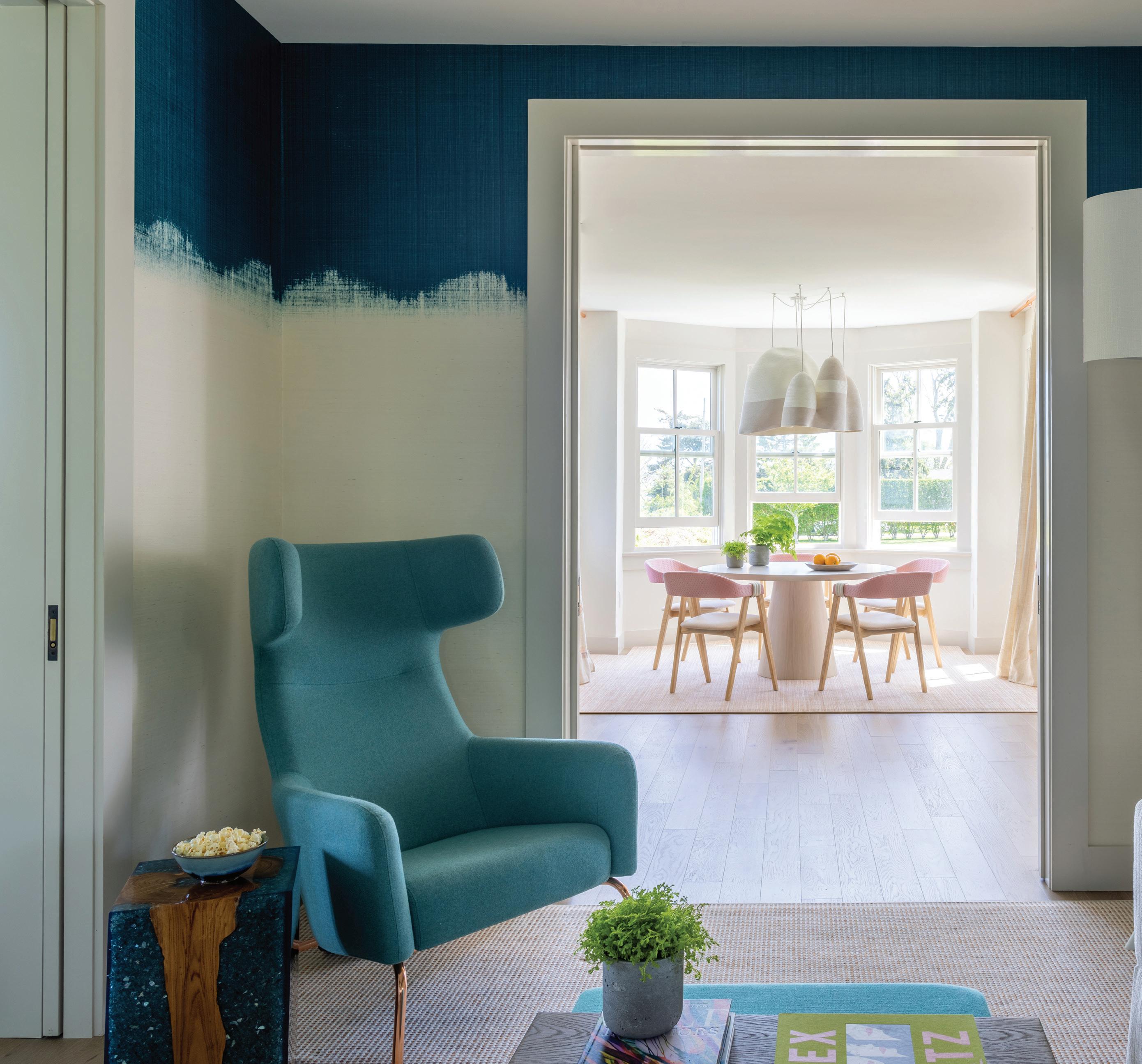
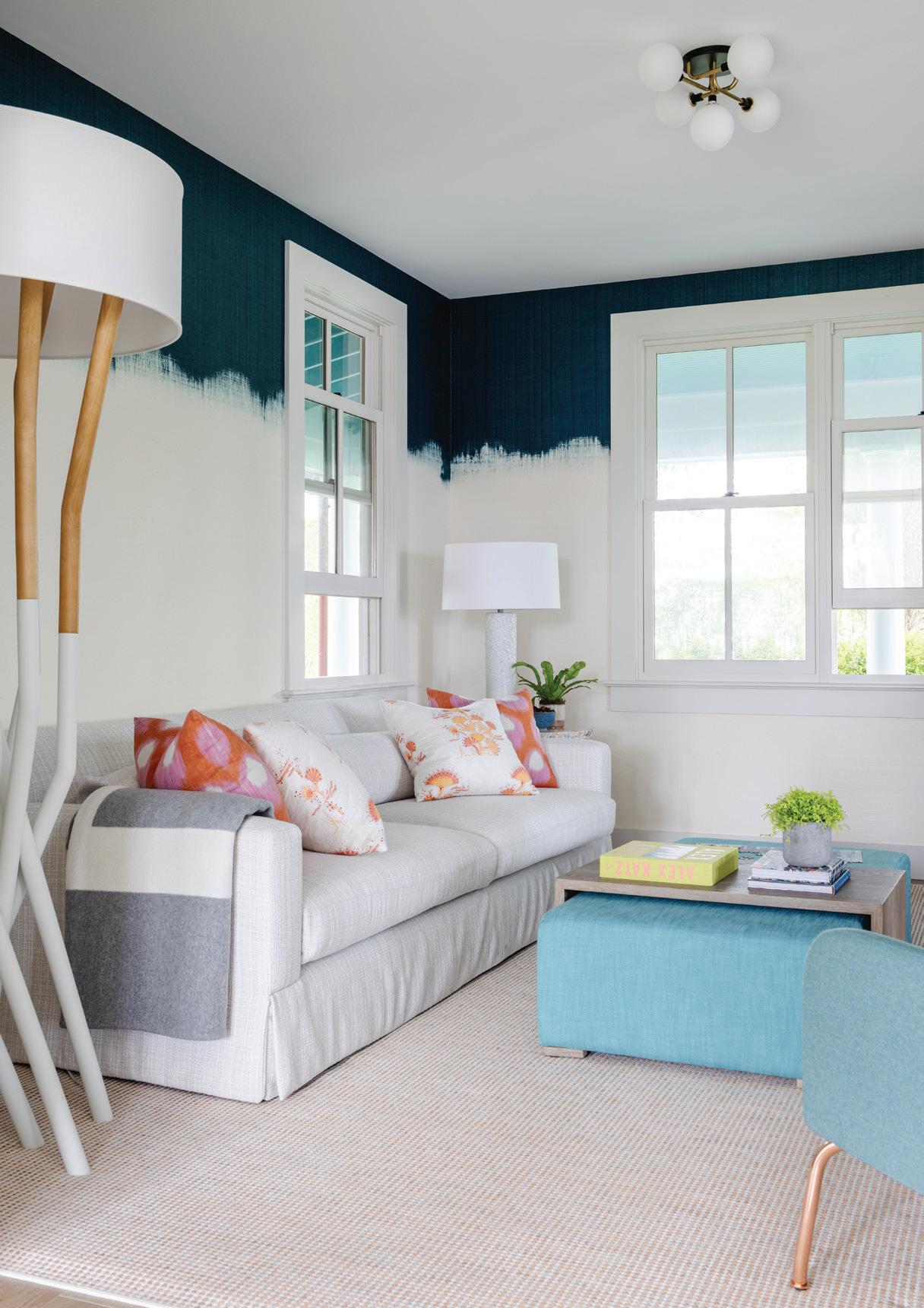
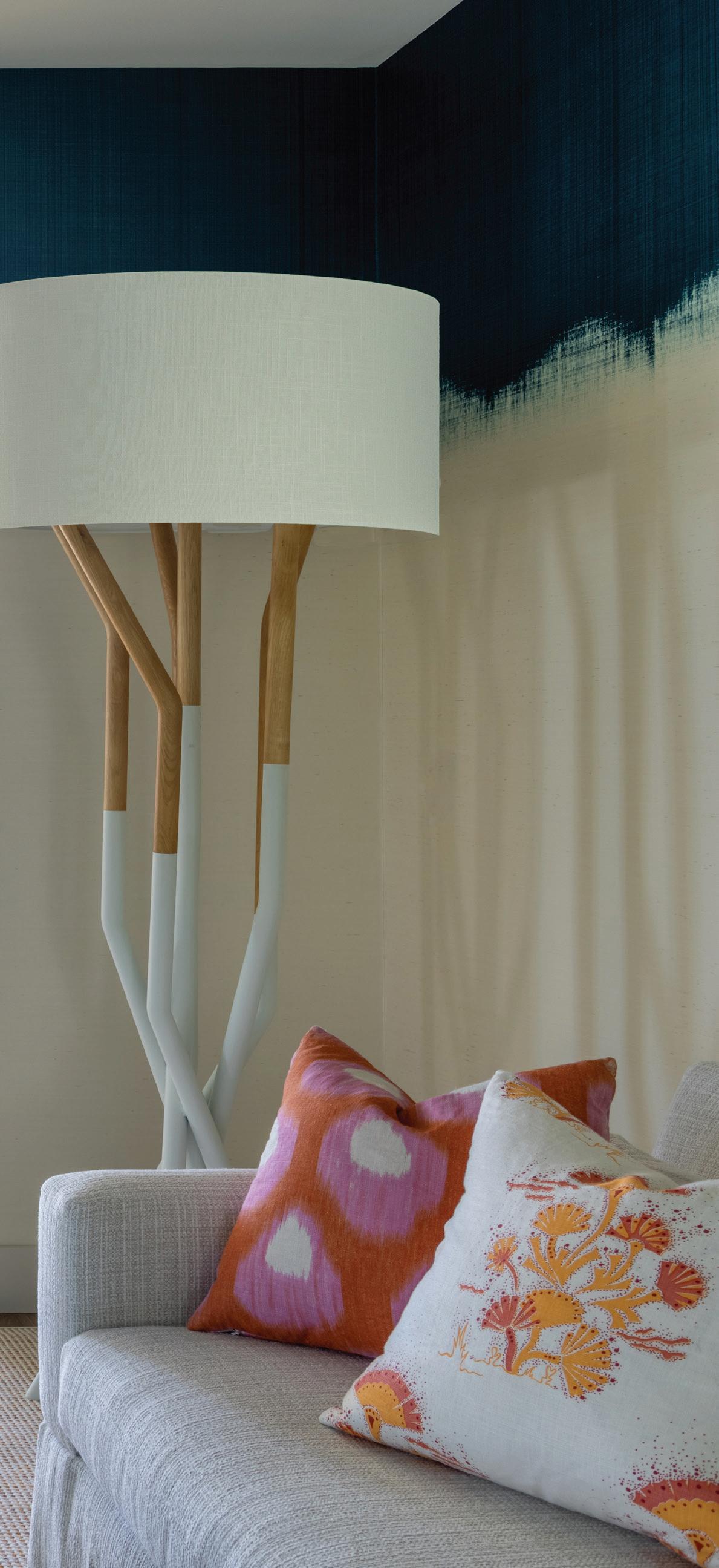
this photo: Glazier Tea ceremony on Marshmallow Mila Hemp wallpaper by Phillip Jeffries wraps this sitting room and adds dimension with color. right: Hirsch pulled in pink and orange shades—seen elsewhere in the house— with the pillows on the sofa.
Tell us about the blue ombré wall treatment. That is a Phillip Jeffries paper that I had been dying to use. I love anything that’s burlap or grasscloth. It can remain as it is without any art on top of it. Wallpapers are so great these days, you don’t have to invest in the art initially. This is tranquil just the way it is.
Let’s talk about all these fun light fixtures throughout the house.
I think it’s the distribution of them that works. I’m a huge fan of The Urban Electric Co. and used their blue lights in the living room. That was the starting point. Then I found Doug Johnston, who did the woven lantern in the breakfast room. To me, it’s just sculptural; it’s a really pretty handwoven element. It’s like art. And then there’s the balance of the blue (in the dining room). I was hoping to get more punch in there, and there’s this great company where you can change the formation of the light. It was all about trying to figure out how to have this zest of color throughout the house. That dining room fixture was definitely a push, because you’re not getting straight white light out of it, you’re getting ambience. It’s a space that’s a pass room, so it’s also interactive. This is their hallway that connects from the living room into their kitchen, and you’re constantly walking back and forth. The table was there, it was very linear and couldn’t be changed, so there were parameters for how the shape had to be. For the kitchen, we came up with the four lights and the four baskets and then this very linear light over the island. Capturing the height of that space was so key. The architecture in there was more streamlined and modern, and they wanted more modern sensibilities to things. But given that it was an old home, I wanted there to be wicker and handwoven elements.
MAY/JUN 2023 athome 53
athomefc.com 54
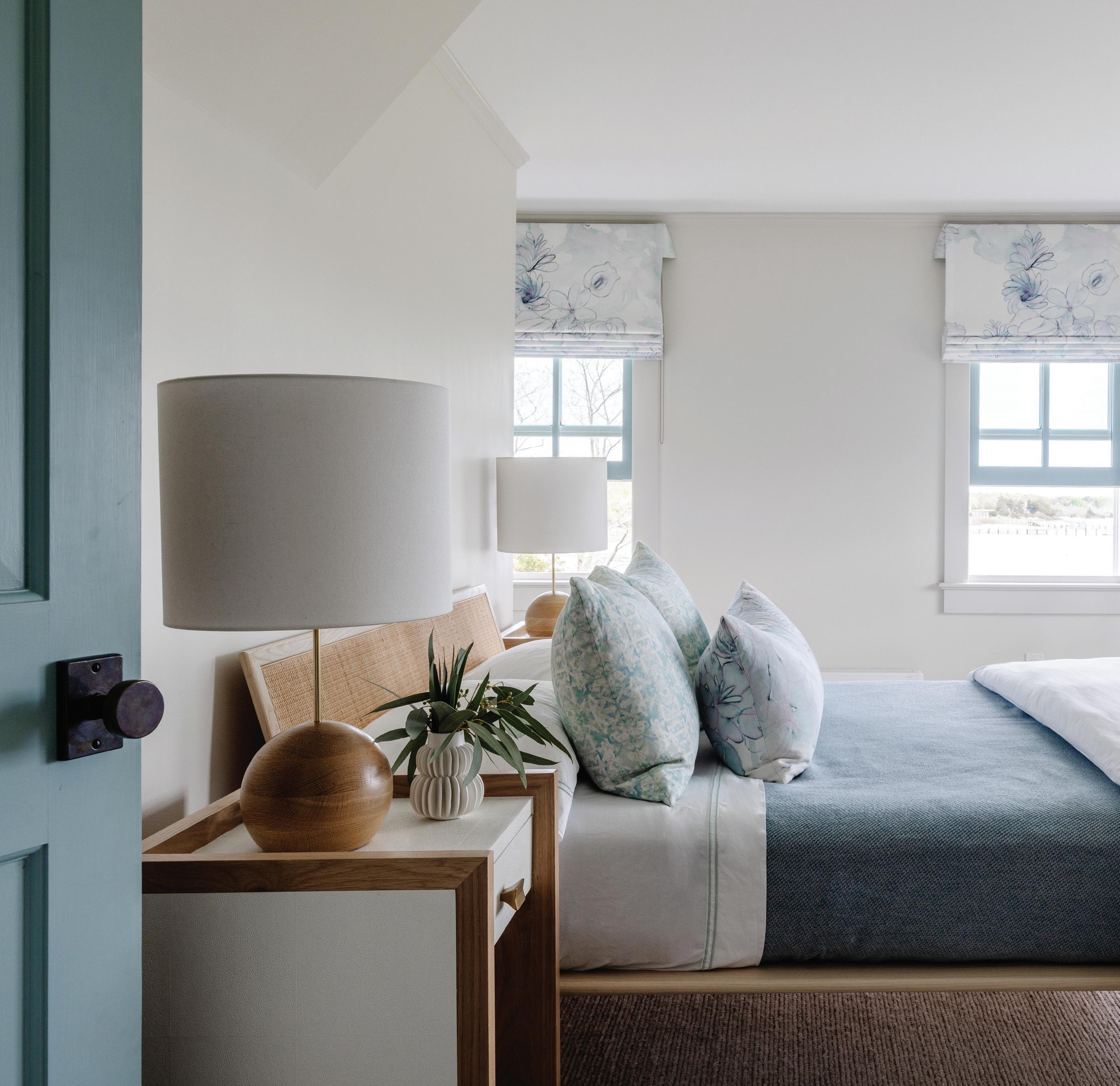
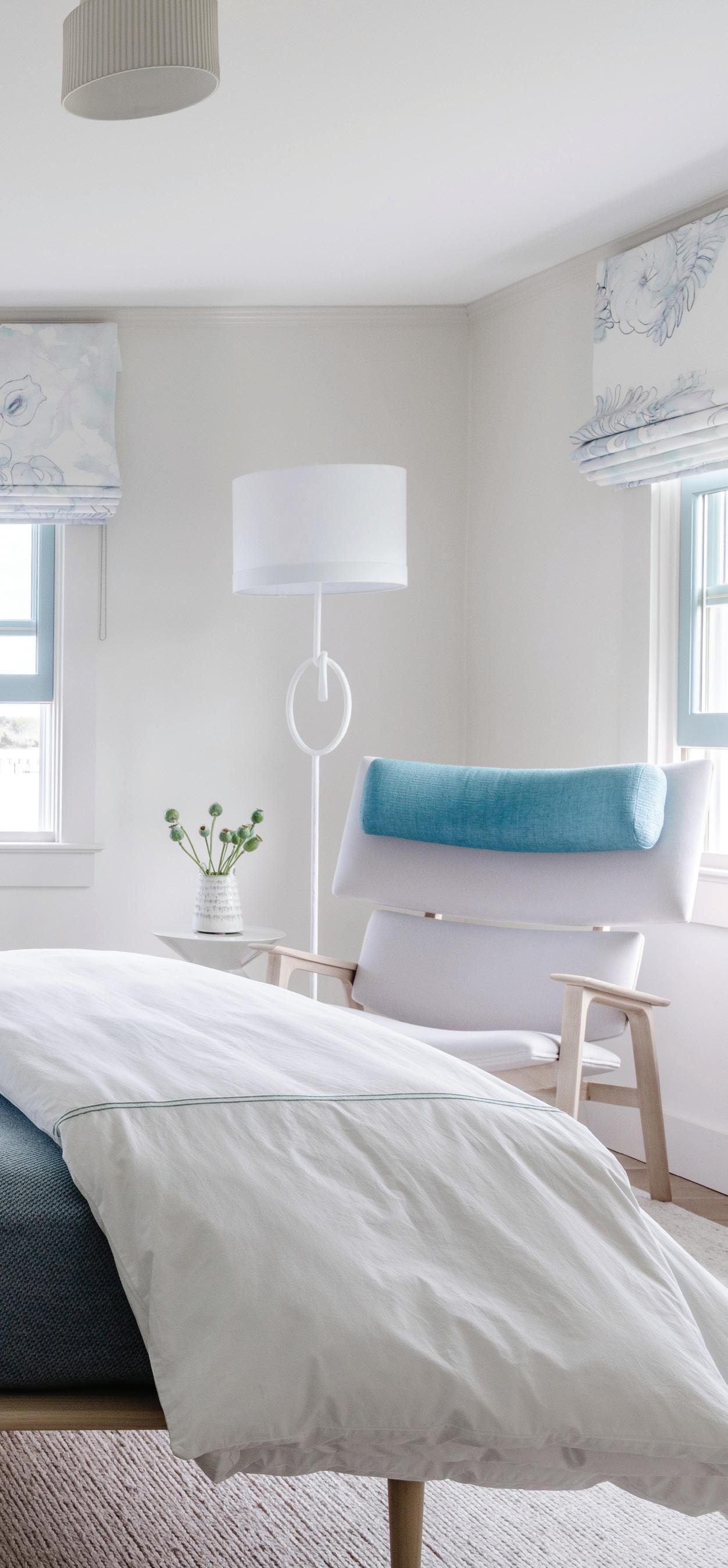
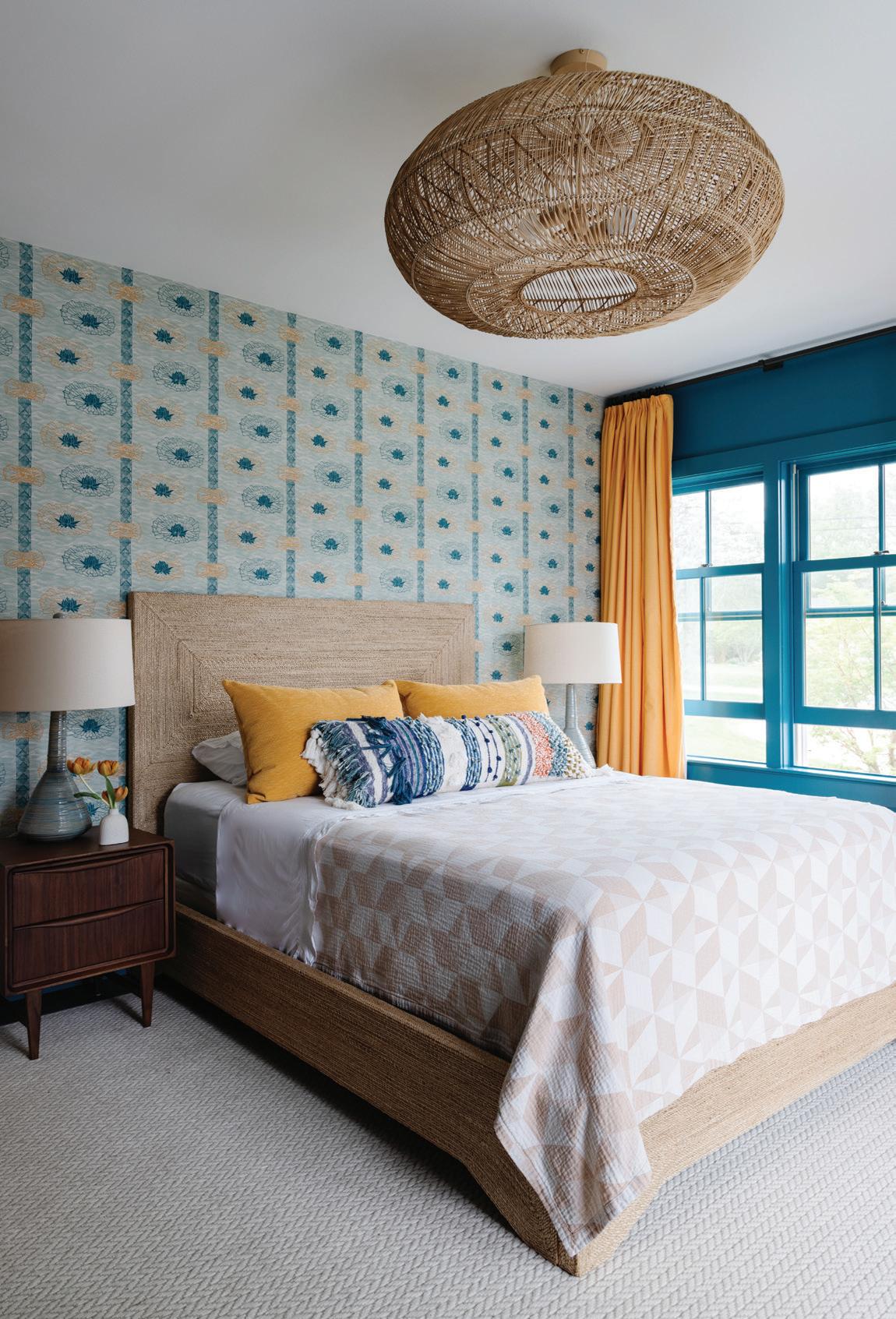
this photo: Eskayel window treatments add painterly watercolor prints to the main bedroom. Walls in Farrow & Ball’s Parma Gray provide a neutral backdrop for the soft blue accents. right: Another fun place to add color: the doors and trim throughout the home.
“When you do houses like this, you have to consider the durability. You have the beach and the sand to plan for, but they also influence the color .”
—amy aidinis hirsch
What are your favorite moments in this house?

The girls’ bedrooms are so fun. The daughters’ personalities are so big, and it was great to create those for them. I do love the breakfast room. And I love the main bedroom. I love the quirkiness of the chair. Less is more. You don’t need to live with a lot of things. You just need to live with the key things. When you’re looking out from the main bedroom into the hallway, you’ll see we ended up adding exterior bocce lights, and they end acting as art. When you come up to the top of the stairs, it falls right upon you. We couldn’t add any lights in the ceiling, and so I said, “Let’s add a series of these lights.” They glow and act as a night light for the young girls.
What was the biggest challenge?
This was the first house that we installed after COVID. That was the scary part, not knowing what obstacle I’d have to deal with. We do so much from afar, but this was different. It was in May, and this house became the family’s sanctuary. They hibernated out here, and it became their main home during the pandemic. We were so grateful to be able to give that to them.
Why is color so important to you?
It’s a way to be adventurous. I don’t live in color in my own home. I have this ability to bring color in as forms of nature or bring it in in doses that you can live amongst. It energizes people. At different times of day, the light catches it—whatever color it may be—it intensifies it or dulls it
down, and there’s beauty in the relationship between natural light and something that has a zest of color. In my world, where I don’t think I design with a tremendous amount of color, this was something that was fun and unique to do.
interview by megan gagnon
Resources:
Interior Design: Amy Aidinis Hirsch Interior Design, Greenwich, 203-661-1266; amyhirsch.com
Architect: Schappacher White DPC, 917-673-7675; schappacherwhite.com
Contractor: Radigan Contracting, Northport, NY, 631-757 5763; radigancontracting.com
Flowers: Green of Greenwich, 203-625-6205; greenofgreenwich.com
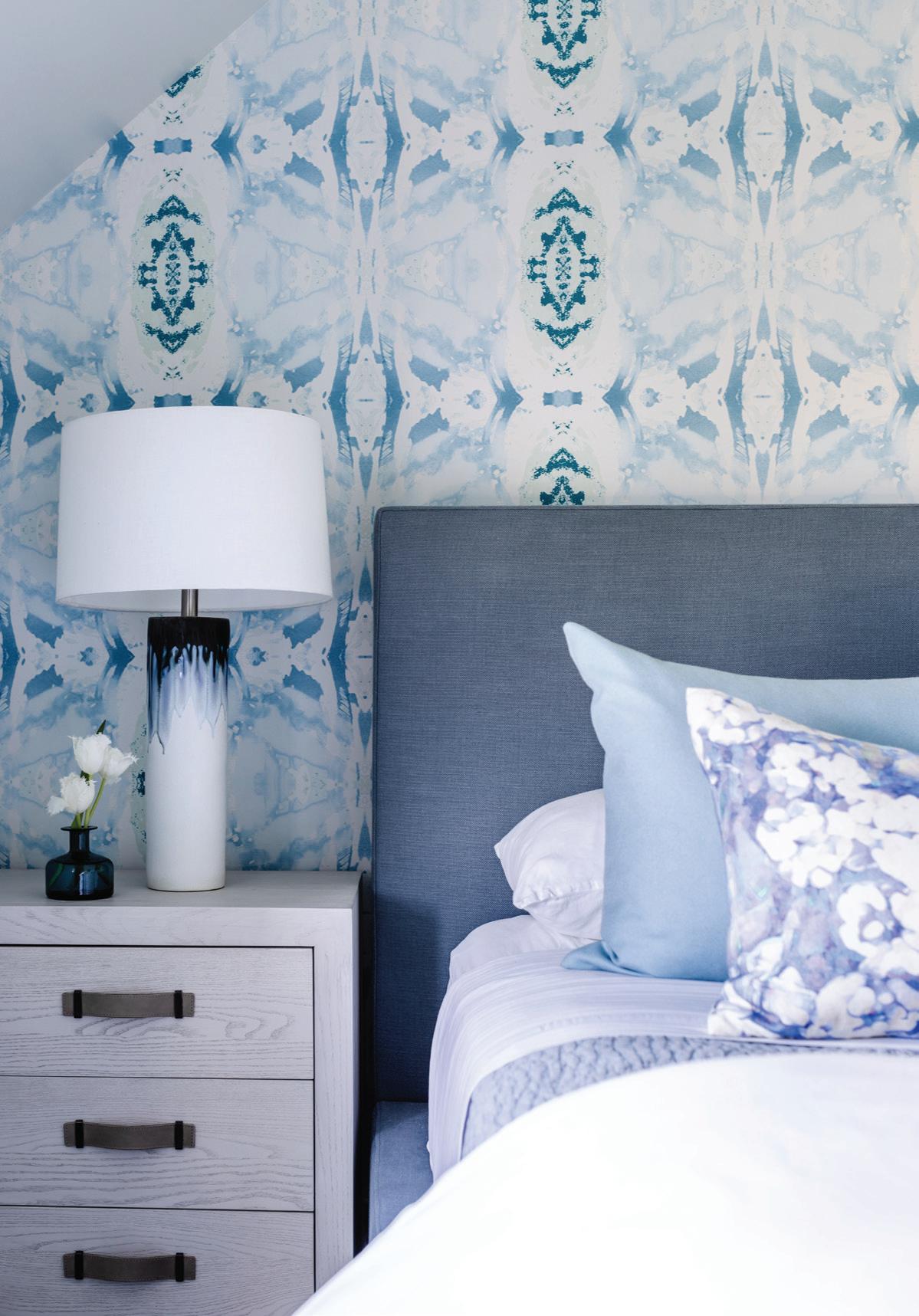
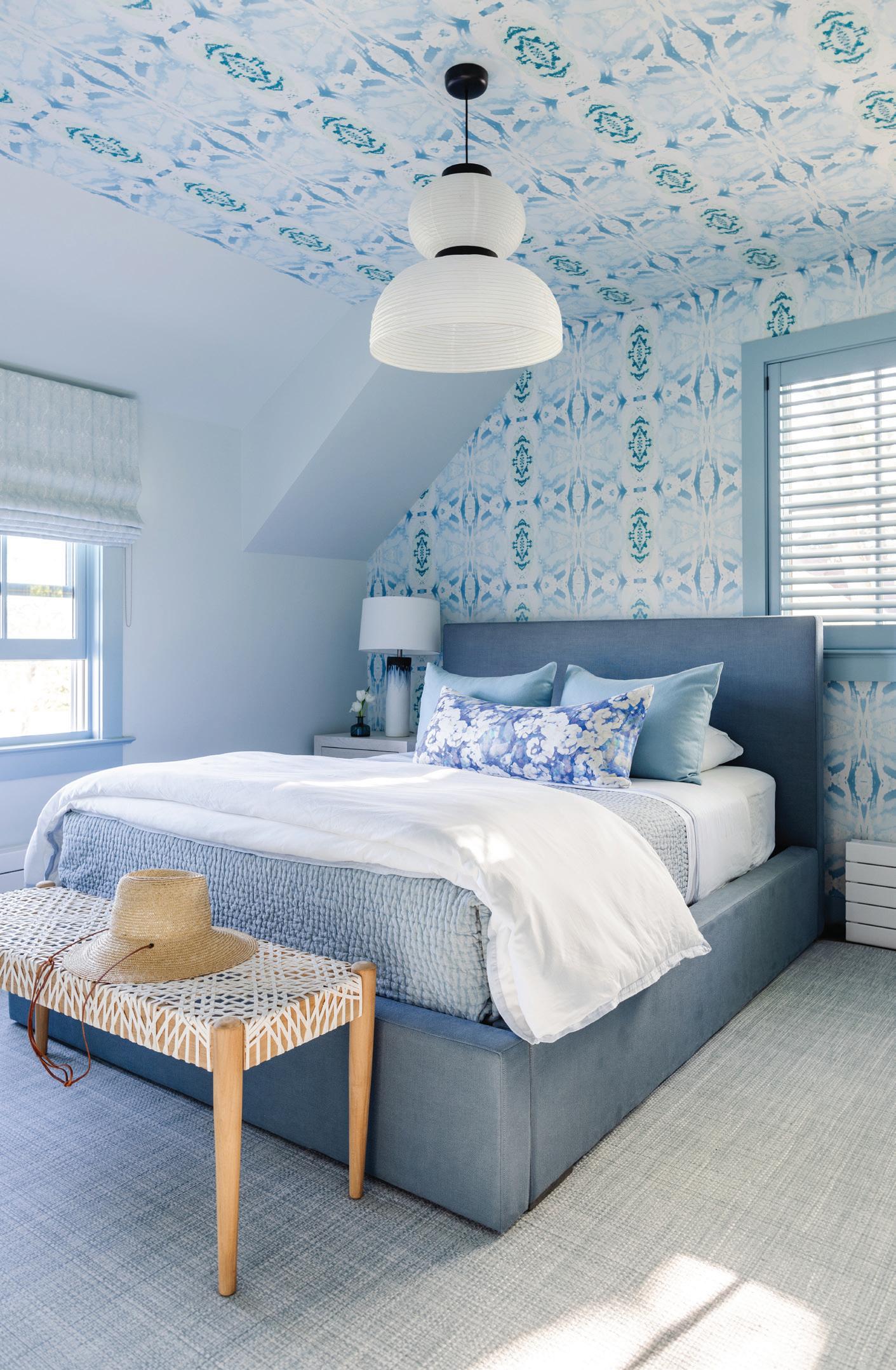
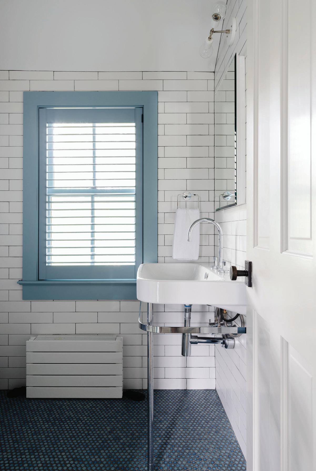
above: Classic penny rounds from Greenwich Tile complement the subway tiles in this bathroom. right: Lindsay Cowles’ wallpaper goes all the way to ceiling, wrapping this blue room in bold, contemporary art.


 this photo: The deep teal side table shares its jewel tone with the walls and windows. left: Katie Ridder wallpaper includes a flower pattern in coordinating colors.
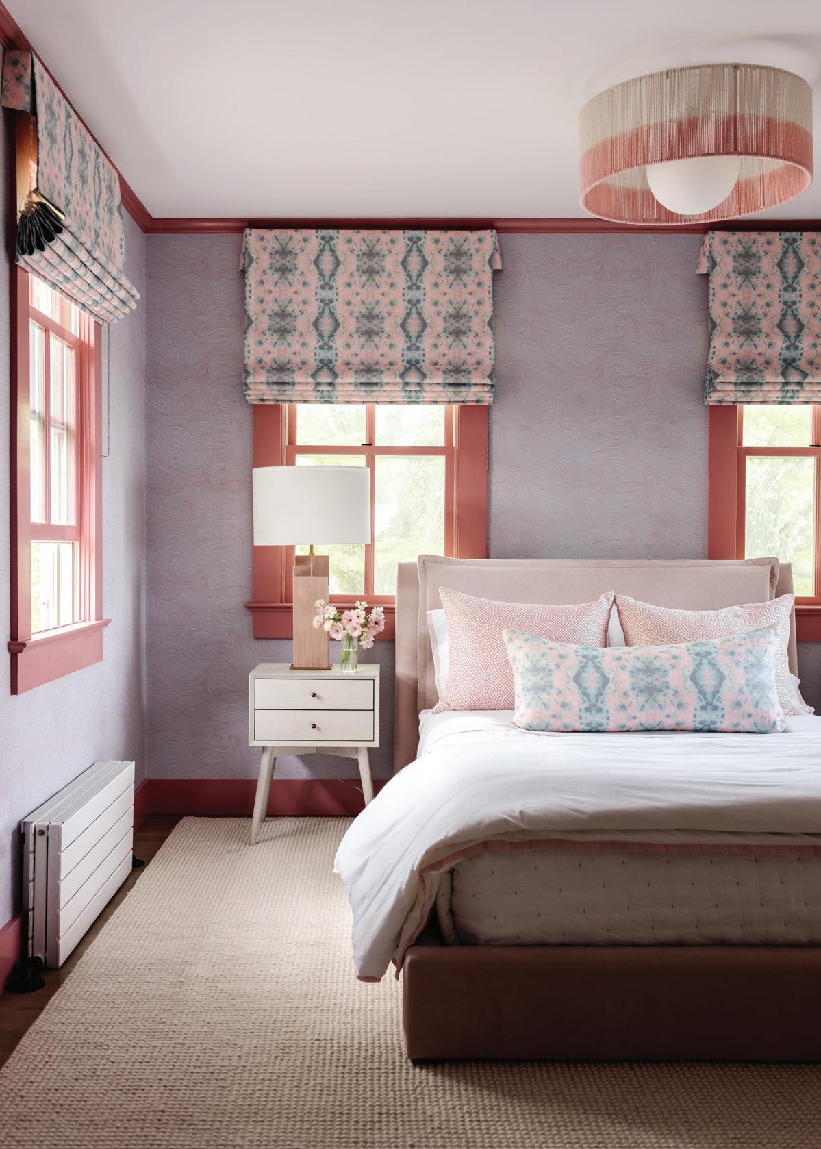
this photo: Molo’s Cloud Softlight hangs overhead in the pool house’s guest quarters. Walls are painted in Canyonlands by Benjamin Moore. right: Eskayel Hive fabric dresses up the pink windows. A custom light fixture by Bone Simple adds texture with its dipdyed drum shade.
BOLD & BEAUTIFUL
Chango & Co. add their signature splashes of color to modernize a traditional home interview
athomefc.com 58
with susana simonpietri, chango & co. // photographers sarah elliott & finn m c clendon (p. 66 to 67)
MAY/JUN 2023 athome 59
this photo: The mahoganywrapped walls were transformed with a coat of Benjamin Moore’s Gentleman’s Gray.
Who lives here?
It’s a family with young children who were relocating from the city. They purchased this house during the pandemic, and we got going right away. The house looked like it was out of Charleston; an older Southern design, but now we had a young, vibrant family that wanted it to feel like a more modern home. We didn’t have a lot of time to do construction but started by editing to let the home breathe a little bit.
What was the design plan, especially when it came to the bolder color decisions?
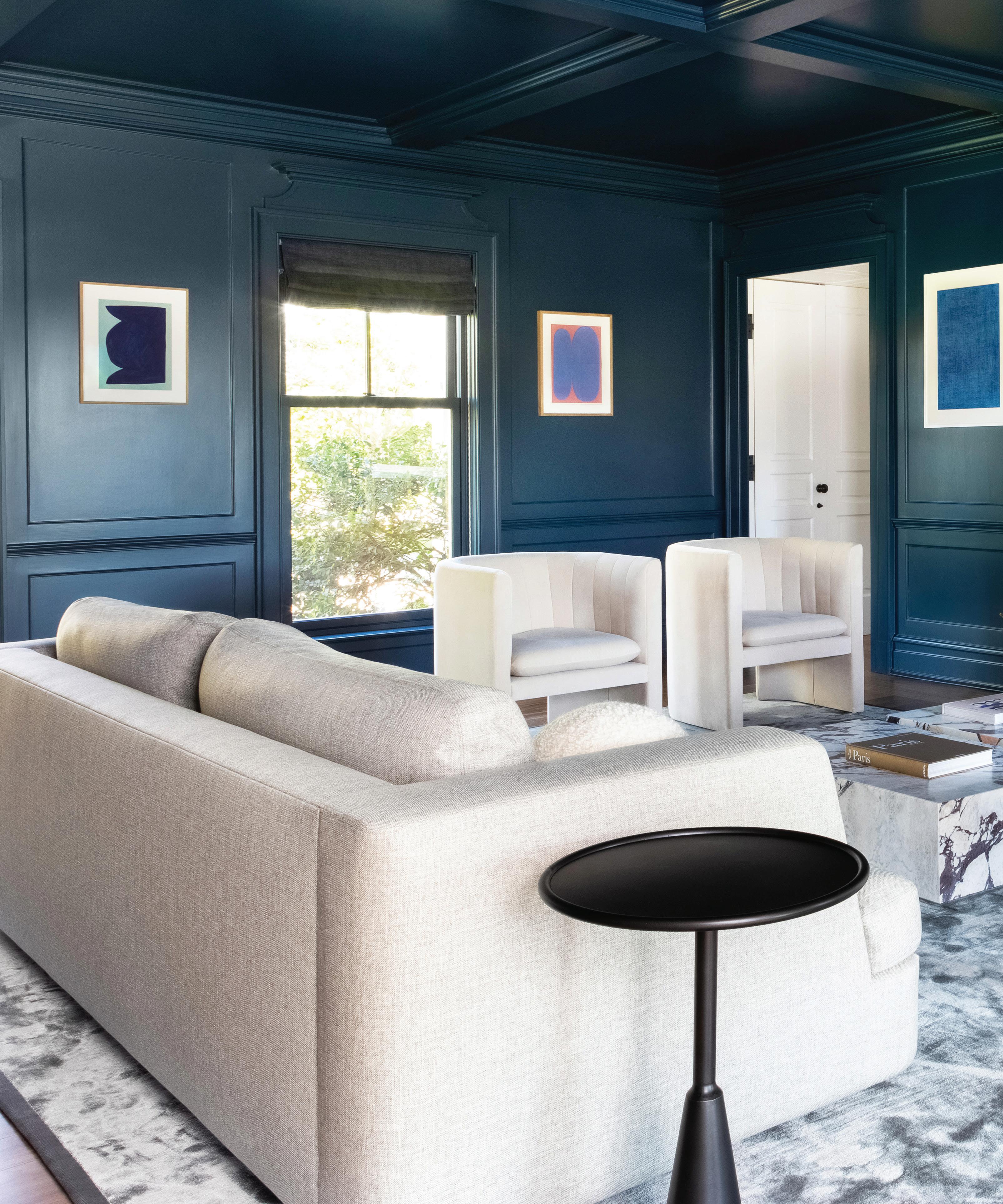
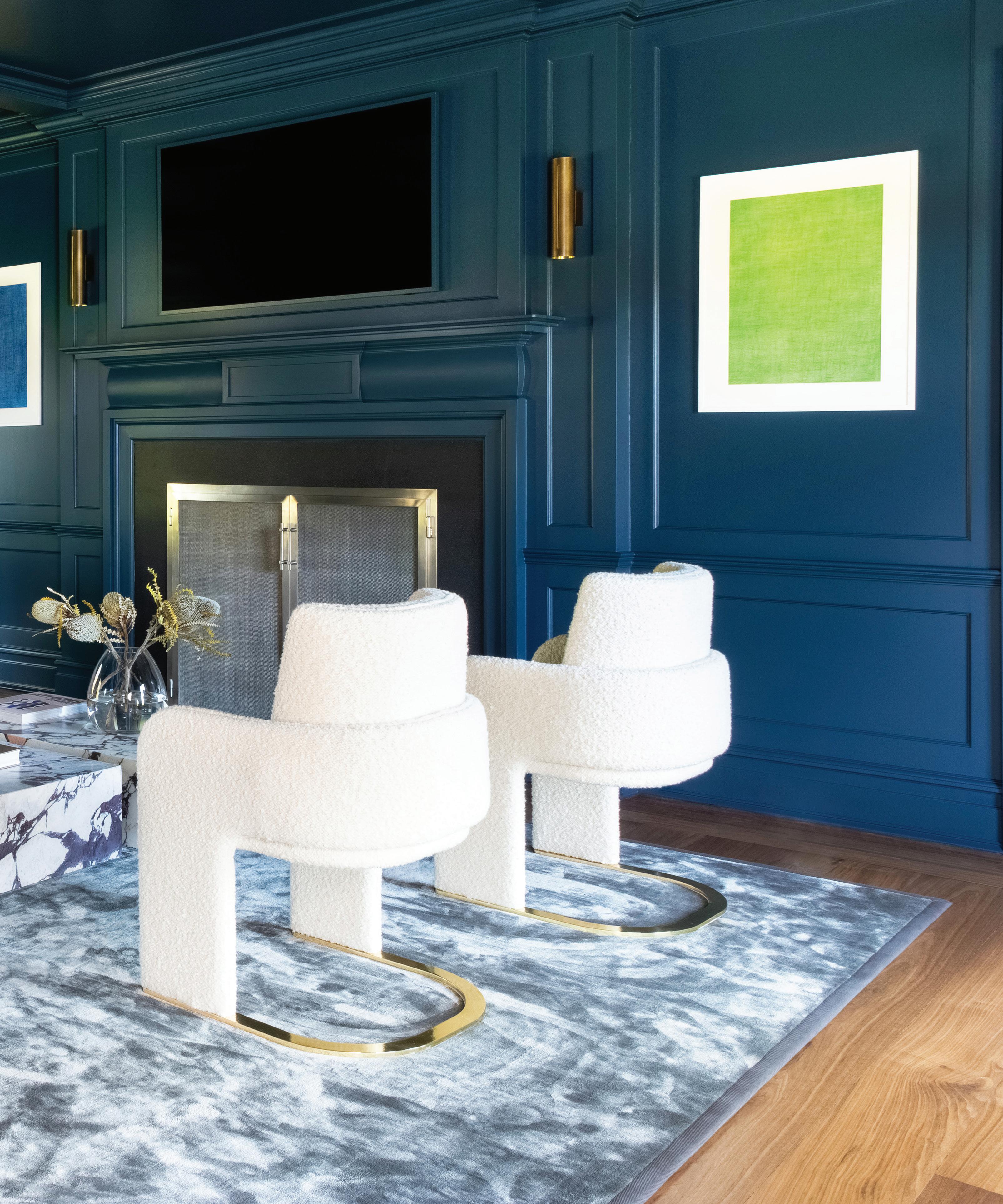
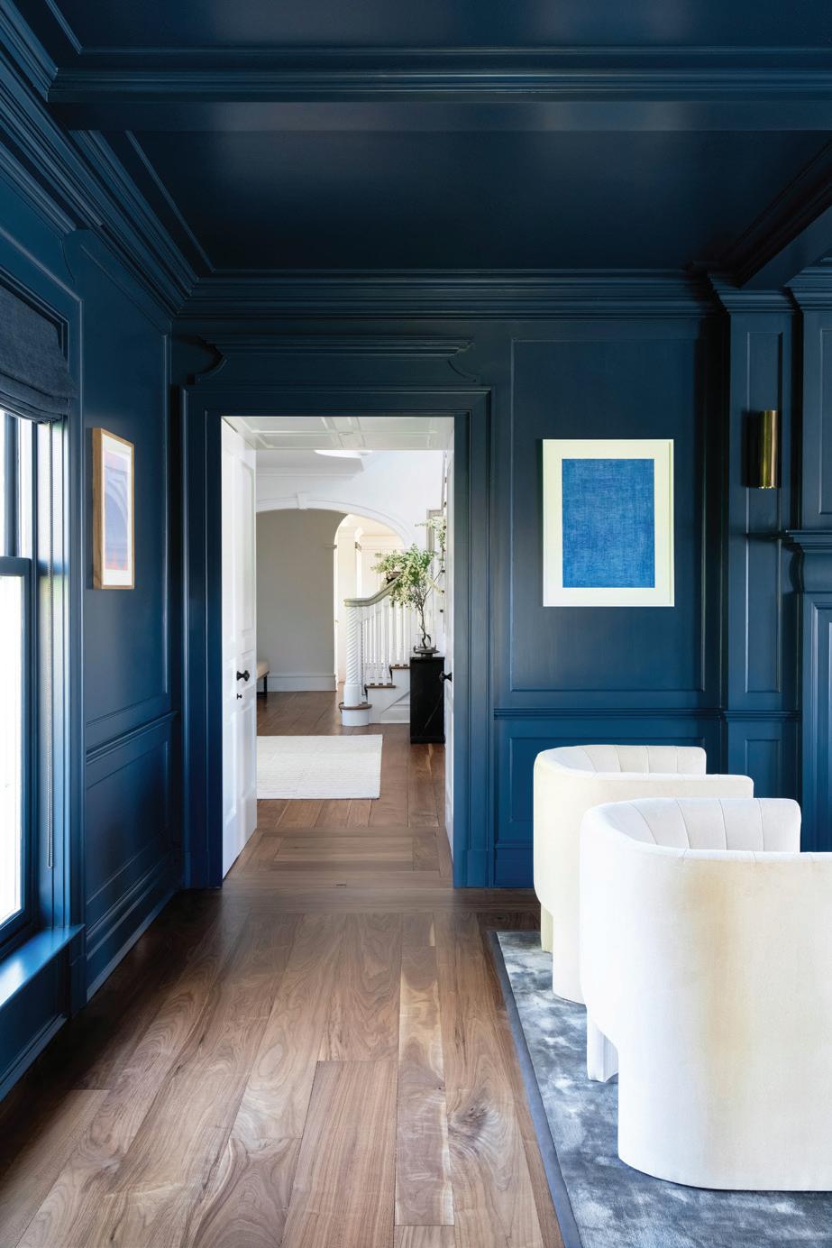
The client was very open to color. Our clients are typically open to color in specific rooms—and I kept the palette pretty neutral throughout the home—saving color for the kids rooms and in that living room that’s dark blue. For the living room, we were dealing with several things: We knew that we wanted the space to be moody, but also, all that boiserie that you see on the wall was all mahogany, and it was very heavy and very rich.

athomefc.com 60
above: A view to the entry from the blue living room. left: Neutral seating in the living room includes bouclé and brass chairs by Dooq, a Dmitriy & Co sofa and Loafer lounge chairs by &tradition. Plinth tables in Calacatta Viola marble add sculptural sophistication to the space. opposite page: One of the directives was lightening the dark wood throughout the house. White paint in the home’s foyer sets a calming tone upon entry.
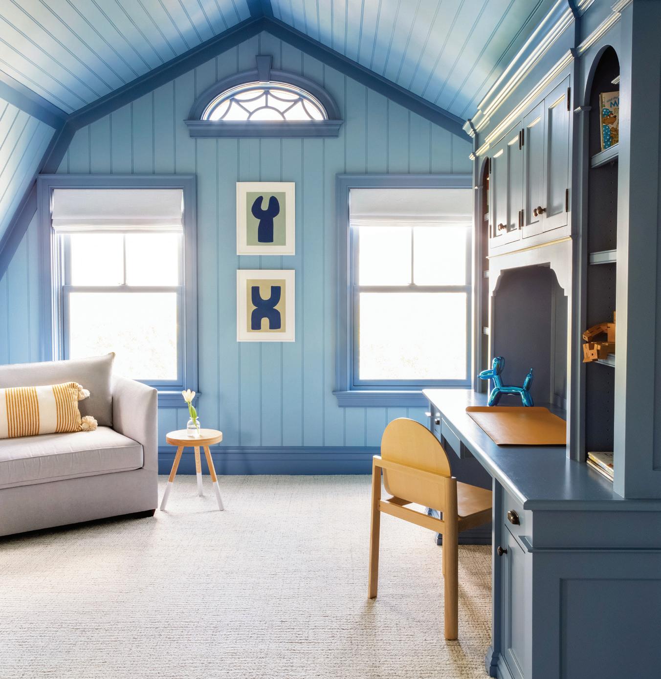
We also had a floor that was originally a very dark walnut, and we lightened it as much as we could. We knew we’d have to tone that wood down, so that’s where that color came in. I still read it as a neutral, weirdly enough. Sometimes those big grays and dark blues can go as neutral as white does. Everyone who comes to us wants color in the kids’ rooms. They gave us what they thought the kids each liked, and we went with it. They weren’t scared of pattern. One of the kids’ rooms has all that beadboard and since we couldn’t do wallpaper, we decided to play with

the different shades of blue to create some pattern within those walls. We wanted to embrace the fact that there’s so many angles in the room, which is so charming. If we had painted it all in the same blue, you wouldn’t have picked up on it.
Tell us about that blue room.
We started with a couple of tones. I was pushing the blue, but we also showed the client a couple options in grays, because we thought it
MAY/JUN 2023 athome 61
“When I do a monochromatic color , I think you have to go big or go home .”
—susana simonpietri, chango & co.
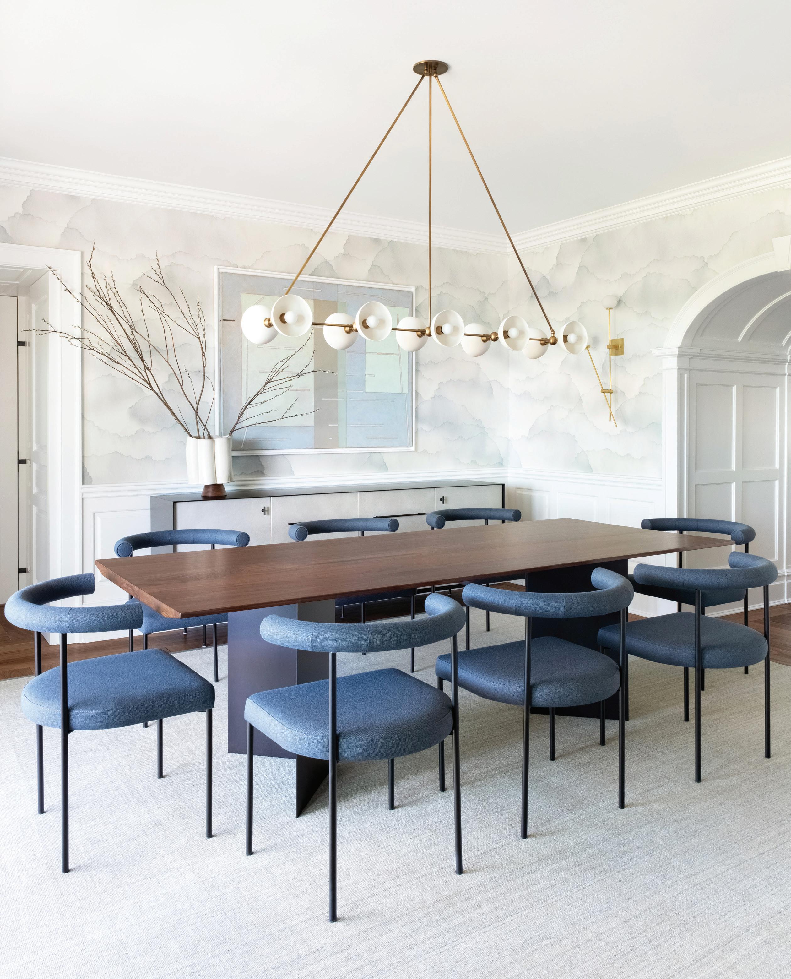
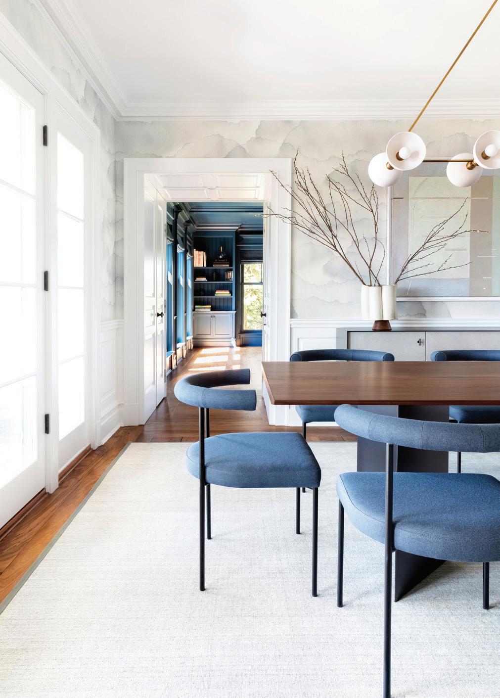
this photo: Wallpaper by Emma Hayes provides a serene backdrop for art over the Croft House buffet. An Apparatus Studio Trapeze pendant illuminates overhead.
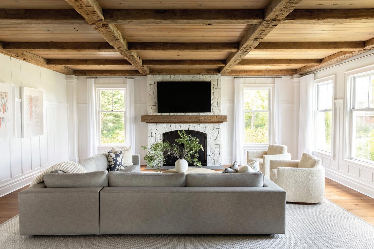

 above: Kashmir chairs by Resident are covered in a blue Maharam fabric that complements the living room paint. right: In the family room, a Restoration Hardware sectional provides ample seating.
this photo: The Pilar coffee table by INDO- features fluted hardwood with an ombré blue effect.
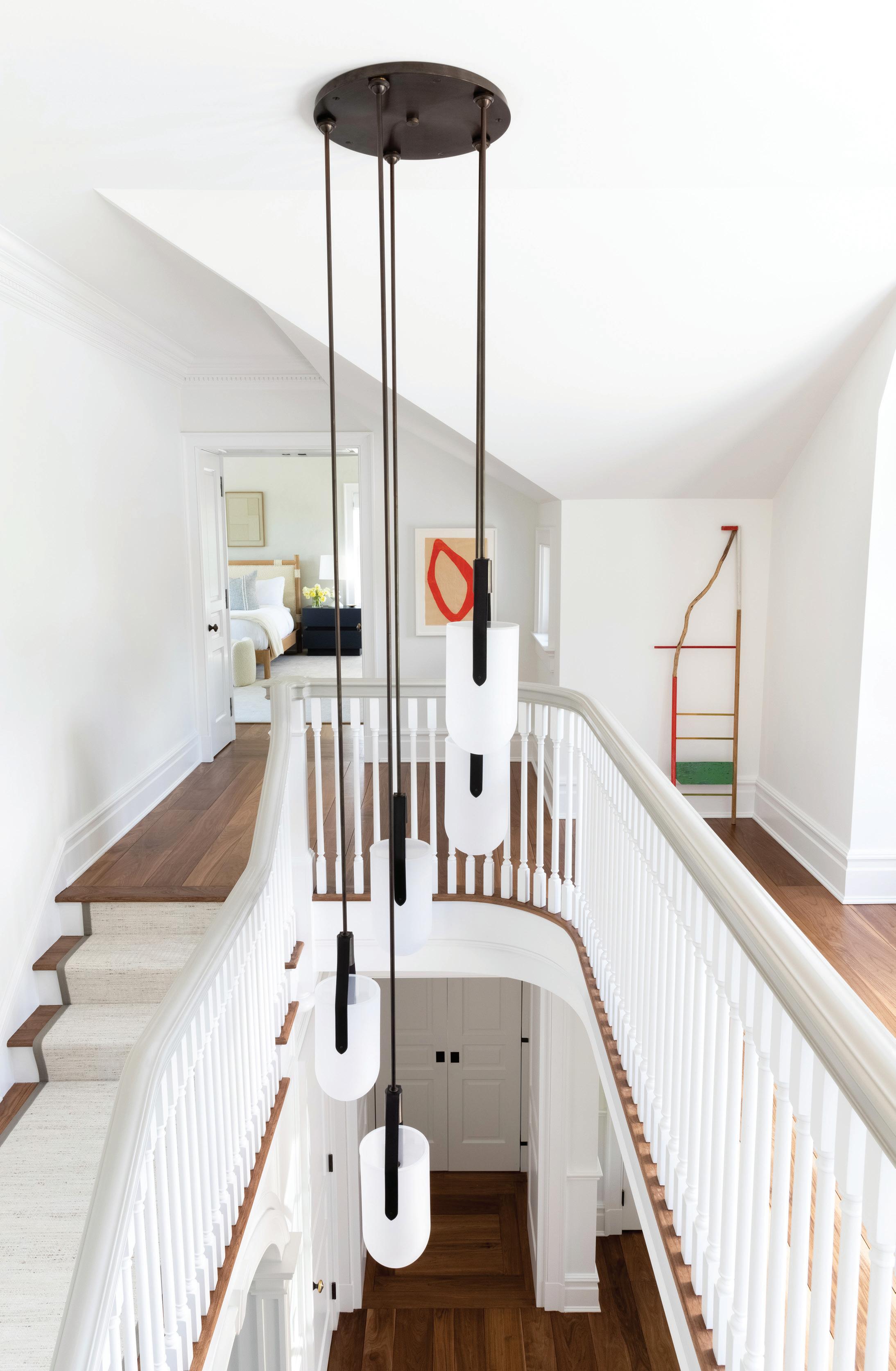 this photo: A modern hanging chandelier adds a graphic statement to the stairwell.
“I think color has such an influence on our well-being and our mood. color is able to evoke so many feelings in us and really transport and bring us to memories.
—susana simonpietri, chango & co.
would be easier to digest. This blue is a very easy blue in that it changes a lot during the day. I definitely wanted to paint everything. Usually when I do a monochromatic color, I think you have to go big or go home. Similar to what happens when you wallpaper a room, I try to convince people to cover everything in the room, except for the ceiling. I didn’t want to interrupt this color. I wanted it to be a full immersive experience.
So many of your projects—here in Connecticut and out in the Hamptons—embrace that concept of coastal living. What does that term mean to you, and how has it evolved since you started designing?
I do think it means something different, depending on what part of the country you’re in. Each town has its own season. I come from Puerto Rico, and I grew up on the beach. I used to surf for ten years. I have always been coastal, it’s part of how I look at the world. These projects that take me close to the water are some of my favorite ones. In general, some of the influences of being Puerto Rican inform the design decisions for my coastal projects. I tend to go with a lot of linen; I reference in my head the way that we dress in the Caribbean, breezy and soft. When I think of Connecticut, I think of a more buttoned-up version of that; less-wrinkled, more pressed. But there’s so much beauty here.
MAY/JUN 2023 athome 65
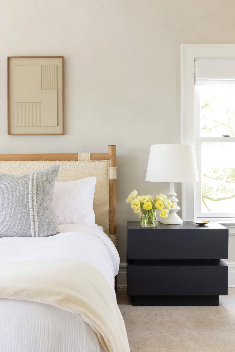
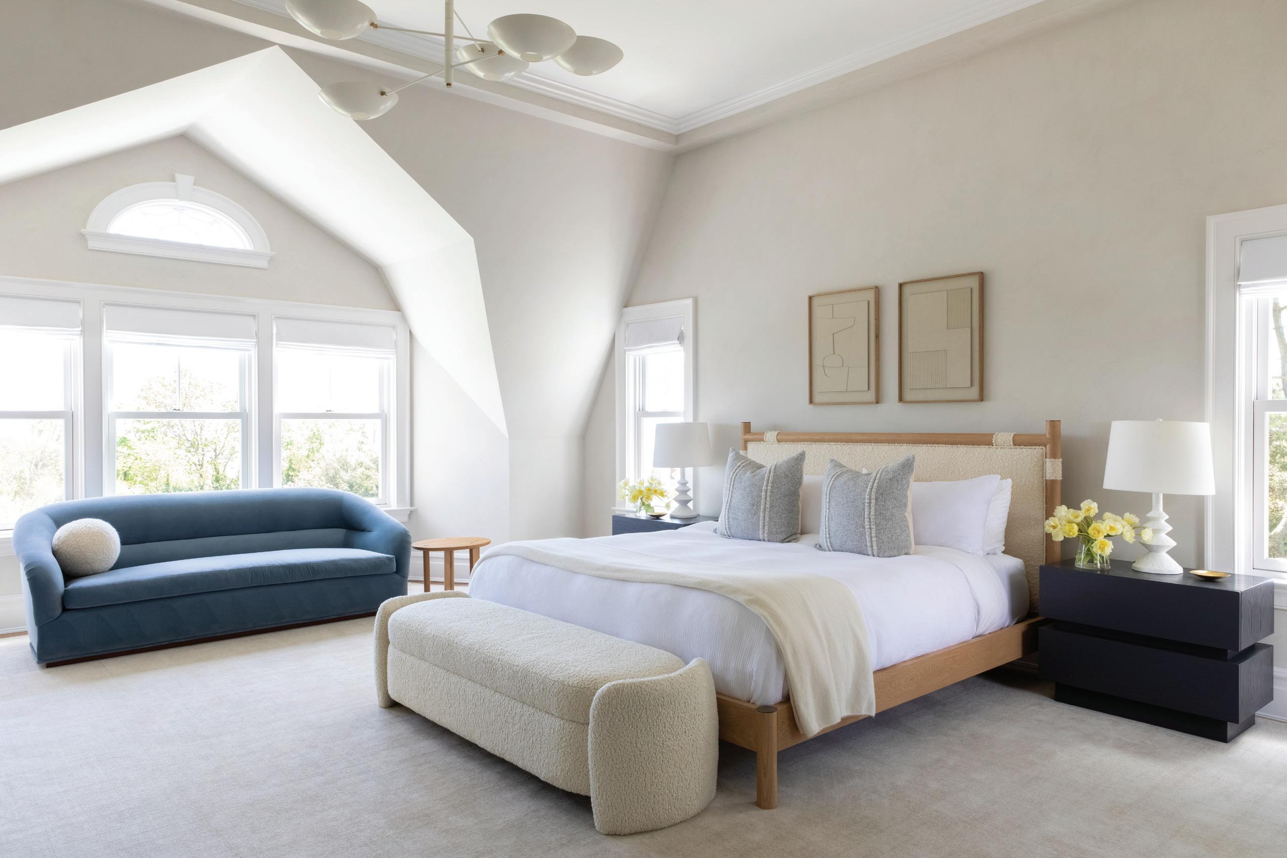
this photo: The primary bedroom is a calm refuge, with layered neutrals and a muted blue sofa. below: The designer sourced the nightstands and bed from Lawson-Fenning.
Tell me about the art. Was that something that you decided on together?
For a lot of our projects, we do all the art curation. I have an art background in my family; my parents are serious art collectors, my mother was the Chancellor Dean of Art at the University of Puerto Rico, and she’s also an art writer, so I grew up around that world. I really enjoy sourcing all the collections for clients. Everything in this home, I handpicked.
As you touched on, people love your children’s spaces. How do you balance an elevated design with the kids’ rooms, which are full of color and pattern?

I don’t love children’s rooms that are super “kiddy” or condescending towards children. I think most children that I’ve met are so deeply intelligent and actually very deep and weird and cool, and when I’m designing for them, I’m embracing their cool personalities and not trying to create a caricature that belongs to a kid because they like certain things. I think our rooms tend to read as more sophisticated for the children,
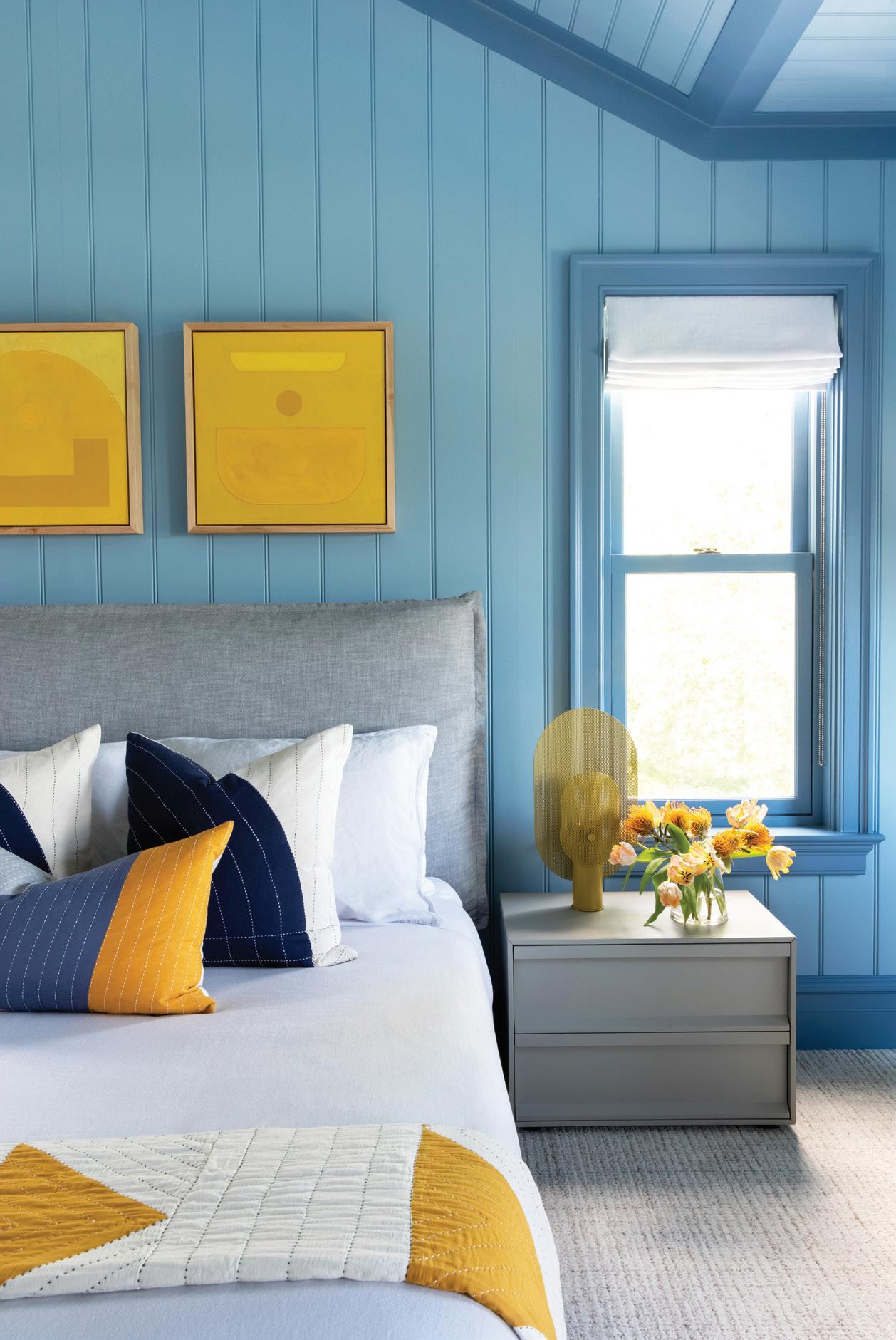
below: Shades of blue and orange play well in this bedroom, with wallpaper by Zak + Fox, upholstered bed by Restoration Hardware and nightstand by Room & Board. right above: Romo’s contemporary check fabric was chosen for the drapery. right below: Smart storage and a sofa with playful pillows complete this sweet girl’s room.


MAY/JUN 2023 athome 67
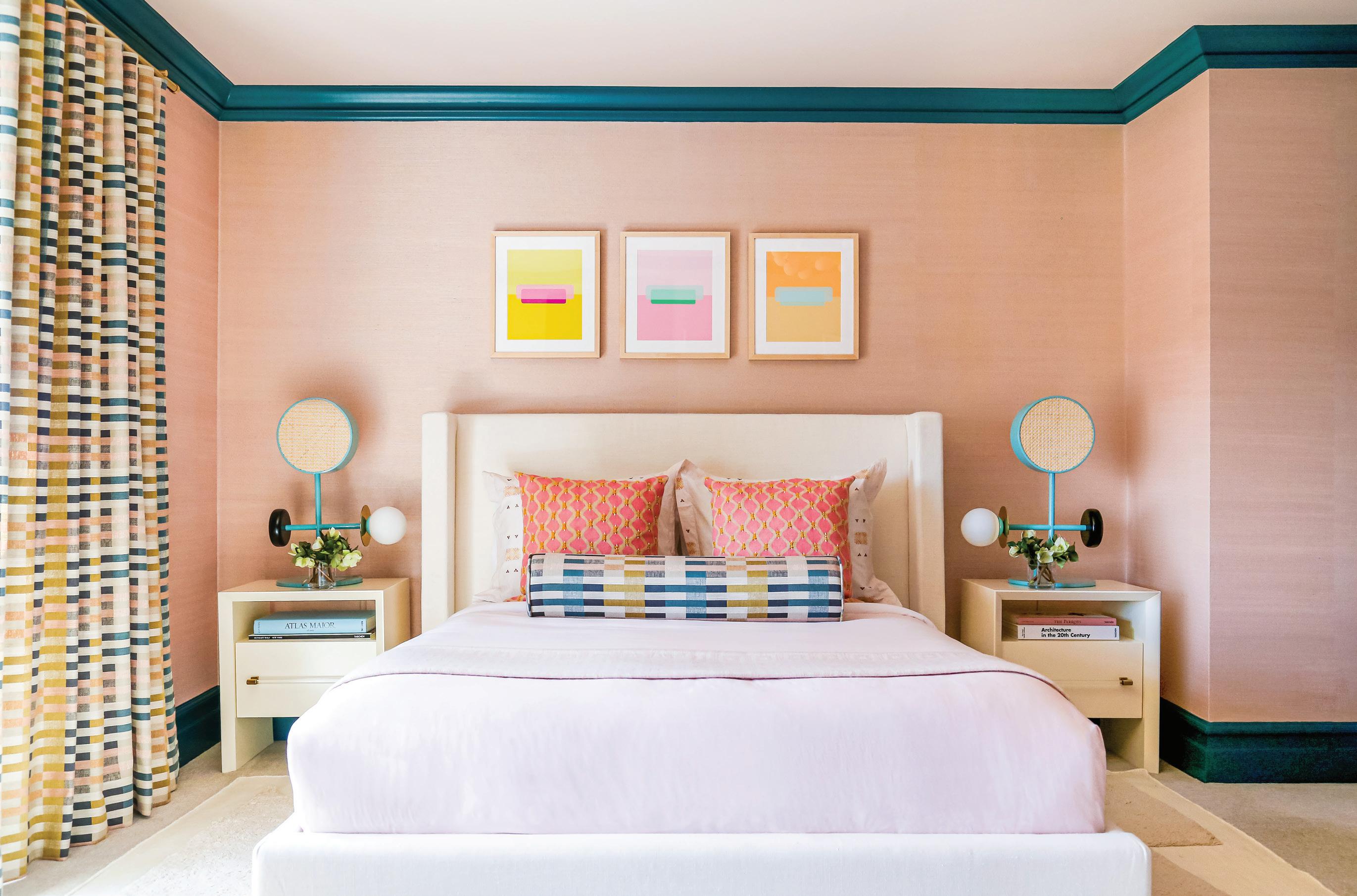
above: Grasscloth in a melon shade from Phillip Jeffries is framed with the room’s deep teal trim. A pair of nighstands from Anthropologie hold Art Deco-inspired lamps made with brass, wood, and rattan. A trio of pop prints in sorbet shades from ArtStar hang over the bed.
“I think most children that I’ve met are so deeply intelligent and actually very deep and weird and cool , and when I’m designing for them, i’m embracing their cool personalities .”
—susana simonpietri, chango & co.
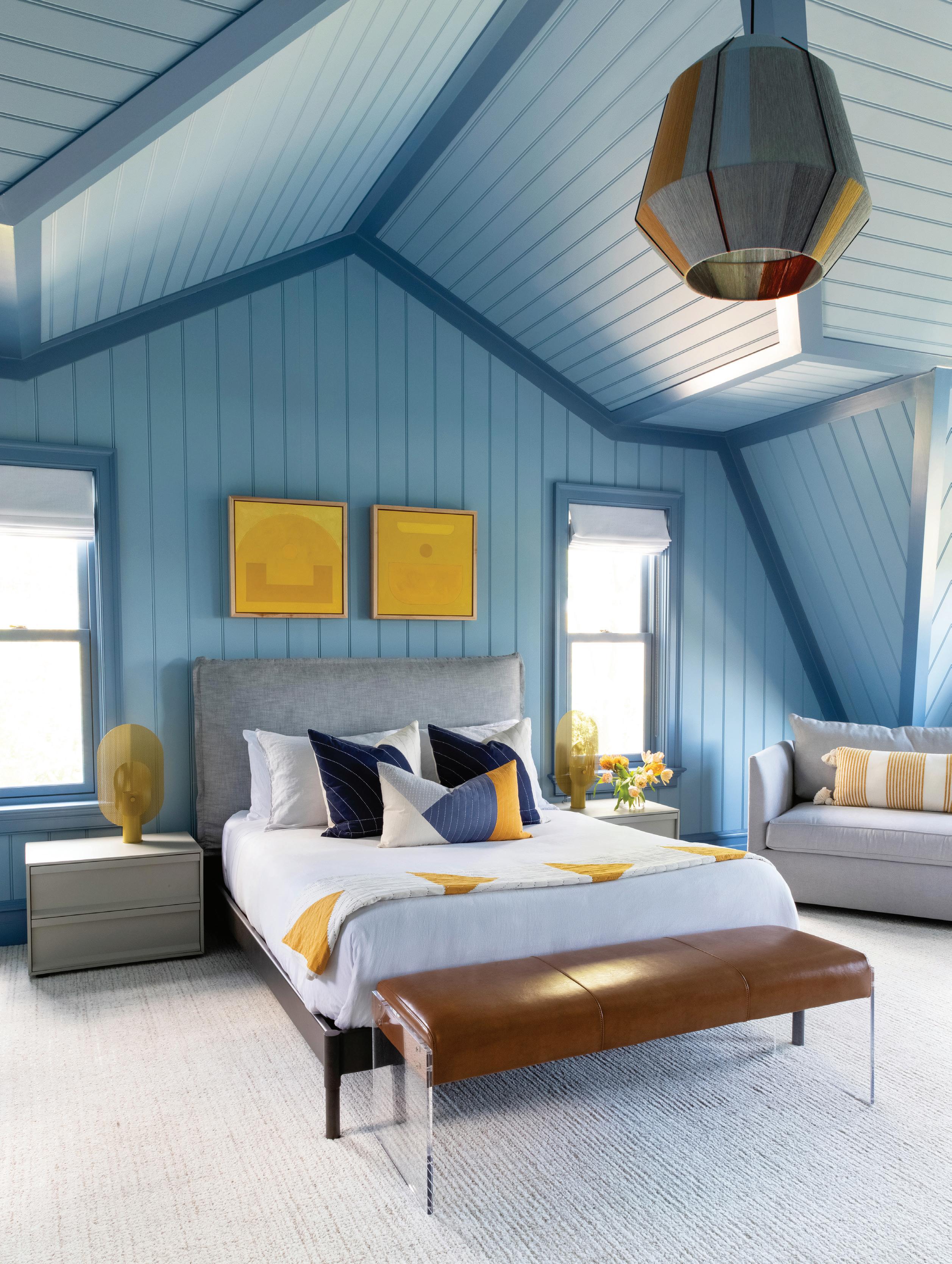 this photo: Wallpaper was not an option on this room’s paneled walls. Instead, Simonpietri embraced the angles and added contrasting blue shades on the beadboard and trim.
because I want to make sure they can grow up with them. Kids’ rooms are always going to be somewhat transient, but you’re embracing it and designing for the joy of the age. You also want to make sure that they’re not going to be bored with it, and that it speaks to their personality; that it encourages them to grow and explore.
Why is color so important to you as a designer?


I love working with color, especially for children’s spaces. I think color has such an influence on our well-being and our mood. Color is able to evoke so many feelings in us and really transport and bring us to memories. I can’t imagine not working with it, and I include white when I think of color, because sometimes we do monochromatic work with white, and that’s still a color that pulls out so much emotion. I have a lot of memories of being a kid and doing design with my mom and watching her in the ‘70s using powder room wallpapers that had big leaf patterns and metallics and navy blue. I could draw those for you right now. They made such an impression on me as a little girl. I think that we get moved and marked by color and visuals more than we give credit.
interview by megan gagnon
Resources:
Interior Design: Chango & Co., New York, chango.com
MAY/JUN 2023 athome 69
left: A Pottery Barn sleeper sofa is perfect for overnight guests. below: Perforated metal screens combine to create the Blu Dot table lamps on either side of the Restoration Hardware bed.


MAY/JUN 2023 athome 71 BUILDING & HOME IMPROVEMENT California Closets, californiaclosets.com 5 Gault Family Companies, gaultstone.com 19 Interstate Lakeland Lumber - Westport+Greenwich Cover 3 James Doyle Design Associates 13 Ring’s End 11 Robert A Cardello Architects LLC, cardelloarchitects.com 7 Tischler und Sohn, tischlerwindows.com Cover 4 Trillium Architects 15 VanderHorn Architects 2, 3 DECORATING & HOME FURNISHINGS Amy Aidinis Hirsch Interior Design, amyhirsch.com Cover 2, 1 Morgan Harrison Home 9 EVENTS A-list Awards, athomealistawards.com 25 Carriage Barn Arts Center 27 New Canaan Nature Center 71 The Glass House 21 MISCELLANEOUS FlowCode 23 insiders’ list Please join us for an afternoon luncheon at The Country Club of New Canaan Thursday, May 11 at 11:00am newcanaannature.org
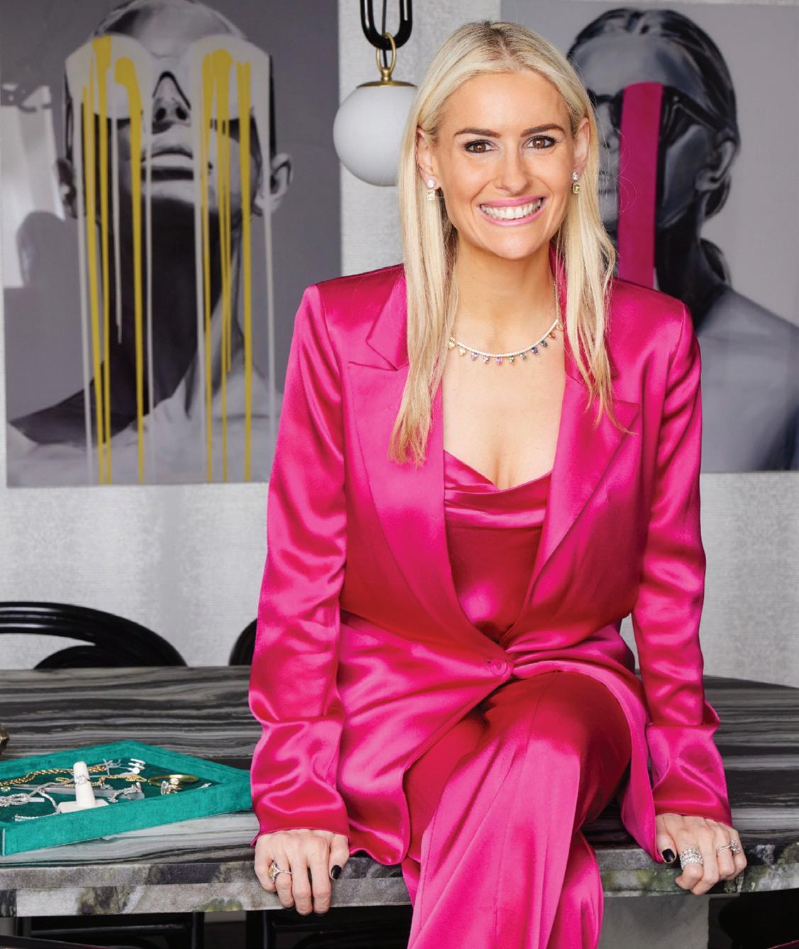
ALI GALGANO
FAMILIAR FACES SHARE THEIR LOCAL FAVORITES
As the face of Serpentine Jewels, founder and designer Ali Galgano often coordinates with the candy-colored bespoke creations that she creates for clients. We paid a visit to her technicolor townhouse and jewelry atelier in Greenwich, where she invites customers to discover that fine jewelry can also be fun.

The one thing that makes me feel at home is … a home-cooked meal by my husband and my kids climbing all over me!
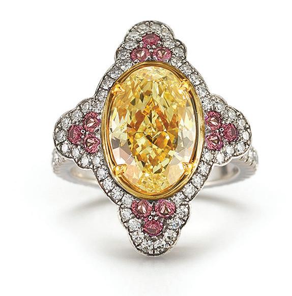
My most prized piece of jewelry is … my engagement ring, designed with a fancy yellow oval diamond accented by pink sapphires—my favorite color combination!

My favorite thing about Connecticut is … that it really has everything: beautiful, natural surroundings, coastline, amazing places to shop and eat, and proximity to NYC.
I can’t live without … my gigantic vintage ‘90s Chanel luggage tote I carry to work every day. It holds anything and everything!

above: Upgrade your own ring with a custom multicolor jacket.

Bold colors are more fun because … color instantly elevates any visual experience, enhances mood, and gives everything more dimension. The use of colored stones in many of our jewelry designs is a Serpentine signature.


I’m currently inspired by … 1920s-era jewelry design. We have studied thousands of Art Deco designs to inspire our bespoke creations for our clients, like a set of diamond spiral earring jackets we just made that transform a client’s everyday diamond studs into a glam evening earring.
My latest local obsession is … The Collective in Stamford. It’s an impeccably curated collection of vintage and modern furniture, accessories and lighting. We got a few pieces for the Serpentine Townhouse there, including a glittery French Neoclassical Globe Chandelier that looks like it’s encrusted with diamonds. Their selection is always on point, no need to dig to find treasures!
At the moment, my favorite Serpentine Jewels are … our transformer pieces, often engineered to upgrade an engagement ring, as well as any pair of everyday diamond studs. Our finished products are a representation of the immaculate craftsmanship NYC artisans have to offer and high fashion design.
serpentinejewels.com
@serpentine_jewels
left: Modern finds are layered with vintage pieces at The Collective in Stamford.


athomefc.com 72 PHOTOS: GALGANO
D’AGOSTINO; TOWNHOUSE BY ANDREA CARSON; THE COLLECTIVE BY GARVIN
ALL OTHER IMAGES COURTESY OF SERPENTINE JEWELS
BY JULIA
BURKE;
above: Galgano teamed up with Danielle Richter Interior Design to outfit Serpentine Townhouse. right: A combination of her two favorite colors, Galgano’s engagement ring is a showstopper.
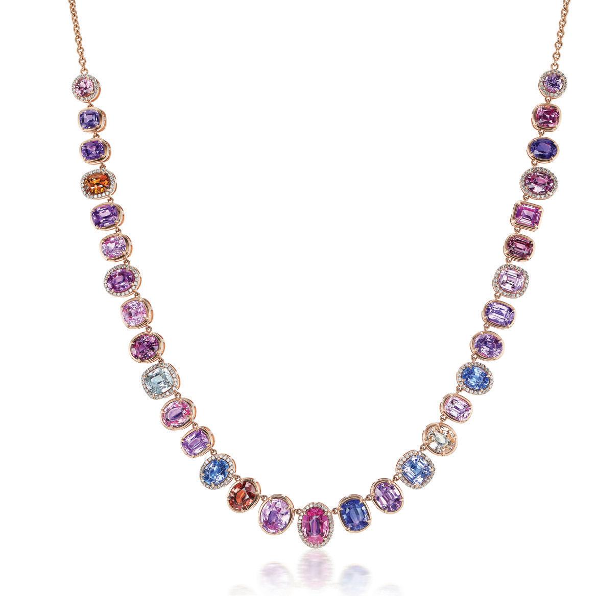
left: A mix of sapphire shades and shapes make a sparkling statement.


Tischler WindoWs and doors. Uncommon. Uncompromising. Tischler und s ohn (U sa ) l td. s ix s uburban avenue, s tamford, c T 06901 Telephone 203/674/0600 Architect: Shope r eno Wh A rton A SS oci A te S p hotogr A phy: r obert b en S on p hotogr A phy


 by megan gagnon


 this photo: Quadrille Bali Hai wallpaper wraps the entry, where a Coleen and Company lantern hangs over a Thibaut table. A peek into the lliving room reveals more bold pattern and color choices.

 interview with sara haydock & zan young, elliott interiors
portrait by andrew baris // interiors by jane beiles
above: Sisters, Sara Haydock and Zan Young of Elliott Interiors


 interview with lisa hilderbrand, hilderbrand interiors // photographer john bessler
left: Hilderbrand added color to the family room with abstract art over the custom sofa. Float (left) and Boat of Sea Foam Green (right) by Michael Rich were acquired from ARC Fine Art LLC in Fairfield.

 above: Layered neutral pieces ground the space, while fixtures from The Urban Electric Co. (wall sconces and ceiling pendant) provide handsome lighting sources. below: An antique 19th-century chest is topped with a Christopher Spitzmiller lamp and framed by drapery in Chablis Bay Blue by Rose Tarlow.


 above left: Hilderbrand opted for two Farrow & Ball colors in the study: Hague Blue on the walls and Babouche for the bar interior. A vintage mirrored coffee table sits in front of a custom sofa. above right: Black Tulips and Vase by Donald Sultan was sourced from Heather Gaudio Fine Art. below left: Custom leather doors were created for this room, along with the fireplace screen, crafted from steel, bronze, and brass.


 this photo: A Regency giltwood mirror, c. 1810, reflects a vintage Italian brass and glass chandelier. The custom rosewood and zebrawood table is surrounded by Artistic Frame chairs dressed in Holland & Sherry leather and Zimmer + Rohde fabric. above left: An antique Italian walnut sideboard was given a coat of aubergine lacquer. Tortoiseshell glass lamps are vintage. below left: The table is set with Swedish brass candlesticks and a Fortuny bowl.


 left: A sleek entertaining setup includes a bar surrounded with brass and black leather CB2 stools and rustic steel mesh lights overhead.


 this photo: Hirsch proves that stylish design can stand up to beach house living. A Jonathan Adler Marcello lounge chair upholstered in Sunbrella fabric pulls indigo tones from the ocean’s depths. Pipe flush mount fixtures from The Urban Electric Co. in verdigris include custom turquoise contrast paint.
 interview with amy aidinis hirsch, amy aidinis hirsch interior design // photographer amy vischio

 above: A Dutch door allows for Bay breezes to blow through the living room. The inviting Verellen sofa has a thin mattress cushion detail, upholstered in Perrenials fabric. A turquoise Missoni carpet is made of nylon and holds up to sandy feet. below: The view from the kitchen—past the dining table and into the living room—reveal the home’s pops of blue. Tribute modern dining chairs by Craft Associates show off walnut frames and are inspired by Sylvie Stenquist. opposite page: Jamie Harris’ 13 Globe Circle and Lines ceiling fixture includes aqua alabaster globes and was customized for this space.


 this photo: The deep teal side table shares its jewel tone with the walls and windows. left: Katie Ridder wallpaper includes a flower pattern in coordinating colors.
this photo: Molo’s Cloud Softlight hangs overhead in the pool house’s guest quarters. Walls are painted in Canyonlands by Benjamin Moore. right: Eskayel Hive fabric dresses up the pink windows. A custom light fixture by Bone Simple adds texture with its dipdyed drum shade.


 above: Kashmir chairs by Resident are covered in a blue Maharam fabric that complements the living room paint. right: In the family room, a Restoration Hardware sectional provides ample seating.
this photo: The Pilar coffee table by INDO- features fluted hardwood with an ombré blue effect.
 this photo: A modern hanging chandelier adds a graphic statement to the stairwell.


 this photo: Wallpaper was not an option on this room’s paneled walls. Instead, Simonpietri embraced the angles and added contrasting blue shades on the beadboard and trim.
