the pr e m ie r e iss ue
TM
N ov e m b e r / D e c e m b e r 201 1 vo lu m e 1 , i ss u e 1
exc lu siv ely for t he luxury tra de pr ofessional
design innovations / 032
Betty Duff’s interior design for NBA all-stars glass construction / 079
Federal meets modern in historic Georgetown van dam custom boats / 098
Handcrafted custom boats for the seafaring elite albert, righter & tittmann architects / 105
A grown-up camp retreat on Martha’s Vineyard
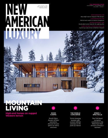
mountain LIVING High-end homes on rugged Western terrain
40
67
100
good karma
THE MOBILE CONCIERGE
SPEED + SPECTACLE
Henrik Fisker, founder of Fisker Automotive, discusses his sexy sports car with a conscience
Vertu’s stunning handsets offer exclusive lifestyle assistance at the push of a button
New York-based Asymptote Architecture’s Abu Dhabi hotel built around a Formula 1 racetrack
C H A R L E S E D WA R D S
速
London + 44 20 7736 8490 www.charLesedwards.com
0 0 3 / E D I TOR ’ S N O T E
W H AT IS LUXURY ? Luxury is a fascinating concept, as fluid as it is steadfast. Tastes are always changing, trends evolving, and new products come on the market every day. Perhaps the best way to define luxury is to put it on display—to bring every corner of the luxury marketplace together to share ideas and inspire new visions. We are proud to introduce you to New American Luxury, the newest go-to resource for high-level professionals in the luxury marketplace. We strive to bring you, our readers, the most comprehensive and informative view of the luxury market as America embraces luxury in new, accessible ways. Luxury brands are thriving in this uniquely auspicious time, and the professionals driving these ventures are as ambitious as they are confident in the market’s strength. New American Luxury is a place for designs, products, destinations, marketing initiatives, and expert advice by and for luxury professionals. From designers and architects to consultants and managers, a wide range of luxury executives meet here to find resources for every business venture. We define luxury by example.
Photo: Samantha Hunter
On behalf of the entire New American Luxury team, I truly hope you draw inspiration from our pages. Enjoy.
Molly Soat, Features Editor
TM
Editorial
Art
Research
Office
Advertising
Administrative
EDITOR-IN-CHIEF
CREATIVE DIRECTOR
CONTROLLER
Karin Bolliger
Titus Dawson
Andrea DeMarte
FEATURES EDITOR
DESIGNER
205 N. Michigan Ave., Suite 3200 Chicago, IL 60601
DIRECTOR OF SALES
Christopher Howe
DIRECTOR OF STRATEGIC PARTNERSHIPS
Molly Soat
Aaron G. Lewis
molly@guerrerohowe.com COPY EDITOR
Cole Stevens cole@guerrerohowe.com Publishing CORRESPONDENTS GUERRERO HOWE, LLC
Pedro Guerrero, President Christopher Howe, CEO & Publisher
guerrerohowe.com
Iya Bakare, Zach Baliva, Laura M. Browning, Thalia A-M Bruehl, Ruth E. Dávila, Tricia Despres, Anne Dullaghan, Annie Fischer, Scott Heskes, Frederick Jerant, Kathy Kidwell, Keith Loria, Kelli McElhinny, Finn Mostow, Trenna Nees, Kelly O’Brien, Eugenia M. Orr, Anita R. Paul, Leslie Price, Suchi Rudra, Lisa Ryan, Julie Schaeffer, Kaleena Thompson, Brigitte Yuille, John D. Ziza
PHOTO EDITOR
Sheila Barabad
George Bozonelos george@guerrerohowe.com EDITORIAL RESEARCH MANAGER
Anthony D’Amico Carolyn Marx EDITORIAL RESEARCH COORDINATOR
Adam Castillo EDITORIAL RESEARCHERS
Liz Boyd, Eric Crabb, Bronwyn Milliken, Jeff Powell
Subscriptions + Reprints
Printed in South Korea. Reprinting of articles is prohibited without permission of Guerrero Howe, LLC. For reprint information, visit newamericanluxury.com/ reprints. For a free subscription, please visit newamericanluxury. com/sub. New American Luxury is a trademark of Guerrero Howe, LLC.
N e wA m e r i c an L u x u r y. c o m / N OV E M B E R + D E C E M B E R 2 0 1 1
titus@guerrerohowe.com
ACCOUNTING ASSISTANT
SALES MANAGERS
Mokena Trigueros
Stacy Kraft Krista Lane Williams
HUMAN RESOURCES GENERALIST
SALES REPRESENTATIVES
Greg Waechter
James R. Ainscough, Toney Dimos, Colin Ducharme, Chris Harris, Michelle Harris, Kurt Hofer, Justin Joseph, Rebekah Mayer, Joe Virgil, Brendan Wittry DIRECTOR OF ACCOUNT MANAGEMENT
Cheyenne Eiswald ACCOUNT MANAGERS
Lindsay Craig, Amy Lara, William Winter, Ashley Zorrilla
EXECUTIVE ASSISTANTS
Katie Brooke Lazaroff Nancy McDonald CIRCULATION MANAGER
Lee Posey POST PRODUCTION DISTRIBUTION MANAGER
Megan Hamlin
0 0 4 / TA B L E O F CO N T E N T S
8
7 6
98
N e w A m e r i c an L u x u r y / N OV E M B E R + D E C E M B E R 2 0 1 1
0 0 5 / TA B L E O F CO N T E N T S
Contents
November/December 2011 Departments
features
006
The Agenda / Winter 2012
Dialogue / Debating “less is more” in a more-is-more world
008
Trend Watch / The beauty of copper
024 025
010
Great Spaces / Inspiring new designs Featuring Joseph Dirand Architecture, Alterstudio, and Ehrlich Architects
014
Tips & Tricks / Selling a luxury property Featuring Marquette Turner Luxury Homes
015
Expansion / Top brands, new frontiers Featuring The Trump Organization and SEVDA
017
Market Watch / Hawaii Featuring Fine Design Hawaii and Kahala Associates
020
style Watch / Italian design in NYC Featuring ORA Studio
124
Expert / Advice from those in the know Featuring Suzanne Lovell Inc.
Thomas Clark Architects DL Design
Sourced / The elements of high-end spaces
026 028 030 032 036 038
Darrell Schmitt Design Associates, Inc. Potter Homes Bertram Architects Design Innovations Karin Hanke, Inc. Novogratz
EcoLuxe / Upscale environmental efforts 040 Fisker Automotive, Inc. 046 Robertson & Landers Architects 048 Robert Hawkins Architects 052 RoblesArq 055 tien limited 058 SPG Architects Dialogue / Gauging the effects of the eco-friendly trend
064 065
Regency Custom Homes Perimeter Architects
Identity / Building and expanding a successful brand
PLUS 003
Editor’s note / What is luxury?
128
Products+Services / Resources
130
Desired / One crave-worthy splurge
067 071 072 074
Vertu The Bookshelf AMB Design, Inc. Mark Timothy Luxury Homes, Inc.
Portfolio / A showcase of opulence
on the cover
The Sugar Bowl Residence by John Maniscalco Architecture is an exemplary mountain home, with exposed columns reflecting the verticality of the pine grove into which it's so perfectly nestled. Read more about this project near Lake Tahoe on page 108.
079 083 086 088 091 096 098 100 105
Glass Construction Nelson Daniels Homes by Pinnacle Guardia Architects TRA Studio Architecture PLLC Bjella Architecture Van Dam Custom Boats Asymptote Architecture Albert, Righter & Tittmann Architects, Inc.
Special Portfolio / Mountain homes
108 112 114 116
John Maniscalco Architecture Go West Development Mathison Custom Builders Manchester Architects
Dialogue / Keeping traditional craft contemporary
122 123
Ballard+Mensua Architecture Capstone Construction
N e wA m e r i c an L u x u r y. c o m / N OV E M B E R + D E C E M B E R 2 0 1 1
006
T H E AG E N DA
THE Agenda Winter 2012
New American Luxury’s picks for this winter’s best and most exclusive events that will inform, educate, and inspire in the coming year.
f
a
a
Art Basel Miami Beach
s
01.10 2012 International Consumer Electronics Show
Miami Beach, Florida; Dec. 1–4, 2011. Art Basel Miami Beach represents a cutting-edge convergence of the world’s most respected artists, collectors, and dealers. Sister event to Switzerland’s 41-year-old Art Basel, the event features over 2,000 artists and 250 leading galleries, with special exhibitions, parties, and crossover events in the Art Deco District. Miami provides a most exquisite setting, drawing international jet-setters with its warm winter climate and top-notch music, film, architecture, and design. q artbaselmiamibeach.com
s 50th Annual Antigua Charter Yacht Show English Harbor, Antigua, British West Indies; Dec. 4–10, 2011. Commemorating its golden anniversary this year, the Antigua Charter Yacht Show is six days of all things boating. The exclusive, industry-only event includes yacht tours for participants to experience the sheer luxury of modern-day boat designs. The sixth day will be anchors up, featuring cruises around the breathtakingly beautiful coastal waters and islands aboard some of the finest charter yachts in the Caribbean. q antiguayachtshow.com
12.01 Art Basel Miami Beach
d International Luxury Travel Market Cannes, France; Dec. 5–8, 2011. Catering to the discriminating luxury travel buyer, the 10th annual International Luxury Travel Market Cannes (ILTM) is one of the top business-to-business events for the global luxury-travel market. Showcasing the world’s most desirable destinations and individually tailored travel experiences, the event is hugely successful in connecting luxury suppliers with high-quality buyers, partly due to its by-invitation-only qualification process. q iltm.net/cannes
12.04 50 th Annual Antigua Charter Yacht Show
N e w A m e r i c an L u x u r y / N OV E M B E R + D E C E M B E R 2 0 1 1
0 07 01.16 imm cologne 2012
12.05 International Luxury Travel Market
g d
01.19 2nd Annual Bahrain International Airshow
h
f
g
h
2012 International Consumer Electronics Show
imm cologne: the international furnishing show
Las Vegas, Nevada; Jan. 10–13, 2012 . For over 40 years, the International Consumer Electronics Show (CES) has hosted previews and announcements of new products from many different consumer technology markets. With more than 300 sessions and 900 expert speakers, the forums cover hot industry trends and topics, with keynote addresses by executives from the world’s largest and most successful technology companies. q cesweb.org
Cologne, Germany; Jan. 16–22, 2012. A well-rounded presentation of international design trends and a platform for some of the industry’s most out-of-the-box thinkers, imm cologne is full of both creative inspiration and solid business opportunity. The show promises to be a highly interesting event for exhibitors and visitors alike, representing a diverse mix of trade professionals, business experts, and architectural luminaries. The week-long event fills all of Cologne with an engaging program of design events throughout the entire city. q imm-cologne.com
2 nd Annual Bahrain International Airshow Sakhir Airbase, Bahrain; Jan. 19–21, 2012 . Celebrating
N e wA m e r i c an L u x u r y. c o m / N OV E M B E R + D E C E M B E R 2 0 1 1
a long, historic association with aviation, Bahrain plays host to this highly luxurious airshow that promises major networking opportunities. Located at the state-of-theart Sakhir Airbase, the 2nd annual Bahrain International Airshow (BIAS) offers corporate hospitality chalets and bespoke facilities, which include direct chalet- and apronfront positioning, on-the-spot aircraft demonstrations, and customer test flights. BIAS’s inaugural event saw 40 exhibitors, 94 aircrafts, visiting delegations from 25 countries, and $1 billion in business deals. q bahraininternationalairshow.com
008
T RE N DWATC H
COPPER TEXTURE
copper shade by Tom Dixon Tom Dixon’s Copper Shade highlights the dynamic and flexible properties of copper. Pure copper is applied as a vacuum-metalized film, only microns thick, on the interior of each polycarbonate globe, creating an enriched and softened light source. The Copper Shade brings a sculptural sophistication to any interior, either alone or grouped as a dramatic chandelier cluster. tomdixon.net
N e w A m e r i c an L u x u r y / N OV E M B E R + D E C E M B E R 2 0 1 1
009
COPPER Bright, dynamic, and unexpected: copper stands out as an eye-catching material this winter from some of the top names in design.
Swell by Ben Blanc Swell is a seamless, hollow copper vessel pierced by a 45-caliber handgun and created by Providence-based designer and artist Ben Blanc. According to Blanc, Swell is “an object formed for its deconstruction in the hope of eliciting new beauty.” Blanc is an adjunct professor at RISD. Dimensions: 12” x 5” x 4” benblanc.com
Karim for ALLOY by Karim Rashid A collaboration between New York-based industrial designer Karim Rashid and Australian metal-tile manufacturer ALLOY, Karim for ALLOY eschews the square for an undulating, organic “cell.” The styles are aptly named flux, infinit (shown), karma, kismet, ninja, kink, and ubiquity. Available in copper, stainless steel, raw steel, brass, and titanium. karimrashid.com, alloydesign.com.au
CUPRETAM POUR LA TABLE by Mauviel This is not an ordinary fondue set. Created by French-heritage brand Mauviel, the foremost manufacturer of professional copper cookware in the world, the Cupretam Pour La Table has a 1.2 mm- to 2 mm-thick copper exterior and is lined with a tin-wash interior that creates the ultimate cooking surface. A timeless product, Cupretam Pour La Table embodies the traditional process and professionalism utilized by Mauviel. mauvielusa.com
N e wA m e r i c an L u x u r y. c o m / N OV E M B E R + D E C E M B E R 2 0 1 1
G RE AT S PACE S
010
Hotel Habita Monterrey, Nuevo León, Mexico
Three years ago, Carlos Couturier and Moises Micha, owners of the luxury hotel collection Grupo Habita, approached Paris-based architect Joseph Dirand about designing a project that would blur the lines between sophistication, simplicity, and sensuality in Monterrey, Mexico. Passing through a sculptural, gray-concrete box clad in Indian-mirror mosaic, visitors arrive in the lobby that features furniture produced by fashion designer Rick Owens. Dirand painted guest-room floors white and stained all wood furniture black. “I thought that for this very colorful country, the hotel was a great opportunity to experiment with a new sensation. I used black and white to do this and to create a rhythm in the architecture in a very picturesque way,” Dirand states.
Mexico’s French Twist
Joseph Dirand used an eclectic mix of contemporary and vintage styles with a Parisian touch at the Hotel Habita Monterrey.
Dirand’s vision has been recognized with such awards as the Wallpaper Design Award’s “Best Hotel 2010” and Architectural Digest’s “Icons of Design” award. Written by Thalia A-M Bruehl N e w A m e r i c an L u x u r y / N OV E M B E R + D E C E M B E R 2 0 1 1
011
Interior Designer
Joseph Dirand Architecture 4, Cour Saint Pierre 75017 Paris, France +33 1 44 69 04 80 josephdirand.com Architect
Landa Arquitectos Rio Orinoco 411, Col. del Valle, San Pedro Garza Garc铆a 66220 Nuevo Le贸n, Mexico +52 81 835646 landaarquitectos.com Client
Grupo Habita hotelhabitamty.com Completed
2008 graphic design
Cadena+Asociados cadena-asociados.com photography
Adrien Dirand adriendirand.com
N e wA m e r i c an L u x u r y. c o m / N OV E M B E R + D E C E M B E R 2 0 1 1
G RE AT S PACE S
012
Avenue G House Austin, TX
The Avenue G House is both a substantial second-story addition and a renovation of a former 1950s duplex in Austin’s Hyde Park national historic district. Particularly unusual is the openness throughout the depth of the house. This double-height space invites light deep into the center of the house. Delicate steel stairs, subtly contained by glass rails, ascend to a loft/ family room and the private realm of the house beyond. Throughout the space, ungraded ipê floors add a sense of warmth.
DESIGN PRACTICE
Alterstudio 1403 Rio Grande Austin, TX 78701 512 499 8007 alterstudio.net design Team
Kevin Alter, Ernesto Cragnolino, Matt Slusarek, Mariana Moncada Contractor
Melde Specialty Construction Inc. meldespecialty.com
Written by Leslie Price
CONSTRUCTION
September 2004–January 2008 PhotographY
Paul Bardagjy Photography bardagjyphoto.com Prune Photography prunephotography.com
N e w A m e r i c an L u x u r y / N OV E M B E R + D E C E M B E R 2 0 1 1
013
G RE AT S PACE S
Carrillo Residence Pacific Palisades, CA
The Carrillo Residence occupies a long, narrow site on the rim of the Santa Monica Canyon with distant views of the Pacific Ocean. The glass living room sits at the far end of the site and divides the outdoor space into two distinct courts, including an informal front court that provides a protected sun-filled play yard that is adjacent to the family zone. The living room and dining room can be completely opened up to this court by a series of oversized pivot doors.
design practice
Ehrlich Architects 10865 Washington Blvd. Culver City, CA 90232 310 838 9700 s-ehrlich.com Design team
Steven Ehrlich, design principal; Takashi Yanai, principal in charge Project Team
Brendan Canning, Jackie Park, Ryan Lobello, Ricardo Moura, Karli Molter, Giovanni Vago
Written by Leslie Price
Builder
Horizon General Contractors horizongeneral.com Structural engineer
William Koh and Associates williamkohassociates.com Lighting Designer
e 2 lighting design 310 374 5316 esquaredlighting.com Kitchen designer
Bulthaup Los Angeles bulthaup.com Photography
Barry Schwartz barryschwartzphotography.com
N e wA m e r i c an L u x u r y. c o m / N OV E M B E R + D E C E M B E R 2 0 1 1
014
T I P S &T RICK S
TOP 10 WAYS TO
SELL A LUXURY PROPERTY
According to the expert agents at Marquette Turner Luxury Homes
1
5
Be accurate and concise when highlighting what makes your property special. Avoid
Know your audience and tailor your marketing to them. Most likely,
frequently overused catch phrases to describe a property. Buyers look at headings skeptically, so be sure to indicate how your property stands out from the crowd and what it actually offers.
2 Bring your property to life. You are not
simply selling four walls: a property represents a lifestyle, so give it some context. This may mean writing about the location, the history, nearby attractions, etc. Help the consumer make an emotional connection to the property, and in doing so you’ll also attract journalists and editors interested in the property’s “story.”
Rid yourself of the mindset that overseas buyers will foolishly pay more. Believing
that international buyers will pay more for a product is fraught with danger. Consumers generally don’t gain their wealth by making poor investment decisions. Overpricing a property with the expectation of hoodwinking an overseas buyer, anticipating their lack of familiarity with your market, will result in a stale property that’s been on the market too long.
4
you have a specific audience in mind when you start the selling process, so hone your marketing accordingly. For instance, the media is very NorthernHemisphere-centric, often dismissing the fact that winter in the north is summer in the south. This can influence the time of year a buyer may be looking for something like a summer vacation home.
6 Get the pricing right from the start. This is one of
A long-term marketing strategy is essential.
Putting a property on a website and expecting a buyer to miraculously find it is akin to finding a needle in a haystack. For example, if your property is in the development stage, then take advantage of people’s curiosity to see its building process and progress.
the most important factors in achieving sales. Overpricing is off-putting and will likely lead to fewer sales, creating a stigma that there’s potentially “something wrong” with your property.
about marquette turner luxury homes Michael Marquette (left) and Simon Turner (right) formed Marquette Turner Luxury Homes in 2007 and are pioneers of marketing luxury properties with the use of social media. Marquette Turner is a multiple-award-winning company and has been featured in Forbes, The New York Times, and various other publications. MarquetteTurner.com showcases luxury real estate for sale throughout the world, including penthouses, villas, mansions, resorts, castles, and islands. The website also features lifestyle articles on design, architecture, travel, food, and business news.
N e w A m e r i c an L u x u r y / N OV E M B E R + D E C E M B E R 2 0 1 1
Trade shows are a marketing and research opportunity. Industry events are an excellent
tool, so long as you don’t expect to sell all your properties by hosting a lavish stand at a single event. They are a great component of a comprehensive sales strategy and come in handy as a research tool to better understand your competition.
8 Keep information accessible and accurate.
It is vital that the laws, rules, and regulations relating to your property are conveyed to the buyer. What is common practice in one country could be alien in another. Consider partnering with lawyers, foreign currencyexchange specialists, and other professionals to help make the transaction easier.
9 10 The Internet can be both a blessing and a curse. On
Incentivize consumers and your broker team. Brokers will be
one hand, it allows a buyer to research and become savvier, but on the other hand, there’s just as much useless, misleading information out there. The key to assisting potential buyers is to provide them with extensive information yourself, giving them the clarity to move forward with a purchase.
far more committed to selling your property if they have seen it first hand. You may offer purchasers incentives such as a guaranteed rental return for a given number of years, refund their travel expenses if their visit results in a sale, provide the property fully furnished at no extra cost, or provide competitive lending rates.
015
EX PA N S IO N
Central america gets its TRUMP CARD company
the trump hotel collection
The Trump Organization 725 Fifth Ave. New York, NY 10022 trump.com
V Trump International Hotel & Tower® Chicago*
new Property
Trump Ocean Club Panama City, Panama architect
Arias Serna Saravia, Architects ariassernasaravia.com.co developer
K Group Developers Commercialization
Espacios Urbanos new Property
Trump International Golf Club Rio Grande, Puerto Rico developer
Empresas Diaz, Inc. Golf-Course Architect
Tom Kite
V Trump International Hotel™ Las Vegas V Trump International Hotel & Tower® New York* V Trump SoHo™ New York V Trump International Hotel™ Waikiki Beach Walk® V Trump International Hotel & Tower Toronto V Trump Ocean Club® International Hotel & Tower Panama V Trump International Golf Club & Residences Puerto Rico *Also includes residences
The Trump Hotel Collection embodies a simple idea—create the finest in luxury living, play, and travel through unprecedented customized services in the most exclusive locations. Partnering with his children Donald Jr., Eric, and Ivanka, Trump turns his sights south with two new standout properties that solidify his company’s place as a leader in luxury development: Trump International Golf Club & Residences Puerto Rico (TIPR), and Trump Ocean Club International Hotel & Tower Panama (TOC). The perfect opportunity to enter Central America remained elusive until the multibillion-dollar Panama Canal expansion sparked an economic boom. Ivanka Trump explains that the good timing and prime location formed an irresistible combination. “Business travelers will appreciate the hotel’s proximity to the financial district, and family travelers will love our private beach club,” Ivanka notes of TOC. Developer Roger Khafif of Newland International Properties Corporation says his team selected the “most exclusive neighborhood in Panama City” for TOC, Latin America’s largest hotel. Just a stretch of ocean until 2003, the area boasts great shopping, top restaurants, and pristine beaches. Khafif partnered with architect Arias Serna Saravia to erect a regal exterior. “We’ve reshaped the skyline with a building that takes the shape of an epic sail overlooking the Pacific Ocean,” he says. TOC’s accommodations offer a modern, multi-functional design sensibility that Ivanka says was inspired by Panama’s tropical locale. “Each guest room and suite features floor-to-ceiling windows and private balconies showcasing extraordinary cityscape and ocean views.” N e wA m e r i c an L u x u r y. c o m / N OV E M B E R + D E C E M B E R 2 0 1 1
Eric Trump has participated in over 70 international developments, with Trump International Golf Club & Residences Puerto Rico (TIPR) as one of his most distinguished. “It’s a phenomenal property,” Eric says. “We have accomplished our ultimate goal by developing the most elite project of its kind in keeping with the world-class standards of the Trump brand.” Eric tapped friend and PGA veteran Tom Kite to design two challenging and complex 18-hole championship golf courses, one of which was named “Best Golf Course of Puerto Rico” by the American Academy of Hospitality Services. The Diaz family (owners of Empresas Diaz, Inc.) had owned and enjoyed the island’s finest parcel, a region known as Coco Beach Resort, for 50 years when the Trumps approached them with the TIPR project. “We knew instantly that it would be a spectacular fit for the Trump brand ... and we were right,” Eric recalls. Because retaining the natural beauty was so important to Jorge Diaz, he and the Trumps focused on implementing sustainable initiatives at every phase of TIPR’s development. “We wanted people to enjoy this land for years to come,” Diaz says. Written by Zach Baliva above
not pictured
The Trump Ocean Club represents an investment of over $400 million in Panama City. The 70-story building spans 2.8 million square feet with 635 luxurious condos and 369 hotel units. The now-iconic sailboatshaped building is a welcome addition to the Panamanian skyline and is helping the area become one of Latin America’s top destinations.
The Trump International Golf Club Puerto Rico is known for its two challenging golf courses designed by PGA veteran Tom Kite. The 7,526-yard Championship Course and the 6,884-yard International Course are recognized among Trump’s best—the International Course was named “Best Golf Course of Puerto Rico” by the American Academy of Hospitality Services.
company
PR Firm
SEVDA London, UK sevda@sevdamutlu.com sevdamutlu.com
Interactive Sponsor Los Angeles, CA 949 209 9645 interactivesponsor.com
founder
representative
Sevda Mutlu (pictured above)
Metin Odemis
distributors
V Numbernine, The Private Space, Yates Buchanan, London V Bloomingdale’s, New York V Los Angeles (planned)
Photo: Kazuhiro Senju
016
EX PA N S IO N
SEVDA Takes on the usa In 2008, SEVDA launched its first line of highend handbags in London, a city known for its cutting-edge fashion. Founded by Turkish-born Sevda Mutlu, the eponymous line was created for the successful, international woman. While she’s been creating handbags overseas for several years, Mutlu has only recently decided to enter the American marketplace. She held her first US trunk show at the Bloomingdale’s flagship store in New York City on Valentine’s Day 2010. She wanted her first trunk show to take place at a high-end location that would best represent the SEVDA product and reach its target demographic. Helping Mutlu create a US branding and marketing presence is Metin Odemis of Los Angelesbased marketing firm Interactive Sponsor. “The question is how do you differentiate the SEVDA brand from other high-end luxury bags?” Odemis asks. “It’s a matter of catering to different tastes, offering a number of choices, and then building a brand by increasing social-media awareness.” “Working with Interactive Sponsor has been a very engaging experience so far,” Mutlu says. “I now have a better appreciation for brand development and that it needs to go hand in hand with my collection and product design.” Written by Anne Dullaghan
N e w A m e r i c an L u x u r y / N OV E M B E R + D E C E M B E R 2 0 1 1
SEVDA Lookbook 2011
Rosie Satchel in Pearl White
017
M A RKE T WATC H
01
Beyond Bamboo Worldly eclecticism characterizes modern Hawaiian design
While the rest of the United States struggled in an economic upheaval, Hawaii’s luxury homeowners were sitting pretty—and so was one of the big island’s top interiordesign firms, Fine Design Interiors, Inc. With a clientele that ranges from young professionals to well-established vacation homeowners, Shirley Wagner, ASID, and her team of three create interiors that complement the natural beauty of Hawaii and still have a style that is fresh and eclectic.
With its stable real-estate market and tourism industry, Hawaii continues to enjoy a rich mix of influences—stylistic, cultural, and otherwise. This diversified feel extends to the interior designs of the archipelago’s most opulent homes, which often look beyond the islands for inspiration. More traditional island looks have given way to the incorporation of fine Asian handicraft, a result of the state’s close proximity to thriving overseas markets. Hawaii has become a hotbed of eclectic design.
COMPANY
Passion for Customization Wagner, a designer for 28 years, has spent her entire career in Hawaii. Fine Design’s clients want to incorporate the beauty of the island with their individual styles, bringing the outdoors in, and weaving a blend of design styles with an understated touch of luxury.
Fine Design Hawaii PO Box 7019 Kamuela, HI 96743 808 885 8992 finedesignhawaii.com
The Fine Design team also includes project designer Diane Bobek, whose passion for color, texture, and unique fabrics is visible in each of her projects. “From the beginning of a
shirley wagner, ASID
diane bobek
Designer, Owner
Designer
N e wA m e r i c an L u x u r y. c o m / N OV E M B E R + D E C E M B E R 2 0 1 1
018
Refresh your home, refresh your life with inspirational, unique and luxurious Southeast Asian furniture and home decor accents from Baik Designs.
02
03
01 Charles Dickey House
rare antiques artful accents exclusive furniture
This historic Honolulu home is known for its distinctive style of Hawaiian architecture, which utilizes pocket-sliding doors, often a feature in resort homes today. Renovation of Charles Dickey’s 1930s, 4,000-squarefoot home took nearly a year and cost approximately $500,000. “It was an honor to work on his home,” Wagner says. “He set the course for Hawaiian architecture, and we still use his rooflines and ventilation.” Photo: Hal Lum 02-03 Naupaka Resort home
This resort residence is among the team’s most unique projects. Located near an alkaline, natural fishpond, the refurbished 7,500-square-foot home features authentic Venetianplastered walls, travertine flooring, mahogany cabinetry, and modern, minimalist furnishings. Photos: Michael Rudd
gentry pacific design center 560 north nimitz highway 808 524 2290 baikdesigns.com
project to the end, we’re creating a vision,” Bobek says. “I love seeing the client’s excitement.” Worldly Hawaiian Style First-time clients often attribute bamboo and Buddhas to island design, but the aesthetic has grown way beyond those preconceptions, fusing traditional elements of the Hawaiianresort lifestyle with both modern and ethnic looks. Wagner and Bobek agree that luxury Hawaiian design is much more contemporary and global than it used to be. In fact, Fine Design has a long-standing relationship with Baik Designs, an Indonesia-based company that imports teak products, oneof-a-kind pieces, fabrics, carvings, and unique furnishings that add a touch of the Pacific to high-end interiors. Wagner says she has built a solid relationship with the family-run company over the past 12 years. “They let us know when they’re planning a trip to Indonesia so we can place orders for unique pieces,” she says. Bobek and Wagner agree that what sets their designs apart is the fusion of the modern and the nostalgic. For example, the firm loves to incorporate classically Hawaiian elements into a room that still seem fresh, not dated. A trademark design element used by the company is the Indonesian-style daybed, or Hawaiian punee. “In each of our designs we try to find a place for one of these. They’re the ultimate in comfort and have an aesthetically pleasing line,” Wagner says. Comfort and aesthetics are the foundations of fine design in Hawaii. Written by Anita R. Paul
N e w A m e r i c an L u x u r y / N OV E M B E R + D E C E M B E R 2 0 1 1
019
Buying & Selling on the Islands Myra Brandt of Kahala Associates gives an insider’s look at the luxury housing market in Hawaii
Myra Brandt
Agent, Owner, and Cofounder
COMPANY
Kahala Associates 4211 Waialae Ave. Honolulu, HI 96816 808 735 7500 kahalaassociates.com
pictured listing
2362 Aha Maka Way Listed at $2,990,000 Sold for $2,800,000 Closed in December 2009
To service Hawaii’s wealthy home-buying clientele, Myra Brandt and her husband Victor founded Kahala Associates, an Oahu-based realestate firm specializing in high-end properties, in 2001. As a member of the Luxury Portfolio, a global network of specialized and branded real-estate firms, Kahala has become the leading high-end real-estate company on the island. New American Luxury spoke with Myra Brandt about the real-estate market in Hawaii, how it endured the housing crisis, and how Kahala helps buyers build long-term wealth through sound real-estate investments.
What distinguishes the Hawaiian luxury real-estate market? It takes longer to sell a luxury home. Homes ranging from $2 million to $3 million have taken as many as 20 months to close. Since it takes longer to sell, more resources are required for the listing. It takes more advertising, and more research is needed to find buyers. How has real estate in Hawaii weathered the global housing storm? The general market in Hawaii is still flat, but over the last year, the sale of homes priced $1 million and over is up from 12 percent to 14 percent. The Hawaiian real-estate market was not affected as drastically as other regional markets in the United States. In 2010, sales transactions increased by 18 percent, but there was only a three-percent increase in sales prices. In 2011, we are seeing an increase in demand and in inventory. Overall, it is healthy and getting healthier. Where do you find luxury buyers for Hawaiian real estate? We target buyers outside of the state. 20 percent of our buyers come from the Luxury Portfolio network. Not only do we target the West Coast, but many new buyers are Canadian and Asian residents. We also employ online marketing
N e wA m e r i c an L u x u r y. c o m / N OV E M B E R + D E C E M B E R 2 0 1 1
M A RKE T WATC H
strategies and co-op advertising activities with other markets. Who is your typical buyer? A typical buyer is a sophisticated investor who not only desires to reside in Hawaii, but is also looking to advance his or her financial portfolio. They are savvy and looking for a bargain in Hawaii. What are the prime areas and properties in Hawaii? Prime properties are anything on the coast or on a golf course. Hawaii also has a vibrant condo, urban-living market fueled by a growing Asian clientele. The Gold Coast has luxury condos that are within walking distance to the beach and sell for $2 million to $3 million. What other trends are you seeing in the Hawaiian real-estate market? The sustainable movement has buyers looking for green materials and energy efficiency. We also have an increasing aging population that is looking for smaller places and single-level homes. Some clients will compromise by living on the outskirts of the central business district of Honolulu, where they are able to get more value for the money. Others will downsize in order to live closer to the ocean. What sets Kahala Associates apart in the Hawaiian marketplace? We are dedicated to informing clients on wealth building and investing. We host educational events that teach people about how to maximize their financial potential. Most recently, we had Robert Kiyosaki, author of Rich Dad, Poor Dad, give a presentation to our clients. We believe that our educational events are a definite benefit of choosing Kahala Associates. Written by Eugenia M. Orr
020
S T Y L E WATC H
l
Giusi Mastro, Italian Architect Turned New Yorker, Breaks Down New York’s Top Italian Design Trends
s
; a
f
h
I like to reinvent spaces and turn visions into realities of volume, color, line, and texture. Growing up in Southern Italy in a family of ceramists, I became aware at an early age of the importance of beautiful surroundings. I established ORA Studio in New York in 2001 as a full-service architecture and design practice. With my training, experience, network of connections, and team, I am able to provide an overall design concept, supervise its meticulous execution, and offer help to the client from the beginning of the project to its successful conclusion. owner
Giusi Mastro design practice
ORA Studio 7 Park Avenue, Suite 144 New York, NY 10016 212 448 9518 orastudiony.com
Photography
Richard Cadan richardcadan.com
In many of my design projects, including the redesign of an apartment at the famed UN Plaza, all the design and architectural elements I used exemplify what makes me an Italian architect/designer. One aspect of the project fully expressed my design philosophy. Using a huge wall as a blank canvas, I transformed an existing dual-sided fireplace into a monumental marble sculpture reflecting the sky above and the river below—a stunning, sleek, contemporary version of the family hearth as the center of the dwelling; its reverse is a seamless transition connecting the kitchen and an informal living room. Through a close collaboration and constant dialogue with the client, an extremely high quality of detail was reached throughout the apartment. This project also displays what I believe are the top Italian trends being used in New York interior design right now, including: N e w A m e r i c an L u x u r y / N OV E M B E R + D E C E M B E R 2 0 1 1
a A flair for the past Italian designers know how to incorporate modern furniture into historical environments. I work best with clients who appreciate modern and contemporary design, or who may be drawn to a European and international aesthetic but appreciate classical elements. s Materials Currently, New York Italian designers are utilizing high-end materials like marble, glass tile (found at Bisazza or NY Stone Manhattan), cutting-edge materials created with new technologies, and highly engineered transformations of old materials. d Ceiling design and lighting Look up and you’ll see that great attention has been paid to shape, color, and material. I created a custom-designed wall unit in addition to a floating ceiling with recessed lighting; it identifies the dining area as the center of the space in the UN Plaza. f Attention to detail Italian designers come from a strong background of cultural heritage, where art and architecture are everywhere, from urban cities to small villages. Our eyes are
0 21
d
g
Giusi Mastro k
used to seeing space as a combination of millions of details working together in harmony.
Come visit us at www.orastudiony.com and get inspired
g Industrial products When designing kitchens, closets, or even doors, Italian designers are opting to use industrial products, including Poliform, Boffi, and Bosca Arredi, versus built-in cabinetry and custom doors.
ORA Studio Inc. | 7 Park Avenue, Suite 144 New York, NY 10016 | 212 448 9518
h Flooring Italian designers are also paying close attention to flooring layout and patterns. High-end materials from Listone Giordano and LV Wood Floors are personal favorites. j Bathrooms These spaces are not only seen as utilitarian, but as more spa-like oases with top-of-the-line bathroom fixtures that not only include extremely appealing layout design but also the most technologically advanced features from Boffi, Agape, Hansgrohe, and Axor. k Color All across the city, there is a strong use of color on walls and ceilings, either as an accent or as an entire space. But for the UN Plaza project, I maintained a neutral palette of white, black, and gray, and an oak floor throughout, while the color in their art collection took center stage.
j
UN Plaza residence
Mastro’s modern yet classic design aesthetic is personified in her UN Plaza project, where an awareness of current trends in Italian-styled New York design finds practical application. Bold lines converge with a luxurious textural palette in both kitchen and bath, whereas the dual marble fireplace lends a sculptural elegance.
l Artwork For the UN Plaza project, my clients had an extensive collection of art in various mediums. Many Italian designers are introducing modern alternatives to traditional art selection that are more sculptural and threedimensional. ; Accessories AND hardware Everyone includes decorative pieces, but it’s important to do so without overwhelming or crowding the space. You want to see the accessories as accents rather than clutter. As told to Lisa Ryan
N e wA m e r i c an L u x u r y. c o m / N OV E M B E R + D E C E M B E R 2 0 1 1
M.A.P.S MID-ATLANTIC PROFESSIONAL SURVEYS Spencer Brickwork is the largest volume residential masonry contracting firm in the St. Louis area. Founded in 1979, Spencer Brickwork has led the industry with dependability, service and award winning projects. Spencer Brickwork runs multiple crews of union trained employees encompassing the whole spectrum of residential masonry from simple mailboxes, to production homes to $750,000.00 plus masonry contracts on 5-10 million dollar dream homes. Spencer Brickwork also does many 3 & 4 story midrise buildings and occasional small commercial work.
www.LANDSURVEYOR.net
DELAWARE MARYLAND VIRGINIA
Spencer Brickwork is a member of the HBA, MCA, MCAA and the MCA/OSHA partnership.
Spencer Brickwork, Inc. 16257 Westwoods Bus. Park St. Louis, MO 63021 P: 636-391-0517 F: 636-391-4071 E: spencerbrickwork@aol.com
P.O. BOX 338 Ridgely, Maryland 21660-0338 Phone (410) 634-2173 Fax (208) 248-9420 info@landsurveyor.net
www.spencerbrickwork.com
www.facebook.com/ MidAtlanticProfessionalSurveys
3 02
D IALO G UE
Mies Van der Rohe
famously said, “Less is more.” how do you apply
that today? THOMAS CLARK, A DC-based architect, and darryl labruyere of DL Design weigh in on the acclaimed modernist’s FAMOUS credo
01
02
Thomas Clark, whose firm was named one of the top 50 residential architecture firms by Southern Living magazine, prefers real craft to plastic replication any day.
Darryl Labruyere sees a clear trend in the building market today: less focus on new construction and more focus on luxury remodels and renovations.
company
comPANY
Thomas Clark Architects 10 N. Calvert St., Suite Ll45 Baltimore, MD 21202 410 539 6830
DL Design 710 South Kirkwood St. Louis, MO 63122 314 822 3620 dldesign.com
N e wA m e r i c an L u x u r y. c o m / N OV E M B E R + D E C E M B E R 2 0 1 1
0 2 4 / D I A L O G UE
01
“With today’s vast array of new building materials, technologies, patterns, shapes, and laminates, ‘less is more’ seems more appropriate than ever.”
ARCH ITEC T THO MAS CL AR K , AS TO LD TO j u lie schaeffer
When Mies van der Rohe said “less is more,” he was arguing for an economy of means, visually and in construction. The adage is still true, but it now has new meanings for luxury homeowners who are building today. “Less” still refers to visual economy of line in an architectural composition, but today it is also an appropriate term to explain owners’ attitudes toward natural resources. That includes consideration of the use of fossil fuels, non-renewable materials, and paintable surfaces; construction waste; grass to mow; patios to clean; and time to lavish on building maintenance. With today’s vast array of new building materials, technologies, patterns, shapes, and laminates, “less is more” seems more appropriate than ever. Today’s luxury-home programs are smaller. Sheer size is no longer the dominant criterion for our clients. “Less” refers to more efficiently sized rooms and fewer single-use spaces. Floor plans are less expansive but more open, less formal and more intensely used. There are fewer steps between the laundry and bedrooms; cabinets with interior fittings are replacing traditional closets. “Less” also means less interest in historic styles and less distinction between one type of cultural heritage and another. Authentic period architecture is so craft dependent, even in the computer age. Unless a client is willing to spend more than $1,000 per square foot, it is simply beyond the budget. Owners who can discern real craft also don’t want to settle for plastic replication. The alternative is to embrace our own age and the marvelous choices we have in today’s materials and technology. More and more owners are achieving luxury by opting for a contemporary appearance over a period look. On luxury homes, we go to great lengths to make sure the house fits the site. This typi-
A BOU T T h o m as Cla r k Clark started his career in Des Moines working for Charles Herbert Associates, which was later named AIA’s “Firm of the Year.” He was a lead designer with Baltimore-based RTKL Architects in the early 1980s before starting Thomas Clark Architects in 1984. Thomas Clark Architects has been named one of the top 50 residential architectural firms in the United States by Southern Living magazine.
The Rabin residence [below] is virtually a poster child for the luxury house of today. It’s a home in a gated community just north of Annapolis, Maryland. We re-sided the exterior, replacing deteriorated gray cedar siding with black and Colonial red corrugated-steel siding. We replaced old wooden railings and balconies with black powder-coated steel. We also opened up the interior by taking out two load-bearing walls so the house became a series of spaces that flow in and out of each other. We replaced small punched windows with storefront-size openings six to eight feet high and eight to 15 feet wide, exposing views of a wooded site in the summer and the waterfront in the winter. It’s a very simple and striking home. People drive through the area and stop to comment on it.
cally requires having a survey of impermeable area, existing vegetation and trees, and accurate contours. Mid-Atlantic Professional Surveys can use a computer-generated survey to build a physical model so accurate you can see a cigarette butt left in the driveway. We’ve referred this company to dozens of clients, never had a complaint, and never had its price undercut. Owners can also get luxury at a lower cost by purchasing many of their own materials. In one recent project, we helped the client buy concrete, steel siding, drywall, patio pavers, windows, doors, landscaping, flooring, railings, cabinets, countertops, tile, carpet, hardware, and a security system. That reduced the cost of the project by 30 percent. It cost less than it would have if we hadn’t been involved, so our architectural services paid for themselves. N e w A m e r i c an L u x u r y / N OV E M B E R + D E C E M B E R 2 0 1 1
A message from Mid-Atlantic Professional Surveys
Mid-Atlantic Professional Surveys (MAPS) is a locally owned, fullservice, and licensed-professional land survey firm and has been in business since 2000 serving Delaware, Maryland, and Virginia. We strive to meet our clients’ expectations on each of their challenging projects by offering a full range of in-house survey and engineering capabilities backed by experienced and registered professionals with more than 100 years of experience. Using the latest technologies, we can deliver the highest quality to our clients, on schedule and within budget. For more information, call 410 634 2173 or visit the MAPS website at landsurveyor.net.
0 2 5 / D I A L O G UE
02
“Although square footage may be less, attention to detail and finishes are in demand inside and outside today’s custom luxury homes.”
Arch itect Darryl L abru yere, as told to Such i Ru dra
Less is more in quality custom homes today. Custom luxury homes are not about how big the home is but how the square footage is directed into spaces that are important to a client’s lifestyle. Formal, two-story great rooms are giving way to more comfortably sized living rooms, such as quaint hearth rooms that open to the kitchen area. Modest-sized rooms located in more private areas of the home are replacing large, illustrious studies visible from the entrance foyer. Although square footage may be less, attention to detail and finishes are in demand inside and outside today’s custom luxury homes. Clients are still skeptical to proceed with building entirely new custom homes, even if they have the financial ability. Sales of existing custom homes on the market are slow, and prices are still being reduced to make the sale. Luxury building had done well before the recession, and during the recession, clients planned their dream homes but were held back. Even clients who had the ability to proceed with a custom home were skeptical. Now, although I see the signs of a luxury-home rebound, I believe we have a long way to go. Clients will have to feel more comfortable about the economy. Instead, people are staying put in existing homes and neighborhoods, while thinking about their comfort and about small projects that could make a huge difference in their lives. We’ve worked on quite a variety of projects, including a hillside French-Country manor built by Custom Langeneckert Homes in a golf-course community; an Italianate-style model home commissioned by builder DH Custom Homes with masonry work by Spencer Brickwork in a coveted three-lot development; and a relaxing weekend getaway on a lake in rural Missouri built by custom homebuilder Johnson Development. Luxury remodel and renovation projects are quite popular lately. The two spaces that
ABOUT DARRYL LABRUYERE In 1983, Labruyere decided to follow his passion by establishing his own architecture firm, DL Design, in the St. Louis area. The early years brought many builders looking for tract home designs, which presented interesting design challenges for the firm, as Labruyere and his team did not have the advantage of meeting prospective homebuyers. Instead, the work required designing to the marketplace and being current on all the latest trends. The firm soon evolved into remodels and additions, custom homes, multifamily housing, and light commercial projects, all the while increasing the firm’s homebuilder clientele.
remodels tend to focus on are the kitchen and the basement. No longer just a space for preparing meals, the kitchen has become a familygathering environment and the heart of the home. Basements have also become popular as a way to introduce extra amenities to the home at less cost than in the main levels. I’ve seen it all, including entertainment areas like wine cellars with tasting or dining rooms, bowling alleys, theaters, bars rivaling your local establishment, exercise rooms, and billiard rooms. These are fun and functional spaces designed to fit a client’s lifestyle. Here, anything goes. N e wA m e r i c an L u x u r y. c o m / N OV E M B E R + D E C E M B E R 2 0 1 1
dream homes as renovations and remodels
Far from sure-footed, the economy has necessitated shifts in the building industry. Focused on meeting the needs of a client’s lifestyle, DL Design is known for an attention to detail in their luxury projects, both inside and out. Marrying more modestly sized rooms with finely honed functionality, the firm’s design philosophy is in line with today’s building trends. Photos: Debby Franke
a
h
h g f
s d
7 02
SOURCED
Californian condoS
a
by Darrell Schmitt Design Associates, Inc.
custom murano glass Chandelier
“The chandelier was our custom design that we based on a suggestion from the client. It refers to the grand French chandeliers of the 1940s and is made of Murano glass, which is a centuries-old tradition. It’s been revived consistently throughout design phases in the 20th century, and we were happy to provide a new interpretation for the Californian.” B Mantoan & C. +39 041 4567470 mantoanluce.com
s
Accent chairs Covered in Pierre Frey “Alma” fabric
“So much of what we do is by feeling, and these chairs really fit into the feel of the 1940s aesthetics.” words
Laura M. Browning
project
The Californian 10800 Wilshire Blvd. Los Angeles, CA 90024 interior-design firm
Darrell Schmitt Design Associates 6030 Wilshire Blvd., Suite 200 Los Angeles, CA 90036 323 951 9283 darrellschmittdesign associates.com
The Californian rises above Wilshire Boulevard in the company of some of the most prestigious condominiums in the Los Angeles area. Designed by Los Angeles-based Darrell Schmitt Design Associates (DSDA), the Californian’s immediate interior boasts clean lines and subdued colors that reference the history of the Wilshire corridor—a stretch along Wilshire Boulevard originally developed during Hollywood’s Golden Age of the 1930s and 1940s. The Californian is a reinterpretation of this legacy, exceeding the high standards expected of a luxury high-rise condominium on the historic street. As the fourth building by DSDA along the Wilshire corridor, principal Darrell Schmitt’s work was already well known when the developer approached him. The challenge for the Californian was to design a space that rose to the level of some of Los Angeles’ most beautifully designed luxury residences. Schmitt’s task was not so much to create a space that stood out, but to create one that blended in. Wilshire Boulevard, running from downtown Los Angeles to the ocean, is often said to be Los Angeles’ main street, and Schmitt wanted to work within its long-standing tradition of streamlined, modern architecture. “We were able to bring those historical references to the interiors,” he says. The lobby and library of the Californian are set off by extensive stone work in both the floors and walls. The rich, cream stone and dark, marble desk underscore the brightly colored fine art, which Schmitt says is “the resounding statement” in these rooms. Many of the details were his own custom designs, such as the Murano glass chandelier in the lobby and the handmade carpets. Schmitt was trained in Chicago and New Orleans—two cities with distinct aesthetic sensibilities. The locales provided an understanding of the elegance attached to East Coast and southern artistic values, giving him an unusual vantage point amongst luxury designers. He has brought that artistic lineage to the West Coast via DSDA, where he continues to provide contemporary interpretations of historical references for his client.
B Baker Knapp & Tubbs, Inc. Pacific Design Center 310 652 7252 bakerfurniture.com B Pierre Frey Showroom 212 421 0534 pierrefrey.com
d
custom Ottoman covered in Ashbury Hides leather
“We wanted to provide an alternative to chair seating for when people aren’t lounging—they might be waiting for a taxi or waiting to meet somebody. The circular A. Rudin ottoman is designed to be a counterpoint to the square furniture in the room.” B A. Rudin Pacific Design Center 310 659 2388 arudin.com B Ashbury Hides 310 360 1520 ashburyhides.com
f
reception desk lamp
B McGuire Lighting Design Pacific Design Center 310 652 7252 mcguirefurniture.com
g
table lamps
“We chose these designs by McGuire Lighting and Lyle & Umbach to give additional pools of lighting to complement the architectural lighting.” B Lyle & Umbach, Ltd. available at David Sutherland, Inc. Pacific Design Center 310 360 1777 davidsutherlandshowroom.com
h
wall art
“The art is really the resounding statement in the lobby. We chose paintings with bright colors, but it was the developer’s intent to create for the residents a very fine and valuable art collection of California artists. It really reflects the quality of the building itself.” B Julie Cline Fine Art Services 805 695 8829 B Charles Arnoldi, Artist charlesarnoldistudio.com
N e wA m e r i c an L u x u r y. c o m / N OV E M B E R + D E C E M B E R 2 0 1 1
0 2 8 / SOURCED
N E
APLES XECUTIVE
B
UILDERS INC.
We Make It Happen!
Hurricane-Proof Residence by Potter homes words
Kaleena Thompson Kathy Kidwell photography
Daniel Newcomb blindimagephotography.com
Project
Beach House Fort Myers, FL construction firm
Potter Homes 2055 Trade Center Way Naples, FL 34109 239 254 9319 potterhomesinc.com
Naples Executive Builders, Inc. has the extensive background and experience to manage a wide range of concrete and masonry operations. Our work includes: spread footings, grade beams, stemwalls, shear walls, elevated cast-in-place slabs, epicore systems, hambro systems, and MUCH, MUCH, MORE!
Self-Performed Licensed & Insured Drug-Free Workplace Full Safety Program O.S.H.A. Compliant
Joining forces with architect Carl Erickson, Potter Homes took on this residential project along Florida’s Fort Myers Beach. A spec house for Boston-based Windover Development, the structure’s location was the project’s greatest challenge: it is in both a 130-mile-per-hour wind zone and a turtle-nesting zone of the surrounding beach. Because of these obstacles, Tom Potter—who serves as project manager and co-owner of the construction firm, sharing ownership with his father, Bill—notes that all windows had to not only be impact rated or have storm-protection panels or shutters, but they also had to have “turtle glass,” which offers 45 percent visual transmittance. The home’s electrical system was another challenge, as the exterior lights had to be “turtle-approved” fixtures, and only one light and one switch was allowed below the base flood elevation, so outlets on the lowest level were placed in the two feet of space above the flood elevation and below the ceiling. “The house is supported on concrete piles, and the first-floor system bears on those piles,” Potter explains. “In between the piles are breakaway infill panels, designed to withstand high winds but fail in a storm surge [flood].” The home’s Key West-style design is reflected in such exterior details as the metal roof, the Hardie siding (painted in Sherwin-Williams "Butter Up"), and the decorative “X” panels on the railings. “On the inside, the house has a casual, beachy feel with bead-board, tongue-and-groove ceilings, light-colored cabinets, and Shaker-style doors,” Potter describes, lending all the credit for this style to Freestyle Interiors, the interior-design firm that Windover hired for the project. “They did a fantastic job,” he adds. As Potter Homes’ first collaboration with Windover Development, the success of this project has led to others. “We have been the general contractor on a couple of successful projects that Windover has developed,” Potter notes. “We continue to develop the relationship through personalized customer service and delivering a great product within schedule.”
Call Us Today!
(239) 403-1714 Let us help you build your next successful building project and see firsthand our committment and integrity in all that we do. N e w A m e r i c an L u x u r y / N OV E M B E R + D E C E M B E R 2 0 1 1
0 2 9 / SOURCED
h
s f
d
a
g
a
s
d
f
g
h
INTERIOR DESIGN & Teak benches from Bali
Building Shell
PGT Sliding Glass Doors, 700 series
Hardie Plank Siding In Sherwin-Williams “Butter Up” EXTERIOR PAINT
Mohawk "Inspire Gold" 20” x 20” Porcelain Tile
Bead-board Ceiling
“Freestyle was part of the construction team before we were brought in. They have a great design team, and we look forward to working with them on future projects.” B Freestyle Interiors 239 949 2210 freestyleinteriors.com B Classic Furniture of Naples 239 261 7677
“We have worked with Naples Executive Builders for a long time. The guys are first class, and they are meticulous with OSHA and insurance compliance.” B Naples Executive Builders 239 403 1714 nebconcrete.net
“Windows Plus specializes in PGT products and are very knowledgeable about protecting openings in coastal construction projects. Their install crew is the best I have worked with.” B Windows Plus 239 267 5858 windowsplusllc.com
“The Hardie siding and yellow exterior complement each other to create a friendly, relaxed Key West appearance.” B James Hardie 888 542 7343 jameshardie.com B Sherwin-Williams 800 474 3794 sherwin-williams.com
N e wA m e r i c an L u x u r y. c o m / N OV E M B E R + D E C E M B E R 2 0 1 1
“Wayne Wiles did all of the floor and bath tile, as well as the wood flooring, stair treads, and the carpet. The company’s ability to provide for the full scope of my flooring needs is a welcomed feature. Their installers are diligent to ensure they provide a quality job.” B Wayne Wiles Floor Coverings 239 482 7600 waynewiles.com
“Smith & DeShields is a local provider of quality products and exceptional service, which has led to a long-standing relationship.” B Smith & DeShields, Inc. 239 591 2224 smithanddeshields.com
0 3 0 / SOURCED
the jewel box
by Bertram Architects
f
s g
h a
d
words
Brigitte Yuille Kathy Kidwell photography
Richard Horn negative-altitude.com
project
Lookout Residence Los Angeles, CA design firm
Bertram Architects 673 N. Berendo St. Los Angeles, CA 90004 323 644 1174 bertramarchitects.com
Location is everything. This real-estate idiom, implying that the structure on a lot can always be redone but the location itself can never be changed, was reinforced by Bertram Architects’ modernist residential project, simply titled Lookout. Situated on a promontory overlooking the Los Angeles basin, Lookout’s location is described by Eliot Mitchell, an associate with the 12-year-old architecture firm, as “a wonderful ‘trophy’ lot in terms of the look, the feel, and the view.” John Bertram, founder of Bertram Architects, adds, “It was basically a flat pad on top of a hill at the end of a street in Beverly Hills.” With such a desirable location, how is it that this lot sat vacant for 10 years? “The original house’s foundation was cracked, the structure would not have been able to support a second story, there was faulted bedrock below, and the entire thing was in disrepair,” Mitchell explains. When a purchaser came along who was inspired by the existing
structure’s design but understood it needed to be demolished and rebuilt, Bertram and Mitchell were hired to devise a plan for an all-new home that shared the vision of the existing structure’s design. “When one is in the house, the edge of the building pad creates a horizon line with the dramatic view of the basin beyond,” Mitchell describes. “The client was interested in preserving this relationship as a way to allow for a view while still maintaining a degree of privacy.” Once completed, the general contractor of Lookout, Eric Dobkin, dubbed the home a “jewel box.” Mitchell explains the name: “Compared with the other houses in the neighborhood, the house is actually quite small. However, it has a lot of different details and finishes packed into it—probably more details than its neighbors. All of those finishes required a high degree of thought in order to provide the level of polish we were looking for.”
N e w A m e r i c an L u x u r y / N OV E M B E R + D E C E M B E R 2 0 1 1
0 31 / SOURCED
a Cabinetry & interior wood panels
“We can’t say enough good things about Alon Goldenberg’s work. In the 10 or so years we have worked with him, we have thrown a number of very challenging casework designs at him. Every time he has risen to the challenge and produces exceedingly beautiful work.” B Golden Touch Construction, Inc. 818 838 2060 gtcabinets.com
s Shamrock stucco exterior
“Smooth-trowel stucco is a classic look and at the same time very difficult to get right. There’s a real balance between smooth and evenly colored versus wavy and mottled. I think we got the balance right.” B Eric Dobkin Construction 323 938 2230
d Building pad
“The original house’s building pad was made by piling artificial fill onto an existing slope. Over time, that artificial fill started to creep down the slope. Geotechnical consultants at Grover-Hollingsworth developed a solution to pin the edge of the building pad together with a system of caissons and grade beams. This kept the artificial fill from sliding down the slope.”
g
B Grover-Hollingsworth & Associates 818 889 0844 grover-hollingsworth.com
f Lapolla Thermo-Flex Acrylic roof coating
“Though this is a standard built-up roof, it features a reflective coating that was applied to achieve ‘cool roof’ status per California energy code.” B Lapolla Industries, Inc. 888 452 7655 lapolla.com
g Windows, sliding doors, & kitchen accordion door and window
“Gerald at Malibu Glass did a great job working with his suppliers to get the look and finish we were after in each of the different glazing situations.” B Malibu Glass & Mirror 310 456 1844 malibuglass.net B Metal Window Corp. (windows) metalwindowcorp.com B Fleetwood Windows & Doors (sliding doors) fleetwoodusa.com B C.R. Laurence Co., Inc. (kitchen accordion door and window) crlaurence.com
h
A MESSAGE FROM golden touch Construction, inc.
Lighting design
Golden Touch Construction, Inc. is a family-owned business that has been serving the Southern California community for over 25 years. Golden Touch Construction offers that rare combination of artisan craftsmanship and personal service that our customers have grown to appreciate. As a family-run business, we take great pride in providing quality custom cabinetry and millwork from our family to yours.
“John Brubaker has an uncanny ability to ‘read’ the modern details of a given set of plans and design his lighting scheme to make those details sing in the final building.” B John Brubaker Architectural Lighting Consultants (designer) 323 874 9849 B Majestic Electric (installers) 818 519 2600 majesticelectric@socal.rr.com
Specializing in: • Fine Custom Cabinetry • Architectural Millwork • Custom Furniture • Residential / Commercial
877-88-GOLDEN www.gtcabinets.com 461 Jessie Street, San Fernando, CA 91340 P: 818-838-2060 | F: 818.838.2062 E-mail: info@gtcabinets.com
N e wA m e r i c an L u x u r y. c o m / N OV E M B E R + D E C E M B E R 2 0 1 1
0 32 / SOURCED
f
d
a
s
Beyond kinG size: DESIGNING FOR THE NBA with Design innovations N e w A m e r i c an L u x u r y / N OV E M B E R + D E C E M B E R 2 0 1 1
0 3 3 / SOURCED
a king-size mattress
"The need for leg space drove Design Innovations to create a custom 128-inch-wide by 120-inch-deep master bed." B Restwell Mattress Factory 952 908 3348 restwellmattress.com
s upholstered custom bed
“With the soaring headboard of pure-white, textured fabric highlighted by polished-nickel nailheads, this bed screams luxury.” B T.W. Sender’s Inc. 952 854 7133 twsenders.com B The Walfab Company 800 329 0188 walfab.net
d fine bedding & accessories
"Due to the bed’s size, custom sheets were ordered, and the bed detail was completed with accent pillows." B Eastern Accents (sheets) 800 397 4556 easternaccents.com B Kravet, Inc. (fabrics) 516 293 2000 kravet.com B Osborne & Little (fabrics) 203 359 1500 osborneandlittle.com
f wall color
“This room would not be the same without the bold accent walls of chocolate lacquer paint!”
g
B Modern Masters 800 942 3166 modernmastersinc.com
g 48"-Deep custom sofa
B T.W. Sender’s Inc. 952 854 7133 twsenders.com B Villa Romo (fabrics) villaromo.com
words
Ruth E. Dávila photography
Justin Bullis bullisphotography.com
design practice
Design Innovations 6521 McCauley Trail West Edina, MN 55439 952 903 5152 designinnovations.org principal
Betty Duff
When NBA stars need interior-design services that cater to their unique needs, they call Betty Duff. Owner of Design Innovations in Edina, Minnesota, Duff landed a crucial client in 1987—an entertainment lawyer—who opened new doors for her business. By 1998, she had networked her way up to her first NBA client, the Boston Celtics’ Kevin Garnett. Duff has designed for a host of players, including several Boston Celtics and Tyronn Lue, two-time NBA Finals champion and former Los Angeles Laker. Duff and her assistant designer of five years, Christine Hoene, see two themes common to NBA style—scale and texture. Mattress size matters for NBA stars, who require master retreats to relax, recoup, and rejuvenate. “Most basketball players have long limbs, but some of them are even wider with their arms stretched out than their length from head
to toe,” Duff says. With beds averaging 12 by 12 feet, Duff invariably seeks custom-designed headboards and footboards. Her first go-to is T.W. Sender's Inc., a Minneapolis-based custom-furniture and upholstery workroom. Texture ranks just as important since NBA stars are extremely tactile. “Basketball players love texture because they use their hands all day,” she explains. “They are in a lot of hard environments—they play on hard floors, sit on hard benches, and play a hard game. So when they get home they want luxurious, super-soft items.” Comfortable seating is paramount in the players’ home theaters, and Duff relies on the expertise of Fortress Inc. of Rancho Cucamonga, California, for top-quality products and installation. Duff partnered with Fortress to create a plush gallery of seating that accommodates eight guests flanking
N e wA m e r i c an L u x u r y. c o m / N OV E M B E R + D E C E M B E R 2 0 1 1
0 3 4 / SOURCED
s
a
one particular NBA All-Star MVP, making him the king of the house. “Most [NBA] clients have large-scale family rooms to accommodate their family and close friends to watch the games of the day,” Duff says. She typically installs one or two oversized sectionals, spanning 14 to 16 feet long and 12 to 14 feet wide, along with ottomans for ultimate relaxation. Formal dining rooms can be traditional or contemporary, but one thing’s for sure: he is the king. “All clients want a large-scale host chair—a tall-backed chair that only they can fit in—one their wife or significant other would feel silly in,” Duff explains. To keep a sophisticated tone, Duff does not allow TVs in the formal dining room unless an illusion mirror or motorized cabinet conceals them. Most clients also request a room to meet and greet guests. This VIP lounge is a place to smoke cigars, entertain, and impress. “They need a space to wait for town cars or limousines with their business acquaintances,” Duff explains. “Most people never get past this space—so it’s important it looks hot.”
d
a
s
d
Rounded barrel chairs
CONCEALED television
“Don’t be fooled by the size of the Baker barrel chairs. The NBA player claims they are his favorite and accommodate his 6-foot-7inch frame well.”
"We chose to hide the TV inside a custom-designed cabinet with a motorized TV lift so that the room could stay formal yet meet the need of the client’s love for sports viewing."
46”-round Bolier cocktail table in Santosrosewood veneer
B Baker Knapp & Tubbs, Inc. 310 652 7252 bakerfurniture.com
a message from fortress off broadway home theater seating
For over 70 years Fortress has been manufacturing custom furniture and providing exceptional solutions for the office and residential markets. Off Broadway Home Theater Seating was designed to address the interior elements of the theater from both a design and physical perspective. Completely customizable seating, combined with a wide array of accessories, gives you the tools to truly design your home theater. Our commitment to customer satisfaction, which doesn’t stop once the chairs are ordered, has made Fortress the go-to company for theater seating. Working with a professional organization such as Design Innovations makes the projects go so much smoother. We at Fortress wish all the best to Betty and the Design Innovations team for their continued success. N e w A m e r i c an L u x u r y / N OV E M B E R + D E C E M B E R 2 0 1 1
B J Michaels Co. Inc 612 871 7939 jmichaelscoinc.com
"Design Innovations created a meet-and-greet VIP area with two large lounge areas, featuring one for TV viewing and one for conversation." B Robert Allen 310 659 6454 robertallendesign.com
速
INDUSTRY PARTNER
0 3 6 / SOURCED
a
h
s f
g
d
a
s
d
f
g
h
Custom glass sconces
Carrara Marble wall cladding, countertop & tile
Custom Wenge Vanity by Karin Hanke, Inc.
plumbing fixtureS, ALL by Hansgrohe
DURavit Vessel Sinks
Custom Glass Shower Enclosure
“I design a lot of custom furniture and cabinetry, and Seth Deysach at Lagomorph Design is my go-to guy in Chicago for my contemporary designs.”
“Hansgrohe makes beautiful, very high-quality, contemporary plumbing fixtures—perfect for this project.”
“I love the beautiful blown-glass lighting from Tracy Glover. It lends an elegance to the room.” B Tracy Glover Studio 401 724 1100 tracygloverstudio.com
“For a tranquil, luxurious feeling, I like using one material such as Carrara marble to wrap the space in.” B Universal Granite & Marble 630 369 4500 universalgranite.com
B Karin Hanke with Lagomorph Design (manufacturing) 773 218 7956 lagomorphdesign.com
B Waterware 708 588 8200 water-ware.com
N e w A m e r i c an L u x u r y / N OV E M B E R + D E C E M B E R 2 0 1 1
“These Duravit vessel sinks complement the overall design of the space with a clean, understated design.” B HIG Luxury Kitchen and Bath 630 705 0150 higbath.com
“The frameless glass shower makes the room feel larger and allows the Carrara marble to have an unobstructed flow through the space.” B D. Pollack Glass & Mirror 630 969 7177 dpollackglass.com
0 37 / SOURCED
high-style spa bathroom by karin hanke words
Kaleena Thompson photography
Rich Sistos Rich Sistos Photography
project
Trump Hotel-Style Spa Bathroom Chicago, IL design firm
Karin Hanke, Inc. 434 Naperville Road Clarendon Hills, IL 60514 630 850 0638 karinhanke.com
When it comes to home trends, Karin Hanke is a force in Chicago’s interior-design scene. Hanke, who first started a career in international business, says she fancied the commercial and residential architecture of Europe and Asia early in her career. “I realize each part of the world has its own unique characteristics in style and approach to living.” For her designs in Chicago, Hanke utilizes the multitude of high-end design resources, showrooms, and galleries throughout the Windy City. “I think the Chicago marketplace appreciates, wants, and can afford beautiful materials that define luxury and fine living, which is prevalent in their bathrooms,” the design sophisticate says. Gone are the days of utilitarian tub/shower combos and sinks. Now, bathroom design boasts amenities that create a spa-like sanctuary. For example, Hanke references the artisans she used in a two-story townhome outside of Chicago that she completely remodeled for a single businessman. With three months to complete, Hanke transformed the home and gutted the master bath. The client chose a “Trump Tower” spa-like look, which she says is a growing trend among Chicago’s elite. The masculine master bath in that Trump-inspired style features white, gray, and black as its main palette, and Carrara marble in complementary tones clads the walls, floors, niche tiles, and countertops. The bathroom also includes a radiant-heat system beneath the marble floors—a cost-effective must-have. Hanke adds, “Heated floors are also relatively easy to install and operate, and warm floors are appealing to anyone living in Chicago in the wintertime. I haven’t had a client yet who didn’t want them, especially in the master bathroom.” So what’s the secret to a luxurious yet livable house in any part of the country? Hanke advises not to sacrifice style for comfort. Whether in Chicago or overseas, her secret is understanding the client’s lifestyle and then designing the appropriate space, incorporating function with timeless details.
TOWER LIGHTING 708-246-9429 WWW.TOWERLTG.COM
N e wA m e r i c an L u x u r y. c o m / N OV E M B E R + D E C E M B E R 2 0 1 1
0 3 8 / SOURCED
Retro Gym LOUNGE
by Robert & Cortney Novogratz words
Zach Baliva photography
Matthew Williams
project
Edge Hoboken Gym 201 963 4060 edgehoboken.com design firm
Novogratz thenovogratz.com
When a well-known hotel developer met Robert and Cortney Novogratz, he knew he had found the perfect design team to handle an outdated Hoboken gym and create a dynamic space suitable for children's charity events. The Novogratzes specialize in exclusive and unique properties where their eccentricities can sparkle as they blend retro and contemporary touches. “When we started, the gym was very 1980s, and not in a good way,” Cortney says. She worked with husband Robert (forming a company known simply as Novogratz) to turn the space’s retro aura into its biggest asset. They found oversized images of athletes to serve as focal points and transformed the top level of the two-story space into a 1950s living area complete with Smeg appliances and vintage accessories. A new streamlined and uncomplicated kitchen acts as a backdrop and unites a once disconnected, boxy gym. Pops of color (like the pink refrigerator) stand out against blacks, whites, and metallics. The hues combine with patterned wallpaper to create both visual interest and a warm environment. “We had to make it a space for people to hang out instead of just a serviceable, unattractive, overly large kitchen and lounge area,” Cortney explains. “We took it from something totally utilitarian and made it into something inviting.” The upstairs lounge area is a perfect match for the existing old-school gym it towers above. The focused approach helped Robert and Cortney take a cavernous, standard gym and turn it into a cohesive unit that is stylish and interesting. The client, Dave Barry, has developed W Hotels and many worldwide properties, so his input was an invaluable resource to Robert and Cortney. “Because we have worked with him before, Dave trusted us to create and execute our vision,” Cortney says. She describes Barry as an ideal client since he gives opinions when needed but also allows for creative license. Robert and Cortney made the space a true Novogratz project by using their signature move—sourcing an eclectic mix of vintage and modern. “It’s the blend of high and low with pops of color and eye-catching art that unifies the whole space,” Cortney says. The retro gym is the perfect spot for guests to play hard and then relax in comfortable and stylish surroundings. Look for Robert and Cortney’s new HGTV show Home by Novogratz and their new eponymous product line released in 2011.
a
a 24” Retro-Style Refrigerator (FAB28UROR)
“We wanted something unique and love the chunkiness of this piece. The color was perfect for us. Having something pink in a gym gives an interesting juxtaposition.” B Smeg USA 212 265 5378 smegusa.com
s vintage high-top tables
“All the high-tops and stools are true vintage. They were sourced from numerous local shops. We love to get things from the neighborhood because it makes the whole process more organic.” B Various vintage sources
d Wallpaper
"The funky wallpaper design helps create visual interest and a playful environment—it’s perfect for a lounge that sits above a gym." B MATTER 212 343 2600 mattermatters.com
f Couches & Chairs
“Adelaide has great classic pieces that fit exactly with what we were going for in the retro gym’s lounge. The leather and stainless-steel combo feels both elegant and comfortable.” B Adelaide 212 627 0508 adelaideny.com
g Graphic Carpet
“We work with The Rug Company all the time and are huge fans of their handmade rugs.” B The Rug Company 212 274 0444 therugcompany.info
h Cowhide Carpets
“We have a home in Trancoso and brought these great carpets back with us.” B Sourced from Brazil
j Fireplace
B Olde Good Things 888 233 9678 ogtstore.com
N e w A m e r i c an L u x u r y / N OV E M B E R + D E C E M B E R 2 0 1 1
d
j
s f g
h
0 4 0 / ECO L UXE
ECO LUXE diamond dust
Karma is the first production vehicle to feature water-based, zero-VOC paint made of 35- to 55-percent recycled glass flake.
solar roof
Featuring a custom honeycomb design, Karma's seamless solar roof is the largest on the market.
N e w A m e r i c an L u x u r y / N OV E M B E R + D E C E M B E R 2 0 1 1
0 41 / ECO L UXE
Henrik Fisker builds Fisker Automotive with the concept for a sports car with a conscience
GREEN MEANS GO
words by Thalia A-M Bruehl
B In 2007, Henrik Fisker, owner and cofounder of Fisker Automotive, and his business partner, Bernhard Koehler, were attending a small luxury car show in Monte Carlo hosted by Prince Albert, when the Prince himself came to the two and posed a simple, yet life-changing question. “Why can’t you make a beautiful-looking, environmentally friendly sports car?” Of course the question had been asked before, and Fisker even had the opportunity to work on such a vehicle while at BMW, but no company had ever truly succeeded in bringing such a model to market. Fisker’s work at BMW, Aston Martin, and as an independent car designer had him primed to begin creating a luxury hybrid. After a fated runin with the CEO of Quantum, a company working on hybrid military vehicles, Fisker had the tools to begin work on what would become the 400-horsepower Karma. When New American Luxury spoke with Fisker, he had just returned from the Formula 1 Grand Prix in Monaco, where a very excited Prince Albert took one of the first Karmas off the production line for three laps around the Formula 1 track. How has the Karma been received since it debuted in 2008? Very well. We were able to pre-sell thousands of vehicles. In the car industry it’s all about the product, so you have to make [it] desirable. We’re doing something that really appeals to one’s inner desire for a really cool car. Even if you’re not a car enthusiast, you can fall in love with a really beautiful and sexy car. We’re also a small car company doing something the big car companies have not yet been able to do. Fisker Automotive is making what the consumer is asking for and filling a gap in the market.
intervieWEe
Henrik Fisker, CEO photography
Bruce Benedict brucebenedictphoto.com Kevin Wing Fisker Automotive
product
Fisker Karma Electric Car company
Fisker Automotive, Inc. 5515 E. La Palma Anaheim, CA 92807 714 888 4255 fiskerautomotive.com
How do you believe the Karma is redefining luxury? To me, luxury is a special thing that only a few people have access to, otherwise it becomes a commodity. A color TV used to be luxury because only a few people could afford it; today it’s a commodity. We need to ask ourselves whether electric windows, air-conditioning, stereos, or even leather seats are luxury. We’re redefining luxury by offering things that are very special. Part of it is the extended range on our electric vehicle—the Karma runs on electric power for 50 miles before a small gas tank turns on, starting a generator that creates electricity while you’re driving—but the Karma also has the biggest solar roof in the world, and we offer an animal-free interior [option]. What sets Fisker Automotive apart from other high-end lines? There’s a real credibility and honesty to our company. For instance, we don’t cut down any trees in Brazil like some other car companies. We use reclaimed wood either left over from the California wildfires or we use antique wood from the bottom of Lake Michigan. I don’t know any other car you can get with 200- or 300-year-old wood. There’s a whole story behind it, and it makes environmental sense. It’s been in front of our noses for years, yet nobody has thought about it. So Fisker Automotive is actually eco-friendly beyond the Karma’s hybrid feature? Everything we do at Fisker Automotive has been thought about from an environmental perspective. For example, most of our office tables are bamboo; all the light bulbs we use are energy efficient. When you buy a hybrid from
N e wA m e r i c an L u x u r y. c o m / N OV E M B E R + D E C E M B E R 2 0 1 1
the fisker Karma
0 4 2 / ECO L UXE
Price
$95,900–$109,850 Horsepower
403 hp Miles Per Gallon
30 mpg–100+ mpg, depending on conditions Miles Per Charge
50 Top Speed
125 mph Where to Buy
US: 45 Fisker dealers Europe: 45 Fisker dealers China: China Grand Auto (2011) With a widespread geographic reach and experience in retailing in the luxury sector (200 stores carrying over 40 brands including luxury marques such as Mercedes, BMW, and Lamborghini), China Grand Auto is an ideal partner. Fisker is currently working with them to determine the best locations for outlets as they move towards a late 2011 launch into the Chinese market.
henrik fisker
The car has an external acoustic sound system. When you drive an electric car there’s very little noise, so we created a sound like something out of Tron—like a space sound.
INTERIOR finishes
Using certified rescued wood from the 2007 Orange County fires, certified sunken wood from the bottom of Lake Michigan, plus offering an animalfree EcoSuede option, Fisker is resoundingly committed to sustainable design practices. Additionally, the dashboard's intuitive touch-screen interface controls the car’s climate, navigation, audio/infotainment, phone, and additional systems.
N e w A m e r i c an L u x u r y / N OV E M B E R + D E C E M B E R 2 0 1 1
0 4 3 / ECO L UXE
at the CORE
a finely tuned machine
Lasting 10 years or 100,000 miles, the Lithium-ion battery benefits from an extremely stable iron-phosphate composition, yielding $1,500 in savings annually.
The rear-motor, rear-wheel drive, along with a mid-mounted battery pack and front/ mid-mounted ICE/Generator combination make for a wellbalanced machine.
N e wA m e r i c an L u x u r y. c o m / N OV E M B E R + D E C E M B E R 2 0 1 1
0 4 4 / ECO L UXE
the boss
Henrik Fisker has been conceptualizing a top-performing, eco-conscious sports car for years. By opening his eponymous brand in 2007, that vision became a reality.
Fisker Karma Timeline 2007
Henrik Fisker launches Fisker Automotive with the concept for the Karma. 2008
The Fisker Karma, an electric luxury sports sedan, is revealed at the North American International Auto Show (NAIAS); Fisker begins taking pre-orders for the Karma. 2009
Fisker previews the Karma S Sunset, the world’s first plug-in hybrid convertible, at NAIAS; the North American Concept Vehicle of the Year Awards names the Karma “North American Production Preview Vehicle of the Year.” 2010
Fisker shows the first production model of the Karma at the Paris Motor Show. 2011
Production starts on the Karma; Fisker dealerships open; Karmas are delivered to thousands of deposit holders.
another company, it’s just about the product; when you buy a Fisker, you’re buying a car that truly represents the company’s philosophy. We’re committed to this lifestyle—luxury without guilt, and luxury that actually contributes. Any favorite features on the Karma? The car has an external acoustic sound system. When you drive an electric car there’s very little noise, so we created a sound like something out of Tron—like a space sound. We did it for two reasons: one is for pedestrian safety, so they can hear when you’re coming, and the other reason is because it just sounds really cool. The car also only has one gear, so you don’t have to wait for the kick down or have to change gears to get great speed. What can we expect next from Fisker Automotive? We are planning other cars, but we’re going to wait to release them. It’s a lot of work to get a car on the road; a lot of time is involved as well as millions and millions of dollars. The Karma will be the first car, and we will make two other derivatives of the Karma that will come out in the next couple of years. We’re also working on a lower-cost, though still premium, car that will come out in 2013. The convertible Karma will come out in 2013 also. It’s already been designed, and we’re just finishing up the work on the engineering.
henrik fisker
When you buy a hybrid from another company, it’s just about the product; when you buy a Fisker, you’re buying a car that truly represents the company’s philosophy ... We’re also a small car company doing something the big car companies have not yet been able to do.
What has been one of the highlights of your career so far? One of the funny things about my career is that the BMW Z8, the first car I designed on my own, actually went into the James Bond film The World is Not Enough. And then again when I was at Aston Martin I was also working on cars for James Bond. I was lucky enough to go to some James Bond premiers and parties. It’s every little boy’s dream, you know. N e w A m e r i c an L u x u r y / N OV E M B E R + D E C E M B E R 2 0 1 1
0 4 5 / ECO L UXE
LED LIGHTS
Bi-Xenon headlamps and lowenergy LED tail lamps and turn signals add to the low-impact performance of the Karma.
good karma
With average annual emissions of 83 g/kg, the Karma is a guiltfree way to satisfy the need for speed.
N e wA m e r i c an L u x u r y. c o m / N OV E M B E R + D E C E M B E R 2 0 1 1
0 4 6 / ECO L UXE
smallER & SMARTER
hydro-air HVAC system
Reclaimed slate ROOF
At 7,000 square feet, the Dionne Home is not small, but it is half the size of its 10,000- to 14,000-square-foot neighbors, which translates to lower energy costs.
Encon Heating/Air Conditioning 203 375 5228, enconhvac.com
Heritage Roof Renovations, LLC 203 364 9833 heritageroof.com
Open-cell, sprayfoam insulation
Spray-Tech Foam Insulation, LLC 860 621 3000 spraytechfoaminsulation.com
Double-insulated, low-E windows
Loewen loewen.com
a new waY IN new canaan
Cedar-plank exterior
Ring's End 914 533 2517 ringsend.com
Underground water-retention system
McChord Engineering Associates, Inc. 203 834 0569, mcchordengineering.com
Inspired by New Canaan’s iconic design legacy, Robertson & Landers Architects focuses on sustainable materials, light, and landscape
words
Scott Heskes
project
Dionne Home New Canaan, CT design firm
Robertson & Landers Architects 59 Grove St., Suite 2D New Canaan, CT 06840 203 966 2617 robertsonandlanders.com
B For Malcolm Robertson, designing luxury homes has always been synonymous with building sustainably. In a town known for its exclusivity, Robertson & Landers’s New Canaan, Connecticut, clients insist upon high-quality, durable materials, realizing the long-term benefits and payoff of front-end investments. Robertson & Landers Architects (R&L) was founded in 1980 by two college friends—Malcolm Robertson, the firm’s current managing principal, and the now-retired Eric Landers. R&L has become a prominent high-end residential architectural firm in a town famous for both classical and forward-thinking design. “We have a very open-minded studio atmosphere,” says Robert Hughes, R&L project manager. “Malcolm's philosophy, which I am in complete agreement with, is and has always been about use of natural materials along with correct site planning to maximize natural sunlight and exposure. A home should be an extension of the site, not a statement.” Known locally as the Stone Cottage, the elegant and wellsited 7,000-square-foot Dionne Home fits quaintly within its natural surroundings and grander neighbors. “This house redefined the trend in this area,” Hughes says. “It was a new way of thinking—that you could do a house with some significance without needing 10,000 or 14,000 square feet.” The contribution of contractors on a sustainable project is particularly sensitive. According to Hughes, “Plateau Painting Company went to great lengths to ensure the protection of the surrounding areas,” while completing the project with meticulous precision. Combining a smaller footprint with an east-west orientation, Robertson blends energy-efficient building systems with natural lighting and ventilation. “There is a certain savvy of East Coast mentality here,” Robertson says. “People in the Northeast want value for their money. They are
smart enough to know that if they can put in more sustainable materials, the payback down the line will come.” The Dionne Home utilizes as many natural, biodegradable, and non-toxic materials as possible, which minimize long-term maintenance. What truly defines R&L’s design philosophy is the focus on natural lighting. “Natural light has a strong psychological effect on people,” Robertson says. “We have found over the years that homes filled with natural light make for happier families; plus, the passive-solar benefits keep the cost of energy down, helping the environment.” Most large windows face south to maximize heat gain (especially during the winter months), while smaller windows on the north side block the north winds but maintain cross ventilation. The firm has seen a significant increase in demand for sustainable design from high-net-worth clients in just the last few years. “The younger clients are fully conscious of what is going on and want to be part of helping the planet,” Robertson says. “There is definitely a sea change happening in luxury design. The wealthy are aware of how the world looks at them. Our clients are more sensitive to the environment and feel less guilty spending money if they know their design is good for the planet,” Robertson comments. R&L follows in the footsteps of the Harvard Five, a group of Harvard Graduate School of Design architects led by Philip Johnson, that has continually redefined the modern home by finding new, innovative materials with which to work and emphasizing creative uses of light, space, and solar shading. “We constantly try to suggest and implement any newer product which contributes positively towards a sustainable building environment,” Hughes explains. R&L represents, in many ways, a second wave of Harvard Five-inspired techniques. The difference, notes Robertson, is that large pieces of single-paned glass had been used in the past for natural lighting but had the negative effect of letting heat out. “I got out of school in 1970 ... so my visiting critics were Paul Rudolph and Philip Johnson. Those fellows were more concerned with the effect of space and light rather than the effect of heating costs, which I have spent a career working to change.”
N e w A m e r i c an L u x u r y / N OV E M B E R + D E C E M B E R 2 0 1 1
0 47 / ECO L UXE
plateau plateau pa i n t i n g c o m pa n y pa i n t i n g c o m pa n y 914.631.5140 plateaupaint.com
914.631.5140 plateaupaint.com Servicing the Greenwich community for over 25 years
Servicing the Greenwich community for over 25 years
N e wA m e r i c an L u x u r y. c o m / N OV E M B E R + D E C E M B E R 2 0 1 1
0 4 8 / ECO L UXE
Three projects by Robert Hawkins Architects push the limits of sustainable architecture in the extreme climate of the Colorado Rockies
Sustainability words
Keith Loria photography
Tim Murphy Photography timmurphyphotography.com David Patterson Photography davidpattersonphotography. com
projects
Reed Home Jessen Residence Szabo Home Steamboat Springs, CO design firm
Robert Hawkins Architects PO Box 771743 Steamboat Springs, CO 80477 970 871 0814 hawkinsarchitects.com
at 6,732 feet
B When designing homes in Steamboat Springs, Colorado, in what is classified as Climate Zone 7 because of its harsh winters, energy efficiency is vital. “We get tons of snow, and it gets down to 40 below zero in the winter at the ski resorts, so it’s an extreme climate six months of the year,” says Robert Hawkins, principal of Robert Hawkins Architects (RH Architects). “We focus on designing energy-efficient, sustainable, custom homes.” A graduate of the University of Colorado at Boulder, Hawkins started in the architectural business more than 22 years ago when he went to work in the architecture office of a former classmate. “I’ve been interested in energy efficiency since I went to school in the 1970s and we went through the oil crisis,” Hawkins says. “We really learned a lot about passive-solar design and other strategies to really maximize the energy from the sun—just the simple principle of orienting a structure to the sun creates a comfortable space to live in.” Hawkins began RH Architects in 1996, specializing in sustainable custom homes. “The main reason we are interested in energy-efficient sustainable design is that it just feels so satisfying to accomplish something harmonious with the planet,” Hawkins says. “This is a luxurious feeling.” He employs just one associate, and the two focus primarily on the Colorado mountain region, creating first homes, second homes, and vacation homes. “We do all of our work in BIM—the modeling base program—and it’s amazing what you can do with just two people,” he says. “It’s a very efficient process, and it works really well with the customers because they are looking at 3-D elevations.” The firm uses strategies such as passive-solar design, renewable-energy systems, and utilizing reclaimed and native building materials that benefit both the environment and the homeowner by conserving materials, energy, and water, thus reducing operating costs. In addition to the clients’ needs, building budgets, and operating costs, Hawkins believes it is also necessary to consider the natural surroundings and the impact on the environment. “It is not enough to satisfy the client—the environment must be left in a natural state as well,” he says.
a Reed Home Located in an exclusive subdivision, the Reed Home is a 3-bedroom, 4-bath, 4,000-square-foot, 5-star-plus Energy Star-rated home. The home features reclaimed wood for the timber frame, interior paneling, and exterior siding. “Reed is a very interesting home. It has too much glass, I admit, but where it is located, it has this incredible view that we really wanted to capture to the west,” Hawkins says. “That’s what the client wanted and we created a tight, wellinsulated building envelope that reduces the demand on heating.” Half of the roof is a living roof planted with a Sempergreen sedum mat. The remaining gable roofs provide the optimum orientation and pitch for solar panels. “It’s a beautiful roof,” N e w A m e r i c an L u x u r y / N OV E M B E R + D E C E M B E R 2 0 1 1
perfectly placed
A carefully planned building envelope marries expanses of windows with amazing views to the west.
0 49 / ECO L UXE
perfect pitcH
green roofs
responsible hvac
The high slope prevents structural damage by minimizing snowfall accumulation. The angle also allows for the optimal placement of solar panels.
Planted with easy-to-install Sempergreen sedum mats, this rooftop is practically maintenance free.
An 8 kW solar-electric system and gas-fired boiler act in concert to reduce heating costs.
permeable pavers
These allow for water and snow melt to infiltrate the ground below, minimizing deep snowpacks in winter and flooding come spring.
native landscaping
reclaimed-TIMBER siding
Selecting native plants known for their hardiness makes for a natural yet dynamic landscape.
Wood construction gets an eco-conscious seal of approval when done with reclaimed materials.
01
01 reed home
With salvaged timber inside and out and close proximity to skiing and other snow sports, this home by Robert Hawkins joins rustic elegance with an attention to green detail.
N e wA m e r i c an L u x u r y. c o m / N OV E M B E R + D E C E M B E R 2 0 1 1
0 5 0 / ECO L UXE
beetle-kill pine columns
lacanche range
efficient windows
Lodgepole-pine forests have been decimated by the invasive species, but the felled timber can be repurposed to beautiful effect.
Completely customizable Lacanche stoves act as exquisite kitchen centerpieces, creating the finest of culinary experiences.
Semco products are known to lower heating and cooling costs, which is a key element for mountain homes exposed to the elements.
radiant floor heating
In-floor heat is more efficient than both baseboard and forced-air heat, giving warmth underfoot and throughout the house.
02
solar secret
from the rooftops
douglas-fir beams
A large solar-thermal array perched inconspicuously on a hillside takes advantage of Colorado's 300+ days of sunshine annually.
Lightweight and water-resistant structural insulated panels, or SIPs, give the mountain home unparalleled energy efficiency.
Known for both its strength and beauty, Douglas fir is the logical wood choice to give the Szabo Home its sound, structural elegance.
03
N e w A m e r i c an L u x u r y / N OV E M B E R + D E C E M B E R 2 0 1 1
0 51 / ECO L UXE
robert hawkins
The thing that's unique about this home is we really maximized the use of the native beetle-kill pine in columns, paneling, and wherever we could.
02 jessen residence
Rustic meets high-tech in this green gem. A fully integrated water-collection and irrigation system filters through the living roof to give the home its selfsustaining quality. 03 szabo home
Demonstrating a conscious, effective organization of space, this spectacular home is a convergence of form and function. The stark geometries of Douglas-fir beams and the large windows give the Szabo Home an air of understated luxury.
Timberframe Design & Engineering
Hawkins says. “It helps mitigate the runoff from storm events, and it helps promote percolation of the water into the ground.” Even the driveway is green, as concrete grass pavers allow for additional water percolation, mitigating additional runoff. It also has an eight-kilowatt solar-electric system, a radiant subfloor on all-natural slate, and a gas-fired boiler.
s Jessen Residence Completed in 2009, the Jessen Residence is a 4,500-squarefoot home whose roof seals its sustainability. “The living roof keeps roof-surface temperatures cool and protects the membrane from UV exposure,” Hawkins says. “The living roof filters and directs rainwater to central locations for future collection and re-use in irrigation.” The home also employs custom-steel, sheet-metal shingle siding, which allows it to rust naturally. “This was built in old-town Steamboat Springs,” Hawkins says. “The thing that’s unique about this home is we really maximized the use of the native beetle-kill pine in columns, paneling, and wherever we could.” Reclaimed Wyoming snow-fence siding was also used on interior paneling and reclaimed oak was used on exterior panels. “It’s a contemporary design, but because we are in the mountains, we like to maintain the shape of the mountains,” he says. “We look for a fun, interesting combination of design to make a regional distinction.” d Szabo Home Decorated with Douglas-fir beams expertly installed by Structural Resources, the Szabo Home is a 5,300-square-foot, 4-bedroom, 3.5-bath home of sustainable, well-planned space. “The one thing that’s distinctive about this home is that we have a large solar-thermal array hidden behind the home on the hillside,” Hawkins says. “What we’re doing is collecting hot water for a 900-gallon storage tank in the crawlspace. The hot water is used to run through the radiant, in-floor heating system.” This process supplements the high-performance boiler and makes it much more efficient. Szabo also utilizes SIP roof panels for energy efficiency. “Szabo and Reed are primarily second homes, and this comes into play because you have the opportunity to have a home that basically runs itself when not being occupied,” Hawkins says. “The renewable-energy use goes up when not occupied. I think that’s really cool.” Cool, indeed.
Structural Resources, Inc. is a small engineering company specializing in residential and timberframe construction. With over 25 years in the construction industry, including 10 years in the field, we bring value engineering and a practical approach to all phases of structural design.
a message from Structural Resources, Inc.
Structural Resources, Inc., founded in 1992, specializes in the design and sale of woodand-steel structural components and systems. Over the past 19 years, SRI has evolved into a structural engineering company focused on residential engineering. Our services include the design and analysis of foundations and structural framing systems, the production of shop drawings and details, and the design of wood trusses. But it’s our passion for timber framing that gave us the opportunity to work on the Jessen Residence. Working closely with architects, contractors, and homeowners, SRI’s early involvement in the design phase of a project offers a more economical and better performing structural system.
N e wA m e r i c an L u x u r y. c o m / N OV E M B E R + D E C E M B E R 2 0 1 1
Structural Resources & Kenai Timberframes 4145 Vrain Street, Denver, Colorado 80212 Phone: 303-458-9450 www.structuralresources.net
0 52 / ECO L UXE
OFF THE GRID
The self-sustaining Casa ISEAMI in Costa Rica’s lush Osa Conservation Area presented a unique engineering challenge for RoblesArq
words
Keith Loria photography
Sergio Pucci photographyincostarica.com
project
Casa ISEAMI Playa Carate, Peninsula de Osa, Puntarenas, Costa Rica iseami.org design firm
RoblesArq 11270-1000 San José, Costa Rica 506 2280 2255 roblesarq.com
B Casa ISEAMI in Playa Carate, Costa Rica—a location in Peninsula de Osa where five percent of the world’s biodiversity exists—serves as an archetype for off-the-grid living. Architect Juan Robles founded RoblesArq to combine innovative solutions with a holistic form of green architecture, exemplified by this completely sustainable home completed in 2010. Casa ISEAMI is the first stage of the Institute of Sustainability, Ecology, Art, Mind, and Investigation (ISEAMI Institute). Its first floor serves as the main area to host activities such as meditation, training, and yoga, while the Institute director resides on the second level. In his design process for the 482-square-meter project, Robles emphasized environmental balance and the responsible use of natural resources. The site is located more than 30 kilometers from the closest town of Puerto Jimenez, so the green elements of the secluded home were designed to allow for energy and water self sufficiency. “Our architecture reflects the spirit of the place where the project is located,” Robles says. “We take advantage of the landscape, climate, community, and epoch of the project itself in order to generate sustainable spaces that promote a good quality of life for those who inherit them.” Thanks to the existence of a water concession on the
juan robles
We take advantage of the landscape, climate, community, and epoch of the project itself in order to generate sustainable spaces that promote a good quality of life for those who inherit them.
N e w A m e r i c an L u x u r y / N OV E M B E R + D E C E M B E R 2 0 1 1
0 5 3 / ECO L UXE
cooling breezes
nestled in nature
Oriented in a southeast-bynortheast direction, the house benefits from cross ventilation, improving indoor-air quality.
Totally self sustaining, Casa ISEAMI is a stunning piece of green architecture, sitting inside a protected forest and taking into account the area's climate and landscape.
Solar panels A fully considered home
482 square meters of well-apportioned space, Casa ISEAMI finds a harmonious balance with its natural surroundings and in RoblesArq's use of green building materials, with the firm's understanding of sun, wind, climate, and local ecology reaching maximum effect. The program is divided into around 50% public and 50% private areas, both of which feature nearly 360-degree views.
Private area
Open for ventilation
Public area Rainwater catchment tank
Polycarbonate skylight panels Views from the private areas
TREX louvers
Views from the public areas
N e wA m e r i c an L u x u r y. c o m / N OV E M B E R + D E C E M B E R 2 0 1 1
Versapanel
0 5 4 / ECO L UXE
eco-luxury realized
With all the comforts of modern luxury in the middle of an untouched preserve, Casa ISEAMI is relaxing yet purpose driven.
lead architect
Arq. Juan Robles design team
Arq. Emilio Quirós, Arq. Andrea Solano, Arq. Erick Guevara, Arq. Isabel Bello, Arq. Adriana Serrano, Arq. Rodolfo Schlager, Dib. Walter Mora, Dib. Allan Calvo, Dib. José A. Ruiz builder
CPS S.A. Construction
2009–2010 area
482 m2
protected forest inside the property, a natural potable-water source that allows the water volume to produce energy with two low-impact hydroelectric generators was easily added into the design. Additionally, the roof of Casa ISEAMI acts as a solar-power plant with a production capability of 10,800 kilowatts an hour. The roof was designed and positioned to maximize its production and contains strong structural components to allow complete access for the occupants. To create a low-maintenance project that could withstand the locale’s humidity, high rainfall, mold, and flora and fauna, RoblesArq carefully selected the materials for the home. CENTRIA's Versawall and Versapanel products were chosen for the walls and roof because of the solar-reflectance index, structural and acoustic properties, and the thermal comfort the materials offer without using empty spaces on the walls. By eliminating open spaces between walls and ceilings, the indoor-air quality rises because there is less chance of mold developing. Furthermore, Robles utilized passive-design strategies to take advantage of the sun exposure, relative humidity, natural illumination, and ventilation—all bioclimatic considerations for the project. The architect elevated the house one meter above ground level so that water permeability would be possible. The house was further oriented in a southeast by northeast direction to allow for cross ventilation. In addition, two polycarbonate skylights were added to control the amount of sunlight reaching the interior, while large overhangs create shadows throughout the day to better control the interior temperatures and natural illumination. Recycled-plastic louvers were also utilized to create a secondary building envelope that surrounds the house in order to maximize the temperature control and rain exposure. Thanks to RoblesArq’s attention to detail and sustainability, Casa ISEAMI will be 100-percent recyclable at the end of its life cycle. N e w A m e r i c an L u x u r y / N OV E M B E R + D E C E M B E R 2 0 1 1
Casa ISEAMI will be 100-percent recyclable at the end of its life cycle.
0 5 5 / ECO L UXE
S u s t a i nabl e
Coutur e Alexis Cristianne of tien limited discusses the art and business of crafting luxury accessories from reclaimed materials
words
Suchi Rudra photography
Andrea Dodd lifeiluli.com stylist
Adrian Perry adrianjosephine.com
project
tien limited Spring 2011 Line tienlimited.com designer
Alexis Cristianne PO Box 1647 Mount Vernon, WA 98273 253 237 2319 tienlimited.com
B One day, Alexis Cristianne's partner brought home a burlap coffee bag from the coffee shop he managed. “Can you do anything with this?” he asked the artist-designer. Cristianne's innovative response led to the launch of her Mount Vernon, Washington-based accessories brand, tien limited, which offers luxury items fashioned from reclaimed materials. “Being a coffee lover, I was flooded with inspiration,” Cristianne recalls. For Cristianne, the true meaning of luxury is all about the level of craftsmanship, “the seen and the unseen construction of a piece.” The construction of tien limited's coffee-bag handbags blends sustainability and luxury through a balance of new and used materials. Using reclaimed coffee-bean burlap bags as the exterior base, Cristianne then incorporates lambskin leather and solid-brass hardware details. She crafts the handbag's interior from remnants of wool taken from discarded designer-clothing lines. “Being mindful of waste in the design and manufacturing is a part of our sustainability. Equal amounts of thought go into every layer of each bag,” she says. As an artist, Cristianne finds inspiration in everything within the natural realm. None of her creations are derived from synthetic materials. But it is no longer just the artist who turns toward nature for inspiration. The luxury
consumer has become increasingly aware of the choice to make responsible purchasing decisions, and he or she can select pieces “that not only look and feel great aesthetically, but consciously as well,” Cristianne explains. The spread of eco-awareness into the high-end fashion world has allowed tien limited to market its sustainable products toward a very receptive luxury clientele. “The more educated that people are becoming on the importance of mindful living, the more they are looking to combine quality of living with quality of design,” Cristianne says. While being green in the fashion industry remains a challenge, Cristianne has found that focusing on the product's combination of “unique creativity within a functional design” has broadened her range of clients, and tien limited continues to look for partners and investors “to share in our luxurious and consciously aware vision,” she adds. While tien is still in its early stage of development, Cristianne is already working on plans to present the brand as a concept store, and to “evoke an experience for all the senses.” She hopes to focus the store's eco-friendly sensibilities on items for the home and kitchen, including table accessories, fair-trade coffee, and the art of making tea, with a plan of expanding to clothing down the road.
N e wA m e r i c an L u x u r y. c o m / N OV E M B E R + D E C E M B E R 2 0 1 1
0 5 6 / ECO L UXE
Caffeinated couture
Reclaimed coffee-bean burlap bags paired with high-end finishing touches like lambskin leather and solid-brass hardware yield inspired designs by Alexis Cristianne.
left Bean Cabled Hand-Knit Merino Wool Cap, $98 310 Market Bag, $340 Modeled by Alexis Cristianne middle Wool Euro Pillow, $225 right 520 Clutch, $327 110 Small Tote, $270 610 Market Bag, $320 Modeled by Alexis Cristianne
N e w A m e r i c an L u x u r y / N OV E M B E R + D E C E M B E R 2 0 1 1
0 57 / ECO L UXE
Alexis Cristianne
The more educated that people are becoming on the importance of mindful living, the more they are looking to combine quality of living with quality of design.
N e wA m e r i c an L u x u r y. c o m / N OV E M B E R + D E C E M B E R 2 0 1 1
0 5 8 / ECO L UXE
water catchment
adaptive reuse
A rainwater catchment system takes advantage of the flat roof and multiple terraces to feed a 74,000-gallon cistern, providing water for the house without putting any stress on the local environment.
Salvaging the original steel structure of the home and reconfiguring the property's perimeter enhanced the beauty of the property's site.
treading lightly
Extreme care was taken to prevent the disruption of the surrounding fragile ecosystem. No foreign, non-native species were introduced to the site. Instead, the lower property was replanted with native or fully adapted species.
chemical-free pool
The stunning freshwater infinity pool is totally chlorine- and chemical-free thanks to a water-purification mineral-ionizer system by Carefree Clear Water. carefreeclearwater.com
designer furniture
Casa Torcida may be 100% off the grid, but it is still a wellappointed luxury home. Highquality materials and furnishings ensure that the home never feels like it's cutting corners.
N e w A m e r i c an L u x u r y / N OV E M B E R + D E C E M B E R 2 0 1 1
0 59 / ECO L UXE
With the debut of Casa Torcida, New York's SPG Architects is pioneering glamorous living off the grid in a guilt-free luxury home nestled deep in the Costa Rican rainforest
natural beauty words
Kelly O'Brien photography
Charles Lindsay charleslindsay.com
project
Casa Torcida Peninsula de Osa, Puntarenas, Costa Rica design firm
SPG Architects 127 West 26th Street, #800 New York, NY 10001 212 366 5500 spgarchitects.com
B Reconciling luxury and sustainability in a sprawling urban center is one thing. Doing the same on a remote Costa Rican mountainside is something else entirely. Such is the story behind Casa Torcida. Designed by Manhattan-based SPG Architects, the home is helping to redefine the relationship between these two seemingly conflicting ideas. Built on a remote hillside on Costa Rica's Osa Peninsula, Casa Torcida seamlessly blends the sleek, modern aesthetic of its living spaces with the incomparable natural beauty of its surroundings. The 5-level, 18,000-square-foot home overlooks unspoiled rainforests and the Golfo Dulce. As a way of heightening this serenity, a series of custom-built louvers and roll-away walls lets in refreshing tropical breezes throughout the house. While Casa Torcida's location has obvious appeal, building in such a place was quite a challenge. “The notion of luxury, by a New Yorker's standards, had to be maintained in a remote area where those standards are not generally upheld,” SPG partner Eric Gartner says. The house took four years to complete, complicated by the rainy season, the site's inaccessibility, and even some cultural differences. But at its completion, Casa Torcida is a marvel of sustainable, modern design. The structure operates totally off the grid and with minimal impact on the environment. Casa Torcida's living spaces—including the expansive living room, two master suites, a yoga deck, gourmet kitchen, pool terrace, and recording studio—are all appointed with designer Italian furniture, rich custom cabinetry, and high-quality building materials. “I think that those are really important things,” Gartner says. “The moments that a person interfaces with the building and interiors are the moments that define luxury.” Casa Torcida’s success began with the team. Founding partner Coty Sidnam has long been a leader both in residential design and environmental responsibility, and partner Eric Gartner has also made a name for himself in both arenas. An evolution of the duo's sensitivities, Casa Torcida carries out their passions and talents in a striking new testament of design. The home is noteworthy not only for its location but also for its ability to deliver an impeccable living space with virtually no environmental impact. New American Luxury took some time to speak with Gartner about Casa Torcida, which he considers a landmark project for the firm.
one hard-working roof
Like all of Casa Torcida, the roof is simultaneously luxurious and practical—it is both an expansive terrace featuring a yoga deck and stunning views to the ocean and surrounding forests, as well as home to the solar arrays that power the house and heat its water. reflective roofing
100% solar powered
The all-white, impermeable, microbe-free, solar-energyreflecting roof membrane helps keep the house cool all year long. fginternational.net
The largest residential solar installation in Costa Rica (at the time of construction), comprising 84 Sanyo solar panels, provides all the energy for the house. Jason Borner, a solarpower expert based in Costa Rica, consulted on the energy systems, helping with local sourcing and installation.
photovoltaic panels hot-water solar panels
What makes Casa Torcida a milestone for SPG? It was our first international project. It was our first off-thegrid, self-sufficient house. And because it was in an environment that was extremely different than anything we had worked in before, in terms of climate conditions, it forced us to be very conscious of the environmental issues associated with the project. What got the project going? It's on a large plot of land that the owner was committed to preserving, almost in its entirety. He had started putting up a steel frame for a house, and he asked us to go down and look at drawings that had been completed locally. We felt that, in an effort to be modern, the drawings had sort of turned their back on the environment. So we encouraged salvaging the steel structure but reconfiguring the perimeter and reconceiving the house so that it was much more compatible with its beautiful site. In addition to preserving the majority of the property, what were some of the other environmental aspects of the project? First and foremost, salvaging the steel structure was probably the most environmentally conscious thing we could have done. At the time of construction, the house incorporated the largest residential solar array in Costa Rica. There’s also
N e wA m e r i c an L u x u r y. c o m / N OV E M B E R + D E C E M B E R 2 0 1 1
0 6 0 / ECO L UXE
smart home
A full array of Energy Star-rated appliances and high-efficiency lighting was installed throughout the house, including an Askousa Energy Star dishwasher (askousa. com), Bosch Energy Star washer and dryer, (bosch-home.com/us), and Sunfrost Energy Star refrigerator/freezer (sunfrost.com).
reclaimed wood
All the wood used in the home was either certified, reclaimed, or collected during the original clearing of the site.
passive-solar strategy
The deep overhangs of the terraces were thoughtfully positioned to take advantage of the seasonal sun angles, shading the living spaces when the sun is high in the hot summer and admitting the lower-angle sun during the cooler winter. Operable windows also allow the client to open and close off areas of the home at will.
custom louver system
Custom-designed louvers—on doors, windows, and walls—allow the client to modulate the light, while also controlling air flow throughout the house and eliminating the need for a central HVAC system. When open, they completely disappear, affording the client the luxury of true indoor-outdoor tropical living. floridashuttersinc.com
N e w A m e r i c an L u x u r y / N OV E M B E R + D E C E M B E R 2 0 1 1
0 61 / ECO L UXE
eco-friendly revamp
The project began with an abandoned steel-frame and concrete-slab structure. That structure was reimagined as the stunning home it is today.
illuminated atmosphere
LED lights provide for changes in the color of the pool by night and allow for changes in mood as the client desires. The pool’s pumps are powered with a lowenergy system utilizing solar panels on the roof.
project team
Coty Sidnam and Eric Gartner architect of record
Sergio Camacho de Pass renewable-energy systems
Solar Design, Jason Borner, Poderco S.A. interior design
Andres Cova
no HVAC system in the house, except for one room (where we're protecting equipment)—otherwise, all cooling of the house is through natural ventilation. Also, any viable wood that was displaced by the structure was reused in cabinetry and furniture. How did you reconcile these sustainable initiatives with Casa Torcida’s need to be a luxury home? One thing that the client wanted, for sure, was to make sure all of the accommodations for environmental responsibility did not diminish the owner's enjoyment of the house. So the level of materials was maintained at a really high level, and the quality of the workmanship also remained very high. Those moments in the house where you touch a material— where you have that sensory, visual, tactile relationship to the house—all of those things were maintained at a very high standard. How do you find a good balance between style and sustainability? With Casa Torcida, the level of design is first and foremost what you perceive, and layered on top of that very closely and intimately are the architectural efforts that we've made to address environmental concerns. As a firm, we have strongly tried to find that balance between providing the highest level of design with the highest level of environmental responsibility. Luxury is about making the individual feel special each and every minute of their day as they interface with your work, and not having that enjoyment negatively impact the world's environment is profoundly special.
N e wA m e r i c an L u x u r y. c o m / N OV E M B E R + D E C E M B E R 2 0 1 1
MEET THE ARCHITECTS
Eric Gartner, RA, AIA, LEED AP+ began working with SPG Architects in 1989, finding his experience in small-firm residential work a good fit with founding partner Coty Sidnam's own background in upscale residential architecture. In the early 1990s, Gartner began to diversify and helped expand SPG's market share through several highprofile retail and commercial contracts. Although most of SPG’s current projects are residential, the partners are also very committed to the firm's pro-bono work, including a community center in Banda, Rwanda, through the Kageno Worldwide Community project. Gartner also sits on the board of E3NYC, an organization promoting sustainable urban development, and Coty Sidnam sits on the board of the Wildlife Conservation Society. Photo: Joseph Moran (josephmoran.com)
DARRELL SCHMITT
DESIGN ASSOCIATES, INC.
ARGENT INTERIORS Excellence In Custom Design Residential / Commercial
Andrea J. Westwater
Calistoga Ranch, An Auberge Resort Photo: Tim Street-Porter
Private Residence
Photo: Mary E. Nichols
An interior design studio offering extraordinary design services internationally for the hospitality industry and for private residential clientele 6030 Wilshire Boulevard, #200 Los Angeles, California 90036-3617 T 323.951.9283 • F 323.951.9231 www.darrellschmittdesignassociates.com
ARGENT INTERIORS Excellence In Custom Design Residential / Commercial
Andrea J. Westwater
602-451-7246 www.argentinteriors.com
P F E
3 06
063 / IDENTIT Y
D IALO G U E
HOW HAS THE
ECO-FRIENDLY TREND AFFECTED YOUR BUSINESS? BUILDER STEVE wIGGINS AND CHICAGO ARCHITECT JOHN ISSA DISCUSS THE GROWTH OF THE GREEN MOVEMENT AND HOW THEY ARE INCORPORATING SUSTAINABLE STRATEGIES INTO THEIR PROJECTS
01
02
Steve Wiggins works within the Arizona desert’s design constraints to create truly responsive luxury homes of supreme quality.
John Issa believes that the green movement marks the popular acceptance of age-old building and design practices.
comPANY
company
Regency Custom Homes 7730 E. Greenway Rd., Suite 102 Scottsdale, AZ 85260 480 367 1959 regencyhomes-az.com
Perimeter Architects 3028 N. Southport Ave. Chicago, IL 60657 773 525 0788 perimeterarchitects.com
N e wA m e r i c an L u x u r y. c o m / N OV E M B E R + D E C E M B E R 2 0 1 1
064 / DIALOGUE
01
“‘Green’ to us is actually three facets of home construction, and for years we have followed these practices on every home we build.”
builder steve wiggins , as told to Frederick J erant
It’s had a very positive impact on us, partly because we’ve been ahead of the curve on many common green trends. And that means we’re in an excellent position to meet our clients’ needs and requests. “Green” to us is actually three facets of home construction, and for years we have followed these practices on every home we build.
We use reclaimed or recycled products wherever we can. Our construction techniques rely on sustainable materials such as bamboo, which is quick to replenish itself. For Mirabel 321, one of our showcase homes, we worked with Argent Interiors of Scottsdale, Arizona, to select flooring materials, paints, fibers, and other materials with low-VOC content. This is important because Regency homes are designed to minimize uncontrolled outside-air infiltration. We also select Energy Star-certified appliances to minimize energy costs, use tankless water heaters, and high-SEER-rated air conditioners. Depending on the client, there will be trade-offs between saving the planet and saving money, but we’ll work with them to attain their desired level of sustainability. Mirabel 321 demonstrates all we can do to improve a home’s energy efficiency while still making it a sumptuous residence. The views there are spectacular—wide mountain ranges, as well as the nearby Mirabel golf course. To capitalize on that, we installed massive, low-E, dual-pane insulated windows, including 30 feet of motorized, retractable curtain wall. The glass is specially coated to reflect the sun’s heat while letting light through. And when you consider
A BOU T ste v e w iggins The founder and president of Regency Custom Homes, Wiggins received a BS in construction engineering from Arizona State University in 1995. His field experience includes the supervision of all construction activity for more than 350 custom homes in the Phoenix area. After a stint as purchasing manager for one of the country’s largest builders, he founded Regency, a firm that was ranked “#1 Custom Home Builder” by Ranking Arizona—The Best of Arizona Business in 2011.
that Arizona’s temperature can easily reach over 115 degrees, you can imagine the heat gain that could occur with ordinary windows. We’re also constantly educating ourselves about emerging design-build techniques and energy-saving technology. In keeping with residents’ preference for understated homes rather than the mansion-on-a-hill look, the exterior surfaces are in muted shades of brown and tan to blend in with the surrounding desert; plus, the neutral colors absorb less heat. We also installed substantial insulation at the roofline instead of the ceiling line. If you run the ductwork through a typically un-insulated attic, you can lose a lot of heating and cooling capacity via the ductwork. We also use home automation to automatically dim the lights and adjust the heating and cooling system throughout the day based N e w A m e r i c an L u x u r y / N OV E M B E R + D E C E M B E R 2 0 1 1
Photos: Duane Darling and Thompson Photographic
We develop designs that accommodate the site. For example, we would build the lower level of a hillside home into the hill itself. That lets us take advantage of its natural insulating properties. For ranch-style homes, we first track the sun’s path and then incorporate the proper shading to allow large windows that show off the magnificent views while minimizing heat gain.
on the lifestyles of the occupants. All of these measures and more have been standard procedure for us, but we’re not stopping there. Right now, we’re building a home that we expect to be LEED certified.
321 mirabel, a sustainable showcase
An effective combination of green materials and ingenuity by Regency Custom Homes, this home also features superb mountain views and thoughtful consideration to the client’s changing lifestyle.
065 / DIALOGUE
02
“You can’t hide from the [eco] movement, but For small projects we have to consider economy of scale .” ARCH ITEC T J ohn Issa , AS TO LD TO Eugenia m . O rr
Certain eco-friendly ideals are not new. Architects have been aware of practices that are sustainable for years, and now they are popular. The building of shelter—in all its forms—consumes more than half of the world’s resources. We embrace building practices that conserve energy by orienting buildings to take full advantage of seasonal changes in the sun’s position. We use diversified and regionally appropriate sources of energy, which may, depending on geographic location, include solar, wind, geothermal, biomass, water, and natural gas. It is more and more possible to build with recycled, renewable, or low-embodied-energy materials that are locally sourced and free from harmful chemicals. We evaluate supplies on the basis of their entire production cycle, including nonpolluting raw ingredients, durability of product, and potential for recycling. Materials should be thoroughly evaluated in terms of their distance from origin, taking into account energy consumed in transport. We conserve and monitor water usage and supplies, and whenever possible we reuse existing buildings and preserve the surrounding environment.
A BOU T john issa As the principal and founder of Perimeter Architects, a Chicago-based architectural firm that specializes in high-end residential design, Issa is on a mission to explore urban environments and provide architectural solutions to the constraints of densely populated areas and the homes situated in those areas. The architect, who also teaches at the Illinois Institute of Technology, creates designs heavily influenced by his Californian roots.
These standards provide measurable criteria for the design and construction of environmentally responsible buildings. At the Lakeview project the wall assembly we used has a high thermal value, and the mechanical systems employ green technology. The house has a small footprint and was orientated to take advantage of the sun and cross ventilation. Since hot air rises, we installed a skylight at the highest point of the house that, when opened, forces the hot air out. Some system-based solutions are being implemented, but ultimately architecture N e wA m e r i c an L u x u r y. c o m / N OV E M B E R + D E C E M B E R 2 0 1 1
066 / DIALOGUE
02
Photo: Ana Miyares Photography
01
03
has always been driven by these ecological “trends.” At the Yao residence, we used sprayin polyurethane insulation and it’s a hidden luxury. There are also operable skylights on the second floor that pull air from the basement in a stack effect. We have found many effective methods of being green without being trendy. How the building works is synonymous with its feel. These green features are hidden luxuries that go beyond the color of the walls. For many people, even at the luxury end of the market, green material costs are still out of reach. These materials cost about 15 to 20 percent more than other materials. While the trend is mainstream, which puts more emphasis on being responsible, it can unfortunately turn into a race to reach the top, with more and more manufacturers entering the field. You can’t hide from the movement. For small projects we have to consider economy of scale; such things as geothermal and green roofs are productive but require extensive effort. We do not work in a design vacuum. Ecoawareness is here to stay, and rightly so. We believe it will become second nature in architecture and will become economically viable.
N e w A m e r i c an L u x u r y / N OV E M B E R + D E C E M B E R 2 0 1 1
01-02 yao residence
The firm used open-cell, sprayfoam insulation as a noise buffer on the west side of the home, which faces a train platform. Skylights provide natural light and ventilation, and a 19-foot-long countertop contains all the appliances, maintaining an openness to the space. 03 lakeview residence
Satisfying a variety of needs— live, work, play, garden, create—the multi-use program makes the most of the building’s triangular site.
I D E NTIT Y
the mobile
Concierge Ve r tu offers lifestyle assistance at the push of a button —the k ey component in its uni q ue product offering
words
company
Julie Schaeffer
Vertu vertu.com
Photography
Courtesy of Vertu
From its very inception, Vertu proposed something wholly unique to the luxury market: manufacture and market high-end mobile phones that feature the same precious materials and construction as luxury watch brands like Rolex. But they didn’t stop there. The brand couples that impeccable product with a unique service that provides lifestyle assistance via customized concierge services. “Physically, the Vertu handset speaks for itself. Exceptional materials with unparalleled craftsmanship create a very tangible expression of luxury,” says Mark Izatt, head of enrichment and engagement at Vertu. “However, our services, delivered directly to a customer one-to-one, are the very embodiment of luxury.” As Izatt notes, it all starts with the handset. Vertu manufactures a range of phones priced from roughly $5,100 for its Constellation model to upwards of $300,000 for its ultraexclusive, limited-edition models that are manufactured in carefully supervised factories in Church Crookham, Hampshire, England. Many handsets are made with precious materials, including sapphire for the mobile screen, rubies for the bearings, and fine leather and gold embellishments for aesthetic effect.
N e wA m e r i c an L u x u r y. c o m / N OV E M B E R + D E C E M B E R 2 0 1 1
068 / IDENTIT Y
N e w A m e r i c an L u x u r y / N OV E M B E R + D E C E M B E R 2 0 1 1
0 69 / I D E N T I T Y
vertu’s unique services
the history of vertu
Founded on the principle that the world’s luxury clientele have discriminating tastes and unique demands, Vertu truly delivers and provides the highest-quality service, a hallmark of the Vertu brand. From Vertu Concierge, offering lifestyle assistance at the touch of a button, to Vertu Select’s exclusive mobile-only content, Vertu’s services are built with its clients’ wishes and needs in mind.
Today, over a decade since its founding, Vertu remains an icon recognized as the pinnacle of mobile-phone service worldwide. B 1998 February
Chief designer Frank Nuovo sketches ideas for the first Vertu phone. B 1998 October
Vertu establishes the principle of hand craftsmanship and rare materials. B 2001 January
Vertu develops its distinctive “Sandpiper” ringtone.
a Vertu Concierge
Vertu Concierge Services provides mobile lifestyle assistance for a high-end clientele. Two examples of fulfilled requests were securing an elephant for a child’s birthday party and locating the last remaining orange ostrich Hermès Birkin bag in the world. In the course of daily requests, however, Vertu Concierge Services is responsible for entertainment planning and booking (theater tickets, concerts); event planning (sourcing locations, securing vendors); vacation support (booking plane tickets or private planes, booking accommodations, renting yachts); gift assistance (securing specific products, shipping); and shopping assistance (securing personal shoppers, locating items, shipping).
B 2001 July
Vertu develops a virtually indestructible logo for the phone’s ceramic “pillow.” B 2001 July
Vertu receives a patent for its concierge service. B 2001 October
The Swiss Assay Office grants the Vertu “signature” a hallmark. B 2002 January
The very first Vertu phone is sold in Paris. B 2002 September
Vertu books its first Concierge Services request—a flight from London to New York. B 2003 June
Vertu’s laser-drilled keypad receives a patent.
s Vertu City brief
B 2003 August
Carefully curated and delivered upon arrival to your destination, Vertu City Brief, available for 200+ locations, provides a much-welcome edit of the best things a city has to offer: the finest restaurants, the most exclusive nightspots, the plushest of accommodations. Frequently updated, users can feel confident that they will, without a doubt, be in the know.
d VERTU SELECT
Not just any news feed, Vertu Select supplies exclusive content to Vertu phones, featuring original articles handpicked to inform and entertain and filtered for one’s region, preferences, and passions.
Vertu opens its 50 th retail location. B 2005 April
Vertu launches its Ascent Pink line targeted to female mobilephone users. B 2005 August
Vertu becomes the first mobile phone to use carbon fiber. B 2005 December
mark izatt
The complimentary offer of lifestyle assistance to all of our customers, globally and 24/7, was fundamental to, and has grown with, the Vertu brand.
Vertu launches its ultrahigh-end Signature Diamond Collection. B 2006 June
Vertu launches its popular Constellation line. B 2007 MArch
The top-lit illumination of the Ascent Ti keypad is granted a patent. B 2007 April
Vertu releases the first mobile phone to be made of titanium.
The little things
Luxury is all in the details at Vertu. Each sapphire key on the phone is individually ground and cut in a process that can take up to 25 hours.
It is the customized concierge services, however, that distinguish the Vertu brand. Each phone comes with a free year of Vertu Concierge-branded assistance. These services are accessed through a special button called the “concierge key,” which is located on the side of every phone. The key connects the user to a team of lifestyle managers who can book services such as travel accommodations and gourmet dining day and night. This service, Izatt says, was at the core of the Vertu concept from the very beginning. “The complimentary offer of lifestyle assistance to all of our customers, globally and 24/7, was fundamental to and has grown with the Vertu brand,” he says. Today, customers have come to rely on Vertu concierges for very personalized support. “I listened to a call recently where the Vertu customer and Vertu Concierge lifestyle manager recognized each other’s voices, and the customer thanked the manager for introducing him to his now favorite restaurant,” Izatt remarks. According to Izatt, Vertu’s success is contingent upon maintaining a stronghold in the exclusive mobile market it has developed. “Certainly being responsible for creating a category has brought with it challenges,” he notes. “But we’ve always carefully targeted our customers and worked N e wA m e r i c an L u x u r y. c o m / N OV E M B E R + D E C E M B E R 2 0 1 1
B 2007 September
Vertu pushes the boundaries of titanium forging even further with the Ascent Ti line of phones, whose two halves fit nearly seamlessly together. B 2oo8 october
The Vertu Signature phone is launched. B 2008 November
Created by Vertu and inspired by Ferrari, the Vertu Ascent Ti Ferrari collection is launched. B 2010 October
Vertu launches its Constellation Quest line of smart phones. Vertu’s US flagship boutique opens on Rodeo Drive in Beverly Hills, CA.
070 / I D E N T I T Y
brick and mortar
mark izatt
Physically, the Vertu handset speaks for itself. Exceptional materials with unparalleled craftsmanship create a very tangible expression of luxury.
Mark Izatt, head of enrichment & engagement
Mark Izatt joined Vertu in 2009, bringing more than a decade of experience in the luxury spirits market, primarily in North America. After a stint leading the global consumer-marketing department at Vertu, he moved to Vertu’s lifestyle-assistance team, with special responsibility for Vertu Concierge Services and all on-device Vertu content. As head of enrichment and engagement, he currently ensures that concierges are successfully satisfying their clients’ wishes.
closely with fellow travelers in the luxury arena. From the very beginning, Vertu has partnered with retailers who have a strong record of luxury activation.” Exclusive points of sale further cement Vertu’s luxury designation. Its creation of a wide-reaching global network of its own boutiques—combined with its ongoing relationships with the finest watch retailers, jewelers, and high-end department stores—demonstrates a dynamic, powerful strategy “in reaching the high-net-worth customer and allowing the world to see Vertu. We also place great store by our brand-activation partnerships through events and content.” Through said brand-activation partnerships, Vertu seeks out partner companies that will appeal to the Vertu customer base, then plans multifaceted campaigns around those companies through either the Vertu Concierge, Vertu City Brief, or Vertu Select services. For example, Vertu recently sent its editorial team members to test-drive and write about a new high-end Jaguar model. That content became available directly on the Vertu handset in an on-phone digital magazine of sorts; customers could then contact Vertu concierges to book a similar experience test-driving the new Jaguar model. Finally, Vertu is constantly benchmarking against the very best in luxury customer-service delivery. Izatt strives to do more than simply exceed other concierge providers, and instead looks at the exceptional service one would expect if standing in front of a concierge desk at one of the world’s finest hotels. Vertu customers demand relevancy as well as speed and accuracy. To that end, Izatt says Vertu has spent a considerable amount of resources ensuring its cultural relevance in many different countries. “When we created Vertu City Brief—an independently written series of guides available in 200 destinations, each carefully curated and automatically presented to you on your Vertu phone when you arrive at that location—relevancy was at the forefront,” he says. “That’s luxury.”
N e w A m e r i c an L u x u r y / N OV E M B E R + D E C E M B E R 2 0 1 1
In addition to select partnerships with high-end retailers and boutiques, Vertu has a number of eponymous storefronts that encapsulate the phone brand’s overall essence, offering a personal user experience the moment one walks through the door.
vertu’s United states
Flagship Boutiques B Rodeo Drive
214 North Rodeo Dr. Beverly Hills, CA 90210 310 385 7647 beverlyhills@vertu.com B Wynn Las Vegas
3131 Las Vegas Blvd. South Las Vegas, NV 89109 702 650 5700 lasvegas@vertu.com B The Plaza Hotel
768 Fifth Ave. New York, NY 10019 212 371 8701 newyork@vertu.com
071 / I D E N T I T Y
the bookshelf Prada Michael Rock (Designer), Sung Joong Kim (Designer), Miuccia Prada (Draft Writer), Patrizio Bertelli (Draft Writer) Hardcover, 704 pages, Abrams, 2010
The 704-page tome featuring everything Prada presents a detailed look at the inner-workings of the multi-disciplinary design studio, from the inside out. A collaborative effort between Prada’s Miuccia Prada and Patrizio Bertelli, and 2x4’s Michael Rock and Sung Joong Kim, the book is divided into 2 sections: Inside digs into the brand’s process and strategy, offering a more-than-thorough glimpse of how Prada produces its exquisitely detailed products; Outside goes beyond the fashion world to include Prada’s commitment to designing the world at large, including its ground-breaking work in architecture, events, and exhibitions. A special advertising section showing the brand’s campaigns since 1987 is appropriately wedged between the book’s two halves, as advertising is the medium “that mediates between a brand and its public.”
Putting the Luxe Back in Luxury: How New Customer Values Are Redefining the Way We Market Luxury Pamela N. Danziger Paperback, 272 pages, Paramount Books, 2011
Driven more by personal value and quality service, today’s luxury consumer seeks an unrivaled bespoke experience over simple material goods. Danziger’s proprietary market research, using data collected from surveys and interviews, offers an astute observation of the post-recession luxury-goods and -services market. Danziger compels luxury marketers to “up their game” by rethinking their approach amidst an ever-shifting economic climate, with helpful tips from high-powered marketing experts peppered throughout.
The Luxury Strategy: Break the Rules of Marketing to Build Luxury Brands Jean-Noël Kapferer and Vincent Bastien Hardcover, 386 pages, Kogan Page, 2008
Luxury seems to have found its way into almost every aspect of retail, manufacturing, and service. While the lines of the term luxury have been blurred, The Luxury Strategy gets down to its essence. Observing current trends and forecasting the future luxury market, the authors give definition to an otherwise nebulous concept. The book provides valuable insider insights on how to implement a luxury strategy in any sector, using original case studies on successful businesses such as Ferrari, BMW, Louis Vuitton, Cartier, and Ralph Lauren.
Luxury Brand Management: A World of Privilege Michel Chevalier and Gerald Mazzalovo Hardcover, 400 pages, Wiley, 2008
Understanding the complexities and intricacies of the luxury market is no easy task, but Michel Chevalier and Gerald Mazzalovo have compiled their impassioned investigations into this easy-to-digest resource. Highlighting industry best practices and benchmarks, the authors closely examine the many facets of the luxury marketplace, including how it is designed and defined. A go-to book for marketers, advertisers, brand managers, and anyone catering to a luxury clientele, Luxury Brand Management holds the keys to success.
N e wA m e r i c an L u x u r y. c o m / N OV E M B E R + D E C E M B E R 2 0 1 1
Selling Luxury: Connect with Affluent Customers, Create Unique Experiences Through Impeccable Service, and Close the Sale Robin Lent and Geneviève Tour Hardcover, 176 pages, Wiley, 2009
Connecting goods and services with the luxury end user should be experiential, focusing on what distinguishes the brand or highend luxury creation from lesser counterparts. With 30 years of firsthand luxury-marketplace experience between them, Lent and Tour offer their finely honed expertise, calling on multi-million-dollar luxury sales professionals to round out a concise view of the high-end marketplace. The book highlights the nuances of dealing with luxury clients, taking the reader step by step through the selling process.
072 / I D E N T I T Y
the woman makes
the BRAND owner Anne-Marie Barton explains how she built salt lake city-based AMB Design into an interior-design firm to watch
Anne-Marie Barton founded Salt Lake City’s AMB Design in 1993 with no interior-design experience and no clients—but within a few short years, she had a number of high-end residential engagements, including a 30,000-square-foot luxury home. Today, AMB Design has grown to a team of six and is a recognizable brand not just in Utah but across the country. Much of that success came from emphasizing brand from the very beginning. “I wanted a resonating identity of quality,” Barton says. Specialty
AMB Design is known for designing homes of all sizes from building materials that express integrity and furnishings that evoke a balance between practical comfort and unique aesthetics. It starts from the ground up, implementing architectural enhancements as well as finishes. Expansion
Although AMB Design’s early focus was on high-end residential projects, it has now expanded into commercial and hospitality work. The firm recently completed the 90,000-squarefoot headquarters of Fusion-io, an international provider of data-centric computing solutions, and will soon begin work on the Silverado Resort in Napa Valley. signature Style
Varies, but includes modern rustic, classic contemporary, and vintage European. “We would never want to do the same thing twice,” Barton says. Notable residential projects
According to Barton, the smartest design choice may be a smaller home infused with character and attention to detail. One of her favorite residential projects was a complete remodel of a 100-year-old English Tudor manor home in Connecticut. “Maintaining authenticity and integrity was essential, from the custom windows to the matching of the antique roof tiles,” she says. “As a team, the client, architect, builder, and I were not interested in shortcuts of any kind.” Notable commercial projects
Barton says Fusion-io is one of her favorite non-residential projects to date due to its fresh, modern spin, including a fountain with a sculpture designed around the concept of binary code, as would befit a technology company. “Our firm gained a great energy from the change,” Barton says. words
company
Julie Schaeffer
AMB Design, Inc. 4680 Kelly Circle Salt Lake City, UT 84117 801 272 8680 annemariebarton.com
Photography
Adam Finkle (portrait) Kristine Hepburn (room)
Celebrity clients
NFL Hall of Fame quarterback Steve Young, CBS sportscaster Jim Nantz, professional golfer Johnny Miller, and Oregon senator Gordon Smith. Media appearances
Barton reinforces her identity (and connection to the AMB brand) with regular media appearances. She appears as a design specialist on a local TV show, Good Things Utah, often hosts home shows such as the Deseret News Home and Garden N e w A m e r i c an L u x u r y / N OV E M B E R + D E C E M B E R 2 0 1 1
073 / I D E N T I T Y
Show, and blogs for a local magazine, Utah Style and Design. Recently, she has asked one of her Los Angeles-based design assistants to amp up media efforts by creating AMB Design’s own blog. Advertising
Advertising has been key to AMB Design’s marketing efforts. “You have to think about advertising because it’s expensive, but the results are worth it,” Barton says. “At least once or twice a week I hear from someone who saw and loved our ad.”
Wolf Creek Ranch
The walls, floors, and ceilings of this Heber, Utah, home are covered in white oak, one of Barton’s favorite materials. The warm wood accentuates this room’s architectural appeal. On the far wall, rugged stone and a carved limestone fireplace create a stunning focal point along with the antique chandelier, which Barton found in Atlanta’s Nicholson Gallery.
Referrals
For AMB Design, construction knowledge has been essential to the firm’s success, having generated recommendations from architects and builders. “We decided early on we were going to learn everything we could about the build so we would have strength beyond decorating,” she says. “Many times we might be hired prior to setting up the team of builder and architect. Being a part of the project early gives our clients a sense of design vision that carries through the entire project ... We are able to speak the language of architects and builders beyond color schemes, furniture, and fabrics.” Reputation
Public perception is essential to a strong brand, Barton says. “What people feel about AMB Design at the finish of a project matters most,” she explains. “Our customer service remains a top priority, as we want to be known as designers who listen to their clients as well as provide the utmost detail and quality control.” N e wA m e r i c an L u x u r y. c o m / N OV E M B E R + D E C E M B E R 2 0 1 1
074 / I D E N T I T Y
signature
STYLE
After t wo decades of creating a distinct aesthetic , Mar k Ti m oth y Luxu ry H o m es , I n c . is a leading name in the South Florida mar k et
words
Keith Loria photography
Brantley Photography brantleyphotography.com IBI DESIGNS ibidesigns.com Robert B McCue II
company
Mark Timothy Luxury Homes, Inc. 41 Southeast 5th St., 2nd Floor Boca Raton, FL 33432 561 272 6852 marktimothy.com
01 sight line
A suspended wood-tread staircase keeps the ocean view at 521 S. Ocean Blvd. unobstructed, whereas marble floors signal the classic, unadulterated luxury for which Mark Timothy is known.
South Florida’s real-estate market is richer today thanks to Mark Timothy Luxury Homes, Inc., whose signature attention to detail puts the builder’s $10-million to $40-million homes in a class of their own. Founder Mark Pulte is known throughout the industry for translating a client’s lifestyle into an elegantly functional, comfortable, and inviting living environment. In 1990, Pulte realized that South Florida was falling short of the prominence he believed possible, so he created Mark Timothy to create a signature design style for the area that would place him as the go-to brand for luxury homes. “What I observed about Florida—especially on the East Coast—was that there was a tremendous amount of demand for new housing,” Pulte recalls. “My secret of success is quality design, quality location, and quality servicing.” Over the course of the past two decades, Pulte has established his company’s brand as one that creates luxury through a hands-on management philosophy and signature design style—a process that mandates the personal attention of Pulte himself. “The brand initiative we have done for the past 21 years is we have built quality, luxury homes that are virtually maintenance-free for the best possible price,” Pulte says. “That brand has grown over the years, and that’s the reputation we have.” Mark Timothy works on both speculative and custom projects, though custom homes have dominated the company’s
N e w A m e r i c an L u x u r y / N OV E M B E R + D E C E M B E R 2 0 1 1
01
075 / I D E N T I T Y
EXQUISITE CARPET AREA RUGS FINE WOOD FLOORS
407.539.2982 FOLLOW US ON
CSOWP.COM N e wA m e r i c an L u x u r y. c o m / N OV E M B E R + D E C E M B E R 2 0 1 1
076 / I D E N T I T Y
02
Mark Timothy’s brand milestones 1990
Pulte noticed demand for luxury housing in the South Florida marketplace. 1991
Began marketing his firm as a leader in personal service and honed its signature style. 2000
Started marketing projects as “turnkey” projects, meaning 100 percent of Mark Timothy houses are fully furnished all the way down to the bathrobes. 2005
Began serving a high-net-worth clientele by becoming the longterm caretakers for each project and catering to the ongoing needs of each customer.
portfolio during recent years. The firm has built a large, well-rounded architect pool to which clients enjoy access, and the strength of these partnerships speaks to Mark Timothy’s business acumen. “It’s like when you hear the name Mercedes—we have that same reputation,” Pulte says. “[We] stand by our products, and over the years 100 percent of our business has been by referrals.” Pulte achieves luxurious home interiors thanks to longterm relationships with companies such as Drapery Castle, Carpet Source, and Marc-Michaels Interior Design. “I have been using these vendors for at least 12 years, and the reason I use them is that they are experts and knowledgeable about their particular fields,” he says. “They really understand design, know quality, and their pricing is competitive.” Drapery Castle contributes window treatments and upholstery that give each project a sharp, finished look and feel. Carpet Source provides projects’ flooring needs, whereas Marc-Michaels Interior Design pulls all the finishes and textures together to create the Mark Timothy signature interiors style.
In 1990, Pulte realized that South Florida was falling short of the prominence he believed possible, so he created Mark Timothy to create a signature design style for the area that would place him as the go-to brand for luxury homes.
N e w A m e r i c an L u x u r y / N OV E M B E R + D E C E M B E R 2 0 1 1
077 / I D E N T I T Y
03
04
02 outside in
The eye travels across an immaculate lawn, over the deep-blue, glass-mosaic-tiled pool and keystone walkway, and far within the home. This play between interior and exterior is intrinsic to the Mark Timothy aesthetic. 03 grand estate
Large-scale, sweeping grandeur defines every aspect of 855 S. Ocean Blvd., striking in appearance from pool to balcony. 04 textural pizzazz
Mark Timothy sets the standard in luxury with its collection of Ocean Boulevard homes. This estate features bleached walnut floors, tongue-andgroove cypress ceiling and cypress beams, and sandstone walls, catering once again to clients’ lofty expectations.
N e wA m e r i c an L u x u r y. c o m / N OV E M B E R + D E C E M B E R 2 0 1 1
Zelaya Construction Company, Inc. is a full service masonry contractor. Here are some of the many products we install: Structural Concrete Masonry Units (CMU) Integrally Colored Concrete Masonry Units Reinforced Retaining Wall Systems Brick Veneer Dimensional Stone Cladding Stone Veneer & Paving Masonry Fireplaces Interior and Exterior Architectural Accents Pavers Architectural Precast Concrete Glass Block Panels Restoration Custom Glazed Masonry Units
timeless t i m e l e s s
d i s t i n c t i v e
www.glassconstruction.biz/timeless
G L A S S
C O N S T R U C T I O N
www.glassconstruction.biz/distinctive
To m G l a s s • 2 0 2 . 3 6 2 . 6 0 1 2 • w w w. g l a s s c o n s t r u c t i o n . b i z
G L A S S
C O N S T R U C T I O N
Tom Glass • 202.362.6012 • www.glassconstruction.biz
www.glassconstruction.biz/distinctive
Zelaya Construction Company, Inc. 3637 Denison Street Frederick, MD 21704 e-mail: info@zelayaconstruction.com Cell (301) 674-9544 Fax (301) 363-8867
G L A S S
C O N S T R U C T I O N
Tom Glass • 202.362.6012 • www.glassconstruction.biz
079 / P O R T F O L I O
P O R TFO LI O
FEDERAL MEETS
MODERN A beautiful townhome in Georgetown’s historic West Village gets a sleek update by Glass Construction N e wA m e ri c an L u x u r y. c o m / N OV E M B E R + D E C E M B E R 2 0 1 1
080 / PORTFOLIO
01
words
Trenna Nees photography
Hoachlander Davis Photography hdphoto.com
project
N Street Residence Historic Smith Row Washington, DC builder
Glass Construction 3307 Connecticut Ave. Washington, DC 20008 202 362 6012 glassconstruction.biz
previous page
The 11 ft. lift-and-slide doors on the rear of the first floor overlook the still waters in the black Diamond Brite plaster-lined pool. 01 basement dining room
By digging the basement out by two feet, Glass was able to heighten the basement ceiling to nine feet, resulting in a very open, sunny, and functional space with minimally obstructed views of the outdoors. 02 front parlor
Large, built-in bookcases span from floor to ceiling, making the most of a tight floor plan and providing a dramatic way to display the owners’ considerable book collection.
G
lass Construction’s N Street project succeeds in striking a balance between old and new. An exquisite home that encompasses the grace and distinguished ideals of early 19th-century craftsmanship, N Street becomes an exemplary modern-day residential sanctuary with the help of Tom Glass, nationally recognized for his artistic insight, passion for historical site preservation, and meticulous attention to detail. Glass Construction has been restoring, renovating, and reclaiming historically rich buildings for over 30 years, having completed many award-winning projects throughout the Washington, DC, area. Preserving the home’s historical integrity was a very important aspect of the renovation. The home sits at one end of Georgetown’s historic Smith Row, a fully intact block of attached townhomes dating to 1815 and built by Walter and Clement Smith, prominent Washington, DC, residents. The row is notable today because nearly all the homes have retained their original architectural features. It was paramount that Glass thoughtfully restore the original Federalstyle façade, preserving the historical character of the home and street, while selectively integrating important structural elements from the renovated interior. N e w A m e ri c an L u x u r y / N OV E M B E R + D E C E M B E R 2 0 1 1
Tom glass
Much of the home was gutted, leaving the original load-bearing structural walls, which influenced the interior design of the home.
While the Smith Row home may look the same as it did in 1815, the interior has not remained quite as static. “Much of the home was gutted, leaving the original load-bearing structural walls, which influenced the interior design of the home,” Glass explains. Now, the N Street home’s interior is anything but dated. Contemporary and minimalist, the recently renovated townhome is a tranquil respite, with simple lines and fluid circulation. “It is an open space that is uninterrupted, showcasing its 11-foot ceilings and 7-foot windows that let in light, creating a sense of openness and the simplicity of contemporary architecture.”
0 81 / P O R T F O L I O
02
N e wA m e ri c an L u x u r y. c o m / N OV E M B E R + D E C E M B E R 2 0 1 1
082 / PORTFOLIO
03 03 historic smith row
Federal style reigns supreme in this Georgetown block built by Walter and Clement Smith in 1815. Street side, the exterior of Glass Construction’s N Street project remains wholly intact while the interior exudes modern elegance. 04 sunny disposition
Bright and sun-washed, the room showcases some of the owners’ art collection, while housing a subtle mix of warm wood tones and simplelined, monochromatic furniture.
04
size
30’ wide x 46’ deep 4 stories, 5,800 sq. ft. constructed
2008–2009 construction PARTNERS
Rodgers Brothers Service, Inc. rodgersbrothers.net Zelaya Construction Company, Inc. zelayaconstruction.com Vaughan Restoration Masonry, Inc. vaughanrestoration.com Smoot Lumber Co. smootlumber.com Northeast Iron Works, Inc. northeastironworks.com W.T. Weaver & Son weaverhardware.com The Craftsmen Group, Inc. thecraftsmengroup.com Dahlquist Studios, Inc. dahlquiststudios.com Atlantic Pools, Inc. atlanticpools.net TW Perry twperry.com
While the home holds true to Federal-style architecture with its clean, unembellished fronts, few visible adornments, and symmetrical design, the interior surprises with luxurious modern twists. The original grand parlors remain intact, but are modernized with an all-white palette that lends itself to the striking display of the owners’ art and book collections without dominating the home’s holistic, peaceful aesthetic. Glass made the home’s six fireplaces architectural focal points by using white marble for mantelpieces, which blend unobtrusively into walls that meet floors at perfect right angles and without traditional trim pieces. Metal reglet bead was used as trim throughout the home’s simplistic design. The lighting is plastered into the ceiling, accentuating the contemporary feel without drawing attention away from the home’s distinctive clarity. The HVAC system utilizes one-inch slots running the full length of the home, hiding any of the HVAC supplies servicing the home. Juxtaposing old and new, the home’s redesign includes adaptive-reuse elements indigenous to the area’s historical beauty. Its dormers, existing windows, original exterior iron fence, and
N e w A m e ri c an L u x u r y / N OV E M B E R + D E C E M B E R 2 0 1 1
entry limestone steps were restored to original condition, incorporating the vast resource of traditional craftsmanship that remains in high demand throughout the historically rich area. Glass Construction demonstrates expertise and specificity while contributing to the preservation of US architectural history. An adaptive and esteemed group of professionals, the firm is well recognized and applauded for its ability to procure, construct, and deliver impeccable craftsmanship to its prominent clients, as evidenced by the N Street project. “This home is a real departure, as all spaces are refreshing,” Glass says. “It is impeccable in symmetry and design, completely contemporary, and truly a unique, modern home in a historic neighborhood.”
083 / PORTFOLIO
01
EVERYDAY getawayS Nelson Daniels has created a guest house and primary home with the finest in resort amenities—designed for everyday living
words
01 welcome home
Kelli McElhinny
The two-story atrium features a large pyramid-shaped skylight to flood the room with natural light. 400-gallon saltwater aquariums anchor the room.
photography
Eric Figge Productions ericfigge.com
design practice
Nelson Daniels 520 S. Sepulveda Blvd., Suite 300 Los Angeles, CA 90049 310 476 8520 nelsondaniels.com
Shawn Nelson and Mark Daniels honed their skills in the commercial market, working on projects as diverse as lavish hotels, ice rinks, and the Ronald Reagan Presidential Library. Since 2003, when the duo opened their own firm, high-end residential clients have benefited from that expertise. That background in commercial work helps Nelson Daniels keep projects on track and avoid unexpected cost overruns for their clients. “The organizational skills that we developed in the commercial sector add value for the client,” Nelson says. “If they know of critical decision points months in advance, they’ll have time to prepare to make those decisions.” The firm’s client-focused approach includes weekly e-mail updates, including photos, on the status of a project’s progress.
N e wA m e ri c an L u x u r y. c o m / N OV E M B E R + D E C E M B E R 2 0 1 1
084 / PORTFOLIO
02
z project
Ritz Cove Monarch Beach, CA architect
David Bernard Fink AQUARIUMS
Reef Systems, Inc. construction
2006–2008 size
10,000 sq. ft.
TROPICAL PARADISE The resort experience comes home with Ritz Cove, a Nelson Daniels project that gives its owners an escape without having to go anywhere at all. The concept of getaway is completely and beautifully actualized here, when considering such prominent design elements as the voluminous entry, gigantic picture windows that blur the lines of pool and garage, and a textural interior that gives a strong nod to island luxury. In their Ritz Cove home, the clients hoped to recreate the environment of their Hawaiian getaway, which they had recently sold. They succeeded, according to Nelson. “You kind of feel like you’re on vacation when you walk into the house,” he says. That ambience begins with a three-story open space at the entrance that gives the home the feel of a hotel foyer. The owners also have surrounded themselves with marine creatures, housed in three aquariums, all of which are in excess of 400 gallons. A large koi fishpond and an accompanying glass bridge are located at Ritz Cove’s entrance, and the residents and their guests can also enjoy the koi pond from the basement’s entertainment room thanks to a window that provides a view from below. The owners did not want a garage detracting from the home’s exterior, so they asked for a drive-in basement. Visible from the neighboring game room, the garage also serves as a showcase for an eye-catching yellow Lamborghini. This request—a first for the firm—required careful planning to ensure adequate ventilation and sufficient clearance for the ground-hugging vehicles. Additionally, the owners wanted to avoid vertical columns that would interfere with movement of their cars in the space. That design feature necessitated a creative solution—huge steel spans that buttressed the structure above. “You don’t see 10,000-pound steel beams in an ordinary house,” Daniels notes. HOTEL-QUALITY GUEST HOUSE At Chaparal, a guest home on a large Southern-California estate, the transition between the structure and its surrounding environment is a nearly seamless one. Fleetwood pocket sliding doors in each of the four rooms across the rear of the house offer easy access to the terrace and the grounds beyond it. “That home has great indoor-outdoor flow,” Nelson observes. N e w A m e ri c an L u x u r y / N OV E M B E R + D E C E M B E R 2 0 1 1
03 02-03 POOL WITH A VIEW
Whether shooting a game of pool or relaxing by the pool, one gets a feeling of luxury from every angle. In the basement level, a billiards room with maple ceiling coffers looks onto the drive-in garage, which is finished with terrazzo flooring and maple cabinetry. The rear of the home comes to life with an infinity-edge pool and a fire feature.
085 / PORTFOLIO
04
05
z project
Chaparal Guest House Brentwood, CA architect
Full Branch designers
Jon Wolf and Larry Moffett construction
2006–2008 size
4,500 sq. ft.
04–05 COURTYARD LIFE
Handmade Majorcan roof tiles function as light sconces flanking the iron entry gates, and the back yard features a coloredplaster pergola and a lush resort-style landscape.
The front of the mid-century remodel is just as impressive. At the home’s entrance, a center courtyard simultaneously cultivates openness in the adjoining space while offering privacy from the main house. Intricate Jali screens carved from limestone line the courtyard, adding a touch of elegance. “The courtyard brings light and life into the surrounding rooms,” Nelson says. Of course, the home has ample artificial lighting, too. Electrical contractor Sun Electric equipped the entire building with a Lutron home-automation system that allows the clients to choose among several lighting settings with the flip of a single switch. “You can pre-set the lighting system in the rooms for the way you live,” Nelson says. The home’s interior design draws heavily on a natural theme. Oak floors and butternut ceilings bring the outdoors in, as do the home’s custom-made Alaskan yellow-cedar doors. A six-centimeter-thick slab of limestone serves as the kitchen counter. Hues of tan, brown, and off-white are dominant in the color scheme and interspersed with muted greens and blues. This approach to décor helps to enhance the home’s hospitality. “It maintains a contemporary feel but adds a little warmth to it,” Nelson notes. This client, for whom Nelson had built the primary house several years earlier, had a goal of offering first-rate accommodations to visiting friends and family. They added touches like quality linens and plush furnishings to achieve that objective. “When you go in there, it feels like a resort hotel,” Daniels says.
N e wA m e ri c an L u x u r y. c o m / N OV E M B E R + D E C E M B E R 2 0 1 1
086 / PORTFOLIO
entertaining
details Homes by Pinnacle brings the movie theater and wine bar home 01
words
John D. Ziza photography
Homes by Pinnacle homesbypinnacle.com project
Dana Lane Home Barrington Hills, IL home builder
Homes by Pinnacle 22285 N. Pepper Rd., Suite 212 Lake Barrington, IL 60010 847 842 1840 homesbypinnacle.com CONSTRUCTED
2007–2010 Size
11,400 sq. ft. Cost
$4,490,000 SUBCONTRACTORS
Cork’s Plumbing & Heating, Inc.; Zalom Pro Corp Masonry; Adept Construction; Scheck Lumber; Grand Appliance and TV; Amron Stair Works; Tynis Concrete, Inc.; Performers Flooring America; Specialty Woodworking, Inc.; Idlewood Electric Supply, Inc.; Global Marble & Granite Importer; Ryco Landscaping
F
or some builders, mass production means mass profits, with creativity losing out to practicality. Custom-home builder Homes by Pinnacle, on the other hand, understands the value of craftsmanship. Located in the Chicago suburb of Lake Barrington, Illinois, Homes by Pinnacle is a family business run by Don and Craig Ciaglia, a father-and-son team with over 50 years of construction experience between them. Their custom-designed home at 414 Dana Lane in Barrington Hills, Illinois, is situated on a five-acre plot with marvelous views of the surrounding community and quite a few standout features throughout the interior. With five bedrooms, five full baths, and two half baths, the approximately 11,400-square-foot Dana Lane estate is sweepingly palatial. The main features include an exquisitely appointed home theater, wine cellar, custom elevator, and a handcrafted cherry library. “We’ve been able to seamlessly combine so many characteristics that make a custom home uniquely custom. For example, we’ve designed our home theater around the most recognizable landmark in the Barrington area, the Catlow Theater,” Craig states. Drawing from the lessons of other great designers, the Ciaglias take advantage of a project’s surroundings. “We designed the floor plan,” Craig says, “so that 95 percent of the N e w A m e ri c an L u x u r y / N OV E M B E R + D E C E M B E R 2 0 1 1
rooms have views of the majestic landscape that the area is so well known for. We created a floor plan that not only excites the senses but also brings a level of livability that so often gets ignored when building large custom homes.” The interior features lavish furnishings and fixtures, custom shelving, coffered ceilings, and stone flooring—a beautifully executed opulence expected from an estate this size. Grand Appliance and TV, a Homes by Pinnacle partner, supplied the technology and appliances that made the home state of the art. “They were an integral part in ensuring that the overall design of the kitchen and wet bars were achieved without compromise,” Craig says. “It’s team members like Grand Appliance and TV that allow us to reach a level of quality that separates us from our competition.” Craig says the home’s most unique design element is the dramatic fireplace in the foyer. The two-story fireplace is actually see-through on the first floor, and Homes by Pinnacle designed and built a “walk-through” feature off the second-floor hallway. “This allowed us to break up the massive, two-story stone fireplace and offered an opportunity to incorporate a memorable design element,” Craig states. Although the economy has impacted the builders’ business, the Ciaglias have no intention of changing their professional identity. Home building is in Craig’s blood, having
0 87 / P O R T F O L I O
02
Craig Ciaglia
We’ve designed our home theater around the most recognizable landmark in the Barrington area, the Catlow Theater.
03
01 home theater
Sophisticated luxury can be found in the detailed millwork and cathedral ceiling; bold colors create a unique ambience. 02 elegance by nightfall
Windows everywhere make the house appear as a gigantic, glass lantern by evening while providing bountiful light during daytime, as well. 03 at the movies
The pub and theater foyer are inspired by a local historical landmark, incorporating the Catlow Theater’s exterior features into the basement “streetscape.”
grown up around laborers, craftsmen, and contractors. When they started Homes by Pinnacle in 1996, the Ciaglias found that specializing in high-end, distinctive homes is both a living and a calling. By limiting their output to five homes per year, they are able to dedicate their full attention to each project and deliver worldclass results to their clients. “Building creative custom homes goes beyond eye-pleasing designs and should more accurately be defined by the balance between beauty and functionality. Our excitement and passion are fueled by the chase of achieving that perfect balance.”
N e wA m e ri c an L u x u r y. c o m / N OV E M B E R + D E C E M B E R 2 0 1 1
088 / PORTFOLIO
When Building Typology Changes A New York bank building gets a residential remodel by Guardia Architects
words
Eugenia M. Orr photography
Bradley Jones focus-photo.biz
project
2112 Broadway New York, NY design practice
Guardia Architects 100 W. 72nd St., #6G New York, NY 212 244 1444 guardiaarchitects.com Construction
Polcon Construction & Renovation, Inc. 718 938 4353 Custom-designed furniture
Guardia Architects Paint
Benjamin Moore benjaminmoore.com Tile
Walker Zanger 732 697 7700 walkerzanger.com Wall coverings
Élitis elitis.fr Textiles
Maharam maharam.com Floor coverings
ABC Carpet 212 473 3000 abchome.com
Guardia Architects’ remodel of a residence in New York’s Apple Bank Building shows the firm’s adeptness in finding creative solutions to design challenges typical of high-end residential rehabs. Guardia Architects is a boutique, residential-architecture firm with offices in Manhattan and Newark, New Jersey. In the firm’s practice, luxury is defined by space and how well it’s articulated. “Even with a small budget, good design translates into luxury,” says Sergio Guardia, owner and founding principal. Built in 1928 by architects York & Sawyer, the trapezoidal Apple Bank Building occupies its own city block, bounded by Broadway and Amsterdam Avenues and 73rd and 74th Streets. Renaissance-Revival with heavy Gothic influences, the building’s style and shape make it a formidable presence on the Upper West Side. In 2006, the structure underwent a major renovation, creating 29 homes on the top eight floors. The trapezoid presented the most significant challenge in turning former bank offices into usable living space, but Guardia Architects was able to make this home in a historical building an optimal one. The owners were seeking abundant light and spatial flow, as well as timeless comfort and luxury in a place that would be marketable in the next five years, when the owners’ family may outgrow the home. “The apartment reads as a traditional space but has elements and details that give the space a twist of modernity,” Guardia notes. The natural-light challenges were addressed using windows of maximum dimension, with mirrors positioned throughout the interior to reflect even more light. Instead of standard door heights, Guardia took advantage of the 10-foot ceilings and raised the door heights to nine feet to eliminate the dark spaces between rooms. Guardia tripled the kitchen, which began as a mere 80 square feet out of 3000 square feet in total, and the breakfast room received a curve to accommodate the building’s trapezoidal angle. The curved wall is accentuated by custom-built banquette seating and an oval table custom designed by Guardia. Additionally, the dining table and chairs, the foyer tables, and the makeup tables were designed by Guardia and handcrafted in Bolivia from solid wood. The other woodworking and general construction was performed by Polcon Construction & Renovation of Ridgewood, New York. Polcon Construction has been one of Guardia Architects’ go-to partners for more than five years. “With Polcon, we have built a business relationship that makes the building and renovation process an easy one,” Guardia says. “Their craftsmanship is wonderful; they are efficient and understand timelines and the intricacies of working within the city limits.” The construction N e w A m e ri c an L u x u r y / N OV E M B E R + D E C E M B E R 2 0 1 1
01 IN THE BANK
It is hard to believe the space that once housed bank offices is now home to casual elegance on the Upper West Side. 02 expanded kitchen
Formerly just 80 square feet, the kitchen was cramped and dark. Now triple the original size, it’s perfect for a modern family. 03 custom pieces
Designed by Sergio Guardia himself, the oval table was handcrafted from solid wood in Bolivia.
0 89 / P O R T F O L I O
01
02
03
N e wA m e ri c an L u x u r y. c o m / N OV E M B E R + D E C E M B E R 2 0 1 1
090 / PORTFOLIO
sergio guardia
Even with a small budget, good design translates into luxury.
POLCON CONSTRUCTION & RENOVATION, INC. Builders of fine high-end residential interiors.
04
We build according to your needs. - Lester Radomski -
718-938-4353 lrpolcon@gmail.com
04 opened up
Guardia was able to achieve the flow the clients desired, bringing light deep into the building’s interior by heightening doorways to nine feet or to the ceiling where possible.
was completed in just a few short months, while preparations like getting building permits lasted for four months leading up to the project start date. “Project completion depends on how fast clients make decisions; the owners knew what they wanted and made decisions quickly,” Guardia states. Guardia Architects took on the challenge of creating an enduring design, keeping in mind the ever-evolving needs of a growing family. The resulting spaces are open, modern in look and feel, and luxurious with classic finishes incorporated into a contemporary design aesthetic.
N e w A m e ri c an L u x u r y / N OV E M B E R + D E C E M B E R 2 0 1 1
091 / PORTFOLIO
WELL PRESERVED TRA Studio Architecture works with the Landmarks preservation commission to tackle adaptive reuse in new york city
words
Annie Fischer photography
Luca Vignelli Reven T.C. Wurman
design firm
TRA Studio Architecture PLLC 106 Franklin St. New York, NY 10013 212 966 2732 trastudio.com
z project
22 Mercer SoHo, New York, NY Size
5 stories, 60,000 sq. ft. Type
Restoration, adaptive reuse, and penthouse addition Client
Property Markets Group propertymg.com Timeline
2005–2009
If a renovation project is located within one of the city’s many historic districts, New York’s Landmarks Preservation Commission (LPC) oversees every step of the process. Buildings cannot be constructed, altered, or demolished without the Commission’s approval. The rigorous process is enough to deter some design firms from ever attempting the challenge. Not so for TRA Studio Architecture PLLC, a Manhattan firm founded by Italian-born architect Caterina Roiatti and her husband, Robert Traboscia, an environmental designer and artist. Perhaps because they also live and work downtown, Roiatti and Traboscia understand well the value of preservation and adaptive reuse, and the couple frequently takes on projects located in downtown historic districts. “We just see [LPC] as another client,” Roiatti explains. “You have to be clear, state your case more than once, but it’s OK. And working with them often raises the stakes for developers.” Roiatti highlights the connection between TRA Studio’s design work and Traboscia’s artwork, and explains that the aesthetic found in their projects is the same aesthetic found in the couple’s own home. “We don’t see the distinction between interior and exterior,” Roiatti explains. “We think of each project as a whole.” Despite the uniqueness of the design challenges presented by TRA’s projects at 173 MacDougal, 22 Mercer, and the Zimmer + Rohde Group Showroom, the projects are unified by the creativity of TRA’s solutions. 22 Mercer TRA took on the restoration, adaptive reuse, and penthouse-addition work for this fivestory, circa-1860 loft building in the SoHo Cast Iron District of New York City, turning it into a mixed-use building. Measuring 50-feet wide and 200-feet deep and serviced by one elevator, the building presented design obstacles with regard to circulation, light, and air. TRA solved the problems by opening the structure’s interior light wells. Each floor features four apartments, and each apartment features a central courtyard atrium lined with custom-patterned glass and semi-reflective Trespa panels. On the roof, the four light-well structures open onto a recreation space.
01
N e wA m e ri c an L u x u r y. c o m / N OV E M B E R + D E C E M B E R 2 0 1 1
092 / PORTFOLIO
Caterina Roiatti
We just see [the Landmarks Preservation Commission] as another client … Working with them often raises the stakes for developers.
03
01-02 fresh adaptation
Built in 1860 and designed by Griffith Thomas, 22 Mercer gets a mixed-use conversion, which includes ground-floor retail and 16 apartments above, plus two additional penthouse levels. The building’s intricate façade (detail on previous page) was also fully restored. 03 LOFT LIVING ROOM
With Brazilian-cherry floors and Bulthaup kitchens, the update of 22 Mercer is full of luxurious amenities, including maximized ceiling height in the living rooms. 04-05 ZIMMER + RohDE
The individual styles of eight fabric companies remain separate but intersect casually in the Manhattan Showroom of Zimmer + Rohde; the detail shows a clean balance of metal, wood, and glass found at one of the sales desks.
02
N e w A m e ri c an L u x u r y / N OV E M B E R + D E C E M B E R 2 0 1 1
093 / PORTFOLIO
y
The project also included the historical restoration of the façades, as well as the design of new storefronts on Broadway and Mercer streets. For the side of the building facing Broadway, the LPC required that the original façade be “faithfully replicated,” which proved to be a challenge since the existing Tuckahoe marble was severely damaged. The Broadway façade restoration took several months and entailed a team of four sculptors applying a mixture called Cathedral stone, then resculpting the missing portions before the mixture solidified—approximately three hours’ time per application. The restoration of 22 Mercer Street is used as a case study for students at the Planning and Preservation School at Columbia University. Zimmer + Rohde Group Showroom As showcased in its adaptive-reuse projects, TRA brings a combination of architectural inventiveness and aesthetic vision to its work. These characteristics also secure the firm design projects like the flagship showroom for the Zimmer + Rohde Group in New York City’s Decoration and Design Building. This project’s main challenge was to physically and conceptually link display spaces of eight individual fabric companies. TRA settled on a design that would encourage movement, with softly curved walls to draw customers around the space while offering a necessary degree of intimacy for each brand. The interior program is spare and employs lacquered millwork, colored glass panels, and walnut flooring and furniture. The design’s minimalism allows for what the firm calls “a canvas, where the fabrics add color and give character to each individual mini boutique.”
Project
Zimmer + Rohde Showroom Decoration & Design Building 979 Third Ave. New York, NY Size
11,500 sq. ft. Type
Fabric showrooms Client
Zimmer + Rohde Group zimmer-rohde.com completed
2008 04
05
N e wA m e ri c an L u x u r y. c o m / N OV E M B E R + D E C E M B E R 2 0 1 1
Photography
Reven Wurman
& DOOR MANUFACTURER 0 94 / P O R T F O L I O
AMERICA’S MOST DIVERSIFIED STEEL WINDOW & DOOR MANUFACTURER
WINDOW
original faÇade. circa 1938
Optimum Window is America’s leader in the Manufacturing of Custom Metal Windows & Doors. Optimum is America’s Optimum Window isfrom Units can Window be fabricated leader Bronze in the Manufacturing of America’s leader in the Steel, & Stainless Custom Metal Windows & Doors. Manufacturing of Custom Steel. All are available in both Units can be fabricated from Steel, Metal Windows &Thermally Doors. Thermally & NonSteel. Bronze & Stainless All are Units can be fabricated Broken designs. Our windows available in both Thermally & from Non Steel, Bronze &designs. Stainless Thermally Broken Our are used in Commercial, windows in Commercial, Steel. All are areused available in both Historical, Institutional Historical, Institutional and High Thermally Nonresidential Thermally and High &End End residential applications. Broken designs. Our windows applications. are used in Commercial, Historical, Institutional and High End residential applications.
28 Canal Street Ellenville, NY 12428 Phone: 845-647-1900 www.optimumwindow.com 28 Canal Street
z project
173 MacDougal Greenwich Village, New York, NY Size
7 stories, 42,000 sq. ft. Type
Loft-building reconstruction and adaptive reuse Client
Property Markets Group propertymg.com Project Manager
Angela Amoia Timeline
2004–2009
1966 FaÇade, pre-restoration. Circa 2004
173 MacDougal Originally designed by Renwick, Aspinwall & Russell Architects (built in 1891), this seven-story, large-scale loft building in Greenwich Village underwent a renovation in 1966 to convert the former printing plant into a church. During that renovation, architect Victor Christ-Janer applied a curtain wall of brick veneer to the existing structure and closed off the top three floors, stripping the building of its architectural details in an effort to make it suitable for a religious worship space. In 2004, TRA was tasked with another renovation of the building, this time to bring back its original architectural details, which required a great deal of innovation on the firm’s part. The church would remain the occupants of the building’s first floor and cellar, and the remaining levels were converted into nine apartments. With regard to adaptive reuse, the firm wasn’t sure how best to approach reconstructing or possibly redesigning the façade. “The project was somewhat risky,” Roiatti says. “We knew we’d have to keep what was behind the 1960s façade, but we didn’t know what condition it was in.” TRA found that the brick veneer had been applied to the original façade with masonry ties, and that the center-bay base arch had been removed along with other architectural details. Rather than use new brick—which wouldn’t match— a small crew of masons laid a combination of brick from interior layers of the historical façade and similarly molded found brick. The historical reconstruction also required the design of new window infill by Optimum Window of New York. For the “upper building” (where the apartments are located), those new windows recall the triangular profile of the original design and offer a view of Washington Square Park from each apartment via bay window or balcony, which is rare in Manhattan’s historic districts. The glass wall lining culminates in the building’s striking cornice, which recalls the grand scale of the original design. That cornice doubles as a clerestory and provides the upper floor with more light, thanks to its high, narrow windows. “It’s a completely new interpretation,” Roiatti says, “but keeps in mind what was there before.”
A Message from Optimum Window
As America’s most diversified steel window manufacturer, fabricating steel windows since 1983, we continue to be on the leading edge of innovation in the steel window industry. Our commitment is to bring you a steel window with optimum performance. We are located in Ellenville, NY, an hour and forty-five minutes outside New York City.
N e w A m e ri c an L u x u r y / N OV E M B E R + D E C E M B E R 2 0 1 1
0 95 / P O R T F O L I O
06 returned to glory
Modern updates, including a glass cornice, make for a beautifully timeless piece of architecture, while the triangular windows are reinterpreted from the original design.
N e wA m e ri c an L u x u r y. c o m / N OV E M B E R + D E C E M B E R 2 0 1 1
0 96 / P O R T F O L I O
Modern Zen Tim Bjella uses his distinctive design philosophy, “art to live in,” to create a sculptural Missouri House
words
Thalia A-M Bruehl photography
Tim Bjella
project
Missouri House Ladue, MO design practice
Bjella Architecture 2115 Morton Road Wayzata, MN 55391 952 548 9804 bjella.com Engineering
Frontenac Engineering 314 644 2200 frontenacengineering.com Excavation
Budrovich Excavating 314 892 3030 budrovich.com masonry
Kirkwood Masonry, Inc. 314 394 1300 kirkwoodmasonry.com steel frame
Martin Steel Fabrication 618 566 9610 martinsteelfab.com Ceramic tile
Williams Tile & Marble, Inc. 314 878 8453 williamstile.com Pre-fab walls
Landmark Structures, Inc. 618 483 3131 landmarkstructuresinc.com Countertops
Stone Fabricators 314 776 7776 sfistone.com Cedar roofing
Allen Roofing & Siding Company 636 391 1117 aroofing.net Rubber roofing
Kirberg Roofing 314 534 4444 kirberg.com Windows
Brady’s Glass 573 635 7995 bradysglass.com
Tim Bjella, president and founder of Bjella Architecture, has made it a point to never build the same house twice. His unique pieces of art, as he calls them, are exactly that—unique. Bjella’s artistic side prevails with the Missouri House, which he calls a “Shinto, Shaker, contemporary, Craftsman home.” This sculptural project was the culmination of Bjella’s clients’ desire to merge multiple architectural styles and Bjella’s own passion for bridging the gap between traditional and contemporary. The home includes classic elements like a pitched roof and arches, but also features some out-of-the-box elements like projected windows and copper paneling reminiscent of fish scales. Bjella works with each client to create the ultimate custom home, whether that means an Arts & Crafts, modern, or even Colonial-style house. “We don’t work within any standard framework or architectural style,” Bjella explains. “We uncover the essence of a style that the clients are drawn to and use it to create a piece of art that’s perfect for them to live in.” The Missouri House’s most impressive feature may be its floating roof, a piece that began as an artistic aspiration for Bjella and was made a reality thanks to the work of RG Ross Construction. The roof is separated from the walls of the house with a layer of glass and appears to float above the walls. “It breaks the traditional boundary between outside and inside and makes you wonder how the roof is standing up,” Bjella explains. The home was built with a steel frame inside the structure that could hold up the roof. “It was extremely difficult to build and it should have taken a minimum of a year and a half—RG Ross Construction completed the project in ten months,” Bjella says enthusiastically. The greatest challenge in building the Missouri House, however, wound up being its most luxurious feature. Though Bjella’s client wanted a high-style pool with an infinity edge, Bjella decided to take it one step further by adding a rimless backside. No pool contractor in St. Louis had ever worked on such a design, so the process was a trial by fire. The detail turned out to be a major success, and when looking out from the kitchen, the pool resembles a reflective sheet of glass. Some of Bjella’s favorite luxury extras in the Missouri House include a cast-iron AGA range, Laminar fountains, stainless-steel Japanese soaking tubs and sinks by Diamond Spas, a Grohe shower tower with massage jets, outdoor fire bowls, and an eight-foot custom hood in the kitchen designed by Bjella himself. Since its inception, Bjella Architecture has strived to create homes that aren’t just functional, but truly spectacular; Bjella designs and builds homes as if he were a sculptor or artist. “We don’t want to rely on decoration,” Bjella says. “We want our houses to look beautiful before the furniture and embellishments. Our homes are not blank slates that require decoration before people move in.” Bjella’s clients agree that the most special feature of their home is that it is the only one like it. As Bjella says, “What is luxury if not exclusivity.” N e w A m e ri c an L u x u r y / N OV E M B E R + D E C E M B E R 2 0 1 1
modern zen retreat
The owner’s desire for a mixture of Shinto, Shaker, contemporary, and Craftsman styles led Bjella to create a style he calls “Modern Zen.” It is characterized by a harmony between the interior and exterior, with forms that reference historical Asian architecture and utilize modern materials. Clad with fish-scale copper panels, the master bedroom of the Missouri home looks across the zero-edge pool.
0 97 / P O R T F O L I O
Building value for clients.
1 2 3 4 5 6 7 8 9 10 11 12 13 14 15 16 17 18 19 20 21
20 21
19
4
3
8
9
18 10
7 6
17
5
5 2
Kitchen Living Room Dining Room main floor 1 Kitchen Entry Stair2 Living Room 3 Dining Room Office 4 Entry Powder Room 5 Stair 6 Office Laundry Room 8 Laundry Room Mudroom 9 Mudroom Gallery 10 Gallery Pool11 Pool Spa12 Spa 13 Outdoor Kitchen Outdoor Kitchen 14 Outdoor Dining Outdoor Dining 15 Patio 16 Master Bedroom Patio 17 Master Bath Owners' Bedroom 18 Dressing Bathroom 19 Maintenance Dressing 20 Garage 21 Auto Court Maintenance Garage Auto Court
Ladue, MO Residence
Whether the project is new construction or an addition or renovation, we work with clients to provide the highest quality workmanship at the greatest value possible.
16 1 12
15
11 14
13
N e wA m e ri c an L u x u r y. c o m / N OV E M B E R + D E C E M B E R 2 0 1 1
Contact Vince Mannino, Executive Vice President
0 98 / P O R T F O L I O
american beauties Modern technology meets old-world craftsmanship in the michigan workshop of van dam custom boats
01
words
Eugenia M. Orr photography
Van Dam Custom Boats
project
Custom Boats company
Van Dam Custom Boats 970 E. Division Street Boyne City, MI 49712 231 582 2323 vandamboats.com Domestic wood
General Hardwood Company Detroit, MI generalhardwood.com L.L. Johnson Lumber Mfg. Co. Charlotte, MI theworkbench.com Imported wood
Theodor Nagel GmbH & Co. Hamburg, Germany theodor-nagel.com
B
uilding functional yet striking watercraft that can withstand the elements would become Steve Van Dam’s life’s work when his desire to sail around the world evolved from a love of travel into a love affair with the actual vessel. “We make [boats] beautiful to look at, but they also have to hold up to the structural stress of being used in what can be very harsh conditions,” Van Dam states. For more than 30 years, Van Dam Custom Boats has been designing and handcrafting classically American wooden boats through his family business. Van Dam’s passion for boat building is evident in the time he takes to educate prospective buyers on the wide range of benefits and features of wooden boats. “We know that once we get people to the shop, have a face-to-face meeting, and let them see what we do, we are confident they will appreciate and want our product,” Steve says. The four-step building process (discovery, design, construction, delivery) utilized by Van Dam provides for intimate client involvement. The discovery phase, which can take up to a year, includes getting to know the customer, synergizing with them, and developing a trusting rapport. Once the discovery phase is complete, the boat design commences, lasting approximately six months. Taking cues from traditional boat designs while infusing new innovations, Van Dam Custom Boats marries old-world craftsmanship with modern technology to exemplify the best of both worlds. “Many people like the details of classic boat design, but we design and build all styles,” Steve says. State-of-the-art, 3-D computer modeling is used to make power and speed predictions and to check clearance and layout prior to construction. Construction is the third step in Van Dam’s building
process. For each boat, there is a project leader and between one and six craftsmen that take the construction from start to finish. “For our process, all of the trades are in-house, with many craftsmen performing more than one specialty,” Steve remarks. “Each of us has a personal commitment to each boat.” All Van Dam boats are handmade from the finest wood, ideal for their timeless American aesthetic. “Wood is an organic material that has life when you look at it,” Steve notes. “Wood lends itself to almost any shape, is strong yet light … and doesn’t have a lot of waste.” Van Dam procures whole logs for construction and examines each piece for color and consistency. From domestic Douglas-fir, Sitka spruce, western red cedar, and Alaskan yellow cedar to imported species like Honduras, Sapele, and African mahogany, Van Dam uses different species to create a unique look and feel for each custom design. Each boat is rigorously tested on and off the water prior to delivery to the customer. Since Van Dam installs all the electrical and mechanical components, each one is inspected and repeatedly checked to ensure flawless performance. Steve Van Dam personally approves each boat prior to delivery and is always available to answer any additional questions clients may have. “My [goal] is to provide luxury not only through a quality product but also through quality service,” Steve says. “I treat customers the way I would want to be treated. My business is founded on integrity.”
N e w A m e ri c an L u x u r y / N OV E M B E R + D E C E M B E R 2 0 1 1
099 / PORTFOLIO
04
steve van dam
For our process, all of the trades are in-house, with many craftsmen performing more than one specialty. Each of us has a personal commitment to each boat.
02
03
01 The alpha z
Curved mahogany lines and a custom-fabricated drivetrain make Alpha Z a stunning marriage of craftsmanship and engineering. Measuring in at 32’9”, Alpha Z also boasts a Honduran mahogany dash with state-of-the-art electronics and a custom-designed and -built steering wheel. 02–05 the susan c
This 38’ sport cruiser has a beautifully shaped stern that flows into a full swim platform, with her hull crafted from laminated mahogany cut from a single log. A generous-size cabin allows for comfortable overnight sleeping. 05
N e wA m e ri c an L u x u r y. c o m / N OV E M B E R + D E C E M B E R 2 0 1 1
10 0 / P O R T F O L I O
speed+spectacle Asymptote Architecture combined high-end architecture and local tradition to design Abu Dhabi’s Yas Hotel around a Formula 1 racetrack
words
Keith Loria photography
Bjorn Moerman bjornmoerman.com
project
Yas Hotel Abu Dhabi, UAE theyashotel.com client
Aldar Properties PJSC, Abu Dhabi, aldar.com design practice
Asymptote Architecture 11-45 46th Ave. Long Island City, NY 11101 212 343 7333 asymptote.net lead designers
Hani Rashid, Lise Anne Couture PROJECT DIRECTORS
Mick McConnell, Andrew Drummond PROJECT MANAGERS
Theo Sarantoglou Lalis, Constantin Doehler, Matthew Utley PROJECT TEAM
Danny Abalos, Keehyun Ahn, Sebastian Andia, Bernardo Crespo, Greg Derrico, Reed Finlay, William Garcia, Armand Graham, Moritz Greiling, Justine Groves, John Guida, Kurt Hanzlik, Robert Hendrick, Tyson Hosmer, Robert Ivanov, Jeremiah Joseph, Feby Kuriakose, David Lessard, Sophie Luger, Brooks McDaniel, Jonathan Podborsek, Klaus Ransmayr, Ben Ritter, Greg Spaw, Ariane Stracke, Linda Stromgren, Kyle Stover, Tae-Hyung Park, Martin Zangerl, Christoph Ziegler COMMERCIAL DIRECTOR
Chris Delusky
The Yas Hotel, Abu Dhabi is a fundamental part of the upcoming Yas Marina Development in Dubai. New York City-based Asymptote Architecture’s founders Hani Rashid and Lise Anne Couture designed the hotel to catapult Abu Dhabi to the top of the luxury-design landscape and also make impressive use of sustainable elements. The 22-year-old firm is well known for its visionary building designs, innovative interiors and art installations, virtual-reality environments, and object design, and they certainly delivered on that reputation. Completed in late 2009, the Yas Hotel was built half over a marina and half over a Formula 1 racetrack, so that the five-star hotel would be forever associated with the annual Etihad Airways Abu Dhabi Grand Prix every November. Wanting to capitalize on its placement to the track, the architects imagined the building as an architectural landmark and combined inspirations both local and global to bring in the artistry and geometries that form the basis of ancient Islamic art and craft traditions, along with the speed and poetics of motor racing. Rashid describes the design as “a perfect union and harmonious interplay between elegance and spectacle,” taking their inspiration from not only Formula 1 racing, but also from Abu Dhabi itself, celebrating the city as a cultural and technological tour de force. The main feature of the 500-room, 85,000-square-meter hotel’s design is a 217-meter expanse of sweeping, curvilinear glass and steel that is made up of 5,800 pivoting diamond-shaped glass panels which can be seen from miles away. The gridshell visually connects and fuses the entire complex together while producing optical effects and spectral reflections that play against the surrounding landscapes of the sky, sea, and desert.
N e w A m e ri c an L u x u r y / N OV E M B E R + D E C E M B E R 2 0 1 1
101 / P O R T F O L I O
N e wA m e ri c an L u x u r y. c o m / N OV E M B E R + D E C E M B E R 2 0 1 1
10 2 / P O R T F O L I O
previous page
The main feature of the project’s design is a 217-meter expanse of sweeping, curvilinear forms constructed of steel and 5,800 pivoting diamond-shaped glass panels. A link bridge was constructed as a monocoque-sculpted steel object passing above the Formula 1 track. THIS PAGE
The gridshell visually connects and fuses the entire complex together while producing optical effects and spectral reflections that play against the surrounding sky, sea, and desert landscape.
N e w A m e ri c an L u x u r y / N OV E M B E R + D E C E M B E R 2 0 1 1
10 3 / P O R T F O L I O
a tour de force
Hani Rashid describes the design of the Yas Hotel as “a perfect union and harmonious interplay between elegance and spectacle.�
N e wA m e ri c an L u x u r y. c o m / N OV E M B E R + D E C E M B E R 2 0 1 1
10 4 / P O R T F O L I O
01
LOCAL ARCHITECTS
Dewan Architects & Engineers, Tilke & Partners W.L.L. STRUCTURAL ENGINEERS
Dewan Architects & Engineers, ARUP GRIDSHELL ENGINEERS
Schlaich Bergermann und Partner (SBP), Waagner-Biro GRIDSHELL BIM CONSULTANT
Gehry Technologies GRIDSHELL LIGHTING CONSULTANT
ARUP Lighting (Rogier van der Heide, Brian Stacy, and Richard Fisher) FACADE CONSULTANTS
Front Inc., TAW & Partner LINK BRIDGE ENGINEERS
ARUP Bridge, Centraal Staal INTERIOR DESIGN CONSULTANTS
Jestico + Whiles, Richardson Sadeki, De8 Architetti LIGHTING CONSULTANTS
LAPD Lighting Design, Bartenbach LichtLabor GmbH, Red Engineering Middle East, ARUP Lighting GRIDSHELL WIND ENGINEERS
Wacker-Ingenieure GRIDSHELL NODE HOUSING CONSULTANT
02
Billings Jackson Design MEP ENGINEER
Red Engineering Middle East LANDSCAPE DESIGN
Cracknell Landscape Architects AUDIO, VISUAL & IT CONSULTANTS
Cyber-Consult TRAFFIC CONSULTANT
WSP Middle East Ltd WATER FEATURE & POOL CONSULTANT
Belhasa Projects, LLC FIRE SAFETY
Wagner Fire Safety Management Consultants SIGNAGE & WAYFINDING STRATEGY
GS Fitch VERTICAL TRANSPORTATION
VDA SECURITY
Oliver Group KITCHEN & LAUNDRY
Two luxurious 12-story towers are connected by a dazzling steel-and-glass sculpted bridge. One tower is set within the race circuit itself, while the other sits on top of the marina. The bridge is a monocoque sculpted-steel object passing above the Formula 1 track that makes its way through the building complex. Green building strategies include an environmentally responsive coating that by day reflects the sky and by night has a full color-changing LED lighting system brightening the way. The pixelated lighting design that the firm came up with in collaboration with Arup Lighting creates colors flowing smoothly across the double-curved surface. Situated in the hotel are 12 restaurants and lounges and a luxurious spa called ESPA that features a steam room complete with rain shower and color therapy, kinesis fitness equipment, and a high-tech lounge peeking out into the racetrack. Thanks to the vision of Asymptote Architecture, the Yas Hotel has become a jewel-like composition as original as they come in a city of opulent architecture.
Tricon Foodservice Consultants PLC FOOD & BEVERAGE
Future Food
N e w A m e ri c an L u x u r y / N OV E M B E R + D E C E M B E R 2 0 1 1
01 full glory
The curvilinear glass-and-steel canopy echoes the shape of the Formula 1 racetrack, further emphasizing the colossal horizontality of the project’s footprint. 02 lobby interior
In a monochromatic palette, the lobby is a study in stark simplicity with its ceiling lines evoking folded paper.
10 5 / P O R T F O L I O
classic Martha’s Vineyard living Albert, Righter & Tittmann Architects creates a modern interpretation oF the island’s traditional cape vernacular
words
Design team
Iya Bakare
Jacob Albert, Karen Kim, and Eric Rochon
Photography
Brian Vanden Brink brianvandenbrink.com
Size
4,600 sq. ft. Completed
project
Little Camp Martha’s Vineyard, MA design practice
Albert, Righter & Tittmann Architects, Inc. 262 Washington St., 2nd Floor Boston, MA 02108 617 451 5740 alriti.com
2009 Contractor
Joseph Chapman Doyle Construction doyleconstructionmarthasvineyard.com Furnishings
Victoria Baker Su Casa Designs sucasa-designs.com
Located on picturesque Martha’s Vineyard, Little Camp embodies a classical New England design aesthetic that is at once relevant and timeless. Jacob Albert, of Albert, Righter & Tittmann Architects, says the project was inspired by something simple: a rustic house located right next to the land of the client’s ideal getaway spot. The home, a centuryold vacation retreat, lent its aesthetic to Little Camp, a new home in the spirit of an old, traditional camp but with all of the modern comforts a client could want. Such an influence pairs well with Albert, Righter & Tittmann Architects’ design philosophy of incorporating the continuity of traditions with an excitement for new trends. Little Camp does just that, providing a relaxing escape for its owners. “It’s about getting away from the cares of the city to find simplicity in life,” Albert says. The low-key, 4,600-square-foot waterfront home includes a 900-square-foot living porch. A separate 900-square-foot guest house sits nearby. “The plan of Little Camp is largely one-room deep to encourage cross ventilation and to take advantage of water views to the north, while also admitting sunlight from the south,” Albert says.
N e wA m e ri c an L u x u r y. c o m / N OV E M B E R + D E C E M B E R 2 0 1 1
10 6 / P O R T F O L I O
01
The horizontal emphasis of the site’s design keeps the profile low and, along with the muted gray-green trim and natural gray shingles, allows the house to blend in with its surroundings. Tree-trunk porch posts, exposed rafter tails cut in the shape of fish heads, and an entirely wood interior further evoke rustic camp imagery. A courtyard garden that embraces the entrance sets the tone for the property. Albert, Righter & Tittmann Architects has always enjoyed the play between memory and invention, and at Little Camp this philosophy is clearly evident. It’s most distinctly seen in the ceiling of the second-floor hall—covered in planks, it resembles the hull of a boat. Throughout the house, intricate and smart design elements abound. The staircase features simply detailed newel posts and an interior window on the landing. Alcoves throughout the upstairs hallway provide light and seating areas. The master bedroom was designed to allow for views in two directions, and the cozy adjacent study features panoramic views. The master bathroom includes a claw-foot tub, painted wood walls, and vanity cabinets. This theme of refined simplicity continues to the guest house and the garage/ workshop, both designed to complement the main quarters. While all facets of the Little Camp project evoke older traditions, the home is executed with attention to modern design principles and techniques of energy conservation. It is a mixture suitable for Martha’s Vineyard—Little Camp brings the traditional New England vernacular into the new millennium without detracting from its legacy.
previous page
first-floor plan
Little Camp keeps a low profile, with a strongly horizontal emphasis. The second floor rooms are contained within the eaves of the roof. The plan is long and thin to allow for cross breezes, views, and light from both sides. 01 outdoor living
The 900-square-foot porch has many points of access from the interior and offers an easy flow to the lawn overlooking the water. The neighboring house visible in the distance inspired the camp-like flavor of Little Camp with its tree-trunk porch posts and exposed rafter tails. second-floor plan 02 second-floor study
Part of the master suite, this cozy study with a built-in day bed has a stunning panoramic view of the property. 03 second-floor hall
The second-floor hall gets its character from the quirky angles of the roof. Battens give texture to the ceiling and are reminiscent of a boat’s hull. Dormer alcoves flood the hall with light and provide nooks for seating areas.
N e w A m e ri c an L u x u r y / N OV E M B E R + D E C E M B E R 2 0 1 1
02
03
108
M O U NTAI N H O ME S
John Maniscalco’s Modern lake Tahoe ski chaleT FloaTs above The snow driFTs words
Eugenia M. Orr PHOTOGraphy
Matthew Millman Photography matthewmillman.com
project
Sugar Bowl Residence Norden, CA Design firm
John Maniscalco Architecture 442 Grove St. San Francisco, CA 94102 415 864 9900 m-architecture.com Design architect
John Maniscalco, AIA ARCHITECT OF RECORD
Robert Kelly Kelly and Abramson Architecture kellyabramson.com STRUCTURAL ENGINEER
Gabbart & Woods Structural Engineers gabbartandwoods.com BUILDER
Ethan Allen Construction 530 268 3987
Seamless integration into nature guides the design of John Maniscalco Architecture’s (JMA) deeply nestled Sugar Bowl Residence in Norden, California. In an area that experiences four times more snowfall than any other spot in Tahoe, the home features volumes of space that are elegantly and thoughtfully configured to maximize its role as a low-maintenance, highefficiency getaway. From the cedar ceiling and the wide-plank walnut floors to the six-foot custom fireplace and the sculptural placement of both the master suite’s bathtub and the two-story staircase, this project is filled with warmth and light. Large windows reframe the outdoors and allow guests to experience the landscape in a particularly breathtaking fashion, taking full advantage of the beauty of the outdoors to craft a space that is natural in its opulence. Contextual design lies at the forefront of John Maniscalco’s architectural practice. For two decades, JMA has maintained sensitivity to proper siting within a project’s natural surroundings. Playing off the unusual geometry of the property’s lot, the wood-and-steel home is an idyllic retreat for the owners—ski adventurists who sought lodge-like luxury in a gathering place for friends and family. Function and comfort come built in. Maniscalco discusses how he gave these clients the relaxing privacy they sought. What client requests dictated your design decisions? A family of six with a passion for skiing, our client charged us with creating a home that was decidedly modern in nature but compatible with the older, alpine-inspired homes of The Village at Sugar Bowl. The client collected photographs of Modernist-style houses from all over the world and asked us to design an architecturally refined home that deferred to the landscape in every way possible. They wanted to remain true to a lodge idea, so we investigated what was
intrinsic to mountain-lodge design and found that the home needed to have a substantial presence while featuring the warmth of allwood construction. What was the most challenging aspect of designing this home? We found quite a challenge in the siting of the house due to the odd geometry of an irregularly proportioned lot. The first set of plans were linear with the home set on a long bar, which proved to be a powerful gesture of clean form against the beauty of the natural environment. From there, we addressed three major issues, all related to the intense snowfall at Sugar Bowl. First, by designing the home on an eightfoot concrete plinth we solved the issue of the typical snow-bound lower floors, making them useable year-round. Second, the plinth made the entry accessible without needing to shovel or plow. Finally, we designed the bent-planar roof to carry snow away from the front of the home to prevent damage. Obviously, snow became a major element in shaping the design.
N e w A m e r i c an L u x u r y / N OV E M B E R + D E C E M B E R 2 0 1 1
sitting pretty
Poised on a geometrically challenging wooded lot, the home is commanding yet understated, which demonstrates the architect’s understanding of scale and context.
FLOOR PLANS
1 Entry Hall 2 Study 3 Dining Room 4 Living Room 5 Kitchen 6 Master Bedroom 7 Master Bathroom 8 Half Baths 9 Deck 10 Bunk Bedroom 11 Hallway 12 Bathrooms 13 Boot Room 14 Laundry 15 Pantry 16 Storage 17 Mechanical 18 Bedroom
N e wA m e r i c an L u x u r y. c o m / N OV E M B E R + D E C E M B E R 2 0 1 1
110 / M O U N TA I N H O ME S
Floors
Primary: Walnut Secondary: Concrete, steel CounterTops
CaesarStone, caesarstoneus.com Fireplace
Spark Modern, sparkfires.com Windows
Western Window Systems westernwindowsystems.com Tubs
WETSTYLE & Kohler wetstyle.ca, kohler.com Sinks
Bath: Duravit, duravit.com Kitchen: Elkay, elkay.com Faucets & fittings
Bath: Jado, jadousa.com Kitchen: KWC, kwcamerica.com Toilets
Toto, totousa.com Ceramic tile
Ann Sacks, annsacks.com Locksets & handsets
Emtek, emtek.com Lighting, dimmers & switchplates
Lutron, lutron.com Paint
Benjamin Moore, benjaminmoore.com
How was the design of the house approached? One of the principal things that shaped how the design developed was properly understanding the components of a full day of skiing. With a family this size and the many friends that come with a ski house, the home would be used primarily in the morning for a warm breakfast before heading to the mountain. We placed the kitchen on the eastern side of the house to catch direct sunlight. The home also needed to accommodate the possibility of a quick lunch and the inevitable afternoon après ski. Long, relaxing evenings around the fire informed the need for a warm, communal space for both small and large gatherings, while providing a variety of different perspectives on the outdoor landscape. One of the interesting things we found is that there are dominant geometries in the nature of a winter environment. Long horizontal lines of snow, the hefty striping of towering trees, and the wide expanses of both sky and mountain all influenced the design of the Sugar Bowl Residence. Spending the entire day immersed in the rich palette of those elements lends itself to the desire of bringing those elements indoors. We sought to reshape and re-characterize one’s perception of the outdoors with the home’s interior design, sustaining the feel of the wonderful landscape by keeping views at the top of our mind. The long slot windows, especially N e w A m e r i c an L u x u r y / N OV E M B E R + D E C E M B E R 2 0 1 1
those that frame the two-story staircase, were opportunities to reframe the space so that the countryside was included as part of the indoor experience as well. How were the interior spaces crafted? The family wanted a home that would accommodate them and visitors without rooms that were hidden. The goal was to create an environment that would fit a lot of people comfortably, while positioning the spaces in the house to coordinate with the movement of the sun. An east-facing kitchen gets a quick blast of morning sunshine, and by late afternoon western light filters in, setting the house aglow. We knew we had hit the mark when we witnessed firsthand the dance of light and shadow present in our design.
About John Maniscalco
For more than 20 years, John Maniscalco has been designing buildings. His repertoire includes project design for a wide range of projects including master planning, commercial office buildings, academic facilities, civic centers, transportation complexes, and wineries, as well as single- and multifamily custom homes. A graduate of Cornell University, he has worked with some of the top firms in the country, including Gensler, Chong Partners, ROMA Design Group, and Ellerbe Becket. John takes personal pride and responsibility for each and every project at JMA, overseeing all phases of design and construction. For John Maniscalco Architecture every design is a product of active client engagement. Creating luxury within the natural context of the area allows each design to serve as a commentary on the landscape and provide a sense of welcoming warmth.
111 / M O U N TA I N H O ME S
OPPOSITE page
The low-profile living room maintains a light and airy feel with its well-appointed interior and direct flow to the mountainscape beyond. THIS PAGE
A dramatic descent into the snowbanks, the stairwell presents a collage of texture—wood, glass, and steel—along with a dazzling array of horizontal, vertical, and diagonal lines.
N e wA m e r i c an L u x u r y. c o m / N OV E M B E R + D E C E M B E R 2 0 1 1
112 / M O U N TA I N H O ME S
Go West development Builds Homes of distinction in park city
words
Tricia Despres
project
Park City Home Park City, UT design firm
Go West Development 2542 Silver Cloud Dr. Park City, UT 84060 435 901 1854 gowestdevelopment.com
Five architectural elements used in Go West Development’S homes 1. Insulated roofs
“Using four inches of Styrofoam offers us incredible heat recovery.” 2. simple roof lines
“We now have the ability to make simple roof lines that can hold the pressure of 350+ inches of snow every year.” 3. creative floor plans
“We can make a 5,000-square-foot house feel like an 8,000-square-foot house.” 4. Geothermal energy
“We like to use the earth’s constant temperature to heat and cool our houses. Melting snow, or just heating household water that comes out of the spigot at 33 degrees, uses tons of energy, so why not let the sun and the earth’s own heat help with that?” 5. Concrete thermal mass
“The Romans learned how to mix a version of concrete similar to what we use today, but it has fallen out of favor. It can be poured into almost any shape, holds up better than anything else in our harsh mountain climate, and, if understood, has thermal properties that make it an ideal material for use in radiant floors, solar heat collection, and more. We use it inside and out whenever possible.”
At a dinner party inside an elaborate Utah mountain home that he had built, Go West Development owner and founder Preston Campbell found his thoughts turning away from the conversation about ski adventures and towards admiration of the architectural masterpiece he created. “Some of the people who live in this area have the ability and the desire to live in a piece of art,” he marvels. One of Go West’s luxurious creations is a recently built, 6,600-square-foot primary residence for Park City clients. Equipped with custom cedar siding, geothermal cooling, and passive-solar technology that essentially collects heat off of a concrete wall and transfers it to warm the driveway, Campbell says this project exemplifies homes that place Go West as a leading builder in the area. With a background in historic-renovation work and with custom carpentry in his bloodline, Campbell founded Go West Development in 2002 with his wife/business partner, Lori, focusing his new business on the high-end, oneof-a-kind residential projects that he so admires. “This area has a spectacular client base filled with people willing to take a chance,” says Campbell, who has long been inspired by the design work of Jean-Yves Lacroix. “Some of the people who call Park City home are the kinds of people who will want exotic limestone from France flown in to build the stair treads of their dream home, and will wait six months to get it here. Others, thankfully, care more about insulation and low-impact materials, but still want something unusual. Everyone has their own idea of luxury.” The Park City home’s owners believe that luxury is the ability to create an efficient and sustainable home without sacrificing highend features and a spacious feel. “This home really has it all,” Campbell says. In addition to its eco-friendly features, he notes that it offers N e w A m e r i c an L u x u r y / N OV E M B E R + D E C E M B E R 2 0 1 1
Some [Park City residents] will want exotic limestone from France flown in to build the stair treads of their dream home; others, thankfully, care more about insulation and low-impact materials, but still want something unusual. preston campbell
“five bedrooms, six and a half baths, hot tubs, custom fireplaces, and polished concrete floors throughout.” The home’s insulation is another point of pride for the company. Go West is passionate about employing high-quality insulation products and techniques to keep its homes efficient. “There are a lot of posers out there who claim they are building green,” he says. “Our idea of green is in the insulation. We are building really tight right now, and trying to catch up with the Canadians. We can learn a lot from them in this particular sector of home building.” And while the size of Go West’s projects has declined—falling from 12,000 square feet a few years ago to 7,000 square feet today—the skills of the tradespeople Campbell employs have remained high in quality. “Jeff Laird from Jeff Laird Excavating is a good example of the quality of people who visit this area and then decide to stay and make it their home,” Campbell praises. “They are not only talented, but interesting, as well.”
DO YOU HAVE THE KEY TO LUXURY? We do.
DISCOVER a wealth of knowledge and experience in the luxury marketplace within the pages of New American Luxury.
view full-size, readable issues and sign up for a subscription at
NEWAMERICANLUXURY.COM
114 / M O U N TA I N H O ME S
Mathison CustoM Builders Pairs reClaiMed tiMBer with loCal stone to award-winning effeCt
words
Kaleena Thompson photography
Carl Scofield carlscofield.com
project
Ski Home Breckenridge, CO builder
Mathison Custom Builders PO Box 8830 Breckenridge, CO 80424 970 485 5912 mathisoncustombuilders.com Architect
2B Design Build 2bdb.com Materials Supplier
Breckenridge Building Center bbc.doitbest.com cabinets & closets
Cutting Edge Wood Working cuttingedge-woodworking.com Framing & Siding Contractor
Ty Cortright Enterprises cortrightenterprises.com Reclaimed-Materials Supplier
Distinguished Wood & Beams Robbie Williams, 970 618 3599
As the leaves turn and a chill fills the air, people flock to their winter retreats in the highend neighborhoods of Breckenridge, Colorado. The mountain lifestyle is embodied in Mathison Custom Builders’ more than 4,400-square-foot winter escape designed as the clients’ home away from home. Although Colorado is full of luxurious winter homes, this Mathison project sets itself apart in its use of recycled materials and in its blending of rustic beauty and modern comfort. At the helm of Mathison Custom Builders is Tony Mathison, founder and president of the 10-year-old firm that specializes in building second homes in picturesque mountain towns throughout Colorado. With an extensive background in framing and siding, Mathison’s team works on everything from remodels and additions to complete high-end, custom homes. “I build the best quality home in a quick timeline with the lowest cost,” he says, which attributes to the firm’s unparalleled reputation. Nestled between two mountains, the Breckenridge project was built as a speculative home, and building on the narrow site proved to be a challenge. “It wasn’t a large deep lot like most properties, where it is easier to build on,” Mathison reveals. However, he says the mountains inspired his initial design and subsequent approach. “My wife and I designed a rustic, mountain-style home that was both comfortable and elegant,” states Mathison, whose wife is an interior designer. The house is framed in a materials palette of dry-stacked moss rock and reclaimed barnwood siding and timbers. “We used engineered lumber for framing, which uses recycled wood. This makes it a more sustainable and quality product,” Mathison says. Steep roofs support the weight of heavy snowfall and allow for southern exposure. A Spanish-pueblo front door serves as an appetizer of what’s to come. Mathison applied salvaged barn-wood timbers and oak throughout the interior of the home, creating a cohesive design aesthetic. The circle-sawn, red- and whiteoak open staircase demonstrates the builder’s exceptional craftsmanship and creative use of natural materials.
The Breckenridge Home won the Summit County Parade of Homes’ award for “Best Interior Finishes and Design.”
Another design standout is the continuation of moss rock into the interior, found in the great room’s fireplace, master bedroom, recreation room, and kitchen in the encasement for the Wolf range. “We brought the stone from the exterior to serve as a unique feature for the fireplaces,” Mathison notes. Custom cabinetry, a Shaw handmade sink, and granite countertops add to the rustic-contemporary style. The lower level features two bedrooms, boasting private baths and handsome reclaimed barn-wood wainscoting throughout. Designed for high-end entertaining, this floor includes a recycled oak bar, towering rock-wall wine cellar, and a recreation room with a pool table. The couple can retreat to the third level in their own private loft and master suite. An additional master suite spoils overnight guests with views of the mountain ranges. They can enjoy a private balcony, an old-fashioned, Colonialstyle bath, marble floors and countertops, and bead-board wainscoting. Selling in 2009 amidst a tumultuous housing market, it won the Summit County Parade of Homes’ award for “Best Interior Finishes and Design.”
N e w A m e r i c an L u x u r y / N OV E M B E R + D E C E M B E R 2 0 1 1
115 / M O U N TA I N H O ME S
Lumber • Windows • Doors • Building Materials • Boise Engineered Lumber • Trusses • Hardware • Paint
01
Professional staff • Personal service
970-453-2372 Fax 970-453-5483 02
03 01 top-of-the-line kitchen
A kitchen with top-of-the-line appliances offset by more earthen, rustic elements like local stone and reclaimed wood gives the Breckenridge House a distinctive mountain-modern flair. 02-03 rustic charms
The recurring use of recycled and natural materials throughout the entire project shows the design team’s commitment to sustainability and to understanding the locale to an ultimate degree. A carved-stone basin in the bathroom adds another tactile and natural touch to the living space.
N e wA m e r i c an L u x u r y. c o m / N OV E M B E R + D E C E M B E R 2 0 1 1
13445 Hwy 9 | Breckenridge www.bbc.doitbest.com
116 / M O U N TA I N H O ME S
Manchester architects eMbraces Modern Mountain style in a stunning new build outside aspen
words
Tricia Despres photography
Brent Moss Photography brentmossphoto.com
design practice
Manchester Architects 25 Lower Woodbridge Rd. Snowmass Village, CO 81615 970 923 4411 manchester-architects.com project
Summit Home Snowmass Village, CO
01 picture-perfect panorama
On a piece of land at the top of a mountain, the home provides not only peaceful respite but also wide-open views in all directions.
People who find themselves in the Rocky Mountains of Colorado are often the ones who grasp the concept of all-season living, finding joy in sunshine as easily as they find joy in snow. The owners of Manchester Architects’ Summit project moved from Greenwich, Connecticut, to Colorado in search of a new, open landscape and refreshed lifestyle—and with the construction of their exquisite mountain home, they succeeded. Creating such luxurious retreats has become one of the primary specialties of Manchester Architects. Located in the exclusive Snowmass Village area of Colorado, the firm works primarily on high-end, custom residential projects, favoring the contemporary-mountain style for both interior and exterior work. While a majority of their projects are remodels, Manchester Architects found that the Summit project required completely new construction. After a few months of careful consideration and study, the client and architect agreed to raze the existing structure, building in its place what is now the stunning Psaki family residence. “It was just a beautiful piece of property right at the top of the mountain,” explains T. Michael Manchester, principal owner of Manchester Architects. “We wanted to capture these incredible views from each and every room, and we did exactly that.” Completed in September 2009, the 3,000-square-foot home is considered rather petite in comparison to neighboring homes within the Snowmass Village ski area. While the size limitations were challenging at first, they did help define this unique home, Manchester recalls. “There are lots of shared places within the home, which certainly helped with energy management and the open, contemporary feel of the home,” Manchester says. “It definitely also consumed much less raw material, and its carbon footprint was much smaller overall.” While the homeowners were convinced that the contemporary style was right for them, Manchester says he included a number of features to up the coziness factor. “We utilized built-in cabinetry in virtually every room and walnut
[The site] was just a beautiful piece of property right at the top of the mountain—we wanted to capture incredible views from each and every room, and we did exactly that. T. Michael Manchester
N e w A m e r i c an L u x u r y / N OV E M B E R + D E C E M B E R 2 0 1 1
117 / M O U N TA I N H O ME S
01
N e wA m e r i c an L u x u r y. c o m / N OV E M B E R + D E C E M B E R 2 0 1 1
118 / M O U N TA I N H O ME S
02
We utilized built-in cabinetry in virtually every room and walnut floors to add a certain amount of warmth to the space. We also used curved beams that psychologically helped to lower the space. T. Michael Manchester
N e w A m e r i c an L u x u r y / N OV E M B E R + D E C E M B E R 2 0 1 1
floors to add a certain amount of warmth to the space,” he explains. “We also used curved beams that psychologically helped to lower the space.” The couple craved an atmosphere that would not only utilize all of the space but focus as much of the living area on one floor as possible. The living room, dining room, kitchen, office, and master bedroom are all on a single level, with the remaining three bedrooms and garage on the lower level, perfect for frequent visits from the couple’s adult children and extended family. Manchester shares that his major takeaway from this project was in lighting innovation. “We used cable lighting along the entire perimeter of the home,” he explains. “Up lighting just gives off a totally different feel, especially at night.” Despite an elevation of 8,500 feet and highly restricted building codes, the home’s construction went along without a hitch. “We worked alongside the folks at Sherlock Homes [the general contractor] for the first time, and things went really well,” Manchester explains. “We had a really successful process that allowed for modification and evolution … throughout the construction phase, which really helped in terms of the ongoing financial analysis.”
119 / M O U N TA I N H O ME S
TRANSPARENCY
TRUSTWORTHINESS
03
ACCOUNTABILITY Providing quality construction to the rocky Mountain region.
04 02 office space
Warm woods and beautiful views make this home office productive and inviting. 03-04 lighting innovations
Cable lighting was utilized along the entire perimeter of the home, highlighting the curved ceiling.
SHERLOCK HOMES custom home building (970) 923-1122 SHERLOCKHOMESASPEN.COM
N e wA m e r i c an L u x u r y. c o m / N OV E M B E R + D E C E M B E R 2 0 1 1
WE MAKE DREAMS A REALITY.
Capstone Construction Quality Homes
Historic Preservation Renovations and Additions Luxury One of a Kind Homes Interiors Landcape Design Hospitality Multi-Family
Generations of Building Excellence 450 W. Broad Street, Suite 312 Falls Church, Virginia 22046 (703) 992-7580 | www.ballardmenusa.com
www.CapstoneQualityHomes.com 1124 Vine St. Denver Colorado 80206
303-333-5259
121
121
D IALO G U E
in today’s market,
how do you keep, traditional craft contemporary & luxurious? architect Seth ballard and builder LOGAN SCARBEARY discuss the enduring importance of Traditional craft in a world increasingly dominated by mass-produced luxury
01
02
Seth Ballard made his career choice when he was just seven years old. “There is a level of design and coordination in [architecture] that creates a space that people just want to be in. I love creating that,” Ballard explains.
Logan Scarbeary, the owner of Capstone Construction, is renewing a builtto-last commitment by taking cues from both the long-held traditions of the building profession and today’s technological innovations.
company
company
Ballard+Mensua Architecture 450 W. Broad St., Suite 312 Falls Church, VA 22046 703 992 7580 ballardmensua.com
Capstone Construction 1124 Vine St. Denver, CO 80206 303 333 5259 capstonequalityhomes.com
Ne wA m e r i c a n L u x u r y. c o m / N OV EMBER + DECEMBER 2 0 1 1
12 2 / D I A L O G U E
01
“[My clients have] often tasted the t ype of luxury—the craftsmanship— that I advocate . I then translate their thoughts into a design that expresses their unique vision.” ARCHITECT s e th ball ar d, As told to fin n m ostow
Craft is the difference between a regular space and a unique space. My most important role as an architect is to help my clients articulate what they want their space to achieve, and to help them envision what might be. The goal is a unique space that will sustain my client’s happiness and pride for decades because it is an expression of his or her self. My primary tool in achieving this goal is craft. I use craftsmen and women who put their soul into a project, and when the homeowners and architects do the same…that’s luxury.
At the Carr Residence, we faced an unusual challenge: blending the homeowners’ appreciation of traditional New England architecture with their love of modern design and details. This project epitomizes the answer to this question. New England architecture has Shaker roots, as evidenced by its simple lines and columns. At the Carr Residence, the exterior showcases this simplistic New England style, but the interior’s dramatic windows offer the contemporary design that the homeowners were looking to add. While keeping with an open, modern floor plan, we introduced craft and layers of simple details to reflect the property’s historic maritime roots. Featured details include built-in furniture pieces that were crafted by Cabico, a Quebec-based custom-cabinetry company; hand-hewn timber frames by South County Post & Beam in Providence, Rhode Island; and handmade glass tiles by Anna Cabo in California. Everything was installed by local craftsmen, as well. I am constantly scouting for craftsmen. Sometimes while I’m traveling, I’m lucky enough to find someone who creates really high-quality,
Good craftsmanship is an affordable luxury. It’s regrettable, in my opinion, that people often perceive a so-called custom home with buildergrade windows and crown-molding packages as “luxury.” They don’t realize how much more personal expression they can achieve in the same budget range. ABOUT se t h balla r d The principal and founder of Ballard+Mensua Architecture, Seth Ballard, NCARB, AIA, knew when he was seven years old that he wanted to be an architect. After graduating from Tulane University with a master’s degree in architecture, Ballard worked as a freelance designer for four years before joining Soe Lin & Associates as a project manager in 1996. Ballard stayed at the firm for nine years, working on an average of 4050 residential projects per year. In 2005, Ballard teamed up with Vicente Mensua to start Ballard+Mensua Architecture with the goal of creating unique, custom residential designs and providing the requisite construction-management services.
I believe we need to dream, and work back from the dream to the reality of what we can afford. However, beauty and happiness is somewhere in between, and I push for the extreme.
unique pieces, but other times I find craftsmen through Internet searches and frequenting trade shows, craft shows, and gallery openings. While at restaurants and dinner parties, if I see a detail I like, I seek out who did the work, and then I research and learn more about the author’s capabilities. I also constantly peruse magazines—I probably read 20 or more design publications monthly. Many people don’t realize how much craft they are exposed to on a regular basis. I bring my clients to places with examples of good craft so we can discuss how it makes the space unique. I then take them to Ballard+Mensua projects, where they’ll see true carpenter craft in the form of custom cabinets, unique porches and railings, exterior stonework and masonry, and bathNe w A m e r i c a n L u x u r y / N OV EMBER + DECEMBER 2 0 1 1
Portrait: Michael Geissinger
My aim is to expose Ballard+Mensua clients to what’s really possible and to discover what they really like. We talk about their personal experiences and preferences, such as what they’ve seen and liked in their travels. They’ve often tasted the type of luxury—the craftsmanship—that I advocate. I then translate their thoughts into a design that expresses their unique vision.
rooms with unique marble and stone—all done by skilled craftsmen. They see firsthand what a qualitative difference craft makes.
carr residence
Ballard+Mensua took full advantage of gorgeous coastal views, providing for changing perspectives of the New England landscape. The home’s plan is divided into distinct areas appropriately named for their shapes and the experiences one can enjoy in each space. The Sunrise Tower and the Sunset Porch are just two architectural moments that make the Carr Residence a beautiful piece of finely crafted New England architecture.
12 3 / D I A L O G U E
02
“craft is important because our clients are holding things they want to pass on to their children, and at a certain quality level you really want things to last forever.” b u ilder Logan Sc ar b e ary, As told to Thalia A- M B ru eh l
Luxury used to mean special orders from manufacturers, utilizing their production designs, materials, and standards. To us, luxury means no predefined or stock designs and includes original molding profiles, as well as quality materials fashioned to the owner’s and the architect’s desires—think the opposite of catalogues. The range of personalization and customization is nearly unlimited now. It is typical to have blacksmiths, bronze casters, machine shops, furniture makers, and faux finishers all working to create truly unique items that add to the aesthetic palette of our homes. Modern luxury needs to blend state-of-the-art electronics, mechanical systems, appliances, and plumbing systems to be subtle without dominating over or competing with classical design elements. All of these things have to work in concert to preserve the symmetry, balance, and fine details, to achieve the design and luxury our clients insist on. It is not just about square footage and custom materials, but about ensuring that our end product caters to each client’s unique needs. Every home is unique and should be an effortless extension of each client’s lifestyle. Clients have requested 600-gallon soaking tubs to fit two people that fill in just over four minutes. Another asked for a two-story glass atrium with special UV glass to naturally light their art collection and recessed drapes for nighttime privacy. People want everything from geothermal heat and swimming pools, to the “perfect” home theater or fully integrated home controls. We just work to ensure that each home we build meets and exceeds client expectations. Older houses were built to last forever, to be classic and functional for generations to come. However, in the 1960s and 1970s new construction materials and techniques began to embrace the “faster, cheaper, standardized” mantra. Capstone Construction became dissatisfied with the lack of pride and craftsmanship and began restoring inner-city properties. These buildings allowed us to pursue craftsmanship and find satisfaction in our occupation. In the late 1980s
A B O U T Loga n S c a r bea ry When Logan Scarbeary, president and owner of Capstone Construction, was 12 years old, he began his first carpentry apprenticeship. Always ahead of the curve, he completed his journeyman carpentry project in 1996, at age 18, and began working as a construction manager for the Northeast Denver Housing Center just after receiving his BA from the University of Colorado. In 2002 Scarbeary joined Capstone Construction as the carpenter/superintendent, and after completing his master carpentry project in 2008, Scarbeary was promoted to vice president. In early 2011 he was promoted to president.
Each custom home we do has been designed by the architect and tailored to the client’s specific needs and desires. We all have individual idiosyncrasies and habits that must be addressed if the home is truly to be an extension of the owner’s lifestyle. A large portion of craft comes from what you don’t see or at least don’t notice at first blush. Our clients demand state-ofthe-art function and cutting-edge electronics but what they want to see is the architectural details, not the technologic ones. It isn’t enough for it to work, and it isn’t enough for it to look appealing—it must always do both.
and early 1990s more high-end clients became interested in building legacy homes. This trend has continued, with clients insisting on quality homes founded on traditional craftsmanship, using quality materials with state-of-the-art function and luxury. When it comes to designing luxury homes, craft is important because our clients are holding things they want to pass on to their children, and at a certain quality level you really want things to last forever. When you’re creating art you don’t want it to be temporary, you want it to stick around. Our craft is what informs us as carpenters. As managers and supervisors, our craft allows us to look ahead, to find possibilities not originally envisioned, and to manage the process for our owners so they can enjoy the creative process of building their dreams. Ne wA m e r i c a n L u x u r y. c o m / N OV EMBER + DECEMBER 2 0 1 1
fine finishes, inside and out
The client-and-builder dialogue is alive and well in Capstone Construction’s projects, which are birthed of a truly collaborative and communicative process. Creating spaces that are both enduring and comfortable, Logan Scarbeary gives earnest attention to finer details and puts quality craftsmanship deep within the realm of luxury. The end result of Scarbeary’s building methodology is a home that caters to the owners’ lifestyle—a home that subtly balances tradition and forward thinking.
12 4 / E XP E RT
01
Ne w A m e r i c a n L u x u r y / N OV EMBER + DECEMBER 2 0 1 1
5 12
E XP E RT
The
Home Curator Interior designer Suzanne Lovell helps her clients build and showcase priceless fine-art collections
Suzanne Lovell has been a top player in the architecture and interior-design business for more than 25 years. Her firm is listed in the Top 100 Interior Design Firms by Architectural Digest magazine, and she has designed interiors for luxury residences around the world. Not one to rest on her laurels, Lovell recently launched Artistic Collection Advisory, which helps clients build art collections in the context of interior design. We caught up with Suzanne to learn more about Artistic Collection Advisory and one of her recent projects, a waterfront townhome in Chicago. You worked as an architect for Skidmore, Owings & Merrill. How has your architectural background inspired your interior-design work? Architecture has informed our organizational logic. For example, we start working with architectural materials, like specialty finishes and wood, at the very beginning of a project. There’s a kind of expertise in textiles, finishes, and in fine-art collection. We take that expertise and integrate it into each project from the beginning. No interior is finished: it’s just a collection of sofas and chairs if you’re not integrating it with the intelligent language of art. How has the language of fine art been woven into your design philosophy? With the formation of my Artistic Collection Advisory, I can help clients think about honoring their artwork and think about where it should go in the context of their homes and their lives. The language of art is so interwoven into architectural elevations, so it felt natural for me to move in this direction. For example, I have a client who is a psychiatrist, so of course she loves looking at faces. We helped her build a portraiture collection that included modern painters like Toulouse-Lautrec and Matisse, but also contemporary artists like Vik Muniz and Candida Höfer. Toulouse-Lautrec and Vik Muniz are an interesting juxtaposition. Do you work with a lot of contrasts like this? It’s very powerful to see juxtaposition at work. And I enjoy helping people be brave and inspired by what we put on their walls. I have one especially interesting client who was building a very important and well-studied contemporary collecNe wA m e r i c a n L u x u r y. c o m / N OV EMBER + DECEMBER 2 0 1 1
interview
Laura M. Browning project photos
Tony Soluri headshot
Jessica Tampas
design practice
Suzanne Lovell Inc. 225 W. Ohio St. Chicago, IL 60654 312 595 1980 suzannelovellinc.com publication
Artistic Interiors: Designing with Fine Art Collections Stewart, Tabori & Chang (2011) project
Waterfront Townhome Chicago, IL interior designer
Suzanne Lovell
01 WATERFRONT TOWNHOME
A millwork alcove frames Salles d’Afrique, 2007, by Robert Polidori, and was designed to display the artwork. The image epitomizes the essence of the residence by portraying the grandeur of another age through a contemporary medium.
126 / E XP E RT
02 MASTER BEDROOM
The artwork in the vestibule is a monotype print, Quotidian Notebook #5, 2006, by Katherine Bowling, and the large-format color photograph over the bed is titled The Meridienne, Detail of the Boiseries et Rideaux, #1, 2007, from the Versailles Portfolio, Etats Transitoires, by Robert Polidori. These works of art reiterate the mood of the residence—it is at once classic and contemporary, urban and peaceful, sophisticated and serene.
Ne w A m e r i c a n L u x u r y / N OV EMBER + DECEMBER 2 0 1 1
It’s very powerful to see juxtaposition at work. And I enjoy helping people be brave and inspired by what we put on their walls.
Photo: Keith Scott Morton
SUzanne lovell
tion. They were starting the collection as we were creating the interior, so we were able to work together to create a broad range of contemporary art and a space for their collection. We have a Mark Bradford, Roy Lichtenstein, and Robert Rauschenberg hanging near each other. When you plan it, it can be so powerful. Context is also important. I have a client with a series of photographs by Edward Curtis, who worked in the first half of the 20th century photographing faces of the American West and Native Americans. We framed about 24 of the photos and hung them on every wall in a large powder room. It was so powerful to see all those faces together. You’ve also recently designed the interior of the Waterfront Townhome in Chicago. How did you bring the sensibility of a London townhome to Chicago? This is a very personalized business, but it’s not really about my style. We’re always looking for an image that the client might be looking for. It’s about them and about their homes. After talking to my client, I came to an understanding that they wanted this to look like a London townhouse. To me, the basics of that are a beautiful dark floor and crisp white walls. I always start with the basic architectural colorings, so that became the strand that I wanted to run through the entire residence. The use of blue-gray coloring was very important in this home. The home sits along the Chicago River near Lake Michigan. I wanted a simplicity of color in the home, and the blue-gray reflects both the water and the sky. I kept the stairs dark in the tread and riser, and ran a beautiful blue-and-beige-striped wool carpet up the stairs, which connected to the high-gloss lacquer in a sitting room that overlooks the water. You’re always connecting to nature if you can. It’s so inviting to have this blue chair reflecting blue sky and blue water. What else sets Suzanne Lovell Inc. apart? We are a service business first and a design business second. We don’t divide up our staff and put teams on projects—we all have expertise in my office, and we all work on these projects together. It makes for a really sophisticated integration of intelligence. It’s palpable to our clients. Our clients trust us with thousands of very expensive decisions—this business is all about trust. Lacquer sideboard & extending dining table by Jacques Adnet (1900-1984), France, ca. 1955 A MESSAGE FROM BERND GOECKLER ANTIQUES
Bernd Goeckler Antiques would like to thank Suzanne Lovell and her talented staff for their continued patronage. For over twenty years, Bernd Goeckler Antiques has supplied interior-design firms and private clients alike with works from the 20 th century’s most-celebrated designers, including Adnet, Arbus, Brandt, Ingrand, Dupré-Lafon, Leleu, Lelii, du Plantier, Ponti, Rateau, Tynell, Ruhlmann, Sornay, and Wabbes. We also carry a large collection of Danish accessories, including works by Axel Salto and Just Andersen.
Chandelier by Maison Veronese, France, ca. 1955 Circular illuminated mirror, Italy, ca. 1940 Rectangular area rug by Paule Leleu (1906-1987) France, ca. 1950 Jar with lid by Bo Kristiansen (1944-1991) Denmark, ca. 1980 Glass Vase Murano, Italy, ca. 1950’s
A MESSAGE FROM CHARLES EDWARDS
Charles Edwards is considered one of the leading designers and manufacturers of 19 th- and 20 th-century-inspired English, French, and American lighting. Available in a wide range of finishes, and in custom sizes, the lighting has been used by Suzanne Lovell Inc. to achieve a personal style for her clients.
Pair of bronze candlesticks by Garouste and Bonetti France, ca. 1990 30 East 10th Street, New York, NY 10003 · T. 212-777-8209 F. 212-777-8302 · email: BGAntiques@mac.com www.BGoecklerAntiques.com
12 8 / S P E C I A L A DV E RT I S I N G S E CT I O N
PRODUCTS SERVICES spotlight
+
The Products & Services Spotlight is designed to:
SHOWCASE the top trends, innovations, services, and amenities available in the luxury marketplace today.
CONNECT New American Luxury readers— elite designers, executives, architects, contractors, landscapers, and more—with the very best high-end products and services for their luxury projects and business ventures.
The Cherner Chair
PROVIDE a resource for New American Luxury
readers to use when presenting project ideas to their high-end clients. Formatted 1/3- or 1/6-page, four-color ads are available. To learn more, contact: Titus Dawson Advertising Director 312 256 8462 titus@guerrerohowe.com
The 1958 molded-plywood armchair by Norman Cherner is now available to a new generation of furniture collectors. Reissued in exact detail from the original drawings and molds, the chair combines the best of both molded-plywood and bent-wood construction, and is available in a variety of veneers. With curves like these, the Cherner Chair will never go out of style. 866 243 7637 chernerchair.com
Gräf & Lantz
Headquartered in Spain and Miami, Florida, Baltus is a market leader in the design and construction of contemporary high-end furnishings. Its designs use the latest materials that afford unusual textures and finishes, resulting in elegant furniture made unique by the generous proportions of each piece. Shown here is the Cubos Detroit bookcase.
Gräf & Lantz’s handsome new take on a classic overnighter is roomy enough to carry everything you need (and everything you want) for a long weekend getaway. The classic bag is available in two natural color blends of sturdy wool felt (gray and brown) and accented with hand-turned leather. With a handle drop of 15”, this duffel can be carried comfortably over the shoulder, and features one pocket with a zipper.
305 575 2620 baltuscollection.com
310 497 4309 graf-lantz.com
Baltus
Ne w A m e r i c a n L u x u r y / N OV EMBER + DECEMBER 2 0 1 1
Revealing the Art in Architectural Photography
Hoachlander Davis Photography w w w. h d p h o t o . c o m 2 0 2 . 3 6 4 . 9 3 0 6
13 0
DESIRED
the
Horological Machine No4 Thunderbolt A wristwatch has a relatively straightforward role: to tell the time. All that is needed is a hand for the hours and another for the minutes. Horological Machine No4 Thunderbolt by MB&F has a hand for the hours and another for the minutes. HM4 Thunderbolt tells the time. But HM4 Thunderbolt is not a traditional wristwatch. The aviation-inspired case and engine of the Thunderbolt are the culmination of three long years of development. Each of the 300-plus components—including
Created by MB&F Terrasse Agrippa d’Aubigné 6, Case postale 3466 1211 Geneva 3, Switzerland mbandf.com
the regulator and even the screws—was developed specifically for this stunning timepiece. The transparent sapphire section of the case alone requires over 100 hours of machining and polishing to transform an opaque solid block of crystal into a complex, exquisitely curved panel allowing the light to come in and the beauty of Thunderbolt’s engine to stand out. Every form has a technical purpose; nothing is superfluous. Highly legible time is a fringe benefit.
Ne w A m e r i c a n L u x u r y / N OV EMBER + DECEMBER 2 0 1 1
rHArchitects designs innovative energy efficient and sustainable homes that satisfy the client’s program objectives, schedule, and budget.
rHArchitects
Living in the area for 37 years has instilled a deep respect for the beauty of the Yampa Valley. “The forms of our designs reflect the shapes of the mountains; peaks and valleys, ridges and meadows.” What fun to enjoy an environmentally responsible
home, connected to the natural world through great architecture! Integrating active solar systems into the building envelope in a discreet manner allows the home to produce as much or more energy than it needs for extended periods of non-occupancy and significantly reduces energy consumption during occupancy.
Steamboat Springs, CO | 970.871.0814 | www.hawkinsarchitects.com
Photo Š BriAn VAndEn Brink
A
R C H I T E C T U R A L
Elliott + Elliott ArchitEcturE
P
H O T O G R A P H E R