#132
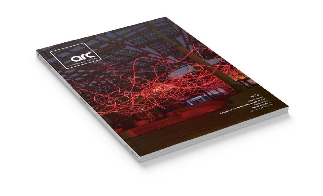
Cover Story: Amplexus, Noor Riyadh, Saudi Arabia
Mark Ridler Retail Lighting
Grimanesa Amorós


#132
Cover Story: Amplexus, Noor Riyadh, Saudi Arabia
Mark Ridler Retail Lighting
Grimanesa Amorós

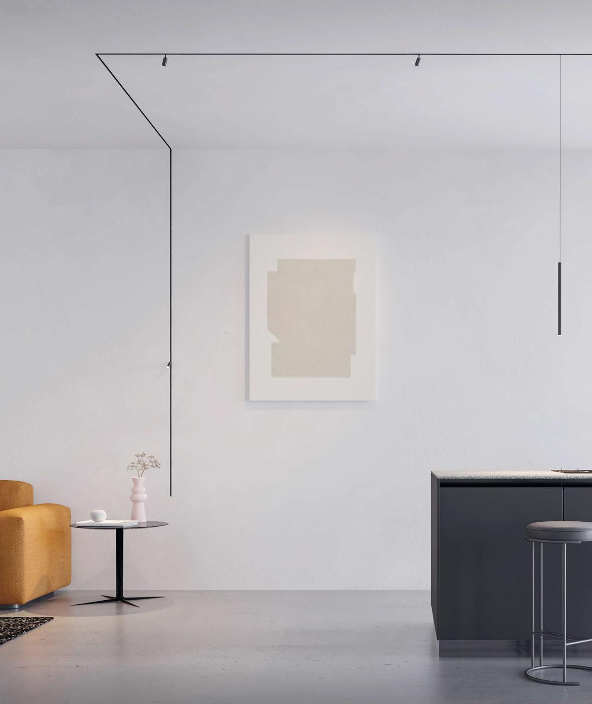
An ultra-miniaturized 24V system that seamlessly fits into every architectural space.
Shape your ideal layout.






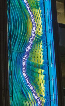


The world’s most iconic architecture deserves premier facade lighting solutions to match. Lumascape is proud to o er a full range of best-in-class luminaires and control systems to transform any building into a dazzling display of performance art with the power of light.
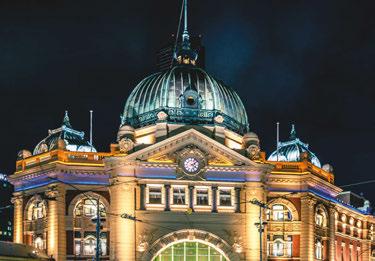
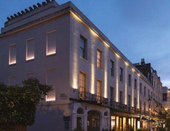
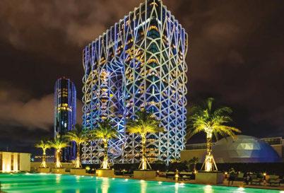
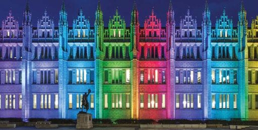

This year marks an impressive 20 years in the lighting industry for Tryka.
launch a successful high-power architectural LED range, our expansive product portfolio and custom manufacturing abilities position us as globally.
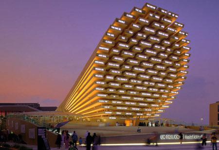
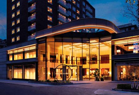
Throughout our 20 years we’ve delivered over 8000 projects, spanning every sector, and encompassing the entire globe. We’re still growing our impressive portfolio and actively seeking new clients and opportunities globally. Following the ground-breaking development of Swansea Arena, 2023 is certain to see us create even more memorable light experiences.
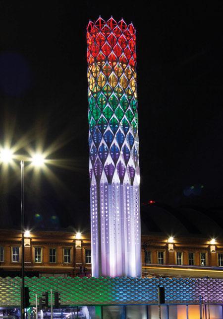
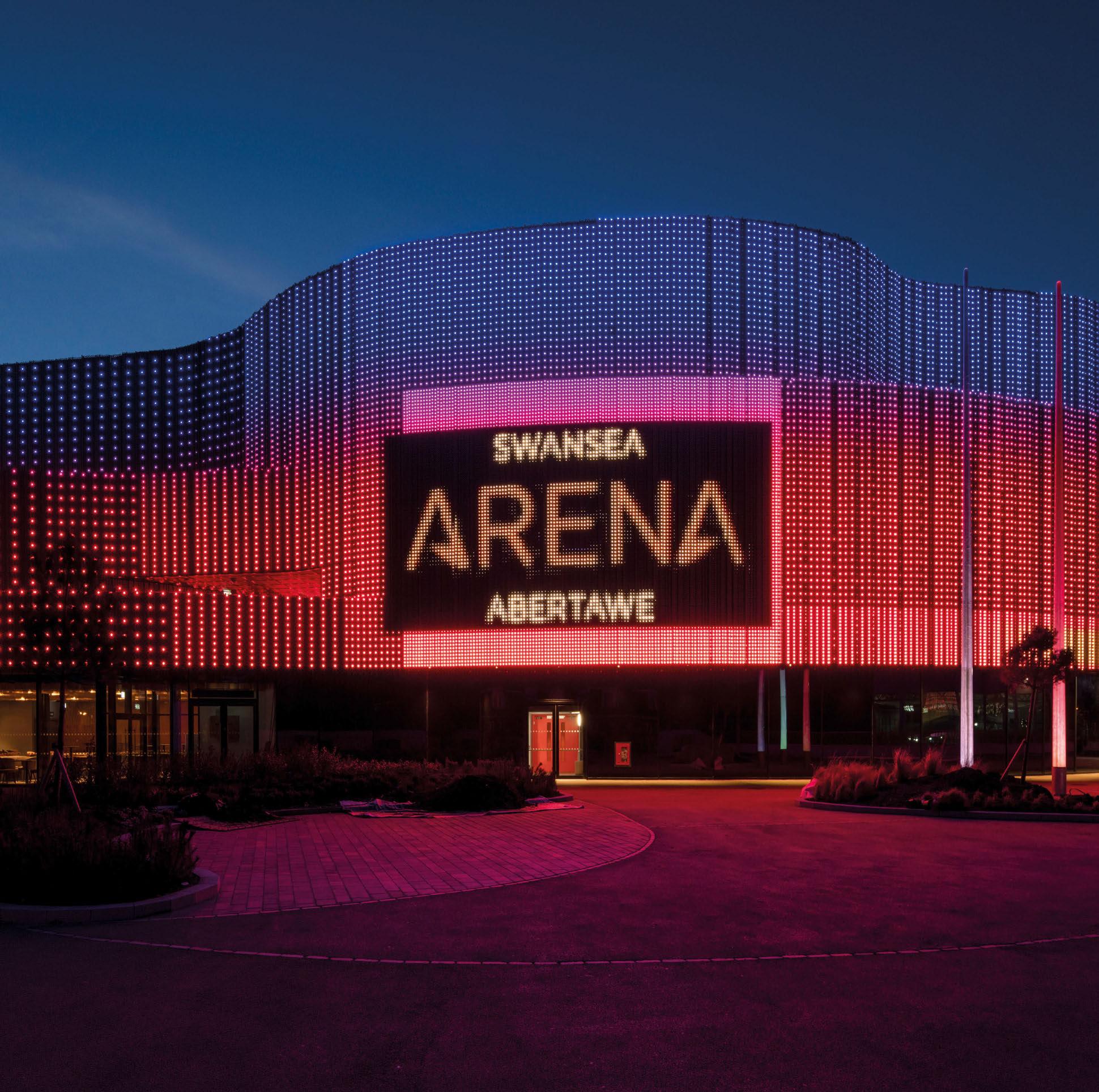
What will you challenge us with next?
Tryka.com


A series of events connecting the very best people creating exceptional lighting projects around the world.
For more information contact Jason Pennington: j.pennington@mondiale.co.uk
The UK’s only dedicated lighting specification exhibition
> 8º, 12º, 30º, 60º, 80º and 12 x 46º beam angle.
> Internal honey comb option for minimal glare.
> RGBW, RGBA, Tunable White and single colour versions.
> Up to 8000 Lumen from a compact 80 Watt, 25 x 25 cm fixture.
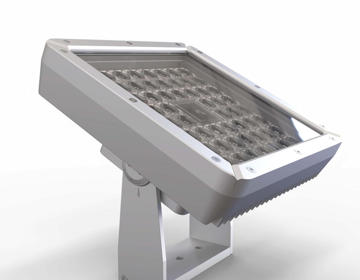
> DMX512, Wireless DMX, Magno Dim, DALI and Casambi control options.
> Dynamic Power Control for up to 50% more light output, compared to other fixtures in the same power category (Colour changing & Tunable White versions)
> Resistant to extreme weather conditions due to its massive CNC cut hard anodized housing.

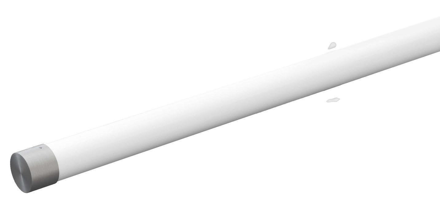
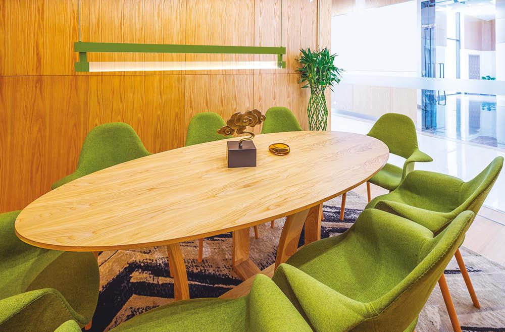
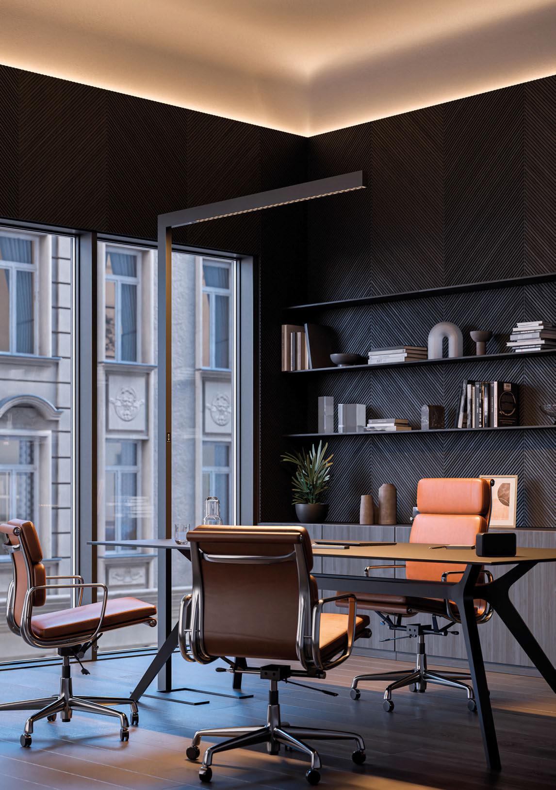
Space 2.0 is a sophisticated direct/indirect linear lighting system. This elegant luminaire features an indirect batwing distribution combined with a linear luminous acrylic module, creating a soft glow to the lower component, and enhancing the visual comfort of the light.
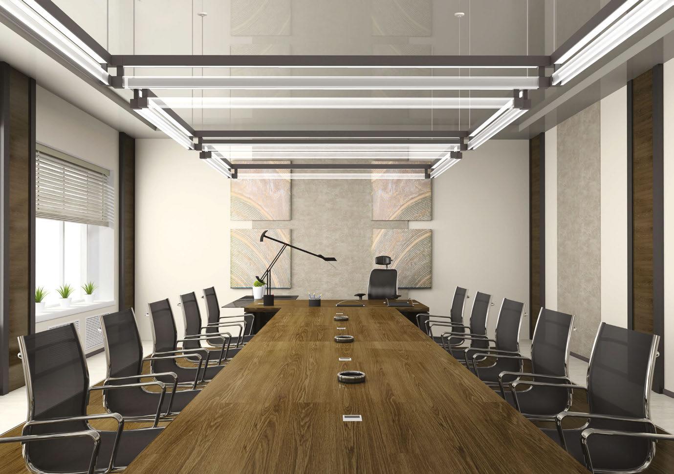
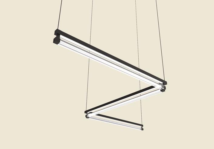
Space 2.0 is available in white light and color-changing options in single fixture lengths or joined together in a continuous linear configuration and geometric shapes.
Space 2.0 is guaranteed to transform your space!


As you’ll have noticed in our last issue, we finished 2022 with a wild flurry of activity - from Light + Building, to [d]arc sessions #3, to LiGHT 22, we were certainly glad to get to the holiday break in one piece! It already looks like 2023 will be another busy one, as we prepare for a full schedule of events around the world. It’s incredibly exciting to see a packed slate of lighting events again after a difficult few years, although organising my diary and planning on which to attend, in amongst our own busy print schedule, is no easy feat! While my colleague Jason and I will be jetting off to New York for LEDucation at the beginning of March (hit me up if you’ll be there!), we’re already looking ahead to one of the most important dates in the lighting calendar - the [d]arc awards party! This will be on 30 March, once again at London’s iconic Fabric nightclub, and we know it’s going to be another incredible night. Voting is currently open for the awards, and we’re inviting all lighting designers, architects, interior designers and product designers to check out the entries and have your say. With a record number of entries this year, picking your favourite is, again, no easy feat!
On to this issue of arc - like many in the industry, I was surprised to see the news late last year that Mark Ridler, Head of Lighting at BDP, was stepping down to pursue a new role away from the industry with the Spinal Injuries Association. Mark has been an integral figure in the UK lighting community over the past 30 years, so I was keen to catch up with him to discuss his stellar career and where he thinks the industry will go moving forward. Elsewhere, following the sophomore edition of Noor Riyadh last November, I sat down with Peruvian-American artist Grimanesa Amorós, creator of the stunning Amplexus installation that graces our front cover. Amorós has built an impressive portfolio of unique sculptures that beautifully harness the power of light, so it was fascinating to learn more about her process in another in-depth interview. You can also check out a full recap of Noor Riyadh later in this issue. Alongside these fascinating pieces, our project focus this time sees us look at some beautiful new retail lighting projects. Featuring work from Metis, Isometrix, Light is More, Equation Lighting Design AND ambience, we hope that you find plenty of inspiration in the coming pages. Enjoy the issue!
 Matt Waring Editor

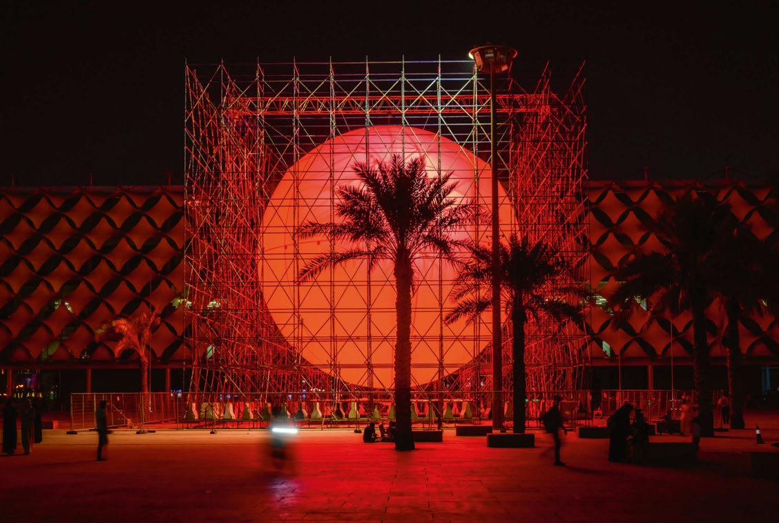
 Front cover: Amplexus, Noor Riyadh, Saudi Arabia (Image: AmorÓs Studio)

Noor Riyadh
The Saudi Arabian light festival returns for its second year.
Mark Ridler

The former Head of Lighting at BDP looks back on his design career.
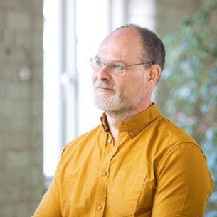
Grimanesa AmorÓs arc learns more about the PeruvianAmerican light artist and her work.
Winter Lights
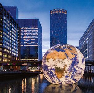
The popular light art festival returns to Canary Wharf after a two-year break.
A Ray of Hope...
Dr. Shelley James explains how lighting can help to improve the lives of those with dementia.

We hear about a new tool for calculating the environmental footprint of lighting fixtures
Dior 30 Montaigne
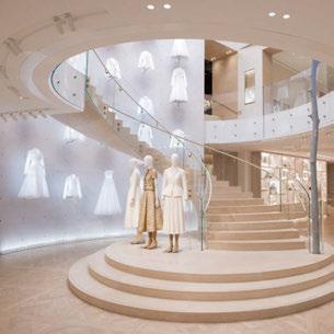
Metis has designed the lighting for Dior’s flagship Paris store.
Cartier Haikou
arc takes a look at the latest collaboration between Light is More and Cartier.
COS Biblioteksgatan
Sustainability-focused brand COS worked with Isometrix to light its flagship Stockholm location.
Borough Yards
Part of a wider regeneration project, Equation Lighting Design has illuminated this mixed-use retail development.
a disruptive scheme for Nagnata’s Byron Bay store.







FEBRUARY
Workspace Design Show
27-28 February
London, UK
www.workspaceshow.co.uk
MARCH
LEDucation
7-8 March
New York, USA
www.leducation.org
Architect@Work
22-23 March
London, UK
www.architect-at-work.co.uk
[d]arc awards
30 March
London, UK www.darcawards.com
APRIL
Archiproducts @ Milan Design Week
17-23 April
Milan, Italy
www.archiproducts.com
Euroluce
18-23 April
Milan, Italy
www.salonemilano.it
Prolight + Sound
25-28 April
Frankfurt, Germany
www.pls.messefrankfurt.com
MAY
[d]arc sessions Europe
14-16 May
Rovinj, Croatia www.darcsessions.com
Lightfair
21-25 May
New York, USA www.lightfair.com
JUNE
GILE
9-12 June
Guangzhou, China
www.guangzhou-international-lighting-exhibition. hk.messefrankfurt.com
IALD Enlighten Europe
30 June - 1 July
Berlin, Germany www.iald.org
AUGUST
Design Helsinki
23-24 August
Helsinki, Finland www.designhelsinki.com
SEPTEMBER
Plasa
3-5 September
London, UK www.plasashow.com
ArchLIGHT Summit
19-20 September
Dallas, USA www.archlightsummit.com
EDITORIAL
Managing Editor Helen Ankers h.ankers@mondiale.co.uk
Editor Matt Waring m.waring@mondiale.co.uk
Contributing Editor Sarah Cullen s.cullen@mondiale.co.uk
COMMERCIAL
Managing Director Paul James p.james@mondiale.co.uk
Head of Business Development
Jason Pennington j.pennington@mondiale.co.uk
Media Sales Manager Andrew Bousfield a.bousfield@mondiale.co.uk
Events & Marketing Manager Moses Naeem m.naeem@mondiale.co.uk
DESIGN
Design Manager David Bell d.bell@mondiale.co.uk
Production Mel Robinson m.robinson@mondiale.co.uk
CORPORATE
Chairman Damian Walsh d.walsh@mondiale.co.uk
Finance Director Amanda Giles a.giles@mondiale.co.uk
Credit Control Lynette Levi l.levi@mondiale.co.uk
[d]arc media Strawberry Studios, Watson Square, Stockport SK1 3AZ, United Kingdom T: +44 (0)161 476 8350 www.arc-magazine.com arc@mondiale.co.uk
Printed by Buxton Press. To subscribe visit www.arc-magazine.com or call +44 (0)161 476 5580 arc, ISSN 17535875, is published bi-monthly by Mondiale Publishing, Strawberry Studios, Watson Square, Stockport, Cheshire, SK1 3AZ. Subscription records are maintained at Strawberry Studios, Watson Square, Stockport, Cheshire, SK1 3AZ.
*NOTE: All dates correct at time of publication*
Deutsches Haus, translated as German House in English, is a 25-storey building complex in Ho Chi Minh City, Vietnam. It was initiated under a bilateral government agreement between Germany and Vietnam, with the purpose of setting standards for “made in Germany”. The new home of the German Consulate General, as well as other German institutions and businesses, Deutsches Haus acts as a cultural and economic hub for German representation in Vietnam’s biggest city.
The lighting, designed by ASA Studios, aims to complement the architectural concept, expressing Germany’s role as an industrial and technological nation through transparency and structured nature, economic construction, and energy efficiency. Lighting fixtures are embedded into the double skin façade structures to light up sophisticated architectural elements in a steely, cool white illumination. Strong modern elements, such as the glazed joint that separates the lower and the higher towers, are accentuated with a refined, soft glow effect.
Deutsches Haus sets new standards for energy efficiency and environmental buildings; it is LEED Platinum and DGNB Gold certified, and has become a new illuminated landmark for the city. www.asastudios.com
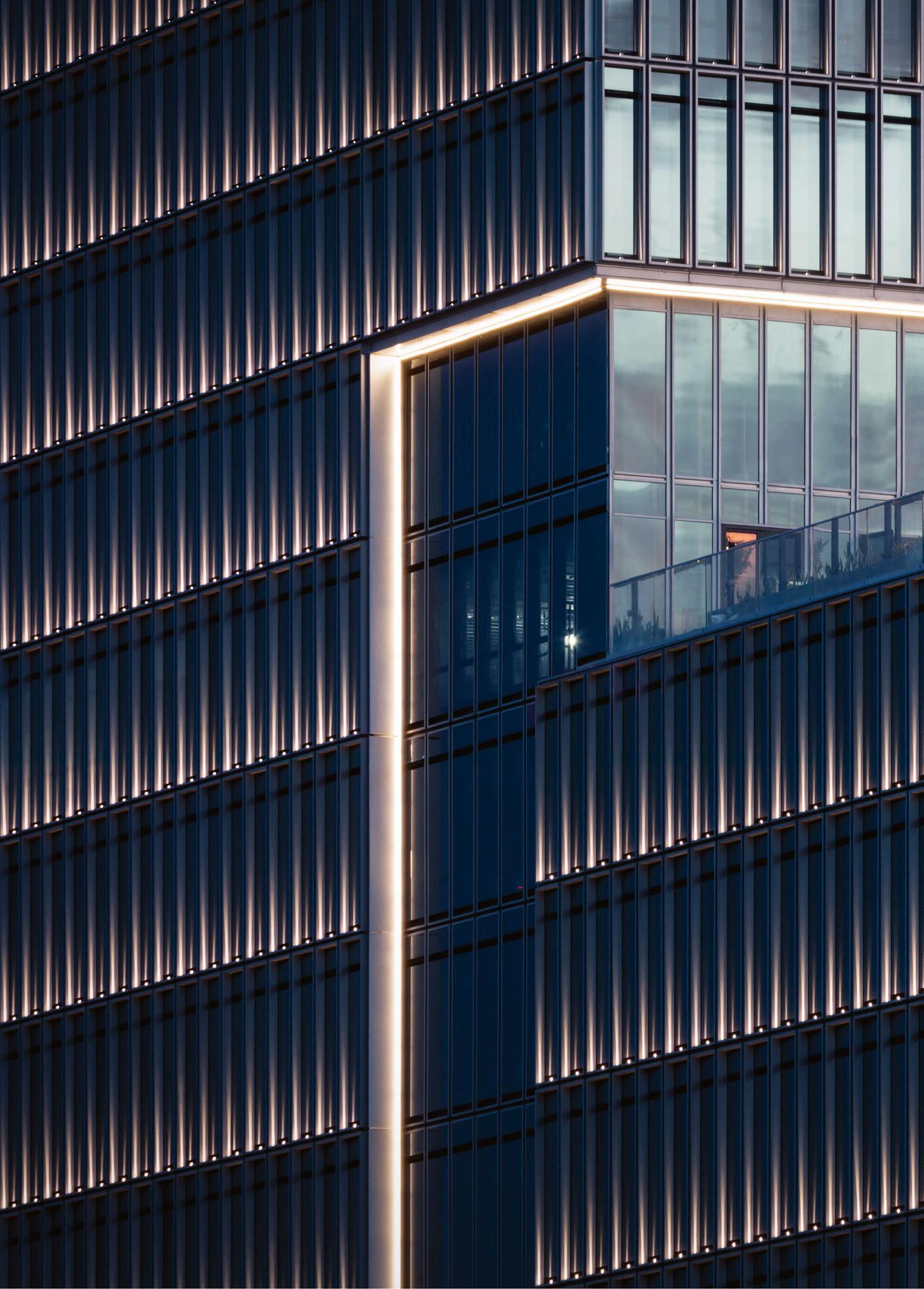
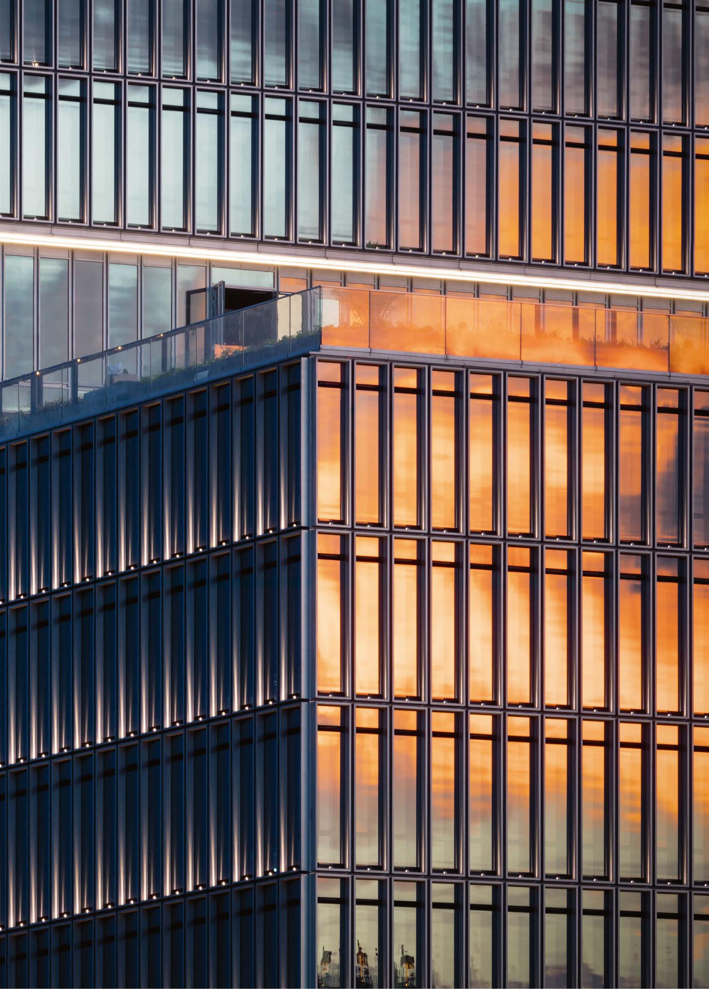 Image: Marcus Bredt
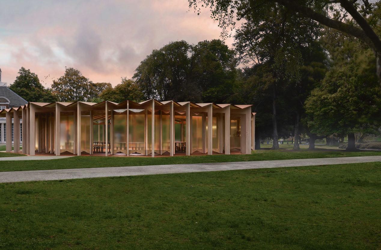
Designs for the 22nd Serpentine Pavilion have officially been unveiled. Opening in June 2023, the pavilion has been designed by Lebanese-born, Paris-based architect Lina Ghotmeh.
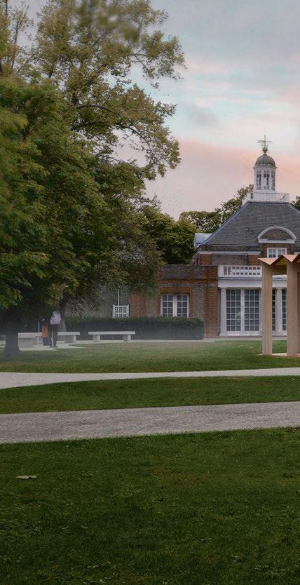
The prestigious competition, which began in 2000 with Dame Zaha Hadid, provides opportunities for some of the biggest names and emerging talents in international architecture to complete their first structures in the UK.
Ghotmeh leads her practice, Lina Ghotmeh –Architecture, in Paris, France, where she develops projects at the crossroads of architecture, art and design, on a global scale. Considerate of social conditions, environments and materials, her practice takes an in-depth approach to its projects, including through research on location history, typology, materials, resources, and user habits.
The 22nd Pavilion will continue this ongoing practice of “Archaeology of the future”, by exploring notions of memory, space, and landscape through the architect’s own personal methodology.
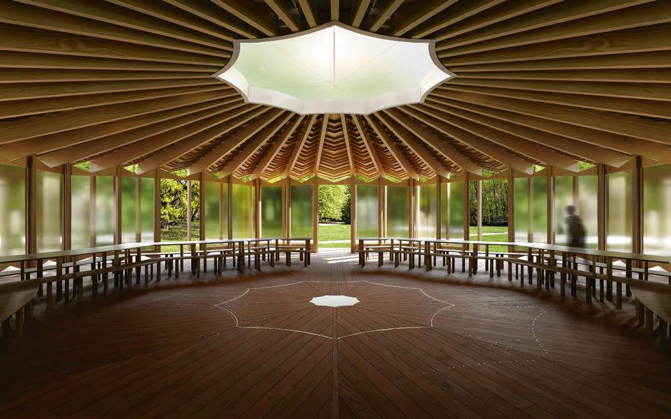
The 2023 Pavilion will be titled À table, the French call to sit down together at a table, and will allude to a sense of unity with the form of its structure and an organic design of a table, as well as seating formation inviting human interactions. Inspired by nature and echoing the grounds and canopies of the trees and its surroundings, the idea of togetherness and community will take centre stage in Ghotmeh’s design.
Built with bio-sourced and low-carbon materials, the structure appears like a skeleton. Sustainably sourced timber ribs are arranged to support a suspended pleated roof. Echoing the structure of tree leaves, the Pavilion has been designed to “embrace the nature of the park in which it emerges”. The Pavilion programme is supported, as in previous years, by Zumtobel Group.
Lina Ghotmeh said: “À table is an invitation to dwell together, in the same space and around the same table. It is an encouragement to enter into a dialogue, to convene and to think about how we could reinstate and re-establish our relationship to nature and the Earth.
“The Earth that embraces us is our first source of sustenance; without it, we living beings could not survive. Rethinking what and how much we eat – how we ‘consume’ and how we weave our relationships to one another in the living world – moves us towards a more sustainable, eco-systemic communion with the Earth. Our ‘cuisine’ grounds us home; it reminds us how linked we are to the climates in which we grew up.
As a Mediterranean woman, born and raised in Beirut and living in Paris, I feel a deep belonging
to our ground, to what it contains, and to what it embraces: from the buried yet weathering archaeologies of past civilisations to the embedded living world that spurs green life to sprout from every crack in the streets.
“In today’s changing times, this Pavilion offers a celebratory space. It is endowed with a table, around which we will sit together in a modest, low structure and in an atmosphere reminiscent of Toguna huts of the Dogon people in Mali, West Africa, designed to bring all members of a community together in discussion. Here we can eat, work, play, meet, talk, rethink, and decide.”
www.linaghotmeh.com


www.serpentinegalleries.org


HS2 has revealed designs for the 150-metre section of viaduct as part of the approach to Birmingham’s new Curzon Street Station, including a 25-metrehigh truss that will create a new icon on the city’s skyline.
A unique light installation, designed by British artist Liz West, will introduce a dynamic colour palette to the apertures of the steel truss, framing views of the city. Titled Out of the Blue, the proposed artwork will establish the bridge as a stunning feature of the city’s landscape both during the day and at night, when the artwork will come to life.
The Curzon 2 bridge, which has been nicknamed “The Bellingham Bridge” by the team, in honour of Birmingham’s England footballer Jude Bellingham’s performances at the 2022 World Cup, is the tallest structure in the sequence of viaducts and structures that make up the Curzon Street Approaches. These approaches take HS2 into Birmingham’s new city centre station.
The bridge consists of a gently curved truss in weathering steel, measuring 150-metres in length and standing 25-metres tall.
West has worked collaboratively with architects Weston Williamson + Partners on the project. Lead Architect Nick McGough said: “Conceptually, the
Curzon Street Approach Viaducts are a series of moments along a coherent thread of structures that will bring HS2 trains into Birmingham.
The Curzon 2 bridge, above its V-shaped piers, represents a special and unique moment when the herculean engineering of HS2 will be on full display as it crosses the Victorian viaduct below. This has only been possible with the close collaboration between contractor, engineer, architect and artist.”
The artwork will ‘paint’ the triangular truss structures within the bridge with a mixing of multiple, linear coloured lights. The blending and merging of the light will create dynamic colourways, and frame the sky beyond, creating new vantage points of the city.
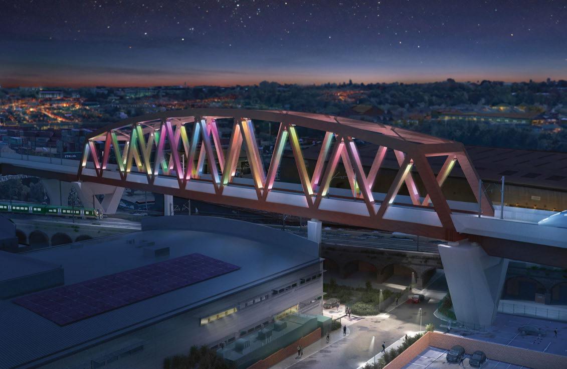
Liz West added: “The core concept of my work is to depict and symbolise a physical and metaphorical meeting point of colours, people and spaces, linking locations through the creation of an immersive, atmospheric and experiential encounter. The use of colour, light and form creates a sense of connectivity and movement, echoing the ways in which the public use, navigate and experience train travel.”
www.liz-west.com
www.westonwilliamson.com


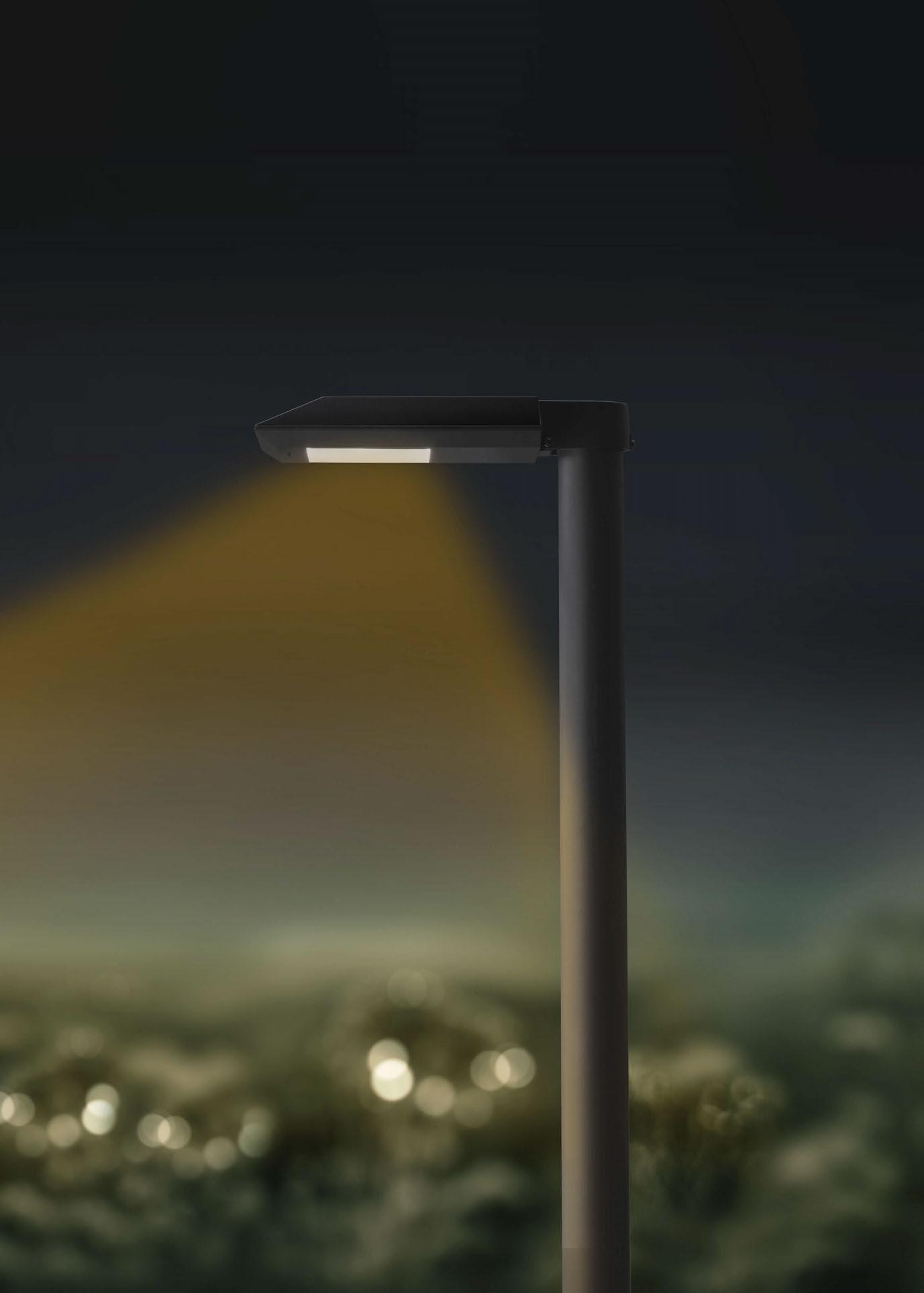
BEGA pole-top luminaires with BugSaver ® technology protect nocturnal fauna by reducing the color temperature from 3000 Kelvin to an amber color around 1800 Kelvin, which reduces the light attractive effect. The color temperature and output can be controlled dynamically. bega.com/bugsaver
Das gute Licht.
Following the announcements of a new regional chapter in the Middle East and the return of the Enlighten Europe conference, arc catches up with IALD CEO Christopher Knowlton for an update on all things IALD.

It feels like it has been a busy few months for the IALD. What’s new?
Lots of change came from the pandemic and IALD had a staff restructure. We no longer have a physical office and I’m the first CEO based outside the US. 2022 saw the return of in-person events and it was great to see the community coming back together again after being separated for such a long time. Now we are focused on making IALD the most relevant global association for the lighting design profession and we are excited to be launching a new education platform later this year, attending in-person events and running the Enlighten conferences again.
You’ve recently expanded your network with a new IALD Middle East region. How and why did this come about?
The Middle East has seen incredible growth in the past 20 years and the established local community of lighting designers is growing and maturing. In response to this, several local members have joined together to form the IALD Middle East Region. I recently attended Light Middle East and felt the very strong connection of the community in the region and the desire to build the local connections alongside a desire for education and professional recognition. As the region’s architecture, design and construction industry grows, there is a desire to elevate the lighting design profession within the projects that they are working on.
For the last 53 years IALD has cemented its position as the global association for lighting designers, and as we enter into 2023 the commitment to raising the profile of the profession and supporting lighting designers around the globe is stronger than ever. A new region represents growth, which can only be a positive for enhancing the voice of the profession to a wider audience. The more designers represented, the greater influence we have at a national and international level. In turn this increases credibility in public policy and advocacy.
For local designers, it means access to a local and global community. Access to education and certification and a channel to work on policy issues within the region. IALD champions the “think global act local” philosophy and the Middle East region really represents this in action. Connecting the local community to a wider group of professionals and leveraging the big goals of recognition, education, credentialing and exchange of knowledge with the actions of a local community.
You’ve also announced the return of IALD Enlighten Europe this year. What more can you tell us about this?
We are really excited to be back in Europe. We held the last Enlighten in Barcelona back in 2018 and it will be great to connect with the European community again. Enlighten will take place in Berlin, Germany, 30 June - 1 July at the beautiful venue of Café Moskau. There will be a great range of topics and session formats bringing together an international audience to gain continued professional education, participate in discussions and network with colleagues and manufacturing partners. This year we are partnering with Light Collective to reimagine the conference and format to deliver our best ever conference event. We want the conference to become a hub where we can draw together the many facets of the lighting industry.
How does it feel for this conference to be returning to Europe?
Great! I’ve grown up in Europe and always been in awe of the cultural diversity, history and openness to new thinking in the region. This year there feels like a particularly special energy about an event that gets the community back together after the pandemic.
It is also a show of commitment from the IALD to the European community that Europe represents a significant region in the world. Associations can play a significant role in helping advance the profession and Europe is somewhere IALD would like to grow.
Will this become a regular fixture in the lighting calendar once more?
I really hope so. Blending online and in-person education and events is where IALD sees the future. Making lighting an accessible profession to everyone is one of the ways we can increase the universal acknowledgement of the importance of light and fulfil our mission.
www.iald.org
Learn
Lighting Design: Zenisk
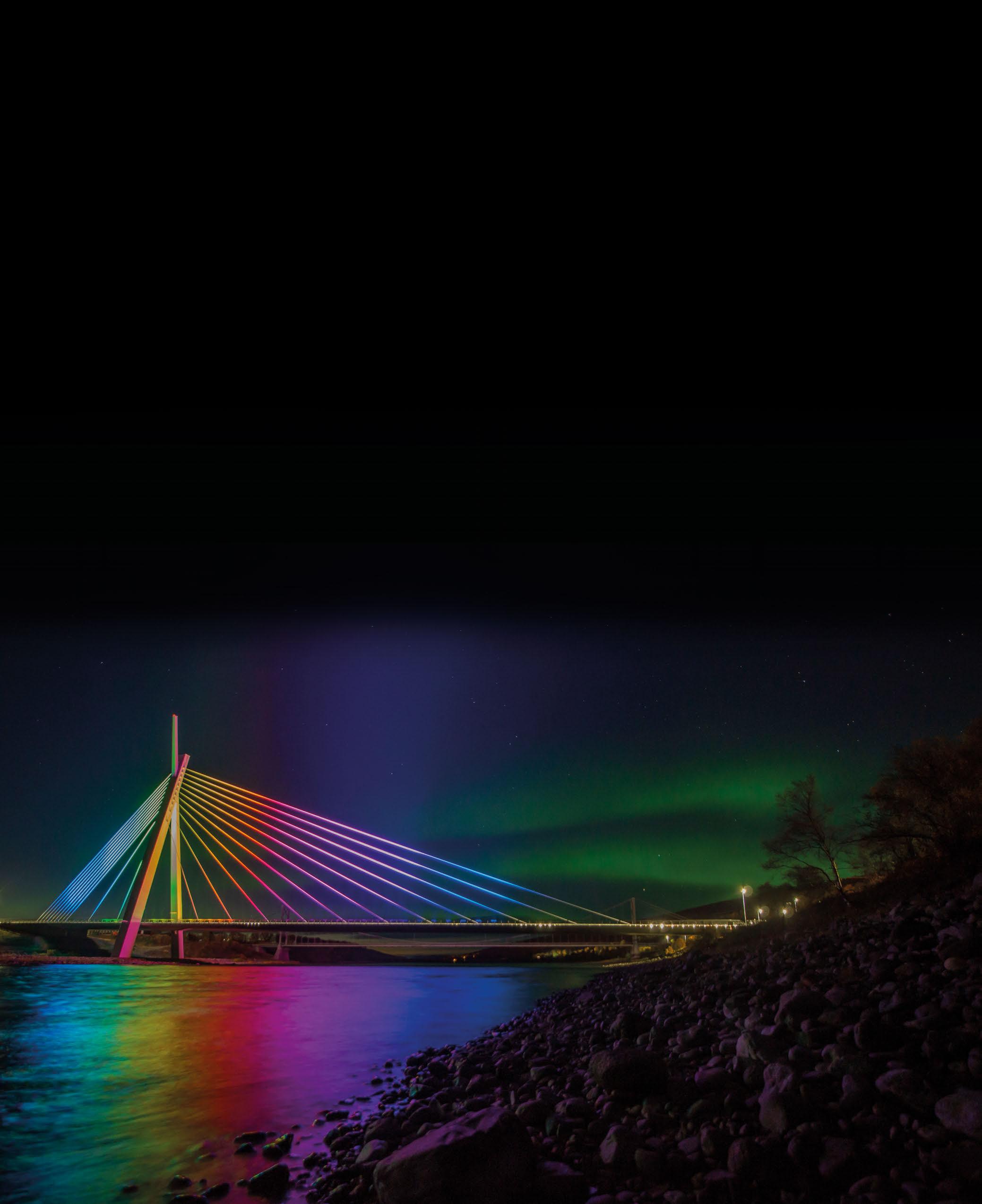
Partner: Rebel Light
Client: Statens Vegvesen
Control: Rebel Control
Photography: Frank M. Ingilæ
With a goal to provide clients with a “boutique” feel, London-based Lighting Design Studio combines beautiful lighting with energyefficient technology to create schemes that make sophisticated designs and systems easy, with work spanning across retail, hospitality, residential and landscape projects.
COYA
Riyadh, Saudi Arabia
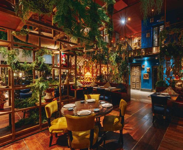
COYA is an international restaurant chain that celebrates the spirit of Latin America and has led the way in innovative dining experiences. The Lighting Design Studio has worked closely with COYA for many years on sites across the globe including London, Dubai, Mykonos, Monte-Carlo, Paris, Riyadh, Barcelona and Doha.
While COYA understands fantastic lighting design is crucial for creating the right ambience and is fundamental to the success of any new restaurant, the Lighting Design Studio has learned from restaurant clients that one of their biggest challenges comes when staff have to use the systems that create the right effects. In many cases, staff are overwhelmed with complex controls. Lighting designers will sometimes get call-backs from clients where someone has decided to fiddle with all the controls and messed up the programming, meaning that parts of the restaurant are over or under-lit at certain times of day.
With COYA, the design team used automated lighting controls so that the staff could get on with running a restaurant instead of having to develop a repertoire of technical skills just to put the right lights on.
To match the beauty of the interior design, Lighting Design Studio used the best quality light fittings to create a warm, beautiful ambience, showing the Peruvian features, textures, patterns, and of course the amazing food in the best possible light.
Jaguar Land Rover SVO
Gaydon, UK
Lighting does more than create ambience and beauty. When it comes to engineering and design, the right lighting can be essential for their facilities to function properly.
Lighting Design Studio has lit a number of showrooms and engineering spaces in the automotive sector, which has led the team to work with many of the world’s leading car manufacturers and Formula 1 teams. Through this, the practice has built a very close relationship with JLR (Jaguar Land Rover) following completion of a lighting scheme for its exclusive world-class Special
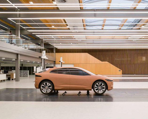
Vehicle Operations (SVO) Technical Centre. This highly innovative building is the world’s most advanced automotive design centre, and in the top 10% of sustainable office buildings in the UK. Following its work on the main building, Lighting Design Studio got to live every car lover’s dream when it was asked to help with JLR’s impressive clay modelling space in the new Jaguar design studio. The team put together an LED lighting scheme for the studio’s 10 clay modelling plates, each measuring 20 metres long, where they test full-sized prototypes and examine them for potential design flaws before the model goes into production. Using sketches, CAD software and reallife clay modelling tools, the modeller and designer can work together to modify the design where desired. Just like in any studio, the wrong light can mean interfering shadows that distort forms, or details that are lost in dim lighting.
The work of the lighting designers brought uniform lighting to the models with optimal colour temperature and brightness for the car designers to do their best work.
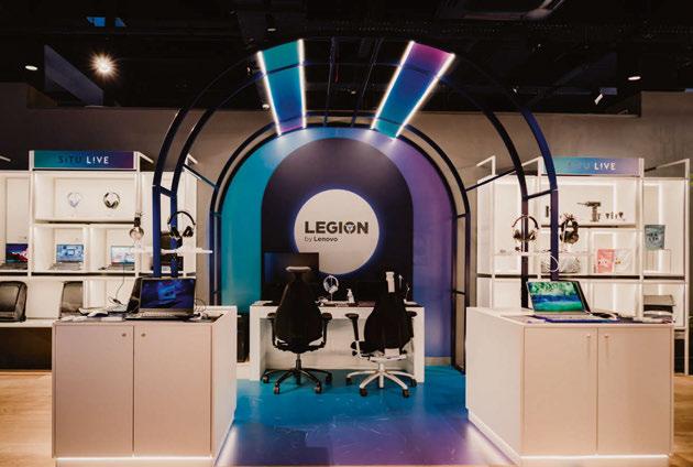
Situ Live is a revolutionary new concept looking to reinvent bricks-and-mortar retail. They’ve ripped up the retail rulebook and created a product experience platform that combines physical retail destinations, live storytelling and digital product discovery. What this means simply is that they’ve created spaces that are both gallery-like, but also relatable enough that customers can view products in an almost magical environment, but also imagine what it might be like to have such products in their everyday lives. Now open at Westfield London, the shop spans 7,500sqft, showcasing products across multiple lifestyle ‘theatres’ so that customers can see products in action and try them before they buy. When they see something they like, they simply scan a QR code, save it to their favourites, and buy at their leisure. As such, the lighting chosen had to be functional so that customers could get a proper
look at the products, but also create enough drama and atmosphere that visiting the shop feels like an out-of-the-ordinary experience. A walk through the shop will take you through beautifully styled familiar spaces - living rooms, kitchens, offices, gyms - and as such, the designers had to create lighting for each space to suit the purpose of that particular area. With practicality in mind, Lighting Design Studio used lighting to create effects with a sense of theatre to further Situ’s goal of keeping storytelling at the forefront of customer experience, literally showing the products in their best possible light.
London, UK
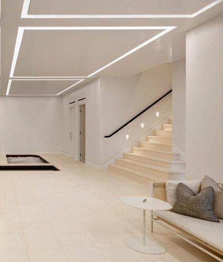
The right lighting does more than enhance architectural beauty, it does more than reducing eye strain from too little or too much light. Human beings, for all our artificial control over our surroundings, still respond to circadian rhythms. Light affects our bodies in a number of ways, including our release of stress, sleep and happiness hormones. Lighting Design Studio brings these principles with it when working on a diverse range of high-end residential projects across the globe. “Living Light” means more than eco-friendly, it also means light to live by. This particular project involved a complete renovation and enlargement of a substantial grade II listed property in London’s historic St Johns Wood Conservation area. The decorative fittings and accent lighting were chosen to enhance the original period features, including bespoke products designed and developed by the lighting designers in-house. Soft washes of light and hidden lighting details in the new basement space ensured the swimming pool, spa, sauna, and gym space felt light and airy. A state-of-theart lighting control system brought it all together and helped to reduce running costs while providing flexibility, with light scenes being recalled at the touch of a button. The end result is a lighting scheme that is sophisticated and premium enough to match the grandeur of the property, while still looking and feeling like a space in which humans can enjoy their lives.
Luxury architectural lighting, eco-mindedness and simplicity. You shouldn’t have to choose only one.
Lighting Design Studio was established in London more than 15 years ago, and has built a reputation for creating luxury lighting schemes that are intelligent, creative, elegant, and dynamic, while also having levels and controls that are friendly to the user, and components and designs that are friendly to the environment.
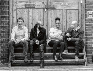
Co-founding directors Luke Locke-Wheaton and Bruce Weil are both respected and renowned industry experts, regularly speaking at leading design events, lecturing at several universities. They sit on the communications committee at The Society of Light and Lighting.
The practice works across a wide range of projects; from some of the world’s best hotels, restaurants, and retail spaces to landscape and large residential projects. The team believes that beautiful lighting design and energy-efficient technology belong together, that’s why the emphasis of the studio is ‘Living Light’. It runs through everything they do. Using less, saving more, and consuming mindfully. It’s what drives decision-making at every point on the journey with clients.
www.lightingdesignstudio.co.uk
Noor Riyadh returned for its second edition in November, bringing more than 120 installations and light artworks to the Saudi capital.
Following the success of its inaugural edition in 2021, Noor Riyadh returned to the Saudi Arabia capital for a mammoth celebration of light and art. Almost tripling in size from the debut event, the festival launched on 3 November, with over 120 installations by more than 100 artists from across 40 countries, on view across 40 locations.
Built around the theme We Dream of New Horizons, the two-week festival was accompanied by a threemonth art exhibition, From Spark to Spirit (open from 3 November 2022 to 4 February 2023) and dynamic public programme.
As one of the world’s most ambitious festivals of its kind, organisers of Noor Riyadh hoped to transform the city into a dazzling, night-time “gallery without walls”, across the largest city footprint of any light art festival worldwide.
The theme of We Dream of New Horizons responded to a motif that is both literal and metaphorical in meaning, alluding to the distant glow of sunrise or sunset, and the shining light of our dreams, with a sense of hopefulness for the future inherent in the phrase. Its connotations are positive, optimistic, and reflective of a confidence in renewal and transformation. Through a sense of wonder, the artists explored the use of illumination, luminosity, and their own encounters with materials as staging relations to otherness and hope in the form of light.
Co-curated by Hervé Mikaeloff, Dorothy Di Stefano and Jumana Ghouth, the second edition of Noor Riyadh saw many renowned names in light art unite with an expanding roster of emerging and established local artists. These artworks and installations illuminated 40 citywide locations, showcasing immersive site-specific installations, monumental public artworks, ephemeral
sculptures, art trails, virtual reality, building projections and drone shows.
International artists showcasing installations included names such as Daan Roosegaarde, who brought his popular Waterlicht piece – an immersive installation that encompasses a dream landscape about the power and poetry of water with an ecological message – to Riyadh’s Salam Park. Elsewhere in Salam Park, Eness drew inspiration from formal civic fountains and classical statues in Cupid’s Koi Garden, the world’s first inflatable fountain.
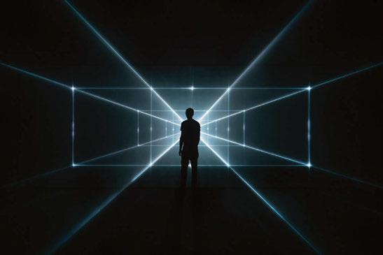
Other notable artworks included The Garden of Light by Charles Sandison – a video projection in the Diplomatic Quarter hub that investigates the virtual horizon created between history and the digital world. Elsewhere, Grimanesa Amorós’ Amplexus light sculpture radiated light through the air, enveloping and embracing the architecture, space and viewer.
Christopher Bauder, founder and creative director of WHITEvoid, who collaborated with musician and composer Strahil Velchev to produce Axion, a large-scale installation inspired by a hypothetical elementary particle that, if it exists, might be a component of the dark matter that cosmologists believe makes up 95% of the universe.
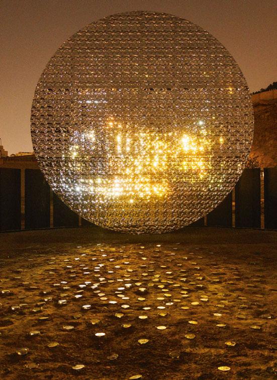
At King Abdullah Financial District, Asaad Badawi’s Chasing the Sun showcased brightly coloured fibreglass shapes that conjure planetary motions. On a similar theme of ingenuity, multidisciplinary artist Zahra Bundakji created a sound portrait of women who have shaped and supported dancefloors in Saudi Arabia, supported by the universal symbol of dance culture, the disco ball. The work, entitled The Voice of Listening, was situated in the JAX District.
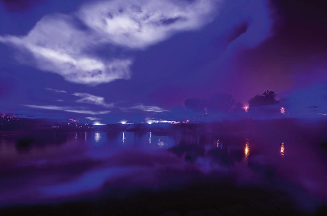
 Waterlicht, Daan Roosegaarde
 Pavilion of Moonlight Horizon, Pauline David
Hidden Order, United Visual Artists
The Order of Chaos: Chaos in Order, Marc Brickman
Axion, Christopher Bauder & Strahil Velchev
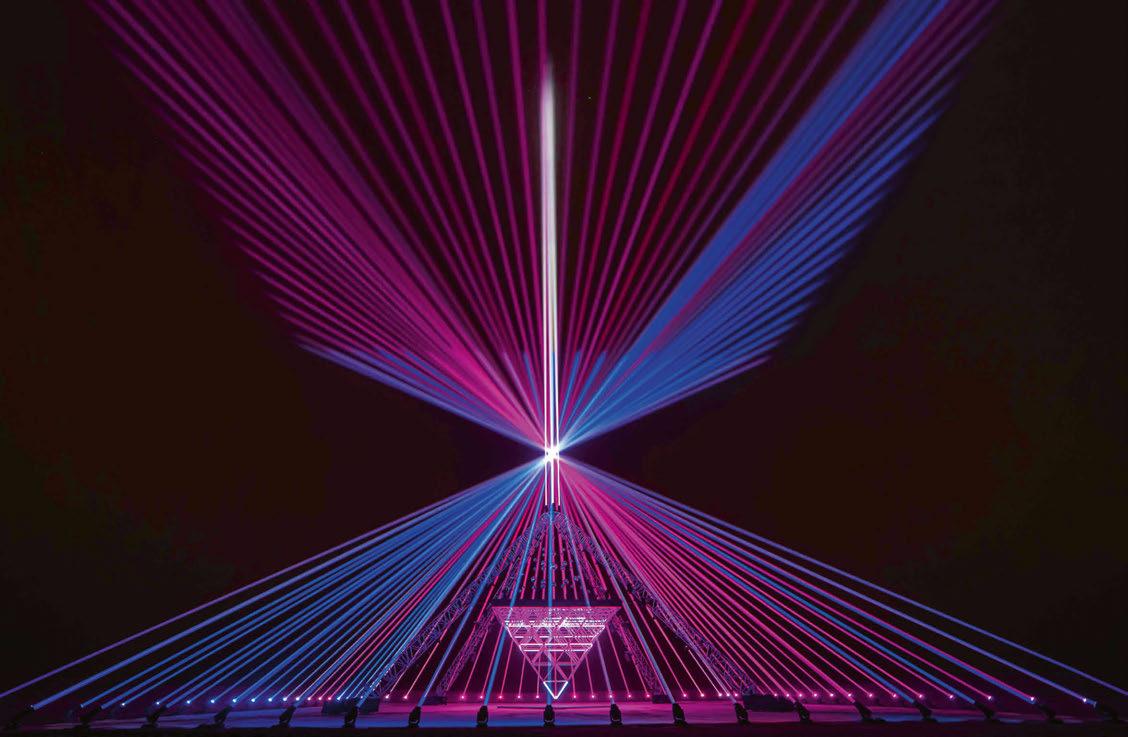
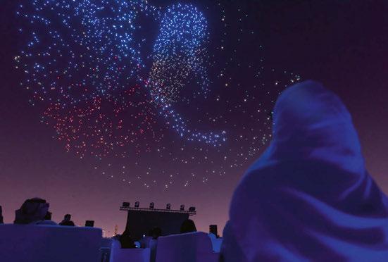
Elsewhere, a nightly laser show was performed in central Riyadh that united Kingdom Tower, Faisaliah Tower and Majdoul Tower. The show, entitled Pulse of Light, was created by Yann Kersalé, in collaboration with show director Martin Arnaud. The performance was accompanied by music from Grammy award-winning artist Zedd. Another highlight came with Marc Brickman’s drone show at King Abdullah Park. Artist in residence at the Empire State Building in 2020, Brickman brought two aerial light installations –The Order of Chaos: Chaos in Order, featuring a swarm of 2,000 drones; and K A L E I D O S C O P E, which explored the absurdity of human constriction through technology, and featured an interactive element in its choreography.
Other international artists showcasing installations included Pauline David (Pavilion of Moonlight Horizon), Daniel Buren (Le Ciel Coloré et Projeté), Shohei Fujimoto (Intangible #form), Douglas Gordon (299792458 M/S), Tadashi Kawamata (Nests in Riyadh), Arne Quinze (Oasis), teamLab (Waves of Light), SpY (Earth, 2021) and Jean-Michel Othoniel (Yardang).
Speaking on the conclusion of the citywide installations, Riyadh Art Program Executive Director, Khaled Al-Hazani said: “We are delighted that Noor Riyadh has created unique moments of joy across the city, nurtured artistic talent and delivered aweinspiring immersive experiences, providing visitors with an opportunity to appreciate world-class light artworks and rediscover the city of Riyadh in a new light.
“We look forward to bringing together a global community of visitors to Noor Riyadh’s accompanying exhibition and shedding light on the artists, curators and community engagement initiatives enriching Riyadh’s thriving art and culture landscape.”
The festival’s accompanying exhibition, entitled From Spark to Spirit was curated by Neville Wakefield and Gaida AlMogren. The exhibition
traced the role that light plays in shaping our relationship to a world in which light itself has become a signal of change, exploring themes such as ‘Technologies of Light’, ‘Architectonics of Light’, and ‘Consciousness of Light’.
Just as the Light and Space Movement, which began in California in the 1960s, reflected changes in the established order, this exhibition explored a landscape of light inflected by the rapid cultural transformations shaping the Middle East. While the exhibition acknowledged the histories that have been shaped by the experience of West Coast America, and the West in general, the show was structured as a cultural dialogue.
Neville Wakefield, lead curator, said: “As explored in From Spark to Spirit, it is evident that light in this world can be seen as an integral means of communication. We are now connected to each other by screens – by the light of information. We communicate with one another through the direct manipulation of light to form words and images that together map a collective consciousness, bringing us together in an era of rapid technological and cultural transformation.”
The festival also included a programme of more than 500 special activities, from tours to talks, workshops, family activities and music, some of which were available online and via an event app, opening the experience up to a wider audience.
Al-Hazani added: “Noor Riyadh is a big part of plans to creatively transform the Kingdom’s capital into a vibrant and cosmopolitan global city, through arts and culture. Supported by Riyadh Art, Noor Riyadh’s parent body, it features public artworks and diverse community activities that provide enriching art experiences that bring together local communities, from families to artists, students, professionals and more, with international audiences fro across the globe.”
www.noorriyadh.sa
www.riyadhart.sa
Designers
Returning the office after the Christmas break can be a bit of a shock to the system for many. Slipping back into having a routine is no small effort, finding our feet after being able to shirk some of the rigidity that the usual Monday to Friday grind entails. Many of us also feel the pressure to set new goals and challenges for the year, running into those commitments headstrong while still finding our feet. Trying to plan out this much activity and change can make us more frustrated and anxious than it causes elation and excitement, but we are capable of flipping that narrative on its head and setting meaningful goals for ourselves.
A few years ago, Designer’s Mind had a roundtable discussion on Clubhouse about New Year’s resolutions and how really, on the whole, they’re a bit of a red herring. Committing to big change and expecting to be able to implement these new goals immediately can often be more discouraging and defeatist than making no change at all. Perhaps worst of all is the all-pervasive culture of comparison that comes with goal-setting; we feel ‘weak’ or ‘incapable’ when we see other people achieving the things that we want with what appears to be relative ease. We are, after all, creatures of habit, and forming new habits is not an all-or-nothing or immediately actionable venture, and some changes will inherently come more easily to different types of people. New Year’s resolutions often take the form of ‘I will start to do x every day of the week’ or ‘I will change the way I do x, starting tomorrow’. But how does that fit into the routine you’re just getting back into? What’s the time, money, or energy commitment to this goal, and how has it been factored into your current commitments?
Instead of an aggressive, all-or-nothing approach to improvement and/or change, it is best to start with introspecting about our own capacity and needs. What aspect of day-to-day life feels like it needs improvement, and what do I want to prioritise? What long-term goals do I have, and what change would make them easier to achieve, or more rewarding to achieve? This will vary for everyone, and our answers may vary from day to day. Our commitments to ourselves and to others are only able to be fulfilled when we feel that we have the internal resource and external support to do so. Big changes often feel like they require sacrifice, which is inherently detrimental to the ideal of improvement and betterment. The goal, then, needs to become more intangible and flexible to best allow for our efforts to feel meaningful. For example, instead of a commitment like ‘I will get eight hours of sleep every night’, instead reframe the prompt to ‘I will create time for myself in the evening to be able to relax’. With this framework, if effort gets put into creating a comfortable environment to signal the physical and chemical needs of encouraging sleep, then it feels like a win. And when most attempts feel like a success, this encourages us to continue these learned behaviours and turn them into habits, ultimately guiding us to that quantifiable goal. But, if tangible goals are more in line with your personal satisfaction, then creating a plan with milestones might be a good alternative. The ‘Couch to 5k’ scheme is a good example of incremental goal setting. If you’ve never run before, you cannot expect yourself to have the endurance or strength to achieve your end goal on day one. Instead, it is a balance of paces and distances to acclimate your body to the act of running. Like the sleep goal, you’re priming your body and mind to a new way of doing things in a patient and thoughtful way. You could also go down the ‘gamifying’ route (which we love here at DM) with wearable tech to track your movement and vitals. With this added layer of external support, you can start to be more conscientious of how your body feels throughout
Mind contributor Kael Gillam looks at the concept of New Year’s resolutions, and the importance of giving yourself realistic, achievable goals. DESIGNERS MINDthe day on your ‘active’ and ‘rest’ days. Changing our habits and our lifestyle necessitates that we are kind to ourselves, and recognise that some days our goals simply won’t be achievable. By starting with incremental change, that is less rigidly measured, we inherently create a more forgiving and welcoming attitude around the change we want to accomplish. To add extra motivation, you can also involve friends and family in your goal setting, and have a shared accountability for your journey. External validation and encouragement during periods of change can be massively rewarding and spur us to stay true to our resolutions when we feel the care and support of those we hold dear.

We wish you all the best for the year ahead, and encourage you to create a space for wellness as part of your new routine.
www.designers-mind.com
“Committing to big change and expecting to be able to implement these new goals immediately can often be more discouraging and defeatist than making no change at all.”
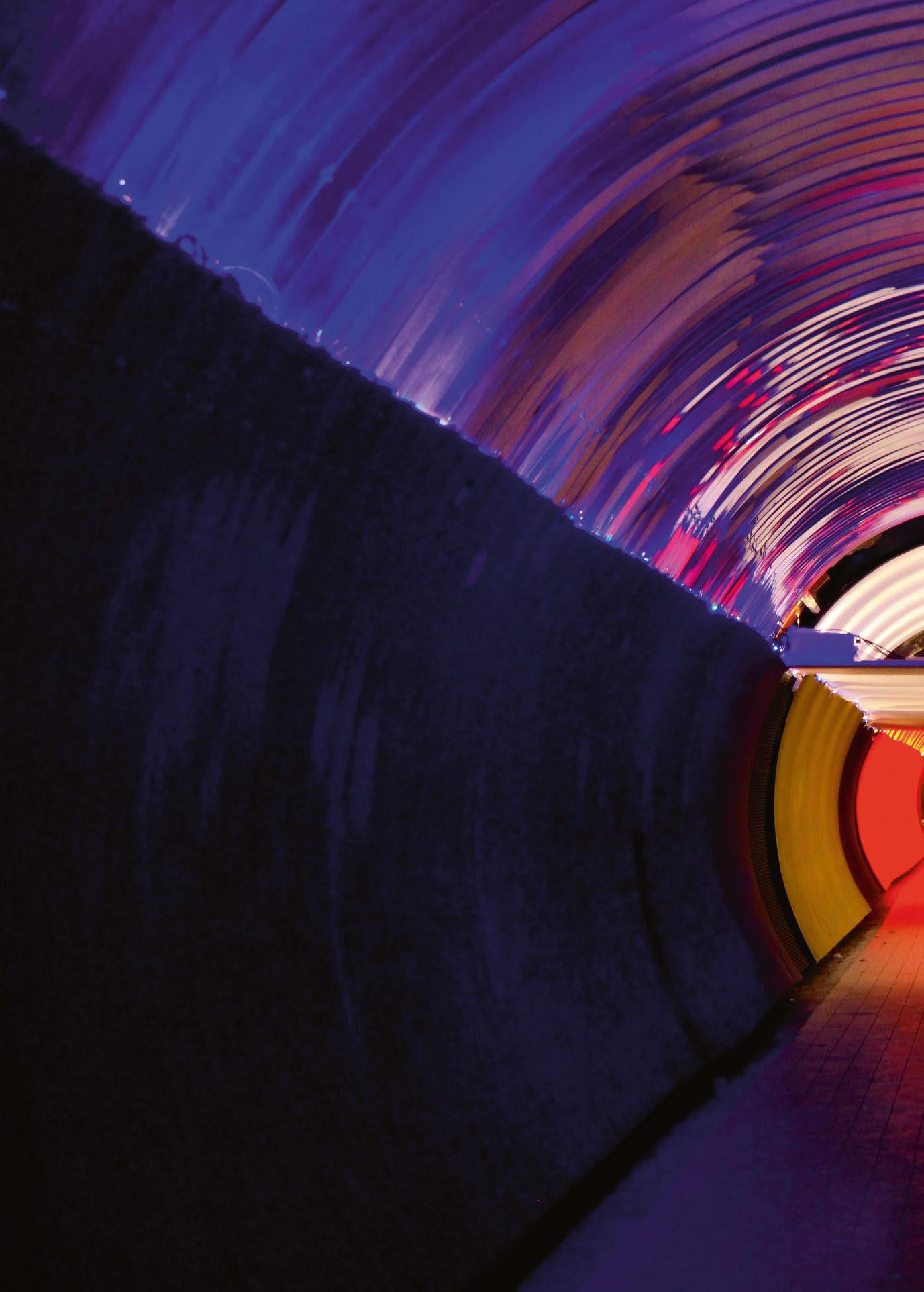
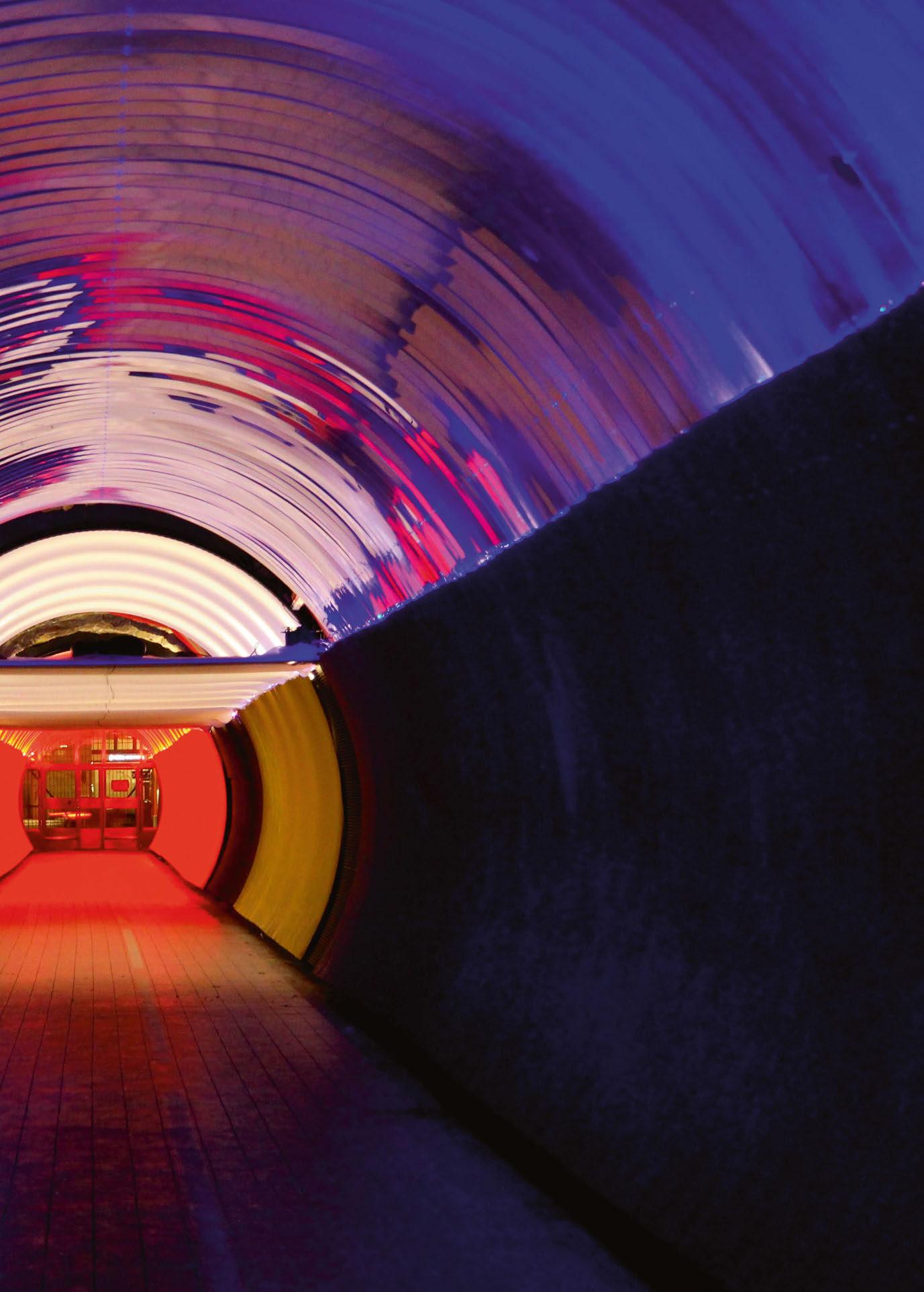
As part of December’s Nobel Prize Week, students at Stockholm’s KTH created a temporary lighting installation that paid homage to Alfred Nobel, as well as the more than 960 Nobel Laureates whom have raised the bar on different research areas and expanded human knowledge, making history. Brunkebergstunneln is a 231-metre-long tunnel that interconnects two of Stockholm’s most central districts. The pedestrian tunnel, itself a marvel of engineering, implemented knowledge of physics and chemistry; two methods were used in the creation of the linear void. At the east side, Alfred Nobel’s invention for blasting, while at the west side, soil temperature was decreased until frozen in order to facilitate excavation. With this duality of approaches in mind, the lighting installation looked to capture the binomial character of Alfred Nobel. On the one hand, the technical and scientific approach by which he created numerous inventions, such as Patent 102 (Dynamite); and on the other, the artistic and sensible side by which he wrote poetry, such as the famous The Riddle. Both gave the inspiration for Riddle 102.
The lighting intervention divided the tunnel into three portions, each using one of Richard Kelly’s three tenets of light.
The first, ambient light, was demonstrated through the use of coloured gels in blue, red and neutral, that filtered the light of the existing features to create a homogenous atmosphere of spatial light.
For the focal glow, the decision was made to create a “visual destination” at the core of the tunnel. The impression was of a neutral white
light – again made with neutral gel and existing fixtures. The incorporation of mesh fabrics along the ceiling broke the spatial continuity, allowing a change of scale and proportions. Diffused and reflected light created a spatial riddle, a moment, a pause that prepared the visitor to immerse into the next portion of the tunnel.
To create a play of brilliants, a DMX-controlled dynamic sequence of light was added along both sides of the tunnel. The short sequence looped endlessly, enhancing the connection to the freezing and blasting techniques. The intention of this was to break the linearity of the space. This set the light’s pace that guided and accompanied the visitor through the journey into the tunnel with a dynamic light scheme that flowed from both ends into the core of the tunnel, where they converged and “exploded”.
To bring an extra dimension, a synchronised soundscape was created specifically for the installation; made up of seven looped tracks that supported and elevated the experience through soundwaves originating from the core and expanding to the edges of the tunnel.
The installation was thought from a multisensory, bodily experience to connect emotionally with the visitor. Vision, audition and kinaesthesia were part of the immersive journey, aiming to alter the perception of the tunnel’s physicality as if the time continuum altered space into a new reality, while bringing back the memory of the blasting/freezing techniques that made possible its construction. www.kth.se
After more than 40 years in lighting, Mark Ridler has stepped down as Head of Lighting at BDP, leaving the industry to take up a new role at the Spinal Injuries Association. Here, Ridler looks back on a stellar lighting career, and speculates what the future holds.

“Where the industry goes is outside of our control, but what I would like to see retained is elements of humanity, empathy, lateral thinking, intelligence, and ethics.”
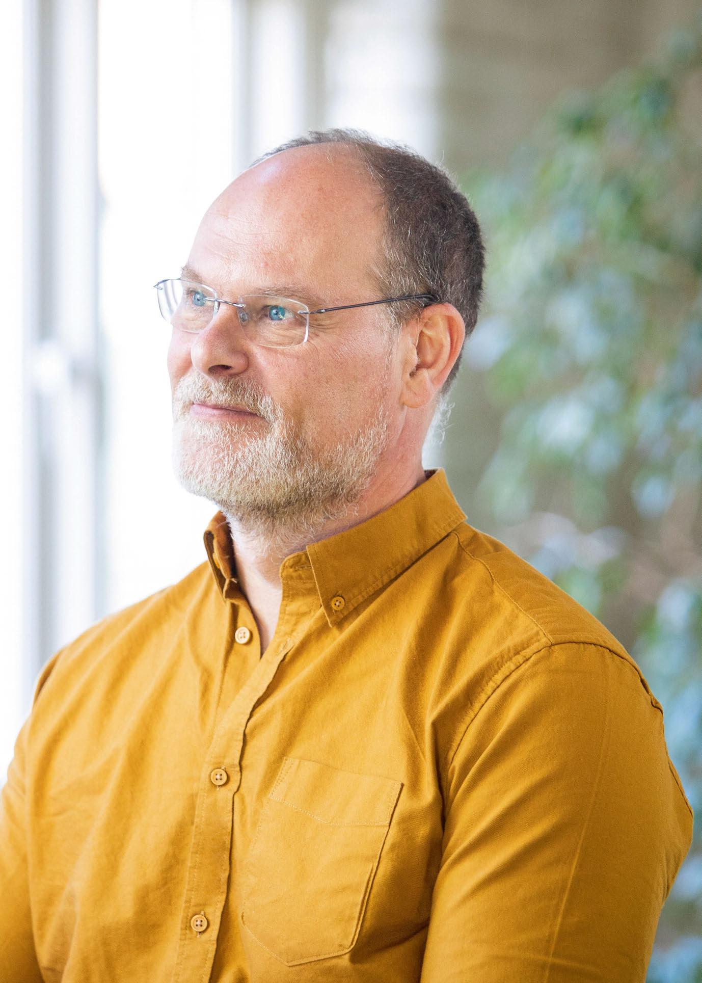
Late last year, Mark Ridler announced that he was stepping away from his position as Head of Lighting at BDP. After more than 40 years in the lighting industry, 19 of which at BDP, Ridler began 2023 taking up a new position as Director of Programmes at the Spinal Injuries Association. The move marks a big transition for Ridler, but is a natural one considering his career-long ambition to create work with a strong ethical consideration and societal impact.
As with many in the lighting community, Ridler found the profession almost by accident, discovering theatrical lighting while studying Engineering at the University of Cambridge. He recalled: “When at university, another student asked me whether I wanted to do a follow spot. I didn’t even know what one was. I’d just stopped rowing and was looking for something to do outside of studying and said yes. So, my first connection with light was very physical – actually holding and directing a light at a performer and looking at the impact it had on them and the audience. I fell in love.
“I was always split between being good at science and the arts. I had to make a choice for A Levels and pursued the sciences, but I was always hankering after the arts. I rejected pure science for engineering because it had a more direct impact on society. I abandoned engineering because at the time it had little or no ethical consideration – an ‘I make the bomb; I don’t use the bomb’ mentality. But here was a profession, lighting in theatre, that did have an ethical context, made a societal impact and also allowed me to combine science and art. It was utterly compelling, but it was a complete fluke that I found it.”
Following his studies, Ridler developed a successful career in theatrical lighting, a career that he said led to “doing increasingly bourgeois shows and evermore travelling”. However, after getting married and starting a family, he sought a change of lifestyle.
“Architectural lighting had intrigued me for a while with the advent of theatre lighting designers illuminating buildings, notably at the time the Lloyds and Hoover buildings,” he said.
“I was doing a lot of networking and met the likes
of Janet Turner, Mark Major and Jonathan Speirs, and others. Maurice Brill was advertising at the time for a senior at MBLD; I applied and got the job. That was a very fast learning curve, but with the support of Rob Honeywill and Kevin Theobald, I made Associate.”
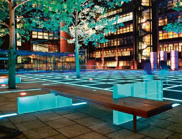
In 2003, Ridler was involved in a road traffic accident, which resulted in him becoming a T10 paraplegic, unable to walk. Following his accident, Ridler explained that he wasn’t able to return to MBLD but was instead offered a job at BDP by then Head of Lighting, Martin Lupton. Lupton had seen an IALD presentation delivered by Ridler about Finsbury Avenue Square – a particularly notable project in his career – and offered him a job as a senior. “The following summer I was moved up to Associate, a couple of years after that Director, and in 2010 when Martin left, Head of Lighting.”
With a background in theatrical lighting, Ridler explained his ambition when he first stepped into the world of architectural lighting: “Coming from theatre, where my work was available to small, paying audiences, it was to make the beauty and power of light available to the widest possible audience, free at the point of delivery.”
This approach led to Ridler preparing a paper for PLDC on the ethics of lighting. “Essentially, the ethos I proposed was that design needed to be centred around the desires and needs of our ultimate clients – all those that use, inhabit, and encounter our designs. It has been my guiding principle ever since,” he said.
Throughout his career, Ridler has worked across a broad range of sectors, from hospitality and retail to infrastructure, workspace, and more artistic installations. This wide variety has meant that he never wanted to specialise in one particular area.
“There is delight and frustration in every sector, and learning that can be carried across each that drives creativity,” he said.
“If you are good at listening to clients and understanding their operational needs, then a lighting design is always about revealing the human form in an architectural envelope, facilitating a variety of activities and hopefully creating an atmosphere that complements or inspires that activity.”
Top right: Life Cycle, created for Signify’s Transitions, Light on the Move roadshow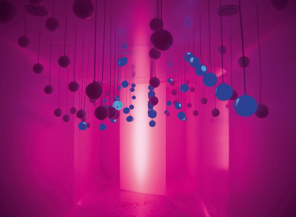
Despite having an ethical guiding philosophy in his work, Ridler feels that he never developed a signature style or aesthetic. Instead, projects are “driven by the context, be it architectural, political, social, historic, environmental, etc”. As such, each project has a very different look and feel. This is an approach that he hoped to instil within the lighting design team at BDP as well. He continued: “I led BDP as a design collective where each designer’s voice has equal weight, irrespective of experience, based upon the quality of the ideas expressed.”
Across an impressive body of work, Ridler cites Finsbury Avenue Square as a project that “put me on the map and changed my life in many different ways”, but as for an overall favourite piece of work, he said it’s “like trying to choose your favourite child”.
“I’m going to nominate one of my last projects, which few of your readers will know because it hasn’t been photographed and publicised yet,” he added. “It is a disused warehouse in Glasgow that has been turned into an event space; it is clearly visible from across the water and adjacent train lines, and accessed by a new public square owned by Barclays.
“Designed with Tom Niven and Bojana Nikolic, the concept used ring of light techniques that Roger Deakins developed for film, combined with a complex colour play through a lattice of
exposed rafters. Scenes are auto-generated from local climatic conditions and the whole thing is immersive and beautiful.
“Different designers come to concepts in many different ways. I’m still essentially a theatrical designer at heart. The process of having determined the available mounting positions, the look and feel is derived quickly and intuitively, and so it was with this one.”
Alongside his stellar design work, Ridler has throughout his career worked closely with organisations intent on driving positive change in the industry, from previous work with associations such as the ILP and PLDA, to more recently serving as a founding member of the GreenLight Alliance. This is something that Ridler believes ties back to his guiding ethos.
“Design has to be for everyone that encounters our design, which makes sustainability imperative,” he said. “Carbon is rightfully the concentration during a climate emergency, but it is the mass extinction event that human society is causing that should drive the circular economy, in my opinion. That, and resource depletion.
“I have always been collaborative by instinct, which is why I have devoted time to the ILP and PLDA in the past. The GreenLight Alliance is another example of how likeminded people can get together and make change.
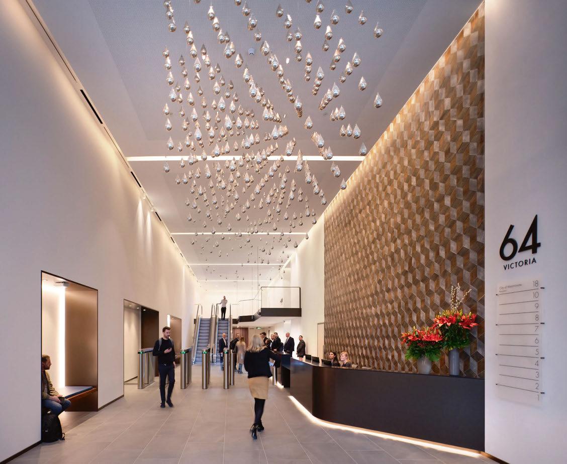
“The world of lighting is special because it acts as a community. While we are in competition, there is a mutual respect and affection. If I am going to miss anything, it will be that.”64 Victoria, London, UK (Image: Philip Vile)
CREATE THE COLOUR CREATE THE MOOD
“I think it is doing great work with tangible impacts, like TM66, but almost more importantly by influencing the culture within the industry. There is a long way to go, of course, but I haven’t seen a similar initiative achieve as much as this in such a short time.”
Over the course of his 40 years in lighting, Ridler has seen a number of advancements and changes across the industry – not just in terms of lighting technology, but in the way that we work. “The biggest change has to be mainly technology,” he said. “At the start of my time at MBLD, we had one computer, faxes, no email, and concept presentations were paper pictures cut out and stuck onto bits of board.
“Since 2003, there has been the explosion of the internet, social media, CAD to BIM, Adobe Photoshop and InDesign, the rise of video, communication over multiple platforms, mobile phones, Teams vs planes. So, everything to do with the production, distribution and exchange of design is faster – time for thought, planning, creativity, is at a premium, and I miss the widespread use of pencils.
“In lighting itself, the big change has been LED, of course. But control has also evolved, in particular into auto generation. Smaller, more discrete, lower energy, cooler, more precise optics, more control over the quality of light, but with the loss of the beauty and controllability of tungsten.”
As for further changes in the industry going forward, Ridler believes that the continued developments in technology, and in particular AI, could have a lasting effect. “I feel like a canal worker being asked that question [about the future of the industry] just at the beginning of the railways. We’ll still need to move goods, but it won’t be with horses and boats, it will be with trains and steam.
“While we do things at night, we will always need artificial light, but I don’t think anyone in the industry is quite understanding the impact that technology, and AI in particular, is going to have. Will there be such a thing as a lighting designer in 20 years? Perhaps not. Will the concept of professions survive? Again, I doubt it. And if they do, the way that we monetise design will be utterly disconnected from the human time spent in the means of production, as it is now.
“We need to have a much clearer sense of what humans are good at, as distinct from machines, and concentrate on those qualities. Those who laughed at me sticking pictures onto a board with glue 20 years ago should consider how pasting JPEGs onto electronic paper will look 20 years from now. Compiling a mood board from Pinterest is well within the grasp of machines, as is selecting luminaires and optimally placing them in a model through parametric design.
“Where the industry goes is outside of our control, but what I would like to see retained is elements of humanity, empathy, lateral thinking, intelligence, and ethics.”
From January of this year, Ridler has taken on a new position as Director of Programmes for the Spinal Injuries Association. An organisation close to his heart, the Spinal Injuries Association is a national charity that provides practical help to people who have been paralysed by spinal cord injury – its purpose is to be the expert, guiding voice for life after spinal cord injury, and it campaigns, educates and supports people affected, to show that an independent and fulfilled life is still achievable with paralysis.
Prior to joining the association full time, Ridler served on its board for four years, and also on an NHS board for the last two years. He explained what his new position as Director of Programmes will entail: “My role is to lead the delivery of all the frontline services and the charity’s communications and campaign activities.
“It will be a massive challenge working in a sector in which I have no operational experience. However, the skills I’ve developed in running a business, leading teams, project work, my knowledge of the NHS and lived experience, I hope, will qualify me to bring new perspectives to what is a strategically led, energetic, thriving organisation. There’s a lot to do and a lot to learn, but then that is exactly why I’m excited.”
Looking back on his time in lighting, Ridler is hopeful that he has left a positive mark on the industry. Speculating on what his legacy may be, he said: “My friend and colleague Colin Ball joked in my goodbye card that at first I will be missed, then blamed, and then forgotten, and I think that is right. Light is intrinsically ephemeral and that is one of its attractions, so my legacy, if there is one, surely will not be projects. It may be an ethos, some words spoken that live in a memory and perhaps passed on to another with a smile.”
After stepping down from his position at BDP, the lighting team there will now be led by Colin Ball and Tom Niven. And while Ridler is excited about his new opportunity, he described the decision to leave the lighting world as “bittersweet”.
“I have been working in light for 45 years, and to leave that is going to be hard. But of course, I’m not leaving light behind. I can’t,” he said. “I live in the Cambridgeshire countryside, and I’m surrounded by the changing seasons of light and a magnificent dark night sky. I still look up every time I enter a room.
“There is much in architecture, however, that I became tired of, and I feared I was becoming stale. I need a change and a challenge, and I couldn’t make that happen within BDP, so it was time to hand the baton to the next generation and do
something else. The future is bright with Colin and Tom. They are both talented designers, and have very complementary skills. They have already grasped the opportunity and articulated a vision on growth and internationalism.”
While he hopes to still keep an eye on the goings on in the lighting world in the future, he offered some closing words of advice to the industry to which he has devoted 40 years of his life: “For all the troubles in the world – political, economic, environmental – we as designers have agency. We can make a difference. That should be a source of hope that is important, I think.
“On occasion, look up from the day-to-day challenges and realise and celebrate the work that we have done. As a profession, much of it is good, and it is important to be kind to ourselves and remember that at times.
“The world of lighting is special because it acts as a community. While we are in competition, there is a mutual respect, and in many cases in my experience, affection. If I am going to miss anything, it will be that.”
www.spinal.co.uk
www.bdp.com
During Miami Art Week 2022, cultural institution Aorist unveiled a new commission from immersive art group Random International, entitled Living Room Housed inside a purpose-built pavilion at Faena Beach, Living Room continues Random International’s exploration of the impact of technological development on the human condition, utilising Web3 to expand the boundaries of immersive and experiential art. The installation examined the idea of space as a living entity; visitors were invited into a fluctuating architectural domain, in which shifting lights, fog, and sound responded to the audience’s movements in unpredictable ways. As visitors navigated through the installation, their movement was tracked and recorded by an array of motion sensors. Every individual’s unique data could be visualised and compressed as a looped video, which visitors could collect as an NFT on Aorist’s marketplace by utilising their entry ticket’s unique ID. The data that the Living Room gathered accumulated across the lifespan of the artwork, creating a visual archive of the installation’s ‘life, that will be minted as an NFT, making it the first archive of an immersive artwork to be stored on the blockchain. Hannes Koch, co-Founder of Random International, said of Living Room: “The installation functions as an architectural organism that uses its materials and components to express itself and interact with those who inhabit it. Living Room creates a living labyrinth that invites visitors to co-create and document their ephemeral experiences, bridging experiential art and blockchain technology for the first time.”
Ximena Caminos, co-Founder and Chief Cultural Strategist of Aorist, added: “I have always been drawn to new forms of art that blur the boundaries of a wide spectrum of disciplines. Living Room is just that, an exercise of artistic co-creation with the machine, where the input is the interaction with the physical installation and the output is the unique data on the blockchain. By creating this type of cross-disciplinary experience, Aorist champions artists to explore new territories while building new models to experience art and ignite imagination.”
Following its premiere at Miami Art Week 2022, Living Room will embark on a world tour with museums and institutions worldwide. www.random-international.com www.aorist.art
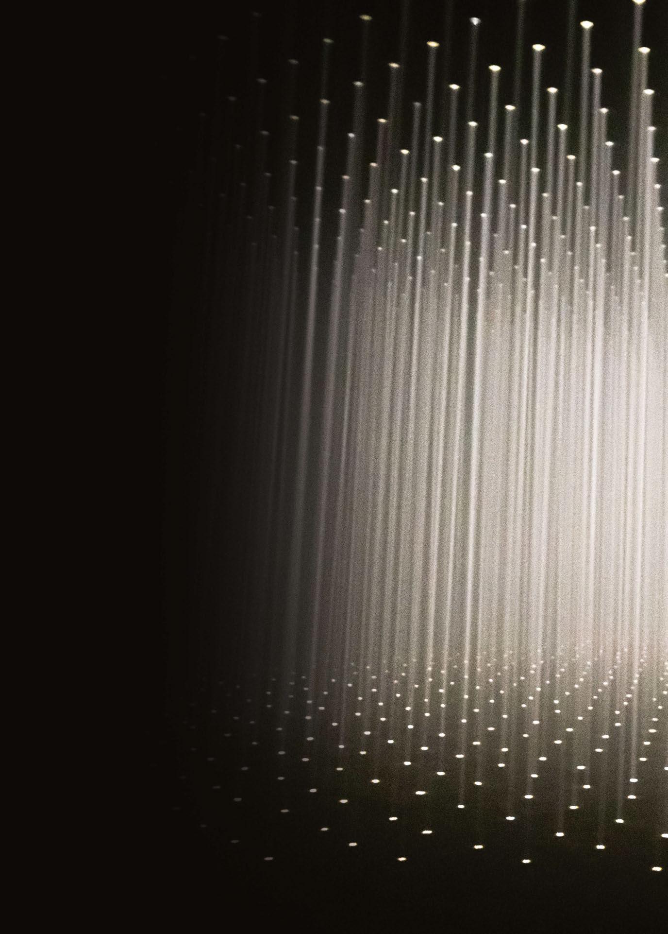
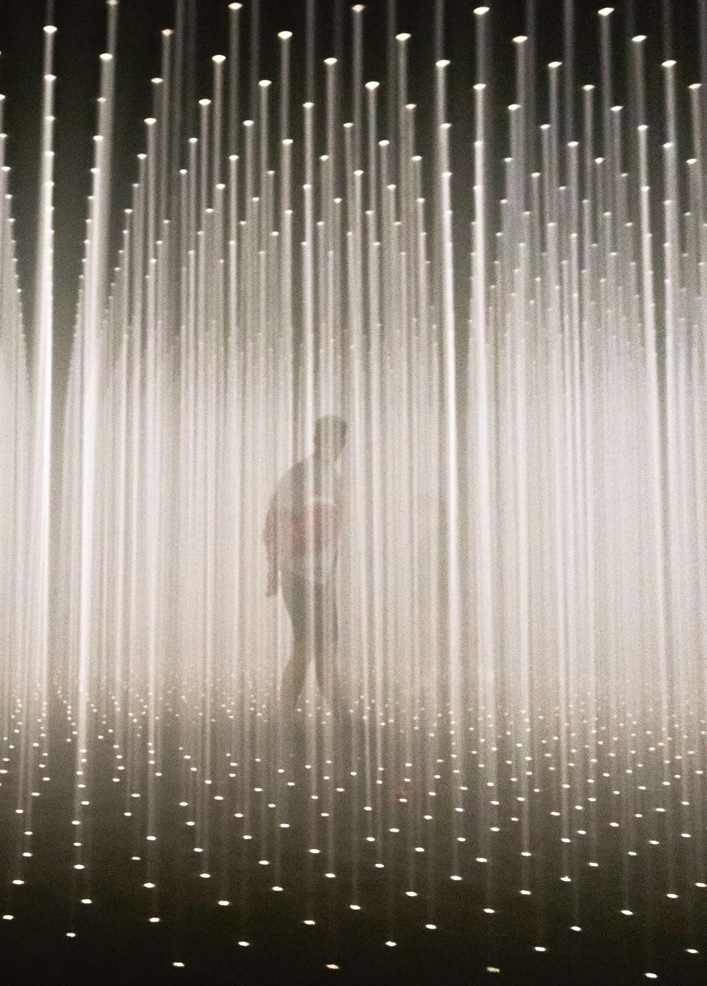 Image: Random International
The latest collaboration between Dior and Metis Lighting has seen the Italian studio design the lighting for the French House’s flagship Paris store.
ating back to 2008, Italian lighting design studio Metis Lighting has collaborated with Dior on a number of projects around the world - the studio’s expertise in high-end retail lighting pairing well with the designer brand’s luxury aesthetic.
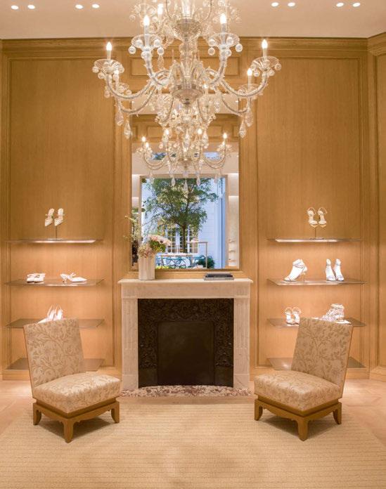
The collaboration has seen Metis Lighting work on Dior projects in Hong Kong, Miami, London, and multiple locations in Paris - Dior Atelier in Goujon Street, Fine Jewellery in Place Vendôme, and the Dior Saint Honorè store. Most recently, Metis has completed the lighting design for the renovation of Dior’s 30 Montaigne, situated on the iconic Parisian avenue.
The Dior 30 Montaigne project saw the reunion of another longstanding collaboration for Metis Lighting, with Peter Marino Architects. Paolo Giovane, Project Manager at Metis Lighting, recalled: “Since 2010, we have illuminated Peter Marino Architects projects like Louis Vuitton Maison Etoile in Rome; the legendary Bulgari Condotti in Rome and Bulgari Flagship store in New York,
with its majestic façade; Fendi and Celine stores worldwide, and high-end residences, to name a few.
“For the renovation of 30 Montaigne, the intent was not to design just another store, but rather to create a full-scale showcase of Dior’s universe and mastery.
“Peter Marino Architects set to create an urban, retail and aesthetic landmark, and a milestone for the brand itself – an idea rather obvious on the first renderings.”
Within the store, every space has its own story and precious details, which together create a coherent journey. Thanks to the skillful use of materials, finishings and architectural gestures, the design resulted in an extremely rich set of ‘episodes’, revealing themselves sinuously.
In this context, the entire Dior collections would be exposed – from shoes, bags, RTW and Haute Couture to Fine Jewellery and Homeware – next to a restaurant and café inside a Winter Garden, and a suite for exclusive clients to stay.
Peter Marino also introduced a series of artworks –both historical Dior references and contemporary art – throughout; a 303ins rose by Isa Genzken, a custom wall collage by Guy Limone, a light sculpture by Paul Cocksedge, and flower creations by Azuma Makoto next to archival photos of Christian Dior and his hand drawings.
Giuseppe Scuderi, Senior Lighting Designer at Metis Lighting, continued: “Our job was to translate the atmosphere and feeling of every single area into lighting terms and qualities, while following the development and flow of the client experience.
“At the same time, this flow had to integrate both the sense of wonder and surprise, but guaranteeing visual comfort along with the necessary illuminance requirements. 30 Montaigne was a retail space, but the criteria for lighting went far beyond, seaming together various principles.
“In such a space, we had to create light to be felt, not seen. It had to reveal the space silently.”
With this in mind, while there was an established lighting concept for the retail lighting criteria, the designers at Metis Lighting wanted to challenge themselves with coming up with a new twist that such an ambitious project deserved.
Considering the significant size of the store and its energy requirements as well, the efficiency of every light fitting had to reach the highest level possible.
“The main goal was to reach the Dior stores’ very high standards, while offering a creative and technical twist,” added Scuderi.
“Our research brought to life new details, new light fittings, custom solutions, following our common leitmotif; details build the overall result.”
The continuous variation in both the exhibited elements and architectural qualities of the space was both challenging and exciting for Metis Lighting, as it implemented its lighting scheme.
In particular, the Maison and Fine Jewellery areas, although located close together, were completely different in design, “like two planets in the same galaxy”. Lighting here moved from downlights, through to “fake skylights” and suspended tracks with projectors.
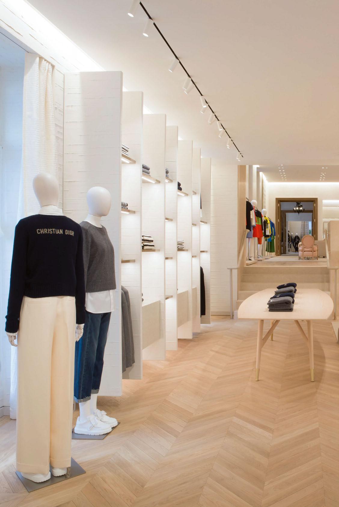

Elsewhere the Knitwear Paradise, evening wear and VIP rooms were three different sequences of spaces, each of which had different materials, displayed objects and lighting. Passing from ceiling mounted tracks with projectors to very shielded downlights, to decorative chandeliers, created a sense of rhythm, while also visually enhancing the variation and perspective.
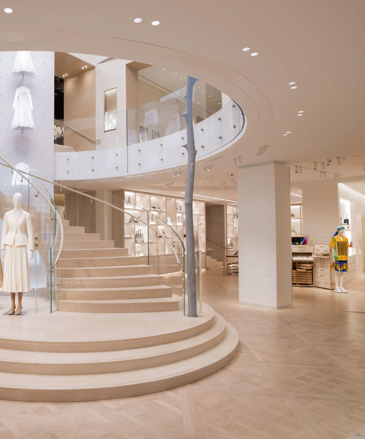
The same is true of the staircase, where a constellation of downlights sits alongside projectors mounted inside the round ceiling reveal, following the architectural lines and luminous ceiling coves to work as an entry line for the atrium garden.
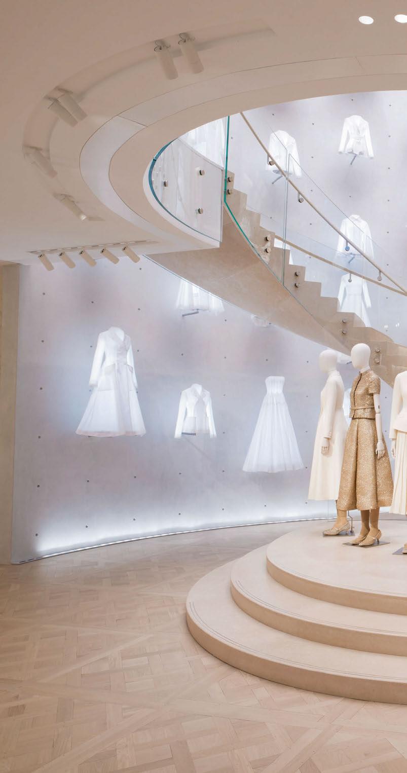
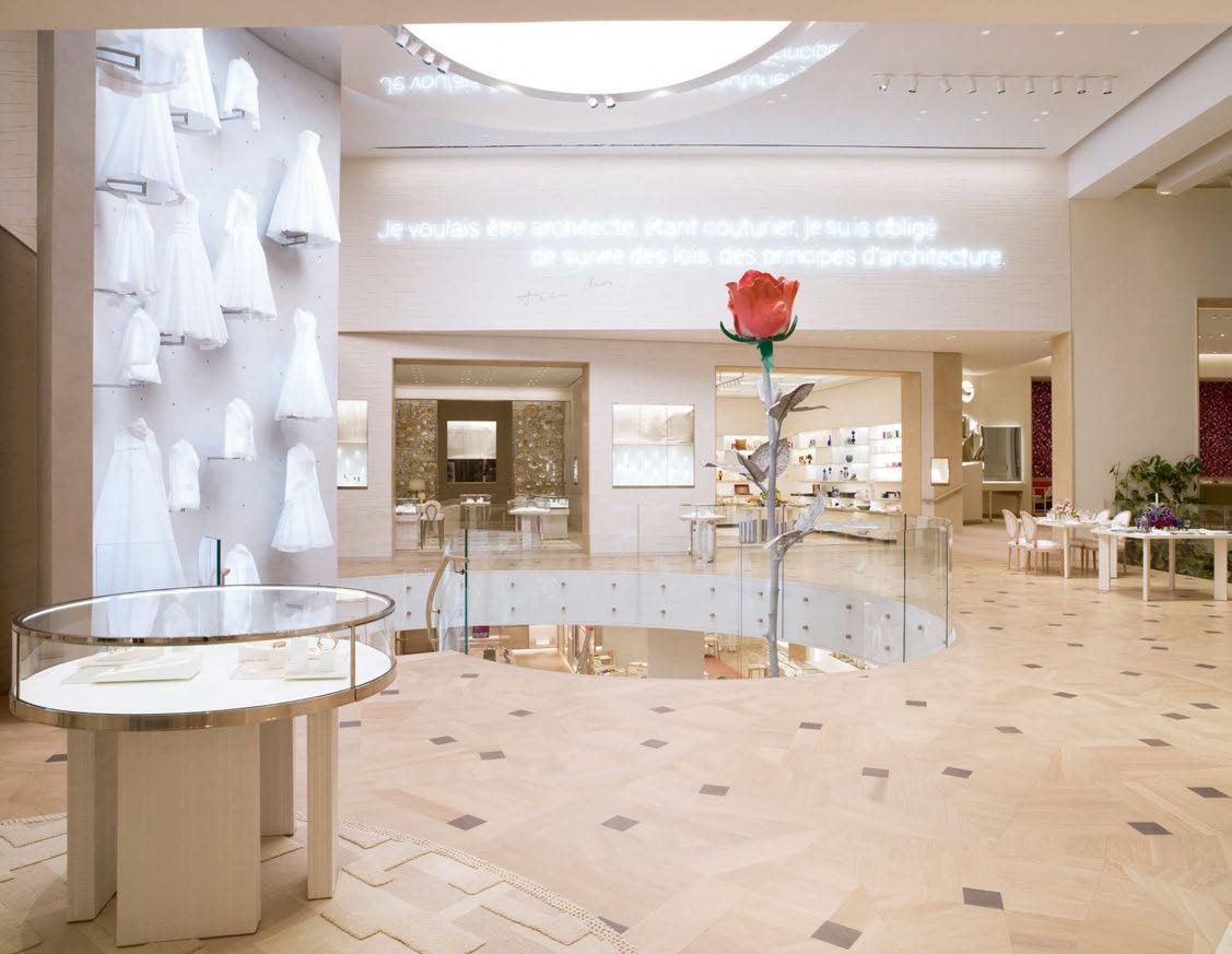
With its floating mannequins wearing the ‘white canvas’ dresses, the staircase is one of the main focal points of the store. The display was inspired by Dior’s Shanghai exhibition Christian Dior: Designer of Dreams, where iconic dresses were mounted on a wall and illuminated very tightly by museum spotlights.
“Recreating the same floating effect in a retail space filled with light wasn’t so easy,” Scuderi explained. “At the same time, the staircase was right next to the skylight over the covered garden. We suggested introducing a wide luminous ceiling for inundating the staircase with diffuse light, counterbalancing the adjacent natural skylight.
“The mannequins also became luminous, integrating light and powerful remote-controlled projectors in the ceiling added focal light. This was one of the instances where museum principles were transferred into a retail space where illuminance and contrasts to work with are completely different.”
From the entrance (Rotonde), visitors can get a glimpse of the bar in the covered garden area, and even further to the restaurant. Lighting therefore had to maintain this fluidity, silently driving through the sequence of moments while also working as a fil-rouge. Either by maintaining a high lighting quality or by balancing the contrasts and luminosity throughout the space, setting visual landmarks along the transition spaces, the overall atmosphere was coherent and, most importantly, visually pleasant.
“Every light effect was like a single instrument making part of the orchestra, playing the same soundtrack underlying Peter Marino’s design; allocating skillfully visual balance, contrasts, and wonder,” added Scuderi.
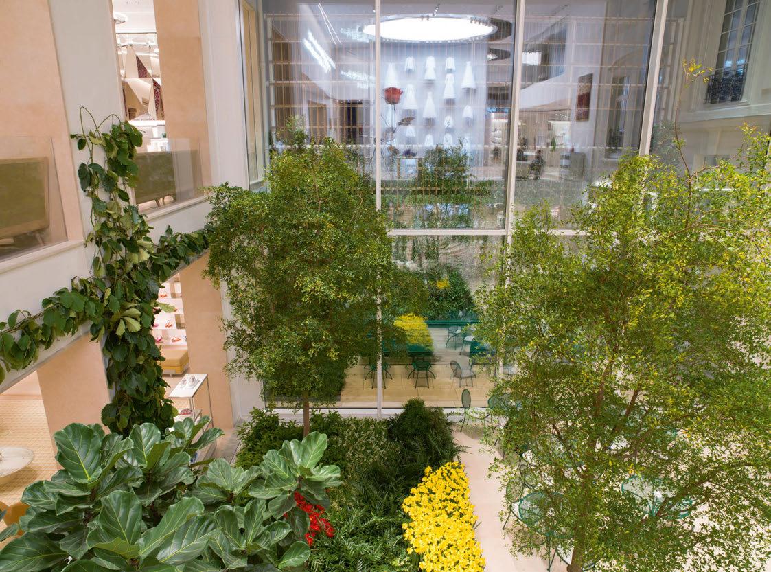
With the introduction of the garden space, there were further considerations for Metis to take into account, to ensure that the lighting would be suitable for the plant life, without interfering with the wider ambience. Scuderi explained: “This was another tricky balance to obtain. Of course, we wanted to illuminate the garden and greenery with the proper colour temperature and amount of light, but at the same time this garden was right next to a cozy café, and the ceiling was made of glass with only several structural beams to accommodate track-mounted projectors. “Choosing the right number and position of projectors with different colour temperatures and beams was our task, and of course the final commissioning and scene setting. Light had to disappear while illuminating properly each element: warm light for the functional illumination, focal light on the tables and bar counter, and cooler light on the vegetation; the green background wall with cool light and the seating with warm. Different colour temperatures and light qualities overlap and the result stays coherent. This was a very exciting game.”
As a lighting design studio, Metis Lighting specialises in boutique, designer retail projects –as evidenced from its longstanding relationship with various brands, including Bulgari, Gucci, Alexander McQueen and Hermès. Comparing Dior 30 Montaigne to other high-end retail projects that the studio has worked on, Scuderi said that it was “particular from all points of view”.
He continued: “All our retail lighting expertise, even from previous Dior stores, was only a part of the overall scheme, and it had to be provided while tuned with the rest of the different uses of the building. First and foremost, being an existing building – a former private mansion built in 1865 – it held a series of architectural standards, limits and requirements that had to be integrated in the design process.
Client: Dior
Lighting Design: Paolo Giovane, Giuseppe Scuderi, Roberta Miani, Metis Lighting, Italy
Architect: Peter Marino Architects, USA
Interior Design: Peter Marino Architects, USA
Lighting Suppliers: Flos, formalighting, Formula Luci Italia
Photography: Kristen Pelou
“The entrance (Rotonde) maintained the existing metal beams, becoming a trace in the ceiling, and obviously lighting had to follow. The VIP Winter Garden was covered by a glass ceiling and walls. Old and new, standard and unconventional, and the lighting followed the same pace. Even established millwork pieces were studied again and improved to reach the necessary level of detail, elevating the various exhibited elements.
“For example, the fine jewellery showcase included dynamic white lighting and specific illuminance values for illuminating the precious stones and materials, while the apparently similar showcase close to it displaying the restaurant menu had a warm colour temperature and diffuse illumination. This was the same for the light integrated into the shelves holding shoes or bags. Each one integrated different lighting details and light fittings.
“So, the variety of elements and features was immense, and it had to maintain the same standards and cohesion. A lot of custom-made lighting fixtures were designed, or standard ones that had to adapt mounting, specifications or finishings to meet the project’s needs, both for millwork and ceiling.”
With all of these challenges to consider, it is no surprise that the project took three years to complete. However, Scuderi said that while this may seem like a long time, it was also not enough, given the “high complexity of the tasks to manage”.
“With lots of determination – and along with the pandemic outbreak – our experience in managing such projects as a team was the only way for us to reach this result. Finally, the multiple Zoom calls, sometimes from our own house, and the positive comments by Peter Marino himself over a screen, became final on-site tours moving furniture and fine-tuning every light fitting, making this journey spectacular.”
Overcoming such challenges, as Claudio Valent, Founding Partner of Metis Lighting, said, is not at all a given, or a matter of luck. Rather, it represents the result of years of research, experience and professional growth, managing a team, collaborating with the various actors of the project and a continuous work on the team’s limits and skills.
Scuderi concluded that all of this put together “in a pot with a sprinkle of genius, twists of courage and some spoons of last-minute epiphanies, is the Metis Lighting recipe.”
www.metislighting.it


French lighting design studio Light is More has recently developed the lighting for a number of Cartier’s new flagship stores. We step inside the latest, in Haikou, China.
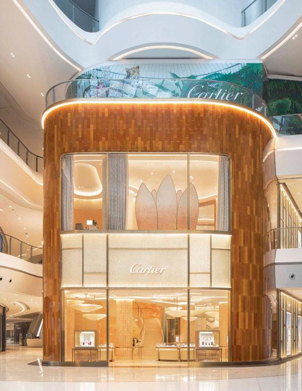
hen a luxury jewellery brand opens a new store, it is only fitting that it has a design to match the quality of the products on display. This was the case for Cartier, which worked with interior designer Laura Gonzalez and Parisbased lighting designers Light is More for its most recent international flagship stores in Chengdu, Moscow and Haikou.
Light is More first began working with Cartier in 2018, initially for the lighting of the façade of the Women’s Pavilion at Expo 2020 in Dubai. Pauline David, Artistic Director of Light is More, explained how this led to the flagship store projects: “Seduced by the lighting concept for the Women’s Pavilion, the retail team quickly got in touch with us to evolve the guidelines of their international flagships and bring a feminine touch to their identity.”
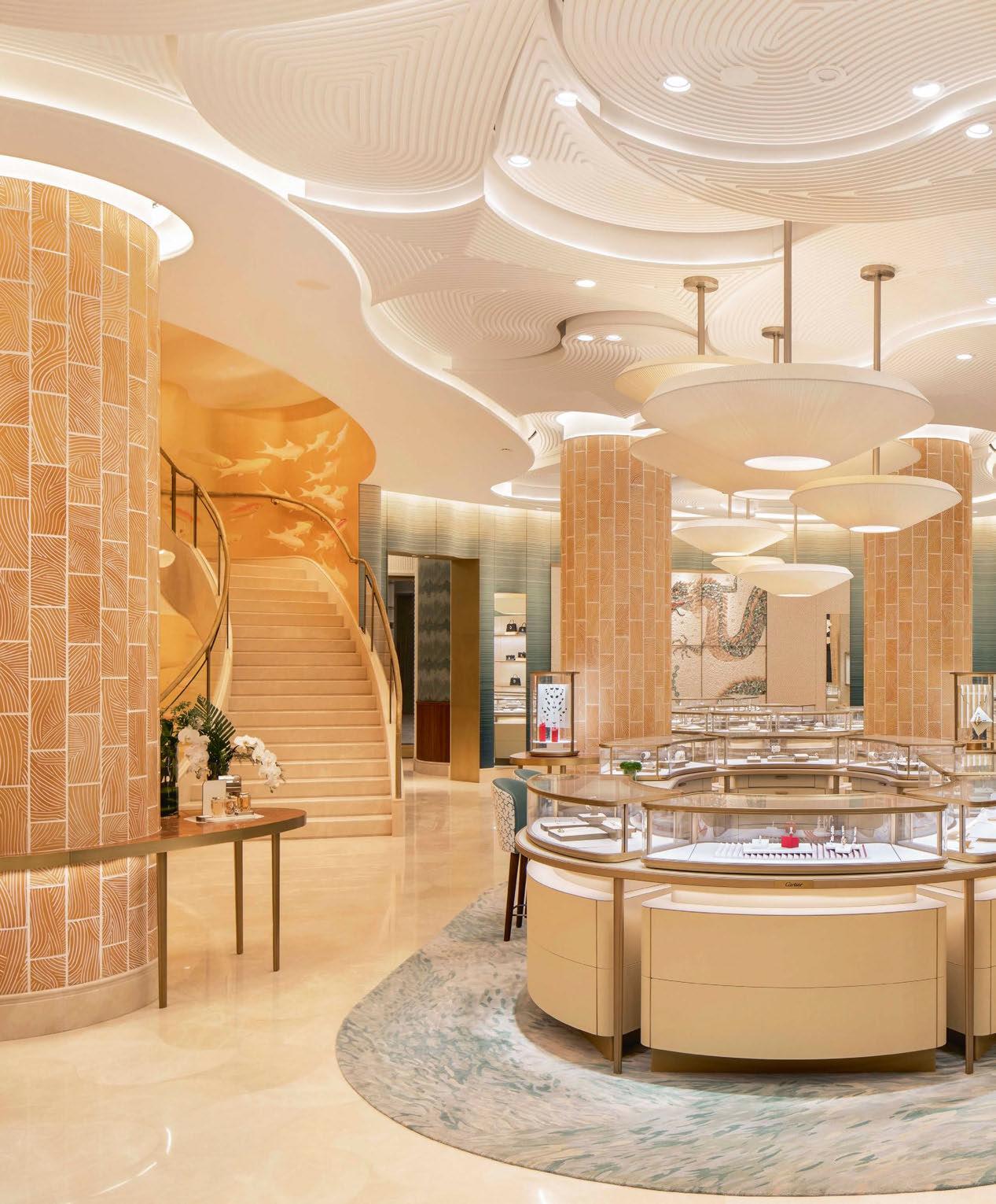
The Haikou store is the latest of which to open. Designed around a narrative from Gonzalez that takes visitors on a “journey between sky and ocean”. Complementing this approach, the architectural lighting has been kept very discreet throughout, with the aim of accentuating the architecture’s curves and highlighting the materials and volumes.
David continued: “The light envelops the materials of the spaces and brings a fluidity to the customer experience, emphasising the curves and bringing glamour and elegance.
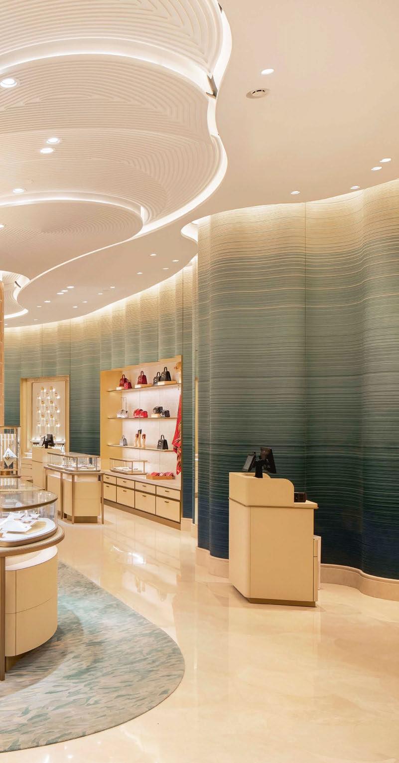
“Our desire was to balance the intensities of light, to favour the lighting of vertical surfaces that compose the large perspectives in order to open the space, to attract the customers by allowing them to perceive the shine of the precious materials, the different layers and volumes of the architecture of the store.
“The light allows for a great harmony of the decorative elements, bringing together the knowhow of the Cartier brand, the culture and history of the store’s location, and the creative imprint of the architect.”
The idea of a journey between ocean and sky was drawn from the different natural landscapes of the tropical island of Hainan – as such, the visitor is “invited for a day trip on the island from the tropical seabed on the ground floor, to the tops of its mountains, covered with lush vegetation, on the second floor”.
David explained further: “On the ground floor, everything evokes marine life. The scale pattern on the floor, the textured and grooved moving ceiling that represents the shells and plants of the coral reefs or the ripples of the ocean surface, and the undulating wall image of a giant wave in shades ranging from the deep blue of the sea to the white sandy colours of the island’s beaches.
“The light seems to pass through this surface, guided by the vertical elements, emphasising the undulating forms. The chandelier on the staircase is a call to join the surface. The same is true with the walls, which are covered with a shoal of fish painted on a gold background, enveloping the visitor as they ascend.”
With such an ornate, sculptural ceiling, the lighting designers wanted to keep light levels low, and the size of the spotlights small to minimise their visual impact, while also reducing electrical consumption. However, David said: “In the retail world where the rush to increase lighting levels is at its climax, in the eyes of the local branch the risk seemed too great in relation to their customers’ habits.” This therefore led to a replacement of spotlights for larger diameter fittings, which have a bigger impact on the plastered ceiling.
On the second floor, the ocean motif is replaced by the feeling of being “in the trunk of a palm tree”, from the large portrait of the brand’s totem panther to the rich wooden panelling on the walls. Adjacent to the façade, a large screen opens out in front of the windows, calling to mind the petals of a lotus flower – a symbol of love, purity, and happiness for couples, this signposts the store’s collection of engagement rings. Lighting here is doubled to make it visible both from inside and outside the store.
Throughout the store, the design team worked to seamlessly blend architectural and decorative lighting elements, with linear fixtures and spotlights enhancing both the store’s interior design, and the chandeliers.
1
KKDC Products used: TIMI/MIMI Glow/KURV-X
Lighting Design: Switch Lighting Design
Architect: Ignite Architects
Photography: Jono Parker Photography
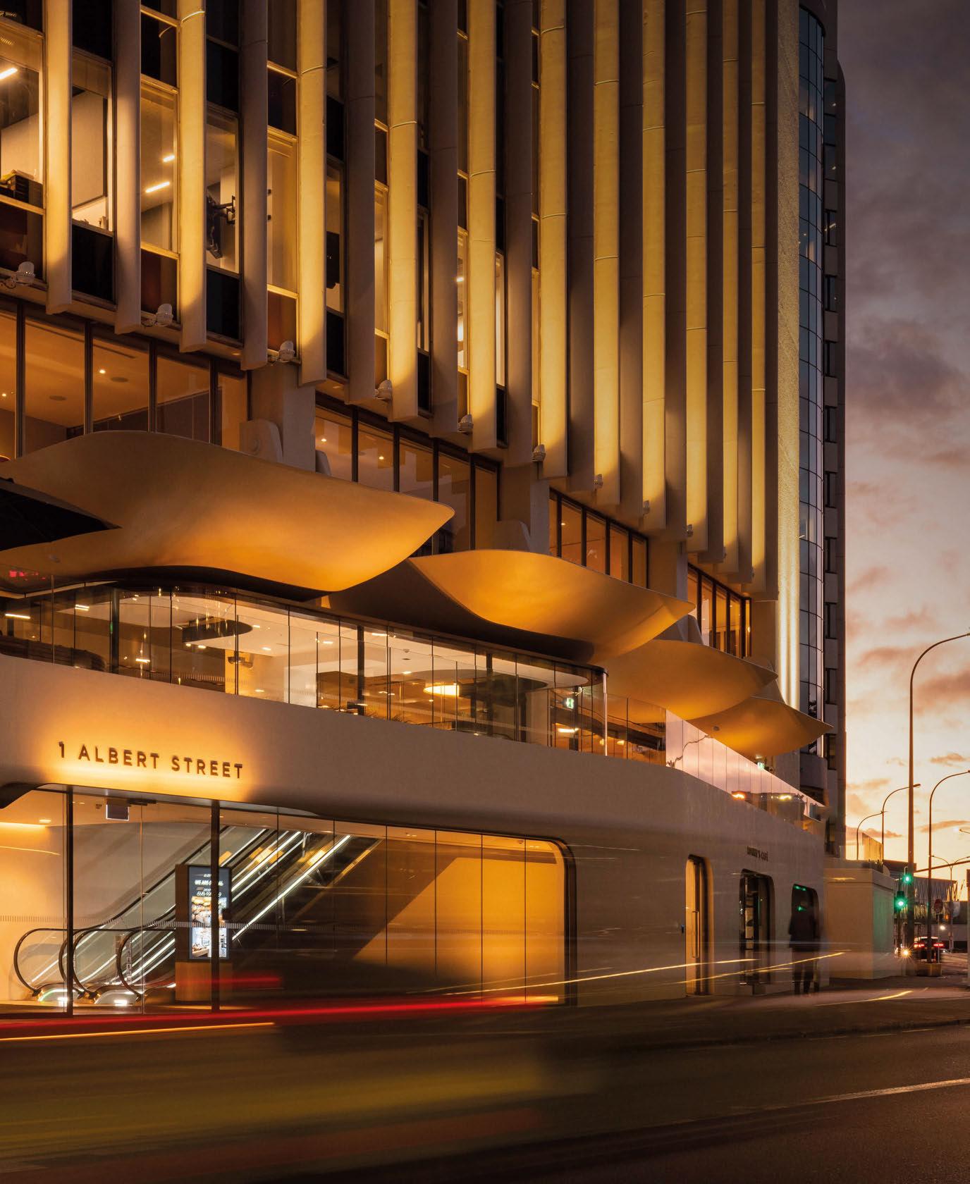 Albert Street, Auckland
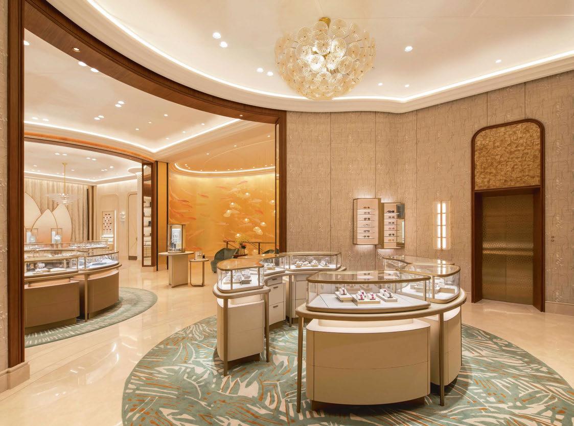
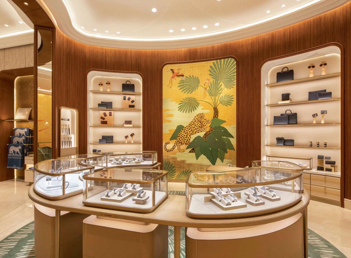
David explained how such a balance was achieved, and some of the challenges that arose along the way: “This is the art of our job, we always develop the lighting project keeping in mind the physical movement, but also the construction of scenographic points of view, as in the theatre. The harmonious result of this shop represents this work, the whole is composed in the perspective from one point of view to another.
“On the ground floor, the integration of the Bover chandeliers and formalighting spotlights into the ceiling décor was a challenge, as it had to accentuate the window displays without casting shadows of the customers or the chandeliers, and without interrupting the harmonious curved lines.
“On the first floor, however, the ceiling integration allows the result to be very airy, the light goes around the walls, columns, curtains, and wraps the brand’s collections. In each of the spaces, the light is intense along the walls, as well as on the showcases and in the background, on the brand’s focus. Between these spaces, the transition is progressive and soft.”
While Light is More has worked across a number of Cartier’s new flagship stores, David explained that the design isn’t guided by a wider “house style”.
“Depending on the architect and the location, each boutique is a new journey, a new adventure,” she
said. “It is also very representative of the brand’s constantly renewed collections. In the Haikou shop, the light reinforces the warmth and sensuality of the architecture.”
Looking back on the project after the store’s opening, David is satisfied that the lighting scheme and wider interior design enhances and complements the luxury feel of the space. She concluded: “The result reflects the fluidity of the exchanges between the various parties involved in the project. The brand’s know-how is reflected in the execution of its boutiques. This allows us to achieve a jewellery-like precision.
“The secret: a right multiplicity of light variations and a meticulous integration into the architecture.” www.light-is-more.com
Client: Cartier
Lighting Design: Pauline David, Light is More, France
Interior Design: Laura Gonzalez, France
Engineering: Hugh Dutton & Associates, France
Lighting Suppliers: ATEA, DGA, formalighting, PSLab
Photography: Courtesy of Cartier
One of the largest urban regeneration projects in Europe, Brent Cross Town has unveiled a new, 21-metre-high, 52-metre-long permanent public artwork. Created by London-based artist Lakwena and architects IF_DO, the piece is formed of a ‘wrap’ around the new electrical substation for Brent Cross Town. Titled Here we come, here we rise, the artwork sits next to London’s A406 North Circular at the junction with the M1 motorway, and adjacent to both the Thameslink railway line and the new Brent Cross West Station. It is estimated that around six million people each year will see the piece, while its exuberant
colour scheme and vast scale ensure that it will stand out as a new local landmark.
Artist Lakwena is known for her technicolour murals and graphic text poetry, and has applied her signature colour, pattern and language to the design. The inspirational title of the piece reflects the ambition to inspire and bring people together in the local community.
Working with Lakwena, IF_DO created a unique structure and façade design comprised of four undulating bands and triangular-shaped ‘lenticular’ panels that create a kaleidoscopic visual effect to emphasise the idea of movement as viewers move around the structure. As well as being a colourful new beacon for north London, the electrical substation is
also notable for its sustainable innovations. Arup led the design team with a focus on minimising the environmental impact of the structure; the project puts circular economy principles into action, with around 50% of the structural steel being salvaged from unused oil pipelines.
Lighting also plays a key part in the design of the artwork; Arup acted as the lead on the lighting design for the project, while Michael Grubb Studio was appointed by developers and co-owners Related Argent to deliver and finalise the details of the scheme to align with the overall masterplan.
Designed to be discreet and attract attention to the artwork during the day and at night, the lighting creates a halo around the façade’s wrap, which filters down through the structure, allowing the light to fade away at lower level.
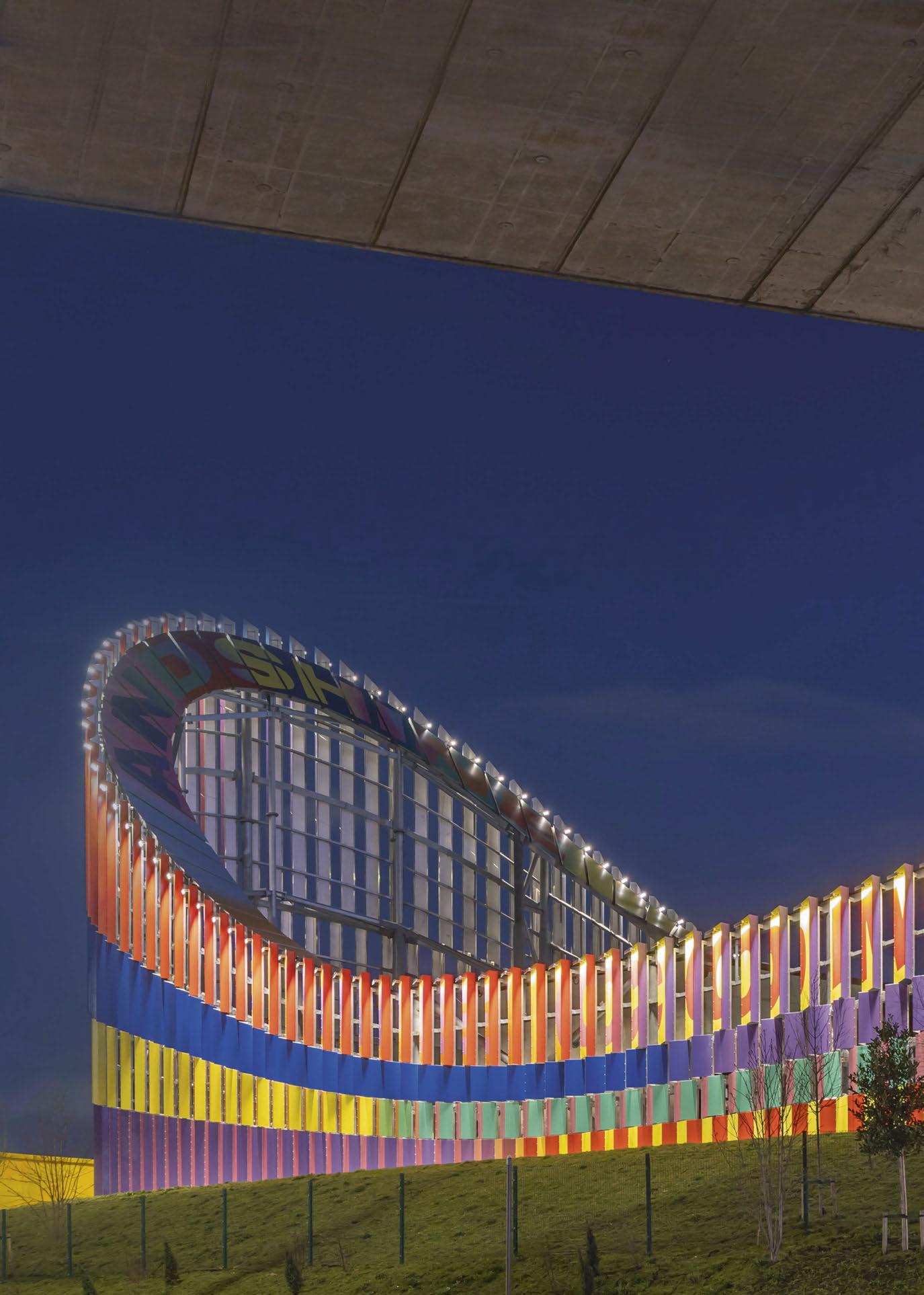
www.michaelgrubbstudio.com
www.arup.com
eye opener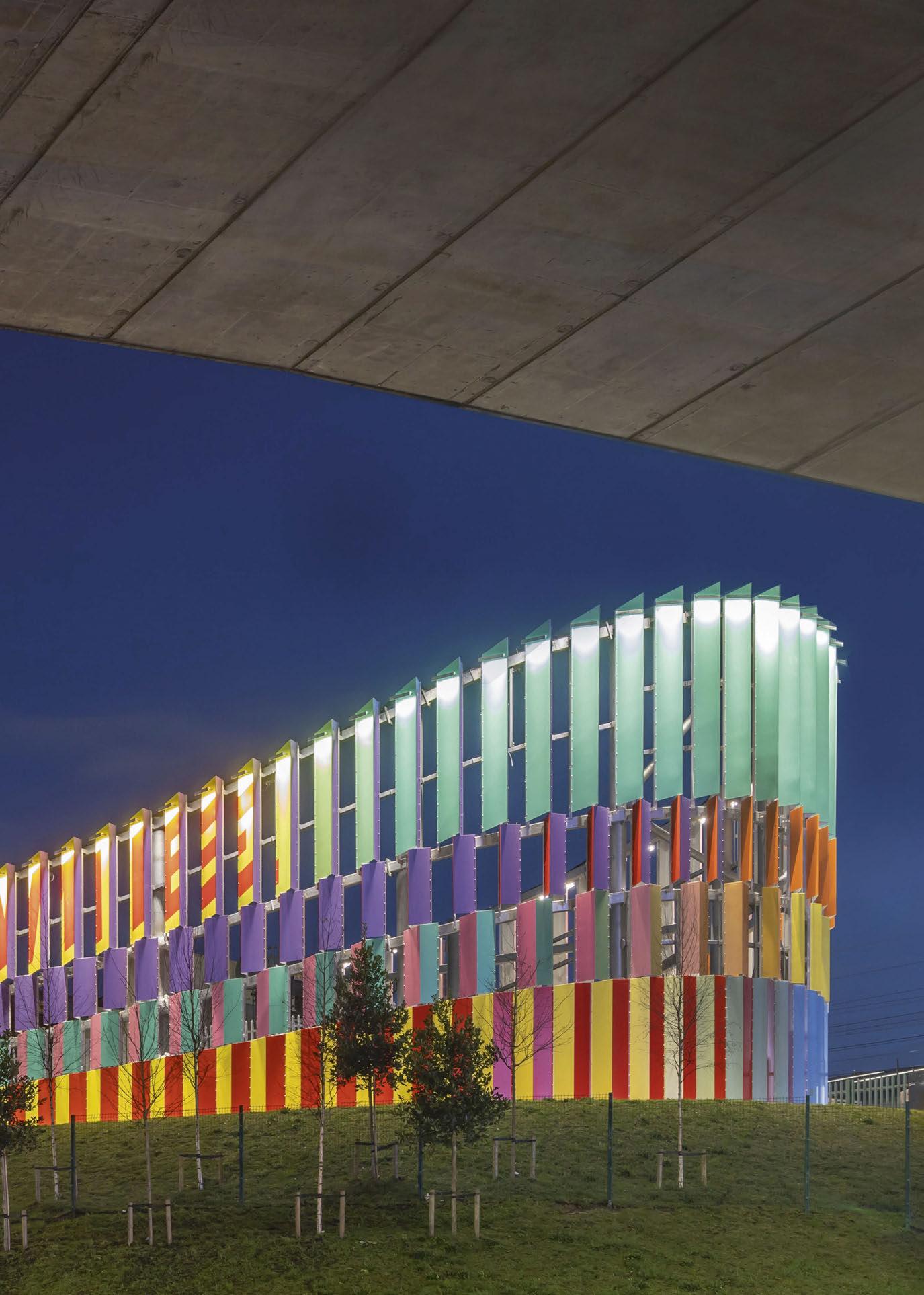 Image: John Sturrock
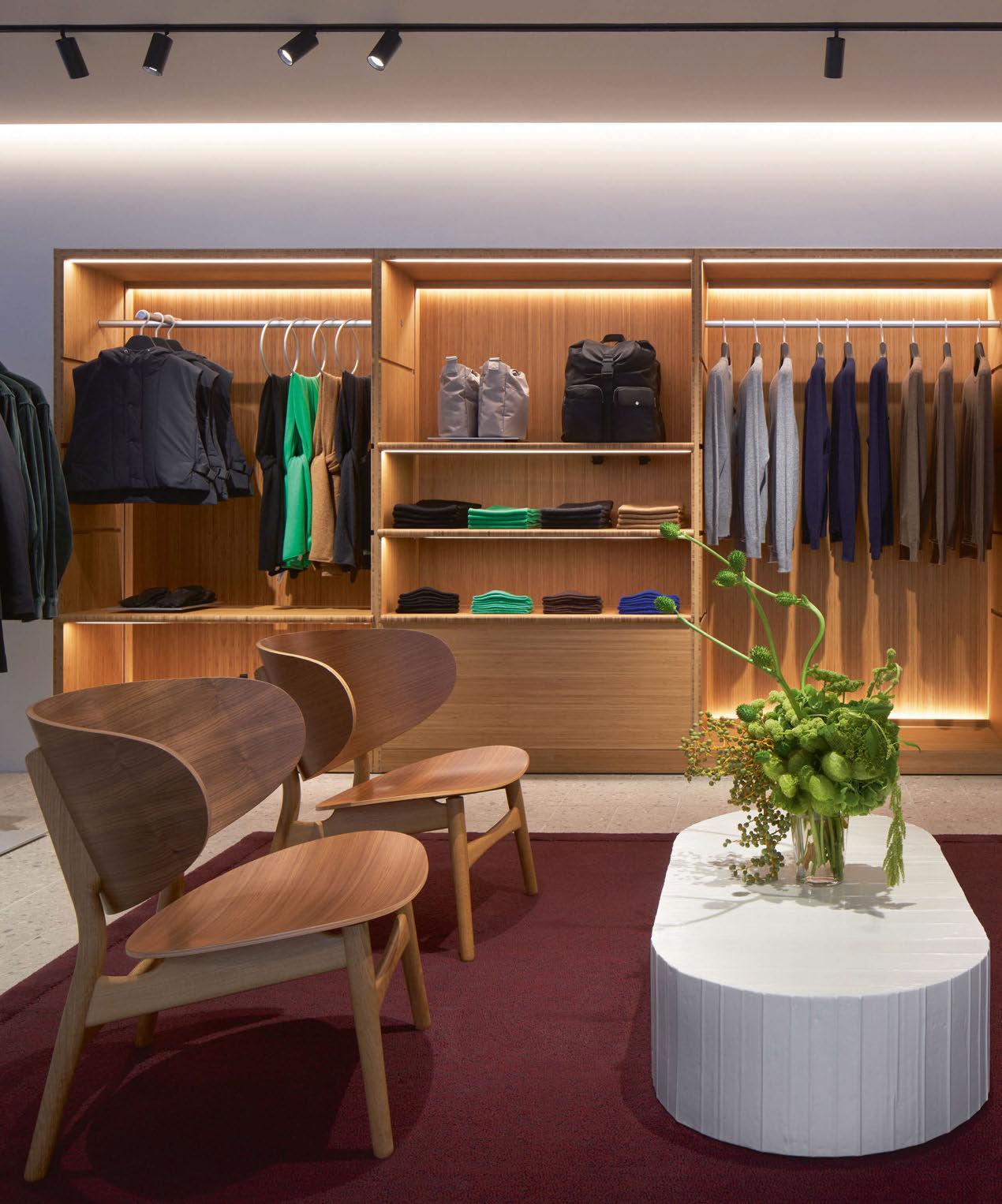
As part of a recent rebrand, sustainability-focused clothing brand COS has redesigned its stores around the world. The brand worked with Isometrix on the lighting design for its Stockholm flagship store.
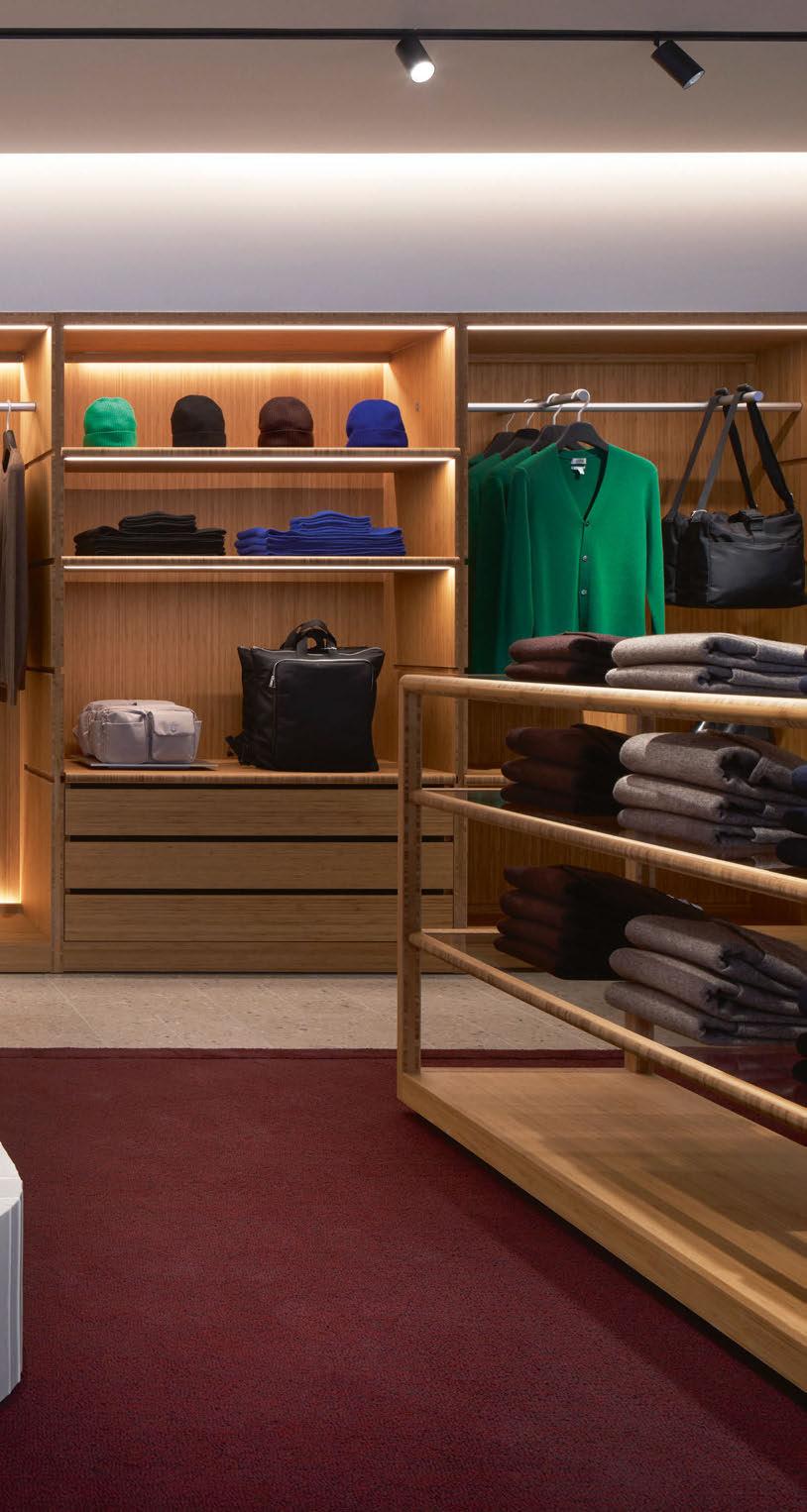
art of H&M Group, COS is a sustainabilityfocused apparel and accessory brand. After opening its first store in London in 2007, the brand has since expanded, and now has establishments across the world.
Late last year, COS re-opened its flagship Stockholm store on Biblioteksgatan, based around an innovative approach; the store is the first in Europe to adapt a new concept featuring a sustainable design and gallery-like space that will host artworks and collaborations, celebrating the brand’s inspirations from contemporary culture. The concept was developed by the brand’s inhouse designers with the ambition of creating fully circular store environments. Lighting designers from London-based Isometrix, were approached by COS to collaborate on the new concept for its stores and design a lighting scheme to match.
“Our design brief was to elevate the COS interiors to align with their brand identity,” said Arnold Chan, Principal at Isometrix. “Their aim was to evoke an emotional response of belonging, inviting their customers to discover the collection through tactile, sustainable materials and customercentric design. The purpose was to enhance the customer experience while shopping and produce an atmosphere that is visually cohesive with the architecture and materials.”
The new look of the store is characterised by new techniques in the organisation of the space, while it also aims to engage the senses and create a fresh, playful atmosphere.
Spread across two floors, spanning 566sqm, the store utilises a number of sustainable materials and fittings as part of COS’ goal to reduce store CO2 emissions while maximising the lifecycle of all of its interiors – the new Stockholm location uses 66% more recycled material decors than the original COS store. Some of the sustainable measures taken by the in-house designers include a fully circular flooring system, 30% recycled aluminium rails, 100% recycled polystyrene mannequins (in place of fibreglass models), statement display tables made from recycled paper or cellulose pulp, and the removal of heavy concrete fittings.
The lighting therefore looked to highlight this design choice, accentuating the materials used. Ryan Jones, Senior Lighting Designer at Isometrix, continued: “Our concept was to celebrate sustainable materials selected by COS, creating depth while ensuring the garments were lit effortlessly, distinguishing colours and textures alike.
“We’ve strived to marry the architectural features of the space with the warmth of light to respond both to the personality of the locations and the collections on display.”

To bring the lighting concept to life, Isometrix held a series of workshops with the wider design team, and built mock-ups of the garment rails, flooring and ceiling in its studio to refine the architectural lighting details with COS. This allowed the lighting designers to determine the spacing between the spotlights to illuminate the garments sufficiently. Once the details were finalised, Isometrix visited a larger mock-up in Stockholm to review all the lighting details, spatial qualities, and ambience holistically.
Due to local regulations, the design team at Isometrix needed to adhere to stringent requirements, which Jones explained proved to be difficult. However, he added that they were able to “facilitate that process due to our close relationship with the manufacturers”.
He continued: “There were structural constraints that proved challenging, in which we needed to adapt the details for the lighting to work sufficiently. We also had to take into considerations all the materials of the ceiling and walls, the ceiling height, and the display furniture, in order to create a harmonious lighting design that emphasises the garments.”
The sustainability goals of the store also extended to the specification of the lighting fixtures, with Isometrix looking to limit waste and improve efficiency, where possible. Utilising fixtures from Prolicht and Delta Light, Kim Chan, Intermediate Lighting Designer at Isometrix, explained how the sustainable ethos factored into the lighting design: “We discussed with the manufacturers the use of environmentally friendly packaging materials, minimising the waste when delivering the products to site. Through our research and refined design,
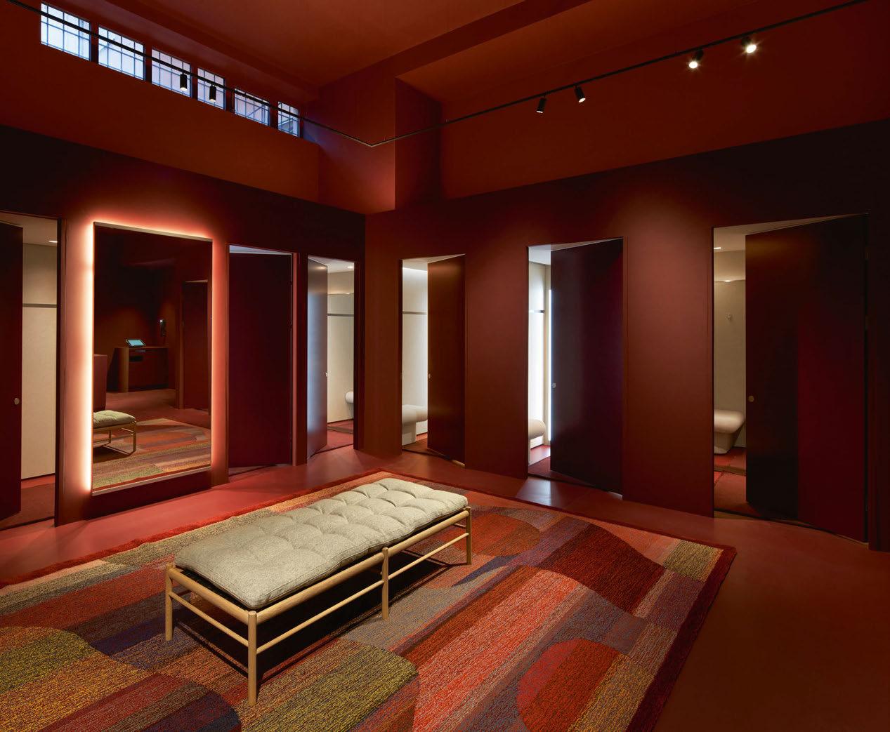
Client: COS
Lighting Design: Arnold Chan, Ryan Jones, Kim Chan, Isometrix, UK
Lighting Suppliers: Delta Light,
Prolicht
Photography: Åke Lindman
we also specified high quality LED products, to be as efficient as possible.”
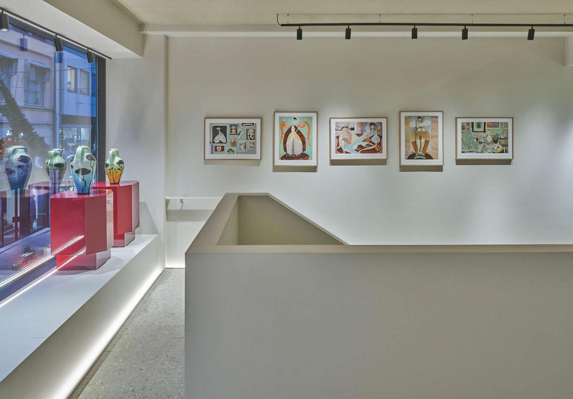
Part of the store’s unique approach was, alongside the display of high-quality clothing, creating a gallery-like space to celebrate the work of international artists. At the store’s re-opening in September last year, there was a curated selection of paintings and sculptures by international artist Liselotte Watkins. The pieces were available for customers to view for a short time, while new works created specifically for the space were introduced later in the season.
Chan explained how the lighting design creates a museum-like quality in the space to better showcase both the artwork and the merchandise. She said: “Much like in a gallery, our goal was to illuminate the objects of interest in an elevated way. With the COS stores, we used minimal trackmounted fittings, which give a gallery-esque quality.
“We also treated COS’ high-end garments, shoes, bags, and accessories as art pieces themselves, specifying high CRI LEDs to bring out the vibrant colours, textures, and quality of the product. We collaborated seamlessly with the Visual Merchandising team by enhancing their merchandising strategy through light.”
While Isometrix worked alongside the in-house
design team at COS, there was still a freedom to be creative with the lighting and explore various options. This, Jones believes, was possible through strong communication and collaboration.
“We had the freedom to explore our lighting concepts, coming up with various approaches that played a part in the design of the store,” he said.
“The communication between teams was effective throughout the process, and successful in its endresult due to the strong collaborative nature of our consultancy.”
Following its opening, the store has been praised for its sustainable concept and gallery-like aesthetic, bringing a luxurious feel to the space while presenting the merchandise in the best possible light.
Arnold Chan is equally pleased with the final outcome. Looking back on the project, he said:
“We love the new COS stores. The new design is very much aligned with the original proposal presented to us at the beginning, factoring in slight refinement due to site constraints.
“Furthermore, the stores feel refreshed, bringing a youthful vibrancy while preserving their loyal customers.”
www.isometrix.co.uk
Five colors - one beam. A revelation in an outdoor floodlight.
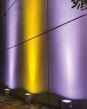
INTRODUCING
Single Source LED Fixture
Bold Bright Colors + Seamless Color Blending (Red, Green, Blue, Amber & Lime)
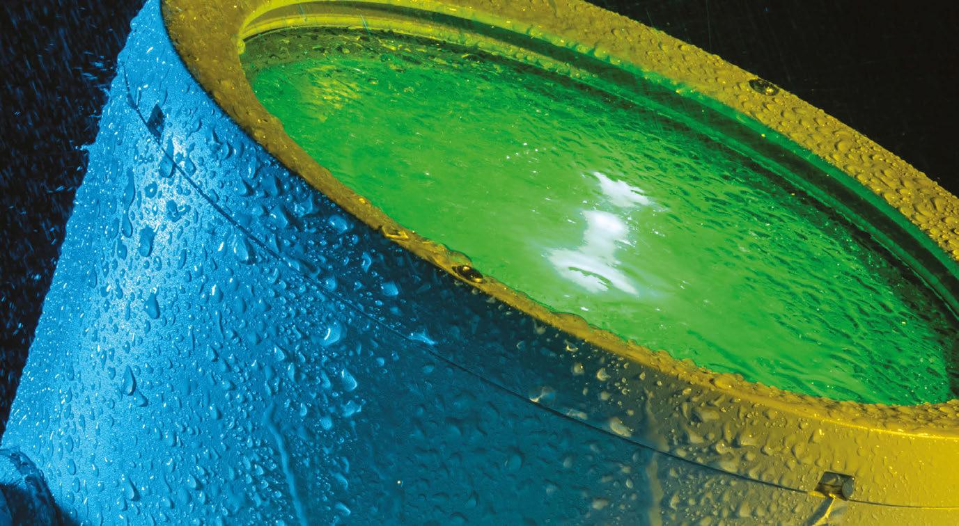
High CRI Whites: 2500K-8000K
10,000+ Lumens Output
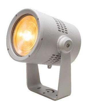
MAKE SURE TO SEE ALL OF OUR NEW AND UPCOMING PRODUCTS.


Part of a wider rejuvenation of South London’s Victorian railway heritage, Borough Yards is a new mixed-use retail development that pays tribute to the city’s industrial past. As such, Equation Lighting Design has developed a subtle, complementary scheme for the space. 072
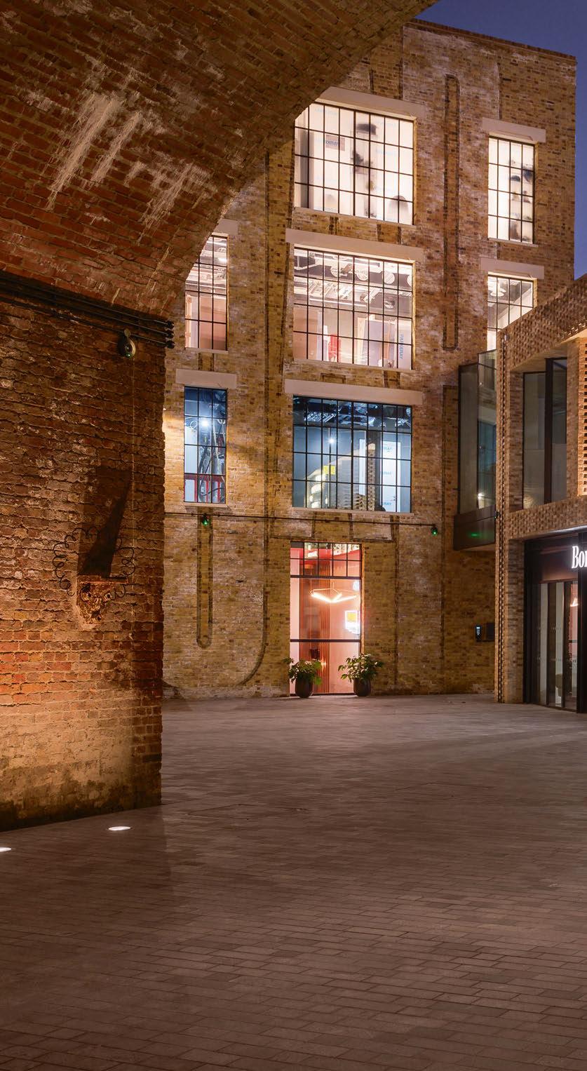
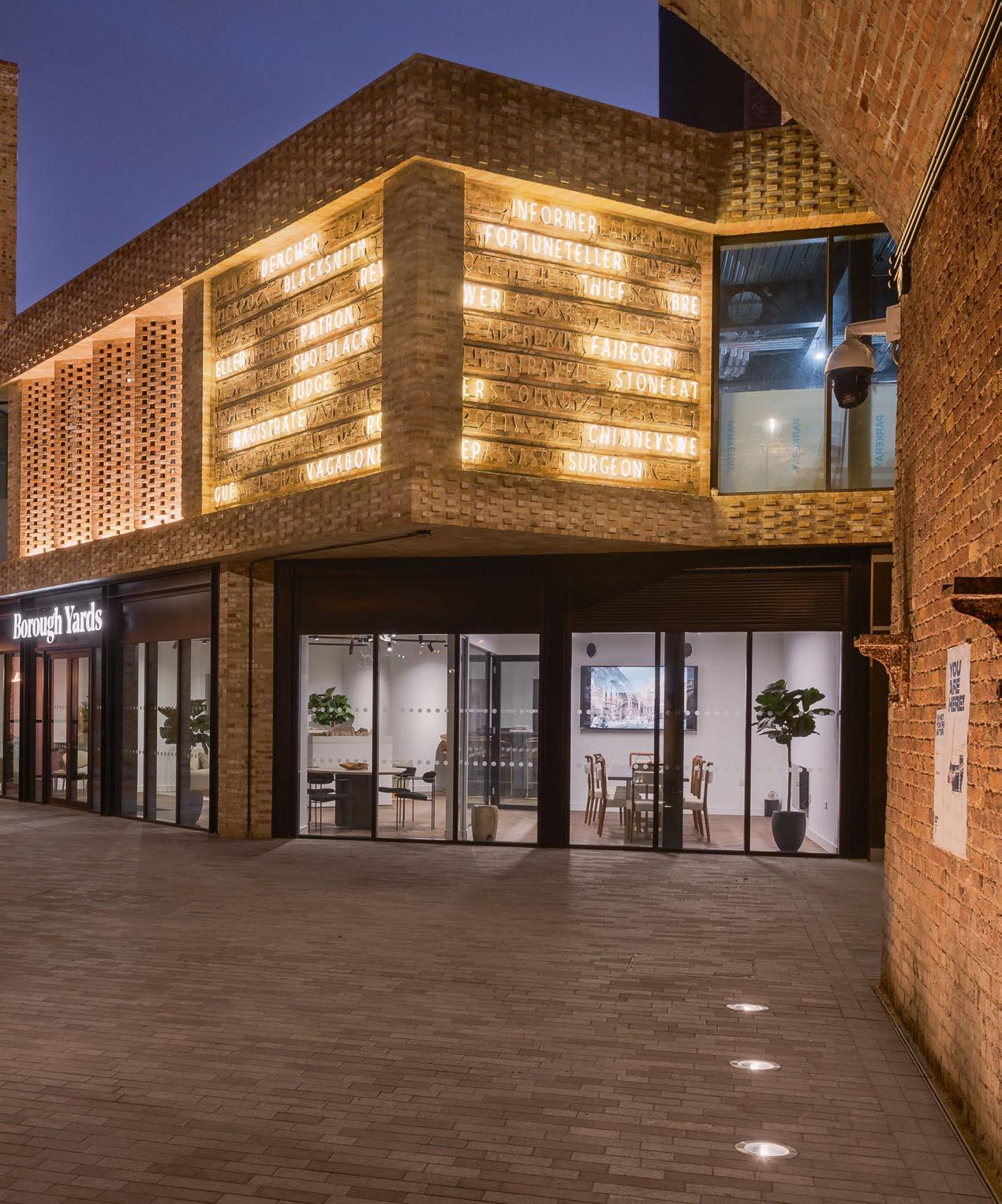
ne of London’s newest mixed-use retail developments, Borough Yards was conceived as an “artisan retail hub”, based around a new public realm comprising pedestrian lanes and yards that link Borough Market to Clink Street and the River Thames at Bankside.
Located in the London Borough of Southwark, the new, high-quality public realm has been developed to restore and rejuvenate an important part of South London’s Victorian railway heritage, with the space re-purposing 8,500sqm of existing railway arches, creating 50 units for retail, food and drink, and leisure brands to create a thriving retail, social and dining destination.
The lighting for this new, landmark destination was designed by Equation Lighting Design, which was approached by project architects SPPARC Architecture, and was “immediately attracted” by the exciting architectural proposals for the previously hidden site.
The scope for Equation included lighting for all public realm areas, exterior building accent lighting and all interior lighting to the repurposed Victorian arches. Maida Hot, Managing Director at Equation, explained the concept for the lighting: “Given the site is located adjacent to the Borough Market area, with its very distinctive character, our idea was to create a strong lighting design narrative to underpin the identity of the new development. We brought simple but impactful interventions to achieve this aim.”
With a brief to create an “inviting public realm that seamlessly incorporates existing railway arches and new residential and commercial buildings, as well as various retail outdoor and indoor spaces”, the idea was to project an already established place, rather than to bring the feeling of a new development.
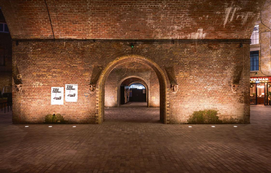
As a result, the lighting has been designed as a key element that weaves together the distinct areas of Stoney Street, Clink Street and Bank End, providing key visual orientation for locals and shoppers alike while enhancing the amenity and atmosphere of the expanded retail zone – the goal was to create a vibrant and welcoming atmosphere at night. Working in the context of the historic neighbourhood was one of the most important aspects of the lighting design. To this end, Equation opted for traditional building-mounted lanterns – with a modern twist – to illuminate the exterior lanes, while more contemporary catenary lanterns were specified for the main public open space, to encourage visitors to dwell longer under a canopy of glowing shades at night. The sequence of arched gateways has also been highlighted, both externally and internally, with ground recessed uplights. This creates a dramatic rhythm, enhancing the texture and materiality of the architecture.
Hot explained how Equation balanced the more traditional lighting techniques with modern touches such as the inground uplights: “We were
Contemporary lighting solutions designed to enhance the beauty of outdoor spaces while also meeting the needs of both people and the environment
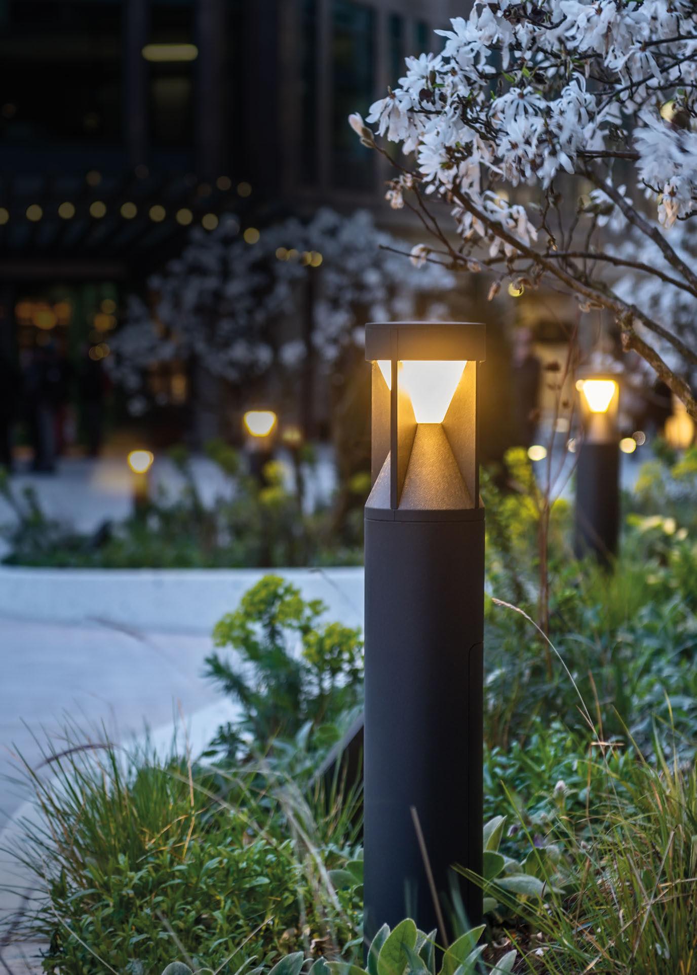
Exchange Square, Broadgate
Lighting Design: Speirs Major
Product: Pharola Max
dwwindsor.com
focusing on achieving the right visual balance and precise optics. The luminaires selected were of a more ‘classic’ appearance, but also very minimalistic for timeless appearance and longevity.”
The lighting to the interior arcades was developed to be concealed and minimally integrated within the architecture. With this aim, Equation designed a series of spandrel-integrated spotlights that, by uplighting the arches, reveal the beauty of the existing Victorian brickwork, while also providing circulation and accent lighting to the retail arcades.
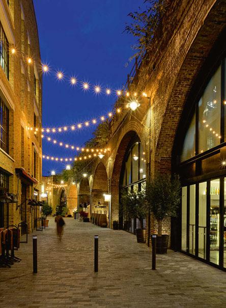
“We were keen to achieve a good modelling of the arches, and selected very precise optics,” explained Hot. “Besides extensive computer modelling, we were fortunate to be able to carry out the mock-up on site, which is a priceless benefit to a lighting designer.”
Alongside the catenary lights in the main public space, Equation installed festoon lighting along
the exterior pathway, assisting in wayfinding and orientation while serving as part of the strategy to “activate the public spaces at night”. This additional layer of lighting creates a sense of human scale and signifies a long-established and well-used development.
The heritage of the site, and its proximity to surrounding residential areas, presented some constraints to the design team, but Hot explained how Equation overcame such difficulties: “The major project challenges were related to the long design and construction programme, and also authorities approvals aspects.
“Given its proximity to the adjacent residential areas, the lighting had to be very contained and lighting optics very precise, and we carried out various studies to support this. We also had to carry out a very careful selection of the light sources and luminaire types, and we had to obtain special approval from Network Rail in order to fix the luminaires in specific locations.”
With these considerations taken into account, the new lighting scheme for Borough Yards has been critical to the development of a coherent night-time expression of the various elements of the project; from the architecture, to interior design, landscape and branding, with the aim of establishing a unique and successful sense of place that will attract visitors and retailers, as well as further investment in the future.
Hot concluded: “The forms and textures have been accentuated, setting the overall environment in a soft, warm light that gives the space a human scale, making it more inviting.
“The lighting provides a unique experience and a new dimension to this unique site, greatly supporting the overall sustainability of the site, and its exciting extended night-time use.”
www.equationlighting.co.uk
Client: MB Bermondsey
Lighting Design: Maida Hot,
Equation Lighting Design, UK
Architect: SPPARC Architecture, UK
Lighting Suppliers: DW Windsor, Erco, iGuzzini, LED Linear, Selux, Targetti
Photography: Simon Callaghan
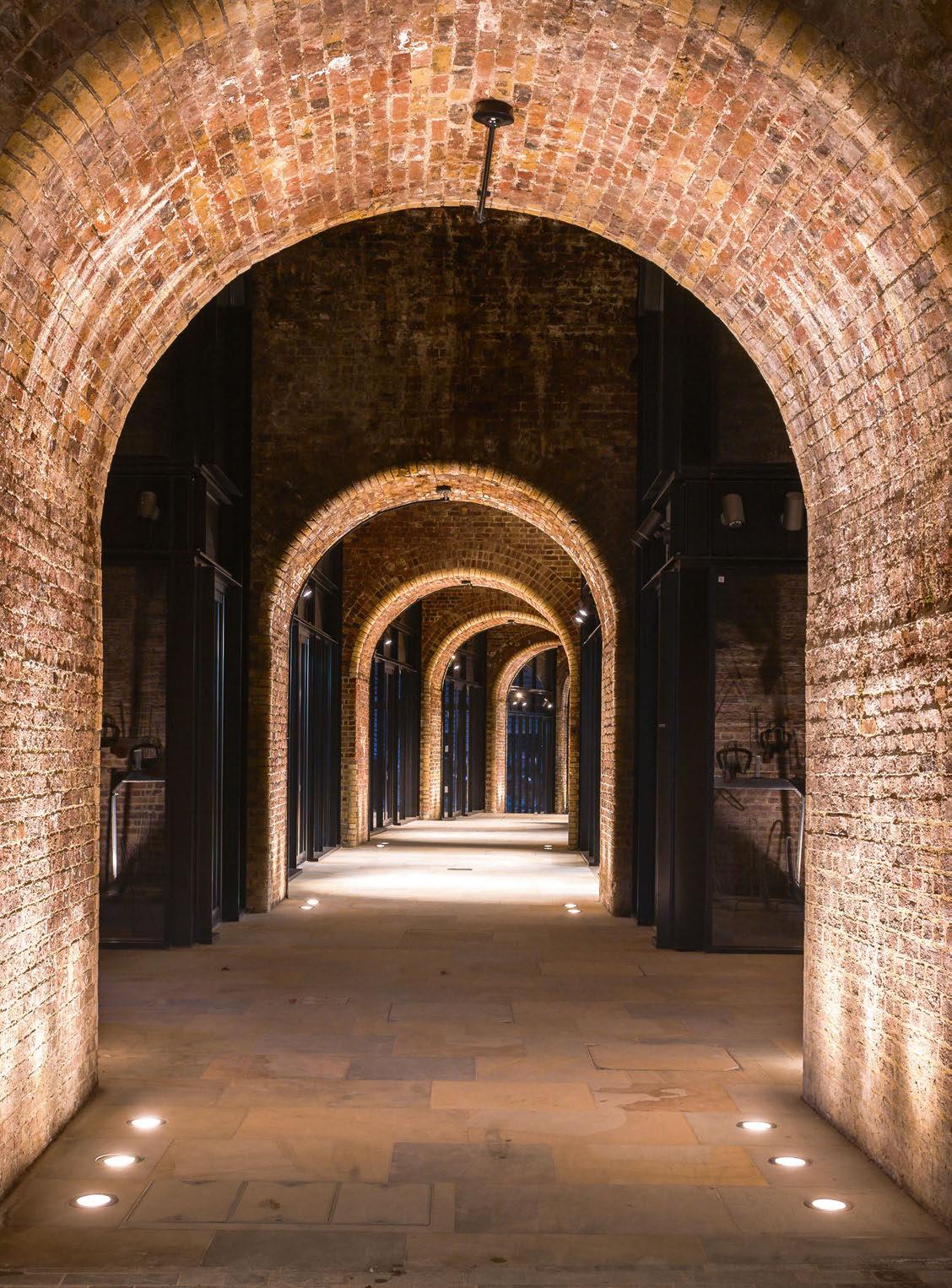
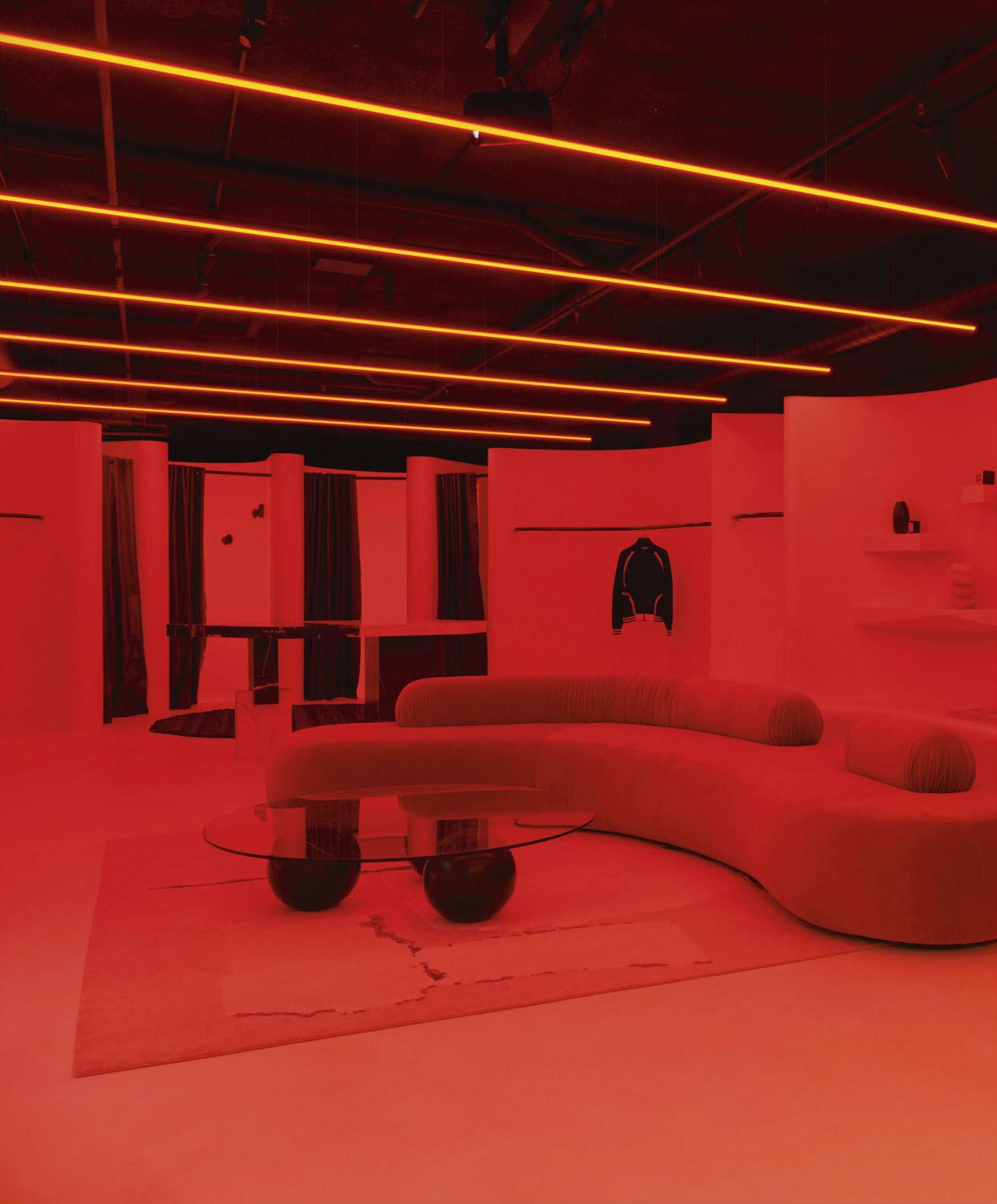
Nagnata
Byron Bay, Australia
Matching fashion brand Nagnata’s disruptive values, ambience has created a vibrant new lighting scheme for the brand’s Byron Bay store.
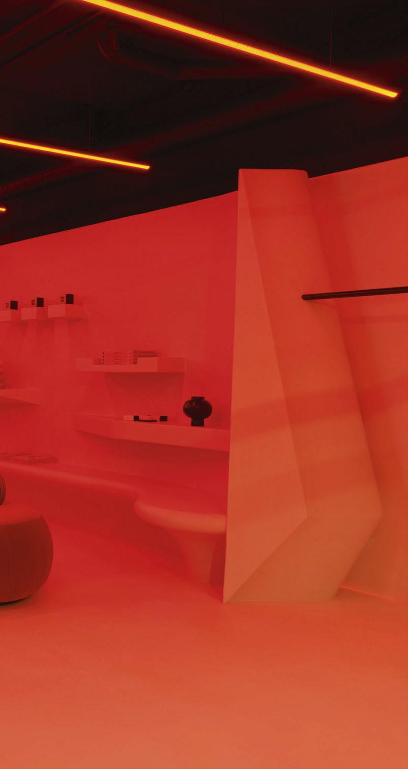
n Australia’s coastal town of Byron Bay, lighting designers at ambience have created a vibrant, disruptive scheme for retail brand Nagnata’s new flagship store. Through the use of an array of rich colours, the lighting project was designed to align with Nagnata’s values of challenging the status quo and taking risks, while also providing an awe-inspiring experience for visitors.
David Justice, Managing Director of ambience, said of the lighting concept: “The idea was to create a unique, immersive retail environment with substance. The first step was to create a space that didn’t just look like someone had installed coloured lights, but a space that looked as if it was instead painted using colourful illumination.
“Importantly, we also didn’t want it to just look cool because of the use of colour. It was of upmost importance for it to be functional too, with spots heroing the product. We wanted to layer the lighting so it can be a thoughtful, pragmatic, and considered retail space, but change its appearance on cue to be playful and highly energetic.”
The lighting project is therefore built around a concept and execution that makes no two moments the same – on one visit a scene simulating sunrise or sunset off Byron Bay, the next metamorphosing into a futuristic, electrifying, and energetic space.

The scene design follows the natural daylight colours from dawn to dusk, then after dark becomes more up-tempo. A procession of Bluetooth-controlled RGB WW linear luminaires that run centrally through the ceiling work hand in hand with various other thoughtfully concealed RGB WW sources to bathe the entire store in a wash of coloured light. With a mind on being more sustainable, ambience used fittings with a high recycled aluminium content, as well as luminaires from local brand Symphony Lighting. Justice explained how this dynamic concept was realised: “Firstly, we focused on two separate looks that we wanted to create: the retail gallery, and the immersive installation. For this, we created two separate lighting designs and then merged them together.
“For the gallery concept, we used a series of customised surface spots with fashion-specific LED modules to light the product in a composed retail fashion manner, but with a gallery quality. For the immersive concept, we used a series of linear lights fitted with tunable white LED strips, and also RGB+ 2700K strips. This gave us the ability to use the linear lighting with muted, colourful hues that are true to and represent the brand’s look and feel.
“A crucial component was creating a space bathed in light, to make those experiencing it not quite sure where the colour was emanating from. To achieve this, we could not just rely on the hanging lights, so we had to work with the interior designers to integrate a series of RGB elements into the joinery, walls, and gaps to make sure the colour applied was even in tone and intensity across the surface in the space. We also used Casambi control to give us endless options for scene setting.”
While the use of coloured light may be atypical for a retail environment, Justice explained how the team arrived at this design decision: “Getting to know the client and their product made us disrupt and break convention because that’s what they are doing. Nagnata’s product celebrates colourful combinations, and we wanted to represent that in the lighting response.
“We were not sure if they would go for the coloured approach because it could potentially draw attention away from the rest of the space. However, we had a vision that we could achieve the coloured illumination while also creating a space that celebrates the amazing product and incredible interior. Luckily, they trusted us and even though we were breaking new ground, we felt confident that it would work.”
The lighting designers worked closely with interior designers Pattern Studio across this project, particularly on the colourful elements, and Justice added that the client “gave us the freedom to create something special, as long as we captured the spirit, attention to quality and uniqueness of the brand”.
While the design concept called for an immersive, extravagant lighting scheme, there were a number of architectural considerations for ambience to work around to make the project a success.
Justice continued: “There was a low exposed ceiling
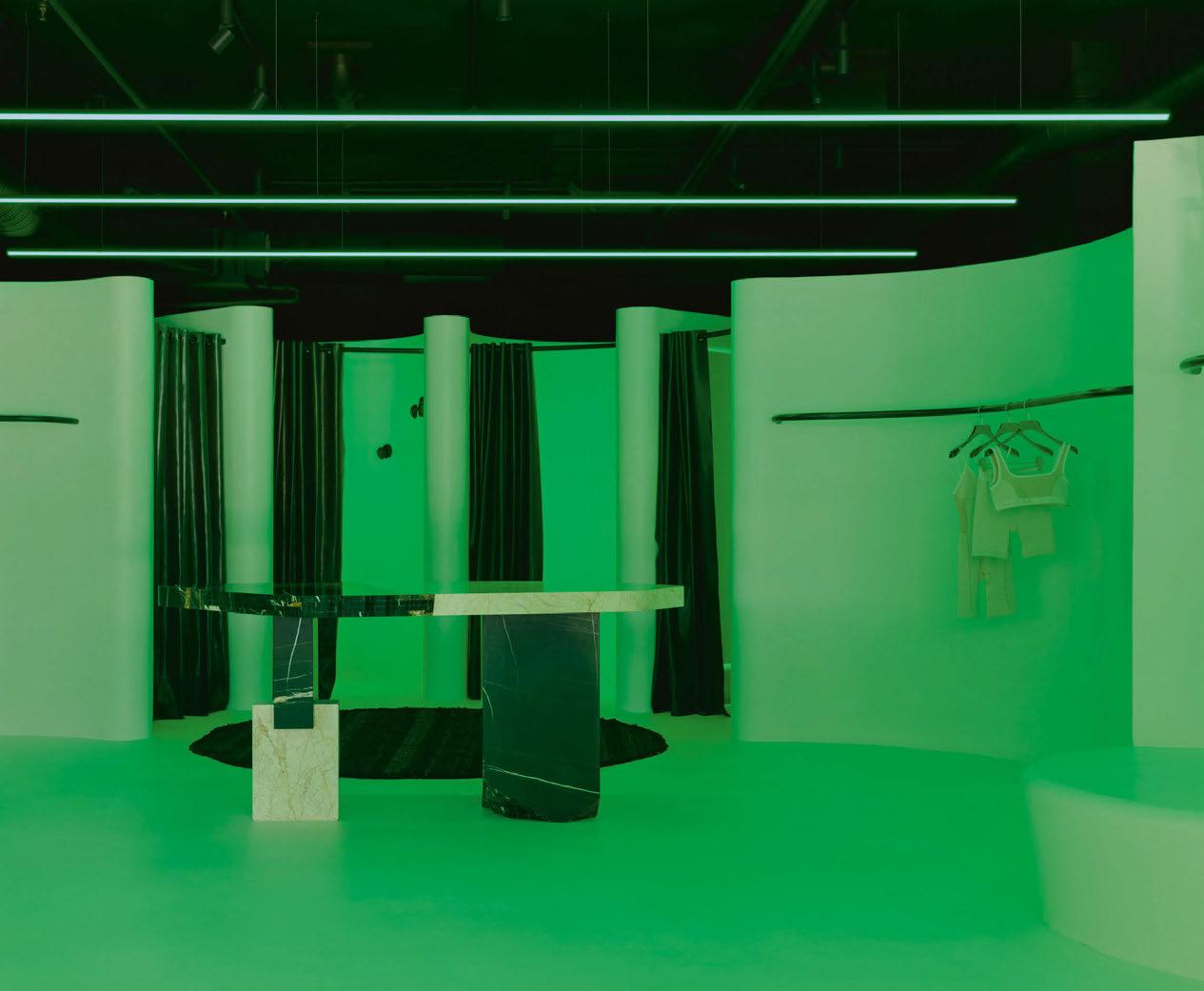
Client: Nagnata
Lighting Design: David Justice, Josh Cain, ambience, Australia
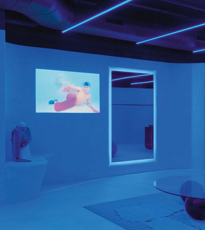
Interior Design: Pattern Studio, Australia
Lighting Suppliers: Casambi, Symphony Lighting
Photography: Tom Ross
with a lot of messy existing services The ceiling was painted out in a beautiful Turkish coffee finish, so we painted all the light fixtures to match so that they would blend into the surroundings. Pulling off the gallery illumination was tricky because we had to navigate the services and were limited on where we could mount the spotlights. There was some incredible custom furniture and joinery created by the interior design team, so we worked in tandem to make sure the lighting also captured these works of art.”
One of the biggest challenges though, was in balancing the vibrant show of colour with lighting that would effectively showcase the products for customers. Justice continued: “This was our biggest hurdle on the project. However, the brand’s appetite to create a retail environment that was a celebration of paradox helped settle the nerves.
“We knew it was critical to not just create this colourful space that photographs well but create a multi-sensory experience with the lighting. To do this, we layered gallery-style spots at high levels above the suspended RGB lights, so we can also capture the product with specific, dedicated spots.
It was very important to us that the product’s detail, material, and quality was not hijacked by colourful light.”
It’s an approach that has paid dividends, as the new store boasts a playful lighting scheme that perfectly fits within Nagnata’s disruptive mindset. Justice is equally impressed with the finished product. He concluded: “It is rare that you work on a space and when it’s completed and photographed, it is more impressive in the flesh.
“The illumination in person is so captivating that it immerses one in the environment, taking you on an exploration, giving a unique insight into the brand’s rebellious spirit. The response from collaborators, but most importantly, the customers, has been incredible.”
www.ambiencelighting.com.au
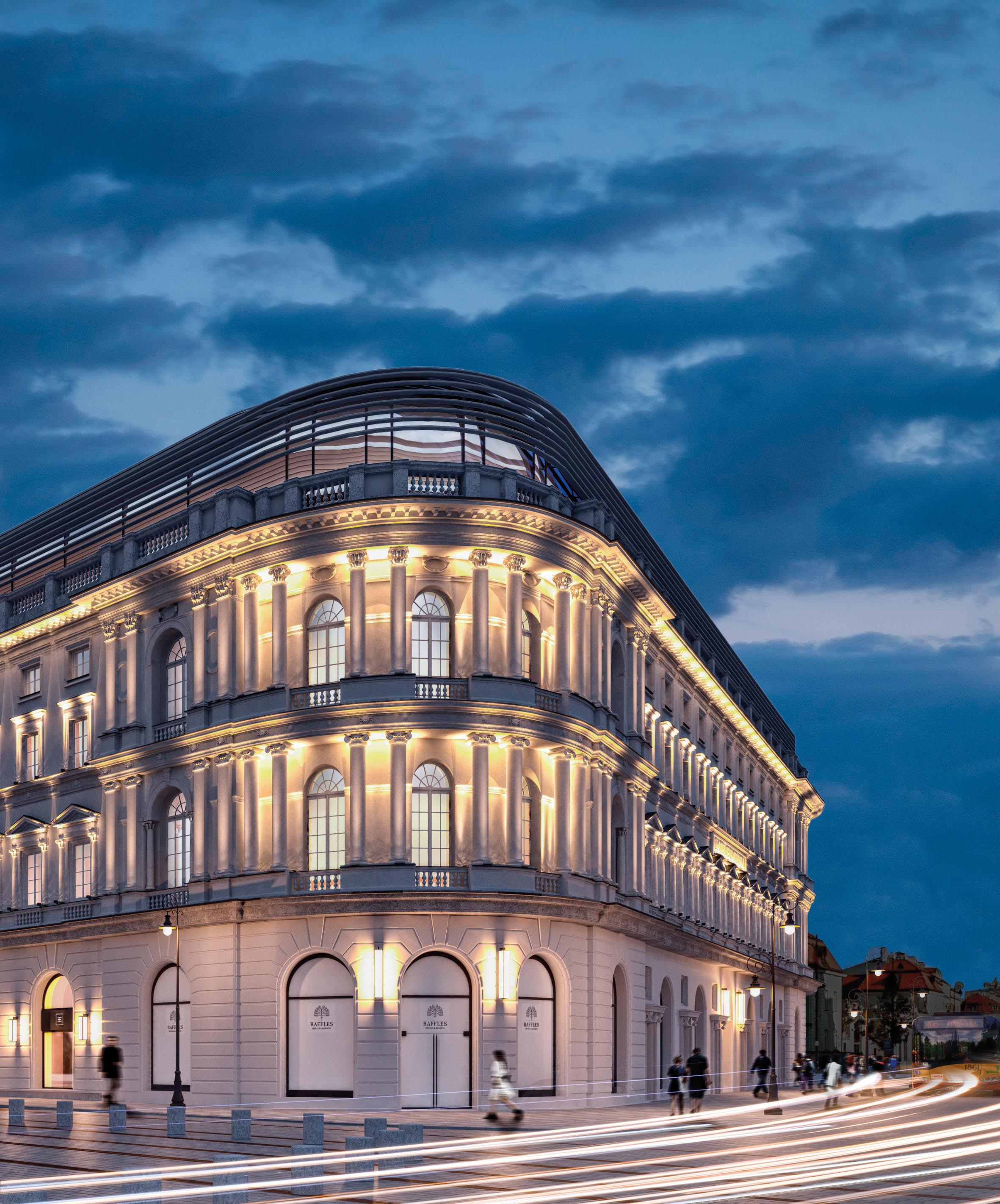

Reggiani’s Yori Evo Ghostrack fixtures bring a contrast to the heritage architecture of the latest Marc Jacobs flagship store in London.
In 2022, Marc Jacobs opened a new, flagship store on London’s Regent Street. The store represents the brand’s largest boutique outside of the United States, and to mark the occasion, the 2,666sqft location has been designed to be the “ultimate destination” to shop Marc Jacobs.
The lighting for the store, developed by Duccio Grassi Architects, highlights Marc Jacobs’ variety and personal style; thanks to a minimal and linear application, the lighting gives full space to the collection exposed.
The store is located in a heritage building characterised by high ceilings, with a clean, grey colour palette used throughout. Reggiani’s Yori Eva Ghostrack system gives light to the whole space, highlighting the clothes on display, as well
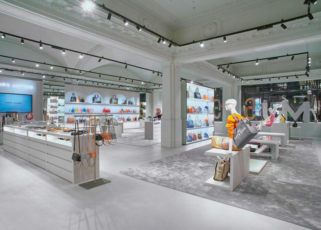
as the leather goods, jewellery, footwear, and signature bags.
The Yori Evo Ghostrack used throughout the store was specified in a black finish, creating a contrast to the white/grey atmosphere; the lighting fixtures become a part of the architectural project, giving the correct light to each corner of the space.
www.reggiani.net
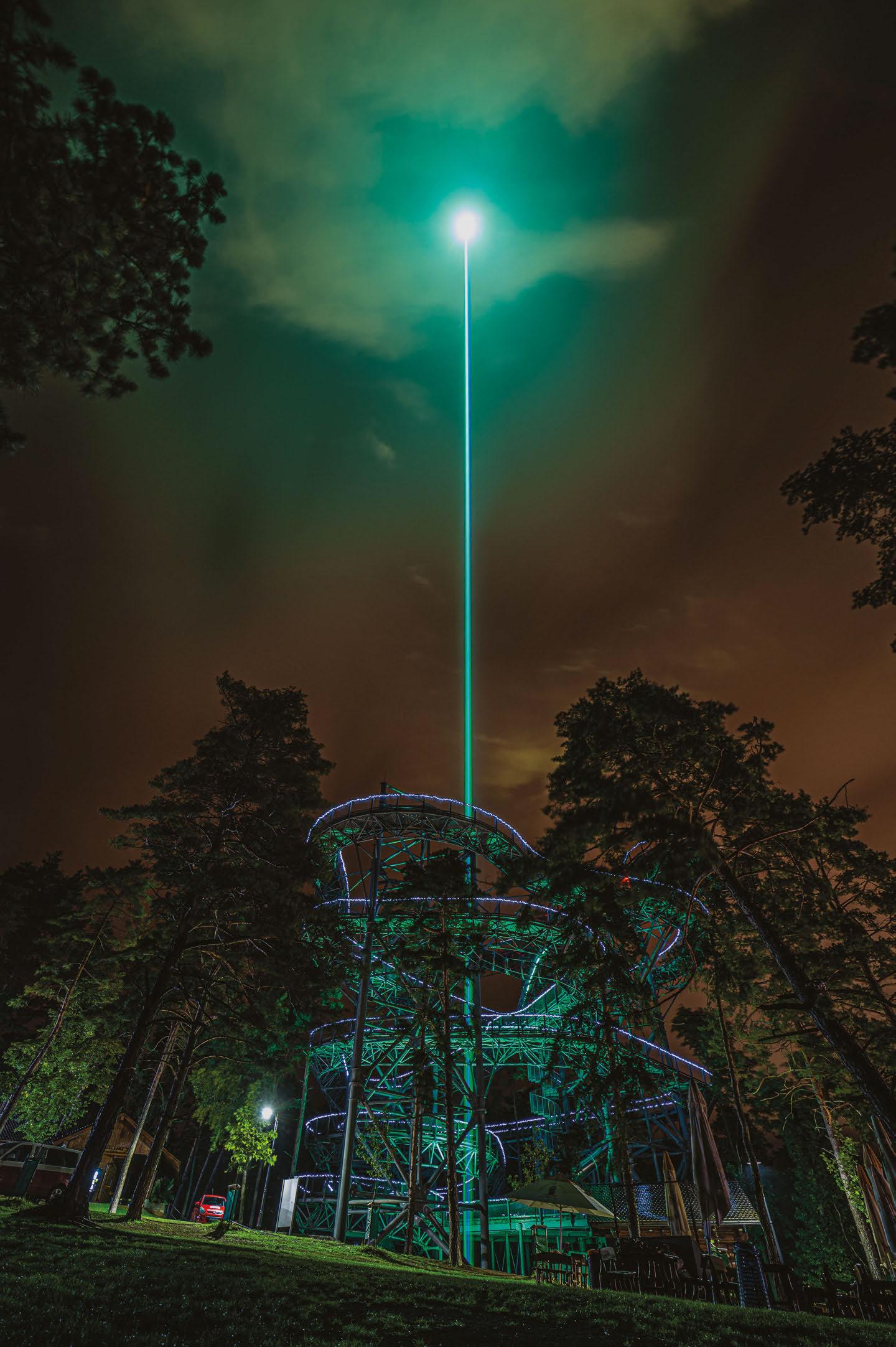


unex lighting strategically focuses on functionality and a fresh approach to flexible lighting solutions for the Zürich-Stettbach Railway Station pharmacy.

The pharmacy at Zürich-Stettbach railway station is more than just a place to buy pharmaceuticals. It’s an establishment where customers can get the medicine they need, as well as expert advice and even treatments in designated rooms.
As a result, the design of the area faces a particular challenge since it must be both hospitable and functional, as well as convey a premium overall perception. An all-around pure premium use of materials was employed in harmony with organic shapes, offering maximum aesthetic quality that is pleasing to the eye.
The placement of the shelves, which have a more free-form design to promote a comfortable atmosphere, makes use of organic forms like circles and curves. Natural stone flooring, wavepatterned hardwood ceiling panels, and fair-faced concrete utilising the building’s construction materials, all combine to give the structure a distinctive appearance.
The wooden shelves follow the curvature of the walls, contributing to the overall design idea. With light taking on an important aspect of the design, the curved lighting lines that follow the wall aid and support the architecture and materialisation.
The installation of Nex Flex lights along the perimeter and centre ensures brightness and even light distribution over and around various locations of the pharmacy to generate attention.
The track lighting is likewise curved, with a highly adaptable system of tracks and track lights. This grants the personnel flexibility to simply modify the illumination for each new presentation the pharmacy wants to highlight. And with the circular pendant lamps’ simple form, it adds to the modern, elegant statement that works well with the overall design concept.
The materialisation in the lab and office spaces is consistent with the overall approach. But the lighting is developed in a much more useful way, which changed the main design concept into a more task-oriented one.
www.unex-lighting.com
www.clearlighting.com

Immersed within the natural scenery of the Nine Women’s Peak in Tai’an, China, SYN Architects has created a moon that never sets. The Hometown Moon is inspired by an ancient poem from the Song Dynasty that ponders on the nature of perspective and emotion – “The clouds and the moon remain the same, but the mountains and rivers evolve through time”. The large, illuminated structure, half above ground, half submerged, combines abstract geometrical shapes and simple materials to create a pure space with complex visuals, designed to stimulate the soul and leave traditional figurative expressions behind.
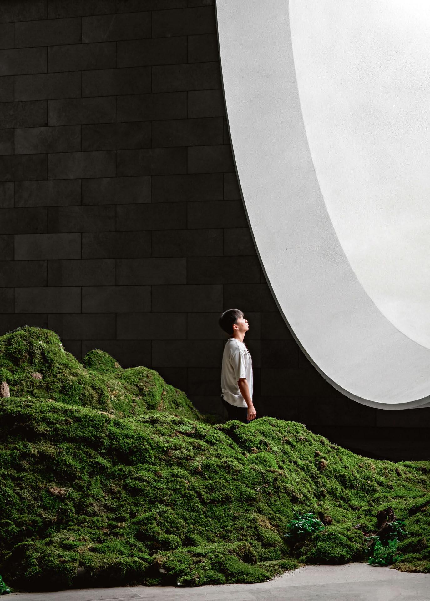
To reach The Hometown Moon, visitors travel down a “purifying road” along a path between mountains and streams, before they encounter a large illuminated semicircular window that seems to hover above a reflective pool of tranquil water.
At the end of the path, visitors find themselves inside the structure, in a ceremony hall beneath the reflective pool and faced with an inverted moon. Like a Buddhist meditation, the experience develops insight by feeling the background of mountains and forests to complete a mental reorganisation, soothing the souls of urban residents. The building occupies more than 1,000sqm, consisting of
the moon, the cavity, and the grey space. Inspired by the mountain stream by the base of the building, the designer used architecture as a medium to reproduce the romantic idea of “a moon born on the sea”.
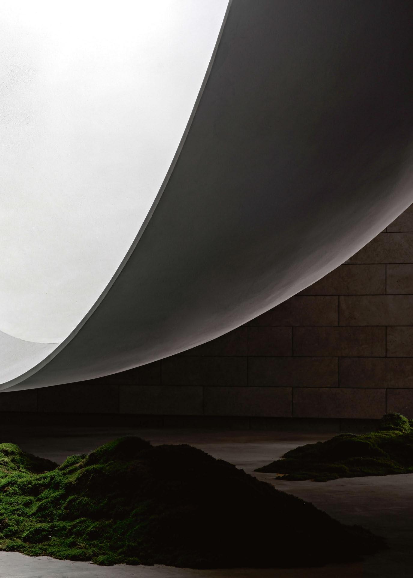
In the Far East, the moon and love are closely interwoven symbols – ancient Chinese poems chant about love in terms of windy flowers under the snowy moonlight, while Japanese novelist Natsume Sōseki even translated ‘I love you’ as ‘the moon is so beautiful tonight’.
Syn Architects interpreted the unique nature of love by adhering to materials closely related to the mountainous environment; graceful rock slabs, stone objects, smooth grey concrete cover the walls and floors of the structure, as if they were a part of the mountain.
On the roof, the use of highly transparent, ultra-clear glass ensures that sunlight can find its way in freely to light up the room below.
The curved wall of the moon forms a natural echo cavity, while throughout the day, the changes of light make the moon adopt different shapes, resembling distinctive “states of mind”. Besides the moon, there are barely any
decorations inside the chamber, including artificial lights - the large moon structure strong enough to light the space itself.
While the Hometown Moon ceremony hall divides the full moon in half, a reflection across the water-like surface of corrugated steel makes it whole again. The architects believe that the design of the Moon symbolises the yin and yang, the philosophical concept of duality (existence and non-existence) showcased by the architectural language.
The architects said: “We have built a poetic and philosophical building that combines the central ideas of Buddhism (harmony, perpetuity, comprehensiveness, and endlessness), the concept of emptiness from Taoism, and the cultural heritage of Confucianism to provide physical shelter from the wind and rain in the shape of Hometown Moon.
“The Hometown Moon is what Le Corbusier used to call an ‘ineffable space’, a place where the only thing that matters is the experience of being there.”
www.bau-jl.com
Following the unveiling of her mammoth, 100ft artwork at Noor Riyadh, held in November of last year, arc speaks to Peruvian-American artist Grimanesa Amorós to learn more about her unique approach to light art.
“When I create a piece of artwork, I focus on making the viewer think. I want to attract your attention and take your mind to creative places.”
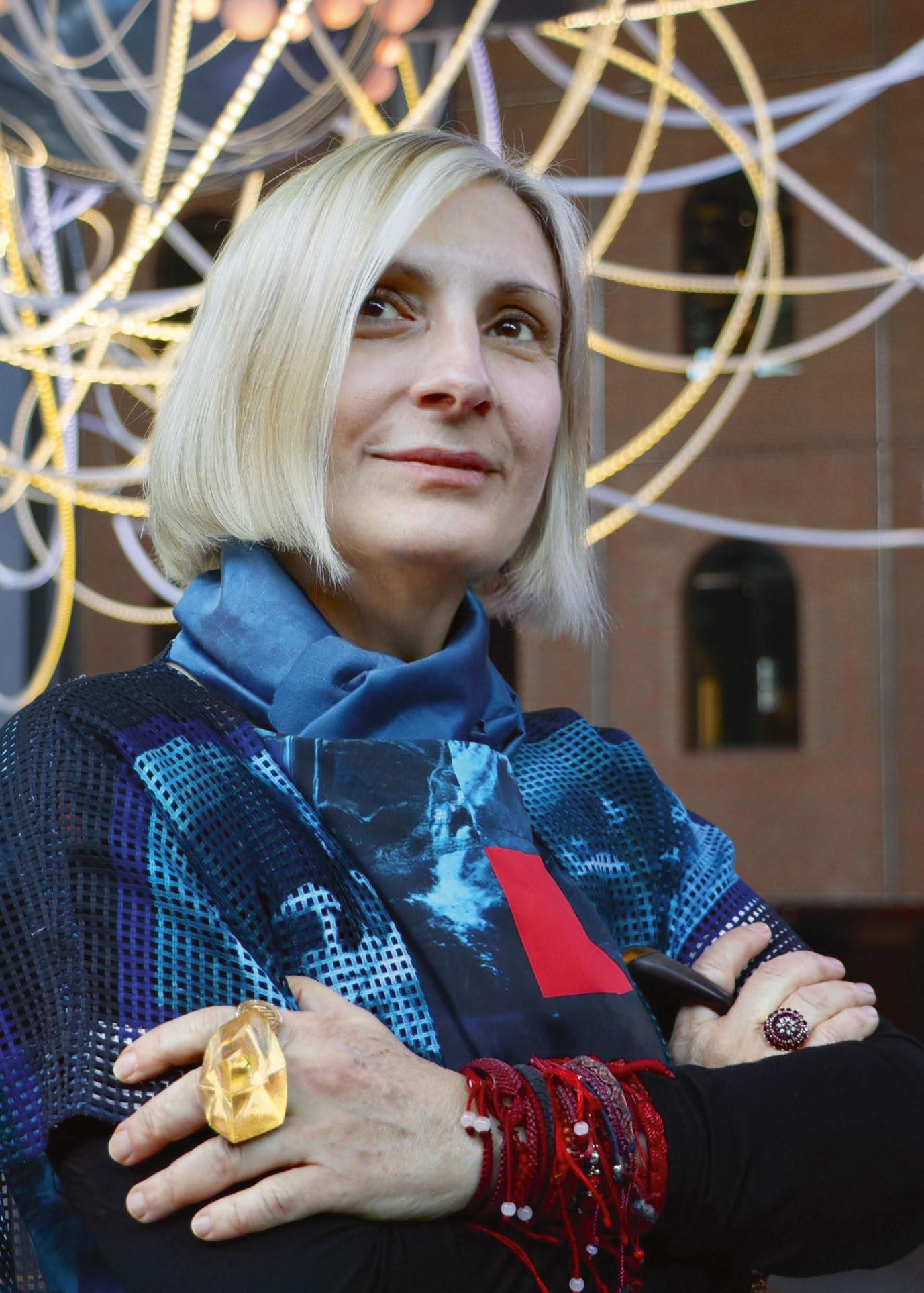 Images courtesy of Amorós Studio
Throughout her career, Peruvian-American interdisciplinary artist Grimanesa Amorós has been guided by her mantra of living in a “romance with the unknown.” It’s a philosophy that inspires her creativity and develops immersive works of art around the globe, each with a contemplation of the local cultural heritage and community. Most recently, Amorós created the enormous 100ft Amplexus (Latin for ‘embrace’) for the 2022 Noor Riyadh light art festival.
While her recent work has become characterised by the sprawling, undulating, interwoven lines of light, Amorós told arc that her love for creating began with a fascination for drawing when she was a child. “When I was 11-years-old, I loved maps,” she said. “That’s how I started, with the love and curiosity for maps, memorising and making these continental shapes, seeing such a vast world beyond my own. Drawing these distances from one point, from one continent to another, went beyond the straight lines we were taught to write on. My mother saw this fascination and, instead of drawing all over my walls, thought it an excellent idea to put me into painting classes. That is how it began, since then; I have never stopped.”
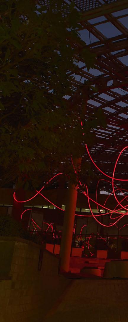
While her passion for creating began at an early age, it wasn’t until a trip to Iceland in 2001 that she unearthed the potential of light as a medium.
“I was lucky enough to see the Aurora Borealis, the Northern Lights, and it was breathtaking; I could not stop saying ‘wow,’” she said.
“I had my camera with me, and I could have become occupied with getting the right shot and angle, but I decided to put my camera down and live the moment. I thought, ‘if only I could share this with others, wouldn’t that be amazing?’
“I was fascinated by that Icelandic experience and began my adventure and relationship with light. I began trying to figure out how to encapsulate the ephemeral part of light into my work, experimenting with materials to try to emulate the light that left an extensive impression on me. I love light because it is not physical; we cannot own or have it.”
From here, Amorós focused on creating immersive works of light art that would replicate “those magical moments that I lived through in Iceland,” inspiring and immersing people in her work. Despite this, she doesn’t consider herself a “light artist,” but rather “an artist that uses light as a medium”.
“At this moment in my life, I communicate my work with others through light, but I started with painting and drawing, and then I worked with handmade paper. As an artist, I have kept evolving, learning, and looking for new challenges. How can I inspire myself and push people beyond the boundaries of their initial reaction? To produce and create, I must fuel myself, which I do through travel and connecting with new places, cultures, and people. Presently, light is the medium that helps me best express myself.”
While Amorós has had a lifelong interest in art, whether through painting or light art, during her studies, she had a brief dalliance with psychology, studying full-time at university while working on her art.
“I was studying during the day, then going home and painting until midnight, so it was quite an intense life,” she recalled. But it was another mantra that inspired her to focus fully on her art.
“I always talk about LPP, which stands for Love, Passion, and Perseverance. I knew that I could never give up on being an artist – it was in my DNA, who I was and am. When I was 21, I had to decide where my life would go; either I pursue a career that I didn’t love or have passion for or focus on what my heart truly sought, to be an artist. I decided to be an artist and left psychology three months before graduating. As you can imagine, my father was not so happy, but I firmly believe we must follow our hearts and ambition. So, I left psychology and, with my two bags and many dreams, moved to New York City.”
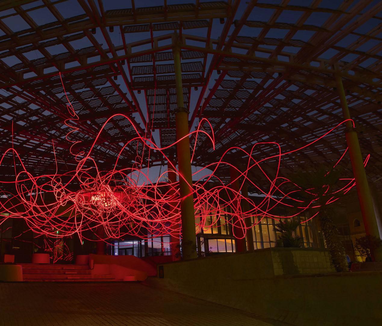
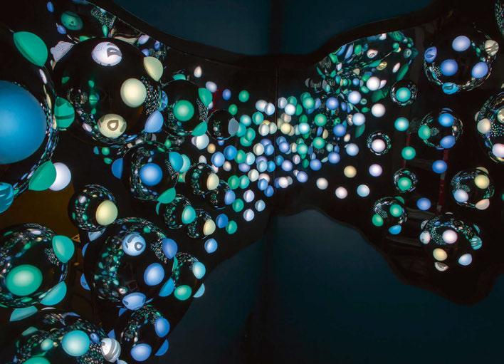
However, while she left psychology behind to focus fully on her art, Amorós believes that her studies impacted how she approaches her work: “I believe that it helped me to be objective when creating,” she explained. “It allowed me to focus on not just creating my vision but a universal one. When you see the work that I did 20 years ago, it still looks current. You can’t put a time or date to it; psychology has helped me understand longevity and humanity.”
A core facet of Amorós’ approach is how her pieces sit within their surroundings and local cultures, especially given the global reach of her work. Amorós explained how she ensures that each installation is in keeping with its locale: “When a project commences, it begins with a conversation. Then, I do research and development – curiosity has always been a part of my being. I love learning about the architecture of a site, the country’s history, and the city. I like to know about the surrounding community. I do a very deep analysis and then ask myself, ‘how I can make a piece that will be challenging, different, and that will embrace the local community.’ I then sketch many drawings that interconnect and incorporate architecture, the viewer, and the piece.”
Within this approach, she has reached a unique artistic style, where each piece is instantly recognisable as a Grimanesa Amorós installation. Again, this came as the result of research and an
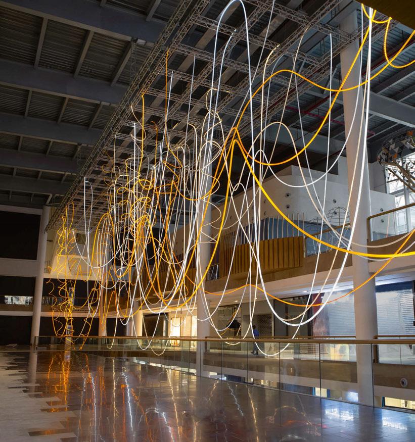
examination of the wider art world. She explained: “As an artist, you must be informed about what is happening and be present. For instance, the goal is to find a visual language that represents you. You might think you’re creative and innovative, but then you discover somebody else is doing something similar. You have to stay fresh and create in a way that is defined as you.
“I think the general responsibility of an artist is to be very well informed. It is important to be in tune with yourself – what is your message? How do you want the viewer to approach your work? How could you do something different for humanity?”
Across her career, Amorós has created a vast array of installations and sculptures worldwide, varying greatly in size and scale. Looking back on her portfolio, she struggled to pick a landmark, or standout piece, instead believing that each work “has its moment.” “The most noteworthy is the latest, but each has an important place, they all have different attributes that make them stand out, but with each piece, we keep on evolving.”
In this instance, her latest piece, Amplexus, is one of her largest works. Spanning more than 100ft in size, the piece was commissioned for the 2022 Noor Riyadh festival, taking over the city’s Cultural Palace in the Diplomatic Quarter. As with previous works, Amorós sought to place the sculpture firmly within its environs, considering the local cultures and reflecting the city onto itself.

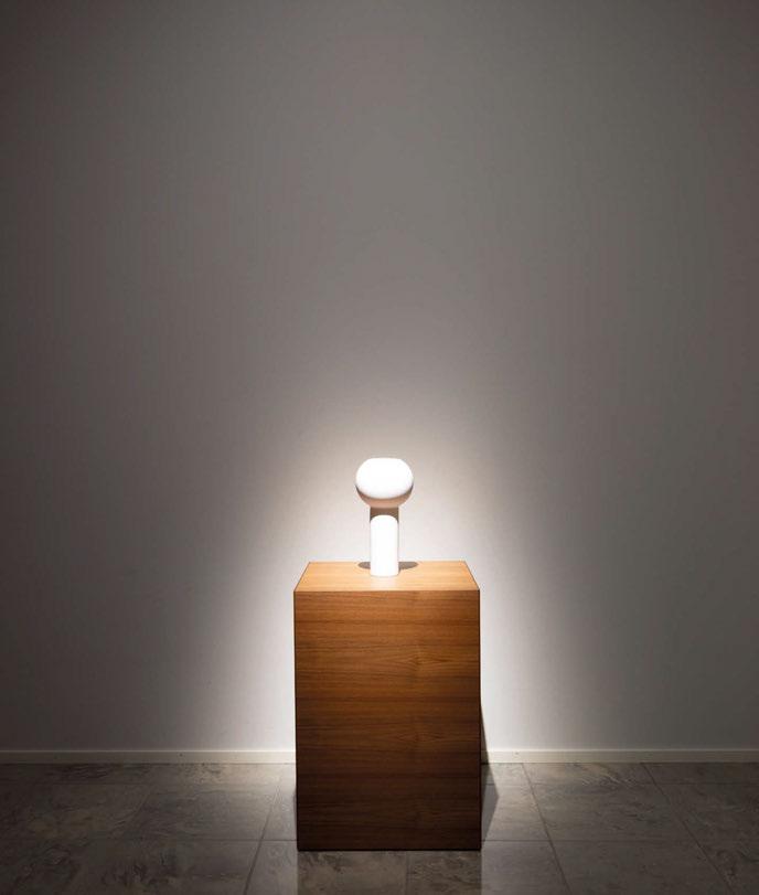
“Amplexus was located in The Cultural Palace, the heart of Riyadh’s global relationship; it’s in the Diplomatic Quarter, where all the embassies are located. I was trying to embody a global identity with the piece while communicating directly with Riyadh’s contemporary and historical architecture. The lighting sequence, however, was inspired by the surrounding desert, where dust storms and dunes can be seen. This directly inspired the undulation and colour changes within the light sequence.”
An integral part of any art installation is to trigger an emotional response in the viewer. Still, while Amorós also sees this as important, she prefers to create a more lasting resonance for her audience. She explained: “When I create a piece of artwork, I focus on making the viewer think. My goal is to have you take your time, as we all know time is precious, to be inquisitive and approach the piece, whether you are walking past it or seeing it in the distance; the aim is to engross and encourage you to come closer. I want to attract your attention and take your mind to creative places. This is very important to me because every viewer is different. Whether you’re a journalist, you’re in the art world, or you’re an individual drawn to the colours or the way the light is moving, there is something for everyone. As an artist, this is one of the driving forces of my work. This is why there is a statement with each piece. An artwork should provide both an emotional and logical response. The reason for its existence and what the artist wants to do with it will cause an emotional response. The logical part is pushing you to think, what is the medium? How was this created? The art piece should push you to question. Because as individuals, we are both emotional and logical.”
Along with upcoming installations in New York, Europe, and Riyadh, Amorós is keen to continue another aspect of her career, teaching and working with local communities. “I do a lot of community work and talks at universities and schools because everything starts when you’re young. I want to inspire the younger generations to see and think differently.”
As for the world of light art as a whole, there are a couple of avenues down which she would like to see the medium travel. “Moving forward, I would like to focus on immersive experiences beyond visual, possibly tactile, and audio. I’m interested in the collaborative process of working with others. It’s another way of learning and growing as a human being. Collaboration is working together without losing the essence of yourself, finding the balance between two entities.”
With this in mind, Amorós’ overarching ethos of “romance with the unknown” will continue to guide her and drive her forward. “Every time I go to a different site, everything is new. There is a new culture to learn from, new ideas, so the discovery within this keeps me aware and drives me to keep on evolving with my work; it’s a magic that also parallels with light,” she said.
“You must know what you want as an artist, like anything else. I know my goal: to make people think, inspire them to be more creative and be better humans, and then keep on evolving, never stopping. It’s like the light and water flow; it keeps going.”
www.grimanesaamoros.com
Top: Hedera, BRIC Celebrate Brooklyn Festival, New York, USA, 2018“Curiosity has always been a part of my being. I love learning about the architecture of a site, the country’s history, and the city.”
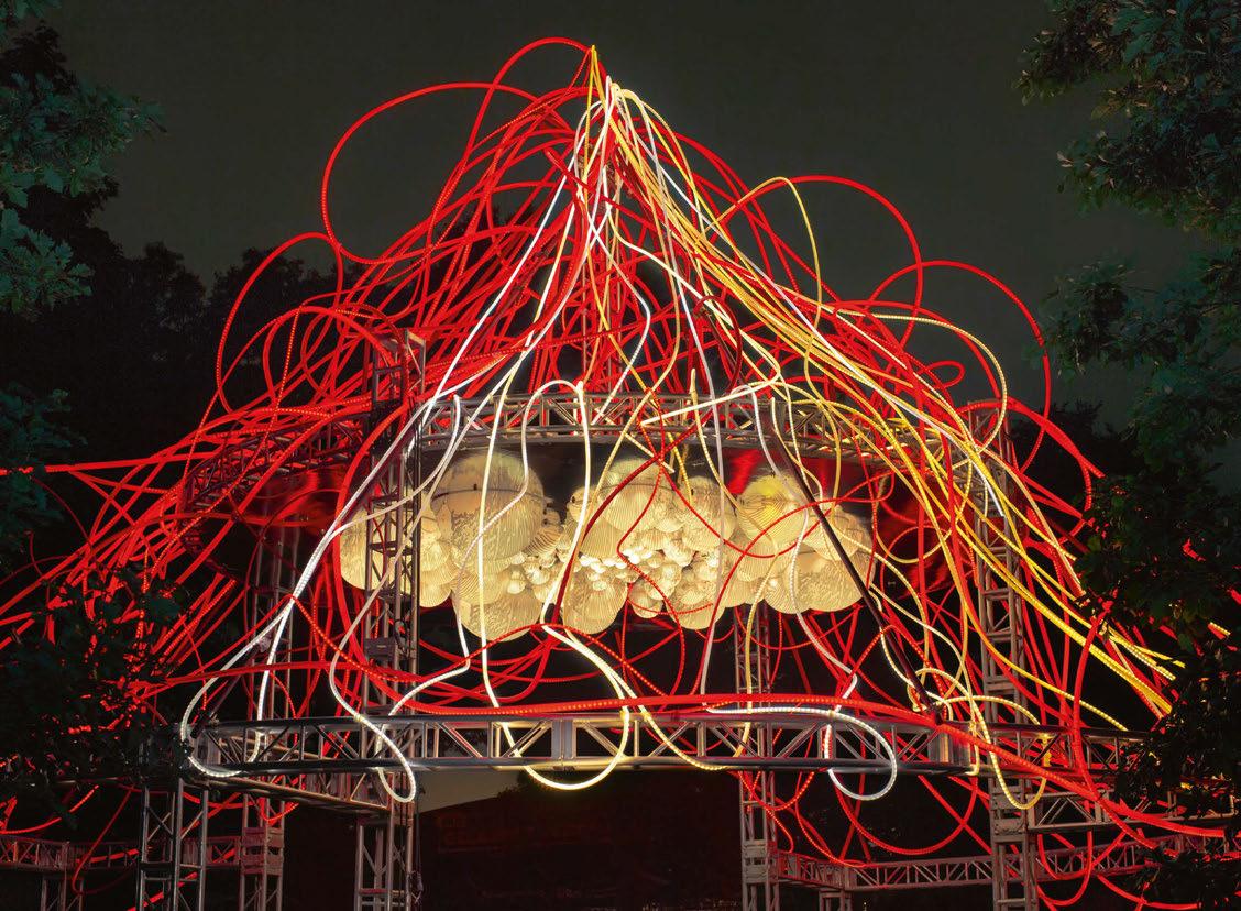
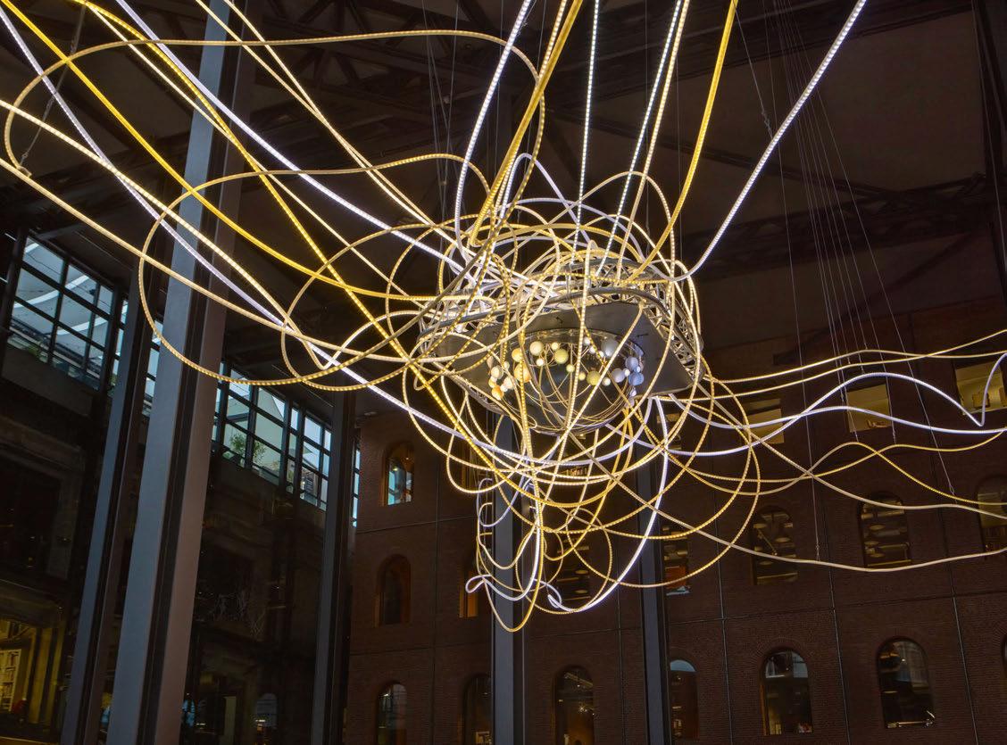
Artist Luke Jerram lit up the Manchester sky in January, with a new artwork commissioned by the city’s newest venue, Factory International.
Entitled First Breath, the piece cast powerful beams of light up into the clouds each evening from 1-29 January between 5-10pm to celebrate new life.
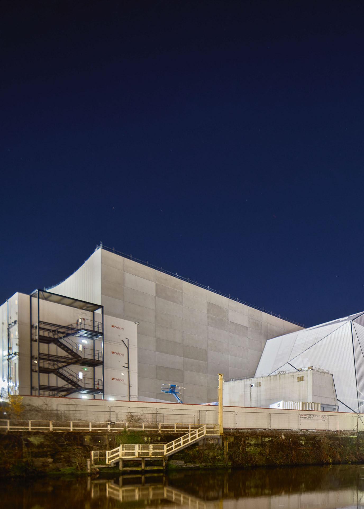
The lights, created from low current LED lighting to ensure lower power consumption, gently pulsed to represent the first breaths of babies born that day in Greater Manchester. Audiences were able to get up close to the artwork, walking in and around the lighting, as well as witnessing it from vantage points across the city.
Artist Luke Jerram said of the piece: “I want to reveal, celebrate, and connect the hidden community of people giving birth each
day in Greater Manchester. Disconnected and yet going through the life-changing experience at the same time, in January there are on average 78 babies born each day in the city. This new artwork is designed to celebrate the moment a child is born – the extraordinary moment when they take their first breath, and a new life arrives in the world.”
As well as the installation of lights, a large screen showed the names, dates and times of new babies born in January.
First Breath took place in what will be a unique new public space at Factory International. Opening in June 2023, it will come alive with a wide-ranging, year-round programme of free events and activities, creating a thriving riverside destination in the city centre.
First Breath set in motion a new programme of bespoke family activities and early learning opportunities for babies and parents at Factory International, connecting a new generation through culture and exploring how art can be woven into daily family life from birth.
John McGrath, Artistic Director and Chief Executive of Factory International and Manchester International Festival, said: “At the turn of 2023 we celebrated new beginnings with a beautiful public artwork projected from the site of our future home into the night sky. As we welcome hundreds of newborns into the world through Luke’s light sculpture, we will also breathe life into our new building and, we hope, setting in motion a fruitful life-long relationship with a new generation.”
www.lukejerram.com
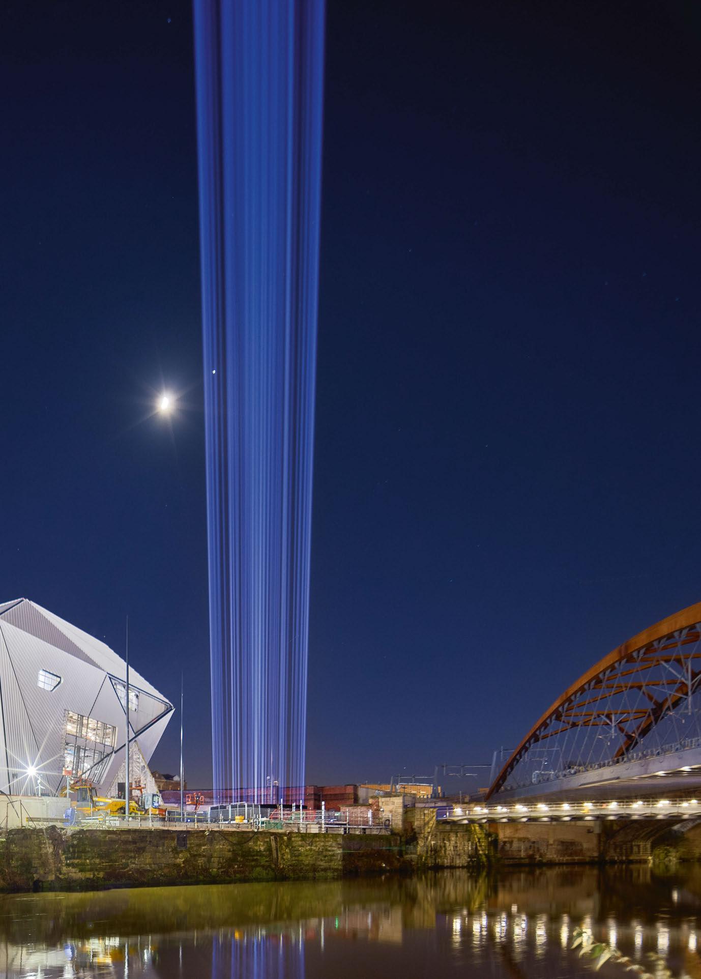 Image: Tomasz Kozak
After a two-year absence, popular light art festival Winter Lights returned to London’s Canary Wharf this January, with more than 20 beautiful light installations.
The multiple [d]arc award-winning Winter Lights returned to London’s Canary Wharf this January after a two-year hiatus.

Running from 18-28 January, the seventh edition of the festival brought 22 spectacular light installations to Canary Wharf in what is London’s largest free-to-attend light display. Visitors were invited to walk the trail of unique installations, among which were nine pieces never previously displayed in the UK, while taking the time to reflect on the event’s themes of togetherness, climate change, and the transfer of data in the modern world.
The collection of artworks, from some of the most talented and innovative artists in the world, celebrated the “simple pleasures of playfulness, beauty and whimsy”.
One of the central pieces on display in this year’s event was Floating Earth by artist Luke Jerram. Located in Middle Dock, the giant, 10-metre globe installation sought to create a sense of the ‘Overview Effect’ felt by astronauts. Through the piece Jerram hoped to inspire a number of feelings in the viewer, such as the feeling of awe for the planet, a stronger understanding of connectivity and life, and a renewed sense of responsibility for taking care of the environment.
Elsewhere in Wood Wharf, Anima by ELISAVA was an immersive tunnel of fibreoptic lights. Designed to symbolise a collection of information, the piece looked to remind visitors that we belong to a system in which, like the lights from thousands of optical fibres, we are all equal but indistinguishable. Another highlight came with Tom Lambert’s Out of the Dark - a multi-sensory, audio-visual light installation that provided space for self-reflection
and positivity, offering a new lens through which to reconnect with the world and people around us.
Out of the Dark was one of a number of installations located in Crossrail Place, with pieces spread across multiple levels of the building, including the Roof Garden. Here, visitors could discover Fragmented Appearances by Gertian Adema, and Inonaluci
(The Light Snails) by Calidos - a mesmerising light installation inspired by the futuristic movement that took place in Italy in the early 20th century, where artist Luigi Russolo created the first ‘Noise’ instrument.
Other pieces inside Crossrail Place included You Exist, Here Now by Fandangoe Kid; Elantica “The Boulder” by Tom and Lien Dekyvere; We Could Meet by Martin Richman; and In[visible] by Daniel Popescu - an enchanting tunnel where the fabric of reality, usually perfectly replicated within mirrors, became compartmentalised, seemingly shattering and distorting familiar sights, including the viewers themselves.
A popular photo opportunity for social media, Cubitt Steps was this year adorned with The Clew Created by artist Ottotto, The Clew was made up of 100 circles of red light framing the Cubitt Steps Bridge. The minimalistic design created reflections on the water and structures, giving a different perspective to the architecture of Canary Wharf. A circular motif was also found at Toroid by This is Loop; an architectural Torus form made by moving a circle in a circle to create an endless surface of revolution. Located in Union Square, 12 giant mirrored hoops formed a pavilion-like framework 4-metres high and 13-metres in diameter that invited its audience to move freely and gather beneath.
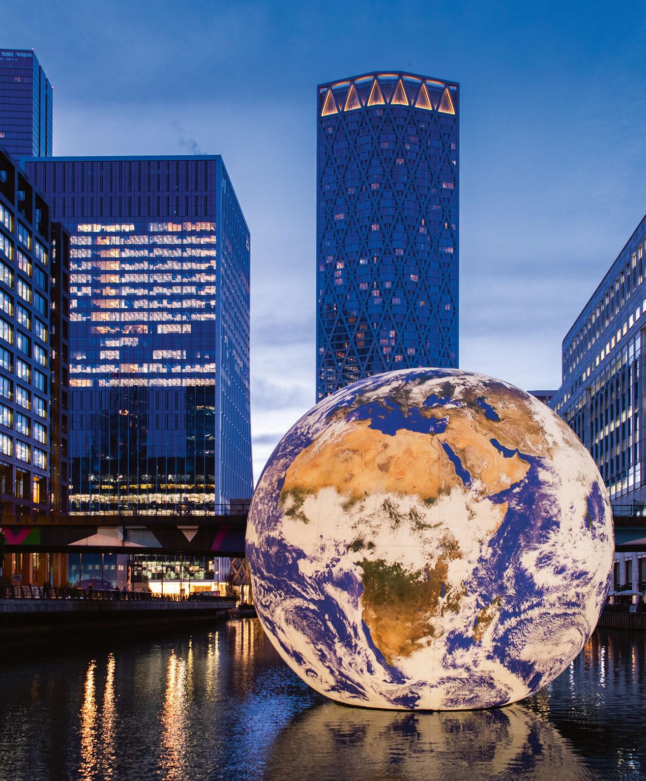
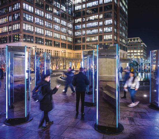
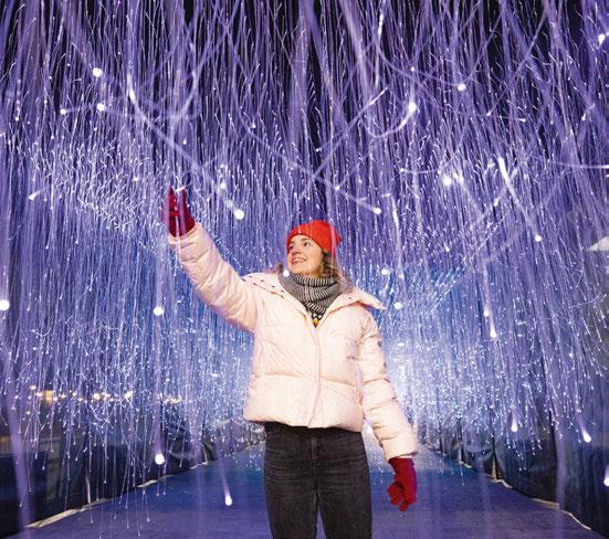
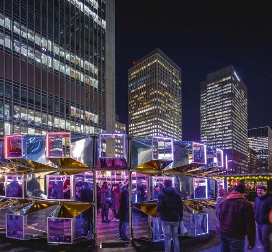
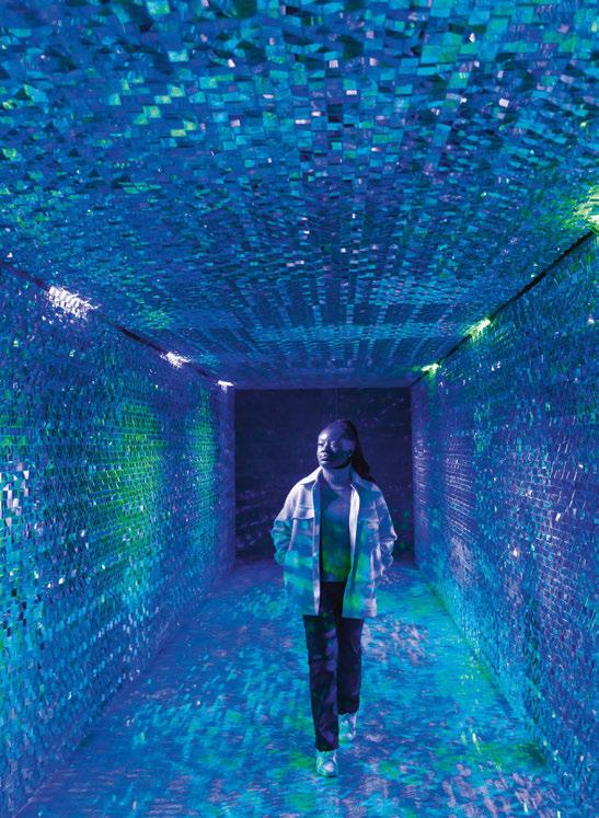
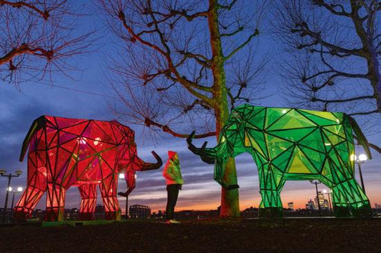
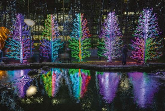 in[visible], Daniel Popescu
This is Loop also created Emergence - a large-scale sculpture conceived as a meditation of light and sound, made of multifaceted two-tone mirrors and moving light. The piece formed part of the artist’s ongoing experimentation with mirrors, reflection, and light.
Two pieces illuminated Jubilee Park; Crystal Greenhouse by Shared Space and Light glowed, sparkled and transformed in front of the passing audience - the domestic scale of the typical greenhouse standing in juxtaposition with the tall buildings of the surrounding Canary Wharf. Fluorescent Firs transformed the tranquil park into a multicoloured forest, gently glowing and changing colour, lighting up the surrounding plants and trees.
Winter Lights included a series of large-scale installations for visitors to explore and immerse themselves within. One such piece was Continuum, created by Illumaphonium, at Cabot Square. Here, a meticulously arranged geometric matrix of reactive and resonating stainless steel mirrors looked to remind visitors that we are all one. An illuminated, infinite space in and around the audience, seemingly bigger than the one it physically occupies, it facilitates a togetherness that humans crave now more than ever.
Other large-scale pieces included Ping by Gijs van Bon; comprised of 200 beacons spread over a 125-metre track like nodes within a network, messages were passed from one beacon to the next, creating a chain reaction. Elsewhere Permafrost - Sleeping Giants saw Belgian artists Fisheye raise awareness of the global climate crisis by creating a synergy between visual shape and societal relevance. The piece “resurrected” three ancient mammoths isolated deep in layers of permafrost for centuries, animating them through light.
Pippa Dale, Senior Arts & Events Manager at Canary Wharf Group, said: “As one of Canary Wharf’s most popular calendar moments, this year is the seventh instalment of Winter Lights, and features works that centre around the topical themes of climate change and the transfer of data. We’re delighted to welcome 22 fantastic artworks that transformed the extraordinary backdrop of Canary Wharf.”
Winter Lights forms part of Canary Wharf Group’s wider arts and events programme, which makes art accessible to all and encompasses London’s largest free to exhibit public art collection of more than 100 art pieces across the estate year-round. www.canarywharf.com

Ahead of an online debate on the subject this March, Dr Shelley James explains how lighting can help to improve the lives of those living with dementia.
Every three seconds, someone in the world develops dementia. Today, an estimated 55 million people worldwide live with this irreversible degenerative condition with a devastating impact on their loved ones. It was the second leading cause of death for men in the UK in 2019.
According to Alzheimer’s UK, dementia costs the UK economy around £25bn annually. More than half of that is accounted for by social and formal healthcare costs. Approximately £10.2bn, is the cost of informal care provided by family and friends. This burden falls disproportionately on women, who contribute over 71% of informal care hours globally.
According to UK Care, average care home fees range from £27,000 to £39,000 per annum for a residential care home. Those costs increase to £35,000 to £55,000 per year if nursing care is needed. Despite the high cost, residents face a significantly greater risk of death from physical and mental health conditions – from falls to inappropriate medication and infectious diseases. According to the Lancet, the age-adjusted risk of death is 10 times higher for care home residents compared to those living in private homes. That deadly multiplier rose to 17 times during the first wave of Covid-19.
Families cite nighttime wandering, memory loss and depression as the main reasons they take the painful decision to place their loved one into care. The great news is that the right light at the right time (‘circadian’ or cycled lighting) can help to provide effective relief for those devastating symptoms and those who care for them.
NASA pioneered this approach as they saw the astronauts living on the space station struggling to sleep. They spent billions of dollars to design powerful energy-efficient lighting systems to mirror the life-affirming cycle of bright days, soft evenings and dark nights of life down here on Earth. Large-scale trials in residential care homes have built on NASA’s discoveries to harness the potential of light to tackle the core symptoms of dementia. The results offer a ray of hope for millions. One Harvard study of the impact of circadian lighting in this setting recorded a 43% reduction in nighttime falls, improved mood, and slower cognitive decline. Other research shows a reduced need for sleep medication, reduced ‘sundowning’ agitation, and greater expressions of alertness and emotion, even among the most severely affected residents. These improvements in quality of life are remarkable enough. The financial benefits are equally rewarding, with reduced costs of medication and hospital admissions due to falls and viral infections.
NASA’s drive to optimise efficiency means that circadian lighting can deliver energy savings too. One American residential care home manager saw a return on her investment within a year. In a sector where more than 81% of businesses report chronic understaffing, a healthier and happier working environment will boost recruitment and retention too.
So why isn’t circadian lighting everywhere?
I was shocked to find that despite growing evidence for the benefits and energy-efficient lighting solutions coming to market, most older adults living in long-term care still do not receive the natural light-dark cycle they so desperately need.
My research found that light levels in most care homes during the day are a fraction of the minimum brightness that our body clocks need to wake up. Daylight is the obvious solution, but the average resident goes outside for less than three minutes per month. Moreover, being woken up by routine checks at night confuse residents’ ageing body clocks that are already struggling to stay on track with the combined effects of age and dementia. As we get older, the strength of the hormone signals that regulate the sleep-wake cycle becomes weaker. At the same time, the part of the brain that drives the body clock becomes smaller as dementia progresses. Finally, gradual yellowing and clouding of the transparent gel in the eye and changes in the pupil mean less light gets into the brain. These factors combine to create a twilight existence for millions of older adults. This situation contributes to the distress of disrupted sleep and nighttime wandering, confusion, and depression. I spoke to healthcare providers about the potential for light to transform the quality of life for residents and staff. Most were unaware of the potential benefits, or concerned that these approaches were expensive marketing hype or too complicated for them. When I reached out to scientists leading the field, they expressed frustration that their findings were rarely understood or translated into practical solutions that could make a real impact.
I realised there needed to be an open forum for scientists and healthcare providers to share knowledge about the principles and practice of lighting for the residential care sector. Please join this ground-breaking online debate on the 7th of March. Following opening remarks by Professor Russell Foster MBE, you will hear from three scientists about new frontiers in lighting research: sleep, acute effects of light on mood and cognition and research methods. Three remarkable healthcare providers from the USA, Denmark and the UK will then explain how they have applied these principles in the real world. Finally, they will share the problems they have faced, their results, and their vision for the future. Guests will be
invited to ask questions of our panel before closing remarks by Helen Loomes, incoming President of the Society of Light and Lighting. Circadian lighting offers a ray of hope for millions living with dementia. Technology developed by NASA for the space station is now available to us here on Earth. These approaches deliver sustained, energy-efficient relief for the distressing symptoms of dementia. A growing number of successful healthcare providers are harnessing the power of this ancient natural remedy. Join this unique conversation to discover how the next generation of lighting can help us all to face the future with a smile.
The event is free to attend, registration information can be found here: https://www.eventbrite. co.uk/e/innovators-in-residential-healthcaretickets-473414384167
Lighting designer Tiphaine Treins has created a new tool to calculate the environmental footprint of lighting fixtures. Here, she tells us all about the LCA-CALC.
LCA-CALC enables lighting specialists to calculate the environmental footprint of all lighting fittings easily and affordably. The idea behind it was to democratise lighting eco-design metrics for designers, suppliers and lighting specialists, thereby moving the lighting industry forward towards a more environmentally friendly future. My design work prioritises ecologically friendly and transparent workmanship. As an eco-lighting innovator, I want to understand and scientifically quantify the environmental impact of each installation. However, my exploration of eco-design in lighting fittings revealed a lack of clarity about which materials have the least environmental impact. I was unable to know with precision which material is best to use. For example, is it best to use recycled aluminium or plastic? When proposing a fitting designed to be reused for two or three times to a client, I had no means to scientifically quantify the environmental impact savings of that fitting. I was also unable to precisely compare the environmental impact of different products. For example, I couldn’t compare a more efficient luminaire to a less efficient one with a longer lifetime warranty.
The answer to these questions, and more, is found through a life cycle assessment (LCA). An LCA is
a technique used to assess the environmental footprint associated with a product over its life cycle, from raw material extraction to manufacture, distribution, use and final disposal. No standardised or accessible system to calculate the lifecycle of a luminaire currently exists. Currently, a lighting designer desiring to understand a luminaire’s life cycle is faced with multiple challenges. Performing the LCA in-house for a supplier requires hiring an expensive LCA analyst who will require costly database and software licenses. Moreover, the life cycle assessment methodology, though globally standardised, can be applied differently by different analyst and multiple regional guidelines complicate the process and necessitate specific skills and know-how to get a relevant LCA. Conducting a life cycle assessment, therefore, is often cost prohibitive. Lighting suppliers have the option of outsourcing the life cycle assessment. However, this route means that even the most minor change to the fittings requires a new – and expensive – calculation.
LCA-CALC was born out of my frustrations with the inability to obtain reliable, scientific, and usable eco-design metrics at a reasonable cost, combined with a desire to innovate and move the lighting industry towards a zero-waste future.
I partnered with the International Reference Center for Life Cycle Assessment and Sustainable Transition (CIRAIG) to build LCA-CALC. CIRAIG is a cutting-edge life cycle assessment research centre that develops metrics necessary for a transition to an eco-friendly society and is affiliated with Polytechnique Montreal. This made the partnership an obvious and fruitful fit. Using CIRAIG’s expertise, I created the first accessible and affordable tool to assess the environmental footprint of all lighting fittings (exterior, interior, decorative fittings).
LCA-CALC is an online platform that easily calculates the environmental footprint of all lighting fittings using the European Footprint 3.0 (EF3) and IMPACT World+ life cycle impact assessment (LCIA) methods. LCA-CALC considers the production of the materials, manufacture of the fixtures,
distribution, use and end-of-life for each fixture. LCA is the general methodology used to assess the environmental footprint of products, it is governed by the ISO 14040-44 standards. There are four phases to an LCA study: the goal and scope definition, the life cycle inventory (LCI) analysis, the life cycle impact assessment (LCIA) and the interpretation of the results.
To obtain the relevant results, the user inputs data into the online platform. Required data includes the list of materials and their respective amounts, manufacturing, distribution, use and end-of-life information. LCA-CALC also requires light output, driver power, fitting and components lifetime and electricity consumption during use and stand-by data.

LCA-CALC uses an in-house methodology to assess the life cycle of LED light fixtures as no European guidance for developing lighting fitting environmental product declarations has yet been made available. Once it is published, LCA-CALC will align with it. Until that time, the environmental footprint of the light fixture is related to the functional unit of “providing 1,000 lumens for 50,000 hours”, as this period corresponds to the average lighting fitting lifetime and warranty.
LCA-CALC uses datasets from the widely used life cycle inventory database ecoinvent v3.8 to analyse the background processes, namely the production and manufacturing of the materials and components used, transportation, electricity generation and waste treatment. It considers the average global context for materials, transportation, and waste treatment, and can apply different specific regional electricity grid mixes for the use stage.
LCA-CALC can also calculate the life cycle assessment of fittings designed with a circular economy model. The tool can consider the reuse of components and includes data on recycled materials. For the latter, the approach used is consistent with the ecoinvent system model, which considers that all burdens associated with the collection, sorting and recycling of the used
material are allocated to the recycled material and the life cycle that uses it.
The environmental footprint obtained with either the EF 3.0 or IMPACT World+ methods consists of a broad range of environmental indicators. EF3.0 provides 16 midpoint indicators, including the carbon footprint in kg of CO2 equivalents, while IMPACT World+ provides two endpoint indicators (Human health and Ecosystem quality) and two midpoint indicators (Fossil/nuclear energy and Mineral resources), with the endpoint indicators aggregate several midpoint indicators, thus facilitating the interpretation of the results for ecodesign purposes.
LCA-CALC provides the following environmental metrics on the life cycle of lighting fittings:

• the carbon footprint.
• the environmental footprint made up of the 16 midpoint indicators of the EF 3.0 LCIA method.
• the environmental footprint is made up of the two endpoint indicators and two midpoint indicators of the IMPACT World+ LCIA method.
The LCIA results are displayed neatly in a digestible and actionable report. Moreover, the LCA-CALC platform user interface allows the user to store all relevant data and metrics and the platform provides online support for users.
LCA-CALC is the first tool of its kind for the lighting industry. Other attempts, such as the CIBSE’s TM66 have been made to create environmental metrics for lighting. Whereas TM66 only provides recommendations for design and manufacture of circular products, LCA-CALC is a widely applicable and in-depth life cycle quantitative assessment tool for all fixtures, new and reused, circular or not. Designed to be user-friendly, flexible, and accessible and affordable for lighting suppliers and designers who wish to prioritise transparent and eco-friendly manufacturing and design, LCA-CALC is currently operating in beta, with the launch for a limited number of users slated for April 2023.
To join the LCA-CALC waitlist and gain the earliest access to the platform register your interest at: www.lca-calc.com/join-waitlist
dpa lighting consultants was commissioned to produce the lighting design for OKKU, an award-winning Japanese Restaurant opening its first offer in Riyadh, Saudi Arabia. Working closely alongside LW design, dpa conceived a lighting concept that would emphasise and reinforce the interior design features, setting an intimate atmosphere, interspersed with regular moments of interest and decoration.
The original and innovative space features two distinct floors where guests are greeted by Samurai warriors, a signature Jelly Fish Tank, a giant Japanese Bell and exquisite interior detailing to complement the food and beverage offering, all produced in a lively show kitchen with bursts of natural flames coming from the Robata Grill. On the first floor, there are private dining rooms, and views out to the exterior terrace. To tie these spaces together, a consistent palette of colour temperatures was used, and the lighting equipment palette was considered very carefully to minimise the number of manufacturers and types of equipment, for ease of future maintenance and installation.
Through the evening, as the artificial lighting becomes dominant, the carefully curated collection of lit effects is revealed. The intensity of each lit effect was balanced through the lighting control system to facilitate a change of emphasis throughout the evening and night, with the general light levels reducing as the evening progresses, allowing the decorative and accent elements to take precedence.
The iconic Japanese warriors are lit from below and above, to reveal their scale and render the faces and armour in an unnatural way, creating an imposing impression. Full, natural stone walls around the glazed lift and staircase are lit from above and below at close offset to reveal the relief and sculpture of the stone, a technique which has also been used on other feature walls with a three-dimensional form.
In the main dining atrium space, a series of spun fabric pendants drop through the space in a cascade of light, with the impression further extended by the mirrored ceiling above. At the end of the space, a giant, custom fabricated bell, with bespoke patterned finishes on the interior is illuminated with a concealed cove light, detailed into the inner rim of the bell. In the surrounding environment, discreet, miniature uplights give accentuation to the printed wooden screening, to highlight the Japanese characters. Artworks are highlighted throughout, with soft, directional downlighting, while tables are spot-lit with tight beam angles to provide the best lit rendering of the cuisine and add drama to the dining spaces.
The exterior terrace has been designed with a similar ethos to the interior, making the most of the opportunities presented by the interior design team. A particular highlight is the shadowed and dynamic lit effect produced by lighting through planting onto a Japanese wall mural, which envelops the terrace with interest on all sides.
dpa worked closely with the design team and client to bring out the richness and detail of the interiors with light, in a subtle and sympathetic manner.
www.dpalighting.com
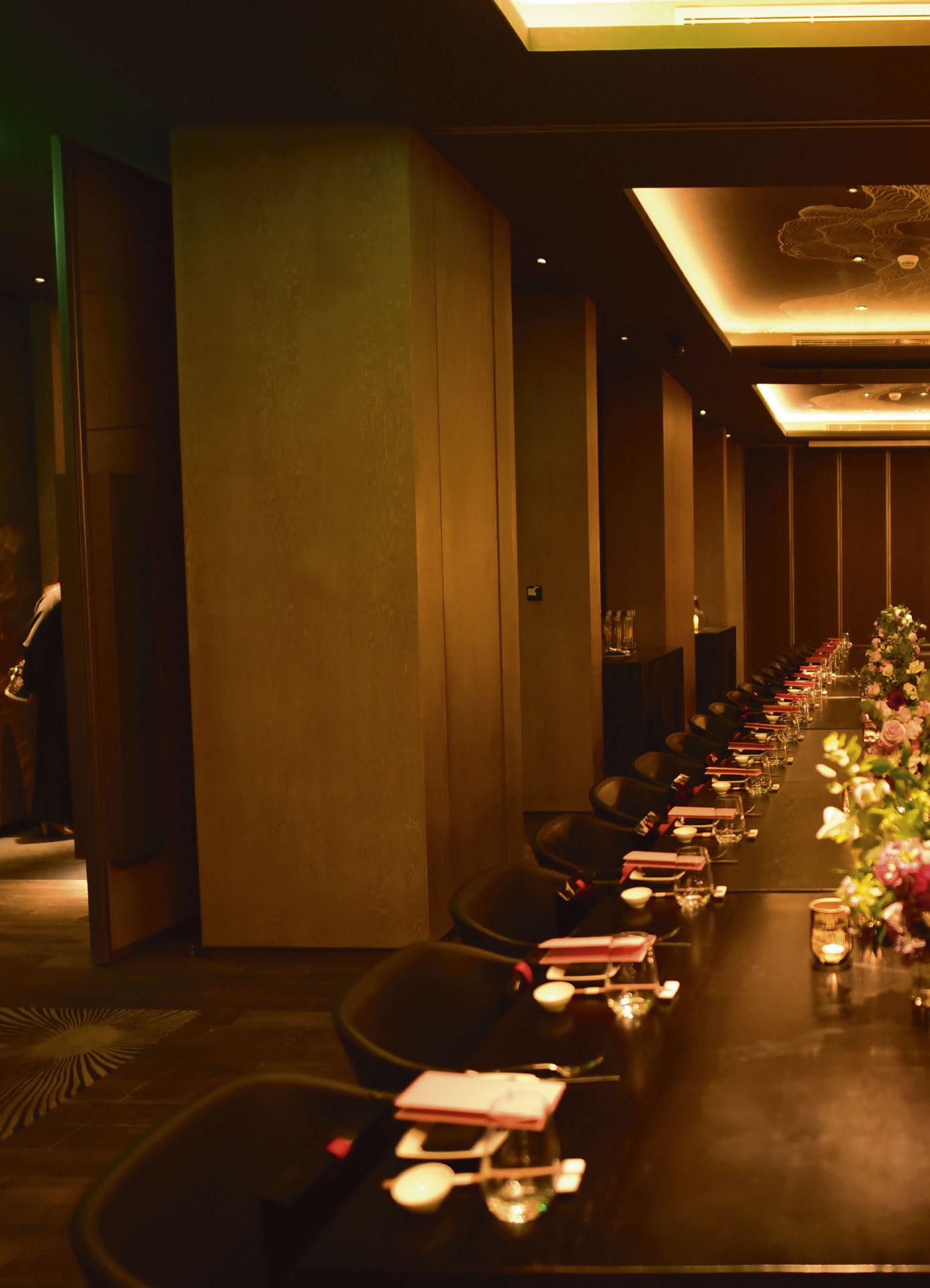
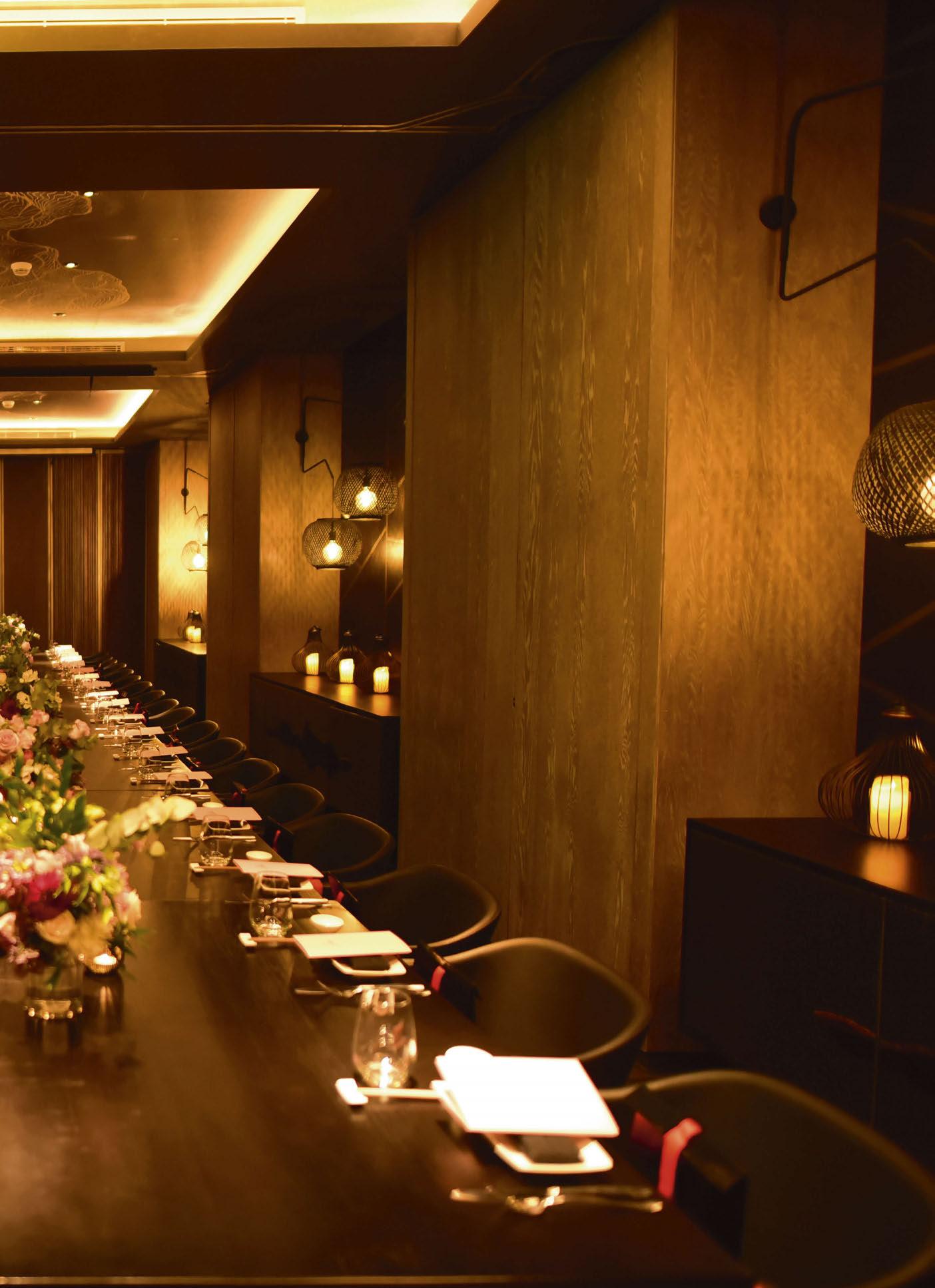 Image: Courtesy of OKKU
Dave Hollingsbee of Stoane Lighting looks at the proposed changes to the Ecodesign for Energy Related Products & Energy Information regulations, breaking down how these changes could impact the lighting industry, both in the UK and beyond.

For the past two years the GreenLight Alliance has existed primarily with the mission to seek and promote the adoption of the circular economy. Our work aims to help all corners of the lighting industry to make meaningful, informed and fair decisions in the pursuit of more sustainable practices. Today we direct the Alliance’s gaze towards the rapidly progressing proposals for changes to the Ecodesign for Energy Related Products & Energy Information (Lighting Products) Regulations 2021, now including Minimum Energy Performance Standard (MEPS). Or, the draft statutory instrument’s full title: Energy Conservation. The Ecodesign for Energy-Related Products and Energy Information. (Lighting Products) (Amendment) Regulations 2023.
This proposed regulation will impact those putting new product on the market in the UK. Does that affect you? Do you specify lighting for projects in the UK? Do you manufacture luminaires in the UK for the UK market? Do you manufacture outside of the UK and export into the UK? Do you manufacture lamps or light emitters destined for UK manufacturers/market? Are you a wholesaler or retailer who places lamps or luminaires on the UK market?
If the answer to any of these questions is “yes” then this proposal affects you.
Essentially, for the UK market it is a light-source efficacy minimum for all light-sources. It constitutes an amendment to Ecodesign and is a two-stage proposal:
Tier 1 (coming into force 15/11/2023) 120 lm/W
Tier 2 (coming into force 01/09/2027) 140 lm/W
From where we sit as an industry in February 2023, that is an ambitious threshold to set by anybody’s reckoning.
Does the GLA applaud it?
The truthful answer is: “Not as it stands”. Members are still getting to grips with the impact of the minimum efficacies (the Pon Max calculation)
brought in with the EU Single Lighting Regulation (EU Com 2019/2020) and corresponding (largely mirroring) 2021 UK Statutory Instrument
2021/1095: “Ecodesign for Energy Related Products and Energy Information (Lighting Products) Regulations 2021”. In essence a large number of established “go-to” LED products fell below the new minimum efficacy thresholds established using the Pon Max calculation in the regulation.
At the time, many were caught napping. Indeed it is arguably far too soon since the October 2021 implementation to know of the impacts and to comment informedly on prospects of another raising of the bar so soon, in the UK at least. One obvious concern is EU/UK divergence. With another set of environmentally motivated regulatory proposals to work with, it is hard to see how this is positive for UK lighting stakeholders or any global light source manufacturers. Of course, where we do see similarities between the UK and Europe is in the quest to reduce energy consumption and carbon emissions related to lighting. Noble and urgent aspirations, but at what cost to the UK lighting industry? What cost to manufacturing, distribution, specification and perhaps most importantly the end user?
This is a very good question, not as easy to answer as you might expect. It is important, there are a range of lm/W concession allowances for particular categories. To attempt to understand the legal definition in this context: have a read through the draft and UKSI 2021/1095. The wording is confusing in the proposed draft, proper understanding of intent and wording is crucial: on the face of it many light sources may not benefit from any allowances at all.
There are allowances for some “light sources”, allowing that light source efficacy below the 120 lm/W threshold (as of this November) or 140 lm/W in 2027.
The concessions are cumulative, so if you have a directional mains light source, higher than 93CRI and under 400lm, perhaps an LED reflector lamp for example, then that ‘light source’ must have a minimum efficacy of 70lm/W under Tier 1, and 90lm/W under Tier 2.
While the allowances may reduce the targets for lamps, there are no such concessions applicable to other light source types. If for example, the light source happens to be an LED for use in an LED luminaire, whether removable or not, then the allowances do not apply. This means that light sources such as COB, LED array and LED tape do not benefit from allowances and must meet the 120lm/W and 140lm/W minimum efficacies in Tier 1 and 2.
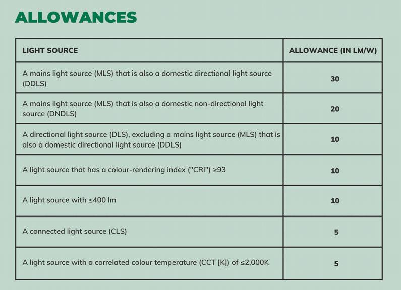
With some research into COB manufacturers, one can see that in particular the very high CRI, warm colour temperatures and lower diameter/lower output LED light sources are going to fall below the minimums immediately, if the regulation is implemented according to the current draft.
How viable is it for luminaire manufacturers to bring their product offering into line with Tier 1 rules by November?
Will light source (“lamp”) manufacturers, retailers and wholesalers have access to suitably rated equipment in order to legally satisfy demand?
How viable is it for specifiers to ensure all UK projects procuring after November 2023 and beyond will be compliant with the new minimum lm/W light source rules? Will specifiers know if they are being offered a product with a complaint light source?
Is there any market surveillance data from UK or from the EU as to the impacts of recent Ecodesign regulation? Has there been any market surveillance done to provide evidence of compliance? Has there been any research to establish the impact of the 2021 Ecodesign regulation in the UK on energy
consumption related to lighting? Is it delivering as intended? What is the feedback from specifiers, manufacturers, retailers and wholesalers in terms of implementation?
Given the scale of impact of recent changes should further steps (such as these proposed by BEIS) not be predicated on learnings from similar previous endeavors?
What opportunities might it bring?
UK manufacturers (and others wishing to export into the UK) are forced to blaze a challenging new trail. If successful and other regions decide to follow, UK businesses may find themselves at an advantage, but acknowledging that virtually all light source manufacturers are based outside of the UK and are manufacturing for global markets, that is not a given. Simply relying on LED manufacturers to support UK specific legislation could be considered more of a risk than an opportunity.
What are the threats and unintended consequences?

The industry is already aware of the flattening off in lm/W improvements in LED technology. Further reductions in energy are now coming from improved optical design, energy conscious designs and of course, intelligent use of controls. Indeed, previously in building regulations, where controls were used, a lower efficacy is allowed. Furthermore we see from building regulations the application of average building level luminaire efficacy, this allows some consideration and flexibility to lighting designers to use the right light in the right places/ applications.
Also, while in-use carbon reduction will always be welcomed, as the UK moves closer to a 100% sustainable electricity grid the emphasis surely diminishes and emphasis shifts more to embodied carbon. Keeping kit in use as long as possible and reducing transportation related carbon. If greater gains can be found here should this be where attention is directed?
The UK does not manufacturer the core building
I think that Ecodesign for lighting has run its course. Any attempts to increase light source efficiency without reference to particular lighting applications is bound to limit quality of light. Regulations without enforcement penalise the local and quality product manufacturer. Creating different regulatory requirements in the UK compared with the EU disadvantages UK manufacturers, increasing their costs and reducing the availability of products in the UK lighting market –and increasing prices.
What should happen? BEIS should park this proposal and see what happens in the next round of Ecodesign in the EU, then make necessary changes to remain in line with that. Keeping parallel rules makes most sense for the industry, the lighting design profession, and the end-users of lighting.
Leela Shanker BR+A / GLA LCA IncubatorOn the one hand, it’s encouraging to see the UK ready to flex legislative muscle and set unprecedented, quantitative targets with some degree of urgency - someone has to lead. Though, for decarbonisation efforts to have the most impact, we should avoid a global policy patchwork and include designers and consumers in the solution. Over-reliance on a single efficacy metric (lm/W) that stops at “the Gate” places undue weight on manufacturers’ product design to reduce the industry’s carbon footprint by underestimating the need to revisit how and where we use light. The potential for progress lies in designers working alongside manufacturers in pursuit of globally harmonised standards measured across all phases of a product’s life.”
 Fig. 1: Allowances for light sources with an efficacy below the 120 lm/W threshold.
Kevan Shaw
EFLA | Kevan Shaw Lighting Design
REACTION
There are numerous complications as we look into this further. But crucially for me there is no mention within MEPS of how existing or conventional luminaires can be maintained or remanufactured and still meet this ‘light source’ efficiency target. This must be addressed to make the transition more sustainable and affordable and avoid huge piles of WEEE waste in its wake.
Arfon Davies Arup

The proposed Minimum Energy Performance Standards (MEPS) within the Ecodesign regulations comes at a time when we urgently need to be focused on what I often refer to as “Beyond Energy”. It is not to say for one moment that lighting energy and operational carbon use is not important, but our focus needs to be on ensuring lighting for humanity is the best it can possibly be. Applying a single efficacy metric to light sources oversimplifies what is a very complex design challenge. It is not helpful as it distracts our attention away from where it should be - careful and informed use of light to create visual environments that promote wellbeing, engagement and generally high-quality experiences for people. The current draft therefore needs an urgent rethink. Amendments would be better focused on promoting higher quality lighting, delivered using circular economy principles, with people and planet in mind, as opposed to driving unrealistic efficacy targets.
blocks that make up solid state emitters, “lamps” or “light engines”. Are we aware of the intentions of the big players in these markets? Will suitable R&D, or simply inventory, be available that meets the proposed changes to the UK market? I.e., will enough product be available that meets the new criteria? What lead time implications? What differing/new commercial implications? If the UK takes a different road, will others pivot to support it, or will the path turn out to be a narrowing trail? Successful luminaire manufacture (something for which the UK currently has an excellent record) that meets particular customer demands is a complicated balance of factors. Light source efficacy is a vital one but it is not the only one. It is not even the only one to impact overall efficiency (i.e. in-use carbon), far from it. Then of course there is embodied carbon to consider (see Fig. 2). By inappropriately over-emphasising any one factor, a product can easily become non-viable. There are already metrics in use that arguably drive more holistic environmental improvements on multiple fronts.
The Lighting Industry Association (LIA) has been heavily engaged on this proposal. As Bob Bohannon, Head of Policy & Academy at the LIA puts it: “The BEIS consultations refer to CLASP and sustainability NGO. Our industry fully agrees with them on the need to deliver net zero, but we differ in how this should be delivered, we think far more energy saving is available via the use of controls and energy effective (scheme) design. CLASP’s Mission Statement is “to improve the energy and environmental performance of the appliances and equipment we use every day, accelerating our transition to a more sustainable world”. Therefore CLASP place supreme emphasis on Efficacy
(lumens per watt), whereas looking at Fig. 3 (derived from the US Dept. of Energy, 2019 Lighting R&D Opportunities), you can see it demonstrates all the other factors we need to consider and some of these come with a technical trade off with energy efficiency.
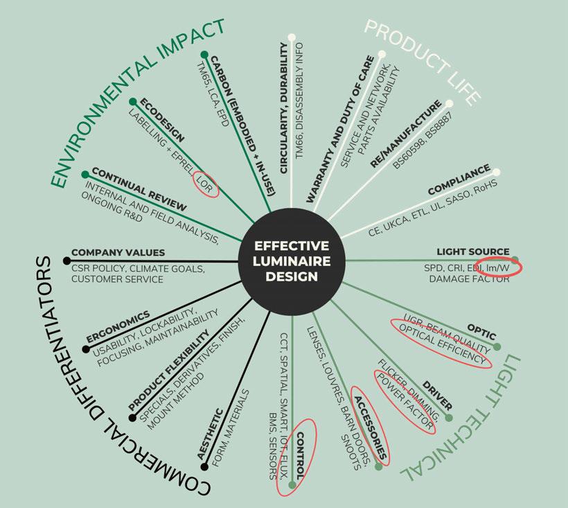
“Our industry is still in the midst of implementing the changes required by two previous sets of regulation – both will significantly help the decarbonisation of our economy. First, the Restriction of Hazardous Substances (RoHS), will largely remove fluorescent lamps (which contain mercury) by early 2024 - this is positive as it will further drive the take-up of low-carbon LEDs. Second, the Ecodesign Regulation changed the energy rating label on lighting products to promote both consumer demand and manufacturer supply of ever more efficient lighting products.
“In terms of practicable timescales, the latter just impacted labelling, the product itself remained unchanged – yet is likely that in excess of 15 million light sources are still on the market with the old label (the problem is shared across Europe, it is not restricted to the UK). The current legislation will require these to be relabelled for display by retailers by 1 April 2023. This situation has arisen due to the disruptions of Covid-19 and the supply chain crisis - LEDs have semiconductors in them. If this date is adhered to, the unintended consequence will be a large-scale shortage of products and potentially mass dumping at a significant cost. Physical relabelling of products on the shelf across the whole supply chain is not practical or deliverable due to staff shortages and cost. We must emphasise that the product has not changed, it is no less energy efficient, the only change is the energy rating label.
ADJUSTABLE HEAD
Friction set head is adjustable up to 90° for placement further away from the path
WIDE RANGE OF FINISHES

Wet spray and textured powder our standard or any RAL colour
EXTRA OVAL BEAM
Offers a wide distribution and the light out onto the pathway whilst the head remains horizontal for low glare
HIDDEN CABLE
Located within the ground spike, exiting at ground-level to maintain its discreet design
, whilst the head remains horizontal for ultra-low glare and light pollution. The cable is hidden within the ground spike to maintain its discreet design. The LD50 has been designed in collaboration with Sanjit Bahra, Prinicpal at lighting design consultancy DesignPlusLight, enabling the creation of a robust, low glare, circular solution for exterior pathway and landscaping applications.
“This is important to understand, as the new MEPS legislation will require complete reformulation of many products, where that is even possible, in seven months, when we have an 18-month replacement cycle. This will result in empty shelves and unrelampable light fittings.
“Tier 1, due to come into effect in November this year, gives insufficient time for the very probable demand pull and supply push effects of those new labels to have had any chance of being effective, nor for any supply chain problems to be resolved – in fact it will exacerbate them.“
The industry has more recently achieved some significant milestones in terms of efficient, long life, very stable, high fidelity solid-state products (think museum and gallery lighting). Similarly, particularly post-Covid; encouraging progress is being made on the light and health front, and in night-sky (nature sensitive) schemes. These, not so niche anymore, areas mostly call for richer phosphor mixes (seeking to approach the light quality of natural daylight or incandescent sources) with correspondingly lower lm/W performance. Are we prepared to surrender some of the progress made in these areas by allowing this regulation to proceed un-challenged?
How does one reconcile a separate sustainability initiative for one small region with the overarching goal of accelerating towards (our collective imperative) consistently reducing the impact of lighting, covering as much of the world as possible?
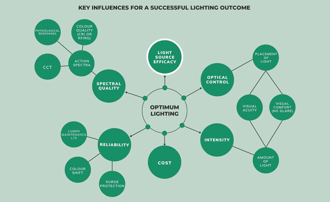
In forming an opinion it is worth looking into your favourite equipment providers; be they luminaire OEM or LED light engine providers. Better still, speak to your contacts there and establish if they think the new rules would affect product availability, future R&D direction and of course, costs.
It is no secret that the initial efficiency leaps in LED technology have slowed and begun levelling off.
Some see the developments in Potassium Fluorosilicate (KSF) phosphor technology as another avenue to surge efficacy, but do we completely understand the areas where we can, or perhaps should not; use that technology yet? Numerous lighting bodies are mobilising on this issue. If you want to learn more we suggest you also contact your societies, members groups and keep an eye out for on-line gatherings by GLA. We hope the article is useful and informative. Please stay engaged. www.greenlight-alliance.com
PROLED Downlight Cuckoo

FLAT DOWNLIGHT AND FLEXIBLE SPOTLIGHT IN ONE EXTENSIBLE, 360° ROTABLE DIFFERENT BEAM ANGLES AVAILABLE IN TWO SIZES
www.proled.com

With an increasing number of companies looking to become more carbon neutral, David Morgan examines the luminaire offering from LumiAdd, a new manufacturer that creates 3D printed components for its products.
Luminaire manufacturers are transitioning towards carbon neutrality along several different paths. Some companies extol the use of machined aluminium components produced for each project as the best way to achieve carbon neutrality and comply with a circular economy approach. Others are advocating the use of 3D printed plastic components, and minimising the amount of aluminium employed, as a better approach to achieving similar goals.
It seems to be a complex task to determine if either approach will make a measurable reduction in the lighting industry’s contribution to global warming, but a lot of development work is now being undertaken and money spent with the aim of making a difference.
Signify (using its Philips brand) has perhaps made the earliest and largest commitment to the 3D printed approach, and now offers a wide variety of standard and customisable luminaire types produced with recyclable polycarbonate and recycled polycarbonate components. In 2019 it began a roll-out project with Marks & Spencer to produce new luminaires to illuminate its stores all using 3D printed luminaire enclosures, claiming that this would reduce the carbon footprint by up to 47%, excluding the optics and electronics.
It is understood that at the end of life, the polycarbonate components will be returned to Philips to be recycled and reused to create new luminaire components.
This approach has now been taken up across the lighting industry and many companies produce luminaire components using a variety of plastic materials including nylons, polycarbonate, and ABS. Being able to quickly create custom designed components for each project without needing to invest in hard tooling is increasingly attractive as surface quality improves and prices reduce.

At the other end of the corporate spectrum from Philips, a start-up UK company called LumiAdd has just launched an initial range of luminaires using components 3D FDM printed from PLA (polylactic) resin, a biodegradable plastic derived
from renewable sources including corn starch, sugarcane, or cassava. In addition to marketing complete luminaires, Lumiadd is supplying PLA components to other lighting companies.
LumiAdd was founded by lighting designer Jamie Norris Green and lighting product designer Lewis Smith in 2022. Jamie is an experienced lighting designer who worked at Aecom and Lumineer before starting his own consultancy in 2013. He has been experimenting with the use of 3D printing for more than 10 years, before starting LumiAdd. Lewis started his luminaire design career at Martech and Cooper Lighting before forming his consultancy in 2015.
The initial LumiAdd range is targeted at the international lighting specification market that Jamie and Lewis are already familiar with, and includes recessed and surface mounted downlights and an adjustable spotlight. One of the great benefits of the 3D printing process is that it allows all orders of the LumiAdd range to be customised with short lead times to meet project requirements, even for small order quantities. The downside with 3D printing is that, to scale up as order quantities grow, the number of printers used will need to increase at more or less the same rate. At some point it may well be appropriate to injection mould some higher volume components, and this can still be done using PLA resins, so the niche that LumiAdd has established can scale to a larger size if demand grows.
The LumiAdd range is constructed using FDMprinted PLA components combined with other parts such as extruded aluminium heat sinks, 90 CRI COB LED light sources and industry standard optics that cannot be 3D printed.
The PLA resin material that Lumiadd uses for its FDM 3D printed parts is sourced from Thailand and is derived from sugar cane. According to a detailed lifecycle impact assessment undertaken by the manufacturer of the resin, Total Corbion, the production of PLA from sugar cane in the tropics is an environmentally sustainable process with a low carbon footprint. They predict that, although
at the moment the resins are not currently carbon neutral, with further development and investment they may become carbon negative.
The primary benefit of using bio-plastics, such as PLA, for luminaire components is to minimise their carbon footprint. However, determining the precise reduction compared to using plastics based on petrochemicals seems to be a complicated process and depends on how the components are disposed of at the end of life, as well as the sustainability of the sourcing, manufacturing, and logistics. If they are composted, which can take years under some conditions, then the CO2 that was captured while the sugar cane was growing is released, giving no overall carbon reduction. If the components are reground and reused to make new components, then the original captured carbon is retained but this process uses energy that will have a carbon footprint. Reusing existing printed components disassembled from old luminaires within a circular economy model would ensure that the carbon remains captive, but I predict that the 3D printing process is going to develop rapidly over the next 10 to 20 years with improved quality and lower costs, which may make the reuse of old parts less likely. The samples that I was sent to review are neatly designed and although the tell-tale surface witness lines resulting from the current FDM 3D printing process were clearly visible, the overall appearance was attractive and when mounted on the ceiling it would not be obvious that these luminaires were not made by conventional processes or materials.
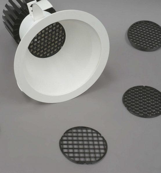
The 3D printed springs worked well to hold the downlights into the ceiling with a positive pressure. The surface mounted downlight incorporated a neat 3D printed threaded fixing to a separate mounting plate to eliminate any visible fixing screws. The Bridgelux COB LED light engine and the Ledil lenses were of high quality and the lit effect from the range was good. The adjustable spotlight incorporated a Ledil zoom lens, which was held into the body with a neat, printed snap fit detail. The design of this product was not as successful as that of the other
LumiAdd luminaires in the range. The PLA material is flexible so while handling the body it felt rather insubstantial and the mounting arm was rather spindly. The pin type aluminium heat sink enclosed in the body becomes warm when fully saturated and this seemed to make the body slightly more flexible than when at ambient temperature. When installed on the ceiling these details would not be of great significance but, at the point of sale, I can imagine there might be some specifier and customer resistance to the use of PLA material. LumiAdd has entered the market at a point when specifiers and end users are looking for ways to reduce the carbon footprint of luminaires, so its timing is good. Using 3D printing has many benefits to the lighting industry for low volume customised parts as can be seen by the increasing use of the process, but currently the higher unit costs compared to injection moulded components, whatever the resin type used, is probably going to be an issue with end users.
Using PLA and other bio derived resins for luminaire components seems likely to grow over the coming decades as their production becomes more efficient, and so LumiAdd may have an early adopter advantage in this market niche for the moment. It will be interesting to see how the range and process develops over the next couple of years and to see the type of projects where these luminaires are used.
www.lumiadd.com
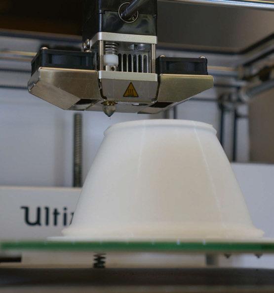
Martin Professional has launched its new Exterior Linear Pro range of dynamic lighting fittings for architectural applications, which sets new standards in performance and comes with an exceptional feature set that reflects Martin’s dynamic lighting DNA. For more than 35 years, Martin has led the way in the development of dynamic lighting that has been used in projects as diverse as the façade of the Burj Al Arab in Dubai, to the Sheikh Zayed Grand Mosque in Abu Dhabi to the Princess Cruises Golden Princess Cruise ship, Auckland Bridge and the Falkirk Wheel in the UK. With a wide range of beam angles, colour engines and segment lengths, the Martin Exterior Linear Pro range truly delivers as a permanent outdoor architectural range. Delivering striking direct and indirect illumination of walls and ceilings, along with textured and decorative surfaces, the Martin Exterior Linear Pro will deliver.
The Exterior Linear Pro is available with either homogenised colour mixing, using colourcalibrated LEDs to ensure superior consistency within and between fitting and a selectable CCT option of between 1000K-12000K; or as a dynamic white CCT version utilising 2700K, 4000K, 6500K LEDs. The fittings demonstrate Martin’s dynamic lighting pedigree. Three fixture types cover most linear
LensVector
LensVector’s dynamic beam shaping lenses deliver virtually infinite beam control, allowing designers to create scenes and manage the size of a light beam without mechanical systems, ladders, replacement optics, and replacement lamps. LensVector lenses work perfectly with conventional or wireless control systems. From a very narrow spot to a wide flood, or something in between, LensVector’s dynamic beam shaping lenses give you more control than ever before. www.lensvector.com
applications: Graze, for a discreet but powerful wall-wash with site adjustable optics; Cove, for a diffused 100° beam angle; and DV Quad, for mounting in Direct View applications to make a bridge or building pop. Controllable as a group of fittings, at fixture level or in increments down to 150mm segments, the fittings are perfect for grazing, washing and even low-resolution video control in stadiums and arenas, cruise ships, theme parks, hotels, casinos, bridges, tunnels, and other permanent indoor or outdoor installations. Shipped in two standard lengths of 312mm and 1227mm, the fittings are designed for performance and reliability. Hybrid Power/DMX cables complete with click-connect fixture connectors as well as click-connect extension cables enhance the speed of installation, as do a range of different mounting brackets. And the flexible on-site change-of-beam optics on the Linear Pro Graze, all facilitate the ease of installation. The stand-alone or RDM addressable “selectable power consumption” feature allows the fittings to be run at 12W, 10W or 5W per 300mm. While the intelligent colour boost technology in the RGBW fittings enables more saturated colours from either a single or mix of colours. www.martin.com
Outline
Reggiani
Outline is a new, low voltage lighting system. Designed to face the continuous need for miniaturised lighting products and their structures, the system includes 24V tracks in recessed, surface and pendant configurations, all only 11mm wide. A height of just 20mm guarantees cleanliness and simplicity: this provides the ability to imitate a recessed effect without complicated ceiling details. Within the Outline system is a new family of 24V projectors – Yori Outline, Yori Pendant, adjustable linear solution Incline Outline Adjustable, and the Linear Outline linear module. www.reggiani.net
The first ex-proof flex light worldwide. ATEX, ETL, and iECEx certified for safety and efficiency in hazardous environments. With the ability to bend and shape the light, while providing a continuous, uniform light output. It makes them perfect for these areas: mines, flammable liquid storage, gas compressor and pump stations, fertiliser production, tank farms, pulp and paper plants. Upgrade your lighting and ensure safety with one single light strip that can run up to 30-metres with multiple colour options.
www.clearlighting.com
Rako
Rako has refreshed its app to allow quick and easy control of colour temperature and light intensity with a touch slider, meaning that clients can adjust the lighting to suit their needs for a particular task, or set scenes to link the lighting with their individual circadian rhythms. Connecting via a Rako hub, the app allows programming and storing of new scene levels, offers colour wheel control for RGB and RGBW fittings and ‘holiday mode’ for users to record and replay their lighting scenarios.
www.rakocontrols.com
LightGraphix
The LD154 is LightGraphix’s most powerful fitting to date, delivering up to 1443lm from a minimal body depth of 71mm. It forms a new range of high-power exterior uplight solutions for drive over, asymmetric (LD154T) and low glare (LD154DR) applications. There are three LED engine options available. A new P1 engine delivers the highest output, whilst the E3 offers an exceptional extra narrow beam of 9° and the N1, a 13° beam.
www.lightgraphix.co.uk
The Video Pixel Linear from SGM Light is one of the most powerful and flexible pixel products available. This easily integrated fixture is suitable for a wide range of applications, including media façades, themed environments, and temporary installations. Available in 1, 2, and 4ft lengths, the VPL has a wide range of optical accessories to seamlessly blend into an installation while providing industry leading intensity, dimming quality, and control. www.sgmlight.com
Landscape Forms
Typology stick lights by Landscape Forms break from lighting tradition such that the pole itself is one solid source of light. These vertical columns of warm white light stake claim to the site, accompanying the ribbon bench across its diverse configurations, and creating prominent visual landmarks that draw people into the site. Arranged side-byside, stick lights can divide spaces, punctuate spaces, or create virtual rooms of light.
www.landscapeforms.com/lighting
Designed for the future with the reduction of waste and reuse-ability at its core the Sava is an outdoor luminaire for the environment. Clever engineering delivers optimal efficiency, tool free entry, simple installation and drama free maintenance/replacement of LED module, power supply and serviceable components. The Sava family is offered in a comprehensive range of options with extra safety features, such as 10KV surge protection and mains isolation included as standard.
www.luglightfactory.com
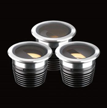
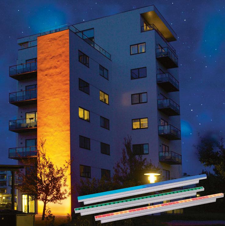
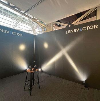
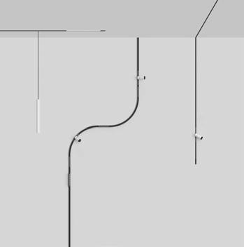
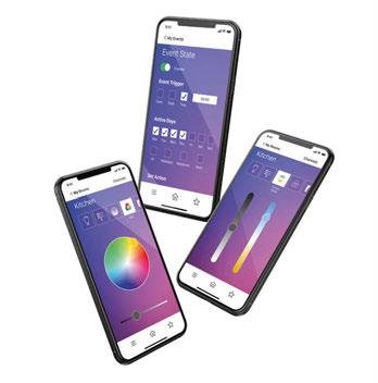
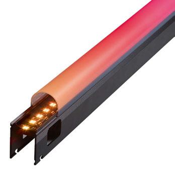
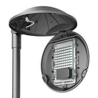
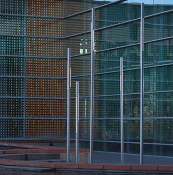
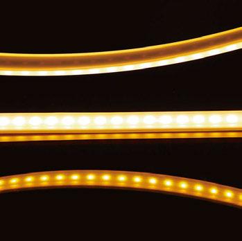
Last December, Disseny Hub Museum in Barcelona unveiled designadal, a new light installation, created by Maurici Ginés, founder and Creative Director of lighting design firm Artec Studio. The large-scale installation, suspended in the heart of the museum, was inspired by the Christmas star – a symbol of dreams, love, and hope – and encouraged visitors to look up and make a wish.
The creative concept of designadal was, according to Ginés, “based on the idea of the shooting star as part of the collective imagination, which can make wishes come true and guide people in the same direction to achieve the future we want: one that’s more sustainable, more supportive, and fairer”.
The installation was a representation of the classic Christmas Star as a symbol of light in movement. Its three-dimensional isotope form was comprised of nine separate light sheets spaced 80cm apart that, when seen as a whole, formed a four-pointed star suspended in the air. With a changing sequence of its components, the piece fashioned a perceptive sensation of movement and colour change, generating a festive feeling throughout the day – through its silver and gold reflections and iridescence in natural light, and through the
vibrancy of the light and colour it gave off when the sun went down. Its predominant tones at night were warm – golds and reds – emphasising the festive feel. Artec Studio collaborated with ProtoPixel for the light programming of the piece.
Following designadal’s introduction in December, the piece was adapted and evolved for February’s Llum BCN light arts festival to form Designova
“Nova is the name given to new stars that arise from an astronomical occurrence between two other stars, also known as a Supernova. Designova manages to transport the observer to the emotion of that moment, generating a sense of timelessness and immersion in starlight,” explained Ginés.
The adapted installation aims to convey a message of the future that is born new, desired, and alive. A trail of colour and positive energy in continuous movement that accompanies the sensory experience with a spatial sound based on the concept of the sound of the stars according to NASA, created by Pierfrancesco Ceregioli. Designova will be open until 5 March. www.artecstudio.net
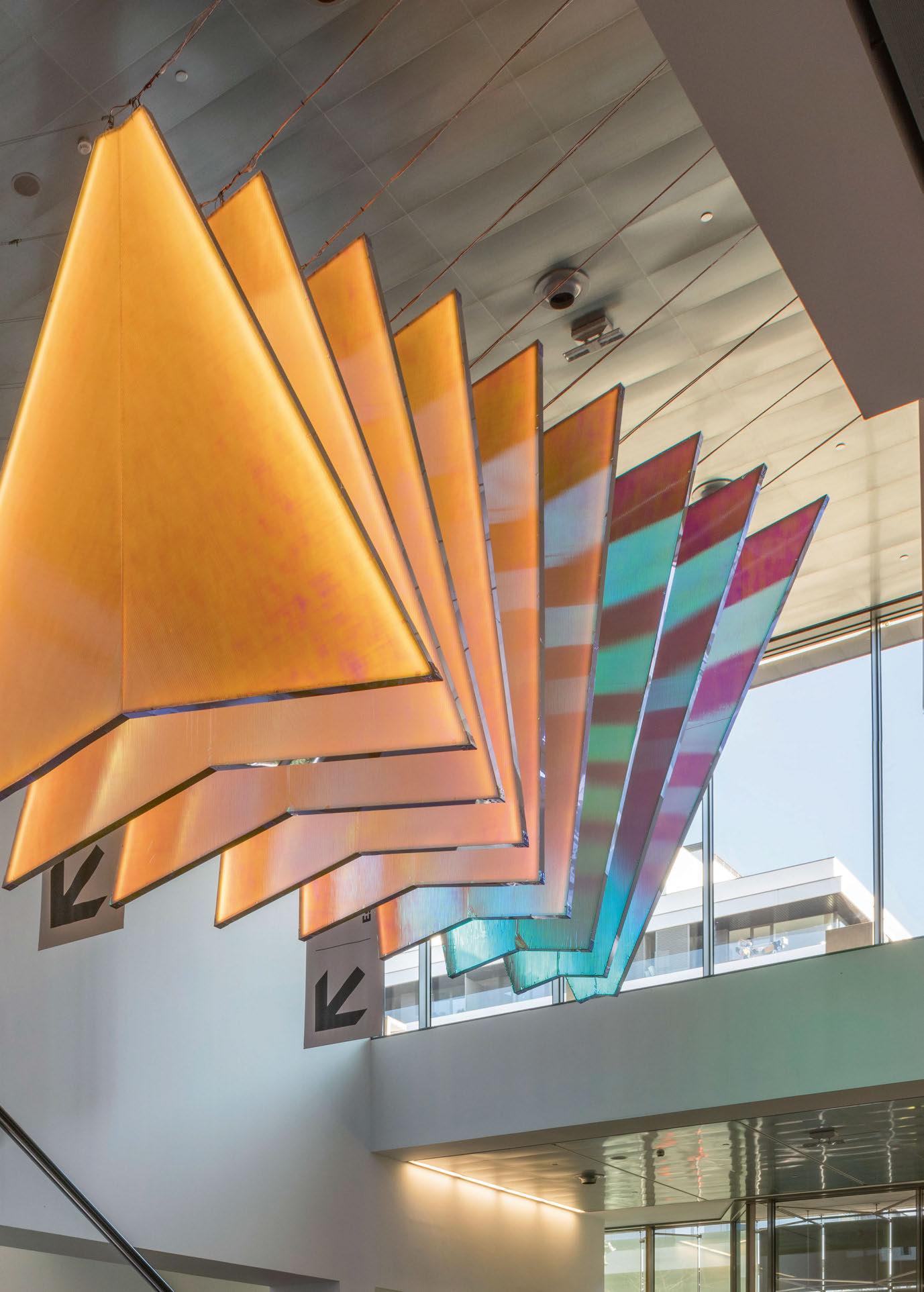
Showcasing the curvature of Amersfoort’s BOW office building, fixtures from Acclaim Lighting bring a pop of colour to its sloping façade.
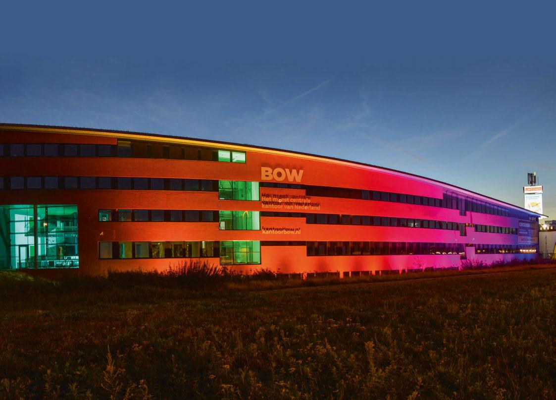
The balance between working at the office and at home has changed and created a new challenge for companies to redefine their work space. Businesses realise that their employees can work anywhere there is Wi-Fi, so companies need to offer space and freedom to give substance to the workplace. This new balance calls for an adapted, more spatial, and safer working environment, one that is in line with the ‘new’ way of working. Answering this challenge, the BOW office building located on Terminalweg in Amersfoort, Netherlands offers the necessary space to furnish workspaces and meeting rooms more spaciously, plus more than enough space for a responsible routing in a safe environment.
The facility consists of three parts. BOW A is located at the head of the facility, transverse to BOW B, which is perpendicular to BOW C. BOW B has curved elements that can be seen in the interior, as well as the exterior. Throughout its four floors, the staircase starts and ends with a curve, while the separation at the lounge has beautiful arches with a round seating area; even the light fixtures and planters are round.
To take advantage of the curve of the building, especially at night, to bring more businesses into the facility, building owner Simon Smink contacted John Hilhorst from Mossink and Ralph Reggoort from Output, and consulted with Pascal Van Sloun from Acclaim Lighting.
Van Sloun said: “The customer wanted the building to become a coloured landmark that passing cars could not miss. In order to achieve this goal, we needed to specify a high-output, high-efficient
luminaire that could easily be controlled by Wi-Fi for colour changing and custom designs. The new lighting system also had to fit onto the existing outer wall brackets.”
After further investigation, Acclaim’s Dyna Drum EO Color was specified. The high output, highefficient outdoor rated cooler mixing floodlight with an internal 100-277VAC power supply has onboard DMX+RDM driver and Aria wireless DMX technology for maximum lighting control.
Dyna Drum EO Color features Acclaim Lighting’s Spectrum Technology (QS version), which offers superior colour mixing, saturation, and an extended colour palette. The colour fixture comes with a standard narrow 10° beam with optional 20°, 40°, 60° and 10°x60° quick-change lenses for wider applications. Its quad chip LED units achieve more total lumens then its single-colour chip counterpart.
To ensure energy efficiency, the luminaires consume less than a maximum of 65W and maintain 70% of their lumens for 150,000 hours. The fixture will perform in temperatures between -40°C to 51°C. Plus, the IP66-rated fixture has a die cast aluminium housing with polycarbonate lens, with an optional marine coating, making it suitable for even the harshest outdoor environments. The new lighting system installation was completed in July 2022 with excellent results. Van Sloun said:
“The facility manager quickly received very positive responses and compliments about the exterior lighting. Now, they are thinking about extending the lights around the rest of the facility.”
www.acclaimlighting.com
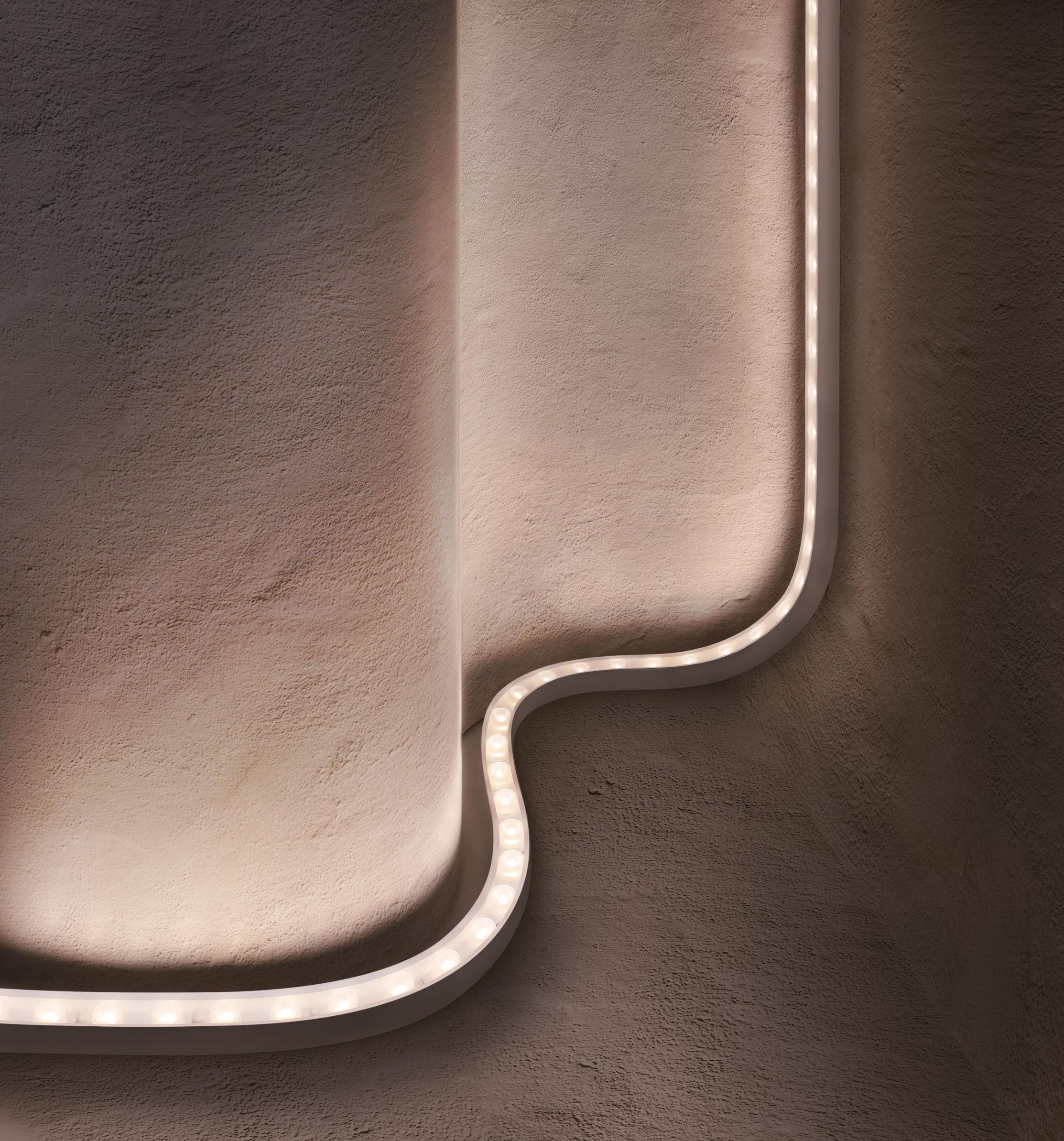


The new Westin London City hotel combines wellbeing and business, with a lighting scheme from Nulty, with fixtures from Linea Light Group, to match.
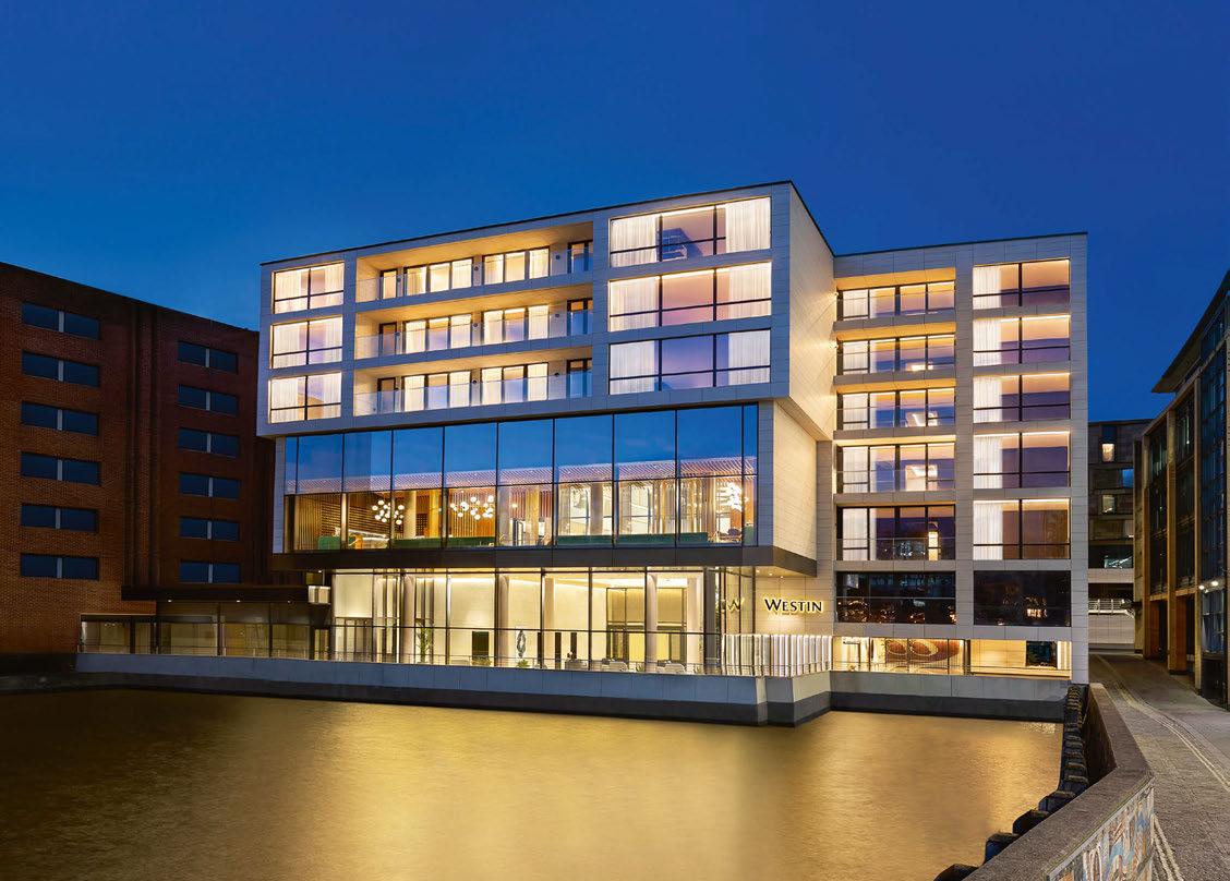
Designed by British architecture and interior design firm Studio Moren, the new Westin London City hotel was formed around the concept of “Bleisure” – wellbeing and business in a new dimension. Spanning across 222 rooms and suites, The Haven events space, Hithe + Seek wine bar, Mosaic restaurant, Heavenly Spa and Westin Workout fitness studio, the hotel presents itself as an open and airy environment, providing guests with just the right intimacy.
The Haven is a hall spread across three floors and flooded with natural light, with an art installation created on paper and inspired by underwater greenery. The large windows showcase the interior space, decorated with natural tones that evoke feelings of tranquillity and wellbeing. The furnishings are also inspired by the natural world in its purest forms, and consist of oak panelling, varied shades of green, matte finishes, and curved lines. Further emphasising the elegant atmosphere of the hotel is the precise lighting design, realised by Nulty in collaboration with Studio Moren, using various solutions from Linea Light Group.
The lighting design was conceived to be perfectly in keeping with the general theme of the hotel –wellbeing. As such, to enhance the Haven lobby at the entrance, and its paper sculpture, track lighting was set up on three sides, with Pound spotlights allowing light beams to be directed in an evocative play of light on the fourth wall in a soft grey colour. The overall effect is a feeling of calm and tranquillity that pervades the visitor on arrival. To complete the effect and emphasise the atmosphere, Vos downlights are recessed into the ceiling.
For the lighting of the Westin Ballroom, used for events for up to 400 guests, Nulty opted for Linea Light Group’s Creek 2.0 spotlights, which, thanks to a new fitting system, can satisfy any installation need, and have been combined with the linear Archicove and Ribbon LED strip.
For the Romeo & Juliet event space – which uses natural light coming from the windows – as well as for the exclusive boardroom, the lighting design uses Ink-System for its versatility, Ribbon LED strips in the suspended ceiling, and Vos downlights that guarantee punctual and even lighting. The foyer of the Romeo & Juliet room, where in addition to the use of a Cell spot, the Ribbon LED strip and Ice-Cut rod offer a total diffusion effect, thanks to its extruded translucent polycarbonate body. The Heavenly Spa enshrines atmospheres of wellbeing and relaxation, where Nulty has chosen both Rubber, and the Ribbon strip. Finally, in the Westin Workout Fitness Studio, alongside the Ribbon strips, the Rollip system has also been installed.
www.linealight.com
www.nultylighting.co.uk
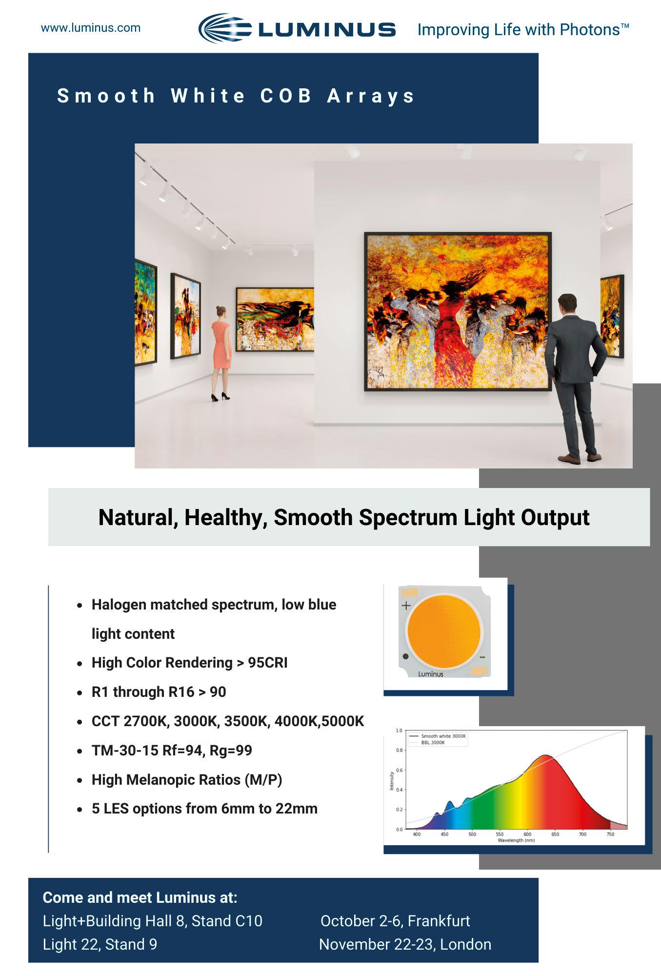
The extension to Hasselt’s Kunsthalle Z33 exhibition space features fixtures from Erco, providing flexibility and precision for temporary exhibitions.
Italian architect Francesca Torzo has designed an extension to Kunsthalle Z33 in the small Flemish town of Hasselt, Belgium. Created as an “exhibition location for contemporary art, design and architecture”, Z33 is located on a trapezoidal former béguinage within the medieval town centre, where as early as 1958, the Swedish architect Gustaaf Daniëls designed a first modern art space for the partly still existing convent grounds. In her expansion, Torzo was thoughtful and careful with the historic site and the town’s medieval traditions. On the one hand, the project concerned the conceptual integration of the existing building ensemble by means of an impressively monumental outer wall consisting of around 35,000 diamond-shaped brick slabs; on the other, the design of a new building, Wing 19. Torzo described the exhibition architecture of the four-storey Wing 19, designed in the form of scenography, as a miniature town, a constructed “echo of the urban landscape” in Hasselt. Belgian lighting designer Ben Boving designed the lighting in close cooperation. “It was important to have a high level of lighting flexibility for the diverse forms of contemporary art,” he said. The complexly displayed space of the new exhibition location presented a challenge. Each room, supported by the light, had its own atmospheric character.
In the winding “Alley” exhibition space, Boving installed Erco Light Board spotlights with narrow light distribution to create a poetic lighting effect. With precise control, light falls from the ceiling down the walls akin to a waterfall. Dedicated optic
systems direct the light precisely without light spill, onto the target surface.
In the “Tower”, natural and artificial light creates an effect as if daylight radiates downwards into the 14-metre-high exhibition space. This was achieved by installing mounting point grids for Erco Opton floodlights on the ceiling, carefully screened with translucent PTFE glass panels. The source of light is concealed to visitors, but they perceive it as a natural form of incidence. Light is used where required by human perception, and where it supports the exhibition concept in a supplementary way to daylight.
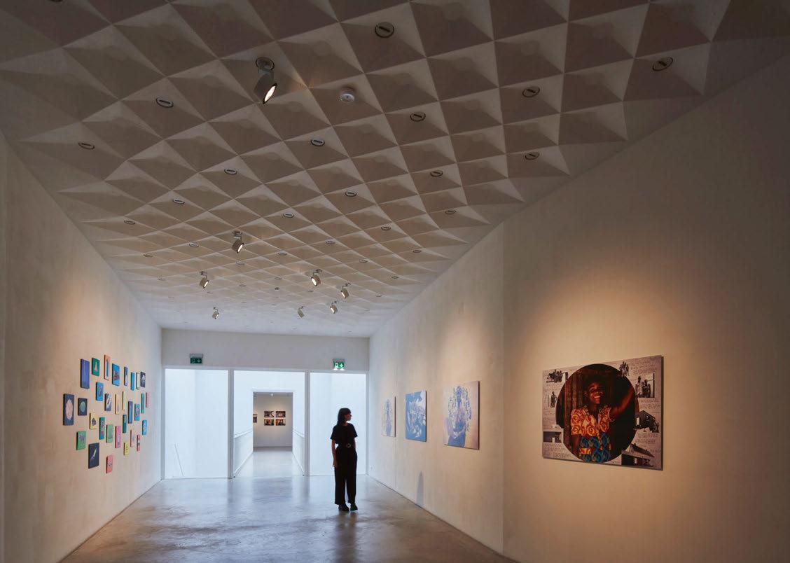
A special feature within the new Z33 exhibition space is the coffered ceilings, inspired by ancient Roman designs. Boving integrated mounting points for Erco’s Parscan spotlights in some of the coffers.
The luminaire model also scored points visually. “Parscan’s round housing contrasts well with the pyramid-shaped coffers,” said Boving. 270 such flexibly used singlets have been integrated throughout the exhibition spaces. “It allows curators to create a specific lighting plan for each exhibition.”
The sophisticated lighting is characteristic of the subtly functional upgrading of the Z33, which was shortlisted for the Mies van der Rohe Award in 2022. With a high level of precision and a confident feeling for the genius loci, an exhibition space of tranquil magic has been created, which manages to become truly spectacular architecture without the need to impose.
www.erco.com
We believe that great design should stand the test of time, be sustainably crafted, and be proudly North American made.
Profile : Defined by its aesthetic and functional versatility
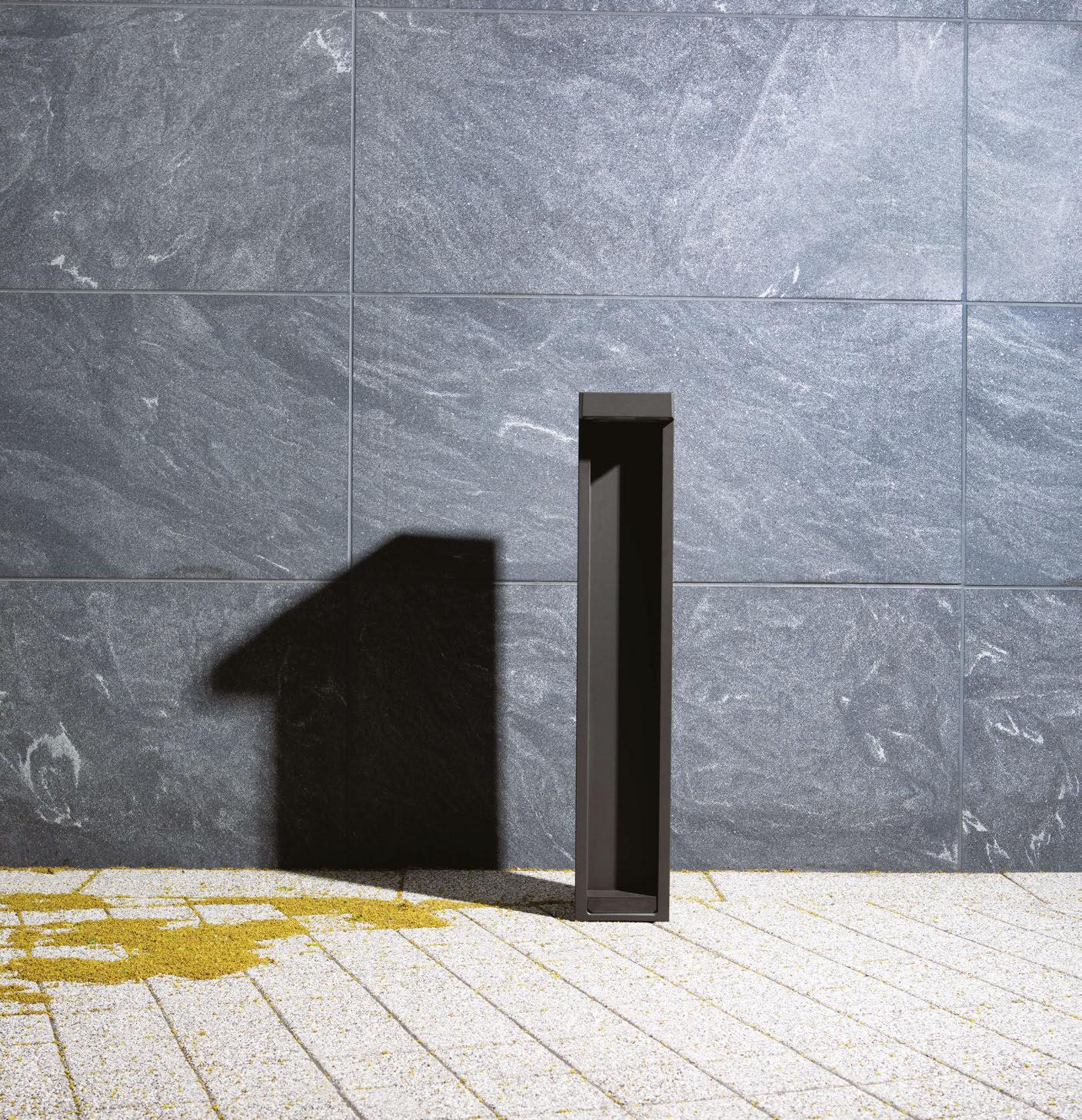
Designed by Linnaea Tillett and Tillett Lighting Design Associates
Landscape Forms | A Modern Craft Manufacturer
Lighting designers at SML Lighting used fixtures from L&L Luce&Light to illuminate a new cultural centre in the Norwegian town of Sand.
The picturesque village of Sand in the municipality of Nord-Odal, nestled deep in the woods of eastern Norway, has recently seen the addition of a new cultural centre. This meeting point for the local community has the aim of revitalising it socially, educationally, and economically, while also giving the town a new identity and promoting its development.
The innovative, multifunctional Samling community space, designed by Helen & Hard Architects, includes a library, new offices for the Odal Sparebank savings bank, and around 10 apartments, all combined in a compact, unique and geometrically intriguing spatial composition. The round structure, with its undulating overhangs, is prominently positioned at the beginning of the town’s main street. It radiates from an open, interconnected oval atrium, expanding the sense of space beyond the structure itself. In the centre of the building, a light well connects the ground and first floors. Wood, with its unique aesthetic and sensory qualities, is used internally as an exposed, load-bearing structure and externally as slatted cladding. It is a reminder of the glorious history of the local timbers and the Nordic peoples’ centurieslong experience in working with this supremely ecological material. Large glass façades offer vistas of the Scandinavian taiga and the surrounding environment, suggesting a continuous dialogue between nature and architecture. The interior space has been divided with organically shaped frame structures whose radial arrangement separates and combines spaces for various uses. The library, the heart of the new Samling centre,
is impressively spacious while maintaining a welcoming, human-scale ambience. Its generous height is divided into two levels connected by a staircase.
The lighting design was created by SML Lighting and implemented using L&L Luce&Light fixtures. It perfectly meets the client’s requirements for flexible, adaptable lighting able to illuminate such a large space while also maintaining the library’s functionality and the wellbeing of its users. On the upper floor, Wall 8.0 6000K, with 25° optics and an elegant satin finish, are positioned on the desks abutting the glass balustrade, where they precisely light the desktops. These lamps, with their flexible neck, were created by the company specifically as reading lights and can be mounted on shelves, walls, or spare gangs. The entire library area is equipped with atmospheric effect lighting, used to mark special anniversaries, receptions, or festive events. This is supplied by Neva Mini 7 and Neva 7.2 linear profiles for architectural lighting, installed at the top of the walls, near the ceiling. Both versions have narrow 18° optics, adjustable supporting brackets with graduations and RGBW LED light sources, so that different lighting scenes can be created in a variety of colours. These are also visible externally, through the large glass windows. Neva profiles feature a minimalist design and recessed optics for excellent visual comfort, while their 4mm-thick, transparent extra-clear glass guarantees the light’s colour uniformity.
www.lucelight.it
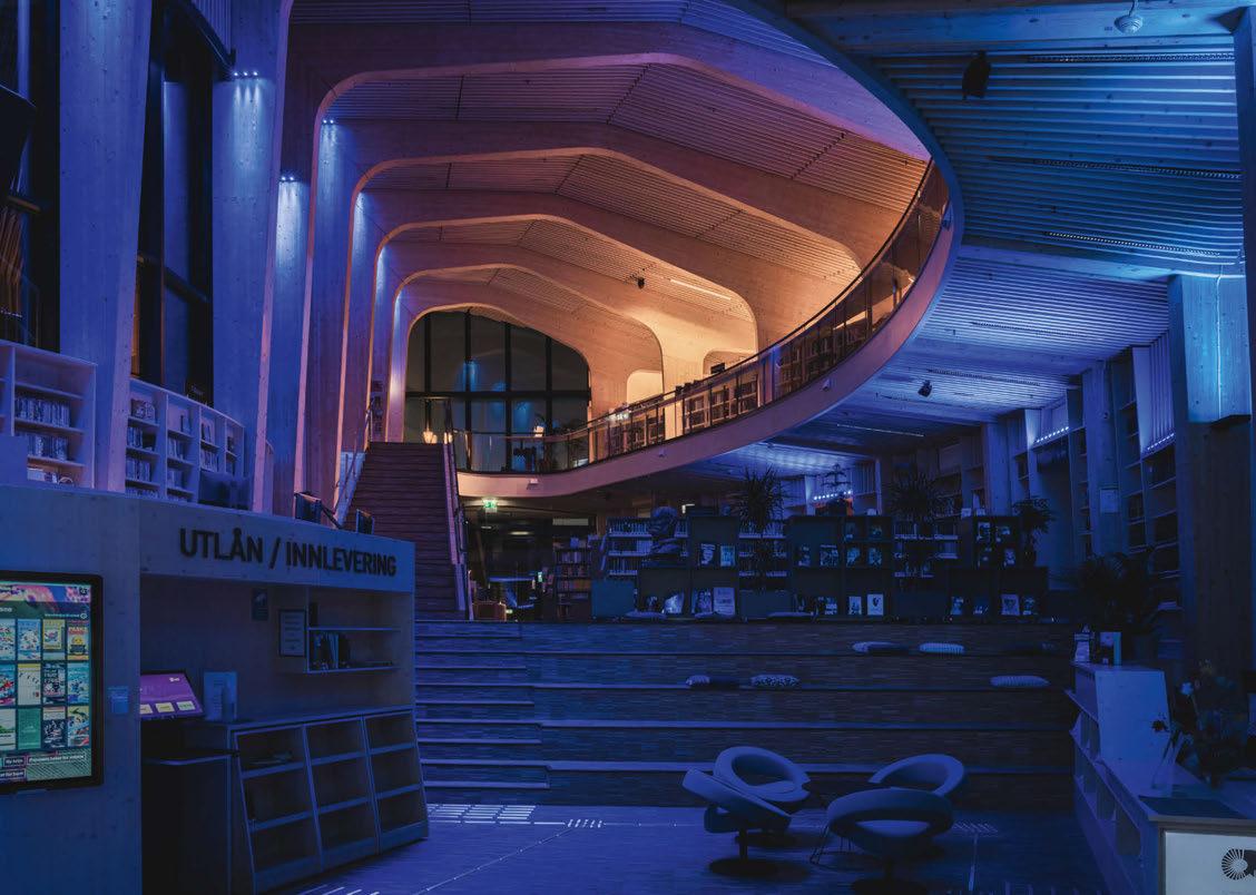
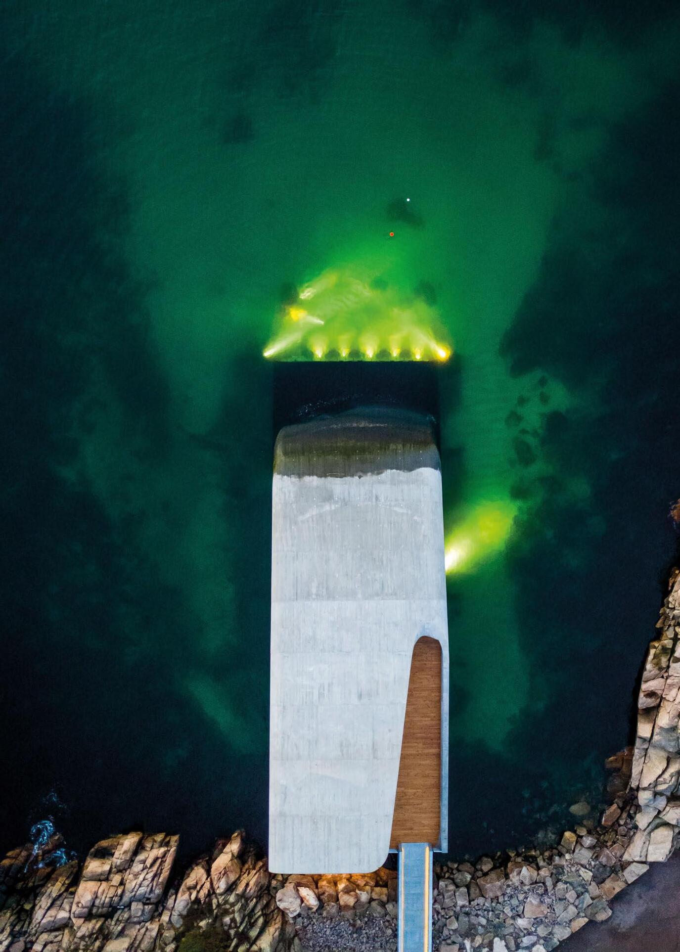


Lighting design studio
18FIFTY opted for fixtures from LEDFlex to bring an opulent elegance to the glamorous Scott’s Richmond restaurant.
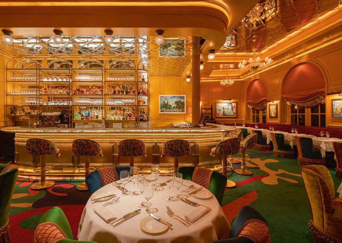
Located on a westward meander of the River Thames, Scott’s new Richmond location brings decadence and old-world elegance to destination dining. Guests are greeted with glamour at the stately terrace for al-fresco dining on the banks of the Thames, the opulent champagne and crustacean bar, and a dazzling dining hall set across two floors. Scott’s prides itself on providing service that is as exceptional as the food, sharing the heritage and experience of its famous original location in Mayfair.
Creative lighting studio 18FIFTY specified bespoke lighting solutions from LEDFlex to create an elegant ambience that elevates the classic character of the interior and respects the Scott’s legacy. LEDFlex Lumen Line 176 in 2100K to 2300K was placed in coffers throughout the ground and first floor, welcoming guests by washing them with a warm and inviting golden glow. To flexibly illuminate the ground floor cornice detail, 18FIFTY selected Nano Flex HE, the narrowest flex in the range by 4mm in 2400K. The luminaire flawlessly accentuates the impressive architectural design of the ceiling, adding to the grandeur of the restaurant.
The decadent golden bar is dazzling through homogeneous illumination with the use of Ultimo Neon Silicone in 2200K, casting glittering reflections on glasses and bottles, creating a bejewelling gem in the corner of the room. The shelves are backlit using Nano Flex 180 in 2400K, a sleek and minimal solution perfect for showcasing each display in an intricate manner, exquisitely highlighting each glass and product. The basement ladies’ restrooms are softly illuminated with Ultimo Neon Silicone in 2200K, while the basement men’s restrooms are subtly lit with Ultimo 16 Neon Silicone in 2700K, to create a relaxing and private environment. The ladies restroom vanity mirror is illuminated with Nano Flex 180 in 2400K, creating a stylish and balanced light source. The lighting design has been carefully considered from top to bottom to evoke a sense of elegance and comfort throughout. The lighting cleverly elevates the dining experience and accentuates the architectural design and interior of this fine restaurant, upholding the renowned Scott’s legacy and adding a stunning addition to the brand.
www.ledflexgroup.com
UK
When upgrading the lighting on London’s iconic Tower Bridge to high performance LED luminaires, Armadillo Lighting specified fixtures from GVA
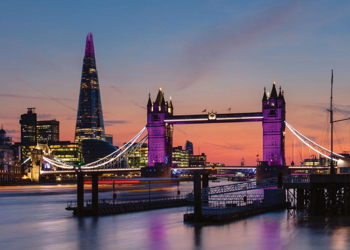
Tower Bridge is a Grade I listed combined suspension and bascule bridge in London, located near to the Tower of London and crossing over the River Thames. Designed by Horace Jones, engineered by John Wolfe Barry and Henry Marc Brunel and completed in 1894, it remains a busy and important route for traffic and pedestrians throughout London.
The bridge stretches across 800ft, connected at the upper level by two horizontal walkways and a central pair of bascules that open to allow tall shipping and high masted boats to pass. Tower Bridge has become an iconic London landmark, with the towers, walkways, and Victorian engine rooms making up an exhibition where visitors can take in the full history of the bridge and enjoy stunning panoramic sights of London, along with the experience of unique views through the glass floor in the walkway down to the road and river below. Specialist Lighting Contractor Armadillo Lighting, which supplied and installed fixtures to Tower Bridge years ago, was appointed to refresh the bridge lighting by replacing older and outdated fixtures with upgraded, high performance LED luminaires. Armadillo specified a range of products from GVA Lighting to meet this project brief. It was important that the lighting design and wiring were sympathetic to the renowned and recognisable landmark and its significance in London. GVA supplied FL100 and FL200 fixtures in RGBW for this project as the ideal solution for architectural wall washing and grazing applications. To obtain the best possible result using the least number of fixtures, extensive lighting calculation
work was performed jointly by Armadillo and GVA along with supporting night trials carried out to validate the results, ensuring the lighting was of the highest possible quality and definition to structure. GVA’s fixtures allow the defining landmark to be illuminated in colour-changing light washes. As a mark of respect and to pay tribute to Queen Elizabeth II, Tower Bridge was washed in purple light to mark the period of national mourning. One of many landmarks across the UK and the globe to be lit in purple light, Tower Bridge was majestically illuminated until Monday 19th September, as a mark of national respect for the day of Queen Elizabeth’s State Funeral.
The royal purple held great significance to The Queen, as the backdrop for her Platinum Jubilee emblem earlier in the year, and as the colour of the Coronation Gown and Robe of State. It was important that Tower Bridge have the ability to be washed in these commemorative colours, to honour Britain’s longest reigning monarch through a key London landmark.
GVA’s fixtures can be changed to various colour displays, allowing Tower Bridge to be illuminated to mark national days and to celebrate special occasions.
www.gvalighting.com
www.armadillolighting.com


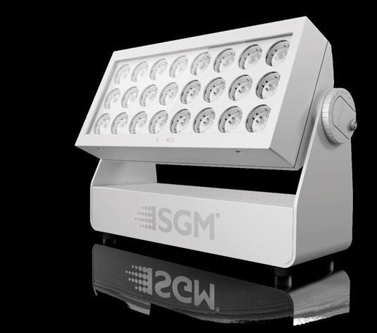

A recent renovation of Shropshire’s Western Park saw Noon Lighting use Rako controls to provide a fully customisable scheme for the Grade I listed property.
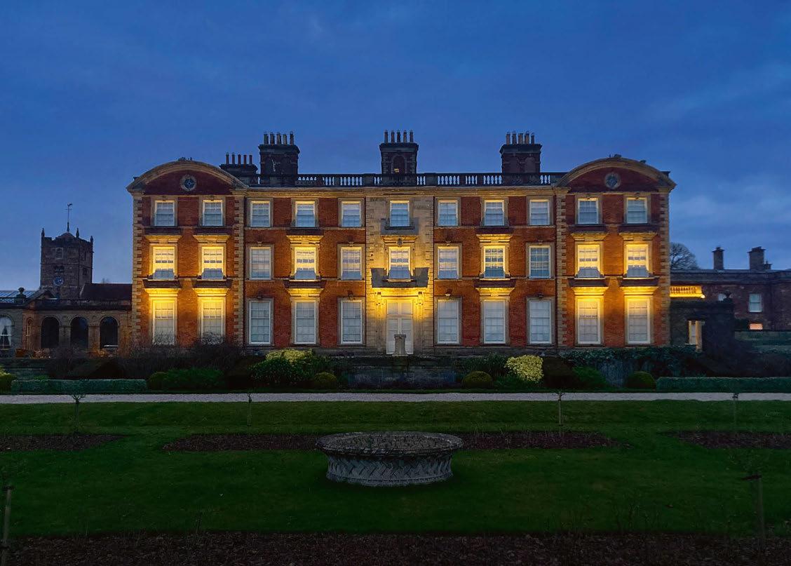
Rako has lit up the gardens of Western Park, a 17th-century mansion in Shropshire, UK, enhancing the natural beauty of the environment and bringing the elegant features of the building into focus. The property, now owned by a charitable trust, hosts a variety of events, from business conferences to weddings, providing a stunning setting for all who visit.
A recent renovation project focused on replacing the outdated floodlights spilling from the roof with a bespoke solution tailored to highlight the impressive historical architecture and its surrounding grounds. Designed and installed by Noon Lighting, with fixtures provided by Lighting of London, the main entrance, south-facing wing, orangery, and Italian gardens have all been beautifully lit to emphasise the long-standing splendour of Western Park.
The purpose of the lighting scheme was to provide suitable visibility of the exterior of the building and its gardens, while also allowing the team at Western Park to personalise the space and curate the perfect atmosphere for any event. An important factor for consideration was that due to the historical importance of this Grade I listed building, there could be no interference or damage to the original structure. Additionally, to be in keeping with the property, the fittings needed to be as discrete as possible.
To overcome these challenges, Noon Lighting selected Rako for its ability to provide an entirely wireless solution, which allowed for complete control over the extensive lighting system, without requiring any invasive work to the building. The
Rako Hub, as well as a wide variety of wireless modules were utilised within the project, and Rako boosters ensured seamless communication across the project’s vast landscape.
Steve Noyes, Creative Director at Noon Lighting, commented: “The distances across the grounds meant that there were long ranges from transmitter to receiver. To ensure the system would be reliable once installed, Rako visited the site to carry out tests and check signal range to address any challenges raised by a building that’s more than 300 years old and its sprawling grounds.”
Rako not only supported Noon Lighting through the practicalities of installation, but its products also made it possible to create personalised lighting effects, adding immense value to the client. Noyes said about the design process for the lighting: “We wanted to provide a lighting display that was not just an aesthetic addition, but also a tool to use, to give value to guests when they hire out the space. We designed it so the lighting colour could be tailored to a specific client, for example, it could match the colour of a specific brand. This subtle feature can provide a personal touch to these impressive grounds, whatever the occasion.”
Initially, the Rako system was programmed with 16 bespoke colours to be used throughout the year. This feature received such positive feedback from the client, they requested more options. The Rako system was then adapted to allow the customer to scroll through a continuous colour system, providing easy control over the lighting system and the ambience desired.
www.rakocontrols.com
Barrisol® is the world leader in stretch ceilings for over 55 years. Barrisol invites light into all interior spaces with its Acoustic Light®, Light Lines®, Light Bands, ELT 3D®, Print Your Mind® and Clim® solutions... The Barrisol® stretch ceiling is also 100% recyclable.
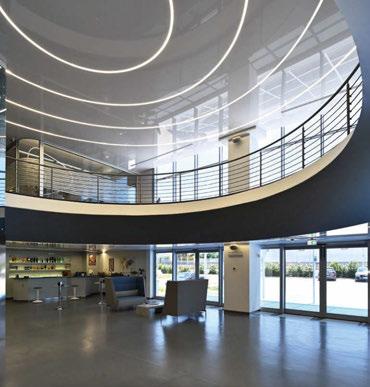
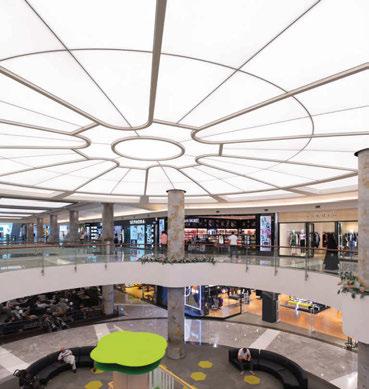
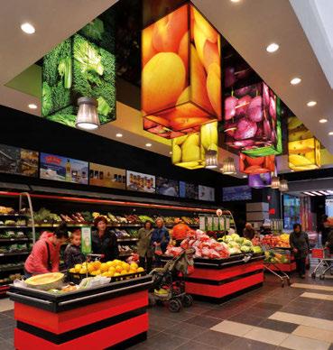
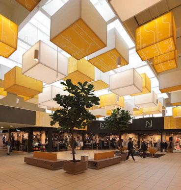
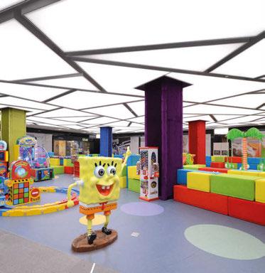
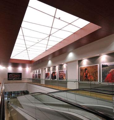
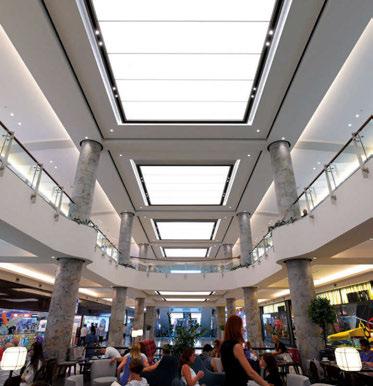
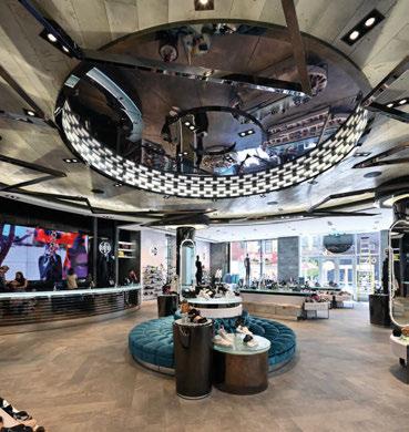

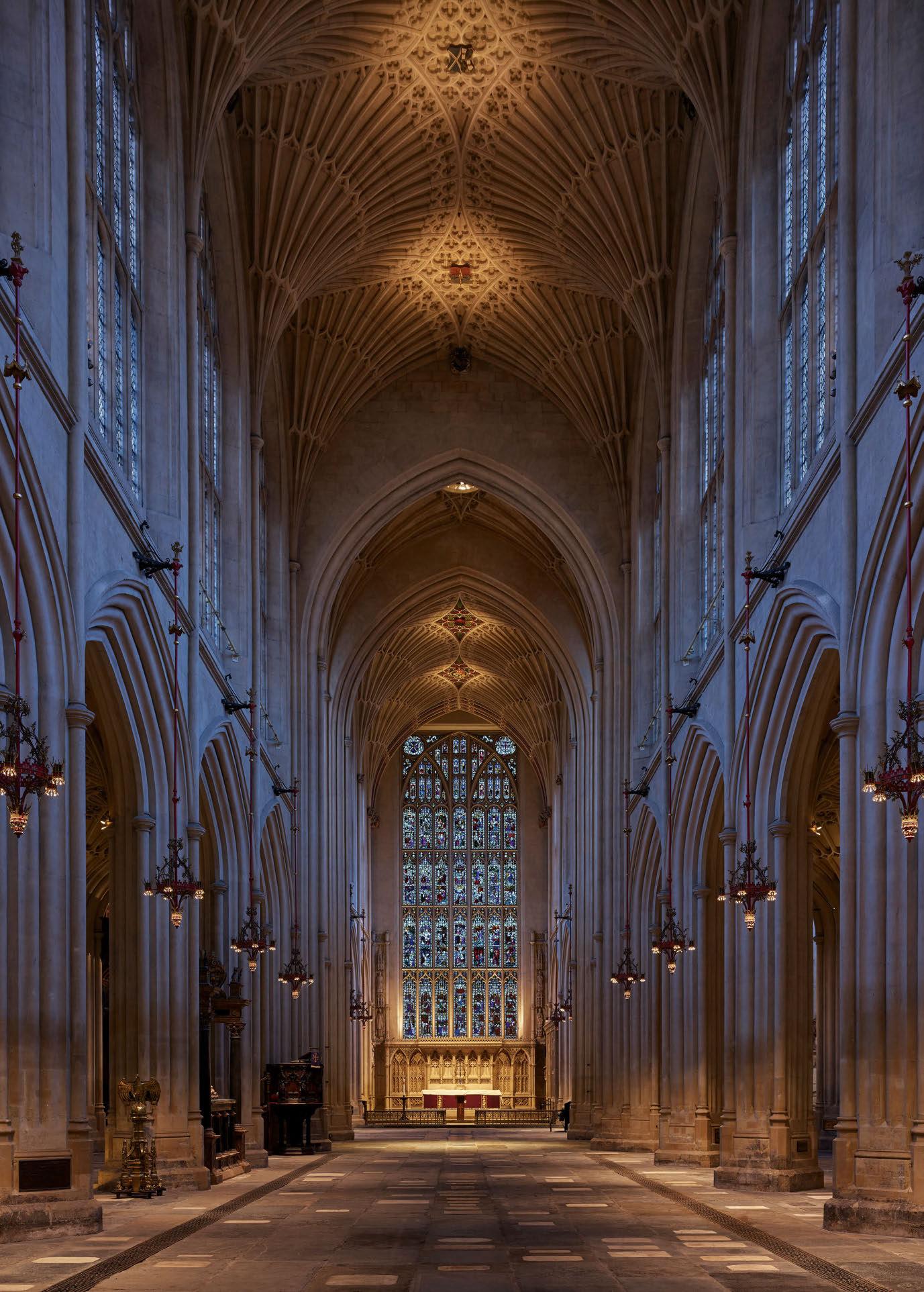 Bath Abbey, UK by Michael Grubb Studio

22 & 23 March 2023
EXCLUSIVE TRADE EVENT FOR ARCHITECTS, INTERIOR DESIGNERS AND SPECIFIERS
CURATED EVENT with over 200 selected products showcased by manufacturers and distributors
All exhibitors go through a strict selection process with an external judging panel, ensuring the presence of high calibre innovations. NETWORKING in an original and creative atmosphere
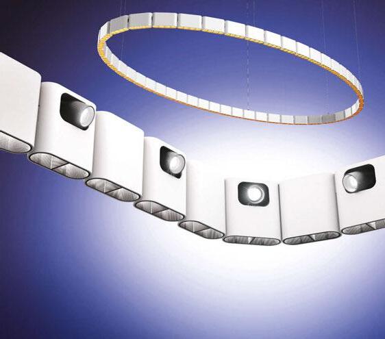
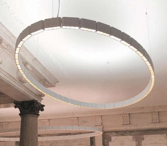




Subscribers benefit from:
- Reviews of the most exciting projects in the world
- In-depth profiles of leading figures from the lighting design and architecture profession

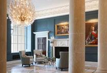
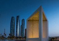
- Special features on stand-out products and collaborations
- Coverage of international exhibitions and conferences
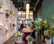
- Bonus subscription to International Lighting Design Survey
www.arc-magazine.com/subscribe
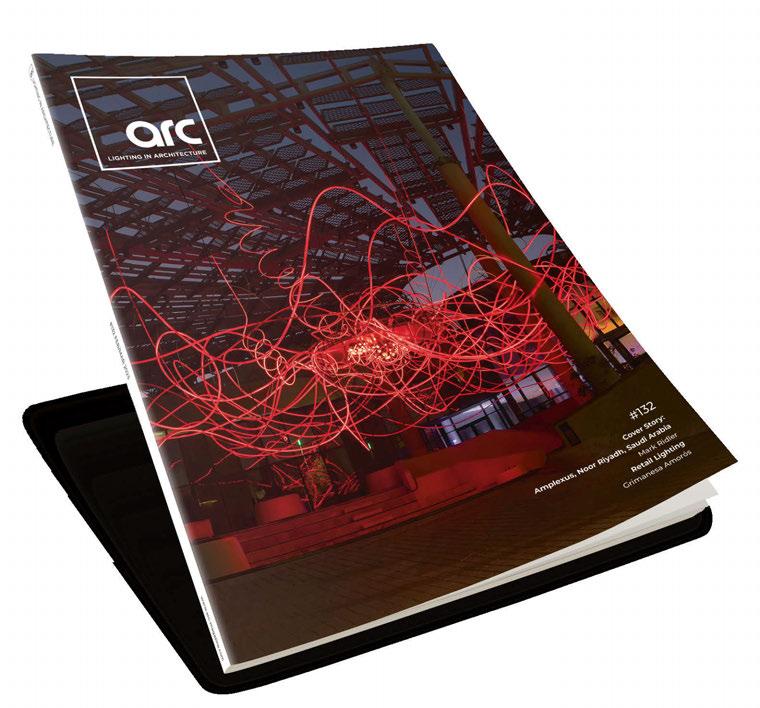
dpa lighting consultants have the following positions available:
We are looking for creative and technically knowledgeable Senior Lighting Designers to join our Oxfordshire and Dubai studios. Excellent written and spoken English is essential. Candidates should have a portfolio of completed projects (interior and exterior). IT skills must include Microsoft Office, AutoCAD, InDesign, Photoshop and DIALux. Knowledge of BIM/Revit would be beneficial but not essential.
Duties and responsibilities would include, working within a team environment on all aspects of the lighting design process, from concept to completion, attending design and site meetings in the UK and overseas and supervising the work of lighting designers within the studio.
Only applicants with professional independent lighting design experience will be considered.
Remuneration will be commensurate with experience and includes bonus opportunities. The Dubai position enjoys a tax free environment subject to personal taxation circumstances. Please note that our Oxfordshire studio is in a rural location and does require a car.
We are currently looking for Lighting Designers to join our Oxfordshire, London and Dubai studios. The role will involve being part of a design team and providing support in the production of concept presentations, layout drawings and details, specifications etc. with the opportunity to progress within the Practice. We will consider both graduate level candidates and applicants with some lighting design experience.
Applicants should have AutoCAD and Photoshop skills. An understanding of InDesign, visualisation programmes and other lighting related packages such as DIALux would be beneficial. BIM/Revit experience would also be advantageous but not essential. Excellent written and spoken English is essential.
Remuneration will be commensurate with experience and includes bonus opportunities. The Dubai position enjoys a tax free environment subject to personal taxation circumstances. Please note that our Oxfordshire studio is in a rural location and does require a car.
For further details about dpa, please refer to our website: www.dpalighting.com.
Please email your application letter and CV along with a portfolio of examples of completed projects where you have had a significant contribution, to Elizabeth Grundy: dpa@dpalighting.com. Please clearly state on your covering email which position/studio you are applying for. No Agencies Please.
 Paul Friedlander
Sculptor and Scientific Artist
What
Climb down a crack in the ground and discover a hinterland between cave and sky. Slot canyons are not caves but valleys carved by flash floods through sandstone. They come in many sizes from so thin you have to squeeze sideways to larger and magnificent with monumental sculptural forms carved by the occasional rushing water. Antelope Canyon is the most famous.

Where
On Navajo land east of Lechee, Arizona.
How
If visiting Antelope Canyon, pay your ticket and follow the crowd. However, in the region there are many other canyons, some almost as remarkable and very peaceful. Use your initiative to find them, be prepared to drive long routes along dusty dirt roads and then walk into a tranquil other world as if you have arrived on another planet. Often you will be the only soul around for miles.
When
Anytime a storm is not brewing. The dangerous storms and flash floods tend to occur in the height of summer, but they are rare so any time of year can be good.
Why
As a child I always dreamed of being a space traveller going off to explore other worlds, not realising our own is full of marvels. We are all space travellers, enjoy the natural wonders of our planet while there is still time.
www.paulfriedlander.com
“And what about the so-called real world of money and taxes and disease and death and war? I prefer to ignore that insignificant world and concentrate instead on the world of ideas, on the quest for understanding. Instead of looking down into the mud, how about looking up at the stars!”
Gregory Chaitin, mathematician and discoverer of the Omega numberImage: courtesy of Paul Friedlander Light
