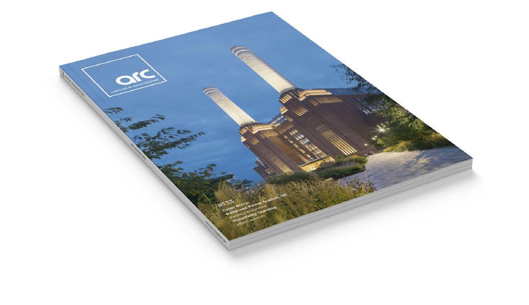
#133 Cover Story: Battersea Power Station, UK

Panos Ferentinos
Hospitality Lighting
[d]arc awards

E Light is the fourth dimension of architecture Invia The modular 48V light structure Experience and configure Invia online: www.erco.com/invia-site



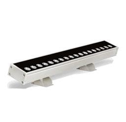

Lancaster Castle features multiple product families with a consistent 2700k CCT. For your project inspiration or more information about our colour calibration service, contact team Tryka. info@tryka.com +44 (0) 1763 260666 STRIPLINE 45 LUKA 9 INGROUND YEARS OF INSPIRING THE IMAGINATION 20
Did you know?
Our colour calibration service delivers lighting consistency within 50k (2SDCM) across our entire product range.
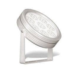


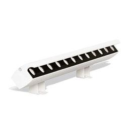
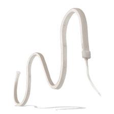


Lighting Perfection Exemplified.

#20YEARSOFTRYKA @TrykaLED @TrykaLED STRIPLINE AG
Tryka.com URA 7
CONTINUITY T

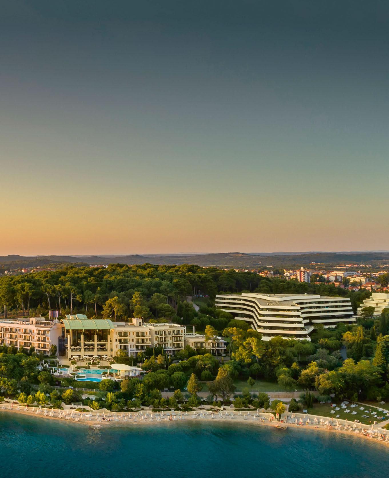
LONE HOTEL, ROVINJ, CROATIA 14 - 16 MAY 2023 www.darcsessions.com
A series of events connecting the very best people creating exceptional lighting projects around the world.
For more information contact Jason Pennington: j.pennington@mondiale.co.uk
STEP INTO THE…
The UK’s only dedicated lighting specification exhibition
21 & 22 November 2023 Business Design Centre Islington • London www.lightexpo.london Interested in Exhibiting? Contact: John-Paul Etchells on jp.etchells@mondiale.co.uk


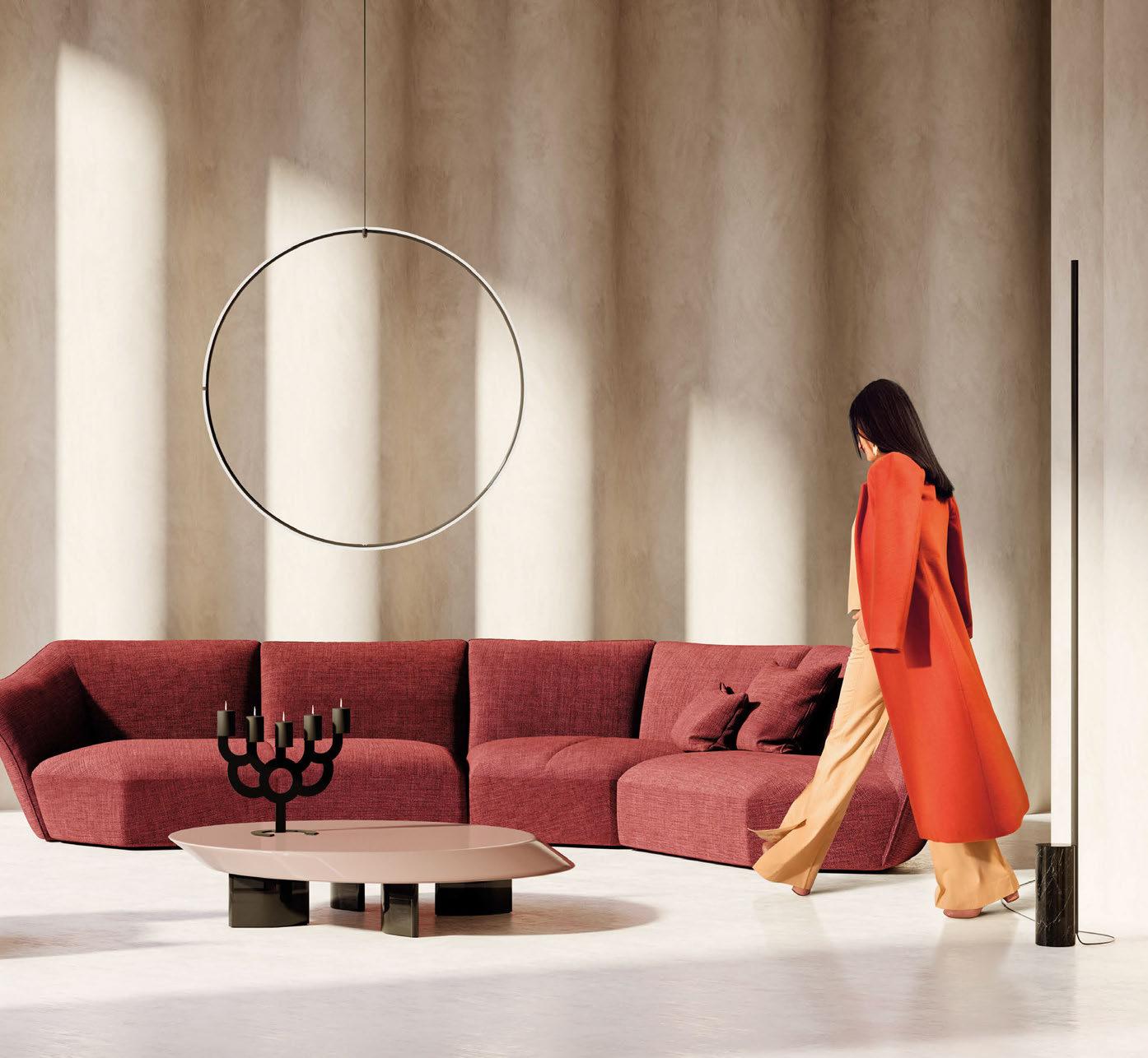
With over 300,000 Products and 3,500 Brands online, Archiproducts offers the perfect tool to bring beauty in every home, every moment, everywhere.
archiproducts.com



Welcome
When it comes to monumental lighting design projects, they don’t come much bigger than the recent renovation of Battersea Power Station. Ever since we saw the first glimpses of its new look, we’ve been deserpate to cover it in the magazine. It has taken a bit of time (and a lot of patience on our part) to pull together, but with the help of the wonderful people at Speirs Major, we were finally able to step inside and check it out. As you’ll expect, it’s a stunning project, and a beautiful example of how a simple and sympathetic lighting design scheme can revitalise a heritage project and bring it back to life. It was the natural choice for this issue’s front cover, and you can read all about how this amazing project was realised in an exclusive nine-page article, starting from page 34. Alongside the amazing lighting design from Speirs Major, we also spoke to Michael Grubb Studio about their work on the Lift 109 visitor experience within Battersea Power Station, which adds another unique element to an already outstanding project.
In other news, it would be remiss of me if I didn’t mention the [d]arc awards party, which returned to the iconic fabric London at the end of March. Now in its eighth year, it was great to see the continued support and appreciation for the [d]arc awards programme, culminating in yet another memorable awards night! A huge thank you to everyone that came down to fabric (more than 500 of you in total), to the design partners and sponsors for once again creating some amazing installations, to everyone that entered their projects and products, voted (more than 17,000 of you!), and generally took part in the awards process. A big shout out also to Light Collective and Streeem for once again helping us bring it all together on the night. Finally, a massive congrats to our good friend Kerem Asfuroglu at Dark Source for taking home the Best of the Best [d]arc award for the Plas Y Brenin project. We’ve been longtime supporters of Kerem, so it’s amazing to see him get this recognition from the design community!
A special digital [d]arc awards supplement, with a recap of all 14 award winners, is available to view online now. You can also see some of the highlights from an amazing [d]arc night later in this issue. Enjoy the issue!
Matt Waring Editor

 Front cover: Battersea Power Station, London, UK (Image: Peter Landers)
#133
Inside this issue
Regulars
Features
Silhouette Awards
We look at the winning mentees of the second annual Silhouette Awards
Panos Ferentinos

Ferentinos speaks to arc about his unique route into lighting design.
[d]arc awards
The winners of the eighth [d]arc awards were revealed this March.
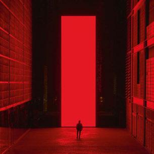
Meraki - The Power of Light
Four lighting designers led a hands-on workshop at Light Middle East.
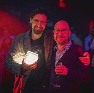

LEDucation Review
A look back at some of the highlights from the New York event.
Projects

Battersea Power Station arc speaks to Speirs Major about the lighting for London’s latest landmark.
Eye Openers
Battersea Power Station - Lift 109 Michael Grubb Studio reveals more about the Station’s visitor experience.
Zuma Mykonos
Into brings a luxury light to a new lifestyle destination.

Frescohallen
The heritage elements of Bergen’s beautiful restaurant are brought to life by Zenisk.

Studio Frantzen
A warm scheme from LDI emphasises the grandeur of the new Harrod’s restaurant.

Waldorf Astoria Lusail
The five-star aesthetic of the new Doha hotel has been highlighted by Nulty.
Cullinan Golf Resort Hotel
Line Lighting Design used light to contribute to the hotel’s unique atmosphere.
#133 Proudly Supporting
Event Diary Drawing Board In Memoriam arc looks back on the legacy of IALD Co-Founder Howard Brandston. Snapshot Lightwaves Designers Mind Kael Gillam examines ‘Working FOMO’ and the ‘always on’ mindset. GreenLight Alliance GLA members explain their environmental and social responsibility initiatives. Product Launches Manufacturer Case Studies Bucket List Beata Denton
Monolith SpY Stadtkirche BXLD Floral Guide Jason Bruges Studio Aria Retreat & Spa Light+Arch Consultancy Cut & Craft Mistry Lighting The Grand Magic Hotel Moment Factory Common Ground Cheryl Wing-Zi Wong 020 054 070 106 018 022 026 028 114 120 128 130 138
030 054 106 116 126 020 032 052 062 092 104 124 034 044 064 070 076 082 088
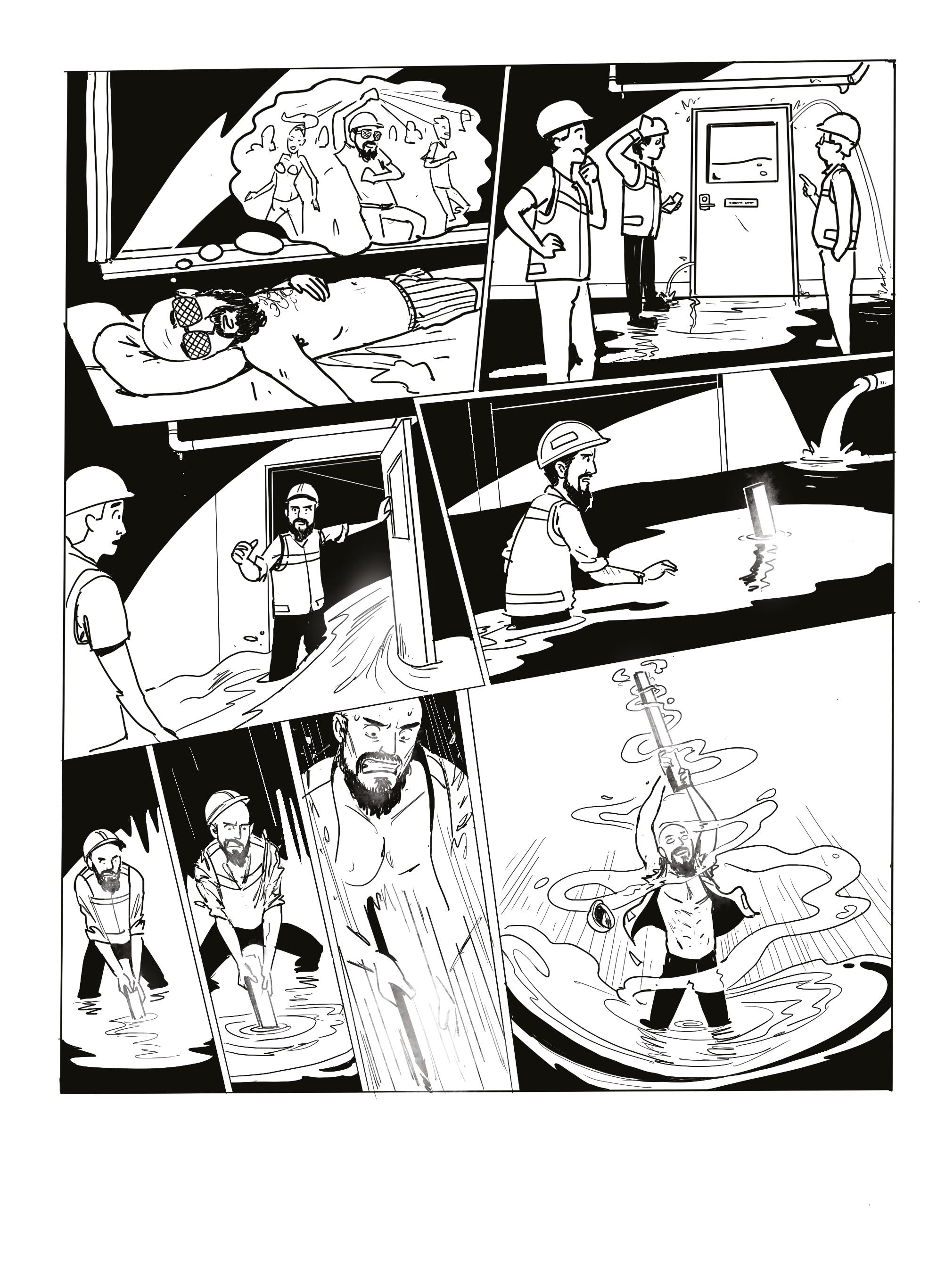

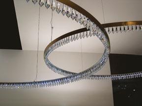
LOOK AT THAT CHANDELIER, WHAT A CLASSIC, I WANT IT . WYN MAN, CHECK IT OUT STOP RIGHT THERE!!! DAMN, HE IS BULLETPROOF TAKE THAT!!!
DARKON.COM.AU
AGHHH!
Events Diary
APRIL
Prolight + Sound
25-28 April
Frankfurt, Germany
www.pls.messefrankfurt.com
MAY
[d]arc sessions Europe
14-16 May
Rovinj, Croatia www.darcsessions.com
Lightfair
21-25 May
New York, USA www.lightfair.com
Clerkenwell Design Week
23-25 May
London, UK
www.clerkenwelldesignweek.com
JUNE
GILE
9-12 June
Guangzhou, China
www.guangzhou-international-lighting-exhibition. hk.messefrankfurt.com
IALD Enlighten Europe
30 June - 1 July
Berlin, Germany www.iald.org
AUGUST
Design Helsinki
23-24 August
Helsinki, Finland
www.designhelsinki.com
*NOTE: All dates correct at time of publication*
SEPTEMBER
Plasa
3-5 September London, UK www.plasashow.com
ArchLIGHT Summit
19-20 September Dallas, USA www.archlightsummit.com
Landscape
27-28 September
Birmingham, UK www.landscapeshow.co.uk
OCTOBER
[d]arc sessions MEA
10-12 October Manama, Bahrain www.darcsessions.com
Hong Kong Int’l Lighting Fair
27-30 October
Hong Kong, China www.hktdc.com
NOVEMBER
IALD Enlighten Americas
2-4 November
Banff, Canada www.iald.org
LiGHT 23
21-22 November
London, UK www.lightexpo.london
EDITORIAL
Managing Editor Helen Ankers h.ankers@mondiale.co.uk
Editor Matt Waring m.waring@mondiale.co.uk
Contributing Editor Sarah Cullen s.cullen@mondiale.co.uk
COMMERCIAL
Managing Director Paul James p.james@mondiale.co.uk
Head of Business Development Jason Pennington j.pennington@mondiale.co.uk
Media Sales Manager Andrew Bousfield a.bousfield@mondiale.co.uk
International Account Manager Ethan Holt e.holt@mondiale.co.uk
Events & Marketing Manager Moses Naeem m.naeem@mondiale.co.uk
DESIGN
Design Manager David Bell d.bell@mondiale.co.uk
Production
Mel Robinson m.robinson@mondiale.co.uk
CORPORATE Chairman Damian Walsh d.walsh@mondiale.co.uk
Finance Director Amanda Giles a.giles@mondiale.co.uk
Credit Control Lynette Levi l.levi@mondiale.co.uk
[d]arc media ltd Strawberry Studios, Watson Square, Stockport SK1 3AZ, United Kingdom
T: +44 (0)161 476 8350 www.arc-magazine.com
ISSN 17535875
Printed by Buxton Press
To subscribe visit www.arc-magazine.com or call +44 (0)161 476 5580
018 / 019
BIG
Modular
Our
You Need.
functionality of your

enhance the beauty
15˚ 25˚ 40˚
Landscape
The Outdoor &
Luminaire
sustainable outdoor lighting solutions
outdoor
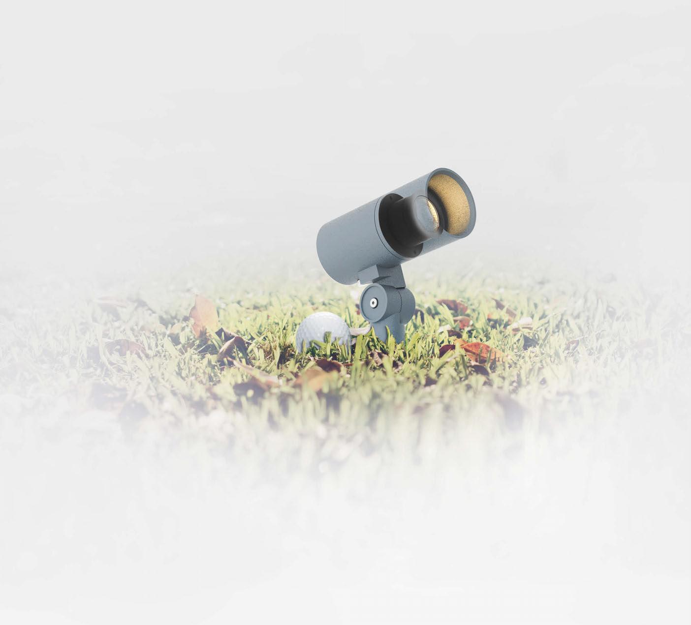
Modular Concept with Various Fixture Selections Surface Wall Mount Canopy Tree Spike In Ground Module Colour Temperature Variation WARM DIM Warm Dim Colour temperature reduces in conjunction with dimming ProART ProART98 High colour rendition Ra~98, R9 > 98 Ra~95, R9 > 50 tuneWHITE Tuning of colour temperature with DALI DT8 exiK Select any desired colour temperature from 1800K to 6500K RGBW Unleash your creativity with our vibrant colourful lights IP66 IK08 Class 3 DC Constant Voltage / Constant Current Tree Spike Luminaire NEBULA 2 TREE SPIKE NEW Lumen Output up to 713lm LED Power 6.2W / 8W Reduced Glare Small in size: 126mm x Ø55mm UNITED KINGDOM 1 Hedel Road, Cardiff, Wales, UK, CF11 8DJ. PROUDLY DESIGNED UNITED KINGDOM UNITED KINGDOM AUSTRIA SWEDEN NETHERLANDS UAE ISRAEL SOUTH AFRICA CHINA HONG KONG & MACAO INDIA INDONESIA MALAYSIA SINGAPORE SOUTH KOREA AUSTRALIA www.elr-group.com Contact us at info@elr-group.com Converging Optical Lens Maximising LOR Future proof with upgradeable module Visit our website to nd out more Circular Economy Product
prioritise circular economy principles and modular design. Our luminaires
and
spaces. COMPACT DESIGN,
IMPACT
Monolith Barcelona, Spain
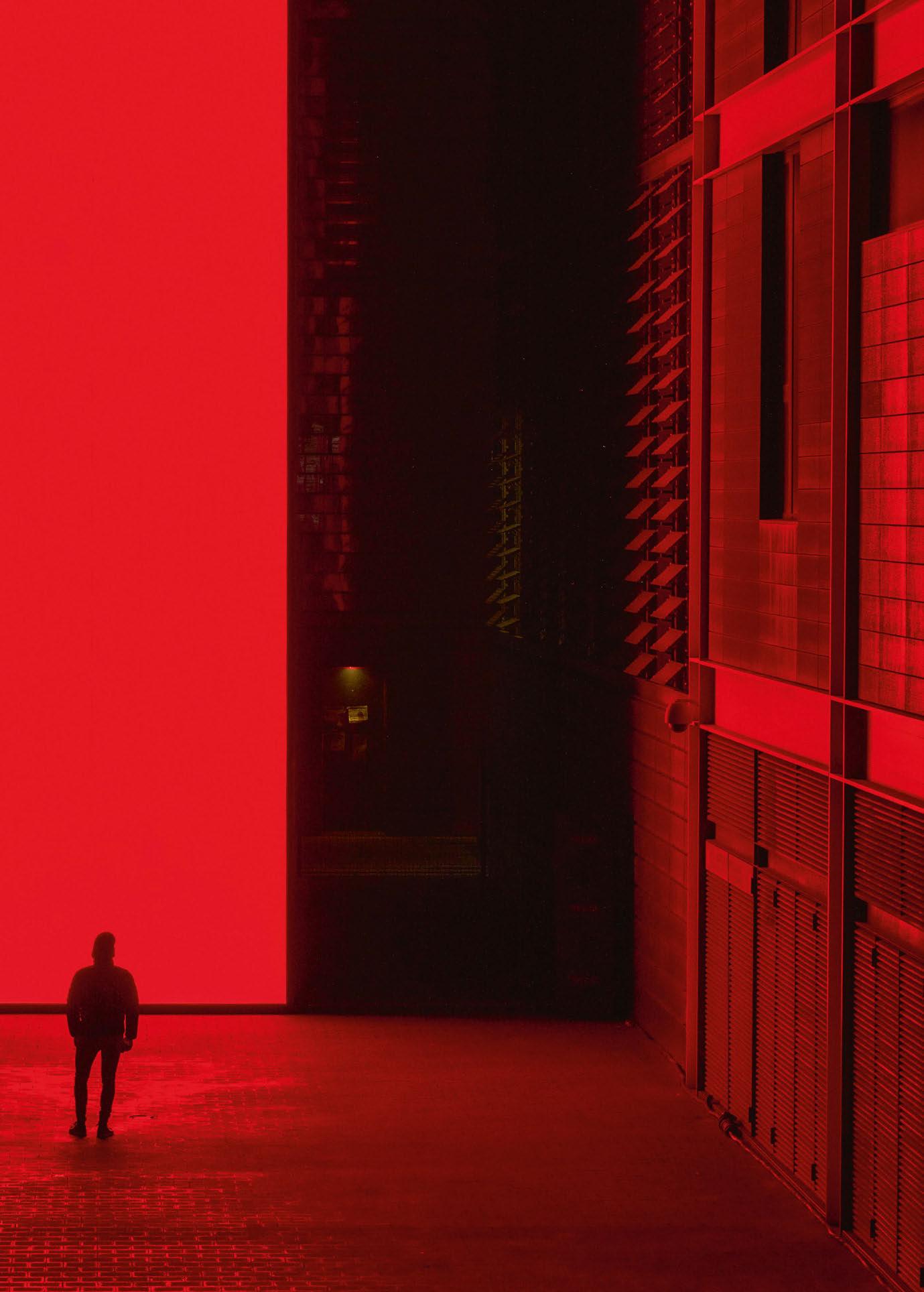
Following the presentation of Earth, 2021 at Noor Riyadh, Spanish artist SpY has unveiled its latest ground-breaking installation, Monolith, at Barcelona’s Llum BCN event. The piece explored the present and future of our relationship with screens and data using light, sound, and context to unprecedented effect.

Monolith pays homage to Kubrick’s classic film, 2001: A Space Odyssey, and was presented as a metaphor for today’s pervasive screens. The artist said of the installation: “The screen is the magical mirror in which we build our personas, and where an ever-larger part of our reality takes form. It has become integrated into our lives to an extent that, until fairly recently, was still unconceivable.
“The screen’s potential for disruptive, emancipatory endeavours and for the circulation of genuine ideas is obscured by a deluge of empty content. We remain stunned by the constant updating of the screen. The screen gives us access to everything, yet keeps us in chains.”
Through Monolith, SpY sought to draw into question this “new reality” and the encroaching intrusion into our personal information. The artist asked: “Are we already in the time when humans become data? How will we confront the integration of bodies and devices? Is this the last generation of humans who are not digitally transformed?”
www.spy-urbanart.com
020 / 021
opener
eye
Drawing Board
Ánanaust Observation Deck ReykjavÍk, Iceland
After severe storms caused serious damages to the road and pathways in the Ánanaust and Eiðssgranði area, the city of Reykjavík decided that the existing sea defense wall was not sufficient, and a reinforcement project was needed. The reinforcement project opened the opportunity to redesign the existing path and cycle ways that run near the sea wall, and as part of it, new observation decks were developed.
The observation deck in Ánanaust is part of a larger infrastructure project and opens to unique views towards the Faxafloa bay. On clear days it is possible to see all the way to the town of Akranes, and the Snæfellsjokul glacier. This deck will also be an excellent spot to experience the arctic summer “midnight sun”.

As for darkness, this observation deck has a conflicting situation between the intrinsic darkness of the seafront, and the illumination from the nearby road. There were plans to accent the observation deck element from one of the nearest light poles. But once lighting designers at Verkís became involved, the approache changed and the target was not just to illuminate the site, but to find a lighting solution that could highlight the element’s design, while creating an inviting atmosphere and preserving as much as possiblethe quality of darkness.
The lighting situation also needs to provide enough safety and visual comfort. The lighting scheme aims to create an atmosphere that invites people to access the site, with a smooth transition between the street lighting and the natural darkness of the sea front. Lighting was also designed to provide a distinctive character, making it a reference point for the overall sea wall reinforcement project.
www.verkis.com


022 / 023


Skyway Southampton, UK
Dark Source has been commissioned by the NHS University Hospital Southampton and BAM Construction to develop the exterior lighting concept for the hospital’s new Skyway, designed by the Kendall Kingscott Architects. This new link bridge forms a prominent part of the ongoing development plans for the University Hospital. To celebrate the new image of the UHS, a considerate lighting design approach was sought to create a unique night-time character for the skyway while enhancing the experience of the surrounding site.
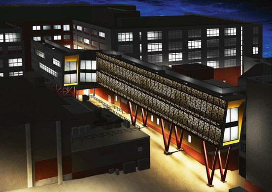
The perforated cladding design of the façade will be backlit to create transparency at night, in contrast to its reflective daytime image. Dynamic lighting will be utilised to animate the façade and provide a versatile and visually intriguing image to the building.
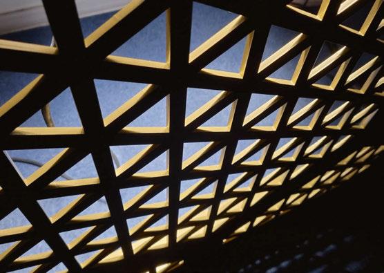
Committed to the environmental values, Dark Source carried out several lighting tests to eliminate light pollution and energy waste. Warm-white downward lighting will be employed to minimise the upward spill and colour-change will be utilised judiciously to keep the scheme sympathetic to the environment.
This project aims to prove that exterior lighting design can enhance the built environment and our experience of the night, while being environmentally sustainable and responsible in all forms of public architecture.


www.dark-source.com


024 / 025 DRAWING BOARD


One of the founding members of the IALD, and to many one of the early pioneers of the architectural lighting design profession, Howard Brandston passed away in February at the age of 87. arc looks back on Brandston’s lasting legacy within the lighting community.
Howard Brandston, founding member of the IALD and pioneer of the lighting design profession, passed away on 24 February at the age of 87.
Born in Canada, Brandston moved to the United States at the age of 9, growing up in New York. From an early age, Brandston had a passion for theatre and art that was encouraged by one of his early mentors – his art teacher at Lincoln High School in Brooklyn, Leon Freund.
Speaking to arc in 2008, he said: “Leon had been involved in the government sponsored WPA projects of the Depression. He called us his ‘Art Squad’; in art studio, he would say to the class ‘You have a blank piece of paper in front of you: it represents an opportunity to create a work of art. Let’s see what you can do.’”
Brandston’s interest in the arts eventually led to him studying Theatrical Illumination at Brooklyn College. Following his studies, Brandston worked as an assistant to lighting luminary Stanley McCandless, whom he credited as being a major influence and inspiration on both his work and his design philosophy.

Following the overriding ethos of “Rules are a substitute for thinking, and I wasn’t going to stop thinking,” Brandston branched out from theatre lighting into architectural lighting design, initially alongside McCandless, before taking a job with architectural lighting designer Seymour Evans, whom Brandston described as “a character beyond belief”.
From here, Branston established his own lighting practice, Howard Brandston Lighting Design Inc –now known as Brandston Partnership Inc (BPI) – in 1965. Through this, one of Brandston’s first major projects was the Canada Pavilion at Montreal Expo in 1967; this in turn led to an opportunity to work on the American Pavilion at Expo 1970 in Osaka, Japan.
In the following 50 years, BPI has completed more than 5,000 projects around the world, and has expanded from its New York headquarters to offices in Shanghai, Beijing, Shenzhen, Chengdu, Singapore and Seoul.
Notable projects from Brandston’s illustrious portfolio include the restoration of the Statue of Liberty; the Detroit City lighting masterplan; the Petronas Twin Towers in Kuala Lumpur (formerly the tallest building in the world); the American Museum of Natural History, New York; and the Marina Bay Financial Centre in Singapore.
Alongside his stellar work with BPI, Brandston was also passionate about teaching – he led a design studio at Rensselaer Polytechnic Institute (RPI), and was actively involved in the Lighting Research Institute, The Lighting Research Center at RPI,
and the Lighting Research and Education Fund. In 1981, he also founded the Annual Workshop for Teachers of Lighting, and endowed the annual Brandston Student Lighting Competition as part of the awards programmes of the Illuminating Engineering Society of North America (IESNA). Brandston was also one of the founding members of the International Association of Lighting Designers (IALD), establishing the association in 1969. Speaking to online lighting platform Lytei, he recalled its formation: “We were setting the standard; we were all looking for excellence; we all had the same goal, even if we didn’t have the same methods; we were all heading in the same direction, even if it was by a different path.”
Across his career, Brandston received many lighting awards, including the Lifetime Achievement award with the IESNA and IALD; Fellow status with the IALD; Honorary Fellow of the Chartered Institution of Building Services Engineers (CIBSE); Honor Award for Contributions to Architecture from the American Institute of Architects (AIA); and he has been inducted into the Interior Design Hall of Fame.
Longtime business partner Robert Prouse, who retired from BPI in 2018, announced the news of Brandston’s passing on LinkedIn. He said: “It is my sad duty to tell you that Howard Brandston passed away peacefully this afternoon, after a few days in hospice care. For those that didn’t know him, he was a towering figure in architectural lighting design. He was a founding member of the IALD, Past President of the IESNA, and recipient of many awards.”
Speaking of Brandston’s legacy, IALD President Mônica Luz Lobo, said: “Words can’t express the contribution he made to our profession. To refer to Howard as an icon in the lighting design profession only begins to touch upon his impact and importance. He is warmly remembered and revered, and the IALD community worldwide owes him immense thanks for his talent, care, and contribution over a lifetime of fantastic achievement.”
Considered by many to be one of the founding fathers of modern architectural lighting design, Brandston leaves behind a rich legacy, and will be long remembered for his invaluable contributions to the lighting design profession.
“Light is everything. Light is life. It is art, it is science, it is whatever you wish to make it.”
–
Howard
Brandston, 1935 – 2023
026 / 027
IN MEMORIAM HOWARD BRANDSTON
Image: Sam Koerbel / Lytei

www.intra-lighting.com/ #Vyko Vyko | All-in-one:
and
to 1600 lm, UGR<19 Vyko E(c)ho friendly
acoustic ceiling
a luminare, up
Snapshot Lightwaves
Since its inception five years ago, Australian lighting design studio Lightwaves has sought to use light as a means to create emotional responses through an appreciation of design, art, and architecture. Here, we take a look at four projects from the studio’s hometown of Sydney.
Gateway Business Lounge Sydney, Australia
Created by Dexus, the stunning space at Gateway Business Lounge at level one, 1 Macquire Place, Sydney, consists of a café and a business working hub for tenants and visitors to enjoy. The design philosophy was to play to the organic curves sweeping through the space, where the custom curvy mesh is the hero and centrepiece of the design. This philosophy travels through the café entrance area, where mesh morphs into organic curved coves. Lightwaves collaborated with Hot Black to develop a unique lighting approach to enhance the design with a simple, evocative and compelling lighting design. The space is split into two areas, the café entrance, and the café/ working hub. The café/working hub seating area with stunning organic mesh curtains suspends from six metres with varying heights. The lighting imitates the organic mesh curve using lensed technology where the light softly grazes down selected sections of the mesh curtain to create light layering. In addition, linear LED extrusion grazes light down the textured wall, which offers a portal of light from the café entrance. Feature suspended pendants, floor lamps and integrated table lights provide an intimate accent. Spike garden lights were selected to uplight and accent the feature palm tree. Suspended CAN downlights provided a base level of illuminance to the space. The café entrance, with its lower false ceiling, consists of organic curved cove lighting, bespoke custom feature pendants and garden spike lights that uplight the greenery. This lighting effect is a play on light and shadow, silhouetting the plants on the adjacent wall/ceiling and integrated joinery lighting for an accent brightness. Downlights were used to provide a base level of illuminance to the space. The use of a digital lighting control system allows for seamless transitions of the scenes through the day from dawn and into the evening.
Sydney, Australia
Investa recently refurbished its lobby at 420 George St, Sydney. This refurbishment included a new cafe and the relocation of the concierge. The lighting design intent was to upgrade and uplift the lighting ambience with focus on featured architectural components. Lightwaves collaborated with the architects, Bates Smart, to ensure the lighting enhanced their design. As the new café is located within an existing lobby, Lightwaves implemented integrated accent lighting and updated LED track spotlights. The upper level consists of cove lighting with low-level skirting lighting and integrated accent lighting under the concierge desk and planter box revealing the sandstone elements. Floor lamps and integrated table lights provided an intimate grounding accent. The linear LED uplighting provided the warm relief for the natural timber of the meeting table. Spike garden lights were selected to light the greenery within the planter box. This provided a softening effect to the space whilst creating a play light and shadow to the ceiling above. Twin recessed and CAN downlights within a blackened channel gave the space a base level of illuminance. Floor lamps and integrated table lights provided an intimate accent. A digital lighting control system was implemented to allow for seamless scene transitions through the day and night.
Deutche Bank Place Sydney, Australia
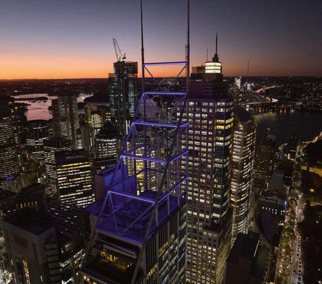
The iconic Deutsche Bank Place at 126 Phillip Street, Sydney, has made its mark on the Sydney CBD skyline following the installation of a new architectural lighting feature. With its city-defining architectural rooftop feature, Deutsche Bank Building, more famously known as the ‘goal posts’, was designed by Foster + Partners. The lighting design intended to enhance its night-time appearance with a more subtle appearance that blends with its original structural presence. The building crown has an elongated appearance during the day and Lightwaves approached its night-time appearance to design a more subtle presence by
highlighting the horizontal features. The lighting design consists of colour-changing RGBW LED luminaires mounted to the structure following the horizontal beams of the façade. The luminaires face outwards, creating a diffused line of light. The lower three levels wrap around the structure, while the top two are linear and mounted on the northern and southern sides. This treatment gives a 360° viewing angle of this iconic structure, ensuring the Deutsche Bank Place’s night time presence. Using a DMX intelligent digital lighting control system allows for seamless transitions of the different everyday scenes as well as the capability to power the special event scenes programmed throughout the year.
One Market Street Lift Lobbies
Sydney, Australia
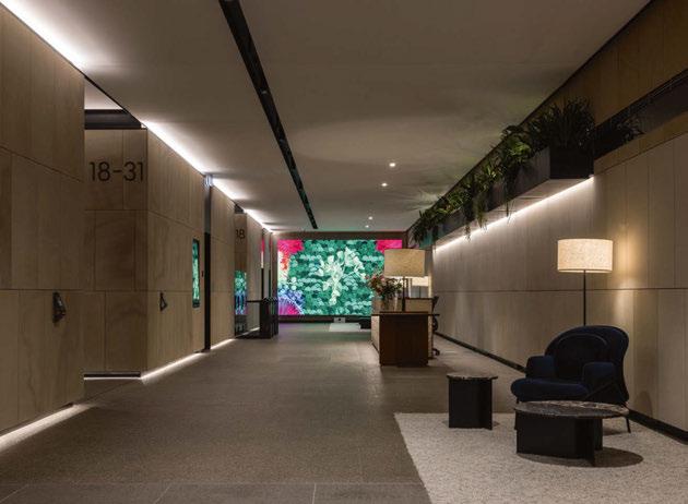
Lift lobbies are transient spaces where people meet, come together, and give newcomers their first impressions of a building, its businesses and cultures. They are the gateway to workplaces and hotel/apartment accommodations. This focus area should create a seamless, inviting experience for everyone that meets and passes through. Lighting, in so many ways, can be the component that allows these areas to be showcased to their potential, a warming experience and an inviting place for all. Investa asked Lightwaves to accentuate the lift lobbies at One Market St, Sydney. Lightwaves approached the design with one objective, to enhance the architectural finishes that Scott Carver had selected. Two LED extrusion graze lights are carefully detailed within a pelmet to ensure concealment, providing an even wash to the vertical walls. Vertical lighting plays an important role in architectural and interior design because it helps create a sense of height and depth within a space while providing task and accent lighting. Dual CAN downlights are concealed within a black service channel to balance the illuminance of this commercial lift lobby.
420 George Street
1 2 3 4 028 / 029
Lightwaves are creative thinkers, passionate about design and architecture, innovation, sustainability and product development. It was established five years ago in response to the growing yearning in Australia and the world to provide people with urban environments that better cater to their needs.


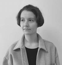
The studio, founded by Tim Geary, uses light as its medium, striving to create emotional responses and distil an innate appreciation of design, art and architecture. Lightwaves has a long history of successful projects across commercial, hospitality, retail, mixed-use developments, and residential projects. Lighting design is for every project, not just the prestigious and the team continually strives to promote the importance and value of lighting design that enhances and focuses environmental designs.
Lightwaves lives and breathes by its ethos: to exceed expectations through client focus and continual communication; to challenge the norm and continually explore different options outside of the box; to care and provide personal calibration on every level; to build strong relationships; and craft a narrative to success and understand the link between details and the successful bigger picture. www.lightwaves.design

100 / 100
2 3 1 4
Image: Rohan Venn Photography
Image: Rohan Venn Photography
Image: SkyMonkey
Silhouette Awards
The winners of the second annual Silhouette Awards, created by Archifos and Parrot PR & Marketing, were announced in an online ceremony on 1 March.
Returning for its sophomore edition, the international Silhouette Awards announced the winners of its 2023 programme in a virtual celebration at the beginning of March.
Designed to reward emerging talent within the lighting industry through recognition and mentorship, the Silhouette Awards pairs junior designers with senior lighting professionals for a six-month mentorship opportunity.
Established in 2021 by Archifos and Parrot PR & Marketing, the mentorship programme will give those recognised the chance to enhance their skillset, progress their career ambitions and add value to the creativity of the industry, raising the bar for talent to steer and lead the industry in years to come; all while learning from an established figure within the industry.
After an entry process that saw submissions from candidates spanning 26 countries around the world, 20 winners were selected by the judging panel and paired with their supporting mentors.
After the announcement of the 2023 winners, Eve Gaut, Silhouette Awards Co-Founder, said: “We are thrilled that, following the overwhelming success of the awards launch, we are returning for a second year of nurturing young talent. A huge congratulations to the winners on this much-deserved achievement. We are immensely grateful for the supporters, sponsors and mentors who have supported the awards. We also want to say a huge thank you to the international lighting community for coming together to celebrate the winners with us at the virtual event. The winning mentees will receive much-deserved recognition and publicity for their achievements, and we are honoured to have created this ongoing supportive platform.”
Katia Kolovea, Silhouette Awards Co-Founder, Archifos, added: “We are so excited to see what’s in store for our mentees during this second year of the awards programme. Reflecting on the great success of the partnerships between our mentors and mentees from last year, the expectations are high. Congratulations to our 2023 winners, this is an incredibly exciting day.
“The Silhouette Awards are much more than an award, and we are proud to have created a programme that allows mentors to nurture young talents, sponsors to connect and support further those individuals, and for everyone involved to
build deep and long-term business relationships and friendships. This is just the beginning.”
Indonesian designer Dane Amilawangi, who was paired with Arup’s Florence Lam, said: “I am truly grateful to be one of the winning mentees. I feel very excited to start my mentoring journey with Florence and have discussions about our passion and ideas in lighting. From this mentorship, I am hoping to get a few steps closer to what I want to do in the long run in the lighting design field.”
Lam added: “Dane’s professional outlook towards lighting design is purposeful and mature. It took me 20 years to figure out and she got it in five. I am excited to take this mentoring journey together with Dane.”
Jessica Keates, who has just joined the lighting industry after working as an Electrical Engineer with Hoare Lea, was partnered with Arianna Ghezzi, Associate at Lighting Design International. She said: “I am very excited to have been selected as a mentee. I am so grateful to have been chosen by Arianna and I am looking forward to learning from her experiences over the next six months and being exposed to a different insight in the lighting industry as I develop my career in lighting.”
Ghezzi said: “Being a mentor means a collaboration where hopefully I can inspire and guide Jessica, but at the same time also grow myself. Championing and helping Jessica, assisting with her career and development is such a big responsibility but at the same time a unique experience that I intend to treasure. My goal is to be there for her, and being someone she can ask questions to without feeling any pressure, so that we can achieve a mutual development at the end of our journey together.” The next edition of the Silhouette Awards will open for entries in September 2023.
www.silhouetteawards.com
030 / 031








 The Silhouette Awards 2023 winners From top, left to right: Alperen Ekici (Mentor: Olga Tuzova); Anastasia Angeli (Mentor: Barbara Horton); Annabelle Hill (Mentor: Fay Greenhalgh); Cherine Talge (Mentor: Maida Hot); Consuelo Emiliana Miranda Barroso (Mentor: Diana Galic); Cristina Antonieta Martinez Bergonje (Mentor: Martin Klaasen); Danai Lytra (Mentor: Claudia Paz); Dane Amilawangi (Mentor: Florence Lam); Farahbee Rahman (Mentor: Yah Li Toh); Gemma Alcalá Jurado (Mentor: Michael Callanchini); Ines Bartl (Mentor: Amardeep M. Dugar); Jessica Keates (Mentor: Arianna Ghezzi); Jessica Smith (Mentor: Beata Denton); Massimiliano Moro (Mentor: Siddharth Mathur); Olga Rybkina (Mentor: Volker von Kardorff); Swapnali Bhadale (Mentor: Nikita Agrawal); Swillow Lee (Mentor: Gary Thornton); Valeria Coghi Martinez (Mentor: Paul Traynor); Walesca Zanonato (Mentor: Kristina Allison); Wenyi Kong (Mentor: Waleed Fakousa)
Stadtkirche Unna, Germany
Within the German city of Unna, there is a great passion for light; home of the International Light Art Museum, there are also many light art projects throughout the city, and several buildings are specially lit.
The city’s church – Stadtkirche – has recently undergone a beautiful restoration, with new lighting designed by Dutch studio BXLD. BXLD has a long history of working in Unna, and in particular with Stadtkirche. More than 20 years ago, the European Lighting Designers Association (ELDA, later renamed PLDA), held an international workshop. BXLD was one of the workshop heads, and created a range of new lighting solutions for the church. The local community loved the results of the workshop, and afterwards the designers were asked to make a permanent lighting scheme for the church. They added colour to the tip of the tower, which became a recognisable element and, in time, a real part of the visitor experience. Two years ago, BXLD was approached to do a redesign, and provide a new lighting solution that would last for the next 20 years.
The lighting design was created to support the church and show the beauty of the building. In the concept, the lighting shows the textures of the structure, while also reducing the amount of light and emphasising the symbolic elements. For the spire, the lighting designers introduced colour in a low brightness – enough to see, but not to dominate. The blue/purple hue was intended to remind visitors of the approaching night, giving viewers time to rethink and rejuvenate.

The daily light scene is active between sunset and 10pm; after which, it turns off to respect the darkness.
www.berluxlichtarchitectuur.nl
032 / 033 eye opener

034 / 035 PROJECT
Battersea Power Station London, UK
After opening to great fanfare in late 2022, arc steps inside the newly renovated Battersea Power Station, and speaks to Speirs Major about the landmark’s monumental new lighting design.
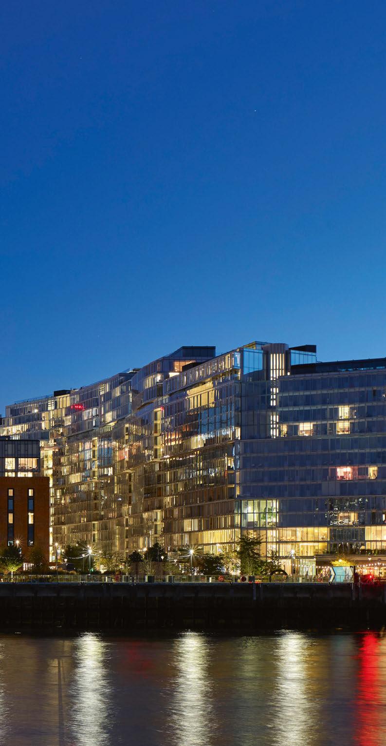
ne of the largest, most prestigious redevelopment projects in recent years, London’s iconic Battersea Power Station finally reopened to the public in late 2022. Already a landmark in the city’s skyline, after nearly a decade-long process, the revived building incorporates retail, hospitality, commercial and residential spaces, and has instantly become a must-see destination for tourists and locals alike.
The lighting design for this monumental project was led by Speirs Major.
Speirs Major first joined the project in 2014, developing a lighting masterplan that created the long-term vision and guidelines, not only for the illumination of the Power Station and its associated public spaces, but also for the entire mixed-use scheme, which is being delivered in multiple phases over several years.
Anchored by a spectacular after-dark image that celebrates both the industrial heritage of the site, as well as its exciting new future, the lighting masterplan looked to “guide the use of light in support of a positive experience of the development for all its different users”, delivering a sense of privacy and intimacy for residents, facilitating easy wayfinding for shoppers and diners, and creating a vibrant atmosphere for locals and tourists alike.
To achieve this delicate balance, the lighting masterplan blends light and darkness across the site, with adjustments in both the quantity and
quality of light according to patterns of use and the time of the day.
At a holistic level, the light intensities and the scale of the equipment have been choreographed to allow the architecture and landscape to have prominence. Lighting levels tail off adjacent to the Power Station and the Thames, preserving views and providing an appropriate setting for the building.
At the point that Speirs Major joined the project, the lighting for Phase 1 of the public realm had already been designed by Equation Lighting Design. This related only to the public realm associated with the first new apartment building to be built, not the Power Station itself. Speirs Major reviewed the Phase 1 design, aligning it with the overall masterplan.
With regards to the wider public realm lighting, the intent was to “reflect on the industrial heritage” with a consistent, warm golden tone across the whole site. Therefore, soft lighting to routes, pathways and landscape creates a welcoming character while meeting functional safety and security requirements. Overall light levels are generally kept minimal to help manage energy use and help reduce environmental impact, but increased at meeting places, gateways, and corners to improve legibility and encourage social interaction.
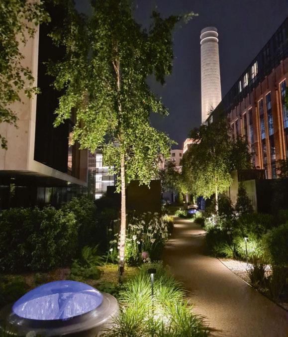
Inside the building, the vast complex of spaces are broken down into a number of different areas, each with their own unique identity and character – these include the main retail environments within the old Turbine Halls and Boiler Houses; heritage spaces in the former Control Rooms; and residential lobbies and roof terraces, situated in the Switch Houses and Wash Tower lobbies.
Mark Major, Senior Partner at Speirs Major, explained how the team managed the complexity of the project: “Setting aside the preserved historic spaces (Control Rooms, Director’s Entrance, etc), there is a commonality across most of the other interior spaces, in the sense that they have been refurbished as functioning spaces with a contemporary industrial aesthetic. So, the designs focus on simple, bold details that pick up on the character of those spaces, helping to create a vibrant background setting for the retail and leisure activities.”
Clementine Fletcher-Smith, Partner at Speirs Major, added: “With such a large and complex project, we worked to keep our designs simple and effective by focusing on key, bold moves, rather than lots of complicated details. Nevertheless, due to the massive underlying complexities in geometry and heritage restrictions, we required many individual lighting details for each space.”
One of the core ambitions for the lighting design was to achieve a careful balance between maintaining the raw energy of the original spaces, while celebrating their new role within the Battersea development. As a result, in each space, the lighting contributes a vibrant atmosphere that allows the renewed focus on retail and hospitality to figure prominently, while gently celebrating the distinctive heritage and architecture.
036 / 037
O
Below: The Roof Terrace of one of the residential spaces (Image: Speirs Major).
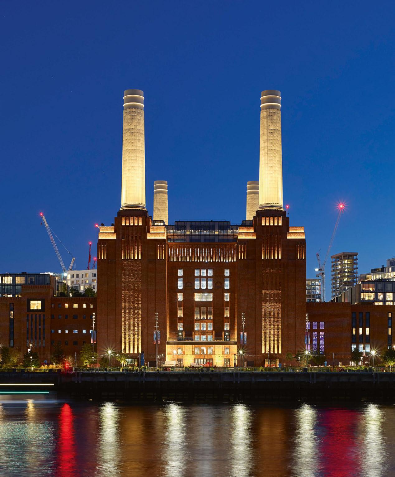
Right: The powerful external appearance of the Power Station, where lighting beautifully picks out its Art Deco flourishes while highlighting the full height of the chimneys. (Image: Peter Landers)

PROJECT BATTERSEA POWER STATION
In the retail areas, the designers looked to keep the palette of equipment relatively simple and minimal, applying light in different ways to support the unique character of each space. Functional light is predominantly kept local to the level it is illuminating, through a combination of integrated handrail lighting and period-appropriate industrial pendants and bulkheads, with high level downlighting only added where required. “Re-use of certain heritage fixtures found on the site was a fundamental part of the brief, and we worked hard to achieve this where it was feasible and costeffective,” Fletcher-Smith added. Over this, a layer of elegant architectural accent lighting enhances and reveals the defining details.
Turbine Hall A was part of the original 1930s Power Station, and is a vast, magnificent industrial Art Deco space. Given such a dramatic setting, it was essential for the design team to use restraint to protect the prominence of the retail environment, while still creating an elegant, refined, and welcoming ambience.
Continuing the lighting language established in the public realm spaces, Speirs Major chose a warm light (2700K), bringing to mind the original tungsten lighting of the period for both the functional and architectural lighting. Gentle highlights to the key details include uplighting the industrial gantries, the main soffit and friezes, and vertical accents to the Art Deco columns.
Added in the 1960s, Turbine Hall B, is characterised by the minimal, Modernist aesthetic of the time.
A smooth, curved roof is penetrated with skylights – some real, and some added using light tubes to unify the appearance of the ceiling. Here, Speirs
Major softly washed this extensive surface with colour changing light that adjusts during the day in line with the natural daylight cycle. Cool, crisp white tones enhance the Modernist aesthetic during the day, followed by a warmer ‘sunset’ feel taking over into the evening, with the facility for bold, full-colour change after dark for celebrations, promotions, and events.
Additional ambient colour-change floodlighting integrated within the skylights creates a feature that also pops through into the roof gardens for the residents of Switch House East. Accent lighting picks up the window reveals and the linear form of the bridge structures, while escalators are highlighted in a dynamic, integrated solution that can tie in with the colour of the curved roof, while still providing safe access and contributing to the character of the space.
The two further retail spaces can be found in the two Boiler Houses – North and South. Essentially a pair of raw industrial shells, architects Wilkinson Eyre created a series of contemporary entrances, event, and retail spaces. The lighting design plays up the retained industrial character of the spaces, revealing the texture and colour of the authentic red brick walls and timber finishes, while highlighting the structural steelwork of the modern architectural interventions. The darker finishes and exposed brickwork in these spaces provide little interreflection, resulting in a moodier and more contrasting ambience.
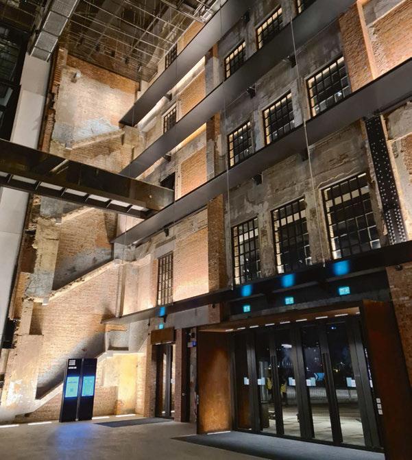
“While of course the primary focus was on creating a fantastic ambience and setting to support the new uses of the Power Station, we also need to focus on the restoration and refurbishment of this much-loved, iconic listed industrial building in an urban setting,” added Major. “So, celebrating the architecture and heritage of the site was also a key part of the design.”
This is particularly evident in the dedicated heritage spaces – Control Room A and B, and the Director’s Entrance. The goal here was to “reinstate the lighting in keeping with the original design intent as far as possible, while adding a discreet extra layer of architectural lighting and control, where needed”, to enable the spaces to be used flexibly for events.
The Director’s Entrance is the original access point to the Control Rooms and Boiler House for the Directors of the Power Station, and dates back to the 1930s. It was originally lit with several statement Art Deco fixtures, some of which had been removed from the site. As part of the overall drive to restore and refurbish the site, Speirs Major created replicas of the missing fixtures based on photographs and drawings, and restored and upgraded the interior wall sconces, lanterns, and pendants found on-site with LED technology.
A dramatic, Grade II* listed space built between 1929-31, Control Room A had been entirely artificially lit since WW2, when the original skylights were blacked out. Restoring and refurbishing these structures means that the space is now filled
PROJECT BATTERSEA POWER STATION 038 / 039
The entrance to Boiler House North, one of the Power Station’s new retail spaces.
(Image: James Newton)
Lighting designed for places and people
Contemporary lighting solutions designed to enhance the beauty of outdoor spaces while also meeting the needs of both people and the environment

Exchange Square, Broadgate
Lighting Design: Speirs Major
Product: Pharola Max
dwwindsor.com
with natural light; the lighting designers added backlighting externally to maintain the illusion after dark. The space’s original Art Deco, lozenge-shaped fixtures have also been reinstated, having been refurbished and upgraded with LED lighting, along with the unique backlit switching control diagrams and buttons, and prismatic wall lanterns along the back route.

Contrasting the Art Deco design of Control Room A, Control Room B dates back to the 1960s, and is an extremely rare – and as such historically highly sensitive – example of a Modernist control room. Again, original lighting has been reinstated here as far as possible, including a central cove that now houses full colour-change LED battens in place of the original fluorescent lamps, uplighting the soffit and providing flexibility to adapt the space for events. Mid-century opaline light boxes have also been restored and upgraded to LED, and in common with the other heritage spaces, additional concealed high-level functional lighting has been added.
“In terms of our general approach to heritage, we adopted and followed the lead from Wilkinson Eyre, who are not afraid to innovate, while respecting the history and context,” said Fletcher-Smith. “They have great experience in this, and having worked with them previously, we have built up a language together. We understand that while you don’t want to lose the character and history of the building, the final outcome needs to be both contemporary and functional.”
This approach is evident in the lobbies for the residential accommodation, which have been reimagined as contemporary spaces that draw on the industrial heritage of the building while delivering the luxury and comfort expected of highend residential living.
The lighting here aims to create a welcoming ambience while aiding wayfinding, with warm light focused on key vertical surfaces and onto the ceilings. Gentle washes of light help to reveal the textures and colours in the materials, including brick, concrete, mesh and Corten steel, while Art Deco-style fixtures add a decorative accent. The four Wash Tower lobbies uniquely feature extremely deep voids. For these, Speirs Major designed a series of special bespoke chandeliers. Suspended at a height of 22-metres, their stacked green glass design was inspired by the form of electricity pylon isolators, in a neat reference to the past use of the space in supplying power to large parts of London. Speirs Major’s unique original concept was further developed in collaboration with manufacturer Jonathan Coles Studio. The upper Wash Tower lobbies on the 11th floor feature glowing linear wall lights to fit with the dramatic lined interior, creating an intimate space with views up into the internally illuminated chimneys.
The project is topped off with three roof terraces, each with low accent lighting to planting and seating, providing sufficient lighting to paths for safe use in a beautiful manner, creating scattered, decorative shadows. Roof gardens on Turbine Hall A and B are flanked by illuminated brickwork that contributes to the overall image of the building, providing a close view of the strong contrast and texture produced by the close offset uplights. The terrace on Turbine Hall B is also punctuated by an ethereal glow from the skylights that cut through to the Turbine Hall below. Even lower light levels are used on the Boiler House roof garden to ensure that the reflections of the chimneys in the central, lake-like skylight are not compromised. Perhaps the most defining element of the restoration of Battersea Power Station though, comes with its revived after dark identity. Despite undoubtedly being an icon of the London cityscape by day, the building has previously never been formally illuminated – instead being the subject of many one-off light shows over the years. Now, the building enjoys a sensitive, yet high-impact permanent exterior lighting scheme that stands a potent symbol of its rejuvenation as an innovative mixed-use neighbourhood, while also honouring its industrial heritage. Topped by the illumination of the Station’s four famous chimneys, the exterior lighting highlights key architectural elements, drawing out the materiality of the building and its fine detailing to create an appealing ambience that blends the old with the new.
Taking into account the building’s visibility across London, the design began with identifying the important close, mid, and distant views. From there, the lighting scheme is shaped around creating maximum visual impact, while building in flexibility, remaining mindful of environmental concerns, the need to protect the historic building fabric and minimising light spill for residents. Considering the magnitude of the external illumination, this proved to be one of the most challenging aspects for the lighting designers. Major explained: “We wanted to create a beautiful
040 / 041

PROJECT BATTERSEA POWER STATION
The vast Turbine Hall A has been converted into a retail space, while still paying tribute to the station’s industrial heritage.
(Image: James Newton)


042 / 043
wash of light, but finding appropriate mounting locations was complicated by the presence of the new residential areas between the chimneys and to the east and west wings. To avoid possible light ingress, we could only mount the equipment close to the chimneys at their base.”
With each chimney measuring 8.8-metres in base diameter, 27.57-metres in base circumference and reaching a height of 42-metres, the design uses 50 close-offset projectors per chimney to ensure precisely controlled coverage and minimal light spill. Rings of high output RGBW LEDs were carefully designed, detailed, installed, focused, and programmed to deliver this high impact lighting scheme, while also endeavouring to minimise the amount of light directed into the night sky. At the base of each chimney, a carefully controlled wash of warm white light to the geometric shoulders defines the frame of the building when seen against the night sky. The classic Art Deco niches running the length of the wash towers and the slots in the high-level friezes are highlighted, creating a strong vertical emphasis, visually connecting the composition to the ground. On the main south façade and the riverside-facing north façade, the entrance recesses feature lighting to the upper window reveals, with the ground level washed in warm light to create a welcoming entry sequence. Soft floodlighting to the brick pilasters that form the east and west upper flanking walls helps to create an attractive backdrop for residents arriving and leaving, while the light from the occupied windows adds richness and animation.
“As with all heritage sites, minimising or limiting the impact on the building fabric is key – particularly on horizontal and roof surfaces where there may be a risk of water ingress,” continued FletcherSmith. “We made multiple presentations to Historic England throughout the design process, but given our extensive experience on historic buildings in the past, we were able to manage things without any major issues.”
“The client was very supportive and allowed us to explore many options for the after dark identity of the Power Station, ranging from highly dynamic to more subtle interventions,” Major added. “The conclusion was that for everyday use, a beautiful, restrained white light approach that respected the heritage of the building and allowed the chimneys to be the main focus was the way forward. For special occasions and events, the facility is there to add high-impact colour to the chimneys, and infrastructure is also in place for additional temporary event lighting.”
After eight years of work on the project, Battersea Power Station officially opened to the public in October of last year. Work is ongoing for Phase 3, in which Speirs Major will deliver exterior lighting to a residential building by Frank O. Gehry; a mixed-use development by Foster + Partners; Malaysia Square by Bjarke Ingels Group and Wilkinson Eyre; and the various areas of connecting public realm, including the Electric Boulevard that leads from the Power Station to the new underground station.
Major explained how the team at Speirs Major worked to ensure a consistency in the concept, despite such a long-running process: “Working on projects with such a long timeframe – in this case, almost a decade – we have become adept at learning how to hold onto the core concepts. Changes to client, design and contractor teams inevitably happen over such a long period, but we hold on – often through simplifying our designs down to essential ideas.”
Fletcher-Smith continued: “With Battersea Power Station, the client and the architectural teams were very supportive, and we were able to retain many of the key details – things like the internal lighting of the freestanding façades to the main entrances, and the ‘pylon isolator’ inspired chandeliers in the Wash Tower residential lobbies. These reflect the industrial architecture really well, while also creating a great atmosphere in the spaces.”
Now that the project is open to the world, the team at Speirs Major looked back on how Battersea Power Station compares to other prestigious projects from across its portfolio, and also how those former experiences contributed to making this iconic new project a success. “We are always honoured when we get the opportunity to work on a truly iconic project like this,” said Major. “You win a competition based on ideas and experience, and then the weight of expectation is in delivering on those ideas – but in a sense you need that injection of adrenaline and drive to help push you to achieve your best work.
“Our experience of working on many different building types is something that always helps us tremendously. We drew on our experience of airport projects like Heathrow T5 and Barajas, Madrid as examples of a complex, large volume that includes retail space; sensitive, listed spaces like St. Paul’s and Westminster Abbey; and those that have reinterpreted former industrial sites, such as Bethlehem Steel Works in Pennsylvania, USA and Zollverein Kokerei in Germany.”
Fletcher-Smith shared her thoughts on the finished lighting scheme: “We feel that we are just now starting to get an impression of the overall result, both by day and after dark. We feel the lighting aligns very well with our intentions and proposals. It delivers a high impact image and identity, makes a strong contribution to placemaking, and creates a vibrant experience for all the users of the site, as well as properly addressing key issues such as wayfinding, safety, and security.
“We are really pleased with the final outcome, especially the balance we achieved between light, darkness, texture and colour throughout the scheme.”
Indeed, with the new lighting scheme, the revitalised Battersea Power Station will long continue to be an iconic landmark in London’s cityscape.
www.smlightarchitecture.com
Top: The lobby of one of the station’s residential spaces, which features custom, bespoke chandeliers designed by Speirs Major and Jonathan Coles Studio.
(Image: Peter Landers)
Bottom: The goal for the Control Rooms was to reinstate the lighting in keeping with the original design intent as far as possible. This extended to restoring or refurbishing existing fixtures.
(Image: Speirs Major)
Client: Battersea Power Station
Development Company
Lighting Design: Core team: Clementine Fletcher-Smith, Ewan Parsons, Mark Major, Philip Rose; Support team – Andrew Howis, Jack Wates, Jessica Zanotto, Kerem Asfuroglu, Lee Sweetman, Martin Firera Alessandri, Sam Tuck, Satu
Streatfield, Tom Hartshorne; Speirs
Major, UK
Architect: Wilkinson Eyre, UK
Landscape Architect (Public Realm): LDA, UK
Landscape Architect (Rooftop
Gardens): Andy Sturgeon, UK
Lighting Suppliers: acdc, Ares, DAL, Delmatic, DW Windsor, Ecosense, Factorylux, LEDFlex, Lumenpulse, Lumino, Meyer, Pharos Architectural Controls, Selux, SGM, Stoane
Lighting, We-ef
Photography: James Newton, Peter Landers, Speirs Major
PROJECT
BATTERSEA POWER STATION

044 / 045 PROJECT
Battersea Power Station - Lift 109 London, UK
Within the vast renovation of Battersea Power Station, Michael Grubb Studio has created a dynamic, immersive experience that takes visitors up one of the building’s iconic chimneys.
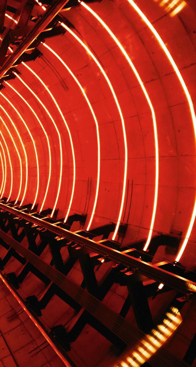
The redevelopment of Battersea Power Station is one of the most significant and iconic restoration projects in recent memory. The project has seen the former power station transformed and revitalised into a mixeduse destination, with retail, hospitality, commercial and residential spaces all housed within the landmark building.
Part of this renovation was the addition of a unique Chimney Lift Experience, where visitors are immersed in a vibrant light show that pays homage to the Power Station’s industrial past. While Speirs Major were lighting designers for the wider interior and exterior of the site, Michael Grubb Studio was appointed to provide the lighting design for a standalone visitor experience – Lift 109.
Combining a dynamic audio-visual experience with breath-taking, 360° views of the London skyline from 109-metres above the ground, Lift 109 sees visitors ride a 15sqm glass elevator that travels inside the interior of the Power Station’s northwest chimney.
Michael Grubb, Founder of Michael Grubb Studio, told arc about his excitement at getting involved in this special project: “The concept of designing a lit experience at Battersea Power Station was an incredible opportunity,” he said.
“If you then include lighting inside a chimney, with a glass elevator ascending 109-metres to 360° views of London as one part of that experience, then it
becomes an opportunity of a lifetime. So, we were thrilled to be invited to join the Lift 109 exhibition design team by Ralph Appelbaum Associates.”
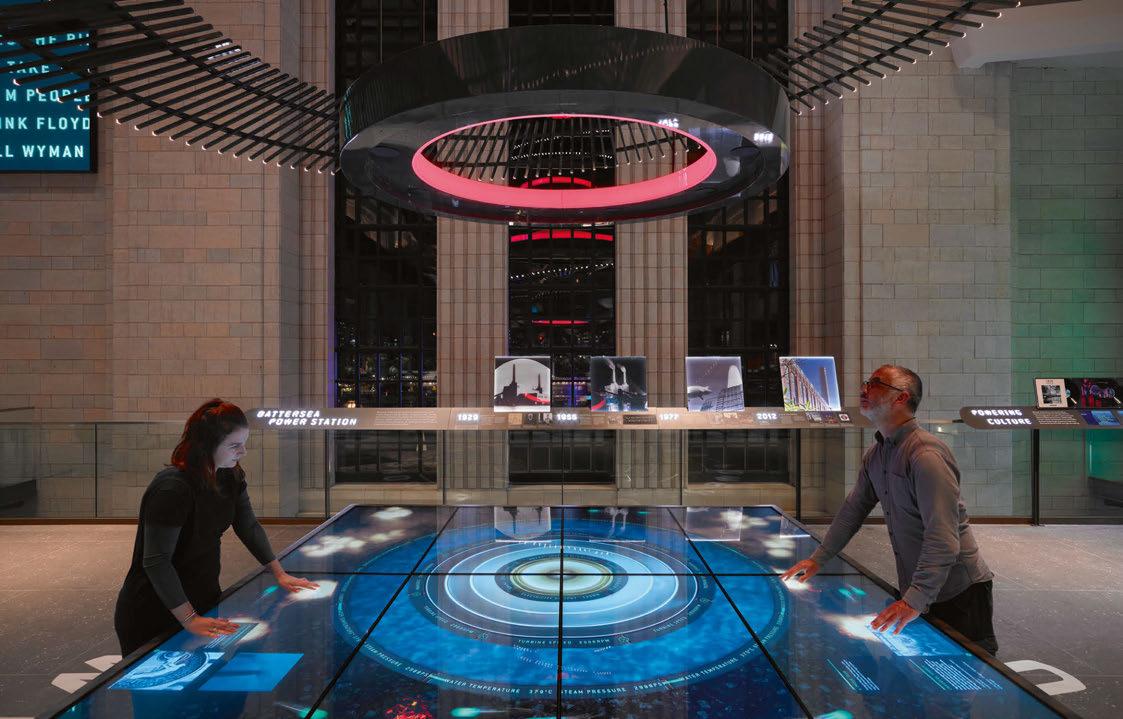
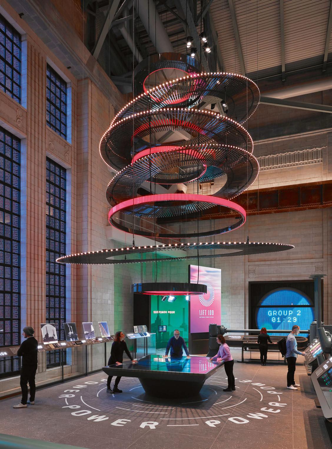
The Lift 109 experience begins at mezzanine level at the northern end of Turbine Hall A. Doubleheight Art Deco windows provide an impressive backdrop to Ralph Appelbaum Associate’s concept experience, that begins with a ‘Generator’ visitor exhibition that tells the historical and cultural story of Battersea Power Station. The centrepiece of this is “Powering London”, a bespoke, eight ring feature chandelier hung above an AV interactive table – the design evocative of the massive circular turbines that once occupied the space. As visitors interact with the AV table, pushing coal into the centre, pulsing particles “ignite” the pendant above through an array of light delivered by 680 individually addressed nodes and coloured rings of light.
Leading on from this is a complete, 360° lighting experience and AV show, provided by Cisco and Squint Media, in the media room, celebrating the history and culture of the building. From here, visitors continue their ascent upwards via an express lift and a spiral staircase with dynamic colour changing light to the base of the chimney. Lighting acts as a guide up the chimney steps; single luminaires light the entrance doorway to create anticipation for what lies beyond, and as guests arrive at the Lift 109 platform, 13 Oculi circular infinity mirrors sit at the top of the stairs
LIFT 109 046 / 047
PROJECT BATTERSEA POWER STATION


+44 (0)20 7471 9449 sales@pharoscontrols.com pharoscontrols.com @pharoscontrols 272 Gunnersbury Avenue Lon don, W4 5QB United Kingdom A n all new and innovative control solution EXPERT CONTRO L & TOU CH and straightforward control solution centred around a single, reliable, set-and-forget elegant wall station interface. Expert makes light of it. See us at Stand: 1769
to create an intense build-up of light casting down to visitors as they wait for their journey into the chimney. The Lift 109 lighting and Oculi both animate in response to multiple triggers linked to the movement of the lift’s ascent and descent.

The lighting experience inside the chimney is aweinspiring; dynamic light shows interact with visitors through various light sequences. “Lift 109 was called the Turbine Twist in our concept, a turbine charged ascent surrounded by 27 warm, colourchanging LED rings,” explained Melissa Byers, Head of Michael Grubb Studio’s Bournemouth studio.
“The lit rings animate individually, building tension to create a powerful, dynamic light show choreographed to an evocative soundscape designed by Coda de Coda. On the journey down, we wanted to create a completely different experience that was focused on the engineering of the lift and the architecture of the chimney, so we used a pure white light to illuminate the space, chasing it down the chimney during the descent.” Although incredibly vibrant and dynamic in nature,
the light show within the Lift 109 experience was designed to pay homage to the Power Station’s industrial past – much like the site-wide lighting design from Speirs Major. Grubb explained further the lighting concept for Lift 109: “Battersea Power Station is commonly referred to as the ‘Cathedral of Power’ in popular culture, and the experience celebrates the plethora of facets this distinctive landmark has as an icon both historically and in popular culture.
“Overarching all the many rich layers of its past over the passage of time is this icon’s powerful presence, retained to this day; a Cathedral of Electrons, an industrial superstation. We had to capture this epic, enigmatic character and create an emotional response to it using light.”
The lit narrative, Grubb continued, was to “celebrate the raw energy” of the station, crafting an emotive journey that would enhance the narrative that is woven throughout. “It’s a light and sound show that builds to a euphoric climax. We created a series of amazing lit moments that immerse visitors, providing memories and moments of delight.
“No other London landmark reveals the view from a lit experience in this way. It’s an immersive fairground ride with a story, a blur between fiction and reality. There’s a circular theme to the lighting throughout that is an homage to the station’s turbines and chimneys, animating around, light rising to draw attention ever upwards, recreating the energy and power once produced. It’s been such a privilege to be part of bringing Battersea Power Station to life again.”
Although a standalone experience within the station, it was still important for the lighting design within the Lift 109 experience centre to be aligned with the wider design narrative. Early on in the design process, Michael Grubb Studio had meetings with Wilkinson Eyre, who provided the team with information about the structure and design of the station and the chimney. The team at Michael Grubb Studio also collaborated with Speirs Major, to understand more about the wider approach to the lighting design, and where their work would interface with the overall scheme design so that they “could be sympathetic to the edges where our design overlapped theirs, respect any heritage considerations within our design, and understand their lighting control system and approach, which was independent of ours”. Byers continued: “Our main responsibility was to ensure that our lighting scheme didn’t conflict with the wider lighting design by Speirs Major in the Turbine Hall, but it also needed to make a statement of its own, so there was a balance to be found.
“We’ve collaborated with Speirs Major previously and it is always a very positive experience sharing information, we’re all working towards the same aspirations. I think we were completely aligned in that the lighting design needed to be high quality, relevant to Battersea Power Station, elegant, powerful, and dramatic. You can follow the same aspirations, but independently still create something different that works very well together.”
048 / 049
PROJECT BATTERSEA POWER STATIONLIFT 109
Client: Battersea Power Station
Lighting Design for Chimney Lift
Experience: Michael Grubb, Melissa
Byers, Anna Freiesleben; Michael Grubb Studio, UK
Lighting Design for Exterior and Interior of Battersea Power Station: Speirs Major, UK
Architect: Wilkinson Eyre, UK
Exhibition Design: Ralph Appelbaum Associates, USA

Sound Design: Coda de Coda, UK
Lighting Suppliers: Architainment, e:cue lighting control, Pharos Architectural Controls, Studiotech
Photography: Battersea Power Station, Ralph Appelbaum Associates, Andrew Lee
However, one of the biggest challenges that the team faced on this project, came in the practicalities of mounting lights within the chimney.
“We were advised that putting lighting into a chimney with a lift in just wouldn’t be allowed from the beginning, in terms of the regulations applied to lifts,” Byers explained.
“Lifts rightly have a lot of stringent laws in place relating to safety, plus the chimneys are listed, so we couldn’t mount anything to the chimney wall. Even if we were permitted to do it, how were we going to do it? The lift has many moving parts, installing lighting up the chimney was not an easy exercise, the programme was very tight, and many people were completing work in this small space, the list went on.
“Each red flag spurred us on with more determination to find a solution, and together we finally found a window of opportunity; the rings of light could fix in several points to the lift structure, whereby we could create an almost complete ring of light, while dodging moving parts, and find a rhythm of placing them up the chimney.”
The efforts made to bring the “Turbine Twist” to life have proven to be worthwhile, as the resulting
experience has become a must-see attraction within a must-see attraction, delivering on Grubb’s initial ambition to “celebrate light as a visible form of energy”.
Reminiscing on the finished project, he said: “It is rare that you can showcase light to celebrate the use of power and energy in such a relevant context. The chandelier and lit rings within the chimney have great presence and feel worthy of their place at Battersea Power Station, which is certainly something we were mindful of when creating the lighting design.
“The lighting brings an opportunity for the visitor to interact directly with light, to metaphorically plug in and experience it. The exhibition design tells you about Battersea Power Station’s historical and cultural past, but the lighting emotionally connects you, generating excitement, anticipation and wonder while doing so. All, importantly, with a great sense of fun.”
www.michaelgrubbstudio.com
LIFT 109 050 / 051
PROJECT BATTERSEA POWER STATION



www.novoluxlighting.com 51 Ø95 Ø420 65 Ø95 Ø620 79 Ø95 Ø820
Floral Guide London, UK
Across the animal kingdom, many living creatures navigate vast distances to reproduce, feed, and find shelter. Insects, birds, reptiles, fish and mammals use varied and fascinating techniques to trace and track their environment.
Inspired by nature’s compass, Floral Guide is a new, interactive media artwork from Jason Bruges Studio, situated with the newly opened underpass connecting Kew Bridge Station and EcoWorld London’s Kew Bridge development, which features the new Brentford Community Station.

Enlivening the pedestrian journey, the artwork uses a network of bespoke luminaires to resemble an ever-blooming glade, and was commissioned by property developer EcoWorld London, which is leading a major redevelopment in the area. A response to the nearby botanical research and education institution, Royal Botanic Gardens Kew, Floral Guide is an exploration
of nature’s colour-based, wayfinding systems. From conversations with Kew scientists, Jason Bruges Studio developed a programmable media palette inspired by interactions between insects and plants. From hibiscus to verbena, many flowers renew and refresh their appearance to communicate with pollinators. These ‘advertising slogans’, often outside our visible spectrum, are imagined as radial ‘petals’ of light. Like bees to flowers, passersby influence the display and become immersed in evolving pattern and colour.
Floral Guide builds on a family of Jason Bruges Studio’s artworks that use technology to transform the urban experience and bring people closer to nature. Jason Bruges, Creative Director and Founder of Jason Bruges Studio, said: “With Floral Guide, the aim was to enliven the pedestrian journey between Kew Bridge Station and Brentford Stadium.
“From early conversations with EcoWorld London and Kew scientists, we knew we wanted to create an interactive artwork that transforms the urban experience and stimulates the appreciation of our vital ecosystems.”
www.jasonbruges.com
052 / 053 eye opener
 Image: Sandra Ciampone
Panos Ferentinos
As he celebrates 20 years in the lighting industry, Panos Ferentinos, Associate at QODA Light, tells arc about his unique route into the industry, and how his background in graphic design shaped his approach to lighting.

“In my work, I tend to treat each project as a new creative challenge, then I let my instinct guide me on what the possibilities are for a successful project.”
054 / 055 talking with…
 Image: Frederic Aranda
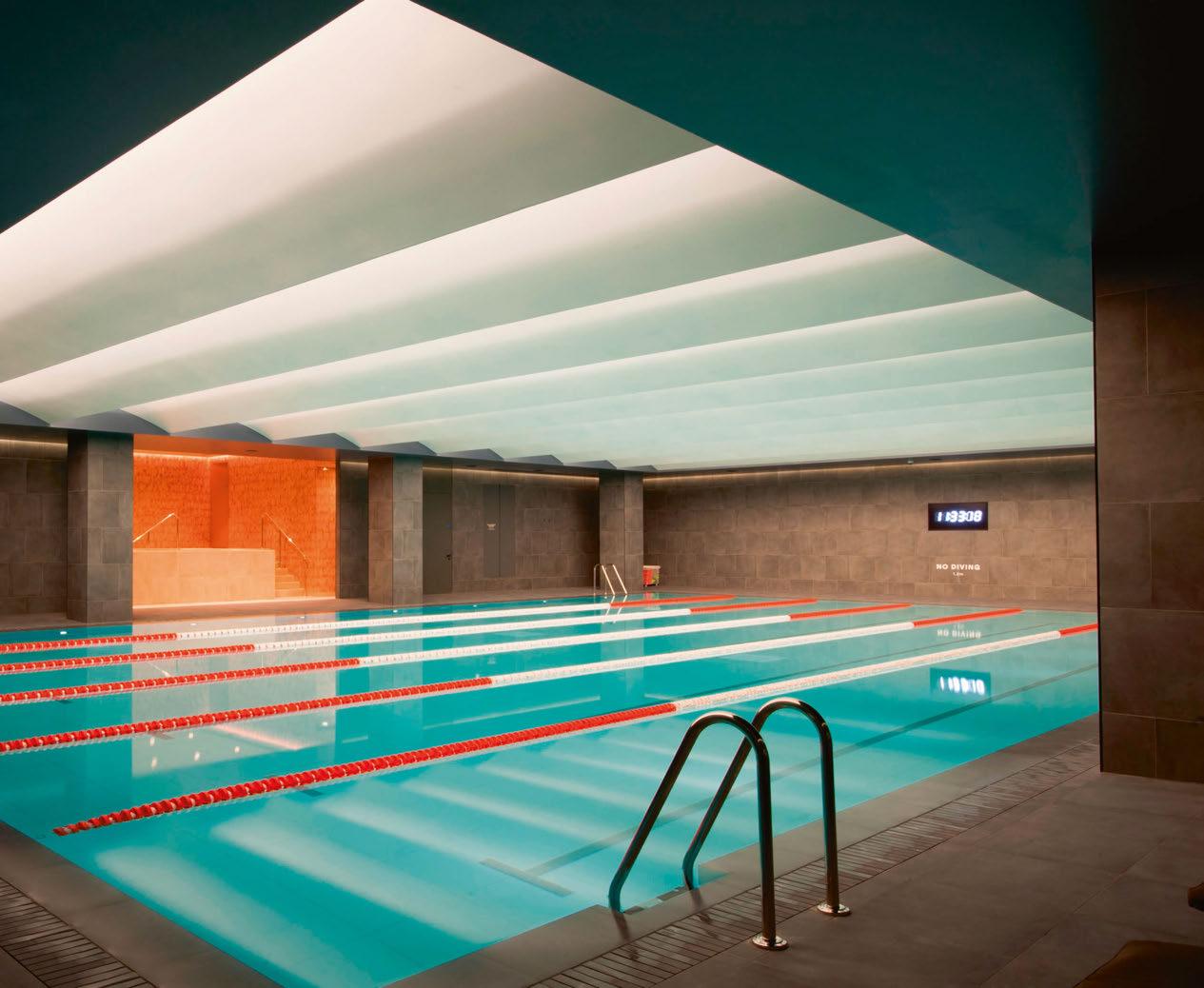
Top Third Space, London, UK
(Image: Chad Rains)
Bottom K11 Art Mall, Wuhan, China
(Image: Dirk Weiblen
Throughout our time as a publication, we’ve interviewed many lighting designers, and have made a point to ask each of them how they arrived in the profession.
Discounting the many that found lighting design “by accident”, there are some very common routes – architecture, theatrical production, interior design, and lighting manufacturing in particular. However, London-based Greek designer Panos Ferentinos found the world of lighting design through an entirely different path.
“I originally studied Graphic Design, and after I finished a Master’s degree in Art & Graphic Design, I started my career working at magazines, wellknown publications, and advertising companies in Athens,” Ferentinos told arc.
It wasn’t until he moved to London 25 years ago that Ferentinos discovered the world of lighting design, although he said he has always had an interest in the effect that lighting has on architecture.
He continued: “When I decided to move to London, I worked for a short time as a graphic designer, until I fell in love with lighting. I was always fascinated with how lighting defined architecture, but I was not aware of the skills that it required to design lighting for spaces.”
With his background in graphic design, Ferentinos got a job with Isometrix as a junior designer, where he “connected more with lighting” through photoshop renderings that he was given to work on for various projects.
“At first, it was very difficult to understand the philosophy and technical part of the lighting design, and the impact that it had on large-scale projects, but this was something that I developed over time,” he said.
“I learned a lot of lighting design on the job. I was exposed to various aspects of the process of architectural lighting design, and later, when I started visiting projects for commissioning, I had the chance to see how a design concept on paper went on to shape into the reality of a constructed project. I also had the chance to travel and work with people around the world, which was another part of the job that really drew me in.” During his time at Isometrix, Ferentinos met a significant figure in his career – a mentor who would take him under their wing and offer support and guidance.
He recalled: “I was starting to lose interest in graphic design when I met a key influencer in my career in lighting – Chad Rains [Founding Director of Illuminationworks, then at Isometrix]; my mentor, who brought me into the job.
“Creativity opens the mind, and he was always encouraging me to think outside the box. It was appealing, and the complexity of the projects was very stimulating, so I found the learning process incredibly rewarding, and no day was the same.” After more than five years at Isometrix, where he progressed to the level of Assistant Lighting
Designer, Ferentinos moved on to a new position at Illuminationworks – a studio where he spent the next 12 years honing his craft and learning more about the lighting design profession. During his time at Illuminationworks, Ferentinos quickly learned the ropes of lighting design, working across a range of projects spanning hospitality, heritage, retail, residential and master planning.
Because of this, he believes that there isn’t one particular are that he specialises in, although his background in graphic design does give him an inside track in the early visualisation stages. “20 years in lighting has brought many types of projects across my desk. While I do not specialise, I find a lot of engagement in the design process, particularly during the early stages of conceptualising and ideation. This is where the graphic designer in me, mixed with my lighting expertise, can really shine.”
When it comes to his own personal style, Ferentinos explained that he often looks to the art world for inspiration, particularly taking to heart the words of the legendary James Turrell.

056 / 057

TALKING WITH... PANOS FERENTINOS
He explained: “Turrell said ‘we create the reality in which we live’. This resonates with me when I think about my approach to lighting.
“I love creating atmosphere and mood, I often turn to art for inspiration. I enjoy walking around London and observing the latest architecture. Each project is exciting and varied. In my work, I tend to treat each one as a new creative challenge, then I let my instinct guide me on what the possibilities are for a successful project.”
With this in mind, while he has worked on a range of projects across all aspects of lighting design, it is those that have an artistic or cultural component to them that stand out. A particular favourite, he revealed, was from his time with Illuminationworks; ROOM – an experiential work of art commissioned from renowned British sculptor Sir Antony Gormley.
Situated at the Beaumont Hotel in London, guests can stay inside the semi-abstract sculpture; a dark, mysterious, cave-like space, ROOM encourages its occupants to enter a different state of consciousness and enjoy a quiet, meditative pause, withdrawing from the busy world outside.
“I love ROOM, it was a unique project, and we were able to work closely with Sir Antony Gormley,” Ferentinos recalled. “Another favourite project was the 21c Oklahoma City Museum Hotel, where a former Ford Model T assembly plant was
transformed into a hospitality space that combined a hotel with contemporary art galleries, that is accessible 24/7.
“I have also enjoyed all of the Marc Jacobs retail projects that I have worked on in the past, while a very challenging project was the K11 Art Shopping Centre in Wuhan, China, which was completed as the pandemic was affecting the city.”
While Ferentinos has built a strong body of work in lighting design, he said that the initial transition from graphic design was a difficult adjustment. However, he believes that it is through self-belief that he was able to carve out a successful career.
“The most important part of any professional transition is that you must believe in yourself,” he said. “It was certainly tough and unknown, but I was curious, enthusiastic, and eager to learn.”
He added that while there are obvious differences between the fields, his past life in graphic design has brought with it some unique benefits. He added: “Being creative and having a good eye for detail really helped. Graphic design is an important part of visual communication; it is the process of using text, images, and colour to create a visual representation of ideas and messages. It is quite a similar process to the concept phase in lighting design, which is one of my strengths.”
Reflecting on his route into the industry, Ferentinos
TALKING WITH... PANOS FERENTINOS 058 / 059
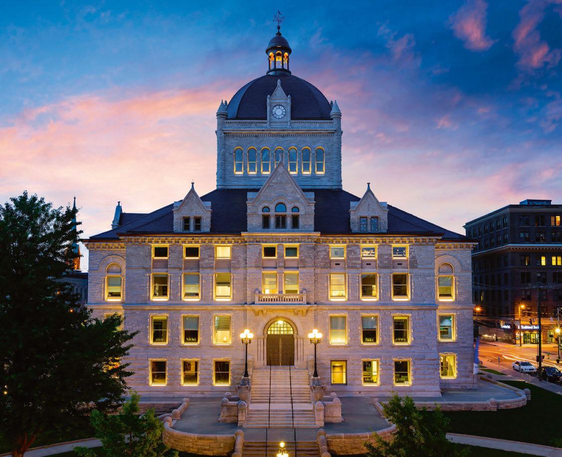
Fayette County Courthouse, Lexington, USA (Image: Tim Furlong Jr)
OUTLINE
An ultra-miniaturized 24V system that seamlessly fits into every architectural space.
Shape your ideal layout.

reggiani.net
acknowledged that while people enter into the world of lighting through a broad spectrum of backgrounds, coming from graphic design was relatively unusual. “Lighting is a field that attracts people from several backgrounds, but from graphic design is rare.
“I was willing to learn on the job, and graphic design was a good foundation, but it also gave me an edge. Additionally, my passion for design and ability to communicate and present ideas through the graphic design skills was an asset.
“I was also fortunate to have had the opportunity to work with talented and kind colleagues that have inspired me.”
After 12 years at Illuminationworks, Ferentinos moved to a new position as Associate at QODA Light at the turn of the year, a move that he describes as a “natural part of my progress in the industry”.
“As the adage goes, timing is everything. The opportunities with QODA Light and Illuminationworks both came at the right moments in my life. I like to challenge myself to see how much better I can be, and how much more I can accomplish, so I’m excited to have this opportunity to take what I have learned into my career path and make many more successful years ahead.”
2023 also marks 20 years since Ferentinos first made the jump from graphic design into lighting. Looking back on his career so far, he hopes that his journey can act as an inspiration to young, emerging talent.
“I never imagined that I would be in the industry for 20 years and it is an achievement. I hope I brought passion for lighting, creative ideas, enthusiasm, and good mentoring to the teams I
work with, especially to the young designers.
“It is not in my nature to seek the spotlight; however, I am ambitious, and always try to go the extra mile. This is essential for me, otherwise I lose interest. I have achieved a lot of my goals, but learning is never ending in lighting.
“I think that with a willingness to learn, anything is possible. My biggest advice would be stay curious, stay passionate. The creative industry is more collaborative these days and has opened up more opportunities for creatives with diverse skillsets and interests. People are making the leap into lighting design regardless of their backgrounds.”
Looking ahead, Ferentinos is fully focused on his new position at QODA Light. “They are working on some exciting projects, which I cannot wait to get involved in,” he said. “I hope the future holds another 20 years of creativity and collaborations with innovative designers.”
www.qodaconsulting.com
Top: ROOM by Antony Gormley, The Beaumont Hotel, London
(Image: Nick Ingram)
Bottom: 21c Museum Hotel, Oklahoma City, USA
/ 061
(Image: Chris Cooper)
060
“James Turrell said ‘we create the reality in which we live’. This resonates with me when I think about my approach to lighting. ”
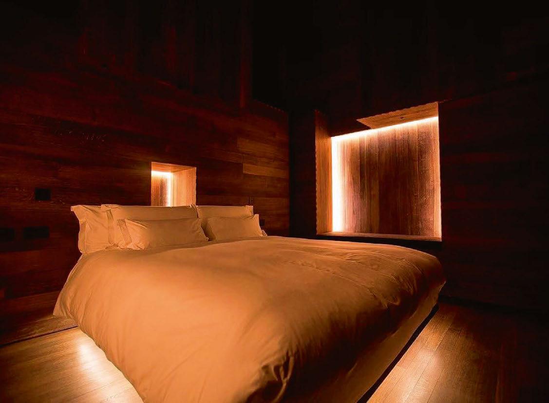

TALKING WITH... PANOS FERENTINOS
Aria Retreat & Spa Lake Lugano, Italy
Overlooking Lake Lugano in northern Italy, the Aria Retreat & Spa is a showcase of five-star hospitality. Set in a 14,000sqm subtropical park, the new resort features five restaurants and swimming pools, tennis courts, a fitness centre, a private beach, a 1,500sqm wellness centre with swimming pools, a spa, a lounge bar and 15 exclusive suites, each with a terrace overlooking the lake. The architectural design, by Milan-based R4M Engineering, saw lighting play a major role from the outset; under precise instructions from the owner, the concepts of freedom, light, and air formed the basis for the development of the entire complex, which required stateof-the-art lighting to connect the various spaces, while highlighting the resort as a new landmark on the lake. The lighting project was entrusted to Light+Arch Consultancy, with architect and lighting designer Giorgio Colombo at the helm, having worked with the owner from the outset to create a charming and striking atmosphere. Throughout the resort, exclusive and elegant spaces interpret a new concept of luxury, furnished with elements of design and works of art, skilfully blended with customised lighting fixtures designed specifically for the project to welcome guests and make them feel pampered. One of the most striking elements of the resort comes in the connecting tunnel, leading from the hotel to the park. This 50-metre tunnel is entirely underground, running within the mountain itself, and was designed as a unique, experiential environment that, from the moment of entry, leads guests to lose all sense of space and time. This element is completely bathed in light, where the illumination creates sensations, emotions, and perceptions through a painstaking study of its movement within and through the saturation of colour.
To create this vibrant and immersive experience, Colombo utilised Linea Light Group’s Xenia RBG, Beret, and Rubber 3D Pixel fixtures, washing the space in a rich, saturated play of colour. www.lightplusarch.it
062 / 063
eye opener
 Image: Andrea Martiradonna
Zuma Mykonos Mykonos, Greece
A new lifestyle concept combining a restaurant, bar and lounge, infinity pool, day beds and DJs, Zuma Mykonos has been given a warm, luxurious lighting design, courtesy of Into
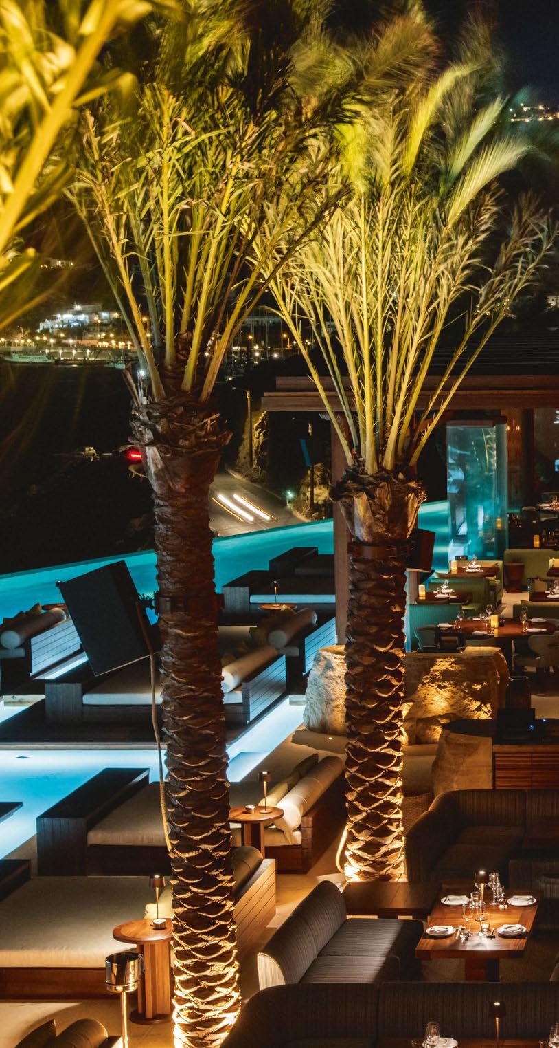
064 / 065
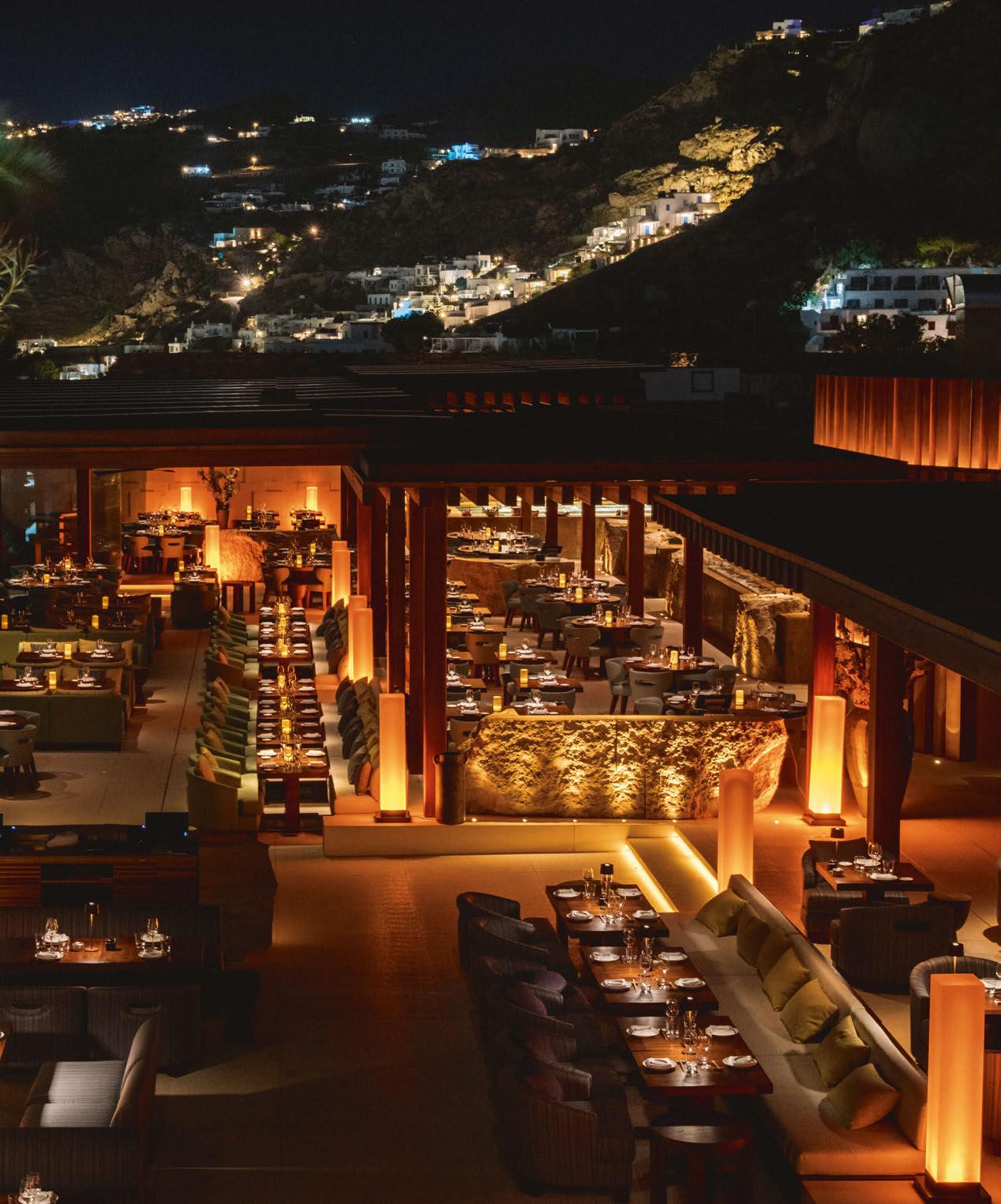
HOSPITALITY LIGHTING
n recent years, Mykonos has fast become a travel hotspot, with tourists flocking to the island to visit its luxurious resorts and bask in the Aegean sun.
One of the latest desirable destinations on the island is Zuma Mykonos. Part of Azumi’s awardwinning global restaurant group, Zuma Mykonos is a new lifestyle concept – a creative, multi-purpose destination that features a restaurant, lounge and bar, infinity pool, day beds and resident DJs.
To bring life to this unique destination, lighting designers at Into were appointed by Azumi to work alongside interior and architectural designers Studio Glitt to realise their combined vision for the lighting design.
Into has worked as a lighting consultant on a number of Azumi projects over the last decade.
Darren Orrow, Director at Into, recalls the original brief for their latest collaboration at Zuma
Mykonos: “The client and interior designer had a clear vision for the lighting concept. The brief was to use lighting to create a dramatic and warm ambience, enhancing the incredible landscape in which the venue sits, while not distracting from the breath-taking views.
“Food and beverage preparation areas were to be theatrically lit and the materials and textures of architectural design highlighted. Dining areas were to have high quality light sources to render the beautifully presented food well.”

With this in mind, the lighting concept was based around using light, darkness and shadow play to highlight spaces, finishes, textures and the dramatic natural landscape both within and surrounding the venue.
“The lighting creates a feeling of excitement and drama as you approach Zuma from the private approach road, taking you on a theatrical journey as you navigate through the entrance walkway and into the different areas for dining, drinking, lounging, or dancing,” Orrow explained.
To enhance the relaxing and intimate ambience, lighting was specified in a warm colour temperature, with fixtures deliberately kept at low level with low glare. This also proved to be an important consideration to ensure that the lighting doesn’t impact on the sunset views across the Aegean seascape.
Johanna Paice, Lead Project Lighting Designer explained: “We ensured that there were multiple layers of light to provide depth, definition, and warmth. The lighting is focused and intentional, all light sources have a purpose, and the warmth of the light matches the tones of the sun as it sets. Cohesion between the surrounding areas and the lighting was very important, highlighting and enhancing, while not distracting from the view.” Throughout the space, Into looked to use integrated lighting details as a means of bringing the interior architecture to life. A warm CCT of 2200K illuminates the surfaces, while a slightly cooler 2700K has been used to illuminate the tables and open kitchen areas, where it was important to showcase the colour and vibrancy of food. Tables are always illuminated, either through ceiling spotlights or battery powered table lights. Within the louvred ceilings, surface mounted spotlights with a tight beam angle were used to create drama and focus.
Elsewhere, the pool features linear lighting treatments under the beds to create a halo effect, with wide beam angle spotlights recessed into the nearside pool wall, shining out towards the sea –again, a deliberate move to have minimal impact on the incredible sea views.
While Zuma Mykonos offers visitors beautiful views out to the Aegean sea, it has an equally impressive entrance, sitting at the base of a cliff face; carved into the rock, the venue is surrounded by a rugged landscape. The lighting designers saw an opportunity to bring an added element of theatricality to the space here, choosing to illuminate the “dramatic backdrop” of the cliff faces. In order to determine the right fixtures, output and colour temperature for the job, Into conducted scale mock-ups at a cliff location in the UK. Once the right fixtures were selected, they were shipped to Mykonos for a client mock-up.
The entrance walkway to the restaurant is also lined with natural cliff faces and beautiful wall structures. “These are lit with a mixture of uplighting and downlighting techniques to create wonderful light and shadow play on the textured surfaces. These lighting techniques follow through on the natural stone walling within the venue,” Paice added.
066 / 067
I
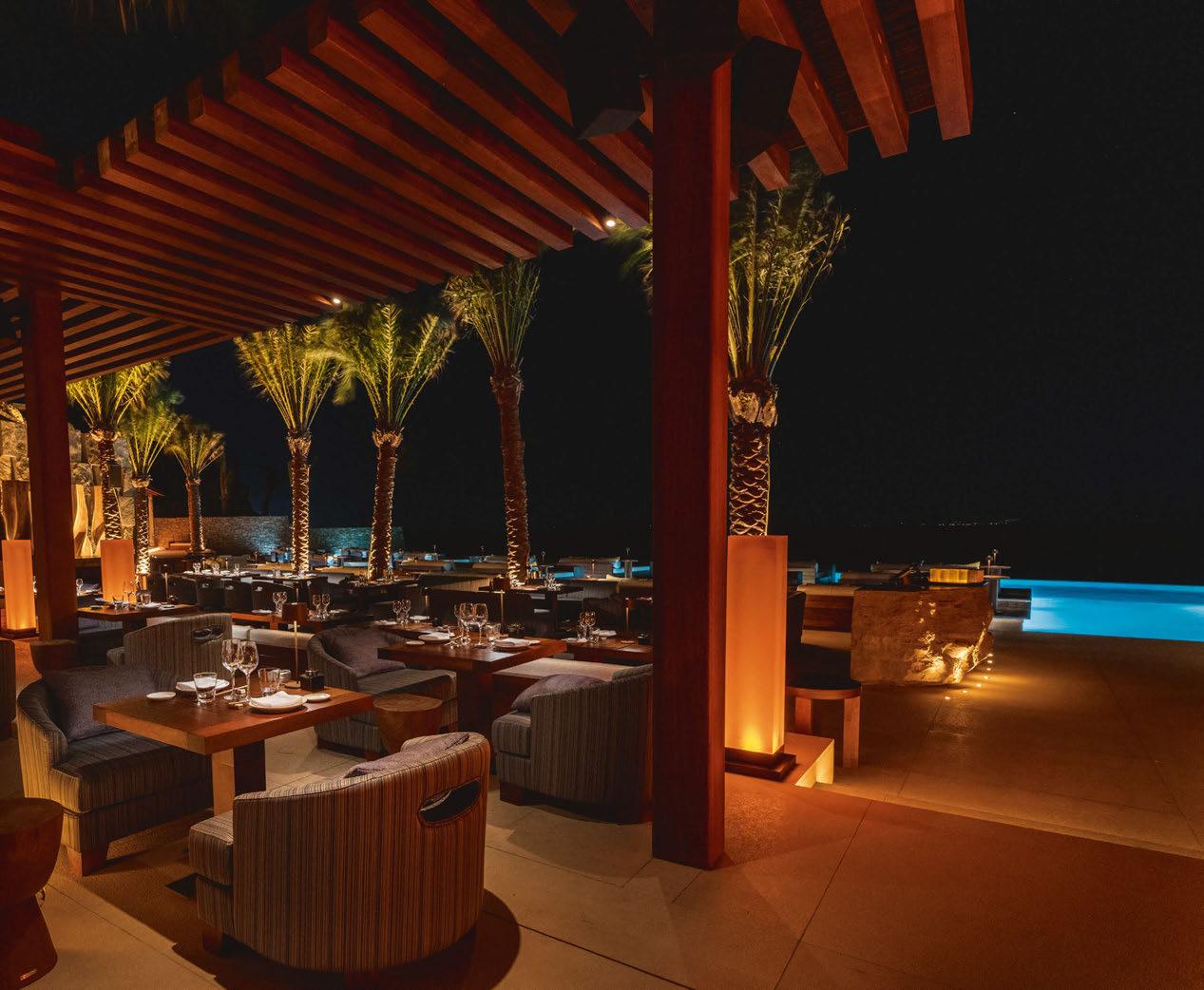
HOSPITALITY LIGHTING ZUMA MYKONOS
Client: Azumi
Lighting Design: Darren Orrow, Johanna Paice, Duncan Hamilton; Into, UK
Concept Architect: Studio Glitt, Japan
Local Architect: Liakos Architects, Greece
Lighting Suppliers: Bright Special
Lighting, eldoLED, Electron, Hoad & More, Linea Light Group, Meyer, MP Illumination, Osram, Soraa, Wibre
Photography: Rusne Draz
Exact locations for the uplighting details were a challenge for the design team, as all the stone was quarried specifically for the site. According to Paice, this meant that it was difficult to know the shape and size of the stone until it was on site, which affected the offsets and locations of fittings. Across the restaurant, Orrow explained that there were a number of architectural lighting treatments that “form part of Zuma’s DNA”. “These are implemented in each project where relevant, further to this each site is unique, as are many interior architectural elements. Our role as lighting designers is to realise a dramatic lighting concept in harmony with the architecture and landscaping, while honouring Zuma’s brand DNA.” Throughout the design process, Into worked closely both with concept architects Studio Glitt, and local implementation architects Liakos Architects to realise a coherent scheme that would sit in harmony with the wider architectural design of the space. Orrow continued: “The architects were integral in ensuring lighting details were correctly implemented on site, and in assisting with the selection of local light fixture suppliers and distributors.”
While Zuma sits in such a beautiful location, it was integral to the client that the restaurant have a lighting design to match – complementing while not overshadowing its surrounds. Orrow believes that Into has achieved this goal, stating that he is “over the moon with the end result”.
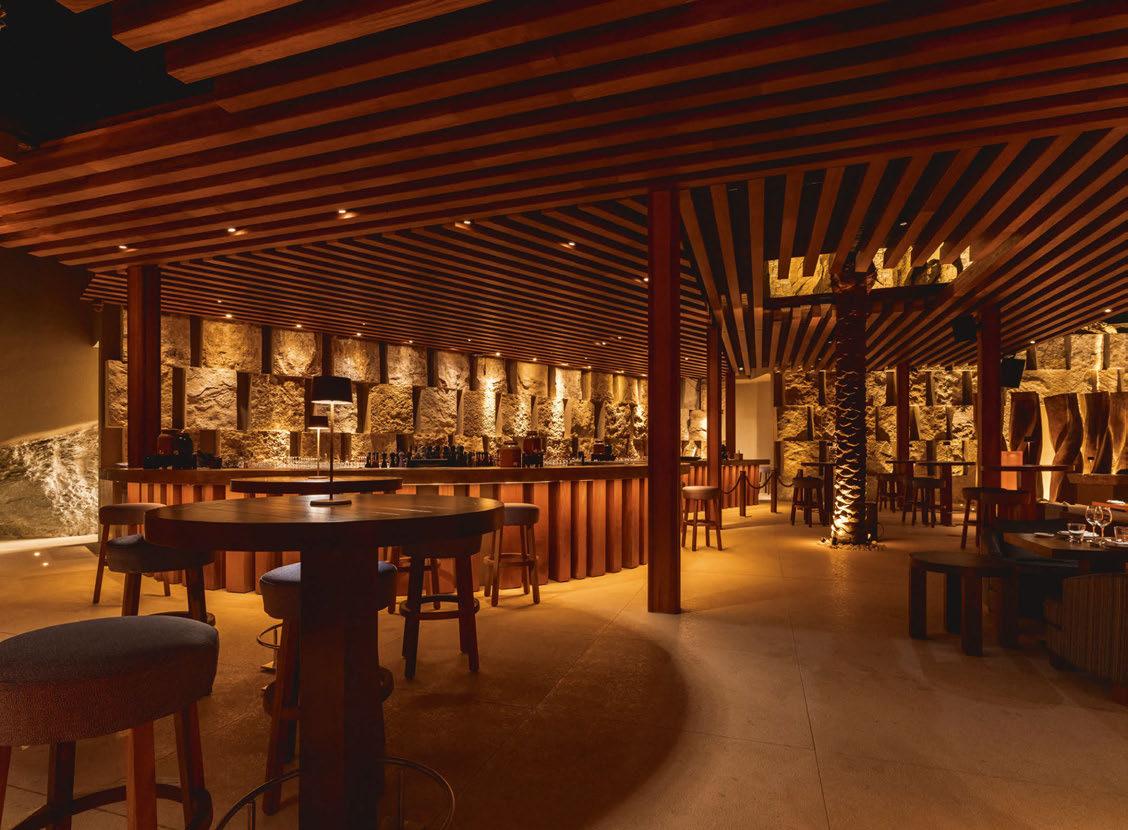
“The lighting looks fantastic, and is testament to a wonderful client putting their trust into the different design principles,” he said. “Zuma has a wonderful ambience in which to relax and enjoy the incredible food, music, and breath-taking views. The lighting concept helps accentuate the Mediterranean and Cycladic elements with the exoticism of Zuma. The rocky background and the spectacular view creates a unique atmosphere for fine dining.”
www.into.co.uk
068 / 069 HOSPITALITY LIGHTING ZUMA MYKONOS
UNDERWATER LIGHTING
ALWAYS AT THE HIGHEST LEVEL
Certified stainless steel spotlights for safe and attractive experience of well-being in private and hotel pools as well as spas and thermal baths. Performance and sustainability in one.

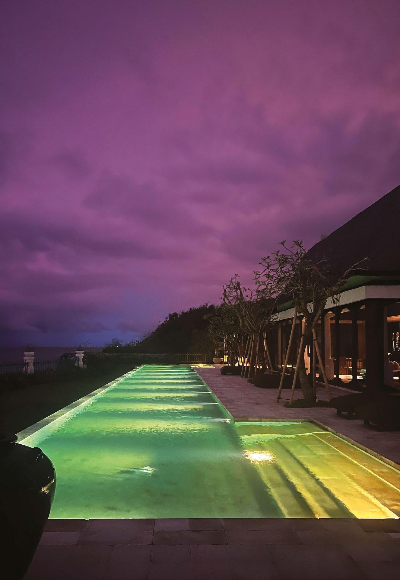
MADE IN GERMANY. SINCE 1919. WIBRE Elektrogeräte Edmund Breuninger GmbH & Co. KG 74211 Leingarten · info@wibre.de · +49(0)7131 9053-0 Presidential Villa, Jumeirah Bali, Indonesia Partner: PT SINAR TEKNIK, Medan, Indonesia WWW.WIBRE.DE
Frescohallen Bergen, Norway
A new lighting design from Zenisk helps to beautifully showcase the heritage aspects of Bergen’s Frescohallen restaurant.
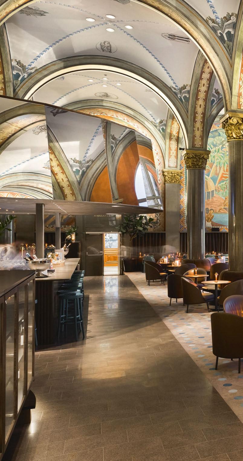
070 / 071

HOSPITALITY LIGHTING
ocated in the heart of Bergen’s city harbour, Frescohallen offers a visual, as well as a culinary feast for patrons. The late Classicist style building, designed by Frank Wilhelm Schiertz in 1861-62 has been transformed into an exclusive restaurant, with the help of Swedish architects Claesson Koivisto Rune. Steeped in heritage, the restaurant has a significant historical impact as its walls are adorned with a series of frescoes, painted by Axel Revold in 1923. These depict Bergen as the centre of the worldwide fishing trade, forming a major work in his production and beginning an era of Norwegian monumental painting that lasted from 1918 to 1950.
As visitors enter Frescohallen, they are immediately enveloped by the grandeur of the space. The frescoed walls are divided into a series of arched bays, each separated by six-metre-tall marble pilasters. A large, round bar is part of the new design, and sits at the centre of the room; its ceiling and top seating is covered in mirrors that reflect the monumental walls beautifully.
The lighting for this grand restaurant was designed by Zenisk, with the goal of showcasing the splendour of the room and highlighting the frescoes, while providing a comfortable light for diners.
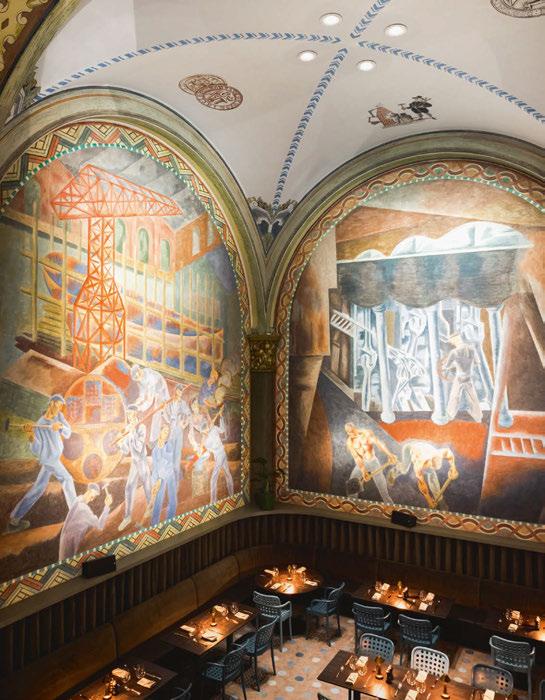
Kristin Bredal, Director at Zenisk, said: “Our goal was to create an immersive experience, where guests will feel surrounded by art and Bergen’s rich heritage, counterpointed by the bold, contemporary, sharp design, with a special attention to the dining experience.”
With this at the forefront of their focus, Bredal and the design team of Bao An Pham and Janja Franeta wanted to develop a lighting scheme where the historic and the new design are separated and yet married with each other. “There is a wonderful soft tension in the room where the frescoes would present themselves in a soft light shining from the outside, while all the new features have an integrated light,” Bredal explained. The hope was that this would give visitors a sense of awe on arrival, and the feeling of being enclosed by the art pieces during the dining experience.
Bredal explained how this concept was actualised: “Our approach involved exploring different ways to light the frescoes without too much intervention on the existing architecture. This allowed us to conceal the light as much as possible without interventions on the existing listed building. We managed to reuse existing cable electrical conduits and mounting holes, keeping the design fully reversible.”
Per the original design brief, the frescoes take centre stage, with no other architectural features illuminated. All the other necessary luminaires are integrated into the physical design; minimal, fully concealed lighting is used to support movement and task functions in interior elements like the bar, stairs, deck, and vitrines.
Bredal continued: “Particular attention was paid to reproducing the frescoes in the best possible way through a careful study of lux levels, focusing, and colour rendition, with small spotlights mounted on column capital tops. The room and dining experience should be luminaire-free, with no glare and other architectural lighting noticeable. Additional downlights were placed in each vault, refitting existing holes – these provided a layer of general functional lighting to the floor area. The large circular mirror bar was left glare-free from direct sources, reflecting the frescoes and surroundings beautifully. It works in synergy with the artwork, amplifying the experience and visual quality of the space.”
Keeping the mirror bar free of glare was a unique challenge for the lighting designers, as Bredal continued: “Any mirror represents a huge “risk” for light sources to get reflected and cause unwanted glare. As this is a 360°, tilted mirror, we had to make sure that no spotlight for the fresco was reflected on it. This was first simulated in detail on software, with additional adjustments made during focusing.
“Part of the brief was to preserve the space as much as possible, which is the kind of challenge we love to solve,” Bredal continued. “This
L 072 / 073 HOSPITALITY
LIGHTING FRESCOHALLEN


074 / 075
requirement guided us to find the best possible concept and challenged us to figure out the technical solution for it.
“The decision to go for minimal, fully concealed fixtures was a challenge, as the mounting positions on the columns’ capitals were all at different distances from the artworks, and often at an angle. We had to carefully study and design each one in depth to find the spotlight amount, beam angle, and mounting order first through software simulation, and then during on site testing.” With large windows across one side of the restaurant, the space is flooded with natural light during the day. The space is used around the clock, serving as a breakfast spot in the morning for the adjoining Bergen Bors Hotel, before becoming an all-day restaurant and lounge in the evening. The plentiful daylight is utilised to the full as the mirrors above the bar reflect daylight into the room. The minimal architectural lighting looks to complement the natural light during the day, while adding to the ambience after dark.
The lighting design therefore forms an integral part of the wider design language for Frescohallen. Bredal explained how Zenisk worked closely with Claesson Koivisto Rune: “The architectural design is bold, and brave, and the lighting supports both the new and the historical.
“The frescoes have bravely been illuminated and brought to the foreground of the dining experience, leaving everything else to be in support of them and not taking attention away.”
Since its opening, Frescohallen has been receiving plaudits both from the design community, and from the general public, becoming a must-visit attraction in Bergen. It is through the hard work of the design team involved that such an outcome has been reached. It was not without its challenges, but Bredal is very happy with the result. “Despite the many unknown factors that arose during the project, the simulations and testing helped us stay true to the initial concept and its
bold approach,” she said. “We were fortunate to have a client and architects who understood the importance of lighting for the best possible experience.
“Today, we are delighted to see the ‘wow’ moment in people’s eyes as they experience the space and its lighting. The lighting design has exceeded our expectations and fits perfectly within our initial plans.
“The lighting design elevates the ambience of the space by creating a visual hierarchy and emphasising the dominance of the monumental frescoes. The lighting guides the guests’ perception of the room, transforming it from a bright and airy space flooded with daylight to a more intimate and immersive experience. The lighting not only enhances the dining experience, but also contributes to creating a truly unforgettable moment for guests.
“It was an honour for us to be part of the design team responsible for bringing this important heritage site of Bergen back to life.” www.zenisk.no
Client: Oddfjell Eiendom and De Bergenske
Lighting Design: Kristin Bredal, Bao An Pham, Janja Franeta; Zenisk, Norway
Architect: Claesson Koivisto Rune, Sweden
Lighting Suppliers: DGA, Erco, Louis Poulsen, Lyskomonenter, Nortronic, Reggiani, Wästberg
Photography: Alex Coppo
HOSPITALITY LIGHTING FRESCOHALLEN
Studio Frantzén London, UK
A rich, warm scheme from Lighting Design International helps to emphasise the grandeur of Harrods’ new Studio Frantzén restaurant.

/ 077
076
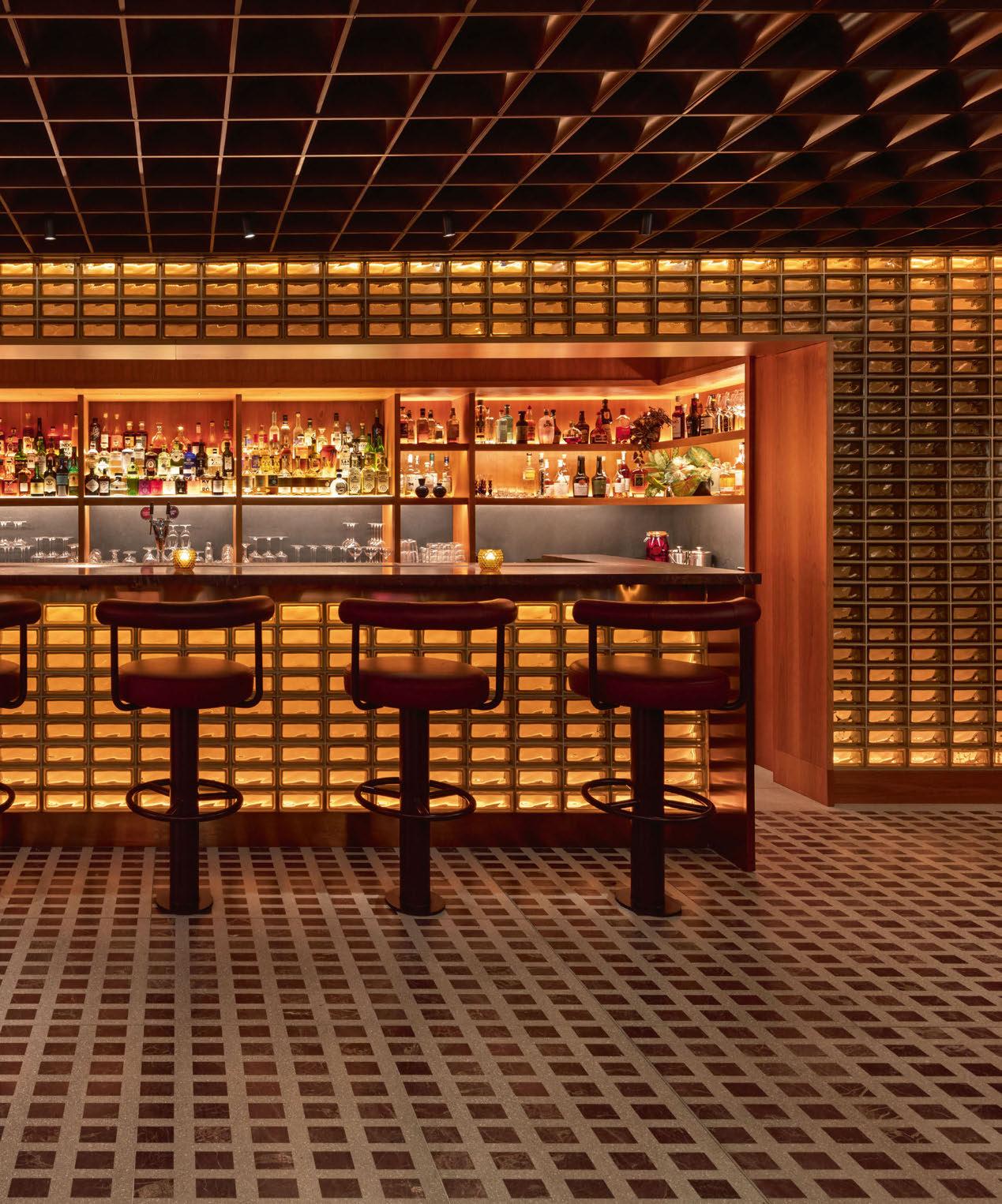
HOSPITALITY LIGHTING
Studio Frantzén is Björn Frantzén’s newest restaurant, serving the Swedish chef’s critically acclaimed Nordic gastronomy with Asian influences. Located at the top of Harrod’s in London, the restaurant’s décor is a luxurious and contemporary interpretation of Scandinavian design.

The restaurant and bar offers an immersive, experience-driven atmosphere, serving lunch and dinner at the top of London’s iconic department store. Entering the restaurant from the store, visitors are instantly transported from luxury retail to fine dining.
The restaurant, with interior design by Swedish designers Joyn Studio and lighting designed by Lighting Design International, is an auditorium of Nordic energy, spreading from the impressive double-height atrium to the roof terrace overlooking London’s skyline.
In the atrium, the lighting emphasises the grandeur of the space with sophisticated concealed lighting and a bespoke feature chandelier. In the bar and restaurant lighting creates a warm, calming and intimate atmosphere. Striking cherry wood panels in the atrium are complemented by colour-tuneable linear LED to harmonise with the timber and changing daylight, warming up for added luxurious deep dimming in the evening. All other linear LED is high-colour rendering 2300K extra warm white, with high levels of bespoke
detailing to conceal the light sources from view. Feature lighting and table lighting boasts precise optics, glare control and meticulous dimming, providing further comfort for the guest while subtly highlighting the highly curated art, interior design, and food, presenting the restaurant’s vibrant character.
Bespoke fittings were developed for the atrium chandelier, mezzanine sconces and terrace festoon system, raising intrigue in the more challenging volumes and adding to the restaurant’s unique ambience. The bespoke atrium chandelier was developed in collaboration with the design team following a concept design provided by Swedish designers Front. The fitting was manufactured by Northern Lights and uses dimmable 2W French tip candle lamps, slightly recessed into the tube to give the impression of real candles floating in the space. With some candle forms pointing upward and some pointing down, the chandelier is an elegant abstraction of a traditional candelabra, bringing intimate, warm, heavy dimmed feature lighting to the space. The chandelier’s maintenance was considered in detail, ensuring all lamps can be reached for simple maintenance and the lamps are E14 mains voltage LED for easy replacement and lamp life. On the lower arms of the chandelier, additional narrow beam chrome finished spotlights were added to pin spot the central dining tables below.
078 / 079
HOSPITALITY LIGHTING STUDIO FRANTZÉN


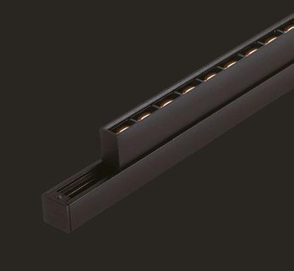


Client: Frantzen Group
Lighting Design: Graham Rollins, Christian Haimes; Lighting Design
International, UK
Architect: Woods Hardwick, UK
Interior Design: Joyn Studio, Sweden
Lighting Suppliers: DGA, John Cullen Lighting, KKDC, LightGraphix, Precision Lighting, Stoane Lighting
Photography: Andrew Beasley
Photography
On the mezzanine a ceiling array of bespoke hammer textured disks provides a warm ambient glow by reflecting the light from the crown silver lamp sources. These disks are also visible from the main atrium, ensuring customers viewing from below see an interesting ceiling scape of decorative lighting, rather than looking up into downlighting. As the terrace roof is retractable for fair days, a suspended catenary lighting system was developed in collaboration with Stoane Lighting. The bespoke globes are made from polished acrylic and have a central frosted core to diffuse the light and bring a depth effect to the acrylic shade. The system also includes a family of low glare downlights that provide spotlighting to the walkway. All fittings are fed on a suspension-by-suspension basis by a single power cable, keeping wiring to a minimum but still allowing two control channels per wire for dimming globes separate to downlights. The light sources are 2400K contrasting against the sky and bringing a cosy atmosphere to the terrace during the evening.
Throughout the restaurant, dramatic focus and considerate lighting control creates the correct ambience day and night across the restaurant, despite varying effects of daylight, use of spaces and architectural challenges. Each space embodies its own distinct personality and lighting level or treatment, but the spaces all exude the same qualities of lighting focus, drama, warmth and luxury.
Guest experience and dramatic focus were a prerequisite to the restaurant’s lighting design, and this ambition went hand in hand with reducing wattages via dimming for sustainability, allowing Lighting Design International to be very selective about what features were lit and to what intensity. This made the lighting scheme not only comfortable but also efficient, using highly controlled lighting optics for feature lighting, allowing lighting to be contained to the tables or features without light spill, reducing the wattage required to build the layers of light and theatre of the space.
The lighting control system also allowed the designers to dramatically lower lighting levels through the day from an appropriately balanced day scene to a very low and dramatic ambience in the evening, ensuring features are never over lit, and energy usage is minimised through considerate lighting control. Lighting for the restaurant was carefully specified to ensure appropriate fitting wattages were used and that fittings were delivering the light with efficiency relevant to the desired lighting effect. The bespoke chandelier, bespoke mezzanine sconces and bespoke terrace festoon lighting system were all designed with sustainability in mind, with all parts replaceable on site and manufacturing and assembly in the UK.
www.lightingdesigninternational.com
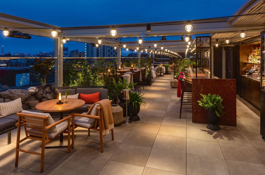
HOSPITALITY LIGHTING STUDIO FRANTZÉN 080 / 081
New compact range additions
COMPACT SIZE, HIGH PERFORMANCE

The compact range has been designed with the knowledge that we have collated from the success of our high-power products. This has allowed us to integrate the same technology, LED engines and features into more compact sized fittings capable of impressive outputs. Delivering between 400lm-600lm, these highly configurable new additions join our existing compact downlights and include our first track mounted fixing option (LD233) and a modularised LD141 inground uplight family.
Scan the QR code below to learn more about the Compact range or visit www.lightgraphix.co.uk

LD233
LD141DR
LD141X
LD141Y
LD238

082 / 083 HOSPITALITY LIGHTING
Waldorf Astoria Lusail Doha, Qatar
The latest, luxurious addition to the Waldorf Astoria portfolio has opened in Doha, Qatar, with a lighting design from Nulty that enhances the five-star aesthetic.
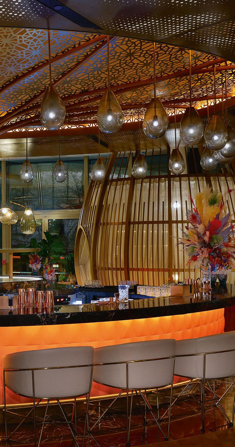
panning 66,300sqm, the Waldorf Astoria Lusail is an expansive, 5-star retreat on the east coast of Doha, Qatar. Home to 429 guest rooms, villas and apartments, eight restaurants, and an ESPA Life spa, the site offers a premium resort for visitors to the Arabian Gulf. Lighting designers at Nulty collaborated with a team of creatives on the design, working with global multi-disciplinary design firm WATG on the architecture and landscape, and Wimberly Interiors, David Collins, and Pierre-Yves Rochon for the interior design.
The Waldorf Astoria brand is synonymous with luxury and elegance, so everything from the architecture and interior design, through to the lighting, had to be seamless. Gary Thornton, Associate Lighting Designer at Nulty, explained the intricacies of the studio’s original design brief.
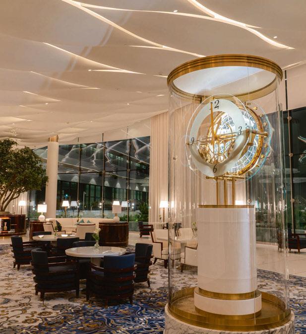
“We focused on using light to improve the way that guests perceive and experience the resort,” he said.
“In a lot of the schemes, this meant integrating light to reinforce the overall visual aesthetic. When luminaires are visible, it’s deliberate and designed to create permeability. Light is the intangible element that changes the look and feel of each scheme. Guests don’t necessarily see the lighting, but they see the surface it interacts with and feel its influence as they move from space to space.”
Although on the surface appearing as an “outwardly simplistic” lighting scheme, the design response for the resort was quite complex, as the team had to consider the entire composition in order to maintain a beautiful and consistent quality of illumination throughout the resort. They then used layers of light to give each individual space character, while ensuring that each space worked within the overall scheme.
Thornton continued: “Working on such a vast scheme gave us the latitude to be creative and experiment with different techniques. In Peacock Alley, you can’t help but look up at the illuminated, peacock-inspired ceiling because light has been used to create a ‘wow’ moment, whereas elsewhere, the lighting is low-key and plays a supporting act to the landscape.
“It was a balancing act; our lighting design is responsive to every context and each individual environment.”
Outside, façade illumination has been used to build a sense of drama and discovery from the outset.
Bands of light follow the curves of the building to create a rhythmic flow of light that highlights the graceful form of the architecture. At landscape level, the team played with scale and intensity to ensure that atmospheric lighting is evident at every turn. High-level lighting emphasises dining terraces and swimming pools, while low-level illumination creates intimacy around seating areas and walkways. The exterior composition brings balance and visual cohesiveness to the resort, while improving permeability from one area to another.
“We brought the whole thing to life using layers of illumination and by balancing indirect and direct light,” Thornton explained. “For the exterior lighting, this meant playing around with scale and intensity. You can see it on the façade, where the bands of light highlight the architectural lines of the building. You feel it at landscape level with the mixture of high and low-level lighting. From a visual perspective, everything is composed; from an atmospheric point of view, light adds character and depth.”
Once guests step inside the hotel, a focus on discreet ambient illumination prevails in the form of minimalist lines of light in the ceiling and backlit panels, which lend the reception desk and café bar an ethereal quality. A similar design language was expressed in the guest rooms and suites, where cove lighting forms a soft backdrop, against which domestic-style luminaires are distinctly more visible.
Thornton added: “With the interior spaces, our design intent was to hero the decorative features and materials in each scheme. We were dealing with a lot of hard and reflective surfaces and had to be very conscious of how light interacted with each finish. A lot of materials were backlit, which meant we had to do a lot of testing beforehand to see how light passed through that material.
“Another key consideration was how we used light to transform the ambience and aesthetic depending on the time of day. A good example of this is in Peacock Alley – an all-day dining area, it is a laid-back spot for breakfast one minute, then an
S 084 / 085
HOSPITALITY LIGHTING WALDORF ASTORIA LUSAIL
KURV-Y installed within domed vaulted ceiling cove
TIMI used within auditorium walkways and bar area
Lighting Design: BDP UK

Architect: Haworth Tompkins, UK
Photography: Philip Vile
A Star Reborn
Theatre Royal Drury Lane restoration project
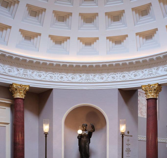


086 / 087
intimate setting for a romantic evening meal the next. We created different scenes to ensure that the lighting design responds to how the space is being used.”
Along Peacock Alley, lighting is integrated into the curved contours of the ceiling, creating a visual experience that elevate the dining experience. Italian dining concept Scarpetta takes its cue from a New York aesthetic, pairing Art Deco style fittings with ambient illumination hidden in the ceiling. Elsewhere, a chandelier in the private dining room, made of radiant strings of translucent Capiz shells that emit a soft glow, forms one of the resort’s key focal points.
In the resort’s beach club centrepiece, Sushisamba, the interplay of light and shadow brings a beautiful layer of artistry and intensity to the scheme. Cove and shelf lighting has been integrated into the canopy-style bar to create the illusion of dappled light filtering through the trees, while decorative pendants theatrically mark out the curvature of the bar. Lighting concealed in seating pods, decorative ceiling panels, and underneath the bar adds further contrast and character.
Upstairs, in the Highmore lounge bar, the lighting shifts to reflect a change in tempo. Coffer illumination and diffuse lines of light around the bar evoke a moody ambience, which extends out onto the rooftop terrace, where warm lines of light below planters, pendants, and tabletop lanterns, form cosy pockets of illumination around seating areas.
With so many different areas, each with their own unique feel and qualities, Thornton explained how the lighting contributes to the variety of the resort: “Each lighting scheme was given its own unique brush stroke for depth and personality. When you arrive at Sushisamba, you instantly feel like you’ve been transported into a laid-back beach bar, so the illumination is softer and more atmospheric. “Our team had a lot of fun playing around with light and shadow to bring character and contrast to the scheme. We integrated tonal changes in the canopy-style bar through dynamic cool to warm light to create the illusion of dappled light filtering through the trees, and used decorative pendants to create a rhythmic play of light around the bar. “The spa is another good example of how lighting design helps to switch up the mood and set the decorative tone. The lighting is much more playful and theatrical to heighten the experience. We created a fibreoptic ceiling in the men’s pool, with the sole intention of making it feel like you are swimming beneath the night sky. In the gym, we changed our approach and used radiating lines of light to create a striking – and quite unexpected –visual feature.”
However, in amongst the different schemes, Thornton believes that there is a “unifying element” to the lighting that works on both a visual and practical level, pulling guests through to each destination.
Although the desire was to create a lighting scheme throughout the resort that was relatively simple in appearance, Thornton added that this brought with it some challenges, particularly when it came to testing fixtures and creating the concealed, seamless finishes. “Simplicity is often hard to get right, especially when the execution must be flawless,” he said. “We were meticulous about testing the quality of luminaires beforehand and experimenting with different finishes and effects. The only way to really understand how different materials will respond to light sources is to test them, so we really took the time to get this right.
“Integrating the lighting was one of the most challenging elements of the project, because it required a high level of coordination with the architect and interior design teams to get it exactly right. We also had to carry this level of detail through to site, where quality of workmanship was essential, particularly when it came to backlighting materials and concealing light in some of the more ambitious design features.”
The attention to detail from Nulty has contributed enormously towards reinforcing the sense of luxury and enhancing the overall ambience of the site – a factor that was of particular importance to the client.
“For a high-end brand such as the Waldorf Astoria, there is an expectation of elegance and quality, which is more about the feeling that you get from the space, rather than a particular style. It’s why the ambience was so important in this project, and why the lighting design plays a big role in influencing the way that guests emotionally connect with the scheme,” Thornton added.
As such, Thornton believes that the lighting scheme across the hotel has been integral in the project’s success, and also goes a long way to showcasing the impact that a good lighting design can have.
“The Waldorf Astoria Lusail is a great example of how lighting design can be both the unsung hero and the defining factor in an architectural scheme. In some instances, light is there to reinforce the interior design and architecture, with everything working symbiotically. Elsewhere, lighting helps to create standout moments. It’s an amazing project in this respect because the lighting design achieves both visual continuity and surprising elements of drama,” he said.
“With any five-star hospitality scheme, there is an expectation of quality, ambience and exclusivity that must be met. The thoughtful simplicity of our lighting scheme helps achieve this by using flow and finesse to elevate the guest experience in a distinctive and memorable way.”
www.nultylighting.co.uk
Client: Waldorf Astoria Hotels & Resorts
Lighting Design: Gary Thornton; Nulty, UK
Architect: WATG, UK
Interior Design: Wimberly Interiors, UK; David Collins Studio, UK; Pierre-Yves Rochon, France
Lighting Suppliers: Astro, LightGraphix, RCL, UFO, Tryka
HOSPITALITY
LIGHTING WALDORF ASTORIA LUSAIL

088 / 089
Cullinan Golf Resort Hotel
Belek, Turkey
Across its varied restaurants and entertainment venues, Line Lighting Design has used light to contribute towards a unique atmosphere at the Cullinan Golf Resort Hotel in Belek, Turkey.
irst opened in the summer of 2022, Cullinan Golf Resort Hotel is located in the Antalya Belek tourism centre on the coast of the Mediterranean Sea.
A new, luxury brand of the Titanic Hotels Group, the resort, which primarily serves as a golf hotel, also offers different experiences for guests with its various restaurants and entertainment venues.
Turkish design studio Line Lighting Design carried out the architectural lighting design of the hotel public spaces, which included the lobby, Irish pub, restaurants and common spaces.

Mustafa Akkaya, Founder of Line Lighting Design, explained that the conceptual approach for the lighting was to “create a unique atmosphere”. He said: “This uniqueness was created by accentuating some of the special architectural details with lighting. Our overall concept was to create a warmer, friendlier atmosphere in the general lighting scenario.
“The emphasis of architectural elements and the interaction of different materials with light, which are among the main ideas of the lighting design concept, created a holistic and perceptual difference in many points of the project.”
Facilitating this warmer ambience, the lighting designers preferred a warm white CCT of 2700K throughout. Although considering the
variety of different functions and the purpose of usages at different times of the day, the entire lighting system was planned to be controllable and dimmable.
One of the most important considerations for the lighting designers when creating the interior lighting schemes was to keep glare control and eye comfort at the highest level, while providing sufficient light levels in the lobby gallery space. While a decorative pendant extending across the gallery space provides the main focal point, this is complemented by double narrow beam angle downlight fixtures hidden between the wooden lamellas on the ceiling, which provide a sufficient level of illumination on the floor. Akkaya continued: “Mostly, indirect illumination with some concealed lighting fixtures is provided to accentuate the architecture, while the decorative luminaires brought the identity to the space, and the Play of Brilliants effect. In order to balance the lighting layers and human perceptions, we have tried to keep the light levels with a lower contrast, and support these with some other technical lighting fixtures.”
Throughout the project, Line was in close contact with Aybak Architects to develop the overall design, with lighting supporting and underlining the architectural details. When it came to the varied restaurants across the resort, Akkaya explained how the lighting
HOSPITALITY LIGHTING
F
Client: Titanic Hotels Group
Lighting Design: Mustafa Akkaya; Line Lighting Design, Turkey
Architect: Aybak Architects, Turkey

Interior Architect: Artmim, Turkey
Exterior Architect: Melek Düvenci
Architects, Turkey
Lighting Suppliers: Airled, Emfa
Photography: Mustafa Akkaya, Cullinan Golf Resort Hotel
assisted in accentuating each venue’s individual character. “Each restaurant type has a different identity in terms of design and function. By taking into consideration each function, and the architectural language of the space, we have tried to create different scenarios to give the feeling of varied spaces and experiences to the guests. “Different scenarios were created by different lighting typologies, such as direct or indirect illumination, or different light beam angles to highlight some specific points. At the same time, we have created different light level scenarios by dimming some groups of lighting fixtures.”
In other restaurant spaces located in the exterior part of the hotel, architectural accents are supported by lighting, with general illumination in the restaurants provided indirectly with a soft light effect.

One of the resort’s defining spots is the Galapagos Club; a snack bar by day that transforms into a club after dark, its organically formed architectural structure stands out with its arching wooden roof. This is accentuated further thanks to the exterior illumination.
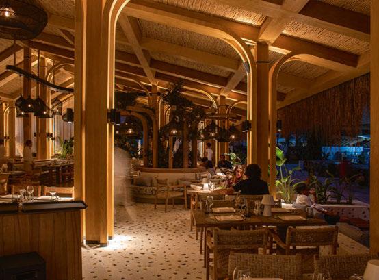
In order to support the organic form of the building, concealed linear lights in its different layers, and underneath steps in the space, emphasise the entire architectural structure, while at the same time providing the general illumination of the space with lights reflected from the floor. With a tight turnaround time to complete the project, Akkaya explained some of the challenges
that arose: “We had some difficulties during the site supervision due to the time schedule. It was very tight, and there was a lot of furniture integrated and inground uplight luminaires to be coordinated with furniture companies and site workers. We got a little tired during this process, and some details didn’t turn out exactly as we wanted to as a result.” However, he is still satisfied with the finished project. He stated: “My overall impression is very good; we worked and coordinated very well with the site in order to realise all the design ideas. There are only a few points missing compared to our initial plans, however they do not affect the overall design that much.
“Therefore, I find the result to be a success. The lighting design brings a spirit to the space, and it is a very important element in giving the resort its character.”
www.lineld.com
090 / 091
HOSPITALITY LIGHTING CULLINAN GOLF RESORT HOTEL
Explora® Halo
Explora® Halo
Designed and manufactured in the UK by Hacel the exclusive Explora® Halo Pendant luminaire is the artistic choice for producing a lighting statement. Displaying a homogenous halo of enlightened luminance, it showcases a translucent yet reflective design, offering direct and indirect lighting and a choice of lumen outputs, delivering up to 9750 lumens. The Explora® Halo is available in three sizes and allows for flexibility in creating inspirational mixed compositions or used as a single, sophisticated focal point to optimise surrounding architecture and create a unique aesthetic. Colour changing options are available in the Explora® Halo Spectrum.
All luminaires can incorporate the latest Bluetooth control platforms, offering intelligent, wireless lighting control.

www.hacel.co.uk

The Cut and Craft Leeds, UK
The Cut and Craft is a luxurious bar and restaurant in Leeds’ Victorian Quarter, and sits within a prestigious Grade II listed building.

The site was the location of the former Collinson’s Café, which regularly hosted band leader Wallace Hartley – well known for his position as Band Master on the Titanic. Used as an underlying design concept, the luxury of the Titanic and the craftsmanship involved, combined with nods to oceanic colours, textures and its metallic qualities, was the inspiration behind the interior design of The Cut and Craft.
Lighting design studio Mistry Lighting worked closely with Studio Two interiors to highlight the original architectural features of the building, while also adding layers of lighting to create drama and impact, drawing attention to the richly detailed elements; the building is a playground of architectural character, from stained glass windows to grand staircases and embossed columns. The grand ceilings lend themselves to the suspension of large bespoke pendants that invite visitors through the space to a circular bar at the heart of the building. A combination of beam
angles to the dome highlights the architectural window frames that encompass the intricate dome, while creating a focal point for visitors to acknowledge the restaurant’s beauty and history. The integration of lighting was key to the success of the project. Being a listed building, there are many limitations to where lighting can be installed. Mistry Lighting therefore worked closely with Studio Two to discreetly house lighting within bespoke joinery details, so that features could be illuminated, while respecting and celebrating the original details of the building - bar shelves are backlit to showcase elegant glasses and bottles, while under counter lighting casts a golden glow along the standalone bar; the use of ambient lighting in the seating areas beneath the central dome bathes guests in a warm, golden glow that harks back to the romance and luxury of the Titanic’s iconic décor. The result is a dynamic and creative lighting design, illuminating opulent features and rich decorative hues for a space that is impactful, atmospheric, and meets the brief perfectly to bring the history and luxury of The Cut and Craft to life.
www.mistrylighting.com
092 / 093
eye opener
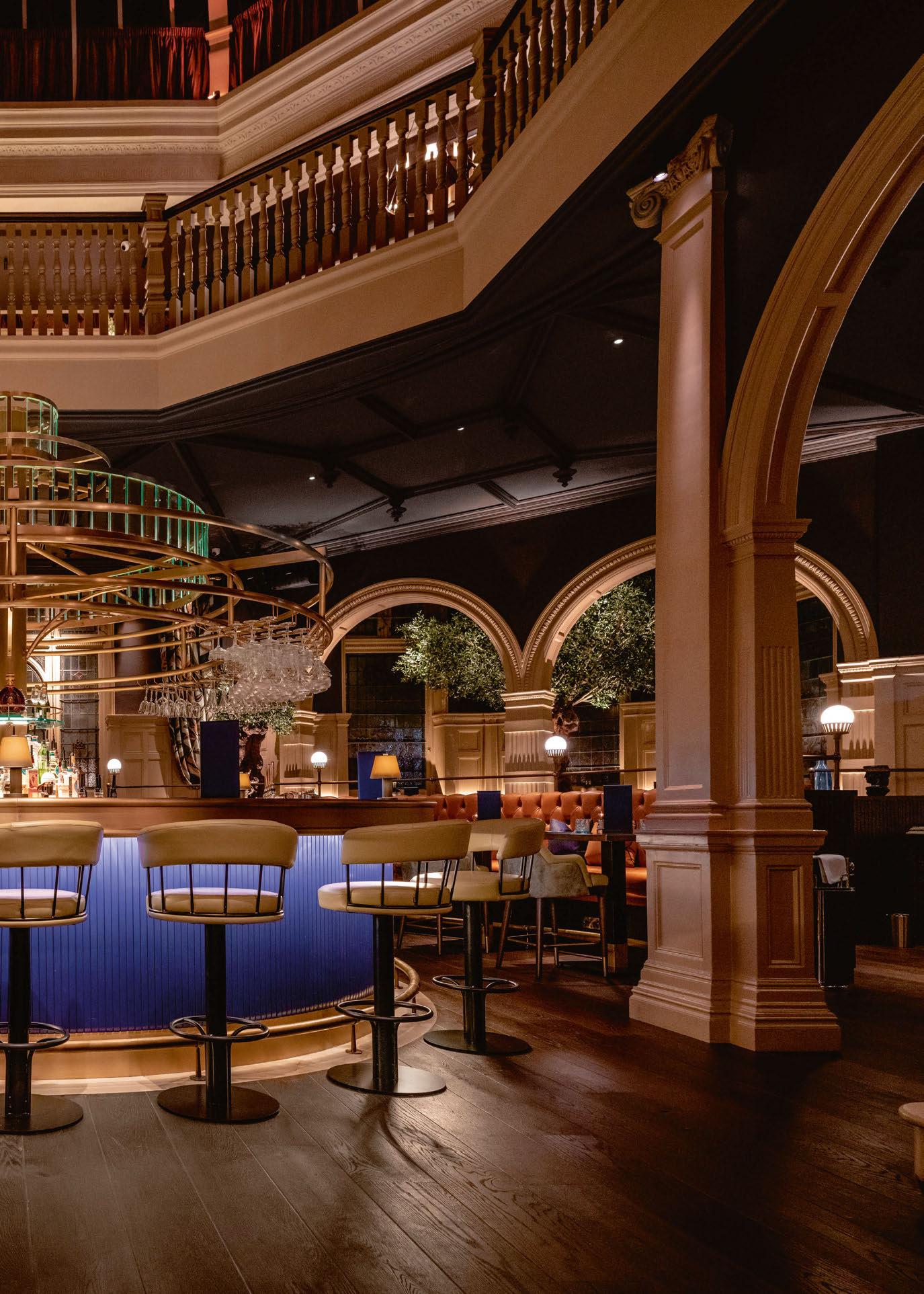 Image: Stevie Campbell
Chic Nonna Dubai, UAE
Opened in August last year, Chic Nonna brings the traditional familystyle hospitality of Italian cuisine to Dubai. The opulent restaurant is illuminated with luminaires from LEDFlex
Nestled in the heart of Dubai’s International Financial Centre, Chic Nonna opened its doors in August last year, furthering the reach of the original restaurant, heralding from Florence, Italy; arguably the home of warm, traditional family-style hospitality. This leisure destination features opulent dining and private lounge areas that exude the personality of a grand villa at every level.
The lighting brief was to expand on the design touches one would expect to find in a classic historical Italian residence. The lighting had to ensure that zones within the space could be controlled and maintain their own personality as the key desire was to transport guests from the hectic environment outside to the tranquillity of a Mediterranean sanctuary.
Specified by lighting designers Vinod Pillai and Lara Janessa in coordination with the interior design team at LW Design Group Rachel Kidd and Jesper Axel Petersen, the LEDFlex range played an integral part in this project. Custom lengths of Nano Flex and Ultimo Neon 16 Silicone have been used throughout to highlight shelving, cove recesses and stair risers. Guests are welcomed to the venue via the ground floor lounge, which has an open plan layout with designated areas. There is a residential style bar counter leading to the restaurant space and outdoor deck.
The interiors are adorned with nostalgic architectural Italian features, including shelves and alcoves integrated with LEDFlex linear light fittings. Bespoke joinery sits alongside hero art pieces hung on the walls for an extra ‘wow’ factor. LEDFlex luminaries were concealed into the intricate
joinery and wall details to ensure a glare-free environment. By virtue of its small size being 4mm wide, the Nano Flex was the perfect fit as it did not compromise the woodworking details and provided superior visual comfort. The colour temperature was specified at 2700K which complemented the overall warm ambience of the space and binds the theme together.
This premier offering brings together authentic Italian culture, glamour, and award-winning cuisine to the UAE. The customer journey is meticulously planned, giving guests a seamless experience where lighting has been used to indicate themed areas including a dance floor being home to live entertainment for the DJ and jazz sets. A ‘molecular’ glass chandelier spreads across the large bar creating a stylish retro statement allowing functional, entertainment and architectural linear lighting to work cohesively together.
The results of this project are stunning and testament to LEDFlex being the designers’ choice for hospitality applications.
www.ledflexgroup.com

094 / 095 case study
HOSPITALITY LIGHTING
Image: Acoulite

Four Seasons Hotel Sultanahmet, Turkey
Redi Lighting seamlessly contributes to the unique blend of historic charm and modern comfort at the Four Seasons Hotel in Sultanahmet, Turkey.
Nestled in the heart of Istanbul’s Old City, Sultanahmet, lies a tranquil sanctuary that has stood the test of time. The century-old neoclassical home, a Roman-era building, offers a unique blend of historic charm and modern comfort.
Surrounded by the mystical waters of the Sea of Marmara and the Bosphorus, the 65-room Four Seasons Hotel is just steps away from the Blue Mosque and Hagia Sophia, two of the city’s top historic attractions.
Designed to be a calming oasis that provides guests with an elevated Four Seasons experience, from the moment visitos arrive, they are enveloped in a sense of peace and tranquility, far removed from the hustle and bustle of the city outside. One of the highlights that cohesively contributed to the environment is the “insideout” atmosphere of the restaurant space through these principles, that were taken into account by ZKLD lighting design studio. Unlike modern buildings, historical buildings require special attention to preserve their unique character and texture. ZKLD understood that any work done on a historical building’s lighting system equipment must be done with great care and must not damage the building’s historical texture. All lights used were chosen for their inconspicuous nature and ease of installation and maintenance. After careful consideration, ZKLD chose Clear Lighting for its exterior lighting needs. With more than 20 years of experience in designing, manufacturing, and supplying LED Flex Linear lights, the products were the perfect choice for the hotel.
During the preliminary testing and trial installation, the lighting designers found that Clear Lighting’s LED Flex Linear lights complemented the hotel’s style perfectly and seamlessly blended in with the historical surroundings.
ZKLD chose to focus on cove lighting on the surface, which creates a holistic experience of the space. The cove lighting was carefully placed throughout the restaurant to drive guests right into the middle of the space, while also seamlessly blending in with the natural light from the outdoors.
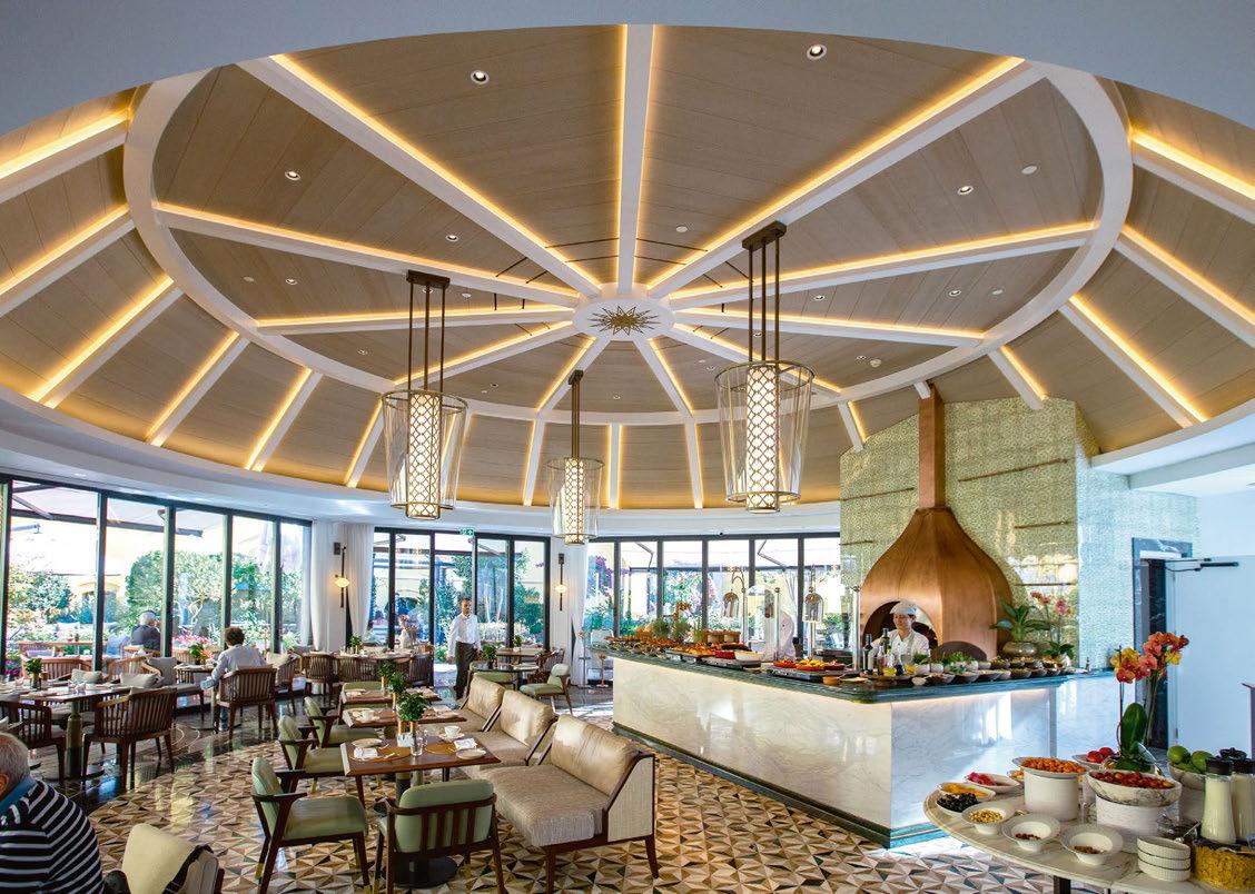
The lighting adds depth and dimension to the space, creating an inviting and cozy ambience. The placement of the LED flex affords natural light from the outside and meshes it seamlessly with indoor lighting. Creating a beautiful transition from the exterior to the interior of the restaurant gives diners the feeling of being in nature while still enjoying the comforts of an indoor space.
www.redi.com.tr
www.zkldstudio.com
www.clearlighting.com
096 / 097 case study HOSPITALITY LIGHTING
Barrisol ® solutions for hospitality lighting




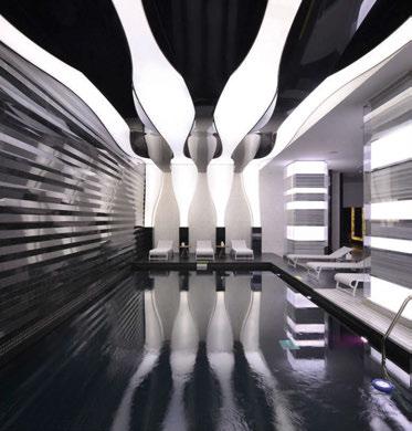

Barrisol® is the world leader in stretch ceilings for over 55 years. Barrisol invites light into all interior spaces with its Acoustic Light®, Light Lines®, Light Bands, ELT 3D®, Print Your Mind® and Clim® solutions... The Barrisol® stretch ceiling is also 100% recyclable.
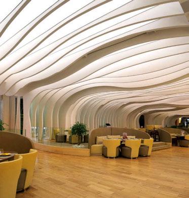

INDOOR AIR EMISSIONS
LEDs Arch.: Hakan KÜLAHÇI Barrisol Light® 3D
100% Recyclable Reusable
shapes
Barrisol® Print Your Mind® Light® Arch. Francesco Adobati Arch. : DYD Interiorismo Chelo Alcaniz
lamp
Lovegrove for Barrisol® Realisation Barrisol Kordekor Barrisol® Print Your Mind® Light® www.barrisol.com Lighting Solutions Arch. : ATÖLYE A MimarlıkAyhan GEVELİ Barrisol® Mirror® Acoustic Light® αw up to 0,80 Raalisation : Njorden et ATYX Barrisol Light Lines® Acoustics® αw up to 0,80 Arch. DGM&Associés Barrisol® Print Your Mind® Light® Barrisol Light Strips Arch. : Alia AlghunaimDesign Manager : Mabanee Company S.A.K Arch. ATÖLYE A MimarlıkAyhan GEVELİ Barrisol Acoustic Light® αw up to 0,80
Manta
by Ross
SLS Dubai Hotel & Residences Dubai, UAE
One of Dubai’s tallest residential buildings, the SLS Dubai Hotel & Residences features lighting controls from Lutron
Among the city’s tallest residential buildings, the SLS Dubai Hotel & Residences celebrates luxury to the fullest in the heart of downtown Dubai. Offering 254 hotel rooms, 321 hotel apartments and 371 branded residences, the property is situated over 75 floors. Opened in 2022, Aedeas served as the project architect and interiors were completed by Paul Bishop Design. The building’s striking honeycomb façade serves as a dynamic point of differentiation, while the modular construction of each unit permits breathtaking views of the city below.
In keeping with the theme of sparing no luxuries, the property looked to Lutron as a key part of its premier design-led amenities programme. The Sky Lobby with double-height windows features striking custom Lutron drapery. Draperies adjust as needed to maximise daylight, protect from heat and glare and set the scene each evening with dramatic skyline panoramas.
The SLS Dubai Hotel and Residences relies on Quantum by Lutron to enable smarter, more advanced building operations – and the power and ease to control over 10,000 devices. Controlling
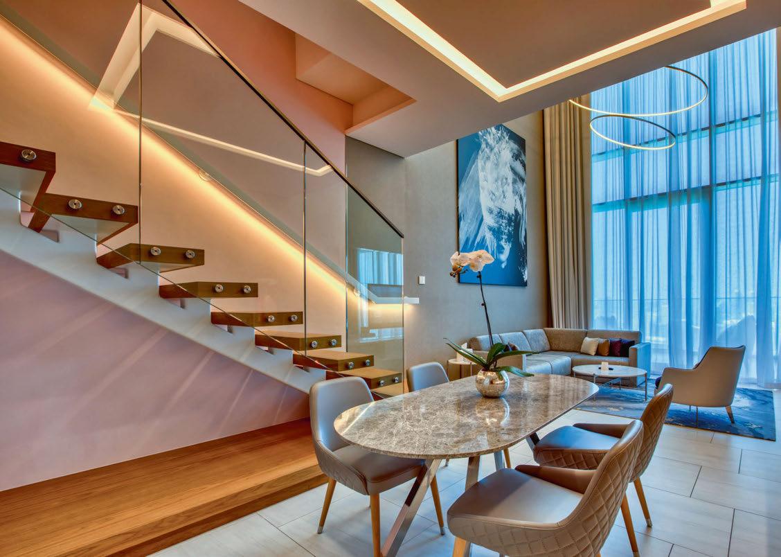
everything from lighting, shading, advance programming, and energy management from a single platform, it’s an ideal option for a hospitality property, as it allows for control of multiple settings and nearly unlimited spaces, controlling lighting, shading and energy management - lobby, restaurants, corridors, lounges, spa, gym, meeting rooms, event spaces and other public areas. Additionally, Quantum allows for unlimited options for customisation, including keypad aesthetics, sensor types and integration capabilities. Offering the ultimate in personalised control, Lutron’s myRoom enables guests to customise a room to their liking. Through the single, comprehensive myRoom system, guests can easily adjust lighting, shading and temperature with ease. A seamless addition to the interior, the all-important bedside “master off” control allows guests to turn off lights and close shades from the comfort of their bed.
www.lutron.com
098 / 099 case study HOSPITALITY LIGHTING
Motive Outdoor
Light as Artistry
We believe that great design should stand the test of time, be sustainably crafted, and be proudly American made. Motive : The moment the design of the object and its illumination become one.
Designed by Justin Champaign
Landscape Forms | A Modern Craft Manufacturer

John Reed Fitness Centre Trieste, Italy
A 1930s bank in Trieste, Italy, has been transformed into a gym that combines training, music, and art. Lighting for the space was provided by Linea Light Group
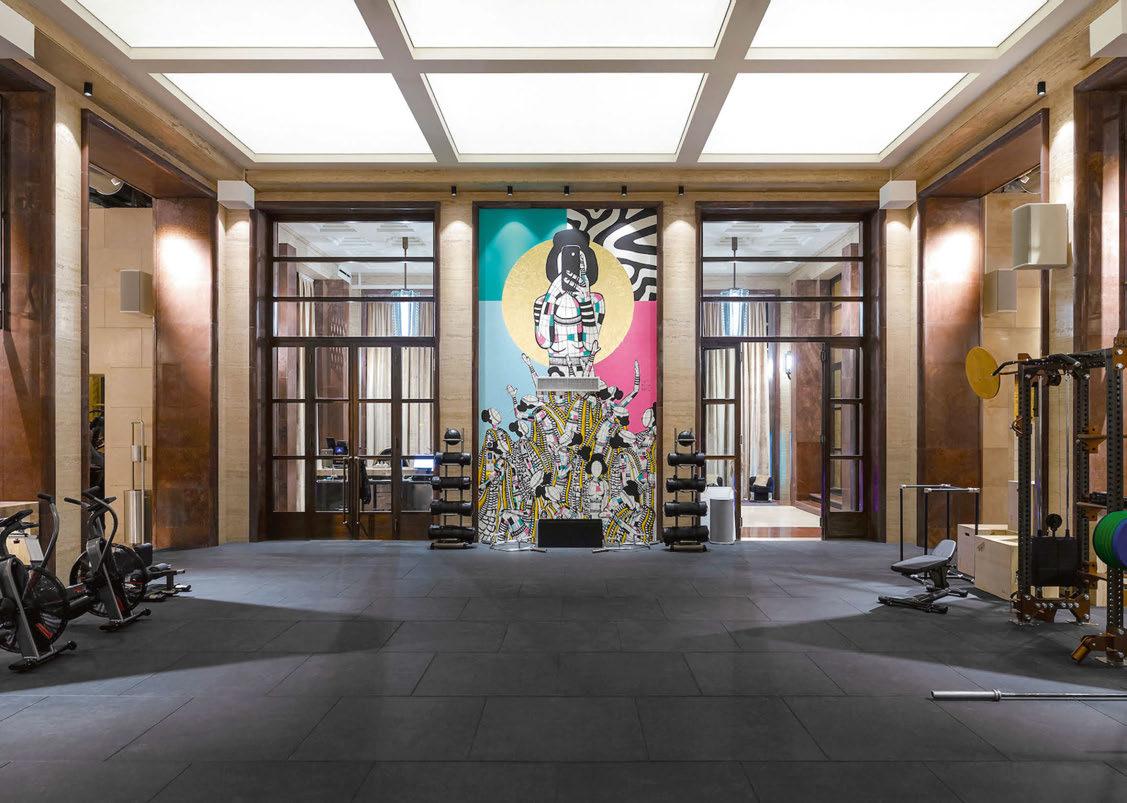
In the Italian city of Trieste, the historic Bank di Napoli building has been transformed into an innovative new gym that combines training, music and art.
The historic 1930s building has undergone an impressive redevelopment, using an intense study of light as a key aspect to its design. Linea Light Group fixtures were chosen to harness the architectural details, emphasise the history and the overall experience.
Owned by German company RSG group, the John Reed Fitness Centre looked to honour the bank’s historical interior, with the renovation based off three essential aspects: light, art and design.
The redevelopment entailed repurposing the old bank’s features while using lighting to highlight the historical details. Linea Light Group was the perfect fit for the project due to its high performance and low energy consumption products that can also generate that yesteryear atmosphere. For example, the original helical marble staircase has been enhanced with the brand’s Tu V suspensions. The vertical tubes descend at different heights from the ceiling within a circular structure of golden chains, with the feature providing an Avant Garde kind of elegance that rings true with the 1930s atmosphere.
Another repurposed original feature is the vault, fittingly renamed “the gold room” after the golden mosaics on the walls that were added to honour the treasures that once resided in there. Now used as the weight room it required a small but highperformance light body due to the thick ceiling and walls. Quantum R downlights integrate with
the architecture perfectly with their deep optical compartments and soft lines. Alongside this, directed towards wall and ceiling, Fylo+Surface4 system gives light and emphasis to the whole room. Finally, completing the lighting design are the Optus T track mounted projectors, which are used in several rooms in the building to illuminate art on display and highlight particular details. The grand marble entrance has been emphasised by replacing the original neon tubes with Mini-Tube linear components. The marble counters on the same floor have been converted into a restaurant and bistro; here, Ribbon High Flux LED strips in the grooves of the counters create a suspended effect, while Optus Ex projectors illuminate artwork behind the counter. Ultimately it gives a harmonious effect thanks to the maintenance of the same chromatic rendition and colour temperature.
Other notable features include the dimmable Ribbon LED strips used to backlight the Barrisol ceiling in the ground floor fitness room, creating a natural outdoor effect. This lighting feature changes through the course of the day in a circadian pattern to suit different training offered throughout the day. To create an even more evocative atmosphere, Baton R spotlights have been installed above the marble columns to illuminate them with precise lighting.
Throughout the revamped John Reed Fitness Centre, lighting has fundamentally been used for functional purposes, while also enhancing the retro aesthetic.
www.linealight.com
100 / 101 case study
HOSPITALITY LIGHTING
Image: Christiandeklic Photography
Innovative & Simple!
PROLED PROcover Optics


THE PROCOVER OPTICS ARE AVAILABLE IN 5 VERSIONS. MOUNTING IN THE PLASTIC COVER TAKES PLACE IN A FORM-FIT MANNER BY SLIDING IN.
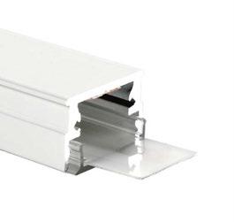
proled.com
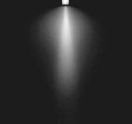


 PROcover Optics beam narrow PROcover Optics duo narrow
PROcover Optics duo wide PROcover Optics asym narrow PROcover Optics asym wide
Ocean Surfers Paradise, Australia
A control system from Pharos Architectural Controls helps the new Ocean tower complex in Australia’s Surfers Paradise shine.

Surfers Paradise is a beautiful hotspot set on Australia’s Gold Coast. Loved by residents and tourists alike, the suburb offers stunning scenery, water sports, family fun and a thriving nightlife. The area boasts many exclusive residential dwellings, with the latest addition to the beachfront recently being completed. Ocean is a striking 76-storey apartment and leisure complex with uninterrupted views of the Pacific, standing proud as the second tallest building on the skyline. The luxurious development is home to a large number of private residential apartments, as well as a five-star hotel, a retail precinct, and on-site café. A residents-only area that is accessible 24 hours a day is located on level 33 and features a gym, sauna, and community space.
A dynamic façade lighting scheme is a key element of Ocean’s stunning appearance after dark. Integrated solutions provider bluebottle was appointed to the project by electrical and communications contracting specialists Blue Star, to supply and commission this lighting design. bluebottle allocated a skilled team to the project; Associate and State Manager Nick Gilbert, Associate Manager and Technical Sales; Flinn Ryan; and Associate and Technical Sales Claire Enoka. Together, they delivered the lighting façade using Color Kinetics and Pharos Architectural Controls solutions. The scheme encompasses a ring of Color Kinetics’ compact Graze fixtures on both the Level 33 amenities floor, and a crown of light on Level 76 of the Ocean building. All of these are controlled by a Pharos Designer LPC 2 (Lighting Playback Controller 2).
The award-winning Pharos Designer LPC provides complete flexibility for controlling DMX and eDMX protocol fixtures, including KiNet for this project. With renowned reliability, it delivers powerful lighting and show control solutions in a robust and compact enclosure. Programming with Designer 2 software provides integrators such as bluebottle with a versatile, comprehensive feature set they can trust will support them to realise even the most demanding lighting installations.
Nick Gilbert, Associate State Manager at bluebottle said: “Ocean is a stunning addition to the beachfront at Surfers Paradise, and offers an incredible place to live and visit. Pharos is our go-to partner for projects like this, because we know they can meet the scale of the project and work with us to navigate any challenges we may face.”
Tony Symms, Regional Sales Manager for Asia Pacific at Pharos Architectural Controls added:
“We’re always thrilled to have bluebottle choose Pharos for their projects as they are true collaborators. The illuminated façade of the Ocean development looks incredibly striking as darkness falls over Surfers Paradise, and our Designer LPC 2 offers full control, including the ability to adapt colours and timelines, to any dynamic scene.”
www.pharoscontrols.com
102 / 103 case study HOSPITALITY LIGHTING
NAVAR Series
The Future of Exterior Lighting
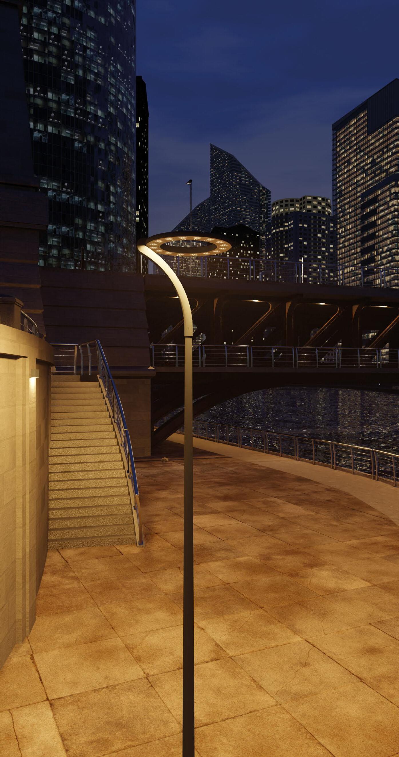
Blending circular economy values with maximised performance through bespoke optical packages, the NAVAR Series o ers 0% ULOR and up to 48m spacings.
With more than 280 unique configurations and full smart controls capabilities, this collection allows for complete project versatility.
Colour temperature variants, catenary, post top, side entry and bespoke bracketry opportunities, all with a marine grade finish and e icient output places NAVAR ahead of the competition.
www.kingfisherlighting.com Part of the group of companies
The Grand Magic Hotel Paris, France
Unveiled in September 2022, The Grand Magic Hotel re-imagines what it means to “be transported.” Developed over a twoyear period by multimedia studio Moment Factory and global investment manager Schroders, the property, located in the Paris region, immerses guests in imaginary worlds from the moment they enter.
The project fuses scenography, architecture, and multimedia to take guests on an unforgettable journey. Moment Factory was tasked with transforming the Hotel’s Lobby and Grand Hall.
The hotel’s multimedia-based transformation
was inspired by Moment Factory’s work in theme park attractions, and a goal of using themed entertainment to complement and enhance the hotel’s practical functions.
“Schroders’ mandate provided us with the opportunity to re-imagine the hotel experience by tapping into our expertise in themed attractions,” explained Thomas Pintal, Creative Director, Moment Factory. “Through multimedia scenography, we take visitors of all ages on an immersive journey.” Merging hospitality and entertainment, the hotel offers a 360° multimedia experience positioned to engage new and returning
guests throughout their stay. Upon arrival, guests are greeted by Mr. Maurice, the fictional owner of The Grand Magic Hotel, who comes to life in a digital portrait that hangs prominently above the Reception Desk. As guests explore the Lobby, they encounter ever-changing graphics that provide visions of the journey to come.
The hotel’s interior not only evolves throughout the day, but also over the course of the seasons, revealing wondrous surprises for guests to explore. These environments are brought to life through fantastical flourishes including architectural effects
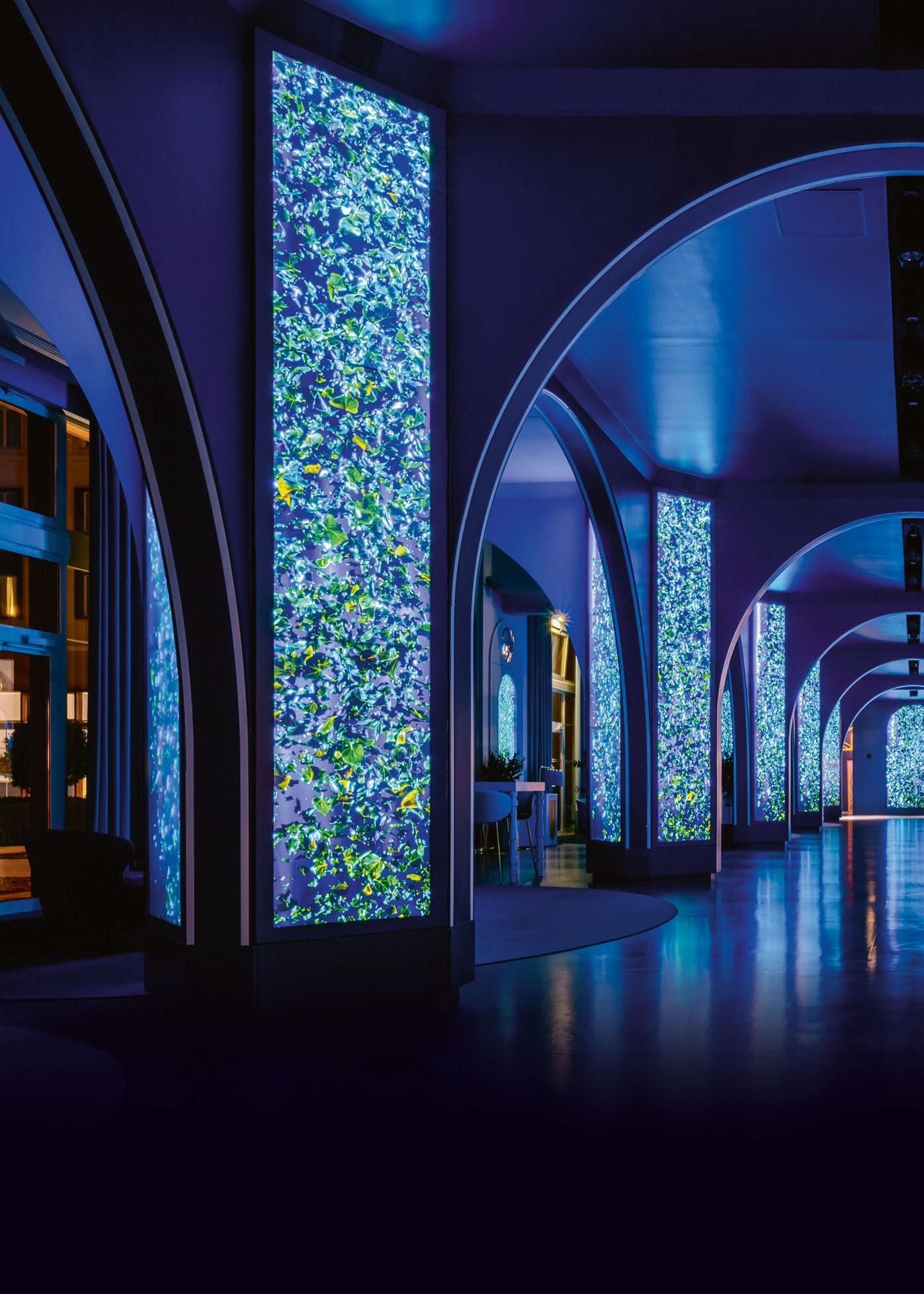
eye opener 104 / 105
and trompe-l’oeil illusions that blur the line between the real and the extraordinary. Come nightfall, the venue reaches the height of its metamorphic powers: the moment Mr. Maurice activates his enchanted elevator, guests are whisked away on a voyage into wondrous worlds.
Content overtakes The Grand Hall’s multimedia features to create an immersive experience. These illusory visuals are extended by the room’s impactful media columns and are supported by an original soundscape.
The multisensory adventure introduces
guests to four unique worlds: The French Garden, The Forest Pavilion, The Water Palace, and The Sky Gallery. Each world is an immersive multimedia show that unfolds over four acts, taking guests on a deliberately-paced journey that includes relaxing ambient sequences and entertaining show moments.
Moment Factory’s contributions to the hotel’s transformation include the creation of an original story world filled with unique animated characters and environments. Fusing lighting, soundscapes, technology, and digital content, the studio developed an
experience inspired by glamorous hotels and the majesty of French castles.
A primary goal was to encourage families and friends to spend time in the Hotel’s Grand Hall, where they can gather, enjoy themed drinks, and take in dynamic content. A seamless layer of multimedia and spatialised sound accommodates multiple viewpoints, ensures illusion from every angle, and fosters an emotional relationship between the guests and their surroundings. www.momentfactory.com
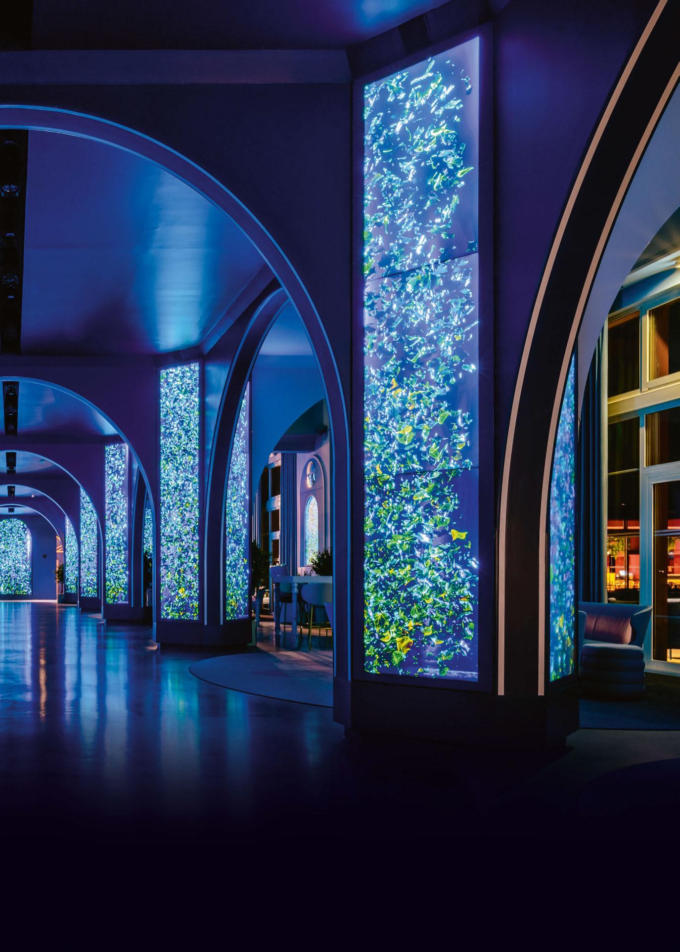 Image: Moment Factory
[d]arc awards
Winners of the 8th annual [d]arc awards were revealed this March at the highly-anticipated [d]arc night, held at the iconic fabric London nightclub.

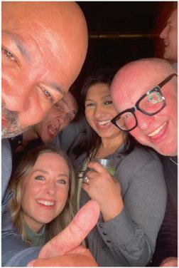
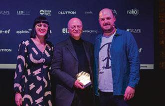
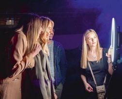


This March, the design community once again came out in force to support the [d]arc awards - the only peer-to-peer lighting design awards in the world. Held once again at the iconic fabric London nightclub, [d]arc night, the offical [d]arc awards party, welcomed more than 500 revellers, as the winners of the 8th edition of the awards programme were revealed.
Alongside the awards presentation, delivered by [d]arc media’s Helen Ankers and Matt Waring, guests enjoyed a series of light art installations (read more about these overleaf), two photo booths, sponsored by Linea Light, and UV face painting, vegetarian street food and an open bar, with the party carrying on until the early hours. The event was also live streamed by Light Collective on YouTube to the wider international audience.
This year, more than 17,000 votes were cast across the awards’ 14 categories, while 312 projects and 100 products were submitted. The global reach of the awards was evident once again, with entries coming from 40 countries around the world. This was also reflected in the winners, with winning
projects coming from as far afield as Japan, Australia, Thailand, China, Turkey, Norway, UK, and Sweden. Awarded the coveted ‘Best of the Best’ award for 2022 was Plas Y Brenin, UK by Dark Source, which also won the Spaces - Low Budget category. The ‘Best of the Best’ prize is given to the projet that recevied the most votes overall out of all the project category winners. Huge congratulations to Kerem Asfuroglu and Dark Source for this fantastic achievement.
[d]arc media would like to say a massive thank you to all of our design partners, sponsors and supporters, to everyone to entered a project or product into the awards, who voted, and who took part in the awards process this year. We would also like to say a special thank you to our production partners Streeem, and to Light Collective, who we couldn’t do the awards without.
More information about all of the winners will be available in a dedicated [d]arc awards supplement, which will be sent out digitally in the coming weeks. www.darcawards.com
106 / 107
Images: Gavriilux
Photobooth images courtesy of Linea Light Group





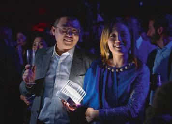

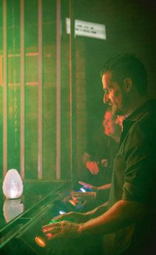

[D]ARC AWARDS
[d]arc awards installations
A popular feature of the [d]arc awards party, we once again saw a series of light installations created by design partners and sponsors. This year, 10 pieces were inspired by the theme of ‘Film’.
As well as revealing the winners of this year’s [d]arc awards, one of the core components of the [d]arc night party was once again the beautiful light art installations, created by supporting design teams. Each year, the design teams are given a theme around which to base their installations. This time around, that theme was ‘Film’. From interactive pieces that encouraged audience participation, to ornate, sculptural works, each installation was inspired by the world of cinema, whether that be unique take on a classic movie such as Alien, Batman, The Matrix, or Alice in Wonderland, or a tribute to the moviegoing experience.
As with last year’s event, one of the core parameters for the design partners was to make their works as sustainable and ecominded as possible. Part of the wider efforts by event organisers [d]arc media and Light Collective to make the night as carbon neutral as possible - an effort that included a
fully vegetarian, locally-sourced food menu, environmentally conscious alcohol brands behind the bar and no single use plastic on site - each design team had to provide a ‘Decarbonisation Statement’, outlining the efforts that they took to reduce their carbon footprint and create more sustainable works of art.
Methods employed by the design teams ranged from using recycled luminaires and compostable materials, to reusing or repurposing the installation for future events. Alongside the 10 installations created by supporting design teams, the awards party also featured two decorative installations from Signify and No Grey Area, as well as two sponsored photobooths from Linea Light Group.
LDI & formalighting - Bruce Wayne’s Bat Incident
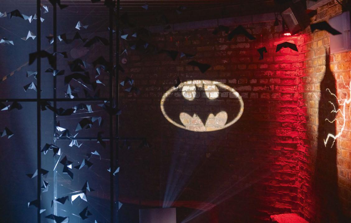
In Batman Begins Bruce Wayne falls down a well filled with bats, and when the colony is disturbed they swam up out of the well into the daylight, creating dramatic movement and shadow. The Lighting Design International and formalighting piece captures this moment with moving cool white lighting casting shadows through the installation’s bat swarm.
This instance in the film creates some of Bruce’s fear of bats, leading to him becoming The Batman to provoke fear in the criminals of Gotham city. In the distance, the ‘Bat Signal’ is projected into the sky and Batman arrives in the shadows.
dpa lighting consultants & ELRFourth Wall
The fully immersive Fourth Wall installation by dpa lighting consultants and ELR sought to put the viewer in the place of the their favourite actors, by transporting them into some of the most iconicly lit moments in film history by bathing the participant in various colour palettes from the rich history of the silver screen.
The inspiration for the installation and each scene came from different lighting techniques used throughout the history of cinematography to convey a wide ranging sense of moods and emotions to the viewer. Unique layers of light were used to set the mood within the installation, specific colours, lighting angles and effects tailored to each individually selected genre to set the scene. Directional uplighting and a deep green backdrop provided a visual effect eerily similar to early horror of the 1930s.
108 / 109
Clockwise from above: Bruce Wayne’s Bat Incident by Lighting Design International & formalighting; Fourth Wall by dpa lighting consultants & ELR; Arch of Fame by Foster + Partners & Atea; Peep by Speirs Major & Tryka. Images: Gavriil Papadiotis, unless otherwise stated.
With a sudden change of lighting to vivid and vibrant oranges, yellows and blues, the warm, playful nature of hollywood musicals was achieved. A dramatic twist to monotone white light and the use of a shuttered gobo meant that the participant became the star of their very own 1920s film noir. Back to vibrant and electric colours, blues and magentas were used to bathe the person within the structure, mirroring scenes from a wide range of science fiction movies.
Finally the stage is set for a classic action film, the participant is highlighted by two spotlights from the front and the backdrop is framed by flashing red and blue lights.
When the structure was not cycling through classic movie scenes, the unqiue perforated design on the structure and the internal lighting element created the sparkle and ‘wow’ factor associated with Hollywood.

For the structural framework of their installation the design team went to think quite literally ‘outside the box’. A [d]arc awards classic ‘the scaffold cube’, was re-imagined into what appears as one floating infinity loop; a thin frame that seemingly balances on its two sinusoidal throughs with all lighting equipment neatly concealed within.
Foster + Partners & Atea Lighting - Arch of Fame
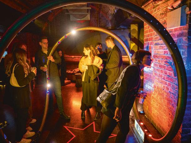
Inspired by the magic of movies, Foster + Partners and Atea Lighting collaborated to create the Arch of Fame installation. Imitating the three-point lighting technique used in cinematography, the structure creates a portal to the movie set by filling a brick archway with light. Stepping into the arch, visitors are transformed into the lead characters of their favourite films, as the pixel-controlled luminaires mounted on the arch shine coloured light on their faces, creating dynamic and immersive effects. The Romulus profiles mounted along the arch were animated using patterns and colour palettes inspired by movies. The Matrix, Blade Runner, Kill Bill, and Star Wars were some of the cinematic references the visitors could immerse themselves in. The Neo 360 fixtures, mounted to follow the contours of the architecture, smoothly transitioned colours between scenes, creating a seamless flow of moods and atmospheres. Additionally, two adjustable Totem Optic linears were positioned behind a fabric backdrop to complement the setup of the installation.
The Madrix Lighting Control system allowed for a high degree of control over the lighting effects, providing customised and flexible programming. To prioritise sustainability and minimise environmental impact, the Arch of Fame utilised natural materials for its structure, including wooden trellis and planks. This approach allows the structure and lighting fixtures to be separated and repurposed for future events and installations, providing a cost-effective and environmentally responsible solution, and ensuring the longevity and versatility of the installation’s components. The installation will be re-installed as part of future events at Foster + Partners, and exhibitions such as the London Open House and LiGHT 23.

[D]ARC AWARDS
Speirs Major & Tryka - Peep
Peep invites onlookers to experience the world through the eyes of a Mad Hatter’s tea party guest, becoming immersed in a rotating kaleidoscope of life-size characters, abstract landscapes and secret messages, drawn from the surrealistic world of Lewis Carroll’s Alice in Wonderland
An unassuming timber box stands within a dimly lit room, peep holes flickering invitingly. Inside, a rotating core of full-height mirrors reflects and re-reflects the AI generated characters, revealing their stories of nihilism, joy, power, trickery and innocence. Suspended above the rotating chamber, a unique 3D printed bio-louvre manipulates the lit environment, adding texture and colour through a dynamic array of UV-enriched colour-changing LED nodes, and lending an almost hallucinatory quality to the experience.
Peep explores themes of voyeurism and unfolds the complex dynamic of observation. Through the eyes of the characters, the viewer becomes both subject of their own internal experience and object of the surrounding participants’ gaze. Encountered with curiosity by the many faces of Wonderland, Alice too must play both object and observer as she navigates her own vivid dreamscape.
DesignPlusLight & KScape - Vedo Ascolto
The DesignPlusLight installation captured the consideration that movies make to both cinematography and sound, the importance of these elements and how they leave an impression in the memory of the viewer.
From the genius of KScape’s RGBW Rail, the design team was able to celebrate the luminaire’s unique
design. The magic comes from the linear fittings containing a hidden sound system, which enabled the designers to blend the experience of both sound and light, seamlessly.
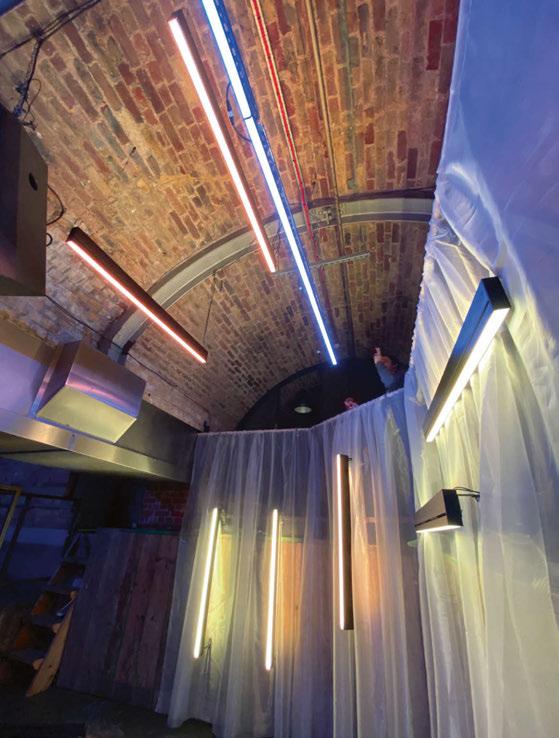
Julia Benford, Senior Lighting Designer at DesignPlusLight, said: “I’ve always been fascinated by the visual imagery and musical mastery of movies. I wanted to mix the soundtracks and colour tones of the ones I found the most moving. “With the use of Casambi programming, the lighting and music were able to become one, creating its own profound experience.”
The installation playlist ran music from Blade Runner, Blade Runner 2049, Amelie, and La La Land
In Blade Runner the blues and yellows have a bright electric hue, with moments of vivid orange or blood red punctuating the narrative. Benford continued: “Linking these colours with arguably the most famous moment in the film; where ‘Tears in the Rain’ begins to play, I wanted to extract these flavours and use them to illuminate the space, pulsing a second of red over the fittings with a background of blue and yellow.”
Blade Runner 2049 is another treat for any lighting designer, its colouration is deeper with amber hues juxtaposed by neon pinks and purples, then again contrasted by a rough grey dystopian world. Using the more dramatic parts of the soundtrack deep blues and oranges were programmed to throb on and off on the most dramatic beats.
“Amelie is one of my favourite films from childhood, her innocence is framed with a watercolour of emerald and scarlet, I was able to lift and embrace these tones and work them between the soft piano notes of Yann Tiersen,” Benford added.
“Finally La La Land’s connection to the colours of violet and yellow cannot be ignored. For the start of the song, I took these colours and saturated them for a feeling of early afternoon and they would then fall into a deeper warmer purple sunset by the end of the mix.
“This was all possible with the help of Fiorella Riccardi and Tom Riby from KScape, as well as Sharon Stammers and [d]arc media for the opportunity to make something so wonderful and unique.”
WSP
& Kingfisher - Riddle Me This?
The dynamic light art installation takes inspiration from the Batman comics and movies over the years and aims to tells a story using light, colour and moving elements.
The light art installation goes through several scenes, a sunrise within the cityscape, to the city in danger and telephone ringing, to the bat signal shining in the sky and, of course, The Batman appearing on top of a skyscraper.
The different scenes were achieved using various luminaires, both colour changing (RGBW) and static white, and a motorised Batman that would appear and disappear.
Each luminaire and the motorised arm were individually controlled via DMX and by using a control software they were programmed into the desired sequences, to dim, change colour and strobe in order to tell the story.
110 / 111
Clockwise from above: Vedo Ascolto by DesignPlusLight & KScape (Image: DesignPlusLight); Riddle Me This? by WSP & Kingfisher; Alien Hunter! by Ideaworks & LEDFlex.

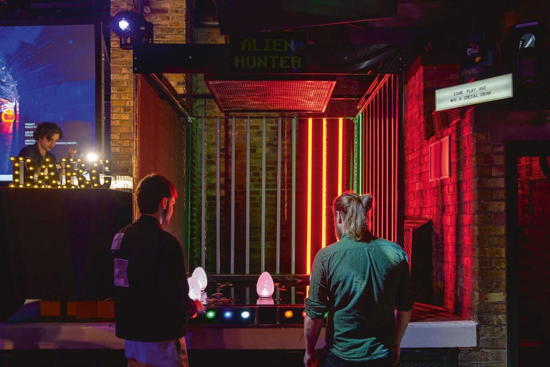
[D]ARC AWARDS
The effect was created using RGBW linear wall washer uplights for the lighting in between the buildings, that offered depth to the cityscape, static white spotlights to highlight different elements like the phone and the Batman silhouette, UV floodlight that revealed hidden writing on the wall, a gobo projector for the Bat signal and an internally illuminated box plinth for the phone.
Ideaworks & LEDFlex - Alien Hunter!
The concept for Ideaworks and LEDFlex’s installation was inspired by the film Alien and sci-fi arcade games such as Space Invaders, and with these ideas the team created a button bashing, egg smashing, two-player reaction speed game that they called Alien Hunter!


Although Alien was released more than 40 years ago its visionary sci-fi set design and portrayal of a resilient and empowered female protagonist make it a classic that stands the test of time. The film is set aboard an industrial spaceship called the Nostromo, and in one memorable scene inside a large dark mechanical space, in which chains hang and water drips from somewhere high above, the Alien, at first hidden in the shadows, descends to pounce upon one of the ship’s crew. Ideaworks and LEDFlex reimagined this mood within their lighting installation and used the chains and water as props to enhance the lit effect.
The team also drew inspiration from the minimalist light sculptures of Dan Flavin, and played with the way in which geometric light forms (the vertical bars of coloured light, also serving as a scoreboard) become distorted in reflection on chaotic surfaces such as rippling water.
Oliver Williamson, Senior Lighting Designer at Ideaworks, said: “It was brilliant to experience the fun and competitive spirit as guests at the [d]arc awards went head-to-head to extinguish the coloured eggs, make in onto the top scores of Alien Hunter and earn themselves a special glowing green cocktail.”
Buro Happold & Lutron - My Life is a Movie
Light is intrinsic to cinema. Supporting the characters and set in creating a mood, atmosphere, and storytelling. Be it the dramatic focused light and sharp shadows that create tension and the unknown in horror, the soft pastel shades and smooth gradients of natural lighting synonymous with romance, or the vivid neon colours that evoke a futuristic world in sci-fi. Inspired by these film lighting techniques, Buro Happold and Lutron’s installation aimed to turn their [d]arc space into an interactive set. On one side, the film studio where attendees could become actors in their own movie. On the other, a home TV set up where the audience could choose from three distinctive film genres on their Lutron TV remote.
The Buro Happold lighting team’s sustainability ethos went hand in hand with the brief. All luminaires were existing samples and will go on to star in another movie. Most props were built using recycled cardboard or borrowed, however in one case where this wasn’t possible, materials will be easily repurposed. People are brought together over iconic films. This design team aimed to achieve the same with its [d]arc installation and create a memorable experience with the help from partner supplier Lutron Electronics, in collaboration with Applelec, Lumenpulse, and We-ef luminaires.
Arup Lighting XE & Rako Controls - Eat Me, Burton
The Arup Lighting XE/Rako Controls installation utilised the team’s expertise with experience design, user interaction, lighting, and control systems to create an inviting and engaging experience. The team drew inspiration from some of the most the iconic movies from Tim Burton: Charlie and the Chocolate Factory, Alice in Wonderland, and Sweeny Todd. These were carefully
112 / 113
L-R: My Life is a Movie by Buro Happold & Lutron (Image: Craig Palmer, courtesy of Buro Happold); Eat Me, Burton by Arup Lighting XE & Rako Lighting Controls; Press & Guess by Delta Lighting Design & We-ef.
selected for their richness and variety of colours. The interaction with the viewer was at the heart of the installation and the selection of these movies was triggered by viewer’s control. Additionally, given this year’s theme, image projection seemed like the perfect element to include for the installation – a harmony of light and picture that create the films we know.
Colour and light are the primary material of the installation: its concept is inspired by the “60-3010” rule used by filmmakers to compose visually striking scenes. Essentially, the dominant colour (of various shades) is present in 60% of the frame, a secondary, complementary colour is present in 30% of the frame and the remaining 10% is an accent colour.
Colour grading choices are made in order to maintain a mood, direct the audience’s attention, and sometimes outright tell the viewer what’s going on, using colour as the vehicle for that message.
The stage where the installation was built effectively became a scene set wrapped by dark drapes and curtains. At the centre of this scene set, suspended white panels created the canvas that realises the installation concept.
A series of linear LEDs were hidden behind the drapery folds so that only the lit effect was visible, and the light sources were carefully concealed. The set-up proposed by Rako had the ability to balance the composition of the colour and intensity while changing for each scene. This reinforced the effect and helped focus the viewers’ attentions on different areas of the installation while looking for different key colour and lighting details. To further engage viewers and add a structure to the controls, the installation included a stand accessible to all viewers, where it is was possible to select one of the three films from a tablet. The selection would vary the colour scenes to appear on select panels. To reinforce the overall concept and supplement the colour scheme while making the scene more tangible, a small number of suspended panels hosted a series of image projections related to the selected movies. These projections were coordinated with the colour scheme and were able to change according to the movie selection.
The result was an engaging and well executed installation bursting with colours and deliberate references to one of modern filmmaking’s bestknown directors.

Delta Lighting Design & We-ef - Press & Guess
Press & Guess is an interactive light art installation that evokes a sense of playfulness and fun. The player is introduced to three push buttons, and upon pressing one, a sequence of visual lighting cues guides the player into the atmosphere of a movie. The challenge of the game is to guess the movie. The active participation of the player to this light art installation reminisces the fun factor of a child playing a game, bringing back that feeling of excitement and mystery we enjoyed when we were kids.
Press & Guess referenced three different movies
– The Matrix, Avatar, and Kill Bill – each one being revealed through three subsequent scenes: colour projection, text projection and image projection. The player is first presented with a colour associated to the movie. Colours transport us into another world, thereby creating a sense of time and place in movies. The use of colours in cinematography is a powerful tool to convey emotions, mood, and symbolism. Each colour palette sets the mood of the scene, and for each movie, the design team chose a distinct colour: yellow and orange, marine blue and crisp green. They chose yellow and orange to expresses danger and thrill, green to represent the futuristic, sci-fi theme, and blue to convey calmness and serenity. Secondly, a relevant quote is projected onto the background wall, reminding the player of the famous dialogue from each movie. Lastly, an image projection is introduced, completing the game sequence. Mirror side walls and carefully set scenes help enhance the visual impact of the movie. www.darcawards.com
[D]ARC AWARDS
Working FOMO
Designers Mind contributor Kael Gillam questions the ‘always on’ mindset, and examines why some may struggle to switch off outside of working hours.
In the working world, is there such a thing as being too consistent? This question came up in a recent discussion with the DM team and made us wonder about the amount of effort and commitment we put into our working lives. Some would argue that it is praiseworthy to check your emails on holiday, always say yes to last-minute requests, and work over your lunch hour. Surely, you might argue, that attitude and those actions embody consistency, commitment, and hard work at their finest. If you’re always contactable, you’re consistent. If you’re always caught up on your emails, you’re consistent. But we need to dig into this a bit deeper; where do your ‘working hours’ end and your free time begin when you’re ‘always on’?
I’ve had this conversation with colleagues both more and less experienced than I am, and there just simply isn’t a consensus as to why people are drawn to being ‘on’. Some feel that there is a ‘fear of missing out’ (FOMO), if they aren’t in some way still connected to the office. What if something happens to the presentation while I’m away? What if the client calls and the next team members won’t deal with it well? There’s two ways to look at this mindset; a lack of trust or a lack of control. When we don’t trust in our team members’ capabilities, then we will constantly fret about whether something can be dealt with ‘correctly’ in case of our absence. And when we are bad at delegating and refuse to allow others to take on shared responsibility for tasks in our absence, we will constantly fret about whether something will be taken out of our control and sent askew by an uninformed colleague. Both are disparaging to our colleagues; in this model we believe that we are such an integral part of the team that our absence will rock the boat and send everything into chaos. While we are of course important members of our workplaces, relinquishing control and trusting in others is an integral part of being a good teammate. With good handovers or briefings, and making our colleagues feel like a valued part of the project(s), then we can feel more confident in being able to ‘let go’ and put trust in their abilities
while we’re unavailable. A teammate that is only ever given information piecemeal, and/or is then micromanaged in undertaking unrelated tasks, will not feel confident in their duties and thus be unable to make informed decisions in the absence of their project leader. A teammate that is included in meeting minutes, has indirect contact with the client or lead designer, and has a full overview of a project will feel more ownership and have more confidence when decisions need to be made. Equally, when they’re better informed, they will be more confident in responding to difficult or ambiguous situations with ‘I don’t know’, and allowing a question to sit until they have an answer. Along with trust and control, the ‘fear of missing out’ can come from a lack of desire to detach from the mentality of the workplace. Some people are really driven by the fast-paced nature of the workplace, and thrive on the low-level (not the high-level!) stress that comes along with making important decisions and communicating our creative endeavours. There is that buzz that comes along with a good presentation, a successful client meeting, a deadline being met and sent out. There is also the joy that we derive from our interactions with our colleagues; sharing those successes and failures together can be intimate and special experiences. More simply, the time spent with our colleagues can foster a general sense of kinship in the day-to-day of office life, which is likely quite different from the relationships we would form outside of the pressure cooker of our profession. When we’re not in the office, either virtually or in person, we may feel like we miss out on these bonding moments and feel the need to be kept up to date so that we don’t feel as though we’ve missed out on important social moments. On the other side of the hesitance to detach is the possibility that the very intense and ever-changing work environment may feel more comfortable and easier to navigate than our home lives. This can manifest in many ways for an individual, and might be very difficult to explain to colleagues or managers when we make the choice to tip our
DESIGNERS MIND
114 / 115
KAEL GILLAM
normal balance in the favour of more work. I have been there myself; in turbulent times in my home life, I have thrown all of myself into my projects and my commitments at the office. There is perhaps a somewhat tongue in cheek phrase that goes ‘would you rather the chaos you know or the chaos you don’t’? I chose the chaos I knew, working 60hour weeks and answering calls from my manager during my holiday time because I was more passionate about my working life than my home life. These circumstances are so much harder to navigate, and need sympathy and time to help our teammates find their own equilibrium again. ‘Letting go’ is often a trust exercise built over a long period of time, and one that we can all equally improve upon to free up our minds of anxiousness and clutter. Sometimes it is trust in ourselves that there is resilience built into the team, and we can prop each other up and fill in the gaps when someone is away. Sometimes it is trust in our colleagues that when we delegate tasks, that their result will be just as satisfactory as what we may have envisioned ourselves doing on our own. These traits and habits are difficult for some but very easy for others; identifying where the hesitance comes from is key in ‘letting go’. If being ‘on’ makes us feel fulfilled and included, rather than anxious and worried, then we have the balance right. But when the fear is all-consuming, and keeps us from the things that bring us joy and relaxation, then we need to step back and assess. In all these scenarios, we need to find our own individual balance in where our priorities lie and what brings us satisfaction and fulfilment. There is no such thing as ‘work-life balance’, for the record; have we written that before? Forgive us if we have. The balance is between activity and rest, and will never be the same between two people. Be kind to yourself and spend time thinking about your balance when you’re outside of your working hours, and how much more you want to be able to detach at the end of the day. Letting go is also a way of holding on. www.designers-mind.com

“‘Letting go’ is often a trust exercise built over a long period of time, and one that we can all equally improve upon to free up our minds of anxiousness and clutter.”
Image: Unsplash
Meraki –The Power of Light
During Light Middle East, four lighting designers led a hands-on workshop for local students to learn more about the power of light. One of the workshop heads, Dipali Shirsat, recalls the experience.

Light has always been a mystical element adding value and enhancing experiences. It has been a core part of the human culture, learning, social activities, spaces we inhabit and in ways much more than we can contemplate. The power of light is truly magical. And as lighting designers, it’s a natural emotion that we all share. But when I was invited to share this experience with students and engage them with a hands-on workshop with light, I was beyond excited to share this magic with them. Teaming up with Roberto Corradini, independent lighting designer and co-founder of LDW, based in Italy; ‘Meraki’ was envisioned to take place at this year’s Light Middle East event.
‘Meraki’ is special in many ways and perfectly outlines the idea of what we wanted to create. It is a Greek word, which means to put a part of yourself in everything you do. For us, it was about putting our soul, creativity and passion together with light. To join us in this Meraki, we invited two other passionate lighting designers from the industry: Katia Kolovea, founder of Archifos and Maria Dautant, Senior Associate of HLB Lighting. It was important to have a global team of workshop heads to ensure students benefit from the diverse nature of design backgrounds.
The first edition of Meraki received an overwhelming response from the universities in Dubai, with around 32 students participating from three different universities – Heriot-Watt University, University of Sharjah, and Istituto Marangoni. Under the event management of Light Middle East, the workshop was scheduled for three days prior to the main event. The programme was focused to have both theoretical and practical sessions for the students, as they came from non-lighting backgrounds. We conducted lecture sessions from the workshop heads and technical sponsors highlighting different aspects of lighting design and introducing students to the world of lighting. Ensuring hands-on learning with the latest lighting technology and introductions to different lighting fixtures, Meraki was enthusiastically supported by some of the leading technical expertise
in the Middle-East region namely – Monarca International, L&L Luce & Light, Atea Lighting, Osram, Intiled and Light Source International (LSI UAE).
Dividing into four teams and under the guidance of the workshop heads, students had to come up with a concept and work with materials to realise it in a full-scale model, which was on display during Light Middle East from 17-19 January, where visitors could experience the light art installations. Each installation took the visitors on a different lighting journey and multi-sensory experience that ranged from the beauty of northern lights to the warmth of memories, from engaging with a play of shadows to being immersed with music. Each installation had a beautiful story and we all were very impressed by the student’s imagination and dedication of putting it all together and realising it in just three days.
Speaking briefly about the different concepts that were put together by the teams – Corradini’s team installation, titled The Embrace showcased the ideology of warmth by weaving of memories, connections, family and passion; the ‘hug’ was materialised to represent a typology of love – a mother’s embrace.
The warmer tones of the installation slowly led you to a cooler experience of Dautant’s team installation – Nordlys, which encapsulated the experience and spirit of the northern lights by walking through an icy tunnel and finding your way to the night sky and bright Auroras.
As you walk past, you could see visitors playing with their shadows in what combines both the beauty of the warmer and cooler tones of Kolovea’s installation – The Circle of Life. The installation, inspired by the sun and the moon, makes you feel connected by being present and experiencing a state of calmness while listening to the soundtrack – “we are connected”.
And as you are about to turn away, you end up grooving to the immersive installation of my team, titled Bahr Al Salam. Bahr Al Salam, meaning ‘The River of Peace’, is an ode to our Mother Nature.
116 / 117
COMMENT DIPALI SHIRSAT
A reminder to switch off from the digital world and enjoy the sunset, feel the sea waves. Take a moment, pause and immerse yourself in nature. Even though the inspiration was diverse and the experiences were different, there was a common emotion and base to all of the four installations –coming together to celebrate the power of light. As a co-host of the first edition of Meraki Workshop, I am immensely proud of all the students who brought this experience to life. And seeing them taking the ownership of their creation with pure joy and satisfaction of what they made is a real achievement. The students took back a good memory of light with them, which I believe will inspire them in their design journey. Hear from my amazing team of workshop heads on what they have to say about MerakiRoberto Corradini said: “It has been a privilege working with such a team of workshop heads and the students. We were able to work hard and build something greater than expected in a very short space of time.
“The memories of these pleasant days we spent together will accompany us for the rest of our life. I love mentoring students in a workshop because they already have an immeasurable creative potential in themselves, our duty (and my pleasure) is to help them to switch it on.
“During the days of the workshop, they have had the unique possibility to share ideas, experiment, make mistakes and try again until they find a

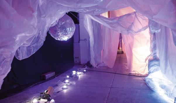
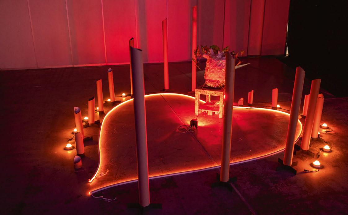 The Embrace
of Life
Nordlys
The Circle
successful solution. We saw an almost frightened group of young students rapidly transform into strong creative teams. Giving life to their strong conceptual ideas, they were able to create something unique with light against any constraint, be it time, materials, cables, luminaires, etc.
“I hope they continue to learn and grow. One day they will mentor other young students, giving them the same love, we shared.”
Maria Dautant added: “When I was asked to be part of the Meraki Student workshop I immediately said yes. I simply could not miss the opportunity to participate in this event alongside Dipali, Roberto and Katia. During the workshop, the enthusiasm of the students was contagious and their interest in learning about the technical and artistic aspects of lighting was amazing. It was an extraordinary opportunity to inspire the younger generation and give them a space to express their ideas. The pieces they designed and installed truly expressed how much they managed to absorbed in the three days the workshop took place. But most importantly it was a fun learning experience that we all, professors, students and mentors, greatly enjoyed.”
Katia Kolovea said: “What a magical experience –an experience filled with passion, light, and soul, reflecting fully on the workshop’s theme and title: Meraki. I am delighted for the opportunity to lead a global and multicultural team and create together an installation with a deep meaning. We
called it: The Circle of Life and our message was summarised in the sentence: We are all connected. “No matter where we are coming from, the sun and the moon are powerful sources of life for each individual. The high energy and excitement that we shared together with my fellow workshop heads, Dipali, Maria, and Roberto plus the passion of all students and supporters made this a truly memorable experience.”
As Roberto likes to call us the ‘Meraki Creators’, we hope to continue these lighting design workshops for years to come in the Middle-East region spreading the knowledge of lighting and bringing more practical learnings to the university students in a fun way. So, watch out for the next edition of Meraki.
www.lightme.net

118 / 119
Bahr Al Salam
MERAKITHE POWER OF LIGHT


www.radiantlights.co.uk | +44 ( 0 ) 208 348 9003 | david@radiantlights.co.uk | All products designed by Water Effect In-ground RAD 180 WE System IP67 In-ground, DMX controlled, dynamic LED effect lighting system IP67 Contact us for more information or to discuss your project
W Hotel Algarve, Portugal
Lighting design and project photography by MBLD
Best Exterior product 2022 Award winner 2022
Do the right thing
In this column, various members of the GreenLight Alliance explain the steps that their companies are taking as part of their broader environmental and social responsibility programmes.
“Integrity gives you real freedom because you have nothing to fear since you have nothing to hide.”
- Zig Ziglar
In recent issues we have dived deep into metrics, legislation, and regulations. In this issue we ease back and take a broader overview to look at the emerging trend for examination and verification of a corporation’s broader environmental and social impact. Whether you are familiar with the acronym CSR (Corporate Social Responsibility) or ESG (Environmental, Social, and Governance), we are talking about largely the same thing; the values and responsibilities that a company proclaims to live by. Increasingly companies are choosing, or being obliged, to publish these and to verify them, by means of independent organisations. This can be to lock-in mission focus, satisfy commercial prequalification criteria, aid recruitment, impress (potential) shareholders, customers or simply to drive internal behavioural changes. Whatever the reason, we are seeing a growing number of new icons appearing in PR output from companies, including across the lighting industry. Primarily manufacturers, but the design and specification community too. The GreenLight Alliance see this trend as encouraging, as more and more companies mobilise, not a moment too soon, to engage with the mammoth challenges we face. While specific approaches vary, the direction of travel is encouraging.
With the recent proposals around the world for legal consequences of making unsubstantiated green claims, we expect to see even more rigour and independent verification.

Whether coaxed or instinctive, we at the GreenLight Alliance welcome the progress. Here follows a brief tour through some of the most prominent examples in our industry, along with words by some of their proponents.
We leave you with this observation from someone who has demonstrated that business success can go hand in hand with integrity, in the broadest sense of the word:
“…it’s always been difficult for us to lead an examined life as a corporation. I’ve always felt like a company has the responsibility to not wait for the government to tell it what to do or to wait for the consumer to tell it what to do, but as soon as it finds out it’s doing something wrong, stop doing it.”
- Yvon Chouinard, Patagonia Founder, environmentalist, philanthropist.
120 / 121 GREENLIGHT ALLIANCE
Employee Ownership

Arfon
Arup
Davies, UK Lighting Design Director


Arup has been employee-owned since 1977 and is currently the third largest employeeowned firm in the UK. Our ownership structure gives us the freedom to decide where we can make a difference – investing in the research, products, partnerships, and skills we believe in. Rather than staying focused on immediate shareholder returns, it gives us more ability to plan for the long-term benefit of the firm and our members, making decisions that keep us resilient and support our members’ passions.
It’s also a model that removes barriers to progress as we work with others to create a more sustainable future for people and planet. It gave us the flexibility to become one of the first organisations to commit to UN Sustainable Development Goals, allows us to carry out pro bono work that benefits communities, and makes it easier for us to fund and develop solutions that accelerate the transition to net zero. www.employeeownership.co.uk
business operations. We have also committed to achieving net-zero operational carbon of our studios by 2025 and reducing waste. We are in the process of developing and integrating minimum environmental performance standards for our projects. We review the performance targets every three years to ensure performance remains valid and suitably ambitious. Where targets are achieved at or prior to this review, new targets are developed. www.iso.org
As a part of CSR and the requirements of accreditation we need to ensure our suppliers are also paying the Living Wage. Doing this created a re-think from our cleaning contractor, who did agree to up the wages of their staff for a very minimal increase in our contract price. The idea of the living wage goes far beyond this and forces us to look at all our suppliers, for example courier companies that we use, online suppliers for stationary, and contractors we employ are all chosen from accredited Living Wage Employers. Making these enquiries certainly opens your eyes to the corporate behaviour of the people we do business with.
www.livingwage.org.uk

Sustainable Development Goals

Alexia Gkika, Associate Lighting Designer

Buro Happold
Buro Happold is committed to the promotion of equitable and sustainable development that ensures the wellbeing of people and the enhancement and protection of the environment, in alignment with the UN Sustainable Development Goals. We recognise that the work we do as engineers and consultants has long-lasting implications for the ability of our clients to meet their own net zero goals and to realise long-term value from their assets.
Social Value UK
ISO 14001
Colin
BDP
Ball, Lighting Director
In accordance with ISO 14001, data has been collected for our studios since 2010, and has increased in accuracy and robustness across this period as problems have been overcome, particularly in our regional studios. Our energy and water reduction targets were, up to 2018, based upon an improvement on the 2013 baseline year. 2018 concluded our five-year reporting period from our 2013 baseline, where we exceeded each of our targets – keeping our Scope 1 and 2 emissions below 1000kgCO2e/capita, implementing measures to encourage sustainable travel decisions, and reducing water consumption by 5% per capita.
In 2020, we made significant updates to our Sustainability Policy to protect and enhance the five capitals (natural, human, manufactured and financial) across all aspects of our operation. This included setting Science Based Targets for our
In March 2021, Buro Happold set validated 1.5°C aligned science-based targets to reduce absolute (total) scope 1, 2 and 3 greenhouse gas emission 21% by financial year (FY) 2025 from FY 2020 base year. This year we have carried out detailed calculations of our carbon emissions (Scope 3) related to purchased goods and services by applying the Greenhouse Gas Protocol spend-method.
The above is a succinct extract from Buro Happold’s annual Global Sustainability Report 2022 – please refer to the extended document for more information.
www.sdgs.un.org/goals
Living Wage
Kevan
KSLD
Shaw, Design Director
We chose to become accredited Living Wage employers as part of our CSR policy a few years ago. While we know Lighting Design is not among the higher paid professions, there is no way we would expect to even pay interns anything as low as the living wage.
Lauren
Bailey, Head of Social Value Ridge and Partners

We are proud that Ridge has become an organisational member of Social Value UK. We understand the importance of being a responsible business, ensuring that local economies, people, and the environment receive a positive benefit from the delivery of our services. As we look to further unlock social value in our construction projects, we will work with clients and supply chains to deliver added social, economic and environmental value.

By partnering with Social Value UK, we are committing to implementing the eight principles of social value. This will see us improve our social value accounting practices and strengthen the impact we have on our clients, our people, and communities. We will also be implementing new accounting methodology to measure and report on activity in line with BS 8950 –the British Standard for social value.
www.socialvalueuk.org
1% for the Planet


Chris Miller, Co-Founder and Director skinflint
For skinflint, charitable giving, and sustainability have always been important to our CRS strategy. This commitment was formalised in 2021 when we partnered with 1% For The Planet. Meaning, each year, 1%
of skinflint’s gross sales are donated to a range of approved environmental partners. Employees voted on a range of NGOs that are mission aligned; that have the same goals and purposes as the brand, but that also mean a lot to them personally. Supporting our local community as well as thinking nationally and globally, we eventually settled on Cool Earth, The River’s Trust and Surfers Against Sewage. As champions of the circular economy, elsewhere skinflint chose to eschew Black Friday by instead matching sales over a five-day period and donating the same amount to these charities. The hope is to inspire other businesses and individuals to do the same.
www.onepercentfortheplanet.org
Cradle to Cradle Tim Bowes, Head of Lighting Application
Whitecroft
With the development of circular lighting solutions, we were keen look for third party verification to support our actions. The reason for this was twofold. Firstly, it was to provide transparency of our design choices to support our customers in making circular and sustainable product choices. Secondly, and as importantly, it was to provide a roadmap to help our business make the right choices and support future business model innovation.
but what the business that produces it stands for. Given the Zumtobel Group’s continuously evolving sustainability agenda, we of course hope to achieve an improved EcoVadis score when the rankings are next updated.

www.ecovadis.com
LEED Certification

Xander Cadisch, Sustainability Director and Senior Project Manager

Phos
B Corp
Dave Hollingsbee, Managing Director

Stoane Lighting
Looking back, B Corp certification was as important a milestone in the company’s journey to becoming employee owned. Only a little while after certifying did we realise that we had gone a long way to satisfying a niggling existential question of what it’s all about. Formally altering our articles of association to give stakeholders primacy over shareholders, as we became a benefit corporation, seemed logical and felt good. Whether the “B” appealed to clients or recruits was not the main point, though anecdotally it seems to be increasingly positively recognised. The holistic validation across five pillars: Governance, Workers, Community, Environment and Customers, was rigorous and extensive. The team wear the B proudly. It’s becoming a regular touchstone against which decisions are gauged. It drives better internal practices and forces a cruel level of transparency. We are hungry to build on our score during our three-year recertification later this year. www.bcorporation.net

The implementation of the Cradle to Cradle Product standard into our ‘Whitecroft Vitality’ range of products, means an alignment with “the global standard for materials, products and systems that positively impact people and planet.” The standard looks at five key areas of design and business actions: Material Health, Product Circularity, Water and Soil Stewardship, Clean Air & Climate Protection and Social Fairness. To date we have eight product families as part of ‘Whitecroft Vitality’ certified to bronze level. www.c2ccertified.org
For Phos, LEED compliance is a vital part of what we do. Along with our B Corp accreditation, the LEED certification has cemented our commitment to offering efficient and cost-effective lighting solutions. Phos chose LEED accreditation to help reduce the environmental impact of our operations and buildings, and align further with our company’s values and mission. It also helps us appeal to customers, who are becoming more conscious of the environmental impact of the products and services they purchase.
Finally, LEED accreditation can lead to cost savings over time. By implementing sustainable building practices and technologies, we have been able to reduce our energy consumption and lower our operating costs.
Overall, there are many reasons why we chose to pursue LEED accreditation but there really are no downsides.
www.usgbc.org/leed
EcoVadis
Sebastian
Gann, Sustainability Director


Zumtobel Group
The Zumtobel Group has a long history of working towards a sustainable future – from developing the first Environmental Product Declaration in 2011 to its technology brand Tridonic being one of the first manufacturers of electronic lighting components to receive a Cradle to Cradle certification for some of their LED modules. By following 12 of the UN’s Sustainable Development Goals, along with ensuring that all our European production sites are ISO 14001 certified, the Zumtobel Group were honoured to achieve the EcoVadis Gold medal in 2021, with Tridonic separately achieving Silver this year. EcoVadis is a sustainability rating platform that looks at a company’s performance in four key categories: environmental responsibility; labour and human rights policy; sustainable procurement; and ethical business practices. In this way EcoVadis doesn’t just look at how a product is made
All of the contributors above would be glad to tell you more if you have questions. Also on the radar and perhaps some topics we will see more of in the near future include:
Social Enterprise UK
www.socialenterprise.org.uk
Make my money matter
www.makemymoneymatter.co.uk
Better Business Act
www.betterbusinessact.org
Architects Declare
www.architectsdeclare.com
Race to Zero
www.unfccc.int/climate-action/race-to-zerocampaign
www.greenlight-alliance.com
122 / 123
GREENLIGHT ALLIANCE
This series is curated by Dave Hollingsbee of Stoane Lighting, dave@mikestoanelighting.com
TRADE SHOW: MAY 23-25 |
CONFERENCE: MAY 21-25

JAVITS CENTER, NEW YORK
Find the Blueprint for Innovation
Don’t miss LightFair, the global event connecting architects with the latest in lighting. With over 165 credit hours available, you can access 10+ courses providing AIA-HSW accreditation at the industry’s most comprehensive conference. Connect with industry leaders and explore innovation in a whole new light this May in New York City.
IES and IALD members enjoy complimentary show floor access with registration.
YOUR SOURCE OF INSPIRATION
REGISTER
FIND
|
AT WWW.LIGHTFAIR.COM

124 / 125 eye opener
Common Ground New York, USA
Common Ground is a site-specific, interactive public artwork created by artist Cheryl Wing-Zi Wong, with lighting design and programming from Arup. Comprised of a colourful pavilion and floor motifs that dance across The Plaza at 300 Ashland, Brooklyn, the installation draws inspiration from the geometry of shrines and sacred spaces and referencing the terraces of the site, this architectural intervention transforms the plaza into an oasis for sitting, socialising, and gathering by day and by night.
Common Ground creates a bold, joyous interruption in the plaza, one of our everyday spaces, and offers a playable

topography to embrace the here and now. As a community hub, Common Ground aspires to cultivate togetherness and resilience, while encouraging moments of pause, reflection, and play.
During the evening, Common Ground creates a shared synesthetic experience. Illuminated with colour-changing lighting and sensors that register environmental audio, light animations shimmer across the sculpture’s steppes in response to these sounds – the movements of passers-by, footsteps climbing on the structure, voices, the ambient hum of traffic. Common Ground is a place of joy and light, celebrating resilience and togetherness to embrace the here and now. The piece features 74ft of individually controlled RGB flexible encapsulated
fixtures. Two sound sensors are located within the wooden modules at both ends of the sculpture. When no sound is detected, the fixtures slowly pulse in the artwork’s colour palette. When sound levels meet the designated threshold, a pulse of coloured light crosses the sculpture, originating from the side where the sound was detected. Over the course of the exhibition, public programmes, including music and dance performances, activate the pavilion. www.cw-zw.com
LEDucation 2023
Butterfly lightly
The Butterfly is lightly’s flagship sustainable linear luminaire design, made from biodegradable materials, without any plastic or metal in its housing. Instead, it is created from sustainably harvested poplar wood and sheep’s wool, enabling a cradle-to-cradle lifecycle. The Butterfly’s unique open-air profile is inspired by butterfly wings, creating an 80% indirect, 20% direct light distribution. It is half the weight and half of the embodied carbon footprint of traditional plastic and aluminium linear fixtures, yet offers better energy performance, glare control, and colour rendering. www.lightly.com
Amy & Yasmeen spot beam optics
LEDiL
Experience the power and elegance of LEDiL’s tight spot beams, carefully designed to highlight products and architecture with impeccable style. The new spot beam optics let you achieve stunning high-contrast lighting in retail and architectural spaces for a perfect balance of technical and aesthetic features. Choose Yasmeen-70-RS for minimal spill light or Amy-50-RS and Amy-70-RS for sleek and elegant slim track and downlights. www.ledil.com
X Series two-inch Modular Downlights
DMF Lighting
The two-inch downlights feature field-changeable trims, modules and optics (15, 25, 40, and 60° and Linear Spread). Downlight or Adjustable (360° rotation and 35° tilt) modules are paired with a universal housing, offering a small footprint without sacrificing light output (750 to 1,500 lumens). Drivers are integrated into the light engine modules for easy serviceability. Die-cast aluminium trims include round and square apertures, and in downlight, wall wash, flangeless and decorative choices. www.dmflighting.com
Ashbery Landscape Forms
A modern interpretation of traditional design, Ashbery is a family of luminaires that brings together advanced LED technology and optics with an homage to traditional-style lights. Ashbery is a modern interpretation of historic forms in high-quality lighting that sparks an emotional connection to the past but performs, looks, and feels authentic for our time. It offers a design solution for the revitalised downtowns of small and mid-size cities.
www.landscapeforms.com
Athena Wireless Processor Lutron
The small, unobtrusive, Athena wireless processor from Lutron delivers all the Athena system features and benefits without the need for separate panels or hubs, increasing design flexibility, minimising required closet space, and delivering a cloud-connected solution. As the latest enhancement to Lutron’s Athena lighting control system, the Athena wireless processor empowers designers and their clients with tools that support future-proof lighting systems, and insights that drive efficient business decisions.
www.lutron.com
DVS Swivel Dim to Warm
Feelux
DVS Swivel Dim to Warm is suitable for lighting in residences, hospitality, hotel, retail and more. Best suited to be installed in even low depths available thanks to 20mm height, it has a dim to warm colour effect, which illuminates goods advantageously. And it helps save money and space that one product expresses a wide variety of kelvin and mood. Kelvin range from 1800K to 3000K, up to 292lm with four wattages DC product. www.feelux.com
Gen 2 CCT tunable COB Luminus Devices
Luminus Devices expands its COB portfolio with its Gen 2 CCT tunable COBs. These dynamic COBs feature two channels with 90+ CRI warm 2700K and cool 6500K in a multi-stripe design for excellent colour mixing and high flux density. Delivering consistent white light <3 SDCM, these COBs are ideal for narrow beam spots in commercial and residential applications including human centric lighting, retail, hospitality, and circadian lighting. www.luminus.com
Hero Glint Lighting
Glint Lighting’s Hero adjustable luminaire gives you the power to change the direction of its light without physically moving the luminaire. Hero integrates harmoniously into the architecture while flexibly illuminating your space with beautiful, glare-free light. Since Hero doesn’t need extra room to adjust, it disappears into tight spaces no other adjustable luminaire can go. Glint builds Hero in recessed, monopoint, track and architectural versions that each give lighting designers and architects delightful new ways to achieve their design intent. www.glintlighting.com
Micro Canopy
Lumenture
Lumenture’s Micro Canopy virtually disappears into the ceiling. With a minimal 70mm trim and a small junction box rated enclosure (just 56mm x 60mm), this spot canopy can be installed wherever you need some extra light with ease. The factory installed Micro Canopy can be paired with any of Lumenture’s T-Series track fixtures - offering an even more refined look for the most high-end applications. www.lumenture.com
REV Flex Meteor Lighting
The REV Flex by Meteor is a series of two, four, and six-inch adjustable recessed downlights that offer unparalleled versatility in a fixed bezel with a 40° cut-off, or in a flexible 359° rotation with 30° tilt. Adding to the line’s versatility are three fieldreplaceable optics, flangeless options in both round and square form factors, and wall wash optics. The REV Flex series also features dynamic DMX, W+RGB colour-changing solution to inspire a variety of commercial and residential projects.
www.meteor-lighting.com
Unity
Acclaim Lighting
Unity fundamentally rethinks what an outdoor LED floodlight can be. It uses the all-new Spectrum Five engine to give you perfect, high output/high CRI whites, dynamic white operation, and full colour mixing in the same unit. It also provides a single, fully homogenised beam with no colour striations or separation. Unity features Acclaim’s ColorSync Digital Color Calibration technology and Aria Wireless control built into every unit.
www.acclaimlighting.com
HL4 GVA
The HL4 has been specifically manufactured for architectural lighting applications that include both direct and indirect view lighting. The Color Stream protocol imbued in the HL4 provides up to 25 times enhanced performance rate compared to the conventional DMX. This advancement has set a benchmark for luminaire performance, delivering unparalleled flexibility with incomparable standards of excellence. The HL4 stands out for its exceptional performance, outstanding flexibility, and unbeatable standards of luminaires performance.
www.gvalighting.com
126 / 127
9 4 3 10 2 5 7 11 1 6 8 12


1 2 4 5 6 7 8 9 10 11 12 3 LEDUCATION
Returning to the New York Hilton Midtown this March, LEDucation 2023 welcomed more than 8,000 attendees from all aspects of the lighting industry across two days. Here, we recap on some of the event’s highlights.
Product Launches
AquaGlo F22 Clear Lighting

The exceptional AquaGlo LED flex delivers an illuminated oasis. Packed with robust construction and built to withstand the rigors of underwater environments. It features highperformance LED technology that offers bright, energy-efficient lighting while reducing heat output and maintenance costs. With a range of colour options and programmable lighting effects and IP68 rated, you will get the flexibility to enhance the allure of any pool, fountain, or spa. www.clearlighting.com
LD44 LightGraphix
Developed around LightGraphix’s miniature LD42 wall light and LD43 uplight, the new IP68 rated LD44 offers a two-core sheathed cable with anti-wicking barrier for robust exterior installations and an increased output of up to 180lm at 700mA. It can be specified as an uplight (LD44X) or wall light (LD44Y) with narrow through to oval beam angles, as well as an optional 20° tilt film. LD44 features the RLE replaceable light engine system.
www.lightgraphix.co.uk
Quartz CLS
The Quartz is the newest IP67 outdoor lighting fixture from CLS, that can be configured in 800+ configurations. It is made from CNC-cut, massive aluminum. The ventilation gland with a Gore-Tex membrane minimises the risk of condensation. Up to 8500 Lumen effective light output from a compact, 25 × 25 cm fixture. With a large choice in beam angles, LED light sources and dimming methods, the Quartz is the energy efficient lighting solution.

www.cls-led.com
Uniscan Erco
A new range of versatile and accessible trackmounted spotlights, floodlights and wallwashers, Uniscan has been developed by Erco for the changing lighting demands of art galleries and museums. Compact, flexible, and easy to handle, the modular Uniscan range is available in three sizes, with six fixed light colours, lens units in 12 light distributions, and various dimming options. Their clear Darklight lenses mean that with just one point of light, they generate a defined, uniform beam of light and precise shadowing for museum-quality lighting. www.erco.com
Colorado
L&L Luce&Light
Colorado is a range of drive-over LED fixtures with built-in power supply, developed for lighting façades up to 20-metres tall. Colorado is available in a range of white light colour temperatures, as well as RGBW and Tunable White versions. Colorado can be recessed flush or with a rebated frame. The recessed versions can be tilted externally by ±20° with a simple adjustment on the end caps, without compromising their IP65 and IP67 protection level. This adjustability ensures precise positioning, so that the light illuminates the façade uniformly. www.lucelight.it


Periskop Linea Light Group
Periskop is an outdoor projector characterised by a directional body made of die-cast aluminum painted with epoxy powders in the following finishes: white, black, grey, dark brown. The front is characterised by a transparent tempered glass with a black screen-printed edge. With the anti-glare accessories, it is possible to further reduce glare for the benefit of significant visual comfort. Also available with narrow optics and in a three-color RGB version.
www.linealight.com

128 / 129
3 4 1 5 2 6 1 2 4 5 6 3
INTRODUCING


DESIGNED FOR THE DESIGNER
Five colors - one beam. A revelation in an outdoor floodlight.


Single Source LED Fixture


Bold Bright Colors + Seamless Color Blending (Red, Green, Blue, Amber & Lime)


High CRI Whites: 2500K-8000K
10,000+ Lumens Output

SOLID STATE SOLID PERFORMANCE

ACCLAIMLIGHTING.COM LINEAR XTR TERRA LINEAR
SCAN ME
CELEBRATING 20 YEARS
550 Madison Avenue Garden New York, USA
Custom-made lighting fixtures from Erco bring an inviting light to the “pocket park” of 550 Madison Avenue Garden.
In Midtown Manhattan, Snøhetta has transformed an open space of 2,000sqm into an artfully designed paradise; a partially covered landscape garden has been created on Madison Avenue, consisting of more than 300 shrubs, 15,000 flowers, and 40 trees.

Inaugurated in 2022, 550 Madison Avenue Garden is part of the revitalisation of the AT&T Building, a New York high-rise icon that is listed as an imposing Post-Modernist monument. Lighting for the garden space was designed by Arup, which realised that high, energy-efficient, luminous output was essential to generate enough brightness for the nature experience. This is because relatively little daylight manages to penetrate between Manhattan’s high-rise buildings. As such, 80 custom made Kona outdoor projectors from Erco were installed. The lighting technology is based on the principle of projection: lenses direct the light precisely onto the target surface, even over long distances, and without relevant losses from spill light. The energy consumed is therefore used as effectively as possible. With the light point height of around 20-metres planned in the project, this results in an outstanding ratio of illuminance to connected load of 1.6lx/W.
In each of the custom-made Kona projectors, the proportion of LEDs is split with regard to light colour; 25% have a colour temperature of 3000K, functioning as general lighting for the new urban garden, while 75% of the LEDs have a neutral white of 4000K, which is ideal for supporting the daylight and enabling the plants to grow healthily.
In the evening hours, the 4000K LEDs are almost
completely dimmed down, providing the necessary night rest for the plants. The warmer LEDs ensure a pleasant quality of stay during the darker hours. All Kona projectors provide continuous light – an important consideration for the lighting designers for aesthetic reasons. The two light colours of the projectors make it possible to generate an effect similar to tunable white. The lighting can be precisely adapted to create uniformly harmonising lighting conditions, with illumination of the 550 Madison Avenue towner, and with the street lighting on 55th and 56th Street.
The new garden is a hybrid between indoors and outdoors, and designed with a flowing transition between inside and out. Despite this, it still feels like you are immersed in nature. The five thematically planted areas connected by small paths were designated as “rooms” by the architects; each of these rooms has its own atmospheric character and conveys its own mood.
550 Madison Avenue Garden is a successful example of how contemporary green regeneration and urban design can be. The old New York tradition of “pocket parks” is also continued. The result is a garden in private ownership that enriches urban life and is accessible to everyone; for enjoying lunch on a bench under the trees, for getting together with friends and colleagues, for relaxing by a rushing waterfall, or for simply catching your breath.
www.erco.com
130 / 131 case study
Image: © Erco Photography: Barrett Doherty
Moynat Boutique Doha, Qatar
Inspired by the Parisian spirit, the new Moynat Boutique in Doha’s Place Vendôme Mall utilises fixtures from Reggiani in a lighting scheme designed by Lisa Marchesi.
Designed by Japanese design studio Curiosity, the new Moynat boutique has opened in Place Vendôme Mall, the new shopping mall in Doha, Qatar. The boutique benefits of a unique location, and realises in making Moynat an ambassador of the savoir faire and savoir vivre that characterise the Parisian spirit.

The space is shaped as a series of large circular rooms that envision the boutique as a French apartment in Paris, re-interpreted in a contemporary way. The customer is accompanied in a soft flow, to fully discover the different collections. The room with floating counter for small leather goods creates the first impression. The large “art piece-like” wall displays highlight the colourful collections and attract the eyes even from outside of the store.
Further inside, the second room features a generous salon, where customers can enjoy a more intimate moment surrounded by the new collections.
The highlight of the boutique is the atelier, characterised by a large working table for the personalisation service.
The lighting project has been developed by Lisa Marchesi Studio, Italian lighting design studio based in Milan. The ambition for the lighting design was to “complete” the space, by assuring a soft and welcoming lighting result. Reggiani’s recessed Mood downlights are used to create a diffused lighting throughout the different rooms, while Yori Surface Base spotlights are used to highlight the new collections.
www.reggiani.net
www.lisamarchesi.com
case study
Porta Gabella Ripa Teatina, Italy
L&L Luce&Light luminaires highlight the past and present at the historic Porta Gabella tower outside of Chieti, Italy.


Perched high on the hills of Abruzzo, Ripa Teatina is a beautiful town in the province of Chieti. The traces it contains of an ancient civilisation draw in visitors, taking them on a fascinating journey into the past. The town is surrounded by rolling hills and broad valleys covered in the typical crops of central Italy, in particular vineyards and olive groves. It was here that the Marrucini, an ancient Osco-Umbrian-speaking Italic people, established their first settlements. During this period of its history, because of its elevated position, the town formed part of the first defences for the city of Chieti. This distinctly military role continued into the Middle Ages, under the rule of the Aragonese, evidenced by the strong city walls and network of watchtowers, joined by an underground walkway, that encircled the town from the south-east. Access to the town was through two large gates flanked by another, cylindrical watchtower. This entrance was demolished during World War II, leaving an urban void and a disconnect between the defensive structures and the town centre.
The cylindrical tower, the torre di Porta Gabella, was successfully reconstructed in its original form by Rocco Valentini Architecture, thanks to the existence of plans and historical photographs, and the reconstruction stands in the place of the wide staircase that first replaced the tower. The latter was originally connected to the adjacent building by a transverse masonry structure that allowed direct passage between the two buildings and made all the levels of the tower accessible. The restoration kept the concept of the original design by inserting an architectural element clearly
distinguishable from its context – an extremely light structure in cor-ten steel enclosed in an envelope of vertical strings using a contemporary language full of echoes of mediaeval architecture. An interpretation of the mediaeval gate, its shape suggests a metaphoric image of two stylised door leaves that open outwards. The suspended walkways that link the elements together take their inspiration from the wooden walkways that ran along the defensive walls in the Middle Ages, connecting the towers. According to the architects, the main goal was to “sew together the urban fabric with a multifunctional structure”, connecting the various spaces with the pedestrian alleyways of the historic centre and creating something that can be transformed into an outdoor stage for musical and artistic performances.
The lighting design, which involves the use of products from L&L Luce&Light, uses a soft, delicate light to highlight the “past and the present”. To light the outer gates, Spot 2.4 outdoor projectors were used in an anthracite finish obtained through multiple treatment and painting steps designed to give effective resistance to corrosion and weathering. The projectors were positioned at the top of the structure to provide functional light and illuminate the building from top to bottom. Contrasting with the projectors, Bright 5.F outdoor recessed fixtures with trim in AISI 316L stainless steel, were installed at the base of the tower to give depth to the site. They emphasise both the soft, curved lines of the construction and the solid materiality of the tower itself. www.lucelight.it
132 / 133 case study
Image: Rocco Valentini


FACTORY Pentagion & Tritonos Str. FACTORY SHOWROOM 8, Palaska Str Skaramangas 12462 | Athens | Greece | T. +30 210 5577445 | +30 210 5570430 F +30 210 5579878 | info@mpillumination.com L UMIN A IR DE SIGNE D & MAD E IN G RE ECE
“Right Light, Right Place, Right Time”

We have the following opportunities available within our Dubai, London and Oxfordshire studios:
Senior Associates - Associates - Senior Lighting Designers - Lighting Designers - www.dpalighting.com
TM
Photograph: “Arctic Love” taken by Erika Valkovicova


Acclaim Lighting 129 ACEVEL 011 ACTLD 137 Alto 013 Archiproducts 012 Barrisol 097 Clear Lighting 133 CLS-LED 010 [d]arc sessions 006, 007 Darkon 017 dpa lighting consultants 134, 135 DW Windsor 039 ELR 019 Erco 002 Feelux 079 formalighting 025 GVA Lighting 073 Hacel 091 Hochschule Wismar 137 IALD 014 Intra Lighting 027 Kingfisher 103 KKDC 085 Kvant Lasers 139 Landscape Forms 099 LED Linear 140 LiGHT 23 008, 009 Lightfair 123 LightGraphix 081 LUG Lighting 095 Lumascape 003 MP Illumination 133 Novalux 051 Pharos Architectural Controls 047 Proled 101 Radiant Architectural Lighting 119 Reggiani 059 Tryka L.E.D 004, 005 Wibre 069
Advertising enquiries should be made to Jason Pennington. Tel: +44 (0) 161 476 8350 email: j.pennington@mondiale.co.uk The leading international magazine for lighting in architecture Subscribers benefit from: - Reviews of the most exciting projects in the world - In-depth profiles of leading figures from the lighting design and architecture profession - Special features on stand-out products and collaborations - Coverage of international exhibitions and conferences - Bonus subscription to International Lighting Design Survey www.arc-magazine.com/subscribe
Advertisers Index
For both roles, we are seeking individuals who are in possession of a valid work permit for Belgium
Senior Lighting Designer
Full-time Position
Minimum 5 years of experience
ACTLD is seeking a motivated and experienced Senior Lighting Designer to join our professional team of designers, architects, visual artists based in Brussels, Belgium.
What about the Job?
As a Senior Lighting Designer, you will be responsible for developing lighting design briefs/ programs/ technical specifications and related plans per various client’s needs and international standards. You will also be responsible for preparing the operating budget for the Lighting Design function and monitor the financial performance.
Interested?
Please send us your application with a portfolio/reel and a short cover letter explaining your motivation why you are the perfect person for this job. Send your email to careers@actld.com indicating in the subject of the email: “Application Lighting Designer April2023”
For more details, visit www.actld.com/careers-lighting-designers/
Experiential Designer
Full-time Position
Minimum 3 years of experience
ACTLD is looking for an Experiential Stage Designer who operates on the forefront of temporary events, installations and perpetual environments. Who delivers surprising environments and brings stories to life in compelling 3D experiential designs that engage audiences with their brand across the globe.

What about the Job?
YOU HAVE A PASSION FOR DESIGN. You are passionate about engaging, connecting, and touching people through LIVE memorable moments and permanent builds. You do so by influencing all the customers’ touch points with the art of shaping these moments with your interdisciplinary skillset so that people walk away feeling good about the event, they leave with a live lasting impression. You will participate in the creative process with our creative director and content team by proposing stunning designs, visual concepts, creating storyboards, interfaces and mock-ups.
Interested?
Please send us your application with a portfolio/reel and a short cover letter explaining your motivation why you are the perfect person for this job. Send your email to careers@actld.com indicating in the subject of the email: “Application Experiential Designer April2023”
For more details, visit www.actld.com/careers-experiential-designer/
We are on the lookout for:
W2 Light, Space, Human Beings

The Faculty of Architecture and esign at Hochschule Wismar is seeking to fill the full-time professorship with permanent tenure by 1 September 2024
The Deputy Chairperson of the appointment committee is: jan.blieske@hs-wismar.de
Applications to be submitted as one PDF document to personalabteilung@hs-wismar.de with reference to job advertisement 550 020 by 22 May 2023.

The full job announcement is available at www.hs-wismar.de/ stellen
Hochschule Wismar
University of Applied Sciences: Technology, Business and Design
Beata Denton Reform Arkitekter
What James Turrell’s Immersive Skyspace light installation in the Austrian alps.

Where Lech am Arlberg, Austria.
How
Hike or ski there. One enters the domed Skyspace through a 15-metre-long tunnel, bathed in coloured light.
When
The light art can be seen in summer or winter during sunrise and sunset. Since the dome must be open for this, good weather conditions are necessary.
Why
Natural light, artificial light and mountains all at once; it seems like a magic mix to me. The Skyspace has an opening in the dome to the sky. While the room slowly changes colour the sky seems to do the same.
I´ve been to a few Turrell installations, but not this one. What they have in common is the slow changing of the experience by the shifting coloured light and how you’re affected by this. One gets drawn into an almost subconscious state of mind. It´s strangely more fascinating the longer one stays. Being immersed in the experience is a relief from other inputs during the day and life. For a long moment just let go of time… simply float along.
The Lech Skyspace installation has an added quality due to its location. I think I would be thrilled when leaving via the coloured light-filled tunnel with the mountains in view at a distance. They represent two different realities - the artificial and the natural…and two different emotional responses at the same time.
www.reformark.se
Origin unknown
138 / 139 bucket list #33 curated by
“Better to light a candle than to curse the darkness”
Image: Florian Holzherr


 Front cover: Battersea Power Station, London, UK (Image: Peter Landers)


 The Silhouette Awards 2023 winners From top, left to right: Alperen Ekici (Mentor: Olga Tuzova); Anastasia Angeli (Mentor: Barbara Horton); Annabelle Hill (Mentor: Fay Greenhalgh); Cherine Talge (Mentor: Maida Hot); Consuelo Emiliana Miranda Barroso (Mentor: Diana Galic); Cristina Antonieta Martinez Bergonje (Mentor: Martin Klaasen); Danai Lytra (Mentor: Claudia Paz); Dane Amilawangi (Mentor: Florence Lam); Farahbee Rahman (Mentor: Yah Li Toh); Gemma Alcalá Jurado (Mentor: Michael Callanchini); Ines Bartl (Mentor: Amardeep M. Dugar); Jessica Keates (Mentor: Arianna Ghezzi); Jessica Smith (Mentor: Beata Denton); Massimiliano Moro (Mentor: Siddharth Mathur); Olga Rybkina (Mentor: Volker von Kardorff); Swapnali Bhadale (Mentor: Nikita Agrawal); Swillow Lee (Mentor: Gary Thornton); Valeria Coghi Martinez (Mentor: Paul Traynor); Walesca Zanonato (Mentor: Kristina Allison); Wenyi Kong (Mentor: Waleed Fakousa)


 Image: Sandra Ciampone

 Image: Frederic Aranda


 Image: Andrea Martiradonna


 Image: Stevie Campbell


 PROcover Optics beam narrow PROcover Optics duo narrow
PROcover Optics duo wide PROcover Optics asym narrow PROcover Optics asym wide


 Image: Moment Factory


 The Embrace

