darc 28

Page 1

DECORATIVE LIGHTING IN ARCHITECTURE

www.darcmagazine.com

#28

NOV/DEC 2018

#28 NOV/DEC 2018

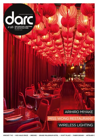
ARIHIRO MIYAKE MISS WONG RESTAURANT WIRELESS LIGHTING KRICKET TVC • HOX HAUS SPACE • BREW92 • GRAND MILLENIUM HOTEL • HYATT PLACE • FABER DESIGN • ARTELIER C


HELEN ANKERS • EDITOR Issue 28 is the last of the year for us and I can't quite believe how quickly 2018 has passed by! What a twelve months it has been - we have brought you some stunning projects covering the hospitality, high end residential and commercial sectors; interviewed key designers; hosted insightful talks at major trade shows including ICFF, Clerkenwell Design Week and 100% Design, brought you darc awards winners big and small (and one hell of a party), and even established our own dedicated lighting event darc room in the heart of Shoreditch, as part of LDF. 2019 is set to be even bigger for the darc team and with Euroluce a matter of months away, it is going to be a busy and exciting time for everyone invovled in lighting! With that in mind, the coming year will see darc bring you fresh content, including insightful industry reports from around the world, starting with the Middle East, Italy, Czech Republic, Spain and the USA. If there is a particular region you're keen to learn more about, do let me know and I can add it to the list! For now though, back to our current issue, Nov/Dec... Our main interview is with Arihiro Miyake on page 10, who discusses the importance of technology, communication and awareness in working with Dutch brand moooi to create the geomteric CoppÊlia chandelier. We also take a closer look at the work of Artelier C and Sebastiaan Vandeputte's use of carbon fibre to create stunning chandeliers and bespoke light installations on page 52 and our regular feature, Folio looks at the work of Birmingham-based design studio Faber Design on page 50. Project wise we've got it covered - from a flagship coffee shop in Saudi Arabia, designed by Liqui Design, on page 24, the first Hyatt Place in Germany, designed by JOI-Design, on page 40 and our cover story, Miss Wong restaurant and bar in Canada on page 44. Our feature this issue focuses on different lighting control applications. As our world becomes 'smarter' clients are looking for new ways to light their space, turn to page 59 to see our selection of control case studies and selection of lights that require little more than a battery charge. Towards the back of this issue, our regular show section features product round-ups from Maison et Objet, London Design Festival and INDEX; and if you're heading to the newly renamed Sleep + Eat show in a few weeks, make sure you have a look at our product preview on page 93. As always, I hope you enjoy our efforts and if you're heading to Downtown Design or Sleep + Eat, I'll see you there!

#readinginthedarc

Cover: Miss Wong restaurant & bar

Image: David Dworkind

Welcome


004

DETAILS

Contents

010 Arihiro Miyake

We talk exclusively with the Japanese designer.

REGULARS 006 FOCAL POINT COCA COLA BUILDING BUENOS AIRES 008 FOCAL POINT YOKO RESTAURANT PARIS

034 Lina Store Restaurant

FEATURES 010 ARIHIRO MIYAKE The Japanese designer discusses the importance of technology, communication and awareness in working with eccentric Dutch brand moooi to create the geometric Coppélia chandelier.

050 FOLIO We look at the work of Birminghambased interior design studio Faber Design.

059 LIGHTING CONTROL As our world becomes 'smarter' clients are looking for new ways to light their space. This issue's feature focuses on different lighting control

052 MATERIALS Artelier C is a global platform for artists looking to work with light. We take a closer look at their work with carbon fibre.

applications.

096 CALENDARC DESIGN SHOWS FOR 2018/19

059 Lighting Control

Red Deer Architects bring an Art Deco feel to this new eatery.

070 WIRELESS LIGHTING darc brings you a selection of decorative lights that require little more than a battery charge.

As technology advances the control choices continue to grow.

PROJECTS

083 LDF Review

Our round-up of lighting on show during London Design Festival.

ON SHOW

016 HOX HAUS, LONDON 74 INTERIOR DESIGN 024 BREW92, AL KHAYYAT LIQUI DESIGN 030 GRAND MILLENIUM, DUBAI NEXO LUCE 034 LINA STORE, LONDON RED DEER ARCHITECTS 038 HYATT PLACE, FRANKFURT JOI-DESIGN 043 MISS WONG, LAVAL MÉNARD DWORKIND ARCHITECTURE AND DESIGN 047 KRICKET TVC, LONDON RUN FOR THE HILLS

078 MAISON + OBJET REVIEW We bring you a selection of lighting highlights from September's design event in Paris. 080 INDEX REVIEW Our review of ighting brands on show during the INDEX design show in September. 083 LONDON DESIGN FESTIVAL REVIEW Our round-up of product launches and events during the most attended design week in the UK. 093 SLEEP + EAT PREVIEW If you are attending this year's show at the Business Design District, make sure you take a look at some of the lighting brands that will be there.

098 SOCIALIGHT INSTAGRAM HIGHLIGHTS

THE MAGAZINE

DESIGN

CORPORATE

Editor | Helen Ankers h.ankers@mondiale.co.uk +44 161 476 8372

Artwork | David Bell d.bell@mondiale.co.uk

Chairman | Damian Walsh d.walsh@mondiale.co.uk

Editorial | Mel Robinson m.robinson@mondiale.co.uk

Publishing Editor | Paul James p.james@mondiale.co.uk

International Advertising | Stephen Quiligotti s.quiligotti@mondiale.co.uk +44 7742 019213

FINANCE

Editorial Contributors Sarah Cullen Matt Waring

Finance Director | Amanda Giles a.giles@mondiale.co.uk

Editorial Intern Matt Nicholls

Credit Control | Lynette Levi l.levi@mondiale.co.uk

#readinginthedarc

Marketing & Events | Moses Naeem m.naeem@mondiale.co.uk darc magazine | Strawberry Studios, Watson Square, Stockport SK1 3AZ, UK | Printed by Buxton Press, Palace Road, Buxton, UK | ISSN 2052-9406


Design to Shape Light

• System power: 33W and 66W  • Lumen output: 3500 and 6500  • Lm/W: 100 • CRI: >80  • Dim: DALI, CLO, Night Dim  • Colour Temp.: 3000K and 4000K

LP Xperi Design by Christian Flindt louispoulsen.com

R11197_LP_DARC_236x333_XperiGalley-AD2.indd 1

08-10-2018 09:04:30


006

FOCAL POINT

focal point COCA COLA BUILDING BUENOS AIRES, ARGENTINA Specified by Pablo Pizarro for Estudio Rosellini for the Coca Cola Company’s new, sustainable building in Buenos Aires, Weplight’s Emilia pendants create a stunning decorative lighting installation for the 12th floor, three-storeys high internal patio. Each pendant is 160cm in diameter and is made out of ash and grey oak. The natural characteristics of the materials used, together with the native vegetation in this translucent space, creates a unique and colourful atmosphere. The giant lamps bring a sense of proportion to the immense space; not only do they look good but they provide acoustic functions to the 2,500m³ glass box. www.weplight.com


007


008

FOCAL POINT

focal point YOKO RESTAURANT PARIS, FRANCE Visitors to September’s Maison et Objet were once again invited to relax in the Yoko restaurant space, this year complimented by the ethereal and whimsical Nenufar collection from Serip. Inspired by a Bonsai tree, and reflecting the aesthetic qualities found in nature, through balance, simplicity and harmony, the lighting collection aims to communicate that nature and creation should remain free of unnecessary ornamentation. The lighting pieces stand out thanks to the intricate aerial roots that achieve an uncanny sense of levitation, while the deliberate imperfections of the curves and creases of the trunk deliver a natural sense of balance. The plumes of leaves are closely connected to the aqueous nature of water lilies and provide an alluring romantic sense of natural beauty. According to Yoko’s existing space concept, the restaurant features a contemporary spirit and purity, taking from Japanese influences and encounters of materials, making it a bright place where the conceptual meets the influences. www.serip.com.pt


009


010

INTERVIEW


011

From Sketches to Spokes Japanese designer Arihiro Miyake discusses the importance of technology, communication and awareness in working with eccentric Dutch brand moooi to create the geometric CoppĂŠlia chandelier.


012

INTERVIEW

Japanese designer Arihiro Miyake traces his creative ambition back to his school days in Kobe, Japan. He realised he had a talent for drawing but never knew what he could do with it until he was introduced to industrial design as a profession while on a school exchange programme in Australia. Miyake never enjoyed studying but felt drawn to more creative disciplines, as he tells darc: “When I was a kid, I was not really interested in studying. I enjoyed art and I was good at it. I liked making things and when I found the subject of product design, I thought ‘this could be my job for life.’” Throughout his education, Miyake studied at Kobe Design University and then, as he discovered more about the work of European designers he saw in magazines, he moved to Finland to study at the University of Art and Design in Helsinki. Here, he completed his masters degree and gained experience wherever he could, soaking up the talent of his motivated and inspiring classmates. “At school, I was surrounded by talented people and I believe they made me who I

am today,” he says. The young designer took a part-time job at university and invested all of his money in developing prototypes of his own products. This was his favourite stage of a project, where he would get to see the first prototype model in his hands, after countless drawings on paper and computers. “Seeing the prototype is the moment you know how far the design is from the result you are aiming for,” says Miyake. Each year, he presented his prototypes at SaloneSatellite in Milan, part of Salone del Mobile furniture fair that’s dedicated to the work of young designers. During his studies in Finland, Miyake worked for multidisciplinary designers including Finnish architect and product designer Ikka Suppanen. Suppanen played an important role in helping Miyake to develop his own understanding of spatial design as well as product design, before he went on to set up his own design firm, Studio Arihiro Miyake. Based in Helsinki, his team now works across product, spatial and concept design, always wanting to create new experiences

by taking a fresh look at the things we live with. Miyake’s interest in lighting design stems from his excitement for the LED revolution, a technological advancement, which he feels lucky to be part of. “Before, we could only design shades for light bulbs, but now we can actually design the light source itself. This creates so many possibilities and so much freedom in design, and this kind of major change doesn’t happen so often in the industry.” With the launch of his Coppelia chandelier for moooi, Miyake received international recognition, and he sees this design as the one that made his career. Working with the eccentric Dutch brand brings a lot of freedom, as they encourage their designers to be spontaneous without constraining them with a brief. “The unique point of working with moooi is that everything starts with hand-drawn sketches,” says Miyake. “They look at sketches before any further development and when moooi sees something interesting, all the developments start.


013

“The idea of Coppelia began as a modern interpretation of the classic chandelier, one that could only work with LED technology. The design is very much about the structure. Each of the LEDs is powered through the steel frame itself, without any additional wires. The complex spoke-like structure of the light ensures that different parts of the frame carrying positive and negative currents never touch and only come together at each LED light source. The stainless steel frame is very thin and comes in either a natural polished chrome or black satin finish. It comes in two different sizes; the larger version has 54 LEDs and the small one has 36. When the light turns on, the LEDs shine so brightly that the frame just seems to sit in the background, giving the appearance of little floating points of light. The result is a contemporary, geometric chandelier that looks weightless and elegant in its suspension. “It’s not that different to the image I had originally drawn in my head,” reveals Miyake, “although it took a long time

to create a functional wire frame that achieved the aesthetic balance as well. In fact, I spent one whole summer doing just that – no beach, no tan! I just kept drawing patterns on the computer to find the most beautiful and intelligent design.” He named the chandelier after the famous French Coppelia ballet, because the form reminded him of a pirouetting ballerina. Miyake admits humbly: “I don’t know what people see in my design. For me, the idea is the most important thing. I always start with an idea, which is my reason for designing something. So the form, the appearance, can be led by the reason too. This is what I want to share with people who use my products.” The Coppelia chandelier was Miyake’s second design for moooi, having created the Carat desk light for the Dutch brand in 2009. Moooi founders Marcel Wanders and Casper Viissers happened upon his stand at Salone and took interest in the little desk light which can be repositioned at various angles by turning the weighted polyhedron base.

The idea of Coppelia began as a modern interpretation of the classic chandelier - one that could work with LED technology. Each of the LEDs is powered through the steel frame itself, without any additional wires. The complex spoke-like structure of the light ensures that different parts of the frame carrying positive and negative currents never touch and only come together at each LED light source.


014

INTERVIEW

Miyake recalls: “Marcel and Casper stopped by my stand and they were interested in my lamp. Moooi decided to put it into production the following year and they named it after me, the Miyake lamp.” The lamp was not a major seller for moooi and is now out of production but the experience of developing that product with moooi allowed Miyake to establish a fruitful relationship with the brand. From then on, Miyake regularly shared his ideas for products with Wanders and Vissers, which he usually worked on at night with a sketch pad and a glass of wine. “After the Miyake lamp, moooi was expecting more ideas from me,” says Miyake. “I was constantly making sketches and once in while, there’s a kind of moment where a few things connect and usually that becomes one of my designs.” The Coppelia chandelier is the result of one of those moments. Miyake has travelled the world with his chandelier, giving talks at moooi’s showroom during London Design Festival and developing video series across various platforms to tell the story of his

design and final product. Miyake tells darc how he enjoys the process of working with manufacturers who can help to develop his ideas further. With moooi, he relied on a close working relationship, using his own communication skills to discuss his ideas with the craftsmen who have a wealth of knowledge and technological understanding. This process gives him a great deal of satisfaction, personally and professionally, as objects that he created in his head become physical objects that can be useful and aesthetically pleasing to people. Miyake works with light because he recognises its importance in enhancing the experience of a space with an incomparable quality. “We live half of the day without sunlight, so it’s very natural that lighting effects us so much. The experience of happiness is created by a combination of different senses. Good food is not enough at a restaurant. We need good company and a good atmosphere as well, right?” Today his collection of projects also includes interiors such as Tooth Tooth, a

famous restaurant in Tokyo as well as a popular bakery in Osaka, Japan. He also works with companies to develop brand identities, showing just how varied and vast his creative capabilities are. As well as this, the designer also now teaches at the University of Art and Design in Helsinki, and as an interior architect for the Japan Finland Design Association. With this myriad of experience and interests, Miyake is a designer who applies intelligence and emotional awareness to his products, always aiming to strike the right balance between form and function by leading with the practical side. He keeps an open mind throughout his design process and humbly cherishes the expertise of those around him, allowing him to find the best possible outcome through a collaborative and iterative process. www.arihiromiyake.com www.moooi.com


j

a

m

z

c o l l e c t i o n

Jazz is not just music, it´s a way of life, it´s a way of being, it´s a way of thinking. Nina Simone

Introducing Jamz, lighting creations combining porcelain with golden, copper or black metal. Make your own composition.

Lladró Showroom New York City D&D Building 979 Third Avenue 18th Floor, Suite 1805 (646) 664-1030 npelletier@us.lladro.com lladro.com

Lladró Showroom Milan Piazza Fontana, 6 (numero verde): 800 46 39 20 + 39 02 2720 1787 info-milano@it.lladro.com


090 016

PROJECT

1

2


017

Bringing The Outdoors In Architecture and interior design firm, 74, renovates former Victorian gymnasium into the new Hox Park student campus. Images: Ed Kingsland

Manchester-based architecture and interior design practice 74 has completed a major project to extend and remodel a Grade II-listed, two-storey, Victorian brick building in a semi-rural location in Englefield Green, just outside Egham. Dating back to the 1890s and originally home to a gymnasium for the Indian Engineering College, which occupied the site between 1890 and 1905, the building has, over the years, adopted and lost various extensions and before the recent refurbishment, had laid dormant for fifteen years. The repurposed 453sqm building – Hox Haus – will serve as the central focus, clubhouse and social amenity for Hox Park student campus, newly-created by developers Moorfield Group for students attending Royal Holloway, University of London. Located within a larger, 67-acre mixed-use site, owned by Royalton Group, the Hox Park campus is one aspect of an overall masterplan for the site that also includes affordable and luxury housing, as well as an Audley Senior Living village. The vision for Hox Haus was to encompass a number of important practical, social and unifying functions for its student users, serving as a welcome point and gatehouse; parcel pick-up area; workspace for single study or group study and a downtime amenity with TV and games lounges, offering video-gaming booths, pool and table football. The building will also serve as the campus hospitality hang-out and has been flexibly designed for easy reconfiguration as a special event space, with moveable furniture and built-in bar points able to house pop-up catering. Architecturally, Hox Haus is a stylish, eyecatching and dynamic two-storey building that seeks to blend its original Victorian brickwork with two new glazed light box interventions, creating a light-filled and largely transparent overall space that brings the outside in, references the building’s semi-rural location and offers a warm,

comfortable and relaxing home-from-home for students. The two new interventions constitute a double-height, 44sqm gatehouse to the building’s east elevation and a 35sqm, covered terrace section on the first-storey, offering views over the whole campus. The terrace extension sits behind the parapet of an existing ground-floor extension, making it subservient to the host building. Royalton Group initially invited 74 to produce a site analysis exploring the building’s further development potential, before private equity real estate fund manager Moorfield Group went on to commission the design studio to develop an integrated vision. “The brief for Hox Haus evolved gradually from the outset,” David Holt, Founder and Director of 74 explained. “Whilst we were initially brought in to look at the interiors of the student accommodation - a speciality of the practice - we were then engaged to explore the potential of this unloved building and, by determining the need for an appropriate amenities provision for the student body, were able to rescue it from decay and provide a much needed focal point for this large-scale, semi-rural student accommodation development.” The heritage of the building was a key driver for the interior approach and, unlike many architectural projects, the interior was in fact the key driver overall, so that the architecture is subservient to both the existing host building and the functions within. The overriding concept was to create a space that felt like a country retreat or clubhouse-with-a-twist. The new gatehouse provides a sense of arrival, whilst offering a separation between the functions of ‘reception’ and the need for a comfortable student social space monitored, but not overlooked, by staff. While certain areas have key functions, such as the two group study areas or the TV and gaming lounges, others are multi-functional,

for students to make use of as they wish. The central zones are more obviously social, whilst quieter areas can be found along the edges of the two-storey space and within the first floor extension directly above the welcome area. Another major design driver was the building’s rural aspect and the design therefore strives to make the most of views over the historic surrounding countryside, as well as bringing the outside in via natural references and creating a rich, textured and high-quality feel with a materials palette that includes marble-effect Hanex solid surfacing and brass detailing. Upholstery fabrics include textiles that nod to British rural tradition, such as checks and tweeds, whilst colours span a whole nature-inspired autumn-to-winter palette and feature greys, browns, rusts and moss greens, with bursts of berry brights and large-scale, natureinspired print wallpaper on opposing feature walls at the ends of the ground floor. Lighting throughout, is supplied by Enigma Lighting and is used to create pockets of atmosphere. While decorative lighting is the main focus, subtle architectural up and downlighters are set within the ceiling and show off the structure of the brickwork. Rachel Whitey, Associate Director at 74 outlines the role decorative lighting played in the scheme: “Decorative lighting was absolutely essential to its success, both in terms of how it is viewed externally and how it felt internally. Part of the client’s brief was the clear desire for a hospitalitystyle environment and for it to not feel like a typical commercial office or education facility. “Key lighting considerations were to ensure the desired lighting levels were achieved for studying within the space, without creating a blanket light over the entire area. The balance was about creating pockets of useable, focused light for study, while also creating a hospitality feel that is both intimate and homely. We managed


018

PROJECT

1

2

3

to coordinate with the M&E consultant to ensure they got the base levels correct and understood the brief. The lighting positions were fully co-ordinared with them to ensure when fitted, they worked in sync with the interior layout and facilities.” Students enter Hox Haus through the fully-glazed, gatehouse and are greeted by staff at the bespoke reception desk, which features three Globe Pearl Drop ceiling lights by Rockett St George hanging above it. Here, the designers chose to keep the lighting minimal so as to not obstruct the clear views and beautiful brick arch elevation that formed the old entrance to the building. Pendants were introduced where it felt necessary to highlight and complement key areas. With that in mind, two pendants also feature in the seating area, chosen specifically because of their black open wire design, which creates a subtle design feature without taking away from the light and airy feel of the space. Immediately to the left of the entrance arch stands a new machined-metal staircase, which has a dark perforatedmetal balustrade and brass handrail. This dark palette is reinforced across the whole interior architectural treatment. Light fittings in the main spaces are arranged on metal-mesh grids suspended around the edge of the ceiling and feature slender brass rods reaching from one end to the other, which house globe pendants on bent arms round its edges and a minimal, geometric chandelier, at its centre. Bar-top lamps and floor lamps complete the varied treatment and help create zonal differentiation. Opposite the staircase is a U-shaped, curved, open-plan bar, which features pendant lights from Belgian lighting brand DARK hanging above it, chosen for their elegant simplicity, shape and marble material, which suits the café counter top. “Each light fitting was carefully decided on by taking into account the particular location the fitting sits within, its interaction with its surroundings, and how it might complement the other interior design elements within its vicinity,” continues Whitey. “Alongside this, it was important to envision the fittings as a collection that come together to work as a considered whole. An example of this is the ground floor group study rooms, which are visible from reception onwards and divided only by a glazed wall with a crittal-style, glazed square framework. Each study room includes spun-leaf-adorned Orland pendant shades from Di Classe. The exact location and proportion of the lights within these rooms became crucial as the square grid of the glazing framed certain elements.”


Because Because good good design design demands demands simplicity. simplicity. ™ ™

British lighting design since 1997 British lighting design since 1997 astrolighting.com astrolighting.com


020

PROJECT

Moving up to the first floor, the roof trusses have been left exposed, housing six eyecatching chandeliers at equal spacing. On the brick walls, the DARK light fittings from the ground floor bar are re-introduced as wall fittings to emphasise the joined-up design feel. “By utilising them in a different way, they also highlight a different zone,” says Whitey. “Mirrors were deliberately placed on opposite walls to reflect the feature lighting and create an extra aspect of depth and lighting within the volume of space. Because this space was designed as an active games and event area, the light fittings chosen were fixed to either the wall or ceiling points to make it simpler to move things around. “The lighting in this area was designed as a ‘village hall’ and to be non-specific to the floor layout. It doesn’t overly highlight specific zones like other areas, such as the ground floor, thus giving the operators the

1

2

3

4

ultimate flexibility while maintaining the same ambient feature lighting.” Aside from the main area, the first floor houses a series of specific-use areas, such as a TV lounge and games room, featuring button-back sofas, antiqued mirroring on the walls and a series of inset panels directly above and punctured by flower-shaped wall lights, bespoke-designed by 74 and made to order by Mullan Lighting. The first floor gatehouse extension features a central work island, with three pendant lights by Decode hanging directly above to create an intimate and focused meeting setting, supplemented by background and surface tubular spots as a backdrop. Alongside this, brass task lights were used for the booth tables and chosen to provide focus lighting for study, while also creating a modern ‘nod’ to the classic banker’s table lamp. As with any project, Hox Haus came with its challenges, mainly relating to constraints

Opening spread 1. Architecturally, Hox Haus is a stylish, eye-catching and dynamic two-storey building that blends its original Victorian brickwork with two glazed light box interventions. 2. The fully glazed 'gatehouse' entrance features three globe pearl drop pendants from Rockett St George. Pendants over the seating area were chosen to create a subtle design feature without taking away from the airy feeling of the space. Previous page 1. The metal mesh grid features slender brass rods reaching from one end to the other and houses smokey globe lights on bent arms, supplied by Enigma Lighting. 2. Four pendant lights from DARK hang above the bar, chosen because of their marble material and elegant simplicity. 3. The group study rooms feature spun-leaf-adorned Orland pendants from Di Classe. This page 1&2 A central work island on the first floor makes use of three pendants from Decode. Their wire nature means they don't block views across the area. 3. In the TV room flower-shaped wall lights made by Mullan Lighting are placed behind the user so as to not interfere with sight lines. 4. Brass task lights feature in the booth tables of the first floor gatehouse space, providing focused lighting to study. Next page 1. Six, evenly spaced, eye-catching chandeliers add a sense of drama to the exposed roof trusses. 2. Large decorative pendants add to the 'outdoors in' theme in the workspace areas.


NATURE

REALISED AS CONCEPT Serip Organic Lighting draws inspiration from organic forms found in nature. The designs are handcrafted with artisanal time-honoured techniques, luxurious materials and unparalleled quality.

www.serip.com.pt info@serip.com.pt

AF_Serip_AD_darc_28 (NovDec).indd 1

10/10/2018 14:21:16


022

PROJECT

1

of the existing building as Whitey explains: “The introduction of lighting fixtures to exposed brickwork walls and exposed structural trusses with no existing power infrastructure was definitely an issue. Without being detrimental to these existing elements, we had to consider carefully how we positioned the feature lighting elements. “For example, on the first floor, the beautiful timber trusses have been left exposed and the six chandeliers highlight the volume of the ceiling, creating drama. By working with the M&E team, we proposed to fix a minimal square trunking to the underside of the beams, into which all the wiring could be housed. We then painted this the same colour as the open roof and beams so that it blended into the existing structure. This meant that the power infrastructure was available to the drop pendants where desired but with no exposed wiring runs, so the trusses could be kept as clear as possible. Any wall lighting additions to the brick walls were added via black conduit, which provides contrast but also suited the overall look and feel of the scheme.” For Whitey, looking back at the original concept visuals and then seeing the finished project, her initial impression is that the

74 team delivered exactly what they had promised and realised the concept and aspirations of the client in doing so. “It was such a unique building with a rich history,” she says. “Using this as the basis to build our design from was quite different to other projects we’ve worked on. After various additions over the years, we wanted to strip the building back to where it started in its original form, then build it up again sensitively into a modern, functioning space. We had to really consider any interventions and look at how we could retain the beauty of the existing structure while also enhancing it.” Sadie Malim, Head of Special Projects and Legal at Moorfield Group, commented on the project: “74 excelled themselves on the design work for Hox Haus. The combination of their devoted attention to detail and design flair resulted in a scheme that sets the new standard for student accommodation in the UK. They understood easily what we were trying to achieve and were able to deliver a knock-out scheme, which encompasses necessary practical considerations, but also delivers the wow factor.” weare74.com

2

design details HOX PARK STUDENT CAMPUS, EGHAM, UK CLIENT: MOORFIELD GROUP ARCHITECT & INTERIOR DESIGN: 74 LIGHTING CONSULTANTS: ENIGMA LIGHTING

lighting specified DARK ROND PENDANT RANGE DECODE WIRE PENDANTS DI CLASSE ORLAND PENDANTS & ARLES TABLE LAMPS / FLOOR LAMPS ENIGMA LIGHTING CURVED WIRE PENDANTS; SMOKEY GLASS PENDANTS; OPAL TABLE LAMPS; BESPOKE PENDANTS FRAUMAIER ELLAGENNIE FLOOR LAMPS MADE PARROT TABLE LAMPS MULLAN LIGHTING AMIAS WALL LIGHTS & DODOMA WALL LIGHTS ROCKETT ST GEORGE GLOBE DROP PEARL PENDANTS STABORD BEYOND DESIGN LEAF DESK LAMPS


024

PROJECT

A Unique Blend Interior design firm Liqui Design, creates a modern, fresh approach to the Saudi coffee shop experience at Brew92's flagship store. Images: Crate47

British interior design studio, Liqui Design, has recently completed the interior design of flagship coffee shop and roaster Brew92, a Saudi Arabian speciality cafe and roasters. Located in Al Khayyat, Jeddah, Brew92’s impressive flagship space is a testament to Liqui Design’s fresh, imaginative and artisanal approach to design. Liqui Design has created a number of original coffee shop interiors across the Middle East from Dubai to Abu Dhabi and Jeddah, with the flagship Al Khayyat cafe and roastery its second project for Brew92. Throughout Saudi Arabia, the speciality coffee scene is burgeoning and offers a popular alternative to traditional Arabic

coffee (a drink that is prepared and served in accordance with a strict etiquette). While Western coffee chains are popular, there is a growing third wave coffee movement that considers coffee as an artisanal foodstuff - a trend that is especially attributable to millennials. Moreover, speciality coffee shops provide forums for social events, from poetry readings to art exhibits. With a keen appreciation of Saudi Arabia’s speciality coffee scene, Liqui Design worked with Brew92 to create an environment that appeals to coffee connoisseurs and art and fashion enthusiasts alike. By combining reclaimed wood, green foliage, blue tones and industrial components, Liqui Design

achieved a space that embodies the Brew92 brand and ethos. The Al Khayyat cafe and roastery began as a large, open and bare two-storey building, devoid of character and charm. Liqui Design reimagined the space with the bold, bright and airy look and feel of a modern warehouse. Despite its scale, the cafe and roastery is imbued with warmth and personality. Commenting on his first meeting with Brew92, Liqui Design Creative Director, Cameron Fry, told darc: “The client is the son of one of the biggest food groups in Saudi Arabia. Educated in New York and the UK and having experienced Western culture,


025

his concept was to bring western speciality coffee to Saudi Arabia. “We met through the London Coffee Festival, which we designed the brand experience for. He was looking for coffee shop designers and, from seeing our work at the festival, asked us to set up his speciality coffee concept in Saudi.” Brew92 wanted Liqui Design to create a cosy, yet industrial feel for the flagship store, which was difficult to pull off, given Fry and his team had to fill a 600sqm space - 400 more than the concept store they had worked on previously. But, upon visiting the store post-build, Fry was amazed at how intimate it actually feels despite its size. On the industrial feel, Fry explained: “They don’t really have old buildings in Saudi like we do in the UK, so we tried to, without it being faux, make the space feel like a coffee shop you would find in London.

“Brew92 required the space to work from day to night and be a place that would attract everyone, whether you're seventeenyears-old or 60-years-old - a feat already accomplished by Bar92’s branding.” Doubling up as a roastery, with a magnificent glazed partition separating the artisanal space from the rest of the shop, the design allows people to see exactly how the coffee is roasted and prepared. There is also a large, bespoke island coffee counter and striking spiral staircase that take centrestage in the space. In order to adhere with Saudi law, the coffee shop needed to be split into areas for singles and families. This separation is a staple in Saudi culture and the owners wanted to both respect their heritage, yet move forward with modern cultural trends that are beginning to take place in the country. To achieve this, Liqui Design divided

the space into a number of smaller seating areas, delineated by natural wood flooring. In addition, private lounge ‘rooms’ for families offer a sense of privacy yet are not completely closed off from the rest of the space; instead they are enclosed within a light industrial mesh. Liqui Design’s own furniture and lighting designs were used for the project, some of which were specifically created to fit the concept of the store. Manufactured in the UK by Liqui Contracts, the furniture and lighting pieces are made with sustainable materials and combine traditional craftsmanship with modern innovation. Commenting on the use of light within the space, Fry tells darc: “We tried to use as much decorative lighting as we could in order to accomplish the job of architectural lighting. A lot of the time we had directional spots hidden in the background to make


026

PROJECT

1

2

sure that we were lighting all the spaces correctly. We tried to put enough different decorative features in so at night it becomes a lot more atmospheric, which worked really nicely. “The introduction of our Symbol standard light fixtures in one of the seating areas, worked really well because of the way the light is cast against the wall. They glow in the space rather than providing directional task lighting, which would be a killer. “By using these fixtures, it gave us more light around the tables without using pendants, which is something you get stuck with sometimes. Same with the bespoke

elements, we used our Trafford lights running up the bookcase in conduit and positioned over - looking almost like street lights. This was done to try and give the same downlight effect on the bookcase but with a different medium. We tried to use all the different variants we could whilst still casting enough light.” In order to reinforce the feeling of being cosy, the design team experimented with the ceiling height, attaching their Work light fixtures to a disc and dropping them to bring the ceiling height down slightly. The same was done with the bar, a metal structure was dropped around the bar to

Opening spread Brew92’s flagship Al Khayyat cafe and roastery began as a large, open and bare twostorey building, devoid of character and charm. Liqui Design reimagined the space with the bold, bright and airy look and feel of a modern warehouse. Despite its scale, the cafe and roastery is imbued with warmth and personality. This page 1. Liqui Designs' Work pendant lights hang beautifully above the cosy, open seating area. While the Symbol light brings a fun design element to the scheme. 2. A cluster of Trafford pendants add to the industrial design brief given by the client. Next page 1. Bespoke versions of the Trafford light are used for the private lounge ‘rooms’, which offer a sense of intimacy and are enclosed with an industrial mesh. 2. The large bespoke island coffee counter is highlighted with strong blue Trafford pendants from Liqui Design.


028

PROJECT

1

2

bring the visual height down and Liqui's Trafford pendants were suspended from that section rather than just dropping them straight from the ceiling. Lighting was also used to create a discreet, shaded barrier between the different seating areas. The shadow lines between areas have customers almost walking in the shadows towards the lighted seating areas. “We didn’t want to put tall walls up as we thought it would ruin the flow of the unit and didn't fit the new cultural direction of the country,” says Fry. “So instead we put up mid-walls with plants in the top so you still have the feeling of scale. “The clients were fantastic to work with as they had complete trust in us from the beginning, allowing us to make adjustments and play around with the design. Stateof-the-art VR technology was given to the contractors working on the site as well, which made the process a lot easier and allowed them to physically see how we wanted the shop to look. “Having visited the coffee shop since it opened, it is an impressive space - we want people to have a bit of a breathtaking moment when they walk up to the front door,” continues Fry. “It glows from the outside and is definitely attracting attention in the region, with queues around the block on opening night. “It’s the biggest interior we’ve done to date and we’re so proud of it, it’s definitely been a learning curve for us.” Fry’s pride is much deserved considering Liqui Design’s efforts in achieving a cosy look and feel in such a large space, while managing to create a social space that balances old and new culture, pushing the boundaries for Saudi’s budding younger generation. www.liquidesign.co.uk

design details BREW92, AL KHAYYAT, SAUDI ARABIA CLIENT: BREW92 INTERIOR & LIGHTING DESIGN: LIQUI DESIGN LIGHTING SPECIFIED: LIQUI DESIGN SYMBOL LAMP; WORK LAMP; TRAFFORD PENDANT


Feeling the light The Secto Design lighting collection is designed by the award-winning architect Seppo Koho. The diligent handwork is carried out by highly talented craftsmen in Finland from top-quality local birch wood. www.sectodesign.fi


030

PROJECT

1

Five Star Review Nexo Luce creates a stunning bespoke lighting scheme for Dubai's Grand Millenium Hotel.

The Grand Millennium Hotel is a five star, 251 room hotel in Dubai, UAE - a new development by RTS Investments, with HLG involved as the main contractor. Having recently opened its doors, the hotel is set to become another iconic hospitality project

contributing to the vibrant landscape of the Business Bay district of Dubai. High-end Italian lighting brand Nexo Luce was responsible for the large-scale bespoke lighting creations at the hotel. One of many projects the company has worked on in the

region, the client’s expectation for Grand Millennium was to set a new standard for luxury in the continuously growing Business Bay area. The team opted to do so by bringing the sophistication of Italian design and made-to-measure craftsmanship.


031

2

Working in close collaboration with local interior designers from DIAR Consult, the Nexo Luce team was strongly inspired by the desert colour palette and curved shapes for the lighting pieces. The atmospheric ambient lighting schemes, in warm amber and copper tones complement the sleek, stylish public and private spaces of the property. As guests enter, they are greated by the most impressive light feature in the hotel. From the top of the nearly eighteen-metre high ceiling, a fourteen-metre Murano glass

chandelier spans three floors of the main lobby. Composed of seven structured cage clusters, made of steel wires and covered by a total of 140 individually crafted amber glass leaves, the shape of the leaves is realised in four types. Venetian craftsmen had the challenging task to create every glass leaf by hand while following a strict design pattern, ensuring the leaves for each type were the same. Lobby lounge lighting includes Nexo Luce designed slimline pendants that make use of polished chrome and glass cylinders in

rich gold, which are suspended around a central sphere. Bespoke lighting continues throughout the public areas, including the bar area, which is adorned with rectangular ceiling mounted lights in stainless steel, and covered in fine Italian fabrics in ivory shades; while the lift corridors are enhanced by wave-shaped complex chandeliers composed of amber frosted and clear glass, with the use of infused golden glitter. For the hotel’s ballroom Nexo Luce created a lighting sculpture, another jewel in the collection for guests to enjoy when


032

PROJECT

1

2

visiting the venue. Hues of white and warm colours of the space are juxtaposed by the cool tones of 27 hand-curved chandeliers filling the coffered ceiling of the three interconnected ballroom halls, which gives it a neutral backdrop for various event types. The modernised design of the chandeliers combines the elements of both classic and contemporary styles. Each of the chandeliers is constructed of clear glass tubes assembled in one by a round-shaped mirrored frame, which creates a light refraction effect. Nexo Luce envisioned a modern-day lighting centrepiece that would create the same sense of luxury and grandeur that the ballroom deserves. Once guests make their way up to their room or suite, they find a spacious and relaxing space that makes use of custom

3

made decorative illuminations, bedside lamps and spotlights, all designed to create a stunning ambiance. “Nexo Luce turned out to be one of the best decisions made by the Bay Views Hotel project team with regards to lighting,” says Ahmad Sabra, RTS Projects Director and Owner Representative and Chief Architect of the project. “The quality of the products, the design and the techniques of engineering made a great impact on the overall project design and its final look. Another added value was the ability of the Nexo Luce team to respond to our needs quickly and efficiently at all times due to their presence and diverse experience in Dubai and the Middle East.” www.nexoluce.com

design details GRAND MILLENIUM, DUBAI, UAE CLIENT: RTS INVESTMENTS INTERIOR DESIGN: DIAR CONSULT LIGHTING SPECIFIED: NEXO LUCE LIRA TABLE & FLOOR LAMPS; COMPASSO TABLE LAMP; CILINDRO VETRO PENDANT; VARIOUS BESPOKE CHANDELIERS: SOFFIONE, RIVOLO, FONTANELLA, FONTANA, ONDE, ONDINE

Opening spread 1. Hand-curved chandeliers fill the coffered ceiling of the three interconnected ballroom halls. 2. A 14-metre Murano glass chandelier spans three floors of the main lobby - composed of seven structured cage clusters, made of steel wires and covered by 140 individually crafted amber glass leaves. This page 1. The lift corridors are enhanced by the wave-shaped complex chandeliers. 2. The lobby lounge includes slim-line pendants of polished chrome and glass cylinders in rich gold, suspended around a central sphere. 3. The guestrooms and suites feature custom made decorative illuminations, bedside lamps and spotlights to create a stunning ambiance.


034

PROJECT


035

Art Deco Dining The iconic Italian deli, Lina Stores, in London has a newly opened restuarant and bar with interior design completed by Red Deer. Images: Mariell Lind Hansen

The original Lina Stores delicatessen opened in London in 1944, and delivered a strong mid-century Art Deco aesthetic that Red Deer architectural practice wanted to use as inspiration for the opening of neighbouring store - 51 Greek Street, Soho. London-based architectural firm Red Deer was brought on board by The White Rabbit Fund to be responsible for designing the interior scheme for the bar and restaurant. Working collaboratively alongside the owners of the Lina Stores, the team conceived a contemporary dining experience, which connects a ground floor open kitchen bar with a downstairs restaurant. Taking inspiration from the original Lina Stores, Art Deco cafes and bistros of Europe, Red Deer has sensitively reimagined many recognisable stylistic elements and materials of the pistachio-green and white Brewer Street namesake, to create an evocative and authentic design for the new restaurant and bar. Architect Lionel Real de Azúa recounted the initial approach: “We didn’t want to duplicate the design of the original Lina Stores, opened in 1944, in the restaurant. We looked for visual cues at the original deli that we could bring over to 51 Greek Street. The strong branding and design of the original and iconic deli, as well as its friendly, welcoming environment also needed to be present in the restaurant. We wanted our design to be true to the values and aesthetic of the deli, but at the same time innovative and contemporary and I think we achieved that by adding a fresh modern twist.” Inside, the restaurant has varying levels

and heights throughout the dining and bar areas, including high counter seating. When first entering, the dining space has a risen twelve-seat diner characterised by a sleek Formica bar with fluted aluminium detailing, concrete bar top and pale green leather bar stools. The internal walls and ceiling have remained untouched to add a contrast to the modern additions. Red Deer enhanced the rawness of the original building by exposing brickwork, piping and ventilation systems. The studio also used a highly texturised plaster mix containing leftover coffee beans from the original Lina Stores Deli. “As a practice, re-use is of great importance to us. For the design of Lina Stores, 51 Greek Street, we reclaimed where we could and played with the innovative repurposing of materials,” explained Real de Azúa. The different materials and textures used play an important role in this interior design and are utilised to differentiate between different zones. The flooring is a mix of traditional green and white terrazzo and the dining furniture is a combination of bespoke Carrara marble and aluminium tables, paired with reclaimed Formica dining chairs and fixed tiled green banquettes with leather seat pads. Architect Gianna Pagliarulo described the furnishings: “We designed the tables with the help of graphic designers EverythingInBetween. We originally wanted a graphic inlay on the tables and they came up with the idea to use the Lina logo on the four corners. “The client, White Rabbit Fund, was really involved in the project from start to finish,

even requesting a romantic seat in the corner,” she added. “We wanted to bring continental touches to the façade and it was non-negotiable that there would be a mosaic floor to greet the guests. Not many Soho façades are tiled, so this was key to this continental design. We even had in an input on the music selection!” Lighting was a major detail in the design plans for the interior scheme and had to carry through the Art Deco and reclamation theme throughout the premises. Decorative lighting played a key part in adding softness and warmth to balance out the concrete bar top, marble, tile, aluminium materials and cool pastel green colour palettes. Real de Azúa explained the choices of lighting fixtures used in the design to darc: “We chose outdoor wall mounted globe lights for the exterior of the restaurant from Peter Reid Lighting, and similar reclaimed globe pendants to hang across the open plan kitchen counter inside. These created spotlights of soft warm diffused lights and are very reminiscent of those used in the mid-century Art Deco cafes and bistros of Italy. We also used reclaimed reeded pillar wall lights in the rear part of the kitchen to highlight and accent the area. Again, a very Art Deco mid-century style, the fluted glass complimented the fluted glass we used in the exterior windows and interior staircase. “Downstairs in the main restaurant we used a mixture of further reclaimed decorative lighting; mini globe wall lights and almost space-age looking flush ceiling aluminium and glass lights. In the bar area we again used reclaimed reeded pillar wall lights to really differentiate this area. The cavernous


036

PROJECT

1

2

structure of the basement restaurant has an intimate feel and we wanted to the use the lighting to emphasise that and not be too bright or clinical. We fitted dimmers to all of the lighting across the restaurant so they can be adjusted for more moodier lighting in the evening.” Similar to the external globe lights, more globes were hung over the counter across the open plan kitchen, which echo the original designs of the older Lina Stores. To celebrate the heart of the restaurant, accent reeded Art Deco glass pillar lights were added to the rear of the kitchen. The high polished aluminium and glass created a sparkling contrast to the raw textures of the walls and industrial kitchen aesthetic. A unique feature of the basement dining area is a low, curved ceiling. This proved difficult to hang pendants from, so the the team at Red Deer focused on ambient lighting surrounding the diners. “We didn’t want to hang pendants that would distract, disrupt and clutter the natural intimate feel of the space,” said Real de Azúa. “We wanted to make the tiled banquette seating a focal point and pendant lights would have distracted from this. Instead we

3

used Mullan Lighting's Yaounde double globe wall lights, placed vertically rather than horizontally for a more contemporary look. We used polished aluminium and opaque glass flush ceiling lights across the arched ceiling along with some spotlights. “Downstairs, we incorporated a traditional rich timber aperitif and cocktail bar that feels both classically Italian and Soho-esque. Here we used the same reeded glass pillar lights as we used in the ground floor open kitchen bar.” Continuing with the theme, the designers also added a reclaimed character to the bathrooms. Old Art Deco ship wall lights with ribbed glass were placed either side of a brass Art Deco mirror, and hidden strip lighting was used to illuminate the basins. “The main challenge was creating a restaurant very much inspired by the Lina Stores deli, but that didn't eclipse it - we needed to compliment the original deli and create a concept that worked alongside it, especially as both sites are in walking distance of each other in Soho,” reflected Real de Azúa. www.reddeer.co.uk

design details LINA STORES, LONDON, UK CLIENT: WHITE RABBIT FUND INTERIOR & LIGHTING DESIGN: RED DEER

lighting specified PETER REID LIGHTING OUTDOOR WALL MOUNTED GLOBE LIGHTS MULLAN LIGHTING YAOUNDE DOUBLE GLOBE WALL LIGHTS RECLAIMED FIXTURES: INTERIOR WALL MOUNTED GLOBES, GLOBE PENDANTS, REEDED GLASS PILLAR WALL LIGHTS, ALUMINIUM AND GLASS CEILING LIGHTS, SHIP WALL RIBBED GLASS LIGHTS AND STRIP LIGHTING.

Opening page The front of the new Lina Stores bar and restaurant in Soho, London presents a striking and iconic aesthetic and colour scheme, heavily influenced by the neighbouring original 1944 deli. This page 1. Continuing with the reclaimed theme into the bathrooms with wall mounted, ribbed glass ship lights. 2. Opaque glass globes hang over the bar adding a touch of warmth to the interior design to balance out the pastel colours of the seating and flooring along with the concrete bar top. 3. Vertically placed Mullan Lighting globes add a unqiue and modern twist to the dining area in the basement. Decorative and architectural spotlights sit flush against the curved ceiling in a simple design so as not to look cluttered or distract from the featured globes.


ANDLIGHT PRESENTS

ORBIT PENDANT LUKAS PEET / 2018


038

PROJECT

Urban Jungle Making its debut in Frankfurt, Germany, Hyatt Place provide stylish comfort and convenience for business travellers, thanks to warm and welcoming interior design from JOI-Design. Images: Simone Ahlers for JOI-Design

JOI-Design has created the interiors for the newly opened Hyatt Place Frankfurt, the lifestyle brand’s first property in Germany. Balancing the calm of nature with high-tech efficiency, the studio as designed an ‘urban jungle’ concept that uses natural materials and palettes to create a connection between the city and nature. The result is a relaxing yet energising sanctuary from the adjacent Frankfurt airport. The 312-room new build was conceived to provide stylish comfort and convenience for business travellers constantly on the move through the largest hub in Europe. Part of Gateway Gardens, a recently constructed

commercial development located at the former Rhein-Main Airbase, the site is a hive of activity in the daytime, while during the early mornings and evenings, it grows quiet. Creating a warm, welcoming ambience was essential to ensure the silence felt relaxing rather than lonely and, with most guest staying only one night, offer a taste of Frankfurt’s culture. JOI-Design first became involved in this project, early 2015, when Feuring Visionary Hotel Development, a long-standing hotel developer embarked on the construction of the building. The design firm’s brief was to create a contemporary and European take

on the Hyatt Place brand and simply build the best hotel in the select service field in Gateway Gardens. Project leader and JOI-Design Partner, Heinrich Boehm, tells darc: “This project offered the best conditions to allow for a smooth workflow. All stakeholders operated on a highly professional basis, having excellent experience in the hotel business. As such, the implementation of our client’s wishes and needs happened quite quickly… The more challenging part of the brief was to identify and strengthen the core of the Hyatt Place brand, as it has been developed in the US… while at the same time, keeping


039

the brand modern and exciting for the target group of business travellers in Europe. This was a joint effort by all players including the Hyatt design team in Dubai. “As the work progressed, it turned out that the building part of the budget had been very well managhed and we were therefore able to slightly increase the FF&E budget and spend more on the public areas. This was really helpful, allowing us to increase the quality of the products and improve guest experience.” JOI-Design found inspiration in the neighbouring parklands that emerged since the US Air Force planted trees at the base decades ago. Reflecting guests’ desire for wellness and natural connections, the greenery of the outdoors has become an appealing interior focus. Round, framed patches of moss hung on the lobby walls bring a sense of freshness and suggest the nearby woodland topography as seen from the air. Open-structured room dividers in the public areas introduce degrees of intimacy while

still allowing guests to feel connected with their surroundings. The first can be seen in the lobby, with ropes strung between full-height circular frames and a suspended track that projects light onto the ceiling. The lattice design has also been used as art behind the reception desk, both to reference the airport’s vast network of flights and to inject a creative energy that uplifts the relaxed, inviting vibe. The crisscross pattern is additionally echoed in the illuminated circular ceiling structure above a double sided ‘island’, which fucntions on one half as a reception and on the other as a bar for the lounge. On the reception side, assorted green, grey and white pendant lights from the Brokis Shadow range hang from the frame and over the bar, cowbellshaped clear glass lights from the Brokis Mona range are suspended from sturdy leather straps. “As the main public guest functions take place in the open lobby space, which covers around 1,000sqm, lighting plays a significant role in highlighting the distinctive layout

and in continuously highlighting the relevant areas throughout the day,” says Boehm. “The lighting design follows the overall design concept, which is influenced by three major factors: the strong connection to the adjacent park with mature tree stock in the heart of Gateway Gardens; the geometric symbolism of Hyatt Place as part of the brand’s identity; and the local reference to Frankfurt and the Rhein Main area, combined with the global network passing through Frankfurt International Airport. “The main goal of decorative lighting in the hotel welcome area with the reception and bar is to introduce and support the individual design concept for arriving guests. In terms of architectural lighting, in this case, it works to provide discreet and understated illumination, while the decorative lighting features are the focal points throughout the hotel. “One of the major lighting features is a group of large suspended steel rings equipped with uplights, of which the largest is 8.5m in diameter. These huge parts


040

PROJECT

required extra care in terms of planning and installation. “Proceeding further throughout public spaces, lighting features were chosen to meet the needs of a flexible and multifunctional space and allow guests to dine, work and relax. In the rooms and bathrooms, lighting creates a comfortable living atmosphere and sense of well-being.” As this property is the country’s first Hyatt Place, JOI-Design was given the task of originating a bedroom concept relevant for the German marketplace and typical guest profile. In a scenario where travellers usually stay for only one night, suitcases are rarely unpacked. The studio realised the conventional closet could be eliminated to free up floor space. Instead, a minimalist set-up with a luggage rack and golden

pipes for hanging clothes creates an open, airy and urban feel. The typical massive writing desk has been replaced by a round, multifunctional table suitable for working or eating and the buly sofar has been swapped for a streamlined chaise longue where travellers can recline. JOI-Design’s philosophy when developing hospitality concepts is to embed subtle cultural references through interior details that together, add up to an impression of the locale. “What you cannot achieve with furniture or any other design features can be delivered through lighting,” concludes Boehm. “It creates a dynamic change of atmosphere throughout the day. www.joi-design.com

design details HYATT PLACE, FRANKFURT CLIENT: HYATT HOTELS INTERIOR DESIGN: JOI-DESIGN

lighting specified BROKIS SHADOWS PENDANT RANGE BROKIS MONA PENDANT RANGE OCCHIO RECESSED LUMINAIRES SATTLER CIRCOLO INSOSPESO WALL LIGHTS LIGHTLIFE CIRCULAR PENDANTS

The main goal of the decorative lighting in the hotel welcome area with the reception and bar, was to introduce and support the individual design concept for arriving guests. Proceeding further through public spaces, lighting features were chosen to meet the needs of a flexible and multifunctional space. In the guest rooms, lighting creates a comfortable living atmosphere and sense of wellbeing.


PERFECT LIGHT ANY WHERE

LUCTRA® FLEX provides good light exactly where it is needed. Anywhere. Anytime. No cables. No restrictions.

www.luctra.eu LUCTRA_darc 3d_02_2018.indd 1

22.02.18 11:33 22.02.18


PROJECT

Hollywood Kitsch Ménard Dworkind Architecture and Design creates a striking interior for the Miss Wong Chinatown themed restuarant and bar in Laval, Canada. Images: David Dworkind

In Eastern Canada, close to Montréal, the city of Laval is host to the extravagant Miss Wong restaurant and bar. Named after the infamous Chinese-American actress from the 1920s-30s, Miss Anna May Wong, the charming restaurant appears to be more

reminiscent of a 1980s San Franciscan Chinatown. Serving a Chinese, Thai, Vietnamese, Japanese and Cambodian inspired menu, the modern-fusion kitchen is run by Vietnamese-Montréal chef Phong Thach. Co-owner Dan Pham runs

the restaurant/bar in partnership with Foodtastic restaurant group, which is mostly known for its Canadian chains. The dazzling interior design of bright neons, exotic Asian fan and paper lantern lights, red and jade décor and chic dining

043


044

PROJECT

000

1

2

accessories was completed by Ménard Dworkind Architecture and Design (MRDK), a Montréal-based firm that specialises in commercial interiors, residential architecture and interior design. For the Miss Wong project, the team at MRDK brought in lighting design firm D’Armes and manufacturer Le Lampiste de Beloeil to create bespoke lighting fixtures to complete the cinematic effect. Dave Dworkind, of MRDK, explains the firm’s approach to the aesthetics of the space and the brief they had to work with: “The initial idea was to make a restaurant/bar with an American Chinatown feel. The project took three months for design and drawings and six months for construction. Firstly, it's a 10,000sqft space with a 500-person capacity, so we needed to create different zone levels to make it more comfortable. The client wanted to be able to accommodate groups in more private spots, groups around the

action of the bar, and plenty of two-seaters to be able to modulate the space. “The lighting always plays an important role in all of our projects,” says Dworkind. “We always custom design all of our lamps to give more personality to projects. In the case of Miss Wong, we opted for a low lighting approach where most of the lamps start from the ground or from the tables. That way, we were able to practically make the 22ft-high ceiling disappear.” Le Lampiste de Beloeil created MRDK’s custom-designed tabletop lamps with laser-cut calligraphy details of Chinese lettering across the shades. Robert-Etienne Cases, from Lampiste, described some of the challenges they faced when creating these custom lamps: “The long 84-inch table fixtures had Chinese lettering cut into them with a laser, but the smallest calligraphy lettering was impossible to do with a standard laser machine. To resolve this, we

had to find a new supplier with specialist fine tips that were able to achieve the desired effect.” To complete the overall look of the lamps, Le Lampiste used Philips LEDs and drivers. In addition to the tabletop lamps from Le Lampiste, MRDK also brought in three RA suspension lamps from D’Armes, a selection of red Chinese lanterns and neon signs. All fixtures are set to 2700K to bring warmth to the space and the named ‘red zone’ is filled with the 88 Chinese red lanterns, creating a dramatic and Hollywood-feel effect in the room. The glass-top tables glow with the reflections of customised neon pendants designed by D’Armes, a Canadian lighting design studio. The young design firm takes inspiration from the New-Wave movement and the visual universe of science-fiction films from the 1980s, which are both an evident influence in the Miss Wong project.


045

4

3

Ronan Le Bourg, of D’Armes, described the firm’s involvement with the project: “MRDK’s projects are audacious and creative and I think that’s what clicked between us. A big part of the Miss Wong lighting universe revolves around neon signs and Chinese lanterns. Placing three of our RA pendant fixtures as central elements of the restaurant was both an extension and counterpart of this story - a way to use neon as a warm gathering light above the table. We appropriated a material that used to be associated with writing and signs.” D’Armes takes a green approach to lighting design, so the idea to use neon was not only an aesthetic choice but also a conscious environmental option for the design team. “We wanted the three RA pendants to be key lighting fixtures. They are cold cathode neon fixtures made out of hand-bent glass tubes, brass and painted steel (instead of aluminium to add extra weight on the silicone cables). The mix of gas and minerals

inside the neon tube is uncommon and gave a warm light of 2800K-1800 lumens, with variable intensity,” explained Le Bourg. “The volume of the place was spectacular. We had to technically adapt our fixtures without altering their appearance. The decorative lights on this project are the storyteller of the Miss Wong. Our fixtures are extensions of this story. They are the bridge allowing people to enter the Miss Wong universe by creating proximity with their warmth and positioning,” he added. The key aim for the MRDK team was to treat the project in a “theatrical way and make it really conceptual,” explained Dworkind. “We wanted to create a whole experience for the user, as if they were stepping inside a real Chinatown.” www.menarddworkind.com

5

design details MISS WONG, LAVAL, CANADA CLIENT: LAVAL CENTROPOLIS INTERIOR / LIGHTING DESIGN: MENARD DWORKIND ARCHITECTURE AND DESIGN

lighting specified D'ARMES RA SUSPENSION PENDANTS; CUSTOM NEON SIGNAGE & CHINESE LANTERNS LE LAMPISTE BELOEIL CUSTOM TABLE LAMPS

Opening page The red room is filled with 88 red Chinese lanterns blanketing the ceiling, creating a unique feature but also an added warmth and enclosed atmosphere for private dining. This page 1. One of the three RA Suspension pendants by D'Armes brought in as feature lamps for the central area of the bar and restuarant. 2. Long bar dining areas in the centre of the restaurant are warmly illuminated by an array of custom-designed table lamps by Le Lampiste, hanging red paper lanterns and one of the custom-built neon signs by D'Armes. 3. The size of the restaurant can be observed from this bird's eye view, demonstrating the different layers and heights the lighting creates in the space. 4. A closer look at the intricate laser cut Chinese lettering in the specially design table lamps by MRDK, made by Le Lampiste. 5. Chic accessories reflect the decorative lighting throughout the space.


sales@lselighting.com

+44 (0)1905 22243

www.lselighting.com


PROJECT

Broadcasting Live Kricket TVC at White City is the third venue to join the London-based restaurant family. While using existing Soho and Brixton venues as inspiration, design studio Run For The Hills creates a more sophisticated yet industrial dinner setting with this latest project. Images: Katya De Grunwald / Run For The Hills

London-based design consultancy Run For The Hills has revealed the interior of the new Kricket TVC restaurant, which launched 24 September at the recently renovated Television Centre in White City. Headed up by founders chef Will Bowlby and Rik Campbell, the 100-cover restaurant is the third Kricket restaurant designed by Run For The Hills. Kricket was founded in 2015 when the duo first began serving out of a 20-seater shipping container in Brixton. Known for its modern, seasonal twists on Indian dishes, Kricket’s latest project showcases Bowlby's flair with Indian spices, learned from his years in Mumbai kitchens and his passion for quality, locally sourced ingredients. Run For The Hills has a long history with the brand having worked on Kricket’s creative identity, website, and designing the interior

of its first two London restaurants in Soho and Brixton. The design studio’s graphics team also designed the Kricket cookbook earlier this year, which coincided with the launch of the Brixton venue. Anna Burles, Creative Director of Run For The Hills, comments: “The brief was to take the spirit of Kricket Soho but make it a little more understated and to notch up the sophistication, while retaining some of the industrial vibe of Kricket Brixton. Ultimately, we had to make the big Television Centre open-plan modern space still feel like a quintessential Kricket, warm and welcoming with soul and character. “For the look and feel of the new space, we’ve styled Kricket TVC with an atmospheric and highly textured palette, ranging from urban nudes and cracked terracottas through smoke-gold-veined

marbles, burnt chocolate joinery and black marbled cork walls, with a mint-crisp crackle-glazed bar top, weathered polished plaster, aged walls and lightly distressed micro-cement floor. The antique brass metallics of Soho have been replaced with rich and dark oil rubbed bronze, raw iron and refined gunmetal steel metalwork. The new design also features a range of bespoke specialist finishes and layering of decorative grilles, custom metalwork and bespoke lighting. The overall scheme is fresh and earthy by day, designed to turn barfly-moody later on, for late night drinks and food.” One of the main challenges for Run For The Hills on this project, was designing something original and characterful within a large, square and very modern landlord designed glazed box. “It makes you work

047


048

PROJECT

really hard to come up with ways of zoning the space cleverly so that it doesn’t feel too open or empty at quieter times,” says Burles. “Using decorative materials and lighting to create distinct sub-areas within the restaurant with their own personality. We also had to conform to landlord perameters with what we could do to the windows, signange and exterior landscaping, but I think we still managed to create a really Kricket-feeling terrace and shop front, that stands out from the neighbours.” The project itself took a full year from start to finish and as you would expect, when a project manifests over such an amount of time, it naturally morphs and changes slightly, not least for budget reasons more often than not. However, for Burles, the spirit and essence of the design concept were retained – even when they had to rethink things to make them simpler or more cost-effective. “The finished piece looks remarkably like the 3D visualisations we designed months ago, which shows how closely we stayed to our original concept, look and feel,” she tells darc. In terms of mood, the venue feels fresh and earthy during the day and warmed by candle-glow lighting at night. Given its

much larger size, the light and airy open plan layout, the new venue doesn’t have the compact and cosy moodiness of Soho. However, the lighting design has been carefully detailed with targeted lighting adding softness and warmth, while zoning different areas within the space. Much of the decorative light fittings have been designed by Run For The Hills, working with talented workshops around the UK. A cluster of various-sized bespoke, handturned, spalted beech wood cupola pendants by Tamasine Osher sit above the communal table, while there is a suite of differentsized, super-long javelin wall lights in black iron that have been woven into a curated mix of sourced lights, including vintage-style surgical holophane pendants, DDR strip lights originally used in Soho, and waterfall crystal chandeliers, which inject a shot of glamour. Hanging above the reception desk are two stunning Aston lantern pendants with Skinny Rib glazing from Fritz Fryer, a wall-mounted version takes centre stage on the main wait station. Vintage Indian clock boxes, as seen at the other restaurant locations, have been customised and turned into light boxes, nestled amongst glassware and bottles on the gantry and back bar.

“We concepted and sourced all of the decorative lights within the space,” continues Burles. The brief was to create a mid-level, warm light ambience with pools of light and pockets of detailed lighting picking out beautiful design details, vintage pieces and key pieces of furniture. A key part of the brief was to make the tables feel intimate for diners through lighting and of course, to make the food look amazing! Decorative lights also had to add to the overall style of the space, with hints of industrial fixtures marrying with decorative glass, colonialstyle fixtures and more organic pieces for a really layered look. All of the decorative lamps were allowed to ‘breathe’ away from architectural spot lighting so that the two weren’t trying to compete. “As it’s a new-build space, lighting tracks and decorative pendant placement and wall lights had to work around all of the other ‘busy’ activity on the ceiling from H-VAC extraction, H&S cabling, loudspeaker systems, and sprinkler systems to name just a few. But you always manage to work it out somehow… some of our wall lights had to be moved to make way for slightly over-zealous regulatory control panel systems in very


049

visible locations, but so be it… you just have to take a deep breath and know that the overall impact will be good.” The overall decorative palette of the restaurant creates the perfect backdrop for pops of Kricket’s brand orange-red, which zings out from sections of upholstery. A fiery glimpse of the brand colour can also be caught when the reception wardrobe doors open. Due to the size of the space, some of the walls have been treated in acoustic materials, including a black-ink marbled cork. Alongside this, Run For The Hill’s team of sign-writers have hand-painted custom graphics and lettering throughout the venue to guide customers around the space. Concluding on the use of lighting throughout, Burles tells darc: “Lighting is everything, not just something nice to have. It can be the make or break that transforms an excellent design into an utterly jaw-dropping design. Great lighting makes everything feel and work so much better. Spaces are zoned as much by the shadows and darkness as they are the lights picking beautiful design details out. “Diners and drinkers enjoy their evening so much more when the lighting adds to the experience. Good lighting is flattering

for guests and staff, it can make the food look amazing on the table and counter. It can highlight a design detail, which costs a decent amount of budget, and the lighting attention can make that part of the design work even harder. Bad lighting can ruin a design and dilute its impact, so we are great believers in the power of lighting. “We are delighted with the results at Kricket TVC and feel the finished interior design is incredibly close to our original concept. The whole team worked really hard to make sure the design was brought to life really carefully and with loving attention to detail.” “This is our third project working with Run For The Hills and they have given it the same level of passion as their first,” adds Rik Campbell, Kricket Co-Founder. “It’s also our biggest site yet, so has been more complex and challenging but we have pulled it off together and still managed to really enjoy the process. They just get us and our ambitions and when you add that to the creativity of their design ideas, and their eagle-eye for a good finish, it makes them a really great design partner.” www.runforthehills.com

design details KRICKET TVC, WHITE CITY, UK CLIENT: KRICKET INTERIOR DESIGN: RUN FOR THE HILLS ARCHITECTURAL LIGHTING DESIGN: INTO LIGHTING

lighting specified AGAPANTHUS INTERIORS CHANDELIERS FELIX LIGHTING VINTAGE SURGICAL HOLOPHANE PENDANTS FRITZ FRYER ASTON LANTERNS, TABLE LAMPS & WALL LIGHTS LABYRINTHE INTERIORS SUSPENSION INDY COLLECTION NORTHERN LIGHTS BESPOKE WALL LIGHTS TRAINSPOTTERS DDR FLUORESCENT STRIP LIGHTS TAMASINE OSHER CUSTOM CLUSTER LIGHT DESIGN The lighting mood of the venue feels fresh and earthy during the day and warmed by candle-glow lighting at night. Given its much larger size and the light and airy open-plan layout the lighting design was carefully detailed with targeted lighting adding softness and warmth, while zoning different areas within the space. Much of the decorative light fittings were designed by Run For The Hills, working with talented workshops around the UK. A cluster of various-sized bespoke, hand-turned, spalted beech wood cupola pendants by Tamasine Osher sit above the communal table, while a suite of different-sized super-long javelin wall lights in black iron have been woven into a curated mix of sourced lights, including vintage style surgical holophane pendants, DDR strip lights originally used in Soho, and waterfall crystal chandeliers which inject a shot of glamour.


050

FOLIO

Faber Design Folio is our regular feature highlighting the importance of decorative lighting in the work of a design studio. This issue, we present Faber Design. Specialising in hospitality, retail and workplace design, Faber engage with an audience on an emotional level.

Marmalade BIRMINGHAM, UK This cafÊ and bistro at Birmingham’s Repertory Theatre is a whimsical homage to the theatrical. Conceived as a series of sets, lighting is used to create different moods as you move between the different areas of the restaurant. A traditional kitchen table scene is created using copper spinnings above a large wooden table. The sitting room and library are defined by oversized floor lamps, tartan, fringed lampshades and cosy seating, fine netting pendants cultivate an almost ethereal feel, adding to the melodrama.

Union Square Cafe Lasan BIRMINGHAM, UK Lasan is a bright, vibrant Indian brasserie concept. The brief was to create a design that would stand the test of time and feel as if the space had always been this way. This sense of history was achieved by choosing classically inspired lighting and combining traditional hardwood flooring with art deco style geometric tiling. Luxurious but elegant materials such as marble, brass and wood were used to provide that sense of durability and opulence associated with older buildings.


051

Thai Express BIRMINGHAM, UK Faber worked with global quick-service restaurant chain, Thai Express, on its new flagship store in Birmingham city centre. Headquartered in Canada, Thai Express opened its first store 10 years ago, and now has more than 200 locations worldwide. The final design has two halves, one which draws inspiration from the buzz of the city and Bangkok’s striking architecture, using materials like concrete and metal; and the other conveying the beauty and vivid colour of Thailand’s natural landscape. The three bespoke lotus flower pendants incorporate the brand’s emblem into the design and represent Thailand’s natural beauty. The fret cut design helps to soften the metal and creates linear slices of fragmented light. This is juxtaposed with the neon-effect LED signage, which makes vivid reference to the urban bustle of Bangkok. Lighting balance was key - as a fast-food outlet, it needed to have a level of brightness that coincided with the shopping mall outside to create a sense of efficiency, whilst also creating an inviting and comfortable space for diners to eat-in.

Kilder BIRMINGHAM, UK A soft palette of green and grey with pale wood furnishings brings much-needed light to this trendy craft beer bar, located under the arches of a railway bridge in Birmingham. Keen to avoid an overly industrial aesthetic, Faber created a crisp, sleek concept, with Scandinavian influences. Bespoke light fittings were designed with this in mind; elevating an industrial silhouette with delicate composition and proportions to create a more considered, refined aesthetic.


052

MATERIALS


053

Carbon Constellations Working with carbon fibre to produce stunning bespoke decorative lighting installations, Sebastiaan Vandeputte and Artelier C are providing interior designers with a unique, flexible lighting experience.


054

MATERIALS

Artelier C, an initiative of Belgian lighting specialist Claeys Verlichting, is a unique concept, offering a platform for talented artists seeking to turn their hand to decorative lighting. Born for artists who put their heart and sole into creating unique, handmade lighting fixtures in all shapes, sizes and materials, Artelier C provides the ideal environment for creatives, giving them the freedom to focus on their craft. The platform offers access to information, logistics support and project management assistance, as well as worldwide administritave, financial and sales structure. First seen by darc at this year’s designjunction in London, Belgian artist Sebastiaan Vandeputte is the pioneer of the Artelier C platform. An artist, technician and designer, his first creation was a suspended bath in polyester, followed by a collection of designer furniture in a composite material. Not long after, he discovered carbon fibre, which called for a total rethink… Carbon is the raw material that lies at the origin of our lighting universe. No other chemical element forms so many compounds – almost ten million. The best known, are diamond, graphite and amorphous carbon. After years of research, Vandeputte was the first person to transform carbon fibre into an artisan product using an industrial process. “I spent two years on a quest,” Vandeputte tells darc, “researching and constantly experimenting with various technological processes and different types of carbon fibre. It was pure trial and error. I travelled all over the globe from Italy to Japan, looking for the world’s top carbon-fibre manufacturers. “Getting hold of the quantities I needed as an artist wasn’t a problem, but tracking down the specific product I wanted was tougher than I expected as it turned out the kind of carbon fibre I required was used exclusively in the space industry and as such, kept firmly under wraps in Europe! “However, the manufacturer really bought into my dreams and ideas and I eventually managed to import my precious carbon fibre to Belgium, despite the Japanese government’s draconian regulations. The result was a range of furniture, chairs and tables that received international acclaim in the interior design world. “And then, a face from the past appeared… Tom Claeys has been exhibiting his decorative lighting products at some of the world’s most prestigious shows for years and already had many big-name clients. He too, was constantly seeking unique beauty and set me a challenge – create the ultimate chandelier in carbon fibre.”


“O”

Pierpaolo Ferrari, 2018

“O” “O”

Pierpaolo Ferrari, 2018 Pierpaolo Ferrari, 2018

Elemental Elemental Elemental

ADV2018 UK.indd 8

ADV2018 UK.indd 8 ADV2018 UK.indd 8

106 Great Russell Street, London WC1B 3NB Tel. 020 7631 5200 info@artemide.co.uk 106 Great Russell Street, London WC1B 3NB 106 Russell Street, London WC1B 3NB Tel. Great 020 7631 5200 Tel. 020 7631 5200 info@artemide.co.uk info@artemide.co.uk

26/04/18 12:17

26/04/18 12:17 26/04/18 12:17


056

MATERIALS

“Sebastiaan used to live right around the corner from me when we were children,” Claeys tells darc. “Years later, in 2013, we met up at a lifestyle show in KnokkeHeist, which is where I first came across his carbon-fibre chairs and noticed how every visitor to the stand would pick up one of those featherweight gems with a look of sheer amazement and admiration. “This is when I realised that my years of searching were finally over – the boy next door, that I had grown up with, was the guy I had been looking for all along. A designer who could create unique chandeliers for my lighting universe. I thought to myself, if he can make chairs like that, then he can also bring carbon fibre to decorative lighting.” The duo brainstormed about light, light values and lighting compositions for hours on end. “Once I had outined what I wanted, I would leave him to think freely, create and work and he would spend hours in his studio. It

was fascinating to watch him grappling with massive spheres of carbon fibre.” The end result was a magnificent collection of around 30 handmade lamps and chandeliers, all crafted in carbon fibre. This, would become the Pret-A-Porter collection. “Things began to move quickly after this,” says Claeys. “The pieces were selected for the World Expo in Milan in 2015 and this marked a turning point – we had blown the entire architectural community away with our decorative lighting made of carbon fibre. But we knew we could do even better… “Sebastiaan’s next challenge was to design the world’s largest chandelier for a luxury shopping mall in a huge building in Antwerp, making it into the Guinness Book of Records. “On the back of that, we won commissions to design chandeliers for ten carefully selected architectural projects scattered around the globe, ranging from an enormous

staircase to an oriental pavilion. The possibilities seemed endless!” To bring these maginificent and unique products to life, an exclusive and sensational material and production process is required. Carbon is one of the few chemical elements known since antiquity; is non-metallic, extremely expensive and has a unique diversity of organic compounds, earning it the moniker ‘King of Elements’. The isotope carbon-14 has a half life of 5,730 years. Carbon fibre is made of up to 24,000 fibres and in pre-cured form can be cut with scissors. It is made by a chemical process called pyrolysis – in which, under very high pressure and at a temperature of 3,000ºC, precursor fibres are transformed into carbon fibre at almost the molecular level. “The secret artisan production process requires an ambient temperature of 26ºC and involves mixing the carbon fibres with epoxy,” says Vandeputte. “They are then


057

applied to a mould by hand and left to harden at 60ºC for three days. The carbon fibre sphere produced can reach a height of two-metres, making them extremely physically demanding to work with.” The items created are always conceived as one single element and can range in size up to 20-metres. One finished sphere can contain up to 400-metres of carbon fibre, while there may be as many as 160 spheres in one chandelier. Available as a free-standing floor and table lamp; wall light and in two ceiling versions, the Pret-A-Porter collection creates poetic, atmospheric lighting effects, with Artelier C’s philosophy of embracing traditional values producing a distinctive baroque design language. The collection is ‘woven’ by hand, each item different and unique, with perfect harmony achieved between the lightweight material and the envisaged silhouette, suggested by a few simple lines. A single fibre has a tensile strength of 1.5kg,

meaning that the sculptured creations are incredibly strong, yet light as a feather. And the fact that the power supply is virtually invisible makes the whole design even more exclusive.The Sur Mesure collection from Vandeputte is aimed at connoisseurs of design who want to be light years ahead – with the only limitation being our own imagination. “Our brand of haute couture is a wholly unique interpretation of the classic chandelier, free from space limitations and seamlessly blending into the architectural context,” says Vandeputte. “The lighting is designed to fit perfectly into the designated space within a building and is symmetrically and asymettrically fashioned into one huge, suspended, geometric ensemble. The effect is out of this world, which is why we named our products after constellations as unique as our lighting sculptures.” www.artelierc.com

Opening spread and previous page Sebastiaan Vandeputte works on his carbon fibre collection in the studio. The spheres can reach a height of twometres, making them extremely phyiscally demanding to work with. Conceived as one single element they can range in size up to 20-metres and can contain up to 400-metres of carbon fibre and up to 160 spheres in one chandelier. This page The product collection is suitable for a wide range of projects - from high end residential, to shopping malls and cathedrals. With no limit to what can be designed, the the pieces are designed to fit perfectly into the designated space.


MARCH 13-14, 2019 LOS ANGELES CONVENTION CENTER

FUEL YOUR BUSINESS Registration is open for Boutique Design magazine’s seventh West Coast trade fair and conference for hospitality design professionals.

H E I G H T E N E D F O C U S on product education relaxed atmosphere that I N V I T E S C O N V E R S A T I O N and product Q&A exquisite Designed Spaces for N E T W O R K I N G A N D D O I N G B U S I N E S S R E N O W N E D C O N F E R E N C E P R O G R A M with CEU sessions insights and strategies from 1 0 0 + K E Y I N D U S T R Y P L A Y E R S

LEARN MORE + REGISTER BoutiqueDesignWest.com

presented by

produced by

in association with


FEATURE | LIGHTING CONTROL

Remote Remedies As our world becomes 'smarter' clients are looking for new ways to light their space. This issue's feature focuses on different lighting control applications and brings you a selection of lights that require little more than a battery charge. Betongrafriken Stockholm, Sweden The co-working industry is currently experiencing a real boom. For the selfemployed and people in creative professions and start-ups, they offer a high level of flexibility and professionalism. One particularly unusual co-working space is Betongfabriken, located near Stockholm, which provides its users with a remarkable working environment. Luctra Flex has been placed within the shared work spaces at Betongfabriken. They provide indirect lighting when not in use and are available for someone to take with them to any bench or desk when they begin to work. The wireless lamp weighs just 2kg and has a battery life of approximately 25 hours, so the user can take Flex with them. They can also adjust the light colour and intensity of the light using the touch panel, choosing a bright white-blue light when undertaking concentrated detailed work and a warm-red light for more relaxed reading and creative tasks. In the private work booths, designed for quiet, individual work, Luctra Table Pro have been selected. The clamp model attaches to the side of the table saving precious work space. Table Pros were selected for their intuitive functionality. Users can use an app on their phone to control the light settings of the lamp. After answering five simple questions about their work day, the app creates a personalised light curve which takes into account the course taken by natural daylight and the personal needs of each user. The personalised light curve can then be transmitted to any lamp via Bluetooth and the lamp will automatically adjust throughout the day to follow the course. When changing location, the light curve can also be easily transferred to any other Luctra luminaire via the app. www.luctra.eu

Luctra Vitacore app The Luctra series of lamps are equipped with ultra-modern LED technology and provide light of outstanding quality for the workplace. Both the colour and intensity of the lights can easily be adjusted using the glass touch panel. Luctra Table Pro can be controlled with absolute precision via an app. Based on the answers to five simple questions, the app creates your own personal 24-hour lighting curve, which adjusts the light's settings automatically after transmitting them to a nearby lamp via Bluetooth.

059


060

CASE STUDY FEATURE | LIGHTING | ECONOMY CONTROL HOTEL

77 Mayfair London, UK Designed by architectural practice Squire and Partners, in collaboration with luxury development manager ‘Luxlo’, 77 Mayfair consists of seven apartments, including an exclusive penthouse, and boasts 3000sqft of residential amenities. A key aspect of the luxury interior was the lighting design. Each of the apartments has a centralised Crestron 3-Series control processor to unify the various technologies, including the lighting, into an integrated intelligent system. The lighting can be operated in a variety of ways to suit the homeowner, including stylish wall-mounted Crestron Cameo keypads with dimming

function. A series of Crestron light and motion detectors, located throughout the apartment automatically detect the level of natural light in a room to adapt the lighting accordingly and also sense movement, turning lights on or off depending on whether the room is occupied. Each apartment is also equipped with its own Crestron seven-inch touchscreen, with edgeto-edge glass and advanced high-definition Smart Graphics, featuring voice recognition, web browsing, video streaming and a builtin camera that links to the entry system. As well as the centralised Crestron processor, each communal area includes a

Crestron 3-Series controller to manage the lighting outputs independently. A Crestron DMX-512 lighting playback interface seamlessly conducts the automatic lighting scenes, featuring sophisticated event scripting capabilities to create the perfect atmospheric illumination for every occasion. The lighting design enhances the building’s architectural features and welcomes residents and visitors with various ambient schemes that work in harmony with the time of day. www.crestron.com

Crestron 3-Series Control Processor The Crestron CP3 control system forms the core of any modern networked home or commercial building, managing and integrating all the disparate technologies throughout your facility. Designed for enhanced scalability, the CP3 affords high-speed, real-time multi-tasking to seamlessly run multiple programs simultaneously. High-speed Ethernet connectivity enables integration with IP-controllable devices and allows the CP3 to be part of a larger managed control network. Native to every 3-Series control system, Crestron XPanel technology transforms any laptop or desktop computer into a virtual Crestron touchscreen. Crestron control apps deliver the Crestron touch creen experience to iPhone, iPad and Android devices, letting you safely monitor and control your entire residence or commercial facility using the one device that goes with you everywhere. Built-in SNMP support enables integration with third-party IT management software, allowing network administrators to manage and control Crestron systems on the network in an IT-friendly format. Native support for the BACnet/IP communication protocol provides a direct interface to third-party building management systems over Ethernet, simplifying integration with HVAC, security, fire & life safety, voice & data, lighting, shades, and other systems.


Haute Couture Carbon Lighting designed by Sebastiaan Vandeputte www.artelierc.com | info@Artelierc.com | +32 56Â 644Â 840 Belgium


062

CASE STUDY FEATURE | LIGHTING | ECONOMY CONTROL HOTEL

The Duke Nistelrode, The Netherlands Featuring 20 luxurious suites, The Duke golf club is among the Netherlands’ finest. Offering an unparalleled experience for members and their guests, the suites, which are housed in a new building, seamlessly blend the old with the new, exuding elegance and romance, while incorporating cutting-edge technology to ensure the highest level of comfort. The new building, which also incorporates a large space that can be used as a ballroom or a convention centre equipped with its own kitchen, has been designed with a classic, country house feel with butler service throughout. To ensure guests are comfortable at all times, the management team at The Duke wanted control of the lighting in the new suites to be as easy and intuitive as possible, while at the same time being

technologically advanced, reflecting the venue’s uncompromising quality standards. Designer Famke van Eerd-Hinrichs said that, first and foremost, she wanted guests to feel at home. “My goal was to achieve a warm, cosy, ‘homefeeling’ ambiance, as well as a connection between classical and modern influences,” she said. The challenge was to find a solution that seamlessly integrated with the traditional aesthetics of the room design while ensuring superior ergonomics and a high-tech feel. The Duke chose to use Lutron’s myRoom plus solution, which is specifically designed for hotel rooms. myRoom plus is able to control lights, blinds and temperature, and can be integrated with other hotel management systems. Each suite at The Duke is equipped with Lutron’s Palladiom ergonomic wallmounted keypads, thermostats, and

matching accessories, in a luxurious and homogeneous black polymer finish. Lighting scenes can be manually selected using the keypads and can also be activated automatically when guests enter a room. There’s even a special setting for the very first time new guests enter their rooms – the Grand Welcome scene introduces guests to the full comfort and ambiance of the room with carefully chosen lights and blinds. And when the room is vacant, the lights turn off and the temperature is set to an energy-saving mode. Lutron solutions were also used to control lighting in all the public spaces of the new building, including the ballroom and convention centre, as well as in the kitchen facilities. www.lutron.com/europe

Lutron myRoom Lutron myRoom is a family of guestroom systems for light, temperature and shade control. Each system can be tailored to specific performance and budget requirements. myRoom is available in two tiers myRoom prime and myRoom plus - for a solution for every property. All myRoom systems offer beautiful,

energy-efficient, affordable control options. The globally-available product and service capabilities of myRoom ensure consistency in properties around the world, and are supported by over 50 years of Lutron innovation, quality, and service.


064

CASE STUDY FEATURE | LIGHTING | ECONOMY CONTROL HOTEL

Alo Pendant VISO As the technology of LED lighting has improved from year to year, the capabilities of lighting are no longer limited to functional applications. The rise in the popularity of lighting controls has become a powerful pairing tool to both design and commercial lighting projects. A great demonstration of a powerful lighting control system was put up by VISO in a temporary Milan showroom at a recent trade show. The VISO Alo pendant was used to create this extravagant display. A custom ceiling canopy measuring 288 inches / 7315mm in length was rigged into the booth to accommodate 132 Alo pendants. The simplistic and sleek design of the Alo made it perfect for this type of display. The pendants were hung at varying heights, creating a wave pattern, adding an additional dimension to the light scenes programmed. This particular display was programmed with Philips Color Kinetics ColorPlay 3

software. With this program, VISO was able to program multiple creative scenes in the vast lighting display that spanned the entire booth space. The program was then loaded into the Philips iPlayer 3, a powerful compact playback device used to control the lighting system. Simple scenes like randomised light fades to more complicated burst and ripple effects were coded into the lights and was easily controlled through a simple application called Remote Key Pad by Philips. The application is available on both tablet and mobile devices. As it is a highly user friendly program, it allowed guests to try out different scenes throughout the show. Carefully programmed scenes in lighting displays can alter the atmosphere of the entire room. Slower and more simplistic patterns can be complimentary to more relaxing environments while faster and stimulating patterns can encourage excitement in the room.

VISO has helped create atmospheres and environments for other customers as well. For example, a large display of the VISO Globos was installed in a Downtown Toronto cinema complex. Varying sizes of the Globos cascade down two storeys while they fade on and off in a randomised pattern, creating a whimsical environment as guests make their way to the cinema on the top floor. With so many programmable options, lighting control systems have become a necessary tool to private homes as well as businesses. The ability to seamlessly program exciting colour options into your lighting as well as dimming and timing options can drastically improve the user experience. Control systems can also be an economical option if the timing and dimming of the lights are optimised professionally to suit the building’s needs. www.visoinc.com


066

CASE STUDY FEATURE | LIGHTING | ECONOMY CONTROL HOTEL

Light Boss

Whilst the advantages of converting from fluorescent lighting to LED technology are substantial, they become far greater when integrated with an intelligent lighting control system, which delivers the correct amount of light when and where it is needed. Wireless lighting control systems are designed to control lighting without the need for complex wiring systems and provide increased flexibility in the way a building can be used. Instead of positioning switches and sensors where wiring permits, controls can be placed where they are needed with ease to optimise lighting performance. Automated lighting networks can radically reduce energy consumption. Typical savings, when combined with LED luminaires are between 60-95%, depending on its application. In addition to this, an intelligent lighting system allows activation of an individual light or groups of lights from one device, sets lights to turn on and off or dim at precise times and creates customised lighting for a specific task. A wirelessly connected system eliminates the disruption, cost and maintenance burden associated with hard-wired installations, whilst still allowing full control of the lighting system. New solutions such as Light Boss make lighting networks a breeze to design as well

as install and maintain. Software enables users to upload their floorplan – existing or proposed - for quick lighting layout creation, via easy-to-use ‘drag and drop’ tools. Once installed, the connected system creates a digital network, where luminaires communicate wirelessly, controlled by Android app or web interface, with simple software. Setting or adjusting the lighting can be achieved without any wiring changes. Luminaires can be added or replaced, and re-configured at the touch of a button – ideal when refurbishing or adapting internal layouts – and without any expensive recommissioning. An extensive status monitoring dashboard provides on-demand reports of the ‘health’ of LED sources and drivers, highlighting any critical failure points that need attention. For those involved in providing lighting support to sites, the solution caters for ‘active’ maintenance support, in addition to delivering ‘reactive’ lighting maintenance solutions fast and effectively. In addition to its routine maintenance capabilities, an intelligent lighting control system provides automation of routine emergency light testing and maintenance requirements. Without the need to attend site and test individual light fittings, users are alerted to faults as and when they occur.

Reporting on the energy consumption of all connected lighting fixtures allows analysis and measurement of a single site, or all the sites being managed. This makes a wirelessly connected system ideal for reviewing the energy performance of multisite portfolios. A major advance of this integrated solution is that it can be applied to new builds, retrofits, old and new lighting. Light Boss modules are connected during the LED lighting upgrade, saving the time and costs of an additional lighting control installation. Because the technology is retrofittable – any luminaire and even individual lamps can be replaced with new LED and wireless-enabled luminaires. Integrate with non-LED luminaires, to make them smart too. All data can be monitored via the Android App (or remotely via web interface) or downloaded for easy analysis. The savings can be substantial; what is more, a wirelessly connected system qualifies for government schemes such as the Carbon Trust Green Business Fund. By claiming 100% first year capital allowance, through the Enhanced Capital Allowances Scheme (ECA), installers can offset the cost of a wireless LED lighting control, LED luminaires, and their installation. www.lightboss.co.uk


A rechargeable pendant lamp with a matt white or corten painted aluminium fixture, a polycarbonate diffuser and a LED light source. The Poldina collection has IP54 protection, making it ideal for indoor and outdoor use. Battery life guaranteed for more than 9 hours. www.zafferanoitalia.com


068

CASE STUDY FEATURE | LIGHTING | ECONOMY CONTROL HOTEL

Moonflower Linea Light Group Just as a beautiful garden in bloom can give joy to the eye and arouse admiration, Moonflower redefines space in compositions of light and boundless imagination. The concept of Moonflower is the result of the inventiveness of British ceramist Colin Johnson and is designed to reflect the light emitted from the RGB LED source of a single unit on the rounded and sinuous ABS structure of the adjacent unit.

Moonflower entertains with impressive luminous games and adorns walls with imagination and originality. In master/slave, standalone mode, the external Stand Alone/DMX RGB control unit manages 21 preset programs, fade and 16 static backdrops, through N/O buttons and regulates the functioning and reproduction cycles of many stored programs, designed to create effects of light and colour with a

strongly evocative charm. Of course, the scenarios can be customised at will, with more complex and involved effects and the unit is compatible with DMX 512 protocol for advanced management, configurable with the support of Linea Light Group design department and manageable through a touch controller. www.linealight.com


BDNY | STAND 546 SLEEP+EAT | STAND G115

NATURALLY SOFT AND DIFFUSE OLED CLASSIC EMITS LIGHT IN A SMOOTH, CONTINUOUS LIGHT SPECTRUM, MORE CLOSELY RESEMBLING DAYLIGHT THAN OTHER LIGHT SOURCES. WITH LOW HEAT, LOW GLARE AND FREE FROM UV, OLED IS A REVOLUTIONARY LIGHT SOURCE.

WWW.DESIGNWITHOLED.CO.UK

darc advert OLED Classic.indd 6

25/10/2018 11:36:23


070

CASE STUDY FEATURE | WIRELESS | ECONOMY LIGHTING HOTEL GUIDE

Blaze Alexander Joseph The launch of Alexander Joseph's range of cordless, custom-made UK luxury lamps brings products with aesthetic appeal to the high-end residential and hospitality sector. Blaze is the first incarnation from the range, created in cobalt blue and infused with 24ct gold - the piece took six months to perfect and 22 attempts to get the size and shape right. "With a cordless lamp, lighting may be placed precisely where the customer wants it," says Mark Robinson, Alexander Joseph founder. "However, in creating the range I knew I had to combine the functional element with the best of British design and choice, therefore all products are designed and handmade in the UK and are CE marked. "Our range has been designed by some of the UK's finest artists and product designers. All components come from UK suppliers, with finishing and assembly undertaken by Alexander Joseph. The ceramic and glass bodies are handmade by master craftsmen in small workshops. We offer bespoke lampshades but appreciate customers may wish to use an existing shade that is part of their established decor." www.alexanderjoseph.co.uk

Solar Stone Di Classe By day these frosted glass objects disguise themselves as decorative stones among the gardenscape, but by night their gentle glow creates the perfect evening atmosphere. Unlike other solar powered lamps, these eco-friendly outdoor lights contain a hidden solar panel and sensor. Placement under direct sunlight is ideal for the brightest result. Cordless and weatherproof, these charmping LED lamps are the perfect way to light up garden pathways. www.di-classe.co.uk


071

Take Away Faro Barcelona Its small size and lightness, the absence of cables and an ergonomic handle make Take Away a light fixture that is free to be placed anywhere. Suitable for all kinds of spaces, since its composition is injected polycarbonate with a wooden base, the table lamp is extremely versatile and can also be turned into a wall light. Take Away uses a battery that is charged via a USB port, giving it five to fifteen hours automony depending on the light intensity. Incorporating LED guarantees miminum electric power consumption. Faro Barcelona entrusted the design of Take Away to Nahtrang, the Barcelona-based design studio headed by Esther Pujol and Daniel Vila. The inspiration for this light fixture's design comes from the versatility of the classic Japanese ceramic bowl, and the simplicity of its shape follows the design codes of oriental lanterns. The name Take Away responds to the light's nomadic nature. www.faro.es

Cordless Lighting Range Modern Lantern Designers Carrie and Stephen Fitzwater have created a patented, wireless and rechargeable lamp, specifically for the luxury commercial hospitality industry. The lamps are perfect for the restaurant industry because of the user-controlled, ambient lighting that can move anywhere around the table without worrying about outlets or cords. On the brightest setting, the rechargeable batteries can last up to eighteen hours on the full charge. On the lowest dimmer setting, they can last more than 40 hours. The lamps come with a UL listed wall charger, which fully recharges the battery pack in about two hours. www.modernlantern.com


072

CASE STUDY FEATURE | WIRELESS | ECONOMY LIGHTING HOTEL GUIDE

Ginger Marset Designed by Joan Gaspar, the Ginger portable lamp appears almost entirely flat, which discreetly lights up spaces with indirect light. Thanks to a rechargeable lithium-ion battery, the new portable table version of Ginger allows spaces to be lit independently with utter freedom, and with no need for wires. www.marset.com

Poldina AiLait Lights Part of the Zafferano Group, the Poldina light fixture is a rechargeable suspension lamp made from matte white or corten painted aluminium, with a polycarbonate diffuser and LED light source. Also available as a wall, floor or table lamp, the Poldina collection has an IP54 rating, making it ideal for indoor use, with its battery life guaranteeing more than nine hours use. www.zafferanoitalia.com/ailatilights


BROKIS TRADITIONALLY CRAFTED CONTEMPORARY VISION OF LIGHT This modern lighting element with marble base, metal frames and a “pearl” placed inside, designed by Lucie Koldova, rounds out the variable Jack O’Lantern family. The new table version combines the beauty of handblown acid etched glass in smoke grey, light pink or triplex opal colours with marble base Carrara or Satinated nero marquinia, in frames with copper, chrome or chrome black liquid metal coating.

collection: Jack O’Lantern design: Lucie Koldova photo: Martin Chum

info@brokis.cz www.brokis.cz


074

CASE STUDY FEATURE | WIRELESS | ECONOMY LIGHTING HOTEL GUIDE

Dome & Lithophane Collections Lladro

Lithophane

Dome

Dome - Goldfish swimming through the waves, delicate embroidery, wicker craftsmanship... Inspiring designs brought to life through the new Dome cordless lamps. With LED system and rechargeable battery, its warm, subtle light is perfect for indoor and outdoor environments. Lithophane - Light and craftsmanship in the lithophane creations join hands to create cozy atmospheres. When lit, lithophanes showcase the hand engraved design through translucent porcelain, emitting a magical, warm and suggestive effect. www.lladro.com

Flex Luctra Available in orange, black, white and aluminium. Flex is a mobile lamp as independent and flexible as today’s way of life. Thanks to rechargeable battery technology Flex has no cables and no restrictions. With a weight of just 2kg, height of 130cm and a battery capacity of up to 25 hours, Flex gives you complete freedom to take light with you anywhere. Using the sleek touch panel, you can very easily adjust the colour and intensity of the light to your personal preference at any time. The lamp head also rotates by 180° and can be used for indirect lighting as well. The rubber edge protector can be adjusted easily, which protects the lamp against rough furniture surfaces. Flex can almost perfectly simulate natural daylight. This practical lamp brings quality light to any space and supports the user’s inner clock, enhancing their happiness and wellbeing. www.luctra.eu


076

WIRELESS LIGHTING FEATURE

focal point LLADRO WIRELESS COLLECTION Inspired by the traditional engraving technique of lithophanes, Lladrรณ innovates in its mastery, creating small lamp collections. Handcrafted in translucent porcelain, the brightness of the LEDs shines through their raised and etched surfaces, revealing their richly detailed designs. With rechargable batteries, these wireless lamps evoke moments of pleasure and can be used indoors, to create lighting with an intimate feel at home, or outdoors to illuminate gardens and terraces. Using state-of-the-art lighting technology and handmade Lladrรณ porcelain, the lamps of the Firefly collection are inspired by the peculiarity of fireflies and by the vegetal motifs of nature such as palm trees, cactus, sunflowers or lotus flowers. The porcelain lithophanes screens let the light pass through, emitting an intense and warm glow, which is perfect for illuminating indoor and outdoor spaces. www.lladro.com


077


078

ON SHOW

Maison & Objet Review September 7-11 2018, Paris, France M+O Designer of the Year Ramy Fischler Ramy Fischler has a taste for experimentation that began when he was studying design at ENSCILes Ateliers in Paris, and then developed while he worked alongside Patrick Jouin. Those years he spent exploring all expressions of design eventually led him to establish his studio in 2011. It was then that he developed his own approach. Rather than focus on the formal aspects of space or product design, Fischler prefers to question the value of function: anticipating tomorrow’s behaviours, defining the reason and use of each project, visualising the environment where a piece would be effective. For Maison et Objet, Fischler chose to spotlight the diversity of his studio’s activities and projects from day-to-day, offering visitors a chance to grasp his visionary and holistic approach. www.rfstudio.fr

Slope Allux

F Model Anour

Modern Suspension Castro Lighting

Filling the circle with light and reflectors creates a unique lighting surface, turning Slope into an ornamental object. Baring direct and indirect light, personalisation of light becomes possible. Designed by Mars Hwasung Yoo, Slope is available in surface mounted, suspended and floor standing options and in two different sizes. www.allux.kr

This floor lamp plays with proportions - the lamp presents a narrow base with a tall pivoting light screen. It has the same design features and usability as the Divar wall lamp, but with the additional flexibility of a base mount. The cleanlined F-Model is inspired by cubism art and architecture. www.anour.dk

Inspired by Piet Mondrian’s artwork, the Mondrian Suspension is composed of several geometrical shapes that come together to create an incorporated and seamless design. Be visually inspired by the dynamism of its geometry and the elegance of the dangling clear Swarovski crystals. Explore a new kind of energy and charm. www.castrolighting.com


079

1

2

3

4

5

6

1. Line Blue Ice K-Lighting

2. Jade Nahoor

3. Steel Drop Pulpo

Inspired by the most beatiful cascades in the world, the Line Blue Ice has been created. This voloptuous chandelier is designed to stimulate the sense of relaxation to the highest level. The translucent and blue glasswork matched with the chrome body and cold light aims to make any project shine. www.k-lighting.com

On show at September's Maison et Objet, the Jade table light from Nahoor comes in polished copper with an onyx base. Designed by William Pianta, the product uses an LED light source and is also available in brass, burnished brass and polish chrome, while the base is also available in black marble. www.nahoor.com

Steel Drop represents light magic in a steel case. For the latest version of the Steel Drop table light, designed by Berlin-based design studio e27, the precision steel light screen sits on an opaque metal base, which is then separated by a thin band of black wood. Steel Drop is available in a small and large version. www.pulpoproducts.com

4. Phasme M Rispal

5. Universe B061 Schwung

6. Case Vitamin

With its retro-futuristic design, the Phasme M table lamp is the first model born from the rebirth of Rispal. Drawing on the DNA of the brand, the Phasme M takes the main features of its predecssor - the Mantis. The 15.110 is a real contemporary re-writing of the style and the original elegance of the Rispal house. www.rispal.com

Enlighten your universe with the Universe B061 solid brass chandelier from Polishbased Schwung. Boasting mouthblown globes, much like the solar system this fixture has orbital movement and can be configured as the client desires. Each light is manufactured and assembled by hand. www.schwunghome.com

Vitamin launched its latest collaboration with design collective someday designs at Maison et Objet. Handmade in UK’s pottery capital, Stoke on Trent, the Case pendant is made from glazed earthenware ceramic and produced in small batches to ensure exact form, colour and textured finish are achieved every single time. www.store.vitaminliving.com


080

ON SHOW

INDEX Review September 17-19 2018, Dubai, UAE

1

2

3

4

5

6

1. Sixteen light chandelier Antonio Ciulli e Figlio

2. Paradise Dolce Vita

3. Bespoke lighting Jago

The Antonio Ciulli e Figlio brand was established in Florence in 1902 as an artistic artisan foundry. Its two brands Ciulli 1902 and Calydia offers a wide range of entirely Made in Italy products including the sixteen light chandelier (pictured), which comes in satined gold bronze and features transparent crystals. www.ciulli.it

Distributed by IDL Export in the Middle East, the Dolce Vita Paradise chandelier is available in a chrome or light gold finish. Making use of Murano glass, it is available in the following finishes: white, gold leaf, silver leaf, transparent, bronze and aquamarine. www.idlexport.it

Jago is an Italian company that specialises in the production of lighting, both classic and modern style, since 1990. Its products are ideal for both private houses and public buildings and its staff can interact with designers, architects and contractors, to provide high quality lighting at the right price. www.jagosrl.it

4. Rezzonico Simone Cenedese

5. Contemporary LED Lanterns Mooni

6. Faรงade lighting Tops Lighting

Glass factory Simone Cenedese, founded on Murano in the 1970s is today a true expression of the Murano glass art, appreciated all over the world. The brand presented its project customisation skills, which includes the Rezzonico collection pictured. www.simonecenedese.it

Exhibiting as part of this year's INDEX show, Mooni designs and manufactures contemporary LED lanterns that combine illumination and sound to allow you to transform an ordinary space into an experience. www.mooni.com

Exhibiting at this year's INDEX show, Tops Lighting specialises in manufacturing and production of faรงade light fixtures that tailor light design and wall illumination to bring vibrancy and elegance to any structure. www.tops-lighting.en.alibaba.com


cutting edge products

architectural lighting

support and advice decorative lighting

find us in new analogue & escape mix design collective

MANCHESTER SHOWROOM 2 COMMERCIAL STREET, MANCHESTER

WWW.ENIGMALIGHTING.COM


LIGHTING

The new home for decorative lighting in the UK, in exclusive collaboration with the Lighting Industry Association.

Register now at januaryfurnitureshow.com


FESTIVAL S PE GN SI

London Design Festival Review

DE

• AL CI

LONDON

LONDON

• AL CI

DE

ON SHOW

darc brings you a round up of the best in decorative lighting launches from London Design Festival 2018.

FESTIVAL SP GN E SI

1

2

3

4

5

6

1. Aston Fritz Fryer

2. Adling David Hunt Lighting

3. Array ANDLight

On show: 100% Design

On show: Decorex

On show: designjunction

Fritz Fryer debuted its handblown glass range of lighting at 100% Design, with an unprecedented welcome response. From rural Herefordshire the brand launched its newest design with a limited edition run of gold plated Aston lanterns alongside its skinny ribbed glass product range, a new take on prismatic glass. www.fritzfryer.co.uk

Adling, from David Hunt Lighting, makes use of an industrial-inspired design and features solid brass metalwork. The range consists of a wall light, single pendant and a three-light cluster pendant with a choice of antique brass or butter brass finish; shown with optional vintage lamps to complete the aesthetic. www.davidhuntlighting.co.uk

Technical yet minimal, the Array family of light fixtures physically utilises its conductive chassis to deliver the electrical current responsible for illuminating its sandblasted opal discs. On show at this year's designjunction the range is avalailable in linear and circular pendants, sconces, floor and table versions. www.andlight.ca

4. Napoli Kinetura

5. Midnight Dew Giopato & Coombes

6. Wallster JR Dark

On show: 100% Design

On show: Decorex

On show: designjunction

Kinetura supplies transformative and responsive lighting controllable by most current automation systems. Imagine light that dims to the requested atmosphere and the shape morphs accordingly. The Napoli metamorphic light with bronze finish sees the simple cross incision slowly bend inwards to reveal a subtle colourful light. www.kinetura.com

A mobile structure connects the single elements in space, allowing a natural soft movement. Small blown glass spheres like dew drops enclose the precious lighting element, protected inside like a magic wand. Small brass weights, geometrical brooches, help the lamp to find its own balance. www.giopatocoombes.com

On show at this year's designjunction and distributed by Enigma Lighting in the UK, the Wallster JR from Belgium lighting brand Dark, features sleek and contemporary design and is a smaller version of the original Wallster fixture. It is a wall-mounted fixture, perfect for hallways, hotel rooms and more. www.dark.be

083


084

ON SHOW

1

2

3

4

5

6

1. The Trafford Liqui Contracts

2. Kepler Innermost

3. Sum Terence Woodgate

On show: 100% Design

On show: Decorex

On show: designjunction

On show at this year's 100% Design, The Trafford by Liqui Contracts retains the essence of a traditional pendant light fitting while still being wholly contemporary. With a choice of birch ply or oak trimmed rim and top, the spun aluminium shade can either be finished in clear lacquer or powder coated. www.liquidesign.co.uk

On show at Decorex and the Innermost Oxo Tower showroom, Kepler is an innovative luminaire designed by Cohda, reminiscent of black holes and portals from sciencefiction. The design uses highly innovative materials, multiplying single LEDs over a large thin surface to widely refract the light and give the illusion of infinity. www.innermost.net

Terence Woodgate's new dimmable lighting collection Sum offers a refined, elegant silhouette with a floating disc, which acts as a decorative feature while shielding the area above the fitting from any spilled light. Featuring an innovative LED module, the pendant can be fitted directly to the mains without a driver or transformer. www.terencewoodgate.com

4. Gople Lamp Artemide

5. Birdie Flight Martin Huxford Studio

6. Timber Hollands Licht

On show: Artemide Showroom

On show: Decorex

On show: designjunction

Designed by BIG Architects, the basic form of the Gople lamp enhances the beauty of glass, hand-processed according to an ancient Venetian technique, that gradually turns white glass into crystal glass. Patented RBW light technology is used to create scenic and ambient effects while providing functional white lighting. www.artemide.com

The modernist Birdie Flight Chandelier is an abstract poetic design, a flight of fancy which suggests the movement of birds. Mobility and change lie at the heart of this Calder inspired design. The articulated arms and tilting Birdie shades allow the shape of the chandelier to be constantly altered and refreshed. www.martinhuxford.com

The Timber shade is expertly turned from a single piece of wood. For this collection, three high-quality varieties of wood are used: ash, oak and walnut. The cables come with a matching casing of mottled white or black linen. Timber is available in three different sizes, which give a pleasant effect when hung together in a cluster. www.hollandslicht.eu


Phone: +44 (0)20 8760 0900 Email: info@dernier-hamlyn.com​ Web: www.dernier-hamlyn.com

THE MANDRAKE

SOUTH PLACE HOTEL

THE WIGMORE

DERNIER & HAMLYN IS A BRITISH COMPANY SPECIALISING IN BESPOKE CONTEMPORARY AND HERITAGE LIGHTING DESIGN AND MANUFACTURE.


086

ON SHOW

1

2

3

4

5

6

1. Capsule Collection Cameron Design House

2. Fold Tigermoth Lighting

3. Auro Di Classe

On show: 2LG Studio

On show: Decorex

On show: designjunction

Designed in collaboration with 2LG Studio, the Capsule Collection comes in three designs: Alas, Keski and Saldo. Taking insipiration from classic strip lighting, each light is created in a pill shape and comes in four colour options: tropical green, flamingo pink, electric powder coated paints and a brushed brass. www.camerondesignhouse.com

Tigermoth Lighting is renowned for its immaculate statement lighting, handcrafted from the finest materials, made to order in England. On show at Decorex this year, the Fold pendant light comprises a trio of folded brass shades. It is part of the brand's new Fold collection, launched at Decorex 2018. www.tigermothlighting.com

On show during designjunction, the flowing bands of light that are the Northern Lights, were the inspiration for the Auro pendant design. Elegant and graceful, the pendant lamp is newly available in a mirror material; it refracts and plays with the light, recreating the spiritual dance of the aurora borealis in a familar space. www.di-classe.co.uk

4. Drops Marc Wood Studio

5. Smile Beem

6. LED Filament Lamps Zico Lighting

On show: Decorex

On show: designjunction

On show: darc room

Drops is a decorative lighting feature inspired by the notion of light cascading through open space. The modular collection comprises of whitened crystal glass orbs, fastened to delicate brass rings. The rings can be hung in a cluster formation of three or more, to create a statement sculpture for any space. www.marcwoodstudio.com

Beem seeks to reshape the world of light sources through innovative combinations of pure form and the latest LED technology. Smile is a distinct, graphic and modern glass bar of light fitted with a flexible filament attached to a ceramic base. Three shapes are available: a straight line, U shape and a smile-like upward curve. beemlamps.com

On show at this year's darc room event in Shoreditch, Zico Lighting's Ultra Dimming technology has been endorsed by Lutron, Mode, Eaton, Helvar and other major dimming and control companies. With smooth dimming and the ability to dim to zero, the range of LED filament lamps are considered the best quality on the market. zico.lighting


088

ON SHOW

1

2

3

4

5

6

1. Prism Collection Sarah Colson x Debenhams

2. Bespoke pieces Art et Floritude

3. 001 LED Plumen

On show: designjunction

On show: darc room

On show: Various LDF locations

Designed exculsively for Debenhams, the Prism collection consists of four pendants and two table lamps. Inspired by natural quartz formations, the geometric crystal shapes are a perfect sculptural addition to any interior. Gently enhanced by a soft, subtle colour palette, the collection invites versatility in its function. www.sarahcolson.com

Art et Floritude specialises in high-end and bespoke lighting sculptures. At this year's darc room, the brand showcased its diverse and unique range of lighting fixtures, which combine centuries old techniques with the very latest technology and an expanded materials palette: porcelain elements, metal and light sources. www.artetfloritude.fr

A patented LED replaces the compact flourescent technology of the 001 meaning greater control, performance and longevity. The lamp is now dimmable, has a lifespan of over 20,000 hours and is available in super-warm, warm and cool. The 001 is now sleeker and sits elegantly in many more fittings and shades. www.plumen.com

4. Age of Elegance Timothy Oulton

5. Thin TossB

6. Fresnel Collection Jonathan Coles

On show: Bluebird, Chelsea showroom

On show: darc room

On show: Decorex

The Age of Elegance collection captures the glamour and excitement of the Jazz Age; a time of extravagant style, parties and anticipation for a future full of promise. Lavish uholstery, edgy leathers and rich timbers, combine with elements of Art Deco and English gentry to convey whisperings of an unforgettable era. www.timothyoulton.com

The Thin lamps can be described as a flattened reimagining of traditional lamp typologies. Their innovative layered design allows perfect cooling of the powerful LED components while the archetypal silhouettes offer a very distinctive yet familiar presence. Scalable, versatile and available in various sizes and finishes. www.tossb.com

Fresnel is an elegant glass light collection available as a wall, table and pendant light. Inspired by light house lens design with a soft warm light effect, the collection is available with a solid machined brass or stainless steel base and caps with scroll finish. A low energy, dimmable LED light source is used. www.jonathancoles.co.uk


090

ON SHOW

1

2

3

4

5

6

1. Killay Singular Design

2. Collection IV Sé

3. Aquiline Collection Gestalt

On show: designjunction

On show: Sé Showroom

On show: Decorex

Killay is a lamp whose geometry and materials evoke minimalism and simplicity. A slim piece of oak into a dodecagon steel body. Light emerges magically. It stays off while the oaken arm remains horizontal. As you rotate the lamp, the light intensity increases, coinciding with the pole in a vertical position. www.singular.design

Designed by Ini Archibong, Collection IV 'Below the Heavens' references the threshold between Heaven and Earth, a place of serenity that the designer feels encompasses the spirit of Sé. The Moirai chandelier, which is likened to a constellation of clouds, illuminated the showroom window during this year's LDF. www.se-collections.com

Launched at Decorex, the Aqualine lighting collection combines precision-cut crystal, sculptural tubular brass and ceramic to create a stylish interior statement. With creative direction from Christopher Jenner, Aqulaine seamlessly connects traditional materials and crafts with contemporary style in a truly special collection of lighting. www.gestaltlighting.com

4. Cosmicity on . entropy

5. Lamp Series Alex Groot Jebbink

6. Le Sfere Astep

On show: designjunction

On show: Enlighten Design III

On show: Decorex

Marble atelier on.entropy launches Cosmicity, a brand new collection of marble pendant lights. Lightweight cut shapes are combined into totemic figurines, aiming to evoke a sense of playfulness and delight. The new collection includes the seamless and cable-free marble pendant 'Ray', and the marble and bronze wall light Appleak. www.onentropy.co.uk

Alongside other Dutch designers, as part of the Enlighten Design exhibition at London Olympia, Alex Groot Jebbink presented the Lamp Series. Characterised by simplicity, an eye for detail and made of precisely cut MDF, pictured is Ovals, a unique designed lamp created of 40 ovals. This lamp is available as pendant and as wall lamp. www.a-lex.nl

Shown on the Staffan Tollgard Design stand, Gino Sarfatti's 1970s Le Sfere collection has been reintroduced to the market using single spheres and iconic chandeliers Designed by Sarfatti's grandson, it features a simple, yet elegant principle in which a blown opaline glass sphere is held in place by a painted aluminium ring. www.astep.design


Aquiline Sophisticated design, handcrafted in Europe With creative direction from Christopher Jenner

Follow us on:


Visit this exhibitor Kartell at Booth #613

Experience Exquisite Interiors Like Never Before.

December 4 - 6, 2018 Ft. Lauderdale Convention Center ICFFSF18_DARC.indd 1

Register for your complimentary expo pass at icffsouthflorida.com using promo code:DARCICFF 10/24/18 2:02 PM


ON SHOW

Sleep + Eat Preview November 20-21 2018, London, UK Sleeper Bar 2018 Exploring colour, texture and nature In the wake of several award-winning Sleeper Bars created by international design practices, the Sleeper Bar at this year’s Sleep + Eat event will explore colour, texture and nature. In a collaboration between Brooklyn-based CRÈME / Jun Aizaki Architecture & Design and British bespoke lighting company, Cameron Design House, the design will explore traditional natural wood dying processes and celebrate the colour indigo, an idea first showcased in CRÈME’s design of the Indigo Chair in 2017. The space will be lit by a single three-metre long Cameron Design House Rokua pendant, a handdrawn cylindrical design based on the ancient coniferous forests of UNESCO site Rokua National Park in Finland and handcrafted in Cameron Design House’s St John's Wood studio. www.sleepandeatevent.com

Apple Mood Quasar

Edition 26 Chelsom

Art Deco Baulmann Leuchten

Quasar Holland launches Apple Mood at this year's Sleep + Eat. Inspired by the shape of apples and its many symbolic meanings in different cultures (immortality, eternal youth, fertility, love and beauty), the luminaire has been created by Russia-born, Milan-based designer, Malika Novi. www.quasar.nl

Chelsom exhibits its latest collection, Edition 26 at Sleep + Eat 2018. An eclectic range, it focuses on finishes and materiality, with striking brass tones, textured Venetian coloured glass, varying marble finishes and dazzling LED lamps. Edition 26 is suitable for guest rooms, corridors, bars and restaurants. www.chelsom.co.uk

Baulmann Leuchten reveals Art Deco, a new range of tubular LED luminaires featuring decorative glass shades, alongside new LED bathroom mirrors at Sleep + Eat. All of the ranges feature built-in 'chip on board' LED technology, integrated dimming, and on/off control via a small touch sensor located on the top of the light. www.baulmann.com

093


094

ON SHOW

1

2

3

4

5

6

1. Muse Contardi

2. Niko Faro Barcelona

3. The Sirens Curiousa & Curiousa

Designed by Maison et Objet Paris 2017 Designer of the Year, Tristan Auer, the Muse lantern is designed for indoor and outdoor spaces, with a braided silk handle for indoor environments and braided leather when used in an outdoor space. It is available in small, medium and large versions and as a suspension light. www.contardi-italia.com

Sleep + Eat will be the venue for Faro Barcelona’s first UK outing with Niko. A wall and table light fitting that incorporates a mobile charger as an integral part of the design, Niko is informed by the needs of today’s hotel guests and its design balances functionality and purpose within a striking yet simple design form. www.faro.es

The Siren is an imaginative twist on the decorative wall plate, combining bone china plates and bowls with layers of handblown coloured glass. The result is an elegantly layered piece, marrying intricate pattern with bold glass colour. Available in two sizes it can be positioned as a single light, a set, or as an eclectic arrangement. www.curiousa.co.uk

4. OLED Installation Applelec

5. Plug & Light Jung

6. Boston Astro Lighting

Applelec is collaborating with Kinetech Design on a folding, kinetic, kirigamiinspired installation. Imagined as a decorative feature for foyer and reception spaces, the installation can be created in materials including brass. OLED luminaires, such as the classic pendant, will also be on display. www.applelec.co.uk

Jung’s innovative LED Plug & Light is designed to provide maximum flexibility for different spaces, operating via a magnet, which means lights can be easily moved around and placed in different locations. Once fitted, each light unit can be swivelled 360º, to enable the lighting effect to be easily adjusted. www.jung.de

Add a touch of mid-century sophistication to any bathroom interior with the new Boston IP44-rated LED wall light. A simple yet unique design, with a geometric cuboid shape and integrated circular glass rods, Boston exudes a pleasing vintage aesthetic and offers efficient LED illumination. Available in polished chrome or bronze. www.astrolighting.com


8th Professional Lighting Design Convention

23. - 26. October, 2019 Rotterdam/NL

Call for Papers open until 16. November, 2018! www.pld-c.com

- merging masterminds -

PLDC is a brand of the

180829_Advert_PLDC2019.indd 1

05.10.18 19:00


096

CALENDARC

On Show

A look ahead to forthcoming design shows with a strong lighting element.

BDNY • NEW YORK, USA 11-12 November 2018 (www.bdny.com)

DOWNTOWN DESIGN • DUBAI, UAE 13-16 November 2018 (www.downtowndesign.com)

STOCKHOLM FURNITURE FAIR SLEEP + EAT

• LONDON, UK

• STOCKHOLM, SWEDEN

20-21 November 2018 (www.thesleepandeatevent.com)

5-9 February 2019 (www.stockholmfurniturelightfair.se)

ICFF SOUTH FLORIDA •

DESIGN SHANGHAI

FLORIDA, USA

• SHANGHAI, CHINA

4-6 December 2018 (www.icff.com/florida)

6-9 March 2019 (www.designshanghai.com)

DARC AWARDS / ARCHITECTURAL • LONDON

IFFS SINGAPORE

6 December 2018 (www.darcawards.com/architectural)

9-12 March 2019 (www.iffs.com.sg)

IMM COLOGNE

EUROLUCE

• COLOGNE, GERMANY

• SINGAPORE

• MILAN, ITALY

14-20 January 2019 (www.imm-cologne.com)

9-14 April 2019 (www.salonemilano.it)

MAISON ET OBJET

RETAIL DESIGN EXPO

• PARIS, FRANCE

• LONDON, UK

18-22 January 2019 (www.maison-objet.com)

1-2 May 2019 (www.retaildesignexpo.com)

ARCHITECT@WORK

ICFF

• LONDON, UK

• NEW YORK, USA

23-24 January 2019 (www.architect-at-work.co.uk)

19-22 May 2019 (www.icff.com)

SURFACE DESIGN SHOW

CLERKENWELL DESIGN WEEK •

• LONDON, UK

5-7 February 2019 (www.surfacedesignshow.com)

LONDON, UK

21-23 May 2019 (www.clerkenwelldesignweek.com)

AD INDEX ANDLight.......................................................................... 37

Downtown Design........................................................42

Lladro................................................................................... 15

Applelec.............................................................................69

Durable/ Luctra............................................................... 41

Louis Poulsen.....................................................................5

Archilume..........................................................................63

Enigma Lighting............................................................. 81

niche.......................................................................................2

Artemide........................................................................... 55

Fritz Fryer......................................................................... 97

Oxen.................................................................................... 87

Astro Lighting.................................................................. 19

Gestalt................................................................................. 91

PLDC...................................................................................95

Atelier C.............................................................................. 61

ICFF Florida..................................................................... 92

Secto Design...................................................................29

BDNY..................................................................................58

In-es.art design............................................................... 97

Serip..................................................................................... 21

Bright Goods...................................................................89

Innermost.......................................................................... 33

Timothy Oulton.............................................................. 23

Brokis.................................................................................. 73

January Furniture fair................................................. 82

Viso................................................................................. OBC

CP Lighting......................................................................65

Karboxx.............................................................................. 27

Zafferano........................................................................... 67

David Trubridge.............................................................99

Light Source Europe ..................................................46

Dernier & Hamlyn .........................................................85

Linea Light Group......................................................... 75


098

SOCIALIGHT

#readinginthedarc A roundup of darc’s highlights from Instagram’s world of decorative lighting and interior design!

1. @dreizehngrad_lights

1

41 Impressive arrangement of our Swing pendant lights in the atrium of the @esprit #flagshipstore in London. #dreizehngrad #lighting #handmade

2

2. @faber.design 108 We’re in love with this timeless design for @biga_haifa, a European-inspired boulangerie and coffee shop in Haifa, Israel. Design by @rust_arch in Tel Aviv.

3

3. @interieur_be 305 The light is on at #interieur18 ! Pic by @pieter.beeldverhalen

4. @studiodavidpompa

4

550 Design House Mingo exhibited in an amazing space! Warmth, character and composition. Space design by @rauldelacerdastudio #handblownglass #brass #design #lighting #interior #designweekmexico #mingo

5

5. @iconiclighting 1593

6

Split! A concrete pendant lamp by @ardomadesign. iconiclighting #lamp #pendantlamp #lighting #lights #lampdesign #lampe #lampara #productdesign #concretedesign #industrialdecor

6. @lambertetfils 490 Dorval 01, Winner of the Biennale Interieur Award, Object category #lambertetfils #DorvalCollection Image: Arseni Khamzin la Dorval 01, lauréate d’un Biennale Interieur Award, catégorie objet


Artistry from Nature Navicula light

Darc FP.indd 17

davidtrubridge.com

4/09/2018 5:02:56 PM


R E F L E C T I O N S. THE ENDLESS CAPABILITIES OF THE VISO CUSTOM DESIGN AND FABRICATION STUDIO / / /

FOUR SEASONS HOTEL KUWAIT

VISOINC.COM/PROJECTS LIGHT@VISOINC.COM


Turn static files into dynamic content formats.

Create a flipbook
Issuu converts static files into: digital portfolios, online yearbooks, online catalogs, digital photo albums and more. Sign up and create your flipbook.