
9 minute read
Stomping Ground
from darc 44
Reclaimed Beauty
Ambience Lighting faithfully restored lighting elements in this new Melbourne-based beer hall, matching the rustic yet contemporary interior design scheme by Studio Y and PlaceFormSpace. David Justice of Ambience tells darc more about their role in the project.
Images: Derek Swalwell
Melbourne-based interior design firm Studio Y and building designer PlaceFormSpace transformed an old cigarette factory boiler room into a unique beer hall, Stomping Ground at Morris Moor, situated amidst an outer suburban industrial and residential area of the city. The Stomping Ground brewery needed to be a welcoming, inclusive, and energetic gathering place for locals to enjoy, while incorporating resourcefulness and sustainability into the core of its running and production. The existing conditions and relating structure of the current building had to be carefully investigated and incorporated into the architectural design. The large site meant that zoning had to be exceptionally considered to ensure sections felt intimate but also retained the openplan beer hall experience. The large structure remained open-plan, with finishes staying mostly untouched to create a contemporary and industrial aesthetic that took inspiration from the original factory. “A mesmerising full-height timber grid structure is the main architectural feature; it was designed to be modular and exposed, visually linking the outdoor and indoor spaces,” describes Studio Y. “Internally it serves a practical purpose, carrying services such as

lighting, AV, brewery mechanical equipment and beer pythons, with planters as a secondary functional use. Externally, the grid is used to support retractable roofs, translucent roofs, and walls. Intertwined with the landscaping, it allows the space to develop character and evolve over time. All connections are bolted, and the timber beams can be re-used at the end of the building’s lifespan or when a different use is required.” A separate function area was designed to be elegant and timeless whilst remaining flexible. High ceilings, vertical pendants, feature arches, custom distressed paint and a private bridal suite all enhance the unique space while paying homage to the original building. “The beer hall staircase leads up onto a bridge above the brewery area. It links to the amenities area and offices and offers an elevated perspective of the beer hall as well as insight in the brewery area from atop. The U-shaped bar separates the beer hall from the beer garden and is one of the key and central elements of the space. The hero bar is clad in existing switchboards and the existing blue floor paint is also a nod to the warehouse aesthetic,” continues the design studio. “Every light fitting across the project has its own story. The lighting concept was designed to replicate the idea of a sunset beer session.
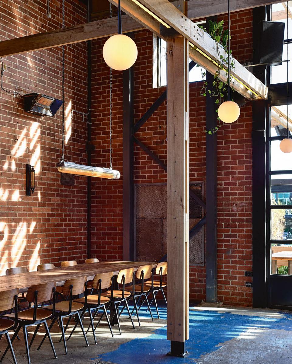
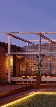
All light fittings were tailored to have layers of optimised filters that replicate the natural colours of a sunset. In a commitment to sustainability and integration, the lighting designers, Ambience made a number of the light fixtures themselves including the refurbishment of original factory light fixtures. David Justice, Managing Director at Ambience, discussed the design journey for the reclaimed space: “We used fixtures found and reclaimed from the original factory because we wanted to foster an authentic representation and design that is at home within the space. And from a story telling point of view, it’s quite captivating and elevates the character of the interior. “A bold idea with creative and technical excellence was paramount. We also wanted to use the lit environment to help elevate a concept that worked just as much aesthetically as psychologically (feeling, mood and emotion). From here the fantastical idea of having a beer in an eternal sunset was born. “We tailored and engineered all the light fittings to have layers of optimised filters that replicated the natural colours and tones of a sunset – a massive but ultimately rewarding undertaking as it’s one that patrons find extremely inviting. The design approach utilised natural light during the day, and we simplified the dimming controls but still provided the flexibility to control the light levels through the day or evening. “The tricky part was decommissioning the old lights and then refitting them to be constant with the sunset theme. The budget wouldn’t allow us to use cutting-edge technology, so we had to look at theatre and photography techniques to help achieve that desired effect,” he adds. Light fittings from Encapsulite and Symphony Lighting were combined
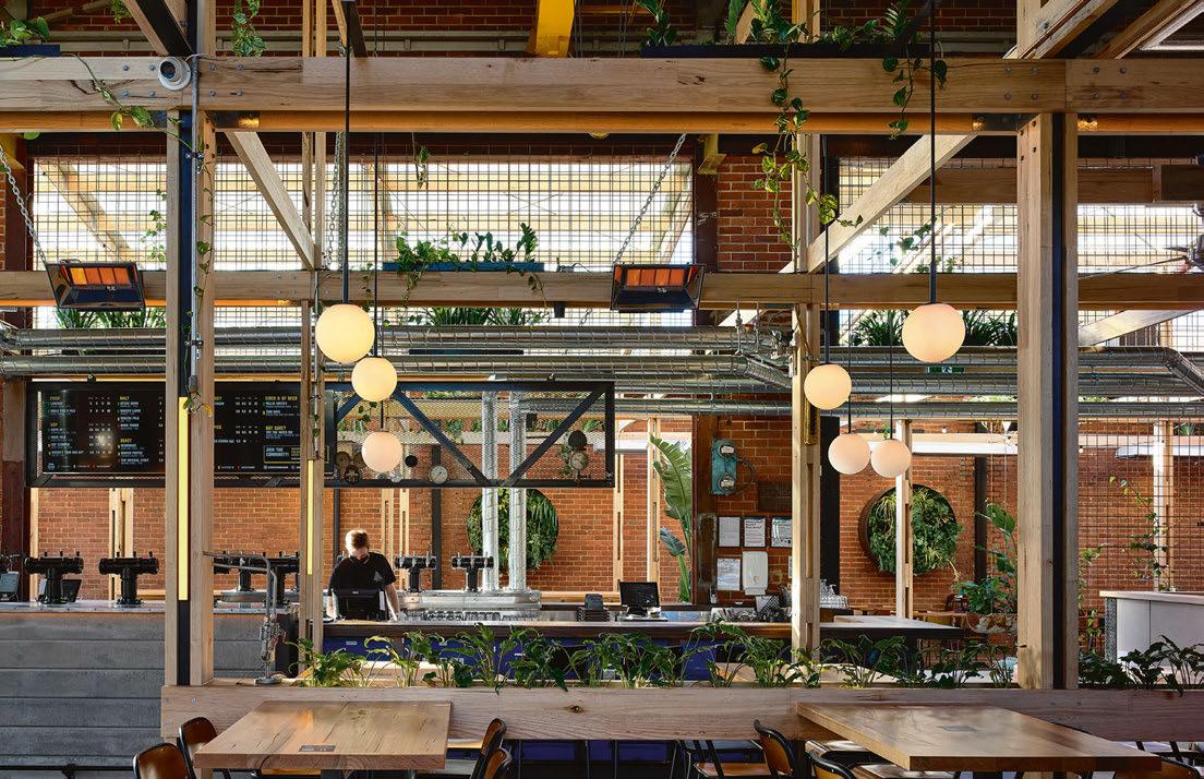

with Ambience’s bespoke fittings and the reclaimed pieces salvaged from the original building. “The process of restoring took old-fashioned elbow grease, pulling them apart, cleaning them, removing the webs out and giving the (deadly) spiders living in there a new home, before we gave them a facelift,” explains Justice. “Because the refurbished fittings had poor quality materials in the diffusers, we had to revitalise them, so they paired and married with the other new fixtures. “It was critical to ensure that the distribution of the light falls on the skin consistently across the space. So, we did a lot of naked eye testing and modifications to make sure distribution was consistent throughout. It wasn’t just about applying sunset filters of a colour temperature to achieve the sunset look, we had to not only achieve the colour characteristics but also make sure every light had the right dispersing properties to achieve the grazing illumination,” he continues. “A hallmark of the space was the intricate architecture, so this called for a lot of customisations and creating of a lighting strategy to integrate within the architecture. For example, linear fixtures within beam coves. The lights also had to be concealed within the spaces, so it looked like sunlight filtering down from within the beams. “The space also featured pub novelties such as a shuffleboard, so that called for custom pendants to fit the space perfectly. In the vast open plan space, there were key areas that needed a carefully considered lighting approach, i.e., dining, beer garden function space, bridal space, brewery, kitchen and alfresco. “The vertical arches behind the bar follow circular AC jets that give it steampunk/machine feel inspired by the old boiler room,” says Justice.
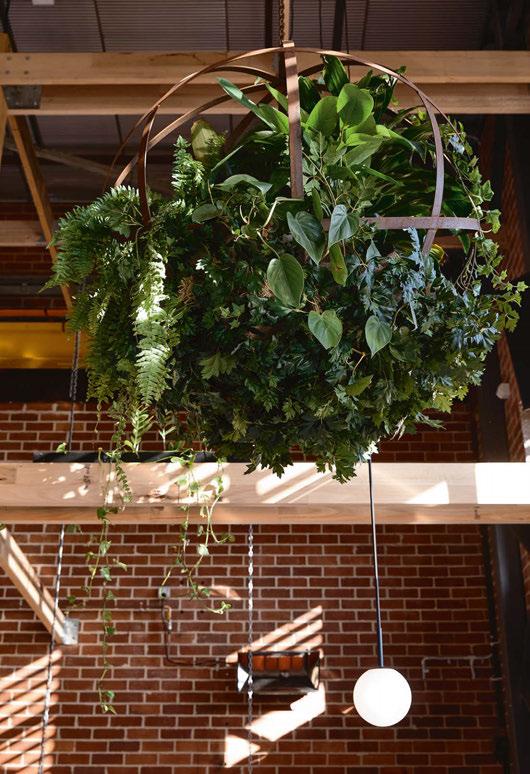
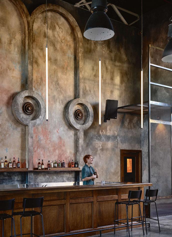
“Both the function space and beer hall take you to a unique bird’s eye view looking down at the space and action. With so many areas it was a feat to perfect delicate light pools of illumination gently grazing across surfaces. This was married with perfecting task lighting so the core of the business can operate safely and efficiently. “This was a follow-through and tradition from previous collaborations with Stomping Ground that not only permeate through each experience but act like a stamp of authenticity upon the space. “Being so hands-on in installing all the filters in replicating a sunset ourselves made it possible to experiment with our innovative approach, giving us absolute assurance that our desired effect was not only possible but being executed successfully.” Steve Jeffares, Co-Founder Stomping Ground Brewing Co., added a concluding note: “We first collaborated on our flagship Brewery & Beer Hall in Collingwood in 2015 and set a new benchmark for brewery hospitality venues in Australia. We have worked with the team for all our venues ever since, culminating in the opening of Stomping Ground Morris Moor. While sharing design DNA with Collingwood, the result is both unique and stunning.” studioy.com.au www.placeformspace.com ambiencelighting.com.au Design Details
Stomping Ground Moris Moor, Melbourne, Australia Interior Design: Studio Y Building Designer: PlaceFormSpace Lighting Specified: Ambience Lighting, Encapsulite, Symphony Lighting
Salvaging lighting pieces from the original structure of the beer hall was a key component to the design of the new space. Sustainability lies at the core of Stomping Ground's brewing ethos and played an important role in the design of its new hospitality venue. Ambience Lighting worked hard to rescue and bring new life to some of the original fixtures and combined them with new pieces from Encapsulite, Symphony Lighting and from its own catelogue to deliver a contemporary yet rustic finish to the overall design scheme.
Natural Forms

Maria Fiter, Founder of Barcelona-based studio Crea-Re, talks to darc about her new collection, Sensi. Inspired by parts of the human body, the new range of lamps are eco-friendly, using paper waste to form the main body of the pendant.
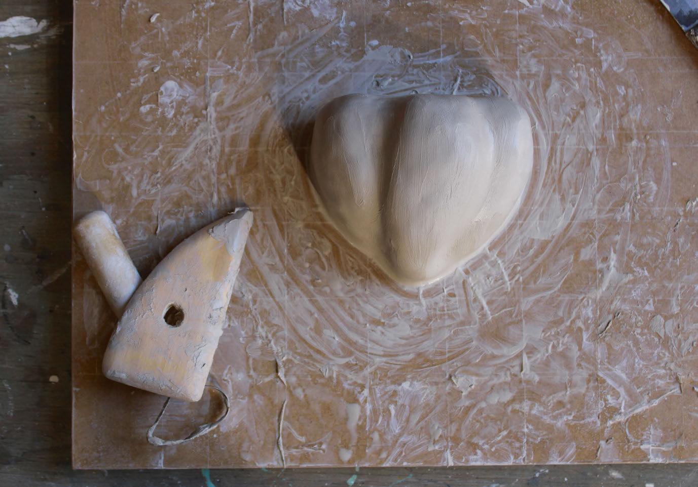
The Sensi collection, created by Maria Fiter of Crea-Re Studio, is a selection of lights that are self-dubbed “ecological, aesthetic and colourful”, inspired by the organic curves and movement of the human body. Each individual lamp comes directly from part of the body. Fiter caught up with darc Editor Sarah Cullen to discuss more of the influences of the collection and how she solely created it. “It is not obvious which lamp comes from which shape. I don't like obvious and easy to read things. They don't leave a space for the imagination. My lamps have abstract shapes and I don't reject any interpretation. “The thing I like the most when talking with people about them is that most of them realise it is something connected with a human shape. People don't know what it is, but they feel it. This is what I like the most, when my message gets to the observer,” she says. Despite their natural forms, these lamps turned out to be the most complex in terms of shape for Fiter. “The most difficult was to create a large scale of the bozzetto in clay and then make a mould for it in plaster. The Sensi I lamp has a plaster mould that consists of five pieces. It is necessary to divide the mould to be able to take out the papier-mâché lamp. All of Fiter’s lamps are made with paper waste and cellulosic glue. Combining these two materials, Fiter creates the papier-mâché, which is then painted in natural, earth pigments. “Papier-mâché, when dry, is very solid and resistant. It is not like normal paper but much more dense and stronger,” explains Fiter. “I like to use this material because it is ecological and easy to work with.
Natural Elements
Using paper waste and cellulosic glue, Maria Fiter creates unique and anatonomicallyinspired shapes to create the Sensi collection. She uses a technique typical to that of sculptors to create the forms, starting with a clay mould before finalising the design and creating a large plaster cast.


