16 minute read
Private Residence
from darc 44
Historic Decadence
Studio Marco Piva completed the interior design scheme for a unique private apartment located in the heart of Padua in Italy. The design blends old and new with bold lighting elements to tie it all together.
Images: BeppeRaso per Lualdi
Situated in the heart of the historic centre of Padua, the private residence benefits from beautiful panoramic views of the city with an abundance of daylight flooding through its large original windows. TThe team at Studio Marco Piva were tasked with creating a contemporary design that incorporated and complemented the residence’s original Art Nouveau architecture. The client gave the brief to create a refined and elegant home environment that is modern yet complementary to the monumental features of the building’s pre-existing works of art and finishes. It was also important to the client to retain certain pieces of classic furniture that possess a high sentimental value. Marco Piva sits down with darc Editor Sarah Cullen, to discuss the design choices, and in particular the decorative lighting pieces selected, for the project. “We already had an established relationship with the client as we collaborated on a project in the past. In February 2019, he approached
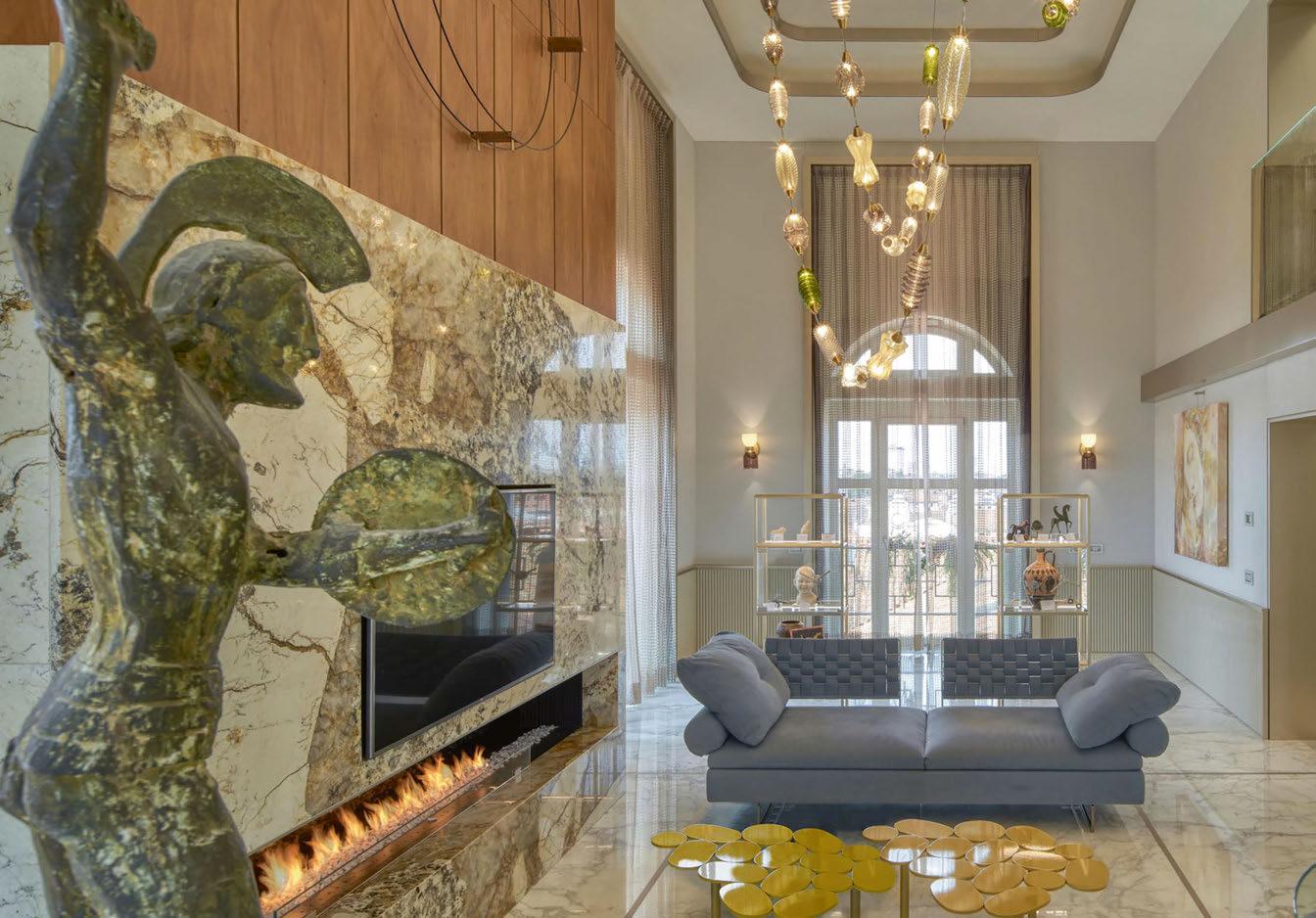
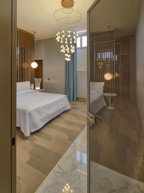
us again to complete the interior design of his new house in Padua city centre. Work began in the Summer of 2019 and finished in Spring 2021.” According to the client’s brief, the studio had to complete extensive research focused on the dualism of old and contemporary in order to provide a design that integrated, in a fluid and natural way, the historic pieces of pre-existing furniture with the new elements. “The objective was to achieve a long-lasting, functional and sophisticated space, rich in details that emphasise the exclusivity of the overall project,” Piva explains. However, working in the beautiful historic site brought with it some challenges for the team to overcome. “The main challenge of the project was to develop a functional continuity between the strong architecture present and the interior design in accordance with the requirements of the client. “The design, studied closely by the studio, emphasises the existing architectural volumes, recalling the historical and Liberty architecture of the building that houses it. “Careful chromatic research went into selecting a contemporary but not invasive colour palette; a trend-colour range that doesn’t go out of fashion over time.” One of the key elements that was considered at the very beginning of the design process was the lighting. Statement pieces were a must in the public spaces, and technical lighting was used to bring subtle functional lighting to task areas as well as to create bold illuminated wall features. “The role of decorative and custom lighting was, first of all, to give a touch of personality and atmosphere, but also to find the perfect harmony between the architecture of the place and the choice of furnishings. “Both the decorative and the technical aspect relating to the use of light were a key element in the whole design process, with regards to the strong natural light that penetrates through the full-height windows in the apartment.” Notably, in the living room, the team wanted to create a “scenographic and sculptural installation worthy of the historic building where the house is located”, which resulted in the bespoke installation, Collier, from Italamp. This eye-catching chandelier, according to Piva, is “a majestic composition that reaches a height of three-metres, inspired by a
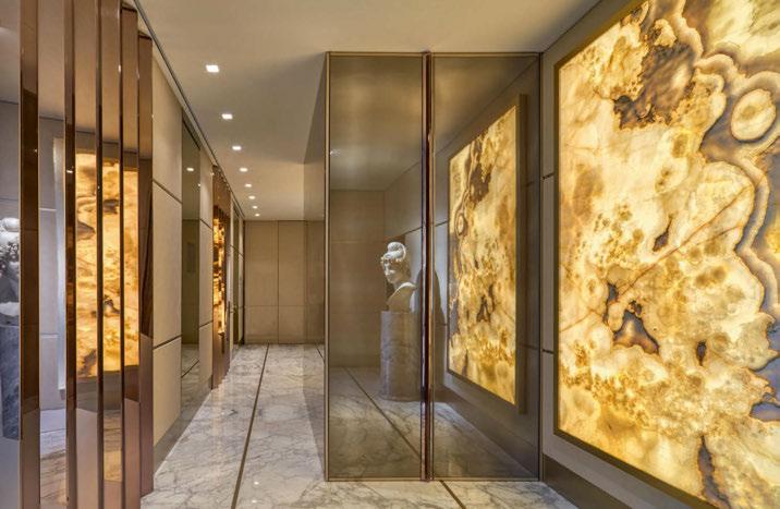
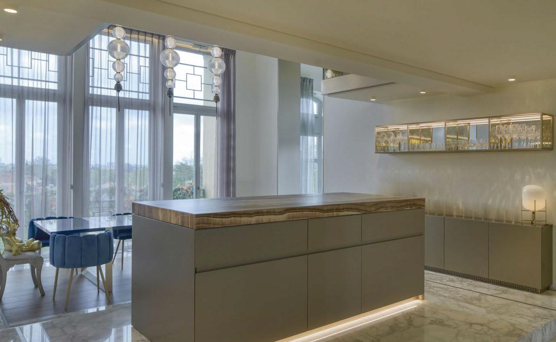
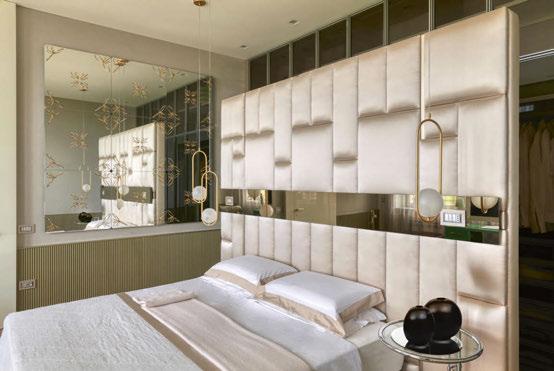
072 | RESIDENTIAL PROJECT | PADUA RESIDENCE large-scale bijoux and arranged in five suspended rows on which a sequence of blown glass elements, each characterised by different shapes, decorations and colours.” “Each component is a unique piece, with colours customised and selected ad hoc for the project - agatha, dove grey, smoked, olive green, teak - where the glass seems to come alive in curves, textures and friezes that recall the ornaments of a precious pendant. The chandelier gives personality to the space and illuminates it through LED sources positioned inside each element, diffusing a delicate light filtered by the colored and decorated glass. “The relationship we had with Italamp and its R&D team was fundamental to achieve these results thanks to their attention to detail and the deep technological research done together to conceive the custom chandelier, and also their respect for the given budget without sacrificing aesthetic and functionality,” he adds. Elsewhere in the living room, six Caterina wall lamps from Italamp were chosen in custom-colour versions that match the palette of the interior scheme. “The wall lights are characterised by an aesthetic with retro references and by a simple but refined design: the metal structure is proposed with a brushed gold finish while the diffuser is articulated into two specular domes of different sizes, one in opal white glass, which contains the LED source, and a lower one in teakcoloured glass,” says Piva. Kreoo marble sheets are backlit by Fabbian Impianti Group fixtures as a custom piece of illuminated artwork. “The stone material is presented in an unusual duality, solid and dynamic; an investigation into the ratio between matter and light. Marble elements uniformly disperse the light with a scenographic effect.” Further backlit Honey Onyx panels from Marmi Orobici Graniti are located in the entrance hallway. “The custom backlit marble panels, with their transparent / reflective finishes, create unusual effects of light and shadow,” explains Piva. “The LED lighting behind the panels can be controlled and managed, with different intensities and colours, to create attractive experiences involving scenarios and atmospheres for any time of the day.” In the dining room, Italamp’s Greta suspension fixture is reminiscent of jewels reinterpreted into a contemporary design, with a central tubular body with surrounding spherical pieces of varied sizes in carved crystal. Three pendants with five spheres were placed in a row in an elegant, symmetrical line. In the son’s bedroom, an IC suspension lamp from Flos was used to break up the rigidity of shaped furniture. “The choices between chandeliers, pendants, appliqués and technical lights are different in the various spaces of the apartment, depending on the focus points or elements we wanted to emphasise with light,” explains Piva. “For example, the iconic custom chandelier produced with Italamp and the Greta pendant lamps were used in the more public and relational spaces - the living and dining room. “Architectural light was used mainly in the entrance and bathrooms, while the rest of the house, with its double-height window, allowed us to exploit the power of natural light. In those areas we have played mainly with decorative sources. “My artificial light choices, both decorative and architectural, try to learn from natural light. Sometimes it’s a simple, soft light, while other times it can be highly theatrical, but it always comes from the search for an intrinsic dynamism, connected to the placement and specificity of the sources,” he continues. Despite its historic foundations, the team didn’t face any structural constraints when installing fixtures. The only piece that needed extra
attention and consideration was the bespoke living room chandelier, designed with Italamp. The Murano glass used increased the weight of the piece considerably, so Piva and the team worked closely with Italamp to manage the best solution for its suspension. Reflecting on the project as a whole, Piva reiterated the importance of the role of lighting and its consideration at the beginning of a design journey. “Beside the intense research that we have carried out to find the best, appropriate and durable materials, the light was one strategic element I wanted to use extensively in this project. “It has been a fundamental step in conceiving the overall design by integrating the light from the earliest planning stages, playing with it and all its expressive possibilities. ”This scheme is able to integrate, as much as possible, the lighting into the fit out interior design elements, hiding the light sources where possible, and only making visible the final lighting effects that characterise spaces. “This approach has permitted us to emphasise the feel of magic, astonishment and emotion of lights that occurs when the architectural elements are less visible, but enhance the richness of materials, textures and colours. “I have brought hints of modern and contemporary into the historical building; an exclusive home, completely custom-designed, that features detailed bespoke designs in all the rooms. “Precious materials and unusual finishes are combined within the lighting sources, creating an original play of contrast where innovation combines with the magnificent history of the place, as for the given brief and our initial ideas.” www.studiomarcopiva.com Design Details
Private Residence, Padua, Italy Interior Design: Studio Marco Piva Lighting Specified: Flos, Fabbian Impianti Group, Italamp
Studio Marco Piva was challenged to create an elegant and contemporary scheme for a historic private residence in the city centre of Padua. Dramatic and magical lighting elements were key factors in the beginning of the design process, which the team achieved with a custom jewel-like pendant created in collaboration with Italamp. The electric lighting elements also had to balance well with the abundance of natural light that floods through the original windows.
Rue des Martyrs Paris, France
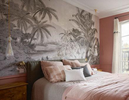
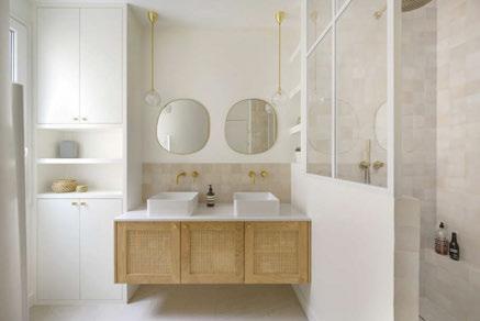
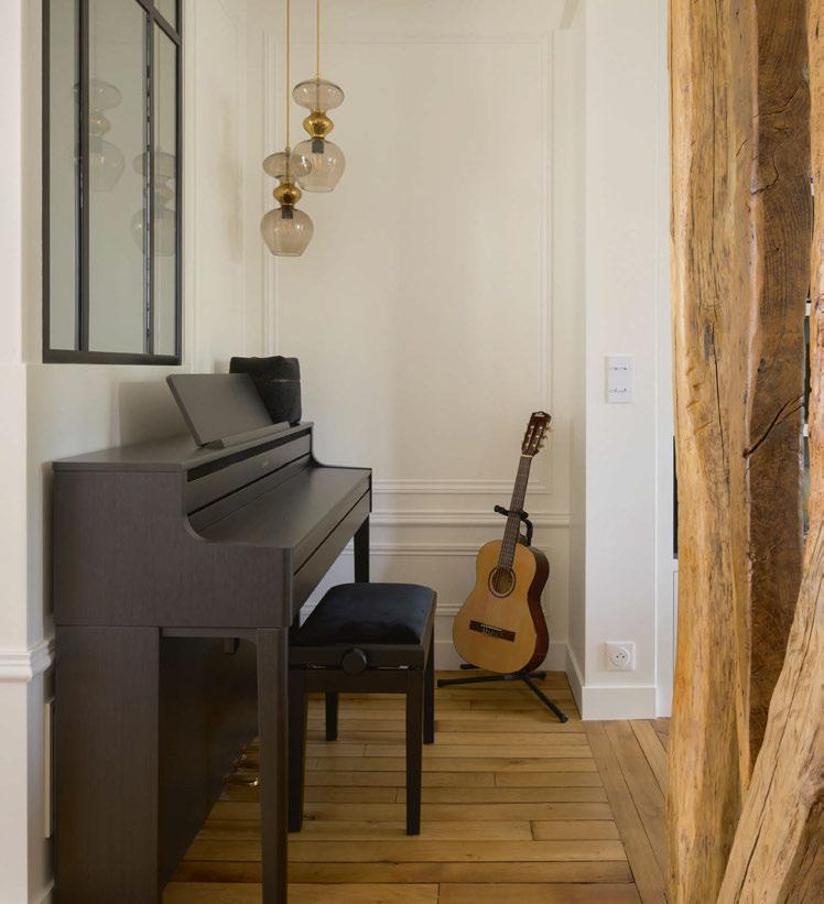
Ebb & Flow lighting designs has been featured in this complete renovation of an old flat located in the 9th district of Paris, which had not been re-decorated for 30 years. Designers Atelier CVD wanted to create a bohemian chic atmosphere while keeping the charm of old attributes such as floors, fireplaces, and molding. The flat is divided into three areas: the living room and kitchen, the kids wing and the master suite including bedroom, bathroom, dressing and office. The aim was to give this master suite a smooth and warm atmosphere, while retaining the bohemian/vintage touch. In the master bedroom, Atelier CVD used the Cuivre Poli colour from Ressource on the walls. A wide grey panoramic wallpaper from Anabô was chosen, providing depth and serenity. Ebb & Flow’s Smykke pendant in crystal check with gold details bring an Art Deco and stylish touch. The master bathroom gives a smooth feeling with the light colors of materials: the zellige from Mosaïc Factory, the Not Totally White colour from Ressource and made to measure oak and wickerwork furniture. The brass taps (Neve) and small versions of Ebb & Flow’s Rowan pendant add brightness and style. In the living room, a corner was designed dedicated to music instruments with a piano and guitar. The Ebb & Flow Futura pendants in Chestnut brown match perfectly with the cosy and vintage touch the designers wanted to bring. ebbandflow.com Images: François Guillemin
Private Residence Valbonne, France
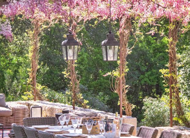
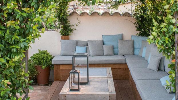
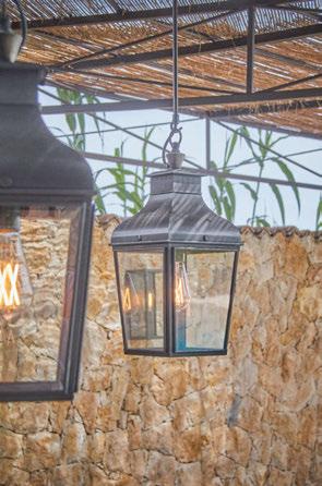
Ambient lighting in the garden is almost as important as the right lounge set. During the day the plants and garden furniture determine the atmosphere in the garden, but at night the mood lighting does all the work. With this in mind, this beautiful garden project was realised in collaboration with English Garden. Through the use of noble materials and a unique character, Tekna’s designs fit perfectly with the concept of outdoor living in the south of France. The Montrose Pendant Small was used to add an extra design touch to the garden. Its streamlined shape reflects the strength of the Nautic Collection. Tekna found its inspiration in the world of shipping. The maritime aspect, the charming character of old train wagons and the craftsmanship in factories are the underlying idea for the designs of Nautic. An original combination in which simplicity and functionality are central. The timeless design and choice of materials give the fixtures a harmonious appearance. They are atmospheric and stylish, without unnecessary adornment. To provide its decorative design lighting with an extra level of finesse and detail, the esigners assembled the glassware with ledges designed especially for Tekna. These ledges are made from durable brass and bronze-plated for a stunning look. Tekna chose to solder rather than glue the parts together, which reinforces the artisanal aspect of the production process. By adding these ledges, it transformed the minimalistic design into a romantic and more authentic one. Tekna stands out for its high-end craftsmanship, all ridges are mitered to create a seamless look. www.tekna.be Images: English Garden
Private Residence Legnano, Italy
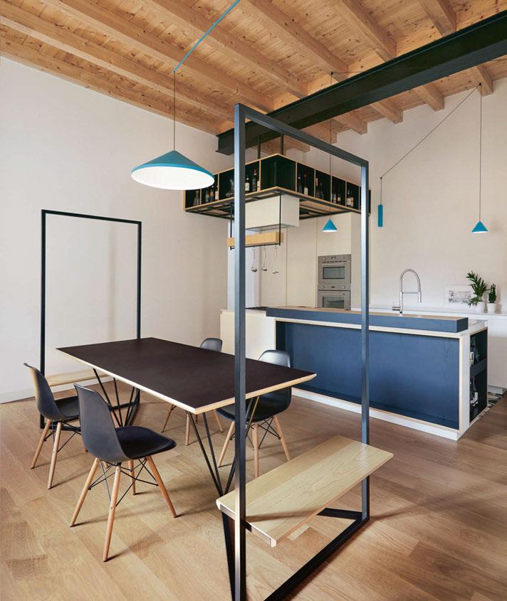
In its complete renovation of a residence in Legnano, Italy, Milan-based NoneStudio created an open layout anchored by custommade furnishings in a sleek, contemporary style. For lighting, the designers selected striking luminaires by Vibia. The kitchen features several fixtures in Arik Levy’s North collection. Over the island, the hanging lamp is suspended from the ceiling. The LED-powered pendant features a spare silhouette punctuated by a triangular shade affixed to the slender rod. The luminaire casts a focused pool of downward light to brighten the food preparation area, while its vertical line echoes the look of the utensils that hang to one side. Nearby, Nonesuch chose a pair of North wall lamps. Its long carbon fibre stem reaches from the wall across the room, one dangling above the dining table and another suspended over the kitchen sink. The lamps’ trajectory in the space draws the eye upwards to the beamed wooden ceiling, its sleek metal craftsmanship creating a compelling material counterpoint. The North lamps are all finished in aqua blue, adding vibrant pop of colour and creating a tonal connection between the collection’s wall lamp and the pendant. vibia.com Image: Sara Magni
Atsina Lane Residence Bozeman, USA
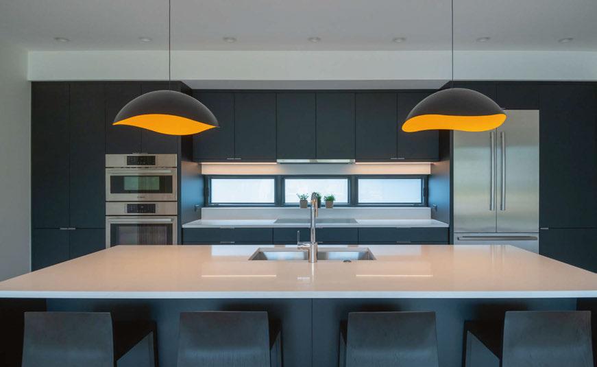
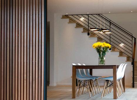
When home design and development company Trimbach Design Build was enlisted to build a modern, yet inviting, single-family home in Bozeman, Montana, they decided it was the perfect chance to showcase bold design details and finishes. From early on in the process, this home was designed to showcase the contrast between a neutral palette and pops of colour. To introduce this elegant yet modern contrast, the Trimbach Design team enlisted the help of Sonneman — A Way of Light. The instant the designers discovered the apricot interior of the Waveform Dome LED Pendants, they knew that this apricot shade would provide the perfect pop of colour to the room and be the main attraction in the kitchen of the Atsina Lane Residence property. “The Atsina Lane Residence was designed as a speculative / model residence to showcase some of our favorite design details and finishes. From early-on in the design process, we wanted to introduce a bold colour into the home. This colour would serve as an identifier / marker for the home,” says Austin Trimbach, Trimbach Design Build. “The instant we discovered the apricot interior of the Waveform pendants by Sonneman - A Way of Light, we knew that this apricot would be the bold colour to brightly contrast off our neutral finish palette (and black kitchen design). Cohesiveness is paramount in all of our homes, and as such, we then selected the Light Guide Ring linear suspension light (apricot interior) to float delicately above the walnut dining table. Our final move with this bold apricot colour was to paint the front door to match!” The chosen Light Guide Ring is a modern linear suspension light that refers to minimal, functional, geometric design, and fits perfectly and delicately above the dining table. sonnemanlight.com
L LIGHTING FOCUS RESIDENTIA 078 | The Wyelands Estate Pwllmeyric Chepstow, Wales
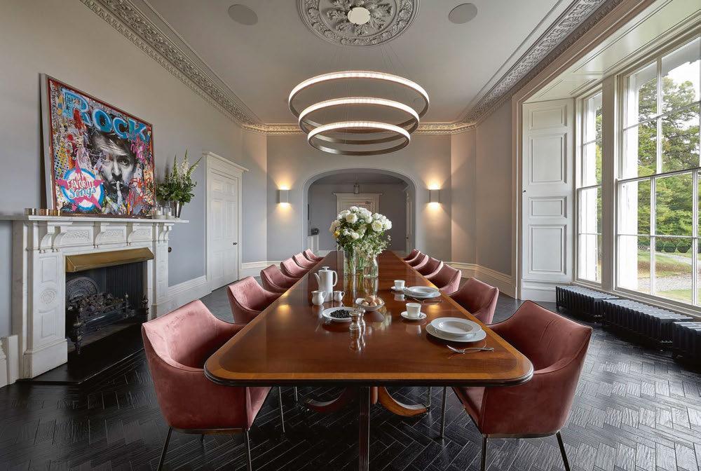
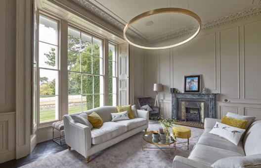
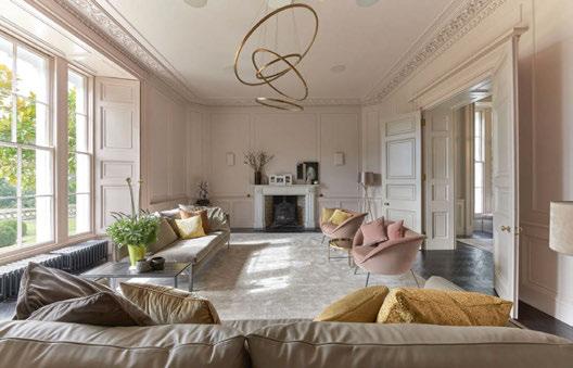
Located in the heart of the Welsh countryside sits a beautiful listed property. With the interior design being led by Project One, sculptural lighting company, Cameron Design House was approached to design and manufacture several bespoke pieces for this elegant family home. With subtle lighting required to complement the vast, dark resin artwork pieces, the use of metals within the lighting structures became a fun way to explore and experiment with mixed media. Designed to fit seamlessly within the spaces, Cameron Design House created a Triple Lahti and Single Lahti chandelier in a brushed light burnished brass finish for the dining and living rooms. Perfectly complementing the neutral tones and abundance of natural light, the striking lighting structures take centre stage, balancing the space and adding modern elegance to the period features that fill each room. A Lohja Four chandelier brings a playful element to the more informal living space. Combining simplicity with geometry, the visually arresting piece changes in appearance from every angle, which adds to the fun family feel that the home emits. Combining elegance with contemporary design, each bespoke lighting piece was handcrafted by the highly specialised team in the brand’s studio workshop in St John’s Wood London. camerondesignhouse.com
NTIAL LIGHTING FOCUS RESIDE 080 | Private Residence, London, UK
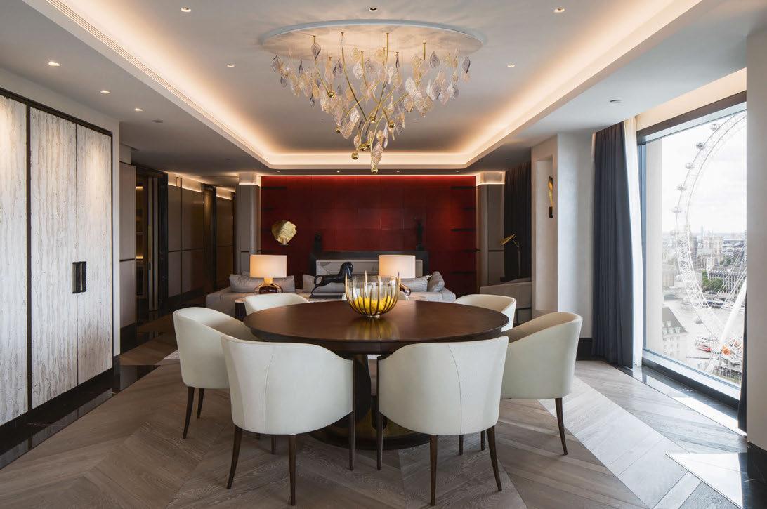
Custom luminaire specialist, Nulty Bespoke, has created a new lighting installation inspired by London’s signature Plane tree. A one-off commission for a Goddard Littlefairdesigned dining scheme, the centrepiece is a playful interpretation of the tree’s sycamore-shaped leaves, elongated stems and circular catkins. Comprising 111 tinted glass leaves and nine brass rods concealing LED light sources within their circular casings, the luminaire directly references the contours and movement of the Plane tree. Each individual glass leaf has been hand blown then dipped in water to produce a crackled surface texture that forms projections of light and shadow throughout the piece. The clarity of the glass is further enhanced by gold flex and white frit detailing, used across the individual leaves to create subtle variations in tone. The leaves have been arranged in an intricate brass frame, made from tapered rods and hand hammered brass balls featuring a dappled effect finish. Celine Gehamy, Product Creation for Nulty Bespoke, comments: “The humble beauty of London’s Plane tree was our creative starting point for this commission. We deconstructed the organic form of the tree and took inspiration from the shape of its leaves and the sway of its catkin-laden branches. What followed was an exploration of the way light interacts with different textures and materials. We housed LEDs in each of the catkin-shaped casings and interspersed them throughout the chandelier to illuminate each crackled glass leaf and create patterns of light across the ceiling.” Throughout the craftsmanship and installation process, Nulty Bespoke employed subtle techniques to conceal the functional elements of the luminaire from view. The metal ceiling tray has been powder coated to complement the tonal palette of the ceiling. Ultra- thin wiring elements in an elegant gold finish ensure that nothing detracts from the piece itself. www.nultybespoke.co.uk Image: James French
