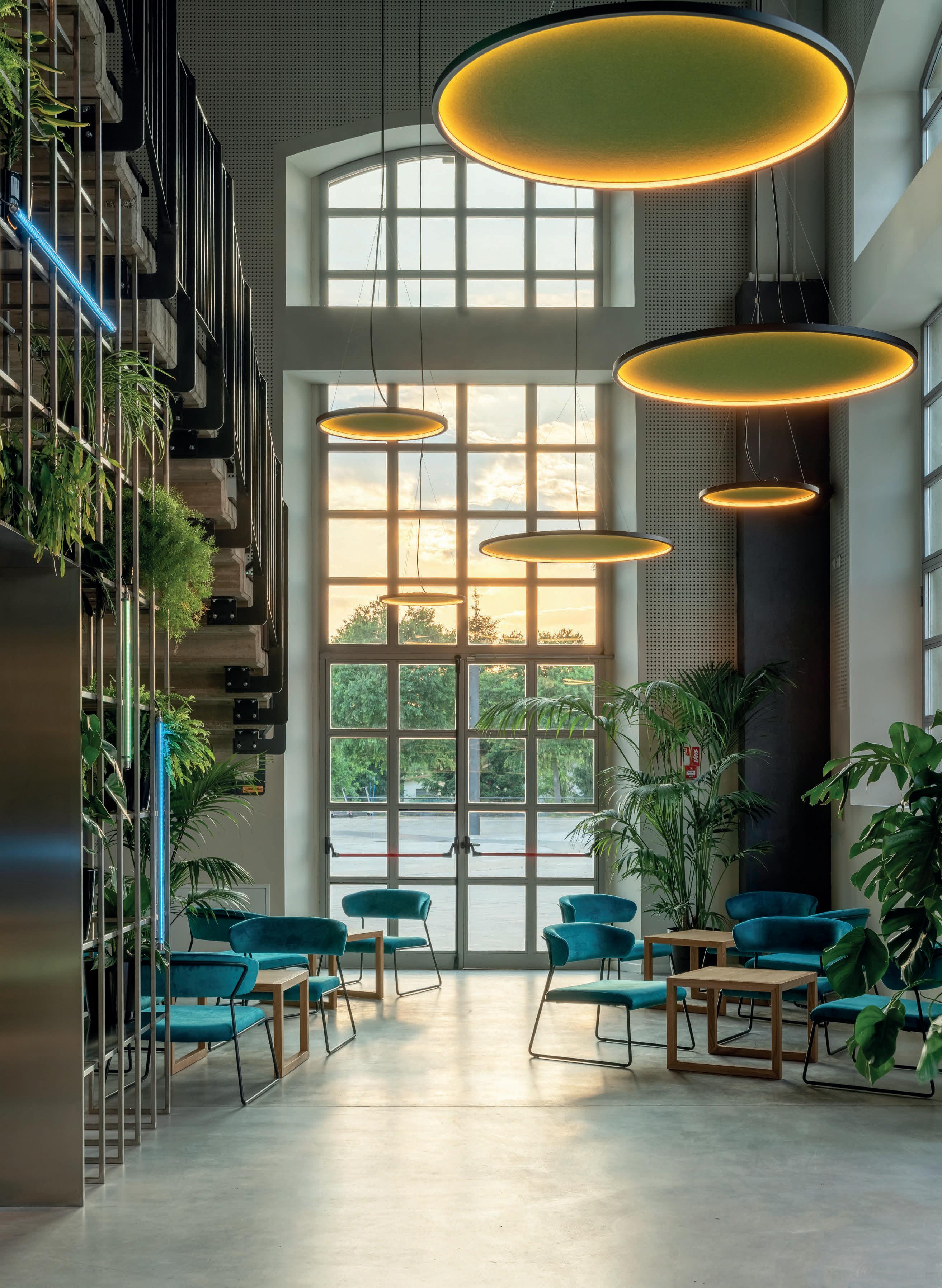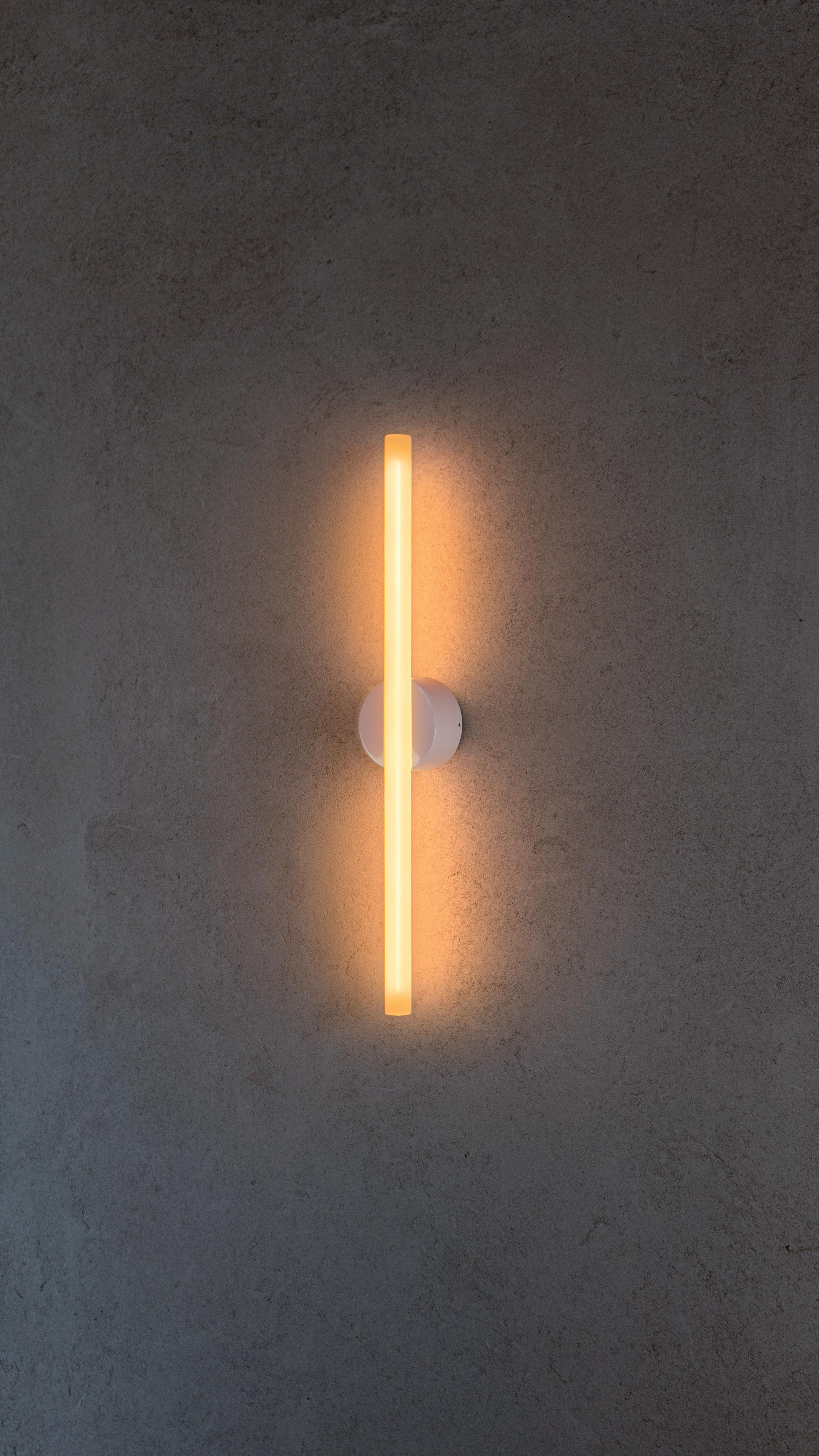
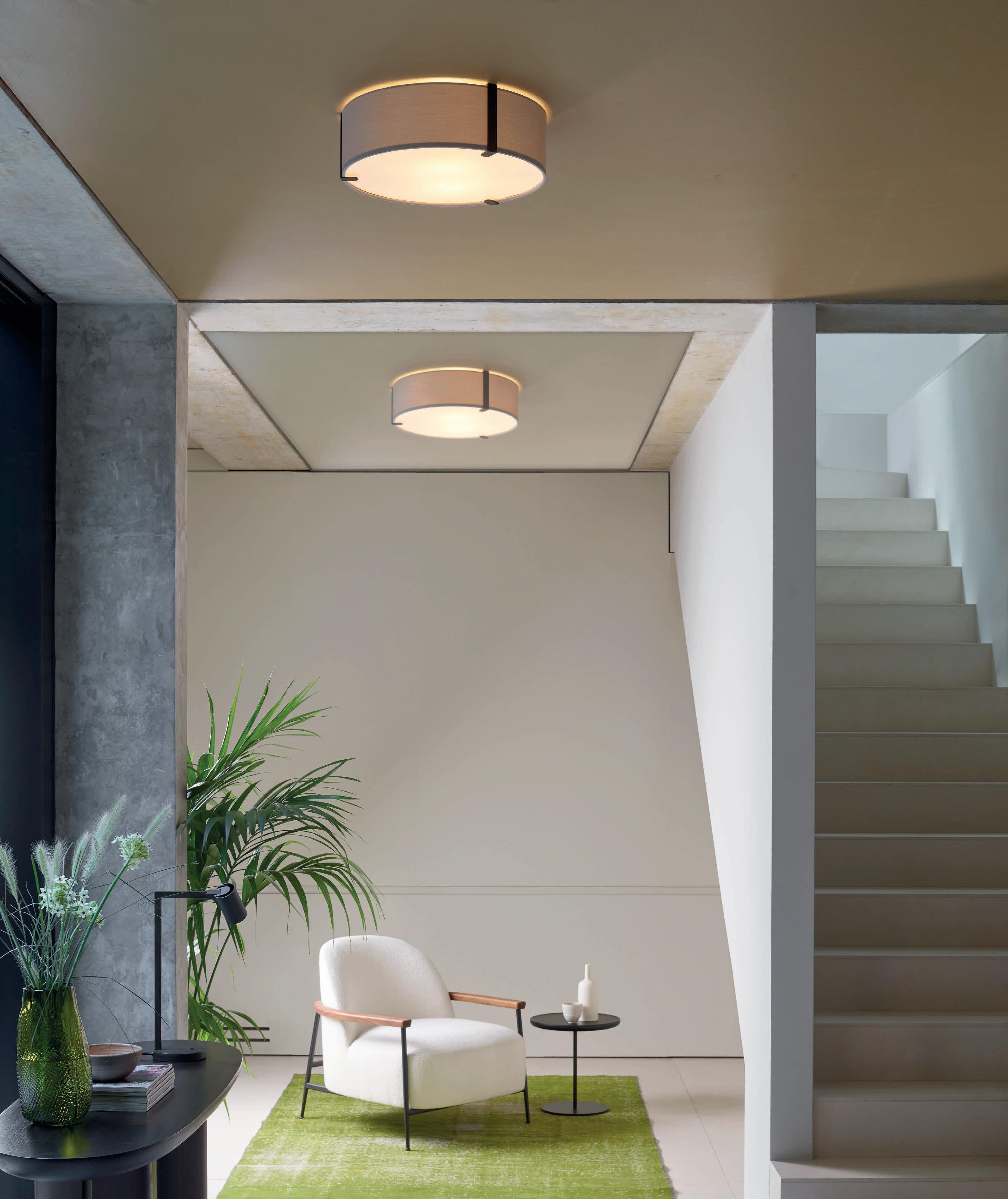
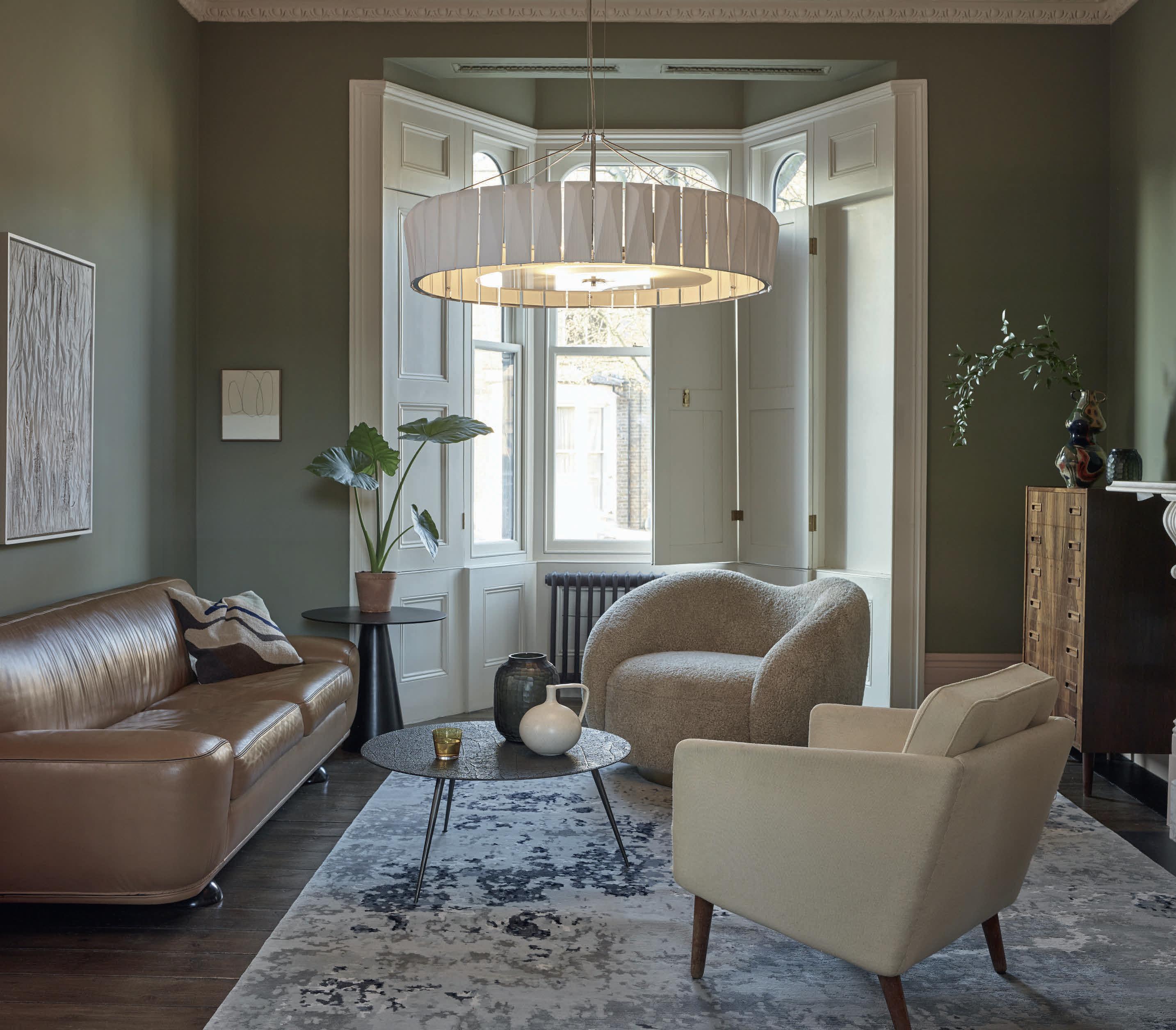
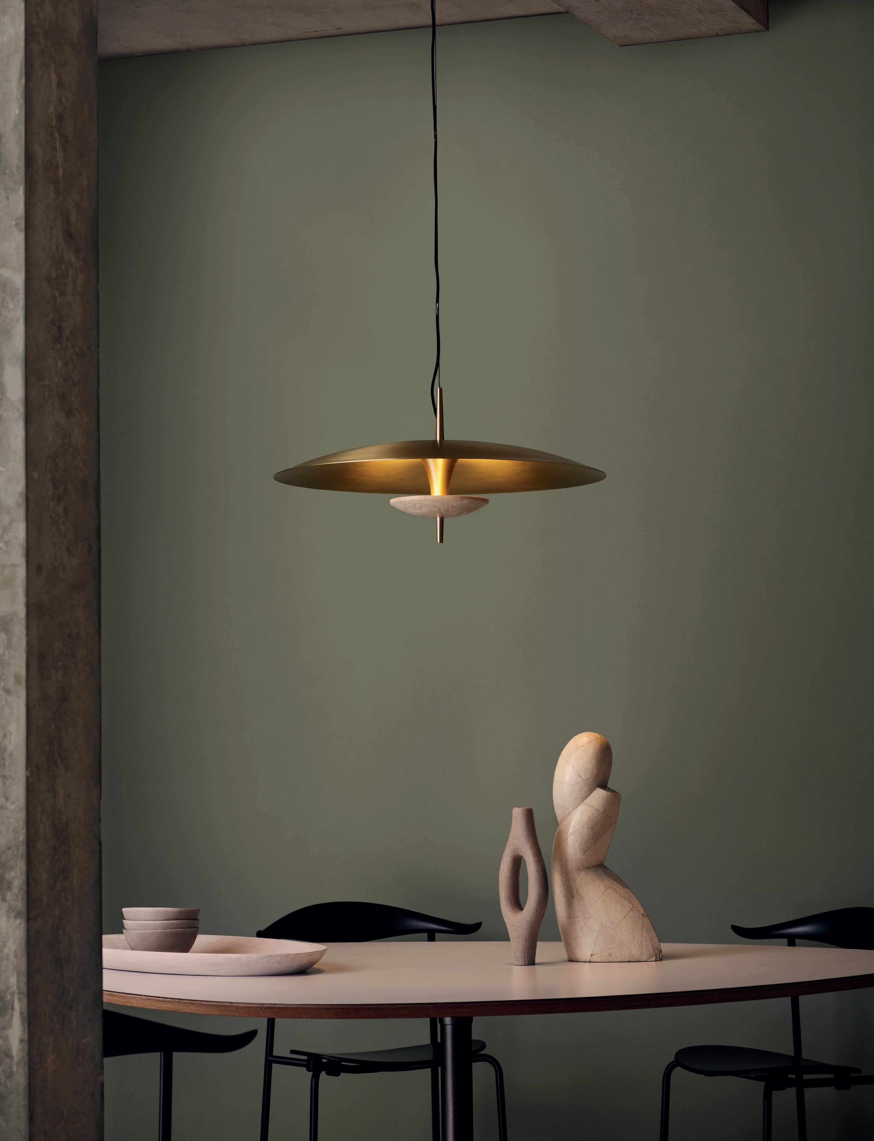
Centred around innovation, embracing where classic meets contemporary. Our latest lighting collection celebrates quality materials and aesthetics influenced by timeless architectural details.


Centred around innovation, embracing where classic meets contemporary. Our latest lighting collection celebrates quality materials and aesthetics influenced by timeless architectural details.


It’s that time of year again here in the UK, as the clocks go backwards and the early nights draw in. It’s been a hectic turnaround for the darc team to get this issue finished, as I’m sure many of you are aware of or have bumped into us while we’ve been out of the office at one of the numerous events happening across September and October! At one point, I was in London, then Amsterdam and onto Frankfurt all in the space of four days!
You’ll be able to catch our events coverage towards the back of the magazine, starting with our LiGHT 22 preview on p.65, followed by a [d]arc sessions review on p.68, Light + Building review on p.71, Decorex review on p.80, and an events recap of LDF on p.86.
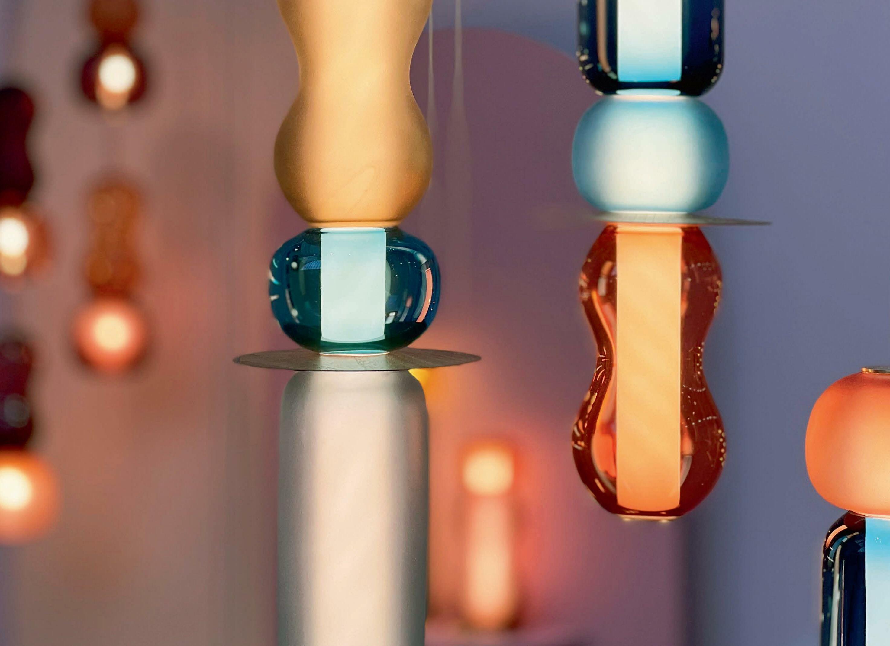
Elsewhere in the issue, we bring you some beautiful interview pieces with Javier Robles of Lumifer (p.26), a Materials feature with Foscarini who provided some stunning behind-the-scenes images on p.43, and a closer look at the newest collection from Curiousa, the Wave collection. A compilation of these pieces can also be seen pictured on our front cover, providing a stunning, colourful cover for the wintery days ahead.

For our projects, we covered the striking new Museum Arnhem designed by Studio Modijefsky.
The studio created a timeless scheme for the historic venue using unique decorative chandeliers in the vast architectural spaces. You can read all about the design journey on p.12. Our second project covers the Canadian Café Constance, which features a unique collection of bespoke tutu-inspired lamps that tie in with a quirky yet classy theme for the Les Grands Ballet Canadiens venue.
Our case study feature for this issue is based on stairwell lighting. We bring you the latest projects completed by international brands that present beautiful stairwell pendant solutions.
You can begin reading them on p.51.
I hope you enjoy the issue and find some inspiration from our events’ product pages and through some of the projects we have featured. Now, it's time for us to start cracking straight on with our Jan/Feb issue!
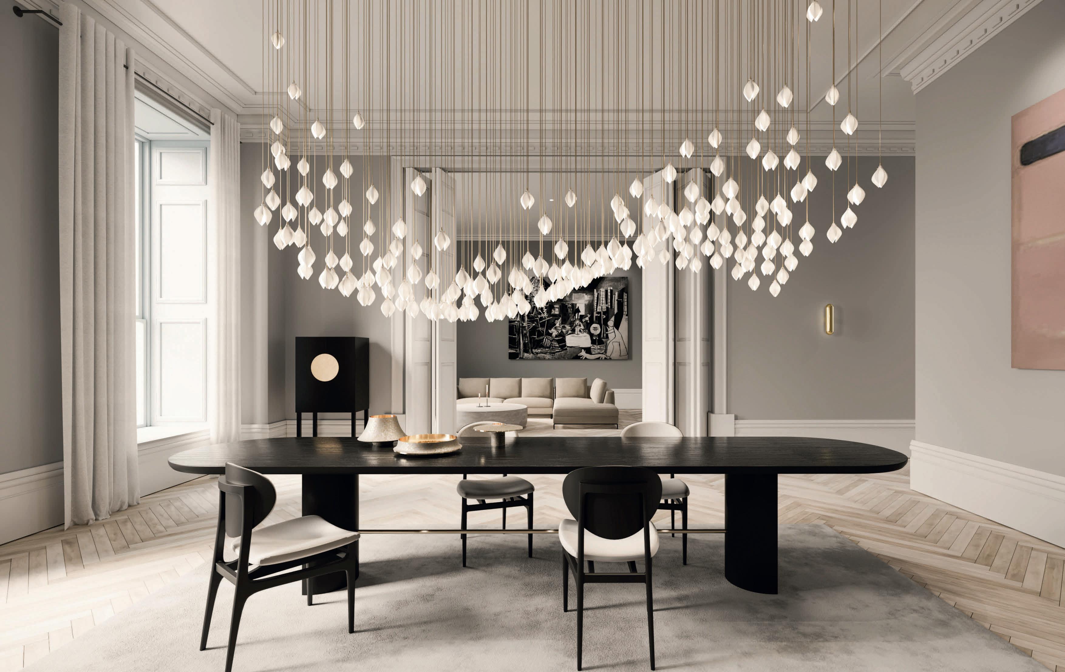
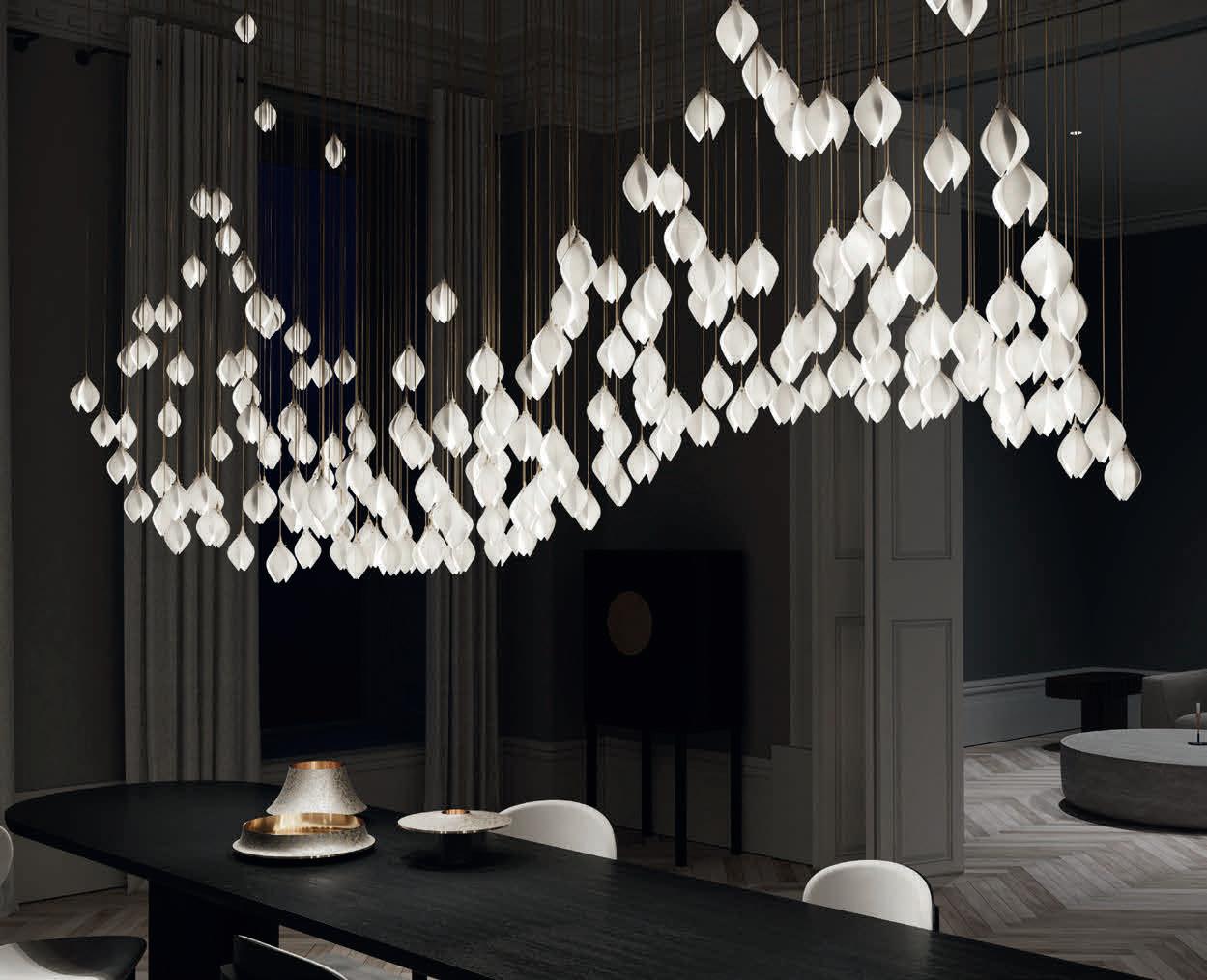
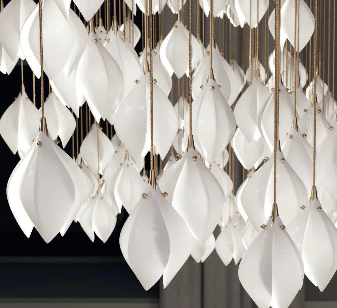
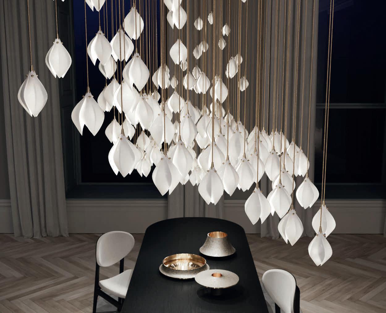
Suspended lighting centrepieces inspired by the first blooms of spring.
Unit 1, Ground Floor Building A3 Design District, Soames Walk Greenwich, London SE10 0BJ
haberdashery.com
@haberdasheryltd collection@haberdashery.com

Modijefsky
Grands Ballet
Zébulon
escapism at the
in Montréal, using bespoke, playful tutu
to an
some of the event's highlights for the brands and designers that participated in the business networking and conference programme.
darc recaps some of the decorative lighting pieces that were presented at Decorex this year, as well as a panel talk put together on The Future of Materials in Lighting.

darc participated in, and hosted, some events across two weeks of LDF, including its 10th anniversary party with Haberdashery, as well as a panel talk with Tala at its pop-up showroom.





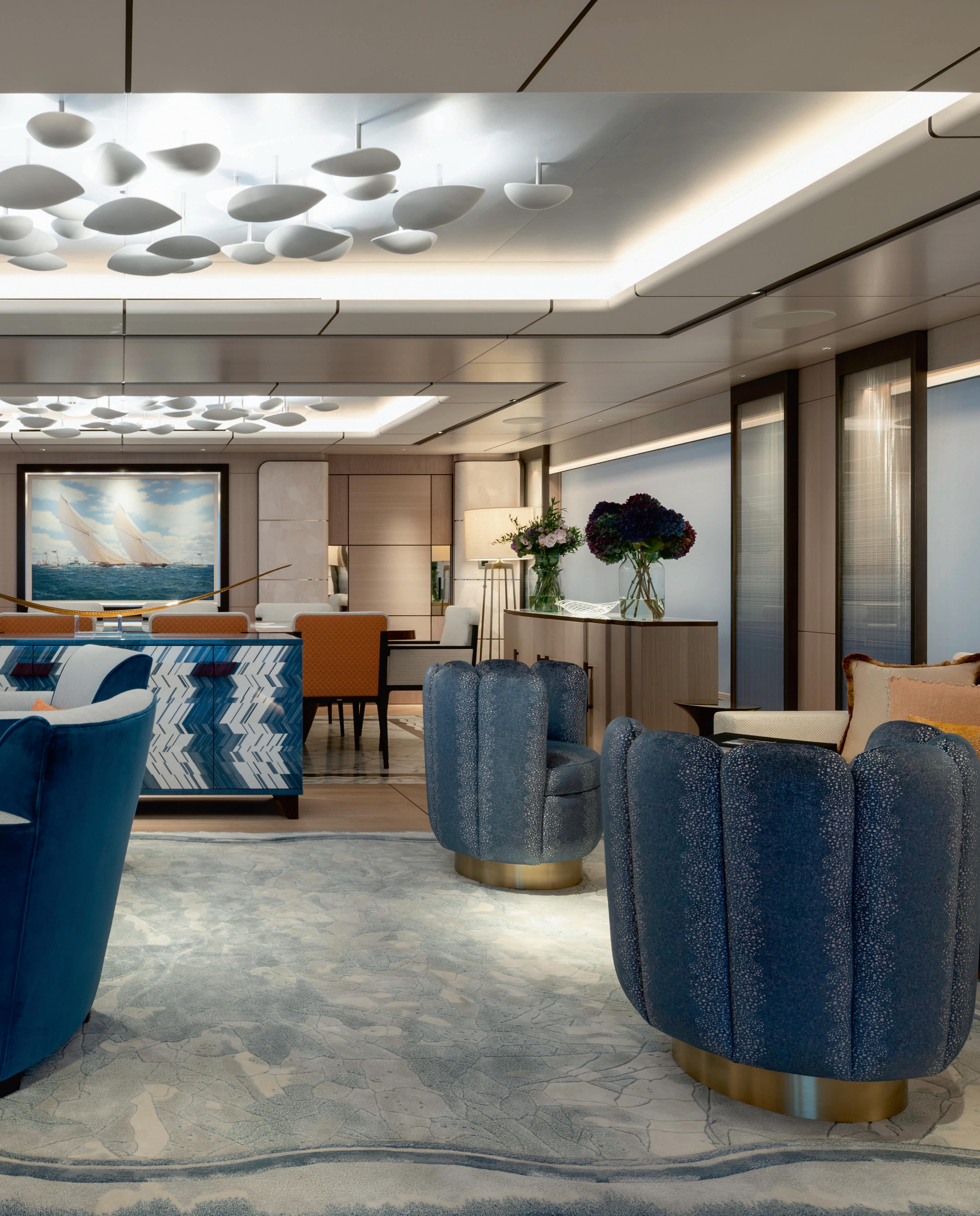
My Moonsand, with interior and exterior design by Bannenberg & Rowell, is a masterpiece of clean yet striking design. Lighting Design International created the lighting scheme for both the exterior and interior of the 55-metre yacht built by Lurssen, with Christian Haimes leading the team as Senior Designer.
While a clean aesthetic was key, the yacht features a courageous use of colour and texture. It was key that high-quality lighting was used to allow the bold finishes to come to life, while not distracting from the elegant design of both the exterior and interior architecture. Through the use of custom mounting plates and shallow lighting slots, all deckhead was minimised and organised to reduce visual impact.
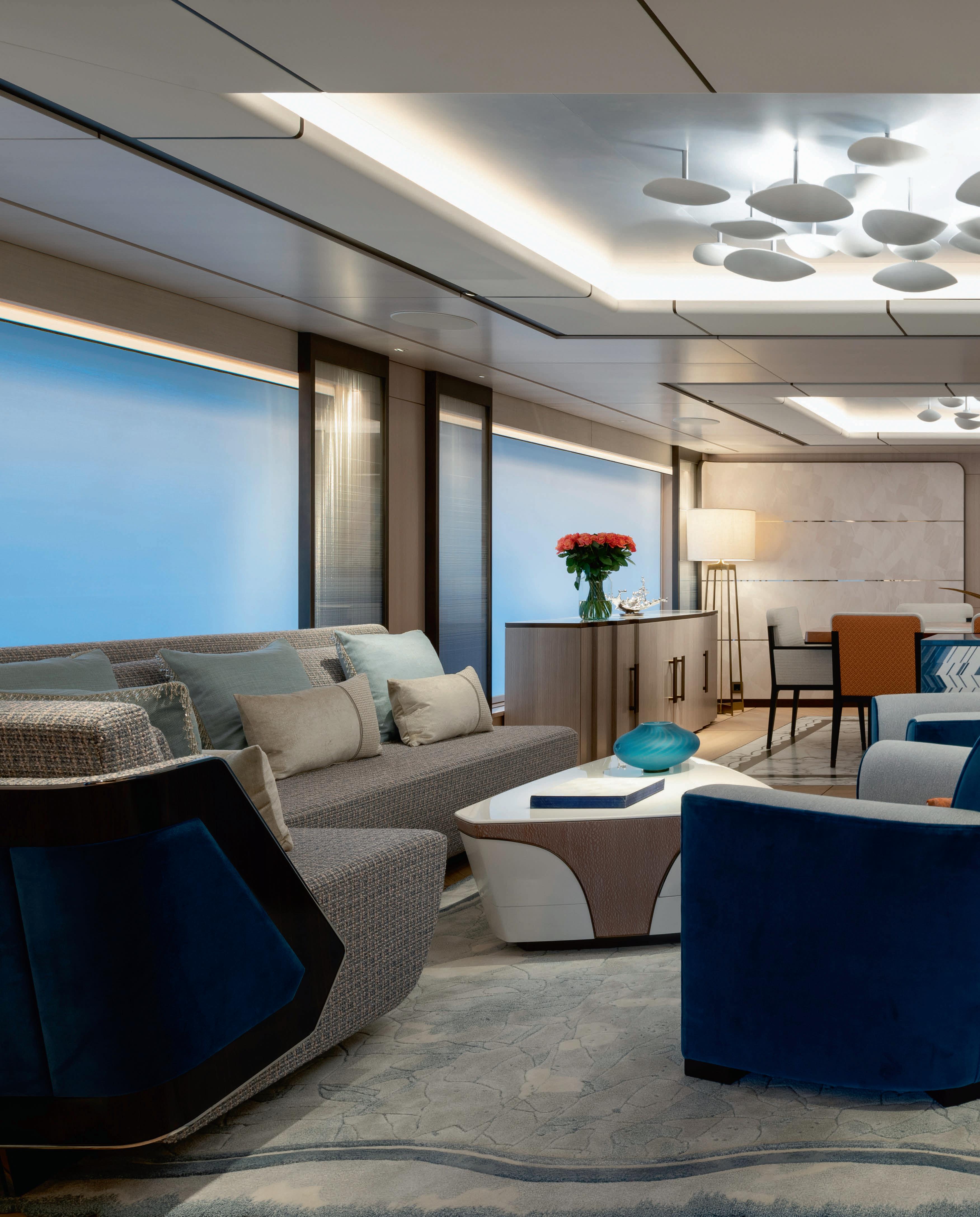
Moonsand has been described as "truly bespoke" and this is certainly true for the lighting. A key feature of the boat is the beautiful ceiling light that sits within the salon and dining areas on the main deck. Featuring 38 stainless steel-backed hand-blown glass segments, the light by Preciosa continues the clean but highly decorative style of the boat. The almost translucent segments are lit with cool white light for a cloud-like effect against the pale blue ceiling, which provides a sense of movement and striking simplicity as you journey through the main deck.
www.lightingdesigninternational.com
www.preciosalighting.com
Images: David Churchill
Studio Modijefsky has created a new interior scheme for the Arnhem Museum in the Netherlands. darc speaks with senior designer Natalia Nikolopoulou to find out more about the studios approach.


Museum Arnhem, in The Netherlands, is home to modern, contemporary, and applied art and design, with a special focus on female artists. The public spaces were recently renovated by Studio Modijefsky, which included the entrance, café, and shop on the ground floor, plus an event space and activity room on the first floor.
The museum’s iconic dome is at the centre of it all, and Studio Modijefsky worked hard to ensure a new design language united these areas spread across the cavernous space. The design language was inspired by the building’s past and present; its origins as a gentleman’s club and the “Magic Realism” of the museum’s current collection.
“While seemingly worlds apart, both these guises have escapism at their heart, from the men who used to evade everyday life to the artists creating fantastical takes on reality,” says the studio. “The new spaces designed by [us] take visitors on the same journey by playing with
perspective and offering pathways into other dimensions.”
The museum’s core value: “from the heart, looking further, from now on and with quality”, is reflected in the new interiors of the building and its collections, which spread into new wings of the museum.

Senior designer on the project Natalia Nikolopoulou sat down with darc to elaborate on the museum’s new aesthetic that was completed in May 2022.
“Museum Arnhem approached Studio Modijefsky in the summer of 2020, and the initial brief was to create a design for the public spaces of the museum; main entrance, café, shop, and activity room. [They wanted] a design that represents the identity and values of Museum Arnhem, respects its surroundings, and the architecture of the building. A destination for art, culture, and nature lovers in a completely renovated building.”
One of the major challenges that the team faced when starting out on the design process was factoring in all the ideas, suggestions, and thoughts from different stakeholders. “[This] was challenging as they all had various and interesting points of view,” says Nikolopoulou. “The ability of Studio Modijefsky to combine and unite all these ideas was the turning point of this design: we overcame the challenge by translating the client’s own desires into a design that clearly speaks Modijefsky’s language.”
Using a selection of bespoke fixtures designed by Studio Modijefsky and created by Signwise, Fiction Factory, as well as some architectural pieces from Modular, a stunning aesthetic was created throughout the museum.

In the entrance, the “Magic Realism” atmosphere begins with a bespoke lightbox hanging above the reception desk, mirroring the
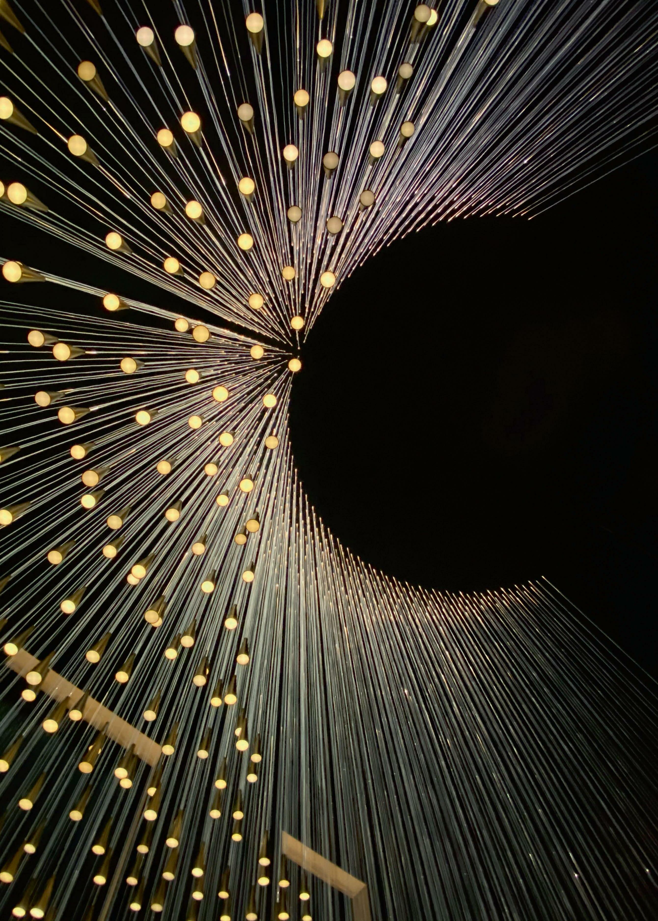
desk’s shape. “ It’s a floating version of this piece of furniture hanging above. It’s made like a kite, with sticks that span from corner to corner, and uses the fabric that is also used for kites,” describes Nikolopoulou. A small (by comparison) chandelier hangs in solitude hinting at its larger version that is yet to be seen on the other side of the entrance. Moving through into the dome area, visitors can enjoy an open-plan zoned space that houses the café and museum shop. Each area is distinguished by a unique identity and set of materials that are linked to different themes of the museum’s collection. Eyes are drawn to a large custom-made chandelier that makes full use of the dome’s impressive height and unites the space. Formed of illuminated curves in different shades of white that hang together in a cluster of varying heights, the chandelier’s shapes mirror the outline cupola above it and the windows above.
Nikolopoulou adds: “The chandelier is inspired by the architecture of the building. Taking the outline of the building’s dome and the outline of the windows situated in the lantern all the way to the top of the dome - we created two basic shapes, that we flipped upside down and used to compose a spatial arrangement with.
“The chandelier elements are divided into groups; each group slowly glows at its own pace.
We wanted illuminating tubes that give light in every direction so we used a system of custom LED tubes, a product we discovered through the executing party. It works really well and provides the same neon tube effect that we were aiming for. The LED tubes are a bit bigger than standard neon tubes, which works well with the proportion of the dome.
We programmed the three-tiered clusters of light to slowly pulse throughout the day.
“A smaller version of the grand chandelier hangs in the entrance of the museum, which can be seen from the outside looking in. And, a second even smaller one appears when standing in the entrance area looking through a window into the dome area, right on the ceiling close to the entrance space. This one leads the visitor to the dome where the big chandelier greets you the moment you enter the space.”
In order to support this grand chandelier, a special suspension system

was installed to ensure the piece hangs comfortably and safely in the centre of the dome. A high seating area, characterised by a lilac backdrop behind the bar, has mirrors to reflect all the colours and structures used in the seating area. As they are positioned higher than the dark wooden plinth, they invite visitors to look up at the reflection of the chandelier. The activity and event space on the first floor also benefit from the large chandelier that transcends this floor, enlightening it throughout at different heights and points.
Speaking of how the decorative lighting elements worked alongside the architecture, Nikolopoulou says: “The existing building served as a blank canvas upon which the design was drawn. Its architectural features are enhanced by the custom furniture that wraps around the monumental columns, delineating the perimeter of the café at the very centre of the area. A lower darker layer creates a contrast with the brightness coming through the big windows, leading the eye towards the dome where the custom chandelier lightens up the entire building.”
Reflecting on the project, Nikolopoulou concludes: “With the collection moving into the new wings of the museum, the interior of this monumental building became a work of art itself, expressing Museum Arnhem’s core values, inviting the visitors to escape reality in their new surroundings.
“A museum inspires you in a different way than a bar or a restaurant.

To unite the areas spread across this cavernous expanse, we created a new design language inspired by aspects of the building’s past and present.
“If [we could have changed] anything, we would add back an initial element of the design, which was let go during the process - a large yellow mirror behind the entrance desk. This large mirror was supposed to be placed parallel to a silver mirror, creating a series of smaller and smaller reflections that appear to recede to infinity. This would have transformed the main entrance into a piece of art itself, inviting the visitor into an infinite mirror play. I hope that this feature will be eventually realised.”
www.studiomodijefsky.nl
Images: Maarten Willemstein
Museum Arnhem, Arnhem, The Netherlands Interior Design: Studio Modijefsky Lighting Specified: Bespoke Studio Modijefsky by Fiction Factory and Signwise, Modular Lighting Instruments
Studio Modijefsky was tasked with renovating the public areas of the Arnhem Museum in 2020 and completed the project in 2022. The studio took inspirations from the buildings present usage and its past as a gentleman's club. The considered aesthetic blends warm furnishings with beautiful bespoke lighting pieces that emphasise the goal of creating pieces of art and sculpture in honour of the building's architecture.



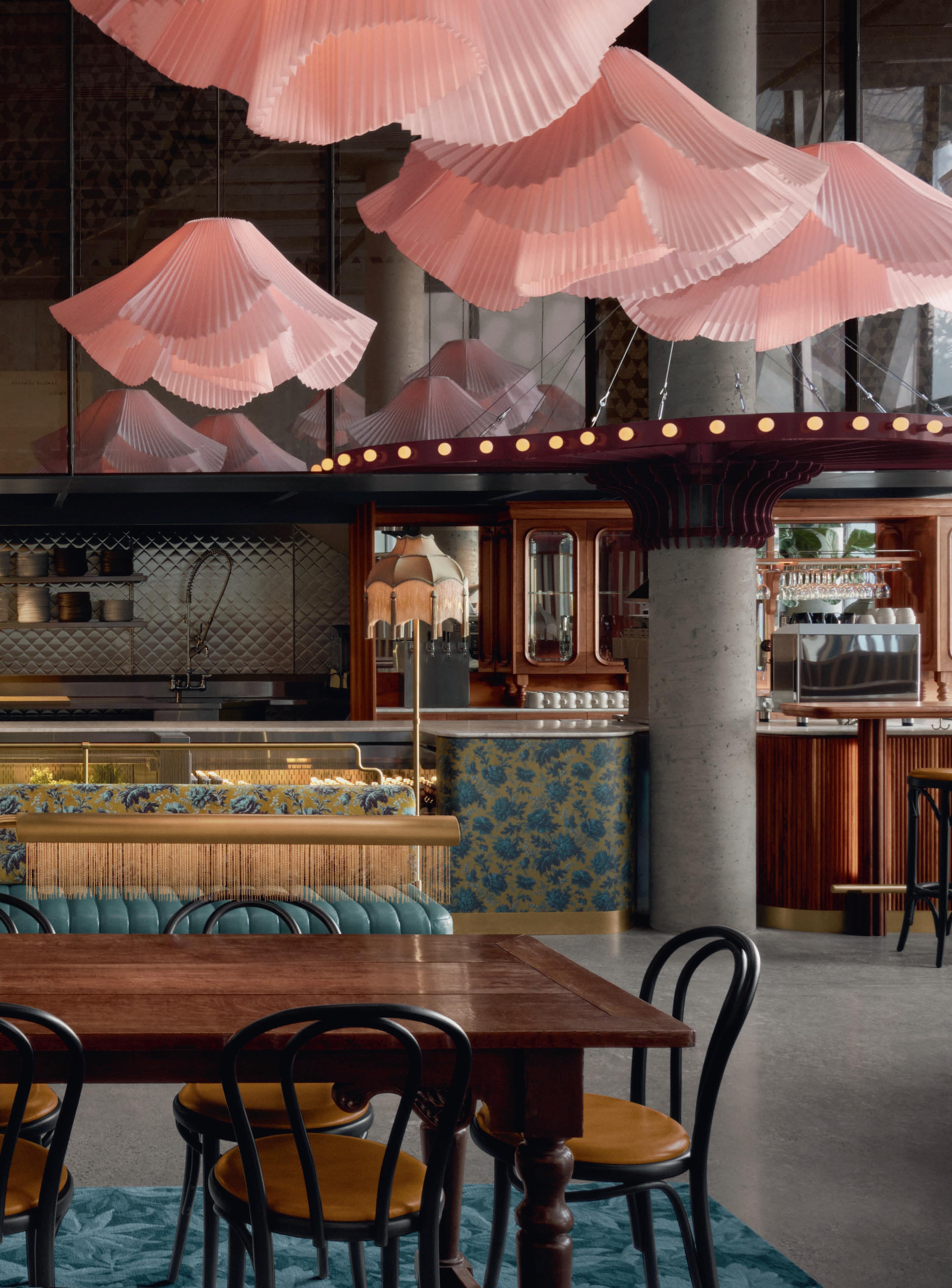
Located in downtown Montréal’s Wilder building, home of Les Grands Ballet Canadiens, is Café Constance, a space for social gatherings.
The café, completed in February 2022 by Atelier Zébulon Perron, pays tribute to Constance Pathy, a Member of the Order of Canada, a generous patron of the arts, and former leader of Les Grands Ballets.

The multifunctional space in the lobby welcomes visitors as a meetand-mingle locale before productions, a traditional café environment for those in the building, and transitions into a cocktail hour evening venue. The main focus of the design was to create something “warm and whimsical in the heart of a contemporary institutional building”.
“We adopted a theatrical approach in order to build a sort of spectacle that is really quite literal,” explains Zébulon Perron, founder and lead designer of the design firm. “The idea was to create something that seems completely out of place, and that captivates the imagination in a strange and wonderful way.”
One of the firm’s primary challenges was to create this stimulating
design whilst maintaining a functional space. A more intimate, human-scaled environment was achieved through the addition of a marquise above the bar area. Bevelled glass, mirrors and backlighting on the back bar suggest a theatrical element that is reminiscent of a wardrobe setting, and a dollhouse-esque atmosphere. The Marquise is custom fabricated in powder-coated steel with integrated sockets for dim-to-warm LED Tala Sphere I light sources.
“Café Constance channels elegance, grace, and movement through its tribute to the arts,” says Perron. “Collectively, all of its design elements interact in an eclectic atmosphere with unique character.”
Further adding to the whimsical nature of the space, the design team took inspiration from Muybridge’s famous stop motion sequences and featured custom-designed tutu lamps that flow through the café and taper its expanse to a more intimate scale. These custom-fabricated tutu shades are formed of crinoline and also feature dim-to-warm COB LED light sources. Each blush-coloured shade is unique in shape,




which adds to the ethereal flow.
Banquettes and stools upholstered in colourful leather, fringed lampshades, and an antique English communal table further contribute to the magical universe of Café Constance, wrapped in the warm embrace of vivid and lively floral fabrics and wallpaper patterns.
These fringed lamps were custom-made in brass tubing and fittings with sockets for dim-to-warm LED Tala lamps and shades sourced from British vendor Lotus Lampshades. The communal “Library” lamp was also custom-fabricated for the venue in brass with integrated dimto-warm LED lighting and a brass chainette fringe.

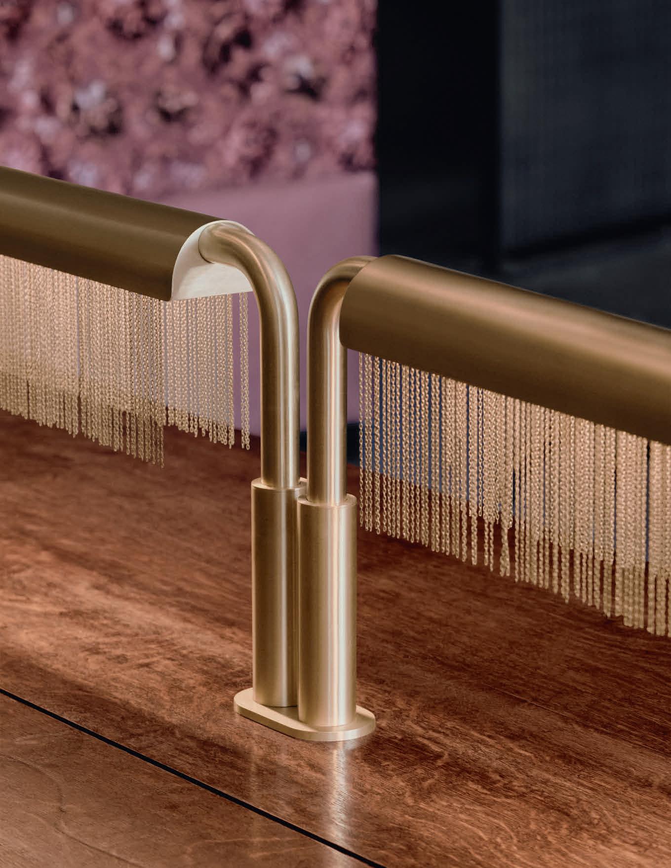
“The tongue-in-cheek approach to Café Constance aimed at creating a fun and fantastical space within the more austere backdrop of the building's contemporary architecture,” concludes Zébulon Perron.
“That play on contrasts extends to the design within the space as well, with hints of Victorian elements and boudoir intimacy animated by intricate colours, patterns, and light fixtures.”
www.zebulonperron.com
Images: Alex Lesage
Café Constance, Montréal, Canada
Interior Design: Atelier Zébulon Perron
Lighting Specified: Bespoke designs by Atelier Zébulon Perron, Lotus Lampshades, Tala
Atelier Zébulon Perron has created a whimsical design for the newly opened Café Constance in the lobby of the Wilder building, home of Les Grands Ballet Canadiens. The theatrical design includes dancing tutu pendants in a beautiful blush tone, along with brass fringed floor and table lamps, which add a dollhouse-like vibe to the space.
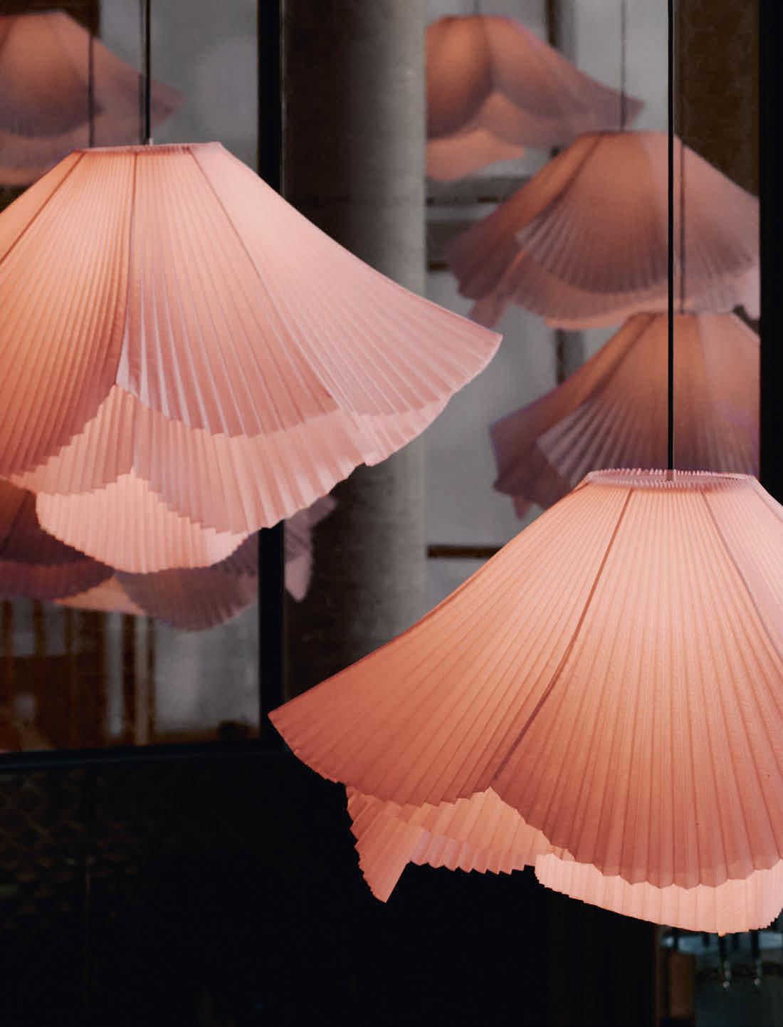
The Secto Design lighting collection is designed by the award-winning architect Seppo Koho. The diligent handwork is carried out by highly talented craftsmen in Finland from top-quality local birch wood.
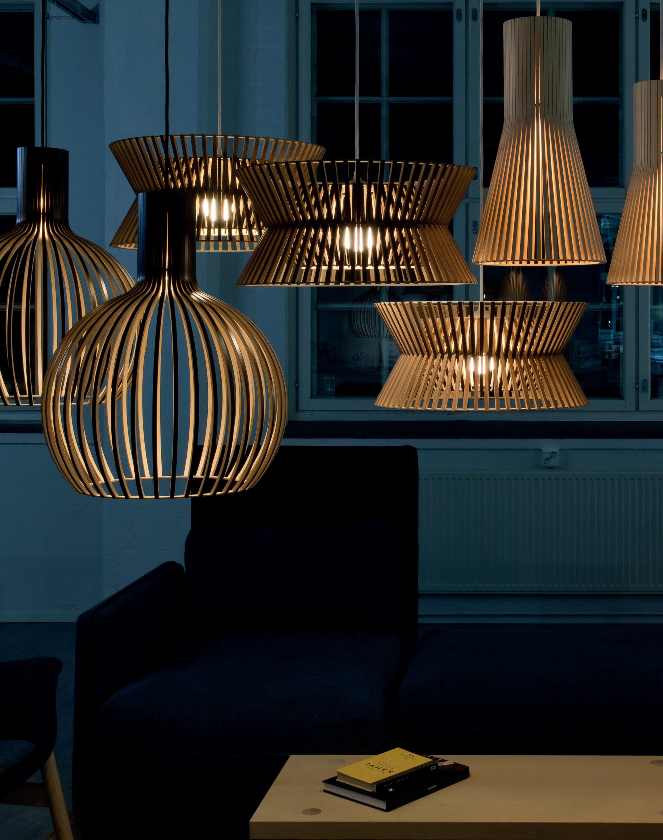


Designer Javier Robles founded New York-based lighting, furniture, and objects studio Lumifer in 2015 as a reaction to his continuous search for products to specify in his architecture and interior design projects. As a result, he created a studio that produces his “everevolving collection of contemporary work inspired by his global cultural experiences and his multidisciplinary approach to the design field”.


Robles sat down with darc to walk us through his personal design journey and dive into these cultural experiences he draws upon in his work.

“Growing up in Trujillo, a coastal city in northern Peru, has been instrumental to my identity and my work,” he kicks off with. “Since a young age, I have found inspiration in my rich cultural heritage, a blend of Spanish and Incan traditions, and the surrounding landscape; the Pacific Ocean, the desert, and the ancient archaeological sites in the
foothills of the Andean mountains.
“It was while studying architecture in São Paulo, Brazil that I began integrating a strong modernist reference into my passion for history, travel and culture that helped serve as the foundation for my signature design vocabulary.”
Robles continues that his “nomadic spirit” led him through South America, New York City and then London to live and work. It was through these cities he gathered influence from multicultural and dynamic artistic hubs that he established his practices, and went on to design, develop, and build a range of cultural projects, luxury homes and collections of bespoke lighting and furniture. “Through the years, I am always brought back to my origins in Peru and Brazil, a connection that continues to strengthen my design methodology and inspiration. More than ever, I am humbled and honoured to use my cultural heritage as part of my design signature and reference in my buildings, interiors and products,” explains Robles. “My appreciation for history, culture and lifestyle and my vast experience in the interiors luxury

industry, consequently gave me the foundation to establish Lumifer; a product design studio where I am able to express my appreciation for craftsmanship and uniqueness by working with the best local vendors and artisans in pursuit of the highest product quality.”

When it comes to the forms and names Robles’ designs take on, he says his greatest influences come from “science, nature, astronomy, aerospace, as well as my cultural heritage and archaeology, but a lot of my direct inspirational drive arrives through travel”.

A natural flâneur, Robles says he becomes more actively creative from “visiting galleries or museums to showrooms or vintage shops, but also by just sitting out at a café or attending a social venue and experiencing different foreign routines, languages or observing people’s moves or fashions.

“I spend quite a lot of time travelling; surrounded by aviation aesthetics, I found these moments from the solitude inside my
seat quite inspiring. Looking out at the sky or the Earth down below, surrounded by a high-tech environment, removes me from reality and forces me to concentrate on my inner space and at the same time to project my visions out to the world. I tend to sketch and write a lot during flights and I found these experiences rather fruitful moments where creativity comes in full.”
Taking these sketches from an idea and concept into a completed piece takes multiple, repetitive stages of refinement. As Robles describes, it’s an “evolution of ideas and an attempt at perfection through repetition”. “Many things come together in a rather simultaneous brainstorm of ideas, inspiration, materials sourcing, technology and aesthetic references. All these influences are translated through sketches, CAD and numerous renders of the piece before a mock-up goes into production.
“Timing is always rather unpredictable,” he continues. “Sometimes a

design for a product can take weeks or even months, but sometimes an idea strikes in my mind and with few sketches and drawings, a new product is born. Some of my more popular pieces have even been developed as a prototype from a single sketch on a cocktail napkin.”
Progressing from the concept stage, the construction stage again takes multiple forms and generations before the final product is settled upon. Robles elaborates: “[When] working with different local artisans and vendors there is a lot of back-and-forth communication and testing at the shop to refine a concept that sometimes takes many prototyping versions until the idea is ready for final production. In this process, the designed object also evolves, and sometimes spins up to something else and can even be the genesis of a new design that is generated out of the shop while testing and playing with a particular component or material.
“That is the case with our three most popular lighting collections,

where each collection was an evolution from the previous one. I believe in designing systems where components or parts can be adapted into an array of options from lighting to furniture and objects. Creating signature components allows me to play with different applications like a matrix that gives me opportunities to design different “lives” whether by changing scales, adding components or arranging the application beyond one single use.
“This exercise and rigour behind the creative process is the story behind all of my products for Lumifer.”
Turning to look more closely at the three collections mentioned above, Robles walks us through the design journeys for Navis, Helix and Stellar.
The Navis wall sconce was originally designed in 2015 using a single brass T-shape as a main axial from which the articulated shades can pivot. This design lay the foundations for more to follow.
“This design is a figurative extension of the Latin word for ship or vessel, which influenced the sleek design of this lighting collection. Propeller design and mechanics served as the naval/aeronautical aesthetic reference for the Navis fixtures. The sharp geometry of each shade is accentuated by the thin rectangular cut allowing light to emanate in multiple directions,” explains Robles.

“As with all my work, from one type, in this case, a sconce, the rest of the collection (pendant, floor and table lamp) is created using the same family of custom-cut components.
“While reviewing a production run of the Navis sconces at the metal shop, I began arranging some of the recently milled Navis T-shapes and saw that by adding each component (more elongated now) into an axial sequence and switching it 90 degrees, a new frame was created giving life to the Helix collection. Adding a new element, a hand-blown glass globe, and a new square-to-round rosette brass


component gave a softer and brighter language. By the Autumn of 2016 the Helix Collection was introduced at Maison Et Object, and soon became our bestselling light and in turn a central theme of the Lumifer design DNA.”
Following on seamlessly, the design journey of the Helix collection began. “The Helix collection is designed as a system of T-shaped hand-finished brass modules. Each light point gracefully transitions to a uniquely designed rosette to house the hand-blown glass globe. Each cascading “T” module forms a subtle helix rotation; creating a mesmerising cylindrical aura that touches on the origin of the natural world.
“The result is a delicate, simple and versatile light, with seamless and beautiful details, resembling vintage 1960s Italian lights with a contemporary and industrial aesthetic that characterises the revival of luxury American design.
“One year later in 2017, I began sketching the “T” component with a more spatial arrangement rather than a linear one (as with the Helix). This lead to a double light point system, and with the addition of a concave/oval glass disc, the Stellar collection was formed. Inspired by the latest images of our universe from NASA’s deep-field telescopes, this lighting composition is based on orbiting binary stars as well as the massive galaxies they inhabit. Light beams project outwards from each glass globe and are reflected and intensified by the paired glass oval disc.”

What will the next evolution of the T-shaped structure be from Lumifer? Now borders have re-opened and travel is very much back on the cards for the world, what future inspirations will Robles collect to inspire his new pieces? We look forward to what’s coming in 2023 from the New York studio.
www.lumifer.us
Lumifer may be a New York City-based studio, but its designs and heritage are a beautiful amalgamation of rich culture, travel and life experiences that its Founder Javier Robles has collected over the years. Taking inspiration from cities, objects and people, Robles creates stunning lighting pieces that sit within a curated portfolio of luxury furniture and accessories.
 Privatbank
Curiousa launches its new Wave collection that refines the studio's design and technical abilities into a striking, colourful range of pendants and table lamps.
Curiousa’s newest “ethereal, sculptural and serene” range comes in the form of splendid colours. The Wave collection combines the “organic nature of free-blown glass with a modern aesthetic”, describes Founder Esther Patterson.
British lighting brand Curiousa was established in 2010, one year after Patterson graduated with a degree in decorative arts, her second qualification after graphic design. Patterson was pursuing both colourful textiles and bone china lighting, when a visit to a local glass blower,

Anthony Wassell, showed her a way to marry up both mediums. “It was an amazing eureka moment, bringing together my two loves - form and colour. At the time, lighting felt quite masculine in greys and whites, so I thought there might be a niche in the market for some simple but still decorative, lighting.”
Based in the lush countryside of the Derbyshire Dales, Patterson takes a lot of her inspiration from nature and directs it both into her designs as well as into the kind of company she wants to lead. “I was never going
to be a city girl, it was always the countryside for me. It keeps you grounded – reminds you of what’s important in life and I try to bring that balance every day into work,” she says.
“Back in 2013 I was commissioned by the Haywood Gallery to design a new collection to work alongside their Light Show, and that’s when I first played with the concept of stacking glass components, creating the Triptych Stack collection, which is still popular today.

“The Wave collection is an extension of that same principle but I wanted to challenge myself and my team to create a range that would work in multiple planes, both horizontally and vertically, to create effortless, almost ethereal floating sculptures of light that still retained the hallmarks of Curiousa’s form and colour.
“We knew to achieve this we had to explore a continuous light source, not just a single lamp, to allow each component to reveal itself. We started experimenting with a whole host of variants to find the exact technology that would match my vision, and achieve the right ‘feel’, with the right control. The solution had to mirror and complement the same effortless grace and strength of the sculptured glass forms themselves.”
Patterson was spurred on to bring her ideas to life since her collaboration with designer Adam Nathanial Furman in the late summer of 2021. “Inspired by my Triptych Stacks, he designed two floor lamps using stacked semi-opaque orb shapes, and I suggested it would be great if we could add a suspended beam to the collection. The problem was, we had never used this approach before, so we had to start from scratch, working out how to create a continuous horizontal beam of light that was strong enough to hold multiple pieces of free-blown glass,” explains Patterson.

“The collection with Adam, which we called the Glowbules, was shown as part of the Decorex Future Heritage in October last year. The technological approach to the Wave collection is the result of a whole year’s worth of honing and refining that solution.”
The Ripple Beam was the most challenging piece for Patterson and her team to develop, as they needed to refine the design to work with clear glass that revealed the light source inside and ensure it worked well as part of the overall aesthetic. Calculating the structural strength of the piece to hold the weight of glass whilst looking effortless was also a key challenge.

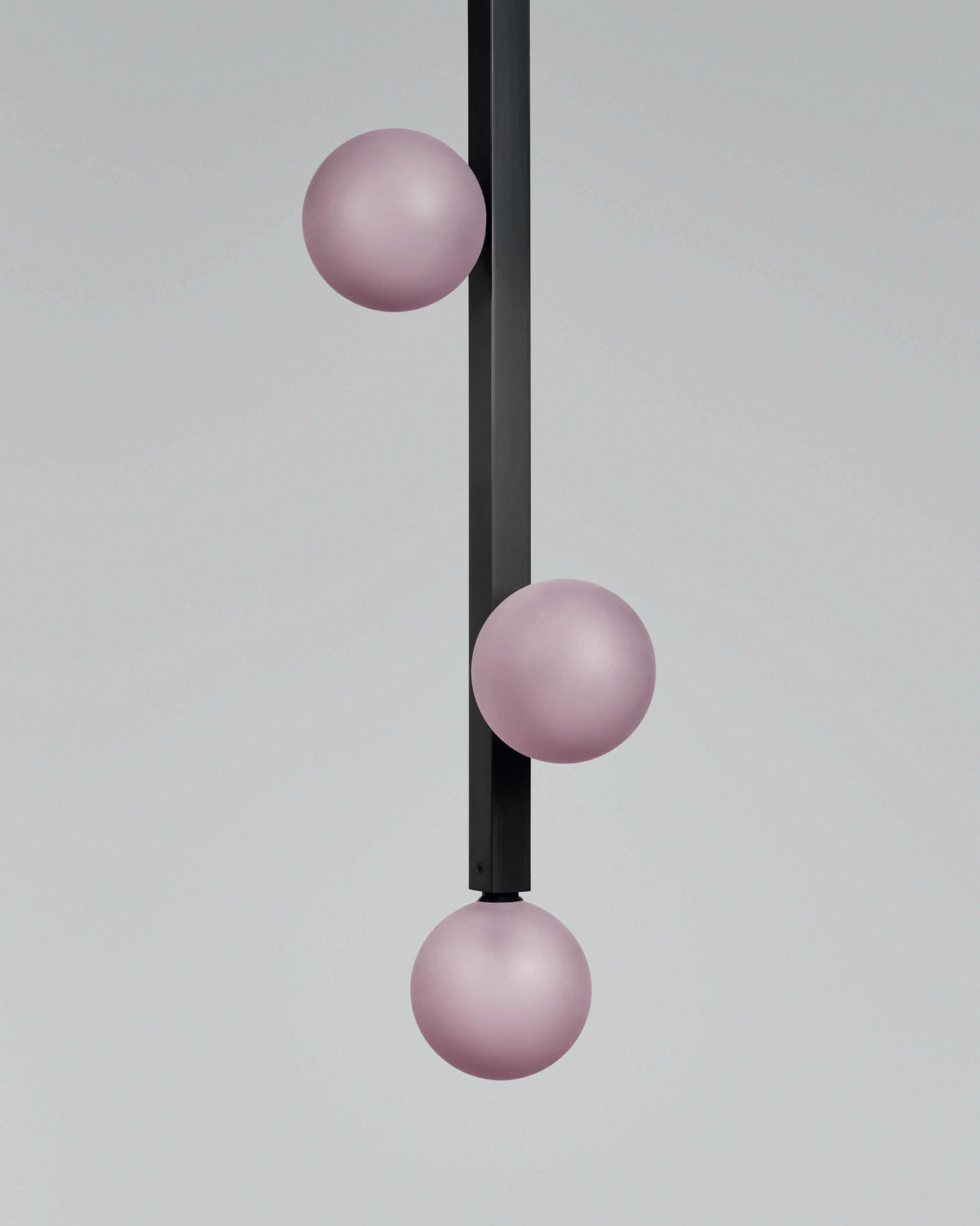
Describing the technologies used for this collection, Patterson explains that low voltage LEDs are powered through two 1.5mm steel cables, which also act as the weight supports. “The positive and negative cables are insulated by 3D printed sheathing, which sit neatly inside the end caps. The transformer is designed to be housed inside the ceiling void with a range of ceiling plate options offered for single or multipledrop chandeliers,” she explains further.
As for the glass housings, each piece is hand-crafted and free-blown without the use of moulds, much the same as all glass pieces from Curiousa. “Our abiding principle is to capture the intrinsic beauty of the glass itself, hold it at the centre of every design with all other elements and finishes designed to complement and enhance.
“Every piece of glass has been carefully ground and polished to align perfectly, creating an effortless flow, combining transparent and sandblasted glass within the designs.
“The Ripple Beam, Crest and Cascade pendants and the table lamps are all finished with locally turned brass end caps, with the Crest and Cascade using a single, hand-turned walnut disc, which visually adds balance to the design, whilst acting as a cushion to the lower glass
pieces.
“The Wave Collection will work well for customers who value originality, colour and warmth; who are excited to see how traditional materials and techniques can be applied to a modern design aesthetic,” continues Patterson. “The Crest and the Cascade pendants work perfectly as multi-drop chandeliers for residential stairwells or hotel foyers, whilst the Ripple Beam would look equally stunning in a luxurious restaurant setting or a private home dining space.
“Their sculptural approach, using colour and organic form definitely sets them apart. There’s nothing like them on the market, which is often dominated by minimalist shapes and white light - we want to challenge the market to celebrate colour and freedom of form with us, and the beauty of hand-blown glass.

“I am so thrilled with the results. The Wave collection shows the beauty of free-blown glass first and foremost - which is always top of my design brief - but does so with bolder, more modern lines.”
www.curiousa.co.uk
Images: Chris Webb Photography

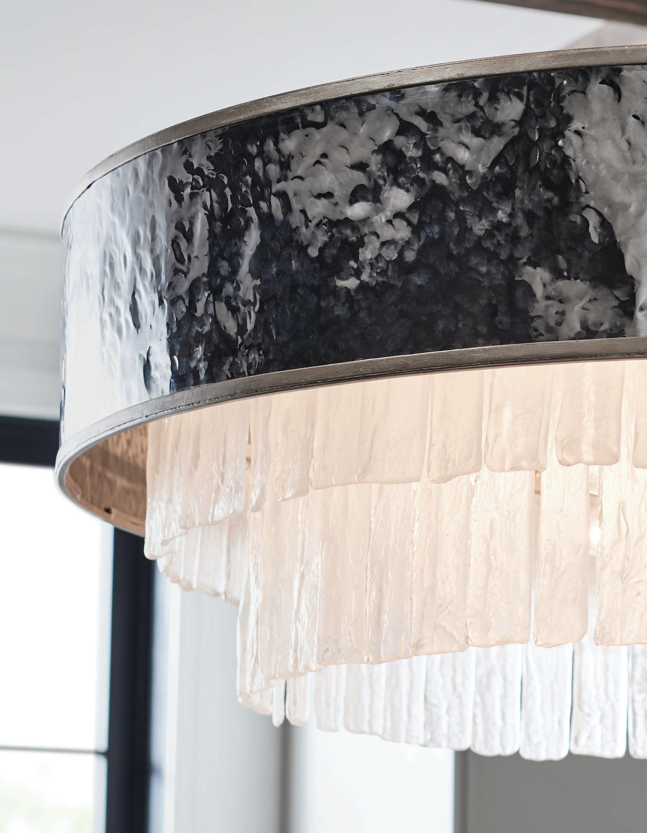
Penta Light's Lit collection provides an interesting and sculptural focal point for interiors. The pieces hang together in an elegant formation, blending a warm palette of colours.


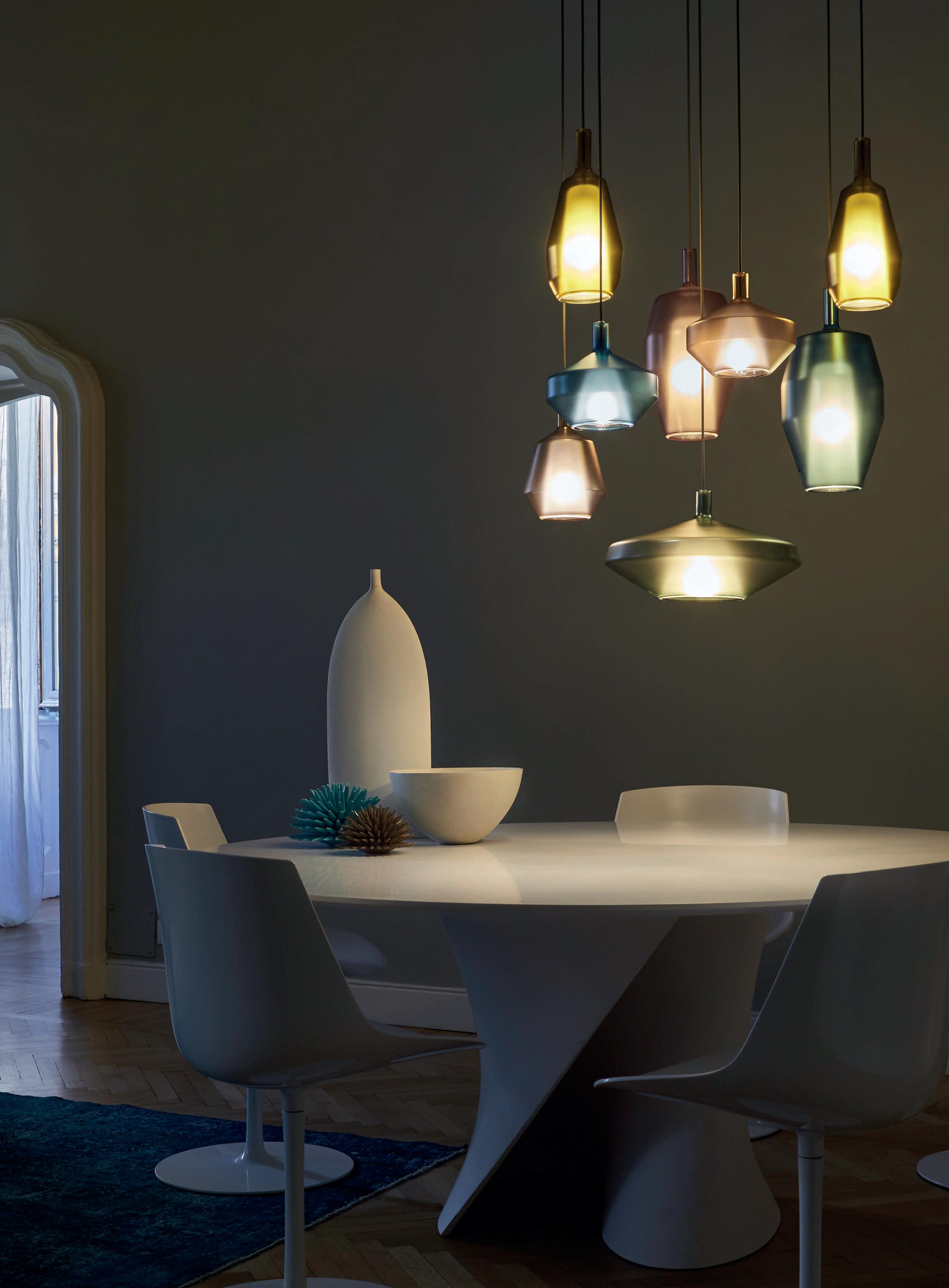
The Lit collection of decorative pendants from Italian brand, Penta Light, was designed by Umberto Asnago. The pieces are formed of a metal structure that holds a mirrored shade of borosilicate glass. The inner shade is striped sandblasted glass, giving the pieces a unique aesthetic when switched on and an ambient warm glow. When off, the pendants hang in a sculptural formation of mirrored colours, which are available in blue, violet, orange, and gold. Ceiling canopies come in finishes white, black, or titanium varnished metal. The collection can be composed of
various colour and size combinations to suit differing environments and effects.
“In 2006 Asnago, after having held important positions in Giorgetti Spa, completely committed himself to his role as a designer, becoming one of Penta’s historic names. Thanks to his vast experience and his refined creative toolbox, Asnago has been the creator of numerous iconic Penta collections,” says the brand. www.pentalight.com


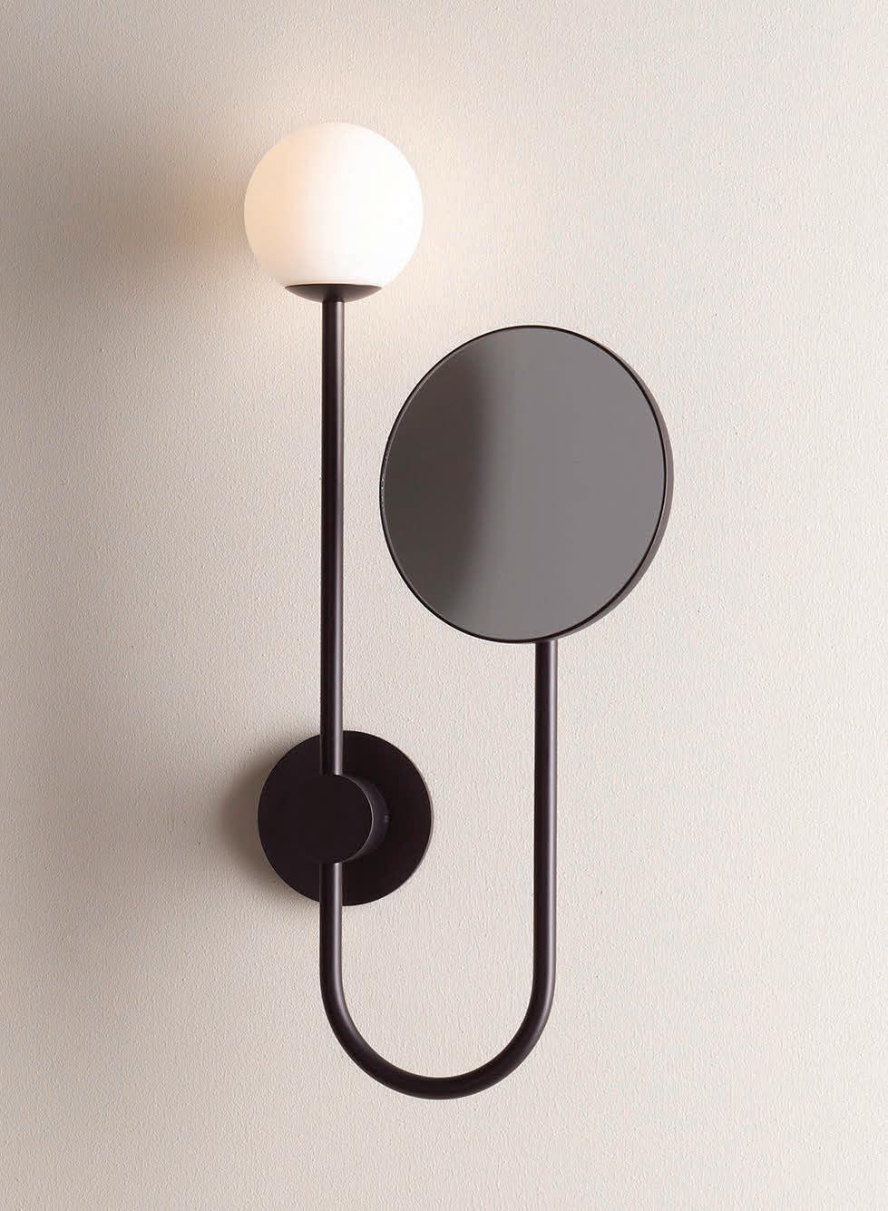
Foscarini releases a new colour hue, Anthracite, for its Aplomb collection. darc speaks with designers Paolo Lucidi and Luca Pevere about its production journey that began 10 years ago.
Foscarini’s well-known Aplomb pendant has received a new, “non-colour” finish: Anthracite, a neutral grey-toned cement, created in collaboration with a small, Italian family business Crea. Originally designed by Paolo Licidi and Luca Pevere and launched in 2010, the Aplomb’s sleek cleancut shapes have made the piece a classic in the Foscarini range.

“The protagonist is a special cement developed to be pleasing to the touch, composed of an exclusive fluid mixture poured into a mould,” says the brand. “Aplomb is a re-composition of contrasts: Foscarini has transformed a hard, rough and only slightly pliable material into a lamp with minimal thickness, produced with a craft-based process by Italian
experts in cement processing.”
Designers Lucidi and Pevere spoke with darc about the new design and its inspirations, giving an insight into the material choices and process.
“The Aplomb concrete pendant has an imperfect surface that gives it an expressive, handmade quality,” describes Pevere. “The design idea was born more than 10 years ago at the end of a design experience in the outdoor field in which we learned to use natural materials such as terracotta, ceramic and natural-based composites. We mainly designed vases where the tactile and visual sensation of the surface was very important. In that period many industrial products were influenced by


the first Apple products: smooth, basic, pure. Perfect. By linking the rejection of this homologation, which contaminated many product sectors, to the design experience that has just ended, the inspiration came: a lamp that did not focus on the lighting effect but on its mass when switched off. Its weight and its imperfection. Foscarini was the ideal partner.
“Aplomb is manufactured by family-run Crea Cemento in the province of Brescia. The fixture is part of Foscarini’s wide-ranging Maestrie project, which documents the craftsmanship and know-how behind its finished products. The aim of the project is to look beyond the brand in order to understand the values and culture that have made a particular object possible, the people and places that have gone into its creation.
It is the expertise of these craftsmen and artisans that Maestrie showcases and celebrates. The development of the Aplomb lamp is indicative of Foscarini’s creative relationship with its production partners but also demonstrates the artisanal know-how that is the foundation of the success of so many of the high-quality furnishings of Made in Italy.”


The intentional decision to use a cement finish was aimed at “introducing a new material that is little used in the world of lighting”. The Aplomb is a “re-composition of contrasts [that] transformed a hard, rough and poorly pliable material into a lamp with minimal thickness”.
Ideally suited to contemporary interiors, the anthracite version of
the Aplomb also features an aluminium neck piece that blends the cement and the cable, matching in a dark hue that aids the transitions of materials.
With regards to the design process, Lucidi explains that it was “tortuous, non-linear, and empirical. The [cement] production process was suited to large castings for architecture or useful for producing heavy elements with a low aesthetic value for common buildings; typically steps, balustrades, fences, manholes, sidewalks, etc.” This forced the design team to challenge the design process to be more flexible and suited to refined product production.
“Our intuitions always had to be verified in the laboratory and modified if the constraints did not allow their feasibility; the concept was immutable, the form was not. The team was so close-knit, passionate and stubborn that it ensured today's Aplomb exactly fit our first design sketch.
“The original drawing for the funnel-shaped pendant was created back in June of 2008. We had approached master craftsman Giovanni Piccinelli, founder of Crea Cemento about producing the design in concrete for Foscarini. We wanted him to execute a thin, cast concrete pendant, hung by a slender cylindrical neck, all of concrete. But upon seeing the specifications, Piccinelli said it could not be done. Foscarini insisted on the project, asking to reconsider. 'When you’re being challenged, you’re probably in a good position to find something new,' Carlo Urbinati, Foscarini Founder and President, says. 'Often, the real meaning of ‘it cannot be done’ is actually ‘I’ve just never done that before.’ Piccinelli went back to the drawing board and began crafting fiberglass moulds for prototypes. He had made thousands of moulds during his decades-long career, but they had been for pillars and staircases, not fancy pendants. The scale of Aplomb was entirely different.
“Meanwhile, the economic downturn of 2008 hit the construction industry hard. As Crea’s other business dried up, Piccinelli and his sons kept working on prototypes for Aplomb, spending more than two years perfecting the recipe of sand, cement, leveling compounds, and other additives to produce a mixture that was fluid enough to pour, yet would retain its shape without breaking. Making matters more complicated, Foscarini had certain requirements, such as a perfectly turned edge and a smooth finish unmarred by large pockmarks. All of these elements could be thrown off by a simple change in temperature or humidity in the workshop. Finally, the team hit upon a recipe that produces a pendant that is sturdy yet delicate. (The name “Aplomb'' refers to the construction tool that uses gravity to determine a vertical line—a plumb bob— and
also to having an attitude of poise or self-confidence.) In 2010, the pendant officially went into production.”
As mentioned, the first challenge the team faced was Piccinelli’s first response that it was impossible to make due to the fragility of the material in such a thin state. Further challenges they had to overcome included establishing a range of variability, a “standardised variation”, especially with regards to surface yield. Thirdly, longterm, the thermal shoches due to ignition broke the lamp.
Lucidi continues, walking us through the construction stages of putting the Aplomb together. “We initially walked the reinforced concrete road by incorporating wire and steel rod into the concrete. We soon realised that this involved flaws and breakages. Today the Aplomb is made of concrete, single material. Components made of other materials are assembled later and grant the tolerances and expansions it needs.
“The mixture of cement, sand, water, self-leveling compound, and other additives used to make Aplomb is proprietary, and varies according to the temperature, humidity, and presence or absence of colour pigments. Before filling the mould, Ndiaye Mamadou (from Crea) uses two vessels to decant the concrete to help eliminate large air bubbles, then lets it sit until the remaining bubbles rise to the surface. Then he slowly pours the mixture into the mould. Sandblasting gives the Aplomb its soft exterior, yet won’t obscure the signature imperfections that are formed by small air bubbles during mixing. Each pendant is sandblasted both inside and out for consistency.
“On the one hand the final sanding does away with any brutalist effect on the cement itself, and on the other there is emphasis on the controlled irregularity of the material thanks to a grain size with pores open to various extents, making each lamp unique, just slightly different from the next.
“Foscarini’s certain requirements meant all of these elements could be thrown off by a simple change in temperature or humidity in the workshop. As Carlo Piccinelli said 'We weigh the ingredients and mix them according to a special recipe, but the success ultimately relies on the sensitivity of the person doing the mixing.'”
With each Aplomb being made by hand and the assembly completed separately, the attention to detail is evident. “What is sophisticated and rare is the know-how and sensitivity of those who produce it,” adds Pevere. “The bricklayer's plumb line effect was one of the sensations we wanted to retain throughout. A weight that stretched the self-supporting electric cable properly.
047
“It is a successful lamp because it does not just suit one specific sector but is very transversal: residential, contract, hospitality, corporate, etc. It can be used in assonance in warm and material environments or by creating a pleasant contrast in extremely minimal and pure environments.
“Aplomb is the first concrete lamp offered on the market with these technical specifications. As concrete is usually used in outdoor spaces and in large quantities like for floors or panels, Aplomb brings a lighter, minimalistic approach to concrete into an indoor space–making it a very unique focal point in any space.
Aplomb is perfect for adding an industrial touch to a space without making it feel cold or heavy. Concrete is durable, versatile, rugged, authentic and has a natural aesthetic appeal–and paired with Aplomb's intricate and delicate form of its funnel-shaped pendant, it adds a beautiful contrast to any room.
“Every new lamp that enters the Foscarini catalogue adds something new. Concrete was a new material for Foscarini, never used before in a lamp. It is a product designed over 10 years ago, and we think it is aging well. Not only in the panorama of Foscarini products but we also believe in the places it illuminates.”
Aplomb’s family of lightweight lamps is available in three sizes and various colours. Its proportions enable it to be used alone, e.g. on a coffee table, in linear configurations to light a surface, or in compositions at different heights. The built-in LED light source recessed into the body of the lamp sends a wide beam of light down towards the underlying surface.
www.foscarini.com
www.creacemento.com
Foscarini's Aplomb pendant collection is formed of a smooth yet textured cement that is crafted to a delicate thinness by Italian specialists Crea. Originally launched in 2010, more than a decade later, the collection releases a new colourway, Anthracite, providing a “non-colour” option to the contemporary design audience.

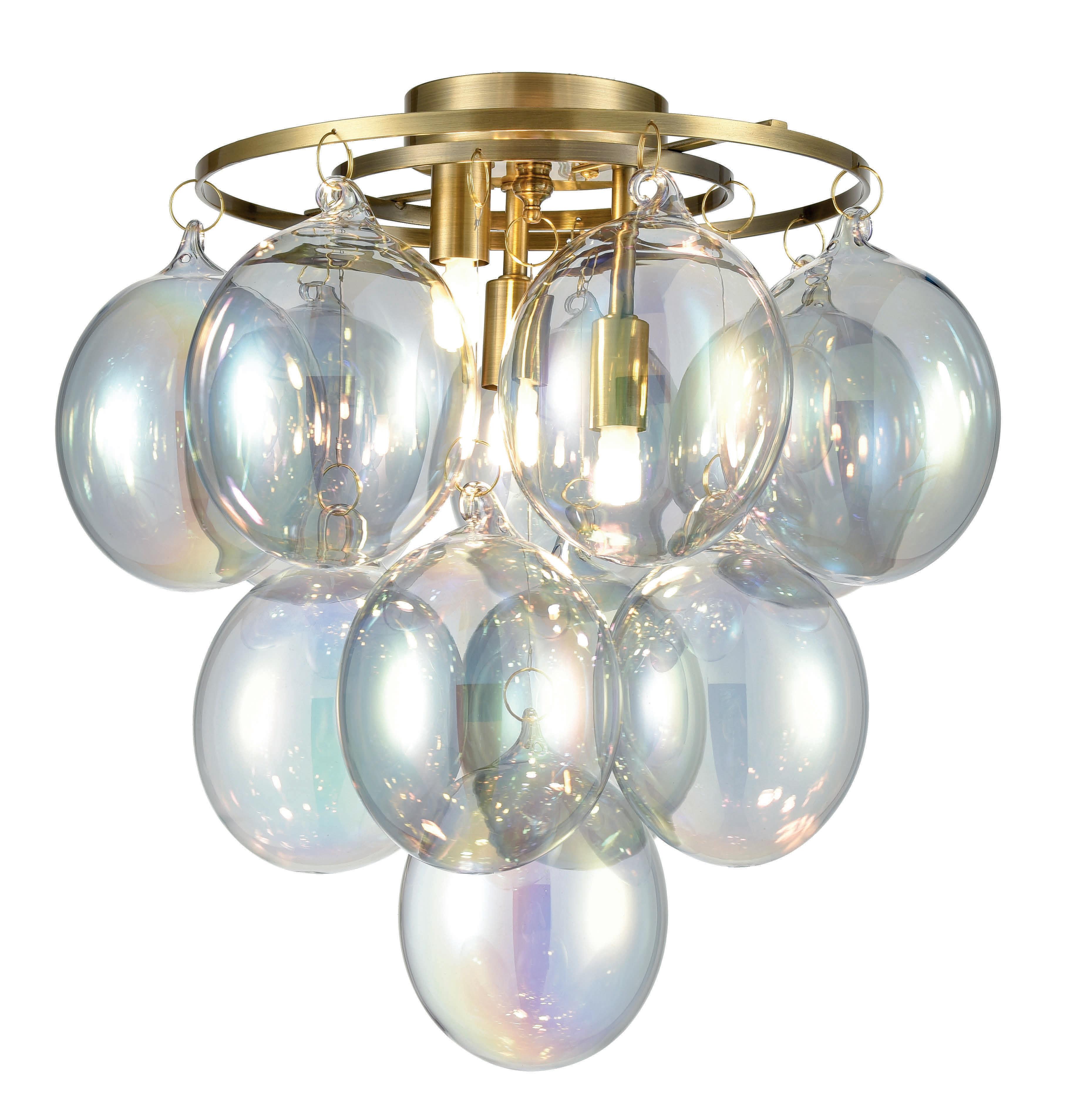
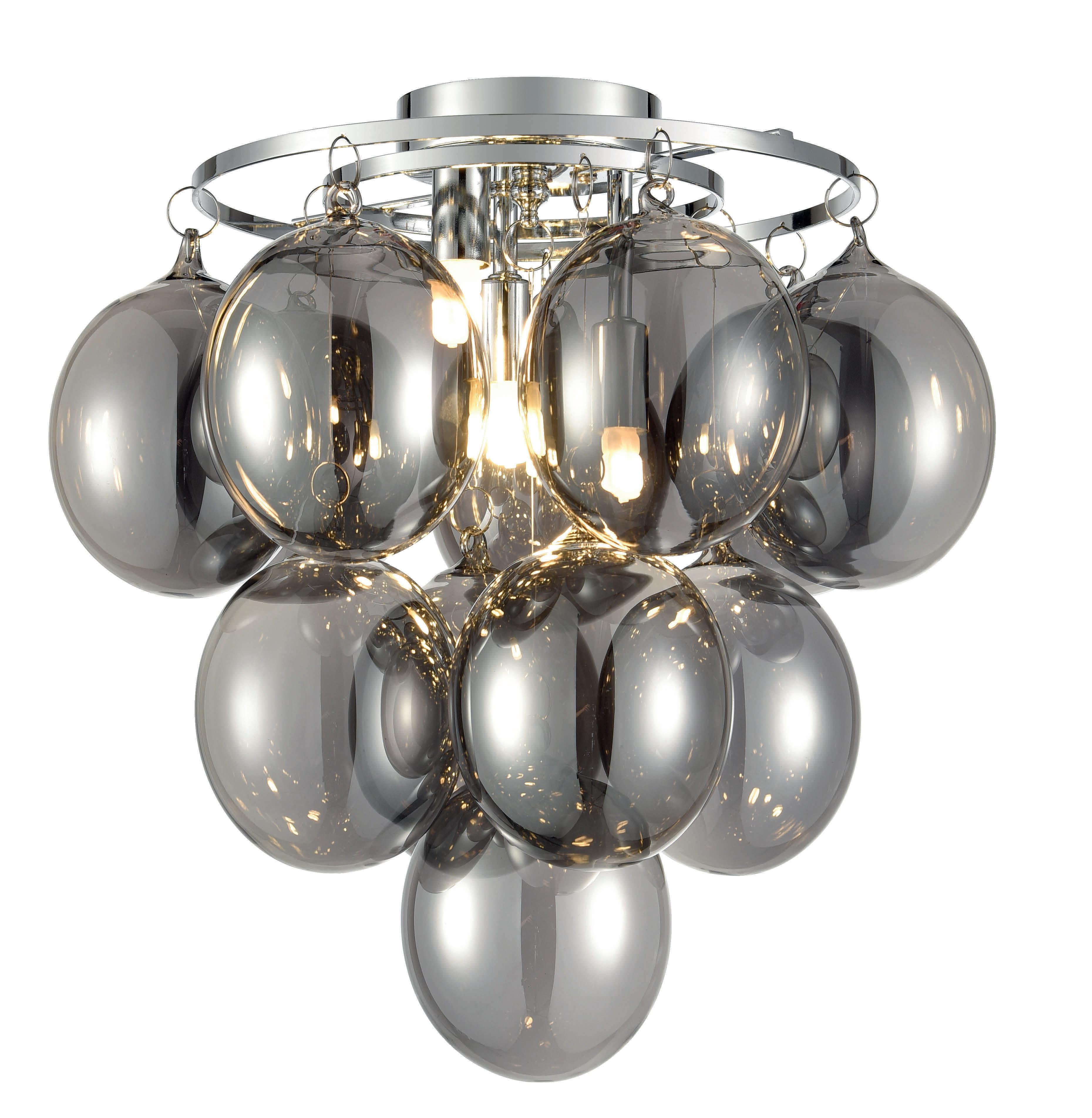
Bubbles range


brass with iridescent glass and chrome with smoked glass. Available in a three light flush fitting or four and six light pendants.



Illuminating the vast space within a stairwell provides an opportunity to flex creativity and create a beautiful lighting focal point. darc covers a handful of beautiful stairwell projects.
UK
Luxxu saw no better place than Manchester to insert its brand-new luxury home, a prestigious apartment project right in the centre of the city. Manchester has a past vastly rooted in the industrial movement and a special focus on art and textiles. All of this rich history served as a major inspiration for many of the home’s interiors. When designing each space, Luxxu strived to create aesthetically pleasing yet functional living spaces. The apartment is fully furnished with a series of brand classics and innovative designs by Luxxu, among a few other surprises that offer this estate a multi-layered character while also
paying homage to its location. Featured in the stairwell area of the living room is a cluster of Luxxu’s Waterfall round suspension lamp. The circular-shaped pieces are designed to give a glamorous sensation of waterfalls, as the name indicates. Preserving the inspiration on the natural sensation of waterfalls, the piece is made with high-quality brass and beautifully handmade ribbed tubes of crystal glass. www.luxxu.net

The exclusive Legami Sushi & More restaurant has chosen the “metropolitan garden” of Terrazza Fausti, looking onto the Quadriportico gallery of the Sentierone Avenue in the “Città Bassa” (the Lower Town) to open its doors to diners in Bergamo, offering a blend of fusion cuisine and sushi, for a unique taste experience in which the chefs’ creations bring out the very best in aromas and flavours from different cultures.
This journey through flavours is made even more special by the contemporary design of the setting, embellished with lighting by Catellani & Smith, which for this project has supplied a selection of lamps in line with the mood of the restaurant. A custom composition of Syphasfera pendants light up the stairs with the irregular surfaces of its spheres placed at differing heights.


www.catellanismith.com
Images: Nava Rapacchietta


Stairwells are one of those difficult spots in both residential and commercial spaces for adding interesting and engaging decorative light fixtures. Christopher Poehlmann, lead designer and owner of CP Lighting in Philadelphia, PA, saw the need for functional yet sculptural stairwell pendants as an opportunity uniquely suited for his organic Rustic Modern light fixtures. Conceived as a sculptural vine-like structure the fixture comprises a series of branches that hook and rest on one another like the old Barrel Of Monkeys children’s toy. The newGrowth Vine fixtures can be easily configured from around two-metres in height to over 10-metres depending upon the size of the stairwell or atrium. The newGROWTH lights are all fabricated from lightweight aluminium, each branch element weighing no more than 10 pounds each. Installation is done from the top down, with one branch hanging
from the last. The fact that most branches are between 1-2-metres further eases the installation logistics when creating a very tall fixture, not to mention the fact that the shipping container can be far more compact than for a single piece fixture. Pictured is one of CP Lighting’s newGrowth2 custom stairwell fixtures in a private residence in Bozeman, MT. The home and interiors were designed by Design Associates in Bozeman. This bespoke fixture was fabricated from aluminium with a black patina finish. Lamping is dedicated 12v LED modules that screw into the branch ends, which act as heat sinks. Each module is 4.3W, approximately 300lm, 2700k and driven by an ELV transformer housed in the canopy. www.cplighting.com


Relaxation in the middle of the Alps, surrounded by picturesque mountains, is a dream become reality with Chalet D in the Austrian Alps. Chalet D was designed as a holiday chalet including a spa area, where several families can spend their holidays together.
The contemporary redesign, by monovolume architecture + design, breathes new life into the existing building and sets it in dialogue with its surroundings. Oak wood, dry stone walls and exposed beams give the chalet a typical alpine flair.
Inside, the cross beams have been restored and made visible through dark colouring, and large windows offer different views of the surrounding mountains on each floor. Light oak wood and numerous fireplaces create a warm environment and blue tones in the interior design are a nod to water - a central

element of relaxation in the spa area. A modern kitchen as well as a large dining and spacious living area on the middle floor create a convivial space for communal living. In the lowest floor of the house there is the spa area. The use of soft materials, soft colours and colourful LED lighting contribute perfectly to relaxation.
Penta’s Mom pendants are featured in the stairwell area in a dark, contemporary yet earthy tone. Designed By Umberto Asnago, the Mom lamps, created in borosilicate glass, are inspired by the Venetian tradition, and refer, in the shape and opaque finishings, to the classical Murano glass vases. www.pentalight.com www.monovolume.cc

The residential client discussed with Fritz Fryer about creating a stunning statement feature, which would descend through the atrium and be visible from all three floors. They still wanted to be able to appreciate the view of the sky from the sky lantern, so a challenge Fritz Fryer’s designers faced was to not obstruct the view completely while incorporating many of its beautiful Hereford shades that the client loved in a mix of sizes and glass types.
The team worked closely with the client’s lighting designer, Steve Allen from Connect Intelligence Ltd, on this project. After some initial frame designs were sketched, Rich Nash of Fritz Fryer transferred them into SolidWorks and made a model of the cluster. Nash was then able to render the model for the client to visualise the different glass and metal finishes.
The atrium in the customer’s home is large and circular, so the design team decided that a circular frame would suit the space. They opted for a double ring design so as to include enough pendants to fill the large area. Due to the large drop it was important to use the XL size to fill the space, and to also give the lantern another dimension.


Once they had decided on the final design, the frame was ordered from laser cutters, and then sent off to be powder coated and finished in a specific RAL colour code, which the client requested to match their windows.
Nash then wired up the 24 pendants at varying lengths and created a wiring harness inside the frame ready for the electrician to connect to the main feed.
A ‘frame’ was used as opposed to a ‘tray’ so as not to obstruct the natural light that came from the sky lantern, and also allows a nice view of the sky when walking beneath. This design is a 24 Way Cluster chandelier, with a mix of 16 large and eight extra large ribbed and clear Hereford shades. It hangs from a circular aluminium frame that is suspended from an eye bolt, which was pre-installed into the centre of the roof lantern. It passes through a very unique circular atrium across three floors, which is over a 6.5-metres high.
www.fritzfryer.co.uk

A cultural heritage building located in the Old Town of Vilnius, Lithuania, the Adam Galdik Museum and School of Arts has been renovated by interior design studio JP Interjero Namai, and features Nemo’s Crown collection.
To recreate the fourth-century history of the building, where the Baroque, Renaissance, and Gothic intertwine, layer after layer of the ruined heritage was uncovered, revealing looted layers of Soviet wallpaper, the remains of amazing frescoes, and erected wall decals. All of this was possible thanks to the client who provided a lot of funds to save and return the original features.
The biggest challenge was to combine the latest technologieslighting, ventilation, and conditioning, so as not to compromise the
authenticity of the building. In Italy, the team ordered special paints made according to the technologies of the 17th century. The floor tiles were made of special clay to replicate the authenticity of past centuries, and the window handles and chandeliers were made specifically for this building.
The Crown collection brings together Classicism and innovation, two important traits needed to embrace the uniqueness of the Adam Galdik Museum and School of Arts. For this project Nemo selected different versions of Crown all in gold plated finishes, designed by Jehs+Laub. www.nemolighting.com Image: Vaidotas Darulis


The Fat Badger is an all-day British drinks and dining room bringing everything about the countryside restaurant to life in London. With a little cheek and lashings of charm, as is true to the Gladwin Brothers style, guests can expect to enjoy the familiarity of brasserie-style dishes with twists from using wild and foraged ingredients to unique takes on classics cooked with flair. In keeping with its continued commitment to ‘what grows together, goes together’, the wine menu features a range of award-winning English wines from its boutique vineyard in West Sussex, Nutbourne. The restaurant is named for the UK’s symbol of the British countryside that lives off the ‘fat’ of the land.
The airy bar area is complete with comfortable, plush loungers and tables-for-two encircling a copper top bar. Original BTC’s Hampton Pendants can be seen throughout the bar and restaurant, complementing the accents of brass, and giving the interior a hint of rural charm. Featured products throughout the hospitality space include: Hampton size 2 pendant, Hampton size 1 wall light, Mini Ship’s Companionway in weathered brass and frosted glass, and Whitby double LED spotlights. www.originalbtc.com

Based in London’s prestigious ‘The Lancasters’ building, overlooking Hyde Park, this French Renaissance style Grade II listed façade is an attractive front to bright and contemporary living spaces inside. Taking two existing dwellings totalling 7,500sqft of space, Katharine Pooley and her luxury interior design studio have renovated the property using sympathetic architectural detailing, thoughtful use of finishes and careful space planning to create this sophisticated residential home, with elegant reception rooms suitable for entertaining, along with cosy lounge areas for quality family time. Inspired by the stunning views from the front of the property, a tranquil, natural theme radiates throughout the project. Pooley’s variety of different glass techniques chosen for the main chandeliers by Czech brand Gladee keep the feeling of space within the double height rooms, allowing the light to reflect and bounce off the surrounding surfaces to maximise
their presence. Paying homage to the style and history of the listed building’s interior design, Pooley and her team’s final design is befitting of this fine, historic residence.
The living room chandelier is 13-metres long and consists of 700 hand-blown ribbed crystal glass rods in champagne ombre. Each rod weighs 1kg, which meant a hidden stainless steel frame was put inside the ceiling to support the weight of the chandelier.


In the dining room there is a chandelier consisting of 225 hand-blown and hand-shaped crystal glass leaves in a mixture of blue, smoke and mica glass with gilded edges.

Finally, in the entrance hangs 140 hand-blown and hand-shaped crystal glass maple leaves in champagne with mica and clear colours. www.gladee.co.uk
Images: Nico Wills


LiGHT 22 is a lighting exhibition for specifiers and designers, brought to you by [d]arc media. Held on 22 & 23 November 2022, at the Business Design Centre in London, LiGHT sees high-end lighting manufacturers exhibit their latest product collections alongside a two-day talks programme; a late-night drinks event, and LiGHT Works - a dedicated workspace for visitors.
In collaboration with lighting control specialist Lutron, the talks programme will see leading designers working with light take to the stage. Headline speakers Sally Storey, founder of Lighting Design International; Mark Major, a founding partner of SpeirsMajor; and Nick Hoggett, of dpa lighting consultants will sit down with arc editor Matt Waring to share their thoughts and insight on the lighting design profession. Considered by many as founders of the lighting design community in the UK, the designers will look at how the industry has grown, predictions for the future and reflect on past projects and trends.
A special feature of the show, LiGHT Works
is a dedicated area for anyone who needs to complete office tasks during the two day show, so they don’t have to worry about being out of the office. In a quiet location upstairs in the gallery of the Business Design Centre, visitors will find a remote office space complete with dedicated wi-fi, charging points, co-working desk space, and comfortable lounge furniture, there’s no need to leave the exhibition to get the job done.
Registration to attend the show is completely free and full visitor information and talks programme details can be found at:
www.lightexpo.london

Kilter is a new take on an architectural lighting staple. Named in reference to the careful confluence of light source and fixture, Kilter emerges at the intersection of decorative and architectural lighting. Tala’s first entry into S14d-style light sources, the omni-directional light throw softly illuminates the texture and colour of the wall behind it. Available in two lengths – 640mm and 500mm – and two colour temperatures – 2200K and 2700K. www.tala.co.uk
Tempus is a new range of innovative illuminated timepieces designed to change the future of how we look at time. Created using beautiful patterns of building light encased in a luxurious housing of aluminium and glass in either wall mounted or standing designs. Launching with the Positano Collector’s edition, inspired by the stunning waters and cliff faces of Positano Italy on the Amalfi coast. Showing for the first time this November, created by design Ben Rousseau. tempustime.com

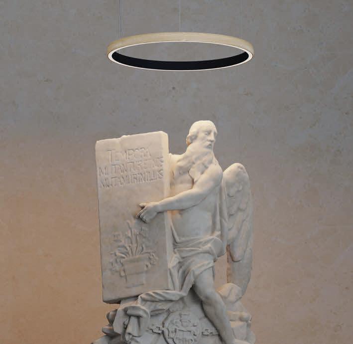
The stunning Orbit range will elevate any space with its contemporary look. Orbit 120 is an inside lit suspended ring, available in black and white, is dimmable and comes with suspension cables allowing a two-metre drop. Suspend over a dining table, meeting room or reception desk for maximum impact; 0.6-metre, 1-metre and 2-metre versions also available in the Ring family to suit any project. www.projectcollection.co.uk


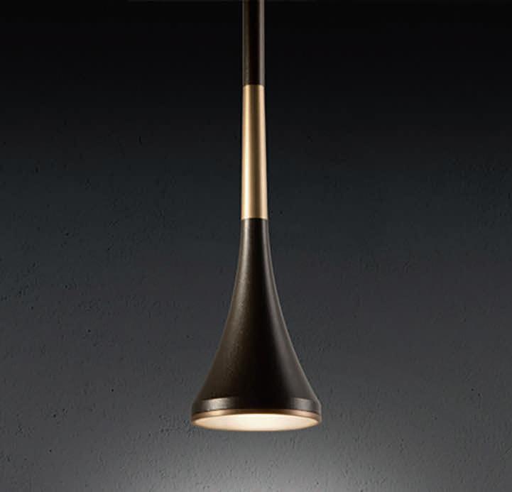
Lumo, designed this year for Zero by Thomas Bernstrand, is in essence a cone-shaped pendant which is available in five colours. Cast from a single piece of aluminium, Lumo has a diffusor in matte acrylic, which is imperceptibly mounted into the shade to avoid glare. Made in Sweden, this versatile lamp can be ordered as a single pendant or on a variety of railing fixtures to form straight, round, triangular or quadrilateral formations suspended with the fixtures’ cables. An example shown here is Lumo Trio on a straight rail.
www.zerolighting.com
There are a number of elegant satin brushed gold, satin brushed silver, and chrome fittings in the Cordelia range, all of which have textured glass bases that diffuse the light evenly. This range includes pendants with single or multiple drops, semi-flush ceiling fittings, and wall brackets suitable for any interior design. franklite.co.uk


Designed by Chia-Ying Lee, Random Solo is an extension of the original Random range, featuring a suspension lamp that hangs blown-glass spheres, resembling bubbles floating in the air. The spheres are available in five sizes and six finishes, including Lodes’ latest glossy bronze shade, which creates an opportunity to play with colour and scale. They can stand alone or be grouped together on a canopy, offering ample freedom to build bespoke lighting compositions that will adapt to any environment.
www.lodes.com

The Crest & Cascade pendants from the new Wave Collection work beautifully for a bespoke chandelier. For each pendant, careful precision and detail is required to piece them together, keeping an organic feel with a modern approach. Each glass part is freeblown in the UK and beautifully complements a locally turned wooden disc. Solid brass end-caps punctuate a spiral of LEDs within a diffused tubular suspension, creating a beam of light that glows through linear stacked glass pieces.

www.curiousa.co.uk
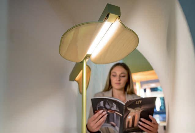
Biga represents the functional evolution of light, a minimal bedside solution but full of hidden advantages and comforts: an adjustable and dimmable reading light, a little shelf with an integrated wireless charger to store small objects such as jewellery or to charge compatible smartphones, two buttons to control, in addition to the integrated reading light, also the general light of the room and a USB port to charge any device. www.lym.it


Glo is an icon of Penta Light’s collection, a glass sphere enhancing the glare of light, in a game of reflections back and forth between the lamp and the space or among the lamps themselves. The rich palette of colours and the different dimensions of the suspension lamps are a toast to creativity. www.pentalight.com
With the launch of Tyson Studio, the lighting company proudly presents its own collection of designed lighting. Available in three sizes and inspired by old fluorescent architectural lamps, the Tyson Strip features clean simple forms finished in satin brass or blackened steel to create strong graphic lines that enhance the tube’s warm linear glow. An array of four tubes are held in a cross format, vertically. Handmade in the UK using techniques passed down through generations of dedicated engineers, the new floor version using carbon negative material will be presented at LiGHT 22.
www.tysonlighting.com

Hoxton is a curvilinear pendant light with three angled facets in spun aluminium, that creates a simple yet striking aesthetic. At the heart of the East End of London, Hoxton is an area of innovation and re-invention. Despite changing trends the area retains a solid sense of identity and functionality, which inspired this collection, also reminiscent of industrial building machinery. Designed by Steve Jones and James Bartlett, yhe pendants come in two diameters: Hoxton 17 and Hoxton 50. Available in spun aluminium in textured black or white with a contrasting antique gold interior. www.innermost.net
Poldina is a battery-operated, portable and rechargeable LED lamp, switched on/off using the touch button on top of the diffuser; the same button adjusts the colour temperature and intensity of the luminous flux. Available as a table lamp, floor, suspension, and two wall lamps, except for the last three versions, the lamps are charged via a contact charging base. They are also suitable for outdoor use thanks to an IP65/54 rating. The die-cast aluminium structure is painted, covered in metallic leaf or treated with a galvanic finish in gold or chrome.
www.zafferanolampesaporter.com

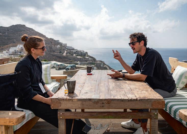
This year’s [d]arc sessions europe took place once again at the stunning Royal Myconian Hotel in Mykonos, Greece from 18 – 20 October.
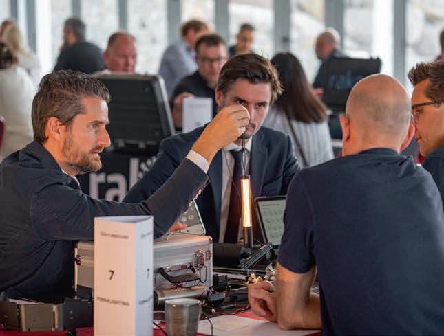
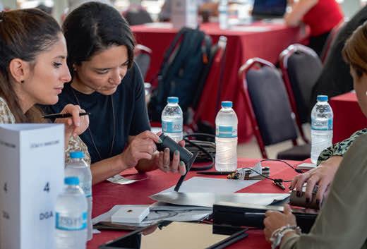
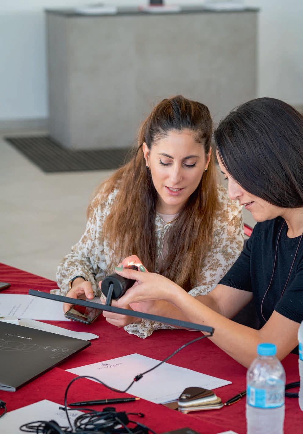
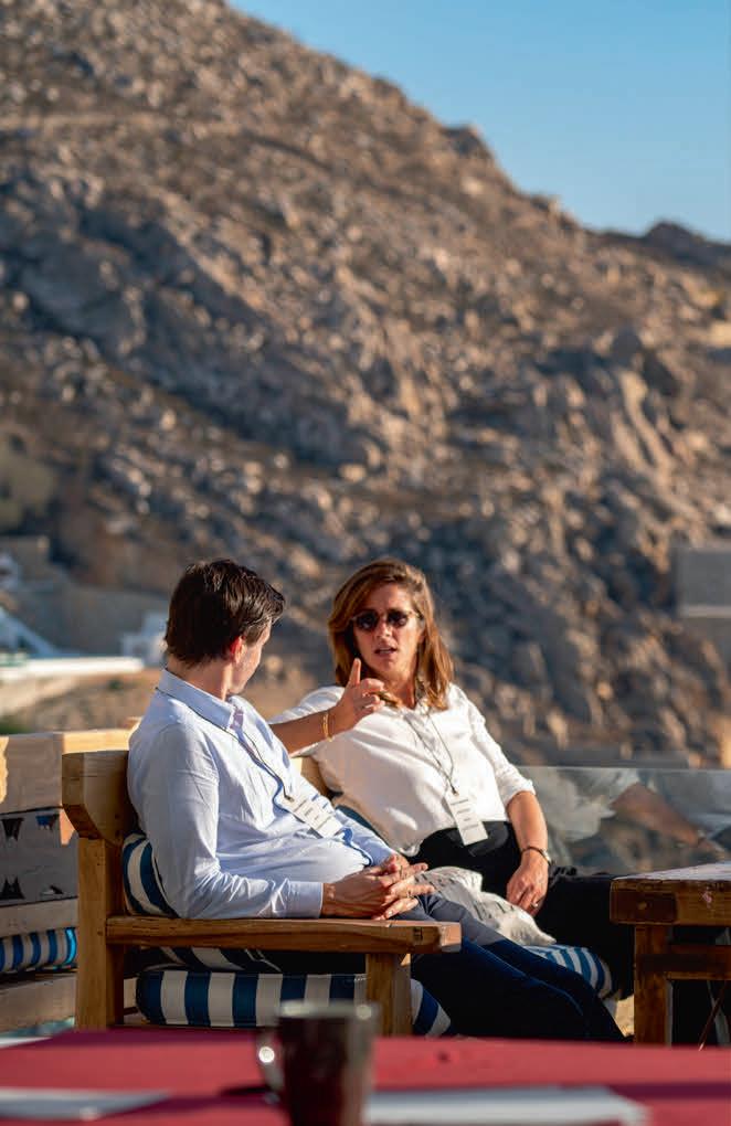
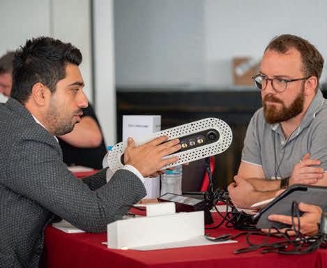
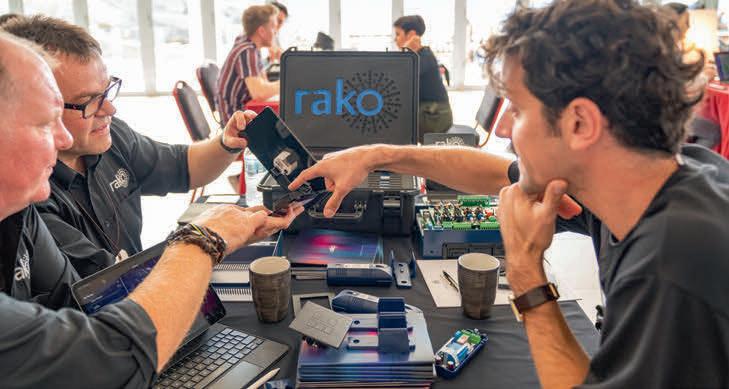
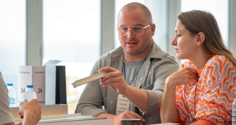
One hundred attendees joined the [d]arc media team for the threeday networking event, which saw senior designers, working within the European lighting specification market, meet with high-end lighting suppliers for a series of speed-dating inspired 20-minute meetings, where they learned about the latest innovations and products to market.
In between meetings, delegates attended a talks programme that saw panellists and the audience discuss various hot topics in lighting.
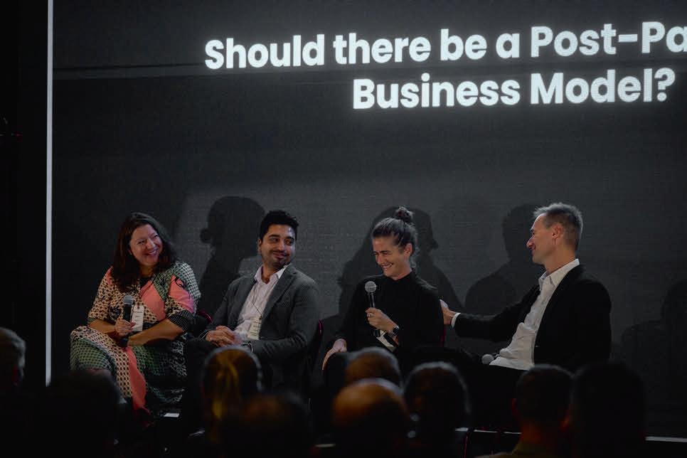
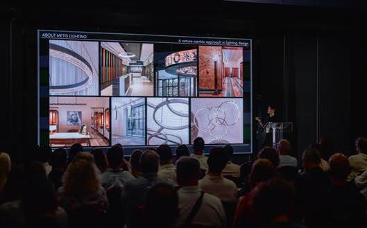
On the first day, the opening panel discussed: “Should there be a Post-Pandemic Business Model?” with panellists Mustafa Akkaya of Line Lighting Design (Turkey); Jörg Frank Seemann of Luce Spazio (Switzerland); Anna Sbokou of AS Lighting Design (Greece), and Ellen Goulmy of Berlux Lighting Design (Netherlands) taking to the stage. This was followed in the afternoon by a keynote presentation from Zoi Katsarou of Metis Lighting (Italy) on ‘a nature-centric approach to design’.
The second day opened with a lively discussion on ‘The Challenges of Working with LED Sources and Dimming’, panellists included Ted Ferreira of CD+M Lighting Design Group (US / UAE); Gé Hulsmans of Summa Systems (Netherlands); independent lighting designer Chiara Carucci (Italy); Carolina Florian of Buro Happold (UK). In the afternoon the topic of “The Importance of Sustainability Strategies,” was
discussed with the panel including Kristin Bredal of Zenisk (Norway); Martina Weiss of Licht Kunst Licht Design Hub (Spain); Laurence Titton of Visual Energy (UK / Germany); and Marcus Steffen of MS Lighting Design (UK).
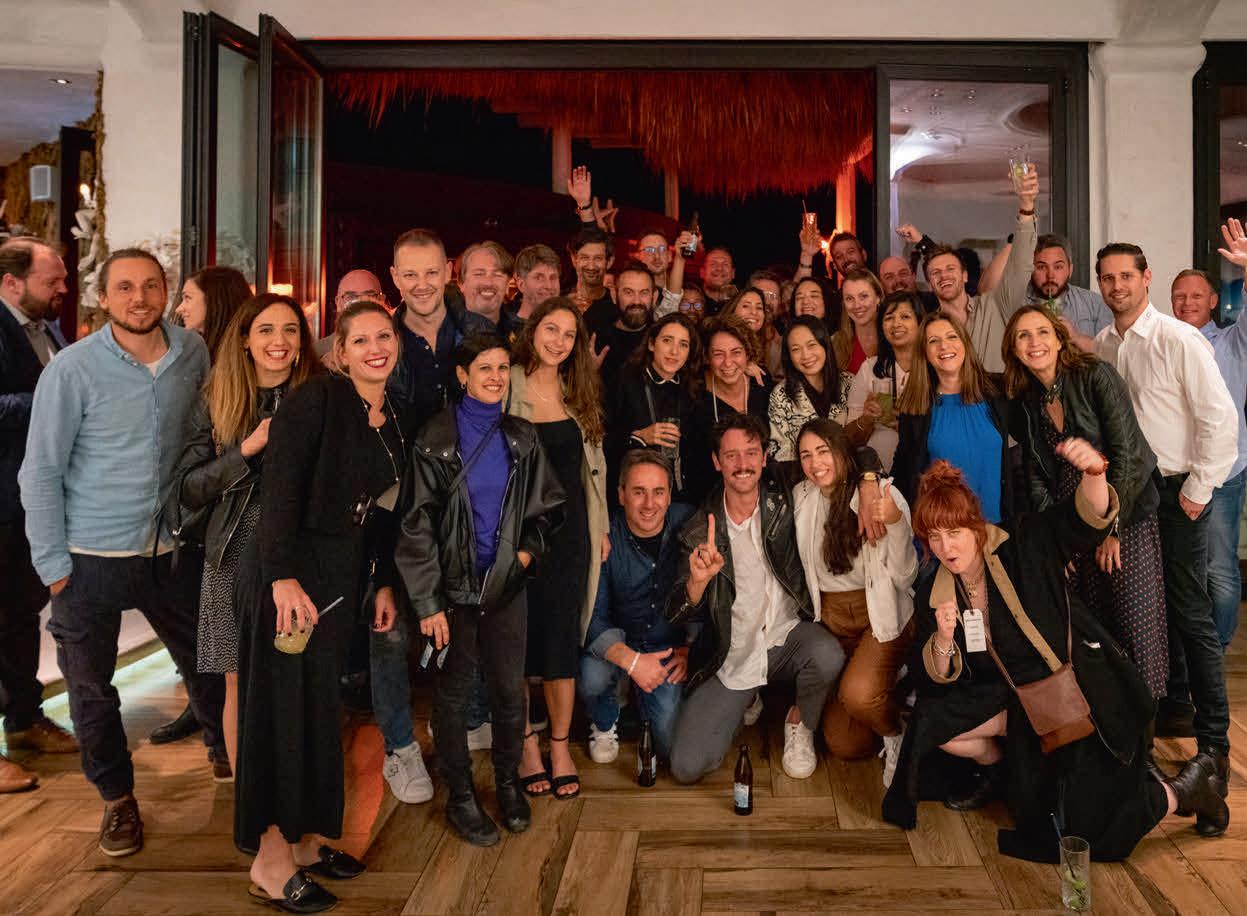
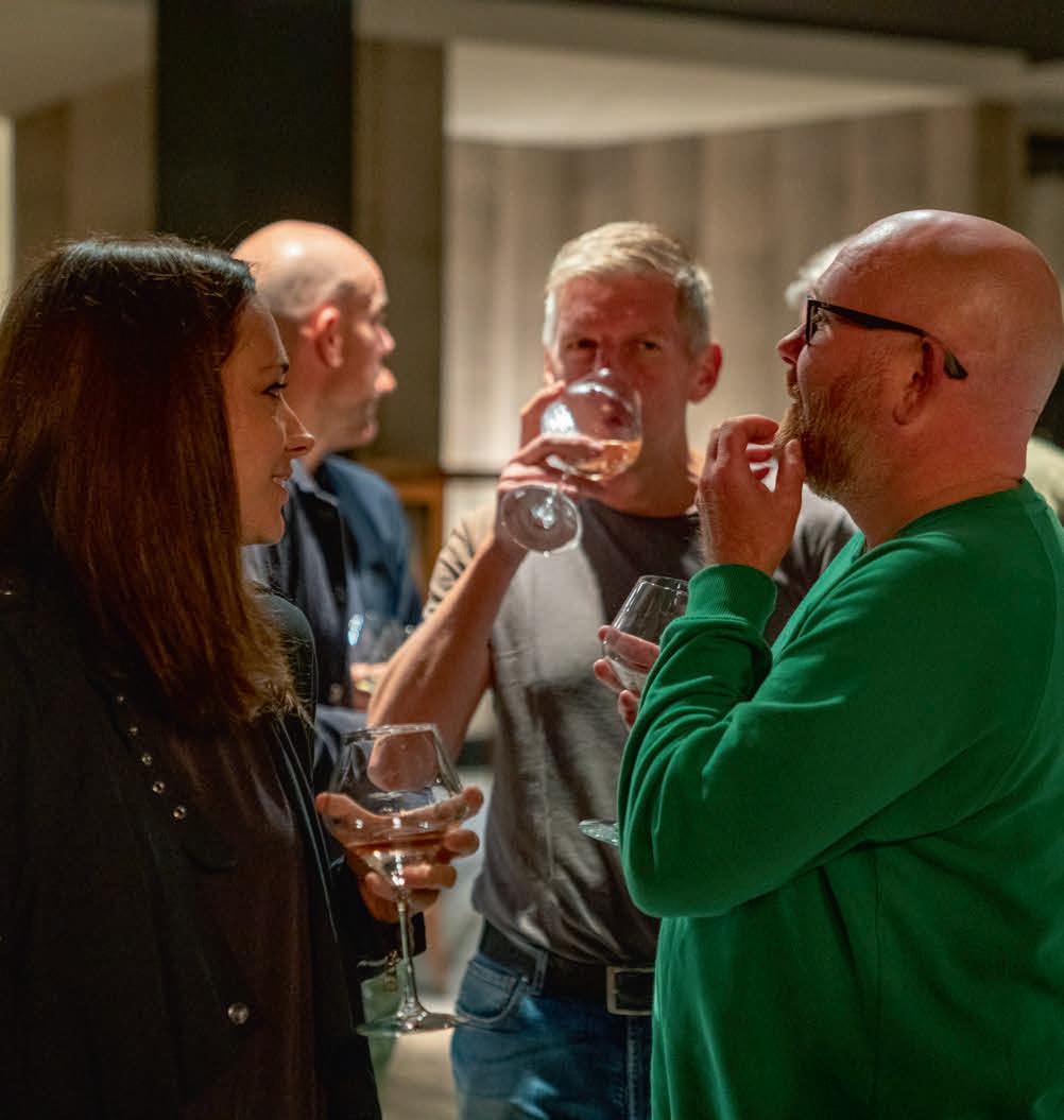
Each day concluded with further networking opportunities in the form of an informal meal and drinks reception, where designers and manufacturers alike could continue their conversations from the meetings earlier in the day.


[d]arc media Managing Director, Paul James, commented on the event’s success: “This was the best [d]arc sessions yet. The engagement of the delegates from all over Europe, both specifiers and suppliers, ensured that everyone gained knowledge, contacts and friends. The positive feedback from the participants proves to me that the event is the perfect combination of a relaxed environment in beautiful surroundings with valuable business meetings and thoughtful education content.”
Planning for the 2023 [d]arc sessions europe event is now well underway with the details confirmed as 15 – 17 May at Hotel Lone in Rovinj, Croatia.
For more information head to www.darcsessions.com
Images: GavriiLux





2-6 October 2022, Frankfurt, Germany
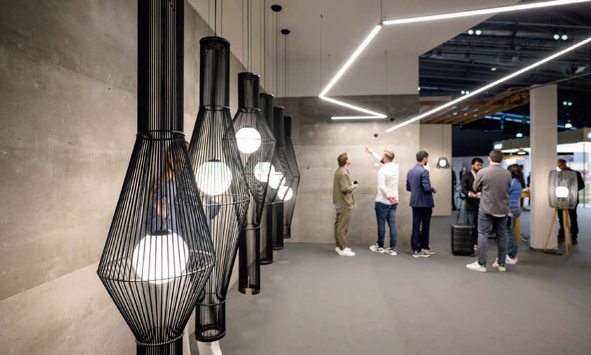
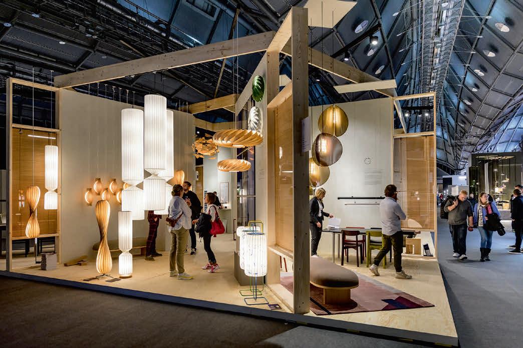
The restart of Light + Building after two and a half years of pandemic was a successful one for event organisers. Held from 2-6 October, this is the first time that Light + Building has been held since March 2018, following two and a half years of cancellations during the Covid-19 pandemic. The returning show saw 92,838 visitors from 147 countries travel to Frankfurt. In addition to Germany, the most visitors came from Italy, the Netherlands, France, Switzerland, Belgium, Spain, Austria, Great Britain and Poland, with international participation at 55%. Post-show surveys show a high level of visitor satisfaction, with 95% of trade visitors satisfied with the achievement of their visiting goals and the range of exhibits, while more than 83% are already planning to visit Light + Building 2024.
"We are delighted with the extremely high level of interest shown by the visitors who came to the Light + Building Autumn Edition. The

themes of the event offer the answers to the current challenges of our time.
"In addition – and this runs through all the discussions we have –personal encounters are and remain the central element of trade fairs. Business is done between people. The following applies to all participants: In times of crisis, it takes courage and a willingness to take risks to look positively and solution-oriented into the future. The exhibiting companies have impressively demonstrated this at the Light + Building Autumn Edition", says Wolfgang Marzin, Chairman of the Board of Management of Messe Frankfurt.
After this one-off Autumn Edition of the fair, Light + Building will return to its usual Spring slot in 2024, taking place in Frankfurt from 3-8 March.


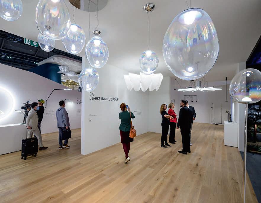
www.light-building.com
Images below: Pietro Sutera
A dive into the origins starting from the concept of the classical lamp (“lampara”), Narciso is meant to be a collection expressing the idea of light as a landmark in the space. The overlapped and plain shapes lead and define the light diffusion. When it is turned on, the bottom part of the conical diffuser reflects its own light, emphasising its shape and its finish.
www.elesi-luce.com
Ambiloom Pendant 250 is a pendant luminaire with textile surface. In addition to a functional downlight, the luminaire also has ambient lighting. Available in four different colour combinations, it adds a pleasant atmosphere to any room. The luminaire is made up with Ettlin Lux's patented textile and is suitable for ceiling mounting. www.ettlinlux.com

A portable lamp that you can take anywhere, One tells a story about decluttering, about a more sustainable lifestyle, and about adventure. One is everywhere you go and (in theory) the only lamp you need.
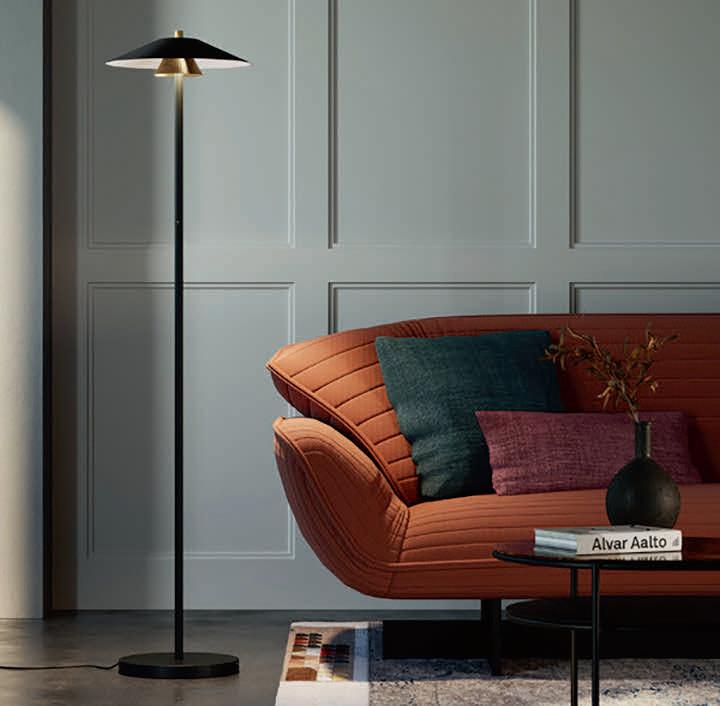

The start is One. What comes next is up to you. One + 3 makes a floor lamp, One + 4 forms a desk/table lamp, and One + 5 makes a bed light.
www.tonone.com
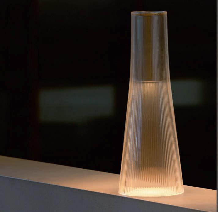
Inspired by a cone of light, Candél casts a warm, intimate candle-like glow. It is a fully rechargeable, portable LED light designed for both indoors and outdoors. Candél features a robust PMMA body in clear or bronze tint combined with a striking anodised aluminium light module that offers capacitive touch light control to provide up to four light levels to set the perfect ambiance. www.pablo.pablodesigns.com
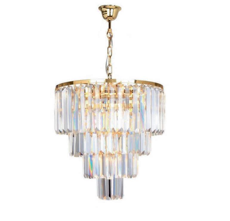
The transparent pendant lamp's shade, from the Amedeo series, consists of glass elements arranged in a cascade, and are supported by a decorative chain attached to a chrome rosette. The luminaire is equipped with five light sources with a maximum light power of 40W. The total height of the structure is 100cm, with a diameter of 39cm. www.zumaline.lighting

The w132 Nendo is one of Wästberg’s more playful lighting solutions. Easily transformed by adding, switching and rearranging its components, the w132 Nendo is being relaunched with a new construction built around a custom-developed die-cast aluminium LED engine that generates a comfortable light. Its 30 SMD LEDs can be dimmed down from a powerful working light to a soft, atmospheric illumination www.wastberg.com

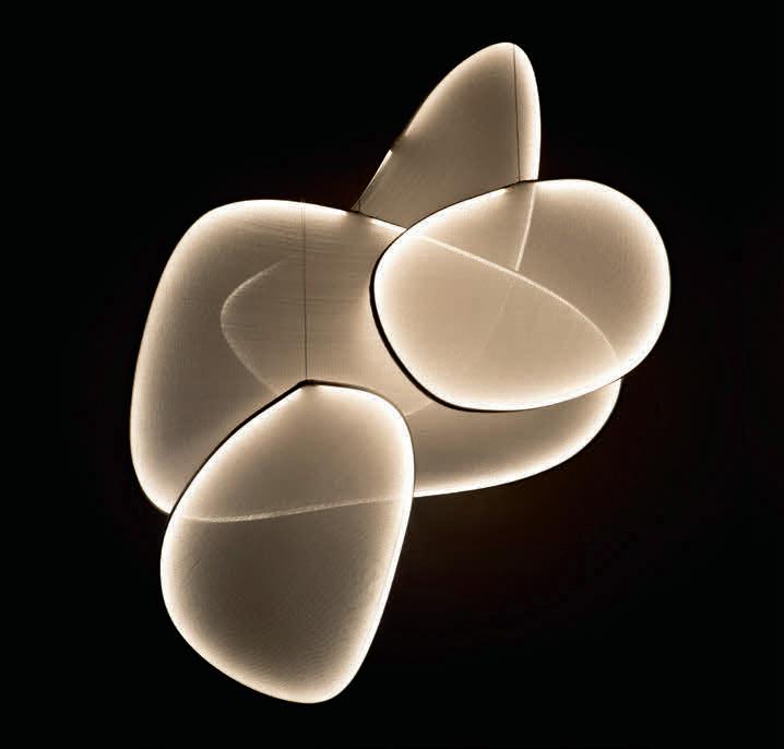
Omma, designed by Eli Gutierrez, is available as a suspension lamp (with one, two, three, and four leaves), a table lamp (with one or two leaves), a floor lamp (with a single leaf), and a wall lamp (with a single leaf). The Omma family is available in several wood veneer colours: Natural white, beech, and cherry, plus various metal finishes including matte black, matte ivory, and gold.

www.lzf-lamps.com
Cyrcle is a subtle pendant. Three thin cables support the LED light source and the round shade, which reflects the light. The aluminium sheet, available in two sizes, can be positioned either with the angle facing upwards or downwards.
www.zavaluce.it
III.09 III
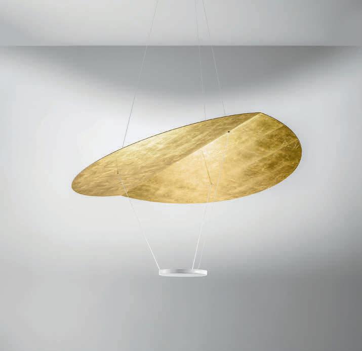
The elegance and unique soft streamlined character of these lamps is the result of the interaction of stretched fabric around curved metal profiles. Through the different layers, one can perceive the attractive lines as well as a strong moiré effect. The lamp is illuminated from its edges by a warm white LED tape, equally dispersing the light throughout the volume.
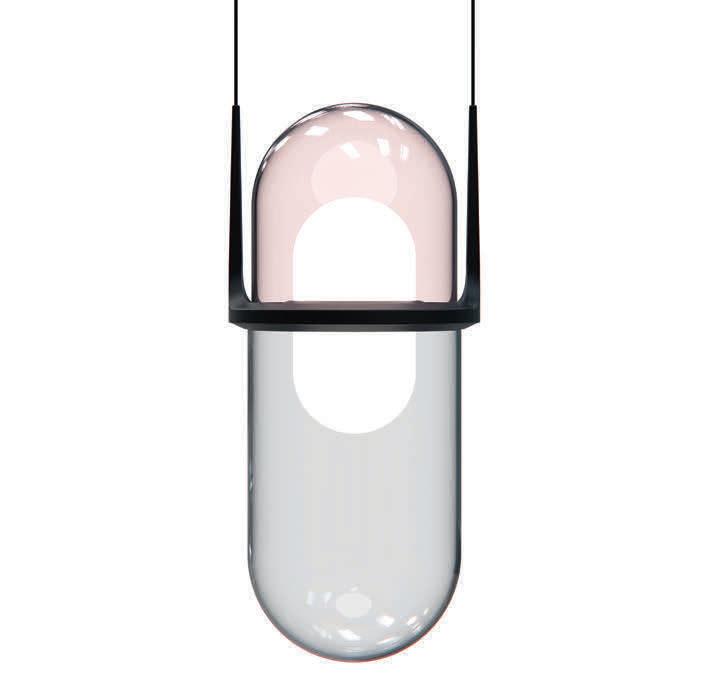
The pendant luminaire designed by Klaus Nolting has a mouth-blown glass element composed of two parts in harmonious colours. They are connected by a horizontal ring holding the glass element while carrying the LEDs. The direct light component of the luminaire hits the surroundings without glare. This is achieved by a second, smaller pill made of frosted glass that floats in the centre of the luminaire.
www.moltoluce.com
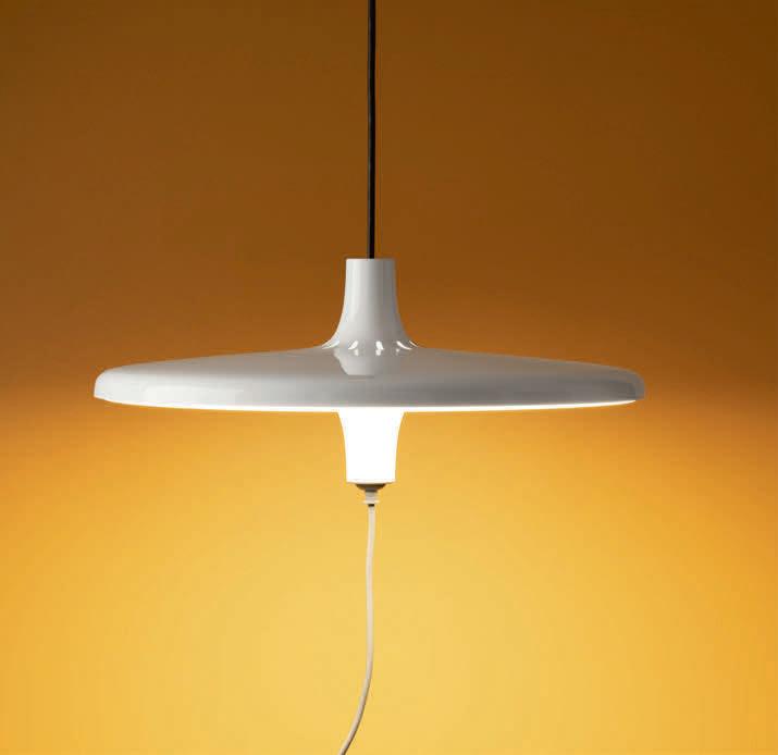
Studio Natural designed the Avro pendant that cleverly conceals a socket in the lower part of its shade.
Studio Natural's aim with this project was not only to simplify working from home, but also to simplify the use of devices that require electricity, transforming the dining table into a true functional workplace at the service of the user's creativity.
www.martinelliluce.com
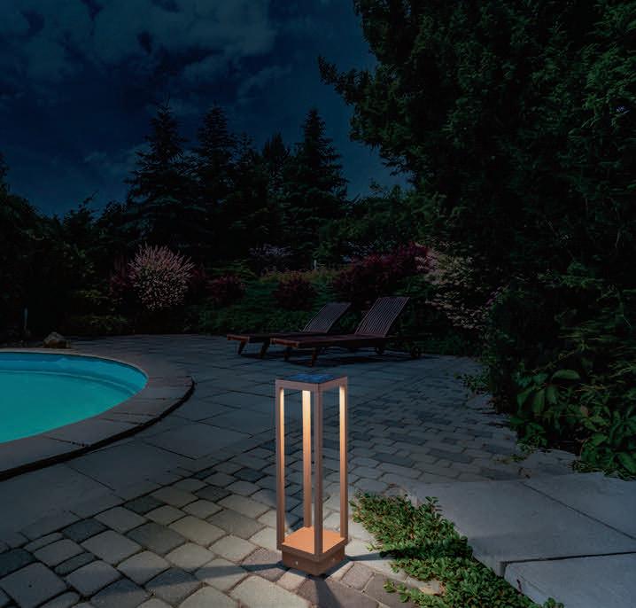
A bollard with a dark grey or corten painted die-cast aluminium frame and a transparent polycarbonate diffuser, Home Solar is IP54rated. It is equipped with a solar panel that charges the replaceable battery, and also has a peg for direct installation on the ground. The lamp is also fitted with a dusk sensor, which activates the lamp into "energy saving" mode (30 lumen); a motion sensor, which activates the lamp in "full light" mode (maximum power); and an off button.
www.zafferanoitalia.com
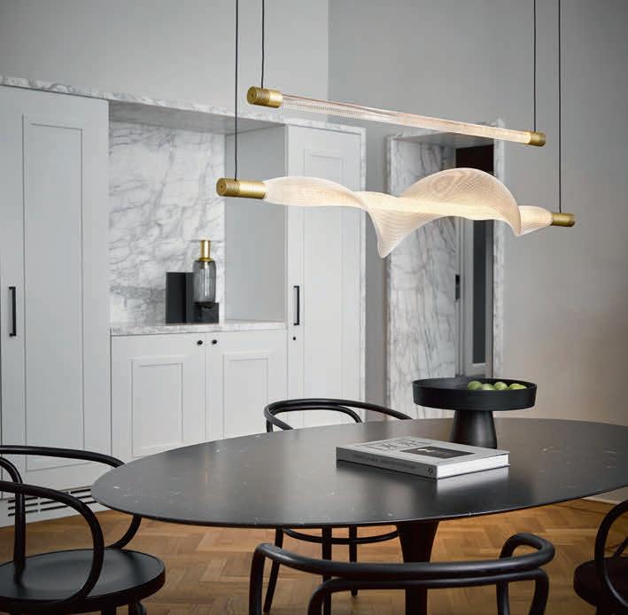
Designers Iris van Daalen and Ruben Thier of Studio Thier & van Daalen have created a remarkable contrast between geometric and organic shapes. Vapour is inspired by a fascination with the structure and dynamics of nature, the unfolding of petals and the hypnotic effect of gently flowing water or vapour swirling upwards through the air.
www.hollandslicht.eu
Bell ceiling is available with a rigid support or with an adjustable cable. Due to its stability to the wind, the Bell Ceiling with rigid support is particularly suitable for outdoor exposed environments. In the cable suspension version Bell is expressed in a very elegant silhouette particularly suitable for porches and lodges. www.simes.it
Two Humble
The Humble Two is a portable, dimmable downlight that uses its domed shade to direct a perfect circle of light onto your table. Fully charged, this little table light produces up to 96 hours of light. The light’s brightness can be changed by simply pressing the button on the bottom - or by pressing the dim-buttons on the remote - to one of three different settings: candle, ambient and work. www.humblelights.com

The light of these unshielded pendants provides excellent room illumination. The efficient luminaires emit light upwards onto the ceiling and downwards towards the floor in equal measures. One of the models comes with an integrated downlight, which helps increase the degree of illuminance on areas below. The luminaires are DALI-controllable; the luminous intensity can be adjusted to match specific lighting requirements. www.bega.com

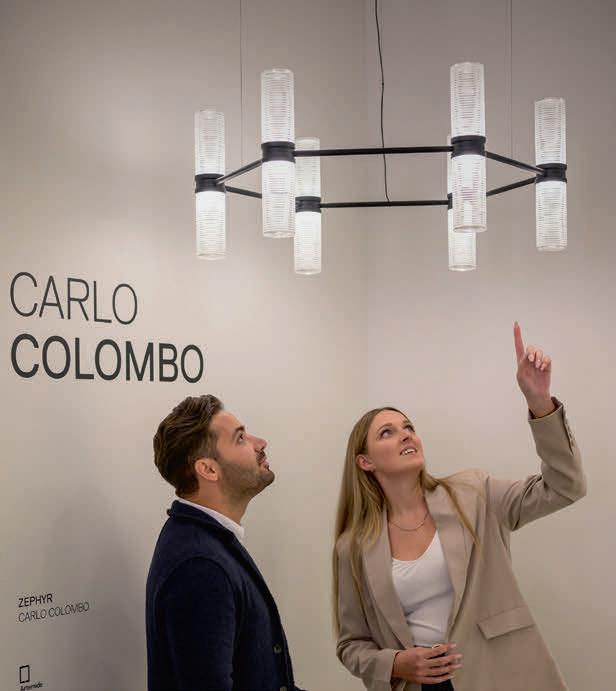
Designed by Carlo Colombo, Zephyr is a minimalist, elegant chandelier with a modular frame that enables infinite custom layouts. The modular element is a double cylindrical diffuser with a central body that encloses the light sources and, by means of two rings rotating on the same axis, defines the position of the neighboring lighting bodies by connecting structural elements. www.artemide.com

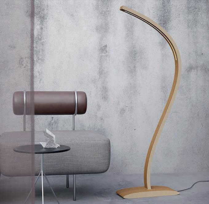
The Moodlifter is a solid wood two-way LED floor lamp. Stripepu solid wood design lamps are created to last for many years and to bring inspiration and dignity for many generations to enjoy. The harmony of the warmth of wood and craftsmanship helps to create spaces that are cosy and inspiring. The 100% birch plywood lamps are oiled with German quality oil Auro 108, which is nontoxic and made with natural ingredients. www.straipu.com
In individual variants from one to five, connected together in a group that can be freely configured from a few to several dozen balls, the Bola Bola LEDs create the impression of a hanging necklace. The concept is completed with pearly colours thanks to the use of paint imitating the effect obtained during the anodising process.
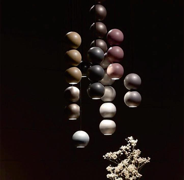
www.loftlight.pl

All products are made from a unique and sustainable material PETpanel, which is made from recycled plastic bottles, and surprisingly the PETpanel feels warm and soft to touch. In addition, PETpanel has an acoustic value, which has a positive effect on the acoustics in the room. Pieces are designed and produced in-house in the Netherlands. All fixtures are available in more than 25 colours.
www.designstracker.com
The breath of the master glassmaker is contained and let go inside the metal cage, generating a soft three-dimensional surface that comes to life. The Pouff family stands out for the elegance it can generate within a space and for the versatility in its applications:. Available in three colours, the Pouff allows you to illuminate the interiors with a unique style.
www.siru.com
5. Accordèon Portable Slamp


Designer Marc Sadler explores the infinite possibilities of Slamp’s technopolymers with Accordèon, conjuring the image of a textile plissé or an accordion’s bellows. The battery charged table version features a transparent shade finished in satin white, ensuring uniform lighting, and a white or matte black base and a semi-matte satin anodised aluminium stand, ensuring additional stability.
www.slamp.com
Like caskets of light that illuminate their surroundings, preserving their intimacy and creating a sophisticated atmosphere, the brass lanterns feature subtle and elegant lines. The antique brass structure makes them suitable for more natural settings. Lanterne Slim is available in various options including a floor lamp in three different sizes, or as a wall lamp.
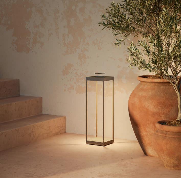
www.ilfanale.com
Großglockner is perfect craftsmanship combined with the latest technology. It is an impressive ring lamp with a diameter of 116cm and has 5850lm of direct lighting and 3950lm of indirect lighting. The indirect lighting creates an outstanding sense of space. Combining solid wood and aluminum, using perfect thermal management guarantees the maximum longevity of the LEDs. Both the wood and aluminium are fully recyclable.
www.wirklicht-leuchten.com

Leaf, Haberdashery
Decorex, London

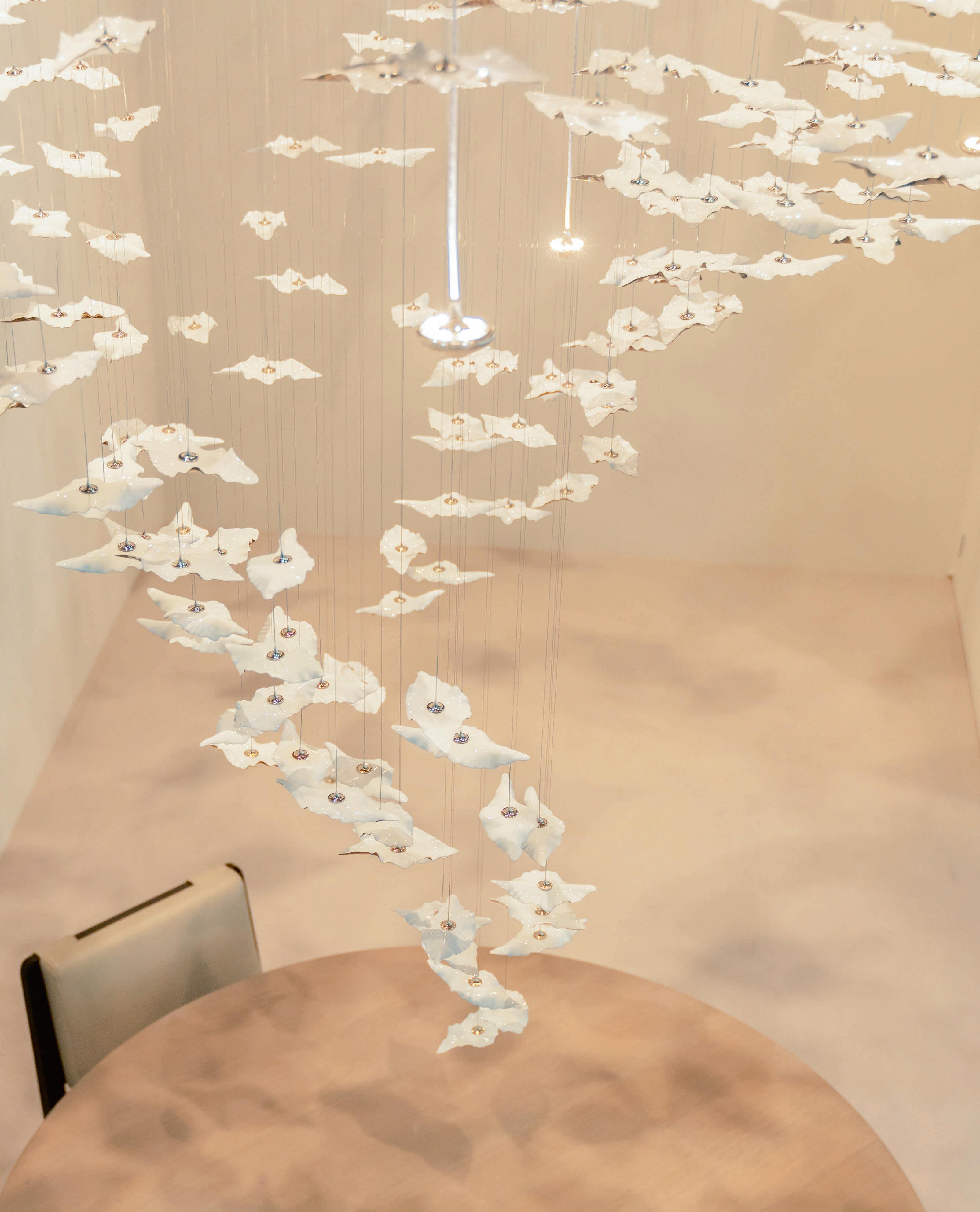
Haberdashery, an established London-based lighting brand focused on the perpetual appeal of light, celebrated one of its classics at this year’s Decorex, unveiling a custom Leaf installation designed exclusively for the show.
The brand’s signature floating porcelain leaves evolved with the addition of new lighting effects and luxury finishes.
The custom Leaf installation featured floating porcelain leaves in a selection of crisp white and precious metal glazes including new bronze lustre. Integrated downlights projected subtle leafy forms onto the surrounding surfaces, extending the aesthetic reach of the sculpture and creating a luxurious ethereal atmosphere. Developed to meet the requirements of design professionals working on high-end residential and hospitality projects, Haberdashery’s collection of lighting centrepieces present a stunning blend of thoughtful design, rich materials and subtle lighting effects.
www.haberdashery.com

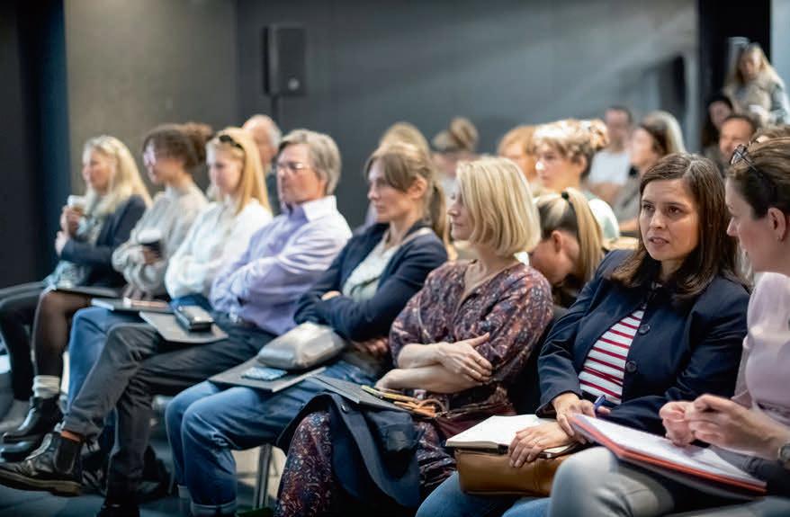
Held this October, Decorex saw a successful turnout of more than 12,000 visitors, who walked the busy show floor to view a curated collection of over 200 exciting interior brands across four days.

Sam Fisher, Event Director for Decorex, comments: “Seeing the design community come together to experience Decorex is always something to celebrate.
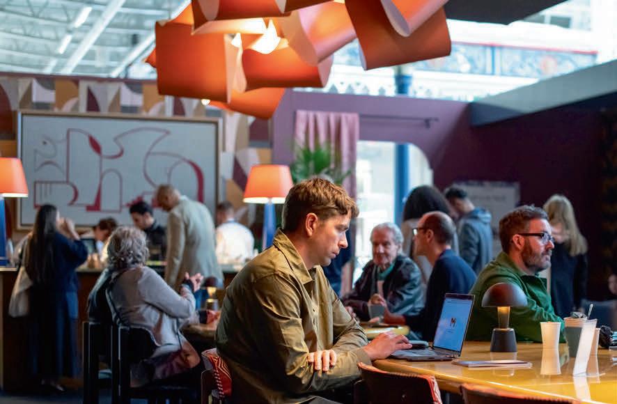

"We are so proud of our impressive reputation as the leading destination for the industry and that wouldn’t be possible without the support of our incredible community of exhibitors, speakers and collaborators. We are delighted to have welcomed so many engaged and enthusiastic visitors, who have all helped make Decorex 2022 such a successful event.”
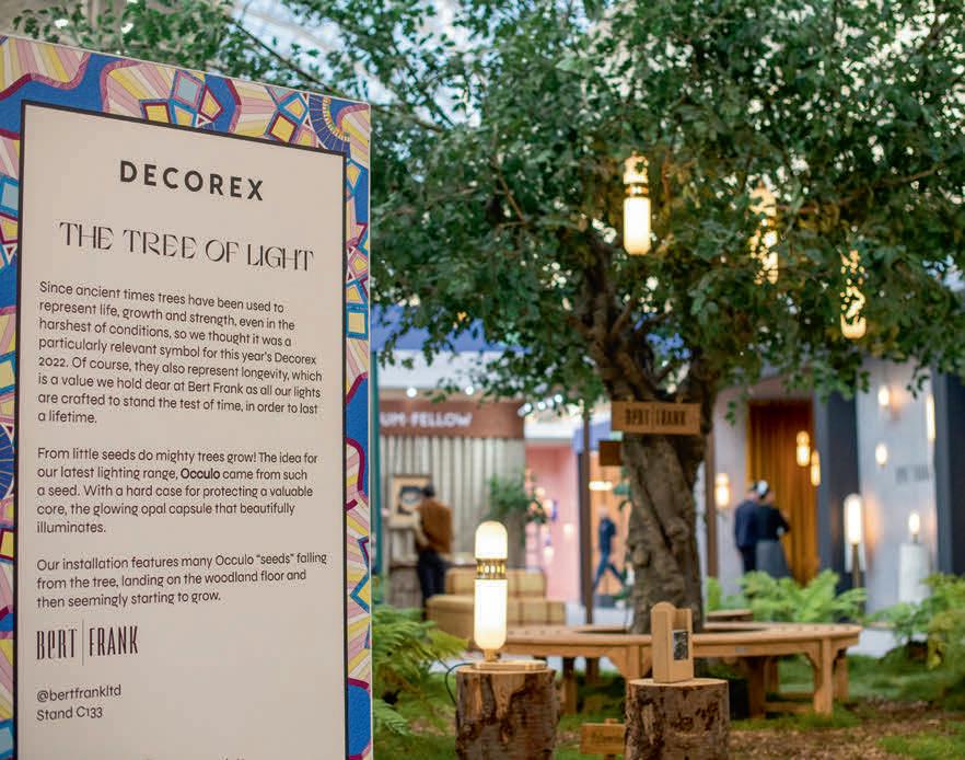
BIID President, Mathew Freeman, adds: “It was fantastic to be back
at Decorex once again. The show excels each year in providing the design community with opportunities to be inspired. The Making Spaces area was a real highlight, and it was great to be able to join in with some of the hands-on demos by the craftspeople sharing their work.
"The focus on providing a more sustainable event for 2022 was apparent with feature areas carefully designed to create minimal waste and a focus on the use of sustainable materials. It was great to see sustainability as a key topic in the talks programme too, showing how important it is for designers to be focused in that area."
www.decorex.com
The Future of Materials in Lighting Panel: James Bassant, Astro; Ehab Sayed, BIOHM Moderator: Andy Bishop, Informa Design Portfolio
Due to illness, the original full panel (including Sarah Cullen, darc, and Sofia Hagen, HagenHinderdael), were unable to attend the talk. However, 'the show must go on!' and the panel went ahead with industry-leading product designer James Bassant of Astro, and materials expert Ehab Sayed of Biohm. The duo discussed the future of materials being used in lighting and what is being considered when specifying these future-proof products in projects. Catch the recorded talk on darc TV soon. www.astrolighting.com, www.biohm.co.uk
This year, visitors to Decorex were welcomed by a magical feature when entering the show. The Tree of Light was a woodland-inspired installation, created by Bert Frank’s lead designer, Robbie Llewellyn, and featured pieces from the brand's latest collection, Occulo, including pendants, wall, table and floor lamps. Llewellyn comments: “The Occulo family is a new shape for Bert Frank. It's softer and more organic in design, and suits a wide variety of rooms and living occasions. Every Bert Frank item is crafted in our Midlands factory and we were very proud to be representing not only British design but British manufacturing at Decorex 2022.” www.bertfrank.co.uk
1. Alisse Keypad Lutron Stand B170
Lutron presented two new control solutions at Decorex, including the Palladiom WireFree shade system, and the Alisse Keypad. The keypad is an elegant and versatile wall control panel that is designed to function in tandem with Lutron HomeWorks. The sleek architectural design, innovative technical approach and customisable controls make Alisse a seamless addition to any room.
www.lutron.com
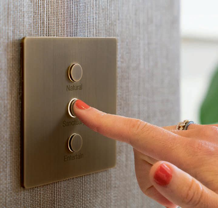
Careful precision and detail have been required to piece together each of these pendant lights, keeping an organic feel with a beautifully modern approach. Each glass part is free-blown in the UK, which complements a locally turned wooden disc. Solid brass end-caps punctuate a spiral of LEDs within a diffused tubular suspension, creating a beam of light that glows through linear stacked glass pieces.
www.curiousa.co.uk
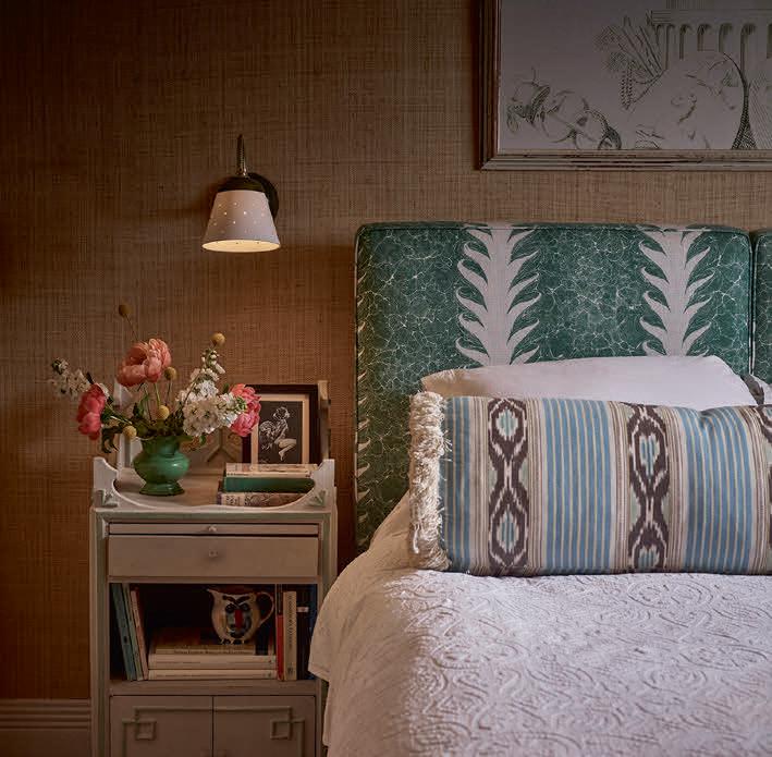
Chelsom debuted its exciting new brand, HOME by Chelsom, to the industry at Decorex as it celebrates its 75th anniversary. Following decades at the top of the global hospitality lighting market, Chelsom now has a team entirely dedicated to servicing highend residential customers and projects. www.chelsom.co.uk
Elstead Lighting presented Calters from the Quintiesse Collection. Designed by Kichler, the range features a modern tapered lantern in a champagne gold finish. The concealed, dimmable LED strips illuminate clear acrylic light-guide panels featuring a dotted pattern. Featured is the QN-CALTERS-P-L-CG with 72.3W integrated LED, 3000K colour temperature and a strong 4461lm output. www.elsteadlighting.com
Introducing Alma, a collaboration between Original BTC Director Charlie Bowles and Interior Designer Beata Heuman, combining the lighting brand's best-of-British approach and ethos with Heuman’s inimitable eye for design and detail. Launched this September, the four-piece collection evolved from Heuman's first design, the go-anywhere table light, with its angleable, slightly oversized shade, brass arm and retro-style dimmer. www.originalbtc.com
Inspired by slender, natural forms, the Reed wall lights are designed to deliver soft accents to an interior lighting scheme. Used in conjunction with the Reed portable luminaires, their versatility combines with a unique aesthetic.

Precision-engineered in aluminium and brass, the lights are available in a wide selection of electroplated and powder-coated finishes. www.tomkirk.com
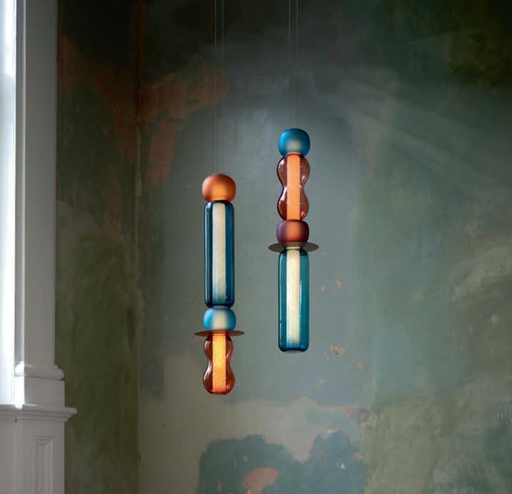


darc attended various events across the UK's capital during September, including LDF showrooms, Focus/22 at Design Centre Chelsea Harbour, and Design London at Magazine in Greenwich. During this time, we also hosted a party to celebrate a decade of covering the decorative lighting industry, joined forces with Tala to promote the launch their pop-up showroom in Shoreditch as well as host a talk on 'Healthy Light'. Find out more about these events here...
darc magazine partnered with Haberdashery to celebrate its 10th anniversary during London Design Festival.
More than 100 industry professionals across the lighting and interior design sectors joined the darc magazine and Haberdashery teams to celebrate a decade of reporting on the decorative lighting market.

Held at Haberdashery’s showroom in the Design District, Greenwich, the evening celebrated the contributions towards and support of the magazine and its [d]arc media events from designers and manufacturers.

Ben Rigby, Creative Director and Co-Founder of Haberdashery, says: “In 2021 we opened our first showroom, located in the inspiring new
design district in Greenwich; a flexible space for showcasing our work whilst engaging with the design industry via events and thought leadership.
“Over our 15-year history, we have worked closely with the lighting design community on incredible projects; the darc magazine 10thanniversary party was a wonderful way to reconnect with this passionate community during LDF.” www.darcmagazine.com www.haberdashery.com Images: Conor McKeown Photobooth: Reflection Pod
In partnership with darc magazine, Tala hosted a panel discussion at its popup showroom on Club Row in Shoreditch on Wednesday 28 September 2022.

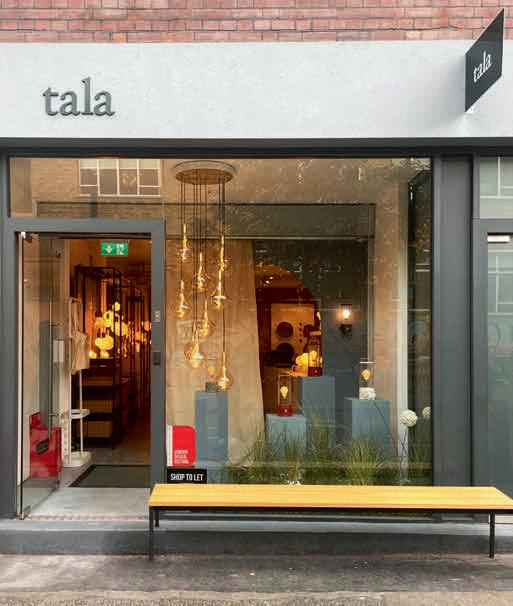

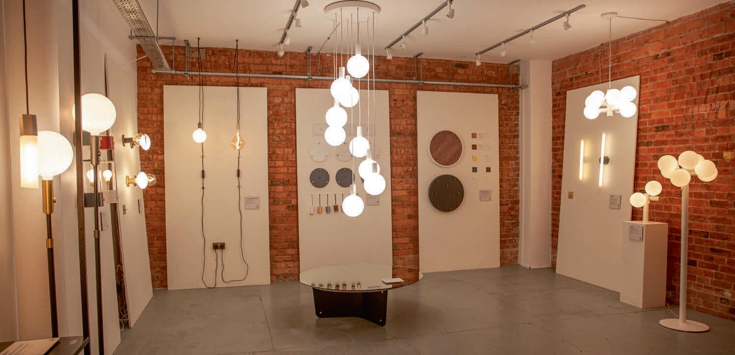
Moderated by darc Editor Sarah Cullen, the incredible panel included biophillic design expert Oliver Heath, Tala’s William Symington and Sophie O’Rourke, founding member of the Green Light Alliance.
‘The Aesthetic of Sustainability’ covered topics around sustainable product manufacturing, circular design, the trade-offs between efficient and beautiful ‘healthy light’, and how bringing nature and the feeling of natural light indoors by adapting colour temperature directly impacts our health and wellbeing.
Welcoming expert opinions from each panelist, the talk developed from conversations on the stage into an open discussion with memebrs of the audience, which included architects, designers, manufacturers, and high school teachers! Discussing real-life case studies that challenged the ability to integrate 'healthy light' and biophilic design proved an interesting talking point for the designer panel both during and after the talk. The full panel discussion will be featured in the next issue of darc as part of a Wellness and Healthy Lighting feature, and a recording of the evening's talk is available to view on darc TV online. www.tala.co.uk www.darcmagazine.com
DOWNTOWN
CRUISE SHIP
MAISON
OBJET
IDS TORONTO
TORONTO, CANADA
- 22 January 2023 (www.interiordesignshow.com)
STOCKHOLM FURNITURE FAIR • STOCKHOLM, SWEDEN
February 2023 (www.stockholmfurniturefair.se)
SURFACE DESIGN
LONDON, UK
09 February 2023 (www.surfacedesignshow.com)
[D]ARC
LONDON, UK
March 2023 (www.darcawards.com)
EUROLUCE • MILAN, ITALY
- 23 April 2023 (www.salonemilano.it)
SESSIONS
ROVINJ, CROATIA
17 May 2023 (www.darcsessions.com)


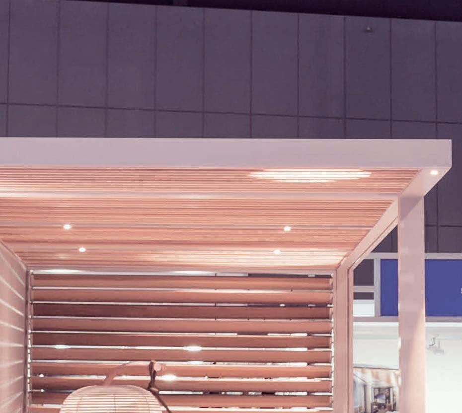


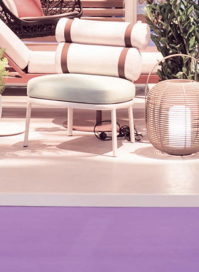





What is the design concept behind the Maison Gerard collection? We’ve been working on proof of concept products that up-cycle stored manufacturing waste for 10 years. Stackabl is the culmination of our research and represents our first attempt at taking one of our ideas to market, at scale. The inspiration is quite simple, we want to put as much remnant waste material to use as possible in the most fun and efficient way we can.
How long have you been working on the collection for? About three years. We started exploring the idea of converting our original Felt collection into a larger Green-tech platform in 2019. We were in deep development in late 2020, and by November 2021 we soft launched our first furniture configurator at Salon Art + Design. Six months later, we launched our first lighting configurator at Milan Design Week.
What was the most challenging aspect of producing this collection? It’s a very ambitious project, and we’re regularly facing new challenges. I would say the overarching issue is always merging physical and digital processes. This is a technology platform that relies heavily on existing manufacturing infrastructures.
Finding our place is not easy - even if our partners have the best of intentions. We have to adapt constantly - always with the goal of finding the gentlest and most efficient ways to hack the system.
Can you tell me more about the materials used? The Stackabl platform is materially agnostic, technically. We select materials based on a set of criteria - such as relative proximity; scale of production; whether waste is digitally inventoried; robotic manufacturing capabilities, etc. If we find three manufacturers within a region that meet those criteria, we design product around their materials and collective capabilities. Our first two collections use regionally sourced, readily available upcycled Merino wool felt cut-offs, post-consumer scrap aluminium, 60% recycled PET and domestic hardwood.
What are your design influences for Maison Gerard? That is a three-part question. As the designer of the fixture forms, we were influenced by yield mostly. I know that sounds unsexy, but we wanted to pick shapes and sizes that were efficient, repeatable and easy to assemble.
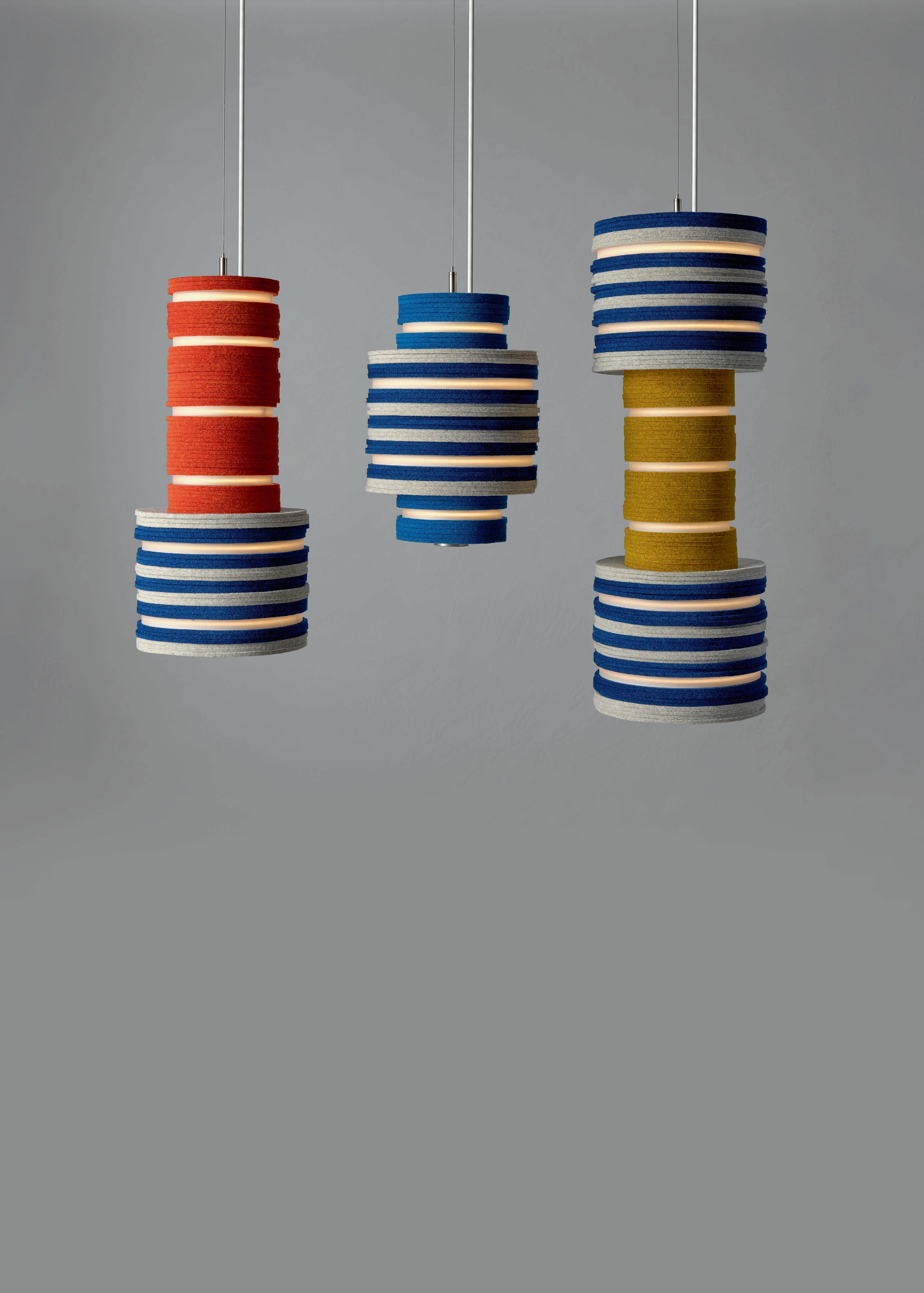
As the designer of the UX/UI, we were influenced by Apple, and Nike - in the sense that we wanted to create an editing tool (rather than a ‘design’ tool) where most of the design decisions were already made, and the user was left really to the fun and expressive task of picking size, finish and colour. We wanted it to be easy.

The designers we selected to create the first eight designs each had their own inspiration. They were all extremely different, which is what we wanted. Anthony Keeler drew inspiration from architecture and created his pieces with the goal of defining space. Wisse Trooster made playful homage to Donald Duck’s nephews’ famous outfits. Sarah Coleman told a deeply personal story about her frame of mind during each year of the pandemic. In each case, we were delighted, and humbled. We learn just how versatile the product can be from each user.
Please describe the product in three words. Expressive, colourful, circular (double entendre intended).
www.stackabl.shop
Maison Gerard by Jeffrey Forrest Stackabl
In Focus
