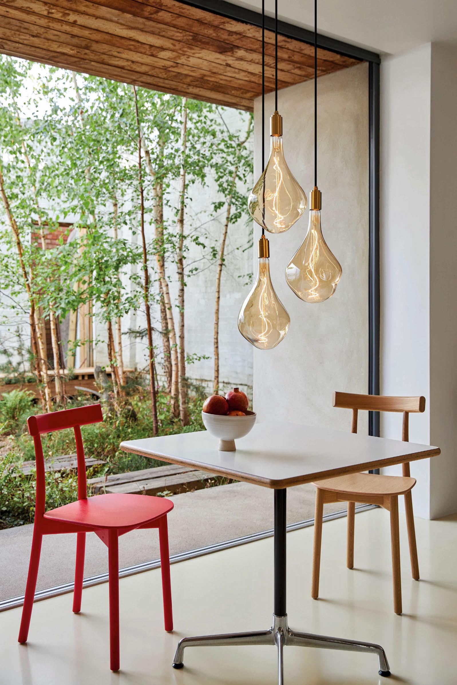


Let me bring you some light in what seems to be an endless carousel of darkness these days… Take a step away from the heavy world news and current affairs, and find some respite in a selection of stunning new lighting pieces in our next issue of darc. With January almost over, the days are beginning to get lighter and, despite the icy-cold snap we are having in the UK at the moment, I feel like it won’t be long before the trees will be sprouting their bright green leaves for Spring!
With newness on the horizon, we have taken this time to introduce some newness to the magazine. You will notice in this issue we have a couple of editorial additions, including Helen Ewart’s (of M1NT Studio) Spring design predictions! This piece is still in its infancy and will likely evolve as the year goes on. However, to kick us off, Helen’s mood board of colours, textures and designs are what she is seeing will creep into design in the forthcoming months. With the change in weather, portable lighting is a key feature!
Elsewhere, you will find some more comment pieces where I have asked the experts to share their thoughts on various topics and themes. Sam Bird of Trindade & Bird interior design provides knowledge on how to work with paint finishes and colours along with your lighting features in residential projects.

Mike Cascarino of Michael Grubb Studio, along with Sanjit Bahra of DesignPlusLight, share their expertise and experience with lighting controls and how they practically combine with decorative lighting elements.
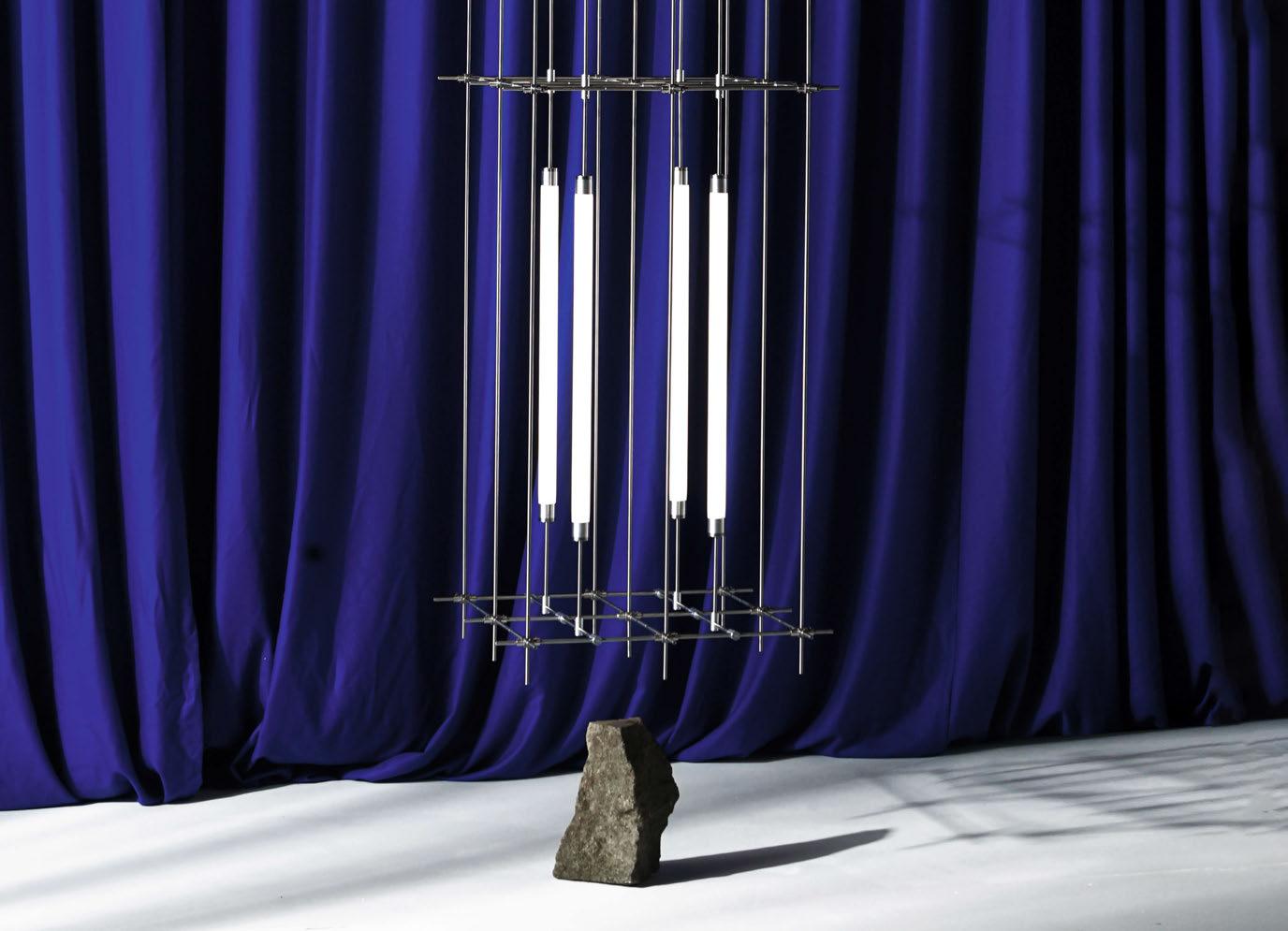
Now… this year appears to be the year of big anniversaries. And with that, we have two big ones featured in this issue. Flos is celebrating its 60th anniversary, along with its iconic Arco floor lamp. I take a look back at the original Castiglione’s design, and how the current Flos design team has brought the piece into 21st century.
Renowned British interior design firm Goddard Littlefair also celebrate a milestone, reaching their 10th year in design. I sit down with both Jo and Martin to discuss their individual and now joint journeys in interior design, discovering their passions and influences that dictate their current design flair.
Enjoy the issue, and I look forawrd to seeing many of you at the upcoming [d]arc awards party on 30 March in London!
The UK’s only dedicated lighting specification exhibition
A series of events connecting the very best people creating exceptional lighting projects around the world.
For more information contact Jason Pennington: j.pennington@mondiale.co.uk
036 Interview | Goddard Littlefair | 10th Anniversary
052 Event | Tala | The Aesthetic of Sustainability
064 Co mment | Lighting Controls | Mike Cascarino | Michael Grubb Studio

066 Co mment | Lighting Controls | Sanjit Bahra | DesignPlusLight | The Athenaeum Club
072 On S how | LiGHT 22 | Review
076 Cale ndarc | International Design Events for 2023
078 In Focus | Mario Tsai Studio | Mazha Lighting System 5.0
010 Fo cal Point | Le Grand Penthouse | Luxxu | UAE
012 Fo cal Point | Tamagawa Takashimaya Grand Patio | Yuko Nagayama and Associates | Japan
014 Ve lvet, Corinthia London
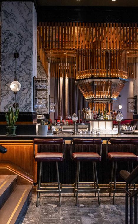
David Collins Studio worked with appointed lighting designers dpa lighting consultants to revamp Corinthia London's bar, now known as Velvet, into a decadent destination in the heart of London.
020 Th e Africa Centre
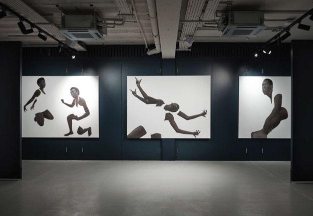
The Africa Centre, a charity based in London, underwent a refurbishment last year, with new interiors completed by Tola Ojuolape Studio.
026 Sol porten Office
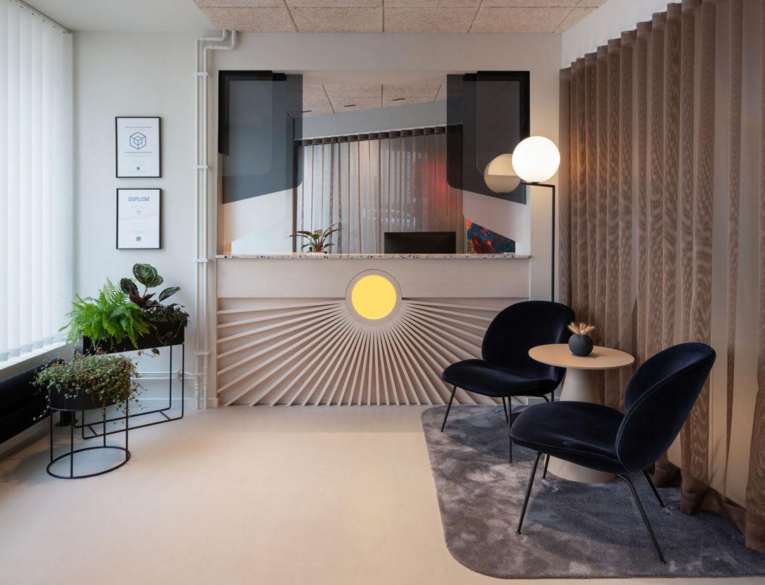
Swedish lighting studio Reform, part of Reflex Arkitekter, transformed its previous client's new office into a space designed to last the ages. Reusing some existing fixtures and fittings and adding a contemporary layer, the team has created a beautiful, inviting atmosphere.
034 Th e World Spa
Spanish lighting brand LZF supplied a large collection of decorative lighting fixtures for this urban wellness centre in the heart of Brooklyn, NYC, created by BK Developers and RYBAK Development.
047 Materials Focus | Flos | Arco K
054 Op inion | Trindade & Bird | Paint vs. Light
062 On T he Board | M1NT Studio | Spring
Managing Editor | Helen Ankers h.ankers@mondiale.co.uk
+44 161 476 8372
Editor | Sarah Cullen s.cullen@mondiale.co.uk
+44 161 476 9401
Contributing Editor Matt Waring
Media Sales Manager | Stephen Quiligotti s.quiligotti@mondiale.co.uk +44 7742 019213
Design
Artwork | Dan Seaton d.seaton@mondiale.co.uk
Editorial | Mel Capper m.capper@mondiale.co.uk
Finance
Finance Director | Amanda Giles a.giles@mondiale.co.uk
Credit Control | Lynette Levi l.levi@mondiale.co.uk
Corporate
Chairman Mondiale Publishing | Damian Walsh
Managing Director [d]arc media | Paul James p.james@mondiale.co.uk
Marketing & Events | Moses Naeem m.naeem@mondiale.co.uk
[d]arc media ltd | Strawberry Studios, Watson Square, Stockport SK1 3AZ, UK | Printed by Buxton Press, Palace Road, Buxton, UK | ISSN 2052-9406
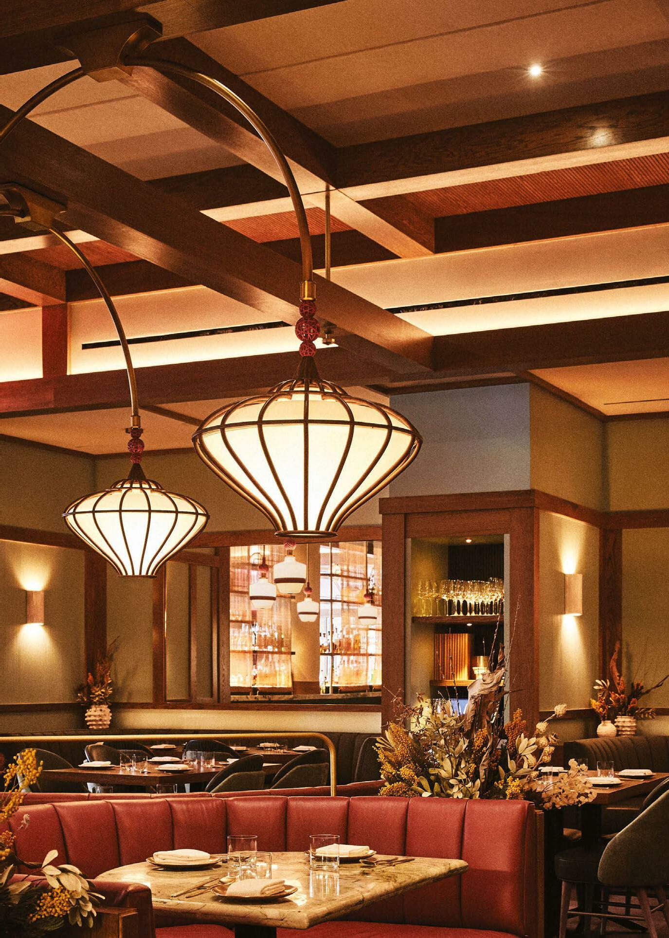
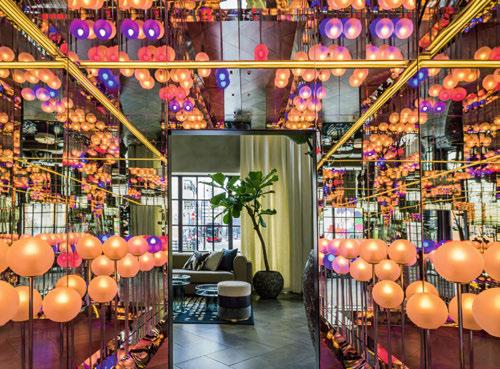
• Intimate overarching light installations
• Bead-like pendants
• Intricate jewel inspired floor lamps
• Column wrap around fixtures

Project: Oiji Mi Restaurant
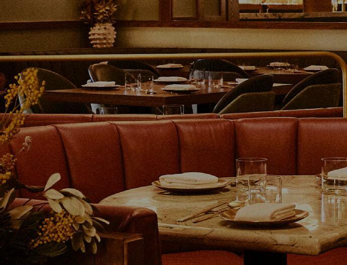
Interior Designer: AvroKo
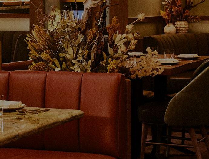

Design-Engineering & Fabrication: VISO Lighting
Photographer: Christian Harder
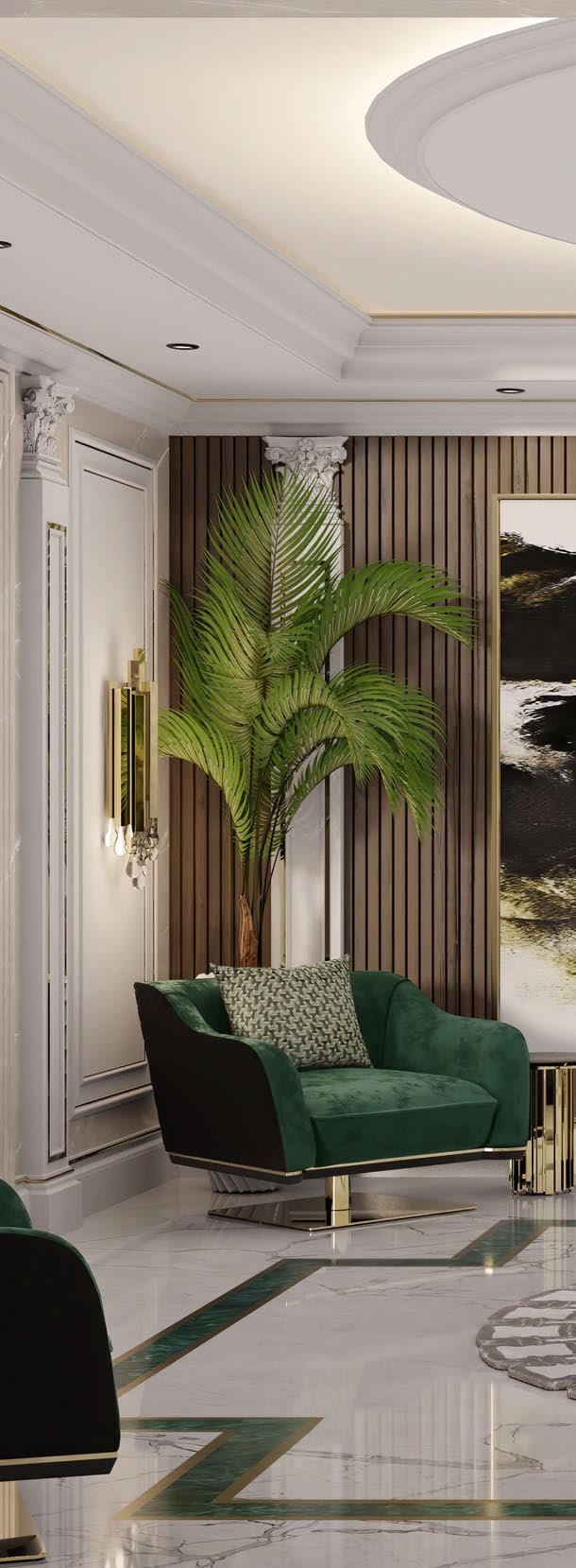
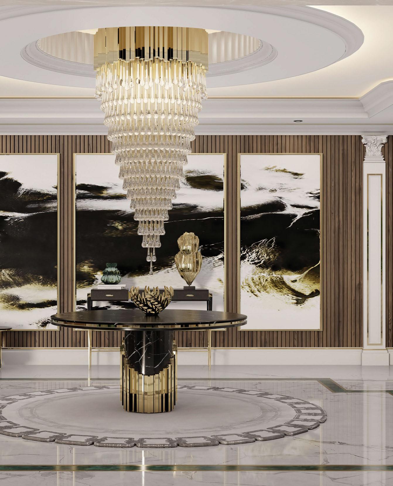
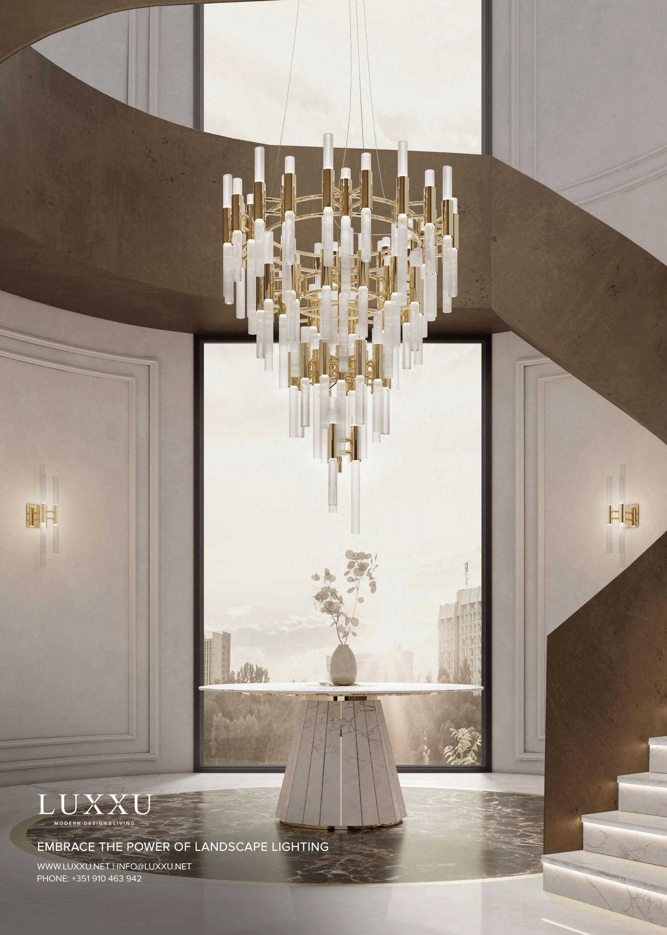
Abu Dhabi, known for its lifestyle, was selected as the location for Le Grand Penthouse, a project entirely designed and decorated by Luxxu. The luxury brand had to match the ostentatious appeal of the city, its artistic flair, and the architectural beauty of its Avant-Garde buildings. As a result, Luxxu pulled all the stops to create a project that best reflected all of these characteristics while remaining quintessentially modern.
The ample entryway is what perhaps best portrays the Arabic nature of the home. However, this area also features notes of Mediterranean style and modernism. One can sense all of these styles in details such as in the extravagant accessories, the padded doors, the sculptural wall columns, as well as the abundant use of gold throughout.
The Trump chandelier sets the stage of grandeur with its gold crystal structure, mainly chosen due to its regal aesthetic. On top, connected gold-plated brass structures serve as the main base for an opulent crystal glass structure underneath. Each one of its glass tears was designed with high attention to detail and traditional craftsmanship techniques. www.luxxu.net
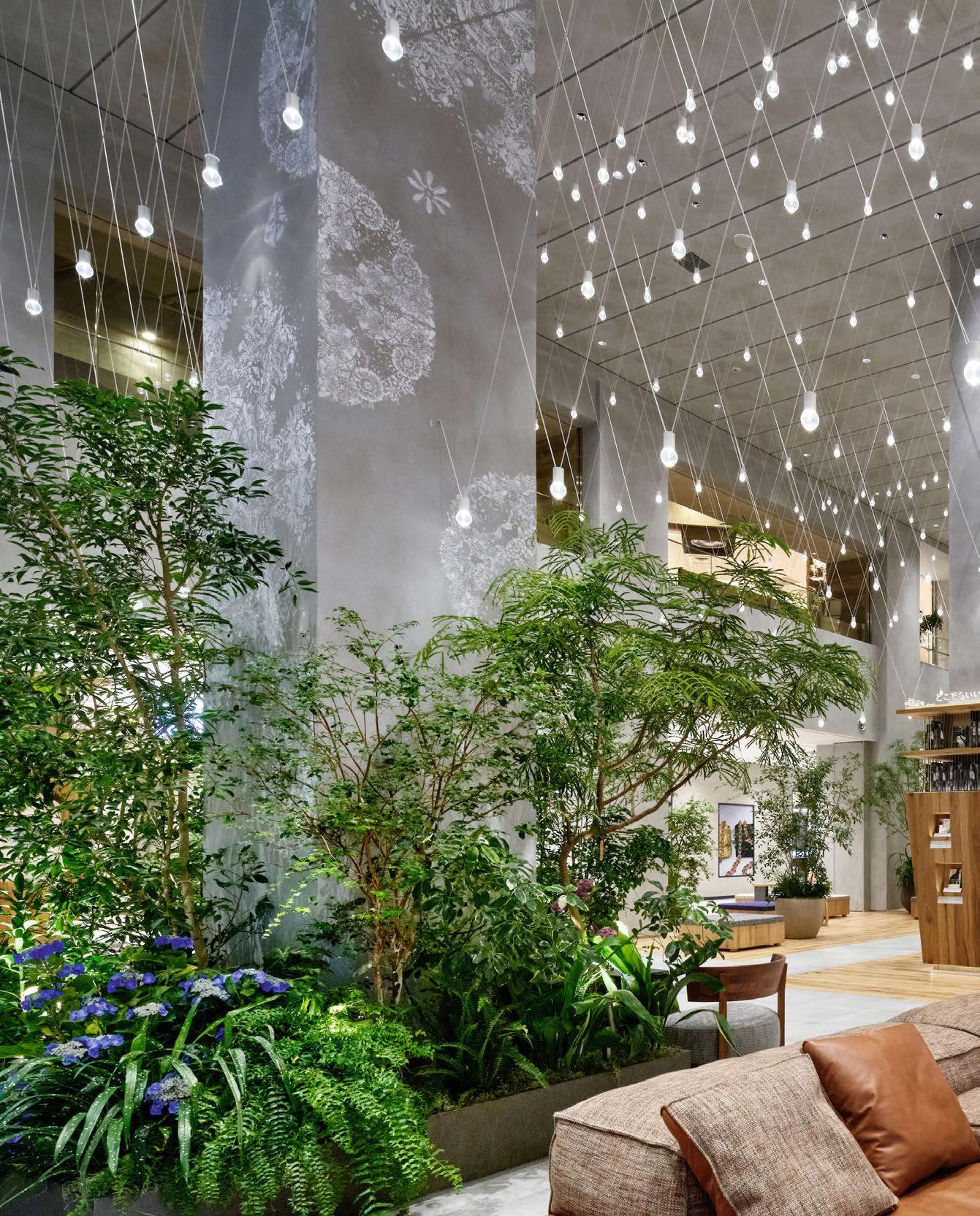
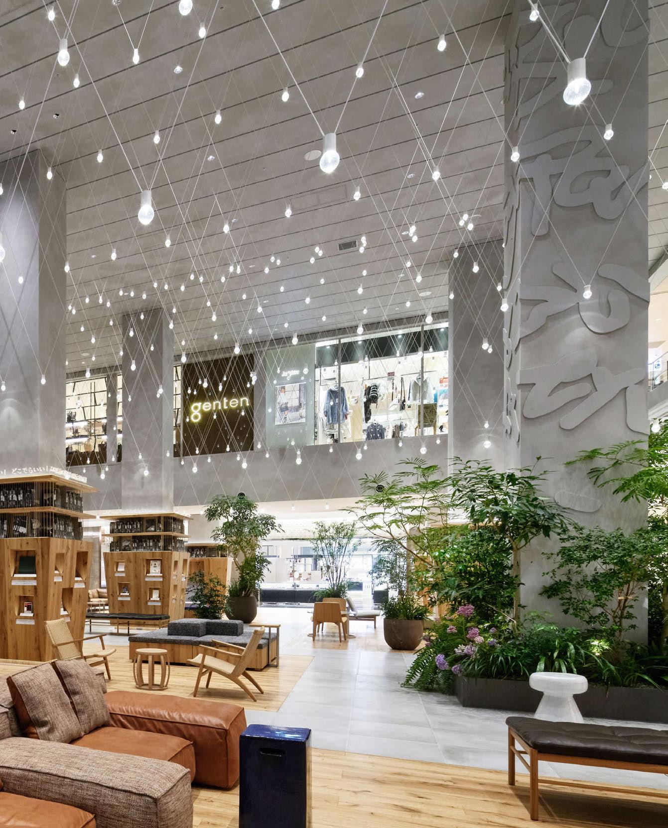
Guided by a design concept of “Library & Art,” the renovation of the Tamagawa Takashimaya S.C. Grand Patio, which has a 50-year history, was completed in 2020 by interior design studio Yuko Nagayama and Associates, with lighting design by Izumi Okayasu Lighting Design. The design transforms the spacious atrium into an intimate enclave that resembles a park in some places and a private library in others, offering opportunities for visitors to encounter books and art. Three primary elements compose the space: an assemblage of lights, shelves for encountering stories, and parklike greenery. Comprised of 669 Daiko Electric lamps and 1338 cords, the assemblage of lights is the most distinctive feature of the project. By varying the height of the suspended lights, the team constructed four ceiling vaults between the columns. Lights are suspended like necklace pendants from two thin cords hung at convergent 40° angles. The white lines overlap to form a nimbus overhead that is illuminated by the suspended light sources. The designers performed weight calculations and made mockups to determine the weight necessary to prevent the longest cords, measuring five metres, from slackening. The lamps are made of carved acrylic rather than glass, ensuring safety if they are ever knocked. Of the two cords used to hang each light, stainless steel wire was inserted in the one without electrical wiring as an additional safety measure to prevent them from falling. To prevent the carved acrylic cavities from shining too brightly from the light reflected inside, the team experimented with different forms to avoid additional distorted reflected light.
www.yukonagayama.co.jp
www.ismidesign.com
Image: Daici Ano
David
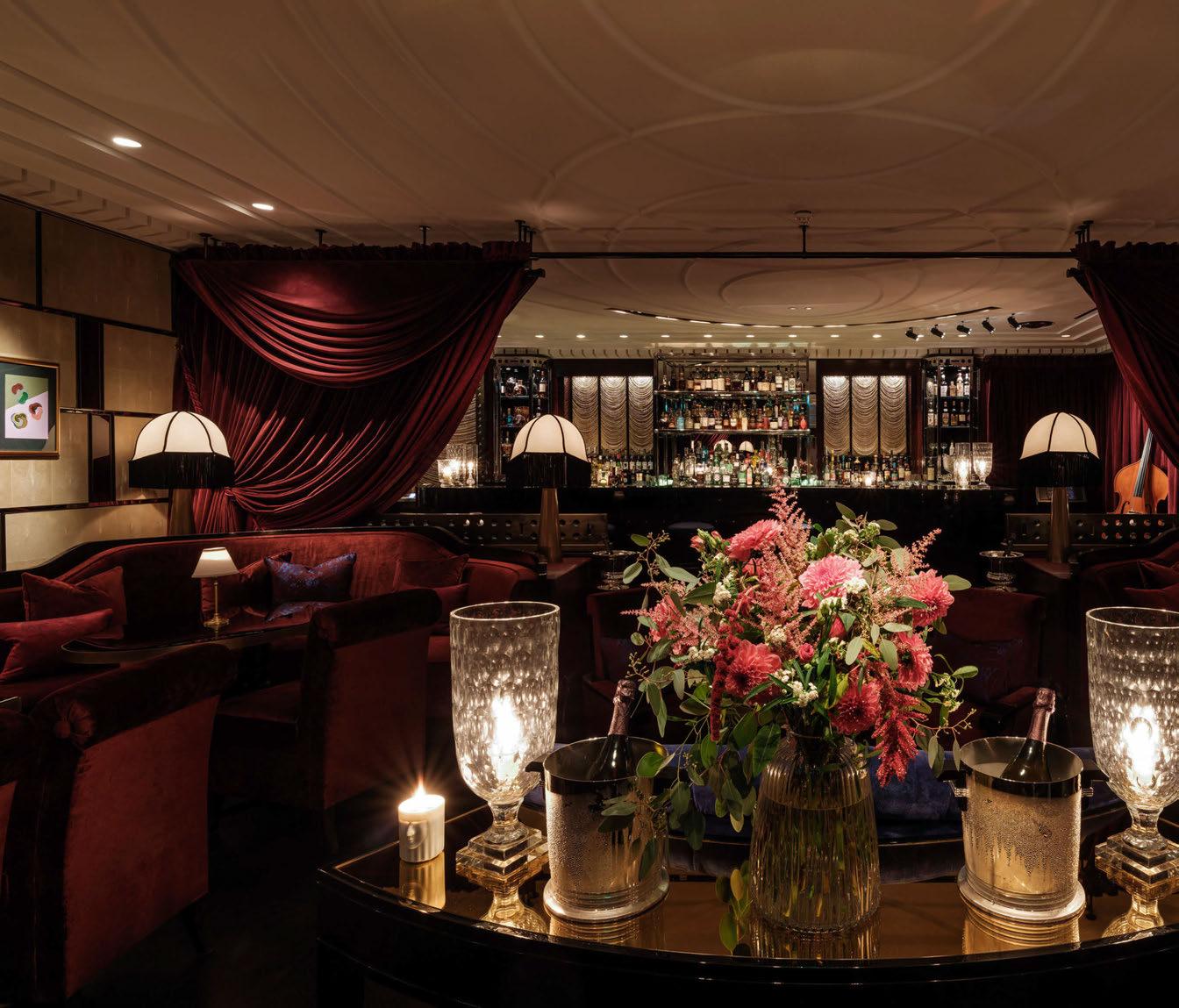
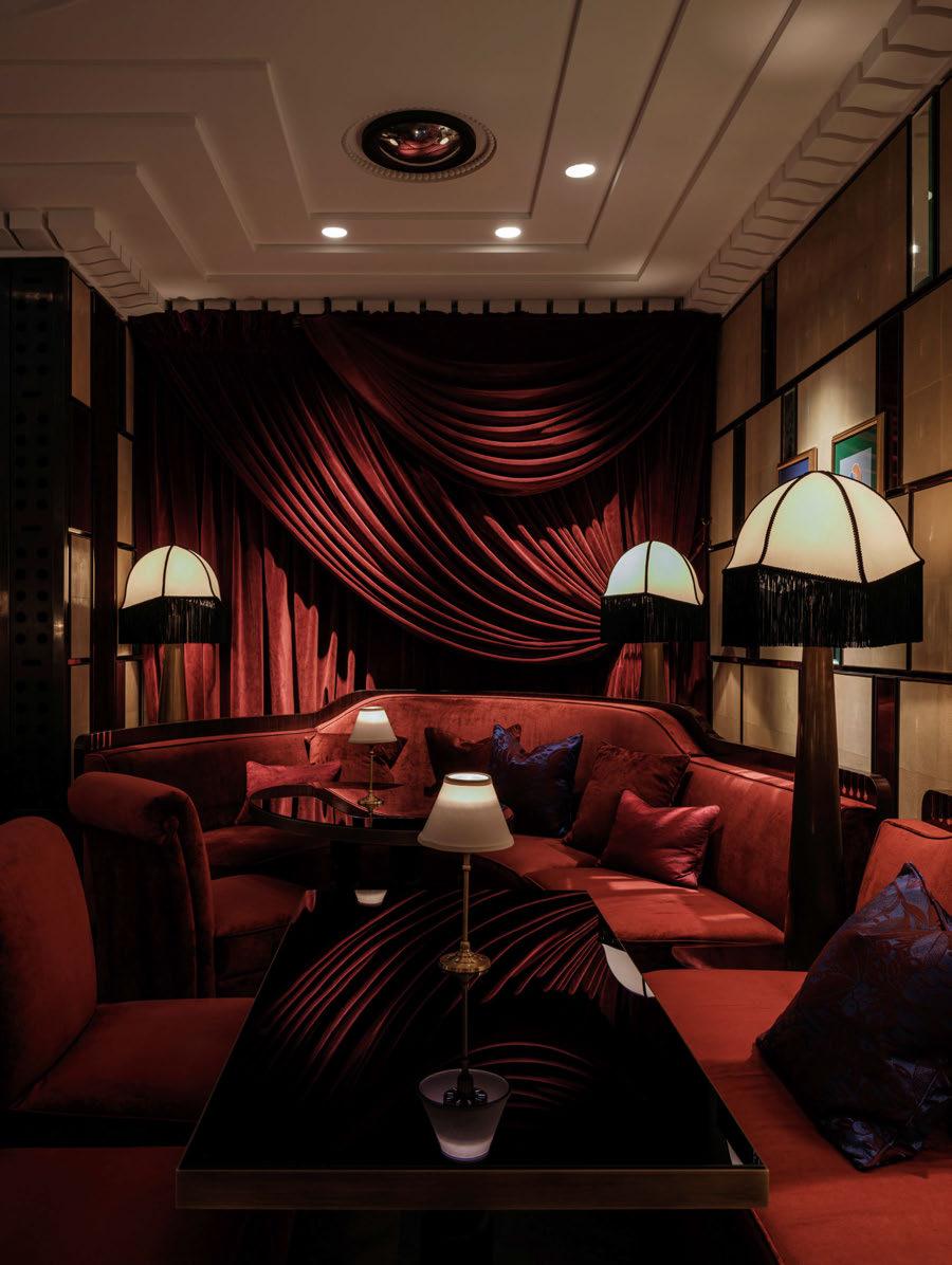
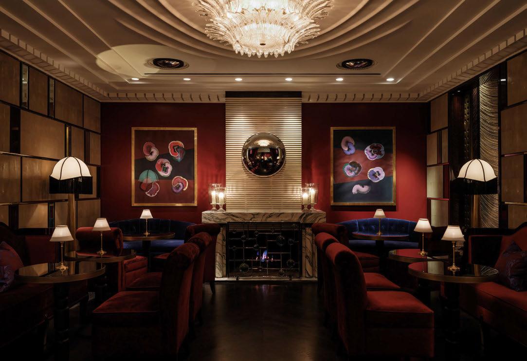
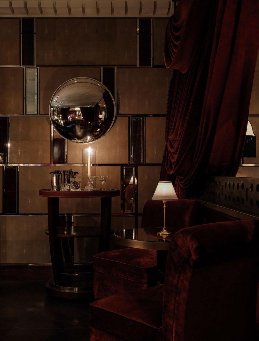
Velvet is a new bar that replaces Bassoon at Corinthia London, UK. The bar was reimagined by interior design firm David Collins Studio, transforming the space into a luxurious venue gowned in rich velvets and new artwork by Robson Stannard, which was curated by Creative Director of David Collins Studio, Simon Rawlings. dpa lighting consultants collaborated closely with David Collins Studio and the hotel to develop a new lighting scheme for the hospitality venue. The aim was to highlight new features as well as upgrade existing fixtures. The team successfully re-lamped all lighting, beam angles were reconsidered, re-aimed and scene-set to create focus and
drama throughout the bar. A new stage area is dressed with Par Can theatre-style lighting, creating a focus area and drawing guests into an atmosphere of opulence from the roaring twenties.
Stephanie Harris, Associate at dpa lighting consultants, says of the team’s involvement in the project: “dpa has a previous history collaborating with both Corinthia London and David Collins Studio after being appointed by the hotel to work on the design for Kerridges Bar and Grill in 2018, among other projects. So, dpa was delighted with the opportunity to join this prestigious team again on the refurbishment of Bassoon Bar – now known as Velvet. dpa was first
commissioned on the project in early 2022 with the doors reopening on the 1 November 2022, approximately nine months from start to finish.
“The brief for the lighting was minimal intervention due to the fastpaced project, utilising the existing lighting, upgrading existing fixtures through re-lamping, and changing beam angles to aid in enhancing the interventions proposed by David Collins Studio.”
David Collins Studio returned to the project via invitation from Corinthia’s General Manager Thomas Kochs, after originally designing Bassoon bar back in 2011.
“The brief was clear from the beginning, and we made sure to keep the strong narrative all the way from implementation through to completion,” explains Rawlings. “Our new design was respectful of the existing interior architecture, while creating a distinctly bold and new guest experience that the client was so seduced by.”
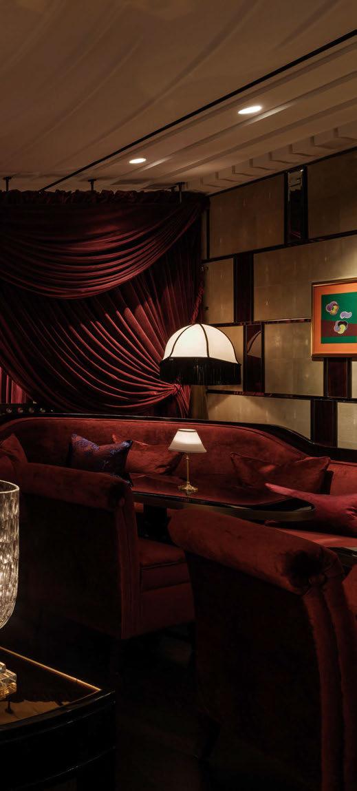
Lighting played a key role in creating the dramatic and luxurious atmosphere the brief demanded. “Key decorative lighting considerations ensured the aesthetics of luminaires were in line with the roaring 1920s feel that the David Collins Studio interiors were oozing,” says Harris. “The addition of new shades with fringing
and rewiring to all the existing table and floor lights transformed the fixtures to look completely different. As with all projects dpa has a strong consideration to the circular economy and reusing, refurbishing, and rewiring where possible.
“The addition of candles to each table along with added decorative elements throughout provides that seductive intimate atmosphere that complements the magic and theatre of the bar.”
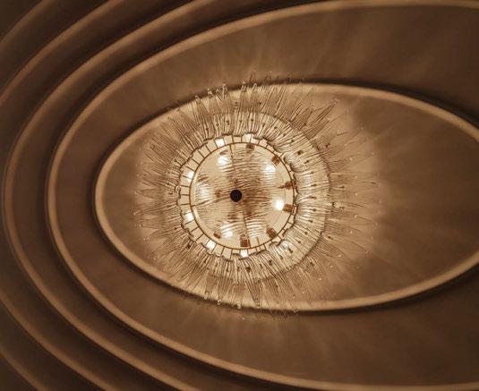
A vintage chandelier was also sourced by David Collins Studio to animate the back area and “give it a more inviting, inhabited feel”. This piece was selected for its style, adding to the overall theme of the space.
“Decorative lighting played a big role in our redesign of the space,” continues Rawlings. “As a night-time venue with no natural light, decorative lighting was key to creating the desired vision for the bar as an intimate and exclusive space. The decorative lighting provided key opportunities to update the interiors and emulate a chic late night cocktail bar atmosphere, highlighting the opulent textiles and adding a layer of sparkle, reflecting off the new material palette.
“The existing architectural lighting was refocused, rebalanced and in certain instances repositioned to work best with the new design intent. Some of the existing decorative lighting was removed to reduce the lighting levels and create the desired ambience.
“Part of the brief was to keep the existing ceiling architectural lighting and inbuilt banquette floor lighting. We updated these with new custom shades and installed a statement vintage chandelier. Movable candle lit lamps and glass hurricanes sit on every surface, providing an easy way to inject light and create intimacy outside of structural constraints.”
Harris adds: “The decorative lighting and architectural lighting have very different purposes on a project like this. The decorative lighting is there to provide style and visual purpose, it really enhances and complements the 1920s ambience of the interiors. This combination with subtle architectural lighting enhancing elements such as the impressive new artwork by Robson Stannard, back bar, the stage, and rich drapery.
“While the purpose of each is very different, the combination


complements the space and provides the backdrop to enable renowned bartender Salvatore Calabrese to provide the theatre and drama through his carefully curated cocktail menu. “As Velvet is purely a night-time venue, it differed from a lot of the projects we work on where we need to consider the daytime view of the space,” she continues. “This enabled us to fully concentrate on the sumptuous, moody atmosphere that can be felt as soon as you step into the room. The interior styling, atmospheric light levels and the candlelight provide a very dramatic venue. The aspiration was always to be the destination bar in London, and we feel this is successfully achieved.”
Turning the project around in such a short time positively forced the design direction and execution of this project. The teams relied on their well-established network of suppliers in order to complete the fit-out in time. Rawlings summarises: “As the hotel remained open during the refurbishment, there was a time pressure to get the project complete.
We are used to working to tight deadlines and working for an existing client like Corinthia and in London makes it easier! We have excellent suppliers and manufacturers who know how we work and that is a huge help. Efficient communication and close collaboration with consultants and suppliers made the project possible in such a short time.
“For me, Velvet captures the essence of a mood. It’s about a feeling, the discreet excitement through the pleasure of music and cocktails. Velvet embodies a bygone era. It captures the spirit of intimacy, extravagance, and secluded indulgence. Gentle lighting and twinkling surfaces exude quality and informal glamour. Strong, iconic, nostalgic, and charming. A bar like no other in London; a palette carefully curated to contrast and harmonise with dramatic swooshes of colour adorning the walls, and pattern, reflection, and depth throughout. A Velvet backdrop to the ultimate cocktails, true personal service, and the celebrated Corinthia attention to detail.”
Iain Watson, Chief Executive Officer at David Collins Studio, says in agreement: “We are delighted to return to work with the Corinthia team and create the jewel like Velvet bar in London that adds to our timeless signature bar portfolio. The project celebrates the Studio’s passion for the blending of periods and layering of materials to redefine modern elegance.”
Harris concludes on the lighting team’s success: “We are absolutely delighted with the finished result. Normally, on most projects, we can always find something we would consider doing differently but we are so pleased with the end result and wouldn’t change anything.”
www.davidcollins.studio www.dpalighting.com
Images: Alex Upton Photography
Velvet, Corinthia London, London, UK
Interior Design: David Collins Studio
Lighting Design: dpa lighting consultants
Lighting Specified: Lucent, Pulse, Wever and Ducre, reclaimed vintage chandelier
Reworking existing light fixtures from David Collins Studio’s original scheme for Bassoon bar, Velvet has been transformed into a luxurious 1920s escape. Utilising its name to the fullest, the bar is draped with copious amounts of rich red velvet. Decorative lighting pieces that hark back to the Art Deco era dress the space with intimate and pockets of lighting, while repurposed architectural lighting balances the scheme.
The Africa Centre is a London-based charity that celebrates the diversity of Africa. Established in 1964, the charity has been proud custodians of African culture and heritage in the UK.
June 2022 saw the opening of its new home in Southwark. The newly refurbished site offers a flexible space for events, exhibitions, pop-ups, and networking.
Multidisciplinary designer and creative director Tola Ojuolape was invited to submit a proposal for the design of the new centre earlier last year. “They were looking for a designer of heritage, a Pan-African and contemporary look and feel to create an appropriate space
celebrating the soul and creativity of the continent,” she tells darc “Marrying my experience in commercial F&B design for the last 10 years in London, love and travels around the continent, I was considered a perfect fit as I was in the process of setting up my new studio and the board unanimously approved my proposal.
“I recognised from the onset the importance and responsibility to consolidate ideas and themes from the continent,” explains Ojuolape. “The concept was centred around the unifiers that make the African continent special and unique, and I concluded this came from the natural essence of handmade, tactile and crafted objects
seen throughout the continent. This governed all of the materials and finishes I sought to deliver in the space across all floors. We collaborated with a number of designers and makers from the continent and diaspora to achieve the look and feel.”
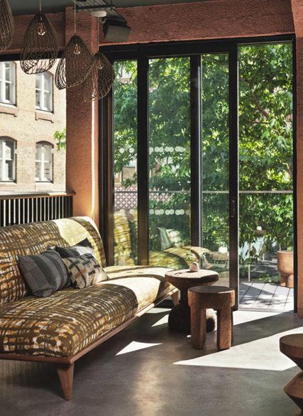
Discussing some of the challenges she faced during this project, Ojuolape explains that the logistics was one of the hardest to configure. “The Africa Centre had an ambition to curate the interiors with artisan and local makers from the continent. Managing the logistics of sourcing and ensuring delivery from a number of countries in Africa was challenging, however all items sourced were delivered
with impeccable quality suitable for the commercial environment.” When it came to choosing decorative lighting for the space, Ojuolape considered it one of the key components for accentuating different interior areas. “It was also an opportunity to showcase African designers,” she says. “We used lighting designers such as Hamimi from Morocco, Golden Editions from Ghana and Modern Gesture from South Africa.”
Throughout the centre, there are various mix-use spaces and a restaurant. Ojuolape used architectural lighting as the main source of light in the restaurant, bar and gallery areas. “On the ground floor, the
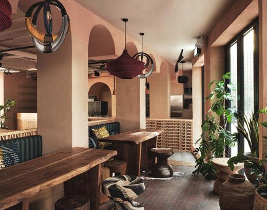
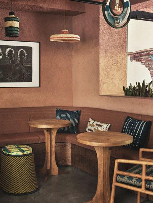
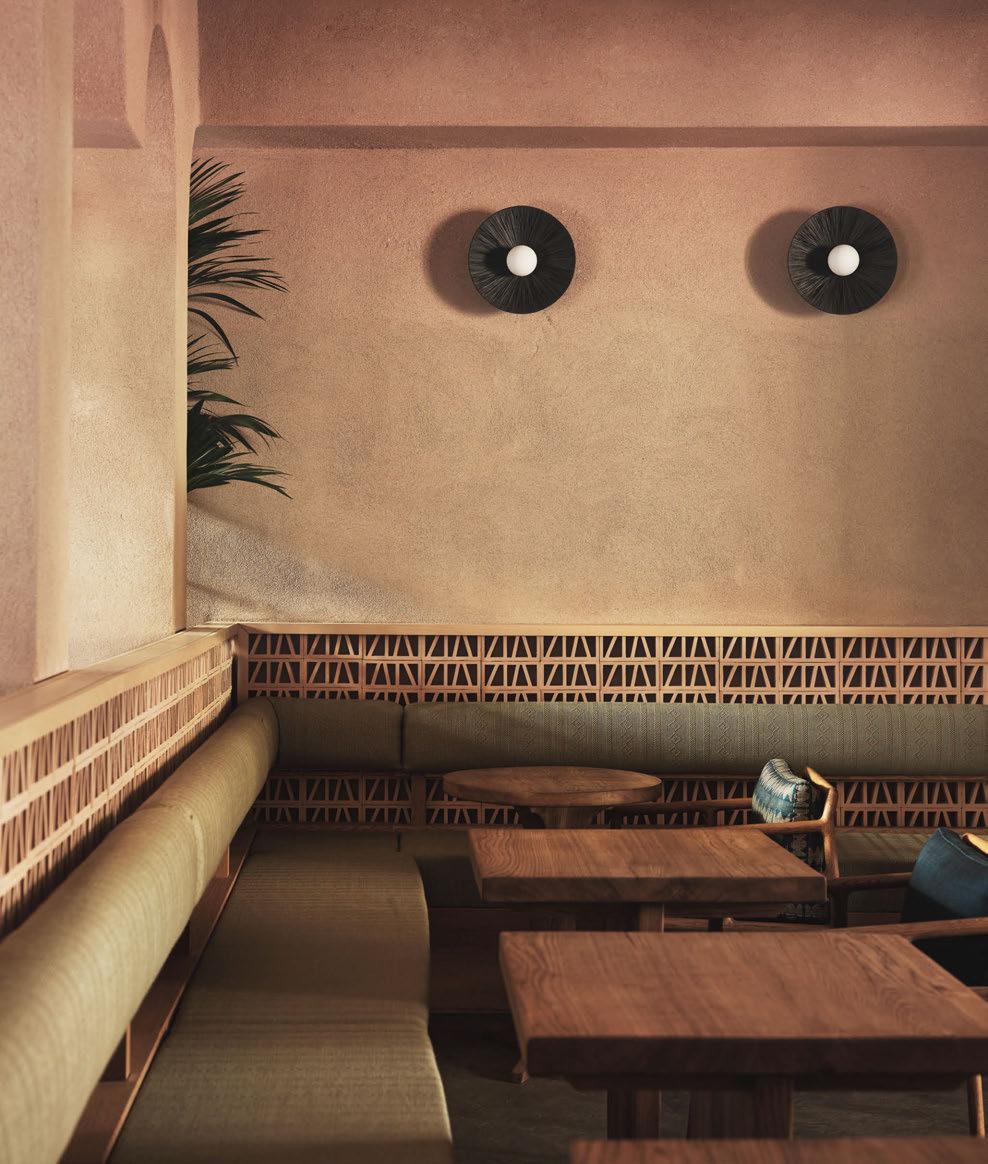
decorative lighting has been placed intentionally to pull towards the raised floor area at the back of the restaurant,” she continues. “The wall lights have a tactile feel and complement the clay works wall finish. Feature lights on the bar area are reminiscent of clay terracotta cooking pots used across the continent.
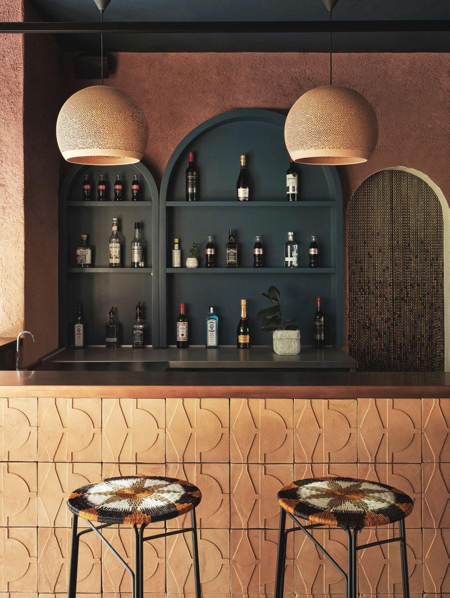
“The architectural lighting has been specified to rescind in the space, allowing for the decorative lighting to be visible and the feature throughout.”
When it came to structural constraints faced in the refurbishment, Ojuolape explains her aesthetic preference to never have visible ductwork was a challenge. “My innate preference for decorative lighting is never to have visible ductwork, to allow for the lighting as the central feature for maximum visibility and aesthetic precence. The first floor bar has visible ductwork. We were able to overcome the ceiling constraint by painting the ceiling in a colour that allowed the ductwork to disappear.”
Overall, Ojuolape sees the lighting as a key feature in linking the interior concept for the centre. “All of the decorative lighting was intentionally sourced to complement the design intent and supports the client’s vision of sourcing from the continent,” she explains. “I’m so pleased we were able to source handcrafted, tactile pieces.
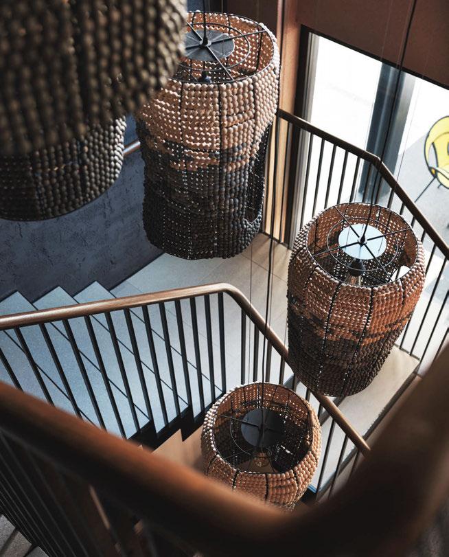
“The strong African heritage was a key driver to the success of the project, while my work always has culture and context embedded in the design, ensuring this was translated throughout was imperative. “I particularly love the use of the indigo blue used across all levels, which was inspired by the rich history of dyeing textiles from West Africa. Indigo cloth dyeing was a highly valuable skill passed on by specialist dyers through generations up to now. I sought to pay homage to heritage with the use of the indigenous colour as an eminent feature in interiors, specifically as a backdrop to the exhibition space and stairwell areas. It also served as a contrast to the terracotta tones and timbers.


“One of the highlights of the project was working with Tapiwa Matsinde, a curator who supported on the procurement and logistics for the project. Her expertise in working with artisans from the continent was invaluable.”
The Africa Centre adds: “Our clear vision for the Africa Centre’s new home was for a building that captured the bold freshness of contemporary Africa; showcased interiors which were rooted in the colours, textures and crafts of Africa but were not bound by them; invited the visitor to dwell and relax in a timeless way. We believe that Tola has realised our vision with an authenticity that will stand the test of time.” www.tolaojuolape.com
Images: Felix Speller
The Africa Centre, London, UK
Interior Design: Tola Ojuolape Studio
Lighting Specified: Dyke & Dean, Forestier, Golden Editions, Hamim, Light & Lamps, Mash T Design Studio, Modern Gestures, Studio Lani
Using a large collection of decorative lighting pieces from designers across Africa, Tola Ojuolape has designed a multifunctional space for The Africa Centre that celebrates African culture and heritage. Decorative lighting adds beautiful lighting layers and textures to the spaces, while also presenting an opportunity for lesser known designers to have a platform in London.
Swedish lighting studio Reform, part of Reflex Arkitekter, transformed its previous client's new office into a space designed to last the ages. Reusing some existing fixtures and fittings and adding a contemporary layer, the team has created a beautiful, inviting atmosphere.
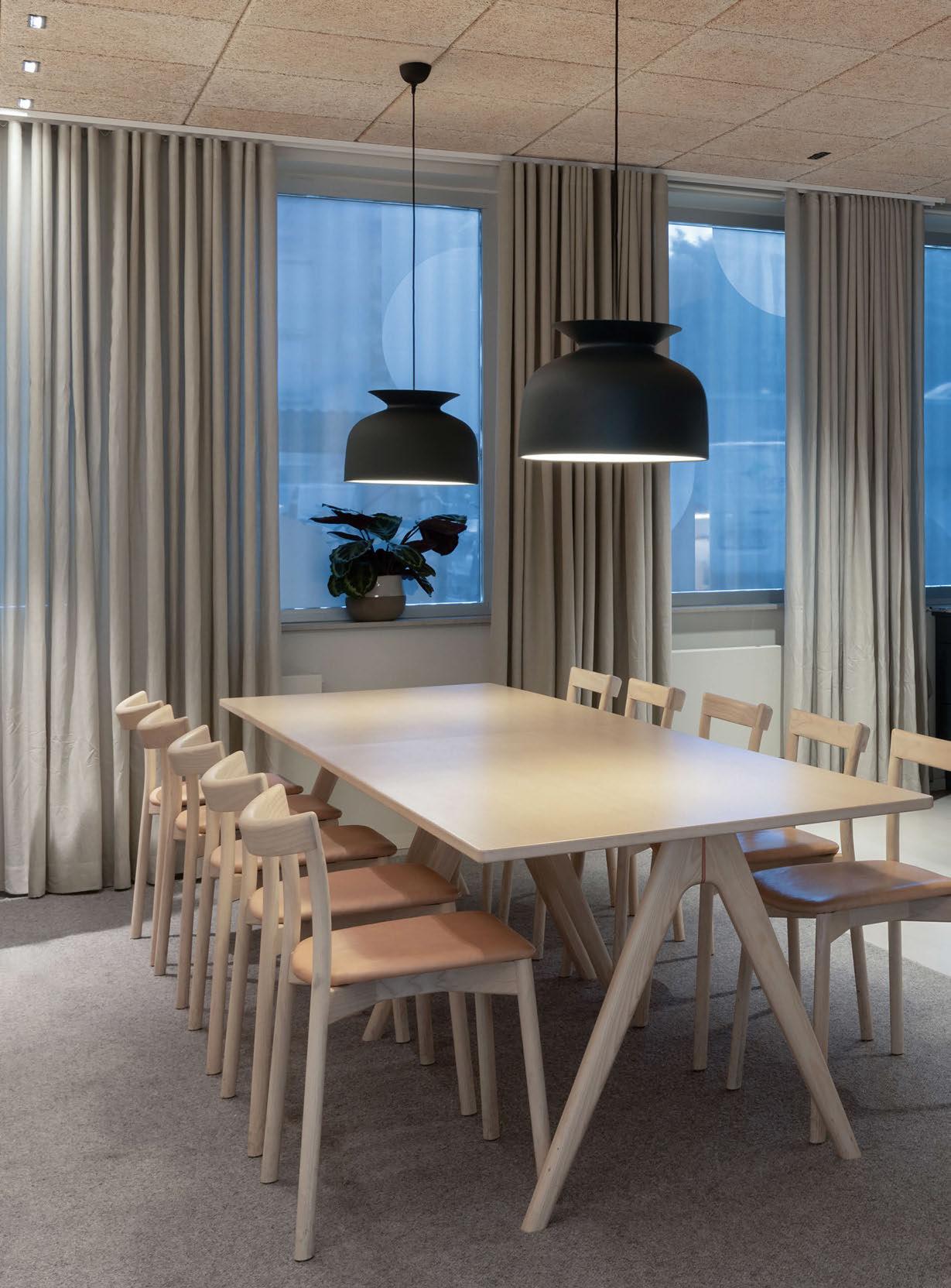
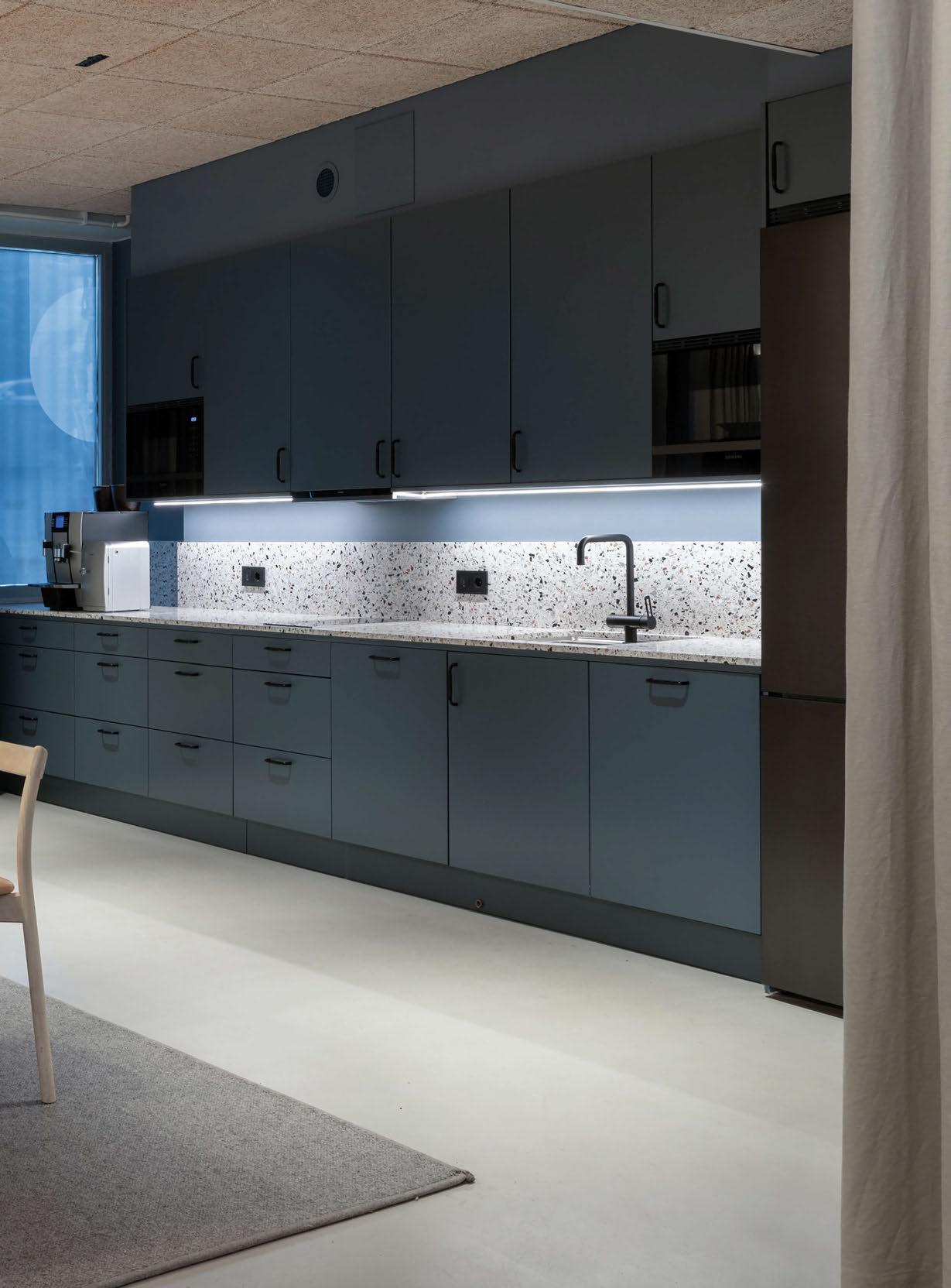
Real estate brand Solporten recently received a new office design with lighting and interiors completed by Swedish design firm Reform. darc sat down with Maria Vrekou, lead lighting designer on the project to find out more.
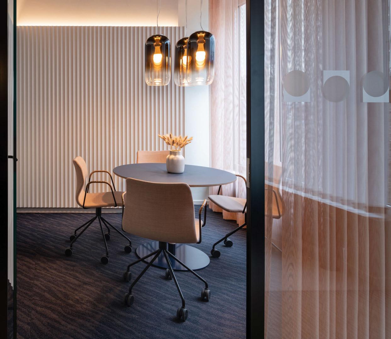
Vrekou begins by explaining how the studio first became involved in the project: “We had been selected to do their previous office, that they were now moving out of. The new premises are owned by our client’s real estate agency, and the idea was to house their offices there for the next 20 years. Therefore, the main task for the lighting scheme, as well as for the interior design, was to create an office space that would last the test of time and continue to feel contemporary over the forthcoming years. The design feels a little industrial, and is elegant but not exclusive. The project started in 2019 and was completed in the beginning of 2022.”
The very nature of working on this project with a client that is wellversed in property and real estate ensured the design and construction process went very smoothly for the teams. “Our client has a great eye
for design,” explains Vrekou. “As he works within the property industry, he could see the potential future challenges, so his initial brief was a very realistic one. The very tight collaboration with the architect, interior designer and of course the client resulted in the very smooth but also precise execution of this project.”
Due to this close network between all involved parties, the brief of a timeless and welcoming office environment for both employees and their visitors remained the same throughout the project. “We had agreed on the concept and scheme in the early stages, so we only had small adjustments after architectural or interior design changes that were made during the whole of the project process,” expands Vrekou. However, there were some structural issues when it came to installing lighting. “The initial choice of downlight and wallwasher was the iGuzzini Laser Blade XS. However, due to the thickness of the acoustic ceiling panels that were chosen, we had to change for the regular Laser Blade. As the optics between the two models are slightly different the placement of the fittings had to be rearranged. The good
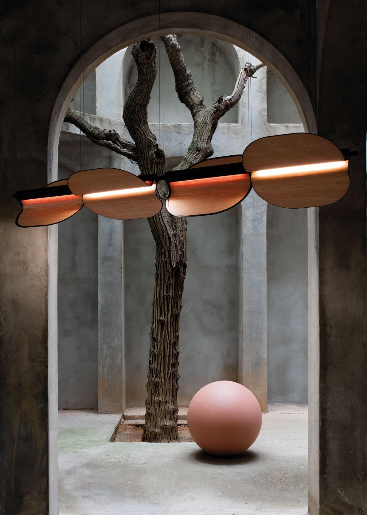
communication with the other disciplines, but also their understanding for the lighting, meant the acoustic ceiling panels could be adjusted for the fittings to be placed in the right place.”
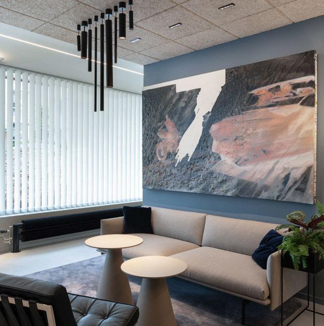
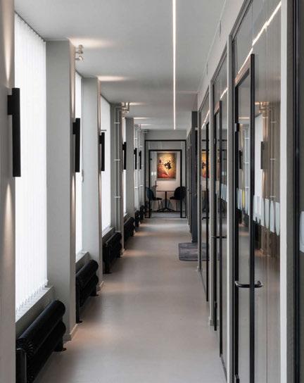
In terms of the decorative lighting fixtures chosen, it was the client’s wish to keep the aesthetic simple and graphic. As a result, Vrekou and her team selected pieces that were simple yet put more focus on the light effect. “We used black Flauta Spiga from Flos on pillars creating a rhythm in the long corridor, and Reggiani Yori pendants in different lengths above the lounge area. From Flos, we also selected floor lights that stand in the lobby, two of the meeting rooms and the lounge area. Three of the Golpe fittings from Artemide are suspended above the table in the external meeting room and a table version sits in the reception area,” she describes.
“We had the intention to keep the list of fittings as short as possible for easier maintenance in the future. The downlights were to produce no glare and be discreet. The client loved the technical aspects of iGuzzinis Laser Blade when we initially presented a sample fitting. We continued with the same product for the wallshers.
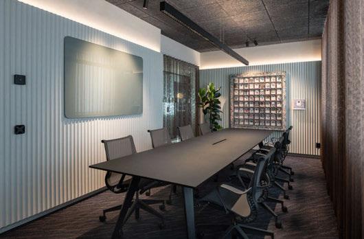
“As we knew from the beginning that art would be a big part of the interior but didn't know the exact place of each piece, we needed to have a flexible solution to highlight the client’s collection. The fitting used for this purpose was the Reggiani Yori Semi-Recessed Precision Zoom spotlight, which gave the possibility to adjust the beam angle according to the size of the artwork. From the very first time I saw the 21-metre long corridor by the façade, I imagined a dominant narrow continuous linear light and wall lights on the pillars to enhance the length through the repetition. The linear product we used is iGuzzini’s Underscore 15 Minimal and the wall lights are Flauta Spiga from Flos (we did not use the reflector at the bottom so we have an almost symmetric up and down light distribution).
“In the office rooms we re-used the Aura Lunaria pro Pendulum pendant fittings above the desks (they were newly purchased and all users were satisfied) but we added Reggiani Yori Semi-recessed Precision Zoom spotlights towards artwork. The Gubi Ronde pendants in the kitchen area also reused from the previous office. In the big meeting room we have a Ledluks ILO pendant with direct and indirect
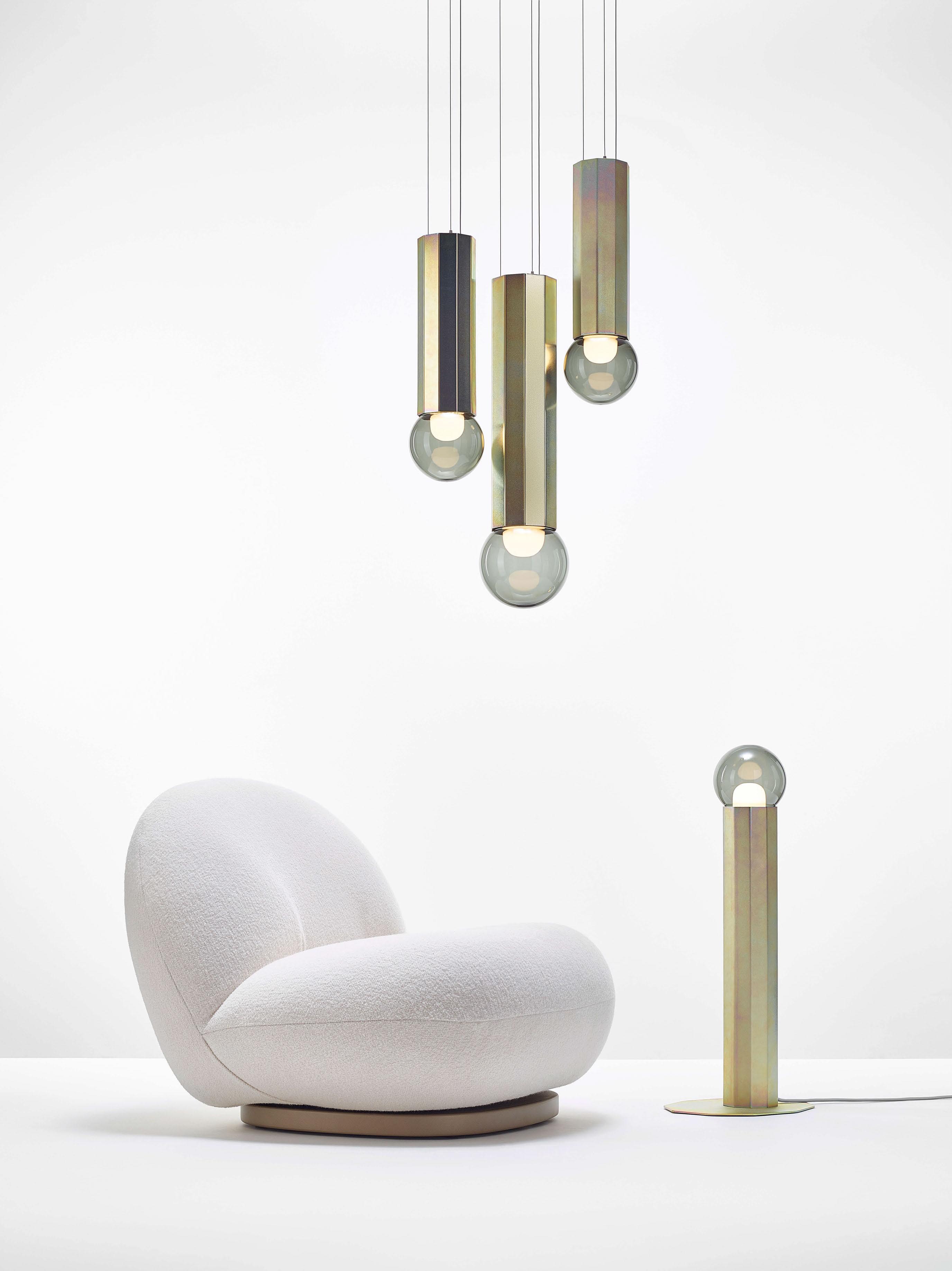
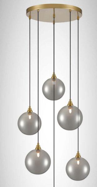
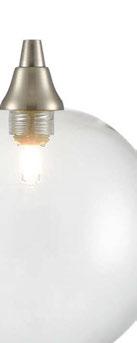
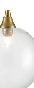
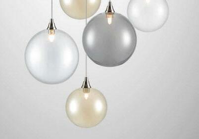
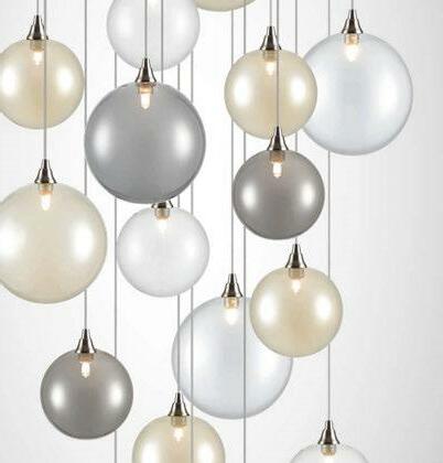
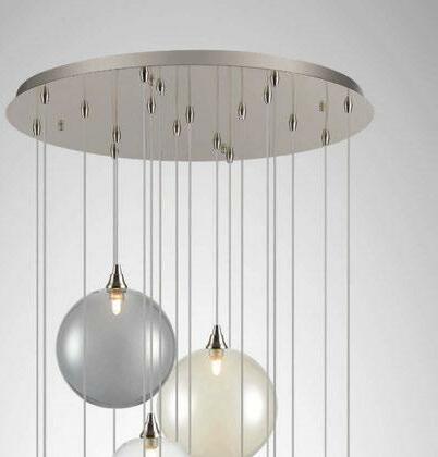
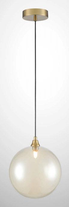
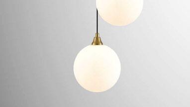
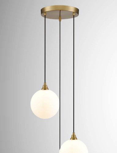
The Galaxy range a collection of spherical shaped glasses in three size options with up to four colours. Hung on single and multiple adjustable suspensions with satin nickel or matt gold metalwork.





light above the table. We wanted to continue with the same discreet lighting and so we chose the modular optics of 60°. And two Pholc Donna 7 pendants are featured above a small coffee station outside the big meeting room.”
To adapt the various architectural and decorative lighting components throughout the office, the team installed wireless controls via Casambi, and programmed three difference scenarios for each room according to the varying functions in each space.
“Personally, I am very content with this project. The client’s clear vision helped to make the initial ideas a reality. All disciplines involved had high ambition for details but also simple and realistic proposals, which made it happen.
“The few decorative fittings contribute with task light above tables and add an overall additional layer of light at a different levels, from floor to tables for example. Most of the product selections had been decided together with the interior architect in order to make sure they fit in the overarching concept, but also serve the lighting requirement in each space.
“This proved the same with the LED stripes behind the wall panels in the meeting rooms, lounge and kitchen areas. It was clear from all sides that light would be added there. It was an element that gave a big boost to the overall atmosphere in the whole office.”
Kristoffer Wilhelmsson, Managing Director at Solporten, adds: “We had an ambition to create a warm and soft industrial feeling, but it turned out even better. Simply brilliant.” www.reformark.se
Solporten Office, Solna, Sweden
Interior Design: Reform, part of Reflex Arkitekter
Lighting Specified: Artemide, Aura Light, Flos, Gubi, iGuzzini, Ledluks, Muuto, Pholc, Proled, Reggiani
"The feeling of a walk on the beach in the hazy morning sun. Colour, texture and light shape the space of Solporten’s new office. 'Sol' means sun, and the circle as a symbol appears in parts of the new design. Reuse of suitable light fittings and furniture were obvious choices for our team," says Beata Denton, Lead Lighting Designer at Reform.
Spanish lighting brand LZF supplied a large collection of decorative lighting fixtures for this urban wellness centre in the heart of Brooklyn, NYC, created by BK Developers and RYBAK Development.
On the site of a former parking lot in Brooklyn, New York, a ‘social wellness lounge’ has been constructed. World Spa was imagined, designed, and created by The World Spa Team, a group formed of the principals at Brooklyn-based BK Developers. The team collaborated with fellow Brooklyn-based RYBAK Development to create the luxury destination that opened its doors in November 2022.
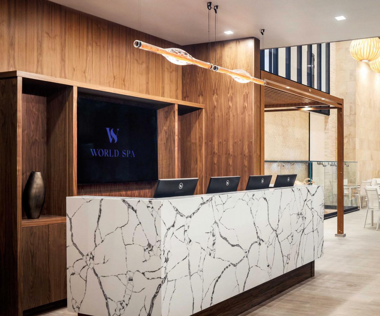
A project that was almost a decade in the making, the expansive threestorey wellness facility is considered an oasis of calm in the heart of the city. Inspired by the bathing and wellness rituals of different cultures around the world, World Spa incorporates a number of authentic spa experiences, including: the Eastern European banya, Finnish sauna,
Turkish and Moroccan hammam, Himalayan salt room, and Japanese onsen. A ‘Clay & Hay’ sauna, infrared sauna, aroma sauna, and snow room, add to the extensive mix of experiences on offer.
When creating World Spa, BK Developers was keen to stress the need for authenticity. Relevant building materials and equipment were sourced and imported from their countries of origin. The walls, floor, and benches of the Moroccan hammam are adorned with a colourful array of mosaic tiles from Morocco. The Turkish hammam features Carrara marble and traditional Turkish tiles. In the Spa’s varied saunas and banyas, the wood—kelo pine—was imported from Northern Europe. Extending the principle of authenticity, the equipment comes from
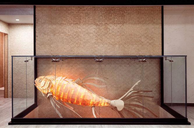
leading European wellness manufacturers. Light and ambience are important to health and wellbeing, and BK Developers incorporated a choice selection of LZF’s handmade wood veneer and hand-blown borosilicate glass lamps throughout the spa. Visitors can relax and unwind in sumptuous surroundings, in company with a discerning line-up of LZF’s lamps: the majestic Candelabro and ethereal Koi, Black Note Triplet, Black Note Duplet, Cervantes, Dune Horizontal, Banga, Poppy, and Pod.
“The main concept of World Spa was to inspire our guests to take a journey through the different spa cultures worldwide," says Leonid Khanin, lead designer and project director. "The use of authentic and
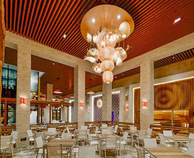
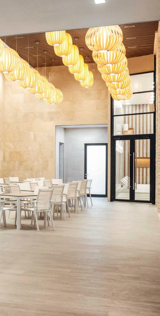
natural finishes, along with a woody, 3D feel in lighting scenarios, was the way we achieved the travelling feel, all while keeping spaces comfortable and welcoming. First, Candelabro lights were added to the main public seating space. LZF's pieces continue throughout the facility, including the Koi light, which we decided to introduce later on, as it was the perfect way to bridge the dark theme spaces of the cellar floor with the main spa lounge level. We wanted spa visitors to be intrigued when looking up and down, seeing the glowing sculpture light penetrating the floor levels.”
www.lzf-lamps.com
Images: Brian Berkowitz and BK Developers

“Travel has always been a lifelong passion; martin and I are both inquisitive people and enchanted by different parts of the world. Hotels are the window that tend to frame a lot of our experiences of destinations. For us, it’s extremely important to ensure that hotels enhance and elevate an experience...”
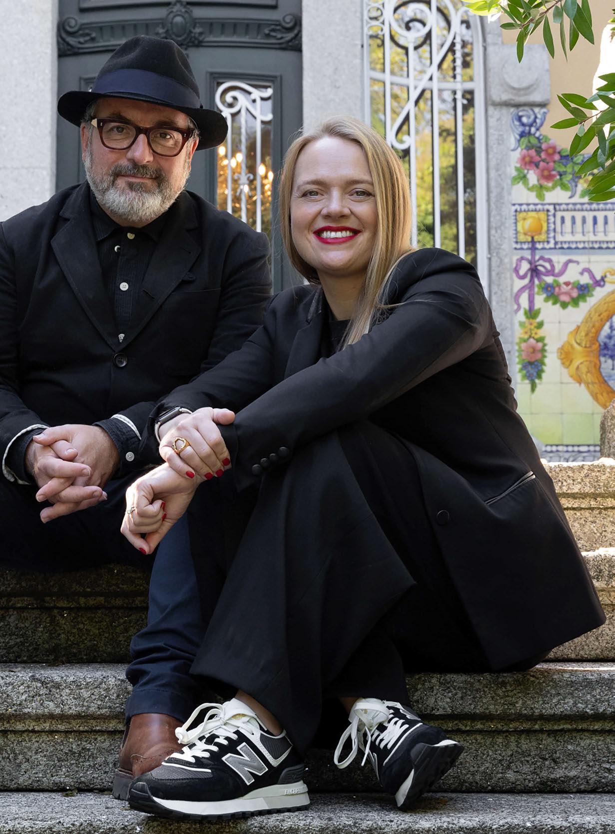
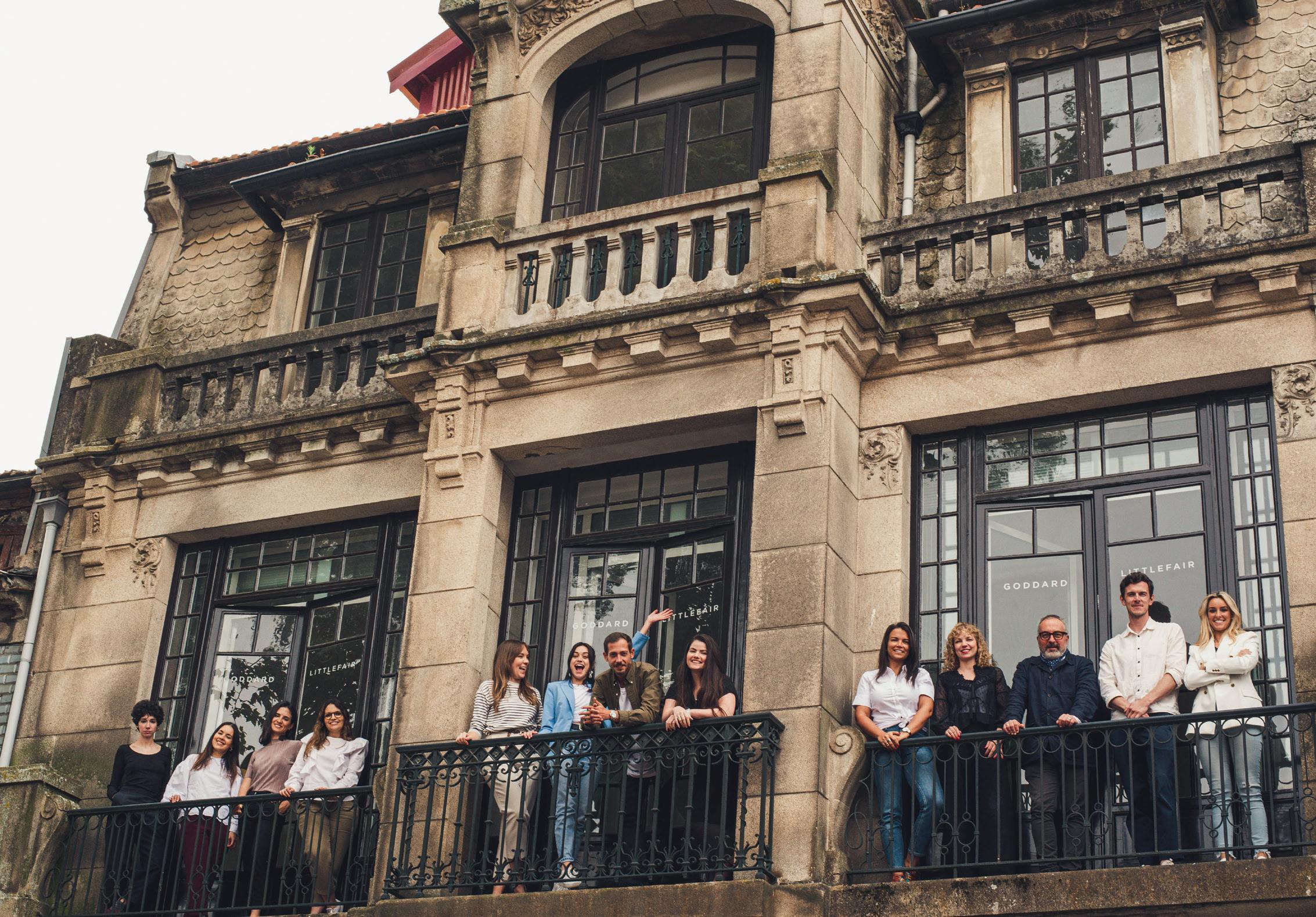
Launched in 2012, London and Porto-based luxury interior design studio Goddard Littlefair celebrates its 10-year anniversary. Sitting down with darc editor Sarah Cullen, Founders Martin Goddard and Jo Littlefair discuss the studio’s successes, personal inspirations and advice for budding designers.
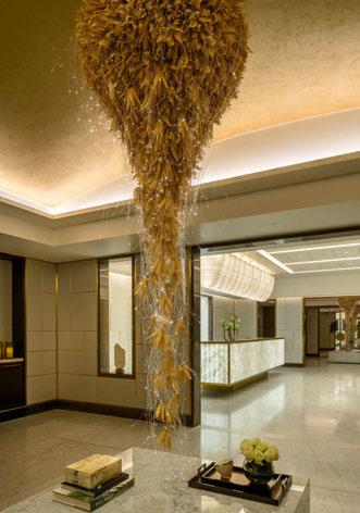
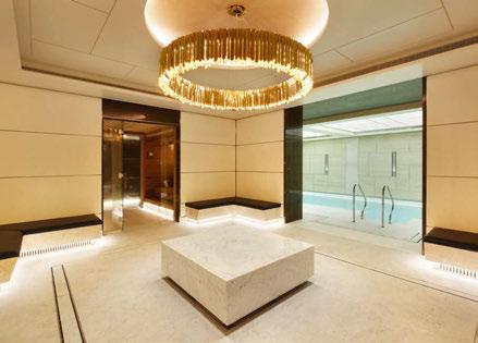
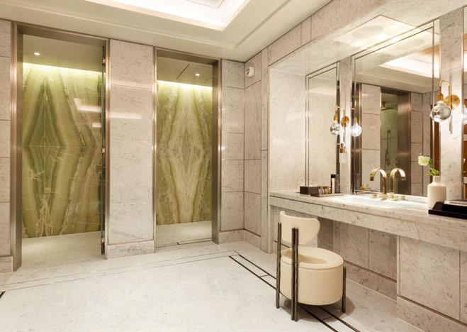
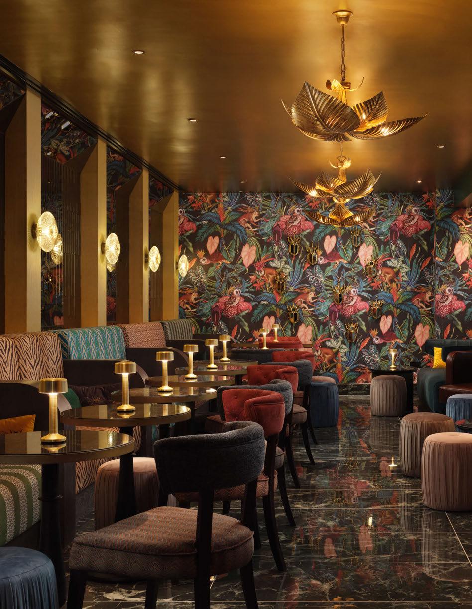
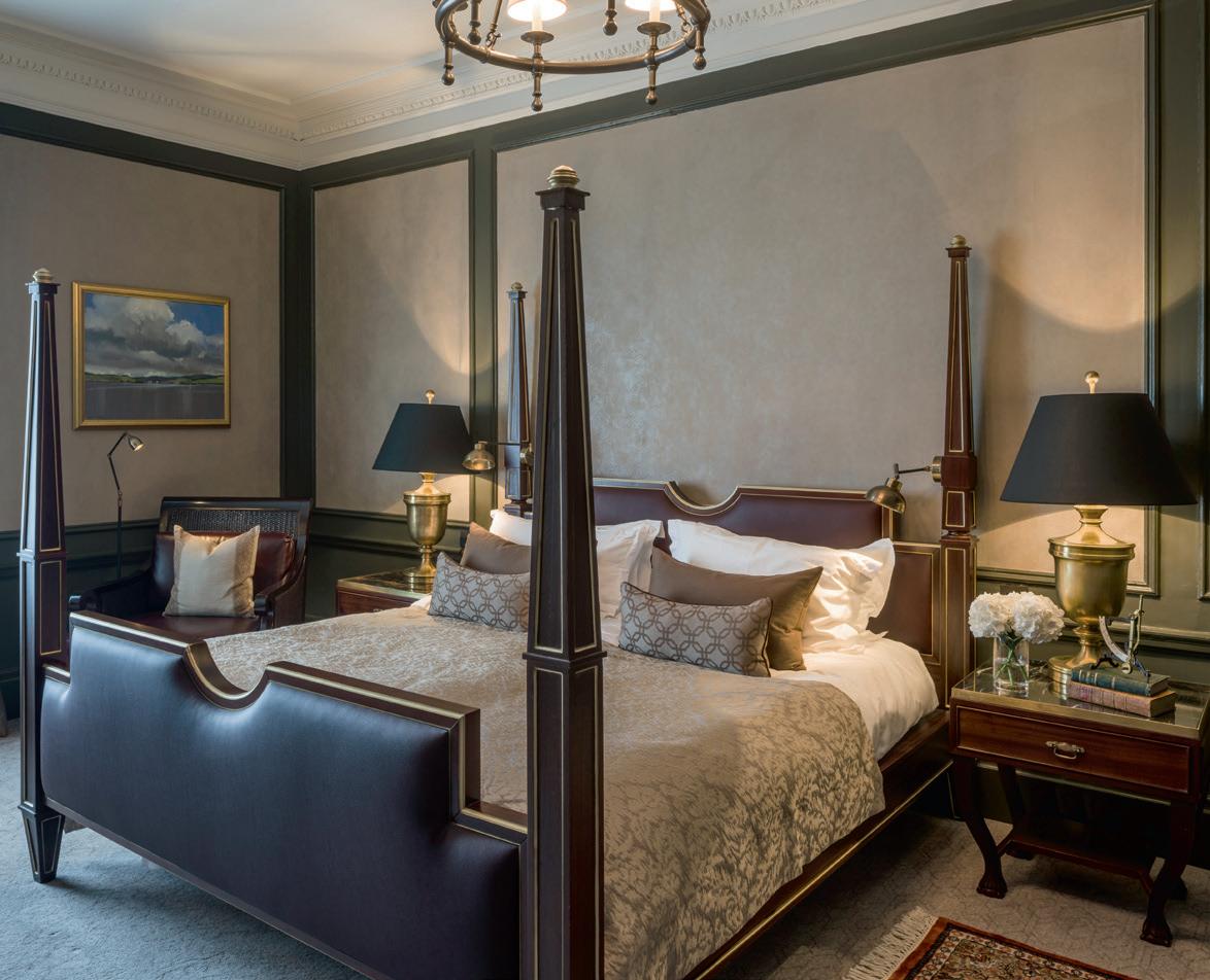
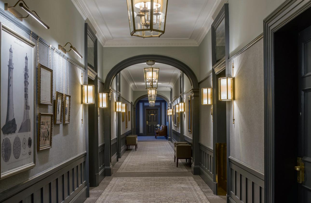
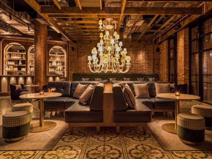
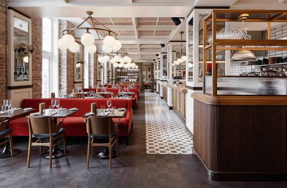
Goddard Littlefair has worked on numerous standout projects over the last decade, with some particular highlights including Mondrian Shoreditch in London, Gleneagles Hotel in Scotland, Mandarin Oriental Vienna in Austria, and Villa Copenhagen in Denmark. “Where did 10 years go?” says Littlefair. “I guess starting any business, you don’t know what the future holds but you have ambitions and hopes. I think we’ve been incredibly lucky, but we’ve also worked really hard, and we’ve been a part of some amazing designs. We couldn’t have imagined what projects were going to come through our door, but they have given us opportunities and helped with our profile. You
really can’t anticipate things like that.”
Goddard adds: “I think when you initially set up, you think it should work. We’ve both got a lot of experience in the industry, and we’ve worked for many years for other people. You make a lot of contacts throughout your career, and you think “ok it should work”. It’s really rewarding when connections turn around and say, “yeah ok, we’re really happy to work with you”. A few people that backed us in the beginning have continued backing us all the way through, and that has been really rewarding. It’s been so nice to work with the same groups, clients, and operators for many years, and that’s a testament to really good relations - and we’re just nice people,” Goddard laughs. Setting the scene for us, the pair describe their initial conversations that resulted in the opening of the studio. “Martin contacted me on LinkedIn. We originally met and worked together in 2005 and then went our separate ways. I set up a business on my own and then had two children. Martin had gone to Canada and studied landscape design before returning to London.
 GLASS EFFECT and PALM by CHELSOM THE OTHER HOUSE, LONDON CHELSOM.CO.UK
Photography courtesy of Jack Hardy
Then basically, opportunities arose... Martin reached out, we started talking and hosting meetings all in restaurants and pubs, as we didn’t have an office; it was very much just on the hoof in London. I encouraged you, you encouraged me, and we just figured out it really worked, and so we thought “let’s just do this”. It all felt very natural. “The partnership between myself and Martin is a bond that was ignited by a mutual understanding. We discovered we both spoke the same design language and that kind of connection is a very powerful one. We are both drawn naturally to different materiality, styles and colours and when you are able to learn from one another and combine the two things together, then the original idea blossoms into more than you ever envisaged in the first instance.”
“It was very much an organic progression from what we were doing,” agrees Goddard. “We would roll up to do client presentations in a taxi with a bag full of fabrics, samples, and a few sketches, and it ended up being a bit of a double act - waving our hands together at the end of the table in front of clients and they seemed to like it! As Jo’s said, it all felt very natural. And from that, we started building some really great people around us. Then, we got our first little office in Barbican, London; a tiny space in a loft above another design practice, but it was
really sweet. It was our little space (only about seven of us could cram in there), but it was ours and it was all very exciting. We were both a bit like “Woah, ok what are we actually doing?”. Then we started landing some substantial jobs. You walk into a meeting when it’s the kick-off of a big project with lots of consultants, and you’re sitting there saying [shyly] “hello”. It was such a nice feeling. There was lots of hard work there but a natural progression.”
Despite their mutual love of and approach to design, the two designers had very different journeys and influences in their early lives before finding their feet in the industry.
“I was brought up in a council flat in East London,” explains Goddard. “There was not much design influence around me there. My grandfather was a cabinet maker, but that’s the only design-related part of my family. I found my own path through art. Through the process of going to an Art Foundation college [Middlesex], I gradually gravitated towards design, and interior design more specifically. So, I followed that track and went down the interiors and interior architecture route.”
In contrast, Littlefair was raised surrounded by the countryside. “I grew up on a farm surrounded by nature and very influenced by colour
and the environment. I think I have some artists in my ancestry but nothing in my immediate family. My mother and grandmother were both very creative in terms of things they made that were useful, from cookery to creating garments and knitting. They were always working on things and reading. I was always into anything that was threedimensional and tactile. That’s how I got into art; it was a hobby as well as something that I studied at school. I was completely driven by my own desire to do it. There were also a lot of family antiques in the farmhouse, which still make me feel at home even to this day.”
Goddard adds: “But I also think we both had a passion for travelling, exploring new things, and going to new places, and I think that is our reference library; our travelling experiences and seeing new places, architecture and cultures, etc. I think that’s where we’ve drawn a lot of our influences from, from our younger life and onwards even now. We love to soak up new places, which all filters down into our design work.”
“Travel has been a lifelong passion; Martin and I are both inquisitive and enchanted by different parts of the world,” says Littlefair. “Hotels are the window that tend to frame a lot of our experiences of destinations. For us, it’s extremely important to ensure that hotels enhance and elevate an experience by both meeting the needs of
weary travellers and allowing them an avenue into the heart of the place. We are lucky enough to work across several sectors of interior design, but hotel design gives an element of escapism and scale that is addictive.”
As a destination that left a strong impression, Littlefair references France as a standout for her. “Paris was the first European city I went to, and I just couldn’t believe it - it was mind-blowing. It might be a bit of an obvious choice, but it’s a pretty special place.
“My parents took me to Versaille as well, which is quite random to take a teenage girl to (and my brother who was really not interested), but for me, the impression really lingered. The proportions, scale, grandeur, craftsmanship, the sense of patina, all those things were hugely impactful.”
For Goddard, it’s a little harder to narrow down: “London gives me a lot of inspiration, but I know it’s a bit of a boring answer. I love wandering around its streets, seeing things, looking up at the architecture, streetscapes, and the contrasts. There’s a lovely street where our new office is, it’s a very narrow Victorian street with old warehouses. When you look up at these Victorian buildings, there’s a modern office block and behind that is the Barbican Centre, all in one shot. It’s such
a nice melting pot of how all the architecture goes together. I think it’s amazing, but any city in Europe has something special. There’s some beautiful architecture in Budapest, as well as in our favourite city Porto where our other office is, which is a cultural mishmash of Portugal and its lovely architecture. There isn’t a particular one for me, they all leave a mark on you.”
Since the studio’s infancy with a team of seven, the pair have now expanded their office in both numbers and locations. Littlefair elaborates: “It’s been quite organic and in response to the work that has come our way. You grow person by person, certainly in the very early stages. It’s a response to fulfilling that need at that time, and we’re now at a point where we have around 60 people here in London, which I have moments of “[gasp] really?!”. But I think that’s a really good number for us to be able to know each of those people, understand their skill sets and build relationships. That’s something Martin and I really like to do. We’re fundamentally designers, not just managing directors; we want to be involved with the clients, with the project managers, and the teams, and we like to know what’s going
on, what the issues and challenges are, and so on. To be able to work with our team and ensure we put the right people on the right project is really vital.”
“And, we’ve got about 20 people in Porto now, which has grown in the last three years,” adds Goddard. “I think we’ve brought people in where we’ve seen we need skillsets. We’ve brought people in with great food and beverage experience because we wanted to make sure we were strong in that area. We have Epicurean, which is a little sub-brand of ours, which we use on those types of projects. We also wanted to bring in people that specialise in spas. I’m very passionate about spa design and wanted a team that has that knowledge, touch, and understanding to put that together.
“We also wanted some architectural capability as it’s particularly important for refurbishments and conversions of old buildings; sometimes you need a bit more of an interior sensibility on those structures, so architecturally it’s so good to have that asset in the team as well.
“Jo’s also a textiles designer, so I wanted more from that industry to

come into our world and bring new ideas. We also have a chap from fine art; he has a lovely eye for detail. He did a lot of research into fine art but has fallen in love with interiors, and again he comes at it from a different angle.
“But we also want to bring in people with the right personality as well, someone we enjoy working with, and we want people to stay with us,” says Goddard. “We’ve had a couple of people that have joined us without a huge amount of experience, but we’ve really liked them so have invited them to stay and seen how it worked out, which has all turned out very positively.”
When asked about whether they would consider adding a lighting specialist to the team, Goddard references the highly skilled work of the lighting designers they collaborate with on projects. “If you look at our work, we a do a lot with decorative lighting, because we love layering light; it’s not all just architectural. It’s all different levels of light from floor lamps to table lamps to wall lights, to chandeliers, which all create those layers of warm light. We also use a lot of bespoke lighting, which is sometimes sculptural, to create real moments for people to react to; they can be really important elements in a project.
“Lighting design can of course add that element of drama. We have a selection of designers we work closely with as consultants who are all much better at their specialty with knowledge on the technicalities and specifications etc. We collaborate closely to design a detailed brief that explains as much as possible about how we want a wall to be lit, for example, or where we need a pool of light or a focus on an important surface, or a moment we need to capture. The lighting designers are also much more skilled at putting the architectural layer on top of the decorative one.”
“I think [the importance and appreciation of the role of lighting and a lighting designer] has definitely increased over the years! It’s a really key ingredient that I think a lot of owners, investors, developers, and project managers all respect. As designers, we obviously knew the value very early on; if you get the ambience and atmosphere right, you can make a success of a space. Getting people to understand the importance of that as an investment piece as well has changed over the years; everyone now stresses that lighting is super important. So, for us it’s tabled very early on in our processes. We really think of the scenes we’re creating with lighting from a very early stage.” Goddard expands on the importance of being aware of how lighting changes throughout the day as well, particularly referencing the flexibility of a hospitality space. “It’s not just a bar in the corner and the restaurant in another room, nowadays these spaces have broken down a lot more. That ambience that you would get in an F&B space now comes out into a lobby and other spaces. Environmentally, lighting designs are also key. We do a lot of work in resorts where we have to do dark sky lighting because of the effects on BREAM, etc. So, the value of good lighting, design, environment, energy saving, and all that other fun stuff that needs to happen, is very much front and centre.” The topic then turned to discuss cyclical sustainable design and designing for longevity. “I just think design sensibly with respect for your things that can age, and age gracefully, and questioning whether you need to throw everything out every time you do a refurbishment. That can be interpreted as a sustainable way of treating design, but it’s something that we’ve just always considered. It’s just putting your sensible head on,” explains Littlefair.
“For the last 30 years, there has been a change in the amount that we need to be talking about sustainability, and from our perspective, we’ve always had it quite high on our list anyway, it’s just something that we’re personally very interested in. I think one of the things in design that is underestimated is the way that we approach it in terms of a sustainable and pragmatic way to what is already in existence, and allowing space for things with patina, and appreciating how things age. Do they gel with the architecture already in the location and how much do you have to change for the sake of change? How much can be retained but improved? How do you design around things to make it all fit, or can you reuse and repurpose materiality, which has been been in place for a very long time? It goes hand in hand as well with
cost savings. And cost savings have never been something that’s out of fashion; it’s always in fashion. In terms of a trend, it actually sits alongside sustainability quite naturally. We’ve always been driven to design cautiously, and carefully when we can but obviously if it needs to be a bigger bolder statement, we have to do that for the good of the project.”
Goddard elaborated more specifically on lighting, reflecting on the evolution of product availability over the last 30 years. Referencing fluorescence in particular, Goddard remembers the introduction of dimmable functions and colour temperature variations. These then developed into low-voltage and more energy-efficient versions before the later introduction of LEDs. It was at this point that a lot of designers became “very excited” with the possibilities available to “use these very small light sources”. “For us, it opened things up by allowing us to put lights into joinery, for example,” he says. “And when talking about lighting design, I think since the introduction of LED, it has gone leaps and bounds ahead of where it was in terms of the opportunities, and things we can now do with the lighting effects, such as wall washing. I think yes, environmentally, it is important, but I think the design opportunities given to us as the technology evolves is also actually amazing.”
Picking up on the sustainable and conscious design points, Littlefair notes that these are areas where classification in the interior design industry could be improved. “I feel that in terms of this sustainability angle, we’re often asked for a lot of thought leadership on this, which is great, but I think from our perspective, it’s understanding how to quantify what we put into projects. For example, how do we quantify in terms of the location of a manufacturer of an item to put into a project, and what does that give you in terms of co2 emissions? What is the reality of that product being recyclable? Do you get a certain point score from that sort of element of the product? Does every product that you put into a project have a score that then leads you to an ultimate qualification for the product? How well has the project done in being sustainable overall? At the minute, it’s very open; we try the best we can. And that is absolutely something we’re doing on a daily basis. But what is the long term? We’ve got rug tests for fabric, variability and durability, we’ve got fire standards, we’ve got soil and stain treatment, repellences, and things like that, but what else? What can we do on sustainability therefore to give it a score, that is easy to understand for designers internationally so that we know that we can design with some assurance?”
Goddard interjects: “We’re now seeing some finances linked to sustainability credentials too, so the developers are starting to need to demonstrate they are walking the walk as well as talking to talk about sustainability. Clients also need this information so they can go back to their investors and claim “yes, we are absolutely ticking these boxes”.
“I think the sort of system that Jo is describing would be an amazing way to report back, because it’s very difficult at the moment on traditional terms, for example with BREEAM and similar organisations, with regards to their tick boxes. They are fine but they’re not always location-specific, but are always product specific. With regards to how we qualify/judge the sustainability status of a project, at the moment we have broad brush measures but we could be more granular.
“We need to link it not only to sustainability but also our duty of care to things like modern slavery - where the product is being made, and how people are being treated. All of this stuff is really important to talk about as it could be part of this scoring system as well.”
Littlefair reinforces her point that the system needs to be in “an international language,” and “something that we can all understand and not complicate”. “We need to work together on this. We have talked to organisations about what can be done in the future. At the moment it’s all a bit of big-picture thinking.”
“And I think that pushes suppliers to make sure they’re compliant,” adds Goddard.
Another area within the industry the pair believe could use some development in is education. “Suppliers need to get into universities,” explains Goddard. “We never had a supplier come into my university to
talk to us. Very rarely you might get taken out to a furniture show. “But education from the industry back into education is really important. I think any course that gives you a year out in the industry is gold dust. That is my advice. Anyone looking at doing a degree in interior design, or any design, have a year out in the industry. I think you learn tonnes and then you come back to your last year very well connected.
“I think we need to encourage suppliers and manufacturers to establish connections with universities. So that part of the coursework is actually literal and it’s reciprocal. Chances are, a student who has suddenly been exposed to a timber floor manufacturer, for example, will specify a timber floor in their first project. I think you could also double up on those sustainability credentials and get that into that conversation.
“Education just needs to focus on what the end product is. It’s not killing creativity, but understanding how commercial environments work, and how you need to produce things. I was lucky to do a year out in my degree in my third year, and I came into my fourth year with so many more tools to use in my project work, not just changing my creativity, but how I presented it, what went on to the page, and how I thought, but also producing it in a speed that matches commercially.”
Bringing the discussion back to the studio’s success, the pair remark on some of their most notable projects, including respected wellness residential projects such as Southbank Place and the Chelsea Barracks Spa, and in hotels such as Four Seasons Hotel Istanbul at Sultanahmet and Corinthia Palace Malta.
“Over the last 10 years we’ve seen the conversations around wellness change from talking about it as being an added bonus, time and budget permitting, and confined to a designated area of an overall space, to now being an element that should be integrated into every part of an
interior as much as possible,” says Littlefair. “As designers of interior spaces, no longer simply confined to the spa, we need to articulate a response that delivers on an aesthetic level and beyond, creating an environment to alter moods and assist rejuvenation.
“Getting the commission to work on Gleneagles in 2015 and working with Ennismore was amazing,” she continues. “The property is incredible; the resorts are incredible. I was really able to put the heart back into that property.
“All of the principal projects that we worked on with Starwood Capital were part of those defining moments, in our early years when the business transformed. And then you’ve got people working with the likes of Hilton, Corinthia, Berkeley Homes, Canary Wharf… And now we’ve got to the final third of our decade, working with Four Seasons and Mandarin Oriental, and really being able to breathe some life into them and go on a journey, and learning about craftsmanship in a different country. Every project is a learning curve; it still is, and always will be. You’ve got to be open to that at all points. And so, we look forward to the future. We’ve done a lot with this decade, and we’re still on that journey; who knows what the future holds?”
Looking at what’s next for the studio and what the teams are working on, Littlefair was quick to not say anything for fear of jinxing it! Goddard on the other hand is eager to broaden the studio’s geographical reach further to the States, Middle East and Europe. “The more we can do in Europe, the better,” he remarks. “I’d also like a landmark project in London. I’d like to do a real standout. We’ve got some lovely projects in the city already, but I mean a real standout property would be amazing to do as it always ticks the box for us.”
To finish off, in addition to Goddard’s advice on taking a year in the industry to experience the commercial world during your training and education, the final pieces of advice from the pair include being humble
and finding your specialism. “I did textile design; I had no idea that there was a whole career you could do in interior design,” explains Littlefair. “I was way behind Martin in that respect. I thought interior design was for the exclusive echelons of the uber rich, and it is to a degree, but when you go into hospitality design, there’s a whole world where you can get really involved and actually make interiors for everybody to share, which is really lovely. That’s why we love hospitality design - the theatre of it. I suffered from a lack of experience and understanding of what jobs there were out there, and I think jobs are constantly being created and there are different roles that we hear about all the time. It’s not as straightforward as it used to be. Within interiors there are specialisms. So just go for what you really enjoy, do what you really love doing, practice and hone it, and do as much of it as you can to soak it all up.” Goddard concludes with one of the pieces of advice he received when first starting out, “be humble”.
“Appreciate the people around you who have got more experience, more talent. They’re doing their job because they’ve worked hard to do it. It’s not going to be given to you on a plate, you have to learn. As a designer you need to get the experience, you need to follow a project all the way through from start to finish. You need to hone your skills and communication with clients and with your colleagues. There’s so much to learn and you have to grow as a person; it takes time. Hospitality projects may take two years, three years, or five years depending on the size of the new build or refurbishment. You need to have the patience to learn and be open to learning from the people around you. And if you’re lucky to have really good people you work with and they take you under their wing, appreciate that. Appreciate that they’re taking time out from themselves to teach you. Get your head down, work hard, and learn.”
“And be a nice person!” exclaims Littlefair.
www.goddardlittlefair.com
22 & 23 March 2023
EXCLUSIVE TRADE EVENT FOR ARCHITECTS, INTERIOR DESIGNERS AND SPECIFIERS
CURATED EVENT with over 200 selected products showcased by manufacturers and distributors
All exhibitors go through a strict selection process with an external judging panel, ensuring the presence of high calibre innovations. NETWORKING in an original and creative atmosphere
Flos releases an iconic Castiglione design with an updated, sophisticated material to celebrate its 60th anniversary.
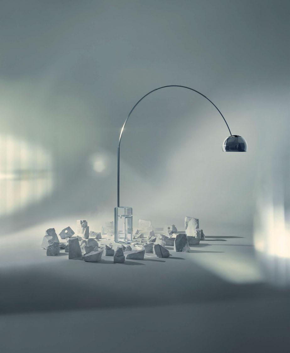
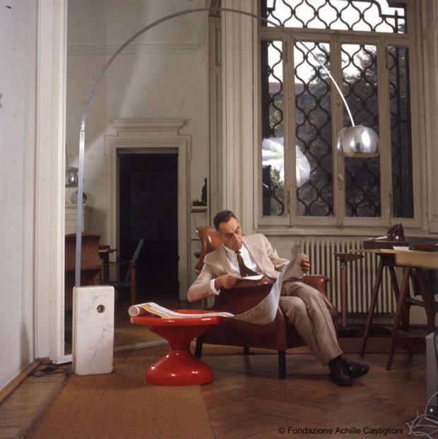
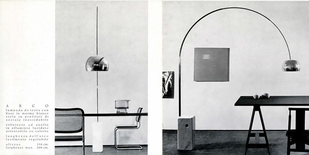
In 1962, designers Achille and Pier Giacomo Castiglione created the iconic Arco floor lamp, the same year design brand Flos was established. Synonymous with Italian design, the lamp became one of the most well-recognised, imitated and referenced pieces of Italian design. Sixty years later, Flos celebrates the lamp’s anniversary with the release of a limited edition lead-free crystal base.
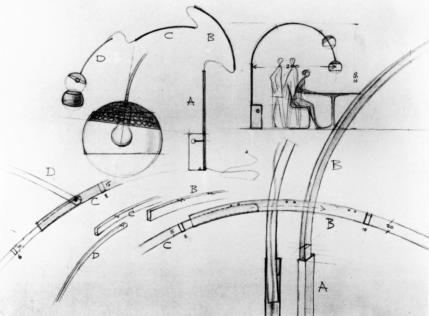
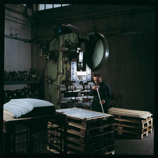
The original design took inspiration from street lights - a simple structure that allows directional light without the construction limitations of installing a chandelier. A telescopic, satin-finished stainless steel arch allowed light to be diffused through a height-
adjustable reflector finished in pressed, polished aluminium and protected with a clear varnish. A 60kg white Carrara marble base anchored the structure, and a dimmer switch allowed for light intensity adjustability.
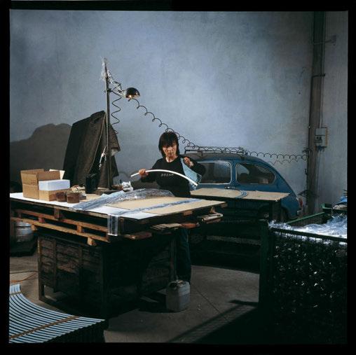
At first glance, a small hole in the base appears to be a contemporary design feature. However, it has a practical purpose as an access point for a broom handle, or something similar, to aid in lifting and transporting the lamp and its heavy base.
To celebrate the lamp’s 40th anniversary, Flos released a limited edition Arco with a black marble base. And again, for its 50th anniversary, the
Manufacturing Processes
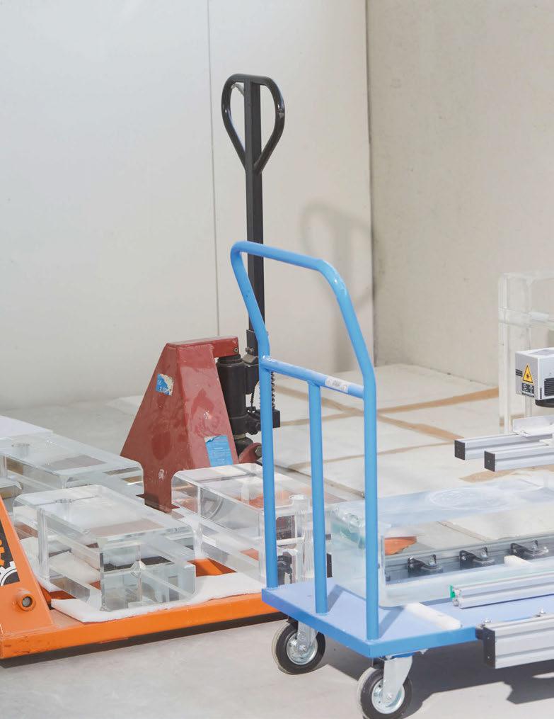
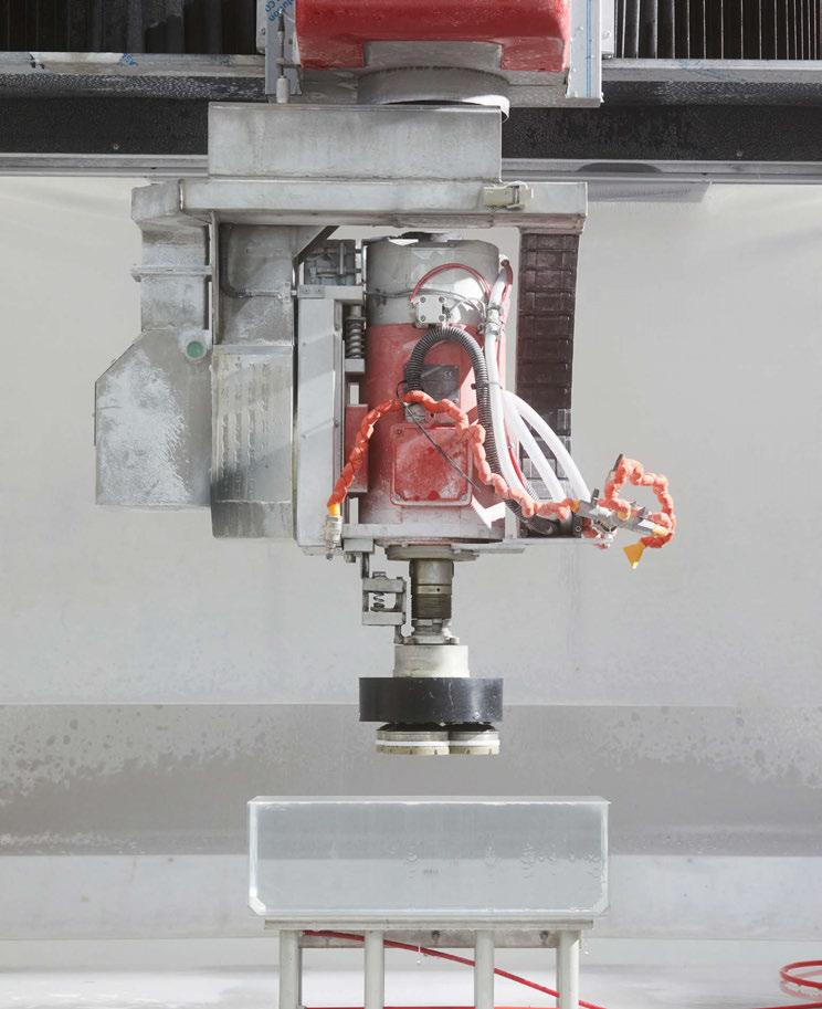
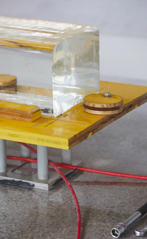
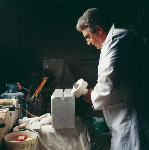
Using specially-created machinery to laser cut the lead-free crystal, the new heavyweight base for the Arco K lamp follows the same design principles as the Castigliones' original concept, yet brings a subtle, contemporary twist to the iconic lamp.
Manufacturing Images: C41
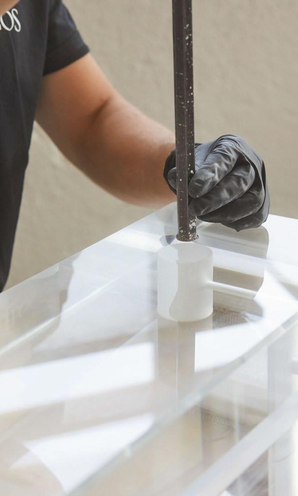
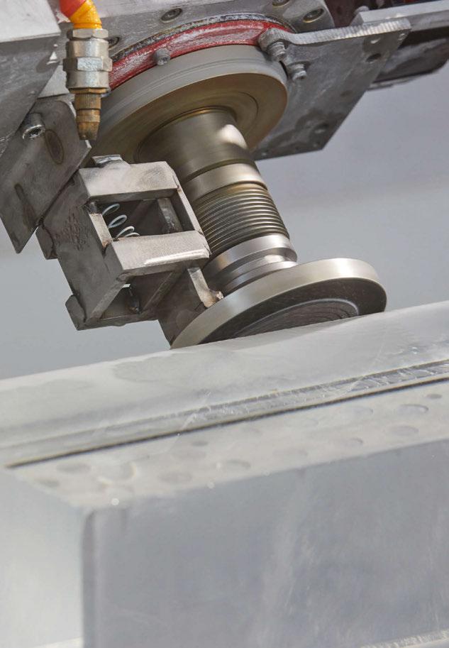
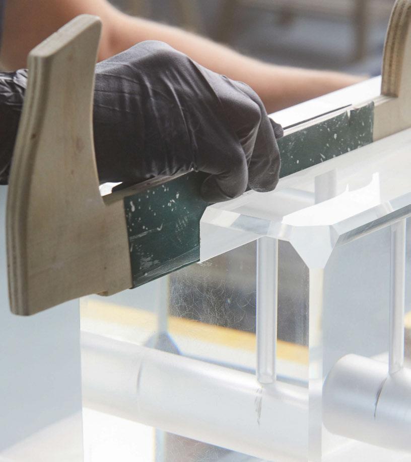
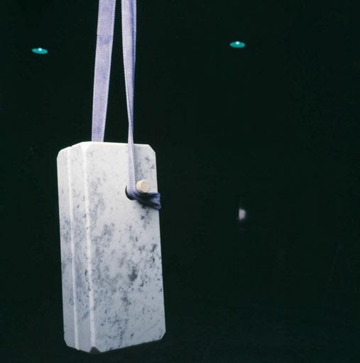
brand paid tribute to the piece, releasing it in an LED version. Arco K, the most recent limited edition version for the lamp's 60th anniversary, sees its base transformed into a material the team deemed more appropriate to the duo’s original design intentions. The aim was for the base to draw the viewer’s gaze from the arch to its origin and structure that supports it.
“Over time, the marble of the lamp base has been associated with an idea of preciousness and luxury that the designers did not actually have in mind: marble was indeed selected due to its heaviness and sturdiness and its capacity to withstand the metal arch and cap. At the time, it was the easiest material to find and the most logical to use,” explains Flos.
“The new choice fell on a material and a procedure that would not have been possible 60 years ago: a special lead-free crystal, which, thanks to its transparency, reveals the mechanics of the lamp and explains its operation and principle.
“The material is recyclable, heavy, refined and technical at the same time: a lead-free crystal, commonly used for optical prisms in labs, laser generators, and small gadgets that require 3D lasers inside engraving,” continues Flos. “The challenge was to move from this small scale [machinery] to a large one, while still maintaining the same high-precision in the delivery.
“The high precision of the shape that was created makes the piece difficult to replicate by plagiarists because it requires a long working process.
“A spiral spring has been added around the fixing pin to ensure that the internal glass is protected from accidental scratches. And finally, the lower part of the block rests on a black mat, invisible to the naked eye thanks to the play of reflections created in the K9 crystal block.
“A floor lamp that illuminates a dining table like a chandelier, Arco is a crossover between traditional types. It is an object that symbolises expressive freedom in interiors, in line with the social and cultural


revolution that was taking place in the years when it was designed.” The Arco K is being released in a limited number of 2022 lamps, available online via pre-booking due to the nature of time it takes to create each lamp. Flos has also developed a particular encrypted NFC traceability system, which guarantees collectors the originality and uniqueness of each item number.
“While observing street lamps, Achille and Pier Giacomo began to consider how the shape of the arch made it possible to transport light from above onto objects. And then to imagine a lamp capable of accomplishing this task by freeing itself from the fixed ceiling fixture”, explain design curators Calvi and Brambilla. "Arco is a gesture, a space that provides a light that drops on things with kindness and that originates from a block that can be freely transported: in essence these were the great revolutions that this lamp brought to the history of design.” www.flos.com
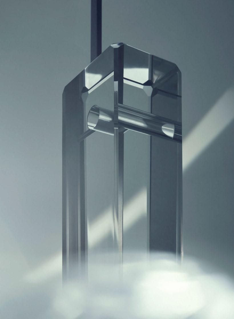


Specialists in the design & manufacture of unique, timeless lighting.
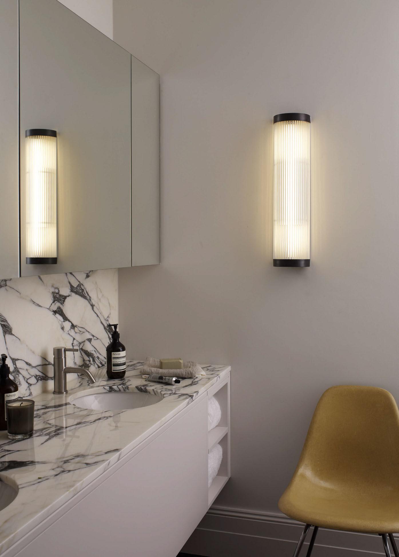
When it comes to choosing colour for your walls, the next most important thing to consider is light.
A common misconception about a space and its lighting is that the smaller the room, the lighter the colours must be in order to make it feel bigger and brighter. When in fact, the opposite is true. Take a basement, for example, that has minimal to no daylight exposure. The best thing to do is to lean into its natural cosiness and choose dark colours and rich textures to create the ultimate intimate space. More on this later…
But first things first, what needs to be established is the client’s desire for a space. When beginning a new project, it is key to understand what they want out of it, as well as how they are intending to use it. That way, you will naturally tailor your scheme to suit their requests, and begin the process of understanding how colour, texture and furniture are going to fit in situ.
It’s important to understand how the use of colour, lighting and the impacts of daylight levels will affect the use of the room. The architectural layout of a property and its physical positioning (southfacing for example), are also key to understanding how the interior interacts with the architecture and how that balances with the levels of natural light the property receives.
An example of this can be seen in the location of my previous home. It wasn’t the biggest house in the world and we were set in the woods surrounded by lots of trees. So, even though daylight would come through the windows, during the summer it was never a bright house because of the constant canopy of surrounding trees. It was in fact
Interior designer and BIID member Sam Bird, of Trindade & Bird, shares insight into the design considerations when working with paint colours and textures and light in residential projects.
a very dark house. And so we ran with that and used a lot of dark colours - we actually painted the whole house in one colour - and created a melting effect, which we then piled a load of textures into. We like to use the term “melting effect” to describe where we blend the same colour across the whole room, from skirting boards to the ceiling, to create the idea that the colour is melting into the whole space and blending the room altogether.
If you’re trying to make a room feel bigger, you need to look at how it is laid out to maximise space as much as you can. The idea of not using colour and going all-white in a smaller space to make it feel bigger is a misconception of what’s really going to happen with that space. It’s all about the size of the furniture and how you place it to make that space feel right. Funnily enough, for a small space you should actually go bigger with the furniture and aim for less clutter.
Choosing the correct paint is your next step. A few years ago, we used to regularly use a matte paint that had added marble to it, which created a unique reflective texture to the finish. Nowadays, we stick fast to a completely flat, matte finish, because it can create some interesting shadows and contrasts that you can use to your advantage in a scheme. We stay away from anything that has too much sheen. Generally what we often do is bring those colours across the entire room, as mentioned before in the melting effect. This allows for an interesting contrast between both the ceiling and walls, and even though it is the same paint and colour, various shadows and tones are reflected at various points of the day.
When it comes to selecting paint colours and textures, it is essential
to be mindful of the quality of the brand you are working with. As with many things in life, you pay for what you get regarding a product’s quality, and much is the same when it comes to paint. The way light interacts with your paint choice will depend entirely on its quality, and not necessarily its colour. If you are using paint that has a lot of sheen to it, it’s going to cause chaos with the lighting. If you stay with the higher end brands, you’re not going to have the same issues of uncontrollable light reflections or light absorptions. Light temperatures, lux levels and overall quality of lamps are extremely important as well; you have to be really careful with your light source choice. When completing a project, we ensure to leave one of each type of light source with our client for any inevitable replacements to make sure the correct quality lamp is used.
A lot of how the lighting interacts with the room’s colours comes down to the programming too. For instance, if you are using reds in a room and rich-toned velvet, you will experience a lot of light and colour changes. Velvet has a lot of reflective qualities to it, but when brushed by hand in another direction, it fills with dark tones. Once you put light onto that fabric, you can exacerbate those effects.
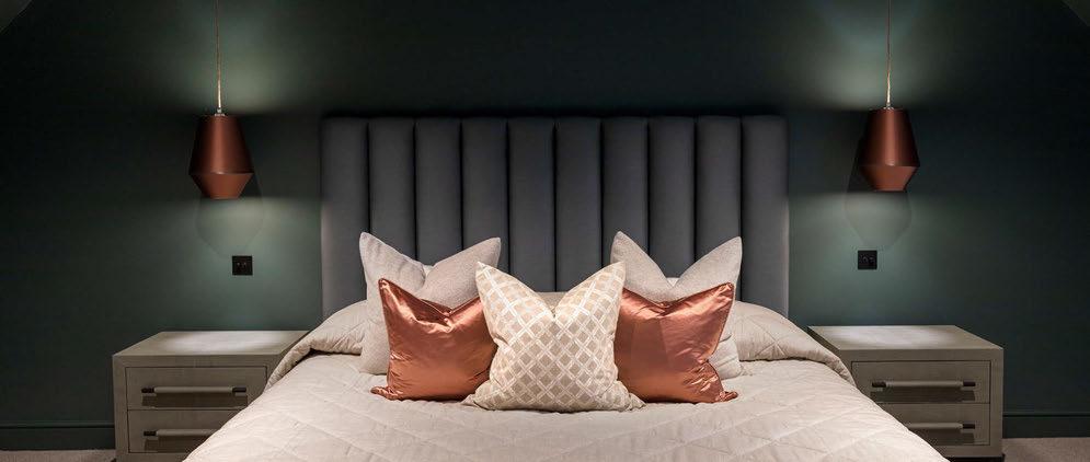
Colour and light spill from decorative fixtures is another aspect to consider in a space. If you have spent a lot of care on a particular wall finish and colour that you do not want to be disrupted by coloured light spill from a decorative shade, for example, there are things you can do to minimise this. Taking shades as an example further, there are things you can use such as a blackout lining. This allows the light to flow directionally upwards and downwards, but it does not spill
through the fabric of the shade. This works in favour of both the wall treatment behind the lamp, as well as for the fabric or finish of the shade itself not losing its impact through backlighting. It allows you to be really selective with your light output. Alternatively, you can use an opaque lining that does allow for light to dissipate through the shade and create an overall soft illumination. This is the most typical finish for a shade, however, the blackout linings create a unique aesthetic that allows for the shade to stand out as a piece of art on its own. If you are using a colour scheme much the same as our melt effect that runs the colour across the entire room, wall lamp shades are something that needs careful consideration if you are matching them to the wall colour, as an opaque lining illumination will change its colour completely.
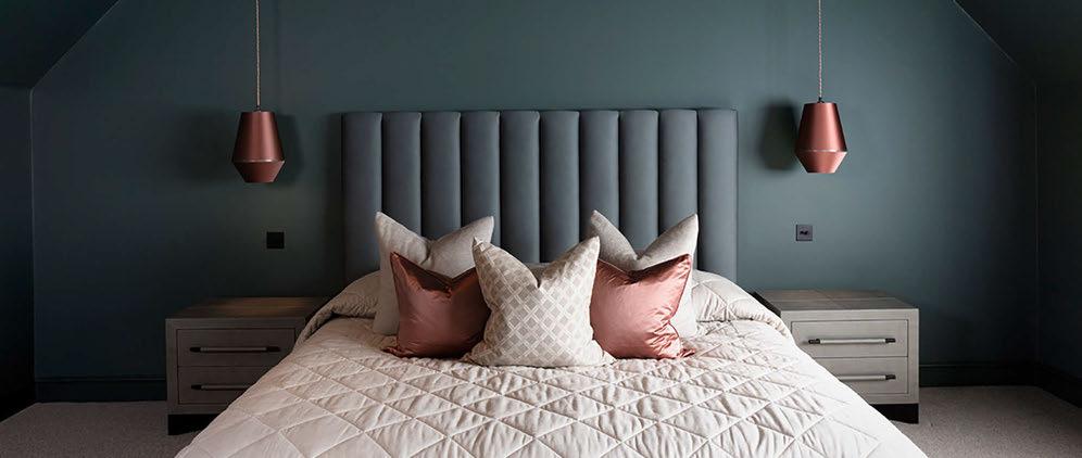
Undertones of paints can vastly change how a colour is perceived during the day and night. For a recent residential project, Hollandbury Park, I used a dark blue colour in a bedroom that had really dark green undertones. The room was designed with nighttime in mind, as a space that is used mostly in times of darkness. The way the colour changed throughout different times of day was drastic, and again with the bedside lamps during the evening and early morning. The colour temperature of your electric lighting against paint colours with cooler or warmer undertones is also worth considering, as it will impact the overall feel of the space during hours of darkness.
www.trindadeandbird.co.uk
During London Design Festival 2022, British lighting brand Tala hosted an intimate panel discussion at its pop-up showroom on Club Row in Shoreditch. darc’s editor Sarah Cullen chaired the talk with panelists Oliver Heath biophilic design expert, Sophie O’Rourke founding member of the Green Light Alliance and Lighting Designer at Aecom, and William Symington, Tala’s co-founder. Here is an excerpt of the evening’s discussion where panelists share their expert knowledge on all things lighting and biophilic design.
During Tala’s panel discussion, the group unpicked ideas that revolved around its title ‘The Aesthetic of Sustainability’, what it means for a business to be sustainable; trends around the term ‘healthy light’ and how it can be integrated into an accessible space.
What follows is an edited excerpt of the evening’s discussion. Watch the full panel talk at www.darc-magazine.com/darctv.
Let’s discuss the trends of healthy light, what that means, and how we can incorporate it in our spaces, touching on aesthetics and the idea of doing the “right” thing.
To kick us off, Oliver, could you please provide an overview of biophilic design and what it means?

Heath: Biophilia design is one component of how we create healthy spaces in the built environment. Essentially, biophilia means a love of nature that explains humans’ innate attraction to nature and natural processes.

It’s a term that was first developed in the 1960s by Erich Fromm
and then picked up by Edward O. Wilson. They realised the society’s departure away from rural dwellings and into city centres, and the many physiological and psychological problems that started to happen as a result of being surrounded by harsh urban geometric shapes and forms. One of the godfathers of biophilic design, Stephen Kellert, recognised this and said, “maybe we need a series of features or patterns that architects and designers and planners can use to subtly infuse city spaces with nature”. So, he created these different patterns, and that’s how biophilic design was born. One of the key principles of biophilic design is what we call the direct connection to nature, the real sensory forms of nature, which are things like natural light, fresh air, water, movement of plants, trees, and all sorts of subtle changes that we see throughout the year. The second bit is the indirect connection to nature. It’s how we mimic with other feelings of nature, using natural materials, colours, textures, forms and even technologies. And the third aspect is reminding ourselves that we are also part of nature, and it’s called the human spatial response. And that’s how it - because in part biophilic design is an evolutionary design ethos - reminds us that we spend 90% of our time evolving in nature. It’s how we create spaces that are both
exciting, stimulating and aspirational, but also calming, relaxing and restorative.
There are two aspects of biophilic design. One is about how nature makes us feel better individually. That’s what we call the neuro-scientific approach. And the other approach is called sociopsychological. It’s how we can use elements of nature to bring people together, much in the same way that when we sit around a campfire, we feel calm and relaxed, and it passes in a better mental and physical state to have quite different conversations with people. So that’s it in a nutshell!
Referring back to your point about a fireplace and warm colour temperatures bringing calmness, what does the term healthy light mean to each of you?
O’Rourke: Well, there’s a big movement towards human centric lighting, where you look at changing colour temperatures throughout the day, with cooler colour temperatures during the morning into the midday, and then toning down to warm colours. Then you’re meant to have half an hour minimum of really warm light before you turn your
light off at night. That 30 minutes before you go to sleep is when your melatonin kicks in.
But there’s also lux levels, which are very important as well, which sometimes gets missed out. You need really bright lux levels during the beginning of the day, hence why getting outside first thing for 30 minutes is actually the best thing you can do. No artificial space can really top that. Then dimming down light levels as you go into the evening.
In terms of the subtleness you were talking about with biophilic design Oliver, it’s also about different types of light sources in your space. Where you have more direct sunlight, having more directional light sources with shadows is ideal. Then if it’s an overcast day, early, or late in the day, have more diffused light sources that have a softer quality of light. There’s a few moving parts to it.
Symington: I would agree with all of that, but one additional element I was thinking of is related to flicker - non perceptual flicker. Artificial light can flicker at a rate that you don’t quite notice, but if you hold up your phone and point the camera towards poorly manufactured or poor quality LEDs with bad drivers, you’ll notice that these lines come
across the screen, which shimmer and shake. That’s something your brain can actually pick up on.
So, removing that element by manufacturing well and choosing good componentry, aside from just the aesthetic, and also the circadian rhythm matching tech, is really important.
O’Rourke: As designers we’re always looking for good dimming curves that are smooth. So if you’re doing dynamic lighting and you’re changing colour temperatures and light levels throughout the day, you don’t want at one point in that zone to get this flicker half away. It’s got to be smooth all the way through for it to not be noticeable.
Symington: That’s a really important part that a lot of people miss, unless you’re monitoring it specifically and looking out for it. A lot of times, especially in smaller spaces in restaurants or boutique hotels, people are not necessarily looking at that because it’s not something they would think to look at.
I think larger lighting design firms and architects are really attuned to this and aware of it, but for slightly smaller interior design firms and smaller practices, perhaps it’s a little bit more difficult to judge.
Heath: I think it’s important to remember, as people live in the built environment, we spend 90% of our lives indoors. And so our light diet is dramatically different to even 200 years ago. It plays a fundamental part in how we deliver tasks in buildings that are so important to our lives.
But also, remember that there is magic in light. There’s so much amazing stuff that just can’t capture the imagination. And I think as a designer, it’s important to go back to your childhood and remember some of those really powerful moments. I don’t know if you’ve ever travelled and seen fireflies, or seen dew drops on a spider’s web or even just fallen asleep to the flicker of a fire; there are so many wonderful moments that we can capture and use to create inspiring, beautiful moments in the built environment. If we think about that kind of rich light diet that we may have had years ago and think about how we can reimagine the world of technology to recreate that and put that kind of beauty back into that environment.
O’Rourke: That’s so often what we’re putting on our mood boardspictures of fireflies, and beautiful phosphorus algi.
Heath: When you see it! I’ve literally had euphoric moments skuba diving in phosphorescence trying to hold my head together thinking “this is just too fantastic for words!”. But I think for lighting designers, the challenge out there is to bring
back some of that incredible magic that we shouldn’t just see as a quantifiable thing that comes down to lux and lumens and flicker rates. It’s also how we make all that seamless. We get these magical moments and mimic some of that, and having some of the ability to go from bright blue light to a warm light that mirrors daytime and dusk is really important; that we have the adaptability and versatility particularly in our technologically filled urban minds.
O’Rourke: When we have been involved in office projects say, from the beginning we have a discussion with the client to see how open they are to customisable lighting. In the sense that we take away a layer of lighting at the top and give people desk lamps that uplight and downlight, as well as dim and have a colour temperature function. At the end of the day we talk about the sort of things that work for humans, but you’ve got to take into account things like your chronotypes. Some people are late people, and some people are early morning people; some people need different wavelengths at different times of the day. So choice is a big part of that.
Heath: Yes, diversity as well. I mean, as human beings, we were starting to recognise that neurodiversity exists in our society. About 70% of the population is now recognised as having some neurodivergent condition, like autism or Asperger’s or ADHD. But beyond that, we all exist on some spectrum, be it hypersensitive for example, meaning that we’re quite sensitive to stimuli in particular visual or hypo sensitive. So we crave that. And we will all have that, we all exist in different states of that across all our seven senses. So, having that versatility and adaptability is absolutely fundamental if we’re going to create spaces that are right for a variety of functions. In our homes in particular now, we’re living and working and socialising, but also need to match these diverse sensitivity types.
So we’ve touched on circadian friendly lighting. What is the progression of circadian lighting in interior design and lighting, and how have you seen that evolution happen?
O’Rourke: There are more options now. There are more manufacturers behind it who are doing a lot of good things with technological advancements. So it’s up to you guys [referring to Tala] to integrate that.
Symington: That’s definitely the direction that we’re going in, even from the manufacturing side, its technology that takes a little bit
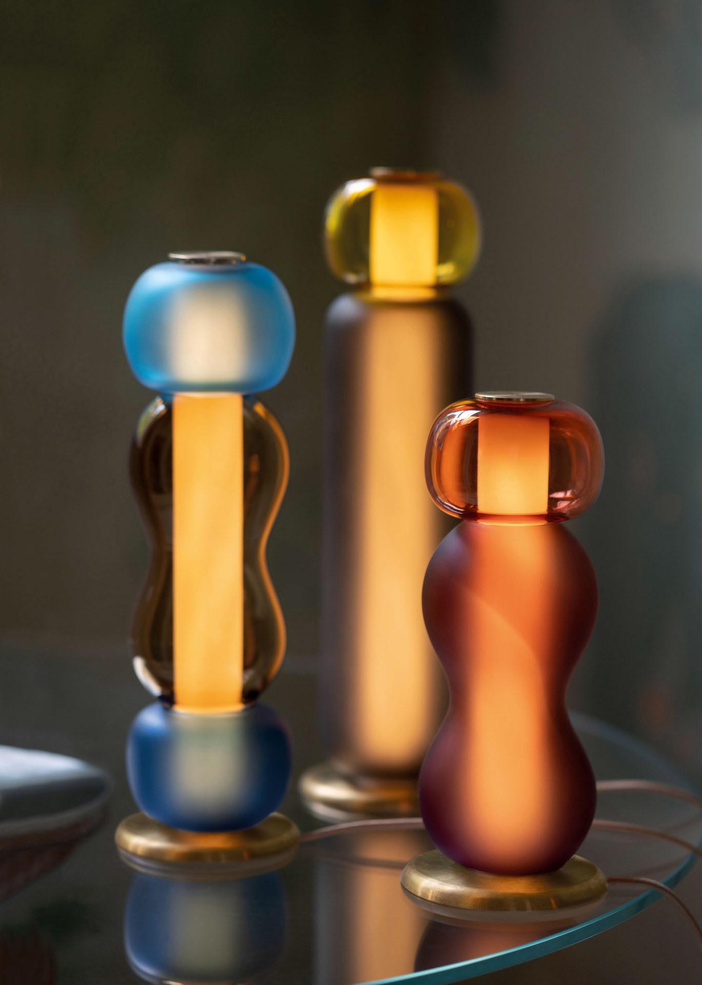
of time to wrap up, especially in LED technology. I’m sure you’ll remember 10 years ago, the birth of a commercial LED light. You could buy in a shop that really harsh blue white light. It’s taken a lot of time for the technology to catch up.
As a smaller brand, you’re waiting for the bigger technological mainstays to release some of this margin into the market, and from our side trying to tweak what’s there and what’s available. It takes a little bit of time for that to catch up.
A lot of where we spend our time trying to figure out what products the market needs or wants comes from talking to the designers and asking what is it that they’re looking for? What is it we need to move towards?
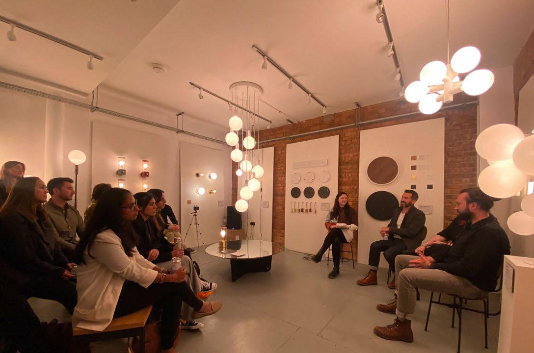
We had a conversation the other day about various different stamps and certifications and WELL was one that came up that more and more people are asking us about, and it forces us in a very positive way to really start thinking about it. We’re trying to take existing technology, push it as much as we can.
Heath: I think some of it comes down to how we control that technology as well. So 10 years ago there would have been a complicated wall-mounted panel, which one member of the family might have got their head around, but for a lot of other people it’s just confusing. And now, so much of the interface of how we control that technology is through an interactive item like a smartphone that we’re already familiar with. We know that we can just dial up and down through a very simple app or interface. Technology is not just in the lights or how we control it, it’s in the familiarity of it.
www.tala.co.uk
www.oliverheath.com
www.greenlight-alliance.com
www.aecom.com
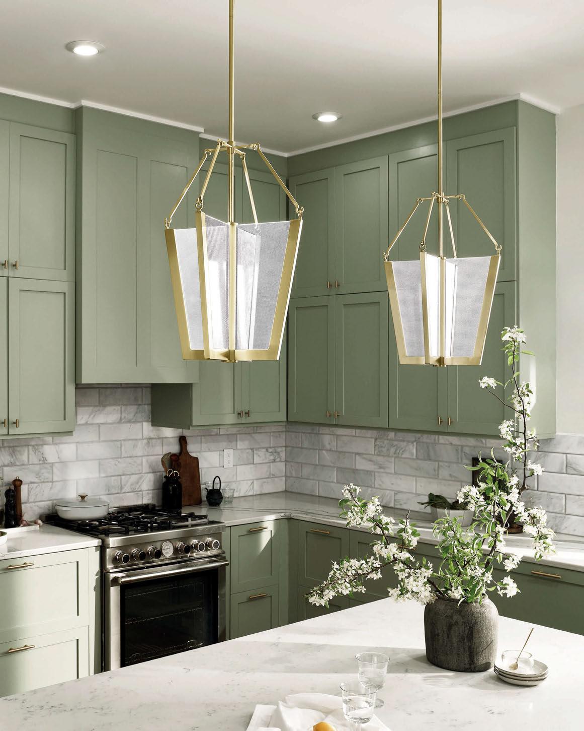
For Spring/Summer, I would like to see more colour coming through, in the form of pastel tones alongside dynamic pops of colour or patterns. Neutral tones that we have seen a lot of in 2022 will still form the base and create a calming balance. You can see from my colour palette, inspired by and selected from Crown paints' vast selection (1), lilac, pinks, and blues accompany the muted greens and neutrals that I don’t see going anywhere. I think we are all in need of a little joy and these calming, subtle pops of colour give us that.


Organic shapes will continue into next year as you can see in the Tun Tables (2) by naughtone. Not only can these create flexibility in their location, but the design is flexible too - fabric bases can be used for a more tactile design, which I love as I see texture as a key design feature
in Spring/Summer– these tables suit all sectors and spaces. Organic shapes are more relaxing than harsh sharp lines; we all aspire for peaceful lives, which is evident in the design outcome.
With texture in mind, I have chosen an array of fabrics from Inloom, Panaz, Bute fabrics and Kvadrat (3) showing depth and warmth. These samples have substance and interest and are fabrics that entice you to want to touch. The use of layering, such as rugs, contrasting textiles and prints will add an extra dynamic to any space.
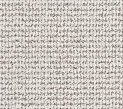
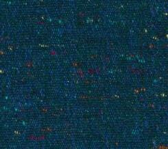
Wellbeing in design and the necessity for sustainable action are still of the utmost importance and I am hoping the need to look after our planet will create incentives in design to encourage this further. I have chosen this beautiful product material from Smile plastics (4). Their
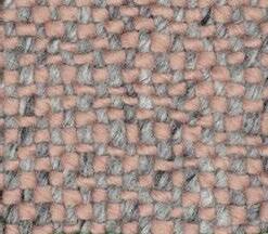
Helen Ewart, Director of Manchester-based interior design firm M1NT Studio, takes a look at the designs, colours, textures, and products she believes will be prominent in interiors this Spring/Summer.
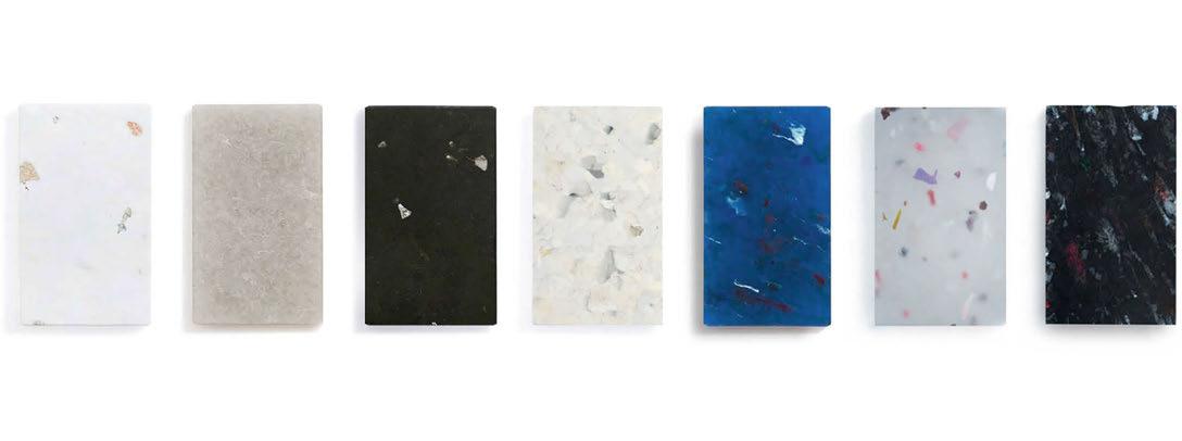

products are made from waste, post-consumer, and post-industrial sources. They can be re-used in most sectors, such as a tabletop in a retail setting or the side of a bathtub in a residential. I would like to see a lot more appreciation for the use of sustainable products, especially from the end-user, and when they look this beautiful how could there not be?
Finally, I have chosen two lighting products from B.Lux, these products summarise the texture and flexibility I keep returning to as Spring/ Summer insights. They are LED portable lamps and can be charged by USB. Commercial, residential and hospitality are hybrid spaces; the need to have products that can move with the end-user needs in a specific time or space is key. The Misko Camp light (5) has a beautiful organic
shape that is soft to the eye and the walnut and black base will go with any colour scheme. I am loving the use of walnut tones, and this will stay strong into next year in contrast to the pastel tones. The handles allow you to lift this product and hang it as a wall light. The Kup camp light (6) is so portable and compact - it can be transported anywhere as we continue to embrace our flexible lifestyles.

I’m excited to see what Spring/Summer holds in design and would love to see some more adventurous use of bold colour choices and clashing prints and textures; these would be fun to see in all design sectors. www.m1ntstudio.com
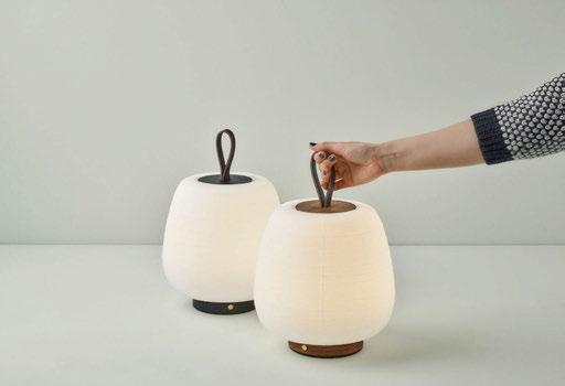
I think that the majority of projects, if not all projects, can benefit from an additional level of control. It is rarely a bad thing to have flexibility, to create a project that is adaptable and futureproofed. When deciding to integrate a controls system into a project, it is best to look at the benefits and make this decision as early as possible. Often the concept is discussed but is not embedded until the later stages of a project, yet the earlier controls are introduced the better. Controls come with a cost implication, and it is better to fight to keep a controls system in than fight to bring it in later. The important thing to realise is that with flexibility there are cost savings for energy usage over time. Introducing the cost implication and sustainability application is an important consideration at the design phase. Choosing the most suitable controls system depends on the unique and specific needs of each project. We work with many different control manufacturers and different systems will suit different projects. When approaching control, we focus on what level of flexibility we need and who it is best suited to. Some projects require more simple allowances for scene sets and button plates, and we suggest manufacturers that offer an excellent selection of materiality, colours and finishes, which is very appealing to the end user and client. Yet some projects have more complex needs and require integration between different systems, and in these cases we would suggest a manufacturer with a background in that
level of integration. The best control manufacturers have handshake protocols, where they talk to one another and allow different devices to communicate.

The risk with lighting control is that so much flexibility creates the possibility of overengineering a lot of spaces. The inverse of that is making sure you are using control effectively for the environment. The approach for using controls differs between project sectors such as hospitality and commercial projects versus residential.
With hospitality and commercial projects, you often end up working within set protocols. The main goal is setting scenes that work for the site and are triggered by the astronomical time clock throughout the year. This creates a malleable space with 6-10 pre-programmed scenes, dimmable options and set levels. This works well for offices that are only used during the day and have set areas that act as feature spaces.
This differs to private residential projects as we aim to give more access to the end user to choose how they want to interpret the space and trigger the lighting around their life. More flexibility is required as it would not suit to trigger an effect at the same time each day with changes in routine, schedule and mood. Through touch controls via mobile, tablet and app it is easy for clients to have a base understanding of how to control the lighting through a simple interface.
Specific controls can be introduced for these various areas – for example, in modern offices reflecting the circadian rhythm is important to make the space as useful as possible. Clients understand that in the modern market a workplace should be more amenable and friendly. This adds character and reflects the energy the company wishes to project as a place that is worth spending time in.
Trying to integrate lighting control into decorative pieces can be difficult, as decorative lighting features rarely have control. Some fittings act more as a statement piece rather than a light source, and this needs to be considered early on in a project. It can be important to a designer to include an expensive decorative fitting, yet it is necessary to take early steps to see how it impacts the rest of the environment. More fittings are becoming readily dimmable, yet often the issue faced is that the LEDs cannot be swapped to become warmer or cooler, and the fitting may just be too bright or dim to work within the rest of the design. Having more flexibility is better for any scheme in the long run, to find a middle ground of meeting the vision of the designer while incorporating control by swapping components where needed. Controls can aid the balance between architectural and decorative lighting in a space rather than focusing on either element. Control allows the lighting to balance focus between the two by adapting the lighting across the day. A day scene can focus on architectural features such as the walls and textures, whereas a night scene can
draw focus to a decorative feature such as a pendant. This effect can be achieved without additional fittings and utilising the features available through clever control.
It is important that the end user is trained in using the control system installed, and the onus is on manufacturers to improve the user experience and understanding. The end user should have a base understanding of the controls and why the lighting was chosen. For a private residential client, they should understand as much as they are willing to learn about the controls to utilise the tools that have been given to make changes to their environment as and when they like. This can be aided by manufacturers through online resources and videos.
There was a lot of caution in regard to control and control systems than I initially expected there would be when I started working in architecture. It is amazing now to see people be less afraid of control as a concept, and to adapt to the playful and adventurous nature of control. It allows us to future-proof spaces for clients and find new ways of being sustainable and reducing energy costs. Control creates the ultimate adaptability, allowing clients to work with more than just the lighting that they have, and creating the lighting that they want and need.
www.michaelgrubbstudio.com
Founded in 1824, the Athenaeum broke the mould, as it was the first private member’s club to allow non-partisan membership based on excellence and achievement rather than wealth or background; and later have the first female chairman and club secretary in the London Clubs.
Located in a Grade I listed building, designed by Decimus Burton, the club has a rich history that counts Dickens, Darwin, Faraday and Lewis Carrol among its members. DesignPlusLight was involved in the refurbishment of the Athenaeum Club over a period of 10 years, from 2009 to 2019. The refurbishment was mainly to upgrade the lighting, to bring the Athenaeum into the 21st century while still respecting the historical features of the building and creating a design sympathetic to
Sanjit Bahra, of DesignPlusLight, walks darc through The Athenaeum Club, which utilises lighting controls to bring the Grade I listed building into the modern age.

its architecture and aesthetic.
Comprising a classical entrance hall, double height staircase, grand dining space, coffee lounge, three libraries, reception room, meeting rooms and guest bedrooms, the club has all the features of a boutique hotel in one of London’s finest neighbourhoods, at the bottom of Regent Street.
The lighting design needed to involve each room and area, to ensure the entire club was given a modern upgrade, and the lighting effect was married throughout. The aim was to refurbish the club to bring the lighting technology into a modern sphere, while respecting the integrity of the space and ensuring the design was carefully thought out to be sympathetic to the historical listing.
A mixture of wired and wireless Rako controls were selected to modernise the lighting system, which used to involve banks of switches and dimmers to be operated on a daily basis. The control system allowed for simple points of control to each space. It offered scene setting at the touch of a button and automatic astronomic time clock operation, while still respecting the listing status of the building and reusing the existing wiring to preserve the structure.
We selected Rako controls as they have proven to be an excellent solution for heritage projects, where one is often limited to the existing wiring and the listed status creates challenges in bringing new wiring into the space. Wireless modules allow separate lighting points in one room to be combined together from a point of control to create the
impression of an integrated system – without having to rewire and physically group everything together.
During the day the grand staircase is bathed in natural daylight from the glass cupola atop a triple height volume. However, at night it felt incredibly dark and dreary as the only light source was a central pendant that struggled to light the space sufficiently. We added layers of lighting into the cupola, cornices, and even concealed spotlights to illuminate the artwork and sculpture. Previously this would have been a maintenance nightmare as the club would have to scaffold the entire stairwell to access any lighting within the triple height volume – at great cost. However, with LED technology this level of maintenance is no longer required.
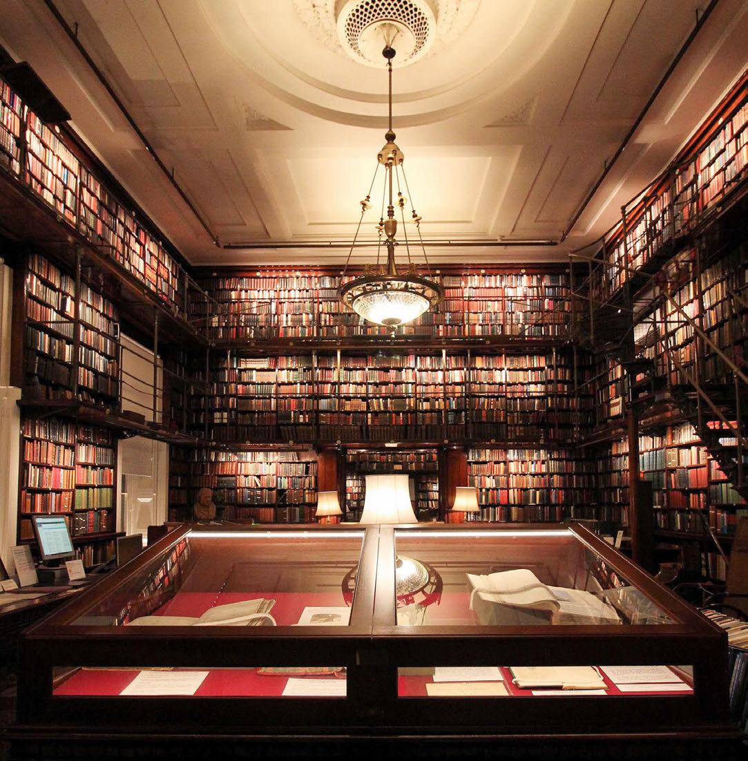
We had to climb into eaves to install wireless control units for the cupola LEDs, and the staircase was the most difficult area to connect from the entrance all the way up to the glazed rooflight. With the Rako control units cleverly tucked away and branching off existing supplies, we were able to create more circuits for the lighting layers added and to connect the lighting throughout. When a button is pressed the staircase is illuminated from the entrance up to the very top. Integrating the staircase and common areas on an astronomic time clock meant that the stress of manually changing the lights was taken away and the club was always presented at its best irrespective of the time of day or season. The Rako controls added a longevity, ease of use and elevation of the presentation of space that could not have been achieved before.
Rako were also able to incorporate boosters that compensated for the thick stone walls, enabling control and connection throughout difficult areas, which simply could not have been achieved with
a conventionally wired system in a Grade 1 listed building – with decorative finishes, panelling, and stone flooring.
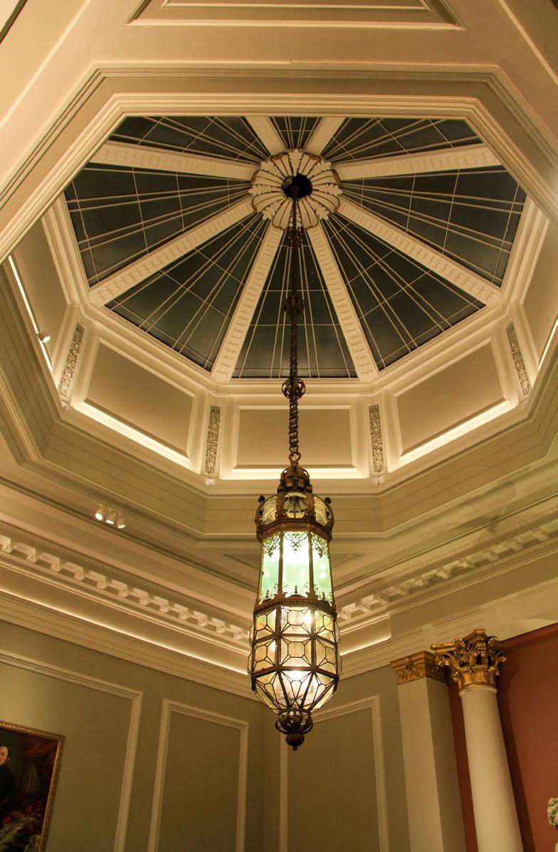
The main challenge that we faced was utilising the existing wiring within the space – as the building is listed, we were unable to install any new wiring, so we had to be innovative in our technique to use what was already there effectively.
Another challenge, which was an interesting observation, is that as the refurbishment took place over a decade, we began to see the development in LED lighting across the years. The lighting included first-generation strip lights by Architectural FX and LED Linear, and as technology changed, we had to ensure it married up between rooms and that the products, LEDs, and control methodology were all suitable. We needed to ensure that the lighting was consistent throughout the space and that one room did not appear more refreshed than another. The design incorporated decorative lighting and unique listed pieces, which we integrated lighting into throughout the entrance staircase,
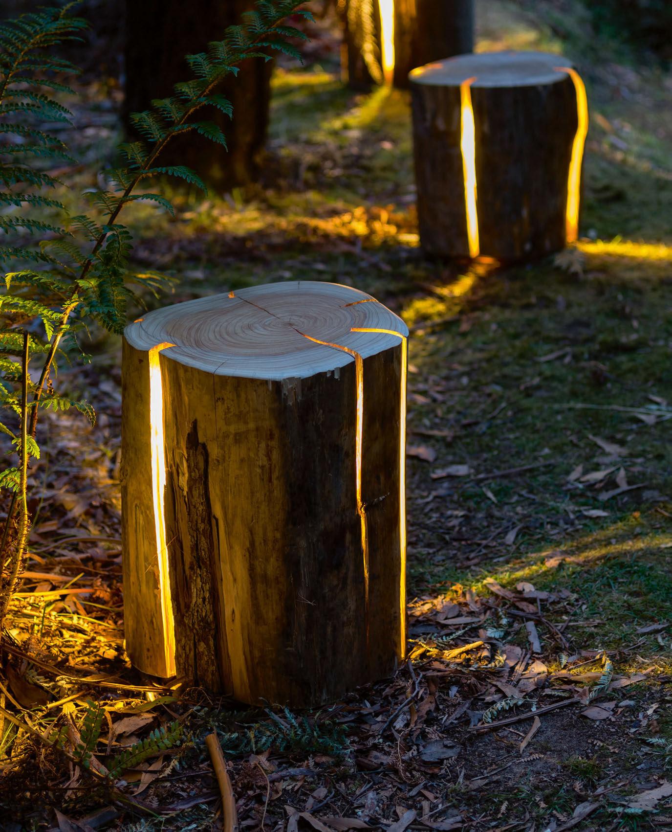
libraries, coffee lounge. The design focused on hiding the fittings within the decorative elements so that the fixtures themselves would not be seen, but the effects of the luminaires would stand out. The enchanting library was brought to life through museum quality picture light modules and a refurbishment of the existing brass rail structure, illuminating the books beautifully. Unique box uplights by Stoane Lighting were created to highlight fireplaces and mantels, uplighting mirrors. This library is the jewel in their crown, and it was particularly important to give the impression that nothing had been altered, but still miraculously lit.
The coffee lounge was originally illuminated by three brass pendants with globes. The use of candles was incorporated, yet the space felt exceedingly dark and austere at night, or on a winter’s afternoon. By using concealed LEDs (by Stoane Lighting) to provide the light throughout the space and keeping the pendants as decorative
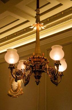
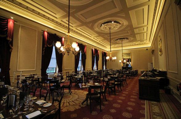
elements, this created the illusion that the pendants continued to provide the light to the room while brightening the space significantly to create a warm and welcoming atmosphere. The cornices and window reveals were uplit using pieces from Light Graphix to accentuate the impressive architecture. We even concealed LED spots from Precision Lighting into the pendants to highlight the decorative Acanthus ceiling roses above – which one never really noticed before and now became a striking feature within the space. The contrasting morning room opposite was covered in gilded wallpaper that was listed to high heaven. We took the decision to not uplight the cornice and resplendent ceiling – instead we illuminated the artwork with LED museum quality picture lights from TM Lighting and made a feature of the fireplace presentation. The result was a very cosy and intimate club picture room with a painting of Charles Darwin beautifully lit on the main axis.
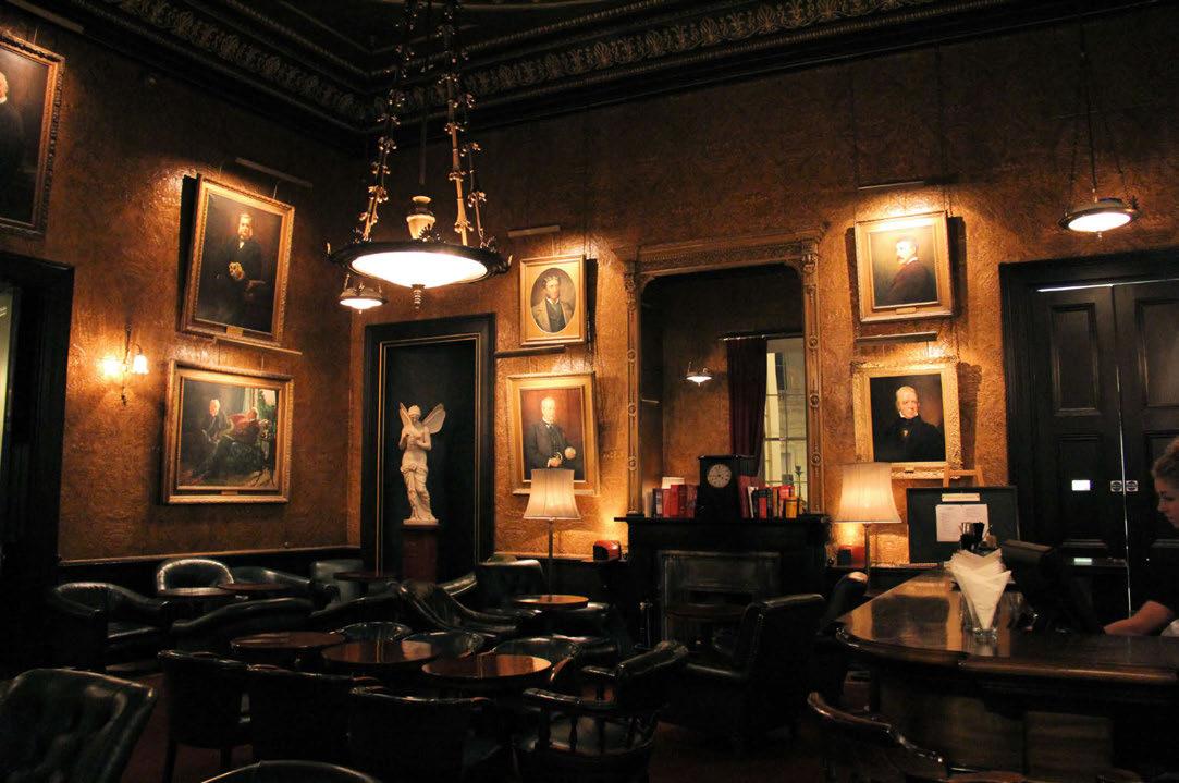
As we progressed with the design, we focused on linking decorative elements into the control system to make the integration simple and seamless.
This project really has a special place in my heart. I truly feel it showcases the magic of lighting design. One can only be a caretaker of a listed structure. Any refurbishment with new lighting and technology must be sensitive to the style and design aesthetic of the building. We received incredible feedback from club members about how grand and well-lit the club looks, commenting that they could truly see it for the first time. The members loved it, and when walking into the space seeing it looked resplendent, it was so joyful to see as a lighting designer. I felt a huge responsibility to take care of the building, and I believe that we accomplished this through the lighting design and controls supplied. www.designpluslight.com
Design Details
The Athenaeum Club, London, UK
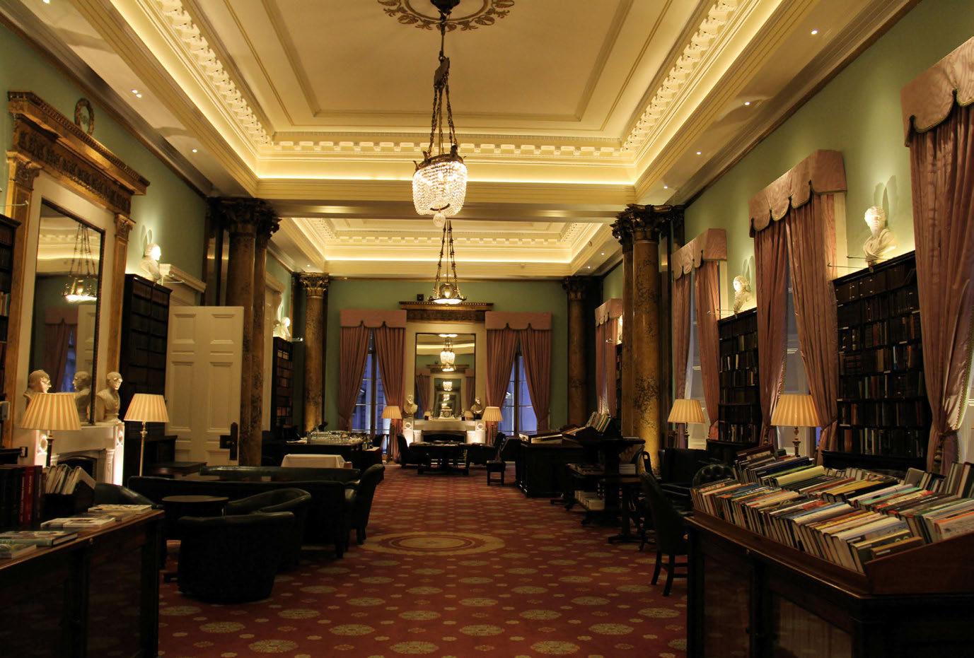
Lighting Design: DesignPlusLight
Lighting Specified: Architectural FX / LED Linear, Light Graphix, Light Projects, Mike Stoane Lighting, Precision Lighting, TM Lighting, UFO
Lighting Controls: Rako
DesignPlusLight worked on renovating this historic members’ club for a decade, bringing its dated lighting scheme up to date using LED fixtures and Rako lighting controls. Working with the existing decorative fixtures, the team balanced the new architectural lighting design to emphasise the beauty of the older pieces and their surroundings.
The first-ever LiGHT exhibition, held at the Business Design Centre in central London, closed its doors in November with a resounding success, gaining over 3,000 visitors across the two days. With a high calibre of brands and an incredible selection of panellists, moving forward, the show looks to be even bigger and better.
Held over two days at the Business Design Centre, the inaugural LiGHT exhibition finished with a buzz of positivity, from both visitors and exhibitors alike.
The design community came out in force to support the new show, with over 3,000 visitors passing through the doors to see more than 100 high-end international lighting brands present their latest product ranges for the architectural and decorative specification market.
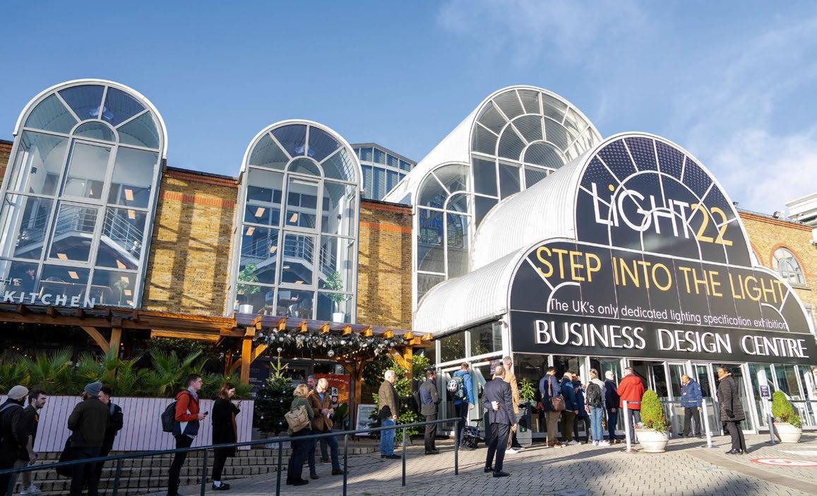
Show highlights included the [d]arc thoughts talk programme, in collaboration with lighting control specialist Lutron, which benefited from a steady stream of guests across the two days, keen to learn more about the hot topics in lighting.
With every talk well attended, the headline
panel saw more than 250 people crowd round the stage to see Masters of Light(ing) designers Sally Storey (Lighting Design International); Mark Major (Speirs Major); and Nick Hoggett (dpa lighting consultants) take to the stage to share their knowledge and expertise with the industry.
Other panel talks, moderated by darc’s editor Sarah Cullen, covered topics such as The Future of Materials, which saw Esther Patterson of Curiousa, Oksana Bondar of Biohm, Dave Hollingsbee of Stoane Lighting, and Massimiliano Tosetto of Lodes discuss the future of sustainability within lighting production, and the importance of driving the demand for change from suppliers. Other talks included The Lifespan of a Project with Carmela Dagnello of WSP and Women in
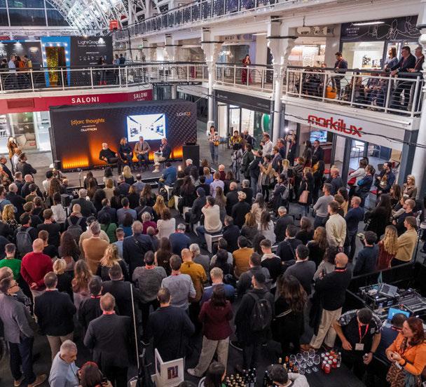

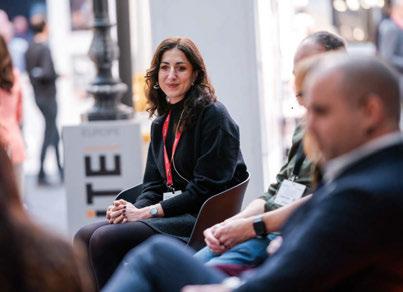
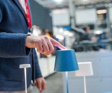

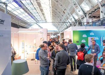
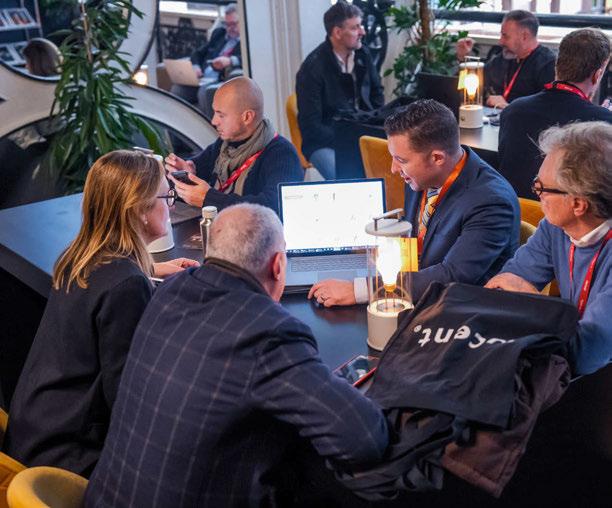
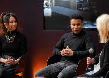
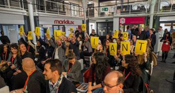
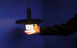

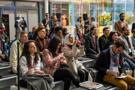
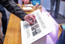
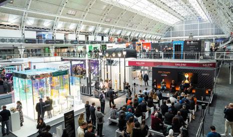
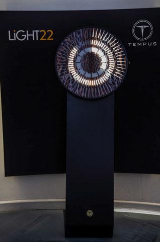
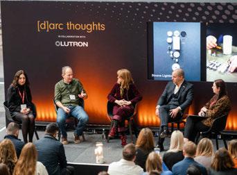
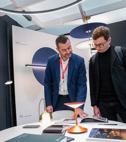
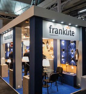
Lighting, Colin Ball of BDP, and Kristina Allison of Atkins Global, which delved into the future-proofing approaches to design, and the value of lighting principles (such as TM66); Specifying Bespoke Lighting with manufacturers and designers Matt Burns of Unibox, Simon Shuck of Inspired by Design, Darren Orrow of Into, Mark Sutton Vane of Sutton Vane Associates talking through the benefits and challenges of working with bespoke fittings on a project; and Design for Wellness with Miguel Aguardo of Lutron, Kael Gillam of Hoare Lea, Sam Bird of Trindade and Bird / BIID member, and Dr Shelley James of Age of Light Innovations where panellists discussed wellness terminology and how it differs for each individual, and as such, so should design.
Each talk sparked deep conversations between panellists as well as active audience participation, gaining interesting feedback and questions from those in attendance.
Visitors to the show also made good use of the dedicated workspace area on the gallery level. Illuminated by table lamps from British lighting brand Tala, LiGHT Work was a beautiful relaxing space allowing show attendees to complete office tasks, while offering dedicated wi-fi, free coffee, and charging points.
Day one closed with a late-night drinks party hosted by the organisers [d]arc media and brand stand parties throughout the space.
The buzz around the new lighting event continued into
day two with a LiGHT networking lunch hosted in the [d]arc thoughts talk arena, allowing visiting designers and manufacturers to meet in a relaxed space, while taking in a video interview with internationally celebrated product designer Michael Anastassiades.
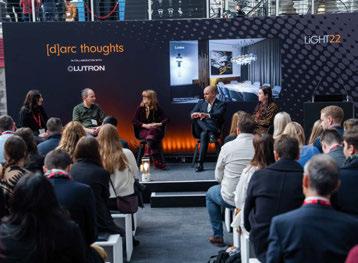

The show was also heavily supported by industry trade bodies and organisations including: SLL; IALD; ILP; LIA; BIID; SBID; Women in Lighting, along with industry media organisations: ICON, On Office; Archiproducts; DeZeen; NLA; World Architecture News; and STIR.
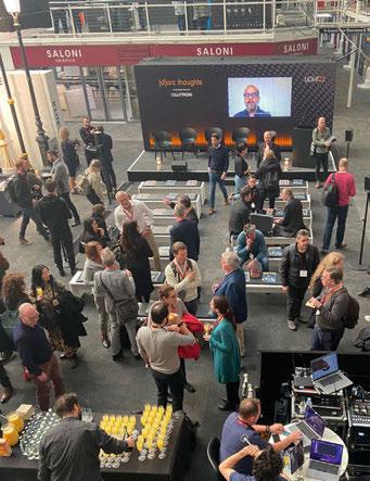
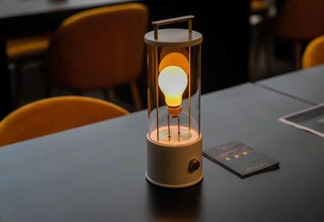
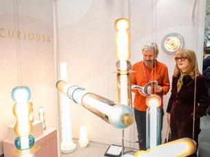
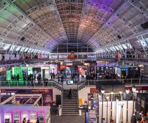
Delighted with the success of the first year, [d]arc media Managing Director, Paul James says: “The show has been a resounding success with the design community coming out in force to support this first year. LiGHT caters to the ever-growing design sector in London and further afield and is a new offering for lighting design built on [d]arc media’s knowledge and experience of the lighting specification market that spans more than 20 years.
“We have had nothing but positive feedback from exhibiting brands and visitors alike and I am really looking forward to what next year’s show will bring.”
Free to attend, dates for next year’s show are confirmed as 21 & 22 November 2023.
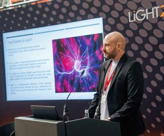
www.lightexpo.london
Images: James Gifford-Mead
A look ahead to forthcoming design shows during 2023 with a strong lighting element.
SURFACE DESIGN SHOW • LONDON, UK
7 - 9 February 2023 (www.surfacedesignshow.com)
STOCKHOLM FURNITURE & LIGHT FAIR • STOCKHOLM, SWEDEN
7 - 11 February 2023 (www.stockholmfurniturefair.se)
[D]ARC AWARDS • LONDON, UK
30 March 2023 (www.darcawrads.com)
ARCHITECT@WORK • LONDON, UK
22 - 23 March 2023 (www.architect-at-work.co.uk)
HONG KONG LIGHTING FAIR (SPRING) • HONG KONG, CHINA
12 - 22 April 2023 (www.hktdc.com)
ARCHIPRODUCTS @ MILAN DESIGN WEEK • MILAN, ITALY
17 - 23 April 2023 (www.milano.archiproducts.com)
EUROLUCE • MILAN, ITALY
18 - 23 April 2023 (www.salonemilano.it)
HD EXPO • LAS VEGAS, USA
2 - 4 May 2023 (www.hdexpo.com)

[D]ARC SESSIONS • ROVINJ, CROATIA
14 - 16 May 2023 (www.darcsessions.com)
ICFF • NEW YORK, USA
21 - 23 May 2023 (www.icff.com)
WANTED DESIGN • NEW YORK, USA
21 - 23 May 2023 (www.wanteddesignnyc.com)
CLERKENWELL DESIGN WEEK • LONDON, UK
23 - 25 May 2023 (www.clerkenwelldesignweek.com)
IMM COLOGNE • COLOGNE, GERMANY
4 - 7 June 2023 (www.imm-cologne.com)
CRUISE SHIP INTERIORS AMERICAS • MIAMI, USA
6 - 7 June 2023 (www.cruiseshipinteriors-expo.com)
LONDON DESIGN FAIR • LONDON, UK
21 - 24 September 2023 (www.londondesignfair.co.uk)
Mazha Lighting System 5.0
Mario Tsai Studio
Founded in Hangzhou, China, in 2014, Mario Tsai Studio is a research-based practice that prides itself on innovative thinking to produce sustainable design.
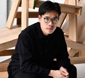
What was the concept behind the Mahza Lighting System 5.0? Using the low voltage and modal elements of the original Mazha Light as its basic principle, the 5.0 uses scaffolding in urban construction as its structural inspiration, which also stems from my observation of the calm but warm light coming through a scaffolding system. The straight lines formed at 90° to each other can grow infinitely in three dimensions, and the lighting tubes become part of the building blocks, creating huge light forms.
How long have you been working on the collection for? It has been four years, from Mazha Lighting System 1.0 to Mazha Lighting System 5.3, but we started to develop the Mazha 5.0 in 2021. When I started the whole project in 2018, I realised that the clients I work with rarely researched and developed their products in any depth, but rather focused more on what type of popular products the market is selling. I began to develop what I thought was a logical design direction from my own perspective, and this was the original motivation for the creation of the Mazha Lighting System.
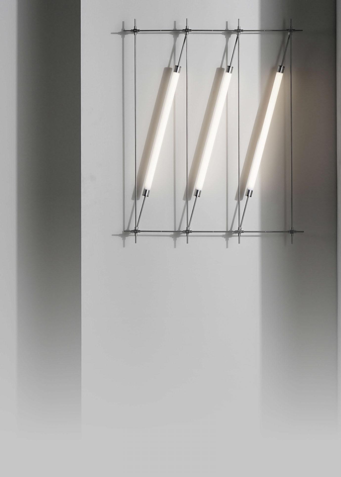
What was the most challenging aspect of producing this collection?
I think it is how to ensure that the lighting system can be efficiently assembled in a modular way and that it remains stable, which depends on the smooth logic of the concept and the technical development that can be implemented.
Can you explain more about the materials and technologies used? The main materials we use are stainless steel, glass, aluminium, LED lighting and electronic chips. The whole development process lasted four years, but it is difficult to describe. The design only took up a small amount of time, more often we were in a laboratory experimenting and constantly testing.
The low voltage 12v is conducted through the metal frame. We focused on designing the circuit composition and how to run the circuit for each version.
What makes this collection different to other Mario Tsai Studio products, and other lighting products available on the market? It has greater modular expandability and can be customised to the size and budget required by the customer, a feature that is largely absent in other products. Our plan is to start expanding our reach and supplying globally.
Please describe the product in 3 words. Minimalism, modularity, flexibility.
www.mariotsai.studio


With the use of wireless Bluetooth technology, you can connect smartphones, computers, or tablets and enjoy your favourite music with a built-in speakers system.
A British design original, inspired by nature.
