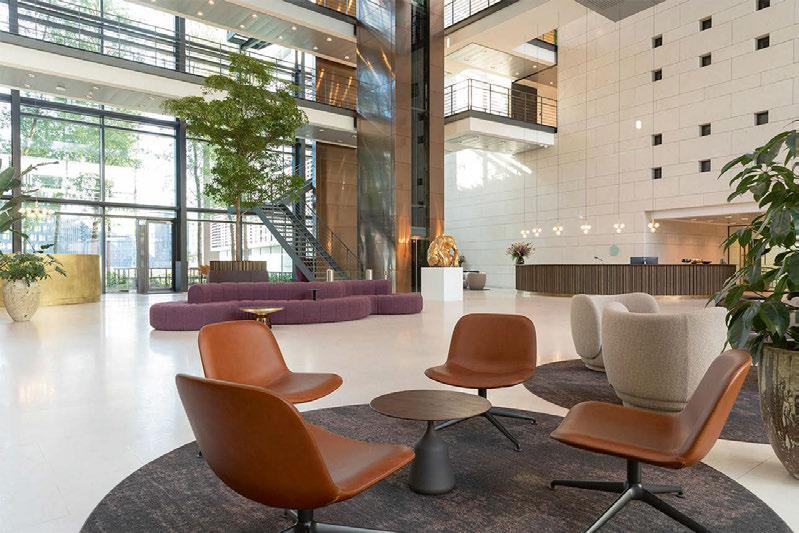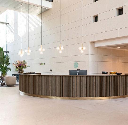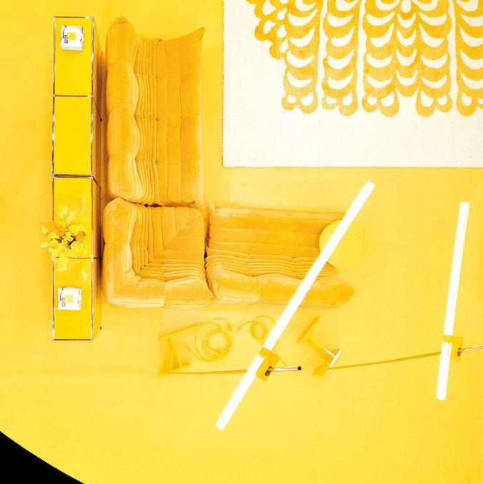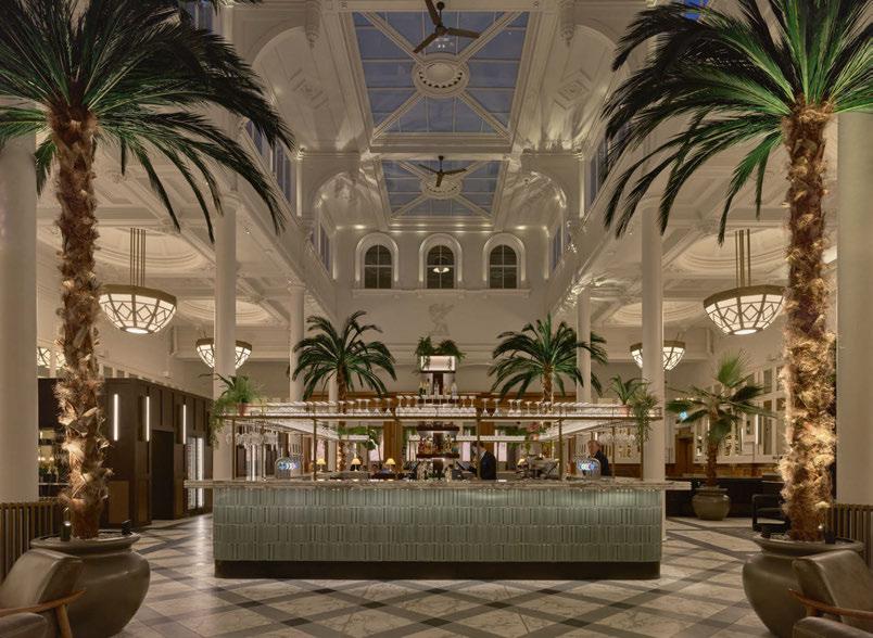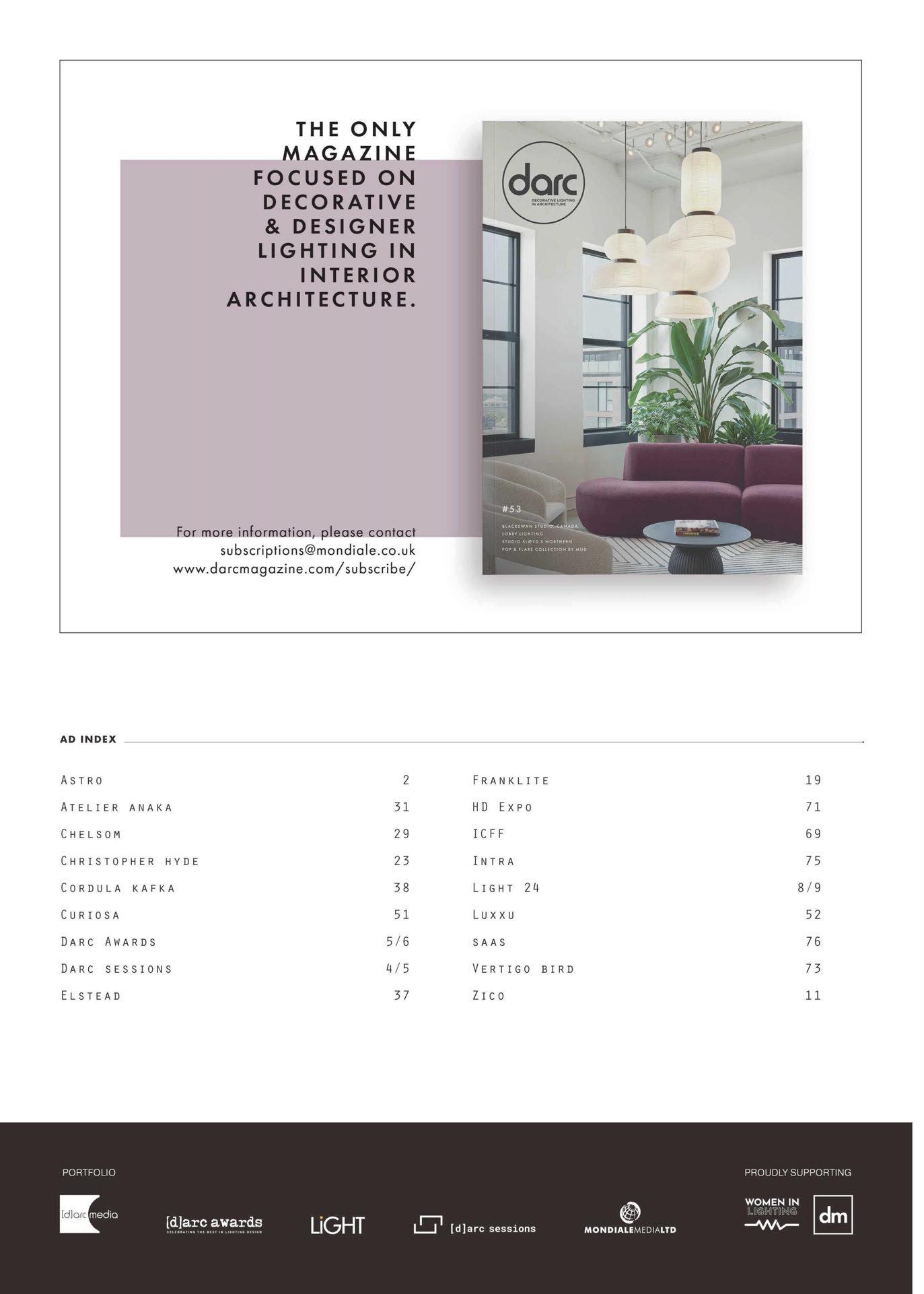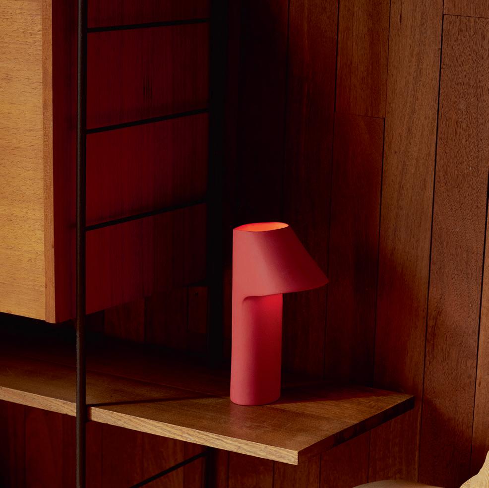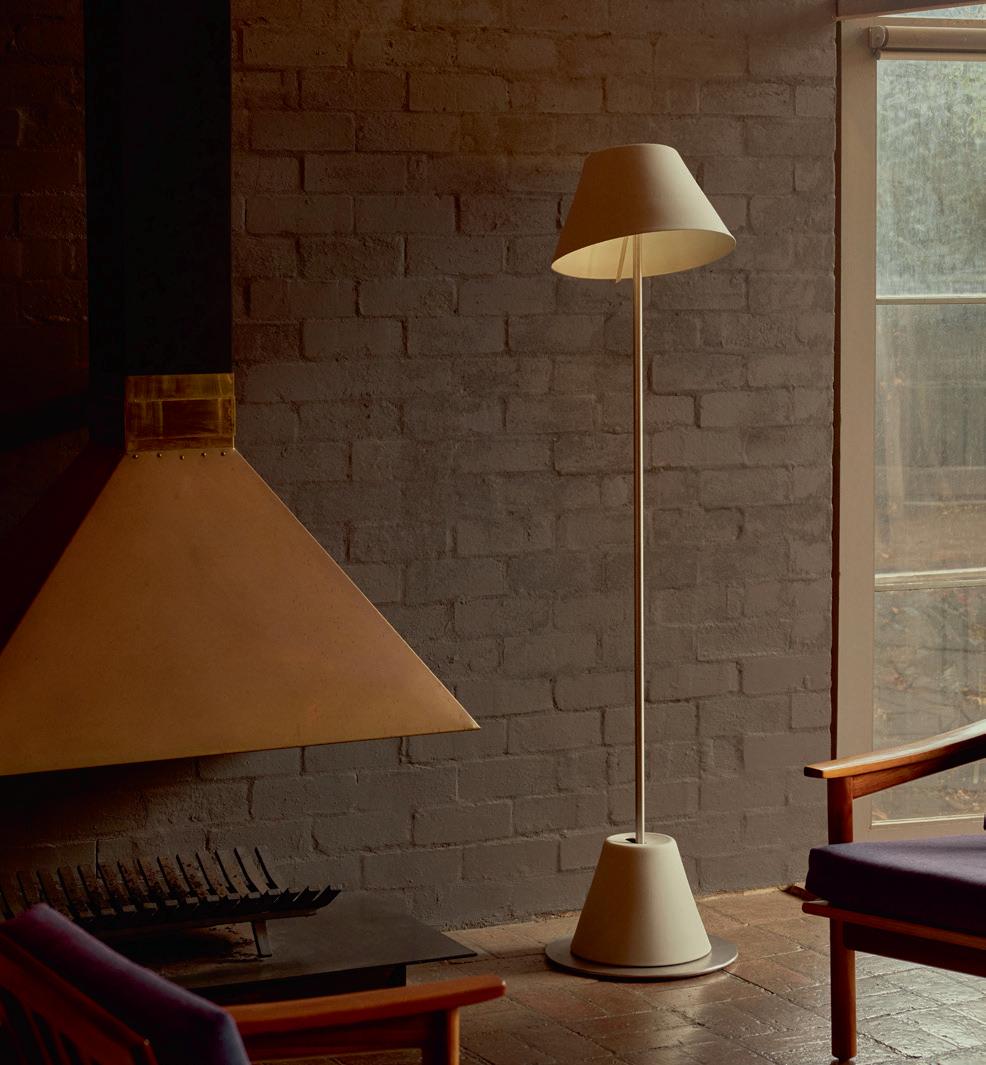
#53 BLACKSWAN STUDIO, CANADA LOBBY LIGHTING
STUDIO SLØYD X NORTHERN POP & FLARED COLLECTION BY MUD

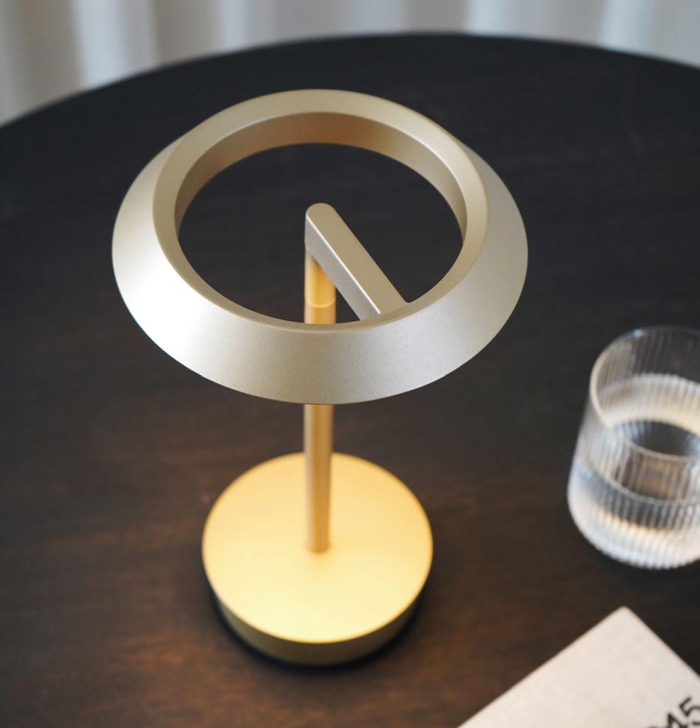

Innovation meets timeless design in our new collection of contemporary lighting concepts for hospitality, residential, and commercial spaces
Lighting designed to stand the test of time
follow @astrolighting | astrolighting.com
WELCOME
 Sarah Cullen • Editor
Welcome to our first issue of 2024! Did January fly by for you too?
I hope everyone had a lovely start to the new year, and you didn’t put too much pressure on yourselves to stick to new resolutions or shortterm diets. Life’s too short to not eat the cake ‘n’ all that!
On that note of newness and cake, why don’t you click that kettle on, grab yourself a slice and delve into this latest issue of darc, where we bring you a wealth of inspiration from the world of decorative lighting. We are covering projects from a tattoo studio in Canada, to a coliving space and an office in the UK, as well as a restaurant in the Netherlands.
Picking up on last issue’s coverage of London Design Festival’s Material Matters exhibition, I caught up with exhibitor Federico Fiermonte to discover how he creates his beautiful Spira lamp in our materials feature.
I also spoke with the design duo of Studio Sløyd to find out more about their competition win that resulted in a collaboration with Northen to create the Archive table lamp.
Our focus for this issue is lobby lighting. Nulty Lighting’s Creative Director Daniel Blaker opens the feature with a comment piece on a lighting designer’s approach to a lobby environment and what to consider when specifying a decorative lighting installation. This is followed by a curation of lobby lighting case studies from international decorative lighting brands.
In typical darc fashion, as this issue flies out hot off the press to your desks, we are working hard on the next, and it’s going to be a big one.
The Mar/Apr issue (#54) will include a round-up of our time at Light + Building, of which we are open for editorial submissions, be it a new product launch or designer comments on their thoughts from the fair. If you have something to say, let us know. Drop me an email at s.cullen@mondiale.co.uk to discuss opportunities.
Issue #54 will also be distributed at Archiproducts during Milan Design Week in May. The team is booked to spend the week in the city to check out all the latest offerings and catch up with clients and friends. Keep me up to date if you are hosting an event you would like darc to attend, or are launching a new product you want on our radar!
Ciao for now,

| 2/3 COVER: BLACKSWAN STUDIO ESPACE 313
/darcmagazine | @darc_mag
For specifiers and suppliers of global lighting projects
A series of events connecting the very best people creating exceptional lighting projects around the world. For more information contact Jason Pennington: j.pennington@mondiale.co.uk
The next session: 14-16 May, 2024 Tróia Design Hotel, Portugal www.darcsessions.com

All
are eligible
Don’t
www.darcawards.com CALLING ALL DESIGNERS… VOTING IS OPEN! Battersea Power Station Washtower Chandeliers, winner of the 2022 Art: Bespoke [d]arc award VOTING DEADLINE: 01 MARCH 2024
independent lighting designers, artists, interior designers, architects and product designers
to vote and receive an exclusive ticket to [d]arc night the awards party at fabric London on 27 March 2024.
miss the biggest party of the year as the lighting industry gets together to celebrate the best projects and products of the year.
STEP INTO THE…
The UK’s only dedicated lighting specification exhibition
20 & 21 November 2024 Business Design Centre Islington • London www.lightexpo.london Interested in Exhibiting? Contact: John-Paul Etchells on jp.etchells@mondiale.co.uk
CONTENTS
FEATURED
046
Interview: Studio Sløyd
The new Archive table lamp from Northern is the result of a collaboration with designers Studio Sløyd. darc’s editor chats with the duo about their first venture into the world of designing lights and how Northern’s Jonas Norheim helped them along the way.
053
Feature Comment: Introducing our Lobby Lighting feature is Nulty’s Creative Director Daniel Blaker. He shares wisdom on approaching a lobby environment as a lighting designer and the important considerations to factor in before leaping into the project.
056
Feature Case Studies: Lobby Lighting
A round-up of some of the best decorative lighting manufacturer projects showcasing lighting solutions in a lobby space.
074
In Focus: Pop & Flare Collection
Mud Founder Shelley Simpson discusses the highlights of creating this new lighting collection, and what inspired her to work with porcelain.
PROJECTS
016
BlackSwan Studio
Montreal-based interior design firm Espace 313 has created a monochromatic and graphic studio, enhanced with elegant lighting, for tattooists at BlackSwan.
020
Gitane
Studio Modijefsky create a warm and inviting palette for one of Amsterdam’s newest dining spots.
024
Winston & Strawn
HLW completes the new office for law firm Winston & Strawn in London, UK. darc speaks with Samuel Edmonds, Associate at HLW, about the scheme.
032
Wembley by Ark
Introducing the boat in the sky, the new addition to the co-living sector in London, Wembley by Ark. Interior Architects Holloway Li took on the challenge of creating a new kind of community living space, using inspiration from London’s homes from canal boats to classic terraced houses.
INSPIRATION
012
Focal Point
Arsenal Femenino, Spain
014
Focal Point
Cœur Tagesbar, Germany
054
Focal Point
La Mamounia, Morocco
039
Comment: Sustainable Product Design
As we move into 2024, Charlie Bowles, Director at Original BTC, shares his thoughts about sustainability being a continued trend in both product and lighting design. Plus, the continued drive to making home life more comforting as we continue to spend more time there.
040
Materials
Federico Fiermonte
The brand new, brutalist-style, sculptural light Spira was presented at 2023’s Material Matters exhibition as part of London Design Festival.
10/11 | CONTENTS THE MAGAZINE Managing Editor | Helen Ankers h.ankers@mondiale.co.uk +44 161 464 4750 Editor | Sarah Cullen s.cullen@mondiale.co.uk +44 161 464 4750 Contributing Editor | Matt Waring m.waring@mondiale.co.uk International Sales Manager | Tristan Blowers t.blowers@mondiale.co.uk +44 7392 895771 Online Content Creator | Ellie Walton e.walton@mondiale.co.uk +44 161 464 4750 DESIGN Artwork | Dan Seaton d.seaton@mondiale.co.uk Editorial | Mel Capper m.capper@mondiale.co.uk FINANCE Finance Director | Amanda Giles a.giles@mondiale.co.uk Credit Control | Lynette Levi l.levi@mondiale.co.uk CORPORATE Managing Director [d]arc media | Paul James p.james@mondiale.co.uk Marketing & Events [d]arc media | Moses Naeem m.naeem@mondiale.co.uk Chairman Mondiale Publishing | Damian Walsh [d]arc media ltd | Strawberry Studios, Watson Square, Stockport SK1 3AZ, UK | Printed by Buxton Press, Palace Road, Buxton, UK ISSN 2052-9406
ARSENAL FEMENINO
BARCELONA, SPAIN
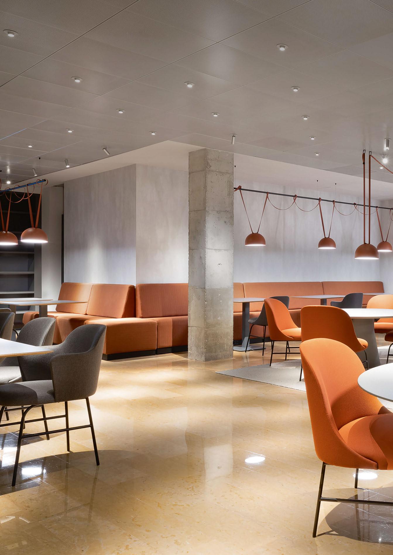
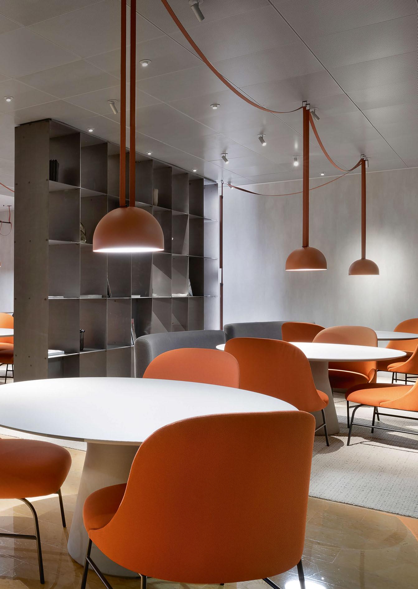
As technology continues to radically alter our working practices and lifestyles, new ways of overlapping both are constantly emerging. Like this new typology, a combination of a co-working space and a restaurant, designed by the Ferruz Studio within the Arsenal Femenino.
The renowned club is a women-only sports, health and leisure facility located in the Sarrià-Sant Gervasi neighbourhood of Barcelona accommodated within a basement. Lighting was therefore the key to creating an efficient but characterful ambience, which is why the Plusminus system by Vibia was selected. The existing space had to adapt to allow for solitary work and communal dining activities. A challenge that is addressed through the strategic placement of furniture and provision of artificial lighting. Plusminus, designed by Diez Office, provides just the right presence and flexibility to adapt to any desired layout. The system is based on a fabric belt with builtin electrical conductivity, which supports a series of semi-spherical spotlights attached as required. The suspended lights are either hung directly by the fabric belts from the ceiling, over individual tables, or draped around a rail positioned over the banquette seating that lines the perimeter of the restaurant. The internal finishes are raw and somewhat stark, mimicking the brutalist architecture style exterior of this iconic building. The concrete structural columns are stripped back and exposed; walls are lined with concrete-effect panels; the golden amber polished floor tiles reflect the metallic suspended ceiling tiles above.
www.vibia.com
Image: David Querol
FOCAL POINT 12/13 | FOCAL POINT | ARSENAL FEMENINO
CŒUR TAGESBAR
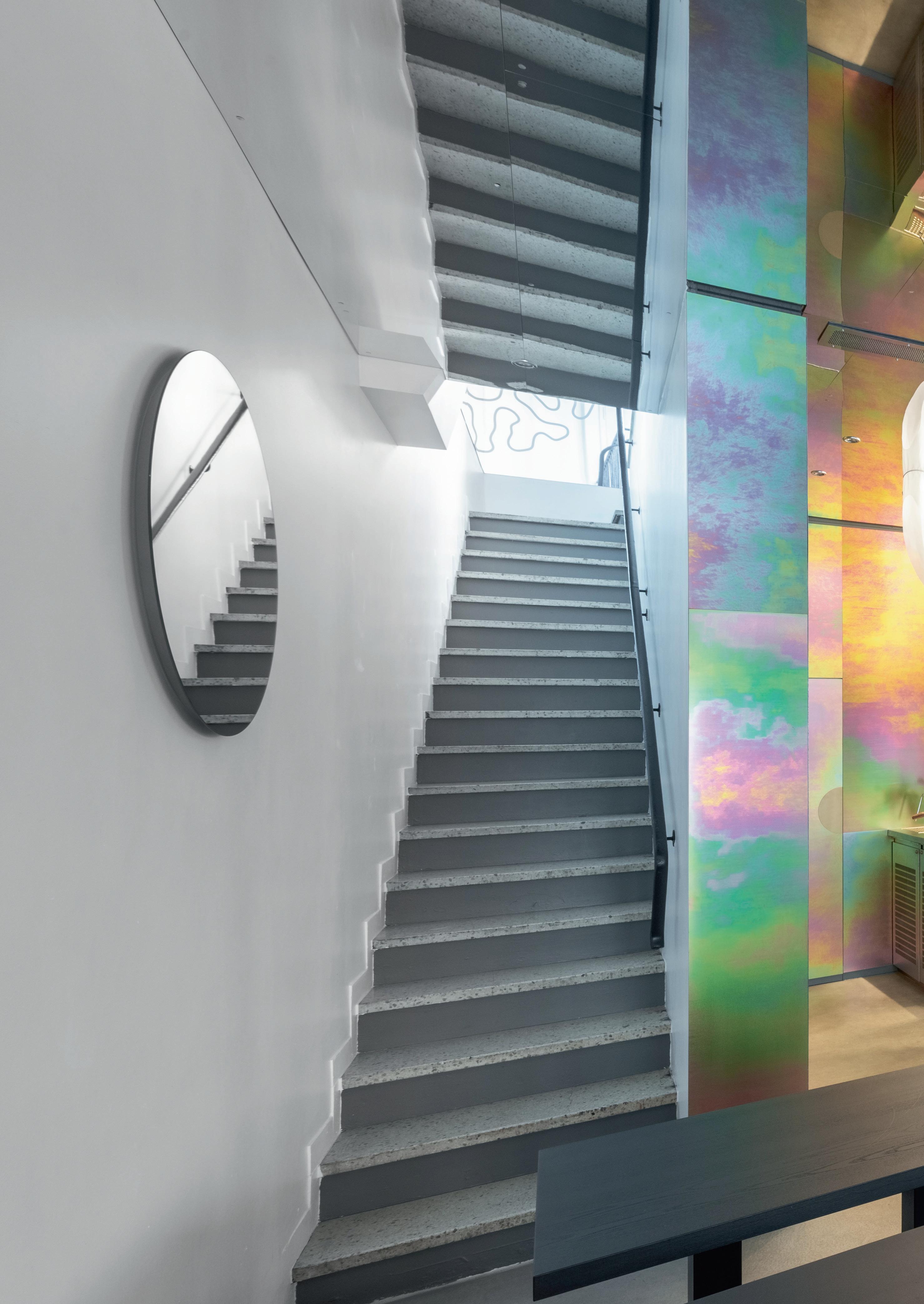
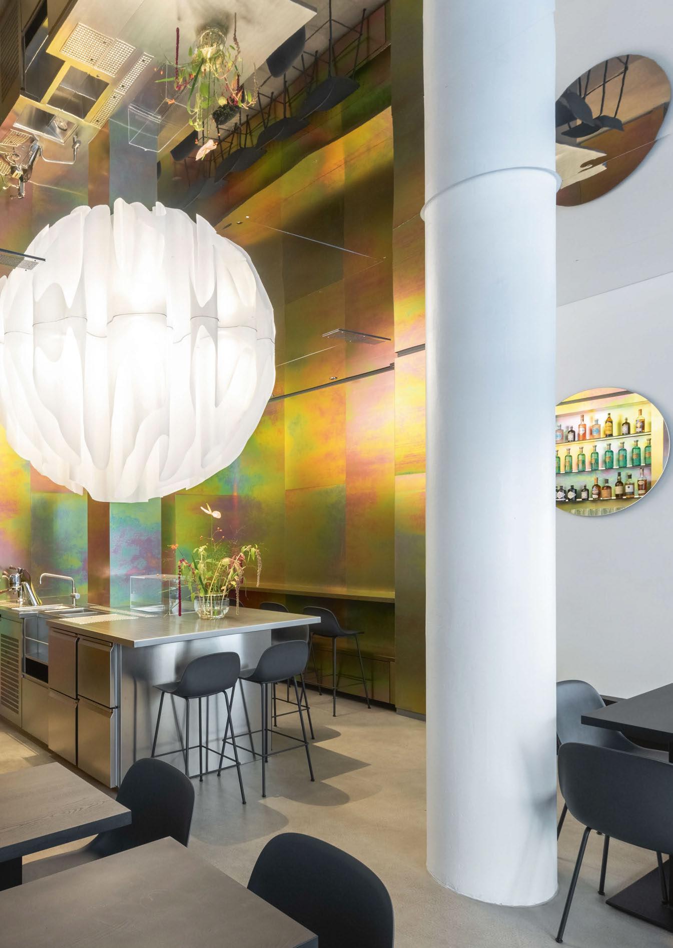
The design for the Munich-based Cœur Tagesbar, by Martino Hutz Architecture (MHA), is based on a simple brief from the client: to optimise a small and intricate space. The design solution was discovered through chromated steel panels, mirrored surfaces, as well as circular and spherical shapes.
Drawing inspiration from nature, MHA employed a biological phenomenon as a metaphor: differential growth. Supported by lighting designer Ingo Kalecinski, all custom fabrications and onsite installation were provided by lighting manufacturer Visual Signage, “Similar to corals or the human brain, we maximised the use of limited space,” explains Hutz. “This concept was incorporated into the hemispherical light installation positioned above the “open bar” as a centrepiece. Thanks to the reflective ceiling, the installation resembles a glowing sphere in an expansive space.”
The 28-metre-long CNC-cut fabric, mounted inside a recessed rail, traces the growth pattern. Eighteen light sources are carefully integrated into the pleated fabric to illuminate the sphere. Three electrical circuits control two RGB units and one LED unit, allowing for different atmospheres on the counter below. Additionally, two custom-made, 3D-printed pendant lights, above nearby black tables, continue the theme of both the sphere and the growth pattern.
www.martinohutz.de
Image: Martino Hutz Architecture (MHA)
MUNICH, GERMANY
FOCAL POINT 14/15 | FOCAL POINT | CŒUR TAGESBAR
BLACKSWAN STUDIO
Montreal-based interior design firm Espace 313 has created a monochromatic and graphic studio, enhanced with elegant lighting, for tattooists at BlackSwan.
Situated in the heart of Montreal, Canada BlackSwan tattoo studio is a hub for inked artists to congregate in the unassuming destination that presents a unique character.
BlackSwan is designed by Espace 313 as a bespoke environment imbued with unapologetic elegance. “In an era of increasing tattoo democratisation since the beginning of the century, as well as a desire for personal affirmation and ownership of one’s own body, the tattoo salon offering has continued to grow, with a desire to differentiate itself from the sometimesintimidating appearance typically associated with these places,” says Gatline Artis, owner and lead designer at Espace 313. “It is in this perspective that the client approached us with the ambition to reinvent the traditional image of the tattoo salon, favouring a soft and refined aesthetic.”
Utilising the existing space, the team added contrasting conceptual interventions merged with a contemporary artistic spirit. Espace 313 wanted to showcase raw and distinctive materiality throughout. Upon entering, the blend of materials and textures sets the tone for the studio. A plaster covered reception desks draws your attention before revealing an enigmatic metal sculpture that rises in front of a delicate white veil that filters soft light. Hanging above the reception desk is Michael Anastassiades’ Mobile Chandelier 9 fixture. The delicate pieces hang beautifully balanced in an arrangement of linear tubes, geometric lighting sources, reflective surfaces, and
16/17 | PROJECT | BLACKSWAN STUDIO
PROJECT

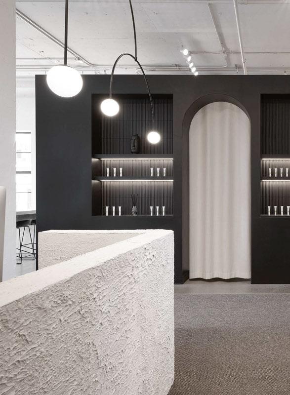
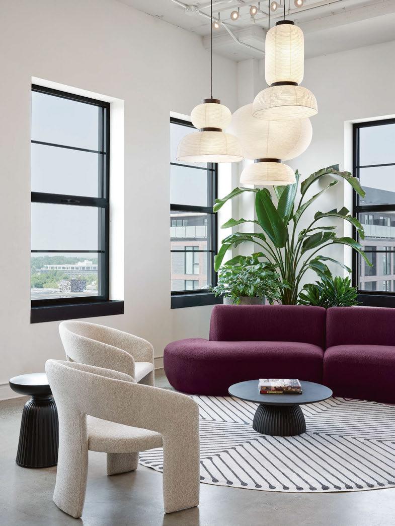
counterbalancing weights. They rotate freely, creating an ever-changing lighting configuration.
Taking inspiration from a tattoo on pale skin, the team aspired to integrate distinctive dark elements onto a bright canvas, and ultimately using the element of contrast as a pillar of the design concept.
At the heart of the project is the welcoming lounge.
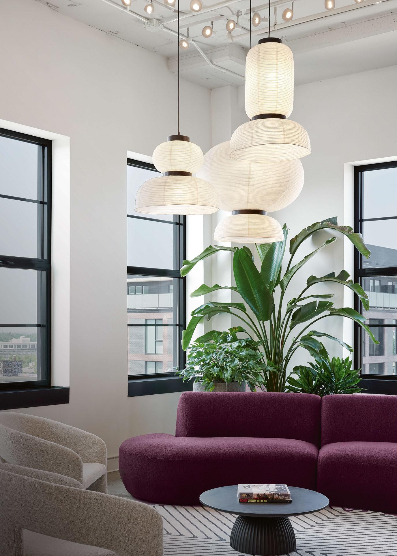
Furniture takes on curved forms and a splash of plum colour is woven into the space, which adds a touch of “vivacity and contrasts with the vegetation already present”. &Tradition’s Formakami pendants, by Jaime Hayon, cluster above the seating area, reinforcing the curvature forms of the furniture. The pendants are a contemporary expression of the traditional Asian lanterns, hand crafted with ivory white rice paper and black stained oak accents.
The lounge area is bathed in an abundance of natural
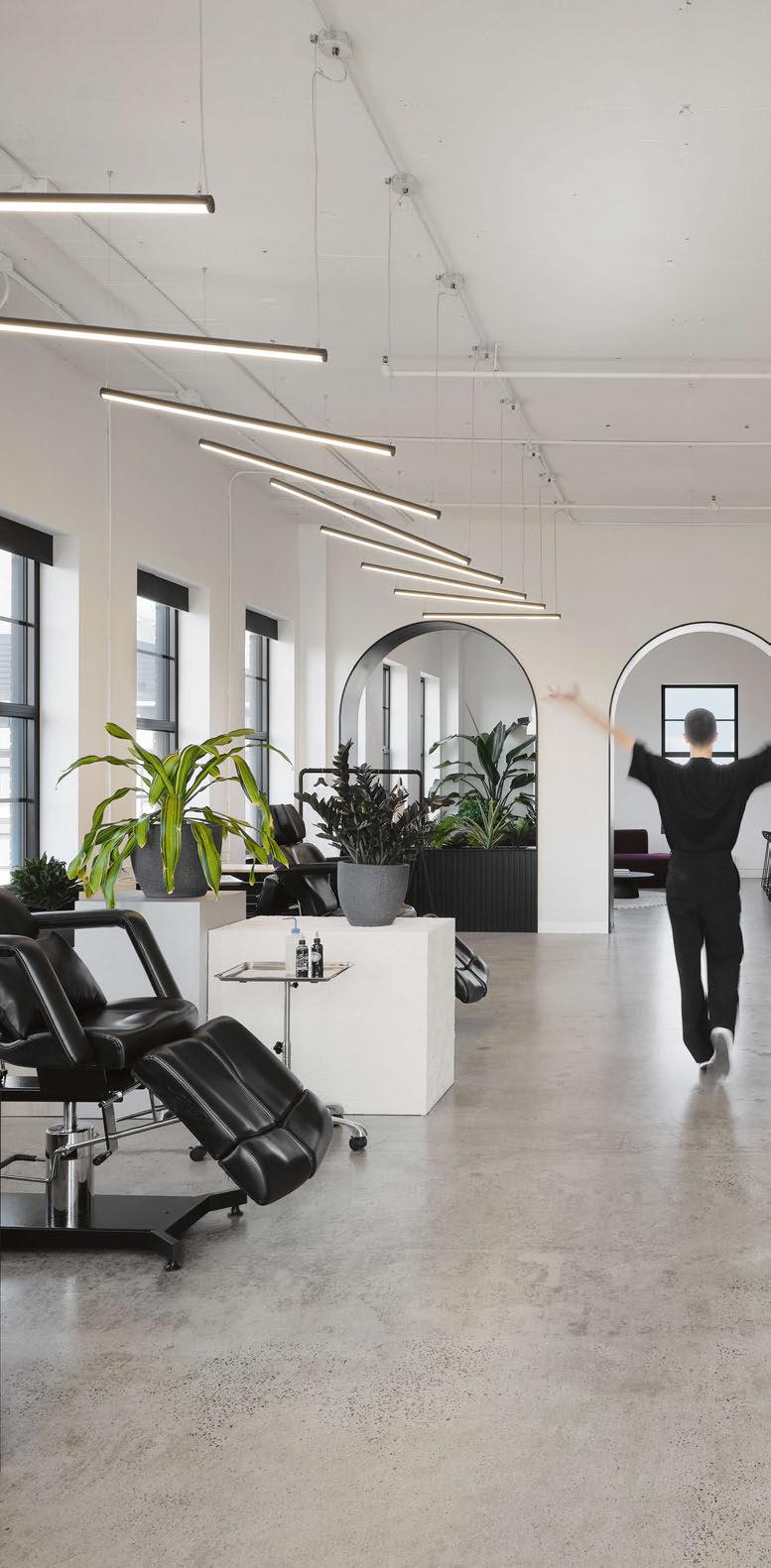
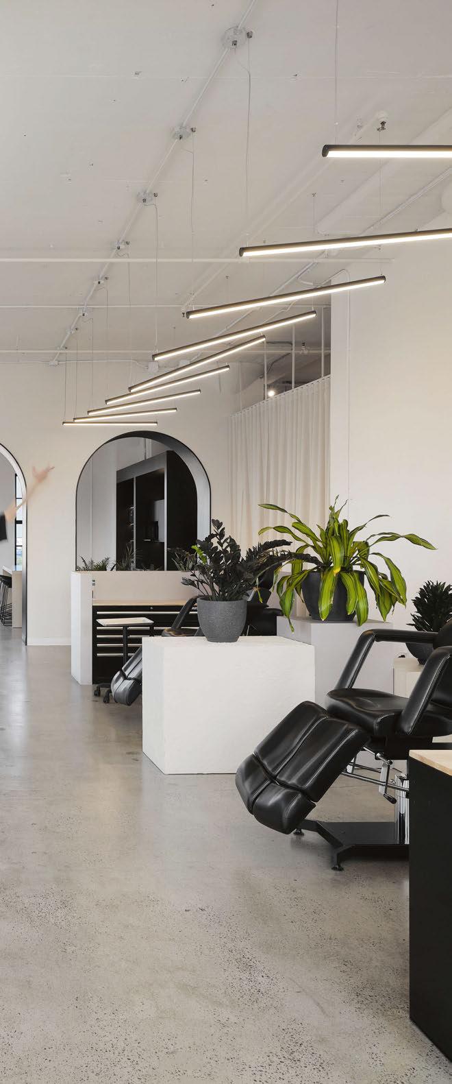
light, but the centrepiece of the tattooing space is a large sculptural light installation, which is “subtly evoking the unfolding of a swan’s wings and echoing the studio’s graphic identity”. The black Vega Minor fixtures used to create this installation, by Kuzco, are a diminutive square linear profile that envelops and radiates a soft uniform light, and again adds to the monochromatic scheme of the space.
Taking this minimalist approach in design goes against the typical aesthetic of tattoo studios. The clean lines and tones give an impression of sterility and cleanliness, and a lack of decoration on the walls and non-customisation of workstations was a deliberate choice by the owner. Instead of imposing an artist’s identity on the space, an emphasis is solely placed on the artwork created in the tattoo designs.
www.en.espace313.com
Simple yet sophisticated decorative lighting pieces hang as artworks in the sleek tattoo studio.
Complementary colours, tones, and shapes enhance the overall aesthetic, creating a uniquely simple environment for visitors to acquire some new ink.
18/19 | PROJECT | BLACKSWAN STUDIO
BLACKSWAN STUDIO
Interior Design: Espace 313
Lighting Specified: &tradition, joy lighting, kuzco, michael anastassiades
Images: Maxime Brouillet
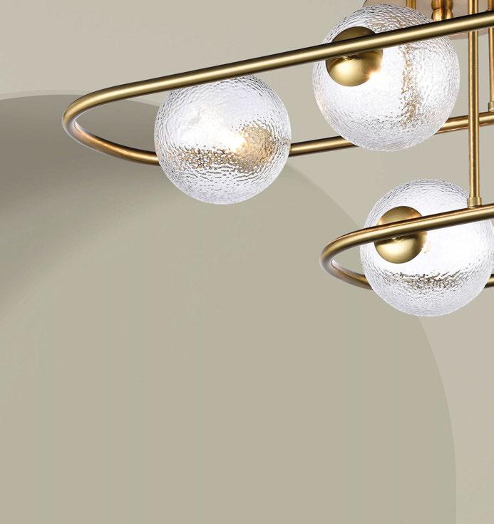
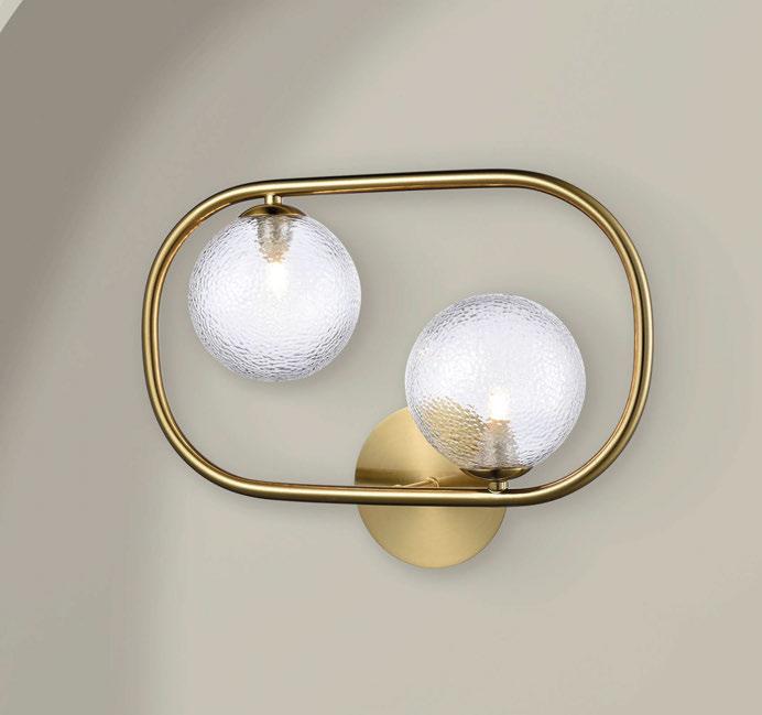


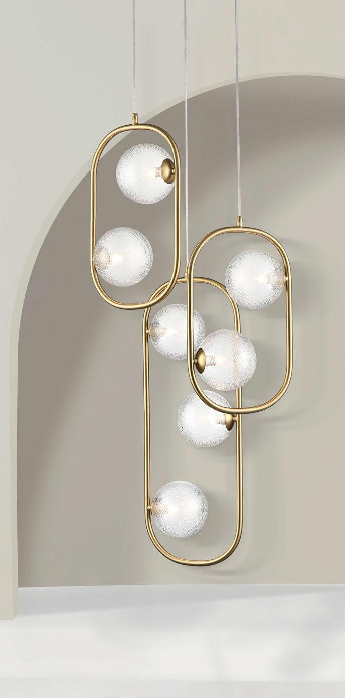


Trapeze A comprehensive range of aged brass nish hoop shaped ttings with clear speckled glass spheres. franklite.co.uk
| hello@franklite.co.uk | +44 (0)1908 691 818 Commercial | Retail | Hospitality | Project Designs
Award Winning Lighting Manufacturer
20/21 | PROJECT | GITANE
PROJECT
GITANE
Studio Modijefsky create a warm and inviting palette for one of Amsterdam’s newest dining spots.
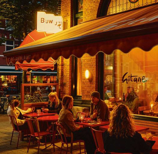
Amsterdam’s hottest young chef, Angelo Kremmydas, opened his debut restaurant, Gitane, in the summer of 2023. Studio Modijefsky was tasked with translating Kremmydas’ culinary vision of refined food that reflects a mix of cultures and flavours, served without fuss.
The studio’s design reflected this in a casual but elegant scheme that radiates a welcoming atmosphere.
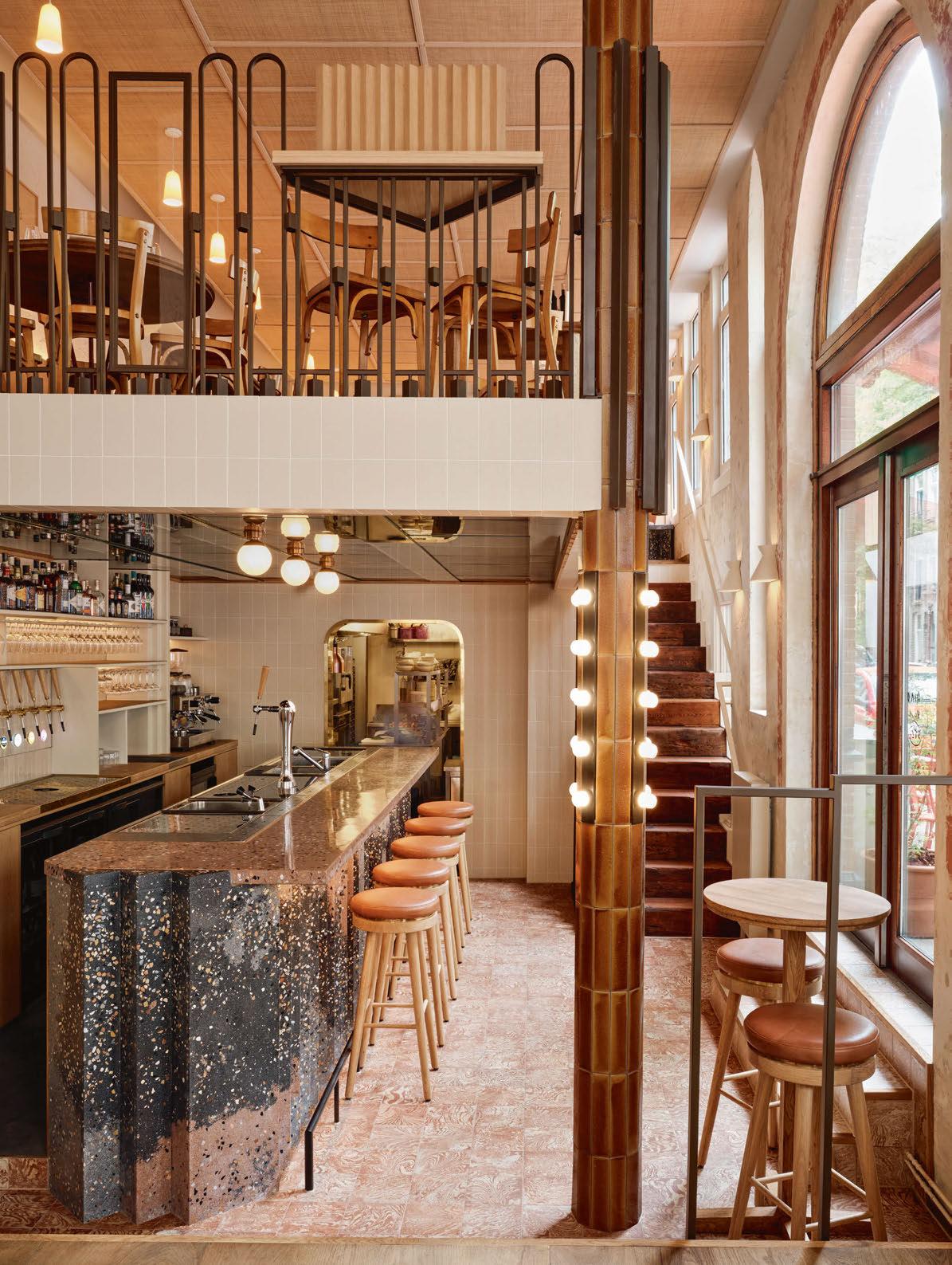
The restaurant is divided into three areas, the ground floor, mezzanine, and bar. The restaurant is spread across the ground floor and mezzanine, while the bar is situated a couple of steps below the ground floor.
The space transitions throughout the day; each area has a unique atmosphere to suit a different mood, activity, and time of day, alternating between dining and evening drinks destinations.
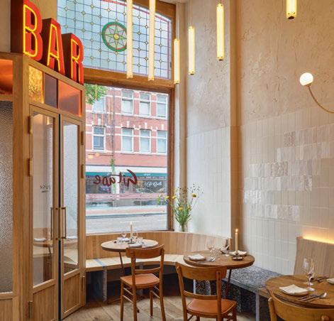
Visitors are welcomed with warm hues, an orange neon
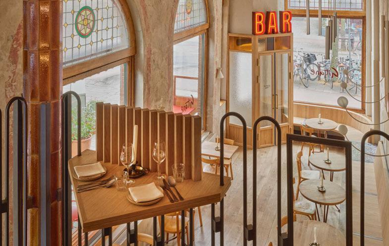
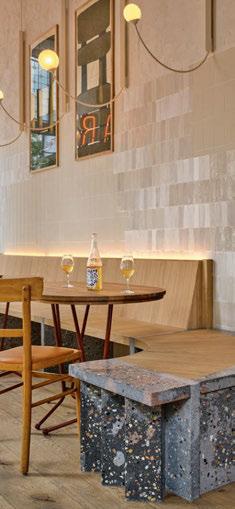
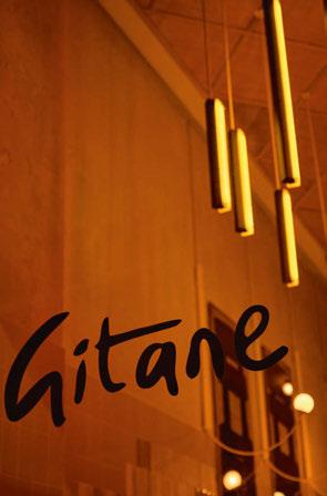
sign spelling ‘BAR’, and custom wood furniture, which set the tone for the restaurant. Tall custom lamps, by the studio, hanging from the ceiling enhance the double height of the room, while curved lamps in the same style, but with playful light spheres, grow from the wall behind a long custom banquette.
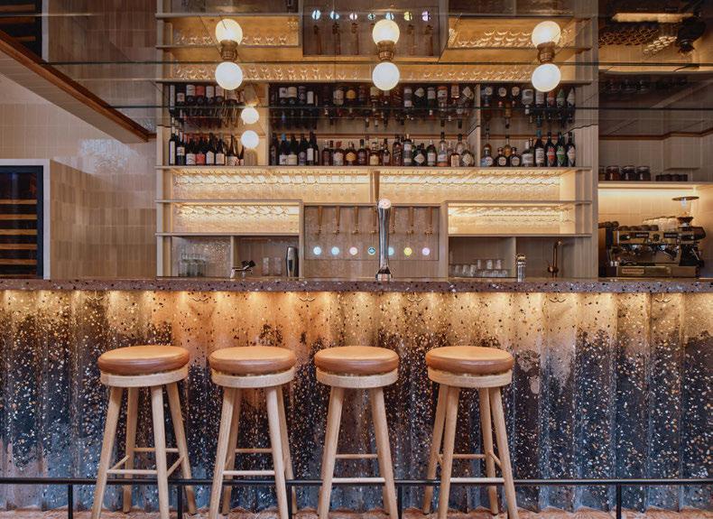
Spherical ceiling fixtures from Jan Best Verlichting highlight the bar top, formed of a unique Corradi terrazzo, which is flecked with earthy tones that help tie the warm concept together. Nuuk Hubert table lamps in gold are featured on the back bar. A dark brown, aged, mirrored ceiling reflects the light spheres on the ceiling as well as patterns of the sculptural bar beneath and captures the contrast between weathered materials and the fresh lines of tiles and terrazzo.
The ceiling of the bar is supported by a column that is finished in rich textured lava tiles and small light accents. As the column rises up to the railing of the mezzanine staircase, it visually connects all three areas of Gitane.
On the opposite side of the restaurant are intimate small tables sat next to arched windows. The windows are defined by faded soft red outlines and enhanced by ceramic, conic Kiro wall lamps by Patrícia Lobo.
Moving upstairs to the mezzanine, small tables are highlighted with porcelain pendants by Granby Workshop. Textured materials are reiterated in these pendants that feature flecks of ground brick, and the warm glow produced enhances the homely feel of the space. Geometric patterns continue into the mezzanine, as well as beautiful natural light that comes through the large arched windows, which subtly bring the façade indoors and extending the visual lines from the street to the interior.
The patchwork of furniture, finishes, and textures that meander from the entrance, throughout the restaurant, past the bar and to the kitchen give the place a timeless feel that give the impression of revealing how the room was previously decorated. www.studiomodijefsky.nl
Lighting Specified: Granby Workshop, Jan Best Verlichting, Nuuk, Patrícia Lobo
Images: Maarten Willemstein
Decorative lighting in warm hues and textured finishes emphasise a welcoming, homely environment for Kremmydas’ new restaurant. A casual space that complements a sophisticated menu.
22/23 | PROJECT | GITANE
GITANE
Interior Design: Studio Modijefsky

ATMOSPHERE COLLECTION
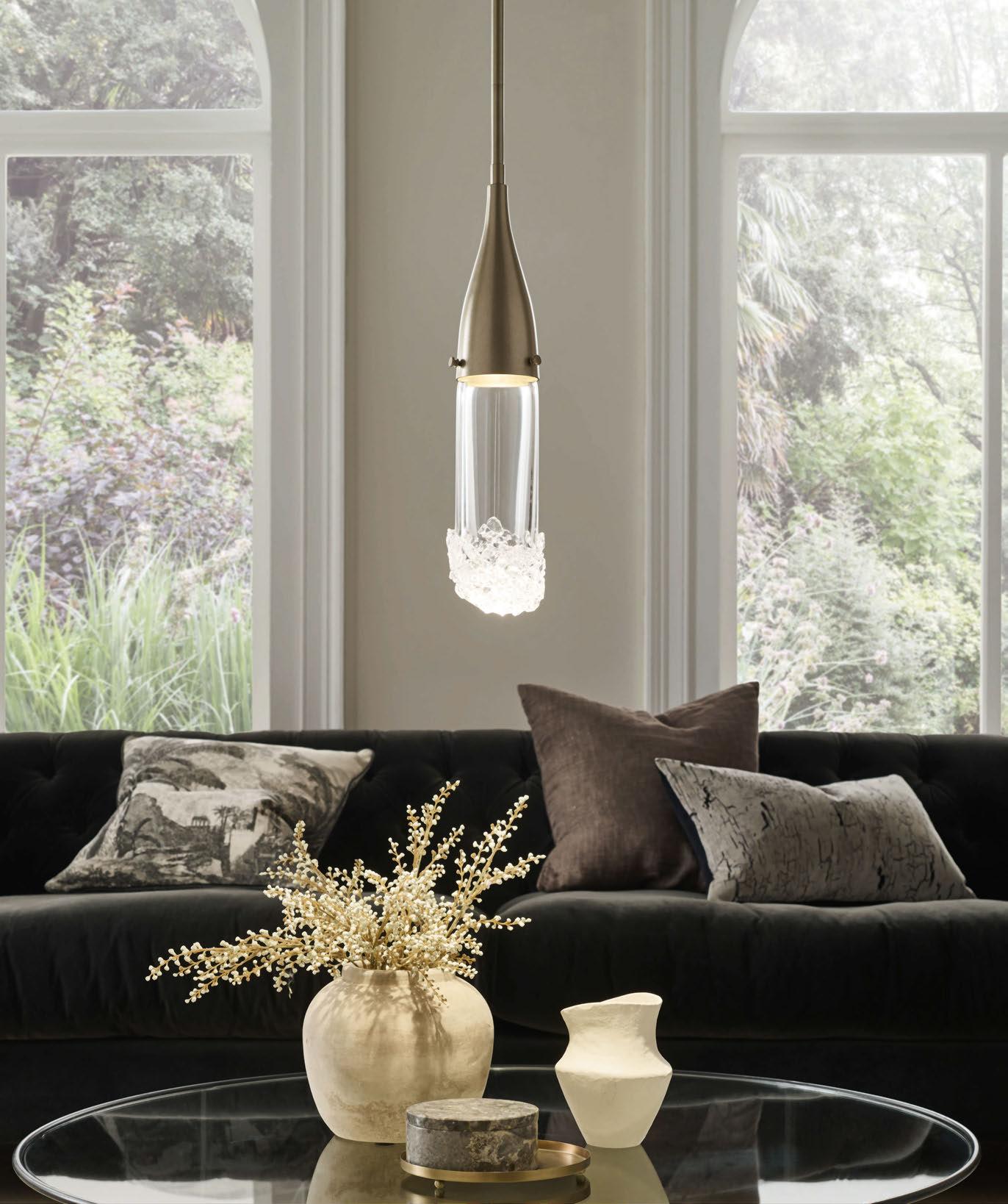
A single stem pendant nished in soft gold with clear glass featuring fused glass fragments. Other nishes available.

7351
|
LONDON | DUBAI +44 (0)20
0863 | sales@christopherhyde.com |
EST. 1995 FIZZ PENDANT
Discover the complete collection at christopherhyde.com
WINSTON & STRAWN
HLW completes the new office for law firm Winston & Strawn in London, UK. darc speaks with Samuel Edmonds, Associate at HLW, about the scheme.
International architecture and design firm HLW recently completed the interior design and fit-out of a private office located on the 33rd floor of 100 Bishopsgate in London for international law firm, Winston & Strawn. A variety of work styles have been catered for in the 14,000sqft space, including two-person offices, open plan workstations, and versatile alternative workspaces. The design was driven by a desire to create a more egalitarian office environment, where senior partners could collaborate with and support junior staff.
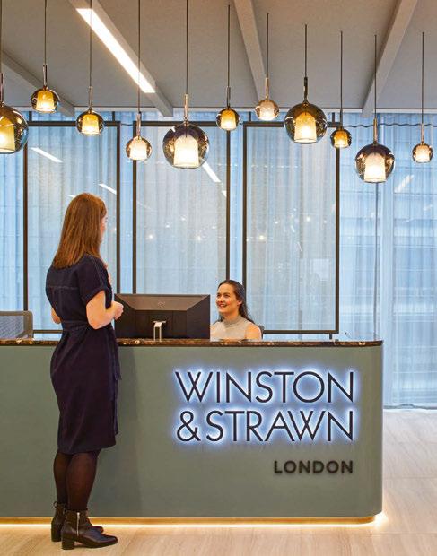
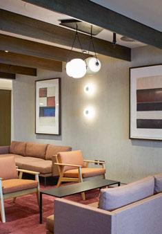
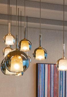
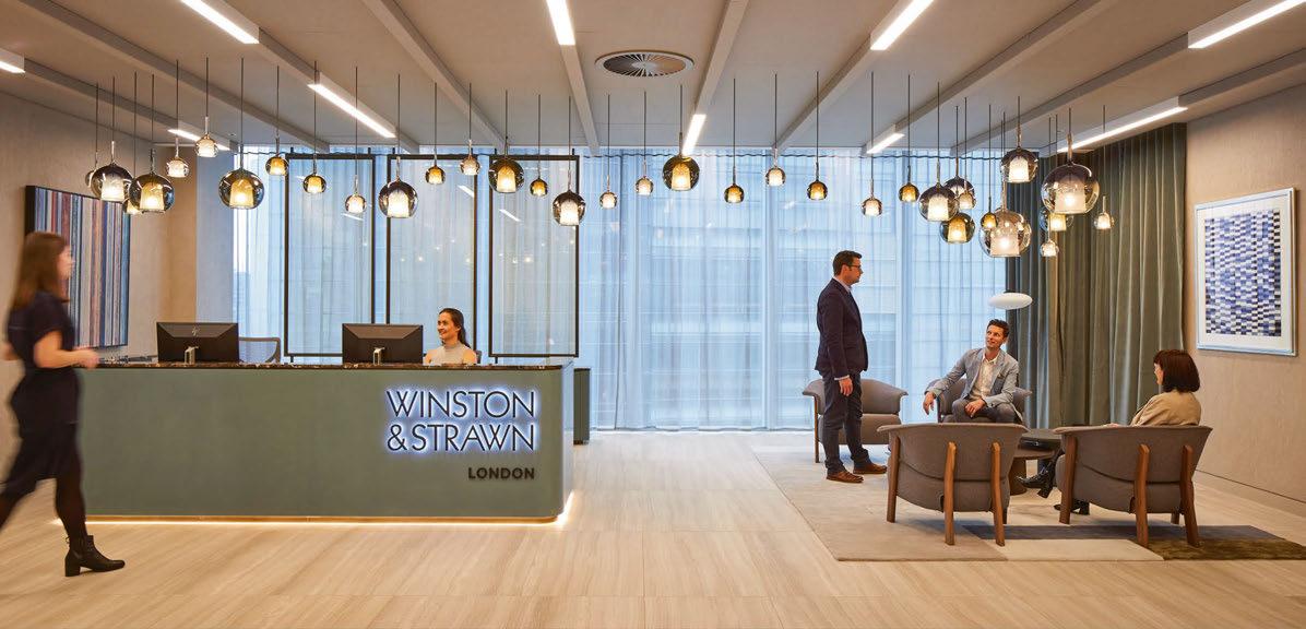
Upon entering the north-facing lobby, visitors and employees are welcomed by an elegant light installation comprised of 36 pendants from Penta. The warm light and glass tones of the pendants beautifully complement the muted palette and warm colours of the furniture and finishes. The curved design of the light installation, connecting the reception and lounge area, was carefully considered to accentuate the reception desk and surrounding finishes.
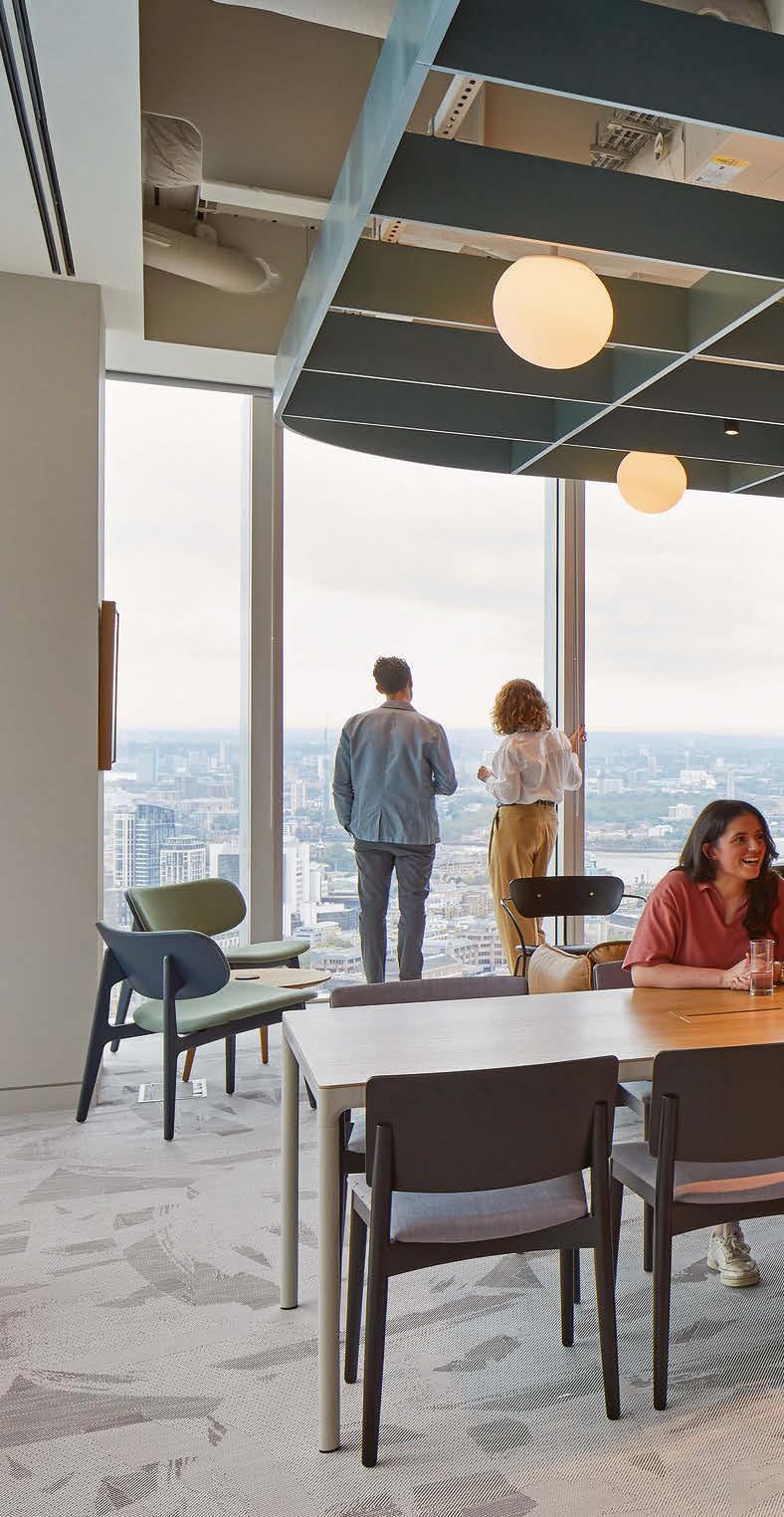
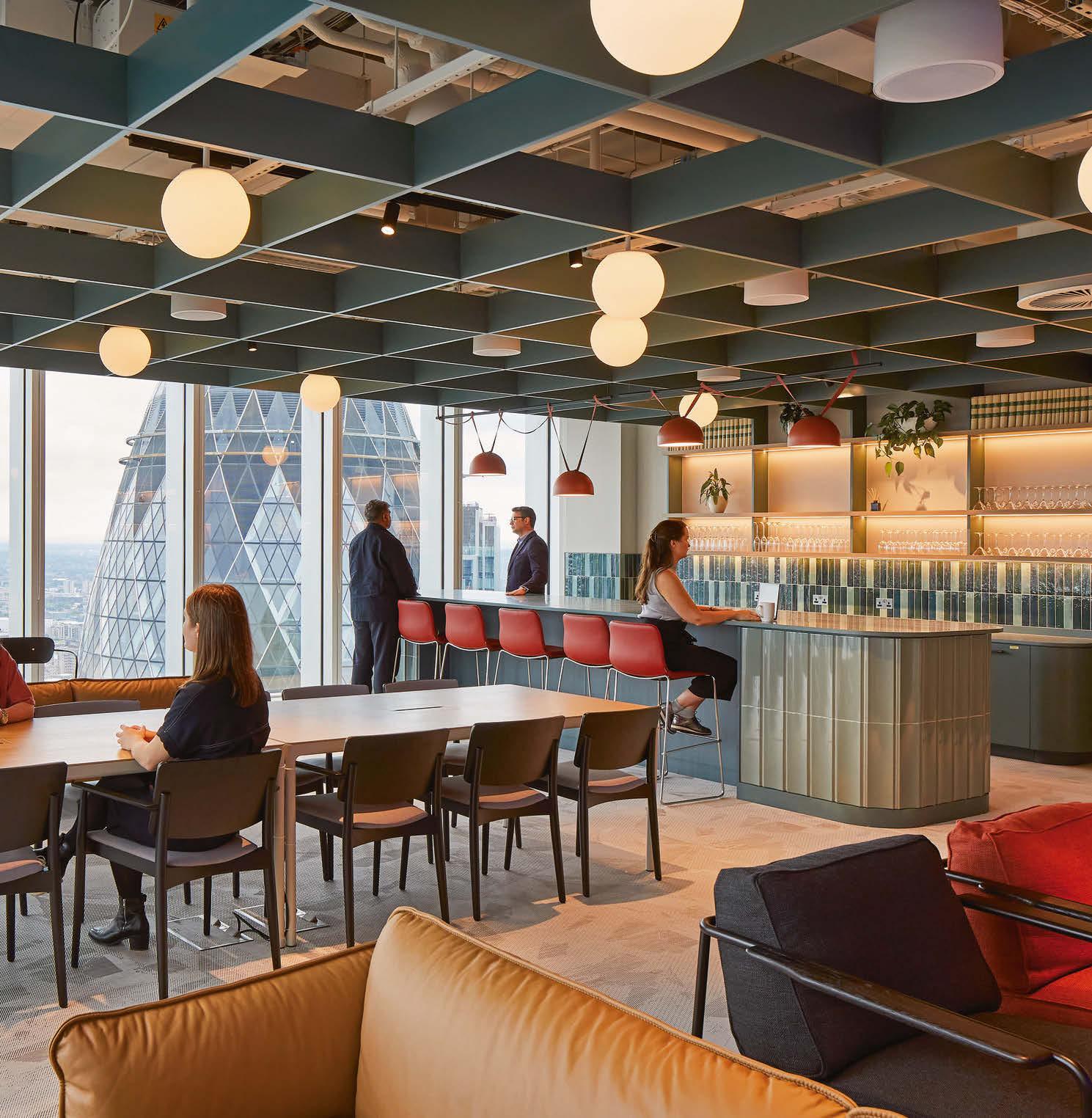
A well-positioned breakout area close to the lobby features pops of colour through red, glossy brick tiles. A similar tile motif, this time in shades of green, is featured in the employee lounge area that offers double-facing views of East London. Hanging gracefully from the exposed ceilings, pendants from Vibia and Brokis add a touch of vibrancy to the space, maintaining a cohesive and colourful design scheme.
The employee library area, nestled in the core of the east wing, boasts a combination of ambient and task lighting. This includes playful Capsula pendants from Brokis, sconces from Marset, and a ceiling pendant from Orluna. Additionally, Mona pendants from Brokis elegantly illuminate the coffee bar booths.
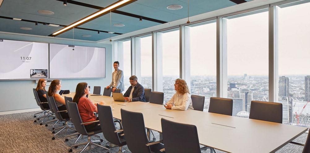
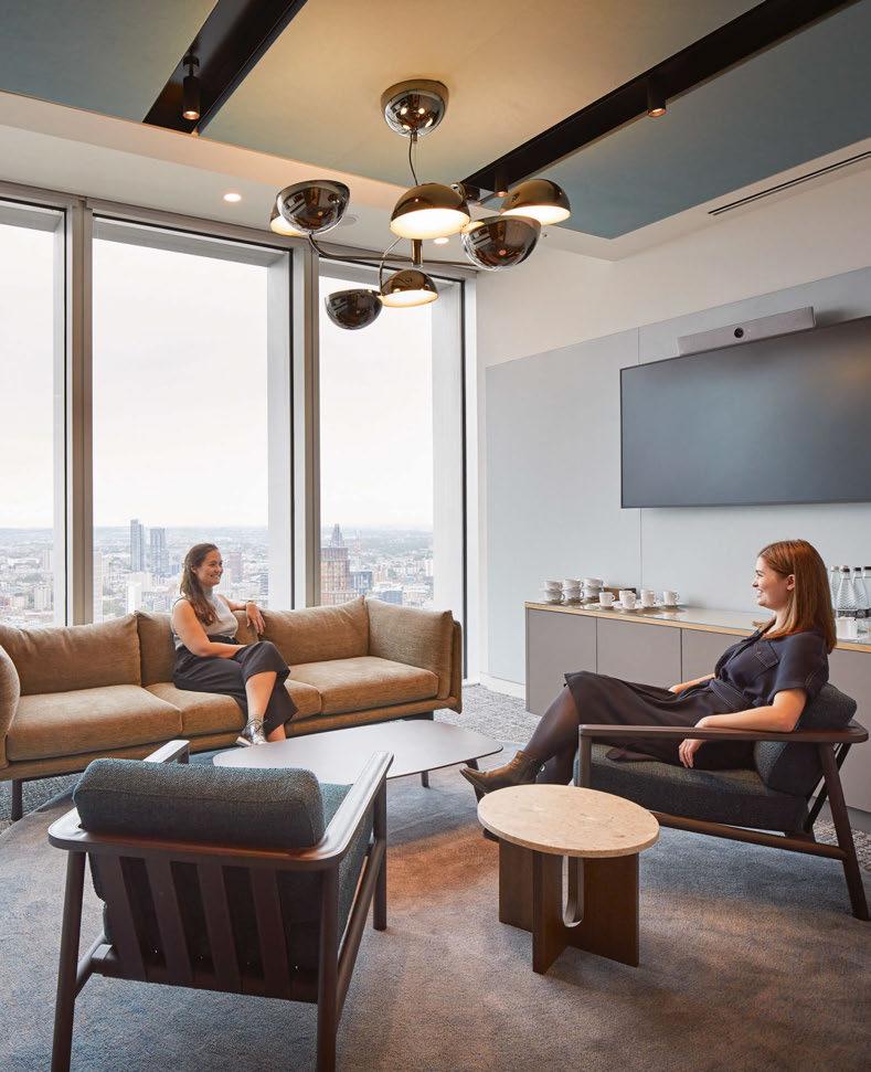
The choice of decorative lighting, consistent throughout the office, extends into the conference rooms with the striking Elisabeth large pendants from Penta. These fixtures were selected not only for their aesthetic appeal but also for their ability to create a dramatic ambiance without sacrificing functionality.
Functional strip and linear lighting were implemented throughout
24/25 | PROJECT | WINSTON & STRAWN
PROJECT

26/27
the offices and corridors to guide people through the various areas. These provide a cohesive and inviting glow and ensures all spaces are well-connected and easy to navigate.
Speaking with darc about their involvement in the project, Samuel Edmonds, Associate at HLW, said: “HLW had previously worked with Winston & Strawn on the refurbishment of their New York office and was given the opportunity to tender for the fit out of their new office in London at 100 Bishopsgate, for which we were appointed in August 2022. The initial brief was to create a working environment that promoted a sense of community for their employees, along with a welcoming and comfortable space for their client and visitors. The project from start to finish took a little over 10 months.
“The biggest challenge was the programme, as there was a move in date of mid-June 2023 that could not be pushed. The briefing and design stages were condensed to maximise the build stages, so there was a lot of work to be done in a short amount of time.”
Edmonds goes on to explain how Winston & Strawn were “the perfect client”. “The briefing process was conducted over the end of the summer, and it provided a clear understanding of their wants and needs, enabling our team to produce a fixed layout very early on. For the overall look and feel, they wanted their front of house space to feel like a boutique hotel lobby, but to be bright and airy to maximise the full height windows and views from the 33rd floor of the building. They wanted the working and amenity spaces to connect with the front of house and provide people with a space they wanted to come to.”
The HLW team collaborated with Into Lighting on the lighting design scheme, who aided in translating the initial ideas and designs into workable solutions that produced the comprehensive design that was maintained through the tender process. With regards to the decorative lighting featured throughout, there were certain considerations taken into account with placement and suitability.
Edmonds expands further: “We wanted to make the key destination space extra special. Introducing decorative lighting into these areas helped to define them and create a point of difference to the main working areas. There were considerations for these, as some were more of a ‘hero’ feature while others would complement the spaces as part of the overall aesthetic.
“For the main reception space, we wanted to create a big statement that is seen as soon as you step out the elevators into the lobby. The idea came about of connecting the reception desk and the seating area with a string and cluster of varying sizes of pendant fixtures installed at varying heights. To make this work, 36 Glo pendants of varying sizes from Penta were chosen for their rich colour palette and reflective nature, which worked in harmony with the aesthetics of the reception. In the coffee bar area, the Lit pendant from Penta was also selected to complement and connect the two areas. In two of the conference rooms, a central feature pendant fixture - the Elisabeth from Penta - elevates the room and makes a point of difference from the others. Its Art Deco celestial forms work together with the Glo pendants in reception, thus creating an elegant space.
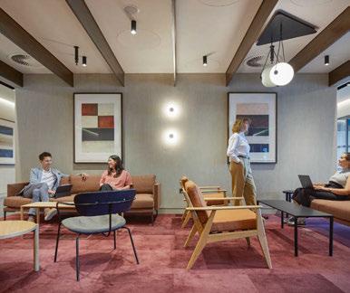
“In the employee lounge, the exposed ceiling and services were painted out in a soft warm grey colour, with a suspended Jade green grid connected to the wall joinery to light the space. To complement the ceiling feature, we looked for a simple white globe pendant fixture. We opted for the Sfera sphere from Brokis and installed it in a random pattern within the ceiling grid. Additional track lighting was added with angled spot lamps to enhance the ambient lighting. Finally, above the large island, we used the Plusminus Semisphere from Vibia in a Terracotta red to contrast the green of the joinery.
“In the employee library, a trio of Capsula pendants by Brokis above one of the seating areas was installed to complement the surface mounted ceiling fixtures, with its sand blasted finish providing a muted light
“The initial brief was to create a working environment that promoted a sense of community for employees, along with a welcoming and comfortable space for their client and visitors.”
PROJECT | WINSTON & STRAWN
“For the main reception space, we wanted to create a big statement that is seen as soon as you step out of the elevators into the lobby.”
source. Wall lamps were introduced to work with the artwork, specifically the Aura lamp from Marset with a white shade. Within the coffee bar area, to create a feature, we installed three Mona medium sized pendants from Brokis as its smoked glass and tan leather straps complements the joinery and finishes within the space.”
When it came to balancing the decorative fixtures with the functional architectural lighting, it was important for Edmonds that the architectural lighting blended into the background. “Within the reception, white linear features were incorporated in the bespoke acoustic ceiling. This produced a uniform background light level to allow the Glo pendants to shine.
“In all conference rooms, offices and the connecting corridors, all architectural lighting, as well as the other services, were incorporated in a black ceiling trough. Creating this central element connected the spaces and created a uniform look across the whole floor, allowing the areas with decorative lighting to pop and

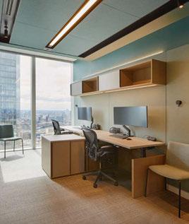
become a key focal point. Within the main corridors, LED strip lighting was introduced into a recess along the edges that produced a subtle glow and highlighted the textured plaster finish to the walls.
“The decorative lighting elevates the key areas. The choices of fixtures are harmonious but also offer subtle changes as you move between spaces. Moving all the architectural lighting into a central ceiling trough in the corridors and offices streamlined the design and made a feature of the ceiling without any decorative lighting.”
Edmonds’ final impression of the project is an overwhelmingly positive one. “The design came together harmoniously,” he says. “I was initially worried that the quantity of Glo pendants in reception might be overpowering, but the result worked better than I could imagine. The impact they have on the space is amazing and they take on a life of their own from different perspectives across reception.
“From the beginning we had complete trust from the client in the ideas and designs that we put forward.

28/29 | PROJECT | WINSTON & STRAWN
CHELSOM.CO.UK
They wanted a space that was impactful and was something they had not seen before. From the early stages, I wanted to make the ceiling and the lighting the standout feature as we were competing with 360° views across London from the floor to ceiling window with amazing natural daylight. By using a restrained palette of finishes and carefully considered application, the space feels connected but also varied as to the different activities.
“The project completed in mid-June, so I only really saw the space illuminated during daylight. It was not until I visited one evening in September, when the impact of the lighting really hit me, and I witnessed how the space changed in the early evening light. This was also visible from the outside of the building, which glowed. “When it all came together, there was nothing I would have changed. Every aspect met the client’s needs and all the finishing details worked as I had hoped.”
Duncan Hamilton, Director of Into, adds: “This was the first time we worked with HLW, and it was a positive collaboration in terms of scheme designs, detailing, and product specification.
“We didn’t specify any of the feature lighting but input our advice and helped with incorporating it into the design. The decorative lighting definitely complements the architectural lighting design as it gives interesting focal points through the scheme in areas that need softening, such as the breakout, canteen, and library. Areas to improve would be the implementation of some of the lighting details by the contractor, which could have been better. Nevertheless, the scheme works well as contemporary workspace with nice design touches and finishes.”
www.hlw.design
www.into.co.uk
30/31 | PROJECT | WINSTON & STRAWN
WINSTON & STRAWN Interior Design: HLW Lighting Design: Into Lighting Lighting Specified: Brokis, Penta, Vibia Images: Hufton + Crow Versatile decorative lighting fixtures were chosen to create beautiful environments, but also aid in the transition and definition of spaces throughout Winston & Strawn’s office.
32/33 | PROJECT | WEMBLEY BY ARK
PROJECT
WEMBLEY BY ARK
Introducing the boat in the sky, the latest addition to the co-living sector in London, Wembley by Ark. Interior Architects Holloway Li took on the challenge of creating a new kind of community living space, using inspiration from London’s homes such as canal boats to classic terraced houses.
Award winning interior architects Holloway Li unveiled its ambitious nautical design for co-living brand Ark in Wembley in September 2023. The London studio transformed the former hotel, while still taking cues from the hospitality setting, and created a rejuvenating retreat around community-centric values. When imagining an enhanced approach to communityfocused living Hollaway Li said it drew inspiration from the hospitality environments. “The client was aware of our work with Locke Hotels and wanted to bring that

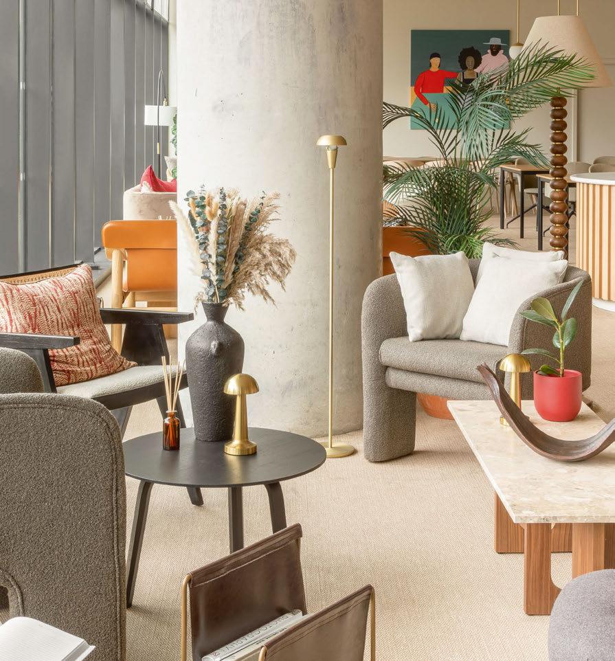
lifestyle driven hospitality approach to the project,” says the studio’s Managing Director, Na Li. After 18 months the project was complete with a design that works for the flexible lifestyles that have come in the aftermath of the pandemic but, in a way that makes working from home both comfortable and enjoyable.
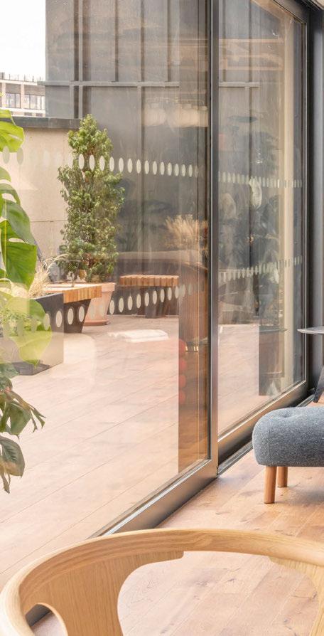
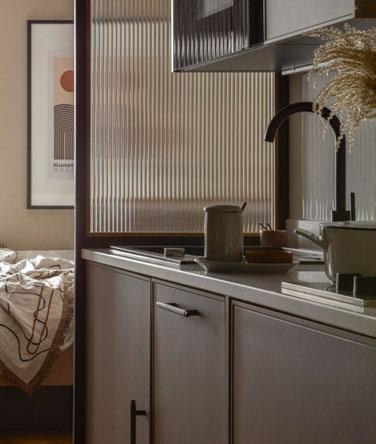
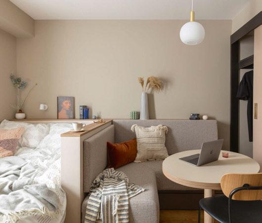
Li further expressed that configuring the former hotel space into the client’s brief and accounting for the various co-living spaces was one of biggest challenges the designers faced. The project encompasses 300 residential spaces with ample shared facilities such as a resident’s lounge, co-working space, a gym, multimedia room, meeting rooms, and a rooftop pavilion and terrace. The latter was added as a brandnew architectural feature, a new challenge for the Holloway Li designers, with full panoramic views of Central London. The terrace’s design acts almost as a ship’s hull where people can relax and picture themselves soaring through the sky as if mid-voyage. Li describes the project as “drawing influence from spatial design of nautical living, from London canal boats to luxury cruise vessels, while paying homage to classic terraced housing, on a grand scale” - while also making a playful nod to the building’s name, Ark. Each resident’s studio takes inspiration from canal boat design; utilising joinery elements like textured
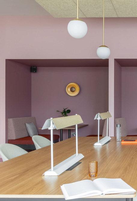
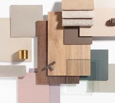
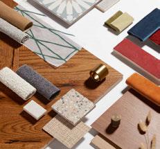
and translucent screens, as well as partitioned seating areas, the rooms achieve a harmonious blend of flexibility, modularity, and spatial efficiency. The studios are distinguished from one another through three subtle colour palettes – sage, sand, and taro – maintaining a neutral back drop that allows residents to infuse their own character and personal touch to a space so it can feel feel like home.
Li says: “We researched the traditional design vernacular of canal boats in depth, borrowing spatial elements to create studios that felt spacious with pockets of intimacy.” The selection of decorative lighting played a crucial role in enhancing this spatial quality. The inclusion of Moooi’s Random Light II and &Traditions’ Formakami lights, were pivotal features in elevating the overall airy ambience and domestic charm of the space. Opting for various paper shade lights, these emit a soft, gentle glow that disperse a warmth in all directions, enveloping the surroundings and creating a cosy, inviting atmosphere within one’s personal space.
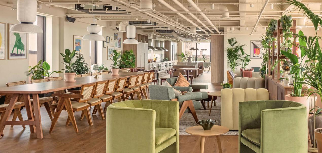
The main entrance lounge and co-working area are situated on the ground floor, the space takes cues from the spatial planning of London terraced houses on a grand scale, while finishes are reminiscent of a hotel lobby or luxury sailing vessel. Furnished with four, 16-seater co-working tables, booth seating, a grab-and-go breakfast island, and private meeting booths, the space allows for casual gatherings
34/35 |

“We researched the design venacular of canal boats in depth, using spatial elements to create studios that felt spacious with pockets of intimacy.”
PROJECT | WEMBLEY BY ARK
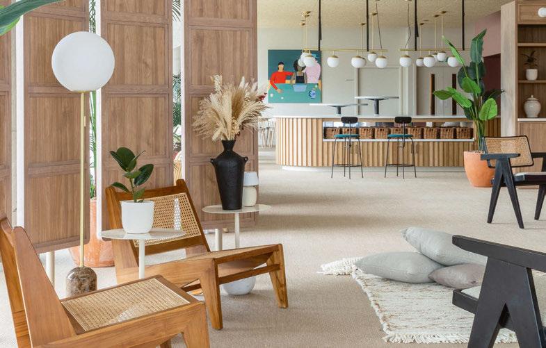
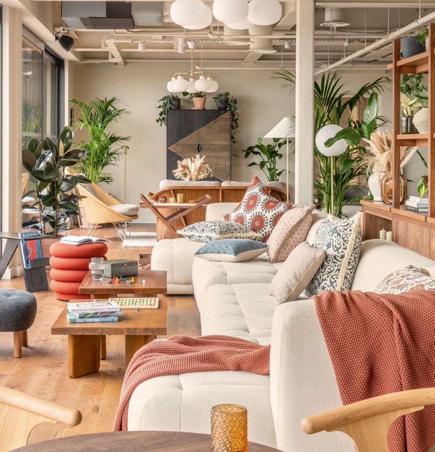
and quiet zones for concentration - meeting the varying needs of post-pandemic lifestyles. The shared areas are also adorned with furnishings such as floor and table lamps, richly patterned cushions, large oversized pendant lamps, and rattan chairs, the design immediately sets the tone and evokes the sense of ‘home’. The use of lighting through the design not only functioned to embellish the space but kept cohesion between the design narrative and the brief’s expectations.
“We used soft, warm lighting throughout to ensure the space felt inviting and comfortable while maximising the natural light available where possible” says Li. “In the co-working space for example, it was crucial the lighting nurtured productivity and comfort in equal measure, with options for adjustable lighting to cater to residents’ live-work needs. We strategically placed the pendant lights at eye level - serving as focal points within the space, while the floor lamps act as natural
partitions within the expansive open-plan layout, effectively defining distinct zones to create a more intimate and inviting ambiance,” says Li. Ark’s rental concept is on a mission to change the way people stay and experience London through its flexible community-centric rental concept. Holloway Li has a similar mission in its own work, as Li puts it, “we enjoyed the challenge of working on a new typology - we’re interested in reshaping modes of living and this project did exactly that.” Holloway Li successfully layed out the blueprint for the interior of this new generation of residential life, using ample amounts of creativity and flair without sacrificing the practicality and certainly not comfort. “We were really proud of the project - the co-living sector is ever-evolving, and we hope with what we have created with Ark will offer a new and nourishing mode of living for those who reside within” concludes Li. www.hollowayli.com
“We used soft and warm light throughout to ensure the space felt inviting and comfortable while also maximising the natural light where possible.”
36/37 | PROJECT | WEMBLEY BY ARK
WEMBLEY BY ARK Interior Design: Holloway Li Lighting Specified: Moooi, &tradition Images: Ed Reeves, Nicolas Worley, Sophie Percival. Cecilia De Paolo
Interior Architects create a nautical design for new co-living concept by Ark in Wembly, London. Utilising decorative and natural light that can create a spatial atmosphere as well as enhancing productivity and the sense of being “at home”.
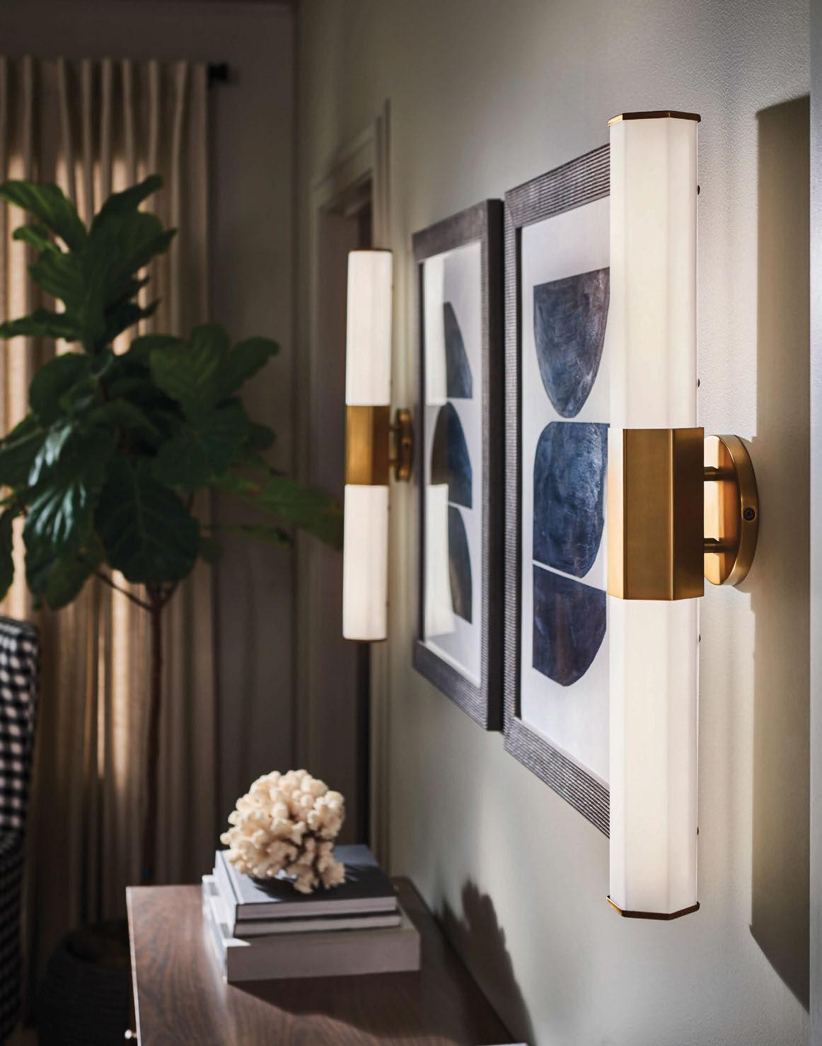
DESIGN BROUGHT TO LIGHT
To see many new products, request or download the Quintiesse and Elstead Catalogues. +44
(0)1420
enquiries@elsteadlighting.com
82377 |
| www.elsteadlighting.com

COMMENT

CHARLIE BOWLES
As we move into 2024, Charlie Bowles, Director at Original BTC, shares his thoughts about sustainability being a continued trend in both product and lighting design. He also comments on the continued drive to making home life more comforting as we continue to spend more time there.
In the ever-evolving world of lighting design, 2023 brought forth a notable shift towards sustainability, with a particular emphasis on the use of natural materials and a reduced reliance on plastics. This ever-emerging trend, which is sure to continue to gain momentum into 2024, marks a significant stride towards eco-conscious practices within the design industry.
This increased incorporation of natural materials, replacing the use of plastics in lighting fixtures, has become more popular recently. This not only aligns with environmental concerns but also introduces a refreshing aesthetic into living spaces.
The move towards sustainability is further underscored by the sustained popularity of portable rechargeable lights. Beyond the environmental benefits of not using as much energy and lowering carbon emissions, these portable lights offer newfound flexibility and convenience, allowing users to adapt their lighting solutions to different spaces and occasions and thereby offers practical solutions for modern living. These lights provide a mobile and versatile lighting solution that adapts to various settings, reducing the need for fixed, energy-consuming fixtures. The integration of technology and sustainability will also continue to be a notable aspect of lighting design in 2024. The choice to focus on sustainability in lighting design isn’t merely a passing fad; it represents a conscientious effort to address environmental challenges and reduce the ecological footprint of design practices. By utilising natural materials, designers contribute to the reduction of material waste, a critical concern in a world grappling with environmental degradation. This shift is not just about aesthetics; it’s about making a tangible and lasting impact on the planet.
As we move into 2024, the anticipation is that the focus on sustainability will persist, with an optimistic outlook towards products designed for longevity. A commitment to crafting designs that stand the test of time is crucial for fostering a more eco-friendly future. Rather than succumbing to fleeting trends, the emphasis is placed on creating timeless pieces that contribute to sustainability and bring enduring joy to consumers for years to come.
The intersection of sustainability and aesthetic appeal
becomes even more pronounced when we consider the rising prominence of soft, earthy colours in lighting design. This trend can be attributed to the desire for a more playful and organic vibe in living spaces, with muted, nature-inspired hues such as sage green and warm beige taking centre stage. The use of these colours complements natural light and also creates a serene and inviting atmosphere, transforming the way we experience our surroundings.
Simultaneously, the continued integration of natural fabrics in lighting design is expected to play a pivotal role. Materials such as ceramic, known for its tactile appeal, add a touch of sophistication and enhance the diffusion of light. This choice aligns seamlessly with the broader eco-conscious movement, offering environmentally-conscious homeowners an aesthetically pleasing and sustainable option. It is a testament to the growing awareness within the design community of the interconnectedness between aesthetic choices and environmental impact.
Furthermore, as the pursuit of wellness and comfort takes centre stage in home design, the demand for lighting that sets a soft, relaxed mood is on the rise. Adjustable and dimmable lighting options are becoming increasingly prevalent, allowing homeowners to tailor the intensity and colour temperature of their lighting sources to suit their preferences. This personalised approach enhances the ambiance of living spaces and profoundly contributes to a sense of well-being. As the population increasingly spends more time in their homes, they are taking a more intentional approach to design, keeping in mind how they want to feel in the space. As such, investing in their furniture and lighting has become increasingly important to create a true sanctuary within the home.
In conclusion, the lighting design trends of 2023 lay a promising foundation for a sustainable and aesthetically pleasing future. From the embrace of natural materials to the continued popularity of portable rechargeable lights and the anticipated rise of soft, earthy colours and natural fabrics, the trajectory of lighting design in 2024 holds exciting possibilities. The choices we make in lighting design not only shape our living spaces but also contribute to a brighter, more sustainable future for all.
www.originalbtc.com
COMMENT | CHARLIE BOWLES | 38/39
40/41 | MATERIALS | FIERMONTE
MATERIALS
FEDERICO FIERMONTE SPIRA
The brand new, brutalist-style, sculptural light Spira was presented at 2023’s Material Matters exhibition as part of London Design Festival.
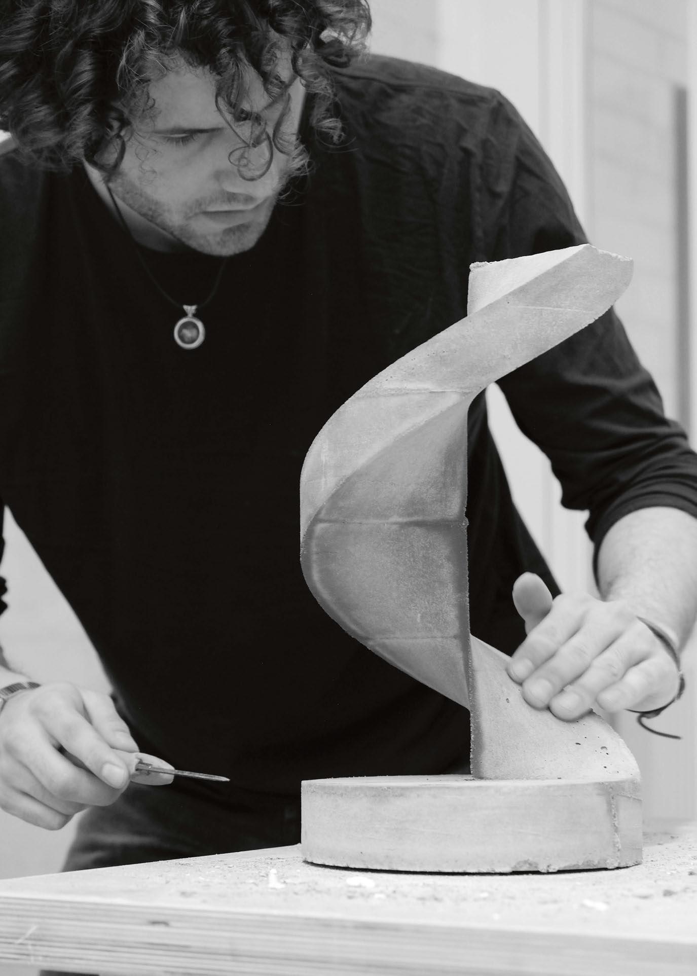
Spira’s creator, Italian Federico Fiermonte is based in Helsinki, Finland and has only been designing and creating objects, experimenting with materials, and developing skills since 2021.
It is a spiral-shaped lamp, described by Fiermonte as “elegant, dynamic and delicate”. “It plays on the contrasts between a light and dynamic shape derived from nature, with an artificial, heavy, and robust material such as concrete, all with an added decorative touch given by the internal light that runs along the slender shape”, he adds.
The spiral shape is a common thread that runs through a lot of Fiermonte’s designs, something he explains as an “unintentional” consideration in his work.
“I envision this product primarily as a collector’s item, given its deeply artisanal creative process, which ensures that each piece is distinctly unique. When placed within a space, the Spira lamp is carefully designed to blend into its surroundings, asserting its presence with elegance.
“It effectively embodies the robust nature of the material that constitutes its essence, evoking a “brutalist” aesthetic. At the same time, as a decorative object, it generates a surprising contrast when placed in a minimalist environment, lending an unexpected element while curiously maintaining a sense of harmony within the environment.
“Exploring the interplay between light and concrete, I wanted to analyse my profound fascination for the field of architecture,” he continues.
“Concrete has made it possible to realise remarkable
structures throughout architectural history, ranging from the iconic Pantheon dome in Rome where I come from, to complex constructions such as the Ganter bridge in the Swiss Alps. Within the context of architecture, I have always been captivated by the potential inherent in concrete. Spira draws great inspiration from the elegant spiral staircases of highend buildings across the world with particular care of those part of the modernist style.
“For me, the key to achieving a harmonious and cohesive environment depends on the intrinsic relationship between design aesthetics and architectural materials.
“A line that guided me in the creation of this product - and which I think is always a characteristic feature of my way of conceiving objects - is to respect precise mathematical and geometric parameters, which vary from project to project.
“Working with light fascinates me enormously through the attempt of sculpting and giving shape to something so intangible and eternal.”
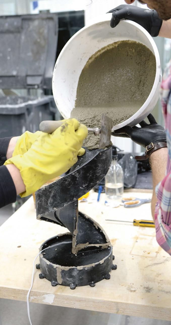
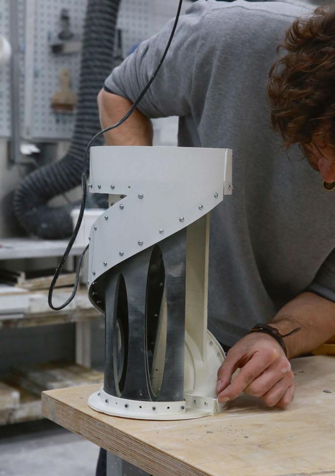
The concrete used by Fiermonte is composed of recycled aggregates to aim for a more sustainable product. The concrete is cast in a 3D printed mould made up of five parts, which proved challenging to create due its complex shape. “The most significant difficulty in making this piece was the creation of a mould that could lead to a clean and optimal result and produce precise edges. Making the mould is in fact 70% of the physical production work and it’s constantly being developed as I add improvements while continuing to work on the product,” he explains.
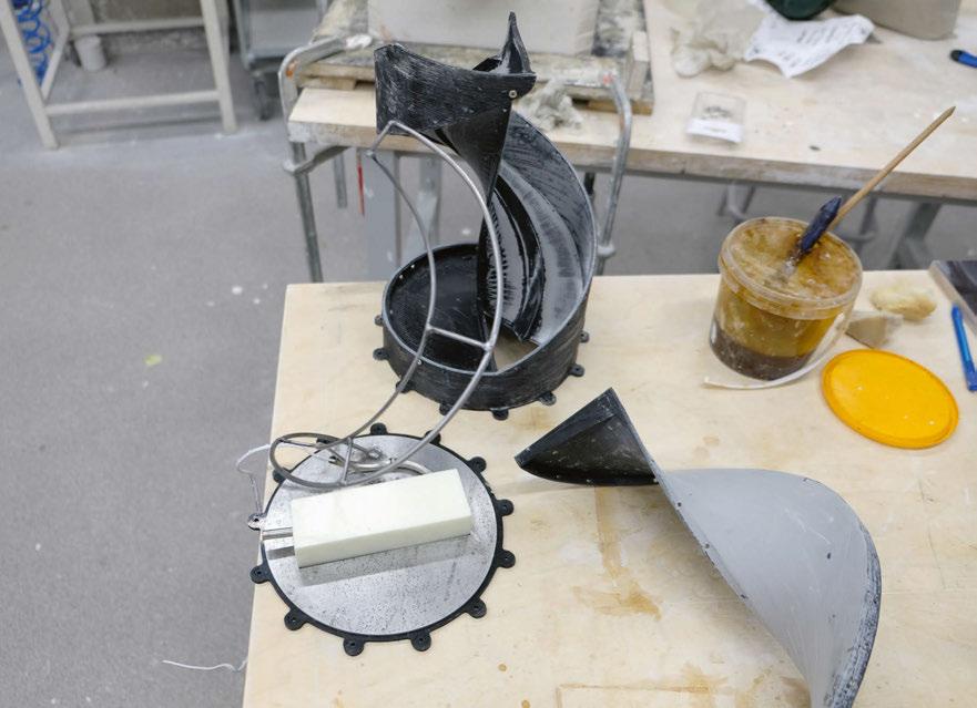
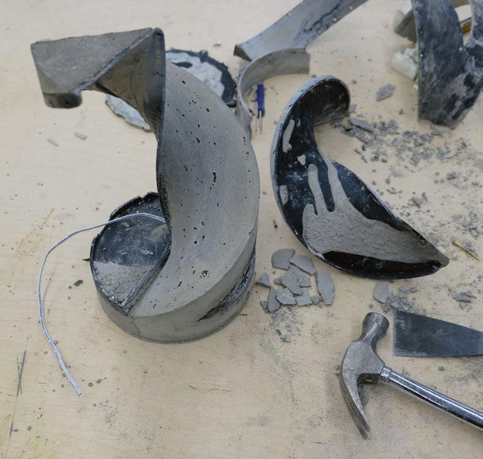
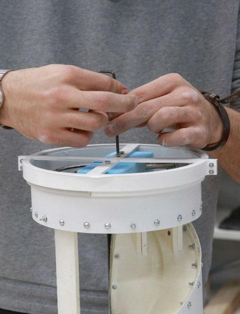
“Within the lamp’s structure lies an armature crafted from hand-bent and welded rods, sourced from reclaimed metal waste, as well as aggregates repurposed from debris of different sizes (one to four millimetres) collected in the Otaniemi area in Espoo near Helsinki within the construction industry.”
42/43 |
MANUFACTURING PROCESSES
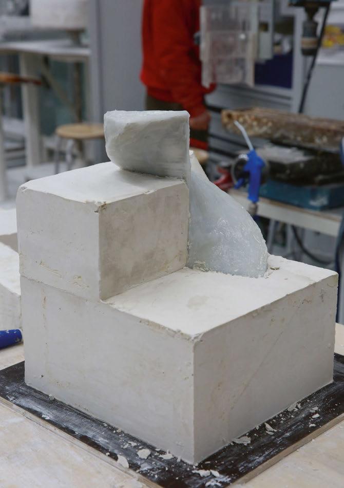
The concrete used by Fiermonte is composed of recycled aggregates to aim for a more sustainable product. The concrete is cast in a 3D printed mould made up of five parts, which proved difficult to create due its complex shape.

MATERIALS | FIERMONTE
“In the initial stages, I experimented with compact foam moulds milled with CNC technique, subsequently I experimented with a silicone mould supported by plaster, and finally reaching the best result with a 3D printed mould with PLA made up of five parts.
“The particularly simple shape is complicated to obtain by casting the concrete, especially to remove once it has solidified.
“Within the lamp’s structure lies an armature crafted from hand-bent and welded rods, sourced from reclaimed metal waste, as well as aggregates repurposed from debris of different sizes (one to four millimetres) collected in the Otaniemi area in Espoo near Helsinki within the construction industry.
“For the functioning elements of the lamp I have been
using a 12V DC transformer and a thin LED COB strip light. The implementation of a COB-type LED light strip allows the individual LEDs to be very close to each creating a seamless line of light that integrates perfectly within the design based on curves and lines.”
He continues: “Crafting an interior piece in concrete, using a recipe divergent from those employed in construction or infrastructure, offers a notable advantage. In this context, there is no imperative to meet specific standards of strength or durability like most structures that are concrete made. This liberates the creative process, fostering a greater degree of flexibility and experimentation, allowing for more focus on other artistic and design aspects.
“The choice to use concrete was partly driven by my

44/45 |


desire to challenge public perception surrounding a material that I find captivating from an aesthetic standpoint, both in an attempt to highlight the beauty that can be obtained through this material and by taking it to its extremes.
“At the same time, I aimed to contribute to a more sustainable production approach by selecting components and conscientiously repurposing other waste elements.”
Once Fiermonte had settled on the design for Spira, his primary goal was to not change or make any compromises on the shape. This greatly impacted the process of creating and developing the mould. But it was all worth it for the designer as he achieved what he set out to, and all within just over a year.
www.fiermonte.design
MATERIALS | FIERMONTE
STUDIO SLØYD
The new Archive table lamp from Northern is the result of a collaboration with designers Studio Sløyd. darc’s editor chats with the duo about their first venture into the world of designing lights and how Northern’s Jonas Norheim helped them along the way.
The Archive table lamp is the first collaboration between Nordic design brand Northern and fellow Norwegians, Studio Sløyd. The collaboration was established during Designers’ Saturday, one of Oslo’s largest and most important design events.
An open competition was hosted to aid in building relationships between designers and manufacturers. Five design briefs were sent out by the manufacturers to which designers could respond. Northern’s brief for a lamp design received approximately 40 different proposals from roughly the same number of designers. Eventually, the team chose Studio Sløyd to be their partners.
Following the acceptance of Sløyd’s design, Northern was then tasked with developing a prototype, which was to be displayed at the next Designers’ Saturday event that takes place every other year. Once the final design is completed, the brand has a choice on whether to release the design back to the design studio who can take it to another manufacturer, or to keep and produce the piece themselves; Northern chose to keep and produce the design.
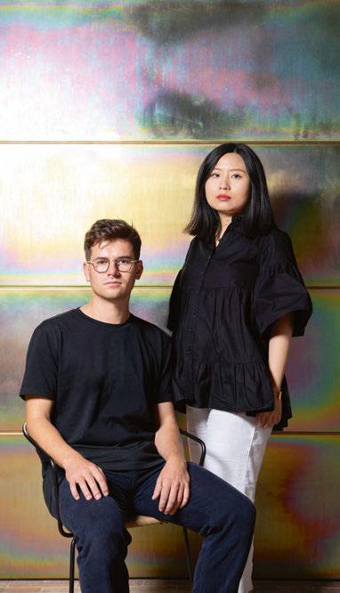
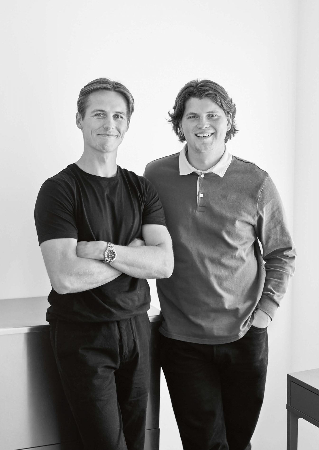
service and interaction design, so when we found we had a common interest in furniture, we collaborated on a school project and thus, the studio was created.” Jøraandstad adds: “We established Studio Sløyd because we wanted to keep creating furniture together. We are also good friends, so we thought that starting a studio, and making a career together would be just perfect. The studio was established in 2019.”
“We established Studio Sløyd because we wanted to keep creating furniture together. We are also good friends, so we thought that starting a studio, and making a career together would be just perfect.”
darc sat down with Herman Ødegaard and Mikkel Jøraandstad of Studio Sløyd, and Jonas Norheim, Director of Northern to find out more about the studio as well as their collaboration on Archive.
“We both grew up in Oslo, Norway,” says Ødegaard. We both attended and met, at the Oslo School of Architecture and Design. The school had a big focus on
When discussing design principals and approaches, darc discovers longevity is key for the young designers. “It can be an expectation that a young design studio is focused on creating objects with a certain “out there” concept and shape, and this can cause objects with a contemporary and short lifespan. We want to create furniture with a long lifespan,” explains Ødegaard. “But it can be challenging to design something completely unique, and something a lot of people want to fill their homes with. It is a big reward when we feel like we have fulfilled both these criteria, as we have with the Archive lamp. “We think that a long lifespan both in quality and in design is important. For us, prototyping is also important for our process. With the Archive lamp we prototyped using regular A4 sheets of paper. This caused the lamp to be sleek and minimalistic. We also think that a good relationship between the designer and the producer is essential to create furniture that both parties can be proud of.” Norheim’s first impressions of the studio’s design submission was that they found something that would fit in nicely with Northern’s branding.
46/47 | INTERVIEW | STUDIO SLØYD - ARCHIVE LAMP
INTERVIEW
“Getting the opportunity to work with the experienced people at Northern has been very educational for us. Not only does Jonas have a lot of good advice when it comes to the production aspect, but he is also a great designer, so we feel very lucky that we got to collaborate and discuss the design with him along the way.”

48/49 |
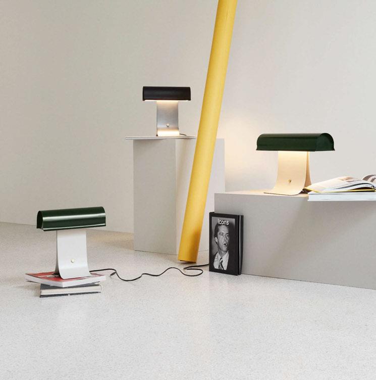
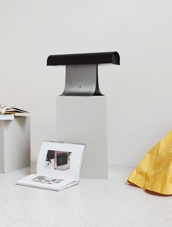
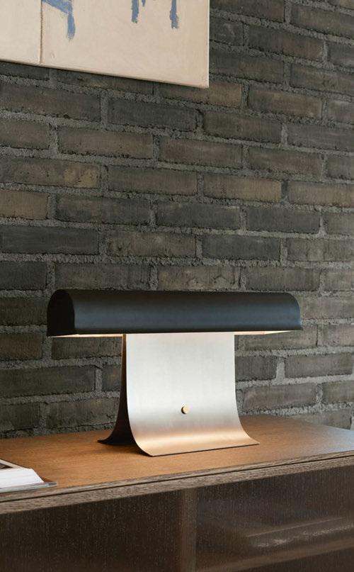
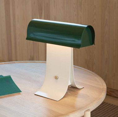
IMAGES: THE ARCHIVE LAMP IN ITS TWO SIZES AND TWO COLOUR OPTIONS - DARK GREEN/LIGHT GREY AND BLACK/ STEEL. BELOW, NORTHERN’S JONAS NORHEIM SKETCHES.
He describes it as a “nice lamp, timeless character, and something new”.
Making the prototypes for the Archive lamp from paper allowed the team to perfect the soft curves of the lamp. It was then down to Sløyd’s materials-focused approach to recreate these smooth curves in striking steel.
“Archive is made from steel and stainless steel,” explains Norheim. “For this lamp, the materials choice was a given, because of its shape. There are a lot of curves and small details, which are very suited to steel. Also, it gives it a fine quality and will make it last for a lifetime.”
Jøraandstad continues: “We used paper to prototype the lamp at the beginning of the process, which also played a part in the inspiration for the lamp. The shape is made up of an elongated cylindrical lampshade in stainless steel, which reflects the light downwards. The end of the cylinder is capped with an angled piece of steel that not only creates an interesting composition, but helps the light reflect onto a wider area. The table lamp has two bent pieces of steel that form the base as well as a visual counterpart to the lampshade. The shape of the base lets the light travel down along the two pieces and creates an interesting gradient of light towards the ground.
“We discussed making it in aluminium, but the weight of the lamp in the final product with steel feels right, and it really feels and looks like a quality product.”
Before embarking on this project with Northern, the Sløyd duo’s experience in design was mostly built upon wooden furniture, so the working relationship they built with Nornheim was invaluable as they developed skills and knowledge in metalwork.
“We had a meeting with Jonas shortly after the announcement of the winners, where we discussed the processes further. Northern was very open minded and assisted us with all the help we needed in the design process, but it was very clear that we should do the big design decisions. We really appreciated the trust from them,” says Ødegaard.
“Getting the opportunity to work with the very experienced people at Northern has been very educational for us. Not only does Jonas have a lot of good advice when it comes to the production aspect, but he is also a great designer, so we feel very lucky that we got to collaborate and discuss the design with him along the way.
“Working on a new kind of object and a new material is always challenging. We had never made a lamp before, and the complexity of all the parts and components was a new chapter for us. Northern made it easy for us to understand, but this was probably the most challenging aspect of the process.”
Nornheim adds: “I think the working relationship was a good one. This was their first lamp in production. So, I believe they learned a thing or two. Heman and
INTERVIEW | STUDIO SLØYD - ARCHIVE LAMP
“For this lamp, the materials choice was a given, because of its shape. There are a lot of curves and small details, which are very suited to steel.“
Mikkel are fast workers, so every time there was some changes needed to be made, they fixed them right away. That is something which is very important when you are developing a lamp in such a short time.”
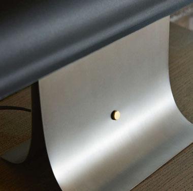
The Archive features a replaceable LED lamp and a three-step dimmer switch, which is integrated as a design feature. It is available in two colour ways and two sizes, which were carefully thought out. “In the development of the Archive lamp, we explored a spectrum of colour combinations and sizes to discover the most harmonious fit for the intended environments - be it a desk, sideboard, or console,” explains Northern. “After thorough consideration, we narrowed it down to two sizes that perfectly cater to these spaces.
“As for the colour selection, we were drawn to dark green/light grey and black/steel. These particular hues naturally stood out, not only complementing the lamp’s design but also embodying a sense of
versatility and timeless elegance that aligns with our vision for the product.
“Naming a new product at Northern is a comprehensive and meticulous process. We conduct numerous workshops to find a name that not only resonates with the essence of the product but also aligns with our brand identity. For the Archive table lamp, we went through an extensive list of over 20 potential names. Ultimately, Archive stood out because it evoked the same emotions and characteristics as the lamp itself, perfectly capturing its spirit and the timeless elegance we strive for in our designs.”
www.studio-sloyd.com
www.northern.no

50/51 | INTERVIEW | STUDIO SLØYD - ARCHIVE LAMP
IMAGES: STUDIO SLØYD SKETCHES THE TECHNICAL DETAILS OF THE ARCHIVE. PLUS CLOSE-UP DETAILS OF THE ARCHIVE SWITCH.
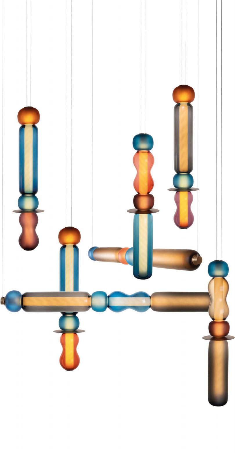


WAVE COLLECTION
BESPOKE FREE-BLOWN GLASS LIGHTING
HAND MADE IN THE UK
WWW.CURIOUSA.CO.UK
COMMENT

DANIEL BLAKER
Daniel Blaker, Creative Director at Nulty, discusses the lighting details to be considered when designing a lobby, and how it can be used to establish the tone of the space.
Entering a lobby should feel like a warm embrace. A beautifully curated welcome that creates a strong first impression and immediately gives you a sense of the occupant’s character and personality. Light has an important role to play here because it has the power to change the tempo and set the tone, so the way that we weave a lighting scheme together needs to be carefully balanced and emotionally driven. While a designer’s approach varies according to whether it’s a commercial space where typically brighter finishes are required, or a hotel where warmer tones are the order of the day, our design intent is simple - a lobby environment should make an impact and feel like the pinnacle of the experience set to unfold.
Before we consider the specifics of incorporating a decorative luminaire or a feature installation, it’s important to step back and unpick the design narrative and purpose of that scheme. What are we trying to say with that space? Who is the scheme intended for and how will it be used? Is it simply a transition space that’s sole purpose is to guide its occupants through to a particular spot. Or should it encompass the welcoming spirit of a concierge and be a space of emotion and connection. It’s likely to be the latter because lobby environments are evolving to become social landscapes that serve multiple purposes, so co-working spaces and casual meeting areas are being embedded into the design. Designing for diversity of purpose is a skill that the lighting designer is becoming increasingly adept at. Often it means pulling a rabbit out of a hat by weaving different lighting techniques together in one single scheme. The trick is how we master the hierarchy of the space; the magic takes place when we design in layers.
First things first, we need to think about how light can be used to influence the way that people move around the space. As the eye is drawn to the brightest point, we can aid wayfinding and improve permeability by using light where it’s needed most to create a dwell point or pause moment such as a reception area or concierge desk, or to guide users to the next stage of their journey by accenting a lift lobby or staircase.
Next, we need to think about what materials are being illuminated and how they receive light. Most of the lit environment is perceived through how effectively the vertical surfaces are illuminated (as opposed to the floor), so when a person enters a space from the outside world, they shouldn’t feel like they are walking into a cave. If we have taken the time to properly illuminate the elevations,
the transition should feel seamless. Finally, we need to make the space sing, come alive and feel unique - this is where a focal point such as a bespoke chandelier or a theatrical lighting installation comes into play. When decorative lighting is thoughtfully curated, it can elicit an emotional response by imprinting a hotel experience in a person’s mind, reinforcing a company’s visual identity in a workplace, or giving pause for reflection in a residential setting. If we get it right, it’s a stylistic intervention that becomes an expression of the wider interior design narrative.
Too often a decorative lighting piece in a lobby is an off-the-shelf response, which is a missed opportunity because creation isn’t just specification, it’s about how form, materials, finishes, and light come together to create something special. Commissioning a piece for a lobby is a chance to have a little bit of fun by adding a creative stroke to that scheme, or weaving in something unexpected that gives it an extra punch of personality. All of this brings us back to our original design mantra - make an impression! This should be the raison d’etre of a decorative luminaire or lighting piece in a lobby space, but it’s important to remember that these standalone lighting elements can’t be expected to enhance an interior space on their own. They need a sprinkle of magic in the form of delicately balanced layers of light that prevent them from becoming featureless and formless.
The key to activating the characteristics of a decorative lighting piece depends entirely on the composition, scale, materiality, sense of movement, and ambience that you are looking to create. In some cases, the feature itself is the light source, and whilst this does inherently provide its own expression, it typically delivers a modest performance that is at best functional light. Considered use of architectural lighting can make all the difference. If we want to add a strong dose of sparkle, we need to balance multiple light sources around a fitting to increase the level of refractions and reflections. And, if we are looking to make a feature soar, incorporating imperceivable up lighting will help it ascend. A harmonious dialogue between architectural and decorative lighting will, without fail, result in a more resonant environment. Staging an experience is fundamental to the success of a lobby environment, and while decorative elements are typically not wall flowers, they need a little bit of help to be teased out of the shadows.
www.nultylighting.co.uk
COMMENT | DANIEL BLAKER | 52/53
LA MAMOUNIA
MARRAKESH,
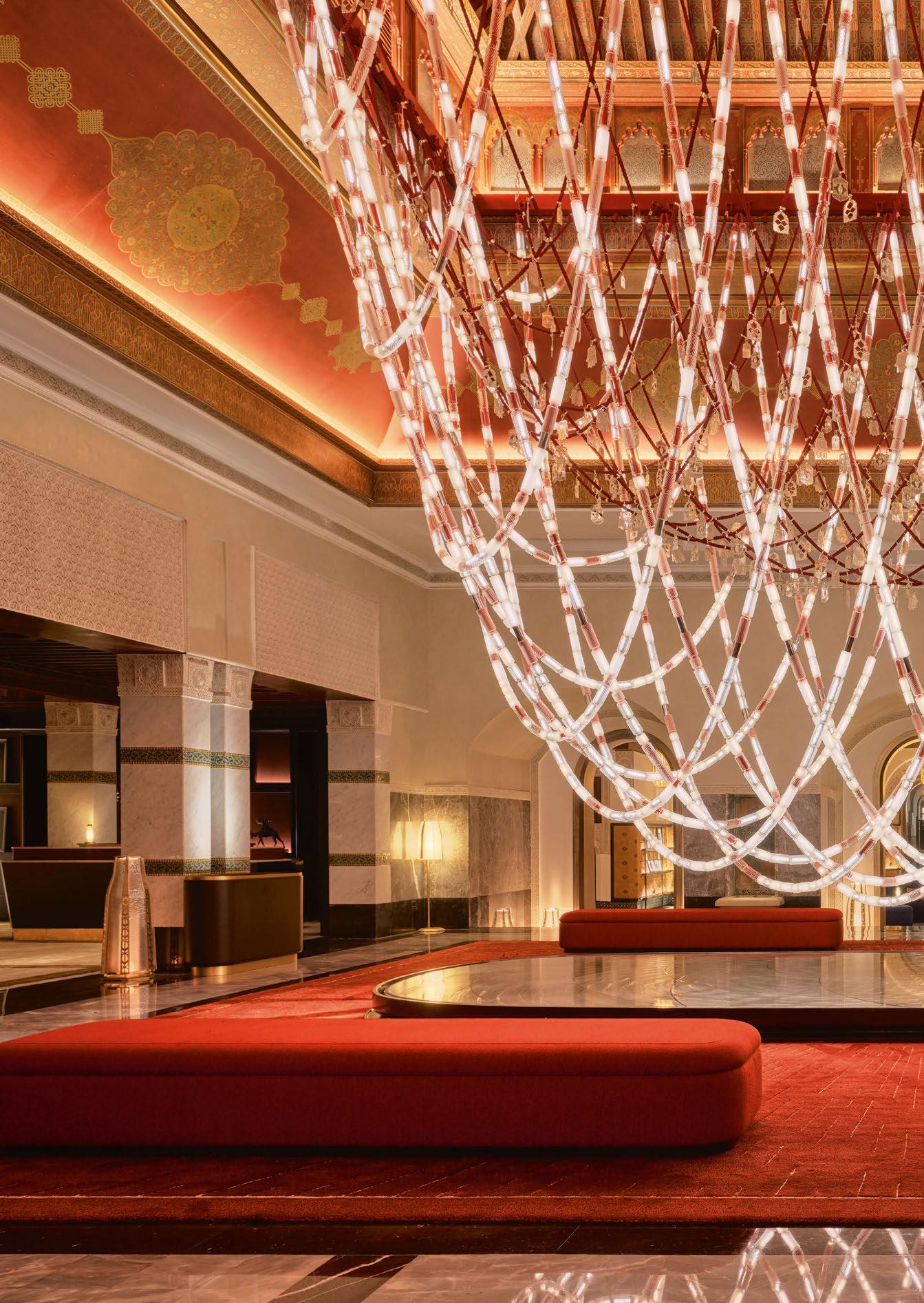
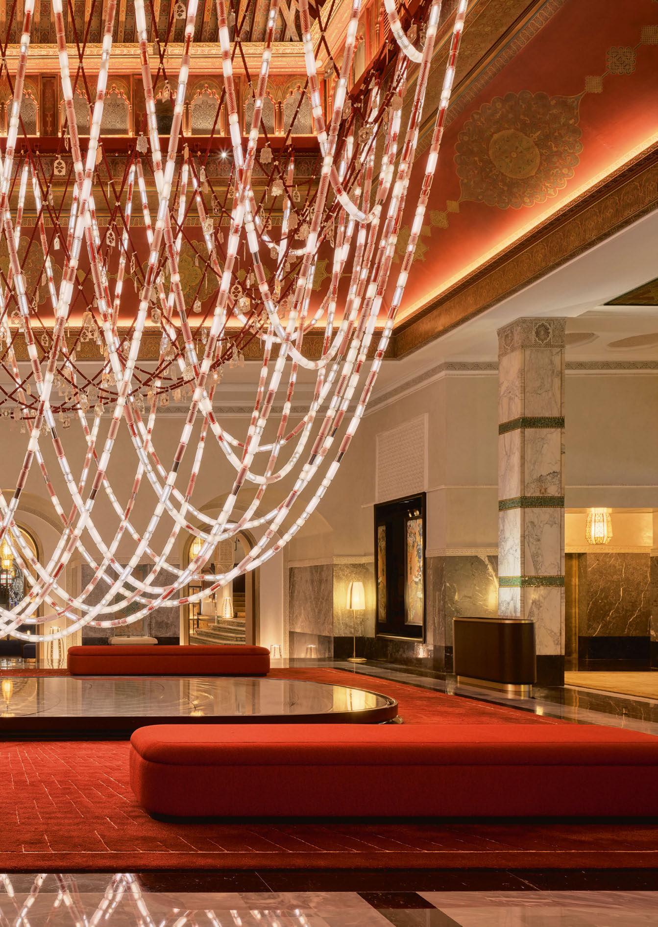
Marking its 100th anniversary, the renowned La Mamounia hotel, situated opposite the Kutubiyya Mosque in Marrakesh, revealed newly refurbished interiors in October 2023.
Lasvit created three handmade lighting pieces for this legendary location. Collaborating with French design studio Jouin Manku, these installations are a tribute to Moroccan tradition with a touch of global sophistication. An impressive near-nine-metre-long chandelier dominates the lobby.
The vision of Jouin Manku was brought to life with “Le Chandelier du Centenaire,” a striking lighting installation suspended less than a metre above the ground at the lobby’s heart. With its intricate design, this chandelier honours the art, traditions, and especially the Berber women of Morocco, drawing inspiration from traditional Berber necklaces. It resembles two intertwined necklaces and incorporates an extensive 300-metres of electrified cables braided in red strings — a colour of profound significance to the Berber community.
The glass elements are individually handblown and shaped. The installation comprises 3,000 of such pieces in three sizes and eight distinct finishes. Some glass elements are braided in red to echo a traditional necklace, while others use silver to accentuate the crystal sparkle.
Central to the chandelier are braided red cords adorned with authentic Berber silver pendants crafted by Moroccan artisans to underscore the cultural significance of the piece. The chandelier is connected to two lighting circuits, allowing a combination of lighting effects to highlight its intricate details.
www.lasvit.com
FOCAL POINT 54/55 | FOCAL POINT | LA MAMOUNIA
MOROCCO
LODES
www.lodes.com CASE STUDIES
THE FULLERTON OCEAN PARK HOTEL, HONG KONG
As the first Fullerton hotel in Hong Kong and first Fullerton resort worldwide, The Fullerton Ocean Park Hotel Hong Kong is a sustainable, oceanfront luxury resort offering a relaxing and tranquil retreat for every kind of traveller.
Located in Aberdeen, Hong Kong, the concept for the Fullerton Ocean Park Hotel was inspired by the tranquil setting of the Southside. Interior designers EM Bespoke reinterpreted elements of linear architecture, colonial curves and furniture, bespoke and tailored details from days gone by, weaving them into a contemporary world. EM Bespoke worked closely with property developers Sino Group on several feature areas, including the lighting installation at the ground
floor group check-in reception, all FF&E for the outdoor terrace/lawn, feature lighting and seating areas throughout the lift lobbies and corridors, and all guest room furniture, art, and accessories.
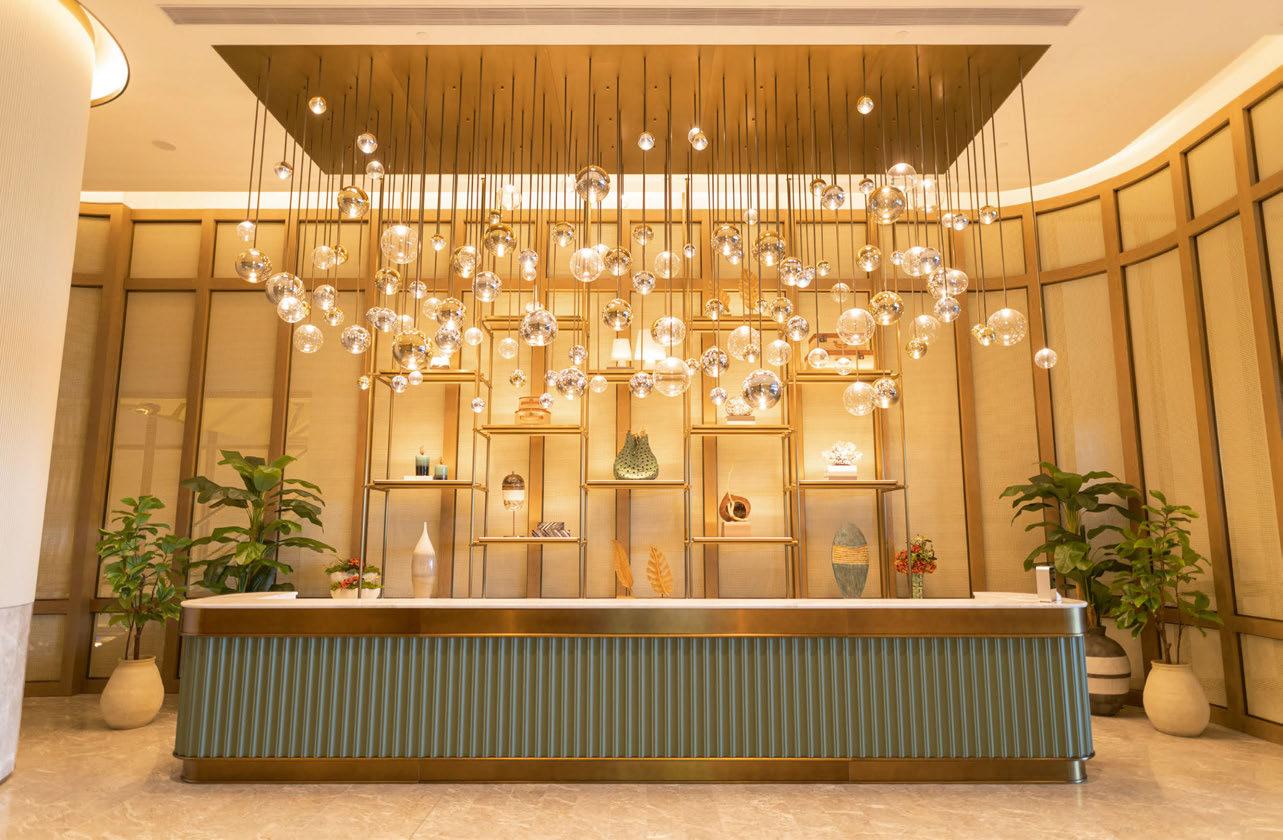
A large installation of Lodes’ Random Solo pendants, supplied by Zodiac Lighting, hang above the reception desk in the hotel’s lobby, creating a stunning welcome for visitors and staff to the hotel. With Random Solo, designer ChiaYing Lee unleashes the individuality of Random’s spherical shapes, which now float like bubbles of light in their solitary beauty and suggest new compositions of luminous harmonies.
56/57 | CASE STUDIES | LOBBY
CURIOUSA THE ARTS HOUSE, ENGLAND
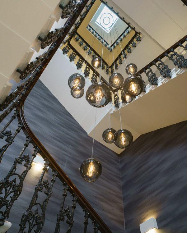
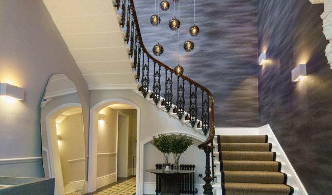
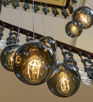
Curiousa was commissioned by architects Marchini Curran Associates, to design a bespoke stairwell chandelier for The Arts House, which is a luxury boutique development in South Kensington, London consisting of 12 prestige apartments.
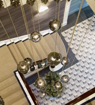
The design needed to enhance the lobby, which has a grand entrance to this exclusive development as well as working across all five floors. Curiousa created the chandelier with a dramatic cluster of 12 large individually handblown pendants in slate grey.
The main challenge for this project was that the piece needed to hang directly under a skylight at the top of the stairwell. The team devised a way of suspending the lights using a dark bronze finished metal double ring that straddled the opening - still allowing the light to pass through and for the pendants to cascade down towards the lower stairwell.
Maintenance is also a very important part of any chandelier project - it’s something clients often forget to consider but each shade needs easy access. Therefore, Curiousa made sure each of these pendants can be pulled up from the stairwell above for cleaning and any lamp changes, ensuring this chandelier really looks the part for years to come.
www.curiousa.co.uk
IMAGES: CHRIS WEBB
LUTRON
LUTRON OFFICE, ENGLAND
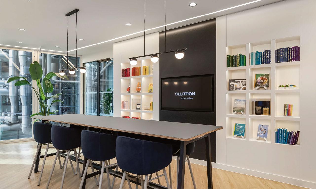
Lutron, a leader in lighting control and automated blinds, recently opened a new office for its UK, Continental Europe and Africa headquarters. The company chose a 7,770sqft premises at 51 Lime Street in the heart of London, which was designed to provide improved comfort for the growing team, including the use of Lutron lighting and shading controls throughout the space. The space had to match the company’s technology by providing a comfortable and bright aesthetic. The new office represents the solutions and design it offers to customers including the notion that Lutron’s products are ideally suited to a lobby environment.
The new office gave Lutron the perfect opportunity to install its latest lighting control platform. They wanted visitors waiting in the colourfully decorated lobby space as well as the Lutron team to enjoy the benefits of its latest innovations the same way customers do. There is dynamic lighting in the lobby and office to adjust colour intensity and temperature throughout the day. The lighting control works in combination with Lutron’s automated blinds, to optimise energy savings while providing a comfortable and productive environment for everyone. www.lutron.com
58/59 |
IMAGE: OLIVER POHLMANN
CORDULA KAFKA
ACADEMY OF SCIENCES, LITERATURE & MUSIC, GERMANY
At the end of 2023, the new chamber music hall of the Academy of Sciences, Literature and Music in Mainz, Germany was ceremoniously opened. Named after the benefactor Sibylle Kalkhof-Rose, the “Kalkhof-Rose Hall” was harmoniously integrated into the existing building complex.
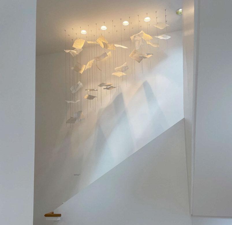
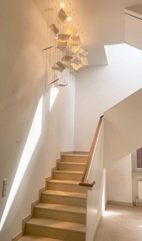
Two Leaves light objects by Cordula Kafka complement the architecture by Timm Helbach from the Mamuth office in Mainz. The floating “papers” made of fine, translucent porcelain accompany visitors from the entrance up into the concert hall.
Leaves represents the image of a frozen moment of movement. It is open to interpretation as to whether the falling porcelain sheets signify sketch paper, sheets of music, or pages from a book. In any case, the viewer is invited to rest and pause on their way to enjoy
a concert in the evening. Leaves thus complements the new and modern academy extension in terms of both form and content.
No two porcelain sheets are the same as they are moulded by hand in Kafka’s studio in Berlin. The highfired and translucent sheets are installed in between fine stainless steel rods and are illuminated from above.
The Leaves installation is a sensual lighting object and a special highlight to many spaces, such as foyers, stairwells, and lounges. The luminaire is made to measure as an individual item. Size, lighting technology, and design of the structural parts are adaptable to each individual environment.
www.cordulakafka.de
CASE STUDIES | LOBBY
BROKIS HOTEL PERK, CZECH REPUBLIC
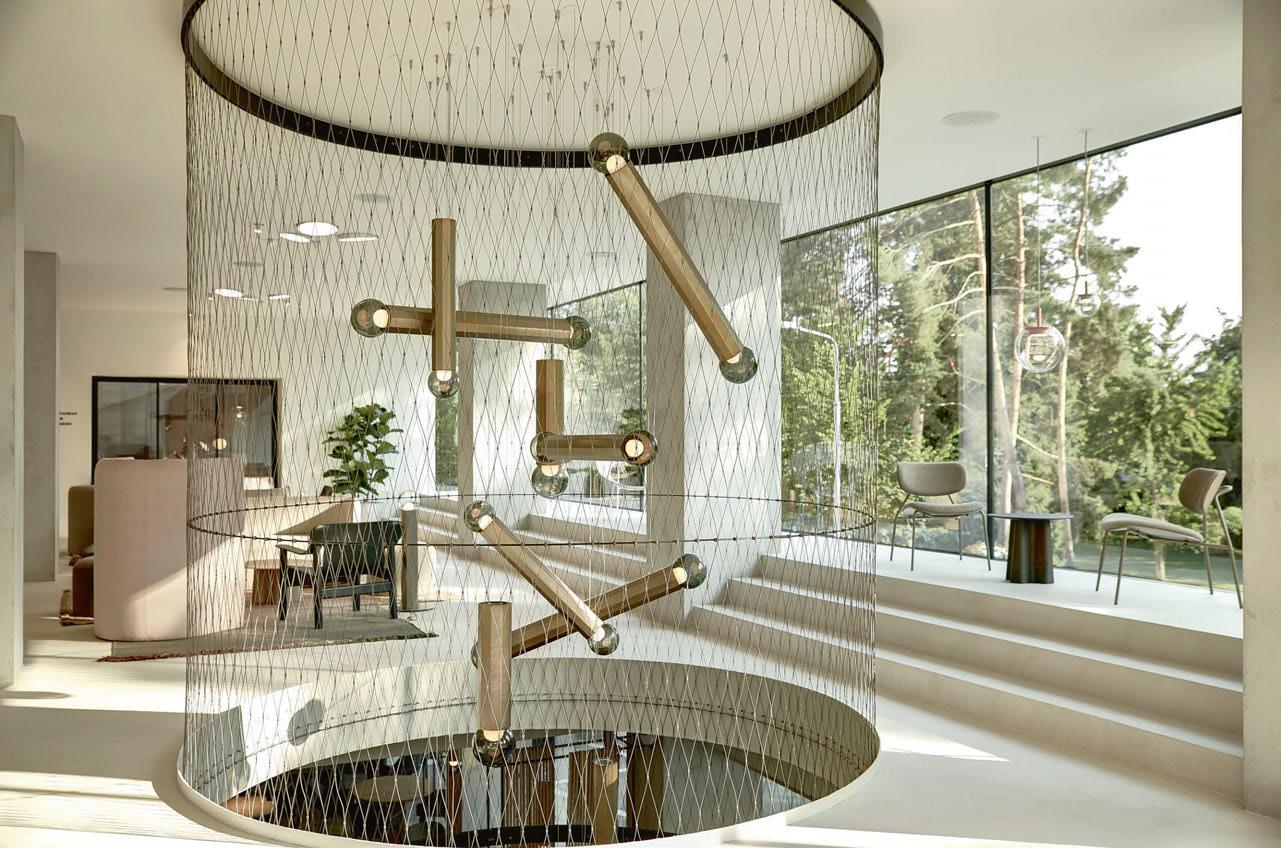
The lights of Brokis are particularly well suited to creating the right mood in restaurants, hotel lobby bars, and other hospitality settings.
The wide spectrum of its collections can evoke a pleasant atmosphere in any environment, indoor or outdoor. Thanks to customisation of components and a broad selection of glass colours, metals, finishes, and colour options, the lights can be used in almost any type of space. Its collections work very well not only as a form of lighting but also as a jewel in the interior, even when they’re not switched on.
Following a remarkable transformation, the functionalistic landmark Hotel Perk has reopened in North-East of Czech Republic in the city Šumperk. Formerly one of the dominant features of the cityscape, Hotel Perk has a rich history.
The modern interior was designed by Brokis‘ Art Director, Lucie Koldova. A playscape of light and subtle shadows that accentuate the building’s clean lines.
The hotel welcomes visitors in a lobby featuring a clean and minimalistic yet stunning Orbis collection, which was designed by Koldova. The building’s clean lines are brought to the forefront by a play of light and subtle accents, such as those elicited by the Orbis collection.
The main stairway, a central feature of the hotel, features an attractive pinkish-grey stucco finish illuminated with a combination of Orbis and Sfera lights. www.brokis.cz
60/61 |

STOANE LIGHTING
BIOTECHNOLOGY INNOVATION ORGANIZATION (BIO), USA
Floating above the central space of the brand-new headquarters of the world’s largest biotechnology trade association, Biotechnology Innovation Organization (BIO), is this stunning feature piece known as the DNA Pendant by Stoane Lighting.
Developed with Inter Lux and FOX Architects, this four-metre-tall sculptural luminaire uses a total of 116 LED sources connected to the central spine; illuminating bespoke diffuser rods of 11 different sizes, carefully arranged to reveal the double helix DNA design. The modular design allows for easy installation, maintenance and remanufacture.
During the collaboration, Stoane Lighting’s team provided a sample section, photos, renderings, and technical drawings in order to accurately communicate the design vision.
The motivation behind the making of this chandelier was to create a striking focal point, to celebrate design and collaboration, and to support the objective of the architecture in reflecting the company’s “mission and commitment to life-saving work.”
www.stoanelighting.com
CASE STUDIES | LOBBY
NILS AM SEE HOTEL, AUSTRIA
Located in Burgenland, Austria, Nils am See is a boutique hotel that opened last year.
The moment guests step into the foyer of Nils, they’ll immediately notice the meticulous attention to detail, genuine craftsmanship, and hard work that went into its design. The subtle colour scheme, generous use of natural materials such as wood, and expert interplay of light and decor create a welcoming and elegant ambience with a relaxed vibe.
Architects Halbritter & Hillerbrand designed the building, while the interior design was carried out by Jürgen Hamberger of Mezza-Maiso, alongside Stefan Bayer, one of the two Nils partners. According to Lucas-Maximilian Lammel, the second partner, Nils aims to provide a tranquil hideaway where guests can feel at home and relax. The hotel offers more spacious rooms than usual, providing a comfortable and homely atmosphere that encourages guests to unwind and recharge.
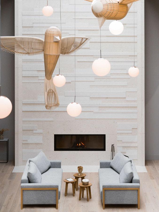
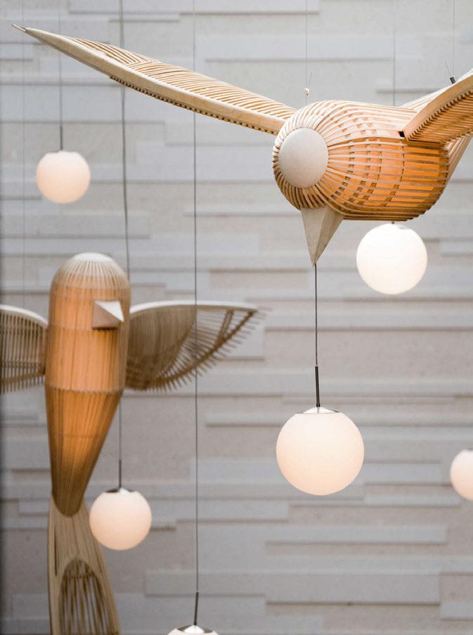
The foyer features two remarkable Big Bird lamps designed by Isidro Ferrer for LZF. The impressive light sculptures made of wood and accompanied by light globes, highlight nature-inspired elements in the space.
The Nils am See is a boutique hotel prioritising sustainable practices in its design, planning, and operations. The hotel utilises a photovoltaic system for most of its electricity needs, with 100% green electricity purchased from the region. To furnish the hotel, the operational team worked as much as possible with regional companies and utilised sustainable or recycled materials. For example, LZF’s sculptural Big Bird lamps are handcrafted from FSC-certified white elm wood by master craftsmen in Valencia, Spain. www.lzf-lamps.com
62/63 |
LZF
ARTICOLO
PARRAMATTA SQUARE, AUSTRALIA
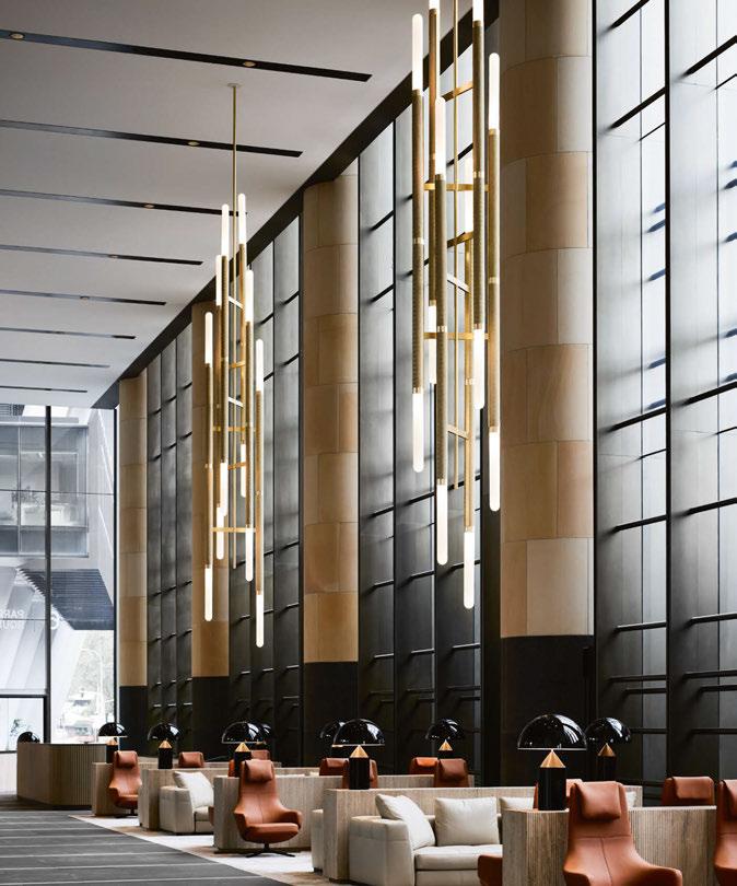
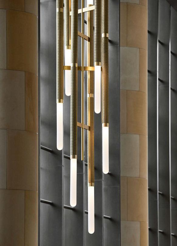
Parramatta Square is a landmark project in Sydney, Australia, by Walker Corporation with architecture by JPW and interior design by Carr. Consisting of three towers connected by a continuous lobby ground plane, the impressive build follows the typography of the site, creating a series of internal and external spaces.
Articolo was commissioned to design three custom pendants in response to the lobby’s exaggerated volumes and a desire to enhance intimacy and comfort.
Inspired by the rhythm and repetition of the architecture and interior spaces, it sought to unify the interconnected ground floor with a reinterpretation of its lauded Staggered Scandal pendant.
The original design was dramatically supersized to over eight-metres in length – six customised barrels extending from each pendant. Enhancing the design’s elongated proportions is an inlay of Italian brass herringbone mesh; the pendants capped end-to-end by Australian mouthblown glass.
Reimagined for this site-specific installation, in a feat of both design and engineering, the trio of pendants were made in Melbourne before being suspended 12-metres in the air at a weight of 170-kilos in solid metal and glass. “I am incredibly proud of what we’ve achieved with Carr and JPW on this landmark project for Walker Corporation at Parramatta Square,” says Nicci Kavals, Articolo’s Founder and Creative Director. “It was a privilege to be entrusted with such a complex commission of scale, and the outcome is truly a feat of both design and engineering.” “Collaborating with Nicci on custom pendants and lighting throughout Parramatta Square was a wonderful experience. She took us on a journey and involved us and the whole team in her strong vision and rigorous process,” adds Rebecca Trenorden, Associate Director of Carr.
Jessica Jordan, Head of Commercial Development at Walker Corporation adds: “This has been an exciting collaboration with our skilled design team, producing an amazing outcome for our lobby spaces at Parramatta Square. This sets a new benchmark for premium office space in the heart of Western Sydney.” www.articolostudios.com
CASE STUDIES | LOBBY

NULTY BESPOKE

THE HOUSE OF WALPOLE AT NO. 1 PALACE STREET, ENGLAND
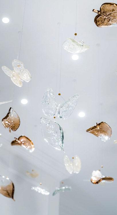
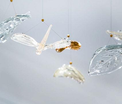
Custom luminaire specialist, Nulty Bespoke, introduces A Garden Breeze, an exquisite handcrafted installation for The House of Walpole at No. 1 Palace Street. The beautifully conceived apartment is a collaboration between Northacre and Walpole to showcase and highlight British luxury within a one-off residence designed entirely by Oliver Burns.
Steeped in history, No. 1 Palace Street, The St. Regis Residences is one of London’s most coveted addresses, adjacent to His Majesty’s official London residence, boasting unique views of the Palace and its private gardens. Taking inspiration from the gardens, Oliver Burns has created a unique design concept for House of Walpole entitled ‘A Celebration of the Palace Gardens’ and the apartment features a curated mix of bespoke pieces from the best British luxury brands.
Situated in the hallway lobby of the elegant apartment, Nulty Bespoke’s luminaire was designed to bring depth, movement, and visual interest to the high-end interior scheme. The playful centrepiece is an abstract depiction of the flora and fauna in the palace gardens and comprises hand-pulled glass butterflies, dragonflies, and mulberry leaves in a delicate tapered arrangement.
The commission saw the team play around with clear, coloured, and opaque effects to reference the vibrancy of nature and punctuate the wider scheme with subtle injections of colour and texture. Some of the sculptured glass elements feature speckled brown and champagne pigment, while others are simply clear. A juxtaposition of crackled and non-crackled finishes adds further visual complexity to the piece. Each of the delicate hand-pulled components were crafted by highly skilled artisans in Stourbridge, the glass-making centre of England. The free-flowing composition of the installation was achieved using ultra minimalist stainless-steel cables that create the illusion that each butterfly, dragonfly, and leaf is floating in the air. The glass designs have been suspended at varying lengths to form an oscillating effect and draw the gaze along the hallway towards the bedroom at the end. Low glare downlights were then positioned on the ceiling to provide a layer of ambient illumination from above, which radiates shimmering light throughout the installation and animates the decorative detail of the glass.
www.nultybespoke.co.uk
64/65 |
LSE LIGHTING ABER BAY,
WALES
Working alongside Nick Carroll Architects, a new, purpose-built luxury clubhouse has been constructed for Aber Bay, a seafront holiday park along the coast from the cultural capital of Wales, Aberystwyth. LSE Lighting was appointed with designing the lighting for all external and internal areas of the clubhouse. The multistorey complex incorporates a swimming pool area, bar and restaurant, and roof terrace bar.
Guests are welcomed by a warm glow around the outside of the building, created by lengths of linear profile. Within LSE’s design and supply, bespoke stepped glass pendants were crafted for the reception desk, along with specially designed opal glass spheres. The spheres blend into an immersive feature light, which consists of 105 glass spheres, leading visitors from the reception area, up the stairs and through into the restaurant/ bar area.
Director of LSE Lighting James Mansfield says: “Throughout this project we worked closely with the client to ensure the vision was brought to life. The opal glass globes represent waves lapping the beach and gather in intensity, drawing users towards the central staircase where they are greeted with a 105-glass ball wave design flowing them into the central terrace bar.”
In addition to the lobby area, LSE also perfectly wall washed the perimeter of the pool area, following the curves of the stepped stretch ceiling. Recessed LEDs also create a calm ambience as well as wayfinding through to the changing rooms. In the bar area, sculptured clouds are suspended throughout, representing an open sky. www.lselighting.com
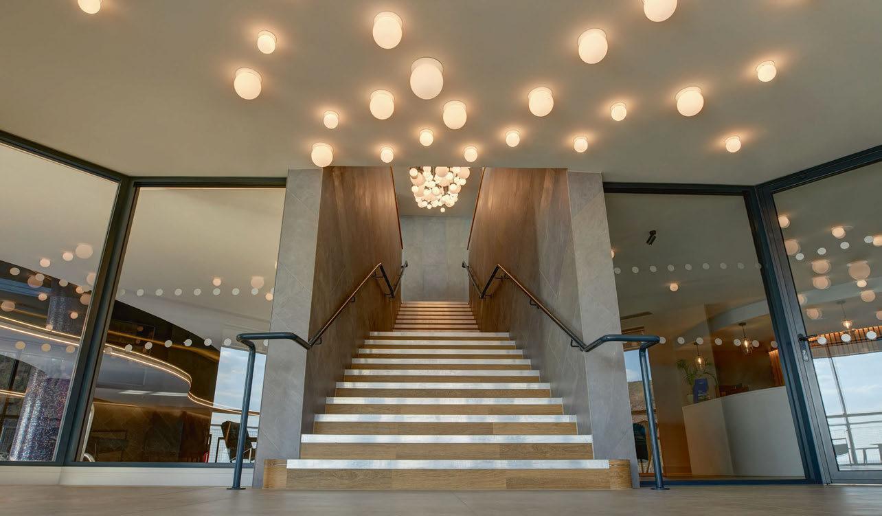
CASE STUDIES | LOBBY
MODERN VERVE
CREATIVE AGENCY RIDGEWOOD, USA
Modern Verve’s Spark series chandelier was specified by Z+ Architects for the lobby of a new build space for an unnamed creative agency located in Ridgewood, New Jersey.
Mary Scro of Z+ Architects says: “the Spark Series Porcelain chandelier by Modern Verve Lighting was the perfect fixture for the unique narrow lobby condition in a new building we designed for a creative advertising client in Ridgewood. “Our client wanted the building we designed to house their art collection. We all liked the artistic design and handmade aspects of the Spark chandelier as well as the energising qualities it provided the space.”
The Spark Series chandelier appears to explode in all directions. It is made of machined brass arms tipped with handmade porcelain shade. This is a feature the architect and client liked since the fixture also acts as a connector to all the floors that opened up to the lobby.
Like many of the light fixtures Modern Verve Lighting makes, the Spark Series chandelier can be manipulated on-site for various configurations. The Ridgewood lobby’s light is fully fanned-out, its arms can also be rotated flat into a linear fashion.
Modern Verve’s owner and lead designer, Shea Bajaj, says: “I feel very strongly that lighting for the 21st Century should not just be static decoration. It is important to me that a fixture be able to adapt to its space as well as to be changed or manipulated by its occupants. This change would be re-configuring the fixture to create a new mood, provide a fresh change or respond to the seasons.”
www.modernverve.com

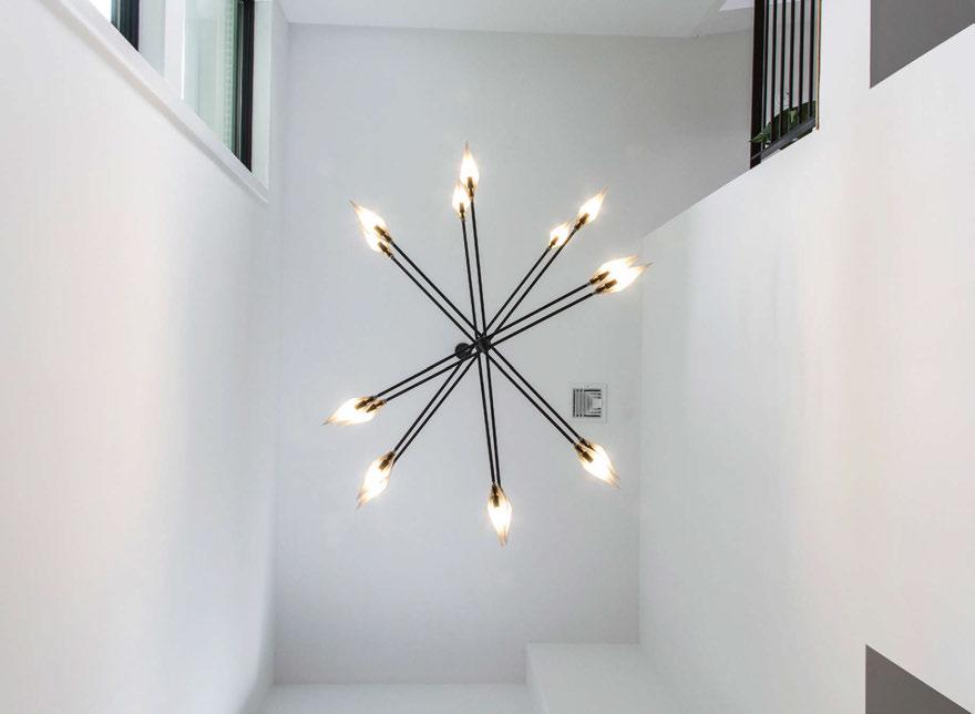
66/67 |
IMAGES: AMANDA KIRKPATRICK
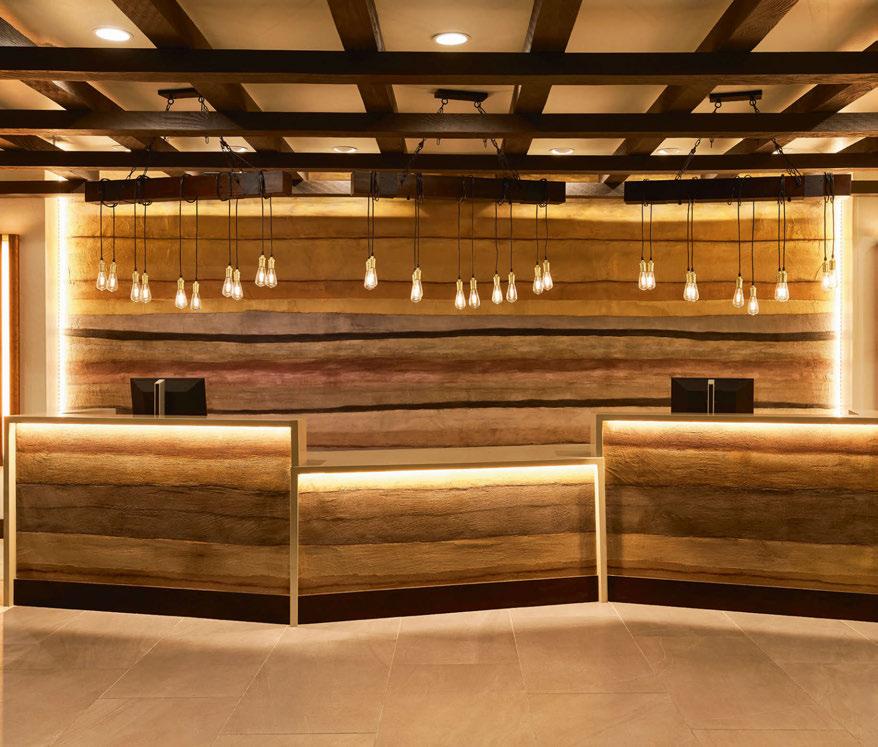
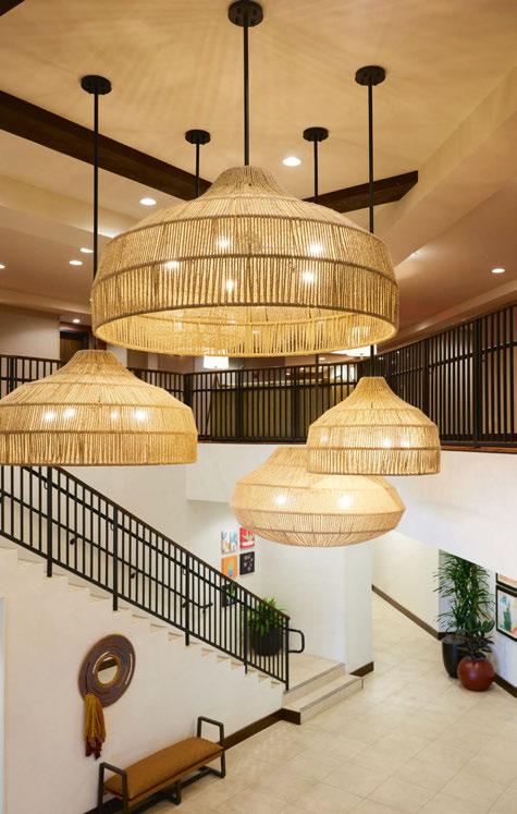
INNOVATIONS IN LIGHTING
EDDY HOTEL, TAPESTRY COLLECTION BY HILTON, USA
When Dwellings set out to design the lighting for the Eddy Hotel in Tucson, the team had a very specific look in mind for the property but needed a lighting partner with the experience in producing custom product to bring their concept to life.
Working closely with the design team, Innovations in Lighting brought its expertise in materials including wood, rope, metal, and resin as well as its manufacturing expertise to help execute this vision.
The outcome was a wave of fixtures above the reception desk, plus a cluster of rope-wrapped pendants hanging in the lobby stairwell, ranging in size from 91cm diameter to 168cm diameter, designed by Dwellings and created by Innovations in Lighting.
“Producing fixtures of this scale and with all the different materials required more than a leap of faith, but almost the ability to get inside a designer’s head and produce what really amounts to functional art,” says Rob Bruck, President of Innovations in Lighting.
“The resulting collaboration speaks both of the design acumen of the team at Dwellings, and the abilities that Innovations in Lighting brought to the project.”
www.innovationsinlighting.com
CASE STUDIES | LOBBY

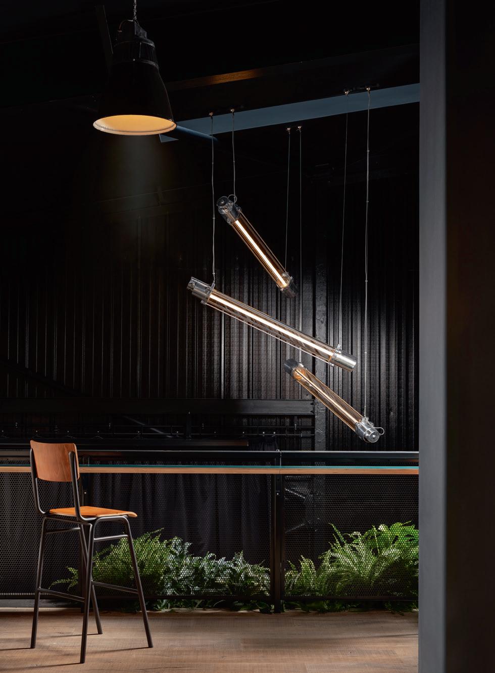
SKINFLINT
VERDANT BREWERY AND TAPROOM, ENGLAND
skinflint was founded on a mission to stop vintage lights going to landfill; salvaging and restoring only the highest quality vintage lights from the 1920s-1970s. Bucking fast-furniture trends, it works sustainably across the UK, Europe and the USA, with a roster of clients from Soho House to fellow B Corps Patagonia and Aesop. But it continues to collaborate with pioneering start-ups too. Verdant Brewing Company is one of many. Designed by Zelah Studios, Verdant’s brewery and taproom in Penryn, Cornwall, prioritises sustainability throughout. Lit by skinflint vintage lights, the space is impressive from the get-go - glance towards the bar and you’ll notice a row of skinflint vintage Czech pendants, their polished aluminium galleries adding to the industrial aesthetic of the interior. The walls are illuminated by skinflint 1950s Eastern Bloc machinist lights, adding layered lighting above tables, and creating cosy corners to enjoy a brew. But stealing the show, like a piece of artwork suspended above the staircase, are a trio of skinflint Eastern Bloc LED lights. Cascading down between the floors, they create a show-stopping focal point in an otherwise unutilised lobby space.
James Collins founder of Zelah Studio says: “Focusing on local suppliers and sustainable materials was key to the re-development at Verdant. No-one optimised this approach more than skinflint. They supplied various beautifully re-conditioned vintage lights and by offering a buy-back scheme, guaranteed the extended life cycle of the product.”
www.skinflintdesign.com
68/69 |
IMAGES: ELLIOT WHITE PHOTOGRAPHY
RADAR
OCTOGONE THÉÂTRE, SWITZERLAND
Radar’s Mirage lamps light up the foyer of the Octogone Théâtre in Lausanne. Strongly recognisable due to its distinctively geometric volume in chiselled cement, the theatre is equipped with a 455-seater hall, hosting dozens of shows per year, and also has a dance studio. Recently, the foyer and bar-restaurant area were subjected to a refurbishment according to a project by SAS Architecture in collaboration with Alexandre Boyer. The load-bearing walls, which feature the same chiselled workmanship as the exterior, perfectly match the warm and welcoming environment, which is carefully furnished with wooden chairs and bistro tables. The common area includes the bar counters, the ticket office and wardrobe, which are highlighted by a lower false ceiling in light plaster evenly paced by the presence of Radar appliques and lit up by the Italian-French brand’s ceiling lamps.
The Mirage lamps designed by Bastien Taillard were selected for the theatre in the elegant bronze finish. The particular workmanship in hammered glass, which is exclusively produced by hand, imbues the surface of these dome-reflectors with a wavy effect and changing reflections reminiscent of shimmering light on a water surface. www.radar-interior.com
 IMAGE: MICHEL BONVIN
CASE STUDIES | LOBBY
NUURA
NETCOMPANY, DENMARK
Netcompany was founded in 2000 and has over 1600 employees. In 2023, the IT company gathered all its Copenhagen staff in one new, unified office in the heart of Copenhagen. Holmris B8 handled the move, project management, and delivery of the new furniture in close cooperation with Netcompany and architect Tine Mouritsen from Colliers.
In addition to improving conditions for the company’s growth in a central location, the new headquarters also provides the framework for the flexible approach Netcompany has to work.
Tine Mouritsen, Director and Head of Workplace & Project Advisory at Colliers, designed the new interiors, including flexible work zones with room for informal meetings and buzz sessions and a stylish bar where the staff can gather for a festive moment.
Nuura’s lighting is placed in various common areas, contributing to a sensuous and warm atmosphere in the new modern domicile. Miira 4, designed by Sofie Refer for Nurra, are located in the reception lobby area, in the specially-built alcoves, and above the bar. Miira 4 helps to spread a pleasant atmosphere while contributing to calmness and coherence in the interior. Apiales 6 is located in the coupés and, together with the unique inventory, helps to form the framework for various meetings. www.nuura.com


68/69 |
IMAGE: HOLMRIS B8

MAY 19-21 2024
JAVITS CENTER NYC
DARC READERS: YOUR PASS IS COMPLIMENTARY WITH PROMO CODE: DAPMDARC
Register at icff.com NORTH AMERICA’S SINGULAR PLATFORM FOR INTERNATIONAL DESIGN.
NORTHERN LIGHTS
THE MUNICIPAL HOTEL LIVERPOOL, ENGLAND
Global hotel giant Accor opened its latest hotel – The Municipal Hotel Liverpool, MGallery – inside one of the city’s most historic venues.
The impressive Grade-II listed building, renowned for its French and Italian architectural style and clock tower, houses 179 beautifully designed rooms, a restaurant, an afternoon tea lounge, a cocktail bar, and a sanctuary spa.
Northern Lights was chosen to collaborate with Manchester-based interior designers Koncept ID and lighting designer Luke Artingstall of Artin Light to develop bespoke lighting for the array of public areas and guest suites throughout the hotel.
The brief called for a vast range of bespoke lighting fittings to be designed, with over two-dozen individual designs being fabricated and distributed throughout the hotel.
Ten exceptional decagonal chandeliers are a big
feature of the Palm Court area. Each fitting comprises stunning laser-cut medium antique fretwork that houses matte opal windows to create an atmospheric ambience that perfectly complements the purposebuilt skylight above.
Medium antique brass has been used to create most of the fittings that Northern Lights supplied to the hotel, including several pendants, chandeliers, table and wall lamps throughout the venue.
Deirdre Billing, General Manager of The Municipal Liverpool – MGallery, says: “I am delighted to write a new story for the Municipal Building, bringing back its local heritage into a hotel and introducing the luxury brand MGallery to Liverpool. It has been a joy to see this iconic building brought back to life, and we can’t wait to welcome guests into the space and experience its charm for themselves.” www.northern-lights.co.uk


70/71 |
GUNNER GU
IMAGES:

600+ exhibitors showcasing thousands of new products. Fresh insights from 150+ inspiring speakers.
Meaningful connections through unparalleled networking.


Don’t miss this year’s HD Expo + Conference. It’s three days of discovery and learning.
Register today at hdexpo.com


april 30 - may 2, 2024

Use code DAPMDARC for your complimentary pass


Astro 2 Atelier Anaka 31 C helsom 29 C hristopher Hyde 23 C ordula Kafka 38 Cu riosa 51 [d]arc awards 6/7 [d]arc sessions 4/5 [d]arc subscriptions 72 Elstead Lighting 37 Franklite 19 H D Expo 71 ICFF 69 Intra Lighting 75 Light 24 8/9 Luxxu 52 SA AS Instruments 76 Vertigo Bird 73 Zico Lighting 11 AD INDEX PORTFOLIO PROUDLY SUPPORTING

vertigo-bird.com
Kokeshi A+A Cooren


Pop & Flared Lamp Collection
Shelley Simpson
What is the inspiration behind this debut lighting collection?
It was really about something that sits quietly in a space. I don’t like things that become the focal point of a room. I wanted the pieces to blend in with the environment. We worked with a technical support - Zachary Hanna - and I believe the pieces we created together are the ones that achieved this quality of sitting quietly in a space and cast a light in a way that is really calming.
Which is your favourite piece from the new collection?
I think it’s the Flared floor lamp; it was like my problem child. It’s frustrating because there is so much more in terms of mechanics to that piece than any of the others, and it will be the last one to enter the market to purchase because of that. It changed many times through the design process, and we had lots of problems when first firing the pieces, as they kept warping way too much. It was then solved by sanding the shelves to allow the porcelain to slide across them. Each piece shrinks about 25% when it’s firing, so it must be able to move in the kiln and not drag.
Why is porcelain Mud’s go-to choice of material?
I worked with earthenware first, which is a starting point for everybody who works with ceramics. It’s the easiest clay to use. I was then approached by an Australian chef, Neil Perry, who had a place called Rockpool, and asked for a black bowl for a squid pasta dish. I knew when my creations went into his kitchen they were not going to last. With earthenware, you put a coating of colour on it, then you put a coating of glaze that seals the piece, but it’s quite soft. If it chips, you see the white on the inside, it accepts water, and then it crackles.
This experience kicked me into action to find a stronger material. I’d read a book about the discovery of porcelain by Europeans and how difficult it was for them to obtain. I was fortunate enough to be able to source it from a local shop, and just needed to figure out how to use it. Normally, when you fire porcelain it nearly always has a shiny glaze. I took the glaze away on the exterior, giving it the inside out glazed effect, which has been our aesthetic for the last 25 years or so. With our lights, you can’t see the glaze at all, which
I think adds to the quietness of the pieces.
www.mudaustralia.com
FOCUS 74/75 | IN FOCUS | MUD
mud IN


It’s main feature is the possibility of rotation. For a pleasant indirect light you simply rotate it with one move. intra-lighting.com/Gramm Gramm
The lightest light

LIGHTS NORTH OF THE 60 th LATITUDE SAAS INSTRUMENTS / Henry Fordin katu 5 B / 00150 Helsinki / Finland / tel +358 9 6860 610 / info@saas.fi / www.saas.fi PIPELINE A MINIMALISTIC SHOWPIECE WITH A NORDIC IDENTITY.


 Sarah Cullen • Editor


 IMAGE: MICHEL BONVIN
